

Page 1

Academic
Courseware
Animation
by Joyce Ryan
Page 2

Page 3

Copyright 2001-2004 Corel Corporation. All rights reserved.
The content of this document and the associated Corel Painter software are the property of Corel Corporation
and its respective licensors, and are protected by copyright.
Corel, the Corel logo, Corel Painter, and Corel PHOTO-PAINT are trademarks or registered trademarks of
Corel Corporation and/or its subsidiaries in Canada, the U.S. and/or other countries. Adobe and Photoshop are
registered trademarks of Adobe Systems Incorporated in the United States and/or other countries. Apple, Mac
OS, and Macintosh are registered trademarks of Apple Computer, Inc., registered in the United States and
other countries. QuickTime is a trademark used under license. QuickTime is a registered trademark of Apple
Computer, Inc. in the United States and other countries. Indeo and Intel are registered trademarks of Intel
Corporation. Windows is a registered trademark of Microsoft Corporation in the United States and/or other
countries. Netscape Navigator is a registered trademark of Netscape Communications Corporation in the U.S.
and other countries. TARGA is a registered trademark of Pinnacle Systems, Inc., registered in the U.S. and
other countries. Cinepak is a registered trademark of Radius, Inc. Wacom is a registered trademark of Wacom
Company, Ltd. Other product and company names and logos may be trademarks or registered trademarks of
their respective companies.
Academic Courseware
Page 4

Page 5

Table of contents
Foreword . . . . . . . . . . . . . . . . . . . . . . . . . . . . . . . . . . . . . . . . . . iii
Jargon 101: The Technical Terms Every Animator Needs to Know1
The Storyboard . . . . . . . . . . . . . . . . . . . . . . . . . . . . . . . . . . . . . . .15
Digital Ink and Paint Techniques . . . . . . . . . . . . . . . . . . . . . . . . .25
The Background Art. . . . . . . . . . . . . . . . . . . . . . . . . . . . . . . . . . .39
The Write-on . . . . . . . . . . . . . . . . . . . . . . . . . . . . . . . . . . . . . . . .49
Saving and Exporting Movies . . . . . . . . . . . . . . . . . . . . . . . . . . . .55
Animating with Strokes . . . . . . . . . . . . . . . . . . . . . . . . . . . . . . . .65
Rotoscoping with Corel Painter. . . . . . . . . . . . . . . . . . . . . . . . . . .71
The Power of Scripting . . . . . . . . . . . . . . . . . . . . . . . . . . . . . . . . .79
3-D Effects . . . . . . . . . . . . . . . . . . . . . . . . . . . . . . . . . . . . . . . . . .87
Vocabulary . . . . . . . . . . . . . . . . . . . . . . . . . . . . . . . . . . . . . . . . 97
Academic Courseware:
Joyce Ryan
i
Page 6

Academic Courseware:
Joyce Ryan
ii
Page 7

Foreword
In 1972, I got my first taste of “computer art.” My husband John and I
were students at the Rhode Island School of Design. John got involved
in an experiment at the Rhode Island School of Design, and Brown
University had started to encourage art students to collaborate with
computer science students. John was led into a frigid room that housed
gigantic machines that seemed to eat punched cards for fuel. Most of the
artists in the program quickly lost interest. The thought of feeding
punch cards in, one at a time, to plot out a black-and-white drawing
made of alphanumeric characters didn’t seem all that appealing. John,
who was studying Graphic Design at the time and liked anything to do
with turning type into pictures, thought this might have some real
potential. He ended up using all of his allotted time and most of the
other artists’ time as well. In those days it cost several hundred dollars
an hour to use the computers.
Moving forward to the mid 1980’s. I was working with Washington
University to develop a program of study that would introduce artists to
computers. John and I were the only artists they had ever heard of who
had any involvement with computers. I was already going to attend
Siggraph, so I kept an eye out for some software that would meet the
needs of such an academic program. I saw the big 3-D modeling
systems, but was most impressed when I came across the first “paint”
system I’d ever seen. It was by a small company called Time Arts, Inc.
and it used a pressure-sensitive tablet with a special graphics card that
allowed the computer to display 256 colors. Far beyond the punch cards
from college, I could now actually draw and paint with the computer,
and in color! This was the tool I needed to start my program at
Washington University. As excited as I was, that was about how
unimpressed the arts faculty were with the idea of drawing and painting
on a computer. My program got a lot of criticism for being “unnatural”
or superfluous. One or two brave souls came around, but mostly the
faculty could not imagine why anyone would want to try to make art
with a computer.
I threw myself into learning this software inside and out, and was
learning even more by teaching my students. This was the beginning of
the computer graphics program in the art school at Washington
University. The more I learned, the more I wanted to meet the people
Academic Courseware:
Joyce Ryan
iii
Page 8

who had written this wonderful software. I had ideas for tools I wanted
them to make especially for animators. My next stop was the Time Arts
offices in Santa Rosa, California, where I first met, among many talented
artists, programmers and engineers, John Derry, who was destined to
become one of the co-creators of Painter. The people I met were
pursuing a goal—to replicate natural media with a computer. I fell in
love with their work, made some of the best friends of my life, and
eventually joined the company in an 8-year relationship, first as a
software reseller, then eventually as an animation consultant, software
trainer, demo artist and interface designer. I wanted to take what I knew
about conventional animation techniques and apply it to the computer.
It has been my passion ever since.
Jump ahead again and it is now 2004 and I am teaching Digital Ink and
Paint at the Art Institute of Atlanta. I am demonstrating Corel®
Painter™ to my class. I ask my students how many of them remember
seeing the scene in “Willy Wonka and the Chocolate Factory” where the
children are shown lickable wallpaper. Willy Wonka excitedly tells them
to lick the wallpaper, that the strawberries taste like strawberries, the
pineapple tastes like pineapple, and the snozzberries taste like
snozzberries—but the children had never heard of or tasted
“snozzberries.” The snozzberries had to be magic. I then showed my
students the watercolor brushes in Painter that acted like watercolor, the
chalk that acted like chalk, and then the brushes that acted like nothing
they had ever seen before. The Image Hose that painted with donuts.
The brush that painted with metal. And how it could all be used to
make animation. For that moment we were all as excited as children
tasting “snozzberries” for the first time. The fruit not from a bush or a
tree, but from an inventor’s imagination!
I wish to thank my husband John for contributing so much of his
artwork and support while I was writing these chapters. I want to thank
my son Lucas for his comments and insight. I want to thank my
students at the Art Institute of Atlanta for letting me test my tutorials
on them. I want especially to thank all the good people at Corel who
supported this book and who continue to develop Painter, pushing the
envelope of what it can do. They just keep making it better—it must be
magic.
Joyce N. Ryan, 2004
Academic Courseware:
Joyce Ryan
iv
Page 9

Chapter 1
Always check to make sure you
are working at the right size before
starting any project. Check the preset
sizes in your editing software, or talk
with your video editor, film editor, Web
developer or service bureau.
Jargon 101: The Technical Terms Every Animator
Needs to Know
Before beginning an animation project, you must consider the final
format your work will be displayed in. Are you working for film, video,
or the Web? Will any of the animation frames ever need to be resized for
print? Setting the correct size, shape, and resolution for your project
from the start is critical to its success.
Typically, if you are working
for film and video, you might work at
720 x 486 pixels (standard NTSC
video). If you are making an animated
comp in QuickTime®, or an AVI to
run on your computer, 320 x 240
usually works well.
Storyboard panel formatted for television.
TV cut-off and safe titling
If you are creating animation for television or film, you must make sure
that your type is not cropped by the shape of the screen, and that
nothing vital in your image is lost. The rule of thumb for layout
purposes is to crop a 12-field layout, 1.5 inches all around for TV cutoff, and 2 inches around for title safe.
Academic Courseware: Chapter 1
Joyce Ryan
1
Page 10

A field guide or “graticule”
helps the animator plan a layout. 35mm film layout is based on a
proportion of 1:1.376 (known as the
Academy Ratio). This typically yields
a size of 12 x 8.72 inches. For
television, this format varies slightly.
Typically, an aspect ratio of 4:3
corresponds to the NTSC standard.
The degree to which TV cut-off crops
the field depends on the make, model,
and age of the TV set.
Tape an animation peg bar to
your scanner, so that all your drawings
are scanned in perfect alignment
(registration) to one another.
TV layout based on a 4:3 aspect ratio indicating TV cut-off and title safe for a
standard NTSC (National Television Standards Committee) television broadcast.
Scanning for animation
If you draw your animation by hand, you will have to scan it into Corel
Painter. Your drawing should be created at the correct dimensions
(width to height) for your animation. Ten seconds of animation at 30
frames per second can translate into 300 drawings if you create one
drawing for every frame of video. It is critical to scan efficiently to
handle that volume of artwork. If you are scanning in art to use as final
renderings in your animation, you will scan at 72 dpi in RGB at 720 x
486 for NTSC video. However, if you are scanning in to trace, reference,
or make a rough pencil test of your motion, get into the habit of
scanning at 72 dpi in grayscale, so that your files are small and scan
quickly. Depending on your drawings, you may even scan them in as
black-and-white line art; the drawings will look jaggy, but if you are
only using them as reference to trace from in Corel Painter, that is all
you need. This will give you files that take up the least amount of
storage space on your computer.
Academic Courseware: Chapter 1
Joyce Ryan
2
Page 11

Each scanner has a different
interface, so you may have to explore a
little to find the settings you need.
If you have to increase the size
of an image, the best place to do that is
on the scanner; blowing up a bitmap in
a software program is always a bad
idea.
“Paint” = Bitmaps, “Draw” = Vectors
Computers handle images in two ways: as bitmaps, or as vector images
(also known as object-oriented graphics). When working with objects
and vectors, the computer keeps a “display list” that describes a series of
points in space and their attributes.
What size should you work
at? That depends on your finished
product. Will the artwork ever be used
for other purposes? Remember, it is
always easy to make the image smaller,
but it is very difficult to make it
bigger.
The rough draft for the fish was done in Corel PHOTO-PAINT®. Once
the client approved it, the image was recreated with shapes so it could
easily be resized for various uses.
Academic Courseware: Chapter 1
Joyce Ryan
3
Page 12

Bitmaps are resolutiondependent. If you blow up pixels, they
just look more obvious.
The finished design created with vectors.
Unlike vector images, bitmaps cannot always be easily resized without
loss of quality.
Note what happens to the letters when they are blown up. It is all right
to reduce a bitmap, but it is almost never acceptable to enlarge one.
Understanding vectors
A vector is a mathematical description of a location in space; as such, it
has no actual size. Images described by vectors are resolutionindependent. They can be rendered at any size and maintain their image
quality. The image file only contains a list of vectors and display
properties, making vector-based (object-oriented) files very small
compared to bitmaps. Eventually, the file has to be converted to a
bitmap output. When it is sent to a printer, the raster image processor
Academic Courseware: Chapter 1
Joyce Ryan
4
Page 13

Vector-based graphics are
easy to resize with no loss of quality.
However, they tend to have a
somewhat flat graphic style to them. If
you want a painterly look, you will
not be satisfied with working only
with vectors.
(RIP) usually handles that task. The display adapter in your computer
interprets the image as a bitmap of pixels on your monitor. Some “Paint”
programs like Corel Painter and Adobe® Photoshop® let you import
vector graphics and turn them into bitmaps (“rasterize” them) so they
can be embellished with paint effects. Corel Painter combines the best of
both worlds by letting the artist work with both bitmaps and vectorbased objects.
An image like this one would be impossible to create with vectors.
Understanding bitmaps
Everything in graphics output eventually becomes a bitmap. Bitmap
files are large! They have to be—the computer must keep track of the
color values of every pixel that makes up the image, not just vectors and
attributes. Bitmaps are also resolution-dependent. If you blow up pixels,
they just look more obvious. To make a bitmapped image large and
smooth, you have to have a finer grid of pixels defining the image. For
best results, you must create your image at the correct resolution, or
higher.
A bitmap is a rectangular grid of dots used to describe an image. It has
four basic characteristics:
•Dimension
•Resolution
•Bit depth
• Color model
Academic Courseware: Chapter 1
Joyce Ryan
5
Page 14

Some software, games, and
Web sites will stipulate the ideal
settings for your monitor, so that you
can see the images as they were
intended.
Resolution
The word “resolution” can be used to describe different things.
Spatial resolution — describes the dimensions of an image in width
and height.
Color resolution — often referred to as “color depth” or “bit depth”;
refers to how many colors are available to define the image.
Scanner resolution — refers to the number of dots per inch (DPI). If
you have to enlarge an image, it should be done on the scanner and not
in Corel Painter. DPI is also used for the resolution of printers,
describing how many dots per inch the printer can apply to the paper.
Screen resolution — refers to the number of pixels per inch (PPI).
Computer monitors can be set for different screen resolutions. The
setting determines how many pixels the monitor can display. A large
monitor can accommodate a high setting. A small monitor may be easier
to see at a lower setting.
Line frequency — also known as “screen frequency”; refers to the
number of lines per inch (LPI) that a halftone screen uses to break down
a continuous tone image into printable dots for reproduction on a
printing press. Low line frequency (large dots) is used for porous papers
like newsprint. Coated stock can hold more detail and can take a higher
line frequency. Always ask your service bureau what LPI you should be
working at.
So how do we understand all
these different references to resolution?
It’s all about dots—the dots just come
in different flavors! Whenever people
are talking about “resolution,” they
are talking about a grid of dots that
are assigned or mapped to a given
space, usually measured in inches or
centimeters. The more dots you put in
an inch, the more detailed the image
will be—it will have a “higher rez.”
An image must be broken into dots with a halftone screen to print on a
commercial printing press.
When you are creating an animation with Corel Painter, consider
• the type of animation you are producing,
Academic Courseware: Chapter 1
Joyce Ryan
6
Page 15

The PPI doesn’t tell you
anything about the actual size of the
grid.
PC’s typically default to 96
ppi, and Macintosh® computers
default to 72 ppi. Television sets
default to 72 ppi. A liquid crystal
display (LCD) screen may be set
brighter than a cathode ray tube
(CRT) one. Apple® computers
typically default to a brighter screen
gamma than PC’s. When designing
for the Web, developers typically test
their work on both platforms. If you
are working in video, you will also
want to look at your work on a video
monitor.
• the requirements of any systems that will process the animation
when you are finished with it in Corel Painter,
• the final delivery medium of the animation (video, film, Web, CD,
QuickTime, AVI, etc.).
Dimensions or spatial resolution
Bitmaps have two dimensions. They are grids containing picture
elements (pixels). The dimensions of a bitmap are described by the
number of pixels the bitmap is high and the number of pixels the
bitmap is wide.
spatial resolution = width x height
The spatial resolution of a bitmapped image is based on how many
pixels in the grid make up each unit of measurement. In Corel Painter,
you are working in pixels per inch (PPI). In other words, if you have a
one-inch grid, how many pixels is this grid broken up into: 72, 96, or
maybe 300? Which would look sharper and have more detail, the 1”
grid described by 76 pixels or the 1” grid described by 300 pixels?
Compare resolution and zooming
Look at an image file and note its resolution. Let’s say it is 720
x 486 pixels and has a resolution of 72 ppi. Zoom in on it
200%. It looks twice as big, but it is still only 720 x 486
pixels. You have made the pixels of the grid look bigger, but
you have not added more pixels to the grid, so the resolution
has not increased.
Increase screen resolution
Increase the resolution of your monitor to see what happens.
The icons on your desktop look smaller. Why?
Color resolution
A bit (binary digit) can describe two states: on and off, black and white,
0 and 1, etc. If 1 bit = 2 colors, 2 bits give you 4 colors, and 8 bits give
you 256 colors. That’s 2x2x2x2x2x2x2x2 = 256, or 2 to the power of 8
8
(2
). At 24 bits of information, you have over 16.7 million colors to
work with. Each pixel is made of three components: Red, Green and
Blue, or RGB for short. We have 8 bits of color for each component, or
256 levels of Red, 256 levels of Green and 256 levels of Blue. Multiply
256 x 256 x 256, and you get 16,777,216 colors. You now know why
Corel Painter and other software programs display RGB in values of 0 to
255. If each of the three RGB colors has 8 bits, the image needs 24 bits
Academic Courseware: Chapter 1
Joyce Ryan
7
Page 16

There is an important
difference between displayable and
definable color. If you have 24 bits of
color, you can define over 16.7 million
colors. If your display is set for 1024 x
768, you only have 786,432 pixels,
so you can only display 786,432 colors
out of a possible 16.7 million.
for all the colors. But what does it mean when you are working with a
32-bit image? What are those other 8 bits for, if they’re not needed to
display the RGB colors? They are used for transparency. Certain file
formats support “alpha channels.” Having an 8-bit alpha channel means
that you can have 256 levels of transparency in your image. Color
resolution, or bit depth, affects not only the file size (fewer colors means
fewer bits), but also the smoothness of the color gradations in an image.
This image has excellent color resolution.
Here is the same image using only 60 colors (it has decreased color depth). Look closely
at the green boat and the clouds; notice how the colors are simplified. This effect is called
“posterization.”
Academic Courseware: Chapter 1
Joyce Ryan
8
Page 17

A common trick used to save on file size is to lower the color resolution
of an image. Depending on the image, it can be hard to tell the
difference between an 8-bit image and a 24-bit image on the screen.
This TIFF file takes up 600 KB of storage space.
This GIF file takes only 60 KB of storage space.
Compare output colors
Let’s look at an image at different bit depths in Corel Painter
using the GIF file format.
1 In Corel Painter, open a new file, 100 x 100 pixels at a resolution of
72 ppi.
2 Set the paper color to pure red in the RGB values by setting the red
to 255 and the green and blue to 0.
Academic Courseware: Chapter 1
Joyce Ryan
9
Page 18

NTSC (National Television
Standards Committee) is often
jokingly referred to as “Never Twice
the Same Color.” Video can’t display
the pure bright red you see on a
computer monitor. That is why you
want to look at your work on an
NTSC monitor if you are working for
video. Corel Painter has a special filter
that ensures your animation will be
compatible with both NTSC for the
U.S. and Pal (Phase Alternation by
Line) for European video systems.
When you have finished
making a movie, you can also run a
script in Corel Painter that will apply
the NTSC filter and convert your
movie to video-safe colors.
3 Go to Effects > Tonal Control > Video Legal Colors. Choose NTSC.
Notice how different the red looks in NTSC.
Visually reduce the number of colors in an image
1 Choose File > Save As and name your image file. Choose the GIF file
format, and click Save. Click OK to dismiss the layer warning, if
displayed.
2 In the Save As GIF Options dialog box, in the Number of Colors
area, choose 256 colors. In the preview window, the image appears in
256 colors.
3 Change the number of colors to 128. In the preview window, the
image appears in 128 colors. Continue reducing the number of colors
Academic Courseware: Chapter 1
Joyce Ryan
10
Page 19

in the graphic until you find the minimum number of colors
necessary for adequate display of your image on a Web page.
4 Choose an Imaging Method. Choose Quantize To Nearest Color if
you want Corel Painter to look at each pixel for which it doesn’t have
the exact color and pick the nearest color for it from the available
colors. Choose Dither Colors if you want Corel Painter to apply a
pattern to the colors chosen to generate a more accurate, less banded
result. In this case, Corel Painter will approximate the color of a
larger area of the image, rather than individual pixel colors.
5 You can now either save the graphic to use it on a Web page, or
return to Corel Painter to continue working on the image.
Resolution for video
In Corel Painter, when we start a new file, we see a dialog box that
requires us to enter a resolution in pixels per inch (PPI), or pixels per
centimeter. These pixels represent the number of blocks per inch making
up the grid of the bitmap. In video, the default screen resolution is 72
ppi. In addition, it is critical to know the width and height, or spatial
resolution necessary for the format you are working in.
Resolution for print
The RGB model can describe 256 levels of gray. Remember those gray
scales you did? How hard it was to create a gray scale with ten steps,
with twenty? Look at this grayscale strip—it is made of 256 levels of
gray. Can you tell the difference between all 256 shades of gray?
Most job printing presses can’t reproduce much more than 100 levels of
gray. Fine printers can do better if they use top quality materials and
papers, and highly controlled press conditions.
Academic Courseware: Chapter 1
Joyce Ryan
11
Page 20

Create a grayscale gradient
In Corel Painter, open a new file, 640 x 100 pixels at a
resolution of 72 ppi. Fill it with a grayscale gradation from
white to black. How many shades of gray can you see? Zoom
in on the gradient and examine it closely.
If you have your own printer
(ink-jet, laser, etc.), you should know
the printer DPI. If you don’t, check
your printer documentation or the
printer properties, or check with the
manufacturer. If you are using a
service bureau, they should tell you
what LPI to work at—ask! If they
don’t know, use a different service
bureau!
The rule of sixteen
Let’s say you want to print out your storyboard for a big client
presentation. There will be several people in the room and you want it to
look good from a distance and also upon close examination. A highquality look is important to impress the client. You created the
storyboard at 72 ppi, and it looked fine on your monitor. When you
printed it out, it looked awful! What happened? There weren’t enough
pixels per printed dot to give you a good-looking print. You need higher
resolution for print than you do for video. How do you find out how
much higher?
You already know it is possible to display 256 levels of gray in RGB.
Now you need to know the highest screen frequency (LPI) you should be
working at, given the capabilities of your printer. To arrive at the LPI
value, divide your printer DPI by 16 and multiply by 2. Here is a simple
example. My ink-jet printer has a resolution of 1440 dpi. If I divide that
by 16, 1440 ÷ 16 = 90. The rule of thumb is that I need 2 pixels per
printed dot to get a nice-looking image from my printer. I multiply 90 x
2, and set my resolution at 180 ppi. This should give me a full range of
tones and a beautiful print on photo glossy paper from my ink-jet
printer.
There is no LPI to worry about in video. Video defaults to 72 pixels per
inch. The important thing to know is the spatial resolution—the size of
the image as measured by its width and height. The screen resolution is
going to default to 72 ppi for video and the Web, but you need to know
the spatial resolution of your final output, in order to create your
animation at the correct dimensions and aspect ratio (the ratio of width
to height).
Academic Courseware: Chapter 1
Joyce Ryan
12
Page 21

Use photo quality paper for
high-resolution printing. It has a
coating that enables it to handle more
color and detail than plain paper.
This printer has a maximum resolution of 600 dpi.
Academic Courseware: Chapter 1
Joyce Ryan
13
Page 22

Academic Courseware: Chapter 1
Joyce Ryan
14
Page 23

Chapter 2
The Storyboard
There are two types of storyboards: the production guide and the
presentation board. A good presentation board helps you sell the client
on your idea. It should communicate the look and feel of the animation.
Presentation board created in Corel Painter using Watercolor variants
and the Sargent Brush from the Artists category.
The production storyboard serves as a visual road map for the
production crew, making it clear how the animation will work. It should
include camera angles, audio cues, zooms and transitions.
Academic Courseware: Chapter 2
Joyce Ryan
15
Page 24

Box and arrows indicate zooming out from a tight close-up.
Created using fills and layers in Corel Painter.
Blur filters were used to create shadow masks.
Academic Courseware: Chapter 2
Joyce Ryan
16
Page 25

Working out a detailed
storyboard in advance of production
helps predict the costs involved in the
production. The producer may use the
storyboard to estimate costs prior to
starting production.
This storyboard for “Mission Health” was created using the
Sargent Brush from the Artists category in Corel Painter.
Assignment 1
Storyboarding a 30-second TV commercial for a new radio show
The client wants something memorable that will help establish a brand
for a new radio show that will be competing with drive-time talk radio.
The show will offer an alternative to the incessant chatter of talk radio
by providing long uninterrupted blocks of music interspersed with
upbeat or funny stories. The radio station is broadcasting in areas with
heavy traffic and long commutes. The broadcast format is aimed at
commuters suffering through the stress of traffic, so the station wants to
communicate an image that will attract its target demographic group—
25- to 38-year-olds whose tastes have been formed by popular culture.
Your job is to come up with a concept that addresses the needs of your
client in an entertaining and memorable fashion. You have one week to
get a storyboard together to impress the client and win the job.
Academic Courseware: Chapter 2
Joyce Ryan
17
Page 26

1 In Corel Painter, create a new file. Set your image size to 720 x 486.
(D1 NTSC uses a spatial resolution of 720 x 486 at 72 ppi.)
2 Set the resolution to 180 ppi. The storyboard panels have to be
printed out in color for a presentation to the client and the
advertising agency for their initial reaction. Therefore, it is a good
idea to roughly double the resolution to 150-180 ppi, depending on
your printer. This will yield a printed panel that is 10 inches wide by
6.75 inches high.
3 Always name your files according to the job you are working on, and
keep all the files involved with that job in one folder. In this case,
name the file Radio_Panel_1.rif and save it in a folder called
Radio_Spot.
4 Pick a tool you like sketching with. Personally, I like the Scratchboard
Tool from the Pens category. Experiment with pencils, pens, charcoal
and chalk to find the tools you are most comfortable sketching with.
There is no “right” tool. If you are painting over a scanned image,
you are ready to go.
5 Once you are happy with the sketch, you are ready to begin working
with watercolor. Corel Painter automatically creates a new layer for
watercolors, so you don’t have to worry about painting over your
lines.
6 Try laying in a wash of color using the Soft Camel brush variant.
Clean up unwanted paint with the Eraser Dry brush.
7 When you are happy with your watercolor, dry the layer and add
another layer for more detail. Try colored pencils on this layer to add
crispness and finer detail.
Academic Courseware: Chapter 2
Joyce Ryan
18
Page 27

The more you work with
Corel Painter, the more you will
develop your own techniques.
Academic Courseware: Chapter 2
Joyce Ryan
19
Page 28

Academic Courseware: Chapter 2
Joyce Ryan
20
Page 29

Academic Courseware: Chapter 2
Joyce Ryan
21
Page 30

Academic Courseware: Chapter 2
Joyce Ryan
22
Page 31

These storyboards were created using the Watercolor brushes in Corel
Painter. Before Corel Painter, the artist, John Ryan of DAGNABIT!,
says he would have used markers on paper. What he especially liked
about using the Watercolor brushes in Corel Painter was that they left
his lines undisturbed: “Painter gave me a very facile watercolor look
without the fuss and muss of the real thing.”
Academic Courseware: Chapter 2
Joyce Ryan
23
Page 32

Academic Courseware: Chapter 2
Joyce Ryan
24
Page 33

Chapter 3
Digital Ink and Paint Techniques
Once your storyboard is complete, it is time to create the art for the
animation. You want to create the art as efficiently as you can, and that
takes planning. Reusable elements, color palettes, naming conventions,
and file folder structure should all be thought out before creating any of
the final artwork.
The following is a typical production workflow for a 30-second
commercial:
• Create model sheets for all the characters.
• Read the audio track for timing.
• Create an exposure sheet.
• Rough out the animation.
• Complete the inbetweening and backgrounds.
• Pencil-test the animation.
• Clean up and ink the animation.
• Paint the animation.
• Put the finished art together with audio.
Creating model sheets
The purpose of a model sheet is to give as much visual information
about the construction of the character as possible. This is especially
critical if other animators will be working with your characters. They
will use your model sheet as a guide to drawing the characters. It is
essential in any animated production for the animator to stay “on
model.” The characters must be consistent from scene to scene. A good
model sheet will give an indication of the character’s personality and
what the character should look like through a variety of expressions. A
full turn of the character helps to visualize it as a three-dimensional
object.
Academic Courseware: Chapter 3
Joyce Ryan
25
Page 34

Simplifying the character and breaking it down to show how it is constructed helps
the animators to maintain the proportions and volume of the character.
The model sheet serves as a reference for the animators. It is critical they stay “on
model” so the character doesn’t lose its original look and feel.
Assignment 2
Creating a model sheet for your characters
Using a pressure-sensitive stylus, start sketching with a brush variant
that feels comfortable to you. Experiment with a number of brushes and
variants until you find the one that fits your sketching style.
Academic Courseware: Chapter 3
Joyce Ryan
26
Page 35

It is a good idea to start any
sketching session by going to Corel
Painter IX > Preferences > Brush
Tracking (Mac OS®), or Edit >
Preferences > Brush Tracking
(Windows®), and setting the
sensitivity of your pen. This is
especially helpful if you have a light
touch, or if you prefer different settings
with different variants. Some artists
even like to tape sketch paper to their
tablets so they feel the “tooth” of the
paper.
The first sketch was created with Tapered Artist Chalk 10 from the Chalk brush
category. The second sketch was created with Fine Detail Air 3 from Airbrushes.
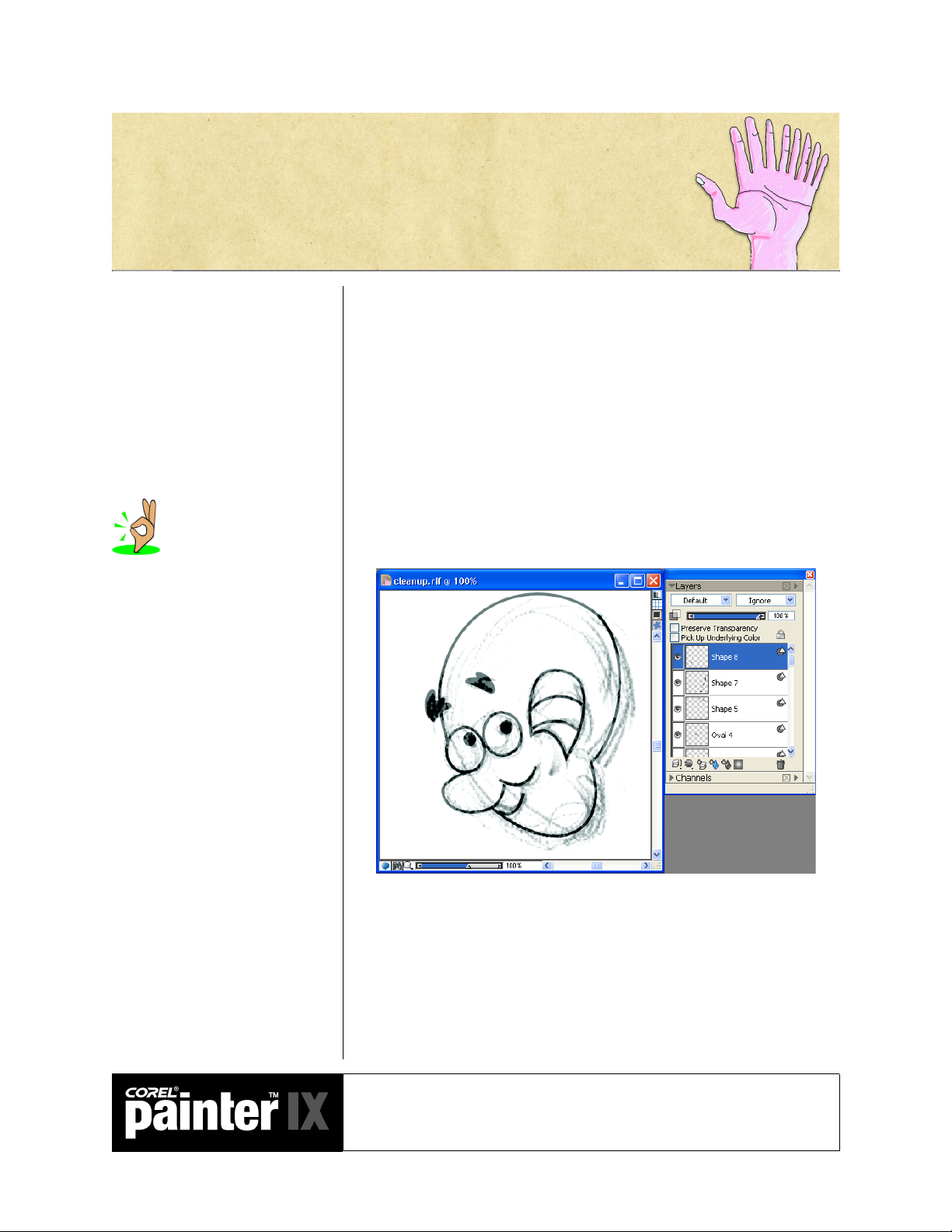
Once you have your sketches, it is time to clean them up and create the
model sheet. You can use layers, or even better, clone your drawing.
1 Clone your drawing (File > Clone).
2 Choose Select > All.
3 Delete the image in the clone (press Delete or Backspace).
4 Toggle on the tracing paper by selecting Canvas > Tracing Paper, or
clicking the Toggle Tracing Paper button in the upper-right corner of
the image window.
5 Trace your sketch using the Pen tools from the toolbox.
6 In the property bar, enable the Stroke check box and disable Fill.
Clean up the drawings using the shape tools to get perfect curves.
Cleaning up a drawing with
shapes has several advantages: Your
characters can be easily resized, and
parts that move can be created on
separate layers and animated
separately without you having to
redraw the whole character. Shapes are
also easily converted to selections,
allowing you to add painterly effects.
7 Create a variety of expressions for your character that show a full
range of emotions.
8 Turn on the rulers and the guides (Canvas > Rulers > Show Rulers
and Canvas > Guides > Show Guides), and set guidelines for
Academic Courseware: Chapter 3
Joyce Ryan
27
Page 36

aligning your character in the front, side and back views. Use the
guides to line up the views of the character.
A complete turn-around of the character gives a sense of the character’s volume and
proportions. It is an invaluable aid to drawing the character from a variety of angles.
Most artists use reference
material as a starting point. Try using
a digital camera and the Cloning tools
in Corel Painter to create your
characters if your drawing skills are
not up to the task. The more you work
from life, the more your drawing skills
are bound to improve.
A good model sheet helps indicate the personality of a character by showing how that
character would experience a wide variety of emotions.
Academic Courseware: Chapter 3
Joyce Ryan
28
Page 37

Make a palette of colors that is
specific for the job, so you can stay
consistent from frame to frame. You
don’t want your characters changing
colors! You may also have an assistant
helping you, who will be working on
the same storyboard and will need to
use your palette.
Coloring your characters
Corel Painter offers an almost unlimited number of options to paint your
characters. Traditionally, animators inked their drawing onto clear
celluloid or acetate sheets called “cels.” These were inked on the front,
then turned over and filled in with special cel vinyl paint on the back.
This technique gave a flat matte finish to the paint and kept the ink line
intact. Color paints had to be mixed in quantity to assure not running
out. Remixing could cause the colors to shift before all the cels were
painted. Each color was labeled and keyed to a master painting for
reference. Many people were required to paint and, again, they all had to
stay on model. Corel Painter makes it easy to both “paint cels” and mix,
store and label your colors.
Create a custom color palette for painting your characters
1 On the Color Sets palette, click the palette menu arrow, and choose
New Empty Color Set.
2 On the Colors palette, choose a color from the Standard Colors or the
Small Colors display (the Hue Ring or the hue indicator). On the
Color Sets palette, click the Add Color To Color Set button.
3 On the Color Sets palette, double-click the color to get the Set Color
Name dialog box. Name each color to correspond to parts of your
character: “face,” “teeth,” “eyes,” “hair,” etc. To display the color
name, choose Display Name from the Color Sets palette menu.
4 Save your color set with the name of your character by choosing Save
Color Set from the palette menu. Anyone who has to paint the “cels”
now has the correct colors with which to paint the character.
5 Experiment with a variety of ways to mix your colors. Try sampling
colors from an image, using the Mixer palette and the Color Info
palette. There is no right or wrong method. Use the technique that
best fits your personal workflow.
Practice cel painting in Corel Painter
Cel painting is no longer limited to flat color. With the advent
of Paint programs like Corel Painter, the range of techniques
used to paint cels is limited only by your imagination.
Experiment with different styles to give your work a unique
look and feel.
1 Open a new file and copy one of your cleaned-up characters to the
file. Save the file and call it ColorRef.rif.
2 Drop the copied layer to the canvas.
Academic Courseware: Chapter 3
Joyce Ryan
29
Page 38

Keeping your line intact on a
separate layer lets you control the
integrity of your line. You may wish to
keep the line or not. You may also wish
to change the color of the line to match
the painting.
3 Select the black lines by using the Select > Auto Select > Image
Luminance command. Copy the lines and choose Edit > Paste In
Place to paste your lines on a new layer.
4 On the canvas layer, choose the Paint Bucket tool. Set the Fill to
Current Color on the property bar, and fill the drawing with the
appropriate colors. Depending on the tolerance and feathering
settings, your fill will antialias to the line.
5 Once the fills are complete, set up your lighting using Effects >
Surface Control > Apply Lighting. Set your lighting and remember
to save it! You now have a painted and shaded cel.
A frame of animation created by John Ryan of DAGNABIT! for the National
Black Arts Festival campaign.
Academic Courseware: Chapter 3
Joyce Ryan
30
Page 39

Experiment with the many
ways there are to mix color. There is no
right or wrong way. Corel Painter
allows many different approaches to
match your personal preferences.
Colors were mixed using the Mixer palette and the Color Info palette, and sampling
scanned watercolor studies.
Reading the audio track
If the character is to talk, the drawing of the character’s mouth must
synchronize with the dialogue. This process is called “lip synching.”
Although there are many references for creating lip synch, including
specialized software, it is critical for the animator to act out the dialogue
in front of a mirror. Acting out the dialogue helps the animator bring
out the personality of the character. Sometimes there is reference footage
of the actor who is doing the voice. The more the animator or actor is in
character, the better the reference will be.
The audio track has to be broken down and interpreted on an exposure
sheet. This “dope sheet” indicates where the parts of speech (phonemes)
occur frame by frame. Good lip synch is an art. Emphasis on specific
sounds works better when the action anticipates the sound by a few
frames.
Academic Courseware: Chapter 3
Joyce Ryan
31
Page 40

Create an exposure sheet or
“dope sheet” to track your audio and
match it to your animation.
Sample exposure sheet with indications for lip synch.
Create mouth positions for reference
Academic Courseware: Chapter 3
Joyce Ryan
A (“ehee”)
32
Page 41

B (“buh”)
C (“ss”)
Practice lip synching
Make a simple sock puppet. Practice making it talk believably.
Try to “speak” your dialogue with the puppet, videotape your
efforts and critique the results. How could you have
emphasized important sounds? Did you open the puppet’s
mouth on the vowels or the consonants?
Create a phoneme chart as a custom Image Portfolio
1 Photograph your mouth and chin forming basic phonemes: A, B, C,
D, E, F, G . . .
2 Display the Image Portfolio palette (Window > Show Image
Portfolio).
Academic Courseware: Chapter 3
Joyce Ryan
33
Page 42

Save your phoneme chart as
a custom Image Portfolio so you
always have reference for mouth
positions.
3 To create a new portfolio, click the palette menu arrow, and choose
Open Library.
4 In the Choose Image Portfolio dialog box, click the New Library
button.
5 In the New Image Portfolio dialog box, choose a location and enter a
name for your image portfolio. Click Save.
6 To add an image to the new image portfolio, select a layer, and do one
of the following:
• To cut the layer from the current document, drag the image from
the document window to the Image Portfolio palette using the
Layer Adjuster tool.
• To copy the layer, hold down Option (Mac OS) or Alt (Windows),
and drag the image from the document window to the Image
Portfolio palette using the Layer Adjuster tool.
7 In the Save Image dialog box, type a name for the image.
8 To use an image from the Image Portfolio, drag it from the Image
Portfolio palette to the document window.
Roughing out the animation
Once you have a good sense of when things have to happen and where
they hit on the audio track, you can start animating. Roughing out the
key poses for your animation is the next step. Some animators like to
animate “straight ahead,” creating each drawing in sequence. Most
animators find it easier to rough out the key poses, then create the inbetween drawings for those poses, and then test the motion and add or
subtract drawings where necessary. You may find yourself using a
combination of the two techniques.
Academic Courseware: Chapter 3
Joyce Ryan
34
Page 43

A rough key pose sketched in Corel Painter.
Inbetweening
Producing the drawings “in between” the key drawings is a skill unto
itself. Traditionally, one would place a key drawing onto a light box, the
next key drawing over it, and then another sheet of paper over that. On
the top sheet, the animator would figure out the position between the
two key drawings and sketch it. We can do something very similar in
Corel Painter using layers.
Once you have your key drawings, you can set them up as layers in a file
and draw the inbetweens. Insert a blank layer over the key drawings you
wish to inbetween, and draw the inbetween. By changing the opacity of
the layers it is easy to see the differences between the key drawings.
Changing the color of the lines also makes it easier to tell the difference
between the keys (you can select the lines using the Image Luminance
option and change the colors of the lines in each layer).
Practice inbetweening techniques using layers
1 Sketch your first key pose on a transparent layer.
2 Create a new layer and select a different contrasting color to sketch
with. Sketch the next key pose.
3 Create a new layer and, with another color, sketch the inbetween
using the key drawings as reference. Experiment with changing the
transparencies of the layers you are referencing.
Academic Courseware: Chapter 3
Joyce Ryan
35
Page 44

Example of inbetweening with layers in Corel Painter.
Drawing the inbetween using layers in Corel Painter.
Pencil-test your motion
1 Open a new file in Corel Painter, the same size as your inbetweens. In
the New dialog box, set the Picture Type to Movie, and set the
number of frames to match the number of inbetweens you have.
2 Paste your inbetweens into separate layers in your movie file.
3 On the first frame of your movie, shut off all layers except the one
you wish to have showing.
Academic Courseware: Chapter 3
Joyce Ryan
36
Page 45

4 Move to the next frame and turn on the next inbetween, turning off
everything else.
5 Repeat until you have an inbetween on each frame of your movie—
your layers have become frames.
6 Shut off all your layers.
7 Play back the movie to test your motion.
8 If your computer plays back too quickly, save your movie as an AVI at
a frame rate of 12 to 15 frames per second and view the AVI, or save
it as sequential TARGA® files to edit in a video editing program.
You can also slow the playback down by repeating the above process,
but instead of forwarding one frame, try forwarding two or three
frames for each drawing.
Pencil tests show you if you have enough inbetweens for fluid motion
from one pose to another. There are two ways to change the timing of
your animation: Adding more inbetweens will slow things down and
make the motion more fluid; holding each drawing for a longer period of
time will slow things down as well, but your motion will be choppier.
In video, you work with 30 frames per second. If you have 15 drawings
to describe that second, you hold each drawing for two frames. This is
referred to as shooting on “twos.” If you have a different drawing for
each frame, or 30 drawings per second, it is called shooting on “ones.”
Getting a feel for timing is a major part of becoming an accomplished
animator. Some motion looks better on twos, some on ones, some on
threes or more. There is a great deal of animation produced for the Web
and television that is designed with far longer holds than twos and that
still works quite well for the style of animation.
Tweening
Inbetweening is drawn by hand and takes drawing skill and practice.
“Tweening” can be done by a software program and can be a tremendous
labor-saving device. Learn how to use inbetweening and tweening to
their best advantage.
Practice tweening with Corel Painter
1 Open a new movie file at 320 x 240 pixels and 72 ppi, set for 30
frames.
2 Open another file, the same size but a single image.
3 Choose the Image Hose brush category. Open the Nozzle Selector in
the toolbox, click the selector menu arrow, and choose Load Nozzle.
Locate the Walkbrush.rif file, and click Open.
Academic Courseware: Chapter 3
Joyce Ryan
37
Page 46

4 Open the Nozzle Selector again, and click the selector menu arrow.
Choose Add Nozzle To Library, and save the nozzle.
5 From the Brush Selector bar menu, turn on Record Stroke.
6 Paint across the canvas with the Walkbrush.
7 Close the file (there is no need to save it).
8 Return to your movie. Choose Movie > Apply Brush Stroke To
Movie. Corel Painter applies your stroke to the frames of your movie.
Academic Courseware: Chapter 3
Joyce Ryan
38
Page 47
Chapter 4
A “pan” in animation refers
to moving a background painting
under a camera to create the illusion of
motion. In live action, the camera
would move, “panning” across a
background to create the same effect.
The Background Art
Now that the characters have been drawn, cleaned up and painted, you
need to create your backgrounds. Imagine your character is driving
along the road. How do you make the view outside his car window
appear to move? With a moving background.
Creating a moving background
In the following example, the character of Vince is layered over a
background of the car interior. The car interior is a simple vector shape
that leaves a transparent opening to view the background through.
Next, the background art is created in a file that is much wider than the
window. This is referred to as a “pan cel.” We are going to move the
background across a movie. This will create the illusion of the character
moving through the background.
Academic Courseware: Chapter 4
Joyce Ryan
39
Page 48

A wide image for the background is the equivalent of a pan cel. It will be moved
through the scene to create the illusion of a moving background.
Create a moving background
1 Assume you are creating an animation that is 320 x 240 pixels at 72
ppi. Create a new file that is 640 x 240 pixels at 72 ppi.
2 Paint the background. Once the background is done, click Select >
All, and then Select > Float. This moves your painting up on a
separate layer above the canvas. Save this file and leave it open.
3 Create a new file, 320 x 240 at 72 ppi. In the New dialog box, under
Picture Type, click the radio button for movie, and set the frames to
30. Name the movie Backgrnd.frm.
4 Choose the Layer Adjuster tool from the toolbox, and enable the
Auto Select Layer check box on the property bar. Click on the
background layer in the document window and drag it into the first
frame of your movie. The background is automatically pasted on a
new layer.
5 Advance one frame in your movie by clicking the Step Forward
button on the Frame Stacks palette. The layer in the previous frame is
merged with the canvas. In the new frame, the layer is active. Use the
left arrow key to move the background the desired amount.
6 Repeat step 5 until you have completed the movie.
7 On the final frame, remember to either drop the background layer or
turn it off before you play back your movie.
8 Play the movie and watch your background move!
Academic Courseware: Chapter 4
Joyce Ryan
40
Page 49
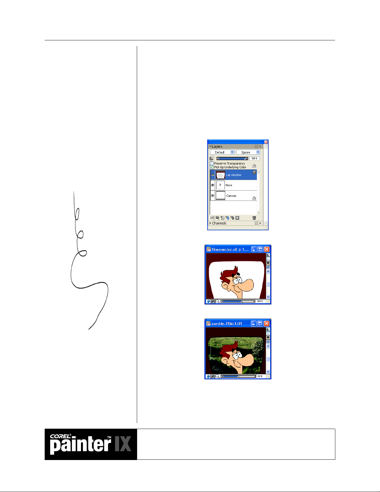
Compositing
Next, we want to combine our character with the moving background.
This process is called “compositing.” To create the composite, start at
the first frame of the movie. Open the file that contains the elements
you wish to composite. Pull the elements into the movie file. Hold down
the Step Forward button until you reach the last frame of the movie,
then click Layers > Drop All.
Here is how the composite is created for the Vince movie. First, the
movie is set on frame 1. Next, the car window layer is moved into
position using the Layer Adjuster tool.
Then the Vince layer is positioned in the same way.
Then the background is added.
Once the layers are in place over the first frame of the movie, the frames
are advanced to the end and all the layers dropped.
Academic Courseware: Chapter 4
Joyce Ryan
41
Page 50

When the movie is played back, it appears that Vince is driving along in
his car. For added realism, Vince can be moved up and down a bit as
each frame is advanced to make his ride look a bit bumpy.
Academic Courseware: Chapter 4
Joyce Ryan
42
Page 51

You can choose different
lighting effects from the Corel Painter
library, or you can create your own
effects by defining brightness, distance,
color, and other characteristics. Once
you’ve produced a lighting effect you
like, you can save it in a library for
use with other images. Your computer
must have a math coprocessor to use the
Apply Lighting effect.
The importance of backgrounds
Creating beautiful backgrounds for animation is a career path in itself.
The background fills most of the screen. In many cases it does not move
(unlike our car window example), so your audience has plenty of time to
appreciate the quality of the background painting. In creating an
effective background, the mood, lighting and texture are critical.
The background painting sets the mood for the animation. What type
of emotional climate does the scene take place in? Is the setting bleak,
mysterious, joyful, cheery? How do you express that in your painting?
One way to express the mood is through lighting. Corel Painter gives
you several options for lighting your scene.
Apply lighting
Open Fields.rif. This scene shows a landscape in mid-afternoon
on a slightly hazy day.
Academic Courseware: Chapter 4
Joyce Ryan
43
Page 52

Photograph by Joyce Ryan, 2004.
1 Choose File > Clone. Click Select > All, and then press Delete or
Backspace to delete the image from the clone file.
2 Using a brush variant from the Cloners category, brush in the
background. For this example, I used the Watercolor Wash Cloner.
Set your opacity low so that you can build up the effect. Try
experimenting with several cloner variants.
3 Go to Effects > Surface Control > Apply Lighting. Experiment with
a variety of preset lighting effects. Try changing the light colors. Try
to create a sunny day, a cloudy, rainy day, a night-time look and dawn
breaking.
Applying a lighting effect to the background.
Academic Courseware: Chapter 4
Joyce Ryan
44
Page 53

Creating the effect of dawn breaking using lighting effects.
This background for a 30-second commercial was created using brush variants
from the Felt Pens and Watercolor categories in Corel Painter.
Animation background provided by DAGNABIT!
Academic Courseware: Chapter 4
Joyce Ryan
45
Page 54

Create background depth
Objects that are closer to you appear to move more quickly
than those far away. For this exercise, you will make it appear
that your background has depth. In this example, the image is
separated into two different layers, foreground and
background.
The foreground was selected and pasted into a new layer. The lake was cloned
to fill in the foreground.
Academic Courseware: Chapter 4
Joyce Ryan
46
Page 55

1 Create a background image with two layers, foreground and
background.
2 Open a new movie file, 640 x 480 at 72 ppi and 10 frames in length.
Using the Layer Adjuster tool, place the background layer onto the
first frame of your movie.
3 Press the left arrow key 4 times, forward to the next frame and repeat
until you reach the final frame. Drop the layer.
4 Next, place the foreground layer in the first frame of your movie.
Repeat step 2, only this time press the left arrow key 8 times within
each frame to make the foreground layer move faster.
5 Save your movie at different frame rates and play it back to see the
effect.
Assignment 3
Creating a moving background
Create a multi-level moving background based on a scene from your
storyboard. Pay close attention to the lighting, mood, texture and
perspective. Make sure the style of your background complements your
characters. Combine your characters with the background to complete a
short segment of your animated storyboard.
Academic Courseware: Chapter 4
Joyce Ryan
47
Page 56

Academic Courseware: Chapter 4
Joyce Ryan
48
Page 57

Chapter 5
The Write-on
Every animator at some point in his or her career is going to have to
create a “write-on.” A write-on is a word or an image being magically
written across the screen. In this chapter, we are going to explore several
techniques in Corel Painter for creating different styles of write-on.
We will create a write-on for the name of a radio station. My radio
station is called WHEW! 98.6 FM. I want to give the WHEW! a shiny
cloud-like 3-D effect that appears over a background of sky and softly
floating clouds.
Create the background
1 Open a new file, 720 x 486 at 72 ppi. Create a gradient from dark
blue to light blue for your sky and save it. Fill the canvas with your
gradient.
2 Choose Select > All, and then Select > Float. Name the new layer
Sky.
A write-on effect can be used
as an effective signature for a client’s
logo. It is also fascinating to watch a
drawing taking shape one step at a
time. This simple technique can be used
in a multitude of situations.
3 On a new layer labeled Clouds1, try using Airbrush variants to create
some clouds. I added some Motion Blur to the background (Effects >
Focus > Motion Blur) to smooth out my clouds and make it look like
there was a little breeze. You will be animating the clouds
independently, so make sure they are not cropped by the edge of the
image. You may want to be able to isolate your clouds as independent
selections for more flexibility.
4 On a new layer, create some smaller foreground clouds. Name this
layer Clouds2. Save your file in the RIFF format to preserve your
layers.
Academic Courseware: Chapter 5
Joyce Ryan
49
Page 58

Play the Clouds script to see how the sky and clouds were
created.
Create the text
1 Open a new file, the same size as your Sky file, and name it Whew.rif.
Click the Text tool in the toolbox, or press “T” on the keyboard to
activate the Text tool. Select a bold font and type “WHEW!.” Use
the Layer Adjuster tool to adjust the height and width of the word to
your liking.
Kerning refers to adjusting the
space between letters. Kern type for
television carefully. Type that looks
good in print does not always look good
in video. Video is made of interlaced
raster lines. If the type is thin, or has
fine serifs, those details can be lost
between the lines in video. It is usually
a good idea to make the tracking (the
space between the letters) a bit wider
for video than for print to make up for
the lower resolution of video.
2 On the Layers palette, click the palette menu arrow and select
Convert Text To Shapes. Click the arrow on the Whew! layer to see
the shapes.
3 Click on any shape that needs adjusting or kerning. Experiment with
the shapes of the letters. Customize the font by manipulating the
shapes. Adjust the kerning. When you are happy with the kerning
and overall letter spacing, choose Shapes > Convert To Selection.
Save your work.
Play the Whew script to watch how the text was created.
4 With a shape layer selected, click on Layers > Dynamic Plug-ins >
Bevel World. Experiment with the controls until you get a look that
you like.
Academic Courseware: Chapter 5
Joyce Ryan
50
Page 59

By moving the background
clouds only one “arrow key press” every
two frames (animating on twos), you
make them move more slowly than the
foreground clouds, which are moved
every frame.
5 Open your Sky.rif file. Open a new movie file, 720 x 486 at 72 ppi,
60 frames, and name it Skytitle.frm. Leave the default setting for the
layers of onion skin at 2, and the storage type at 24-bit color with 8bit alpha.
6 Copy the gradient layer from the Sky file and paste it into your
movie. Hold down the Step Forward button on the Frame Stacks
palette to deposit your gradient on each frame of your movie. When
you have finished, drop the gradient layer.
7 Copy your first cloud layer from the Sky file and paste it into the first
frame of your movie. You will be moving the clouds slowly across the
screen. You may also select individual clouds from your layer to paste
if you prefer.
8 Forward to the next frame and press the right arrow key on your
keyboard to nudge the clouds over. Press the Page Up key twice, then
nudge your clouds again. Repeat moving your clouds once for every
two frames of animation until you have animated your clouds moving
over the entire 60 frames. Drop the first cloud layer. (Animating on
“twos” will cause the background clouds to appear to be moving
more slowly than your foreground clouds.)
9 Close the file. Make a copy of the file under a new name for backup.
All changes you make to a movie file are automatically saved over
previous versions of the file; if you want to preserve the current
version of the movie, you need to save the file under a different name
before making any further changes.
Save versions of your
animation regularly. You cannot undo
once you forward a frame. You should
copy your frame stack with a new file
name and version number to keep track
of your work.
Create the write-on
1 Open the Skytitle.frm file, the Whew.rif file and the Sky.rif file. Click
the Fast Forward button on the Frame Stacks palette and make sure
you are on frame 60 of your animation.
Academic Courseware: Chapter 5
Joyce Ryan
51
Page 60

Timing is an important
consideration when creating any
animation. To create the WHEW!
write-on, you must establish the
following: 1) How long do you want it
to take? In this instance, I decided
that a 2-second effect would work
nicely. Therefore, I created 60 frames.
Video runs at 30 frames per second. I
wanted a very smooth effect, so I
animated on every frame. This is
called working on “ones.” 2) How
many times do you need to erase within
each letter? I looked at each letter and
calculated how many erasures I needed
to make.
2 Using the Layer Adjuster tool, pull your text on top of the final frame
of your animation. You may want to adjust the brightness and
contrast of your letters in relation to the sky by using Effects > Tonal
Control > Brightness/Contrast. I also chose to add a very thin drop
shadow from Effects > Objects > Create Drop Shadow.
3 On the Layers palette, make sure the Preserve Transparency check
box is disabled, and the Pick Up Underlying Color box is enabled.
Click back one frame to deposit your completed text on frame 60.
4 From the Erasers brush category, select the Eraser variant. Erase a
portion of the exclamation point. Click backwards to the next frame
and erase a little more. Repeat until you are back to frame one, and
your letters are completely erased. Delete the text layer. This is a
good time to play your animation! Close the movie file and save a
new version of your animation.
5 Reopen Skytitle.frm. Now let’s add a special effect. Make sure you are
on the final frame of the animation by clicking the Fast Forward
button on the Frame Stacks palette. Then, press the Page Down key
on your keyboard to move back to frame 59. From the F-X brushes,
select Fairy Dust. Make sure your current color is white. Experiment
with the size of your brush by painting a little, then using the Undo
function (Edit > Undo). When you are satisfied with the brush, paint
over the edge of the area that has just been erased from the letters in
the current frame. Page down and repeat until you reach frame 1.
Use the Page Up and Page Down keys to check your placement of
twinkles. Play your animation! Close the file and save a new version
of your animation.
6 Your are now ready to animate the final cloud layer. Reopen the
Skytitle.frm file. From your Sky.rif file, click on the Clouds2 layer.
Select all, and copy your clouds. Paste the clouds onto the first frame
of animation and animate them as you did the background layer.
Move these clouds a bit on every frame so they will move faster than
Academic Courseware: Chapter 5
Joyce Ryan
52
Page 61

the background clouds. When you reach frame 60, drop the cloud
layer or delete it before playing back your animation.
7 Play your animation. You may now export your animation in a
variety of formats.
Play Skytitle.mov to see the final animation.
Save your animation as sequential TARGA files
1 Choose File > Save As. The Save Movie dialog box appears.
2 Select the Save Movie As Numbered Files option.
3 In the Save Image As dialog box, choose a location where you want to
save the file, and choose the TARGA file format from the Save As
Type list. In the File Name box, enter a name for the first file. Since
you may wish to import these files into another program, it is
important to name and number them properly. The safest technique
is to follow the convention of limiting your file name to 8
alphanumeric characters and your extension to 3 letters. For the
Skytitle animation, try skya001.tga—“sky” describes the animation,
“a” is the version, and “001” allows the creation of sequential files
from 1 to 999. You must always begin or end the filename with a
number with sufficient zeroes to accommodate the length of your
animation.
4 Click Save. All frames of the animation are automatically saved and
numbered as sequential files.
Saving your animation as
sequential TARGA files has several
advantages. The TARGA format is a
common one used for video and is easily
imported into video editing and
compositing programs. The TARGA
format will preserve alpha channel
data, also making the images easier to
composite. Corel Painter allows you to
import sequentially numbered
TARGA files into a new Corel
Pai nt er m ov i e f il e .
Academic Courseware: Chapter 5
Joyce Ryan
53
Page 62

Academic Courseware: Chapter 5
Joyce Ryan
54
Page 63

Chapter 6
Saving and Exporting Movies
Once your movie is finished, you can save it or export it in various file
formats. In this chapter, you will find out about the different saving and
exporting options you have for your movie.
Corel Painter provides several options for saving and exporting your
finished movies. Some file formats (such as QuickTime and Video for
Windows) have compression options available.
Exporting a single image from a movie
You can export a single frame from your movie as a separate image.
Export a single image from a movie
1 Display the frame you want to export in the image window. You can
click on the frame thumbnail in the Frame Stacks palette to display
the frame.
The word “codec” comes from
combining the words “compression”
and “decompression.” A codec is any
technology for compressing and
decompressing data. Codecs can be
implemented in software, hardware, or
a combination of both. Some popular
codecs for computer video include
MPEG, Indeo® and Cinepak®.
2 Choose File > Save As. The Save Movie dialog box appears. Select
Save Current Frame As Image, and click OK.
3 In the Save Image As dialog box, choose a location and file format,
enter a name for the file, and click Save.
Exporting movies as QuickTime movies
You can export a movie as a QuickTime movie on either the Macintosh
or the Windows platform. QuickTime supports different compression
schemes (codecs). The following descriptions of the main compression
options should help you choose one; however, you’ll probably want to
experiment with different compressors and settings to identify the best
settings for your work. You may also have additional compression
methods available depending on your hardware.
Academic Courseware: Chapter 6
Joyce Ryan
55
Page 64

The compression ratio is inversely proportional to image quality. The
Quality slider allows you to set an optimum level between the amount
of compression and image quality. For most work in Corel Painter, you’ll
want Quality set to High.
Animation
This compression method works well with areas of continuous tone. If
you set Quality to Best and make every frame a key frame, this
compressor is lossless. For most Corel Painter animations, this
compressor is a good choice.
Cinepak
This method produces acceptable motion and image quality at
remarkably small file sizes. It is the preferred format for CD-ROM
delivery and transfer across the Internet. Cinepak can take a long time
to compress, and it can be difficult to find the best compression settings
for certain image types and frame rates.
Graphics
Codecs make use of different
techniques to compress images. Some are
“lossy,” meaning that they lose data to
make the files smaller. The JPEG
format is lossy. This is a great format
for the Web, allowing you to choose the
amount of loss you are willing to
accept. However, you should never save
a JPEG twice. Each time the file is
resaved, it will lose more data. Be
aware of whether you are saving your
work with lossy or lossless compression
and choose wisely.
This method is limited to 256 colors. It compresses the file at a greater
ratio than the Animation compressor, but does not play as quickly.
None
With this setting, no compression is used, so the images retain all of
their quality. With a large frame size, some computers might not be fast
enough to play at a high frame rate.
Photo-JPEG
JPEG is an international standard for image compression. It allows high
compression ratios while maintaining excellent image quality. However,
it does not play at high rates.
Video
This method is designed for recording and playing back digitized video
at high rates. Because of the spatial compression method it uses, the
Video compressor does not provide great results for images with large
areas of continuous tone, such as those in most animations.
Academic Courseware: Chapter 6
Joyce Ryan
56
Page 65

Export a Corel Painter movie as a QuickTime movie
1 Choose File > Save As.
2 In the Save Movie dialog box, enable the Save Movie As QuickTime
option.
3 In the Enter Movie Name dialog box, choose a location, enter a name
for the file, and click Save.
4 In the Compression Settings dialog box, choose a compression
method from the pop-up menu. Specify the options you want.
Exporting movies as AVI movies (Windows)
If you are using a Windows system, you can export your movie as an
AVI m ov ie . AV I, li ke Qu ic kTi m e, supports various compression
schemes. The most common options are explained below. Again, you
will probably want to experiment with different compressors and
settings to identify the best settings for your work.
Cinepak Codec By Radius
This method produces acceptable motion and image quality at
remarkably small file sizes. It is the preferred format for CD-ROM
delivery and transfer across the Internet. Cinepak takes a long time to
compress, and it can be difficult to find the best compression settings for
certain image types and frame rates.
Intel® Indeo Video R3.2
This method is capable of full-motion playback on systems with a
hardware compression accelerator.
Microsoft Video 1
This method is designed for recording and playing back digitized video
at high rates.
Full Frames (Uncompressed)
This method uses no compression, so the images retain all of their
quality. With a large frame size, some computers might not be fast
enough to play at a high frame rate. This is the preferred format for
transferring Corel Painter movies to AVI-editing applications.
Academic Courseware: Chapter 6
Joyce Ryan
57
Page 66

Export a Corel Painter movie as an AVI movie
1 Choose File > Save As.
2 In the Save Movie dialog box, enable the Save Movie As AVI option,
and specify the number of frames per second.
3 In the Enter Movie Name dialog box, choose a location, enter a name
for the file, and click Save.
4 In the Video Compression dialog box, choose a compression method
from the Compressor pop-up menu. Specify the options you want.
For some compression methods, you can click the Configure button
to specify additional options.
Working with numbered files
Corel Painter supports importing and exporting numbered files.
Numbered files are any series of files that are the same size and
resolution, and that are named following a specific style, which includes
a number at the beginning or at the end of each filename. For example,
the first frame might be called Movie001, the second frame Movie002,
and so on. When you export a movie as numbered files, you can import
the numbered files into an application that may not support other movie
formats.
When exporting, you specify the filename for the first file. You must
include zeroes so that all numbered files have the same number of digits.
For example, if you are creating numbered files from 1 to 24, include
“01” in the filename. If you are creating numbered files from 89 to 110,
include “089” in the filename.
Importing numbered files is an excellent method of bringing an
animation from another 3-D or animation program into Corel Painter.
When importing numbered files, make sure that the file format is
supported by Corel Painter, and that the number of digits in each
filename is the same. When you import numbered files, you create a
new frame stack, and you are prompted to choose a number of onion
skin layers and a storage type.
Export a Corel Painter movie as numbered files
1 Choose File > Save As.
2 In the Save Movie dialog box, select the Save Movie As Numbered
Files option.
Academic Courseware: Chapter 6
Joyce Ryan
58
Page 67

Most Web visitors will not
wait a long time for pages to load. Not
everyone has high-speed Web access.
Try to design for a typical modem speed
of 56,600 bps. Test your pages on
different platforms to see how they hold
up. Macintosh computers typically use
a brighter gamma setting than the PC.
You want your work to look good
under a variety of circumstances.
3 In the Save Image As dialog box, choose a location and file format,
enter a name for the first file. You must begin or end the filename
with a number—for example, “01Movie” or “Animation14.”
4 Click Save.
Import numbered files
1 Choose File > Open.
2 In the Select Image dialog box, enable the Open Numbered Files
check box. Double-click the last numbered file. (You can also select
the file and click Open).
3 In the Enter Movie Name dialog box, choose a location to save the
imported movie, enter a filename, and click Save.
4 In the New Frame Stack dialog box, choose a number of onion skin
layers and a storage type.
5 Click OK. Corel Painter sequences the images into the frames of a
new frame stack.
Exporting movies for the Web
Corel Painter allows exporting a frame stack as an animated GIF file
which can be displayed on a Web page. Animated GIFs can be used to
animate Web banners, greeting cards and short films for the Web.
To make your animation files
smaller, you can reduce the frame size.
Limiting the number of frames is
another way to shrink file size.
The primary concern in designing animation for the Web is file size. The
larger the file, the longer it will take to load. Most Web visitors will not
want to wait very long for an animation to load, especially if the
animation is not very informative or is strictly decorative. With that
said, all the animation techniques you have learned so far, with a little
planning for file economy, can be used to create animation for the Web.
Understanding GIF options
“GIF” stands for Graphics Interchange Format, a file format using 8 or
fewer bits. That means that when you save a GIF file, you can choose
settings from 4 colors to no more than 256 colors. However, you can
choose how your colors will be displayed and even choose to make a part
of your image transparent.
When saving a GIF, you can enable the Color Set option to force all
colors in the GIF file to match the colors in the current color set. This
option is especially useful if you want to constrain colors to a specific
color set or control the number of colors in a Web page, thus controlling
the image file size. Corel Painter has a “Web-safe” color set, mapping to
the default Netscape Navigator® color set.
Academic Courseware: Chapter 6
Joyce Ryan
59
Page 68

Limit the number of colors
you use. Fewer colors lead to smaller
file sizes.
Corel Painter offers many
powerful Web design tools, including
tools for image slicing, rollovers, and
image maps. Check the online Help or
your manual to familiarize yourself
with all the Web options offered to you.
Corel Painter even ships with a Web
brushes library of “Web-safe” brushes.
It is advisable to create images for the Web using Web-safe colors from
the beginning. That way your image will not change, and it will not
need dithering. To use Web-safe colors, open the Netscape Navigator
color set by going to the Color Sets palette drop-down menu and
clicking Open Color Set. Choose Netscape Navigator 216. Load the
color set and make sure you select your colors from it while creating
your Web graphics.
Sometimes the color palette has already been set with other output in
mind. Perhaps you are re-purposing video to use on the Web. You have
to take an image from millions of colors down to 256 colors or fewer. In
Academic Courseware: Chapter 6
Joyce Ryan
60
Page 69

If your animation promises to
be entertaining, rather than essential,
you can give the user a choice whether
to open the animation. Under those
circumstances, you can get away with
a larger animation file. Use a preview
of the animation that the user can click
on to open the larger animation.
Wherever possible, give the user a
choice, and provide an estimate of the
time it will take to load large files.
Web banners are a situation where the
user is not given a choice. They are
usually an integral part of the design
of the Web page. In that case, consider
it good manners, as well as good sense,
to design the animation to load as
quickly as possible.
that case, you need to determine the best settings for your image based
on what you consider acceptable image quality, weighed against the file
size.
The Imaging Method setting that you choose will determine how your
24-bit Corel Painter document will be converted to the limited number
of colors that the GIF format uses. If you choose the Quantize To
Nearest Color option, Corel Painter picks the color nearest to that of
each pixel. This method is useful if your image has broad areas of a
single color. If you choose Dither Colors, Corel Painter applies a pattern
to the colors chosen to generate a more accurate, less banded result. You
will have to experiment to see which works best with your particular
imagery.
If you want your image to have transparency, enable the Output
Transparency check box. Most programs that display GIF files support
transparency, but for those that don’t, you should specify the color of the
“transparent” area—this area will be the same color as the background
of the Web page, and so it will appear transparent. If your image is
going to be displayed on the Web, enable the Background Is WWW
Gray option. You can also choose to use the background color of your
Web page by enabling the Background Is BG Color option. Plan
carefully if you use transparency.
For programs that support transparency, your selection will determine
which areas are transparent. The Threshold slider determines which
selection (loaded mask) value becomes transparent. You can see how the
Threshold slider is affecting the transparency of your image in the
Preview window. Transparency is represented in the Preview window by
a rectangular lattice. Enable the Interlaced check box if your image will
be displayed on a Web page.
Export a movie as a GIF
1 Import the Run QuickTime movie and save it as Webanimation.frm.
2 Choose File > Save As, and then choose Save Movie As GIF
Animation. The Save As GIF Options dialog box appears.
3 Move the dialog box next to the image so that you can compare the
colors in the Preview window with the colors in the original image.
Try different color settings, as well as Dither Colors and Quantize To
Nearest Color. Pick the settings that most closely resemble the
original.
4 Open the file in a Web browser to see how it looks.
5 Try selecting an area for transparency and saving the file with the
transparency set.
Academic Courseware: Chapter 6
Joyce Ryan
61
Page 70

You can set animation-specific GIF options—Frame Delay, Disposal
Method, and Loop. Frame Delay allows you to specify a pause (in 100ths
of a second) between each frame. Without a delay, the frames appear as
quickly as the system can load and display them. The display of each
image (especially with larger frames) will vary among computer systems,
so the actual animation display rate may be lower. Allow more time for
display. The Disposal Method lets you specify what happens to an image
after it has been displayed (and its frame delay has passed), and before
the next image is displayed. The disposal method is significant only
when using transparency that differs between frames.
• With Default, the browser’s default disposal method is used.
• With None, the image is left on-screen and the next frame is
rendered over it.
• With Background, the region covered by the image is restored to the
background color.
• With Previous, the region covered by the graphic is returned to the
imagery of the previous frame.
If you want the animation to repeat, enable the Loop option. Enter the
number of times the animation should repeat. If you want it to repeat
indefinitely, enter 0.
Create a slide show of your portfolio
1 Scan or use a digital camera to photograph your artwork. Try for a
minimum of 6 to 10 pieces.
2 Copy your work to a new folder called Web Portfolio.
3 Resize the artwork to 72 ppi and no more than 200 x 200 pixels. Save
the resized versions in your new folder so your originals are left intact.
4 Assuming you have 10 pieces of art for your show, open a new frame
stack, 200 x 200 pixels at 72 ppi and 10 frames.
5 Copy your artwork file and paste it into a frame of your movie.
Remember to drop it so it is not accidentally deposited when you
move to the next frame. Repeat until you have a different piece of
your artwork in each frame of your movie.
6 Save the completed frame stack as a GIF. Painter does not open GIF
files as frame stacks so make sure you save your file under a different
name than your frame stack.
7 In the GIF options dialog box, set your color choices. Under the
animation options, set the frame delay to the interval you desire, as
well as the disposal method you would like to use. Decide how often
you would like the slide show to repeat and set that number under
Loop.
8 Open the file in your browser to watch the slide show.
Academic Courseware: Chapter 6
Joyce Ryan
62
Page 71

Assignment 4
Animating a Web banner
Using the write-on techniques you learned in the previous lesson, create
a Web banner announcing your new Web site. Keep the following in
mind: If you limit your color palette, your file will be smaller. If you
stick with Web-safe colors, you won’t have to dither the image. The
fewer the frames, the smaller the animation file will be. Design your
animation to loop so it looks good running continuously.
1 Create a file folder to hold all the elements of your Web banner.
2 Storyboard your animation first. Web banners are typically 468 x 60
pixels at 72 ppi, so storyboard at the correct size.
3 Based on your storyboard, plan all the separate pieces of artwork you
will need to create to build your animation. Create them and save
them to your Web banner folder.
4 Create a new frame stack, 468 x 60 pixels at 72 ppi and no more than
10 to 15 frames in length.
5 Create the animation and save it as a GIF. Make sure Loop is set to 0
if you want it to loop indefinitely.
6 Check the file size and open the file in your browser to test.
Academic Courseware: Chapter 6
Joyce Ryan
63
Page 72

Academic Courseware: Chapter 6
Joyce Ryan
64
Page 73

Chapter 7
Animating with Strokes
Imagine being able to animate simply with a stroke of the brush! Now
imagine creating a brush that consists of the stages of a man walking.
Imagine recording drawing with that brush, and automatically creating
an animation of your character walking wherever your brush wandered!
Working with the Image Hose
To begin, we will create a simple cycle of a butterfly flapping its wings.
Cycles are great for
animating anything that needs to be
repeated. Walks are especially good
candidates for cycling, as well as birds
flying, butterflies fluttering, eyes
blinking, water spilling, flames
flickering—all are worth animating
as cycles.
Create a butterfly nozzle for the Image Hose
1 Open a new file, 320 x 240 at 72 ppi and call it Butrfly.rif.
2 Create a new layer and name it Butterfly 1. Sketch the first position
of your butterfly using one of the brush variants. Experiment with a
variety of brushes to get an “ink” line that you like.
3 Using the inbetweening skills you learned in chapter 3, create 8
positions for your butterfly cycle, each on its own layer.
Academic Courseware: Chapter 7
Joyce Ryan
65
Page 74

To save time switching fills
and colors, paint with one color or fill
at a time on each layer. Shut off all the
layers but the one you are painting on.
Fill with one color or pattern. Shut off
the layer and click on the next layer to
fill, turn it on and paint. Continue
until you are finished painting each
layer with that one color and fill.
4 Paint your butterflies. Try using and making patterns for filling the
wings. I used a pattern to make textured fills on my wings. I
reproduced the pattern in different colors for different parts of the
wings.
Make a separate file of the
full color painting as a reference to
paint and sample color from. This is
especially useful if more than one
person is doing the coloring.
5 Hold down the Shift key and starting with Layer 1, click on each
layer on the Layers palette until all 8 layers of butterflies are selected.
Choose Layers > Group to group the butterflies.
6 In the toolbox, click the Nozzle Selector. Click the selector menu
arrow, and choose Make Nozzle From Group. Corel Painter will
create a file with all the positions of your butterfly. Save the file as
Butterflybrush.rif and close it.
7 In the Nozzle Selector, click the menu arrow, and choose Load
Nozzle. Open Butterflybrush.rif.
8 From the Brush Selector bar, select the Image Hose brush category
and try several variants. I chose the Linear-Size-P Angle-R variant.
Butterflies flit around somewhat erratically. This variant allows me to
change the size and angle of butterflies flight with the pressure I
exert, helping me to draw a more realistic flight pattern.
Try the sample butterfly brush (Buttrflybrush.rif).
Record a stroke
1 Open a new file, 320 x 240 at 72 ppi.
2 On the Brush Selector bar, click the menu arrow, and choose Record
Stroke. The next brush stroke you make is saved in memory.
3 Adjust the brush size and using your butterfly brush, draw a
continuous path across the canvas.
Academic Courseware: Chapter 7
Joyce Ryan
66
Page 75

4 Open a new movie, 320 x 240 at 72 ppi and 60 frames. Name the
movie Flight.
5 Select Movie > Apply Brush Stroke To Movie. Sit back and watch
your butterfly flit across your movie!
Play the Flight QuickTime movie.
Academic Courseware: Chapter 7
Joyce Ryan
67
Page 76

Animate the butterfly through a field of flowers
1 Open a new file, 640 x 480 at 72 ppi, and call it Flowers.rif.
2 Using a variety of tools in Corel Painter, create a field of flowers for
your butterfly to fly through. Create some of the flowers on a
separate layer so the butterfly will appear to fly behind some of the
flowers. Save the file and leave it open.
3 Create a new movie file of 60 frames at 640 x 480 and 72 ppi. Name
it Lazyday.frm.
4 Copy and paste the background into the movie. Apply the
background by holding down the Step Forward button in the Frame
Stacks palette to deposit the background on each frame. When you
are done, delete the layer and return to frame 1.
5 Open a new file, 640 x 480 at 72 ppi. Record the stroke of the
butterfly Image Hose across the canvas. Close the file without saving.
6 Apply the stroke to your movie.
7 Record another stroke in a new file and apply that to your movie as
well. Repeat this step until you have several butterflies flitting across
the background.
8 Drag the next layer of flowers from the Flowers.rif file over your
movie. Apply the layer by holding down the Step Forward button in
the Frame Stacks palette to deposit the flowers on each frame. When
you are done, delete the layer and return to frame 1. Remember to
drop or delete the layer before playing back the animation.
9 Export the movie in the format of your choice. Try importing it into
an editing program and adding some sound!
Play the Lazyday QuickTime movie.
Academic Courseware: Chapter 7
Joyce Ryan
68
Page 77

Assignment 5
Animating a walk cycle
1 Draw a walk cycle. Use the inbetweening skills you have learned in
earlier exercises.
2 Clean up your drawings and place each pose on a separate layer.
With the pressure preference
set high for the Wacom® pen, the
Brush Tracking > Pressure Scale
option, accessible from Corel Painter
IX > Preferences (Mac OS) or Edit
> Preferences (Windows), will give
you a lot of control over the Image Hose
variants that use pressure. To create
the silly walking man, I recorded a
stroke varying the stroke pressure from
hard to light to make him get smaller
as he trundles away.
3 Group the layers of all the walk positions.
4 Make an Image Hose nozzle out of your walk cycle just as you did
with the butterflies. Save the Image Hose file as Walk.rif.
5 Create a movie with a moving background.
6 Record the stroke of the walk to match the background.
7 Apply the stroke to the movie.
Play the Walkman QuickTime movie.
Academic Courseware: Chapter 7
Joyce Ryan
69
Page 78

Academic Courseware: Chapter 7
Joyce Ryan
70
Page 79

Chapter 8
Just tracing animation is
never enough. The animator still has
to make important aesthetic decisions.
Animation is about exaggeration, not
about mimicking reality. You will find
that you have to tweak rotoscoped
animation so that it does not simply
look like processed footage. The trick is
to make use of the reference without
being a slave to it.
Tracing with a color not
found in the image makes it easier to
select the tracing afterwards. If you are
shooting footage that will be used as a
reference to rotoscope later, try to shoot
against a color that is in contrast to
the image you are shooting so that you
can easily separate it from the
background. This is a variation on a
technique called “chroma keying,”
which is one of the “blue screen”
techniques for television.
Rotoscoping with Corel Painter
Rotoscoping is the process of taking footage and using it as reference to
create animation. It is essentially about tracing over an image to add
special effects, remove unwanted elements or add new backgrounds. For
the new animator, rotoscoping can be a great way to study lip synching.
In addition, Corel Painter has some unique tools that can be used to
create interesting effects with rotoscoping.
Corel Painter can easily import QuickTime movies, AVI files and
sequentially numbered files in TARGA and TIFF formats. All of these
are translated to frame stacks by Corel Painter, so the animator can work
on them with any of the tools available.
Import and trace footage
1 In Corel painter, open the Hello QuickTime movie. You will have to
select it twice, once in the Select Image dialog box (to select the file
itself) and once in the Open dialog box (to select the preview). You
will then be asked to save the file as a frame stack. Name it
Lipsynch.frm. The QuickTime movie will be read in and made into a
frame stack.
2 Select the Pen tool from the toolbox. Make sure the Fill check box is
disabled in the property bar. Choose a stroke color that is not in the
image, for example bright green, and trace over the mouth.
3 If you need more than one shape to create the tracing, group the
shapes by selecting them in the Layers palette and then grouping the
layers (Layers > Group). Collapse the group by clicking the Layer
Commands button and choosing Collapse, and commit all shapes to a
layer. Drop the layer to the canvas by clicking the Layer Commands
button and choosing Drop.
Academic Courseware: Chapter 8
Joyce Ryan
71
Page 80

Get in the habit of using the
layer shortcut buttons at the bottom of
the Layers palette to access the most
commonly used layer commands.
Don’t forget you can zoom in
on the area you are working on—a
big help when you are tracing.
Remember, you can use other tools
along with the Pen tool to clean up
your tracing. If you start to paint on a
shape layer, it will automatically
collapse to a regular layer!
4 Proceed to the next frame and repeat steps 1-3 until you have the
mouth traced in every frame.
Separate the mouth
Why a green mouth? The better to separate it from the
picture!
1 Choose Window > Show Scripts. The Scripts palette opens.
2 Click on the red Record button.
3 Zoom in on the mouth. Using the Dropper tool from the toolbox,
click on the lips to select the green color.
4 Choose Select > Color Select, and enable the Inverted check box.
Adjust the controls so that only the green tracing is selected. It
should appear as green lips on a red background. Move the preview
around to make sure that nothing but the lips is showing. Click OK.
Academic Courseware: Chapter 8
Joyce Ryan
72
Page 81

5 Set the foreground color to white and choose Effects > Fill >
Current Color to fill everything but the lips with white.
6 Stop recording the script and name it Lips.
7 Undo the changes you made to the first frame of the movie.
8 Go to Movie > Apply Script To Movie. When the dialog box opens,
select the Lips script and click Playback. The script will now play
over the entire movie. You should be left with just green lips on a
white background.
9 Play the movie at 12 frames per second to watch the mouth lip synch
the words “Hello. How are you?”
Play the Lipsonly QuickTime movie.
Composite a strawberry with the lips
We will use another script to composite a strawberry with the
lips.
1 From the Image Portfolio, choose the Strawberry image and drag it
onto the first frame of the lips movie. On the Layers palette, lower
the transparency so you can see to line up the strawberry with the
mouth. Once the strawberry is in position, return the transparency to
100%. Select the strawberry layer and copy it.
Academic Courseware: Chapter 8
Joyce Ryan
73
Page 82

2 Make a new file the same size as the movie (320 x 240 at 72 ppi).
Choose Edit > Paste In Place to paste the strawberry. Drop the
strawberry layer to the canvas. Save the file as
Strawberrybackground.rif and keep it open.
3 In the movie file, delete the strawberry layer.
4 Start recording a new script.
5 Choose the Magic Wand tool from the toolbox. In the property bar,
make sure the Contiguous box is checked and the tolerance is set at
16 or less. With the Magic Wand tool, select the white background
around the lips in the movie frame.
6 Choose File > Clone Source, and choose Strawberrybackground.rif.
7 Select Effects > Fill > Clone Source. The strawberry should appear
behind the lips. Use Command+D (Mac OS) or Ctrl+D (Windows)
to deselect.
8 Stop recording. Name your script Clonestrawberry.
9 Undo the changes to the first frame of the movie. Choose Movie >
Apply Script To Movie and select the Clonestrawberry script. Click
the Playback button. The strawberry should now be sitting behind
the lips on every frame of the movie.
10Paint in the lips frame by frame.
Play the Berrylips QuickTime movie.
Assignment 6
Rotoscoping dialogue
1 Using the techniques you have learned in the exercises, videotape
yourself or a friend speaking a brief phrase.
2 Save the footage as a QuickTime movie, or a series of sequential files.
3 Open the movie in Corel Painter and trace the elements you wish to
use.
4 Design a simple character to match the mouth movements you have
traced.
5 Combine your character with the lip-synched mouth movements.
6 Clean up, paint the final animation and save it as a QuickTime
movie.
7 Play your movie!
Academic Courseware: Chapter 8
Joyce Ryan
74
Page 83

Combining 2-D elements
with 3-D animation can save a great
deal of time. “Render unto 3-D what
should be 3-D, and render unto 2-D
what should be 2-D” is an important
lesson to learn. If your background is
going to have to turn in space, by all
means model it in 3-D. If it is
stationary, save yourself a tremendous
amount of rendering time by creating
the background in 2-D in the proper
perspective, then match the 3-D model
to the background.
Combining the best of both: Rotoscoping 3-D
3-D animation programs have changed the face of animation. Some of
the best films are made by artfully combining 2-D and 3-D animation.
Corel Painter can be used in many ways to tweak the look and feel of
animation done in a 3-D program. The following image of a
swordswoman, created in a 3-D program, was combined with a
background created in Corel Painter.
3-D model of street and swordswoman matched and rendered
over the 2-D Corel Painter background.
Creating the background
The background was created in Corel Painter from a photograph.
Photograph of John Ryan by the author, Joyce Ryan.
Academic Courseware: Chapter 8
Joyce Ryan
75
Page 84

The photograph was cropped, and cloning tools were used to remove
John, the power lines and other contemporary objects from the picture.
Next, the Effects > Surface Control > Sketch function was used to
transform the photo into a line drawing.
Photograph transformed into a sketch using the Effects > Surface
Control > Sketch function in Corel Painter.
Next, the original photograph was cloned into a new file using
watercolor cloners. A lighting filter was added (Effects > Surface
Control > Apply Lighting) to give it a golden “storybook” glow. The
sketch was then copied and pasted into the clone.
Effects > Surface Control > Apply Lighting was used to
impart a golden light to the image.
Finally, a surface texture of watercolor paper was added to complete the
effect of a watercolor background.
Rotoscoping the 3-D animation
The next step was to select the wall from the original 3-D background
and copy and paste it into the animation to get the illusion of the
swordswoman running behind the building.
Academic Courseware: Chapter 8
Joyce Ryan
76
Page 85

3-D programs can save
sequentially numbered files that are
easily opened as frame stacks in Corel
Painter. The swordswoman was
brought into Corel Painter for further
rotoscoping.
Completed background painting composited with the 3-D animation.
The road needed some texture to match the rest of the background. In
this case, I used the Magic Wand tool to select the road. The road
texture and a tint of color were added by making a selection of the road
and filling the selection with a color overlay (Effects > Surface Control
> Color Overlay) set to Paper. This had the advantage of only adding
texture and a color adjustment, preserving the shadow of the running
figure on the road.
Play the Run QuickTime movie.
Academic Courseware: Chapter 8
Joyce Ryan
77
Page 86

Academic Courseware: Chapter 8
Joyce Ryan
78
Page 87

Chapter 9
There are two kinds of scripts
in Corel Painter. One type you use with
the Record feature. The other
automatically records your work
session. Should your computer crash,
there is a good possibility you can
retrieve your work session in Painter by
playing back the script from the time of
the crash.
You can specify how many days Painter
keeps the automatically recorded scripts
by specifying the number of days in the
Preferences > General dialog box.
The default is one day.
The Power of Scripting
Every good computer graphics program offers the ability to write scripts
in one form or another. Tapping into the power of scripting greatly
increases your ability to make software work for you. No matter how
comprehensive the tools in a piece of software might be, there is always
something the programmers didn’t think of, or a feature that would
have been too bulky or specialized to include, or a repetitive task you
would like to automate, such as applying the same effect to each frame
in a video clip. And that is where scripting comes in. You can literally
write your own processes without having to learn programming.
In Corel Painter, scripting offers you, for example, the power to have
unlimited “undos.” If you record your work in a script, you can revert to
any stage in the project by playing the script back and stopping it at the
stage you want.
Play a script
1 Open the Scripts palette by going to Window > Show Scripts.
Should you have to play back
a day’s script, you will be better off to
open it and copy just the parts you
need, then paste them into a new script
and play that script back.
2 Play the Tim Warnock 1 script by clicking the Play button at the
bottom of the palette.
3 Play the script again, this time using the Stop or Pause button to stop
the playback.
Academic Courseware: Chapter 9
Joyce Ryan
79
Page 88

Before recording a script, stop
and think about what it is you want
the script to do. Write down your steps,
then record.
4 From the Script Selector, choose another script and play it back.
5 Click the Single Step button to see the steps the script is following.
Recording a script
As an animator, I am constantly making storyboards. I find it
convenient to have a script that will automatically create my storyboard
templates. In this exercise, we will script a typical video storyboard
panel.
Record a script
A script is a tiny file
compared to a high-resolution image
file. Record a script for every type of
storyboard you might need. Move the
scripts to a library called Storyboards.
Load the library and run the
appropriate script whenever you need a
storyboard panel!
1 Start recording by clicking the Record button on the Scripts palette.
2 Open a new file with a white background. Set it to 720 x 486 at 180
ppi (that is a good resolution for printing on a 1440 dpi inkjet
printer).
3 Choose Select > All, or use Command+A (Mac OS) or Ctrl+A
(Windows). Choose Select > Convert To Shape.
4 From the Shapes > Set Shapes Attributes dialog box, make sure
Stroke is on and Fill is off. Select a color for your border and adjust
the size of the stroke.
5 Choose the Shape Selection tool in the toolbox. In the property bar,
click the Convert To Layer button, then drop the layer to the canvas.
6 Go to Canvas > Canvas Size, and add 200 pixels to the bottom of the
canvas.
7 Click on the Text tool in the toolbox, and type in “Audio,” “Job” and
“Scene #.”
8 Put a thin border around the entire image. Make sure everything is
dropped to the canvas, and stop recording. Give your script a
descriptive name like NTSC756X486.
9 Close your image file and play back your script. If you have done
everything correctly, you should have an image similar to this:
Academic Courseware: Chapter 9
Joyce Ryan
80
Page 89

Editing scripts
Scripts are flexible. For example, you can play a script one instruction at
a time. You can also edit scripts by opening them in the Scripts palette.
To open a script, click the palette menu arrow, and choose Open Script.
In the dialog box, choose the script and click Open. You will see all the
steps and information about the script listed.
You can edit a script to change the order of instructions, remove an
instruction, or add a segment from a different script. You can select
instructions by clicking them. To select multiple instructions, hold down
Shift when clicking them.
Academic Courseware: Chapter 9
Joyce Ryan
81
Page 90

To cut, copy and paste parts of your script, select one or more
instructions, then click the palette menu arrow and choose Cut or Copy.
Select the instruction before which you want to paste. Click the palette
menu arrow and choose Paste. Corel Painter stores copied instructions in
the Clipboard, so you can close one script, open another, and paste the
instructions there.
Recording a painting
Imagine recording a drawing, then playing the drawing back with a
different drawing tool. This is an easy way to experiment with different
looks, and an easy effect to create using scripting. The trick is to set up
the script options correctly in Corel Painter.
Replaying scripts with different tools is a wonderful way to experiment
with a sketch.
Before you start recording a
painting, make sure that Record
Initial State is turned off, and pick the
tool you wish to draw with.
Original sketch created with an Airbrush variant.
The same sketch script replayed using an orange neon pattern brush.
Academic Courseware: Chapter 9
Joyce Ryan
82
Page 91

Sketch played back with a different pattern brush.
Record a painting
1 Open a new file. Pick your color and your drawing tool.
2 On the Scripts palette, click the palette menu arrow, and choose
Script Options. In the Script Options dialog box, disable the Record
Initial State option. This will allow you to change art materials on
playback.
3 Start recording.
4 Make your sketch, but be careful not to change colors or drawing
tools.
5 End recording and name your script Sketch.
6 Choose Select > All, and hit the Delete or Backspace key to clear
your canvas. Test your script by playing it.
7 Now play back the script with different tools and colors. Try
combining several playbacks over the same file.
Scripting for animation
Scripts can also be created for the purpose of making movies. You can
create a movie from a script by saving the script as frames during
playback. Before you record the script, you need to enable the Record
Initial State option. Once the script is recorded, you can play it back to
test it before you save it as a movie. When you want to create a movie
from the script, go to the Script Options dialog box and enable the Save
Frames On Playback option (this is the option that directs Corel Painter
to create a movie on playback).
Academic Courseware: Chapter 9
Joyce Ryan
83
Page 92

If you are turning a long script
into a frame stack, be aware that it
may result in a very large file. If you
recorded the act of painting a highresolution picture, the frame stack will
have to create frames the same size and
resolution as the picture. And even
with standard 720 x 486 frames at
72 ppi, hundreds of frames will make
for a very large file. Be careful that
you have sufficient disk space before
you start a project of that magnitude.
Choose how many tenths of a second you want between frames. Corel
Painter defaults to ten 1/10ths of a second. The lower the number, the
more frequently a frame is created and the smoother the animation will
be. More frames, however, use more disk space.
In this example, I played back my Sketch script. When Save Frames On
Playback is turned on and you play a script, a dialog box will open
asking you to save a frame stack. I named the file Sketch.frm. Corel
Painter automatically broke the movie up into 72 frames. The length of
the movie will depend on the 1/10ths of a second setting you choose and
the length of your script.
Play the Sketch QuickTime movie.
Increasing resolution with scripts
In Chapter 1 we covered a great deal of information on how to choose
the correct resolution to work in. One of the reasons artists like to work
with vectors is that they are resolution-independent. They are easy to
make larger with no loss of image quality. When you enlarge a bitmap,
however, the image quality suffers. With scripts, there is a way around
this limitation. You can use a script to record your painting while you
work at a low resolution, then play the painting back at a higher
resolution! This technique allows you to paint quickly and intuitively at
a low resolution, while still having the advantage of being able to render
your painting at a high resolution.
When creating a script for
high resolution, keep things simple. If
you import photos or use shapes, image
hose brushes or complicated selections as
part of the script, your image may not
play back correctly at a high
resolution. Try to plan your painting so
that you add those things after the
painting has been rendered in high
resolution.
Replay a script at a higher resolution
1 In the Script Options dialog box, make sure the Record Initial State
option is enabled and everything else is turned off.
2 Open a new file, 640 x 480 at 72 ppi.
3 Choose Select > All. (This action allows for a resolution-independent
playback later. It creates a reference rectangle that is part of the
recording. The rectangle must be recorded to play a session back into
a higher resolution file later.)
4 Start recording your script.
5 Make your painting. When you are finished, stop recording and
name your script Hi_rez.
6 Open a new document, two to four times the size of your original file
(in this case, 1280 x 960 or 2560 x 1920 at 72 ppi). Make sure the
new document has the same aspect ratio as the original, so your
image won’t get distorted.
Academic Courseware: Chapter 9
Joyce Ryan
84
Page 93

Do not try to render your
painting at more than 2 to 4 times the
original size.
7 Choose Select > All again to select the entire canvas. The rectangle
recorded at the outset of the original script is referenced to the
selected rectangle in this document.
8 Now play back the Hi_rez script you created. Corel Painter will play
back the script in the new document while automatically scaling the
brushes to fit the higher resolution.
Assignment 7
Using a script to create animation
1 In the Script Options dialog box, enable the Record Initial State and
the Save Frames On Playback options. Leave the default speed at 10.
2 Open a new file, 320 x 240 at 72 ppi.
3 Start recording your script.
4 Make a simple painting on any subject matter. Feel free to change
colors and use a variety of brushes and effects.
5 Save your script.
6 Play back your script, name your frame stack and watch Corel
Painter create the animation.
7 Save your frame stack as a QuickTime movie.
Academic Courseware: Chapter 9
Joyce Ryan
85
Page 94

Academic Courseware: Chapter 9
Joyce Ryan
86
Page 95

Chapter 10
Corel Painter has tools that
utilize 3-D principles in modeling,
texture mapping and lighting.
Although these models can’t be
exported into a 3-D program except as
bitmaps, Corel Painter offers the tools
to create a number of 3-D effects
quickly and easily.
3-D Effects
Many animators today find themselves moving back and forth between
their favorite 3-D program and a paint program for creating textures
and bump maps that they will use in their 3-D creations. Earlier, in the
“swordswoman” animation sample, we looked at using Corel Painter to
create a background for a 3-D footage.
Working with Bevel World
Corel Painter itself has many tools that act similarly to tools in a 3-D
program. The Bevel World dynamic plug-in is one of them.
Example of 3-D letters created with Bevel World in Corel Painter.
Experiment with Bevel World
1 Open a new file, 640 x 480 at 72 ppi. Using the Rectangular
Selection tool from the toolbox, select a square approximately 200 x
200 pixels.
2 Click the Dynamic Plug-Ins button at the bottom of the Layers
palette and select Bevel World. The square selection becomes a new
layer, and the Bevel World dialog box opens.
3 Experiment with the controls.
Academic Courseware: Chapter 10
Joyce Ryan
87
Page 96

Bevel World controls
The Bevel World dialog box includes the following controls in the Bevel
Controls area:
Preview — shows a real-time preview based on the options you set.
Off — prevents Corel Painter from applying the settings to the image.
You can later turn the bevel back on by disabling the check box.
Bevel Interior Edges — lets you add beveling on the interior edges of
the bevel area.
Bevel Width — describes the width of the bevel in relation to the layer
diameter.
Outside Portion — controls the portion of the bevel that appears
outside the layer.
Outside Color — determines the color of the outside portion of the
bevel. This control applies only when Outside Portion is greater than
zero. You can click the Outside Color chip and use the Color dialog box
to set the color.
Rim Slope — specifies the angle of the rim (innermost portion) of the
bevel.
Cliff Portion — describes the horizontal distance between the base and
the rim.
Academic Courseware: Chapter 10
Joyce Ryan
88
Page 97

Cliff Height — specifies the vertical distance between the base level
and rim level.
Cliff Slope — describes the angle of the cliff (middle portion) of the
bevel.
Base Slope — describes the angle of the base (outermost portion) of the
bevel.
Smoothing — controls the roundness of the transitions between base,
cliff, and rim, as well as the sharpness of the resulting ridges.
Create buttons for a Web page
1 Open a new file, 50 x 50 pixels at 72 ppi. Name it Buttonup.rif.
2 Choose Select > All to select the entire canvas.
3 Click the Dynamic Plug-ins button at the bottom of the Layers
palette, and select Bevel World.
4 Match the following settings:
5 Click OK and save the file. You have created the “up” position for a
button.
6 Repeat steps 1-3, call your new file Downbutton.rif, and match these
settings:
Academic Courseware: Chapter 10
Joyce Ryan
89
Page 98

7 Repeat steps 1-3, call your new file Activebutton.rif, and match these
settings to change the color of the button:
You can change the light color by clicking the Light Color chip and
using the Color dialog box to set the color.
Academic Courseware: Chapter 10
Joyce Ryan
90
Page 99

Refer to the Help in Corel
Painter for detailed instructions on
how to create rollovers with your
buttons.
You should now have three buttons suitable for creating a rollover
button that can show three different states.
Light controls
Lighting changes can make a huge difference in the 3-D appearance of
the bevel. In addition to the light color, you can change the other
properties of the light as well.
Light Direction — controls the light’s angle. Moving the Light
Direction slider rotates the light around the center. You can also change
the light’s angle by dragging the circle in the preview sphere.
Light Height— controls the light’s position. With Light Height at
maximum, the light shines straight down on the layer and the Light
Direction setting has no effect.
Brightness — controls the light’s intensity.
Scatter — adjusts the spread of the light’s shine over the surface.
Shine — controls the prevalence of highlights.
Reflection — controls how much of the source image is visible in the
bevel. If you are working with a clone, the clone source is mapped onto
the surface at a variable percentage.
Creating texture maps for 3-D
One of the most common tasks in texturing a 3-D model is to create a
seamless tile. Corel Painter has some great tools for creating texture and
tiling effects.
Academic Courseware: Chapter 10
Joyce Ryan
91
Page 100

Seamless tiles are great for
Web page backgrounds. A single
pattern tile is repeated by your Web
browser to fill a background. This
allows you to use a small file to create
a large background!
Patterns are created by repeating a rectangular image tile across an area.
When you develop patterns, you’re creating images that will be tiled.
Ideally, those images must tile seamlessly. That is, the eye should not be
able to distinguish tile edges. Corel Painter provides ways to help you
generate images that will tile easily.
Create a seamless tile
1 Open the Brick.jpg file and make a selection around some of the
bricks.
2 Open the Pattern Selector in the toolbox, then click the menu arrow
and choose Launch Palette to open the Patterns palette.
3 On the Patterns palette, click the palette menu arrow and choose
Capture Pattern. Name the new pattern Brick.
4 From the palette menu, choose Check Out Pattern. A document with
your pattern will open, allowing you to edit the pattern.
5 Select the Grabber tool from the toolbox and while holding down the
Shift key, drag the image sideways. Where the edge of the image was,
Academic Courseware: Chapter 10
Joyce Ryan
92
 Loading...