

Page 1

Newton 2.0 User Interface
Guidelines
Addison-Wesley Publishing Company
Reading, Massachusetts Menlo Park, California New York
Don Mills, Ontario Wokingham, England Amsterdam Bonn
Sydney Singapore Tokyo Madrid San Juan
Paris Seoul Milan Mexico City Taipei
Page 2

Apple Computer, Inc.
© 1996, 1994 Apple Computer, Inc.
All rights reserved.
No part of this publication may be
reproduced, stored in a retrieval
system, or transmitted, in any form
or by any means, mechanical,
electronic, photocopying, recording,
or otherwise, without prior written
permission of Apple Computer, Inc.,
except to make a backup copy of
any documentation provided on
CD-ROM. Printed in the United
States of America.
No licenses, express or implied, are
granted with respect to any of the
technology described in this book.
Apple retains all intellectual
property rights associated with the
technology described in this book.
This book is intended to assist
application developers to develop
applications only for Apple-labeled
or Apple-licensed computers.
Every effort has been made to
ensure that the information in this
manual is accurate. Apple is not
responsible for printing or clerical
errors.
Apple Computer, Inc.
1 Infinite Loop
Cupertino, CA 95014
408-996-1010
Apple, the Apple logo, APDA,
AppleLink, AppleTalk, LaserWriter,
Macintosh, and Newton are
trademarks of Apple Computer, Inc.,
registered in the United States and
other countries.
Balloon Help, Espy, Geneva, the
light bulb logo, MessagePad,
NewtonScript, Newton Toolkit, New
York, QuickDraw, and System 7 are
trademarks of Apple Computer, Inc.
Adobe Illustrator and PostScript are
trademarks of Adobe Systems
Incorporated, which may be
registered in certain jurisdictions.
FrameMaker is a registered
trademark of Frame Technology
Corporation.
Helvetica and Palatino are
registered trademarks of Linotype
Company.
ITC Zapf Dingbats is a registered
trademark of International Typeface
Corporation.
Simultaneously published in the
United States and Canada.
LIMITED WARRANTY ON MEDIA
AND REPLACEMENT
ALL IMPLIED WARRANTIES ON
THIS MANUAL, INCLUDING
IMPLIED WARRANTIES OF
MERCHANTABILITY AND FITNESS
FOR A PARTICULAR PURPOSE, ARE
LIMITED IN DURATION TO NINETY
(90) DAYS FROM THE DATE OF THE
ORIGINAL RETAIL PURCHASE OF
THIS PRODUCT.
Even though Apple has reviewed this
manual, APPLE MAKES NO
WARRANTY OR REPRESENTATION,
EITHER EXPRESS OR IMPLIED, WITH
RESPECT TO THIS MANUAL, ITS
QUALITY, ACCURACY,
MERCHANTABILITY, OR FITNESS
FOR A PARTICULAR PURPOSE. AS A
RESULT, THIS MANUAL IS SOLD “AS
IS,” AND YOU, THE PURCHASER,
ARE ASSUMING THE ENTIRE RISK
AS TO ITS QUALITY AND
ACCURACY.
IN NO EVENT WILL APPLE BE
LIABLE FOR DIRECT, INDIRECT,
SPECIAL, INCIDENTAL, OR
CONSEQUENTIAL DAMAGES
RESULTING FROM ANY DEFECT OR
INACCURACY IN THIS MANUAL,
even if advised of the possibility of such
damages.
THE WARRANTY AND REMEDIES
SET FORTH ABOVE ARE EXCLUSIVE
AND IN LIEU OF ALL OTHERS, ORAL
OR WRITTEN, EXPRESS OR IMPLIED.
No Apple dealer, agent, or employee is
authorized to make any modification,
extension, or addition to this warranty.
Some states do not allow the exclusion
or limitation of implied warranties or
liability for incidental or consequential
damages, so the above limitation or
exclusion may not apply to you. This
warranty gives you specific legal rights,
and you may also have other rights
which vary from state to state.
ISBN 0-201-48838-8
1 2 3 4 5 6 7 8 9-MA-0099989796
First Printing, May 1996
Library of Congress Cataloging-in-Publication Data
Newton 2.0 user interface guidelines / Apple Computer, Inc.
p. cm.
Includes index.
ISBN 0-201-48838-8
1. User interfaces (Computer systems) I. Apple Computer, Inc.
QA76.9.U83N49 1996
005.265—dc20 96-20168
CIP
Page 3

Contents
Figures xiii
Preface
Chapter 1
About This Book
Who Should Read This Book xxi
What’s in This Book xxii
Related Books xxii
Visual Cues Used in This Book xxiii
Developer Products and Support xxiii
Newton and Its Users
Understand Newton 1-1
Know Your Audience 1-2
What People Do With Newton 1-3
Accessibility 1-3
Observe Basic Human Interface Principles 1-4
Metaphors 1-4
Direct Manipulation 1-6
Feedback 1-7
See and Point 1-7
Consistency 1-7
User Control 1-8
Forgiveness 1-8
Stability 1-9
Aesthetic Integrity 1-9
Design for the Newton System 1-10
Observe the Built-In Applications 1-10
Use the Common Pool of Data 1-10
Keep Applications Simple 1-11
xxi
1-1
iii
Page 4

Use Screen Space Wisely 1-11
Check the Screen Size 1-11
Involve Users in the Design Process 1-13
Define Your Audience 1-13
Analyze Tasks 1-13
Build Prototypes 1-14
Observe Users 1-14
Ten Steps for Conducting a User Observation 1-15
Chapter 2
Container Views
How Views Look 2-3
View Controls 2-3
View Title 2-4
View Border 2-6
Matte Border 2-6
Striped Border 2-7
Wavy Border 2-7
Plain Border 2-8
Drop Shadows 2-8
View Fill 2-9
Main Views 2-9
Title or Folder Tab 2-10
Primary Controls and Status Bar 2-11
Separator Bars 2-11
The Main View’s Border 2-13
Auxiliary Views 2-14
Slips 2-15
Notification Alerts 2-17
Confirmation Alerts 2-18
Status Slips 2-20
Title and Message 2-21
Progress Indicator 2-22
2-1
iv
Page 5

Close, Stop, or Cancel 2-23
User Decision 2-24
Palettes 2-24
Drawers 2-26
Roll Views 2-27
How Views Work 2-28
Opening Container Views 2-28
View Display Order 2-28
The Backdrop 2-29
What Is Active 2-29
View Position 2-30
Position of a Main View 2-30
Position of Auxiliary Views 2-31
Closing a View 2-32
Closing a Main View 2-32
Closing a Slip 2-33
Closing a Drawer 2-33
Moving a View 2-33
Changing a View’s Size 2-34
Scrolling 2-36
Scrolling With Scroll Arrows 2-37
Universal Scroll Arrows 2-38
Local Scroll Arrows 2-39
Four-way Scrolling 2-41
Automatic Scrolling 2-43
Scrolling Performance 2-44
Overview 2-44
Overview Contents 2-44
Overview Button 2-46
Switching to and from an Overview 2-47
Scroll and Overview in an Overview 2-48
Closing an Overview 2-49
Nonfunctional Scroll and Overview Controls 2-49
v
Page 6

Chapter 3
Controls
Buttons 3-2
Text Buttons 3-2
Text Button Sizes 3-3
Naming Text Buttons 3-4
Naming Take-Action Buttons 3-4
Naming Cancel- and Stop-Action Buttons 3-5
Picture Buttons 3-7
Designing Picture Buttons 3-8
Button Behavior 3-9
Button Feedback 3-9
Button States 3-10
Button Placement 3-11
Button Spacing 3-12
Large Buttons 3-14
Close Boxes 3-14
Where to Use a Regular Close Box 3-15
Where to Use a Large Close Box 3-15
Radio Buttons 3-16
Checkboxes 3-18
Sliders 3-20
Hot Spots 3-21
Standard Newton Buttons 3-22
Analog Clock Button 3-23
Info Button 3-23
Recognizer Button 3-24
Keyboard Button 3-25
New Button 3-26
Show Button 3-26
Filing Button 3-27
Action Button 3-28
Item Info Button 3-29
Rotate Button 3-30
3-1
vi
Page 7

Chapter 4
Pickers
List Pickers 4-2
Elements of List Pickers 4-2
Check Marks 4-3
Icons 4-3
Item Names 4-3
Table of Items 4-4
Unavailable Items 4-5
Organization of List Pickers 4-6
Sources of List Pickers 4-7
Position of List Pickers 4-8
Using a List Picker 4-9
Picking an Item 4-9
User Editing of Pickers 4-11
Scrolling 4-12
Index Tabs 4-13
Hierarchical List Pickers 4-14
Number Picker 4-16
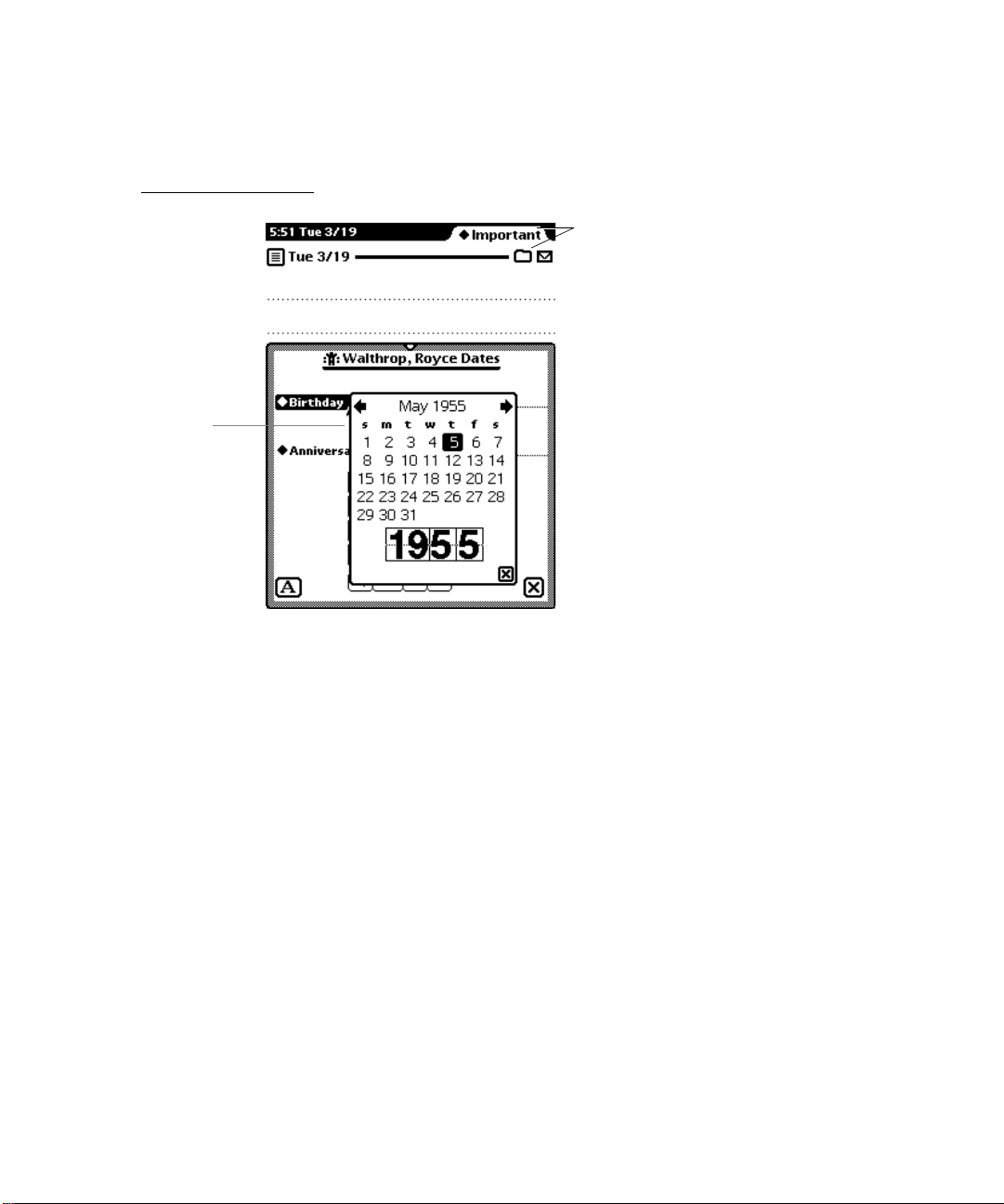
Date and Time Pickers 4-17
Overview Pickers 4-19
Contents of Overview Pickers 4-19
Position of Overview Pickers 4-20
Using an Overview Picker 4-21
Picking Items 4-21
Scrolling Items 4-22
Creating New Items 4-23
Standard Newton Pickers 4-23
Info Picker 4-24
New Picker 4-25
Show Picker 4-26
Action Picker 4-26
People Picker 4-27
4-1
vii
Page 8

Chapter 5
Icons
Designing Effective Icons 5-1
Thinking Up an Icon Image 5-2
Make Shapely Icons 5-3
Design for the Newton Display 5-3
Avoid Text in Icons 5-4
Make All Sizes of an Icon Look Alike 5-4
Use Icons Consistently 5-5
Think About Multicultural Compatibility 5-6
Extras Drawer Icons 5-6
Extras Drawer Icons Together 5-6
Extras Drawer Icon Size 5-8
Extras Drawer Icon Shape 5-9
Extras Drawer Icon Names 5-9
Animating an Extras Drawer Icon 5-9
Title Icons 5-11
Button Icons 5-12
Icons in a Picker 5-12
5-1
Chapter 6
viii
Data Input
Input Fields 6-1
Tapping 6-3
Pickers 6-3
Scrolling Lists and Tables 6-4
Radio Buttons 6-6
Checkboxes 6-7
Sliders 6-7
Writing, Drawing, and Editing 6-8
Text Input 6-8
Simple Input Line 6-9
Labeled Input Line 6-10
Text Input Lines that Expand 6-11
Paragraph Input 6-12
Structured List Input 6-12
6-1
Page 9

Shape Input 6-13
General Input 6-14
Recognition 6-15
User Control of Recognition 6-16
Deferred Recognition 6-18
Forcing Recognition 6-19
Configuring Recognition 6-19
Editing 6-21
Selecting Text and Shapes 6-22
Erasing Text or Shapes 6-24
Joining Words 6-26
Breaking Paragraphs 6-26
Inserting Space in Text 6-26
Inserting New Text 6-27
Replacing Text 6-29
Correcting Misrecognized Text 6-29
Changing Capitalization of Text 6-31
Changing Paragraph Margins 6-31
Removing Extra Space from Paragraphs 6-31
Duplicating Text or Shapes 6-31
Changing Shapes 6-31
Moving Objects 6-32
Typing 6-32
Displaying Keyboards 6-33
Keyboard Position 6-34
Keys 6-34
Character Keys 6-34
Return 6-35
Tab 6-35
Del 6-35
Shift 6-35
Caps 6-35
Option 6-36
Arrow Keys 6-36
Type-Ahead and Auto-Repeat 6-36
ix
Page 10

Error Handling 6-37
Error Correction 6-37
Error Detection 6-38
Chapter 7
Routing and Communications
The In/Out Box 7-2
The In Box 7-3
The Out Box 7-4
In/Out Box Items 7-4
Viewing Items in the In/Out Box 7-5
Viewing Routing Information 7-6
Routing Outgoing Items 7-7
Action Button and Picker 7-8
An Action Button’s Location 7-9
Action Picker Contents 7-10
Building an Action Picker 7-11
Routing Slips 7-12
Sender Picker 7-13
Recipient Pickers 7-15
Choosing a Printer 7-15
Choosing Fax or E-mail Recipients 7-16
Transport Picker 7-18
Send Button and Close Box 7-18
Other Routing Slip Elements 7-20
Format Picker 7-20
Preview Button 7-23
Sending Out Box Items 7-24
Routing Incoming Items 7-24
Receiving In Box Items 7-25
Receiving Remote In Box Items 7-26
Disposing of Received Items 7-26
Putting Away Received Items 7-27
Putting Away Items Automatically 7-28
Filing Items That Are Put Away 7-28
Extending the Tag Picker 7-29
7-1
x
Page 11

Routing Status 7-29
Stopping a Send or Receive in Progress 7-31
Transport Preferences 7-32
Routing Alternatives 7-34
Routing by Intelligent Assistant 7-35
Programmed Sending 7-36
Chapter 8
Newton Services
Automatic Busy Cursor 8-2
Notify Button and Picker 8-2
Alarms 8-4
Unacknowledged Alarms 8-5
Alarm Etiquette 8-5
Sound 8-6
Find 8-6
Text Searches 8-7
Date Searches 8-8
The Scope of a Search 8-8
Customizing the Standard Find Slip 8-9
Initiating or Canceling a Search 8-11
Search Status 8-11
Search Results 8-11
Filing 8-13
Filing Button and Slip 8-14
A Filing Button’s Location 8-15
A Filing Slip’s Contents 8-16
Editing Folders 8-18
Folder Tab 8-19
Intelligent Assistant 8-22
Invoking the Assistant 8-22
Interpreting the Request Phrase 8-23
Assist Slip 8-24
Task Slips 8-27
Help 8-28
8-1
xi
Page 12

Preferences 8-30
System-wide Preferences 8-30
Application Preferences 8-31
Appendix
Avoiding Common Mistakes
Info Button A-1
New and Show Buttons A-1
Screen Size A-1
Tapping v. Writing A-1
Picker Placement and Alignment A-2
Field Alignment A-2
Close Box Size A-2
Button Location A-2
Button Spacing A-2
Button Size A-3
Capitalization A-3
Picker Icons A-3
Dismissing a Slip A-3
Take-Action Button A-3
Fonts A-4
Keyboard Button A-4
Punctuation to Avoid A-4
Extras Drawer Icons A-4
Storage A-5
Date and Time Input A-5
A-1
xii
Glossary
Index
GL-1
IN-1
Page 13

Figures
Chapter 1
Chapter 2
Newton and Its Users
Figure 1-1
Figure 1-2
Figure 1-3
Metaphors help people quickly grasp how
software works 1-5
Users should feel they are directly controlling
something tangible 1-6
An application adjusts its size, position, and layout to
fit the screen 1-12
Container Views
Figure 2-1
Figure 2-2
Figure 2-3
Figure 2-4
Figure 2-5
Figure 2-6
Figure 2-7
Figure 2-8
Figure 2-9
Figure 2-10
Figure 2-11
Figure 2-12
Figure 2-13
Figure 2-14
Figure 2-15
Figure 2-16
Figure 2-17
Examples of container views 2-2
Standard controls for manipulating views 2-4
Various title styles 2-5
A matte border indicates a movable view 2-6
A striped border suggests routing 2-7
An alert box has a thick wavy border 2-8
Some views need the simplicity of a
plain border 2-8
Sparing use of some types of shadows is OK 2-9
A title or a folder tab tops a main view 2-10
A status bar anchors primary controls at the bottom
of a main view 2-11
Separator bars separate multiple items in a
scrolling view 2-12
Main views have matte or plain borders with
rounded corners 2-13
Examples of auxiliary views 2-14
Users can move most slips 2-15
Dismissing slips that complete actions 2-16
A notification alert tells the user something
important 2-17
A Snooze button enables a user to dismiss an alert
temporarily 2-18
1-1
2-1
xiii
Page 14

Figure 2-18
Figure 2-19
Figure 2-20
Figure 2-21
Figure 2-22
Figure 2-23
Figure 2-24
Figure 2-25
Figure 2-26
Figure 2-27
Figure 2-28
Figure 2-29
Figure 2-30
Figure 2-31
Figure 2-32
Figure 2-33
Figure 2-34
Figure 2-35
Figure 2-36
Figure 2-37
Figure 2-38
Figure 2-39
A confirmation alert tells the user about a grave
situation 2-19
A status slip reports on a lengthy operation 2-20
A sequence of status messages traces the steps
of an operation 2-22
A gauge in a status slip measures elapsing
progress 2-23
A status slip can report a condition that demands
a user decision 2-24
A palette provides handy access to useful
settings 2-25
A drawer slides open and closed 2-26
Where to position a small auxiliary view 2-31
Dragging a view’s drag handle moves
the view 2-34
Dynamically adjust a view’s position, size, and layout
to fit the screen 2-35
A view may change size in response to user
actions 2-35
Ready to scroll Notepad notes into view from
above or below 2-36
Scrolling by tapping a down arrow 2-37
The universal scroll arrows at the bottom of a
MessagePad screen 2-39
How scroll arrows work in the Date Book’s
Day view 2-40
Scroll arrow color may indicate what scrolling
will reveal 2-41
A control for scrolling in four directions 2-42
An alternate control for scrolling in four
directions 2-42
Automatic scrolling 2-43
How an overview relates to a detail view 2-45
The Overview button at the bottom of a
MessagePad screen 2-46
Getting an overview 2-47
xiv
Page 15

Chapter 3
Controls
3-1
Figure 3-1
Figure 3-2
Figure 3-3
Figure 3-4
Figure 3-5
Figure 3-6
Figure 3-7
Figure 3-8
Figure 3-9
Figure 3-10
Figure 3-11
Figure 3-12
Figure 3-13
Figure 3-14
Figure 3-15
Figure 3-16
Figure 3-17
Figure 3-18
Figure 3-19
Figure 3-20
Figure 3-21
Figure 3-22
Figure 3-23
Figure 3-24
Figure 3-25
Figure 3-26
Figure 3-27
Figure 3-28
Figure 3-29
Figure 3-30
Tapping a button initiates an action 3-2
A text button’s name states what the
button does 3-2
Leave standard margins between a button’s name and
its borders 3-3
Name buttons distinctively wherever possible 3-5
Where to use a button named Cancel 3-6
A Stop button lets a user halt an operation 3-6
A picture button depicts what the button does 3-7
Where to use borders with small, self-bordered
picture buttons 3-8
Tapping a button highlights it 3-9
A button disappears when it isn’t available 3-10
Where to put buttons in a view 3-12
Group buttons by function 3-12
Regular spacing between buttons on a
MessagePad 3-13
A Close box compared to a large Close box 3-14
Where to use a regular Close box 3-15
Where to use a large Close box 3-16
Only one radio button in a cluster can
be selected 3-17
Each checkbox can be on or off 3-19
One checkbox vs. two radio buttons 3-20
A slider used for data input 3-21
Providing feedback for small, transparent
hot spots 3-22
How the Analog Clock button works 3-23
Where an Info button goes 3-24
Where a Recognizer button goes 3-24
The Recognizer button indicates the type of
recognition in effect 3-24
Where a Keyboard buttons goes 3-25
Where a New button goes 3-26
Where a Show button goes 3-26
Where a Filing button goes 3-27
A Filing button reports where a data item
is stored 3-28
xv
Page 16

Figure 3-31
Figure 3-32
Figure 3-33
Where an Action button goes 3-29
Seeing an Item Info slip 3-30
A Rotate button lets users change the screen
orientation 3-31
Chapter 4
Pickers
Figure 4-1 The parts of list pickers 4-2
Figure 4-2 A list picker can contain a two-dimensional table
Figure 4-3 Remove unavailable items from a list picker 4-5
Figure 4-4 Grouping items in list pickers 4-7
Figure 4-5 Pickers can pop up from buttons, labels, and
Figure 4-6 How a list picker should align with its label
Figure 4-7 Using a list picker from a button 4-10
Figure 4-8 Using a list picker from a label 4-10
Figure 4-9 List pickers that are too long to display all at once
Figure 4-10 A lengthy picker can include scroll arrows and
Figure 4-11 How a two-level hierarchy of list pickers works 4-15
Figure 4-12 A number picker simplifies specifying a numerical
Figure 4-13 Time pickers specify a time, a time range, or a
Figure 4-14 Date pickers specify one date or a date range 4-18
Figure 4-15 The parts of overview pickers 4-20
Figure 4-16 Entering a new value in an overview picker 4-22
Figure 4-17 An Info picker lists information items 4-24
Figure 4-18 The New picker lists types of data items that users
Figure 4-19 The Show picker lists alternate ways to see an
Figure 4-20 The Action picker lists commands for acting
Figure 4-21 A People picker excerpts items from the Names File
4-1
of items 4-5
hot spots 4-8
or button 4-9
have scroll arrows 4-12
index tabs 4-13
value 4-16
time offset 4-17
can create 4-25
application’s data 4-26
on data 4-27
and Owner Info applications 4-28
xvi
Page 17

Chapter 5 Icons 5-1
Figure 5-1 Distinctive icon shapes are easier to recognize than
Figure 5-2 Avoid text in icons 5-4
Figure 5-3 Small icon resembles large icon 5-5
Figure 5-4 Use icon elements consistently 5-5
Figure 5-5 The good, the bad, and the ugly in Extras
Figure 5-6 Large icons crowd the Extras Drawer 5-8
Figure 5-7 An icon’s mask either highlights or animates
Figure 5-8 Combining an icon with its mask to animate
Figure 5-9 An icon in a slip title should decorate
Figure 5-10 An icon can label a button 5-12
Figure 5-11 Icons can help communicate picker item
Chapter 6 Data Input 6-1
Figure 6-1 Users enter and edit data in input fields 6-2
Figure 6-2 How a picker works for data input 6-4
Figure 6-3 Data input using scrolling lists with or without
Figure 6-4 With radio buttons, a user can select one value
Figure 6-5 With checkboxes, a user can select more than one
Figure 6-6 A slider used for data input 6-7
Figure 6-7 How an unlabeled text-input line works 6-9
Figure 6-8 How labeled text input lines work 6-10
Figure 6-9 How expandos work 6-11
Figure 6-10 Interface element for multiple-line or paragraph
Figure 6-11 A user can rearrange a structured list by dragging
Figure 6-12 Interface element for shape input 6-14
Figure 6-13 Interface element for general input 6-15
rectangular icons 5-3
Drawer icons 5-7
the icon 5-10
the icon 5-11
and inform 5-11
functions 5-13
checkboxes 6-5
for a field 6-6
value for a field 6-7
text input 6-12
topic markers 6-13
xvii
Page 18

Figure 6-14 The Recognizer button and picker give users control
Figure 6-15 Users may need to control recognition separately
Figure 6-16 In an Alpha Sorter picker, users select a sort key
Figure 6-17 Selecting words and shapes 6-23
Figure 6-18 Orientations of the scrubbing gesture 6-24
Figure 6-19 Scrubbing a little or a lot 6-25
Figure 6-20 Joining two words 6-26
Figure 6-21 Breaking a paragraph into two paragraphs 6-26
Figure 6-22 Inserting space in text 6-27
Figure 6-23 A caret marks the text insertion point 6-27
Figure 6-24 The Caret picker lists 14 hard-to-write characters and
Figure 6-25 How a Correction picker works 6-29
Figure 6-26 How a Corrector view works 6-30
Figure 6-27 The four built-in keyboards 6-32
Figure 6-28 A Keyboard picker lists alternate on-screen
Figure 6-29 A keyboard can be embedded in a data-
over recognition 6-16
in a slip 6-17
for ink text 6-19
three actions 6-28
keyboards 6-33
input slip 6-34
Chapter 7 Routing and Communications 7-1
xviii
Figure 7-1 The In/Out Box application displays either the In Box
or the Out Box 7-3
Table 7-1 Meanings of status words in the In/Out Box
headers 7-5
Figure 7-2 A Show button provides access to alternative
views 7-6
Figure 7-3 Viewing routing information in an Item Info slip 7-7
Figure 7-4 An Action picker lists the transports available
for sending 7-8
Figure 7-5 An Action button at the bottom of a view affects the
entire view 7-9
Figure 7-6 An Action button above an item affects only
that item 7-10
Figure 7-7 An Action picker can include two kinds
of actions 7-11
Page 19

Figure 7-8 A routing slip shows sender, recipient, and type
Figure 7-9 Changing the sender’s name or location 7-14
Figure 7-10 Choosing a printer in a routing slip 7-16
Figure 7-11 Choosing fax or e-mail recipients in a
Figure 7-12 Switching to another transport in a group 7-18
Figure 7-13 Setting format and content options in a
Figure 7-14 Format choices vary by transport and class
Figure 7-15 A format can get supplemental information in
Figure 7-16 Previewing outgoing page images 7-23
Figure 7-17 The Out Box’s Send picker lets users send items to
Figure 7-18 The Receive picker lists the transports available
Figure 7-19 Connection setup varies by transport 7-26
Figure 7-20 The Tag picker disposes of currently selected
Figure 7-21 Status slips apprise users of lengthy transport
Figure 7-22 Accessing transport preferences from the In/Out Box’s
Figure 7-23 Some common preference items for
Figure 7-24 A Call routing slip sets up an outgoing
Figure 7-25 Routing with the Intelligent Assistant 7-35
of transport 7-13
routing slip 7-17
routing slip 7-20
of data 7-21
an auxiliary view 7-22
output devices 7-24
for receiving 7-25
In Box items 7-27
activities 7-30
Info picker 7-32
transports 7-33
phone call 7-34
Chapter 8 Newton Services 8-1
Figure 8-1 A busy cursor indicates the system is temporarily
engaged 8-2
Figure 8-2 The Notify button signals an ongoing action or
deferred alert 8-3
Figure 8-3 The Notify picker lists ongoing actions and
deferred alerts 8-3
Figure 8-4 An alarm notification alert’s Snooze button can
postpone the alarm 8-4
xix
Page 20

Figure 8-5 A standard Find slip specifies what to find and where
Figure 8-6 Specifying text or date searches in a Find slip 8-7
Figure 8-7 Specifying a date in a Find slip 8-8
Figure 8-8 Searching specified applications 8-9
Figure 8-9 A custom Find slip displays application-specific
Figure 8-10 A status slip shows the progress of a Find
Figure 8-11 A Find overview lists items that match search
Figure 8-12 The Find slip reports which found item is currently
Figure 8-13 A Filing slip names available folders and storage
Figure 8-14 A Filing button at the bottom of a view affects the
Figure 8-15 A Filing button above an item affects only
Figure 8-16 A Filing slip can include storage locations, folders,
Table 8-1 Headings for radio button clusters in
Figure 8-17 Slips for entering and editing folder names 8-19
Figure 8-18 A folder tab allows users to filter a view
Figure 8-19 A Folder picker can list available storage
Figure 8-20 A folder tab can include a digital clock and
Figure 8-21 A folder tab can include a view title 8-21
Figure 8-22 The Assist button makes the Assistant try a written
Figure 8-23 An Assist slip appears when the Assistant needs
Figure 8-24 The Assistant’s Please picker lists known actions and
Figure 8-25 Online help has a topical outline and concise
Figure 8-26 The Prefs application shows system-wide
Figure 8-27 A preferences slip contains application-specific
to look 8-7
criteria at the top 8-10
operation 8-11
criteria 8-12
displayed 8-13
locations 8-14
entire view 8-15
that item 8-16
or both 8-17
Filing slips 8-18
by folder 8-20
locations 8-20
calendar 8-21
action request 8-23
more information 8-25
recent phrases 8-26
instructions 8-28
preference settings 8-30
settings 8-31
xx
Page 21

PREFACE
About This Book
Newton 2.0 User Interface Guidelines describes how to create
software products that optimize the interaction between people
and devices that use Newton 2.0 software. The book explains
the whys and hows of the Newton 2.0 interface in general terms
and in specific details.
Newton 2.0 User Interface Guidelines helps you link the philosophy
behind the Newton 2.0 interface to the actual implementation of
the interface elements. Examples from a range of Newton software show good human interface design. These examples are
augmented by descriptions and discussions of the reasoning behind
the guidelines.
This book also contains examples of how not to design human
interface; they are marked as such and appear with a discussion
that points out what’s inappropriate and how to correct it.
Who Should Read This Book
This book is for people who design and develop software for
Newton devices. If you are a designer, a human interface
professional, or an engineer, this book contains information you
need to design and create software that fits the Newton model.
It also provides background information to help you plan your
software product’s design.
Even if you don’t design and develop software for Newton, reading
this book will help you understand the Newton interface. This
understanding is useful to managers and planners who are
thinking about developing Newton software, as well as to people
who are studying human interface design in general.
xxi
Page 22

PREFACE
This book assumes you are familiar with the concepts and
terminology used with Newton devices, and that you have used a
Newton device and its standard applications.
What’s in This Book
This book begins with a chapter that describes Newton devices
such as the Apple MessagePad, what people do with them, and
how they differ from personal computers. The first chapter also
presents important principles you should keep in mind when
designing Newton software, and explains how to involve users
in designing the interface. The rest of the chapters define various
parts of the Newton 2.0 interface. They describe each interface
element in general language and show examples of how to use
the elements correctly. For the more technical reader, the book
specifies dimensions, spacing, and other specific implementation
details for the Apple MessagePad. The book concludes with a list
of common interface mistakes and a glossary.
Related Books
xxii
This book does not explain how to create Newton software with
Newton Toolkit, the Newton development environment. For that
you’ll need to refer to these other books, all of which come with
Newton Toolkit:
■ Newton Programmer’s Guide
guide and reference for Newton programming. This book
explains how to write Newton programs and describes the
system software routines that you can use to do so.
.
This set of books is the definitive
Page 23
PREFACE
■ Newton Toolkit User’s Guide. This book introduces the Newton
Toolkit (NTK) development environment and shows how to
develop Newton applications using Newton Toolkit. You
should read this book first if you are a new Newton application
developer.
■ Newton Book Maker User’s Guide. This book describes how to use
Newton Book Maker and Newton Toolkit to make Newton
digital books and to add online help to Newton applications.
You have this book only if you purchased the Newton Toolkit
package that includes Book Maker.
■ The NewtonScript Programming Language. This book describes
the NewtonScript programming language.
Visual Cues Used in This Book
Throughout this book you’ll see visual cues to certain types of
information.
■ Boldfaced text indicates that a new term is being defined and
that a definition of the word appears in the glossary.
■ This symbol indicates an example of the correct way to use a
Newton interface element.
■ This symbol indicates an example of the wrong way to
use a Newton interface element. It specifically calls out
common mistakes.
Developer Products and Support
APDA is Apple’s worldwide source for hundreds of development
tools, technical resources, training products, and information for
anyone interested in developing applications for Apple computer
platforms. Customers receive the Apple Developer Catalog, which
xxiii
Page 24

PREFACE
features all current versions of Apple development tools, as well
as popular third-party development tools. APDA offers
convenient payment and shipping options, including site
licensing.
To order product or to request a complimentary copy of the Apple
Developer Catalog, use the following information:
APDA
Apple Computer, Inc.
P.O. Box 319
Buffalo, NY 14207-0319
Telephone 1-800-282-2732 (United States)
1-800-637-0029 (Canada)
716-871-6555 (International)
Fax 716-871-6511
AppleLink APDA
America Online APDAorder
CompuServe 76666,2405
Internet APDA@applelink.apple.com
xxiv
If you provide commercial products and services, call
408-974-4897 for information on the developer support
programs available from Apple.
Page 25

Figure 1-0
Table 1-0
CHAPTER 1
Newton and Its Users 1
Before you can begin to design an application, it is crucial that you have a
clear picture of what a Newton device can do and how people will use your
Newton software. This chapter introduces some high-level concepts that
will help you clarify that picture. In addition, this chapter presents some
basic principles of user interface design that apply to all types of software.
The chapter concludes by detailing how to conduct user tests of your
product during its development.
Understand Newton 1
Newton is a software and hardware technology designed for a family of
products in the category of personal digital assistants (PDAs), such as the
Apple MessagePad. The goal of Newton technology is to help people and
businesses become more productive by simplifying basic tasks and making it
easier for people to manage bits and pieces of information while on the
move. Information entered on a Newton device can be moved to a desktop
machine or a mainframe computer, where it can be manipulated in powerful
applications.
Understand Newton 1-1
Page 26

CHAPTER 1
Newton and Its Users
Newton is not a small portable computer with another graphical user
interface. There may be similarities between portable computers and Newton
devices, but the differences summarized below are more important than the
similarities when it comes to designing a user interface for an application.
Newton Portable Computers
Focused function General purpose
New architecture optimized for
mobility and communications—
use it anywhere, any time
Tapping, writing, and drawing
with a pen
Intelligent assistant Scripting and macros
New and custom applications Existing desktop applications
It’s a communications assistant It’s a personal computer
Simple Complex
Derived from desktop computer
architecture, which is optimized
for stationary operation
Typing, pointing, and clicking with
mouse and keyboard
To take advantage of its distinguishing features and capabilities, Newton has
distinctive user interface elements.
Know Your Audience 1
Identifying and understanding your target audience are among the most
important first steps when you start designing your product. To create a
product that people can and will use, study the people who make up your
target audience.
It’s useful to create scenarios that describe a typical day in the life of a person
you think uses the type of product you’re designing. Think about the different
work spaces, tools, and constraints and limitations that people deal with.
You can also visit actual work places and study how people do their jobs.
Analyze the steps necessary to complete each task you anticipate people
wanting to accomplish. Then design your product to facilitate those tasks,
1-2 Know Your Audience
Page 27

CHAPTER 1
Newton and Its Users
using a step-by-step approach by thinking of how a person might get from
one place to the next in a logical fashion.
Involve users throughout the design process and observe them working in
their environment. Use people who fit your audience description to test your
prototypes and development products. Listen to their feedback and try to
address their needs in your product. Develop your product with people and
their capabilities, not computers and their capabilities, in mind. For more
information, see “Involve Users in the Design Process” on page 1-13.
What P eople Do With Newton 1
The features and capabilities that make Newton what it is also strongly
influence what people want to do with Newton devices. These expectations
indirectly affect the user interface of Newton software. An application must
make it easy for people to accomplish the following tasks on demand:
■ Capture information fragments—write, sketch, pick from lists, specify
dates and times, and select options
■ Organize information—file, sort, schedule, prioritize, copy, delete,
and format
■ Retrieve information—find, recall, browse, skim, read, and view
■ Send and in some cases receive information by various means—print, fax,
mail, and direct transfer
Accessibility 1
Your software needs to appeal to and be useful to people with a wide range
of abilities and backgrounds. There are likely to be members of your target
audience who are different from the so-called average user that you envision.
Users will undoubtedly vary in their ages, styles, and abilities. They may
also have physical or cognitive limitations, linguistic differences, or other
differences you need to consider. Identify how the individuals in your target
audience differ and what special needs they may have.
Know Y our Audience 1-3
Page 28

CHAPTER 1
Newton and Its Users
Make your application accessible to people around the world by including
support for worldwide capabilities in your designs from the beginning of
your development process. Take stock of the cultural and linguistic needs
and expectations of your target audiences.
Observe Basic Human Interface Principles 1
Effective software adheres to certain basic principles no matter whether it
runs on a Newton PDA, a personal computer, or a high-powered computer
workstation. These principles are based on the capabilities and processes not
of the machine but of the human operator—how people usually think, act,
and work.
Metaphors 1
Wherever possible, model the actions and objects in your program on
something from the real world. This trick especially helps inexperienced
users quickly grasp how your program works. Folders are a classic metaphor.
People file things in folders in the real world, so they immediately understand
the concept of filing data items in folders on a Newton. Other common
metaphors include scrubbing to delete data, tapping buttons to make things
happen, sending and receiving things through an in box and out box, setting
dates and times on calendars and digital clocks, and homing in on information
with alphabetic index tabs. Figure 1-1 illustrates some Newton metaphors.
Metaphors suggest a use for objects and actions in the Newton interface, but
that use doesn’t define or limit the implementation of the metaphor. For
example, a paper folder has a limited storage capacity, but a folder on a
1-4 Observe Basic Human Interface Principles
Page 29
Folder button and
C
alendar for
s
pecifying a date
CHAPTER 1
Newton and Its Users
Figure 1-1 Metaphors help people quickly grasp how software works
folder tab for filing
notes
Newton doesn’t have to be constrained by the same limitation. Newton
folders can hold a limitless number of items (up to the storage capacity of
the hardware), and this is an advantage that the Newton can offer. Try to
strike a balance between the metaphor’s suggested use and the ability of the
Newton to support and extend the metaphor.
Naturally you can’t find a metaphor for everything. Be sure to use the
established metaphors, but if you can’t come up with a solid metaphor for
another object or action, then do without. Don’t distort the real world into
a caricature in a slavish attempt to find a metaphor.
Observe Basic Human Interface Principles 1-5
Page 30
CHAPTER 1
Newton and Its Users
Direct Manipulation 1
Your product should let users feel that they are directly controlling
something tangible, not abstract. Make sure objects on the screen remain
visible while a user performs actions on them, and make the result of the
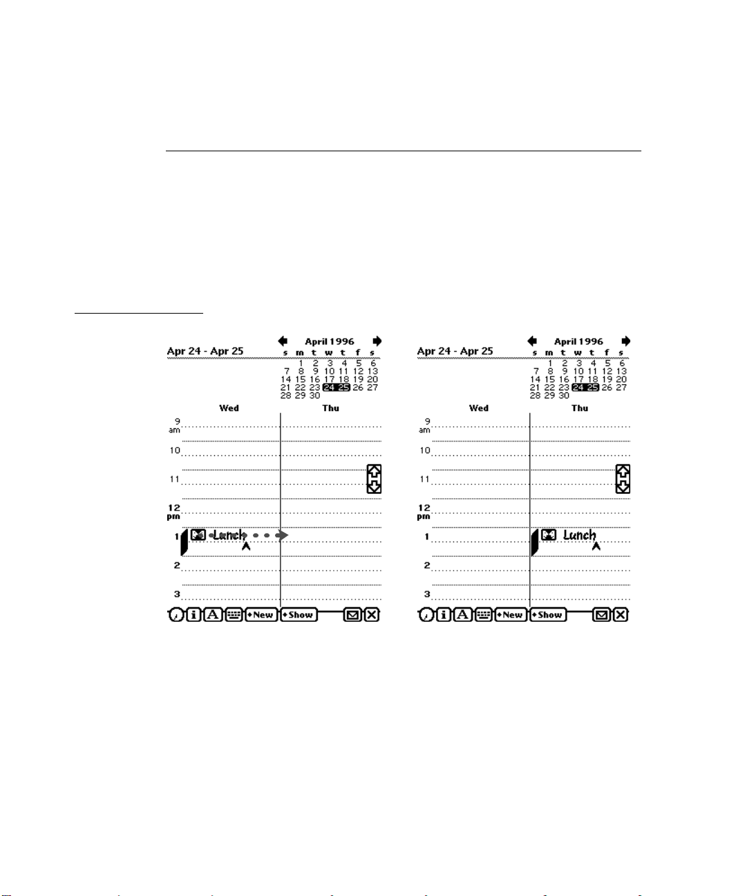
user’s actions immediately visible. For example, a user can reschedule a
meeting in the built-in Date Book application by dragging the meeting’s icon
from one time to another. Figure 1-2 illustrates direct manipulation.
Figure 1-2 Users should feel they are directly controlling something tangible
1. User drags a meeting icon to a new time 2. Icon appears at new meeting time
1-6 Observe Basic Human Interface Principles
Page 31

CHAPTER 1
Newton and Its Users
Feedbac k 1
In addition to seeing the results of their actions, users need immediate feedback when they operate controls and ongoing status reports during lengthy
operations. Have your application respond to every user action with some
visible change. For example, make sure every button highlights when a user
taps it. Audible feedback also helps, but can’t be the primary or sole feedback
because people may use Newtons in places where they can’t hear or where
they must turn off the sound.
The system automatically provides feedback when it’s temporarily busy by
displaying the busy cursor. During operations that last more than a few
seconds, your application should display explanatory messages and show
elapsing progress.
See and P oint 1
A Newton application is better than a person at remembering lists of options,
commands, data, and so on. Take advantage of this situation by presenting
lists and letting users choose from them. People can concentrate on
accomplishing tasks with your program instead of remembering how to
operate it. As a bonus, your program controls its inputs and doesn’t have to
check as many error conditions.
Consistency 1
It’s likely that people will use other Newton software besides yours—at the
least they will use some of the built-in applications and services. You can
turn this likelihood to your advantage by designing your application’s interface to be consistent with other Newton applications. Both you and your
application’s users benefit if they can build on prior experience when learning
how to use your application.
Observe Basic Human Interface Principles 1-7
Page 32

CHAPTER 1
Newton and Its Users
You can make your application consistent visually and behaviorally by
incorporating standard Newton interface elements in it. Visual consistency
helps people learn and then easily recognize the graphic language of the
interface. For example, users learn to recognize a black diamond as the
source of a pop-up list of choices. Behavioral consistency of the interface
means people only have to learn once how to do things such as erasing and
scrolling. Then they can explore new functions and applications using the
skills they already have.
User Control 1
Allow users, not your application, to initiate and control actions. Keep
actions simple and straightforward so users can easily understand and
remember them. Provide ample opportunity to cancel operations before they
begin, and wherever possible allow users to gracefully stop an operation
that’s underway. Be careful about unleashing agents, experts, or wizards that
will do things behind a user’s back.
Forgiveness 1
People make mistakes, so your program should make it easy for them to
correct their mistakes. Let them use the Undo button to reverse their last
action. People need to feel they can experiment without damaging the
system or their data. Create safety nets for people so they feel comfortable
learning and using your product.
Always advise people when they begin an operation that has potentially
dire consequences. Display a warning and have the user confirm the operation
before proceeding. This doesn’t mean you should have users confirm every
action. Frequent warning messages suggest something is wrong with
the program design—obviate some of the warnings by making more
actions reversible.
1-8 Observe Basic Human Interface Principles
Page 33

CHAPTER 1
Newton and Its Users
Stability 1
Personal digital assistants introduce a new level of complexity for many
people. To cope with this complexity, people need some stable reference
points. The Newton interface is designed to provide an environment that is
understandable, familiar, and predictable. It defines a number of regular
interface elements to foster a perception of stability, including view borders,
view titles, folder tabs, standard buttons, and standard button locations.
Each of these elements has a specific look and a regular, predictable behavior.
In addition, the interface defines a clear, finite set of basic data objects—text,
ink text, shapes, and sketches—and a clear, finite set of editing commands
with which users can create and manipulate the objects. Your application can
share and enhance the stability by using the regular interface elements and
handling data objects in the customary manner.
Aesthetic Integrity 1
People primarily see software as a functional product, not a fashion product.
This means you want them to notice what your product does, not how it
looks. Don’t succumb to the temptation to load up with the latest interface
fads; they’ll quickly become dated. Since people will spend a lot of time with
your product, design it to be pleasant to look at for a long time. A spare,
clean interface will stand up to repeated viewing much better than a highly
decorative interface. For example, the built-in Setup application has lots of
non-functional decorative elements to make a user’s first Newton experience
a friendly one, but the built-in applications that people use daily have none
of that decoration.
Make sure you follow the graphic language of the interface. Don’t invent
new interface elements to replace existing ones, and don’t change the
function of standard interface elements. If you change the look of standard
interface elements, people will actually try to make up functional reasons
for the differences. If you square off the corners of your buttons, use unique
view borders, or use a different symbol to designate a pop-up, people will
waste time trying to figure out what your custom elements do that the
standard ones don’t. It won’t occur to people that you merely have your own
notion of how the interface elements should look.
Observe Basic Human Interface Principles 1-9
Page 34

CHAPTER 1
Newton and Its Users
Design for the Newton System 1
In addition to the general user interface principles presented in the previous
section, you should keep in mind the guidelines in this section as you design
software specifically for the Newton system.
Observe the Built-In Applications 1
Your software will coexist with built-in Newton applications and services.
On an Apple MessagePad they include the Notepad, Names File, Date Book,
In/Out Box, Filing, Routing, Find, Assist, and others. If your application has
functions analogous to those in the built-in applications and services, use
the same mechanisms. Users will be accustomed to them and will expect
other software to work in the same way. You can most easily match the builtin applications and services by using the system proto templates in the
Newton Toolkit.
You can extend the Newton interface if you need to, but make sure your
extensions retain the original look and feel.
Use the Common P ool of Data 1
All built-in Newton applications and services can access a common pool of
data, and so can your Newton software. This pool is the information a user
enters into the Newton device. Since all applications have access to this data,
a user can work more efficiently—because each piece of information needs to
be entered only once. Thereafter, the data can be accessed and used in many
different ways. Your application can read and write this data. Put it to the
user’s advantage.
1-10 Design for the Newton System
Page 35

CHAPTER 1
Newton and Its Users
Keep Applications Simple 1
Newton isn’t designed for complex tasks or applications that require viewing
a large area or multiple windows of data at a time. Applications that require
the user to keep track of several pieces of information at once probably won’t
work well because the user must either move around a lot within the
application, or deal with many simultaneous or layered views. Studies show
that users become confused in those situations.
Remember that people will use Newton while on the move, in places where
there’s no place to sit or to set it down. In such settings, it’s easiest to use
applications with simple, straightforward screens and an obvious path
through the information. Make sure that your application’s controls are
clearly identified, that there aren’t too many “places” for the user to navigate
through, that you don’t display too many container views at once, and that
the user can easily see what to do. Minimize writing; tapping to pick from a
list of alternatives is easier.
Use Screen Space Wisely 1
Because the user’s hand is usually held close to a Newton device, it’s best to
keep tappable controls at the bottom of the screen, have the user enter data
in the middle of the screen, and display titles and other descriptors at the top
of the screen. This way, the most important information (the user’s information) isn’t obscured each time he or she taps a button. If you need to display
controls on the side, make sure your application allows users to move the
controls to either side of the screen, according to whether they are right- or
left-handed.
Check the Screen Size 1
A Newton application’s main view—the visual object that serves as the
application’s base of user operations—can be any size. If your application’s
main view does not fill the entire screen, keep in mind that whatever is
visible behind your application will be operable. In this situation, users can
Design for the Newton System 1-11
Page 36

CHAPTER 1
R
Newton and Its Users
get confused about what’s frontmost—and therefore about what will be
scrolled when the scroll arrows are tapped and which view is currently
in use.
Also keep in mind when designing your application that future Newton
devices may have larger or smaller screens than current Newton devices. To
work with different screen sizes, a Newton application must check the screen
size and make adjustments as needed to the size and location of the things it
displays so that everything fits. If you want your application to work in
either of the two display orientations available on an Apple MessagePad 120,
your application needs to be able to adjust the position and configuration
of everything it displays for regular or sideways orientation of the display.
Figure 1-3 shows how the built-in Notepad application and the on-screen
keyboard adjust their size, position, and layout when a user rotates
the display.
Figure 1-3 An application adjusts its size, position, and layout to fit the screen
Sideways orientation on a MessagePad 120
egular orientation on a MessagePad 120
1-12 Design for the Newton System
Page 37

CHAPTER 1
Newton and Its Users
Involve Users in the Design Process 1
The best way to make sure your product meets the needs of your target
audience is to show it to the kinds of people you hope will buy it. Do they
understand what it’s for and what to do with it? Can they use it? Can they
keep track of where they are? Does it help them? You can do this during
every phase of the design process to help reveal what works about your
product as well as what needs improvement.
When you give people an opportunity to use your product or a mock-up of
it, they will inevitably find some undiscovered flaws. You can implement
significant changes to your product during its evolution and thereby save
yourself lots of time and money and save your users from frustration. By
identifying and focusing on users’ needs and experiences, you can create
products that are easier to assemble, learn, and use. These improvements
can translate into competitive advantages, increased sales, and enhanced
customer satisfaction.
Define Y our Audience 1
There are several steps to involving users in your design process. The first
step, done at the beginning of a project, is to define the users and then do an
analysis of the target audience. You want to determine what these people
are like, how they might use a product like yours, if they have any similar
products, and what features they would like to see in your product. By doing
some research on your target audience, you can find out if what you’re
including in a product is desirable and useful.
Analyze Tasks 1
The second step is to analyze the tasks people will be doing with your
product. You need to do a task analysis for each task you anticipate that your
users will do. Look at how they perform similar tasks without a Newton.
Involve Users in the Design Process 1-13
Page 38

CHAPTER 1
Newton and Its Users
Then look at how the Newton can facilitate the tasks. To help plan a task
analysis, imagine a scenario in which someone uses your product. List each
task a person might perform in that scenario, then break each task apart into
its component steps. This allows you to identify each step that a person goes
through in order to complete the task. Order the steps according to how
people do them. When you feel you have all the steps listed and ordered,
read the list back to someone and see if that person can use the steps you’ve
listed to accomplish the task.
Build Prototypes 1
For the third step, apply the information you’ve collected about your users,
their skills, and the tasks you envision them performing to create a prototype
of your design. Prototyping is the process by which you develop preliminary
versions of your design to verify its workability. You can use a variety of
techniques to construct prototypes of your design. Creating storyboards is
one technique—you draw out the steps your users will go through to
accomplish a task. Another technique is to build a simulation of the product
in prototyping software that animates some features or demonstrates how
the product will work.
Observe Users 1
Once you have a prototype drawn or mocked up, you can begin to show it to
people to get reactions to it. The fourth step, called user observation, lets
you test the workability of your product design by watching and listening
carefully to users as they work with your prototype. Although it is possible
to collect far more elaborate data, observing users is a quick way to obtain an
objective view of your product. Before you do any testing, take time to figure
out what you’re testing and what you’re not. By limiting the scope of the
test, you’re more likely to get information that will help you solve a specific
problem. You can use the information you gather about your target audience
to help you pick participants for your user observation; find people who
have the same demographic background and experience level as the typical
user in your target audience. Your participants will work through one or
1-14 Involve Users in the Design Process
Page 39

CHAPTER 1
Newton and Its Users
more specific tasks. These tasks can be based on the task analyses that you
performed earlier in the design process. After you determine which tasks to
use, write them out as short, simple instructions. Your instructions to the
participants should be clear and complete but should not explain how to
do things you’re trying to test. See the following section, “Ten Steps for
Conducting a User Observation,” for more information; it includes a series
of sample steps on which you can base your own user observation.
During the user observation, record what you learn about your design; you’ll
be using this information to revise your prototype. Once you’ve revised your
prototype, conduct a second user observation to test the workability of the
changes you’ve made to your design. Continue this iterative process of
creating prototypes and conducting user observations until you feel
confident that you’ve fully addressed the needs of your target audience.
Ten Steps f or Conducting a User Observation 1
The following steps provide guidelines that you can use when conducting a
simple user observation. Remember, this test is not designed as an experiment,
so you will not get quantitative data that can be statistically analyzed. You
can, however, see where people have difficulty using your product, and you
can then use that information to improve your product.
Most of these steps include some explanatory text with sample statements
that you can read to the participant. Feel free to modify the statements to suit
your product and the situation.
1. Introduce yourself and describe the purpose of the observation (in very
general terms). Most of the time, you shouldn’t mention what you’ll be
observing.
Set the participant at ease by stressing that you’re trying to find problems
in the product. For example, you could say something like this:
n
“You’re helping us by trying out this product in its early stages.”
n
“We’re looking for places where the product may be difficult to use.”
n
“If you have trouble with some of the tasks, it’s the product’s fault, not
yours. Don’t feel bad; that’s exactly what we’re looking for.”
Involve Users in the Design Process 1-15
Page 40

CHAPTER 1
Newton and Its Users
n
“If we can locate the trouble spots, then we can go back and improve
the product.”
“Remember, we’re testing the product, not you.”
n
2. Tell the participant that it’s OK to quit at any time.
Never leave this step out. Make sure you inform participants that they can
quit at any time if they find themselves becoming uncomfortable. Participants shouldn’t feel like they’re locked into completing tasks. Say something like this:
“Although I don’t know of any reason for this to happen, if you should
n
become uncomfortable or find this test objectionable in any way, you
are free to quit at any time.”
3. Talk about the equipment in the room.
Explain the purpose of each piece of equipment (hardware, software,
video camera, tape recorder, microphones, and so forth) and how it will
be used in the test.
4. Explain how to think aloud.
Ask participants to think aloud during the observation, saying what
comes to mind as they work. By listening to participants think and plan,
you’ll be able to examine their expectations for your product as well as
their intentions and their problem-solving strategies. You’ll find that
listening to users as they work provides you with an enormous amount of
useful information that you can get in no other way.
Some people feel awkward or self-conscious about thinking aloud.
Explain why you want participants to think aloud and demonstrate how
to do it. For example, you could say something like this:
“We have found that we get a great deal of information from these
n
informal tests if we ask people to think aloud as they work through
the exercises.”
n
“It may be a bit awkward at first, but it’s really very easy once you get
used to it. All you have to do is speak your thoughts as you work. If
you forget to think aloud, I’ll remind you to keep talking. Would you
like me to demonstrate?”
1-16 Involve Users in the Design Process
Page 41

CHAPTER 1
Newton and Its Users
5. Explain that you will not provide help.
It is very important that you allow participants to work with your product
without any interference or extra help. This is the best way to see how
people really interact with the product. For example, if you see a participant
begin to have difficulty and you immediately provide an answer, you will
lose the most valuable information you can gain from user observation—
where users have trouble and how they figure out what to do.
Of course, there may be situations in which you will have to step in and
provide assistance, but you should decide what those situations will be
before you begin testing. For example, you may decide that you will allow
someone to struggle for at least three minutes before you provide
assistance. Or you may decide that there is a distinct set of problems on
which you will provide help. However, if a participant becomes very
frustrated, it’s better to intervene than have the participant give up
completely.
As a rule of thumb, try not to give your test participants any more information than the true users of your product will have. Here are some
things you can say to the participant:
“As you’re working through the exercises, I won’t be able to provide
n
help or answer questions. This is because we want to create the most
realistic situation possible.”
n
“Even though I won’t be able to answer your questions, please ask
them anyway. It’s very important that I capture all your questions and
comments. When you’ve finished all the exercises, I’ll answer any
questions you still have.”
6. Describe in general terms what the participant will be doing.
Explain what all the materials are (such as the set of tasks, disks, and a
questionnaire) and the sequence in which the participant will use them.
Give the participant written instructions for the tasks.
If you need to demonstrate your product before the user observation
begins, be sure you don’t demonstrate something you’re trying to test.
For example, if you want to know whether users can figure out how to
use certain controls, don’t show them how to use the controls before the
session. Don’t demonstrate what you want to find out.
Involve Users in the Design Process 1-17
Page 42

CHAPTER 1
Newton and Its Users
7. Ask if there are any questions before you start; then begin
the observation.
8. During the observation, remember several pointers:
n
Stay alert. It’s very easy to let your mind wander when you’re in the
seventh hour of observing users. A great deal of the information you
can obtain is subtle.
n
Ask questions or prompt the participant. Make sure you have a tester
protocol that spells out how frequently you prompt and what you
say. Your interruptions shouldn’t be frequent, but when a participant
is hesitating or saying, “Hmmm,” ask what the participant is
thinking about.
n
Be patient; it is very easy to become impatient when someone is taking
a long time. The participant is doing you a favor and is probably
somewhat nervous. Anything you can do to alleviate the participant’s
insecurities and put the participant at ease will provide you with much
richer data.
9. Conclude the observation.
Do the following when the test is over:
Explain what you were trying to find out during the test.
n
n
Answer any remaining questions the participant may have.
n
Discuss any interesting behaviors you would like the participant
to explain.
n
Ask the participant for suggestions on how to improve the product.
10. Use the results.
As you observe, you may see users doing things you never expected them
to do. When you see participants making mistakes, your first instinct may
be to blame the mistakes on the participant’s inexperience or lack of
intelligence. This is the wrong focus to take. The purpose of observing
users is to see what parts of your product might be difficult to use or
ineffective. Therefore, if you see a participant struggling or making
mistakes, you should attribute the difficulties to faulty product design,
not to the participant.
1-18 Involve Users in the Design Process
Page 43

CHAPTER 1
Newton and Its Users
Be sure to schedule time between your sessions to make notes and review
the session. Jot down any significant points. If you used videotape or
audio cassette tape, mark in your notes the specific parts of the tape that
you may want to review.
To get the most out of your test results, review all your data carefully and
thoroughly (your notes, the videotape or cassette tape, the tasks, and so
on). Look for places where participants had trouble and see if you can
determine how your product could be changed to alleviate the problems.
Look for patterns in the participants’ behavior that might tell you whether
the product was understood correctly.
It’s a good idea to keep a record of what you found out during the test.
You don’t need elaborate video equipment; a hand-held video camera will
work. In fact, you don’t even have to use video equipment. You can use a
tape recorder to record what is spoken during the session. The important
point is that you create some kind of objective, factual record of the
session that you refer to later. That way, you’ll have documentation to
support your design decisions and you’ll be able to see trends in users’
behavior. You might want to write a report that documents the process
you used and the results you found. After you’ve examined the results
and summarized the important findings, fix the problems you found and
test the product again. By testing your product more than once, you’ll see
how your changes affect users’ performance.
Involve Users in the Design Process 1-19
Page 44

Page 45

Figure 2-0
Table 2-0
CHAPTER 2
Container Views 2
pictThis chapter describes container views, in which an application shows
the user text and graphic information, and in which the user interacts with
the information and the application. The chapter presents specifications and
recommendations about the appearance and behavior of these container
views, including how to display them on the screen, how users interact with
them, and how they interact with each other. There are several kinds of
standard container views whose regular looks enhance the visual stability of
Newton applications. The standard views provide predictable ways to see
and interact with all the different kinds of information people can create and
store on Newton devices. Figure 2-1 shows examples of container views.
There are conventions for opening, closing, moving, scrolling, and getting an
overview of container views. This means that no matter which application
people use, they know how to control container views on the screen and how
to adjust container views in the available screen space.
2-1
Page 46

CHAPTER 2
Container Views
Figure 2-1 Examples of container views
Main view
Routing slip
2-2
Ordinary slip
Palette
Alert box
Corrector view
Page 47

CHAPTER 2
Container Views
When people manipulate container views on the screen, they see immediate
visual feedback. As a user drags a movable container view, the view keeps up
with the user’s pen, reinforcing the user’s sense of direct manipulation. When
people open and close container views, they see a representation of such
actions. These mechanisms emphasize that the user is in control and can
directly manipulate “real” interface objects such as container views.
How Views Look 2
Nothing makes an application look more like it belongs—or less like it
belongs—on a Newton device than the appearance of its container views.
This section describes the key visual attributes of container views:
■ controls
■ title style
■ border style
■ fill pattern
View Controls 2
There are several standard controls for manipulating container views. These
controls include the drag handle, folder tab, Close box, local scroll arrows,
universal scroll arrows, and Overview button. The first four controls are part
of the container view they affect. The latter two controls are not part of the
container view they affect. Figure 2-2 points out the standard view controls.
For details on container view controls, see “Moving a View” on page 2-33,
“Folder Tab” on page 8-19, “Close Boxes” on page 3-14,“Scrolling” on
page 2-36, and “Overview” on page 2-44.
How Views Look 2-3
Page 48

D
rag handle
U
a
O
CHAPTER 2
Container Views
Figure 2-2 Standard controls for manipulating views
Folder tab
Local scroll
arrows
Close box
niversal scroll
rrows
verview button
View Title 2
A container view should have a title at the top unless the view’s identity is
obvious from its contents. Ordinarily a title consists of text in the bold style
of the system font, an optional small icon, and a triple underline, all centered
at the top of the view. If the title of a subordinate view is long or instructional,
2-4 How Views Look
you can left-justify it and omit the icon and the triple underline. Figure 2-3
compares different types of titles.
Page 49

Ordinary title with
ic
on
O
w
S
t
N
c
p
rdinary title
ithout icon
ubordinate view
itle—left-justified
o title—view’s
ontents make its
urpose clear
CHAPTER 2
Container Views
Figure 2-3 Various title styles
The title only identifies the container view’s contents. The title is not a control
that the user can tap to change a setting, alter a state, or initiate an action.
Controls that do these things are described in Chapter 3, “Controls.” For
example, if you want users to be able to change a view’s title, have them tap
a button or choose from a picker in the status bar.
A view title should not end with a colon. The title’s position, size, and font
make a colon unnecessary and distracting.
You capitalize view titles according to conventional rules for book titles. That
is, you capitalize the first word of a title, and you capitalize all other words
except articles (a, an, the), coordinating conjunctions (for example, and, or), and
prepositions of three or fewer letters.
On an Apple MessagePad use 10-point text for the title. The optional icon must
be no more than 11 pixels tall.
How Views Look 2-5
Page 50

CHAPTER 2
R
Container Views
View Border 2
Every container view is framed by a border. (A border is not visible if its
view fills the screen.) Primarily, a view’s border serves to demarcate what’s
in the view and what’s not. Secondarily, certain borders identify special
types of container views.
In general, Newton views are rectangular and have rounded corners.
Use square-cornered borders only when you have a specific need for a
particular look.
A view’s border is not visible if the view completely covers the screen. For
example, a MessagePad 120 user does not see the border of a view that
measures 240 × 320 pixels. The view has a border, but it is off-screen.
Matte Border 2
The most common type of view border, called a matte border, consists of a
thick gray band edged on the outside by a thin black line. Users expect views
with matte borders to be movable (see “Moving a View” on page 2-33).
Figure 2-4 shows the matte border.
Figure 2-4 A matte border indicates a movable view
ounded corners
On an Apple MessagePad a standard matte border is five pixels thick with a
corner roundness of five pixels and an inset of one pixel.
2-6 How Views Look
Page 51

CHAPTER 2
S
s
in
c
Routing slip
s
a
S
fo
t
Container Views
Striped Border 2
A border made of pairs of short, slanted lines edged by a thin black rectangle
is used around views known as routing slips (see “Routing Slips” on
page 7-12). It’s no accident that this border looks something like the border
traditionally printed on airmail envelopes, because routing slips are analogous
to postal envelopes. Figure 2-5 shows a routing slip border.
Figure 2-5 A striped border suggests routing
pecifies source
nd destination
hadow
eparates routing
formation from
ontent options
lide-out panel
r setting options
hat affect content
Square corners
The paired short lines in a striped border slant 45 degrees to the right.
Wavy Border 2
A view with a heavy black wavy border is called an alert box. It contains an
important message that a user must acknowledge. There are two types of
alert boxes; they are described in “Notification Alerts” on page 2-17 and
“Confirmation Alerts” on page 2-18. Figure 2-6 shows the wavy border of
an alert box.
How Views Look 2-7
Page 52

CHAPTER 2
Container Views
Figure 2-6 An alert box has a thick wavy border
Plain Border 2
For simplicity, some container views require a plain black border made of
medium-weight lines. Figure 2-7 shows examples of views with plain borders.
Figure 2-7 Some views need the simplicity of a plain border
Drop Shadows 2
It’s possible to add a drop shadow to a view’s bottom and right borders, but
this ersatz 3D look is not appropriate for Newton applications. Don’t use
drop shadows just because you like the way they look or because you want
to make a Newton application look like a personal computer application.
Although you shouldn’t use drop shadows, you can use another type of
shadow that tells users something about a view. For example, a shadow
2-8 How Views Look
Page 53

CHAPTER 2
Container Views
reinforces the notion that there are two parts to a routing slip—an outer part
above the shadow and an inner part below it. Figure 2-8 shows acceptable
and unacceptable uses of shadows in the Newton interface.
Figure 2-8 Sparing use of some types of shadows is OK
This plain shadow’s function is to separate
the top of the routing slip from the bottom
Don’t use decorative drop shadows on a
Newton
View Fill 2
Standard container views by default are filled with white, not with black or a
pattern. If you want users to see through a container view to the views
beneath it, you can make it transparent.
Main Views 2
Nearly every application has a main view that serves as a base of operations.
An application’s main view may also be called the application base view.
But strictly speaking, the main view is a user’s concept and the application
base view is a programmer’s concept. An application base view is the view
that contains all the other views that make up the application. A main view
is a center of user operations.
Main Views 2-9
Page 54

CHAPTER 2
TItle (underlined
s
P
F
c
c
Container Views
Applications are not limited to one main view. The built-in Names File and
Date Book applications, for example, have several main views each.
Title or Folder Tab 2
An application’s main view should have an ordinary, underlined title at the
top unless the view’s identity is obvious from its contents. An application’s
main view cannot have an ordinary title at the top if the application allows
users to file information in folders. In this case a folder tab must go at the
top of the main view. A folder tab shows the name of the folder whose data
is currently displayed in the view, and a user can choose a different folder by
tapping the folder tab. A folder tab can include a view title or a digital clock
and calendar, but does not have to include either of them. (For more
information on folders and folder tabs, see Chapter 8, “Newton Services.”)
Figure 2-9 compares a main view with a title to another main view with a
folder tab.
Figure 2-9 A title or a folder tab tops a main view
tyle preferred)
lain folder tab
older tab with
lock and
alendar
2-10 Main Views
Page 55

S
tatus bars with
a
ssorted controls
CHAPTER 2
Container Views
Primary Controls and Status Bar 2
An application’s primary controls go at the bottom of its main view,
usually on a status bar. A status bar is not strictly required, but it helps
to visually anchor the controls. Figure 2-10 shows sample status bars
with assorted controls.
Figure 2-10 A status bar anchors primary controls at the bottom of a main view
Each application can have a different set of controls, but an application’s main
view must have a Close box unless the application is the backdrop (see “The
Backdrop” on page 2-29 and “Closing a Main View” on page 2-32). Close boxes
and other standard status-bar controls are described in “Close Boxes” on
page 3-14 and “Standard Newton Buttons” on page 3-22.
On an Apple MessagePad, the status bar is a black line two pixels thick,
with end points two pixels from the right and left edges of the application’s
main view.
Separator Bars 2
In a view that may display more than one variable-sized item at once, like
the notes in the Notepad, a separator bar heads each item. A separator bar
identifies the item below it and carries controls that apply only to that item.
Figure 2-11 shows some separator bars in the Notepad.
Main Views 2-11
Page 56

CHAPTER 2
S
I
it
T
Controls that
Container Views
Figure 2-11 Separator bars separate multiple items in a scrolling view
eparator bar
ndicates type of
em
itle of item
affect the item
Name of item’s
folder
A user creates a separator bar, also called a divider bar, by drawing a line
across the view or by tapping a New button on the view’s status bar. Tapping
the New button always scrolls to the last item and adds a new blank item
below it. Making the line gesture adds a new blank item below the line,
before the following item.
A separator bar is a heavy black line with various buttons and text. At the
left end of each separator bar is a picture button, called the Item Info button,
which indicates the type of item below it. Next to that button is the item’s
title, displayed in the bold style of the system font. For more information on
the Item Info button, see “Item Info Button” on page 3-29.
At the right end of each separator bar is an Action button for routing the
item. If the application allows users to file items in folders, a Filing button
appears on each separator bar next to the Action button, and the name of the
item’s folder appears next to the Filing button whenever the view is showing
the items of all folders. For more information on those buttons, see “Action
Button and Picker” on page 7-8 and “Filing Button and Slip” on page 8-14.
On an Apple MessagePad, the separator line is two pixels thick and the title
is in 9- or 10-point text.
2-12 Main Views
Page 57

CHAPTER 2
Container Views
The Main View’s Border 2
Every application’s main view must have a border, even if the border is not
visible because the view fills the screen. Generally, an application’s main
view should have a rounded-corner matte border (as described under “View
Border” on page 2-6). Alternatively, a main view can have a plain roundedcorner black border. A matte border is a better choice if the view is movable
(or might be movable on a large screen), because users historically have
associated matte borders with movable views and plain borders with
stationary views. Figure 2-12 shows the two border styles.
Figure 2-12 Main views have matte or plain borders with rounded corners
A movable main view is preferable to a fixed view. If users can’t move your
application’s main view, they may have to close your application to work on
another application beneath it. If you want a user to be able to leave your
application open, make its main view small, matte-bordered, and movable.
It’s possible for a stationary main view to have a different border style and still
look like it belongs on a Newton device. You need a strong reason—something
more than personal preference—to give your application’s main view anything
other than a rounded-corner black border or a rounded-corner matte border.
Main Views 2-13
Page 58

CHAPTER 2
S
d
Container Views
Auxiliary Views 2
When an application needs to display and input more information than
will fit in its main view, it displays an auxiliary view. There are several
types of auxiliary views, as shown in Figure 2-13 and detailed in the
following sections.
Figure 2-13 Examples of auxiliary views
Notification alerts communicate important
messages to users
Ordinary slips give users the space they need to
make detailed settings and to input or change data
Confirmation alerts ask users to authorize a
far-reaching or dangerous operation
tatus slips tell users what is happening
uring lengthy operations
Palettes give users handy access to useful
settings and information
2-14 Auxiliary Views
Page 59

CHAPTER 2
D
M
Container Views
An auxiliary view appears in front of the view to which it is subordinate. For
details on the customary position of a slip and the front-to-back ordering of
views, “How Views Work” on page 2-28.
Slips 2
The most common type of auxiliary view is called a slip. An application can
use slips to get detailed user input. For example, the Date Book application
displays essential information about meetings and events in its main view
but has users input or change details in meeting and event slips. In addition,
an application can use slips to display and allow users to change incidental
and infrequently accessed information such as the title of an item or preference
settings. Slips can also request responses and present alternatives that specify
how an action should be completed. For example, a slip for routing e-mail
should insist the user enter an e-mail address, without which the e-mail
cannot be sent, and the slip offers numerous options that affect what the
e-mail message includes.
Most slips are movable, but some are stationary. Movable slips provide more
flexibility for someone using your application. If a user wants to see something
under a movable slip while the slip is open, the user can drag the slip out of
the way. To see something under a stationary slip, a user has no choice but to
close the slip. Figure 2-14 compares slips that move with slips that can’t.
Figure 2-14 Users can move most slips
rag handle
atte border
Movable slips should have a drag handle and a
matte border
Auxiliary Views 2-15
Stationary slips do not have a drag handle or a
matte border
Page 60

CHAPTER 2
Better—
Container Views
Movable slips should have matte borders, and stationary slips should not.
For instance, routing slips are stationary and have special striped borders.
Border styles are described in “View Border” on page 2-6.
A slip contains text and controls and may contain icons, pictures, and input
fields. Each slip contains some text to indicate the purpose of the slip and
what caused the slip to appear. In some cases this text is a title for the slip.
Most slips have a Close box or large Close box in the bottom right corner,
and some slips have additional primary controls at the bottom. For instance,
a Close box alone is not enough in a slip whose purpose is to prepare for and
initiate an action. In this case users must be presented with a choice for
dismissing the slip: take action or cancel. A text button named with a verb
such as Do or Find clearly means “Take this action with the settings I’ve
made in this slip.” A large Close box located next to one of those take-action
buttons thus means “Ignore these settings and cancel the action.” The
alternative combination of buttons—a text button named Cancel to mean
“cancel” next to a large Close box to mean “take action”—is ambiguous.
Figure 2-15 compares these two alternatives.
Figure 2-15 Dismissing slips that complete actions
Clear
choice
Take specific action
Close (don’t take action)
Worse—
Vague
choice
Cancel
Close (take action?)
2-16 Auxiliary Views
Page 61

CHAPTER 2
Container Views
In the absence of a take-action button, a Close box means simply, “I’m done
with this task.”
Close boxes and text buttons are covered in Chapter 3, “Controls.” Input
fields follow the guidelines given in Chapter 6, “Data Input.”
Notification Alerts 2
An application uses a particular type of auxiliary view, a notification alert,
to provide messages about error conditions, warn users about potentially
undesirable situations or actions, and announce alarms. Use a notification
alert to convey information that is useful to the user but doesn’t present any
threat such as a loss of data.
The notification alert’s wavy black border visually distinguishes it from
operational slips. A user responds to a notification alert by tapping its
Close box, thereby acknowledging the message and putting away the slip.
Figure 2-16 shows a notification alert.
Figure 2-16 A notification alert tells the user something important
Some notification alerts have a Snooze button, which enables a user to
temporarily dismiss the alert. The alert reappears after an interval of time
chosen by the user. For example, this is the type of notification alert the
built-in Date Book application uses for its reminder alarms. Figure 2-17
shows a notification alert with a Snooze button (for more information, see
“Alarms” on page 8-4.).
Auxiliary Views 2-17
Page 62

CHAPTER 2
Container Views
Figure 2-17 A Snooze button enables a user to dismiss an alert temporarily
How long until the
alert reappears
Before closing a notification alert, a user can tap the small circled i in the upper
left corner to display the date and time at which the notification appeared.
While any notification alert is open, the user can scroll through recent
messages by using the universal scroll arrows (as described under “Universal
Scroll Arrows” on page 2-38). The Newton operating system logs notification
messages, handles notification message scrolling, and provides the small
circled i and its functionality.
When you write notification messages, use phrasing that make sense to
users. Use simple, nontechnical language; don’t provide system-oriented
information that a user can’t relate to. When possible, give users information
that helps explain how to correct the problem. Be as specific as possible; if
appropriate, use the name of the application or the name of the view to
which the message applies. For example, “The Expense Report slip doesn’t
scroll” is more helpful than “This view doesn’t support scrolling.”
Confirmation Alerts 2
An application uses a confirmation alert, which has the same wavy border as
a notification alert, to have the user confirm or cancel an action that may
have far-reaching consequences. For example, confirmation alerts appear
before the Newton puts into effect changes the user has made to folder
names. Use a confirmation alert to warn the user in advance of a potentially
2-18 Auxiliary Views
Page 63

CHAPTER 2
Container Views
dangerous situation. For example, a confirmation alert appears before
Newton restores anything from the backup on a storage card.
A confirmation alert has no Close box. Instead, it has labeled buttons, usually
one named OK and another named Cancel. The user taps OK to continue the
far-reaching or potentially hazardous action or taps Cancel to cancel the
action and do something else. Figure 2-18 shows a confirmation alert with
OK and Cancel buttons.
Figure 2-18 A confirmation alert tells the user about a grave situation
Take care to phrase the confirmation message so that it makes sense with either
the Cancel button or the OK button. For instance, the message “You’ve
modified one or more items. Do you really want to cancel?” is not as clear as
“Disregard all changes? (can’t undo)”
Instead of an OK button, you can use a button whose label describes the
result of accepting the message in the confirmation alert. For example, in a
confirmation alert that warns about the consequences of restoring from a
card, you could have a button named Restore instead of OK. Likewise, you
could replace the Cancel button with one that more precisely describes the
action, such as Don’t Restore.
Confirmation alerts are modal. While a confirmation alert is displayed, the
system restricts users to interacting primarily with that confirmation alert.
The system ignores all taps outside a confirmation alert. (A user can write
outside a confirmation alert, however.)
Auxiliary Views 2-19
Page 64

M
a
in
I
con and title
id
o
entify the
peration
essage gives
dditional
formation
CHAPTER 2
Container Views
Status Slips 2
When an application begins an operation that takes more than a few seconds
to complete, the application should display a message describing its busy
status. The application can display the status message in a view that’s
already displayed, or it can display the message in a status slip. Figure 2-19
shows a typical status slip.
Figure 2-19 A status slip reports on a lengthy operation
Progress
indicator shows
busy state
A status slip contains some or all of the following items:
■ An icon visually identifies the application or the operation in progress.
■ A title names the application or the operation in progress.
■ A message provides additional information about the operation in
progress (for example, “Searching Names...”, “Connecting to desktop”,
and so on).
■ A progress indicator shows that the system is busy, and may show
elapsing progress.
■ A Stop or Cancel button allows a user to halt the ongoing operation.
■ A Close box allows a user to put away the status slip without halting the
ongoing operation.
2-20 Auxiliary Views
Page 65

CHAPTER 2
Container Views
A status slip does not take the place of the Newton busy cursor, which
appears automatically at the top center of the screen when the system
temporarily cannot respond to user input (see “Automatic Busy Cursor” on
page 8-2). Your application should display a status slip when it begins an
operation that takes more than a few seconds to complete.
Title and Message 2
Either the title or the message text in a status slip should begin with a
gerund, such as preparing or sorting, and end with three periods (. . .), not a
single period, a hyphen, a dash, or an ellipsis character (…). For example,
when searching more than one application, the built-in Find service displays
“Find” on the first line and a message similar to “Searching in Names...” (the
message is continuously updated with the name of the application currently
being searched). Other applications use the title and message text differently.
When receiving e-mail, for example, the first line could display the current
phase of the operation and the second line could display specific information
being used in that phase. Figure 2-20 illustrates.
The title should be in the bold style of the system font, and the message
should be in the plain style of the system font. The icon size should correspond
to the title height. On an Apple MessagePad, use 9-point text for the title and
9-point text for the message.
Auxiliary Views 2-21
Page 66

CHAPTER 2
5
3
1
Container Views
Figure 2-20 A sequence of status messages traces the steps of an operation
No progress
indicator (barber
pole) for a brief
.
2.
operation
.
.
4.
6.
Progress Indicator 2
The progress indicator, if present in a status slip, can take different forms. It
can be a simple “barber pole” gauge, which animates a set of diagonal stripes
while the operation progresses but does not indicate how much of the
operation has been completed. Alternatively, if it’s possible to quantify the
progress of the operation that’s underway, then a status slip should include a
progress gauge that indicates relative completeness of the current operation
2-22 Auxiliary Views
as a shaded portion of the entire gauge. Figure 2-21 shows two examples of
progress gauges.
Page 67

CHAPTER 2
Container Views
Figure 2-21 A gauge in a status slip measures elapsing progress
Close, Stop, or Cancel 2
A status slip usually has a large Close box and a Stop button or Cancel button.
Tapping the Stop button or Cancel button halts the operation that’s in
progress. If halting the operation takes more than a few seconds, the
application should change the status message to “Stopping...” or “Canceling...”
while halting is in progress.
Make an effort to choose the button—Stop or Cancel—that most accurately
describes the action that will occur. Stop suggests halting an operation that
has already begun. In contrast, Cancel suggests a user has decided to take a
different tack—without any action having taken place.
Tapping a status slip’s Close box closes the status slip but does not stop the
operation it was monitoring. To alert the user that an operation is in progress,
the application registers the operation with the system’s Notify service,
causing the Notify button to blink at the top of the screen (see “Notify Button
and Picker” on page 8-2). The user can open the status slip by tapping the
Notify button and choosing the operation from the Notify picker that pops
up. If an application completes an ongoing operation while the status slip is
closed, the application must unregister the operation so the Notify service
will remove it from the Notify picker.
Close boxes and text buttons are covered in Chapter 3, “Controls.”
Auxiliary Views 2-23
Page 68

CHAPTER 2
Container Views
User Decision 2
Besides reporting on the progress of an ongoing operation, a status slip can
report a condition that requires a user to choose one of two alternatives. This
type of status slip contains an icon, a message of up to three lines, and two
text buttons. This type of status slip does not have a progress indicator, Stop
button, Cancel button, or Close box. Figure 2-22 shows an example of a
status slip that demands a user decision.
Figure 2-22 A status slip can report a condition that demands a user decision
Palettes 2
A palette is a small container view that gives a user instant access to useful
settings or information. For example, a user can use the Styles palette (from
the Extras Drawer) to set the font, size, and style of any selected text or to
change the line weight of a drawing. Figure 2-23 shows the Styles palette.
A palette must be movable, so it has a rounded-corner matte border and a drag
handle, like a slip. A palette can have a title, but typically a palette’s contents
make its function clear without a title.
A palette floats on top of main views and on top of slips that are already open.
For details on the customary position of a palette, the front-to-back order of
container views, and how container views move, see “How Views Work” on
page 2-28.
2-24 Auxiliary Views
Page 69

P
alette
CHAPTER 2
Container Views
Figure 2-23 A palette provides handy access to useful settings
A palette has a Close box, or a large Close box if a text or picture button is
adjacent, but the user may leave the palette open indefinitely. This has several
ramifications, one being that a user must be able to move the palette to get at
whatever it is covering. In addition, changes a user makes in a palette should
take effect right away. Immediate feedback lets the user see that the input had
the desired effect. If your application doesn’t respond immediately to new
settings of checkboxes, radio buttons, and other controls, it’s less clear to the
user when the input goes into effect. (For descriptions of close boxes, radio
buttons, checkboxes, and other controls, see Chapter 3, “Controls.”)
Palettes that remain open take up screen space, a valuable commodity on
smaller screens. Therefore, use palettes sparingly. Don’t use a palette where
you can use a slip instead (such as in situations where the user can make the
appropriate settings and then close the slip). Don’t use a palette in place of
controls in the status bar.
Auxiliary Views 2-25
Page 70

CHAPTER 2
Container Views
Drawers 2
A drawer is a container view that slides open and closed at the bottom of the
screen or at the bottom of another container view. Figure 2-24 shows the
Extras Drawer.
Figure 2-24 A drawer slides open and closed
The Extras Drawer closed The Extras Drawer open
A drawer can be used for the main view of an application or for an auxiliary
view. It can have a a title, a folder tab, or neither, depending on its function
and contents. A drawer must have a Close box.
2-26 Drawers
Page 71

CHAPTER 2
Container Views
Roll Views 2
In a roll view several discrete, fixed-size subviews are arranged one above
another like pictures on a filmstrip. A roll view invariably contains more
subviews than can be displayed in full detail at once. To see a subview that’s
not currently displayed, a user can scroll through the subviews. Alternatively,
a user can see an overview consisting of one-line subview titles.
In most applications, users don’t find roll views useful. Studies show that
users tend not to use scrolling to access different subviews, finding it easier
to pick from a list than to remember the relative position of subviews. Usually
it makes more sense to implement the subviews of a roll view as individual
slips, and list their titles in an overview. For example, the overviews of the
built-in Preferences and Formulas applications list the titles of individual
slips, and users cannot scroll from slip to slip.
For more information on scrolling and overview, see “Scrolling” on page 2-36
and “Overview” beginning on page 2-44.
Roll views bear some resemblance to the paper roll structure of the Notepad,
but there are several major distinctions. For one, users can create new notes
in the Notepad but cannot create new subviews in a roll view. Users can also
vary the length of notes in the Notepad, but a roll view’s subview sizes are
fixed. Moreover, a roll view’s summary cannot scroll and can display at most
16 one-line subview descriptions. There can be more than 16 subviews; to see
beyond the 16th subview, a user must scroll subview by subview, starting
with the 16th one.
Roll Views 2-27
Page 72

CHAPTER 2
Container Views
How Views Work 2
Container views provide immediate feedback about actions a user may take,
such as opening, closing, moving, and scrolling. The remainder of this chapter
describes these behaviors.
Opening Container Views 2
Opening a container view makes it visible and gives the user access to it
(unless it is partly or completely obscured by another container view that’s
already open). Some of an application’s container views open in response to
user actions. Tapping an icon in the Extras Drawer may open an application’s
main view; tapping a button, tapping a text label marked with a black
diamond, or choosing from a picker may open a plain slip, a confirmation
alert, or a palette. In addition, an application may open status slips,
notification alerts, and other views on its own.
View Displa y Order 2
A Newton user can keep more than one application open at a time (memory
permitting). Each open application has its own pile of container views. At the
bottom of an application’s pile of views is its main view. An application’s
auxiliary views appear on top of the main view in the order in which they
were opened. (Technically, it is the application base view that contains all of
an application’s other views. Usually the main view is the base view, but you
can organize your application differently if necessary.)
A user can bring a view with a matte border and drag handle to the front by
tapping the drag handle.
2-28 How Views W ork
Page 73

CHAPTER 2
Container Views
The Backdrop 2
A Newton device always has at least one application open, and it is called
the backdrop. The backdrop’s main view is at the bottom of the display
order. The backdrop cannot be closed, so its main view has no Close box. For
example, the backdrop on an Apple MessagePad 120 is initially the Notepad.
A user can change the backdrop with the Extras Drawer application.
What Is Active 2
On a Newton device there is no single active view or active application,
because all visible views and applications are active. Most views, both
movable and stationary, allow users full access to the visible parts of other
views. If a user can see a place to tap, write, or draw outside a view, the user
can usually do it. A user can even interact with some applications that aren’t
visible by using the system’s Find service or its Intelligent Assistant service
(described in Chapter 8, “Newton Services”).
Naturally, a small movable view affords the most access to other views
behind it. A stationary view only allows access to what a user can see around
it. A large movable view—larger than half the height or width of a Newton
device’s screen—will always block some part of what’s behind it. (A user
can’t move a view partially off the screen.)
It is possible for an application to take over the screen, putting users in the
state, or mode, of being able to work only inside one view. The application
temporarily suspends access to other views that may be visible. It forces the
user to make decisions before doing any other actions, such as adding or
changing information in a visible application. Users can cancel a modal view,
they can respond to a message in it, or they can use a modal view to set
parameters or assign values that become content in a view to which the
modal view is subordinate. If users tap in other views, nothing happens.
Users must attend to the one modal view and must close it before they can
use other views. Users can put away a modal view only by tapping one of
its controls.
How Views Work 2-29
Page 74

CHAPTER 2
Container Views
Although modeless views give users more flexibility, modal views have the
advantage of being less ambiguous. Nothing a user does in a modal view
should take effect until the user taps a button to confirm the state of the
modal view. A modal view avoids intermediate states that can occur with a
modeless view, where a user’s changes take effect without the user being
aware that this is happening.
You can use modal views when your application needs information before it
can continue. A modal view is fairly simple to implement, but that doesn’t
mean that you should use modal views too freely. You should rarely restrict
the user’s actions by forcing the user into a mode.
View Position 2
When designing an application, you must decide where to position the
application’s main view, ordinary slips, and palettes. The system takes care
of positioning routing slips, status slips, notification alerts, and confirmation
alerts. In making these decisions consider the type of view, its size in relation
to the main view (or the screen), what other views you know will also be
open, and how the view’s content relates to the other open views.
The positions at which views open affects the usability of your application
and of the whole Newton device. Each view that opens may obscure part of
the other views already open.
Equally important are users’ preferences. If a user moves a view, your
application should maintain that position.
Position of a Main View 2
The initial position of a main view that fills the screen is obvious. Most
smaller main views are centered horizontally but are off-center vertically.
Usually there is about three times as much uncovered screen space below the
view as above it. Some main views, such as the built-in Find and Assist
views, are centered at the bottom edge of the visible screen area.
2-30 How Views W ork
Page 75

CHAPTER 2
T
m
b
Horizontally
c
Container Views
If the main view is movable, your application should save its position before
closing it, and should reopen it in the position at which the user left it. Keep
users in control.
Position of Auxiliary Views 2
When a user opens a slip, palette, or other auxiliary view, your application
should initially position it directly over the view to which it relates. This
arrangement reinforces the relationship between the auxiliary view and its
related view, and also puts the auxiliary view near the user’s focus. In
general you should horizontally center a small auxiliary view over its related
view, and place it near the top of the related view, leaving about one-fourth
of the uncovered portion of the related view visible above the auxiliary view.
Figure 2-25 shows the best position for a small auxiliary view.
Figure 2-25 Where to position a small auxiliary view
entered
hree times
ore space
elow
y y
x
3x
Keep an auxiliary view within the bounds of its related main view (its parent
view). If an auxiliary view hangs outside its parent view, the Newton system
draws and refreshes the auxiliary view unpredictably. Moreover, the auxiliary
How Views Work 2-31
Page 76

CHAPTER 2
Container Views
view does not get any pen input from outside the parent’s bounds. These
restrictions have no practical effect on an auxiliary view that is attached to the
root view instead of an application’s base view.
Closing a View 2
Closing a container view makes it go away. Most views close in response to
user actions. If a view has a Close box (and most views do), a user can close
the view by tapping the Close box. A view may also have other controls that
close it. In addition, an application should close a status slip on its own when
it finishes the operation that occasioned the status slip.
An application determines what happens visually, audibly, and logically
when a user closes the application’s views. The user may see a visual effect
and hear a sound effect, or the view may seem simply to disappear. The
Newton system determines the visual and sound effects when a user closes a
notification alert, confirmation alert, or routing slip.
Closing a Main View 2
Tapping the Close box in an application’s main view closes the application.
The main view goes away, together with any of the application’s auxiliary
views that are also open.
Because a Newton device is personal, most applications should maintain their
state while closed, even if the Newton device goes to sleep or a user turns it off.
An application that involves an ongoing task should save its state before
closing, and it should return to that saved state the next time it opens. State
information to be saved and restored includes newly and partially entered
data, the positions of all movable container views (including the main view, if
it is movable), and anything else the application will need to recreate what the
user sees at the time the application closes.
An application doesn’t need to save and restore its state if the application
involves discrete, short-term tasks—a dictionary, e-mail, and so forth.
2-32 How Views W ork
Page 77

CHAPTER 2
Container Views
Closing a Slip 2
A user can close any slip except a confirmation alert by tapping the Close
box at the slip’s lower right corner. The slip goes away, and the application
accepts any changes a user made in the slip unless the slip has a take-action
button next to the Close box (as described in “Slips” on page 2-15). If a user
taps a take-action button, such as Do or Find, the slip goes away and the
application initiates the named action with the settings the user made in the
slip. If a user taps a Close box that is next to a take-action button, the slip
goes away and the application does not initiate the named action.
To close a confirmation alert a user taps the OK button (or other affirmative
button) to authorize the pending action, or taps Cancel (or equivalent) to cancel
the action.
Closing a Drawer 2
A user can close a drawer by tapping its Close box. Alternatively, a user can
close a drawer that has no other views open in front of it by tapping the
same button that opened the drawer. If a drawer is open but another view is
in front of it, tapping the drawer’s button twice closes the drawer. (The first
tap brings the drawer to the front.)
Moving a View 2
Users expect to be able to move views that have matte borders. To move a
view, a user puts the pen on the drag handle and drags to a new location.
Figure 2-26 points out a drag handle.
Moving a view doesn’t affect the appearance of its contents. A main view can’t
be moved off the screen, and an auxiliary view can’t be moved outside the
bounds of the main view (unless the auxiliary view is a child of the root view).
How Views Work 2-33
Page 78

D
rag handle
CHAPTER 2
Container Views
Figure 2-26 Dragging a view’s drag handle moves the view
1. User drags the keyboard view’s drag handle up
2. Keyboard view moves up
Changing a View’s Size 2
Your application determines the size of its views. It should base its view sizes
on the screen size of the Newton device on which it is running, since Newton
screens can come in a wide range of sizes. For example, a container view that
fills the screen on an Apple MessagePad 120 (which measures 240 × 320 pixels)
will not fill the screen on a MessagePad 100 (which measures 240 × 336 pixels).
The same image would be too tall to fit on a screen of a MessagePad 120 that
a user has rotated to the wide orientation (320 × 240 pixels). An application
can dynamically determine the screen size, and based on that information
can calculate appropriate view sizes. An application may also need to adjust
view layouts according to the aspect ratio of the screen. Figure 2-27 shows
how the built-in Calculator adjusts its size and layout when a user rotates
the display.
2-34 How Views W ork
Page 79

CHAPTER 2
R
Container Views
Figure 2-27 Dynamically adjust a view’s position, size, and layout to fit the screen
Sideways orientation on a MessagePad 120
egular orientation on a MessagePad 120
An application may grow or shrink one of its views in response to user
actions, but users should not be allowed to change view size directly. Do not
allow users to resize a view by dragging a corner of it. Figure 2-28 shows
how the Filing slip changes size after a user creates a new folder.
Figure 2-28 A view may change size in response to user actions
1. Before creating a new folder
How Views Work 2-35
2. After a user creates the Quotes folder
Page 80

CHAPTER 2
Container Views
Scrolling 2
An application that deals with multiple instances of similar information—
multiple notes in the Notepad, multiple names in the Name File, multiple
days in the Date Book, and so on—can’t display all the instances at once in
a single view. People scroll the information to move currently displayed
information out of view and bring other information into view. The information
appears to roll out at one edge of the view and roll in at the opposite edge.
Figure 2-29 shows a conceptual view of notes ready to be scrolled in the
Notepad’s main view.
Figure 2-29 Ready to scroll Notepad notes into view from above or below
2-36 How Views W ork
Page 81

CHAPTER 2
Container Views
Scrolling With Scroll Arrows 2
A user scrolls information in a view by tapping scroll arrows on a Newton
device. Scroll arrows always come in pairs, each arrow pointing away from
the other and toward information that is currently hidden. Tapping an arrow
means “Show me more of the information that’s hidden in this direction.”
For example, when a user taps a scroll arrow that points down, the
information moves up, bringing up what was just below the view. Pressing
and holding the pen on a scroll arrow causes continuous movement in the
appropriate direction. Figure 2-30 shows the change when a user scrolls the
Notepad by tapping a down arrow.
Figure 2-30 Scrolling by tapping a down arrow
1. Before tapping the down arrow 2. After tapping the down arrow
How Views Work 2-37
Page 82

CHAPTER 2
Container Views
Each tap on a scroll arrow moves one unit in the chosen direction. Your
application determines how much one unit is. For example, the Notepad
moves one note for each tap on the arrow; for a note longer than the view, each
tap scrolls the number of displayed lines minus one. The Names File application
moves one “card” for each tap. The Date Book’s day-at-a-time view moves one
day for each tap, and the week-at-glance view moves a week per tap. Time
Zones moves from city to city alphabetically. If your application’s information
falls naturally into sections, each tap on a scroll arrow should scroll one section.
If not, scroll a screenful minus one line at a time (a “page”).
Whether your application should scroll smoothly or unevenly depends on the
type of information being scrolled. With smooth scrolling, each tap on a scroll
arrow moves the same amount. That is how the Date Book, Names File,
Calculator, and Time Zones applications work, for example. In some cases,
uneven scrolling is better than smooth scrolling. The Notepad scrolls by
uneven increments—note by note—to take advantage of a user’s visual
memory of where he or she wrote things.
While scrolling up by uneven increments, an application may encounter an
item that is too large to display all at once. Since the application can’t show
the whole item, it must either show the bottom of the item or the top of the
item. The appropriate response depends on whether the view scrolls page-bypage or continuously like a roll of paper. A view that scrolls continuously
should scroll up to the bottom of an item that is too large to show all at once.
A view that scrolls page-by page should scroll up to the top of an item that is
too large to show all at once. For instance, the Notepad (which scrolls like a
roll of paper) scrolls up to the bottom of a note that is taller than the height of
the Notepad main view. In contrast, the Out Box (which scrolls detail items
page-by-page) would scroll up to the top of the same note.
Universal Scroll Arrows 2
Newton devices have two universal scroll arrows for user control of scrolling.
The universal scroll arrows are part of the Newton system; they are not
attached to one view. On an Apple MessagePad 120, they are located in the
center of the screen, below the display area. Figure 2-31 shows the universal
scroll arrows.
2-38 How Views W ork
Page 83

S
croll up
S
croll down
CHAPTER 2
Container Views
Figure 2-31 The universal scroll arrows at the bottom of a MessagePad screen
Any view can have its scrolling controlled by user taps on the universal
scroll arrows, but they only affect one of the open views. To be affected, a
view must meet two requirements. First, the view must be set up during
application development to receive taps on the universal scroll arrows.
Second, it must be in front of all other open views that have also been set up
to receive those taps. It is entirely possible for the view that is affected by the
universal scroll arrows to be partially or completely covered by other open
views that were not set up to receive scroll-arrow taps. (A view that receives
scroll-arrow taps also receives taps on the Overview button, which is
described in “Overview” on page 2-44).
There is no convention for indicating what will scroll when a user taps a
universal scroll arrow. Users must learn by experience what will scroll when
they tap the universal scroll arrows.
Generally, the universal scroll arrows should scroll most of the information
in a view. An application should not use the universal scroll arrows to scroll
part of the information embedded in a view. For instance, the built-in Date
Book application uses the universal scroll arrows for scrolling from day to
day, not for scrolling from hour to hour or month to month.
Local Scroll Arrows 2
For scrolling part of the information embedded in a view, an application
should use local scroll arrows. For instance, the Date Book has a set of
local scroll arrows for scrolling from hour to hour and another set for
scrolling from month to month. Figure 2-32 illustrates the Date Book’s
use of scroll arrows.
How Views Work 2-39
Page 84

CHAPTER 2
U
a
t
Container Views
Figure 2-32 How scroll arrows work in the Date Book’s Day view
Local scroll
arrows scroll
month to month
Local scroll
arrows scroll hour
to hour
niversal scroll
rrows scroll day
o day
Usually each tap on a local scroll arrow scrolls one item of information. If
a user presses and holds the pen on a local scroll arrow, items scroll by
continuously. After five items have scrolled by, the application can begin
scrolling page by page. For scrolling purposes, the size of a page is one less
than the number of items that fit in the view. As a shortcut, a user can doubletap a local scroll arrow to scroll a page. These two forms of accelerated
scrolling are optional, but an application that features accelerated scrolling
should behave as described here.
A view can contain local scroll arrows even if it does not respond to the
universal scroll arrows. The local scroll arrows shouldn’t scroll the whole
view; they should only scroll some part of the view.
2-40 How Views W ork
Page 85

CHAPTER 2
Container Views
Local scroll arrows can use color—white or black—to indicate whether
scrolling will bring more items or any more empty space into view. An arrow
is black if tapping it will bring more items into view. An arrow is white if
tapping it will not bring more items into view. Figure 2-33 illustrates the use
of color in local scroll arrows.
Figure 2-33 Scroll arrow color may indicate what scrolling will reveal
Black—more items in this direction
White—empty in this direction
If you implement local scrolling in your application and want users to easily
recognize your local scroll arrows, make them look like the arrows in the
built-in applications. Do not design your own scroll arrows or make them look
like scroll arrows on personal computers.
Four-way Scrolling 2
A view that allows the user to pan up, down, left, and right across a map,
drawing, or other large document must provide a four-way (two-dimension)
scrolling control. The four-way scroller should be centered at the bottom of
the view. Figure 2-34 shows how the standard four-way scroller looks.
How Views Work 2-41
Page 86

S
croll left, right,
u
S
u
p, or down
CHAPTER 2
Container Views
Figure 2-34 A control for scrolling in four directions
There’s an alternate four-way scroller that may be better in some situations.
The alternate scroller is more compact than the standard scroller, but users
find the standard scroller easier to target. Figure 2-35 shows the alternate
four-way scroller.
Figure 2-35 An alternate control for scrolling in four directions
croll left, right,
p, or down
2-42 How Views W ork
Page 87

CHAPTER 2
Container Views
Automatic Scrolling 2
In the discussions of scrolling behavior and appearance in the previous
sections, the user controls scrolling by deciding which scroll arrow to use
and how long to use it. Most of the time the user should be in control, but
sometimes an application should scroll a view automatically. When your
application performs an operation and the effect is to select something that’s
not currently visible, your application must scroll to show the new selection.
For example, when the user searches for some text, your application locates
the desired text. If this text appears in a part of the information that isn’t
currently visible, your application should scroll the information to show
the found text. Figure 2-36 shows the effect of automatic scrolling in the
Names File.
Figure 2-36 Automatic scrolling
1. Before the search for Mercedes 2. After the search for Mercedes
An application should not scroll automatically any more than is necessary to
bring a selection into view. Users want to control what shows in a scrollable
view. If part of a selection is showing in the view after the user performs an
operation, don’t scroll at all. For example, if the user increases the text size of a
lengthy selection so that the bottom part extends out of view, your application
should not automatically scroll to the end of the selection.
How Views Work 2-43
Page 88

CHAPTER 2
Container Views
Scrolling Performance 2
Scrolling the contents of a view can sometimes seem slow. Here are some
techniques you can use to improve scrolling speed:
■ Implement the accelerated scrolling behavior described in “Local Scroll
Arrows” on page 2-39.
■ Scroll multiple lines at a time, rather than just a single line at a time, when
the user taps a scroll arrow.
■ Reduce the number of child views that need to be redrawn, if possible. For
example, make a list that is implemented as several paragraphs (each a
separate view) into a single paragraph.
■ Set the view fill to white. Many views need no fill color, so you may be
inclined to set the fill color to none when you create such a view.
However, it’s best to fill the view with white if you don’t need a
transparent view. This can increase the performance of your application
because when the system is redrawing the screen, it doesn’t have to
update views behind those filled with a solid color such as white.
Overview 2
In addition to scrolling, an application that deals with multiple instances of
similar information can show an overview of the information—a view of the
forest instead of the trees. From the overview a user can select a part of the
information to see in detail. Figure 2-37 shows a conceptual view of the
Notepad’s overview.
Overview Contents 2
An overview is not another view displayed on top of the current view; an
overview is the same view in a different format. Instead of showing
individual data items in full detail, an overview presents a summary list of
multiple data items.
2-44 How Views W ork
Page 89

CHAPTER 2
Container Views
Figure 2-37 How an overview relates to a detail view
An overview commonly takes the form of a table of contents. It lists the titles
or names of items that can be viewed in more detail. Together with the name
or title of each item, the overview lists a a key bit of information about the
item. For instance, the Notepad lists the first part of each note next to its title.
The Names File lists a phone number with each name. The Call Log lists the
date and time of each call. And the Extras Drawer lists each item’s size and
where it is stored.
If an item’s title or supplemental information is too long for the space
available in an overview, the application can use an ellipsis to indicate there
is more information.
Next to each item in an overview there may be a small icon that symbolizes
the type of item—note, checklist, or outline in the Notepad; person, company,
group, or place in the Names File; and so forth. The overview may also have
a checkbox next to each item so a user can select one or more items and act
How Views Work 2-45
Page 90

CHAPTER 2
O
Container Views
on the selected items with controls in the status bar, such as a Filing button
or Action button (see “Primary Controls and Status Bar” on page 2-11). A
gray line separates checkboxes from data items.
If an overview lists items that users may have filed in folders, the overview
should have a folder tab at the top so users can determine which folder’s
items are displayed (see “Folder Tab” on page 8-19). If listed items cannot be
filed in folders, the application can organize the overview by some other
criterion, such as by date. For example, the Date Book groups meetings and
events by date, starting with the displayed date.
Overview Button 2
The control for seeing an overview is the round black button located between
the universal scroll arrows. On an Apple MessagePad the Overview button is
at the center of the screen below the display area. Figure 2-38 shows the
Overview button.
Figure 2-38 The Overview button at the bottom of a MessagePad screen
verview
Like the universal scroll arrows, the Overview button is a function of the
Newton system and is not attached to one view. The Overview button affects
one open view. To be affected a view must be set up during application
development to receive taps on the Overview button. In addition, the view
must be in front of all other open views that have also been set up to receive
those taps. The view that is affected by the Overview button may be partially
or completely covered by other open views that were not set up to receive
Overview-button taps. (A view that receives taps on the Overview button
also receives taps on the universal scroll arrows, which are described in
“Universal Scroll Arrows” on page 2-38).
2-46 How Views W ork
Page 91

CHAPTER 2
Container Views
Switching to and from an Overview 2
To see an overview, a user taps the Newton device’s Overview button. The
detail item that was displayed should either be centered in the overview or
at the top of the overview. Figure 2-39 shows the change when a Names File
user taps the Overview button.
Figure 2-39 Getting an overview
1. Before tapping the Overview button 2. After tapping the Overview button
To see an item in detail, a user taps its title in the overview. Tapping an item
listed in the overview closes the overview and displays the detail view for
the item that was tapped. Your application could also take different actions
depending on where the user taps an entry in the overview. For example, in
a Names File overview, tapping the left part of a line, where the name is
How Views Work 2-47
Page 92

CHAPTER 2
Container Views
displayed, causes the normal view of the tapped name to appear; but
tapping the right part of the line, where the telephone number is displayed,
initiates a phone call.
If an application spends more than a few seconds preparing an overview, it
should display a status slip with a message such as “Preparing overview...”
(see “Status Slips” on page 2-20).
Scroll and Overview in an Overview 2
An overview should respond to the universal scroll arrows and the Overview
button. When a user taps a scroll arrow, your application should scroll all the
currently visible items out of view except the last item. After scrolling, there
should always be one item still visible from before scrolling. When scrolling
the last item into view, the application can leave more than one item still
visible from before scrolling so that the overview remains full of items; users
can’t do anything with empty space in an overview.
When a user taps the Overview button, the overview goes away and the
detail view reappears, showing the same item as before the overview
appeared. Thus, repeatedly tapping the Overview button switches back and
forth between the overview and the detail view. Avoid any temptation to use
the Overview button to zoom up or down multiple levels of detail or to step
through a hierarchy of views, because the user can easily become confused
about whether the next tap will go up or down.
An application that doesn’t have a list-style overview can use the Overview
button to toggle a view between two levels of detail or magnification. If there
are more than two levels of zooming, the Overview button must always
toggle between the same two levels, preferably the biggest and smallest
levels. For access to other levels, use another type of control described in
Chapter 3, “Controls.” For example, you could use a button on the status
bar—the Show button or a special Zoom button or zoom-looking picture
button. For completeness, the magnification control should provide access to
all levels, including the two levels controlled by the Overview button.
2-48 How Views W ork
Page 93

CHAPTER 2
Container Views
Closing an Overview 2
Tapping the Close box has the same effect whether a view is displaying item
detail or an overview—the application closes. Tapping a Close box in an
overview does not switch to item detail.
Nonfunctional Scroll and Overview Controls 2
Some views scroll or display an overview, but not both. Rather than doing
nothing when a user taps a nonfunctional scroll or overview control, a view
should provide feedback. If a view that scrolls but doesn’t have an overview
is frontmost and a user taps the Overview button, the view should notify the
user with a message such as “This view does not have an overview.” Likewise,
if a user taps a scroll arrow when a view that doesn’t scroll is frontmost, the
view should notify the user with a message such as “This view does not
scroll.” To avoid confusing users, don’t begin messages about not scrolling or
not having an overview with “This application” unless the message applies
to every one of the views in your application. Furthermore, better messages
state the title of the view in place of the generic “This view” or “This
application.
If the frontmost view has local scroll arrows but doesn’t respond to the
universal scroll arrows and doesn’t let views behind it receive universal
scroll arrow events, then the view should display a message that explains
why the universal arrows don’t work or what the user must do to make
them work. Under these circumstances a message such as “You must close
this view to use the universal scroll arrows” is clearly more accurate than
“This view does not scroll.”
No view has to receive taps on the Overview button and universal scroll
arrows. If the frontmost view was not designated during application
development to receive taps on those controls, the taps go to the next lower
view that was so designated. For example, a slip or other auxiliary view can
simply let its main view respond to the Overview button and the universal
scroll arrows.
How Views Work 2-49
Page 94

Page 95

Figure 3-0
Table 3-0
CHAPTER 3
Controls 3
Controls are graphic objects that cause instant actions or audible results
when the user manipulates them with the pen. Some controls change settings
that modify future actions. Other controls allow users to make choices or to
assign parameters in a range. Controls display existing choices so that they
are visible to users. Because of their appearance and behavior, controls
enhance the user’s sense of direct manipulation.
This chapter describes the appearance and behavior of the following basic
Newton controls:
■ Text and picture buttons
■ Close boxes (regular and large)
■ Radio buttons
■ Checkboxes
■ Sliders
■ Hot spots
This chapter ends with brief descriptions of standard Newton buttons
that appear in the status bars of many applications: the Analog Clock,
Info, Recognizer, Keyboard, New, Show, Filing, Action, Item Info, and
Rotate buttons.
3-1
Page 96

CHAPTER 3
Lists information
Lists types of new
T
Controls
Buttons 3
A button is a small graphic object that performs an action when tapped. The
action that the button performs is described by text or a picture on the
button, as shown in Figure 3-1.
Figure 3-1 Tapping a button initiates an action
ext buttons
options
Lists recognition
options
Displays a
keyboard
data items
Displays a Filing
slip
Lists routing
options
Te xt Buttons 3
A text button is a rounded rectangle containing text that names the button’s
function. Figure 3-2 shows some typical text buttons in a slip.
Figure 3-2 A text button’s name states what the button does
3-2 Buttons
Page 97

CHAPTER 3
3
le
3
b
Controls
Text Button Sizes 3
A text button should be the same height as the large Close box (described
under “Close Boxes” on page 3-14) and wide enough for its name to fit
centered on one line in the bold style of the system font. Make the button
wide enough to leave as much space at the sides of the text as there is space
above the text.
On an Apple MessagePad, make text buttons 13 pixels tall (not counting the
2-pixel black border). Use 9-point text in the bold style of the system font for
the button name. Leave three pixels between the button’s bottom border and
the baseline of the text, and make the button wide enough to leave three or
four pixels between the name and the button’s left and right borders. In a
group of buttons, you can make all buttons uniformly narrower if you must,
but always leave at least two pixels of white space at the right and left ends
of the text. Figure 3-3 shows the preferred spacing between the name and
border of a text button on an Apple MessagePad.
Figure 3-3 Leave standard margins between a button’s name and its borders
or 4 pixels at
ft and right
pixels to
aseline of text
Buttons 3-3
Page 98

CHAPTER 3
Controls
If your application has buttons whose names change during the operation of
the application, the application must resize the button when its name
changes so that the spacing always conforms to the guidelines.
Naming Text Buttons 3
Keep button names short. Never use more than three words for a button
name, and try to limit button names to one word. Capitalize button names
like book titles. That is, always capitalize the first and last words of the name,
and capitalize all other words except articles (a, an, the), coordinating
conjunctions (for example, and, or), and prepositions of three or fewer letters.
Since button names should seldom be more than two words, almost all
words in button names should be capitalized.
Avoid punctuation and symbols in button names. Except for very common
symbols such as an ampersand (&), users find symbols ambiguous. Do not use
ellipses (…) in the button name even if tapping the button displays another
slip. However, a button name should begin with a diamond symbol (
the button pops up a picker. (For complete information on pickers, see
Chapter 4, “Pickers”).
◆) if
Naming Take-Action Buttons 3
A user typically reads the text in a slip until it becomes familiar, and then
relies on visual cues, such as button names or positions, to respond. To assist
users in quickly spotting which button in the slip initiates an action, name
the take-action button with a specific verb such as Print, Fax, or File. These
words are self-sufficient, whereas vaguely affirmative names such as OK and
Yes require the user to scan other parts of the slip to verify what action the
button initiates. Figure 3-4 compares a specific button name to a generic
button name in the same context.
3-4 Buttons
Page 99

Use a
specific
verb
Avoid a
vague
affirmative
CHAPTER 3
Controls
Figure 3-4 Name buttons distinctively wherever possible
There are cases where a button named OK or Yes serves best. You may want to
name a button with a vague affirmative to encourage the user to look elsewhere
in the slip for a complete description of a pending action with far-reaching
consequences. Another place to use OK or Yes is in a slip where you simply
can’t name the action to be taken with one or two words. If you name buttons
with generic words, be sure other text in the slip makes clear what action the
button initiates.
Naming Cancel- and Stop-Action Buttons 3
A slip with a button that initiates an action also needs a means of canceling
the pending action. On a Newton device you ordinarily use a large Close box
(described under “Close Boxes” on page 3-14), not a button named Cancel,
to dismiss a slip and take no action. However, you can use a button named
Cancel to complement an OK or Yes button. Figure 3-5 shows where to use
a Cancel button and where not to use one.
Buttons 3-5
Page 100

CHAPTER 3
Controls
Figure 3-5 Where to use a button named Cancel
Don’t use Cancel with a specific actionUse Cancel with OK or Yes
A button named Cancel should close the view it’s in and return the application
to the state it was in before the view appeared. Cancel means “Dismiss the
operation I started, with no other effects.” A Cancel button should not be the
only button that can close a view; in such a view, use a Close box instead.
Rather than Cancel, use a text button named Stop to allow a user to halt an
operation that’s underway, especially if this button is next to a large Close box.
In that context a Cancel button may look to some users like a duplicate of the
Close box. Figure 3-6 illustrates the use of a Stop button.
Figure 3-6 A Stop button lets a user halt an operation
3-6 Buttons
 Loading...