

Page 1

Module Reference
Page 2

The information in this document is subject to change without notice and does not repre
a commitment on the part of Native Instruments GmbH. The software described by
sent
this document is subject to a License Agreement and may not be copied to other media.
No part of this publication may be copied, reproduced or otherwise transmitted or record
ed, for any purpose, without prior written permission by Native Instruments GmbH, herein
after referred to as Native Instruments.
“Native Instruments”, “NI” and associated logos are (registered) trademarks of Native In
struments GmbH.
Mac, Mac OS, GarageBand, Logic, iTunes and iPod are registered trademarks of Apple
Inc., registered in the U.S. and other countries.
Windows, Windows Vista and DirectSound are registered trademarks of Microsoft Corpora
tion in the United States and/or other countries.
All other trade marks are the property of their respective owners and use of them does not
imply any affiliation with or endorsement by them.
Document authored by: Aleksander Rebane
Document version: 1.1 (05/2011)
Special thanks to the Beta Test Team, who were invaluable not just in tracking down bugs,
but in making this a better product.
Disclaimer
Page 3

Germany
Native Instruments GmbH
Schlesische Str. 28
D-10997 Berlin
Germany
www.native-instruments.de
USA
Native Instruments North America, Inc.
5631 Hollywood Boulevard
Los Angeles, CA 90028
USA
www.native-instruments.com
Contact
© Native Instruments GmbH, 2011. All rights reserved.
Page 4

Table of Contents
Table of Contents
1 Panel ........................................................................................................................
1.1 Fader/Knob ................................................................................................................................. 46
1.2 Button ........................................................................................................................................ 47
1.3 List ............................................................................................................................................. 49
1.4 Switch ........................................................................................................................................ 52
1.5 Lamp .......................................................................................................................................... 56
1.6 Level Lamp ................................................................................................................................. 61
1.1.1 Overview .................................................................................................................... 46
1.1.2 Ports .......................................................................................................................... 47
1.1.3 Example: Sampler with Trigger Button ...................................................................... 47
1.2.1 Overview .................................................................................................................... 48
1.2.2 Ports .......................................................................................................................... 48
1.2.3 Example: Sampler with Trigger Button ...................................................................... 49
1.3.1 Overview .................................................................................................................... 49
1.3.2 Ports .......................................................................................................................... 50
1.3.3 Properties: View Page ................................................................................................ 50
1.3.4 Example: Routing Signals Using a List and Selector Module ..................................... 51
1.4.1 Overview .................................................................................................................... 52
1.4.2 Ports .......................................................................................................................... 53
1.4.3 Properties: View Page ................................................................................................ 54
1.4.4 Example: Routing Signals Using a Switch ................................................................. 55
1.5.1 Overview .................................................................................................................... 56
1.5.2 Ports .......................................................................................................................... 57
1.5.3 Properties: Function Page .......................................................................................... 57
1.5.4 Properties: View page ................................................................................................ 58
1.5.5 Example: LFO Monitor ................................................................................................ 60
46
REAKTOR 5.5 - Module Reference - 4
Page 5

Table of Contents
1.7 RGB Lamp .................................................................................................................................. 66
1.8 Meter .......................................................................................................................................... 68
1.9 Level Meter ................................................................................................................................. 73
1.10 Picture ........................................................................................................................................ 77
1.11 Multi Picture ............................................................................................................................... 80
1.6.1 Overview .................................................................................................................... 61
1.6.2 Ports .......................................................................................................................... 62
1.6.3 Properties: Function Page .......................................................................................... 62
1.6.4 Properties: View page ................................................................................................ 63
1.6.5 Example: Activating a Table Module .......................................................................... 65
1.7.1 Overview .................................................................................................................... 66
1.7.2 Ports .......................................................................................................................... 66
1.7.3 Properties: Function Page .......................................................................................... 67
1.7.4 Properties: View page ................................................................................................ 67
1.7.5 Example: Setting RGB Color from the Panel ............................................................... 68
1.8.1 Overview .................................................................................................................... 69
1.8.2 Ports .......................................................................................................................... 69
1.8.3 Properties: Function Page .......................................................................................... 69
1.8.4 Properties: View page ................................................................................................ 70
1.8.5 Example: LFO Monitor ................................................................................................ 72
1.9.1 Overview .................................................................................................................... 73
1.9.2 Ports .......................................................................................................................... 74
1.9.3 Properties: Function Page .......................................................................................... 74
1.9.4 Properties: View page ................................................................................................ 74
1.9.5 Example: Signal Level Display ................................................................................... 77
1.10.1 Overview .................................................................................................................... 77
1.10.2 Properties: Function Page .......................................................................................... 78
1.10.3 Properties: View Page ................................................................................................ 79
REAKTOR 5.5 - Module Reference - 5
Page 6

Table of Contents
1.12 Text .............................................................................................................................................93
1.13 Multi Text ....................................................................................................................................96
1.14 XY ............................................................................................................................................... 99
1.15 Scope ..........................................................................................................................................107
1.16 Multi Display .............................................................................................................................. 111
1.11.1 Overview .................................................................................................................... 80
1.11.2 Ports .......................................................................................................................... 81
1.11.3 Properties: Function Page .......................................................................................... 82
1.11.4 Properties: View Page ................................................................................................ 84
1.11.5 Example: Value Edit Field .......................................................................................... 85
1.12.1 Overview .................................................................................................................... 93
1.12.2 Properties: Info Page ................................................................................................. 94
1.12.3 Properties: View Page ................................................................................................ 94
1.13.1 Overview .................................................................................................................... 96
1.13.2 Ports ......................................................................................................................... 96
1.13.3 Properties: Function Page .......................................................................................... 96
1.13.4 Properties: View Page ................................................................................................ 97
1.13.5 Example: Instructions for Tutorial .............................................................................. 98
1.14.1 Overview .................................................................................................................... 100
1.14.2 Ports .......................................................................................................................... 100
1.14.3 Properties: Function Page .......................................................................................... 101
1.14.4 Properties: View Page ................................................................................................ 102
1.14.5 Example: Multiplex Sequencer ................................................................................... 104
1.15.1 Overview .................................................................................................................... 107
1.15.2 Ports .......................................................................................................................... 108
1.15.3 Properties: Function Page .......................................................................................... 109
1.15.4 Properties: View Page ................................................................................................ 110
1.15.5 Example: Simple Scope .............................................................................................. 110
REAKTOR 5.5 - Module Reference - 6
Page 7

Table of Contents
1.17 Poly Display ................................................................................................................................ 122
1.18 Mouse Area ................................................................................................................................. 132
1.19 Stacked Macro ............................................................................................................................ 146
1.20 Panel Index Module .....................................................................................................................148
1.16.1 Overview .................................................................................................................... 111
1.16.2 Ports .......................................................................................................................... 113
1.16.3 Properties: Function Page .......................................................................................... 115
1.16.4 Properties: View Page ................................................................................................ 118
1.16.5 Example: Simple Multi Display .................................................................................. 120
1.17.1 Overview .................................................................................................................... 122
1.17.2 Ports .......................................................................................................................... 124
1.17.3 Properties: Function Page .......................................................................................... 126
1.17.4 Properties: View Page ................................................................................................ 127
1.17.5 Example: Displaying Pitch Values .............................................................................. 129
1.18.1 Overview .................................................................................................................... 132
1.18.2 Ports .......................................................................................................................... 133
1.18.3 Properties: Function Page .......................................................................................... 135
1.18.4 Properties: View Page ................................................................................................ 136
1.18.5 Example: Value Edit Field .......................................................................................... 139
1.19.1 Overview .................................................................................................................... 147
1.19.2 Properties: View Page ................................................................................................ 147
1.20.1 Overview .................................................................................................................... 148
1.20.2 Ports .......................................................................................................................... 148
1.20.3 Properties: Function Page .......................................................................................... 148
1.20.4 Example: 2 Stacked Macros ....................................................................................... 149
2 MIDI In .....................................................................................................................
2.1 Note Pitch ................................................................................................................................... 151
2.1.1 Overview .................................................................................................................... 151
151
REAKTOR 5.5 - Module Reference - 7
Page 8

Table of Contents
2.2 Pitchbend ................................................................................................................................... 155
2.3 Gate ............................................................................................................................................156
2.4 Single Trig Gate .......................................................................................................................... 160
2.5 Sel Note Gate .............................................................................................................................. 165
2.6 On Velocity ..................................................................................................................................169
2.1.2 Ports .......................................................................................................................... 152
2.1.3 Properties: Function Page .......................................................................................... 152
2.1.4 Example: Sampler with Trigger Button ...................................................................... 154
2.2.1 Overview .................................................................................................................... 155
2.2.2 Ports .......................................................................................................................... 155
2.2.3 Properties: Function Page .......................................................................................... 156
2.2.4 Example: Note Pitch with Pitchbend .......................................................................... 156
2.3.1 Overview .................................................................................................................... 156
2.3.2 Ports .......................................................................................................................... 157
2.3.3 Properties: Function Page .......................................................................................... 157
2.3.4 Example: Loop Sampler ............................................................................................. 159
2.4.1 Overview .................................................................................................................... 161
2.4.2 Ports .......................................................................................................................... 161
2.4.3 Properties: Function Page .......................................................................................... 162
2.4.4 Example: Note to Chord ............................................................................................. 164
2.5.1 Overview .................................................................................................................... 165
2.5.2 Ports .......................................................................................................................... 166
2.5.3 Properties: Function Page .......................................................................................... 166
2.5.4 Example: Tapedeck Playback ..................................................................................... 168
2.6.1 Overview .................................................................................................................... 169
2.6.2 Ports .......................................................................................................................... 169
2.6.3 Properties: Function Page .......................................................................................... 170
2.6.4 Example: 6-Step Pitch Sequencer .............................................................................. 172
REAKTOR 5.5 - Module Reference - 8
Page 9

2.7 Off Velocity ................................................................................................................................. 174
2.8 Controller ....................................................................................................................................177
2.9 Channel Aftertouch .....................................................................................................................181
2.10 Poly Aftertouch ........................................................................................................................... 184
2.11 Sel. Poly Aftertouch .....................................................................................................................187
2.12 Program Change .........................................................................................................................191
2.7.1 Overview .................................................................................................................... 174
2.7.2 Ports .......................................................................................................................... 174
2.7.3 Properties: Function Page .......................................................................................... 174
2.7.4 Example: Gate Off with Off Velocity ........................................................................... 176
2.8.1 Overview .................................................................................................................... 177
2.8.2 Ports .......................................................................................................................... 178
2.8.3 Properties: Function Page .......................................................................................... 178
2.8.4 Example: Master Volume ........................................................................................... 181
2.9.1 Overview .................................................................................................................... 181
2.9.2 Ports .......................................................................................................................... 182
2.9.3 Properties: Function Page .......................................................................................... 182
2.9.4 Example: Channel Aftertouch for Filter Cutoff ........................................................... 183
2.10.1 Overview .................................................................................................................... 184
2.10.2 Ports .......................................................................................................................... 184
2.10.3 Properties: Function Page .......................................................................................... 185
2.10.4 Example: Poly Aftertouch for Filter Cutoff .................................................................. 186
2.11.1 Overview .................................................................................................................... 187
2.11.2 Ports .......................................................................................................................... 188
2.11.3 Properties: Function Page .......................................................................................... 188
2.11.4 Example: Sel Poly Aftertouch for Filter Cutoff ............................................................ 190
2.12.1 Overview .................................................................................................................... 191
2.12.2 Ports .......................................................................................................................... 191
Table of Contents
REAKTOR 5.5 - Module Reference - 9
Page 10

Table of Contents
2.13 Start/Stop ................................................................................................................................... 194
2.14 Clock .......................................................................................................................................... 199
2.15 Sync Pulse .................................................................................................................................. 200
2.16 Song Position ..............................................................................................................................203
2.17 Channel Message ....................................................................................................................... 205
2.12.3 Properties: Function Page .......................................................................................... 192
2.12.4 Example: Snapshot Recall and Program Change ....................................................... 193
2.13.1 Overview .................................................................................................................... 194
2.13.2 Ports .......................................................................................................................... 195
2.13.3 Properties: Function Page .......................................................................................... 195
2.13.4 Example: Multiplex Sequencer ................................................................................... 195
2.14.1 Overview .................................................................................................................... 199
2.14.2 Ports .......................................................................................................................... 199
2.14.3 Properties: Function Page .......................................................................................... 200
2.14.4 Example: 1/16th Notes Event Source ......................................................................... 200
2.15.1 Overview .................................................................................................................... 201
2.15.2 Ports .......................................................................................................................... 201
2.15.3 Properties: Function Page .......................................................................................... 201
2.15.4 Example: 6-Step Pitch Sequencer .............................................................................. 202
2.16.1 Overview .................................................................................................................... 203
2.16.2 Ports .......................................................................................................................... 204
2.16.3 Example: Beat and Bar Counter ................................................................................. 204
2.17.1 Overview .................................................................................................................... 205
2.17.2 Ports .......................................................................................................................... 206
2.17.3 Properties: Function Page .......................................................................................... 206
2.17.4 Example: Note to Chord ............................................................................................. 207
3 MIDI Out ...................................................................................................................
3.1 Note Pitch/Gate .......................................................................................................................... 208
208
REAKTOR 5.5 - Module Reference - 10
Page 11

Table of Contents
3.2 Pitchbend Out .............................................................................................................................211
3.3 Controller Out ............................................................................................................................. 213
3.4 Channel Aftertouch Out .............................................................................................................. 217
3.5 Poly Aftertouch Out ..................................................................................................................... 219
3.6 Sel Poly Aftertouch Out ............................................................................................................... 222
3.1.1 Overview .................................................................................................................... 208
3.1.2 Ports .......................................................................................................................... 209
3.1.3 Properties: Function Page .......................................................................................... 209
3.1.4 Example: Gate, Pitch, and Pitchbend Out .................................................................. 210
3.2.1 Overview .................................................................................................................... 211
3.2.2 Ports .......................................................................................................................... 211
3.2.3 Properties: Function Page .......................................................................................... 212
3.2.4 Example: Gate, Pitch, and Pitchbend Out .................................................................. 213
3.3.1 Overview .................................................................................................................... 213
3.3.2 Ports .......................................................................................................................... 214
3.3.3 Properties: Function Page .......................................................................................... 214
3.3.4 Example: Modulation Wheel with Knob ...................................................................... 216
3.4.1 Overview .................................................................................................................... 217
3.4.2 Ports .......................................................................................................................... 217
3.4.3 Properties: Function Page .......................................................................................... 217
3.4.4 Example: Envelope to Channel Aftertouch ................................................................. 219
3.5.1 Overview .................................................................................................................... 220
3.5.2 Ports .......................................................................................................................... 220
3.5.3 Properties: Function Page .......................................................................................... 220
3.5.4 Example: Envelope to Poly Aftertouch ........................................................................ 221
3.6.1 Overview .................................................................................................................... 222
3.6.2 Ports .......................................................................................................................... 223
3.6.3 Properties: Function Page .......................................................................................... 223
REAKTOR 5.5 - Module Reference - 11
Page 12

Table of Contents
3.7 Program Change Out .................................................................................................................. 225
3.8 Start/Stop Out ............................................................................................................................ 228
3.9 Clock Out .................................................................................................................................... 229
3.10 Song Position Out ....................................................................................................................... 230
3.11 Channel Message Out .................................................................................................................233
3.6.4 Example: Envelope to Selective Aftertouch ................................................................ 225
3.7.1 Overview .................................................................................................................... 226
3.7.2 Ports .......................................................................................................................... 226
3.7.3 Properties: Function Page .......................................................................................... 226
3.7.4 Example: Snapshot Recall and Program Change ....................................................... 227
3.8.1 Overview .................................................................................................................... 228
3.8.2 Ports .......................................................................................................................... 228
3.8.3 Properties: Function Page .......................................................................................... 229
3.8.4 Example: MIDI Start/Stop Messages from Panel ........................................................ 229
3.9.1 Overview .................................................................................................................... 230
3.9.2 Ports .......................................................................................................................... 230
3.9.3 Properties: Function Page .......................................................................................... 230
3.10.1 Overview .................................................................................................................... 231
3.10.2 Ports .......................................................................................................................... 231
3.10.3 Example: Song Position and Clock from Structure ..................................................... 231
3.11.1 Overview .................................................................................................................... 233
3.11.2 Ports .......................................................................................................................... 234
3.11.3 Properties: Function Page .......................................................................................... 234
3.11.4 Example: Sending Multiple MIDI CC Messages .......................................................... 235
4 Math .........................................................................................................................
4.1 Constant .....................................................................................................................................237
4.1.1 Overview .................................................................................................................... 237
4.1.2 Ports .......................................................................................................................... 238
237
REAKTOR 5.5 - Module Reference - 12
Page 13

Table of Contents
4.2 Add, + ........................................................................................................................................ 239
4.3 Subtract ..................................................................................................................................... 241
4.4 Invert, -x ..................................................................................................................................... 242
4.5 Multiply, X .................................................................................................................................. 244
4.6 Mult/Add (a * b + c), X+ ............................................................................................................ 246
4.7 Reciprocal, 1 / x ..........................................................................................................................249
4.1.3 Properties: Function Page .......................................................................................... 238
4.1.4 Example: Constant Pitch and Amplitude ................................................................... 238
4.2.1 Overview .................................................................................................................... 239
4.2.2 Ports .......................................................................................................................... 240
4.2.3 Properties: Function Page .......................................................................................... 240
4.2.4 Example: Mixing Two Signals ..................................................................................... 240
4.3.1 Overview .................................................................................................................... 241
4.3.2 Ports .......................................................................................................................... 241
4.3.3 Example: Transposing ............................................................................................... 242
4.4.1 Overview .................................................................................................................... 242
4.4.2 Ports .......................................................................................................................... 243
4.4.3 Example: Inverting an LFO ......................................................................................... 243
4.5.1 Overview .................................................................................................................... 244
4.5.2 Ports .......................................................................................................................... 245
4.5.3 Properties: Function Page .......................................................................................... 246
4.5.4 Example: Simple Amplifier ......................................................................................... 246
4.6.1 Overview .................................................................................................................... 246
4.6.2 Ports .......................................................................................................................... 247
4.6.3 Example 1: LFO With Envelope ................................................................................... 247
4.6.4 Example 2: Simple Crossfader ................................................................................... 248
4.7.1 Overview .................................................................................................................... 249
4.7.2 Ports .......................................................................................................................... 250
REAKTOR 5.5 - Module Reference - 13
Page 14

Table of Contents
4.8 Divide, / ...................................................................................................................................... 251
4.9 Modulo ........................................................................................................................................252
4.10 Rectifier, |x| ................................................................................................................................ 254
4.11 Rectify/Sign ................................................................................................................................ 255
4.12 Compare ..................................................................................................................................... 256
4.13 Compare/Equal ...........................................................................................................................258
4.14 Quantize ..................................................................................................................................... 260
4.7.3 Example: Efficient Normalization ............................................................................... 250
4.8.1 Overview .................................................................................................................... 251
4.8.2 Ports .......................................................................................................................... 251
4.8.3 Example: Scaling ....................................................................................................... 252
4.9.1 Overview .................................................................................................................... 252
4.9.2 Ports .......................................................................................................................... 253
4.9.3 Example: Measure and Count Calculator ................................................................... 253
4.10.1 Overview .................................................................................................................... 254
4.10.2 Ports .......................................................................................................................... 254
4.10.3 Example: Changing Polarity ....................................................................................... 254
4.11.1 Overview .................................................................................................................... 255
4.11.2 Ports .......................................................................................................................... 255
4.11.3 Example: Sign and Magnitude Decomposition ........................................................... 256
4.12.1 Overview .................................................................................................................... 256
4.12.2 Ports .......................................................................................................................... 257
4.12.3 Example: Routing ...................................................................................................... 257
4.13.1 Overview .................................................................................................................... 258
4.13.2 Ports .......................................................................................................................... 259
4.13.3 Example: Routing ...................................................................................................... 259
4.14.1 Overview .................................................................................................................... 260
4.14.2 Ports .......................................................................................................................... 261
REAKTOR 5.5 - Module Reference - 14
Page 15

Table of Contents
4.15 Exp (Lvl-to-A) Module ................................................................................................................. 262
4.16 Exp (P-to-F) ................................................................................................................................ 263
4.17 Log (A-to-Lvl) ............................................................................................................................. 265
4.18 Log (F-to-P) ................................................................................................................................ 267
4.19 Power ..........................................................................................................................................268
4.20 Square Root ................................................................................................................................ 270
4.21 1 / Square Root ...........................................................................................................................271
4.14.3 Example: Frequency Quantization .............................................................................. 261
4.15.1 Overview .................................................................................................................... 262
4.15.2 Ports .......................................................................................................................... 263
4.15.3 Example: Oscillator Amplitude in dB ......................................................................... 263
4.16.1 Overview .................................................................................................................... 264
4.16.2 Ports .......................................................................................................................... 264
4.16.3 Example: Frequency Shifting ..................................................................................... 264
4.17.1 Overview .................................................................................................................... 265
4.17.2 Ports .......................................................................................................................... 266
4.17.3 Example: Level Meter ................................................................................................. 266
4.18.1 Overview .................................................................................................................... 267
4.18.2 Ports .......................................................................................................................... 268
4.18.3 Example: Cutoff Frequency ........................................................................................ 268
4.19.1 Overview .................................................................................................................... 269
4.19.2 Ports .......................................................................................................................... 269
4.19.3 Example: Power of 2 .................................................................................................. 269
4.20.1 Overview .................................................................................................................... 270
4.20.2 Ports .......................................................................................................................... 270
4.20.3 Example: Square Root of 81 ....................................................................................... 270
4.21.1 Overview .................................................................................................................... 271
4.21.2 Ports .......................................................................................................................... 271
REAKTOR 5.5 - Module Reference - 15
Page 16

Table of Contents
4.22 Sine ............................................................................................................................................ 272
4.23 Sine/Cosine ................................................................................................................................ 274
4.24 ArcSin Module .............................................................................................................................277
4.25 ArcCos Module ............................................................................................................................ 278
4.26 ArcTan Module ............................................................................................................................ 279
4.21.3 Example: Reciprocal Square Root of 81 ..................................................................... 272
4.22.1 Overview .................................................................................................................... 272
4.22.2 Ports .......................................................................................................................... 273
4.22.3 Example: Waveshaping .............................................................................................. 273
4.23.1 Overview .................................................................................................................... 274
4.23.2 Ports .......................................................................................................................... 275
4.23.3 Example: Circle .......................................................................................................... 275
4.24.1 Overview .................................................................................................................... 277
4.24.2 Ports .......................................................................................................................... 277
4.24.3 Example: Arc Sine As Inverse of Sine ......................................................................... 277
4.25.1 Overview .................................................................................................................... 278
4.25.2 Ports .......................................................................................................................... 278
4.25.3 Example: Arc Cosine As Inverse of Cosine .................................................................. 279
4.26.1 Overview .................................................................................................................... 280
4.26.2 Ports .......................................................................................................................... 280
4.26.3 Example: Arc Tangent as Inverse of Tangent ............................................................. 280
5 Signal Path ...............................................................................................................
5.1 Selector ...................................................................................................................................... 282
5.2 Relay .......................................................................................................................................... 287
5.1.1 Overview .................................................................................................................... 282
5.1.2 Ports .......................................................................................................................... 283
5.1.3 Properties: Function Page .......................................................................................... 284
5.1.4 Example: Linear Interpolation Curve .......................................................................... 286
282
REAKTOR 5.5 - Module Reference - 16
Page 17

Table of Contents
5.3 Crossfade ................................................................................................................................... 289
5.4 Distributor .................................................................................................................................. 293
5.5 Stereo Pan .................................................................................................................................. 298
5.6 Mixer ...........................................................................................................................................302
5.7 Stereo Mixer ................................................................................................................................ 304
5.2.1 Overview .................................................................................................................... 287
5.2.2 Ports .......................................................................................................................... 287
5.2.3 Properties: Function Page .......................................................................................... 288
5.2.4 Example: Choose One Signal ..................................................................................... 288
5.3.1 Overview .................................................................................................................... 289
5.3.2 Ports .......................................................................................................................... 290
5.3.3 Properties: Function Page .......................................................................................... 291
5.3.4 Example: Parallel Crossfading Between Two Signals ................................................. 292
5.4.1 Overview .................................................................................................................... 293
5.4.2 Ports .......................................................................................................................... 294
5.4.3 Properties: Function Page .......................................................................................... 295
5.4.4 Example: Distribution Between 4 Ports ...................................................................... 297
5.5.1 Overview .................................................................................................................... 298
5.5.2 Ports .......................................................................................................................... 299
5.5.3 Properties: Function Page .......................................................................................... 300
5.5.4 Example: Panning Constant Signals .......................................................................... 301
5.6.1 Overview .................................................................................................................... 302
5.6.2 Ports .......................................................................................................................... 303
5.6.3 Properties: Function Page .......................................................................................... 303
5.6.4 Example: Mixing Two Oscillators ................................................................................ 303
5.7.1 Overview .................................................................................................................... 304
5.7.2 Ports .......................................................................................................................... 305
5.7.3 Properties: Function Page .......................................................................................... 306
REAKTOR 5.5 - Module Reference - 17
Page 18

Table of Contents
5.7.4 Example: Stereo Drums .............................................................................................. 306
6 Oscillators ................................................................................................................
6.1 Sawtooth Oscillator .................................................................................................................... 307
6.2 Saw FM Oscillator ....................................................................................................................... 309
6.3 Saw Sync Oscillator .................................................................................................................... 311
6.4 Saw Pulse Oscillator ................................................................................................................... 314
6.5 Bi-Saw Oscillator ........................................................................................................................316
6.6 Triangle Oscillator ...................................................................................................................... 318
6.7 Tri FM Oscillator ......................................................................................................................... 320
6.1.1 Overview .................................................................................................................... 307
6.1.2 Ports .......................................................................................................................... 308
6.1.3 Example: Rehearsing the Oscillator ........................................................................... 308
6.2.1 Overview .................................................................................................................... 309
6.2.2 Ports .......................................................................................................................... 309
6.2.3 Example: Rehearsing the Oscillator ........................................................................... 310
6.3.1 Overview .................................................................................................................... 311
6.3.2 Ports .......................................................................................................................... 312
6.3.3 Example: Rehearsing the Oscillator ........................................................................... 312
6.4.1 Overview .................................................................................................................... 314
6.4.2 Ports .......................................................................................................................... 314
6.4.3 Example: Rehearsing the Oscillator ........................................................................... 315
6.5.1 Overview .................................................................................................................... 316
6.5.2 Ports .......................................................................................................................... 316
6.5.3 Example: Rehearsing the Oscillator ........................................................................... 317
6.6.1 Overview .................................................................................................................... 318
6.6.2 Ports .......................................................................................................................... 318
6.6.3 Example: Rehearsing the Oscillator ........................................................................... 319
6.7.1 Overview .................................................................................................................... 320
307
REAKTOR 5.5 - Module Reference - 18
Page 19

Table of Contents
6.8 Tri Sync Oscillator .......................................................................................................................322
6.9 Tri/Par Symm Oscillator .............................................................................................................. 325
6.10 Parabol Oscillator ....................................................................................................................... 327
6.11 Par FM Oscillator ........................................................................................................................ 329
6.12 Par Sync Oscillator ..................................................................................................................... 331
6.13 Par PWM Oscillator ..................................................................................................................... 334
6.14 Sine Oscillator ............................................................................................................................ 336
6.7.2 Ports .......................................................................................................................... 320
6.7.3 Example: Rehearsing the Oscillator ........................................................................... 321
6.8.1 Overview .................................................................................................................... 322
6.8.2 Ports .......................................................................................................................... 323
6.8.3 Example: Rehearsing the Oscillator ........................................................................... 323
6.9.1 Overview .................................................................................................................... 325
6.9.2 Ports .......................................................................................................................... 325
6.9.3 Example: Rehearsing the Oscillator ........................................................................... 326
6.10.1 Overview .................................................................................................................... 327
6.10.2 Ports .......................................................................................................................... 327
6.10.3 Example: Rehearsing the Oscillator ........................................................................... 328
6.11.1 Overview .................................................................................................................... 329
6.11.2 Ports .......................................................................................................................... 329
6.11.3 Example: Rehearsing the Oscillator ........................................................................... 330
6.12.1 Overview .................................................................................................................... 331
6.12.2 Ports .......................................................................................................................... 332
6.12.3 Example: Rehearsing the Oscillator ........................................................................... 332
6.13.1 Overview .................................................................................................................... 334
6.13.2 Ports .......................................................................................................................... 334
6.13.3 Example: Rehearsing the Oscillator ........................................................................... 335
6.14.1 Overview .................................................................................................................... 336
REAKTOR 5.5 - Module Reference - 19
Page 20

Table of Contents
6.15 Sine FM Oscillator .......................................................................................................................337
6.16 Sine Sync Oscillator .................................................................................................................... 340
6.17 Sine 4x Oscillator ........................................................................................................................343
6.18 Sine Bank ................................................................................................................................... 346
6.19 Pulse Oscillator .......................................................................................................................... 350
6.20 Pulse FM Oscillator ..................................................................................................................... 353
6.21 Pulse Sync Oscillator .................................................................................................................. 355
6.14.2 Ports .......................................................................................................................... 336
6.14.3 Example: Rehearsing the Oscillator ........................................................................... 337
6.15.1 Overview .................................................................................................................... 338
6.15.2 Ports .......................................................................................................................... 338
6.15.3 Example: Rehearsing the Oscillator ........................................................................... 339
6.16.1 Overview .................................................................................................................... 340
6.16.2 Ports .......................................................................................................................... 341
6.16.3 Example: Rehearsing the Oscillator ........................................................................... 341
6.17.1 Overview .................................................................................................................... 343
6.17.2 Ports .......................................................................................................................... 343
6.17.3 Example: Rehearsing the Oscillator ........................................................................... 345
6.18.1 Overview .................................................................................................................... 346
6.18.2 Ports .......................................................................................................................... 347
6.18.3 Properties: Function Page .......................................................................................... 349
6.19.1 Overview .................................................................................................................... 350
6.19.2 Ports .......................................................................................................................... 351
6.19.3 Example: Rehearsing the Oscillator ........................................................................... 352
6.20.1 Overview .................................................................................................................... 353
6.20.2 Ports .......................................................................................................................... 354
6.20.3 Example: Rehearsing the Oscillator ........................................................................... 354
6.21.1 Overview .................................................................................................................... 356
REAKTOR 5.5 - Module Reference - 20
Page 21

Table of Contents
6.22 Pulse 1-Ramp Oscillator ............................................................................................................. 359
6.23 Pulse 2-Ramp Oscillator ............................................................................................................. 362
6.24 Bi-Pulse Oscillator ......................................................................................................................365
6.25 Impulse Oscillator ...................................................................................................................... 367
6.26 Impulse FM Oscillator ................................................................................................................. 369
6.27 Impulse Sync Oscillator .............................................................................................................. 371
6.28 4-Step Oscillator ........................................................................................................................ 374
6.21.2 Ports .......................................................................................................................... 357
6.21.3 Example: Rehearsing the Oscillator ........................................................................... 358
6.22.1 Overview .................................................................................................................... 359
6.22.2 Ports .......................................................................................................................... 360
6.22.3 Example: Rehearsing the Oscillator ........................................................................... 361
6.23.1 Overview .................................................................................................................... 362
6.23.2 Example: Rehearsing the Oscillator ........................................................................... 364
6.24.1 Overview .................................................................................................................... 365
6.24.2 Ports .......................................................................................................................... 366
6.24.3 Example: Rehearsing the Oscillator ........................................................................... 366
6.25.1 Overview .................................................................................................................... 367
6.25.2 Ports .......................................................................................................................... 368
6.25.3 Example: Rehearsing the Oscillator ........................................................................... 368
6.26.1 Overview .................................................................................................................... 369
6.26.2 Ports .......................................................................................................................... 370
6.26.3 Example: Rehearsing the Oscillator ........................................................................... 370
6.27.1 Overview .................................................................................................................... 371
6.27.2 Ports .......................................................................................................................... 372
6.27.3 Example: Rehearsing the Oscillator ........................................................................... 373
6.28.1 Overview .................................................................................................................... 374
6.28.2 Ports .......................................................................................................................... 375
REAKTOR 5.5 - Module Reference - 21
Page 22

Table of Contents
6.29 5-Step Oscillator ........................................................................................................................ 376
6.30 6-Step Oscillator ........................................................................................................................ 378
6.31 8-Step Oscillator ....................................................................................................................... 380
6.32 4-Ramp Oscillator ...................................................................................................................... 383
6.33 5-Ramp Oscillator ...................................................................................................................... 385
6.34 6-Ramp Oscillator ...................................................................................................................... 387
6.35 8-Ramp Oscillator ...................................................................................................................... 389
6.28.3 Example: Rehearsing the Oscillator ........................................................................... 375
6.29.1 Overview .................................................................................................................... 376
6.29.2 Ports .......................................................................................................................... 377
6.29.3 Example: Rehearsing the Oscillator ........................................................................... 377
6.30.1 Overview .................................................................................................................... 378
6.30.2 Ports .......................................................................................................................... 379
6.30.3 Example: Rehearsing the Oscillator ........................................................................... 379
6.31.1 Overview .................................................................................................................... 380
6.31.2 Ports .......................................................................................................................... 381
6.31.3 Example: Rehearsing the Oscillator ........................................................................... 381
6.32.1 Overview .................................................................................................................... 383
6.32.2 Ports .......................................................................................................................... 383
6.32.3 Example: Rehearsing the Oscillator ........................................................................... 384
6.33.1 Overview .................................................................................................................... 385
6.33.2 Ports .......................................................................................................................... 385
6.33.3 Example: Rehearsing the Oscillator ........................................................................... 386
6.34.1 Overview .................................................................................................................... 387
6.34.2 Ports .......................................................................................................................... 387
6.34.3 Example: Rehearsing the Oscillator ........................................................................... 388
6.35.1 Overview .................................................................................................................... 389
6.35.2 Ports .......................................................................................................................... 390
REAKTOR 5.5 - Module Reference - 22
Page 23

Table of Contents
6.36 Ramp Oscillator ..........................................................................................................................391
6.37 Clock Oscillator .......................................................................................................................... 393
6.38 Noise Oscillator .......................................................................................................................... 396
6.39 Random Oscillator ...................................................................................................................... 397
6.40 Geiger Oscillator ......................................................................................................................... 399
6.35.3 Example: Rehearsing the Oscillator ........................................................................... 390
6.36.1 Overview .................................................................................................................... 391
6.36.2 Properties: Function Page .......................................................................................... 392
6.36.3 Ports .......................................................................................................................... 392
6.36.4 Example ..................................................................................................................... 393
6.37.1 Overview .................................................................................................................... 393
6.37.2 Ports .......................................................................................................................... 394
6.37.3 Example: Simple Timer .............................................................................................. 395
6.38.1 Overview .................................................................................................................... 396
6.38.2 Ports .......................................................................................................................... 396
6.38.3 Example: Rehearsing the Oscillator ........................................................................... 396
6.39.1 Overview .................................................................................................................... 397
6.39.2 Ports .......................................................................................................................... 398
6.39.3 Example: Rehearsing the Oscillator ........................................................................... 398
6.40.1 Overview .................................................................................................................... 399
6.40.2 Ports .......................................................................................................................... 400
6.40.3 Example: Rehearsing the Oscillator ........................................................................... 400
7 Samplers ..................................................................................................................
7.1 Sampler ...................................................................................................................................... 402
7.2 Sampler FM ................................................................................................................................ 404
7.1.1 Overview .................................................................................................................... 402
7.1.2 Ports .......................................................................................................................... 403
7.1.3 Example: Sampler with Trigger Button ...................................................................... 403
402
REAKTOR 5.5 - Module Reference - 23
Page 24

Table of Contents
7.3 Sampler Loop ..............................................................................................................................407
7.4 Grain Resynth ............................................................................................................................. 412
7.5 Grain Pitch Former ...................................................................................................................... 417
7.6 Grain Cloud Sampler .................................................................................................................. 423
7.7 Beat Loop .................................................................................................................................. 427
7.8 Sample Lookup ........................................................................................................................... 432
7.2.1 Overview .................................................................................................................... 404
7.2.2 Ports .......................................................................................................................... 405
7.2.3 Example: FM Sampler ................................................................................................ 406
7.3.1 Overview .................................................................................................................... 407
7.3.2 Ports .......................................................................................................................... 409
7.3.3 Example: Loop Sampler ............................................................................................. 411
7.4.1 Overview .................................................................................................................... 412
7.4.2 Ports .......................................................................................................................... 414
7.4.3 Example: Grain Resynth Resampler ........................................................................... 416
7.5.1 Overview .................................................................................................................... 417
7.5.2 Ports .......................................................................................................................... 419
7.5.3 Example: Grain Pitch Former ..................................................................................... 421
7.6.1 Overview .................................................................................................................... 423
7.6.2 Ports .......................................................................................................................... 424
7.6.3 Example: Simple Grain Cloud Sampler ...................................................................... 426
7.7.1 Overview .................................................................................................................... 428
7.7.2 Ports .......................................................................................................................... 429
7.7.3 Example: Simple Beat Loop Sampler ......................................................................... 431
7.8.1 Overview .................................................................................................................... 432
7.8.2 Ports .......................................................................................................................... 433
7.8.3 Example: Sample Lookup Oscillator ........................................................................... 433
8 Sequencer ................................................................................................................
435
REAKTOR 5.5 - Module Reference - 24
Page 25

8.1 6-Step Sequencer ....................................................................................................................... 435
8.2 8-Step Sequencer ....................................................................................................................... 438
8.3 12-Step Sequencer ..................................................................................................................... 441
8.4 16-Step Sequencer ..................................................................................................................... 445
8.5 Multiplex 16 Sequencer .............................................................................................................. 449
8.1.1 Overview .................................................................................................................... 435
8.1.2 Ports .......................................................................................................................... 436
8.1.3 Example: 6-Step Pitch Sequencer .............................................................................. 437
8.2.1 Ports .......................................................................................................................... 439
8.2.2 Example: 8-Step Pitch Sequencer .............................................................................. 440
8.3.1 Ports .......................................................................................................................... 442
8.3.2 Example: 12-Step Pitch Sequencer ............................................................................ 443
8.4.1 Ports .......................................................................................................................... 446
8.4.2 Example: 16-Step Pitch Sequencer ............................................................................ 447
8.5.1 Overview .................................................................................................................... 449
8.5.2 Ports .......................................................................................................................... 450
8.5.3 Example: Multiplex Sequencer ................................................................................... 450
9 LFO, Envelope ...........................................................................................................
9.1 LFO ............................................................................................................................................. 454
9.2 Slow Random ..............................................................................................................................457
9.3 H - Env ....................................................................................................................................... 458
9.1.1 Overview .................................................................................................................... 454
9.1.2 Ports .......................................................................................................................... 455
9.1.3 Example: Tremolo ...................................................................................................... 456
9.2.1 Overview .................................................................................................................... 457
9.2.2 Ports .......................................................................................................................... 457
9.2.3 Example: Random Pitch Deviation ............................................................................. 458
9.3.1 Overview .................................................................................................................... 458
Table of Contents
454
REAKTOR 5.5 - Module Reference - 25
Page 26

Table of Contents
9.4 HR - Env ..................................................................................................................................... 461
9.5 D - Env ....................................................................................................................................... 466
9.6 DR - Env ..................................................................................................................................... 469
9.7 DSR - Env ................................................................................................................................... 472
9.8 DBDR - Env .................................................................................................................................475
9.3.2 Ports .......................................................................................................................... 459
9.3.3 Properties: View Page ................................................................................................ 460
9.3.4 Example: Amplitude Envelope .................................................................................... 460
9.4.1 Overview .................................................................................................................... 462
9.4.2 Ports .......................................................................................................................... 462
9.4.3 Properties: View Page ................................................................................................ 463
9.4.4 Example 1: Amplitude Envelope ................................................................................. 464
9.4.5 Example: Envelope Follower ....................................................................................... 465
9.5.1 Overview .................................................................................................................... 466
9.5.2 Ports .......................................................................................................................... 466
9.5.3 Properties: View Page ................................................................................................ 467
9.5.4 Example: Amplitude Envelope .................................................................................... 468
9.6.1 Overview .................................................................................................................... 469
9.6.2 Ports .......................................................................................................................... 469
9.6.3 Properties: View Page ................................................................................................ 470
9.6.4 Example: Amplitude Envelope .................................................................................... 471
9.7.1 Overview .................................................................................................................... 472
9.7.2 Ports .......................................................................................................................... 473
9.7.3 Properties: View Page ................................................................................................ 474
9.7.4 Example: Amplitude Envelope .................................................................................... 474
9.8.1 Overview .................................................................................................................... 476
9.8.2 Ports .......................................................................................................................... 476
9.8.3 Properties: View Page ................................................................................................ 477
REAKTOR 5.5 - Module Reference - 26
Page 27

Table of Contents
9.9 DBDSR-Env .................................................................................................................................479
9.10 AD - Env ..................................................................................................................................... 483
9.11 AR - Env ..................................................................................................................................... 486
9.12 ADR-Env ..................................................................................................................................... 489
9.13 ADSR - Env ................................................................................................................................. 492
9.14 ADBDR - Env ...............................................................................................................................496
9.8.4 Example: Amplitude Envelope .................................................................................... 478
9.9.1 Overview .................................................................................................................... 479
9.9.2 Ports .......................................................................................................................... 480
9.9.3 Properties: View Page ................................................................................................ 481
9.9.4 Example: Amplitude Envelope .................................................................................... 482
9.10.1 Overview .................................................................................................................... 483
9.10.2 Ports .......................................................................................................................... 484
9.10.3 Properties: View Page ................................................................................................ 484
9.10.4 Example: Amplitude Envelope .................................................................................... 485
9.11.1 Overview .................................................................................................................... 486
9.11.2 Ports .......................................................................................................................... 487
9.11.3 Properties: View Page ................................................................................................ 487
9.11.4 Example: Amplitude Envelope .................................................................................... 488
9.12.1 Overview .................................................................................................................... 489
9.12.2 Ports .......................................................................................................................... 490
9.12.3 Properties: View Page ................................................................................................ 491
9.12.4 Example: Amplitude Envelope .................................................................................... 491
9.13.1 Overview .................................................................................................................... 493
9.13.2 Ports .......................................................................................................................... 493
9.13.3 Properties: View Page ................................................................................................ 494
9.13.4 Example: Amplitude Envelope .................................................................................... 495
9.14.1 Overview .................................................................................................................... 496
REAKTOR 5.5 - Module Reference - 27
Page 28

Table of Contents
9.15 ADBDSR-Env ...............................................................................................................................500
9.16 AHDSR - Env ............................................................................................................................... 504
9.17 AHDBDR - Env ............................................................................................................................ 508
9.18 4-Ramp ...................................................................................................................................... 512
9.19 5-Ramp ...................................................................................................................................... 516
9.14.2 Ports .......................................................................................................................... 497
9.14.3 Properties: View Page ................................................................................................ 498
9.14.4 Example: Amplitude Envelope .................................................................................... 499
9.15.1 Overview .................................................................................................................... 500
9.15.2 Ports .......................................................................................................................... 501
9.15.3 Properties: View Page ................................................................................................ 502
9.15.4 Example: Amplitude Envelope .................................................................................... 503
9.16.1 Overview .................................................................................................................... 504
9.16.2 Ports .......................................................................................................................... 505
9.16.3 Properties: View Page ................................................................................................ 506
9.16.4 Example: Amplitude Envelope .................................................................................... 506
9.17.1 Overview .................................................................................................................... 508
9.17.2 Ports .......................................................................................................................... 509
9.17.3 Properties: View Page ................................................................................................ 510
9.17.4 Example: Amplitude Envelope .................................................................................... 511
9.18.1 Overview .................................................................................................................... 512
9.18.2 Ports .......................................................................................................................... 512
9.18.3 Properties: View Page ................................................................................................ 514
9.18.4 Example: Amplitude Envelope .................................................................................... 515
9.19.1 Overview .................................................................................................................... 516
9.19.2 Ports .......................................................................................................................... 517
9.19.3 Properties: View Page ................................................................................................ 518
9.19.4 Example: Amplitude Envelope .................................................................................... 519
REAKTOR 5.5 - Module Reference - 28
Page 29

9.20 6-Ramp ...................................................................................................................................... 521
9.20.1 Overview .................................................................................................................... 521
9.20.2 Ports .......................................................................................................................... 522
9.20.3 Properties: View Page ................................................................................................ 524
9.20.4 Example: Amplitude Envelope .................................................................................... 524
10 Filter ........................................................................................................................
10.1 HP/LP 1-Pole ...............................................................................................................................526
10.2 HP/LP 1-Pole FM ......................................................................................................................... 528
10.3 1-Pole All-Pass ........................................................................................................................... 531
10.4 Multi 2-Pole ................................................................................................................................ 532
10.5 Multi 2-Pole FM .......................................................................................................................... 535
10.1.1 Overview .................................................................................................................... 526
10.1.2 Ports .......................................................................................................................... 527
10.1.3 Example: Envelope Follower ....................................................................................... 527
10.2.1 Overview .................................................................................................................... 528
10.2.2 Ports .......................................................................................................................... 529
10.2.3 Properties: View Page ................................................................................................ 529
10.2.4 Example: 1-Pole Filter ................................................................................................ 530
10.3.1 Overview .................................................................................................................... 531
10.3.2 Ports .......................................................................................................................... 531
10.3.3 Example: 1-Pole Allpass Filter ................................................................................... 532
10.4.1 Overview .................................................................................................................... 533
10.4.2 Ports .......................................................................................................................... 534
10.4.3 Properties: View Page ................................................................................................ 534
10.5.1 Overview .................................................................................................................... 535
10.5.2 Ports .......................................................................................................................... 537
10.5.3 Properties: View Page ................................................................................................ 537
10.5.4 Example: 2-Pole Filter ................................................................................................ 538
Table of Contents
526
REAKTOR 5.5 - Module Reference - 29
Page 30

10.6 2-Pole Notch ............................................................................................................................... 539
10.7 2-Pole Notch FM ......................................................................................................................... 542
10.8 Multi/LP 4-Pole ........................................................................................................................... 547
10.9 Multi/LP 4-Pole FM ..................................................................................................................... 550
10.10 Multi/HP 4-Pole .......................................................................................................................... 554
10.11 Multi/HP 4-Pole FM ..................................................................................................................... 558
10.12 Pro-52 Filter ............................................................................................................................... 562
10.6.1 Overview .................................................................................................................... 539
10.6.2 Ports .......................................................................................................................... 541
10.6.3 Properties: View Page ................................................................................................ 541
10.7.1 Overview .................................................................................................................... 542
10.7.2 Ports .......................................................................................................................... 544
10.7.3 Properties: View Page ................................................................................................ 545
10.7.4 Example: 2-Pole Notch Filter ...................................................................................... 546
10.8.1 Overview .................................................................................................................... 547
10.8.2 Ports .......................................................................................................................... 548
10.8.3 Properties: View Page ................................................................................................ 549
10.9.1 Overview .................................................................................................................... 550
10.9.2 Ports .......................................................................................................................... 551
10.9.3 Properties: View Page ................................................................................................ 552
10.9.4 Example: 4-Pole Filter ................................................................................................ 553
10.10.1 Overview .................................................................................................................... 554
10.10.2 Ports .......................................................................................................................... 556
10.10.3 Properties: View Page ................................................................................................ 557
10.11.1 Overview .................................................................................................................... 558
10.11.2 Ports .......................................................................................................................... 559
10.11.3 Properties: View Page ................................................................................................ 560
10.11.4 Example: 4-Pole Filter ................................................................................................ 561
Table of Contents
REAKTOR 5.5 - Module Reference - 30
Page 31

Table of Contents
10.13 Ladder Filter ............................................................................................................................... 565
10.14 Ladder Filter FM ..........................................................................................................................568
10.15 Modal Bank ................................................................................................................................ 573
10.16 Peak EQ ...................................................................................................................................... 578
10.17 Peak EQ FM .................................................................................................................................580
10.18 High Shelf EQ ............................................................................................................................. 583
10.12.1 Overview .................................................................................................................... 562
10.12.2 Ports .......................................................................................................................... 563
10.12.3 Properties: View Page ................................................................................................ 564
10.12.4 Example: Pro-52 4-Pole Low-Pass Filter .................................................................... 564
10.13.1 Overview .................................................................................................................... 565
10.13.2 Ports .......................................................................................................................... 566
10.13.3 Properties: View Page ................................................................................................ 567
10.14.1 Overview .................................................................................................................... 569
10.14.2 Ports .......................................................................................................................... 569
10.14.3 Properties: View Page ................................................................................................ 570
10.14.4 Example: Ladder Filter ............................................................................................... 572
10.15.1 Overview .................................................................................................................... 573
10.15.2 Ports .......................................................................................................................... 574
10.15.3 Properties: Function Page .......................................................................................... 577
10.16.1 Overview .................................................................................................................... 578
10.16.2 Ports .......................................................................................................................... 579
10.16.3 Properties: View Page ................................................................................................ 579
10.17.1 Overview .................................................................................................................... 580
10.17.2 Ports .......................................................................................................................... 581
10.17.3 Properties: View Page ................................................................................................ 582
10.17.4 Example: Peak Equalizer ............................................................................................ 582
10.18.1 Overview .................................................................................................................... 584
REAKTOR 5.5 - Module Reference - 31
Page 32

Table of Contents
10.19 High Shelf EQ FM ........................................................................................................................ 586
10.20 Low Shelf EQ ...............................................................................................................................589
10.21 Low Shelf EQ FM ......................................................................................................................... 591
10.22 Differentiator .............................................................................................................................. 594
10.23 Integrator ................................................................................................................................... 596
10.18.2 Ports .......................................................................................................................... 584
10.18.3 Properties: View Page ................................................................................................ 585
10.19.1 Overview .................................................................................................................... 586
10.19.2 Ports .......................................................................................................................... 586
10.19.3 Properties: View Page ................................................................................................ 587
10.19.4 Example: High Shelf Equalizer ................................................................................... 588
10.20.1 Overview .................................................................................................................... 589
10.20.2 Ports .......................................................................................................................... 589
10.20.3 Properties: View Page ................................................................................................ 590
10.21.1 Overview .................................................................................................................... 591
10.21.2 Ports .......................................................................................................................... 592
10.21.3 Properties: View Page ................................................................................................ 592
10.21.4 Example: Low Shelf Equalizer .................................................................................... 593
10.22.1 Overview .................................................................................................................... 594
10.22.2 Ports .......................................................................................................................... 595
10.22.3 Example 1: Differentiator Audio Filter ........................................................................ 595
10.22.4 Example 2: Envelope Follower .................................................................................... 595
10.23.1 Overview .................................................................................................................... 596
10.23.2 Ports .......................................................................................................................... 597
10.23.3 Example: Integrator Audio Filter ................................................................................ 597
11 Delay ........................................................................................................................
11.1 Single Delay ................................................................................................................................599
11.1.1 Overview .................................................................................................................... 599
599
REAKTOR 5.5 - Module Reference - 32
Page 33

Table of Contents
11.2 Multi-Tap Delay .......................................................................................................................... 603
11.3 Diffuser Delay ............................................................................................................................. 607
11.4 Grain Delay ................................................................................................................................. 610
11.5 Grain Cloud Delay ....................................................................................................................... 615
11.6 Unit Delay ................................................................................................................................... 622
11.1.2 Ports .......................................................................................................................... 600
11.1.3 Properties: Function Page .......................................................................................... 601
11.1.4 Example: Comb Filter ................................................................................................. 602
11.2.1 Overview .................................................................................................................... 603
11.2.2 Properties: Function Page .......................................................................................... 605
11.2.3 Example: Scanning Delay .......................................................................................... 605
11.3.1 Overview Module ........................................................................................................ 607
11.3.2 Ports .......................................................................................................................... 608
11.3.3 Properties: Function Page .......................................................................................... 608
11.3.4 Example: Diffuser Delay Effect .................................................................................. 609
11.4.1 Overview .................................................................................................................... 611
11.4.2 Ports .......................................................................................................................... 611
11.4.3 Properties: Function Page .......................................................................................... 612
11.4.4 Example: Pitch Shifter Delay Effect ........................................................................... 613
11.5.1 Overview .................................................................................................................... 615
11.5.2 Ports .......................................................................................................................... 616
11.5.3 Properties: Function Page .......................................................................................... 618
11.5.4 Properties: View Page ................................................................................................ 620
11.5.5 Example: Grain Cloud Delay Effect ............................................................................ 620
11.6.1 Overview .................................................................................................................... 622
11.6.2 Ports .......................................................................................................................... 622
11.6.3 Example: Simple Non-Recursive Filter ....................................................................... 623
12 Audio Modifier ..........................................................................................................
626
REAKTOR 5.5 - Module Reference - 33
Page 34

12.1 Saturator .................................................................................................................................... 626
12.2 Saturator 2 ................................................................................................................................. 628
12.3 Clipper ........................................................................................................................................630
12.4 Mod Clipper ................................................................................................................................ 632
12.5 Mirror 1 .......................................................................................................................................634
12.6 Mirror 2 .......................................................................................................................................636
12.7 Chopper ...................................................................................................................................... 638
12.1.1 Overview .................................................................................................................... 626
12.1.2 Ports .......................................................................................................................... 627
12.1.3 Example: Comb Filter ................................................................................................. 627
12.2.1 Overview .................................................................................................................... 628
12.2.2 Ports .......................................................................................................................... 629
12.2.3 Example: Parabolic Saturator as a Distortion Effect .................................................. 630
12.3.1 Overview .................................................................................................................... 631
12.3.2 Ports .......................................................................................................................... 631
12.3.3 Example: Conventional Hard Clipper ......................................................................... 631
12.4.1 Overview .................................................................................................................... 632
12.4.2 Ports .......................................................................................................................... 633
12.4.3 Example: Hard Clipper .............................................................................................. 633
12.5.1 Overview .................................................................................................................... 634
12.5.2 Ports .......................................................................................................................... 634
12.5.3 Example: Mirroring Distortion Effect .......................................................................... 634
12.6.1 Overview .................................................................................................................... 636
12.6.2 Ports .......................................................................................................................... 636
12.6.3 Example: Mirroring Distortion Effect .......................................................................... 637
12.7.1 Overview .................................................................................................................... 638
12.7.2 Ports .......................................................................................................................... 639
12.7.3 Example: Chopper Distortion Effect ........................................................................... 639
Table of Contents
REAKTOR 5.5 - Module Reference - 34
Page 35

12.8 Shaper 1 BP ................................................................................................................................640
12.9 Shaper 2 BP ................................................................................................................................643
12.10 Shaper 3 BP ................................................................................................................................646
12.11 Parabolic Shaper ........................................................................................................................ 650
12.12 Cubic Shaper .............................................................................................................................. 651
12.13 Slew Limiter ................................................................................................................................653
12.14 Peak Detector ............................................................................................................................. 656
12.8.1 Overview .................................................................................................................... 641
12.8.2 Ports .......................................................................................................................... 641
12.8.3 Example: Simple Single Breakpoint Shaper ............................................................... 642
12.9.1 Overview .................................................................................................................... 643
12.9.2 Ports .......................................................................................................................... 644
12.9.3 Example: Simple Two Breakpoint Shaper ................................................................... 645
12.10.1 Overview .................................................................................................................... 646
12.10.2 Ports .......................................................................................................................... 647
12.10.3 Example: Modulated Three Breakpoint Shaper ........................................................... 648
12.11.1 Overview .................................................................................................................... 650
12.11.2 Ports .......................................................................................................................... 650
12.11.3 Example: Parabolic Control Shaper ............................................................................ 651
12.12.1 Overview .................................................................................................................... 651
12.12.2 Ports .......................................................................................................................... 652
12.12.3 Example: Simple Cubic Shaper .................................................................................. 652
12.13.1 Overview .................................................................................................................... 654
12.13.2 Ports .......................................................................................................................... 654
12.13.3 Example: Beat Tracing ............................................................................................... 655
12.14.1 Overview .................................................................................................................... 656
12.14.2 Ports .......................................................................................................................... 656
12.14.3 Example: Envelope Follower ....................................................................................... 657
Table of Contents
REAKTOR 5.5 - Module Reference - 35
Page 36

12.15 Sample & Hold ............................................................................................................................658
12.16 Audio Frequency Divider ............................................................................................................. 660
12.17 Audio Table .................................................................................................................................662
12.15.1 Overview .................................................................................................................... 658
12.15.2 Ports .......................................................................................................................... 659
12.15.3 Example: Envelope Follower ....................................................................................... 659
12.16.1 Overview .................................................................................................................... 660
12.16.2 Ports .......................................................................................................................... 661
12.16.3 Example: Envelope Follower with Frequency Divider .................................................. 661
12.17.1 Overview .................................................................................................................... 662
12.17.2 Ports .......................................................................................................................... 664
13 Event Processing .......................................................................................................
13.1 Accumulator ............................................................................................................................... 666
13.2 Counter .......................................................................................................................................668
13.3 Randomize ..................................................................................................................................673
13.4 Event Frequency Divider ............................................................................................................. 676
13.1.1 Overview .................................................................................................................... 666
13.1.2 Ports .......................................................................................................................... 666
13.1.3 Example: Stopwatch .................................................................................................. 667
13.2.1 Overview .................................................................................................................... 669
13.2.2 Ports .......................................................................................................................... 669
13.2.3 Example 1: Logic Event Counter ................................................................................ 670
13.2.4 Example 2: Multiplex Sequencer ................................................................................ 670
13.3.1 Overview .................................................................................................................... 674
13.3.2 Ports .......................................................................................................................... 674
13.3.3 Example: Voice Spread .............................................................................................. 674
13.4.1 Overview .................................................................................................................... 676
13.4.2 Ports .......................................................................................................................... 677
Table of Contents
666
REAKTOR 5.5 - Module Reference - 36
Page 37

Table of Contents
13.5 Control Shaper 1 .........................................................................................................................678
13.6 Control Shaper 2 .........................................................................................................................680
13.7 Control Shaper 3 .........................................................................................................................682
13.8 Logic AND ................................................................................................................................... 684
13.9 Logic OR ..................................................................................................................................... 685
13.10 Logic EXOR ................................................................................................................................. 688
13.11 Logic NOT ................................................................................................................................... 690
13.4.3 Example: 1/16th Notes Event Source ......................................................................... 677
13.5.1 Overview .................................................................................................................... 678
13.5.2 Ports .......................................................................................................................... 679
13.5.3 Example: Simple Shaped Resonance Parameter ........................................................ 679
13.6.1 Overview .................................................................................................................... 680
13.6.2 Ports .......................................................................................................................... 681
13.6.3 Example: Shaped Resonance Parameter .................................................................... 681
13.7.1 Overview .................................................................................................................... 682
13.7.2 Ports .......................................................................................................................... 683
13.7.3 Example: S-Shaped Control Parameter ...................................................................... 683
13.8.1 Overview .................................................................................................................... 684
13.8.2 Ports .......................................................................................................................... 684
13.8.3 Example: Logic AND Router ........................................................................................ 685
13.9.1 Overview .................................................................................................................... 686
13.9.2 Ports .......................................................................................................................... 686
13.9.3 Example: Stopwatch .................................................................................................. 687
13.10.1 Overview .................................................................................................................... 688
13.10.2 Ports .......................................................................................................................... 689
13.10.3 Example: Logic Event Counter ................................................................................... 689
13.11.1 Overview .................................................................................................................... 690
13.11.2 Ports .......................................................................................................................... 690
REAKTOR 5.5 - Module Reference - 37
Page 38

Table of Contents
13.12 Order .......................................................................................................................................... 691
13.13 Iteration ......................................................................................................................................693
13.14 Separator ....................................................................................................................................697
13.15 Value .......................................................................................................................................... 699
13.16 Merge ......................................................................................................................................... 701
13.17 Step Filter ................................................................................................................................... 703
13.18 Router M to 1 .............................................................................................................................. 705
13.11.3 Example: Gate Off Hold .............................................................................................. 691
13.12.1 Overview .................................................................................................................... 691
13.12.2 Ports .......................................................................................................................... 692
13.12.3 Example: Logic AND Router ........................................................................................ 692
13.13.1 Overview .................................................................................................................... 693
13.13.2 Ports .......................................................................................................................... 694
13.13.3 Properties: Function Page .......................................................................................... 694
13.13.4 Example: Simple Multi Display .................................................................................. 695
13.14.1 Overview .................................................................................................................... 697
13.14.2 Ports .......................................................................................................................... 698
13.14.3 Example: Event Clipper .............................................................................................. 698
13.15.1 Overview .................................................................................................................... 699
13.15.2 Ports .......................................................................................................................... 700
13.15.3 Example: Event Clipper .............................................................................................. 700
13.16.1 Overview .................................................................................................................... 701
13.16.2 Example: Event Clipper .............................................................................................. 702
13.17.1 Overview .................................................................................................................... 703
13.17.2 Ports .......................................................................................................................... 703
13.17.3 Example: Stopwatch .................................................................................................. 704
13.18.1 Overview .................................................................................................................... 706
13.18.2 Ports .......................................................................................................................... 707
REAKTOR 5.5 - Module Reference - 38
Page 39

Table of Contents
13.19 Router .........................................................................................................................................709
13.20 Router 1 to M .............................................................................................................................. 711
13.21 Timer .......................................................................................................................................... 714
13.22 Hold ............................................................................................................................................ 716
13.23 Event Table .................................................................................................................................717
13.18.3 Properties: Function Page .......................................................................................... 708
13.18.4 Example: LFO Waveform Router ................................................................................. 708
13.19.1 Overview .................................................................................................................... 709
13.19.2 Ports .......................................................................................................................... 710
13.19.3 Properties: Function Page .......................................................................................... 710
13.19.4 Example: Logic AND Router ........................................................................................ 711
13.20.1 Overview .................................................................................................................... 711
13.20.2 Ports .......................................................................................................................... 713
13.20.3 Properties: Function Page .......................................................................................... 713
13.20.4 Example: Choosing Modulation Destination ............................................................... 714
13.21.1 Overview .................................................................................................................... 715
13.21.2 Ports .......................................................................................................................... 715
13.21.3 Example: BPM Tap ..................................................................................................... 715
13.22.1 Overview .................................................................................................................... 716
13.22.2 Ports .......................................................................................................................... 716
13.22.3 Example: Gate Off Hold .............................................................................................. 717
13.23.1 Overview .................................................................................................................... 718
13.23.2 Overview .................................................................................................................... 718
13.23.3 Ports .......................................................................................................................... 720
14 Auxiliary ...................................................................................................................
14.1 Tapedeck 1 Channel ................................................................................................................... 722
14.1.1 Overview .................................................................................................................... 722
14.1.2 Ports .......................................................................................................................... 724
722
REAKTOR 5.5 - Module Reference - 39
Page 40

Table of Contents
14.2 Tapedeck 2 Channel ................................................................................................................... 727
14.3 Audio Voice Combiner ................................................................................................................. 734
14.4 Event V.C. All .............................................................................................................................. 735
14.5 Event V.C. Max ............................................................................................................................736
14.6 Event V.C. Min ............................................................................................................................ 738
14.7 A to E .......................................................................................................................................... 739
14.8 A to E (Trig) ................................................................................................................................ 740
14.1.3 Properties: Function Page .......................................................................................... 725
14.2.1 Overview .................................................................................................................... 728
14.2.2 Ports .......................................................................................................................... 729
14.2.3 Properties: Function Page .......................................................................................... 731
14.2.4 Example: Grain Resynth Resampler ........................................................................... 733
14.3.1 Overview .................................................................................................................... 734
14.3.2 Ports .......................................................................................................................... 734
14.3.3 Example: New Instrument Outputs ............................................................................ 735
14.4.1 Overview .................................................................................................................... 735
14.4.2 Ports .......................................................................................................................... 736
14.4.3 Example: Instrument Event Outputs .......................................................................... 736
14.5.1 Overview .................................................................................................................... 737
14.5.2 Ports .......................................................................................................................... 737
14.5.3 Example: Select Highest Velocity ............................................................................... 737
14.6.1 Overview .................................................................................................................... 738
14.6.2 Ports .......................................................................................................................... 738
14.6.3 Example: Select Lowest Velocity ................................................................................ 739
14.7.1 Overview .................................................................................................................... 739
14.7.2 Ports .......................................................................................................................... 740
14.7.3 Example: Modulation Envelope .................................................................................. 740
14.8.1 Overview .................................................................................................................... 741
REAKTOR 5.5 - Module Reference - 40
Page 41

Table of Contents
14.9 A to E (Perm) .............................................................................................................................. 743
14.10 A to Gate .....................................................................................................................................744
14.11 To Voice ...................................................................................................................................... 746
14.12 From Voice .................................................................................................................................. 749
14.13 Voice Shift .................................................................................................................................. 751
14.14 Audio Smoother .......................................................................................................................... 753
14.8.2 Ports .......................................................................................................................... 741
14.8.3 Example 1: Event Sample and Hold ........................................................................... 741
14.8.4 Example 2: Simple Scope ........................................................................................... 742
14.9.1 Overview .................................................................................................................... 743
14.9.2 Ports .......................................................................................................................... 743
14.9.3 Example: Modulation Envelope .................................................................................. 744
14.10.1 Overview .................................................................................................................... 744
14.10.2 Ports .......................................................................................................................... 745
14.10.3 Example: Single Trigger Gate ..................................................................................... 745
14.11.1 Overview .................................................................................................................... 746
14.11.2 Ports .......................................................................................................................... 746
14.11.3 Example 1: Note to Chord .......................................................................................... 747
14.11.4 Example 2: Displaying Pitch Values ........................................................................... 748
14.12.1 Overview .................................................................................................................... 750
14.12.2 Ports .......................................................................................................................... 750
14.12.3 Example: Voice Spread .............................................................................................. 750
14.13.1 Overview .................................................................................................................... 752
14.13.2 Ports .......................................................................................................................... 752
14.13.3 Example: Voice Shift of Voice Info Values .................................................................. 753
14.14.1 Overview .................................................................................................................... 753
14.14.2 Ports .......................................................................................................................... 754
14.14.3 Properties: Function Page .......................................................................................... 754
REAKTOR 5.5 - Module Reference - 41
Page 42

Table of Contents
14.15 Event Smoother .......................................................................................................................... 755
14.16 Master Tune/Level ...................................................................................................................... 757
14.17 Tempo Info ..................................................................................................................................759
14.18 Voice Info ....................................................................................................................................761
14.19 Tuning Info ................................................................................................................................. 766
14.20 System Info .................................................................................................................................769
14.14.4 Example: Comb Filter ................................................................................................. 754
14.15.1 Overview .................................................................................................................... 756
14.15.2 Ports .......................................................................................................................... 756
14.15.3 Properties: Function Page .......................................................................................... 756
14.15.4 Example: Smoothing an Envelope Signal ................................................................... 757
14.16.1 Overview .................................................................................................................... 757
14.16.2 Ports .......................................................................................................................... 758
14.16.3 Properties: Function Page .......................................................................................... 759
14.16.4 Example: Master Instrument ...................................................................................... 759
14.17.1 Overview .................................................................................................................... 760
14.17.2 Ports .......................................................................................................................... 760
14.17.3 Example: Tempo in BPM ............................................................................................ 760
14.18.1 Overview .................................................................................................................... 761
14.18.2 Ports .......................................................................................................................... 762
14.18.3 Example: Stereo Spread ............................................................................................. 762
14.19.1 Overview .................................................................................................................... 766
14.19.2 Ports .......................................................................................................................... 767
14.19.3 Properties: Function Page .......................................................................................... 768
14.19.4 Example: Instrument Tuning ...................................................................................... 768
14.20.1 Overview .................................................................................................................... 769
14.20.2 Ports .......................................................................................................................... 769
14.20.3 Example: Stopwatch .................................................................................................. 770
REAKTOR 5.5 - Module Reference - 42
Page 43

14.21 Note Range Info .......................................................................................................................... 771
14.22 MIDI Channel Info ....................................................................................................................... 773
14.23 Snapshot .................................................................................................................................... 776
14.24 Set Random ................................................................................................................................ 782
14.25 Unison Spread ............................................................................................................................ 784
14.26 Snap Value ................................................................................................................................. 785
14.21.1 Overview .................................................................................................................... 771
14.21.2 Ports .......................................................................................................................... 772
14.21.3 Properties: Function Page .......................................................................................... 772
14.21.4 Example: Split Keyboard ............................................................................................ 773
14.22.1 Overview .................................................................................................................... 774
14.22.2 Ports .......................................................................................................................... 774
14.22.3 Properties: Function Page .......................................................................................... 775
14.22.4 Example: Set MIDI Out Channel ................................................................................. 775
14.23.1 Overview .................................................................................................................... 776
14.23.2 Ports .......................................................................................................................... 777
14.23.3 Properties: View Page ................................................................................................ 779
14.23.4 Properties: Function Page .......................................................................................... 781
14.23.5 Example: Snapshot Control from Panel ...................................................................... 781
14.24.1 Overview .................................................................................................................... 782
14.24.2 Ports .......................................................................................................................... 783
14.24.3 Properties: Function Page .......................................................................................... 783
14.24.4 Example: Random Pitch Deviation ............................................................................. 783
14.25.1 Overview .................................................................................................................... 784
14.25.2 Ports .......................................................................................................................... 784
14.25.3 Example: Cutoff Spread ............................................................................................. 785
14.26.1 Overview .................................................................................................................... 785
14.26.2 Ports .......................................................................................................................... 786
Table of Contents
REAKTOR 5.5 - Module Reference - 43
Page 44

Table of Contents
14.27 Snap Value Array ........................................................................................................................ 797
14.26.3 Properties: Function Page .......................................................................................... 787
14.26.4 Example: Value Edit Field .......................................................................................... 789
14.27.1 Overview .................................................................................................................... 797
14.27.2 Ports .......................................................................................................................... 798
14.27.3 Properties: Function Page .......................................................................................... 800
14.27.4 Example: Saving 2 Values ......................................................................................... 803
15 Terminal ...................................................................................................................
15.1 In Module ....................................................................................................................................805
15.2 Out Module ................................................................................................................................. 806
15.3 Send ........................................................................................................................................... 807
15.4 Receive ....................................................................................................................................... 809
15.5 IC Send ....................................................................................................................................... 815
15.1.1 Overview .................................................................................................................... 805
15.1.2 Ports .......................................................................................................................... 805
15.1.3 Properties: Function Page .......................................................................................... 806
15.2.1 Overview .................................................................................................................... 806
15.2.2 Ports .......................................................................................................................... 807
15.2.3 Properties: Function Page .......................................................................................... 807
15.3.1 Overview .................................................................................................................... 807
15.3.2 Ports .......................................................................................................................... 808
15.3.3 Properties: Function Page .......................................................................................... 808
15.4.1 Overview .................................................................................................................... 809
15.4.2 Ports .......................................................................................................................... 809
15.4.3 Properties: Function Page .......................................................................................... 810
15.4.4 Properties: View Page ................................................................................................ 812
15.4.5 Example: Send and Receive within an Instrument ..................................................... 813
15.5.1 Overview .................................................................................................................... 815
805
REAKTOR 5.5 - Module Reference - 44
Page 45

Table of Contents
15.6 IC Receive ...................................................................................................................................818
15.7 OSC Send ....................................................................................................................................819
15.8 OSC Receive ............................................................................................................................... 822
15.5.2 Ports .......................................................................................................................... 816
15.5.3 Properties: Function Page .......................................................................................... 817
15.5.4 Properties: View Page ................................................................................................ 817
15.6.1 Overview .................................................................................................................... 818
15.6.2 Ports .......................................................................................................................... 819
15.6.3 Properties: Connections Page .................................................................................... 819
15.7.1 Overview .................................................................................................................... 820
15.7.2 Properties: Function Page .......................................................................................... 821
15.8.1 Overview .................................................................................................................... 822
15.8.2 Properties: Function Page .......................................................................................... 823
Index ........................................................................................................................
824
REAKTOR 5.5 - Module Reference - 45
Page 46

1 Panel
Panel Modules provide onscreen controls for various REAKTOR processes. They can be in
dependently set to appear on the A and B Panel Views and they can be arranged different
ly on those panels. Some Panel Modules are for display purposes only. Those include
Lamp Modules, Meter Modules, and Scope Modules for displaying REAKTOR processes as
well as graphics and text Modules for ornamentation. The remaining Modules generate or
route data for REAKTOR processing. Those include Fader, Knob, Button, Switch, and
Menu Modules, and an XY controller (XY Module) which can be used for both display and
control.
1.1 Fader/Knob
Fig. 1.1 Knob and Fader Modules
Panel
Fader/Knob
1.1.1 Overview
The Fader and Knob Modules are Panel Elements which let you control the values that are
from the Module output port in the Structure. The two are essentially the same Mod
sent
ule, with the type of control (knob or fader) being chosen in the Module's View page under
the Style radio button selector. Custom control styles can be created via skins. Please refer
to section 8.5 in the Application Reference for more information on how to do this.
With the fader or knob control in the panel you adjust the value which is output (as Event
and Audio) by the corresponding Module in the structure. The signal is Mono unless the
output is connected to a Polyphonic input, in which case all Voices receive the same val
ue. The Fader and Knob Modules are discussed in more detail in the Application Refer
ence in subsection 8.2.1. Please refer to chapter 8 as a whole for more information on the
Instrument Panel and Modules that have Panel representations.
Although the fader and the knob are essentially the same Module, there are separate menu
entries for them in the
Built-In Module > Panel menu.
REAKTOR 5.5 - Module Reference - 46
Page 47

Application
The Knob and Fader Modules have the obvious application of providing you controls with
which you can tweak your effect or instrument from the Instrument Panel.
1.1.2 Ports
▪ (Out)
1.1.3 Example: Sampler with Trigger Button
The simplest sampler Instrument can be built using the Sampler Module (↑7.1,
which
ger
Instrument
the
Fader Module) for an input port with the right range and resolution simply by right-clicking
the input port and choosing the Create Control menu entry. Make sure that the Button at
the "Trig" (trigger) input port has been set to Trigger Mode in its Function page.
"Out" is the Event output port for the value that is set from the Module's Panel
representation.
Sampler
receives its pitch input from the Note Pitch Module (
signal from a Button Module (
Panel using a Knob Module (
↑1.2,
Button
). Its amplitude can be controlled from the
↑1.1,
Fader/Knob
↑2.1,
Note Pitch
) labeled "Ampl", as shown in
) and its trig
Structure below. Note that you can create a Knob Module (or sometimes a Button or
Please refer to subsection 6.2.1 in the Application Reference for more information on load
ing samples into the Sampler Module's Sample Map.
Panel
Fader/Knob
)
Fig. 1.2 The Structure for a simple sampler Instrument.
1.2 Button
Fig. 1.3 A Button Module
REAKTOR 5.5 - Module Reference - 47
Page 48

1.2.1 Overview
The Button Module is a Panel element which lets you easily send single Events to your
Structure
or toggle between two Structure states (also via Events). The Button Module has
three different operation modes which can be set in the Function page with the Mode radio
button selector: Toggle, Trigger, and Gate.
▪
Toggle
: the button has two states, “On” and “Off”. When you turn the button on, an
Event with the value specified by the On Value edit field is sent. When you turn the
button off, an Event with the value specified by the Off Value edit field is sent. The
Toggle Mode is useful for controlling signal flow. A “bypass” button that turns an ef
fect on and off is most likely in Toggle Mode.
▪
Trigger
: when you click the button, a trigger signal in the form of an Event is sent. The
Event carries the value specified by the On Value edit field. This Mode is useful for
triggering samples.
▪
Gate: similar to the Toggle Mode, the button has two states, “On” and “Off”. When you
(and hold) the button, an Event with the value specified by the On Value edit
press
field is sent. The moment that you release the button, an Event with the value speci
fied by the Off Value edit field is sent. With a button in this Mode you could send Gate
signals to envelopes.
The signal is Mono unless the output is connected to a Polyphonic input, in which case all
Voices
receive the same value. The Button Module is discussed in more detail in the Ap
plication Reference in subsection 8.2.2. Please refer to chapter 8 as a whole for more in
formation on the Instrument Panel and Modules that have Panel representations. Custom
control styles can be created via skins. Please refer to section 8.5 in the Application Ref
erence for more information on how to do this.
Panel
Button
Application
The Button Module supplies you with a button on your Instrument Panel. Buttons are use
ful
for triggering Events (such as sample playback), toggling between Structure states
(such as turning an effect on and off), and for Gate signals (such as triggering notes).
1.2.2 Ports
▪ (Out)
"Out" is the Event output port for the trigger, toggle, or gate Event as determined
by your actions on the Module's Panel representation.
REAKTOR 5.5 - Module Reference - 48
Page 49

1.2.3 Example: Sampler with Trigger Button
The simplest sampler Instrument can be built using the Sampler Module (↑7.1,
pler
)which receives its pitch input from the Note Pitch Module (↑2.1,
trigger
the
in
signal from a Button Module (
Instrument Panel using a Knob Module (
the Structure below. Note that you can create a Knob Module (or sometimes a Button or
↑1.2,
Button
↑1.1,
). Its amplitude can be controlled from
Fader/Knob
) labeled "Ampl", as shown
Note Pitch
Sam
) and its
Fader Module) for an input port with the right range and resolution simply by right-clicking
the input port and choosing the Create Control menu entry. Make sure that the Button at
the "Trig" (trigger) input port has been set to Trigger Mode in its Function page.
Please refer to subsection 6.2.1 in the Application Reference for more information on load
ing samples into the Sampler Module's Sample Map.
Panel
Button
Fig. 1.4 The Structure for a simple sampler Instrument.
1.3 List
Fig. 1.5 List Module
1.3.1 Overview
The List Module lets you construct lists on your Instrument Panel. Selecting an entry from
List Module's Panel representation causes an Event with the corresponding value to be
the
sent from its output port. Which values correspond to which list entries, can be configured
in the Module's Function page. The List Module has four different Panel representation
styles: Buttons, Menu, Spin, and Text Panel. These styles are shown in that order in the
figure above. Please refer to subsection 8.2.4 in the Application Reference for more de
REAKTOR 5.5 - Module Reference - 49
Page 50

tailed information on editing the List Module's entries in the Function page, among other
Properties.
Custom control styles can be created via skins. Please refer to section 8.5 in
the Application Reference for more information on how to do this.
Please refer to chapter 8 as a whole for more information on the Instrument Panel and Mod
ules that have Panel representations.
Application
The List Module enables you to switch between a number of Structure states via a suitable
Panel
the Panel when choosing if a signal is routed through two filter sections in a parallel or in
a serial manner. You can combine the List Module with a Selector Module to choose from
a number of signals that are to be routed to another part of the Structure. Such an exam
ple is shown below. Please refer to the header "Switch vs. Router vs. Selector" in the sub
section 8.2.3 in the Application Reference for more detailed information on the differen
ces when applying the List and Selector Module's versus just using a Switch Module.
1.3.2 Ports
representation. This can be useful, for example, when you want to have access from
▪ (Out) "Out" is the Event output port for the value that corresponds to the list entry that
has been selected on the Module's Panel representation.
Panel
List
1.3.3 Properties: View Page
Choosing the List Module's Panel Representation
You can choose between four styles for the List Module's Panel representation. This is
by choosing the desired menu entry from the Style drop-down menu in the Module's
done
View page, as shown in the figure below. The following styles are available:
▪
▪
: Each list entry in the Module's Function page creates a button. All buttons will
Button
be arrayed vertically in the Instrument Panel. The currently activated button will be
displayed in the Indicator color of the Instrument (please refer to section 8.3 in the
Application Reference for more information on changing the different colors of the In
strument). The size of the buttons can be adjusted in the Module's View page.
Menu: Each list entry in the Module's Function page creates a new menu entry in this
Panel representation which is a drop-down menu.
REAKTOR 5.5 - Module Reference - 50
Page 51

▪ Text Panel: Each list entry in the Module's Function page creates a new entry in a list
which
displays multiple entries at the same time. If you have created more entries than
are able to fit into the text panel display specified by the Width and Height edit field in
the View page, you will get scrollbars in the panel.
▪
: Each list entry in the Module's Function pages creates a new entry in a list. You
Spin
can switch through the list using a + and a - button to the right of the list entry in the
Panel representation.
Fig. 1.6 Use the Style drop-down menu to choose the Panel representation of the List Module.
Changing the Size of the List's Panel Representation
Depending on the size of your list, you might need a small or large area for the List Mod
ule's Panel representation.
► To change the width and height of the List Module's Panel representation, go to the
Module's View page and enter the desired values into the Width and Height edit fields, as
shown in the figure below.
Panel
List
Please refer to subsection 8.2.4 in the Application Reference for more detailed information
on editing the List Module's entries in the View page, among other Properties.
1.3.4 Example: Routing Signals Using a List and Selector Module
The List Module can be used in conjunction with a Selector Module to provide functionali
similar to the Switch Module (see screenshot below). The Selector Module “selects”
ty
which signal to forward to its output port depending on the value at the “Pos” (position)
REAKTOR 5.5 - Module Reference - 51
Page 52

input port. For example, a “Pos” value of “0” will cause the Selector Module to forward
the signal at the “0” input port to its output port. Similarly, a “Pos” value of “1” will
only
cause the Selector Module to forward only the signal at the “1” input port to its output
port. By connecting a List Module to the “Pos” input port you can use the Panel represen
tation of the List Module to control the routing of the signal from the Instrument Panel.
Fig. 1.7 Here you see a common Structure for routing signals. Here, a List Module is used to supply the “position” value the
“Pos” input port of a Selector Module.
See below for a Panel representation of the List Module.
1.4 Switch
Panel
Switch
Fig. 1.8 Switch Modules
1.4.1 Overview
The Switch Module is a special type of Panel Element. It does not contain any signal proc
essing
of its own but establishes a switchable connection between other Modules. Multiple
signals can be connected to the Switch Module's input ports, but which of these signals it
forwards, is chosen on the Instrument Panel by its Panel representation. All the other un
selected inputs are disconnected. Modules whose outputs are disconnected, through the
action of a switch or otherwise, are automatically deactivated to reduce unnecessary load
to the CPU. A Module’s status lamp remains dark while the Module is deactivated.
Please refer to subsection 7.4 in the Application Reference for more information on active
and inactive Modules.
REAKTOR 5.5 - Module Reference - 52
Page 53

The Switch Module is a hybrid Module (as can be identified by its green input and output
ports).
Therefore it can process Event signals as well as Audio signals, depending on the
type of wires that are connected to it. The three dots below the input ports indicate that
the Switch module supports dynamic input port management. When a wire is dragged to
an empty part of the in-port region (the left edge of the Module icon) of a dynamic-input
Module while holding down the Ctrl key in Windows (Cmd key in Mac OS X), a new input
port is created automatically.
The Switch Module has four different Panel representation styles: Buttons, Menu, Spin,
and Text Panel. These styles are shown in that order in the figure above. Please refer to
subsection 8.2.3 in the Application Reference for more detailed information on editing the
Switch Module's entries in the Function page, among other Properties. Custom control
styles can be created via skins. Please refer to section 8.5 in the Application Reference for
more information on how to do this.
Please refer to chapter 8 as a whole for more information on the Instrument Panel and Mod
ules that have Panel representations.
Application
The Switch Module enables you to switch between a number of Structure states via a suit
Panel representation. What is special about the Switch Module is that it can actually
able
deactivate unused input signal branches. This can be useful when you want to save CPU
on unused parts of the Structure. Use the Switch Module when choosing one of several
effects that should be used to treat a signal or when choosing which oscillator signal to
use as a starting point for synthesis.
Panel
Switch
Please refer to the header "Switch vs. Router vs. Selector" in the subsection 8.2.3 in the Ap
plication
Modules that can be used for routing signals.
1.4.2 Ports
Reference for more detailed information on the differences between the different
Input Ports
▪ (In1) "In1" is the hybrid input port for the first signal that can be selected on the Panel
representation to be forwarded to the output.
REAKTOR 5.5 - Module Reference - 53
Page 54

Panel
Switch
▪ (…)
"In2, In3, …" are the dynamic "channel" input ports. Additional "channel" input
ports can be created (if all existing "channel" input ports are already connected) by
holding down the Ctrl key in Windows (Cmd key in Mac OS X) while dragging a wire
from an output port of another Module to the three dots on the Switch Module. The
maximum number of "channel" input ports for the Switch Module is 40.
Output Ports
▪
(Out)
"Out" is the hybrid output port for the signal at the input port that corresponds to
the chosen list entry in the Module's Panel representation.
1.4.3 Properties: View Page
Choosing the Switch Module's Panel Representation
You can choose between four styles for the Switch Module's Panel representation. This is
by choosing the desired menu entry from the Style drop-down menu in the Module's
done
View page, as shown in the figure below. The following styles are available:
Button
▪
▪
▪
▪ Spin
: Each a in the Module's Function page creates a button. All buttons will be ar
rayed vertically in the Instrument Panel. The currently activated button will be dis
played in the Indicator color of the Instrument (please refer to section 8.3 in the Appli
cation Reference for more information on changing the different colors of the Instru
ment). The size of the buttons can be adjusted in the Module's View page.
Menu
: Each input port of the Switch Module creates a new menu entry in this Panel
representation which is a drop-down menu.
Text Panel: Each input port of the Switch Module creates a new entry in a list which displays multiple entries at the same time. If you have created more entries than are able
to
fit into the text panel display specified by the
Width and Height edit field in the View
page, you will get scrollbars in the panel.
: Each input port of the Switch Module creates a new entry in a list. You can
switch through the list using a + and a - button to the right of the list entry in the Pan
el representation.
REAKTOR 5.5 - Module Reference - 54
Page 55
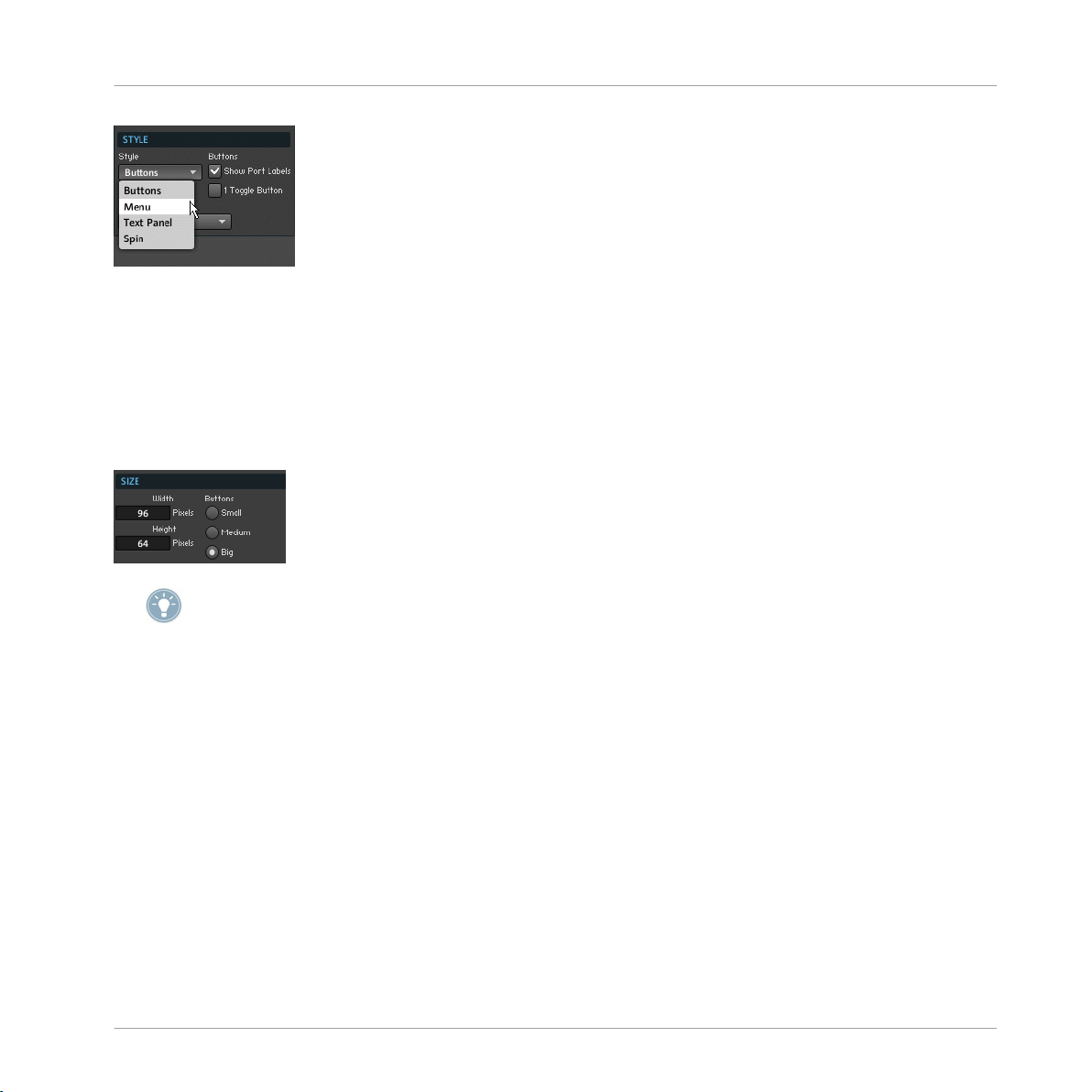
Fig. 1.9 Use the Style drop-down menu to choose the Panel representation of the Switch Module.
Changing the Size of the Switch's Panel Representation
Depending on the number of input ports, you might need a small or large area for the
Switch Module's Panel representation.
► To change the width and height of the Switch Module's Panel representation, go to the
Module's View page and enter the desired values into the Width and Height edit fields, as
shown in the figure below.
Panel
Switch
Please refer to subsection 8.2.3 in the Application Reference for more detailed information
on editing the Switch Module's entries in the View page, among other Properties.
1.4.4 Example: Routing Signals Using a Switch
In the following example you are shown how to use the Switch Module to choose which
signals
are forwarded to an Output Terminal. Let's say we have a Macro that is applied to a
signal as an effect. We call the processed signal the “wet” signal and the unprocessed sig
nal the “dry” signal. See the screenshot below for an exemplary structure.
REAKTOR 5.5 - Module Reference - 55
Page 56

Fig. 1.10 Here a Switch Module is used to forward either the “wet” signal or the “dry” signal to the Output Terminal.
If we go to the Instrument Panel, the Switch can be set to have a Panel representation as
shown
in the figure below. The Switch Module lets you choose between the different sig
nals arriving at its input ports. Here the input ports have been labeled “Wet” and “Dry”
and these names also appear on the Instrument Panel. If you click on the “Wet” button,
then the signal arriving at the “Wet” input port of the Switch Module is routed to its out
put port. If you press the “Dry” button, then the signal arriving at the “Dry” input port of
the Switch Module is routed to its output port.
Panel
Lamp
Fig. 1.11 A possible Panel representation of the Switch Module.
An important case is when you have Event signals connected to the input ports of the
Switch
Module. “Switching” to one of these signals causes the value that was sent last to
that particular input port to be sent from the output port of the Switch Module in the form
of an Event.
1.5 Lamp
Fig. 1.12 Lamp Modules
1.5.1 Overview
The Lamp Module is an indicator lamp for a Monophonic signal. It has two modes of oper
ation which can be set in the Module's Function page:
REAKTOR 5.5 - Module Reference - 56
Page 57

Panel
Lamp
▪ Discrete
: In Discrete mode the lamp in the Instrument Panel lights up as long as the
input signal (sampled at 25 Hz) is within the range set with the Min and Max edit fields
in the Function page. That is, the lamp is lit up when the signal’s value is larger than
"Min" and less than or equal to "Max".
▪
Continuous
: In Continuous mode, the lamp color will gradually fade in and out for val
ues between "Min" and "Max". For values above "Max" the lamp is lit up and for values
below "Min" the lamp is unlit.
Application
Lamp Modules are good for monitoring signals from the Instrument Panel. Lamps are es
pecially
quire a simple display. Another common use for the Lamp Module is to activate Modules
within a Structure (such as the Audio Table Module in the example in section 11.2 in the
Application Reference). This is done by engaging the Always Active checkbox in the Lamp
Module's Function page and connecting the Lamp Module to an output port of the Module
you wish to activate.
1.5.2 Ports
▪ (In)
useful when you only need a rough idea of the signal level and therefore only re
Although the Lamp Module only accepts Monophonic signals, connecting a Polyphonic sig
nal
to its input port will still keep the Module, from which the Polyphonic signal stems, ac
tive.
"In" is the input port for the Monophonic signal to be displayed by the lamp display
in the Instrument Panel.
1.5.3 Properties: Function Page
Keeping the Lamp Module Always Active
A common use for the Lamp module is to activate other Modules within a Structure. In
such a case you would connect the output port of another Module to the Lamp Module
which then would need to have the Always Active feature active.
► To keep the Lamp Module always active, go to its Function page and engage the Always
Active checkbox, shown in the figure below.
REAKTOR 5.5 - Module Reference - 57
Page 58

Changing between Discrete and Continuous Mode
The Lamp Module has two operation modes: Discrete mode and Continuous mode. They
are described in the Module Overview subsection above.
► To activate Continuous mode, go to the Lamp Module's Function page and engage the
Continuous Mode
checkbox. Otherwise, with the Continuous Mode checkbox disengaged, the
Lamp Module operates in Discrete mode.
Fig. 1.13 The Lamp Module's Function page holds the edit fields to set the "Max" and "Min" values (in dB) as well as the
checkbox to switch between Discrete and Continuous operation mode.
Setting the "Min" and "Max" Values
The general functionality of the Lamp Module is described in the Module Overview subsec
tion
above. Both operation modes (Discrete and Continuous) behave according to the "Min"
and "Max" values.
► To set the "Min" and "Max" values (in dB), go to the Lamp Module's Function page and
enter the desired values into the Min. Value and Max. Value edit fields, respectively.
Panel
Lamp
1.5.4 Properties: View page
Choosing the Lamp Color
The color of the lamp can be chosen in the View page of the Module Properties. You can
either
you can define custom colors for the On and Off positions of the lamp using the color
picker of your OS.
► To choose a preset color combination for the lamp, click on the desired color in the
Default Color
choose from preset colors with the (red, green, blue, yellow or Indicator color), or
ratio button selector, shown in the figure below.
REAKTOR 5.5 - Module Reference - 58
Page 59

Please refer to section 8.3 in the Application Reference for more information on changing
the Indicator color of your Instrument.
► To set the On and Off states of your lamp to custom colors, press the Set On Color and Set
Off Color buttons, respectively. The color picker dialog window of your OS will let you pick a
desired color.
The Set On Color and Set Off Color buttons are shown in the figure below.
Turning Off the Lamp Frame
You might want to place several Lamps next to each other to create a pixilated display of
some
sort. In that case the nice frame, with which the Lamp Module comes, becomes su
perfluous. With the frame removed, you are able to place the lamps pixel accurate side by
side in the Instrument Panel without any gaps between them.
► To turn off the Lamp Module's frame on the Instrument Panel, disengage the Has Frame
checkbox in the View page (shown in the screenshot below).
Panel
Lamp
Setting Label and Lamp Size
Depending on your Instrument Panel layout, you might want a larger or smaller lamp with
a larger or smaller Label and Value display.
For other visibility settings for the Panel representation (Label, Picture, and Value, please re
fer to subsection 8.2.1 in the Application Reference).
REAKTOR 5.5 - Module Reference - 59
Page 60

► To change the size of your Lamp Module's Label and Value display, choose the desired
size from the Label/Value radio button selector in the View page (shown in the screenshot
above).
► To choose between preset sizes for the Lamp Module's Panel representation, choose the
desired size from the
Set Default Size radio button selector, shown in the screenshot below.
► To exactly set the width and height of the Lamp Module's Panel representation, go to
the Module's View page and enter the desired values into the Width
and Height edit fields, as
shown in the figure below.
Custom lamp styles can be created via skins. Please refer to section 8.5 in the Application
Reference for more information on how to do this.
Panel
Lamp
1.5.5 Example: LFO Monitor
This example shows how to use the Lamp Module to monitor an LFO Module's (↑9.1, LFO)
signal
level from the Instrument Panel. The simple Structure for this is shown in the figure
below.
Fig. 1.14 You can use the Lamp Module to monitor the signal level of an LFO from the Instrument Panel.
REAKTOR 5.5 - Module Reference - 60
Page 61

The Lamp Module's Panel representation has color corresponding to the "off" state and a
corresponding to the "on" state. The values that yield these states are set in the Mod
color
ule's Function page with the Max. Value and Min. Value edit fields. Since the LFO in the exam
ple outputs a waveform in the range [-1 … 1], the range of the Lamp Module has been set
accordingly. Also, the Continuous Mode checkbox has been enables for the Lamp Module to
represent values between "-1" and "1" in a gradient that goes from the "off" color to the
"on" color.
Fig. 1.15 To be able to display a smooth transition from the "off" color to the "on" color of the Lamp Module, engage the
Continuous Mode checkbox.
1.6 Level Lamp
Panel
Level Lamp
Fig. 1.16 Level Lamp Modules
1.6.1 Overview
The Level Lamp Module is an indicator lamp for a Monophonic signal with logarithmic set
tings. It has two modes of operation which can be set in the Module's Function page:
▪ Discrete: In Discrete mode the lamp in the Instrument Panel lights up as long as the
input
signal (sampled at 25 Hz) is within the range set (in dB) with the Min and Max
edit fields in the Function page. That is, the lamp is lit up when the signal’s value is
larger than "Min" and less than or equal to "Max".
Continuous: In Continuous mode, the lamp color will gradually fade in and out for val
▪
ues
between "Min" and "Max". For values above "Max" the lamp is lit up and for values
below "Min" the lamp is unlit.
REAKTOR 5.5 - Module Reference - 61
Page 62

Application
Level Lamp Modules are good for monitoring signals from the Instrument Panel. Level
Lamps
fore only require a simple display. Another common use for the Level Lamp Module is to
activate Modules within a Structure (such as the Audio Table Module in the example in
section 11.2 in the Application Reference). This is done by engaging the Always Active
checkbox in the Level Lamp Module's Function page and connecting the Level Lamp Mod
ule to an output port of the Module you wish to activate.
1.6.2 Ports
▪ (In)
1.6.3 Properties: Function Page
are especially useful when you only need a rough idea of the signal level and there
Although the Level Lamp Module only accepts Monophonic signals, connecting a Polyphonic
to its input port will still keep the Module, from which the Polyphonic signal stems,
signal
active.
"In" is the input port for the Monophonic signal to be displayed by the lamp display
in the Instrument Panel.
Panel
Level Lamp
Keeping the Level Lamp Module Always Active
A common use for the Level Lamp module is to activate other Modules within a Structure.
such a case you would connect the output port of another Module to the Level Lamp
In
Module which then would need to have the Always Active feature active.
► To keep the Level Lamp Module always active, go to its Function page and engage the
Always Active
checkbox, shown in the figure below.
Changing between Discrete and Continuous Mode
The Level Lamp Module has two operation modes: Discrete mode and Continuous mode.
They are described in the Module Overview subsection above.
REAKTOR 5.5 - Module Reference - 62
Page 63

► To activate Continuous mode, go to the Level Lamp Module's Function page and engage
the Continuous Mode checkbox. Otherwise, with the Continuous Mode checkbox disengaged, the
Level Lamp Module operates in Discrete mode.
Setting the "Min" and "Max" Values
The general functionality of the Level Lamp Module is described in the Module Overview
subsection
above. Both operation modes (Discrete and Continuous) behave according to
the "Min" and "Max" values.
► To set the "Min" and "Max" values (in dB), go to the Level Lamp Module's Function
page and enter the desired values into the Min. Value and Max. Value edit fields, respectively.
1.6.4 Properties: View page
Choosing the Level Lamp Color
The color of the lamp can be chosen in the View page of the Module Properties. You can
either
you can define custom colors for the On and Off positions of the lamp using the color
picker of your OS.
► To choose a preset color combination for the lamp, click on the desired color in the
Default Color
choose from preset colors with the (red, green, blue, yellow or Indicator color), or
ratio button selector, shown in the figure below.
Panel
Level Lamp
Please refer to section 8.3 in the Application Reference for more information on changing
the Indicator color of your Instrument.
REAKTOR 5.5 - Module Reference - 63
Page 64

► To set the On and Off states of your lamp to custom colors, press the Set On Color and Set
Off Color
desired color.
buttons, respectively. The color picker dialog window of your OS will let you pick a
The Set On Color and Set Off Color buttons are shown in the figure below.
Turning Off the Level Lamp Frame
You might want to place several Level Lamps next to each other to create a pixilated dis
of some sort. In that case the nice frame, with which the Level Lamp Module comes,
play
becomes superfluous. With the frame removed, you are able to place the lamps pixel accurate side by side in the Instrument Panel without any gaps between them.
► To turn off the Level Lamp Module's frame on the Instrument Panel, disengage the Has
Frame checkbox in the View page (shown in the screenshot below).
Panel
Level Lamp
Setting Label and Level Lamp Size
Depending on your Instrument Panel layout, you might want a larger or smaller lamp with
a larger or smaller Label and Value display.
For other visibility settings for the Panel representation (Label, Picture, and Value, please re
fer to subsection 8.2.1 in the Application Reference).
► To change the size of your Level Lamp Module's Label and Value display, choose the
desired size from the Label/Value radio button selector in the View page (shown in the
screenshot above).
REAKTOR 5.5 - Module Reference - 64
Page 65

► To choose between preset sizes for the Level Lamp Module's Panel representation,
choose the desired size from the Set Default Size radio button selector, shown in the screen
shot below.
► To exactly set the width and height of the Level Lamp Module's Panel representation,
go to the Module's View page and enter the desired values into the Width and Height edit
fields, as shown in the figure below.
Custom lamp styles can be created via skins. Please refer to section 8.5 in the Application
Reference for more information on how to do this.
Panel
Level Lamp
1.6.5 Example: Activating a Table Module
The Level Lamp Module can also be applied for its "Always Active" feature. In this exam
ple,
it is connected to the output of an Event Table Module to activate it for whatever pur
pose you wish to use it for. For this application the Always Active checkbox in the Level
Lamp Module's Function page has to be activated. However, it does not matter if the in
coming signal is Polyphonic and therefore the Level Lamp Module's input port gets muted
— the Modules lying upstream will be activated nevertheless.
REAKTOR 5.5 - Module Reference - 65
Page 66

Fig. 1.17 Use the Level Lamp Module to activate Modules upstream.
1.7 RGB Lamp
Fig. 1.18 An RGB Lamp Module
Panel
RGB Lamp
1.7.1 Overview
The RGB Lamp Module is a resizable, colored display. Its color is controlled by the values
appearing
at its three color input ports: "R" (red), "G" (green), and "B" (blue). The Module's
horizontal and vertical size can be set in pixels in the View page.
Application
With the RGB Lamp Module you can create custom displays and controls that change their
color depending on what is going on in the Instrument's Structure.
1.7.2 Ports
Input Ports
▪ (R) "R" (red) is the Audio input port for the intensity of the red component. The range
of values at this input port is [0 … 1]. When disconnected, the default value, "0", is
used.
REAKTOR 5.5 - Module Reference - 66
Page 67

"G" (green) is the Audio input port for the intensity of the green component. The
▪ (G)
range of values at this input port is [0 … 1]. When disconnected, the default value,
"0", is used.
▪
"B" (blue) is the Audio input port for the intensity of the blue component. The range
(B)
of values at this input port is [0 … 1]. When disconnected, the default value, "0", is
used.
1.7.3 Properties: Function Page
Keeping the RGB Lamp Module Always Active
Before the RGB Lamp Module shows the colors that have been specified by its input port,
you need to activate it.
► To activate the RGB Lamp Module, go to its Function page and engage the Always Active
checkbox, shown in the figure below.
1.7.4 Properties: View page
Panel
RGB Lamp
Turning Off the RGB Lamp Frame
You might want to place several RGB Lamps next to each other to create a pixilated dis
of some sort. In that case the nice frame, with which the RGB Lamp Module comes,
play
becomes superfluous. With the frame removed, you are able to place the lamps pixel accurate side by side in the Instrument Panel without any gaps between them.
► To turn off the RGB Lamp Module's frame on the Instrument Panel, disengage the Has
Frame checkbox in the View page (shown in the screenshot below).
Setting the RGB Lamp Size
Depending on your Instrument Panel layout, you might want a larger or smaller lamp.
REAKTOR 5.5 - Module Reference - 67
Page 68

For other visibility settings for the Panel representation including the Labe and Label size,
please refer to subsection 8.2.1 in the Application Reference).
► To choose between preset sizes for the RGB Lamp Module's Panel representation,
choose the desired size from the Set Default Size radio button selector, shown in the screen
shot above.
► To exactly set the width and height of the RGB Lamp Module's Panel representation, go
to the Module's View page and enter the desired values into the Width and Height edit fields,
as shown in the figure above.
1.7.5 Example: Setting RGB Color from the Panel
This example shows how you can control the color of the RGB Lamp Module's Panel repre
sentation
with three knobs. To create the Structure shown below, just right-click on each
input port and choose the Create Control menu entry.
Panel
RGB Lamp
Fig. 1.19 Use the Create Control menu entry to quickly create the controls for the red, green, and blue values.
Note that you can use the RGB Lamp Module as a background for another Panel element,
for example. In the figure shown below, the RGB Lamp Module's size has been changed.
Fig. 1.20 The Panel representation of the RGB Lamp Module.
1.8 Meter
Fig. 1.21 A Meter Module
REAKTOR 5.5 - Module Reference - 68
Page 69

1.8.1 Overview
The Meter Module is a value indicator for a Monophonic signal. The value of the incoming
signal
is sampled (at 25 Hz) and displayed on a linear scale in the Instrument Panel. The
displayed range is set in the Function page of the Module's Properties. The color and size
of the display can be set in the Module's View page.
The Meter Module is the same as the Numeric Readout Module. The only difference is that
Numeric Readout Module's default setting is to only show the value field in its Panel
the
representation without the animated picture of the meter.
Application
The Meter Module is good for monitoring signals from the Instrument Panel. A common
application
decide to modulate a parameter with both an LFO and an envelope then it's even more
useful to monitor the resulting signal, since that might be (a little bit) more unpredictable
than the regular oscillations of an LFO,
for example.
1.8.2 Ports
▪ (In)
is to monitor envelope levels or the output signal of an LFO. Of course, if you
"In" is the input port for the signal whose value is to be displayed on the meter,
Panel
Meter
1.8.3 Properties: Function Page
Keeping the Meter Module Always Active
Before the Meter Module shows the value that has been specified by its input port, you
need to activate it.
► To activate the Meter Module, go to its Function page and engage the
checkbox, shown in the figure below.
REAKTOR 5.5 - Module Reference - 69
Always Active
Page 70

Setting the Range for Displayed Values
► To set the range for the values that correspond to a minimum and maximum display
state of the Meter Module, go to the Module's Function page and enter the corresponding
values into the
1.8.4 Properties: View page
Min. Value and Max. Value edit fields (shown in the screenshot above).
Choosing the Meter Color
The color of the meter can be chosen in the View page of the Module Properties. You can
either
you can define custom colors for the On and Off positions of the meter using the color
picker of your OS.
► To choose a preset color combination for the meter, click on the desired color in the
Default Color
choose from preset colors with the (red, green, blue, yellow or Indicator color), or
ratio button selector, shown in the figure below.
Panel
Meter
Please refer to section 8.3 in the Application Reference for more information on changing
the Indicator color of your Instrument.
► To set the On and Off states of your meter to custom colors, press the Set On Color
and Set
Off Color buttons, respectively. The color picker dialog window of your OS will let you pick a
desired color.
The Set On Color and Set Off Color buttons are shown in the figure below.
Setting Meter and Label Size
Depending on your liking you might want a meter with a different number of segments, of
different size, or with a larger or smaller Label and Value display.
REAKTOR 5.5 - Module Reference - 70
Page 71

For other visibility settings for the Panel representation (Label, Picture, and Value, please re
fer to subsection 8.2.1 in the Application Reference).
► The size of the Meter Module's Panel representation depends on the number and size of
the segments it comprises. To change the width and height of the segments, enter the de
sired size into the Segment Width and Segment Height edit fields in the Meter Module's View
page (shown in the screenshot below).
► To change the number of segments in the meter, enter the desired number into the
Number of Segments
edit field (shown in the screenshot below).
► To quickly change the size of the Meter Module's Panel representation, you can use one
of the three default sizes.
► To choose a default size for the Meter Module, choose the desired size from the Set De
fault Size radio button selector, shown in the screenshot below.
Panel
Meter
Use the Set Default Size radio button selector in the Meter Module's View page to quickly
change
the size of your Meter Module's Panel representation. Use the Label/Value radio but
ton selector to change the size of the Label and Value in the Module's Panel representation.
► To change the size of your Meter Module's Label and Value display, choose the desired
size from the
Label/Value radio button selector in the View page (shown in the screenshot
above).
Changing the Meter Orientation
The Meter Module's Panel representation can sit either vertically or horizontally in the In
strument Panel.
REAKTOR 5.5 - Module Reference - 71
Page 72

► To change the Meter Module's orientation, click on the appropriate radio button in the
Orientation
1.8.5 Example: LFO Monitor
radio button selector.
Custom meter styles can be created via skins. Please refer to section 8.5 in the Application
Reference for more information on how to do this.
This example shows how to use the Meter Module to monitor an LFO Module's (↑9.1, LFO)
signal
level from the Instrument Panel. The simple Structure for this is shown in the figure
below.
Panel
Meter
Fig. 1.22 You can use the Meter Module to monitor the signal level of an LFO from the Instrument Panel.
The Meter Module's Panel representation consists of a row of segments of which an in
creasing
number is lit up, depending where the incoming value lies in the range [Min …
Max]. This range is set in the Module's Function page with the Max. Value and Min. Value edit
fields. Since the LFO in the example outputs a waveform in the range [-1 … 1], the range
of the Meter Module for this example has been set accordingly, as shown in the figure be
low. The resulting Panel representation is shown in the second figure below. Note that
since the LFO signal is dynamic (for frequency values other than 0 Hz), the meter in the
screenshot is actually moving up and down.
REAKTOR 5.5 - Module Reference - 72
Page 73

Fig. 1.23 The incoming range of values lies in the range [-1 … 1] so the range for the Meter Module has been set according
ly.
Fig. 1.24 The Panel representation of the Meter Module.
1.9 Level Meter
Fig. 1.25 Level Meter Module
Panel
Level Meter
1.9.1 Overview
The Level Meter Module is a value indicator for a Monophonic signal with logarithmic set
tings. The value of the incoming signal is sampled (at 25 Hz) and displayed on a linear
scale in the Instrument Panel. The displayed range is set in the Function page of the Mod
ule's Properties. The color and size of the display can be set in the Module's View page.
Application
The Level Meter Module is good for monitoring signals from the Instrument Panel. A com
mon
application is to monitor envelope levels or the output signal of an LFO. Of course, if
you decide to modulate a parameter with both an LFO and an envelope then it's even more
useful to monitor the resulting signal, since that might be (a little bit) more unpredictable
than the regular oscillations of an LFO,
for example.
REAKTOR 5.5 - Module Reference - 73
Page 74

1.9.2 Ports
1.9.3 Properties: Function Page
"In" is the input port for the signal whose value is to be displayed on the meter,
▪ (In)
Keeping the Level Meter Module Always Active
Before the Level Meter Module shows the value that has been specified by its input port,
you need to activate it.
► To activate the Level Meter Module, go to its Function page and engage the Always Active
checkbox, shown in the figure below.
Setting the Range for Displayed Values
► To set the range for the values (in dB) that correspond to a minimum and maximum
display state of the Level Meter Module, go to the Module's Function page and enter the
corresponding values (in dB) into the Min. Value and Max. Value edit fields (shown in the
screenshot above).
Panel
Level Meter
1.9.4 Properties: View page
Choosing the Level Meter Color
The color of the meter can be chosen in the View page of the Module Properties. You can
either
you can define custom colors for the On and Off positions of the Meter using the color
picker of your OS.
choose from preset colors with the (red, green, blue, yellow or Indicator color), or
REAKTOR 5.5 - Module Reference - 74
Page 75

► To choose a preset color combination for the meter, click on the desired color in the
Default Color
ratio button selector, shown in the figure below.
Please refer to section 8.3 in the Application Reference for more information on changing
the Indicator color of your Instrument.
Panel
Level Meter
► To set the On and Off states of your meter to custom colors, press the Set On Color
and Set
Off Color buttons, respectively. The color picker dialog window of your OS will let you pick a
desired color.
The Set On Color and Set Off Color buttons are shown in the figure below.
Setting Level Meter and Label Size
Depending on your liking you might want a meter with a different number of segments, of
different size, or with a larger or smaller Label and Value display.
For other visibility settings for the Panel representation (Label, Picture, and Value, please re
fer to subsection 8.2.1 in the Application Reference).
► The size of the Level Meter Module's Panel representation depends on the number and
size of the segments it comprises. To change the width and height of the segments, enter
the desired size into the Segment Width and Segment Height edit fields in the Level Meter Mod
ule's View page (shown in the screenshot below).
REAKTOR 5.5 - Module Reference - 75
Page 76

► To change the number of segments in the meter, enter the desired number into the
Number of Segments
edit field (shown in the screenshot below).
► To quickly change the size of the Level Meter Module's Panel representation, you can
use one of the three default sizes.
► To choose a default size for the Level Meter Module, choose the desired size from the
Set Default Size
radio button selector, shown in the screenshot below.
Use the Set Default Size radio button selector in the Level Meter Module's View page to quick
ly change the size of your Level Meter Module's Panel representation. Use the Label/Value
radio button selector to change the size of the Label and Value in the Module's Panel repre
sentation.
► To change the size of your Level Meter Module's Label and Value display, choose the
desired size from the Label/Value radio button selector in the View page (shown in the
screenshot above).
Panel
Level Meter
Changing the Level Meter Orientation
The Level Meter Module's Panel representation can sit either vertically or horizontally in
the Instrument Panel.
► To change the Level Meter Module's orientation, click on the appropriate radio button
in the Orientation radio button selector.
Custom meter styles can be created via skins. Please refer to section 8.5 in the Application
Reference for more information on how to do this.
REAKTOR 5.5 - Module Reference - 76
Page 77

1.9.5 Example: Signal Level Display
The Level Meter Module is good for using the meter Panel representation to display incom
signal levels in the logarithmic scale. This means that although values incoming to the
ing
Level Meter Module are in the range [0 … 1], for example, the display shows the level
equivalent in the logarithmic scale. For example, an envelope follower Structure (see ex
ample for the Peak Detector Module, see also
in the range [0 … 1]. The Level Meter Module then enables you to see from the In
level
↑12.14, Peak Detector) outputs an envelope
strument Panel what control signal the envelope follower has generated from the initial in
coming signal.
Fig. 1.26 The Level Meter Module displays the signal level from the "Event Follower" Macro, which is in the range [0 … 1],
in the logarithmic scale.
1.10 Picture
Panel
Level Meter
Fig. 1.27 A Picture Module
1.10.1 Overview
The Picture Module enables you to display a picture on the Instrument Panel. Pictures can
be
loaded from 24-bit Bitmap (*.bmp) and 32-bit uncompressed Targa (*.tga) images.
The advantage of the Targa file format is that it supports an alpha channel, which can be
used as a mask for the visible portion of the graphic — the unmasked portion will then be
transparent. You can load pictures using the Select Picture drop-down menu in the View page
of any object that can display pictures. Opening a picture automatically brings up the Pic
ture Properties window where you specify all relevant picture settings. By default, the dis
REAKTOR 5.5 - Module Reference - 77
Page 78

play size will be set to the size of the image. It is possible to modify the display size in
pixels
in the Module's View page and the visibility of a frame can be turned on or off. The
image itself cannot be resized inside REAKTOR; for this you need to use external picture
editing software. All loaded pictures are automatically shared and available to all Modules
that use pictures. The Picture Module has no input or output ports.
Application
The Picture Module is usually applied for decoration for your Instrument Panel. As with
the
Multi Picture Module (
(↑1.18,
Mouse Area
) over the Picture Module to add graphics to the Mouse Area interac
↑1.11,
Multi Picture
), you can place a Mouse Area Module
tion field.
1.10.2 Properties: Function Page
Loading a Picture
Before the Picture Module displays a picture in the Instrument Panel, you need to load the
picture file that the Module should use.
1. To load a picture file for the Picture Module, go to its Function page and open the
Select Picture
2. Now either choose the -> Open from file… menu entry to load a new picture file or
choose a menu entry corresponding to a picture file that has already been loaded into
the Ensemble by another Module.
drop-down menu (shown in the figure below).
Panel
Picture
3. This opens up the Picture Properties dialog window. This window shows the picture
preview.
In the case of the Picture Module it usually suffices to just press the OK but
ton to load the picture and continue with your work. Please refer to section 8.5 in the
Application Reference for more information on working with the Picture Properties dia
log window.
REAKTOR 5.5 - Module Reference - 78
Page 79

These instructions should be considered as the example for the Picture Module.
Choosing the Picture Index
If the picture you have loaded consists of a number of animation frames which you have
configured with the Picture Properties dialog window (please refer to subsection 8.5.3
also
in the Application Reference for more information on this), you may choose which anima
tion frame is displayed in the Instrument Panel.
► To choose which animation frame is displayed in the Instrument Panel, go to the Mod
ule's Function page and select the index of the animation frame with the Index
edit field.
This edit field is shown in the figure below.
1.10.3 Properties: View Page
Turning on the Picture Frame
► To turn on the frame for the Picture Module's Panel representation, engage the Has
Frame
checkbox in the View page (shown in the screenshot below).
Panel
Picture
Setting the Display Size
Depending on your Instrument Panel layout, you might want a larger or smaller display
for your picture. This can be useful when you want to tile certain parts of your picture
area
when the display size exceeds the size of the actual picture used.
Please refer to subsection 8.5.4 in the Application Reference for more information on resiza
bility.
► To set the width and height of the Picture Module's Panel representation, go to the
Module's View page and enter the desired values into the Width and Height edit fields, as
shown in the figure above.
REAKTOR 5.5 - Module Reference - 79
Page 80

Choosing Label Size and Visibility Settings
► To reduce the size of your Picture Module's Label, engage the Small Label
(shown in the figure below).
► To make the Label disappear, disengage the Show Label
checkbox (shown in the figure
below).
► To make the Picture Module's Panel representation disappear, disengage the On check
box (shown in the figure below).
checkbox
Panel
Multi Picture
► Engage the
Show Label checkbox to show the Label. Engage the Small Label checkbox to
reduce the size of the Label of the Module's Panel representation. Disengage the On check
box to make the Picture Module's display disappear.
1.11 Multi Picture
Fig. 1.28 Multi Picture Module
1.11.1 Overview
The Multi Picture Module is a user definable display and a 2-dimensional controller (like
the
XY module, see also
tus
at its output ports. It supports multi-frame animation so that the animation frame se
↑1.14, XY) that reports the mouse position and mouse button sta
lected by the "Sel" (select) input port can be displayed by the Multi Picture Module's Pan
el representation. For this the loaded picture has to be set up in the Picture Properties
window by indicating the number of animation frames and their orientation (horizontal or
vertical) within the loaded picture file.
REAKTOR 5.5 - Module Reference - 80
Page 81

You can load pictures using the Select Picture drop-down menu in the View page of any ob
that can display pictures. Opening a picture automatically brings up the Picture Prop
ject
erties window where you specify all relevant picture settings. By default, the display size
will be set to the size of the image. It is possible to modify the display size in pixels in the
Module's View page and the visibility of a frame can be turned on or off. The image itself
cannot be resized inside REAKTOR; for this you need to use external picture editing soft
ware. All loaded pictures are automatically shared and available to all other Modules that
use pictures as well.
Pictures can be loaded from 24-bit Bitmap (*.bmp) and 32-bit uncompressed Targa
(*.tga) images. The advantage of the Targa file format is that it supports an alpha channel,
which can be used as a mask for the visible portion of the graphic — the unmasked por
tion will then be transparent. This is useful for round knobs on a square background, for
example.
The Multi Picture Module has two operation modes:
▪ If the Incremental Mouse Mode is turned off, the absolute mouse position on the Mod
Panel representation is translated to values between the "Min" and "Max" values
ule's
set in the Function page. The display width and height define the range and resolution
for mouse movements and the Mouse Reso edit field in the Function page has no effect.
▪ With the Incremental Mouse Mode turned on, the "MX" (mouse X) and "MY" (mouse Y)
values are controlled by the relative movement of the mouse compared to the point
where the left the mouse button was pressed. The X and Y mouse resolution is given by
the Mouse Reso edit field in the Function page.
Panel
Multi Picture
Application
The Multi Picture Module can be used to add animations to your Instrument Panel. These
animations
) to create custom controls.
Area
1.11.2 Ports
can be coupled to Modules such as the Mouse Area Module (
↑1.18,
Mouse
Input Ports
(Sel) "Sel" (select) is the Audio input port for selecting the animation index (animation
▪
frame)
the number of animation frames. The default value that is used in the case that this
input port is disconnected is "0". The "Sel" input port is sampled at the display rate.
by number. The range of values at this input port is [0 … "N-1"] where "N" is
REAKTOR 5.5 - Module Reference - 81
Page 82

Panel
Multi Picture
▪ (BX)
"BX" (base X) is the Event input port to set a new base value from which the incre
mental increase in the "MX" (mouse X) value is calculated. The "BX" (base X) value is
only used if Incremental Mode has been activated.
▪
"BY" (base Y) is the Event input port to set a new base value from which the incre
(BY)
mental increase in the "MY" (mouse Y) value is calculated. The "BY" (base Y) value is
only used if Incremental Mode has been activated.
Output Ports
▪
(MX)
"MX" (mouse X) is the Event output port for the horizontal (X) mouse position
when the mouse is within the Multi Picture Module's display area in the Instrument
Panel. Events with the current mouse position are only sent when the mouse button is
depressed.
(MY) "MY" (mouse Y) is the Event output port for the vertical (Y) mouse position when
▪
the
mouse is within the Multi Picture Module's display area in the Instrument Panel.
Events with the current mouse position are only sent when the mouse button is de
pressed.
(MB)
▪
▪
"MB" (mouse button) is the Event output port for the left mouse button status. It
is "1" when the mouse button is depressed; otherwise it is "0". Events are sent from
this output port only when the mouse is within the Multi Picture Module's display area
in the Instrument Panel.
(N - 1) "N-1" is the Event output port for the value "N - 1" where "N" denotes the num
ber of animation frames you have entered in the Picture Properties dialog window.
1.11.3 Properties: Function Page
Loading a Picture
Before the Multi Picture Module displays a picture in the Instrument Panel, you need to
load the picture file that the Module should use.
REAKTOR 5.5 - Module Reference - 82
Page 83

1. To load a picture file for the Multi Picture Module, go to its Function page and open
the Select Picture drop-down menu (shown in the figure below). The Max Index display
shows the value "N-1" where "N" denotes the number of animation frames in your load
ed picture.
2. Now either choose the -> Open from file… menu entry to load a new picture file or
choose
a menu entry corresponding to a picture file that has already been loaded into
the Ensemble by another Module.
3. This opens up the Picture Properties dialog window. This window shows the picture
preview
and lets you specify how REAKTOR should extract the animation frames from
the loaded picture. Please refer to section 8.5 in the Application Reference for more
information on working with the Picture Properties dialog window. Press the OK button
when you are finished setting the picture properties.
Panel
Multi Picture
Keeping the Multi Picture Module Always Active
If the Multi Picture Module is not connected to an active signal flow, then you are unable
to
switch the displayed pictures via the "Sel" (select) input port. In such a case you can
activate the Module with the Always Active checkbox.
► To activate the Multi Picture Module, go to its Function page and engage the
Always Ac
tive checkbox, shown in the figure below.
Activating Incremental Mouse Mode
The output values for the Multi Picture Module are calculated in two different ways, de
pending on the operation mode. These two modes are discussed in the Module's Overview,
above.
REAKTOR 5.5 - Module Reference - 83
Page 84

► To toggle between the two Multi Picture operation modes, engage or disengage the Incre
mental Mouse Mode checkbox accordingly. This checkbox is shown in the screenshot of the
Function page below.
Setting the Range and Resolution for the Output Values
The range and resolution of the Multi Picture Module's values at the "MX" (mouse X) and
(mouse Y) output ports are set in the Output Range area of the Module's Function
"MY"
page, shown in the screenshot below. The edit fields contained in this area function analo
gously to the ones contained in a conventional Knob or Fader Module. To learn how these
edit fields affect the output values, please refer to subsection 8.2.1 in the Application
Reference.
Panel
Multi Picture
Fig. 1.29 The range and resolution of the Multi Picture Module's output values are set in the Output Range area of its Func
tion page.
1.11.4 Properties: View Page
Turning on the Picture Frame
► To turn on the frame for the Multi Picture Module's Panel representation, engage the
Has Frame
checkbox in the View page (shown in the screenshot below).
REAKTOR 5.5 - Module Reference - 84
Page 85

Setting the Display Size
Depending on your Instrument Panel layout, you might want a larger or smaller display
for your picture. This can be useful when you want to tile certain parts of your picture
area
when the display size exceeds the size of the actual picture used.
Please refer to subsection 8.5.4 in the Application Reference for more information on resiza
bility.
► To set the width and height of the Picture Module's Panel representation, go to the
Module's View page and enter the desired values into the Width and Height edit fields, as
shown in the figure above.
Choosing Label Size and Visibility Settings
► To reduce the size of your Multi Picture Module's Label, engage the Small Label
(shown in the figure below).
► To make the Label disappear, disengage the
Show Label checkbox (shown in the figure
below).
► To make the Picture Module's Panel representation disappear, disengage the On check
box (shown in the figure below).
checkbox
Panel
Multi Picture
► Engage the
Show Label checkbox to show the Label. Engage the Small Label checkbox to
reduce the size of the Label of the Module's Panel representation. Disengage the On check
box to make the Multi Picture Module's display disappear.
1.11.5 Example: Value Edit Field
This example shows how to build a custom value edit field that displays numbers with one
decimal
point precision. The edit field also enables you to change the values by clicking
and dragging the mouse over the edit field and to reset the value to "0" by double clicking
on the field. Start by creating a Macro with an output port labeled "Out". Make sure the
Macro is set to Monophonic Mode before you start building this example Structure. First
we will start with building the value display. We want to display decimal numbers from
REAKTOR 5.5 - Module Reference - 85
Page 86

-9.9 to 9.9, in 0.1 step increments. For this purpose you will need three Multi Picture
Modules (↑1.11, Multi Picture): one for the sign ( + and - ), one for the integers ( 0 to 9 ),
and one for the first decimal place after zero (.0 to .9).
After inserting the three Multi Picture Modules into the Structure, designate one for the
and go to its Function page. There, in the Select Picture menu you will find the -> Open
sign
from file… menu entry, click on it. This opens the Load Image File dialog box. Go to the
Tutorial Ensembles folder and from there enter the folder labeled Module Reference where
you will find the file "plus_minus.tga". Select the file and click the Open button. In the
following Picture Properties dialog window, make sure that the Alpha Channel checkbox is ac
tivated. Next, make sure that the Animation Width and Animation Height edit fields both carry
the value "32". You should now see a "+" and a "-" with transparent backgrounds next to
each other in the Picture Preview display. If so, click the OK button to continue.
Panel
Multi Picture
Fig. 1.30 The Picture Properties dialog window.
REAKTOR 5.5 - Module Reference - 86
Page 87

Now follow this same procedure for loading the digit animations to the other the Multi Pic
Modules. Designate one of the Modules for integer digits and load the "numbers.tga"
ture
file from the same location as "plus_minus.tga" into the Multi Picture Module whilst mak
ing sure that the same settings for the Alpha Channel checkbox and Animation Height and Ani
mation Width edit fields apply. For the third Multi Picture Module, repeat the aforementioned
procedure, but this time loading the file "decimals.tga" into the Module. This last Module
will be dedicated to display the first position after the decimal point. Go to the Instrument
Panel and arrange the signs and digits in a way that makes sense when reading from left
to right: first the sign, then the integer, and then the decimal fraction.
Fig. 1.31 The display part of the value edit field.
Now we need a way to split up the information that the value display should display into
three
parts: the sign (if the value is positive or negative), the integer part, and the decimal
fraction. The first split will happen between the sign and the numbers. For that, insert a
Rectify/Sign Module into the structure. The incoming value to the value display goes into
the "In" input port of the Rectify/Sign Module. The "Sign" output port of that Module out
puts a "1" if the incoming value is positive and "-1" if the incoming value is negative. We
need to convert these values to specify the picture index of the animation loaded into the
Multi Picuture Module. For that purpose, add an Add Module (
structure
and use it to add "1" to the signal from the "Sign" output port of the Rectify/Sign
↑4.2,
Add, +
) into the
Modue. The output of the Add Module will then be "0" if the value at the input of the Rec
tify/Sign Module is negative and "2" if the value is positive. After connecting the output
port of the Add Module to the "Sel" input port of the Multi Picture Module, the "0" will
address the first picture in the animation, the minus sign, and the value "2" will address
the last picture of the animation, the plus sign. To test out the functionality of the value
display, create a Knob Module at the "In" input of the Rectify/Sign Module by right-click
ing on the "In" input port and clicking on the Create Control menu item. Set the range of
the
knob to [-9.9 … 9.9] by going to the Module's Function page and setting the Max Value
edit field to "9.9" and the Min Value
On to the numbers: insert two Modulo Modules (
"|x|" output port of the Rectify/Sign Module the "A" input port of one Modulo Module.
the
edit field to "-9.9".
↑4.9, Modulo) into the structure. Connect
Since we want to split the number into integers and fractions, it is only natural to create a
Panel
Multi Picture
REAKTOR 5.5 - Module Reference - 87
Page 88

Constant with the value "1" at the "B" input port of the first Modulo Module. Now the "Div"
output
port of the Modulo Module carries the value that is the largest multiple of "1" and
is at the same time smaller than the value received from the "|x|" output port of the Recti
fy/Sign Module. For example, if |x| = 5.2, then Div = 5 or if |x| = 3.8, then Div = 3. Con
nect the "Div" output port to the "Sel" input port of the Multi Picture Module that is meant
to display the integer part of the incoming signal value. Since we want to display signals
within the range -9.9 to 9.9, then the "Div" value has a range [0 … 9] which exactly
matches the indices of the pictures of the animation file "numbers.tga" loaded into that
Multi Picture Module. Go to the Instrument Panel and move the knob that you previously
created and watch the sign and the integer numbers change in the Panel display of the
Multi Picture Modules. Next, hook up the decimal fraction part of the incoming signal,
namely the value sent to the "Mod" output of the Modulo Module, to the "A" input port of
the second Modulo Module. Next, create a Constant with the value "0.1" at the "B" input
port of that Modulo Module. Wire the "Div" output port that same Modulo Module to the
"Sel" input of the last remaining Multi Picture Module. With the "B" input port of the first
Modulo Module receiving a constant value of "0.1", the "Mod" output port of the Modulo
Module outputs the remainder of the incoming value, divided by "0.1". To demonstrate
this with the numbers used in the previous example, if |x| = 5.2, then for the first Modulo
Module, Mod = 0.2 and sending that value to the "A" input of the second Modulo Module,
we get 0.2 / 0.1 = 2 at the "Div" output of the second Modulo Module. In the same way, if
|x| = 3.8, then for the first Modulo Module, Mod = 0.8 and when that value is sent to the
"A" input port of the second Modulo Module, the "Div" output of that Module is 0.8 / 0.1 =
8. Note that since the range of the "Mod" output of the first Modulo Module is [0 … 0.9]
and in the second Modulo Module we divide by "0.1", the range of the "Div" output of the
second Modulo Module is [0 … 9]. In this case "Mod" has a range [0 … 9] which exactly
matches the indices of the pictures of the animation file "decimals.tga" loaded into that
Multi Picture Module. Go to the Instrument Panel and move the previously created knob to
test out the functionality of the value display.
Panel
Multi Picture
REAKTOR 5.5 - Module Reference - 88
Page 89

Fig. 1.32 The Structure for sorting out the sign and decimal parts of the value.
Now that you have a functioning value display, you probably want a way to manipulate the
values
directly through the value display itself, not with an extra knob cluttering your Pan
el layout. This can conveniently be achieved with the Mouse Area Module. Place it into the
structure in front of the Rectify/Sign Module, leaving a bit of space for a Merge Module
that you will insert later. By default, the Mouse Area Module is transparent in the Instru
ment Panel. To make testing the functionality easier you should make the mouse area visi
ble. First, the Mouse Area Module needs to have a graphic element in the Instrument Pan
el. In the Appearance page of the Module, click on the Bar Outline Style selector to create a
filled rectangle as the graphical element of the mouse area in the Instrument Panel. Now
you have a 100 % transparent rectangle marking the mouse area in the Instrument Panel;
for ease of manipulation you should to make the appearance more opaque. To do this, en
ter the value "80" into the Inactive Transparency edit field and the value "70" into the Active
Transparency edit field of the Module's Appearance page. To add one more touch, click on
the Left Button selector to make the active state of the mouse area appear during a left-click
on
the mouse area in the Instrument Panel. Now you should be able to see the mouse area
in the Instrument Panel and see it become darker when you click on it. Unlock the Panel
and move the mouse area over your value display. Set the dimensions of the mouse area to
cover all digits of the value display using the Size X and Size Y edit fields in the Appearance
page
of the Mouse Area Module. After finding good settings for the dimensions, ("30" for
Size X and "60" for Size Y should be good) lock the Panel again.
Panel
Multi Picture
REAKTOR 5.5 - Module Reference - 89
Page 90

Fig. 1.33 The value edit field with the mouse area.
The Mouse Area Module can supply us with the values that we want to display with the
structure
that you built above. When you click and drag the mouse over the mouse area in
the Instrument Panel, the "X" and "Y" output ports output events carrying the "x" and "y"
coordinates, respectively, as specified in the Function page of the Module. For our pur
pose, we are only interested in clicking and dragging the mouse vertically to change the
values in the value display since that seems the most intuitive setup for most Instrument
layouts. For this reason we will leave the "X" output (and hence the settings in the Range X
area of the Function page) alone and focus on the "y" coordinate. Connect the "Y" output
port of the Mouse Area Module to the "In" input port of the Rectify/Sign Module. In order
to be able to control the output values of the "X" and "Y" output ports of the Mouse Area
Module over the mouse area in the Instrument Panel much like a fader, that is, that click
ing and dragging changes the output value, engage the Incremental Mouse checkbox in the
Function page of the Mouse Area Module.
The range of values that we want to get out of the Mouse Area Module is [-9.9 … 9.9]. To
specify these parameters, go to the Function page of the Mouse Area Module and enter
"-9.9" into the Min Y Value edit field and "9.9" into the Max Y Value edit field in the Range Y
area. Next, we want to determine the precision with which one can manipulate the output
values. The relevant parameters to this are edited with the Num Steps X and Mouse Reso X edit
fields. If Num Steps X and Mouse Reso X are too large, you would have to drag the mouse all the
way to the top of the screen to see any change in the output value. On the other hand, if
these parameters are too small, dragging the mouse over the mouse area just a small dis
tance already effects a great change in the output value. In order to have the right value
increments at the output, the Num Steps X value should be an integer multiple of the Mouse
Reso
X value. Try playing around with the values and seeing the effect it has on the value
display, but in the end settling with a value of "1000" in the Num Steps X edit field and
"500" in the
Mouse Reso X edit field should be fine.
You now have a structure that displays values and lets you directly manipulate the values
by clicking and dragging the mouse over the display. We would like to add one additional
feature to this setup, namely, the possibility to double-click the mouse area to reset the
value to a certain number. The Mouse Area Module has an output port labeled "Db" that
Panel
Multi Picture
REAKTOR 5.5 - Module Reference - 90
Page 91

sends out an event with the value "1" every time the mouse area on the Panel is doubleclicked.
You now have two sources of events to determine the number that your value edit
field is supposed to display. To combine them, place a Merge Module into the structure
between the Mouse Area Module and the Rectify/Sign Module. Replace the wire to the "In"
input port of the Rectify/Sign Module with a wire from the "Out" output port of the Merge
Module. Next, connect the "Y" output port of the Mouse Area Module to the input port of
the Merge Module and finally, while holding Ctrl, drag a wire from the "Db" output of the
Mouse Area Module to the three dots on the left side of the Merge Module. The latter ac
tion creates a second port for the Merge Module. When you click and drag the mouse over
the mouse area in the Instrument Panel, a value is sent to the Merge Module from the "Y"
output port of the Mouse Area Module. This value is then forwarded in the form of an
event (carrying the same value as was received from the "Y" output port) to the value dis
play part of your structure which starts with the Rectify/Sign Module. If you now double
click the mouse area in the Instrument Panel, the value "1" is sent to the Merge Module.
Now the output port of the Merge Module sends an event with the value "1". This should
be reflected in the Instrument Panel where the value display should display "+1.0". Each
new event at any of the input ports of the Merge Module triggers an event at the output
port with the same value as the last incoming event. During initialization, the value from
the lowest input port of the Merge Module is sent last to its output port so in the current
structure, if you press the Run/Stop Audio button twice (turning the audio off and then on
again) to reinitialize the structure, your value display will show the initialization value com
from the "Db" output port of the Mouse Area Module, namely "1". Depending on the
ing
circumstances, this might not be what you want, so changing the port order of the wires
connected to the Merge Module can be a way to get the desired reinitiation behavior. In
this case switching the port orders around will yield the initialization value "0" from the "Y"
port of the Mouse Area Module to be sent to the Merge Module's output last.
Regardless of the port order of the wires at the Merge Module's input, you might not want
the
value edit field to be reset to "+1.0" when you double click the display. Having a resetbehavior of "0" might be much more natural. This can be changed very easily with the help
of only one additional Module. Insert a Value Module into the structure and connect the
"Db" output port of the Mouse Area Module to the "Trig" input port. Any event at the "Trig"
input port will cause an event with the value lying at the "In" input port of the Value Mod
ule to be sent from its output port. In this case we leave the "In" input port disconnected
which means that an event from the "Db" output port of the Mouse Area Module causes an
event with the value "0" to be sent from the output of the Value Module. This is exactly
Panel
Multi Picture
REAKTOR 5.5 - Module Reference - 91
Page 92

what you want: you replaced an event carrying the value "1" with an even carrying the val
"0"! Now replace the wire at the input port of the Merge Module that is connected to
ue
the "Db" output port of the Mouse Area Module with a wire to the output port of the Value
Module. Now go to the Instrument Panel, make sure the value display is nonzero and dou
ble click it. Voila! The value display should now reset to the value "0".
Your value edit field is almost complete. You are probably asking, “Why almost and not
fully complete??” The reason lies yet again in the initialization behavior. If you reinitialize
the structure or load the Instrument anew, regardless of the value that the display was set
to, it will always show "0". If you want to use this structure in an Instrument, it is desirable
to have the Instrument's state upon saving fully recalled. Knob, fader, and value display
settings count among the things you usually do not want to change when you reload an
Instrument. This is where the Snap Value Module comes into play. Insert one into the
structure and connect its input port to the output port of the Merge Module. The output
port of the Snap Value Module should now be connected to the input port of the Rectify/
Sign Module and the "Out" Out Port that you added to your Macro's structure in the very
beginning. The Snap Value Module takes the last value that was received at its input port
and stores it in memory. When the structure is reinitialized or the Instrument is reloaded,
this value will be sent to the output port of the Snap Value Module (and on to the struc
ture downstream) instead of the initialization values from the Mouse Area Module. To en
sure that the Snap Value Module properly deals with the values that it is supposed to
store, go to its Function page and set the Max Value edit field to "9.9" and the Min Value edit
to "-9.9". This range is the one we have been using in this example. Also, to retain
field
the functionality that we have achieved until now, that is, that the values from the Mouse
Area Module are sent to the rest of the structure (and now, to the Out Port), make sure
that the Event Thru checkbox in the Function page of the Snap Value Module is engaged. If
the Event Thru checkbox would be disengaged, the values arriving at the Snap Value Mod
ule's
input port would not be forwarded to the output port except during initialization. Your
complete structure should now look like the following picture.
Panel
Multi Picture
REAKTOR 5.5 - Module Reference - 92
Page 93

Fig. 1.34 The final Structure of the value edit field.
1.12 Text
Panel
Text
Fig. 1.35 A Text Module
1.12.1 Overview
The Text Module lets you display a written text with simple alignment options in the In
strument
Panel. The displayed text should be entered in the Module's Info page. The Text
Module does not process any signals.
Application
The main application for the Text Module is to add text to the Instrument Panel. However,
you
can also use it to add text to the Structure. For example it can be used for noting the
author and creation date of an instrument and to explain how it works. Longer explana
tions can be entered into the Info page. With the Hints feature turned on you can display
such a text as a fly-out info when hovering over the Module with your mouse cursor.
REAKTOR 5.5 - Module Reference - 93
Page 94

The keyboard shortcut for toggling the Hints feature on and off is Ctrl+I if you are in Win
dows (Cmd+I if you are in Mac OS X).
1.12.2 Properties: Info Page
Entering the Display Text
The Info page for the Text Module serves to let you enter the text that the Module should
display.
▪ To display a text on the Instrument Panel and in the Module's fly-out info in the Struc
go to the Text Module's Info page and enter your text in the edit field below. This
ture,
is shown in the screenshot below.
Panel
Text
Fig. 1.36 Use the Info page to enter the text that should be displayed in the Instrument Panel and fly-out info.
This one instruction step here comprises the example for the Text Module (besides placing it
into the Structure, of course).
1.12.3 Properties: View Page
Setting the Display Size
Depending on your Instrument Panel layout, you might want a larger or smaller display
for your text. If the display width is insufficient to have the text displayed in one line,
area
the text will be wrapped. If the text requires more vertical space than the chosen display
height, a vertical scrollbar appears on the right side of the display.
► To set the width and height of the Text Module's Panel representation, go to the Mod
ule's View page and enter the desired values into the
in the figure below.
Width and Height edit fields, as shown
REAKTOR 5.5 - Module Reference - 94
Page 95

Fig. 1.37 Use the Width and Height edit fields to change the display size of the Text Module.
Choosing Label Size and Visibility Settings
► To reduce the size of your Text Module's Label, engage the
in the figure below).
► To make the Label disappear, disengage the Show Label checkbox (shown in the figure
below).
► To make the Text Module's Panel representation disappear, disengage the On
(shown in the figure below).
Small Label checkbox (shown
checkbox
Panel
Text
► Engage the Show Label
reduce the size of the Label
checkbox to show the Label. Engage the Small Label checkbox to
of the Module's Panel representation. Disengage the On check
box to make the Text Module's display disappear.
Choosing the Text Style
You can choose between three styles of Panel representations of the Text Module: Flat,
Transparent, and Frame.
► To choose the Panel representation style for the Text Module, go to the Module's View
page and select the appropriate menu entry from the Style
the figure below.
For the Panel representation you can choose between three text alignment options: left,
center, and right.
► To choose the text alignment, go to the Module's View page and choose the correspond
ing menu entry from the Alignment drop-down menu, as shown in the figure below.
drop-down menu, as shown in
REAKTOR 5.5 - Module Reference - 95
Page 96

1.13 Multi Text
Fig. 1.38 Multi Text Module
1.13.1 Overview
The Multi Text Module provides a changeable text display for your Instrument Panel. Any
number
of texts can be added in the Module's Function page, where they can also be edit
ed or deleted. Only one text is displayed at a time on the Instrument Panel. The displayed
text is chosen by the input port.
Application
Use the Multi Text Module to create custom controls whose texts or labels change depend
ing
on the control state. The Multi Text Module is also useful when creating interactive tu
torials in REAKTOR.
Panel
Multi Text
1.13.2 Ports
▪ (In) "In" is the Audio input port for the number of the text item to be displayed. The
value "0" addresses the first text, the value "1" the second text, and so on.
1.13.3 Properties: Function Page
Entering the Display Texts
You can enter several texts to be displayed by the Multi Text Module in the Module's Func
tion page.
► To create a list of texts, go to the Multi Text Module's Function page.
► To enter the first text in the list, just enter the appropriate text in the large edit field,
shown in the figure below.
► To add another text at the end of the list, press the Append button.
► To switch between the different texts, click and drag the Text ID edit field or directly en
ter the new text ID value into that edit field.
REAKTOR 5.5 - Module Reference - 96
Page 97

► To insert a new text item at the position after the current text ID, press the Insert button.
► To delete the current text from the list, press the Delete button.
Fig. 1.39 Use the Multi Text Module's Function page to add and edit texts that should be displayed.
Keeping the Multi Text Module Always Active
If the Multi Text Module is not connected to an active signal flow, then you are unable to
switch
with the Always Active checkbox.
► To activate the Multi Text Module, go to its Function page and engage the Always Active
checkbox, shown in the figure below.
the displayed texts via the input port. In such a case you can activate the Module
Panel
Multi Text
Fig. 1.40 To activate the Multi Picture Module, engage the Always Active checkbox in its Function page.
1.13.4 Properties: View Page
Setting the Display Size
Depending on your Instrument Panel layout, you might want a larger or smaller display
area
for your text. If the display width is insufficient to have the text displayed in one line,
the text will be wrapped. If the text requires more vertical space than the chosen display
height, a vertical scrollbar appears on the right side of the display.
► To set the width and height of the Multi Text Module's Panel representation, go to the
Module's View page and enter the desired values into the Width
shown in the figure below.
and Height edit fields, as
REAKTOR 5.5 - Module Reference - 97
Page 98

Choosing Label Size and Visibility Settings
► To reduce the size of your Multi Text Module's Label, engage the Small Label checkbox
(shown in the figure below).
► To make the Label disappear, disengage the
below).
► To make the Multi Text Module's Panel representation disappear, disengage the On
checkbox (shown in the figure below).
Show Label checkbox (shown in the figure
Panel
Multi Text
► Engage the
Show Label checkbox to show the Label. Engage the Small Label checkbox to
reduce the size of the Label of the Module's Panel representation. Disengage the On check
box to make the Multi Text Module's display disappear.
Choosing the Text Style
You can choose between three styles of Panel representations of the Multi Text Module:
Flat, Transparent, and Frame.
► To choose the Panel representation style for the Text Module, go to the Module's View
page and select the appropriate menu entry from the Style
the figure below.
► For the Panel representation you can choose between three text alignment options: left,
center, and right.
► To choose the text alignment, go to the Module's View page and choose the correspond
ing menu entry from the Alignment drop-down menu, as shown in the figure below.
► The
Style drop-down menu lets you choose the Panel representation of the Multi Text
Module. Use the Alignment drop-down menu to select the text alignment.
1.13.5 Example: Instructions for Tutorial
You can use the Multi Text Module to document tutorial Instruments, for example. As
shown
in the Structure below, use the List Module to control which text is shown in the
area of the Instrument Panel designated for the Multi Text Module.
drop-down menu, as shown in
REAKTOR 5.5 - Module Reference - 98
Page 99

Fig. 1.41 Use the List Module which text is to be displayed by the Multi Text Module.
Next, you need to enter the desired texts into the Multi Text Module. Each text has an ID
number
Append
(starting with "1"), by which the List Module (
button (shown in the figure below) to add the first text. Type in the text and press
↑1.3,
) addresses it. Click the
List
the Append button again to add another text. Use the Text ID edit field to go back to edit or
view a text. The resulting Panel representation is shown in the second figure below.
Fig. 1.42 Use the Multi Text Module's Function page to add and edit texts.
Panel
XY
Fig. 1.43 The Panel representation of the Text Module along with the List Module .
1.14 XY
Fig. 1.44 An XY Module
REAKTOR 5.5 - Module Reference - 99
Page 100

1.14.1 Overview
The XY Module has two functions. It displays Audio input signals and acts as a 2-dimen
sional
controller to be used with the mouse. Incoming data at the "X1", "Y1", "X2", and
"Y2" input ports can be visualized on the XY Module's Panel representation in 9 different
forms including pixels, rectangles, crosshairs, lines, and as an oscilloscope display.
Similarly, when the mouse cursor lies on the XY Module's Panel representation and the
(left) mouse button is depressed, you can send Events with values relating to the cursor
position on the display from the Module's output ports. The last position can be visually
represented by a crosshair with a size of your choice.
The XY Module has two operation modes:
▪ If the Incremental Mouse Mode is turned off, the absolute mouse position on the Mod
ule's Panel representation is translated to values between the "Min" and "Max" values
set in the Function page. . The values are output to the "MX" (mouse X) and "MY"
(mouse Y) output ports for the horizontal and vertical position, respectively. The dis
play width and height define the range and resolution for mouse movements and the
Mouse Reso edit field in the Function page has no effect.
▪ With the Incremental Mouse Mode turned on, the "MX" (mouse X) and "MY" (mouse Y)
values
are controlled by the relative movement of the mouse compared to the point
where the left the mouse button was pressed. The X and Y mouse resolution is given by
the Mouse Reso edit field in the Function page.
Panel
XY
Application
A common application for the XY Module is to create scroll bars for custom displays on
Instrument Panel. You can also use the XY Module as an oscilloscope and use the
your
crosshairs to make measurements of the incoming signal which are then directly forwarded
to the Structure for further processing. Of course, you can also use the XY Module also as
a conventional XY controller.
1.14.2 Ports
Input Ports
▪ (X1)
▪
▪
"X1" is the Audio input port for the X1 coordinate of the visual object.
(Y1)
"Y1" is the Audio input port for the Y1 coordinate of the visual object.
(X2)
"X2" is the Audio input port for the X2 coordinate of the visual object.
REAKTOR 5.5 - Module Reference - 100
 Loading...