Xerox® Versalink®
C8000W Document
Design Tips
Additional information, if needed, on one or more
lines
Month 00, 0000
<Part Number>
© 2020 Xerox Corporation. All rights reserved. Xerox® is a trademark of Xerox Corporation in the
United States and/or other countries. BR32618
Other company trademarks are also acknowledged.
Document Version: 1.0 (January 2020).

Document Design Tips for Xerox® VersaLink®
Paper Color
RGB (0
-
255) CMYK (%)
Black / Noir / Negro / Schwarz / Nero
[64, 64, 64]
[0, 0, 0, 100]
White / Blanc / Blanco / Weiß / Bianco
[255, 255, 255]
[0, 0, 0, 0]
Blue /
Bleu / Azul / Blau / Blu
[16, 32, 64]
[70, 50, 5, 70]
Yellow / Jaune / Amarillo / Gelb / Giallo
[255, 255, 128]
[0, 0, 50, 0]
Green / Vert / Verde / Grün / Verde
[16, 48, 32]
[85, 50, 70, 50]
Pink / Rose / Rosa / Rosa / Rosa
[255, 64, 255]
[0, 50, 0,
0]
Gray / Gris / Gris / Grau / Grigio
[191, 191, 191]
[11, 11, 11, 11]
Red / Rouge / Rojo / Rot / Rosso
[255, 32, 48]
[0, 100, 85, 20]
Orange / Orange / Naranja / Orange /
[255, 160, 96]
[0, 35, 85, 0]
Purple / Violet / Púrpura / Lila /
Viola
[79, 63, 79]
[85, 85, 70, 5]
Brown / Marron / Marrón / Braun /
[80, 64, 64]
[50, 50, 50, 35]
Cyan / Cyan / Cian / Cyan / Ciano
[86, 255, 255]
[85, 20, 0, 0]
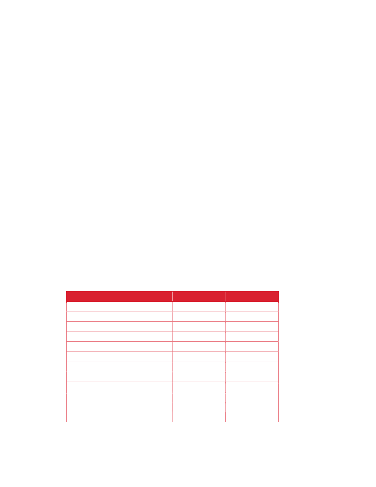
C8000W
For effective and predictable output from the Xerox® VersaLink® C8000W, designers need to carefully
consider and setup their document’s white areas so that the print result matches the designers intent, to either
print with white-toner as an underlay or to be transparent and show through the paper’s natural color.
On page 2 is an example of a document designed originally for white media, and what to look out for when
wanting to print that document onto a colored media. These sections highlight areas of focus for a designer to
make sure they achieve the desired effect with their prints for maximum impact.
Before changing a document to print on colored media, it is important for designers to understand each
element on their page and how they want it to appear on the finished print. For example, an element with a
hole in the middle could be designed so that if placed on colored media, the center allows media to show
through. Equally it could be designed so that white toner is put in the center meaning white would show
though.
CH E C K I NG PA P ER SH O W - TH RO U GH
An easy test for design elements on the document is to insert a rectangle covering the entire page area of
your document that matches the color of the paper layered behind other elements in your design. If an area in
a design element shows white, not the underlying paper-substitute rectangle, it will likely print with white toner.
If you want the colored media to show though, select that design element’s color and set it to 100%
transparent to let the paper-substitute show through. Be sure to delete this paper-substitute rectangle before
submitting your document for printing. E.g. the bagel on page 2.
FO R CI N G P AP E R SH O W- T HR O UG H
If you want to be certain that a specific area will show through the paper’s color, and not print with any toner,
use the “no-toner color” from the table provided below in a vector object. Fill that vector object with the “no
toner color” corresponding to your project’s planned paper’s color, make sure it doesn’t have a stroke around
the outside that’s a different color, and that area will not have any toner applied to it. Please note that no-toner
values only work in vector objects, not bitmaps. If you are printing on clear output media, you should use the
“Gray” no toner color.
CO R RE C T CO L OR DE F IN I TI ON
Be sure to convert any spot-colors or Pantone colors to their RGB or CMYK process-equivalents before
saving your document for printing depending on what your document uses. It is recommended to use RGB
colors instead of CMYK ones for better color output.
Table providing RGB, and CMYK values for paper color
Page 1
 Loading...