

Page 1
OKI C7000 Series and OKI C9000 Series
Colour Guide
Page 2

Preface
EEC compatibility
Every effort has been made to ensure that the
information in this document is complete, accurate, and
up-to-date. Oki assumes no responsibility for the results
of errors beyond its control. Oki also cannot guarantee
that changes in software and equipment made by other
manufacturers and referred to in this guide will not
affect the applicability of the information in it. Mention
of software products manufactured by other companies
does not necessarily constitute endorsement by Oki.
Copyright 2000 by Oki. All rights reserved.
Oki is a registered trademark of Oki Electric Industry
Company Ltd.
Energy Star is a trademark of the United States
Environmental Protection Agency.
Microsoft, MS-DOS and Windows are registered
trademarks of Microsoft Corporation.
This product complies with the
requirements of the Council
Directives 89/336/EEC (EMC) and
73/23/EEC (LVD), as amended
where applicable, on the
approximation of the laws of the
member states relating to
Electromagnetic Compatibility and
Low Voltage.
Energy Star
As an Energy Star Partner, Oki
has determined that this product
meets the Energy Star guidelines
for energy efficiency.
Universal Serial Bus
This printer is fitted with an
industry standard universal
serial bus (USB) data interface.
ii Colour Guide
Page 3

Table of contents
English
Preface . . . . . . . . . . . . . . . . . . . . . . . . . . . . . . . . . . ii
EEC compatibility. . . . . . . . . . . . . . . . . . . . . . . . . . ii
Energy Star . . . . . . . . . . . . . . . . . . . . . . . . . . . . . . . ii
Universal Serial Bus . . . . . . . . . . . . . . . . . . . . . . . . ii
Table of contents. . . . . . . . . . . . . . . . . . . . . . . . . . . iii
Colour Printing. . . . . . . . . . . . . . . . . . . . . . . . . . . . . . .1
Introduction. . . . . . . . . . . . . . . . . . . . . . . . . . . . . . . .1
Use of colour. . . . . . . . . . . . . . . . . . . . . . . . . . . . . . .2
Colour perception . . . . . . . . . . . . . . . . . . . . . . . . . . .4
Electromagnetic spectrum. . . . . . . . . . . . . . . . . . . . .5
Primary and secondary colours. . . . . . . . . . . . . . . . .6
Additive and subtractive primaries . . . . . . . . . . . . . .7
Additive primaries. . . . . . . . . . . . . . . . . . . . . . . .7
Subtractive primaries . . . . . . . . . . . . . . . . . . . . .8
Neutral colours . . . . . . . . . . . . . . . . . . . . . . . . . . . . .9
Colour complements. . . . . . . . . . . . . . . . . . . . . . . .10
Colour wheel. . . . . . . . . . . . . . . . . . . . . . . . . . . . . .11
Problems using colour . . . . . . . . . . . . . . . . . . . . . .12
Colour management systems . . . . . . . . . . . . . . . . .13
Specifying colour . . . . . . . . . . . . . . . . . . . . . . . . . .14
Printing colour . . . . . . . . . . . . . . . . . . . . . . . . . . . .16
Colour registration . . . . . . . . . . . . . . . . . . . . . . . . .17
Colour adjustments . . . . . . . . . . . . . . . . . . . . . . . . .18
OKI C7000/C9000 Printer Drivers . . . . . . . . . . . . . 19
Colour management. . . . . . . . . . . . . . . . . . . . . . . . 20
Windows and Macintosh PostScript driver . . . . . . 21
Windows colour matching . . . . . . . . . . . . . . . . 21
Image colour matching. . . . . . . . . . . . . . . . 21
Black finish. . . . . . . . . . . . . . . . . . . . . . . . . 21
Colour halftone. . . . . . . . . . . . . . . . . . . . . . 22
Image colour rendering style . . . . . . . . . . . 22
Macintosh colour matching . . . . . . . . . . . . . . . 22
Colour/greyscale. . . . . . . . . . . . . . . . . . . . . 22
Black and white . . . . . . . . . . . . . . . . . . . . . 22
ColorSync colour matching . . . . . . . . . . . . 23
PostScript colour matching. . . . . . . . . . . . . 23
Windows ICM . . . . . . . . . . . . . . . . . . . . . . . . . 23
No colour matching . . . . . . . . . . . . . . . . . . . . . 24
Print in greyscale . . . . . . . . . . . . . . . . . . . . . . . 24
Print colour separations . . . . . . . . . . . . . . . . . . 24
Windows PCL driver . . . . . . . . . . . . . . . . . . . . . . . 25
Auto colour. . . . . . . . . . . . . . . . . . . . . . . . . . . . 25
Manual colour . . . . . . . . . . . . . . . . . . . . . . . . . 25
Halftone type . . . . . . . . . . . . . . . . . . . . . . . 25
Colour setting . . . . . . . . . . . . . . . . . . . . . . . 26
Manual adjustment . . . . . . . . . . . . . . . . . . . 26
Print colour swatch . . . . . . . . . . . . . . . . . . . 26
Preface iii
Page 4

Monochrome . . . . . . . . . . . . . . . . . . . . . . . . . . 26
Quality . . . . . . . . . . . . . . . . . . . . . . . . . . . . . . . 27
Black finishing in photo printing . . . . . . . . 27
Monochrome dithering . . . . . . . . . . . . . . . . 27
Glossary . . . . . . . . . . . . . . . . . . . . . . . . . . . . . . . . . . . 29
Index . . . . . . . . . . . . . . . . . . . . . . . . . . . . . . . . . . . . . . 33
iv Colour Guide
Page 5

Colour Printing
Introduction
This Colour Guide has been conceived to provide you
with a broad overview of issues related to colour
printing, in order that the best use of colour be made in
the software applications used. The text is designed to
describe the technical issues in a manner that can be
understood by anyone involved in the preparation of
colour documents.
Please familiarise yourself with the user documentation
provided, which describes operational details of the
OKI printer setup and configuration for specific
options.
OKI are sure that you will find this colour printer an
excellent part of printing solution. If you have any
comments with regard to the content of this document,
then please let us know through your local OKI
representative.
English
Colour Printing 1
Page 6

Use of colour
Recent advances have brought colour to the desktop in
a way that could not have been imagined a decade ago.
It has been shown that using colour in print can increase
memory retention by up to 65% and readership by as
much as 40%, not to mention the added impact that it
provides. As colour becomes more and more accessible
it is essential to understand the importance of colour
and how best to use it.
People use colour for different reasons; it has become a
very important tool and is used widely in marketing to
grab attention and communicate ideas and, when used
effectively, can alter the viewer’s perception.
Colour can be used in text documents as well as for
graphics. It can be used to emphasise headings or
particular words which would otherwise be lost in the
vast array of black and white. Colour adds impetus to a
company logo and can be as important as the design
itself. The use of colour also makes a document easier
to comprehend and can convey information at a glance.
For example, using red to highlight negative figures in
a spreadsheet.
The use of colour should be considered an integral part
of any presentation or document and not added at the
end as an afterthought.
2 Colour Guide
Page 7
The following examples list some widely used colours
and their significance:
This is a very powerful and passionate colour.
The power and passion it portrays has made it
a favourite for many exotic sports cars.
Unlike red, green is a very calming and
‘natural’ colour. It signifies trees, grass and
plant life in general. It is soothing and perhaps
associated with a stroll in a field. As well as
the calming side of green, it is also the colour
of envy.
A cool and refreshing colour. It is the colour of
summer skies and a clear blue sea which
produces a calming effect. Dark blues are
associated with wealth and dignity and also
have names that suggest these virtues – Royal
blue, Navy blue, etc.
This is really an absence of colour and the
contrast that it provides with other colours has
made it one of the most widely used. Black is
usually associated with night and darkness
English
The colour of pure snow and in itself suggests
purity. It is used in hospitals to portray an air
of cleanliness and sterility. Like black, white
can be paired with most colours and is
therefore very popular.
In short, colours can be used effectively to send their
own message, regardless of the message that they are
supporting. The colours used within a message are seen
and automatically decoded before the message itself
has been read. This underlines the importance and
effectiveness of using colour.
Colour Printing 3
Page 8
Colour perception
Colour does not exist by itself but is dependent on the
presence of:
• a light source
• an object
•an observer
Our perception of colour involves light from a source
being reflected off, or transmitted through, an object
and entering the eye.
Light interacts with an object and what we see is the
final result of that interaction. An object can reflect,
transmit or emit light. A reflective object absorbs some
sections of the visible spectrum and reflects the rest.
What we see is the reflected portion. An object
removing wavelengths at the ultra violet end for
example, will appear red in hue. A transmissive object
allows light to pass through it and may absorb a section.
The colour of the object in this case will depend upon
the wavelengths of light that are allowed to pass
through. An emissive object emits light and the
appearance of the light will depend on the wavelengths
emitted. In short, the composition of the light and its
interaction with the object will define the colour we see.
4 Colour Guide
Page 9
1 micrometre= 1×10⁻⁶ metre
(0·001 mm)
1 nanometre= 1×10
-9
metre
(0·000001 mm)
1 picometre= 1×10
-12
metre
(0·000000001 mm)
1 femtometre= 1×10
-15
metre
(0·000000000001 mm)
Visible light spectrum
Electromagnetic spectrum
All colours we can see fall into what is the visible part
of the electromagnetic (EM) spectrum. The visible
portion of the EM spectrum is minute and although we
are ‘blind’ to the rest, the part we can see has a
significant effect on our perception of everything
around us.
If light containing all visible wavelengths in balanced
quantities is detected, then white light is seen. If there
is an absence of all wavelengths then black is
perceived. The infinite combination of different
wavelengths give rise to what we perceive as colour. So
colour is light.
When our eyes receive information containing a strong
content of a particular wavelength then we interpret that
as a colour. A strong content around 700 nm (0.0007
mm wavelength) is interpreted as red and at the other
end of the scale, 400 nm is interpreted as violet.
Visible light spectrum
English
Colour Printing 5
Page 10
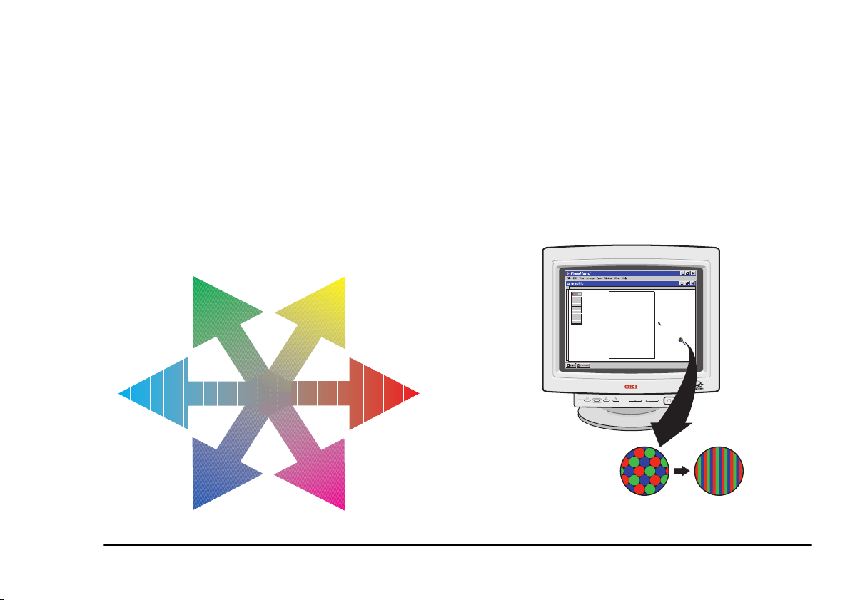
Primary and secondary colours
In theory, all colours can be made up from a very small
group of ‘colour elements’. There are three primary
colours, and all other colours can, in theory, be obtained
by mixing the primary colours in varying proportions.
Mixing two primary colours in equal proportions
produces what is known as a secondary colour.
PROCESS
DISPLAY
6 Colour Guide
Page 11
Additive and subtractive
standard dot display Trinitron™ display
primaries
Primary colours can be split into two categories which
are termed additive and subtractive. It is important to
note the difference between mixing additive primaries
and subtractive primaries. For example mixing red and
green inks will produce a ‘muddy’ brown, whilst red
and green light mixes to give yellow. So in which way
do the two models differ ?
GREEN YELLOW
CYAN
English
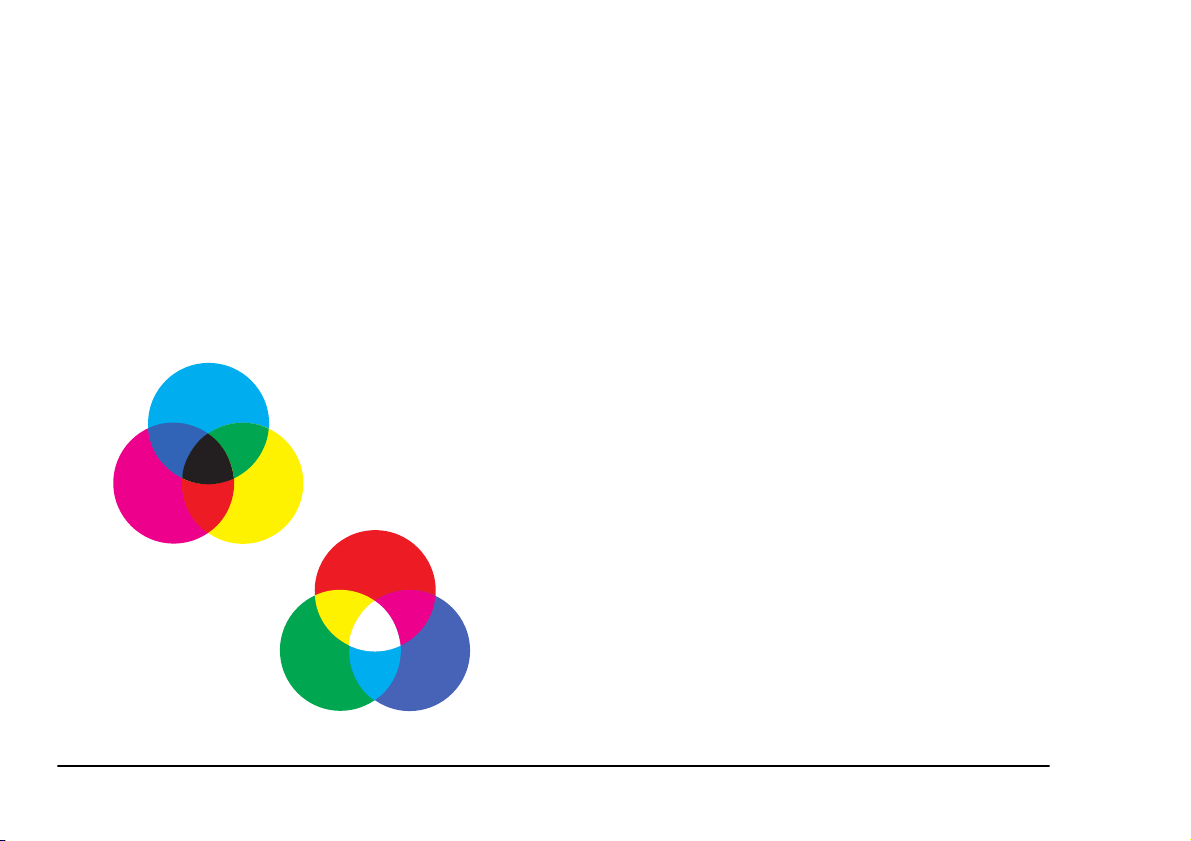
Additive primaries
Video technology such as computer monitors and
television screens use the additive model. The additive
primaries are Red, Green and Blue (RGB). Starting
from black (lack of colour) and adding red, green and
blue in equal quantities will generate shades of grey
with white being generated with full, balanced
intensities of all three. Mixing the three colours in
different quantities will generate intermediate colours.
RED
BLUE MAGENTA
Colour Printing 7
Page 12

Subtractive primaries
Cyan, Magenta and Yellow (CMY) are known as the
subtractive primaries and are commonly used in
printing processes. In this case we start with a white
background (usually paper) and add translucent inks of
cyan, magenta and yellow to subtract certain
wavelengths of light. For example, cyan ink on a page
appears to be this colour because the ink removes
components of red light and reflects green and blue,
which we perceive as cyan.
In theory, a combination of the three subtractive
primaries will produce black. In practice however,
pigments used in inks are not perfect and usually give
rise to a dark green/brown. For this reason, in many
colour output devices, a separate black ink is used to
produce greys and black (in shadows and black text for
example). This is the CMYK model and is the method
most widely used in the colour printing and printer
industry. The OKI C7000 Series and OKI C9000 Series
of printers use separate cartridges of cyan, magenta,
yellow and black toner to generate high definition
colour images for the workgroup or networked
environment.
Traditional CMYK print
8 Colour Guide
Page 13

Neutral colours
Although the term ‘colour’ is applied, neutral colours
do not have properties of hue or saturation. They are
described in terms of lightness only. The neutral
colours are black and white and all shades of grey in
between. A balanced mix of cyan, magenta and yellow
yields a neutral colour or black (in theory). The same
effect can be achieved with the additive primaries by
having an equal mix of red, green and blue light.
English
Colour Printing 9
Page 14

Colour complements
Complements are pairs of colours that combine to
produce a neutral colour. It can be seen from the above
that balanced quantities of all three primaries produce a
neutral. Mixing two primaries produces a secondary
colour. Mixing this secondary colour with the
remaining primary colour produces a neutral colour.
For example:
CYAN + MAGENTA + YELLOW = NEUTRAL
- red (magenta + yellow)+ cyan= NEUTRAL
- green (yellow + cyan)+ magenta= NEUTRAL
- blue (cyan + magenta)+ yellow= NEUTRAL
This relationship can be applied to all colours and is
shown in more detail in the following section.
10 Colour Guide
Page 15

Colour wheel
English
The relationship between colours can be best shown on
what is known as a colour wheel. The hue value of a
particular colour is expressed in degrees. Red for
example is at 0° and green and blue are located at 120°
and 240° respectively. The subtractive primaries,
yellow, cyan and magenta are located at mid points
between these.
The colour wheel shows the following relationships:
• the additive primaries are displaced by 120° from
each other.
• the subtractive primaries are displaced by 120°
from each other.
• each colour is a secondary colour of the two
colours either side of it. For example, mixing
equal quantities of yellow and magenta will
produce red.
• a colour is directly opposite its complement.
We can continue to mix neighbouring colours on the
colour wheel to produce further, intermediate colours.
The number of colours on the colour wheel now
doubles to twelve (as shown below). Repeating the
procedure a number of times produces a colour wheel
with subtle changes of hue from neighbour to
neighbour.
Colour Printing 11
Page 16

Problems using colour
As already explained, a computer monitor, where an
image is first viewed, and a printer, which produces the
final document, use different methods to generate
colours. Indeed they are based around a different set of
primaries (RGB for monitors, CMYK for printers).
Monitors do not generate a full range of perfect colours
and neither do printers. There is a limit on how many
colours a monitor or printer can generate. This is known
as a device’s colour gamut. Some colours can be
reproduced by both devices, while others can be
displayed on a monitor but cannot be printed or vice
versa. This in practice may lead to a colour print not
resembling the original on-screen image. So what has
happened?
Images (graphics and text) can be captured through
scans or digital photography, or input directly into the
PC via applications programs. However the original
image is obtained, it will be displayed and manipulated
in RGB colour space (on-screen) and finally converted
to CMYK for print. Each of these processes requires
data conversion/manipulation. An image seen on a
computer monitor relies on the monitor’s ability to
reproduce the image and represent colours within it.
Adjustments such as brightness, colour and contrast
also tailor the image to the preference of the viewer
rather than a display of true colour. The data sent to the
printer may not be adjusted to allow for imperfections
in the inks used.
12 Colour Guide
Page 17

Colour management systems
English
Colour management systems (CMS), such as those
found in the OKI C7000 Series and OKI C9000 Series
printer drivers, allow for any mismatches that may
occur between the RGB and CMYK conversion
process. Colour matching systems go a long way to
ensuring a better match between the input data and
printed result, but cannot always allow for monitor
adjustment or a variation in paper stock. Paper can
sometimes appear blue or cream in hue which will have
an effect on the light reflected from the page and
therefore change the appearance of some colours. The
texture of the paper used will affect the way that light is
scattered and may also result in patches of light or
dense colour. It is therefore best to find and adopt a
paper that provides you with the best results. This of
course may be a process of trial and error.
Although colour has its obvious benefits, it has also
created a whole new set of problems that need to be
dealt with:
• It is important not to go overboard and add dashes
of colour without thought as this will
undoubtedly have a negative effect on the whole
purpose of using colour.
• Using colours which are considered garish will
also affect the way in which your document or
presentation is perceived.
• The proximity of colours is also an important
factor and it is best to consider the result when
certain colours are paired.
To minimize any problems it is important to use colour
with pre-planning and a great deal of care. If specific
colours are of paramount importance (such as those in
a company logo) then it is best to print these colours
beforehand and note the composition that gives the
closest match to the required colour. Then use the
component amounts regardless of what is displayed on
the monitor.
Colour Printing 13
Page 18

Specifying colour
There are many different ways to specify colour and
there are many different models to cater for this. The
colour wheel, as already shown, is a two-dimensional
view of the HSL model which is based on Hue,
Saturation and Lightness as components for specifying
colour. The third dimension in this case is lightness and
describes the tendency towards black or white.
Commonly used models are:
•HSL
•HSB
•CMY(K)
•RGB
• CIE, CIELab, CIELuv
•YCC
Each of the models have their benefits and
disadvantages and are useful in particular situations.
Most applications will have support for the RGB model
which (along with CMYK) is perhaps the simplest to
use. This model is used to specify colours by varying
the proportions and levels of the red, green and blue
components.
The amount of red, green and blue present in a colour is
usually expressed as a number from 0 to 255. Less
HUE
commonly it may also be expressed as number between
0 and 65535 or as a percentage. Converting between the
systems is straight forward and a few examples are
given below:
Example:
To achieve a colour that is described as 100% red, 50%
Green and 40% blue…
255 Colour scale:
100/100× 255 = 255 red
50/100× 255 = 128 green
LIGHTNESS SATURATION
14 Colour Guide
40/100× 255 = 102 blue
Page 19

65535 Colour scale:
100/100× 65535 = 65535 red
50/100× 65535 = 32768 green
40/100× 65535 = 26214 blue
The printout from this set of numbers should produce a
colour close to the original. Due to the variation in
printer inks however, it may be necessary to make
minor adjustments until the right combination is found.
Once a colour match is obtained, the RGB components
should be entered regardless of the colours displayed
on-screen. To maintain colour consistency it is
recommended that OKI original consumables are used
as they are specifically manufactured for the OKI
C7000 Series and OKI C9000 Series of printers.
English
Colour Printing 15
Page 20

Printing colour
No matter how colours are specified, the printer is only
able to use a combination of three colours plus black to
generate an image on paper. To achieve this the printer
uses processes known as halftoning and dithering. Each
addressable picture element (pixel) on a monitor screen
or printed output contributes to what we see in the final
image. The pixels are placed in close proximity so the
eye is unable to resolve individual dots. Colours of
adjacent pixels appear to merge and produce a new
colour. Using dot patterns of a given set of colours to
generate new colours is known as dithering. Shades of
grey can be generated by using a similar technique of
black dot placement. This technique is known as
halftoning and gives rise to what we perceive as a
continuous tone image. Examples of dither and halftone
are shown below:
DITHER PATTERN
HALFTONE PATTERN
The entire printing area is split into sections known as
cells (much like a grid). The patterns within the cell are
then altered to obtain the required amount of greyscale.
An area of an image containing 50% grey will contain
cells that have half of the dots within the cell printed
with black and the other half left empty.
16 Colour Guide
Page 21

Colour registration
The CMYK printing process, as already stated, uses
overlapping inks of cyan, magenta and yellow. To
produce the best possible output, the colours must print
in specific positions so that overlaps and dithering are
accurate. If the colours are not aligned, the resulting
print will have colour shifts (colours produced where
incorrect colours overlap to produce an undesired
colour) or appear blurred. Using black to print grey and
also black in text eliminates the problem in these
instances but not when colour is constructed from two
or more of the process primaries. The illustration shows
how registration problems can cause undesired effects.
English
Colour Printing 17
Page 22

Colour adjustments
Certain images such as bitmaps, sometimes print with a
strong hint of a particular colour. Images that appear
fine when viewed on a monitor may not necessarily
print that way due to the reasons described previously.
The colour that appears to dominate the picture will
vary depending on factors such as the scanner (or other
input device) having a bias towards a particular colour,
or the monitor’s ability to represent certain colours onscreen. To compensate for this, OKI C7000 Series and
OKI C9000 Series of printers have a colour adjustment
system that can reduce the amount of any of the process
colours put on the page in relation to the others. The
printer drivers supplied with your printer provide these
adjustments, which are outlined in this manual and
explained in more detail in the driver’s on-line help.
(Click on the Help button in any driver dialog box.).
This is useful if, for example, you find that all of your
graphics have a tendency to contain too much blue. To
compensate for this, you could reduce the amount of
cyan or magenta as it is these two colours that combine
to produce blue. Bear in mind that other colours
containing cyan or magenta will also be affected. An
alternative would be to increase the amount of yellow.
This has the advantage of increasing colour saturation
while balancing the image.
Another method of decreasing strong colours is to
increase the lightness setting in the printer driver. To
compensate for this, the saturation setting must be
stepped down accordingly. As a rule, the saturation
should be stepped down an equal number of steps to the
level that the lightness has been stepped up.
18 Colour Guide
Page 23

OKI C7000/C9000 Printer Drivers
There are various features designed to allow you to
achieve the best results with your OKI C7000 Series
and OKI C9000 Series of printers. The colour options
within the printer driver provides a list of colour
matching techniques and adjustments which can be
applied to your graphics and text to provide the
optimum balance of colour on your document. The
options and adjustments that can be made are described
below for each of the different printer drivers. Clicking
on the properties button after a print request has been
made allows you to carry out colour adjustments before
printing the document.
English
OKI C7000/C9000 Printer Drivers 19
Page 24

Colour management
Colour management ensures the best rendition of
colours when an image or page is displayed on your
monitor and printed by your printer. In most cases,
colour management works automatically using colour
profiles that are installed when a printer or monitor is
installed. These colour profiles are used every time
colours are displayed or printed.
Users with specialised needs, such as graphic artists and
desktop publishers, can manually specify which colour
profile a printer or monitor uses, or which colour
profile is used for images or pages with special colour
reproduction requirements.
There are two settings for colour management and these
are as follows:
Automatic
colour profile to use from the list of associated colour
profiles stored on your computer. This is the
recommended setting for colour management.
Manual
colour profile to use from the list of associated colour
profiles for all output from the printer if you have
specialised needs for colour printing.
20 Colour Guide
- Windows automatically selects the best
- This allows you to manually select which
Page 25

Windows and Macintosh PostScript driver
Windows colour matching
Clicking on the Options button allows you to select the
settings for colour matching system built into the
printer.
Image colour matching
English
OKI Colour Matching
colour matching process using ASIC installed in a
printer. The colour matching process is applied when
OKI C7000/C9000 Printer Drivers 21
- This option carries out a
print data with RGB colour space used in general
applications is converted into CMYK colour space of a
printer.
PostScript Colour Matching
a colour matching process using the colour rendering
dictionary of Adobe PostScript.
Black finish
- This option generates black in the most
Auto
appropriate method for the document to be printed. This
is the default setting and is recommended for most print
jobs.
- This option generates black only with black
Matte
toner and is the best setting for graphics and texts. If the
- This option carries out
Page 26

dark part of a photograph is printed with a blackish
tone, then please use Auto or Glossy setting.
- With this setting black is composed of cyan,
Glossy
magenta, yellow and black toner giving a brownish and
glossy black, which is best for printing photographs.
Colour halftone
Device Best Dither
that focuses on expression (resolution) and is best used
for printing graphics and text.
Cluster Ordered Dither
dithering to give smooth gradation between colours and
is best used for printing photographs.
Image colour rendering style
- This setting matches colours using the most
Auto
appropriate method for the document being printed.
This is the default setting and is recommended for most
print jobs.
Perceptual
contrast. All colours are equally converted into colours
within the colour range of the printer.
Vivid
brightness. Colours outside the colour range of the
printer are converted into colours with close saturation
in the colour range.
22 Colour Guide
- This setting gives colours with more
- This setting gives colours with mode
- This setting carries out dithering
- This setting carries out
Macintosh colour matching
Colour/greyscale
The Colour/Greyscale setting enables the Adobe
PostScrip to send colour data to colour printers or
equivalent greyscale data to monochrome printers. The
Colour/Greyscale setting produces better black-andwhite output than the Black and White option, even on
monochrome printers and is the default setting.
Black and white
The Black and White setting limits printing to
monochrome only. Use this option if you want your
printed output identical to the output you can obtain
using the Apple LaserWriter 7.x printer driver with
black-and-white printers.
Page 27

ColorSync colour matching
The ColorSync Color Matching setting enables a
Macintosh computer to convert from one colour
representation to another (for example, from monitor
colour to printer colour) using colour rendering
dictionaries that reside on the Macintosh computer.
This setting requires a printer profile, which contains
information defining the colours that the printer can
represent. This setting is available only if the Apple
ColorSync software is installed.
Choose this setting if your Macintosh processor is
faster and more powerful than your printer because it
will improve overall color-printing performance.
PostScript colour matching
The PostScript Color Matching setting enables your
printer to convert from one colour representation to
another (for example, from monitor color to printer
color) using colour rendering dictionaries that either
reside on the printer or have been downloaded from the
computer to your printer. Use this option if your printer
is not colour calibrated and uses PostScript Level 3.
Windows ICM
Clicking on the Options button allows you to select the
settings for Windows image colour matching.
Host Image Colour Matching
matching is carried out by the computer and gives a
better printer performance. This is the default setting.
Download Image Colour Matching
matching is carried out by the printer which results in
better computer performance. The printer driver creates
colour rendering dictionaries and downloads them to
the printer before printing.
Printer Image Colour Matching
matching is carried out by the printer using colour
- All image colour
- Image colour
- Image colour
English
This setting requires you to select a printer profile,
which contains information defining the colours that
the printer can represent.
OKI C7000/C9000 Printer Drivers 23
Page 28

rendering dictionaries that have been previously
downloaded to the printer or are resident in the printer.
This setting is recommended when printing to file.
No colour matching
This setting does not carry out colour matching.
Choose this setting when you use the colour matching
system of the software application being used.
Print in greyscale
Prints in greyscale using the colour information to
produce the various shades of grey that are required.
Print colour separations
This setting can be used if a software application does
not support printing colour separations of cyan,
magenta, yellow and black.
24 Colour Guide
Page 29

Windows PCL driver
Auto colour
Using Auto Colour, the printer automatically adjusts to
the colours specified in the document and prints. This is
the optimal printing mode for colour and is the default
setting. For normal printing, it is recommend to use this
setting.
Manual colour
With Manual Colour, you can adjust each item of the
colour setting. This setting is recommended for users
who have lot of experience using colour. When using
manual colour settings, the printed colours can differ
greatly from the colours on the monitor screen.
Halftone type
Error Diffusion
spreads out any inaccuracies when representing a pixel
of colour with the surrounding pixels.
- A method of colour reduction that
English
OKI C7000/C9000 Printer Drivers 25
Page 30

- This setting carries out dithering to achieve
Photo
smooth tone that is required when printing photos.
Graphics/Text
an emphasis on form expression (resolution) that is
required when printing graphics and texts.
Colour setting
- Prints each photo, graphic and character in the
Auto
most suitable colours.
Natural
screen. Sometimes the printed colours do not match
those on the screen because colour characteristics
(brightness, saturation and contrast) of the monitor
cannot be recognized.
Natural Vivid
vividly as possible, i.e. colours are more saturated and
vibrant.
Unadjusted
data is sent directly to the printer. Printed colours may
not match those specified within the document.
Manual adjustment
Lightness
adjusted so that colours within it tend to appear closer
to black (negative adjustment or darker) or white
(positive adjustment or lighter).
- This setting carries out dithering with
- Makes the colours close to those seen on the
- Colours are printed as brightly and
- No colour adjustment is carried out and
- This allows the image brightness to be
Saturation
so that they appear dull (negative adjustment) or vivid
(positive adjustment).
Print colour swatch
Pressing this button allows the choice of printing out 4
pages or 12 pages of colour swatches from the printer.
These colour swatches are a range of colours and their
corresponding RGB (Red Green Blue) values. This
makes it possible to select a specific colour and see how
it will print from any application which allows you to
define colour using RGB values.
- This adjusts all colours within the image
Monochrome
All print data is sent as monochrome (black and white)
with colours being output as greyscale. Only the black
toner cartridge is used in this instance. The only manual
adjustments that can be made are as follows:
Lightness
adjusted so that greyscales within it tend to appear
closer to black (negative adjustment or darker) or white
(positive adjustment or lighter).
Contrast
within the image so that they appear dull (negative
adjustment) or vivid (positive adjustment).
- This allows the image brightness to be
- This adjusts the vividness of the greyscales
26 Colour Guide
Page 31

English
Quality
Two further options are available for colour printing
after clicking on the Quality tab in printer properties.
Composite black (CMYK)
composed of cyan, magenta, yellow and black toner
giving a brownish and glossy black. This setting is best
for printing the darker parts of photographs with a
- With this setting black is
slightly lighter tone.
Black finishing in photo printing
Monochrome dithering
True black
black toner (K) and is the best setting for graphics and
text. If the dark part of a photograph is printed with a
blackish tone, then please use composite black setting.
OKI C7000/C9000 Printer Drivers 27
- This option generates black only with
This option gives the choice of allowing the printer
driver or the software application to carry out dithering
when printing in monochrome.
Page 32

28 Colour Guide
Page 33

Glossary
English
Brightness
darkness of a colour and is usually measured as a
percentage from 0% (black) to 100% (white).
Cluster-dot screening
that uses multiple pixels that vary from small to larger
dots as the colour gets darker. It is characterized by a
polka-dot look.
Colour gamut
produce is known as its colour gamut. Devices are
unable to produce all colours that occur in nature so
their colour gamut is a subset of this.
Colour management system (CMS)
to communicate colour fidelity across devices such as
input, display and output to ensure that the best colour
rendition possible is given at all times.
Colour mapping
representation from one device (or system) to another.
Colour models
allows colours to be arranged or identified. There are
various models in existence, with some more suitable to
specific applications than others.
- Brightness is the relative lightness or
- This is a halftoning method
- The range of colours that a device can
- A system used
- This is the translation of colour
- A colour model is a system that
•
•
•
•
•
- Computer monitors for example, use red,
RGB
green and blue phosphors to display images and
colours are specified using the RGB model.
CMY(K)
the inks used in the four colour print process and
there is a model used to describe this. Due to the
imperfections in printing inks, black is added
rather than produced by mixing the other three
inks. Black is identified as ‘K’ to avoid confusion
with other colours such as blue.
HSL
lightness.
HSB
brightness. The dimensions are similar to the
HSL model but the HSB model is related to the
RGB system.
YCC
encoding colour images for display on video
monitors. RGB values are converted to a
luminance component (Y) and chromatic
components (C1) and (C2).
- Cyan, magenta, yellow and black are
- Colours are defined by hue, saturation and
- Colours are defined by hue, saturation and
- This system was developed by Kodak for
Glossary 29
Page 34

•
- In 1931 the Commission Internationale de
CIE
l’Eclairage (CIE) devised a colour system based
on the human visual system and is an accepted
standard. This system is not linear and difficult to
interpret. There have been modifications to the
system that have given rise to CIELab and
CIELuv.
Colour separations
- Each of the process colours are
printed separately and must therefore be specified
individually, as the colour is needed. Image data is
therefore split into the primary colours (plus spot
colours) before printing.
Colour space
- This is a method of describing colour.
Some systems are device-dependent such as RGB and
CMYK. The CIE system is a device independent colour
space. Note that all colour models are not colour spaces
in their own right.
Colourants
- These are the colours used by a device to
reproduce colour. A printing press uses the CMYK
colourants.
Density
- In this context, there is no relation to the mass
and volume of the object, but is the ability of the object
to absorb light. The more light absorbed, the higher the
object density.
Dithering
- A technique where pixels of different
colours are placed in close proximity to give the illusion
of another colour as perceived by the human visual
system.
Dot gain
- During the printing process, inks may spread
causing dots on a page to print larger than intended.
This results in darker tones and colours. The problem
can be compensated for by careful adjustment.
Error diffusion
- This is usually associated with
halftoning but can also be used with dither. The error
between a pixel and its intended value is propagated to
adjacent pixels to produce a balanced overall effect.
Results may sometimes appear grainy.
Greyscale
- Differing shades of grey ranging from
black to white. Eight bits of data will produce 256
shades of grey.
Halftoning
- A printed image is composed of dots (or
pixels). The spacing of these pixels can give the illusion
of shades or tone. Increasing the spacing of dots
lightens the shade so that it tends towards white (colour
of the page).
Highlight
- This is the lightest part of an image. In the
extreme, this would be white.
- Hue is the colour reflected from or transmitted
Hue
throough an object. It is measured as a location on the
30 Colour Guide
Page 35

standard colour wheel, expressed as a degree between
o
0
to 360o. In common use, hue is identified by the
name of the colour such as red, green, orange, etc.
Indexed colour
- Colour pixels are represented by 8bits. This gives the possibility of 256 colours which are
contained in a lookup table.
Lightness
- This describes the intensity of a colour and
determines whether a colour is closer to black or white.
Moiré pattern
- This is an undesirable pattern that
occurs due to pixel (or) dot placement. The eye is able
to pick up repetitive patterns that exist within an image.
These can be eliminated during print by careful
selection of screen angles.
- This is the smallest addressable dot or PICture
Pixel
ELement. This has been abbreviated as PIXEL rather
than PICEL.
Primary colour
- All colours can be produced by
mixing a limited set of colours. There are two different
sets of primary colours associated with the video and
printing industries:
•
Additive primaries
- Red, Green and Blue
(RGB) are the additive primaries and the basis for
forming other colours in displays such as
computer monitors or television.
English
•
Subtractive primaries
- Cyan, Magenta and
Yellow (CMY) are the subtractive primaries and
are the basis for inks used in colour printing.
Colour is produced because inks are designed to
absorb certain wavelengths of light and transmit
others.
Registration
- This describes the alignment of the
various colours when printing. As each of the process
primaries are specified by their own plate and printed
individually, it is important that the ink is placed in
precise locations or colours will not align to produce the
desired result.
Saturation
- Saturation, sometimes called chroma, is
the strength or purity of the colour. It represents the
amount of grey in proportion to the hue and is measured
as a percentage from 0% (grey) to 100% (fully
saturated). On the standard colour wheel, saturation
increases from the centre to the edge.
Secondary colour
- Mixing two primary colours in
equal amounts will produce a secondary colour.
Spot colour
- These are additional colours used in
printing that are not a part of the process ink set and
specified individually. These colours are required when
the end result is of paramount importance (such as
within a corporate logo) as there is a substantial
increase in cost. A separate plate is also required.
Glossary 31
Page 36

32 Colour Guide
Page 37

Index
English
A
Additive primaries . . . . . . . . . . . . . . . . . . . . . . . . . 7, 31
Adjustments of colours. . . . . . . . . . . . . . . . . . . . . . . . .18
Auto colour. . . . . . . . . . . . . . . . . . . . . . . . . . . . . . . . . .25
B
Black and white . . . . . . . . . . . . . . . . . . . . . . . . . . . . . .22
Black finish. . . . . . . . . . . . . . . . . . . . . . . . . . . . . . . . . .21
Brightness. . . . . . . . . . . . . . . . . . . . . . . . . . . . . . . . . . .29
C
CIE . . . . . . . . . . . . . . . . . . . . . . . . . . . . . . . . . . . . 14, 30
Cluster dot screening . . . . . . . . . . . . . . . . . . . . . . . . . .29
CMY(K) . . . . . . . . . . . . . . . . . . . . . . . . . . . . . . . . 14
ColorSync. . . . . . . . . . . . . . . . . . . . . . . . . . . . . . . . . . .23
Colour gamut . . . . . . . . . . . . . . . . . . . . . . . . . . . . . . . .29
Colour management . . . . . . . . . . . . . . . . . . . . . . . . . . .20
Colour management systems . . . . . . . . . . . . . . . . 13
Colour mapping . . . . . . . . . . . . . . . . . . . . . . . . . . . . . .29
Index 33
29
,
29
,
Colour matching
ColorSync. . . . . . . . . . . . . . . . . . . . . . . . . . . . . . . 23
Macintosh . . . . . . . . . . . . . . . . . . . . . . . . . . . . . . . 22
PostScript . . . . . . . . . . . . . . . . . . . . . . . . . . . . . . . 23
Windows. . . . . . . . . . . . . . . . . . . . . . . . . . . . . . . . 21
Colour models . . . . . . . . . . . . . . . . . . . . . . . . . . . . . . . 29
Colour separations . . . . . . . . . . . . . . . . . . . . . . . . .24
Colour setting . . . . . . . . . . . . . . . . . . . . . . . . . . . . . . . 26
Colour space . . . . . . . . . . . . . . . . . . . . . . . . . . . . . . . . 30
Colour swatch . . . . . . . . . . . . . . . . . . . . . . . . . . . . . . . 26
Colour wheels . . . . . . . . . . . . . . . . . . . . . . . . . . . . . . . 11
Colourants . . . . . . . . . . . . . . . . . . . . . . . . . . . . . . . . . . 30
Colours
Adjustments . . . . . . . . . . . . . . . . . . . . . . . . . . . . . 18
Complements . . . . . . . . . . . . . . . . . . . . . . . . . . . . 10
Models . . . . . . . . . . . . . . . . . . . . . . . . . . . . . . . . . 14
Neutral . . . . . . . . . . . . . . . . . . . . . . . . . . . . . . . . . . 9
Perception. . . . . . . . . . . . . . . . . . . . . . . . . . . . . . . . 4
Primary and secondary . . . . . . . . . . . . . . . . . . . . . . 6
Printing . . . . . . . . . . . . . . . . . . . . . . . . . . . . . . . . . 16
Problems using . . . . . . . . . . . . . . . . . . . . . . . . . . . 12
Registration . . . . . . . . . . . . . . . . . . . . . . . . . . . . . 17
30
,
Page 38

Significance and effectiveness . . . . . . . . . . . . . . . . 3
Specifying. . . . . . . . . . . . . . . . . . . . . . . . . . . . . . . 14
Using . . . . . . . . . . . . . . . . . . . . . . . . . . . . . . . . . . . 2
Composite black . . . . . . . . . . . . . . . . . . . . . . . . . . . . . 27
Contrast . . . . . . . . . . . . . . . . . . . . . . . . . . . . . . . . . . . . 26
D
Density. . . . . . . . . . . . . . . . . . . . . . . . . . . . . . . . . . . . . 30
Dithering . . . . . . . . . . . . . . . . . . . . . . . . . . . . . . . . . . . 30
Dot gain . . . . . . . . . . . . . . . . . . . . . . . . . . . . . . . . . . . . 30
E
Electromagnetic spectrum . . . . . . . . . . . . . . . . . . . . . . . 5
Error diffusion . . . . . . . . . . . . . . . . . . . . . . . . . . . . 25
30
,
G
Greyscale . . . . . . . . . . . . . . . . . . . . . . . . . . . . . . . . 22, 30
H
Halftone . . . . . . . . . . . . . . . . . . . . . . . . . . . . . . . . . . . . 22
Halftoning . . . . . . . . . . . . . . . . . . . . . . . . . . . . . . . . . . 30
Highlight . . . . . . . . . . . . . . . . . . . . . . . . . . . . . . . . . . . 30
HSB . . . . . . . . . . . . . . . . . . . . . . . . . . . . . . . . . . . . 14
HSL . . . . . . . . . . . . . . . . . . . . . . . . . . . . . . . . . . . . 14
Hue . . . . . . . . . . . . . . . . . . . . . . . . . . . . . . . . . . . . . . . 30
29
,
29
,
I
Image colour matching. . . . . . . . . . . . . . . . . . . . . . . . .21
Image rendering styles . . . . . . . . . . . . . . . . . . . . . . . . .22
Indexed colour . . . . . . . . . . . . . . . . . . . . . . . . . . . . . . .31
L
Lightness. . . . . . . . . . . . . . . . . . . . . . . . . . . . . . . . 26, 31
M
Macintosh colour matching . . . . . . . . . . . . . . . . . . . . .22
Manual adjustments . . . . . . . . . . . . . . . . . . . . . . . . . . .26
Manual colour. . . . . . . . . . . . . . . . . . . . . . . . . . . . . . . .25
Models of colour. . . . . . . . . . . . . . . . . . . . . . . . . . . . . .14
Moiré pattern . . . . . . . . . . . . . . . . . . . . . . . . . . . . . . . .31
Monochrome. . . . . . . . . . . . . . . . . . . . . . . . . . . . . . . . .26
N
Neutral colours . . . . . . . . . . . . . . . . . . . . . . . . . . . . . . . .9
P
Perception of colour . . . . . . . . . . . . . . . . . . . . . . . . . . . .4
Pixel . . . . . . . . . . . . . . . . . . . . . . . . . . . . . . . . . . . . . . .31
Primary colours. . . . . . . . . . . . . . . . . . . . . . . . . . . . 6
Additive . . . . . . . . . . . . . . . . . . . . . . . . . . . . . . . . . .7
Subtractive. . . . . . . . . . . . . . . . . . . . . . . . . . . . . . . .8
31
,
34 Colour Guide
Page 39

Printer drivers . . . . . . . . . . . . . . . . . . . . . . . . . . . . . . . .19
Colour management . . . . . . . . . . . . . . . . . . . . . . .20
Colour matching . . . . . . . . . . . . . . . . . . . . . . . . . .22
Colour separations. . . . . . . . . . . . . . . . . . . . . . . . .24
Greyscale. . . . . . . . . . . . . . . . . . . . . . . . . . . . . . . .24
Macintosh . . . . . . . . . . . . . . . . . . . . . . . . . . . . . . .22
No colour matching. . . . . . . . . . . . . . . . . . . . . . . .24
Windows colour matching . . . . . . . . . . . . . . . . . .21
Windows PCL . . . . . . . . . . . . . . . . . . . . . . . . . . . .25
Windows PostScript . . . . . . . . . . . . . . . . . . . . . . .21
Printing colour . . . . . . . . . . . . . . . . . . . . . . . . . . . . . . .16
Problems . . . . . . . . . . . . . . . . . . . . . . . . . . . . . . . . . . . .12
R
Registration. . . . . . . . . . . . . . . . . . . . . . . . . . . . . . . . . .31
Registration of colours . . . . . . . . . . . . . . . . . . . . . . . . .17
RGB . . . . . . . . . . . . . . . . . . . . . . . . . . . . . . . . . . . 14
29
,
S
Saturation . . . . . . . . . . . . . . . . . . . . . . . . . . . . . . . . . . .31
Secondary colours . . . . . . . . . . . . . . . . . . . . . . . . . 6
Specifying colours . . . . . . . . . . . . . . . . . . . . . . . . . . . .14
Spot colour . . . . . . . . . . . . . . . . . . . . . . . . . . . . . . . . . .31
Subtractive primaries . . . . . . . . . . . . . . . . . . . . . . . 8
31
,
31
,
English
T
True black . . . . . . . . . . . . . . . . . . . . . . . . . . . . . . . . . . 27
W
Windows colour matching. . . . . . . . . . . . . . . . . . . . . . 21
Windows image color matching . . . . . . . . . . . . . . . . . 23
Y
YCC . . . . . . . . . . . . . . . . . . . . . . . . . . . . . . . . . . . . 14, 29
Index 35
Page 40

OKI SYSTEMS COMPANIES
Oki Systems (UK) Ltd
550 Dundee Road, Slough Trading Estate
Slough, Berkshire SL1 4LE
UNITED KINGDOM
Tel: +44 (0) 1753 819 819
Fax: +44 (0) 1753 819 899
http://www.oki.co.uk
Oki Systems (Ireland) Limited
The Square Industrial Complex
Tallaght, Dublin 24
EIRE
Tel: +353 (01) 459 8666
Fax: +353 (01) 459 8840
http://www.oki.ie
Hawthorn Business Centre
Adelaide Industrial Estate
Falcon Road, Belfast BT12 6HP
NORTHERN IRELAND
Tel: +44 (028) 9057 2355
Fax: +44 (028) 9057 2350
http://www.oki.ie
Oki Data Corporation
4-11-22, Shibaura, Minato-ku, Tokyo 108-8551
JAPAN
Tel: +81 (0) 3 5445 6111
Fax: +81 (0) 3 5445 6182
Oki Electronics (Hong Kong) Ltd
Suite 1901-9, Tower 3, China Hong Kong City
33 Canton Road, Tsim Sha Tsui, Kowloon
HONG KONG
Tel: +852 2736 2336
Fax: +852 2736 2395
Oki Electronics (Singapore) Pte Ltd
78 Shenton Way, #09-01
SINGAPORE 079120
Tel: +65 221 3722
Fax: +65 221 9282
Oki Systems (Thailand) Ltd
956 UdomVidhya Building 6th Floor, Rama IV Road
Silom, Bangrak, Bangkok 10500
THAILAND
Tel: +662 636 2535
Fax: +662 636 2536
36 Colour Guide
 Loading...