

Page 1
Quick View Display
User experience
for small spaces
Page 2
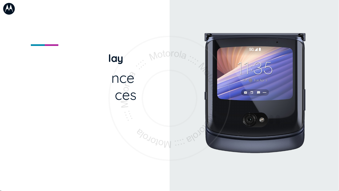
The goal of the Quick View
Display is to surface simple
information, tools, and actions
that don’t require the user to
flip open their device.
When the flip is closed...
Users want to receive incoming information
and easily decide if they want to engage
deeper by opening their phone. For
example, users may want to
pause/play/skip media when closed, but
crafting a playlist is not necessary ideal for
this state.
On a small screen...
Complex experiences can be dicult at this
size, as a user’s thumb may take up roughly
⅓ of the screen height. Elements may need
to be removed or redistributed to be
eective at this size.
Page 3
Optimizing use cases
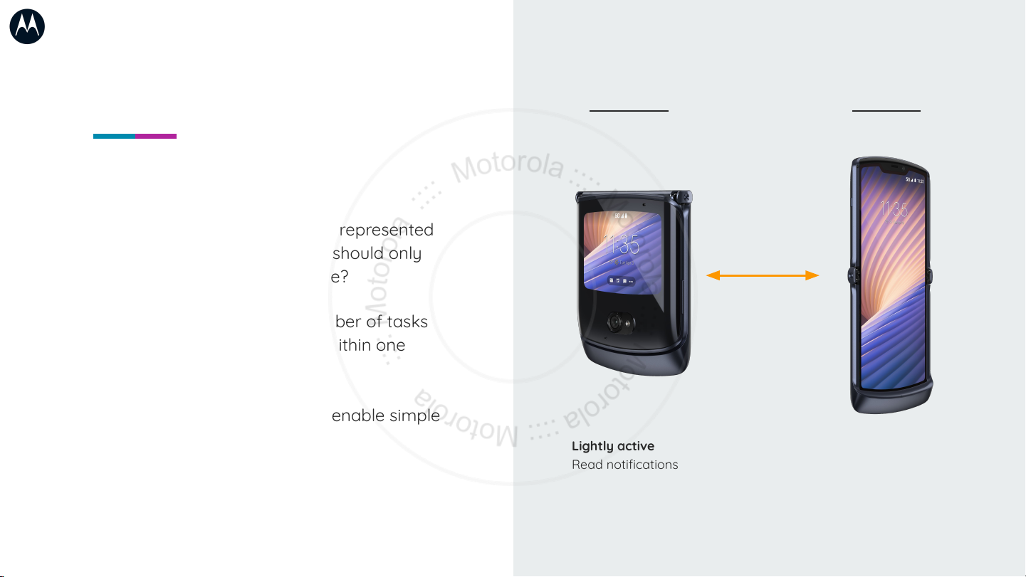
Does the entire app need to be represented
on the Quick View Display? Or should only
targeted use cases be available?
Is it possible to reduce the number of tasks
the user needs to accomplish within one
view?
Try to highlight use cases that enable simple
actionable tasks.
Flip closed Flip open
Lightly active
Read notifications
Start/stop music
See heads up navigation
Watch a video clip
Heavily active
Draft an email
Create a to-do list
Search map routes
Watch a movie
Page 4

Aording easy touch targets &
reducing complexity are critical
usability considerations
● No overlapping buttons/containers
● Access to menus/primary states
● Text readability & legibility
● UI should fill the whole screen
● User should be able to easily
accomplish the app’s main goal
Page 5

Display size
355 x 266
Key aordances
1 - Status bar
2 - Navigation bar
3 - Back gesture
Primary interaction space*
307x218dp
24dp
24dp
Display frame
355x266px
24dp 24dp
3 3
1
Recommended
aordances
2
Ideal target size
Area - 48x48 dp
Spacing - 8dp
*Unless app runs in immersive mode
307dp
Interaction space
218dp
Page 6

Optimizing for the display
Leverage breakpoints in the UI
to preserve the usability of the
experience when viewed on a
small display.
Breathing room
Instead of shrinking to fit, aspects may need to
be redistributed to preserve touch targets and
ensure legibility.
Space to move
Scrolling within a small space can be dicult,
especially if footers and headers reduce the
usable space. Consider collapsible elements to
optimize as much space as possible.
Bite sized
Too much visual stimulus can make the
small space feel chaotic and overwhelming.
1 or 2 use cases at a time will be easier to
complete within the small space.
Reference Smart Watch design
Smartwatch experiences are an ideal case
study for small display design—simplified
layouts, simplified tasks, and working within
screen size constraints.
Page 7

Case study: Example 1
When redesigning the dialer for
the Quick View Display, it was
important to identify the most
important actions and ensure
they were presented well to
the user.
Feature importance
Prioritize core features and interactions to be
presented to the user.
Stacking & layering
In order to allow important elements to fit, some UI
elements are rearranged, grids are adjusted, or
hierarchy is changed. The priority is on preserving
usability and touch target aordances.
Think beyond static layouts
Consider making some elements persistent, and
some dynamic. While tools should not be dicult to
find, reducing the clutter will make the space feel
easier to interact with.
Main display UI translated to external display
The primary interactions are persistent,
secondary interactions hide/reveal on tap
Page 8

Case study: Example 2
Feature importance
As seen in the previous example, core features
are simplified and just the most important
aspects are visualized.
Stacking & layering
In both feature examples, page layouts are
oriented in landscape rather than portrait to
optimize space.
Think beyond static layouts
Not all of the features appear at once, layers
or aordances are available to allow the user
to move through the information they need
without overburdening the space available.
Main display
UI translated to external display
Search results populate as a number is
typed, users can tap to view more
contacts
Page 9

Thank you!
Additional resources
Get your apps ready for foldables
https://developer.android.com/guide/topics/ui/foldables
 Loading...