


Color Guide
DOCUCOLOR 40 CP


Copyright © 1998 Electronics for Imaging, Inc. All rights reserved.
This publication is protected by copyright, and all rights are reserved. No part of it may be reproduced or transmitted in any form or by any means for any purpose
without express prior written consent from Electronics for Imaging, Inc., except as expressly permitted herein. I nformation in this document is subject to change
without notice and does not represent a commitment on the part of Electronics for Imaging, Inc.
The software described in this publication is furnished under license and may only be used or copied in accordance with the terms of such license.
Patents: 5,666,436; 5,553,200; 5,543,940; 5,537,516; 5,517,334; 5,506,946;5,424,754; 5,343,311; 5,212,546; 4,941,038; 4,837,722; 4,500,919
Trademarks
EFI, the EFI logo, Fiery , the Fiery logo, EFICOLOR, and Rip-While-P rint are trademarks registered in the U.S. P atent and Trademark Office. F iery ZX, Fiery X2,
Command Wor kStation, AutoCal, Starr Compression, Memory M ultiplier, ColorWise, NetWise, and V isualCal ar e trademarks of E lectronics for I maging, I nc.
DocuColor and all Xerox product names mentioned in this publication are trademarks of the XEROX CORPORATION.
Adobe, the Adobe logo, Adobe Illustrator , P ostScript, Adobe P hotoshop, Adobe S eparator , and A dobe P ageMaker are trademarks of A dobe Systems Incorporated,
registered in certain jurisdictions. EPS (Encapsulated PostScript) is a trademark of Altsys Corporation. Apple, the A pple logo, AppleS hare, A ppleTalk, E therTalk,
LaserWriter, and Macintosh are registered trademarks, and MultiFinder is a trademark of Apple Computer, Inc. Microsoft, MS, MS-DOS, and Windows are
registered trademarks of Microsoft in the US and other countries. QuarkXPress is a registered trademark of Quark, Inc. Times, Helvetica, and Palatino are
trademarks of Linotype AG and/or its subsidiaries. ITC Avant Garde, ITC Bookman, ITC Zapf Chancery, and ITC Zapf Dingbats are registered trademarks of
International Typeface Corporation. Ethernet is a registered trademark of Xerox Corporation. Farallon, PhoneNET PC, and PhoneNET Talk are trademarks of
Farallon Computing, Inc. COPS and COPSTalk are trademarks of CoOperative Printing Solutions, Inc. NetWare and Novell are registered trademarks and
Internetwork Packet Exchange (IPX) is a trademark of N o vell, Inc. SyQ uest is a registered trademark, in the U nited S tates and certain other countries, of SyQuest
Technology , Inc. UNIX is a registered trademark of UNIX System Laboratories, a wholly owned subsidiary of Novell, Inc. PANTONE is a registered trademark
of Pantone, Inc.
All other terms and product names may be trademarks or registered trademarks of their respective owners, and are hereby acknowledged.
Legal Notices
APPLE COMPUTER, INC. (“APPLE”) MAKES NO WARRANTIES, EXPRESS OR IMPLIED, INCLUDING WITHOUT LIMITATION THE
IMPLIED WARRANTIES OF MERCHANTABILITY AND FITNESS FOR A PARTICULAR PURPOSE, REGARDING THE APPLE SOFTWARE.
APPLE DOES NOT WARRANT, GUARANTEE, OR MAKE ANY REPRESENTATIONS REGARDING THE USE OR THE RESULTS OF THE USE
OF THE APPLE SOFTWARE IN TERMS OF ITS C ORRECTNESS, ACCURA CY, RELIABILITY , CURRENTNESS, OR OTHERWISE. THE ENTIRE
RISK AS TO THE RESULTS AND PERFORMANCE OF THE APPLE SOFTWARE IS ASSUMED BY YOU. THE EXCLUSION OF IMPLIED
WARRANTIES IS NOT PERMITTED BY SOME STATES. THE ABOVE EXCLUSION MAY NOT APPLY TO YOU.
IN NO EVENT WILL APPLE, ITS DIRECTORS, OFFICERS, EMPLOYEES OR AGENTS BE LIABLE TO YOU FOR ANY CONSEQUENTIAL,
INCIDENTAL OR INDIRECT DAMA GES (INCLUDING DAMA GES FOR LOSS OF BUSINESS PR OFITS, BUSINESS INTERRUPTION, L OSS OF
BUSINESS INFORMATION, AND THE LIKE) ARISING OUT OF THE USE OR INABILITY TO USE THE APPLE SOFTWARE EVEN IF APPLE
HAS BEEN ADVISED OF THE POSSIBILITY OF SUCH DAMAGES. BECAUSE SOME STATES DO NOT ALLOW THE EXCLUSION OR
LIMITATION OF LIABILITY FOR CONSEQUENTIAL OR INCIDENTAL DAMAGES, THE ABOVE LIMITATIONS MAY NOT APPLY TO YOU.
Apple’s liability to you for actual damages from any cause whatsoever, and regardless of the form of the action (whether in contract, tort [including negligence],
product liability or otherwise), will be limited to $50.
Restricted Rights Legends
For defense agencies: Restricted Rights Legend. Use, reproduction, or disclosure is subject to restrictions set forth in subparagraph (c)(1)(ii) of the Rights in
Technical Data and Computer Software clause at 252.227.7013.
For civilian agencies: Restricted Rights Legend. Use, reproduction, or disclosure is subject to restrictions set forth in subparagraph (a) through (d) of the
commercial Computer Software Restricted Rights clause at 52.227-19 and the limitations set forth in Electronics for Imaging, Inc.’s standard commercial
agreement for this software. Unpublished rights reserved under the copyright laws of the United States.
Printed in the United States of America on recycled paper.
Part Number:
n/a

CE Mark
The CE marking applied to this product symbolises Rank Xerox’s declaration of conformity with the following applicable directives of the European Union as of
the dates indicated.
January 1, 1996—Council Directive 70/80/CCO amended by Council Directive 93/68/EEO. Approximation of the laws of the member states related to low
voltage equipment.
January 1, 1996—Council Directive 59/336/EEC. Approximation of the laws of the member states related to electromagnetic compatibility.
A full declaration defining the relevant directives and referenced standards can be obtained from your Rank Xerox representative.
W ARNING: In or der to allow this equipment to operate in proximity to industrial, scientific, and M edical (ISM) equipment, the external radiation fr om
ISM equipment may have to be limited or special migration measures taken.
WARNING: This is a Class A product. In a domestic environment this product may cause radio interference, in which case the user may be required to
take adequate measures.
FCC Information
WARNING: FCC Regulations state that any unauthorized changes or modifications to this equipment not expressly approved by the manufacturer could void
the user’s authority to operate this equipment.
NOTE: This equipment has been tested and found to comply with the limits for a Class A digital device, pursuant to Part 15 of the FCC Rules. These limits are
designed to provide reasonable protection against harmful interference when the equipment is operated in a commercial environment. This equipment generates,
and uses, and can radiate radio frequency energy and, if not installed and used in accordance with the instruction manual, may cause harmful interference to radio
communications. Operation of this equipment in a residential area is likely to cause interference in which case the user will be required to correct the interference
at his own expense.
Industry Canada Class A Notice
This digital apparatus does not exceed the Class A limits for radio noise emissions from digital apparatus as set out in the interference-causing equipment standard
entitled, “Digital Apparatus” ICES-003 from Industry Canada.
Avis de Conformation Classe A de l’Industrie Canada
Le présent appareil numérique n’émet pas de bruits radioélectriques dépassant les limites applicables aux appareils numériques de la Classe A prescrites dans la
norme sur le matériel brouilleur, “Appareils Numériques” NMB-003 édictée par l’Industrie Canada.
Certificate by Manufacturer/Importer
This is to certify that the FC07 is shielded against radio interference in accordance with the provisions of VFG 243/1991. The G erman Postal Services have been
advised that this device is being put on the market and that they have been given the right to inspect the series for compliance with the regulations.
Bescheinigung des Herstellers/Importeurs
Heirmit wird bescheinigt, daß der FC07 im Übereinstimmung mit den Bestimmungen der VFG 243/1991 Funk-Entstort ist. Der D eutschen Bundespost wurde
das Inverkehrbringen dieses Gerätes angezeigt und die Berechtigung zur Überprüfung der Serie auf Einhaltung der Bestimmungen eingeraumt.
Electronics for Imaging, Inc.
RFI Compliance Notice
This equipment has been tested concerning compliance with the relevant RFI protection requirements both individually and on system level (to simulate normal
operation conditions). However, it is possible that these RFI Requirements are not met under certain unfavorable conditions in other installations. It is the user
who is responsible for compliance of his particular installation.
Dieses Geraet wurde einzeln sowohl als auch in einer Anlage, die einen normalen Anwendungsfall nachbildet, auf die Einhaltung der Funk-entstoerbestimmungen
geprueft. Es ist jedoch moeglich, dass die Funk-enstoerbestimmungen unter unguenstigen Umstaenden bei anderen Geraetekombinationen nicht eingehalten
werden. Fuer die Einhaltung der Funk-entstoerbestimmungen seigner gesamten Anlage, in der dieses Geraet betrieben wird, ist der Betreiber verantwortlich.
Compliance with applicable regulations depends on the use of shielded cables. It is the user who is responsible for procuring the appropriate cables.

Einhaltung mit betreffenden Bestimmungen kommt darauf an, dass geschirmte Ausfuhrungen gebraucht werden. Fuer die beschaffung richtiger Ausfuhrungen
ist der Betreiber verantwortlich.
Software License Agreement
Electronics for Imaging, Inc. grants to you a non-exclusive, non-transferable license to use the software and accompanying documentation (“Softwar e”) included
with the DocuColor 40 CP you have purchased, including without limitation the PostScript® software provided by Adobe Systems Incorporated.
You may:
a. use the Software solely for your own customary business purposes and solely with DocuColor 40 CP;
b. use the digitally-encoded machine-readable outline and bitmap programs (“Font Programs”) provided with DocuColor 40 CP in a special encrypted format
(“Coded Font Programs ”) to r eproduce and display designs, styles, weights, and versions of letters, numerals, characters and symbols (“Typefaces ”) solely for y our
own customary business purposes on the display window of the DocuColor 40 CP or monitor used with DocuColor 40 CP;
c. use the trademarks used by Electronics for Imaging to identify the Coded Font Programs and Typefaces reproduced therefrom (“Trademarks”); and
d. assign your rights under this Agreement to a transferee of all of your right, title and interest in and to DocuColor 40 CP provided the transferee agrees to be
bound by all of the terms and conditions of this Agreement.
You may not:
a. make use of the Software, directly or indirectly, to print bitmap images with print resolutions of 600 dots per inch or greater, or to generate fonts or typefaces
for use other than with DocuColor 40 CP;
b. make or have made, or permit to be made, any copies of the Software, Coded Font Programs, accompanying documentation or portions thereof, except as
necessary for use with the DocuColor 40 CP unit purchased by you; provided, however, that under no circumstances may you make or have made, or permit to
be made, any copies of that certain portion of the Software which has been included on the DocuColor 40 CP hard disk drive. You may not copy the
documentation;
c. attempt to alter, disassemble, decrypt or reverse engineer the Software, Coded Font Programs or accompanying documentation.
d. rent or lease the Software.
Proprietary Rights
You acknowledge that the Software, Coded Font Programs, Typefaces, Trademarks and accompanying documentation are proprietary to Electronics for Imaging
and its suppliers and that title and other intellectual property rights therein remain with Electronics for Imaging and its suppliers. Except as stated above, this
Agreement does not grant you any right to patents, copyrights, trade secrets, trademarks (whether registered or unregistered), or any other rights, franchises or
licenses in respect of the Software, Coded Font Programs, Typefaces, Trademarks or accompanying documentation. You may not adapt or use any trademark or
trade name which is likely to be similar to or confusing with that of Electronics for Imaging or any of its suppliers or take any other action which impairs or reduces
the trademark rights of Electronics for Imaging or its suppliers. The trademarks may only be used to identify printed output produced by the Coded Font
Programs. At the reasonable request of Electronics for Imaging, you must supply samples of any Typeface identified with a trademark.
Confidentiality
You agr ee to hold the Software and Coded F ont P rograms in confidence, disclosing the Softwar e and Coded Font P rograms only to authoriz ed users having a need
to use the Software and Coded Font Programs as permitted by this Agreement and to take all reasonable precautions to prevent disclosure to other parties.
Remedies
Unauthorized use, copying or disclosure of the Software, Coded F ont Programs, Typefaces, Trademarks or accompanying documentation will result in automatic
termination of this license and will make available to Electronics for Imaging other legal remedies.
Limited Warranty and Disclaimer
Electronics for Imaging warrants that, for a period of ninety (90) days from the date of delivery to you, the Software under normal use will perform without
significant errors that make it unusable. Electronics for Imaging’s entire liability and your exclusive remedy under this warranty (which is subject to you returning
DocuColor 40 CP to Electronics for Imaging or an authorized dealer) will be, at Electronics for Imaging’ s option, to use reasonable commercial efforts to attempt
to correct or work around errors, to replace the Software with functionally equivalent software, or to refund the purchase price and terminate this Agreement.
Some states do not allow limitations on duration of implied warranty, so the above limitation may not apply to you.
Except for the above express limited warranty, Electronics for Imaging makes and you receive no warranties or conditions on the Products, express, implied, or
statutory, and Electronics for Imaging specifically disclaims any implied warranty or condition of merchantability or fitness for a particular purpose.
For warranty service, please contact your authorized service/support center.

EXCEPT FOR THE ABOVE EXPRESS LIMITED WARRANTY, ELECTRONICS FOR IMAGING MAKES AND YOU RECEIVE NO WARRANTIES
OR CONDITIONS ON THE SOFTW ARE OR CODED FONT PROGRAMS, EXPRESS, IMPLIED, STATUTORY, OR IN ANY OTHER PROVISION
OF THIS AGREEMENT OR COMMUNICATION WITH YOU, AND ELECTRONICS FOR IMAGING SPECIFICALL Y DISCLAIMS ANY IMPLIED
WARRANTY OR CONDITION OF MER CHANT ABILITY OR FITNESS FOR A PAR TICULAR PURPOSE. Electr onics for Imaging does not warrant that
the operation of the software will be uninterrupted or error free or that the Software will meet your specific requirements.
Limitation Of Liability
IN NO EVENT WILL ELECTRONICS FOR IMAGING OR ITS SUPPLIERS BE LIABLE FOR ANY DAMA GES, INCLUDING LOSS OF DATA, LOST
PROFITS, COST OF COVER OR O THER SPECIAL, INCIDENT AL, CONSEQ UENTIAL OR INDIRECT DAMAGES ARISING FR OM THE USE OF
THE SOFTWARE, CODED FONT PROGRAMS OR ACCOMPANYING DOCUMENTATION, HOWEVER CAUSED AND ON ANY THEORY OF
LIABILITY. THIS LIMITATION WILL APPLY EVEN IF ELECTRONICS FOR IMAGING OR ANY AUTHORIZED DEALER HAS BEEN ADVISED
OF THE POSSIBILITY OF SUCH DAMAGE. YOU ACKNO WLEDGE THAT THE PRICE OF THE UNIT REFLECTS THIS ALLOCA TION OF RISK.
BECAUSE SOME STATES/JURISDICTIONS DO NOT ALLOW THE EXCLUSION OR LIMITATION OF LIABILITY FOR CONSEQUENTIAL OR
INCIDENTAL DAMAGES, THE ABOVE LIMITATION MAY NOT APPLY TO YOU.
Export Controls
You agr ee that you will not export or re-export the S oftware or Coded Font Programs in any form without the appropriate United States and foreign government
licenses. Your failure to comply with this provision is a material breach of this Agreement.
Government Use
Use, duplication or disclosure of the Software by the United States Government is subject to restrictions as set forth in subdivision (c) (1) (ii) of the Rights in
Technical Data and Computer Software clause at DFARS 252.227-7013 or in subparagraphs (c) (1) and (2) of the Commercial Computer Software—Restricted
Right Clause at 48 CFR 52.227-19, as applicable.
Third Party Beneficiary
You are hereby notified that Adobe Systems Incorporated, a California corporation located at 345 Park Avenue, San Jose, CA 95110-2704 (“Adobe”) is a thirdparty beneficiary to this Agreement to the extent that this Agreement contains provisions which relate to your use of the Fonts, the Coded Font Programs, the
T ypefaces and the Trademarks licensed hereby. S uch provisions are made expressly for the benefit of A dobe and are enforceable by Adobe in addition to Electr onics
for Imaging.
General
This Agreement will be governed by the laws of the State of California.
This Agreement is the entire agreement held between us and supersedes any other communications or advertising with respect to the Software, Coded Font
Programs and accompanying documentation.
If any provision of this Agreement is held invalid, the remainder of this Agreement shall continue in full force and effect.
If you have any questions concerning this Agreement, please write to Electronics for Imaging, Inc., Attn: Licensing Dept. or see Electronics for I maging’s web site
at www.efi.com.
Electronics for Imaging, Inc.
2855 Campus Drive
San Mateo, CA 94403

Contents
Introduction
About this manual
Tips for success
Chapter 1: Desktop Color Primer
The properties of color
The physics of color 1-1
CIE color model 1-2
Hue, saturation, and brightness 1-3
Additive and subtractive color systems 1-3
Printing techniques
Halftone and continuous tone devices 1-5
Using color effectively
A few rules of thumb 1-7
Color wheel 1-7
Color and text 1-8
Registration and trapping 1-9
Raster images and vector images
Optimizing files for processing and printing
Resolution of raster images 1-10
Scaling 1-12
xiii
xiv
1-1
1-4
1-6
1-9
1-10
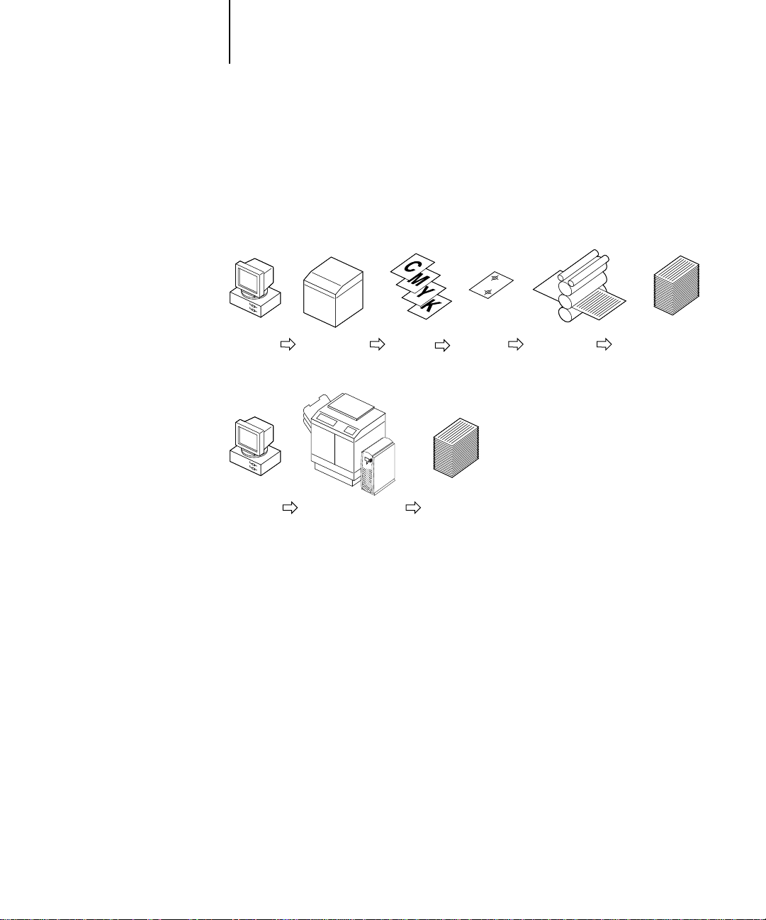
Workflow scenarios
Short-run color printing 1-13
Offset printing 1-14
1-13

viii Contents
Chapter 2: Color Management
Controlling printed color
Maintaining print device consistency 2-2
Print device gamut 2-3
Basics of color management
Color conversion 2-5
DocuColor 40 CP color management
RGB Source 2-8
Rendering styles 2-9
CMYK Simulation 2-10
Automatic DocuColor 40 CP color management features 2-10
Optional ICC color management for advanced users
Color management on Mac OS computers 2-11
Color management on Windows computers 2-13
Chapter 3: Working with Color in Applications
Working with color
Color reference pages 3-2
Office applications
Choosing colors in office applications 3-3
Resident calibration 3-3
2-1
2-4
2-6
2-11
3-1
3-2
PostScript applications
Choosing colors in PostScript applications 3-4
Resident calibration 3-6
CMYK simulation 3-6
3-4

ix Contents
Chapter 4: Printer Drivers and Print Options
What a printer driver does
Adobe PostScript Printer Driver for Mac OS
Setting color management print options 4-2
Adobe PostScript Printer Driver for Windows 95
Setting color management print options 4-5
Adobe PostScript Printer Driver for Windows 3.1x
Setting color management print options 4-7
Microsoft PostScript Printer Driver for Windows NT 4.0
Chapter 5: Adobe Photoshop 4.0
Before you begin
With Windows versions of Photoshop 5-1
With Photoshop 2.5 for Mac OS 5-2
Defining colors
Saving files for importing into other documents
Selecting options when printing
Printing RGB images 5-4
Printing CMYK images 5-5
4-1
4-2
4-5
4-6
4-8
5-1
5-2
5-2
5-3
Chapter 6: Page Layout Applications
Working with page layout applications
Defining colors 6-1
Importing images 6-1
CMYK simulation and calibration 6-2
Adobe PageMaker 6.5 for Mac OS and Windows
Importing images 6-3
Selecting options when printing 6-4
QuarkXPress 4.02 for Mac OS and Windows
Importing images 6-8
Selecting options when printing 6-8
6-1
6-3
6-8

x Contents
QuarkXPress 3.32 for Mac OS and Windows
Importing images 6-12
Selecting options when printing 6-12
Chapter 7: Illustration Applications
Working with illustration applications
Defining colors 7-1
Importing images 7-2
CMYK simulation 7-3
Adobe Illustrator 7.0 for Mac OS and Windows
Defining colors 7-3
Importing images 7-5
Selecting options when printing 7-5
Saving files for importing into other documents 7-6
For advanced users: Using Illustrator color management 7-7
Macromedia FreeHand 7.0 for Mac OS and Windows
Defining colors 7-8
Importing images 7-8
Selecting options when printing 7-9
Saving files for importing into other documents 7-10
For advanced users: Using FreeHand color management 7-11
6-12
7-1
7-3
7-8
CorelDRAW 7.0 for Windows
Defining colors 7-12
Importing images 7-13
Selecting options when printing 7-13
Saving files for importing into other documents 7-14
For advanced users: Using CorelDRAW color management 7-14
7-12

xi Contents
Chapter 8: Office Applications
Working with office applications
Defining colors 8-1
Working with imported files 8-1
Selecting options when printing 8-2
Calibration targets 8-2
Microsoft Office 97
8-1
8-3
Glossary
Bibliography
Index


xiii About this manual
Introduction
Welcome to the
associated with printing to a DocuColor 40 CP Color ServerTM. It also contains
application notes that explain how to print to the DocuColor 40 CP from popular
Windows and Mac OS applications.
This manual is one book in a set of documentation that also includes manuals for users
and system administrators. All the other manuals should be available at your site—
refer to them for a complete description of your documentation.
Color Guide
. This manual introduces you to the concepts and issues
About this manual
This manual is written for anyone who prints to a DocuColor 40 CP using popular
Windows and Mac OS applications. It goes beyond the mechanics of sending a print
job and explains issues that affect the quality of the results, such as:
• Use of color in the document
• Resolution and file formats used for imported images
• Features of ColorWiseTM color management performed by the DocuColor 40 CP
• Effects of print option settings on printed color
Because each application has different options that affect color printing, detailed appli-
cation notes are included.
Words in bold (for example,
Glossary. The Bibliography at the end of this manual provides sources for further
investigation of color printing issues.
additive color model
), are terms that appear in the
The phrase “DocuColor 40 CP color management” refers to the ColorWise color
management system built into the DocuColor 40 CP Color Server.

xiv Introduction
Tips for success
The built-in ColorWise color management system of the DocuColor 40 CP ensures
that every color job you print looks good. Regardless of the computer you work on, the
application you use, and the type of color work you do, your DocuColor 40 CP print
device provides high-quality color output without any special effort on your part.
You can also customize the DocuColor 40 CP color management system for particular
types of projects or environments. The DocuColor 40 CP provides total flexibility,
allowing you to specify color settings on a job-by-job basis.
The following list summarizes the issues you should consider when you create and
print a color document.
1. Maintain and calibrate your print device and DocuColor 40 CP Color Server regularly.
(Chapter 2 and the
2. Use the Color Reference pages when choosing and defining RGB and CMYK colors in
applications. Use the PANTONE Reference pages when choosing PANTONE spot colors
from within your application’s PANTONE library.
(Chapter 3)
Job Management Guide
)
3. Save raster images at the optimal resolution for your print device.
(Chapter 1)
4. Choose the appropriate settings for these print options (described in Chapter 2):
•
RGB Source
(and, for a custom RGB source space, Gamma, Phosphors, and White
Point)—affects the output of all RGB data in your document (see page 2-8)
Rendering Style
•
—determines the type of color effect produced; for example, vibrant
colors (such as for presentations) or accurate-match colors (such as for spot colors in
logos)
Brightness
•
•
CMYK Simulation
—increases or decreases the brightness of all colors in the document
—lets you use your DocuColor 40 CP print device as a proofing
device for offset press jobs
CMYK Simulation Method
•
—determines the method of simulation used (quick or full)

1-1 The properties of color
1
Chapter 1: Desktop Color Primer
This chapter covers concepts that are basic to printing in color, including:
• The properties of color
• Printing techniques
• Using color effectively
• Raster images and vector images
• Optimizing files for processing and printing
• Workflow scenarios
If you are already familiar with color theory and digital color printing, you can skip to
the last section (page 1-10) for tips on optimizing your files for printing.
The properties of color
What we call “color” is really a perceptual ability unique to humans and a small
number of animal species. Color theory is an attempt to systematize the properties of
color perception, which by nature is relative and changeable. A color appears different
depending on the other colors around it, and individuals vary in their abilities to
perceive color.
This section introduces concepts that are basic to color theory. You will encounter
some of these concepts (such as hue, saturation, and brightness) when you work with
color in applications; others provide useful background information.
topic, so consider this a starting point for experimentation and further research.
Color is a complex
The physics of color
The human eye can see electromagnetic radiation at wavelengths between 400
nanometers (purplish blue) and 700 nanometers (red). This range is called the visible
spectrum of light. We see pure
Sunlight at midday, which we perceive as white or neutral light, is composed of light
from across the visible spectrum in more or less equal proportions. Shining sunlight
through a prism separates it into its spectral components, resulting in the familiar
rainbow of colors (plate 1).
spectral light
as intensely saturated or pure colors.

1-2 Desktop Color Primer
1
Like the sun, most light sources we encounter in our daily environment emit a mixture
of many light wavelengths, although the particular distribution of wavelengths can
vary considerably. Light from a tungsten light bulb, for example, contains much less
blue light than sunlight. Tungsten light appears white to the human eye which, up to a
point, can adjust to the different light sources. However, color objects appear different
under tungsten light than they do under sunlight because of the different spectral
makeup of the two light sources.
The mixture of light wavelengths emitted by a light source is reflected selectively by
different objects. Different mixtures of reflected light appear as different colors. Some
of these mixtures appear as relatively saturated colors, but most appear to us as grays or
impure hues of a color.
CIE color model
In the 1930s, the Commission Internationale de l’Eclairage (CIE) defined a standard
color space
communication of color information. This color space is based on research on the
nature of color perception. The CIE chromaticity diagram (plate 2) is a twodimensional model of color vision. The arc around the top of the horseshoe
encompasses the pure, or spectral, colors from blue-violet to red. Although the CIE
chromaticity diagram is not perceptually uniform—some areas of the diagram seem to
compress color differences relative to others—it is a good tool for illustrating some
interesting aspects of color vision.
, a way of defining colors in mathematical terms, to help in the
By mixing any two spectral colors in different proportions, we can create all the colors
found on the straight line drawn between them in the diagram. It is possible to create
the same gray by mixing blue-green and red light or by mixing yellow-green and blueviolet light. This is possible because of a phenomenon peculiar to color vision called
metamerism
different combinations of spectral light can produce the same perceived color.
Purple colors, which do not exist in the spectrum of pure light, are found at the
bottom of the diagram. Purples are mixtures of red and blue light—the opposite ends
of the spectrum.
. The eye does not distinguish individual wavelengths of light. Therefore,

1-3 The properties of color
1
Hue, saturation, and brightness
A color can be described in terms of three varying characteristics:
• Hue—tint (the qualitative aspect of a color—red, green, or orange)
• Saturation—the purity of the color
• Brightness—relative position between white and black.
While the CIE chromaticity diagram (plate 2) conveys hue and saturation, a threedimensional color model is required to add the brightness component (plate 3).
Many computer applications include dialog boxes in which you choose colors by
manipulating hue, saturation, and brightness. For example, Photoshop uses a square
Color Picker (plate 4) which can be reconfigured according to your preference.
Additive and subtractive color systems
Color devices used in desktop publishing and printing
colors using a set of primary colors that are combined to create other colors. There ar e
two methods of creating a range of colors from a set of primary colors. Computer
monitors and scanners use the additive color model. Printing technologies, including
DocuColor 40 CP print devices and offset presses, use the
simulate
the range of visible
subtractive color model
.
Additive (RGB) color
Color devices that use the additive color model make a range of colors by combining
varying amounts of red, green, and blue light. These colors are called the
primaries
and blue light available. Black occurs wherever all three colors are absent. Grays are
created by adding varying amounts of all three colors together. Combining varying
amounts of any two of the additive primaries creates a third, saturated hue.
A familiar device that uses this color model is the computer monitor (plate 6).
Monitors have red, green, and blue
display a given color. Scanners create digital representations of colors by measuring
their red, green, and blue components through colored filters.
(plate 5). White is created by adding the maximum amount of red, green,
phosphors
that emit varying amounts of light to
additive

1-4 Desktop Color Primer
1
Subtractive (CMY and CMYK) color
The subtractive color model is used in color printing, and in color photographic prints
and transparencies. While the additive color model simulates the visible spectrum of
color by adding light of three primary hues, the subtractive color model uses a “white ”
or neutral light source containing light of many wavelengths. Inks, toners, or other
colorants
otherwise would be reflected or transmitted by the media in question.
The
blue light, respectively (plate 7). Combining any two subtractive primaries creates a
new color that is relatively pure or saturated. For example, you can make red by
combining magenta and yellow, which absorb green and blue light, respectively. White
occurs when no colorant is applied. Combining all three subtractive primaries in
theory yields black, but due to deficiencies of cyan, magenta, and yellow colorants,
combining these three primaries actually yields a muddy brown. Black colorant is
added to compensate for the deficiencies of cyan, magenta, and yellow colorants, and
consequently color printing uses four
blacK (CMYK). The use of black ink helps in producing rich solid blacks and also
allows for improved rendition of black text.
are used to selectively absorb (subtract) certain wavelengths of light that
subtractive primaries
are cyan, magenta, and yellow; they absorb red, green, and
process colors: C
yan, Magenta, Yellow, and
The CMYK colorants used in offset printing and by your DocuColor 40 CP print
device are to some degree transparent. When one layer of colorant is applied on top of
another, you see the effect of both. To create a range of intermediary colors, a method
is required for varying the amount of each colorant that is applied. A technique called
halftoning
proprietary system for applying ink or toner colors that is similar to halftoning.
is used in offset printing, while color print devices typically use a
Printing techniques
Until recently, most color printing was done on printing presses using one of several
printing techniques—
All traditional printing techniques require lengthy preparation before a print run can
take place. Short-run color printing, including DocuColor 40 CP printing, eliminates
most of this preparation. By streamlining the process of color printing, the
DocuColor 40 CP makes short print runs economically feasible.
offset lithography, flexography
, and
gravure
, to name a few.
1-5 Printing techniques
1
In contemporary offset lithographic printing, digital files from desktop computers are
output to an imagesetter, which creates film separations. The film is used to make a
prepress proof
opportunity to make corrections before going to press. Once the proof is approved, the
printer makes plates from the film and runs the print job on the press.
, which is an accurate predictor of the final print job, allowing an
computer
Desktop
computer
With a DocuColor 40 CP, you simply print the file. The DocuColor 40 CP processes
the
PostScript
magenta, yellow, and black) to the print engine. The ease of DocuColor 40 CP printing makes possible experimentation that would be too costly on press, allowing unlimited fine-tuning of color and design elements.
Halftone and continuous tone devices
Halftoning is used in offset printing to print each process color at a different intensity,
allowing millions of different colors to be reproduced using only the four process
colors. Depending on the required intensity of a given color, ink is placed on paper in
dots of different size. The grid of dots used for each ink color is called a screen.
Halftone screens are aligned to unique angles designed to eliminate interference
patterns called
Imagesetter Film Proof PressDesktop Print run
Print device Color prints
information in the file and sends four
moiré
that can arise with halftoning.
bitmaps
(one each for cyan,

1-6 Desktop Color Primer
1
Some color print devices are commonly referred to as
devices. They do not use traditional halftone screen patterns and angles. H owever, they
do apply dots (in some cases very elongated dots or lines) of different sizes to paper in a
process similar to halftoning.
Some DocuColor 40 CP systems have an optional Halftone Printer mode. When this
option is selected, the DocuColor 40 CP sends data to the print device as though it
were a halftone device, with each device pixel assigned either the maximum amount of
toner, or none at all. The halftone option, however, does not use the type of halftone
screens used in offset printing, nor does it duplicate results obtained in offset printing.
Even if your color printing is done exclusively on the DocuColor 40 CP, you will
encounter concepts from offset printing if you use high-end graphics applications. For
example, color controls in illustration applications such as Illustrator are geared toward
specifying color for offset printing using process and
allow you to specify the screening used for each printing plate.
continuous tone
spot colors
. Many applications
(or “contone”)
Using color effectively
The ability to print in color can greatly increase the effectiveness of your message,
whether you are printing a presentation or a newsletter , or pr oofing an ad concept that
will later be printed on press. Some potential benefits of using color include:
• Conveying information rapidly by using color cues
• Making use of the emotive aspects of different colors
• Increasing impact and message retention
Color can also be a source of distraction and discord if it is used poorly. This section
outlines some tips and concepts that will prove useful as you approach designing color
materials.

1-7 Using color effectively
1
A few rules of thumb
Try some of the following strategies for creating successful color materials:
• Rather than applying colors indiscriminately, use color to aid comprehension. In
presentations, graphs, and charts, use color to highlight patterns and emphasize
differences.
• In general, fewer colors work better than many colors.
• Use red as an accent color. Red is particularly effective when used in otherwise
monochromatic materials.
• Consider the tastes of your target audience when choosing colors.
• Keep a file of printed color pieces that appeal to you or strike you as effective. Refer
to it for ideas when designing your own documents.
Color wheel
A color wheel (plate 8) is a helpful tool for understanding the interrelation of colors.
The colors on one side of the color wheel, from magenta to yellow, appear to most
people to be warm colors, while those on the other side, from green to blue, appear to
be cool. The distance between two colors on the color wheel can help predict ho w they
will appear when seen side by side.
Colors opposite one another on the wheel are called complements (plate 9), and create
a striking contrast side by side. This can be the basis for a bold graphical design, but it
is an effect you should use with discretion since it can be visually fatiguing. Other bold
combinations to consider are split complements (a color and the two colors adjacent to
its complement) and triads (three colors evenly spaced on the color wheel). Colors
adjacent to one another on the color wheel result in subtle harmonies.
The color wheel simplifies color relationships for the purpose of clarity, showing only
saturated or pure colors. Adding the myriad variations of each hue to the palette (more
or less saturated, darker or lighter) creates a wealth of possibilities. Taking a pair of
complements from the color wheel and varying the saturation and brightness of one or
both colors produces a very different result from the pure complements. Combining a
light tint of a warm color with a darker shade of its cooler complement often gives
pleasing results. Combining a darker shade of a warm color with a light tint of its
cooler complement produces an unusual effect you may like.

1-8 Desktop Color Primer
1
Once you have mastered the concept of the color wheel, you have a good framework
for experimenting with color combinations. Many books targeted at graphic designers
show groups of preselected color combinations. Some are organized by themes or
moods, and some are based on a custom color system such as PANTONE. The more
you develop a critical facility for judging color combinations, the more you will be able
to trust your own eye for color. The Bibliography at the back of this manual includes
books on design.
Color and text
It is not a coincidence that the overwhelming majority of text you see is printed in
black on white paper. Text in black on white is highly legible and is not fatiguing to
read for extended periods. For many color materials, using black text on a white
background and confining color to graphic elements and headings is a good choice.
Color text can add flair to documents printed on paper when used skillfully, and is
widely used in presentations. When using color text, avoid dazzling text and
background combinations created from primary complements, especially red and cyan
or red and blue; they are visually fatiguing and hard to read. Color text is more legible
when distinguished from its background by a difference in lightness—for example,
dark blue text on a light beige background. In addition, using many different colors in
a string of text makes for a confused appearance and is hard to read. However, using a
single highlight color is an effective way to draw the reader’s eye to selected words. See
plate 10 for color text samples.
When using color text, keep in mind that small font sizes typically do not print in
color with the same sharpness as in black. In most applications, black text prints
exclusively in black toner, while color text usually prints with two or more toners. Any
misregistration between the different toners on paper causes color text to lose
definition. You can make test prints to find the smallest point size at which color text
prints clearly. When using high-end graphics applications that allow you to specify
color as percentages of cyan, magenta, yellow, and black, you can create pure cyan or
pure magenta text that prints with the same sharpness as black text. (Pure yello w text is
extremely hard to read on anything but a dark or complementary background.)

1-9 Raster images and vector images
1
Registration and trapping
With any print device, there is the possibility that the different toners may print
slightly out of register, producing distracting gaps between objects. Trapping is the
process of spreading one color slightly into adjacent colors to compensate for any
misregistration that might occur when the file is printed. Depending on the job’s
makeup, you may need to take trapping into consideration for best printed results. See
the Bibliography for sources of information on trapping.
The DocuColor 40 CP includes a Combine Separations print option. This option can
be used with PageMaker and QuarkXPress to proof trapping, overprinting, and other
four-color printing effects before creating film separations. With Combine Separations
turned on, separations are printed in color on a single page. The Combine Separations
print option also enables you to combine Desktop Color Separations (DCS) files to
print at high resolution instead of printing the low-resolution master file. For more
information, see the Printing Guide.
Raster images and vector images
Two broad categories of artwork can be printed from a personal computer to a color
printer: raster and vector images (plate 11).
A raster image, also referred to as a bitmap, is composed of a grid of pixels, each
assigned a particular color value. The grid, when sufficiently enlarged, resembles a
mosaic made from square tiles. Examples of raster images include scans and images
created in painting or pixel-editing applications, such as Photoshop and Painter.
The amount of information found in a raster depends on its resolution and bit depth.
The resolution of a raster describes the density of the pixels and is specified in pixels
per inch (ppi). The bit depth is the number of bits of information assigned to each
pixel. Black and white rasters require only one bit of information per pixel. For
photographic quality color, 24 bits of RGB color information are required per pixel,
yielding 256 separate levels of red, green, and blue. For CMYK images, 32 bits per
pixel are required.
When printing raster artwork, the quality of the output depends on the resolution of
the raster. If the raster’s resolution is too low, individual pixels become visible in the
printed output as small squares. This effect is sometimes called “pixelation.”

1-10 Desktop Color Primer
1
In vector images, picture elements are defined mathematically as lines or curves
between points—hence the term “vector.” Picture elements can have solid, gradient,
or patterned color fills. Vector artwork is created in illustration and drawing
applications such as Illustrator and CorelDRAW. Page layout applications such as
QuarkXPress also allow you to create simple vector artwork with their drawing tools.
PostScript fonts are vector-based as well.
V ector artwork is r esolution-independent; it can be scaled to any size without danger of
pixels becoming visible in printed output.
Optimizing files for processing and printing
The following sections provide tips on how to create image files that produce the
highest possible print quality while minimizing the processing time and disk space they
require.
Resolution of raster images
While a 72 ppi raster image appears sharp on a monitor, the same image would likely
appear pixelated when printed to the DocuColor 40 CP. Color print devices are
capable of much greater detail than monitors, and require correspondingly higher
resolution image files. However, high-resolution files can be large, and therefore
cumbersome to transmit over a network, process for printing, store on disk, and edit.
Beyond a certain threshold, a higher image resolution greatly increases file size while
having a minimal effect on output quality. The optimal image resolution depends on
the resolution of the final print device. Aim for the resolution that optimizes both file
size and output quality.
1-11 Optimizing files for processing and printing
1
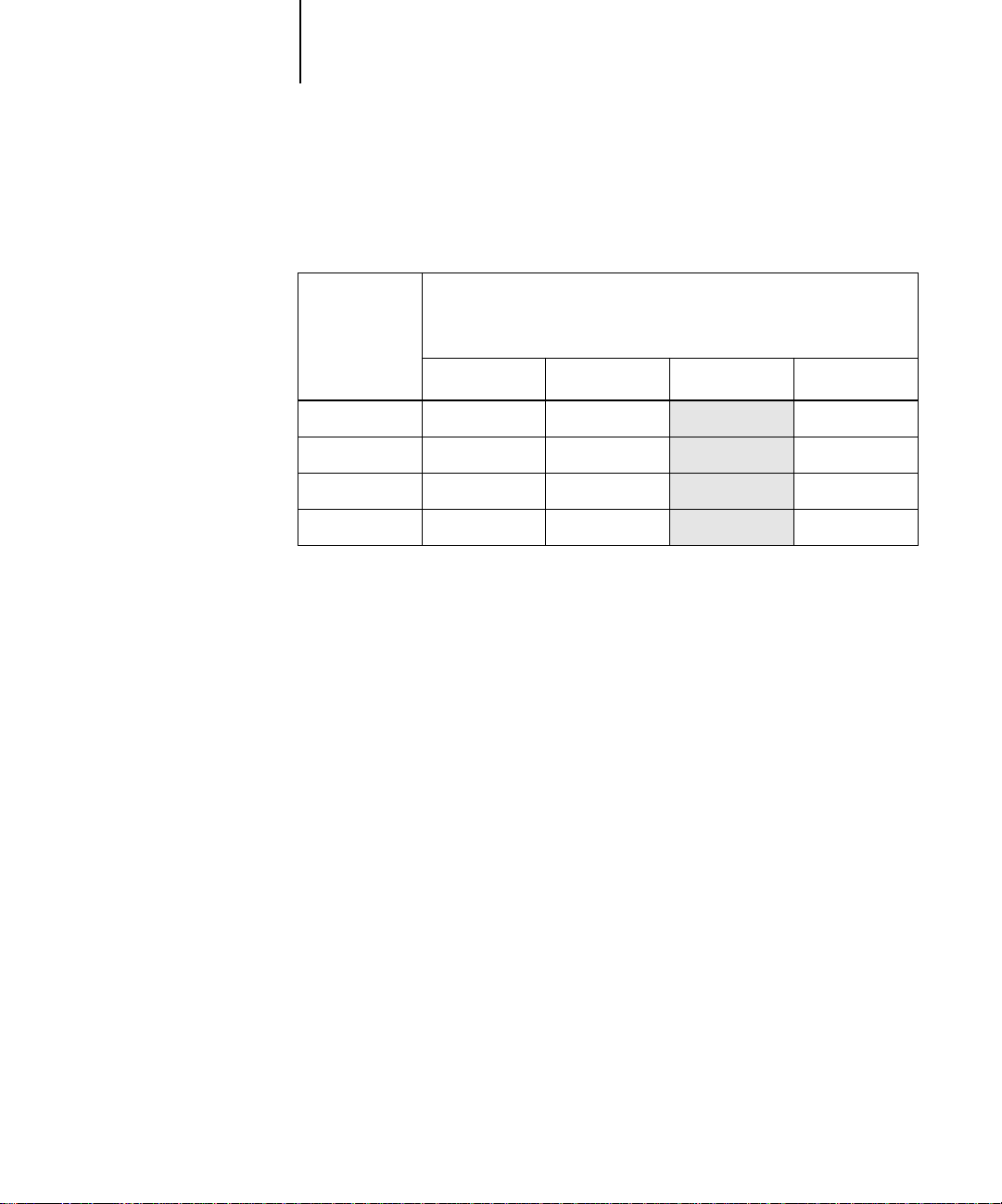
The resolution of a raster image, along with its bit depth and physical dimensions,
determine its file size. The following table shows the file sizes of color raster images at
different dimensions and resolutions.
File size at:
Image size 100 ppi 150 ppi 200 ppi 400 ppi
RGB/CMYK RGB/CMYK RGB/CMYK RGB/CMYK
3"
x 4"
x 7"
5"
x 11"
8.5"
x 17"
11"
In this table, the shaded areas indicate that 200 ppi is typically the best trade-off
between image quality and file size. However, higher resolutions (e.g., 250 to 300 ppi)
may be needed for offset printing, when quality is of the utmost importance, or for
images containing sharp diagonal lines.
To find the best image resolution for your purposes, make test prints of some raster
artwork at different resolutions. Start with a high-resolution image (400 ppi) and save
versions at progressively lower resolutions, down to 100 ppi, using a pixel-editing
application such as Photoshop. Always save a copy of the original high-resolution
version in case you need to revert to it. The high-resolution data cannot be recreated
from a lower resolution version.
0.4/0.5 MB 0.8/1.0 MB 1.4/1.8 MB 5.5/7.3 MB
1.0/1.3 MB 2.3/3.0 MB 4.0/5.3 MB 16.0/21.4 MB
2.7/3.6 MB 6.0/8.0 MB 10.7/14.3 MB 42.8/57.1 MB
5.4/7.1 MB 12.0/16.1 MB 21.4/28.5 MB 85.6/114.1 MB
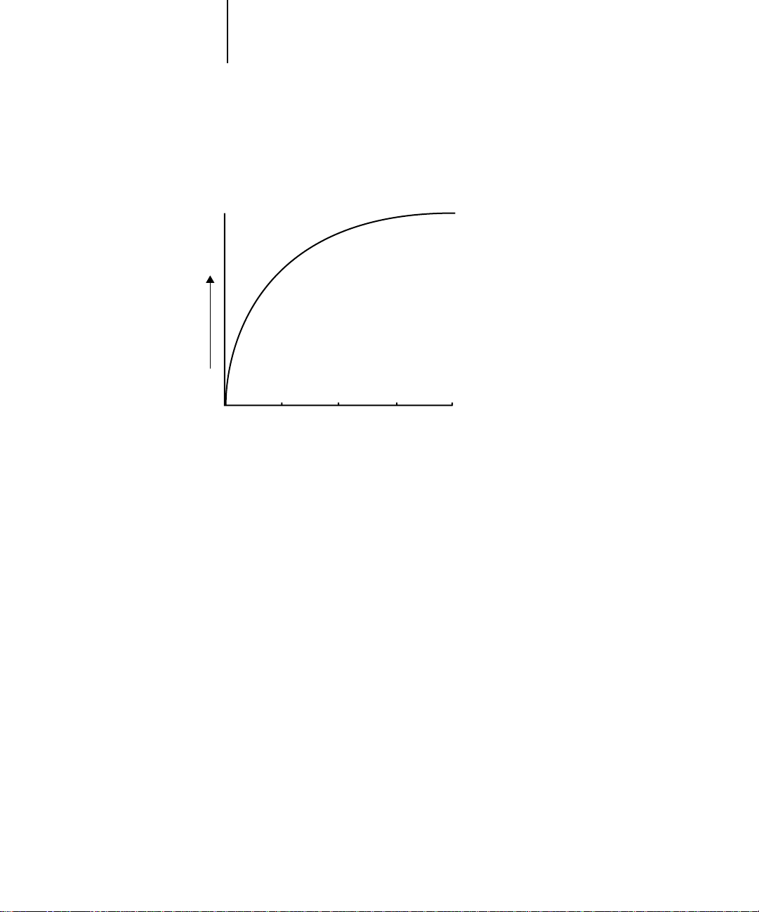
1
Image quality
1-12 Desktop Color Primer
Print the files and examine the output. You will likely begin to see a marked
deterioration in output quality at resolutions below 200 ppi, while above 200 ppi the
improvement may be very subtle.
100 ppi 200 ppi 300 ppi 400 ppi
Image resolution
Raster images prepared for offset printing may need to be at higher resolutions than
needed for proofing on your DocuColor 40 CP. Check with your prepress service
provider and printing vendor for their recommendations on image resolution based on
your job specifications.
Scaling
Ideally, each raster image should be saved at the actual size it will be placed into the
document and at the optimal resolution for the print device. If the image resolution is
correct for the print device, there is no quality advantage to be gained by scaling an
image down to a percentage of its actual size. If you scale a large image down to a
percentage of its actual size, you incur unnecessary file transfer time because the image
data for the entire large image is sent to the printer . If an image is placed multiple times
at a markedly different sizes in a document, save a separate version of the image at the
correct size for each placement.
If you need to place an image at greater than 100% in a document, remember that the
output image resolution is affected. For example, if you scale a 200 ppi image to
200%, the image is printed at 100 ppi.

1-13 Workflow scenarios
1
Workflow scenarios
Color print jobs can be divided into two categories:
• Short-run print jobs for which the DocuColor 40 CP is the final print device
• Offset print jobs being proofed on the DocuColor 40 CP
For either type of job, issues of effective color usage, trapping, file optimization, and
scaling are important ones. The areas of differ ence between the workflows for these two
types of jobs are outlined in the following sections.
Short-run color printing
For short-run color jobs printed to the DocuColor 40 CP:
• You can work in either the RGB color model or the CMYK color model (see the
application notes). When working with RGB colors, you should take advantage of
the color rendering capabilities of the DocuColor 40 CP (see Chapter 2).
• When choosing or defining colors in your application, use the DocuColor 40 CP
color reference pages to be assured of predictable results (see Chapter 3).
• When printing, choose the appropriate settings for print options that affect color
output (see Chapter 2).
• When printing, make sure the resident calibration on the DocuColor 40 CP is the
appropriate one for your job. The DocuColor 40 CP includes a calibration target
designed for your print device, but you can also create a custom target to achieve
particular color effects (see Chapter 2 and the Job Management Guide, which
describes DocuColor 40 CP calibration).

1-14 Desktop Color Primer
1
Offset printing
For jobs that will be proofed on the DocuColor 40 CP in preparation for being
printed on an offset press:
• Work in the CMYK color model only (see the application notes). All elements in
your document, including placed images, must be in the CMYK color model to
create film separations for printing.
• When choosing or defining colors in your application, use the DocuColor 40 CP
color reference pages to be assured of predictable results (see Chapter 3).
• If cost is a factor and the document does not contain CMYK images, consider using
two or three PANTONE colors, instead of the standard four process colors (see
Chapter 3). This reduces the number of film separations and printing plates needed
to print the job.
• If your document contains high-resolution CMYK raster images, you can reduce
processing time by saving the images in Encapsulated PostScript (EPS) format with
Photoshop using Desktop Color Separations (DCS). A DCS image consists of five
separate files—one for each of the CMYK color channels of the image, plus one lowresolution master composite file that you use for placement in the document (see
your Photoshop documentation). The low-resolution master file provides a
composite preview of the image for screen viewing and is used to print composites.
DCS files do not use less disk space than single CMYK files, but they do reduce the
amount of time needed to send image data to the printer. DCS files can be used to
create film separations as well.
• Use the Combine Separations print option to check for trapping problems (see the
Printing Guide).
• Choose the appropriate CMYK Simulation and CMYK Simulation Method settings
(see Chapter 2).

2-1 Controlling printed color
2
Chapter 2: Color Management
This chapter provides information on the factors involved in controlling and managing
color output with the objective of achieving predictable color results, including:
• Controlling printed color
• Basics of color management
• DocuColor 40 CP color management
• Optional ICC color management on Mac OS and Windows computers
Controlling printed color
When working with color materials, whether they be presentations, illustrations, or
complicated page designs, you make aesthetic decisions about the colors you use. Once
you have decided on your goal, you then need to realize it in print. Your color printing
system becomes an ally in this creative process to the extent that you can get results
that are predictable.
• If you have designed a brochure to print on the DocuColor 40 CP, you want the
printed colors to match the design specification.
• If you are printing presentations on the DocuColor 40 CP, you want to preserve the
vivid colors in the monitor display.
• If you are working with color that will print on press, you want the
DocuColor 40 CP output to match prepress proofs or PANTONE color swatch
books.
The type of print job and the final print device, DocuColor 40 CP or offset press,
determine the methodology you use to achieve optimal results.
No matter what your goals are, two hardwar e factors always impact color print output:
print device consistency and the range of colors the print device can print, known as its
gamut. These factors are covered briefly in this chapter. Creating successful color
documents and presentations also requires an understanding of color management
software as it is implemented by the DocuColor 40 CP and on your desktop
computer. Most of this chapter is devoted to discussing the various elements of color
management that contribute to predictable color results.

2-2 Color Management
2
Maintaining print device consistency
The factors described below affect print device consistency, as well as color fidelity and
overall output quality.
Paper stock and toner
The paper and toner used by your print device can greatly affect printed color . F or best
results, use the supplies recommended by the manufacturer of the print device.
Maintenance
Problems such as streaking and insufficient or excessive amounts of one or mor e toners
arise when a print device does not receive periodic maintenance or needs major repairs.
In addition to having it serviced regularly, monitor the condition of your print device
by making standard test prints at regular intervals. You can do this easily by printing
the DocuColor 40 CP Test Page. Save the prints and show them to the service
technician whenever output densities vary from the norm or other problems appear.
Calibration
Output from color print devices is subject to changes in temperature and humidity,
and is prone to drift over time, with a resulting loss in color predictability. For this
reason, regular service visits alone do not guarantee consistent results from a print
device. Where color accuracy and consistency are crucial, regular calibration of the
DocuColor 40 CP and print device is necessary.
Calibration compares the measured toner densities from a color print device to a set of
target densities and downloads a software correction to the DocuColor 40 CP that
keeps the densities consistent. Calibration also optimizes the DocuColor 40 CP’s color
response for use with the DocuColor 40 CP color management system (see page 2-6).
A resident calibration target is specified during DocuColor 40 CP calibration. The
administrator or operator can create custom calibration targets as needed for the
specific requirements of your site. For information on performing calibration, see the
Job Management Guide, which describes DocuColor 40 CP calibration.
 Loading...