


ZebraDesigner for
Developers
User Guide
Rev-2019-1
P1109190-EN

2

ZEBRA and the stylized Zebra head are trademarks of Zebra Technologies Corporation,
registered in multiple jurisdictions worldwide. All other trademarks are the property of their
respective owners. ©2019 Zebra Technologies Corporation and/or its affiliates. All rights
reserved.
Information in this document is subject to change without notice. The software described in
this document is furnished under a license agreement or nondisclosure agreement. The
software may be used or copied only in accordance with the terms of those agreements.
For further information regarding legal and proprietary statements, please go to:
SOFTWARE:www.zebra.com/linkoslegal
COPYRIGHTS:www.zebra.com/copyright
WARRANTY:www.zebra.com/warranty
END USER LICENSE AGREEMENT: www.zebra.com/eula
Terms of Use
Proprietary Statement
This manual contains proprietary information of Zebra Technologies Corporation and its
subsidiaries (“Zebra Technologies”). It is intended solely for the information and use of
parties operating and maintaining the equipment described herein. Such proprietary
information may not be used, reproduced, or disclosed to any other parties for any other
purpose without the express written permission of Zebra Technologies.
Product Improvements
Continuous improvement of products is a policy of Zebra Technologies. All specifications
and designs are subject to change without notice.
Liability Disclaimer
Zebra Technologies takes steps to ensure that its published Engineering specifications and
manuals are correct; however, errors do occur. Zebra Technologies reserves the right to
correct any such errors and disclaims liability resulting therefrom.
Limitation of Liability
In no event shall Zebra Technologies or anyone else involved in the creation, production, or
delivery of the accompanying product (including hardware and software) be liable for any
damages whatsoever (including, without limitation, consequential damages including loss of
business profits, business interruption, or loss of business information) arising out of the use
of, the results of use of, or inability to use such product, even if Zebra Technologies has
3

been advised of the possibility of such damages. Some jurisdictions do not allow the
exclusion or limitation of incidental or consequential damages, so the above limitation or
exclusion may not apply to you.
4

Contents
1 Introducing ZebraDesigner for Developers 7
2 Typographical Conventions 8
2.1 Basic ZebraDesigner for Developers Concepts 8
2.2 Keyboard and Mouse Support 10
2.3 Options (Configuring the Program) 11
3 Workspace Overview 13
3.1 Landing Page 13
3.2 Object and Explorer Panels 14
3.3 Printer and Status Bar 15
3.4 Tabs and Ribbons 16
3.5 Design Surface 43
3.6 Document Properties and Management Dialogs 46
3.7 Context Menus 47
4 Label 50
4.1 New Label Setup Wizard 50
4.2 Label Properties 52
4.3 Label Objects 57
4.4 Working with Objects 75
5 Creating Receipt-Style Labels 78
5.1 New Receipt Setup Wizard 79
5.2 Receipt Style Label Properties 81
5

6 Barcode 85
6.1 Source 85
6.2 Barcode 85
6.3 Check Digit 86
6.4 Human Readable 87
6.5 Bearer Bar 88
6.6 Details 88
6.7 Position 88
6.8 General 89
6.9 Available Barcodes and Their Settings 90
6.10 GS1 DataBar Subtypes 103
6.11 1D Barcode Details 106
6.12 2D Barcode Details 106
6.13 GS1 DataBar Specifics 108
7 Dynamic Data Sources 110
7.1 Variables 110
7.2 Special Character Shortcuts 119
7.3 Insert Characters with <#hex_code> Syntax 121
7.4 Insert Characters with <Alt>+<ASCII_code> 121
7.5 Chip-based Serialization 122
8 Glossary 123
6

1 Introducing ZebraDesigner for Developers
Welcome to ZebraDesigner for Developers.
Use ZebraDesigner for Developers to design label templates and to store your templates
on your mobile or offline Zebra printers. ZebraDesigner for Developers transforms your
templates into labels when you need to print. ZebraDesigner for Developers also
incorporates variable data from various external business applications into your labels.
ZebraDesigner for Developers lets you send crucial print stream commands and minimizes
the amount of data you need to send.
TIP: Offline printing helps you print labels faster because your label’s variable objects are
already stored on your printers. Offline printing means you can print without using your
label design application. Offline printing is also useful when you want to print without
using your computer due to unacceptable conditions or logistical issues.
7

2 Typographical Conventions
Text that appears in bold refers to menu names and buttons.
Text that appears in italics refers to options, confirming actions like Read only, and locations
like Folder.
Text enclosed in <less-than and greater-than signs> refers to keys from desktop PC
keyboards such as <Enter>.
Variables are enclosed in [brackets].
NOTE: This is the style of a note.
EXAMPLE: This is the style of an example.
This is the style of a best practice.
WARNING: This is the style of a warning.
TIP: This is the style of a tip.
2.1 Basic ZebraDesigner for Developers Concepts
This section describes the ZebraDesigner for Developers elements that enable you to
efficiently design label templates.
Listed below are the essential ZebraDesigner for Developers concepts.Being familiar with
them provides a perfect starting point for successful labeling projects.
8

l Label
l Object
l Design Surface
If you come across any other unfamiliar items while working with ZebraDesigner for
Developers, refer to the Help tab.
2.1.1 Label
Label works as a template to add label objects and print using any kind of printing media.
Each object adds a different kind of content such as text, line, ellipse, barcode or rectangle
to a label. The content is either fixed (manually entered by the user) or dynamic (defined
using values from connected data sources).
After finishing your label template layout, you can store the template on your printers.
2.1.2 Object
Object is the basic building block for designing labels. To design a label means to select,
add, and position the objects on the design surface.
EXAMPLE: Each object performs a different role. Text object is in most cases used for
single-line textual content that does not need to adapt its font size to the label design.
Barcode object adds a barcode whose type and content can be adapted to the needs of
current document.
Label object types and their purpose are listed here.
2.1.3 Design Surface
Your design surface is a place to create, add, position, and interconnect label objects.
To help you design labels as simply and efficiently as possible, your design surface uses
usability and functional principles from Microsoft Office.
TIP: Use View tab to customize your design surface.
l Learn more about design surface elements here.
l Learn more about design surface editing actions here.
l Learn more about design surface visual aid elements here.
9

2.2 Keyboard and Mouse Support
To efficiently perform and complete the ZebraDesigner for Developers tasks, follow the
guidelines related to the use of keyboard and mouse:
l How to efficiently use keyboard and mouse
l Keyboard shortcuts
2.2.1 Efficient Use of Keyboard and Mouse
Use the following list of tips to make your work with ZebraDesigner for Developers easier
and more efficient.
1.
Select object anchoring point. Press <Ctrl> key and click the object placeholders
to quickly define the anchoring point.
2.
Label scrolling and zooming. Use mouse wheel to scroll the label. Holding <Ctrl>
when rotating the wheel, adjusts zoom factor. <Shift> scrolls label left or right.
3. Set label or form properties. Double-click the design surface to open the label
properties dialog.
4.
Vertical or horizontal object moving. Hold <Shift> while moving an object over
the design surface. The object is moved in straight vertical and horizontal lines.
5.
Resize an object with arrow keys. Holding <Shift> while pressing arrow keys
resizes the object.
6.
Fine-tune the object position. Hold <Ctrl> while pressing arrow keys.
7. Open contextual menus. Right-click the object or design surface to access the label
or design surface contextual menus.
8.
Select multiple objects. Hold <Shift> and click the objects to add them to the
selected objects in a group.
9. Quickly add an object with connected data source. Click the object's shortcut
handle in the object toolbox. A list of available data sources appears. Select a data
source or add a new one, and click the design surface to add an object which already
has a dynamic data source connected to it.
2.2.2 Keyboard Shortcuts
Use keyboard shortcuts to reduce the time needed to accomplish frequent tasks with
ZebraDesigner for Developers. To complete these tasks, use a standard combination of
keys.
10
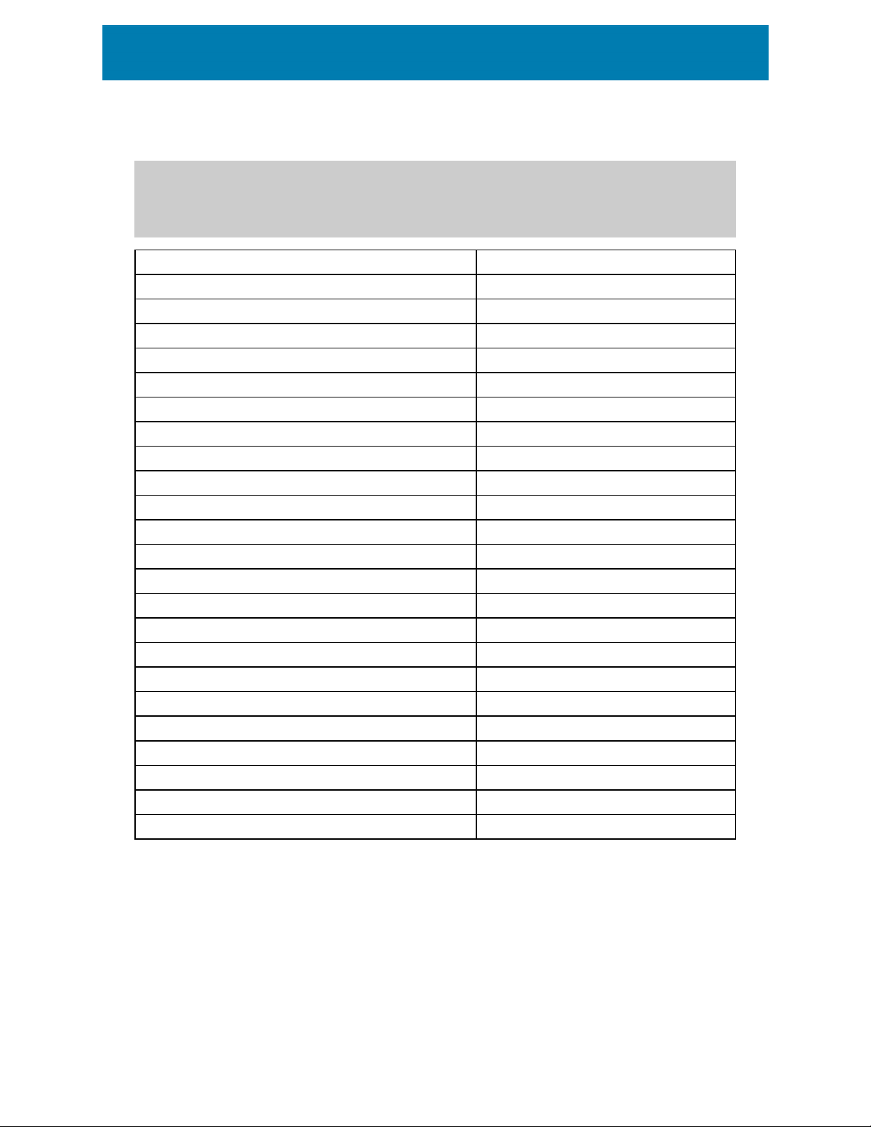
TIP: Keyboard shortcuts are just a faster and more convenient way of choosing
commands. The command itself is executed in the same way as if it was run from the menu
or toolbar.
Action Press
Select all Ctrl+A
Paste Ctrl+V
Cut Ctrl+X
Move up ↑
Move right →
Move down ↓
Move left ←
Close Alt+F4
Zoom to document Ctrl+0
Copy Ctrl+C
Zoom Out Ctrl+minus sign on numeric keypad
Zoom In/Out Ctrl+mouse scroll up/down
Open Ctrl+O
Zoom In Ctrl+plus sign on numeric keypad
Save Ctrl+S
Open blank label connected to default printer Ctrl+Shift+N
Redo Ctrl+Y
Undo Ctrl+Z
Cancel Esc
Move Focus Tab or Shift+Tab
Store Ctrl+Alt+S
Format painter – copy object properties Ctrl+Shift+C
Format painter – paste object properties Ctrl+Shift+V
2.3 Options (Configuring the Program)
To customize the general program configuration of ZebraDesigner for Developers, open the
Options dialog which is accessible from the File tab.
11

ZebraDesigner for Developers configuration options are grouped on the following tabs:
l Folders:allows you to set the default locations for storing the labels and picture files.
l Language:selects the user interface language. Select the preferred language from
the listed options.
l Designer: enables you to configure opening behavior of ZebraDesigner.
12

3 Workspace Overview
Your ZebraDesigner for Developers workspace provides a flexible and easy-to-use
environment for simple label designing.
Your ZebraDesigner for Developers workspace follows widely used application interface
guidelines and is equipped with tools and interface elements familiar to most users.
ZebraDesigner for Developers workspace includes the following:
l Landing page
l Object and Explorer Panels
l Printer and Status bar
l Tabs and Ribbons
l Design Surface
3.1 Landing Page
Your landing page in ZebraDesigner for Developers is an introduction which opens after the
application loads. The page includes the following:
l New document area: create new or open existing ZebraDesigner for Developers
documents.
l Create a New Label:create new label documents.
l Create a New Receipt: create new receipt style labels.
l Recent Files: lists recently used ZebraDesigner for Developers files.
l Learning resources: access useful resources to help you create labels, and learn
more about ZebraDesigner.
l Printer Drivers:access Zebra printer drivers. Drivers let you optimize your labels to
print on specific printer models.
13

3.2 Object and Explorer Panels
Object and explorer panels are located at the left-most area of the ZebraDesigner for
Developers window. They provide access to objects.
l Object Toolbox: Contains available objects. These objects are ready to be used on a
label. Click the selected object and drag it to the design surface.
l Dynamic Data Explorer: The tool for managing your data sources.
3.2.1 Dynamic Data Explorer
The Dynamic Data Explorer performs two roles. It serves as a tool for managing your
variables, and gives an overview of the data sources that are currently in use.
NOTE: Right-clicking your variables allows you to cut, copy, paste, delete, edit, and
rename them.
14

l Add new variable: adds an additional variable to the label data sources. There are
four default variable types available. Their values are defined via dialogs described in
dedicated sections
l Variable: a type of variable that obtains value when a label is printed.
l Current date: displays current date in the requested format.
l Current time: displays current time in the requested format.
l Counter: displays a counter value.
l RFID Tag:If you are working with an RFIDcompatible printer, you can directly add the
content encoded in the RFIDtag to your label as Text, Text Box or Barcode objects.
3.3 Printer and Status Bar
Printer and Status bar stretches over the bottom part of the ZebraDesigner for
Developers window. The bar performs these roles:
l Printer Selection for the current print job. Select your preferred printer from the
drop-down list of installed printers.
TIP: When changing a printer, label and paper size adapt automatically to the dimensions
defined by the printer driver.
NOTE: Working with ZebraDesigner for Developers is tied to your installed Zebra printer
drivers. As a result, only supported printer drivers are listed on the printer selection list.
l Printer Properties: Gives you direct access to the properties dialog of the selected
printer driver.
l Design surface zooming.
l RFID Status and Tag Access: Indicates if writing the data to the RFIDtags is enabled
or not. Click the button to open the RFIDtag dialog. This is where you can enable or
disable writing to RFIDtags.
15

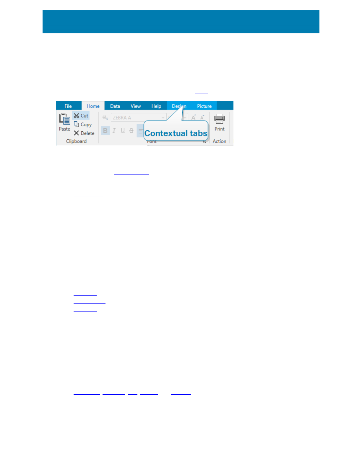
3.4 Tabs and Ribbons
ZebraDesigner for Developers uses a standard Windows-based interface.
The ZebraDesigner for Developers's top section interface segments are described below.
3.4.1 Tabs
Tabs represent subsets of ZebraDesigner for Developers features. The tabs contain
interrelated commands that are available to the user in an organized way – grouped, and
labeled:
l File (background): opens the store form and document management panel.
l Home: offers commonly used commands such as copy/paste, print, and style
commands.
l Data: offers data source related commands.
l View: gives you control over layout tools, zooming options and element markers
visibility.
l Contextual tabs: appear after clicking an object. They allow you to define object-
specific settings. The type of contextual tabs adapts to the selected object.
l Help:besides offering the access to F1 help, this tab leads you to multiple helpful
resources that make your work with ZebraDesigner for Developers easier and more
efficient.
3.4.2 Ribbon
Ribbon is a rectangular area that spreads across the top of an application window. Related
commands are divided into ribbon groups.The ribbon changes along with the selected tabs
and adapts to the currently used tools using the contextual tabs.
3.4.3 File Tab
File tab serves as document management panel. The following options are available:
l Start:takes you to the ZebraDesigner for Developers landing page.
l New: creates a new stand-alone label.
l Open: allows opening existing label.
l Save: saves the active label.
l Save As: allows saving the active label file by defining its name and location.
l Store:stores the current label as a template on the printer to be used in store/recall
mode.
l Close: closes the current ZebraDesigner for Developers document.
16

l Options: opens the dialog for configuring the program defaults.
l About: provides software version information.
l Exit: closes the application.
3.4.3.1 Start
Start panel takes you to ZebraDesigner for Developers landing page. Use it to create or
open documents, access recently opened files, preview files and learn more about
ZebraDesigner for Developers.
3.4.3.2 New
New Label creates a new stand-alone label. New Label Setup Wizard opens after clicking
this button.
New receipt creates a new receipt style label. Start designing variable length receipts with
predefined header, body, and footer objects. Details are available in section "Creating
Receipt-Style Labels" on page78
New from Sample Templates creates a document based on a selection of
industry-standard templates.
TIP: There are two ways of opening new labels. You can open each additional document
in a separate instance (window) of ZebraDesigner for Developers. An alternative way is to
open documents within the already opened instance. To select the way that suits you
better, go to File > Options > Designer.
3.4.3.3 Open
Open dialog allows opening existing label files.
Browse allows selecting the label on local or connected network drives.
Recent Files field lists the latest files that have been edited. Click any of them to open the
file.
3.4.3.4 Save
Save panel saves the active label using the same file name that was used to open it.
NOTE: If a file has been opened for the first time, Save directs you to the Save as on the
File tab.
3.4.3.5 Save as
Save as allows saving the active label file by defining its name and location.
17

Recent folders field lists the folders that were recently used to save the label files.
3.4.3.6 Storing Label Templates
Store label templates you create directly into your printer memory for faster printing or
printing offline. Recall your stored templates to print labels using integrated external
business applications without installing additional software. The store and recall features of
ZebraDesigner for Developers help you create, store, test, and integrate labels you recall
and print with external business applications.
l Store: save your pre-made templates in your printer memory.
l Recall: print labels from your printer memory using your pre-made templates
populated with variable data.
Store and recall your label templates using the following sections:
Operation
l Store template to printer: store your pre-made templates in your printer memory.
l Store template to printer then recall: store your pre-made templates in your printer
memory and immediately recall labels you manually populate with variable data. Use
this feature to test your printing process and diagnose problems. Normally, you recall
labels populated with variable data from external business applications.
l Generate print file with variables: generate .prn files of commands you send to your
printers in ZPL format. ZebraDesigner for Developers saves your print files on your
local disk, not in your printer memory. Use print files to analyze your print streams,
replace variable names with values, and integrate your stored label templates with
external business applications.
Recall stream format
Choose which format your printer uses to populate variables when you recall your labels.
l XML: recall your labels using variables populated in XML format.
l ZPL: recall your labels using variables populated in ZPL format.
Store fonts
Zebra printers use Zebra internal fonts by default. To use other fonts (e.g., TrueType and
OpenType fonts) on your labels, use your printer driver settings to store them on your
printer in Zebra format. Select Yes to associate these other fonts with your label templates
in your printer memory and use them on all your printers.
18

NOTE: When you connect text objects to variables, use Zebra printer fonts. Your printer
displays TrueType and OpenType fonts as graphics, which causes printing errors with
variables.
Destination
Choose where to store your label templates.
l Network printers and click Printers: view, add to, search, and choose from your list
of network printers.
l Local disk and click Browse: save your templates to your local disk in .prn format.
l Printer selected in label: store your templates using your currently active printer
driver.
Template name on printer
Your printer holds multiple templates. Give your templates unique names so you can find and
recall them later.
NOTE: ZebraDesigner for Developers limits your template names to 16 characters.
Printer memory location
Zebra printers have different memory types. Choose your printer memory location
according to your printer specifications (For example: DRAM, Internal Flash, etc.).
Now you understand how to store your label templates on your printer and recall, populate,
and print labels offline or use integrated external business applications.
3.4.3.7 Options (Configuring the Program)
To customize the general program configuration of ZebraDesigner for Developers, open the
Options dialog which is accessible from the File tab.
ZebraDesigner for Developers configuration options are grouped on the following tabs:
l Folders:allows you to set the default locations for storing the labels and picture files.
l Language:selects the user interface language. Select the preferred language from
the listed options.
l Designer: enables you to configure opening behavior of ZebraDesigner.
19

3.4.3.7.1 Folders
Folders tab defines the default location for opening and storing the documents and files
which are edited and used in ZebraDesigner for Developers.
NOTE: Make sure read/write rights are granted to the account under which the
ZebraDesigner for Developers is running.
l Labels:location for opening and saving the label files.
l Pictures: location for opening the picture files.
Folders set in this tab serve as the default location when searching for a specific file in
ZebraDesigner for Developers.
3.4.3.7.2 Language
Language tab allows selecting the ZebraDesigner for Developers interface language. Select
the appropriate language and click OK.
NOTE: Restart is necessary to make the user interface appear in the selected language.
Make sure you save your work before closing the program.
3.4.3.7.3 Designer
Designer tab enables you to configure opening behavior of ZebraDesigner for Developers.
Opening Mode group defines how your ZebraDesigner for Developers opens new
documents.
l Display each document in its own window: If enabled, additionally opened
documents appear in separate windows of ZebraDesigner for Developers. This
applies to both – newly created and existing documents.
If you decide to disable this option, additionally opened documents will appear within
the currently active instance of ZebraDesigner for Developers.
Variables group allows you to set the default variable properties while designing your label
templates.
l Default name prefix for new variables: Defines the default name prefix for the
variables that you add while designing label templates. This is the name prefix that
automatically appears in the variable creation dialog. ZebraDesigner for Developers
20

adds serial numbers to the variables with the same name prefix.
EXAMPLE: By default, the variables in ZebraDesigner for Developers have XML
name prefix. If you create three variables for your label template, the names of your
variables are XML, XML1, and XML2.
3.4.3.8 About
The About dialog page contains software information for your copy of ZebraDesigner for
Developers.
3.4.4 Home Tab
Home Tab provides access to frequently used commands and settings in the following
ribbon groups:
l Clipboard: group temporarily stores the selected elements, objects or groups of
objects.
l Font: group lets you define the font properties.
l Action: group allows you to store label templates and run test prints.
l Management: group provides direct access to Document properties.
l The Align group options define relative horizontal and vertical positioning for the
object content.
l Objects: group allows you to align, group or arrange label objects.
3.4.4.1 Clipboard
Clipboard group temporarily stores the selected elements, objects or groups of objects.
Use the selected and stored objects to transfer them from one label to another.
TIP: Copying and pasting of textual (plain text) and graphical (bitmaps) content between
multiple applications is supported.
l Paste: pastes the clipboard contents on the design surface. Multiple reuse of a single
clipboard item is allowed.
l Cut: removes the selected element(s) from the design surface and adds it to the
clipboard to be pasted elsewhere. Note that the first element is selected by clicking
it. When selecting additional elements, press and hold <Shift> key while clicking
these elements.
l Copy: copies the selected content to the clipboard. Multiple objects can be copied at
once – select them and click Copy.
l Format painter: copies the formatting properties from one object to another. This is
how you multiply the style of your reference object.
21

EXAMPLE: Use the format painter to copy font, font size, font color, alignment and
spacing from your reference Text object to all other Text objects using a single
action.
To copy the object style properties:
1. Click your reference object. This is the object you want to copy the properties
2. Click the format painter.
3. Click the target object. This object now has the same properties as your
When using the format painter for different objects, you are copying and pasting the
object's properties from the Style tab. If there are matching Style properties
between the objects, ZebraDesigner for Developers transfers these properties to
the target object.
EXAMPLE: When multiplying the properties from a Rectangle object to Ellipse
objects, all Style tab properties apply, except for the corner radius. This property is
only applicable to the Ellipse object.
3.4.4.2 Font
from.
reference object.
Font group defines font properties:
l Show/hide printer fonts: button allows you to exclusively display internal printer
fonts on the list of available fonts. Graphical fonts are hidden in this case. After
pressing this button again, all available fonts are visible on the list once more.
l Font: defines the font family to be used in a selected object.
l Font Size: defines the text size in an object. Select the desired point size from the
dropdown selector or enter it manually.
l Font Style: defines the object text stylistic characteristics of text, such as bold or
italic.
l Alignment: defines horizontal text positioning in an object: Left, Center or Right.
l Justify: makes a paragraph aligned along the left and right object margins.
TIP: When changing a font during the design process, ZebraDesigner for Developers
remembers the last used font type and size.
3.4.4.3 Action
Action group allows you to store label templates and run test prints.
22

Use the Store button to store your label templates on printer. During the storing procedure,
ZebraDesigner for Developers converts the label template to a print stream that your Zebra
printer can interpret. The result are stored labels with empty variable values, which are
assigned during the recall.
Use the Test Print button to verify the label printout on your Zebra printer. By pressing this
button, you print the labels populated with provisional values on your Zebra printer.
3.4.4.4 Management
Management ribbon group provides direct access to:
l Document Properties opens current label properties.
3.4.4.5 Align
The Align group options define relative horizontal and vertical positioning for the object
content:
l Align Objects Left: aligns objects with the left border of the first selected object or
with the leftmost object.
l Align Objects Center: aligns objects with the horizontal center of the first selected
object or with horizontal center of the largest object.
l Align Objects Right: aligns objects with the right border of the first selected object
or with the rightmost object.
l Distribute Horizontally: distributes objects using equal horizontal spacing.
l Align Objects Top: aligns objects with the upper border of the first selected object or
with the highest object.
l Align Objects Middle: aligns objects with the vertical center of the first selected
object or with vertical center of the largest object.
l Align Objects Bottom: aligns objects with the bottom border of the first selected
object or with the lowest object.
l Distribute Vertically: distributes objects using equal vertical spacing.
3.4.4.6 Object grouping and arranging
The Objects group helps you work with mutiple objects.
23

l Group objects unites the selected objects and makes them behave as a single
object.
l Ungroup objects: separates the grouped objects.
Arrange positions the objects so that they appear either in front of or behind each other.
l Send Backward: sends the element back one level.
l Send to Back: sends the element behind all other elements on the label.
l Bring Forward: brings the element forward one level.
l Send to Front: sends the element in front of all other elements on the label.
Delete allows you to remove the selected individual or group objects from your label
template.
3.4.5 Data Tab
Data tab displays the ZebraDesigner for Developers ribbon with groups that enable you to
instantly connect an object with commonly used data sources:
l RFID ribbon group gives direct acces to RFID Tag dialog.
3.4.6 View Tab
View Tab gives you control over document zooming, marker visibility, visual aids and design
surface rotation. It makes the following ribbon groups available:
l Zoom: defines design surface zoom level and ZebraDesigner for Developers window
zoom behavior.
l Object Markers Visibility: defines visibility settings for object properties.
l Alignment and Gridlines: sets object positioning behavior and defines properties for
design surface gridlines.
l Rotation:rotates the design surface clockwise for 90 degrees per click.
3.4.6.1 Zoom
Zoom group defines the design surface zoom level.
l Zoom to Document: displays the entire label in the ZebraDesigner for Developers
window.
l Zoom to Objects: displays all objects in the ZebraDesigner for Developers window.
l Zoom In: magnifies the design surface by a percentage of the currently defined zoom
level.
l Zoom Out: decreases the design surface by a percentage of the currently defined
zoom level.
24

l Zoom percentage drop-down menu:allows you to type in or select the exact
zooming percentage for your current document.
3.4.6.2 Object Markers Visibility
Objects markers visibility group toggles the visibility for the following object properties:
l Object Name: displays the name of an object.
l Printer Element: indicates that the object will be printed using a printer built-in
function. This options serves as an alternative to sending the object to printer as a
graphic.
l Data Source:indicates that the object is connected to a dynamic data source.
3.4.6.3 Alignment and Gridline Guides
Alignment and Gridlines group sets object positioning behavior and defines properties for
design surface gridlines.
l Display gridline guides: makes the design surface grid dots visible.
l Grid Size X: defines horizontal distance between the grid dots.
l Grid Size Y: defines vertical distance between the grid dots.
l Grid Offset X: defines the horizontal offset of the grid from the design surface
center.
l Grid Offset Y: defines the vertical offset of the grid from the design surface center.
l Align to Objects: makes an object align with other objects on the design surface.
When an object is aligned, a line which marks the object alignment appears.
l Align to Gridlines: aligns the selected objects with gridlines.
l Do Not Align: makes the object position independent of gridlines and position of
other object(s).
3.4.6.4 Rotation
Rotate view button rotates the design surface clockwise. Horizontal and vertical rulers
adapt to the current position of the design surface.
TIP: Rotation type is defined by the printer driver. Certain drivers support complete 360
degrees rotation (90 degrees per click), while others allow 90 degrees rotation clockwise
(portrait/landscape).
3.4.7 Contextual Tabs
Contextual tab is a hidden tab that becomes visible when a specific label object is selected
on the design surface. Contextual tabs appear on the right side of the standard
25
ZebraDesigner for Developers tab. The selection of displayed tabs depends on the object
that you are currently editing.
l Label-specific contextual tabs are described here.
3.4.7.1 Label-specific Contextual Tabs
When editing various label objects, the following contextual tabs appear depending on the
selected object:
l Design tab
l Barcode tab
l Shape tab
l Picture tab
l Text tab
3.4.7.1.1 Design Contextual Tab
Design tab serves as a contextual tab that defines the layout and positioning of the
selected label object.
The following groups of settings are available on the Design tab:
l General: defines object's visibility and printability on a label.
l Positioning: defines the object's position on the design surface.
l Arrange: positions the object relative to neighboring objects on a label.
General
General group defines the object's visibility and printability on a label.
l Not printable: when enabled, this option prevents the object from being printed on
the label. The object remains visible on the label preview.
l Visible: when disabled, the object neither appears on the print preview nor on the
printed label. The object is treated as if it does not exist.
l Printing Optimization: allows activating the use of printer elements (available with
rectangle, barcode, line, ellipse and inverse objects).
l Name: allows you to enter object name and its description.
26

Positioning
Positioning group sets the object location and size on a label.
Position button opens:
l X and Y: coordinates set the exact position on the design surface.
l Width and Height: object dimensions.
l Keep Aspect Ratio: makes sure both object dimensions change proportionally while
resizing.
l Rotation angle: rotates the object clockwise.
Anchoring Point button defines the spot where an object is pinned to the design surface.
Variable size objects increase or decrease their size in the direction that is opposite to the
chosen anchoring point.
Keep Aspect Ratio: makes sure the object is resized proportionally.
Lock prevents the selected object from being moved during the design process.
Arrange
Group objects: adds selected objects to a group.
l Group objects: unites the selected objects and makes them behave as a single
object.
l Ungroup objects separates previously grouped objects.
Arrange: defines how objects are positioned in a group.
l Bring forward: moves the selected object up one layer.
l Bring to front: moves the selected object to the top of the object stack.
l Send backward: moves the selected object down one layer.
l Send to back: moves the selected object to the bottom of the object stack.
Align group allows setting the alignment and spacing for objects on the design surface. All
objects can be aligned according to the neighboring object or according to the document
border.
Horizontal alignment options are:
l Left: aligns the selected objects with the left edge of the leftmost object or with the
left edge of the first selected object. If a single object is selected, it is placed on the
label's left border.
27

l Center Horizontally: aligns the selected objects with the horizontal center of the
largest selected object or with the horizontal center of the first selected object. If a
single object is selected, it is placed in the horizontal center of a label.
l Right: aligns the selected objects with the right edge of the rightmost object or with
the right edge of the first selected object. If a single object is selected, it is placed on
the label's right border.
l Distribute Horizontally: equalizes horizontal spacing between the objects.
Vertical alignment options are:
l Top: aligns the selected objects with the top edge of the topmost object or with the
top edge of the first selected object. If a single object is selected, it is placed on the
label's top border.
l Center Vertically: aligns the selected objects with the vertical center of the largest
selected object or with the vertical center of the first selected object. If a single
object is selected, it is placed in the vertical center of a label.
l Bottom: aligns the selected objects with the bottom edge of the lowest object or
with the bottom edge of the first selected object. If a single object is selected, it is
placed on the label's bottom border.
l Distribute Vertically: equalizes vertical spacing between the objects.
3.4.7.1.2 Barcode Contextual Tab
Barcode tab serves as a contextual tab that defines the type, layout and positioning of
barcode object.
The following groups of settings are available on the Barcode tab:
l Barcode: defines basic barcode symbol type and its dimensions.
l Settings:defines barcode details.
l Arrange: positions the object relative to neighboring objects on a label.
Barcode Tab
Barcode group allows you to choose the barcode type and to set the dimensions of your
barcode symbol.
NOTE: Settings in Barcode group depend on the selected barcode type.
l Barcode Type: defines the type of the barcode symbol to be used on a label.
By default, Code128 barcode type is selected. For more details about the available barcode
types, see section Barcode Types and Available Settings.
28

l DataBar Type: if one of the DataBar barcode types is selected, DataBar Type
defines its specific subtype to be used on the label.
l X dimension: width of the barcode's narrow bar in the selected Unit of
measurement.
l Height: vertical dimension of your barcode in the selected Unit of measurement.
l Ratio defines the ratio between the barcode's narrow and wide bar widths.
Each barcode type's range of permitted ratios is limited by the standard.
ZebraDesigner for Developers only allows you to use valid ratios. By default, the ratio
is set to 3. This means that the wide bar is 3 times the width of a narrow bar.
NOTE: The available ratios depend on the selected X dimension. If you are
changing the X dimension, this also affects the selection of available ratios.
l Row height defines the height of a single data row in 2D barcodes. Row height is
specified as a multiple over the X dimension.
Settings
Settings group allows you to configure barcode details.
Human Readable button defines the human readable content's layout.
l No human readable: makes the barcode appear without the human readable text.
l Above barcode: locates human readable text above the barcode.
l Below barcode: locates human readable text below the barcode.
Style group allows you to set custom properties for human readable text.
l Custom Font: enables font and font size selection. Internal printer fonts cannot be
used as custom human readable font.
l Auto font scaling:If enabled (default setting), human readable text grows or shrinks
proportionally along with the changing size of the barcode. To set a custom size for
human readable text, disable this option and select the appropriate font size.
l Bold: makes human readable text appear bold.
l Italic:makes human readable text appear italic.
Mask group sets the format of the input data before it is displayed on a label.
l Content mask sets the format of the input data before it is displayed on a label.
l Mask character is a character used in the mask that is replaced with actual data on
the printed label.
29

E X A M P L E
A use r n e e ds t o format a phone n umber t o be mor e re a dable on the lab e l .
Data in put is not fo r mat t e d si n ce it is read from a database.
If th e i n p ut val ue read from a datab ase is:
+38642805090
an d the con t ent mas k is:
(****) **** - ****
the r e s ult in g output i s:
(+386) 4280 - 5090
If th e d ata con t ains th e a st e r isk "*" ch aracter, ch an g e t he Mask char acte r .
The ch ar act e r sh ould hav e a unique value t h a t d oe s n o t appear an y w h e re
in th e d ata.
Barcode Details differ according to the barcode standards. Define the options that are
given with regard to the currently selected barcode type. Details for 1D and 2D barcodes
are described in dedicated sections:
l 1D barcode details
l 2D barcode details
Check digit is derived from the preceding barcode digits and is placed as the final digit of a
barcode.
Color: sets the barcode's line and human readable content color on the printed label.
Arrange
Group objects: adds selected objects to a group.
l Group objects: unites the selected objects and makes them behave as a single
object.
l Ungroup objects separates previously grouped objects.
Arrange: defines how objects are positioned in a group.
l Bring forward: moves the selected object up one layer.
l Bring to front: moves the selected object to the top of the object stack.
30

l Send backward: moves the selected object down one layer.
l Send to back: moves the selected object to the bottom of the object stack.
Align group allows setting the alignment and spacing for objects on the design surface. All
objects can be aligned according to the neighboring object or according to the document
border.
Horizontal alignment options are:
l Left: aligns the selected objects with the left edge of the leftmost object or with the
left edge of the first selected object. If a single object is selected, it is placed on the
label's left border.
l Center Horizontally: aligns the selected objects with the horizontal center of the
largest selected object or with the horizontal center of the first selected object. If a
single object is selected, it is placed in the horizontal center of a label.
l Right: aligns the selected objects with the right edge of the rightmost object or with
the right edge of the first selected object. If a single object is selected, it is placed on
the label's right border.
l Distribute Horizontally: equalizes horizontal spacing between the objects.
Vertical alignment options are:
l Top: aligns the selected objects with the top edge of the topmost object or with the
top edge of the first selected object. If a single object is selected, it is placed on the
label's top border.
l Center Vertically: aligns the selected objects with the vertical center of the largest
selected object or with the vertical center of the first selected object. If a single
object is selected, it is placed in the vertical center of a label.
l Bottom: aligns the selected objects with the bottom edge of the lowest object or
with the bottom edge of the first selected object. If a single object is selected, it is
placed on the label's bottom border.
l Distribute Vertically: equalizes vertical spacing between the objects.
3.4.7.1.3 Shape Contextual Tab
Shape tab serves as a contextual tab that defines the appearance of ellipse, rectangle and
line objects.
The following groups of settings are available on the Shape tab:
l Outline:defines how the line of the selected shape should appear.
l Fill:group defines the shape's fill style and color.
l Arrange:positions the object relative to neighboring objects on a label.
31

Outline
Outline group defines how the line of the selected shape should appear.
Outline Style button options are:
l None: makes the object line invisible.
l Solid: makes the object line solid.
l Dot: makes the object line dotted.
l Dash: makes the object line dashed.
l Clear: makes parts of other objects underneath the line invisible.
Outline Color defines the color of the shape's line.
Thickness defines the object line's width.
Corner radius: makes the rectangle corners round. Higher values make the curve broader.
Fill
Fill group defines the shape's fill style and color.
FillStyle options are:
l None: makes the object completely transparent.
l Clear: makes other objects beneath the active one invisible.
l Solid: fills the object with solid color.
l 25% of color: sets fill color opacity to 25 %.
l 50% of color: sets fill color opacity to 50 %
l 75% of color: sets fill color opacity to 75 %.
Background Color defines the color of the shape's fill.
Arrange
Group objects: adds selected objects to a group.
l Group objects: unites the selected objects and makes them behave as a single
object.
l Ungroup objects separates previously grouped objects.
Arrange: defines how objects are positioned in a group.
l Bring forward: moves the selected object up one layer.
l Bring to front: moves the selected object to the top of the object stack.
l Send backward: moves the selected object down one layer.
l Send to back: moves the selected object to the bottom of the object stack.
32

Align group allows setting the alignment and spacing for objects on the design surface. All
objects can be aligned according to the neighboring object or according to the document
border.
Horizontal alignment options are:
l Left: aligns the selected objects with the left edge of the leftmost object or with the
left edge of the first selected object. If a single object is selected, it is placed on the
label's left border.
l Center Horizontally: aligns the selected objects with the horizontal center of the
largest selected object or with the horizontal center of the first selected object. If a
single object is selected, it is placed in the horizontal center of a label.
l Right: aligns the selected objects with the right edge of the rightmost object or with
the right edge of the first selected object. If a single object is selected, it is placed on
the label's right border.
l Distribute Horizontally: equalizes horizontal spacing between the objects.
Vertical alignment options are:
l Top: aligns the selected objects with the top edge of the topmost object or with the
top edge of the first selected object. If a single object is selected, it is placed on the
label's top border.
l Center Vertically: aligns the selected objects with the vertical center of the largest
selected object or with the vertical center of the first selected object. If a single
object is selected, it is placed in the vertical center of a label.
l Bottom: aligns the selected objects with the bottom edge of the lowest object or
with the bottom edge of the first selected object. If a single object is selected, it is
placed on the label's bottom border.
l Distribute Vertically: equalizes vertical spacing between the objects.
3.4.7.1.4 Picture Contextual Tab
Picture tab serves as a contextual tab that defines picture resizing options and object
arranging.
The following groups of settings are available on the Picture tab:
l Resize: resizes the object relative to neighboring objects on a label.
l Arrange: positions the object relative to neighboring objects on a label.
Resize
Resize group defines if the picture adapts to the label size at print time or not.
Picture Fit button opens the picture sizing options.
33

l Resize options: define how the source file dimensions adapt to the size of object at
print time.
l Keep original picture size: disables resizing. The source file is displayed using
the object with its original dimensions.
l Resize proportionally: makes the source file resize proportionally. The aspect
ratio of source file dimensions is preserved.
l Resize to the designed size: resizes the picture horizontally and vertically to
make it fit into the bounding box. Using this option will most likely make the
picture distorted.
l Original size: displays the picture's Width and Height before resizing.
l Revert to original picture size: removes resizing actions.
Keep Aspect Ratio makes sure both object dimensions change proportionally while
resizing.
Arrange
Group objects: adds selected objects to a group.
l Group objects: unites the selected objects and makes them behave as a single
object.
l Ungroup objects separates previously grouped objects.
Arrange: defines how objects are positioned in a group.
l Bring forward: moves the selected object up one layer.
l Bring to front: moves the selected object to the top of the object stack.
l Send backward: moves the selected object down one layer.
l Send to back: moves the selected object to the bottom of the object stack.
Align group allows setting the alignment and spacing for objects on the design surface. All
objects can be aligned according to the neighboring object or according to the document
border.
Horizontal alignment options are:
l Left: aligns the selected objects with the left edge of the leftmost object or with the
left edge of the first selected object. If a single object is selected, it is placed on the
label's left border.
l Center Horizontally: aligns the selected objects with the horizontal center of the
largest selected object or with the horizontal center of the first selected object. If a
single object is selected, it is placed in the horizontal center of a label.
34

l Right: aligns the selected objects with the right edge of the rightmost object or with
the right edge of the first selected object. If a single object is selected, it is placed on
the label's right border.
l Distribute Horizontally: equalizes horizontal spacing between the objects.
Vertical alignment options are:
l Top: aligns the selected objects with the top edge of the topmost object or with the
top edge of the first selected object. If a single object is selected, it is placed on the
label's top border.
l Center Vertically: aligns the selected objects with the vertical center of the largest
selected object or with the vertical center of the first selected object. If a single
object is selected, it is placed in the vertical center of a label.
l Bottom: aligns the selected objects with the bottom edge of the lowest object or
with the bottom edge of the first selected object. If a single object is selected, it is
placed on the label's bottom border.
l Distribute Vertically: equalizes vertical spacing between the objects.
3.4.7.1.5 Text Contextual Tab
Text tab serves as a contextual tab that defines formatting of Text object.
The following groups of settings are available on the Text tab:
l Format: lets you define the text format.
l Text Settings: lets you define the layout of any textual content that is added to label
object.
l Arrange:positions the object relative to neighboring objects on a label.
Format
Format group lets you define the text format.
l Show/hide printer fonts: button turns visibility of printer fonts on the font list on/off.
l Font: allows specifying the typeface and its size. Fonts fall into two groups, OpenType
fonts and Printer fonts.
NOTE: If the currently selected printer is a thermal printer, additional fonts will be
visible on the list of available fonts. These are the Printer fonts identified by the
printer icon in front of their names.
l The font may appear Bold, Italic, Underlined or as a Strikethrough text.
l Alignment buttons allow you to align the text to the left, center, right, or evenly.
35

l Font color: specifies font and underscore color.
l Increase/decrease font buttons allow you to gradually change the font size.
l Scaling: factor that defines how much the font is stretched from its original
proportions.
NOTE: If the stretch factor is set to 100 %, the font has a normal look. If factor is
200 %, it means that font is twice as wide as normal. If it is 50 %, the font is half as
wide.
Text Settings
Text Setting group allows defining the layout of any textual content that is added to the
object.
Character and Paragraph button opens line and character spacing options:
l Line spacing: distance between each line in a paragraph.
l Character spacing: distance between individual characters.
Effects button displays the available text effects:
l Inverse: inverts the colors of text and background.
Arrange
Group objects: adds selected objects to a group.
l Group objects: unites the selected objects and makes them behave as a single
object.
l Ungroup objects separates previously grouped objects.
Arrange: defines how objects are positioned in a group.
l Bring forward: moves the selected object up one layer.
l Bring to front: moves the selected object to the top of the object stack.
l Send backward: moves the selected object down one layer.
l Send to back: moves the selected object to the bottom of the object stack.
Align group allows setting the alignment and spacing for objects on the design surface. All
objects can be aligned according to the neighboring object or according to the document
border.
Horizontal alignment options are:
l Left: aligns the selected objects with the left edge of the leftmost object or with the
left edge of the first selected object. If a single object is selected, it is placed on the
36

label's left border.
l Center Horizontally: aligns the selected objects with the horizontal center of the
largest selected object or with the horizontal center of the first selected object. If a
single object is selected, it is placed in the horizontal center of a label.
l Right: aligns the selected objects with the right edge of the rightmost object or with
the right edge of the first selected object. If a single object is selected, it is placed on
the label's right border.
l Distribute Horizontally: equalizes horizontal spacing between the objects.
Vertical alignment options are:
l Top: aligns the selected objects with the top edge of the topmost object or with the
top edge of the first selected object. If a single object is selected, it is placed on the
label's top border.
l Center Vertically: aligns the selected objects with the vertical center of the largest
selected object or with the vertical center of the first selected object. If a single
object is selected, it is placed in the vertical center of a label.
l Bottom: aligns the selected objects with the bottom edge of the lowest object or
with the bottom edge of the first selected object. If a single object is selected, it is
placed on the label's bottom border.
l Distribute Vertically: equalizes vertical spacing between the objects.
3.4.8 Help Tab
Help tab provides direct access to various resources that help you design and use labels
quickly and efficiently.
Help ribbon group includes buttons with links to the following resources.
l Help:ZebraDesigner for Developers online help.
l Knowledge Base: online library of articles that describe many technical solutions,
tips, and solved issues for labels.
l Sample Files:access to the collection of sample label files. Use them to become
familiar with ZebraDesigner for Developers and to explore software capabilities.
l Technical Support: connects you with Zebra technical support department.
Product ribbon group includes links to:
l Software About page
l Zebra Home Page:www.zebra.com
37

3.4.9 RFID Tag
The RFID Tag dialog allows you to select the appropriate RFID tag type, to define its
content, and to configure which type of data is going to be encoded on the tag.
NOTE: RFID functionality is available with installed Zebra printer driver.
RFID Tag dialog allows you to configure how the tag content is encoded in a tag:
l Select the RFID tag type.
l Configure various tag settings related to its structure and programming.
l Set the RFIDsecurity parameters.
l Insert and configure data fields.
3.4.9.1 Tag
The Tag panel of the RFID Tag dialog allows you to select which tag type is going to carry
the encoded data and how the data should be written to the tag.
Tag group includes the tag type selection.
l Tag type dropdown list offers the selection of available RFIDtag types. The selection
of tag types is automatically defined by the printer driver.
Select the printer (and the corresponding driver) for the label with RFIDtag in the status
bar.
Usage group defines the RFID Tag data sources and how the data is written to the tag.
l RFID write enabled: Enables or disables data writing to the RFIDtag.
TIP: Disabled writing might be useful during the label designing process or during
specific workflow phases.
The encodable RFIDdata fields are added to the Dynamic Data explorer under RFID Tag.
D A T A F I E L D P O S S I B I L I T I E S
- EP C : D at a fi e l d w it h E le ctron ic Pro d uct Cod e
- User Data: D ata fi e ld with t h e cont e n t to be enco de d on t h e RF IDtag
- TID: Data field wit h un i que ID of the RFID t ag
38

TIP: Drag the appropriate data field and place it on the label in form of a Text, Text Box, or
Barcode object (defined by the driver).
3.4.9.2 Content
The Content panel of the RFID Tag dialog allows you to define the content of an RFIDtag.
To encode the data in an RFIDtag, complete the following steps.
Step 1: Select Data Fields
Data Fields group allows you to select the data fields. These fields are going to
contain the encoded data of the RFIDtag.
NOTE: The selection of available Data Fields with corresponding settings
depends on the selected Tag type.
D A T A F I E L D E X A M P L E S
- TID: un ique ID o f the RFID t ag
- EP C : s y n t a x for un ique i d e n t ifiers as signed t o object s , un it
loads, locat io n s , or othe r e n tit ie s that ar e i n clude d in bus in e s s
ope ra t i ons
- User Data: payl oad dat a t o be w r it t e n in the RF ID t ag
- RFID Tag Memory:t he only da t a fi e l d avai l able for non-Gen 2
RF ID t ags
Step 2:Select Data Type
Data type defines the method for entering the Data field content. The
availability of data types depends on the selected Data field.
l Memory block: the table allows you to enter the data into individual
RFIDtag memory blocks. Each table row represents a single block of the
selected Tag type.
Memory block structure and properties of individual blocks depend on the
selected Tag type.
Data type can be defined for each block individually:
39

l Electronic Product Code (EPC): added fields allow you to enter the
RFID data according to the EPCstandard.
l ASCII string: RFIDdata to be entered as a string of ASCIIcharacters.
l HEXencoded string: RFIDdata to be entered as a string of hexadecimal
pairs.
Encoding type allow you to select the data encoding format that corresponds
to your current Data type.
NOTE: Details about the SGTINencoding type and the chip-based
serialization are available in section "Chip-based Serialization" on page122.
Step 3:Insert Value
Insert the value to be encoded in the RFIDtag according to the selected Data
type.
3.4.9.3 Security
Security tab of the RFIDTag dialog allows you to configure the RFIDtag security settings.
These settings allow or deny access to RFIDdata writing or editing.
Security settings depend on the selected printer. There are three major configuration
types.
3.4.9.3.1 Multiple Memory Fields
Access Protection group sets a password that must be entered before editing or writing
the RFIDdata.
Data type defines the method for entering the Password.
l ASCII string: Password should be entered as a string of ASCIIcharacters.
l HEXencoded string: Password should be entered as a string of hexadecimal pairs.
l Numeric: Password should be entered as a string of digits.
Kill code defines the code that disables the RFIDtag permanently and irreversibly.
TIP: Once the kill code is activated, the data can neither be retrieved from nor written to
the tag.
Data type defines the method for entering the Kill code characters.
40

l ASCII string: Kill code should be entered as a string of ASCIIcharacters.
l HEXencoded string: Kill code should be entered as a string of hexadecimal pairs.
l Numeric: Kill code should be entered as a string of digits.
3.4.9.3.2 Multiple Memory Fields With Block Locking
Additional settings from Multiple Memory Fields allow the user to set the locking for
individual blocks within RFIDtag memory fields.
Locking group includes an overview of the memory fields that are included in the RFIDtag.
Each memory field can be locked individually.
Select locking settings allows you to define how the blocks are locked.
l Preserve original setting: original locking setting cannot be retrieved, but the
default option assumes that the tag setting should remain unchanged.
l Lock: block is locked and further changes are prevented.
l Unlock: block is unlocked and editable.
l Relock: RFID tag is unlocked for the changes to be applied. When done, the tag is
relocked immediately.
l Permanent lock, unlock or relock: makes the above described settings permanent.
These settings cannot be undone.
Blocks for locking: defines the individual blocks or range(s) of blocks to be locked.
TIP: Individually locked blocks are defined with an index and separated by a comma (with
or without inserting the space between). Ranges of blocks are defined with a dash.
41

3.4.9.4 Settings
Settings tab of the RFID Tag dialog allows you to configure various tag settings related to
its structure and programming.
All available settings are listed in a table under the Settings group:
NOTE: The selection of available settings depends on the current Tag type.
3.4.9.5 RFID Read and Print
This section describes how to define which data fields from the RFID tag should be read and
printed on the label using the internal printer elements.
To configure the data field properties and to make the RFIDencoded data on the label, drag
it to design surface. After adding it to design surface, the data field appears as a normal Text
label object with the following additional properties.
Data format defines the format in which the RFIDdata field content is written in the label
object and printed.
NOTE: Available data formats and number of permitted characters are defined by the
printer driver and selected tag type.
l HEX encoded string: data field content is a string of hexadecimal pairs.
l ASCII string: data field content is a string of ASCIIcharacters.
l Numeric: data field content is a string of numbers.
42

NOTE: You must select a printer's native font (those stored internally on the printer) to
print. All other fonts will result in an error.
Preview presents the data field content as it would appear using the selected Data format.
Preview field does not include the actual encoded data. Enter the characters manually. By
default, the object contains as many question marks, as given by the length of the RFID data
field.
TIP: The role of Preview field is to fill the object with dummy content during the label
design process and to give an impression of its layout on the printed label. The object on
the actual printed label displays the content which was read from the RFIDtag.
Data Extraction group defines which part(s) of data field content should be read from the
RFIDtag and printed on the label.
TIP: By default, the entire range of encoded data is read from the RFIDtag.
l Select bytes: specifies which bytes of the encoded RFIDtag data should appear in
the label object.
l Starting byte:the number of the byte in an encoded string which starts the
selection.
l Length in bytes: number of selected bytes which should be extracted from the
encoded data.
l Select blocks: specifies which blocks of the encoded RFIDtag data should appear in
the label object.
l Starting block:the number of the block in an encoded string which starts the
selection.
l Number of blocks: number of selected blocks which should be extracted from
the encoded data.
3.5 Design Surface
Your design surface is a place to create, add, position, and interconnect label objects.
To help you design labels as simply and efficiently as possible, your design surface uses
usability and functional principles from Microsoft Office.
TIP: Use View tab to customize your design surface.
43

l Learn more about design surface elements here.
l Learn more about design surface editing actions here.
l Learn more about design surface visual aid elements here.
3.5.1 Design Surface Elements
Design surface consists of the following elements:
l Ruler: Design surface is equipped with horizontal and vertical ruler. Use it to line up
the objects or to properly position the label and its content. Change the unit
measurements displayed on the ruler in Label properties.
l Paper: Yellow area of the design surface displays the current size of paper. The
information about supported paper format is acquired from the printer driver, but you
also have the option to define custom format. Manual paper size has to be defined
when printing on regular office sheets of paper. See Paper section for more details.
l Label: White area represents the area for label designing. Red line displays limit of the
currently printable area.
l Object Properties Window: Defines the selected label object's properties.
Double-click an object to open the dialog.
3.5.2 Design Surface Editing Actions
Below listed are the most relevant common actions for editing the objects on design
surface:
44

l Object arranging: allows the objects to be placed in front of or behind other objects
in a group. Arranging options are described here.
l Objects aligning: allows the objects to be aligned among each other. Aligning
options are described here.
l Zooming: enables the entire design surface to be zoomed in or out. Zooming options
are described here.
l Scrolling: enables sliding the design surface up and down.
l Selecting: enables the objects on design surface to be selected for editing
individually or in a group. Group selection allows any actions to be applied to multiple
objects simultaneously.
l Rotating: enables object rotation.
3.5.3 Visual Aid Elements
Listed below are the visual aid elements that enable you to work with ZebraDesigner for
Developers.
l Gridlines serve as a visual aid during the design process. They can be either visible
or hidden. Their density is customizable. Gridline options are available in the
Alignment and Gridlines ribbon group.
l Snaplines are non-visible alignment lines that help the user align the objects during
the design process. Snap options are available in ZebraDesigner for Developers's
Align ribbon group.
l Ruler shows the available design area for label (white colored field) and file page (gray
colored field).
l Resize handles appear on the selected (active) objects. They enable you to resize
the object dimensions. X and Y dimensions can be resized simultaneously or
separately.
l Margins are the amount of fixed space between the edge of an object and the edge
of a label.
3.5.4 Object Properties Window
When designing a label object, double-click an object to set its properties.
Double-click opens the object properties window. Available object properties window
options adapt to each selected object and its properties.
l Available label objects and their properties are listed and described in detail here.
45

3.6 Document Properties and Management Dialogs
ZebraDesigner for Developers offers multiple dialogs that help you configure and manage
the active document and connected data sources. Read the following topics for detailed
instruction:
l Label Properties
3.6.1 Label Properties
Label Properties editor selects the printer, sets label dimensions, and defines the printing
paper properties.
The label properties settings are listed below and appear as dialog tabs:
Label Property Description
Printer Selects the preferred printer.
Label Dimensions Defines the Unit of measure and label dimensions.
Paper Defines the printing paper properties.
Stocks Selects the stock type.
Style Defines the label style parameters.
Info Inserts the label description.
Custom Scripts
Allow you to override the default variable settings and add
special parameters or commands.
46

TIP: To open the Label Properties Editor, double-click the design surface.
3.7 Context Menus
In ZebraDesigner for Developers, right-click displays various context menus that contain
commonly used commands. The availability of commands depends on the selected items –
design surface or object.
3.7.1 Design Surface Context Menu
When right-clicking the design surface, a context menu appears. The context menu includes
commonly used commands:
l Document Properties: opens the dialog.
l Paste: pastes clipboard contents on the design surface. Multiple reuse of a single
clipboard item is allowed.
l Cut: removes the selected element(s) from the design surface and adds it to the
clipboard to be pasted elsewhere.
l Copy: copies the selected object to the clipboard.
l Select all: selects all objects on the design surface.
l Alignment and Gridlines: allows you to define how the objects take their positions
on the design surface.
l Align to objects: makes the object on the design surface align with other
objects. When two objects are aligned, a leading line appears linking the edges
of the two aligned objects.
47

l Align to grid: makes the object on the design surface align with gridlines.
When moving the object, it always snaps to the gridline.
l Do not align:allows you to move the objects freely.
l Display gridline guides: makes the gridlines visible.
l Objects markers visibility: toggles visibility for the object properties. Markers
become visible when moving the mouse pointer over the object.
l Object name: marker shows the name of an object.
l Internal element: marker shows if the selected object belongs to the internal
printer elements.
l Zoom: defines zooming behavior.
l Zoom to Document: shows the entire label in the ZebraDesigner for
Developers window.
l Zoom to Objects: shows all objects in the ZebraDesigner for Developers
window.
3.7.2 Object Context Menu
When right-clicking an object, a context menu appears. The context menu includes the
following commands:
l Properties: opens object properties dialog.
l Copy: copies the selected content to the clipboard.
l Cut: removes the selected element from the design surface and adds it to the
clipboard to be pasted elsewhere.
l Delete: removes the selected object from the design surface.
l Lock/Unlock: prevents the selected object from being moved or re-enables moving.
l Arrange: positions the objects so that they appear either in front of or behind each
other.
l Send Backward: sends the element back for one level.
l Send to Back: sends the element behind all other elements on the label.
l Bring Forward: brings the element forward for one level.
l Bring to Front: sends the element in front of all other elements on the label.
3.7.3 Group Context Menu
When right-clicking a group of objects, a context menu appears. The context menu includes
the following commands:
l Properties: opens common group properties dialog.
l Copy: copies the selected content to the clipboard.
l Cut: removes the selected group from the design surface and adds it to the clipboard
to be pasted elsewhere.
l Delete: deletes the selected object(s) from the design surface.
48

l Lock/Unlock: prevents the selected group from being moved or re-enables moving.
l Group objects: unites the selected objects and makes them behave as a single
object.
l Ungroup objects: separates previously grouped objects.
l Arrange group defines how the group position according to other objects or groups.
l Send Backward: moves the selected group down one level.
l Send to Back: moves the selected group to the bottom of the object stack.
l Bring Forward: moves the selected group up one level.
l Bring to Front: moves the selected group to the top of the object stack.
l Align group allows setting the alignment and spacing for objects on the design
surface. All objects can be aligned according to the neighboring object or according
to the document border.
Horizontal alignment options are:
l Left: aligns the selected objects with the left edge of the leftmost object or
with the left edge of the first selected object. If a single object is selected, it is
placed on the label's left border.
l Center Horizontally: aligns the selected objects with the horizontal center of
the largest selected object or with the horizontal center of the first selected
object. If a single object is selected, it is placed in the horizontal center of a
label.
l Right: aligns the selected objects with the right edge of the rightmost object
or with the right edge of the first selected object. If a single object is selected,
it is placed on the label's right border.
l Distribute Horizontally: equalizes horizontal spacing between the objects.
Vertical alignment options are:
l Top: aligns the selected objects with the top edge of the topmost object or
with the top edge of the first selected object. If a single object is selected, it is
placed on the label's top border.
l Center Vertically: aligns the selected objects with the vertical center of the
largest selected object or with the vertical center of the first selected object. If
a single object is selected, it is placed in the vertical center of a label.
l Bottom: aligns the selected objects with the bottom edge of the lowest object
or with the bottom edge of the first selected object. If a single object is
selected, it is placed on the label's bottom border.
l Distribute Vertically: equalizes vertical spacing between the objects.
49

4 Label
Label works as a template to add label objects and print using any kind of printing media.
Each object adds a different kind of content such as text, line, ellipse, barcode or rectangle
to a label. The content is either fixed (manually entered by the user) or dynamic (defined
using values from connected data sources).
After finishing your label template layout, you can store the template on your printers.
4.1 New Label Setup Wizard
Label Setup Wizard guides you through the process of creating a new label. The wizard
consists of four configuration steps and a summary:
l Step 1:Select the Printer
l Step 2:Set the Page Size
l Step 3:Select the Label Layout
l Step 4:Specify the Label Dimensions
l Step 5: Summary
After finishing these steps, the label is ready for editing.
NOTE: To quit Label Setup Wizard during any step, press <Escape>. The new label
properties are set to default.
4.1.1 Step 1:Select the Printer
This step selects the printer to be used for printing the newly created label. It also provides
direct access to printer driver properties.
1. Select the printer from the dropdown list.
2. Label setup wizard remembers the last selected printer. When creating another new
label, the wizard will automatically select the printer that you selected for your last
created label. If this printer is currently missing, your default printer is selected.
50

4.1.2 Step 2: Set the Page Size
This step defines how the page size is selected. When using a thermal printer, it is
recommended to set the size automatically. Manual selection proves to be useful if you know
the exact stock code or label format.
NOTE: When changing the printer, the Page Size settings always go to default
(automatic).
1. Select print media.
l Print on a roll of labels option prints on the installed roll of labels. Page size
for thermal printers is detected automatically.
NOTE: If a thermal printer is selected in the preceding Select the Printer
wizard step, this option is enabled by default.
l Print on a sheet of paper option prints labels on sheets of paper. It lets you
manually define the label page size to fit the printer.
With this option selected, additional settings appear:
l Unit of measure: defines the unit of measure to be used while designing
the label.
l Paper: defines the label page Width and Height.
2. Select stock.
Load settings from a predefined stock option sets the page to be defined by the
selected stock type.
With this option selected, additional settings appear:
l Stock: defines which stock type should be used when designing and printing
the newly created label. Stock types are usually associated with printer
vendors or stationery suppliers. Select the exact stock from the dropdown
menu.
If the selected stock is not compatible with printer, a warning appears. Label
designing and printing is disabled.
l Stock information: displays the selected stock's properties.
51

4.1.3 Step 3:Select the Label Layout
This step defines the label orientation and rotation on a printer:
l Orientation: sets the new label layout as Portrait or Landscape.
l Rotated: rotates the Printer Layout of a label by 180 degrees, if the selected printer
supports it.
l Preview field: displays the label layout according to the currently set properties.
4.1.4 Step 4:Specify the Label Dimensions
This step defines the dimensions of the newly created label, its margins, measurement unit,
and labels across positioning settings:
l Unit of measure: defines the unit to be used while designing the label.
l Label Dimensions: define the new label's Width and Height.
l Margins: define the distance between the edge of the printing surface and the edge
of the label (left/right, top/bottom).
l Labels Across: defines the number of labels to be printed on a single label sheet.
l Horizontal count: number of labels in a row.
l Vertical count: number of labels in a column.
l Horizontal gap: sets horizontal distance between the labels on a sheet.
l Vertical gap: sets vertical distance between the labels on a sheet.
l Processing order: defines the direction in which the labels are printed. Set the
starting corner where the printing starts and define the horizontal and vertical
direction of label positioning.
4.1.5 Step 5:Summary
This step summarizes the new label properties as defined using the Label Setup Wizard.
Before clicking Finish to enter the label editing and printing phases, check the displayed
settings:
l Printer: selected printer for label printing.
l Label dimensions: dimensions of newly created label.
l Paper dimensions: dimensions of printable paper.
4.2 Label Properties
Label Properties editor selects the printer, sets label dimensions, and defines the printing
paper properties.
52

The label properties settings are listed below and appear as dialog tabs:
Label Property Description
Printer Selects the preferred printer.
Label Dimensions Defines the Unit of measure and label dimensions.
Paper Defines the printing paper properties.
Stocks Selects the stock type.
Style Defines the label style parameters.
Info Inserts the label description.
Custom Scripts
TIP: To open the Label Properties Editor, double-click the design surface.
Allow you to override the default variable settings and add
special parameters or commands.
4.2.1 Printer
Printer dropdown menu lets you select a printer from the currently available printers.
TIP: To set the printer settings, select a printer and click Printer properties. This button
gives direct access to the selected printer's driver and its settings.
53

4.2.2 Label Dimensions
Label Dimensions tab specifies label dimensions and defines whether its size should adapt
to the changing size of the objects or not.
Unit of measure defines the unit to be used while designing the label. There are four
available units:cm, in, mm, and dot.
Label Dimensions group defines the label's Width and Height. Label dimension settings
become active if manual label dimensions are enabled.
When manually inserting the unit of measure, this also changes the currently defined Unit.
Margins group sets the distance between the edge of the printing surface and the edge of
the label (left/right, top/bottom).
Radius group enables you to make the label corners rounded.
l Vertical radius: adjusts corner roundness value in vertical direction.
l Horizontal radius: adjusts corner roundness value in horizontal direction.
Labels Across defines the number of labels to be printed on a single label sheet.
l Horizontal count: number of labels in a row.
l Vertical count: number of labels in a column.
l Horizontal gap: horizontal distance between labels on a sheet.
l Vertical gap: vertical distance between labels on a sheet.
l Processing order: defines the direction in which labels are printed. Set the starting
corner in which printing starts, and the horizontal/ vertical directions of label
positioning.
4.2.3 Paper
Paper tab sets printing paper properties.
Unit selects the Unit of measure to be used in a label.
Paper Type group defines paper dimensioning type – automatic or manual.
l Automatically set page size based on the label dimensions (labels on a roll): page
size is defined by the printer driver.
l Manually set page size (sheets of paper): page size is set manually.
If the page size is defined manually, additional options appear:
l Paper: selection of standard paper formats.
l Width and Height: custom paper dimensions.
54

Orientation group sets the new label layout as Portrait or Landscape.
l Rotated: Printer Layout is rotated by 180 degrees.
Preview displays current label screen and print layouts.
4.2.4 Stocks
Label stocks are a time-saving alternative to designing labels from scratch. Use stock
templates when designing labels for a specific printer type and when optimizing the label
designing process.
Stocks group defines which stock type should be used when designing and printing a label.
Stock types are usually associated with printer vendors or stationery suppliers.
NOTE: Here defined stock properties override the manually set label properties.
Stock defines the exact stock to be used for label designing and printing. Stocks are sorted
by vendors and media formats. Expand stock provider and select a specific stock type.
TIP: Use Search... to easily find the requested stock. Partial search is available – enter a
sequence of characters and all stocks which contain that sequence will be listed. If the
selected stock is not compatible with the selected printer, a warning appears. Previously
selected stock becomes active again (if it was defined) allowing the printing to continue.
NOTE: If the selected stock is not compatible with the selected printer, a warning
appears. Previously selected stock becomes active again (if it was defined) allowing the
printing to continue.
Stock information displays the selected stock's properties:
l Label dimensions
l Labels across
l Description
l Author
4.2.5 Style
Style tab is used for defining label style properties.
Background color: sets the color of label background.
55

Background picture: sets the label background picture.
l Picture file name: defines the image file to be used as background picture.
l Embed picture in a document: saves picture into the label file.
l Save embedded picture to file: the embedded label picture is saved to a separate
file.
l Remove embedded picture:embedded picture is removed from the label file.
l Picture position: sets picture position on the label.
l Center: centers the picture on the label with its original dimensions. A picture
larger than the label will display only the central part leaving the rest out of
view.
l Fit:resizes the picture to fill the label while keeping the original aspect ratio.
l Stretch: stretches picture to make it fill the entire label.
NOTE: This option ignores the original aspect ratio of the picture. The
picture might appear distorted on the label.
l Rotation: allows you to rotate the background picture in steps of 90 degrees.
l Print background picture: background picture is printed.
4.2.6 Info
Info tab includes a Description that serves as a hint or as a guide for the user that is going
to work with the label.
Define label Description by entering text into the field.
4.2.7 Custom Scripts
Custom Scripts allow you to add Zebra Programming Language (ZPL) parameters and
commands to the data stream when storing your label templates. This means that when you
finish designing the template, and store the template to your printer's memory, custom
scripts can execute additional actions.
Depending on your requirements, you can use the custom scripts as a header or footer
scripts.
l Use header/footer script allows you to add custom script to the data stream when
storing your label template.
NOTE: You can use custom header/footer scripts in combination with script definitions
that you add to the variable values on your templates.
56

EXAMPLE:
^FX[Fonts]^FS
^FX[Graphics]^FS
^FX[Format]^FS
<my header script>
CT~~CD,~CC^~CT~
^XA
^DFE:XML-SPEC.ZPL^FS
~TA000~JSN^LT0^MNW^MTT^PON^PMN^LH0,0^JMA^PR6,6^MD15^LRN^CI0
^MMT
^PW831
^LL0406
^LS0
^FT196,67^A0N,28,28^FB56,1,0^FH\^FN2^FDXML1^FS
^FT198,126^A0N,28,28^FB56,1,0^FH\^FN3^FDXML2^FS
^FT199,189^A0N,28,28^FB89,1,0^FH\^FN4^FDXML3^FS
<my variable script>
^XZ
<my footer script>
NOTE: This option is for advanced users only. The use of custom scripts requires in-
depth knowledge of ZPL.
4.3 Label Objects
After setting the label properties, it's time to start adding content to the label. Label objects
are basic design items that are used for adding and editing various content types. Each
object has its own function as described in the table below.
Label Object Icon Description
Container for textual content. It adapts its dimensions to
Text
fit the amount of entered characters. When typing, text
object grows horizontally and/or vertically.
57

Label Object Icon Description
Container for textual content. It can either adapt its height
Text box
to the content or make the font increase or decrease to
fit into the object frame.
Barcode
Picture Object for adding graphic content to a label.
Rectangle Object for creating rectangular shapes on a label.
Line Object for creating lines on a label.
Ellipse Object for creating circular shapes on a label.
Object for adding and editing various types of barcodes
on a label.
Inverse Object for inverting the color of the underlying object.
4.3.1 Text
Text object is a container for textual content which adapts its dimensions to fit the amount
of inserted characters. When typing, text object grows horizontally and/or vertically.
4.3.1.1 Source
Connected data source defines the content source of the selected object.
l Variables: predefined variable values which are used as object content.
Content field allows you to type the object content.
58

NOTE: When connecting your Text object to a variable, keep one of the selected internal
printer fonts. Changing to one of the TrueType or OpenType fonts returns an error that
results from using the variable Text object as graphic.
4.3.1.2 Style
Font color sets text font and underline color.
Font selects the typeface. Fonts are divided into two groups: OpenType fonts and Printer
fonts.
NOTE: If the currently selected printer is a thermal printer, additional fonts become
available. These are the internal Printer fonts that are installed on the printer. Printer
fonts are identified by the printer icon in front of their names.
The font may appear Bold, Italic, Underlined or as a Strikethrough text.
Font Scaling sets the font stretch factor. If the factor is set to 100 %, font appears in normal
scale. If the factor is set to 200 %, font appears twice as wide. If set to 50 %, font width is
shrunk to half its size.
Alignment defines horizontal positioning of the entered content.
l Left: text aligned with the left object border.
l Center: text positioned in the center of the object.
l Right: text aligned with the right object border.
l Justified: distributes text evenly along both sides.
Spacing sets the space between text characters and lines.
l Line spacing: space between each line in a paragraph.
l Character spacing: space between individual characters.
4.3.1.3 Effects
Inverse: inverted text and object background colors.
4.3.1.4 Position
Position tab defines object positioning and its position-related behavior.
Position group defines the object's position.
l X and Y: anchoring point coordinates.
59
Size group gives information about the object's dimensions.
l Width and Height: horizontal and vertical object dimension.
l Keep aspect ratio: simultaneous changing of object dimensions while scaling.
In Text object, the size of text is determined by the font size. Object dimensions and aspect
ratio cannot be changed manually and only serve as information about its current size.
NOTE: If the measurement unit is changed in label properties, the value transforms
automatically.
Rotation angle is the object angle according to the design surface.
There are multiple ways to set the object's angle: enter the angle manually , drag the slider
or click and drag the icon on the selected object. Rotation angle and slider rotates the
object around its anchoring point. The icon rotates the object around its central point.
Anchoring point is the spot where an object is pinned to design surface. Variable size
objects increase or decrease their size in the direction that is opposite to the chosen
anchoring point.
Lock prevents the object from being moved during the design process, select under the
Design behavior group.
4.3.1.5 General
General tab identifies the object and sets its status.
Name sets a unique object ID.
NOTE: Avoid using spaces or special characters in object names.
Description allows adding notes and annotations for an object. It provides help during the
label design process.
Status group defines object visibility on print preview and on printed labels.
l Not printable: prevents the object from being printed.
l Visible: if the checkbox is not selected, the object neither appears on the print
preview nor on the printed label. The object is treated as if it does not exist.
60

4.3.2 Text Box
Text box object is a container for textual content on a label. Text box object is very similar to
the standard ZebraDesigner for Developers Text object. The difference between these two
is the presentation of textual content with variable length. Text object is always expanding
or shrinking to adapt its size to the amount of entered characters. In contrast, Text Box can
either adapt (expand/shrink) its height to the content or make the font increase or decrease
its size to fit into the object frame.
TIP: To ensure that the content fits the predefined box is especially useful when working
with variable data. No matter how long the text value is, it is always placed and displayed
on a label within the pre-designed frame.
4.3.2.1 Source
Connected data source defines the content source of the selected object.
l Variables: predefined variable values which are used as object content.
Content field allows you to type the object content.
NOTE: When connecting your Text Box object to a variable, keep one of the selected
internal printer fonts. Changing a TrueType or OpenType fonts returns an error that
results from using the variable Text Box object as graphic.
4.3.2.2 Style
Font color sets text font and underline color.
Font selects the typeface. Fonts are divided into two groups: OpenType fonts and Printer
fonts.
NOTE: If the currently selected printer is a thermal printer, additional fonts become
available. These are the internal Printer fonts that are installed on the printer. Printer
fonts are identified by the printer icon in front of their names.
The font may appear Bold, Italic, Underlined or as a Strikethrough text.
Font Scaling sets the font stretch factor. If the factor is set to 100 %, font appears in normal
scale. If the factor is set to 200 %, font appears twice as wide. If set to 50 %, font width is
shrunk to half its size.
Alignment defines horizontal positioning of the entered content.
61
l Left: text aligned with the left object border.
l Center: text positioned in the center of the object.
l Right: text aligned with the right object border.
l Justified: distributes text evenly along both sides.
Spacing sets the space between text characters and lines.
l Line spacing: space between each line in a paragraph.
l Character spacing: space between individual characters.
Inverse: inverted text and object background colors.
4.3.2.3 Effects
Inverse: inverted text and object background colors.
4.3.2.4 Position
Position tab defines object positioning and its position-related behavior.
Position group defines the object's position.
l X and Y: anchoring point coordinates.
Size group sets the object's dimensions:
l Width and Height: horizontal and vertical object dimension.
l Keep aspect ratio: simultaneous changing of object dimensions while scaling.
NOTE: If the measurement unit is changed in label properties, the value transforms
automatically.
Rotation angle is the object angle according to the design surface.
TIP: There are multiple ways to set the object's angle: enter the angle manually, drag the
slider or click and drag the icon on the selected object. Rotation angle and slider
rotates the object around its anchoring point. The icon rotates the object around its
central point.
Anchoring point is the spot where an object is pinned to design surface. Variable size
objects increase or decrease their size in the direction that is opposite to the chosen
anchoring point.
Lock prevents the object from being moved during the design process.
62
NOTE: If the measurement unit is changed, the value transforms automatically.
4.3.2.5 General
General tab identifies the object and sets its status.
Name sets a unique object ID.
NOTE: Avoid using spaces or special characters in object names.
Description allows adding notes and annotations for an object. It provides help during the
label design process.
Status group defines object visibility on print preview and on printed labels.
l Not printable: prevents the object from being printed.
l Visible: if the checkbox is not selected, the object neither appears on the print
preview nor on the printed label. The object is treated as if it does not exist.
4.3.3 Barcode
Barcode object is used for adding various types of barcodes with encoded data to a label.
Details on barcode properties, types, and data encoding methods are available in the
dedicated Barcode section.
4.3.4 Picture
Use Picture object to add graphic content on a label. The following file formats are
supported:
l Portable Network Graphic (*.png)
l PDF (*.pdf)
l Adobe Photoshop (*.psd)
l Scalable Vector graphics (*.svg)
l Paintbrush (*.pcx)
l JPEGbitmaps (*.jpg, *.jpeg, *.jpe)
l TIFFbitmaps (*.tif, *.tiff)
l Enhanced Windows Metafile (*.emf)
l Windows Metafile (*.wmf)
l Windows bitmap (*.bmp)
4.3.4.1 Source
Connected data source defines the content source of the selected object.
63

l Fixed data: manually entered fixed text.
Content field is used for entering the object content.
To (re)define the Picture object Content, click Browse and locate the file to be displayed on
the label.
Embed picture in a document stores the picture in the label file. Link to the original picture
file is discarded.
TIP: Picture embedding makes the label file more portable as the user does not have to
include the picture file when sharing the label.
Save embedded picture to file: the embedded label picture is saved as a separate file.
4.3.4.2 Style
Dithering group allows you to select the most appropriate dithering method to print
pictures on labels in black and white.
TIP: When printing pictures in black and white, dithering creates the illusion of multiple
colors and shades by varying the pattern of black dots.
Dithering type selects the dithering method:
l Printer driver default: no dithering method is selected for the picture object. When
printing in black and white, printer driver uses its own dithering method.
If no dithering is set for the picture object, the algorithm can also be selected using the
printer properties dialog. The selected dithering algorithm for an object in ZebraDesigner
for Developers overrides the algorithm selected using printer properties dialog.
l Ordered: achieves dithering by applying a threshold map (matrix with cells) on the
pixels displayed. If the value of the pixel (scaled into the 0-9 range) is less than the
number in the corresponding cell of the matrix, the algorithm plots the pixel black,
otherwise, it plots it white.
l Threshold: sets a threshold to which every pixel is compared. If the original pixel
value is higher than the threshold, it renders white. The lower the threshold value,
the higher the share of pixels turned to white.
l Floyd Steinberg:achieves dithering using error dispersion. This algorithm generates
the closest result to the original, but represents the slowest option.
4.3.4.3 Position
Position tab defines object positioning and its position-related behavior.
64

Position group defines the object's position.
l X and Y: anchoring point coordinates.
Size group sets the object's dimensions:
l Width and Height: horizontal and vertical object dimension.
l Keep aspect ratio: simultaneous changing of object dimensions while scaling.
NOTE: If the measurement unit is changed in label properties, the value transforms
automatically.
Rotation angle is the object angle according to the design surface.
TIP: There are multiple ways to set the object's angle: enter the angle manually, drag the
slider or click and drag the icon on the selected object. Rotation angle and slider
rotates the object around its anchoring point. The icon rotates the object around its
central point.
Anchoring point is the spot where an object is pinned to design surface. Variable size
objects increase or decrease their size in the direction that is opposite to the chosen
anchoring point.
Lock prevents the object from being moved during the design process.
NOTE: If the measurement unit is changed, the value converts automatically.
Graphic Resizing tab is available if the picture object is connected to a variable. These
settings define how the Picture object adapts its size to the source file at print time.
l Keep original picture size: disabled picture resizing. Picture size remains
unchanged.
l Resize proportionally: proportional picture resizing. Aspect ratio of picture
dimension remains fixed.
l Resize to the designed size: horizontal and vertical picture resizing to make it fit into
the bounding box. This option will most likely make the picture distorted.
Original size displays the picture's Width and Height before resizing. Revert to original
picture size cancels the resizing actions.
65

4.3.4.4 General
General tab identifies the object and sets its status.
Name sets a unique object ID.
NOTE: Avoid using spaces or special characters in object names.
Description allows adding notes and annotations for an object. It provides help during the
label design process.
Status group defines object visibility on print preview and on printed labels.
l Not printable: prevents the object from being printed.
l Visible: if the checkbox is not selected, the object neither appears on the print
preview nor on the printed label. The object is treated as if it does not exist.
4.3.5 Rectangle
Rectangle object creates a rectangular frame on a label.
4.3.5.1 Style
Outline group defines line settings:
l Thickness: object line thickness.
l Outline style: object line style.
l Solid: solid line.
l Dot: dotted line.
l Dash: dashed line.
l Erase: parts of neighboring objects become invisible underneath this object.
l Outline color: color of the line.
l Corner radius: makes the rectangle corners round. Higher values make the curve
broader.
Fill group defines the object fill settings and color.
l Fill style: object fill properties definition:
l None: completely transparent object.
l Erase: makes objects beneath the active one hidden.
l Solid: fills the object with solid color.
l Right Diagonal: fills the object with diagonal lines that ascend toward the right
side.
66

l Left Diagonal: fills the object with diagonal lines that ascend toward the left
side.
l Vertical: fills the object with vertical lines.
l Horizontal: fills the object with horizontal lines.
l Cross: fills the object with crossed lines.
l Cross Diagonal: fills the object with diagonally crossed lines.
l 25% of color: fill color opacity 25 %.
l 50% of color: fill color opacity 50 %.
l 75% of color: fill color opacity 75 %.
l Background color: object fill color definition.
NOTE: The system does not allow the Outline style and Fill style to be set to None at
the same time.
TIP: Shape objects (Rectangle, Line and Ellipse) in ZebraDesigner remember the last
used setting. Each time you add one of these objects to the label, it has the same outline
and fill settings as the previously added shape object.
4.3.5.2 Position
Position tab defines object positioning and its position-related behavior.
Position group defines the object's position.
l X and Y: anchoring point coordinates.
Size group sets the object's dimensions:
l Width and Height: horizontal and vertical object dimension.
l Keep aspect ratio: simultaneous changing of object dimensions while scaling.
NOTE: If the measurement unit is changed in label properties, the value transforms
automatically.
Rotation angle is the object angle according to the design surface.
TIP: There are multiple ways to set the object's angle: enter the angle manually, drag the
slider or click and drag the icon on the selected object. Rotation angle and slider
rotates the object around its anchoring point. The icon rotates the object around its
central point.
67

Anchoring point is the spot where an object is pinned to design surface. Variable size
objects increase or decrease their size in the direction that is opposite to the chosen
anchoring point.
Lock prevents the object from being moved during the design process.
4.3.5.3 General
General tab identifies the object and sets its status.
Name sets a unique object ID.
NOTE: Avoid using spaces or special characters in object names.
Description allows adding notes and annotations for an object. It provides help during the
label design process.
Status group defines object visibility on print preview and on printed labels.
l Not printable: prevents the object from being printed.
l Visible: if the checkbox is not selected, the object neither appears on the print
preview nor on the printed label. The object is treated as if it does not exist.
Printing optimization group allows activating the use of internal printer elements.
TIP: If supported by the selected printer model, a share of label element processing is
handled directly by the printer (e.g., internal fonts, shapes, barcodes). This speeds up the
printing process also due to significantly reduced data traffic.
l Use printer element if supported: prints labels using internal printer elements if the
printer allows it. If a selected printer does not support internal printer elements, the
element is sent as a graphic file.
l Always use printer element:prints labels using printer elements only. If a selected
printer does not support internal printer elements, an error message with
explanation is displayed.
l Always print as graphics: sends and prints the objects as graphic files.
NOTE: When connecting your object to a variable, enable the Use printer
element if supported or Always use printer element option. Printing in graphic
mode returns a printing error.
68

4.3.6 Line
Line object creates a line on a label.
4.3.6.1 Style
Outline group defines line settings:
l Thickness: object line thickness.
l Outline style: object line style.
l Solid: solid line.
l Dot: dotted line.
l Dash: dashed line.
l Erase: parts of neighboring objects become invisible underneath this object.
l Outline color: color of the line.
TIP: Shape objects (Rectangle, Line and Ellipse) in ZebraDesigner remember the last
used setting. Each time you add one of these objects to the label, it has the same outline
and fill settings as the previously added shape object.
4.3.6.2 Position
Position tab defines object positioning and its position-related behavior.
Position group defines the object's position.
l X and Y: anchoring point coordinates.
l Length:sets the line length.
If the measurement unit is changed in label properties, the value transforms automatically.
Rotation angle is the object angle according to the design surface.
TIP: There are multiple ways to set the object's angle: enter the angle manually, drag the
slider or click and drag the icon on the selected object. Rotation angle and slider
rotates the object around its anchoring point. The icon rotates the object around its
central point.
Lock prevents the object from being moved during the design process.
4.3.6.3 General
General tab identifies the object and sets its status.
69

Name sets a unique object ID.
NOTE: Avoid using spaces or special characters in object names.
Description allows adding notes and annotations for an object. It provides help during the
label design process.
Status group defines object visibility on print preview and on printed labels.
l Not printable: prevents the object from being printed.
l Visible: if the checkbox is not selected, the object neither appears on the print
preview nor on the printed label. The object is treated as if it does not exist.
Printing optimization group allows activating the use of internal printer elements.
TIP: If supported by the selected printer model, a share of label element processing is
handled directly by the printer (e.g., internal fonts, shapes, barcodes). This speeds up the
printing process also due to significantly reduced data traffic.
l Use printer element if supported: prints labels using internal printer elements if the
printer allows it. If a selected printer does not support internal printer elements, the
element is sent as a graphic file.
l Always use printer element:prints labels using printer elements only. If a selected
printer does not support internal printer elements, an error message with
explanation is displayed.
l Always print as graphics: sends and prints the objects as graphic files.
NOTE: When connecting your object to a variable, enable the Use printer
element if supported or Always use printer element option. Printing in graphic
mode returns a printing error.
4.3.7 Ellipse
Ellipse object creates a circular object on a label.
4.3.7.1 Style
Outline group defines line settings:
70

l Thickness: object line thickness.
l Outline style: object line style.
l Solid: solid line.
l Dot: dotted line.
l Dash: dashed line.
l Erase: parts of neighboring objects become invisible underneath this object.
l Outline color: color of the line.
Fill group defines the object fill settings and color.
l Fill style: object fill properties definition:
l None: completely transparent object.
l Erase: makes objects beneath the active one hidden.
l Solid: fills the object with solid color.
l Right Diagonal: fills the object with diagonal lines that ascend toward the right
side.
l Left Diagonal: fills the object with diagonal lines that ascend toward the left
side.
l Vertical: fills the object with vertical lines.
l Horizontal: fills the object with horizontal lines.
l Cross: fills the object with crossed lines.
l Cross Diagonal: fills the object with diagonally crossed lines.
l 25% of color: fill color opacity 25 %.
l 50% of color: fill color opacity 50 %.
l 75% of color: fill color opacity 75 %.
l Background color: object fill color definition.
NOTE: The system does not allow the Outline style and Fill style to be set to None at
the same time.
TIP: Shape objects (Rectangle, Line and Ellipse) in ZebraDesigner remember the last
used setting. Each time you add one of these objects to the label, it has the same outline
and fill settings as the previously added shape object.
4.3.7.2 Position
Position tab defines object positioning and its position-related behavior.
Position group defines the object's position.
l X and Y: anchoring point coordinates.
71

Size group sets the object's dimensions:
l Width and Height: horizontal and vertical object dimension.
l Keep aspect ratio: simultaneous changing of object dimensions while scaling.
NOTE: If the measurement unit is changed in label properties, the value transforms
automatically.
Rotation angle is the object angle according to the design surface.
TIP: There are multiple ways to set the object's angle: enter the angle manually, drag the
slider or click and drag the icon on the selected object. Rotation angle and slider
rotates the object around its anchoring point. The icon rotates the object around its
central point.
Anchoring point is the spot where an object is pinned to design surface. Variable size
objects increase or decrease their size in the direction that is opposite to the chosen
anchoring point.
Lock prevents the object from being moved during the design process.
NOTE: If the measurement unit is changed, the value transforms automatically.
4.3.7.3 General
General tab identifies the object and sets its status.
Name sets a unique object ID.
NOTE: Avoid using spaces or special characters in object names.
Description allows adding notes and annotations for an object. It provides help during the
label design process.
Status group defines object visibility on print preview and on printed labels.
l Not printable: prevents the object from being printed.
l Visible: if the checkbox is not selected, the object neither appears on the print
preview nor on the printed label. The object is treated as if it does not exist.
Printing optimization group allows activating the use of internal printer elements.
72

TIP: If supported by the selected printer model, a share of label element processing is
handled directly by the printer (e.g., internal fonts, shapes, barcodes). This speeds up the
printing process also due to significantly reduced data traffic.
l Use printer element if supported: prints labels using internal printer elements if the
printer allows it. If a selected printer does not support internal printer elements, the
element is sent as a graphic file.
l Always use printer element:prints labels using printer elements only. If a selected
printer does not support internal printer elements, an error message with
explanation is displayed.
l Always print as graphics: sends and prints the objects as graphic files.
NOTE: When connecting your object to a variable, enable the Use printer
element if supported or Always use printer element option. Printing in graphic
mode returns a printing error.
4.3.8 Inverse
4.3.8.1 About
Inverse object inverts the underlying object's color.
4.3.8.2 Position
Position tab defines object positioning and its position-related behavior.
Position group defines the object's position.
l X and Y: anchoring point coordinates.
73

Size group sets the object's dimensions:
l Width and Height: horizontal and vertical object dimension.
l Keep aspect ratio: simultaneous changing of object dimensions while scaling.
NOTE: If the measurement unit is changed in label properties, the value transforms
automatically.
Rotation angle is the object angle according to the design surface.
TIP: There are multiple ways to set the object's angle: enter the angle manually, drag the
slider or click and drag the icon on the selected object. Rotation angle and slider
rotates the object around its anchoring point. The icon rotates the object around its
central point.
Anchoring point is the spot where an object is pinned to design surface. Variable size
objects increase or decrease their size in the direction that is opposite to the chosen
anchoring point.
Lock prevents the object from being moved during the design process.
NOTE: If the measurement unit is changed, the value transforms automatically.
4.3.8.3 General
General tab identifies the object and sets its status.
Name sets a unique object ID.
NOTE: Avoid using spaces or special characters in object names.
Description allows adding notes and annotations for an object. It provides help during the
label design process.
Status group defines object visibility on print preview and on printed labels.
l Not printable: prevents the object from being printed.
l Visible: if the checkbox is not selected, the object neither appears on the print
preview nor on the printed label. The object is treated as if it does not exist.
Printing optimization group allows activating the use of internal printer elements.
74

TIP: If supported by the selected printer model, a share of label element processing is
handled directly by the printer (e.g., internal fonts, shapes, barcodes). This speeds up the
printing process also due to significantly reduced data traffic.
l Use printer element if supported: prints labels using internal printer elements if the
printer allows it. If a selected printer does not support internal printer elements, the
element is sent as a graphic file.
l Always use printer element:prints labels using printer elements only. If a selected
printer does not support internal printer elements, an error message with
explanation is displayed.
l Always print as graphics: sends and prints the objects as graphic files.
4.4 Working with Objects
This section describes how to work with objects and blend them with the design of a label.
Object is a basic building block of any label. Each object is dedicated to a specific type of
content. See the related topics for style and content related object properties.
These are the common actions for multiple object types:
l Adding an object: adds an object to the design surface.
l Adding an object with connected data source: click the down arrow next to the object
button and select an existing or new data source to make the newly added object
instantly connected to a dynamic data source.
l Grouping: makes multiple object behave as a single object.
l Rotating: changes the angle of a selected object.
l Aligning:make the object positions.
4.4.1 Adding Objects
There are multiple methods to add an object to a label. Use the most convenient one:
l Click and Click: click the object in the object toolbox. Mouse cursor transforms. Click
on the design surface – the selected object appears where clicked.
l Click and Drag:click the object in object toolbox. Mouse cursor transforms. Click on
the design surface and drag to define the size of the added object.
Text object's size cannot be defined using this method – its size is defined dynamically.
75

l Drag and Drop: click the object in the object toolbox and drag it to the design
surface. The selected object appears where the mouse button is released.
l Copy and Paste: graphical and textual content can be pasted directly to the design
surface. The following rules apply when copying items and pasting them directly to a
label:
l Graphical content from clipboard is pasted as embedded Picture object.
l Single line text is pasted as Text object.
4.4.2 Grouping
To make multiple objects on a label behave as a single object, add them to a group. To group
objects:
l Surround the objects you wish to group using mouse. A rectangle appears marking
the selected objects. Right-click and select Group objects to create a group of
objects.
l
Hold <Shift> key and click the objects you wish to group. This selects multiple
objects – right-click and select Group objects to create a group of objects.
4.4.3 Rotating
There are two ways to set the angle of an object:
l Enter the angle manually in degrees or drag the slider. The object rotates around its
anchoring point. Rotation commands are accessible in two ways:
l Click Position in the Positioning group of the Design tab.
l Go to Object properties -> Position -> Rotation angle.
76

l
Click and drag the icon next to the selected object. The icon rotates the
object around its central point.
Anchoring point is the spot where an object is pinned to the design surface. Variable size
objects increase or decrease their size in the direction that is opposite to the chosen
anchoring point.
77

5 Creating Receipt-Style Labels
Receipts are an essential part of the purchasing process. When your customers make
purchases, they expect professional looking receipts that include standard pieces of
information such as purchased items, prices, and sum totals. Your receipts should also
include company names, addresses, and transaction details.
ZebraDesigner for Developers helps you design your receipts using dedicated receipt-style
label files. Designing your receipts this way saves you time by ensuring your receipts always
contain information customers need and print correctly during purchases.
Receipt-style labels include the following:
l Separate header, body, and footer sections for individual label files. These sections
serve as "sub-labels" and each contain predefined portions of your receipts.
l Variable label heights. Receipt-style labels adapt their sizes to the number of
purchased items. Receipt-style labels use label rolls as media.
To create and design receipt-style labels:
1. Go to File > New, and click New Receipt.
2. Complete the New Receipt Setup Wizard steps.
3. The receipt style label editing window opens.
78

4. Note the three tabs under the design surface: Header, Body, and Footer. Use these
tabs to switch between the "sub-labels" of receipts you create.
l Use the Header tab for your company information, date of purchase, and similar
details.
l Use the Body tab to create the core content of your receipts which contain
lists of purchased items and prices.
l Use the Footer tab for sum totals, tax information, and similar details.
5. After completing your receipt designs, store the files on your printer.
NOTE: Use the label preview to visually inspect your receipt-style labels. The
preview displays header, body, and footer "sub-labels" separately.
Your stored receipts are ready to print using data retrieved from your business information
systems.
5.1 New Receipt Setup Wizard
The Setup Wizard guides you through the process of creating a new receipt style label. The
wizard consists of three configuration steps and a summary:
l Step 1:Select the Printer
l Step 2:Set the Page Size
l Step 3:Specify the Label Dimensions
l Step 4: Summary
After finishing these steps, the receipt is ready for editing and storing.
79

NOTE: To quit the Receipt Setup Wizard during any step, press Escape. The new label
properties are set to default.
5.1.1 Step 1:Select the Printer
This step selects the printer to be used for printing the newly created receipt style label.
The dialog also provides direct access to printer driver properties.
Select your printer from the drop-down list.
The setup wizard remembers the last selected printer. When creating another new receipt,
the wizard automatically selects the printer that you selected for your last created label. If
this printer is currently missing, your default printer is selected.
5.1.2 Step 2: Set the Page Size
This step defines the receipt style label page size.
Select the print media.
l Print on a roll of labels: This option prints on the installed roll of labels. Page size for
thermal printers is detected automatically.
NOTE: If a thermal printer is selected in the preceding Select the Printer wizard
step, this option is enabled by default.
Select stock.
Load settings from a predefined stock option sets the page to be defined by the selected
stock type.
With this option selected, additional settings appear:
l Stock: defines which stock type should be used when designing and printing the
newly created label. Stock types are usually associated with printer vendors or
stationery suppliers. Select the exact stock from the dropdown menu.
If the selected stock is not compatible with printer, a warning appears. Label designing and
printing is disabled.
l Stock information: displays the selected stock's properties.
80

5.1.3 Step 3:Specify the Label Dimensions
This step defines the dimensions of the newly created label, its margins, measurement unit,
and bottom offsets:
l Unit of measure: Defines the unit to be used while designing the label.
l Label Dimensions: Define the new receipt's Width. Height settings are disabled
because the receipts use paper rolls with variable height.
l Margins: Define the distance between the edge of the printing surface and the edge
of the receipt (left/right, top/bottom).
l Botton offset: Defines the amount of empty space between the last object on your
receipt, and the bottom edge of the "sub-labels" that belong to your receipt (header,
body, or footer).
5.1.4 Step 4:Summary
This step summarizes the new receipt style label properties as defined using the Label
Setup Wizard.
Before clicking Finish to enter the label editing and printing phases, check the displayed
settings:
l Printer: Your selected printer for designing and storing the receipt.
l Label dimensions: Dimensions of the newly created receipt.
l Paper dimensions: Dimensions of printable paper.
5.2 Receipt Style Label Properties
Label Properties editor selects the printer, sets label dimensions, and defines the printing
paper properties.
The label properties settings are listed below and appear as dialog tabs:
Label Property Description
Printer Selects the preferred printer.
Label Dimensions Defines the Unit of measure and label dimensions.
Stocks Selects the stock type.
Style Defines the label style parameters.
Info Inserts the label description.
Custom Scripts
Allow you to override the default variable settings and add
special parameters or commands.
81

TIP: To open the Label Properties Editor, double-click the design surface.
5.2.1 Printer
Printer dropdown menu lets you select a printer from the currently available printers.
TIP: To set the printer settings, select a printer and click Printer properties. This button
gives direct access to the selected printer's driver and its settings.
5.2.2 Label Dimensions
Label Dimensions tab specifies the receipt dimensions and defines whether its size should
adapt to the changing size of the objects or not.
Unit of measure defines the unit to be used while designing the label. There are four
available units:cm, in, mm, and dot.
Label Dimensions group defines the label's Width. Height settings are disabled because
the receipts use paper rolls with variable height.
When manually inserting the unit of measure, this also changes the currently defined Unit.
Margins group sets the distance between the edge of the printing surface and the edge of
the label (left/right, top/bottom).
Bottom offset defines the amount of empty space between the last object on your receipt,
and the bottom edge of the "sub-labels" that belong to your receipt (header, body, or
footer).
5.2.2.1 Custom Scripts
Custom Scripts allow you to add Zebra Programming Language (ZPL) parameters and
commands to the data stream when storing your label templates. This means that when you
finish designing the template, and store the template to your printer's memory, custom
scripts can execute additional actions.
Depending on your requirements, you can use the custom scripts as a header or footer
scripts.
l Use header/footer script allows you to add custom script to the data stream when
storing your label template.
82
NOTE: You can use custom header/footer scripts in combination with script definitions
that you add to the variable values on your templates.
EXAMPLE:
^FX[Fonts]^FS
^FX[Graphics]^FS
^FX[Format]^FS
<my header script>
CT~~CD,~CC^~CT~
^XA
^DFE:XML-SPEC.ZPL^FS
~TA000~JSN^LT0^MNW^MTT^PON^PMN^LH0,0^JMA^PR6,6^MD15^LRN^CI0
^MMT
^PW831
^LL0406
^LS0
^FT196,67^A0N,28,28^FB56,1,0^FH\^FN2^FDXML1^FS
^FT198,126^A0N,28,28^FB56,1,0^FH\^FN3^FDXML2^FS
^FT199,189^A0N,28,28^FB89,1,0^FH\^FN4^FDXML3^FS
<my variable script>
^XZ
<my footer script>
NOTE: This option is for advanced users only. The use of custom scripts requires in-
depth knowledge of the ZPL.
5.2.3 Stocks
Label stocks are a time-saving alternative to designing labels from scratch. Use stock
templates when designing labels for a specific printer type and when optimizing the label
designing process.
Stocks group defines which stock type should be used when designing and printing a label.
Stock types are usually associated with printer vendors or stationery suppliers.
NOTE: Here defined stock properties override the manually set label properties.
83

Stock defines the exact stock to be used for label designing and printing. Stocks are sorted
by vendors and media formats. Expand stock provider and select a specific stock type
TIP: Use Search... to easily find the requested stock. Partial search is available – enter a
sequence of characters and all stocks which contain it will be listed. If the selected stock
is not compatible with the selected printer, a warning appears. Previously selected stock
becomes active again (if it was defined) allowing the printing to continue.
5.2.4 Style
Style tab is used for defining label style properties.
Background color: sets the color of label background.
Background picture: sets the label background picture.
l Picture file name: defines the image file to be used as background picture.
l Embed picture in a document: saves picture into the label file.
l Save embedded picture to file: the embedded label picture is saved to a separate
file.
l Remove embedded picture:embedded picture is removed from the label file.
l Picture position: sets picture position on the label.
l Center: centers the picture on the label with its original dimensions. A picture
larger than the label will display only the central part leaving the rest out of
view.
l Fit:resizes the picture to fill the label while keeping the original aspect ratio.
l Stretch: stretches picture to make it fill the entire label.
NOTE: This option ignores the original aspect ratio of the picture. The
picture might appear distorted on the label.
l Rotation: allows you to rotate the background picture in steps of 90 degrees.
l Print background picture: background picture is printed.
5.2.5 Info
Info tab includes a Description that serves as a hint or as a guide for the user that is going
to work with the label.
Define label Description by entering text into the field.
84

6 Barcode
ZebraDesigner for Developers supports a wide variety of 1D and 2D barcode types to be
printed on labels. Each barcode type is configurable according to specific standards.
TIP: When encoding the barcode content, make sure the used characters, length, and
identifiers comply with the barcode standard guidelines.
The following barcode types are available in ZebraDesigner for Developers:
l 1D and 2D Barcodes
l GS1 DataBar Barcode Subtypes
In ZebraDesigner for Developers, barcodes are added to a label using the barcode object.
To properly encode the data and to set the barcode object properties, read the sections
below. Each of these sections describes barcode object properties. To start editing them,
double-click the object to open the Object Properties Window.
6.1 Source
Connected data source defines the content source of the selected object.
l Variables: predefined variable values which are used as object content.
Content field allows you to type the object content.
NOTE: When connecting your Barcode object to a variable, keep using the barcode as
internal printer element. Changing the barcode to a graphic returns an error.
6.2 Barcode
Barcode Type defines the specific barcode type which should be used to encode the data.
85

TIP: Code128 barcode type is selected by default. For more details about the available
barcode types, see section Barcode Types and Available Settings.
l X dimension: width of the narrowest bar in the barcode.
l Height: barcode's vertical dimension.
l Ratio defines the ratio between the barcode's narrow and wide bar widths.
Each barcode type's range of permitted ratios is limited by the standard.
ZebraDesigner for Developers only allows you to use valid ratios. By default, the ratio
is set to 3. This means that the wide bar is 3 times the width of a narrow bar.
NOTE: The available ratios depend on the selected X dimension. If you are
changing the X dimension, this also affects the selection of available ratios.
l Row height defines the height of a single data row in 2D barcodes. Row height is
specified as a multiple over the X dimension. For example, "3x" means that the row is
3 times the X dimension.
Actual properties based on selected printer displays the X dimension as it would appear
printed on a label using the currently selected printer.
Color defines the color of the barcode.
6.3 Check Digit
Check digit is used by any scanning system to verify that the number scanned from a
barcode is read correctly.
TIP: Check digit is derived from the preceding barcode digits and is placed as the final
digit of a barcode.
Include check digit determines if check digit is included in a barcode or not.
l Auto-generate check digit: automatic check digit calculation.
If the data already includes invalid check digit, ZebraDesigner for Developers replaces it
with a proper value.
l Verify the provided check digit: verification of the manually provided check digit. An
error message appears if the check digitis incorrect.
86
l Display check digit in human readable: check digit included in the human readable
barcode text.
6.4 Human Readable
Human Readable text displays readable barcode data content located below or above the
barcode. Its role is to provide backup in case the barcode is damaged or of poor quality.
NOTE: Human Readable tab is visible with supported barcode types.
l No human readable: barcode is rendered without human readable text.
l Above barcode: human readable text is located above the barcode.
l Below barcode: human readable text is located below the barcode.
Style group allows you to set custom properties for human readable text.
NOTE: If you decide to customize human readable text, barcode can no longer be used as
internal printer element. It is sent to printer and printed as a graphic element.
l Custom Font: enables font and font size selection. Internal printer fonts cannot be
used as custom human readable font.
l Auto font scaling:If enabled (default setting), human readable text grows or shrinks
proportionally along with the changing size of the barcode. To set a custom size for
human readable text, disable this option and select the appropriate font size.
l Bold: makes human readable text appear bold.
l Italic:makes human readable text appear italic.
Mask group sets the format of the input data before it is displayed on a label.
l Content mask sets the format of the input data before it is displayed on a label.
l Mask character is a character used in the mask that is replaced with actual data on
the printed label.
E X A M P L E
A use r n e e ds t o format a phone n umber t o be mor e re a dable on the lab e l .
Data in put is not fo r mat t e d si n ce it is read from a database.
If th e i n p ut val ue read from a datab ase is:
+38642805090
87

an d the con t ent mas k is:
(****) **** - ****
the r e s ult in g output i s:
(+386) 4280 - 5090
If th e d ata con t ains th e a st e r isk "*" ch aracter, ch an g e t he Mask char acte r .
The ch ar act e r sh ould hav e a unique value t h a t d oe s n o t appear an y w h e re
in th e d ata.
6.5 Bearer Bar
Bearer bar is a border that surrounds the barcode. Its purpose is to protect the barcode
image and to enhance reading reliability.
l Fixed thickness: automatically defined bearer bar width.
l Variable thickness: user-defined bearer bar width.
l Thickness multiplier:bearer bar width factor.
l Show vertical bar: vertical bearer bars displayed or hidden.
6.6 Details
Details differ according to the barcode standards. Define the options that are given with
regard to the currently selected barcode type. Details for 1D and 2D barcodes are
described in dedicated sections:
l 1D barcode details
l 2D barcode details
6.7 Position
Position tab defines object positioning and its position-related behavior.
Position group defines the object's position.
l X and Y: anchoring point coordinates.
88

Size group sets the object's dimensions:
l Width and Height: horizontal and vertical object dimension.
l Keep aspect ratio: simultaneous changing of object dimensions while scaling.
NOTE: If the measurement unit is changed in label properties, the value transforms
automatically.
Rotation angle is the object angle according to the design surface.
TIP: There are multiple ways to set the object's angle: enter the angle manually, drag the
slider or click and drag the icon on the selected object. Rotation angle and slider
rotates the object around its anchoring point. The icon rotates the object around its
central point.
Anchoring point is the spot where an object is pinned to design surface. Variable size
objects increase or decrease their size in the direction that is opposite to the chosen
anchoring point.
Lock prevents the object from being moved during the design process.
NOTE: If the measurement unit is changed in label properties, the value transforms
automatically.
6.8 General
General tab identifies the object and sets its status.
Name sets a unique object ID.
NOTE: Avoid using spaces or special characters in object names.
Description allows adding notes and annotations for an object. It provides help during the
label design process.
89

Status group defines object visibility on print preview and on printed labels.
l Not printable: prevents the object from being printed.
l Visible: if the checkbox is not selected, the object neither appears on the print
preview nor on the printed label. The object is treated as if it does not exist.
Printing optimization group allows activating the use of internal printer elements.
TIP: If supported by the selected printer model, a share of label element processing is
handled directly by the printer (e.g., internal fonts, shapes, barcodes). This speeds up the
printing process also due to significantly reduced data traffic.
l Use printer element if supported: prints labels using internal printer elements if the
printer allows it. If a selected printer does not support internal printer elements, the
element is sent as a graphic file.
l Always use printer element:prints labels using printer elements only. If a selected
printer does not support internal printer elements, an error message with
explanation is displayed.
l Always print as graphics: sends and prints the objects as graphic files.
NOTE: When connecting your object to a variable, enable the Use printer
element if supported or Always use printer element option. Printing in graphic
mode returns a printing error.
6.9 Available Barcodes and Their Settings
Barcode Example Info Available Settings
Basic Barcode Settings
Anker
Variation of Plessey
Code. Used for point of
sale systems prior to the
advent of EAN code.
90
Human Readable
Details tab:
Include quiet
zones
Space correction

Barcode Example Info Available Settings
Basic Barcode
Settings
Bookland
Codabar
Code93
Type of EAN barcode
used exclusively for
books.
A self-checking and binary level linear barcode
symbology with no check
sum digit appended.
Widely used in libraries
and package delivery systems.
43 characters allowed.
ASCII character set supported by using combinations of 2 characters.
Human Readable
Details tab:
Include quiet
zones
Space correction
Basic Barcode
Settings
Human Readable
Details tab:
Include quiet
zones
Basic Barcode
Settings
Human Readable
Details tab:
Include quiet
zones
Code128
Code128-A
Double density data
encoding, ASCII character set supported.
ASCII characters 00 to 95
(0-9, A-Z, and control
codes), special char-
91
Space correction
Basic Barcode
Settings
Human Readable
Details tab:
Include quiet
zones
Space correction
Basic Barcode
Settings
Human Readable

Barcode Example Info Available Settings
Details tab:
Code128-B
Code128C
acters, and FNC 1-4 supported.
ASCII characters 32 to
127 (0-9, A-Z, a-z), special
characters, and FNC 1-4
supported.
00-99 (encodes each two
digits with one code) and
FNC1.
Include quiet
zones
Space correction
Basic Barcode
Settings
Human Readable
Details tab:
Include quiet
zones
Space correction
Basic Barcode
Settings
Human Readable
Details tab:
Include quiet
zones
Code-39
Fully alphanumeric barcode for use with dataentry systems.
92
Space correction
Basic Barcode
Settings
Check Digit
Human Readable
Details tab:
Include quiet
zones
Inter character
gap
Space correction

Barcode Example Info Available Settings
Basic Barcode
Settings
Check Digit
Human Readable
Code-39 full
ASCII
28 ASCII character set
including asterisks supported.
Details tab:
Include quiet
zones
Inter character
gap
Space correction
Basic Barcode
Settings
Check Digit
Human Readable
Code-39 Tri
Optic
Computer tape cartridge
marking.
Details tab:
Include quiet
zones
Dun-14
Numbering system for
shipping containers that
uses other barcode
types.
93
Inter character
gap
Space correction
Basic Barcode
Settings
Check Digit
Human Readable
Details tab:
Include quiet
zones
Space correction

Barcode Example Info Available Settings
Basic Barcode
Settings
Check Digit
Human Readable
Details tab:
Ean-13
Ean-13 + 2
European Article Number,
used for global retail.
Often used on newspapers and magazines.
Include quiet
zones
Descender bar
Include EANwhite
space
Space correction
Basic Barcode
Settings
Check Digit
Human Readable
Details tab:
Include quiet
zones
Ean-13 + 5
For books in English language: the first digit of
the EAN-5 is the currency
indicator. The four following digits represent
the price multiplied by
100.
94
Descender bar
Include EANwhite
space
Basic Barcode
Settings
Check Digit
Human Readable
Details tab:
Include quiet
zones
Descender bar

Barcode Example Info Available Settings
Include EANwhite
space
Basic Barcode
Settings
Check Digit
Ean-14 Traded goods.
Small package marking
Ean-8
where an EAN-13 barcode would be too large.
Human Readable
Details tab:
Include quiet
zones
Space correction
Basic Barcode
Settings
Check Digit
Human Readable
Details tab:
Include quiet
zones
Descender bar
Include EANwhite
space
Space correction
Ean-8 + 2
Only used if the article is
too small for an EAN-13
code.
95
Basic Barcode
Settings
Check Digit
Human Readable
Details tab:
Include quiet
zones
Descender bar

Barcode Example Info Available Settings
Include EANwhite
space
Basic Barcode
Settings
Check Digit
Human Readable
Ean-8 + 5
Only used if the article is
too small for an EAN-13
code.
Details tab:
Include quiet
zones
Descender bar
Include EANwhite
space
Basic Barcode
Settings
GS1-128
Interleaved 2 of 5
ITF 14
A variant of Code 128 - it
automatically inserts a
FNC1 character after the
initial character.
Used on 135 film, for ITF14 barcodes, and on
packaging.
Higher level packaging.
GTIN included.
Human Readable
Details tab:
Include quiet
zones
Space correction
Basic Barcode
Settings
Check Digit
Human Readable
Details tab:
Include quiet
zones
Space correction
Basic Barcode
Settings
96

Barcode Example Info Available Settings
Check Digit
Human Readable
Bearer Bar
Details tab:
Space correction
Basic Barcode
Settings
Check Digit
ITF 16
Higher level packaging.
GTIN included.
Human Readable
Bearer Bar
Details tab:
Space correction
Basic Barcode
Settings
MSI
SSCC
Plessey
Used primarily for inventory control, marking storage containers and
shelves in warehouse
environments.
Identification in logistics.
The code includes an
extension digit, a GS1
company prefix, a serial
reference, and a check
digit.
One of the first barcode
symbologies. Still used in
libraries and for shelf
tags in retail stores.
Check Digit
Human Readable
Details tab:
Include quiet
zones
Space correction
Basic Barcode
Settings
Human Readable
Details tab:
Space correction
Basic Barcode
Settings
Check Digit
97

Barcode Example Info Available Settings
Human Readable
Details tab:
Include quiet
zones
Space correction
Basic Barcode
Settings
SSCC-18
Identification in logistics.
The code includes an
extension digit, a GS1
company prefix, a serial
reference, and a check
digit.
Check Digit
Human Readable
Details tab:
Include quiet
zones
Space correction
Basic Barcode
Settings
Upc Case Code
Upc-A
Used for cartons, cases,
or pallets that contain
products with UPC or
EAN product identification number.
Product identifying at
retail checkout. GTIN
included.
Check Digit
Human Readable
Details tab:
Include quiet
zones
Space correction
Basic Barcode
Settings
Check Digit
Human Readable
Details tab:
Include quiet
zones
Descender bar
98

Barcode Example Info Available Settings
Space correction
Basic Barcode
Settings
Upc-A + 2
Upc-A + 5
Product identifying at
retail checkout. GTIN
included. Used with
magazines and periodicals.
Product identifying at
retail checkout. GTIN
included. Used for book
pricing.
Check Digit
Human Readable
Details tab:
Include quiet
zones
Descender bar
Basic Barcode
Settings
Check Digit
Human Readable
Details tab:
Include quiet
zones
Descender bar
Basic Barcode
Settings
Upc-E
Product identifying at
retail checkout. GTIN
(compressed)included.
Adapted for smaller packages.
99
Check Digit
Human Readable
Details tab:
Include quiet
zones
Descender bar
Space correction
Symbology

Barcode Example Info Available Settings
Basic Barcode
Settings
Upc-E + 2
Upc-E + 5
USPSIntelligent
Mail Barcode
Product identifying at
retail checkout. GTIN
(compressed)included.
Adapted for smaller packages.
Product identifying at
retail checkout. GTIN
(compressed)included.
Adapted for smaller packages.
Tracking and sorting of
letters and flat packages
in the United States.
Check Digit
Human Readable
Details tab:
Include quiet
zones
Descender bar
Basic Barcode
Settings
Check Digit
Human Readable
Details tab:
Include quiet
zones
Descender bar
Details tab:
Include quiet
zones
6.9.1 2D Barcodes
Barcode Example Info Available Settings
Basic Barcode Settings
Details tab:
Code page
Data layer
Error correction level
Aztec
High capacity, symbol size adjusts
automatically
depending on the
amount of input
data.
100
 Loading...