

Page 1

WAP Service Developer's Guide for the Nokia 9110i
1 (26)
July 2000
Page 2

2 (26)
Disclaimer:
Nokia Mobile Phones Limited disclaims all liability, including liability for infringement of any proprietary rights,
relating to the implementation of information presented in this document. Nokia Mobile Phones Limited does not
warrant or represent that such use will not infringe such rights.
Nokia Mobile Phones Limited retains the right to make changes to this specification at any time without notice.
License:
A license is hereby granted to download and print a copy of this specification for personal use only. No other license
to any other intellectual property rights is granted herein.
Page 3

3 (26)
Contents
1. INTRODUCTION...............................................................................................................................4
1.1 References............................................................................................................................... 4
1.2 Contact information.................................................................................................................. 4
2. WIRELESS APPLICATION PROTOCOL - WAP.......................................................................................... 6
2.1 Introduction ............................................................................................................................ 6
2.2 WAP Architecture..................................................................................................................... 6
2.3 Developing Applications with WAP..............................................................................................7
2.4 Further Information.................................................................................................................. 8
3. INTRODUCTION TO THE USER INTERFACE OF THE NOKIA 9110i COMMUNICATOR......................................9
3.1 Keypad.................................................................................................................................... 9
3.2 Display - detailed description ..................................................................................................... 9
3.3 WAP Browser Display.............................................................................................................. 10
4. GENERAL USABILITY ISSUES – GUIDELINES FOR DESIGN..................................................................... 11
4.1 Validate Your WML................................................................................................................. 11
4.2 Site Organization.................................................................................................................... 11
4.3 Pictures, Tables and Colour....................................................................................................... 12
4.4 Use of card titles and element labels......................................................................................... 13
4.5 Perform usability test.............................................................................................................. 13
5. NOKIA 9110i COMMUNICATOR USER INTERFACE ELEMENTS OF WML................................................... 13
5.1 Display and Formatting Elements.............................................................................................. 13
5.2 Images, Links and Timers.......................................................................................................... 17
5.3 DO element and dynamic buttons ............................................................................................. 20
5.4 WML Content Processing......................................................................................................... 22
5.5 WML Input Processing............................................................................................................. 23
5.6 Labels and titles..................................................................................................................... 25
5.7 Limitations............................................................................................................................ 26
Page 4

1. INTRODUCTION
This Service Developer's Guide for the Nokia 9110i Communicator provides information and practical
examples for developers who want to develop WAP services for Nokia 9110i. 9110i Communicator is an
advanced communications device with a feature-rich WAP services application. The document will
highlight the possibilities, limitations and requirements of service development and provides a good
introduction to the Nokia style of designing user interfaces.
The Wireless Application Protocol (WAP) will enhance the functionality of mobile handsets through
real-time interactive services. The protocol has been designed specially for small screens and low
bandwidth, and it offers a wide variety of wireless services over the Internet using handsets. However,
in 9110i especially the WAP services screen size differ a lot from common handsets and should be
taken into account when designing services that are both fast and easy to use, and offer the user
maximum enjoyability. In addition to 9110i-specific issues, many of the instructions in this document
can be used to maximize interoperability and ease of use on various other browsers.
This guide is not written for service developers only, but essentially for anyone involved in creating the
wireless information society and who needs to know more about service creation on small mobile
terminals. It can be used in conjunction with the Nokia WAP Toolkit.
4 (26)
The Toolkit offers developers an environment for creating, testing and demonstrating WAP applications.
This allows service providers to evaluate the usability of wireless applications and services together
with their end-user organization.
We at Nokia are very proud of our user interfaces and we have spent a lot of effort in constantly
improving them. In this guide we have collected a lot of what we have learned to help developers
improve their services. We believe that good usability will increase use and satisfaction and
subsequently revenues for service providers.
This guide is not intended to be a detailed WAP document and it is not meant to replace any WAP
specification.
1.1 References
User's guide for the Nokia 9110
The Nokia WAP Toolkit can be downloaded from http://www.forum.nokia.com/
Wireless Application Specifications http://www.wapforum.org/
Information about Nokia products can be obtained from http://www.nokia.com/
1.2 Contact information
Developer support can be obtained through Forum Nokia web-page http://www.forum.nokia.com/
Page 5

Terminology
5 (26)
Card
A single WML unit of navigation and user interface.
Deck
A collection of WML cards that is the smallest download unit. You cannot download a single card in a
deck, but must download the entire Deck. Service developers should be aware of this, and not do a
giant application in one big Deck.
Hyperlink
A link within a document or card that allows quick navigation to another document (card).
Do element
A way of defining a binding between events (e.g. a user selection) and a task (e.g. to go somewhere).
Input element
A mark-up element that allows for interaction with the user, i.e. letting the user input textual values.
These can be used for inputs to locally stored scripts, or for parsing to origin servers.
Proportional fonts
A font, in which the letters don’t necessarily take up the same amount of pixels in the width. ‘W’ and ‘I’
are good examples.
Navigation
The principle of moving between menu items, decks and cards.
PDA
Personal Digital Assistant
CMT
Cellular Mobile Terminal
Page 6
2. WIRELESS APPLICATION PROTOCOL - WAP
2.1 Introduction
The Wireless Application Protocol (WAP) is a set of protocols that allow the development of
applications and services for use with Mobile Phones and other mobile devices. These protocols and
their related standards and specifications are maintained by the WAP Forum.
The WAP Forum consists of a number of hi-tech companies from the Information Technology, Software
and Telecommunications industries. The objectives of the WAP Forum are to:
• Bring Internet content and advanced data applications to digital cellular phones.
• Create a global wireless protocol specification that works across different wireless network
technologies.
• Enable the creation of content and applications that scale across a wide range of bearer networks
and device types.
• Embrace existing standards and technology wherever possible.
2.2 WAP Architecture
6 (26)
2.2.1 WAP and Internet Architecture
In order to leverage on the existing Internet standard as much as possible, the WAP stack closely
follows the Internet model. This is illustrated in Figure 1.
Internet
HTML
JavaScript
TM
HTTP
TLS - SSL
TCP/IP
UDP/IP
Figure 1 – Comparison of Internet and WAP Architecture
Wireless Application
Wireless Application Environment (WAE)
Wireless Session Layer (WSP)
Wireless Transaction Protocol (WTP)
Wireless Transport Layer Security (WTLS)
Wireless Datagram Protocol (WDP)
Bearers:
SMS USSD CSD
IS-136
CDMA CDPD PDC-P Etc..
Other Services
and
Applications
This layered architecture allows applications to utilize the features of the WAP stack through welldefined interfaces. This close link to the Internet architecture allows developers to utilize their existing
knowledge and expertise when developing applications for mobile terminals.
2.2.2 Wireless Application Environment (WAE)
The Wireless Application Environment (WAE) is a general-purpose application environment that uses a
combination of Internet and mobile terminal technology. It provides a framework for the development
of applications on a mobile terminal.
The WAE contains support for the following functionality:
Page 7
Wireless Mark-up Language (WML) - a lightweight presentation language, similar to HyperText Markup Language (HTML) but optimized for use with mobile terminals.
Wireless Mark-up Language Script (WMLS) - a lightweight script language, similar to Java Script
Wireless Telephony Application / Interface (WTA / WTAI) - telephony services and programming
interfaces.
Content Formats - defined data formats, such as vCard and vCalendar.
2.2.3 Wireless Session Protocol (WSP)
The Wireless Session Protocol (WSP) provides the application layer of WAP with an interface for two
session services. The first is a connection-oriented service that operates above the transaction layer
protocol. The second is a connectionless service that operates above a secure or non-secure datagram
service.
The WSP is optimized for low bandwidth bearer networks with long latency.
2.2.4 Wireless Transport Protocol (WTP)
7 (26)
TM
.
The Wireless Transport Protocol (WTP) runs on top of the datagram service and provides a lightweight
transaction-oriented protocol suitable for use in mobile terminals. WTP operates over secure or nonsecure wireless datagram networks
2.2.5 Wireless Transport Layer Security (WTLS)
The Wireless Transport Layer Security (WTLS) is based on the industry standard Transport Layer Security
(TLS) and is optimized for used over narrow band communication channels. WTLS may be used for
secure communication between terminals, and applications can selectively enable WTLS features.
2.3 Developing Applications with WAP
Application Developers can use the principles of WAP to develop new services or adapt existing
Internet applications for use with mobile terminals. Applications are written in the Wireless Mark-up
Language (WML) and the WMLScript, and stored on either a normal web server (origin server) or
directly on the WAP Gateway. The content stored on the web server will be accessible from the mobile
terminals via the cellular network and a WAP gateway or proxy.
The Proxy Server acts as a gateway between the cellular network and the Inter/Intranet. The data sent
between the origin server and the handset is binary encoded to optimize transmission over the narrow
bandwidth of the cellular network. Note that the content stored on the web server might be in either
textual or binary format. When the WAP gateway fetches textual content, it automatically compiles
this to the encoded format to minimize network load.
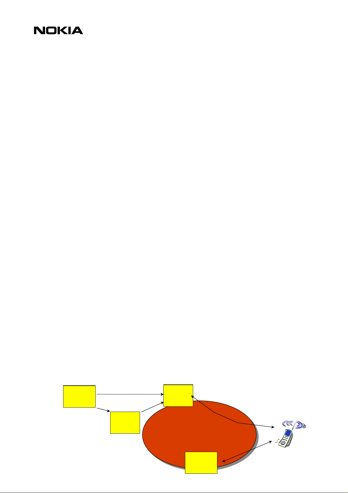
Figure 2 shows the network-related elements required for developing and offering services to mobile
users.
.
Web
Server
HTML
WML
HTML
Filter
WML
WAP
Proxy
Wireless
Network
Binary WML
WTA
Server
Binary
WML
Page 8

Figure 2 – Network-Related Elements for WAP Applications
8 (26)
Web Server
The Web Server stores the applications written in WML. Alternatively, existing HTML applications can
be used.
HTML Filter
Any applications written in HTML will have to be converted to WML before they are sent to the mobile
terminal. This HTML Filter may form part of the Web Server or the WAP Proxy.
WAP Proxy
The WAP Proxy acts as the gateway between the cellular network and the Inter/Intranet. It binary
encodes the information which is to be sent to the mobile terminal and decodes information sent from
the mobile terminal.
WTA Server
The WTA server handles network-specific applications. These applications are not discussed in this
document.
2.4 Further Information
Further information about WAP is available on the Internet at www.wapforum.org.
:
:
:
:
Page 9

3. INTRODUCTION TO THE USER INTERFACE OF THE NOKIA 9110i COMMUNICATOR
This section gives a short overview of the user interface of the Nokia 9110i Communicator. The Nokia
9110i is a Communicator device with features of both PDA and CMT sides. WAP services application is
implemented in PDA side together with the other Internet services, like Mail and WWW. The phone UI
in the CMT part does not contain any WML browser.
This section provides a basic understanding of how the product behaves when using different kinds of
Browser/WML elements.
9 (26)
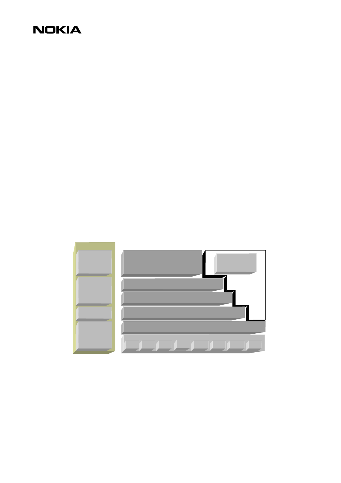
Figure 1 shows the User Interface of the Nokia 9110.
Figure 1.
3.1 Keypad
Keypad type in 9110i Communicator is QWERTY keyboard with a menu key.
3.2 Display - detailed description
3.2.1 Overview
PDA screen resolution is 640x200 pixels. The screen is divided into three parts; the indicator area, the
application area and the command button area.
• In the indicator area there are spaces reserved for different kinds of information, e.g. inbox and
outbox, clock, profile etc. The indicator area is 80 pixels wide
• The width of the command button area is dynamic, it depends on the longest command text in the
view. The width changes only if the whole view changes, i.e. the width remains the same when
only the button texts change in the same view. The command texts are aligned right. The minimum
width of the command button area is 80 pixels, the maximum being 130 pixels.
Page 10

10 (26)
• The size of the application area depends on the width of the longest command button text. The
minimum width of the command button area is 430 pixels, the maximum being 480 pixels.
Command
Indicator
area
Application area
button area
area
Search
field
Figure 2 Different parts of the display
3.2.2 Display components
The display is able to show 16 grey tones. All of these will be used when images are shown. Only 4
tones are to be used in the system UI (i.e. components, icons, the indicator area etc.)
The fonts use two different tones (Black, grey 2N), grey. Normally all texts are black. When command
buttons or texts in the active window are dimmed (meaning that the user can’t select them) grey 2N is
used.
3.3 WAP Browser Display
WAP services main view is shown below:
Selection
frame
Scroll
bar
Figure 3. Main view
Page 11

11 (26)
WAP Browser main view opens when selecting WAP services from Internet application. The homepage
URL is displayed on the bottom line of the view, if the URL exceeds the end of line, the remaining part
of the name is not showed to the user.
View includes buttons:
Button 1: Home
Button 2: Bookmarks
Button 3: Settings
Button 4: Hang up / Close
Home button fetches information from the homepage (address can be seen at the bottom of the main
view). Homepage is related to the used access point. Access point and homepage can be set at Settings.
In case there are no access point defined, the Home – button is dimmed. Home-button is also dimmed
if no Home page has been defined in selected access point settings.
Bookmarks –button opens the Bookmarks view. Settings button opens the Settings view. Close – button
(offline) closes the Main view and returns to the Internet application main view. If the data call is
active the WAP services application main view contains button "Hang up". When "Hang up" – button is
pressed, the flashing note: ”Disconnecting from the network…” is shown. Flashing note is removed,
after the data call is dropped.
4. GENERAL USABILITY ISSUES – GUIDELINES FOR DESIGN
Nokia Mobile Phones are renowned for their simple to use and intuitive user interface. In order to
create a service that will be perceived as usable and easy to understand, Nokia Mobile Phones provides
some general guidelines to help service providers develop their applications.
4.1 Validate Your WML
There are several XML validators available that validate your documents against WML Document Type
Definition. It is recommended that authors validate their WAP pages, because invalid WML is always
treated as an error and discarded (ie. not shown to the user!).
Several XML validators can be found at http://www.wapdevelopers.org/xml.tpl?CALLER=index.tpl.
4.2 Site Organization
4.2.1 Avoid ‘doormat’ pages
The user is accessing your WAP site over a GSM data call, and pays per second. It is not recommended
to start your site using a ‘doormat’ page, which has no functionality other than perhaps to greet the
visitor and to display a logo. It is better to go to your service directly. If there's a need to use timer it
shouldn't be timed longer than ~1,5 sec, otherwise add a link 'continue' to give the user possibility to
exit the card.
4.2.2 Automatically Detect the Browser
If you are using a modern web site hosting environment, it is possible to detect the browser as well as
the language mode and supply correct content transparently, without user interaction. 9110i
Communicator display is larger and has more possibilities than usually phone displays that is wort h to
take advantage of.
Page 12

4.2.3 Optimize for Size
The size of the content is critical. If you have large decks (listings, large tables, etc.), consider splitting
them in multiple parts for faster download.
As for the total download time, some studies place an upper limit for acceptable delay to 10 to 15
seconds, including all images, on a PC-based browser. It is highly recommended to have a response
time (excluding connection time) less than 10s in mobile environment.
4.2.4 Choose Descriptive Card Titles
It is very useful to give a descriptive name for the card. It might be a good idea to start the title with
your service’s name and keep the total length of the title short.
It also pays to use meaningful URLs since the user sees the URL of the currently selected link on the
screen and can use it as a navigational help, especially when images have not been loaded.
4.2.5 Pay Attention to the First Screenful
12 (26)
Because of 9110i's form factor, the first (topmost) screenful of any page is the most important one. All
of the often-used navigational links, search fields, login screens, and bulk of the information should
reside there if at all. The user is then able to navigate forward before the rest of the card has been
loaded, and the user does not have to scroll the card.
Avoid wasting the top of the page for banner advertisements or non-informative graphics. It is better
to place the advertisements at the left or right edges than on the top.
4.2.6 Do Not Use Absolute Values for the Screen Size
When using images the use of absolute values (in pixels) is not recommended. Sizes should be specified
as percentages from the total width or height.
4.2.7 DO-elements Usage
Always use descriptive and short labels for all DO-elements. Favor local DO-elements instead of
anchored links that are totally out of surrounding context. Global DO-elements should be used only
when especially needed at the end of the card. Always include prev element in every card to enable
backward navigation.
4.3 Pictures, Tables and Colour
4.3.1 Avoid Useless Images
Downloading of images takes time, and many users may switch the loading of images off for more
speed. Try to optimize the size of images. If you have large pictures on your site, consider using
thumbnails for the image index.
Always give an alternative text (using the ALT attribute of the IMG element) for images that convey
information. Always use a null alternative text (ALT=””) for images which do not convey information, or
are used for page layout or decorative purposes only.
Page 13

4.3.2 Use Reasonable Tables Sizes
If the table size exceeds the maximum width of WAP services application screen due to number of
columns the table size will be scaled down to fit the screen. To keep the cell content readable, special
attention should be paid on table structuring.
4.4 Use of card titles and element labels
Card titles describe the content of the display and their use is recommended. They help the user to
navigate in the application because they function as a reminder of where the user is in the application.
The header text should be determined by the item previously selected by the user. For instance, the
card title ‘Bookmarks’ tells the user that the display contains a list of bookmarks in the application and
that the Options item previously selected was Bookmarks.
Proportional fonts are used in header texts, and if the header text is too long it is automatically
truncated. Truncation is usually better than abbreviations, because the user might be confused by
unfamiliar abbreviations that can be difficult to understand.
13 (26)
4.5 Perform usability test
It is always good to perform a usability test of new applications. People who have not been involved in
the design or development of the applications tend to notice potential usability problems often not
obvious to those who know the design by heart. Usability tests should always be performed as early as
possible in the development process. Any necessary changes resulting from the tests can then be
implemented within the development timescale. Try to recruit users who are representative of the end
users of the application, and try to conduct the usability test on a smaller scale, if the timescale does
not allow for extensive testing.
5. NOKIA 9110i COMMUNICATOR USER INTERFACE ELEMENTS OF WML
This chapter is a guide for using WML in designing services specially for Nokia 9110i Communicator. It
is an overview of the graphical user interface elements and their WML capabilities supported by the
browser so the document doesn't include all possible WML elements and attributes. WML Version
supported in 9110i is v1.1.
The elements are shortly described and shown in example figures and WML code. The code examples
include only the essential part in using the elements ie. the document prologue is not shown after
example 1.
5.1 Display and Formatting Elements
WAP service features include a display size of a 640x200 pixels, lines of text for data 8 and
approximately 60 normal characters are suited per line. The pixel shape is rectangular and the pixel
pitch is 0,17mm. The display can be scrolled vertical with the arrow key and for selecting there is a gobutton.
The screen has an indicator pane on the left and the soft button pane on the right. The vertical scroll
bar is visible if the card does not fit on the screen all at once.
The title row is divided in two parts. On the left, the title of the card is shown. On the right, the title of
the currently active element is shown.
Page 14

5.1.1 Card
14 (26)
If the title of the card is too long, the end of the title is not shown. If the active element is too long the
end of the element is not shown. If the title of the active hyperlink is not defined the actual URL is
shown. If the URL is too long, the end of the URL is not shown.
For example if the user navigates to a select element, its title is displayed. While the user is choosing
something from the select menu, the title is updated to reflect the option currently under the cursor.
After the selection has been done, the title shows the title of the select element again.
The card element is a container of text and input elements and indicates the general layout. The order
of elements in a card is significant.
Example 1 WML deck with cards
<?xml version="1.0"?>
<!DOCTYPE wml PUBLIC "-//WAPFORUM//DTD WML 1.1//EN"
"http://www.wapforum.org/DTD/wml_1.1.xml">
<wml>
<card id="card1" title="Nokia Group">
<p>
<img src="n2_black.wbmp" alt="nokia"/><br/>
<big>Nokia Group</big><br/>
<a title="Nokia In Brief" href="info.wml">General Information –
Nokia In Brief</a> <br/>
<a title="Research Projects" href="NRCprojects.wml">Research And
Development</a><br/><br/>
<big>News Release - Latest Releases</big><br/>
<a title="Financial Information" href="Financial.wml">Financial
Information</a>
</p>
<do type="prev" label="Back">
<prev/>
</do>
5.1.2 Paragraph
</card>
</wml>
Paragraph <p> determines the text groups, new paragraph always starts at a new line. Sentences too
long to fit the screen are in all cases word-wrapped. Text inside a paragraph can be aligned left, center
or right by option, left is displayed by default. Align is determined in paragraph attributes (f.ex. <p
align="right">).
Page 15

5.1.3 Text formatting elements
The normal font size used in 9110i is 12 pixels. The 9110i browser supports all text emphasis elements
of WML, listed below. The picture below demonstrates how different emphasis elements are rendered
as text and in a table.
Em <em> element is rendered as bold text
Strong <strong> element is rendered as bold + italic text
Italics <i> element is rendered as italic text
Bold <b> element is rendered as bold text
Underlined <u> element is rendered as underlined text
Larger font <big> element is rendered as bigger text than normal, 14+ pixels
Smaller font <small> element is rendered as smaller text than normal, 10 pixels
It is recommended to use the em and strong elements for text formatting where possible.
15 (26)
5.1.4 Line Break
Example 2 Text formatting
<wml>
<card id="card1" title="Emphasis">
<p align="center">
<u>This is how <b> Nokia 9110i </b> shows <i> text:</i><br/>
</u>
<table columns="5">
<tr> <td><b>WML ELEMENT</b></td> <td>em</td> <td>strong</td>
<td>big</td> <td>small</td> </tr>
<tr> <td><b>RENDERING</b></td> <td><em>emphasis</em></td>
<td><strong>strong em</strong></td> <td><big> big font</big></td>
<td><small>smaller font</small></td> </tr>
</table>
</p>
<do type="prev" label="Back">
<prev/>
</do>
</card>
</wml>
New lines in text can be defined by line break element <br>. The <br> can be used inside other
elements as long as it belongs to a paragraph.
Page 16

5.1.5 Fieldset
5.1.6 Tables
16 (26)
The <fieldset> -element can be used for grouping elements. It implies a paragraph break between
the elements, and the title of the element is used as the active element’s title if it has no title of its
own. Note that fieldset title is not supported for text ie. text in a card can not be titled by using
fieldset element.
The table element <table>, and its content <tr> and <td> is used to create columns and rows of
text and images in a card. Table elements do not specify column or intercolumn widths, the width of
the column is same as the width of the widest cell in the column. If the cell content is too long to be
displayed in one row, the text is automatically word wrapped to required amount of rows to fit the cell.
The table may also contain links, they are focused from left to right and from top to bottom order
when scrolling down with arrow keys. Images and other elements can be placed inside a table and the
maximum columns of a table is 10. All exceeding columns cell contents are alltogether rendered in the
last column of table.
Table attributes:
columns specifies the number of columns for the row set
align alignment of the cell content. Possible values are left, right and center. Left alignment is
the default mode.
Example 3 Table element (see example 2 for table element as well).
<wml>
<card id="card1" title="Weather Forecast">
<p>
<table columns="4" align="LCCL">
<tr>
<td><a title="link to week/year" href="#date">Date</a></td>
<td>F'cast</td><td>T°C</td>
<td>Description</td>
</tr>
<tr>
<td>M 6/7</td><td><img src="rainy.wbmp" alt="rain"/></td>
<td>Hi 20°C, Lo 13°C</td><td>Rainy</td>
</tr>
<tr>
<td>T 6/8</td><td><img src="partcldy.wbmp" alt="part cldy"/></td>
<td>Hi 25°C, Lo 15°C</td><td>Partly cloudy</td>
</tr>
<tr>
Page 17

<td>W 6/9</td><td><img src="cloudy.wbmp" alt="cloudy"/></td>
<td>Hi 22°C, Lo 18°C</td><td>Cloudy</td>
</tr>
<tr>
<td>T 6/10</td><td><img src="rainy.wbmp" alt="rainy"/></td>
<td>Hi 20°C, Lo 13°C</td><td>Rainy</td>
</tr>
<tr>
<td>F 6/11</td><td><img src="sunny.wbmp" alt="sunny"/></td>
<td>Hi 28°C, Lo 20°C</td><td>Sunny</td>
</tr>
</table>
</p>
<do type="prev" label="Back">
<prev/>
</do>
</card>
</wml>
17 (26)
5.2 Images, Links and Timers
5.2.1 Img – Images
Use the image element <img> to show an image in a card. Nokia 9110i Communicator supports
image format Wireless Bitmap (wbmp). The alt-text (used as attribute) is shown on the screen during
the load time or if the image cannot be displayed at all. Images sizes can be 8192 bytes or less, there
are no actual limits in image physical measurements, however user must scroll down higher images
and only leftmost part is shown for images wider than browser area. If image size is determined using
percentages (as it is recommended) it is related to the maximum size of image, ie. 8192 bytes. Images
can also be used inside a table (see example 3) and as links (see example 5).
Image attributes:
alt specifies an alternative textual representation for the image. This representation is used
src specifies the URI for the image. The browser downloads the image from the specified URI
vspace specify the amount of white space to be inserted to the above and below an image or
hspace specify the amount of white space to be inserted to the left and right an image or object
height
width give user agents an idea of the size of an image or object so that they may reserve space
when the image cannot be displayed using any of the methods.
and renders it when the text is being displayed.
object
for it and continue rendering the card while waiting for the image data.
Page 18

Example 4. Image handling
<wml>
<card id="card1" title="The sun - images">
<p>
original size:<img src="sunny.wbmp" alt="sun"/>
enlarged image:<img src="sunny.wbmp" alt="sun" height="40%" width="40%"/>
<br/>
stretched image:<img src="sunny.wbmp" alt="sun" hspace="80" vspace="30"
height="40" width="80"/>
</p>
<do type="prev" label="Back">
</do>
</card>
</wml>
5.2.2 ANCHOR & A – Hyperlink
18 (26)
<prev/>
Use the <anchor> element to create a hyperlink. A hyperlink provides easy navigation through an
application and lets the user navigate to a new location. Link can be either text or an image. The <a>
element is a short form of the <anchor> element, and is bound to a go task without variables. In
general it is recommended to use the <a> element instead of <anchor> where possible, to allow
more efficient tokenisation.
Anchor- and a- attributes:
title specifies a brief text string identifying the link. In 9110i the link is displayed on a title
row, right side.
In example 5 there is a text link (the "products" card) and an image link (the "group" card) to another
card in the deck. The user activates a link by pressing go-button. The second card ("products") has links
to a local URL ("Mobile Phones" and “Wireless Data). “Nokiahome” is a link back to the first card.
Anchored links are rendered as underlined, and when selected with highlight emphasis. Note that as
links are placed within text the spaces around it has to be defined separately, this can be done by using
non-breaking space ( ) before and after the link.
Example 5, Text and image as a link
<wml>
<card id="nokiahome" title="Nokiahome">
<p>
Page 19

NOKIA - connecting people<br/><br/>
Here's a <anchor title="Link to Products">link
<go href="#products"/></anchor> to Nokia
products.<br/>
The image below can be used as a link to Nokia Group
page.<br/>
<a title="Link to Nokia Group" href="#group">
<img src="nokiaLOGO2.wbmp" alt="nokia"/></a>
</p>
<do type="prev" label="Back">
<prev/>
</do>
</card>
<card id="products" title="Products">
<p>
<a title="Link to Mobile Phones" href="phones.wml">Mobile
Phones</a><br/>
<a title="Link to Wireless Data" href="data.wml">Wireless
Data</a><br/><br/>
<a title="Nokiahome" href="#nokiahome">Nokiahome</a>
</p>
<do type="prev" label="Back">
<prev/>
</do>
</card>
<card id="group" title="Nokia Group">
<p>
<a title="NMP" href="nmp.wmlc">NMP</a><br/>
<a title="NET" href="nmp.wmlc">NET</a><br/><br/>
<a title="Nokiahome" href="#nokiahome">Nokiahome</a>
</p>
<do type="prev" label="Back">
<prev/>
</do>
</card>
</wml>
19 (26)
5.2.3 Timer
The timer element declares a card timer, which exposes a means of processing inactivity or idle time.
This element can be used only once in card and its unit is 1/10s.
Timer attributes:
name specifies the name of the variable to be set with the value of the timer
value indicates the default timer value. If the name variable already contains a value, the value
attribute is ignored.
Example 6. Timer
<card id="card1" title="Timer" ontimer="#card2">
<timer value="10"/>
<p>
Page 20

<img src="nokia3.wbmp" alt="nokia3"/>
</p>
</card>
<card id="card2" title="Nokia page">
<p>
…
</p>
</card>
</wml>
5.3 DO element and dynamic bu t tons
5.3.1 WML DO Construct: Dynamic Buttons
WML makes it possible to include ‘dynamic buttons’ in the card. The do element binds a task to a user
action. The buttons are displayed in a neat fashion (flushed left with a little space between the
buttons). Figure below illustrates the dynamic buttons with input fields.
20 (26)
If the dynamic buttons are specified in card wide scope (inside a card), they are rendered inline within
the text. Deck wide do-elements are always placed at the end of the card.
Please note that if there is no label attribute defined for a do-element, the button will be named 'go'.
Therefore, pay a special attention to always include a label attribute in a do-element.
In addition, there is a special menu item called 'Actions', which is a list of current dynamic do controls.
The item names in Actions menu are the same as the button labels. If there is no label, the menu item
will be named 'go'. Therefore do-elements should always have a label attribute defined. Furthermore, if
no action buttons have been defined, Action menu is empty (dimmed). Actions can be shadowed by a
noop event in which case they are not shown in the list at all. All optional do elements are rendered.
DO-attributes:
label specifies a textual string suitable for labelling of a button.
name specifies the name of the do event binding.
Optional Boolean. If this attribute has a value of true, the user agent may ignore this element
type provides a hint to the user agent about the authors intended use of the element and how
the element should be mapped to a physical user interface construct.
Example 7. DO-element - buttons
<wml>
<template>
Page 21

<do type="options" name="help-button" label="Nokia Help">
<go href="http://.../help.wml"/>
</do>
<do type="options" label="Contact">
<go href="http://.../contact.wml"/>
</do>
<do type="prev" label="Back">
<prev/>
</do>
</template>
<card id="nokiahome" title="Nokiahome">
<p>
Please, register<br/>
Username:
<input name="username" type="text" title="Username"/>
Password:
<input name="password" type="password" title="Password"/>
<do type="accept" label="Enter">
<go href="#confirm"/>
</do>
</p>
</card>
<card id="confirm" title="Confirmation">
<p>
$(username), you've registered.
</p>
</card>
</wml>
21 (26)
Back-button
prev elements are mapped to the 2nd soft button, to the menu items list and to a button with default
label 'go' but can be labelled with any text desired. Pressing the Back button will activate the prev
element. If there is no deck-wide prev element, the button and the menu item will be mapped to
card-wide prev element. If there is no card-wide prev element, the button and menu item will be
dimmed and disabled. Note that including prev element in every wml-page (either deck- or card-wide)
is highly recommended.
Card-wide prev elements can be placed inline with text and other elements but otherwise is rendered
the same way as deck-wide prev. Deck-wide prev elements are always placed at the end of card and
should be used only when the back-button is especially needed at the end of the card. Deck-wide prev
can be seen in example 7 and the following pictures show how the card-wide prev element can be
placed in a card.
Page 22

Example 8. Card-wide back-button
<wml>
<card id="prevcard1" title="Cardwide prev">
<p>
Cardwide prev can be placed between text or other
elements,
<do type="prev" label="Cardwide prev">
<prev/>
</do>
on bottom of page just like deckwide prev <a
title="prev on top of page" href="#prevcard2">or...</a>
</p>
</card>
22 (26)
<card id="prevcard2" title="Cardwide prev2">
<do type="prev" label="Cardwide prev">
<prev/>
</do>
<p>
...cardwide prev can be placed on the top of page
</p>
</card>
</wml>
Example 9. Deck-wide back-button (see example 7 as well)
<template>
<do type="prev" label="Back">
<prev/>
</do>
</template>
5.4 WML Content Processing
To enable processing of the WML content the following elements are supported.
5.4.1 Tasks – go, prev and noop
The go element declares a go task in response to an event, indigating a navigation to an URI. The URI
can be relative or absolut. The <go/> element is a short form of the <go>…</go> element, and can
only be used without variables.
Page 23

GO Attributes:
href specifies the destination URL. Href is an obligatory attribute.
method specifies the HTTP submission method. Values 'get' and 'post' are accepted, in 9110i 'get'-
A prev element declares a prev task, indicating navigation to the previous URI on the history stack. If
there isn't any history stack the previous task will be dimmed.
A noop element specifies that nothing should be done ie. no operation
5.5 WML Input Processing
There are two kinds of input elements; text-fields determined by input-element and selection lists
determined by select-element. Option elements are used to specify a single choise option in a select
element. Option elements can be grouped by using optgroup-element (see the picture below with
selection lists and input fields).
23 (26)
method is default.
5.5.1 Selection lists
Selection lists (<select><option>) are an input element that specifies a list of options for the
user to choose from. There are single choise and multiple choise lists available, the user can select
multiple choices, if the multiple attribute is set as TRUE (selected items are marked with a selection
symbol).
The figure above shows how the multiple selection element is rendered. When the Select – button is
pressed the item is selected and marked with dark color. When OK is pressed the selections are moved
to the box on the deck. User can see the selections on the box. If those strings cannot fit to the box,
only first ones are shown.
If the selection element attribute multiple is false, the Select and Deselect – buttons are not visible . In
that case the selection is made by pressing OK. Cancel – button cancels the selection and closes the
dialog.
Options can be grouped with <optgroup> element. Option group titles cannot be selected, the
selection bar "jumps" over those. Functionality is similar than selecting multiple items from selection
list.
Select attributes:
multiple indicates that the select list should accept multiple selections. When not set, the select
name name of the variable to set with the result of the selection
list only accepts a single selected option. Possible values true/false
Page 24

value indicates the default value of the variable named in the name attribute
iname the name of the variable to be set with the index result of the selection
ivalue assigned when the variable named in the iname attribute is not set
title specifies a title for this element, which may be used in the presentation of this object
Variables - $identifier, $(identifier), $(identifier:conversion)
5.5.2 Input fields
The input element specifies a text entry object. The maximum size of the input field is 8000 characters.
The shortcuts copy (ctrl+c), cut (ctrl+x) and paste (ctrl+v) can also be used in input fields. In the
picture below there is an example of input fields with text input.
Input attributes:
name name of the variable to set with the result of the user's text input
value indicates the default value of the variable named in the name attribute
type specifies the type of input field. Possible values text/password
format specifies an input mask for input entries.
size specifies the width, in characters, of the text input area
maxlength specifies the maximum number of characters that can be entered by user
title specifies a title for this element, which may be used in the presentation of this object
24 (26)
Example 10. Select element, Input element
<wml>
<card id="phones" title="Information Request">
<p>
Send me more information about:
<select name="models" multiple="true" title="Products">
<optgroup title="Phones">
Page 25

<option value="Nokia 8210">8210</option>
<option value="Nokia 7110">7110</option>
<option value="Nokia 6110">6110</option>
</optgroup>
<optgroup title="Accessories">
<option value="Battery">Battery</option>
<option value="Desktop stand">Desktop stand</option>
<option value="Charger">Charger</option>
<option value="Headset">Headset</option>
</optgroup>
</select>
Please, provide your<br/>
Name:
<input name="name" type="text" title="Name"/>
Address:
<input name="address" title="Address"/>
</p>
25 (26)
<do type="accept" label="Confirm">
<go href="#confirm"/>
</do>
<do type="prev" label="Back">
</do>
</card>
<card id="confirm" title="Confirmation">
<p>
</p>
<do type="prev" label="Back">
</do>
</card>
</wml>
5.6 Labels and titles
Labels are used with do-element to name a dynamic button. The use of label attribute is highly
recommended because the default label for every button is 'go' (see 5.3.1 for dynamic labels). Titles are
used in presenting the element that is currently active. In 9110i Communicator the title card is
displayed on the left side of the title row and the title of an active element is displayed on the right
side of the title row.
<prev/>
$(name), we are pleased to send you more
information about $(models).
<prev/>
Elements with title attribute are:
<anchor>
<select>
<option>
<optgroup>
<input>
<fieldset>
Page 26

5.7 Limitations
26 (26)
<table>
This section includes the technical limitations of the WAP services application.
The limitation for encoded WML file is 8192 Bytes.
META DATA (HTTP-EQUIV) is handled like WAP stack handles it.
The User-Agent header Information given to the server is "Nokia9110/1.0".
 Loading...