

Page 1

Using Flex Builder
Page 2

Trademarks
ActiveEdit, ActiveTest, Add Life to the Web, Afterburner, Aftershock, Andromedia, Allaire, Animation PowerPack, Aria, Attain,
Authorware, Authorware Star, Backstage, Blue Sky Software, Blue Sky, Breeze, Bright Tiger, Captivate, Clustercats, ColdFusion,
Contents Tab Composer, Contribute, Design In Motion, Director, Dream Templates, Dreamweaver, Drumbeat 2000, EDJE,
EJIPT, Extreme 3D, Fireworks, Flash, FlashCast, FlashHelp, Flash Lite, FlashPaper, Flex, Flex Builder, Fontographer, FreeHand,
Generator, Help To Source, HomeSite, Hotspot Studio, HTML Help Studio, JFusion, JRun, Kawa, Know Your Site, Knowledge
Objects, Knowledge Stream, Knowledge Track, LikeMinds, Lingo, Live Effects, MacRecorder Logo and Design, Macromedia,
Macromedia Action!, Macromedia Central, Macromedia Flash, Macromedia M Logo and Design, Macromedia Spectra,
Macromedia xRes Logo and Design, MacroModel, Made with Macromedia, Made with Macromedia Logo and Design, MAGIC
Logo and Design, Mediamaker, Movie Critic, Open Sesame!, RoboDemo, RoboEngine JFusion, RoboHelp, RoboHelp Office,
RoboInfo, RoboInsight, RoboPDF, 1-Step RoboPDF, RoboFlash, RoboLinker, RoboScreenCapture, ReSize, Roundtrip,
Roundtrip HTML, Shockwave, Sitespring, Smart Publishing Wizard, Software Video Camera, SoundEdit, Titlemaker,
UltraDev, Web Design 101, what the web can be, WinHelp, WinHelp 2000, WinHelp BugHunter, WinHelp Find+, WinHelp
Graphics Locator, WinHelp Hyperviewer, WinHelp Inspector, and Xtra are either registered trademarks or trademarks of
Macromedia, Inc. and may be registered in the United States or in other jurisdictions including internationally. Other product
names, logos, designs, titles, words, or phrases mentioned within this publication may be trademarks, service marks, or trade
names of Macromedia, Inc. or other entities and may be registered in certain jurisdictions including internationally.
Third-Party Information
This guide contains links to third-party websites that are not under the control of Macromedia, and Macromedia is not
responsible for the content on any linked site. If you access a third-party website mentioned in this guide, then you do so at your
own risk. Macromedia provides these links only as a convenience, and the inclusion of the link does not imply that Macromedia
endorses or accepts any responsibility for the content on those third-party sites.
Copyright © 2004 Macromedia, Inc. All rights reserved. This manual may not be copied, photocopied, reproduced,
translated, or converted to any electronic or machine-readable form in whole or in part without written approval from
Macromedia, Inc. Notwithstanding the foregoing, the owner or authorized user of a valid copy of the software with which
this manual was provided may print out one copy of this manual from an electronic version of this manual provided with
the software for the sole purpose of learning to use such software by such owner or authorized user; provided, that no part
of this manual may be printed out, reproduced, distributed, resold or transmitted for any other purposes, including
without limitation, commercial purposes, such as selling copies of this documentation or for providing paid for support
services
Acknowledgments
Senior Management: Sheila McGinn
Project Management: Charles Nadeau
Writing: Charles Nadeau
Editing: Lisa Stanziano, Mary Ferguson, Rosana Francescato, Linda Adler
Production Management: Patrice O’Neill
Media Design and Production: John Francis, Adam Barnett, Aaron Begley
Special thanks to Heidi Bauer-Williams, Gabe Chua, Larry McLister, Paul Gubbay, Brad Becker, David Lenoe, Lucian Beebe,
Lori Hylan-Cho, Mark Shepherd, Tanya Dimalsky, Matthew Hoffberg, Jon Varese, Dave George, Brandon Purcell, Stephen
Gilson and the Flex IMD team, the beta testers, and the entire Flex Builder engineering and QA teams.
Second Edition: December 2004
Macromedia, Inc.
600 Townsend St.
San Francisco, CA 94103
Page 3

CONTENTS
CHAPTER 1: Getting Started with Flex Builder . . . . . . . . . . . . . . . . . . . . . . . . . . . . 5
Exploring the authoring environment . . . . . . . . . . . . . . . . . . . . . . . . . . . . . . . . . . . 5
Starting a new application in Flex Builder . . . . . . . . . . . . . . . . . . . . . . . . . . . . . . . . 9
Defining a site for the Flex Sample Apps application. . . . . . . . . . . . . . . . . . . . . . . 12
Getting help in Flex Builder . . . . . . . . . . . . . . . . . . . . . . . . . . . . . . . . . . . . . . . . . 17
What you need to build Flex applications . . . . . . . . . . . . . . . . . . . . . . . . . . . . . . . 18
Typographical conventions of this guide . . . . . . . . . . . . . . . . . . . . . . . . . . . . . . . . 20
CHAPTER 2: Flex Builder Tutorials . . . . . . . . . . . . . . . . . . . . . . . . . . . . . . . . . . . . 21
Tutorial: Setting up a development environment. . . . . . . . . . . . . . . . . . . . . . . . . . 21
Tutorial: Creating a layout with Flex Builder. . . . . . . . . . . . . . . . . . . . . . . . . . . . . 26
Tutorial: Building custom components with Flex Builder . . . . . . . . . . . . . . . . . . . 34
Tutorial: Binding components to data with Flex Builder . . . . . . . . . . . . . . . . . . . . 58
Next steps . . . . . . . . . . . . . . . . . . . . . . . . . . . . . . . . . . . . . . . . . . . . . . . . . . . . . . . 74
CHAPTER 3: Creating, Coding, and Debugging Flex Files . . . . . . . . . . . . . . . . . . 75
Creating MXML or ActionScript files . . . . . . . . . . . . . . . . . . . . . . . . . . . . . . . . . . 75
Working with the code in Flex files . . . . . . . . . . . . . . . . . . . . . . . . . . . . . . . . . . . . 76
Testing and debugging Flex files . . . . . . . . . . . . . . . . . . . . . . . . . . . . . . . . . . . . . . 83
CHAPTER 4: Building a Flex User Interface Visually . . . . . . . . . . . . . . . . . . . . . . 95
Customizing the Document window. . . . . . . . . . . . . . . . . . . . . . . . . . . . . . . . . . . 96
Laying out your user interface with MXML containers . . . . . . . . . . . . . . . . . . . . . 97
Adding Flex components to the user interface . . . . . . . . . . . . . . . . . . . . . . . . . . . . 98
Repositioning Flex components. . . . . . . . . . . . . . . . . . . . . . . . . . . . . . . . . . . . . . . 99
Resizing Flex components . . . . . . . . . . . . . . . . . . . . . . . . . . . . . . . . . . . . . . . . . . 100
Cutting, copying, and pasting Flex components . . . . . . . . . . . . . . . . . . . . . . . . . 100
Editing Flex component properties . . . . . . . . . . . . . . . . . . . . . . . . . . . . . . . . . . . 101
Applying CSS styles to Flex components . . . . . . . . . . . . . . . . . . . . . . . . . . . . . . . 102
Applying effects to Flex components . . . . . . . . . . . . . . . . . . . . . . . . . . . . . . . . . . 109
Assigning event handlers to components . . . . . . . . . . . . . . . . . . . . . . . . . . . . . . . 114
3
Page 4

CHAPTER 5: Working with Components . . . . . . . . . . . . . . . . . . . . . . . . . . . . . . 117
Inserting controls and containers in an MXML file . . . . . . . . . . . . . . . . . . . . . . . 117
Creating MXML component files . . . . . . . . . . . . . . . . . . . . . . . . . . . . . . . . . . . . 121
Synchronizing with custom components on the server . . . . . . . . . . . . . . . . . . . . 125
CHAPTER 6: Working with Data . . . . . . . . . . . . . . . . . . . . . . . . . . . . . . . . . . . . . 127
Binding a control or container. . . . . . . . . . . . . . . . . . . . . . . . . . . . . . . . . . . . . . . 127
Editing a binding visually . . . . . . . . . . . . . . . . . . . . . . . . . . . . . . . . . . . . . . . . . . 129
Working with Flex data models . . . . . . . . . . . . . . . . . . . . . . . . . . . . . . . . . . . . . . 129
Working with Flex data services. . . . . . . . . . . . . . . . . . . . . . . . . . . . . . . . . . . . . . 136
APPENDIX A: Basic Flex Concepts . . . . . . . . . . . . . . . . . . . . . . . . . . . . . . . . . . 145
About the Flex application model . . . . . . . . . . . . . . . . . . . . . . . . . . . . . . . . . . . . 145
Typical application development steps. . . . . . . . . . . . . . . . . . . . . . . . . . . . . . . . . 146
About Flex files . . . . . . . . . . . . . . . . . . . . . . . . . . . . . . . . . . . . . . . . . . . . . . . . . . 146
About Flex containers, components, and controls . . . . . . . . . . . . . . . . . . . . . . . . 148
About Flex data bindings. . . . . . . . . . . . . . . . . . . . . . . . . . . . . . . . . . . . . . . . . . . 150
INDEX . . . . . . . . . . . . . . . . . . . . . . . . . . . . . . . . . . . . . . . . . . . . . . . . . . . . . . . . . . 155
4 Contents
Page 5

CHAPTER 1
Getting Started with Flex Builder
This chapter provides an overview of Macromedia Flex Builder and steps to get started developing
Flex applications.
Flex Builder is an integrated development environment (IDE) for Flex developers. Because it’s
tightly integrated with the Macromedia Flex server, the Flex application model, and the Flex
programming languages, Flex Builder can improve the productivity of all members of your
development team.
This guide focuses on Flex Builder. If you’re new to Flex, you may want to review Appendix A,
“Basic Flex Concepts,” on page 145. For in-depth information about Flex (as opposed to Flex
Builder), see Developing Flex Applications Help and the Flex ActionScript and MXML API
Reference Help.
The following topics are covered in this chapter:
• “Exploring the authoring environment” on page 5
• “Starting a new application in Flex Builder” on page 9
• “Defining a site for the Flex Sample Apps application” on page 12
• “Getting help in Flex Builder” on page 17
• “What you need to build Flex applications” on page 18
• “Typographical conventions of this guide” on page 20
Exploring the authoring environment
The Flex Builder IDE lets you write, edit, debug, and preview MXML and ActionScript files, and
includes the following features:
The Start page provides links to quickly define a site, create and open files, and access useful
information about Flex Builder. For example, you can take a quick tour, explore Flex samples,
take tutorials, and learn about debugging in Flex Builder.
5
Page 6
Design view (View > Design) lets you lay out and edit an MXML user interface visually. Design
view has two modes: Expanded and Standard. In Expanded mode, you can easily insert, edit,
position, or resize MXML components because Flex Builder adds temporary borders and padding
around objects. In Standard mode, Flex Builder removes the borders and padding to give you a
more accurate picture of how the MXML file will look in Macromedia Flash Player.
Code view (View > Code) lets you work with code. MXML and ActionScript syntax is color-
coded and code hints assist you as you type. Design view tools such as the Insert bar, Tag
inspector, and Data panel are also fully functional in Code view.
The ActionScript debugging panels help you debug your code after setting breakpoints and
switching to debug mode. The debugging panels include the Variables panel, the Watch panel,
the Output panel, and the Call Stack panel. For more information, see “Debugging ActionScript”
on page 87.
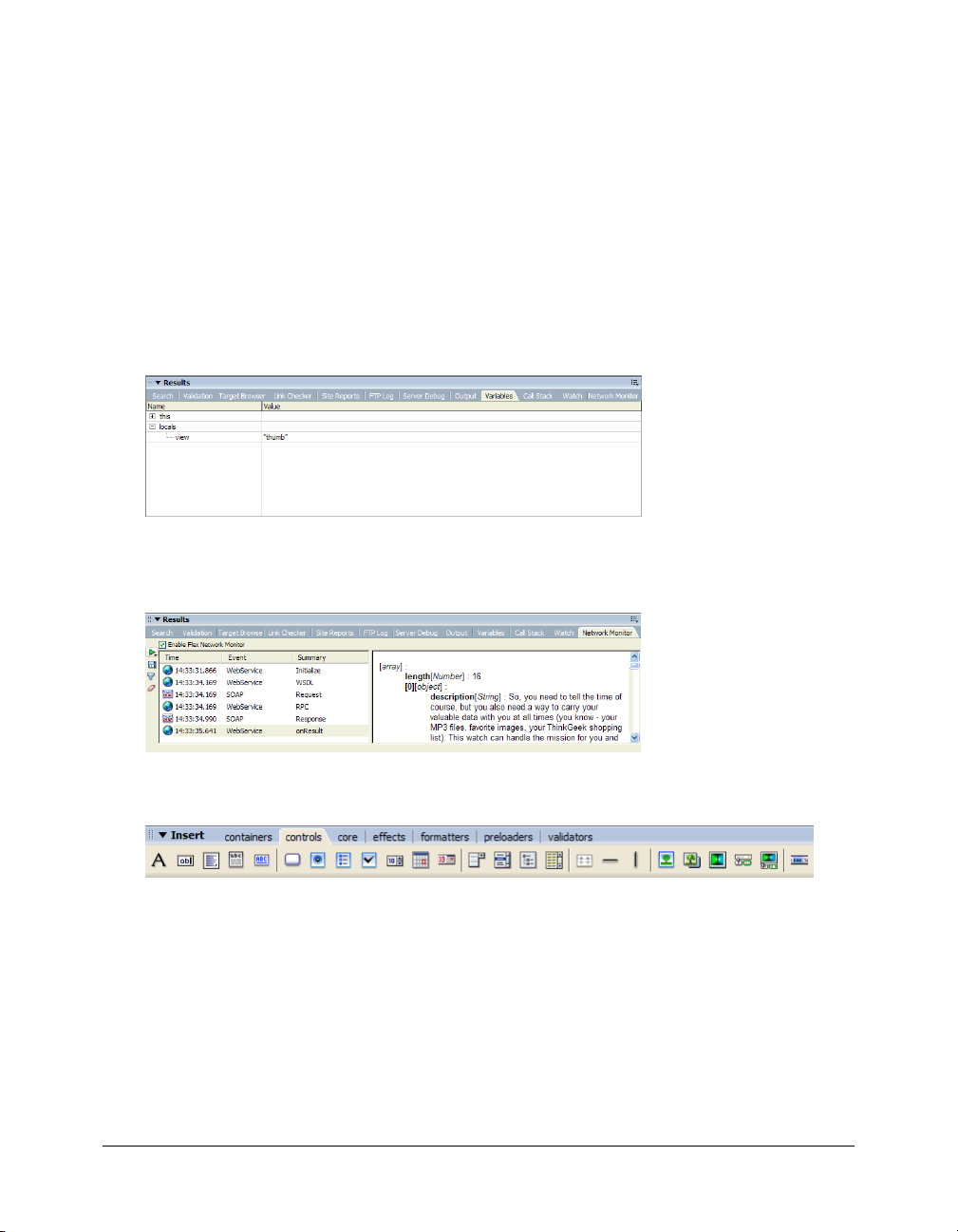
The Network Monitor panel helps you monitor network traffic and data going back and forth
between the client and the Flex server. For more information, see “Debugging applications by
monitoring interactions with the server” on page 91.
The Insert bar lets you rapidly insert Flex containers and components in Design view by clicking
or dragging. The Insert bar also lets you rapidly insert their tags in Code view.
Note: The Favorites tab found in Macromedia Dreamweaver is not supported in Flex Builder.
6 Chapter 1: Getting Started with Flex Builder
Page 7
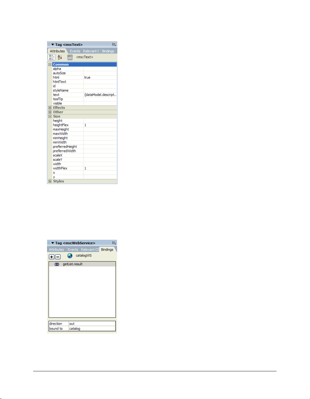
The Tag inspector lets you set the properties of containers and components in the file. You can
also use it to apply effects, specify event handlers, modify CSS styles, and create data bindings.
The Tag inspector replaces the traditional Property inspector in Dreamweaver. While you can still
use the Property inspector for editing HTML and other document types in Flex Builder, it is
disabled when you work on MXML or ActionScript files.
The Bindings panel in the Tag inspector lets you visually bind components, Flex data models,
and Flex data services to other components, data models, and data services. After creating the
binding, data can pass between the objects at runtime.
Exploring the authoring environment 7
Page 8
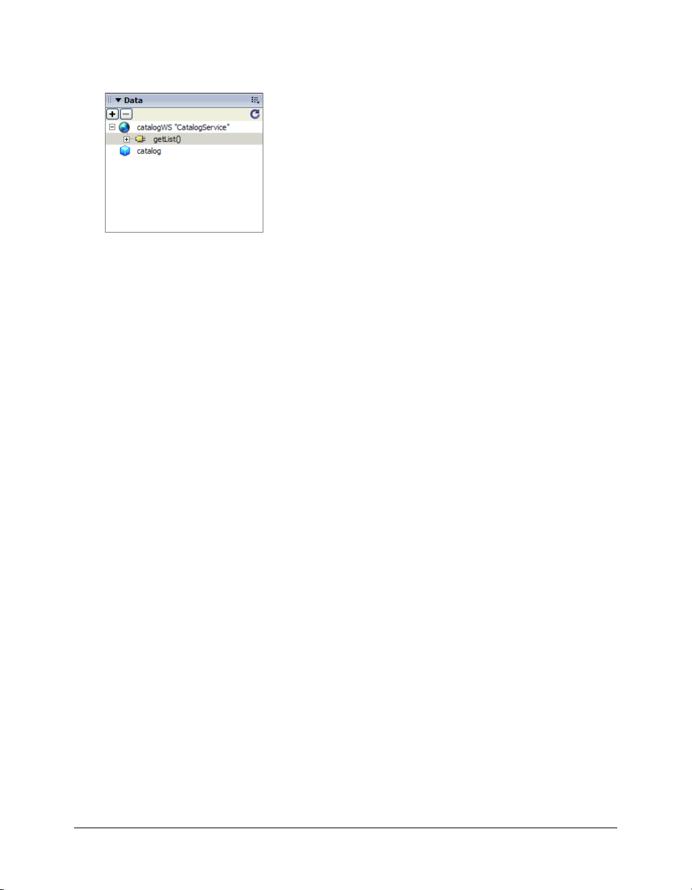
The Data panel lets you inspect the data services (such as web services) and data models in the
current MXML file, as well as insert or delete services in the file.
You can work in Design view, Code view, or both.
To switch between Design and Code views:
1.
Open any MXML file in Flex Builder by double-clicking the file in the Files panel
(Window > Files).
2.
If you’re in Code view and you want to work in Design view, do one of the following:
■ Click the Design button on the Document toolbar.
■ Select View > Design.
■ Press Control+’ (the slanted quotation mark that usually shares the tilde (~) key).
Note: You can’t work on ActionScript files in Design view. Because ActionScript files don’t render
in Flash Player, they would appear blank in Design view. As a result, Flex Builder always displays
ActionScript files in Code view.
3.
If you’re in Design view and you want to work in Code view, do one of the following:
■ Click the Code button on the Document toolbar.
■ Select View > Code.
■ Press Control+’ (the slanted quotation mark that usually shares the tilde (~) key).
4.
To split the view to see both Design and Code views, do one of the following:
■ Click the Split button on the Document toolbar.
■ Select View > Code and Design.
5.
To place Code view on a separate monitor, open the Code inspector (Window > Code Inspector
or F10) and position it on the second monitor.
For more information on the coding environment, see “Working with the code in Flex files”
on page 76. For more information on the visual environment, see Chapter 4, “Building a Flex
User Interface Visually,” on page 95.
8 Chapter 1: Getting Started with Flex Builder
Page 9
Starting a new application in Flex Builder
The first step in creating any new Flex application in Flex Builder is to define a Flex Builder site.
A Flex Builder site is analogous to a project in other development environments: it lets you
manage files and transfer them to the computer running the Flex server. A Flex Builder site also
lets you visually design, preview, and debug MXML and ActionScript files without leaving Flex
Builder.
You need access to a Flex server before you can define a site. The server allows you to run and
debug MXML and ActionScript files without leaving Flex Builder (see “What you need to build
Flex applications” on page 18). You can install the Flex server or consult your system
administrator. For information on installing the server, see Installing Flex on the Macromedia
website at www.macromedia.com/go/flex_install/. For information on installing the server on the
same computer as Flex Builder, see “Install the Flex server on your computer” on page 22.
This section covers the following topics:
• “Defining a Flex Builder site” on page 9
• “Identifying a Flex application root folder” on page 11
Defining a Flex Builder site
You can define a Flex Builder site quickly or with more advanced options, as follows.
To quickly define a Flex Builder site:
1.
In Flex Builder, select Site > Manage Sites, click the New button on the Manage Sites dialog
box, and select Flex Site from the context menu.
Tip: You can also click Flex Site on the Start page.
The Flex Server Site Setup dialog box appears.
2.
Enter new values or accept the default values for your site.
Accept the default values only if you installed the Flex server on the same computer as Flex
Builder using the integrated JRun/Flex install option.
For a list of possible settings for this dialog box, see “Examples of site settings” on page 15.
For more information, click the Help button.
Starting a new application in Flex Builder 9
Page 10

To define a Flex Builder site with advanced options:
1.
In Flex Builder, select Site > Manage Sites, click the New button on the Manage Sites dialog
box, and select Site from the context menu.
The Site Definition dialog box appears. If the Basic tab is selected, click the Advanced tab and
select Local Info from the Category list (it should be the default).
For possible settings for this dialog box, see “Examples of site settings” on page 15.
2.
In the Local Info category, specify where you want to store your application files.
If the Flex server is installed on the same computer as Flex Builder, specify a Flex application
root folder as the Local Root Folder. For more information, see “Identifying a Flex application
root folder” on page 11.
For more information on setting the Local Info category options, click the Help button on the
dialog box.
3.
(Optional) In the Remote Info category, specify where you want to upload or download files
from a remote server.
Complete this category if the Flex server is running on a different computer than Flex Builder.
This folder must be an application root folder on the server. For more information, see
“Identifying a Flex application root folder” on page 11.
If you are using FTP access, enter the Flex application root folder as the Host Directory value.
If you are using network access, enter the Flex application root folder in the Remote Folder text
box.
For more information on setting the Remote Info category options, click the Help button on
the dialog box.
4.
In the Testing Server category, select MXML for JSP from the Server Model pop-up menu.
5.
In the Testing Server category, specify where Flex Builder can “test” your files—that is, how and
where it sends the files to be compiled at design time.
Flex Builder sends MXML and ActionScript files to the server for compilation at design time
so that you can preview Flex files, get debugging information, and connect to back-end
systems.
Specify how and where to send the files as follows:
■ In the Access pop-up menu, select the method Flex Builder should use to send the files to
the server. Select Local/Network if you want to transfer the files to a local folder or to a
remote folder with network access. Select FTP if you want to transfer the files to a remote
folder using FTP.
■ In the Testing Server Folder text box, specify a folder where MXML and ActionScript files
can be compiled by the Flex server. This folder must be a Flex application root folder as
specified in steps 2 or 3 above. For more information, see “Identifying a Flex application
root folder” on page 11.
10 Chapter 1: Getting Started with Flex Builder
Page 11

6.
In the URL Prefix text box, specify the URL prefix that Flex Builder should append to Flex
file names.
To get a file compiled at design time, Flex Builder sends the file to the Flex application root
folder and then attempts to request it using a URL—in effect Flex Builder becomes a client.
Flex Builder deduces the correct URL by combining the URL prefix you specify with the file
name.
For example, if your application’s URL is www.macromedia.com/flex/start.mxml, you enter
the following URL prefix in the Testing Server category:
http://www.macromedia.com/flex/
If Flex Builder runs on the same computer as your Flex server, you can use localhost for your
domain name, as follows:
http://localhost:8700/flex/
Note: The default port number is 8700. If you changed it during installation, use the appropriate
number in the URL prefix.
For more information on setting the Testing Server category options, click the Help button on
the dialog box.
7.
Click OK to define the Flex Builder site and dismiss the Site Definition dialog box, and then
click Done to dismiss the Manage Sites dialog box.
You can now start developing your application with Flex Builder.
Related topics
• “Tutorial: Setting up a development environment” on page 21
• “Specifying where dynamic pages can be processed” in Using Dreamweaver Help.
Identifying a Flex application root folder
You must specify a valid Flex application root folder when defining a Flex Builder site. Flex
Builder puts files such as MXML, ActionScript, CSS, and image files in this folder in order to run
and debug files at design time. If the folder is not a valid application root folder, Flex Builder will
not work properly.
To identify a folder as a Flex application root folder:
• Look for a WEB-INF/flex/ subfolder with a flex-config.xml file in it.
A Flex application root folder always has a WEB-INF/flex/ subfolder with a flex-config.xml file
in it. For example, if you’re using JRun 4 as the J2EE server, the application root folder is as
follows:
jrun_root/servers/server/Flex_app
where jrun_root is the J2EE server’s root folder, server is the name of a defined JRun server
(such as “default”), and Flex_app is the application root folder. The Flex_app folder must
contain a WEB-INF/flex/ subfolder with a flex-config.xml file in it, as follows:
Flex_app/WEB-INF/flex/flex-config.xml
Starting a new application in Flex Builder 11
Page 12

For example, if you installed the Flex server on a Windows computer using the integrated
JRun4/Flex install option, the application root folder of the default application is as follows:
C:\Program Files\Macromedia\Flex\jrun4\servers\default\flex
In this example, the JRun root (jrun_root) is C:\Program Files\Macromedia\Flex\jrun4\, the
JRun4 server (server) is called default, and the Flex application (Flex_app) is called flex. The
flex folder has a WEB-INF\flex subfolder with a flex-config.xml file:
...\flex\WEB-INF\flex\flex-config.xml
For more examples, see “Examples of site settings” on page 15.
Defining a site for the Flex Sample Apps application
A Flex application called Flex Sample Apps is created when you install the Flex server using the
integrated JRun4/Flex install option. This application provides a number of sample applications
you can use to explore Flex and learn to work with Flex Builder. This section describes how to
define a Flex Builder site to work with the Flex Sample Apps application.
Note: If you didn’t use the JRun4/Flex install option to install Flex, then you must deploy the samples
.war file yourself.
For information on installing Flex server, see Installing Flex on the Macromedia website at
www.macromedia.com/go/flex_install/. For information on installing Flex server on the same
computer as Flex Builder, see “Install the Flex server on your computer” on page 22.
This section consists of the following sections:
• “Defining the site if the Flex server is local” on page 12
• “Defining the site if the Flex server is remote” on page 14
• “Examples of site settings” on page 15
Defining the site if the Flex server is local
This section describes how to define a Flex Builder site to work with the Flex Sample Apps
application installed with the Flex server. The section assumes you installed the server on the same
computer as Flex Builder using the integrated JRun4/Flex install option (see “Install the Flex
server on your computer” on page 22). For settings for other configurations, see “Examples of site
settings” on page 15.
For information on setting up Flex Builder when the Flex server is on another computer,
“Defining the site if the Flex server is remote” on page 14.
To set up Flex Builder for the samples application if Flex is running locally:
1.
In Flex Builder, select Site > Manage Sit es, click the New button in the Manage Sites dialog box,
and select Flex Site from the context menu.
The Flex Server Site Setup dialog box appears.
Tip: You can also open this dialog box by clicking the Flex Site link on the Start page.
2.
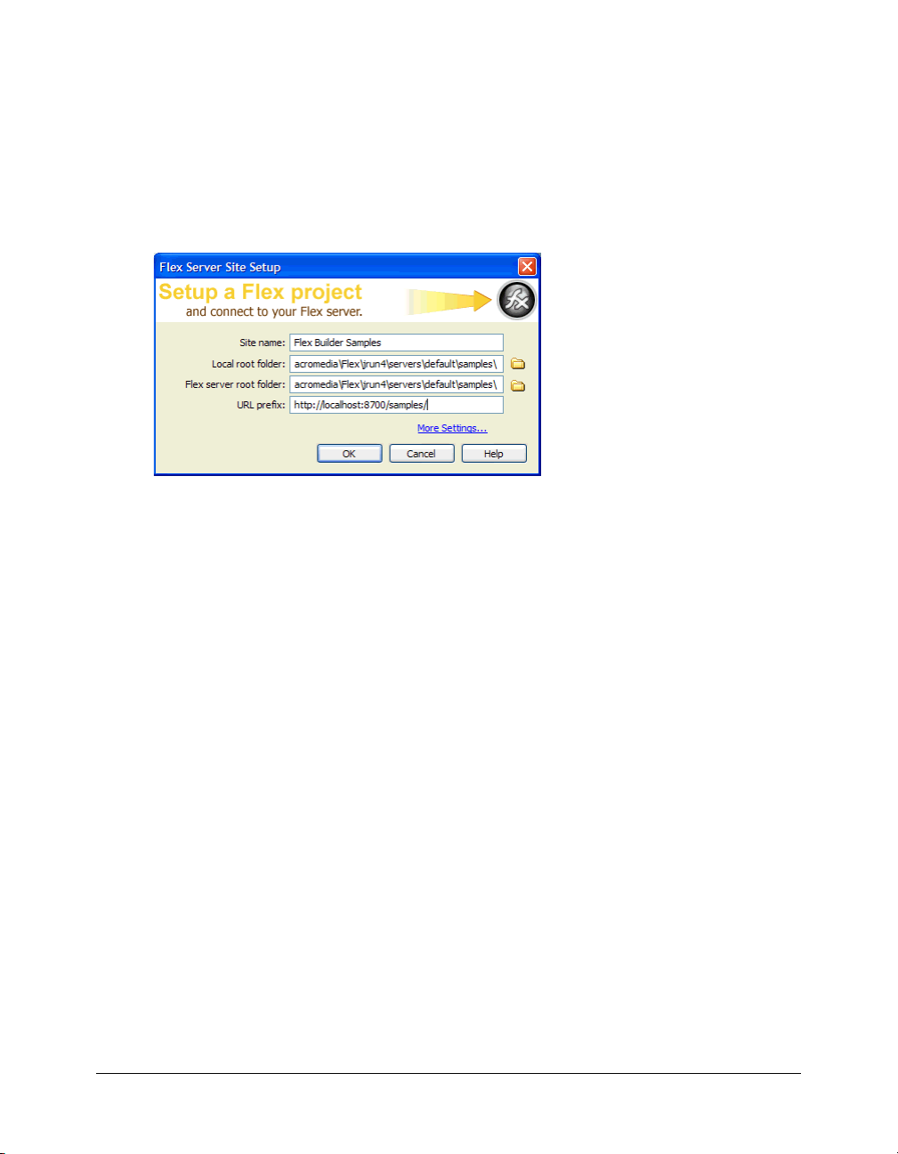
In the Site Name text box, enter Flex Sample Apps or something similar.
The name identifies your Flex Builder site.
12 Chapter 1: Getting Started with Flex Builder
Page 13
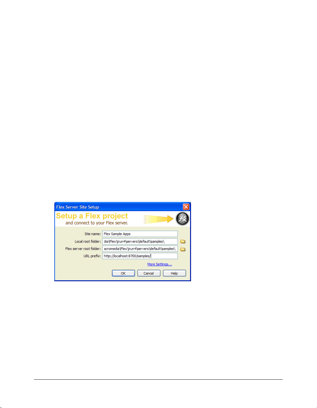
3.
In the Local Root Folder text box, click the folder icon and select the following folder:
C:\Program Files\Macromedia\Flex\jrun4\servers\default\samples\
This step tells Flex Builder where the application files are located on your hard drive.
4.
In the Flex Server Root Folder text box, make sure the following path is specified:
C:\Program Files\Macromedia\Flex\jrun4\servers\default\samples\
This folder must always be a Flex application root folder on the server. To determine whether a
folder is an application root folder, check to see if it has a WEB-INF/flex folder containing a
flex-config.xml file. An application root folder always has this folder and file. For more
information, see “Identifying a Flex application root folder” on page 11.
This step tells Flex Builder where it can “test” files—that is, where it can send MXML and
ActionScript files to be compiled by the Flex server at design time. Flex Builder needs to get
these files compiled so you can preview MXML files, get build and debugging information,
and connect to back-end systems.
5.
In the URL Prefix text box, enter the following URL:
http://localhost:8700/samples/
Note: The default port number is 8700. If you changed it during installation, use the appropriate
number in the URL prefix.
To get the Flex server to compile files while you work, Flex Builder uploads the file to the
application root folder you specified and attempts to request it using the URL prefix.
The Flex Server Site Setup dialog box should look as follows:
6.
Click OK to define the site and close the Flex Server Site Setup dialog box, and then click Done
to close the Manage Sites dialog box.
The Flex Sample Apps site is defined and you can start exploring, editing, previewing, and
debugging the sample apps with Flex Builder.
Caution: You should make a backup of the samples folder so you can restore files if necessary.
Defining a site for the Flex Sample Apps application 13
Page 14

Defining the site if the Flex server is remote
This section describes how to define a Flex Builder site to work with the Flex Sample Apps
application if the Flex server is installed and running on a different computer than Flex Builder.
For more information, see Installing Flex on the Macromedia website at www.macromedia.com/
go/flex_install/.
Before you start, you can review example settings for common J2EE servers. See “Examples of site
settings” on page 15.
To set up Flex Builder for the samples application if Flex is running remotely:
1.
In Flex Builder, select Site > Manage Sites, click the New button on the Manage Sites dialog
box, and select Site from the context menu.
The Site Definition dialog box appears. If the Basic tab is selected, click the Advanced tab and
select Local Info from the Category list (it should be the default). You use the Local Info
category to tell Flex Builder where the Flex application files are located on your hard drive.
2.
In the Site Name text box, enter Flex Sample Apps or something similar.
The name identifies your Flex Builder site.
3.
In the Local Root Folder text box, click the folder icon and specify where you want to store your
files on your hard drive while you work on them with Flex Builder.
4.
In the Remote Info category, specify where you want to put files to the remote server.
For this Flex Builder site, you must specify the folder called samples on the server. For example,
if you installed Flex with JRun 4, the application root folder is as follows:
jrun_root/servers/default/samples
where jrun_root is the J2EE server’s root folder, default is the name of a defined JRun server,
and samples is a Flex application root folder.
The remote folder for a Flex site must always be an application root folder on the server. To
determine whether a folder is an application root folder, check to see if it has a WEB-INF/flex
folder containing a flex-config.xml file. An application root folder always has this folder and
file. The samples folder contains a WEB-INF/flex/ subfolder with a flex-config.xml file in it, as
follows:
samples/WEB-INF/flex/flex-config.xml
For more information, see “Identifying a Flex application root folder” on page 11.
If using FTP access, select FTP from the Access pop-up menu and specify the samples folder as
the Host Directory value, as well as any other FTP settings required to access that folder.
If using network access, select Local/Network from the Access pop-up menu and specify the
network path to the samples folder in the Remote Folder text box.
For more information on setting the Remote Info category options, click the Help button on
the dialog box.
14 Chapter 1: Getting Started with Flex Builder
Page 15

5.
Click Testing Server in the Category list to display the Testing Server settings.
You use the Testing Server options to tell Flex Builder where it can “test” files—that is, where it
can send files to be compiled at design time. Flex Builder needs to get these files compiled so
you can preview MXML files, get build and debugging information, and connect to back-end
systems.
6.
Select MXML for JSP from the Server Model pop-up menu.
This tells Flex Builder what kind of web application you’re developing.
7.
In the Access pop-up menu, select the same access method you selected in the Remote Info
category (FTP or Local/Network).
After you make your selection, Flex Builder automatically populates the rest of the dialog box
based on the information you entered in the Remote Info category. This is only a best guest.
Make sure the following values are used:
■ Testing Server Folder (if using Local/Network access) is identical to the remote folder in
the Remote Info category (.../samples)
■ FTP settings (if using FTP access) are identical to the settings in the Remote Info category
■ URL Prefix is an HTTP address Flex Builder can use to request a file in the testing server
folder, such as http://<hostname>/samples/.
To get a file compiled at design time, Flex Builder uploads the file to the testing server folder
you specified and attempts to request it using the URL prefix.
8.
Click OK to define the site and dismiss the Site Definition dialog box, and then click Done to
dismiss the Manage Sites dialog box.
The Flex Sample Apps site is defined and you can start exploring, editing, previewing, and
debugging the sample apps with Flex Builder.
Caution: You should make a backup of the samples folder so you can restore files if necessary.
Examples of site settings
This section lists Flex Builder site settings for the Flex Sample Apps application running on
common J2EE servers. This application provides a number of sample applications you can use to
explore Flex and learn to work with Flex Builder.
The Flex Sample Apps application is created when you install the Flex server using the JRun4/
Flex install option. If you don’t use this install option, you must deploy the samples .war file
yourself.
Use the following settings in the Flex Server Site Setup dialog box. For more information, see
“Defining a Flex Builder site” on page 9. You can also use these settings in the advanced Site
Definition dialog box (if you access the server through a network). Enter the Flex Server Root
Folder value in both the Remote Folder text box and the Testing Server Folder text box in the Site
Definition dialog box.
Replace items in angle brackets with the information specific to your server configuration.
Defining a site for the Flex Sample Apps application 15
Page 16
Caution: These site settings assume default installations of both the application server and the Flex
server. The settings may not work for custom installations.
Integrated JRun4/Flex - Local Install
Local Root Folder: C:\Program Files\Macromedia\Flex\jrun4\servers\default\samples
Flex Server Root Folder: C:\Program Files\Macromedia\Flex\jrun4\servers\default\samples
URL Prefix http://localhost:8700/samples/
Non-integrated JRun4 - Local Install
Local Root Folder: C:\JRun4\servers\<servername>\samples\
Flex Server Root Folder: C:\JRun4\servers\<servername>\samples\
URL Prefix http://localhost:<port>/samples/
Tomcat 5.0 - Remote Install
Local Root Folder: Any folder on the computer running Flex Builder
Flex Server Root Folder: ...<installfolder>\Tomcat 5.0\webapps\samples
URL Prefix http://<hostname>:8080/samples/
WebSphere 5.1 - Remote Install
Local Root Folder: Any folder on the computer running Flex Builder
Flex Server Root Folder: ...<installfolder>\WebSphere\AppServer\installedApps\<nodename>\<ap
pname>.ear\samples.war
(where <nodename> is the machine name—but could also be an IP or a
fqdn—and <appname> is configurable at deploy time)
URL Prefix http://<hostname>:9080/samples/
WebLogic 8.1 - Remote Install
Local Root Folder: Any folder on the computer running Flex Builder
Flex Server Root Folder: ...<installfolder>\bea\user_projects\<domain>\applications\samples
(assumes you exploded the war file into a folder named samples to get a
samples context root)
URL Prefix http://<hostname>:7001/samples/
16 Chapter 1: Getting Started with Flex Builder
Page 17

Getting help in Flex Builder
Flex Builder has a variety of resources to help you develop Flex applications. You can get contextsensitive help about an MXML tag, find out how to use a Flex Builder feature, or look up a term
in the Flex ActionScript Language Reference.
This section covers the following topics:
• “Context-sensitive help” on page 17
• “Flex Builder Help” on page 17
• “Macromedia website resources” on page 18
Context-sensitive help
While working in Code view, you can get context-sensitive help about MXML components.
To get help about an MXML component:
1.
In Code view, click anywhere inside the MXML component’s tag.
2.
Press F1.
Flex ActionScript and MXML API Reference Help opens and displays information about
the tag.
You can also access this help from the Help menu.
Flex Builder Help
The Flex Builder Help menu gives you access to thousands of pages of information while you
work. The following menu items can be useful for Flex developers:
Using Flex Builder describes how to use Flex Builder to develop Flex applications.
Developing Flex Applications is a code-centric developer guide that describes how to develop
Flex applications with MXML and ActionScript. The guide includes chapters on working with
various controls, containers, and their properties.
Flex ActionScript Language Reference is a revised version of the ActionScript Reference Guide
included in Flash MX 2004. The reference also acts as a developer guide providing a good
overview of ActionScript syntax, information on how to use ActionScript when working with
different types of objects, and details on the syntax and usage of the language elements.
Flex ActionScript and MXML API Reference is an API reference for Flex developers.
Using Dreamweaver provides comprehensive, task-oriented information about Dreamweaver
MX 2004, the professional web authoring tool built into Flex Builder.
Getting help in Flex Builder 17
Page 18

Macromedia website resources
The Macromedia website contains the following resources to support Flex developers:
Flex Builder support pages on the Macromedia website at www.macromedia.com/go/
fb_support/ helps you get the most out of Flex Builder. The website is updated regularly with the
latest information on Flex Builder, plus advice from expert users, examples, tips, updates, and
information on advanced topics.
The Flex Support Center on the Macromedia website at www.macromedia.com/go/
flex_support/ provides information on Flex technology.
The Flex Documentation Center on the Macromedia website at www.macromedia.com/go/
flex_docs/ provides product manuals, tutorials, and articles about Flex.
Macromedia Developer Center on the Macromedia website at www.macromedia.com/go/
devnet/ provides tools, tutorials, and more for all Macromedia products.
The Flex online forum on the Macromedia website at www.macromedia.com/go/
flex_newsgroup.
What you need to build Flex applications
To develop and test Flex applications with Flex Builder, you need a computer running Microsoft
Windows 2000 or Windows XP. For more information, see “System requirements for Flex
Builder” on page 19.
You also need the Flex server (see “About the Flex server” on page 20), which requires the
following software:
• An HTTP web server (see “About web servers and Flex” on page 19)
• A J2EE application server (see “About J2EE application servers and Flex” on page 19)
You can quickly set up a Flex server by using the HTTP web server and J2EE server installed with
the Flex server. For added convenience, you can install and run this software on the same
computer as Flex Builder. For more information, see “Install the Flex server on your computer”
on page 22.
You can also configure the Flex server to work with third-party web servers and J2EE servers. For
more information, see the Flex installation guide on the Macromedia website at
www.macromedia.com/go/flex_install/, or consult your system administrator. Generally, it’s best
to match your development environment to your production environment as closely as possible.
For example, if you use Tomcat in your production environment, you may want to configure
your development environment around Tomcat.
A Flex best practice is to place the code implementing the functionality or business rules of the
application in a business layer. Flex is designed for building the presentation layer (or user
interface) of multi-tier enterprise applications. There is no inherent database support. To access
databases, you must connect your presentation layer to a business layer. For more information, see
“Flex data services” on page 152. The development of the business and data layers is beyond the
scope of this guide.
18 Chapter 1: Getting Started with Flex Builder
Page 19

This section covers the following topics:
• “System requirements for Flex Builder” on page 19
• “About web servers and Flex” on page 19
• “About J2EE application servers and Flex” on page 19
• “About the Flex server” on page 20
System requirements for Flex Builder
The following hardware and software is required to run Flex Builder.
• Windows 2000 or Windows XP
• An Intel Pentium III processor or equivalent, 600 MHz or faster
• At least 256 MB of available RAM (512 MB recommended)
• At least 275 MB available disk space
• A 16-bit (thousands of colors) monitor capable of 1024 x 768 pixel resolution or better
(millions of colors recommended)
About web servers and Flex
To host websites containing Flex files, you need a web server, which is sometimes called an HTTP
server. A web server is software that serves files in response to requests from web browsers using
the HTTP protocol. Common web servers include Apache HTTP Server and Microsoft Internet
Information Server (IIS).
If you select the integrated JRun4/Flex option when installing the Flex server, you don’t need a
separate web server. JRun4 has a web server that’s installed and configured for you. For more
information, see “Install the Flex server on your computer” on page 22.
If you plan on using Tomcat as your J2EE application server, you don’t need to install a web server
either. Apache HTTP Server is built into Tomcat. For more information, see “About J2EE
application servers and Flex” on page 19.
For information on installing and configuring a web server, see the server vendor’s documentation
or your system administrator.
About J2EE application servers and Flex
A J2EE application server helps the Flex server process MXML and ActionScript files.
If you select the integrated JRun4/Flex option when installing the Flex server, you don’t need a
separate J2EE server. A J2EE server (JRun 4) is installed and configured for you. For more
information, see “Install the Flex server on your computer” on page 22.
The following are the application servers supported by Flex:
• Macromedia JRun 4 with Updater 2. You can install JRun 4 with the Flex server by selecting
the integrated JRun4/Flex install option. You can also download a trial version of JRun 4 from
the Macromedia website at www.macromedia.com/go/jun_trial/.
What you need to build Flex applications 19
Page 20

• Jakarta Tomcat 4.1.29 or 5.0.18. You can download a copy of Tomcat from the Jakarta Project
website at http://jakarta.apache.org/tomcat/.
• IBM WebSphere Application Server 5. You can download a trial version from the IBM website
at www7b.software.ibm.com/wsdd/downloads/WASsupport.html#download.
• BEA WebLogic Server 7 or 8.1. You can download a trial version from the BEA website at
http://commerce.bea.com/index.jsp.
For information on installing and configuring an application server, see the server vendor’s
documentation or your system administrator.
About the Flex server
To compile and run MXML and ActionScript files, you need the Flex server, which is available for
Windows, Linux, and Solaris operating systems.
You can order the Developer edition of the Flex server for a nominal fee from the Macromedia
website at www.macromedia.com/go/flex_trial/. The Developer edition is for noncommercial use
for developing and testing Flex applications. It is not licensed for deployment. After 60 days, it
will support requests from only five IP addresses (plus localhost), but you can still use it for
development and testing as long as you want. The software does not expire.
For information on installing the Developer edition on the same computer as Flex Builder, see
“Install the Flex server on your computer” on page 22. For information on other possible
configurations, see the Flex installation guide on the Macromedia website at
www.macromedia.com/go/flex_install/.
Related topics
• Appendix A, “Basic Flex Concepts,” on page 145
Typographical conventions of this guide
The following typographical conventions are used in this guide:
• Menu items are shown in this format: menu name > menu item name. Items in submenus are
shown in this format: menu name > submenu name > menu item name.
• Code font indicates HTML tag and attribute names as well as literal text used in examples.
• Italic code font indicates replaceable items (sometimes called metasymbols) in code.
• Bold roman text indicates text for you to enter verbatim.
20 Chapter 1: Getting Started with Flex Builder
Page 21

CHAPTER 2
Flex Builder Tutorials
This series of four interconnected tutorials explains how you can build a simple Macromedia Flex
application using Macromedia Flex Builder. The application is part of a website for the fictitious
Flex Store company. The application gives visitors the ability to view a product catalog, find out
more about each product, and add products to a shopping cart. The application is a simplified
version of the Flex Store application installed with the Flex server.
The tutorials focus on using the development tools in Flex Builder, not on developing Flex
applications. The goal is to show you how to use Flex Builder to develop a Flex application more
rapidly and with less coding.
You can complete each tutorial as a stand-alone unit or as a part of a larger four-part tutorial. You
don’t have to complete all the tutorials or complete them in order, except for the first tutorial,
which you must complete before you can start any of the others.
The first tutorial shows you how to set up a Flex development environment. The second shows
you how to lay out a Flex user interface with Flex Builder. The third shows you how to use Flex
Builder to create custom components, the building blocks of Flex applications. The fourth shows
you how to visually bind components to data with Flex Builder.
This chapter includes the following tutorials:
• “Tutorial: Setting up a development environment” on page 21
• “Tutorial: Creating a layout with Flex Builder” on page 26
• “Tutorial: Building custom components with Flex Builder” on page 34
• “Tutorial: Binding components to data with Flex Builder” on page 58
Tutorial: Setting up a development environment
This tutorial shows you how to install the Flex server on your computer, copy sample files to a
folder, and define a Flex Builder site. You must complete these tasks to complete the other
tutorials in this chapter.
In this tutorial, you’ll accomplish the following tasks:
• “Install the Flex server on your computer” on page 22
• “Copy the tutorial folders to the Flex samples folder” on page 24
• “Define a Flex Builder site” on page 25
21
Page 22
Install the Flex server on your computer
This part of the tutorial describes how to set up the Developer edition of Flex on the same
computer as Flex Builder. To compile and run MXML and ActionScript files, you need access to
a Flex server.
The setup described in this part of the tutorial is only one of many possible configurations. You
can also install Flex on a remote server running a different J2EE server and access it through a
network or using FTP. If you don’t select the integrated JRun4/Flex install option, make sure you
deploy the samples .war file. For more information, see the Flex installation guide on the
Macromedia website at www.macromedia.com/go/flex15_install/.
The Developer edition is for noncommercial use for developing and testing Flex applications. It is
not licensed for deployment. After 60 days, it will support requests from only five IP addresses
(plus localhost), but you can still use it for development and testing as long as you want. The
software does not expire.
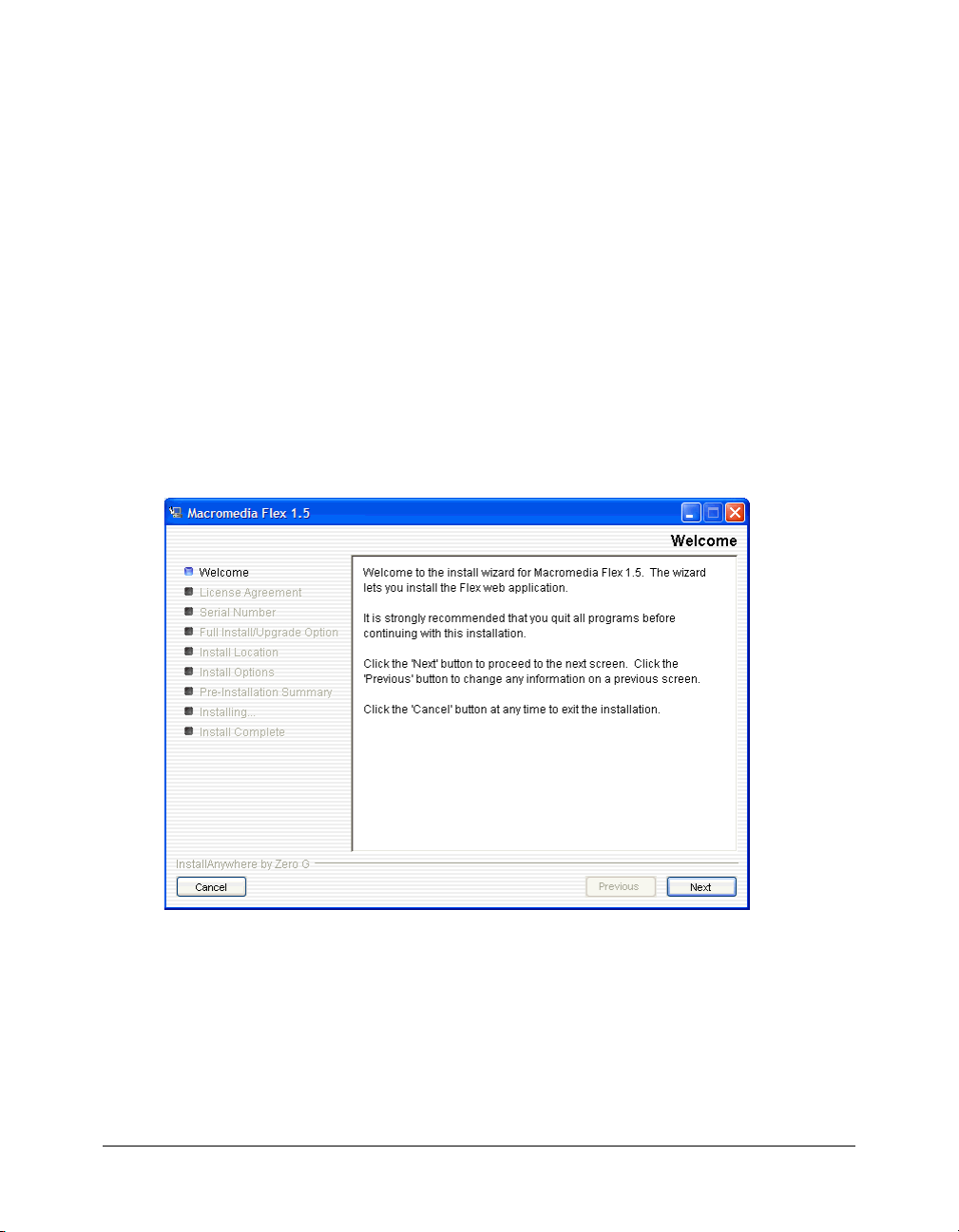
1.
Copy the Windows version of the Flex installer from the Macromedia Flex CD.
2.
In Windows, double-click the Flex installer file, flex-15-win.exe.
The install wizard appears:
3.
Follow the onscreen instructions.
4.
When prompted for a serial number, leave the text box blank.
You don’t need to enter a serial number for the Developer edition. The Flex server works for 60
days as a trial edition; after that, it becomes a Developer edition.
22 Chapter 2: Flex Builder Tutorials
Page 23
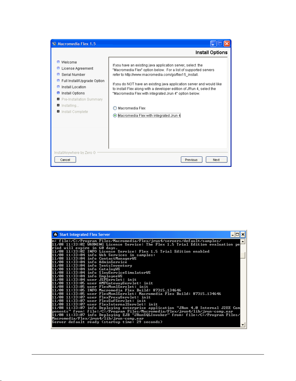
5.
On the Install Options dialog box, select the second option, Macromedia Flex with integrated
JRun4.
The dialog box gives you another installation option. This tutorial assumes that you selected
the Integrated JRun4/Macromedia Flex option.
6.
After you finish installing Flex 1.5, install any Flex updaters available on the Macromedia
website at www.macromedia.com/go/flex_updaters.
7.
Start the server by selecting Start > All Programs > Macromedia > Macromedia Flex > Start
Integrated Flex Server.
The server displays startup information.
Caution: Do not close the Start Integrated Flex Server dialog box once the server is running.
Closing it shuts down the Flex server.
Tutorial: Setting up a development environment 23
Page 24

For more information, see the Flex installation documentation on the Macromedia website at
www.macromedia.com/go/flex15_install/.
You can verify that the Flex server is running normally as follows:
1.
Open the following URL in your browser:
http://localhost:8700/samples
The Flex Sample Apps page appears.
2.
Select a sample application to run it.
If the application doesn’t run, try the following troubleshooting suggestions:
Problem Possible solution
Port conflicts If you created a new server for the Flex application, make sure the ports used by
that server don’t conflict with other servers running on your web application server.
Application
server
Flash Player Make sure you’re running the latest Macromedia Flash Player. Flash Player is
Make sure the integrated JRun4/Flex server is running. In Windows, select Start >
All Programs > Macromedia > Macromedia Flex > Start Integrated Flex Server.
installed when you install Flex Builder.
Copy the tutorial folders to the Flex samples folder
In this part of the tutorial, you copy the Flex Builder tutorial folders to the folder called samples
on the Flex server. The samples folder is the Flex application root folder of the Flex Sample Apps
application.
Caution: You must copy the tutorial folders to the folder called samples or the tutorials will not work
properly.
1.
Locate the Tutorial folder in the following folder on your hard disk.
C:\Program Files\Macromedia\Flex Builder 1.5\Tutorial\
If you didn’t install Flex Builder to the default location, locate the Tutorial folder on your
hard disk.
2.
Select the three folders (fbBindings, fbComponents, and fbLayout) in the Tutorial folder and
copy them to the following Flex application root folder:
C:\Program Files\Macromedia\Flex\jrun4\servers\default\samples\
Note: If you installed Flex on a different computer, you must copy the files to the samples folder on
the remote computer. For more information, see “Examples of site settings” on page 15.
3.
In the Flex application root folder, locate the folder named products in the
\samples\flexstore\assets\ folder and copy it to the \samples\fbBindings\assets\ folder.
The products folder contains the product images used in the tutorial. If you're working with
the integrated JRun4/Flex server locally, the path of the original products folder is as follows:
C:\Program Files\Macromedia\Flex\jrun4\servers\default\samples\flexstore\assets\products
After copying the folder, it should also appear at the following location:
C:\Program Files\Macromedia\Flex\jrun4\servers\default\samples\fbBindings\assets\products
24 Chapter 2: Flex Builder Tutorials
Page 25

Define a Flex Builder site
In this part of the tutorial, you define a Flex Builder site for the tutorials. A Flex Builder site lets
you visually design, preview, and debug MXML and ActionScript files without leaving Flex
Builder.
After you define the Flex Builder site, you can start working on the tutorials.
This section assumes you installed the Flex server on the same computer as Flex Builder using the
integrated JRun/Flex install option. If you installed the Flex server on a different computer, you
must use a procedure that’s different from the one below to define the site. For instructions, see
“Defining the site if the Flex server is remote” on page 14.
1.
In Flex Builder, select Site > Manage Sit es, click the New button in the Manage Sites dialog box,
and select Flex Site from the context menu.
The Flex Server Site Setup dialog box appears.
Tip: You can also open this dialog box by clicking the Flex Site link on the Start page.
2.
In the Site Name text box, enter Flex Builder Samples.
The name identifies your site. The samples folder contains not only the Flex Builder tutorials,
but other sample applications as well.
3.
In the Local Root Folder text box, click the folder icon and select the following folder:
C:\Program Files\Macromedia\Flex\jrun4\servers\default\samples\
It should contain the Flex Builder tutorial folders (see “Copy the tutorial folders to the Flex
samples folder” on page 24), among other folders.
This step tells Flex Builder where your files are located on your hard disk.
4.
In the Flex Server Root Folder text box, make sure the following path is specified:
C:\Program Files\Macromedia\Flex\jrun4\servers\default\samples\
This folder must always be a Flex application root folder on the server. You can tell if a folder is
an application root folder by checking to see if it has a WEB-INF/flex folder containing a flexconfig.xml file. An application root folder always has this folder and file. For more
information, see “Identifying a Flex application root folder” on page 11.
This step tells Flex Builder where it can “test” files—that is, where it can send MXML and
ActionScript files to be compiled by the Flex server at design time. Flex Builder needs to get
these files compiled so you can preview MXML files, get build and debugging information,
and connect to back-end systems.
Tutorial: Setting up a development environment 25
Page 26
5.
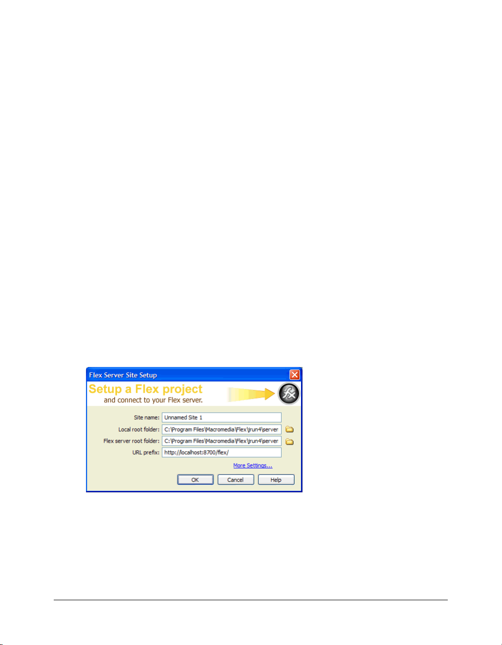
In the URL Prefix text box, enter the following URL:
http://localhost:8700/samples/
Caution: Flex Builder may auto-populate this text box with http://localhost:8700/flex/. Make sure
you change the value to http://localhost:8700/samples/.
To get the Flex server to compile files while you work, Flex Builder uploads the file to the
application root folder you specified and attempts to request it using the URL prefix.
The Flex Server Site Setup dialog box should look like this:
6.
Click OK to define the site and close the dialog box, and then click Done to close the Manage
Sites dialog box.
The Flex Builder site is defined and the tutorials are set up. To start working on a tutorial, see any
of the following:
• “Tutorial: Creating a layout with Flex Builder” on page 26
• “Tutorial: Building custom components with Flex Builder” on page 34
• “Tutorial: Binding components to data with Flex Builder” on page 58
Tutorial: Creating a layout with Flex Builder
This tutorial shows you how to use Flex Builder to quickly lay out a Flex user interface.
You can complete this tutorial as a stand-alone unit or as the first part of a multipart tutorial. In
either case, you must complete the setup tutorial before you begin. For instructions, see “Tutorial:
Setting up a development environment” on page 21.
In this tutorial, you’ll accomplish the following tasks:
• “Review the approved user interface mock-ups” on page 27
• “Create an MXML file” on page 28
• “Import your CSS styles” on page 29
• “Position the page title” on page 30
• “Position the catalog component” on page 31
• “Position the product detail and shopping cart components” on page 32
• “Add view buttons to the product catalog” on page 33
26 Chapter 2: Flex Builder Tutorials
Page 27
Review the approved user interface mock-ups
During the planning and approval stages of the project, members of your team produced final
mock-ups of the user interface for the Flex Store. You will use these mock-ups to guide you when
you create the MXML layout.
The final mock-ups for the Flex Store application are stored in your fbLayout folder:
/fbLayout/mockups
You can open a mock-up file in your favorite image editor from the Files panel in Flex Builder.
This feature is useful if you want to quickly change or touch up a mock-up.
1.
In Flex Builder, make sure the Flex Builder Samples site is selected in the Files panel.
If the Files panel is closed, select Window > Files to open it.
2.
In the Files panel, locate the uiGrid.png image and double-click it.
Flex Builder opens the image in your default image editor. For more information on setting a
default image editor, see “Setting external image editor preferences” in Using Dreamweaver
Help.
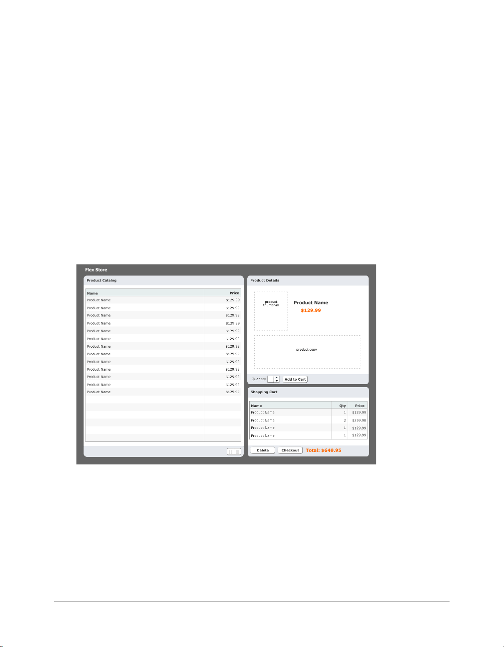
The first mock-up file, uiGrid.png, shows the general layout of the Flex Store user interface:
Tutorial: Creating a layout with Flex Builder 27
Page 28
The user will also have the option of viewing thumbnails in the product catalog on the left side of
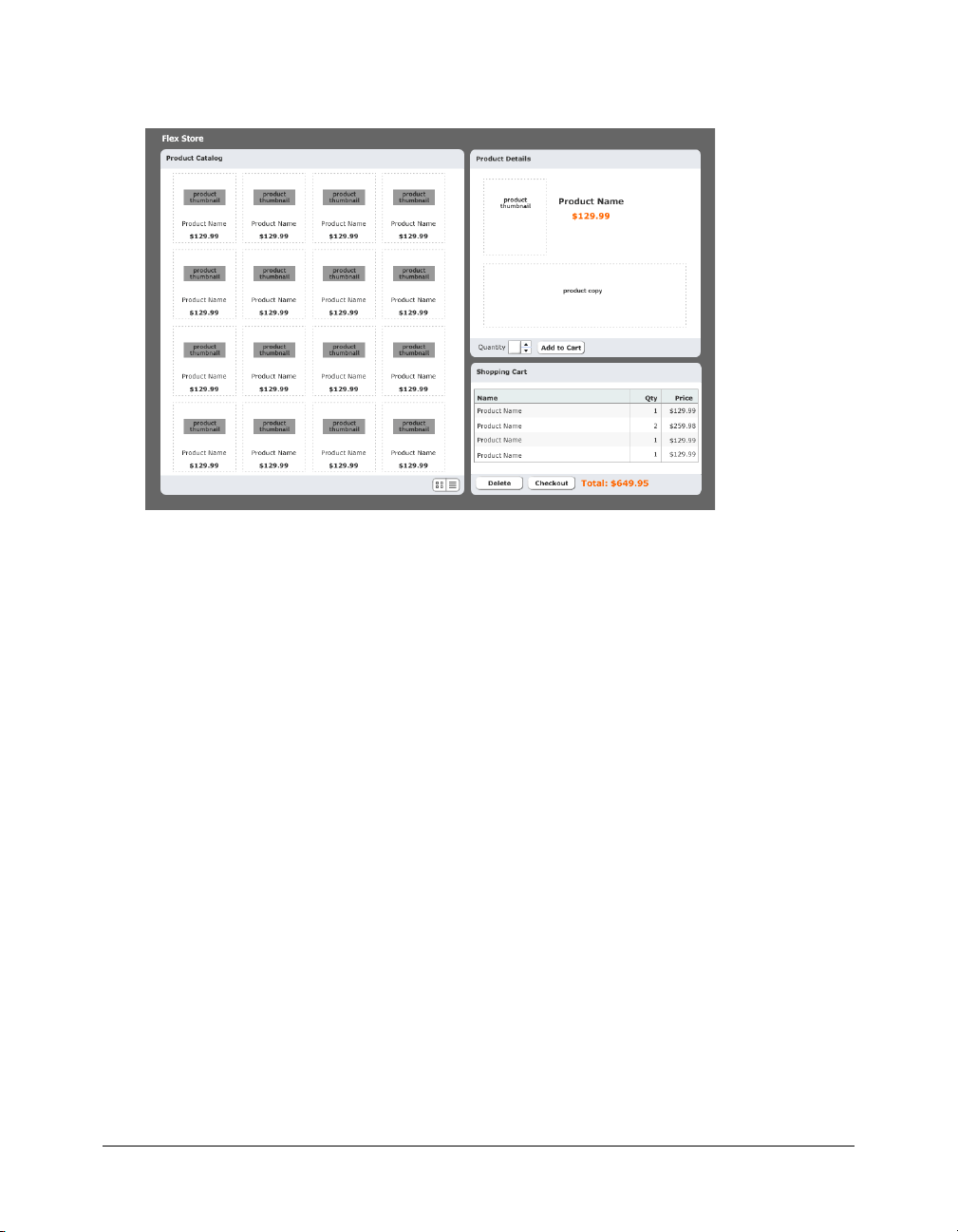
the layout. The second mock-up file, uiThumbs.png, shows this thumbnail view:
The layout contains the following custom components:
• Two interchangeable product catalog components on the left side, which give the user two
views of the catalog
• A product detail component on the upper right side
• A shopping cart component on the lower right side
Another tutorial shows you how to build these components (see “Tutorial: Building custom
components with Flex Builder” on page 34). In this tutorial you create the basic layout of the
application.
Create an MXML file
In this part of the tutorial, you take the first step in laying out the application by creating an
MXML file. MXML is a XML-based language for building Flex applications. For more
information, see “About MXML files” on page 146.
1.
In Flex Builder, make sure the Flex Builder Samples site is selected in the Files panel.
2.
Select File > New.
The New Document dialog box appears.
3.
Select Flex Development in the left pane and MXML Application in the right pane, and then
click Create.
The dialog box closes and a blank MXML file appears.
28 Chapter 2: Flex Builder Tutorials
Page 29
4.
Set the following property in the Attributes panel of the Tag inspector (Window > Tag
Inspector):
■ Styles > verticalGap: 0
Note: The angle bracket means the verticalGap property is located in the Styles category of the
Attributes tab. This convention is used throughout the tutorials.
5.
Save the file in the fbLayout folder by selecting File > Save, double-clicking the fbLayout folder,
and naming the file as follows:
flexstore.mxml
Import your CSS styles
In this part of the tutorial, you import CSS styles into the flexstore.mxml file. You want to import
styles defined in an external CSS file to make sure your site has a consistent look and feel. CSS
styles also give you more flexibility when you want to change the design of your site.
1.
Make sure the flexstore.mxml file is open in Flex Builder.
2.
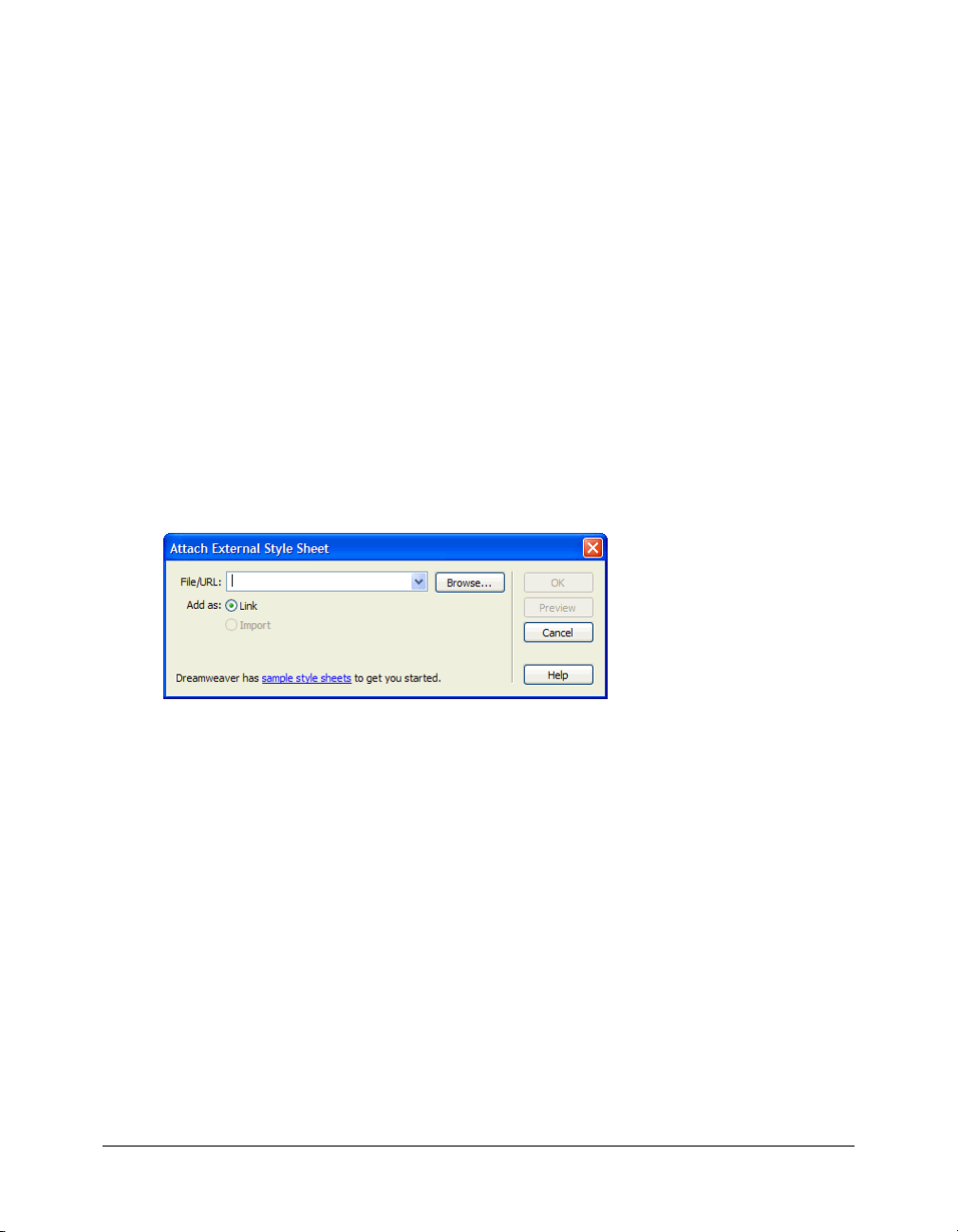
Open the CSS Styles panel (Window > CSS Styles) and click the Attach Style Sheet button at
the lower edge of the panel.
The Attach External Style Sheet dialog box appears.
3.
In the Attach External Style Sheet dialog box, click Browse to select the external CSS style sheet
called flexstore.css located in the fbLayout folder.
After you click OK twice to close the dialog boxes, the name of the external CSS style sheet
appears in the CSS Styles panel. You can click the Plus (+) icon to display a tree view of all the
styles in the style sheet and their properties.
4.
Save your work.
Tutorial: Creating a layout with Flex Builder 29
Page 30
Position the page title
After importing the CSS styles, the next task is to create a basic layout for the user interface. In
this part of the tutorial, you position the page title (Flex Store) in the upper left corner of the
layout, as indicated in the mock-up of the user interface (see “Review the approved user interface
mock-ups” on page 27).
You decide to use a VBox (for vertical box) container to position the page title at the top of the
file. The rest of the user interface will be positioned below the page title.
1.
In Design view, click the Expanded button on the Document toolbar and then click anywhere
inside the Application container.
Expanded mode adds borders and padding to controls and containers in Design view to help
you lay out your application. (The borders and padding appear only at design time.) You can
click the Standard button at any time to get a better representation of how your project will
look after it’s compiled.
2.
In the Containers category of the Insert bar, click the VBox button.
Flex Builder inserts a VBox container in the file.
3.
Insert the page title by clicking anywhere inside the VBox container and clicking the Label
button in the Controls category of the Insert bar.
Flex Builder inserts a Label control in the file and selects it.
4.
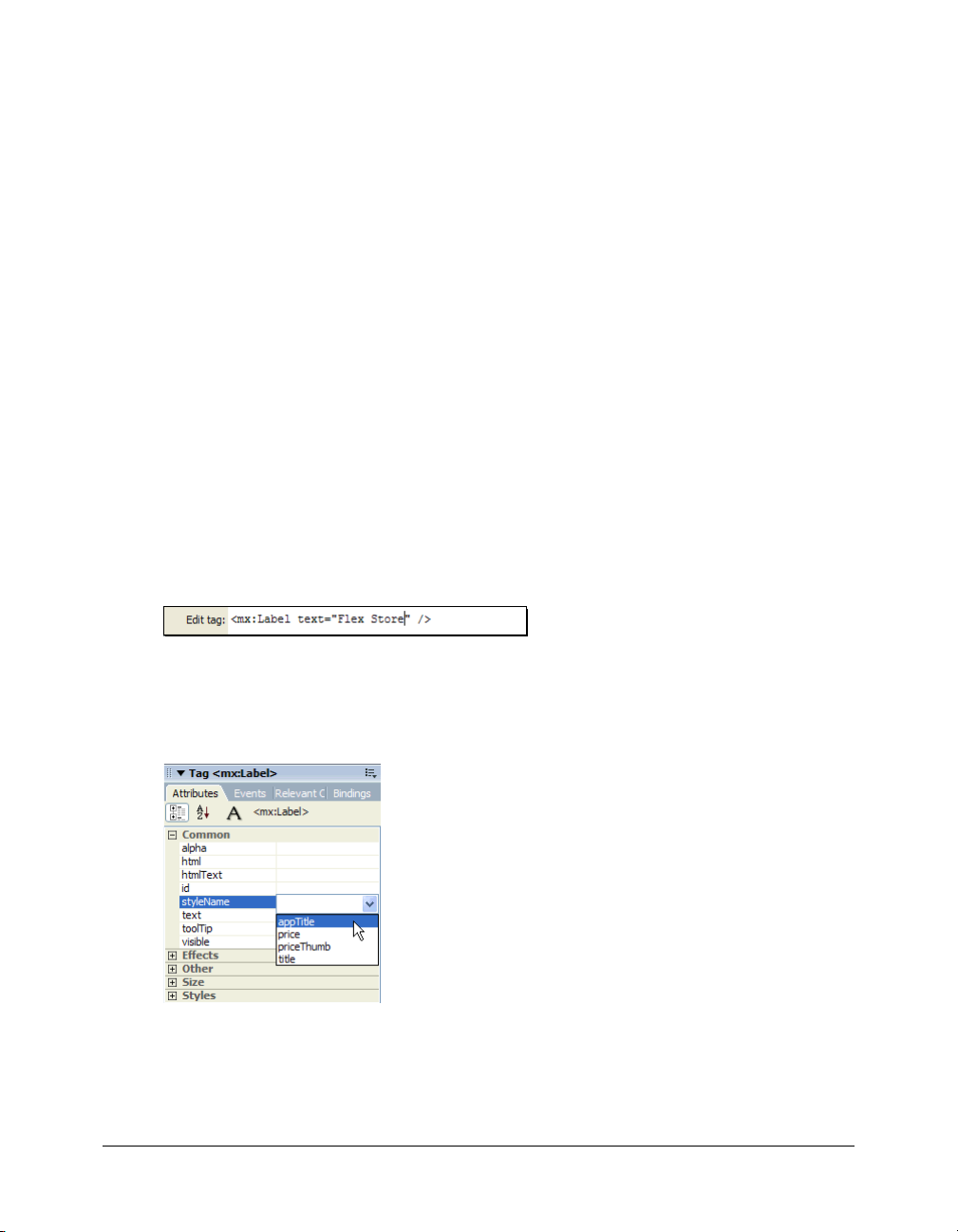
Modify the Label text by double-clicking the Label control to open the Quick Tag Editor, and
then changing the
text property value to "Flex Store" as follows and pressing Enter.
5.
With the Label control still selected, set the following property in the Attributes panel:
■ Common > styleName: appTitle
You can select the style from the pop-up menu that appears when you click the field for the
styleName property.
You can see the effect of applying the style in Design view.
6.
Save your work.
30 Chapter 2: Flex Builder Tutorials
Page 31

Position the catalog component
In this part of the tutorial, you position the product catalog on the left side of the user interface as
shown in the mock-ups (see “Review the approved user interface mock-ups” on page 27). To meet
this design requirement, you decide to use an HBox (for horizontal box) container to position the
two halves of your user interface side by side.
1.
In Code view (View > Code), place the insertion point at the lower edge of the VBox container
by clicking immediately before the closing
2.
In the Containers category of the Insert bar, click the HBox button.
</mx:VBox> tag.
Flex Builder inserts an HBox container in the file.
3.
Click anywhere in the <mx:HBox> tag, click the Refresh button on the Attributes panel, and set
the following properties in the panel:
■ Styles > horizontalGap: 4
■ Size > height: 548
■ Size > width: 860
Note: When you set the first size property, a message box appears warning you that the container
clips any content that extends beyond the specified size. Select the Don’t Show Me This Message
Again option, and click OK.
4.
Switch to Design view (View > Design), click anywhere in the HBox container, and click the
Panel button in the Containers category of the Insert bar.
Flex Builder inserts a Panel container in the file. You want to use a Panel container for the
product catalog.
5.
Specify the panel’s title by double-clicking the Panel container to open the Quick Tag Editor,
and then entering the property
title="Product Catalog" as follows.
6.
With the Quick Tag Editor still open, enter the following properties and then Press Enter:
id="main" height="400" width="478"
Tip: Use code hints to work more rapidly.
7.
Insert a ViewStack container inside the Panel container by clicking anywhere inside the Panel
container, clicking the ViewStack button on the Insert bar, and entering bodyStack in the ID
text box in the dialog box that appears.
After you click OK, Flex Builder inserts a ViewStack container in the Panel container. You
want to use this container to place two views of the product catalog—a grid view and a
thumbnail view—in the same space.
Tutorial: Creating a layout with Flex Builder 31
Page 32

8.
With the ViewStack container still selected, set the following property in the Attributes panel:
■ Effects > changeEffect: Fade
■ Size > height: 100%
■ Size > width: 100%
You can select the Fade value from the pop-up menu. The Fade effect will make the ViewStack
container change from transparent to opaque in 500 milliseconds (the default effect duration).
9.
Save your work.
Position the product detail and shopping cart components
In this part of the tutorial, you position the product detail and shopping cart components on the
right side of the user interface as shown in the mock-ups (see “Review the approved user interface
mock-ups” on page 27). You decide to use the existing HBox container to meet this layout
requirement.
The mock-up also shows the product detail and shopping cart components stacked on top of each
other. To meet this layout requirement, you decide to use a VBox container.
1.
In Design view, click inside the HBox container to the right of the Panel container.
Be careful not to click inside the Panel container; the vertical insertion bar should appear
beside the Panel container.
2.
In the Containers category of the Insert bar, click the VBox button.
Flex Builder inserts a VBox container in the file. You want to use the VBox container to stack
the product detail and shopping cart components on top of each other.
3.
With the insertion point still blinking in the VBox container, set the following properties in the
Attributes panel:
■ Size > width: 100%
You want the VBox container to scale based on its content.
4.
Click anywhere in the new VBox container, click the Canvas button in the Containers category
of the Insert bar, and accept the default width and height values in the dialog box that appears.
Flex Builder inserts a Canvas container in the VBox. You want to insert the product detail
component in this container.
5.
With the Canvas container still selected, set the following properties in the Attributes panel:
■ Common > id: topCanvas
■ Size > height: 326
■ Size > width: 100%
■ Other > vScrollPolicy: off
Tip: If you prefer, you can list all the properties alphabetically by clicking the Show List View button
on the Attributes panel.
32 Chapter 2: Flex Builder Tutorials
Page 33

6.
Insert another Canvas container by switching to Code view, clicking immediately after the
closing
</mx:Canvas> tag, and clicking the Canvas button on the Insert bar.
After you accept the default width and height values in the dialog box that appears, Flex
Builder inserts another Canvas container in the VBox. You want to insert the shopping cart
component in this container.
7.
Click anywhere in the new <mx:Canvas> tag, click the Refresh button on the Attributes tab,
and set the following properties in the Attributes tab:
■ Common > id: bottomCanvas
■ Size > height: 208
■ Size > width: 100%
■ Other > vScrollPolicy: off
8.
Switch back to Design view to inspect your layout.
Tip: Press F4 to hide the workspace and maximize the Document window. Press F4 again to
restore the workspace.
9.
Save your work.
Add view buttons to the product catalog
The product catalog area of the layout gives the user two views of the products—a grid view and a
thumbnail view. According to the user interface mock-ups, the user should be able to switch views
by clicking view buttons at the lower edge of the catalog. For information about the user interface
mock-ups, see “Review the approved user interface mock-ups” on page 27.
After studying the mock-up, you decide to use the following containers to lay out the buttons:
• A ControlBar container in the left Panel container to create a footer
• An HBox container in the ControlBar container to position the buttons horizontally
You use the following steps to lay out and insert the buttons with Flex Builder.
1.
Make sure the flexstore.mxml file is open in Flex Builder.
2.
Insert a ControlBar container by clicking inside the lower edge of the Panel container (without
clicking inside the ViewStack container), and then clicking the ControlBar button in the
Containers category of the Insert bar.
Flex Builder inserts an empty ControlBar container and automatically positions it at the lower
edge of the Panel container.
3.
With the insertion point still blinking in the ControlBar container, specify the values for the
following properties in the Attributes panel:
■ Size > height: 45
■ Styles > horizontalAlign: right
4.
Insert an HBox container by clicking anywhere inside the ControlBar container, and clicking
the HBox button on the Insert bar.
Tutorial: Creating a layout with Flex Builder 33
Page 34

5.
With the insertion point still blinking in the HBox container, set the value for the following
property in the Attributes panel:
■ Styles > horizontalGap: 0
6.
Insert the thumbnail view button by clicking inside the HBox container, clicking the Image
button in the Controls category of the Insert bar, and selecting the following image file:
/fbLayout/assets/images/thumb_off.png
7.
Insert the grid view button by clicking inside the HBox container on the right side of the
thumbnail view button (without selecting the button), clicking the Image button on the Insert
bar, and selecting the following image file:
/fbLayout/assets/images/list_off.png
8.
Save your work
This completes the layout tutorial. If you like, you can continue building the Flex Store by
completing the components tutorial, which shows you how to build custom components and
insert them in your layout.
Tutorial: Building custom components with Flex Builder
In this tutorial, you learn how to use Flex Builder to create custom components, the building
blocks of Flex applications. The Flex Store application requires the following custom
components:
• Two catalog components that give the user different views of the product catalog
• A product detail component that gives the user more detail on a product the user clicks in
the catalog
• A shopping cart component that lists the products the user wants to purchase
You can complete this tutorial as a stand-alone unit or as the second part of a multipart tutorial.
In either case, you must complete the setup tutorial before you begin. For instructions, see
“Tutorial: Setting up a development environment” on page 21.
The tutorial includes a pre-built set of files so you can complete the tutorial without completing
the layout tutorial first. If you completed the layout tutorial, you can overwrite the files in the
fbComponents folder with your files in the fbLayout folder.
In this tutorial, you will accomplish the following tasks:
• “Build the grid view component” on page 35
• “Build the thumbnail view component” on page 38
• “Build the product detail component” on page 40
• “Build the shopping cart component” on page 47
• “Insert the view components in the Flex Store layout” on page 51
• “Insert the detail and cart components in the layout” on page 53
• “Activate the catalog view buttons” on page 54
34 Chapter 2: Flex Builder Tutorials
Page 35

Build the grid view component
According to the following mock-up, the grid view component should display the Flex Store
product catalog as a two-column grid of names and prices. The user can select the grid view by
clicking a button at the lower edge of the catalog.
The grid view component does not contain any product data in this tutorial. Another tutorial
describes how to add data (see “Tutorial: Binding components to data with Flex Builder”
on page 58).
1.
In Flex Builder, make sure the Flex Builder Samples site is selected in the Files panel.
2.
Select File > New.
The New Document dialog box appears.
3.
Select Flex Development in the left pane and MXML Component:Vertical in the right pane,
and then click Create.
The dialog box closes and a component file with a VBox container appears. By default, Flex
Builder assigns the value of 400 to the
height and width properties. You don’t want to use
these values.
Tutorial: Building custom components with Flex Builder 35
Page 36

4.
With the insertion point still blinking in the VBox container, specify the values for the following
properties in the Attributes panel:
■ Size > height: 100%
■ Size > width: 100%
■ Styles > verticalGap: 0
Note: The “Size > height” expression means the height property is located in the Size category of
the Attributes tab. This convention is used throughout the tutorials.
5.
Insert a DataGrid component to display the product catalog by clicking anywhere in the VBox
container, and clicking the DataGrid button in the Controls category of the Insert bar.
The DataGrid dialog box appears.
6.
Set the dialog box options as follows:
■ ID: list
■ Header Text (first row): Name
■ Header Text (second row): Price
■ Column Name (first row): name
■ Column Name (second row): price
The DataGrid dialog box should look similar to the following figure:
Caution: Make sure the column name values exactly match “name” and “price.” Column names
must exactly match the name of the data fields that will be assigned to the DataGrid in the bindings
tutorial.
7.
Click OK.
Flex Builder inserts a DataGrid component in your component file.
8.
Click the DataGrid component and set the following properties in the Attributes tab:
■ Size > height: 100%
■ Size > width: 100%
36 Chapter 2: Flex Builder Tutorials
Page 37

9.
Switch to Code view (View > Code) and set column properties of the DataGrid by locating the
two
<mx:DataGridColumn> tags, and adding the following properties (shown in bold type):
<mx:DataGridColumn headerText="Name" columnName="name" width="300"/>
<mx:DataGridColumn headerText="Price" columnName="price" textAlign="right"
marginRight="4" />
You can use Code hints to quickly set these properties. For example, to set the width property,
click in the tag before the closing angle bracket, press the Spacebar to display the code hints,
type the letter w to quickly select the property, and press Enter. Type 300 to set the value.
10.
Save the component file in the fbComponents folder by selecting File > Save, double-clicking
the fbComponents folder, and naming the component file as follows:
GridView.mxml
In Design View, the completed component should look similar to the following figure if you
select the VBox container:
Note: The component will scale to fit in the space allotted to it in the flexstore.mxml file.
Tutorial: Building custom components with Flex Builder 37
Page 38

Build the thumbnail view component
According to the following mock-up, the thumbnail view component should display the Flex
Store product catalog as a set of thumbnails with names and prices. The user can select the
thumbnail view by clicking a button at the lower edge of the catalog.
The thumbnail view component will not contain any product data in this tutorial. Another
tutorial describes how to add data (see “Tutorial: Binding components to data with Flex Builder”
on page 58).
1.
In Flex Builder, select File > New.
The New Document dialog box appears.
2.
Select Flex Development in the left pane and MXML Component:Vertical in the right pane,
and then click Create.
The dialog box closes and a component file with a VBox container appears.
3.
With the insertion point still blinking in the VBox container, specify the values for the following
properties in the Attributes panel:
■ Size > height: Clear the value.
■ Size > width: Clear the value.
■ Styles > verticalGap: 0
38 Chapter 2: Flex Builder Tutorials
Page 39

4.
Insert a Tile container to lay out the products by clicking anywhere in the VBox container, and
clicking the Tile button in the Containers category of the Insert bar.
Flex Builder inserts a Tile container in the component file.
5.
With the insertion point still blinking in the Tile container, specify the values for the following
properties in the Attributes panel:
■ Common > id: tileView
■ Size > y: 12
6.
Save the component file in the fbComponents folder by selecting File > Save, and naming the
component file as follows:
ThumbnailView.mxml
7.
Insert placeholder images for the products by clicking anywhere inside the Tile container,
clicking the Image button in the Controls category of the Insert bar, and selecting the following
image in the mockups folder:
fbComponents/mockups/tnProduct.png
You want to insert five or more placeholder images to represent the products. In the tutorial on
data bindings (see “Tutorial: Binding components to data with Flex Builder” on page 58), you
replace these placeholder images with a Repeater component and a custom component that
retrieves product data and displays each product’s thumbnail image, name, and price.
8.
Click inside the right edge of the Tile container (without selecting the thumbnail image), and
repeat step 7 four more times to insert more thumbnail images in the Tile container.
If you’re unable to click inside the edge, click the Expanded button on the Document toolbar
to add extra space around the container.
9.
Save your work.
Tutorial: Building custom components with Flex Builder 39
Page 40

In Design view, the completed component should look similar to the following figure if you select
the VBox container:
Note: The component will scale to fit in the space allotted to it in the flexstore.mxml file.
Build the product detail component
According to the component’s functional specification, the product detail component should
display product details when a user clicks one of the products in the product catalog. The user can
add the product to the shopping cart by specifying a quantity and clicking the Add to Cart button
at the lower edge of the panel.
40 Chapter 2: Flex Builder Tutorials
Page 41

The following is a mock-up of the component:
The product detail component will not contain any data in this tutorial. Another tutorial
describes how to add data (see “Tutorial: Binding components to data with Flex Builder”
on page 58).
In this part of the tutorial, you complete the following tasks:
• “Lay out the product detail component” on page 41
• “Add the product details” on page 43
• “Finish the footer of the product detail component” on page 45
Lay out the product detail component
After studying the component mock-up, you decide to use the following Flex containers to lay
out the component:
• A Panel container to create the header and position the component’s child containers vertically
• An HBox container within the Panel container to position the product thumbnail and the
product information side by side
• A VBox container within the HBox to position the product name on top of the price
• A ControlBar container to create the footer
You start by creating a new component file based on a Panel container.
1.
In Flex Builder, press Control+N.
The New Document dialog box appears.
2.
Select Flex Development in the left pane and double-click MXML Component:Panel in the
right pane.
The dialog box closes and a component file with a Panel container appears.
Tutorial: Building custom components with Flex Builder 41
Page 42

3.
With the insertion point still blinking in the Panel container, specify the values for the following
properties in the Attributes panel:
■ Common > title: Product Details
■ Styles > marginBottom: 8
■ Styles > marginLeft: 8
■ Styles > marginRight: 8
■ Styles > marginTop: 8
4.
Insert an HBox container inside the Panel container by clicking anywhere inside the Panel
container and clicking the HBox button in the Containers category of the Insert bar.
Flex Builder inserts an empty HBox container in the component.
5.
With the insertion point still blinking in the HBox container, specify the value for the following
property in the Attributes panel:
■ Styles > verticalAlign: middle
6.
Insert a Canvas container to position the product thumbnail by clicking anywhere inside the
HBox container, clicking the Canvas button on the Insert bar, clearing the default values in the
dialog box that appears, and clicking OK.
Flex Builder inserts an empty Canvas container in the component.
7.
With the Canvas container still selected, specify the values for the following properties in the
Attributes panel:
■ Size > height: 140
■ Size > width: 150
■ Common > clipContent: false
8.
Insert a VBox container for the product name and price by clicking inside the right edge of the
HBox container (without clicking inside the Canvas container), and clicking the VBox button
on the Insert bar.
Flex Builder inserts an empty VBox container in the component.
9.
Insert a ControlBar container by clicking inside the Panel container outside and below the
HBox container, and clicking the ControlBar button on the Insert bar.
Flex Builder inserts an empty ControlBar container and automatically positions it at the lower
edge of the Panel container.
10.
With the insertion point still blinking in the ControlBar container, specify the value for the
following property in the Attributes panel:
■ Common > id: ctrl
11.
To make sure the component fits correctly in the Flex Store user interface, select the Panel
container and clear the following properties in the Attributes panel:
■ Size > height:
■ Size > width:
42 Chapter 2: Flex Builder Tutorials
Page 43

12.
Save the component file in the fbComponents folder by pressing Control+S, double-clicking
the fbComponents folder, and naming the component file as follows:
ProductDetail.mxml
In Design view, the component’s layout should look similar to the following figure if you select
the Panel container:
Note: The component will scale to fit in the space allotted to it in the flexstore.mxml file.
Add the product details
According to the mock-up, the component should display the following information: a
thumbnail image, the product name and price, and a brief product description.
1.
Make sure the component file, ProductDetail.mxml, is open in Flex Builder.
2.
Insert a placeholder image for the product thumbnail by clicking in the upper left corner of the
Canvas container, clicking the Image button in the Controls category of the Insert bar, and
selecting the following image:
fbComponents/mockups/tnImage.png
In the tutorial on data bindings (see “Tutorial: Binding components to data with Flex Builder”
on page 58), you modify the
source property of the Image so that its value is set dynamically
when the user clicks a product in the catalog.
Tutorial: Building custom components with Flex Builder 43
Page 44

3.
With the Image still selected in the file, change the following properties in the Attributes panel:
■ Size > height: 140
■ Size > width: 150
■ Size > x: 0
■ Size > y: 0
4.
Insert a Label component for the product name by clicking anywhere inside the VBox
container, clicking the Label button on the Insert bar, and specifying the following properties
in the Attributes panel:
■ Common > text: Product Name
■ Common > styleName: title
In the tutorial on data bindings, you modify the
text property so that its value is set
dynamically when the user clicks a product in the catalog.
The title style is defined in the flexstore.css file attached to the flexstore.mxml file (see “Import
your CSS styles” on page 29). Your custom component will have access to this style sheet when
the component is used in the flexstore.mxml file.
5.
Insert another Label component for the product price by switching to Code view (View >
Code), clicking immediately after the existing
<mx:Label> tag and clicking the Label button on
the Insert bar.
Flex Builder inserts a
6.
Click anywhere in the new <mx:Label> tag, click the Refresh button on the Attributes panel to
<mx:Label> tag.
display the tag properties, and specify the following properties:
■ Common > text: $129.98
■ Common > styleName: price
7.
Switch back to Design view and insert a Text component to display the product description by
clicking inside the Panel container outside and below the HBox container, clicking the Text
button on the Insert bar (not to be confused with the Label button), and specifying the
following properties in the Attributes panel:
■ Common > htmlText: product copy
■ Size > height: 100%
■ Size > width: 100%
8.
Save your work.
44 Chapter 2: Flex Builder Tutorials
Page 45

In Design view, the component should look similar to the following figure if you select the Panel
container:
Finish the footer of the product detail component
According to the component mock-up, the footer has a control that lets users specify the quantity
of the selected item they want to add to the shopping cart. The footer also has a button that lets
users add the selected item to the shopping cart.
1.
Make sure the component file, ProductDetail.mxml, is open in Flex Builder.
2.
In Design view, click inside the ControlBar container at the lower edge of the Panel container.
Make sure the blinking insertion bar appears inside the ControlBar container.
3.
Insert a Label component by clicking anywhere inside the ControlBar container and clicking
the Label button in the Controls category of the Insert bar.
4.
Modify the label text by double-clicking the Label component in Design view to open the
Quick Tag Editor, and then changing the value of the
text property as follows (shown in
bold type):
<mx:Label text="Quantity" />
5.
Press Enter to accept your change and close the Quick Tag Editor.
Tutorial: Building custom components with Flex Builder 45
Page 46

6.
Insert a NumericStepper control by clicking to the right of the Quantity label in the ControlBar
container, clicking the NumericStepper button in the Controls category of the Insert bar, and
specifying the following properties in the Attributes panel:
■ Common > id: qty
■ Common > maximum: 100
■ Common > minimum: 1
■ Common > stepSize: 1
■ Common > value: 1
■ Size > width: 40
7.
Insert a button by clicking to the right of the NumericStepper control in the ControlBar
container, and clicking the Button control on the Insert bar.
8.
Modify the button text by double-clicking the button to open the Quick Tag Editor, and then
changing the value of the
<mx:Button label="Add to Cart" />
9.
Press Enter to accept your change and close the Quick Tag Editor.
10.
Save your work.
label property as follows (shown in bold type):
In Design view, the completed product detail component should look similar to the following
figure if you select the Panel container:
46 Chapter 2: Flex Builder Tutorials
Page 47

Build the shopping cart component
According to the component’s functional specification, the shopping cart component should
display the products that the user wants to bring to the checkout area for purchase. The user can
delete items from the cart by selecting an item and clicking the Delete button. The user can also
proceed to the checkout area by clicking the Checkout button.
The following is a mock-up of the component:
The shopping cart component does not contain any data in this tutorial. Another tutorial
describes how to add data (see “Tutorial: Binding components to data with Flex Builder”
on page 58).
The Checkout button is disabled in these tutorials.
In this part of the tutorial, you complete the following tasks:
• “Lay out the shopping cart component” on page 47
• “Add the product list to the shopping cart” on page 48
• “Finish the footer of the shopping cart component” on page 50
Lay out the shopping cart component
After studying the component mock-up, you decide to use the following Flex containers to lay
out the component:
• A Panel container to create the header and position the component’s child containers vertically
• A ControlBar container to create the footer
You start by creating a component file based on a Panel container.
1.
In Flex Builder, press Control+N.
The New Document dialog box appears.
2.
Select Flex Development in the left pane and double-click MXML Component:Panel in the
right pane.
The dialog box closes and a component file with a Panel container appears.
3.
Double-click the Panel container and enter the following property value (shown in bold type)
in the Quick Tag Editor:
<mx:Panel... title="Shopping Cart" />
Tutorial: Building custom components with Flex Builder 47
Page 48

4.
Press Enter to accept your change and close the Quick Tag Editor.
5.
Insert a ControlBar container by clicking inside the Panel container and clicking the
ControlBar button in the Containers category of the Insert bar.
Flex Builder inserts an empty ControlBar container and automatically positions it at the lower
edge of the Panel container.
6.
With the insertion point still blinking in the ControlBar container, specify the value for the
following property in the Attributes panel:
■ Common > id: ctrl
7.
Save the component file in the fbComponents folder by pressing Control+S and naming the
component file as follows:
CartView.mxml
In Design view, the component’s layout should look similar to the following figure if you select
the Panel container:
Add the product list to the shopping cart
According to the mock-up, the component should display a list of products the user wants to
bring to the checkout area for purchase. The list should include the quantity and price of each
product. You decide to use a DataGrid component for this task.
1.
Make sure the component file, CartView.mxml, is open in Flex Builder.
2.
Insert a DataGrid by clicking anywhere inside the Panel container and clicking the DataGrid
button in the Controls category of the Insert bar.
The DataGrid dialog box appears.
48 Chapter 2: Flex Builder Tutorials
Page 49

3.
Click the Plus (+) button to add a third column, and then set the following options in the
DataGrid dialog box:
■ ID: dg
■ Header Text (first row): Name
■ Header Text (second row): Qty
■ Header Text (third row): Price
■ Column Name (first row): name
■ Column Name (second row): qty
■ Column Name (third row): price
The DataGrid dialog box should look similar to the following figure:
4.
Click OK.
Flex Builder inserts a DataGrid component in your component file.
5.
Click the DataGrid component to select it and set the following properties in the Attributes
panel:
■ Size > height: 100%
■ Size > width: 100%
6.
Switch to Code view (View > Code) and set the column properties of the DataGrid component
by locating the three
<mx:DataGridColumn> tags and adding the following properties (shown
in bold type):
<mx:DataGridColumn headerText="Name" columnName="name" width="180" />
<mx:DataGridColumn headerText="Qty" columnName="qty" width="50"
textAlign="right" marginRight="4" />
<mx:DataGridColumn headerText="Price" columnName="price" width="60"
textAlign="right" marginRight="4" />
Tip: You can use Code hints to quickly set these properties.
7.
To make sure the component fits correctly in the Flex Store user interface, locate and delete the
height and width properties in the <mx:Panel> tag.
8.
Save your work.
Tutorial: Building custom components with Flex Builder 49
Page 50

In Design view, the component should look similar to the following figure if you select the Panel
container:
Note: The component will scale to fit in the space allotted to it in the flexstore.mxml file.
Finish the footer of the shopping cart component
According to the component mock-up, the footer has one button to let the user delete a selected
item in the shopping cart, and another button to let the user proceed to the checkout area. The
footer should also display the total price of all the products in the cart.
1.
Make sure the component file, CartView.mxml, is open in Flex Builder.
2.
In Design view, click anywhere inside the ControlBar container at the lower edge of the Panel
container.
Make sure the blinking insertion bar appears inside the ControlBar container.
3.
Insert a button by clicking the Button control in the Controls category of the Insert bar, and
specifying the values for the following properties in the Attributes panel:
■ Common > label: Delete
■ Size > width: 75
4.
Insert a second button by clicking to the right of the Delete button in the ControlBar container,
clicking the Button control on the Insert bar, and specifying the values for the following
properties in the Attributes panel:
■ Common > label: Checkout
■ Size > width: 75
50 Chapter 2: Flex Builder Tutorials
Page 51

5.
Insert a Label component by clicking to the right of the Checkout button in the ControlBar
container, clicking the Label button on the Insert bar, and specifying the values for the following
properties in the Attributes panel:
■ Common > text: Tot a l: $
■ Common > styleName: price
6.
Save your work.
In Design view, the CartView component should look similar to the following figure if you select
the Panel container:
Insert the view components in the Flex Store layout
After completing the custom components, you’re ready to insert them in the Flex Store layout.
The layout is already created in this tutorial. To create it yourself, see “Tutorial: Creating a layout
with Flex Builder” on page 26).
The product catalog is positioned in the Flex Store layout with a ViewStack container so that two
views of the catalog—a grid view and a thumbnail view—can occupy the same space. For more
information, see “Position the catalog component” on page 31. In this part of the tutorial, you
insert the two components you created, GridView.mxml and ThumbnailView.mxml, into the
ViewStack container.
Tutorial: Building custom components with Flex Builder 51
Page 52

1.
Open the fbComponents/flexstore.mxml file in Flex Builder.
Make sure you open the file located in the fbComponents folder.
2.
In Design view, click anywhere inside the ViewStack container in the Product Catalog panel,
and select Insert > Local Component.
The Insert Local Component dialog box appears:
3.
Click the Browse button and select the ThumbnailView component, ThumbnailView.mxml,
in the Open dialog box that appears.
After you click Open and then OK to close the dialog boxes, Flex Builder inserts the custom
component in the ViewStack container.
4.
Insert the GridView component by switching to Code view, clicking immediately after the
<local:ThumbnailView> tag, selecting Insert > Local Component from the menu, and
selecting your GridView component.
You insert the GridView component in the same ViewStack container as the ThumbnailView
component.
5.
Click anywhere in the opening <mx:Panel> tag, click the Refresh button on the Attributes
panel to display the tag’s properties, and modify the following values:
■ Size > height: 100%
■ Size > width: 484
6.
Locate the <local:ThumbnailView> tag, and add the following property (shown in bold type):
<local:ThumbnailView xmlns:local="*" id="thumbView" />
7.
Locate the <local:GridView> tag, and add the following property (shown in bold type):
<local:CartView xmlns:local="*" id="gridView" />
8.
In Design view, you can switch between the two catalog views by selecting the ViewStack
container and then clicking the left or right arrows at the top of the container.
9.
Save your work.
52 Chapter 2: Flex Builder Tutorials
Page 53

Insert the detail and cart components in the layout
Two Canvas containers were inserted in the Flex Store layout to position the product detail and
shopping cart components. In this part of the tutorial, you insert the two components that you
created, ProductDetail.mxml and CartView.mxml, into the Canvas containers.
1.
Make sure the flexstore.mxml file is open in Flex Builder.
The file is located in the fbComponents folder.
2.
In Design view, insert the product detail component by clicking in the first Canvas container
(ID is topCanvas) on the right side of the layout, and selecting Insert > Local Component.
The Insert Local Component dialog box appears.
3.
Click the Browse button in the dialog box that appears, and select the ProductDetail
component, ProductDetail.mxml.
4.
Click Open, and then click OK to close the dialog boxes.
Flex Builder inserts the custom component in the Canvas.
5.
Click the <mx:Canvas> tag on the tag selector on the lower edge of the Document window to
select the container, and then clear the
width and height properties in the Tag inspector.
These values were for prototyping purposes only.
6.
Insert the CartView component by clicking in the second Canvas container (ID is
bottomCanvas) and inserting CartView.mxml using the technique described in steps 2
through 4.
7.
Select the second Canvas container and clear the width and height properties in the Tag
inspector.
8.
Switch to Code view (View > Code), locate the <local:ProductDetail> tag, and add the
following properties (shown in bold type):
<local:ProductDetail xmlns:local="*" id="productDetail" height="330"
width="370" vScrollPolicy="off" />
9.
Locate the <local:CartView> tag, and add the following properties (shown in bold type):
<local:CartView xmlns:local="*" id="cartView" height="212" width="370" />
10.
Save your work.
Tutorial: Building custom components with Flex Builder 53
Page 54

11.
Make sure the Flex server is started, and then press F12 to run the flexstore.mxml file in
a browser.
The file should look similar to the following figure:
If the Results panel displays validation errors, carefully retrace the preceding steps. If you get a
server error, make sure the testing server is correctly defined in Flex Builder. For more
information, see “Define a Flex Builder site” on page 25.
Activate the catalog view buttons
According to the functional specifications, the Flex Store application should give the user the
ability to switch between the grid view and the thumbnail view of the product catalog. The user
interface contains two buttons for that purpose at the lower edge of the product catalog, as in the
following figure:
In this part of the tutorial, you configure the view buttons so that the user can switch views.
54 Chapter 2: Flex Builder Tutorials
Page 55

You decide to write an ActionScript function called changeView() that sets the child component
of the ViewStack container, which displays when the user clicks one of the buttons. The
ViewStack container has two child components: the GridView and the ThumbnailView
components that you inserted in it (see “Insert the view components in the Flex Store layout”
on page 51).
To make your code more readable, you decide to place the ActionScript function in a separate file
called flexstore_script.as, which you then import in the flexstore.mxml file.
1.
In Flex Builder, press Control+N.
The New Document dialog box appears.
2.
Select Flex Development in the left pane and double-click the ActionScript item in the
right pane.
The dialog box closes and a blank ActionScript file appears.
3.
Copy and paste, or enter, the following code into the file:
var currentView="thumb";
// Handle view button events
function changeView(view) {
currentView=view;
if (view=="thumb") {
bodyStack.selectedChild=thumbView;
} else if (view=="grid") {
bodyStack.selectedChild=gridView;
}
}
Note: Make sure you include the variable declaration at the top of the code sample.
If the user clicks the thumbnail button, the ViewStack container displays the ThumbnailView
component. If the user selects the list button, the ViewStack container displays the GridView
component.
Note: You assigned the IDs bodyStack, gridView, and thumbView to the ViewStack, GridView,
and ThumbnailView components, respectively.
4.
Save the ActionScript file in the fbComponents folder by pressing Control+S and naming the
file as follows:
flexstore_script.as
5.
Switch to your flexstore.mxml file, make sure you’re in Code view, and enter the following tag
immediately after the opening
<mx:Script source="flexstore_script.as" />
<mx:Application> tag:
This line imports the ActionScript file into the flexstore.mxml file.
Tip: To quickly open an ActionScript file in Flex Builder, click anywhere on the filename in the
<mx:Script> tag (in this case, flexstore_script.as) and press Control+D.
Tutorial: Building custom components with Flex Builder 55
Page 56

6.
Assign the event handler to the thumbnail view button by clicking anywhere in the first
<mx:Image> tag in the flexstore.mxml file and setting the following property in the Events panel
of the Tag inspector:
■ mouseDown: changeView('thumb')
When the user clicks the image, the
7.
Assign the event handler to the grid view button by clicking anywhere in the second
<mx:Image> tag and setting the following property in the Events panel:
■ mouseDown: changeView('thumb')
8.
Save the flexstore.mxml file.
9.
Click the Run button on the Document toolbar to test the buttons in the embedded browser.
changeView() function is called.
You discover a bug. When you click the grid view button at the lower edge of the product
catalog, the application doesn’t switch to the grid view. The view should change when you click
the button.
You decide to run the ActionScript debugger to locate and fix the problem.
Debug the view buttons
One of the catalog view buttons is broken: it won’t display the catalog’s grid view. You believe you
can find clues to the problem in the ActionScript file that contains the buttons’ event handler.
You decide to run the ActionScript debugger to pinpoint the problem.
1.
Make sure both the flexstore.mxml and flexstore_script.as files are open in Flex Builder.
2.
Switch to the flexstore_script.as file and review the event handler for the view buttons:
function changeView(view) {
currentView=view;
if (view=="thumb") {
bodyStack.selectedChild=thumbView;
} else if (view=="grid") {
bodyStack.selectedChild=gridView;
}
}
The changeView function will select gridView only if the string “grid” is passed to the
function’s
view argument. You decide to set a breakpoint to check the value passed to the
function.
3.
Set a breakpoint on the following line by Control-clicking the line’s gutter:
currentView=view;
A breakpoint marker appears in the gutter. You set a breakpoint on this line because it
immediately follows the line that assigns a value to the
here, the
4.
Switch to the flexstore.mxml file and click the Debug button on the Document toolbar.
view variable will have a value.
view variable. When the debugger stops
Flex Builder compiles the application and runs it in its embedded browser.
56 Chapter 2: Flex Builder Tutorials
Page 57

5.
Scroll down the Flex Store page and click the grid view button.
The click event calls the changeView function in the ActionScript file. Flex Builder does the
following:
■ Stops the application’s execution at the breakpoint you set.
■ Switches to Code view and centers on the line with the breakpoint.
■ Displays the Call Stack panel in the Results panel group.
6.
Click the Variables tab next to the Call Stack tab and then expand the Locals category.
The Variables panel tells you that the
view variable contains the value “thumb”. The value
should be “grid”. The function is receiving an incorrect value from the grid view button.
7.
Switch to the flexstore.mxml file and click the Code button on the Document toolbar.
8.
Locate the <mx:Image> tag associated with the grid view button (it uses the list_off.png image)
and check the value of the changeView function’s parameter:
<mx:Image source="@Embed('assets/images/list_off.png')"...
mouseDown="changeView('thumb')" />
The value of the parameter is wrong: it should be ‘grid’.
9.
Click the Stop button on the Debug toolbar and change the parameter from ‘thumb’ to ‘grid’
in the
<mx:Image> tag.
Note: You cannot edit files when the debugger is running.
10.
Save the file.
11.
Click Debug to recompile the application and check the grid view button again.
After you click the application’s grid view button in the embedded browser, the Variables panel
should confirm that the value of the
12.
Click Continue on the Debug toolbar.
view variable is now “grid”.
Since you didn’t set any other breakpoints, the application finishes executing. It should now
display the catalog’s grid view.
For more information on using the ActionScript debugger, see “Debugging ActionScript”
on page 87.
This completes the components tutorial. If you like, you can continue building the Flex Store by
completing the bindings tutorial.
Tutorial: Building custom components with Flex Builder 57
Page 58

Tutorial: Binding components to data with Flex Builder
This tutorial shows you how to use Flex Builder to visually bind Flex components to data. It also
explains how to use the Network Monitor to monitor the data passed between your application
and the Flex server.
In a real-world situation, the Flex Store application would connect to a backend system to retrieve
and display information about the products. The backend system in this tutorial is simulated with
a sample web service installed with the Flex server.
You can complete this tutorial as a stand-alone unit or as the third part of a multipart tutorial. In
either case, you must complete the setup tutorial before you begin. For instructions, see “Tutorial:
Setting up a development environment” on page 21.
The tutorial includes a pre-built set of files so you can complete the tutorial without completing
the layout or components tutorials first. If you completed the components tutorial, you can
overwrite the files in the fbBindings folder with your files in the fbComponents folder.
Tip: This tutorial requires that you type a lot of code. If you’re working with a printed copy of the
tutorial, you may want to paste the code from an electronic version of the tutorial in Using Flex Builder
Help.
In this tutorial, you will accomplish the following tasks:
• “Bind the view components” on page 58
• “Bind the product detail component” on page 65
• “Bind the shopping cart component” on page 70
Bind the view components
The product catalog in the Flex Store layout consists of two custom components, GridView.mxml
and ThumbnailView.mxml, which provide different views of the catalog. Your job is to bind the
two custom components to product data.
In this part of the tutorial, you complete the following tasks:
• “Specify the web service to use” on page 59
• “Bind the web service to a data model” on page 60
• “Send the web service request” on page 61
• “Bind the GridView component to the data” on page 63
• “Bind the ThumbnailView component to the data” on page 65
58 Chapter 2: Flex Builder Tutorials
Page 59

Specify the web service to use
The source of the Flex Store product data is a web service that returns an array containing the
data.
1.
In Flex Builder, open the flexstore.mxml file located in the fbBindings folder (not the
fbComponents folder).
2.
In the Data panel (Window > Data), click the Plus (+) button, and select Web Service from the
pop-up menu.
The Add Web Service dialog box appears.
3.
Select FlexStoreCatalogWS from the pop-up menu.
A web service with this name is mapped in the whitelist for the Flex server samples (/samples/
WEB-INF/flex/flex-config.xml).
Note: If you get an error message that says the WSDL fetch failed, make sure the Flex server is
running. Also make sure you entered the correct values for the local and the Flex server root
folders. The values must be exactly the same as those described in the site setup tutorial. See
“Define a Flex Builder site” on page 25.
4.
Click OK.
The web service appears in the Data panel.
5.
Click the web service in the Data panel to select it and specify the value of the following property
in the Attributes panel:
■ Common > id: catalogWS
Note: The angle bracket means the ID property is located in the Common category of the
Attributes tab. This convention is used throughout the tutorials.
Tutorial: Binding components to data with Flex Builder 59
Page 60

6.
Expand the tree control in the Data panel to inspect the web service.
The catalogWS web service has one method called getList that returns an array.
7.
Save the flexstore.mxml file.
Bind the web service to a data model
A Flex data model provides a convenient way to refer to and manipulate data in Flex applications.
For the Flex Store, you decide to create a data model and bind it to the product data returned by
the web service.
1.
Make sure your flexstore.mxml file is open in Flex Builder.
2.
Switch to Code view, and insert a data model by entering the following lines after the closing
</mx:WebService> tag:
<mx:Model id="catalog">
</mx:Model>
3.
Switch to Design view.
The new catalog model appears in the Data panel.
4.
Select the catalog model in the Data panel, and then, in the Bindings panel in the Tag inspector,
click the Plus (+) button.
The Add Binding - Step 1 dialog box appears. Make sure the first option is selected:
This option specifies the destination of the data. In this case, the destination is the data model
called catalog.
60 Chapter 2: Flex Builder Tutorials
Page 61

5.
Click Next to go to Step 2.
6.
In the left pane in the Add Binding - Step 2 dialog box, select the catalogWS web service.
The Flex component containing the data you want to pass to the data model is the web service.
7.
In the right pane, expand the tree control, and select result.
8.
Click Finish to create the binding.
The new binding appears in the Bindings panel.
9.
Save your work.
Send the web service request
You must specify an event that sends a request to the web service for the product data. The Flex
Store functional specification approved by the client says that the product catalog must be
displayed every time the flexstore.mxml file is opened in a browser. Therefore, you must send the
web service request when the application is initialized. You decide to write an event handler that
sends the request, and then you assign the handler to the initialization event of the application.
1.
Open the flexstore_script.as file located in the fbBindings folder.
2.
Enter the following event handler function in the ActionScript file:
function initApp() {
catalogWS.getList.send();
}
Tutorial: Binding components to data with Flex Builder 61
Page 62

3.
Save the ActionScript file.
4.
Switch to the flexstore.mxml file.
5.
In Code view, assign the event handler to the application’s initialize event by locating the
<mx:Application> tag, and adding the following property (shown in bold type):
<mx:Application
xmlns:mx="http://www.macromedia.com/2003/mxml"
initialize="initApp()"
...
When the application is initialized, the initApp() function is called.
6.
Save the flexstore.mxml file.
Verify that the web service works
Before you continue, you decide to make sure the web service is called when the application is
initialized and data is successfully passed to the application. You want to catch and fix any data
problems early. Since the data is not yet bound to any visual controls that you could use to check,
you use the Network Monitor in Flex Builder to make sure the web service is passing catalog data
to your application.
When enabled, the Network Monitor intercepts all data transactions with the server and displays
the information in a panel.
1.
Make sure your flexstore.mxml file is open in Flex Builder.
2.
In the Network Monitor panel (Window > Network Monitor), click the Enable Flex Network
Monitor checkbox on the top edge of the panel.
3.
Click the Filter Settings button on the panel’s sidebar and deselect the following event types:
trace, HTTP, XML, AMF, and RemoteObject.
You don’t want to track these events in this situation, but you do want to track SOAP and
WebService events.
4.
Click the Run button on the Document toolbar.
While the Flex server compiles the flexstore.mxml file and Flex Builder displays it in the
embedded browser, the Network Monitor monitors and lists all the captured events of the type
you specified. The left side of the panel displays the event types while the right side displays
specific information for the selected event.
62 Chapter 2: Flex Builder Tutorials
Page 63

5.
Click the final WebServer event (onResult) and inspect the information in the right pane.
If the application successfully called the web service when it was initialized, then the data for
the product catalog should appear in the right pane. Note how the Network Monitor converts
the raw data passed between the server and the application into ActionScript. Scroll down to
view the catalog data passed to the application.
This confirms that the web service is called when the application is initialized and the catalog
data is passed to the application.
6.
Disable the Network Monitor for now by clicking the Enable Flex Network Monitor checkbox
again.
For more information on using the Network Monitor, see “Debugging applications by
monitoring interactions with the server” on page 91.
Bind the GridView component to the data
After specifying where and when to retrieve the data, and then verifying that the data is passed to
the application, you can use the data to populate the GridView component.
1.
Open the GridView.mxml file located in the fbBindings folder.
2.
In Code view, enter the following script block after the opening <mx:VBox> tag to declare a
variable called dataObject:
<mx:Script>
var dataObject;
</mx:Script>
By creating a variable called dataObject, you create a property for the component. You can use
this new property in the GridView tag to pass data to the GridView component. For example,
you can write the following tag in another MXML file:
<local:GridView xmlns:local="*" dataObject="somevalue"...>
The value is passed to the component and stored in the dataObject variable.
Note: If you use Code hints to write this script block, Flex Builder automatically inserts a CDATA
block for you. You can declare the variable in this block. For more information on CDATA blocks,
see “About ActionScript files in Flex applications” on page 147.
3.
Locate the <mx:DataGrid> tag in the file and add the following property (shown in bold type):
<mx:DataGrid id="list"
dataProvider="{dataObject}"
...
The data stored in the dataObject variable is used in the DataGrid control.
Tutorial: Binding components to data with Flex Builder 63
Page 64

4.
Save the GridView.mxml file.
5.
Switch to the flexstore.mxml file.
6.
In Code view, locate the <local:GridView> tag and add the following property (shown in
bold type):
<local:GridView xmlns:local="*" id="gridView" dataObject="{catalog}" />
You created the dataObject property in step 2 above to pass the catalog data to the component,
where it’s used in the DataGrid control (see step 3 above).
7.
Save the flexstore.mxml file.
8.
Make sure the Flex server is running and then press F12 to test the flexstore.mxml file in a
browser.
If the thumbnail view is showing, switch views by clicking the grid view button at the lower
edge of the catalog. The catalog should now display the actual product data, as follows:
64 Chapter 2: Flex Builder Tutorials
Page 65

Bind the ThumbnailView component to the data
After binding the GridView component to the data, you bind the ThumbnailView component.
1.
Open the ThumbnailView.mxml file located in the fbBindings folder.
2.
In Code view, enter the following script block after the opening <mx:VBox> tag to declare a
variable called dataObject:
<mx:Script>
var dataObject;
</mx:Script>
By creating a variable called dataObject, you create a property for the component. You can use
this new property in the ThumbnailView tag to pass data to the ThumbnailView component.
3.
Select and delete all the <mx:Image> tags in the Tile container.
These placeholder images are no longer required.
4.
With the insertion point still between the opening and closing <mx:Tile> tags, enter the
following script block:
<mx:Repeater id="list" dataProvider="{dataObject}">
<ProductThumbnail id="product" xmlns="*" dataObject="{list.currentItem}"
/>
</mx:Repeater>
The product data passed by the flexstore.mxml file is stored in the dataObject variable. You use
the custom component called ProductThumbnail to display the product’s thumbnail image,
name, and price. The custom component file, ProductThumbnail.mxml, is supplied with this
tutorial.
5.
Save the ThumbnailView.mxml file.
6.
Switch to the flexstore.mxml file.
7.
In Code view, locate the <local:ThumbnailView> tag, and add the following property (shown
in bold type):
<local:ThumbnailView xmlns:local="*" id="thumbView" dataObject="{catalog}" /
>
8.
Save the flexstore.mxml file.
9.
Press F12 to test the file in a browser.
If necessary, click the thumbnail view button at the lower edge of the product catalog to switch
views.
Bind the product detail component
When a user clicks a product in the catalog in the grid view or the thumbnail view, the
application should display details about the product in the ProductDetail component on the
right.
In this part of the tutorial, you complete the following tasks:
• “Detect the product in the GridView component” on page 66
• “Detect the product in the ThumbnailView component” on page 66
Tutorial: Binding components to data with Flex Builder 65
Page 66

• “Retrieve the product selection” on page 67
• “Display the product detail” on page 68
Detect the product in the GridView component
The first task is to modify the GridView component so it can detect when a user clicks a product.
1.
Open the GridView.mxml file located in the fbBindings folder and enter the following tag after
the opening
<mx:Metadata>
[Event("change")]
</mx:Metadata>
2.
Locate the <mx:Script> tag and add the following variable declaration (shown in bold type):
<mx:Script>
var dataObject;
var selectedItem;
</mx:Script>
You want to use this local variable to store the product the user selected.
3.
Locate the <mx:DataGrid> tag and add the following property (shown in bold type):
<mx:DataGrid id="list"
dataProvider="{dataObject}"
change="selectedItem=event.target.selectedItem;
dispatchEvent({type:'change'})"
...
4.
Save the GridView.mxml file.
<mx:VBox> tag:
Detect the product in the ThumbnailView component
You also modify the ThumbnailView component so it can detect when the user clicks a product
and what the product is.
1.
Open the ThumbnailView.mxml file located in the fbBindings folder and enter the following
tag after the opening
<mx:Metadata>
[Event("change")]
</mx:Metadata>
2.
Locate the <mx:Script> tag and add the following variable declaration (shown in bold type):
<mx:Script>
var dataObject;
var selectedItem;
</mx:Script>
3.
Locate the <ProductThumbnail> tag and add the following property (shown in bold type):
<ProductThumbnail id="product"
xmlns="*"
dataObject="{list.currentItem}"
mouseDown="selectedItem=event.target.dataObject;
dispatchEvent({type:'change'})" />
4.
Save the ThumbnailView.mxml file.
66 Chapter 2: Flex Builder Tutorials
<mx:VBox> tag:
Page 67

Retrieve the product selection
After detecting the product selected by the user, you must pass the information from the
GridView and ThumbnailView components to the main application. If the user hasn’t selected a
product yet, you must specify a default selection.
1.
Open the flexstore_script.as file located in the fbBindings folder.
2.
Enter the following variable declaration at the top of the page:
var selectedItem;
You want to use this variable to store the product selected by the user. The variable is
automatically incorporated in the flexstore.mxml file because the ActionScript file is included
in the file.
3.
Save the ActionScript file.
4.
Switch to the flexstore.mxml file.
5.
In Code view, assign the selected product to the selectedItem variable by locating the
<local:GridView> tag and adding the following property (shown in bold type):
<local:GridView xmlns:local="*"
id="gridView"
dataObject="{catalog}"
change="selectedItem=event.target.selectedItem" />
When a change is detected in the GridView component—for example, when the user clicks a
product in the catalog—the selected product is assigned to the
6.
Locate the <local:ThumbnailView> tag and add the following property (shown in bold type):
<local:ThumbnailView xmlns:local="*"
id="thumbView"
dataObject="{catalog}"
change="selectedItem=event.target.selectedItem" />
7.
Assign the default product to the selectedItem variable by locating the <mx:WebService> tag
and adding the following property (shown in bold type) in the
<mx:WebService id="catalogWS" serviceName="FlexStoreCatalogWS">
<mx:operation name="getList"
result="selectedItem=catalogWS.getList.result[0]" >
</mx:operation>
</mx:WebService>
selectedItem variable.
<mx:operation> child tag:
The first product in the catalog (getList.result[0]) is assigned to the selectedItem
variable so it can be displayed in the ProductDetail component when the user hasn’t selected a
product in the catalog yet.
8.
Save the flexstore.mxml file.
Tutorial: Binding components to data with Flex Builder 67
Page 68

Display the product detail
After detecting and retrieving the product selection, you can retrieve the product’s data and use it
in the ProductDetail component.
1.
Open the ProductDetail.mxml file located in the fbBindings folder.
2.
In Code view, enter the following code after the opening <mx:Panel> tag to declare an object
variable called dataObject:
<mx:Script>
var dataObject:Object;
</mx:Script>
The variable declaration creates a property of the ProductDetail component. You want to use
this property in the
<local:ProductDetail> tag in the flexstore.mxml file to pass the product
data to your custom component.
3.
In Code view, enter the following code after the <mx:Script> block you just entered:
<mx:Model id="dataModel">
<name>{dataObject.name}</name>
<price>{dataObject.price}</price>
<description>{dataObject.description}</description>
<image>{dataObject.image}</image>
</mx:Model>
You want to store the data passed to the ProductDetail component in this data model.
4.
Switch to the Design view and click the Refresh button on the Data panel.
The new model appears in the panel.
The next step is to bind the elements of the data model to the display controls.
5.
Select the Label control for the product name and clear the value of the text property in the
Attributes panel.
The literal string “Product Name” served as a placeholder until now.
Note: If you’re working in Standard mode, the Label control disappears after you clear the value.
Click the Expanded button on the Document toolbar to display the control again.
6.
Bind the Label control to the data model by switching to the Bindings panel and clicking the
Plus (+) button to start a new binding.
The Add Binding dialog box appears.
68 Chapter 2: Flex Builder Tutorials
Page 69

7.
With the To option selected, scroll down and select the text property (it should be selected by
default).
You w ant t he
8.
Specify the source of the data by clicking the Next button, and then selecting the name element
text property to receive the product name data.
of the dataModel data model, as follows:
9.
Click Finish to create the binding.
10.
Bind the second Label control to the price data by repeating steps 5 through 9—select the
control, clear the placeholder value for the
text property, start a new binding, select text as
the destination property, and select the price element of the data model as the source property.
11.
Repeat the procedure to bind the Text control to the description data, this time being careful
to clear and bind to the
12.
Bind the Image control by selecting the Image control, clearing the placeholder value for the
source property, starting a new binding, selecting source as the destination property (it should
htmlText property instead of the text property.
be selected by default), and selecting the image element in the data model as the source property.
13.
Save the ProductDetail.mxml file.
Tutorial: Binding components to data with Flex Builder 69
Page 70

14.
Switch to the flexstore.mxml file and in Code view, locate the <local:ProductDetail> tag
and add the following property (shown in bold type):
<local:ProductDetail xmlns:local="*"
id="productDetail"
dataObject="{selectedItem}"
...
You bind the dataObject property to the selectedItem variable to pass the product stored in
the variable to the ProductDetail component.
15.
Save the flexstore.mxml file.
16.
Make sure the Flex server is running and then press F12 to test the file in a browser.
Click any product in either the list view or thumbnail view. The product details should appear
in the product detail view (the ProductDetail component) on the right side of the catalog.
Bind the shopping cart component
The shopping cart view (the CartView component) should display the contents of the shopping
cart as the user adds products to it. The spec says that it should display the following information:
the name of the items added to the shopping cart, the quantity of each item, and the price of each
item. The total price of all the products in the cart must be displayed, as well as a button to delete
items in the cart and a button to let the user proceed to the checkout pages.
Note: The Checkout button is not activated in this tutorial.
In this part of the tutorial, you complete the following tasks:
• “Add the shopping cart logic” on page 70
• “Add products to the shopping cart” on page 71
• “Display the products in the shopping cart” on page 71
• “Activate the Delete button” on page 73
Add the shopping cart logic
You need a way to keep track of the items in the shopping cart. A member of your team writes an
ActionScript class to perform the task. The class is defined in a file called ShoppingCart.as, which
is provided in this tutorial.
1.
Switch to the flexstore.mxml file.
2.
In Code view, add the ShoppingCart class to your application by entering the following tag after
the opening
<ShoppingCart id="cart" xmlns="*" />
<mx:Application> tag:
You can open the ShoppingCart.as file in Flex Builder to view the class members.
ShoppingCart is a model class created in ActionScript that defines the functions you need to
track the items that are in the cart, how many there are, and the total price for the items.
3.
Save the flexstore.mxml file.
70 Chapter 2: Flex Builder Tutorials
Page 71

Add products to the shopping cart
The product detail view (ProductDetail component) must not only display details about a
product, it must let the user do the following tasks:
• Specify the quantity of the displayed product the user wants to add to the shopping cart
• Add the product and quantity to the shopping cart.
You modify the ProductDetail component so that it adds the displayed product and quantity to
the shopping cart when the user clicks the Add to Cart button.
1.
Switch to the ProductDetail.mxml file.
2.
In Code view, locate the <mx:Script> tag and enter the following variable declaration (shown
in bold type):
<mx:Script>
var dataObject:Object;
var shoppingCart;
</mx:Script>
The variable declaration creates a property of the ProductDetail component. You want to use
this property in the
cart object to the component. This object keeps track of items in the shopping cart.
3.
Locate the <mx:Button> tag in the file, and add the following property (shown in bold type):
<mx:Button
label="Add to Cart"
click="shoppingCart.addItem(dataObject, qty.value); qty.value=1;" />
When the user clicks the Add to Cart button, the addItem method of the shoppingCart object
adds the product (
Note: The qty identifier is the name of the NumericStepper component that you use to specify a
quantity.
<local:ProductDetail> tag in the flexstore.mxml file to pass a shopping
dataObject) and the quantity (qty.value) to the shoppingCart object.
4.
Save the ProductDetail.mxml file.
5.
Switch to your flexstore.mxml file.
6.
In Code view, locate the <local:ProductDetail> tag, and add the following property (shown
in bold type):
<local:ProductDetail xmlns:local="*"
id="productDetail"
dataObject="{selectedItem}"
shoppingCart="{cart}"
...
You bind the shoppingCart property to the shopping cart object (cart) to pass the object to
the ProductDetail component.
7.
Save the flexstore.mxml file.
Display the products in the shopping cart
After using the shoppingCart object to add products to the shopping cart, you can retrieve the
data and use it in the CartView component.
Tutorial: Binding components to data with Flex Builder 71
Page 72

1.
Open the CartView.mxml file located in the fbBindings folder.
2.
In Code view, enter the following code after the opening <mx:Panel> tag:
<mx:Script>
var dataObject:ShoppingCart;
</mx:Script>
The variable declaration creates a property of the CartView component. You want to use this
property in the
<CartView> tag in the flexstore.mxml file to pass the shoppingCart object to
the component.
3.
Locate the <mx:DataGrid> tag, and add the following property (shown in bold type):
<mx:DataGrid id="dg"
dataProvider="{dataObject.items}"
...
4.
Locate the <mx:Label> tag near the end of the file and modify the value of the text property
as follows (shown in bold type):
<mx:Label styleName="price"
text="Total: ${dataObject.total}" />
5.
Save the CartView.mxml file.
6.
Switch to your flexstore.mxml file.
7.
In Code view, locate the <local:CartView> tag, and add the following property (shown in
bold type):
<local:CartView xmlns:local="*"
id="cartView"
dataObject="{cart}"
...
You bind the dataObject property to the shopping cart object (cart) to pass the object to the
CartView component.
8.
Save the flexstore.mxml file.
9.
Press F12 to test the file in a browser.
Click any product in the list view or the thumbnail view. The product details should appear in
the product detail area. Click the Add to Cart button to add the product to the shopping cart.
Choose another product, change the quantity, and click the Add to Cart button again.
72 Chapter 2: Flex Builder Tutorials
Page 73

Activate the Delete button
The final step in this tutorial is to active the Delete button in the shopping cart area so the user
can remove items from the cart.
1.
Switch to the CartView.mxml file.
2.
In Code view, enter the following function in the <mx:Script> tag (shown in bold type):
<mx:Script>
var dataObject:ShoppingCart;
function removeItem() {
if (dg.selectedIndex!=undefined)
dataObject.removeItemAt(dg.selectedIndex);
}
</mx:Script>
The function calls the remoteItemAt method of the cart object.
3.
Locate the <mx:Button> tag for the Delete button near the end of the file and add the following
two properties (shown in bold type):
<mx:Button label="Delete"
width="75"
enabled="{dg.selectedItem!=null}"
click="removeItem()" />
The Delete button is enabled only when a user selects an item in the shopping cart. When the
user clicks the button when an item is selected, the
4.
Save the CartView.mxml file.
5.
Switch to the flexstore.mxml file and click Run on the Document toolbar to test the Delete
removeItem() function is called.
button in the browser embedded in Flex Builder.
Add items to the shopping cart, select an item in the cart, and click the Delete button. The
item should be removed from the cart.
This completes the tutorial on Flex data bindings. If you want, you can continue experimenting
with Flex Builder and Flex development by adding more features to your Flex Store application.
For example, you could add drag-and-drop support to let the user drag a product from the catalog
view to the product detail view.
Tutorial: Binding components to data with Flex Builder 73
Page 74

Next steps
For more samples and tutorials, see the following websites:
• Flex Builder pages on the Macromedia website at www.macromedia.com/go/fb_devcenter/
• Flex Developer Center on the Macromedia website at www.macromedia.com/go/
flex_devcenter/
For more information on the Flex Builder features discussed in these tutorials, see the following
topics:
• Chapter 3, “Creating, Coding, and Debugging Flex Files,” on page 75
• Chapter 4, “Building a Flex User Interface Visually,” on page 95
• Chapter 5, “Working with Components,” on page 117
• Chapter 6, “Working with Data,” on page 127
• Developing Flex Applications Help
• Flex ActionScript Language Reference Help
• Flex ActionScript and MXML API Reference Help
74 Chapter 2: Flex Builder Tutorials
Page 75

CHAPTER 3
Creating, Coding, and Debugging Flex Files
Macromedia Flex applications are made up of plain text files containing MXML and ActionScript
code, plus assets such as Flash components (SWC files) and images. The Flex server compiles the
MXML and ActionScript files into Macromedia Flash SWF files that can run in Macromedia
Flash Player or in a web browser with Flash Player installed.
Macromedia Flex Builder provides you with an integrated development environment for writing,
editing, debugging, previewing, and deploying MXML and ActionScript files.
This chapter contains the following topics:
• “Creating MXML or ActionScript files” on page 75
• “Working with the code in Flex files” on page 76
• “Testing and debugging Flex files” on page 83
Creating MXML or ActionScript files
You can create MXML or ActionScript files in Flex Builder.
To create a new MXML or ActionScript file:
1.
Select File > New.
The New Document dialog box appears.
2.
In the Category list, select Flex Development.
75
Page 76

3.
In the Document list, select one of the MXML options or ActionScript, and do one of
the following:
■ Click Create.
■ Double-click the item in the Document list.
■ Press Enter.
The dialog box closes, and a new MXML or ActionScript file appears in the Document
window.
4.
Save and name the new file (File > Save).
Related topics
• “Creating MXML component files” on page 121
• “About Flex files” on page 146
• “Setting a default new document type” in Using Dreamweaver Help
Working with the code in Flex files
Flex Builder provides a number of coding tools for developing Flex applications.
While this section provides information on the main coding features in Flex Builder, it does not
cover every coding feature in the product. For more information, see “Coding in Dreamweaver”
in Using Dreamweaver Help.
This section covers the following topics:
• “Viewing and editing code in a file” on page 76
• “Using code hints” on page 78
• “Using the Tag inspector” on page 79
• “Setting coding preferences” on page 80
Related topics
• “About Flex files” on page 146
Viewing and editing code in a file
You can view and edit the code in your files by turning on Code view. You can also split the view
or work in the Code inspector, a separate coding window. The Code inspector works just like
Code view; you can think of it as a detachable Code view for the current file.
To view the code in the file, do one of the following:
• Click the Code button on the Document toolbar.
• Select View > Code.
• From Design view, press Control+’ (the slanted quotation mark that usually shares the tilde
[~] key).
76 Chapter 3: Creating, Coding, and Debugging Flex Files
Page 77

To view both Code and Design views:
1.
Do one of the following:
■ Click the Split button on the Document toolbar.
■ Select View > Code and Design.
The code appears in the top pane while a visual representation of the file appears in the
bottom pane.
2.
To adjust the size of the panes in the Document window, drag the splitter bar to the desired
position.
The splitter bar is located between the two panes.
3.
To get a more accurate view of the layout, click the Standard button on the toolbar to remove
the padding and borders around objects in Design view.
Standard mode gives you a more accurate view of the layout. This mode is ideal in Split view if
you prefer to work in the code but you still like to get visual feedback about the changes you
make. For more information, see “Customizing the Document window” on page 96.
4.
Click in either pane to start editing.
Code view is updated automatically when you make changes in Design view. When you make
changes in Code view, however, do one of the following to update Design view:
■ Click anywhere in Design view.
■ Click the Refresh Design View button on the toolbar.
■ Press F5.
Working with the code in Flex files 77
Page 78

To view and edit code in a separate window:
• Select Window > Code Inspector.
Related topics
• “Using the Tag inspector” on page 79
• “Setting code-coloring preferences” on page 80
• “Setting code formatting preferences” on page 81
Using code hints
You can use code hints to write MXML or ActionScript more rapidly and efficiently. If you’re
working with MXML, the code hints display lists of tags and properties as you type. If you’re
working with ActionScript, the code hints display function patterns of built-in ActionScript
classes (function name, return type, names and types of arguments), as in the following example:
unshift(value:Object):Number.
Note: If a method or property is inherited, the data type will not be specified.
Code hinting is not supported in custom classes.
To insert a code hint in your code:
• Select the item in the pop-up menu and press Enter, or double-click the item.
To clear the pop-up menu:
• Press Backspace or Escape, or keep typing.
Related topics
• “Setting code hints preferences” on page 82
78 Chapter 3: Creating, Coding, and Debugging Flex Files
Page 79

Using the Tag inspector
You can edit all the properties of an MXML tag in one place—the Tag inspector. You can also use
the Tag inspector to apply Flex effects, assign event handlers, and modify any CSS styles applied
to the tag.
To use the Tag inspector:
1.
Click anywhere inside the MXML tag in Code view, or select the component or container in
Design view.
The properties of the tag appear in the Attributes panel of the Tag inspector (Window > Tag
Inspector, or press F9).
2.
Click the value field of a property in the Attributes tab, and enter or edit the value.
For more information on the various properties, see Flex ActionScript and MXML API
Reference Help. For more information on the effect properties, see “Applying effects to Flex
components” on page 109.
3.
To list the properties alphabetically, click the Show List View button on the panel.
To list the properties by category again, click the Show Category View button.
Related topics
• “Modifying a CSS style applied to a component” on page 107
• “Applying effects to Flex components” on page 109
• “Creating MXML component files” on page 121
Working with the code in Flex files 79
Page 80

Using the Quick Tag Editor
You can use the Quick Tag Editor to quickly inspect and edit HTML tags without leaving Design
view.
To use the Quick Tag Editor:
1.
In Design view, double-click any standard MXML component in the file.
The Quick Tag Editor appears. Depending on the component you double-clicked, the
text, or label value in the tag may be highlighted and ready for your changes to help you
work even faster.
2.
Edit the tag and then press Enter when you’re finished.
Setting coding preferences
You can customize the Flex coding environment in Flex Builder.
While this section covers some basic coding preferences, it does not cover every preference. For
more information, see “Setting Up Your Coding Environment” in Using Dreamweaver Help.
This section contains the following topics:
• “Setting code-coloring preferences” on page 80
• “Setting code formatting preferences” on page 81
• “Setting code hints preferences” on page 82
title,
Setting code-coloring preferences
You can change the color of MXML and ActionScript code displayed in Flex Builder.
To set code-coloring preferences for MXML and ActionScript:
1.
Select Edit > Preferences > Code Coloring.
2.
Select one of the MXML or ActionScript options from the list of d ocument types, and click Edit
Coloring Scheme.
80 Chapter 3: Creating, Coding, and Debugging Flex Files
Page 81

The Edit Coloring Scheme dialog box appears.
3.
Edit the code-coloring scheme and click OK.
For more information, click the Help button in the dialog box.
Setting code formatting preferences
You can change the look of your code by specifying formatting preferences such as indentation,
line length, and the case of tag and property names.
Working with the code in Flex files 81
Page 82

To set code formatting preferences:
1.
Select Edit > Preferences > Code Format.
T
2.
Set your preferences.
For more information, click the Help button in the dialog box.
Setting code hints preferences
You can modify the way code hints work by enabling or disabling automatic tag completion,
enabling or disabling code hints, changing the length of the delay before hints are displayed, or
changing the type of hints you want to see while working.
82 Chapter 3: Creating, Coding, and Debugging Flex Files
Page 83

To set code hints preferences:
1.
Select Edit > Preferences > Code Hints.
2.
Set your preferences.
For more information, click the Help button in the dialog box.
Related topics
• “Using code hints” on page 78
Testing and debugging Flex files
Flex Builder has several tools to help you test and debug Flex applications, including an MXML
validator, an ActionScript debugger, and a network monitor.
This section covers the following topics:
• “Validating MXML” on page 84
• “Compiling files to check for errors” on page 84
• “Compiling and running Flex files” on page 85
• “Debugging ActionScript” on page 87
• “Debugging applications by monitoring interactions with the server” on page 91
Related topics
• “Optimizing and Debugging Your Code” in Using Dreamweaver Help
Testing and debugging Flex files 83
Page 84

Validating MXML
Flex Builder can validate MXML and display syntax errors or warnings.
Flex Builder automatically validates an MXML file when you perform an action that synchronizes
the file, such as switching to Design view, previewing the file, or switching to debug mode. Flex
Builder displays any validation errors or warnings in the Validation panel in the Results panel
group. You can also validate a file at any time.
To validate a file, do one of the following:
• Press Shift+F6.
• In Code view, after making a change, click the Refresh button on the coding toolbar.
• Select File > Check Page > Validate Markup.
• In the Validation panel in the Results panel group (Window > Results), click the Play button
on the sidebar and select one of the validation options.
To jump to an error in your MXML:
• Double-click the error in the Validation panel.
Tip: To validate ActionScript, compile the project. ActionScript errors, if any, will appear in the Output
panel.
Compiling files to check for errors
You can compile Flex files from time to time to check for errors and compilation warnings. After
the server compiles the file, Flex Builder displays any compile-time errors or warnings in the
Output panel. The panel includes ActionScript errors detected in ActionScript files attached to
the MXML file or in ActionScript embedded in the MXML file. You can also use the Output
panel to quickly jump to and fix errors.
You can also view the file in a browser after compiling it. For more information, see “Compiling
and running Flex files” on page 85.
Before you start, make sure you correctly defined a Flex testing server for Flex Builder, and that
the server is running. Flex Builder relies on the testing server to compile Flex files and return any
error messages. For more information, see “Starting a new application in Flex Builder” on page 9.
84 Chapter 3: Creating, Coding, and Debugging Flex Files
Page 85

To compile a Flex file to check for errors:
1.
Open an MXML application file in Flex Builder.
An MXML application file contains an
<mx:Application> root tag.
If you want to compile custom components, insert them in a test application file and compile
the file. For more information, see “Inserting controls and containers in an MXML file”
on page 117.
2.
Compile the file by doing one of the following:
■ Select File > Build.
■ In the Output panel in the Results panel group (Window > Results), click the Play button
on the sidebar and select Build on Server.
The server compiles the application file and Flex Builder displays any MXML and
ActionScript compile-time error messages and warnings in the Output panel.
3.
Review any compilation errors or warnings in the Output panel.
For more information on the Output panel, click the Help button in the panel.
4.
Double-click any error or warning message in the panel to open the file in which the error
occurred and jump to the line that caused the problem.
Compiling and running Flex files
You can run compiled versions of Flex files in a browser from time to time to check the progress
of your design.
If you want to compile and review error messages without running the file in a browser, see
“Compiling files to check for errors” on page 84.
Before you start, make sure you correctly defined a Flex testing server for Flex Builder, and that
the server is running. Flex Builder relies on the testing server to compile Flex files and display
them in a browser. For more information, see “Starting a new application in Flex Builder”
on page 9.
This section covers the following topics:
• “Running a file” on page 86
• “Uploading dependent files” on page 87
Testing and debugging Flex files 85
Page 86

Running a file
You can run MXML files in a stand-alone browser or in the browser embedded in Flex Builder.
Note: To set up more than one browser, see “Setting the Preview in Browser Preferences options” in
Using Dreamweaver Help.
The following is a quick reference, followed by more detailed information:
To do this task... Perform this action
Run a file in the embedded browser Press F6.
Exit the embedded browser and return to the editing
environment
Run a file in an external browser Press F12.
To run a Flex file:
1.
Open an MXML application file in Flex Builder.
An MXML application file contains an
<mx:Application> root tag.
Click the Code, Split, or Design button on the
Document toolbar.
If you want to run custom components, insert them in a test application file and compile the
file. For more information, see “Inserting controls and containers in an MXML file”
on page 117.
2.
Run the file in the browser embedded in Flex Builder by doing one of the following:
■ Press F6.
■ On the Document toolbar, click the Run button.
■ In the Output panel in the Results panel group (Window > Results), click the Play button
on the sidebar and select Run > Run in Flex Builder.
■ In the Network Monitor panel in the Results panel group (Window > Results), click the
Play button on the sidebar and select Run > Run in Flex Builder.
A dialog box appears asking you if you want to upload dependent files.
3.
Run the file in an external browser by doing one of the following:
■ Press F12.
■ Select File > Run in Browser, and select the browser you want to use.
■ In the Output panel in the Results panel group (Window > Results), click the Play button
on the sidebar, select Run, and select the browser you want to use.
■ In the Network Monitor panel in the Results panel group (Window > Results), click the
Play button on the sidebar, select Run, and select the browser you want to use.
A dialog box appears asking if you want to upload dependent files.
86 Chapter 3: Creating, Coding, and Debugging Flex Files
Page 87

4.
If copies of dependent files such as images or other files are not already located on the testing
server, select Yes in the Dependent Files dialog box.
Flex Builder uploads most dependent files to the testing server. The server compiles the
MXML application file using the files on the server. If a dependent file is missing, then the
application file may not compile or may not run properly.
Note: Flex Builder may not upload all dependent files. For more information, see “Uploading
dependent files” on page 87.
After the server is finished compiling, Flex Builder displays the resulting SWF file in a browser.
5.
If you want, try the various components on the page to make sure they work as intended.
6.
If you want, review any compilation errors or warnings in the Output panel in the Results panel
group (Window > Results).
You can use the panel to quickly find and fix the errors. Double-click the error message or the
warning in the panel to open the file in which the error occurred and jump to the line that
caused the error or warning.
For more information on the Output panel, click the Help button in the panel.
7.
To return to the editing environment if using the embedded browser, select one of the view
buttons (Code, Split, Design) in the Document toolbar.
Uploading dependent files
Before running or debugging a file, Flex Builder asks if you want it to upload dependent files to
the server. Dependent files include ActionScript files, MXML files, image files, SWF files, and
other media files.
While Flex Builder will upload most dependent files, it will not upload the following files:
• Any component file referenced by ActionScript in the parent file, such as a pop-up window
component or a cell renderer component
• New or modified ActionScript classes placed in ActionScript packages imported in the
parent file
To upload these files, do the following:
• If you're working directly in the files on the server, click the Refresh button in the browser to
force the server to recompile the files.
• If you're working on the files locally and uploading them to a remote server, upload the
component file to the remote server by clicking it in the Files panel and clicking the Put button
(the blue up arrow) on the panel toolbar.
Debugging ActionScript
You can use the ActionScript debugger to check your code for ActionScript syntax and logical
errors. For example, you can set breakpoints in your script to stop the execution of the script so
that you can inspect the values of variables and other information up to that point. You can also
step to the next breakpoint or step into a function call to see the variable values change.
Testing and debugging Flex files 87
Page 88

The debugger will only stop at breakpoints set on lines containing the following:
• MXML tags containing an ActionScript event handler, such as <mx:Button
click="dofunction()" ...>
• ActionScript lines such as those enclosed in an <mx:Script> tag or in an AS file
Before you start, make sure you correctly defined a Flex testing server for Flex Builder, and that
the server is running. Flex Builder relies on the testing server to compile ActionScript and to
obtain information about the state of the application. For more information, see “Starting a new
application in Flex Builder” on page 9.
Note: To use the ActionScript debugger, the debug version of Flash player is required. Flex Builder
installs this version, but it can be overwritten if you install a new version of the player or if you install
another Macromedia product such as Breeze. To reinstall the debug version of the player, see the
Release Notes on the Macromedia website at www.macromedia.com/go/fb_releasenotes/.
The following table provides a quick debugging reference, followed by more detailed information:
To do the following task... Perform this action
Set a breakpoint In Code view, Control-click the file’s gutter next to the
line of ActionScript where you want to stop.
Start the debugger Click the Debug button on the Document toolbar or
press Alt+F6.
Step through the ActionScript Click the Continue, Step In, Step Out, and Step Over
buttons on the debugging toolbar.
Stop the debugger Click Stop on the debugging toolbar.
Remove a breakpoint In Code view, click the breakpoint in the gutter of the file.
To debug ActionScript:
1.
Set one or more breakpoints by doing one of the following in Code view:
■ Control-click in the gutter beside the ActionScript line where you want the script to stop
executing.
■ Click anywhere inside the line of code and press Control+Alt+B.
■ Click anywhere inside the line of code and select Edit > Set Breakpoint.
■ Right-click anywhere inside the line of code and select Set Breakpoint from the context
menu.
A small dot representing the breakpoint appears in the gutter beside the line.
Note: Before you can set breakpoints in a file in Code view, the file must exist on the hard disk.
Save the file before setting breakpoints.
To remove one or more breakpoints, do one of the following:
■ To remove one breakpoint, Control-click the breakpoint in the gutter of the file.
■ To remove all breakpoints in the file, select Edit > Remove All Breakpoints in File.
■ To remove all breakpoints in internal files, select Edit > Remove All Internal Breakpoints.
Tip: You can also right-click the file and select the Edit options in the context menu that appears.
88 Chapter 3: Creating, Coding, and Debugging Flex Files
Page 89

2.
If you want, enter one or more traces in the ActionScript and set a breakpoint on the line
immediately following the trace.
For example, you might enter the following trace (shown in bold type) in your ActionScript
file:
5 ...
6 function myFunc()
7{
8 trace("Inside my function");
9 btn.label="OK";
10 }
11 ...
If you set a breakpoint at line 9 (btn.label="OK";) and start the debugger, the Output panel
should display the item “Inside my function” when Flex Builder stops at the breakpoint.
3.
Switch to the project’s application file (the file with the <mx:Application> root tag) and start
the debugger by doing one of the following:
■ Press Alt+F6.
■ On the Document toolbar, click the Debug button.
■ Select File > Debug.
■ Select File > Debug in Browser, and select a browser.
■ On the Output panel in the Results panel group (Window > Results), click the Play button
on the sidebar and select Debug > Debug in Flex Builder.
■ On the Network Monitor panel in the Results panel group (Window > Results), click the
Play button on the sidebar and select Debug > Debug in Flex Builder.
A dialog box appears asking you if you want to upload dependent files. Dependent files include
any ActionScript file, MXML file, or image file referenced in the file.
If copies of dependent files such as images or other files are not already located on the testing
server, select Yes in the Dependent Files dialog box.
Flex Builder will upload most dependent files to the testing server. The server compiles the
MXML application file using the files on the server. If a dependent file is missing, then the
application file may not compile or may not run properly.
Note: Flex Builder may not upload all dependent files. For more information, see “Uploading
dependent files” on page 87.
The Flex server attempts to build the project. If the build is successful, Flex Builder switches to
debug mode and the ActionScript executes up to the first breakpoint and stops. If you set a
breakpoint in an event handler, you must trigger the event in the application to reach the
breakpoint.
After reaching a breakpoint, Code view becomes read-only and debugging information appears
in some of the Results panels.
Testing and debugging Flex files 89
Page 90

4.
Review the information about the application up to the breakpoint in the Results panels.
Flex Builder provides you with the following information:
The Variables panel shows the names and values of all variables up to that point. For simple
data types, you can edit a value and your change will take effect immediately on the next code
step. Curly brackets ({}) denote complex data types.
Tip: You can add a listed variable to the Watch panel by right-clicking it and selecting Add to
Watch Panel from the context menu.
The Watch panel
lets you monitor the value of variables you specify. To specify a variable to
watch, click in the Name column of the panel and enter the variable’s name. You can also
specify a variable by right-clicking a variable in the Variables panel and selecting Add to Watch
Panel from the context menu.
The Call Stack panel shows a list of all the functions called to that point, in the order called.
For example, the first function called is at the bottom of the list. You can double-click a
function to jump to it in the script; Flex Builder updates the information in the Variables panel
to reflect the new location in the script.
The Output panel displays runtime errors, warnings, and traces. For more information, select
Help from the context menu in the panel.
5.
If you want to set breakpoints in any other file used by your application, such as custom classes
and internal Flex classes, do the following:
■ Click the Files button on the debugging toolbar and select the internal file from the list.
■ After the internal file opens in Code view, set one or more breakpoints in the file.
■ Restart the debugger.
6.
If you want to return to Code view to fix a bug, click the Stop button in the debugging toolbar.
Because Code view is read-only during debugging, you must stop the debugger to fix a bug.
7.
To continue stepping through the code, do any of the following:
■ To step to the next breakpoint, click the Continue button in the debugging toolbar, or press
Control+5.
■ To step into a function, click the Step In button on the debugging toolbar, or press
Control+6.
■ To step over a function, click the Step Over button on the debugging toolbar, or press
Control+7.
■ To step out of a function, click the Step Out button on the debugging toolbar, or press
Control+8.
Note: You can also use the Debug menu for all these tasks.
90 Chapter 3: Creating, Coding, and Debugging Flex Files
Page 91

Debugging applications by monitoring interactions with the server
If your Flex application isn’t working as expected, you can use the Network Monitor to look for
clues to the problem. When enabled, the Network Monitor monitors and records all data
transactions with the server and displays the information in the Results panel.
The Network Monitor records and displays the following information:
• Events relating to the MXML service tags, including the <mx:WebService>,
<mx:HTTPService>, and <mx:RemoteObject> tags
• Transport layer information, including SOAP envelopes and AMF/FlashRemoting packets
• Interactions resulting from the use of the ActionScript XML object, such as XML.send() and
XML.sendAndLoad()
• HTTP traffic
The Network Monitor displays data that comes from the server in its native ActionScript
equivalent.
In general, the Network Monitor captures and stores all event data until you either quit the
application or explicitly clear the data. The events are displayed in chronological order. You can
also selectively filter out specific events.
This section contains the following topics:
• “Turning on the Network Monitor” on page 91
• “Monitoring interactions with the server” on page 92
• “Using trace statements with the Network Monitor” on page 93
• “Saving event data” on page 94
Turning on the Network Monitor
The Network Monitor inserts itself between the application and the server to gain complete
access to the data passing between them. You must enable it before using it.
To enable the Network Monitor:
1.
Make sure a Flex server is defined as the testing server.
For more information, see “Starting a new application in Flex Builder” on page 9.
2.
In the Network Monitor panel in the Results panel group (Window > Results), click the Play
button on the sidebar and select Settings.
The Network Monitor Settings dialog box appears.
3.
In the Network Monitor Settings dialog box, accept the default port values or specify the local
communication ports that the Network Monitor should listen in on.
Testing and debugging Flex files 91
Page 92

4.
In the Network Monitor panel, click the Enable Flex Network Monitor option.
Monitoring interactions with the server
Once enabled, the Network Monitor automatically monitors and records interactions with the
server. In Flex Builder, these interactions occur when you run or debug a file.
Captured events appear in the Network Monitor panel in the Results panel group (Window >
Results). The left side of the panel displays all the events while the right side displays specific
information for the selected event.
To view details about an event:
• Click an event in the list.
The details (right) side of the panel supports the standard context menu and shortcut keys for
selecting and copying text.
92 Chapter 3: Creating, Coding, and Debugging Flex Files
Page 93

To filter out events:
• Click the Filter Settings button in the panel’s sidebar and deselect event types from the pop-up
menu.
The types of events that you deselected are no longer displayed in the panel. To view them
again, select them in the Filter Settings pop-up menu.
To clear all the event data in the panel:
• Click the Clear Log Data button in the panel’s sidebar.
Using trace statements with the Network Monitor
You can insert trace statements in your ActionScript code and use the Network Monitor to track
them at runtime.
The syntax for Network Monitor trace statements is as follows:
NetworkDebugger.NetworkMonitor.trace("string");
or
NetworkDebugger.NetworkMonitor.trace(var);
You cannot use a concatenation expression such as the following:
NetworkDebugger.NetworkMonitor.trace("hello" + myVar);
After you insert the trace statement in your ActionScript, the trace statement should appear as a
trace event in the Network Debugger when the application calls the server—as long as your code
doesn’t have logic or some bug that prevents the section of code containing the trace statement
from executing.
Note: You can also use plain ActionScript trace statements and view them in the Output panel after
setting breakpoints in the file and starting the debugger. The syntax of these trace statements differs
from Network Monitor trace statements. For more information, right-click the tab of the Output panel
and select Help from the context menu.
Testing and debugging Flex files 93
Page 94

Saving event data
You can save the event data generated by a particular interaction for analysis or printing.
To save the event data:
• Click the Save button (the diskette) in the panel’s sidebar and save the file to a location on your
hard disk.
The event data is stored in an XML file.
94 Chapter 3: Creating, Coding, and Debugging Flex Files
Page 95

CHAPTER 4
Building a Flex User Interface Visually
You can use Macromedia Flex Builder to build Flex user interfaces for multi-tier enterprise
applications. MXML controls and containers are the building blocks of Flex user interfaces. You
use containers to position the controls in your user interface.
This chapter contains the following topics:
• “Customizing the Document window” on page 96
• “Laying out your user interface with MXML containers” on page 97
• “Adding Flex components to the user interface” on page 98
• “Repositioning Flex components” on page 99
• “Resizing Flex components” on page 100
• “Cutting, copying, and pasting Flex components” on page 100
• “Editing Flex component properties” on page 101
• “Applying CSS styles to Flex components” on page 102
• “Applying effects to Flex components” on page 109
• “Assigning event handlers to components” on page 114
Related topics
• “Tutorial: Creating a layout with Flex Builder” on page 26
• “About Flex containers, components, and controls” on page 148
• Chapter 5, “Working with Components,” on page 117
• Chapter 6, “Working with Data,” on page 127
95
Page 96

Customizing the Document window
You can customize the Document window in Flex Builder to suit the job at hand or your personal
preferences.
To work in Design view, do one of the following:
• Click the Design button on the Document toolbar.
• Select View > Design.
• From Code view, press Control+’ (the slanted quotation mark that usually shares the
tilde [~] key).
You can split the view to work in the visual and coding environments at the same time.
To split the view, do one of the following:
• Click the Split button on the Document toolbar.
• Select View > Code and Design.
Flex Builder provides two modes for Design view: Standard and Expanded. In the default
Expanded mode, Flex Builder adds a 10-pixel padding and a border around containers and
controls to help you select, move, and resize them with the mouse. The padding and borders are
not visible at runtime. You can remove the padding and border at design time by switching to
Standard mode.
Tip: If you prefer working in code, combine Standard mode with Split view (click the Split button on
the Document toolbar) to get quick visual feedback about the edits you make without compiling the
file. For more information, see “Viewing and editing code in a file” on page 76.
To remove the padding and borders around containers and controls:
• Click the Standard button on the Document toolbar.
To restore the padding and borders around containers and controls:
• Click the Expanded button on the Document toolbar.
To remove the panels to maximize the window:
• Press F4.
To restore the panels:
• Press F4.
The following are some suggestions for customizing the Document window:
• If you’re creating an MXML layout from scratch, try working in Design view in Expanded
mode.
This environment is ideal for the iterative process of adding controls to an MXML file and
directly manipulating them in the layout. You can use the mouse to select objects from the
Insert bar and position them in the file. You can also use the mouse to resize, reorder, and nest
objects. You can double-click objects in the layout to rapidly edit their
properties.
96 Chapter 4: Building a Flex User Interface Visually
title, text, or label
Page 97

• If you’re tweaking a layout, try working in Design view in Standard mode.
This environment provides the highest possible fidelity for your layout (short of compiling and
running the file). As such, the environment is well-suited for fine-tuning an MXML layout.
You can make small modifications to the size and position of elements by using a combination
of the mouse and the Tag inspector. You can select a nested component by clicking its tag in
the tag selector at the bottom of the page.
Laying out your user interface with MXML containers
You can use MXML containers to lay out the user interface of your Flex application, and then
insert controls in the containers.
To create a layout with MXML containers:
1.
Create an MXML application file by selecting File > New and double-clicking
MXML:Application in the New Document dialog box.
Flex Builder creates a file that contains an
MXML applications. All MXML elements, controls, containers, and components ultimately
reside in this tag.
2.
If you want, change the default size of the Application container by clicking it and dragging a
resize handle, or by clicking it and changing its width and height properties in the Attributes
panel of Tag inspector (Window > Tag Inspector).
3.
If you want, drag other MXML containers from the Insert bar into the Application container.
Flex Builder inserts a graphical representation of each container vertically, starting in the upper
left corner of the Application container. The Application container automatically arranges
controls and containers in a vertical column.
4.
If you want, remove the padding and border Flex Builder adds to containers by clicking the
Standard button on the Document toolbar.
By default, Flex Builder adds borders and padding around containers to help you manipulate
them at design time. The padding and border are not visible at runtime. For more
information, see “Customizing the Document window” on page 96.
<mx:Application> tag. This is the parent tag of all
The following are some useful containers and their layout management rules:
VBox automatically arranges components in a single column that stretches vertically to fit the
components.
HBox automatically arranges components in a single row that stretches horizontally to fit the
components.
Canvas supports absolute positioning. Similar to the Stage in Macromedia Flash, you can drag
and position components anywhere in this container.
Accordion organizes information in a series of child panels, where one panel is active at any time.
Grid is similar to an HTML table tag. You can use the GridRow and GridItem containers
together with the
rowSpan and colSpan properties to specify the number of rows and grid cells.
Laying out your user interface with MXML containers 97
Page 98

For more information, see “Introducing Containers” and “Using Layout Containers” in
Developing Flex Applications Help.
Related topics
• “Repositioning Flex components” on page 99
• “Resizing Flex components” on page 100
• “Cutting, copying, and pasting Flex components” on page 100
Adding Flex components to the user interface
You can visually add MXML controls and Flash components to your user interface. Your ability
to position them depends on the layout management rules of the container. For example, if you
drag a control into a VBox container, the control will snap into a position above or below the
other controls in the container. However, if you drag a control into a Canvas container, which has
absolute positioning, you can position it anywhere in the container. For more information on a
container’s layout management rules, see “Using Layout Containers” in Developing Flex
Applications Help.
To add a component to your user interface:
1.
Make sure the active file is an MXML file.
Components can only be inserted in MXML files.
2.
In Design view (View > Design View), drag the component from the Insert bar to a container
in the file.
The insertion point (the cursor) changes depending on the layout management rules of the
container:
■ If you drag a component into a container with automatic positioning (such as an
Application or Form container), a line appears to indicate where the component will be
positioned.
■ If you drag a component into a Canvas container, which has absolute positioning, a cross-
hair appears to indicate where the component will be positioned. Alignment guides appear
as well to help you with positioning. When you release the mouse button, the component is
inserted with its upper left corner positioned on the cross-hair.
You can also click inside the container first, and then select the component from the Insert bar or
Insert menu. Flex Builder inserts the component at the insertion point in the container. If you
can’t easily click inside a container to insert the control, click the Expanded button on the
Document toolbar to add padding around the container. For more information, see
“Customizing the Document window” on page 96.
Related topics
• “Inserting controls and containers in an MXML file” on page 117
• “Laying out your user interface with MXML containers” on page 97.
• “Repositioning Flex components” on page 99
• “Resizing Flex components” on page 100
• “Cutting, copying, and pasting Flex components” on page 100
98 Chapter 4: Building a Flex User Interface Visually
Page 99

Repositioning Flex components
You can visually move MXML and Flash components from one container to another, or within a
container.
For more information on a container’s layout management rules, see “Using Layout Containers”
in Developing Flex Applications Help.
To reposition components on a page:
1.
Select the component as follows:
■ To select a container, click any of the following: the container’s tab, its border, or any white
space in it.
■ To select any other component, click it on the page or in the tag selector at the bottom of
the Document window.
■ To select multiple components, drag to select a group of components, or Control-click each
component to add it to the group.
2.
Drag the component or components to a new position on the page.
The insertion point changes depending on the layout management rules of the container:
■ If you drag a component into a container with automatic positioning (such as an
Application or Tile container), a line appears to indicate where the component will be
positioned.
■ If you drag a component into a Canvas container, which has absolute positioning, a cross-
hair appears to indicate where the component will be positioned. When you click, the
component is inserted with its upper left corner positioned on the cross-hair.
Related topics
• “Laying out your user interface with MXML containers” on page 97
• “Adding Flex components to the user interface” on page 98
• “Customizing the Document window” on page 96
Repositioning Flex components 99
Page 100

Resizing Flex components
You can resize MXML containers and controls visually with your mouse.
Note: When you resize a component with this method, Flex Builder sets absolute width and height
values. The component will not grow to accommodate its children, nor will it change size when the
user resizes the application.
To resize an MXML component with the mouse:
1.
Select the component by clicking it in the layout or on the tag selector at the bottom of the
Document window.
2.
Click a handle on the component to resize it.
Holding the Shift key while resizing constrains the item to its current proportions.
If you have trouble grabbing a handle, click the Expanded button on the Document toolbar to
add padding around the component.
3.
To rapidly clear the width or height properties of controls and containers, right-click the
component and select Size to Content from the context menu.
This command is useful if you want the container to resize automatically according to its
contents.
Related topics
• “Laying out your user interface with MXML containers” on page 97
• “Adding Flex components to the user interface” on page 98
• “Editing Flex component properties” on page 101
Cutting, copying, and pasting Flex components
You can cut, copy, and paste components in Design view.
To cut, copy, and paste components in Design view:
1.
Select one or more components on the page and cut or copy them using your preferred cutting
or copying method (for example, Control+X or Control+C).
You can use the keyboard shortcuts, the Edit menu, or right-click and use the context menu.
You can select multiple components by Control-clicking them. You can also select one or more
components by clicking outside the outermost container and dragging.
If you have trouble selecting a component, click the Expanded button on the Document
toolbar to add padding around objects on your page.
2.
Paste the components elsewhere on the page or in another page using your preferred pasting
method (for example, Control+V).
Related topics
• “Laying out your user interface with MXML containers” on page 97
• “Adding Flex components to the user interface” on page 98
• “Repositioning Flex components” on page 99
• “Resizing Flex components” on page 100
100 Chapter 4: Building a Flex User Interface Visually
 Loading...