

Page 1
USING ADOBE FLEX BUILDER 3
Page 2

© 2008 Adobe Systems Incorporated. All rights reserved.
Using Adobe® Flex® Builder™ 3
If this guide is distributed with software that includes an end-user agreement, this guide, as well as the software described in it, is furnished under license and may be used or
copied only in acc ordance with the terms of such license. Except as p ermitted by any such lic ense, no part of t his guide may be reproduced, stored in a retrieval system, or transmitted, in any form or by any means, electronic, mechanical, recording, or otherwise, without the prior written permission of Adobe Systems Incorporated. Please note that the
content in this guide is protected under copyright law even if it is not distributed with software that includes an end-user license agreement.
The content of this guide is furnished for informational use only, is subject to change without notice, and should not be construed as a commitment by Adobe Systems Incorporated. Adobe Systems Incorporated assumes no responsibility or liability for any errors or inaccuracies that may appear in the informational content contained in this guide.
Please remember that existing artwork or images that you may want to include in your project may be protected under copyright law. The unauthorized incorporation of such
material into your new work could be a violation of the rights of the copyright owner. Please be sure to obtain any permission required from the copyright owner.
Any references to company names in sample templates are for demonstration purposes only and are not intended to refer to any actual or ganizati on.
Adobe, the Adobe logo, ActionScript, ColdFusion, Flash, and Flex are either registered trademarks or trademarks of Adobe Systems Incorporated in the United States and/or
other countries.
Mac and Macintosh are trademarks of Apple Inc., registered in the United States and other countries. Java is a trademark or registered trademark of Sun Microsystems, Inc. in
the United States and other countries. Microsoft is either a registered trademark or trademark of Microsoft Corporation in the United States and/or other countries. All other
trademarks are th e property of their respective owners.
This product includes software developed by the Apache Software Foundation (http://www.apache.org/).
This product contains either BISAFE and/or TIPEM software by RSA Data Security, Inc.
The Flex Builder 3 software contains code provided by the Eclipse Foundation (“Eclipse Code”). The source code for the Eclipse Code as contained in Flex Builder 3 software
(“Eclipse Source Code”) is made available under the terms of the Eclipse Public License v1.0 which is provided herein, and is also available at http://www.eclipse.org/legal/eplv10.html.
Adobe Systems Incorporated, 345 Park Avenue, San Jose, CA 95110-2704, USA.
Notice to U.S. gover nment end users. The software and documentation are “Com mercial Items,” as that term is d efined at 48 C.F.R. §2.101, consisting of “Commercial Computer
Software” and “Commercial Computer Software Documentation,” as such terms are used in 48 C .F.R. §12.212 or 48 C.F.R. §227.7202, as applicable. Consistent with 48 C.F.R.
§12.212 or 48 C.F.R. §§227.7202-1 through 227.7202-4, as applicable, the Commercial Computer Software and Commercial Computer Software Doc umentati on are being
licensed to U.S. Government end users (a) only as Commercial items and (b) with only those rights as are granted to all other end users pursuant to the terms and conditions
herein. Unpublished-rights reserved under the copyright laws of the United States. For U.S. Government End Users, Adobe agrees to comply with a ll applicable equa l opportunity
laws including, if appropriate, the provisions of Executive Order 11246, as amended, Section 402 of the Vietnam Era Veterans Readjustment Assistance Act of 1974 (38 USC 4212),
and Section 503 of the Rehabilitation Act of 1973, as amended, and the regulations at 41 CFR Parts 60-1 through 60-60, 60-250 ,and 60-741. The affirmative action clause and
regulations contained in the preceding sentence shall be incorporated by reference.
Page 3

Contents
Chapter 1: Learning Flex Builder
Using Flex and Flex Builder documentation . . . . . . . . . . . . . . . . . . . . . . . . . . . . . . . . . . . . . . . . . . . . . . . . 1
Getting the most from the Flex and Flex Builder learning resources . . . . . . . . . . . . . . . . . . . . . . . . . 2
Using the Flex Builder help system . . . . . . . . . . . . . . . . . . . . . . . . . . . . . . . . . . . . . . . . . . . . . . . . . . . . . . . . . 3
Chapter 2: About Flex Builder
What you can do with Flex Builder . . . . . . . . . . . . . . . . . . . . . . . . . . . . . . . . . . . . . . . . . . . . . . . . . . . . . . . . . 7
Flex Builder versi ons . . . . . . . . . . . . . . . . . . . . . . . . . . . . . . . . . . . . . . . . . . . . . . . . . . . . . . . . . . . . . . . . . . . . . . 8
Flex Builder configurations . . . . . . . . . . . . . . . . . . . . . . . . . . . . . . . . . . . . . . . . . . . . . . . . . . . . . . . . . . . . . . . . 8
Activating Flex Builder . . . . . . . . . . . . . . . . . . . . . . . . . . . . . . . . . . . . . . . . . . . . . . . . . . . . . . . . . . . . . . . . . . . . 9
Chapter 3: Flex Builder Workbench Basics
About the workbench . . . . . . . . . . . . . . . . . . . . . . . . . . . . . . . . . . . . . . . . . . . . . . . . . . . . . . . . . . . . . . . . . . . . 10
About Flex Builder editors . . . . . . . . . . . . . . . . . . . . . . . . . . . . . . . . . . . . . . . . . . . . . . . . . . . . . . . . . . . . . . . . 11
About Flex Builder perspectives . . . . . . . . . . . . . . . . . . . . . . . . . . . . . . . . . . . . . . . . . . . . . . . . . . . . . . . . . . 13
Workbench menus, toolbars, and shortcuts . . . . . . . . . . . . . . . . . . . . . . . . . . . . . . . . . . . . . . . . . . . . . . .23
Extending the Flex Builder workbench . . . . . . . . . . . . . . . . . . . . . . . . . . . . . . . . . . . . . . . . . . . . . . . . . . . . 25
ADOBE FLEX BUILDER 3
Using Adobe Flex Builder 3
iii
Chapter 4: Working with Projects
About Flex Builder projects . . . . . . . . . . . . . . . . . . . . . . . . . . . . . . . . . . . . . . . . . . . . . . . . . . . . . . . . . . . . . . . 27
Creating Flex projects . . . . . . . . . . . . . . . . . . . . . . . . . . . . . . . . . . . . . . . . . . . . . . . . . . . . . . . . . . . . . . . . . . . . 32
Managing projects . . . . . . . . . . . . . . . . . . . . . . . . . . . . . . . . . . . . . . . . . . . . . . . . . . . . . . . . . . . . . . . . . . . . . . . 35
Managing project resources . . . . . . . . . . . . . . . . . . . . . . . . . . . . . . . . . . . . . . . . . . . . . . . . . . . . . . . . . . . . . . 40
About ActionScript projects . . . . . . . . . . . . . . . . . . . . . . . . . . . . . . . . . . . . . . . . . . . . . . . . . . . . . . . . . . . . . . 44
About library projects . . . . . . . . . . . . . . . . . . . . . . . . . . . . . . . . . . . . . . . . . . . . . . . . . . . . . . . . . . . . . . . . . . . . 47
Chapter 5: Navigating and Customizing the Flex Builder Work bench
Working with perspectives . . . . . . . . . . . . . . . . . . . . . . . . . . . . . . . . . . . . . . . . . . . . . . . . . . . . . . . . . . . . . . . 52
Working with editors and views . . . . . . . . . . . . . . . . . . . . . . . . . . . . . . . . . . . . . . . . . . . . . . . . . . . . . . . . . . 54
Switching the workspace . . . . . . . . . . . . . . . . . . . . . . . . . . . . . . . . . . . . . . . . . . . . . . . . . . . . . . . . . . . . . . . . . 58
Customizing the workbench . . . . . . . . . . . . . . . . . . . . . . . . . . . . . . . . . . . . . . . . . . . . . . . . . . . . . . . . . . . . . . 58
Searching in the workbench . . . . . . . . . . . . . . . . . . . . . . . . . . . . . . . . . . . . . . . . . . . . . . . . . . . . . . . . . . . . . . 60
Working in the editor’s Source and Design modes . . . . . . . . . . . . . . . . . . . . . . . . . . . . . . . . . . . . . . . . . 61
Accessing keyboard shortcuts . . . . . . . . . . . . . . . . . . . . . . . . . . . . . . . . . . . . . . . . . . . . . . . . . . . . . . . . . . . . 61
Setting workbench preferences . . . . . . . . . . . . . . . . . . . . . . . . . . . . . . . . . . . . . . . . . . . . . . . . . . . . . . . . . . . 61
Chapter 6: Building a Flex User Interface
About the structure of Flex user interfaces . . . . . . . . . . . . . . . . . . . . . . . . . . . . . . . . . . . . . . . . . . . . . . . . 64
Adding and changing components . . . . . . . . . . . . . . . . . . . . . . . . . . . . . . . . . . . . . . . . . . . . . . . . . . . . . . . 66
Working with components visually . . . . . . . . . . . . . . . . . . . . . . . . . . . . . . . . . . . . . . . . . . . . . . . . . . . . . . . 69
Applying styles and skins . . . . . . . . . . . . . . . . . . . . . . . . . . . . . . . . . . . . . . . . . . . . . . . . . . . . . . . . . . . . . . . . . 78
Laying out your user interface . . . . . . . . . . . . . . . . . . . . . . . . . . . . . . . . . . . . . . . . . . . . . . . . . . . . . . . . . . . . 84
Adding navigator containers . . . . . . . . . . . . . . . . . . . . . . . . . . . . . . . . . . . . . . . . . . . . . . . . . . . . . . . . . . . . . 87
Page 4

Adding data provider controls . . . . . . . . . . . . . . . . . . . . . . . . . . . . . . . . . . . . . . . . . . . . . . . . . . . . . . . . . . . . 90
Adding charting components . . . . . . . . . . . . . . . . . . . . . . . . . . . . . . . . . . . . . . . . . . . . . . . . . . . . . . . . . . . . 91
Chapter 7: Adding View States and Tra ns it ion s
About view states and transitions . . . . . . . . . . . . . . . . . . . . . . . . . . . . . . . . . . . . . . . . . . . . . . . . . . . . . . . . . 93
Creating a view state . . . . . . . . . . . . . . . . . . . . . . . . . . . . . . . . . . . . . . . . . . . . . . . . . . . . . . . . . . . . . . . . . . . . . 94
Creating a state based on an existing state . . . . . . . . . . . . . . . . . . . . . . . . . . . . . . . . . . . . . . . . . . . . . . . . 95
Setting a non-base state as the starting state . . . . . . . . . . . . . . . . . . . . . . . . . . . . . . . . . . . . . . . . . . . . . . 95
Setting the initial state of a component . . . . . . . . . . . . . . . . . . . . . . . . . . . . . . . . . . . . . . . . . . . . . . . . . . . 95
Switching states at run time . . . . . . . . . . . . . . . . . . . . . . . . . . . . . . . . . . . . . . . . . . . . . . . . . . . . . . . . . . . . . . 95
Modifying the appearance of existing states . . . . . . . . . . . . . . . . . . . . . . . . . . . . . . . . . . . . . . . . . . . . . . 96
Deleting a view state . . . . . . . . . . . . . . . . . . . . . . . . . . . . . . . . . . . . . . . . . . . . . . . . . . . . . . . . . . . . . . . . . . . . . 97
Creating a transition . . . . . . . . . . . . . . . . . . . . . . . . . . . . . . . . . . . . . . . . . . . . . . . . . . . . . . . . . . . . . . . . . . . . . 97
Chapter 8: Adding Interactivity with Behaviors
About Flex behaviors . . . . . . . . . . . . . . . . . . . . . . . . . . . . . . . . . . . . . . . . . . . . . . . . . . . . . . . . . . . . . . . . . . . . . 99
Creating a behavior for a component . . . . . . . . . . . . . . . . . . . . . . . . . . . . . . . . . . . . . . . . . . . . . . . . . . . . . 99
Chapter 9: Code Editing in Flex Builder
About code editing in Flex Builder . . . . . . . . . . . . . . . . . . . . . . . . . . . . . . . . . . . . . . . . . . . . . . . . . . . . . . .102
About Flex Builder content assistance . . . . . . . . . . . . . . . . . . . . . . . . . . . . . . . . . . . . . . . . . . . . . . . . . . . .103
Navigating and orga nizing code . . . . . . . . . . . . . . . . . . . . . . . . . . . . . . . . . . . . . . . . . . . . . . . . . . . . . . . . .107
Formatting and editing code . . . . . . . . . . . . . . . . . . . . . . . . . . . . . . . . . . . . . . . . . . . . . . . . . . . . . . . . . . . .111
Finding references and refactoring code . . . . . . . . . . . . . . . . . . . . . . . . . . . . . . . . . . . . . . . . . . . . . . . . .113
About markers . . . . . . . . . . . . . . . . . . . . . . . . . . . . . . . . . . . . . . . . . . . . . . . . . . . . . . . . . . . . . . . . . . . . . . . . . .114
About syntax error checking . . . . . . . . . . . . . . . . . . . . . . . . . . . . . . . . . . . . . . . . . . . . . . . . . . . . . . . . . . . . .116
Code editing keyboard shortcuts . . . . . . . . . . . . . . . . . . . . . . . . . . . . . . . . . . . . . . . . . . . . . . . . . . . . . . . .118
ADOBE FLEX BUILDER 3
Using Adobe Flex Builder 3
iv
Chapter 10: Building Projects
Understanding how projects are built and exported . . . . . . . . . . . . . . . . . . . . . . . . . . . . . . . . . . . . . .121
Build basics . . . . . . . . . . . . . . . . . . . . . . . . . . . . . . . . . . . . . . . . . . . . . . . . . . . . . . . . . . . . . . . . . . . . . . . . . . . . .122
Customizing project builds . . . . . . . . . . . . . . . . . . . . . . . . . . . . . . . . . . . . . . . . . . . . . . . . . . . . . . . . . . . . . .124
Export Release Build . . . . . . . . . . . . . . . . . . . . . . . . . . . . . . . . . . . . . . . . . . . . . . . . . . . . . . . . . . . . . . . . . . . .126
Advanced build options . . . . . . . . . . . . . . . . . . . . . . . . . . . . . . . . . . . . . . . . . . . . . . . . . . . . . . . . . . . . . . . . .128
Publishing source code . . . . . . . . . . . . . . . . . . . . . . . . . . . . . . . . . . . . . . . . . . . . . . . . . . . . . . . . . . . . . . . . . .134
Chapter 11: Running and Debugging Applications
About running and debugging applications . . . . . . . . . . . . . . . . . . . . . . . . . . . . . . . . . . . . . . . . . . . . .136
Running your applications . . . . . . . . . . . . . . . . . . . . . . . . . . . . . . . . . . . . . . . . . . . . . . . . . . . . . . . . . . . . . . .138
Managing launch configurations . . . . . . . . . . . . . . . . . . . . . . . . . . . . . . . . . . . . . . . . . . . . . . . . . . . . . . . .139
Debugging your applications . . . . . . . . . . . . . . . . . . . . . . . . . . . . . . . . . . . . . . . . . . . . . . . . . . . . . . . . . . . .141
Chapter 12: Creating Modules
Creating modules in Flex Builder . . . . . . . . . . . . . . . . . . . . . . . . . . . . . . . . . . . . . . . . . . . . . . . . . . . . . . . . .147
Adding modules to your project . . . . . . . . . . . . . . . . . . . . . . . . . . . . . . . . . . . . . . . . . . . . . . . . . . . . . . . . .151
Optimizing modules in Flex Builder . . . . . . . . . . . . . . . . . . . . . . . . . . . . . . . . . . . . . . . . . . . . . . . . . . . . . .153
Debugging modules in Flex Builder . . . . . . . . . . . . . . . . . . . . . . . . . . . . . . . . . . . . . . . . . . . . . . . . . . . . . .153
Page 5

Chapter 13: Profiling Flex applications
About profiling . . . . . . . . . . . . . . . . . . . . . . . . . . . . . . . . . . . . . . . . . . . . . . . . . . . . . . . . . . . . . . . . . . . . . . . . .155
How the Flex profiler works . . . . . . . . . . . . . . . . . . . . . . . . . . . . . . . . . . . . . . . . . . . . . . . . . . . . . . . . . . . . . .156
Using the profiler . . . . . . . . . . . . . . . . . . . . . . . . . . . . . . . . . . . . . . . . . . . . . . . . . . . . . . . . . . . . . . . . . . . . . . .158
About the profiler views . . . . . . . . . . . . . . . . . . . . . . . . . . . . . . . . . . . . . . . . . . . . . . . . . . . . . . . . . . . . . . . . .165
About garbage collection . . . . . . . . . . . . . . . . . . . . . . . . . . . . . . . . . . . . . . . . . . . . . . . . . . . . . . . . . . . . . . .178
Identifying problem areas . . . . . . . . . . . . . . . . . . . . . . . . . . . . . . . . . . . . . . . . . . . . . . . . . . . . . . . . . . . . . . .178
About profiler filters . . . . . . . . . . . . . . . . . . . . . . . . . . . . . . . . . . . . . . . . . . . . . . . . . . . . . . . . . . . . . . . . . . . . .181
Chapter 14: Working with Data in Flex Builder
About working with data in Flex Builder . . . . . . . . . . . . . . . . . . . . . . . . . . . . . . . . . . . . . . . . . . . . . . . . .183
Automatically generating database applications . . . . . . . . . . . . . . . . . . . . . . . . . . . . . . . . . . . . . . . . .186
Automatically generating web service proxies . . . . . . . . . . . . . . . . . . . . . . . . . . . . . . . . . . . . . . . . . . .190
Automatically generating Flex Ajax Bridge code . . . . . . . . . . . . . . . . . . . . . . . . . . . . . . . . . . . . . . . . . .204
Managing Flash Player security . . . . . . . . . . . . . . . . . . . . . . . . . . . . . . . . . . . . . . . . . . . . . . . . . . . . . . . . . .208
Chapter 15: Flex Builder User Interface Reference
Setting project properties . . . . . . . . . . . . . . . . . . . . . . . . . . . . . . . . . . . . . . . . . . . . . . . . . . . . . . . . . . . . . . .210
Using Flex Builder views . . . . . . . . . . . . . . . . . . . . . . . . . . . . . . . . . . . . . . . . . . . . . . . . . . . . . . . . . . . . . . . . .213
Creating project resources . . . . . . . . . . . . . . . . . . . . . . . . . . . . . . . . . . . . . . . . . . . . . . . . . . . . . . . . . . . . . . .220
ADOBE FLEX BUILDER 3
Using Adobe Flex Builder 3
v
Chapter 16: Creating Custom MXML Components
About custom components . . . . . . . . . . . . . . . . . . . . . . . . . . . . . . . . . . . . . . . . . . . . . . . . . . . . . . . . . . . . .227
Creating MXML components visually . . . . . . . . . . . . . . . . . . . . . . . . . . . . . . . . . . . . . . . . . . . . . . . . . . . .227
Designing components visually . . . . . . . . . . . . . . . . . . . . . . . . . . . . . . . . . . . . . . . . . . . . . . . . . . . . . . . . .229
Editing and distributing custom MXML components . . . . . . . . . . . . . . . . . . . . . . . . . . . . . . . . . . . . .229
Page 6

1
Chapter 1: Learning Flex Builder
Adobe® Flex® Builder™ includes a variety of resources to help you learn the program quickly and become proficient
in creating Flex applications. All the Flex and Flex Builder documentation is available in online help and Adobe PDF.
To p ic s
Using Flex and Flex Builder documentation. . . . . . . . . . . . . . . . . . . . . . . . . . . . . . . . . . . . . . . . . . . . . . . . . . . . . . . . . . . . 1
Getting the most from the Flex and Flex Builder learning resources . . . . . . . . . . . . . . . . . . . . . . . . . . . . . . . . . . . . . . . 2
Using the Flex Builder help system. . . . . . . . . . . . . . . . . . . . . . . . . . . . . . . . . . . . . . . . . . . . . . . . . . . . . . . . . . . . . . . . . . . . 3
Using Flex and Flex Builder documentation
The Flex and Flex Builder documentation includes information for users who have a variety of backgrounds. This
section helps you understand how to approach the documentation, depending on your background and what you
want to accomplish with Flex and Flex Builder.
New users
• Start by going to the Flex Getting Started Experience site, which gives you an overview of essential Flex concepts
and provides a series of tutorial lessons.
• Flex Builder is built on Eclipse (an open source IDE), so you need to know specific terms and concepts to be
successful using it. For more information, see
workbench” on page 10.
Web application designers
• Start by going to the Flex Getting Started Experience site, which gives you an overview of essential Flex concepts
and provides a series of tutorial lessons.
• You can define a user interface entirely in code using the MXML editor in Source mode; however, in Design
mode, Flex Builder contains design and layout tools that make designing Flex applications much easier. For more
information, see
on page 64.
Experienced web application developers
• Start by going to the Flex Getting Started Experience site, which gives you an overview of essential Flex concepts
and provides a series of tutorial lessons.
• For all the details of the Flex framework, including code samples, see the Adobe Flex 3 Developer Guide.
• For in-depth information about the steps involved in building and deploying a Flex application, see Building and
Deploying Adobe Flex
• If you are using Flex Builder as your IDE and want a quick overview of the capabilities and features of the Flex
Builder workbench, see the following topics:
• “What you can do with Flex Builder” on page 7
• “About Flex Builder projects” on page 27
• “About code editing in Flex Builder” on page 102
“Flex Development perspective in Design mode” on page 16 and “Building a Flex User Interface”
3 Applications.
“Flex Builder Workbench Basics” on page 10 and especially “A b ou t th e
Page 7
ADOBE FLEX BUILDER 3
Using Adobe Flex Builder 3
• “Understanding how projects are built and exported” on page 121
• “About running and debugging applications” on page 136
• For all the API details, see Adobe Flex Language Reference. This reference is also available from Flex Dynamic
Help in the Flex Builder IDE.
Flash and ActionScript developers
• For all the API details, see Adobe Flex Language Reference. This reference is also available from Flex Dynamic
Help in the Flex Builder IDE.
• For an overview of the ways you use ActionScript to develop Flex framework and Flash API applications in Flex
Builder, see
“About ActionScript projects” on page 44.
• To understand how to design and lay out applications in Flex Builder, see “Building a Flex User Interface” on
page 64.
Eclipse users
• Experienced Eclipse users will find that Flex Builder uses familiar workbench conventions. For an overview of
the perspectives, editors, and views that are contained within the Flex Builder plug-ins, see
“Flex Builder Workbench
Basics” on page 10.
2
Getting the most from the Flex and Flex Builder learning resources
Flex Builder includes a variety of media to help you learn the program quickly and become proficient in creating Flex
applications. The Flex Builder help system includes several topics that help you learn about Flex Builder, Flex,
MXML, and ActionScript. (All documentation is available online in LiveDocs format and Adobe PDF.) You can also
consult other online resources as you learn how to build Flex applications.
The following table summarizes additional online resources for learning Flex Builder:
Resource Description/Audience Where to Find It
Flex Support Center TechNotes, plus support and problem-solving information for Flex
Flex Developer Center Articles and tutorials to help you improve your skills and learn new
Documentation
Resource Center
Adobe Online Forums Discussion and problem-solving information by Flex users, technical
Adobe Training Courses featuring hands-on tasks and real-world scenarios. www.adobe.com/go/flex_training
users.
ones.
Links to LiveDocs, product manuals in PDF format, and release notes. www.adobe.com/go/flex_documentation
suppor t representatives, and the Flex development team.
You can purchase printed versions of select titles. For more information, see www.adobe.com/go/buy_books.
www.adobe.com/go/flex_support
www.adobe.com/go/flex_devcenter
www.adobe.com/go/flex_newsgroup
Page 8

ADOBE FLEX BUILDER 3
Using Adobe Flex Builder 3
Using the Flex Builder help system
The online help system available in the Help menu provides detailed information on all tasks you can perform with
Flex Builder.
Set Help preferences
You can control how Help is displayed in the workbench by setting Help preferences.
1 Open the Preferences dialog and select Help.
2 Set the following options as needed:
Use Extern al Browser (This option is only available if your platform supports an embedded browser. See
“Changing the default web browser” on page 140.) Lets you display help in the web browser of your choice. By
default, the embedded browser of the IDE displays help. Select the Use External Browser option and then select
the Web Browser link to select your web browser. The Use External Browser option is only available
Open Window Context Help Determines how to display context-sensitive help links for an open window. By
default, context-sensitive help links are displayed in the Dynamic Help view which, when opened, is docked into
the current perspective like all other views. You can specify to display context-sensitive help links in an infopop
(similar to a tooltip).
Open Dialog Context Help Determines how to display context-sensitive help links for an open dialog box. By
default, help is displayed in the dialog box. You can specify to display context-sensitive Help links in an infopop
(similar to a tooltip).
Open Help View Documents Determines where to display documents opened from links in Dynamic Help.
By default, help documents open in the Flex Builder IDE editing area. Select in-place to open help documents in
the Dynamic Help view window.
3
Open Help
You can access in-product help while you work in Flex Builder.
❖ Select Help > Help Contents.
Use dynamic help
Dynamic Help is docked to the current perspective and displays topics related to the currently selected MXML tag
or ActionScript class.
❖ Select Help > Dynamic Help.
Use context-sensitive help
As you work in Flex Builder, you can display context-sensitive help for specific user interface elements of the
workbench (views, dialog boxes, and so on) and language-reference help for code elements.
1 Select an editor, view, dialog box, or other user interface element in the workbench.
2 Press the keyboard shortcut for Dynamic Help: F1 (Windows) or Command+Shift+/ (Mac OS).
For quick access to the Adobe Flex Language Reference while writing code, see “Getting help while writing code” on
page 107.
Page 9

ADOBE FLEX BUILDER 3
Using Adobe Flex Builder 3
Searching Help
There are a few ways you can do full text searches of Flex and Flex Builder Help.
Search in-product help
1 Select Help > Help Contents (a separate Help window will appear).
2 Enter a word or phrase in the text box, and click Go.
3 Click a topic in the list of results to display it.
To search for a specific phrase, enclose it in double quotes.
You can al so s earch di rectly from th e Help me nu by select ing He lp > Se arch. The Help panel i s opened i n th e IDE
with the search box selected.
Select the scope of the search
You can select the documentation set that you want to search. For example, if you have other Eclipse plug-ins
installed, the list of available documentation in help can be quite long. To search only the Flex documentation, you
can define the scope of the search to eliminate unwanted search results.
1 In the Help viewer (Help > Help Contents), click the Search scope link.
The Select Search scope dialog box appears.
2 To create a search scope, click New.
3 Enter a name for the search scope list.
4 Select the Help packages to include in the search.
5 Click OK to save the search scope list.
6 Click OK again to close the Select Search Scope dialog box.
When you perform a new search, the search is limited to the selected help packages. You can create other search
scope lists or search all help topics.
4
Using Help bookmarks
As you browse documentation in the Help viewer, you can bookmark topics to reference later.
Add a Help bookmark
❖ In Flex Builder Help (Help > Help Contents), with a help topic selected and displayed, select the Bookmark
Document button in the Help viewer toolbar.
View your Help bookmarks
❖ In Flex Builder Help, select the Bookmarks tab.
All the bookmarks you set are listed. Click a bookmark to display the topic. You can also delete one or all of your
bookmarks.
Changing the Help viewer font size
The Help viewer in Flex Builder does not support changing the font size used to display Help documentation.
However, you can select to run Help in a web browser and control the font size using the browser’s font settings.
Display Help in an external browser
1 In Flex Builder, select Window > Preferences > Help.
Page 10

ADOBE FLEX BUILDER 3
Using Adobe Flex Builder 3
2 Select the Use External Browser option.
3 (Optional) Select the Web Browser link to select a specific web browser.
If you bypass this step, Help appears in the system default web browser.
4 Click OK.
5 Select Help > Help Contents.
Help appears in a web browser. You can control the size of the display font by using the browser’s font settings;
for example, in Firefox, select Edit > Text Size.
Using the Flex Start page
The Flex Start page appears the first time you run Flex Builder. You can view the Flex Start page at any time by
selecting Help > Flex Start Page.
The Flex Start page contains links to the Flex Getting Started Experience, which contains information about building
Flex and ActionScript 3.0 applications in Flex Builder, sample applications, and other useful information. Use the
Flex Start page much like a web page. Click any of the links to display information or work with sample applications.
5
Page 11

Part 1: Getting Started with Flex Builder
To p ic s
About Flex Builder . . . . . . . . . . . . . . . . . . . . . . . . . . . . . . . . . . . . . . . . . . . . . . . . . . . . . . . . . . . . . . . . . . . . . . . . . . . . . . . . . 7
Flex Builder Workbench Basics. . . . . . . . . . . . . . . . . . . . . . . . . . . . . . . . . . . . . . . . . . . . . . . . . . . . . . . . . . . . . . . . . . . . . . 10
6
Page 12

7
Chapter 2: About Flex Builder
Adobe® Flex® Builder™ is an integrated development environment (IDE) for developing applications that use the
Adobe® Flex® framework, MXML, Adobe® Flash® Player 9, ActionScript 3.0, Adobe® LiveCycle™ Data Services ES, and
the Adobe® Flex® Charting components.
Flex Builder is built on top of Eclipse, an open-source IDE, and provides all the tools you need to develop Flex 2 and
ActionScript 3.0 applications. It runs on Microsoft Windows, Apple Macintosh OS X, and Linux, and is available in
several versions. Installation configuration options let you install Flex Builder as a set of plug-ins in an existing
Eclipse workbench installation or to create an installation that includes the Eclipse workbench.
To p ic s
What you can do with Flex Builder . . . . . . . . . . . . . . . . . . . . . . . . . . . . . . . . . . . . . . . . . . . . . . . . . . . . . . . . . . . . . . . . . . . 7
Flex Builder versions . . . . . . . . . . . . . . . . . . . . . . . . . . . . . . . . . . . . . . . . . . . . . . . . . . . . . . . . . . . . . . . . . . . . . . . . . . . . . . . 8
Flex Builder configurations . . . . . . . . . . . . . . . . . . . . . . . . . . . . . . . . . . . . . . . . . . . . . . . . . . . . . . . . . . . . . . . . . . . . . . . . . . 8
Activating Flex Builder. . . . . . . . . . . . . . . . . . . . . . . . . . . . . . . . . . . . . . . . . . . . . . . . . . . . . . . . . . . . . . . . . . . . . . . . . . . . . . 9
What you can do with Flex Builder
Using Flex Builder, you can develop Flex and ActionScript 3.0 applications in a full-featured IDE that lets you do the
following tasks:
• Create Flex projects with or without using the Flex server. For more information, see “Creating Flex projects” on
page 32.
• Create ActionScript projects that use the Flash API. For more information, see “About ActionScript projects” on
page 45.
• Write and edit your application source code using editors that provide features such as code refactoring, code
hinting, streamlined code navigation, and automatic syntax error checking. For more information, see
editing in Flex Builder” on page 102.
• Use the MXML editor in Design mode to simplify using view states and transitions, to design using absolute
layout options, to drag components onto the design canvas and then reposition and resize them as needed, and so
on. For more information, see
• Create ActionScript functions within your MXML code or as separate files of ActionScript functions, classes,
and interfaces.
• Create custom components and then easily access them using the Components view. For more information, see
“Creating Custom MXML Components” on page 227.
• Manage your application projects by using the many features provided by the underlying Eclipse IDE. For
example, you can add and delete projects and resources, link to resources outside your project, and so on. For more
information, see
• Build your applications using predefined builders or create custom builders using Apache Ant. For more infor-
mation, see “Building Projects” on page 121.
• Run your applications in a web browser or the stand-alone Flash Player. Create custom launch configurations to
control how your applications run. For more information, see
“Managing launch configurations” on page 139.
“Managing projects” on page 36 and “Creating folders and files in a project” on page 41.
“Building a Flex User Interface” on page 64.
“Running your applications” on page 138 and
“A b o ut c o d e
Page 13

ADOBE FLEX BUILDER 3
Using Adobe Flex Builder 3
• Test and debug your applications using the integrated debugging tools in Flex Builder. For more information,
see
“Running and Debugging Applications” on page 136.
• Publish your application source code so it can be viewed by users and other developers. For more information,
see
“Publishing source code” on page 134.
• Create library projects that generate shared component library (SWC) and run-time shared library (RSL) files
for code reuse and distribution. For more information, see
“About library projects” on page 47.
• Customize the IDE. For example, you can arrange the interface to include your favorite tools in the specific
layout. For more information, see
“Navigating and Customizing the Flex Builder Workbench” on page 52.
Flex Builder versions
Flex Builder is available in two versions: Standard and Professional.
Flex Builder Standard This version provides a full-featured IDE which allows you to create Flex and ActionScript applications using the Flex framework and Flash API. Flex Builder Standard also includes MXML, ActionScript, and CSS editors, as well as debugging tools. Under a trial license, Flex Builder Standard can also provide
the advanced charting and advanced data tools included in the Professional version described below.
Flex Builder Professional In addition to the Standard version features, this version includes a library of interactive charts and graphs which enable you to create rich data dashboards, interactive data analysis, and data
visualization components. It also includes memory and performance profiling and automated testing tools.
8
Flex Builder configurations
The Flex Builder installer provides the following two configuration options:
Plug-in configuration This configuration is for users who already use the Eclipse workbench, who want to
add the Flex Builder plug-ins to their toolkit of Eclipse plug-ins (for example, someone who also uses Eclipse to
develop Java applications). Because Eclipse is an open, extensible platform, hundreds of plug-ins are available for
many different development purposes.
Stand-alone configuration This configuration is a c ustomized packaging of Eclipse and the Flex Builder plugins created specifically for developing Flex and ActionScript applications. The user interface of the stand-alone
configuration is more tightly integrated than in the plug-in configuration, which eliminates much of the
potential confusion that the open, multipurpose plug-in configuration might create. The stand-alone configuration is ideal for new users and users who intend to develop only Flex and ActionScript applications.
If you aren’t sure which configuration to use, follow these guidelines:
• If you already use and have Eclipse 3.11 (or later) installed, select the plug-in configuration. On Macintosh,
Eclipse 3.2 is the minimum version.
• If you don’t have Eclipse installed and your primary focus is on developing Flex and ActionScript applications,
select the stand-alone configuration. This configuration also allows you to install other Eclipse plug-ins, so you can
expand the scope of your development work in the future.
Both configurations provide the same functionality and you select the configuration you want when installing Flex
Builder.
Page 14

ADOBE FLEX BUILDER 3
Using Adobe Flex Builder 3
Activating Flex Builder
If you’re a single-license user, you must activate your license within thirty days of installation. When you start Flex
Builder, you will be prompted to enter the serial number. Likewise, if you installed the trial version of Flex Builder,
you have 30 days to use it before the trial expires. Once expired, you need to purchase a license to continue using
Flex Builder. Product activation does not require you to submit personal information, only your product serial
number.
Managing Flex licenses
Each of the products within the Flex product family have separate licenses. For example, you need separate licenses
for Flex Builder, Flex Charting, and Adobe LiveCycle Data Services ES. As noted above, when you purchase a Flex
product, you have 30 days to activate it by entering the serial number. You can also install trial versions of these
products and evaluate them for 30 days. When you acquire a license for a Flex product, you can activate the product
from within Flex Builder.
Activate a Flex product in Flex Builder
1 Select Help > Manage Flex Licenses.
2 Select the Flex product you want to activate and enter the serial number.
3 Click Restart. Flex Builder restarts, properly activated with the serial number that you entered.
If you’re using the plug-in configuration of Flex Builder (see “Flex Builder configurations” on page 8) and the 30-day
activation or trial has expired, the Eclipse workbench and all other plug-ins will continue to work properly. You will
not, however, have access to the Flex Builder features (for example, opening an MXML file). When you acquire a
serial number you can unlock Flex Builder (or other Flex products) by entering the serial number using the
procedure described above.
For more information, visit the Adobe Product Activation Center at www.adobe.com/go/activation.
9
Page 15

10
Chapter 3: Flex Builder Workbench Basics
Adobe® Flex® Builder™ is built on Eclipse, an open-source, integrated development environment (IDE). You use it to
develop Flex and ActionScript 3.0 applications using powerful coding, visual layout and design, build, and
debugging tools.
To p ic s
About the workbench . . . . . . . . . . . . . . . . . . . . . . . . . . . . . . . . . . . . . . . . . . . . . . . . . . . . . . . . . . . . . . . . . . . . . . . . . . . . . . 10
About Flex Builder editors. . . . . . . . . . . . . . . . . . . . . . . . . . . . . . . . . . . . . . . . . . . . . . . . . . . . . . . . . . . . . . . . . . . . . . . . . . 11
About Flex Builder perspectives . . . . . . . . . . . . . . . . . . . . . . . . . . . . . . . . . . . . . . . . . . . . . . . . . . . . . . . . . . . . . . . . . . . . . 13
Workbench menus, toolbars, and shortcuts . . . . . . . . . . . . . . . . . . . . . . . . . . . . . . . . . . . . . . . . . . . . . . . . . . . . . . . . . . . 23
Extending the Flex Builder workbench . . . . . . . . . . . . . . . . . . . . . . . . . . . . . . . . . . . . . . . . . . . . . . . . . . . . . . . . . . . . . . . 25
About the workbench
The Flex Builder workbench is a full-featured development environment that is tailored to assist you in developing
Adobe Flex, AIR™, and ActionScript applications. Flex Builder is built on Eclipse, an open-source IDE. Flex Builder
is a collection of Eclipse plug-ins that let you create Flex and ActionScript 3.0 applications. Much of the basic
functionality of the Flex Builder IDE comes from Eclipse. For example, managing, searching, and navigating
resources are core features. The Flex Builder plug-ins add the features and functionality needed to create Flex and
ActionScript 3.0 applications, and they modify the IDE user interface and some core functionality to support those
tasks.
The information you need to use Flex Builder is contained in the Flex Builder documentation. Unless you are using
other Eclipse plug-ins (such as CVS or Java) with Flex Builder, or you want to extend the Flex Builder plug-ins (see
“Extending the Flex Builder workbench” on page 25), you do not need to be concerned with the underlying Eclipse
framework.
Wo rk b en ch The term workbench refers to the Flex Builder development environment. The workbench
contains three primary elements: perspectives, editors, and views. You use all three in various combinations at
various points in the application development process. The workbench is the container for all of the development
tools you use to develop applications. You might equate it to Microsoft Visual Studio, which provides a
framework and core functionality for a variety of development tools.
Persp ective A perspective is a group of views and editors in the workbench. Essentially it is a special work
environment that helps you accomplish a specific type of task. For example, Flex Builder contains two perspectives. The Flex Development perspective is used for developing applications, and the Flex Debugging perspective
is used when debugging your applications. Flex Builder Professional also contains the Flex Profiling perspective.
If you use the Flex Builder plug-in configuration (see “Flex Builder configurations” on page 8), your workbench
might contain additional perspectives such as a Java perspective that contains editors and views used to develop
Java applications.
For more information about perspectives, see “About Flex Builder perspectives” on page 13.
Editor An editor allows you to edit various file types. The editors available to you depend on the number and
type of Eclipse plug-ins installed. Flex Builder contains editors for writing MXML, ActionScript 3.0, and
Cascading Style Sheets (CSS) code. For more information about Flex Builder code editing, see “Ab o u t c o d e
editing in Flex Builder” on page 102.
Page 16

ADOBE FLEX BUILDER 3
Using Adobe Flex Builder 3
Views A view typically supports an editor. For example, when editing MXML, the Components and Flex
Properties views are also displayed in the Flex Development perspective. These views support the development
of Flex applications and are therefore displayed when a MXML file is opened for editing.
Some views support the core functionality of the workbench itself. For example, the Flex Navigator view allows
you to manage files and folders within the workbench and the Tasks view displays all of the tasks that are either
automatically generated by the workbench or added manually.
The term view is synonymous with the term panel as it is used in earlier versions of Flex Builder, Dreamweaver®,
and other Adobe development tools.
Wo rk s pa c e Not to be confused with workbench, a workspace is a defined area of the file system that contains
the resources (files and folders) that make up your application projects. You can work with only one workspace
at a time; however, you can select a different workspace each time you start Flex Builder. For more information,
see “Managing projects” on page 36.
Resource The term resource is used generically to refer to the files and folders within the projects in a
workspace. For more information, see “Creating folders and files in a project” on page 41.
Project All of the resources that make up your applications are contained within projects. You cannot build an
application in Flex Builder without first creating a project. You can create three types of projects in Flex Builder:
Flex, ActionScript 3.0, and Library projects. For more information, see “Working with Projects” on page 27.
Launch configuration A launch configuration is created for each of your projects, and it defines project
settings that are used when running and debugging your applications. For example, the names and locations of
the compiled application SWF files are contained in the launch configuration, and you can modify these settings.
For more information, see “Running your applications” on page 138.
11
About Flex Builder editors
Flex Builder contains editors that allow you to edit MXML, ActionScript 3.0, and CSS code. Editors are the essence
of the workbench and views, and the perspectives in which they are contained support their functionality.
Editors are associated with resource types, and as you open resources in the workbench, the appropriate editor is
opened. The workbench is a document-centric (and project-centric) environment for developing applications.
When you develop Flex applications in Flex Builder, you use the MXML, ActionScript 3.0, and CSS editors. Each
editor provides the functionality needed to author the given resource type. Flex Builder contains the following
editors:
MXML editor You use the MXML editor to edit MXML and to embed ActionScript and CSS code in
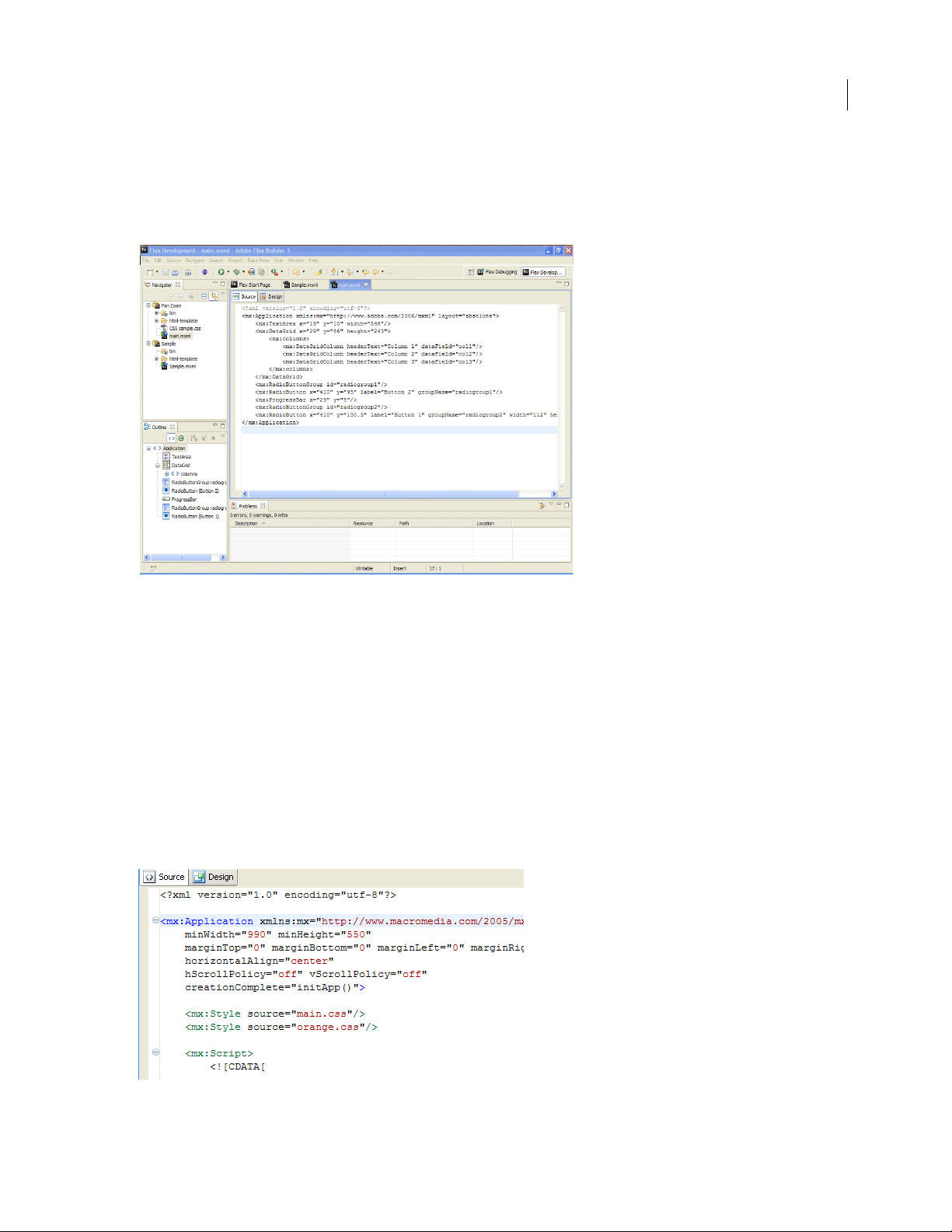
<mx:Script> and <mx:Style> tags. The MXML editor has two modes: Source and Design. Source mode is used
for editing code. Design mode is used for visually laying out and designing your applications. The two modes
are synchronized and changes in one mode are immediately reflected in the other. For more information, see
“About code editing in Flex Builder” on page 102.
ActionScript editor You use the ActionScript editor to edit ActionScript class and interface files. Although
you can embed ActionScript functions into an MXML file by using the
to define classes in separate ActionScript files and then import the classes into MXML files. Using this method,
you can define most of your Flex applications in ActionScript.
CSS editor You use the CSS editor to display and edit Cascading Style Sheets. You can then apply styles to the
visual elements of your applications. For more information, see “Working with components visually” on page 69
and “Using Styles and Themes” on page 470 in the Adobe Flex 3 Developer Guide.
<mx:Script> tag , it is a c om mo n p ra ct ic e
Page 17
ADOBE FLEX BUILDER 3
Using Adobe Flex Builder 3
Code hinting
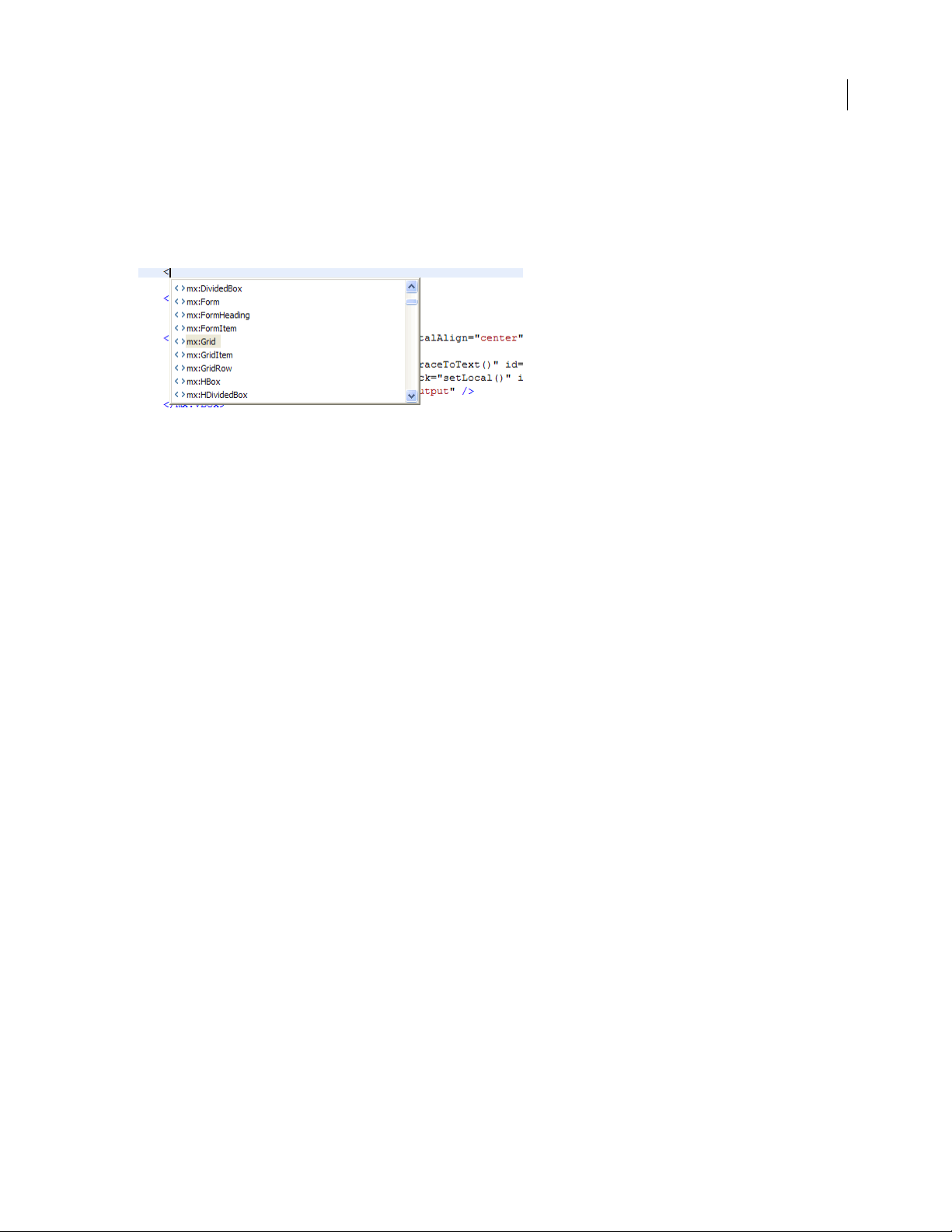
Editors contain many features that simplify and streamline code development. Foremost among these features is
Content Assist, which displays code completion hints as you enter MXML, ActionScript, and CSS code.
Code hints appear automatically as you enter your code. (You can also display code hints by pressing
Control+Space.) The following example shows code hints in the MXML editor:
Code hints appear whenever you begin typing a code expression that Flex or the language (MXML, ActionScript,
and CSS) recognizes. For example, if you type the name of a Flex component, you are prompted with a list of all
properties of that component.
ActionScript code hinting is also supported. ActionScript code hints are displayed within embedded
tags in an MXML document and within stand-alone ActionScript files. Content Assist displays code hints for all
ActionScript language elements: interfaces, classes, variables, functions, return types, and so on.
Content Assist also provides code hints for custom MXML components or ActionScript classes that you create
yourself. For example, if you define a custom MXML component and add it to your project, code hints are displayed
when you refer to the component in your MXML application file.
For more information, see “About Content Assist” on page 104.
<mx:Script>
12
Code navigation
Code navigation simplifies the burden of working with code, especially in large projects with many resources. Code
navigation includes the ability to select a code element (a reference to a custom Flex component in an MXML application file, for example) and go to the source of the code definition, wherever it is located in the project, workspace,
or path.
Other code navigation features include code folding, which allows you to collapse and expand multiline code statements. Another feature is the Outline view, which hierarchically presents, and allows you to navigate to, all user
interface and code elements in a file. For more information, see “Navigating and organizing code” on page 107.
Code formatting
As you write code, Flex Builder automatically indents lines of code to improve readability, adds distinguishing color
to code elements, and provides many commands for quickly formatting your code as you enter it (adding a block
comment, for example). For more information, see “Formatting and editing code” on page 111.
Page 18
ADOBE FLEX BUILDER 3
Using Adobe Flex Builder 3
Find references and code refactoring
Flex Bui lder l ets you fi nd a ll re feren ces and de claratio ns to ide ntifiers in a given f ile, projec t, or work space, in cluding
references found in elements linked from SWC files and other entries on a library path (for example, classes, interfaces, functions, variables, and some metadata). You use refactoring to rename identifiers in your code while
updating all references to them in your entire code base. For more information, see “Finding references and refac-
toring code” on page 113.
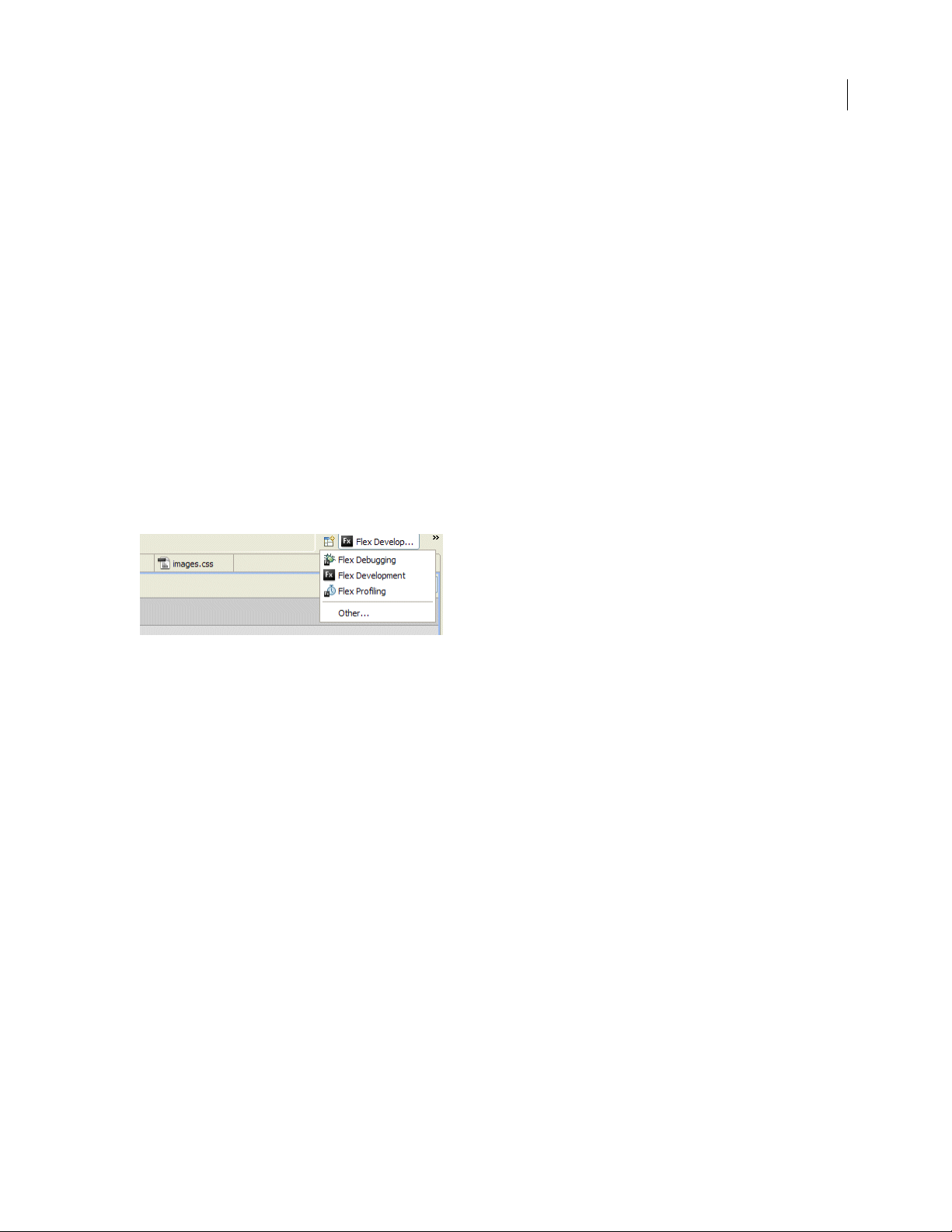
About Flex Builder perspectives
To support a particular task or group of tasks, editors and supporting views are combined into a perspective. Flex
Builder contains two perspectives: Flex Debugging and Flex Development. Flex Builder Professional contains an
additional perspective, Flex Prof iling.
Perspectives change automatically to support the task at hand. For example, when you create a Flex project, the
workbench switches to the Development perspective; when you start a debugging session, the Debugging
perspective is displayed when the first breakpoint is encountered. You can also manually switch perspectives yourself
by selecting Window > Perspective from the main menu (Window > Open Perspective in plugin version). Or, you
can use the perspective bar, which is located in the main workbench tool bar.
13
If you use the plug-in configuration of Flex Builder and have other Eclipse plug-ins installed, you might have many
additional perspectives. While predefined perspectives are delivered with each Eclipse plug-in, you can customize
them to your liking or create your own. Customizing or creating a perspective is a matter of selecting, placing, and
sizing the editors and views you need to accomplish your development tasks. For more information about working
with and customizing perspectives, see “Working with perspectives” on page 52.
Page 19
ADOBE FLEX BUILDER 3
Using Adobe Flex Builder 3
The Flex Development perspective
The Flex Development perspective includes the editors and views you need to create Flex and ActionScript 3.0 applications. When you create a project, Flex Builder switches into the Development perspective so you can begin developing your application. The following example shows the Flex Navigator, Outline, and Problems views:
14
The focal point of the perspective (and the workbench generally) is the editor area. The editor area contains all of the
currently open documents in a multitab interface. The supporting views are placed around the editor area. Perspectives predefine the layout of all the elements within it, but you may rearrange them to your liking. For more information, see “Navigating and Customizing the Flex Builder Workbench” on page 52.
In Source (code editing) mode, the Development perspective contains the following elements:
Flex Builder editors
The editor area contains all of the open documents. When you create a Flex project, the main MXML application file
is opened in the editor area. You can then open and switch between any of the MXML, ActionScript, and CSS
documents you are working in.
The MXML and CSS editors operate in two modes (Source and Design) and the Development perspective is
modified to accommodate each set of tasks as you toggle between the two modes. The ActionScript editor is a singlepurpose editor that is used to create ActionScript files.
Page 20
ADOBE FLEX BUILDER 3
Using Adobe Flex Builder 3
For more information about using the MXML editor, see “About code editing in Flex Builder” on page 102 and
“Working with components visually” on page 69.
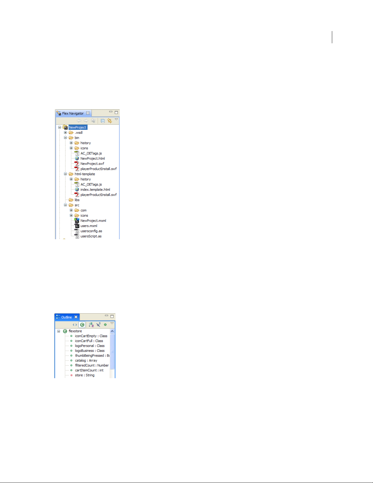
Flex Navigator view
The Flex Navigator view contains all of the projects and resources in the workspace and is therefore an essential
element of the Flex Builder workbench. It is always displayed in the Development and Debugging perspectives.
15
For more information about the Flex Navigator view and working with projects, see “Working with Projects” on
page 27.
Outline view
In Source mode, the Outline view presents a hierarchical view of the code structure of the selected MXML or ActionScript document so that you can inspect and navigate the sections or lines of code in the document. The Outline
view also displays syntax error alerts that the compiler generates. This view is also available when you use the ActionScript editor.
For more information about using the Outline view in Source mode, see “Using the Outline view to navigate and
inspect code” on page 108.
Page 21
ADOBE FLEX BUILDER 3
Using Adobe Flex Builder 3
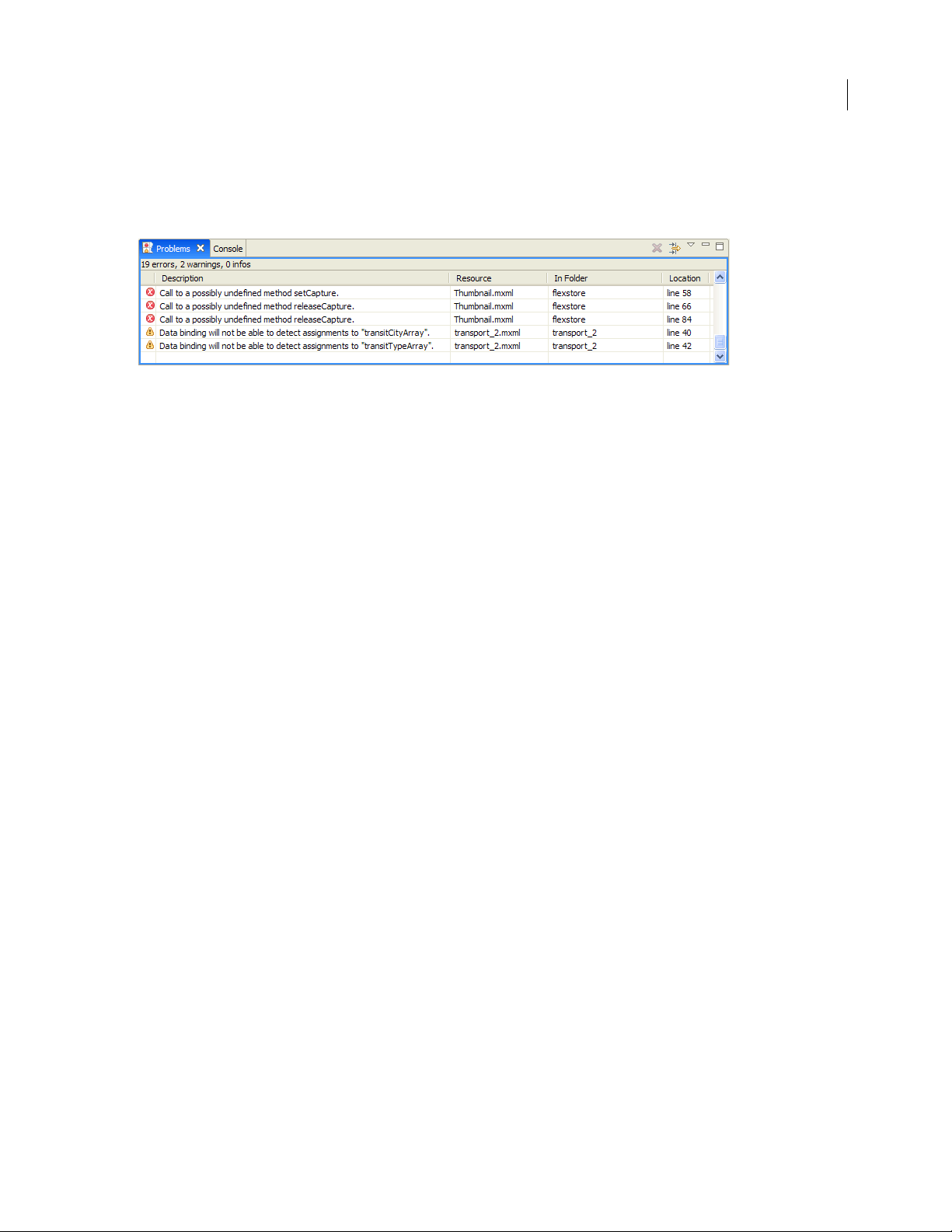
Problems view
As you enter code, the Flex Builder compiler detects syntax and other compilation errors, and these are displayed in
the Problems view. When you debug your applications, errors, warnings, and other information are displayed in the
Problems view.
For more information, see “Running and Debugging Applications” on page 136.
Note: You can also optionally add the Tasks and Bookmarks views. These views provide additional shortcuts for
managing and navigating your code. For more information about these views, see
introduction to the optional views that are available in Flex Builder, see “Other useful workbench views” on page 22.
“About markers” on page 114. For an
Flex Development perspective in Design mode
You visually lay out and design your Flex applications in the MXML editor in MXML Design mode. Design mode is
the visual representation of the code that you edit in Source mode. In Design mode, however, additional views are
added to support design tasks. These are the Components, Flex Properties, and States views. In addition, when you
are in Design mode, the Outline view displays the MXML structure of your Flex applications. You can also display
and edit CSS in CSS Design mode. For more information about designing Flex applications in Flex Builder, see
“Building a Flex User Interface” on page 64.
Note: Design mode is not available when working with ActionScript projects. To preview the user interface of your
ActionScript applications, you need to build and run them. For more information about working with ActionScript, see
“About ActionScript projects” on page 44 and “Running and Debugging Applications” on page 136.
In Design mode, the development perspective contains the MXML editor and the Components, States, and Flex
Properties, and Outline views.
16
Page 22
ADOBE FLEX BUILDER 3
Using Adobe Flex Builder 3
The MXML editor
In MXML Design mode, you interact with your Flex applications visually; dragging and dropping components on
to the design area, selecting and resizing components, and so on. You can also expand the MXML editor in Design
mode to clearly see and select individual components, and use pan and zoom to get a closer look at items; this is
especially useful when you have embedded container components. For more information about working in Design
mode, see “Building a Flex User Interface” on page 64.
17
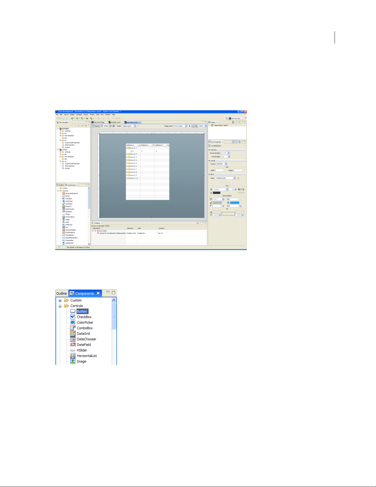
Components view
The Components view contains all of the standard Flex components, which you can select and add to the design area.
As you create your own custom components, they are also displayed in the Components view.
For more information, see “Adding and changing components” on page 66.
Page 23
ADOBE FLEX BUILDER 3
Using Adobe Flex Builder 3
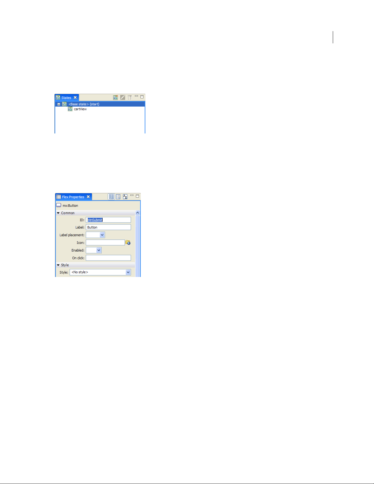
States view
Flex allows you to create applications that change their appearance based on events that are triggered directly by the
user or events that are generated programmatically. These user interface transformations are referred to as view
states. You create and manage view states in the States view.
For more information about view states, see “Adding View States and Transitions” on page 93.
Flex Properties view
When a Flex component is selected, its properties are displayed in the Flex Properties view. You can set and edit
properties as appropriate. You can view a component’s properties graphically (as shown in the following example)
and as a categorized or alphabetical list.
18
For more information, see “Setting component properties” on page 74.
Page 24
ADOBE FLEX BUILDER 3
Using Adobe Flex Builder 3
Outline view
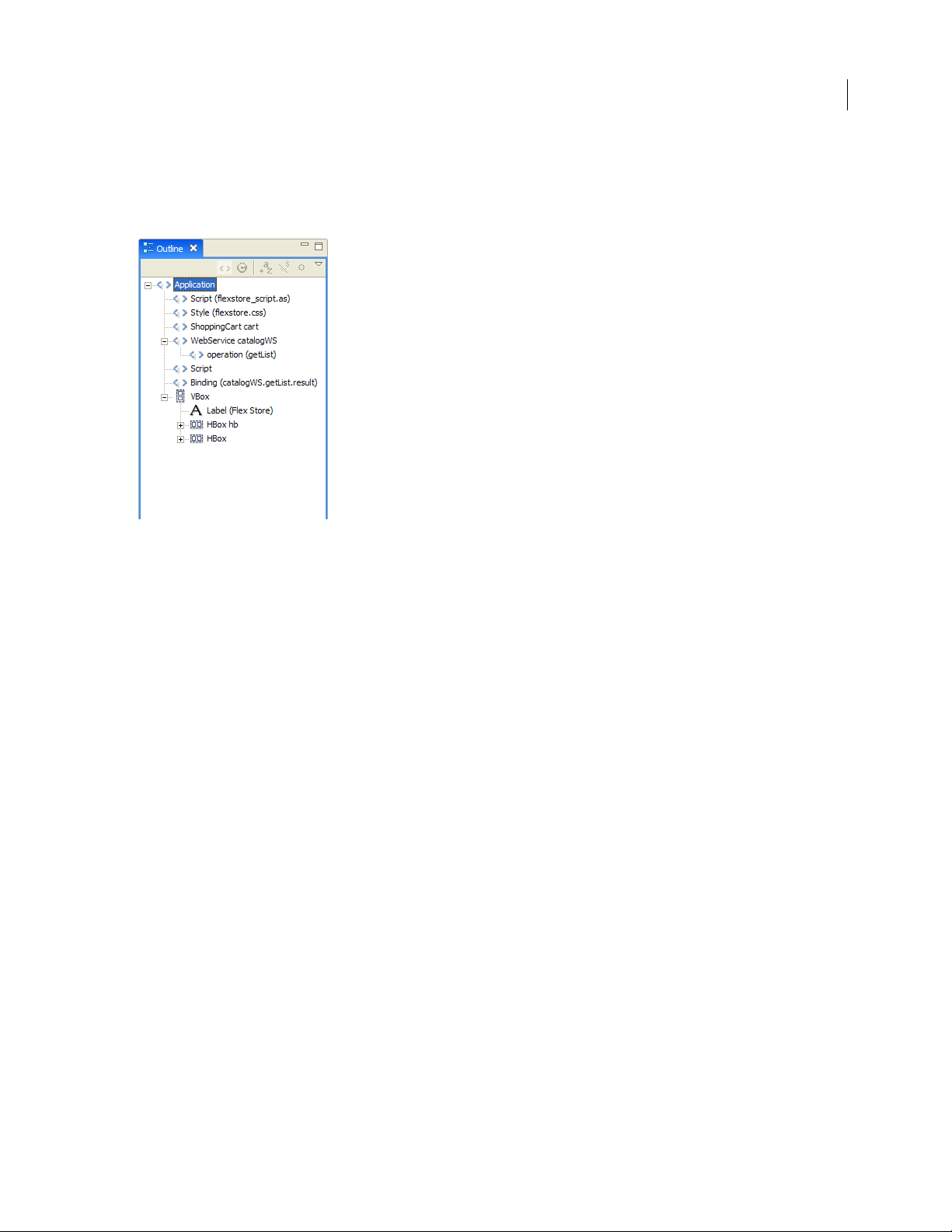
In Design mode, the Outline view presents a hierarchical view of the MXML structure of your Flex applications. You
can easily navigate the structure of your application by selecting individual MXML tag statements and components.
When you select an item in the Outline view, it is highlighted in Design mode.
19
For more information about working with the Outline view in Design mode, see “Inspecting the structure of your
MXML” on page 77.
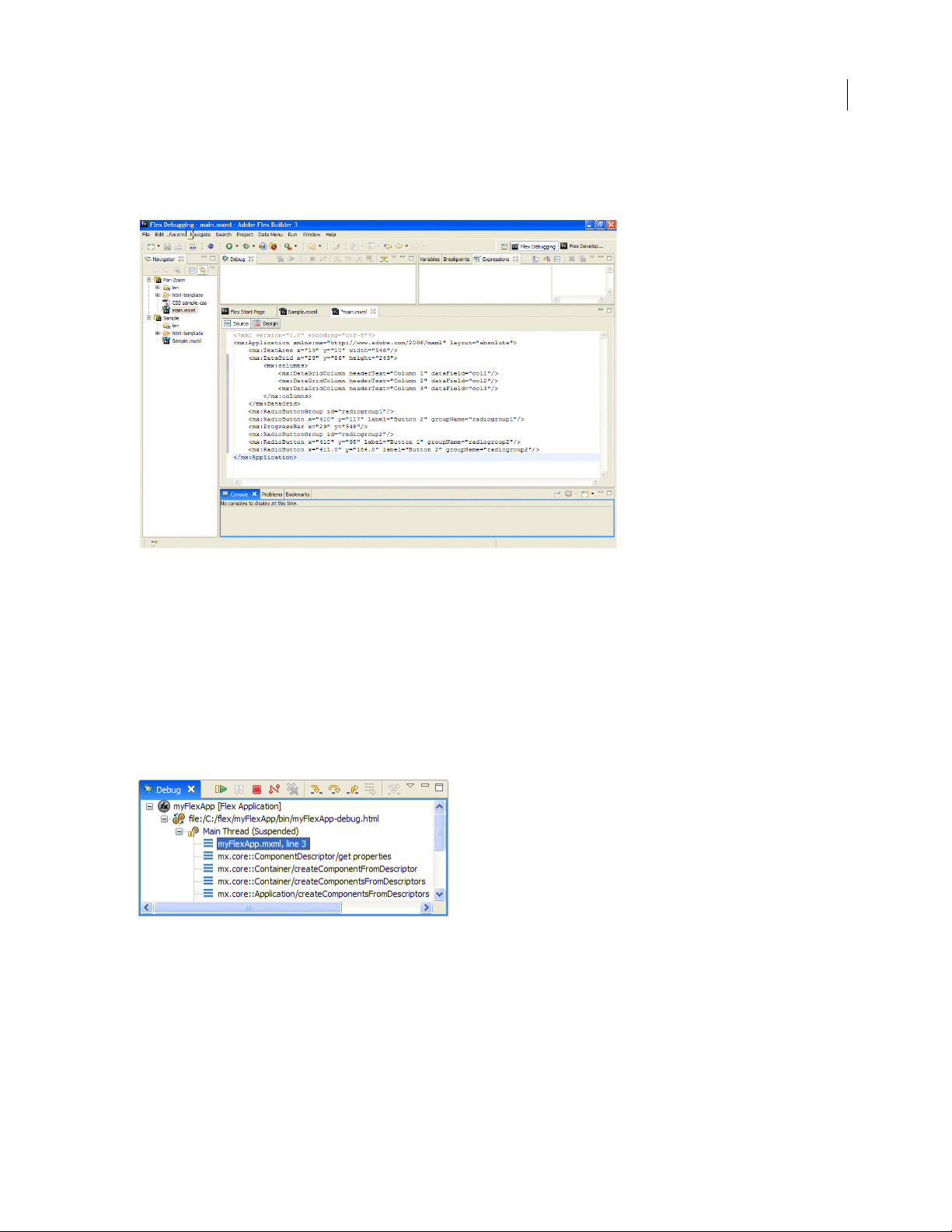
The Flex Debugging perspective
The Flex Debugging perspective contains the tools you need to debug your Flex and ActionScript applications. Like
the Development perspective, the primary tool within the debugging perspective is the editor. In the context of
debugging your applications, the editor works with the debugging tools to locate and highlight lines of code that need
attention so that you can fix them and continue testing your application.
Page 25
ADOBE FLEX BUILDER 3
Using Adobe Flex Builder 3
For example, you can set breakpoints in your script to stop the execution of the script so that you can inspect the
values of variables and other information up to that point. You can also move to the next breakpoint or step in to a
function call to see the variable values change.
20
The Debugging perspective appears automatically when the first breakpoint is reached. You can also switch to the
Debugging perspective manually by selecting it from the Perspective bar, which is located at the right edge of the
main workbench toolbar.
The Debugging perspective contains Debug, Breakpoints, Console, Variables, and Expressions views.
Debug view
The Debug view (in other debuggers this is sometimes referred to as the callstack) displays the stack frame of the
suspended thread of the Flex application you are debugging. You use the Debug view to manage the debugging
process. For example, the Debug view allows you to resume or suspend the thread, step into and over code statements, and so on.
For more information about working with the Debug view, see “Managing the debugging session in the Debug view”
on page 143.
Flex applications are single-threaded (not multithreaded like Java, for example) and you can debug only one Flex
application at a time. Therefore, when you debug a Flex application, you see only the processes and Debug view for
a single thread of execution.
Page 26
ADOBE FLEX BUILDER 3
Using Adobe Flex Builder 3
The Debug view shows a list of all the functions called to that point, in the order called. For example, the first
function called is at the bottom of the list. You can double-click a function to move to it in the script; Flex Builder
updates the information in the Variables view to reflect the new location in the script.
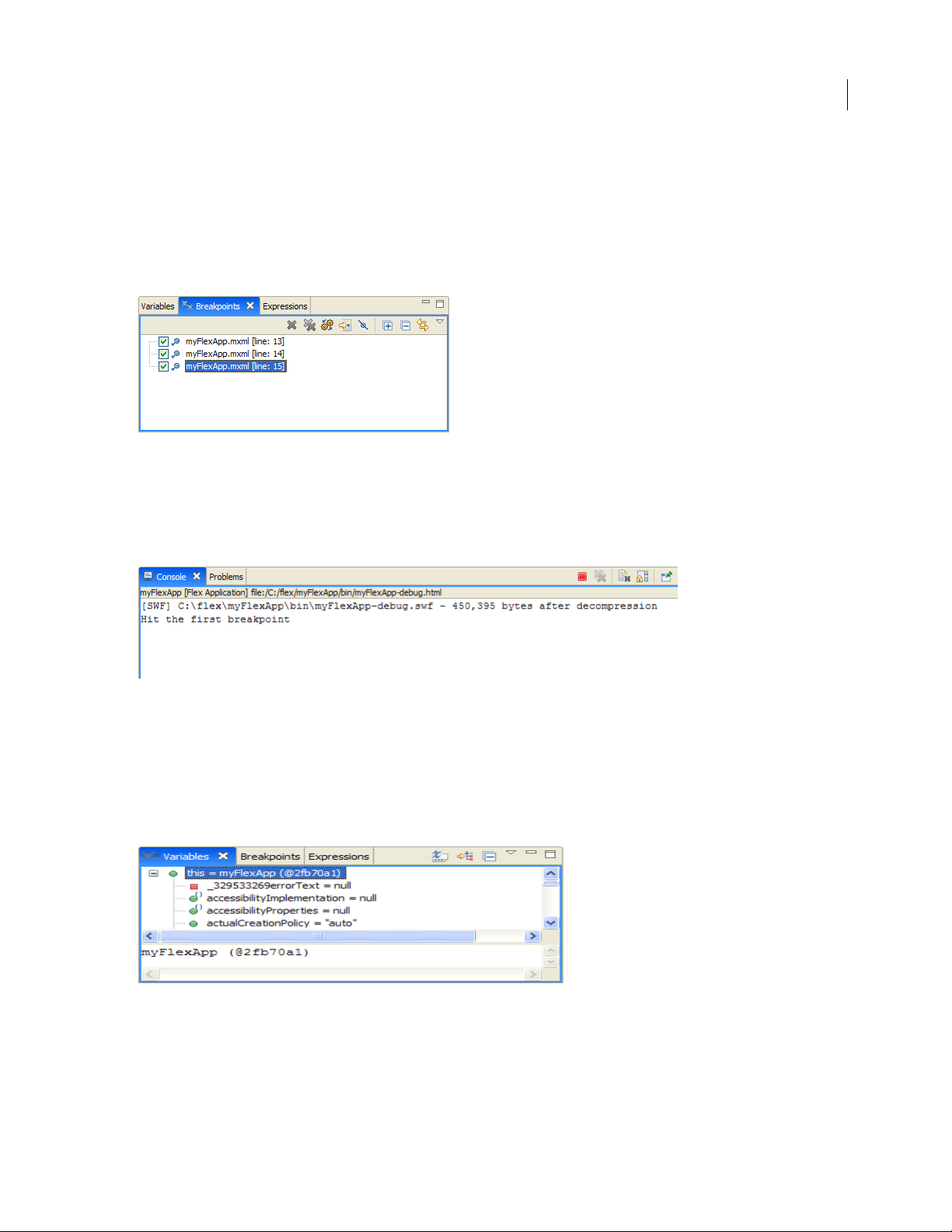
Breakpoints view
The Breakpoints view lists all of the breakpoints you set in your project. You can double-click a breakpoint and
display its location in the editor. You can also disable, skip, and remove breakpoints.
For more information, see “Managing breakpoints in the Breakpoints view” on page 143.
Console view
The Console view displays the output from trace statements placed in your ActionScript code and also feedback from
the debugger itself (status, warnings, and errors).
21
For more information, see “Using the Console view” on page 144.
Variables view
The Variables view displays information about the variables in a selected stack frame. You can select variables to
monitor (in the Expressions view) and also change variable values during the debugging session. During the debug
session you can see the changes in the currently running SWF file and experiment with fixes for the problem you
need to resolve.
For more information, see “Managing variables in the Variables view” on page 144.
Page 27
ADOBE FLEX BUILDER 3
Using Adobe Flex Builder 3
Expressions view
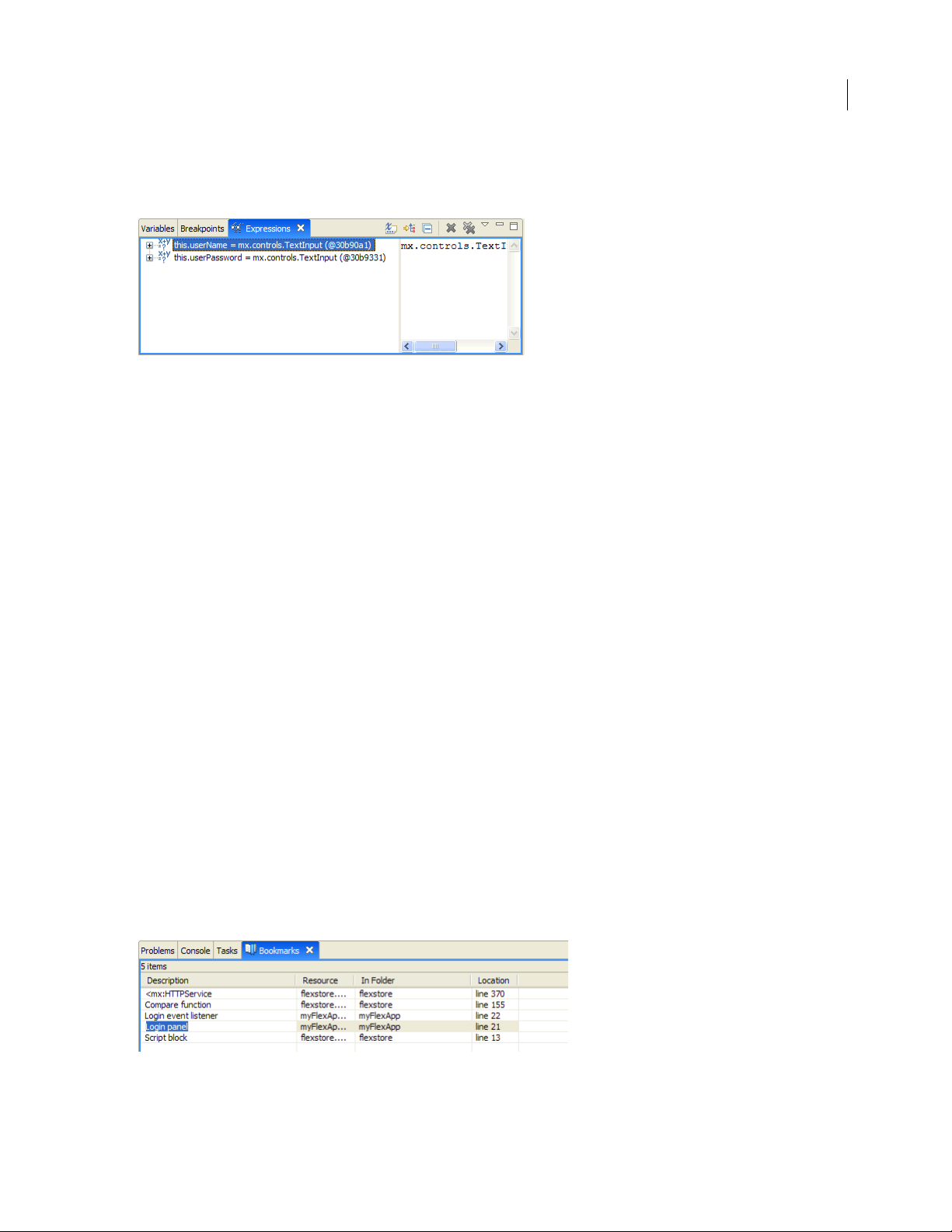
The Expressions view is used to monitor a set of critical variables. You can choose the variables you consider critical
in the Variables view and add them to the Expressions view for monitoring.
When you debug your application, you can then monitor and, if needed, modify the values. You can also add and
remove variables in the Expressions view. For more information, see “Using the Expressions view” on page 145.
For more information about debugging Flex and ActionScript applications, see “Running and Debugging Applica-
tions” on page 136.
The Flex Profiling perspective
Flex Builder Professional contains an additional perspective. The Adobe Flex profiler helps you identify performance
bottlenecks and memory leaks in your applications. The Profiling perspective displays several panels (or views) that
present profiling data in different ways. As you interact with your application, the profiler records data about the
state of the application, including the number of objects, the size of those objects, the number of method calls, and
the time spent in those method calls. For more information about the profiler, see “About profiling” on page 155.
22
Other useful workbench views
In addition to the editors and views associated with Flex Builder’s default development, debugging, and profiling
perspectives, the workbench contains other views that help you streamline the application development process.
You can access views that are not already displayed with a perspective and add them to the workbench by selecting
Window > Other Views > General (Window > Show View Other in plugin version). These optional views are categorized by type and are associated with distinct workbench functionality or with specific Eclipse plug-ins. For more
information about working with views, see “Working with editors and views” on page 54.
You will find that several workbench views in particular are valuable aids as you develop your applications in Flex
Builder. These include the Tasks, Bookmarks, and Search views.
Bookmarks view
The Bookmarks view is used to manage the bookmarks that you add to specific lines of code or to resources. As in
a web browser, bookmarks are used as a convenience for keeping track of noteworthy items. Selecting a bookmark
locates and displays it in the workbench.
For more information about the Bookmarks view, see “About markers” on page 114.
Page 28
ADOBE FLEX BUILDER 3
Using Adobe Flex Builder 3
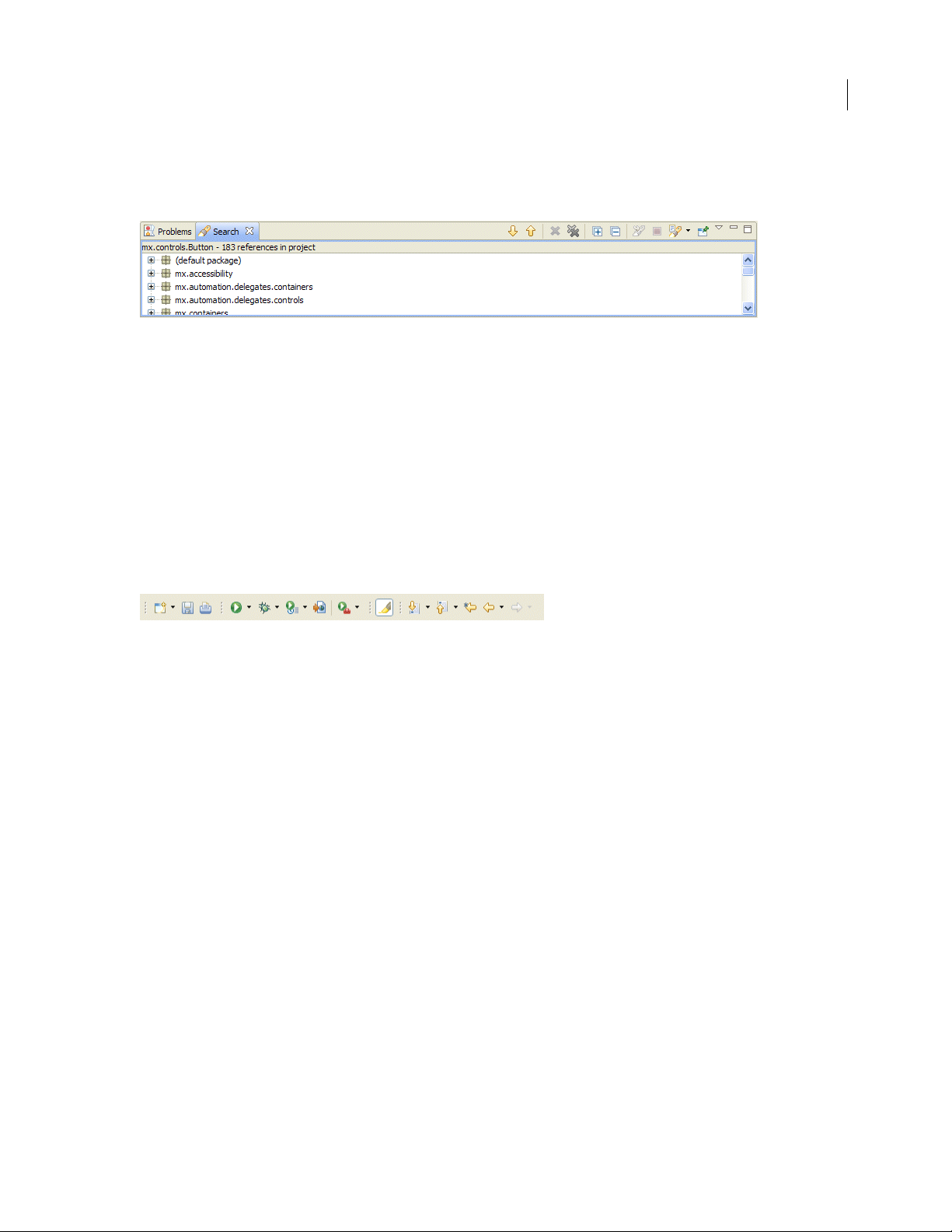
Search view
The Search view is displayed automatically when you search the resources in the workspace. You can use it to define
and recall previous searches and to filter the list of search results.
For more information about the Search view, see “Searching in the workbench” on page 60.
Workbench menus, toolbars, and shortcuts
All of the workbench commands are contained in the menu system, in right-click context menus, from toolbars, and
through keyboard shortcuts.
The workbench toolbar
The workbench toolbar contains buttons for important and frequently used commands. These commands are also
available from various Flex Builder menus.
23
The following buttons appear in the workbench toolbar (shown left to right):
New Displays a pop-up menu that displays all the types of projects and documents you can create.
Save Saves the document that is open in the editor and currently selected.
Print Source Prints the document that is open in the editor and currently selected.
Build All Appears when “Build automatically” is deselected from the Project menu.
Run Opens the main application SWF file in your default web browser or directly in stand-alone Flash Player.
You can also select other application files in the project from the attached pop-up menu. For more information,
see “Running your applications” on page 138.
Debug Uses the current project’s main application file to begin a debugging session. You can also select other
application files in the project from the attached pop-up menu. For more information, see “Starting a debugging
session” on page 141.
Profile Creates, manages, and runs configurations. For more information, see “About profiling” on page 155.
Export Release Build Launches a wizard that helps you choose the application for which you want to export
an optimized release-quality version.
External Tools Selects a custom launch configuration.
Mark Occurrences Allows you to select and mark code occurrences in Source mode.
Next Annotation Allows you to select and move forward to code annotations in Source mode.
Previous Annotation Allows you to select and move backward to code annotations in Source mode.
Last Edit Location Returns you to the location of the last edit you made to a resource (for example, the exact
line of code or, in Design mode, the user interface element in which you added a control or set a property).
Page 29
ADOBE FLEX BUILDER 3
Using Adobe Flex Builder 3
Back and Next Go backward or forward to previously selected documents. You can also select from the list of
currently open documents from the attached pop-up menu.
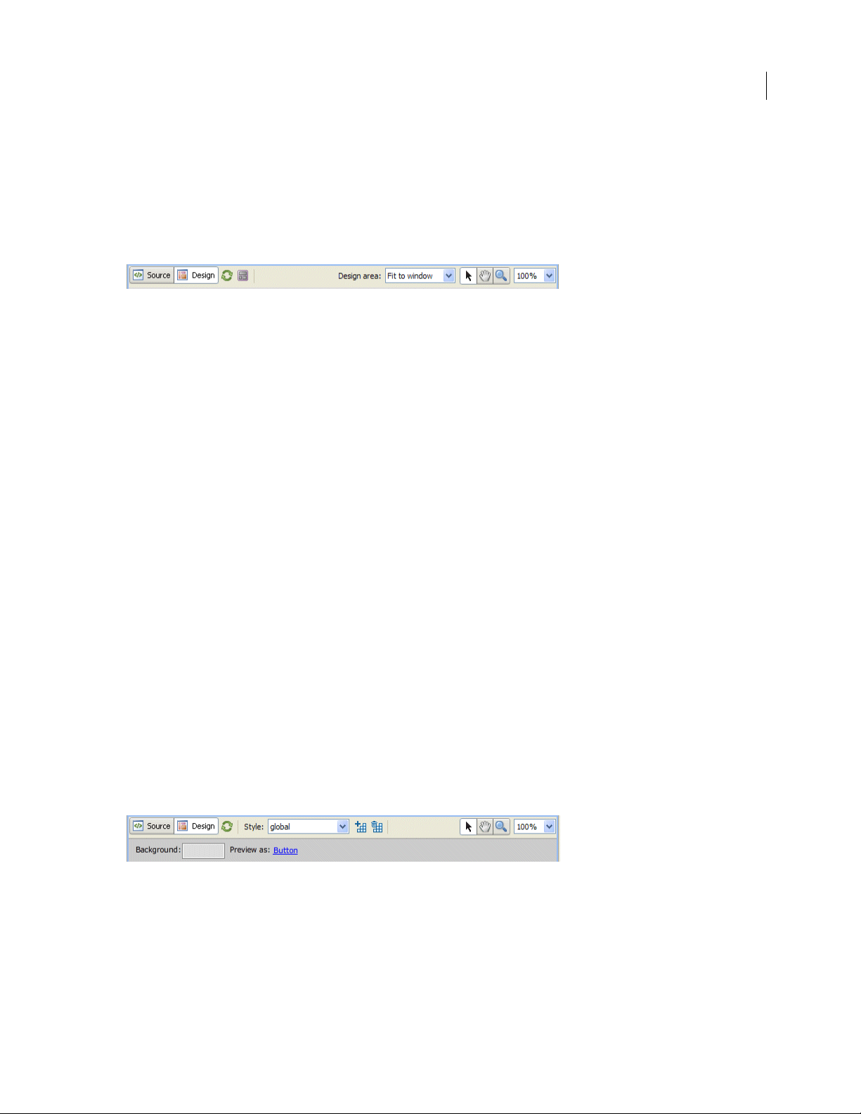
The MXML editor toolbar
The MXML editor toolbar contains several buttons that allow you to control the editor in Source and Design modes.
To see the toolbar, open an MXML file in Design mode.
The following buttons appear in the MXML editor toolbar (shown left to right):
Source Displays the editor in Source mode, which is where you edit code.
Design D ispl ays the ed itor in De sig n mode, which i s where you vi sually lay out a nd design you r Fl ex appl i-
cations.
Refresh Reloads the visual elements (images, SWF files, or class files containing drawing API methods)
that define the visual design of your application. Collectively, these elements are referred to as a skin. For
more information, see “Creating Skins” on page 550 in the Adobe Flex 3 Developer Guide.
Show Surrounding Containers Expands the Design mode view so that you can see and select individual
components. For more information, see “Laying out your user interface” on page 85.
State Pop-up menu displays all the defined views states. Selecting view states updates the display of the
visual design. For more information, see “Adding View States and Transitions” on page 93.
Design Area Displays and allows you to select predefined design area sizes (1024 x 768 pixels and 800 x
600 pixels, for example). You can also set a custom size. For more information, see “Using the MXML editor
in Design mode” on page 69.
Select Mode Engaged by default when a file is opened; it allows you to select, move, and resize items.
Pan Mode Allows you to pan and scroll around in design area; items cannot be selected or moved in Pan
mode.
Zoom Mode Defaults to zoom-in preset magnification values. To zoom out press Alt+Click (Opt+Click
on Macintosh). You can double click the Zoom Mode button to return the design view to 100%.
Magnification Pop-up menu displays specific zoom percentages, which can also be selected from the
Design > Magnification menu. The default setting is 100%.
24
The CSS editor toolbar
The CSS editor contains several buttons that allow you to control the editor in Source and Design modes. To see the
CSS editor toolbar, open a CSS file in Design mode.
The following buttons appear in the CSS toolbar (shown left to right):
Source Displays the editor in Source mode, which is where you edit code.
Design Displays the editor in Design mode, which is where you visually lay out and design your Flex appli-
cations.
Page 30

ADOBE FLEX BUILDER 3
Using Adobe Flex Builder 3
Refresh Reloads the visual elements (images, SWF files, or class files containing drawing API methods)
that define the visual design of your application. Collectively, these elements are referred to as a skin. For
more information, see “Creating Skins” on page 550 in the Adobe Flex 3 Developer Guide.
Style Pop-up menu lists the styles contained in your CSS file.
New Style Launches the New Style dialog box which allows you to choose the selector types and compo-
nents to apply the new style.
Delete Style Deletes the selected style for your CSS file.
Select Mode Engaged by default when a file is opened. It allows you to select, move, and resize items.
Pan Mode Allows you to pan and scroll around in design area. Items cannot be selected or moved in Pan
mode.
Zoom Mode Defaults to zoom-in preset magnification values. To zoom out press Alt+Click (Opt+Click
on Macintosh). Double click the Zoom Mode button to return the design view to 100%.
Magnification Pop-up menu displays specific zoom percentages which can also be selected from the
Design > Magnification menu. The default setting is 100%.
Background Launches a color picker where you can select a background color for the preview area.
Changing this color does not change the CSS file nor does it affect your Flex application when you run it.
Preview as (If applicable) Shown when the style rule is not tied to one specific MXML component.
Edit scale grids (not shown) (If applicable) Shown when the style rule uses image file skins.
25
Using keyboard shortcuts
Many operations that are available from the menu system in Flex Builder are also available as keyboard shortcuts.
Display the list of all keyboard shortcuts in Flex Builder
❖ Select Help > Key Assist, or enter Control+Shift+L (Command+Shift+L on Macintosh).
You can use Key Assist as a reference to all the Flex Builder keyboard shortcuts, or you can run these commands
directly from the Key Assist panel by double-clicking the commands. You can also modify keyboard shortcuts or
create your own. For more information, see “Changing keyboard shortcuts” on page 58.
Extending the Flex Builder workbench
Flex Builder is a collection of Eclipse plug-ins that provide the tools you need to create Flex and ActionScript 3.0
applications. The Eclipse plug-in framework allows plug-ins to expose extension points, which can be used to extend
the features and capabilities of the tool. For more information, see Adobe Flex Builder 3 Extensibility API Reference
in Help.
Page 31

Part 2: Flex Builder Basics
To p ic
Working with Projects . . . . . . . . . . . . . . . . . . . . . . . . . . . . . . . . . . . . . . . . . . . . . . . . . . . . . . . . . . . . . . . . . . . . . . . . . . . . . 27
Navigating and Customizing the Flex Builder Workbench. . . . . . . . . . . . . . . . . . . . . . . . . . . . . . . . . . . . . . . . . . . . . . . 52
26
Page 32

27
Chapter 4: Working with Projects
Adobe Flex Builder lets you create, manage, package, and distribute projects for building web and desktop applications. When you generate shared component library (SWC) files, you can share components and other resources
between applications or with other developers. You can also work with different versions of the Adobe Flex SDK
directly in Flex Builder.
To p ic s
About Flex Builder projects . . . . . . . . . . . . . . . . . . . . . . . . . . . . . . . . . . . . . . . . . . . . . . . . . . . . . . . . . . . . . . . . . . . . . . . . . 27
Creating Flex projects. . . . . . . . . . . . . . . . . . . . . . . . . . . . . . . . . . . . . . . . . . . . . . . . . . . . . . . . . . . . . . . . . . . . . . . . . . . . . . 32
Managing projects. . . . . . . . . . . . . . . . . . . . . . . . . . . . . . . . . . . . . . . . . . . . . . . . . . . . . . . . . . . . . . . . . . . . . . . . . . . . . . . . . 36
Managing project resources. . . . . . . . . . . . . . . . . . . . . . . . . . . . . . . . . . . . . . . . . . . . . . . . . . . . . . . . . . . . . . . . . . . . . . . . . 40
About ActionScript projects . . . . . . . . . . . . . . . . . . . . . . . . . . . . . . . . . . . . . . . . . . . . . . . . . . . . . . . . . . . . . . . . . . . . . . . . 44
About library projects. . . . . . . . . . . . . . . . . . . . . . . . . . . . . . . . . . . . . . . . . . . . . . . . . . . . . . . . . . . . . . . . . . . . . . . . . . . . . . 47
About Flex Builder projects
Flex Builder uses a traditional approach to software development: grouping the resources (folders and files) that
constitute an application into a container called a project. A project contains a set of properties that control how the
application is built, where the built application resides, how debugging is handled, and the relationships to other
projects in the workspace.
To manage projects, you use the Flex Navigator view, which lets you add, edit, and delete resources. You can also close
projects within a workspace, import resources, and link to external resources.
In addition to Flex projects, Flex Builder provides a basic project type called an ActionScript project. Using an Action-
Script project, you can code and debug ActionScript applications that directly access the Adobe Flash Player APIs
and are compiled into SWF files. ActionScript projects do not use the Flex framework or MXML language.
Flex and ActionScript applications
Using Flex Builder, you can create Flex and ActionScript applications. You compile Flex applications into standalone SWF files. For more information, see “Working with Projects” on page 27 and “About ActionScript projects”
on page 44.
Adobe AIR applications
With Flex Builder you can debug, package, and manage AIR projects. Flex Builder enables you to run Flex applications in AIR. You create AIR projects by using the New Flex Project wizard. Use the Export Release Build feature to
generate a release-quality, installable AIR package. For more information, see Developing AIR Applications with
Adobe Flex 3.
The Adobe AIR Marketplace is a place where AIR developers can publish AIR applications for users to download.
To find the Marketplace, go to http://www.adobe.com/go/marketplace. If you have questions on the Adobe AIR
Marketplace, go to http://www.adobe.com/go/marketplace_faq.
Page 33

ADOBE FLEX BUILDER 3
Using Adobe Flex Builder 3
Flex libraries
You also use Flex Builder to build custom code libraries that you share between your applications or distribute to
other developers. A library project generates a SWC file, which is an archive file for Flex components and other
resources. For more information, see “About library projects” on page 47.
Applications contained in proj ects
To begin building a Flex or ActionScript application in Flex Builder, you must first create a project. When you create
a Flex project, a main application file is created for you. Then you add other resources such as MXML application
files, custom MXML component files, ActionScript files, and all of the other assets that make up your Flex application. When you create an ActionScript project, a main ActionScript file is created; then you can build an application by using ActionScript and the Flash Player API. For more information, see “Creating Flex projects” on page 32
and “Managing projects” on page 36.
Projects managed in workspaces
Projects are managed from within a workspace, which is a defined area of the file system that contains the resources
(files and folders) that make up your applications. By default, your projects reside within the workspace. You can,
however, create projects that are located outside the workspace; Flex Builder automatically links them to the
workspace. To switch workspaces, you must restart Flex Builder.
More than one project in each workspace
You can add as many projects to a workspace as needed. All of your projects are displayed in the Flex Navigator view,
and you can manage them as you need to—adding resources, organizing your projects into folders, and building
projects in the workspace. For more information, see “Managing projects” on page 36 and “Creating folders and files
in a project” on page 41.
28
External linked resource s
In addition to the resources in your projects, you can link to resources outside a project and workspace. Linked
external resources appear as part of the project but reside outside the project’s location. For more information, see
“Linking to resources outside the project workspace” on page 42.
More than one application in a project
Flex Builder lets you define more than one file in your project as an application. When you create a project, Flex
Builder generates a main application file that serves as the entry point into your application, and the compiler uses
this file to generate the application SWF file. However, if your project is complex, you can create additional application files. All application files must reside in the src folder under the root folder of your project. For more information, see “Managing project application files” on page 40.
Support for Multiple Flex SDKs
You could have projects that are in progress or an older project code base that must be maintained. With Flex Builder,
you can work with different versions of the Flex SDK. To specify the installed SDKs, you configure the Flex Builder
workspace, which provides a default SDK for any project. After you set up a project, you can add, remove, or edit
SDK configurations in the Preferences dialog by selecting Flex > Installed SDKs. You can also modify the SDK
configurations by selecting Project > Properties > Flex Compiler. For more information, see “Using multiple SDKs
in Flex Builder” on page 131.
Page 34

ADOBE FLEX BUILDER 3
Using Adobe Flex Builder 3
Automatic project builds
By default, your project is automatically built any time you save changes to a file. You have complete control over how
and how often your applications are built. If you have no special requirements for customizing the build, it works
transparently and automatically generates the application SWF files. For more information, see “Building Projects”
on page 121.
Export Release Build
When your application is ready to deploy, you use the Export Release Build wizard to create a release-quality nondebug version of your Flex, AIR, or ActionScript application. The wizard copies required assets to a bin-release folder
separate from the debug version, Export Release Build with or without source code. This version is an optimized
production build that can be viewed by end users. For Adobe AIR projects, AIR applications are exported to an AIR
file. You use Export Release Build to create a digitally signed AIR file, which users install before running an application. For more information, see “Export Release Build” on page 126.
Custom Ant scripts
Apa che Ant is a Java-b ase d build tool that you use to creat e custom scripts for building your Fl ex applic ations in Fle x
Builder. You use Ant to modify and extend the standard build process. For more information, see “Customizing
builds with Apache Ant” on page 131.
29
Project types
You use Flex Builder to create project types in the following configurations:
Flex projects
Flex project configuration options are based on how your Flex application accesses data and if you have Adobe
LiveCycle Data Services ES installed. You can create Flex projects for web (runs in Flash player) or desktop (runs in
Adobe AIR) applications. Here are the options:
None If you do not have an application server, this basic configuration lets you specify the output folder for
your compiled Flex application. You also set the build paths for your new project.
ASP .NET With Microsoft Windows and Microsoft Visual Web Developer installed, you can create Flex
projects that use ASP .NET Development Server for deployment. Also, if you have access to Internet Information
Service (IIS), you can create Flex projects with a Flex output folder under IIS.
ColdFusion This project configuration lets you create Flex projects that use ColdFusion with LiveCycle Data
Services or ColdFusion Flash Remoting. If neither option is selected, a ColdFusion project is created with a Flex
output folder under web root (or virtual folder).
J2EE This project configuration lets you create Flex projects that use J2EE with or without remote object access
service and LiveCycle Data Services. When no option is selected, a Flex output folder is created under the Java
application server root. If you select the Use Remote Object Access Service option, you can use Flex with
LiveCycle Data Services and your project is deployed on a LiveCycle Data Services server. With the Eclipse Web
Tools Project (WTP) plug-in installed, you select the Create Combined Java/Flex Project Using WTP option to
create combined Java/Flex projects with or without remote object access service. For locally compiled projects
with WTP, projects are deployed on your J2EE server.
You can use LiveCycle Data Services with or without WTP. If you use it with WTP, the project will not be
deployed on the local LiveCycle Data Services server, but it will be deployed using WTP features.
PHP This project configuration lets you create Flex projects that have a Flex output folder under the
Apache/IIS web root (or virtual folder). You configure the URL and run and debug your Flex application by
using your PHP server or scripts.
Page 35

ADOBE FLEX BUILDER 3
Using Adobe Flex Builder 3
Other If you have an application server other than those previously listed, this option lets you specify the
output folder for your compiled Flex application. You can also set the build paths for your new project.
ActionScript projects
Based on the Flash API, not the Flex framework, ActionScript projects let ActionScript developers use Flex Builder
to code, build, and debug ActionScript-only applications. Because these projects do not use MXML to define a user
interface, you cannot view the application layout and design in Design mode. You work exclusively in the source
editor, the debugging tools as necessary, and then build the project into SWF application files to preview and test
your application in a web browser or stand-alone Flash Player. For more information about ActionScript projects,
see “About ActionScript projects” on page 44.
Flex library projects
Library projects are used to package and distribute components and other resources. They generate SWC files that
you add to other projects or distribute to other developers. For more information, see “About library projects” on
page 47.
Projects in the Flex Navigator view
All projects in a workspace are displayed in the Flex Navigator view, as the following example shows. Using this view,
you manage your projects by adding and deleting resources (folders and files), importing and linking to external
resources, and moving resources to other projects in the workspace.
30
Flex Builder provides the following wizards to help you create projects:
• The New Flex Project wizard automatically generates Flex project configuration files, the output (bin) folder
where your compiled application resides, and the main application file. It also lets you create an Adobe AIR project.
• The New ActionScript Project wizard generates a main ActionScript application file.
• The New Flex Library Project wizard helps you generate a Flex Library Project that you use to package and
distribute components and other resources.
From the Flex Navigator view, you can open the project resources for editing. For example, you can edit MXML and
ActionScript in
visually manipulate components and controls to create the application’s layout and behavior. For more information
about working with the Flex Builder editors, see “About code editing in Flex Builder” on page 102 and “Building a
Flex User Interface” on page 64.
Then you add projects, files, and folders, and organize and manage them as needed (see “Creating folders and files
in a project” on page 41).
<mx:Script> blocks and CSS in <mx:Style> blocks, or you can switch to Design mode and
Page 36

ADOBE FLEX BUILDER 3
Using Adobe Flex Builder 3
You can also modify the Flex Navigator view’s appearance. For example, you can expand and collapse projects and
folders, limit which projects and resources are visible by creating a working set (a collection of resources), create
display filters, and sort resources by name and type. For more information about modifying views, see “Navigat ing
and Customizing the Flex Builder Workbench” on page 52.
Most menu commands that you use in the Flex Navigator view are also available from the Flex Navigator view’s
context menu. For example, instead of selecting File > New, you can right-click (Control-click on Macintosh) in the
Flex Navigator view, and select New from the context menu.
For more information about working with projects in the Flex Navigator view, see “Managing projects” on page 36
and “Creating folders and files in a project” on page 41.
Project resources
Flex and ActionScript applications support several standard resource types (MXML, ActionScript, and CSS). The
following table lists the resource types that you can add to your projects. (To add these resources, select File > New.)
Resource type Description
ActionScript Class An ActionScript class file. When you add this type of resource, the New ActionScript Class wizard
ActionScript File A text file template for creating Ac tionSc ript func tions.
ActionScript Interface An ActionScript int er fac e fi le. Whe n yo u ad d th is t ype of r eso urc e, th e N ew ActionScript Interface wizard
ActionScript Project An ActionScript projec t based on th e Flash API, not th e Flex framework. ActionScript projects let Action-
CSS File A text file template for creating a Cas cading Style S heets file.
File An unformatted text file. For more information, see “Creating folders and files in a project” on page 41.
Flex Project A Flex project contains a set of properties that control how the application is built, where the built appli-
Flex Library Project Flex Library Projects are used to package and distribute components and other resources. They generate
Fol der A standard file system folder for organizing the contents of your projects. For more information, see
MXML Application A standard Flex application file with the <mx:Application> tag as the root MXML element. A Flex
MXML Component A standard Flex component file with the <mx:Canvas> tag as the root MXML element. For more infor-
prompts you for class definition elements, such as the superclass, interfaces, and so on. For more infor
mation a bout working w ith Act ionSc ript in Flex Build er, see “Creating an ActionScript class” on page 46.
prompts you for interface definition elements such as extended interfaces and the package in which
they reside. For more information about workin g with
ActionScript inter face” on page 46.
Script developers use Flex Builder to code, bu ild, and debug Ac tionSc ript- only applications. For more
information, see
cation resides, how debugging is handled, and the relationships to other projects in the workspace. For
more information, see
SWC files that you add to other projects or distribute to other developers. For more information, see
“About library projects” on page 47.
“Creating folders and files in a project” on page 41.
project can have more than one application file. For more infor mation, see
tion files” on page 40.
mation, see “Creating MXML components visually” on page 227.
“Creating ActionScript projects” on page 45
“Setting Flex project properties” on page 36.
ActionScript in Flex B uilder, see “Creating an
“Managing project applica-
-
31
Page 37

ADOBE FLEX BUILDER 3
Using Adobe Flex Builder 3
Resource type Description
MXML Module A resource that can be added to an existing application project or created separately, but always associ-
Other Other file types that are registered in Flex Builder. Select File > New > Other to add any other file types.
ated with one application. For more information on using modules, “Creating mod ules in Flex Builder”
on page 147.
For example, if you have a Java p lug-in installed in
and packages.
When a file type is registered in Fl ex Bui lder , a corresponding editor is also available in the workbench.
For more informat ion, see
You can always add unregistered file types to your projec ts by importing them. For more information see
“Importing projects” on page 37
“Associating ed itors with file types” on page 56.
Flex Builder, you ca n add new Ja va classes, int erfaces,
For more information about adding resources to your projects, see “Creating folders and files in a project” on
page 41.
Creating Flex projects
When you create a project, the New Flex Project wizard guides you through the steps, prompting you for the type of
project to create, the project name, location, and other options.
32
For information about creating an ActionScript project, see “Creating ActionScript projects” on page 45. For infor-
mation about creating library projects, see “About library projects” on page 47.
Page 38

ADOBE FLEX BUILDER 3
Using Adobe Flex Builder 3
Creating a Flex project with no server
If yo u d o not h av e a se rv er to con fi gu re, this basic configuration lets you specify the output folder for your compiled
Flex application. You can optionally set the build paths for your new project.
1 Select File > New > Flex Project.
2 Enter a project name.
3 Select the project location. The default location is the workspace, which is My Documents\Flex Builder
3\project_name (for example, C:\Documents and Settings\Flex Developer\My Documents\Flex Builder
3\myFlexApp). To choose a different project location, deselect the Use Default Location option.
4 Choose the application type (web or desktop).
5 For application server type, choose None.
6 Click Finish or click Next to select more configuration options.
7 (Optional) Specify the output folder for your Flex application. Click Finish or click Next to select more configu-
ration options.
8 (Optional) Click Next to set the build paths for your new project. Click the Source Path and Library Path tabs to
specify main source folder, main application file, and output folder URL.
9 Click Finish to create your project.
33
Creating a Flex project with ASP .NET
With Microsoft Windows and Microsoft Visual Web Developer installed, you can create Flex projects that use ASP
.NET for deployment. Also, if you have access to an Internet Information Service (IIS) development server, you can
create Flex projects with a Flex output folder under IIS.
1 Select File > New > Flex Project.
2 Enter a project name.
3 Specify the project location. The default location is the workspace, which is My Documents\Flex Builder
3\project_name (for example, C:\Documents and Settings\Flex Developer\My Documents\Flex Builder
3\myFlexApp). To choose a different project location, deselect the Use Default Location option.
4 Choose the application type (web or desktop).
5 For application server type, choose ASP .NET.
6 Click Next.
7 Select the ASP .NET server:
• If you are using an ASP .NET Development Server, there is no need to specify a server location.
• If you are using IIS, enter the Web Application Root and Web Application URL.
• Specify the output folder for your Flex application.
8 Click Finish or click Next to select more configuration options.
9 (Optional) Click Next to set the build paths for your new project. Click the Source Path and Library Path tabs to
specify main source folder, main application file, output folder, and output folder URL.
10 Click Finish to create the project.
Creating a Flex project with J2EE
This project configuration lets you create Flex projects that use a J2EE servlet with the remote object access service
option. When no option is selected, and Java server is used, a Flex output folder is created under the server root. If
you installed the Eclipse Web Tools Project (WTP) plug-in, you can create combined Java and Flex projects with or
without remote object access service.
Page 39

ADOBE FLEX BUILDER 3
Using Adobe Flex Builder 3
Note: To use LiveCycle Data Services ES in your Flex projects, you must have LiveCycle Data Services ES installed.
You have two compile options for creating a Flex project that uses J2EE. The recommended option compiles the
application locally, and then saves the files (including the SWF file and HTML wrapper) on the server. The other
option compiles the application source file directly on the server.
1 Select File > New > Flex Project.
2 Enter a project name.
3 Specify the project location. The default location is the workspace, which is My Documents\Flex Builder
3\project_name (for example, C:\Documents and Settings\Flex Developer\My Documents\Flex Builder
3\myFlexApp). To choose a different project location, deselect the Use Default Location option.
4 Choose the application type (web or desktop).
5 For application server type, choose J2EE.
6 Select the Use Remote Object Access Service option. LiveCycle Data Services ES is automatically selected. If you
installed WTP, you can also choose to create a combined Java and Flex project that uses WTP (the Java source folder
is selected for you).
7 Click Next.
8 Configure the J2EE server.
• If you selected the Use Remote Access Service and LiveCycle Data Services options, specify the root settings:
Root Folder is the Flex server (web application) that serves your application (for example,
C:\fds2\jrun4\servers\default\flex). If you choose not to use the default Flex development server option, you
can speci fy a new lo cat ion for t he roo t folder, but it must b e a valid fo lder that is mappe d to th e sp ecifie d root
URL. If you are using a remote server, specify the location; for example, myServer\MyApplica-
tions\jrun4\servers\default\flex.
Root URL is a valid root URL of the Flex server (web application) that serves your application. The default
root URL for local server instances is http://localhost:8700/flex/. If you use a remote server, the URL might
look like this: http://myserver.com:8700/flex/.
Context Root should typically match the last segment of the root URL path.
• If you selected the Create Combined Java/Flex Project Using WTP option (with or without LiveCycle Data
Services):
• Specify the names of your Java and Flex source folders and target runtime.
When you create a Flex project with LiveCycle Data Services ES, Flex Builder either creates a directory with
the same n ame as y our pr oject, or u ses an existing dire ctor y with that name. Tha t dire ctory is a su bdi recto ry
of the root folder that you specified for the project.
• With LiveCycle Data Services ES, specify a flex.war file, which is located in the server installation folder.
9 Specify the location to compile your project.
• For applications that compile locally, Flex Builder creates a projectname-debug folder in which the SWF files
and HTML wrappers are saved.
• For applications that compile on the server, the project location must be on the server.
10 (Optional) Click Next to set the build paths for your new project. Click the Source Path and Library Path tabs to
specify main source folder, main application file, and output folder URL.
11 Click Finish to create your project.
Note: Regardless of which option you choose for a LiveCycle Data Services ES project in Flex Builder, you must specify
a valid LiveCycle Data Services ES root folder and root URL. These values map the root of a LiveCycle Data Services ES
web application. If you deselect the options, you must enter only your web root and root URL.
34
Page 40

ADOBE FLEX BUILDER 3
Using Adobe Flex Builder 3
Creating a Flex project with ColdFusion
To access data that uses ColdFusion, you must have ColdFusion MX 7 Updater 2 (7.0.2) or Adobe ColdFusion 8. You
can optionally install the ColdFusion Extensions for Flex Builder. For more information, see the ColdFusion product
page.
1 Select File > New > Flex Project.
2 Enter a project name.
3 Specify the project location. The default location is the workspace, which is Documents and
Settings\username\workspace\.
4 Specify the application type (web or desktop).
5 For application server type, select ColdFusion, then choose the following options:
Use Remote ObjectAccess Service If you deselect this option, the Flex output folder is under the ColdFusion
web root or virtual folder. You must enter only your web root and root URL.
If you select this option, you have the following choices:
LiveCycle Data Services The Flex output folder is under the ColdFusion web root or virtual folder.
Additionally, you can choose whether your project is compiled in Flex Builder (recommended, because this
option generates an HTML wrapper) or whether your project uses the web-tier compiler. Flex Builder adds
fds.swc to the library path. If you use the web-tier compiler, the project must be located under the ColdFusion
web root.
ColdFusion Flash Remoting The Flex output folder is under the ColdFusion web root or virtual folder.
6 Click Next to configure the ColdFusion server.
7 Choose the server location and compilation options.
Select the ColdFusion installation type: Standalone or Deployed to J2EE server.
Click Validate Configuration to ensure the setup is correct, then click Next.
8 (Optional) Click Next to set the build paths for your new project. Click the Source Path and Library Path tabs to
specify main source folder, main application file, and output folder URL.
9 Click Finish.
35
Creating a Flex project with another server
If you have another type of server to configure, one that is not listed on the server type pop-up menu, this basic
configuration lets you specify the output folder for your compiled Flex application. You can optionally set the build
paths for your new project.
1 Select File > New > Flex Project.
2 Enter a project name, and then select the project location.
3 Choose the application type (web or desktop).
4 For server type, choose Other.
5 Click Finish or click Next to select more configuration options.
6 (Optional) Specify the output folder for your Flex application, and then click Finish.
7 (Optional) Click Next to set the build paths for your new project, and then click Finish.
Page 41

ADOBE FLEX BUILDER 3
Using Adobe Flex Builder 3
Managing projects
You use the Flex Navigator view to add and import resources into projects, export projects, and move and delete
resources.
Setting Flex project properties
Each Flex project has its own set of properties. To set these properties, select the project in the Flex Navigator view.
Then select Project > Properties from the main menu, or right-click (Control-click on Macintosh) to display the
context menu and select Properties.
36
You can set the following project-specific preferences in Flex Builder:
Resource Displays general information about the project, settings for text encoding, and the operating system
line delimiter.
Builders Specifies the build tool to use. A standard builder is included in Flex Builder. You can use Apache
Ant (an open-source build tool) to create build scripts or import existing Ant build scripts. (See “Customizing
builds with Apache Ant” on page 131.)
Flex Applications Displays the names of the project files that are set as application files, which can be
compiled, debugged, and run as separate applications. (See “Managing project application files” on page 40.)
Flex Build Path Specifies the build path, which specifies where external source and library files are located.
You can modify the build path and also change the name of the output folder. (See “Setting up a project output
folder” on page 124 and “Building projects manually” on page 128.)
Flex Compiler Specifies optional compiler preferences, such as generating an accessible SWF file, enabling
compiler warnings and type checking, specifying additional compiler arguments, Flex SDK version, and sets
HTML wrapper settings. (See “Advanced build options” on page 128.)
Page 42

ADOBE FLEX BUILDER 3
Using Adobe Flex Builder 3
Flex Modules Specifies modules to build and optimize for the project. For more information about using
modules in Flex Builder, see “Creating modules in Flex Builder” on page 147.
Flex Server Determines the location of the Flex root folder and the Flex root URL (for LiveCycle Data Services
projects only), and validates location.
Project References Lists the projects that the current project references.
Run/Debug Settings Manages launch configuration settings.
Importing projects
Flex Builder provides wizards to guide you through steps to import projects. You can work with many projects simultaneously. All projects in the current workspace are displayed in the Flex Navigator view.
You can import existing projects into the workspace or create new projects. Existing projects must be valid Flex
Builder projects and reside either in another workspace or, if removed from a workspace, in the file system. You can
also work with a project that is not currently in your workspace. The project may be packaged in a single .zip file, or
a complete project folder.
Import .zip project (stand-alone configuration)
If the .zip project was created with Export Flex Project Archive:
1 Select File > Import > Flex Project.
2 In the Import Flex Project dialog box, select the .zip file you want to import. If the project is compiled on the
server (ColdFusion with LiveCycle Data Services or J2EE with/without LiveCycle Data Services), the project location
must be the root of LiveCycle Data Services. If a project is not compiled in Flex Builder, you must specify a custom
path, ideally under the server’s web root. You can import any Flex, AIR, ActionScript, or Library project.
3 Click Finish.
37
Import .zip project (plug-in configuration)
If the .zip project was created with Eclipse’s Export Archive File:
1 Select File > Import > General > Existing Projects into Workspace. Click Next.
2 In the Import Projects dialog box, enter the root directory or archive file paths as described above.
3 Click Finish.
Import complete project folder
If you have a project that was downloaded from source control or a different workspace:
1 Select File > Import > General > Existing Projects Into Workspace and click Next.
2 In the Import Projects dialog box, select the root directory or archive file option; then select Browse to navigate
to the project location.
You can import the following archive file types: jar, zip, tar, tar.gz, and tgz.
All valid projects that are available in the specified location are listed in the dialog box.
3 Select one or more projects, and click Finish.
Note: Importing a project into a workspace creates a link from the workspace to the existing location of the project.
Import folder(s) containing other source files or assets
If you want to import source files or assets not in an actual Flex Builder project, use the New Flex Project wizard:
Page 43

ADOBE FLEX BUILDER 3
Using Adobe Flex Builder 3
❖ Create a new project at a specific location and set source and output folder settings to match existing folder
structure.
or
❖ Create a new project in a different location and move source files to the new project folder structure.
Exporting projects
Flex Builder provides wizards to guide you through the steps to export a project to an archive file (.zip). You can
easily share .zip files with other developers who use Flex Builder by posting the archive file on a web site or attaching
it to a Jira bug report.
1 Select File > Export.
2 In the Export wizard, select File > Flex > Export Project, then click Next.
3 In the Export Project dialog box, select a project then enter or browse to enter the location where the .zip file will
be exported.
4 Click Finish to export your project to the designated location.
For server projects, the paths to the Flex output folder and/or server root are replaced with Eclipse variables.
When you export a project, Flex Builder opens readme_flex_export.txt listing which paths were replaced. This
readme file is located in the in the .zip archive.
For more information about Eclipse variables and linked resources, see the Eclipse documentation.
38
Exporting Adobe AIR application installer
For AIR projects, a production build creates a digitally signed AIR file, which users can install before running the
application. This process is similar to creating an installer .exe for a typical native application. Optionally you can
create an unsigned intermediate package which you can sign later before release. Before using Export Release Build
you should decide how to digitally sign your AIR application:
• Sign the application using a VeriSign or Thawte digital certificate
• Create and use a self-signed digital certificate
• Add a timestamp (a timestamp is an assertion from a timestamp authority that the digital certificate was valid
when the timestamp was issued). Note that AIR disallows installation if the certificate has expired and there is no
timestamp.
• Choose to package the application and sign it later
Digital certificates provided by VeriSign and Thawte give users some assurance as to your identity as a publisher and
verification that the installation file has not been altered since you signed it. Self-signed digital certificates serve the
same purpose but they are not validated by a third party. You can also package your AIR application without a digital
signature by creating an intermediate AIR file (.airi). An intermediate AIR file is not valid because it cannot be
installed. Instead, developers can use it for testing and then it can be launched using the AIR ADT command line
tool. This capability is provided because in some development environments digital signing is handled by a
particular developer or team, which ensures an additional level of security.
1 Select Project > Export Release Build.
If you have multiple projects and applications open in Flex Builder, select the AIR project you want to package.
2 Choose the export settings for project and application.
• If your project does not have a server web root associated with it, all assets are copied to the project_name
folder, which is the default location.
Page 44

ADOBE FLEX BUILDER 3
Using Adobe Flex Builder 3
• If your project has server web root associated with it (for example, PHP and J2EE), all assets are copied to
the web_root/project_name-debug folder.
• If you want users to view source code, select Enable View Source.
• Click Choose Source Files to select files to you want to publish, then click OK.
• Click Next.
3 On the Digital Signature page:
Specify the digital certificate that represents the application publisher's identity. To generate a self-signed certificate, click Create to enter data in required fields.
If you want to export a file that will be signed later, you can export an intermediate AIRI file.
4 In the AIR File Contents page, select the output files to include in the AIR or AIRI file.
5 Click Finish.
For more information about Adobe AIR files, see Developing AIR Applications with Adobe Flex 3.
Moving a project from one workspace to another
You us e a combination of deleting and import ing operations to move a project f rom one workspace to another. When
you delete a project from a workspace, you can remove it from the workspace but leave it in the file system (see
“Deleting projects” on page 39). After you remove a project from one workspace you can import it into another.
39
Deleting projects
When you delete a project, you remove the project from the current workspace. You can also remove the project from
the file system at the same time.
Instead of deleting the project from the workspace, you can close the project. Closing the project lets you keep a
reference to it in your workspace and also free some system resources. For more information, see “Closing and
opening projects” on page 39.
1 In the Flex Navigator view, select the project to delete.
2 Select Edit > Delete from the main menu.
3 Select an option:
Also Delete Contents Under Directory Permanently removes the project from the workspace and the file
system.
Do Not Delete Contents Removes the project from the workspace but not from the file system.
Closing and opening projects
To save memory and improve build time without deleting a project, you can close it. When you close a project, you
collapse the project and its resources, however, the name remains visible in the Flex Navigator view. A closed project
requires less memory than an open project, and is excluded from builds. You can easily reopen the closed project
from the Flex Navigator view.
1 In the Flex Navigator view, select the project to close or reopen.
2 Right-click (Control-click on Macintosh) to display the context menu and select Close Project or Open Project.
Page 45

ADOBE FLEX BUILDER 3
Using Adobe Flex Builder 3
Switching the main application file
When you create a project, the main application file is generated for you. By default, it is named after the project. The
main application file is the entry point into your applications and becomes the basis of the application SWF file.
Howeve r, a s you add f iles to your applic atio n, you mig ht want t o desi gnate a di fferent file as the ma in appli cation file.
If you prefer to set multiple files as application files so that each application file is built into a separate SWF file, see
“Managing project application files” on page 40.
1 In the Flex Navigator view, select the MXML application file that you want to make the main application file.
2 Right-click (Control-click on Macintosh) to display the context menu and select Set as Default Application.
You can manage the application files in your project by selecting Project > Properties > Flex Applications (or ActionScript Applications if you’re working with an ActionScript project).
Managing project application files
Usually, a project has a single main application file, which serves as the entry point to your application. The Flex
Builder compiler uses this file to generate the application SWF file.
For example, you might have a complex Flex application with many custom MXML components that represent
distinct but interrelated application elements. You can create an application file that contains a custom component
and then build, run, and test it separately.
By default, whenever you add an MXML application file to your Flex project, you can run the application, and it is
added to the list of project application files. All files defined as application files must reside in your project’s source
folder.
You can manage the list of application files by selecting a project and viewing its properties.
1 In the Flex Navigator view, select a project.
2 Select Project > Properties from the main menu or right-click (Control-click on Macintosh) to select Properties
from the context menu.
3 In the Project Properties dialog box, select Flex Applications (or ActionScript Applications if you are working
with an ActionScript project).
4 Add and remove application files as needed. Click OK.
40
Managing project resources
Projects consist of resources (folders and files) that you can manage from the Flex Navigator view. Projects are
contained within a workspace, which is a reflection of the file system. The Flex Navigator view is refreshed each time
you add, delete, or modify a resource.
You can also edit project resources outside Flex Builder and the Flex Navigator view, directly in the file system.
Page 46

ADOBE FLEX BUILDER 3
Using Adobe Flex Builder 3
Creating folders and files in a project
You can add folders and files to your project as needed. For example, you might create a folder to store all of your
data models or to organize all the assets that make up the visual design of your application, as the following example
shows:
Create a folder
1 In Flex Navigator view select File > New > Folder.
2 If you have multiple projects in your workspace, select the project to add to the stand-alone folder.
If you create the new folder in the source path folder, it is treated like a package name and you can place source
files inside that will be recognized by the compiler.
If you create the folder outside of the source path folder, you can later make it the root of a package structure by
adding it to your source path. After you complete this procedure, select Project > Properties and then select Flex
Build Path. Click Add Folder and navigate to the newly created folder.
3 Enter the folder name and click Finish.
41
Create a file
1 In the Flex Navigator view, select File > New > File.
2 If you have multiple projects in your workspace, select the project to which you want to add the file.
3 Enter the filename and click Finish.
You can also add folders and files that are located outside the current project; for more information, see “Linking to
resources outside the project workspace” on page 42.
Deleting folders and files
Deleting folders and files from your project removes them from the workspace and, therefore, from the file system.
Note: If you delete a linked resource, you delete only the link from your project, not the resource itself (see “Linking to
resources outside the project workspace” on page 42). However, if you’ve linked to a folder and you delete any of the files
in it, they are removed from the file system.
1 In the Flex Navigator view, select the resource to delete.
2 Select Edit > Delete or press the Delete key, and click Yes.
The resource is deleted from the file system.
Moving resources between projects in a workspace
When you work with multiple projects in a workspace, you can move resources from one project to another.
Page 47

ADOBE FLEX BUILDER 3
Using Adobe Flex Builder 3
1 In the Flex Navigator view, select the resource to move.
2 Do one of the following:
• Drag the resource to a new project.
• Cut and paste the resource to another project.
Note: You can move both normal resources and linked resources. For information about linking resources, see “Linking
to resources outside the project workspace” on page 42.
Refreshing resources in the workspace
As you edit, add, or delete resources in Flex Builder, the workbench automatically refreshes the various views that
display these resources. For example, when you delete a file from your project, that change is immediately reflected
in the Flex Navigator view.
You can also edit resources outside Flex Builder, directly in the file system. These changes are visible only inside Flex
Builder after you refresh the workspace.
By default, in the stand-alone configuration of Flex Builder, the workspace is refreshed automatically. This option is
available in the Flex Builder preferences dialog box, which you can access by selecting Window > Preferences >
General > Workspace. You can also change the Flex Builder default behavior so that it never refreshes the workspace
automatically.
42
Manually refresh the workspace
❖ In the Flex Navigator view, right-click (Control-click on Macintosh) and select Refresh from the context menu.
All project resources in the workspace are refreshed.
Turn off the automatic refresh preference
1 Open the Preferences dialog and select General > Workspace.
2 Deselect Refresh Automatically.
Linking to resources outside the project workspace
You can create links to resources outside the project and workspace location. You can link to folders and files
anywhere on the file system. This option is useful when you have resources that are shared between your projects.
For example, you can share a library of custom Flex components or ActionScript files among many different Flex
projects.
Folders that contain linked resources are marked in the Flex Navigator view (as the following example shows), so
that you can distinguish between normal and linked resources.
Other examples for linking resources include a folder of image file assets, or situations when the output folder is not
in the project root folder.
When you work with shared resources, the changes you make to the source folders and files affect all of the projects
that are linked to them. Be cautious when you delete linked resources from your projects; in some cases you merely
delete the link reference, and in others you delete the source itself. For more information, see “Deleting folders and
files” on page 41.
Page 48

ADOBE FLEX BUILDER 3
Using Adobe Flex Builder 3
Note: A best practice is to link other projects to your Library Project. Linked resources should only be encouraged for
third-party libraries with an SWC file.
Link to resources outside the project workspace
1 In the Flex Navigator view, select the project to add linked resources to.
2 Select File > New > Folder (or File).
3 Select the project or project folder to add the linked resources to.
4 Enter the folder or filename. The folder or filename you enter can be different from the name of the folder or file
you are linking to.
5 Click the Advanced button.
6 Select Link to folder in the file system. Enter or browse to the resource location.
7 Click Finish to link the resource to your project.
Using a path variable to link to resources
Rather than linking to resources by entering the full path to the local or network folder where you store your files,
you can define path variables. For more information, see “Creating a path variable” on page 125.
1 In the Flex Navigator view, select the project to add linked resources to.
Path variables can also be used in certain project settings, such as the library path and source path.
43
2 Select File > New > Folder (or File if you want to add files).
3 Select the project or project folder to add the linked resources to.
4 Click the Advanced button to display the advanced options.
5 Select Link to folder in the file system. Click the Variables button.
6 Select a defined path variable, or click New to create a path variable.
If you selected a defined path variable, skip to step 9. If you clicked New, you’ll see the New Variable dialog box.
7 Enter the path variable name and enter or browse to the file or folder location.
Click OK to create the path variable.
8 Select the new path variable in the Select Path Variable dialog box and click OK.
9 Click Finish to complete the link to the resource.
You can also define and manage path variables by using the Flex Builder workbench preferences (Open the Preferences dialog and select Preferences > General > Workspace > Linked Resources).
Page 49

ADOBE FLEX BUILDER 3
Using Adobe Flex Builder 3
Adding resource folders to the project source path
To share resources between projects, place all shared resources into folders that can then be linked to each project by
using the project’s source path. This is the best method for using shared resources such as classes, MXML components, and images. Updates to these resources are immediately available to all projects that use them. When your
projects are compiled, the shared resources are added to the SWC file.
Add an external resource folder to the source path
1 Select the project in the Flex Navigator view.
2 Select Project > Properties > Flex Build Path (or ActionScript Build Path if you are working with an ActionScript
project).
3 On the build path properties page, select the Source Path tab.
4 Click the Add Folder button.
5 Enter or and browse to the folder’s path, and click OK.
The folder is added to the source path.
You can also use the Source Path properties tab to edit, delete, or reorder items in the source path.
Folders that are added to the source path are marked in the Flex Navigator view.
44
Alternatives to using project references
Project references can impact build order, so Flex Builder provides alternatives to using project references.
Flex Library projects The preferred way to create a reusable library. Flex Builder creates a project reference to
ensure that the SWC project is built before the main project that includes it on the library path. Also, because Flex
Builder adds it to the library path, code hints appear in the main project for the classes in the SWC project.
Source path The recommended way to include code in your project that is not under the same folder structure.
This enables code hints in the project files and classes in related files, and the compiler knows where to find the
source code. You can add any number of source paths to your project and they are displayed as linked folders in the
Flex Navigator view.
Viewing resource properties
When you work in the Flex Navigator view, you can select a resource and view its properties.
1 In the Flex Navigator view, select a resource.
2 Select File > Properties or press Alt+Enter (Option+Enter on Macintosh).
About ActionScript projects
Flex Builder lets you create ActionScript projects that use the Flash API (not the Flex framework). This leverages the
Flex Builder workbench tools and the ActionScript editor, which means that you have a full-featured IDE for developing ActionScript applications.
ActionScript projects do not have a visual representation in Flex Builder; in other words, there is no Design mode
for ActionScript applications. You view your ActionScript applications by compiling them in Flex Builder and then
running them in Flash Player. You can use all the debugging tools.
Page 50

ADOBE FLEX BUILDER 3
Using Adobe Flex Builder 3
When you create an ActionScript project or a stand-alone ActionScript file to contain functions, a class, or interface,
the Flex development perspective is modified to support the ActionScript editor. The primary supporting views of
the ActionScript editor are the Outline and Problems views.
Creating ActionScript projects
When you create an ActionScript project, the New ActionScript Project wizard guides you through the steps,
prompting you for the type of project to create, the project's name, location, and other advanced options.
1 Select File > New > ActionScript Project.
45
2 Enter a Project name, and then specify the following:
Project Location The default location is the workspace, which is My Documents\Flex Builder 3\project_name
(for example, C:\Documents and Settings\Flex Developer\My Documents\Flex Builder 3\myASApp). You can
choose a different project location by deselecting the Use Default Location option. On the Macintosh, the default
workspace location is /Users/Flex Developer/Flex Builder 3/project_name.
Flex SDK Version Choose default or specific. You can also click the Configure SDKs link to add, edit, or
remove SDKs on the main Preferences page.
3 Click Next to set the following advanced options (otherwise, click Finish):
Source Path Specifies the path to link external resources to your application. For example, if you have a folder
of shared ActionScript classes, you can link to that folder by adding it to the source path.
Library Path Specifies the path to link external resource libraries (SWC files). By default, the library path of
new ActionScript projects contains the playerglobal.swc and utilities.swc files.
Main Source Folder Specifies, by default, the root of your project. You can, however, choose a different folder
within the project. You can browse the project folder structure and create a folder for the source if needed.
Main Application File Specifies the name of the ActionScript file that is the main application file. By default,
Flex Builder uses the project name as the main application filename. You can change this name.
Output Folder Specifies the location of the compiled application files. By default, this is the bin folder, but you
can change this.
Page 51
ADOBE FLEX BUILDER 3
Using Adobe Flex Builder 3
Output Folder URL Specifies the server location of the compiled application files. This is optional.
4 When you finish entering the ActionScript project settings, click Finish.
Creating an ActionScript class
You can use a wizard in Flex Builder to quickly create ActionScript classes for your Flex and ActionScript projects.
The wizard also provides an easy way to generate stubs for functions that must be implemented.
1 Select File > New > ActionScript Class.
46
2 Specify the basic properties of your new class in the dialog box, and then click Finish.
After clicking Finish, Flex Builder saves the file in the specified package and opens it in the code editor.
If you saved the file in the current project or in the source path of the current project, Flex Builder also displays
the component in the Components view so that you can rapidly insert it in your applications. For more information, see “Add components in MXML Design mode” on page 67.
3 Write the definition of your ActionScript class.
For more information, see “Simple Visual Components in ActionScript” on page 105 in Creating and Extending
Adobe Flex 3 Components.
Creating an ActionScript interface
You can use a wizard in Flex Builder to quickly create ActionScript interfaces for your Flex and ActionScript projects.
An interface is a collection of constants and methods that different classes can share.
Page 52

1 Select File > New > ActionScript Interface.
ADOBE FLEX BUILDER 3
Using Adobe Flex Builder 3
47
2 Specify the basic properties of your new interface in the dialog box, and then click Finish.
3 Add any constants or methods to your ActionScript interface that different classes share.
About library projects
Library projects let you build custom code libraries that you can share between your applications or distribute to
other developers. A library project generates a SWC file, which is an archive file for Flex components and other
resources. For example, the Flex framework is contained in SWC files. When you create a Flex project, the Flex
framework SWC files are added to the project’s library path. You can view and edit the library path by accessing the
project’s build path properties page (for Flex projects, select Project > Properties > Flex Build Path).
Archived into a SWC file is a SWF file that contains components and resources and a catalog.xml file that is the
manifest of the elements contained within the SWF file. Typically, the SWF file contains one or more components
and any other required resources. Adding the library to a project lets you use those components in your application
and also enables code hinting for those components.
In addition to providing a convenient way to package and distribute components, SWC libraries are used as themes,
the visual appearance of Flex applications. A SWC theme file contains a CSS file and all the related graphic assets.
For more information about creating and using themes, see “About themes” on page 645 in the Adobe Flex 3
Developer Guide.
Libraries are useful if you create components entirely in ActionScript and use them in Design mode in Flex Builder.
ActionScript components are not visually rendered in Design mode until they are compiled into a SWF file. By
adding ActionScript components to a library project, you create a SWF file that is contained in a SWC file. You can
add the library to a project’s library path, and the ActionScript components visually render in Design mode when
you add them to the application.
Page 53

ADOBE FLEX BUILDER 3
Using Adobe Flex Builder 3
Configuring libraries for your applications
You use SWC libraries in your projects in the following ways:
Merged into the application When you add a SWC file to the project’s library path, the components contained
in the library are available to use in your application. When you build the application, only the library components you actually used are compiled into the application SWF file. In other words, all of your application code
is merged into a single SWF file. This is the most common and straightforward way of using library components.
External to the application You can keep library components separate from the compiled SWF file, so they
are not merged into the file. The compiler resolves all code contained in the library that is used by the application,
but does not merge the code into the application SWF file. The advantage of this approach is that you make the
application SWF file smaller. The components contained in the SWC file are retrieved and loaded into memory
as needed, at run time.
Runtime Share d Library In Flex projects only, you can also use SWC files as a Runtime Shared Library (RSL),
which is similar to a dynamically linked library on other platforms. Use SWC files as an RSL when you have a
collection of components that are used by more than one application.
There are several advantages to sharing components between applications by using an RSL. First, the library is
loaded into memory once, cached, and then available to all the applications that use those components. Second,
the components contained within the library are only loaded when they are needed, which reduces the application’s start-up time because the size of each application is smaller. The potential problem to this approach is
that the entire RSL is loaded into memory, rather than the individual components that the applications use. For
more information about when to use SWC files as an RSL, see “Using Runtime Shared Libraries” on page 195 in
Building and Deploying Adobe Flex 3 Applications.
48
Creating Flex library projects
When you create a library project, the New Flex Library Project wizard guides you through the steps, prompting you
for the project name, location, and build path information. After you create the Library project, you add components, specify the library project elements to include in the SWC file, and then build the project to generate the SWC
file. The first step in creating a SWC file in Flex Builder is to create a Flex Library project.
1 Select File > New > Flex Library Project.
Page 54

ADOBE FLEX BUILDER 3
Using Adobe Flex Builder 3
2 Enter a Project name, and then specify the following:
Project Location The default location is the workspace, which is My Documents\Flex Builder 3\project_name
(for example, C:\Documents and Settings\Flex Developer\My Documents\Flex Builder 3\myLibrary). You can
choose a different project location by deselecting the Use Default Location option. On Macintosh, the default
workspace location is /Users/Flex Developer/Flex Builder 3/project_name.
Flex SDK Version Choose default or specific. You can also click the Configure SDKs link to add, edit, or
remove SDKs on the main Preferences page.
Include Adobe AIR libraries Sele ct t his option if your library mu st us e AI R features, such a s access to the AI R
APIs. Flex Builder then changes the library path of this new Flex Library project so that it includes airglobal.swc
and airframework.swc. Web-based Flex projects cannot use this library.
Do not select this option if you are writing a generic library intended to be used only in a web-based Flex application, or in either a web-based or AIR-based application.
3 Click Next.
4 (Optional) Set the build path information. For example, you can add folders to the project’s source path that
contains the components to include in the SWC file. You can also add other projects, folder, or library SWC files to
include in your library project. See
5 When you finish entering the project settings, click Finish.
“Using SWC files in your projects” on page 50.
49
Adding components to the library project
You add components to the library project in the following ways:
• Add new or existing custom components, ActionScript classes, and other assets to the project.
• Link to existing components in other projects in the workspace. (See “Linking to resources outside the project
workspace” on page 42.)
• Add a linked folder that contains components to the library project’s source path. (See “Deleting folders and files”
on page 41.)
Note: All the components you include in the library project must be associated with the library project (directly or as
linked resources).
Selecting library project elements to include in the SWC file
The next step in creating a library SWC file is to select the elements (components and resources) to include in the
SWC file when it is built by the compiler.
1 Select Project > Properties > Flex Library Build Path.
The components that you added to the project (either directly or by linking to them) appear in the Classes tab.
2 Select the component classes to include in the SWC file.
3 (Optional) Select the Resources tab and then select the resources to include in the SWC file.
4 After you make your selections, click OK.
Building library projects
After you select elements to include in the SWC file, and if you selected the Build Automatically option, the SWC
file is immediately compiled and generated into the project’s output folder. If you build your projects manually, you
can build the library project when you want by selecting Project > Build Project or Build All.
Building your library project generates a SWC file, which you can share with other applications or users.
Page 55

ADOBE FLEX BUILDER 3
Using Adobe Flex Builder 3
A SWC file is an archive file. You can open the SWC file in any archive utility, such as WinZip. Inside the SWC file
are the library.swf and catalog.xml files. There also are properties files and other embedded assets.
You can export the library as an open directory rather than as a SWC file. You typically export a library as an open
directory when you plan on using the library.swf file inside the SWC file as an RSL.
You do this by setting the
directory to create, and set the
directory and output compiler options. You set the output option to the name of a
directory option to true to indicate t hat you want an open d irect ory and not a SWC
file when you build the library. To edit the compiler options, select Project > Properties > Flex Library Compiler, and
add the options to the “Additional compiler arguments” field; for example:
-directory=true -output=myOpenDir
Flex Builder creates a directory in the project named myOpenDir and stores the contents of the SWC file in that
directory.
Using SWC files in your projects
To use SWC files in your Flex projects, you add them to the project’s library path. The SWC files can be located in
the project, in a Flex library project, in a shared folder within the workspace, or any other location that has been
linked to the project (using a shared folder that was added to the project’s source path, for example).
When you use SWC files in applications, there are configuration options that determine whether they are statically
or dynamically linked to the application, merged into the application SWF file, or external to it and accessed
separately at run time.
50
Add an SWC file to the library path
1 With a project selected in the Flex Navigator view, select Project > Properties > Flex Build Path.
2 Click on the Library Path tab.
3 Select any of these options to add SWC files:
Add Project Adds a Flex library project.
Add SWC Folder Lets you add a folder that contain SWC files.
Add SWC Adds a compiled SWC file.
Add Flex SDK Lets you add other Flex SDKs. If your project already has a Flex SDK in its library path, this
button is disabled. If you remove the existing Flex SDK from your library path, the button is enabled. When you
click this button, a Flex SDK node is added, but you are not prompted which one is added. To control which Flex
SDK to use, select Project > Properties > Flex Compiler.
4 Enter or browse to and select the location of the SWC file, project, or folder. Click OK.
The SWC file, library project, or folder is added to the library path.
Merge the SWC file into the application SWF file when compiled
1 With a project selected in the Flex Navigator view, select Project > Properties > Flex Build Path.
2 Click on the Library Path tab, and then select and expand the SWC file entry to display the SWC options.
3 Double-click the Link Type option. The Library Path Items Options dialog box appears.
4 Select the Merged into Code option, and click OK.
This procedure is the equivalent of using the library-path compiler option.
Set the SWC file as an external library file
1 With a project selected in the Flex Navigator view, select Project > Properties > Flex Build Path.
Page 56

ADOBE FLEX BUILDER 3
Using Adobe Flex Builder 3
2 Select the Library Path tab, and then select and expand the SWC file entry to display the SWC options.
3 Double-click the Link Type option. The Library Path Items Options dialog box appears.
4 Select the External option, and click OK.
This procedure is the equivalent of using the external-library-path compiler option.
Use the SWC file as an RSL
1 With a project selected in the Flex Navigator view, select Project > Properties > Flex Build Path.
2 Select the Library Path tab, and then select and expand the SWC file entry to display the SWC options.
3 Double-click the Link Type option. The Library Path Items Options dialog box appears.
4 Select the Run-time Shared Library (RSL) option.
5 Enter the URL where the SWC library will reside when the application is deployed.
6 (Optional) To extract the SWF file in the SWC file when it is placed in the deploy location, select the Automat-
ically extract swf to deployment path option.
7 Click OK.
Using the SWC files as an RSL simplifies the process for using RSLs manually. To do this, you extract the SWF file
from the SWC file and set the values of the
runtime-shared-library-path compiler option.
For more information about using SWC files as an RSL, see “Using Runtime Shared Libraries” on page 195 in
Building and Deploying Adobe Flex 3 Applications.
51
Page 57

52
Chapter 5: Navigating and Customizing the Flex Builder Workb ench
The term workbench refers to the Flex Builder development environment. The workbench contains three primary
elements: perspectives, editors, and views. You use all three in various combinations at various points in the application development process. The workbench is the container for all the development tools you use to develop applications.
Note: For more information about some of the Eclipse workbench features, see the Eclipse Workbench User’s Guide at
http://help.eclipse.org/help31/index.jsp.
To p ic s
Working with perspectives . . . . . . . . . . . . . . . . . . . . . . . . . . . . . . . . . . . . . . . . . . . . . . . . . . . . . . . . . . . . . . . . . . . . . . . . . 52
Working with editors and views . . . . . . . . . . . . . . . . . . . . . . . . . . . . . . . . . . . . . . . . . . . . . . . . . . . . . . . . . . . . . . . . . . . . . 54
Customizing the workbench . . . . . . . . . . . . . . . . . . . . . . . . . . . . . . . . . . . . . . . . . . . . . . . . . . . . . . . . . . . . . . . . . . . . . . . . 58
Searching in the workbench . . . . . . . . . . . . . . . . . . . . . . . . . . . . . . . . . . . . . . . . . . . . . . . . . . . . . . . . . . . . . . . . . . . . . . . . 60
Working in the editor’s Source and Design modes . . . . . . . . . . . . . . . . . . . . . . . . . . . . . . . . . . . . . . . . . . . . . . . . . . . . . 61
Accessing keyboard shortcuts . . . . . . . . . . . . . . . . . . . . . . . . . . . . . . . . . . . . . . . . . . . . . . . . . . . . . . . . . . . . . . . . . . . . . . . 62
Setting workbench preferences . . . . . . . . . . . . . . . . . . . . . . . . . . . . . . . . . . . . . . . . . . . . . . . . . . . . . . . . . . . . . . . . . . . . . . 62
Working with perspectives
Perspectives include combinations of views and editors that are suited to performing a particular set of tasks. For
example, you normally open the Flex Debugging perspective to debug your Flex application.
For an overview of perspectives, see “About Flex Builder perspectives” on page 13.
Opening and switching perspectives
When you open a file that is associated with a particular perspective, Flex Builder automatically opens that
perspective. You can also open a perspective manually. The stand-alone configuration of Flex Builder contains three
perspectives:
• Flex Development
• Flex Debugging
• Flex Profiling (available on a trial basis or complete with Flex Builder Professional)
❖ Select Window > Perspective or choose Other to access all other Eclipse perspectives. (In the plug-in configu-
ration of Flex Builder, you select Window > Open Perspective.)
You can also click the Open Perspective button in the upper-right corner of the workbench window, then select
a perspective from the pop-up menu.
To see a complete list of perspectives, select Other from the Open Perspective pop-up menu.
Page 58

ADOBE FLEX BUILDER 3
Using Adobe Flex Builder 3
When the perspective opens, its title changes to display the name of the perspective you selected. An icon appears
next to the title, allowing you to quickly switch back and forth between perspectives in the same window. By default,
perspectives open in the same window. To open perspectives in a new window, edit preferences.
Setting the default perspective
The default perspective is indicated by the word default in parentheses following the perspective name.
1 Open the Preferences dialog and select General > Perspectives.
2 Under Available Perspectives, select the perspective to define as the default, and click Make Default.
3 Click OK.
Opening perspectives in a new window
You can change the default behavior for opening perspectives to open a perspective in a new window.
1 Open the Preferences dialog and select General > Perspectives.
2 Under Open a New Perspective, select In A New Window.
To switch back to the default, select In The Same Window.
3 Click OK.
53
Customizing a perspective
To modify a perspective’s layout, you change the editors and views that are visible in a given perspective. For example,
you could have the Bookmarks view visible in one perspective, and hidden in another perspective.
You can also configure several other aspects of a perspective, including the File > New submenu, the Window >
Perspective > Other submenu, the Window > Other Views submenu, and action sets (buttons and menu options)
that appear in the toolbar and in the main menu items. (Menu names differ slightly in the plug-in configuration of
Flex Builder.)
Create a new perspective
1 Open an existing perspective.
2 Show views and editors as desired.
For more information, see “Opening views” on page 54, and “Opening files for editing” on page 56.
3 Select Window > Perspective > Save Perspective As (Window > Save Perspective As in the plug-in configuration
of Flex Builder).
4 In the Save Perspective As dialog box, enter a new name for the perspective, then click OK.
Configure a perspective
1 Open the perspective to configure.
2 Select Window > Perspective > Customize Perspective (Window > Customize Perspective in the plug-in config-
uration of Flex Builder).
3 Click the Shortcuts tab or the Commands tab, depending on the items you want to add to your customized
perspective.
4 Use the check boxes to select which elements to see on menus and toolbars in the selected perspective.
5 Click OK.
6 Select Window > Perspective > Save Perspective As (Window > Save Perspective As in the plug-in configuration
of Flex Builder).
Page 59

ADOBE FLEX BUILDER 3
Using Adobe Flex Builder 3
7 In the Save Perspective As dialog box, enter a new name for the perspective and click OK.
When you save a perspective, Flex Builder adds the name of the new perspective to the Window > Perspective menu
(Window > Open Perspective in the plug-in configuration of Flex Builder).
Deleting a customized perspective
You can delete perspectives that were previously defined. You cannot delete a perspective you did not create.
1 Open the Preferences dialog and select General > Perspectives.
2 Under Available Perspectives, select the perspective you want to delete.
3 Click Delete, then click OK.
Resetting perspectives
You can restore a perspective to its original layout after you made changes to it.
1 Open the Preferences dialog and select General > Perspectives.
2 Under Available perspectives, select the perspective to reset.
3 Click Reset, then click OK.
54
Working with editors and views
Most perspectives in the workbench are composed of an editor and one or more views. An editor is a visual
component in the workbench that is typically used to edit or browse a resource. Views are also visual components in
the workspace that support editors, provide alternative presentations for selected items in the editor, and let you
navigate the information in the workbench.
For an overview of editors and views, see “About the workbench” on page 10.
Opening views
Perspectives contain predefined combinations of views and editors. You can also open views that the current
perspective might not contain.
❖ Select Window and choose a Flex Builder view or select Window > Other Views to choose other Eclipse
workbench views. (In the plug-in configuration of Flex Builder, select Window > Show View.)
After you add a view to the current perspective, you might want to save that view as part of the perspective. For more
information, see “Customizing a perspective” on page 53.
You can also create fast views to provide quick access to views that you use often. For more information, see “Creating
and working with fast views” on page 55.
Moving and docking views
You can move views to different locations in the workbench, docking or undocking them as needed.
1 Drag the view by its title bar to the desired location.
As you move the view around the workbench, the pointer changes to a drop cursor. The drop cursor indicates
where you’ll dock the view when you release the mouse button.
You can drag a group of stacked views by dragging from the empty space to the right of the view tabs.
Page 60

ADOBE FLEX BUILDER 3
Using Adobe Flex Builder 3
You can also move a view by using the view’s context menu. Right-click (Control-click on Macintosh) on the view
tab, select Move > View, move the view to the desired location, and click the mouse button again.
2 (Optional) Save your changes by selecting Window > Perspectives > Save Perspective As (Window > Save
Perspective As in the plug-in configuration of Flex Builder).
Rearranging tabbed views
In addition to docking views at different locations in the workbench, you can rearrange the order of views in a tabbed
group of views.
❖ Click the tab of the view to move, drag the view to the desired location, and release the mouse button. A stack
symbol appears as you drag the view across other view tabs.
Switching between views
You can switch between views to work in a different view.
❖ Click the tab of the view to switch to.
You can also press Control+F7 (Command+F7 on Macintosh), use the F7 key to select the view to switch to, and
then release the Control key.
55
Creating and working with fast views
Fast views are hidden views that you can quickly open and close. They work like other views, but do not take up space
in the workbench while you work.
Whenever you click the fast view icon in the shortcut bar, the view opens. Whenever you click anywhere outside the
fast view (or click Minimize in the fast view toolbar), the view becomes hidden again.
Note: If you convert the Flex Navigator view to a fast view, and then open a file from the Flex Navigator fast view, the
fast view automatically is hidden to allow you to work with that file.
Create a fast view
❖ Drag the view you want to turn into a fast view to the shortcut bar located in the lower-left corner of the
workbench window.
The icon for the view that you dragged appears on the shortcut bar. You can open the view by clicking its icon
on the shortcut bar. As soon as you click outside the view, the view is hidden again.
Restore a fast view to normal view
1 Right-click (Control-click on Macintosh) the view’s tab to open the view’s context menu.
2 Deselect Fast View.
Filtering the Tasks and Problems views
You can filter the tasks or problems that are displayed in the Tasks or Problems views. For example, you might want
to see only problems that the workbench has logged, or tasks that you logged as reminders to yourself. You can filter
items according to which resource or group of resources they are associated with, by text string in the Description
field, by problem severity, by task priority, or by task status.
1 In Tasks or Problems view taskbar, click Filter.
2 Complete the Filters dialog box and click OK.
For more information about views, see “Flex Builder Workbench Basics” on page 10.
Page 61

ADOBE FLEX BUILDER 3
Using Adobe Flex Builder 3
Creating working sets
If your workspace contains many projects, you can create a working set to group selected projects together. You can
then view separate working sets in the Flex Navigator and Task views and also search working sets rather than
searching everything in the workspace.
Create a working set
1 In the Flex Navigator view, open the toolbar menu and select Select Working Set.
2 Select New.
Flex Builder provides two set types: breakpoints (used in debugging) and resources.
3 Select the resources type and click Next.
4 Enter the working set name and then choose the projects in the workspace that you want to include in the
working set.
5 Click Finish.
The working set is immediately applied to the Flex Navigator view and only those projects and resources contained
in the set are displayed.
56
Display all projects in the workspace
❖ In the Flex Navigator view, open the toolbar menu and choose Deselect Working Set.
Opening files for editing
When you open a file, you launch an editor so that you can edit the file.
❖ Do one of the following:
• Right-click (Control-click on Macintosh) the file in one of the navigation views and select Open from the
context menu.
• Double-click the file in one of the navigation views.
• Double-click the bookmark associated with the file in the Bookmarks view.
• Double-click an error warning or task record associated with the file in the Problems view.
This opens the file with the default editor for that particular type of file. To open the file in a different editor, rightclick (Control-click on Macintosh) the file, select Open With from the context menu, and select the editor to use.
Associating editors with file types
You can associate editors with various file types in the workbench.
1 Select Window > Preferences.
2 Click the plus button to expand the General category.
3 Click the plus button to expand the Editors category, and then select File Associations.
Page 62

ADOBE FLEX BUILDER 3
Using Adobe Flex Builder 3
4 Select a file type from the File Types list.
To add a file type to the list, click Add, enter the new file type in the New File Type dialog box, and then click OK.
5 In the Associated Editors list, select the editor to associate with that file type.
To add an internal or external editor to the list, click Add and complete the dialog box.
6 Click OK.
You can override the default editor preferences by right-clicking (Control-clicking on Macintosh) any resource in
one of the navigation views and selecting Open With from the context menu.
Editing files outside the workbench
You can edit an MXML or ActionScript file in an external editor and then use it in Flex Builder. The workbench
performs any necessary build or update operations to process the changes that you made to the file outside the
workbench.
Refresh an MXML or ActionScript file edited outside the workbench
1 Edit the MXML or ActionScript file in the external editor of your choice.
2 Save and close the file.
3 Start Flex Builder.
4 In the workbench, right-click (Control-click on Macintosh) the file you edited in one of the navigation views and
select Refresh from the context menu.
If you work with external editors regularly, you might want to enable auto-refresh. To do this, select Window >
Preferences, expand the General category, select Workspace, and check Refresh Automatically. When you enable
this option, the workbench records any external changes to the file. The speed with which this happens depends on
your platform.
57
Tiling editors
The workbench lets you open multiple files in multiple editors. But unlike views, editors cannot be dragged outside
the workbench to create new windows. You can, however, tile editors in the editor area, so that you can view source
files side by side.
1 Open two or more files in the editor area.
2 Select one of the editor tabs.
3 Drag the editor over the left, right, upper, or lower border of the editor area.
The pointer changes to a drop cursor, indicating where the editor will appear when you release the mouse button.
4 (Optional) Drag the borders of the editor area of each editor to resize the editors as desired.
Maximizing a view or editor
You can temporarily maximize a view or editor so that it fills the workbench window.
Maximize a view or editor
❖ Right-click (Control-click on Macintosh) the view or editor’s title bar and select Maximize.
Restore a view or editor to its previous position and size
❖ Right-click (Control-click on Macintosh) the view or editor’s title bar and select Restore.
Page 63

ADOBE FLEX BUILDER 3
Using Adobe Flex Builder 3
You can also maximize or restore a view or editor by double-clicking the title bar or by clicking the
Maximize/Restore icons in the upper-right corner.
Switching the workspace
You can work in only one workspace at a time. When you install and run Flex Builder for the first time, you are
prompted to create a workspace, which becomes the default workspace. You can create other workspaces and switch
among them by either selecting the workspace when you start Flex Builder or by selecting File > Switch Workspace.
Customizing the workbench
You can customize the workbench to suit your individual development needs. For example, you can customize how
items appear in the main toolbar, create keyboard shortcuts, or alter the fonts and colors of the user interface.
Rearranging the main toolbar
Flex Builder lets you rearrange sections of the main toolbar. Sections of the main toolbar are divided by a space.
1 Ensure that the toolbar is unlocked by right-clicking (Control-clicking on Macintosh) the toolbar and
deselecting Lock the Toolbars.
2 Move the mouse pointer over the thick vertical line that is on the left side of the toolbar section you want to
rearrange.
3 Click and hold the left mouse button (mouse button on Macintosh) to grab the toolbar section.
4 Move the section left, right, up, or down, and release the mouse button to place the section in the new location.
To prevent accidental changes, lock the toolbar again by right-clicking (Control-clicking on Macintosh) the toolbar
and selecting Lock the Toolbars.
58
Changing keyboard shortcuts
1 Open the Preferences dialog and select General > Keys.
2 In the View screen of the Keys dialog box, select the command you want to change.
3 In the Binding field, type the new keyboard shortcut you want to bind to the command.
4 In the When pop-up menu, select when you want the keyboard shortcut to be active.
5 Click Apply or OK.
Changing fonts and colors
By default, the workbench uses the fonts and colors that your computer’s operating system provides. However, you
can customize fonts and colors in a number of ways. The workbench lets you configure the following fonts:
Banner font Appears in the title area of many wizards. For example, the New Flex Project wizard uses the
Banner font for the top title.
Dialog font Appears in widgets and dialog boxes.
Header font Appears as a section heading.
Te x t fo n t Appears in text editors.
Page 64

ADOBE FLEX BUILDER 3
Using Adobe Flex Builder 3
CVS Console font App ears in the CVS console.
Ignored Resource font Displays resources that CVS ignores.
Outgoing Change font Displays outgoing changes in CVS.
Console font (Defaults to text font) Appears in the Debug console.
Detail Pane Text font Defaults to text font) Appears in the detail panes of Debug views.
Memor y View Table font (Defaults to text font) Appears in the table of the Memory view.
Java Editor Text font (Defaults to text font) Appears in Java editors.
Properties File Editor Text font (Defaults to text font) Appears in Properties File editors.
Compare Text font (Defaults to text font) Appears in textual compare or merge tools.
Java Compare Text font (Defaults to text font) Appears in Java compare or merge tools.
Java Properties File Compare Text font (Defaults to properties file editor text font) Appears in Java properties
file compare or merge tools.
Part Title font (Defaults to properties file editor text font) Appears in view and editor titles.
View Message font (Defaults to properties file editor text font) Displays messages in the view title bar (if
present).
Plug-ins that use other fonts might also provide preferences that allow for customizing. For example, the Java Development Tools plug-in provides a preference for controlling the font that the Java editor uses (In the Preferences
dialog, select > General > Appearance > Colors and Fonts > Java > Java Editor Text Font).
The operating system always displays some text in the system font (for example, the font displayed in the Flex
Navigator view tree). To change the font for these areas, you must use the configuration tools that the operating
system provides (for example, the Display Properties control panel in Windows).
59
Changing fonts and colors
1 Open the Preferences dialog and select General > Appearance > Colors and Fonts.
2 Expan d the Basic , CVS , Debu g, Tex t Comp are, or Vi ew and Editor Folde rs categori es to locate and select the font
and colors to change.
Note: You can also click Use System Font instead of Change to set the font to a reasonable value that the operating system
chooses. For example, in Windows, selecting this option causes Flex Builder to use the font selected in the Windows
Display Properties control panel.
3 Set the font and color preferences as desired.
Changing colors
The workbench uses colors to distinguish different elements, such as error text and hyperlink text. The workbench
uses the same colors that the operating system uses. To change these colors, you can also use the configuration tools
that the system provides (for example, the Display Properties control panel in Windows).
Change colors
1 Open the Preferences dialog and select General > Appearance > Colors and Fonts.
2 Expand the Basic, CVS, Debug, Text Compare, or View and Editor Folders categories to locate and select the
color to change.
3 Click the color bar to the right to open the color picker.
4 Select a new color.
Page 65

ADOBE FLEX BUILDER 3
Using Adobe Flex Builder 3
Controlling single- and double-click behavior
You can control how the workbench responds to single and double clicks.
1 Open the Preferences dialog and select General.
2 In the Open Mode section, make your selections and click OK.
Searching in the workbench
Flex Builder provides a search tool that lets you quickly locate resources. For more information about searching for
text in a particular file, see “Finding and replacing text in the editor” on page 112.
Searching for files
Flex Builder lets you conduct complex searches for files.
❖ In the plug-in version of Flex Builder select Search > Search or Search > File.
In the stand-alone version of Flex Builder select Edit > Find in Files.
Note: Click Customize to define what kinds of search tabs are available in the Search dialog box.
60
Searching for references and declarations
Flex Builder includes advanced search features that are more powerful than find and replace. To help you understand
how functions, variables, or other identifiers are used, Flex Builder lets you find and mark references or declarations
to identifiers in ActionScript and MXML files, projects, or workspaces. For more information, see “Finding refer-
ences and refactoring code” on page 113.
Using the Search view
The Search view displays the results of your search.
Open a file from the list
❖ Double-click the file.
Remove a file from the list
❖ Select the file to remove and click Remove Selected Matches.
Remove all files from the list
❖ Click Remove All Matches.
Navigate between matched files
❖ Click Show Next Match or Show Previous Match.
View previous searches
❖ Click the down arrow next to Show Previous Searches and select a search from the pull-down list.
Page 66

ADOBE FLEX BUILDER 3
Using Adobe Flex Builder 3
Return to the Search view after closing it
1 Select Window > Other Views > General. (Window > Show View > Other in the plug-in configuration of Flex
Builder.)
2 Expand the General category, select Search, and click OK.
Working in the editor’s Source and Design modes
The MXML editor in Flex Builder lets you work in either Source or Design mode. You can also use Flex Builder to
create a split view so that you can work in both Source and Design modes simultaneously.
View your file in Design mode
❖ Click Design at the top of the editor area.
View your file in Source mode
❖ Click Source at the top of the editor area.
Work in both Source and Design modes simultaneously
1 Right-click (Control-click on Mac OS) the editor’s tab and select New Editor.
You now have two editor tabs for the same file.
2 Drag one of the tabs to the right to position the editor windows side-by-side.
3 Set one of the editors to Design mode, and set the other editor to Source mode.
61
Switch between the Source and Design modes
❖ Press Control+`(Left Quote).
Accessing keyboard shortcuts
The keyboard shortcuts available to you while working in Flex Builder depend on many factors, including the
selected view or editor, whether or not a dialog is open, installed plug-ins, and your operating system. You can obtain
a list of available keyboard shortcuts at any time using Key Assist.
❖ Select Help > Key Assist.
Setting workbench preferences
You can set preferences for many aspects of the workbench. For example, you can specify that Flex Builder should
prompt you for the workspace you want to use at startup, you can select which editor to use when opening certain
types of resources, and you can set various options for running and debugging your Flex applications.
Your Flex Builder preferences apply to the current workspace only. You can, however, export your workbench preferences and then import them into another workspace. This may be helpful if you are using multiple workspaces
yourself, or if you want to share your workbench preferences with other members of your development team.
Page 67

ADOBE FLEX BUILDER 3
Using Adobe Flex Builder 3
You can also set preferences for individual projects within a workspace. For example, you can set separate compiler
or debugging options for each of your Flex projects.
Set Flex Builder workbench preferences
1 Select Window > Preferences.
2 Select any of the categories of workbench preferences and modify them as needed.
3 Click OK.
62
Page 68

Part 3: Developing a Flex Application
User Interface
To p ic s
Building a Flex User Interface . . . . . . . . . . . . . . . . . . . . . . . . . . . . . . . . . . . . . . . . . . . . . . . . . . . . . . . . . . . . . . . . . . . . . . . 64
Adding View States and Transitions. . . . . . . . . . . . . . . . . . . . . . . . . . . . . . . . . . . . . . . . . . . . . . . . . . . . . . . . . . . . . . . . . . 93
Adding Interactivity with Behaviors . . . . . . . . . . . . . . . . . . . . . . . . . . . . . . . . . . . . . . . . . . . . . . . . . . . . . . . . . . . . . . . . . 99
Creating Custom MXML Components . . . . . . . . . . . . . . . . . . . . . . . . . . . . . . . . . . . . . . . . . . . . . . . . . . . . . . . . . . . . . . 227
63
Page 69

64
Chapter 6: Building a Flex User Interface
The Adobe Flex framework consists of a component-based system for building rich Internet applications. You use
Adobe Flex Builder to rapidly build user interfaces for Flex applications. There are several options for structuring
your user interface.
To p ic s
About the structure of Flex user interfaces . . . . . . . . . . . . . . . . . . . . . . . . . . . . . . . . . . . . . . . . . . . . . . . . . . . . . . . . . . . . 64
Adding and changing components. . . . . . . . . . . . . . . . . . . . . . . . . . . . . . . . . . . . . . . . . . . . . . . . . . . . . . . . . . . . . . . . . . . 66
Working with components visually . . . . . . . . . . . . . . . . . . . . . . . . . . . . . . . . . . . . . . . . . . . . . . . . . . . . . . . . . . . . . . . . . . 69
Applying styles and skins. . . . . . . . . . . . . . . . . . . . . . . . . . . . . . . . . . . . . . . . . . . . . . . . . . . . . . . . . . . . . . . . . . . . . . . . . . . 78
Laying out your user interface. . . . . . . . . . . . . . . . . . . . . . . . . . . . . . . . . . . . . . . . . . . . . . . . . . . . . . . . . . . . . . . . . . . . . . . 85
Adding navigator containers . . . . . . . . . . . . . . . . . . . . . . . . . . . . . . . . . . . . . . . . . . . . . . . . . . . . . . . . . . . . . . . . . . . . . . . . 88
Adding data provider controls . . . . . . . . . . . . . . . . . . . . . . . . . . . . . . . . . . . . . . . . . . . . . . . . . . . . . . . . . . . . . . . . . . . . . . 90
Adding charting components . . . . . . . . . . . . . . . . . . . . . . . . . . . . . . . . . . . . . . . . . . . . . . . . . . . . . . . . . . . . . . . . . . . . . . . 91
About the structure of Flex user interfaces
The building blocks of Flex user interfaces are MXML containers and controls. A control is a user interface
component such as a Button, TextArea, or ComboBox. A container is a rectangular region of the Flash Player
drawing surface that you use to organize and lay out controls, other containers, and custom components.
Flex applications typically consist of an MXML application file (a file with an
one or more components defined in separate MXML files, ActionScript files, or Flash component files (SWC files).
You can insert containers and controls directly in the MXML application file, or you can insert them in separate
MXML files to create custom components and then insert the custom components in the application file.
Generally, it is best to structure the main portions of your application inside Panel containers. Most of the Flex
controls were not designed to be used directly on the dark application background.
<mx:Application> parent tag), and
Page 70

Container 1 - HBox
Control A
Control B
Control C
Control E
mx:Application
Control D
Control G
Control H
Control F
Container 2 - VBox
ADOBE FLEX BUILDER 3
Using Adobe Flex Builder 3
The following example shows a simple structure for a Flex application. The containers and controls are inserted
directly into the MXML application file.
65
Page 71

mx:Application
Control A
Control B
Control C
Control D
Custom Component 1
Control E
Control F
Custom Component 2
ADOBE FLEX BUILDER 3
Using Adobe Flex Builder 3
The following example shows a component-based structure for a Flex application. You group the controls of the userinterface elements in separate custom component files, which you then insert into the MXML application file.
66
A component-based structure is useful when your user interface consists of distinct functional elements. For
example, your layout could have an element that retrieves and displays a product catalog, another element that
retrieves and displays details about any product that the user clicks in the catalog, and an element that lets the user
add the selected product to a shopping cart. This user interface could be structured as three custom components, as
in the previous example, or as a mixture of custom components and controls inserted directly into the layout.
For more information about components, see “Using Flex Visual Components” on page 88 in the Adobe Flex 3
Developer Guide.
Adding and changing components
You use Flex Builder to add, size, position, edit, or delete Flex components, as well as custom components defined
in separate MXML and ActionScript files.
Page 72

ADOBE FLEX BUILDER 3
Using Adobe Flex Builder 3
Add components in MXML Design mode
You add standard Flex containers and controls to your user interface in MXML Design mode. You drag and drop
components from the Components view to the Design area of the MXML file and position them according to the
layout rule of the container. You can also add custom components that you define in separate MXML and ActionScript files and save in the current project or in the source path of the current project.
1 In the MXML editor’s Design mode, open the MXML file in which you want to insert the component.
An MXML file must be open in Design mode to use the Components view. The MXML file can be the main
application file (a file with an Application container) or a custom MXML component file.
2 In the Components view, locate the component that you want to add.
If the Components view is not open, select Window > Components.
67
The components are organized by categories in the view.
The Custom category lists all the custom components that you define in separate MXML and ActionScript files
and save in the current project or in the source path of the current project. For example, if you create a
component file called EmployeeView.mxml and save it in your project, the EmployeeView component appears
in the Custom category. For more information, see “Creating Custom MXML Components” on page 227.
Note: The Components view lists only visible custom components (components that inherit from the UIComponent
class). For more information, see Adobe Flex Language Reference in Help.
3 Drag a component from the Components view into the MXML file.
The component is positioned in the layout according to the layout rule of the parent container.
The default layout rule of an Application, Panel, or TitleWindow container can be overridden by specifying a
layout="absolute" property. You can then drag and position the component anywhere in the container. If you
create an application or a Panel or TitleWindow component file with Flex Builder, the
layout="absolute"
property is included by default.
Add components in complex layouts
1 Drag a component over to the design area in the layout where you want to insert it, and then press the Control
key.
2 Drop the component into the highlighted container, or hover over a different area and press the Control key
again to see the target container.
Page 73

ADOBE FLEX BUILDER 3
Using Adobe Flex Builder 3
Add components by writing code
You can use code hinting to add standard Flex containers and controls to your user interface. In Flex Builder, as in
Eclipse, code hinting is called Content Assist.
1 Open an MXML file in the MXML editor’s Source mode.
The MXML file can be the main application file (a file with an Application container) or a custom MXML
component file.
2 Place the insertion point in the parent container tag.
For example, to insert a VBox container inside an HBox parent container, place the insertion point after the
opening
<mx:HBox>
</mx:HBox>
3 Enter the component tag.
As you enter the tag, a pop-up menu appears suggesting possible entries.
4 If necessary, use the arrow keys to select your tag from the menu, then press Enter.
<mx:HBox> tag:
insertion point here
68
In addition to the standard Flex components, the pop-up menu lists the custom components you defined in
separate MXML and ActionScript files and saved in the current project or in the source path of the current
project. For more information, see “Creating Custom MXML Components” on page 227.
Adding Flash components (SWC files)
You can add Flash components (SWC files) to your user interface either visually or by writing code.
Note: Adobe Flash CS3 Professional creates applications compatible with Adobe Flash Player 9. Adobe Flex applications
also support Flash Player 9, which means that you can import assets from Flash CS3 Professional to use in your Flex
applications. You can create Flex controls, containers, skins, and other assets in Flash CS3 Professional, and then import
those assets into your Flex application as SWC files. Before you can create Flex components in Flash CS3, you must
install the Flex Component Kit for Flash CS3. For more information, see the article
1 Ensure that the Flash component is saved in the library path of the current project.
The library path specifies the location of one or more SWC files that the application links to at compile time. The
path is defined in the Flex compiler settings for the project. In new projects the libs folder is on the library path
by default.
To set or learn the library path, select the project in the Flex Navigator view and then select Project > Properties.
In the Properties dialog box, select the Flex Build Path category, and then click the Library Path tab. For more
information, see “Building projects manually” on page 128.
The library path can also be defined in the flex-config.xml configuration file in Adobe LiveCycle Data Services
ES.
Importing Flash CS3 Assets into Flex.
Page 74

ADOBE FLEX BUILDER 3
Using Adobe Flex Builder 3
2 Open an MXML file and add a Flash component in one of the following ways:
• In the MXML editor’s Design mode, expand the Custom category of the Components view and drag the
Flash component into the MXML file. For documents that are already open, click the Refresh button (the green
circling arrows icon) to display the component after you insert it.
• In Source mode, enter the component tag and then use Content Assist to quickly complete the tag.
Working with components visually
Flex Builder lets you work with components visually in the MXML and CSS editors so you can see what your application looks like as you build it. The MXML and CSS editors have two modes: Source mode for writing code, and
Design mode for developing applications visually.
Using the MXML editor in Design mode
You can set the size of the design area in Design mode. This lets you preview how the layout of your application or
component will look at different sizes. You can also select, pan, move, resize, scroll, and magnify items in the design
area.
69
View an MXML file
1 If the MXML file is not already open in the MXML editor, double-click the file in the Flex Navigator view to open
it.
2 If the MXML editor displays source code, click Design at the top of the editor area.
You can quickly switch between modes by pressing Control+`(Left Quote).
Switching between Source and Design modes automatically shows or hides design-related views like the Components, Properties, and States views. To turn this behavior on and off, select Window > Preferences, then Flex>
Editors > Design Mode, then select the Automatically Show Design-related Views option.
Set the size of the design area
1 Select a size from the Design area pop-up menu on the editor’s toolbar.
• If the size of your layout is larger than the editor window, the editor displays scrollbars to preserve the layout
at the set size.
• If you select Fit to Window, the editor doesn’t display scrollbars. Instead, it adjusts the layout (if possible) to
fit the window size.
• If you specify a size for the Application container, the size overrides the View As settings for that dimension.
Page 75

ADOBE FLEX BUILDER 3
Using Adobe Flex Builder 3
Select and move components in the design area
❖ Click the Select Mode (arrow) button on the right side of the editor toolbar. Select Mode is activated by default
when you open a document. Press V on the keyboard to enter Select Mode. Click and drag a component to the
desired place. You can also drag to resize and click to select.
Pan and scroll in the design area
❖ Click the Pan Mode button on the right side of the editor toolbar. Press H to enter Pan Mode from the keyboard.
To temporarily enter Pan Mode, press and hold the spacebar on the keyboard. You cannot select or move items in
Pan Mode.
Zoom in the design area
There are several ways to use the zoom tool. You can select percentages from the main and pop-up menus, click the
Zoom Mode button on the toolbar, or use keyboard shortcuts. The current magnification percentage is always
displayed in the toolbar.
• From the main menu select Design > Zoom In or Design > Zoom Out. You can also select the Magnification
submenu and choose a specific percentage.
• Click the Zoom Mode button on the toolbar or press Z from the keyboard. A plus symbol cursor will appear in
the design area.
• Se lec t a percentage f rom th e pop- up menu n ext to the Select, P an, a nd Z oom Mo de buttons on the editor toolbar.
The design area changes to the selected percentage or fits to the window.
• Right-click in the design area to select Zoom In, Zoom Out, or the Magnification submenu. The design area
changes to your selection.
You can always use the following keyboard shortcuts from the design area:
• Zoom In: Ctrl+= (Command+= on Mac OS)
• Zoom Out: Ctrl+- (Command+- on Mac OS)
For more keyboard shortcuts, select Help > Key Assist.
70
Selecting multiple components in an MXML file
You can select more than one component in an MXML file. This can be useful if you want to set a common value for
a shared property.
• Control-click (Command-click on Macintosh) each component in the layout.
• Click the page background and draw a box that overlaps the components.
• In Outline view (Window > Outline), Control-click (Command-click on Macintosh) the components in the
tree control.
Deselecting multiple components
• Click the background container.
• Click an unselected component.
• Click in the gray margin around the root component.
Page 76

ADOBE FLEX BUILDER 3
Using Adobe Flex Builder 3
Positioning components
You can change the position of components visually depending on the layout rules of the parent container. The
properties of the parent container can also affect the position of child components. You can also dynamically
position components by using a constraint-based layout. For more information, see “Setting layout constraints for
components” on page 87.
1 In the MXML editor’s Design mode, select the component in the layout and drag it to a new position.
The component is positioned in the layout according the layout rules of the parent container. For example, if you
move a VB ox con tain er in an HBox containe r, the V Box containe r is po sitioned into the horizontal arrangement
with the other child containers (if any).
If the container has absolute positioning, you can drag and position components anywhere in the container. A
container has absolute positioning if it is a Canvas container or an Application, Panel, or TitleWindow container
with a
layout property set to absolute. The layout="absolute" property overrides the container’s default
layout rule. For more information, see “Using Layout Containers” on page 373 in the Adobe Flex 3 D eveloper
Guide.
2 In Design mode, select the component’s parent container and edit the component’s layout properties in the Flex
Properties view.
In some cases, you can change the position of child components by changing the properties of the parent
container. For example, you can use the
the spacing between child components and the
verticalGap and horizontalGap properties of a Tile container to set
direction property to specify either a row or column layout.
71
Sizing components
You can dynamically size components in an MXML file visually in the design area in a constraint-based layout. In
the design, you can anchor one or more sides of a component to the edges of the component's container or the
container’s constraint regions. You can also change the size of a component in an MXML file by selecting menu
options or by editing its properties in the Flex Properties view. For more information, see “About constraint-based
layouts” on page 85.
Size a component visually
❖ In the MXML editor’s Design mode, click on the component and drag a resize handle to resize the component.
• To constrain the proportions of the component, hold down the Shift key while dragging.
• If snapping is enabled, as you resize, snap lines appear to line up the edges of the component with nearby
components. To enable or disable snapping from the main menu, select Design > Enable Snapping.
Make two or more components the same width or height
1 In Design mode, select two or more components.
2 In the Design menu, select one of the following sizing options:
Make Same Width Sets the width property for all selected components to that of the component you selected
first.
Make Same Height Sets the height property for all selected components to that of the component you
selected first.
If all selected components are in the same container, and the first component you select has a percent width or
height specified, all items are set to that percent width or height. Otherwise, all components are set to the same
pixel width or height.
Page 77

ADOBE FLEX BUILDER 3
Using Adobe Flex Builder 3
Size a component by editing its properties
1 In Design mode, select the component.
You can Control-click (Shift-click on Mac OS) more than one component to set their sizes simultaneously.
2 In the Flex Properties view (Window > Flex Properties), set the height or width property of the selected
component or components.
The Flex Properties view provides three views for inspecting a component’s properties: a standard form view, a
categorized table view, and an alphabetical table view. You can switch between them by clicking the view buttons
in the toolbar.
Note: The Flex Properties view appears only when the MXML editor is in Design mode.
3 Press Tab or Enter, or click outside the view to apply your last change.
Using snapping to position components
When you drag a component visually in a container that has absolute positioning, the component may snap into
place depending on where you drop it relative to existing components. The components can line up vertically or
horizontally.
Note: A container has absolute positioning if it is a Canvas container or if it has a layout property set to absolute.
The
layout="absolute" property can be used only with the Application, Panel, and TitleWindow containers. It
overrides the container’s layout rule and lets you drag and position components anywhere in the container.
You can disable snapping for one component or for all components.
72
Enable or disable snapping
❖ With the MXML file open in the MXML editor’s Design mode, select (or deselect) Design > Enable Snapping.
Enable or disable snapping as a preference
1 Select Window > Preferences from the main menu.
2 Select Flex> Editors > Design Mode in the sidebar of the Preferences dialog box.
3 Select or deselect the Enable Snapping option.
Page 78

ADOBE FLEX BUILDER 3
Using Adobe Flex Builder 3
Aligning components
You can visually align components relative to each other in a container that has absolute positioning.
Note: A container has absolute positioning if its layout property is set to absolute. Only Application, Canvas, and
Panel containers can use the
Application and Panel containers, you must specify
container’s layout rule and lets you drag and position components anywhere in the container.
You can also center components in a container by using a constraint-based layout. For more information, see “Setting
layout constraints for components” on page 87.
Align components in a container that has absolute positioning
1 In the MXML editor’s Design mode, select two or more components in the container.
For more information, see “Selecting multiple components in an MXML file” on page 70.
2 Select one of the following alignment options from the Design menu:
Align Left Positions all selected components so that their left edges align with that of the first component you
selected.
Align Vertical Centers Positions all selected components so that their vertical centerlines are aligned with the
vertical centerline of the first component you selected.
Align Right Positions all selected components so that their right edges align with that of the first component
you selected.
Align Top Positions all selected objects so that their top edges align with that of the first component you
selected.
Align Horizontal Centers Positions all selected components so their horizontal centerlines are aligned with
the horizontal centerline of the first component you selected.
Align Bottom Positions all selected components such that their bottom edges align with that of the first
component you selected.
Align Baselines Positions all selected components so that their horizontal text baselines are aligned with that
of the first component you selected. For components that have no text baseline (such as HBox), the bottom edge
is considered the baseline.
For objects with no layout constraints, Flex Builder adjusts the
adjusts the
y property to change the horizontal alignment.
For objects with layout constraints, Flex Builder adjusts the left and right constraints to change the vertical
alignment and adjusts the top and bottom constraints to change the horizontal alignment. Only existing
constraints are modified; no new constraints are added.
For example, suppose component A has a left constraint and no right constraint, and component B has both a
left and right constraint. If you select component A and B and then select Design > Align Vertical Centers, Flex
Builder adjusts the left constraint of object A and both the left and right constraints of object B to align them.
The unspecified right constraint of object A remains unspecified.
layout="absolute" property. For Canvas containers, this attribute is the default; for
layout="absolute" explicitly. This parameter overrides the
x property to change the vertical alignment, and
73
Nudging components
You can fine-tune the position of components in a container that has absolute positioning by adjusting the components one pixel or ten pixels at a time in any direction with the arrow keys.
Nudge components by one pixel
❖ Select one or more components in the MXML editor’s Design mode and press an arrow key.
Page 79

ADOBE FLEX BUILDER 3
Using Adobe Flex Builder 3
Nudge components by ten pixels
❖ Select one or more components in the MXML editor’s Design mode and press an arrow key while holding down
the Shift key.
Holding down the arrow key continues to move the component.
Setting component properties
You visually set the properties of components in the design area or in the Flex Properties view.
Edit the text displayed by a component
❖ To edit text displayed by a component such as a Label or TextInput control, double-click the component and
enter your edits.
Change text in the ID field
When you change text in the ID field, you are prompted to update all references with the new ID. You can suppress
this dialog box on the Design Mode preferences page:
1 Select Window > Preferences from the main menu.
2 Select Flex > Editors > Design Mode.
3 Select or deselect Always Update References When Changing IDs in the Flex Properties View.
74
Page 80

ADOBE FLEX BUILDER 3
Using Adobe Flex Builder 3
Set other properties of a component
❖ Select the component and set its properties in the Flex Properties view (Window > Flex Properties).
75
Page 81

ADOBE FLEX BUILDER 3
Using Adobe Flex Builder 3
To set the properties in Category view or Alphabetical view, click the view buttons in the toolbar:
Note: To apply your last edit, press Enter or Tab, or click outside the view.
Showing surrounding containers
You can show surrounding containers in the MXML editor’s Design mode to better visualize the containers in your
layout and to more easily insert or select containers in complex layouts.
1 Select a container in the layout.
If it is too difficult to select a container, select a control inside it instead.
2 Press the F4 key.
If you selected a control, select the parent container now. It should be easy to see.
Semitransparent overlays appear showing all the containers around the selected container, expanded outward
slightly so there is room to insert more components into them. Overlays also appear showing all the children
containers.
76
Page 82

Canvas
HBox
Panel
ADOBE FLEX BUILDER 3
Using Adobe Flex Builder 3
When you select the Panel container and press F4 in the following example, Flex Builder displays overlays for the
panel’s parent container (Canvas) and child component (HBox).
77
The overlays change if you select another container.
Show a container’s parents and immediate children
❖ With surrounding containers turned on, click the container.
Move a container into another container
❖ Drag the container overlay over another container, wait for the target container to become highlighted, and then
drop the container.
Dismiss the surrounding containers
❖ Press the F4 key again.
Inspecting the structure of your MXML
You use Outline view (Window > Outline) in Design mode to inspect the structure of your design and to select one
or more components. When you have multiple view states, Outline view shows you the structure of the current view
state.
Page 83

ADOBE FLEX BUILDER 3
Using Adobe Flex Builder 3
❖ With the MXML file open in Design mode, select Outline view.
❖ In Outline view, click to select a single component or Control-click (Command-click on Macintosh) to select
multiple components.
Hiding container borders
By default, Flex Builder shows the borders of containers in the MXML editor’s Design mode. If you want, you can
hide these borders.
❖ Select Design > Show Container Borders.
This command is a toggle switch. Select it again to show the borders again.
78
Copying components to other MXML files
You can visually copy and paste components from one MXML file to another.
1 Make sure the two MXML files are open in the MXML editor’s Design mode.
2 Select the component in one file and press Control+C (Command+C on Macintosh) to copy it.
3 Switch to the other file, click inside the desired container, and press Control+V (Command+V on Macintosh)
to paste the component or components into the container.
Deleting components
You can visually delete components from your user interface.
❖ Select the component and press the Delete key on your keyboard, or right-click (Control-click on Macintosh)
the component and select Delete from the context menu.
Applying styles and skins
Styles affect the appearance of components. They alter visual parameters such as border thickness, or replace the
entire look of a component with a new image (skin). You can set style properties inline on an MXML tag or separately
using CSS code.
When you apply inline styles to components, you can convert component styles into a CSS rule in an external
stylesheet. You can also move from the MXML editor to the CSS editor when external styles are used.
Apply inline styles to a component
1 With your MXML file open in Design mode, click the component to select it.
Page 84

2 Enter the style property values in the Flex Properties view.
In Category view, the Styles category lists the styles that can be applied to the selected component.
ADOBE FLEX BUILDER 3
Using Adobe Flex Builder 3
79
Note: Multiword style names in Flex can be written either like an ActionScript identifier (for example, fontFamily) or
like similar HTML styles (for example, font-family).
Apply an external or embedded style to an application
1 Make sure you import the external style sheet or embed styles in your MXML file.
For example, the following expression imports an external style sheet called styles.css:
<mx:Style source="styles.css"/>
Page 85

ADOBE FLEX BUILDER 3
Using Adobe Flex Builder 3
The following expression embeds two styles in the MXML file using CSS code:
<mx:Style>
.myclass { color: Red } /* class selector */
Button { fontSize: 10pt; color: Yellow } /* type selector */
</mx:Style>
For styles such as Button, the style is automatically applied to all matching components.
For styles such as
2 Click the component in the MXML editor’s Design mode to select it.
3 Apply the desired style by selecting it from the Style pop-up menu in the Flex Properties view.
.myclass follow these steps:
The Style pop-up menu lists the styles defined in the external style sheet or embedded in the current file.
Convert to CSS
1 From your MXML file, click a component in the design area, then apply style values from the Flex Properties
view.
2 Click the Convert to CSS button.
80
3 If you have multiple projects open in your workspace, select/deselect the resource files you want to save in the
Save Resources dialog. Then click OK.
4 In the New Style Rule dialog box, select the .css file or click New to create one. Then select the type of the style
rule you want to create, which determines the components it will affect.
Page 86

ADOBE FLEX BUILDER 3
Using Adobe Flex Builder 3
5 Click OK.
Edit style rule
When external CSS styles are already applied to a component, you can quickly jump from the component to edit
these styles.
1 Select a component and in the Flex Properties view.
2 Click the Edit Style Rule button next to the Style pop-up menu, then select the style you want to edit.
The CSS file opens in the CSS editor’s Design mode. You use the Flex Properties view to make further changes.
You can also modify your CSS in Source mode.
Using the CSS editor in Design mode
The CSS Design mode editor allows you to visually display and edit the contents of a CSS file. As with the MXML
editor, you use the Flex Properties view to edit styles. The toolbar gives you quick access to common tasks such as
creating and deleting styles, and pan/view. You can also apply skins for Flex components in CSS Design mode.
Create new style
1 Click the New Style button next to the Style pop-up menu on the CSS Design editor toolbar.
81
2 In the New Style dialog box choose a Selector Type option for the style to be created.
The type selected determines which components the styles will be applied to. If there is a specific component
affected by the new style rule, select a component from the pop-up menu.
When the style is selected, it is previewed in the design area. Use the Flex Properties view to make further
changes to your CSS.
Note: You can also modify your CSS in Source mode.
For more information, see “Using Cascading Style Sheets” on page 479 in the Adobe Flex 3 Developer Guide.
Edit styles and skins
In CSS editor’s Design mode you can manipulate CSS and skin styles for Flex components.
1 In the Flex Properties Standard view, click the Style or Skin buttons to alter your CSS style or skins.
2 Choose from the controls and pop-up menus to modify your CSS or skin styles.
3 To use graphica l sk ins, cli ck the Skin button and th en cho ose Image File or Flas h Sym bol from the p op-up menu.
The supported formats are the same as the Import Skin Artwork wizard.
Page 87

ADOBE FLEX BUILDER 3
Using Adobe Flex Builder 3
Edit scale grids
When an image file is applied as a skin, the Edit Scale Grid button appears in the upper-right corner of the design
area. The scaling grid allows you to visually resize image skins.
1 Click the Edit Scale Grid button.
The preview switches to editing mode with dotted lines representing the grid.
2 Drag the lines to reposition the grid.
3 Click the Edit Scale Grid button again to leave editing mode.
For more information, see “Using 9-slice scaling with embedded images” on page 784 in the Adobe Flex 3 Developer
Guide.
Edit content area
When you apply skins to a sub-class of a container (for example, VBox, Panel, Canvas) you may need to adjust the
region where the container lays out its child Flex components.
1 Select Design > Show Content Area.
2 Drag the resize handles to resize the content area.
Edit sub-parts of a component
When the selected component has an external style set on it, an Edit button appears next to the Style field. Some
components contain entire built-in sub-components with their own style and skin properties. For example,
Accordion has section header buttons and List contain a VScrollBar.
❖ While viewing the parent component, click the Edit button.
Flex Builder automatically generates CSS code for both the parent component and the sub-part.
After viewing the sub-part, click the Back button to return to the parent component.
82
Default values
Most style properties that are not explicitly set on the selected item will still have a default value that is inherited
through the CSS style chain. For example, ToggleButtonBar inherits any styles applied to ButtonBar.
The Flex Properties view displays default, inherited values for any style properties that are not explicitly set on a
selected item. To distinguish default values from values that are not explicitly set, text fields use gray italic text and
color swatches use a paler border.
Note: These default values apply to both the MXML editor and the CSS editor. However, in the MXML editor only some
(not all) fields in the Flex Properties view are styles. Fields that are not styles will only display values that are explicitly
set.
For more information, see “Using Styles and Themes” on page 470 in the Adobe Flex 3 Developer Guide.
Page 88

ADOBE FLEX BUILDER 3
Using Adobe Flex Builder 3
Additional options in the CSS editor
Many of the features in the CSS Flex Properties view are expanded versions of similar features in the MXML editor.
For example, you can also make changes to text, fill, and layout styles from this view.
Additional options in the CSS editor include an expanded fonts list, an Embed This Font option, and color swatches
for choosing rollover, selected, and disabled text. The fonts list includes all web fonts, installed OS fonts, TTF files,
and any additional embedded fonts in the current CSS file.
For more information, see the Adobe Flex 3 Developer Guide.
83
Importing Skin Artwork
You use the Import Skin Artwork wizard to import both vector graphics artwork and bitmap artwork from the CS3
versions of Flash, Fireworks, Illustrator, and Photoshop. (For bitmap artwork, any .PNG, .JPG, or .GIF can be used).
The artwork can then be used as skins for Flex components.
Note: Adobe provides a set of skinning templates to make it easy to create skins for the built-in Flex components. Use the
templates with Flash, Fireworks, Illustrator, or Photoshop to create the artwork. You can also use Flash to create fully
functional custom Flex components. For more information, see the articles
Importing Flash CS3 Assets into Flex.
1 Select File > Import > Skin Artwork.
In the plugin version, select File > Import > Artwork.
2 In the Import Skin Artwork dialog box:
• Choose a folder of bitmaps or a SWC or SWF file to import skins from, or click Browse to locate one.
Supported file types include the following:
• AS3 SWF and AS3 SWC files created in Adobe Flash CS3 for Flash Player 9
• Vector graphic files created in Adobe illustrator CS3 and exported as SWF files for Flash Player 8
• Bitmap graphic files in PNG, GIF, and JPG formats
Importing Skins into Flex Builder and
Page 89

ADOBE FLEX BUILDER 3
Using Adobe Flex Builder 3
• Choose a folder to import the skins to. The folder must be a source folder for a Flex project (or you can
specify a subfolder in the source folder). The default selection is the folder for the Flex project currently open.
• In the Copy Artwork To Subfolder field, the default folder name is based on the folder or assets being
imported. Click Browse to choose a different location.
• In the Create Skin Style Rules In field, specify a name for a CSS file that will contain the style rules. The
default name is based on the name of the artwork folder or Flash file being imported.
• Click the Delete All Existing Rules In File checkbox if you want the specified CSS file to be overwritten upon
importing (as opposed to importing skins and keeping other existing definitions in the CSS file). The box is
unchecked by default, and if the CSS file does not exist it is disabled.
• In the Apply Styles To Application field, the default is the selected file in the Flex Navigator or active editor
view, or the main application file for the project.
• Click Next.
3 In the next Import Skin Ar twork di alog b ox, se lec t the s kins y ou want to i mport and sp ecify wh ich CS S styl e type
and skin part property will be used. You can check items one at a time or click Check All or Uncheck All.
• If items do not have a valid style or skin part property name, they will not be checked by default. The
following examples show the naming convention used in Flex Builder:
• Button_upSkin
• Button_glow_downSkin (maps to downSkin property of Button.glow style rule)
• TabBar-tab_upSkin (upSkin property maps to tabStyleName property of TabBar style rule)
• MyCustomComponent_borderSkin
For custom components, the item will be checked if the component has been defined somewhere within the
project you are importing to.
• If necessary choose a style and skin part for the pop-up menus in each column.
• Click Finish.
A CSS file is created and displayed in the Source view. The CSS file will be attached to the application
specified in the wizard. If you import a SWC file, it is automatically added to the library path for the project.
84
Refreshing Design mode to render properly
If necessary, you can refresh the MXML and CSS editors’ Design mode to render your layout properly. The rendering
of your layout can become out of date in certain situations. This can happen, for example, if you modify a visual
element in a dependent Flash component (SWC). Styles and skins may also not be rendered properly because Flex
Builder needs to rebuild the file.
❖ Click the Refresh button in the editor toolbar.
Laying out your user interface
To lay out a Flex user interface, you insert and position components in a container that has absolute positioning, and
then define layout constraints for the components so they adjust automatically when a user resizes the application
window. In Flex Builder you can define layout constraints in the design area or add or modify values in the Flex
Properties view.
Page 90

mx:Canvas
Label A
220px
Label B
Label C
TextInput A
TextInput B
TextArea C
Button
350px
ADOBE FLEX BUILDER 3
Using Adobe Flex Builder 3
About constraint-based layouts
Flex supports constraint-based layouts. There are several approaches to layout: absolute positioning, nested H/VBox
layouts, simple constraints, and advanced row/column constraints. The two scenarios outlined in the bullet points
are best handled either by nested H/VBoxes or by advanced constraints.
In some situations, you could use nested H /VBoxes or advan ced co nstraints (advanced constraints c an only be e dited
in Source mode):
• When controls might be dynamically sized to fit their content—as in the case of localized strings, for example—
and the controls need to push each other out of the way so they don't overlap.
• When you want multiple columns that are the same size or that need to remain a specific percentage width.
To create a constraint-based layout, you must use a container that has absolute positioning. The
layout="absolute" property overrides the container’s layout rule and lets you drag and position components
anywhere in the container. This property can be used only with the Application, Canvas, and Panel containers. For
Canvas containers,
property explicitly.
Absolute positioning gives you the ability to set layout constraints. For example, if you want a TextInput control to
stretch when you make the application window wider, you can anchor the control to the left and right edges of the
container so the width of the TextInput control is set by the width of the container.
When you create an MXML application file in Flex Builder, a
included in the
In the following example, all the controls are absolutely positioned in a container either by dragging them or by
setting the x and y coordinates in the Flex Properties view:
layout="absolute" is the default; for Application and Panel containers, you must set this
layout="absolute" property is automatically
<mx:Application> tag.
85
Also, a number of layout constraints are applied to the controls to ensure that the layout adjusts correctly when the
user resizes the application:
• Label A, Label B, and Label C are anchored to the left and upper edges so the labels remain in place as the user
resizes the layout.
• TextInput A and TextInput B are anchored to the left and right edges so the controls stretch or compress horizon-
tally as the user resizes the layout.
Page 91

ADOBE FLEX BUILDER 3
Using Adobe Flex Builder 3
• TextArea C is anchored to the left and right edges and to the upper and lower edges so that the control stretches
or compresses horizontally and vertically as the user resizes the layout.
• The Button control is anchored to the right and lower edges so that the control maintains its position relative to
the lower-right corner of the container as the user resizes the layout.
The following image shows how the constraints make the controls behave when the user resizes the layout:
86
The TextInput A and TextInput B controls stretch horizontally as the layout is enlarged. TextArea C control stretches
horizontally and vertically. The Button control moves down and to the right.
For more information, see “Using Layout Containers” on page 373 in the Adobe Flex 3 Developer Guide.
Row and column constraints
You may also define a grid of horizontal and vertical constraint regions, ConstraintColumn regions and
ConstraintRow regions. Components can be constrained to the edges or centers of these regions similarly to being
constrained to the edges or centers of their parent containers. Constraint columns are laid out in the container from
left to right, and constraint rows are laid out from top to bottom.
Constraint regions can be defined with fixed pixel dimensions (width or height) or as a percentage of the space in
the parent container. The set of constraint columns and rows may have any combination of fixed or percentage
dimensions.
Components within a parent container may be constrained to the container or to constraint regions or to any combination of container and region constraints.
For more information about row and column constraints, see the Adobe Flex 3 Developer Guide.
Inserting and positioning components in the layout
The first step in creating a constraint-based layout is to insert and position components in a container that has
absolute positioning.
1 Ensure that the open MXML file includes a container that has absolute positioning.
2 In the MXML editor’s Design mode, drag a component from the Components view into the container.
The component is inserted into your layout.
3 Position the component in the container either by moving it in the design area or by setting its x and y properties
in the Flex Properties view (Window > Flex Properties).
4 Set layout constraints for the component.
Page 92

ADOBE FLEX BUILDER 3
Using Adobe Flex Builder 3
Setting layout constraints for components
You use the Flex Properties view to set layout constraints relative to the edges of the parent container. Layout
constraints relative to constraint columns and rows can only be set by editing the source code.
1 In the MXML editor’s Design mode, select the component positioned in the container that has absolute
positioning.
2 Use the Flex Properties view to specify constraints. You can expand the Layout category in this view. (You may
need to scroll down to see the constraints tool.)
If you see a list of properties instead of a form, click the Standard View button in the toolbar.
3 Using the following table as a guide, select the constraint check boxes to achieve the effect you want when the
user resizes the application:
Effect Constraints
Maintain the component’s position and size None
Move the component horizontally Left or Right
Move the component vertically Top or Bottom
Move the component both h orizontally and vertically Left + Top or Right + Bottom
Resize the component horizontally Left + Right
87
Resize the component ver tically Top + Bottom
Resize the component both horizontally and vertically Left + Right and Top + Bottom
Center the component horizontally Horizontal center
Center the component vertically Vertical center
Center the component both horizontally and vertically Vertical center + Horizontal center
4 Specify the distance of the constraints from the edges of the container.
For example, you can set the component to maintain its position 90 pixels from the left edge and 60 pixels from
the right edge. If the user resizes the application, the component stretches or compresses to maintain these
distances from the edges of the application window. Flex Builder expresses these constraints in the MXML code
as follows, assuming you set a
<mx:TextInput y="160" left="90" right="60"/>
5 To set a component’s column and row constraints with respect to a particular constraint region, prefix the pixel
y property of 160:
offset values with the ID of the appropriate ConstraintColumn or ConstraintRow.
Adding navigator containers
Navigator containers provide a way to organize your user interface into a group of related views. For example, you
can use them to create a tabbed user interface. The containers provide built-in mechanisms for letting the user move
through, or navigate, the views. For example, the TabNavigator container has tabs that let users select a different view.
Note: You can also create multiview interfaces with Flex view states. For more information, see “Adding View States
and Transitions” on page 93.
Page 93

ADOBE FLEX BUILDER 3
Using Adobe Flex Builder 3
You can use Flex Builder to insert navigator containers in your application, and then create the layout of each of the
container’s views. If you use a ViewStack container, you can use Flex Builder to add the means for the user to select
a view.
Creating layouts in navigator containers
After you insert a navigator container in your application, you can use Flex Builder to create the layout of each of the
container’s views. The views are child containers of the navigator container.
Only the ViewStack, TabNavigator, and Accordion navigator containers have child containers that you can lay out.
The LinkBar, ButtonBar, and TabBar navigator containers don’t have child containers. Instead, they let users control
the active child container of a ViewStack container.
1 In the MXML editor’s Design mode, drag a ViewStack, TabNavigator, or Accordion container from the Compo-
nents view into the application.
2 To add or remove a child container in the navigator container expand the top of the container.
3 For the ViewStack container, select a child container by clicking the Left or Right arrows that appear at the top
of the container.
The arrows let you cycle through the child containers in the container.
88
You can also select views in the Outline view (Window > Outline).
4 For the TabNavigator and Accordion containers, click the child tab to select a child container.
5 To set properties of the child container in the Properties view, click its background.
6 Create your layout by inserting controls or containers into the child container.
7 If you are working with a ViewStack container, add a mechanism to let users select the child containers.
Letting users select a view in a ViewStack container
A ViewStack container consists of a collection of child containers stacked on top of each other with only one
container visible, or active, at a time. The ViewStack container does not have a built-in mechanism for letting users
select a child container. You must add a LinkBar, ButtonBar, or TabBar navigator container, or build the logic yourself
in ActionScript. The following example shows an example of a ViewStack container with a LinkBar container:
Page 94

ADOBE FLEX BUILDER 3
Using Adobe Flex Builder 3
You use Flex Builder to add a LinkBar, ButtonBar, or TabBar to a ViewStack container so that users can select the
child containers in the ViewStack container. A LinkBar defines a horizontal row of Link controls that designate a
series of link destinations, as the following example shows:
A ButtonBar defines a horizontal row of buttons. A TabBar defines a horizontal row of tabs, as the following example
shows:
1 Ensure that you set the label property for each child in the ViewStack container.
The label property of the ViewStack children determines the text of the labels that appear on the TabBar or
LinkBar. The following example shows children of a ViewStack container:
<mx:ViewStack id="myViewStack" borderStyle="solid" width="100%">
<mx:Canvas id="search" label="Search">
<mx:Label text="Enter search terms"/>
...
</mx:Canvas>
<mx:Canvas id="custInfo" label="Customer Info">
<mx:Label text="Please enter your customer information"/>
...
</mx:Canvas>
<mx:Canvas id="accountInfo" label="Account Info">
<mx:Label text="Please enter your account information"/>
...
</mx:Canvas>
</mx:ViewStack>
89
2 Drag a LinkBar, ButtonBar, or TabBar container from the Components view into your layout, above the
ViewStack container.
The LinkBar, ButtonBar, and TabBar containers are listed in the Navigator category of the Components view.
3 Set the dataProvider property of the LinkBar, ButtonBar, or TabBar container to the ID of the target ViewStack
container.
To set th e dataProvider property, you can select the LinkBar, ButtonBar, or TabBar and set the property in the
Flex Properties view. Alternatively, you can click the navigator’s Plus (+) button and then select the ViewStack
ID in the dialog box that appears.
Setting the
dataProvider property to the ViewStack ID specifies the name of the ViewStack container
associated with it. The text of the labels on the LinkBar, ButtonBar, or TabBar correspond to the values of the
label property of each child of the ViewStack container.
Once the association is made between a ViewStack and a navigator, clicking the buttons or tabs of the navigator
in Design mode will select the corresponding view in the ViewStack.
Page 95

ADOBE FLEX BUILDER 3
Using Adobe Flex Builder 3
Adding data provider controls
You use Flex Builder to add data provider controls such as a ComboBox or a DataGrid to your application. For
example, a ComboBox control might be populated with a list of countries from a database or an XML file.
Data provider controls take input from a data provider, which is a collection of objects similar to an array. After
adding a data provider control, you must define a data provider for the control.
1 In the MXML editor’s Design mode, drag a data provider control from the Components view into your user
interface.
Data provider controls are listed in the Controls category of the Components view. They include the DataGrid,
HorizontalList, List, TileList, Tree, and ComboBox controls. For more information, see “Using Data-Driven
Controls” on page 295 in the Adobe Flex 3 Developer Guide.
2 Switch to Source mode and insert a <mx:dataProvider> child tag in the control’s tag.
You can use Content Assist to quickly enter the tag. In the following example, you insert the
<mx:dataProvider> tag in a Tree control tag:
<mx:Tree id="myTree">
<mx:dataProvider>
</mx:dataProvider>
</mx:Tree>
90
3 Specify the source of the data in the <mx:dataProvider> tag.
You can specify the data directly in the tag with an Array of Objects, as in the following example:
<mx:ComboBox>
<mx:dataProvider>
<mx:Array>
<mx:Object label="Red" data="#FF0000"/>
<mx:Object label="Green" data="#00FF00"/>
<mx:Object label="Blue" data="#0000FF"/>
</mx:Array>
</mx:dataProvider>
</mx:ComboBox>
The <mx:Object> tag in the example defines a label property that contains the string to display in the
ComboBox, and a
data property that contains the value that you want to submit for processing.
You can define the data provider in an ActionScript variable, and then use the variable in the
<mx:dataProvider> tag, as in the following example:
<mx:Script>
<![CDATA[
var COLOR_ARRAY:Array =
[{label:"Red", data:"#FF0000"},
{label:"Green", data:"#00FF00"},
{label:"Blue", data:"#0000FF"}];
]]>
</mx:Script>
<mx:ComboBox>
<mx:dataProvider>
{COLOR_ARRAY}
</mx:dataProvider>
</mx:ComboBox>
In the previous example, you could also write the <mx:ComboBox> tag as follows:
<mx:ComboBox dataProvider="{COLOR_ARRAY}">
</mx:ComboBox>
Page 96

ADOBE FLEX BUILDER 3
Using Adobe Flex Builder 3
Adding charting components
You can use Flex Builder to add charting components to display data in your user interface. The Flex charting
components let you create some of the most common chart types, and also give you extensive control over the
appearance of your charts. For an overview of the different charts available, see “Chart Types” on page 36 in Adobe
Flex 3 Data Visualization Developer Guide.
The Flex charts are available in Adobe Flex Builder Professional. A trial version of the charts is included in the
standard version of Flex Builder.
This section describes how to add charting components to your user interface. For information on defining chart
data, formatting chart elements, and manipulating other aspects of charts, see “Introduction to Charts” on page 2 in
Adobe Flex 3 Data Visualization Developer Guide.
Add a charting component
1 In the MXML editor’s Design mode, drag a charting component from the Components view into your user
interface as shown below.
91
2 Enter an ID for the chart.
3 To display more than one series of data in your chart, click the Add button and enter the new series name in the
dialog box that appears.
Page 97

ADOBE FLEX BUILDER 3
Using Adobe Flex Builder 3
For example, the following ColumnChart control has two data series. The bar on the left represents the gross
profit for six months, and next one is the net profit during the same period.
Remove a data series by selecting it in the list and clicking the Remove button.
4 (Optional) Select the Include Legend option.
The Include Legend option lets you add a Legend control to the chart that displays the label for each data series
in the chart and a key showing the chart element for the series.
5 Click OK to insert the chart.
92
Page 98

93
Chapter 7: Adding View States and Transitions
You use Adobe® Flex® Builder™ to create applications that change their appearance depending on tasks performed by
the user. For example, the base state of the application could be the home page and include a logo, sidebar, and
welcome content. When the user clicks a button in the sidebar, the application dynamically changes its appearance
(its state), replacing the main content area with a purchase order form but leaving the logo and sidebar in place.
In Flex, you can add this kind of interactivity with view states and transitions. A view state is one of several views that
you define for an application or a custom component. A transition is one or more effects grouped together to play
when a view state changes. The purpose of a transition is to smooth the visual change from one state to the next.
To p ic s
About view states and transitions . . . . . . . . . . . . . . . . . . . . . . . . . . . . . . . . . . . . . . . . . . . . . . . . . . . . . . . . . . . . . . . . . . . . 93
Creating a view state . . . . . . . . . . . . . . . . . . . . . . . . . . . . . . . . . . . . . . . . . . . . . . . . . . . . . . . . . . . . . . . . . . . . . . . . . . . . . . . 94
Creating a state based on an existing state. . . . . . . . . . . . . . . . . . . . . . . . . . . . . . . . . . . . . . . . . . . . . . . . . . . . . . . . . . . . . 95
Setting a non-base state as the starting state . . . . . . . . . . . . . . . . . . . . . . . . . . . . . . . . . . . . . . . . . . . . . . . . . . . . . . . . . . . 95
Setting the initial state of a component . . . . . . . . . . . . . . . . . . . . . . . . . . . . . . . . . . . . . . . . . . . . . . . . . . . . . . . . . . . . . . . 95
Switching states at run time. . . . . . . . . . . . . . . . . . . . . . . . . . . . . . . . . . . . . . . . . . . . . . . . . . . . . . . . . . . . . . . . . . . . . . . . . 95
Modifying the appearance of existing states . . . . . . . . . . . . . . . . . . . . . . . . . . . . . . . . . . . . . . . . . . . . . . . . . . . . . . . . . . . 96
Deleting a view state . . . . . . . . . . . . . . . . . . . . . . . . . . . . . . . . . . . . . . . . . . . . . . . . . . . . . . . . . . . . . . . . . . . . . . . . . . . . . . . 97
Creating a transition. . . . . . . . . . . . . . . . . . . . . . . . . . . . . . . . . . . . . . . . . . . . . . . . . . . . . . . . . . . . . . . . . . . . . . . . . . . . . . . 97
About view states and transitions
A view state is one of several layouts that you define for a single MXML application or component. You create an
application or component that switches from one view state to another, depending on the user’s actions. You can use
view states to build a user interface that the user can customize or that progressively reveals more information as the
user completes specific tasks.
Each application or component defined in an MXML file always has at least one state, the base state, which is represented by the default layout of the file. You can use a base state as a repository for content such as navigation bars or
logos shared by all the views in an application or component to maintain a consistent look and feel.
You create a view state by modifying the layout of an existing state. Modifications can include editing, moving,
adding, or removing components. The modified layout is what the user sees when he or she switches state.
For a full conceptual overview of view states as well as examples, see “Using View States” on page 672 in the Adobe
Flex 3 Developer Guide.
Generally, you do not add pages to a Flex application as you do in an HTML-based application. You create a single
MXML application file and then add different layouts that can be switched when the application runs. While you can
use view states for these layouts, you can also use the ViewStack navigator container with other navigator containers.
For more information, see “Using Navigator Containers” on page 419 in the Adobe Flex 3 Developer Guide.
Page 99

ADOBE FLEX BUILDER 3
Using Adobe Flex Builder 3
When you change the view states in your application, the appearance of the user interface also changes. By default,
the components appear to jump from one view state to the next. You can eliminate this abruptness by using transitions.
A transition is one or more v isu al effe cts that play sequentially or simultaneo usly w hen a ch ange in view st ate oc curs.
For example, suppose you want to resize a component to make room for a new component when the application
changes from one state to another. You can define a transition that gradually minimizes the first component while a
new component slowly appears on the screen. For more information on transitions, see “Using Transitions” on
page 702 in the Adobe Flex 3 Developer Guide.
Creating a view state
You use Flex Builder to create a view state for an application or a component defined in an MXML file. First, you
create a base state for the application or component, and then you create a second state based on the base state.
1 Using the layout tools in Flex Builder, design the layout of the base state of your application or component.
For more information, see “Building a Flex User Interface” on page 64.
2 In the States view (Window > States), click the New State button in the toolbar.
94
The New State dialog box appears. The newly created state is based on the selected state in the States view.
3 Enter a name for the new state, and click OK.
The name of the new state appears in the States view.
4 Use the layout tools in Flex Builder to modify the appearance of the state.
You can edit, move, add, or delete components. As you make changes, the changes defining the new state become
part of the MXML code.
5 Define an event handler that lets the user switch to the new state.
For more information, see “Switching states at run time” on page 95.
Page 100

ADOBE FLEX BUILDER 3
Using Adobe Flex Builder 3
Creating a state based on an existing state
You use Flex Builder to create a state based on a state that is not the base state.
1 Ensure that the MXML file contains at least one state that is not the base state.
2 In the States view (Window > States), click the New State button.
3 Enter a name for the new state.
4 From the Based On pop-up menu, select the state on which to base the new state.
The pop-up menu lists the states defined in the current document.
5 Click OK.
6 Use the layout tools in Flex Builder to change the layout.
You can modify, move, add, or delete components. As you make changes to the state, they’re recorded in the
MXML code.
7 Define an event handler to switch to the new state.
Setting a non-base state as the starting state
95
By default, an application displays the base state when it starts. However, you can display a non-base state when the
application starts.
1 With the MXML file opens in Design mode, double-click the view state that you want in the States view
(Window > States).
2 In the Edit State Properties dialog box that appears, select the Set As Start State option and click OK.
Setting the initial state of a component
If your application has multiple states, you can set the initial state of a component independently from the rest of the
application.
1 With the MXML file open in Design mode, select the component in your layout.
2 Select the initial state of the component in the State pop-up menu on the editor’s toolbar.
Switching states at run time
When your Flex application is running, users need ways of switching from one view state to another. You can use
Flex Builder to define event handlers for user controls so that users can switch states at run time.
The simplest method is to assign the currentState property to the click event of a control such as a button or a link.
The
currentState property takes the name of the view state you want to display when the click event occurs. In the
code, you specify the
click="currentState='viewstatename'"
currentState property as follows:
If the view state is defined for a specific component, you must also specify the component name, as follows:
click="currentState='componentID.viewstatename'"
 Loading...