

Page 1

Developing Flex Components and Themes
in Flash Authoring
Page 2

Trademarks
ActiveEdit, ActiveTest, Add Life to the Web, Afterburner, Aftershock, Andromedia, Allaire, Animation PowerPack, Aria, Attain,
Authorware, Authorware Star, Backstage, Blue Sky Software, Blue Sky, Breeze, Bright Tiger, Captivate, Clustercats, ColdFusion,
Contents Tab Composer, Contribute, Design In Motion, Director, Dream Templates, Dreamweaver, Drumbeat 2000, EDJE,
EJIPT, Extreme 3D, Fireworks, Flash, FlashHelp, Flash Lite, FlashPaper, Flex, Flex Builder, Fontographer, FreeHand, Generator,
Help To Source, HomeSite, Hotspot Studio, HTML Help Studio, JFusion, JRun, Kawa, Know Your Site, Knowledge Objects,
Knowledge Stream, Knowledge Track, LikeMinds, Lingo, Live Effects, MacRecorder Logo and Design, Macromedia,
Macromedia Action!, Macromedia Central, Macromedia Flash, Macromedia M Logo and Design, Macromedia Spectra,
Macromedia xRes Logo and Design, MacroModel, Made with Macromedia, Made with Macromedia Logo and Design, MAGIC
Logo and Design, Mediamaker, Movie Critic, Open Sesame!, RoboDemo, RoboEngine JFusion, RoboHelp, RoboHelp Office,
RoboInfo, RoboInsight, RoboPDF, 1-Step RoboPDF, RoboFlash, RoboLinker, RoboScreenCapture, ReSize, Roundtrip,
Roundtrip HTML, Shockwave, Sitespring, Smart Publishing Wizard, Software Video Camera, SoundEdit, Titlemaker,
UltraDev, Web Design 101, what the web can be, WinHelp, WinHelp 2000, WinHelp BugHunter, WinHelp Find+, WinHelp
Graphics Locator, WinHelp Hyperviewer, WinHelp Inspector, and Xtra are either registered trademarks or trademarks of
Macromedia, Inc. and may be registered in the United States or in other jurisdictions including internationally. Other product
names, logos, designs, titles, words, or phrases mentioned within this publication may be trademarks, service marks, or trade
names of Macromedia, Inc. or other entities and may be registered in certain jurisdictions including internationally.
Third-Party Information
This guide contains links to third-party websites that are not under the control of Macromedia, and Macromedia is not
responsible for the content on any linked site. If you access a third-party website mentioned in this guide, then you do so at your
own risk. Macromedia provides these links only as a convenience, and the inclusion of the link does not imply that Macromedia
endorses or accepts any responsibility for the content on those third-party sites.
Copyright © 2004 Macromedia, Inc. All rights reserved. This manual may not be copied, photocopied, reproduced,
translated, or converted to any electronic or machine-readable form in whole or in part without prior written approval of
Macromedia, Inc.
Acknowledgments
Project Management: Stephen M. Gilson
Writing: Matthew J. Horn, Mike Peterson
Editing: Linda Adler, Noreen Maher
Production Management: Patrice O’Neill
Media Design and Production: Adam Barnett, John Francis
First Edition: November 2004
Macromedia, Inc.
600 Townsend St.
San Francisco, CA 94103
Page 3

CONTENTS
CHAPTER 1: Working with Flash MX 2004 . . . . . . . . . . . . . . . . . . . . . . . . . . . . . . 5
About creating components. . . . . . . . . . . . . . . . . . . . . . . . . . . . . . . . . . . . . . . . . . . 5
Working in the Flash environment . . . . . . . . . . . . . . . . . . . . . . . . . . . . . . . . . . . . . 7
Working with component symbols . . . . . . . . . . . . . . . . . . . . . . . . . . . . . . . . . . . . 12
Exporting components . . . . . . . . . . . . . . . . . . . . . . . . . . . . . . . . . . . . . . . . . . . . . 16
CHAPTER 2: Creating Basic Components in Flash MX 2004 . . . . . . . . . . . . . . . 23
Creating simple components . . . . . . . . . . . . . . . . . . . . . . . . . . . . . . . . . . . . . . . . . 23
Working with component properties . . . . . . . . . . . . . . . . . . . . . . . . . . . . . . . . . . . 30
Binding properties to a custom component . . . . . . . . . . . . . . . . . . . . . . . . . . . . . . 31
Adding events to custom components . . . . . . . . . . . . . . . . . . . . . . . . . . . . . . . . . . 33
Setting default sizes . . . . . . . . . . . . . . . . . . . . . . . . . . . . . . . . . . . . . . . . . . . . . . . . 37
Styling custom components. . . . . . . . . . . . . . . . . . . . . . . . . . . . . . . . . . . . . . . . . . 38
Skinning custom components . . . . . . . . . . . . . . . . . . . . . . . . . . . . . . . . . . . . . . . . 39
Creating compound components . . . . . . . . . . . . . . . . . . . . . . . . . . . . . . . . . . . . . 42
CHAPTER 3: Creating Advanced Components in Flash MX 2004 . . . . . . . . . . . 45
About Creating components . . . . . . . . . . . . . . . . . . . . . . . . . . . . . . . . . . . . . . . . . 45
Writing the component’s ActionScript code. . . . . . . . . . . . . . . . . . . . . . . . . . . . . . 46
Skinning custom controls . . . . . . . . . . . . . . . . . . . . . . . . . . . . . . . . . . . . . . . . . . . 69
Adding styles . . . . . . . . . . . . . . . . . . . . . . . . . . . . . . . . . . . . . . . . . . . . . . . . . . . . . 70
Making components accessible . . . . . . . . . . . . . . . . . . . . . . . . . . . . . . . . . . . . . . . 71
Improving component usability. . . . . . . . . . . . . . . . . . . . . . . . . . . . . . . . . . . . . . . 71
Best practices when designing a component . . . . . . . . . . . . . . . . . . . . . . . . . . . . . 72
Using the ModalText example. . . . . . . . . . . . . . . . . . . . . . . . . . . . . . . . . . . . . . . . 73
Troubleshooting . . . . . . . . . . . . . . . . . . . . . . . . . . . . . . . . . . . . . . . . . . . . . . . . . . 76
INDEX . . . . . . . . . . . . . . . . . . . . . . . . . . . . . . . . . . . . . . . . . . . . . . . . . . . . . . . . . . . 79
3
Page 4

4 Contents
Page 5

CHAPTER 1
Working with Flash MX 2004
This chapter describes how to set up and work in the Macromedia Flash environment when
creating components for Macromedia Flex. It helps familiarize you with setting the classpath in
Flash, working with symbols, and exporting component SWC files.
If you are an experienced Flash developer, you may be able to skip this chapter.
For a set of simple examples that illustrate the basics of component development, see Chapter 2,
“Creating Basic Components in Flash MX 2004,” on page 23. For a more in-depth look at
programming the ActionScript class files for components, see Chapter 3, “Creating Advanced
Components in Flash MX 2004,” on page 45.
Contents
About creating components . . . . . . . . . . . . . . . . . . . . . . . . . . . . . . . . . . . . . . . . . . . . . . . . . . . . 5
Working in the Flash environment. . . . . . . . . . . . . . . . . . . . . . . . . . . . . . . . . . . . . . . . . . . . . . . 7
Working with component symbols. . . . . . . . . . . . . . . . . . . . . . . . . . . . . . . . . . . . . . . . . . . . . . 12
Exporting components. . . . . . . . . . . . . . . . . . . . . . . . . . . . . . . . . . . . . . . . . . . . . . . . . . . . . . . 16
About creating components
You can create a new component for Flex in several ways. Depending on what kind of component
you want to create, you use different tools. To extend the class of an existing component and add
a new method, for example, you can write just a single ActionScript class file. To create a new tag
in MXML, you can create a component in MXML using a combination of MXML tags and
ActionScript. Or, to create a new component with new behaviors, graphics, and other interactive
elements, you can use the Flash MX 2004 Integrated Development Environment (IDE).
This section describes how to create a new component for Flex using the Flash environment.
You do this when you want to accomplish the following tasks:
• Generate SWC files. SWC files are component archive files that you add to your Flex
environment. They provide easy portability among Flash and Flex developers. This chapter
includes instructions on how to create and use a SWC file.
• Change the appearance of Flex components. By editing a component’s visual assets on the
Flash Stage, you can change a component’s appearance from styles and skins to the shape
and size.
5
Page 6

• Create components that feature complex user interaction, such as the Data Grid. You can make
the component respond to different user input, such as adding keyboard event listeners.
• Take advantage of the Flash tools, such as font and drawing tools, to create complex graphics.
Flash comes with a rich set of tools to edit graphics, sounds, and video when building a new
component.
You would not use the instructions in this section to accomplish the following:
• Change the theme of your components or only their appearance and not their behavior.
Although it is possible to re-theme all of your components using the instructions in this
section, the process of theming is designed to be easier than what this section describes.
• Add functionality to code-only or faceless components that have no user interaction. You can
extend existing components more easily by writing an ActionScript class. For more
information, see Developing Flex Applications.
• Create components with fairly simple graphics. You can create a new component that employs
a simple set of graphics using the drawing API available in MXML and ActionScript to output
vector graphics.
Introduction to components
A component can provide any functionality that its creator can imagine. It lets developers create
functionality that designers can use in applications. Developers can encapsulate frequently used
functionality into components, and designers can customize the look and behavior of
components by adding methods and events to the components.
A component can be a simple user interface control, such as a Radio Button or a CheckBox, or it
can contain content, such as a Canvas or Data Grid; a component can also be nonvisual, like the
FocusManager that lets you control which object receives focus in a Flex application.
Flex components are built on Version 2 of the Macromedia Component Architecture, which lets
you easily and quickly build robust applications with a consistent appearance and behavior. This
architecture includes classes on which all components are based, style and skin mechanisms that
let you customize component appearance, a broadcaster-listener event model, depth and focus
management, and an accessibility implementation.
Components enable the separation of coding and design. All components are subclasses of the
UIObject and UIComponent classes and inherit all properties, methods, and events from those
classes. Components also let you reuse code, either in components that you create, or by
downloading and installing components created by other developers.
Many components are also subclasses of other components. All components also use the same
event model, CSS-based styles, and built-in skinning mechanism.
Component classes are written in ActionScript 2.0. Each component is a class and each class is in
an ActionScript package. For example, a Radio Button component is an instance of the
RadioButton class whose package name is
6 Chapter 1: Working with Flash MX 2004
mx.controls.
Page 7

About component types
Flex uses the following types of components:
UI controls UI controls are visual components that represent discrete elements of a user
interface (Checkbox, ComboBox, TextInput components, and so on) and are the interface
between application data and the user.
Containers Containers are shells for different types of content. For example, Panel is a
container. The mx.containers.Container class is the base class for containers. You generally would
not use the instructions in this chapter to create new containers because they are nonvisual.
Data components Data components are nonvisual components that connect, contain, and
process content. Use data components with UI controls. The process for connecting them is
called data binding, where a change in data in one component forces an event to occur in other
dependent components. Examples of data components are the WebServiceConnector, DataSet,
and the Validator. A typical application contains multiple instances of a data component. You
generally would not use the instructions in this chapter to create new data components because
they are nonvisual.
Managers Managers are nonvisual components that are responsible for managing some type of
system resource. Examples of managers include the FocusManager and the DepthManager. A
typical application contains only one instance of a manager, and these managers are normally
instantiated if they are needed by components that rely on them. You generally would not use the
instructions in this chapter to create new managers because they are nonvisual.
Working in the Flash environment
The Macromedia Flash MX 2004 and Flash MX Professional 2004 environments are set up to
make the structure of classes and components logical. You must take the following steps to
prepare your Flash environment for extending or creating new components for Flex:
1.
Import Flex components into Flash, and make Flex classes available to Flash.
2.
Set the Flash classpath to point to the Flex classes.
If you have not created a component before, you should also familiarize yourself with the asset
types (such as graphics, symbols, class files, and FLA files) that you will be working with.
The following sections describe these steps and component assets in detail.
About component assets
When creating a new visual component for Flex in Flash MX 2004, you start with a FLA file and
add or change the skins, graphics, ActionScript class files, and other assets. You then export the
files as SWC files, which are then used by Flex as components.
This section describes the types of assets that you work with to create your component in Flash.
Working in the Flash environment 7
Page 8

Symbols and MovieClips
In Flash, most assets are also known as symbols, and each symbol must have a unique name. You
can store symbols anywhere in the FLA file, because Flex accesses the assets by the symbol name
rather than by the Timeline or Stage.
A symbol is a graphic, button, or movie clip that you create in Flash MX 2004. You create the
symbol only once; you can then reuse it throughout your document or in other documents. Any
symbol that you create automatically becomes part of the Library for the current document.
Each symbol has its own Timeline. You can add frames, keyframes, and layers to a symbol
Timeline, just as you can to the main Timeline. Movie clips are symbols that can play animation
in a Flash application. If the symbol is a movie clip or a button, you can control the symbol with
ActionScript. Flex abstracts the idea of the MovieClip, so you may not be familiar with them.
However, they are the foundation of the Flash environment, and you use them when creating
components for Flex in Flash.
Compiled clips
Symbols can be compiled in Flash and converted into a compiled clip symbol. The compiled clip
symbol behaves just like the movie clip symbol from which it was compiled, but compiled clips
appear and publish much faster than regular movie clip symbols. Compiled clips cannot be
edited, but they do have properties that appear in the Property Inspector and in the Component
Inspector panel and they include a live preview.
The components included with Flash MX 2004 have already been converted to compiled clips.
Classes
The ActionScript class file specifies the properties, methods, and events for the component, and
defines which, if any, classes that your component inherits from. It also includes other class files
and packages that your component uses.
You must use the .as file naming convention for ActionScript source code, and name the source
code file after the component itself. For example, the MyComponent.as file contains the source
code for the MyComponent component.
The FLA file includes a reference to the ActionScript class file for the component. This is known
as binding the component to the class file. The binding is also known as a linkage identifier.
Class files can reside at the top level of the directory structure, or you can create a directory
structure that mirrors your ActionScript class file’s package name and store the ActionScript class
file there.
Adding Flex classes and components to the Flash IDE
The Flex components and the Flash components share the same names and most of the same
functionality. However, Flex has enhanced and upgraded the Flash component set. Therefore, you
must add the Flex components to the Flash environment using the instructions in this section in
order to compile new components for Flex.
8 Chapter 1: Working with Flash MX 2004
Page 9

To compile a new component’s SWC file in Flash for use in Flex, you must add the Flex SWC
files and ActionScript class files to your local FLA file’s classpath. These files are included in the
FlexforFlash.zip file, which is included in the Flex installation process. After you extract the
contents of the FlexforFlash.zip file, you must add them to your classpath.
To add Flex components to the Flash environment:
1.
Close the Flash IDE if it is open.
2.
Find the Flex_install_dir/resources/flexforflash/FlexforFlash.zip file. This file was included in
the installation with the other Flex files.
The default location in Windows is C:\Program
Files\Macromedia\Flex\resources\flexforflash\FlexforFlash.zip.
3.
Extract the contents of the FlexForFlash.zip file to the Flash First Run directory.
The default location is C:/Program Files/Macromedia/Flash MX 2004/en/First Run. This file
creates the Components/Flex Components directory and copies the Flex SWC files to that
directory. In addition, it creates the Flex Classes directory, which contains the ActionScript
source files for the Flex classes.
4.
Open the Flash IDE.
The Flex Components list appears in the Components panel with the other component lists.
5.
In each new FLA file that you create, add the following classpath entry to the top of the local
classpath listing:
$(LocalData)/Flex Classes
Note: You must add the Flex Classes entry to the top of the classpath list.
For more information on editing your FLA file’s classpath settings, see “Changing the Flash
classpath” on page 10.
About the Flash MX 2004 classpath
The classpath is an ordered list of directories that Flash searches for class files when you export a
component as a SWC file. The order of the classpath entries is important because Flash uses the
classes on a first-come, first-served basis. At export time, classes found on the classpath that match
linkage identifiers in the FLA file are imported into the FLA file and registered with their
symbols.
There are two types of classpaths in Flash MX 2004: global and local. The global classpath is used
by all FLA files generated with the Flash IDE. A local classpath applies only to the current FLA
file. When you make changes to the classpath, you should change only the local classpath.
Before you can create components for Flex in Flash, you must edit the FLA file’s local classpath
settings to include the /Flex Classes directory and the dot (.).
Relative values in the Flash classpath are relative to the location of the FLA file.
Working in the Flash environment 9
Page 10

About the default classpath
The default local classpath is empty. The default global classpath consists of the following paths:
• . (the dot)
• $(LocalData)/Classes
The dot (.) indicates the current working directory. Flash searches the FLA file’s current directory
for the ActionScript classes it needs.
The $(LocalData)/Classes path indicates the per-user configuration directory. This directory
points to the following physical locations:
• On Windows 2000 or Windows XP, this directory is C:\Documents and Settings\username\
Local Settings\Application Data\ Macromedia\Flash MX 2004\en\Configuration\Classes.
• On the Macintosh, this directory is volume:Users:username:Library:Application Support:
Macromedia:Flash MX 2004:en:configuration:classes.
The user configuration directories mirror the directories located in Flash_root/en/Configuration.
However, the classpath does not directly include those directories.
By default, Flash MX 2004 does not include the Flex classes in its environment. You must
download and install a separate set of files, and then add them to your classpath settings. For
more information, see “Adding Flex classes and components to the Flash IDE” on page 8.
Changing the Flash classpath
This section describes how to change the global and local classpaths. Macromedia recommends
changing only the local classpath and adding the following entries to your local classpath:
• $(LocalData)/Flex Classes
• . (the dot)
The $(LocalData)/Flex Classes classpath entry points to the classes that you extracted in “Ad di ng
Flex classes and components to the Flash IDE” on page 8. The dot (.) indicates the current
working directory in Flash. This is the directory in which you store your FLA file.
Note: To edit the local classpath, you must have a FLA file open.
To change the local classpath:
1.
Create a new FLA file or open an existing FLA file in Flash.
2.
Select File > Publish Settings.
The Publish Settings dialog box appears.
3.
Select the Flash tab.
4.
Click the Settings button.
The ActionScript Settings dialog box appears.
5.
Add, remove, or edit entries in the Classpath dialog box.
6.
Click OK to save your changes.
7.
Save the FLA file.
10 Chapter 1: Working with Flash MX 2004
Page 11

To change the global classpath:
1.
Select Edit > Preferences.
The Preferences dialog box appears.
2.
Select the ActionScript tab.
3.
Click the ActionScript 2.0 Settings button.
The Classpath dialog box appears.
4.
Add, remove, or edit entries in the Classpath dialog box.
5.
Click OK to save your changes.
About importing classes
Flash imports all files referenced in ActionScript classes with
import statements.
For example, if your component extends the UIObject class and makes use of assets found in the
SimpleButton and TextInput controls, you import the following classes in your class file:
import mx.core.UIObject;
import mx.controls.SimpleButton;
import mx.controls.TextInput;
When importing classes, you can use a wildcard to import all classes in a particular package; for
example:
import mx.controls.*;
Flash only imports the necessary classes when compiling the component.
Flash finds classes that you import by searching the directories in the classpath. For most
situations, your local Flash classpath must consist of at least the following entries:
• $(LocalData)/Flex Classes
• . (the dot)
The $(LocalData)/Flex Classes points to the classes that you extracted in “Adding Flex classes and
components to the Flash IDE” on page 8. The dot (.) indicates the current working directory in
Flash. This is the directory in which you store your FLA file.
To import a custom class or package of classes, you can store the file or the directory structure in
the same directory as the FLA file so that Flash will find them with these classpath settings.
Working in the Flash environment 11
Page 12

Working with component symbols
All components are MovieClip objects, which are a type of symbol. This section describes how to
create new symbols, edit existing symbols, and convert symbols to components.
Adding new symbols
To create a new component, you must insert a new symbol into a new FLA file. You then convert
the symbol to a component so that you can link the component to a class file.
To add a new component symbol:
1.
In Flash, create a blank Flash document.
2.
Select Insert > New Symbol.
The Create New Symbol dialog box appears.
3.
In the Name field, enter the fully qualified symbol name. You should use package names and
avoid simple names such as Button or List, to avoid naming conflicts with existing components.
The symbol name will be the component name, including the package (if any) that it resides
in. A good convention to use is to name the component by capitalizing the first letter of each
word in the component (for example, myPackage.MyComponent or MyComponent).
4.
Select the Movie Clip option for the behavior.
Note: A MovieClip object has its own multiframe Timeline that plays independently of the
main Timeline.
5.
Click the Advanced button.
The advanced settings appear in the dialog box.
6.
In the Identifier field, enter a fully qualified linkage identifier (for example,
myPackage.MyComponent).
The identifier is used as symbol name and linkage name, and as the associated class name. It
should be the same as the symbol name.
7.
In the AS 2.0 Class field, enter the fully qualified path to the component’s ActionScript 2.0 class
file, relative to your classpath settings. If the ActionScript file is in a package, you must include
the package name (for example, myPackage.MyComponent).
Note: Do not include the filename’s extension; the AS 2.0 Class text box points to the packaged
location of the class and not the file system’s name for the file. This field’s value should be the
same as the Identifier.
8.
Select Export for ActionScript. This tells Flash to package the component by default with any
Flash content that is used by the component.
9.
Deselect Export in First Frame (it is selected by default).
10.
Click OK.
Flash adds the new symbol to the Library and switches to Edit Symbols mode. In this mode,
the name of the symbol appears above the upper left corner of the Stage, and a cross-hair
pointer indicates the symbol’s registration point.
You can edit the linkage identifier and ActionScript class for the new symbol by right-clicking
on the symbol in the Library and selecting Properties.
12 Chapter 1: Working with Flash MX 2004
Page 13
Editing symbols
Each symbol has its own Timeline. You can add frames, keyframes, and layers to a symbol’s
Timeline, just as you can to the main Timeline. On these layers and in these frames you store the
graphical assets for the symbol.
To edit the symbol’s linkage information:
• Right-click the symbol in the Flash Library, and select Linkage.
When creating components, you often start with a single symbol. Flash provides the following
ways for you to edit symbols:
• Edit the symbol in the context of the other objects on the Stage by selecting the Edit in Place
command. Other objects are dimmed to distinguish them from the symbol that you are
editing. The name of the symbol you are editing appears in an edit bar at the top of the Stage,
to the right of the current scene name.
• Edit the symbol in a separate window by selecting the Edit in New Window command.
Editing a symbol in a separate window lets you see the symbol and the main Timeline at the
same time. The name of the symbol that you are editing appears in the edit bar at the top of
the Stage.
• Edit the symbol by changing the window from the Stage view to a view of only the symbol,
using Edit Symbols mode. To enter Edit Symbols mode, select the symbol’s instance from the
Edit Symbols drop-down icon. The name of the symbol that you are editing appears in the edit
bar at the top of the Stage, to the right of the current scene name:
Editing symbol layers
After you add a new symbol and define the linkages for it, you can define the component’s assets
in the symbol’s Timeline.
A component’s symbol should have two layers. The first layer is the main layer, in which you
invoke the
comprises. The second layer contains all the skins and graphical symbols used by the component.
This section describes what layers to insert and what to add to those layers.
stop() action so that the player does not play the entire movie that the component
Working with component symbols 13
Page 14
To edit symbol layers:
1.
Enter Edit Symbols mode.
2.
Rename an empty layer, or create a layer called main. You can use any name for the main layer;
however, this document refers to this layer as the main layer.
3.
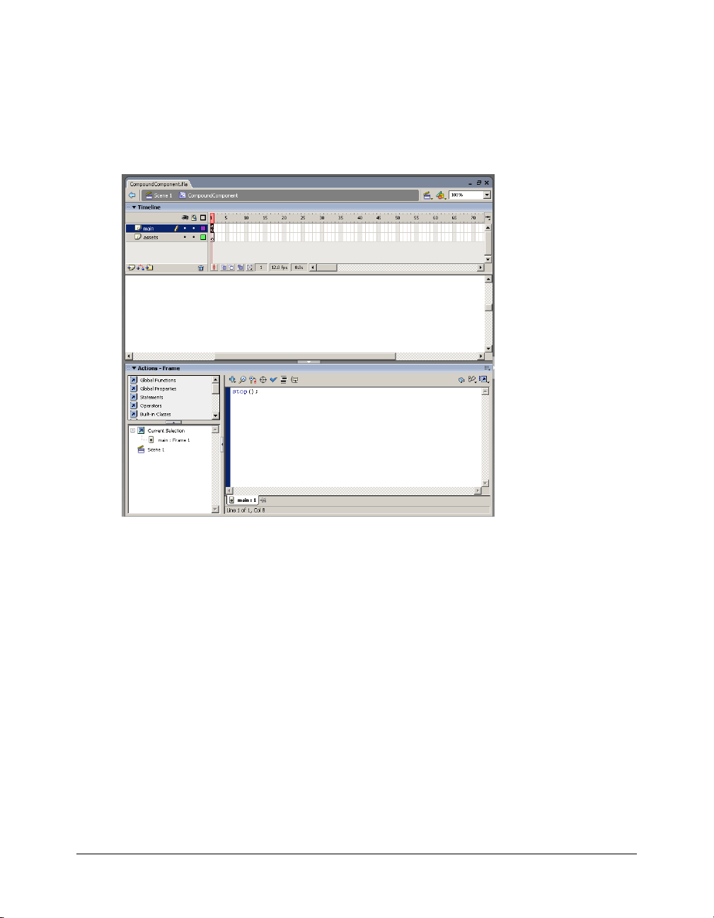
In the first frame of the main layer, add a stop() action in the Actions panel, as the following
figure shows:
Do not add any graphical assets to this layer.
4.
Rename an empty layer, or create a layer called assets. You can use any name for the assets layer;
however, this document refers to this layer as the assets layer.
The assets layer includes all the graphical assets used by this component.
5.
Insert a blank Keyframe on the assets layer. You should now have two frames on the assets layer.
6.
Add any graphical assets used by this component on the second frame of your component’s
assets layer. For example, if you are creating a custom button, add the graphics that represent
the button’s states (up, down, and so on).
7.
Drag dependent components onto the Stage of the component symbol’s assets layer, if
necessary. For more information, see “Adding dependent components” on page 15.
8.
When you have finished creating the symbol content, do one of the following to return to
document-editing mode:
■ Click the Back button at the left side of the edit bar above the Stage.
■ Select Edit > Edit Document.
■ Click the scene name in the edit bar above the Stage.
14 Chapter 1: Working with Flash MX 2004
Page 15
Adding dependent components
You can create new components based on existing Flex components, such as Button, CheckBox,
UIObject, and UIComponent. In many cases your new component combines the functionality
and symbols of existing visual Flex components. You must add the component symbols (or
compiled clips) of the components on which your new component depends to the component
FLA file’s Library.
After you add symbols to the Library, Flash can include the assets in the SWC file when you
export your new component. For example, to create a custom text area component, you must first
add the TextArea component and its assets to the Library.
Also, when you build a compound component (a component that is built from multiple
components, such as a ComboBox), you must add each of the subcomponents to the Library.
If you add a dependent component that is not in Flash but is in the Flex architecture, you must
take special steps to produce a SWC file. For more information, see “Using the SWCRepair
utility” on page 19.
To add a dependent component to your component’s Library:
1.
Enter Edit Symbols mode for your component symbol.
2.
Select the second frame of the assets layer.
3.
Select the dependent component’s symbol from the Flex Components drop-down list in the
Components panel. If you do not have a list of Flex Components in your Components panel,
see “Adding Flex classes and components to the Flash IDE” on page 8.
4.
Drag the component onto the Stage in the second frame of your new component’s assets layer.
Flash adds the component to the Library.
Converting symbols into components
After you add a symbol to your FLA file, add its assets, and link it to the ActionScript class file,
you must convert it to a component. You can inspect and edit a component with the Component
Definition panel, and you also can export it as a SWC file.
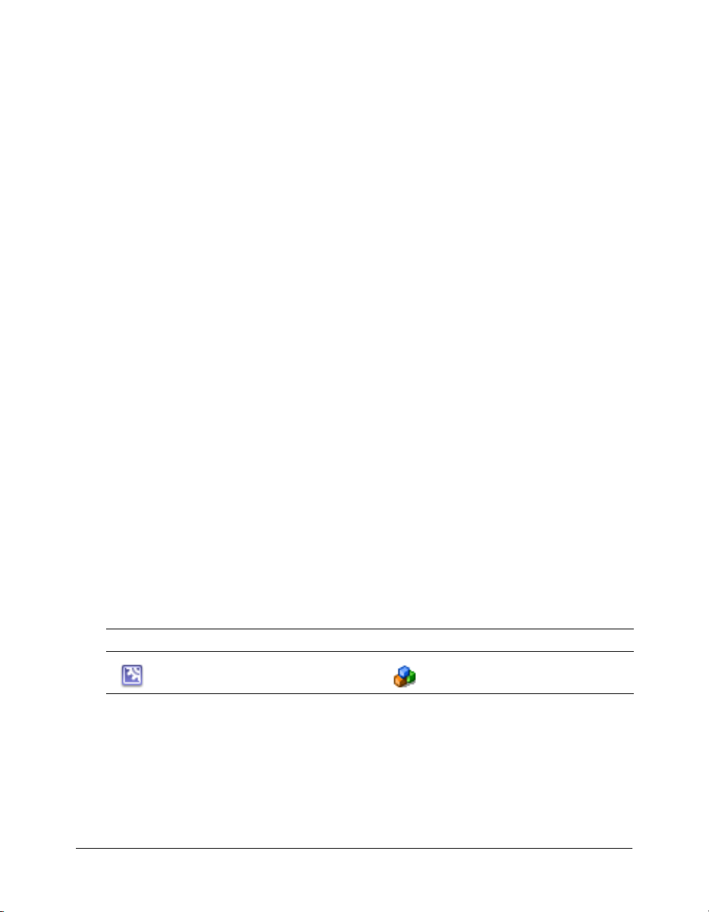
To tell the difference between a symbol and a component, look at the icon in the Library. The
following table shows the symbol icon and the default component icon:
Symbol Component
Each built-in Flash component has a distinct icon. For example, the Button control has its own
icon that looks like a button. You can add your own icon for your new component to the Flash
environment, or use one of the Flash component icons. The latter practice is not recommended,
because it might cause confusion. The default icon is adequate to indicate a generic component.
For more information, see “Adding an icon” on page 71.
Working with component symbols 15
Page 16
You must create the class file before turning the symbol into a component. If Flash does not
convert your symbol into a component, it most likely cannot find the ActionScript class. Another
possibility is that the class file is not in the Flash classpath.
To convert a symbol into a component:
1.
Create an ActionScript class file and save it with an .as filename extension.
For more information on creating ActionScript class files, see the examples in Chapter 2,
“Creating Basic Components in Flash MX 2004,” on page 23.
2.
Save the FLA file that you are working in. If you do not save the document, Flash does not try
to establish a link between the FLA file and the class file.
3.
Right-click the custom component’s symbol name in the Library.
4.
Select Component Definition.
The Component Definition panel appears.
5.
Enter the class name in the AS 2.0 Class text box. You must enter the fully qualified class name,
if the class is in a package. Do not include the filename extension. For example, if the classname
is MyComponent.as, enter MyComponent.
6.
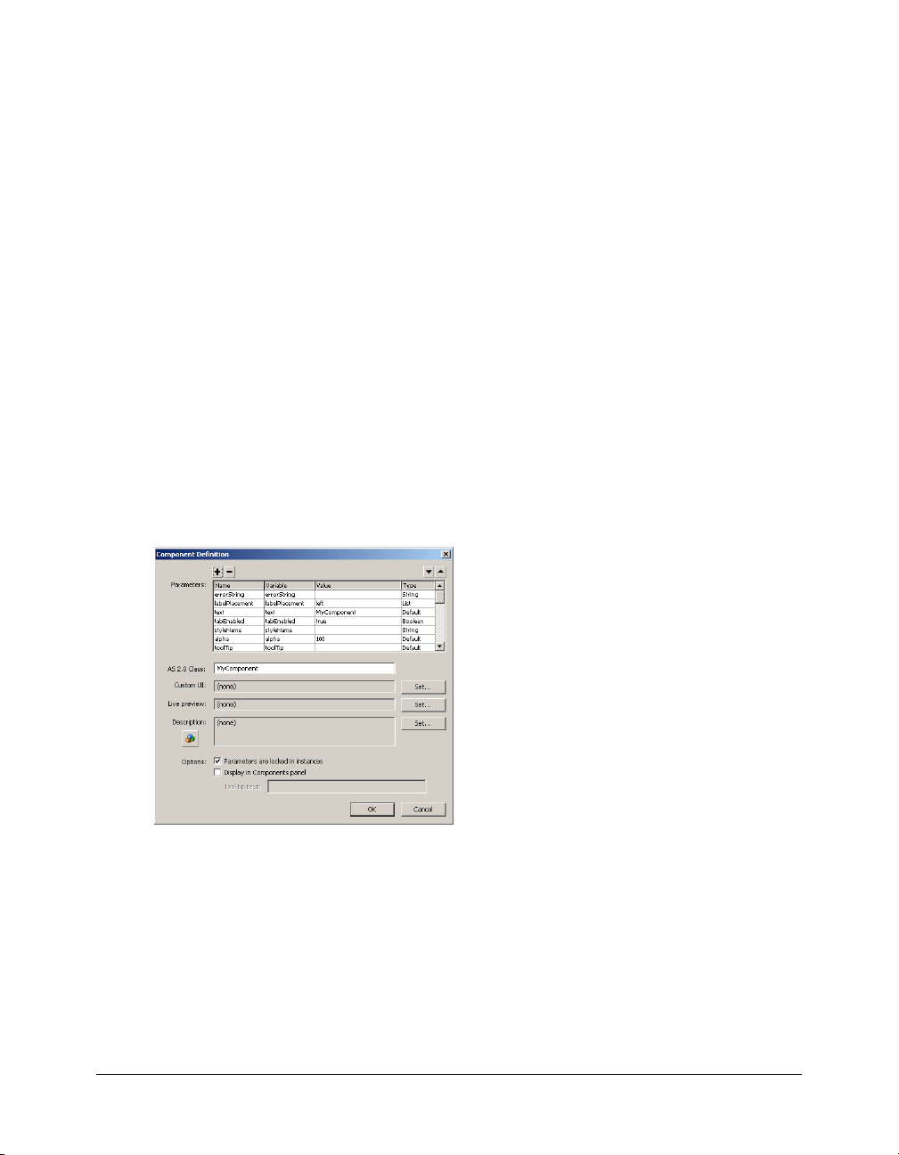
Click OK.
Flash transforms the symbol into a component and populates the Parameters box with the
component properties that are available in the class file and the classes from which your class
inherits, as the following figure shows:
Exporting components
Flash MX 2004 exports components as component packages (SWC files). A SWC file contains all
the code, SWF files, images, and metadata associated with the component, so you can easily add
it to your Flex environment. When you distribute a component, you only need to give your users
the SWC file.
SWC files are usually copied into a single directory for use in Flex or Flash, so each component
must have a unique filename to prevent conflicts.
This section describes a SWC file and explains how to import and export SWC files in Flash.
16 Chapter 1: Working with Flash MX 2004
Page 17

About component files
When you create a new component with Flash MX 2004, you have a minimum of four files, as
follows:
*.fla file The Flash source file that contains the symbols and skins used by the component.
*.as file The ActionScript source class file that defines the methods and properties of the
component.
*.swc file The compiled component file used by Flex.
*.mxml file The Flex application file from which you invoke the component.
You must be sure to store the *.as and *.fla files in a separate directory from the *.swc and *.mxml
files. The *.as and *.fla files should not be accessible by your users, and their presence in the same
directory as the *.mxml file can cause problems with the ActionScript classpath.
About SWC files
A SWC file is a zip-like file that is generated by the Flash authoring tool, and packaged and
expanded with the PKZip archive format. It contains everything that a component needs to run
in the Flash or Flex environment.
The following table describes the contents of a SWC file:
File Description
catalog.xml (Required) Lists the contents of the component package and its individual
components, and serves as a directory to the other files in the SWC file.
Source code Contains one or more ActionScript files that contain a class declaration for the
Implementing
SWF files
Live Preview
SWF files
Debug info (Optional) Includes a SWD file corresponding to the implementing SWF file. The
component.
The source code is used only for type-checking when extending components, and is
not compiled by the authoring tool because the compiled bytecode is already in the
implementing SWF file.
The source code might contain intrinsic class definitions that contain no function
bodies and are provided only for type-checking.
(Required) Implements the components. One or more components can be defined in
a single SWF file. If the component is created with Flash MX 2004, only one
component is exported per SWF file.
(Optional) Supports Live Preview in the authoring tool. If omitted, the implementing
SWF files are used for Live Preview instead. You can omit the Live Preview SWF file
in nearly all cases; include the file only if the component’s appearance depends on
dynamic data (for example, a text box that shows the result of a web service call).
filename is always the same as that of the SWF file, but with the extension .swd. If it is
included in the SWC file, debugging of the component is allowed. For more
information, see “Including debugging information” on page 21.
Exporting components 17
Page 18

File Description
Icon (Optional) Contains the 18 x 18, 8-bit-per-pixel icon used to display a component in
Property
inspector
the authoring tool user interface(s). If you don’t supply an icon, a default icon appears
(see “Adding an icon” on page 71). The icon must be a PNG file.
(Optional) Supports a custom Property inspector in the authoring tool. If omitted, the
default Property inspector is displayed to the user.
Flex includes a single SWC file that contains all the built-in components. This SWC file is
located in the flex_app_root/WEB-INF/flex/frameworks directory. In addition, you expanded a
ZIP file containing all of the individual SWC files when you prepared the Flash environment in
“Adding Flex classes and components to the Flash IDE” on page 8.
Viewing and changing SWC file contents
To view the contents of a SWC file, you can open it using any compression utility that supports
PKZip format (including WinZip).
You can optionally include other files in the SWC file, after you generate it from the Flash
environment. For example, you might want to include a Read Me file, usage instructions, or the
FLA file, if you want users to have access to the component’s source code.
Using SWC files
This section describes how to create and import SWC files. You should give instructions for
importing SWC files to your component users, either as a separate set of instructions or as a
Read Me file inside the SWC file.
Creating SWC files
Flash MX 2004 and Flash MX Professional 2004 create SWC files by exporting a component.
When creating a SWC file, Flash reports compile-time errors as if you were testing a Flash
application. This means that once a component is compiled as a SWC file, you can be reasonably
certain that you will not encounter runtime errors, such as type mismatches.
Note: After you create a SWC file, you can rename the file, but the tag name you use in your MXML
file must match the Linkage Identifier in the original FLA file (or the symbolName in the class file).
To export a SWC file:
1.
Select a component in the Flash Library.
2.
Right-click the item and select Export SWC File.
3.
Save the SWC file.
4.
(Optional) Postprocess the SWC file with the SWCRepair utility. This step is necessary only if
your new custom component is a subclass of a component that was not included in Flash, but
is included in Flex. For more information, see “Using the SWCRepair utility” on page 19.
18 Chapter 1: Working with Flash MX 2004
Page 19

Using the SWCRepair utility
If your new component extends a component that is not native to the Flash environment (but is
instead in the Flex Components list), you must run the SWCRepair utility against the SWC file
when you finish exporting it from Flash and before you use it in Flex. This applies mostly to
containers, since they are not normally used in Flash.
The SWCRepair utility updates a Flash SWC file for use in Flex; the FlexforFlash.zip file includes
the SWCRepair utility. This file is described in “Adding Flex classes and components to the Flash
IDE” on page 8.
When you expand the FlexforFlash.zip file, the SWCRepair utility is expanded to Flash_root/en/
First Run/SWCRepair/bin/. The default location is C:/Program Files/Macromedia/Flash MX
2004/en/First Run/SWCRepair/bin/SWCRepair.exe.
The SWCRepair utility has the following syntax:
SWCRepair SWC_filename [Flash_root/en/First Run/Components/Flex Components]
For example:
C:/Program Files/Macromedia/Flash MX 2004/en/First Run/SWCRepair/bin/
SWCRepair.exe C:/myProjects/myComponent.SWC
The SWCRepair utility assumes that Flash is installed in C:/Program Files/Macromedia/Flash
MX 2004. If this is not the actual path, a second argument to the program specifies the Flex
Components directory. For example, if Flash is installed in D:/MM/Flash, you would run the
SWCRepair utility as the following example shows:
D:/MM/Flash/en/First Run/SWCRepair/bin/SWCRepair.exe C:/myProjects/foo.swc
"D:/MM/Flash/en/First Run/Components/Flex Components"
After you run the SWCRepair utility against a SWC file, check whether a log file was created. The
log file name is the same as the SWC filename and appears in the same directory as the SWC file.
For example, if the SWC file is C:/myProjects/foo.swc, the log file is C:/myProjects/foo.log.
If the SWCRepair utility does not generate a log file, check the program arguments and rerun
the utility.
Adding SWC files to Flex
After you generate a SWC file, you must store it in a location that Flex can access so you can use
the SWC file in your Flex applications.
To use a SWC file in your Flex application, save it to a directory defined by the
<lib-path> child tag in the flex-config.xml file. The following example from the flex-config.xml
file adds the /WEB-INF/flex/myswcs directory to the
<lib-path> setting, in addition to the
<compiler> tag’s
user_classes and frameworks directories:
<compiler>
...
<lib-path>
<path-element>/WEB-INF/flex/myswcs</path-element>
<path-element>/WEB-INF/flex/user_classes</path-element>
<path-element>/WEB-INF/flex/frameworks</path-element>
</lib-path>
<compiler>
Exporting components 19
Page 20

Note: You should not store custom SWC files in the /WEB-INF/flex/frameworks directory.
SWC files must be at the top level of the directory. You cannot put them in subdirectories, unless
you explicitly define those subdirectories with the
<lib-path> setting. The package information
for the classes in the SWC file is internalized by the SWC file, so you are not required to mirror
that package when referring to the SWC file.
You can also store your SWC file in the flex_app_root/WEB-INF/flex/user_classes directories.
If you export a new version of a SWC file from Flash to Flex, you do not have to restart Flex or
close your browser. The Flex application recognizes that the SWC file was added or changed
based on its timestamp, and reloads it in the client when the application refreshes the page.
To determine if a SWC is reloading properly, you can add the following arguments to the Flex
J2EE server Java arguments. If you are using JRun, add these entries to the jvm.config file located
in the flex_root/jrun4/bin directory.
-Dtrace.cache -Dtrace.swc
After restarting the Flex server, you see notifications from FileWatcherService as you modify your
SWC file and then reload the MXML. The logging information indicates where the SWC file
that Flex is loading is located on the Flex server’s hard disk.
You can also verify that Flex is not loading older versions of SWC files from an unexpected
location by setting the
<create-compile-report> option to true in the flex-config.xml file, as
the following example shows:
<debugging>
<create-compile-report>true</create-compile-report>
...
</debugging>
Flex generates a file named your_app-report.xml in the same directory as your MXML file. This
file contains the source location and timestamp of every symbol definition that went into the final
SWF file.
Instantiating components in Flex
To use your component in your Flex applications, at a minimum you must declare a namespace
and use a tag that matches the name of the component, as the following example shows:
<?xml version="1.0"?>
<mx:Application xmlns:mx="http://www.macromedia.com/2003/mxml" xmlns:my="*">
<my:ModalText />
</mx:Application>
If you store the component in the same directory as the application, you can specify a global
namespace and forego the tag prefix, as the following example shows:
<?xml version="1.0"?>
<mx:Application xmlns:mx="http://www.macromedia.com/2003/mxml" xmlns="*">
<ModalText />
</mx:Application>
20 Chapter 1: Working with Flash MX 2004
Page 21

If the component’s ActionScript classes are in a package, you must specify a namespace that points
to that package in your MXML file, as the following example shows:
<?xml version="1.0"?>
<mx:Application xmlns:mx="http://www.macromedia.com/2003/mxml"
xmlns:myp="myPackage.*" >
<myp:myComponent />
</mx:Application>
For more information on using namespaces for Flex components, see Developing Flex Applications.
To pass properties to the component, add them as tag properties, as the following example shows:
<ModalText labelPlacement="left"/>
You can instantiate a custom component by creating the component’s class in ActionScript using
the
createClassObject() method:
<mx:Script>
<![CDATA[
createClassObject(MyComponent, "myComp", 0, {myName:"Ted"});
]]>
</mx:Script>
The previous example is equivalent to the following MXML statement:
<MyComponent id="myComp" myName="Ted" />
Including debugging information
The SWD file contains debugging information for the SWF file. You must use SWD files to use
the Debug Flash Player to debug your component. By default, Flash does not include debugging
information when exporting the SWC file.
When you export a SWC file, you can include the SWD file in the SWC file by selecting
Debugging Permitted in the Publish Settings dialog box. As with all settings in the Publish
Settings dialog box, you must make this change for every FLA file. It is not a global setting.
Note: You should not include debugging information in your SWC file if the SWC file is used in a
production environment. It increases the size of the SWC file and also makes debugging information
available to users.
To include the SWD file in your SWC file:
1.
Open your FLA file.
2.
In the Flash environment, select File > Publish Settings.
The Publish Settings dialog box appears.
3.
Select the Debugging Permitted check box.
4.
Click OK.
5.
Save the FLA file.
6.
Export the SWC file as described in “Creating SWC files” on page 18.
Flash includes the SWD file with the other files in your SWC file.
Exporting components 21
Page 22

Importing SWC files into the Flash IDE
SWC files are a convenient way to share components among Flash developers. After you create a
SWC file, you can give that SWC component to anyone else with Flash and they can use your
component in their applications. Flash authors can use custom SWC components as they would
any other component in the Flash Library.
Note: After you create a SWC file, you can rename the file, but the tag name you use in your MXML
file must match the Linkage Identifier in the original FLA file (or the symbolName in the class file).
When you distribute your components to other developers, you can include the following
instructions so that they can install and use them immediately.
To use a SWC file in the Flash authoring environment:
1.
Copy the SWC file into the Flash_root/en/First Run/Components directory.
2.
Start the Flash authoring environment or reload the Components panel if it was already
running. To reload the component list on the Components panel, click the menu button and
select Reload.
The component’s icon appears in the Components panel. You can now use the component as if
it were any of the built-in components.
22 Chapter 1: Working with Flash MX 2004
Page 23

CHAPTER 2
Creating Basic Components in Flash MX 2004
This chapter includes a set of simple examples that illustrate the basics of component
development. The first part of the chapter introduces the Green Square, Orange Circle, and Blue
Button components, which illustrate simple component construction and usage. The latter part
of the chapter expands on the simple components and describes how to use event handling,
styling, skinning, and other techniques when creating your components.
If you are unfamiliar with working in the Macromedia Flash environment, see Chapter 1,
“Working with Flash MX 2004,” on page 5. For more advanced information on creating
components, see Chapter 3, “Creating Advanced Components in Flash MX 2004,” on page 45.
Contents
Creating simple components . . . . . . . . . . . . . . . . . . . . . . . . . . . . . . . . . . . . . . . . . . . . . . . . . . 23
Working with component properties . . . . . . . . . . . . . . . . . . . . . . . . . . . . . . . . . . . . . . . . . . . . 30
Binding properties to a custom component . . . . . . . . . . . . . . . . . . . . . . . . . . . . . . . . . . . . . . . 31
Adding events to custom components . . . . . . . . . . . . . . . . . . . . . . . . . . . . . . . . . . . . . . . . . . . 33
Setting default sizes . . . . . . . . . . . . . . . . . . . . . . . . . . . . . . . . . . . . . . . . . . . . . . . . . . . . . . . . . 37
Styling custom components . . . . . . . . . . . . . . . . . . . . . . . . . . . . . . . . . . . . . . . . . . . . . . . . . . . 38
Skinning custom components . . . . . . . . . . . . . . . . . . . . . . . . . . . . . . . . . . . . . . . . . . . . . . . . . 39
Creating compound components. . . . . . . . . . . . . . . . . . . . . . . . . . . . . . . . . . . . . . . . . . . . . . . 42
Creating simple components
This section describes how to create simple components in Macromedia Flash for Macromedia
Flex. As with creating any Hello World–style example, these procedures ignore some practices to
help new component developers quickly achieve success and begin creating components.
This section describes how to create the following components:
Green Square Create a component that exists in a flat namespace. This component’s
ActionScript class file is not part of a package.
23
Page 24

Orange Circle Create a component that exists in a package. By developing this component, you
learn how to work in a namespace that uses packaged classes.
Blue Button Create a component that extends an existing visual component.
These components illustrate the basic concepts of component creation. Building the components
also shows you the minimum requirements for creating a custom visual component in Flash for
use in Flex. For detailed information about building more complex components, see Chapter 3,
“Creating Advanced Components in Flash MX 2004,” on page 45.
Creating the Green Square
Creating the Green Square is similar to creating a Hello World component, but because this is
Flash, the simplest example creates a visual component rather than printing the words "Hello
World".
The Green Square component prints a shape on the screen. The shape is green and square.
To create the Green Square:
1.
Set up the Flash environment by adding the Flex components and class files. For more
information, see “Adding Flex classes and components to the Flash IDE” on page 8.
2.
In Flash, create a new FLA file.
3.
Edit the FLA file’s local classpath settings to include the following two classpath entries:
■ $(LocalData)/Flex Classes
■ . (the dot)
For more information, see “Changing the Flash classpath” on page 10.
4.
Draw a green square on the Stage. Make sure that the origin indicator (or registration point) is
at the top left corner.
5.
Save the FLA file as greensquare.fla.
6.
Open a text editor and create a file called greensquare.as. Save the ActionScript file in the same
directory as the greensquare.fla file. This should be a directory that is not in the web
application’s directory structure, since these are source files for your eventual component.
Furthermore, it cannot be the same directory into which you deploy the SWC file and the
MXML file.
7.
Add the following code to the greensquare.as file:
class greensquare extends mx.core.UIObject {
static var symbolName:String="greensquare";
static var symbolOwner:Object = greensquare;
var className:String = "greensquare";
function greensquare() { //empty constructor
}
function init() {
24 Chapter 2: Creating Basic Components in Flash MX 2004
Page 25

super.init();
invalidate(); // Required call so that Flex draws the component.
}
}
8.
Return to the Flash environment. Right-click the square and select Convert to Symbol.
The Convert To Symbol dialog box appears.
9.
In the Convert to Symbol dialog box, set the Name, Identifier, and AS 2.0 Class fields to
greensquare. To access the Identifier and AS 2.0 Class fields, you must select the Export for
ActionScript check box.
10.
Click OK.
Flash adds the greensquare symbol to the Library as a Movie Clip.
11.
Convert the symbol to a component by right-clicking the symbol in the Flash Library and
selecting Component Definition.
12.
In the Component Definition dialog box, set the AS 2.0 Class field to greensquare.
13.
Right-click the symbol in the Flash Library and select Export SWC File.
The Export File dialog box appears.
14.
Save the new SWC file as greensquare.swc.
15.
In a text editor, create a new MXML file that contains the following code:
<?xml version="1.0"?>
<mx:Application xmlns:mx="http://www.macromedia.com/2003/mxml" xmlns="*">
<greensquare/>
</mx:Application>
16.
Save the MXML file as greentest.mxml. You cannot name the file greensquare.mxml. You must
give it a name that is different from the component’s name, such as greentest.mxml.
17.
Copy the SWC component you created (greensquare.swc) to the same directory as the MXML
file. This should not be the same directory into which you saved the ActionScript and FLA files.
This directory must be in the web application’s directory structure so that Flex can compile a
SWF from the MXML file.
18.
Request the MXML file in your browser or a stand-alone Flash Player. A green square should
appear.
Creating the Orange Circle
This section describes how to create the Orange Circle component. This component is different
from the Green Square because its ActionScript class file exists in a package. As a result, there are
additional steps that you must take to build it in Flash, and then refer to it in your MXML file.
The Orange Circle component prints a shape on the screen. The shape is orange and circular.
Creating simple components 25
Page 26

To create the Orange Circle:
1.
Set up the Flash environment by adding the Flex components and class files. For more
information, see “Adding Flex classes and components to the Flash IDE” on page 8.
2.
In Flash, create a new FLA file.
3.
Edit the FLA file’s local classpath settings to include the following two classpath entries:
■ $(LocalData)/Flex Classes
■ . (the dot)
For more information, see “Changing the Flash classpath” on page 10.
4.
Draw an orange circle on the Flash Stage and save the FLA file as orangecircle.fla.
5.
Create a file in a text editor and add the following code to it:
class myPackage.orangecircle extends mx.core.UIObject {
static var symbolName:String="myPackage.orangecircle";
static var symbolOwner:Object = myPackage.orangecircle;
var className:String="orangecircle";
function orangecircle() { // Empty constructor.
}
function init() {
super.init();
invalidate(); // Required call so that Flex draws the component.
}
}
6.
Save the text file as orangecircle.as in the myPackage subdirectory, below the directory in which
the FLA file is stored. This should be a directory that is not in the web application’s directory
structure, since these are source files for your eventual component. Furthermore, it cannot be
the same directory into which you deploy the SWC file and the MXML file.
The files you are using now should be in the following locations:
../orangecircle.fla
../myPackage/orangecircle.as
7.
Return to the Flash environment. Right-click the circle on the Stage, and select Convert to
Symbol.
8.
In the Convert to Symbol dialog box, set the Name field to orangecircle.
9.
Enter myPackage.orangecircle in the AS 2.0 Class and Identifier text boxes.
10.
Click OK.
Flash adds the orange circle symbol to the Library.
11.
Convert the symbol to a component by right-clicking the symbol in the Flash Library and
selecting Component Definition.
12.
In the Component Definition dialog box, set the AS2.0 Class field to myPackage.orangecircle.
26 Chapter 2: Creating Basic Components in Flash MX 2004
Page 27

13.
Right-click the symbol in the Flash Library and select Export SWC File.
14.
Save the new SWC file as orangecircle.swc.
15.
In a text editor, create an MXML file that contains the following code:
<?xml version="1.0"?>
<mx:Application xmlns:mx="http://www.macromedia.com/2003/mxml"
xmlns:myp="myPackage.*" >
<myp:orangecircle />
</mx:Application>
You must add a namespace declaration that includes the package whenever you access a
component that uses ActionScript files in packages.
You cannot name the file orangecircle.mxml. You must give it a name that is different from the
component’s name, such as oc.mxml.
16.
Save the MXML file.
17.
Copy the SWC file that you created (orangecircle.swc) to the same directory as the MXML file.
This should not be the same directory in which you saved the ActionScript and FLA file. This
directory must be in the web application’s directory structure, so that Flex can compile a SWF
from the MXML file.
18.
Request the MXML file in your browser or a stand-alone Flash Player. An orange circle should
appear.
Creating the Blue Button
This procedure shows you how to extend an existing Flex control. In this example, it is a button.
The button’s border and text are blue. When you insert the Blue Button component into your
Flex application, it inherits all of the events, behaviors, and capabilities of a standard Button
control, but it has a customized style.
To create the Blue Button:
1.
Set up the Flash environment by adding the Flex components and class files. For more
information, see “Adding Flex classes and components to the Flash IDE” on page 8.
2.
In Flash, create a FLA file.
3.
Edit the FLA file’s local classpath settings to include the following two classpath entries:
■ $(LocalData)/Flex Classes
■ . (the dot)
For more information, see “Changing the Flash classpath” on page 10.
4.
Select Insert > New Symbol.
The Create New Symbol dialog box appears.
Rather than convert existing graphical assets to a symbol, you create a symbol and add
dependent components to it as assets.
Creating simple components 27
Page 28

5.
In the Create New Symbol dialog box, perform the following steps:
a
Enter BlueButton in the Name field.
b
Enter BlueButton in the Identifier field.
c
Enter BlueButton in the AS2.0 Class field.
To access the Identifier and AS 2.0 Class field, you must select the Export for ActionScript
check box.
6.
Click OK.
7.
Save the FLA file as BlueButton.fla.
8.
Open a text editor and create a file called BlueButton.as. Save the ActionScript file in the same
directory as the BlueButton.fla file. This should be a directory that is not in the web
application’s directory structure, since these are source files for your eventual component.
Furthermore, it cannot be the same directory into which you deploy the SWC file and the
MXML file.
9.
Add the following code to the BlueButton.as file:
class BlueButton extends mx.controls.Button {
static var symbolName:String="BlueButton";
static var symbolOwner:Object = BlueButton;
var className:String = "BlueButton";
function BlueButton() {
}
function init() {
//Set the label text to blue.
setStyle("color", 0x6666CC);
super.init();
invalidate();
}
}
This script extends the mx.controls.Button class rather than the base classes (UIObject or
UIComponent). As a result, it inherits all the skins, styles, behaviors, and events of the Button
control.
It also calls the UIObject
setStyle() method and sets the values of the color property to a
hexadecimal equivalent of the color blue. When setting colors in
you must use the hexadecimal values for the value and surround the property name with
quotation marks.
10.
Return to the Flash environment and enter Edit Symbols mode to edit the BlueButton symbol.
11.
Rename the existing layer main.
12.
Add the following line to the main layer’s first frame:
stop();
13.
Add a new layer called assets.
28 Chapter 2: Creating Basic Components in Flash MX 2004
setStyle() method calls,
Page 29

14.
Insert a blank keyframe in the second frame of the assets layer by selecting the frame, and then
selecting Insert > Timeline > Blank Keyframe. The following figure shows the layers for the
BlueButton symbol:
15.
Find the Button control in the Flex Components list:
If you do not see the Flex Components listed in the Components panel, see “Addin g Flex
classes and components to the Flash IDE” on page 8.
16.
Drag the Button control from the Flex Components list onto the second frame of the
assets layer.
Flash adds the Button to the Library as a Compiled Clip asset.
17.
Right-click the BlueButton movie clip in the Library and select Component Definition.
18.
In the Component Definition dialog box, set the AS2.0 Class field to BlueButton.
19.
Click OK.
Flash converts the symbol to a component.
20.
Right-click the component in the Flash Library and select Export SWC File.
21.
Save the new SWC file as BlueButton.swc.
22.
In a text editor, create a new MXML file that contains the following code:
<?xml version="1.0"?>
<mx:Application xmlns:mx="http://www.macromedia.com/2003/mxml" xmlns="*">
<BlueButton label="Blue Button" />
</mx:Application>
Creating simple components 29
Page 30

23.
Copy the SWC file that you created (BlueButton.swc) to the same directory as the MXML file.
This should not be the same directory into which you saved the ActionScript and FLA file. This
directory must be in the web application’s directory structure so that Flex can compile a SWF
from the MXML file.
24.
Request the MXML file in your browser or a stand-alone Flash Player. The blue button should
appear.
Working with component properties
Most components have instance properties that the Flex author can set while adding the
component to the application. To make this possible, you add properties to the class definition.
You can set all component properties as properties in MXML and in ActionScript, unless they are
explicitly marked private.
You can expose component properties by doing the following:
• Creating an instance variable
• Defining getters and setters
These methods are described in the following sections.
Creating an instance variable
Creating instance variables is simple. In the component’s ActionScript class file, you declare a
variable:
var myName:String;
If the variable declaration does not specify a default value, your code must either take into
account that myName might be
In MXML, you set that property using a tag property:
<MyComponent myName="Ted" />
As a result, you should define a default value for most regular properties, as the following example
shows:
var myName:String = "Fred";
You can use the Inspectable keyword to set the default value of a property and to limit the
available values for the property; for example:
[Inspectable(defaultValue="left", enumeration="left, right")]
function set labelPlacement(p:String)
...
In this example, the labelPlacement property is limited to the values left or right, and the
default value is
left. For more information on using the Inspectable keyword, see “Inspectable”
on page 63. The ModalText example class file shows the use of the Inspectable keyword. For more
information, see “Using the ModalText example” on page 73.
undefined, or the user could encounter unexpected results.
30 Chapter 2: Creating Basic Components in Flash MX 2004
Page 31

Defining getters and setters
The recommended way of exposing properties in your class file is with a pair of getters and setters.
These functions must be public. The advantage of getters and setters is that you can calculate the
return value in a single place and trigger events when the variable changes.
You define getter and setter functions using the get and set method properties within a class
definition block.
The following example declares a getter and setter for the
private var _myName:String = "Fred";
public function get myName():String {
return _myName;
}
public function set myName(name:String) {
_myName = name;
}
myName variable:
The local value of _myName is private, while the getter and setter methods are public.
In getters and setters, you cannot use the same name of the property in the function name. As a
result, you should use some convention, such as prefixing the member name with an underscore
character (_).
Binding properties to a custom component
Most properties should be bindable so that developers can use the contents of your component as
parameters to a web service call or to update the UI. The simplest form of binding is to use the
curly braces ({ }) syntax that binds a property of a control to another control’s property. In the
component’s ActionScript class, you can declare a variable as follows:
var myName:String = "Fred";
In your MXML file, you then bind the value of a control’s property to the component’s property,
as the following example shows:
<MyComponent id="myComp1" name="Fred" />
<mx:TextArea text="{myComp1.myName}" />
Although it is sometimes useful, this simple binding technique does not fully take advantage of
the capabilities of binding. If the user changes the value of the MyComponent
the TextArea component is not notified. To keep the two synchronized, the MXML author must
write code that stores and periodically compares the two values.
With a little modification, the component’s class file can support dynamic binding so that
whenever the component’s property changes, the Flex control reflects that change.
To be dynamically bindable, a property must dispatch an event when it is changed. The main
property of a component often dispatches either a
change or click event when it is accessed, but
you can use any event.
myName property,
Binding properties to a custom component 31
Page 32

Add the ChangeEvent metadata keyword to the getter, and a dispatchEvent() method call
inside the setter. When the property’s value is set, the component dispatches the
Since the getter is bound to the ChangeEvent
change, the binding subsystem knows what to
change event.
listen for when that property changes.
At the top of the class file, you must also add the Event metadata keyword to identify
change as
an event that this component emits.
The following ActionScript class file shows how to bind a property to an event:
[Event("change")]
class BindChar extends mx.core.UIComponent {
static var symbolName:String="BindChar";
static var symbolOwner:Object = BindChar;
var className:String = "BindChar";
function BindChar() {
}
// This example uses a TextField to store and display the character.
var myCharField:TextField;
function init() {
super.init();
tabEnabled = true;
invalidate();
}
function keyDown(evt:Object):Void {
//Triggers the setter on every keystroke.
char = String.fromCharCode(evt.ascii);
}
[ChangeEvent("change")]
public function get char():String {
return myCharField.text;
}
public function set char(c:String) {
myCharField.text = c;
dispatchEvent({ type: "change" });
}
}
The following MXML file binds the component’s char property to the TextArea control’s
text property:
<?xml version="1.0"?>
<mx:Application xmlns:mx="http://www.macromedia.com/2003/mxml" xmlns="*" >
<BindChar id="myComp1" char="F" />
<mx:TextArea id="ta1" text="{myComp1.char}" />
</mx:Application>
32 Chapter 2: Creating Basic Components in Flash MX 2004
Page 33

If your custom SWC file has properties typed Array, do not use data binding to supply initial
values for array properties. For example, if your custom SWC file has a
labels property that is
typed Array, do not use data binding in the MXML as the following example shows:
<yourSWC labels={myArray}/>
<mx:Script>
<![CDATA[
var myArray=["cat", "dog", "bird"];
]]>
</mx:Script>
The problem is that Flex instantiates the SWC file before data binding occurs. Instead, you define
the array using the
<yourSWC>
<labels>
<mx:Array>
<mx:String>cat</mx:String>
<mx:String>dog</mx:String>
<mx:String>bird</mx:String>
</mx:Array>
</labels>
</yourSWC>
<mx:Array> tag, as the following example shows:
Adding events to custom components
All visual controls inherit a large set of events from the base classes, UIObject and UIComponent.
From the UIComponent class, components inherit events such as
and
keyUp. From the UIObject class, components inherit events such as mouseDown, mouseUp,
mouseOver, and mouseOut. For a complete list of UIObject and UIComponent events, see
Developing Flex Applications.
focusIn, focusOut, keyDown,
Components can emit and consume events. In most cases, you want your component to emit an
event and the MXML application to consume and handle it.
Custom components that extend existing Flex classes inherit those events. For example, if you
extend the mx.controls.Button class, you have the set of click-related events at your disposal, in
addition to the events that all controls inherit, such as
mouseOver and mouseDown.
This section describes how to add event handling and emitting functionality to your custom
components.
Handling the initialize event
When Flex finishes creating a component, it emits the component’s
initialize event. This
event is used by MXML developers to populate data, debug, or perform some other function
before the user starts interacting with the application.
Adding events to custom components 33
Page 34

Because nearly all classes extend the UIObject class, the initialize event is already supported in
custom components. To define a handler for it, you add the
initialize property to the
component’s MXML tag, and then add ActionScript code that processes the event, as the
following example shows:
<?xml version="1.0"?>
<mx:Application xmlns:mx="http://www.macromedia.com/2003/mxml" xmlns="*">
<mx:Script>
<![CDATA[
function myInit() {
trace('init greensquare');
}
]]>
</mx:Script>
<greensquare initialize="myInit();" />
</mx:Application>
Handling mouse events
All visual components that inherit from the UIObject class support a number of navigational
mouse events, including the following:
• mouseOver
• mouseOut
• mouseDown
• mouseUp
These events do not include the
click event. For a complete list of events supported by visual
components, see the information about the control in Developing Flex Applications.
To use the common mouse events, you point to a handler in your MXML file. You do not need
to add any additional code to the component source code.
The following example changes the alpha (transparency) of the Green Square component
when the mouse moves over the component, and again when the mouse moves away from
the component:
<?xml version="1.0"?>
<mx:Application xmlns:mx="http://www.macromedia.com/2003/mxml" xmlns="*">
<mx:Script>
<
]]>
</mx:Script>
<greensquare id="myGS" mouseOver="changeAlpha(100);"
mouseOut="changeAlpha(startAlpha);" />
</mx:Application>
To handle an event that is not supported by the current parent class, such as a click event on a
UIObject, you must edit the component class file. However, to add a
click event to your
component, it is sometimes easier to extend the Button or SimpleButton class than it is to write
the code to support a
click event.
For information on defining new events and event handlers for your custom component, see
“Emitting events” next.
Emitting events
You can define an event that is not inherited from the component’s parent class, such as a click for
a control that is not a subclass of the Button class. In the following example, Flex throws an error
because the Green Square component does not emit a
<greensquare id="myGS" click="changeAlpha(0);" />
click event:
If you try to use a click handler in the MXML file, you get an error similar to the following:
Error: unknown attribute 'click' on greensquare
This means that you have to go back to the component’s ActionScript class and tell the
component to emit a
click event. You do this by adding a call to dispatchEvent() in the
component’s ActionScript class file. You must also include the Event metadata keyword so that
Flex recognizes the dispatched event. For more information on the
dispatchEvent() method,
see Developing Flex Applications.
The following example adds a metadata keyword identifying
component can emit, and then dispatches the
triggered. In this case, the
[Event("click")]
class greensquare extends mx.core.UIObject {
static var symbolName:String="greensquare";
static var symbolOwner:Object = greensquare;
var className:String = "greensquare";
function greensquare() {
}
function init() {
super.init();
invalidate();
}
function onRelease(Void):Void {
dispatchEvent({ type: "click" });
click event causes a change in the instance’s alpha property.
click event when the onRelease() method is
Adding events to custom components 35
click as an event that this
Page 36

}
}
The following MXML file handles the click event within an <mx:Script> block:
<?xml version="1.0"?>
<mx:Application xmlns:mx="http://www.macromedia.com/2003/mxml" xmlns="*"
initialize="createListener();" >
<mx:Script>
<![CDATA[
var startAlpha:Number = 40;
var curState:Number = 100;
function myInit() {
myGS.alpha=startAlpha;
}
function modAlpha(curAlpha:Number) {
gs.alpha=curAlpha;
if (curState==100) {
curState=40;
} else {
curState=100;
}
}
]]>
</mx:Script>
<greensquare id="gs" initialize="myInit();" click="modAlpha(curState);" />
</mx:Application>
For an example of a custom component that emits and handles its events, see “Creating
compound components” on page 42.
Handling keyboard events
Keyboard events are emitted by all components that extend the UIComponent class. To make use
of keyboard events in your MXML files, you should capture the keys and include the value of the
key in your event object, and then dispatch the keyboard event with the event object.
The following component class emits the
keyDown event so that the Flex application can handle
it. It builds an event object, adding the ASCII value of the key that the user pressed as the
property of the event object. The class extends the UIComponent class but not the UIObject
class, which does not handle this event.
[Event("mykeydown")]
class greensquare extends mx.core.UIComponent {
static var symbolName:String="greensquare";
static var symbolOwner:Object = greensquare;
var className:String = "greensquare";
function greensquare() {
}
36 Chapter 2: Creating Basic Components in Flash MX 2004
myKey
Page 37

function init() {
super.init();
tabEnabled = true;
invalidate();
}
function keyDown(Void):Void {
var k = Key.getCode();
trace("key: " + k);
dispatchEvent({type:"mykeydown", myKey:k});
}
}
The following MXML file handles the keyboard event that the class file emits. The MXML file
inspects the event object’s
<?xml version="1.0"?>
<mx:Application xmlns:mx="http://www.macromedia.com/2003/mxml" xmlns="*">
<mx:Script>
<![CDATA[
function handleKeyDown(evt) {
if (evt.myKey == 8) { // backspace
ta1.text = "";
} else {
ta1.text='pressed: ' + evt.myKey;
}
}
]]>
</mx:Script>
myKey property to determine which key the user pressed.
<greensquare id="myGS" mykeydown="handleKeyDown(event);" />
<mx:TextArea id="ta1" text="" />
</mx:Application>
Setting default sizes
You can set the default size of a custom component by setting the values of the
_measuredPreferredWidth and _measuredPreferredHeight properties in the measure()
method. These values will be used if no explicit width and height are specified in the component’s
MXML tag. Your measure function should not set the
properties.
The following class sets the default size of the BlueButton control to 500 by 200 pixels, and uses
the
setStyle() method to define the default fontSize property for the button’s label:
class BlueButton extends mx.controls.Button {
static var symbolName:String="BlueButton";
static var symbolOwner:Object = BlueButton;
var className:String = "BlueButton";
function BlueButton() {
preferredWidth and preferredHeight
Setting default sizes 37
Page 38

}
function init() {
setStyle("fontSize", 24);
super.init();
invalidate();
}
function measure() {
_measuredPreferredWidth=500;
_measuredPreferredHeight=200;
}
}
The following MXML file instantiates the BlueButton control. All instances of this BlueButton
control have a default size of 500 by 200 pixels, with a label
<?xml version="1.0"?>
<mx:Application xmlns:mx="http://www.macromedia.com/2003/mxml" xmlns=”*” >
<BlueButton label="My Big Button" />
</mx:Application>
fontSize of 24.
You can override custom style settings in the MXML file, as the following example shows:
<BlueButton label="My Big Button" fontSize="12" />
Styling custom components
Style properties define the look of a component, from the size of the fonts used to the color of the
background. To change style properties in custom components, use the
the component’s
but Flex application authors can override the settings of the
init() function. This applies the same style to all instances of the component,
setStyle() method in their MXML
tags. Any style properties that are not explicitly set in the component’s class file are inherited from
the component’s superclass.
setStyle() method in
This section includes a class file that extends an existing control. For more information on setting
up the Flash environment and exporting this custom component as a SWC file, see “Creating the
Blue Button” on page 27.
The following ActionScript class file sets the
color and themeColor styles of the BlueButton
control:
class BlueButton extends mx.controls.Button {
static var symbolName:String="BlueButton";
static var symbolOwner:Object = BlueButton;
var className:String = "BlueButton";
function BlueButton() {
}
function init() {
// Set the label text to blue.
38 Chapter 2: Creating Basic Components in Flash MX 2004
Page 39

setStyle("color", 0x6666CC);
// Set the background and border to blue when mouse hovers over control.
setStyle("themeColor", 0x6666CC);
super.init();
invalidate();
}
}
The following MXML file instantiates the BlueButton control without overriding the default
styles set in the component’s class file:
<?xml version="1.0"?>
<mx:Application xmlns:mx="http://www.macromedia.com/2003/mxml" xmlns="*" >
<BlueButton label="Blue Button" />
</mx:Application>
In addition to setting the color property, you can set the font face, font size, and other style
properties. For more information on the available style properties, see Developing Flex
Applications.
Skinning custom components
When you extend an existing visual control, you can include additional graphics inside the SWC
file and instruct the new control to use these graphical assets to represent its appearance. The
process of changing the appearance of a control is called skinning. Skins can be any kind of
graphic that Flash supports, from a simple line drawing to a multipart SWF file.
To skin a component, you start with a FLA file, just as you would when creating any new
component. However, you add a new symbol to the FLA file that defines the skin in addition to
the component’s symbol itself.
The following table describes the general structure of a FLA file that includes new skins for
the component:
Name Frame Description
Main Layer 1
Frame 1
Symbol: custom
component
Layer 2
Layer 2
Symbol: skin graphics Layer 1
Layer 1
Frame 1
Frame 1
Frame 2
Frame 1-x
The top level of the FLA file, which contains a single blank
frame.
First layer, named main, with an ActionScript
statement.
Empty.
Second layer, named assets, which contains the skin symbol
plus any additional graphical assets used by this component.
The new symbol, which contains as many frames as are
necessary to represent the new skin. For a simple, static
graphic, you can draw the new skin on a single frame.
stop()
Skinning custom components 39
Page 40

In the component’s class file, you must also override the name of the skin. Macromedia
recommends that you apply the skin to your component as a clip parameter in the
constructObject2() method rather than rely on the timing of the instantiation process. This is
especially true when the component creates child components that rely on the positioning of
the skin.
You can override some or all of the control’s skins. For example, the Button control has the
following basic skins, each representing a state of the control:
• falseUpSkin
• falseDownSkin
• falseOverSkin
• falseDisabledSkin
• trueUpSkin
• trueDownSkin
• trueOverSkin
• trueDisabledSkin
Each state is represented as a variable in the class file, or is an inherited variable. By setting the
value of one of these variables, you instruct Flex to apply a new skin, using the symbol name to
find the skin.
When you add a new skin, it should respond to resizing and drawing methods of the component.
For a list of what skins are used by what controls, see each control’s entry in Developing Flex
Applications.
This section describes a simple method for changing the skin for one of the states of the standard
Button control. You can use the steps in this procedure to change the skin for any visual control
in Flex.
To create a custom component with a different skin:
1.
In the Flash environment, create a FLA file and set the classpath settings to include the Flex
classes and the local directory. For more information, see “Changing the Flash classpath”
on page 10.
2.
Insert a new symbol by selecting Insert > New Symbol. The Create New Symbol dialog box
appears. This new symbol will be the new component.
3.
In the Create New Symbol dialog box, do the following:
a
Select the MovieClip for Behavior option (the default).
b
Select the Export for ActionScript check box.
c
Enter the appropriate name, identifier, and class file in the Name, Identifier, and AS 2.0
Class fields.
d
Clear the Export in First Frame check box.
4.
In Edit Symbols mode for the new symbol, rename the Timeline’s first layer to main, and add
a
stop() action in the Actions Frame.
40 Chapter 2: Creating Basic Components in Flash MX 2004
Page 41

5.
Add a second layer called assets, and add a second blank keyframe to this layer.
6.
Return to the main FLA file.
7.
Insert a new symbol by selecting Insert > New Symbol. The Create New Symbol dialog box
appears. This new symbol will be the new skin.
8.
In the Create New Symbol dialog box, do the following:
a
Select the MovieClip for Behavior option (the default).
b
Select the Export for ActionScript check box.
c
Enter a symbol Name.
Do not specify an AS 2.0 Class name or an Identifier for this symbol. For more information
on creating a new symbol, see “Adding new symbols” on page 12.
d
Clear the Export in First Frame check box.
9.
Draw the new skin on the second symbol’s Stage in Edit Symbols mode. The new skin can be
a simple graphic or a composite of MovieClips.
10.
Return to Edit Symbols mode and edit the component’s symbol (the first symbol you created).
11.
Drag the skin symbol you created onto the second frame of the component’s assets layer.
12.
Create a new ActionScript class file. In this file, extend the existing control, set the value of the
skin to the new skin name, and apply the skin as a clip parameter in the
constructObject2()
method.
The following example overrides the
falseUpSkin skin with the symbol named redbox in a
new Button control called SkinnedButton:
class SkinnedButton extends mx.controls.Button {
// Set the value of the falseUpSkin state to the new skin.
var falseUpSkin:String = "redbox";
static var symbolName:String="SkinnedButton";
static var symbolOwner:Object = SkinnedButton;
var className:String = "SkinnedButton";
function SkinnedButton() {
}
function init() {
super.init();
invalidate();
}
static var clipParameters:Object = { redbox:1 };
function constructObject2(o:Object):Void {
super.constructObject2(o);
applyProperties(o, SkinnedButton.clipParameters);
}
}
Skinning custom components 41
Page 42

13.
Right-click the component’s symbol in the Library and select Component Definition. In the
AS 2.0 Class field, enter the class name.
14.
Export the SWC file. For more information, see “Creating SWC files” on page 18.
15.
Add the new component to an MXML file and request that file to see the new skin.
If the skin is not positioned properly on the Stage, you can rearrange it by returning to the FLA
file and editing the skin’s symbol.
Creating compound components
Compound components are components that include the assets of multiple controls inside them.
They might be graphical assets or a combination of graphical assets and classes. For example, you
can create a component that includes a button and a text field, or a component that includes a
button, a text field, and a validator.
When you create compound components, you should instantiate the controls inside the
component’s class file. Assuming that some of these controls have graphical assets, you must plan
the layout of the controls that you are including, and set properties such as default values in your
class file. You must also ensure that you import all the necessary classes that the compound
component uses.
Since the class extends one of the base classes, such as mx.core.UIComponent, and not a controls
class like mx.controls.Button, you must instantiate each of the controls as children of the custom
component and arrange them on the screen.
Properties of the individual controls are not accessible from the MXML author’s environment
unless you design your class to allow this. For example, if you create a new component that
extends the UIComponent class and uses a Button and a TextArea component, you cannot set the
label text in the MXML tag because you do not directly extend the Button class.
To instantiate controls inside your compound component, use the
method inside the
createChildren() method. For more information, see “Implementing the
createChildren() method” on page 54.
This section uses an example component, called CompoundComponent, that combines a Button
control and a TextArea control. It handles the
click event of the Button control and writes a
message to the TextArea control.
Since this component handles events (and doesn’t just emit them), it includes an event listener
and an event handler in the class file.
The
layoutChildren() method handles the layout of the controls inside the component. This
method calls the control’s
TextArea control. The values passed to the
move() method to arrange the Button control centered below the
move() method are relative to the registration point in
the FLA file. This appears in the Flash Stage as a "+".
createClassObject()
Another example of a compound component is ModalText, which uses a TextInput control and a
SimpleButton control. For more information, see “Using the ModalText example” on page 73.
42 Chapter 2: Creating Basic Components in Flash MX 2004
Page 43

The following ActionScript class file creates a component that instantiates TextArea and
Button controls:
// Import all necessary classes.
import mx.core.UIComponent;
import mx.controls.Button;
import mx.controls.TextArea;
[Event("click")]
class CompoundComponent extends UIComponent {
static var symbolName:String="CompoundComponent";
static var symbolOwner:Object = CompoundComponent;
var className:String = "CompoundComponent";
function CompoundComponent() {
}
function init() {
super.init();
invalidate();
}
// Declare two children member variables.
var text_mc:TextArea;
var mode_mc:Button;
function createChildren():Void {
if (mode_mc == undefined)
createClassObject(Button, "mode_mc", 1, { });
if (text_mc == undefined)
createClassObject(TextArea, "text_mc", 0, { preferredWidth: 150,
editable: false });
mode_mc.addEventListener("click", this);
mode_mc.label = "Click Me";
}
function layoutChildren():Void {
mode_mc.move(text_mc.width/2-5, 50);
}
// Handle events that are dispatched by the children.
function handleEvent(evt:Object):Void {
if (evt.type == "click")
text_mc.text = "the button was clicked";
}
}
Creating compound components 43
Page 44

44 Chapter 2: Creating Basic Components in Flash MX 2004
Page 45

CHAPTER 3
Creating Advanced Components in
Flash MX 2004
This chapter describes the details of creating visual, interactive components in the Macromedia
Flash MX 2004 workspace for use in Macromedia Flex applications. The majority of the work is
in writing the ActionScript class file, which derives from Flex existing classes, and adding your
own custom functionality.
For a set of simple examples that show the basics of component development, see Chapter 2,
“Creating Basic Components in Flash MX 2004,” on page 23. If you are unfamiliar with working
in the Flash environment, see Chapter 1, “Working with Flash MX 2004,” on page 5.
Contents
About Creating components . . . . . . . . . . . . . . . . . . . . . . . . . . . . . . . . . . . . . . . . . . . . . . . . . . 45
Writing the component’s ActionScript code . . . . . . . . . . . . . . . . . . . . . . . . . . . . . . . . . . . . . . . 46
Skinning custom controls. . . . . . . . . . . . . . . . . . . . . . . . . . . . . . . . . . . . . . . . . . . . . . . . . . . . . 69
Adding styles . . . . . . . . . . . . . . . . . . . . . . . . . . . . . . . . . . . . . . . . . . . . . . . . . . . . . . . . . . . . . . 70
Making components accessible. . . . . . . . . . . . . . . . . . . . . . . . . . . . . . . . . . . . . . . . . . . . . . . . . 71
Improving component usability . . . . . . . . . . . . . . . . . . . . . . . . . . . . . . . . . . . . . . . . . . . . . . . . 71
Best practices when designing a component. . . . . . . . . . . . . . . . . . . . . . . . . . . . . . . . . . . . . . . 72
Using the ModalText example . . . . . . . . . . . . . . . . . . . . . . . . . . . . . . . . . . . . . . . . . . . . . . . . . 73
Troubleshooting. . . . . . . . . . . . . . . . . . . . . . . . . . . . . . . . . . . . . . . . . . . . . . . . . . . . . . . . . . . . 76
About Creating components
This section describes the general process for creating a component that extends an existing Flash
MX 2004 class. If you want to create a component that is based on the Button control, for
example, you can subclass the mx.controls.Button class. However, if you want to invent your own
component, you will likely extend either the mx.core.UIComponent or mx.core.UIObject class.
Choosing one of these base classes is discussed later, but Macromedia recommends that most
custom components extend the UIComponent class rather than the UIObject class.
45
Page 46

The process of creating a Flex component in Flash is different from the one for creating general-use
Flash components. It is possible, and even desirable, to create components that operate in both
environments; however, there are certain optimizations available to Flex applications that require
that components behave in a more sophisticated manner.
Flex components are different from Flash components in that Flex does not expose the Timeline,
which means that the infrastructure can have more control over how components are instantiated.
In addition, Flex does not have a Stage with objects.
Use the following general process for creating a new Flex component in Flash:
1.
Create a symbol and add assets in the FLA file.
a
Insert a new symbol onto the Flash Stage and convert it to a component.
b
Add dependent components to the new symbol.
2.
Create an ActionScript class file.
a
Extend one of the base classes (UIObject or UIComponent) or another component.
b
Specify symbolName, symbolOwner, and className.
c
Specify properties that can be set using an MXML tag property (clip parameters).
d
Implement the constructObject2() method.
e
Implement the init() method.
f
Implement the createChildren() method.
g
Implement the measure() method.
h
Implement the layoutChildren() method.
i
Implement the draw() method.
j
Add properties, methods, and metadata.
3.
Link the class file to the FLA file.
4.
Generate a SWC file.
Writing the component’s ActionScript code
Most components include some ActionScript code. When you create a component symbol that
derives from a parent class, you link the symbol to an external ActionScript 2.0 class file. (For
information on defining this file, see “Working with component symbols” on page 12.)
The external ActionScript class extends another class, adds methods, adds getters and setters, and
defines events and event handlers for the component. When you extend an existing component
class, you can inherit from only one class. ActionScript 2.0 does not allow multiple inheritance.
To edit ActionScript class files, you can use Flash, any text editor, or an Integrated Development
Environment (IDE).
46 Chapter 3: Creating Advanced Components in Flash MX 2004
Page 47

Simple example of a class file
The following is a simple example of a class file called MyComponent.as. If you were creating this
component, you would link this file to the component in the Flash IDE.
This example contains a minimal set of imports, methods, and declarations for a component that
inherits from the UIObject class.
//Import packages.
import mx.core.UIObject;
//Declare the class and extend from the parent class.
class myPackage.MyComponent extends UIObject {
// Identify the symbol name that this class is bound to.
static var symbolName:String = "myPackage.MyComponent";
// Identify the fully qualified package name of the symbol owner.
static var symbolOwner:Object = Object(myPackage.MyComponent);
// Provide the className variable.
var className:String = "MyComponent";
// Define an empty constructor.
function MyComponent() {
}
// Override the init method, and call the parent’s init method.
function init(Void):Void {
super.init();
// Call invalidate() to display graphics.
invalidate();
}
}
General process for writing a class file
Use the following general process when you write a component’s ActionScript class file.
Depending on the type of component that you create, whether you override any of the superclass’s
methods is optional. For the simplest form of component, you are not required to implement any
of these methods.
To write the ActionScript file for a component:
1.
Select and extend a parent class.
2.
Define the symbolName, symbolOwner, and className properties.
3.
Write an empty class constructor.
4.
Specify properties that can be set using an MXML tag property (clip parameters).
5.
Implement the constructObject2() method.
6.
Implement the init() method.
Writing the component’s ActionScript code 47
Page 48

7.
Implement the createChildren() method.
8.
Implement the measure() method.
9.
Implement the layoutChildren() method.
10.
Implement the draw() method.
11.
Add properties, methods, and metadata.
The ordering of methods that you implement in this process mirrors that in the component
instantiation life cycle. By understanding which methods are called and in what order, you can
better understand how you write a component’s class file. For more information, see “About the
component instantiation life cycle” on page 51.
Each of the steps in this process is covered in more detail in the remainder of this chapter.
Selecting a parent class
Most components share some common behavior and functionality. Flash includes two base classes
to supply this commonality: UIObject and UIComponent. By extending these classes, your
components have a basic set of methods, properties, and events.
Note: Macromedia recommends that you base your components on the UIComponent class rather
than the UIObject class. The UIComponent class provides more built-in functionality, but maintains
the flexibility of extending the UIObject class.
UIObject and UIComponent are the base classes of the component architecture. Understanding
the principles at work in these two classes is important for building components.
The following table briefly describes the two base classes:
Class Extends Description
mx.core.UIComponent UIObject UIComponent is the base class for all Flex components. It can
participate in tabbing, accept low-level events such as keyboard
and mouse input, and be disabled so it does not receive mouse
and keyboard input.
The UIComponent class lets you perform the following tasks:
• Create focus navigation
• Enable and disable components
• Resize components
Macromedia recommends using the UIComponent class rather
than the UIObject class as the base class for your custom
components.
mx.core.UIObject MovieClip UIObject is the base class for all graphical objects. It can have
shape, draw itself, and be invisible.
The UIObject class lets you perform the following tasks:
• Edit styles
• Handle events
• Resize by scaling
Macromedia does not recommend using the UIObject class
rather than the UIComponent class as the base class for your
custom components.
48 Chapter 3: Creating Advanced Components in Flash MX 2004
Page 49

About the UIObject and UIComponent classes
Components based on version 2 of the Macromedia Component Architecture descend from the
UIObject class, which wraps the MovieClip class. The MovieClip class is the base class for the
classes in Flash that can draw on the screen. By providing a wrapper around its methods and
properties, Flex makes the UIObject syntax more intuitive and improves the conceptual
management of representing graphic objects.
Many MovieClip properties and methods are related to the Timeline. The UIObject class
abstracts many of those details. Subclasses of the MovieClip class do not use unnecessary
MovieClip properties and methods. However, you can access these properties and methods, if
you want.
The UIObject (mx.core.UIObject) class hides the mouse handling and frame handling in the
MovieClip class. The UIObject class also defines the styles, skins, and event aspects of the
component architecture. The UIObject class and its subclasses broadcast their events just before
drawing. If you are familiar with Flash, this event is analogous to the
enterFrame() MovieClip
event. The UIObject class posts events to its listeners just before drawing when loading and
unloading, and when its layout changes (
move, resize).
A UIObject class or UIObject subclass resizes itself by scaling. When you change its size using the
setSize() method, the new dimensions are handed to the _width and _height properties of the
MovieClip class, which scale the subclass.
The UIComponent (mx.core.UIComponent) class is a subclass of the UIObject class. It defines
high-level behaviors that are specific to a graphical object. The UIComponent class handles enduser interactions (such as clicking and focus) and component enabling and disabling. The
UIComponent class inherits all the methods, properties, and events of the UIObject class.
The UIComponent class also handles dragging, but you should not override the
startDrag()
method when defining custom components.
Extending other classes
You can extend any component class to create a new component class. For example, if you want to
create a component that behaves almost the same as a Button component does, you can extend
the Button class instead of recreating all the functionality of the Button class from the base classes.
To make component construction easier, you can extend a subclass for any class in the component
architecture; you do not need to extend the UIObject or UIComponent class directly. If you
extend any other component’s class, you extend these base classes by default, because all
components are subclasses of the UIComponent class, which is a subclass of the UIObject class.
When you add dependent components, you should override the
layoutChildren() methods to instantiate, position, and resize the components properly.
Writing the component’s ActionScript code 49
createChildren() and
Page 50

Accessing application scope
Every class that extends the UIObject class has an
application property that stores a reference to
the Application object. You can use this property to access data or methods at the application
level. Because the event handlers and the bindings of a component execute in the context of that
component, using the Application object gives you access to the application scope.
To access the Application object, you must import the Application package in your class file, as
the following example shows:
import mx.core.Application;
Some nonvisual components, such as Validator, do not inherit from the UIObject class. As a
result, some components do not have an
access the application by using the static property
In the following example, the component calls the
application property. For these components, you can
Application.application.
getName() method on the Application object.
Assume that the method is written in the MXML file or some dependent class that uses your
component.
var name:String = application.getName();
Identifying the class, symbol, and owner names
To help Flash find the proper ActionScript classes and packages, and to preserve the component’s
naming, you must set the
symbolName, symbolOwner, and className variables in your
component’s ActionScript class file.
The following table describes these variables:
Property Type Description
symbolName
symbolOwner
className
50 Chapter 3: Creating Advanced Components in Flash MX 2004
String Symbol name for the object (name of the ActionScript class). The symbol
name must be the fully qualified class name (for example,
myPackage.MyComponent).
This name must match the Linkage Identifier and ActionScript 2.0 Class
fields in the Create New Symbol dialog box described in “Adding new
symbols” on page 12.
You must declare this variable as static.
Object Class used in the internal call to the createClassObject() method.
The symbol owner must be the fully qualified class name (for example,
myPackage.MyComponent).
Do not use quotation marks around the
Object.
This name must match the Linkage Identifier and ActionScript 2.0 Class
fields in the Create New Symbol dialog box described in “Adding new
symbols” on page 12.
You must declare this variable as static.
String Name of the component class. This does not include the package name
and has no corresponding setting in the Flash development environment.
You can use the value of this variable when setting style properties.
symbolOwner value, since it is of type
Page 51

The following example adds the symbolName, symbolOwner, and className properties to the
MyButton class:
class MyButton extends mx.controls.Button {
static var symbolName:String = "myPackage.MyButton";
static var symbolOwner = myPackage.MyButton;
var className:String = "MyButton";
...
}
About the component instantiation life cycle
When you instantiate a new component, Flex calls a number of methods, and those methods call
other methods that you can override. Instantiating a new control in your application triggers the
following method calls by Flex:
1.
Class constructor
After the class constructor is called, Flex calls the
2.
The constructObject2() method
When you implement the
super.constructObject2() method or make manual calls to the init() and
createChildren() methods.
3.
The init() method
Flex calls the
4.
The createChildren() method
Flex calls the
init() method from the parent class’s constructObject2() method.
createChildren() method from the parent class’s constructObject2()
constructObject2() method, you must call the
constructObject2() method.
method.
5.
The measure() method
Flex calls the
6.
The layoutChildren() method
Flex calls the
7.
The draw() method
Flex calls the
Each of the
measure() method.
layoutChildren() method.
draw() method.
measure(), layoutChildren(), and draw() methods has a corresponding invalidate
function. For more information, see “About invalidation” on page 68.
The remaining sections describe each of these methods. For the purposes of initialization, you do
not need to add any explicit calls to these methods, because Flex initiates each call. However, you
might be required to explicitly call some of these methods to refresh the object’s state after it has
been created and displayed.
Writing the component’s ActionScript code 51
Page 52

Writing the constructor
Generally, component constructors should be empty so that the object can be customized with its
properties interface. For example, the following code shows a constructor for MyComponent:
function MyComponent() {
}
In this example, when a new component is instantiated, the MyComponent() constructor is called.
Setting properties in the constructor can lead to overwriting default values, depending on the
ordering of initialization calls.
The empty constructor is not the only method necessary to instantiate the object with property
values. You can also override the
constructObject2() method. This happens because the
constructor is called too early in the life cycle of the object to support the proper construction of
it and its children. As a result, Flex finally instantiates the object when the
constructObject2()
method is called. For more information, see “Implementing the constructObject2() method”
on page 54.
Each class can contain only one constructor function; overloaded constructor functions are not
supported in ActionScript 2.0.
Specifying clip parameters
Clip parameters define the instance properties that you can set as an MXML tag’s property. The
values of these are stored in the initObject so that Flex can apply them to the component during
instantiation. Clip parameters mirror the set of properties in the Flash UI Property inspector.
They are used in Flex as a list of properties to be applied during the construction of the object.
Clip parameters are roughly equivalent to constructor parameters in Java or C++, although they
are not set in the constructor call, but later, in the
constructObject2() method.
Clip parameters are not meant to set default values, but rather to apply tag attributes to the
component when it is created.
You define clip parameters and then apply them to the object using the
UIObject.applyProperties() method inside the constructObject2() method. You use the
applyProperties() method to apply the clip parameters, based on values set by the user in the
MXML tag.
When playing a standard Flash SWF file, Flash Player applies clip parameters before the object’s
constructor is called (which calls the
constructObject() method, which calls the init()
method).
In Flex, Flash Player no longer applies clip parameters by default. This lets you control when they
are applied, which should be in the
parameters explicitly in the
constructObject2() method, Flex applies them after the
constructObject2() method. If you do not apply the clip
constructor finishes.
In an MXML file, you might have a tag that defines a foo property, as the following
example shows:
<MyComponent foo="myvalue" />
52 Chapter 3: Creating Advanced Components in Flash MX 2004
Page 53

When it instantiates the component, the Flex framework creates an initialization object ({foo:
"myvalue"}
) and passes it to the constructObject2() method. The constructObject2()
method sets this property.
Clip parameters can take any number of comma-separated arguments. Flex stores the clip
parameters as an array. Every argument in the clip parameter definition must have a “:1” after it in
order for Flex to let you use it.
The following example creates the clip parameters
applyProperties() method from within the constructObject2() method:
var clipParameters:Object = { text: 1, html: 1, autoSize: 1};
function constructObject2(obj:Object):Void {
...
applyProperties(obj, Label.prototype.clipParameters);
}
text, html, and autoSize, and then calls the
The applyProperties() method has the following signature:
applyProperties(Object, Object):Void
Thus, when you have a component like the following:
class MyComponent extends UIComponent {
...
private var clipParameters:Object = {someProperty: 1};
private static var mergedClipParameters =
mx.core.UIObject.mergeClipParameters(MyComponent.prototype.
clipParameters,UIComponent.prototype.clipParameters);
public var someProperty:String;
...
}
You can do this:
function constuctObject2(initObj:Object) {
super.constructObject2(initObj);
this.applyProperties(initObj, clipParameters);
}
This example uses the bracket notation to get around type-checking. If it runs in Flash, the
constructObject2() method is never called and UIObject.init takes care of all property
initialization. If it runs in Flex, it calls the
constructObject2() method and this function
applies properties as required.
You can dynamically create a list of clip parameters using the
mergeClipParameters() method.
This method creates the list of clip parameters using ActionScript shorthand; for example:
static function mergeClipParameters(obj, par):Boolean {
for (var i in par) {
obj[i] = par[i];
}
return true;
}
Writing the component’s ActionScript code 53
Page 54

Implementing the constructObject2() method
The
constructObject2() method is effectively the constructor for your class. The
UIObject.constructObject2() method calls the init() and createChildren() methods. It
should apply any properties in the initObj that are needed by
and then call
The
constructObject2() method has the following signature:
constructObject2(initObj:Object):Void
super.constructObject2().
init() and createChildren(),
In addition, if you use clip parameters, you should add a call to the applyProperties() method
at the end of the
function constructObject2(o:Object):Void {
super.constructObject2(o);
applyProperties(o, Label.prototype.clipParameters);
}
constructObject2() method; for example:
If you override the constructObject2() method, you must at least call the
super.constructObject2() method.
The initObj contains all the component instance’s properties that are set in the MXML tag
(and stored as clip parameters). Flex creates this object implicitly during instantiation of the
component.
Implementing the init() method
Flash calls the
should call the superclass’s
init() method when the class is created. At a minimum, the init() method
init() method. The width, height, and clip parameters are not
properly set until after this method is called.
function init(Void):Void {
super.init();
}
The implicit init object (initObj) contains everything passed in through the initObj argument to
the
createClassObject() method. You can access it in the init() method.
Note: Do not create child objects in the init() method. You should use it only for setting up initial
properties.
Implementing the createChildren() method
Components implement the
createChildren() method to create subobjects (such as other
components) in the component. Rather than calling the subobject’s constructor in the
createChildren() method, call the createClassObject() method to instantiate a subobject
of your component.
The
createClassObject() method has the following signature:
createClassObject(className, instanceName, depth, initObject)
54 Chapter 3: Creating Advanced Components in Flash MX 2004
Page 55

The following table describes the arguments:
Argument Type Description
className
instanceName
depth
initObject
Object The name of the class.
String The name of the instance.
Number The depth for the instance.
Object The object that contains the initialization properties.
To c all the
createClassObject() method, you must know what those children are (for example,
a border or a button that you always need), because you must specify the name and type of the
object, plus any initialization parameters in the call to
The following example calls the
createClassObject() method to create a new Label object for
createClassObject().
use inside a component:
up_mc.createClassObject(Label, "label_mc", 1); // Create a label in the holder
You set properties in the call to the createClassObject() method by adding them as part of the
initObject argument. The following example sets the value of the label property:
form.createClassObject(CheckBox, "cb", 0, {label:"Check this"});
The following example creates TextInput and SimpleButton components:
function createChildren():Void {
if (text_mc == undefined)
createClassObject(TextInput, "text_mc", 0, { preferredWidth: 80,
editable:false });
text_mc.addEventListener("change", this);
text_mc.addEventListener("focusOut", this);
if (mode_mc == undefined)
createClassObject(SimpleButton, "mode_mc", 1, { falseUpSkin:
modeUpSkinName, falseOverSkin: modeOverSkinName, falseDownSkin:
modeDownSkinName });
mode_mc.addEventListener("click", this);
}
If your component is a container, and you do not know exactly which children it contains, call the
createComponents() method. This method creates all child objects. For more information on
using the
At the end of the
(
invalidate(), invalidateSize(), or invalidateLayout()) to refresh the screen. For more
createComponents() method, see Developing Flex Applications.
createChildren() method, call the necessary invalidate methods
information, see “About invalidation” on page 68.
Implementing the commitProperties() method
Flex calls the
chance to set variables that are used by the
commitProperties() method before it calls the measure() method. It provides a
measure() method after the constructor has finished
and MXML attributes have been applied.
Writing the component’s ActionScript code 55
Page 56

Flex only calls the commitProperties() method after it calls the invalidateProperties()
method.
For example, the ViewStack container uses the
performance. When you set the
ViewStack.selectedIndex property, the ViewStack container
doesn’t update to a new page right away. Instead, it privately stores a
commitProperties() method to maximize
pendingSelectedIndex
property. When it is time for Flash Player to update the screen, Flex calls the
commitProperties(), measure(), layoutChildren(), and draw() methods. In the
commitProperties() method, the ViewStack container checks to see whether the
pendingSelectedIndex property is set, and it updates the selected index at that time.
The motivation to use the
commitProperties() method is to delay processing until the last
minute, so that Flash Player avoids doing computationally expensive, redundant work. For
example, if a script changes the
ViewStack.selectedIndex property 15 times, you would want
to minimize the number of times the display of the ViewStack container updates when the
selectedIndex property changes. By using the commitProperties() method, you can update
the
pendingSelectedIndex property 15 times, and then only do the rendering once.
This is most useful for properties that are computationally expensive to update. If setting a
property is inexpensive, you can avoid using the
commitProperties() method.
Implementing the measure() method
Generally, the
measure() method is only called once when the component is instantiated. The
component’s container sets the initial size and Flex calculates the preferred minimum and
maximum sizes. You can use the
measure() method to explicitly set the size of the component,
although Macromedia does not recommend doing this when developing components.
You can set the following properties in the
measure() method. Flex calculates them, but you can
override them:
• _measuredMinWidth
• _measuredMaxWidth
• _measuredMinHeight
• _measuredMaxHeight
• _measuredWidthFlex
• _measuredHeightFlex
• _measuredPreferredWidth
• _measuredPreferredHeight
The Flex properties (those that end with the word Flex) define limits for when the object is
resized. These measured properties are used for layout in containers if your component doesn’t
explicitly set a
preferredWidth or preferredHeight attribute.
Controls calculate the values of these based on runtime properties. For example, the Button
control’s
_measuredPreferredWidth property.
56 Chapter 3: Creating Advanced Components in Flash MX 2004
measure() method examines how wide its label is in order to compute the value of the
Page 57

By default, Flex sets the values of _measuredPreferredWidth and _measuredPreferredHeight
to the values of the current height and width, but you should override them. The following
example of the
measure() method from the Label component sets a default width and height if
the label text field is empty:
function measure(Void):Void {
var myTF = _getTextFormat();
var txt = text;
if (txt == undefined || txt.length < 2) {
txt = "Wj";
}
var textExt = myTF.getTextExtent2(txt);
var textW = textExt.width + 4;
var textH = textExt.height + 4;
if (textW == undefined) {
textW = 20;
}
if (textH == undefined) {
textH = 8;
}
trace("Label: " + textW + " " + textH);
_measuredPreferredWidth = textW;
_measuredPreferredHeight = textH;
}
Implementing the layoutChildren() method
The
layoutChildren() method positions subobjects within the confines set by the
layoutWidth and layoutHeight properties of your component. Each component should
implement this method. The
layoutChildren() method deprecates the size() method, which
is used primarily by Flash designers to perform the same function.
Use the width and height properties of the child controls when changing the size of the children.
These properties are scaled for use inside the component. Use the
layoutHeight properties when changing the size of the component itself. These properties are
layoutWidth and
not scaled because the component is at the top level.
The
layoutChildren() method does not update the screen unless you call an invalidation
method. Flex only calls the
layoutChildren() method if the invalidateLayout() method was
previously called. For more information, see “About invalidation” on page 68.
The following example checks for the value of the
labelPlacement property and lays out the
mode_mc object accordingly:
function layoutChildren():Void {
text_mc.setSize(layoutWidth - mode_mc.width, layoutHeight);
if (labelPlacement == "left")
Writing the component’s ActionScript code 57
Page 58

{
mode_mc.move(layoutWidth - mode_mc.width, 0);
text_mc.move(0, 0);
}
else {
mode_mc.move(0, 0);
text_mc.move(mode_mc.width, 0);
}
}
Implementing the draw() method
The
draw() method displays objects on the screen. Whenever the component needs to draw an
interface element, it calls a
draw() method. You use the draw() method to create or modify
elements that are subject-to-change.
Everything is made visible in the
until its
draw() method is called. Any graphical assets that you bring in for the purposes of
measuring are invisible until the
draw() method. A border does not actually call the drawing API
draw() method is called.
You should not call the
and that method calls the
method. However, Flex calls the
actually call an invalidation method if you want Flex to invoke the
draw() method directly. Instead, call one of the invalidation methods,
draw() method. Flex also calls the draw() method from the redraw()
redraw() method only if the object is invalidated, so you should
draw() or redraw() method.
If you do not call an invalidation method, the component remains invisible unless you set its
visibility property to
true in MXML. For more information, see “About invalidation”
on page 68.
Flex also calls the
Inside the
other graphical elements. You can also call the
objects. In general, to set lengths in the
this.layoutHeight instead of width and height.
draw() method after the layoutChildren() method.
draw() method, you can use calls to the Flash drawing API to draw borders, rules, and
clear() method, which removes the visible
draw() method, you should use this.layoutWidth and
The following example clears the component and then draws a border around the component:
function draw():Void {
clear();
if (bTextChanged) {
bTextChanged = false;
text_mc.text = text;
}
// Draw a border around everything.
drawRect(0, 0, this.layoutWidth, this.layoutHeight);
}
Defining getters and setters
Getters and setters provide visibility to component properties and control access to those
properties by other objects.
58 Chapter 3: Creating Advanced Components in Flash MX 2004
Page 59

To define getter and setter methods, precede the method name with get or set, followed by a
space and the property name. Macromedia recommends that you use initial capital letters for the
second word and each word that follows. For example:
public function get initialColorStyle(): Number
The variable that stores the property’s value cannot have the same name as the getter or setter. By
convention, precede the name of the getter and setter variables with two underscores (__). In
addition, Macromedia recommends that you declare the variable as private.
The following example shows the declaration of
initialColor, and getter and setter methods
that get and set the value of this property:
...
private var __initialColor:Color = 42;
...
public function get initialColor():Number {
return __initialColor;
}
public function set initialColor(newColor:Number) {
__initialColor = newColor;
}
You commonly use getters and setters in conjunction with metadata keywords to define properties
that are visible, are bindable, and have other properties. For more information, see “Component
metadata” on page 59.
Component metadata
The Flash compiler recognizes component metadata statements in your external ActionScript
class files. The metadata tags define component attributes, data binding properties, events, and
other properties of the component. Flash interprets these statements during compilation; they are
never interpreted during runtime in Flex or Flash.
Using metadata keywords
Metadata statements are associated with a class declaration or an individual data field. They are
bound to the next line in the ActionScript file. When defining a component property, add the
metadata tag on the line before the property declaration. When defining component events or
other aspects of a component that affect more than a single property, add the metadata tag outside
the class definition so that the metadata is bound to the entire class.
In the following example, the
colorStr, and shapeStr properties:
[Inspectable(defaultValue="strawberry")]
public var flavorStr:String;
[Inspectable(defaultValue="blue")]
public var colorStr:String;
[Inspectable(defaultValue="circular")]
public var shapeStr:String;
Inspectable metadata keywords apply to the flavorStr,
Writing the component’s ActionScript code 59
Page 60

Metadata tags
The following table describes the metadata tags that you can use in ActionScript class files:
Tag Description
Bindable Reveals a property in the Bindings tab of the Component inspector.
ChangeEvent Identifies events that cause data binding to occur. For more
Effect Defines the valid property name for the tag’s effect. For more
Embed Imports JPEG, GIF, PNG, SVG, and SWF files at compile time. Also
Event Describes the events that the component emits. For more
IconFile Identifies the filename for the icon that represents the component in
Inspectable Defines an attribute exposed to component users in the Component
InspectableList Identifies which subset of inspectable parameters should be listed in
NonCommittingChangeEvent Identifies an event as an interim trigger. For more information, see
Style Describes a style property allowed on the component. For more
For more information, see “Bindable” on page 60.
information, see “ChangeEvent” on page 61.
information, see “Effect” on page 62.
imports image assets from SWC files.
This is functionally equivalent to the MXML @Embed syntax, as
described in Developing Flex Applications.
information, see “Event” on page 62.
the Flash Components panel. For more information, see “Adding an
icon” on page 71.
inspector. Also limits allowable values of the property. For more
information, see “Inspectable” on page 63.
the Flash MX 2004 Property inspector. If you don’t add an
InspectableList property to your component's class, all inspectable
parameters appear in the Property inspector. For more information,
see “InspectableList” on page 64.
“NonCommittingChangeEvent” on page 65.
information on using the
on page 66.
Style metadata keyword, see “Style”
The following sections describe the component metadata tags in more detail.
Bindable
Data binding connects components to each other. You achieve visual data binding through the
Bindings tab in the Component inspector. From there, you add, view, and remove bindings for a
component.
Although data binding works with any component, its main purpose is to connect user-interface
components to external data sources, such as web services and XML documents. These data
sources are available as components with properties, which you can bind to other component
properties. The Component inspector is the main tool used in Flash MX Professional 2004 to do
data binding.
60 Chapter 3: Creating Advanced Components in Flash MX 2004
Page 61

Use the Bindable metadata keyword to make properties and getter and setter functions in your
ActionScript classes appear on the Bindings tab in the Component inspector.
The
Bindable metadata keyword has the following syntax:
[Bindable[readonly|writeonly[,type="datatype"]]]
The Bindable keyword must precede a property, a getter or setter function, or other metadata
keyword that precedes a property or getter or setter function.
The following example defines the property
flavorStr as a public, inspectable variable that is
also accessible on the Bindings tab in the Component inspector:
[Bindable]
[Inspectable(defaultValue="strawberry")]
public var flavorStr:String = "strawberry";
The Bindable metadata keyword takes three options that specify the type of access to the
property, as well as the data type of that property. The following table describes these options:
Option Description
readonly
writeonly
type="datatype"
Instructs Flash to allow the property to be only the source of a binding, as this
example shows:
[Bindable("readonly")]
Instructs Flash to allow the property to be only the destination of a binding, as
this example shows:
[Bindable("writeonly")]
Specifies the data type of the property that is being bound. If you do not specify
this option, data binding uses the property’s data type as declared in the
ActionScript code.
If
datatype is a registered data type, you can use the functionality in the Schema
tab’s Data Type pop-up menu.
The following example sets the data type of the property to String:
[Bindable(type="String")]
You can combine the access option and the data type option, as the following example shows:
[Bindable(param1="writeonly",type="DataProvider")]
The Bindable keyword is required when you use the ChangeEvent metadata keyword. For more
information, see “ChangeEvent” on page 61.
ChangeEvent
Use the ChangeEvent metadata keyword to generate one or more component events when
changes are made to properties.
The
ChangeEvent metadata keyword has the following syntax:
[ChangeEvent("event_name"[,...)]
property_declaration or get/set function
You can use this keyword only with variable declarations or getter or setter functions, although it
is not required.
Writing the component’s ActionScript code 61
Page 62

The Bindable keyword is required when you use the ChangeEvent metadata keyword. For more
information, see “Bindable” on page 60.
In the following example, the component generates the
flavorStr property changes:
[ChangeEvent("change")]
public var flavorStr:String;
change event when the value of the
When the event specified in the metadata occurs, Flash informs whatever is bound to the
property that the property has changed.
You can also instruct your component to generate an event when a getter or setter function is
called, as the following example shows:
[ChangeEvent("change")]
function get selectedDate():Date
In most cases, you set the change event on the getter function, and dispatch the event on the
setter function.
You can register multiple
change events in the metadata so that more than one event is generated
when the property changes, as the following example shows:
[ChangeEvent("change1")]
[ChangeEvent("change2")]
[ChangeEvent("change3")]
Any one of those events indicates a change to the variable. They do not all have to occur to
indicate a change.
Effect
The Effect metadata keyword defines the name of the property that you can assign to an effect
for the MXML tag.
The
Effect metadata keyword has the following syntax:
[Effect("effect_name")]
The effect_name generally matches the event_name listed in the Effect metadata plus the word
Effect. The following example means that a tag may have a
resizeEffect property assigned to
the effect to play when the resize event triggers:
[Effect("resizeEffect")]
Event
Use the Event metadata keyword to define events dispatched by this component. Add the Event
statements outside the class definition in the ActionScript file so that they are bound to the class
and not a particular member of the class.
The
Event metadata keyword has the following syntax:
[Event("event_name")]
62 Chapter 3: Creating Advanced Components in Flash MX 2004
Page 63

The following example identifies the myClickEvent event as an event that the component
can dispatch:
[Event("myClickEvent")]
If you do not identify an event in the class file with the Event metadata keyword, the compiler
ignores the event during compilation, and Flex ignores this event triggered by the component
during runtime. The metadata for events is inherited from the parent class, however, so you do
not need to tag events that are already tagged with the
Event metadata keyword in the parent
class.
The following example shows the
resize, move, and draw events:
...
[Event("resize")]
[Event("move")]
[Event("draw")]
class mx.core.UIObject extends MovieClip {
...
}
Event metadata for the UIObject class, which handles the
Inspectable
You specify the user-editable (or inspectable) parameters of a component in the class definition for
the component using the
Inspectable metadata keyword. If you tag a property as inspectable, it
appears in the Component inspector of the Flash user interface.
Prior to the availability of this metadata keyword, you had to define the property in the
ActionScript class file and in the Component inspector, which introduced the possibility of errors
because the property was defined in multiple locations. Now, you define the property only once.
The
Inspectable metadata statement must immediately precede the property’s variable
declaration to be bound to that property.
The
Inspectable metadata keyword has the following syntax:
[Inspectable(value_type=value[,option=value,...])]
property_declaration name:type;
The following table describes the options of the Inspectable metadata keyword:
Option Type Description
category
defaultValue
enumeration
String (Optional) Groups the property into a specific subcategory in the
String or
Number
String (Optional) Specifies a comma-delimited list of legal values for the
Property inspector of the Flash user interface.
(Required) Defines the default value for the inspectable property.
This property is required if used in a getter or setter function. The
default value is determined from the property definition.
property. Only these values are allowed; for example,
item3.
item1, item2,
Writing the component’s ActionScript code 63
Page 64

Option Type Description
environment
format
listOffset
name
type
variable
verbose
String (Optional) Notes which inspectable properties should not be allowed
String (Optional) Indicates that the property holds a value with a file path.
Number (Optional) Defines the default index of a List value. Added for
String (Optional) Defines a display name for the property; for example, Font
String (Optional) Specifies the type. If omitted, use the property’s type. The
String (Optional) Specifies the variable to which this parameter is bound.
Number (Optional) Indicates that this inspectable property should be
(
none), which are used only for Flash (Flash), and which are used
only by Flex and not Flash (
backward compatibility with Flash MX components.
Width. If not specified, use the property’s name, such as _fontWidth.
following values are acceptable:
• Array
• Object
• List
• String
• Number
• Boolean
• Font Name
• Color
If the property is an array, you must list the valid values for the array.
Added for backward compatibility with Flash MX components.
displayed in the Flash user interface only when the user indicates
that verbose properties should be included. If this property is not
specified, Flash assumes that the property should be displayed.
MXML).
The following example defines the enabled parameter as inspectable:
[Inspectable(defaultValue=true, verbose=1, category="Other")]
var enabled:Boolean;
The Inspectable keyword supports loosely typed properties, as the following example shows:
[Inspectable("danger", 1, true, maybe)]
InspectableList
Use the InspectableList metadata keyword to specify exactly which subset of inspectable
parameters should appear in the Property Inspector or Component definition panels in the Flash
MX 2004 user interface.
The
InspectableList metadata keyword eliminates inheritance of inspectable properties in the
base class. Only the properties in this list are marked as inspectable. Use the
keyword in combination with the
Inspectable keyword to hide inherited attributes for
InspectableList
subclassed components.
If you do not add an
InspectableList metadata keyword to your component’s class, all
inspectable parameters, including those of the component’s parent classes, appear in the Flash
Property inspector.
64 Chapter 3: Creating Advanced Components in Flash MX 2004
Page 65

The InspectableList metadata keyword has the following syntax:
[InspectableList("attribute1"[,...])]
The InspectableList keyword must immediately precede the class definition because it applies
to the entire class and not individual members of the class.
The following example allows the
Property inspector, but excludes other inspectable properties (such as
flavorStr and colorStr properties to be displayed in the
flavorAge) from the
DotParent class:
[InspectableList("flavorStr","colorStr")]
class BlackDot extends DotParent {
[Inspectable(defaultValue="strawberry")]
public var flavorStr:String;
[Inspectable(defaultValue="blue")]
public var colorStr:String;
[Inspectable(defaultValue="10")]
public var flavorAge:String;
...
}
NonCommittingChangeEvent
The NonCommittingChangeEvent metadata keyword identifies an event as an interim trigger.
You use this keyword for properties that might change often, but for which you do not want
validation to occur on every change.
An example of this is if you tied a validator function to the text property of a TextInput control.
The text property changes on every keystroke, but you do not want to validate the property until
the user presses the Enter key or changes focus away from the field. The
NonCommittingChangeEvent keyword lets you trigger validation when the user is done editing
the text field.
The
NonCommittingChangeEvent metadata keyword has the following syntax:
[NonCommittingChangeEvent("event_name")]
In the following example, the component is aware that the property has changed if the change is
triggered; however, that change is not final. There is another
ChangeEvent keyword that probably
triggers when the change is final.
[Event("change")]
...
[ChangeEvent("valueCommitted")]
[NonCommittingChangeEvent("change")]
function get text():String {
return getText();
}
function set text(t):Void {
setText(t);
}
Writing the component’s ActionScript code 65
Page 66

Style
The Style metadata keyword describes a style property allowed for the component. The Style
metadata keyword has the following syntax:
[Style(name=style_name[,option=value,...])]
The following table describes the options for the Style metadata keyword:
Option Type Description
name
type
format
inherit
String (Required) The name of the style.
String The type of data.
String Units of the property.
String Whether the property is inheriting. Valid values are yes and no.
The following example shows the
[Style(name="textSelectedColor",type="Number",format="Color",inherit="yes")]
textSelectedColor property:
Defining component parameters
When building a component, you can add parameters that define its appearance and behavior.
The most commonly used properties appear as authoring parameters in the Component
inspector. You define these properties by using the
Inspectable keyword (see “Inspectable”
on page 63). You can also set all inspectable parameters with ActionScript. Setting a parameter
with ActionScript in your MXML application overrides any value set during component
authoring.
The following examples set several component parameters and expose them with the
Inspectable metadata keyword in the Component inspector:
// A string parameter.
[Inspectable(defaultValue="strawberry")]
public var flavorStr:String;
// A string list parameter.
[Inspectable(enumeration="sour,sweet,juicy,rotten",defaultValue="sweet")]
public var flavorType:String;
// An array parameter.
[Inspectable(name="Flavors", defaultValue="strawberry,grape,orange",
verbose=1, category="Fruits")]
var flavorList:Array;
// An object parameter.
[Inspectable(defaultValue="belly:flop,jelly:drop")]
public var jellyObject:Object;
// A color parameter.
[Inspectable(defaultValue="#ffffff")]
public var jellyColor:Color;
66 Chapter 3: Creating Advanced Components in Flash MX 2004
Page 67

// A setter.
[Inspectable(defaultValue="default text")]
function set text(t:String)
Parameters can be any of the following supported types:
• Array
• Object
• List
• String
• Number
• Boolean
• Font Name
• Color
Handling events
The event model is a dispatcher-listener model based on the DOM Level 3 proposal for event
architectures. Every component in the architecture emits events in a standard format, as defined
by the convention. Those events vary across components, depending on the functionality that the
component provides.
Components generate and dispatch events and consume (listen to) other events. An object that
wants to know about another object’s events registers with that object. When an event occurs, the
object dispatches the event to all registered listeners by calling a function requested during
registration. To receive multiple events from the same object, you must register for each event.
Although every component can define unique events, events are inherited from the core classes of
the architecture, mx.core.UIObject and mx.core.UIComponent. These classes define low-level
component events, such as
draw, resize, move, load, and others that are fundamental to all
components. Subclasses of these classes inherit and broadcast these events.
Dispatching events
In the body of your component’s ActionScript class file, you broadcast events using the
dispatchEvent() method. The dispatchEvent() method has the following signature:
dispatchEvent(eventObj)
The eventObj argument is the event object that describes the event. You can explicitly build an
event object before dispatching the event, as the following example shows:
var eventObj = new Object();
eventObj.type = "myEvent";
dispatchEvent(eventObj);
You can also use the following shortcut syntax that sets the value of the type property for the
event object and dispatches the event in a single line:
dispatchEvent({type:"myEvent"});
Writing the component’s ActionScript code 67
Page 68

The event object has an implicit property, target, that is a reference to the object that triggered
the event.
For more information on events, see Developing Flex Applications.
Defining event handlers
You define the event handler object or event handler function that listens for your component’s
events in your application’s ActionScript. The following example handles the
and
click events of the children of the component:
function handleEvent(evt:Object):Void {
if (evt.type == "change") {
dispatchEvent({ type: "change" });
} else if (evt.type == "focusOut") {
text_mc.editable = false;
} else if (evt.type = "click") {
text_mc.editable = !text_mc.editable;
}
}
change, focusOut,
Using the Event metadata
Add Event metadata in your ActionScript class file for each event listener. The value of the
keyword becomes the first argument in calls to the
addEventListener() method, as the
following example shows:
[Event("click")] // Event declaration.
...
class FCheckBox{
function addEventListener(eventName:String, eventHandler:Object) {
... // eventName is String
}
}
Event metadata describes the events that this component emits, not the ones it consumes. For
more information on the
Event metadata keyword, see “Event” on page 62.
Event
About invalidation
Macromedia recommends that a component not update itself immediately in most cases, but
instead save a copy of the new property value, set a flag indicating what is changed, and call one of
the three invalidation methods.
The following are the invalidation methods:
invalidateSize() Indicates that one of the _measured properties may have changed. This results
in a call to the
_measured properties, it calls the layoutChildren() method.
invalidateLayout() Indicates that the position and/or size of one of the subobjects may have
changed, but the
layoutChildren() method. If you change a subobject in the layoutChildren() method, you
should call the
68 Chapter 3: Creating Advanced Components in Flash MX 2004
measure() method. If the measure() method changes the value of one of the
_measured properties have not been affected. This results in a call to the
invalidate() method.
Page 69

invalidate() Indicates that just the visuals for the object have changed, but size and position of
subobjects have not changed. This method calls the
invalidateProperties() Indicates that you have changed properties. This method calls the
commitProperties() method.
draw() method.
You should call the
invalidateSize() method infrequently because it measures and redraws
everything on the screen, and this can be an expensive action. Sometimes you need to call more
than one of these methods to force a layout, even though the computed sizes did not change.
You must call an invalidation method at least once during the instantiation of your component.
The most common place for you to do this is in the
createChildren() or layoutChildren()
method.
Skinning custom controls
A user-interface control is composed entirely of attached MovieClip objects or symbols that are
stored inside a SWF file. All assets for a user-interface control can be external to the user-interface
control, so they can also be used by other components. For example, if your component needs
button functionality, you can reuse the existing Button component assets.
The Button control uses a separate symbol to represent each of its states (FalseDown, FalseUp,
Disabled, Selected, and so on). However, you can associate your custom symbols—called skins—
with these states. At runtime, the old and new symbols are exported in the SWF file. The old
states become invisible to give way to the new symbols. This ability to change skins during
author-time as well as runtime is called skinning.
To use skinning in components, create a variable for every skin element or linkage used in the
component in your ActionScript class file. This lets someone set a different skin element just by
changing a parameter in the component, as the following example shows:
var falseUpSkin = "mySkin";
The name mySkin is subsequently used as the linkage name of the symbol to display the
FalseUpSkin.
The following example shows the skin variables for the various states of the Button component:
var falseUpSkin:String = "ButtonSkin";
var falseDownSkin:String = "ButtonSkin";
var falseOverSkin:String = "ButtonSkin"
var falseDisabledSkin:String = "ButtonSkin";
var trueUpSkin:String = "ButtonSkin";
var trueDownSkin:String = "ButtonSkin";
var trueOverSkin:String = "ButtonSkin";
var trueDisabledSkin:String = "ButtonSkin";
var falseUpIcon:String = "";
var falseDownIcon:String = "";
var falseOverIcon:String = "";
var falseDisabledIcon:String = "";
var trueUpIcon:String = "";
var trueDownIcon:String = "";
var trueOverIcon:String = "";
var trueDisabledIcon:String = "";
Skinning custom controls 69
Page 70

In some cases, you must call the invalidate() method after changing skin properties. This
depends on where you set the skin. If you set it prior to the
invalidate() call in that method takes care of it for you. But if you set skin properties late in the
component instantiation life cycle, you might have to call the
layoutChildren() method, the
invalidate() method again to
have Flash draw the new skins.
Adding styles
Adding styles is the process of registering all the graphic elements in your component with a class
and letting that class control the graphics at runtime. Flex gathers style information from style
sheets and external files, and builds a styleDeclaration object that stores this information.
When the component checks a style property, it queries its own style properties (and therefore the
properties of its ancestors). If it cannot find the style property, it checks to see if it has a
styleDeclaration object assigned to it.
If it does, it returns the corresponding property in the styleDeclaration object. If not, and the
property is not inherited, the value of the style is
the style property of its parent component. The parent component returns the property if it has it
or checks its parent. When the last parent is queried and no style has been found, Flex checks for
a global style object.
undefined. If the property is inherited, it checks
To set or get styles on an instance of an object, you access the UIObject
setStyle() methods. The following example sets the color on a button instance:
myButton.setStyle("color", 0xFF00FF);
getStyle() or
You cannot access style properties as ".propertyName". Instead, you must use the getStyle() or
setStyle() methods. This abstracts the code that handles inheriting styles and updating of a
component after a style change.
The
getStyle() and setStyle() methods have the following signatures:
getStyle(styleName:String);
setStyle(styleName:String, value):Void;
The getStyle() method returns a string, number, or object representing the styleName. It
returns
undefined if the style does not exist.
The
setStyle() method sets a style on the object (and children if it is a cascading style).
You do not need to implement code in your component to support styles and style inheritance,
because it is implemented in the base classes. For more information about styles, see Developing
Flex Applications.
70 Chapter 3: Creating Advanced Components in Flash MX 2004
Page 71

Making components accessible
A growing requirement for web content is that it should be accessible to people who have
disabilities. Visually impaired people can use the visual content in Flash applications by means of
screen reader software, which provides an audio description of the material on the screen.
When you create a component, you can include ActionScript that enables the component and a
screen reader to communicate. Then, when developers use your component to build an
application in Flash, they use the Accessibility panel to configure each component instance.
Flash MX 2004 includes the following accessibility features:
• Custom focus navigation
• Custom keyboard shortcuts
• Screen-based documents and the screen authoring environment
• An Accessibility class
To enable accessibility in your component, add the following line to your component’s class file:
mx.accessibility.ComponentName.enableAccessibility();
For example, the following line enables accessibility for the MyButton component:
mx.accessibility.MyButton.enableAccessibility();
When developers add the MyButton component to an application, they can use the Accessibility
panel to make it available to screen readers.
Improving component usability
After you create the component and prepare it for packaging, you can make it easier for your users
to use. This section describes some techniques for adding usability to your component.
Adding an icon
You can add an icon that represents your component in the Components panel of the Flash
authoring environment.
To add an icon for your component:
1.
Create an image with the following specifications:
■ 18 pixels x 18 pixels
■ Saved in PNG format
■ 8-bit with alpha transparency
■ A transparent upper-left pixel, to support masking
2.
Add the following definition to your component’s ActionScript class file before the class
definition:
[IconFile("component_name.png")]
3.
Add the image to the same directory as the FLA file.
When you export the SWC file, Flash includes the image at the root level of the archive.
Improving component usability 71
Page 72

Adding ToolTips
ToolTips appear when a user rolls the mouse over your component name or icon in the
Components panel of the Flash authoring environment.
To add a ToolTip to your component, use the
component’s ActionScript class file. You must comment out this keyword using an asterisk (*),
and precede it with an at sign (@) for the compiler to properly recognize it.
The following example shows the tooltip for the CheckBox component:
* @tiptext Basic CheckBox component. Extends Button.
Adding versioning
When releasing components, you should define a version number. This lets developers know
whether they should upgrade, and helps with technical support issues. When you set a
component’s version number, use the static variable
static var version:String = "1.0.0.42";
If you create many components as part of a component package, you can include the version
number in an external file. Thus, you update the version number in only one place. For example,
the following code imports the contents of an external file that stores the version number in
one place:
#include "../myPackage/ComponentVersion.as"
The contents of the ComponentVersion.as file are identical to the previous variable declaration, as
the following example shows:
static var version:String = "1.0.0.42";
tiptext keyword outside the class definition in the
version, as the following example shows:
Best practices when designing a component
Use the following practices when designing a component:
• Keep the file size as small as possible.
• Make your component as reusable as possible by generalizing functionality.
• Use the Border class rather than graphical elements to draw borders around objects.
• Use tag-based skinning.
• Assume an initial state. Because style properties are on the object, you can set initial settings for
styles and properties so your initialization code does not have to set them when the object is
constructed, unless the user overrides the default state.
• When defining the symbol, do not select the Export in First Frame option unless it is
absolutely necessary. Flash loads the component just before it is used in your Flash application,
so if you select this option, Flash preloads the component in the first frame of its parent. The
reason you typically do not preload the component in the first frame is for considerations on
the web: the component loads before your preloader begins, defeating the purpose of the
preloader.
• Avoid multiple frame MovieClips (except for the two-frame trick for assets).
72 Chapter 3: Creating Advanced Components in Flash MX 2004
Page 73

• Always implement an init() method and call the super.init() method, but otherwise keep
the component as lightweight as possible.
• Use the invalidate() and invalidateStyle() methods to invoke the draw() method
instead of calling the
draw() method explicitly.
Using the ModalText example
The following code example implements the class definition for the ModalText component. This
is a sample custom component that is included in the Flex installation in the flex_install_dir/
resources/flexforflash directory. The ModalText.zip file contains ModalText.fla, a file that defines
the symbols for the ModalText component necessary to generate the SWC file. This ZIP file also
contains ModalText.as, which is also provided here.
The ModalText component is a text input whose default is the noneditable mode, but you can
switch to editable mode by clicking its button.
Save the following code to the file ModalText.as, and then generate the SWC file using the
FLA file:
// Import all necessary classes.
import mx.core.UIComponent;
import mx.controls.SimpleButton;
import mx.controls.TextInput;
// Modal text sends a change event when the text is changed.
[Event("change")]
/*** a) Extend UIComponent. ***/
class ModalText extends UIComponent {
/*** b) Specify symbolName, symbolOwner, className. ***/
static var symbolName:String = "ModalText";
static var symbolOwner:Object = ModalText;
// className is optional and used for determining default styles.
var className:String = "ModalText";
/*** c) Specify clipParameters, which are the properties you want to set
before the call to init() and createChildren() ***/
static var clipParameters = { text:1, labelPlacement: 1 };
/***d) Implement constructObject2(), which is effectively the constructor
for this class. ***/
function constructObject2(o:Object):Void
{
super.constructObject2(o);
applyProperties(o, ModalText.clipParameters);
}
/*** e) Implement init(). ***/
function init():Void
{
// Set up initial values based on clipParameters, if any (there are none
Using the ModalText example 73
Page 74

// in this example).
super.init();
}
/*** f) Implement createChildren(). ***/
// Declare two children member variables.
var text_mc:TextInput;
var mode_mc:SimpleButton;
// Declare default skin names for the button states.
// This is optional if you do not want to allow skinning.
var modeUpSkinName:String = "ModalUpSkin";
var modeOverSkinName:String = "ModalOverSkin";
var modeDownSkinName:String = "ModalDownSkin";
// Note that we test for the existence of the children before creating them.
// This is optional, but we do this so a subclass can create a different
// child instead.
function createChildren():Void
{
if (text_mc == undefined)
createClassObject(TextInput, "text_mc", 0, { preferredWidth: 80,
editable:false });
text_mc.addEventListener("change", this);
text_mc.addEventListener("focusOut", this);
if (mode_mc == undefined)
createClassObject(SimpleButton, "mode_mc", 1,
{ falseUpSkin: modeUpSkinName,
falseOverSkin: modeOverSkinName,
falseDownSkin: modeDownSkinName });
mode_mc.addEventListener("click", this);
}
/*** g) implement measure ***/
// The default width is the size of the text plus the button.
// The height is dictated by the button.
function measure():Void
{
_measuredPreferredWidth = text_mc.preferredWidth +
mode_mc.preferredWidth;
_measuredPreferredHeight = mode_mc.preferredHeight;
}
/*** h) implement layoutChildren ***/
// Place the button depending on labelPlacement and fit the text in the
// remaining area.
function layoutChildren():Void
{
text_mc.setSize(width - mode_mc.width, height);
if (labelPlacement == "left")
{
mode_mc.move(width - mode_mc.width, 0);
74 Chapter 3: Creating Advanced Components in Flash MX 2004
Page 75

text_mc.move(0, 0);
}
else
{
mode_mc.move(0, 0);
text_mc.move(mode_mc.width, 0);
}
}
/*** i) implement draw ***/
// Set flags when things change so we only do what we have to.
private var bTextChanged:Boolean = true;
// Set text if it changed, and draw a border.
function draw():Void
{
clear();
if (bTextChanged)
{
bTextChanged = false;
text_mc.text = text;
}
// Draw a simple border around everything.
drawRect(0, 0, width, height);
}
/*** j) add methods, properties, metadata ***/
// The general pattern for properties is to specify a private
// holder variable.
private var __labelPlacement:String = "left";
// Create a getter/setter pair so you know when it changes.
[Inspectable(defaultValue="left", enumeration="left, right")]
function set labelPlacement(p:String)
{
// Store the new value.
__labelPlacement = p;
// Add invalidateSize(), invalidateLayout(), or invalidate(), depending on
// what changed. You may call more than one if you need to.
invalidateLayout();
}
function get labelPlacement():String
{
return __labelPlacement;
}
var __text:String = "ModalText";
[Inspectable(defaultValue="ModalText")]
function set text(t:String)
{
__text = t;
Using the ModalText example 75
Page 76

bTextChanged = true;
invalidate();
}
function get text():String
{
if (bTextChanged)
return __text;
return text_mc.text;
}
// Handle events that are dispatched by the children.
function handleEvent(evt:Object):Void
{
if (evt.type == "change")
{
dispatchEvent({ type: "change" });
}
else if (evt.type == "focusOut")
{
text_mc.editable = false;
}
else if (evt.type = "click")
{
text_mc.editable = !text_mc.editable;
}
}
}
The following is an example MXML file that instantiates the ModalText control and sets the
labelPlacement property to "left":
<?xml version="1.0"?>
<mx:Application xmlns:mx="http://www.macromedia.com/2003/mxml" xmlns=”*”
width="800" height="400">
<ModalText labelPlacement="left"/>
</mx:Application>
Troubleshooting
This section describes some common problems and their solutions when creating components for
Flex in Flash.
I get an error "don't know how to parse ..." when I try to use the component from MXML.
This means that the compiler could not find the SWC file, or the contents of the SWC file did
not list the component. The MXML tag must match the
ensure that the SWC file is in a directory that Flex searches, and ensure that your
is pointing to the right place. Try moving the SWC file to the same directory as the MXML file
and setting the namespace to "*" as the following example shows:
<mx:Application xmlns:mx="http://www.macromedia.com/2003/mxml" xmlns="*">
For more information, see “Using SWC files” on page 18.
76 Chapter 3: Creating Advanced Components in Flash MX 2004
symbolName for the component. Also,
xmlns property
Page 77

I get an error "xxx is not a valid attribute ..." when I try to use the component from MXML.
Ensure that the attribute is spelled correctly and is marked as Inspectable in the metadata. The
metadata syntax is not checked, so ensure that there are no misspellings or syntax errors. Also be
sure that it is not private.
For more information, see “Inspectable” on page 63.
I don't get any errors, but nothing shows up.
Verify that the component was instantiated. One way to do this is to put a Button control and a
TextArea control in the MXML application and set the
.text property to the ID for the
component when the button is clicked.
<!-- This verifies whether a component was instantiated. -->
<zz:mycomponent id="foo" xmlns:zz="zz.custom.mycomponents" />
<mx:TextArea id="output" />
<mx:Button label="Print Output" click="output.text = foo" />
I tried the verification test and I got nothing or "undefined" in the output.
This means that one of your dependent classes was either not loaded or was loaded too late. Print
various classes to the output to see whether they are being created. Any components created with
the
createClassObject() method as subcomponents of your component must be placed in
your component symbol.
For more information, see “Adding dependent components” on page 15.
A good practice is to create a hidden frame and place components on that frame. Then put a
stop() action in the preceding frame, so the hidden frame never gets played. As an example, the
ModalText symbol has a layer called assets and the
The component is instantiated properly but does not show up (#1)
stop() action on the main layer.
In some cases, helper classes are not ready by the time your component requires them. Flex adds
classes to the application in the order that they need to be initialized (base classes, and then child
classes). However, if you have a static method that gets called as part of the initialization of a class,
and that static method has class dependencies, Flex does not know to place that dependent class
before the other class because it does not know when that method is going to be called.
One possible remedy is to add a static variable dependency to the class definition. Flex knows that
all static variable dependencies must be ready before the class is initialized, so it orders the class
loading correctly.
The following example adds a static variable to tell the linker that class A must be initialized
before class B:
class mx.example.A {
static function foo():Number
{
return 5;
}
}
class mx.example.B
{
Troubleshooting 77
Page 78

static function bar():Number
{
return mx.example.A.foo();
}
static var z = B.bar();
// Dependency
static var ADependency = mx.example.A;
}
The component is instantiated properly but does not show up (#2)
Verify that the _measuredPreferredWidth and _measuredPreferredHeight properties are
nonzero. If they are zero, ensure that you implemented the
measure() method correctly.
Sometimes you have to ensure that subobjects are created in order to get the correct
measurements.
You can also check the values of the
code might have set those values to 0. If so, set a breakpoint in the setters for the
preferredWidth, and preferredHeight properties to see what is setting them.
You can also verify that the
_visible property is an internal property used by Flash Player. If visible=true and
_visible=false, ensure that your component called the invalidate() method in its
measure() or layoutChildren() methods.
visible property and the _visible property are set to true. The
The system does not call the
must call the
invalidate() method at least once, because their layout changes as they are given
preferredWidth and preferredHeight properties. Other
width, height,
invalidate() method unless you explicitly do so. All components
their correct size during the layout process.
The component is instantiated properly but does not show up (#3)
It is possible that there is another class or SWC file that overrides your custom class or the
symbols used in your component. Check the ActionScript classes and SWC files in the
flex_app_root/WEB-INF/flex/user_classes directory to ensure that there are no naming conflicts.
78 Chapter 3: Creating Advanced Components in Flash MX 2004
Page 79

INDEX
A
accessibility, for custom components 71
ActionScript
classpath in Flash 9
writing for a new component 46, 47
applyProperties 52
AS 2.0 Class option, setting 25, 26, 28, 50
B
Bindable metadata keyword 60
C
ChangeEvent metadata keyword 60
children, layoutChildren() method 57
classes
and ActionScript 8
createClassObject() method 54
extending 49
extending subclasses 49
name, for custom component 50
selecting a parent class 48
className variable 50
classpath
changing 10
default in Flash 10
UserConfig directory and 10
clear() method 58
commitProperties() method 55
component class file code sample 47
components. See creating components
constructObject2() method 54
constructor, writing for a new component 52
createChildren() method 54
creating components
adding events 67
code sample for class file 47
component symbol 12
creating SWC files 18
event metadata 68
extending a class 49
process for writing ActionScript 47
selecting a class name 50
selecting a symbol name 50
using metadata statements 59
writing a constructor 52
custom components
ActionScript 46
adding styles 70
advanced overview 45
best practices 72
compound 42
constructObject2() method 54
constructors 52
creating 24
events 33
exporting from Flash 16
init() method 54
instantiating 20
keyboard events 36
metadata 59
mouse events 34
naming 12
packaging 12
properties 30
resizing 68
selecting a parent class 48
sizing 37
skinning 39
versioning 72
D
debugging SWC files 21
dispatchEvent() method 67
draw() method 58
79
Page 80

E
Edit Symbol mode 12
editing symbols, for components 13
Effect metadata keyword 60, 62
effects, custom components 62
enableAccessibility() method 71
Event metadata keyword 60, 62
events
adding 67
binding properties with 31
handling 67
handling in custom components 67
metadata 68
Export in First Frame option 72
exporting custom components 16
extending classes 49
F
Flash MX 2004
authoring environment, adding Flex components 8
creating symbols 12
importing classes 11
using Flex classes 8
FlexforFlash.zip file 9
G
getStyle() method 70
getters and setters 58
I
IconFile metadata keyword 60, 71
icons, for custom components 71
identifier. See linkage identifier
initialize event for components 33
initObj 54
Inspectable metadata keyword 60, 63
InspectableList metadata keyword 60, 64
instance properties, clip parameters 52
instantiation
creating children in components 54
troubleshooting custom components 77, 78
invalidateProperties() method 56, 69
invalidation, methods 69
L
layers, symbols 13
layoutChildren() method 57
life cycle of components 51
linkage identifier 13
Live Preview SWF files 17
M
measure() method
implementing 56
preferred properties 56
metadata
event 68
explained 59
inspectable properties 63
keywords 60
syntax 59
tags 60
metadata keywords
Bindable 60
ChangeEvent 61
Effect 62
Event 62
IconFile 71
Inspectable 63
InspectableList 64
NonCommittingChangeEvent 65
Style 66
MovieClip, in custom components 49
N
names, for custom components 50
NonCommittingChangeEvent metadata keyword 60,
65
O
owner names, for custom components 50
P
parameters, defining for custom components 66
parent class, selecting for a new component 48
preferred properties, measure() method 56
properties
binding to custom components 31
commitProperties() method 55
getters and setters 58
inspectable 63
80 Index
Page 81

R
redraw() method 58
resizing custom components 56
S
scope, custom components 50
screen readers, accessibility in custom components 71
setStyle() method 70
setters, defining for custom components 31
skinning custom components 69
startDrag() method 49
styleDeclaration object 70
styles
adding 70
for custom components 38, 70
Style metadata keyword 60
SWC files
contents 18
creating 18
file format explained 17
importing into Flash 22
using in Flex 19
symbol layers, editing for a new component 13
symbol names, for custom components 50
symbol owners, for custom components 50
symbolName variable 50
symbolOwner variable 50
symbols
compiled clips 8
converting to components 15
editing mode 13
editing, for components 13
variables 50
syntax for metadata statements 59
U
UIComponent class
compared to UIObject class 49
description 48
UIObject class description 48
usability, custom components 71
V
variables, custom components 30
versioning 72
T
tags for metadata 60
Timeline
editing symbols 13
in custom components 49
tiptext. See ToolTips
Too l Ti p s 7 2
troubleshooting
custom components 76
using the SWCRepair utility 19
Index 81
Page 82

82 Index
 Loading...