

Page 1

Using Components
Page 2
Trademarks
Add Life to the Web, Afterburner, Aftershock, Andromedia, Allaire, Animation PowerPack, Aria, Attain, Authorware,
Authorware Star, Backstage, Bright Tiger, Clustercats, ColdFusion, Contribute, Design In Motion, Director, Dream Templates,
Dreamweaver, Drumbeat 2000, EDJE, EJIPT, Extreme 3D, Fireworks, Flash, Flash Lite, Flex, Fontographer, FreeHand,
Generator, HomeSite, JFusion, JRun, Kawa, Know Your Site, Knowledge Objects, Knowledge Stream, Knowledge Track,
LikeMinds, Lingo, Live Effects, MacRecorder Logo and Design, Macromedia, Macromedia Action!, Macromedia Breeze,
Macromedia Flash, Macromedia M Logo and Design, Macromedia Spectra, Macromedia xRes Logo and Design, MacroModel,
Made with Macromedia, Made with Macromedia Logo and Design, MAGIC Logo and Design, Mediamaker, Movie Critic,
Open Sesame!, Roundtrip, Roundtrip HTML, Shockwave, Sitespring, SoundEdit, Titlemaker, UltraDev, Web Design 101, what
the web can be, and Xtra are either registered trademarks or trademarks of Macromedia, Inc. and may be registered in the United
States or in other jurisdictions including internationally. Other product names, logos, designs, titles, words, or phrases mentioned
within this publication may be trademarks, service marks, or trade names of Macromedia, Inc. or other entities and may be
registered in certain jurisdictions including internationally.
Third-Party Information
This guide contains links to third-party websites that are not under the control of Macromedia, and Macromedia is not
responsible for the content on any linked site. If you access a third-party website mentioned in this guide, then you do so at your
own risk. Macromedia provides these links only as a convenience, and the inclusion of the link does not imply that Macromedia
endorses or accepts any responsibility for the content on those third-party sites.
Speech compression and decompression technology licensed from Nellymoser, Inc. (www.nellymoser.com).
Sorenson™ Spark™ video compression and decompression technology licensed from Sorenson Media, Inc.
Opera ® browser Copyright © 1995-2002 Opera Software ASA and its suppliers. All rights reserved.
Apple Disclaimer
APPLE COMPUTER, INC. MAKES NO WARRANTIES, EITHER EXPRESS OR IMPLIED, REGARDING THE
ENCLOSED COMPUTER SOFTWARE PACKAGE, ITS MERCHANTABILITY OR ITS FITNESS FOR ANY
PARTICULAR PURPOSE. THE EXCLUSION OF IMPLIED WARRANTIES IS NOT PERMITTED BY SOME STATES.
THE ABOVE EXCLUSION MAY NOT APPLY TO YOU. THIS WARRANTY PROVIDES YOU WITH SPECIFIC
LEGAL RIGHTS. THERE MAY BE OTHER RIGHTS THAT YOU MAY HAVE WHICH VARY FROM STATE TO
STATE.
Copyright © 2004 Macromedia, Inc. All rights reserved. This manual may not be copied, photocopied, reproduced,
translated, or converted to any electronic or machine-readable form in whole or in part without prior written approval of
Macromedia, Inc.
Acknowledgments
Director: Erick Vera
Project Management: Julee Burdekin, Erick Vera
Writing: Jay Armstrong, Jody Bleyle, Mary Burger, Francis Cheng, Jen deHaan, Stephanie Gowin, Phillip Heinz, Shimul Rahim,
Samuel R. Neff
Managing Editor: Rosana Francescato
Editing: Mary Ferguson, Mary Kraemer, Noreen Maher, Antonio Padial, Lisa Stanziano, Anne Szabla
Production Management: Patrice O’Neill
Media Design and Production: Adam Barnett, Christopher Basmajian, Aaron Begley, John Francis
Second Edition: June 2004
Macromedia, Inc.
600 Townsend St.
San Francisco, CA 94103
Page 3

CONTENTS
INTRODUCTION: Getting Started with Components . . . . . . . . . . . . . . . . . . . . . . . 7
Intended audience . . . . . . . . . . . . . . . . . . . . . . . . . . . . . . . . . . . . . . . . . . . . . . . . . . 7
System requirements . . . . . . . . . . . . . . . . . . . . . . . . . . . . . . . . . . . . . . . . . . . . . . . . 8
About the documentation . . . . . . . . . . . . . . . . . . . . . . . . . . . . . . . . . . . . . . . . . . . . 8
Typographical conventions . . . . . . . . . . . . . . . . . . . . . . . . . . . . . . . . . . . . . . . . . . . 8
Terms used in this manual. . . . . . . . . . . . . . . . . . . . . . . . . . . . . . . . . . . . . . . . . . . . 9
Additional resources . . . . . . . . . . . . . . . . . . . . . . . . . . . . . . . . . . . . . . . . . . . . . . . . 9
CHAPTER 1: About Components. . . . . . . . . . . . . . . . . . . . . . . . . . . . . . . . . . . . . . 11
Installing components . . . . . . . . . . . . . . . . . . . . . . . . . . . . . . . . . . . . . . . . . . . . . . 12
Where component files are stored . . . . . . . . . . . . . . . . . . . . . . . . . . . . . . . . . . . . . 13
Benefits of using components . . . . . . . . . . . . . . . . . . . . . . . . . . . . . . . . . . . . . . . . 14
Categories of components . . . . . . . . . . . . . . . . . . . . . . . . . . . . . . . . . . . . . . . . . . . 15
About version 2 component architecture . . . . . . . . . . . . . . . . . . . . . . . . . . . . . . . . 15
What’s new in version 2 components. . . . . . . . . . . . . . . . . . . . . . . . . . . . . . . . . . . 16
About compiled clips and SWC files . . . . . . . . . . . . . . . . . . . . . . . . . . . . . . . . . . . 17
Accessibility and components . . . . . . . . . . . . . . . . . . . . . . . . . . . . . . . . . . . . . . . . 18
CHAPTER 2: Creating an Application with Components (Flash Professional Only)
19
About working with components . . . . . . . . . . . . . . . . . . . . . . . . . . . . . . . . . . . . . 19
About this tutorial. . . . . . . . . . . . . . . . . . . . . . . . . . . . . . . . . . . . . . . . . . . . . . . . . 20
View the application . . . . . . . . . . . . . . . . . . . . . . . . . . . . . . . . . . . . . . . . . . . . . . . 21
About data integration in the sample application. . . . . . . . . . . . . . . . . . . . . . . . . . 22
Build the application architecture . . . . . . . . . . . . . . . . . . . . . . . . . . . . . . . . . . . . . 23
Bind components to display product information from an external source . . . . . . 31
Add ActionScript to the main Timeline. . . . . . . . . . . . . . . . . . . . . . . . . . . . . . . . . 33
Test the application . . . . . . . . . . . . . . . . . . . . . . . . . . . . . . . . . . . . . . . . . . . . . . . . 41
CHAPTER 3: Working with Components . . . . . . . . . . . . . . . . . . . . . . . . . . . . . . . 43
The Components panel. . . . . . . . . . . . . . . . . . . . . . . . . . . . . . . . . . . . . . . . . . . . . 44
Adding components to Flash documents. . . . . . . . . . . . . . . . . . . . . . . . . . . . . . . . 44
Components in the Library panel . . . . . . . . . . . . . . . . . . . . . . . . . . . . . . . . . . . . . 47
Setting component parameters . . . . . . . . . . . . . . . . . . . . . . . . . . . . . . . . . . . . . . . 47
Sizing components . . . . . . . . . . . . . . . . . . . . . . . . . . . . . . . . . . . . . . . . . . . . . . . . 49
3
Page 4

Deleting components from Flash documents. . . . . . . . . . . . . . . . . . . . . . . . . . . . . 50
Using code hints . . . . . . . . . . . . . . . . . . . . . . . . . . . . . . . . . . . . . . . . . . . . . . . . . . 50
Creating custom focus navigation . . . . . . . . . . . . . . . . . . . . . . . . . . . . . . . . . . . . . 50
Managing component depth in a document . . . . . . . . . . . . . . . . . . . . . . . . . . . . . 51
Components in Live Preview. . . . . . . . . . . . . . . . . . . . . . . . . . . . . . . . . . . . . . . . . 52
About using a preloader with components. . . . . . . . . . . . . . . . . . . . . . . . . . . . . . . 52
About loading components . . . . . . . . . . . . . . . . . . . . . . . . . . . . . . . . . . . . . . . . . . 52
Upgrading version 1 components to version 2 architecture . . . . . . . . . . . . . . . . . . 53
CHAPTER 4: Handling Component Events . . . . . . . . . . . . . . . . . . . . . . . . . . . . . 55
Using the on() event handler . . . . . . . . . . . . . . . . . . . . . . . . . . . . . . . . . . . . . . . . . 55
Using listeners to handle events . . . . . . . . . . . . . . . . . . . . . . . . . . . . . . . . . . . . . . . 56
Delegating events . . . . . . . . . . . . . . . . . . . . . . . . . . . . . . . . . . . . . . . . . . . . . . . . . 63
About the event object. . . . . . . . . . . . . . . . . . . . . . . . . . . . . . . . . . . . . . . . . . . . . . 66
CHAPTER 5: Customizing Components . . . . . . . . . . . . . . . . . . . . . . . . . . . . . . . . 67
Using styles to customize component color and text . . . . . . . . . . . . . . . . . . . . . . . 67
About themes . . . . . . . . . . . . . . . . . . . . . . . . . . . . . . . . . . . . . . . . . . . . . . . . . . . . 77
About skinning components . . . . . . . . . . . . . . . . . . . . . . . . . . . . . . . . . . . . . . . . . 80
CHAPTER 6: Components Dictionary. . . . . . . . . . . . . . . . . . . . . . . . . . . . . . . . . . 91
Types of components. . . . . . . . . . . . . . . . . . . . . . . . . . . . . . . . . . . . . . . . . . . . . . . 91
Other listings in this chapter . . . . . . . . . . . . . . . . . . . . . . . . . . . . . . . . . . . . . . . . . 94
Accordion component (Flash Professional only) . . . . . . . . . . . . . . . . . . . . . . . . . . 96
Alert component (Flash Professional only) . . . . . . . . . . . . . . . . . . . . . . . . . . . . . 115
Button component . . . . . . . . . . . . . . . . . . . . . . . . . . . . . . . . . . . . . . . . . . . . . . . 131
CellRenderer API . . . . . . . . . . . . . . . . . . . . . . . . . . . . . . . . . . . . . . . . . . . . . . . . 145
CheckBox component. . . . . . . . . . . . . . . . . . . . . . . . . . . . . . . . . . . . . . . . . . . . . 157
Collection interface (Flash Professional only). . . . . . . . . . . . . . . . . . . . . . . . . . . . 169
ComboBox component . . . . . . . . . . . . . . . . . . . . . . . . . . . . . . . . . . . . . . . . . . . . 176
Data binding classes (Flash Professional only) . . . . . . . . . . . . . . . . . . . . . . . . . . . 213
DataGrid component (Flash Professional only) . . . . . . . . . . . . . . . . . . . . . . . . . . 247
DataHolder component (Flash Professional only) . . . . . . . . . . . . . . . . . . . . . . . . 286
DataProvider API . . . . . . . . . . . . . . . . . . . . . . . . . . . . . . . . . . . . . . . . . . . . . . . . 290
DataSet component (Flash Professional only) . . . . . . . . . . . . . . . . . . . . . . . . . . . 301
DateChooser component (Flash Professional only) . . . . . . . . . . . . . . . . . . . . . . . 350
DateField component (Flash Professional only) . . . . . . . . . . . . . . . . . . . . . . . . . 367
Delegate class . . . . . . . . . . . . . . . . . . . . . . . . . . . . . . . . . . . . . . . . . . . . . . . . . . . 388
Delta interface (Flash Professional only) . . . . . . . . . . . . . . . . . . . . . . . . . . . . . . . 390
DeltaItem class (Flash Professional only) . . . . . . . . . . . . . . . . . . . . . . . . . . . . . . . 397
DeltaPacket interface (Flash Professional only) . . . . . . . . . . . . . . . . . . . . . . . . . . 401
DepthManager class . . . . . . . . . . . . . . . . . . . . . . . . . . . . . . . . . . . . . . . . . . . . . . 406
EventDispatcher class . . . . . . . . . . . . . . . . . . . . . . . . . . . . . . . . . . . . . . . . . . . . . 415
FocusManager class . . . . . . . . . . . . . . . . . . . . . . . . . . . . . . . . . . . . . . . . . . . . . . . 419
Form class (Flash Professional only). . . . . . . . . . . . . . . . . . . . . . . . . . . . . . . . . . . 430
Iterator interface (Flash Professional only) . . . . . . . . . . . . . . . . . . . . . . . . . . . . . . 441
Label component. . . . . . . . . . . . . . . . . . . . . . . . . . . . . . . . . . . . . . . . . . . . . . . . . 443
List component . . . . . . . . . . . . . . . . . . . . . . . . . . . . . . . . . . . . . . . . . . . . . . . . . . 450
4 Contents
Page 5

Loader component . . . . . . . . . . . . . . . . . . . . . . . . . . . . . . . . . . . . . . . . . . . . . . . 484
Media components (Flash Professional only). . . . . . . . . . . . . . . . . . . . . . . . . . . . 497
Menu component (Flash Professional only). . . . . . . . . . . . . . . . . . . . . . . . . . . . . 538
MenuBar component (Flash Professional only) . . . . . . . . . . . . . . . . . . . . . . . . . . 574
NumericStepper component . . . . . . . . . . . . . . . . . . . . . . . . . . . . . . . . . . . . . . . . 588
PopUpManager class . . . . . . . . . . . . . . . . . . . . . . . . . . . . . . . . . . . . . . . . . . . . . . 601
ProgressBar component. . . . . . . . . . . . . . . . . . . . . . . . . . . . . . . . . . . . . . . . . . . . 603
RadioButton component. . . . . . . . . . . . . . . . . . . . . . . . . . . . . . . . . . . . . . . . . . . 621
RadioButtonGroup component. . . . . . . . . . . . . . . . . . . . . . . . . . . . . . . . . . . . . . 635
RDBMSResolver component (Flash Professional only) . . . . . . . . . . . . . . . . . . . . 636
RectBorder class . . . . . . . . . . . . . . . . . . . . . . . . . . . . . . . . . . . . . . . . . . . . . . . . . 647
Screen class (Flash Professional only). . . . . . . . . . . . . . . . . . . . . . . . . . . . . . . . . . 651
ScrollPane component. . . . . . . . . . . . . . . . . . . . . . . . . . . . . . . . . . . . . . . . . . . . . 668
SimpleButton class . . . . . . . . . . . . . . . . . . . . . . . . . . . . . . . . . . . . . . . . . . . . . . . 686
Slide class (Flash Professional only) . . . . . . . . . . . . . . . . . . . . . . . . . . . . . . . . . . . 693
StyleManager class. . . . . . . . . . . . . . . . . . . . . . . . . . . . . . . . . . . . . . . . . . . . . . . . 721
SystemManager class . . . . . . . . . . . . . . . . . . . . . . . . . . . . . . . . . . . . . . . . . . . . . . 724
TextArea component . . . . . . . . . . . . . . . . . . . . . . . . . . . . . . . . . . . . . . . . . . . . . . 725
TextInput component . . . . . . . . . . . . . . . . . . . . . . . . . . . . . . . . . . . . . . . . . . . . . 742
TransferObject interface . . . . . . . . . . . . . . . . . . . . . . . . . . . . . . . . . . . . . . . . . . . 756
Tree component (Flash Professional only) . . . . . . . . . . . . . . . . . . . . . . . . . . . . . . 759
TreeDataProvider interface (Flash Professional only) . . . . . . . . . . . . . . . . . . . . . . 787
UIComponent class. . . . . . . . . . . . . . . . . . . . . . . . . . . . . . . . . . . . . . . . . . . . . . . 793
UIEventDispatcher class . . . . . . . . . . . . . . . . . . . . . . . . . . . . . . . . . . . . . . . . . . . 802
UIObject class. . . . . . . . . . . . . . . . . . . . . . . . . . . . . . . . . . . . . . . . . . . . . . . . . . . 808
UIScrollBar component . . . . . . . . . . . . . . . . . . . . . . . . . . . . . . . . . . . . . . . . . . . 829
Web service classes (Flash Professional only) . . . . . . . . . . . . . . . . . . . . . . . . . . . . 842
WebServiceConnector component (Flash Professional only) . . . . . . . . . . . . . . . . 865
Window component . . . . . . . . . . . . . . . . . . . . . . . . . . . . . . . . . . . . . . . . . . . . . . 878
XMLConnector component (Flash Professional only) . . . . . . . . . . . . . . . . . . . . . 894
XUpdateResolver component (Flash Professional only) . . . . . . . . . . . . . . . . . . . . 907
CHAPTER 7: Creating Components . . . . . . . . . . . . . . . . . . . . . . . . . . . . . . . . . . 915
Component source files . . . . . . . . . . . . . . . . . . . . . . . . . . . . . . . . . . . . . . . . . . . . 915
What’s new in version 2 components. . . . . . . . . . . . . . . . . . . . . . . . . . . . . . . . . . 916
Overview of component structure . . . . . . . . . . . . . . . . . . . . . . . . . . . . . . . . . . . . 917
Building your first component . . . . . . . . . . . . . . . . . . . . . . . . . . . . . . . . . . . . . . 918
Selecting a parent class. . . . . . . . . . . . . . . . . . . . . . . . . . . . . . . . . . . . . . . . . . . . . 924
Creating a component movie clip . . . . . . . . . . . . . . . . . . . . . . . . . . . . . . . . . . . . 927
Creating the ActionScript class file . . . . . . . . . . . . . . . . . . . . . . . . . . . . . . . . . . . 930
Exporting and distributing a component. . . . . . . . . . . . . . . . . . . . . . . . . . . . . . . 953
Adding the finishing touches . . . . . . . . . . . . . . . . . . . . . . . . . . . . . . . . . . . . . . . . 955
Contents 5
Page 6

APPENDIX: Collection Properties . . . . . . . . . . . . . . . . . . . . . . . . . . . . . . . . . . . . 959
Defining a collection property . . . . . . . . . . . . . . . . . . . . . . . . . . . . . . . . . . . . . . . 960
Simple collection example . . . . . . . . . . . . . . . . . . . . . . . . . . . . . . . . . . . . . . . . . . 960
Defining the class for a collection item . . . . . . . . . . . . . . . . . . . . . . . . . . . . . . . . 962
Accessing collection information programmatically . . . . . . . . . . . . . . . . . . . . . . . 963
Exporting components that have collections to SWC files . . . . . . . . . . . . . . . . . . 964
Using a component that has a collection property . . . . . . . . . . . . . . . . . . . . . . . . 965
INDEX . . . . . . . . . . . . . . . . . . . . . . . . . . . . . . . . . . . . . . . . . . . . . . . . . . . . . . . . . . 967
6 Contents
Page 7

INTRODUCTION
Getting Started with Components
Macromedia Flash MX 2004 and Macromedia Flash MX Professional 2004 are the professional
standard authoring tools for producing high-impact web experiences. Components are the
building blocks for the Rich Internet Applications that provide those experiences. A component is
a movie clip with parameters that are set during authoring in Macromedia Flash, and with
ActionScript methods, properties, and events that allow you to customize the component at
runtime. Components are designed to allow developers to reuse and share code, and to
encapsulate complex functionality that designers can use and customize without using
ActionScript.
Components are built on version 2 of the Macromedia Component Architecture, which allows
you to easily and quickly build robust applications with a consistent appearance and behavior.
This book describes how to build applications with version 2 components and describes each
component’s application programming interface (API). It includes usage scenarios and procedural
samples for using the Flash MX 2004 or Flash MX Professional 2004 version 2 components, as
well as descriptions of the component APIs, in alphabetical order.
You can use components created by Macromedia, download components created by other
developers, or create your own components.
This chapter contains the following sections:
Intended audience . . . . . . . . . . . . . . . . . . . . . . . . . . . . . . . . . . . . . . . . . . . . . . . . . . . . . . . . . . . 7
System requirements . . . . . . . . . . . . . . . . . . . . . . . . . . . . . . . . . . . . . . . . . . . . . . . . . . . . . . . . . 8
About the documentation . . . . . . . . . . . . . . . . . . . . . . . . . . . . . . . . . . . . . . . . . . . . . . . . . . . . . 8
Typographical conventions. . . . . . . . . . . . . . . . . . . . . . . . . . . . . . . . . . . . . . . . . . . . . . . . . . . . . 8
Terms used in this manual . . . . . . . . . . . . . . . . . . . . . . . . . . . . . . . . . . . . . . . . . . . . . . . . . . . . . 9
Additional resources. . . . . . . . . . . . . . . . . . . . . . . . . . . . . . . . . . . . . . . . . . . . . . . . . . . . . . . . . . 9
Intended audience
This book is for developers who are building Flash MX 2004 or Flash MX Professional 2004
applications and want to use components to speed development. You should already be familiar
with developing applications in Flash and writing ActionScript.
7
Page 8

If you are less experienced with writing ActionScript, you can add components to a document, set
their parameters in the Property inspector or Component inspector, and use the Behaviors panel
to handle their events. For example, you could attach a Go To Web Page behavior to a Button
component that opens a URL in a web browser when the button is clicked without writing any
ActionScript code.
If you are a programmer who wants to create more robust applications, you can create
components dynamically, use ActionScript to set properties and call methods at runtime, and use
the listener event model to handle events.
For more information, see Chapter 3, “Working with Components,” on page 43.
System requirements
Macromedia components do not have any system requirements in addition to Flash MX 2004 or
Flash MX Professional 2004.
Any SWF file that uses version 2 components must be viewed with Flash Player 6 (6.0.79.0) or
later.
About the documentation
This document explains the details of using components to develop Flash applications. It assumes
that you have general knowledge of Macromedia Flash and ActionScript. Specific documentation
about Flash and related products is available separately.
This document is available as a PDF file and as online help. To view the online help, start Flash
and select Help > Using Components.
For information about Macromedia Flash, see the following documents:
• Getting Started with Flash (or Getting Started Help)
• Using Flash (or Using Flash Help)
• Using ActionScript in Flash (or Using ActionScript Help)
• Flash ActionScript Language Reference (or Flash ActionScript Language Reference Help)
Typographical conventions
The following typographical conventions are used in this book:
• Italic font indicates a value that should be replaced (for example, in a folder path).
• Code font indicates ActionScript code.
• Code font italic indicates a code item that should be replaced (for example, an
ActionScript parameter).
• Bold font indicates a value that you enter.
Note: Bold font is not the same as the font used for run-in headings. Run-in heading font is used
as an alternative to a bullet.
8 Introduction: Getting Started with Components
Page 9

Terms used in this manual
The following terms are used in this manual:
at runtime When the code is running in Flash Player.
while authoring While you are working in the Flash authoring environment.
Additional resources
For the latest information on Flash, plus advice from expert users, advanced topics, examples,
tips, and other updates, see the Macromedia DevNet website at www.macromedia.com/devnet,
which is updated regularly. Check the website often for the latest news on Flash and how to get
the most out of the program.
For TechNotes, documentation updates, and links to additional resources in the Flash
Community, see the Macromedia Flash Support Center at www.macromedia.com/support/flash.
For detailed information on ActionScript terms, syntax, and usage, see Using ActionScript in Flash
and Flash ActionScript Language Reference.
For an introduction to using components, see the Macromedia On Demand Seminar, Flash MX
2004 Family: Using UI Components at www.macromedia.com/macromedia/events/online/
ondemand/index.html.
Additional resources 9
Page 10

10 Introduction: Getting Started with Components
Page 11

CHAPTER 1
About Components
Components are movie clips with parameters that allow you to modify their appearance and
behavior. A component can be a simple user interface control, such as a radio button or a check
box, or it can contain content, such as a scroll pane; a component can also be non-visual, like the
FocusManager that allows you to control which object receives focus in an application.
Components enable anyone to build complex Macromedia Flash MX 2004 and Macromedia
Flash MX Professional 2004 applications, even if they don’t have an advanced understanding of
ActionScript. Rather than creating custom buttons, combo boxes, and lists, you can drag these
components from the Components panel to add functionality to your applications. You can also
easily customize the look and feel of components to suit your design needs.
Components are built on version 2 of the Macromedia Component Architecture, which allows
you to easily and quickly build robust applications with a consistent appearance and behavior.
The version 2 architecture includes classes on which all components are based, styles and skins
mechanisms that allow you to customize component appearance, a broadcaster/listener event
model, depth and focus management, accessibility implementation, and more.
Each component has predefined parameters that you can set while authoring in Flash. Each
component also has a unique set of ActionScript methods, properties, and events, also called an
API (application programming interface), that allows you to set parameters and additional
options at runtime.
Flash MX 2004 and Flash MX Professional 2004 include many new Flash components and
several new versions of components that were included in Flash MX. For a complete list of
components included with Flash MX 2004 and Flash MX Professional 2004, see “Installing
components” on page 12. You can also download components built by members of the Flash
community at the Macromedia Exchange at www.macromedia.com/cfusion/exchange/index.cfm.
This chapter contains the following sections:
Installing components . . . . . . . . . . . . . . . . . . . . . . . . . . . . . . . . . . . . . . . . . . . . . . . . . . . . . . . 12
Where component files are stored . . . . . . . . . . . . . . . . . . . . . . . . . . . . . . . . . . . . . . . . . . . . . . 13
Benefits of using components. . . . . . . . . . . . . . . . . . . . . . . . . . . . . . . . . . . . . . . . . . . . . . . . . . 14
Categories of components . . . . . . . . . . . . . . . . . . . . . . . . . . . . . . . . . . . . . . . . . . . . . . . . . . . . 15
11
Page 12

About version 2 component architecture . . . . . . . . . . . . . . . . . . . . . . . . . . . . . . . . . . . . . . . . . 15
What’s new in version 2 components . . . . . . . . . . . . . . . . . . . . . . . . . . . . . . . . . . . . . . . . . . . . 16
About compiled clips and SWC files . . . . . . . . . . . . . . . . . . . . . . . . . . . . . . . . . . . . . . . . . . . . 17
Accessibility and components. . . . . . . . . . . . . . . . . . . . . . . . . . . . . . . . . . . . . . . . . . . . . . . . . . 18
Installing components
A set of Macromedia components is already installed when you launch Flash MX 2004 or Flash
MX Professional 2004 for the first time. You can view them in the Components panel.
Flash MX 2004 includes the following components:
• Button component
• CheckBox component
• ComboBox component
• Label component
• List component
• Loader component
• NumericStepper component
• ProgressBar component
• RadioButton component
• ScrollPane component
• TextArea component
• Tex t In p ut c om p on e n t
• Window component
Flash MX Professional 2004 includes the Flash MX 2004 components and the following
additional components and classes:
• Accordion component (Flash Professional only)
• Alert component (Flash Professional only)
• Data binding classes (Flash Professional only)
• DateField component (Flash Professional only)
• DataGrid component (Flash Professional only)
• DataHolder component (Flash Professional only)
• DataSet component (Flash Professional only)
• DateChooser component (Flash Professional only)
• Form class (Flash Professional only)
• Media components (Flash Professional only)
• Menu component (Flash Professional only)
• MenuBar component (Flash Professional only)
12 Chapter 1: About Components
Page 13

• RDBMSResolver component (Flash Professional only)
• Screen class (Flash Professional only)
• Slide class (Flash Professional only)
• Tree component (Flash Professional only)
• WebServiceConnector class (Flash Professional only)
• XMLConnector component (Flash Professional only)
• XUpdateResolver component (Flash Professional only)
To verify installation of the Flash MX 2004 or Flash MX Professional 2004 components:
1.
Start Flash.
2.
Select Window > Development Panels > Components to open the Components panel if it isn’t
already open.
3.
Select UI Components to expand the tree and view the installed components.
You can also download components from the Macromedia Exchange at www.macromedia.com/
exchange. To install components downloaded from the Exchange, download and install the
Macromedia Extension Manager at www.macromedia.com/exchange/em_download/
Any component can appear in the Components panel in Flash. Follow these steps to install
components on either a Windows or Macintosh computer.
To install components on a Windows-based or a Macintosh computer:
1.
Quit Flash.
2.
Place the SWC or FLA file containing the component in the following folder on your hard disk:
■ \Program Files\Macromedia\Flash MX 2004\<language>\Configuration\Components
(Windows)
■ HD/Applications/Macromedia Flash MX 2004/Configuration/Components (Macintosh)
3.
Open Flash.
4.
Select Window > Development Panels > Components to view the component in the
Components panel if it isn’t already open.
Where component files are stored
Flash components are stored in the application-level Configuration folder.
Note: For information about these folders, see “Configuration folders installed with Flash” in Using
Flash.
Components are installed in the following locations:
• Windows 2000 or Windows XP: C:\Program Files\Macromedia\Flash MX
2004\language\Configuration\Components
• Mac OS X: HD/Applications/Macromedia Flash MX 2004/Configuration/Components
The source ActionScript files for components are located in the mx subfolder of the First Run
folder.
Where component files are stored 13
Page 14
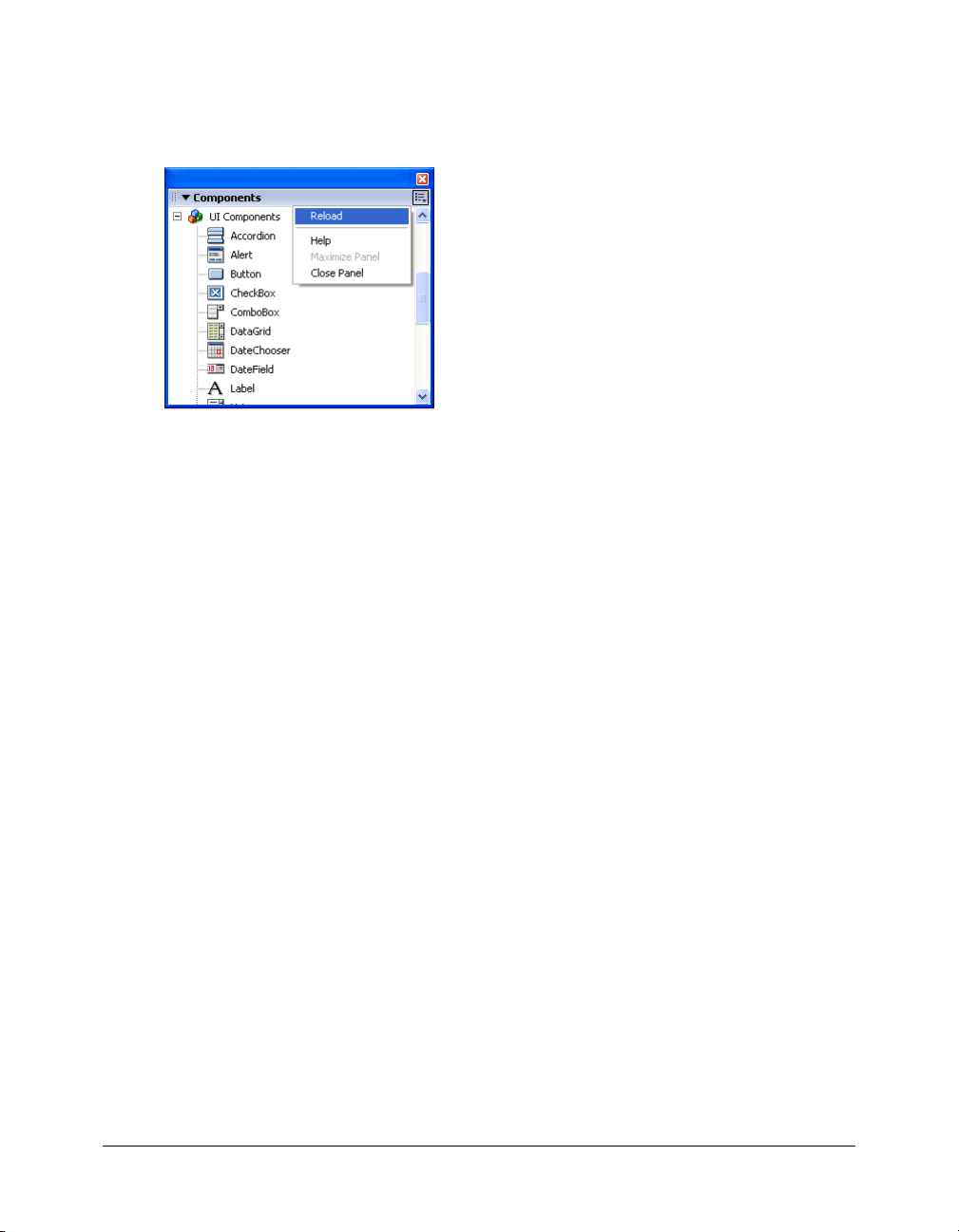
If you’ve added components, you’ll need to refresh the Components panel.
To refresh the contents of the Components panel:
• Select Reload from the Components panel menu.
To remove a component from the Components panel:
• Remove the MXP or FLA file from the Configuration folder.
Benefits of using components
Components enable the separation of coding and design. They also allow you to reuse code,
either in components you create, or by downloading and installing components created by
other developers.
Components allow coders to create functionality that designers can use in applications.
Developers can encapsulate frequently used functionality into components and designers can
customize the look and behavior of components by changing parameters in the Property inspector
or the Component inspector.
Members of the Flash community can use the Macromedia Exchange at www.macromedia.com/
go/exchange to exchange components. By using components, you no longer need to build each
element in a complex web application from scratch. You can find the components you need and
put them together in a Flash document to create a new application.
Components that are based on the version 2 architecture share core functionality such as styles,
event handling, skinning, focus management, and depth management. When you add the first
version 2 component to an application, there is approximately 25K added to the document that
provides this core functionality. When you add additional components, that same 25K is reused
for them as well, resulting in a smaller increase in size to your document than you may expect. For
information about upgrading components, see “Upgrading version 1 components to version 2
architecture” on page 53.
14 Chapter 1: About Components
Page 15

Categories of components
Components included with Flash MX 2004 and Flash MX Professional 2004 fall into the
following five categories (the locations of their ActionScript source files roughly correspond to
these categories as well and are listed in parentheses):
• User interface components (mx.controls.*)
User interface components allow you to interact with an application; for example, the
RadioButton, CheckBox, and TextInput components are user interface controls.
• Data components (mx.data.*)
Data components allow you to load and manipulate information from data sources; the
WebServiceConnector and XMLConnector components are data components.
Note: The source files for the data components aren’t installed with Flash. However, some of the
supporting ActionScript files are installed.
• Media components (mx.controls.*)
Media components let you play back and control streaming media; MediaController,
MediaPlayback, and MediaDisplay are media components.
• Managers (mx.managers.*)
Managers are nonvisual components that allow you to manage a feature, such as focus or
depth, in an application; the FocusManager, DepthManager, PopUpManager, StyleManager,
and SystemManager components are manager components.
• Screens (mx.screens.*)
The screens category includes the ActionScript classes that allow you to control forms and
slides in Flash MX Professional 2004.
For a complete list of each category, see Chapter 6, “Components Dictionary,” on page 91.
About version 2 component architecture
You can use the Property inspector or the Component inspector to change component parameters
to make use of the basic functionality of components. However, if you want greater control over
components, you need to use their APIs and understand a little bit about the way they were built.
Flash MX 2004 and Flash MX Professional 2004 components are built with version 2 of the
Macromedia Component Architecture. Version 2 components are supported by Flash Player 6.79
and Flash Player 7. These components are not always compatible with components built using
version 1 architecture (all components released before Flash MX 2004). Also, the original version
1 components are not supported by Flash Player 7. For more information, see “Upgrading version
1 components to version 2 architecture” on page 53.
Note: Flash MX UI components have been updated to work with Flash Player 7. These updated
components are still based on version 1 architecture. You can download them from the Macromedia
Flash Exchange at www.macromedia.com/cfusion/exchange/
index.cfm#loc=en_us&view=sn106&viewName=Exchange%20Search%20Details&authorid=606
39501&page=0&scrollPos=0&subcatid=0&snid=sn106&itemnumber=0&extid=1009423&catid=0.
About version 2 component architecture 15
Page 16

Version 2 components are included in the Components panel as compiled clip (SWC) symbols. A
compiled clip is a component movie clip whose code has been compiled. Compiled clips cannot
be edited, but you can change their parameters in the Property inspector and Component
inspector, just as you would with any component. For more information, see “Ab out c ompi led
clips and SWC files” on page 17.
Version 2 components are written in ActionScript 2.0. Each component is a class and each class is
in an ActionScript package. For example, a radio button component is an instance of the
RadioButton class whose package name is mx.controls. For more information about packages, see
“Using packages” in Using ActionScript in Flash.
Most UI components built with version 2 of the Macromedia Component Architecture are
subclasses of the UIObject and UIComponent classes and inherit all properties, methods, and
events from those classes. Many components are also subclasses of other components. The
inheritance path of each component is indicated in its entry in Chapter 6, “Components
Dictionary,” on page 91.
Note: The class hierarchy is also available as a GIF file (v2_Flash_component_arch.gif) in the
Examples folder.
All components also use the same event model, CSS-based styles, and built-in themes and
skinning mechanisms. For more information on styles and skinning, see Chapter 5, “Customizing
Components,” on page 67. For more information on event handling, see Chapter 3, “Working
with Components,” on page 43.
For a detailed explanation of the version 2 component architecture, see Chapter 7, “Creating
Components,” on page 915.
What’s new in version 2 components
This section outlines the differences between version 1 and version 2 components from the
perspective of a developer using components to build Flash applications. For detailed information
about the differences between the version 1 and version 2 architectures for building components,
see Chapter 7, “Creating Components,” on page 915.
The Component inspector allows you to change component parameters while authoring in
Macromedia Flash and Macromedia Dreamweaver. (See “Setting component parameters”
on page 47.)
The listener event model allows listeners to handle events. (See Chapter 4, “Handling
Component Events,” on page 55.) There isn’t a
inspector, as there was in Flash MX; you must write ActionScript code to handle events.
Skin properties let you load individual skins (for example, up and down arrows or the check for
a check box) at runtime. (See “About skinning components” on page 80.)
CSS-based styles allow you to create a consistent look and feel across applications. (See “Using
styles to customize component color and text” on page 67.) To set a component style, use the
following syntax:
Themes allow you to drag a new look from the library onto a set of components. (See “About
componentInstance.setStyle("styleName", value).
themes” on page 77.)
16 Chapter 1: About Components
clickHandler parameter in the Property
Page 17

The Halo theme provides a ready-made, responsive, and flexible user interface for applications.
Halo is the default theme that the version 2 components use. (See “About themes” on page 77.)
Manager classes provide an easy way to handle focus and depth in a application. (See “Creating
custom focus navigation” on page 50 and “Managing component depth in a document”
on page 51.)
The base classes UIObject and UIComponent provide core methods, properties, and events to
components that extend them. (See “UIComponent class” on page 793 and “UIObject class”
on page 808.)
Packaging as a SWC file allows easy distribution and concealable code. See Chapter 7,
“Creating Components,” on page 915.
Built-in data binding is available through the Component inspector. For more information, see
Using Flash > Data Integration.
An easily extendable class hierarchy using ActionScript 2.0 allows you to create unique
namespaces, import classes as needed, and subclass easily to extend components. See Chapter 7,
“Creating Components,” on page 915 and Flash ActionScript Language Reference.
About compiled clips and SWC files
Components included with Flash MX 2004 or Flash MX Professional 2004 are not FLA files—
they are compiled clips that have been packaged into SWC files. SWC is the Macromedia file
format for distributing components; it contains a compiled clip, the component’s ActionScript
class file, and other files that describe the component. For details about SWC files, see “Exporting
and distributing a component” on page 953.
When you place a SWC file in the First Run/Components folder, the component appears in the
Components panel. When you add a component to the Stage from the Components panel, a
compiled clip symbol is added to the library.
A compiled clip is a package of precompiled symbols and ActionScript. It’s used to avoid
recompiling symbols and code that aren’t going to change. A movie clip can also be “compiled” in
Flash and converted to a compiled clip symbol. For example, a movie clip with a lot of
ActionScript code that doesn’t change often could be turned into a compiled clip. The compiled
clip symbol behaves just like the movie clip symbol from which it was compiled, but compiled
clips appear and publish much faster than regular movie clip symbols. Compiled clips can’t be
edited, but they do have properties that appear in the Property inspector and the Component
inspector.
To compile a movie clip symbol:
• Right-click (Windows) or Control-click (Macintosh) the movie clip in the Library panel, and
then select Convert to Compiled Clip.
To export a SWC file:
• Select the movie clip in the Library panel and right-click (Windows) or Control-click
(Macintosh), and then select Export SWC File.
Note: Flash MX 2004 and Flash MX Professional 2004 continue to support FLA components.
About compiled clips and SWC files 17
Page 18

Accessibility and components
A growing requirement for web content is that it should be accessible; that is, usable for people
with a variety of disabilities. Visual content in Flash applications can be made accessible to the
visually impaired with the use of screen reader software, which provides a spoken audio
description of the contents of the screen.
When a component is created, the author can write ActionScript that enables communication
between the component and a screen reader. Then, when a developer uses components to
build an application in Flash, the developer uses the Accessibility panel to configure each
component instance.
Most components built by Macromedia are designed for accessibility. To find out whether a
component is accessible, see its entry in Chapter 6, “Components Dictionary,” on page 91. When
you’re building an application in Flash, you’ll need to add one line of code for each component
(
mx.accessibility.ComponentNameAccImpl.enableAccessibility();), and set the
accessibility parameters in the Accessibility panel. Accessibility for components works the same
way as it works for all Flash movie clips.
Most components built by Macromedia are also navigable by the keyboard. Each component’s
entry in Chapter 6, “Components Dictionary,” indicates whether or not you can control the
component with the keyboard.
18 Chapter 1: About Components
Page 19

CHAPTER 2
Creating an Application with Components (Flash
Professional Only)
Components in Flash are prebuilt elements that you can use when creating Flash applications, to
add user interface controls, data connectivity, and other functionality. Components can save you
work when you’re building an application, because you don’t have to create all the design and
functionality from scratch.
This tutorial shows how to build a Flash application using components available in Macromedia
Flash MX Professional 2004, including a variety of user interface and data connectivity
components. You’ll learn how to work with components by using panels and other interface
features in the Flash authoring environment and by using ActionScript.
About working with components
All components are listed in the Components panel. To use a component, you add an instance of
the component to a Flash application.
You can add a component instance in several ways:
• To add a component instance to an application while authoring, drag the component from the
Components panel onto the Stage. This also places the component in the library. You can add
additional instances of the component by dragging the component from the library onto the
Stage. For more information, see “The Components panel” on page 44 and “Adding
components during authoring” on page 44.
• To create a component instance dynamically, first add the component to the library: drag the
component from the Components panel onto the Stage and then delete the instance on the
Stage (the component remains in the library). Then add ActionScript to the application to
create the instance, as you would create an instance of a movie clip or other object in the
library. For more information on adding components dynamically, see “A ddi ng c omp o ne nts a t
runtime with ActionScript” on page 46.
Once the component is added to the library, you can create instances either by dragging to the
Stage or by writing ActionScript.
19
Page 20

You can modify the appearance and behavior of components by setting component parameters in
the authoring environment, using the Parameters tab in either the Property inspector or the
Component inspector. You can also control components during runtime using ActionScript. All
components have ActionScript methods, properties, and events. For more information on
authoring parameters, see “Setting component parameters” on page 47.
After you build an application using components, you can update or repurpose it simply by
resetting component parameters, without having to rewrite code. An application built with
components can even be updated by someone who doesn’t know all the code used to create it.
The components included with Flash MX 2004 and Flash MX Professional 2004 are SWC files
(the Macromedia file format for components). A SWC file contains a compiled clip of the
component, as well as an icon that appears in the Components panel, and other assets to create
component functionality.
Compiled clips are complex symbols that are precompiled so that they are easier to work with in a
Flash document. For example, both the Test Movie and the Publish procedures run faster with
compiled clips, because the clips don’t need to compile when the SWF file is generated.
Because components are precompiled, you cannot edit them as you would uncompiled movie
clips (FLA files). You modify components by setting their parameters or by using their
ActionScript methods, properties, and events.
For more general information about components, see the following topics:
• Chapter 1, “About Components”
• Chapter 3, “Working with Components”
• Chapter 6, “Components Dictionary”
About this tutorial
This tutorial is intended for intermediate Flash users who are familiar with the Flash authoring
environment and have some experience with ActionScript. In the authoring environment, you
should have some experience using panels, tools, the Timeline, and the library. In ActionScript,
you should be familiar with writing functions, adding event listeners, and using class files.
• Build the application architecture: Add component instances and movie clips to build the
application interface. This section covers adding UI and data components and setting their
parameters while authoring.
• Bind components to display product information from an external source: Bind components
to one another to distribute and display data from an external XML file. This section covers
using the data integration features in the Flash authoring environment to bind data and UI
components together.
• Add ActionScript to the main Timeline: Add ActionScript code to create interactive
functionality. This section includes importing the classes for the components used in the
application. Most of the code places event listeners on components to process data in response
to user input.
20 Chapter 2: Creating an Application with Components (Flash Professional Only)
Page 21

If you are experienced with building application architecture in Flash, you may want to skip the
first section of the tutorial and read the second and third sections while referring to the finished
FLA file of the sample application, to learn about the procedures used to bind the components
and add event listeners for data integration. (To view the finished FLA file, see the next section.)
All the ActionScript needed for creating the sample application is provided with this tutorial.
However, to understand the scripting concepts and create your own application using the
procedures described here, you should have some prior experience writing ActionScript.
View the application
In this tutorial you’ll create an application for the “Fix Your Mistake” gift service, which helps
users select an appropriate gift when they need to make amends with someone.
Keep in mind that the sample application is for demonstration purposes only. It is not possible to
check errors or verify data in the sample.
The sample application uses several UI components (including the ComboBox, TextArea, and
Button components) to create the application interface. It includes data components to connect
to external data sources: the XMLConnector component (to connect to an XML file) and the
DataSet component (to filter the data from the XML file and make the data available to UI
components). The application also uses the WebService class to connect dynamically to a web
service.
View the SWF file for the completed application
To view the completed application, open the first_app_v3.swf file at the following location:
• In Windows: boot drive\Program Files\Macromedia\Flash MX 2004\Samples\
HelpExamples\components_application
• On the Macintosh: Macintosh HD/Applications/Macromedia Flash MX 2004/Samples/
HelpExamples/components_application
To see how the application works, first click the arrow control in the What Did You Do? section.
Select from a list of blunders you might have committed (ranging in severity from Forgot to
Water Your Plants to Burned Your House Down). This section uses the ComboBox UI
component, populated by a web service.
A list of gift suggestions appears in the Gift Ideas section. Click a gift to view more information
about it. In the pop-up window that appears, select the quantity you want using the numeric
stepper, and click Add to Cart. Click the close box to close the window. Back in the main screen
of the application, click Checkout. This section uses the XMLConnector data component to
connect to an external XML file, the DataSet data component to filter the data from the XML
file, and the DataGrid UI component to display the data.
View the application 21
Page 22

On the Checkout screen, click the Billing Information, Shipping Information, and Credit Card
Information headers to view the form fields for each of these items. To place an order, you can
add the appropriate information in each of these panes, and click Confirm at the bottom of the
Credit Card Information pane. You can also click Back to return to the main screen. Close the
SWF file when you finish examining the completed application. This screen includes several UI
components (Accordion, TextArea, and others) to display information and provide fields for user
input.
View the FLA file for the completed application
To view the FLA file for the application, open the first_app_v3.fla file in the
components_application folder (the same folder that contains the first_app_v3.swf file).
Examine the Stage, library, and Actions panel to see the content for the application. Notice that
all the components used in the application appear in the library (along with graphics files and
other assets used to create the application architecture). Drag the playhead to view the keyframes
labeled Home (Frame 1) and Checkout (Frame 10). Some components appear as instances on the
Stage. Some are referenced in the ActionScript code but do not appear until runtime.
About data integration in the sample application
The sample application uses features of the Flash data integration architecture to connect to
external data sources, manage the data from those sources, and map the data to UI components in
the application for display. The Flash data integration architecture enables you to work with
external data in different ways, using components and ActionScript classes. For general
information on Flash data integration features, see Chapter 14, “Data Integration (Flash
Professional Only)” in Using Flash.
The sample application uses both components and classes, to introduce you to different ways of
working with data:
• The XMLConnector component connects to an external XML file. Using this component is
similar to loading an external XML file with
object). However, the XMLConnector component is far more powerful and versatile, because
the component makes the XML data available for display in a variety of UI components,
simply by binding component parameters in the Flash authoring environment. For more
information, see “XMLConnector component (Flash Professional only)” on page 894.
XML.load() (the load method of the XML
• The DataSet component manages and filters data from the XML file. You bind the
XMLConnector component to the DataSet component in the Flash authoring environment,
and then bind the DataSet component to a UI component. For more information, see
“DataSet component (Flash Professional only)” on page 301.
• The DataGrid component displays data from the XML file that has been filtered by the
DataSet. You bind the DataSet component to the DataGrid component. (You can also bind
the DataSet component to other UI components. The DataGrid component is just one
example.) For more information, see “DataGrid component (Flash Professional only)”
on page 247.
22 Chapter 2: Creating an Application with Components (Flash Professional Only)
Page 23

• The WebService class is part of a set of web service classes, which provides a set of methods,
events, and properties that enable you to connect to a web service. The WebService class is
different from the WebServiceConnector component. (The WebServiceConnector
component, like the XMLConnector component, enables you to connect to an external data
source—in this case, a web service—by adding a component to an application and setting its
parameters.) The sample application uses the WebService class rather than the
WebServiceConnector component simply to demonstrate another way of connecting to an
external data source. For more information on the set of web service classes, see “Web service
classes (Flash Professional only)” on page 842.
Build the application architecture
To build the application architecture, you’ll add components to the Stage on Frame 1 (for the
main screen) and Frame 10 (for the Checkout screen). You’ll also create movie clips that will be
used to display information inside various components.
Add component instances for the main screen of the application
You’ll start the application by adding instances of the ComboBox, DataGrid, DataSet,
XMLConnector, and Button components to the Stage.
You’ll also add the Window component to the library. Later in the tutorial you’ll add code to
create instances of the Window component dynamically, to display product information when a
user clicks an item in the Gift Ideas section.
The ComboBox instance will display the list of blunders that the user can choose from. The list
will be provided by a web service that you’ll connect to the ComboBox component later in the
tutorial, using the WebService class.
The DataGrid instance will display the list of gift ideas that the user can choose from. The list of
gifts (and all the product details for each gift) will be provided by an external XML file, which you
connect to by means of the XMLConnector component. To filter and sort the data from the
XML file, you’ll use the DataSet component. Later in the tutorial, you’ll use the Flash data
binding features to bind the DataGrid, XMLConnector, and DataSet components to interpret
and display product information from the XML file.
The Window component will be used to create a pop-up window that displays information on
each product in the Gift Ideas list.
1.
Open the first_app_v3_start.fla file for the application, located in the components_application
folder (the same folder that contains the first_app_v3.swf and first_app_v3.fla files).
The start_app.fla file contains three layers: a Background layer with a black background image
and text titles, a Text layer with text labels for sections of the application, and a Labels layer
with labels on the first frame (Home) and the tenth frame (Checkout).
2.
Select File > Save As. Rename the file and save it to your hard drive.
3.
In the Timeline, select the Labels layer and click the Add Layer button to add a new layer above
it. Name the new layer Form. You’ll place the component instances on this layer.
Build the application architecture 23
Page 24

4.
Make sure the Form layer is selected. In the Components panel (Window > Development
Panels > Components), locate the ComboBox component in the UI Components folder. Drag
an instance of ComboBox onto the Stage. Place it below the What Did You Do? text. In the
Property inspector (Window > Properties), for the instance name enter problems_cb. Set
Width to 400 pixels.
Notice that the ComboBox component symbol is added to the library (Window > Library).
When you drag an instance of a component to the Stage, the compiled clip symbol for the
component is added to the library. As with all symbols in Flash, you can create additional
instances of the component by dragging the library symbol onto the Stage.
5.
Drag an instance of the DataGrid component from the UI Components folder in the
Components panel onto the Stage. Place it below the Gift Ideas text. Enter products_dg for the
instance name. Set Width to 400 pixels and Height to 160 pixels.
6.
Drag an instance of the DataSet component from the Data Components folder in the
Components panel onto the side of the Stage. (The DataSet component does not appear in the
application at runtime. The DataSet icon is simply a placeholder that you work with in the
Flash authoring environment.) Enter products_ds for the instance name.
7.
Drag an instance of the XMLConnector component from the Data Components folder in the
Components panel to the side of the Stage. (Like the DataSet component, the XMLConnector
component does not appear in the application at runtime.) Enter products_xmlcon for the
instance name. Click the Parameters tab in the Property inspector, and enter http://www.flash-
mx.com/mm/firstapp/products.xml for the
Note: You can also use the Component inspector (Window > Development Panels > Component
Inspector) to set parameters for components. The Parameters tab in the Property inspector and
the Component inspector work in the same way.
URL property.
The URL specifies an external XML file with data about the products that appear in the Gift
Ideas section of the application. Later in the tutorial you’ll use data binding to bind the
XMLConnector, DataSet, and DataGrid components together; the DataSet component will
filter data from the external XML file, and the DataGrid component will display it.
8.
Drag an instance of the Button component from the UI Components folder in the Components
panel onto the Stage. Place it in the lower right corner of the Stage. Enter checkout_button for
the instance name. Click the Parameters tab and enter
9.
Drag an instance of the Window component from the UI Components folder in the
Checkout for the label property.
Components panel onto the Stage. Select the instance on the Stage and delete it.
The Window component symbol is now added to the library. Later in the tutorial, you’ll create
instances of the Window component using ActionScript.
Remember to save your work frequently.
24 Chapter 2: Creating an Application with Components (Flash Professional Only)
Page 25

Create a movie clip with component instances to display product details
In the application, a pop-up window appears when a user clicks on a product in the Gift Ideas
section. The pop-up window contains component instances that display information for the
product, including a text description, image, and price. To make this pop-up window, you’ll
create a movie clip symbol and add instances of the Loader, TextArea, Label, NumericStepper,
and Button components.
Later in the tutorial, you’ll add ActionScript that dynamically creates an instance of this movie
clip for each product. These movie clip instances will be displayed in the Window component,
which you added to the library earlier. The component instances will be populated with elements
from the external XML file.
1.
In the Library panel (Window > Library), click the options menu on the right side of the title
bar and select New Symbol.
2.
In the Create New Symbol dialog box, enter ProductForm for Name and select Movie Clip for
Behavior.
3.
Click the Advanced button. Under Linkage, select Export for ActionScript, leave Export in First
Frame selected, and click OK. A document window for the new symbol opens in symbolediting mode.
For movie clip symbols that are in the library but not on the Stage, you must select Export for
ActionScript so that you can manipulate them using ActionScript. (Exporting in first frame
means that the movie clip is available as soon as the first frame loads.) Later in the tutorial
you’ll add ActionScript that will generate an instance of the movie clip dynamically each time a
user clicks a product in the Gift Ideas section.
4.
In the Timeline for the new symbol, select Layer 1 and rename it Components.
5.
Drag an instance of the Loader component from the UI Components folder in the Components
panel onto the Stage. Set the X, Y coordinates to 5, 5. Enter image_ldr for the instance name.
Click the Parameters tab in the Property inspector. Select
scaleContent.
false for autoLoad and false for
The Loader component instance will be used to display an image of the product. The
setting for
scaleContent specifies that the image will not be scaled. Later in the tutorial you’ll add code
autoLoad specifies that the image will not load automatically. The false setting for
that loads the image dynamically, based on the product that the user selects in the Gift Ideas
section.
6.
Drag an instance of the TextArea component from the UI Components folder in the
Components panel onto the Stage. Place it next to the Loader component. Set the X, Y
coordinates to 125, 5. Enter description_ta for the instance name. Click the Parameters tab in
the Property inspector. For
true.
editable, select false. For html, select true. For wordWrap, select
The TextArea component instance will be used to display a text description of the selected
product. The selected settings specify that the text cannot be edited by a user, that it can be
formatted with HMTL tags, and that lines will wrap to fit the size of the text area.
false
Build the application architecture 25
Page 26

7.
Drag an instance of the Label component from the UI Components folder in the Components
panel onto the Stage. Place it below the Loader component. Set the X, Y coordinates to 5, 145.
Enter price_lbl for the instance name. Click the Parameters tab in the Property inspector. For
autoSize, select left. For html, select true.
The Label component instance will display the price of the product and the price qualifier (the
quantity of products indicated by the specified price, such as “each” or “one dozen.”)
8.
Drag an instance of the NumericStepper component from the UI Components folder in the
Components panel onto the Stage. Place it below the TextArea component. Set the X, Y
coordinates to 135, 145. Enter quantity_ns for the instance name. Click the Parameters tab in
the Property inspector. For
Setting
minimum to 1 specifies that the user must select at least one of the product in order to
minimum, enter 1.
add the item to the cart.
9.
Drag an instance of the Button component from the UI Components folder in the Components
panel onto the Stage. Place it beside the NumericStepper component. Set the X, Y coordinates
to 225, 145. Enter addToCart_button for the instance name. Click the Parameters tab in the
Property inspector. For
label, enter Add To Cart.
Add code to the ProductForm movie clip
Next, you’ll add ActionScript to the ProductForm movie clip that you just created. The
ActionScript populates the components in the movie clip with information about the selected
product, and adds an event listener to the Add to Cart button that adds the selected product to
the cart.
For more information on working with event listeners, see “Using event listeners” in Using
ActionScript in Flash.
1.
In the Timeline of the ProductForm movie clip, create a new layer and name it Actions. Select
the first frame in the Actions layer.
2.
In the Actions panel, add the following code:
// create an object to reference the selected product item in the DataGrid
var thisProduct:Object = this._parent._parent.products_dg.selectedItem;
// populate the description_ta TextArea and price_lbl Label instances with
// data from the selected product
description_ta.text = thisProduct.description;
price_lbl.text = "<b>$"+thisProduct.price+" "+thisProduct.priceQualifier+"</
b>";
// load an image of the product from the application directory
image_ldr.load(thisProduct.image);
Note: The code includes comments explaining its purpose. It’s a good idea to include comments
like these in all the ActionScript code you write, so that you or anyone else going back to the code
later can easily understand what it was for.
First, the code defines a variable to refer to the selected product in the subsequent code. Using
thisProduct means you don’t have to refer to the specified product using the path
this._parent._parent.products_dg.selectedItem.
26 Chapter 2: Creating an Application with Components (Flash Professional Only)
Page 27

Next, the code populates the TextArea and Label instances by using the description, price,
and
priceQualifier properties of the thisProduct object. These properties correspond to
elements in the products.xml file that you linked to the products_xmlcon XMLConnector
instance at the beginning of the tutorial. Later in the tutorial, you’ll bind the XMLConnector,
DataSet, and DataGrid component instances together, and the elements in the XML file will
populate the other two component instances.
Finally, the code uses the
image property of the thisProduct object to load an image of the
product into the Loader component.
3.
Next you’ll add an event listener to add the product to the cart when the user clicks the Add to
Cart button. (You’ll add ActionScript to the main Timeline in the application later in the
tutorial, to create an instance of the Cart class.) Add the following code:
var cartListener:Object = new Object();
cartListener.click = function(evt:Object) {
var tempObj:Object = new Object();
tempObj.quantity = evt.target._parent.quantity_ns.value;
tempObj.id = thisProduct.id;
tempObj.productObj = thisProduct;
var theCart = evt.target._parent._parent._parent.myCart;
theCart.addProduct(tempObj.quantity, thisProduct);
};
addToCart_button.addEventListener("click", cartListener);
4.
Click the Check Syntax button (the blue check mark above the Script pane) to make sure there
are no syntax errors in the code.
You should check syntax frequently as you add code to an application. Any errors found in the
code are listed in the Output panel. (When you check syntax, only the current script is
checked; other scripts that may be in the FLA file are not checked.) For more information, see
“Debugging your scripts” in Using ActionScript in Flash.
5.
Click the arrow button at the top left of the document window or select View > Edit Document
to exit symbol editing mode and return to the main Timeline.
Add components for the Checkout screen
When the user clicks the Checkout button on the main screen, the Checkout screen appears. The
Checkout screen provides forms where the user can enter billing, shipping, and credit card
information.
The checkout interface consists of components placed on a keyframe at Frame 10 in the
application. You’ll use the Accordion component to create the checkout interface. The Accordion
component is a navigator that contains a sequence of children that it displays one at a time. You’ll
also add a Button component instance to create a Back button, so users can return to the main
screen.
Build the application architecture 27
Page 28

Later in the tutorial, you’ll create movie clips to use as children in the Accordion instance, to
display the Billing, Shipping, and Credit Card Information panes.
1.
In the main Timeline for the application, move the playhead to Frame 10 (labeled Checkout).
Make sure the Form layer is selected.
2.
Insert a blank keyframe on Frame 10 in the Form layer (select the frame and select Insert >
Timeline > Blank Keyframe).
3.
With the new keyframe selected, drag an instance of the Accordion component from the UI
Components folder in the Components panel onto the Stage. In the Property inspector, enter
checkout_acc for the instance name. Set Width to 300 pixels and Height to 200 pixels.
4.
Drag an instance of the Button component from the UI Components folder in the Components
panel onto the Stage. In the Property inspector, enter back_button for the instance name. Click
the Parameters tab, and enter
Back for the label property.
About the Billing, Shipping, and Credit Card panes
The Billing, Shipping, and Credit Card Information panes are built with movie clip instances that
are displayed in the Accordion component instance. Each pane consists of two nested movie clips.
The parent movie clip contains a ScrollPane component, used to display content in a scrollable
area. The child movie clip contains Label and TextInput components where users can enter
personal data, such as name, address, and so on. You’ll use the ScrollPane component to display
the child movie clip so that the user can scroll through the information fields.
Create movie clips for the Billing Information pane
First you’ll create two movie clips that will display the Billing Information form fields: a parent
movie clip with the ScrollPane component instance, and a child movie clip with the Label and
TextArea component instances.
1.
In the Library panel (Window > Library), click the options menu on the right side of the title
bar and select New Symbol.
2.
In the Create New Symbol dialog box, enter checkout1_mc for Name and select Movie Clip
for Behavior.
3.
Click the Advanced button. Under Linkage, select Export for ActionScript, leave Export in First
Frame selected, and click OK.
A document window for the new symbol opens in symbol-editing mode.
4.
Drag an instance of the ScrollPane component onto the Stage.
5.
In the Property inspector, enter checkout1_sp for the instance name. Set the W and H
coordinates to 300, 135. Set the X and Y coordinates to 0, 0.
6.
Click the Parameters tab. Set the contentPath property to checkout1_sub_mc.
The checkout1_sub_mc movie clip will appear inside the scroll pane, and will contain the
Label and TextInput components. You’ll create this movie clip next.
7.
From the Library options menu, select New Symbol.
28 Chapter 2: Creating an Application with Components (Flash Professional Only)
Page 29

8.
In the Create New Symbol dialog box, enter checkout1_sub_mc for Name and select Movie
Clip for Behavior.
9.
Click the Advanced button. Under Linkage, select Export for ActionScript, leave Export in First
Frame selected, and click OK.
A document window for the new symbol opens in symbol-editing mode.
10.
Drag six instances of the Label component onto the Stage. Alternatively, you can drag one
instance onto the Stage, and Control-drag (Windows) or Option-drag (Macintosh) it on the
Stage to make copies. Name and position the instances as follows:
■ For the first instance, enter firstname_lbl for the instance name and set the X and Y
coordinates to 5, 5. Click the Parameters tab and enter
■ For the second instance, enter lastname_lbl for the instance name and set the X and Y
coordinates to 5, 35. Click the Parameters tab and enter
■ For the third instance, enter country_lbl for the instance name and set the X and Y
coordinates to 5, 65. Click the Parameters tab and enter
■ For the fourth instance, enter province_lbl for the instance name and set the X and Y
coordinates to 5, 95. Click the Parameters tab and enter
■ For the fifth instance, enter city_lbl for the instance name and set the X and Y coordinates
to 5, 125. Click the Parameters tab and enter
■ For the sixth instance, enter postal_lbl for the instance name and set the X and Y
City for text.
coordinates to 5, 155. Click the Parameters tab and enter
11.
Drag six instances of the TextInput component onto the Stage. Place a TextInput instance
First Name for text.
Last Name for text.
Country for text.
Province/State for text.
Postal/Zip Code for text.
immediately to the right of each Label instance. For example, the X, Y coordinates of the first
TextInput instance should be 105, 5. Name the TextInput instances as follows:
■ Name the first instance billingFirstName_ti.
■ Name the second instance billingLastName_ti.
■ Name the third instance billingCountry_ti.
■ Name the fourth instance billingProvince_ti.
■ Name the fifth instance billingCity_ti.
■ Name the sixth instance billingPostal_ti.
Sometimes content in a scroll pane can be cropped if it’s too close to the border of the pane. In
the next few steps you’ll add a white rectangle to the checkout1_sub_mc movie clip so that the
Label and TextInput instances are displayed properly.
12.
In the Timeline, click the Add New Layer button. Drag the new layer below the existing layer.
(The layer with the rectangle should be on the bottom, so that the rectangle doesn’t interfere
with the component display.)
13.
Select Frame 1 of the new layer.
Build the application architecture 29
Page 30

14.
In the Tools panel, select the Rectangle tool. Set the Stroke color to None and the Fill color to
white.
Click the Stroke Color control in the Tools panel and click the None button—the white
swatch with a red line through it. Click the Fill Color control and click the white color swatch.
15.
Drag to create a rectangle that extends beyond the bottom and right edges of the Label and
TextInput instances.
Create movie clips for the Shipping Information pane
The movie clips for the Shipping Information pane are very similar to those for the Billing
Information pane. You’ll also add a CheckBox component, enabling users to populate the
Shipping Information form fields with the same data they entered in the Billing Information
pane.
1.
Follow the earlier instructions (see “Create movie clips for the Billing Information pane”
on page 28) to create the movie clips for the Credit Card Information pane. Note these naming
differences:
■ For the first movie clip, enter checkout2_mc for the symbol name and checkout2_sp for the
instance name. In the Property inspector’s Parameters tab, set the
checkout2_sub_mc.
■ For the second movie clip, enter checkout2_sub_mc for the symbol name.
■ For the TextInput instances, change “billing” to “shipping” in the instance names.
2.
With the checkout2_sub_mc movie clip open in symbol-editing mode, drag an instance of the
contentPath property to
CheckBox component onto the Stage and position it just above the first Label instance.
Make sure to place this instance on Layer 1, along with the other component instances.
3.
In the Property inspector, enter sameAsBilling_ch for the instance name.
4.
Click the Parameters tab. Set the label property to Same As Billing Info.
Create movie clips for the Credit Card Information pane
The movie clips for the Credit Card Information pane are also similar to those for the Billing and
Shipping Information panes. However, the nested movie clip for the Credit Card Information
pane has somewhat different fields than the other two panes, for credit card number and other
card data.
1.
Follow steps 1-11 of the Billing Information instructions (see “Create movie clips for the Billing
Information pane” on page 28) to create the movie clips for the Credit Card Information pane.
Note these naming differences:
■ For the first movie clip, enter checkout3_mc for the symbol name and checkout3_sp for the
instance name. In the Property inspector’s Parameters tab, set the
checkout3_sub_mc.
■ For the second movie clip, enter checkout3_sub_mc for the symbol name.
30 Chapter 2: Creating an Application with Components (Flash Professional Only)
contentPath property to
Page 31

2.
Drag four instances of the Label component onto the Stage. Name and position the instances
as follows:
■ For the first instance, enter ccName_lbl for the instance name and set the X and Y
coordinates to 5, 5. Click the Parameters tab and enter
■ For the second instance, enter ccType_lbl for the instance name and set the X and Y
coordinates to 5, 35. Click the Parameters tab and enter
■ For the third instance, enter ccNumber_lbl for the instance name and set the X and Y
coordinates to 5, 65. Click the Parameters tab and enter
■ For the fourth instance, enter ccExp_lbl for the instance name and set the X and Y
coordinates to 5, 95. Click the Parameters tab and enter
3.
Drag an instance of the TextInput component onto the Stage and position it to the right of the
Name On Card for text.
Card Type for text.
Card Number for text.
Expiration for text.
ccName_lbl instance. Name the new instance ccName_cb.
4.
Drag an instance of the ComboBox component onto the Stage and position it to the right of
the ccType_lbl instance. Name the new instance ccType_cb.
5.
Drag another instance of the TextInput component onto the Stage and position it to the right
of the ccNumber_lbl instance. Name the new instance ccNumber_cb.
6.
Drag two instances of the ComboBox component onto the Stage. Position one to the right of
the ccExp_lbl instance, and position the other one to the right of that. Name the first new
instance ccMonth_cb, and name the second ccYear_cb.
7.
Drag an instance of the Button component onto the Stage and position it at the bottom of the
form, below the ccMonth_cb instance. Name the new instance checkout_button. In the
Property inspector’s Parameters tab, set the
8.
Follow the instructions in steps 14-16 of the Billing Information instructions (see “Create
label property to Checkout.
movie clips for the Billing Information pane” on page 28) to add a rectangle to the bottom of
the form.
Bind components to display product information from an external source
In the beginning of the tutorial, you added instances of the DataGrid, DataSet, and
XMLConnector components to the Stage. You set the
(named products_xmlcon) to the location of an XML file containing product information for the
Gift Ideas section of the application.
Now you’ll use data binding features in the Flash authoring environment to bind the
XMLConnector, DataSet, and DataGrid components together to use the XML data in the
application. For general information on working with data binding and other features of the Flash
data integration architecture, see Chapter 14, “Data Integration (Flash Professional Only)” in
Using Flash.
When you bind the components, the DataSet component will filter the list of products in the
XML file according to the severity of the blunder that the user selects in the What Did You Do?
section. The DataGrid component will display the list.
Bind components to display product information from an external source 31
URL property for the XMLConnector
Page 32

Specify a schema for the XML data source
When you connect to an external XML data source with the XMLConnector component, you
need to specify a schema—a schematic representation which identifies the structure of the XML
document. The schema tells the XMLConnector component how to read the XML data source.
The easiest way to specify a schema is to import a copy of the XML file that you’re going to
connect to, and use that copy as a schema.
1.
Launch your web browser and go to www.flash-mx.com/mm/firstapp/problems.xml (the
location you set for the XMLConnector URL parameter).
2.
Select File > Save As.
3.
Save products.xml to the same location as the FLA file that you’re working on.
4.
Select Frame 1 in the main Timeline.
5.
On the Stage, select the products_xmlcon (XMLConnector) instance.
6.
In the Component inspector, click the Schema tab. Click the Import button (on the right side
of the Schema tab, above the scroll pane). In the Open dialog box, locate the products.xml file
that you imported in step 3, and click Open. The schema for the products.xml file appears in
the scroll pane of the Schema tab.
Bind the XMLConnector, DataSet, and DataGrid components
You’ll use the Binding tab in the Component inspector to bind the XMLConnector, DataSet, and
DataGrid component instances to one another.
For information on working with data binding, see “Data binding (Flash Professional only)” in
Using Flash.
1.
With the products_xmlcon (XMLConnector) instance selected on the Stage, click the Bindings
tab in the Component inspector.
2.
Click the Add Binding button.
3.
In the Add Binding dialog box, select the results.products.product array item and click
OK.
4.
In the Bindings tab, click the Bound To item in the Binding Attributes pane (the bottom pane,
showing attribute name-value pairs).
5.
In the Value column for the Bound To item, click the magnifying glass icon to open the Bound
To dialog box.
6.
In the Bound To dialog box, select the products_ds (DataSet) instance in the Component Path
pane. Select
7.
In the Bindings tab, click the Direction item in the Binding Attributes pane. From the pop-up
dataProvider:array in the Schema Location pane. Click OK.
menu in the Value column, select Out.
This option means that the data will pass from the products_xmlcon instance to the
products_ds instance (rather than passing in both directions, or passing from the DataSet
instance to the XMLConnector instance).
32 Chapter 2: Creating an Application with Components (Flash Professional Only)
Page 33

8.
On the Stage, select the products_ds instance. In the Bindings tab of the Component inspector,
notice that the component’s data provider appears in the Binding List (the top pane of the
Bindings tab). In the Binding Attributes pane, the Bound To parameter indicates that the
products_ds instance is bound to the products_xmlcom instance, and the binding direction
is In.
In the next few steps you’ll bind the DataSet instance to the DataGrid instance so that the data
that is filtered by the data set will be displayed in the data grid.
9.
With the products_ds instance still selected, click the Add Binding button in the Bindings tab.
10.
In the Add Binding dialog box, select the dataProvider: array item and click OK.
11.
In the Bindings tab, make sure the dataProvider: array item is selected in the Binding List.
12.
Click the Bound To item in the Binding Attributes pane.
13.
In the Value column for the Bound To item, click the magnifying glass icon to open the Bound
To dialog box.
14.
In the Bound To dialog box, select the products_dg (DataGrid) instance in the Component
Path pane. Select
dataProvider:array in the Schema Location pane. Click OK.
Add ActionScript to the main Timeline
With the application architecture and data binding in place, you’re ready to add ActionScript to
the main Timeline to complete the application functionality.
Create references to component class names
Each component is associated with a class file that defines its methods and properties. In this
section of the tutorial, you’ll add ActionScript to create references to the class names for the
components used in the application. For some of these components, you have already added
instances to the Stage. For others, you’ll add ActionScript later in the tutorial to create instances
dynamically.
Creating a references to the class name makes it easier to write ActionScript for the component
because it enables code completion for component instances, so you can avoid using the fully
qualified name. For example, when you create a reference to the class file for the ComboBox
component, you can refer to instances of the ComboBox with the syntax
instanceName:ComboBox, rather than instanceName:mx.controls.ComboBox.
You’ll need these classes:
WebService class This class populates the ComboBox instance with a list of “problems.” For
this class, you’ll also need to import the WebServiceClasses item from the Classes common
library. This item contains compiled clips (SWC files) that you’ll need in order to compile and
generate the SWF file for your application.
Add ActionScript to the main Timeline 33
Page 34

UI Components Controls package This package contains classes for the user interface control
components, including ComboBox, DataGrid, Loader, TextInput, Label, NumericStepper,
Button, and CheckBox. A package is a directory that contains class files and resides in a
designated classpath directory. You can use a wild card to create references to all the classes in a
package: for example, the syntax
mx.controls.* creates references to all classes in the controls
package. (When you create a reference to a package with a wild card, the unused classes are
dropped from the application when it is compiled, so they don’t add any extra size.)
UI Components Containers package This package contains classes for the user interface
container components, including Accordion, ScrollPane, and Window. As with the controls
package, you can create a reference to this package by using a wild card.
DataGridColumn class This class lets you add columns to the DataGrid instance and control
their appearance.
Cart class A custom class provided with this tutorial, the Cart class defines the functioning of
the shopping cart that you’ll create later. (To examine the code in the Cart class file, open the
cart.as file located in the component_application folder with the application FLA and SWF files).
You’ll create an Actions layer and add ActionScript code to the first frame of the main Timeline.
For all the code that you’ll add to the application in the remaining steps of the tutorial, make sure
you place it on the Actions layer.
1.
To import the WebServiceClasses item from the Classes library, select Window > Other
Panels > Common Libraries > Classes.
2.
Drag the WebServiceClasses item from the Classes library into the library for the application.
Importing an item from the Classes library is similar to adding a component to the library: it
adds the SWC files for the class to the library. The SWC files need to be in the library in order
for you to use the class in an application.
3.
In the Timeline, select the Form layer and click the Add New Layer button. Name the new layer
Actions.
4.
With the Actions layer selected, select Frame 1 and press F9 to open the Actions panel.
5.
In the Actions panel, enter the following code to create a stop() function that prevents the
application from looping during playback:
stop();
6.
With Frame 1 in the Actions layer still selected, add the following code in the Actions panel to
import the classes:
// import necessary classes
import mx.services.WebService;
import mx.controls.*;
import mx.containers.*;
import mx.controls.gridclasses.DataGridColumn;
// import the custom Cart class
import Cart;
34 Chapter 2: Creating an Application with Components (Flash Professional Only)
Page 35

Add an instance of the Cart class and initialize it
The next code that you’ll add creates an instance of the custom Cart class and then initializes the
instance.
• In the Actions panel, add the following code:
var myCart:Cart = new Cart(this);
myCart.init();
This code uses the init() method of the Cart class to add a DataGrid instance to the Stage,
define the columns, and position the DataGrid instance on the Stage. It also adds a Button
component instance and positions it, and adds an Alert handler for the button. (To see the code
for the Cart class
init() method, open the Cart.as file.)
Set the data type of component instances
Next you’ll assign data types to each of the component instances you dragged to the Stage earlier
in the tutorial.
ActionScript 2.0 uses strict data typing, which means that you assign the data type when you
create a variable. Strict data typing makes code hints available for the variable in the Actions
panel.
• In the Actions panel, add the following code to assign data types to the four component
instances that you already created.
// data type instances on the Stage; other instances might be added at
// runtime from the Cart class
var problems_cb:ComboBox;
var products_dg:DataGrid;
var cart_dg:DataGrid;
var products_xmlcon:mx.data.components.XMLConnector;
Use styles to customize component appearance
Each component has style properties and methods that let you customize its appearance,
including highlight color, font, and font size. You can set styles for individual component
instances, or set styles globally to apply to all component instances in an application. For this
tutorial you’ll set styles globally.
• Add the following code to set styles:
// define global styles and easing equations for the problems_cb ComboBox
_global.style.setStyle("themeColor", "haloBlue");
_global.style.setStyle("fontFamily", "Verdana");
_global.style.setStyle("fontSize", 10);
_global.style.setStyle("openEasing", mx.transitions.easing.Bounce.easeOut);
This code sets the theme color (the highlight color on a selected item), font, and font size for
the components, and also sets the easing for the ComboBox—the way that the drop-down
menu appears and disappears when you click the ComboBox title bar.
Add ActionScript to the main Timeline 35
Page 36

Add columns to the Gift Ideas section
Now you’re ready to add columns to the data grid in the Gift Ideas section of the application, for
displaying product information and price.
• In the Actions panel, add the following code to create, configure, and add a Name column and
a Price column to the DataGrid instance:
// define data grid columns and their default widths in the products_dg
// DataGrid instance
var name_dgc:DataGridColumn = new DataGridColumn("name");
name_dgc.headerText = "Name";
name_dgc.width = 280;
// add the column to the DataGrid
products_dg.addColumn(name_dgc);
var price_dgc:DataGridColumn = new DataGridColumn("price");
price_dgc.headerText = "Price";
price_dgc.width = 100;
// define the function that will be used to set the column’s label
// at runtime
price_dgc.labelFunction = function(item:Object) {
if (item != undefined) {
return "$"+item.price+" "+item.priceQualifier;
}
};
products_dg.addColumn(price_dgc);
Connect to a web service to populate the combo box
In this section you’ll add code to connect to a web service that contains the list of blunders
(Forgot to Water Your Plants, and so on). The web service description language (WSDL) file is
located at www.flash-mx.com/mm/firstapp/problems.cfc?WSDL. To see how the WSDL is
structured, point your browser to the WSDL location.
The ActionScript code passes the web service results to the ComboBox instance for display. A
function sorts the blunders in order of severity. If no result is returned from the web service (for
example, if the service is down, or the function isn’t found), an error message appears in the
Output panel.
• In the Actions panel, add the following code:
/* Define the web service used to retrieve an array of problems.
This service will be bound to the problems_cb ComboBox instance. */
var problemService:WebService = new WebService("http://www.flash-mx.com/mm/
firstapp/problems.cfc?WSDL");
var myProblems:Object = problemService.getProblems();
/* If you get a result from the web service, set the field that will be used
for the column label.
Set the data provider to the results returned from the web service. */
myProblems.onResult = function(wsdlResults:Array) {
problems_cb.labelField = "name";
problems_cb.dataProvider = wsdlResults.sortOn("severity", Array.NUMERIC);
36 Chapter 2: Creating an Application with Components (Flash Professional Only)
Page 37

};
// If you are unable to connect to the remote web service, display the
// error messages in the Output panel.
myProblems.onFault = function(error:Object) {
trace("error:");
for (var prop in error) {
trace(" "+prop+" -> "+error[prop]);
}
};
Load the external XML file listing product information
Next you’ll add a line of code that causes the XMLConnector instance to load, parse, and bind
the contents of the remote products.xml file. This file is located at the URL you entered for the
URL property of the XMLConnector instance that you created earlier. The file contains
information on the products that will appear in the Gift Ideas section of the application.
• Add the following code in the Actions panel:
products_xmlcon.trigger();
Add an event listener to filter the products displayed in the Gift Ideas section
You’ll add an event listener to detect when a user selects a blunder in the What Did You Do?
section (the problems_cb ComboBox instance). The listener includes a function that filters the
Gift Ideas list according to the blunder the user chooses. Selecting a minor blunder displays a list
of modest gifts (such as a CD or flowers); selecting a more serious blunder displays more opulent
gifts.
For more information on working with event listeners, see “Using event listeners” in Using
ActionScript in Flash.
• In the Actions panel, add the following code:
/* Define a listener for the problems_cb ComboBox instance.
This listener will filter the products in the DataSet (and DataGrid).
Filtering is based on the severity of the currently selected item in the
ComboBox. */
var cbListener:Object = new Object();
cbListener.change = function(evt:Object) {
products_ds.filtered = false;
products_ds.filtered = true;
products_ds.filterFunc = function(item:Object) {
// If the current item's severity is greater than or equal to the
selected
// item in the ComboBox, return true.
return (item.severity>=evt.target.selectedItem.severity);
};
};
// Add the listener to the ComboBox.
problems_cb.addEventListener("change", cbListener);
Add ActionScript to the main Timeline 37
Page 38

Resetting the filtered property (setting it to false and then to true) at the beginning of the
change() function ensures that the function will work properly if the user changes the What Did
You Do? selection repeatedly.
The
filterFunc function checks whether a given item in the array of gifts falls within the
severity the user selected in the combo box. If the gift is within the selected severity range, it is
displayed in the DataGrid instance (which is bound to the DataSet instance).
The last line of code registers the listener to the problems_cb ComboBox instance.
Add an event listener to display product details
Next you’ll add an event listener to the products_dg DataGrid instance to display information
about each product. When the user clicks a product in the Gift Ideas section, a pop-up window
appears with information about the product.
• In the Actions panel, add the following code:
// create a listener for the DataGrid to detect when the row in the
// DataGrid is changed
var dgListener:Object = new Object();
dgListener.change = function(evt:Object) {
// when the current row changes in the DataGrid, launch a new pop-up
// window displaying the product's details
myWindow = mx.managers.PopUpManager.createPopUp(_root,
mx.containers.Window, true, {title:evt.target.selectedItem.name,
contentPath:"ProductForm", closeButton:true});
// set the dimensions of the pop-up window
myWindow.setSize(340, 210);
// define a listener that closes the pop-up window when the user clicks
// the close button
var closeListener:Object = new Object();
closeListener.click = function(evt) {
evt.target.deletePopUp();
};
myWindow.addEventListener("click", closeListener);
};
products_dg.addEventListener("change", dgListener);
This code creates a new event listener called dgListener, and creates instances of the Window
component you added to the library earlier. The title for the new window is set to the product’s
name. The content path for the window is set to the ProductForm movie clip. The size of the
window is set to 340 x 210 pixels.
The code also adds a close button to enable the user to close the window after viewing the
information.
38 Chapter 2: Creating an Application with Components (Flash Professional Only)
Page 39

Add an event listener to the Checkout button
Now you’ll add code to display the Checkout screen when the user clicks the Checkout button.
• In the Actions panel, add the following code:
// when the Checkout button is clicked, go to the "checkout" frame label
var checkoutBtnListener:Object = new Object();
checkoutBtnListener.click = function(evt:Object) {
evt.target._parent.gotoAndStop("checkout");
};
checkout_button.addEventListener("click", checkoutBtnListener);
This code specifies that, when the user clicks the Checkout button, the playhead moves to the
Checkout label in the Timeline.
Add code for the Checkout screen
Now you’re ready to add code to the Checkout screen of the application, on Frame 10 on the
main Timeline. This code processes the data that users enter in the Billing, Shipping, and Credit
Card Information panes that you created earlier with the Accordion component and other
components.
1.
In the Timeline, select Frame 10 in the Actions layer and insert a blank keyframe (select Insert >
Timeline > Blank Keyframe)
2.
Open the Actions panel (F9).
3.
In the Actions panel, add the following code:
stop();
import mx.containers.*;
// define the Accordion component on the Stage
var checkout_acc:Accordion;
4.
Next you’ll add the first child to the Accordion component instance, to accept billing
information from the user. Add the following code:
// define the children for the Accordion component
var child1 = checkout_acc.createChild("checkout1_mc", "child1_mc",
{label:"1. Billing Information"});
var thisChild1 = child1.checkout1_sp.spContentHolder;
The first line calls the createChild() method of the Accordion component and creates an
instance of the
name
child1_mc and the label “1. Billing Information”. The second line of code creates a
checkout1_mc movie clip symbol (which you created earlier) with the instance
shortcut to an embedded ScrollPane component instance.
5.
Create the second child for the Accordion instance, to accept shipping information:
/* Add the second child to the Accordion.
Add an event listener for the sameAsBilling_ch CheckBox.
This copies the form values from the first child into the second child. */
var child2 = checkout_acc.createChild("checkout2_mc", "child2_mc",
{label:"2. Shipping Information"});
var thisChild2 = child2.checkout2_sp.spContentHolder;
var checkboxListener:Object = new Object();
Add ActionScript to the main Timeline 39
Page 40

checkboxListener.click = function(evt:Object) {
if (evt.target.selected) {
thisChild2.shippingFirstName_ti.text =
thisChild1.billingFirstName_ti.text;
thisChild2.shippingLastName_ti.text =
thisChild1.billingLastName_ti.text;
thisChild2.shippingCountry_ti.text = thisChild1.billingCountry_ti.text;
thisChild2.shippingProvince_ti.text =
thisChild1.billingProvince_ti.text;
thisChild2.shippingCity_ti.text = thisChild1.billingCity_ti.text;
thisChild2.shippingPostal_ti.text = thisChild1.billingPostal_ti.text;
}
};
thisChild2.sameAsBilling_ch.addEventListener("click", checkboxListener);
The first two lines of code are similar to the code for creating the Billing Information child:
you create an instance of the
child2_mc and the label “2. Shipping Information”. The second line of code creates a shortcut
checkout2_mc movie clip symbol, with the instance name
to an embedded ScrollPane component instance.
Beginning with the third line of code, you add an event listener to the CheckBox instance. If
the user clicks the check box, the shipping information uses the data the user entered in the
Billing Information pane.
6.
Next, create a third child for the Accordion instance, for credit card information:
// define the third Accordion child
var child3 = checkout_acc.createChild("checkout3_mc", "child3_mc",
{label:"3. Credit Card Information"});
var thisChild3 = child3.checkout3_sp.spContentHolder;
7.
Add this code to create ComboBox instances for the credit card month, year, and type, and
populate each with a statically defined array:
/* set the values in the three ComboBox instances on the Stage:
ccMonth_cb, ccYear_cb and ccType_cb */
thisChild3.ccMonth_cb.labels = ["01", "02", "03", "04", "05", "06", "07",
"08", "09", "10", "11", "12"];
thisChild3.ccYear_cb.labels = [2004, 2005, 2006, 2007, 2008, 2009, 2010];
thisChild3.ccType_cb.labels = ["VISA", "MasterCard", "American Express",
"Diners Club"];
8.
Finally, add the following code to add event listeners to the Checkout button and the Back
button. When the user clicks the Checkout button, the listener object copies the form fields
from the Billing, Shipping, and Credit Card Information panes into a LoadVars object that is
sent to the server. (The LoadVars class lets you send all the variables in an object to a specified
URL.) When the user clicks the Back button, the application returns to the main screen.
/* Create a listener for the checkout_button Button instance.
This listener sends all the form variables to the server when the user clicks
the Checkout button. */
var checkoutListener:Object = new Object();
checkoutListener.click = function(evt:Object);
evt.target.enabled = false;
/* Create two LoadVars object instances, which send variables to
and receive results from the remote server. */
40 Chapter 2: Creating an Application with Components (Flash Professional Only)
Page 41

var response_lv:LoadVars = new LoadVars();
var checkout_lv:LoadVars = new LoadVars();
checkout_lv.billingFirstName = thisChild1.billingFirstName_ti.text;
checkout_lv.billingLastName = thisChild1.billingLastName_ti.text;
checkout_lv.billingCountry = thisChild1.billingCountry_ti.text;
checkout_lv.billingProvince = thisChild1.billingProvince_ti.text;
checkout_lv.billingCity = thisChild1.billingCity_ti.text;
checkout_lv.billingPostal = thisChild1.billingPostal_ti.text;
checkout_lv.shippingFirstName = thisChild2.shippingFirstName_ti.text;
checkout_lv.shippingLastName = thisChild2.shippingLastName_ti.text;
checkout_lv.shippingCountry = thisChild2.shippingCountry_ti.text;
checkout_lv.shippingProvince = thisChild2.shippingProvince_ti.text;
checkout_lv.shippingCity = thisChild2.shippingCity_ti.text;
checkout_lv.shippingPostal = thisChild2.shippingPostal_ti.text;
checkout_lv.ccName = thisChild3.ccName_ti.text;
checkout_lv.ccType = thisChild3.ccType_cb.selectedItem;
checkout_lv.ccNumber = thisChild3.ccNumber_ti.text;
checkout_lv.ccMonth = thisChild3.ccMonth_cb.selectedItem;
checkout_lv.ccYear = thisChild3.ccYear_cb.selectedItem;
/* Send the variables from the checkout_lv LoadVars to the remote script
on the server.
Save the results in the response_lv instance. */
checkout_lv.sendAndLoad("http://www.flash-mx.com/mm/firstapp/cart.cfm",
response_lv, "POST");
response_lv.onLoad = function(success:Boolean) {
evt.target.enabled = true;
};
};
thisChild3.checkout_button.addEventListener("click", checkoutListener);
cart_mc._visible = false;
var backListener:Object = new Object();
backListener.click = function(evt:Object) {
evt.target._parent.gotoAndStop("home");
}
back_button.addEventListener("click", backListener);
Test the application
Congratulations! You’ve finished building the application. Now you’re ready to test it. If you find
any errors during testing, check your application against the finished sample (first_app_v3.fla) to
correct any mistakes.
Try using the procedures demonstrated in this tutorial to build component-based applications of
your own.
1.
Select Control > Test Movie or press Control+Enter (Windows) or Command+Return
(Macintosh).
2.
Click through the application to test it: select a blunder, choose a gift, and add checkout
information.
Test the application 41
Page 42

42 Chapter 2: Creating an Application with Components (Flash Professional Only)
Page 43

CHAPTER 3
Working with Components
In this chapter, you’ll use several Macromedia Flash (FLA) files and ActionScript class files to
learn how to add components to a document and set their properties. This chapter also explains a
few advanced topics such as using code hints, creating custom focus navigation, managing
component depth, and upgrading version 1 components to version 2 architecture.
The files used in this chapter are TipCalulator.fla and TipCalculator.swf. The files are installed in
the following locations on your hard disk:
• (Windows) Program Files/Flash MX 2004/Samples/HelpExamples/TipCalculator
• (Macintosh) Applications/Flash MX 2004/Samples/HelpExamples/TipCalculator
This chapter covers the following topics:
The Components panel . . . . . . . . . . . . . . . . . . . . . . . . . . . . . . . . . . . . . . . . . . . . . . . . . . . . . . 44
Adding components to Flash documents . . . . . . . . . . . . . . . . . . . . . . . . . . . . . . . . . . . . . . . . . 44
Components in the Library panel . . . . . . . . . . . . . . . . . . . . . . . . . . . . . . . . . . . . . . . . . . . . . . 47
Setting component parameters. . . . . . . . . . . . . . . . . . . . . . . . . . . . . . . . . . . . . . . . . . . . . . . . . 47
Sizing components. . . . . . . . . . . . . . . . . . . . . . . . . . . . . . . . . . . . . . . . . . . . . . . . . . . . . . . . . . 49
Deleting components from Flash documents . . . . . . . . . . . . . . . . . . . . . . . . . . . . . . . . . . . . . . 50
Using code hints . . . . . . . . . . . . . . . . . . . . . . . . . . . . . . . . . . . . . . . . . . . . . . . . . . . . . . . . . . . 50
Creating custom focus navigation . . . . . . . . . . . . . . . . . . . . . . . . . . . . . . . . . . . . . . . . . . . . . . 50
Managing component depth in a document. . . . . . . . . . . . . . . . . . . . . . . . . . . . . . . . . . . . . . . 51
Components in Live Preview . . . . . . . . . . . . . . . . . . . . . . . . . . . . . . . . . . . . . . . . . . . . . . . . . 52s
About using a preloader with components . . . . . . . . . . . . . . . . . . . . . . . . . . . . . . . . . . . . . . . . 52
About loading components . . . . . . . . . . . . . . . . . . . . . . . . . . . . . . . . . . . . . . . . . . . . . . . . . . . 52
Upgrading version 1 components to version 2 architecture . . . . . . . . . . . . . . . . . . . . . . . . . . . 53
43
Page 44
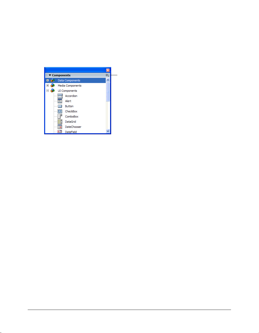
The Components panel
All components in the user-level configuration/Components directory are displayed in the
Components panel. (For more information about this directory, see “Where component files are
stored” on page 13.)
To display the Components panel:
• Select Window > Development Panels > Components.
Components panel menu
To display components that were installed after Flash started up:
1.
Select Window > Development Panels > Components.
2.
Select Reload from the Components panel menu.
Adding components to Flash documents
When you drag a component from the Components panel to the Stage, a compiled clip (SWC)
symbol is added to the Library panel. Once a compiled clip symbol is in the library, you can drag
multiple instances to the Stage. You can also add that component to a document at runtime by
using the
UIObject.createClassObject() ActionScript method.
Adding components during authoring
You can add a component to a document by using the Components panel, and then add
additional instances of the component to the document by dragging the component from the
Library panel to the Stage. You can set properties for additional instances in the Parameters tab of
the Property inspector or in the Parameters tab in the Component inspector.
To add a component to a Flash document by using the Components panel:
1.
Select Window > Development Panels > Components.
2.
Do one of the following:
■ Drag a component from the Components panel to the Stage.
■ Double-click a component in the Components panel.
44 Chapter 3: Working with Components
Page 45

3.
If the component is a FLA (all installed version 2 components are SWC files) and if you have
edited skins for another instance of the same component, or for a component that shares skins
with the component you are adding, do one of the following:
■ Select Don’t Replace Existing Items to preserve the edited skins and apply the edited skins to
the new component.
■ Select Replace Existing Items to replace all the skins with default skins. The new component
and all previous versions of the component, or of components that share its skins, will use
the default skins.
4.
Select the component on the Stage.
5.
Select Window > Properties.
6.
In the Property inspector, enter an instance name for the component instance.
7.
Click the Parameters tab and specify parameters for the instance.
The following illustration shows a the Property inspector for the TextInput component that is
in the TipCalculator.fla sample file (installed at Flash MX 2004/Samples/HelpExamples/
TipCalculator).
For more information, see “Setting component parameters” on page 47.
8.
Change the size of the component as desired.
For more information on sizing specific component types, see the individual component
entries in Chapter 6, “Components Dictionary,” on page 91.
9.
If you want to change the color and text formatting of a component, do one or more of
the following:
■ Set or change a specific style property value for a component instance by using the
setStyle()
UIObject.setStyle() on page 825.
■ Edit multiple properties in the global style declaration assigned to all version 2 components.
■ Create a custom style declaration for specific component instances.
method, which is available to all components. For more information, see
For more information, see “Using styles to customize component color and text”
on page 67.
10.
If you want to customize the appearance of the component, do one of the following:
■ Apply a theme (see “About themes” on page 77).
■ Edit a component’s skins (see “About skinning components” on page 80).
Adding components to Flash documents 45
Page 46

Adding components at runtime with ActionScript
Use the
createClassObject() method (which most components inherit from the UIObject
class) to add components to a Flash application dynamically. For example, you could add
components that create a page layout based on user-set preferences (as on the home page of a
web portal).
Version 2 components that are installed with Flash MX 2004 reside in package directories. (For
more information, see “Using packages” in Using ActionScript in Flash.) If you add a component
to the Stage during authoring, you can refer to the component simply by using its instance name
(for example,
myButton). However, if you add a component to an application with ActionScript
(at runtime), you must either specify its fully qualified class name (for example,
mx.controls.Button) or import the package by using the import statement.
For example, to write ActionScript code that refers to an Alert component, you can use the
import statement to reference the class, as follows:
import mx.controls.Alert;
Alert.show("The connection has failed", "Error");
Alternatively, you can use the full package path, as follows:
mx.controls.Alert.show("The connection has failed", "Error");
For more information, see “Importing classes” in Using ActionScript in Flash.
You can use ActionScript methods to set additional parameters for dynamically added
components. For more information, see Chapter 6, “Components Dictionary,” on page 91.
To add a component to a document at runtime, it must be in the library when the SWF file is
compiled. To add a component to the library, add it to the Stage and delete it.
Note: The instructions in this section assume an intermediate or advanced knowledge
of ActionScript.
To add a component to your Flash document using ActionScript:
1.
Drag a component to the Stage and delete it.
If you do this, you must select the Export in First Frame check box in the Linkage Properties
dialog box of the component in the library.
Note: If a component is set to Export in First Frame, you can’t preload the component.
2.
Select the frame in the Timeline where you want to add the component.
3.
Open the Actions panel if it isn’t already open.
4.
Call createClassObject() to create the component instance at runtime.
This method can be called on its own, or from any component instance. The
createClassObject() method takes the following parameters: a component class name, an
instance name for the new instance, a depth, and an optional initialization object that you can
use to set properties at runtime.
You can specify the class package in the class name parameter, as in this example:
createClassObject(mx.controls.CheckBox, "cb", 5, {label:"Check Me"});
46 Chapter 3: Working with Components
Page 47

Alternatively, you can import the class package, as in this example:
import mx.controls.CheckBox;
createClassObject(CheckBox, "cb", 5, {label:"Check Me"});
For more information, see UIObject.createClassObject() on page 810 and Chapter 4,
“Handling Component Events,” on page 55.
Components in the Library panel
When you add a component to a document, it is displayed as a compiled clip (SWC file) symbol
in the Library panel.
A ComboBox component in the Library panel
You can add more instances of a component by dragging the component icon from the library to
the Stage.
For more information about compiled clips, see “About compiled clips and SWC files”
on page 17.
Setting component parameters
Each component has parameters that you can set to change its appearance and behavior. A
parameter is a property that appears in the Property inspector and Component inspector. The
most commonly used properties appear as authoring parameters; others must be set with
ActionScript. All parameters that can be set during authoring can also be set with ActionScript.
Setting a parameter with ActionScript overrides any value set during authoring.
All version 2 components inherit properties and methods from the UIObject and UIComponent
classes; these are the properties and methods that all components use, such as
UIObject.setSize(), UIObject.setStyle(), UIObject.x, and UIObject.y. Each
component also has unique properties and methods, some of which are available as authoring
parameters. For example, the ProgressBar component has a
(
ProgressBar.percentComplete), and the NumericStepper component has nextValue and
previousValue properties (NumericStepper.nextValue, NumericStepper.previousValue).
percentComplete property
Setting component parameters 47
Page 48
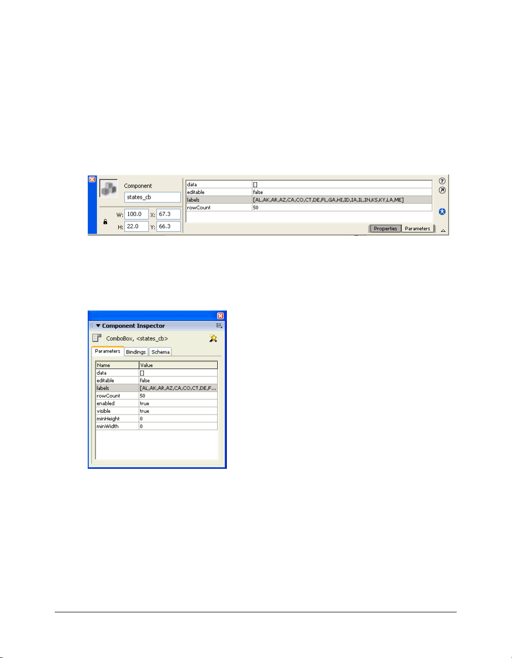
You can set parameters for a component instance using the Component inspector or the Property
inspector (it doesn’t matter which panel you use).
To enter an instance name for a component in the Property inspector:
1.
Select Window > Properties.
2.
Select an instance of a component on the Stage.
3.
Enter an instance name in the text field under the word Component.
It’s a good idea to add a suffix to the instance name that indicates what kind of component it
is; this makes it easier to read your ActionScript code. In this example, the instance name is
states_cb because the component is a combo box that lists the US states.
To enter parameters for a component instance in the Component inspector:
1.
Select Window > Development Panels > Component Inspector.
2.
Select an instance of a component on the Stage.
3.
To enter parameters, click the Parameters tab.
4.
To enter or view bindings or schemas for a component, click their respective tabs. For more
information, see Chapter 14, “Data Integration (Flash Professional Only),” in Using Flash.
48 Chapter 3: Working with Components
Page 49

Sizing components
Use the Free Transform tool or the setSize() method to resize component instances.
Resizing the Menu component on the Stage with the Free Transform tool
You can call the
setSize() method from any component instance (see UIObject.setSize()
on page 823) to resize it. The following code resizes the Menu component to 200 pixels wide and
300 pixels high:
myMenu.setSize(200, 300);
Note: If you use the ActionScript
component, the component is resized but the layout of the content in the component remains the
same. This might cause the component to be distorted in movie playback.
_width and _height properties to adjust the width and height of a
A component does not resize automatically to fit its label. If a component instance that has been
added to a document is not large enough to display its label, the label text is clipped. You must
resize the component to fit its label.
A clipped label for the CheckBox component
For more information about sizing components, see their individual entries in Chapter 6,
“Components Dictionary,” on page 91.
Sizing components 49
Page 50

Deleting components from Flash documents
To delete a component’s instances from a Flash document, you must delete the component from
the library by deleting the compiled clip icon. It isn’t enough to delete the component from the
Stage.
To delete a component from a document:
1.
In the Library panel, select the compiled clip (SWC) symbol.
2.
Click the Delete button at the bottom of the Library panel, or select Delete from the Library
options menu.
3.
In the Delete dialog box, click Delete to confirm the deletion.
Using code hints
When you are using ActionScript 2.0, you can use strict typing for a variable that is based on a
built-in class, including component classes. If you do so, the ActionScript editor displays code
hints for the variable. For example, suppose you type the following:
import mx.controls.CheckBox;
var myCheckBox:CheckBox;
myCheckBox.
As soon as you type the period after myCheckBox, Flash displays a list of methods and properties
available for CheckBox components, because you have designated the variable as type CheckBox.
For more information, see “Strict data typing” and “Using code hints” in Using ActionScript in
Flash.
Creating custom focus navigation
When a user presses the Tab key to navigate in a Flash application or clicks in an application, the
FocusManager class determines which component receives input focus. You don’t need to add a
FocusManager instance to an application or write any code to activate the Focus Manager.
If a RadioButton object receives focus, the Focus Manager examines that object and all objects
with the same
to
true.
Each modal Window component contains an instance of the Focus Manager, so the controls on
that window become their own tab set. This prevents a user from inadvertently navigating to
components in other windows by pressing the Tab key.
To create focus navigation in an application, set the
(including buttons) that should receive focus. When a user presses the Tab key, the FocusManager
class looks for an enabled object whose
tabIndex. Once the FocusManager class reaches the highest tabIndex property, it returns to 0.
For example, in the following code, the
receives focus first, and then the
var comment:mx.controls.TextArea;
var okButton:mx.controls.Button;
50 Chapter 3: Working with Components
groupName value and sets focus on the object with the selected property set
tabIndex property on any components
tabIndex value is greater than the current value of
comment object (probably a TextArea component)
okButton object receives focus:
Page 51

comment.tabIndex = 1;
okButton.tabIndex = 2;
You can also use the Accessibility panel to assign a tab index value.
If nothing on the Stage has a tab index value, the Focus Manager uses the depth levels (z-order).
The depth levels are set up primarily by the order in which components are dragged to the Stage;
however, you can also use the Modify > Arrange > Bring to Front/Send to Back commands to
determine the final z-order.
To give focus to a component in an application, call
focusManager.setFocus().
To create a button that receives focus when a user presses Enter (Windows) or Return
(Macintosh), set the
FocusManager.defaultPushButton property to the instance of the desired
button, as in the following code:
focusManager.defaultPushButton = okButton;
The FocusManager class overrides the default Flash Player focus rectangle and draws a custom
focus rectangle with rounded corners.
For more information about creating a focus scheme in a Flash application, see “FocusManager
class” on page 419.
Managing component depth in a document
If you want to position a component in front of or behind another object in an application, you
must use the DepthManager class. The methods of the DepthManager class allows you to place
user interface components in an appropriate z-order (for example, a combo box drops down in
front of other components, insertion points appear in front of everything, dialog boxes float over
content, and so on).
The Depth Manager has two main purposes: to manage the relative depth assignments within any
document, and to manage reserved depths on the root Timeline for system-level services such as
the cursor and tooltips.
To use the Depth Manager, call its methods (see “DepthManager class” on page 406).
The following code places the component instance
loader.setDepthBelow(button);
loader below the button component:
Managing component depth in a document 51
Page 52

Components in Live Preview
The Live Preview feature, enabled by default, lets you view components on the Stage as they will
appear in the published Flash content; the components appear at their approximate size. The live
preview reflects different parameters for different components. For information about which
component parameters are reflected in the live preview, see each component entry in Chapter 6,
“Components Dictionary,” on page 91.
A Button component with Live Preview enabled
A Button component with Live Preview disabled
Components in Live Preview are not functional. To test component functionality, you can use the
Control > Test Movie command.
To turn Live Preview on or off:
• Select Control > Enable Live Preview. A check mark next to the option indicates that it
is enabled.
About using a preloader with components
Components are set to Export in First Frame by default. This causes the components to
load before the first frame of an application is rendered. If you want to create a preloader for
an application, deselect Export in First Frame for any compiled clip symbols in your library.
Note: If you’re using the ProgressBar component to display loading progress, leave Export in First
Frame selected for the progress bar.
About loading components
If you load version 2 components into a SWF or into the Loader component, the components
may not work correctly. These components include the following: Alert, ComboBox, DateField,
Menu, MenuBar, and Window.
Use the
If you’re using the Loader component, add the following code:
myLoaderComponent.content._lockroot = true;
If you’re using a movie clip with a call to loadMovie(), add the following code:
myMovieClip._lockroot = true;
If you don’t set _lockroot to true in the loader movie, the loader only has access to its own
library, but not the library in the loaded movie.
The
MovieClip._lockroot in Flash ActionScript Language Reference.
52 Chapter 3: Working with Components
_lockroot property when calling loadMovie() or loading into the Loader component.
_lockroot property is supported by Flash Player 7. For information about this property, see
Page 53

Upgrading version 1 components to version 2 architecture
The version 2 components were written to comply with several web standards (regarding events
[www.w3.org/TR/DOM-Level-3-Events/events.html], styles, getter/setter policies, and so on)
and are very different from their version 1 counterparts that were released with Macromedia Flash
MX and in the DRKs that were released before Macromedia Flash MX 2004. Version 2
components have different APIs and were written in ActionScript 2.0. Therefore, using version 1
and version 2 components together in an application can cause unpredictable behavior. For
information about upgrading version 1 components to use version 2 event handling, styles, and
getter/setter access to the properties instead of methods, see Chapter 7, “Creating Components,”
on page 915.
Flash applications that contain version 1 components work properly in Flash Player 6 and Flash
Player 7, when published for Flash Player 6 or Flash Player 6 (6.0.65.0). If you want to update
your applications to work when published for Flash Player 7, you must convert your code to use
strict data typing. For more information, see Chapter 10, “Creating Custom Classes with
ActionScript 2.0,” in Using ActionScript in Flash.
Upgrading version 1 components to version 2 architecture 53
Page 54

54 Chapter 3: Working with Components
Page 55

CHAPTER 4
Handling Component Events
Every component has events that are broadcast when a user interacts with it (for example, the
click and change events) or when something significant happens to the component (for
example, the
event occurs.
Each component broadcasts its own set of events. This set includes the events of any class from
which the component inherits. This means that all components, except the media components,
inherit events from the UIObject and UIComponent classes, because they are the base classes of
the version 2 architecture. To see the list of events a component broadcasts, see the component’s
entry and its ancestor classes’ entries in Chapter 6, “Components Dictionary,” on page 91.
This chapter uses several versions of a simple Macromedia Flash application, TipCalculator, to
teach you how to handle component events. The FLA and SWF files are installed with Flash MX
2004 version 7.2 to the Macromedia/Flash MX 2004/Samples/HelpExamples/TipCalculator
folder.
This chapter contains the following sections:
Using the on() event handler . . . . . . . . . . . . . . . . . . . . . . . . . . . . . . . . . . . . . . . . . . . . . . . . . . 55
Using listeners to handle events . . . . . . . . . . . . . . . . . . . . . . . . . . . . . . . . . . . . . . . . . . . . . . . . 56
Delegating events. . . . . . . . . . . . . . . . . . . . . . . . . . . . . . . . . . . . . . . . . . . . . . . . . . . . . . . . . . . 63
load event). To handle an event, you write ActionScript code that executes when the
About the event object . . . . . . . . . . . . . . . . . . . . . . . . . . . . . . . . . . . . . . . . . . . . . . . . . . . . . . . 66
Using the on() event handler
The easiest, but least powerful, way to handle a component event is to use the on() event handler.
You can assign the
handler to a button or movie clip. For complex applications, it’s best to use event listeners. For
more information, see “Using listeners to handle events” on page 56.
on() event handler to a component instance, just as you would assign a
55
Page 56

The keyword this, used inside an on() handler attached to a component, refers to the
component instance. For example, the following code, attached to the Button component
instance
on(click){
}
To use the on() event handler:
1.
myButton, sends “_level0.myButton” to the Output panel:
trace(this);
Open the file TipCalculator1.fla from Macromedia\Flash MX
2004\Samples\HelpExamples\TipCalculator.
2.
On the Stage, select the TextInput component beside the “Enter subtotal” text.
3.
Open the Actions panel, if it isn’t already open.
4.
Look at the following code assigned to the subtotal_ti TextInput component:
on(change){
this._parent.calculate();
}
This code calls the calculate() function that is defined on Frame 1 of the main Timeline
when the TextInput component changes. The
calculate() function calculates the tip
according to which radio button is selected.
5.
Select each of the radio buttons to see their event handlers.
Each radio button also calls the
6.
Select Control > Test Movie to use the tip calculator.
calculate() function when clicked.
Using listeners to handle events
The version 2 component architecture has a broadcaster/listener event model. (A broadcaster is
sometimes also referred to as a dispatcher.) It is important to understand the following key points
about the model:
• All events are broadcast by an instance of a component class. (The component instance is the
broadcaster.)
• A listener can be a function or an object. If the listener is an object, it must have a callback
function defined on it. The listener handles the event; this means the function, or callback
function, executes when the event occurs.
56 Chapter 4: Handling Component Events
Page 57

• To register a listener to a broadcaster, call the addEventListener() method from the
broadcaster. Use the following syntax:
componentInstance.addEventListener("eventName", listenerObjectORFunction);
• You can register multiple listeners to one component instance.
myButton.addEventListener("click", listener1);
myButton.addEventListener("click", listener2);
• You can register one listener to multiple component instances.
myButton.addEventListener("click", listener1);
myButton2.addEventListener("click", listener1);
• The handler function is passed an event object.
You can use the event object in the body of the function to retrieve information about the
event type, and the instance that broadcast the event. See “About the event object” on page 66.
Using listener objects
To use a listener object, you can either use the
this keyword to specify the current object as the
listener, use an object that already exists in your application, or create a new object.
• Use this in most situations.
It’s often easiest to use the current object (
components that need to react when the event is broadcast.
this) as a listener, because its scope contains the
• Use an existing object if it is convenient.
For example, in a Flash Form Application, you may want to use a form as a listener object if
that form contains the components that react to the event. Place the code on a frame of the
form’s Timeline.
• Use a new listener object if many components are broadcasting an event (for example, the
click event) and you want only certain listener objects to respond.
If you use the
the syntax is as follows:
function eventName(evtObj:Object){
// your code here
};
If you want to use a new listener object, you must create the object, define a property with the
same name as the events, and assign the property to a callback function that executes when the
event is broadcast, as follows:
var listenerObject:Object = new Object();
listenerObject.eventName = function(evtObj:Object){
// your code here
};
If you want to use an existing object, use the same syntax as a new listener object, without
creating the new object, as shown here:
existingObject.eventName = function(evtObj:Object){
this object, define a function with the same name as the event you want to handle;
Using listeners to handle events 57
Page 58

// your code here
};
Tip: The
passed to the callback function. The event object has properties that contain information about the
event. For details, see “About the event object” on page 66.
evtObj parameter is an object that is automatically generated when an event is triggered and
Finally, you call the addEventListener() method from the component instance that broadcasts
the event. The
addEventListener() method takes two parameters: a string indicating the name
of the event and a reference to the listener object.
componentInstance.addEventListener("eventName", listenerObject);
Here is the whole code segment, which you can copy and paste. Be sure to replace any code in
italics with actual values; you can use
but you must change
var listenerObject:Object = new Object();
listenerObject.eventName = function(evtObj:Object){
// code placed here executes
// when the event is triggered
};
componentInstance.addEventListener("eventName", listenerObject);
eventName to the name of the event.
listenerObject and evtObj or any other legal identifiers,
The following code segment uses the this keyword as the listener object:
function eventName(evtObj:Object){
// code placed here executes
// when the event is triggered
}
componentInstance.addEventListener("eventName", this);
You can call addEventListener() from any component instance; it is mixed in to every
component from the EventDispatcher class. (A “mix-in” is a class that provides specific features
that augment the behavior of another class.) For more information, see
EventDispatcher.addEventListener() on page 416.
For information about the events a component broadcasts, see the component’s entry in
Chapter 6, “Components Dictionary,” on page 91. For example, Button component events
are listed in the Button component section (or Help > Using Components > Components
Dictionary > Button component > Button class > Event summary for the Button class).
To register a listener object in a Flash (FLA) file:
1.
In Flash, select File > New and create a new Flash document.
2.
Drag a Button component to the Stage from the Components panel.
3.
In the Property inspector, enter the instance name myButton.
4.
Drag a TextInput component to the Stage from the Components panel.
5.
In the Property inspector, enter the instance name myText.
6.
Select Frame 1 in the Timeline.
7.
Select Window > Development Panels > Actions.
58 Chapter 4: Handling Component Events
Page 59

8.
In the Actions panel, enter the following code:
var myButton:mx.controls.Button;
var myText:mx.controls.TextInput;
function click(evt){
myText.text = evt.target;
}
myButton.addEventListener("click", this);
The target property of the event object, evt, is a reference to the instance broadcasting the
event. This code displays the value of the
To register a listener object in a class (AS) file:
1.
Open the file TipCalculator.fla from the location specified in “Working with Components”
target property in the TextInput component.
on page 43.
2.
Open the file TipCalculator.as from the location specified in “Working with Components”
on page 43.
3.
In the FLA file, select form1 and view the class name, TipCalculator, in the Property inspector.
This is the link between the form and the class file. All the code for this application is in the file
TipCalculator.as. The form assumes the properties and behaviors defined by the class assigned
to it.
4.
In the AS file, scroll to line 25, public function onLoad():Void.
The
onLoad() function executes when the form loads into Flash Player. In the body of the
function, the
percentRadio15, percentRadio18, and percentRadio20, call the addEventListener()
subtotal TextInput instance and the three RadioButton instances,
method to register a listener with an event.
5.
Look at line 27, subtotal.addEventListener("change", this).
When you call
indicating the name of the event that is broadcast—in this case,
addEventListener(), you must pass it two parameters. The first is a string
"change". The second is a
reference to either an object or a function that handles the event. In this case, the parameter is
the keyword
this, which refers to an instance of the class file (an object). Flash then looks on
the object for a function with the name of the event.
6.
Look at line 63, public function change(event:Object):Void.
This is the function that executes when the subtotal TextInput instance changes.
7.
Select the TipCalculator.fla and select Control > Test Movie to test the file.
Using the handleEvent callback function
You can also use listener objects that support a
the event that is broadcast, the listener object’s
if else or a switch statement to handle multiple events. For example, the following code uses
an
if else statement to handle the click and change events:
// define the handleEvent function
// pass it evt as the event object parameter
handleEvent function. Regardless of the name of
handleEvent method is called. You must use an
Using listeners to handle events 59
Page 60

function handleEvent(evt){
// check if the event was a click
if (evt.type == "click"){
// do something if the event was click
} else if (evt.type == "change"){
// do something else if the event was change
}
};
// register the listener object to
// two different component instances
// because the function is defined on
// "this" object, the listener is this.
instance.addEventListener("click", this);
instance2.addEventListener("change", this);
Using listener functions
Unlike the
of having the
the
myList.addEventListener("change", myChangeHandler);
myList.addEventListener("scroll", myScrollHandler);
handleEvent syntax, several listener functions can handle different events. So instead
if and else if checks in myHandler, you can just define myChangeHandler for
change event and myScrollHandler for the scroll event and register them, as shown here:
To use a listener function, you must first define a function:
function myFunction:Function(evtObj:Object){
// your code here
}
Tip: The
passed to the function. The event object has properties that contain information about the event. For
details, see “About the event object” on page 66.
evtObj parameter is an object that is automatically generated when an event is triggered and
Then you call the addEventListener() method from the component instance that broadcasts
the event. The
addEventListener() method takes two parameters: a string indicating the name
of the event and a reference to the function.
componentInstance.addEventListener("eventName", myFunction);
You can call addEventListener() from any component instance; it is mixed in to every
component from the EventDispatcher class. For more information, see
EventDispatcher.addEventListener() on page 416.
For information about the events a component broadcasts, see each component’s entry in
Chapter 6, “Components Dictionary,” on page 91.
To register a listener object in a Flash (FLA) file:
1.
In Flash, select File > New and create a new Flash document.
2.
Drag a List component to the Stage from the Components panel.
3.
In the Property inspector, enter the instance name myList.
60 Chapter 4: Handling Component Events
Page 61

4.
Select Frame 1 in the Timeline.
5.
Select Window > Development Panels > Actions.
6.
In the Actions panel, enter the following code:
// declare variables
var myList:mx.controls.List;
var myHandler:Function;
// add items to the list
myList.addItem("Bird");
myList.addItem("Dog");
myList.addItem("Fish");
myList.addItem("Cat");
myList.addItem("Ape");
myList.addItem("Monkey");
// define myHandler function
function myHandler(eventObj:Object){
// use the eventObj parameter
// to capture the event type
if (eventObj.type == "change"){
trace("The list changed");
} else if (eventObj.type == "scroll"){
trace("The list was scrolled");
}
}
// Register the myHandler function with myList.
// When an item is selected (triggers the change event) or the
// list is scrolled, myHandler executes.
myList.addEventListener("change", myHandler);
myList.addEventListener("scroll", myHandler);
Note: The
type property of the event object, evt, is a reference to the event name.
7.
Select Control > Test Movie; then select an item in the list and scroll the list to see the results
in the Output panel.
Caution: In a listener function, the keyword this refers to the component instance that calls
addEventListener(), not to the Timeline or the class where the function is defined. However, you can
use the Delegate class to delegate the listener function to a different scope. See “Delegating events”
on page 63. To see an example of function scoping, see the next section.
About scope in listeners
Scope refers to the object within which a function executes. Any variable references within that
function are looked up as properties of that object. You can use the Delegate class to specify the
scope of a listener. For more information, see “Delegating events” on page 63.
Using listeners to handle events 61
Page 62

As discussed earlier, you register a listener with a component instance by calling
addEventListener(). This method takes two parameters: a string indicating the name of the
event, and a reference to either an object or a function. The following table lists the scope of each
parameter type:
Listener type Scope
Object Listener object
Function Component instance broadcasting the event
If you pass
addEventListener() an object, the callback function assigned to that object (or the
function defined on that object) is invoked in the scope of the object. This means that the
keyword
var lo:Object = new Object();
lo.click = function(evt){
}
myButton.addEventListener("click", lo);
this, when used inside the callback function, refers to the listener object, as follows:
// this refers to the object lo
trace(this);
However, if you pass addEventListener() a function, the function is invoked in the scope of the
component instance that calls
addEventListener(). This means that the keyword this, when
used inside the function, refers to the broadcasting component instance. This causes a problem if
you’re defining the function in a class file. You cannot access the properties and methods of the
class file with the expected paths because
this doesn’t point to an instance of the class. To work
around this problem, use the Delegate class to delegate a function to the correct scope. See
“Delegating events” on page 63.
The following code illustrates the scoping of a function when passed to
addEventListener() in
a class file. To use this code, copy it into an ActionScript (AS) file named Cart.as. Create a Flash
(FLA) file with a Button component,
both components on the Stage and press F8 to convert them into a new symbol named
the Linkage properties for the Cart symbol, assign it the class
class Cart extends MovieClip {
var myButton:mx.controls.Button;
var myGrid:mx.controls.DataGrid;
myButton, and a DataGrid component, myGrid. Select
Cart. In
Cart.
function myHandler(eventObj:Object){
// Use the eventObj parameter
// to capture the event type.
if (eventObj.type == "click"){
/* Send the value of this to the Output panel.
Because myHandler is a function that is not defined
on a listener object, this is a reference to the
component instance to which myHandler is registered
(myButton). Also, since this doesn't reference an
instance of the Cart class, myGrid is undefined.
*/
62 Chapter 4: Handling Component Events
Page 63

trace("this: " + this);
trace("myGrid: " + myGrid);
}
}
// register the myHandler function with myButton
// when the button is clicked, myHandler executes
function onLoad():Void{
myButton.addEventListener("click", myHandler);
}
}
Delegating events
You c an i mpo rt t he Delegate class into your scripts or classes to delegate events to specific scopes
and functions. Use the following syntax:
import mx.utils.Delegate;
compInstance.addEventListener("eventName", Delegate.create(scopeObject,
function));
The scopeObject parameter specifies the scope in which the specified function parameter is
called.
There are two common uses for calling
Delegate.create():
• To dispatch the same event to two different functions.
See the next section.
• To call functions within the scope of the containing class.
When you pass a function as a parameter to
the scope of the broadcaster component instance, not the object in which it is declared. See
“Delegating the scope of a function” on page 65.
Delegating events to functions
Calling
Delegate.create() is useful if you have two components that broadcast events of the
same name. For example, if you have a check box and a button, you would have to use the
statement on the information you get from the
determine which component is broadcasting the
To use the following code, place a check box named
myButton_btn on the Stage. Select both instances and press F8 to create a new symbol. Click
Advanced, Export for ActionScript, and enter the AS 2.0 class name Cart. You can give the new
symbol any instance name you want in the Property inspector. The symbol is now an instance of
the Cart class.
import mx.utils.Delegate;
import mx.controls.Button;
import mx.controls.CheckBox;
class Cart {
var myCheckBox_chb:CheckBox;
addEventListener(), the function is invoked in
eventObject.target property in order to
click event.
myCheckBox_chb and a button named
switch
Delegating events 63
Page 64

var myButton_btn:Button;
function onLoad() {
myCheckBox_chb.addEventListener("click", this);
myButton_btn.addEventListener("click", this);
}
function click(eventObj:Object) {
switch(eventObj.target) {
case myButton_btn:
// sends the broadcaster instance name
// and the event type to the Output panel
trace(eventObj.target + ": " + eventObj.type);
break;
case myCheckBox_chb:
trace(eventObj.target + ": " + eventObj.type);
break;
}
}
}
The following is the same class file (Cart.as) modified to use Delegate:
import mx.utils.Delegate;
import mx.controls.Button;
import mx.controls.CheckBox;
class Cart {
var myCheckBox_chb:CheckBox;
var myButton_btn:Button;
function onLoad() {
myCheckBox_chb.addEventListener("click", Delegate.create(this,
chb_onClick));
myButton_btn.addEventListener("click", Delegate.create(this,
btn_onClick));
}
// two separate functions handle the events
function chb_onClick(eventObj:Object) {
// sends the broadcaster instance name
// and the event type to the Output panel
trace(eventObj.target + ": " + eventObj.type);
// sends the absolute path of the symbol
// that you associated with the Cart class
// in the FLA file to the Output panel
trace(this)
}
function btn_onClick(eventObj:Object) {
trace(eventObj.target + ": " + eventObj.type);
}
}
64 Chapter 4: Handling Component Events
Page 65

Delegating the scope of a function
The
addEventListener() method requires two parameters: the name of an event and a reference
to a listener. The listener can either be an object or a function. If you pass an object, the callback
function assigned to the object is invoked in the scope of the object. However, if you pass a
function, the function is invoked in the scope of the component instance that calls
addEventListener(). (For more information, see “About scope in listeners” on page 61.)
Because the function is invoked in the scope of the broadcaster instance, the keyword
this in the
body of the function points to the broadcaster instance, not to the class that contains the
function. Therefore, you cannot access the properties and methods of the class that contains the
function. Use the Delegate class to delegate the scope of a function to the containing class so that
you can access the properties and methods of the containing class.
The following example uses the same approach as the previous section with a variation of the
Cart.as class file:
import mx.controls.Button;
import mx.controls.CheckBox;
class Cart {
var myCheckBox_chb:CheckBox;
var myButton_btn:Button;
// define a variable to access
// from the chb_onClick function
var i:Number = 10
function onLoad() {
myCheckBox_chb.addEventListener("click", chb_onClick);
}
function chb_onClick(eventObj:Object) {
// You would expect to be able to access
// the i variable and output 10.
// However, this sends undefined
// to the Output panel because
// the function isn't scoped to
// the Cart instance where i is defined.
trace(i);
}
}
To access the properties and methods of the Cart class, call Delegate.create() as the second
parameter of
import mx.utils.Delegate;
import mx.controls.Button;
import mx.controls.CheckBox;
addEventListener(), as follows:
class Cart {
var myCheckBox_chb:CheckBox;
var myButton_btn:Button;
// define a variable to access
Delegating events 65
Page 66

// from the chb_onClick function
var i:Number = 10
function onLoad() {
myCheckBox_chb.addEventListener("click", Delegate.create(this,
chb_onClick));
}
function chb_onClick(eventObj:Object) {
// Sends 10 to the Output panel
// because the function is scoped to
// the Cart instance
trace(i);
}
}
About the event object
The event object is an instance of the ActionScript Object class; it has the following properties
that contain information about an event.
Property Description
type
target
When an event has additional properties, they are listed in the event’s entry in the Components
Dictionary.
The event object is automatically generated when an event is triggered and passed to the listener
object’s callback function or the listener function.
You can use the event object inside the function to access the name of the event that was
broadcast, or the instance name of the component that broadcast the event. From the instance
name, you can access other component properties. For example, the following code uses the
target property of the evtObj event object to access the label property of the myButton
instance and sends the value to the Output panel:
var myButton:mx.controls.Button;
var listener:Object;
A string indicating the name of the event.
A reference to the component instance broadcasting the event.
listener = new Object();
listener.click = function(evtObj){
trace("The " + evtObj.target.label + " button was clicked");
}
myButton.addEventListener("click", listener);
66 Chapter 4: Handling Component Events
Page 67

CHAPTER 5
Customizing Components
You might want to change the appearance of components as you use them in different
applications. There are three ways to accomplish this in Macromedia Flash MX 2004 and
Macromedia Flash MX Professional 2004:
• Use the setStyle() method of each component and style declaration to change the color and
text formatting of a component. See “Using styles to customize component color and text”
on page 67.
• Apply a theme—a collection of styles and skins that make up a component’s appearance. See
“About themes” on page 77.
• Modify or replace a component’s skins. Skins are symbols used to display components.
Skinning is the process of changing the appearance of a component by modifying or replacing
its source graphics. A skin can be a small piece, like a border’s edge or corner, or a composite
piece like the entire picture of a button in its up state (the state in which it hasn’t been pressed).
A skin can also be a symbol without a graphic, which contains code that draws a piece of the
component. See “About skinning components” on page 80.
Using styles to customize component color and text
Every component instance has style properties (also called styles) and setStyle() and
getStyle() methods that you can use to set and get style property values. The setStyle() and
getStyle() methods are inherited from the UIObject class. (For more information, see
UIObject.setStyle() on page 825 and UIObject.getStyle() on page 814.)
Note: You cannot set styles for the Media components.
The styles used by each component depend partially on what theme the document uses (see
“About themes” on page 77). Some styles, such as
components regardless of the theme applied to the document. Other styles, such as
and
symbolBackgroundColor, are used only by components if the corresponding theme is in use.
For example,
is used only if the Sample theme is in use.
themeColor is used only if the Halo theme is in use, and symbolBackgroundColor
defaultIcon, are used by the associated
themeColor
67
Page 68

You can use styles to customize a component in the following ways:
• Set styles on a component instance.
You can change color and text properties of a single component instance. This is effective in
some situations, but it can be time consuming if you need to set individual properties on all
the components in a document.
See “Setting styles on a component instance” on page 69.
• Create custom style declarations and apply them to several component instances.
You may want to have groups of components in a document share a style. To do this, you can
create custom style declarations to apply to the components you specify.
See “Setting custom styles for groups of components” on page 69.
• Create default class style declarations.
You can define a default class style declaration so that every instance of a class shares a default
appearance.
See “Setting styles for a component class” on page 71.
• Use inheriting styles to set styles for components in a portion of a document.
The values of style properties set on containers are inherited by contained components.
See “Setting inheriting styles on a container” on page 71.
• Use the global style declaration that sets styles for all components in a document.
If you want to apply a consistent look to an entire document, you can create styles on the
global style declaration.
See “Setting global styles” on page 73.
Flash does not display changes made to style properties when you view components on the Stage
using the Live Preview feature. For more information, see “Components in Live Preview”
on page 52.
Supported styles
Flash MX 2004 and Flash MX Professional 2004 provide many styles for customizing component
color, text, and behavior. The set of styles used depends on each component and the theme
applied to the document. For a list of styles supported by each component, see Chapter 6,
“Components Dictionary,” on page 91.
Flash provides two visual themes for components: Halo (HaloTheme.fla) and Sample
(SampleTheme.fla). A theme is a set of styles and graphics that controls the appearance of
components in a document. Each theme provides additional styles to the components. To know
what style properties you can set for a component, you must know what theme is assigned to that
component. The style tables for each component in the Components Dictionary indicate
whether each style property applies to one or both of the supplied themes. (For more information,
see “About themes” on page 77.)
68 Chapter 5: Customizing Components
Page 69

Setting styles on a component instance
You can write ActionScript code to set and get style properties on any component instance.
The
UIObject.setStyle() and UIObject.getStyle() methods can be called directly from
any component. The following syntax specifies a property and value for a component instance:
instanceName.setStyle("propertyName", value);
For example, the following code sets the accent colors on a Button instance called myButton that
uses the Halo theme:
myButton.setStyle("themeColor", "haloBlue");
Note: If the value is a string, it must be enclosed in quotation marks.
Even though you can access the styles directly as properties (for example, myButton.color =
0xFF00FF
), it’s best to use the setStyle() and getStyle() methods so that the styles work
correctly and components are redrawn with the new style settings. For more information, see
UIObject.setStyle() on page 825.
Style properties set on a component instance through
setStyle() have the highest priority and
override all other style settings discussed in the following sections.
Note: If you want to change multiple properties, or change properties for multiple component
instances, you should create a custom style. For more information, see “Setting custom styles for
groups of components” on page 69.
To set or change a property for a single component instance that uses the Halo theme:
1.
Select the component instance on the Stage.
2.
In the Property inspector, give it the instance name myComponent.
3.
Open the Actions panel and select Scene 1, then select Layer 1: Frame 1.
4.
Enter the following code to change the instance to orange:
myComponent.setStyle("themeColor", "haloOrange");
5.
Select Control > Test Movie to view the changes.
For a list of styles supported by a particular component, see the component’s entry in
Chapter 6, “Components Dictionary,” on page 91.
Setting custom styles for groups of components
You can create custom style declarations to specify a unique set of properties for groups of
components in your Flash document. You create a new instance of the CSSStyleDeclaration
object, create a custom style name and place it on the
(
_global.styles.newStyle), specify the properties and values for the style, and assign the style
_global.styles list
name to component instances that should share the same look.
To make changes to a custom style format, use the following syntax:
_global.styles.CustomStyleName.setStyle(propertyName, propertyValue);
The CSSStyleDeclaration object is accessible if you have placed at least one component instance
on the Stage.
Using styles to customize component color and text 69
Page 70

Custom style settings have priority over class, inherited, and global style settings.
For a list of the styles that each component supports, see the component entries in Chapter 6,
“Components Dictionary,” on page 91.
To create a custom style declaration for a group of components:
1.
Make sure the document contains at least one component instance.
For more information, see “Adding components to Flash documents” on page 44.
This example uses three button components with the instance names
a, b, and c. If you use
different components, give them instance names in the Property inspector and use those
instance names in step 9.
2.
Create a new layer in the Timeline and give it a name.
3.
Select a frame in the new layer on which (or before which) the component appears.
4.
Open the Actions panel.
5.
Use the following syntax to create an instance of the CSSStyleDeclaration object to define the
new custom style format:
var styleObj = new mx.styles.CSSStyleDeclaration();
6.
Set the styleName property of the style declaration to name the style:
styleObj.styleName = "newStyle";
7.
Place the style on the _global.styles list:
_global.styles.newStyle = styleObj;
You can also create a CSSStyleDeclaration object and assign it to a new style declaration by
using the following syntax:
var styleObj = _global.styles.newStyle = new
mx.styles.CSSStyleDeclaration();
8.
Use the following syntax to specify the properties you want to define for the newStyle
style declaration:
styleObj.setStyle("fontFamily”, "_sans");
styleObj.setStyle("fontSize”, 14);
styleObj.setStyle("fontWeight”, "bold");
styleObj.setStyle("textDecoration”, "underline");
styleObj.setStyle("color”, 0x336699);
styleObj.setStyle("themeColor", "haloBlue");
9.
In the same Script pane, use the following syntax to set the styleName property of three specific
components to the custom style declaration:
a.setStyle("styleName", "newStyle");
b.setStyle("styleName", "newStyle");
c.setStyle("styleName", "newStyle");
Now you can access styles on the custom style declaration using the setStyle() and getStyle()
methods through its global
style on the
_global.styles.newStyle.setStyle("themeColor", "haloOrange");
newStyle style declaration:
styleName property. The following code sets the backgroundColor
70 Chapter 5: Customizing Components
Page 71

Another option in setting custom style declarations is you can assign the CSSStyleDeclaration
instance directly to the component instance’s
declaration in
_global.styles. To use this approach, modify the above procedure as follows:
styleName property and bypass storing the
• Remove the ActionScript from steps 6 and 7 above.
• Modify the ActionScript in step 9 to assign the CSSStyleDeclaration instance directly to the
component instances:
a.setStyle("styleName", styleObj);
b.setStyle("styleName", styleObj);
c.setStyle("styleName", styleObj);
Setting styles for a component class
You can define a class style declaration for any class of component (Button, CheckBox, and so on)
that sets default styles for each instance of that class. You must create the style declaration before
you create the instances. Some components, such as TextArea and TextInput, have class style
declarations predefined by default because their
must be customized.
Caution: If you replace a class style sheet, make sure to add any styles that you want from the old
style sheet; otherwise, they will be overwritten.
The following code creates a class style declaration for CheckBox and sets the color for all check
box instances to blue:
if (_global.styles.CheckBox == undefined) {
_global.styles.CheckBox = new mx.styles.CSSStyleDeclaration();
}
_global.styles.CheckBox.setStyle(“color”, 0x0000FF);
Custom style settings have priority over inherited and global style settings.
borderStyle and backgroundColor properties
Setting inheriting styles on a container
An inheriting style is a style that inherits its value from parent components in the document’s
MovieClip hierarchy. If a text or color style is not set at an instance, custom, or class level, Flash
searches the MovieClip hierarchy for the style value. Thus, if you set styles on a container
component, the contained components inherit these style settings.
The following styles are inheriting styles:
• fontFamily
• fontSize
• fontStyle
• fontWeight
• textAlign
• textIndent
• All single-value color styles (for example, themeColor is an inheriting style, but
alternatingRowColors is not)
Using styles to customize component color and text 71
Page 72

The Style Manager tells Flash whether a style inherits its value. Additional styles can also be added
at runtime as inheriting styles. For more information, see “StyleManager class” on page 721.
Note: The CSS inherit value is not supported.
Inherited styles take priority over global styles.
The following example demonstrates how inheriting styles can be used with an Accordion
component, which is available with Flash MX Professional. (The inheriting styles feature is
supported by both Flash MX and Flash MX Professional.)
To create an Accordion component with styles that are inherited by the components in the
individual Accordion panes:
1.
Open a new FLA file.
2.
Drag an Accordion component from the Components panel to the Stage.
3.
Use the Property inspector to name and size the Accordion component. For this example, give
the component the instance name accordion.
4.
Drag a TextInput component and a Button component from the Components panel to the
Stage. Select the instances on the Stage and delete them.
By dragging the components to the Stage and immediately deleting them, you add the
components to the library and make them available to your document at runtime.
5.
Add the following ActionScript to the frame:
var section1 = accordion.createChild(mx.core.View, "section1", {label:
"First Section"});
var section2 = accordion.createChild(mx.core.View, "section2", {label:
"Second Section"});
var input1 = section1.createChild(mx.controls.TextInput, "input1");
var button1 = section1.createChild(mx.controls.Button, "button1");
input1.text = "Text Input";
button1.label = "Button";
button1.move(0, input1.height + 10);
var input2 = section2.createChild(mx.controls.TextInput, "input2");
var button2 = section2.createChild(mx.controls.Button, "button2");
input2.text = "Text Input";
button2.label = "Button";
button2.move(0, input2.height + 10);
The above code adds two children to the Accordion component and loads each with a
TextInput and Button control, which this example uses to demonstrate style inheritance.
6.
Select Control > Test Movie to see the document before adding style inheritance.
7.
Add the following ActionScript to the end of the frame:
accordion.setStyle("fontStyle", "italic");
8.
Select Control > Test Movie to see the changes.
72 Chapter 5: Customizing Components
Page 73

Notice that the fontStyle setting on the Accordion component affects not only the Accordion
text itself but also the text associated with the TextInput and Button components inside the
Accordion component.
Setting global styles
The global style declaration is assigned to all Flash components built with version 2 of the
Macromedia Component Architecture. The _global object has a
(
_global.style) that is an instance of CSSStyleDeclaration. This property acts as the global
style property
style declaration. If you change a property’s value on the global style declaration, the change is
applied to all components in your Flash document.
Caution: Some styles are set on a component class’s CSSStyleDeclaration instance (for example,
the
backgroundColor style of the TextArea and TextInput components). Because the class style
declaration takes precedence over the global style declaration when style values are determined,
setting
backgroundColor on the global style declaration would have no effect on TextArea and
TextInput components. For more information, see “Using global, custom, and class styles in the same
document” on page 73.
To change one or more properties in the global style declaration:
1.
Make sure the document contains at least one component instance.
For more information, see “Adding components to Flash documents” on page 44.
2.
Select a frame in the Timeline on which (or before which) the components appear.
3.
In the Actions panel, use code like the following to change properties on the global style
declaration. You need to list only the properties whose values you want to change, as shown
here:
_global.style.setStyle("color", 0xCC6699);
_global.style.setStyle("themeColor", "haloBlue")
_global.style.setStyle("fontSize",16);
_global.style.setStyle("fontFamily" , "_serif");
4.
Select Control > Test Movie to see the changes.
Using global, custom, and class styles in the same document
If you define a style in only one place in a document, Flash uses that definition when it needs to
know a property’s value. However, one Flash document can have a variety of style settings—style
properties set directly on component instances, custom style declarations, default class style
declarations, inheriting styles, and a global style declaration. In such a situation, Flash determines
the value of a property by looking for its definition in all these places in a specific order.
Flash looks for styles in the following order until a value is found:
1.
Flash looks for a style property on the component instance.
2.
Flash looks at the styleName property of the instance to see if a custom style declaration is
assigned to it.
3.
Flash looks for the property on a default class style declaration.
Using styles to customize component color and text 73
Page 74

4.
If the style is one of the inheriting styles, Flash looks through the parent hierarchy for an
inherited value.
5.
Flash looks for the style in the global style declaration.
6.
If the property is still not defined, the property has the value undefined.
About color style properties
Color style properties behave differently than noncolor properties. All color properties have a
name that ends in “Color”—for example,
backgroundColor, disabledColor, and color. When
color style properties are changed, the color is immediately changed on the instance and in all of
the appropriate child instances. All other style property changes simply mark the object as
needing to be redrawn, and changes don’t occur until the next frame.
The value of a color style property can be a number, a string, or an object. If it is a number, it
represents the RGB value of the color as a hexadecimal number (0xRRGGBB). If the value is a
string, it must be a color name.
Color names are strings that map to commonly used colors. You can add new color names by
using the Style Manager (see “StyleManager class” on page 721). The following table lists the
default color names:
Color name Value
black 0x000000
white 0xFFFFFF
red 0xFF0000
green 0x00FF00
blue 0x0000FF
magenta 0xFF00FF
yellow 0xFFFF00
cyan 0x00FFFF
haloGreen 0x80FF4D
haloBlue 0x2BF5F5
haloOrange 0xFFC200
Note: If the color name is not defined, the component may not draw correctly.
You can use any valid ActionScript identifier to create your own color names (for example,
"WindowText" or "ButtonText"). Use the Style Manager to define new colors, as shown here:
mx.styles.StyleManager.registerColorName("special_blue", 0x0066ff);
Most components cannot handle an object as a color style property value. However, certain
components can handle color objects that represent gradients or other color combinations. For
more information, see the “Using styles” section of each component’s entry in Chapter 6,
“Components Dictionary.”
74 Chapter 5: Customizing Components
Page 75

You can use class style declarations and color names to easily control the colors of text and
symbols on the screen. For example, if you want to provide a display configuration screen that
looks like Microsoft Windows, you would define color names like ButtonText and WindowText
and class style declarations like Button, CheckBox, and Window.
Note: Some components provide style properties that are an array of colors, such as
alternatingRowColors. You must set these styles only as an array of numeric RGB values, not color
names.
Customizing component animations
Several components, such as the Accordion, ComboBox, and Tree components, provide
animation to demonstrate the transition between component states—for example, when
switching between Accordion children, expanding the ComboBox drop-down list, and expanding
or collapsing Tree folders. Additionally, components provide animation related to the selection
and deselection of an item, such as rows in a list.
You can control aspects of these animations through the following styles:
Animation style Description
openDuration
openEasing
popupDuration
selectionDuration
selectionEasing
The duration of the transition for open easing in Accordion, ComboBox,
and Tree components, in milliseconds. The default value is 250.
A reference to a tweening function that controls the state animation in the
Accordion, ComboBox, and Tree components. The default equation uses
a sine in/out formula.
The duration of the transition as a menu opens in the Menu component, in
milliseconds. The default value is 150. Note, however, that the animation
always uses the default sine in/out equation.
The duration of the transition in ComboBox, DataGrid, List, and Tree
components from a normal to selected state or back from selected to
normal, in milliseconds. The default value is 200.
A reference to a tweening function that controls the selection animation in
ComboBox, DataGrid, List, and Tree components. This style applies only
for the transition from a normal to a selected state. The default equation
uses a sine in/out formula.
The mx.transtions.easing package provides six classes to control easing:
Easing class Description
Back
Bounce
Elastic
Extends beyond the transition range at one or both ends one time to
provide a slight overflow effect.
Provides a bouncing effect entirely within the transition range at one or
both ends. The number of bounces is related to the duration: longer
durations produce more bounces.
Provides an elastic effect that falls outside the transition range at one or
both ends. The amount of elasticity is unaffected by the duration.
Using styles to customize component color and text 75
Page 76

Easing class Description
None
Regular
Strong
Provides an equal movement from start to end with no effects, slowing, or
speeding. This transition is also commonly referred to as a linear transition.
Provides for slower movement at one or both ends for a speeding-up
effect, a slowing-down effect, or both.
Provides for much slower movement at one or both ends. This effect is
similar to Regular but is more pronounced.
Each of the classes in the mx.transitions.easing package provides the following three easing
methods:
Easing method Description
easeIn
easeOut
easeInOut
Provides the easing effect at the beginning of the transition.
Provides the easing effect at the end of the transition.
Provides the easing effect at the beginning and end of the transition.
Because the easing methods are static methods of the easing classes, you never need to instantiate
the easing classes. The methods are used in calls to
import mx.transitions.easing.*;
trace("_global.styles.Accordion = " + _global.styles.Accordion);
_global.styles.Accordion.setStyle("openDuration", 1500);
_global.styles.Accordion.setStyle("openEasing", Bounce.easeOut);
Note: The default equation used by all transitions is not available in the easing classes listed above.
To specify that a component should use the default easing method after another easing method has
been specified, call
setStyle("openEasing", null).
setStyle(), as in the following example.
Getting style property values
To retrieve a style property value, use
UIObject.getStyle(). Every component that is a subclass
of UIObject (which includes all version 2 components except the Media components) inherits the
getStyle() method. This means you can call getStyle() from any component instance, just as
you can call
The following code gets the value of the
var myCheckBox:mx.controls.CheckBox;
var oldFontSize:Number
oldFontSize = myCheckBox.getStyle("fontSize");
trace(oldFontSize);
76 Chapter 5: Customizing Components
setStyle() from any component instance.
themeColor style and assigns it to the variable oldStyle:
Page 77

About themes
Themes are collections of styles and skins. The default theme for Flash MX 2004 and Flash MX
Professional 2004 is called Halo (HaloTheme.fla). The Halo theme lets you provide a responsive,
expressive experience for your users. Flash MX 2004 and Flash MX Professional 2004 include one
additional theme, Sample (SampleTheme.fla). The Sample theme provides an example of how
you can use more styles for customization. (The Halo theme does not use all styles included in the
Sample theme.) The theme files are located in the following folders in a default installation:
• Windows: \Program Files\Macromedia\Flash MX 2004\language\
Configuration\ComponentFLA\
• Macintosh: HD/Applications/Macromedia Flash MX 2004/Configuration/ComponentFLA/
You can create new themes and apply them to an application to change the look and feel
of all the components. For example, you could create themes that mimic the native operating
system appearance.
Components use skins (graphic or movie clip symbols) to display their appearances. The AS file
that defines each component contains code that loads specific skins for the component. You can
easily create a new theme by making a copy of the Halo or Sample theme and altering the
graphics in the skins.
A theme can also contain a new set of style default values. You must write ActionScript code to
create a global style declaration and any additional style declarations. For more information, see
“Modifying default style property values in a theme” on page 78.
Creating a new theme
If you don’t want to use the Halo theme or the Sample theme, you can modify one of them to
create a new theme.
Some skins in the themes have a fixed size. You can make them larger or smaller and the
components will automatically resize to match them. Other skins are composed of multiple
pieces, some static and some that stretch.
Some skins (for example, RectBorder and ButtonSkin) use the ActionScript drawing API to draw
their graphics, because it is more efficient in terms of size and performance. You can use the
ActionScript code in those skins as a template to adjust the skins to your needs.
For a list of the skins supported by each component and their properties, see Chapter 6,
“Components Dictionary,” on page 91.
To create a new theme:
1.
Select the theme FLA file that you want to use as a template, and make a copy.
Give the copy a unique name such as MyTheme.fla.
2.
Select File > Open MyTheme.fla in Flash.
3.
Select Window > Library to open the library if it isn’t open already.
About themes 77
Page 78

4.
Double-click any skin symbol you want to modify to open it in symbol-editing mode.
The skins are located in the Flash UI Components 2/Themes/MMDefault/Component Assets
folder (this example uses RadioButton Assets).
5.
Modify the symbol or delete the graphics and create new graphics.
You may need to select View > Zoom In to increase the magnification. When you edit a skin,
you must maintain the registration point in order for the skin to be displayed correctly. The
upper left corner of all edited symbols must be at (0,0).
For example, open the States/RadioFalseDisabled asset and change the inner circle to a light
gray.
6.
When you finish editing the skin symbol, click the Back button at the left side of the
information bar at the top of the Stage to return to document-editing mode.
7.
Repeat steps 4-6 until you’ve edited all the skins you want to change.
8.
Apply MyTheme.fla to a document by following the steps shown later in this chapter. (See
“Applying a theme to a document” on page 79.)
Modifying default style property values in a theme
The default style property values are provided by each theme in a class named Default. To change
the defaults for a custom theme, create a new ActionScript class called Default in a package
appropriate for your theme, and change the default settings as desired.
To modify default style values in a theme:
1.
Create a new folder for your theme in First Run/Classes/mx/skins.
For example, create a folder called myTheme.
2.
Copy an existing Defaults class to your new theme folder.
For example, copy mx/skins/halo/Defaults.as to mx/skins/myTheme/Defaults.as.
3.
Open the new Defaults class in an ActionScript editor.
Flash MX 2004 Professional users can open the file within Flash MX 2004 Professional. Flash
MX 2004 users can open the file in Notepad in Windows or SimpleText on the Macintosh.
4.
Modify the class declaration to reflect the new package.
For example, our new class declaration is
5.
Modify the style settings as desired.
class mx.skins.myTheme.Defaults.
For example, change the default disabled color to a dark red.
o.disabledColor = 0x663333;
6.
Save the changed Defaults class file.
7.
Copy an existing FocusRect class from the source theme to your custom theme.
For example, copy mx/skins/halo/FocusRect.as to mx/skins/myTheme/FocusRect.as.
8.
Open the new FocusRect class in an ActionScript editor.
78 Chapter 5: Customizing Components
Page 79

9.
Modify all references to the source theme’s package to the new theme’s package.
For example, change all occurrences of “halo” to “myTheme”.
10.
Save the changed FocusRect class file.
11.
Open the FLA file for your custom theme.
This example uses MyTheme.fla.
12.
Open the library (Window > Library) and locate the Defaults symbol.
In this example, it’s in Flash UI Components 2/Themes/MMDefault/Defaults.
13.
Edit the symbol properties for the Default symbol.
14.
Change the AS 2.0 Class setting to reflect your new package.
The example class is mx.skins.myTheme.Defaults.
15.
Click OK.
16.
Locate the FocusRect symbol.
In this example, it’s in Flash UI Components 2/Themes/MMDefault/FocusRect.
17.
Edit the symbol properties for the FocusRect symbol.
18.
Change the AS 2.0 Class setting to reflect your new package.
The example class is mx.skins.myTheme.FocusRect.
19.
Click OK.
20.
Apply the custom theme to a document by following the steps in the next section.
Remember to include the Defaults and FocusRect symbols when dragging assets from your
custom theme to the target document.
In this example you used a new theme to customize the text color of disabled components. This
particular customization, changing a single default style property value, would have been
accomplished more easily through styling as explained in “Using styles to customize component
color and text” on page 67. Using a new theme to customize defaults is appropriate when
customizing many style properties or when already creating a new theme to customize component
graphics.
Applying a theme to a document
To apply a new theme to a document, open a theme FLA file as an external library, and drag the
theme folder from the external library to the document library. The following steps explain the
process in detail.
To apply a theme to a document:
1.
Select File > Open and open the document that uses version 2 components in Flash, or select
File > New and create a new document that uses version 2 components.
2.
Select File > Save and choose a unique name such as ThemeApply.fla.
About themes 79
Page 80

3.
Select File > Import > Open External Library, and select the FLA file of the theme you want to
apply to your document.
If you haven’t created a new theme, you can use the Sample theme.
4.
In the theme’s Library panel, select Flash UI Components 2/Themes/MMDefault and drag the
Assets folder of any components in your document to the ThemeApply.fla library.
For example, drag the RadioButton Assets folder to the ThemeApply.fla library.
If you’re unsure about which components are in the document, drag the Sample Theme movie
clip to the Stage. The skins are automatically assigned to components in the document.
Note: The Live Preview of the components on the Stage will not reflect the new theme.
5.
If you dragged individual component Assets folders to the ThemeApply.fla library, make sure
the Assets symbol for each component is set to Export in First Frame.
For example, the Assets folder for the RadioButton component is called RadioButton Assets; it
has a symbol called RadioButtonAssets, which contains all of the individual asset symbols. If
you set Export in First Frame on the RadioButtonAssets symbol, all individual asset symbols
will also export in the first frame.
6.
Select Control > Test Movie to see the document with the new theme applied.
In this example, make sure you have a RadioButton instance on the Stage and set its
property to
false in the Actions panel in order to see the new disabled RadioButton
appearance.
About skinning components
enabled
Skins are movie clip symbols a component uses to display its appearance. Most skins contain
shapes that represent the component’s appearance. Some skins contain only ActionScript code
that draws the component in the document.
Version 2 components are compiled clips—you cannot see their assets in the library. However, the
Flash installation includes FLA files that contain all the component skins. These FLA files are
called themes. Each theme has a different appearance and behavior, but contains skins with the
same symbol names and linkage identifiers. This lets you drag a theme onto the Stage in a
document to change its appearance. You also use the theme FLA files to edit component skins.
The skins are located in the Themes folder in the Library panel of each theme FLA file. (For more
information about themes, see “About themes” on page 77.)
Each component is composed of many skins. For example, the down arrow of the ScrollBar
subcomponent consists of four skins: ScrollDownArrowDisabled, ScrollDownArrowDown,
ScrollDownArrowOver, and ScrollDownArrowUp. The entire ScrollBar uses 13 different skin
symbols.
Some components share skins; for example, components that use scroll bars—such as
ComboBox, List, and ScrollPane—share the skins in the ScrollBar Skins folder. You can edit
existing skins and create new skins to change the appearance of components.
80 Chapter 5: Customizing Components
Page 81

The AS file that defines each component class contains code that loads specific skins for the
component. Each component skin corresponds to a skin property that is assigned to a skin
symbol’s linkage identifier. For example, the pressed (down) state of the down arrow of the
ScrollBar component has the skin property name
downArrowDownName property is "ScrollDownArrowDown", which is the linkage identifier of the
skin symbol in the theme FLA file. You can edit existing skins and apply them to all components
that use the skin by editing the skin symbol and leaving the existing linkage identifier. You can
create new skins and apply them to specific component instances by setting the skin properties for
a component instance. You do not need to edit the component’s AS file to change its skin
properties; you can pass skin property values to the component’s constructor function when the
component is created in your document.
The skin properties for each component are listed in each component’s entry in the Components
Dictionary. For example, the skin properties for the Button component are located here:
Components Dictionary > Button component > Customizing the Button component > Using
skins with the Button component.
Choose one of the following ways to skin a component according to what you want to do. These
approaches are listed from easiest to most difficult.
downArrowDownName. The default value of the
• To change the skins associated with all instances of a particular component in a single
document, copy and modify individual skin elements. (See “Editing component skins in a
document” on page 81).
This method of skinning is recommended for beginners, because it doesn’t require
any scripting.
• To replace all the skins in a document with a new set (with each kind of component sharing
the same appearance), apply a theme. (See “About themes” on page 77.)
This method of skinning is recommended for applying a consistent look and feel across all
components and across several documents.
• To link the color of a skin element to a style property, add ActionScript code to the skin to
register it as a colored skin element. (See “Linking skin color to styles” on page 83).
• To use different skins for multiple instances of the same component, create new skins and set
skin properties. (See “Creating new component skins” on page 83 and “Applying new skins to
a component” on page 85.)
• To change skins in a subcomponent (such as a scroll bar in a List component), subclass the
component. (See “Applying new skins to a subcomponent” on page 86.)
• To change skins of a subcomponent that aren’t directly accessible from the main component
(such as a List component in a ComboBox component), replace skin properties in the
prototype. (See “Changing skin properties in the prototype” on page 89.)
Editing component skins in a document
To edit the skins associated with all instances of a particular component in a single document,
copy the skin symbols from the theme to the document and edit the graphics as desired.
About skinning components 81
Page 82

The procedure described below is very similar to creating and applying a new theme (see “About
themes” on page 77). The primary difference is that this procedure describes copying symbols
directly from the theme already in use to a single document and editing only a small number of all
skins available. This is appropriate when your modifications are all in a single document and
when you are modifying skins for only a few components. If the edited skins will be shared in
multiple documents or encompass changes in several components, you may find it maintenance
to be easier if you create a new theme.
To edit component skins in a document:
1.
If you already applied the Sample theme to a document, skip to step 5.
2.
Select File > Import > Open External Library, and select the HaloTheme.fla file.
This file is located in the application-level configuration folder. For the exact location on your
operating system, see “About themes” on page 77.
3.
In the theme’s Library panel, select Flash UI Components 2/Themes/MMDefault and drag the
Assets folder of any components in your document to the library for your document.
For example, drag the RadioButton Assets folder to the ThemeApply.fla library.
4.
If you dragged individual component Assets folders to the library, make sure the Assets symbol
for each component is set to Export in First Frame.
For example, the Assets folder for the RadioButton component is called RadioButton Assets; it
has a symbol called RadioButtonAssets, which contains all of the individual asset symbols. If
you set Export in First Frame on the RadioButtonAssets symbol, all individual asset symbols
will also export in the first frame.
5.
Double-click any skin symbol you want to modify to open it in symbol-editing mode.
For example, open the States/RadioFalseDisabled symbol.
6.
Modify the symbol or delete the graphics and create new graphics.
You may need to select View > Zoom In to increase the magnification. When you edit a skin,
you must maintain the registration point in order for the skin to be displayed correctly. The
upper left corner of all edited symbols must be at (0,0).
For example, change the inner circle to a light gray.
7.
When you finish editing the skin symbol, click the Back button at the left side of the
information bar at the top of the Stage to return to document-editing mode.
8.
Repeat steps 5-7 until you’ve edited all the skins you want to change.
Note: The live preview of the components on the Stage will not reflect the edited skins.
9.
Select Control > Test Movie.
In this example, make sure you have a RadioButton instance on the Stage and set its
property to
false in the Actions panel in order to see the new disabled RadioButton
appearance.
82 Chapter 5: Customizing Components
enabled
Page 83

Creating new component skins
If you want to use a particular skin for one instance of a component, but another skin for another
instance of the component, you must open a theme FLA file and create a new skin symbol.
Components are designed to make it easy to use different skins for different instances.
To create a new skin:
1.
Select File > Open and open the theme FLA file that you want to use as a template.
2.
Select File > Save As and select a unique name, such as MyTheme.fla.
3.
Select the skins that you want to edit (in this example, RadioTrueUp).
The skins are located in the Themes/MMDefault/Component Assets folder (in this example,
Themes/MMDefault/RadioButton Assets/States).
4.
Select Duplicate from the Library options menu (or by right-clicking the symbol), and give the
symbol a unique name, such as MyRadioTrueUp.
5.
Click Advanced in the Symbol Properties dialog box, and select Export for ActionScript.
A linkage identifier that matches the symbol name is entered automatically.
6.
Double-click the new skin in the library to open it in symbol-editing mode.
7.
Modify the movie clip, or delete it and create a new one.
You may need to select View > Zoom In to increase the magnification. When you edit a skin,
you must maintain the registration point in order for the skin to be displayed correctly. The
upper left corner of all edited symbols must be at (0,0).
8.
When you finish editing the skin symbol, click the Back button at the left side of the
information bar at the top of the Stage to return to document-editing mode.
9.
Select File > Save but don’t close MyTheme.fla. Now you must create a new document in which
to apply the edited skin to a component.
For more information, see “Applying new skins to a component” on page 85, “Applying new
skins to a subcomponent” on page 86, or “Changing skin properties in the prototype”
on page 89.
Note: Flash does not display changes made to component skins when you view components on the
Stage using Live Preview.
Linking skin color to styles
The version 2 component framework makes it easy to link a visual asset in a skin element to a
style set on the component using the skin. To register a movie clip instance to a style, or an entire
skin element to a style, add ActionScript code in the Timeline of the skin to call
mx.skins.ColoredSkinElement.setColorStyle(targetMovieClip, styleName).
About skinning components 83
Page 84

To link a skin to a style property:
1.
If you already applied the Sample theme to a document, skip to step 5.
2.
Select File > Import > Open External Library, and select the HaloTheme.fla file.
This file is located in the application-level configuration folder. For the exact location on your
operating system, see “About themes” on page 77.
3.
In the theme’s Library panel, select Flash UI Components 2/Themes/MMDefault, and drag the
Assets folder of any components in your document to the library for your document.
For example, drag the RadioButton Assets folder to the target library.
4.
If you dragged individual component assets folders to the library, make sure the Assets symbol
for each component is set to Export in First Frame.
For example, the Assets folder for the RadioButton component is called RadioButton Assets; it
has a symbol called RadioButtonAssets, which contains all of the individual asset symbols. If
you set Export in First Frame on the RadioButtonAssets symbol, all individual asset symbols
will also export in the first frame.
5.
Double-click any skin symbol you want to modify to open it in symbol-editing mode.
For example, open the States/RadioFalseDisabled symbol.
6.
If the element to be colored is a graphic symbol and not a movie clip instance, use Modify >
Convert to Symbol to covert it to a movie clip instance.
For this example, change the center graphic, which is an instance of the graphic symbol
RadioShape1, to a movie clip symbol; then name it Inner Circle. You do not need to select
Export for ActionScript.
It would be good practice, but it is not required, to move the newly created movie clip symbol
to the Elements folder of the component assets being edited.
7.
If you converted a graphic symbol to a movie clip instance in the previous step, give that
instance a name so it can be targeted in ActionScript.
For this example, name the instance innerCircle.
8.
Add ActionScript code to register the skin element or a movie clip instance it contains as a
colored skin element.
For example, add the following code to the skin element’s Timeline.
mx.skins.ColoredSkinElement.setColorStyle(innerCircle,
"symbolBackgroundDisabledColor");
In this example you’re using a color that already corresponds to an existing style name in the
Sample style. Wherever possible, it’s best to use style names corresponding to official Cascading
Style Sheet standards or styles provided by the Halo and Sample themes.
9.
Repeat steps 5-8 until you’ve edited all the skins you want to change.
For this example, repeat these steps for the RadioTrueDisabled skin, but instead of converting
the existing graphic to a movie clip, delete the graphic and drag the existing Inner Circle
symbol to the RadioTrueDisabled skin element.
10.
When you finish editing the skin symbol, click the Back button at the left side of the
information bar at the top of the Stage to return to document-editing mode.
84 Chapter 5: Customizing Components
Page 85

11.
Drag an instance of the component to the Stage.
For this example, drag two RadioButton components to the Stage, set one to selected, and use
ActionScript to set both to disabled in order to see the changes.
12.
Add ActionScript code to the document to set the new style property on the component
instances or at the global level.
For this example, set the property at the global level as follows:
_global.style.setStyle("symbolBackgroundDisabledColor", 0xD9D9D9);
13.
Select Control > Test Movie.
Applying new skins to a component
Once you have created a new skin, you must apply it to a component in a document. You can use
the
createClassObject() method to dynamically create the component instances, or you can
manually place the component instances on the Stage. There are two different ways to apply skins
to component instances, depending on how you add the components to a document.
To dynamically create a component and apply a new skin:
1.
Select File > New to create a new Flash document.
2.
Select File > Save and give the file a unique name, such as DynamicSkinning.fla.
3.
Drag any components from the Components panel to the Stage, including the component
whose skin you edited (in this example, RadioButton), and delete them.
This adds the symbols to the document’s library, but doesn’t make them visible in
the document.
4.
Drag MyRadioTrueUp and any other symbols you customized from MyTheme.fla to the Stage
of DynamicSkinning.fla, and delete them.
This adds the symbols to the document’s library, but doesn’t make them visible in
the document.
5.
Open the Actions panel and enter the following on Frame 1:
import mx.controls.RadioButton;
createClassObject(RadioButton, "myRadio", 0, {trueUpIcon:"MyRadioTrueUp",
label: "My Radio Button"});
6.
Select Control > Test Movie.
To manually add a component to the Stage and apply a new skin:
1.
Select File > New to create a new Flash document.
2.
Select File > Save and give the file a unique name, such as ManualSkinning.fla.
3.
Drag components from the Components panel to the Stage, including the component whose
skin you edited (in this example, RadioButton).
4.
Drag MyRadioTrueUp and any other symbols you customized from MyTheme.fla to the Stage
of ManualSkinning.fla, and delete them.
This adds the symbols to the document’s library, but doesn’t make them visible in
the document.
About skinning components 85
Page 86

5.
Select the RadioButton component on the Stage and open the Actions panel.
6.
Attach the following code to the RadioButton instance:
onClipEvent(initialize){
trueUpIcon = "MyRadioTrueUp";
}
7.
Select Control > Test Movie.
Applying new skins to a subcomponent
In certain situations you may want to modify the skins of a subcomponent in a component, but
the skin properties are not directly available (for example, there is no direct way to alter the skins
of the scroll bar in a List component). The following code lets you access the scroll bar skins. All
the scroll bars that are created after this code runs will also have the new skins.
If a component is composed of subcomponents, the subcomponents are identified in the
component’s entry in Chapter 6, “Components Dictionary.”
To apply a new skin to a subcomponent:
1.
Follow the steps in “Creating new component skins” on page 83, but edit a scroll bar skin.
For this example, edit the ScrollDownArrowDown skin and give it the new name
MyScrollDownArrowDown.
2.
Select File > New to create a new Flash document.
3.
Select File > Save and give the file a unique name, such as SubcomponentProject.fla.
4.
Double-click the List component in the Components panel to add it to the Stage, and press
Backspace to delete it from the Stage.
This adds the component to the Library panel, but doesn’t make the component visible in
the document.
5.
Drag MyScrollDownArrowDown and any other symbols you edited from MyTheme.fla to the
Stage of SubcomponentProject.fla, and delete them.
This adds the symbol to the Library panel, but doesn’t make it visible in the document.
6.
Do one of the following:
■ If you want to change all scroll bars in a document, enter the following code in the Actions
panel on Frame 1 of the Timeline:
import mx.controls.List;
import mx.controls.scrollClasses.ScrollBar;
ScrollBar.prototype.downArrowDownName = "MyScrollDownArrowDown";
You can then enter the following code on Frame 1 to create a list dynamically:
createClassObject(List, "myListBox", 0, {dataProvider: ["AL","AR","AZ",
"CA","HI","ID", "KA","LA","MA"]});
Or, you can drag a List component from the library to the Stage.
86 Chapter 5: Customizing Components
Page 87

■ If you want to change a specific scroll bar in a document, enter the following code in the
Actions panel on Frame 1 of the Timeline:
import mx.controls.List
import mx.controls.scrollClasses.ScrollBar
var oldName = ScrollBar.prototype.downArrowDownName;
ScrollBar.prototype.downArrowDownName = "MyScrollDownArrowDown";
createClassObject(List, "myList1", 0, {dataProvider: ["AL","AR","AZ",
"CA","HI","ID", "KA","LA","MA"]});
myList1.redraw(true);
ScrollBar.prototype.downArrowDownName = oldName;
Note: Set enough data so that the scroll bars appear, or set the
7.
Select Control > Test Movie.
vScrollPolicy property to true.
You can also set subcomponent skins for all components in a document by setting the skin
property on the subcomponent’s
To use #initclip to apply an edited skin to all components in a document:
1.
Follow the steps in “Creating new component skins” on page 83, but edit a scroll bar skin. For
prototype object in the #initclip section of a skin symbol.
this example, edit the ScrollDownArrowDown skin and give it the new name
MyScrollDownArrowDown.
2.
Select File > New and create a new Flash document. Save it with a unique name, such as
SkinsInitExample.fla.
3.
Select the MyScrollDownArrowDown symbol from the library of the edited theme library
example, drag it to the Stage of SkinsInitExample.fla, and delete it.
This adds the symbol to the library without making it visible on the Stage.
4.
Select MyScrollDownArrowDown in the SkinsInitExample.fla library, and select Linkage from
the Library options menu.
5.
Select the Export for ActionScript check box. Click OK.
Export in First Frame is automatically selected.
6.
Double-click MyScrollDownArrowDown in the library to open it in symbol-editing mode.
7.
Enter the following code on Frame 1 of the MyScrollDownArrowDown symbol:
#initclip 10
import mx.controls.scrollClasses.ScrollBar;
ScrollBar.prototype.downArrowDownName = "MyScrollDownArrowDown";
#endinitclip
8.
Do one of the following to add a List component to the document:
■ Drag a List component from the Components panel to the Stage. Enter enough label
parameters so that the vertical scroll bar will appear.
■ Drag a List component from the Components panel to the Stage and delete it. Enter the
following code on Frame 1 of the main Timeline of SkinsInitExample.fla:
createClassObject(mx.controls.List, "myListBox1", 0, {dataProvider:
["AL","AR","AZ", "CA","HI","ID", "KA","LA","MA"]});
Note: Add enough data so that the vertical scroll bar appears, or set
vScrollPolicy to true.
About skinning components 87
Page 88

The following example explains how to skin something that’s already on the Stage. This example
skins only List scroll bars; any TextArea or ScrollPane scroll bars would not be skinned.
To use #initclip to apply an edited skin to specific components in a document:
1.
Follow the steps in “Editing component skins in a document” on page 81, but edit a scroll bar
skin. For this example, edit the ScrollDownArrowDown skin and give it the new name
MyScrollDownArrowDown.
2.
Select File > New and create a Flash document.
3.
Select File > Save and give the file a unique name, such as MyVScrollTest.fla.
4.
Drag MyScrollDownArrowDown from the theme library to the MyVScrollTest.fla library.
5.
Select Insert > New Symbol and give the symbol a unique name, such as MyVScrollBar.
6.
Select the Export for ActionScript check box. Click OK.
Export in First Frame is automatically selected.
7.
Enter the following code on Frame 1 of the MyVScrollBar symbol:
#initclip 10
import MyVScrollBar
Object.registerClass("VScrollBar", MyVScrollBar);
#endinitclip
8.
Drag a List component from the Components panel to the Stage.
9.
In the Property inspector, enter as many Label parameters as necessary for the vertical scroll bar
to appear.
10.
Select File > Save.
11.
Select File > New and create a new ActionScript file.
12.
Enter the following code:
import mx.controls.VScrollBar
import mx.controls.List
class MyVScrollBar extends VScrollBar{
function init():Void{
if (_parent instanceof List){
downArrowDownName = "MyScrollDownArrowDown";
}
super.init();
}
}
13.
Select File > Save and save this file as MyVScrollBar.as.
14.
Click a blank area on the Stage and, in the Property inspector, click the Publish Settings button.
15.
Click the ActionScript Version Settings button.
16.
Click the Add New Path (+) button to add a new classpath, and select the Target button to
browse to the location of the MyVScrollBar.as file on your hard disk.
17.
Select Control > Test Movie.
88 Chapter 5: Customizing Components
Page 89

Changing skin properties in the prototype
If a component does not directly support skin variables, you can subclass the component and
replace its skins. For example, the ComboBox component doesn’t directly support skinning its
drop-down list, because the ComboBox component uses a List component as its drop-down list.
If a component is composed of subcomponents, the subcomponents are identified in the
component’s entry in Chapter 6, “Components Dictionary.”
To skin a subcomponent:
1.
Follow the steps in “Editing component skins in a document” on page 81, but edit a scroll bar
skin. For this example, edit the ScrollDownArrowDown skin and give it the new name
MyScrollDownArrowDown.
2.
Select File > New and create a Flash document.
3.
Select File > Save and give the file a unique name, such as MyComboTest.fla.
4.
Drag MyScrollDownArrowDown from the theme library above to the Stage of
MyComboTest.fla, and delete it.
This adds the symbol to the library, but doesn’t make it visible on the Stage.
5.
Select Insert > New Symbol and give the symbol a unique name, such as MyComboBox.
6.
Select the Export for ActionScript check box and click OK.
Export in First Frame is automatically selected.
7.
Enter the following code in the Actions panel on Frame 1 of the MyComboBox symbol:
#initclip 10
import MyComboBox
Object.registerClass("ComboBox", MyComboBox);
#endinitclip
8.
When you finish editing the symbol, click the Back button at the left side of the information
bar at the top of the Stage to return to document-editing mode.
9.
Drag a ComboBox component to the Stage.
10.
In the Property inspector, enter as many Label parameters as necessary for the vertical scroll bar
to appear.
11.
Select File > Save.
12.
Select File > New and create a new ActionScript file.
About skinning components 89
Page 90

13.
Enter the following code:
import mx.controls.ComboBox
import mx.controls.scrollClasses.ScrollBar
class MyComboBox extends ComboBox{
function getDropdown():Object{
var oldName = ScrollBar.prototype.downArrowDownName;
ScrollBar.prototype.downArrowDownName = "MyScrollDownArrowDown";
var r = super.getDropdown();
ScrollBar.prototype.downArrowDownName = oldName;
return r;
}
}
14.
Select File > Save and save this file as MyComboBox.as.
15.
Return to the file MyComboTest.fla.
16.
Click a blank area on the Stage and, in the Property inspector, click the Publish Settings button.
17.
Click the ActionScript Version Settings button.
18.
Click the Add New Path (+) button to add a new classpath, and select the Target button to
browse to the location of the MyComboBox.as file on your hard disk.
19.
Select Control > Test Movie.
90 Chapter 5: Customizing Components
Page 91

CHAPTER 6
Components Dictionary
This reference chapter describes each component and its application programming interface
(API). Each component description contains information about the following:
• Keyboard interaction
• Live preview
• Accessibility
• Setting the component parameters
• Using the component in an application
• Customizing the component with styles and skins
• ActionScript methods, properties, and events
Components are presented alphabetically. You can also find components arranged by category in
the tables that follow.
This chapter contains the following sections:
Types of components . . . . . . . . . . . . . . . . . . . . . . . . . . . . . . . . . . . . . . . . . . . . . . . . . . . . . . . . 91
Other listings in this chapter . . . . . . . . . . . . . . . . . . . . . . . . . . . . . . . . . . . . . . . . . . . . . . . . . . 94
Types of components
The following tables list the different components, arranged by category, in version 2 of the
Macromedia Component Architecture.
User interface (UI) components
Component Description
Accordion component (Flash
Professional only)
Alert component (Flash
Professional only)
Button component A resizable button that can be customized with a custom icon.
A set of vertical overlapping views with buttons along the top that
allow users to switch views.
A window that presents a message and buttons to capture the
user’s response.
91
Page 92

Component Description
CheckBox component Allows users to make a Boolean (true or false) choice.
ComboBox component Allows users to select one option from a scrolling list of choices.
This component can have an selectable text field at the top of the
list that allows users to search the list.
DataGrid component (Flash
Professional only)
DateChooser component
(Flash Professional only)
DateField component (Flash
Professional only)
Label component A non-editable, single-line text field.
List component Allows users to select one or more options from a scrolling list.
Loader component A container that holds a loaded SWF or JPEG file.
Menu component (Flash
Professional only)
MenuBar component (Flash
Professional only)
NumericStepper component A text box with clickable arrows that raise and lower the value of a
ProgressBar component Displays the progress of a process, such as a loading operation.
RadioButton component Allows users to select between mutually exclusive options.
ScrollPane component Displays movies, bitmaps, and SWF files in a limited area using
TextArea component An optionally editable, multiline text field.
TextInput component An optionally editable, single-line text input field.
Tree component (Flash
Professional only)
Window component A draggable window with a title bar, caption, border, and Close
UIScrollBar component Allows you to add a scroll bar to a text field.
Allows users to display and manipulate multiple columns of data.
Allows users to select one or more dates from a calendar.
An nonselectable text field with a calendar icon. When a user clicks
inside the component’s bounding box, Macromedia Flash displays
a DateChooser component.
A standard desktop application menu; allows users to select one
command from a list.
A horizontal bar of menus.
number.
automatic scroll bars.
Allows a user to manipulate hierarchical information.
button and content-display area.
Data handling
Component Description
Data binding classes (Flash
Professional only)
DataHolder component (Flash
Professional only)
92 Chapter 6: Components Dictionary
Classes that implement the Flash runtime data
binding functionality.
Holds data and can be used as a connector between components.
Page 93

Component Description
DataProvider API The model for linear-access lists of data; it provides simple array-
DataSet component (Flash
Professional only)
RDBMSResolver component
(Flash Professional only)
Web service classes (Flash
Professional only)
WebServiceConnector
component (Flash Professional
only)
XMLConnector component
(Flash Professional only)
XUpdateResolver component
(Flash Professional only)
manipulation capabilities that broadcast data changes.
A building block for creating data-driven applications.
Lets you save data back to any supported data source. This
component translates the XML that can be received and parsed by
a web service, JavaBean, servlet, or ASP page.
Classes that allow access to web services that use Simple Object
Access Protocol (SOAP). These classes are in the mx.services
package.
Provides scriptless access to web service method calls.
Reads and writes XML documents by using the HTTP
POST methods.
Lets you save data back to any supported data source. This
component translates the delta packet into XUpdate.
Media components
Component Description
MediaController component Controls streaming media playback in an application.
MediaDisplay component Displays streaming media in an application.
MediaPlayback component A combination of the MediaDisplay and
MediaController components.
GET and
For more information on these components, see “Media components (Flash Professional only)”
on page 497.
Managers
Class Description
DepthManager class Manages the stacking depths of objects.
FocusManager class Handles Tab key navigation between components. Also handles
focus changes as users click in the application.
PopUpManager class Lets you create and delete pop-up windows.
StyleManager class Lets you register styles and manages inherited styles.
SystemManager class Lets you manage which top-level window is activated.
Types of components 93
Page 94

Screens
Class Description
Form class (Flash Professional
only)
Screen class Base class for the Slide and Form classes. See Screen class
Slide class (Flash Professional
only)
Lets you manipulate form application screens at runtime.
(Flash Professional only).
Lets you manipulate slide presentation screens at runtime.
Other listings in this chapter
This chapter also describes several classes and APIs that don’t fall into the above categories of
components. They are listed in the following table.
Item Description
CellRenderer API A set of properties and methods that the list-based components
Collection interface (Flash
Professional only)
DataGridColumn class (Flash
Professional only)
Delegate class Allows a function passed from one object to another to be run in
Delta interface (Flash
Professional only)
DeltaItem class (Flash
Professional only)
DeltaPacket interface (Flash
Professional only)
EventDispatcher class Let you add and remove event listeners so that your code can react
Iterator interface (Flash
Professional only)
MenuDataProvider class Lets XML instances assigned to a
RectBorder class Describes the styles used to control component borders.
SimpleButton class Lets you control some aspects of button appearance and
TransferObject interface Defines a set of methods that items managed by the DataSet
(List, DataGrid, Tree, Menu, and ComboBox) use to manipulate
and display custom cell content for each of their rows.
Lets you manage a group of related items, called collection items.
Each collection item in this set has properties that are described in
the metadata of the collection item class definition.
Lets you create objects to use as columns of a data grid.
the context of the first object.
Provides access to the transfer object, collection, and transfer
object-level changes.
Provides information about an individual operation performed on a
transfer object.
Along with the Delta interface and DeltaItem class, lets you
manage changes made to data.
to events appropriately.
Lets you step through the objects that a collection contains.
Menu.dataProvider property use
methods and properties to manipulate their own data as well as the
associated menu views.
behavior.
component must implement.
94 Chapter 6: Components Dictionary
Page 95

Item Description
TreeDataProvider interface
(Flash Professional only)
A set of properties and methods used to create XML for the
Tree.dataProvider property.
UIComponent class Provides methods, properties, and events that allow components
to share some common behavior.
UIEventDispatcher class Allows components to emit certain events. This class is mixed in to
the UIComponent class.
UIObject class The base class for all version 2 components.
Other listings in this chapter 95
Page 96

CHAPTER 6
Components Dictionary
Accordion component (Flash Professional only)
The Accordion component is a navigator that contains a sequence of children that it displays one
at a time. The children must be objects that inherit from the UIObject class (which includes all
components and screens built with version 2 of the Macromedia Component Architecture); most
often, children are a subclass of the View class. This includes movie clips assigned to the class
mx.core.View. To maintain tabbing order in an accordion’s children, the children must also be
instances of the View class.
An accordion creates and manages header buttons that a user can click to navigate between the
accordion’s children. An accordion has a vertical layout with header buttons that span the width
of the component. One header is associated with each child, and each header belongs to the
accordion—not to the child. When a user clicks a header, the associated child is displayed below
that header. The transition to the new child uses a transition animation.
An accordion with children accepts focus, and changes the appearance of its headers to display
focus. When a user tabs into an accordion, the selected header displays the focus indicator. An
accordion with no children does not accept focus. Clicking components that can take focus
within the selected child gives them focus. When an Accordion instance has focus, you can use
the following keys to control it:
Key Description
Down Arrow, Right
Arrow
Up Arrow, Left Arrow Moves focus to the previous child header. Focus cycles from first to last
End Selects the last child.
Enter/Space Selects the child associated with the header that has focus.
Home Selects the first child.
Page Down Selects the next child. Selection cycles from the last child to the first child.
Page Up Selects the previous child. Selection cycles from the first child to the
Shift+Tab Moves focus to the previous component. This component may be inside
Tab Moves focus to the next component. This component may be inside the
Moves focus to the next child header. Focus cycles from last to first
without changing the selected child.
without changing the selected child.
last child.
the selected child, or outside the accordion; it is never another header in
the same accordion.
selected child, or outside the accordion; it is never another header in the
same accordion.
The Accordion component cannot be made accessible to screen readers.
96 Chapter 6: Components Dictionary
Page 97

Using the Accordion component (Flash Professional only)
You can use the Accordion component to present multipart forms. For example, a three-child
accordion might present forms where the user fills out her shipping address, billing address, and
payment information for an e-commerce transaction. Using an accordion instead of multiple web
pages minimizes server traffic and allows the user to maintain a better sense of progress and
context in an application.
Accordion parameters
You can set the following authoring parameters for each Accordion component instance in the
Property inspector or in the Component inspector:
childSymbols is an array that specifies the linkage identifiers of the library symbols to be used to
create the accordion’s children. The default value is
childNames is an array that specifies the instance names of the accordion’s children. The values
[] (an empty array).
you enter will be the instance names for the child symbols you specify in the childSymbols
parameter. The default value is
childLabels is an array that specifies the text labels to use on the accordion’s headers. The default
value is
childIcons is an array that specifies the linkage identifiers of the library symbols to be used as the
[] (an empty array).
icons on the accordion’s headers. The default value is
[] (an empty array).
[] (an empty array).
You can write ActionScript to control additional options for the Accordion component using its
properties, methods, and events. For more information, see “Accordion class (Flash Professional
only)” on page 105.
Creating an application with the Accordion component
In this example, an application developer is building the checkout section of an online store. The
design calls for an accordion with three forms in which a user enters a shipping address, a billing
address, and payment information. The shipping address and billing address forms are identical.
To use screens to add an Accordion component to an application:
1.
In Flash, select File > New and select Flash Form Application.
2.
Double-click the text Form1, and enter the name addressForm.
Although it doesn’t appear in the library, the addressForm screen is a symbol of the Screen
class. Because the Screen class is a subclass of the View class, an accordion can use it as a child.
3.
With the form selected, in the Property inspector, set the form’s visible property to false.
This hides the contents of the form in the application; the form only appears in the accordion.
4.
Drag components such as Label and TextInput from the Components panel onto the form to
create a mock address form; arrange them, and set their properties in the Parameters tab of the
Component inspector.
Position the form elements in the upper left corner of the form. This corner of the form is
placed in the upper left corner of the accordion.
Accordion component (Flash Professional only) 97
Page 98

5.
Repeat steps 2-4 to create a screen named checkoutForm.
6.
Create a new screen named accordionForm.
7.
Drag an Accordion component from the Components panel to the accordionForm form, and
name it myAccordion.
8.
With myAccordion selected, in the Property inspector, do the following:
■ For the childSymbols property, enter addressForm, addressForm, and checkoutForm.
These strings specify the names of the screens used to create the accordion’s children.
Note: The first two children are instances of the same screen, because the shipping address
form and the billing address form are identical.
■ For the childNames property, enter shippingAddress, billingAddress, and checkout.
These strings are the ActionScript names of the accordion’s children.
■ For the childLabels property, enter Shipping Address, Billing Address, and Checkout.
These strings are the text labels on the accordion headers.
9.
Select Control > Test Movie.
To add an Accordion component to an application:
1.
Select File > New and create a new Flash document.
2.
Select Insert > New Symbol and name it AddressForm.
3.
In the Create New Symbol dialog box, click the Advanced button and select Export for
ActionScript. In the AS 2.0 Class field, enter mx.core.View.
To maintain tabbing order in an accordion’s children, the children must also be instances of the
View class.
4.
Drag components such as Label and TextInput from the Components panel onto the Stage to
create a mock address form; arrange them, and set their properties in the Parameters tab of the
Component inspector.
Position the form elements in relation to 0,0 (the middle) on the Stage. The 0,0 coordinate of
the movie clip is placed in the upper left corner of the accordion.
5.
Select Edit > Edit Document to return to the main Timeline.
6.
Repeat steps 2-5 to create a movie clip named CheckoutForm.
7.
Drag an Accordion component from the Components panel to add it to the Stage on the
main Timeline.
8.
In the Property inspector, do the following:
■ Enter the instance name myAccordion.
■ For the childSymbols property, enter AddressForm, AddressForm, and CheckoutForm.
These strings specify the names of the movie clips used to create the accordion’s children.
Note: The first two children are instances of the same movie clip, because the shipping address
form and the billing address form are identical.
98 Chapter 6: Components Dictionary
Page 99

■ For the childNames property, enter shippingAddress, billingAddress, and checkout.
These strings are the ActionScript names of the accordion’s children.
■ For the childLabels property, enter Shipping Address, Billing Address, and Checkout.
These strings are the text labels on the accordion headers.
■ For the childIcons property, enter AddressIcon, AddressIcon, and CheckoutIcon.
These strings specify the linkage identifiers of the movie clip symbols that are used as the
icons on the accordion headers. You must create these movie clip symbols if you want icons
in the headers.
9.
Select Control > Test Movie.
To use ActionScript to add children to an Accordion component:
1.
Select File > New and create a Flash document.
2.
Drag an Accordion component from the Components panel to the Stage.
3.
In the Property inspector, enter the instance name myAccordion.
4.
Drag a TextInput component to the Stage and delete it.
This adds the component to the library so that you can dynamically instantiate it in step 6.
5.
In the Actions panel on Frame 1 of the Timeline, enter the following:
myAccordion.createChild("View", "shippingAddress", {label: "Shipping
Address"});
myAccordion.createChild("View", "billingAddress", {label: "Billing
Address"});
myAccordion.createChild("View", "payment", {label: "Payment"});
This code calls the createChild() method to create its child views.
6.
In the Actions panel on Frame 1, below the code you entered in step 5, enter the following code:
var o = myAccordion.shippingAddress.createChild("TextInput", "firstName");
o.move(20, 38);
o.setSize(116, 20);
o = myAccordion.shippingAddress.createChild("TextInput", "lastName");
o.move(175, 38);
o.setSize(145, 20);
This code adds component instances (two TextInput components) to the accordion’s children.
Customizing the Accordion component (Flash Professional only)
You can transform an Accordion component horizontally and vertically during authoring and at
runtime. While authoring, select the component on the Stage and use the Free Transform tool or
any of the Modify > Transform commands. At runtime, use the
UIObject.setSize()).
The
setSize() method and the Transform tool change only the width of the accordion’s headers
setSize() method (see
and the width and height of its content area. The height of the headers and the width and height
of the children are not affected. Calling the
setSize() method is the only way to change the
bounding rectangle of an accordion.
Accordion component (Flash Professional only) 99
Page 100

If the headers are too small to contain their label text, the labels are clipped. If the content area of
an accordion is smaller than a child, the child is clipped.
Using styles with the Accordion component
You can set style properties to change the appearance of the border and background of an
Accordion component.
If the name of a style property ends in “Color”, it is a color style property and behaves differently
than noncolor style properties. For more information, see “Using styles to customize component
color and text” on page 67.
An Accordion component uses the following styles:
Style Theme Description
themeColor
backgroundColor
border styles
headerHeight
color
disabledColor
embedFonts
fontFamily
fontSize
fontStyle
fontWeight
textDecoration
Halo The base color scheme of a component. This is the only color style
that doesn’t inherit its value. Possible values are "
"
haloBlue", and "haloOrange".
haloGreen",
Both The background color. The default color is white.
Both The Accordion component uses a RectBorder instance as its border
and responds to the styles defined on that class. See “RectBorder
class” on page 647.
The Accordion component’s default border style value is "
solid".
Both The height of the header buttons, in pixels. The default value is 22.
Both The text color. The default value is 0x0B333C for the Halo theme
and blank for the Sample theme.
Both The color for text when the component is disabled. The default color
is 0x848384 (dark gray).
Both A Boolean value that indicates whether the font specified in
fontFamily is an embedded font. This style must be set to true if
fontFamily refers to an embedded font. Otherwise, the embedded
font will not be used. If this style is set to
true and fontFamily does
not refer to an embedded font, no text will be displayed. The default
value is
false.
Both The font name for the header labels. The default value is "_sans".
Both The point size for the font of the header labels. The default value is
10.
Both The font style for the header labels; either "normal" or "italic". The
default value is
"normal".
Both The font weight for the header labels; either "none" or "bold". The
default value is
All components can also accept the value
"none" during a setStyle() call, but subsequent calls to getStyle()
will return
"none".
"normal" in place of
"none".
Both The text decoration; either "none" or "underline".
100 Chapter 6: Components Dictionary
 Loading...