

Page 1
User guide Voltcraft SEM-PRO 5000
Home
Main menu
The main menu can be found in the lower part of the window. Here you can choose between the
items Home, Compare, Chart, Overview and Settings.
Time window
You can choose between the time periods Day, Week, Month or Year. In the calendar you can pick
the desired time. The present day is shown in boldface. Below the calendar you can choose the unit
in which the values are shown, possible units are costs (in the configured currency), energy
consumption (in kWh) or emission (in CO2). The user interface reloads automatically after clicking
a button.
Main window
You can show or hide the views Consumption, History, Overview, Target performance and Budget
by clicking on the respective buttons. Multiple views can be selected at the same time.
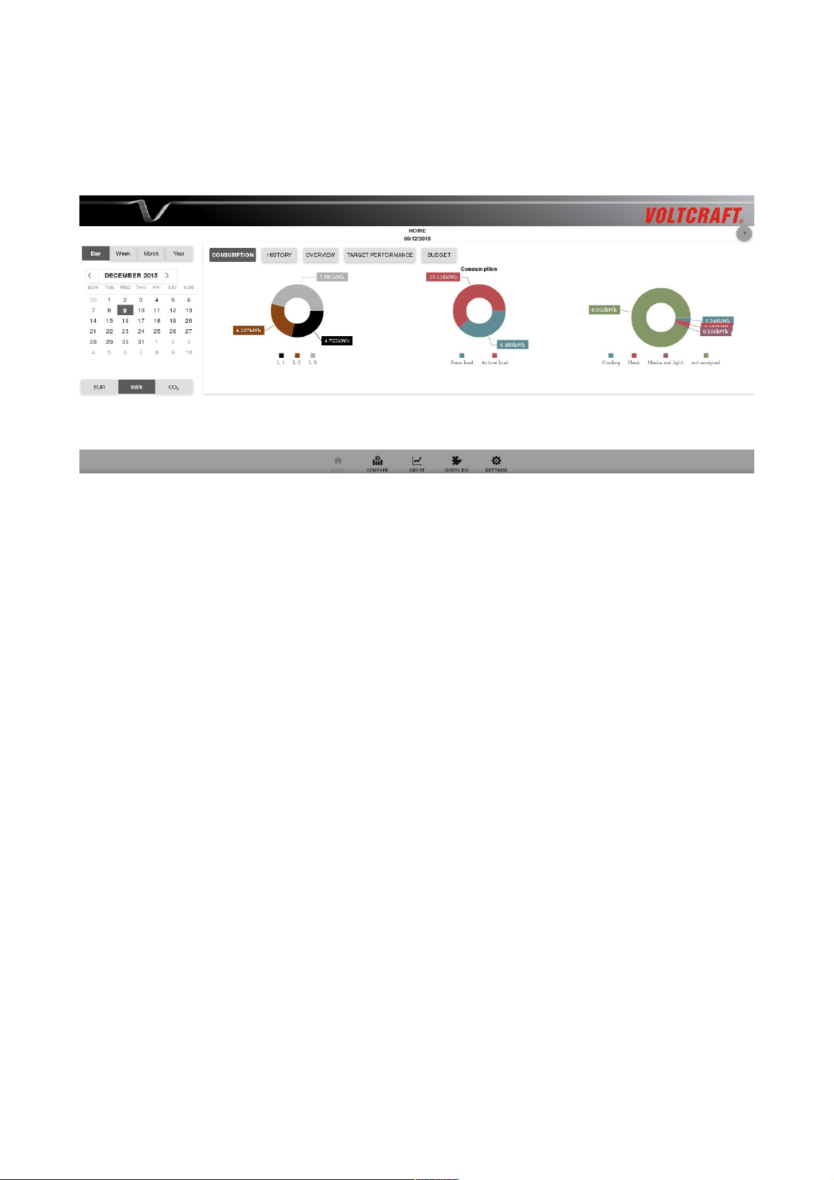
• Consumption: The three doughnut charts show how the consumption is distributed to the 3
phases, to base load and active load and to the different consumption classes (heat, cooling,
washing, media and light and “not assigned”).
• History: The bar chart shows the energy consumption within the selected time period in the
next smaller unit. Clicking on one of the bars shows the bar chart in the next smaller unit.
• Overview: The left column shows the total consumption within the selected time period and
the minimum, maximum and mean within this period. The right column shows the currently
1
Page 2
measured values for the total power and the individual phases. The user interface reloads
automatically every 3 seconds.
• Target performance: In the chart, the target value for the selected time period is shown in
green and the actual consumption is shown in red. The target value is calculated as monthly
advance payment minus the consumption in the current month up to now (until 11:59 pm of
the previous day).
When you move the mouse over the chart, a small pop-up window opens in which the target
value, the consumption and the difference between these two values is shown for the
respective points in time.
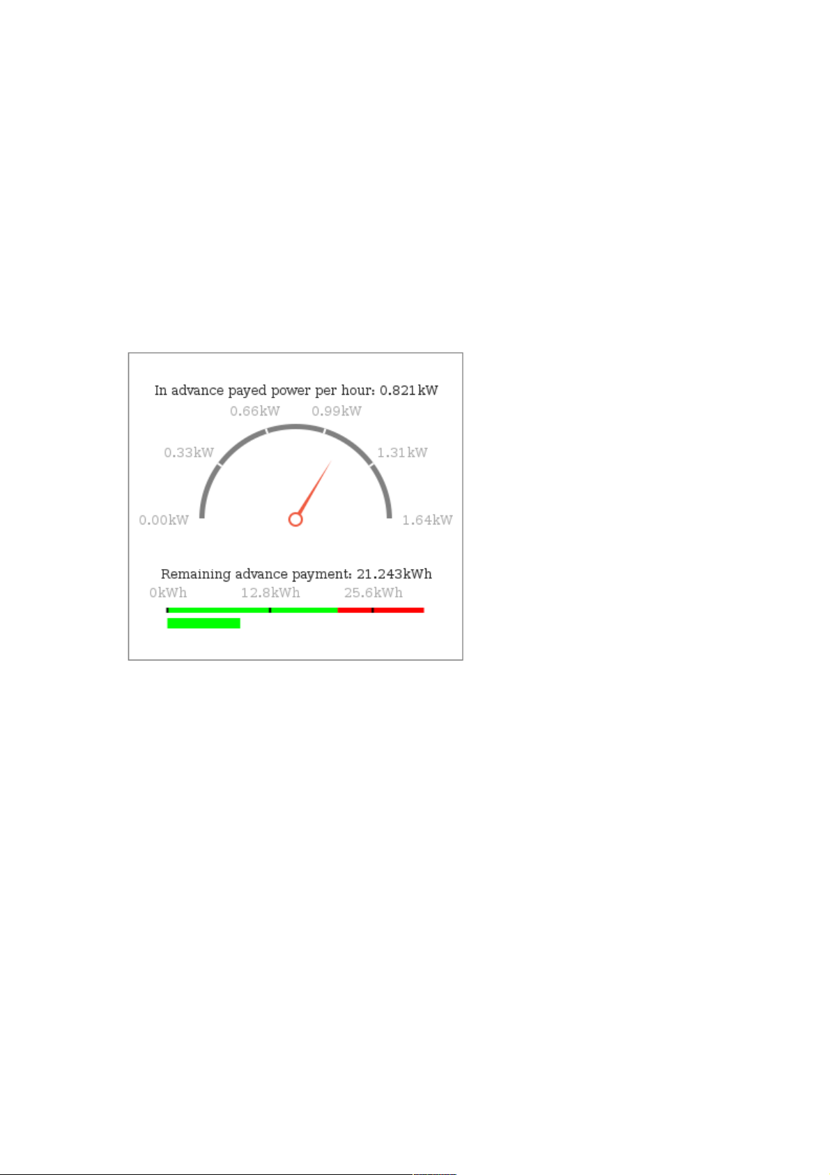
• Budget: The upper part of the graphics (in advance payed power per hour and tachometer)
refers to the current consumption and is independent of the settings in the time window.
◦ In advance payed power per hour: The power which is payed in advance for an hour
(=monthly advance payment / (number of days in the month * 24 hours * price per
kWh)).
◦ Circular gauge: The gauge reaches from 0 kW to twice the hourly advance payment, so
that the hourly advance payment is exactly in the middle of the gauge.
The red pointer shows the power which is currently measured. If the pointer is right of
the middle, the currently measured power exceeds the advance payment.
◦ Remaining advance payment: The calculation of the remaining advance payment
depends on which time period is selected:
▪ Selection day: remaining advance payment = target value / number of days
remaining in the current month
▪ Selection week, month or year: the remaining advance payment is the advance
payment for the selected time period
◦ Linear gauge: The green part of the gauge reaches from 0 kWh to the value of the
remaining advance payment (2/3 of the gauge). The part right of this value is shown in
red. The green bar below shows the consumption in the selected period (until now).
2
Page 3
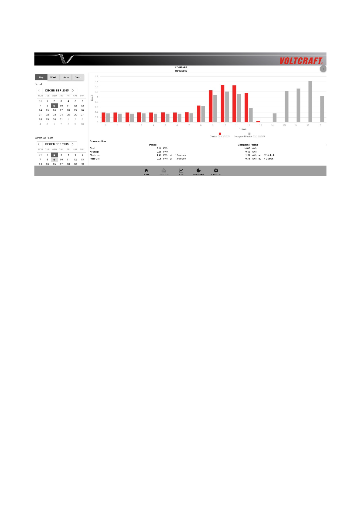
Compare
Time window
As in the other menus, you can choose between the time periods day, week, month and year in the
calendar. In the upper and lower calendar you can select the two time periods you would like to
compare. As default values the current day and the same day in the previous week are preselected.
Below the calendar you can choose the unit in which the values are shown.
Main window
• Bar chart: The chart shows the energy consumption (resp. the costs or the CO2 emission)
within the two selected time periods in the next smaller unit. The bars referring to the first
time period are shown in red, the grey bars belong to the comparison time period. Clicking
on one of the bars opens the chart in the next smaller unit.
• Consumption: The table shows the total consumption and the average, maximum and
minimum values together with the time of their occurrence for the two selected time periods.
The last column shows the differences between the two time periods.
3
Page 4
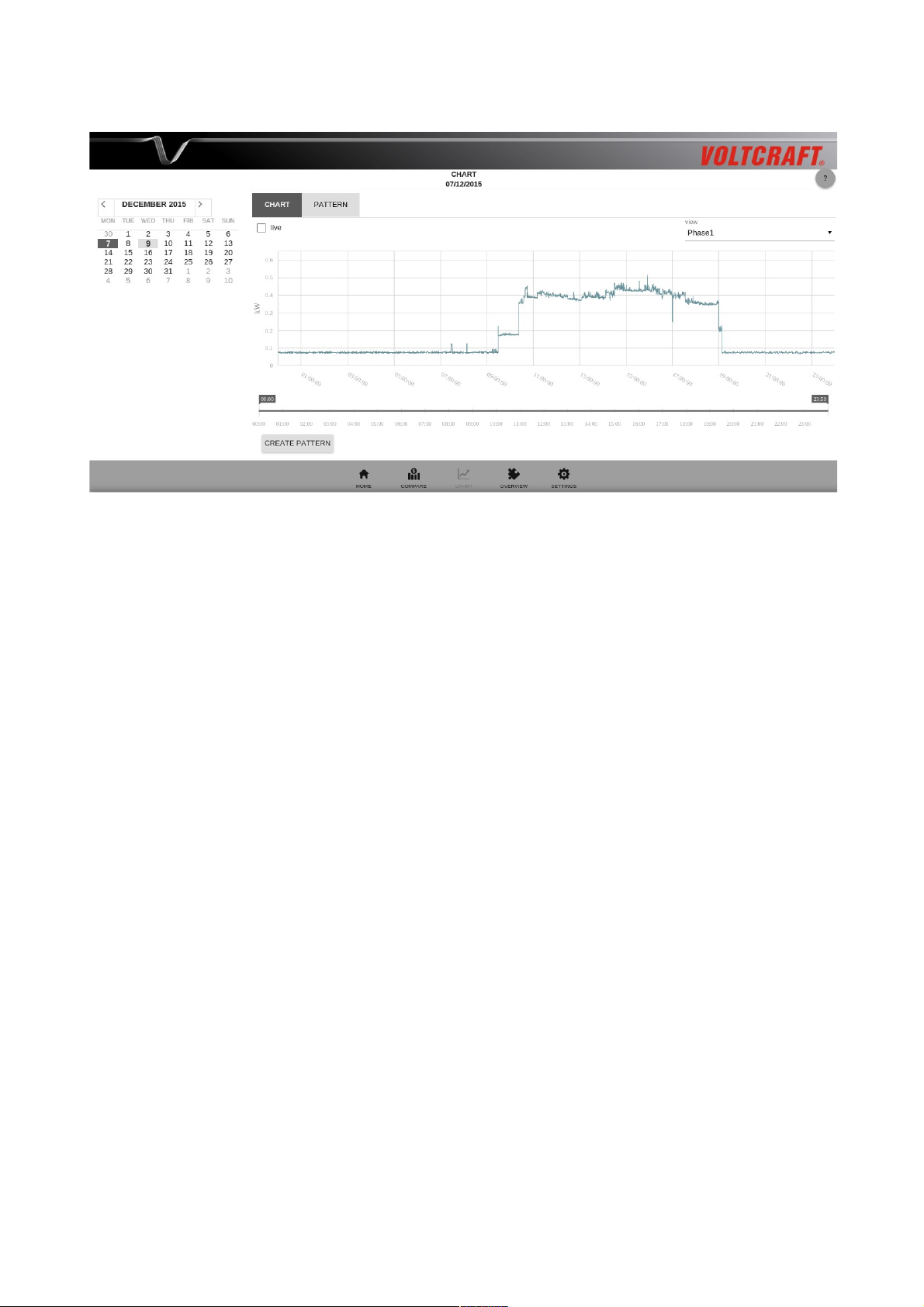
Chart
Main window
In the main window there are the tabs chart and pattern, further tabs are opened upon viewing
patterns.
In the tab chart the energy consumption can be shown for a maximum time period of 24 hours. Per
default the energy consumption of the current day is shown. When you move the mouse over the
chart, a small pop-up window opens which shows the time and the power measured at this point in
the chart.
Functions of the tab chart:
• Phase selection: In the drop down menu in the upper right part of the main window, you can
choose between the three phases. When “All 3 phases” is selected, the sum of the three
phases is shown.
• Zoom: With the time scale below the chart one can zoom into parts of the chart and out
again. Alternatively, one can also zoom into the chart by clicking on a start and end time
directly in the chart.
• Pattern creation: In order to create a pattern, continue zooming into the chart until you
reduced the view to the desired part. Then click on the button “Create pattern” below the
time scale and scroll down. Here you can fill in the fields Name, Category and Phase for the
pattern. Choose “mobile appliance” if the pattern belongs to a device that can be run on
different phases (e. g. in different rooms).
When you choose a section for pattern creation it is important, that this section contains both
the switching-on and the switching-off of a certain device. If you want to create a pattern for
the recognition of your washing machine, for example, you should choose the section such
that the complete washing procedure is contained. For switching devices like e. g. the
4
Page 5

electric kettle the section should contain the complete heating procedure including switching
on and off.
• Live view: In order to get a live view of the energy consumption, you have to check the box
“Live” in the upper left part of the main window. Then the consumption within the last 30
minutes is shown, the view updates automatically every 10 seconds. To return to the static
view uncheck the box again.
Please note: The data are available in a per-second granularity only for the last 31 days.
Functions of the tab pattern:
• Pattern management: In the tab pattern the saved patterns are listed according to their
phase affiliation. Click on the + to open the list with the saved patterns for a certain phase
resp. for mobile appliances. The saved patterns can be edited, viewed or deleted.
Overview
Main window
In the tab spreadsheet you find a summary of the energy consumptions within the different
categories. In the calendar on the left you can select a day. In the first and second column of the
spreadsheet the consumption on the selected and the previous day is shown, respectively. The
following columns show the consumption in the last week (Monday 12:00 a.m. to Sunday 11:59
p.m.), in the last (calendar) month and in the last (calendar) year.
In the columns that refer to the selected and the previous day one can click on the values to obtain a
more detailed view. The view is shown in an extra tab.
• When clicking in one of the rows Total, Budget, Base load or Active load, the total
consumption separated into base load and active load is shown as doughnut chart.
5
Page 6

• When clicking in one of the rows Heat, Cooling, Washing, Media and light or “not
assigned”, a list of all appliances is shown that were assigned to this category according to
the saved patterns.
Using the buttons “csv” and “pdf” below the spreadsheet you can export the view in one of the two
file formats.
Settings
In the menu settings you find the following items:
• Time zone & language:
◦ Time settings: Here you can choose the time zone and set the time of the Voltcraft SEM-
5000 PRO. Per default, four time servers are configured where the Voltcraft SEM-5000
PRO can obtain the time from. With the button “restore default values” you can restore
the factory settings with respect to the time servers.
Alternatively, you can also set the time manually. In order to do so, activate the radio
button “manual input”. Here you can either set the time manually by using the arrow
keys or fetch it by clicking on the button “fetch time from browser”. After configuration
of the time you need to save the changes.
Please note: After a longer interruption of the power supply (a few days) the time must
be set again.
◦ Currency settings: You can input the currency in which values are to be shown.
◦ Language settings: In this item you can select the desired language; possible languages
are German and English (USA or GB).
6
Page 7

• Tariff settings: In the field ”consumption levels” you can configure how many consumption
levels there are in your electricity tariff. You can configure up to four consumption levels.
For each level enter the minimum consumption, the basic rate, the price per kWh in the
high-rate tariff and, if applicable, the price per kWh in the low-rate tariff.
The assignment to one of the consumption levels is done automatically according to your
power consumption in the last year. You can enter it in the field “Consumption in the
previous year” below. The consumption levels must be entered in ascending order.
Consumption level 1 always starts at 0 kWh/year, consumption level 2 must start at a value
greater than zero, consumption level 3 must start at a value greater than that in level 2, and
so on. In the field “tariff levels” you can select if you have one or two tariff levels.
Below the consumption levels you can enter the times at which the low-rate tariff holds.
Below, there are fields for entering the CO2 emission (in g per kWh), the monthly advance
payment in your electricity tariff and your electricity consumption in the last year for the
assignment to one of the consumption levels.
Calibration of the electricity meter:
Please note that the Voltcraft SEM-5000 PRO is not a device for calculating the exact
electricity consumption and the resulting costs. Due to the measurement method applied, the
energy values displayed in your Voltcraft SEM-5000 PRO and in the electricity meter
installed in your house can differ from each other.
If this is the case for you, you can calibrate your Voltcraft SEM-5000 PRO with the help of a
correction factor. The correction factor serves to avoid measurement errors which are e. g.
caused by reactive power or fluctuations in the line voltage.
The following example will explain how to calibrate the electricity meter:
◦ At time 1 (e. g. on Monday at 8 AM) read the current energy value from the electricity
meter in your house and write it down.
◦ At the same time read the current energy value shown in your Voltcraft SEM-5000 PRO
and write it down, too. The display of the energy value in the Voltcraft SEM-5000 PRO
reloads automatically every 5 minutes and then stops for 5 minutes. This makes it easier
for you to read the values at the same time.
◦ Repeat the procedure after a few days. The longer the period you choose, the more exact
your result will be.
◦ Now calculate for both devices the difference of the displayed values between the two
7
Page 8

times. To find the correction factor, divide the difference obtained for the electricity
meter in your house by the difference obtained for the Voltcraft SEM-5000 PRO.
The following table shows an example how to calculate the correction factor:
Energie value Monday 8 AM Sonday 8 AM Difference
Electricity meter 140 198.2 58.2
SEM-5000 PRO 20.5 80.5 60
Difference electricity meter / Difference SEM-5000 PRO = 0.97
You can now adjust the correction factor with the slider. After saving the value, all values
displayed in the software will be corrected by this factor.
• Network settings: Per default, if a wireless network interface controller (WNIC) is plugged,
the Voltcraft SEM-5000 PRO is configured as an access point. In order to connect to the
Voltcraft SEM-5000 PRO's WLAN network, look for “SEM-xxxxxx” (xxxxxx=last 6 signs
of the Voltcraft SEM-5000 PRO's MAC address) among the available wireless networks and
connect to this network. The password is 87654321.
Once the connection is established, you can access the user interface in the browser via the
ip address http://192.168.127.1. You can now adjust the network settings via the user
interface.
• The Voltcraft SEM-5000 PRO can be configured either as an access point or as a participant
in a WLAN network. Independent of the wireless configuration it can be used in the LAN at
the same time.
◦ WLAN: In order to connect the Voltcraft SEM-5000 PRO to your local WLAN, you can
either use your router's WPS function, if available, or you can go to the item WLAN and
enter the login details according to your local WLAN settings:
▪ Establish connection with the router via WPS:
With WPS (Wi-Fi Protected Setup) you can quickly and easily establish a secure
WLAN connection to the router. The preconditions are that your WLAN base station
supports WPS, that WPS is enabled there, and that the SSID (wireless network
name) of the WLAN base station is visible. Furthermore, the USB WLAN adapter
used in the SEM-5000 PRO must be WPS enabled.
First press the WPS button on the router. Depending on the type of router an LED
will begin to flash there.
Then press the WPS button on the SEM-5000 PRO. Both LEDs of the SEM-5000
PRO now flash alternatively for a maximum of 2 minutes. During this time, both
devices will search for a suitable signal. Once the connection is established (but no
later than 2 minutes) the LEDs stop flashing.
▪ Manual input of the WLAN login details:
Enter the SSID and the password of your local WLAN, unckeck the box “Access
8
Page 9

point” and save your input. Reboot the device using the button “reboot” at the very
bottom of the menu settings.
It is advisable with reception problems to install the USB wireless adapter (optional,
not included) by means of a USB extension cable (length max. 1.8 m) outside the
distribution box.
◦ LAN: In the item LAN DHCP is activated per default. If you unckeck the box “DHCP”,
you can enter the parameters for the LAN connection manually. Afterwards, save your
settings and reboot the device.
Once the connection is established, you can access the user interface of the SEM-5000 PRO
via http://sem-xxxxxx. If you are not able to connect with the SEM-5000 PRO's user
interface using the given URL, you can alternatively search in your router’s software in the
list of connected devices for “sem-xxxxxx” and call the user interface with the assigned IP
address: http://<IP address>.
• Password: Per default the password protection is off. You can activate the password
protection by checking the box “Password protection on”. Then you can fill in the fields
below; the password must have a minimum length of five. Choose a security question and
enter an answer for it. Then click on save. Next time you reload the user interface, you will
be asked for the password.
Please note: if you forget the password and the answer to the security question, the only
possibility to retain access to the user interface is to do a factory reset. Hereby, all data will
be lost.
• E-mail: In order to receive notifications and data per e-mail, you have to configure a sender
and a recipient e-mail address first.
◦ Sender: Enter an e-mail address from which the e-mails should be sent and the
associated password. You can use an already existing e-mail address, consider, however,
that the password of your e-mail account will be shown in plain text. In the field “SMTP
server” enter the SMTP server of your e-mail account.
Some e-mail providers deactivate sending and receiving of e-mails via external
programs per default. In the case you experience problems with sending e-mails via the
SEM-5000 PRO, check the settings of your e-mail account.
◦ Recipient: You can enter up to five e-mail addresses.
◦ Notifications: You can select which notifications you would like to receive per e-mail
and in which interval. The SEM-5000 PRO can send the report, the measurement data
and the index data. When the corresponding box is checked, a menu expands where you
can select the interval and if applicable also the file format.
▪ Report: The report can be sent yearly, monthly, weekly or daily, possible file
formats are csv, pdf or both. The report contains a summary of the consumptions in
the selected time period, similar to the table shown in the menu overview.
▪ Measurement data: The per-second resolved measurement data can be sent weekly,
daily or hourly. The data are sent as zip-compressed csv file. The csv file contains a
9
Page 10

table with 5 columns; the first column contains the time stamp in local time, the
following 4 columns contain the measurement values for the sum of the 3 phases and
for the phases 1, 2 and 3 each in the unit kilowatt.
▪ Index data: Die index data can be sent monthly, weekly or daily as zip-compressed
csv file. The file contains all the hourly and daily calculated consumptions and costs
within the selected time period. Furthermore, the consumptions and the costs are
saved separate for base load and active load. These values are all in the unit kWh.
In addition, for each day the maximum and minimum electric power as well as the
average power are saved in the unit kW.
The file mainly serves for data recovery purposes in the case that a device needs to
be replaced.
Please note: the values contained in the files are the actual measurement values,
before they are multiplied with the correction factor. In order to obtain the same
values as shown in the software, you have to multiply them with the correction
factor.
• Software update:
In the menu software update the number of the installed firmware version is shown in the
first line. In the next line it is shown, if a software update is available on the update server.
In this case the version number of the available update is shown here.
Alternatively, you can also upload the file with the update from your computer in order to
perform a software update. First click on the button “select file” and select the respective file
on your computer. Then click on “upload”.
When the upload is finished, the update is shown above the button “Install”.
10
Page 11

Now click on “install”. When the update process is finished, a popup window appears. The
device must be rebooted after the successful update.
• Save and restore data:
◦ Export: With the Voltcraft SEM-5000 PRO you can export settings, measurement data
and index data.
▪ Settings: The settings are exported in a cfg file. It contains all your configurations,
so that in the case your device must be replaced you can easily recover them.
▪ Measurement data: The per-second resolved measurement data can be exported on
a daily or weekly basis. For export on a daily basis choose a start and end date in the
calendar (maximum 7 days) and click on export. Now you see a red progress
indicator next to the button “Export”. Depending on the selected time period, the
data export can take some minutes. The progress indicator disappears once the file
has been generated; the file is shown above the calendar and can be downloaded,
deleted or imported again.
For file export on a weekly basis click on “week” above the calendar and select the
desired week. Then click on export.
▪ Index data: The index data can be exported on a daily, weekly or monthly basis.
When the export is finished the file is available for download above the calendar.
◦ Import: You can upload files containing data or settings from your computer to the
Voltcraft SEM-5000 PRO. Possible file formats are .csv (for data) and .cfg (for settings).
Please note: Per-second resolved measurement data which are older than 31 days are
deleted automatically due to data size.
Interface to access the per-second resolved measurement data:
It is possible to access the per-second resolved data of the SEM-5000 PRO via a WebSocket
interface with port 11112. The data is in the following format:
2016-02-29 13:27:01 SEM-xxxxxx-0-000 719.612 W 220.357 W 412.216 W 87.039 W
The time is UTC time. The first power value corresponds to the sum of the 3 phases, the following
3 values are the power values of phase 1, 2 and 3.
For a first visualisation of the data you can use, e.g., the app "Simple Web Socket Client" in the
Chrome Browser. Enter the address ws://<IP-Adresse-SEM>:11112 in the field URL.
11
 Loading...