

Page 1
Allen-Bradley
PanelBuilder1400e
Configuration
Reference
Software for
Windows
(Cat. No. 2711E–ND1)
Manual
Page 2

Important User Information
Because of the variety of uses for the products described in this publication,
those responsible for the application and use of this control equipment must
satisfy themselves that all necessary steps have been taken to assure that
each application and use meets all performance and safety requirements,
including any applicable laws, regulations, codes and standards.
The illustrations, charts, sample programs and layout examples shown in
this guide are intended solely for purposes of example. Since there are
many variables and requirements associated with any particular installation,
Allen-Bradley does not assume responsibility or liability (to include
intellectual property liability) for actual use based upon the examples shown
in this publication.
Allen-Bradley publication SGI-1.1, Safety Guidelines for the Application,
Installation, and Maintenance of Solid-State Control (available from your
local Allen-Bradley office), describes some important differences between
solid-state equipment and electromechanical devices that should be taken
into consideration when applying products such as those described in this
publication.
Reproduction of the contents of this copyrighted publication, in whole or in
part, without written permission of Allen-Bradley Company, Inc., is
prohibited.
Throughout this manual we use notes to make you aware of safety
considerations:
ATTENTION: Identifies information about practices
or circumstances that can lead to personal injury or
!
Attention statements help you to:
death, property damage, or economic loss.
• identify a hazard
• avoid the hazard
• recognize the consequences
Important: Identifies information that is critical for successful
application and understanding of the product.
PanelBuilder, PanelView, Data Highway Plus, DH+, ControlNet, and SLC are trademarks, and
PLC, PLC-2, and PLC-3 are registered trademarks of Allen-Bradley Company, Inc.
RSView and RSLinx are trademarks of Rockwell Software, Inc.
IBM, PC, PS/2, VGA, and PC-DOS are registered trademarks of International Business Machines
Corporation.
Epson is a registered trademark of Seiko Epson Corporation.
Ethernet is a registered trademark of Digital Equipment Corporation, Intel, and Xerox
Corporation.
Microsoft, Windows, MS, and MS-DOS are registered trademarks of Microsoft Corporation.
Mouse Systems is a trademark of MSC Technologies, Inc.
AutoCAD is a registered trademark of Autodesk Inc.
Taylor, and ProWORXPLUS are registered trademarks of Taylor Industrial Software, Inc.
MODICON, MODSOFT, Quantum, and Modbus are registered trademarks of
AEG Schneider Automation, Inc.
All other brand and product names are trademarks of their respective companies
and are hereby acknowledged.
Page 3

Table of Contents
Preface
ASCII Displays
ASCII Inputs
Welcome to PanelBuilder 1400e Configuration Software
for Windows P–1. . . . . . . . . . . . . . . . . . . . . . . . . . . . . . . . . . . . . .
Registering Your Copy of PanelBuilder 1400e P–1. . . . . . . . . . . . . . . .
Available Documentation P–1. . . . . . . . . . . . . . . . . . . . . . . . . . . . . . .
What’s in the Reference Manual? P–2. . . . . . . . . . . . . . . . . . . . . . . . .
Who Should Read the Reference Manual? P–3. . . . . . . . . . . . . . . . . . .
Terminology Used P–3. . . . . . . . . . . . . . . . . . . . . . . . . . . . . . . . . . . .
Before You Begin P–4. . . . . . . . . . . . . . . . . . . . . . . . . . . . . . . . . . . . .
Technical Support Services P–4. . . . . . . . . . . . . . . . . . . . . . . . . . . . . .
About ASCII Displays 1. . . . . . . . . . . . . . . . . . . . . . . . . . . . . . . . . .
ASCII Display String Format 3. . . . . . . . . . . . . . . . . . . . . . . . . . .
Special Characters and Control Sequences 3. . . . . . . . . . . . . . . .
Invalid Control Sequences 3. . . . . . . . . . . . . . . . . . . . . . . . . . . .
Configuring the ASCII Display Object 4. . . . . . . . . . . . . . . . . . . .
About ASCII Inputs 5. . . . . . . . . . . . . . . . . . . . . . . . . . . . . . . . . . .
ASCII Input Object Displays 6. . . . . . . . . . . . . . . . . . . . . . . . . . .
Buttons of the ASCII Input Object 7. . . . . . . . . . . . . . . . . . . . . . .
Configuring the ASCII Input Object (Large or Small) 9. . . . . . . . . .
Bar Graphs
Control Selectors
Drawings
About Bar Graphs 11. . . . . . . . . . . . . . . . . . . . . . . . . . . . . . . . . . . .
Configuring the Bar Graph 12. . . . . . . . . . . . . . . . . . . . . . . . . . . .
About Control Selectors 13. . . . . . . . . . . . . . . . . . . . . . . . . . . . . . . .
Control List Selector with Enter Key 14. . . . . . . . . . . . . . . . . . . . . . . .
Configuring a Control List Selector with Enter Key 15. . . . . . . . . . .
Control List Selector without Enter Key 17. . . . . . . . . . . . . . . . . . . . .
Configuring a Control List Selector without Enter Key 18. . . . . . . . .
Set Bit Cursor Points (Keypad Terminals Only) 20. . . . . . . . . . . . . . . .
Using the Set Bit Cursor Point on the PanelView Terminal 21. . . . . .
Cursor Point Default Operation 22. . . . . . . . . . . . . . . . . . . . . . .
Cursor Point Operation after Screen Change 23. . . . . . . . . . . . .
Cursor Point Operation on a Terminal Powerup 23. . . . . . . . . . .
Defining the Set Bit Cursor Point Character and Display Field 24. . .
Configuring the Set Bit Cursor Point 25. . . . . . . . . . . . . . . . . . . . .
About Drawing Objects 27. . . . . . . . . . . . . . . . . . . . . . . . . . . . . . . . .
Arc 27. . . . . . . . . . . . . . . . . . . . . . . . . . . . . . . . . . . . . . . . . . . . . . .
Ellipse 28. . . . . . . . . . . . . . . . . . . . . . . . . . . . . . . . . . . . . . . . . . . .
Line 28. . . . . . . . . . . . . . . . . . . . . . . . . . . . . . . . . . . . . . . . . . . . . .
Arrows 28. . . . . . . . . . . . . . . . . . . . . . . . . . . . . . . . . . . . . . . . . .
Publication 2711E-820 – January 1998
Page 4

Table of Contentstoc–ii
Panel 29. . . . . . . . . . . . . . . . . . . . . . . . . . . . . . . . . . . . . . . . . . . . .
Rectangle 29. . . . . . . . . . . . . . . . . . . . . . . . . . . . . . . . . . . . . . . . . .
Wedge 29. . . . . . . . . . . . . . . . . . . . . . . . . . . . . . . . . . . . . . . . . . . .
Goto Configure Mode
Graphic Images
Indicators
Local Message Displays
About the Goto Configure Mode Button 31. . . . . . . . . . . . . . . . . . . . .
Software Mode Switching at the PanelView Terminal 33. . . . . . . . .
Configuring the Goto Configure Mode Button 34. . . . . . . . . . . . . . .
About Graphic Images 35. . . . . . . . . . . . . . . . . . . . . . . . . . . . . . . . .
Importing Graphic Images 35. . . . . . . . . . . . . . . . . . . . . . . . . . . .
Sizing Graphic Images 36. . . . . . . . . . . . . . . . . . . . . . . . . . . . . . .
Copying and Exporting Graphic Images 36. . . . . . . . . . . . . . . . . . .
About Indicators 39. . . . . . . . . . . . . . . . . . . . . . . . . . . . . . . . . . . . .
Multistate Indicator 39. . . . . . . . . . . . . . . . . . . . . . . . . . . . . . . . . . . .
Configuring the Multistate Indicator 40. . . . . . . . . . . . . . . . . . . . . .
List Indicator 41. . . . . . . . . . . . . . . . . . . . . . . . . . . . . . . . . . . . . . . .
Configuring the List Indicator 42. . . . . . . . . . . . . . . . . . . . . . . . . .
About Local Message Displays 43. . . . . . . . . . . . . . . . . . . . . . . . . . .
How a Local Message Is Triggered 44. . . . . . . . . . . . . . . . . . . . . .
Triggering Messages on Multiple Local Message Displays 44. . . .
Configuring the Local Message Display 44. . . . . . . . . . . . . . . . . . .
Numerics
About Numerics 47. . . . . . . . . . . . . . . . . . . . . . . . . . . . . . . . . . . . . .
Increment and Decrement Value Buttons 48. . . . . . . . . . . . . . . . . . . .
Increment V alue Button (with or without Display) 48. . . . . . . . . . . .
Configuring the Increment Value Button 49. . . . . . . . . . . . . . . . . . .
Decrement Value Button (with or without Display) 51. . . . . . . . . . . .
Configuring the Decrement Value Button 52. . . . . . . . . . . . . . . . . .
Numeric Data Display 53. . . . . . . . . . . . . . . . . . . . . . . . . . . . . . . . .
Configuring the Numeric Data Display 55. . . . . . . . . . . . . . . . . . . .
Numeric Keypad Enable Button (Keypad Terminals Only) 57. . . . . . . .
Configuring the Numeric Keypad Enable Button 58. . . . . . . . . . . . .
Numeric Input Cursor Point (Keypad Terminals Only) 60. . . . . . . . . . .
Using the Numeric Input Cursor Point on the PanelView Terminal 60
Defining the Numeric Input Cursor Point Character 62. . . . . . . . . . .
Using the Decimal Point (Display Component) 62. . . . . . . . . . . . . .
Configuring the Numeric Input Cursor Point 63. . . . . . . . . . . . . . . .
Name 63. . . . . . . . . . . . . . . . . . . . . . . . . . . . . . . . . . . . . . . . .
Numeric Input Configuration 64. . . . . . . . . . . . . . . . . . . . . . . . .
Display Configuration 65. . . . . . . . . . . . . . . . . . . . . . . . . . . . . .
Controls 66. . . . . . . . . . . . . . . . . . . . . . . . . . . . . . . . . . . . . . .
Numeric Entry Keypads (Touch Screen Terminals only) 69. . . . . . . . . .
Configuring the Numeric Entry Keypad 70. . . . . . . . . . . . . . . . . . .
Publication 2711E-820 – January 1998
Page 5

Table of Contents toc–iii
Examples: Editing an Array of Numeric V alues 72. . . . . . . . . . . . . . .
Using the Decimal Point 75. . . . . . . . . . . . . . . . . . . . . . . . . . . . . . . .
Enter Key Handshake Operation 78. . . . . . . . . . . . . . . . . . . . . . . . . .
Using Write Expressions 79. . . . . . . . . . . . . . . . . . . . . . . . . . . . . . .
Push Buttons
Scales
Screen Print Buttons
About Push Buttons 81. . . . . . . . . . . . . . . . . . . . . . . . . . . . . . . . . . .
How the Different Push Buttons Work 81. . . . . . . . . . . . . . . . . . . .
Normally Open Momentary (N/O) Push Button 82. . . . . . . . . . . . . . . .
Configuring the Normally Open Momentary (N/O) Button 83. . . . . . .
Normally Closed Momentary (N/C) Push Button 85. . . . . . . . . . . . . . .
Configuring the Normally Closed Momentary (N/C) Button 86. . . . . .
Latched Push Button 87. . . . . . . . . . . . . . . . . . . . . . . . . . . . . . . . . .
Configuring the Latched Push Button 88. . . . . . . . . . . . . . . . . . . . .
Maintained Push Button 89. . . . . . . . . . . . . . . . . . . . . . . . . . . . . . . .
Configuring the Maintained Push Button 90. . . . . . . . . . . . . . . . . .
Multistate Push Button 91. . . . . . . . . . . . . . . . . . . . . . . . . . . . . . . . .
Configuring the Multistate Push Button 92. . . . . . . . . . . . . . . . . . .
Interlocked Push Button 94. . . . . . . . . . . . . . . . . . . . . . . . . . . . . . . .
Configuring the Interlocked Push Button 95. . . . . . . . . . . . . . . . . .
About Scales 97. . . . . . . . . . . . . . . . . . . . . . . . . . . . . . . . . . . . . . . .
Configuring the Scale 98. . . . . . . . . . . . . . . . . . . . . . . . . . . . . . . .
About Screen Print Buttons 99. . . . . . . . . . . . . . . . . . . . . . . . . . . . . .
Configuring the Screen Print Button 99. . . . . . . . . . . . . . . . . . . . . .
Screen Selectors
Scrolling Lists
About Screen Selectors 101. . . . . . . . . . . . . . . . . . . . . . . . . . . . . . . .
Goto Screen and Return to Previous Screen Buttons 102. . . . . . . . . . .
Configuring the Goto Screen and Return to Previous
Screen Buttons 102. . . . . . . . . . . . . . . . . . . . . . . . . . . . . . . . .
Screen List Selector 103. . . . . . . . . . . . . . . . . . . . . . . . . . . . . . . . . . .
Configuring the Screen List Selector 104. . . . . . . . . . . . . . . . . . . . .
Screen Select Keypad (Large and Small) (Touch Screen
Terminals Only) 105. . . . . . . . . . . . . . . . . . . . . . . . . . . . . . . . . . .
Configuring the Screen Select Keypad 105. . . . . . . . . . . . . . . . . . . .
Screen Keypad Enable Button (Keypad Terminals Only) 106. . . . . . . . .
Configuring the Screen Keypad Enable Button 106. . . . . . . . . . . . . .
About Scrolling Lists 107. . . . . . . . . . . . . . . . . . . . . . . . . . . . . . . . . .
Cursor List 108. . . . . . . . . . . . . . . . . . . . . . . . . . . . . . . . . . . . . . . . .
Configuring the Cursor List 108. . . . . . . . . . . . . . . . . . . . . . . . . . . .
Configuring Preview States 110. . . . . . . . . . . . . . . . . . . . . . . . . . . .
Configuring Retained Last List States 1 11. . . . . . . . . . . . . . . . . . . .
The Cursor List Controls 1 12. . . . . . . . . . . . . . . . . . . . . . . . . . . . . .
Configuring Cursor List State Values 114. . . . . . . . . . . . . . . . . . . . .
Publication 2711E-820 – January 1998
Page 6

toc–iv
Table of Contents
Configuring Skipped States 1 15. . . . . . . . . . . . . . . . . . . . . . . . . . .
Configuring the Cursor List Buttons 116. . . . . . . . . . . . . . . . . . . . . .
Configuring the Cursor List Font 1 18. . . . . . . . . . . . . . . . . . . . . . . .
Optimizing Scrolling List Performance 1 18. . . . . . . . . . . . . . . . . . . .
Object Lists 119. . . . . . . . . . . . . . . . . . . . . . . . . . . . . . . . . . . . . . . . .
Multistate Indicator Object List 121. . . . . . . . . . . . . . . . . . . . . . . . . . .
Configuring Labels for Multistate Indicator Object Lists 121. . . . . . . .
Configuring the Multistate Indicator Object List 123. . . . . . . . . . . . . .
Local Message Object List 124. . . . . . . . . . . . . . . . . . . . . . . . . . . . . .
Configuring the Local Message Object List 124. . . . . . . . . . . . . . . . .
Numeric Data Display Object List 125. . . . . . . . . . . . . . . . . . . . . . . . .
Configuring the Numeric Data Display Object List 125. . . . . . . . . . . .
Scrolling List Example 128. . . . . . . . . . . . . . . . . . . . . . . . . . . . . . . . .
Step 1: Create the Cursor List 129. . . . . . . . . . . . . . . . . . . . . . . . .
Step 2: Create the Object Lists 130. . . . . . . . . . . . . . . . . . . . . . . . .
Assembly Stations 130. . . . . . . . . . . . . . . . . . . . . . . . . . . . . . . .
Luxury Option 130. . . . . . . . . . . . . . . . . . . . . . . . . . . . . . . . . . .
Station Status 131. . . . . . . . . . . . . . . . . . . . . . . . . . . . . . . . . . .
Option Command 131. . . . . . . . . . . . . . . . . . . . . . . . . . . . . . . .
Option Style Number 132. . . . . . . . . . . . . . . . . . . . . . . . . . . . . .
Assigning Addresses for Object Lists 132. . . . . . . . . . . . . . . . . . .
Step 3: Program the PLC 133. . . . . . . . . . . . . . . . . . . . . . . . . . . . .
Create the Block Transfer Rungs 134. . . . . . . . . . . . . . . . . . . . . .
Create the Auto Mode Rung 135. . . . . . . . . . . . . . . . . . . . . . . . .
Create the Manual Mode Rung 136. . . . . . . . . . . . . . . . . . . . . . .
Create the Toggle Command Rungs 137. . . . . . . . . . . . . . . . . . .
Create the Set Command Input Rung 139. . . . . . . . . . . . . . . . . .
Create the Option Style Number Input Rung 139. . . . . . . . . . . . . .
Create the Manual On / Manual Off Input Rung 140. . . . . . . . . . .
Create the Visible State File Copy Rung 141. . . . . . . . . . . . . . . .
Create the Auto Mode Simulation Rungs 142. . . . . . . . . . . . . . . .
Symbols
Text
Time and Date Displays
Publication 2711E-820 – January 1998
About Symbols 145. . . . . . . . . . . . . . . . . . . . . . . . . . . . . . . . . . . . . .
Available Graphic Images 145. . . . . . . . . . . . . . . . . . . . . . . . . . . . .
Sizing Symbols 146. . . . . . . . . . . . . . . . . . . . . . . . . . . . . . . . . . . .
Configuring Symbols 146. . . . . . . . . . . . . . . . . . . . . . . . . . . . . . . .
About Text 149. . . . . . . . . . . . . . . . . . . . . . . . . . . . . . . . . . . . . . . . . .
The Extended ASCII Character Set 149. . . . . . . . . . . . . . . . . . . . . .
About Time and Date Displays 151. . . . . . . . . . . . . . . . . . . . . . . . . . .
Time Display 151. . . . . . . . . . . . . . . . . . . . . . . . . . . . . . . . . . . . . .
Date Display 151. . . . . . . . . . . . . . . . . . . . . . . . . . . . . . . . . . . . . .
Configuring the Time and Date Display 152. . . . . . . . . . . . . . . . . . .
Page 7

Table of Contents
toc–v
Trends
ISA Symbols
DIN Symbols
Arrows and Parts
ASCII Character Set
About Trends 153. . . . . . . . . . . . . . . . . . . . . . . . . . . . . . . . . . . . . . .
Configuring the Trend 157. . . . . . . . . . . . . . . . . . . . . . . . . . . . . . . .
Configuring the Pens 158. . . . . . . . . . . . . . . . . . . . . . . . . . . . . .
Configuring the Pen Value Labels 159. . . . . . . . . . . . . . . . . . . . .
Appendix A
Symbol Icons A–1. . . . . . . . . . . . . . . . . . . . . . . . . . . . . . . . . . . . . . .
Appendix B
Symbol Icons B–1. . . . . . . . . . . . . . . . . . . . . . . . . . . . . . . . . . . . . . .
Appendix C
Arrows C–1. . . . . . . . . . . . . . . . . . . . . . . . . . . . . . . . . . . . . . . . . . . .
Equipment Parts C–2. . . . . . . . . . . . . . . . . . . . . . . . . . . . . . . . . . . . .
Appendix D
ASCII Character Set D–1. . . . . . . . . . . . . . . . . . . . . . . . . . . . . . . . . .
Index
Publication 2711E-820 – January 1998
Page 8

Welcome to
PanelBuilder 1400e
Configuration Software for
Windows
Registering Your Copy of PanelBuilder 1400e
Welcome to Allen-Bradley’s PanelBuilder 1400e Configuration
Software for Windows, Version 4. With this software you can create
applications in the Microsoft Windows 3.1 (or later) operating
system, Windows 95, and in Windows NT 4.0. You can use the
PanelBuilder applications in PanelView 1000e, 1200e, or 1400e
terminals, or PanelView 1200 Series F and later terminals that have
been enhanced to -MC catalog numbers.
PanelBuilder 1400e Configuration Software for Windows, Version 4
provides the advantages that PanelBuilder 1400e Version 3 offered,
as well as other enhancements. These include running on Windows
NT 4.0, increased ControlNet station addressing, an Ethernet/RIO
Pass-Through File Transfer, RSLinx communication driver
compatibility, and a CD–ROM install.
For a more comprehensive description of each of these features, see
“What’s New in PanelBuilder 1400e, Version 4” in Chapter 1 of
Getting Started with PanelBuilder 1400e Configuration Software for
Windows.
To register your software, mail the registration card from the front of
this manual to this address:
Available Documentation
Rockwell Software
Software Services
6680 Beta Drive
Mayfield Village, Ohio 44143
or fax the card to 1-440-646-7701.
Your PanelBuilder 1400e software comes with several types of
documentation to meet your different needs:
• Getting Started with PanelBuilder 1400e Configuration Software
for Windows (Publication Number 2711E-818) guides you
through setting up PanelBuilder 1400e and introduces you to
PanelBuilder 1400e basics. It includes a tutorial to give you
hands-on experience working with a PanelBuilder 1400e
application.
• The PanelBuilder 1400e Configuration Software for Windows
User Manual (Publication Number 2711E-819) explains
PanelBuilder 1400e in detail, and provides step-by-step
instructions for planning, creating, and working with applications.
Publication 2711E-820 – January 1998
Page 9

PrefaceP–2
• The PanelBuilder 1400e Screen Objects Reference Manual
(Publication Number 2711E-820) provides detailed reference
information for application screen objects.
• The PanelBuilder 1200/1400e Transfer Utility User Manual
(Publication Number 2711E-6.8) provides detailed instructions
for transferring files using the Transfer Utility that comes with
PanelBuilder 1400e Version 3.
• Context-sensitive online Help provides a reference for any
procedures or commands you need explained, or problems you
may encounter. To get help, press
you’re in a dialog box.
F1 or choose the Help button if
• The PanelBuilder 1400e Readme file is a Microsoft Windows
Notepad file that is copied to your hard disk when you install
PanelBuilder 1400e. It informs you of any software changes after
the manuals were printed.
• The PanelView 1000e, 1200e, and 1400e Operator Terminals
User Manual (Publication Number 2711E-821) describes the
features, operation, and specifications of PanelView operator
terminals.
• The PanelBuilder 1400e Modbus User Manual (Publication
Number 2711E-6.12) describes how to create PanelBuilder
applications for the Modbus communications network. This
manual is supplied as part of the optional Modbus
Communications Kit, Catalog Number 2711E-UMOD.
What’s in the Reference
Manual?
The Reference Manual is a guide to the objects you can create for
application screens. It contains the following chapters:
• ASCII Displays
• ASCII Inputs
• Bar Graphs
• Control Selectors
• Drawings
• Goto Configure Mode
• Graphic Images
• Indicators
• Local Message Displays
• Numerics
• Push Buttons
• Scales
• Screen Print Buttons
• Screen Selectors
• Scrolling Lists
• Symbols
Publication 2711E-820 – January 1998
Page 10

Preface P–3
• Text
• Time and Date Displays
• Trends
The titles of the chapters match the selections on the Objects menu,
which appears when you open a screen in PanelBuilder. If a selection
on the Objects menu has a submenu, the group of related objects on
the submenu is described in the same chapter. For example, numeric
objects are described in the chapter called Numerics. The drawing
objects are combined in the chapter called Drawings. Chapters are
arranged alphabetically for easy reference.
Who Should Read the
Reference Manual?
Terminology Used
This manual is intended as a reference guide for users who are
experienced with PanelBuilder 1400e, and have a good knowledge of
Microsoft Windows. Users who are not familiar with PanelBuilder
1400e should read Getting Started with PanelBuilder 1400e
Configuration Software for Windows and the PanelBuilder 1400e
Configuration Software for Windows User Manual first.
Users who are not familiar with Microsoft Windows should read
their Microsoft Windows User’s Guide (for users of Windows 3.1),
Introducing Microsoft Windows 95 (for users of Windows 95), or
Introducing Microsoft Windows NT Workstation (for users of
Windows NT).
The term PanelBuilder refers to PanelBuilder 1400e Configuration
Software for Windows. Where confusion may arise between the
current and previous versions of the software, the current release of
software is “PanelBuilder 1400e, Version 4.”
PanelView terminal and terminal refer to a PanelView 1000e
terminal, an enhanced PanelView 1200 Series F or G terminal, a
PanelView 1200e terminal, or a PanelView 1400e terminal.
The terms programmable controller and PLC refer to a
programmable logic controller, or any other controlling device.
The term control is a generic term that refers to the PLC addresses
that dynamic objects write to or read from. Some controls use tags
only, while others can use tags or expressions. All dynamic objects
use one or more controls. In this manual, the configuration table for
each object lists the controls for the object, and specifies which
controls use tags only and which can use expressions. For more
information about expressions see Chapter 7, Creating Expressions,
in the PanelBuilder 1400e Configuration Software for Windows User
Manual.
Publication 2711E-820 – January 1998
Page 11

PrefaceP–4
User Manual refers to the PanelBuilder 1400e Configuration
Software for Windows User Manual. Other user manuals are referred
to by their full names.
Before You Begin
Before you begin, you should install and know how to operate the
following equipment and software:
• a personal computer with at least a 486, 25-MHz microprocessor;
at least 8 MB Random Access Memory (RAM) for Windows
3.1/95 (although 16 MB RAM is recommended for Windows 95);
at least 32 MB RAM for Windows NT; and a SVGA monitor with
256 colors (recommended). For users working with imported .dxf
files, at least 16 MB RAM is required.
If you want to resize graphic images in PanelBuilder, set your
display adapter to 65,536 colors.
• Microsoft Windows 3.1 and above, Windows 95, or
Windows NT 4.0
• the family of PLCs you’ll be monitoring and controlling
You should also be familiar with these manuals:
• Getting Started with PanelBuilder 1400e Configuration Software
for Windows
• PanelBuilder 1400e Configuration Software for Windows User
Manual
Technical Support Services
If you have questions about PanelBuilder, please consult the manuals
or the online Help first. If you can’t find the answer, take advantage
of our Technical Support Fax Back system, available 24 hours a day,
7 days a week at 1-440-646-5436, or browse through our technical
support document library at http://www.ab.com/mem/prodserv/
services/technotes/techmain.html on the World Wide Web.
Alternatively, contact:
Allen-Bradley
Technical Support
1 Allen Bradley Drive
Mayfield Heights, Ohio 44124-6118
or call 1-440-646-6800 or fax 1-440-646-6890 for technical support
between 8
Please have the serial number for your software ready when you call,
or include it on your fax. You can find this number:
AM and 5 PM (EST), Monday to Friday.
• on the Software Registration card that was shipped with your
software
• on the screen that appears when you start PanelBuilder
• in the main Help menu, when you choose “About”
Publication 2711E-820 – January 1998
Page 12

ASCII Displays
ASCII Displays
This chapter tells you:
• how the ASCII Display object functions
• about special characters and control sequences
• which characters are in the ASCII character set
• about invalid control sequences
• how to configure the ASCII Display object
About ASCII Displays
The ASCII Display object is used to display on the PanelView
terminal a character string sent from the PLC. The display is updated
whenever the string changes.
The ASCII Display object can display any character in the IBM
extended character set. Special control characters can be included, to
provide special formatting for the displayed characters. The
characters displayed are controlled exactly as specified by the data in
the string. Characters are processed sequentially until a null character
(all bits 0) is received. Any characters after a null character are
ignored.
The maximum character string length is 82 characters.
If only 10 displayable characters (not control characters) are in the
string, only 10 positions on the screen will be filled. Any previously
existing text anywhere else within the display area will be
unaffected.
Words wrap within the area defined for the ASCII Display object,
but if the character string is too long to be displayed, the extra
characters are ignored.
Publication 2711E-820 – January 1998
Page 13

2 ASCII Displays
Example 1: Character String Display and Overwrite
The display is defined as 10 characters wide by 3 characters
high. The characters are single height and single width. The
string to be displayed is “A long string for the ASCII display.”
The object will show:
A long
string for
the ASCII
The last word of the string is lost, because the object isn’t large
enough for the whole string.
A second string, “This shows how characters overwrite,” is sent
while the first one is displayed.
This shows
how ng for
characters
Any character which was not directly covered by a new character
remained in the display. This feature can be useful for updating
portions of an ASCII display while leaving portions unchanged. If
you want to clear the display, or clear a line in the display, embed
control characters for those purposes in the string.
To properly display the second string shown above, a “clear to
end of display” control sequence, ESC[J, could have been
included at the beginning of the string.
The string would then be: “ESC[JThis shows how characters
overwrite,” which would display:
This shows
how
characters
Publication 2711E-820 – January 1998
Notice that there is no space between the control sequence and
the text. Also see “Special Characters and Control Sequences,”
and “Invalid Control Sequences,” later in this chapter.
Page 14
ASCII Display String Format
Á
Á
Á
Á
Á
Á
Á
Á
Á
Á
Á
Á
Á
Á
Á
Á
Á
Á
Á
Á
Á
Á
Á
Á
Á
Á
Á
Á
Á
Á
Á
Á
The format of the data string must be as in the following table. For
more characters see the ASCII character set in Appendix D, or see
Appendix B, The Extended Character Set, in the PanelBuilder 1400e
Configuration Software for Windows User Manual.
3ASCII Displays
Name
БББББ
Carriage Return
БББББ
Line Feed
БББББ
Clear to End of Display
Clear to End of Line
Position Text
БББББ
БББББ
БББББ
БББББ
Reverse Video Text On
БББББ
Reverse Video Text Off
Sequence
БББББ
CR
БББББ
LF
БББББ
ESC[0J or ESC[J
ESC[0K or ESC[K
ESC[row;columnH
БББББ
ESC[;columnH
ESC[rowH
БББББ
ESC[H
БББББ
БББББ
ESC[7m
БББББ
ESC[27m
Bit
1st word
2nd word
15 8
1st character
3rd character
…
7 0
2nd character
4th character
…
Special Characters and Control Sequences
The ASCII Display uses character 255 (G) to align display strings of
odd length. Fill characters are not printable and will not occupy
space on the display. For a list of the ASCII character set, see
Appendix D in this manual.
The following table lists the control sequences used by the
PanelView terminal.
Hex
ÁÁÁ
0D
ÁÁÁ
0A
ÁÁÁ
1B5B4A
1B5B4B
1B5Bxx3Byy48
ÁÁÁ
1B5B3Byy48
1B5Bxx48
ÁÁÁ
1B5B48
ÁÁÁ
ÁÁÁ
1B5B376D
ÁÁÁ
1B5B32376D
Action
БББББББББББББББ
Move to the beginning of the current line.
БББББББББББББББ
Move to the next line below the current one. If the current position is
БББББББББББББББ
the last line, no more data from the string is displayed.
Clear from the current display position to the end of the display.
Clear from the current display position to the end of the line.
Move the display position to the specified row and column number.
БББББББББББББББ
The top left corner of the display area is row and column number
0,0. If either row or column number is omitted, the missing
БББББББББББББББ
coordinate will be 0.
БББББББББББББББ
Note: The coordinates are character positions. For example,
БББББББББББББББ
position (1,1) refers to pixel coordinates (8,20) in the object.
Begin displaying text in reverse video. This flips the foreground and
background colors.
БББББББББББББББ
End the reverse-video text block.
Invalid Control Sequences
If an incorrect control sequence is detected, the invalid portion is
displayed as part of the string.
For example, in the display area shown earlier, the string:
“ESC[3;0HThis sequence is invalid” would be invalid: the display is
10 characters by 3 lines, and a line specification of 3 would start
printing at the fourth line.
Publication 2711E-820 – January 1998
Page 15

4 ASCII Displays
If the current display position were 0;0, the string would display:
←[3;0HThis
sequence
is invalid
The left arrow character in the display represents ESC.
Other invalid sequences:
• nested Reverse Video On, for example,
“ESC[7mOneESC[7mTwo”
The second command is invalid and, if possible, is displayed as
part of the string.
"
Note: If the Reverse Video On is without an Off, the terminal
automatically turns off the reverse video at the end of the string.
• nested Reverse V ideo Off, for example,
“ESC[27mOneESC[27mTwo”
The second command is invalid and, if possible, is displayed as
part of the string.
• wrong characters in text position sequence. The text position
coordinates must not contain any characters other than 0 to 9, for
example, “ESC[a3;4HThe string.”
Configuring the ASCII Display Object
Configure the ASCII Display object according to this table:
Field Meaning
Name
Control ASCII Text indicates the PLC location of the string this object
Assign a name, up to 15 characters, to document the object for
printed reports. This increases the application’s size by 1 byte
per character.
displays. The display is updated whenever this string changes.
Assign a String type tag up to 82 characters long.
Publication 2711E-820 – January 1998
"
You can adjust the size of the ASCII Display and format its
foreground color, background color, font style, border style, and
blink and underline attributes. For details on formatting objects see
“Changing Object Appearance,” in Chapter 9, Creating Objects, in
the PanelBuilder 1400e Configuration Software for Windows User
Manual.
Note: If you use the Extra Large Font, the application will be
compatible only with PanelView Version 2 or later. The application
will not be compatible with earlier versions.
Page 16
ASCII Inputs
This chapter tells you:
• how the ASCII Input object functions
• how to configure the ASCII Input object
ASCII Inputs
About ASCII Inputs
The ASCII Input object allows the operator to send an alphanumeric
string (up to 82 characters) to the PLC.
There are two types of ASCII Input objects:
• large ASCII Input object
• small ASCII Input object
These function differently on keypad and touch screen terminals.
• On the Large ASCII Input object for a touch screen terminal, the
operator selects characters by touching the keyboard on the
screen. The selected character appears in the scratchpad. When
the character string in the scratchpad is complete, the operator
sends it to the ASCII Input control by pressing the ENT button on
the keyboard.
• On the Small ASCII Input object for both touch screen and
keypad terminals, and on the Large ASCII Input object for
keypad terminals, the operator selects characters from the
keyboard by moving the screen cursor (with the arrow keys) to
the desired character and pressing the SEL button. The selected
character appears in the scratchpad. When the character string in
the scratchpad is complete, the operator sends it to the ASCII
Input control by pressing the ENT button.
The following table shows the scratchpad input and contents of the
ASCII Input control.
Scratchpad Input ASCII Input
leftmost character
2nd character low byte – 1st word
3rd character high byte – 2nd word
4th character low byte – 2nd word
The ASCII Input control’s initial value is sent to the PLC when the
application first runs. The initial value is also displayed with the
object.
high byte – 1st word
Publication 2711E-820 – January 1998
Page 17
6 ASCII Inputs
RIO
DH+
Important: In Remote I/O applications, depending on how the
Application Startup screen is configured, the PanelView
terminal retains the current value of the ASCII Input
control even after the terminal is turned off.
In DH+ applications the value is not retained.
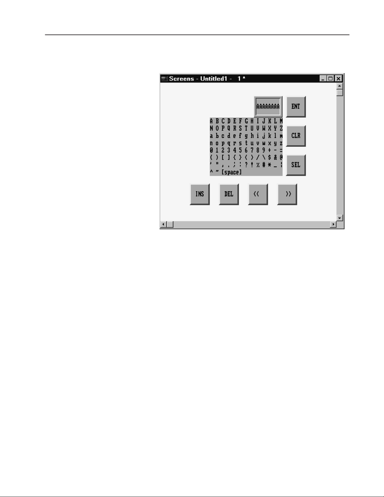
ASCII Input Object Displays
The following illustration shows the Large ASCII Input object for a
touch screen terminal.
Publication 2711E-820 – January 1998
Page 18
The following illustration shows a Small ASCII Input Object for a
keypad terminal.
7ASCII Inputs
Buttons of the ASCII Input Object
The object’s buttons function differently, depending on the terminal
type.
The following buttons are used to edit the string displayed in the
scratchpad:
• SHF (Shift) (Large ASCII Input object for touch screens
only)—By default this button is off, and labels appear
non-shifted. When this button is on, the Shift key is displayed in
reverse video. All the character keys, including numbers and
symbols, display and are input in their shifted state. For example,
“a” becomes “A”; “2” becomes “:”.
• CAPS (Large ASCII Input object for touch screens only)—By
default this button is off, and labels appear in lower case. When
on, the button is displayed in reverse video, and the labels appear
in upper case. With CAPS on, letters are input in upper case, but
numbers and symbols are not shifted. The state is maintained
across power cycles and screen changes.
• INS (Insert)—toggles the keyboard between insert and overstrike
modes. The state is maintained across power cycles and screen
changes.
Publication 2711E-820 – January 1998
Page 19

8 ASCII Inputs
When the keyboard entry is in insert mode the button appears in
reverse video. New characters appear at the current cursor
position. The cursor also moves one character to the right for
each new character. The string in the scratchpad scrolls; however,
if the maximum number of input characters has been entered in
the scratchpad, the new character will not be inserted.
When the keyboard entry is in overstrike mode and the INS
button is in normal video, new characters type over existing
characters.
• DEL (Delete)—deletes the character at the current scratchpad
cursor position.
• <<—moves the cursor in the scratchpad to the left.
• >>—moves the cursor in the scratchpad to the right.
• CLR (Clear)—clears the scratchpad.
• SEL (Select)—places the highlighted character into the
scratchpad at the cursor position. (For all ASCII Input objects
except the Large ASCII Input object for touch screens.)
• ENT (Enter)—When the operator presses the ENT button, the
leftmost character is placed in the high order byte of the first PLC
word, the next character to the right in the low order byte, and so
on. If the character string is too large for the configured tag, the
terminal displays an “out of range” error message. In this case,
the character string is not sent to the PLC.
The ASCII input object supports a scrollable scratchpad area so
the operator can enter a long character string in a small
scratchpad. Pressing ENT sends all the characters to the PLC, not
only the visible characters. For example, if the scratchpad is five
characters wide, and the operator enters ten characters and presses
Enter, all ten characters are sent, assuming the “Number of Input
Characters” is configured to ten or more.
The string in the scratchpad is highlighted after the ENT button is
pressed. If the operator selects an ASCII character immediately,
the terminal clears the scratchpad and displays that character.
However, if the operator presses an editing key (INS, DEL, or the
cursor keys << and >> ), the terminal continues to display the
existing string (no longer highlighted), allowing the operator to
edit it without having to retype it.
• Arrow keys (Large and Small ASCII Input objects for keypad
terminals)—The operator uses the arrow keys on the PanelView
terminal to select characters from the keyboard.
• Arrow keys (Small ASCII Input object for touch screen
terminals)—The operator uses the four directional arrows that are
part of the object to select characters from the keyboard.
Publication 2711E-820 – January 1998
Page 20

Configuring the ASCII Input Object (Large or Small)
Configure the ASCII Input object according to the following table:
Field Meaning
Name Assign a name, up to 15 characters, to document the object for
printed reports. This increases the application’s size by 1 byte
per character.
Type (keypad only) Select Small ASCII Input or Large ASCII Input.
Fill Characters Specify which character you want the ASCII string padded with
if it is less than the number of input characters when the
character string is sent to the PLC. Choices are:
Spaces
Zeroes
FF*
Null (default)
* F is the hexadecimal equivalent of setting 4 bits to 1; FF
means to set all 8 bits to 1. Each character takes up one byte
(8 bits), so padding the string with FF means that all 8 bits of
each unused character in the string are set to 1.
Number of Scratchpad
Characters
Number of Input
Characters
Button Function Key
Assignments (keypad
only)
Control The ASCII Input object uses the following controls.
Specify the number of characters (from 1–64) that will be
visible in the scratchpad. This must be less than or equal to the
number of input characters.
Specify the number of characters (1–82) that will be sent to the
PLC. If this number is greater than the number of scratchpad
characters, the scratchpad will scroll to allow more characters
to be entered.
Specify a function key for each of the buttons associated with
this object.
ASCII Input identifies which PLC location the string will be
written to.
Note: This must be a string tag.
Enter Key Control and Enter Key Handshake must be used
together to provide handshaking between the PLC and the
terminal. You can assign a tag only to the Enter Key Control.
You can assign a tag or expression to the Enter Key
Handshake.
When the operator presses the ENT button to send the value to
the PLC, the terminal sets the Enter Key Control value to 1
(after the Enter Key Control delay, as specified in the Timing
Parameters tab of the Terminal Setup dialog box). To inform the
terminal that the handshake has been received, put a line in
your PLC program to cause a 0 to non-0 transition in the Enter
Key Handshake. When the terminal sees this value change
from 0 to non-0, it changes the Enter Key Control value back
to 0.
9ASCII Inputs
Publication 2711E-820 – January 1998
Page 21

10 ASCII Inputs
Field Meaning
Control (con’t) If the terminal does not receive acknowledgment (transition
from 0 to non-0) within the Enter Key Handshake Time (as
specified in the Timing Parameters tab of the Terminal Setup
dialog box), it displays an error message in the Fault Window
and resets the Enter Key Control. If the Enter Key Handshake
is unassigned, the Enter Key Control remains set for the
duration of the Push Button Hold Time or for as long as the
button is pressed, whichever is longer.
Because this control uses only two values, a digital tag is
recommended.
Important: If the Enter Key Control is assigned, all keypad
and touch screen input is disabled when the Enter Key is
pressed, until the Enter Key Control is reset to 0.
You can adjust the size of the scratchpad and format the ASCII Input
object’s foreground color, background color, font style, and border
style. For details on formatting objects see “Changing Object
Appearance,” in Chapter 9, Creating Objects, in the PanelBuilder
1400e Configuration Software for Windows User Manual.
"
Note: If you use the Extra Large Font the application will be
compatible with PanelView Version 2 or later. It will not be
compatible with earlier versions.
Publication 2711E-820 – January 1998
Page 22

Bar Graphs
This chapter tells you:
• how bar graphs function
• how to configure bar graphs
Bar Graphs
About Bar Graphs
"
Bar graphs are useful for monitoring analog conditions that change,
such as temperature or fluid levels. You can create vertical and
horizontal bar graphs across the height or width of the screen.
Vertical bars can be configured to fill from bottom to top or
vice-versa. Horizontal bars can be configured to fill from left to right
or vice versa.
Tip: Use the following suggestions to customize bar graphs:
• To show the bar’s fill level, make an axis with incremental ticks
alongside the bar graph by using the Scale object, or by using
lines or graphic images.
• To have a bar graph change color at certain values, cascade bar
graphs together. To do this, remove the border from the graphs,
place the high end of one graph at the low end of the next, and
adjust each graph’s data range accordingly. To add a border to the
cascading graphs, place a hollow or solid panel behind the bar
graphs.
• To create a fully functional “template,” group bar graphs with
other objects. For example, position two or three bar graphs
together and put numeric display objects immediately below the
bar graphs to display the process variable, set point, and control
variable. You can use any of the numeric entry objects
interactively with these values.
Publication 2711E-820 – January 1998
Page 23

12 Bar Graphs
Configuring the Bar Graph
Configure the bar graph according to this table:
Field Meaning
Name
Graph Type Specify Vertical Bar Graph or Horizontal Bar Graph.
Fill Direction Specify the direction you want the bar to fill.
Maximum Value Specify the maximum value to be displayed in the graph. When
Minimum Value Specify the minimum value to be displayed in the graph. When
Control Bar Graph Value identifies the value to be displayed. Assign a
Assign a name, up to 15 characters, to document the object for
printed reports. This increases the application’s size by 1 byte
per character.
For vertical graphs, specify either Top Down or Bottom Up.
For horizontal graphs, specify either Left to Right
or Right to Left.
the PLC value reaches (or exceeds) this value, the bar graph is
completely full. Enter a value between -2,147,483,648 and
2,147,483,647.
The maximum value must be greater than the minimum value.
the PLC value drops to (or falls below) this value, the bar graph
is completely empty. Enter a value between -2,147,483,648
and 2,147,483,647.
The minimum value must be less than the maximum value.
tag or expression to the Bar Graph Value control.
You can adjust the size of the bar graph and format its foreground
color, background color, border style, and blink attributes. For details
on formatting objects see “Changing Object Appearance,” in
Chapter 9, Creating Objects, in the PanelBuilder 1400e
Configuration Software for Windows User Manual.
Publication 2711E-820 – January 1998
Page 24

Control Selectors
Control Selectors
This chapter discusses:
• the different types of Control Selectors
• how to use Control Selectors
• how to configure Control Selectors
About Control Selectors
"
Control Selectors allow operators to select items from a list. When
the application is running, the operator can move through the list
using the Up and Down Cursor buttons and select items.
The choice the operator makes is always indicated by the value of
the Selector Control.
There are three Control Selectors:
This Control Selector Does this
Control List Selector with Enter
Key
Control List Selector without Enter
Key
Set Bit Cursor Point
(Keypad applications only)
Allows the operator to move through a list and select
a list item by pressing Enter.
Allows the operator to move through a list. The
current list item is automatically selected.
Points to a screen character and allows the operator
to select from a list or an array of objects.
Tip: You can position Control Selectors so they point at other
objects on the same screen. For example, a Control List Selector
could point to an adjacent list of Numeric Display objects. Values
entered using the selector could be directed (by the PLC program) to
the Displayed Value tag or expression of the numeric object being
displayed.
Control List Selectors consist of a list of entries. Consider each entry
in the Control List Selector as a state, where state 0 is the first entry
and state ‘n’ is the last entry.
Each state in the list corresponds to a value. This value is written to
the Selector Control.
Publication 2711E-820 – January 1998
Page 25

14 Control Selectors
Control List Selector with Enter Key
The Control List Selector with Enter Key object allows the operator
to choose items in a list by selecting them and then pressing Enter.
The maximum number of items in this list is determined by the size
of the list component. For information on changing the size of the
list component, see Chapter 9, Creating Objects, in the PanelBuilder
1400e Configuration Software for Windows User Manual.
The Control List Selector with Enter Key consists of the following
components:
This component Does this
Selector List
Up Cursor Button When the operator presses the Up Cursor button, the arrow
Down Cursor Button When the operator presses the Down Cursor button, the
Enter When the operator presses Enter, the desired option is
This vertical list can have up to 24 different states (each list
item represents a state). With Double High or Large Font, the
list can contain 12 states. If you use the Extra Large Font, the
list can contain only 6 states.
in the list moves up by one list entry. If the Down Cursor
button is enabled, you can disable the Up Cursor button. Only
one of the Up and Down Cursor buttons needs to be enabled.
The Up Cursor button auto-repeats at the rate specified in the
Timing Parameters tab of the Terminal Setup dialog box.
arrow in the list moves down by one list entry. If the Up
Cursor button is enabled, you can disable the Down Cursor
button. Only one of the Up and Down Cursor buttons needs
to be enabled.
The Down Cursor button auto-repeats at the rate specified in
the Timing Parameters tab of the Terminal Setup dialog box.
chosen and the Selector Control value is updated.
Publication 2711E-820 – January 1998
As the operator presses the Up or Down Cursor buttons, an arrow
indicator moves through the list states, wrapping around the top and
bottom. To make a choice, the operator presses Enter
. When Enter is
pressed, the list state is chosen, and the terminal updates the Selector
Control with the value assigned to that state.
Because the operator can move through the list and select different
states at will, the states are not necessarily executed consecutively.
The new state is determined by the cursor’s position in the list when
Enter is pressed.
Page 26

15Control Selectors
The Control List Selector with Enter Key recognizes when the
Selector Control value is changed externally. For example, if the tag
assigned to the Selector Control is also assigned to another object,
and this object sends a new value to the tag, the Control List
Selector’s highlight bar moves to the list state that has this value
assigned. If the state value doesn’t match the tag value, the highlight
bar will be removed. An error state also occurs if the Selector
Control is not assigned. In this case also, no highlight bar appears.
If the Selector Control cannot accommodate a state value, an error
message is displayed, and the PLC value is not changed. The
operator must clear the fault before continuing.
RIO
Important: In Remote I/O applications, the PanelView terminal can
retain the current value for the Control List Selector
with Enter Key, even after the terminal is turned off.
Depending on how the Application Startup operation is
defined, the retained value (last state) or initial value
(default) is sent to the PLC when power is re-applied.
For details on configuring Application Startup
operation, see “Application Startup” in Chapter 5 in the
PanelView 1000e, 1200e, and 1400e Operator
Terminals User Manual.
Configuring a Control List Selector with Enter Key
Configure the Control List Selector with Enter Key according to this
table:
Field Meaning
Name
Control List Type Specify Control List Selector with Enter Key.
Initial State Specify the state that the cursor defaults to when the
Edit States Change the values of the states. You can assign any unique
Assign a name, up to 15 characters, to document the object for
printed reports. This increases the application’s size by 1 byte
per character.
application is run for the first time. Choose any of the states in
the list.
Instead of assigning a state, you can enter a blank value in the
Initial State field. This means that the object will always use the
Selector Control’s initial value to set the initial state.
value from –2,147,483,648 to 2,147,483,647. For more
information, see “Configuring List Object States,” in Chapter 9,
Creating Objects, in the PanelBuilder 1400e Configuration
Software for Windows User Manual.
Note: To minimize the size of the application file, use state
values that increment by one for each state. Do not configure
more states than you need.
Publication 2711E-820 – January 1998
Page 27

16 Control Selectors
Field Meaning
Up Cursor
Down Cursor Specify whether the Down Cursor button is enabled, and, if you
Enter If you have a keypad application, specify which function key the
Control The Control List Selector with Enter Key uses the following
Specify whether the Up Cursor button is enabled, and, if you
have a keypad application, select a function key. You must
have at least one of the Up and Down Cursor buttons enabled.
have a keypad application, select a function key. You must
have at least one of the Up and Down Cursor buttons enabled.
operator will press to choose the highlighted selection.
controls:
Selector Control records the state value of the list item
currently selected. You can assign a tag only to the Selector
Control.
Note: If you do not assign this control, an error state occurs
when the object is displayed on the PanelView terminal. No
highlight bar appears on the list, alerting the operator to the
error state.
Enter Key Control records that the Enter Key has been
pressed. You can only assign a tag to this control.
When Enter is pressed after the Enter Key Control Delay time
has elapsed, the control is set to 1 for the Enter Key
Handshake Time (specified in the Timing Parameters tab of the
Configure Terminal Setup dialog box) or until the Enter Key
Handshake makes a 0 to non-0 transition. When either occurs,
the Enter Key Control is reset to 0.
Since this control uses only two values, a digital tag is
recommended.
Enter Key Handshake is set by the PLC to confirm that it has
recorded the change for the Enter Key Control. You can assign
a tag or expression to the Enter Key Handshake control.
The PanelView terminal sets the Enter Key Control to 1 when
the operator presses the button. PLC logic must set the Enter
Key Handshake to non-0 when the Enter Key Control is set.
When the terminal detects a 0 to non-0 transition in the Enter
Key Handshake, it resets the Enter Key Control to 0. PLC logic
must then reset the Enter Key Handshake to 0.
If this control is left unassigned, the Enter Key Control is reset
after the Push Button Hold Time.
Publication 2711E-820 – January 1998
"
You can adjust the size of each component of the Control List
Selector with Enter Key and format the object’s foreground color,
background color, font style, button margins (touch screen
applications only), border style, fill style, and blink attributes. For
details on formatting objects see “Changing Object Appearance,” in
Chapter 9, Creating Objects, in the PanelBuilder 1400e
Configuration Software for Windows User Manual.
Note: If you use the Extra Large Font, the application will be
compatible only with PanelView Version 2 or later. The application
will not be compatible with earlier versions.
Page 28

17Control Selectors
Control List Selector without Enter Key
Unlike the Control List Selector with Enter Key, the selections in the
Control List Selector without Enter Key list are highlighted and sent
to the PLC as the operator moves the cursor to each item.
The number of items in this list is determined by the size of the list
component. For information on changing the size of the list
component, see Chapter 9, Creating Objects, in the PanelBuilder
1400e Configuration Software for Windows User Manual.
The Control List Selector without Enter Key consists of these
components:
This component Does this
Selector List
Up Cursor Button When the operator presses the Up Cursor button, the
Down Cursor Button When the operator presses the Down Cursor button, the
This vertical list can have up to 24 different states (each list
item represents a state). With Double High or Large Font,
the list can contain 12 states. If you use the Extra Large
Font, the list can contain only 6 states.
arrow in the list moves up by one list entry. If the Down
Cursor button is enabled, you can disable the Up Cursor
button. Only one of the Up and Down Cursor buttons
needs to be enabled.
The Up Cursor button auto-repeats at the rate specified in
the Timing Parameters tab of the Terminal Setup dialog
box.
arrow in the list moves down by one list entry. If the Up
Cursor button is enabled, you can disable the Down
Cursor button. Only one of the Up and Down Cursor
buttons needs to be enabled.
The Down Cursor button auto-repeats at the rate specified
in the Timing Parameters tab of the Terminal Setup dialog
box.
"
"
Tip: Build a simple two-position Control List Selector and include
only the Down Cursor button. Functionally, the result is the same as
a Maintained Push Button or a hard-wired, two-position selector
switch. However, you also have a two-position list with the current
selection highlighted.
Note: The Control List Selector without Enter Key recognizes when
the Selector Control value is changed externally. For example, if the
tag assigned to the Selector Control is also assigned to another
object, and this object writes a new value in the tag, the Control List
Selector indicates the new value. If the Selector Control value does
not match any of the list’s state values, the highlight bar is removed.
If the Selector Control cannot accommodate the state value, an error
message is displayed, and the PLC value is not changed. The
operator must clear the fault before continuing.
Publication 2711E-820 – January 1998
Page 29
18 Control Selectors
RIO
Important: In Remote I/O applications, the PanelView terminal can
retain the current value for the Control List Selector
without Enter Key, even after the terminal is turned off.
Depending on how the Application Startup operation is
defined, the retained value (last state) or initial value
(default) is sent to the PLC when power is re-applied.
For details on configuring Application Startup
operation, see “Application Startup” in Chapter 5 in the
PanelView 1000e, 1200e, and 1400e Operator
Terminals User Manual.
ATTENTION: A control function should require
operator confirmation. Do not use this object on its
!
own to initiate a control function. Also, a retained
value could be used when the terminal is powered back
on, which could result in a control function starting
without the operator’s knowledge.
Configuring a Control List Selector without Enter Key
Configure the Control List Selector without Enter Key according to
this table:
Field Meaning
Name
Control List Type Specify Control List Selector without Enter Key.
Initial State Specify the state that the cursor defaults to when the
Edit States Change the values of the states. You can assign any unique
Auto-Repeat Rate Set the number of times per second the Up and Down Cursor
Auto-Repeat Start
Delay
Assign a name, up to 15 characters, to document the object for
printed reports. This increases the application’s size by 1 byte
per character.
application is run for the first time. Choose any of the states in
the list.
Instead of assigning a state, you can enter a blank value in the
Initial State field. This means that the object will always use the
Selector Control’s initial value to set the initial state.
value from –2,147,483,648 to 2,147,483,647. For more
information, see “Configuring List Object States” in Chapter 9,
Creating Objects, in the PanelBuilder 1400e Configuration
Software for Windows User Manual.
Note: To minimize the size of the application file, use state
values that increment by one for each state. Do not configure
more states than you need.
buttons will repeat when pressed and held down by the
operator. A value of 0 disables auto-repeat.
Set the time that should pass before the Up and Down Cursor
buttons go into Auto-Repeat mode when pressed and held
down by the operator. The range is 200 milliseconds to 2.5
seconds.
Publication 2711E-820 – January 1998
Page 30

Field Meaning
Up Cursor
Down Cursor Specify whether the Down Cursor button is enabled, and if you
Control Selector Control records the state value of the list item
Specify whether the Up Cursor button is enabled, and if you
have a keypad application, select a function key. You must
have at least one of the Up and Down Cursor buttons enabled.
have a keypad application, select a function key. You must
have at least one of the Up and Down Cursor buttons enabled.
currently selected. You can assign a tag only to the Selector
Control.
When the application is run for the first time, if initial values are
defined, the value of the initial state is written to the Selector
Control. Each time the button is pressed, the value of the next
state is sent to the Selector Control. After the value for the last
state is sent, the next button press wraps back to the first state.
The button recognizes external control value changes. If the
Selector Control value changes to one that does not match any
of the state values, the next button press will set the button to
state 0.
Note: If you do not assign this control, an error state occurs
when the object is displayed on the PanelView terminal. No
highlight bar appears on the list, alerting the operator to the
error state.
19Control Selectors
"
You can adjust the size of each component of the Control List
Selector without Enter Key, and format the object’s foreground color,
background color, font style, button margins (touch screen
applications only), border style, fill style, and blink attributes. For
details on formatting objects see “Changing Object Appearance,” in
Chapter 9, Creating Objects, in the PanelBuilder 1400e
Configuration Software for Windows User Manual.
Note: If you use the Extra Large Font, the application will be
compatible only with PanelView Version 2 or later. The application
will not be compatible with earlier versions.
Publication 2711E-820 – January 1998
Page 31

20 Control Selectors
Set Bit Cursor Points (Keypad Terminals Only)
A group of Set Bit Cursor Point objects allows the operator to select
from a list or an array of objects.
The Set Bit Cursor Point object consists of a cursor character, a
display field, and a unique control.
To use the Set Bit Cursor Points at runtime, the operator must press
the Select button on the PanelView terminal, thereby enabling the
arrow and Home keys. The arrow keys move the cursor to the
desired Set Bit Cursor Point on the terminal display. The Home key
moves the cursor to the home position (the cursor position at the top
left of the screen).
When the operator selects a Set Bit Cursor Point, the PanelView
terminal sets the selected Set Bit Cursor Point’s control to 1 and
displays the Set Bit Cursor Point character highlighted and blinking.
To turn off the Set Bit Cursor Point feature and disable the keys, the
operator must press the Cancel button on the PanelView terminal.
Only the selected Set Bit Cursor Point will have a control value set
to 1. All other Set Bit Cursor Points will have a Control value of 0.
Important: The Cursor Point operation status (Select or Cancel)
and the current cursor point position for each
application screen are maintained even after the
terminal is turned off and back on. This is true for DH+,
ControlNet, and Remote I/O applications.
ATTENTION: A control function should require
operator confirmation. Do not use this object on its
!
When you create a screen in PanelBuilder 1400e, all Set Bit Cursor
Point characters are visible. However, when you display the screen
on a PanelView terminal, only one Set Bit Cursor Point character is
visible and blinking.
Place successive Set Bit Cursor Points above, below, or beside
existing Set Bit Cursor Points (any distance apart). Refer to the X
and Y coordinates in the status bar to make sure the Set Bit Cursor
Points line up. At runtime, if the Set Bit Cursor Points aren’t
properly lined up, the operator may not be able to navigate from
point to point as expected. There is no warning if the Set Bit Cursor
Points don’t line up.
own to initiate a control function. Also, a retained
value could be used when the terminal is powered back
on, which could result in a control function starting
without the operator’s knowledge.
Publication 2711E-820 – January 1998
Page 32

Example 1: Using Set Bit Cursor Points
To monitor all the motors on a conveyor belt, draw a line to
represent the belt, and place Set Bit Cursor Points pointing to
each motor along the belt.
Program the PLC so that when you display this screen on a
terminal you can move the cursor to the desired motor and see
its status in a Local Message Display or Multistate Indicator.
21Control Selectors
Using the Set Bit Cursor Point on the PanelView Terminal
When the application is running, the operator can use these keys on
the PanelView terminal to control the Set Bit Cursor Point:
This key Does this
Select
Arrow keys Move the cursor through the Set Bit Cursor Points on the
Home Moves the cursor to the home position (at the top left of the
Cancel Turns the Set Bit Cursor Point feature off and disables the
Enables the arrow keys and Home key.
screen.
screen).
arrow and Home keys.
Publication 2711E-820 – January 1998
Page 33

22 Control Selectors
When selected, the Cursor Point character is highlighted and
blinking. The Control is set to 1. To turn off the Set Bit Cursor Point
feature and disable the keys, the operator must press the Cancel
button on the PanelView terminal.
The Set Bit Cursor Point values are not changed when the Set Bit
Cursor Point feature is cancelled. The last selected Set Bit Cursor
Point remains on.
"
"
Note: By default, when the Cancel button is pressed, the Set Bit
Cursor Point character becomes invisible. To keep the character
visible, even after the Cancel button is pressed, enable the Retain
Cursor On Cancel check box in the Object Setup tab of the Terminal
Setup dialog box. For more information about terminal setup
options, see Chapter 12, “Configuring Terminal Setup Options,” in
the PanelBuilder 1400e Configuration Software for Windows User
Manual.
Note: If you enable the Retain Cursor On Cancel option, the
application will be compatible only with PanelView Version 2 or
later. The application will not be compatible with earlier versions.
Cursor Point Default Operation
1. When the application is run for the first time, the PanelView
terminal scans all Set Bit Cursor Point objects in the screen from
left to right, top to bottom. The first Set Bit Cursor Point object
with its control value set to 1 is as the active Cursor Point for that
screen.
2. If none are found, the Cursor Point object (Set Bit or Numeric
Input) nearest the home position of the screen is the active Cursor
Point object for that screen. If this is a Set Bit Cursor Point, its
control is set to 1.
Publication 2711E-820 – January 1998
"
3. All other Set Bit Cursor Point objects in the selected screen have
their control values reset to 0. Any other Numeric Input Cursor
Point objects on the screen remain inactive.
4. In a Remote I/O application, when the screen is selected and the
Screen Number to PLC option is enabled, both the new screen
number and the new Set Bit Cursor Point values are transferred to
the PLC in the same PLC scan.
Note: When the application is first run, the Cursor Point operation is
enabled.
Page 34

Cursor Point Operation after Screen Change
1. When a screen is re-selected, the Set Bit Cursor Point object that
was last active is active again.
2. The object’s control value is set to 1.
3. All other Set Bit Cursor Point objects in the screen have their
control values reset to 0.
Cursor Point Operation on a Terminal Powerup
The Set Bit Cursor Point operation status (Selected or Cancelled) is
always saved. On powerup, as well as when you switch to a new
screen, the Set Bit Cursor Point object that was active when the
screen was last displayed is active.
ATTENTION: The Set Bit Cursor Point object should
not share tags with objects used for control purposes.
!
Sharing tags could cause control functions to start
without the operator’s knowledge.
23Control Selectors
The following example shows how the PanelView terminal
determines which Set Bit Cursor Point is active.
Example 2: When a Screen Uses Multiple Set Bit Cursor Points
The Application Startup screen has five Set Bit Cursor Points:
three in a row at the top of the screen and two in a row below.
The first two Set Bit Cursor Points in each row are aligned in
columns.
Publication 2711E-820 – January 1998
Page 35

24 Control Selectors
When the application is downloaded, the Set Bit Cursor Point at
the top left corner of the screen is selected as the default and its
control is set to 1. If the right arrow key is pressed, its control is
set to 0 and the second Set Bit Cursor Point in the same row is
set to 1.
"
Defining the Set Bit Cursor Point Character and Display Field
The Set Bit Cursor Point object consists of a cursor point character
and a display field. By default the Set Bit Cursor Point object uses a
small arrow as the cursor character.
Note: You can change the attributes of the cursor as you would any
other text character. For example, you could increase the size of the
arrow by selecting another font from the Format menu. See Chapter
9, Creating Objects, in the PanelBuilder 1400e Configuration
Software for Windows User Manual.
T o define the Set Bit Cursor Point character:
1. Create the Set Bit Cursor Point object.
2. Choose Text from the Objects menu, or
3. Position the I-beam to the immediate left of the arrow on the Set
Bit Cursor Point. Use the
DELETE key to delete the arrow.
from the toolbar.
Publication 2711E-820 – January 1998
Page 36

25Control Selectors
4. To use a character from the keyboard, type that character. You can
type only one character. To use a character from the extended
character set, hold down the
ALT key while you enter the
character’s ASCII code on the numeric keypad. See Appendix B,
The Extended Character Set, in the PanelBuilder 1400e
Configuration Software for Windows User Manual for more
information.
You can use text or a graphic image as the Set Bit Cursor Point
display.
T o define the Set Bit Cursor Point display field:
1. Create the Set Bit Cursor Point object.
2. Type the text you want to see associated with the cursor point, or
import and place a graphic image in the display.
You can position the display on another area of the screen, instead
of next to the character.
If you don’t want a display with the cursor point, remove the
border and change the field’s background color to the screen
color. This will make the field disappear.
"
Configuring the Set Bit Cursor Point
Configure the Set Bit Cursor Point according to this table:
Field Meaning
Name
Set Bit Control Set Bit Control records the status of the Set Bit Cursor Point.
You can adjust the size of the Set Bit Cursor Point’s display and
format the object’s foreground color, background color, font style,
border style, fill style, and blink attributes. For details on formatting
objects see “Changing Object Appearance,” in Chapter 9, Creating
Objects, in the PanelBuilder 1400e Configuration Software for
Windows User Manual.
Note: If you use the Extra Large Font, the application will be
compatible only with PanelView Version 2 or later. The application
will not be compatible with earlier versions.
Assign a name, up to 15 characters, to document the object for
printed reports. This increases the application’s size by 1 byte
per character.
You can only assign a tag to this control.
When it is selected, the control is set to 1. Otherwise it is 0.
Since this control uses only two values, a digital tag is
recommended.
Publication 2711E-820 – January 1998
Page 37

This chapter tells you how to use the PanelBuilder drawing objects
to illustrate your application.
About Drawing Objects
Arc
"
"
Tip: To simplify screen editing and maximize runtime performance,
convert all text and drawing objects into wallpaper. See Chapter 9,
Creating Objects, in the PanelBuilder 1400e Configuration Software
for Windows User Manual, for detailed information.
Use the following drawing objects to illustrate your application
screens:
• arcs
• ellipses
• lines
• panels
• rectangles
• wedges
Note: For information about Scales, see the Scales chapter, later in
this manual.
You can draw arcs from one to four quadrants. You can size the arc,
configure it to appear hollow or solid, and change the line style or
width.
"
When you first draw an arc, it appears as an ellipse. Select one of the
handles and drag the pointer around the circumference of the ellipse
to reduce the curve to three, two, or one quadrant of the ellipse.
Tip: To draw quadrants of a perfect circle, hold the Shift key as you
first draw the arc.
For more details on drawing and configuring arcs, see Chapter 9,
Creating Objects, in the
for Windows User Manual.
PanelBuilder 1400e Configuration Software
Publication 2711E-820 – January 1998
Page 38

28 Drawings
Ellipse
Line
"
"
You can create any size and shape of ellipse.
You can configure the ellipse as hollow or solid, and change the line
style or width.
Tip: To create or edit a perfect circle, hold the Shift key as you draw
or edit the ellipse. You can draw any size of circle.
For details on drawing and configuring ellipses, see Chapter 9,
Creating Objects, in the
for Windows User Manual.
Lines can be used for emphasis, to divide the screen, to connect
symbols, or to represent physical devices like pipes or conveyors.
You can draw lines in any direction.
Tip: To create exact 45_ angles when drawing or moving a line,
hold the Shift key while you move the mouse.
Five line styles are available:
PanelBuilder 1400e Configuration Software
• Solid, in four widths (1, 2, 4, and 8 pixels)
• Dash
• Dot
• Dash-Dot
• Dash-Dot-Dot
For more information on lines and line styles, refer to Chapter 9,
Creating Objects, in the PanelBuilder 1400e Configuration Software
for Windows User Manual.
Arrows
You can use the arrow graphic images to place arrows on lines. The
arrow images are contained in the IMAGES directory. If you
followed the default installation, the directory will be
C:\AB\PB1400E\IMAGES\ARROWS.
You must import the arrow images into the graphic images library
before you can place them on the screen. For instructions on
importing Graphic Images, refer to Chapter 9, Creating Objects, in
the PanelBuilder 1400e Configuration Software for Windows User
Manual.
Publication 2711E-820 – January 1998
Page 39

29Drawings
Panel
Rectangle
"
"
Panels are similar to rectangles, except panels can have a border.
They are useful for providing emphasis.
You can configure the border style of the panel and assign a hollow
or solid fill pattern.
Tip: To draw or edit a perfect square, hold the Shift key as you draw
or edit the panel. You can draw any size of panel.
For details on drawing and configuring panels, see Chapter 9,
Creating Objects, in the
for Windows User Manual.
Use rectangles to emphasize text or any other object. You can draw
any size of rectangle. You can configure the rectangle as hollow or
solid and change its line style or width.
Tip: To draw or edit a perfect square, hold the Shift key as you draw
or edit the rectangle. You can draw any size of square.
For details on drawing and configuring rectangles, see Chapter 9,
Creating Objects, in the PanelBuilder 1400e Configuration Software
for Windows User Manual.
PanelBuilder 1400e Configuration Software
Wedge
"
Wedges or pie-shapes are partial ellipses or closed arcs. You can
draw wedges from one to four quadrants. Wedges always have a fill
style and can have any line style or width.
When you first draw a wedge, it appears as an ellipse. Select one of
the handles and drag the pointer around the circumference of the
ellipse to reduce the curve to three, two, or one quadrant of the
ellipse.
Tip: To draw quadrants of a perfect circle, hold the Shift key as you
draw the wedge.
For more details on drawing and configuring wedges, see Chapter 9,
Creating Objects, in the PanelBuilder 1400e Configuration Software
for Windows User Manual.
Publication 2711E-820 – January 1998
Page 40

Goto Configure Mode
Goto Configure Mode
This chapter shows you how to create the Goto Configure Mode
object. This object allows operators to switch the PanelView terminal
from Run Mode to Configure Mode without using the terminal’s
hardware keyswitch (where applicable). In addition, this chapter
provides tips on how to configure the Goto Configure Mode object
to avoid accidental switching of the terminal to Configure Mode.
About the Goto Configure Mode Button
When the operator presses the Goto Configure Mode button, the
terminal displays the Confirm Configure Mode screen.
After the operator presses OK the terminal switches from Run Mode
to Configure Mode and displays the Terminal Configuration Screen.
Pressing Cancel returns the operator to the application currently
executing on the terminal without interrupting communications or
execution of the application in any way.
Publication 2711E-820 – January 1998
Page 41

32 Goto Configure Mode
The screen shown below is for a 1000e or 1400e touch screen
terminal; the screen for the 1200e touch screen terminal includes an
Align Screen function. The screen includes function key labels for
1000e, 1200e, and 1400e keypad terminals.
"
Note: The Goto Configure Mode button switches the terminal from
Run Mode to Configure Mode only if Software Mode Switching is
enabled on the PanelView terminal’s Configure Mode Security
screen. For more information about Software Mode Switching and
about how the Goto Configure Mode button’s twin, Run Mode,
functions at the terminal, see the PanelView 1000e, 1200e, and
1400e Operator Terminals User Manual.
Important: When the terminal is switched to Configure Mode, the
application that was previously running on the terminal
is terminated and all communication with the PLC
stops. You may therefore want to put the Goto
Configure Mode button on a screen to which security
has been assigned, so an operator does not inadvertently
switch the terminal out of Run Mode.
Important: If Software Mode Switching is enabled on the
PanelView terminal’s Configure Mode Security screen,
a Goto Configure Mode button will be present on all
Major Fault windows and on the Application Transfer
screen. The Goto Configure Mode button cannot be
protected by screen security in these instances and any
operator can switch the terminal to Configure Mode.
Publication 2711E-820 – January 1998
Page 42

33Goto Configure Mode
Software Mode Switching at the PanelView Terminal
For the Goto Configure Mode Button to operate, the Soft Mode
Switch must be enabled, and the terminal’s hardware keyswitch must
be in Run mode. The Goto Configure Mode button allows operators
to switch between Run and Configure modes without using the
hardware keyswitch.
When in Configure Mode, press the Mode Switch tab in the Security
window to display the following screen.
Important: If the Software Mode Switch is set to Enable, the Goto
Configure Mode button is displayed without access
restrictions on both the Transfer Application screen and
the Major Fault window. (See below for a screen
display.) This may pose a security issue, because all
operators will be able to switch between Run and
Configure modes.
The presence of the Goto Configure Mode button in an application
running on the PanelView terminal does not disable the terminal’s
hardware keyswitch; the terminal can still be switched from Run
mode to Configure mode using the keyswitch or remote keyswitch
(if fitted).
Publication 2711E-820 – January 1998
Page 43

34 Goto Configure Mode
The following table shows the behavior of the terminal at power up:
If the terminal is powered up with Then the terminal powers up in
The Software Mode Switching option
disabled
The Software Mode Switching option
enabled, and the hardware key switch in
Run Mode
The Software Mode Switch option enabled
and the hardware keyswitch in Configure
Mode
The mode indicated by the hardware
keyswitch
The same mode it was in at power down
Configure Mode
The Software Mode Switch button also lets you enable or disable the
Run Mode button on the Terminal Configuration screen.
• EnableIf you enable the software mode switch, operators can
switch the terminal from Run mode to Configure mode using the
Goto Configure Mode button. Also the Run Mode button on the
Terminal Configuration screen is enabled.
• DisableIf you disable the software mode switch, the Goto
Configure Mode button is disabled, and the Run Mode button on
the Terminal Configuration screen is disabled.
Configuring the Goto Configure Mode Button
Configure the Goto Configure Mode button according to this table:
Field Meaning
Name
Function Key
(Keypad only)
You can adjust the size of the button and format its foreground color,
background color, button margins (touch screen applications only),
border style, fill style, and blink attributes. For details on formatting
objects see “Changing Object Appearance,” in Chapter 9, Creating
Objects, in the PanelBuilder 1400e Configuration Software for
Windows User Manual.
Assign a name, up to 15 characters, to document the object for
printed reports. This increases the application’s size by 1 byte
per character.
Specify which function key the operator must press to activate
this button.
Publication 2711E-820 – January 1998
Page 44

Graphic Images
Graphic Images
This chapter tells you how to use graphic images.
For step-by-step instructions about importing, placing, sizing,
copying, and exporting graphic images, refer to Chapter 9, Creating
Objects, in the PanelBuilder 1400e Configuration Software for
Windows User Manual.
About Graphic Images
"
Tip: To simplify screen editing and maximize runtime performance,
convert all graphic images except object labels into wallpaper. See
Chapter 9, Creating Objects, in the PanelBuilder 1400e
Configuration Software for Windows User Manual, for detailed
information.
Use graphic images to illustrate screens, objects, functions, and so
on. You can add graphic images to the screen background, or add
them to an object as object labels. See Symbols later in this manual
for information about using graphic images as object labels.
If you followed the default installation, you’ll find a set of bitmap
(.bmp) files in the folders contained in the
C:\AB\PB1400E\IMAGES directory. The images in these folders
include all ISA symbols, arrow images, DIN symbols, and other
color bitmaps. See Appendix A, ISA Symbols, Appendix B, DIN
Symbols, and Appendix C, Arrows and Parts, for samples of these
graphic images.
Importing Graphic Images
"
You can import bitmaps from any other application into PanelBuilder
1400e’s bitmap graphic image library. You can also import 2-D
AutoCAD graphics saved in the .dxf file format into PanelBuilder
1400e’s DXF Image library. Transparent AutoCAD .dxf images are
made solid when converted for use in PanelBuilder. Color bitmaps
and .dxf graphics are converted into 16-color images; monochrome
bitmap images are imported as monochrome. The maximum graphic
image size is 640 by 480 pixels. If you import a file larger than this,
PanelBuilder automatically shrinks it to 640 by 480 pixels.
Note: AutoCAD (.dxf) graphics are converted to bitmap files when
PanelBuilder creates the application’s .pvd file for downloading to
the PanelView terminal.
Publication 2711E-820 – January 1998
Page 45

36 Graphic Images
"
"
Tip: Convert two-color bitmaps to monochrome before you import
them. Monochrome images use less memory and therefore provide
better runtime performance. You can configure a monochrome
image’s foreground and background colors, fill style, and blink
attributes. You can’t change the format of 16-color images.
Tip: Because PanelBuilder converts color images to 16-color
bitmaps, a 256-color image may not convert as expected. To achieve
a photographic appearance for your color bitmaps, import images
that use few colors. Screen 10 of the demonstration applications
shows a good example: TANK16.BMP uses grays and greens and
has the quality of a photographic image. If you followed the default
installation, the demonstration application files are in the
PB1400E\DEMO folder.
Once bitmaps and .dxf files are imported into the application’s
graphic image libraries, you can select the files and place them on
the application screen or in objects as labels.
Sizing Graphic Images
You can increase or decrease the size of the graphic images once you
place them on screens in PanelBuilder. You can use multiple copies
of the same graphic image and change the size of any or all of them.
The size of the source image remains unchanged; PanelBuilder saves
each new size of the image as a separate graphic when the
application’s .pvd file is created.
"
Note: The application’s size increases each time you resize an
image. Limit the number of images you resize to ensure that your
application will fit in the terminal’s memory.
Copying and Exporting Graphic Images
If you copy a graphic image to another PanelBuilder application, its
size attributes are copied as well. If you export a graphic image, it is
exported with its original size dimensions, or with the size 640 by
480 pixels, if it was originally larger than this. When exporting, if
the source image was a .dxf file, the exported file is a bitmap (.bmp)
representation of the source image.
Publication 2711E-820 – January 1998
Page 46

37Graphic Images
"
Note: If you are concerned about minimizing the size of your
application, use as few graphic images as possible. For each graphic
image you use, the application file’s size increases the number of
bytes in the image. Copies of a graphic image take much less space
than the original, so you might consider using the same image on
several screens rather than placing a unique image on each screen.
Ensure that all copies are the same size as the original, however,
otherwise each copy is saved as a separate image. Monochrome
graphic images take less file space than 16-color images that are the
same height and width.
Publication 2711E-820 – January 1998
Page 47

Indicators
This chapter tells you about:
• the different types of Indicators
• how to configure each Indicator
Indicators
About Indicators
Multistate Indicator
"
You can create these two types of Indicators:
• Multistate Indicator
• List Indicator
Indicators do not retain their values when the terminal is turned off.
The Multistate Indicator is a display object that enables the operator
to display the state of a PLC operation on the screen.
You can use the Multistate Indicator for various purposes. For
example, create a Multistate Indicator that is only two pixels high to
simulate flow in a pipe or indicate the motion of an object. Use a
two-state solid rectangle to simulate an indicator light, add
descriptive text to the object, or add a graphic image. Or, use a
Multistate Indicator to hide text until it is needed or becomes
applicable.
You can configure the state values of Multistate Indicator objects. At
runtime, the object displays the state whose value matches the
Indicator State control value.
Note: If the Indicator State control contains a value that doesn’t
match any of the Multistate Indicator’s assigned state values, an error
state occurs and the highest numbered state is displayed without its
label. An error state also occurs if the Indicator State control is not
assigned. In this case also, the highest numbered state is displayed
without its label.
"
Tip: If you plan to use the same graphic image for each state, use a
Symbol instead of a Multistate Indicator. You can configure the
Symbol to display different colors or blink attributes for different
states, and the Symbol uses less memory. PanelView also processes
the information more quickly for Symbols than for Multistate
Indicators. For more information, see Symbols, later in this manual.
Publication 2711E-820 – January 1998
Page 48

40 Indicators
Configuring the Multistate Indicator
For each Multistate Indicator, you must specify the number of states
(from 2 to 255), and define an Indicator State control. At runtime,
the value at the Indicator State control determines the state that is
displayed on the PanelView terminal.
Configure the Multistate Indicator according to this table:
Field Meaning
Name
Number of States Specify the number of states, from 2 to 255, this object will
Edit States If you increase the number of states beyond the default of 4,
Control Indicator State controls the state for this object. You can assign
Assign a name, up to 15 characters, to document the object for
printed reports. This increases the application’s size by 1 byte
per character.
display.
you must assign state values. You can also change the default
state values for the default 4 states.
To assign different values to the states, choose Edit States. You
can assign any unique value from -2,147,483,648 to
2,147,483,647. See “Configuring Object States,” in Chapter 9,
Creating Objects, in the PanelBuilder 1400e Configuration
Software for Windows User Manual for information on assigning
state values and configuring state attributes.
Note: To minimize the size of the application file, use state
values that increment by one for each state. Do not configure
more states than you need.
You should configure colors, text, graphic images, and other
attributes for each state.
a tag or expression to this control.
When the PLC changes the control’s value, the terminal
displays the state with the assigned value.
Note: If you do not assign this control, an error state occurs
when the object is displayed on the PanelView terminal. The
highest numbered state is displayed without its label, alerting
the operator to the error state.
Publication 2711E-820 – January 1998
You can adjust the size of the Multistate Indicator and format its
background color, border style, and blink attributes. For details on
formatting objects see “Changing Object Appearance,” in Chapter 9,
Creating Objects, in the PanelBuilder 1400e Configuration Software
for Windows User Manual.
Page 49

41Indicators
List Indicator
"
The List Indicator displays a list of states for a particular PLC
operation and highlights the current state.
The font size determines the maximum number of states possible in
the list. Small and Double Wide fonts allow up to 24 states; Double
High or Large fonts allow up to 12 states. If you use the Extra Large
font the maximum number of states is 6.
Note: List text can be in only one font size. The List Indicator
supports text labels only, not graphic image labels.
At runtime, the operator can see all the states for a particular
operation and see which state is current. The current state is
highlighted. The size of the list component determines the number of
states. For information on changing the font size, resizing the list,
and adding state text, see “Changing Object Appearance,” in
Chapter 9, Creating Objects, in the PanelBuilder 1400e
Configuration Software for Windows User Manual.
The List Indicator is similar to the Control List Selector, except the
PLC, rather than the operator, controls the display.
You can configure the state values of List Indicator objects. At
runtime, the object highlights the state whose value matches the
Indicator State control’s value.
"
Note: If the Indicator State control contains a value that doesn’t
match any of the List Indicator’s assigned state values, an error state
occurs and no state is highlighted. An error state also occurs if the
Indicator State control is not assigned. In this case also, no highlight
bar appears.
Publication 2711E-820 – January 1998
Page 50

42 Indicators
Configuring the List Indicator
The size of the List Indicator, font size, and border configuration
determine the maximum number of states. To increase or decrease
the number of states, resize the list. Configure the List Indicator
according to this table:
Field Meaning
Name
Edit States Assign different values to the states. You can assign any unique
Control Indicator State controls the state for this object. You can assign
Assign a name, up to 15 characters, to document the object for
printed reports. This increases the application’s size by 1 byte
per character.
value from –2,147,483,648 to 2,147,483,647. See “Configuring
List Object States” in Chapter 9, Creating Objects, in the
PanelBuilder 1400e Configuration Software for Windows User
Manual for information on assigning state values.
Note: To minimize the size of the application file, use state
values that increment by one for each state. Do not configure
more states than you need.
a tag or expression to the Indicator State control.
When the PLC changes the control’s value, the terminal
highlights the state with the assigned value.
Note: If you do not assign this control, an error state occurs
when the object is displayed on the PanelView terminal. No
highlight bar appears on the list, alerting the operator to the
error state.
"
You can adjust the size of the List Indicator and format its
foreground color, background color, font style, border style, and
blink attributes. For details on formatting objects see “Changing
Object Appearance,” in Chapter 9, Creating Objects, in the
PanelBuilder 1400e Configuration Software for Windows User
Manual.
Note: If you use the Extra Large Font, the application will be
compatible only with PanelView Version 2 or later. The application
will not be compatible with earlier versions.
Publication 2711E-820 – January 1998
Page 51

Local Message Displays
Local Message Displays
This chapter explains:
• how the Local Message Display object functions
• how to configure the Local Message Display object
About Local Message Displays
The Local Message Display provides information to the operator by
displaying one message from a list.
There are two components to a local message: the Local Message
Display object, and the list of local messages. You add Local
Message Display objects to screens; you define the messages in the
Local Messages editor. You can create up to 2000 messages per
application. The message’s text can contain any characters, including
those in the extended ASCII character set. For information about
creating messages, see Chapter 10, Creating Messages, in the
PanelBuilder 1400e Configuration Software for Windows User
Manual.
Each Local Message Display object is assigned a Message Control.
The value of this control determines which message is displayed. For
example, if the control value is 39, the local message that has trigger
value 39 is displayed. You can program the PLC to set this value, or
you can add objects to the screen so the operator can control which
local message is displayed.
The Local Message Display object can display single or multiple
lines of message text, depending on the object size and font size. A
local message can contain up to 256 characters. You can select any
font size, including the Extra Large font.
At runtime, if the display is wide enough to display the full message
on one line, the text appears centered within the display area. If the
message is longer than the display area, it is left-justified.
If the display is not wide enough, automatic word wrapping occurs
so the message is displayed on multiple lines, and the text is
left-justified. If the message uses the newline character (\n), the text
after the character begins on a new line of the display. If the message
is longer than the display, the message is truncated to fit. The “>”
character at the end of the message indicates it has been truncated.
Publication 2711E-820 – January 1998
Page 52

44 Local Message Displays
How a Local Message Is Triggered
A message is triggered when the value of the Message Control
changes. This value must correspond to the trigger value of a local
message. For example, a control value of 19 would cause the
message with trigger value 19 from the Local Message list to appear
in the display. If the control value changed to 27, the message with
trigger value 27 would appear, replacing the previous message. The
Local Message Display is cleared when the trigger value is 0. If no
matching trigger value is found, the display is cleared and displays
“????”.
Triggering Messages on Multiple Local Message Displays
Each application has only one local message list but you can have
several Local Message Displays for different purposes. To trigger
different messages for different displays, create a subset of the local
message list for each display.
To trigger different messages on multiple Local Message Displays,
create the display objects using controls with different tags or
expressions that don’t overlap addresses. Then create all messages
using the Local Message editor.
The PLC can then write different values to each object control,
causing different messages to appear in each display.
For an example of using Local Message Displays with a Scrolling
List Object, see “Scrolling Lists”, later in this manual.
Configuring the Local Message Display
Configure the Local Message Display according to this table:
Field Meaning
Name
Control Message Control records the trigger value of the local
Assign a name, up to 15 characters, to document the object for
printed reports. This increases the application’s size by 1 byte
per character.
message to be displayed. You can assign a tag or expression to
the Message Control.
The control must be able to accommodate the trigger values of
all messages to be displayed for the object.
Publication 2711E-820 – January 1998
Page 53

You can adjust the size of the Local Message Display and format its
foreground color, background color, font style, border style, and
blink and underline attributes. For details on formatting objects see
“Changing Object Appearance,” in Chapter 9, Creating Objects, in
the PanelBuilder 1400e Configuration Software for Windows User
Manual.
45Local Message Displays
"
Note: If you use the Extra Large Font, the application will be
compatible only with PanelView Version 2 or later. The application
will not be compatible with earlier versions.
Publication 2711E-820 – January 1998
Page 54

This chapter describes:
• the different Numeric objects
• how to configure each Numeric object
• how different Numeric objects can work together
About Numerics
There are six Numeric objects:
• Increment Value Button (with and without Display)
• Decrement Value Button (with and without Display)
• Numeric Data Display
• Numeric Keypad Enable Button (keypad terminals only)
• Numeric Input Cursor Point (keypad terminals only)
• Small or Large Numeric Entry Keypad (touch screen terminals
only)
Numeric objects can be divided into two groups: input objects
(which are used for numeric entry) and display objects (which
display numeric values on the screen). Some numeric objects belong
to both groups.
The following table outlines which objects are input and which are
display. It also outlines which objects support polarity, decimal
points, and floating decimal points.
Object Input Display Polarity Decimal Point Floating
Increment Value Button
Increment Value Button with Display
Decrement Value Button
Decrement Value Button with Display
Numeric Data Display
Numeric Keypad Enable Button
Numeric Input Cursor Point
Numeric Entry Keypad
n n
n n n
n n
n n n
n n n n
n n n
n n n n n
n n n
Decimal
Publication 2711E-820 – January 1998
Page 55

48 Numerics
The following table lists tag types, data types, and the valid range of
values available when assigning tags to numeric objects.
Tag Type Data Type Range of Values
Analog
Digital 0 or 1
String 1 to 82 characters
Block 1 to 1024 bits
Default Address dependent (for Device tags)
0 to 65535 (for RIO tags)
Unsigned Integer 0 to 65535
Integer –32768 to 32767
Long Integer –2,146,483,648 to 2,147,483,647
Floating Point
Byte 0 to 255
Binary Address dependent
Bit Position Address dependent
1-Digit BCD to
8-Digit BCD
–3.402823 × 1038 to –3.402823 × 10
+3.402823 × 10
0 to 99,999,999
–37
to +3.402823 × 10
–37
, 0,
38
Increment and Decrement Value Buttons
"
Increment and Decrement Value Buttons are input objects that the
operator presses to change a current value.
Increment Value Button (with or without Display)
When the operator presses the Increment Value Button, the value of
the Button Control increases by a specified integer or floating-point
amount.
Note: If you configure the Increment Value Button for floating-point
values, the application will be compatible only with PanelView
Version 2 or later. The application will not be compatible with earlier
versions.
You can control the value range by assigning an upper limit to the
button. If the operator tries to increment the Button Control above
the upper limit, an error message is displayed, and the value is not
sent to the PLC.
You can choose to have the Increment Value Button’s numeric value
displayed. You can place the Numeric Display component anywhere
on the screen.
Publication 2711E-820 – January 1998
Page 56

49Numerics
RIO
"
"
Tip: If you want immediate indication of the value you’re sending
to the PLC, use the button’s Numeric Display component instead of a
Numeric Data Display. This is especially important for DH+ and
ControlNet applications when Auto-Repeat is enabled. Since the
DH+ and ControlNet network response can be slow, you don’t want
to overshoot the target value when the button is auto-repeating. The
Numeric Display component shows the last value sent to the PLC.
Use a separate Numeric Data Display object if you want to feed back
the value you’ve written.
Note: When the button is released, the Numeric Display component
will be aware of any external changes to the Button Control and
update itself.
At runtime, if the numeric value cannot be displayed—for example,
if the field is too small—the Numeric Display component is filled
with asterisks (***).
Important: In Remote I/O applications, the PanelView terminal can
retain the current Button Control value, even after the
terminal is turned off. Depending on how the
Application Startup operation is defined, the retained
value (last state) or initial value (default) is sent to the
PLC when power is re-applied.
For details on configuring Application Startup
operation, see “Application Startup” in Chapter 5 in the
PanelView 1000e, 1200e, and 1400e Operator
Terminals User Manual.
ATTENTION: A control function should require
operator confirmation. Do not use this object on its
!
own to initiate a control function. Also, a retained
value could be used when the terminal is powered back
on, which could result in a control function starting
without the operator’s knowledge.
Configuring the Increment Value Button
Configure the Increment Value Button according to this table:
Field Meaning
Name
Button Type Specify Increment Value Button.
Function Key
(Keypad only)
Assign a name, up to 15 characters, to document the object for
printed reports. This increases the application’s size by 1 byte
per character.
Specify which function key the operator must press to activate
this button.
Publication 2711E-820 – January 1998
Page 57

50 Numerics
Field Meaning
Auto-Repeat Rate
(per second)
Auto-Repeat Start
Delay
Amount per Increment Enter an integer or floating-point value between 0.0000000001
Maximum Value Define a maximum value above which the Increment Value
Show Numeric Display Check this field if you want the button’s value to be displayed. If
Number of Digits If you choose to show the numeric display with the button, you
Fill Left With If you choose to show the numeric display with the button, you
Control Button Control. The control’s value increases by the specified
Specify a number between 0 and 20. When the operator holds
down the Increment Value Button, the terminal begins
increasing the value at the Button Control by the “Amount per
Increment” value at the rate you specify in this field.
A value of 0 disables auto-repeat. When the button is pushed
and held, the value at the Button Control increases once by the
amount specified in the Amount per Increment field. The button
must be released and pushed again for the next increment.
Specify the time, between 200 milliseconds and 2.5 seconds,
that the operator must hold down the Increment Value Button
before the auto-repeat function starts.
and 2,147,483,647. Floating-point values are accurate to 10
significant digits The value at the control increases by this
amount each time the operator presses the button or at each
auto-repeat.
Button value will stop increasing. If the value is already at or
above the maximum you define here, and the Increment Value
Button is pressed, the value will not change. Instead, an error
message appears. Enter a value between –2,147,483,648 and
2,147,483,647. Floating-point values are accurate to 10
significant digits.
you choose this, it will be an Increment Value Button with
Display object.
can specify the number of digits that will appear. Choose from 1
to 16. Keep in mind that a minus sign uses one digit.
can specify how the left portion of the display appears when
fewer than the maximum number of digits are displayed. You
can choose either spaces or zeroes.
amount each time the operator presses the Increment Value
Button or when the button auto-repeats. You can assign only a
tag to this control.
Publication 2711E-820 – January 1998
"
You can adjust the size of the Increment Value Button and format its
foreground color, background color, button margins (touch screen
applications only), border style, fill style, and blink attributes. If you
choose the Show Numeric Display option you can also format the
display’s font style and underline attributes. For details on formatting
objects see “Changing Object Appearance,” in Chapter 9, Creating
Objects, in the PanelBuilder 1400e Configuration Software for
Windows User Manual.
Note: If you use the Extra Large Font, the application will be
compatible only with PanelView Version 2 or later. The application
will not be compatible with earlier versions.
Page 58

51Numerics
Decrement Value Button (with or without Display)
When the operator presses the Decrement Value Button, the value of
the Button Control decreases by a specified integer or floating-point
amount.
"
"
Note: If you configure the Decrement Value Button for
floating-point values, the application will be compatible only with
PanelView Version 2 or later. The application will not be compatible
with earlier versions.
You can control the value range by assigning a lower limit to the
button. If the operator tries to decrement the Button Control below
the lower limit, an error message is displayed and the value is not
sent to the PLC.
You can choose to have the Decrement Value Button’s numeric value
displayed. You can place the Numeric Display component anywhere
on the screen.
Tip: If you want immediate indication of the value you’re sending
to the PLC, use the button’s Numeric Display component instead of a
Numeric Data Display. This is especially important for DH+ and
ControlNet applications when Auto-Repeat is enabled. Since the
DH+ and ControlNet network response can be slow, you don’t want
to overshoot the target value when the button is auto-repeating. The
Numeric Display component will show the last value sent to the
PLC. Use a separate Numeric Data Display object if you want to
feed back the value you’ve written
RIO
"
Note: When the button is released, the Numeric Display component
will recognize any external changes to the Button Control and update
itself.
At runtime, if the numeric value cannot be displayed—for example,
if the field is too small—the Numeric Display component is filled
with asterisks (***).
Important: In Remote I/O applications, the PanelView terminal can
retain the current Button Control value, even after the
terminal is turned off. Depending on how the
Application Startup operation is defined, the retained
value (last state) or initial value (default) is sent to the
PLC when power is re-applied.
For details on configuring Application Startup
operation, see “Application Startup” in Chapter 4 in the
PanelView 1200e and 1400e Operator Terminals User
Manual.
Publication 2711E-820 – January 1998
Page 59

52 Numerics
ATTENTION: A control function should require
operator confirmation. Do not use this object on its
!
own to initiate a control function. Also, a retained
value could be used when the terminal is powered back
on, which could result in a control function starting
without the operator’s knowledge.
Configuring the Decrement Value Button
Configure the Decrement Value Button according to this table:
Field Meaning
Name
Button Type Specify Decrement Value Button.
Function Key
(Keypad only)
Auto-Repeat Rate
(per second)
Auto-Repeat Start
Delay
Amount per Decrement Enter an integer or floating-point value between 0.0000000001
Minimum Value Define a minimum value below which the Decrement Value
Show Numeric Display Check this field if you want the button’s value to be displayed. If
Number of Digits If you choose to show the numeric display, you can specify the
Assign a name, up to 15 characters, to document the object for
printed reports. This increases the application’s size by 1 byte
per character.
Specify which function key the operator must press to activate
this button.
Specify a number between 0 and 20. When the operator holds
down the Decrement Value Button, the terminal begins
decreasing the value at the Button Control by the “Amount per
Decrement” value at the rate you specify.
A value of 0 disables auto-repeat. When the button is pushed
and held, the value at the Button Control is decreased once by
the amount specified in the Amount per Decrement field. The
button must be released and pushed again for the next
decrement.
Specify the time, between 200 milliseconds and 2.5 seconds,
that the operator must hold down the Decrement Value Button
before the auto-repeat function starts.
and 2,147,483,647. Floating-point values are accurate to 10
significant digits. The value at the control will decrease by this
amount each time the operator presses the button or at each
auto-repeat.
Button will stop decrementing the value. If the value is already
at or below the minimum you define here, and the Decrement
Value Button is pressed, the value will not change. Instead, an
error message appears. Enter a value between –2,147,483,648
and 2,147,483,647. Floating-point values are accurate to 10
significant digits.
you choose this, it will be a Decrement Value Button with
Display.
number of digits that will appear. Choose from 1 to 16. Keep in
mind that a minus sign uses one digit.
Publication 2711E-820 – January 1998
Page 60

53Numerics
Field Meaning
Fill Left With
Control Button Control . The control’s value increases by the specified
If you choose to show the numeric display with the button, you
can specify how the left portion of the display will appear when
fewer than the maximum number of digits are displayed. You
can choose either spaces or zeroes.
amount each time the operator presses the Increment Value
Button or when the button auto-repeats. You can assign only a
tag to this control.
You can adjust the size of the Decrement Value Button and format its
foreground color, background color, button margins (touch screen
applications only), border style, fill style, and blink attributes. If you
choose the Show Numeric Display option you can also format the
display’s font style and underline attributes. For details on formatting
objects see “Changing Object Appearance,” in Chapter 9, Creating
Objects, in the PanelBuilder 1400e Configuration Software for
Windows User Manual.
Numeric Data Display
"
"
Note: If you use the Extra Large Font, the application will be
compatible only with PanelView Version 2 or later. The application
will not be compatible with earlier versions.
The Numeric Data Display object allows the operator to monitor a
PLC process. This object displays PLC values such as temperature,
level, and speed.
Depending on how you configure the Numeric Data Display object,
it can display a decimal point and a minus sign.
Tip: Use Numeric Data Displays with other objects. For example,
include a Numeric Keypad (for touch screen terminals), or a
Numeric Keypad Enable Button (for keypad terminals) on the same
screen as a Numeric Data Display. Assign the same Control to both
objects so the display can show the control’s current value as entered
by the input object.
Important: The Numeric Data Display does not retain its value
when power is switched off and on.
The following examples show how the Numeric Data Display works.
They illustrate how the Decimal Display and polarity options affect
the way numbers are displayed.
Publication 2711E-820 – January 1998
Page 61

54 Numerics
"
Example 1: Displaying a Negative Fractional Value
The Displayed Value control has a fractional value. The value
displayed depends on the assigned Decimal Display option and
the value of the Polarity control.
Implicit (floating-point) values are accurate up to 7
Note:
significant digits. If there are more than 7 significant digits, the
number is rounded off.
The following table illustrates how the Decimal Display option
determines the display. The Displayed Value control is set to
–3124.798.
If Polarity is unassigned, and the
Decimal Display option is set to
Disabled
Implicit –3124.798
PLC Controlled at 1 digit –3124.8
Fixed Position at 5 digits –3124.79800
This value is displayed
–3125
The following table illustrates how the value of the Polarity
control determines the display. The Displayed V alue control is
set to –3124.798.
If the Decimal Display is set to Implicit,
and the Polarity control is this value
Unassigned
0 3124.798
1 –3124.798
This value is displayed
–3124.798
Publication 2711E-820 – January 1998
Example 2: Displaying an Integer Value
The Displayed Value control has an integer value. The value
displayed depends on the assigned Decimal Display option and
the value of the Polarity control.
The following table illustrates how the Decimal Display option
determines the display. The Displayed Value control is set to
3124.
Page 62

55Numerics
If Polarity is unassigned, and the
Decimal Display option is set to
Disabled
Implicit 3124
PLC Controlled at 1 digit 312.4
Fixed Position at 5 digits .03124
This value is displayed
3124
The following table illustrates how the value of the Polarity
control determines the display. The Displayed V alue control’s
value is –3124.
If the Decimal Display is set to Implicit,
and the Polarity control is this value
Unassigned
0 3124
1 –3124
Configuring the Numeric Data Display
This value is displayed
–3124
Configure the Numeric Data Display according to the following
table:
Field Meaning
Name
Fill Left With Choose whether the left portion of the display will be filled with
Number of Digits Specify the number of digits to display, up to a maximum of 16.
Decimal Display How you configure the decimal display and polarity determines
Assign a name, up to 15 characters, to document the object for
printed reports. This increases the application’s size by 1 byte
per character.
zeroes or blank spaces when fewer than the maximum number
of digits are displayed.
Keep in mind that a decimal point and minus sign each take one
digit.
At runtime, if the value can’t be displayed within the number of
digits specified for the object, a string of asterisks (*) is
displayed.
the appearance and behavior of the Numeric Data Display. (See
the examples before this table.) The configuration also
determines the tags or expressions you must assign. Each
Numeric Data Display can have only one configuration.
Disabled—Select this item if you don’t want any decimal point
displayed. If the Displayed Value control contains a decimal
point, it will be rounded off.
Publication 2711E-820 – January 1998
Page 63

be padde
ith zeroes.
the value has more than the numbe
56 Numerics
Field Meaning
Decimal Display (con’t)
Implicit—The value from the Displayed Value control will be
displayed as it is, without any external decimal manipulation.
For example, a value of “1” is displayed as “1”. A value of “1.3”
is displayed as “1.3.” If the number of digits following the
decimal point is too large to fit in the display, the fraction is
rounded off to fit the number of digits. For example, if the
display has four digits, and the value is “1.237,” the display will
show “1.24.” If an integer value or the integer portion of a
number can’t be displayed fully, asterisks (***) are displayed
instead.
PLC Controlled—Select this item if you want the position of the
decimal point to be determined by the PLC. This means that the
decimal point is not in a fixed position, and the PLC controls the
number of digits after the decimal point. If the Displayed Value
control is a fractional number and has fewer than the specified
number of digits to the right of the decimal point, the value will
be padded with zeroes. If the value has more than the number
d w
If
of digits, the value will be rounded off. The PLC Controlled
decimal position can display 1 to 15 decimal digits. If the value
returned by the Decimal Point Position control is outside this
range, the display field is filled with asterisks (***). If you check
this button, define the Decimal Point Position control.
Fixed Position—Select this item if you want the decimal point
to appear always in the same position. See Digits after Decimal
Point, next.
Tip: Use Fixed Position with an analog tag that has scale and
offset defined to achieve the version 5.10 Scaled Numeric Data
Display capability. Or, define an expression so that it will
manipulate the PLC output to achieve the same effect.
If the Displayed Value control is a fractional number and has
fewer than the specified number of digits to the right of the
decimal point, the value is padded with zeroes. If the value has
more than the number of digits, the value is rounded off.
Digits after Decimal
Point
If you specify the decimal point as Fixed Position, enter the
number of digits that will appear after the decimal point. The
maximum is 15.
Control The Numeric Data Display uses the following controls. You can
assign a tag or expression to each control.
Displayed Value contains the value to be displayed. If the
control uses a tag with a float address or a non-standard scale
and offset value, the object can display a fractional value.
Important: If you assign the Polarity control, when you define
the Displayed Value control use a digital or analog tag with any
of the following unsigned data types: byte, binary, bit position,
or 1 to 8 BCD. If you use a signed data type, do not assign the
Polarity control unless you want to override the value’s own
polarity.
Decimal Point Position determines the position of the decimal
point. Define this control if you specified the Decimal Display
field as PLC Controlled. The value of this control determines the
number of digits after the decimal point.
Polarity determines whether or not a minus sign is displayed. If
the Polarity control’s value is other than 0, the minus sign is
always displayed; if it is 0, the sign is never displayed. If this
control is assigned, it overrides the Displayed Value control’s
polarity. Remember to account for the minus sign in the number
of digits you assign.
r
Publication 2711E-820 – January 1998
Page 64

You can adjust the size of the Numeric Data Display and format its
foreground color, background color, font style, border style, and
blink and underline attributes. For details on formatting objects see
“Changing Object Appearance,” in Chapter 9, Creating Objects, in
the PanelBuilder 1400e Configuration Software for Windows User
Manual.
57Numerics
Numeric Keypad Enable Button (Keypad Terminals Only)
"
Note: If you use the Extra Large Font, the application will be
compatible only with PanelView Version 2 or later. The application
will not be compatible with earlier versions.
The Numeric Keypad Enable Button object calls up the Numeric
Keypad scratchpad. The operator enters a numeric value in the
scratchpad to be sent to the PLC. If you assign the Optional Keypad
Write Expression, the PanelView terminal can perform a
mathematical calculation or logical operation on the value the
operator enters, and then send the result to the PLC.
While the Numeric Keypad scratchpad is on the screen, the Cancel
key, numeric keypad, backspace, decimal point, minus sign and
Home/Arrow keys remain active. All other keys and buttons are
disabled.
The Numeric Keypad scratchpad is removed when:
• the Cancel key is pressed
• the screen changes
• the operator moves the cursor to a Set Bit Cursor Point
• mode is switched
RIO
"
The Numeric Keypad scratchpad can display up to 16 digits. The
decimal point and minus sign use one digit each.
Note: The Numeric Keypad scratchpad appears over the top
60 pixels of the screen. Keep this in mind before you place objects in
this area.
Important: In Remote I/O applications, the PanelView terminal can
retain the current values for the object’s controls, even
after the terminal is turned off. Depending on how the
Application Startup operation is defined, the retained
value (last state) or initial value (default) is sent to the
PLC when power is re-applied.
For details on configuring Application Startup
operation, see “Application Startup” in Chapter 4 in the
PanelView 1200e and 1400e Operator Terminals User
Manual.
Publication 2711E-820 – January 1998
Page 65

58 Numerics
Configuring the Numeric Keypad Enable Button
Configure the Numeric Keypad Enable Button according to the
following table:
Field Meaning
Name
Scratchpad Specify whether you want the Numeric Keypad scratchpad to
Decimal Point Specify whether the operator can enter a number with decimal
Digits after Decimal
Point
Function Key Specify which function key the operator must press to call up
Assign a name, up to 15 characters, to document the object for
printed reports. This increases the application’s size by 1 byte
per character.
be retained or removed after the operator presses the Enter
key:
Retain after Enter retains the scratchpad on the screen.
Remove after Enter removes the scratchpad from the screen.
points, and how the decimal points appear in the scratchpad.
Disabled—the operator can’t enter a decimal point.
Implicit—allows the operator to enter the number and decimal
point. Assign an analog tag with Floating Point data type.
Fixed Position—you specify where the decimal point is
positioned in the scratchpad display. See Digits after Decimal
Point, next.
PLC Controlled—allows the PLC to determine the number of
digits that appear after the decimal point by specifying a value
in the tag for the Decimal Point Position control.
The PLC Controlled decimal position can display 1 to 15
decimal digits. If the value returned by the Decimal Point
Position control is outside this range, the decimal point
character is replaced by a single asterisk (*).
Decimal Key Controlled—allows the operator to enter the
number and decimal point. The terminal calculates the decimal
point position and writes this value to the Decimal Point Position
control.
See “Using the Decimal Point” later in this chapter for more
information.
If you specify the decimal point as Fixed Position, enter the
number of digits that will appear after the decimal point. The
maximum is 15.
the scratchpad.
Publication 2711E-820 – January 1998
Page 66

Field Meaning
Control
The Numeric Keypad Enable Button uses the following controls:
Keypad Numeric Input identifies the PLC location to which the
terminal writes the value that the operator enters in the
scratchpad. You can assign only a tag to this control.
Define this control for all Decimal Point options.
Optional Keypad Write Exprn performs a mathematical
calculation or logical operation on the value the operator enters
at the PanelView terminal, then sends the result to the Keypad
Numeric Input control. Use of this control is optional. You can
assign only an expression to this control. See “Using Write
Expressions” later in this chapter for information about
assigning this control.
Decimal Point Position determines or indicates the position of
the decimal point.
If you specified the Decimal Point field as PLC Controlled, you
can assign a tag or expression to this control.
If you specified the Decimal Point field as Decimal Key
Controlled, you can assign only a tag.
Enter Key Control and Enter Key Handshake are used
together to provide handshaking between the PLC and the
terminal. See “Enter Key Handshake Operation” later in this
chapter for more information. You can assign only a tag to the
Enter Key Control. You can assign a tag or expression to the
Enter Key Handshake control.
Important: All function keys are disabled while the terminal is
waiting for handshake acknowledgement.
59Numerics
"
You can adjust the size of the Numeric Keypad Enable Button and
format its foreground color, background color, border style, fill style,
and blink attributes. For details on formatting objects see “Changing
Object Appearance,” in Chapter 9, Creating Objects, in the
PanelBuilder 1400e Configuration Software for Windows User
Manual.
Note: If you assign a write expression, or configure the Numeric
Keypad Enable button for implicit decimal point operation, the
application will be compatible only with PanelView Version 2 or
later. The application will not be compatible with earlier versions.
Publication 2711E-820 – January 1998
Page 67

60 Numerics
Numeric Input Cursor Point (Keypad Terminals Only)
Numeric Input Cursor Point
The Numeric Input Cursor Point object allows the operator to select
from an array of numbers. Each Numeric Cursor Point has an
associated Keypad Numeric Input control that communicates the
value to the PLC. At the terminal, the keypad’s arrow and Home
keys are used to select a cursor point. The keypad’s Select button
enables the arrow and Home keys while Cancel disables them.
"
Refer to the section “Cursor Point Default Operation” in the chapter
on Control Selectors.
Note: Numeric Input Cursor Points can be used with Set Bit Cursor
Points on the same application screen.
Using the Numeric Input Cursor Point on the PanelView Terminal
When the application is running, the operator can use the following
keys to control the Numeric Input Cursor Point:
This key Does this
Select
Arrow keys Move the cursor to the desired Numeric Input or Set Bit Cursor
Home Moves the cursor to the Home position (the top left Numeric
Cancel Turns off the Numeric Input Cursor Point feature and disables
Enables cursor point operation and activates the arrow and
Home keys.
Point in the screen.
Input or Set Bit Cursor Point) in the screen.
the keys.
Publication 2711E-820 – January 1998
Page 68

61Numerics
When a Numeric Input Cursor Point is selected, the Numeric Entry
scratchpad prompt “Enter New Value
appears on the top of the display. The operator then uses the Numeric
Keypad keys to type the new value, and presses the Enter key to send
the value to the Keypad Numeric Input control. If you assign the
Optional Keypad Write Expression, the PanelView terminal can
perform a mathematical calculation or logical operation on the value
the operator enters, and then send the result to the PLC.
If the operator uses the Raise or Lower keys while the scratchpad’s
value field is blank, the Keypad Numeric Input control value is
incremented or decremented directly, without the Enter key being
pressed. The Raise and Lower keys are disabled as soon as a digit is
entered into the Numeric Entry scratchpad. They remain disabled
until the value in the scratchpad has been entered or cleared.
or Press Cancel”
RIO
"
"
Note: If you assign the Optional Keypad Write Expression, the
Raise and Lower keys are disabled.
The operator can enter up to 16 digits in the window. By default, 5 of
these are displayed. Pressing Enter validates the value. If the value
entered is valid, the window clears. The new value is then sent to the
PLC.
If the value is invalid, an error message appears. The value remains
in the window and is not sent to the PLC. The operator must clear
the error message from the display.
Note: The Numeric Entry scratchpad occupies the full screen width
of the top 60 pixels of the screen. When displayed, the scratchpad
covers any objects in this area. Keep this in mind before you place
objects in this area.
Important: In Remote I/O applications, the PanelView terminal can
retain the current values for the object’s controls, even
after the terminal is turned off. Depending on how the
Application Startup operation is defined, the retained
value (last state) or initial value (default) is sent to the
PLC when power is re-applied.
For details on configuring Application Startup
operation, see “Application Startup” in Chapter 4 in the
PanelView 1200e and 1400e Operator Terminals User
Manual.
Publication 2711E-820 – January 1998
Page 69

62 Numerics
Defining the Numeric Input Cursor Point Character
By default, the Numeric Input Cursor Point object uses a small arrow
as the cursor character. You can change this character to either a
keyboard character or a character from the extended character set.
For information about the extended characters and their ASCII
codes, see Appendix B, The Extended Character Set, in the
PanelBuilder 1400e Configuration Software for Windows User
Manual.
"
"
Note: By default, when the Cancel button is pressed at the terminal,
the Numeric Input Cursor Point Character becomes invisible. To
keep the character visible, even after the Cancel button is pressed,
enable the Retain Cursor On Cancel check box in the Object Setup
tab of the Terminal Setup dialog box. For more information about
terminal setup options, see Chapter 12, “Configuring Terminal Setup
Options,” in the PanelBuilder 1400e Configuration Software for
Windows User Manual.
Note: If you enable the Retain Cursor On Cancel option, the
application will be compatible only with PanelView Version 3 or
later. The application will not be compatible with earlier versions.
Using the Decimal Point (Display Component)
The Numeric Input Cursor Point has both a display and an input
component. See “Using the Decimal Point” later in this chapter for
information about the decimal point options for the input component.
The following options let you determine how the decimal point will
be displayed.
• Disabled—Select this option if you don’t want any decimal point
displayed. If the Displayed Value control contains a decimal
point, it is rounded off.
• Implicit—The value from the Displayed Value control is
displayed as it is, without any external decimal position
manipulation. For example, a value of “1” is displayed as “1”. A
value of “1.3” is displayed as “1.3”. If the number of digits
following the decimal point is too large to fit in the display, the
fraction is rounded off to fit the number of digits. For example, if
the display has four digits, and the value is “1.237,” the display
shows “1.24”. If an integer value or the integer portion of a
number can’t be displayed fully, asterisks (***) are displayed.
Publication 2711E-820 – January 1998
Page 70

63Numerics
• PLC Controlled—Select this option if you want the position of
the decimal point to be determined by the PLC. This means that
the decimal point is not in a fixed position, and the PLC controls
the number of digits after the decimal point.
If the Displayed Value control is a fractional number and has
fewer than the specified number of digits, the value is padded
with zeroes. If the value has more than the number of digits, the
value is rounded off.
If you select this option, you must define the Displayed Decimal
Point Position control.
If the PLC’s value is invalid or greater than 15, this field is filled
with asterisks (***).
• Fixed Position—Select this option if you want the decimal point
to appear always in the same position. You must specify the
number of digits to appear after the decimal point. Enter a value
between 1 and 15.
"
Tip: Use Fixed Position with an analog tag that has scale and
offset defined to achieve the version 5.10 Scaled Numeric Data
Display capability. Or, define an expression for the Displayed
Value control to achieve the same result.
Configuring the Numeric Input Cursor Point
Configure the Numeric Input Cursor Point according to the
following tables.
Name
Field Meaning
Name
Assign a name, up to 15 characters, to document the object for
printed reports. This increases the application’s size by 1 byte
per character.
Publication 2711E-820 – January 1998
Page 71

64 Numerics
Numeric Input Configuration
How you configure the numeric input determines the values the
operator can enter at runtime.
Field Meaning
Decimal Point
Digits after Decimal
Point
Auto-Repeat Rate
(per second)
Auto-Repeat Start
Delay
Amount per Increment/
Decrement
Specify whether the operator can enter a number with decimal
points.
Disabled—the operator can’t enter a decimal point.
Implicit—allows the operator to enter the number and decimal
point. Use an analog tag with Floating Point data type.
Fixed Position—you specify where the decimal point is
positioned in the scratchpad display.
PLC Controlled—allows the PLC to determine the number of
digits that appear after the decimal point by specifying a value
at the Numeric Decimal Point Position control.
The PLC Controlled decimal position can display 1 to 15
decimal digits. If the value returned by the Numeric Decimal
Point Position control is outside this range, the decimal point
character is replaced by a single asterisk (*).
Decimal Key Controlled—allows the operator to enter the
number and decimal point. The terminal calculates the decimal
point position and writes this value to the Numeric Decimal
Point Position control.
See “Using the Decimal Point” later in this chapter for more
information.
If you’ve selected the decimal point as Fixed Position, specify
the number of digits to follow the decimal point, up to a
maximum of 15.
When the operator holds down the Raise or Lower key, the
terminal begins changing the value in the Keypad Numeric Input
control by the specified Amount per Increment/Decrement
value, at the rate entered in this field. Specify a number
between 0 and 20 (per second).
A value of 0 disables auto-repeat.
Specify the time, between 200 ms and 2.5 seconds, that the
operator must hold down the Raise or Lower key before the
auto-repeat function starts.
Enter a value between 1 and 2,147,483,647 if the decimal point
is disabled. If the decimal point is enabled, enter any value
between 0.0000000001 and 2,147,483,647. The number can
have a maximum of 10 digits. The decimal point is not
considered a digit.
The value at the Keypad Numeric Input control will change by
this amount each time the operator presses the Raise or Lower
key.
Publication 2711E-820 – January 1998
Page 72

Field Meaning
Maximum Value
Minimum Value Specify a minimum value less than the maximum value. The
Specify a maximum value greater than the minimum value. The
range of possible values is any number between
–2,147,483,647 and 2,147,483,647. The number can have a
maximum of 10 digits. The decimal point is not considered a
digit.
Note: If the Decimal Point type is Implicit, the valid range is
–2,147,483,000 to 2,147,483,000. Implicit (floating–point)
values are accurate up to 7 significant digits; additional digits
are rounded off at the PanelView terminal.
At runtime, if the operator enters a value above the value you
specify, the terminal won’t write the value to the PLC.
range of possible values is any number between
–2,147,483,648 and 2,147,483,646. The number can have a
maximum of 10 digits. The decimal point is not considered a
digit.
Note: If the Decimal Point type is Implicit, the valid range is
–2,147,484,000 to 2,147,482,000. Implicit (floating-point) values
are accurate up to 7 significant digits; additional digits are
rounded off at the PanelView terminal.
At runtime, if the operator enters a value below the value you
specify, the terminal won’t write the value to the PLC.
65Numerics
Display Configuration
How you configure the display determines how the values appear to
the operator at runtime.
Field Meaning
Number of Digits
Fill Left With Choose whether the left portion of the display will be filled with
Decimal Point How you configure the decimal display determines the
Enter the number of digits that can be displayed on the screen.
The maximum number is 16.
zeroes or blank spaces when fewer than the maximum number
of digits is displayed.
appearance of the display. It also determines the controls you
must assign.
Disabled—Select this option if you don’t want any decimal point
displayed. If the Displayed Value control contains a decimal
point, it will be rounded off.
Implicit—The value from the Displayed Value control will be
displayed as it is, without any external decimal position
manipulation.
Fixed Position—Specify where the decimal point is positioned
in the numeric display. See Digits after Decimal Point, next.
Publication 2711E-820 – January 1998
Page 73

66 Numerics
Field Meaning
Decimal Point (con’t)
Digits after Decimal
Point
PLC Controlled—Select this option if you want the position of
the decimal point to be determined by the PLC. This means that
the decimal point is not in a fixed position, and the PLC controls
the number of digits after the decimal point.The PLC Controlled
decimal position can display 1 to 15 decimal digits. If the value
returned by the Displayed Decimal Point Position control is
outside this range, the display field is filled with asterisks (***).
See the section “Using the Decimal Point (Display Component)”
earlier in this chapter for more information.
If you specify the decimal point as Fixed Position, enter the
number of digits that will appear after the decimal point. The
maximum is 15.
Controls
Field Meaning
Control
The Numeric Input Cursor Point uses the following controls:
Keypad Numeric Input identifies where the terminal writes the
value to the PLC. You can assign only a tag to this control.
Define this control for all Decimal Point options.
Optional Keypad Write Exprn performs a mathematical
calculation or logical operation on the value the operator enters
at the PanelView terminal, then sends the result to the Keypad
Numeric Input control. Use of this control is optional. You can
assign only an expression to this control. See ”Using Write
Expressions” later in this chapter for information about
assigning this control.
Numeric Decimal Point Position indicates or determines the
position of the decimal point.
If you specified the decimal point as PLC Controlled, you can
assign a tag or expression to this control.
If you specified the decimal point as Decimal Key Controlled,
you can assign only a tag to this control.
Enter Key Control and Enter Key Handshake are used
together to provide handshaking between the PLC and the
terminal. You can assign only a tag to the Enter Key Control.
You can assign a tag or expression to the Enter Key Handshake
control.
See “Enter Key Handshake Operation” later in this chapter for
more information about basic handshake operation.
Publication 2711E-820 – January 1998
Page 74

Field Meaning
Control (con’t)
When the Raise or Lower buttons are pressed, PanelView sets
the Enter Key Control (after the delay specified in the Enter Key
Control Delay field in the Configure Terminal Setup dialog box)
and ignores the Enter Key Handshake control. After the button
is released, PanelView monitors the Enter Key Handshake
control for a 0 to non-0 transition. If this does not occur within
the specified Enter Key Handshake Time, a minor fault occurs.
If the Raise or Lower button is released before the Enter Key
Control Delay has expired, the terminal waits until that time
expires before setting the Enter Key Control. After the Enter Key
Control is set, the terminal monitors the Enter Key Handshake
control for up to the Enter Key Handshake Time for a 0 to non-0
transition.
The terminal resets the Enter Key Control in these situations:
•an error message appears if the terminal does not receive
acknowledgement (transition from 0 to another value) within
the Enter Key Handshake Time specified in the Timing
Parameters tab of the Configure Terminal Setup dialog box.
•if the Enter Key Handshake is unassigned, the Enter Key
Control remains set for the duration of the Push Button Hold
Time if the value is entered using the Enter key. If the raise or
lower keys are used, the Enter Key Control waits for the
duration of the Enter Key Delay time after the Raise or Lower
key is released.
•if the handshake occurs.
Define these controls for all Decimal Point options.
Displayed Value identifies the value to be displayed in the
numeric display. You can assign a tag or expression to this
control.
You can assign the same tag you assigned to the Keypad
Numeric Input control. Whatever value appears in this tag will
be displayed. However, if you are using the Enter Key Control
and Enter Key Handshake control, use a different PLC address
for the Displayed Value control. You should program your PLC
to read the value at the Keypad Numeric Input control and copy
it to the Displayed Value control. This will provide loop-back
confirmation for the value entered.
Define this control for all Decimal Point options.
Displayed Decimal Point Position indicates the position of the
decimal point. You can assign a tag or expression to this
control.
The value of this control determines the number of digits
displayed to the right of the decimal point.
Define this control if you specified the Decimal Point as PLC
Controlled.
67Numerics
Place successive Numeric Input Cursor Points any distance above,
below, or beside existing Numeric Input Cursor Points. Refer to the
X and Y coordinates in the status bar to check that the cursor point
characters align properly.
Publication 2711E-820 – January 1998
Page 75

68 Numerics
When you create the screen, you’ll be able to see all the cursor point
characters. However, when you display the screen on a PanelView
terminal, only one cursor point character will be blinking and
highlighted. The display component is shown for all Numeric Input
Cursor Points.
You can assign an upper and lower limit to the Numeric Input Cursor
Point. These limits apply whether the value is entered using the Enter
key or using the Raise and Lower keys.
"
"
"
Note: If you assign the Optional Keypad Write Expression, the
Raise and Lower keys are disabled.
You can configure a display as part of the object to provide feedback
of the control’s value as it is changed by the cursor point input.
You can adjust the size of the Numeric Input Cursor Point and format
its foreground color, background color, font style, border style, fill
style, and blink and underline attributes. For details on formatting
objects see “Changing Object Appearance,” in Chapter 9, Creating
Objects, in the PanelBuilder 1400e Configuration Software for
Windows User Manual.
Note: If you use the Extra Large Font, assign a write expression, or
configure the Numeric Input Cursor Point for implicit decimal point
operation, the application will be compatible only with PanelView
Version 2 or later. The application will not be compatible with earlier
versions.
Note: By default, when the Cancel button is pressed at the terminal,
the Numeric Input Cursor Point Character becomes invisible. To
keep the character visible, even after the Cancel key is pressed,
enable the Retain Cursor On Cancel check box in the Object Setup
tab of the Terminal Setup dialog box. For more information about
terminal setup options, see Chapter 12, “Configuring Terminal Setup
Options,” in the PanelBuilder 1400e Configuration Software for
Windows User Manual.
Publication 2711E-820 – January 1998
"
Note: If you enable the Retain Cursor On Cancel option, the
application will be compatible only with PanelView Version 3 or
later. The application will not be compatible with earlier versions.
Page 76

69Numerics
Numeric Entry Keypads (Touch Screen Terminals only)
The Small or Large Numeric Entry Keypads enable an operator to
send numeric data to the PLC from a touch screen terminal. If you
assign the Optional Keypad Write Expression, the PanelView
terminal can perform a mathematical calculation or logical operation
on the value the operator enters, then send the result to the PLC.
RIO
Large Numeric Entry Keypad Small Numeric Entry Keypad
The two keypads differ only in size. The large keypad is 384 pixels
wide by 480 pixels high. The small keypad is 192 pixels wide by
480 pixels high.
Both keypads operate in exactly the same way. They include number
keys, Clear, Delete, Enter, and the minus sign. The keypad may
include a decimal point, depending on which Decimal Point option
you choose.
Important: In Remote I/O applications, the PanelView terminal can
retain the current values for the object’s controls, even
after the terminal is turned off. Depending on how the
Application Startup operation is defined, the retained
value (last state) or initial value (default) is sent to the
PLC when power is re-applied.
For details on configuring Application Startup
operation, see “Application Startup” in Chapter 4 in the
PanelView 1200e and 1400e Operator Terminals User
Manual.
A maximum of 16 digits can be displayed on the scratchpad of the
Small and Large Numeric Entry Keypads. The decimal point and
minus sign use one digit each. The assigned tag’s data type
determines the range of PLC values.
Publication 2711E-820 – January 1998
Page 77

70 Numerics
Configuring the Numeric Entry Keypad
Configure the Numeric Entry Keypad according to the following
table:
Field Meaning
Name
Type Specify Small Numeric Entry Keypad or Large Numeric Entry
Decimal Point Specify whether the operator can enter a number with decimal
Digits after Decimal
Point
Assign a name, up to 15 characters, to document the object for
printed reports. This increases the application’s size by 1 byte
per character
Keypad.
points, and how the decimal points appear in the scratchpad.
Disabled—the operator can’t enter a decimal point.
Implicit—allows the operator to enter the number and decimal
point. Assign an analog tag with Floating Point data type.
Fixed Position—you specify where the decimal point is
positioned in the scratchpad display. See Digits after Decimal
Point, next.
PLC Controlled—allows the PLC to determine the number of
digits that appear after the decimal point by specifying a value
at the Decimal Point Position control.
The PLC Controlled decimal position can display 1 to 15
decimal digits. If the value returned by the Decimal Point
Position control is outside this range, the decimal character is
replaced by a single asterisk (*).
Decimal Key Controlled—allows the operator to enter the
number and decimal point. The terminal calculates the decimal
point position and writes this value to the Decimal Point Position
control.
For more details, see “Using the Decimal Point” earlier in this
chapter.
If you specify the decimal point as Fixed Position, enter the
number of digits that will appear after the decimal point. The
maximum is 15.
Publication 2711E-820 – January 1998
Page 78

Field Meaning
Control
The Numeric Entry Keypad uses the following controls:
Keypad Numeric Input identifies where the terminal writes the
value. You can assign only a tag to this control.
Optional Keypad Write Exprn performs a mathematical
calculation or logical operation on the value the operator enters
at the PanelView terminal, then sends the result to the Keypad
Numeric Input control. Use of this control is optional. You can
assign only an expression to this control. See “Using Write
Expressions” later in this chapter for information about
assigning this control.
Decimal Point Position determines or indicates the position of
the decimal point.
If you specified the Decimal Point field as PLC Controlled, you
can assign a tag or expression to this control.
If you specified the Decimal Point field as Decimal Key
Controlled, you can assign a tag only.
Enter Key Control and Enter Key Handshake are used
together to provide handshaking between the PLC and the
terminal. You can assign only a tag to the Enter Key Control.
You can assign a tag or expression to the Enter Key Handshake
control.
See “Enter Key Handshake Operation” later in this chapter for
more information.
Important: All touch screen input is disabled while the terminal
is waiting for handshake acknowledgement.
71Numerics
"
You can format the Numeric Entry Keypad’s foreground color and
background color. For details on formatting objects see “Changing
Object Appearance,” in Chapter 9, Creating Objects, in the
PanelBuilder 1400e Configuration Software for Windows User
Manual.
Note: If you assign a write expression, or configure the Numeric
Entry Keypad for implicit decimal point operation, the application
will be compatible only with PanelView Version 2 or later. The
application will not be compatible with earlier versions.
Publication 2711E-820 – January 1998
Page 79

72 Numerics
Examples: Editing an Array of Numeric Values
Numeric Keypad Enable Button
I:011/0–17 — Keypad Numeric Input (RIO)
N7:11 — Keypad Numeric Input (DH+/CNet)
I:010/1 — Enter Key Control (RIO)
N7:10/1 — Enter Key Control (DH+/CNet)
Set Bit Cursor Point
I:010/0 – Control (RIO)
N7:10/0 – Control (DH+/CNet)
Numeric Data Display
O:010/0–17 – Displayed Value (RIO)
N7:12 – Displayed Value (DH+/CNet)
The following examples show different ways of displaying numeric
values on a screen and allowing an operator to change them.
Example 3: Set Bit Cursor Points (for keypad terminals)
"
Note: Although the above illustration shows both Remote I/O
and DH+ or ControlNet addresses, an application can have only
one type of address. The illustration is meant as an example
only, for all types of applications.
The operator enters numeric values via the Numeric Keypad that
appears when the Numeric Keypad Enable Button is pressed.
Numeric Data Displays display values in the PLC. Set Bit Cursor
Point objects are placed next to each Numeric Data Display to
provide a means of selecting which value to change.
The following PLC-5/15 rungs show how the data can be read
into the PLC and transferred to the corresponding Numeric Data
Display.
Rung for Remote I/O Application
I:010
] [
01
Enter Bit
I:010
] [
MOV
MOVE
SOURCE: I:011
DEST : O:010
20383
Publication 2711E-820 – January 1998
Page 80

Rung for DH+ or ControlNet Application
73Numerics
Enter Bit
N7:10
] [
01
N7:10
] [
MOV
MOVE
SOURCE: N7:11
DEST : N7:12
20383
To select the value to change, press the SELECT button on the
PanelView terminal to enable the Set Bit Cursor Point object.
Use the arrow keys to select the value, then press the Numeric
Keypad Enable Button and enter the new value.
Example 4: Numeric Input Cursor Point (for keypad terminals)
Numeric Input Cursor Point
Numeric Input Cursor Point objects change an array of values.
To select which value to change, press the SELECT button on
the PanelView terminal to enable the Numeric Input Cursor
Points and to open the scratchpad at the top of the screen. Use
the arrow keys to select the value to change, then use the
Numeric Keypad to enter the data in the window. Use the Enter
key to send the data to the PLC.
Publication 2711E-820 – January 1998
Page 81

74 Numerics
Rung for Remote I
Application
Small Numeric Entry Keypad
I:011/0–17—Keypad Numeric Input (RIO)
N7:11—Keypad Numeric Input (DH+/CNet)
I:010/1—Enter Key Control (RIO)
N7:10/1—Enter Key Control (DH+/CNet)
Interlocked Push Button
I:012/0–17—Button Control (RIO)
N7:13—Button Control (DH+/CNet)
Numeric Data Display
O:010/0–17—Displayed Value (RIO)
N7:12—Displayed Value (DH+/CNet)
Example 5: Numeric Entry Keypad (for touch screen terminals)
"
Note: Although the above illustration shows both Remote I/O
and DH+ or ControlNet addresses, an application can have only
one type of address. The illustration is meant as an example
only, for all types of applications.
In this example, all numeric values are entered using one
Numeric Keypad. Numeric Data Displays display the values in
the PLC. Interlocked Push Buttons are placed next to each
Numeric Data Display to provide a means of selecting which
value to change. The Interlocked Push buttons have been given
control values 0 to 3.
The following PLC-5/15 rungs show how the data can be read
into the PLC and transferred to the corresponding Numeric Data
Display.
EQU
EQUAL
SOURCE A I:012
SOURCE B 0
/O
Enter Bit
I:010
] [
1
MOV
MOVE
SOURCE: I:011
DEST: O:010
Publication 2711E-820 – January 1998
20383
Page 82

Rung for DH+ or ControlNet Application
75Numerics
Using the Decimal Point
EQU
EQUAL
SOURCE A N7:13
SOURCE B 0
To select which value to change, press the Interlocked Push
Button beside the value, and use the Numeric Keypad to enter
the new value.
You can determine whether or not the operator can enter numbers
with decimal points in the scratchpad for the Numeric Keypad
Enable Button, Numeric Input Cursor Point, and Numeric Entry
Keypad objects.
"
Note: With the exception of the Implicit decimal point option, any
decimal point entered is implied only. With the Implicit option, a
floating-point value is written to the PLC. For all other decimal point
options, the value sent to the Keypad Numeric Input control is
stripped of the decimal point.
Enter Bit
N7:10
] [
1
MOV
MOVE
SOURCE: N7:11
DEST: N7:12
20384
Choose from the following decimal point options:
• Disabled specifies no values with decimal points can be entered
in the scratchpad. Only integer values can be entered.
• Implicit allows the operator to enter the number and decimal
point. Unlike the Decimal Key Controlled option, Implicit does
not use a (Numeric) Decimal Point Position control. The Keypad
Numeric Input control, which uses a floating-point address in the
PLC, contains all the information.
Implicit (floating-point) numbers are accurate up to 7 significant
digits. Leading or trailing zeroes do not count as significant
digits. If there are more than 7 significant digits, the number is
rounded off. The following table illustrates how the PanelView
terminal calculates the number of significant digits.
Number Entered Number of Significant Digits Number sent to the
.000012
.000012345678 8 .00001234568
123.45000
123.45678
2
5
8
PLC
.000012
123.45
123.4568
Publication 2711E-820 – January 1998
Page 83

76 Numerics
Á
Á
Á
"
The control you assign must use an analog tag with a Floating
Point data type. If you use Device tags (for ControlNet or DH+),
the tag must specify a floating-point address in the programmable
controller. If you use RIO, the tag must be configured with a
Block Transfer File address. For more information see Chapter 6,
Defining Tags, in the PanelBuilder 1400e Configuration Software
for Windows User Manual.
Note: If you use the Implicit option, the application will be
compatible only with PanelView Version 2 or later. The
application will not be compatible with earlier versions.
• Fixed Position specifies that a decimal point always appears in a
fixed position, and a fixed number of digits is always displayed
after the decimal point. You can specify the number of digits to
follow the decimal point.
The number of digits after the decimal determines the minimum
number of digits in the value to be sent to the control. For
example, if the setting was for three digits after the decimal, an
operator’s entry would appear as follows:
"
Digits Entered Number Displayed Keypad Numeric Input Value
1
12
123
1234
12345
.1
.12
.123
1.234
12.345
(to PLC)
100
120
123
1234
12345
Note: Although you can configure up to 15 digits after the
decimal point, 10 or more digits may generate a Mistake message
on the PanelView terminal. PanelView converts the decimal
number into a signed long value, with a range of –2,147,483,648
to 2,147,483,647. If the converted number is outside this range,
the Mistake message appears.
If the setting was for 15 digits after the decimal, an operator’s
entry would appear as follows:
Digits Entered Number Displayed Keypad Numeric Input Value
0000000000000015
0100000000000015
БББББ
0.000000000000015 15
0.100000000000015
ÁÁÁÁ
(to PLC)
ERROR
(100000000000015)
БББББББ
Publication 2711E-820 – January 1998
• PLC Controlled allows the PLC to set the number of digits to be
displayed after the decimal point.
Page 84

77Numerics
Á
Á
Á
If you choose the PLC Controlled decimal point, assign a
Decimal Point Position control. For the Numeric Input Cursor
Point object, use the Numeric Decimal Point Position control (not
the Decimal Point Position control).
This control should use analog tags.
The following examples illustrate how the (Numeric) Decimal
Point Position control’s value affects the appearance of the
scratchpad:
• If the control’s value is zero, no decimal point is displayed.
• If the control’s value is three, three digits are displayed to the
right of the decimal point.
• If the control’s value is seven, seven digits are displayed to the
right of the decimal point.
• If the control’s value changes, the display changes
accordingly.
"
"
Note: If the Decimal Point control’s value is greater than 15, the
decimal point is replaced by a single asterisk (*). Pressing Enter
when the asterisk is displayed displays an error message.
The number of digits after the decimal determines the minimum
number of digits in the value to be sent to the control. For
example, if the setting was for three digits after the decimal, an
operator’s entry would appear as follows:
Digits Entered Number Displayed Keypad Numeric Input Value
1
12
123
1234
12345
.1
.12
.123
1.234
12.345
(to PLC)
100
120
123
1234
12345
Note: Although you can configure up to 15 digits after the
decimal point, 10 or more digits may generate a Mistake message
on the PanelView terminal. PanelView converts the decimal
number into a signed long value, with a range of –2,147,483,648
to 2,147,483,647. If the converted number is outside this range,
the Mistake message appears.
If the setting was for 15 digits after the decimal, an operator’s
entry would appear as follows:
Digits Entered Number Displayed Keypad Numeric Input Value
0000000000000015
0100000000000015
БББББ
0.000000000000015 15
0.100000000000015
БББББ
(to PLC)
ERROR
ББББББ
(100000000000015)
Publication 2711E-820 – January 1998
Page 85

78 Numerics
• Decimal Key Controlled allows the operator to enter the number
and decimal point. The terminal notes the position of the decimal
point and sets the Decimal Point Position control to that value.
For the Numeric Input Cursor Point object, use the Numeric
Decimal Point Position control (not the Decimal Point Position
control).
This control should use analog tags.
To send a decimal point value to the PLC, define a (Numeric)
Decimal Point Position control. The value stored at this control
determines the number of digits to the right of the decimal point.
The relationship between the number and decimal point is
implied; the number sent to the PLC does not contain a decimal
point.
Enter Key Handshake Operation
Digits Entered Number Displayed Keypad Numeric
123
1.23
.12345
123
1.23
.12345
Input
123
123
12345
(Numeric)
Decimal Point
Position Value
0
2
5
You can assign controls to provide handshaking between the PLC
and terminal for the Numeric Keypad Enable Button, Numeric Input
Cursor Point, and Numeric Entry Keypad objects. To use this option,
assign the Enter Key Control and the Enter Key Handshake.
When the operator presses the Enter key to send the value to the
PLC, the terminal sets the Enter Key Control to 1 (after the delay
specified in the Enter Key Control Delay field in the Timing
Parameters tab of the Configure Terminal Setup dialog box). To
inform the terminal that the handshake has been received put a rung
in your PLC program to cause a 0 to non-0 transition in the value of
the Enter Key Handshake control. When the terminal sees this non-0
value, it resets the Enter Key Control value.
Publication 2711E-820 – January 1998
The Enter Key Control is also reset:
• if the terminal does not receive acknowledgement (transition
from 0 to a non-0 value) within the Enter Key Handshake Time
specified in the Timing Parameters tab of the Configure Terminal
Setup dialog box. An error message appears.
• if the Enter Key Handshake control is unassigned. The Enter Key
Control remains set for the duration of the Push Button Hold
Time.
Page 86

79Numerics
Using Write Expressions
Optionally, you can assign write expressions to perform a
mathematical calculation or logical operation on the value the
operator enters through the Numeric Keypad Enable Button,
Numeric Input Cursor Point, and Numeric Entry Keypad objects. To
use this option, assign the Optional Keypad Write Expression.
When the operator presses the Enter key to send the value to the
PLC, the PanelView terminal performs the mathematical calculation
or logical operation specified in the Optional Keypad Write
Expression, then sends the result to the Keypad Numeric Input
Control.
Write expressions use the same syntax as read expressions. However,
you must also include the User Entry Character, to indicate the
position in the expression of the value entered by the operator. The
User Entry Character is the question mark symbol “?”. For example,
if the operator enters a 5 at the Numeric Entry Keypad, the
expression:
tag1 + ?
evaluates to the value of tag1, plus 5.
You can enter multiple question marks in the write expression, for
example, if you are using a Case statement in the expression. See
“Assigning Write Expressions” in Chapter 7, Creating Expressions,
in the PanelBuilder 1400e Configuration Software for Windows User
Manual.
"
Note: If you assign a write expression, the application will be
compatible only with PanelView Version 2 or later. The application
will not be compatible with earlier versions.
Publication 2711E-820 – January 1998
Page 87

Push Buttons
Push Buttons
This chapter tells you:
• what push buttons are
• how the different types of push buttons function
• how to configure each type of push button
About Push Buttons
"
Push buttons are application screen objects that function like
mechanical push buttons on industrial control panels. Operators use
push buttons to control processes.
There are six types of push buttons:
• Normally Open Momentary
• Normally Closed Momentary
• Latched
• Maintained
• Multistate
• Interlocked
Note: Some PanelBuilder objects consist of several components,
including buttons. For example, Control List Selectors have two or
three associated buttons. These buttons are configured as part of the
object that contains them, not as independent push buttons.
ATTENTION: Push buttons can be used as stop
buttons but not for emergency stops. Emergency stop
!
buttons must be hard-wired.
How the Different Push Buttons Work
Each push button has an assigned Button Control at the PLC. When
the button is pressed, the value of this control changes and initiates
an action.
The six types of push buttons differ in these ways:
• number of states
• how they respond to being pressed
• how they respond to screen changes, mode switches, and power
cycles
Publication 2711E-820 – January 1998
Page 88

82 Push Buttons
The following table shows the differences between the push buttons:
Push Button States Response to button-press Response to
Normally Open or
Closed Momentary
Latched 2 State changes to latched, and remains
Maintained 2 State toggles, and remains changed when
Multistate 2 to 255 Cycles through a pre-configured set of
Interlocked 1 Usually functions as a group of buttons.
2 State changes to open (0) or closed (1).
When released, the button returns to its
initial state.
latched when released.
The button remains latched until unlatched
by the handshake value from the PLC.
released.
Pressing the button a second time returns
the button to its initial state.
states. Pressing the button triggers the
change of state. The state’s value is then
written to the Button Control.
Pushing one button cancels out the function
of the previous button pressed, and sets the
Button Control to the newly pressed button’s
control value.
A single Interlocked Push Button can also
be used to set a value.
screen
changes/mode
switch
Returns to its initial
state.
Returns to its initial
state.
Retains its changed
state.
Retains its changed
state.
Retains its changed
state.
Response to power
cycles
Returns to its initial
state.
Returns to its initial
state.
Retains its changed
state or returns to its
initial state,
depending on the
terminal’s
Application Startup
setting.
Retains its changed
state or returns to its
initial state,
depending on the
terminal’s
Application Startup
setting.
Retains its changed
state or returns to its
initial state,
depending on the
terminal’s
Application Startup
setting.
Normally Open Momentary (N/O) Push Button
Publication 2711E-820 – January 1998
"
Use a Normally Open Momentary Push Button to initiate a
PLC-controlled process or action.
The Normally Open Momentary Push Button controls the value at
the Button Control. Normally, the control’s value is 0. When the
button is pressed, the control is set to 1. When the button is released,
the control is reset to 0. If the button is being pressed at the moment
a window (Information Message, Alarm Message, or Fault Window)
appears on the screen, the button’s value is reset to 0. In other words,
a window appearing is treated as an automatic button release.
Note: You can assign more than one Normally Open Momentary
Push Button to the same Button Control. Normally Open Momentary
Push Buttons using the same control will function like their
hard-wired equivalents wired in parallel.
Page 89

This object also has an Indicator State control, used to control the
display state of the object. The PanelView terminal evaluates the
control and compares the result to the state values to determine
which state to display.
83Push Buttons
"
Note: If the Indicator State value does not match any of the defined
state values, an error state occurs and the button displays state 1
without labels. An error state also occurs if the Button Control is not
assigned. In this case also, the button displays state 1 without labels.
Important: The Normally Open Momentary Push Button does not
retain its value when power is switched off and on
again, after screen changes, or when the terminal is
switched to Configuration mode and then back to Run
mode. The Button Control is reset to the initial state
value.
ATTENTION: If a communication error occurs, the
control value remains in its last state and the Button
!
Control will not reset. For Remote I/O applications, the
rack fault bit should be monitored when these buttons
are used. For DH+ and ControlNet applications, use the
active node bits in the status file. See your controller
documentation for more information.
ATTENTION: You can use this button as a stop
button but not for emergency stops. Emergency stop
!
buttons must be hard-wired.
Configuring the Normally Open Momentary (N/O) Button
Configure the button according to this table:
Field Meaning
Name
Button Type Specify a Normally Open Momentary Push Button.
Function Key
(Keypad only)
Number of States Only two states are possible. The value of state 0 is fixed at 0;
Initial State The button’s initial state is fixed at 0. You cannot edit this value.
Assign a name, up to 15 characters, to document the object for
printed reports. This increases the application’s size by 1 byte
per character.
Specify which function key the operator must press to activate
this button.
the value of state 1 is fixed at 1. You cannot change the number
of states or their values.
Publication 2711E-820 – January 1998
Page 90

84 Push Buttons
Field Meaning
Control
The Normally Open Momentary Push Button uses the following
controls:
Button Control records the status of the button: 1 when the
button is pressed and 0 otherwise. You can assign only a tag to
this control.
The Push Button Hold Time, as selected in the Timing
Parameters tab of the Configure Terminal Setup dialog box,
ensures that the value at this control is held for at least the
specified duration.
Note: If you do not assign this control, an error state occurs
when the object is displayed on the PanelView terminal. The
button displays state 1 without its label, alerting the operator to
the error state.
Indicator State controls the display state of the object. You can
assign a tag or expression to this control.
If you assign just the Button Control and not the Indicator State
control, the button state is displayed as soon as the button is
pressed and released. The feedback for this control is local and
immediate. It does not necessarily reflect the Button Control’s
value.
If you assign the same tag to the Button Control and Indicator
State control, the terminal displays the button state based on
the Button Control value. The button displays state 1 when the
operator presses it, and displays state 0 when the operator
releases it. This is a more reliable way of configuring the button;
however, if traffic is heavy over DH+ or ControlNet, the display
response may be delayed.
To provide a visual handshake with the PLC, assign different
PLC addresses to the Button Control and Indicator State
control. Program the PLC to set the Indicator State control to 1
when the Button Control is 1, and the button displays state 1.
If the Indicator State control value does not match any of the
state values, an error state occurs and the button displays state
1 without labels.
Since these controls use only two values, digital tags are
recommended.
Publication 2711E-820 – January 1998
You can adjust the size of the Normally Open Momentary Push
Button and format its foreground color, background color, button
margins (touch screen applications only), border style, fill style, and
blink attributes. For details on formatting objects see “Changing
Object Appearance,” in Chapter 9, Creating Objects, in the
PanelBuilder 1400e Configuration Software for Windows User
Manual.
Page 91

85Push Buttons
Normally Closed Momentary (N/C) Push Button
"
"
The Normally Closed Momentary Push Button controls the value at
the Button Control. Normally, this control’s value is 1. When the
button is pressed, the control is set to 0. When the button is released,
the control is reset to 1. If the button is pressed at the moment a
window (Information Message, Alarm Message, or Fault Window)
appears on the screen, the button’s value is reset to 1.
Note: You can assign two or more of these buttons to the same
Button Control. When this is the case, Normally Closed Momentary
Push Buttons function like their hard-wired equivalents wired in
series: pressing either button, rather than both, turns off the PLC
control.
This object also has an Indicator State control, used to control the
display state of the object. The PanelView terminal evaluates the
control and compares the result to the state values to determine
which state to display.
Note: If the Indicator State value does not match any of the defined
state values, an error state occurs and the button displays state 1
without labels. An error state also occurs if the Button Control is not
assigned. In this case also, the button displays state 1 without labels.
Important: The Normally Closed Momentary Push Button does not
retain its value when power is switched off and on
again, after screen changes, or when the terminal is
switched to Configuration mode and then back to Run
mode. The Button Control is reset to the initial state
value.
ATTENTION: If a communication error occurs, the
control value remains in its last state and the Button
!
!
Control will not reset. For Remote I/O applications, the
rack fault bit should be monitored when these buttons
are being used. For DH+ and ControlNet applications,
use the active node bits in the status file. See your
controller documentation for more information.
ATTENTION: You can use this button as a stop
button but not for emergency stops. Emergency stop
buttons must be hard-wired.
Publication 2711E-820 – January 1998
Page 92

86 Push Buttons
Configuring the Normally Closed Momentary (N/C) Button
Configure the button according to this table:
Field Meaning
Name
Button Type Specify a Normally Closed Momentary Push Button.
Function Key
(Keypad only)
Number of States Only two states are possible. The value of state 0 is fixed at 1;
Initial State The button’s initial state is fixed at 0. You cannot edit this value.
Control The Normally Closed Momentary Push Button uses the
Assign a name, up to 15 characters to document the object for
printed reports. This increases the application’s size by 1 byte
per character.
Specify which function key the operator must press to activate
this button.
the value of state 1 is fixed at 0. You cannot change the number
of states or their values.
following controls:
Button Control records the status of the button: 0 when the
button is pressed and 1 otherwise. You can assign only a tag to
this control.
The Push Button Hold Time, as selected in the Timing
Parameters tab of the Configure Terminal Setup dialog box,
ensures that the value at the control is held for at least the
specified duration.
Note: If you do not assign this control, an error state occurs
when the object is displayed on the PanelView terminal. The
button displays state 1 without its label, alerting the operator to
the error state.
Indicator State controls the display state of the object. You can
assign a tag or expression to this control.
If you assign only the Button Control and not the Indicator State
control, the button state is displayed as soon as the button is
pressed and released. The feedback for this control is local and
immediate. It does not necessarily reflect the Button Control’s
value.
If you assign the same tag to the Button Control and Indicator
State control, the terminal displays the button state based on
the Button Control value. The button displays state 1 when the
operator presses it, and displays state 0 when the operator
releases it. This is a more reliable way of configuring the button;
however, if DH+ or ControlNet network traffic is heavy, the
display response may be delayed.
To provide a visual handshake with the PLC, assign different
PLC addresses to the Button Control and Indicator State
control. Program the PLC to set the Indicator State control to
the value of the Button Control, and the button changes to the
state with that value.
If the Indicator State control value does not match any of the
state values, an error state occurs and the button displays state
1 without labels.
Because these controls use only two values, digital tags are
recommended.
Publication 2711E-820 – January 1998
Page 93

87Push Buttons
You can adjust the size of the Normally Closed Momentary Push
Button and format its foreground color, background color, button
margins (touch screen applications only), border style, fill style, and
blink attributes. For details on formatting objects see “Changing
Object Appearance,” in Chapter 9, Creating Objects, in the
PanelBuilder 1400e Configuration Software for Windows User
Manual.
Latched Push Button
"
A Latched Push Button changes state when pressed and remains in
the latched state until unlatched by the PLC. This button uses a
Handshake control as well as the Button Control and Indicator State
control.
Pressing the button sets the Button Control to the state 1 value.
When this happens, the PLC program must set the Handshake
control to a non-0 value. When the terminal detects that the
Handshake control has made a 0 to non-0 state transition, it resets the
Button Control to the state 0 value. Your PLC must be programmed
to set the Handshake control back to 0.
If the Button Control cannot accommodate the state value (if the
value is too large for the control’s address), an error message is
displayed, and the PLC value is not changed. The operator must
clear the fault before continuing.
Use the Latched Push Button when you want the Button Control to
remain on until a particular process within the PLC is completed.
Tip: Use a Latched Push Button if you have a PLC with long
program or I/O scan times. Use the Handshake control to signal that
the program has read the Button Control. You can accomplish the
same thing by creating a Normally Open Momentary Push Button
with a long enough Push Button Hold Time, but a Latched Push
Button takes the guesswork out of estimating the program or I/O
scan times, or the network responsiveness in DH+ and ControlNet
applications.
"
Note: If the Indicator State value does not match any of the defined
state values, an error state occurs and the button displays state 1
without labels. An error state also occurs if the Button Control is not
assigned. In this case also, the button displays state 1 without labels.
Important: The Latched Push Button does not retain its value when
power is switched off and on again, after screen
changes, or when the terminal is switched to
Configuration mode and then back to Run mode. The
Button Control is reset to the initial state value
Publication 2711E-820 – January 1998
Page 94

88 Push Buttons
Important: Operator screen changes are not permitted while the
Button Control is set to the state 1 value (if the
handshake is still outstanding). If the PLC initiates a
screen change, the Button Control is reset to the state 0
value.
Configuring the Latched Push Button
Configure the Latched Push Button according to the following table:
Field Meaning
Name
Button Type Specify a Latched Push Button.
Function Key
(Keypad only)
Number of States Only two states are possible. You cannot change this number.
Initial State The initial state is fixed at 0. You cannot change the initial state.
Edit States Although you can’t change the initial state, you can change the
Control The Latched Push Button uses the following controls:
Assign a name, up to 15 characters to document the object for
printed reports. This increases the application’s size by 1 byte
per character.
Specify which function key the operator must press to activate
this button.
state values. For example, you could assign 100 to state 0, and
557 to state 1.
To change the state values, choose Edit States. You can assign
any unique value from –2,147,483,648 to 2,147,483,647. See
“Configuring Object States” in Chapter 9, Creating Objects, in
the PanelBuilder 1400e Configuration Software for Windows
User Manual for more information.
Note: To minimize the size of the application file, use state
values that increment by one for each state. Do not configure
more states than you need.
Button Control records the status of the button: state 1 value
when the button is pressed and state 0 value otherwise. You
can assign only a tag to this control.
Note: If you do not assign this control, an error state occurs
when the object is displayed on the PanelView terminal. The
button displays state 1 without its label, alerting the operator to
the error state.
Indicator State controls the display state of the object. You can
assign a tag or expression to this control.
If you assign just the Button Control and not the Indicator State
control, the button state is displayed as soon as the button is
pressed and released. The feedback for this control is local and
immediate. It does not necessarily reflect the Button Control’s
value.
If you assign the same control to the Button Control and
Indicator State control, the terminal displays the button state
based on the Button Control value. The button displays state 1
when the operator presses it, and displays state 0 when the
operator releases it. This is a more reliable way of configuring
the button; however, if traffic is heavy over DH+ or ControlNet,
the display response may be delayed.
Publication 2711E-820 – January 1998
Page 95

Field Meaning
Control (con’t)
You can provide a visual handshake with the PLC by assigning
different PLC addresses to the Button Control and Indicator
State control. If the PLC is programmed to match the value of
the Indicator State control to the value of the Button Control, the
button changes to the state with that value.
If the Indicator State control value does not match any of the
state values, an error state occurs and the button displays state
1 without labels.
Handshake is set by the PLC to confirm that it has recorded the
change for the Button Control. You can assign a tag or
expression to this control. A digital tag is recommended.
The PanelView terminal sets the Button Control to the state 1
value when the operator presses the button. PLC logic must set
the Handshake control to a non-0 value when the Button
Control is set. When the terminal detects a 0 to non-0 transition
in the Handshake control, it resets the Button Control to state 0.
PLC logic must then reset the Handshake control to 0.
If the Handshake control is not assigned, the Button Control
value remains at the state 1 value.
89Push Buttons
Maintained Push Button
You can adjust the size of the Latched Push Button and format its
foreground color, background color, button margins (touch screen
applications only), border style, fill style, and blink attributes. For
details on formatting objects see “Changing Object Appearance,” in
Chapter 9, Creating Objects, in the PanelBuilder 1400e
Configuration Software for Windows User Manual.
A Maintained Push Button has two states. It changes state when
pressed and remains in the changed state when released. Pressing the
button a second time changes the button back to its original state.
This button is also known as “Push-On, Push-Off.”
When the application first runs, the Maintained Push Button is in its
initial state. When the button is pressed, the corresponding Button
Control is set to its other state’s value. The control remains set even
after the button is released. The operator must press the button a
second time to reset the control to the initial state value.
If the Button Control cannot accommodate the state value (if the
value is too large for the control’s address), an error message is
displayed, and the PLC value is not changed. The operator must
clear the fault before continuing.
"
Note: If the Indicator State value does not match any of the defined
state values, an error state occurs and the button displays state 1
without labels. An error state also occurs if the Button Control is not
assigned. In this case also, the button displays state 1 without labels.
Publication 2711E-820 – January 1998
Page 96

90 Push Buttons
RIO
Important: In Remote I/O applications, depending on how the
Application Startup screen is configured, the PanelView
terminal can retain the current value for the button
setting even after the terminal is turned off. For this
reason, don’t use a Maintained Push Button to initiate a
PLC-controlled machine or process. Instead use a
Latched or Momentary Push Button.
Configuring the Maintained Push Button
Configure the Maintained Push Button according to the following
table:
Field Meaning
Name
Button Type Specify a Maintained Push Button.
Function Key
(Keypad only)
Number of States Only two states are possible. You cannot change this number.
Initial State You can assign either state to be the button’s initial state. This
Edit States If you wish, you can edit the values of each state. For example,
Control The Maintained Push Button uses the following controls:
Assign a name, up to 15 characters to document the object for
printed reports. This increases the application’s size by 1 byte
per character.
Specify which function key the operator must press to activate
this button.
state’s value will be written to the Button Control when the
application is run for the first time. This value will override the
control’s initial value.
You don’t need to assign any state as the initial state. You can
instead assign the button’s initial state to be blank. If you do, the
object will write the tag’s initial value to the Button Control.
you could assign 100 to state 0, 200 to state 1.
To change the state values, choose Edit States. You can assign
any unique value from –2,147,483,648 to 2,147,483,647. See
“Configuring Object States” in Chapter 9, Creating Objects, in
the PanelBuilder 1400e Configuration Software for Windows
User Manual for more information.
Note: To minimize the size of the application file, use state
values that increment by one for each state. Do not configure
more states than you need.
Button Control records the status of the button. You can
assign only a tag to this control.
When the button is first pressed, the control is set to the value
of the state not configured as the initial state. This value
remains until the button is pressed a second time, resetting the
control to the initial state value.
The button is aware of external control value changes. If the
Button Control value changes to one that does not match any of
the state values, the next button pressed sets the button to
state 0.
Publication 2711E-820 – January 1998
Page 97

Field Meaning
Control (con’t)
Note: If you do not assign this control, an error state occurs
when the object is displayed on the PanelView terminal. The
button displays state 1 without its label, alerting the operator to
the error state.
Indicator State controls the display state of the object. You can
assign a tag or expression to this control.
If you assign just the Button Control and not the Indicator State
control, the button state is displayed as soon as the button is
pressed and released. The feedback for this control is local and
immediate. It does not necessarily reflect the Button Control’s
value.
If you assign the same tag to the Button Control and Indicator
State control, the terminal displays the button state based on
the Button Control value. The button displays state 1 when the
operator presses it, and displays state 0 when the operator
presses it again. This is a more reliable way of configuring the
button; however, if traffic is heavy over DH+ or ControlNet, the
display response may be delayed.
You can provide a visual handshake with the PLC by assigning
different PLC addresses to the Button Control and Indicator
State control. If the PLC is programmed to match the value of
the Indicator State control to the value of the Button Control, the
button changes to the state with that value.
If the Indicator State control value does not match any of the
state values, an error state occurs and the button displays state
1 without labels.
91Push Buttons
Multistate Push Button
"
You can adjust the size of the Maintained Push Button and format its
foreground color, background color, button margins (touch screen
applications only), border style, fill style, and blink attributes. For
details on formatting objects see “Changing Object Appearance,” in
Chapter 9, Creating Objects, in the PanelBuilder 1400e
Configuration Software for Windows User Manual.
The Multistate Push Button enables the operator to send a
pre-configured series of values to the PLC.
Each button state can be configured with different attributes such as
text and graphic image labels and colors.
At runtime, if the Button Control cannot accommodate the state
value (if the value is too large for the control’s address), an error
message is displayed, and the PLC value is not changed. The
operator must clear the fault before continuing.
Note: If the Indicator State value does not match any of the defined
state values, an error state occurs and the button displays the highest
state without labels. An error state also occurs if the Button Control
is not assigned. In this case also, the button displays the highest state
without labels.
Publication 2711E-820 – January 1998
Page 98

92 Push Buttons
RIO
Important: In Remote I/O applications, depending on how the
Application Startup screen is configured, the terminal
can retain the current value for the button setting even
after the terminal is turned off. For this reason, don’t
use a Multistate Push Button to initiate a
PLC-controlled machine or process. Use a Momentary
Push Button instead.
Configuring the Multistate Push Button
Configure the Multistate Push Button according to the following
table:
Field Meaning
Name
Button Type Specify a Multistate Push Button.
Function Key
(Keypad only)
Number of States Assign from 2 to 255 states to the button. If you increase the
Initial State You can assign any state to be the button’s initial state. This
Edit States If you wish, you can edit the values of each state. For example,
Auto-Repeat Rate Specify how many times the button will repeat per second, if
Auto-Repeat Start
Delay
Assign a name, up to 15 characters, to document the object for
printed reports. This increases the application’s size by 1 byte
per character.
Specify which function key the operator must press to activate
this button.
number of states from the default of 2, you must assign state
values. To do so, choose Edit States, described below.
state’s value is written to the Button Control when the
application runs for the first time. This value overrides the
control’s initial value.
You don’t need to assign any state as the initial state. You can
instead assign the button’s initial state to be blank. If you do, the
object writes the tag’s initial value to the Button Control.
if you assign three states, you could assign 100 to state 0, 200
to state 1, and 57 to state 3.
To assign different values to the states, choose Edit States.
Assign a unique value from –2,147,483,648 to 2,147,483,647
for each state. See “Configuring Object States” in Chapter 9,
Creating Objects, in the PanelBuilder 1400e Configuration
Software for Windows User Manual for more information.
Note: To minimize the size of the application file, use state
values that increment by one for each state. Do not configure
more states than you need.
held down. A value of 0 disables auto-repeat.
Specify how long the button must be held down before it starts
to auto-repeat.
Publication 2711E-820 – January 1998
Page 99

Field Meaning
Control
The Multistate Push Button uses the following controls:
Button Control records the status of the button. You can
assign only a tag to this control.
When the application runs for the first time, the value of the
initial state is written to the Button Control. Each time the button
is pressed, the value of the next state is sent to the Button
Control. After the value for the last state is sent, the next button
press wraps back to the first state.
The button recognizes external control value changes. If the
Button Control value changes to one that does not match any of
the state values, the next button pressed sets the button to
state 0.
Note: If you do not assign this control, an error state occurs
when the object is displayed on the PanelView terminal. The
highest state is displayed without its label, alerting the operator
to the error state.
Indicator State controls the display state of the object. You can
assign a tag or expression to this control.
If you assign just the Button Control and not the Indicator State
control, the button state is displayed as soon as the button is
pressed and released. In this case, the feedback for this control
is local and immediate. It does not necessarily reflect the Button
Control’s value.
You can assign the same tag to the Button Control and Indicator
State control. In this case, the terminal displays the button state
based on the Button Control value. This is a more reliable way
of configuring the button; however, if traffic is heavy over DH+ or
ControlNet, the display response may be delayed.
You can provide a visual handshake with the PLC by assigning
different PLC addresses to the Button Control and Indicator
State control. If the PLC is programmed to match the value of
the Indicator State control to the value of the Button Control, the
button changes to the state with that value.
If the Indicator State control value does not match any of the
state values, an error state occurs and the button displays the
highest state without its label.
93Push Buttons
You can adjust the size of the object and format its foreground color,
background color, button margins (touch screen applications only),
border style, fill style, and blink attributes. For details on formatting
objects see “Changing Object Appearance,” in Chapter 9, Creating
Objects, in the PanelBuilder 1400e Configuration Software for
Windows User Manual.
Publication 2711E-820 – January 1998
Page 100

94 Push Buttons
Interlocked Push Button
"
An Interlocked Push Button is one of a group of buttons that have
the same control. The buttons function together in much the same
way as the station selector buttons on a car radio: pressing one
cancels the other and makes a new selection. Although Interlocked
Push Buttons function as a group, you must add them to the screen
one at a time.
When the operator presses an Interlocked Push Button, the
PanelView terminal places the button’s control value at the Button
Control address in the PLC and highlights the selected button.
The Interlocked Push Button remains highlighted as long as the PLC
value is the same as the value of the button. Therefore only one
button in the group is active and highlighted at any time.
If two or more Interlocked Push Buttons have the same control
value, both are highlighted whenever the associated Button Control
contains that value.
Note: If the Button Control value does not match any of the
Interlocked Push Buttons’ Control Values, an error state occurs and
no button is highlighted. An error state also occurs if the Button
Control is not assigned. In this case also, no button is highlighted.
"
RIO
"
You can use different groups of Interlocked Push Buttons on the
same screen, as long as each group uses a different Button Control.
Note: You can also add a single Interlocked Push Button to the
screen. When pressed, it sends its control value to the PLC. This acts
as a Set Value Button.
Important: In Remote I/O applications, the PanelView terminal can
retain the current value for the button setting, even after
the terminal is turned off. Depending on how the
Application Startup operation is defined, the retained
value (last state) or initial value (default) is sent to the
PLC when power is re-applied.
For details on configuring Application Startup
operation, see “Application Startup” in Chapter 4 in the
PanelView 1200e and 1400e Operator Terminals User
Manual.
Tip: While a Control List Selector with Enter Key serves a similar
purpose, you have much more flexibility in placing Interlocked Push
Buttons on your screen.
Publication 2711E-820 – January 1998
 Loading...