

Page 1

Fontographer User's Manual
Contents
Introduction: What a Long,
Strange Trip It’s Been
Introducing Fontographer
How to get the most out of your
Fontographer materials
Tips icon
Before you begin
Getting started
Read me...
Registering your software to receive technical
support
Network Copy Protection
Chapter One: Modifying Your Fonts
Steps to modifying your font
Opening a font
Changing the character’s weight
Naming your font
Saving your work
Generating your font
Installing the font
Using the font
Creating an oblique font
Skewing multiple characters
Creating a fraction using composite
characters
Unlinking a reference character
Table of Contents Page #1
Page 2

Fontographer User's Manual
Creating a ligature
Changing the character width
Creating a condensed character or font
Setting the basepoint
Chapter Two: Creating New Fonts
Autotracing
Tracing an image
Advanced tracing options
Curve fit
Allow curve fit errors
Balance lines
Eliminate close points
Make straight lines
Look for cusps
Treat nearly flat paths as straight lines
Find extrema points
Transformation options
Flip
Move
Rotate
Scale
Scale uniformly
Skew
Multiple transformations
3-D transformations using the Transform dialog
Guidelines
Setting guidelines
Setting guidelines from the Font Info dialog
Adding new guidelines
Hiding guidelines
Snap to guides
Table of Contents Page #2
Page 3

Fontographer User's Manual
Creating a stroked font
Outline vs. stroked characters
Setting stroke attributes
End caps and joins
Expand stroke
Clean Up Paths
Creating calligraphic characters
Calligraphic tutelage from Judith Sutcliffe
Creating variable weight characters
Blend Fonts to create new fonts
When things go wrong...
Jonathan Hoefler sez...
Chapter Three: Altering Outlines
Altering a logo
Pasting EPS outlines from the clipboard
Paths and points
Closed paths
Path direction and fills
Normal fill
Even/odd fill
Correct path direction
Reverse path direction
Types of points
Curve points
Corner points
Tangent points
Selecting multiple points
Changing a point type
Inserting points
Duplicating points
Table of Contents Page #3
Page 4

Fontographer User's Manual
Power duplicating
Removing points
Splitting a path
Splitting line segments
Joining points
Adding Serifs
Merging points
Moving a point
Demagnified move
Keyboard commands to move points:
Accurate point placement
Point and path preferences
Path display
Point display
Show and hide control points
Editing and placing BCPs
BCP principles
Dragging a control point’s BCPs
Dragging a curve point’s BCPs
Dragging a corner point’s BCPs
Dragging a tangent point’s BCPs
Retracting BCPs
Auto Curvature
Chapter Four: Editing Bitmaps
Using the Bitmap Window
The Bitmap Window
Editing a bitmap
The central edit area
Ascent and descent values
Offset and width values
Visible layers
Tools in the Bitmap Window
Table of Contents Page #4
Page 5

Fontographer User's Manual
Undo and Redo
Changing bitmap views
Enlarging using the View Menu
Switching characters in the Bitmap Window
Next and previous character
Next and previous point size
When should you recalculate bitmaps?
Preserving your original bitmaps
Chapter Five: Metrics: Spacing
and Kerning
Spacing
Pair kerning
Auto Spacing
Auto Kerning
The Metrics Window
Character display
The spreadsheet area
Importing Metrics
Clearing kerning pairs
Exporting Metrics
The Fontographer Metrics file
Copying widths
More powerful spacing and kerning
commands
Set Width
Equalize Sidebearings
Advanced Metrics operations
Set Metrics
Assisted Metrics
Table of Contents Page #5
Page 6

Fontographer User's Manual
Metrics Assistance
Kerning Assistance
Advanced Auto Spacing
Advanced Auto Kerning
Chapter Six: Printing
Sample text
Sample file
PostScript file
Key map
Kerning pairs
Characters
The print header
Chapter Seven: Generating and
Exporting Fonts
Before you do anything...
Easy or Advanced?
Macintosh fonts
PostScript Type 1
The PostScript ID Field
TrueType
Include vertical and horizontal hints
Include diagonal hints
Dropout prevention
Character mapping
PostScript Type 3
Other Type 3 Formats
None
Encoding Options
When should you use Hints?
A word about Flex
A special note to designers of nonRoman Macintosh fonts!
Table of Contents Page #6
Page 7

Fontographer User's Manual
Windows fonts
PostScript Type 1
Other Options
Overwrite existing files
Output AFM file
Output PFM file
Output INF file
The CFG file
TrueType for Windows
Symbol Encoded PC fonts
PostScript Type 3
NeXT and Sun PostScript fonts
Pack your Suitcase: Bitmap fonts
Bitmaps vs. Outlines
Adding bitmap sizes
Deleting bitmap sizes
Bitmap format
None
NFNT
BDF
FON
The ID Field
The menu name
Creating bitmaps for cross-platform use
Exporting files
Exporting EPS files
Exporting Macintosh PICT
Exporting Encoding
Chapter Eight: Creating a Font
Family
Families: Windows, SUN, NeXTSTEP
Font families on the Macintosh
Table of Contents Page #7
Page 8

Fontographer User's Manual
How Style Merger works
Things you should know about Style Merger
Adobe Type Reunion (ATR) compatibility
Chapter Nine: Installing and
Removing Fonts
Installing Macintosh PostScript fonts
Installing PostScript fonts in System 6 or earlier
Installing PostScript fonts in System 7.0.x
Installing PostScript fonts in System 7.1 or
later versions
Installing PostScript fonts with Suitcase or
MasterJuggler
Macintosh TrueType font installation
Installing TrueType
Installing TrueType fonts in System 7.0.x
Installing TrueType fonts in System 7.1 or later
Installing Windows fonts
Installing PostScript fonts in Windows 3.x or
higher with Adobe Type Manager 2.x
Windows TrueType and .fon installation
Installing TrueType and .fon fonts in Windows 3.1 or later
versions
Installing TrueType Fonts in Windows 95
Transferring Windows fonts from the Macintosh
to your PC
Transferring fonts from the PC to your Macintosh
Porting NeXT PostScript fonts to
NEXTSTEP
From the Macintosh
Installing PostScript fonts in NEXTSTEP
Porting Sun PostScript fonts to the SUN
Installing PostScript fonts
Table of Contents Page #8
Page 9

Fontographer User's Manual
Installing Type 1 fonts in OS/2 Version
2.0
Removing installed fonts
Removing a Macintosh font
In System 6.0
In System 7.0
In System 7.1 or higher
Removing a Windows font
PostScript
TrueType
Removing fonts from the NEXTSTEP operating
system
Removing fonts from Solaris 2/Open Windows
3 on the SUN
Removing fonts from OS/2 2.0
Chapter Ten: Expert Advice
General preferences
Options for Undo
Using the keyboard to choose a character
When reading an outline font
Editing behavior
Distances
Behavior of Snap to Point
When a path is clicked on
Point display
Windows and dialogs
Window preferences
Dialog box
Defaults
Font blending—the technical details
The blending process
Table of Contents Page #9
Page 10

Fontographer User's Manual
Font hinting
Are you still with us?
What is hinting all about?
Hinting controls
Autohint
Editing hints in the Outline Window
Removing hints
Making new hints
Selection Info for hints
Hint type
Apply to
The buttons
Vertical Alignment Zones
Hint Parameters
Hints to include
Hint order
Hint direction
Common stems
Changing the default
What happens when Fontographer opens up
PostScript Type 1 fonts
What happens when Fontographer opens
TrueType fonts
Using a resource editor to tweak Fontographer
4.1 on your Macintosh
Adding custom encoding vectors
Creating the names resource
Setting Developer IDs
Customizing Sample Text printout
Customizing Fontographer sounds on your
Macintosh
Customizing Fontographer sounds on your PC
Chapter Eleven: Reference Section
Windows
Table of Contents Page #10
Page 11

Fontographer User's Manual
Font Window
View by menu
Outline Window
Tool palette
Layers palette
Changing and hiding layers
Magnification
Switching characters
Bitmap Window
Tool palette
Ascent/Descent/Offset/Width
From outline
Magnification
Scrolling
Switching characters
Changing point sizes
Metrics Window
The keys to using the Metrics Window are:
Kerning and sidebearing lines
Key commands to change spacing and/or
kerning:
Kerning
File
Menus
About Fontographer
The File Menu
New Font
Open Font
Close
Save
Save As
Revert
Table of Contents Page #11
Page 12

Fontographer User's Manual
Preferences
Generate Font Files
Import
Export
Print
Quit/Exit
The Edit Menu
Undo
Redo
Cut
Copy
Paste
Clear
Copy Widths
Copy Reference
Unlink Reference
Select All
Duplicate
Clone
The View Menu
Preview
Show points
Magnification
Next Character
Next Kerning Pair
Next Point
Next Point Size
Previous Character
Previous Kerning Pair
Previous Point
Previous Point Size
Snap to Points
Snap to guides
Table of Contents Page #12
Page 13

Fontographer User's Manual
Snap to Grid
The Element Menu
Transform
Flip
Move
Rotate
Scale
Scale uniformly
Skew
Arrange
Font Info
Selection Info
Bitmap Info
Auto Trace
Change Weight
Clean Up Paths
Expand Stroke
Recalc Bitmaps
Remove Overlap
Correct path direction
Clockwise
Counterclockwise
Blend Fonts
Multiple Master
(Macintosh only)
The Points Menu
Align Points
Align Points to Grid
Merge Points
Retract BCPs
Split Points
Auto Curvature
Curve Point
Table of Contents Page #13
Page 14

Fontographer User's Manual
Corner Point
Tangent Point
Set Basepoint
Reset Basepoint
The Metrics Menu
Auto Space
Auto Kern
Kerning Assistance
Metrics Assistance
Set Metrics
Set Width
Equalize Sidebearings
Clear Kerning Pairs
The Window(s) Menu
Open Outline Window
Open Bitmap Window
Open Metrics Window
View Windows by
Show Layers Palette
Show Tool Palette
The Window Choices
Make Vertical Stem
Make Horizontal Stem
Make Vertical Serif
Make Horizontal Serif
Make Diagonal Hint
Build Serif
Split Serif
Flip Hint Direction
Hint Parameters
Vertical Alignment Zones
Autohint
The Help Menu (PC Only)
Table of Contents Page #14
Page 15

Fontographer User's Manual
Contents
Keys
How to Use Help
About Fontographer
Special keys
Keyboard alternatives
Appendix A: Tips
Appendix B: Answers to
commonly asked questions
Appendix C: General information
Type terminology
Fontographer background
Bitmap background
PostScript background
Filling techniques
LaserWriter background
Appendix D: A Short Bibliography
of Typography and Allied Subjects
Overviews of Printing Types
Type Designs from Various Periods
Typography
Type Designers
Typeface Reference Works
History of Printing
Electronic Typography
Bibliographies
Book Dealers/Publishers Specializing in
Typography
The Fontographer User Guide Bibliography
Table of Contents Page #15
Page 16

Glossary
Fontographer User's Manual
Table of Contents Page #16
Page 17

Fontographer User's Manual
Introduction
What a Long, Strange Trip It’s
Been
Introducing Fontographer
How to get the most out of your Fontographer materials
Before you begin
by David Berlow
They say that good things come in small packages. When it
comes to Fontographer, this has never been so true. In
1985, I was working at Bitstream designing type on a large
proprietary font design system. For those of you who don’t
know what this means, I’ll tell you. Large means it wouldn’t
fit on a desktop because it was larger than a desk. We had
workstations that were about six feet wide by six feet deep
by four feet tall, with a 19" vector-monitor, a mouse with
four or five buttons, and a keyboard with a few dozen extra
keys. If you must know, this was trucktop publishing.
Proprietary means that we developed the software and
some of the hardware ourselves so no one else could use it,
and there were only two or three engineers in the world
who knew how to make changes, additions or fixes to the
software and this happened quite infrequently and very
slowly. In addition, proofing the fonts required a series of
conversions, and mastery of a typesetting command
language about as friendly as Kanji.
Into this world, one day, came two visitors from somewhere
down south. They carried a little box that, because it was so
small, I thought was surely a kitchen appliance, a toaster or
blender perhaps. But when they plugged it in there seemed
to be type drawing going on inside of the little box. There
were about ten Bitstream type designers in the room and
we all gasped. I climbed upon the table to get a closer look
and sure enough, there was a letter on that tiny screen. But
Introduction Page #1
Page 18

Fontographer User's Manual
there were not enough points on the character and not
enough buttons on the mouse and the screen was smaller
than my face—how could this possibly work? Well, within
two months I had a Mac Plus and Microsoft Word, so I
could “correspond with our clients.” I also purchased my
first copy of Fontographer from Altsys. I played around and
drew a few characters. It took a while to get the hang of
the Bezier tools. At first I thought I had a tiger by the tail.
But for me, used to the real estate of the big screen, and
the point structures of Bitstream outline fonts, this “toaster”
font design system was like painting a picture through a
porthole.
A bit later though, the Mac II came out. It didn’t take me
long to convince the powers at Bitstream
that “corresponding with our clients” would be a lot easier if
I had a more powerful machine and a bigger screen and a
LaserWriter and a 300 dpi scanner. (I can’t remember how
I got the scanner, I think it had something to do with OCR.)
The first upgrade of Fontographer also was bought and now
I was able to cook. I started making characters that were
much more complex than what we could make on our
proprietary system and I was making them in much less
time. But still I wasn’t making fonts. I will never forget the
first time I actually made a font on Fontographer.
Roger Black, the well-known publication designer who
worked at Newsweek back then, wanted a font for his
redesign of California Magazine. Roger had visited the
letterdrawing offices at Linotype where I worked in the
70’s, and he had visited Bitstream as well in the 80’s in
several failed attempts to get Linotype and Bitstream to
make custom fonts for him and his clients. When he came
back to strafe us again in the winter of 1986, we were
ready. Matthew Carter, Bitstream’s VP of design,
deflected him at me and I told Roger that we had never
actually made a font with Fontographer and the Mac, but
we would love to try. He sent me the artwork of a long
neglected type from an Italian foundry which I scanned,
and went to work on digitizing and spacing. I was totally
stunned at how quickly it was done and the quality of the
results. It was great, and Roger loved it as well. Most
especially because it took less than a working week to
accomplish. From the time we agreed to do the face to the
time it appeared in the magazine was about a month!
Introduction Page #2
Page 19

Fontographer User's Manual
By 1989, Fontographer was getting better and better. Things
like remove overlap, correct path direction, merge point, the
ability to generate Type 1 fonts and more, were all making
it a pleasure to design fonts for the first time in my life.
The Mac was getting more powerful and there were a lot
of graphic designers, droves in fact, moving to the Mac. But
they were constrained in their graphic design by the limited
availability of fonts on the Mac. When Fontographer got
hinted generation of Type 1 fonts into the market in 1990,
the font world was truly changed. By this time I had left
Bitstream to concentrate fully on The Font Bureau, the type
design company I have founded with Roger Black. We
released our first retail fonts that year. The general
impression was that they were as good as any fonts
available for the Mac. Needless to say, Altsys had become
my best friend. Throughout these years, from 1985 to 1990,
the most astonishing thing to me was that Altsys was
constantly improving the features, performance and ease-ofuse of Fontographer in spite of the fact that there was no
competition in the field for Fontographer. When competition
and a larger user base developed, Altsys went into
overdrive. Through Fontographer 3.0 and 3.5, TrueType
and PC font generation, improved printing functionality,
Multiple Masters, change weight, and all the rest—Altsys
was always doing the right things at the right time for all the
right reasons. Today, you have before you the next
generation of this great tool. Macromedia Fontographer 4.1
is a truly revolutionary change in the quality and
functionality of type design tools. Letter spacing is treated
like a database, scaling, rotation, skewing and such are
totally interactive functions, and autotrace is amazing! The
Font Bureau tested and tempted itself with version 4 as
soon as the specification came to us in 1991. Throughout
our review and use of version 4, we had the feeling that we
had only scratched the surface of what it can do for type
designers like us. In the coming year we think we’ll be
finding out that we’ve got a tiger by the tail—again!
Good luck to all, and thanks to the Fontographer team!
Introducing Fontographer
Welcome to Fontographer!
Introduction Page #3
Page 20

Fontographer User's Manual
First of all, thank you for buying our product. Second, thanks
for opening this manual. We hope you’re reading it not
because you’re having trouble, but because you want to
learn more about this exciting program.
Our manuals are written by people who actually use (and
create) Fontographer and who have graphic arts and
typography backgrounds. We’ve tried to be as informative
as possible without being stuffy.
We hope you’ll find every aspect of this program easy:
from our unique approach to learning, to the panoramic
interface of the program itself, and finally, to the actual
process of creating fonts. We want your experience with
Fontographer to be so satisfying and painless that when
you’re through, you’ll agree that this is the best font design
program in the world!
As a matter of fact, Fontographer has been the standard for
professional typeface and logo design since its introduction
in 1986. Before Fontographer, typed images could only be
produced by using complex, expensive, and time-consuming
procedures. With the advent of personal computers
however, typography became attainable to everyone: from
the graphic illustrator to the desktop publisher to the
business executive. And now, Fontographer provides this
capability to you.
So, on with the manual—we hope you enjoy it.
Fontographer 4.1 allows you to generate ATM-compatible
Type 1 fonts, as well as Type 3 PostScript fonts, TrueType
fonts, PICTs and multiple masters on the Macintosh, and
Encapsulated PostScript (EPS) files. You can import EPS
files directly, and use their outlines in the drawing window.
You can also use metrics information from a variety of
sources, and export information to those sources, as well.
Additionally, you can import kerning tables from Adobe
Font Metrics (AFM) and other files. You can also take
advantage of the PostScript graphics you create in
Macromedia FreeHand and Adobe Illustrator by pasting
them directly into your characters.
Many dialogs in the program give you two options: Easy
and Advanced mode—letting you have total control of the
program if you want it, or allowing you to rely on its simple
Introduction Page #4
Page 21

Fontographer User's Manual
and automatic settings.
For advance users who don’t always want to rely on
automatic hint settings, we have a menu of hinting controls.
And in the Metrics arena, Fontographer lets you space and
kern faster and easier than ever. With autospace, autokern,
and assisted kerning and metrics you can save yourself
from having to kern and space each individual character or
font separately. Now you can ask Fontographer to do it
automatically, or you can use the same kerning and spacing
information from one font, for others that kern and space
similarly.
So whether you are a novice or an experienced graphic
designer, Fontographer allows you to assign your characters
and graphic images to any key or combination of keys, and
gives you the added ability to instantly repeat and resize
these images in any application.
Fontographer makes it easy to create new typefaces or add
your logo to existing typefaces. Fontographer’s drawing
tools help you create a professional-quality character in
minutes and print that character on any Post-Script or
TrueType compatible printer. Now, with Fontographer and
your personal computer, you can create designs that rival
those produced by professional typographers.
How to get the most out of your Fontographer
materials
Our User’s Manual is designed for both Macintosh and
PC users. We placed keyboard alternatives after certain
menu commands; the Macintosh command is always
followed by the command for the PC. Get into the habit of
using these “quick commands” that our more experienced
users prefer.
For basic information about using Fontographer on the
Macintosh, and for information about how to set up
Macintosh multiple master fonts and KHCRs refer to
Using Fontographer on Your Macintosh. For the PC,
refer to Using Fontographer on Your PC.
For an update on the changes made to the newest version
of Fontographer, see the What’s New guide for current
users. What’s New is in two parts: Part I: Best New
Introduction Page #5
Page 22
For the PC version of Fontographer 4.1, you will need a 386
Fontographer User's Manual
Features and Abilities, and Part II: Tips for Previous
Fontographer Users.
All of the Fontographer manuals assume that you are
familiar with the computer and that you have a working
knowledge of how your system operates. If you need
more information on these topics, refer to your
Macintosh or PC owner’s manual.
Tips icon
We’ve also compiled a truly excellent collection of tips you
can use to create your fonts. Tips are also easy to find.
Look for this tip icon throughout the manual or find them
under “Tips” in the Index.
Before you begin
Getting started
Before you can actually start using Fontographer, you need
to check to make sure your package is complete. Your
package should include a “User’s Manual” (this
book), “What’s New,” “Using Fontographer on Your
Macintosh” OR “Using Fontographer on Your PC,” a
Quick Reference Card, a product registration card, and—of
course—a CD ROM. In the event you don’t have access
to a CD ROM reader, you will also find a floppy disk
request card with which you can request software on 3.5
diskettes.
Make sure that you have everything you need to be able to
use Fontographer. If you are using the Macintosh version
of Fontographer 4.1, you must have a Macintosh Plus (or
higher) computer running a System 6 or later operating
system with 5.1 MB hard drive space, and at least 4 MB of
available RAM. It’s also a good idea to make sure you have
the latest version of Apple’s Hardware System update for
your machine. Otherwise you may encounter unexpected
results. You can get this utility from your Apple dealer,
through local user’s groups, or from Apple’s on-line
service AppleLink™.
Introduction Page #6
Page 23
Fontographer User's Manual
For the PC version of Fontographer 4.1, you will need a 386
(or better) computer running Windows 3.1, 3.11, NT, or
Windows 95 with 5.5 MB hard drive space, VGA video,
and at least 6 MB of available RAM. If you want to print
PostScript files from your PC, you will also need have an
HP driver dated after September 1993, or use Adobe 3.01
PostScript driver.
Read me...
All Macromedia release and update disks contain a
document titled ReadMe (.txt). It contains late-breaking
information about the product which may not be present in
the User’s Manual. You should read this file before
attempting to use the program.
Registering your software to receive technical
support
To become a registered user and receive technical support,
you must complete and return the registration card included
in this package.
Macromedia believes in customer support, and wants to
resolve any problems you have.
Our support lines are available Monday through Friday from
6:00 a.m., to 5:00 p.m. Pacific Time. The technical support
phone number for Fontographer is (415) 252-9080. Please
have your serial number on-hand when you call. You can
also try the MacroFacts faxback at (800) 449-3329, or
check out Macromedia’s web site at http://www.
macromedia.com.
Network Copy Protection
No, Fontographer is not “copy protected.” We know that
most people view copy protection with the contempt usually
reserved for root canals and tax audits. The last thing we
want to do is make it difficult to use Fontographer. We
have, however, given Fontographer the ability to detect
copies of itself running elsewhere on a network. Should you
receive the following message, “Sorry, the user
Introduction Page #7
Page 24

Fontographer User's Manual
named ‘blah blah’ is using a duplicate of this program...,”
this means that more than one copy has inadvertently been
personalized with the same serial number.
In order to alleviate this problem, simply discard the
Fontographer preferences file (located in the Preferences
folder in your System folder on the Macintosh, or in the
FOG41 directory on the PC), restart Fontographer, and fill
out the Fontographer personalization dialog with a different
serial number. If you have only one serial number (meaning
you only purchased one copy of Fontographer), you must
purchase additional copies of Fontographer in order to run
more than one copy at the same time. (For additional
copies, call Macromedia at (415) 252-2000, or your nearest
Fontographer dealer).
Introduction Page #8
Page 25

Fontographer User's Manual
Chapter One
Modifying Your Fonts
Steps to Modifying Fonts
Opening Fonts
Changing Character Weight
About Font Piracy
Creating Oblique Fonts
Creating Fractions
Creating Ligatures
Creating Condensed Characters
Imagine an ideal world where you can create completely
new fonts without ever drawing a thing. Picture yourself in
this “Font Utopia,” creating new weights of your font, new
small caps versions, and new oblique typefaces—without
drawing a line, placing a point, or manipulating a curve.
Does the very concept sound so far-fetched as to be
beyond belief? Well, it’s not...because Fontographer lets
you create completely new fonts by modifying your existing
fonts.
Why would you want to modify a font instead of buying a
new one? The answer is simple: You’ve invested a lot of
money in the typefaces you own. Although many talented
people create their own from scratch, the easiest way to
create a completely new typeface is by modifying the fonts
you already have. Fontographer makes it so easy to modify
your existing typefaces, that you practically don’t even have
to think about it. So, if you don’t have to think about it...
what’s the point of this section? This section gives you
some quick ways to make modifications. Hopefully, it will
encourage you to create some outstanding typefaces of
your own.
1: Modifying Your Fonts Page #1
Page 26
Fontographer User's Manual
Steps to modifying your font
1. Open a font.
2. Modify it; for example, you can simply change the
weight.
3. Save the file (Optional).
4. Generate an installable font.
5. Install the font.
6. Put it to work!
Opening a font
You start Macromedia Fontographer the same way you
start other applications—by double-clicking the program
icon. In a few seconds, Fontographer’s About box appears.
Choose “Open Font” from the File menu to open one of the
fonts in your System, a folder, a file server, or a disk (or
you can use one of the fonts provided in the Sample Fonts
folder).
The standard file selection dialog works in the normal
fashion, so you can change drives or directories, open a file,
or cancel. You can also specify which types of font file
formats you want to display. On the Macintosh you can
eject disks as well.
Once the selection dialog is open, you can select a font file
by clicking on its name and then “Open,” or simply by
double-clicking on its name.
One or more progress dialogs will appear before
1: Modifying Your Fonts Page #2
Page 27
Fontographer User's Manual
Fontographer displays the Font Window. To cancel
progress dialogs, type Command-period on the Macintosh,
or Esc on the PC.
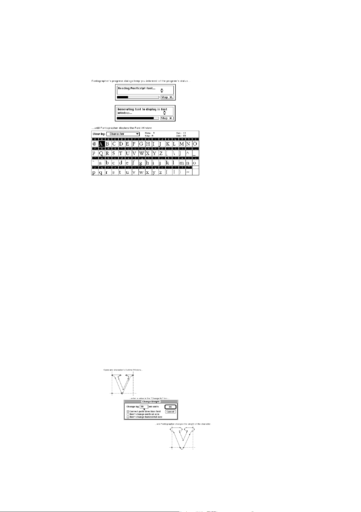
Changing the character’s weight
You can quickly create a heavier or lighter version of your
character (or the entire font) by using Fontographer’s
Change Weight command.
To change weight:
1. Go to the Font Window and double-click on the “v”
to open it.
2. Choose “Change Weight” from the Element menu.
The “Change Weight” dialog appears.
3. Enter “30” in the “Change by” text edit box and
click “OK.”
Fontographer increases the weight of the “v” by 30 em
units.
Fontographer also gives you the option of changing the
1: Modifying Your Fonts Page #3
Page 28
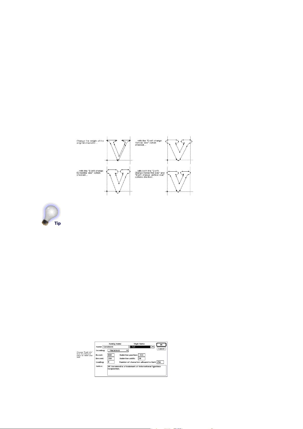
Fontographer User's Manual
weight of your character (or entire font) without affecting
the vertical or horizontal size of the character.
Go back to the “v” and select “Undo Change Weight” from
the Edit menu to undo the changes you performed in the
last exercise. Repeat the exercise above, but check
the “Don’t change vertical size” option before you
click “OK.”
Look at the difference in the two options. You can try the
option with the “Don’t change horizontal size” option next.
Now try the exercise with both options checked.
You can now apply the desired weight to the entire font, or
just selected characters. From the Font Window, use the
pointer tool to click and Shift-click on the desired
characters. (You can choose them all by choosing “Select
All” from the Edit Menu.) Then repeat the procedure above
to apply the selected changes to the desired characters.
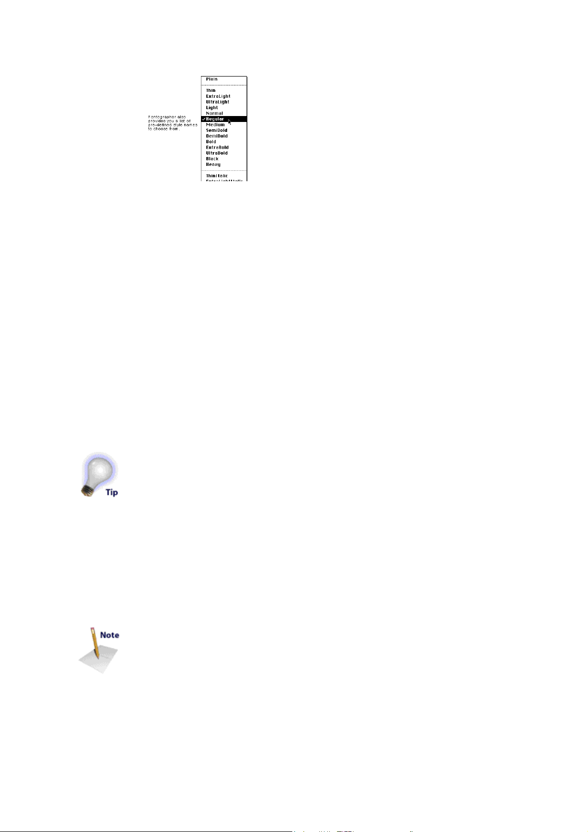
Naming your font
You can name your font by choosing “Font Info” (-General
on the PC) from the Element menu. The Font Information
dialog appears. For this exercise, name your font something
simple like “Garamond-Fat.” (Don’t forget the hyphen
before the Style Name.) For more information about
naming your font, refer to the section “The menu name” in
Chapter 7, “Generating and Exporting Fonts.”
1: Modifying Your Fonts Page #4
Page 29
Fontographer User's Manual
If you want to use a custom style name, be sure to let
Fontographer assign a standard style name first and then reassign your custom name. So, if you want to call your bolditalic version of a font “fat slanted,” use the pull-down menu
and select “bold italic” first, then change the style name
to “fat slanted.”
This will allow Fontographer to recognize and assign the
proper style to your custom name.
Be sure to name your font before you save your database
file and generate a font. Otherwise your fonts will end up
with unusable names like “Untitled.ttf” (for a TrueType
font), and you’ll have to start over.
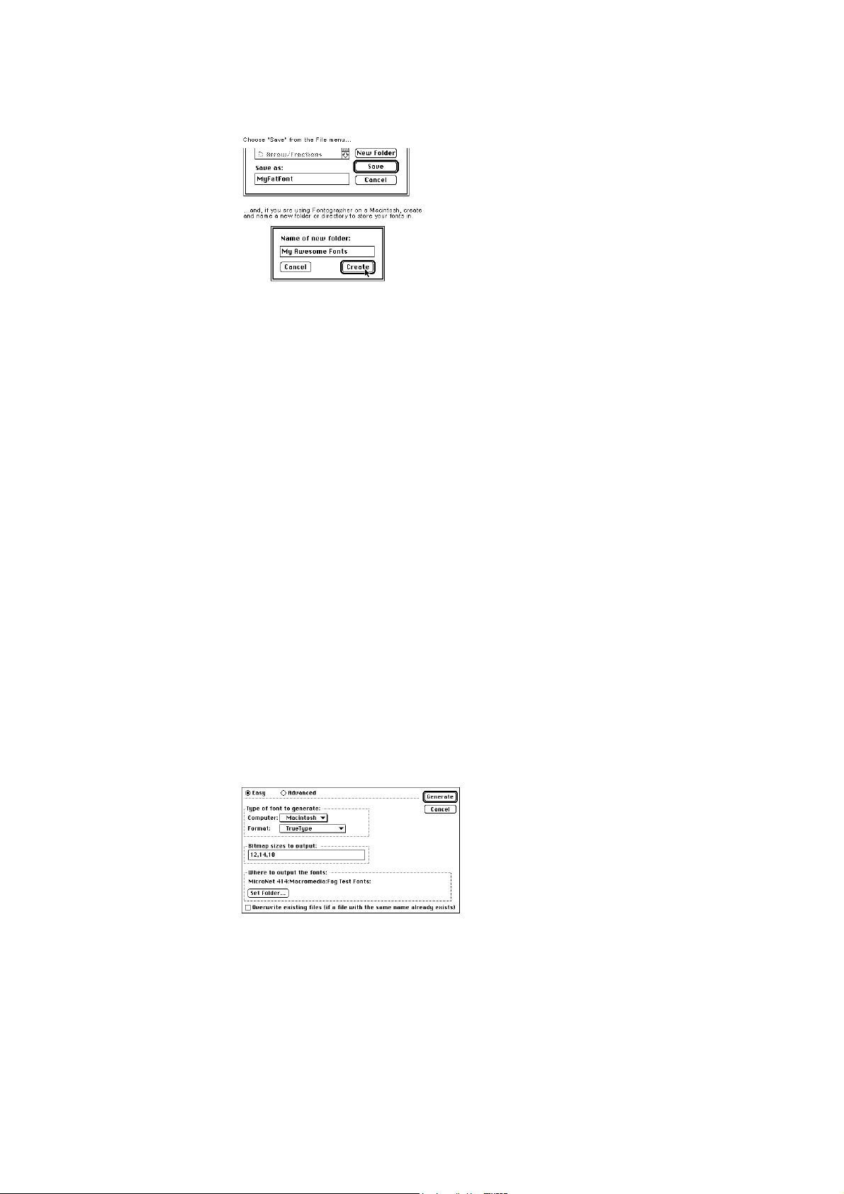
Saving your work
You save Fontographer database files via the Save or Save
As commands in the File menu. The database file is where
Fontographer stores all the parts needed to construct any
font. Just like you save documents in Microsoft Word, or
graphics in Macromedia FreeHand™, the database is
where you save your fonts in Fontographer.
The standard file saving dialog appears. You can name
your databases anything you like, because there’s no
relationship between the name of the actual font you’ll use
in your programs and the name of the database itself.
1. Choose “Save as” from the File menu.
Macintosh users have the option of creating and naming a
new folder to store a font in. You can save your font
directly to another folder, drive, or directory on all platforms.
2. Type in “MyFatFont.”
PC users will note that Fontographer automatically gives
you the name “MyFatFon.fog” if you also named
1: Modifying Your Fonts Page #5
Page 30
Fontographer User's Manual
it “MyFatFont” in Font Info.
Generating your font
After you save the file, it’s time to generate an installable
font. You will have to do this if you want to use the font in
another application besides Fontographer.
Fonts are composed of different files which you will need to
install before you can use the font. For more about installing
fonts, refer to Chapter 9, “Installing and Removing Fonts.”
1. Choose “Generate Font Files” from the File menu.
The Generate Font Files dialog offers a number of options
(including the ability to generate fonts for several
computer platforms), but for the purposes of this exercise
you’ll use the Easy mode. Choose the computer you’re
generating fonts for and select TrueType for the Format.
We’ve typed some commonly used bitmap sizes in our
example and you can do the same. However, bitmaps are
only necessary if you’ll be using a PostScript font on the
Macintosh.
The Set Folder/Directory button gives you the option of
generating your fonts directly into a specific folder. This
saves you the extra step of moving files into folders later.
The Overwrite existing files option lets you replace an
existing file (that has the same name) with a new file. If
you don’t choose this option (and have a font with the
1: Modifying Your Fonts Page #6
Page 31

Fontographer User's Manual
same name), Fontographer will create a new font with the
same name followed by a bullet ( ), on the Macintosh, or a
dollar sign ($) on the PC.
Installing the font
Since installing fonts is different depending on the platform
and operating system you’re using, we can’t really cover
this in a quick “how-to” here. If you need more information
about installing fonts, refer to Chapter 9 or your System’s
User’s Manual.
Using the font
Once you’ve installed the font, go to the application of your
choice, type some text, and select your font (just like you
would any other font) from the Font menu.
Creating an oblique font
By using Fontographer’s Skew feature, you can create your
own oblique font. You can consider this an easy way to
make an oblique typeface. Actually, it’s sort of like cheating
since an oblique font is just a right-slanted version of a
Roman typeface; a true italic typeface has redesigned
characters that compliment the face. But, skewing is a
really easy way to create a new typeface that can add
emphasis to your text.
1: Modifying Your Fonts Page #7
Page 32

Fontographer User's Manual
Again, Fontographer allows you to skew one, several, or all
characters at once. As in our previous example, we
recommend that you try out your modifications on one
character before you apply the transformation to the entire
font.
Follow the steps given in the “Change Weight” exercise to
open your font.
To skew a character:
1. Go to the Font Window and double-click on the
character “k” to open it.
2. Choose “Transform” from the Element menu.
3. Drag down in the “First transformation” pop-up
menu until you’ve selected the Skew option and
made sure the other pop-up menus say: “Do
nothing.”
Fontographer defaults to a horizontal skew value of -12
degrees (the appropriate angle for an oblique font,
depending on who you ask).
4. Click the Transform button, and Fontographer skews
the “k.”
Fontographer gives you the option of applying other
transformations at the same time you skew the character.
To apply more than one transformation:
1. Double-click on the “k” and select “Undo
Transform” from the Edit menu to undo your last
move.
2. Select “Skew” from the Transform dialog and
1: Modifying Your Fonts Page #8
Page 33

Fontographer User's Manual
enter -12 degrees Horizontal (leave Vertical at 0).
3. Then select “Scale” and enter “80” in the Horizontal
text box.
4. Select “Basepoint” from the Center
Transformations around pop-up menu.
5. Click “Transform.”
Fontographer skews and condenses the “k” at the same
time.
Try some of the other transformation options to see what
effects they have on your character.
Once you’ve finished trying out all the options, you can
apply the transformation to several characters or the entire
font, by selecting groups of characters in the Font Window.
Skewing multiple characters
You can skew, scale, flip, or move either a single character
or a range of characters. Select more than one character in
the Font Window by holding down the Shift key while
clicking on characters. Select a range of characters by
dragging through the characters. In this way you can apply
transformations to one, several, or all characters.
Creating a fraction using composite characters
1: Modifying Your Fonts Page #9
Page 34

Fontographer pastes the number “8” on top of the “3.”
Fontographer User's Manual
Have you ever checked out how many fractions are in your
font? If you have, you know that most commercial fonts
have a small number of fractions, if any. Historically, if you
wanted to type the fraction 3/8, you had to type the 3, the
forward slash, and the 8, and even then the fraction didn’t
look so hot! Fontographer makes it extremely easy to add
composite characters made up of more than one character
combined in a single character slot to your font. So you can
now have traditional fractions in all your fonts!
To create a fraction:
1. Go to the Font Window and double-click on the “3”
to open it.
2. Click on the “8” character slot in the Font Window
(it’s not necessary to open the Outline Window to
copy the character) and then select “Copy
Reference” from the Edit menu.
3. Click on the “3” Outline Window and
choose “Paste” from the Edit menu.
1: Modifying Your Fonts Page #10
Page 35

Fontographer User's Manual
Fontographer pastes the number “8” on top of the “3.”
4. Select everything in the Outline Window by
choosing “Select All” from the Edit menu.
5. Go to the Transform menu, select “Scale
Uniformly” as your first transformation, enter 60%,
and make sure all the other transformation pop-ups
say “Do nothing.”
Fontographer scales both characters to 60% of their
original size.
6. Position your pointer away from the characters, and
click on nothing to deselect everything (or simply
press the tab key, which always deselects
everything). Then click the mouse on the outline of
the “8.”
A box will appear around the number “8” (this represents
the composite character’s bounding box). Composite
characters do not show the points you normally see. (You
cannot edit points in a composite character unless you first
choose “Unlink Reference.”)
7. Drag the box containing the “8” toward the lower
right-hand corner.
8. Double-click on the path or on any point on the
number “3” to select all of it, and then move the “3”
toward the top left corner.
You can create the divisor line by copying the forward
1: Modifying Your Fonts Page #11
Page 36

Fontographer User's Manual
slash into your character. You can also draw the divisor
line if you prefer. However, it is often much easier to use
existing characters to create parts.
9. Select the forward-slash character in the Font
Window.
10. Choose “Copy” from the Edit menu.
11. Paste the forward-slash character into the “3”
character slot.
To change a reference character:
1. Open the Outline Window for the actual
character “8.”
2. Modify some part of it.
You’ll see any changes you make to the original eight
reflect in the denominator you created in your fraction
character.
Unlinking a reference character
Fontographer also lets you remove the link from any
composite character. This gives you access to the points in
the character as well as removing the link to the original
character.
To unlink a reference character:
1. Click on the fraction you created (in the “3”
character slot).
2. Choose “Unlink Reference” from the Edit menu.
As you can see in our illustration, the character’s points
are now visible and you can move them individually, or
together as a group.
Creating a ligature
1: Modifying Your Fonts Page #12
Page 37

Fontographer User's Manual
A ligature is a character made up of one or more
characters. Most commercial fonts have some commonly
used ligatures like “,” and “ú.” However, Fontographer
makes it easy to create ligatures of your own without
drawing a thing.
To create a ligature:
1. Open the Outline Window for the “f.”
2. Choose “Select All” and then choose “Duplicate” to
create another “f.”
3. Move the new “f” to the right.
4. Go back to the Font Window.
5. Copy the “l” into the same window using the “Copy
Reference” command from the Edit menu.
6. Move the referenced “l” to the right of the second “f.”
7. Choose “Unlink Reference” from the Edit menu.
8. Choose “Remove Overlap” from the Element menu.
Changing the character width
You probably noticed the vertical line that runs through the
second “f.” This is the character width line. Width is a
moveable vertical line which specifies the width of each
character. (Width is covered in more detail in Chapter 5.)
When you print a line of text, the origin line of the next
character is placed on top of the width line of the current
1: Modifying Your Fonts Page #13
Page 38

Fontographer User's Manual
character. Since you changed the contents of this
particular Outline Window, it’s important that you change
the width as well.
To change the character’s width:
1. Make sure you still have the Outline Window for
the “f” open.
2. You can choose “Preview” and turn off Show Points
from the View menu to get a better look at the
character if you like.
3. Move the width line with the selection pointer.
That’s all there is to it! So, if your font doesn’t contain the
ligature you want, you now know how to create your own
with Fontographer.
In some word processing and page layout programs you can
set the preferences to automatically substitute curly quotes
for straight ones, or the fl ligature if you type “fl.” For the
substitutions to occur, you’ll need to be sure to use an
Adobe encoded font.
Creating a condensed character or font
Fontographer has the ability to modify character images to
produce interesting special effects. You can create these
effects in either the Outline Window (on one particular
character) or the Font Window (on the whole font). For
example, you can create an oblique font by selecting all the
characters in the Font Window and skewing them -12
degrees (like we did in the earlier exercise “To skew a
character”). Or you can create an extended font, by
increasing the horizontal scaling factor of the font. Your
options are limitless.
You can also create a condensed font by scaling the
character 80% horizontally. Condensed versions of a font
1: Modifying Your Fonts Page #14
Page 39

Fontographer User's Manual
You can also create a condensed font by scaling the
character 80% horizontally. Condensed versions of a font
are the same height as their counterparts, but are narrower
to fit into a more compact space.
To create a condensed character:
1. Click on the Font Window to make it active, and
then press and hold the mouse button while you
drag through the characters “a” through “e.”
2. Choose “Transform” from the Element menu.
The Transform dialog appears.
As you can see from the screen shots on this page,
Fontographer scales the characters horizontally without
changing their height.
1: Modifying Your Fonts Page #15
Page 40

Fontographer User's Manual
Setting the basepoint
The baseline is the line upon which the letters sit. The
baseline position is always at a vertical location of zero. The
dot at the intersection of the origin line and baseline is the
basepoint.
The basepoint is used to accurately and quickly align points
and characters. The basepoint is generally at the
character’s origin (where the origin line and the baseline
intersect at 0,0); but, you can position the basepoint
anywhere. Fontographer allows you to set each character’s
basepoint differently. It can be moved as needed by
selecting the pointer tool and dragging it to a new location,
or by entering a specific horizontal and vertical location.
1: Modifying Your Fonts Page #16
Page 41

Fontographer User's Manual
For precise numeric entry, choose “Set Basepoint” from
the Points menu. To reset the basepoint back to the origin
point, choose “Reset Basepoint” from the Points menu.
If you select one point and choose “Set Basepoint,”
Fontographer will move the basepoint to that point.
However, if you select more than one point, Fontographer
will set the basepoint to the center of selection.
In the position display in the Outline Window, distance from
the basepoint is continuously updated as the pointer moves
within the drawing area. This on-screen measuring tool
makes it easy to measure character parts. Just place the
basepoint on a reference point of the character and watch
the position display as you move the pointer. Horizontal or
vertical alignment of points is very easy to check; set a
basepoint on one point then drag the other until the
horizontal or vertical delta is zero.
1: Modifying Your Fonts Page #17
Page 42

Fontographer User's Manual
Chapter Two
Creating New Fonts
Autotracing
Transformation Options
Guidelines
Creating a Stroked Font
Clean Up Paths
Creating Calligraphic Characters
Creating Variable Weight Characters
Blending Fonts to Create New Fonts
Somewhere in the dark recesses of a second-hand
bookstore, there is probably a well-worn and dust-covered
book that contains an old-fashioned typeface no one has
seen for years. Imagine being able to digitize that typeface
and transfer it to your documents. Or how about that logo
you created with a pen or pencil before you ever heard of a
graphics program? What about the beautiful effects that are
created with calligraphy fountain pens? Wouldn’t it be great
if you could use all of these in your word processor? With
Fontographer, any of these scenarios is simple.
Fontographer takes what used to be possible with only pen
and pencil, and puts it into the hands of the desktop designer.
Autotracing
The bitmap option is one of Fontographer’s most advanced
features. Autotracing is probably most useful for tracing
scanned images. Say you have an existing character, logo,
or image that you want to assign to a keystroke. On the
Macintosh, you can scan your image, save it in PICT
format, and place it into your Scrap-book or Clipboard.
2: Creating New Fonts Page #1
Page 43

A gray bounding box appears.
Fontographer User's Manual
Then you can paste your character into the Outline Window
(where it will be used like a background template) and let
Fontographer autotrace the image. On the PC, take your
scanned image to an application like FreeHand or Adobe
Streamline where you can either copy from the
application and paste into Fontographer and then autotrace,
or save/export as an EPS and then import into Fontographer.
To paste an image into the Template layer:
It’s remarkably easy to paste an image into the Template
(or background) layer. Select an image from the “Scanned
images/Scanned.bmp” file on your Fontographer CD. In
this example, we use a scanned Vivaldi “f.”
1. On the Macintosh, copy the image from the
Scrapbook or Clipboard and “Paste” it into the
Outline Window. On the PC, copy the image from
Paint/Paintbrush, and paste it into Fontographer’s
Outline Window.
Fontographer will automatically paste the image into the
Template layer where it will be shown as a grayed-out
image.
To move a Template image:
1. Click the Template layer to select it.
2. Click the template image with the selection pointer.
2: Creating New Fonts Page #2
Page 44

Fontographer User's Manual
A gray bounding box appears.
3. Move the image into place by positioning the
pointer inside the image, then dragging it to a new
location.
To resize a Template image:
1. Click the template image to select it.
2. Choose “Transform” from the Element menu
and “Scale uniformly” 90 percent.
Tracing an image
Once you have your image sized and positioned the way
you want, you can trace it
1. Make sure you are in the Outline layer.
2. Choose “Auto Trace” from the Element menu.
The Auto Trace dialog appears.
2: Creating New Fonts Page #3
Page 45

Fontographer User's Manual
You have two options: Easy and Advanced.
3. Choose “Easy” and keep the default Curve fit of “5.”
The tighter you set a curve fit, the more points will be
placed on your character. By having more points, the
tracing will more closely resemble the original image.
However, too many points will consume unnecessary
memory without appreciably improving the accuracy of
your path. It is better to use as few points as possible to
get the shape you desire.
When the Tracing progress dialog box finishes generating,
you will have a completely traced character in the
Outline Window.
You can cancel the tracing operation at any time by clicking
on the Cancel button or by typing Command-period, or Esc
on the PC.
Advanced tracing options
Fontographer’s Advanced tracing mode offers some
specific options.
Curve fit
Choosing an item from this pop-up will set all the other
controls in the dialog to recommended settings for Loose,
Normal, or Tight fit. Try changing the value of this pop-up a
2: Creating New Fonts Page #4
Page 46

Fontographer User's Manual
few times and see how the other controls respond. It might
give you an idea of how each slider affects the fit tightness.
If you change any of the other controls in the dialog, the
Curve Fit pop-up will automatically switch to “Custom” to
indicate that you have customized the values. Once you
have customized the settings you can always go back to
Loose, Normal, or Tight by changing the Curve Fit pop-up
back to one of these settings. You can switch back to
Custom as well. Normal is generally the best all-purpose
selection. Tight would be a good selection for more intricate
designs, while Loose would be good for characters with
straight angles (such as block letters) and poor quality
scans. Choose “Custom” if you want to set the Curve fit
options manually.
Allow curve fit errors
This control will have the largest affect on your tracing
results. A low value means Fontographer will allow fewer
curve fit errors, and you’ll get a very tight trace with more
points. A higher value means Fontographer will allow more
errors, and you’ll get a loose trace with fewer points.
Balance lines
This control will have very subtle, almost unnoticeable
affects on your tracing results. A low value means it will do
almost nothing. A high value means Fontographer will
attempt to align lines when it thinks it’s necessary. For
instance, it might try to align the left and right parts of the
crossbar in a “T” character.
Eliminate close points
This control can help eliminate redundant points (points that
are almost on top of each other). A low value means that
almost no points will be eliminated, and the shape of the
path will be the most accurate. A high value means that it
will eliminate as many points as necessary, but it may
slightly alter the shape of the curve in order to do so.
Make straight lines
This control has very subtle effects. It determines how
straight a curve should be before it is turned into a straight
line. This will never turn extremely curvy paths into straight
2: Creating New Fonts Page #5
Page 47

Fontographer User's Manual
lines; however, curves that appear to be almost straight to
begin with may be slightly modified so that they are
perfectly straight. A low setting for this control means
almost no curves will be straightened. A high value will
cause more curves to be straightened.
Look for cusps
When Fontographer traces an image it often finds places
where two paths join at a sharp angle. A join of this type is
called a cusp, and Fontographer will always place a corner
point at such a location. The “Look for cusps” control
determines how lenient Fontographer is in finding cusps, and
thus it will have an effect on how many corner points are
used in the tracing results. Setting this control to a low
value means it will find very few cusps, and the results
won’t have many corner points. Setting the control to a high
value means it will find many cusps, and the results will
have more corner points.
Treat nearly flat paths as straight lines
This check box is similar to the “Make straight lines”
control; however, it differs in a subtle way. The Make
straight lines control can help straighten any curves that are
nearly flat. However, the “Treat nearly flat paths as straight
lines” checkbox only straightens curves that are nearly flat,
and that only bend to one side. For example, this control can
straighten a C-shaped curve that bends to the left of the
straight line, but it can’t straighten an S-shaped curve that
bends to either side of the straight line. If you think the
difference between these two controls is too subtle for your
needs, then we recommend that you ignore this control and
just use the Make straight lines control.
Find extrema points
You should probably leave this checkbox turned on. It will
make sure that points are always placed at extrema points in
the tracing results, and this is recommended for PostScript
and TrueType fonts.
Transformation options
Fontographer’s transformation options are located under
Transform in the Element menu. Any of these can be
2: Creating New Fonts Page #6
Page 48

Fontographer User's Manual
applied from the Font Window or Outline Window. When
used from the Font Window, you can apply a transformation
to one, several, or all characters. On the other hand, in a
character’s Outline Window, you can only apply the
transformation to the selected points. If there are no
selected points, the transformation applies to the entire
character.
Flip
You can use the Flip transformation to flip the image to the
opposite side of an imaginary horizontal or vertical line.
You access the Flip transformation pop-up menu via the
Transform menu, or by double-clicking on the Flip tool in the
tool palette.
To flip selected items horizontally:
1. Select a character.
2. Choose “Flip” as the first transformation.
3. Click on the Horizontal radio button.
4. Click the Transform button.
To flip selected items vertically:
1. Choose “Flip” as the first transformation.
2. Click on the Vertical radio button.
3. Click the Transform button to apply the vertical flip.
2: Creating New Fonts Page #7
Page 49

Fontographer User's Manual
Move
The Move transformation can move whole characters, or a
specific point a specified horizontal and/or vertical amount.
To move selected items horizontally:
1. Choose “Move” as the first transformation.
2. Enter a value in the Horizontal text box.
3. Click “Transform” to move the image.
To move selected items vertically:
1. Choose “Move” as the first transformation.
2. Enter a value in the Vertical text box.
3. Click “Transform.”
Move an image horizontally and vertically by entering
2: Creating New Fonts Page #8
Page 50

Fontographer User's Manual
values in both text boxes.
Rotate
The Rotate option is used to rotate the selection a specified
number of degrees. Selected points rotate around the
reference point by a specified angle. Positive angles
indicate a counterclockwise rotation, while negative angles
specify a clockwise rotation.
You access the Rotate transformation pop-up via the
Transform menu or by double-clicking on the Rotate tool in
the tool palette.
To rotate a selected item:
1. Choose “Rotate” from the Transform pop-up.
2. Enter a rotation angle in the text box.
3. Click “Transform.”
Scale
There are two Scale pop-up menus: Scale and Scale
uniformly. Both of these options are used to increase or
decrease the size of an image by a specific scale factor.
The Scale option lets you scale horizontal and vertical
attributes independently of each other. You’ll find this
feature useful when you want to create condensed and
extended versions of a font, since you can apply the scaling
transformation to the entire font.
You access the Scale transformation pop-up via the
Transform menu or by double-clicking on the Scale tool in
the tool palette.
2: Creating New Fonts Page #9
Page 51

Fontographer User's Manual
To scale a character vertically:
1. Choose Scale from the pop-up menu.
2. Enter a vertical scaling value.
3. Click “Transform.”
To scale a character horizontally:
1. Choose the Scale pop-up menu.
2. Enter a horizontal scaling value.
3. Click “Transform.”
Scale uniformly
This option scales the entire image uniformly. If you select
a character and enter a scale factor of 50%, the image will
be reduced to 50% of its original size (both horizontally and
vertically). Doubling the size of the image would require a
scale factor of 200%.
To scale uniformly:
1. Choose the Scale uniformly pop-up menu.
2. Enter a scaling value in the text box.
2: Creating New Fonts Page #10
Page 52

Fontographer User's Manual
3. Click “Transform.”
Skew
The Skew option applies a slant to the image. Negative
values slant the character to the right, positive values to the
left. Vertical skewing can be used to create oblique
characters (sort of a “fake” italic). Italics are normally
skewed vertically by -12 degrees.
You access the Skew transformation pop-up menu via the
Transform menu or by double-clicking on the Skew tool in
the tool palette.
To skew selected characters:
1. Choose the Skew transformation pop-up menu.
2. Enter a skew value in either the horizontal or
vertical text box.
3. Click “Transform.”
Multiple transformations
There are times when you’ll probably want to do more than
one transformation at once. Fontographer lets you apply up
to four transformations (at one time) to one character, or
2: Creating New Fonts Page #11
Page 53

Fontographer User's Manual
the entire font.
Say you want to create a condensed oblique font and move
it closer to the baseline to compensate for the skew angle.
It’s easier than you probably think.
To apply multiple transformations:
1. Select a character.
2. Choose Transform from the Element menu.
3. Select up to four transformations.
4. Enter the transformation values.
5. Click “Transform.”
3-D transformations using the Transform dialog
Using the Transform dialog to apply 3-D transformations is
simpler if you use the tools to setup the transformation.
Double-clicking on the Perspective tool will bring up the
Transform dialog ready to apply a 3-D rotation
transformation. Option double-clicking on the selection tool
will bring up the Transform dialog ready to apply a 3-D
move transformation.
Let’s do an example of a 3-D rotation. In our example, we
will draw and then transform a square/circle .
To use the Scale tool:
1. Draw a square and a circle (holding the shift key
2: Creating New Fonts Page #12
Page 54

Fontographer User's Manual
down to constrain the tools) that start at the origin
point and extend to the descent.
2. Drag the width line on top of the rightmost point on
the circle.
3. Choose “Correct Path Direction from the Element
menu.
The character should look like this with Preview selected
from the View menu (or press Command- or Ctrl+L):
4. Choose “Select all” from the Edit menu.
5. Option or Alt double-click on the Scale tool to bring
up the Transform dialog with Scale uniformly as the
first transformation.
6. Choose “Center of Selection” from the Center
transformations around pop-up menu at the top of
the dialog.
7. Type in “90” into the text edit field and press return
or click Transform.
The character should look like this in Outline mode:
To use the Perspective tool:
1. Option double-click on the Perspective tool to bring
up the Perspective Setup dialog.
2: Creating New Fonts Page #13
Page 55

Fontographer User's Manual
2. Set the Distance to 1000 and the Point to Basepoint
and press Return or click OK.
This tells the Perspective tool that the image you see in
the Outline Window is being viewed as if you are 1000 em
units away from the Basepoint.
3. Choose “Select All” from the edit menu.
4. Choose “Set Basepoint” from the Points menu.
Your basepoint just moved to the center of the
square/circle, which is defined as the perspective
point in this example.
5. Choose Copy from the Edit menu. You will paste
this copy later in this example.
6. Click and hold the mouse on the origin line (the line
that extends from the bottom of the window to the
top if the window along the left side of the character).
7. Drag the mouse to the right while holding down the
shift key.
As you drag the mouse you will notice that the information
bar looks something like this:
8. Continue dragging to the right until the number
underneath the reads -90.
You have just rotated the selected points by -90 degrees in
the XZ Plane. You can also think of it as rotating around
the Y axis.
9. Choose Paste from the Edit menu. You now can
apply the next transformation to the copy of the
original.
10. Click down with the mouse on the baseline.
11. Now drag the mouse up while holding down the
shift key until the number under the symbol
reads 90.
2: Creating New Fonts Page #14
Page 56

Fontographer User's Manual
The character in the Outline Window should now look
something like this:
To apply 3-D transformations using the Transform dialog:
Let’s do an example of a 3-D rotation. To make things
simple, you will start where you left off using the
Perspective tool. For this example to work, the
square/circle being transformed should already be copied
into the clipboard.
1. Choose “Paste” from the Edit menu.
2. Choose the Perspective tool from the tool palette.
3. Click down with the mouse on the width line and
release the mouse button immediately. The mouse
click will be used as the center of the transformation
in the Transform dialog.
4. Double-click on the Perspective tool. The Transform
dialog will be brought up ready to apply a 3-D
rotation.
5. Choose “Last mouse click” from the Center
transformations around pop-up menu.
6. Set the XY angle to 0, the XZ angle to 90, and the
YZ angle to 0.
7. Set the Perspective Point pop-up to “Basepoint.”
Important: If you wish to setup additional transforms in
this dialog, then make sure you do the perspective
transform last. Any transforms that occur after the
perspective transform will not have a three-dimensional
appearance.
When you are done, the Transform dialog should look like
this:
2: Creating New Fonts Page #15
Page 57

Fontographer User's Manual
8. Press “Return.”
You have probably noticed that a three-dimensional box or
cube is being created. The previous set of steps created
the right side of cube. The next set of steps will create the
top side of cube.
1. Choose “Paste” from the Edit menu.
2. Click down on the ascent line.
3. Double-click on the Perspective tool.
4. Set the XZ angle to 0 and the YZ angle to -90.
5. Press “Return.”
If you have been following our example from the
beginning, then your character in the Outline Window
should look something like this:
To do a 3-D Move:
Let’s continue where we left off, creating a disjointed cube.
For this example to work, the square/circle you are
transforming should still be copied into the clipboard.
You will now create the back side of the cube by moving
the selected points backward (by 800 em units) into the 3rd
dimension.
1. Choose “Paste” from the Edit menu.
2. Option double-click on the selection tool to bring up
the Transform dialog.
2: Creating New Fonts Page #16
Page 58

Fontographer User's Manual
The dialog will come up showing Move and Perspective,
ready to do a three-dimensional move.
3. Set both the transformation (at the top of the dialog)
and the Perspective transform (at the bottom of the
dialog) to Basepoint.
4. Change the Horizontal and Vertical text edit fields
to “0” and change the depth edit text field to “800.”
5. Press “Return” or click OK.
6. Select “Preview, ” and voila:
Guidelines
Setting guidelines
The Guides layer is used to construct drawing guidelines
which are common to every character of the font (such as
the x-height line). The Guides layer is similar to the
Template layer, except it is drawn in light gray or green and
appears behind every character of the font. Guides are
purposely drawn in a lighter color so they can be
distinguished from the outline and template images.
Guidelines may be edited or created from any character’s
Outline Window. Change to the Guides layer by clicking on
its name in the Layers palette or by typing “g” when the
lock icon is in the locked state.
With the Guides layer active, you can edit or draw
guidelines with the standard drawing and editing tools.
Changes made to the Guides layer will appear in every
character in the font. You can undo changes made to the
2: Creating New Fonts Page #17
Page 59

Fontographer User's Manual
Guides layer just like you would in any other layer.
Setting guidelines from the Font Info dialog
Ascent and descent are already defined and can be reset
by choosing “Font Info” from the Element menu and typing
the values in the Ascent and Descent text boxes.
Adding new guidelines
Additional guidelines can be set two ways in the Guides layer.
To create a guideline:
1. Select the Guides layer.
2. Use the selection tool to drag vertically from the
baseline or horizontally from the origin line.
You can also create a guide by drawing it with any of the
drawing tools in Fontographer.
1. Select the Guides layer.
2. Click on the drawing tool of your choice to draw a
guideline.
Hiding guidelines
2: Creating New Fonts Page #18
Page 60

Fontographer User's Manual
You can hide the guides by checking on the Guides layer
checkbox to turn it off or (when the lock icon is locked) by
typing Option-G (Macintosh) or Caps Lock+G (on the PC).
Snap to guides
Choose “Snap to Guides” from the View menu. When
points are within a predetermined distance (you set this
value in the File menu Preferences’ Editing Behavior) from
the guideline, they snap or align to that guideline.
Creating a stroked font
Outline vs. stroked characters
Up until this point in the manual, we have been discussing
outline characters. You create outline characters by
drawing a path around the character’s perimeter. Stroked
characters are constructed by drawing just the centerline
path. PostScript draws these characters by sweeping a pen
along the path. The pen has a width called the stroke
weight which is made up of em units. As PostScript sweeps
2: Creating New Fonts Page #19
Page 61

Fontographer User's Manual
along the path, it paints a line that is so many units wide.
Any character which is constructed entirely of equal weight
strokes can be drawn as a stroked character. For example,
we drew the letters in this Fontographer logo as stroked
characters. You must generate these as Type 3 fonts, since
neither TrueType nor Type 1 fonts allow stroked characters.
Fontographer gives you complete control over the type of
pen you’ll use to create your stroked font. In addition to its
width, you can specify its appearance and behavior where
segments join. Also, since some people prefer drawing with
a pen (in real life situations), Fontographer makes it easy to
change the stroked character into an outline character (or
font).
Setting stroke attributes
Before you can create a stroked character, you will need to
change the attributes of the character from filled to stroked.
To change a filled character to stroked:
1. Choose “Selection Info” from the Element menu.
2. Turn off “Fill” and turn on “Stroke.”
3. Leave the Tint set at 100%.
4. Enter a pen Weight.
2: Creating New Fonts Page #20
Page 62

Round joins draw a circle with a diameter equal to the
Fontographer User's Manual
You’ll notice that Fontographer has two pop-up menus for
Cap and Join. In our example, we use Round on both since
we want the ends of the characters to be rounded. Each of
these options is discussed after this example.
5. Click “OK” and get ready to draw a character.
6. Choose a drawing tool, or one of the control point
tools.
7. Draw an “L.”
8. Turn on Preview to see what your character actually
looks like.
End caps and joins
There are three types of end caps: butt, round, and square.
Butt end caps stop right at the end point of the line.
Round end caps project a semicircle out from the end
point. This semicircle has a diameter equal to the stroke
weight and center point at the end point.
Square end caps project out one half the stroke weight in
the direction of the path.
There are three types of line joins: miter, round, and bevel.
Miter joins extend the outer edges of the lines until they
meet at an angle, like the corners of a picture frame.
2: Creating New Fonts Page #21
Page 63

Fontographer User's Manual
Round joins draw a circle with a diameter equal to the
stroke width at each bend.
Bevel joins are drawn as if the joining segments were
stroked with butt cap ends and the resulting notch filled with
a triangle.
Expand stroke
The Expand Stroke command is used to expand stroked
characters into contoured (outline) or filled characters.
To expand the stroke width:
1. Choose “Expand Stroke” from the Element menu.
2. Click “Normal pen.”
3. Enter a Pen width value.
4. Click “OK.”
Fontographer automatically changes the stroked character
into an outline character.
The Expand Stroke command can also be used to
automatically change your stroked character into a
calligraphic character.
To change a stroked character into a calligraphic
character:
1. Choose “Expand Stroke.”
2. Click “Calligraphic pen,” enter a value, and
click “OK.”
2: Creating New Fonts Page #22
Page 64

Fontographer User's Manual
3. Choose “Selection Info” and change the character
to a “Filled” character.
4. Choose “Remove Overlap” from the Element menu.
Clean Up Paths
One of the most revolutionary features in Fontographer is
called Clean Up Paths. This incredible command
automatically improves the quality of your outlines by
removing unnecessary points. Fontographer will try to
change the path as little as possible; less will change the
outline as little as possible—more will remove more points
and thus, change the path more. And if you have less
points, your printing time will be faster as well!
There are two different uses for this dialog: one is to put
points where they belong for proper typographical outlines.
This is called putting points at the extrema. If you bring up
the dialog and only have the Insert points at extrema box
checked, that’s all Fontographer will do. Simplify paths will
remove points it judges to be superfluous. The slider control
adjusts the ratio between getting rid of a lot of points (and
changing your path a little), and getting rid of fewer points
and maintaining the integrity of the path.
We believe you should spend your time creating wonderful
designs instead of worrying about point placement and the
2: Creating New Fonts Page #23
Page 65

Fontographer User's Manual
We believe you should spend your time creating wonderful
designs instead of worrying about point placement and the
mechanical details of Bzier path construction. When your
character is through, just choose “Clean Up Paths” from
the Element menu or (even better!) apply the command to
the entire font directly from the Font Window.
Creating calligraphic characters
One of the most notable features of Fontographer is the
freehand drawing tool which you can use directly with the
mouse or with a pressure-sensitive pen and digitizing tablet.
Additionally, you can use the freehand drawing tool as
either a calligraphic pen or a variable-weight pen.
To use the calligraphic pen:
1. Double-click on the freehand drawing tool.
The Freehand Tool Setup dialog appears.
2. Click on the Calligraphic pen checkbox.
3. Make sure the Pressure sensitive option, the Tight
curve fit and the Draw dotted line Stroke options
are all turned off.
2: Creating New Fonts Page #24
Page 66

Fontographer User's Manual
4. Enter a Pen width of 100 em units.
For the purposes of this exercise, you should leave the Pen
angle set at 45 degrees since that is one of the
recommended angles for calligraphic characters.
5. Click “OK.”
The freehand tool icon will change to a calligraphic pen icon.
6. Press and hold down the mouse button while
moving it around on your desk or mouse pad, or
use a digitizing tablet to draw a calligraphic
character.
7. Choose “Remove Overlap” from the Element menu.
Fontographer removes the overlapping area, and your
calligraphic character is complete.
8. Choose “Preview” from the View menu and turn
2: Creating New Fonts Page #25
Page 67

Fontographer User's Manual
8. Choose “Preview” from the View menu and turn
off “Show Points” to view your character without
points and filled.
Calligraphic tutelage from Judith Sutcliffe
Calligraphy is not the same thing as type. Generally, type is
carefully structured, straight-backed and neatly drawn.
Calligraphy is often looser, more graphically expressive and
flowing, and it more closely reminds us of the instrument
with which it was drawn. You can use Fontographer to
simulate a flat-nibbed pen or a Chinese brush, any of the
variety of instruments with which people have written with
calligraphic panache over the centuries.
Start by taking a look at the past and present of western,
eastern or middle eastern calligraphy. Your local library or
bookstore’s graphics section will have books with samples
of the work of ancient and modern calligraphers.
Try working with a calligraphic pen or brush. You don’t
have to be a whiz at it. You just need to pay attention to the
limitations of the medium. Try holding a wide, flat-nibbed
pen at a 45 degree angle and making vertical, horizontal and
angled lines as well as circles. You will quickly see how the
characteristic shapes of western calligraphy are achieved.
That knowledge of how the position of the pen affects the
line of ink that flows from it is what you need to know to
draw calligraphy with Fontographer. You need to internalize
the mechanics of the pen in your head. So that when you
draw an “O” you know that the pen will issue a wide
curving line on the right-side downstroke, but will taper to
near nothingness as you pull the stroke to a close at lower
left. Because the pen has a precise width, the stroke will
have a predictable variance in size. Most basic strokes are
made without turning the pen, but more advanced strokes do
2: Creating New Fonts Page #26
Page 68

Fontographer User's Manual
involve a twist of the wrist and pen, and if you carefully
study the calligraphy manuals, you will find these little
secrets. Also, most letters are made with two or more
strokes joined together invisibly. An “O” is made from a
downward left stroke and a downward right stroke, not one
stroke all the way around. These conventional stroke
combinations are shown in most calligraphy manuals and
are easy to learn. Remember, you don’t have to be a
calligrapher, you just have to learn to think like a
calligrapher’s pen.
If you are interested in oriental calligraphy, dip a Chinese
brush in ink and press the soft tip to paper, pushing the
bristles about half way down and to one side and then
gradually lifting it and tapering off to the other side. Note
the shape of the ink stroke. The movement of the brush and
the look of the marks it leaves is considerably more complex
than the workings of the western pen. However, Chinese
calligraphy involves a graphic language of a very small
number of simple stroke shapes combined into more
complex characters. There is a particular way to make
dots, horizontal lines, vertical lines, lines angled left, lines
angled right, corners and endings of lines. You can find
these in books on Chinese calligraphy.
You can also draw with a pen or brush roughly, without
paying much attention to any calligraphic tradition, but the
instrument will still leave characteristic marks. Those are
what you want to remember.
Turning to Fontographer, you might wish to start by copying
some calligraphic hand that you admire. There are three
ways to do this. One is by scanning the original in and autotracing it. For the instructions on that method, refer back to
the beginning of this chapter.
The second way is without a drawing tablet: Choose a
couple letters that are most characteristic of the hand you
are going to recreate. You might start with the
lowercase “l” and “o” as they contain the basic straight and
rounded strokes on which the rest of the alphabet will be
based. One way to do this quickly is to use corner points for
every point you place. That will rough out the letter for you.
Then go back and change the points ruling what should be
curves to curve points. Adjust, check the black image in
Preview, readjust. If you draw an “o” that you think works,
2: Creating New Fonts Page #27
Page 69

Fontographer User's Manual
copy it to the background [Template layer] of “c,” “d” and
other rounded characters and construct them over the
pattern. That will give you a consistency of form that a
calligrapher works for years to achieve in eye and hand
coordination. The same goes for your “l” and all the
ascenders of the lower case alphabet. You must, of course,
keep your stroke widths very similar, as it has all been
written with the same “pen.”
But—don’t be too perfect, or you’ll be making something
more akin to a text typeface. Let every rounded form vary
just a little bit from every other one, let the ascenders lean a
little, but not so much that it is obvious. This is a subtle way
to add life to your font.
Continue building characters until you have enough to write
a word in the Metrics Window and to print out some wordlike gibberish from the Print Sample window. Take the
printed proof and look at it upside down. What’s your first
impression of the weight of the letters? Turn it right side up
and look again. How do the letters look together? Do they
look related in their stroke widths, sizes, leanings? If not, try
to pick out the offending characters and rework them to fit
into the family a bit better. How’s the spacing? Move the
margins in the Metrics Window until you get a pleasant
spacing, particularly in smaller sizes.
Third method, with drawing tablet: You’ll be doing the same
thing as described above, but you’ll have the aid of
Fontographer’s wonderful, automatic, electronic calligraphic
pen. In your hand it looks like the cordless pen of your
drawing tablet, but on screen it draws like a calligraphic pen
or a Chinese brush. If you have any natural or trained
calligraphic talent, you will find a drawing tablet extremely
useful because you can whip out a calligraphic shape with
one swoop of that pen. You will want to experiment a bit at
the outset with the various nib widths and slant variations
available. And you will want to try the calligraphy pen alone,
the pressure pen alone, and the combination of the two. For
imitating western calligraphy you will use the calligraphic
pen with or without the pressure mode. Try it both ways
and see which produces most easily the shapes you have in
mind.
Now here’s one difference that practicing pen
calligraphers will need to curb at the outset. Fontographer
2: Creating New Fonts Page #28
Page 70

Fontographer User's Manual
Now here’s one difference that practicing pen
calligraphers will need to curb at the outset. Fontographer
characters are usually made in one continuous outline. So
make an “O” in one fell swoop, not two separate ones.
Pretend you’re writing on really slick paper and your pen
doesn’t catch. Go all the way around. If you don’t, you’ll
have to patch the two sections together and that’s a drag.
(It’s easy, of course, using the Remove Overlaps command,
but save yourself time by not creating multiple parts in the
first place.)
Since this is spontaneous drawing, you might consider
sketching each letter several times in succession across the
character window and then picking the best one to keep.
This is only the beginning. Unless you are one of the
world’s best calligraphers, you are not going to whip out 26
perfect calligraphic letters on the first try. No problem. Do
the best you can. Decide which ones are the right
proportions, the best style, and then do minor alterations on
the others to bring them in line. Using Fontographer
commands, scale them up or down, rotate when necessary,
etc. If a stroke is too narrow, grab points on one side and
pull to widen it. You can’t do this in ink but you sure can in
Fontographer.
Sometimes when you sketch a letter, the Fontographer
outline that appears will have more points than are
necessary. You want the fewest points possible, so prune
out the excess (using Merge Points, or Clean Up Paths).
Also check to be sure that you have the path direction
correct (clockwise on outer outlines). If your character has
overlapping parts, do a Select All and Remove Overlap. If
that doesn’t work, make a copy of the outline and put it in
the Template layer, then in Outline rework the overlapping
section, following the original calligraphic shape. If there’s
something that doesn’t please you, just grab the points and
adjust. It’s not ink; you can tweak it until you get it right.
Assuming you’ve got a lower case that’s looking good, you
can get a little fancier for your upper case characters.
Maybe you will add a few flourishes. Remember that the
margin and kerning adjustments leave you great leeway in
how you place each lower case letter in combination with
each upper case. Use automatic kerning to make them fit
2: Creating New Fonts Page #29
Page 71

Fontographer User's Manual
just the way you want.
Let’s say you have now worked out a basic alphabet and it
is looking good when you do some proof printing of various
letter combinations. But when you print two “l”s together,
they look mechanical and wooden. Here’s where the fun
begins, and the complications start. Make yourself a nice
calligraphic double “l,” with one letter a little taller than the
other. Then when you’re setting type you can do a “search
and replace” command and drop a hand-tooled double “l” in
for every two twin “l”s. Alternate characters look really
neat, and give the look of authenticity to calligraphic
typesetting. You can create as many double letters as you
want. You can create nice combinations of “Th.” You can
give your font 15 different “a”s, if you feel in the mood.
That’s the creative part.
The complex part comes in with the decision on just where
in the world of keyboard character positioning do you put a
double “l.” There are no standards and no rules. If you are
the only person who is going to use the font, you can do
anything you like, as long as you make yourself a map so
you can find that double “l” six months from now.
But if you’re going to sell the font, you will do some brow
furrowing, because you will probably be supplying both Mac
and PC versions of your font, and characters maps differ
considerably between the two platforms and also within the
two platforms. The safe way out is to not put anything in
the “Upper ASCII” positions (numbers 128 to 255) except
standard position international accent characters. Put extras
into a separate font on the upper/lower case keys, even
though it is much less convenient than having all the
alternates in one font.
Or, if you’re creating fonts in Mac original format, put the
alternates wherever it’s most convenient for Mac users
(bearing in mind that there are differences between System
6 and 7 key positions). Then make a separate font and put
the “Upper ASCII” characters into it, on upper/lower case
keys and supply both fonts for PC users.
Another aspect of calligraphic font making arises if you
decide to make a script face, one in which all letters in a
word appear joined, as if written in one continuous hand. It
is quite possible to create a font of script letters that will
2: Creating New Fonts Page #30
Page 72

Fontographer User's Manual
appear when printed out to be written as a continuous line,
but it is not easy. The general principle is that you must
design a standard shape for both incoming and outgoing
strokes and use them as part of every character. The
margins of characters need to be set so that the outgoing
stroke of one letter overlaps the incoming stroke of the
following character. This takes some careful
experimentation with and slight manipulation of each
character’s incoming and outgoing strokes. But once you get
it to work right, it will look quite natural, especially if here
and there you leave an incoming stroke off. You will want
to avoid kerning as much as possible and should design an
alphabet set that needs very little.
For Chinese or Japanese calligraphy or to give an oriental
flavor to a western alphabet, try a cordless pen and drawing
tablet with Fontographer set to pressure-sensitive pen only.
It’s very quick and sensitive and will take a little getting
used to, but with some practice you will be able to
construct Chinese characters with only minor need for point
adjustments. If you are quite serious about working on a
Chinese font, you will probably want to work out a library of
the basic strokes and copy from that storehouse when
building new characters. The Remove Overlap command
will be very handy. You can always adjust each new
character for balance and style.
Creating variable weight characters
Variable weight characters give the effect of being drawn
with a brush. That is, they can have wide and thin areas.
Fontographer’s freehand drawing tool can be used directly
with the mouse or with a pressure-sensitive pen and
digitizing tablet to give you these effects.
To use the pressure-sensitive pen:
1. Double-click on the freehand drawing tool.
The Freehand Tool Setup dialog appears.
2. Click on the Pressure sensitive checkbox.
2: Creating New Fonts Page #31
Page 73

Fontographer User's Manual
3. Make sure the Calligraphic pen and other options
are turned off.
4. Enter a minimum and maximum stroke width (like
the ones we’ve set here).
Try experimenting with different values, and line caps and
joins to get different line effects.
5. Click “OK.”
The freehand drawing tool icon changes to reflect the
Pressure sensitive setting.
If you are using a pressure-sensitive pen, go to step 6;
if you are using a mouse, skip to step 8.
6. By applying varying amounts of pressure as you
draw, you can create Script characters with thick
and thin areas like our example:
7. Choose “Remove Overlap” and then “Clean Up
Paths” from the Element menu.
Fontographer removes the overlapping area, and your
character is complete.
If you are using a mouse instead of a pressure-sensitive
pen, follow these instructions:
8. Press and hold down the mouse button while
2: Creating New Fonts Page #32
Page 74

Fontographer User's Manual
moving it around on your desk or mouse pad to
draw a character.
9. Press the right and left arrow keys while you move
the mouse button to see the different effects you
can create.
The left arrow key (or the number “1”) reduces the
stroke width (down to the minimum stroke width you
specified in the Freehand Tool Setup). The right arrow key
(or the number “2”) increases the stroke size (up to the
maximum stroke width you specified in the Freehand Tool
Setup dialog).
Blend Fonts to create new fonts
Experimentation is at the heart of creating fonts. And
Fontographer’s Blend Fonts option is the ultimate vehicle
for creativity. Font Blend is going to let us create as new
fonts as we like, without drawing a thing.
Well... not exactly. Blend Fonts is very much like our own
Macromedia FreeHand’s blending of one object to another.
It helps if your fonts are similar in characteristics. Imagine
that your fonts are at opposite ends of a one-dimensional
line segment and that you are creating a new font that is
some percentage of the way between them (or beyond
them). You can edit those intermediate versions as you like,
and quickly produce a family of weights, say, from just two
master designs like Extra Light and Extra Bold.
To blend fonts:
1. Open a font.
Font blending needs the least amount of attention when
you blend between similar fonts. In this exercise, we use
two from the same family: TimesRoman and TimesBold.
2. Choose “Blend Fonts” from the Element menu.
2: Creating New Fonts Page #33
Page 75

Fontographer User's Manual
The Font Blend panel appears.
The font you opened in Step #1 automatically appears as
the Font 1 Source font. Source fonts are the fonts you will
base your third font upon.
If you have any other fonts open when you choose Blend
Fonts, they will automatically appear in the Font 1 and Font
2 Source fonts pop-up menus.
3. Choose a Source font for the Font 2 position by
clicking on its pop-up menu and selecting “Other.”
A standard dialog appears that lets you choose fonts
directly from your drive, directory, or a folder.
4. Enter a Blend amount of 50%.
5. There are three other settings below the Blend
amount; leave them turned on for this exercise.
6. Click the OK button.
Fontographer automatically creates a completely new
Untitled font based on the values you set in the Blend
amount text box.
2: Creating New Fonts Page #34
Page 76

Fontographer User's Manual
The two source fonts are now dynamically linked to the
new font. If you open any Outline window in the new font,
you will see both source outlines in the Template layer (like
in this illustration).
Any changes you make to the source font’s outline will
show in the Template layer, but not change the new
blended font’s outline unless you choose “Blend Fonts”
again.
To change selected destination characters:
1. Make some changes to a character in one of your
Source fonts.
The change is reflected in the Untitled font character’s
Template layer.
2. Click on the Selected destination character’s radio
button.
3. Click “OK.”
Fontographer will automatically reblend the characters.
4. Turn off the Template layer and “Show Points” and
then choose “Preview” from the View menu to view
your new character.
2: Creating New Fonts Page #35
Page 77

Fontographer User's Manual
You can continue making minor tweaks to the blended
character (or font), or simply save it as a new variation and
go on to another variation with a different interpolation
percentage.
Closing the new font unlinks the source fonts.
When things go wrong...
Doing the above example using Times and Times-Bold,
you most likely encountered an error message after the
blend attempt that read, “Could not complete your request
because some characters didn’t match during blending.
Consult your log file for details about the unblended
characters.” When you open the text file Fontog.log, you
will see the list of error(s). Here are some examples of
possible errors:
char. #1 char. #2 Path # Error
290 290 different
# of
paths
303 303 1 different
type of
paths
741 char
missing
in font 2
Let’s go through the error messages one at a time:
The first headers refer to the character decimal location in
the fonts. So character 290 in Font 1 and Character 290 in
font 2 don’t match because they have a different number of
paths. This means that, for example, your lowercase “g” in
font 1 has three paths, but in font 2 it only has two. Or the
Ccedillas () don’t match because in one font you used
2: Creating New Fonts Page #36
Page 78

Fontographer User's Manual
remove overlap, causing the character to have one path, but
you forgot to do it in font 2, so the still has two paths.
The message “different types of paths” occurs when a
character such as is a Referenced character in one font, but
is an actual outline character in the other. You can correct
this by using the “unlink reference” command on the
referenced character. The path # is the number of the path
that the error message applies to, and it doesn’t check any
further than the first mismatch.
The last message, “Character missing in font 2” means
that while one font has this character, the other does not,
and Fontographer can’t blend what isn’t there. If the two
fonts do not have the same number of character slots, your
blended font will have the same number of characters as
the font with the fewest character slots.
After consulting your log file, you can go back and correct
the errors and then blend again—blending only the selected
characters if you wish—to finish your font blend.
Just remember, the key to success using Blend Fonts is that
your characters in both fonts must have the same number
of paths, the same types of paths, and each font must have
the same number of character slots.
For information about the more technical details of the
blending process, refer to Chapter 10, Expert Advice.
Jonathan Hoefler sez...
In 1990, Sports Illustrated commissioned my studio to
design six typefaces, a set of six sans serifs in differing
widths (Champion Gothic Heavyweight, Middleweight,
Welter-weight, Lightweight, Featherweight, and
Bantamweight.) These fonts were drawn in Adobe
Illustrator and manufactured in Fontographer.
In 1992, the rights for these typefaces bounced back to me,
and I began selling them retail. Several art directors called
to say how much they liked the six fonts, but expressed
hope that I would someday extend the range to include a
super-condensed typeface. Given that no one was willing to
underwrite the design of a seventh font (whereas Sports
Illustrated had paid for the considerable development of the
2: Creating New Fonts Page #37
Page 79

Fontographer User's Manual
first six faces), it seemed unlikely that I would ever have
the opportunity to revisit the fonts.Until 1993, when
Fontographer added the interpolation feature (now called
Font Blend).
Using interpolation, I could quickly create intermediate fonts
between the Bantamweight and Featherweight types; more
importantly, using extrapolation (using a blend amount
greater than 100 percent), I was able to carry the changes
from the wider Featherweight font, through the narrower
Bantamweight font, into a new typeface, a super condensed
sans serif I dubbed Champion Gothic Flyweight.
By caricaturing the ways in which the Bantamweight and
Featherweight fonts differed, the new extrapolated font
highlighted some of the design flaws in the original two
faces, which I was able to easily correct. But most
importantly, this technique enabled me to create a new font
in just MINUTES rather than weeks.
2: Creating New Fonts Page #38
Page 80

Fontographer User's Manual
Chapter Three
Altering Outlines
Altering Logos
Paths and Points
Power Duplicating
Adding Serifs
Editing and Placing BCPs
Auto Curvature
In any art or craft there is a line between grace and excess
that the artist usually doesn’t want to cross.
Fontographer’s Outline Window can help you walk that
line with style. Self-expression knows few boundaries with
Fontographer. The only limits are your own imagination and
skill—the raw materials, the drawing tools and layers, offer
you all you need to start creating typefaces. The Outline
Window is the place to test your creative wings. So go for
it! Add serifs to a sans-serif font, create geometric designs,
or import your favorite illustrations from other PostScript
drawing programs. If you want to learn more about the
basics of font production make sure you read the
Typography section and Type Designers section of the
Bibliography in the Appendix at the back of this manual.
The tools provided in Fontographer’s Outline Window let
you alter graphic images or font characters in a number of
different ways. You can move points or paths, duplicate
points, merge points, insert points, remove them, or drag
them. You may want to alter your outlines based on other
images placed in the Template layer of the window, either
using copied images from other characters, or scanned
images for tracing. Refer to Chapter 2, “Creating New
Fonts,” if you’d like more information about tracing a
scanned image.
3: Altering Outlines Page #1
Page 81

If you already know everything about outlines, paths, and
points you can skip this chapter. If not... or you’re just
curious... read on.
Altering a logo
This quick-step exercise shows you how to import an image
from a drawing program into a character slot in
Fontographer so you can access it with a keystroke. You
will make some changes to the logo, and then change its
width by scaling the image. For practice, import any
Encapsulated PostScript (EPS) image created in a drawing
program like Macromedia FreeHandor Adobe Illustratoror
use the art file, torch.eps, provided on your Fontographer
disks.
Fontographer User's Manual
1. Open a font in Fontographer, and from the Font
Window select and open a character‘s Outline
Window.
You can delete the character outline from its Outline
Window if you need to, by choosing “Select All” from the
Edit menu, and then pressing the delete key.
2. Select “Import” from the File menu and then
select “EPS” from the submenu.
3. Select the PostScript file named “Torch.eps” from
the Fontographer Sample Files folder or directory,
or choose your own Macromedia FreeHand or
Adobe Illustrator EPS file.
Fontographer automatically imports the image into the
character’s Outline Window. The image will be scaled to fit
between the character’s baseline and ascent lines.
If you choose Preview from the View menu, you can see
that the fills are automatically transferred to the typeface.
Important: If you have trouble getting a single character
logo to display on screen and/or print, you may need to
break the character into parts that can be placed into
multiple key-strokes. For more information, check
MacroFacts at (800) 449-3329 for a TechNotes.
That’s all there is to it. If you’d like to modify the image
further, you can. The rest of this chapter is bursting with
3: Altering Outlines Page #2
Page 82

Fontographer User's Manual
additional information about manipulating points.
Pasting EPS outlines from the clipboard
On the Macintosh, you can also paste FreeHand and
Illustrator images directly into the character edit window
(without saving the file as an EPS).
While you are in FreeHand or Illustrator, select the
graphics you wish to copy, then press the Option or
Control key and select “Copy” from the Edit menu.
In Fontographer, select a character slot and “Paste” in the
image.
The path data will be pasted into your character so it fits
between the ascent and the descent. Holding down the
Option key while pasting the EPS file (or bitmap image) will
retain the image’s size at the moment you copied it.
Pressing Shift-Option-Paste will fit the EPS file (or bitmap
image) between the baseline and the ascent. Pressing
Shift+Alt+Paste will have the same effect for a bitmap on
the PC.
Paths and points
Paths are made of straight or curved line segments which
are either connected or unconnected. Characters like the
lowercase “i” and “j” are composed of two separate nonover-lapping paths: the dots and the stems. When you join
the endpoints of a path, you’ve closed that path.
Important: All typographically correct paths need to be
closed.
If you already know how paths work, you can skip this
3: Altering Outlines Page #3
Page 83

Fontographer User's Manual
section and go to Types of Points later in this chapter.
Closed paths
Closed paths can be filled; open paths can’t. PostScript
always closes paths and fills images unless you specifically
command Fontographer to do otherwise. To turn character
fill off, choose Selection Info from the Element menu and
click off Fill in the Character Information dialog. If you want
to have outline and path connections without a fill (this is a
character made up of stroked lines), click on the Stroke
checkbox. Basically, you should know that 99% of the time
you’ll be using closed paths. For more about stroked
characters, refer to Chapter 2, “Creating New Fonts.”
Path direction and fills
A character with an open path remains unfilled by
PostScript, but characters with closed paths are filled.
PostScript automatically closes paths unless you specify
otherwise. Open paths are lines in which the final point
does not reconnect to the initial point in the path and are
basically worthless unless you’re creating a Type 3 font. A
closed path includes an endpoint that reconnects with the
first point in the path.
In the Character Information dialog (which displays when
you choose “Selection Info” from the Element menu), you
can select one of two types of fills—“Normal”
or “Even/odd.” The standard PostScript filling technique is
called a winding number fill, which is the Normal fill. The
Even/odd fill operates differently (refer to the even/odd fill
3: Altering Outlines Page #4
Page 84

Fontographer User's Manual
section later in this chapter for more information about this
technique).
When you choose “Selection Info,” you will only get the
Character Information dialog if no points are selected or
more than one is selected. When one point is selected, the
Point Information dialog will appear.
Normal fill
You should use the Normal fill type for PostScript Type 1
and TrueType fonts.
Important: The Normal fill relies on the outside path being
described as clockwise, and the next inside path being
described as counterclockwise, hence the term “ winding
number.”
This results in normally filled characters, like in the “o”
below.
The current path direction, clockwise or counterclockwise,
is shown in the Element menu. Click on a control point and
choose “ Clockwise” or “Counterclockwise” from the Path
menu to change path direction. You can also change it via
the path direction indicator in the Outline Window. Path
direction is only defined on closed paths.
Technically, it doesn’t make any difference whether the
outside path is clockwise or counterclockwise, but for the
sake of consistency between Fontographer’s fonts and the
proper operation of automatic hints, we recommend that the
outer paths should be clockwise and the inner paths
counterclockwise.
3: Altering Outlines Page #5
Page 85

Reverse path direction
Fontographer User's Manual
Even/odd fill
The other filling technique is called an even-odd fill. You
should use the even/odd fill type for PostScript Type 3 fonts
or for modifying the behavior of the Remove Overlap
command. An outside path is not filled until it crosses a
path. The area that it crosses is filled; the next area the
path crosses becomes unfilled, and so on.
In the previous illustration of the “O,” even/odd filling would
give the desired result even if both paths were clockwise.
Correct path direction
Path directions can be automatically corrected—that is, you
can tell Fontographer to examine all the path directions and
reorder them if necessary. Path directions must be correctly
set for proper filling of characters. Choosing “Correct Path
Direction” from the Element menu tells Fontographer to
examine all the selected characters and, if necessary,
automatically adjust their path directions.
Outer paths will be set to clockwise, inner paths to
counterclockwise. When required, Fontographer
automatically (but temporarily) reverses these (for
instance, when generating Type 1 fonts).
3: Altering Outlines Page #6
Page 86

Reverse path direction
To reverse path direction, select the path to be reversed
and click on the path direction indicator with the mouse (in
the lower left corner of the Outline Window), or choose the
opposite direction from the Element menu—either
clockwise or counter-clockwise. Reversing path direction
will alter the fill in your character.
Types of points
Fontographer uses three different types of points: corner
points, curve points, and tangent points. Don’t be confused
by the different point types—like control handles, they’re
nothing more than different ways of working with the same
basic element. The shape of characters is determined by
the kinds of points used to construct them. You control the
shape of the line segments in a path by either manipulating
two control handles attached to each point or directly
manipulating the path itself.
Fontographer User's Manual
Certain principles operate in using the corner, tangent, and
curve points. Once you understand these principles,
creating and altering characters is easy.
Curve points
When you place a curve point (or convert another type of
point to a curve point), Fontographer automatically extends
two control handles from the point to create a smooth curve
between the preceding and following points on the path.
The shape of the lines that extend from both sides of a
curve point will be an arc.
The curve point tool is used to create curve points and join
curves to other curves smoothly. The curve point tool can
be selected by clicking on its indicator. When the lock icon is
in the locked position, the numeric keypad equivalent for
choosing the curve point tool is “8.”
3: Altering Outlines Page #7
Page 87

Fontographer User's Manual
Basically, if a series of curve points is connected, the
points will display an arc that takes the most graceful and
efficient route in maintaining the line through the sequence
of points. In mathematical terms, the slope of the curve is
continuous through the point.
Corner points
The corner point tool is used to join straight segments to
curved segments or to other straight segments at an angle,
or to connect two curve segments at a cusp. The corner
point tool can be selected by clicking on its indicator. When
the lock icon is in the locked position, the numeric equivalent
for choosing the corner point tool is “9.”
When you select a corner point, Fontographer displays the
point as a hollow square. You can change an existing point
to a corner point by selecting “Corner Point” from the
Points menu.
Tangent points
The tangent point tool is used to connect straight lines to
curves with a smooth tangent join. Tangent points may also
be used to connect straight line segments together. You can
select the tangent point tool by clicking on its indicator.
When the lock icon is in the locked position, the numeric
keypad equivalent for choosing the curve point tool is “0.”
When you select a tangent point, Fontographer displays the
3: Altering Outlines Page #8
Page 88

Fontographer User's Manual
When you select a tangent point, Fontographer displays the
point as a hollow triangle. You can change an existing point
to a tangent point by selecting “Tangent Point” from the
Points menu.
Selecting multiple points
In Fontographer, you can select a group of points or paths
in a variety of ways:
Position the pointer tool outside the area of points you want
in the selection, press the mouse button down, and drag to
the opposite corner of the group of points or paths you
want to include.
A dotted-line box surrounding your selection appears as
you drag. Release the mouse button when you’re through
selecting points.
You can select an entire path by double-clicking on any
point in that path or on the path itself.
To select any combination of points, just press the Shift
key and select each point individually with the pointer tool.
Select all the points by choosing “Select All” from the
Edit menu.
Changing a point type
You can convert any point into another type of point at any
time. To change a point’s type, select the point or group of
points, and choose the new point type from the Points
menu, or press the Command or Ctrl key plus the
appropriate numeric equivalent. The need to change point
type arises in cases where the shaping of a line requires
different attributes than those offered by the currently
selected point type.
3: Altering Outlines Page #9
Page 89

Fontographer User's Manual
To change point types:
1. Select the point with the pointer tool, by clicking on
it once.
2. Then choose the point type you’d like to change it to
from the Points menu.
The point changes to the new point type.
The check mark beside the point type in the Points menu
indicates the selected point type.
or
1. Select the point with the pointer tool by clicking on it.
2. Then choose the new point type from the Points
menu or use the menu command.
Inserting points
In general, with font characters and other graphic images,
the fewer points you include the more graceful the image.
On the other hand, there are situations when you need to
add points to get more control. One professional
typographer—Judy Sutcliffe—recommends “roughing out”
characters by drawing them in an outline form with corner
points, and then returning and substituting other kinds of
points where needed. With whatever process you use for
building images or characters, there will be instances where
you want to add points to a path, so you can more easily
control the path’s shape.
To insert a point:
1. Select the appropriate control point tool (or the pen
tool).
3: Altering Outlines Page #10
Page 90

Fontographer User's Manual
2. Position the pointer on the figure where the new
point should be inserted (on top of a line or a curve).
If the pointer is positioned some distance away from the
line or curve, a new path is started, or if the current path is
active (open), it is continued.
3. Click on the figure.
The point is inserted into the figure at that position.
Duplicating points
By choosing “Duplicate” from the Edit menu, you can copy
selected points and paths. The duplicated points will offset
slightly (down and to the right) from the original outline and
are selected.
Power duplicating
By combining the Clone and Duplicate items in the Edit
menu you can create some pretty interesting images.
3: Altering Outlines Page #11
Page 91

Fontographer User's Manual
Follow our example below to create a spiral character, and
then try some combinations of your own.
1. Create any shape.
2. Choose “Clone” from the Edit menu.
3. Use the rotation tool on the cloned image.
4. Select “Duplicate” from the Edit menu.
5. Repeat step #4 to make as many duplicates as you
like.
Try this with some of the other transformation tools to see
what effects you can create.
Removing points
Anytime you want, you can delete a point in a path by
selecting the point and pressing the Backspace or Delete
3: Altering Outlines Page #12
Page 92

Fontographer User's Manual
key. Fontographer removes the point and opens up the
path. Sometimes, you will want to split a path to create two
open paths. However, most of the time you’ll probably want
to remove points without breaking the path—this is called
merging points. We tell you how to do both in this section.
To remove points within a path:
Select the points and choose “Clear” from the Edit menu.
or
Select the points and press the Delete or backspace key.
This removes active points, opening the path up if it was
closed, or splitting it if it was open and the selected point
was not an endpoint.
Splitting a path
Sometimes, you’ll need to split a path at a point to create
either two open paths, or, if you’re working with a closed
path, to create an open path. Simply click on a point and
then select “Split Points” from the Points menu.
Fontographer splits the selected point into two separate
points. Both of the new points are selected after
Fontographer splits the point. The point connected to the
start of the original path (according to the path’s direction)
will be under the point connected to the end of the original
path.
To split a path:
1. Click on the point you want to split into two points.
3: Altering Outlines Page #13
Page 93

Fontographer User's Manual
2. Choose “Split Points” from the Points menu.
Fontographer splits the selected point into two points. The
second point is hidden under the top point.
3. Press the Tab key to deselect any selected points.
4. Choose the selection pointer from the tool palette.
5. Click on the split point and move it.
Splitting line segments
If you want to split a path by splitting a line segment (rather
than by splitting the path at a point), select the knife tool,
and drag across the path where you want to split it.
Fontographer splits the path, creating two new points where
the knife tool crossed (or intersected) the path.
Joining points
When you want to connect a path to another by joining
points, as in instances where you are joining serifs and
stems, we recommend using the “Frankenstein”
approach—pasting your image together by joining points.
This can be especially useful if you want to copy the stems
from a serif typeface and add them to your sans-serif
3: Altering Outlines Page #14
Page 94

Fontographer User's Manual
typeface.
To join points from open paths:
Drag an endpoint of one of the paths over an endpoint of
the other path.
Fontographer joins the paths.
In the example below, the curve point changed to a corner
point since Fontographer always tries to maintain the
original shape of the path.
Adding Serifs
For those instances where you might want to combine the
serifs from a serif typeface with your sans serif typeface:
1. Drag around an area to select the points you want
to copy (in your serif typeface).
2. Choose “Copy” from the Edit menu.
3. Choose “Paste” from the Edit menu to paste the
points into the new character (in your sans-serif
typeface).
4. Drag the selected path, until the points you want to
merge cover their coordinate points on the other
path or paths.
5. Release the mouse button.
Fontographer automatically joins the points and unites the
paths.
3: Altering Outlines Page #15
Page 95

Fontographer User's Manual
Merging points
There will be many times when you’ll want to remove
excess points from a character. If you use the methods
described in the previous sections, you’ll be left with a
broken line segment... or an open path. Merging points
simply removes the point from the path and connects the
point on either side of the deleted point with a single line
segment. This is handy for removing unnecessary points.
Merging points removes the active point, but joins the points
on either side, so closed paths remain closed and open paths
are not split into two pieces.
See “Cleaning Up Paths” in Chapter 2 for more
automatic ways of removing unneeded points.
Moving a point
Moving a point or a group of points can be done in a couple
of ways. Use the arrow keys to move the point a certain
number of em-units in any of four directions, or drag the
point with the selection pointer.
3: Altering Outlines Page #16
Page 96

Fontographer User's Manual
To move a point with the mouse:
1. Click on the selection tool, position it on the point
to be moved, and click.
2. Without releasing the mouse button, drag the point
to the new location.
When you use the selection pointer to move a point that is
connected to other points, you can see the line segments
change as you drag. If the point is connected to other points,
the connecting lines or curves are shown during the move,
so you can see the effect of the move as it happens.
While you’re moving the point(s), the position indicators at
the top of the window are continuously updated to show the
actual position and distance of the pointer from the basepoint.
Demagnified move
Most drawing programs require zooming to a more detailed
view to draw intricate designs. Sometimes, however, this
causes a loss of overall perspective. Fontographer has a
unique capability called a demagnified move which allows
for very precise point placement by constraining cursor
movement to one tenth the distance specified in the
Preferences, at full resolution.
To use demagnification:
1. Hold down the Control key while dragging a point.
If your Preferences under the File menu are set to the
default of 10 em units, Fontographer will move the
selection in one-em-unit increments.
Keyboard commands to move points:
Click on a control point to select it, and use the left, right,
up, or down arrow keys to move the point by one em unit.
3: Altering Outlines Page #17
Page 97

Fontographer User's Manual
Click on the control point to select it, and hold down the
Shift key while using the arrow keys to move the point by
ten times the specified cursor distance.
To move a point by more than one em unit, which is the
default preference setting for cursor editing behavior,
select “Preferences” from the File menu. Type in the
preferred distance in the cursor textbox.
Accurate point placement
For accurate BCP and point placement, select a control
point and choose “Selection Info” from the Element menu.
Type in whatever coordinates you like. You can move the
Point Information dialog anywhere on your screen to allow
an unobstructed view of the points you are setting.
Any changes you make in the Point Information dialog are
immediately reflected in the character Outline Window. In
addition to being able to use the “Tab” key to move through
the fields, additional key commands are available for the
Next and Previous Points operations. These commands are
shown on the Next and Previous buttons.
To select the next point in the path:
Click the “Next pt” button.
To select the previous point in the path:
Click the “Prev pt” button.
To make a point the first point in a path:
1. Select a point.
2. Click the “Make First” button in the Point
Information dialog.
You can undo resetting of the first point by pressing the
Cancel button or choosing “Undo” when you’re back in the
Outline Window.
3: Altering Outlines Page #18
Page 98

Fontographer User's Manual
Pressing “Cancel” will undo everything you did in the Point
Information dialog and restore the character to its original
state.
Choosing “Undo” from the Edit menu will also undo
everything you did in the Point Information dialog since
selecting it is considered one action.
To retract BCPs into their point:
1. Click on the “On point” checkbox for the incoming
and/or outgoing BCP in the Point Information dialog.
The BCPs will move (or disappear from view) into their
point.
2. Click on the checkbox again to disable it and the
BCPs will reappear and return to their previous
coordinates.
You can also retract BCPs in the Outline Window with a
menu command. See “Retracting BCPs” later in this
section for more information.
Point and path preferences
Path display
You can control the way paths appear by setting options in
the Preferences dialog. Choose “Preferences” from the
File menu. Then select “Editing behavior” from the first popup menu in the dialog.
Next choose the radio button relating to the path behavior
that best describes how you want paths to act when you
select them.
You can drag paths as a whole. To choose this option,
click on the “Select and drag the path” radio button.
3: Altering Outlines Page #19
Page 99

Fontographer User's Manual
In this case, when you click on a path with the selection
pointer, you select the two adjacent points and any
segments extending between and on either side of them.
or
Choose the “Select and edit the path” radio button to move
a segment lying between two points (and leave those points
in place) when you click on the segment and drag with
the mouse.
Instead of having to manipulate control handles to regulate
the shape of the segment, you can drag the line in any
direction.
The outline of the original position of the line stays on the
screen as you drag, enabling you to go back to your starting
place. Of course, you can also undo these actions by
choosing “Undo” from the Edit menu.
Choosing the “Do nothing” option results in no action taking
place when you click on a path with the mouse. In order to
move the path, you will have to move the control point or
its BCP handles.
Point display
To select the type of point display that you want to see
when you edit your characters or graphic images, choose
from the possibilities found in the Preferences dialog. First
choose “Preferences” from the File menu. Then
select “Point display” from the pop-up menu to display the
options for viewing points.
Click on each of the options to see the differences you’ll
3: Altering Outlines Page #20
Page 100

Fontographer User's Manual
get when you edit. For more information on each of the
display options, refer tothe section “Point Display” in
Chapter 10, “Expert Advice.”
Show and hide control points
Depending on the type of work you are doing, you may or
may not want to view your image with the points showing.
The Show Points item in the View menu lets you show or
hide control points. When you are dealing with very small
paths and points that may overlap, the screen can get a little
full, and in those instances you can either reduce the point
size, or turn off the display of points. This is important for
premium WYSIWYG in the Preview mode.
To show control points:
Choose “Show Points” from the View menu to turn on the
display of points.
To hide control points:
If Show Points is already checked, choose “Show Points”
from the View menu to deselect it.
Editing and placing BCPs
Fontographer gives you considerable control over the shape
of curved segments. This is done by adjusting the position of
the Bezier Control Points (nicknamed BCPs because
3: Altering Outlines Page #21
 Loading...