

Page 1

Flex Builder Tutorials
This series of four interconnected tutorials explains how you can build a simple Macromedia Flex
application using Macromedia Flex Builder. The application is part of a website for the fictitious
Flex Store company. The application gives visitors the ability to view a product catalog, find out
more about each product, and add products to a shopping cart. The application is a simplified
version of the Flex Store application installed with the Flex server.
The tutorials focus on using the development tools in Flex Builder, not on developing Flex
applications. The goal is to show you how to use Flex Builder to develop a Flex application more
rapidly and with less coding.
You can complete each tutorial as a stand-alone unit or as a part of a larger four-part tutorial. You
don’t have to complete all the tutorials or complete them in order, except for the first tutorial,
which you must complete before you can start any of the others.
The first tutorial shows you how to set up a Flex development environment. The second shows
you how to lay out a Flex user interface with Flex Builder. The third shows you how to use Flex
Builder to create custom components, the building blocks of Flex applications. The fourth shows
you how to visually bind components to data with Flex Builder.
This chapter includes the following tutorials:
• “Tutorial: Setting up a development environment” on page 1
• “Tutorial: Creating a layout with Flex Builder” on page 6
• “Tutorial: Building custom components with Flex Builder” on page 15
• “Tutorial: Binding components to data with Flex Builder” on page 39
Tutorial: Setting up a development environment
This tutorial shows you how to install the Flex server on your computer, copy sample files to a
folder, and define a Flex Builder site. You must complete these tasks to complete the other
tutorials in this chapter.
In this tutorial, you’ll accomplish the following tasks:
• “Install the Flex server on your computer” on page 2
• “Copy the tutorial folders to the Flex samples folder” on page 4
• “Define a Flex Builder site” on page 5
1
Page 2
Install the Flex server on your computer
This part of the tutorial describes how to set up the Developer edition of Flex on the same
computer as Flex Builder. To compile and run MXML and ActionScript files, you need access to
a Flex server.
The setup described in this part of the tutorial is only one of many possible configurations. You
can also install Flex on a remote server running a different J2EE server and access it through a
network or using FTP. If you don’t select the integrated JRun4/Flex install option, make sure you
deploy the samples .war file. For more information, see the Flex installation guide on the
Macromedia website at www.macromedia.com/go/flex_install/.
The Developer edition is for noncommercial use for developing and testing Flex applications. It is
not licensed for deployment. After 60 days, it will support requests from only five IP addresses
(plus localhost), but you can still use it for development and testing as long as you want. The
software does not expire.
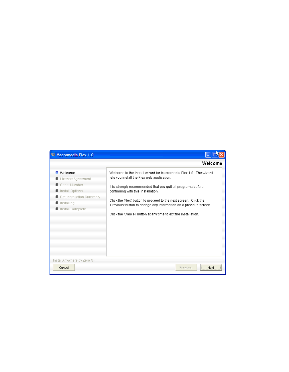
1.
Copy the Windows version of the Flex installer from the Macromedia Flex CD.
2.
In Windows, double-click the Flex installer file, flex-10-win.exe.
The install wizard appears:
3.
Follow the onscreen instructions.
4.
When prompted for a serial number, leave the text box blank.
You don’t need to enter a serial number for the Developer edition. The Flex server works for 60
days as a trial edition; after that, it becomes a Developer edition.
2 Flex Builder Tutorials
Page 3
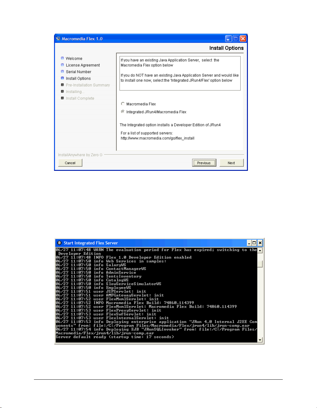
5.
On the Install Options dialog box, select the Integrated JRun4/Macromedia Flex option.
The dialog box gives you other installation options. This tutorial assumes that you selected the
Integrated JRun4/Macromedia Flex option.
6.
After you finish installing Flex 1.0, install any Flex updaters available on the Macromedia
website at www.macromedia.com/go/flex_updaters.
7.
Start the server by selecting Start > All Programs > Macromedia > Macromedia Flex > Start
Integrated Flex Server.
The server displays startup information.
Caution: Do not close the Start Integrated Flex Server dialog box once the server is running.
Closing it shuts down the Flex server.
Tutorial: Setting up a development environment 3
Page 4
For more information, see the Flex installation documentation on the Macromedia website at
www.macromedia.com/go/flex_install/.
You can verify that the Flex server is running normally as follows:
1.
Open the following URL in your browser:
http://localhost:8700/samples
The Flex Sample Apps page appears.
2.
Select a sample application to run it.
If the application doesn’t run, try the following troubleshooting suggestions:
Problem Possible solution
Port conflicts If you created a new server for the Flex application, make sure the ports used by
that server don’t conflict with other servers running on your web application server.
Application
server
Flash Player Make sure you’re running the latest Macromedia Flash Player. Flash Player is
Make sure the integrated JRun4/Flex server is running. In Windows, select Start >
All Programs > Macromedia > Macromedia Flex > Start Integrated Flex Server.
installed when you install Flex Builder.
Copy the tutorial folders to the Flex samples folder
In this part of the tutorial, you copy the Flex Builder tutorial folders to the folder called samples
on the Flex server. The samples folder is the Flex application root folder of the Flex Sample Apps
application.
Caution: You must copy the tutorial folders to the folder called samples or the tutorials will not work
properly.
1.
Locate the Tutorial folder in the following folder on your hard disk.
C:\Program Files\Macromedia\Flex Builder\Tutorial\
If you didn’t install Flex Builder to the default location, locate the Tutorial folder on your
hard disk.
2.
Select the three folders (fbBindings, fbComponents, and fbLayout) in the Tutorial folder and
copy them to the following Flex application root folder:
C:\Program Files\Macromedia\Flex\jrun4\servers\default\samples\
Note: If you installed Flex on a different computer, you must copy the files to the samples folder on
the remote computer. For more information, see “Examples and site settings” in Using Flex
Builder Help.
4 Flex Builder Tutorials
Page 5

3.
In the Flex application root folder, locate the folder named products in the
\samples\flexstore\assets\ folder and copy it to the \samples\fbBindings\assets\ folder.
The products folder contains the product images used in the tutorial. If you're working with
the integrated JRun4/Flex server locally, the path of the original products folder is as follows:
C:\Program Files\Macromedia\Flex\jrun4\servers\default\samples\flexstore\assets\products
After copying the folder, it should also appear at the following location:
C:\Program Files\Macromedia\Flex\jrun4\servers\default\samples\fbBindings\assets\products
Define a Flex Builder site
In this part of the tutorial, you define a Flex Builder site for the tutorials. A Flex Builder site lets
you visually design, preview, and debug MXML and ActionScript files without leaving Flex
Builder.
After you define the Flex Builder site, you can start working on the tutorials.
This section assumes you installed the Flex server on the same computer as Flex Builder using the
integrated JRun/Flex install option. If you installed the Flex server on a different computer, you
must use a procedure that’s different from the one below to define the site. For instructions, see
“Defining the site if the Flex server is remote” in Using Flex Builder Help.
1.
In Flex Builder, s elect Site > Manag e Sites, click the New button in the Manage Sites dialog box,
and select Flex Site from the context menu.
The Flex Server Site Setup dialog box appears.
Tip: You can also open this dialog box by clicking the Flex Site link on the Start page.
2.
In the Site Name text box, enter Flex Builder Samples.
The name identifies your site. The samples folder contains not only the Flex Builder tutorials,
but other sample applications as well.
3.
In the Local Root Folder text box, click the folder icon and select the following folder:
C:\Program Files\Macromedia\Flex\jrun4\servers\default\samples\
It should contain the Flex Builder tutorial folders (see “Copy the tutorial folders to the Flex
samples folder” on page 4), among other folders.
This step tells Flex Builder where your files are located on your hard disk.
4.
In the Flex Server Root Folder text box, make sure the following path is specified:
C:\Program Files\Macromedia\Flex\jrun4\servers\default\samples\
This folder must always be a Flex application root folder on the server. You can tell if a folder is
an application root folder by checking to see if it has a WEB-INF/flex folder containing a flexconfig.xml file. An application root folder always has this folder and file. For more
information, see “Identifying a Flex application root folder” in Using Flex Builder Help.
This step tells Flex Builder where it can “test” files—that is, where it can send MXML and
ActionScript files to be compiled by the Flex server at design time. Flex Builder needs to get
these files compiled so you can preview MXML files, get build and debugging information,
and connect to back-end systems.
Tutorial: Setting up a development environment 5
Page 6
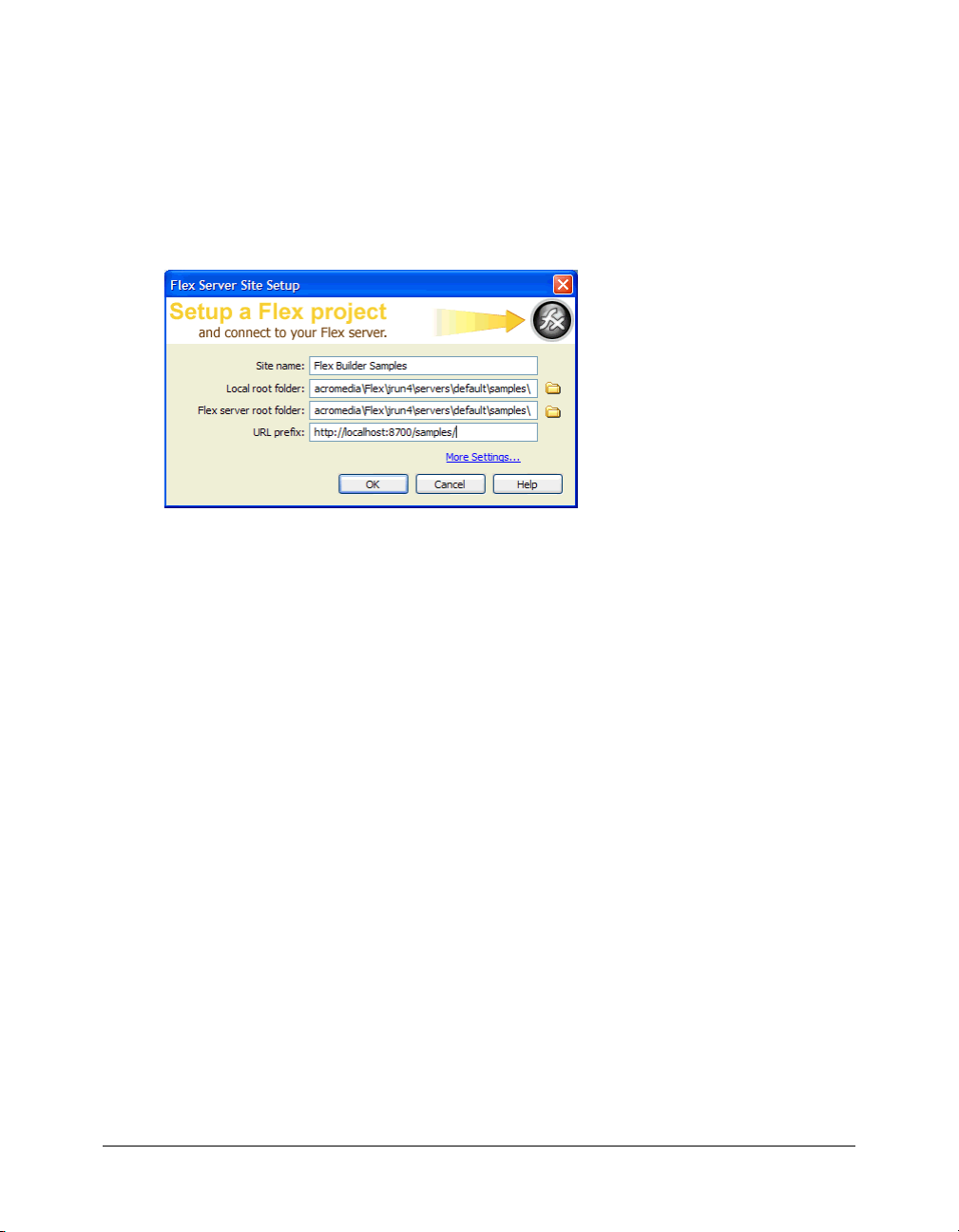
5.
In the URL Prefix text box, enter the following URL:
http://localhost:8700/samples/
Caution: Flex Builder may auto-populate this text box with http://localhost:8700/flex/. Make sure
you change the value to http://localhost:8700/samples/.
To get the Flex server to compile files while you work, Flex Builder uploads the file to the
application root folder you specified and attempts to request it using the URL prefix.
The Flex Server Site Setup dialog box should look like this:
6.
Click OK to define the site and close the dialog box, and then click Done to close the Manage
Sites dialog box.
The Flex Builder site is defined and the tutorials are set up. To start working on a tutorial, see any
of the following:
• “Tutorial: Creating a layout with Flex Builder” on page 6
• “Tutorial: Building custom components with Flex Builder” on page 15
• “Tutorial: Binding components to data with Flex Builder” on page 39
Tutorial: Creating a layout with Flex Builder
This tutorial shows you how to use Flex Builder to quickly lay out a Flex user interface.
You can complete this tutorial as a stand-alone unit or as the first part of a multipart tutorial. In
either case, you must complete the setup tutorial before you begin. For instructions, see “Tutorial:
Setting up a development environment” on page 1.
In this tutorial, you’ll accomplish the following tasks:
• “Review the approved user interface mock-ups” on page 7
• “Create an MXML file” on page 8
• “Import your CSS styles” on page 9
• “Position the page title” on page 9
• “Position the catalog component” on page 11
• “Position the product detail and shopping cart components” on page 12
• “Add view buttons to the product catalog” on page 13
6 Flex Builder Tutorials
Page 7
Review the approved user interface mock-ups
During the planning and approval stages of the project, members of your team produced final
mock-ups of the user interface for the Flex Store. You will use these mock-ups to guide you when
you create the MXML layout.
The final mock-ups for the Flex Store application are stored in your fbLayout folder:
/fbLayout/mockups
You can open a mock-up file in your favorite image editor from the Files panel in Flex Builder.
This feature is useful if you want to quickly change or touch up a mock-up.
1.
In Flex Builder, make sure the Flex Builder Samples site is selected in the Files panel.
If the Files panel is closed, select Window > Files to open it.
2.
In the Files panel, locate the uiGrid.png image and double-click it.
Flex Builder opens the image in your default image editor. For more information on setting a
default image editor, see “Setting external image editor preferences” in Using Dreamweaver
Help.
The first mock-up file, uiGrid.png, shows the general layout of the Flex Store user interface:
Tutorial: Creating a layout with Flex Builder 7
Page 8
The user will also have the option of viewing thumbnails in the product catalog on the left side of
the layout. The second mock-up file, uiThumbs.png, shows this thumbnail view:
The layout contains the following custom components:
• Two interchangeable product catalog components on the left side, which give the user two
views of the catalog
• A product detail component on the upper right side
• A shopping cart component on the lower right side
Another tutorial shows you how to build these components (see “Tutorial: Building custom
components with Flex Builder” on page 15). In this tutorial you create the basic layout of the
application.
Create an MXML file
In this part of the tutorial, you take the first step in laying out the application by creating an
MXML file. MXML is a XML-based language for building Flex applications. For more
information, see “About MXML files” in Using Flex Builder Help.
1.
In Flex Builder, make sure the Flex Builder Samples site is selected in the Files panel.
2.
Select File > New.
The New Document dialog box appears.
3.
Select Flex Development in the left pane and MXML Application in the right pane, and then
click Create.
The dialog box closes and a blank MXML file appears.
8 Flex Builder Tutorials
Page 9
4.
Set the following property in the Attributes panel of the Tag inspector (Window > Tag
Inspector):
■ Styles > verticalGap: 0
Note: The angle bracket means the verticalGap property is located in the Styles category of the
Attributes tab. This convention is used throughout the tutorials.
5.
Save the file in the fbLayout folder by selecting File > Save, double-clicking the fbLayout folder,
and naming the file as follows:
flexstore.mxml
Import your CSS styles
In this part of the tutorial, you import CSS styles into the flexstore.mxml file. You want to import
styles defined in an external CSS file to make sure your site has a consistent look and feel. CSS
styles also give you more flexibility when you want to change the design of your site.
1.
Make sure the flexstore.mxml file is open in Flex Builder.
2.
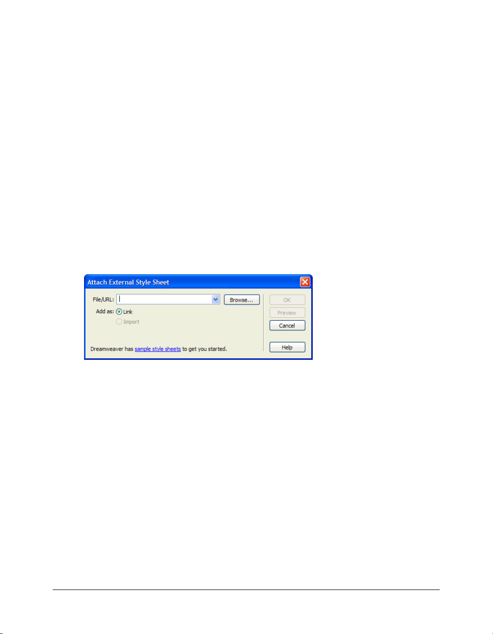
Open the CSS Styles panel (Window > CSS Styles) and click the Attach Style Sheet button at
the lower edge of the panel.
The Attach External Style Sheet dialog box appears.
3.
In the Attach External Style Sheet dialog box, click Browse to select the external CSS style sheet
called flexstore.css located in the fbLayout folder.
After you click OK twice to close the dialog boxes, the name of the external CSS style sheet
appears in the CSS Styles panel. You can click the Plus (+) icon to display a tree view of all the
styles in the style sheet and their properties.
4.
Save your work.
Position the page title
After importing the CSS styles, the next task is to create a basic layout for the user interface. In
this part of the tutorial, you position the page title (Flex Store) in the upper left corner of the
layout, as indicated in the mock-up of the user interface (see “Review the approved user interface
mock-ups” on page 7).
You decide to use a VBox (for vertical box) container to position the page title at the top of the
file. The rest of the user interface will be positioned below the page title.
Tutorial: Creating a layout with Flex Builder 9
Page 10
1.
In Design view, click the Expanded button on the Document toolbar and then click anywhere
inside the Application container.
Expanded mode adds borders and padding to controls and containers in Design view to help
you lay out your application. (The borders and padding appear only at design time.) You can
click the Standard button at any time to get a better representation of how your project will
look after it’s compiled.
2.
In the Containers category of the Insert bar, click the VBox button.
Flex Builder inserts a VBox container in the file.
3.
With the insertion point still blinking in the VBox container, set the following property in the
Attributes panel:
■ Size > widthFlex: 0
Tip: To verify that the component is selected, check that <mx:VBox> and its associated icon
appear at the top of the Attributes panel.
4.
Insert the page title by clicking anywhere inside the VBox container and clicking the Label
button in the Controls category of the Insert bar.
Flex Builder inserts a Label control in the file and selects it.
5.
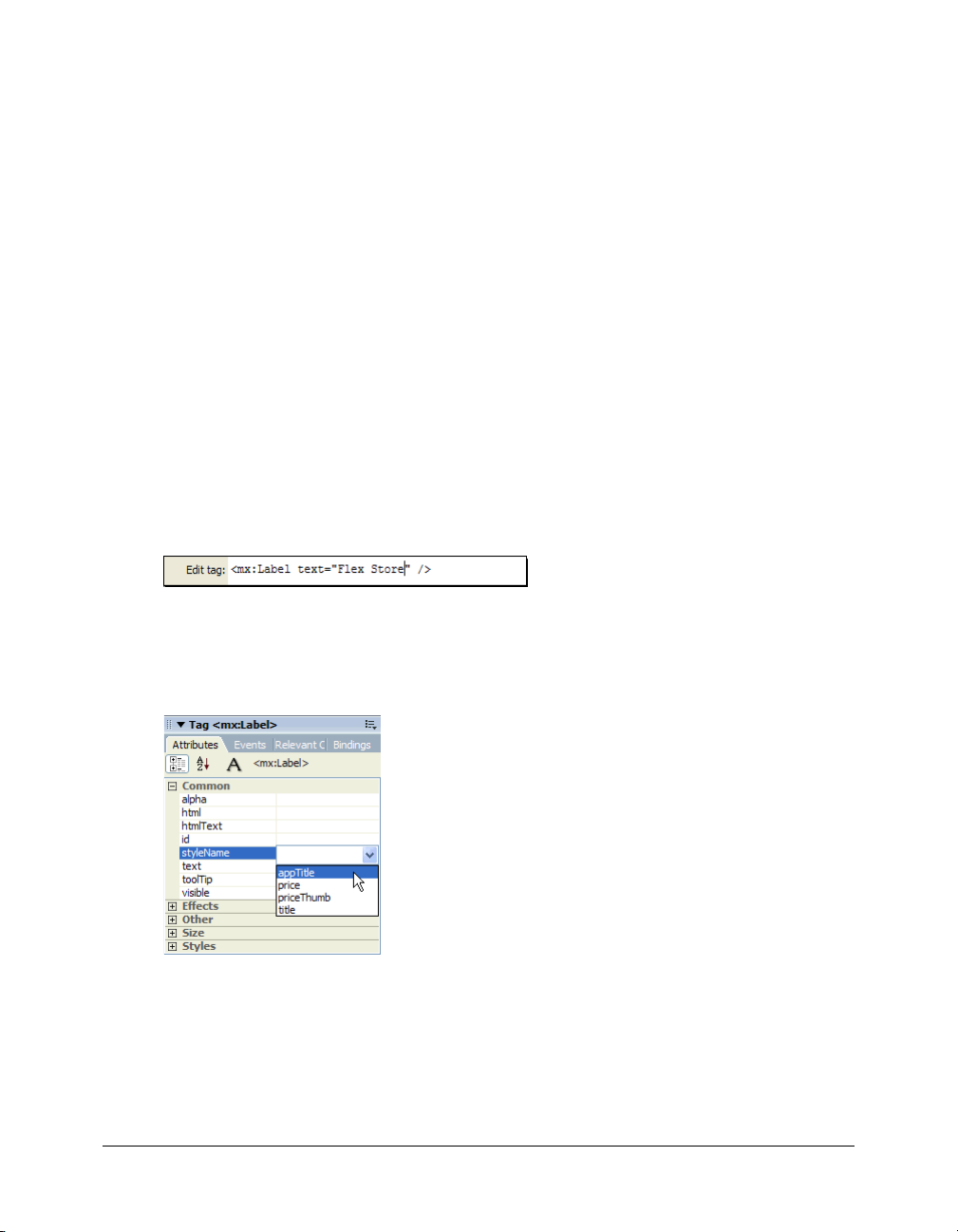
Modify the Label text by double-clicking the Label control to open the Quick Tag Editor, and
then changing the
6.
With the Label control still selected, set the following property in the Attributes panel:
■ Common > styleName: appTitle
text property value to "Flex Store" as follows and pressing Enter.
You can select the style from the pop-up menu that appears when you click the field for the
styleName property.
You can see the effect of applying the style in Design view.
7.
Save your work.
10 Flex Builder Tutorials
Page 11
Position the catalog component
In this part of the tutorial, you position the product catalog on the left side of the user interface as
shown in the mock-ups (see “Review the approved user interface mock-ups” on page 7). To meet
this design requirement, you decide to use an HBox (for horizontal box) container to position the
two halves of your user interface side by side.
1.
In Code view (View > Code), place the insertion point at the lower edge of the VBox container
by clicking immediately before the closing
2.
In the Containers category of the Insert bar, click the HBox button.
</mx:VBox> tag.
Flex Builder inserts an HBox container in the file.
3.
Click anywhere in the <mx:HBox> tag, click the Refresh button on the Attributes panel, and set
the following properties in the panel:
■ Styles > horizontalGap: 4
■ Size > height: 548
■ Size > width: 860
Note: When you set the first size property, a message box appears warning you that the container
clips any content that extends beyond the specified size. Select the Don’t Show Me This Message
Again option, and click OK.
4.
Switch to Design view (View > Design), click anywhere in the HBox container, and click the
Panel button in the Containers category of the Insert bar.
Flex Builder inserts a Panel container in the file. You want to use a Panel container for the
product catalog.
5.
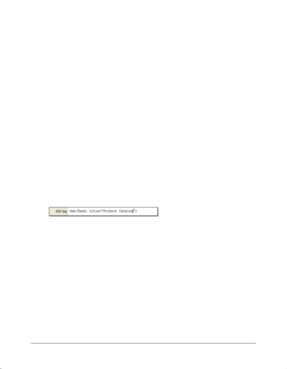
Specify the panel’s title by double-clicking the Panel container to open the Quick Tag Editor,
and then entering the property
title="Product Catalog" as follows.
6.
With the Quick Tag Editor still open, enter the following properties and then Press Enter:
id="main" height="544" width="478"
Tip: Use code hints to work more rapidly.
7.
Insert a ViewStack container inside the Panel container by clicking anywhere inside the Panel
container, clicking the ViewStack button on the Insert bar, and entering bodyStack in the ID
text box in the dialog box that appears.
After you click OK, Flex Builder inserts a ViewStack container in the Panel container. You
want to use this container to place two views of the product catalog—a grid view and a
thumbnail view—in the same space.
8.
With the ViewStack container still selected, set the following property in the Attributes panel:
■ Effects > changeEffect: Fade
You can select the Fade value from the pop-up menu. The Fade effect will make the ViewStack
container change from transparent to opaque in 500 milliseconds (the default effect duration).
9.
Save your work.
Tutorial: Creating a layout with Flex Builder 11
Page 12

Position the product detail and shopping cart components
In this part of the tutorial, you position the product detail and shopping cart components on the
right side of the user interface as shown in the mock-ups (see “Review the approved user interface
mock-ups” on page 7). You decide to use the existing HBox container to meet this layout
requirement.
The mock-up also shows the product detail and shopping cart components stacked on top of each
other. To meet this layout requirement, you decide to use a VBox container.
1.
In Design view, click inside the HBox container to the right of the Panel container.
Be careful not to click inside the Panel container; the vertical insertion bar should appear
beside the Panel container.
2.
In the Containers category of the Insert bar, click the VBox button.
Flex Builder inserts a VBox container in the file. You want to use the VBox container to stack
the product detail and shopping cart components on top of each other.
3.
With the insertion point still blinking in the VBox container, set the following property in the
Attributes panel:
■ Size > widthFlex: 1
You want the VBox container to scale based on its content.
4.
Click anywhere in the new VBox container, click the Canvas button in the Containers category
of the Insert bar, and accept the default width and height values in the dialog box that appears.
Flex Builder inserts a Canvas container in the VBox. You want to insert the product detail
component in this container.
5.
With the Canvas container still selected, set the following properties in the Attributes panel:
■ Common > id: topCanvas
■ Size > height: 326
■ Size > width: 364
■ Size > widthFlex: 1
■ Other > vScrollPolicy: off
Tip: If you prefer, you can list all the properties alphabetically by clicking the Show List View button
on the Attributes panel.
6.
Insert another Canvas container by switching to Code view, clicking immediately after the
closing
</mx:Canvas> tag, and clicking the Canvas button on the Insert bar.
After you accept the default width and height values in the dialog box that appears, Flex
Builder inserts another Canvas container in the VBox. You want to insert the shopping cart
component in this container.
12 Flex Builder Tutorials
Page 13

7.
Click anywhere in the new <mx:Canvas> tag, click the Refresh button on the Attributes tab,
and set the following properties in the Attributes tab:
■ Common > id: bottomCanvas
■ Size > height: 208
■ Size > width: 364
■ Size > widthFlex: 1
■ Other > vScrollPolicy: off
8.
Switch back to Design view to inspect your layout.
Tip: Press F4 to hide the workspace and maximize the Document window. Press F4 again to
restore the workspace.
9.
Save your work.
Add view buttons to the product catalog
The product catalog area of the layout gives the user two views of the products—a grid view and a
thumbnail view. According to the user interface mock-ups, the user should be able to switch views
by clicking view buttons at the lower edge of the catalog. For information about the user interface
mock-ups, see “Review the approved user interface mock-ups” on page 7.
After studying the mock-up, you decide to use the following containers to lay out the buttons:
• A ControlBar container in the left Panel container to create a footer
• An HBox container in the ControlBar container to position the buttons horizontally
You use the following steps to lay out and insert the buttons with Flex Builder.
1.
Make sure the flexstore.mxml file is open in Flex Builder.
2.
Insert a ControlBar container by clicking inside the lower edge of the Panel container (without
clicking inside the ViewStack container), and then clicking the ControlBar button in the
Containers category of the Insert bar.
Flex Builder inserts an empty ControlBar container and automatically positions it at the lower
edge of the Panel container.
3.
With the insertion point still blinking in the ControlBar container, specify the values for the
following properties in the Attributes panel:
■ Size > height: 45
■ Styles > horizontalAlign: right
4.
Insert an HBox container by clicking anywhere inside the ControlBar container, and clicking
the HBox button on the Insert bar.
5.
With the insertion point still blinking in the HBox container, set the value for the following
property in the Attributes panel:
■ Styles > horizontalGap: 0
Tutorial: Creating a layout with Flex Builder 13
Page 14
6.
Insert the thumbnail view button by clicking inside the HBox container, clicking the Image
button in the Controls category of the Insert bar, and selecting the following image file:
/fbLayout/assets/images/thumb_off.png
7.
Insert the grid view button by clicking inside the HBox container on the right side of the
thumbnail view button (without selecting the button), clicking the Image button on the Insert
bar, and selecting the following image file:
/fbLayout/assets/images/list_off.png
8.
Save your work.
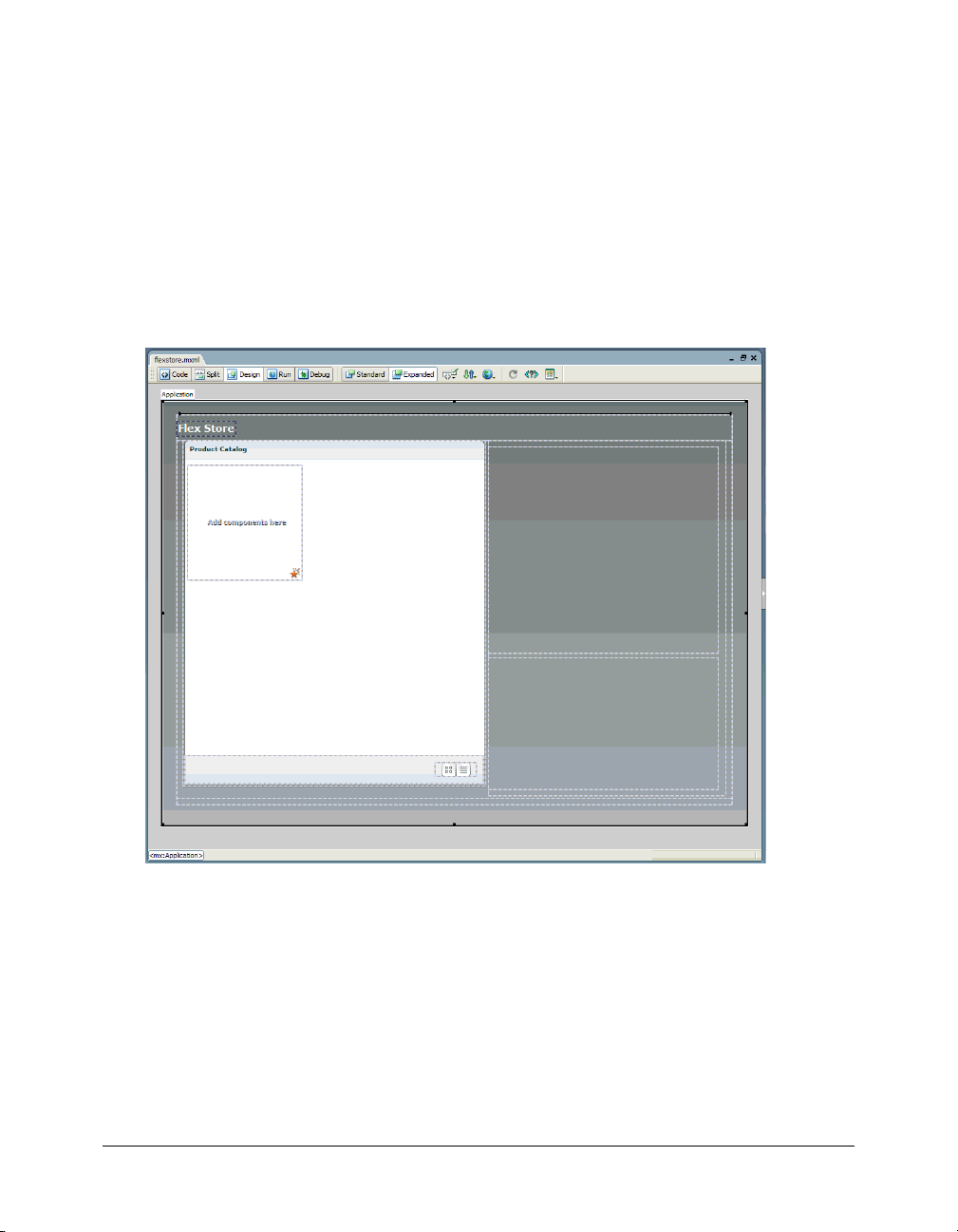
In Design view, the completed layout should look similar to the following figure if you select the
Application container:
This completes the layout tutorial. If you like, you can continue building the Flex Store by
completing the components tutorial, which shows you how to build custom components and
insert them in your layout.
14 Flex Builder Tutorials
Page 15

Tutorial: Building custom components with Flex Builder
In this tutorial, you learn how to use Flex Builder to create custom components, the building
blocks of Flex applications. The Flex Store application requires the following custom
components:
• Two catalog components that give the user different views of the product catalog
• A product detail component that gives the user more detail on a product the user clicks in
the catalog
• A shopping cart component that lists the products the user wants to purchase
You can complete this tutorial as a stand-alone unit or as the second part of a multipart tutorial.
In either case, you must complete the setup tutorial before you begin. For instructions, see
“Tutorial: Setting up a development environment” on page 1.
The tutorial includes a pre-built set of files so you can complete the tutorial without completing
the layout tutorial first. If you completed the layout tutorial, you can overwrite the files in the
fbComponents folder with your files in the fbLayout folder.
In this tutorial, you will accomplish the following tasks:
• “Build the grid view component” on page 16
• “Build the thumbnail view component” on page 19
• “Build the product detail component” on page 21
• “Build the shopping cart component” on page 28
• “Insert the view components in the Flex Store layout” on page 32
• “Insert the detail and cart components in the layout” on page 34
• “Activate the catalog view buttons” on page 35
Tutorial: Building custom components with Flex Builder 15
Page 16
Build the grid view component
According to the following mock-up, the grid view component should display the Flex Store
product catalog as a two-column grid of names and prices. The user can select the grid view by
clicking a button at the lower edge of the catalog.
The grid view component does not contain any product data in this tutorial. Another tutorial
describes how to add data (see “Tutorial: Binding components to data with Flex Builder”
on page 39).
1.
In Flex Builder, make sure the Flex Builder Samples site is selected in the Files panel.
2.
Select File > New.
The New Document dialog box appears.
3.
Select Flex Development in the left pane and MXML Component:Vertical in the right pane,
and then click Create.
The dialog box closes and a component file with a VBox container appears. By default, Flex
Builder assigns the value of 400 to the
height and width properties. You don’t want to use
these values.
16 Flex Builder Tutorials
Page 17
4.
With the insertion point still blinking in the VBox container, specify the values for the following
properties in the Attributes panel:
■ Size > height: Clear the value
■ Size > width: Clear the value
■ Styles > verticalGap: 0
Note: The “Size > height” expression means the height property is located in the Size category of
the Attributes tab. This convention is used throughout the tutorials.
5.
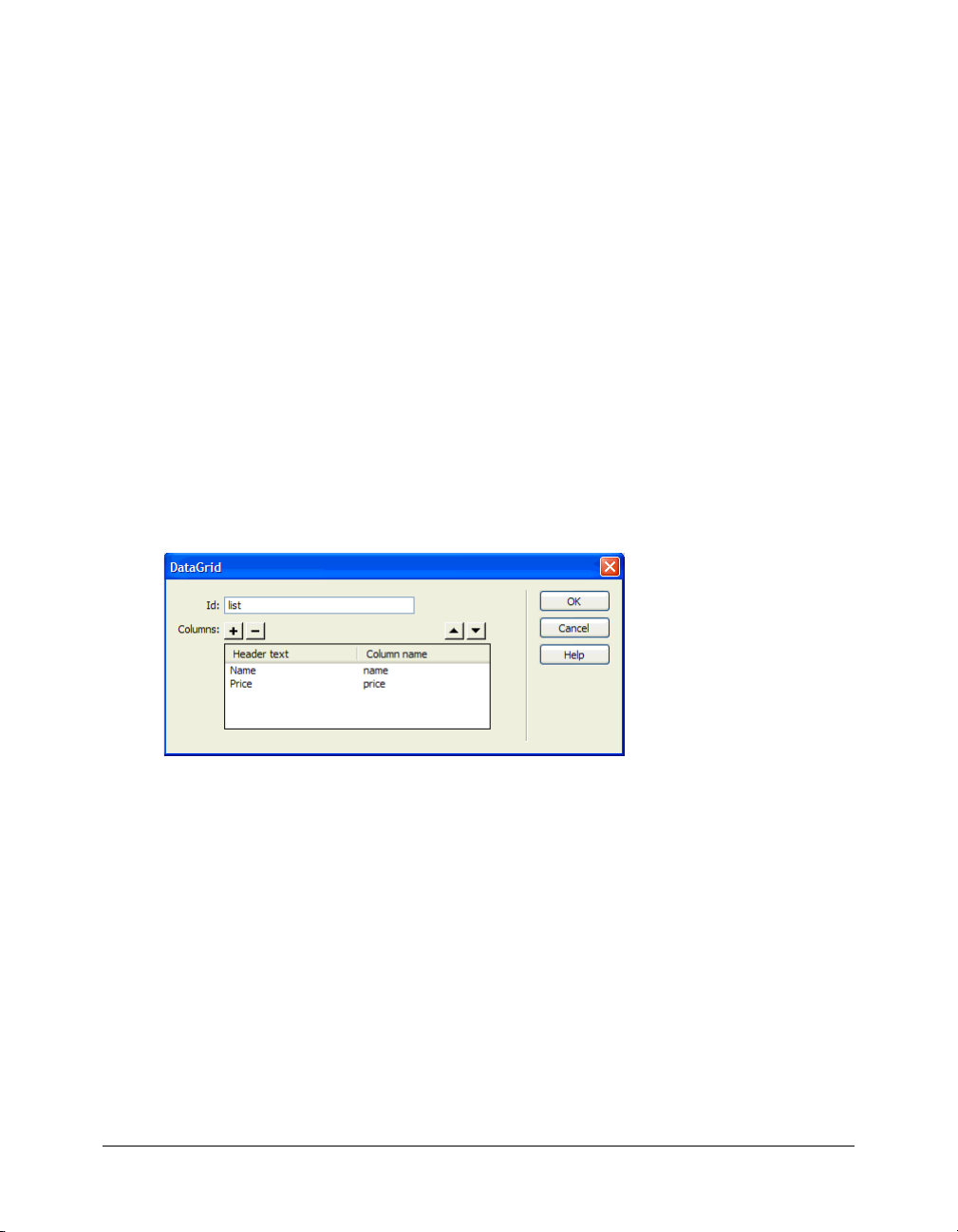
Insert a DataGrid component to display the product catalog by clicking anywhere in the VBox
container, and clicking the DataGrid button in the Controls category of the Insert bar.
The DataGrid dialog box appears.
6.
Set the dialog box options as follows:
■ ID: list
■ Header Text (first row): Name
■ Header Text (second row): Price
■ Column Name (first row): name
■ Column Name (second row): price
The DataGrid dialog box should look similar to the following figure:
Caution: Make sure the column name values exactly match “name” and “price.” Column names
must exactly match the name of the data fields that will be assigned to the DataGrid in the bindings
tutorial.
7.
Click OK.
Flex Builder inserts a DataGrid component in your component file.
8.
Click the DataGrid component and set the following properties in the Attributes tab:
■ Size > heightFlex: 1
■ Size > widthFlex: 1
Tutorial: Building custom components with Flex Builder 17
Page 18

9.
Switch to Code view (View > Code) and set column properties of the DataGrid by locating the
two
<mx:DataGridColumn> tags, and adding the following properties (shown in bold type):
<mx:DataGridColumn headerText="Name" columnName="name" width="300"/>
<mx:DataGridColumn headerText="Price" columnName="price" textAlign="right"
marginRight="4" />
You can use Code hints to quickly set these properties. For example, to set the width property,
click in the tag before the closing angle bracket, press the Spacebar to display the code hints,
type the letter w to quickly select the property, and press Enter. Type 300 to set the value.
10.
Save the component file in the fbComponents folder by selecting File > Save, double-clicking
the fbComponents folder, and naming the component file as follows:
GridView.mxml
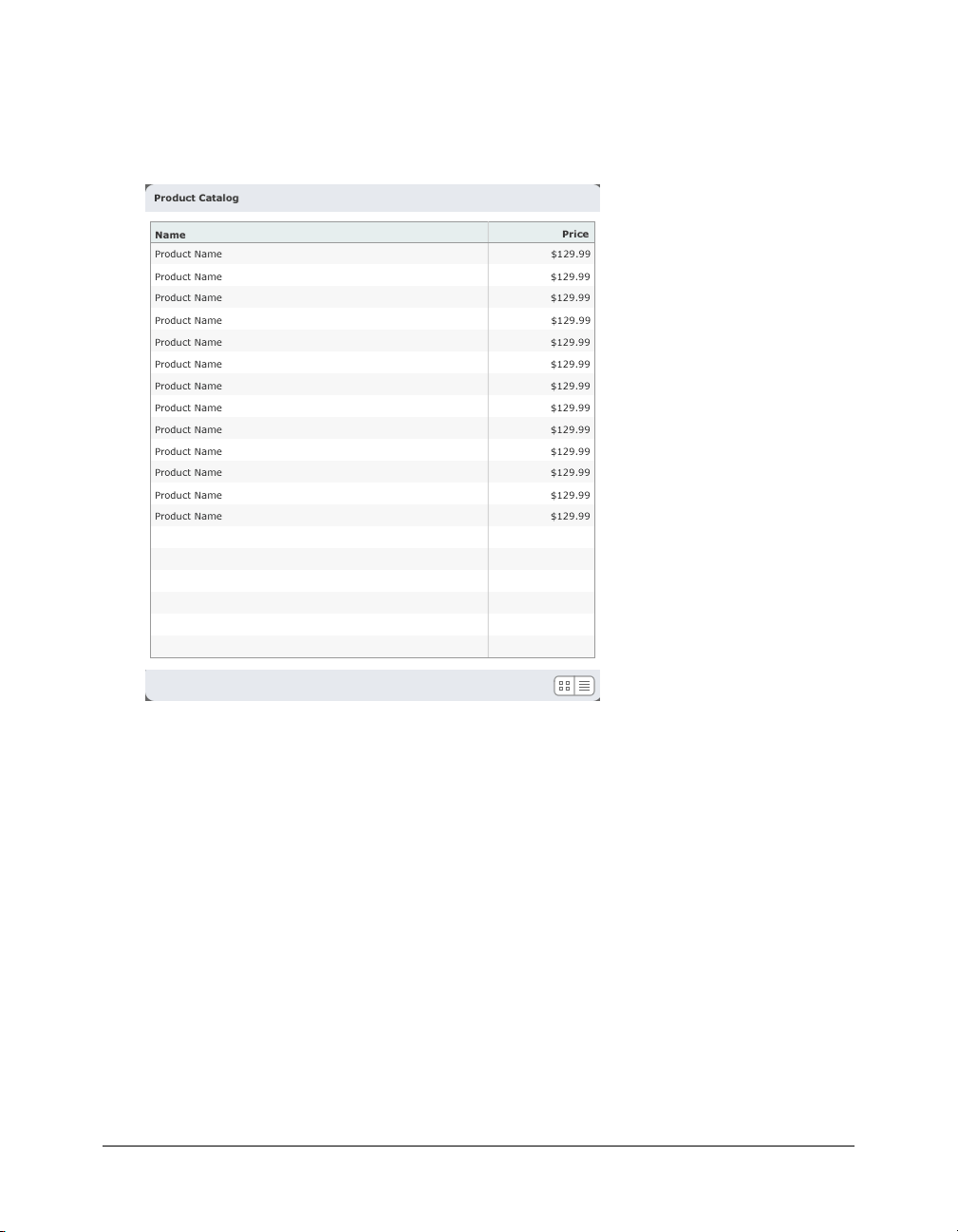
In Design View, the completed component should look similar to the following figure if you
select the VBox container:
Note: The component will scale to fit in the space allotted to it in the flexstore.mxml file.
18 Flex Builder Tutorials
Page 19

Build the thumbnail view component
According to the following mock-up, the thumbnail view component should display the Flex
Store product catalog as a set of thumbnails with names and prices. The user can select the
thumbnail view by clicking a button at the lower edge of the catalog.
The thumbnail view component will not contain any product data in this tutorial. Another
tutorial describes how to add data (see “Tutorial: Binding components to data with Flex Builder”
on page 39).
1.
In Flex Builder, select File > New.
The New Document dialog box appears.
2.
Select Flex Development in the left pane and MXML Component:Vertical in the right pane,
and then click Create.
The dialog box closes and a component file with a VBox container appears.
3.
With the insertion point still blinking in the VBox container, specify the values for the following
properties in the Attributes panel:
■ Size > height: Clear the value.
■ Size > width: Clear the value.
■ Styles > verticalGap: 0
Tutorial: Building custom components with Flex Builder 19
Page 20

4.
Insert a Tile container to lay out the products by clicking anywhere in the VBox container, and
clicking the Tile button in the Containers category of the Insert bar.
Flex Builder inserts a Tile container in the component file.
5.
With the insertion point still blinking in the Tile container, specify the values for the following
properties in the Attributes panel:
■ Common > id: tileView
■ Size > y: 12
6.
Save the component file in the fbComponents folder by selecting File > Save, and naming the
component file as follows:
ThumbnailView.mxml
7.
Insert placeholder images for the products by clicking anywhere inside the Tile container,
clicking the Image button in the Controls category of the Insert bar, and selecting the following
image in the mockups folder:
fbComponents/mockups/tnProduct.png
You want to insert five or more placeholder images to represent the products. In the tutorial on
data bindings (see “Tutorial: Binding components to data with Flex Builder” on page 39), you
replace these placeholder images with a Repeater component and a custom component that
retrieves product data and displays each product’s thumbnail image, name, and price.
8.
Click inside the right edge of the Tile container (without selecting the thumbnail image), and
repeat step 7 four more times to insert more thumbnail images in the Tile container.
If you’re unable to click inside the edge, click the Expanded button on the Document toolbar
to add extra space around the container.
9.
Save your work.
20 Flex Builder Tutorials
Page 21

In Design view, the completed component should look similar to the following figure if you select
the VBox container:
Note: The component will scale to fit in the space allotted to it in the flexstore.mxml file.
Build the product detail component
According to the component’s functional specification, the product detail component should
display product details when a user clicks one of the products in the product catalog. The user can
add the product to the shopping cart by specifying a quantity and clicking the Add to Cart button
at the lower edge of the panel.
The following is a mock-up of the component:
Tutorial: Building custom components with Flex Builder 21
Page 22

The product detail component will not contain any data in this tutorial. Another tutorial
describes how to add data (see “Tutorial: Binding components to data with Flex Builder”
on page 39).
In this part of the tutorial, you complete the following tasks:
• “Lay out the product detail component” on page 22
• “Add the product details” on page 24
• “Finish the footer of the product detail component” on page 26
Lay out the product detail component
After studying the component mock-up, you decide to use the following Flex containers to lay
out the component:
• A Panel container to create the header and position the component’s child containers vertically
• An HBox container within the Panel container to position the product thumbnail and the
product information side by side
• A VBox container within the HBox to position the product name on top of the price
• A ControlBar container to create the footer
You start by creating a new component file based on a Panel container.
1.
In Flex Builder, press Control+N.
The New Document dialog box appears.
2.
Select Flex Development in the left pane and double-click MXML Component:Panel in the
right pane.
The dialog box closes and a component file with a Panel container appears.
3.
With the insertion point still blinking in the Panel container, specify the values for the following
properties in the Attributes panel:
■ Common > title: Product Details
■ Styles > marginBottom: 8
■ Styles > marginLeft: 8
■ Styles > marginRight: 8
■ Styles > marginTop: 8
4.
Insert an HBox container inside the Panel container by clicking anywhere inside the Panel
container and clicking the HBox button in the Containers category of the Insert bar.
Flex Builder inserts an empty HBox container in the component.
5.
With the insertion point still blinking in the HBox container, specify the value for the following
property in the Attributes panel:
■ Styles > verticalAlign: middle
22 Flex Builder Tutorials
Page 23

6.
Insert a Canvas container to position the product thumbnail by clicking anywhere inside the
HBox container, clicking the Canvas button on the Insert bar, clearing the default values in the
dialog box that appears, and clicking OK.
Flex Builder inserts an empty Canvas container in the component.
7.
With the Canvas container still selected, specify the values for the following properties in the
Attributes panel:
■ Size > height: 140
■ Size > width: 150
■ Common > clipContent: false
8.
Insert a VBox container for the product name and price by clicking inside the right edge of the
HBox container (without clicking inside the Canvas container), and clicking the VBox button
on the Insert bar.
Flex Builder inserts an empty VBox container in the component.
9.
Insert a ControlBar container by clicking inside the Panel container outside and below the
HBox container, and clicking the ControlBar button on the Insert bar.
Flex Builder inserts an empty ControlBar container and automatically positions it at the lower
edge of the Panel container.
10.
With the insertion point still blinking in the ControlBar container, specify the value for the
following property in the Attributes panel:
■ Common > id: ctrl
11.
To make sure the component fits correctly in the Flex Store user interface, select the Panel
container and clear the following properties in the Attributes panel:
■ Size > height:
■ Size > width:
12.
Save the component file in the fbComponents folder by pressing Control+S, double-clicking
the fbComponents folder, and naming the component file as follows:
ProductDetail.mxml
Tutorial: Building custom components with Flex Builder 23
Page 24

In Design view, the component’s layout should look similar to the following figure if you select
the Panel container:
Note: The component will scale to fit in the space allotted to it in the flexstore.mxml file.
Add the product details
According to the mock-up, the component should display the following information: a
thumbnail image, the product name and price, and a brief product description.
1.
Make sure the component file, ProductDetail.mxml, is open in Flex Builder.
2.
Insert a placeholder image for the product thumbnail by clicking in the upper left corner of the
Canvas container, clicking the Image button in the Controls category of the Insert bar, and
selecting the following image:
fbComponents/mockups/tnImage.png
In the tutorial on data bindings (see “Tutorial: Binding components to data with Flex Builder”
on page 39), you modify the
source property of the Image so that its value is set dynamically
when the user clicks a product in the catalog.
3.
With the Image still selected in the file, change the following properties in the Attributes panel:
■ Size > height: 140
■ Size > width: 150
■ Size > x: 0
■ Size > y: 0
24 Flex Builder Tutorials
Page 25

4.
Insert a Label component for the product name by clicking anywhere inside the VBox
container, clicking the Label button on the Insert bar, and specifying the following properties
in the Attributes panel:
■ Common > text: Product Name
■ Common > styleName: title
In the tutorial on data bindings, you modify the
text property so that its value is set
dynamically when the user clicks a product in the catalog.
The title style is defined in the flexstore.css file attached to the flexstore.mxml file (see “Import
your CSS styles” on page 9). Your custom component will have access to this style sheet when
the component is used in the flexstore.mxml file.
5.
Insert another Label component for the product price by switching to Code view (View >
Code), clicking immediately after the existing
<mx:Label> tag and clicking the Label button on
the Insert bar.
Flex Builder inserts a
6.
Click anywhere in the new <mx:Label> tag, click the Refresh button on the Attributes panel to
<mx:Label> tag.
display the tag properties, and specify the following properties:
■ Common > text: $129.98
■ Common > styleName: price
7.
Switch back to Design view and insert a Text component to display the product description by
clicking inside the Panel container outside and below the HBox container, clicking the Text
button on the Insert bar (not to be confused with the Label button), and specifying the
following properties in the Attributes panel:
■ Common > html: true
■ Common > text: product copy
■ Size > heightFlex: 1
■ Size > widthFlex: 1
8.
Save your work.
Tutorial: Building custom components with Flex Builder 25
Page 26

In Design view, the component should look similar to the following figure if you select the Panel
container:
Finish the footer of the product detail component
According to the component mock-up, the footer has a control that lets users specify the quantity
of the selected item they want to add to the shopping cart. The footer also has a button that lets
users add the selected item to the shopping cart.
1.
Make sure the component file, ProductDetail.mxml, is open in Flex Builder.
2.
In Design view, click inside the ControlBar container at the lower edge of the Panel container.
Make sure the blinking insertion bar appears inside the ControlBar container.
3.
Insert a Label component by clicking anywhere inside the ControlBar container and clicking
the Label button in the Controls category of the Insert bar.
4.
Modify the label text by double-clicking the Label component in Design view to open the
Quick Tag Editor, and then changing the value of the
bold type):
<mx:Label text="Quantity" />
5.
Press Enter to accept your change and close the Quick Tag Editor.
26 Flex Builder Tutorials
text property as follows (shown in
Page 27

6.
Insert a NumericStepper control by clicking to the right of the Quantity label in the ControlBar
container, clicking the NumericStepper button in the Controls category of the Insert bar, and
specifying the following properties in the Attributes panel:
■ Common > id: qty
■ Common > maximum: 100
■ Common > minimum: 1
■ Common > stepSize: 1
■ Common > value: 1
■ Size > width: 40
7.
Insert a button by clicking to the right of the NumericStepper control in the ControlBar
container, and clicking the Button control on the Insert bar.
8.
Modify the button text by double-clicking the button to open the Quick Tag Editor, and then
changing the value of the
<mx:Button label="Add to Cart" />
9.
Press Enter to accept your change and close the Quick Tag Editor.
10.
Save your work.
label property as follows (shown in bold type):
In Design view, the completed product detail component should look similar to the following
figure if you select the Panel container:
Tutorial: Building custom components with Flex Builder 27
Page 28

Build the shopping cart component
According to the component’s functional specification, the shopping cart component should
display the products that the user wants to bring to the checkout area for purchase. The user can
delete items from the cart by selecting an item and clicking the Delete button. The user can also
proceed to the checkout area by clicking the Checkout button.
The following is a mock-up of the component:
The shopping cart component does not contain any data in this tutorial. Another tutorial
describes how to add data (see “Tutorial: Binding components to data with Flex Builder”
on page 39).
The Checkout button is disabled in these tutorials.
In this part of the tutorial, you complete the following tasks:
• “Lay out the shopping cart component” on page 28
• “Add the product list to the shopping cart” on page 29
• “Finish the footer of the shopping cart component” on page 31
Lay out the shopping cart component
After studying the component mock-up, you decide to use the following Flex containers to lay
out the component:
• A Panel container to create the header and position the component’s child containers vertically
• A ControlBar container to create the footer
You start by creating a component file based on a Panel container.
1.
In Flex Builder, press Control+N.
The New Document dialog box appears.
2.
Select Flex Development in the left pane and double-click MXML Component:Panel in the
right pane.
The dialog box closes and a component file with a Panel container appears.
3.
Double-click the Panel container and enter the following property value (shown in bold type)
in the Quick Tag Editor:
<mx:Panel... title="Shopping Cart" />
28 Flex Builder Tutorials
Page 29

4.
Press Enter to accept your change and close the Quick Tag Editor.
5.
Insert a ControlBar container by clicking inside the Panel container and clicking the
ControlBar button in the Containers category of the Insert bar.
Flex Builder inserts an empty ControlBar container and automatically positions it at the lower
edge of the Panel container.
6.
With the insertion point still blinking in the ControlBar container, specify the value for the
following property in the Attributes panel:
■ Common > id: ctrl
7.
Save the component file in the fbComponents folder by pressing Control+S and naming the
component file as follows:
CartView.mxml
In Design view, the component’s layout should look similar to the following figure if you select
the Panel container:
Add the product list to the shopping cart
According to the mock-up, the component should display a list of products the user wants to
bring to the checkout area for purchase. The list should include the quantity and price of each
product. You decide to use a DataGrid component for this task.
1.
Make sure the component file, CartView.mxml, is open in Flex Builder.
2.
Insert a DataGrid by clicking anywhere inside the Panel container and clicking the DataGrid
button in the Controls category of the Insert bar.
The DataGrid dialog box appears.
Tutorial: Building custom components with Flex Builder 29
Page 30

3.
Click the Plus (+) button to add a third column, and then set the following options in the
DataGrid dialog box:
■ ID: dg
■ Header Text (first row): Name
■ Header Text (second row): Qty
■ Header Text (third row): Price
■ Column Name (first row): name
■ Column Name (second row): qty
■ Column Name (third row): price
The DataGrid dialog box should look similar to the following figure:
4.
Click OK.
Flex Builder inserts a DataGrid component in your component file.
5.
Click the DataGrid component to select it and set the following properties in the Attributes
panel:
■ Size > heightFlex: 1
■ Size > widthFlex: 1
6.
Switch to Code view (View > Code) and set the column properties of the DataGrid component
by locating the three
<mx:DataGridColumn> tags and adding the following properties (shown
in bold type):
<mx:DataGridColumn headerText="Name" columnName="name" width="180" />
<mx:DataGridColumn headerText="Qty" columnName="qty" width="50"
textAlign="right" marginRight="4" />
<mx:DataGridColumn headerText="Price" columnName="price" width="60"
textAlign="right" marginRight="4" />
Tip: You can use Code hints to quickly set these properties.
7.
To make sure the component fits correctly in the Flex Store user interface, locate and delete the
height and width properties in the <mx:Panel> tag.
8.
Save your work.
30 Flex Builder Tutorials
Page 31

In Design view, the component should look similar to the following figure if you select the Panel
container:
Note: The component will scale to fit in the space allotted to it in the flexstore.mxml file.
Finish the footer of the shopping cart component
According to the component mock-up, the footer has one button to let the user delete a selected
item in the shopping cart, and another button to let the user proceed to the checkout area. The
footer should also display the total price of all the products in the cart.
1.
Make sure the component file, CartView.mxml, is open in Flex Builder.
2.
In Design view, click anywhere inside the ControlBar container at the lower edge of the Panel
container.
Make sure the blinking insertion bar appears inside the ControlBar container.
3.
Insert a button by clicking the Button control in the Controls category of the Insert bar, and
specifying the values for the following properties in the Attributes panel:
■ Common > label: Delete
■ Size > width: 75
4.
Insert a second button by clicking to the right of the Delete button in the ControlBar container,
clicking the Button control on the Insert bar, and specifying the values for the following
properties in the Attributes panel:
■ Common > label: Checkout
■ Size > width: 75
Tutorial: Building custom components with Flex Builder 31
Page 32

5.
Insert a Label component by clicking to the right of the Checkout button in the ControlBar
container, clicking the Label button on the Insert bar, and specifying the values for the following
properties in the Attributes panel:
■ Common > text: Tot a l : $
■ Common > styleName: price
6.
Save your work.
In Design view, the CartView component should look similar to the following figure if you select
the Panel container:
Insert the view components in the Flex Store layout
After completing the custom components, you’re ready to insert them in the Flex Store layout.
The layout is already created in this tutorial. To create it yourself, see “Tutorial: Creating a layout
with Flex Builder” on page 6).
The product catalog is positioned in the Flex Store layout with a ViewStack container so that two
views of the catalog—a grid view and a thumbnail view—can occupy the same space. For more
information, see “Position the catalog component” on page 11. In this part of the tutorial, you
insert the two components you created, GridView.mxml and ThumbnailView.mxml, into the
ViewStack container.
32 Flex Builder Tutorials
Page 33

1.
Open the fbComponents/flexstore.mxml file in Flex Builder.
Make sure you open the file located in the fbComponents folder.
2.
In Design view, click anywhere inside the ViewStack container in the Product Catalog panel,
and select Insert > Local Component.
The Insert Local Component dialog box appears:
3.
Click the Browse button and select the ThumbnailView component, ThumbnailView.mxml,
in the Open dialog box that appears.
After you click Open and then OK to close the dialog boxes, Flex Builder inserts the custom
component in the ViewStack container.
4.
Insert the GridView component by switching to Code view, clicking immediately after the
<local:ThumbnailView> tag, selecting Insert > Local Component from the menu, and
selecting your GridView component.
You insert the GridView component in the same ViewStack container as the ThumbnailView
component.
5.
Click anywhere in the opening <mx:Panel> tag, click the Refresh button on the Attributes
panel to display the tag’s properties, and modify the following values:
■ Size > height: Clear the value.
■ Size > width: 484
6.
Locate the <local:ThumbnailView> tag, and add the following property (shown in bold type):
<local:ThumbnailView xmlns:local="*" id="thumbView" />
7.
Locate the <local:GridView> tag, and add the following property (shown in bold type):
<local:CartView xmlns:local="*" id="gridView" />
8.
In Design view, you can switch between the two catalog views by selecting the ViewStack
container and then clicking the left or right arrows at the top of the container.
9.
Save your work.
Tutorial: Building custom components with Flex Builder 33
Page 34

Insert the detail and cart components in the layout
Two Canvas containers were inserted in the Flex Store layout to position the product detail and
shopping cart components. In this part of the tutorial, you insert the two components that you
created, ProductDetail.mxml and CartView.mxml, into the Canvas containers.
1.
Make sure the flexstore.mxml file is open in Flex Builder.
The file is located in the fbComponents folder.
2.
In Design view, insert the product detail component by clicking in the first Canvas container
(ID is topCanvas) on the right side of the layout, and selecting Insert > Local Component.
The Insert Local Component dialog box appears.
3.
Click the Browse button in the dialog box that appears, and select the ProductDetail
component, ProductDetail.mxml.
4.
Click Open, and then click OK to close the dialog boxes.
Flex Builder inserts the custom component in the Canvas.
5.
Click the <mx:Canvas> tag on the tag selector on the lower edge of the Document window to
select the container, and then clear the
width and height properties in the Tag inspector.
These values were for prototyping purposes only.
6.
Insert the CartView component by clicking in the second Canvas container (ID is
bottomCanvas) and inserting CartView.mxml using the technique described in steps 2
through 4.
7.
Select the second Canvas container and clear the width and height properties in the Tag
inspector.
8.
Switch to Code view (View > Code), locate the <local:ProductDetail> tag, and add the
following properties (shown in bold type):
<local:ProductDetail xmlns:local="*" id="productDetail" height="330"
width="370" vScrollPolicy="off" />
9.
Locate the <local:CartView> tag, and add the following properties (shown in bold type):
<local:CartView xmlns:local="*" id="cartView" height="212" width="370" />
10.
Save your work.
34 Flex Builder Tutorials
Page 35

11.
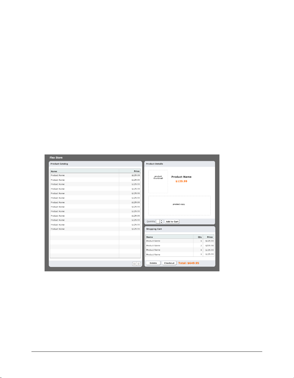
Make sure the Flex server is started, and then press F12 to run the flexstore.mxml file in
a browser.
The file should look similar to the following figure:
If the Results panel displays validation errors, carefully retrace the preceding steps. If you get a
server error, make sure the testing server is correctly defined in Flex Builder. For more
information, see “Define a Flex Builder site” on page 5.
Activate the catalog view buttons
According to the functional specifications, the Flex Store application should give the user the
ability to switch between the grid view and the thumbnail view of the product catalog. The user
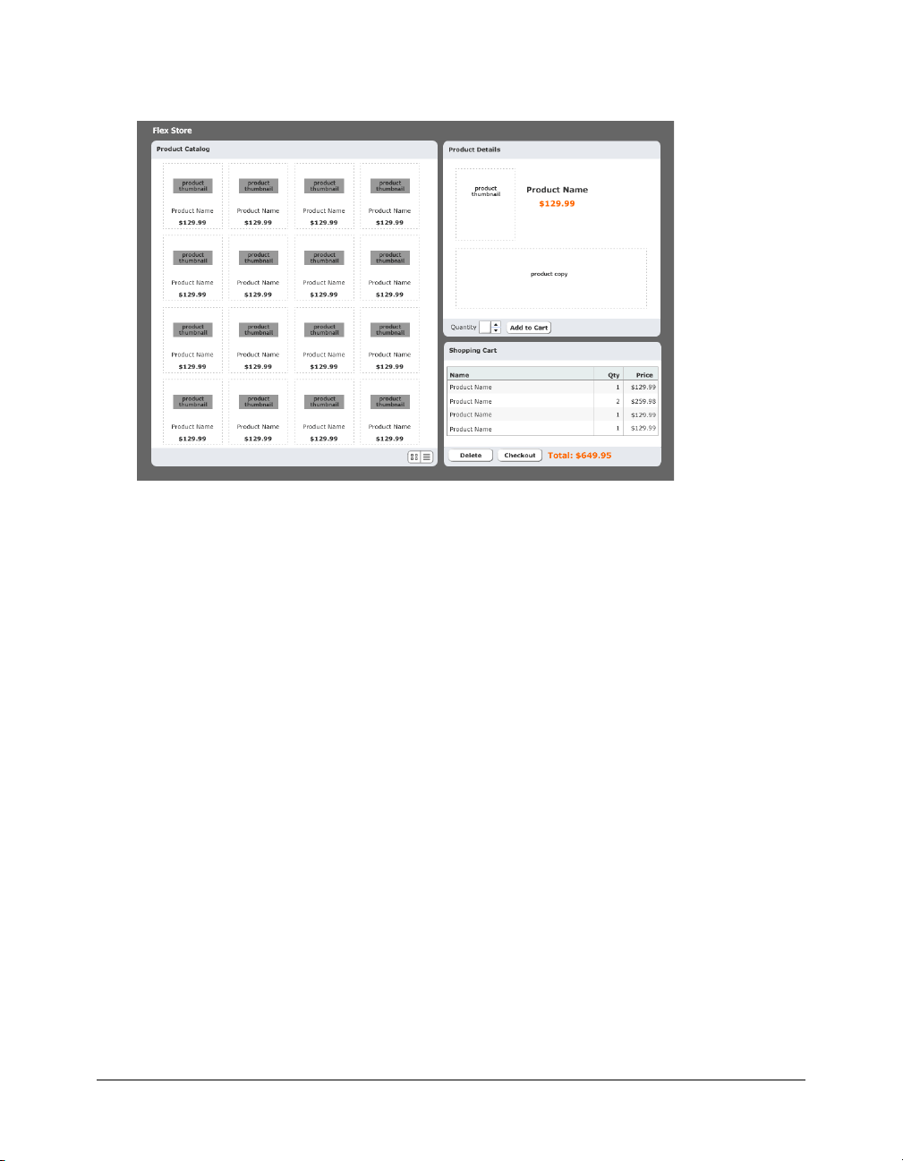
interface contains two buttons for that purpose at the lower edge of the product catalog, as in the
following figure:
In this part of the tutorial, you configure the view buttons so that the user can switch views.
Tutorial: Building custom components with Flex Builder 35
Page 36

You decide to write an ActionScript function called changeView() that sets the child component
of the ViewStack container, which displays when the user clicks one of the buttons. The
ViewStack container has two child components: the GridView and the ThumbnailView
components that you inserted in it (see “Insert the view components in the Flex Store layout”
on page 32).
To make your code more readable, you decide to place the ActionScript function in a separate file
called flexstore_script.as, which you then import in the flexstore.mxml file.
1.
In Flex Builder, press Control+N.
The New Document dialog box appears.
2.
Select Flex Development in the left pane and double-click the ActionScript item in the
right pane.
The dialog box closes and a blank ActionScript file appears.
3.
Copy and paste, or enter, the following code into the file:
var currentView="thumb";
// Handle view button events
function changeView(view) {
currentView=view;
if (view=="thumb") {
bodyStack.selectedChild=thumbView;
} else if (view=="grid") {
bodyStack.selectedChild=gridView;
}
}
Note: Make sure you include the variable declaration at the top of the code sample.
If the user clicks the thumbnail button, the ViewStack container displays the ThumbnailView
component. If the user selects the list button, the ViewStack container displays the GridView
component.
Note: You assigned the IDs bodyStack, gridView, and thumbView to the ViewStack, GridView,
and ThumbnailView components, respectively.
4.
Save the ActionScript file in the fbComponents folder by pressing Control+S and naming the
file as follows:
flexstore_script.as
5.
Switch to your flexstore.mxml file, make sure you’re in Code view, and enter the following tag
immediately after the opening
<mx:Script source="flexstore_script.as" />
This line imports the ActionScript file into the flexstore.mxml file.
Tip: To quickly open an ActionScript file in Flex Builder, click anywhere on the filename in the
<mx:Script> tag (in this case, flexstore_script.as) and press Control+D.
36 Flex Builder Tutorials
<mx:Application> tag:
Page 37

6.
Assign the event handler to the thumbnail view button by clicking anywhere in the first
<mx:Image> tag in the flexstore.mxml file and setting the following property in the Events panel
of the Tag inspector:
■ mouseDown: changeView('thumb')
When the user clicks the image, the
7.
Assign the event handler to the grid view button by clicking anywhere in the second
<mx:Image> tag and setting the following property in the Events panel:
■ mouseDown: changeView('thumb')
8.
Save the flexstore.mxml file.
9.
Click the Run button on the Document toolbar to test the buttons in the embedded browser.
changeView() function is called.
You discover a bug. When you click the grid view button at the lower edge of the product
catalog, the application doesn’t switch to the grid view. The view should change when you click
the button.
You decide to run the ActionScript debugger to locate and fix the problem.
Debug the view buttons
One of the catalog view buttons is broken: it won’t display the catalog’s grid view. You believe you
can find clues to the problem in the ActionScript file that contains the buttons’ event handler.
You decide to run the ActionScript debugger to pinpoint the problem.
1.
Make sure both the flexstore.mxml and flexstore_script.as files are open in Flex Builder.
2.
Switch to the flexstore_script.as file and review the event handler for the view buttons:
function changeView(view) {
currentView=view;
if (view=="thumb") {
bodyStack.selectedChild=thumbView;
} else if (view=="grid") {
bodyStack.selectedChild=gridView;
}
}
The changeView function will select gridView only if the string “grid” is passed to the
function’s
view argument. You decide to set a breakpoint to check the value passed to the
function.
3.
Set a breakpoint on the following line by Control-clicking the line’s gutter:
currentView=view;
A breakpoint marker appears in the gutter. You set a breakpoint on this line because it
immediately follows the line that assigns a value to the
here, the
4.
Switch to the flexstore.mxml file and click the Debug button on the Document toolbar.
view variable will have a value.
view variable. When the debugger stops
Flex Builder compiles the application and runs it in its embedded browser.
Tutorial: Building custom components with Flex Builder 37
Page 38

5.
Scroll down the Flex Store page and click the grid view button.
The click event calls the changeView function in the ActionScript file. Flex Builder does the
following:
■ Stops the application’s execution at the breakpoint you set.
■ Switches to Code view and centers on the line with the breakpoint.
■ Displays the Call Stack panel in the Results panel group.
6.
Click the Variables tab next to the Call Stack tab and then expand the Locals category.
The Variables panel tells you that the
view variable contains the value “thumb”. The value
should be “grid”. The function is receiving an incorrect value from the grid view button.
7.
Switch to the flexstore.mxml file and click the Code button on the Document toolbar.
8.
Locate the <mx:Image> tag associated with the grid view button (it uses the list_off.png image)
and check the value of the changeView function’s parameter:
<mx:Image source="@Embed('assets/images/list_off.png')"...
mouseDown="changeView('thumb')" />
The value of the parameter is wrong: it should be ‘grid’.
9.
Click the Stop button on the Debug toolbar and change the parameter from ‘thumb’ to ‘grid’
in the
<mx:Image> tag.
Note: You cannot edit files when the debugger is running.
10.
Save the file.
11.
Click Debug to recompile the application and check the grid view button again.
After you click the application’s grid view button in the embedded browser, the Variables panel
should confirm that the value of the
12.
Click Continue on the Debug toolbar.
view variable is now “grid”.
Since you didn’t set any other breakpoints, the application finishes executing. It should now
display the catalog’s grid view.
For more information on using the ActionScript debugger, see “Debugging ActionScript” in
Using Flex Builder Help.
This completes the components tutorial. If you like, you can continue building the Flex Store by
completing the bindings tutorial.
38 Flex Builder Tutorials
Page 39

Tutorial: Binding components to data with Flex Builder
This tutorial shows you how to use Flex Builder to visually bind Flex components to data. It also
explains how to use the Network Monitor to monitor the data passed between your application
and the Flex server.
In a real-world situation, the Flex Store application would connect to a backend system to retrieve
and display information about the products. The backend system in this tutorial is simulated with
a sample web service installed with the Flex server.
You can complete this tutorial as a stand-alone unit or as the third part of a multipart tutorial. In
either case, you must complete the setup tutorial before you begin. For instructions, see “Tutorial:
Setting up a development environment” on page 1.
The tutorial includes a pre-built set of files so you can complete the tutorial without completing
the layout or components tutorials first. If you completed the components tutorial, you can
overwrite the files in the fbBindings folder with your files in the fbComponents folder.
Tip: This tutorial requires that you type a lot of code. If you’re working with a printed copy of the
tutorial, you may want to paste the code from an electronic version of the tutorial in Using Flex Builder
Help.
In this tutorial, you will accomplish the following tasks:
• “Bind the view components” on page 39
• “Bind the product detail component” on page 46
• “Bind the shopping cart component” on page 51
Bind the view components
The product catalog in the Flex Store layout consists of two custom components, GridView.mxml
and ThumbnailView.mxml, which provide different views of the catalog. Your job is to bind the
two custom components to product data.
In this part of the tutorial, you complete the following tasks:
• “Specify the web service to use” on page 40
• “Bind the web service to a data model” on page 41
• “Send the web service request” on page 42
• “Bind the GridView component to the data” on page 44
• “Bind the ThumbnailView component to the data” on page 45
Tutorial: Binding components to data with Flex Builder 39
Page 40

Specify the web service to use
The source of the Flex Store product data is a web service that returns an array containing the
data.
1.
In Flex Builder, open the flexstore.mxml file located in the fbBindings folder (not the
fbComponents folder).
2.
In the Data panel (Window > Data), click the Plus (+) button, and select Web Service from the
pop-up menu.
The Add Web Service dialog box appears.
3.
Select FlexStoreCatalogWS from the pop-up menu.
A web service with this name is mapped in the whitelist for the Flex server samples (/samples/
WEB-INF/flex/flex-config.xml).
Note: If you get an error message that says the WSDL fetch failed, make sure the Flex server is
running. Also make sure you entered the correct values for the local and the Flex server root
folders. The values must be exactly the same as those described in the site setup tutorial. See
“Define a Flex Builder site” on page 5.
4.
Click OK.
The web service appears in the Data panel.
5.
Click the web service in the Data panel to select it and specify the value of the following property
in the Attributes panel:
■ Common > id: catalogWS
Note: The angle bracket means the ID property is located in the Common category of the
Attributes tab. This convention is used throughout the tutorials.
40 Flex Builder Tutorials
Page 41

6.
Expand the tree control in the Data panel to inspect the web service.
The catalogWS web service has one method called getList that returns an array.
Bind the web service to a data model
A Flex data model provides a convenient way to refer to and manipulate data in Flex applications.
For the Flex Store, you decide to create a data model and bind it to the product data returned by
the web service.
1.
Make sure your flexstore.mxml file is open in Flex Builder.
2.
Switch to Code view, and insert a data model by entering the following lines after the closing
</mx:WebService> tag:
<mx:Model id="catalog">
</mx:Model>
3.
Switch to Design view.
The new catalog model appears in the Data panel.
4.
Select the catalog model in the Data panel, and then, in the Bindings panel in the Tag inspector,
click the Plus (+) button.
The Add Binding - Step 1 dialog box appears. Make sure the first option is selected:
This option specifies the destination of the data. In this case, the destination is the data model
called catalog.
5.
Click Next to go to Step 2.
Tutorial: Binding components to data with Flex Builder 41
Page 42

6.
In the left pane in the Add Binding - Step 2 dialog box, select the catalogWS web service.
The Flex component containing the data you want to pass to the data model is the web service.
7.
In the right pane, expand the tree control, and select result.
8.
Click Finish to create the binding.
The new binding appears in the Bindings panel.
9.
Save your work.
Send the web service request
You must specify an event that sends a request to the web service for the product data. The Flex
Store functional specification approved by the client says that the product catalog must be
displayed every time the flexstore.mxml file is opened in a browser. Therefore, you must send the
web service request when the application is initialized. You decide to write an event handler that
sends the request, and then you assign the handler to the initialization event of the application.
1.
Open the flexstore_script.as file located in the fbBindings folder.
2.
Enter the following event handler function in the ActionScript file:
function initApp() {
catalogWS.getList.send();
}
42 Flex Builder Tutorials
Page 43

3.
Save the ActionScript file.
4.
Switch to the flexstore.mxml file.
5.
In Code view, assign the event handler to the application’s initialize event by locating the
<mx:Application> tag, and adding the following property (shown in bold type):
<mx:Application
xmlns:mx="http://www.macromedia.com/2003/mxml"
initialize="initApp()"
...
When the application is initialized, the initApp() function is called.
6.
Save the flexstore.mxml file.
Verify that the web service works
Before you continue, you decide to make sure the web service is called when the application is
initialized and data is successfully passed to the application. You want to catch and fix any data
problems early. Since the data is not yet bound to any visual controls that you could use to check,
you use the Network Monitor in Flex Builder to make sure the web service is passing catalog data
to your application.
When enabled, the Network Monitor intercepts all data transactions with the server and displays
the information in a panel.
1.
Make sure your flexstore.mxml file is open in Flex Builder.
2.
In the Network Monitor panel (Window > Network Monitor), click the Enable Flex Network
Monitor checkbox on the top edge of the panel.
3.
Click the Filter Settings button on the panel’s sidebar and deselect the following event types:
trace, HTTP, XML, AMF, and RemoteObject.
You don’t want to track these events in this situation, but you do want to track SOAP and
WebService events.
4.
Click the Run button on the Document toolbar.
While the Flex server compiles the flexstore.mxml file and Flex Builder displays it in the
embedded browser, the Network Monitor monitors and lists all the captured events of the type
you specified. The left side of the panel displays the event types while the right side displays
specific information for the selected event.
Tutorial: Binding components to data with Flex Builder 43
Page 44

5.
Click the final WebServer event (onResult) and inspect the information in the right pane.
If the application successfully called the web service when it was initialized, then the data for
the product catalog should appear in the right pane. Note how the Network Monitor converts
the raw data passed between the server and the application into ActionScript. Scroll down to
view the catalog data passed to the application.
This confirms that the web service is called when the application is initialized and the catalog
data is passed to the application.
6.
Disable the Network Monitor for now by clicking the Enable Flex Network Monitor checkbox
again.
For more information on using the Network Monitor, see “Debugging applications by
monitoring interactions with the server” in Using Flex Builder Help.
Bind the GridView component to the data
After specifying where and when to retrieve the data, and then verifying that the data is passed to
the application, you can use the data to populate the GridView component.
1.
Open the GridView.mxml file located in the fbBindings folder.
2.
In Code view, enter the following script block after the opening <mx:VBox> tag to declare a
variable called dataObject:
<mx:Script>
var dataObject;
</mx:Script>
You want to use this variable as a property of the GridView tag that you inserted in the
flexstore.mxml file to pass the catalog model in the flexstore.mxml file to your custom
component.
Note: If you use Code hints, Flex Builder automatically inserts a CDATA block for you. You can
declare the variable in this block. For more information on CDATA blocks, see “About
ActionScript files in Flex applications” in Using Flex Builder Help.
3.
Locate the <mx:DataGrid> tag in the file and add the following property (shown in bold type):
<mx:DataGrid id="list"
dataProvider="{dataObject}"
...
The product data passed by the flexstore.mxml file is stored in the dataObject variable.
4.
Save the GridView.mxml file.
5.
Switch to the flexstore.mxml file.
44 Flex Builder Tutorials
Page 45

6.
In Code view, locate the <local:GridView> tag and add the following property (shown in
bold type):
<local:GridView xmlns:local="*" id="gridView" dataObject="{catalog}" />
7.
Save the flexstore.mxml file.
8.
Make sure the Flex server is running and then press F12 to test the flexstore.mxml file in a
browser.
If the thumbnail view is showing, switch views by clicking the grid view button at the lower
edge of the catalog. The catalog should now display the actual product data, as follows:
Bind the ThumbnailView component to the data
After binding the GridView component to the data, you bind the ThumbnailView component.
1.
Open the ThumbnailView.mxml file located in the fbBindings folder.
2.
In Code view, enter the following script block after the opening <mx:VBox> tag to declare a
variable called dataObject:
<mx:Script>
var dataObject;
</mx:Script>
You want to use this variable as a property of the ThumbnailView tag, which you inserted in
the flexstore.mxml file, to pass the catalog model in the flexstore.mxml file to your custom
component.
Tutorial: Binding components to data with Flex Builder 45
Page 46

3.
Select and delete all the <mx:Image> tags in the Tile container.
These placeholder images are no longer required.
4.
With the insertion point still between the opening and closing <mx:Tile> tags, enter the
following script block:
<mx:Repeater id="list" dataProvider="{dataObject}">
<ProductThumbnail id="product" xmlns="*" dataObject="{list.currentItem}"
/>
</mx:Repeater>
The product data passed by the flexstore.mxml file is stored in the dataObject variable. You use
the custom component called ProductThumbnail to display the product’s thumbnail image,
name, and price. The custom component file, ProductThumbnail.mxml, is supplied with this
tutorial.
5.
Save the ThumbnailView.mxml file.
6.
Switch to the flexstore.mxml file.
7.
In Code view, locate the <local:ThumbnailView> tag, and add the following property (shown
in bold type):
<local:ThumbnailView xmlns:local="*" id="thumbView" dataObject="{catalog}" /
>
8.
Save the flexstore.mxml file.
9.
Press F12 to test the file in a browser.
If necessary, click the thumbnail view button at the lower edge of the product catalog to switch
views.
Bind the product detail component
When a user clicks a product in the catalog in the grid view or the thumbnail view, the
application should display details about the product in the ProductDetail component on
the right.
In this part of the tutorial, you complete the following tasks:
• “Detect the product in the GridView component” on page 47
• “Detect the product in the ThumbnailView component” on page 47
• “Retrieve the product selection” on page 48
• “Display the product detail” on page 49
46 Flex Builder Tutorials
Page 47

Detect the product in the GridView component
The first task is to modify the GridView component so it can detect when a user clicks a product.
1.
Open the GridView.mxml file located in the fbBindings folder and enter the following tag after
the opening
<mx:Metadata>
[Event("change")]
</mx:Metadata>
2.
Locate the <mx:Script> tag and add the following variable declaration (shown in bold type):
<mx:Script>
var dataObject;
var selectedItem;
</mx:Script>
<mx:VBox> tag:
You want to use this local variable to store the product the user selected.
3.
Locate the <mx:DataGrid> tag and add the following property (shown in bold type):
<mx:DataGrid id="list"
dataProvider="{dataObject}"
change="selectedItem=event.target.selectedItem;
dispatchEvent({type:'change'})"
...
4.
Save the GridView.mxml file.
Detect the product in the ThumbnailView component
You also modify the ThumbnailView component so it can detect when the user clicks a product
and what the product is.
1.
Open the ThumbnailView.mxml file located in the fbBindings folder and enter the following
tag after the opening
<mx:Metadata>
[Event("change")]
</mx:Metadata>
2.
Locate the <mx:Script> tag and add the following variable declaration (shown in bold type):
<mx:Script>
var dataObject;
var selectedItem;
</mx:Script>
3.
Locate the <ProductThumbnail> tag and add the following property (shown in bold type):
<ProductThumbnail id="product"
xmlns="*"
dataObject="{list.currentItem}"
mouseDown="selectedItem=event.target.dataObject;
dispatchEvent({type:'change'})" />
4.
Save the ThumbnailView.mxml file.
<mx:VBox> tag:
Tutorial: Binding components to data with Flex Builder 47
Page 48

Retrieve the product selection
After detecting the product selected by the user, you must pass the information from the
GridView and ThumbnailView components to the main application. If the user hasn’t selected a
product yet, you must specify a default selection.
1.
Open the flexstore_script.as file located in the fbBindings folder.
2.
Enter the following variable declaration at the top of the page:
var selectedItem;
You want to use this variable to store the product selected by the user. The variable is
automatically incorporated in the flexstore.mxml file because the ActionScript file is included
in the file.
3.
Save the ActionScript file.
4.
Switch to the flexstore.mxml file.
5.
In Code view, assign the selected product to the selectedItem variable by locating the
<local:GridView> tag and adding the following property (shown in bold type):
<local:GridView xmlns:local="*"
id="gridView"
dataObject="{catalog}"
change="selectedItem=event.target.selectedItem" />
When a change is detected in the GridView component—for example, when the user clicks a
product in the catalog—the selected product is assigned to the
6.
Locate the <local:ThumbnailView> tag and add the following property (shown in bold type):
<local:ThumbnailView xmlns:local="*"
id="thumbView"
dataObject="{catalog}"
change="selectedItem=event.target.selectedItem" />
7.
Assign the default product to the selectedItem variable by locating the <mx:WebService> tag
and adding the following property (shown in bold type) in the
<mx:WebService id="catalogWS" serviceName="FlexStoreCatalogWS">
<mx:operation name="getList"
result="selectedItem=catalogWS.getList.result[0]" >
</mx:operation>
</mx:WebService>
selectedItem variable.
<mx:operation> child tag:
The first product in the catalog (getList.result[0]) is assigned to the selectedItem
variable so it can be displayed in the ProductDetail component when the user hasn’t selected a
product in the catalog yet.
8.
Save the flexstore.mxml file.
48 Flex Builder Tutorials
Page 49

Display the product detail
After detecting and retrieving the product selection, you can retrieve the product’s data and use it
in the ProductDetail component.
1.
Open the ProductDetail.mxml file located in the fbBindings folder.
2.
In Code view, enter the following code after the opening <mx:Panel> tag to declare an object
variable called dataObject:
<mx:Script>
var dataObject:Object;
</mx:Script>
The variable declaration creates a property of the ProductDetail component. You want to use
this property in the
<local:ProductDetail> tag in the flexstore.mxml file to pass the product
data to your custom component.
3.
In Code view, enter the following code after the <mx:Script> block you just entered:
<mx:Model id="dataModel">
<name>{dataObject.name}</name>
<price>{dataObject.price}</price>
<description>{dataObject.description}</description>
<image>{dataObject.image}</image>
</mx:Model>
You want to store the data passed to the ProductDetail component in this data model.
4.
Switch to the Design view and click the Refresh button on the Data panel.
The new model appears in the panel.
The next step is to bind the elements of the data model to the display controls.
5.
Select the Label control for the product name and clear the value of the text property in the
Attributes panel.
The literal string “Product Name” served as a placeholder until now.
Note: If you’re working in Standard mode, the Label control disappears after you clear the value.
Click the Expanded button on the Document toolbar to display the control again.
6.
Bind the Label control to the data model by switching to the Bindings panel and clicking the
Plus (+) button to start a new binding.
The Add Binding dialog box appears.
Tutorial: Binding components to data with Flex Builder 49
Page 50

7.
With the To option selected, scroll down and select the text property (it should be selected by
default).
You w an t the
8.
Specify the source of the data by clicking the Next button, and then selecting the name element
text property to receive the product name data.
of the dataModel data model, as follows:
9.
Click Finish to create the binding.
10.
Bind the second Label control to the price data by repeating steps 5 through 9—select the
control, clear the placeholder value for the
the destination property, and select the price element of the data model as the source property.
11.
Repeat the procedure to bind the Text control to the description data.
12.
Bind the Image control by selecting the Image control, clearing the placeholder value for the
source property, starting a new binding, selecting source as the destination property (it should
be selected by default), and selecting the image element in the data model as the source property.
13.
Save the ProductDetail.mxml file.
50 Flex Builder Tutorials
text property, start a new binding, select text as
Page 51

14.
Switch to the flexstore.mxml file and in Code view, locate the <local:ProductDetail> tag
and add the following property (shown in bold type):
<local:ProductDetail xmlns:local="*"
id="productDetail"
dataObject="{selectedItem}"
...
You bind the dataObject property to the selectedItem variable to pass the product stored in
the variable to the ProductDetail component.
15.
Save the flexstore.mxml file.
16.
Make sure the Flex server is running and then press F12 to test the file in a browser.
Click any product in either the list view or thumbnail view. The product details should appear
in the product detail view (the ProductDetail component) on the right side of the catalog.
Bind the shopping cart component
The shopping cart view (the CartView component) should display the contents of the shopping
cart as the user adds products to it. The spec says that it should display the following information:
the name of the items added to the shopping cart, the quantity of each item, and the price of each
item. The total price of all the products in the cart must be displayed, as well as a button to delete
items in the cart and a button to let the user proceed to the checkout pages.
Note: The Checkout button is not activated in this tutorial.
In this part of the tutorial, you complete the following tasks:
• “Add the shopping cart logic” on page 51
• “Add products to the shopping cart” on page 52
• “Display the products in the shopping cart” on page 53
• “Activate the Delete button” on page 54
Add the shopping cart logic
You need a way to keep track of the items in the shopping cart. A member of your team writes an
ActionScript class to perform the task. The class is defined in a file called ShoppingCart.as, which
is provided in this tutorial.
1.
Switch to the flexstore.mxml file.
2.
In Code view, add the ShoppingCart class to your application by entering the following tag after
the opening
<ShoppingCart id="cart" xmlns="*" />
<mx:Application> tag:
You can open the ShoppingCart.as file in Flex Builder to view the class members.
ShoppingCart is a model class created in ActionScript that defines the functions you need to
track the items that are in the cart, how many there are, and the total price for the items.
3.
Save the flexstore.mxml file.
Tutorial: Binding components to data with Flex Builder 51
Page 52

Add products to the shopping cart
The product detail view (ProductDetail component) must not only display details about a
product, it must let the user do the following tasks:
• Specify the quantity of the displayed product the user wants to add to the shopping cart
• Add the product and quantity to the shopping cart.
You modify the ProductDetail component so that it adds the displayed product and quantity to
the shopping cart when the user clicks the Add to Cart button.
1.
Switch to the ProductDetail.mxml file.
2.
In Code view, locate the <mx:Script> tag and enter the following variable declaration (shown
in bold type):
<mx:Script>
var dataObject:Object;
var shoppingCart;
</mx:Script>
The variable declaration creates a property of the ProductDetail component. You want to use
this property in the
cart object to the component. This object keeps track of items in the shopping cart.
3.
Locate the <mx:Button> tag in the file, and add the following property (shown in bold type):
<mx:Button
label="Add to Cart"
click="shoppingCart.addItem(dataObject, qty.value); qty.value=1;" />
When the user clicks the Add to Cart button, the addItem method of the shoppingCart object
adds the product (
Note: The qty identifier is the name of the NumericStepper component that you use to specify a
quantity.
<local:ProductDetail> tag in the flexstore.mxml file to pass a shopping
dataObject) and the quantity (qty.value) to the shoppingCart object.
4.
Save the ProductDetail.mxml file.
5.
Switch to your flexstore.mxml file.
6.
In Code view, locate the <local:ProductDetail> tag, and add the following property (shown
in bold type):
<local:ProductDetail xmlns:local="*"
id="productDetail"
dataObject="{selectedItem}"
shoppingCart="{cart}"
...
You bind the shoppingCart property to the shopping cart object (cart) to pass the object to
the ProductDetail component.
7.
Save the flexstore.mxml file.
52 Flex Builder Tutorials
Page 53

Display the products in the shopping cart
After using the shoppingCart object to add products to the shopping cart, you can retrieve the
data and use it in the CartView component.
1.
Open the CartView.mxml file located in the fbBindings folder.
2.
In Code view, enter the following code after the opening <mx:Panel> tag:
<mx:Script>
var dataObject:ShoppingCart;
</mx:Script>
The variable declaration creates a property of the CartView component. You want to use this
property in the
<CartView> tag in the flexstore.mxml file to pass the shoppingCart object to
the component.
3.
Locate the <mx:DataGrid> tag, and add the following property (shown in bold type):
<mx:DataGrid id="dg"
dataProvider="{dataObject.items}"
...
4.
Locate the <mx:Label> tag near the end of the file and modify the value of the text property
as follows (shown in bold type):
<mx:Label styleName="price"
text="Total: ${dataObject.total}" />
5.
Save the CartView.mxml file.
6.
Switch to your flexstore.mxml file.
7.
In Code view, locate the <local:CartView> tag, and add the following property (shown in
bold type):
<local:CartView xmlns:local="*"
id="cartView"
dataObject="{cart}"
...
You bind the dataObject property to the shopping cart object (cart) to pass the object to the
CartView component.
8.
Save the flexstore.mxml file.
Tutorial: Binding components to data with Flex Builder 53
Page 54

9.
Press F12 to test the file in a browser.
Click any product in the list view or the thumbnail view. The product details should appear in
the product detail area. Click the Add to Cart button to add the product to the shopping cart.
Choose another product, change the quantity, and click the Add to Cart button again.
Activate the Delete button
The final step in this tutorial is to active the Delete button in the shopping cart area so the user
can remove items from the cart.
1.
Switch to the CartView.mxml file.
2.
In Code view, enter the following function in the <mx:Script> tag (shown in bold type):
<mx:Script>
var dataObject:ShoppingCart;
function removeItem() {
if (dg.selectedIndex!=undefined)
dataObject.removeItemAt(dg.selectedIndex);
}
</mx:Script>
The function calls the remoteItemAt method of the cart object.
3.
Locate the <mx:Button> tag for the Delete button near the end of the file and add the following
two properties (shown in bold type):
<mx:Button label="Delete"
width="75"
enabled="{dg.selectedItem!=null}"
click="removeItem()" />
The Delete button is enabled only when a user selects an item in the shopping cart. When the
user clicks the button when an item is selected, the
4.
Save the CartView.mxml file.
5.
Switch to the flexstore.mxml file and click Run on the Document toolbar to test the Delete
button in the browser embedded in Flex Builder.
Add items to the shopping cart, select an item in the cart, and click the Delete button. The
item should be removed from the cart.
54 Flex Builder Tutorials
removeItem() function is called.
Page 55

This completes the tutorial on Flex data bindings. If you want, you can continue experimenting
with Flex Builder and Flex development by adding more features to your Flex Store application.
For example, you could add drag-and-drop support to let the user drag a product from the catalog
view to the product detail view.
Next steps
For more samples and tutorials, see the following websites:
• Flex Builder pages on the Macromedia website at www.macromedia.com/go/fb_devcenter/
• Flex Developer Center on the Macromedia website at www.macromedia.com/go/
flex_devcenter/
For more information on the Flex Builder features discussed in these tutorials, see the following
chapters in Using Flex Builder Help:
• “Creating, Coding, and Debugging Flex Files”
• “Building a Flex User Interface Visually”
• “Working with Components”
• “Working with Data”
If you want to learn more about building Flex applications, you can consult the following
documentation from the Help menu in Flex Builder:
• Developing Flex Applications
• Flex ActionScript Language Reference
• Flex ActionScript and MXML API Reference
Next steps 55
Page 56

56 Flex Builder Tutorials
 Loading...