

Page 1
Using Components
Page 2
Trademarks
1 Step RoboPDF, ActiveEdit, ActiveTest, Authorware, Blue Sky Software, Blue Sky, Breeze, Breezo, Captivate, Central,
ColdFusion, Contribute, Database Explorer, Director, Dreamweaver, Fireworks, Flash, FlashCast, FlashHelp, Flash Lite,
FlashPaper, Flash Video Encoder, Flex, Flex Builder, Fontographer, FreeHand, Generator, HomeSite, JRun, MacRecorder,
Macromedia, MXML, RoboEngine, RoboHelp, RoboInfo, RoboPDF, Roundtrip, Roundtrip HTML, Shockwave, SoundEdit,
Studio MX, UltraDev, and WebHelp are either registered trademarks or trademarks of Macromedia, Inc. and may be registered in
the United States or in other jurisdictions including internationally. Other product names, logos, designs, titles, words, or phrases
mentioned within this publication may be trademarks, service marks, or trade names of Macromedia, Inc. or other entities and
may be registered in certain jurisdictions including internationally.
Third-Party Information
This guide contains links to third-party websites that are not under the control of Macromedia, and Macromedia is not
responsible for the content on any linked site. If you access a third-party website mentioned in this guide, then you do so at your
own risk. Macromedia provides these links only as a convenience, and the inclusion of the link does not imply that Macromedia
endorses or accepts any responsibility for the content on those third-party sites.
Speech compression and decompression technology licensed from Nellymoser, Inc. (www.nellymoser.com).
Sorenson™ Spark™ video compression and decompression technology licensed from
Sorenson Media, Inc.
Opera ® browser Copyright © 1995-2002 Opera Software ASA and its suppliers. All rights reserved.
Macromedia Flash 8 video is powered by On2 TrueMotion video technology. © 1992-2005 On2 Technologies, Inc. All Rights
Reserved. http://www.on2.com.
Visual SourceSafe is a registered trademark or trademark of Microsoft Corporation in the United States and/or other countries.
Copyright © 2005 Macromedia, Inc. All rights reserved. This manual may not be copied, photocopied, reproduced,
translated, or converted to any electronic or machine-readable form in whole or in part without written approval from
Macromedia, Inc. Notwithstanding the foregoing, the owner or authorized user of a valid copy of the software with which
this manual was provided may print out one copy of this manual from an electronic version of this manual for the sole
purpose of such owner or authorized user learning to use such software, provided that no part of this manual may be
printed out, reproduced, distributed, resold, or transmitted for any other purposes, including, without limitation,
commercial purposes, such as selling copies of this documentation or providing paid-for support services.
Acknowledgments
Project Management: Sheila McGinn
Writing: Bob Berry, Jen deHaan, Peter deHaan, David Jacowitz, Wade Pickett
Managing Editor: Rosana Francescato
Lead Editor: Lisa Stanziano
Editing: Mary Ferguson, Mary Kraemer, Lisa Stanziano
Production Management: Patrice O’Neill, Kristin Conradi, Yuko Yagi
Media Design and Production: Adam Barnett, Aaron Begley, Paul Benkman. John Francis, Geeta Karmarkar, Masayo Noda,
Paul Rangel, Arena Reed, Mario Reynoso
Special thanks to Jody Bleyle, Mary Burger, Lisa Friendly, Stephanie Gowin, Bonnie Loo, Nivesh Rajbhandari, Mary Ann Walsh,
Erick Vera, the beta testers, and the entire Flash and Flash Player engineering and QA teams.
First Edition: September 2005
Macromedia, Inc.
601 Townsend St.
San Francisco, CA 94103
Page 3

Contents
Intended audience . . . . . . . . . . . . . . . . . . . . . . . . . . . . . . . . . . . . . . . . . . . . . . 8
System requirements. . . . . . . . . . . . . . . . . . . . . . . . . . . . . . . . . . . . . . . . . . . . 8
About the documentation . . . . . . . . . . . . . . . . . . . . . . . . . . . . . . . . . . . . . . . .8
Typographical conventions . . . . . . . . . . . . . . . . . . . . . . . . . . . . . . . . . . . . . .9
Terms used in this manual . . . . . . . . . . . . . . . . . . . . . . . . . . . . . . . . . . . . . . .9
Additional resources . . . . . . . . . . . . . . . . . . . . . . . . . . . . . . . . . . . . . . . . . . . .9
Chapter 1: About Components. . . . . . . . . . . . . . . . . . . . . . . . . . . . . .11
Installing components . . . . . . . . . . . . . . . . . . . . . . . . . . . . . . . . . . . . . . . . . . 12
Where component files are stored . . . . . . . . . . . . . . . . . . . . . . . . . . . . . . . 14
Modifying the component files . . . . . . . . . . . . . . . . . . . . . . . . . . . . . . . . . . 15
Benefits of using components. . . . . . . . . . . . . . . . . . . . . . . . . . . . . . . . . . . 16
Component categories . . . . . . . . . . . . . . . . . . . . . . . . . . . . . . . . . . . . . . . . . 16
About version 2 component architecture . . . . . . . . . . . . . . . . . . . . . . . . . 17
Version 2 component features . . . . . . . . . . . . . . . . . . . . . . . . . . . . . . . . . . 18
About compiled clips and SWC files . . . . . . . . . . . . . . . . . . . . . . . . . . . . . 19
Accessibility and components. . . . . . . . . . . . . . . . . . . . . . . . . . . . . . . . . . 20
Chapter 2: Creating an Application with Components
(Flash Professional Only) . . . . . . . . . . . . . . . . . . . . . . . . . . . . . . . . . 21
About the Fix Your Mistake tutorial . . . . . . . . . . . . . . . . . . . . . . . . . . . . . . 21
Build the main page . . . . . . . . . . . . . . . . . . . . . . . . . . . . . . . . . . . . . . . . . . . 23
Bind data components to display gift ideas . . . . . . . . . . . . . . . . . . . . . . 29
Display gift details . . . . . . . . . . . . . . . . . . . . . . . . . . . . . . . . . . . . . . . . . . . . 33
Create the checkout screen . . . . . . . . . . . . . . . . . . . . . . . . . . . . . . . . . . . . 39
Test the application . . . . . . . . . . . . . . . . . . . . . . . . . . . . . . . . . . . . . . . . . . . .47
Viewing the completed application . . . . . . . . . . . . . . . . . . . . . . . . . . . . . .47
3
Page 4

Chapter 3: Working with Components. . . . . . . . . . . . . . . . . . . . . .49
The Components panel . . . . . . . . . . . . . . . . . . . . . . . . . . . . . . . . . . . . . . . .50
Adding components to Flash documents . . . . . . . . . . . . . . . . . . . . . . . .50
Components in the Library panel . . . . . . . . . . . . . . . . . . . . . . . . . . . . . . . . 54
Setting component parameters . . . . . . . . . . . . . . . . . . . . . . . . . . . . . . . . . 55
Sizing components . . . . . . . . . . . . . . . . . . . . . . . . . . . . . . . . . . . . . . . . . . . . 56
Deleting components from Flash documents . . . . . . . . . . . . . . . . . . . . . 57
Using code hints . . . . . . . . . . . . . . . . . . . . . . . . . . . . . . . . . . . . . . . . . . . . . . 58
Creating custom focus navigation . . . . . . . . . . . . . . . . . . . . . . . . . . . . . . . 58
Managing component depth in a document . . . . . . . . . . . . . . . . . . . . . .59
Components in Live Preview . . . . . . . . . . . . . . . . . . . . . . . . . . . . . . . . . . .60
Using a preloader with components . . . . . . . . . . . . . . . . . . . . . . . . . . . . .60
About loading components . . . . . . . . . . . . . . . . . . . . . . . . . . . . . . . . . . . . . 62
Upgrading version 1 components to version 2 architecture. . . . . . . . . 62
Chapter 4: Handling Component Events . . . . . . . . . . . . . . . . . . . .63
Using listeners to handle events. . . . . . . . . . . . . . . . . . . . . . . . . . . . . . . . . 64
Delegating events . . . . . . . . . . . . . . . . . . . . . . . . . . . . . . . . . . . . . . . . . . . . . 73
About the event object . . . . . . . . . . . . . . . . . . . . . . . . . . . . . . . . . . . . . . . . . 77
Using the on() event handler . . . . . . . . . . . . . . . . . . . . . . . . . . . . . . . . . . . . 78
Chapter 5: Customizing Components . . . . . . . . . . . . . . . . . . . . . . 81
Using styles to customize component color and text . . . . . . . . . . . . . . 82
About skinning components . . . . . . . . . . . . . . . . . . . . . . . . . . . . . . . . . . . . 96
About themes . . . . . . . . . . . . . . . . . . . . . . . . . . . . . . . . . . . . . . . . . . . . . . . . 108
Combining skinning and styles to customize a component . . . . . . . . .118
Chapter 6: Creating Components. . . . . . . . . . . . . . . . . . . . . . . . . 125
Component source files . . . . . . . . . . . . . . . . . . . . . . . . . . . . . . . . . . . . . . . 125
Overview of component structure . . . . . . . . . . . . . . . . . . . . . . . . . . . . . . 126
Building your first component. . . . . . . . . . . . . . . . . . . . . . . . . . . . . . . . . . 127
Selecting a parent class . . . . . . . . . . . . . . . . . . . . . . . . . . . . . . . . . . . . . . . 136
Creating a component movie clip. . . . . . . . . . . . . . . . . . . . . . . . . . . . . . . 138
Creating the ActionScript class file . . . . . . . . . . . . . . . . . . . . . . . . . . . . . 143
Incorporating existing components within your component . . . . . . . 173
Exporting and distributing a component . . . . . . . . . . . . . . . . . . . . . . . . 182
Final steps in component development . . . . . . . . . . . . . . . . . . . . . . . . . 185
4Contents
Page 5

Chapter 7: Collection Properties . . . . . . . . . . . . . . . . . . . . . . . . . . 187
Defining a collection property . . . . . . . . . . . . . . . . . . . . . . . . . . . . . . . . . .188
Simple collection example . . . . . . . . . . . . . . . . . . . . . . . . . . . . . . . . . . . . .189
Defining the class for a collection item . . . . . . . . . . . . . . . . . . . . . . . . . . 191
Accessing collection information programmatically . . . . . . . . . . . . . . . 191
Exporting components that have collections to SWC files. . . . . . . . .194
Using a component that has a collection property . . . . . . . . . . . . . . . .194
Index . . . . . . . . . . . . . . . . . . . . . . . . . . . . . . . . . . . . . . . . . . . . . . . . . 197
Contents 5
Page 6

6Contents
Page 7
Introduction
Macromedia Flash Basic 8 and Macromedia Flash Professional 8 are the standard authoring
tools for producing high-impact web experiences. Components are the building blocks for the
Rich Internet Applications that provide these experiences. A component is a movie clip with
parameters that are set during authoring in Macromedia Flash, and with ActionScript
methods, properties, and events that allow you to customize the component at runtime.
Components are designed to allow developers to reuse and share code, and to encapsulate
complex functionality that designers can use and customize without using ActionScript.
Components are built on version 2 of the Macromedia Component Architecture, which
allows you to easily and quickly build robust applications with a consistent appearance and
behavior. This book describes how to build applications with version 2 components. The
related Components Language Reference describes each component’s application programming
interface (API). It includes usage scenarios and procedural samples for using the Flash version
2 components, as well as descriptions of the component APIs, in alphabetical order.
You can use components created by Macromedia, download components created by other
developers, or create your own components.
This chapter contains the following sections:
Intended audience . . . . . . . . . . . . . . . . . . . . . . . . . . . . . . . . . . . . . . . . . . . . . . . . . . . . . . . . . 8
System requirements. . . . . . . . . . . . . . . . . . . . . . . . . . . . . . . . . . . . . . . . . . . . . . . . . . . . . . . 8
About the documentation . . . . . . . . . . . . . . . . . . . . . . . . . . . . . . . . . . . . . . . . . . . . . . . . . . . 8
Typographical conventions . . . . . . . . . . . . . . . . . . . . . . . . . . . . . . . . . . . . . . . . . . . . . . . . . 9
Terms used in this manual . . . . . . . . . . . . . . . . . . . . . . . . . . . . . . . . . . . . . . . . . . . . . . . . . . 9
Additional resources . . . . . . . . . . . . . . . . . . . . . . . . . . . . . . . . . . . . . . . . . . . . . . . . . . . . . . . 9
7
Page 8

Intended audience
This book is for developers who are building Flash applications and want to use components
to speed development. You should already be familiar with developing applications in Flash
and writing ActionScript.
If you are less experienced with writing ActionScript, you can add components to a
document, set their parameters in the Property inspector or Component inspector, and use
the Behaviors panel to handle their events. For example, you could attach a Go To Web Page
behavior to a Button component that opens a URL in a web browser when the button is
clicked without writing any ActionScript code.
If you are a programmer who wants to create more robust applications, you can create
components dynamically, use ActionScript to set properties and call methods at runtime, and
use the listener event model to handle events.
For more information, see Chapter 3, “Working with Components,” on page 49.
System requirements
Macromedia components do not have any system requirements in addition to Flash.
Any SWF file that uses version 2 components must be viewed with Flash Player 6 (6.0.79.0)
or later, and must be published for ActionScript 2.0 (you can set this through File > Publish
Settings, in the Flash tab).
About the documentation
This document explains the details of using components to develop Flash applications. It
assumes that you have general knowledge of Macromedia Flash and ActionScript. Specific
documentation about Flash and related products is available separately.
This document is available as a PDF file and as online help. To view the online help, start
Flash and select Help > Using Components.
For information about Macromedia Flash, see the following documents:
■ Using Flash
■ Learning ActionScript 2.0 in Flash
■ ActionScript 2.0 Language Reference
■ Components Language Reference
8Introduction
Page 9

Typographical conventions
The following typographical conventions are used in this book:
■ Italic font indicates a value that should be replaced (for example, in a folder path).
■ Code font indicates ActionScript code, including method and property names.
■ Code font italic indicates a code item that should be replaced (for example, an
ActionScript parameter).
■ Bold font indicates a value that you enter.
Terms used in this manual
The following terms are used in this manual:
at runtime When the code is running in Flash Player.
while authoring While you are working in the Flash authoring environment.
Additional resources
For the latest information on Flash, plus advice from expert users, advanced topics, examples,
tips, and other updates, see the Macromedia DevNet website at www.macromedia.com/
devnet, which is updated regularly. Check the website often for the latest news on Flash and
how to get the most out of the program.
For TechNotes, documentation updates, and links to additional resources in the Flash
Community, see the Macromedia Flash Support Center at www.macromedia.com/support/
flash.
For detailed information on ActionScript terms, syntax, and usage, see Learning ActionScript
2.0 in Flash and the ActionScript 2.0 Language Reference.
For an introduction to using components, see the Macromedia On Demand Seminar, Using
UI Components at www.macromedia.com/macromedia/events/online/ondemand/
index.html.
Additional resources 9
Page 10

10 Introduction
Page 11
CHAPTER 1
About Components
Macromedia Flash components are movie clips with parameters that allow you to modify
their appearance and behavior. A component can be a simple user interface control, such as a
radio button or a check box, or it can contain content, such as a scroll pane; a component can
also be non-visual, like the FocusManager that allows you to control which object receives
focus in an application.
Components enable you to build complex Macromedia Flash applications, even if you don’t
have an advanced understanding of ActionScript. Rather than creating custom buttons,
combo boxes, and lists, you can drag these components from the Components panel to add
functionality to your applications. You can also easily customize the look and feel of
components to suit your design needs.
Components are built on version 2 of the Macromedia Component Architecture, which
allows you to build robust applications, easily and quickly, with a consistent appearance and
behavior. The version 2 architecture includes classes on which all components are based, styles
and skins mechanisms that allow you to customize component appearance, a broadcaster/
listener event model, depth and focus management, accessibility implementation, and more.
NOTE
When publishing version 2 components, you must set your publish settings to publish for
ActionScript 2.0 (File > Publish Settings, Flash tab). The version 2 components will not
run correctly if published using ActionScript 1.0.
1
Each component has predefined parameters that you can set while authoring in Flash. Each
component also has a unique set of ActionScript methods, properties, and events, also called
an API (application programming interface), that allows you to set parameters and additional
options at runtime.
For a complete list of components included with Flash Basic 8 and Flash Professional 8, see
“Installing components” on page 12. You can also download components built by members of
the Flash community at the Macromedia Exchange at www.macromedia.com/cfusion/
exchange/index.cfm.
11
Page 12

This chapter contains the following sections:
Installing components . . . . . . . . . . . . . . . . . . . . . . . . . . . . . . . . . . . . . . . . . . . . . . . . . . . . . 12
Where component files are stored . . . . . . . . . . . . . . . . . . . . . . . . . . . . . . . . . . . . . . . . . . 14
Modifying the component files . . . . . . . . . . . . . . . . . . . . . . . . . . . . . . . . . . . . . . . . . . . . . 15
Benefits of using components. . . . . . . . . . . . . . . . . . . . . . . . . . . . . . . . . . . . . . . . . . . . . . 16
Component categories . . . . . . . . . . . . . . . . . . . . . . . . . . . . . . . . . . . . . . . . . . . . . . . . . . . . 16
About version 2 component architecture . . . . . . . . . . . . . . . . . . . . . . . . . . . . . . . . . . . . .17
Version 2 component features . . . . . . . . . . . . . . . . . . . . . . . . . . . . . . . . . . . . . . . . . . . . . 18
About compiled clips and SWC files . . . . . . . . . . . . . . . . . . . . . . . . . . . . . . . . . . . . . . . . 19
Accessibility and components. . . . . . . . . . . . . . . . . . . . . . . . . . . . . . . . . . . . . . . . . . . . . . 20
Installing components
A set of Macromedia components is already installed when you start Flash for the first time.
You can view them in the Components panel.
Flash Basic 8 includes the following components:
■ Button component
■ CheckBox component
■ ComboBox component
■ Label component
■ List component
■ Loader component
■ NumericStepper component
■ ProgressBar component
■ RadioButton component
■ ScrollPane component
■ TextArea component
■ Tex t I n p u t c o m p on e n t
■ Window component
12 About Components
Page 13

Flash Professional 8 includes the Flash Basic 8 components plus the following additional
components and classes:
■ Accordion component (Flash Professional only)
■ Alert component (Flash Professional only)
■ Data binding classes (Flash Professional only)
■ DateField component (Flash Professional only)
■ DataGrid component (Flash Professional only)
■ DataHolder component (Flash Professional only)
■ DataSet component (Flash Professional only)
■ DateChooser component (Flash Professional only)
■ FLVPlayback Component (Flash Professional Only)
■ Form class (Flash Professional only)
■ Media components (Flash Professional only)
■ Menu component (Flash Professional only)
■ MenuBar component (Flash Professional only)
■ RDBMSResolver component (Flash Professional only)
■ Screen class (Flash Professional only)
■ Slide class (Flash Professional only)
■ Tree component (Flash Professional only)
■ WebServiceConnector component (Flash Professional only)
■ XMLConnector component (Flash Professional only)
■ XUpdateResolver component (Flash Professional only)
To view the Flash Basic 8 or Flash Professional 8 components:
1. Start Flash.
2. Select Window > Components to open the Components panel if it isn’t already open.
3. Select User Interface to expand the tree and view the installed components.
You can also download components from the Macromedia Exchange at
www.macromedia.com/exchange. To install components downloaded from the Exchange,
download and install the Macromedia Extension Manager at www.macromedia.com/
exchange/em_download/
Any component can appear in the Components panel in Flash. Follow these steps to install
components on either a Windows or Macintosh computer.
Installing components 13
Page 14
To install components on a Windows-based or a Macintosh computer:
1. Quit Flash.
2. Place the SWC or FLA file containing the component in the following folder on your
hard disk:
■ In Windows: C:\Program Files\Macromedia\
Flash 8\language\Configuration\Components
■ On the Macintosh: Macintosh HD/Applications/Macromedia Flash 8/Configuration/
Components (Macintosh)
3. Start Flash.
4. Select Window > Components to view the component in the Components panel if it isn’t
already open.
Where component files are stored
Flash components are stored in the application-level Configuration folder.
NOTE
For information about these folders, see “Configuration folders installed
with Flash” in Getting Started with Flash.
Components are installed in the following locations:
■ Windows 2000 or Windows XP: C:\Program Files\Macromedia\
Flash 8\language\Configuration\Components
■ Mac OS X: Macintosh HD/Applications/Macromedia Flash 8/Configuration/
Components
14 About Components
Page 15
Modifying the component files
The source ActionScript files for components are located in:
■ Windows 2000 or Windows XP: C:\Program Files\Macromedia\Flash 8\language\
First Run\Classes\mx
■ Mac OS X: Macintosh HD/Applications/Macromedia Flash 8/First Run/Classes/mx
The files in the First Run directory are copied to your Documents and Settings path when
Flash is first lunched. The Documents and Settings paths are:
■ Windows 2000 or Windows XP: C:\Documents and Settings\username\Local
settings\Application Data\Macromedia\Flash 8\language\Configuration\Classes\mx
■ Mac OS X: Username/Library/Application Support/Macromedia/Flash 8/language/
Configuration/Classes/mx
When Flash starts, if a file is missing from the Document and Settings path, Flash copies it
over from the First Run directory to your Documents and Settings path.
NOTE
If you want to modify the source ActionScript files, modify the ones in the Documents
and Settings path. If any of your modifications “break” a component, Flash will restore
the original functionality when you close and relaunch Flash by copying the functional file
from the First Run directory. However if you modify the files in the First run directory and
that “breaks” a component, then you may need to reinstall Flash to restore the source
files back to the functional ones.
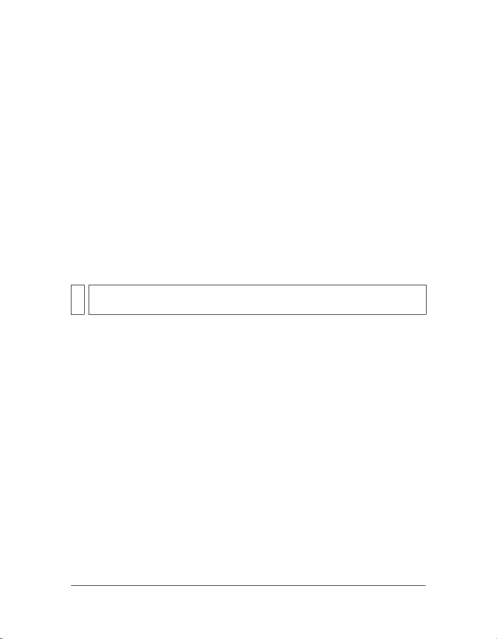
If you’ve added components, you’ll need to refresh the Components panel.
To refresh the contents of the Components panel:
■ Select Reload from the Components panel menu.
To remove a component from the Components panel:
■ Remove the MXP or FLA file from the Configuration folder.
Modifying the component files 15
Page 16
Benefits of using components
Components enable you to separate the process of designing your application from the
process of coding. They also let you to reuse code, either in components that you create, or by
downloading and installing components created by other developers.
Components allow coders to create functionality that designers can use in applications.
Developers can encapsulate frequently used functionality into components and designers can
customize the look and behavior of components by changing parameters in the Property
inspector or the Component inspector.
Flash developers can use the Macromedia Exchange at www.macromedia.com/go/exchange to
exchange components. By using components, you no longer need to build each element in a
complex web application from scratch. You can find the components you need and put them
together in a Flash document to create a new application.
Components that are based on the version 2 architecture share core functionality such as
styles, event handling, skinning, focus management, and depth management. When you add
the first version 2 component to an application, there is approximately 25K added to the
document that provides this core functionality. When you add additional components, that
same 25K is reused for them as well, resulting in a smaller increase in size to your document
than you may expect. For information about upgrading components, see “Upgrading version
1 components to version 2 architecture” on page 62.
Component categories
Components included with Flash fall into the following five categories (the locations of their
ActionScript source files roughly correspond to these categories as well and are listed in
parentheses):
■ Data components (mx.data.*)
Data components allow you to load and manipulate information from data sources; the
WebServiceConnector and XMLConnector components are data components.
NOTE
The source files for the data components aren’t installed with Flash. However, some
of the supporting ActionScript files are installed.
■ FLVPlayback component (mx.video.FLVPlayback)
The FLVPlayback component lets you readily include a video player in your Flash
application to play progressive streaming video over HTTP, from a Flash Video Streaming
Service (FVSS), or from Flash Communication Server (FCS).
16 About Components
Page 17
■ Media components (mx.controls.*)
Media components let you play back and control streaming media; MediaController,
MediaPlayback, and MediaDisplay are media components.
■ User interface components (mx.controls.*)
User interface components (often referred to as “UI Components”) allow you to interact
with an application; for example, the RadioButton, CheckBox, and TextInput
components are user interface controls.
■ Managers (mx.managers.*)
Managers are nonvisual components that allow you to manage a feature, such as focus or
depth, in an application; the FocusManager, DepthManager, PopUpManager,
StyleManager, and SystemManager components are manager components.
■ Screens (mx.screens.*)
The screens category includes the ActionScript classes that allow you to control forms and
slides in Flash.
For a complete list of components, see Components Language Reference.
About version 2 component architecture
You can use the Property inspector or the Component inspector to change component
parameters to make use of the basic functionality of components. However, if you want
greater control over components, you need to use their APIs and understand a little bit about
the way they were built.
Flash components are built with version 2 of the Macromedia Component Architecture.
Version 2 components are supported by Flash Player 6 (6.0.79.0) and later, and ActionScript
2.0. These components are not always compatible with components built using version 1
architecture (all components released before Flash MX 2004). Also, the original version 1
components are not supported by Flash Player 7. For more information, see “Upgrading
version 1 components to version 2 architecture” on page 62.
NOTE
Flash MX UI components have been updated to work with Flash Player 7 or later. These
updated components are still based on version 1 architecture. You can download them
from the Macromedia Flash Exchange at www.macromedia.com/go/v1_components.
Version 2 components are included in the Components panel as compiled clip (SWC)
symbols. A compiled clip is a component movie clip whose code has been compiled.
Compiled clips cannot be edited, but you can change their parameters in the Property
inspector and Component inspector, just as you would with any component. For more
information, see “About compiled clips and SWC files” on page 19.
About version 2 component architecture 17
Page 18
Version 2 components are written in ActionScript 2.0. Each component is a class and each
class is in an ActionScript package. For example, a radio button component is an instance of
the RadioButton class whose package name is mx.controls. For more information about
packages, see “About packages” in Learning ActionScript 2.0 in Flash.
Most UI components built with version 2 of the Macromedia Component Architecture are
subclasses of the UIObject and UIComponent classes and inherit all properties, methods, and
events from those classes. Many components are also subclasses of other components. The
inheritance path of each component is indicated in its entry in the Components Language
Reference.
NOTE
The class hierarchy is also available as a FlashPaper file in the installation location: Flash
8\Samples and Tutorials\Samples\Components\arch_diagram.swf.
All components also use the same event model, CSS-based styles, and built-in themes and
skinning mechanisms. For more information on styles and skinning, see Chapter 5,
“Customizing Components,” on page 81. For more information on event handling, see
Chapter 3, “Working with Components,” on page 49.
For a detailed explanation of the version 2 component architecture, see Chapter 6, “Creating
Components,” on page 125.
Version 2 component features
This section outlines the features of version 2 components (compared to version 1
components) from the perspective of a developer using components to build Flash
applications. For detailed information about the differences between the version 1 and version
2 architectures for building components, see Chapter 6, “Creating Components,” on
page 125.
The Component inspector allows you to change component parameters while authoring in
Macromedia Flash and Macromedia Dreamweaver. (See “Setting component parameters”
on page 55.)
The listener event model allows listeners to handle events. (See Chapter 4, “Handling
Component Events,” on page 63.) Flash doesn’t have a
Property inspector, as there was in Flash MX; you must write ActionScript code to
handle events.
Skin properties let you load individual skins (for example, up and down arrows or the check
for a check box) at runtime. (See “About skinning components” on page 96.)
CSS-based styles allow you to create a consistent look and feel across applications. (See
“Using styles to customize component color and text” on page 82.)
clickHandler parameter in the
18 About Components
Page 19
Themes allow you to drag a predesigned appearance from the library onto a set of
components. (See “About themes” on page 108.)
The Halo theme is the default theme that the version 2 components use. (See “About themes”
on page 108.)
Manager classes provide an easy way to handle focus and depth in a application. (See
“Creating custom focus navigation” on page 58 and “Managing component depth in a
document” on page 59.)
The base classes UIObject and UIComponent provide core methods, properties, and events
to components that extend them. (See “UIComponent class” and “UIObject class” in the
Components Language Reference.)
Packaging as a SWC file allows easy distribution and concealable code. See Chapter 6,
“Creating Components,” on page 125.
Built-in data binding is available through the Component inspector. For more information,
see “Data Integration (Flash Professional Only)” in Using Flash.
An easily extendable class hierarchy using ActionScript 2.0 allows you to create unique
namespaces, import classes as needed, and subclass easily to extend components. See Chapter
6, “Creating Components,” on page 125 and the ActionScript 2.0 Language Reference.
NOTE
Flash 8 has several features that are not supported by the v2 components, including 9slice (sometimes referred to as “scale-9”), FlashType, and bitmap caching.
About compiled clips and SWC files
A compiled clip is a package of precompiled Flash symbols and ActionScript code. It’s used to
avoid recompiling symbols and code that will not be changed. A movie clip can also be
“compiled” in Flash and converted to a compiled clip. For example, a movie clip with a lot of
ActionScript code that doesn’t change often could be converted to a compiled clip. The
compiled clip behaves just like the movie clip from which it was compiled, but compiled clips
appear and publish much faster than regular movie clips. Compiled clips can’t be edited, but
they do have properties that appear in the Property inspector and the Component inspector.
Components included with Flash are not FLA files—they are compiled clips (that have been
packaged into compiled clip (SWC) files. SWC is the Macromedia file format for distributing
components; it contains a compiled clip, the component’s ActionScript class file, and other
files that describe the component. For details about SWC files, see “Exporting and
distributing a component” on page 182.
About compiled clips and SWC files 19
Page 20
When you place a SWC file in the First Run/Components folder, the component appears in
the Components panel. When you add a component to the Stage from the Components
panel, a compiled clip symbol is added to the library.
To compile a movie clip:
■ Right-click (Windows) or Control-click (Macintosh) the movie clip in the Library panel,
and then select Convert to Compiled Clip.
To export a SWC file:
■ Select the movie clip in the Library panel and right-click (Windows) or Control-click
(Macintosh), and then select Export SWC File.
NOTE
Flash Basic 8 and Flash Professional 8 continue to support FLA components.
Accessibility and components
A growing requirement for web content is that it should be accessible; that is, usable for
people with a variety of disabilities. Visual content in Flash applications can be made
accessible to the visually impaired with the use of screen reader software, which provides a
spoken audio description of the contents of the screen.
When a component is created, the author can write ActionScript that enables communication
between the component and a screen reader. When a developer uses that component to
build an application in Flash, the developer uses the Accessibility panel to configure each
component instance.
Most components built by Macromedia are designed for accessibility. To find out whether a
component is accessible, see its entry in the Components Language Reference. When you’re
building an application in Flash, you’ll need to add one line of code for each component
(
mx.accessibility.ComponentNameAccImpl.enableAccessibility();), and set the
accessibility parameters in the Accessibility panel. Accessibility for components works the
same way as it works for all Flash movie clips.
Most components built by Macromedia are also navigable by the keyboard. Each component’s
entry in the Components Language Reference indicates whether you can control the component
with the keyboard.
20 About Components
Page 21

CHAPTER 2
Creating an Application with Components (Flash Professional Only)
Components are prebuilt Flash elements that you can use when creating Macromedia Flash
applications. Components include user interface controls, data access and connectivity
mechanisms, and media-related elements. Components save you work when building a Flash
application by providing you with elements and behavior that you would need to create from
scratch otherwise.
This chapter contains a tutorial that shows you how to build a Flash application using
components that are available in Macromedia Flash Professional 8. You will learn how to work
with components in the Flash authoring environment and also learn how to make them
interactive with ActionScript code.
About the Fix Your Mistake tutorial
This tutorial takes you through the steps to create a basic online shopping application for the
“Fix Your Mistake” gift service. This service helps a user select an appropriate gift to make
amends to someone whom the user has offended. The application filters a list of gifts to those
choices that match the severity of the user’s offense. From that list the user can add items to
the shopping cart and then proceed to the checkout page to provide billing, shipping, and
credit card information.
This chapter contains the following sections:
About the Fix Your Mistake tutorial . . . . . . . . . . . . . . . . . . . . . . . . . . . . . . . . . . . . . . . . . 21
Build the main page . . . . . . . . . . . . . . . . . . . . . . . . . . . . . . . . . . . . . . . . . . . . . . . . . . . . . . .23
Bind data components to display gift ideas . . . . . . . . . . . . . . . . . . . . . . . . . . . . . . . . . .29
Display gift details . . . . . . . . . . . . . . . . . . . . . . . . . . . . . . . . . . . . . . . . . . . . . . . . . . . . . . . . 33
Create the checkout screen . . . . . . . . . . . . . . . . . . . . . . . . . . . . . . . . . . . . . . . . . . . . . . . . 39
Test the application . . . . . . . . . . . . . . . . . . . . . . . . . . . . . . . . . . . . . . . . . . . . . . . . . . . . . . . 47
Viewing the completed application . . . . . . . . . . . . . . . . . . . . . . . . . . . . . . . . . . . . . . . . . 47
2
21
Page 22
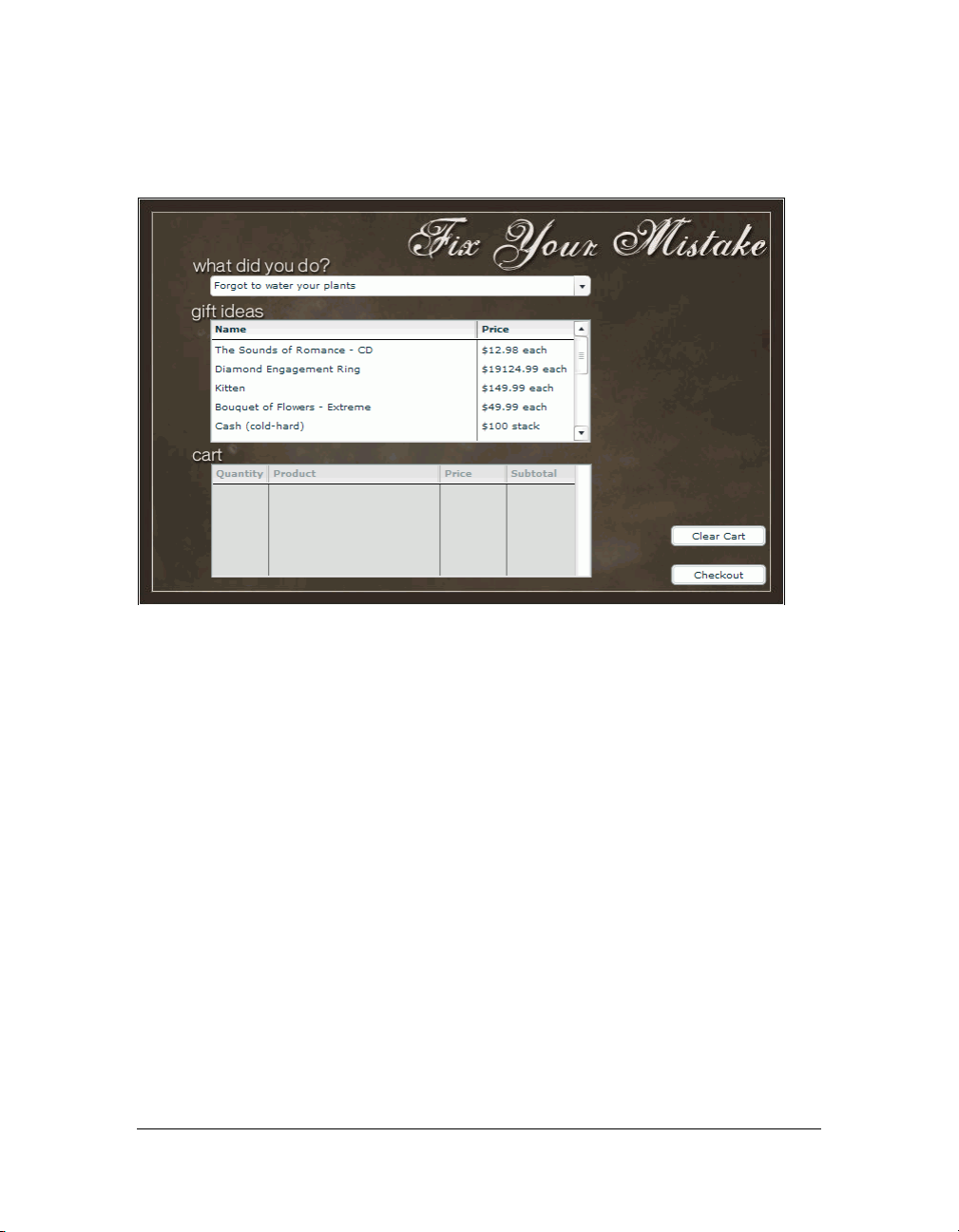
The application uses the ComboBox, DataGrid, TextArea, and Button components, as well as
others, to create the application interface. The main page of the interface looks like this:
The application uses the ActionScript WebService class to connect dynamically to a web
service to retrieve the list of offenses (problems.xml) that appear in the combo box. It also uses
ActionScript to handle the user’s interactions with the application.
The application uses data components to connect the interface to another data source. It uses
the XMLConnector component to connect to an XML data file (products.xml) for the list of
gifts and it uses the DataSet component to filter the data and present it to the data grid.
The tutorial requires some familiarity with the Flash authoring environment and some
experience with ActionScript. In the authoring environment, you should have some
experience using panels, tools, the timeline, and the library. All the ActionScript needed for
creating the sample application is provided here within the tutorial. To understand the
scripting concepts and create your own applications, however, you will need additional
experience writing ActionScript.
To see a working version of the completed application, see “Viewing the completed
application” on page 47
Keep in mind that the sample application is for demonstration purposes and therefore is not
as complete as a real-world application.
22 Creating an Application with Components (Flash Professional Only)
Page 23

Build the main page
Follow these steps to create the application’s main page by adding components to a skeletal
starter page. Then add ActionScript code to customize the components, import the
ActionScript classes that allow you to manipulate the application’s components, and access a
web service to populate the combo box with a list of offenses. The code populates the combo
box by setting its
1. Open the first_app_start.fla file, which you can find at one of the following locations:
■ In Windows: install drive:\Program Files\Macromedia\Flash 8\Samples and
Tutorials\Samples\Components\ComponentsApplication
■ On the Macintosh: Macintosh HD/Applications/Macromedia Flash 8/Samples and
Tutorials/Samples/Components/ComponentsApplication
The file contains a start page that looks like the following:
dataProvider property to receive the results from the web service.
The start_app.fla file contains three layers: a background layer with a black background
image and text titles, a text layer with text labels for sections of the application, and a
labels layer with labels on the first frame (Home) and the tenth frame (Checkout).
2. Select File > Save As. Rename the file and save it to your hard disk.
3. In the Timeline, select the Labels layer and click the Add Layer button to add a new layer
above it. Name the new layer Form. You will place the component instances in this layer.
Build the main page 23
Page 24
4. Make sure the Form layer is selected. In the Components panel (Window > Components),
locate the ComboBox component in the User Interface tree. Drag an instance of
ComboBox onto the Stage. Place it below the What Did You Do? text. In the Property
inspector (Window > Properties > Properties), enter problems_cb for the instance name.
Enter 400 (pixels) for the width. Enter 76.0 for the x location and 82.0 for the y location.
NOTE
The ComboBox component symbol is added to the library (Window > Library). When
you drag an instance of a component to the Stage, the compiled clip symbol for the
component is added to the library. As with all symbols in Flash, you can create
additional instances of the component by dragging the library symbol onto
the Stage.
5. Drag an instance of the DataGrid component from the User Interface tree in the
Components panel onto the Stage. Place it below the Gift Ideas text. Enter products_dg
for the instance name. Enter 400 (pixels) for the width and 130 for the height. Enter 76.0
for the x location and 128.0 for the y location.
6. Drag an instance of the DataSet component from the Data tree in the Components panel
onto the side of the Stage. (The DataSet component does not appear in the application at
runtime. The DataSet icon is simply a placeholder that you work with in the Flash
authoring environment.) Enter products_ds for the instance name.
Drag an instance of the XMLConnector component from the Data tree in the
Components panel to the side of the Stage. (Like the DataSet component, the
XMLConnector component does not appear in the application at runtime.) Enter
products_xmlcon for the instance name. Click the Parameters tab in the Property
inspector, and enter www.flash-mx.com/mm/firstapp/products.xml for the
URL property.
Click the value for the direction property to activate the combo box, click the down-arrow
and select
NOTE
receive from the list.
You can also use the Component inspector (Window > Component Inspector) to set
parameters for components. The Parameters tab in the Property inspector and the
Component inspector work in the same way.
The URL specifies an external XML file with data about the products that appear in the
Gift Ideas section of the application. Later in the tutorial you will use data binding to bind
the XMLConnector, DataSet, and DataGrid components together; the DataSet
component filters data from the external XML file, and the DataGrid component will
display it.
7. Drag an instance of the Button component from the User Interface tree in the Components
panel onto the Stage. Place it in the lower-right corner of the Stage. Enter checkout_button
for the instance name. Click the Parameters tab and enter Checkout for the
label
property. For the x and y coordinates, enter 560.3 and 386.0, respectively.
24 Creating an Application with Components (Flash Professional Only)
Page 25

Import the component classes
Each component is associated with an ActionScript class file that defines its methods and
properties. In this section of the tutorial, you will add ActionScript code to import the classes
associated with the application’s components. For some of these components, you have
already added instances to the Stage. For others, you will add ActionScript later in the tutorial
to create instances dynamically.
The import statement creates a reference to the class name and makes it easier to write
ActionScript for the component. The import statement enables you to refer to the class by its
class name rather than its complete name, which includes the package name. For example,
after you create a reference to the ComboBox class file with an import statement, you can
refer to instances of the combo box with the syntax
instanceName:mx.controls.ComboBox.
A package is a directory that contains class files and resides in a designated classpath directory.
You can use a wild card character to create references to all the classes in a package: for
example, the syntax
mx.controls.* creates references to all classes in the controls package.
(When you create a reference to a package with a wild card, the unused classes are dropped
from the application when it is compiled, so they don’t add any extra size.)
For the application in this tutorial, you need the following packages and individual classes:
UI Components Controls package This package contains classes for the user interface
control components, including ComboBox, DataGrid, Loader, TextInput, Label,
NumericStepper, Button, and CheckBox.
UI Components Containers package This package contains classes for the user interface
container components, including Accordion, ScrollPane, and Window. As with the controls
package, you can create a reference to this package by using a wild card.
DataGridColumn class This class lets you add columns to the DataGrid instance and
control their appearance.
WebService class This class populates the ComboBox instance with a list of problems or
offenses. For this class, you will also need to import the WebServiceClasses item from the
Classes common library. This item contains compiled clip (SWC) files that you will need in
order to compile and generate the SWF file for your application.
Cart class A custom class provided with this tutorial, the Cart class defines the functioning
of the shopping cart that you will create later. (To examine the code in the Cart class file, open
the cart.as file located in the component_application folder with the application FLA and
SWF files).
instanceName:ComboBox, rather than
Build the main page 25
Page 26

To import these classes, you will create an Actions layer and add the ActionScript code to the
first frame of the main timeline. All the code that you will add to the application in the
remaining steps of the tutorial should be placed in the Actions layer.
1. To import the WebServiceClasses item from the Classes library, select Window > Common
Libraries > Classes.
2. Drag the WebServiceClasses item from the Classes library into the library for
the application.
Importing an item from the Classes library is similar to adding a component to the
library: it adds the SWC files for the class to the library. The SWC files need to be in the
library in order for you to use the class in an application.
3. In the Timeline, select the Form layer and click the Add New Layer button. Name the new
layer Actions.
4. With the Actions layer selected, select Frame 1 and press F9 to open the Actions panel.
5. In the Actions panel, enter the following code to create a stop() function that prevents the
application from looping during playback:
stop();
With Frame 1 in the Actions layer still selected, add the following code in the Actions panel
6.
to import the classes:
// Import necessary classes.
import mx.services.WebService;
import mx.controls.*;
import mx.containers.*;
import mx.controls.gridclasses.DataGridColumn;
// Import the custom Cart class.
import Cart;
26 Creating an Application with Components (Flash Professional Only)
Page 27
Set the data types of component instances
Next you will assign data types to each of the component instances you dragged to the Stage
earlier in the tutorial.
ActionScript 2.0 uses strict data typing, which means that you assign the data type when
you create a variable. Strict data typing makes code hints available for the variable in the
Actions panel.
■ In the Actions panel, add the following code to assign data types to the four component
instances that you already created.
/* Data type instances on the Stage; other instances might be added at
runtime from the Cart class.*/
var problems_cb:ComboBox;
var products_dg:DataGrid;
var cart_dg:DataGrid;
var products_xmlcon:mx.data.components.XMLConnector;
NOTE
The instance names you specify here must agree with the instance names that you
assigned when you dragged the components to the Stage.
Customize the appearance of components
Each component has style properties and methods that let you customize its appearance,
including highlight color, font, and font size. You can set styles for individual component
instances, or set styles globally to apply to all component instances in an application. For this
tutorial you will set styles globally.
■ Add the following code to set styles:
// Define global styles and easing equations for the problems_cb
ComboBox.
_global.style.setStyle("themeColor", "haloBlue");
_global.style.setStyle("fontFamily", "Verdana");
_global.style.setStyle("fontSize", 10);
_global.style.setStyle("openEasing",
mx.transitions.easing.Bounce.easeOut);
This code sets the theme color (the highlight color on a selected item), font, and font size
for the components, and also sets the easing for the ComboBox—the way that the dropdown list appears and disappears when you click the ComboBox title bar.
Build the main page 27
Page 28
Display offenses in the combo box
In this section you will add code to connect to a web service that contains the list of offenses
(Forgot to Water Your Plants, and so on). The web service description language (WSDL) file
is located at www.flash-mx.com/mm/firstapp/problems.cfc?WSDL. To see how the WSDL is
structured, browse to the WSDL location.
The ActionScript code passes the web service results to the ComboBox instance for display. A
function sorts the offenses in order of severity. If no result is returned from the web service
(for example, if the service is down, or the function isn’t found), an error message appears in
the Output panel.
■ In the Actions panel, add the following code:
/* Define the web service used to retrieve an array of problems.
This service will be bound to the problems_cb ComboBox instance. */
var problemService:WebService = new WebService("http://www.flash-mx.com/
mm/firstapp/problems.cfc?WSDL");
var myProblems:Object = problemService.getProblems();
/* If you get a result from the web service, set the field that will be
used for the column label.
Set the data provider to the results returned from the web service. */
myProblems.onResult = function(wsdlResults:Array) {
problems_cb.labelField = "name";
problems_cb.dataProvider = wsdlResults.sortOn("severity",
Array.NUMERIC);
};
/* If you are unable to connect to the remote web service, display the
error messages in the Output panel. */
myProblems.onFault = function(error:Object) {
trace("error:");
for (var prop in error) {
trace(" "+prop+" -> "+error[prop]);
}
};
TIP
Press Control+S to save your work and then Control+Enter (or select Control > Test
Movie) to test the application. The combo box should be populated with a list of
offenses at this point and you should see the empty data grid that you created for Gift
Ideas, along with the checkout button.
28 Creating an Application with Components (Flash Professional Only)
Page 29

Bind data components to display gift ideas
In the beginning of the tutorial, you added instances of the DataGrid, DataSet, and
XMLConnector components to the Stage. You set the
instance, named products_xmlcon, to the location of an XML file containing product
information for the Gift Ideas section of the application.
Now you will use data binding features in the Flash authoring environment to bind the
XMLConnector, DataSet, and DataGrid components together to use the XML data in the
application. For general information on working with data binding and other features of the
Flash data integration architecture, see Chapter 16, “Data Integration (Flash Professional
Only)” in Using Flash.
When you bind the components, the DataSet component filters the list of products in the
XML file according to the severity of the offense that the user selects in the What Did You
Do? section. The DataGrid component will display the list.
Use schema to describe the XML data source
When you connect to an external XML data source with the XMLConnector component,
you need to specify a schema—a schematic representation which describes the structure of the
XML document. The schema tells the XMLConnector component how to read the XML
data source. The easiest way to specify a schema is to import a copy of the XML file that
you’re going to connect to, and use that copy as a schema.
1. Open your web browser and go to www.flash-mx.com/mm/firstapp/products.xml (the
location you set for the XMLConnector URL parameter).
2. Select File > Save As.
3. Save products.xml to the same location as the FLA file that you’re working on.
4. Select Frame 1 in the main Timeline.
5. Select the products_xmlcon (XMLConnector) instance beside the Stage.
6. In the Component inspector, click the Schema tab. Click the Import button (on the right
side of the Schema tab, above the scroll pane). In the Open dialog box, locate the
products.xml file that you imported in step 3, and click Open. The schema for the
products.xml file appears in the scroll pane of the Schema tab.
In the top pane of the Schema tab, select the
and change the value from <empty> to String. Repeat this step for the description
type
element.
image element. In the bottom pane, select data
URL property for the XMLConnector
Bind data components to display gift ideas 29
Page 30

Filter the gift ideas to match the offense
You will use the Binding tab in the Component inspector to bind the XMLConnector,
DataSet, and DataGrid component instances to one another.
For information on working with data binding, see “Data Integration (Flash Professional
Only)” in Using Flash.
1. With the products_xmlcon (XMLConnector) instance selected on the Stage, click the
Bindings tab in the Component inspector.
2. Click the Add Binding button.
3. In the Add Binding dialog box, select the results.products.product array item and
click OK.
4. In the Bindings tab, click the Bound To item in the Binding Attributes pane (the bottom
pane, showing attribute name-value pairs).
5. In the Value column for the Bound To item, click the magnifying glass icon to open the
Bound To dialog box.
6. In the Bound To dialog box, select the DataSet <products_ds> instance in the
Component Path pane. Select
Click OK.
7. In the Bindings tab, click the Direction item in the Binding Attributes pane. From the pop-
up menu in the Value column, select Out.
This option means that the data will pass from the
products_ds instance (rather than passing in both directions, or passing from the
DataSet instance to the XMLConnector instance).
8. On the Stage, select the products_ds instance. In the Bindings tab of the Component
inspector, notice that the component’s data provider appears in the Binding List (the top
pane of the Bindings tab). In the Binding Attributes pane, the Bound To parameter
indicates that the
products_ds instance is bound to the products_xmlcom instance, and
the binding direction is In.
In the next few steps you will bind the DataSet instance to the DataGrid instance so that
the data that is filtered by the data set will be displayed in the data grid.
9. With the products_ds instance still selected, click the Add Binding button in the
Bindings tab.
10. In the Add Binding dialog box, select the dataProvider: array item and click OK.
11. In the Bindings tab, make sure the dataProvider: array item is selected in the
Binding List.
12. Click the Bound To item in the Binding Attributes pane.
dataProvider:array in the Schema Location pane.
products_xmlcon instance to the
30 Creating an Application with Components (Flash Professional Only)
Page 31

13. In the Value column for the Bound To item, click the magnifying glass icon to open the
Bound To dialog box.
14. In the Bound To dialog box, select the products_dg (DataGrid) instance in the
Component Path pane. Select
dataProvider:array in the Schema Location pane.
Click OK.
Add columns to the Gift Ideas section
Now you are ready to add columns to the data grid in the Gift Ideas section of the application,
for displaying product information and price.
■ Select the Actions layer. In the Actions panel, add the following code to create, configure,
and add a Name column and a Price column to the DataGrid instance:
// Define data grid columns and their default widths in the products_dg
// DataGrid instance.
var name_dgc:DataGridColumn = new DataGridColumn("name");
name_dgc.headerText = "Name";
name_dgc.width = 280;
// Add the column to the DataGrid.
products_dg.addColumn(name_dgc);
var price_dgc:DataGridColumn = new DataGridColumn("price");
price_dgc.headerText = "Price";
price_dgc.width = 100;
// Define the function that will be used to set the column’s label
// at runtime.
price_dgc.labelFunction = function(item:Object) {
if (item != undefined) {
return "$"+item.price+" "+item.priceQualifier;
}
};
products_dg.addColumn(price_dgc);
Trigger the XML Connector
Next you will add a line of code that causes the XMLConnector instance to load, parse, and
bind the contents of the remote products.xml file. This file is located at the URL you entered
for the
URL property of the XMLConnector instance that you created earlier. The file contains
information on the products that will appear in the Gift Ideas section of the application.
■ Add the following code in the Actions panel:
products_xmlcon.trigger();
Bind data components to display gift ideas 31
Page 32

Add an event listener to filter the gift ideas
In this section, you add an event listener to detect when a user selects an offense in the What
Did You Do? section (the
function that filters the Gift Ideas list according to the offense the user chooses. Selecting a
minor offense displays a list of modest gifts (such as a CD or flowers); selecting a more serious
offense displays more opulent gifts.
For more information on working with event listeners, see “Using event listeners” in Learning
ActionScript 2.0 in Flash.
■ In the Actions panel, add the following code:
/* Define a listener for the problems_cb ComboBox instance.
This listener will filter the products in the DataSet (and DataGrid).
Filtering is based on the severity of the currently selected item in the
ComboBox. */
var cbListener:Object = new Object();
cbListener.change = function(evt:Object) {
products_ds.filtered = false;
products_ds.filtered = true;
products_ds.filterFunc = function(item:Object) {
// If the current item's severity is greater than or equal to the
// selected item in the ComboBox, return true.
return (item.severity>=evt.target.selectedItem.severity);
};
};
// Add the listener to the ComboBox.
problems_cb.addEventListener("change", cbListener);
Resetting the filtered property (setting it to false and then to true) at the beginning of
the
change() function ensures that the function will work properly if the user changes the
What Did You Do? selection repeatedly.
The
filterFunc() function checks whether a given item in the array of gifts falls within the
severity the user selected in the combo box. If the gift is within the selected severity range, it is
displayed in the DataGrid instance (which is bound to the DataSet instance).
The last line of code registers the listener to the
problems_cb ComboBox instance). The listener includes a
problems_cb ComboBox instance.
32 Creating an Application with Components (Flash Professional Only)
Page 33

Add the cart
The next code that you will add creates an instance of the custom Cart class and initializes it.
■ In the Actions panel, add the following code:
var myCart:Cart = new Cart(this);
myCart.init();
This code uses the init() method of the Cart class to add a DataGrid instance to the Stage,
define the columns, and position the DataGrid instance on the Stage. It also adds a Button
component instance and positions it, and adds an Alert handler for the button. (To see the
code for the Cart class
TIP
Press Control+S to save your work and then Control+Enter (or select Control->Test
Movie) to test the application. When you select an offense in the combo box, the data
grid that you created for Gift Ideas should display a subset of gifts to match the
selected offense.
init() method, open the Cart.as file.)
Display gift details
A pop-up window appears in the application when a user clicks a product in the Gift Ideas
section. The pop-up window contains component instances that display information about
the product, including a text description, an image, and the price. To make this pop-up
window, you will create a movie clip symbol and add instances of the Loader, TextArea, Label,
NumericStepper, and Button components. The product detail window for Bouquet of
Flowers Extreme looks like this:
Display gift details 33
Page 34

You will later add ActionScript that dynamically creates an instance of this movie clip for each
product. These movie clip instances will be displayed in the Window component, which you
added to the library earlier. The component instances will be populated with elements from
the external XML file.
1. Drag an instance of the Window component from the User Interface tree in the
Components panel to the library.
The Window component symbol is now added to the library. Later in the tutorial, you
will create instances of the Window component using ActionScript.
2. In the Library panel (Window > Library), click the options menu on the right side of the
title bar and select New Symbol.
3. In the Create New Symbol dialog box, enter ProductForm for Na me an d se lect Movi e Cli p
for Type.
4. Click the Advanced button. Under Linkage, select Export for ActionScript, leave Export in
First Frame selected, and click OK. A document window for the new symbol opens in
symbol-editing mode.
For movie clip symbols that are in the library but not on the Stage, you must select Export
for ActionScript so that you can manipulate them using ActionScript. (Exporting in first
frame means that the movie clip is available as soon as the first frame loads.) Later in the
tutorial you will add ActionScript that will generate an instance of the movie clip
dynamically each time a user clicks a product in the Gift Ideas section.
5. In the Timeline for the new symbol, select Layer 1 and rename it Components.
6. Drag an instance of the Loader component from the User Interface tree in the Components
panel onto the Stage. Enter 5, 5 for the x, y coordinates respectively. Enter image_ldr for
the instance name. Click the Parameters tab in the Property inspector. Select
autoLoad and false for scaleContent.
false for
The Loader component instance will be used to display an image of the product. The
false setting for autoLoad specifies that the image will not load automatically. The
false setting for scaleContent specifies that the image will not be scaled. Later in the
tutorial you will add code that loads the image dynamically, based on the product that the
user selects in the Gift Ideas section.
34 Creating an Application with Components (Flash Professional Only)
Page 35

7. Drag an instance of the TextArea component from the User Interface tree in the
Components panel onto the Stage. Place it next to the Loader component. Enter 125, 5
for the x, y coordinates respectively. Enter description_ta for the instance name. Set the
Width to 200 and Height to 130. Click the Parameters tab in the Property inspector. For
editable, select
false. For html, select true. For wordWrap, select true.
The TextArea component instance is used to display a text description of the selected
product. The selected settings specify that the text cannot be edited by a user, that it can
be formatted with HMTL tags, and that lines will wrap to fit the size of the text area.
8. Drag an instance of the Label component from the User Interface tree in the Components
panel onto the Stage. Place it below the Loader component. Set the x, y coordinates to 5,
145. Enter price_lbl for the instance name. Click the Parameters tab in the Property
inspector. For
autoSize, select left. For html, select true.
The Label component instance will display the price of the product and the price qualifier
(the quantity of products indicated by the specified price, such as “each” or “one dozen.”)
9. Drag an instance of the NumericStepper component from the User Interface tree in the
Components panel onto the Stage. Place it below the TextArea component. Set the x, y
coordinates to 135, 145. Enter quantity_ns for the instance name. Click the Parameters
tab in the Property inspector. For
Setting
minimum to 1 specifies that the user must select at least one of the products in
minimum, enter 1.
order to add the item to the cart.
10. Drag an instance of the Button component from the User Interface tree in the Components
panel onto the Stage. Place it beside the NumericStepper component. Set the x, y
coordinates to 225, 145. Enter addToCart_button for the instance name. Click the
Parameters tab in the Property inspector. For
label, enter Add To Cart.
Display gift details 35
Page 36

Add an event listener to trigger the display of gift details
Next you will add an event listener to the products_dg DataGrid instance to display
information about each product. When the user clicks a product in the Gift Ideas section, a
pop-up window appears with information about the product.
■ In the Actions panel of the main Timeline, add the following code:
// Create a listener for the DataGrid to detect when the row in the
// DataGrid is changed
var dgListener:Object = new Object();
dgListener.change = function(evt:Object) {
// When the current row changes in the DataGrid, launch a new pop-up
// window displaying the product's details.
myWindow = mx.managers.PopUpManager.createPopUp(_root,
mx.containers.Window, true, {title:evt.target.selectedItem.name,
contentPath:"ProductForm", closeButton:true});
// Set the dimensions of the pop-up window.
myWindow.setSize(340, 210);
// Define a listener that closes the pop-up window when the user
clicks
// the close button.
var closeListener:Object = new Object();
closeListener.click = function(evt) {
evt.target.deletePopUp();
};
myWindow.addEventListener("click", closeListener);
};
products_dg.addEventListener("change", dgListener);
This code creates a new event listener called dgListener, and creates instances of the Window
component you added to the library earlier. The title for the new window is set to the
product’s name. The content path for the window is set to the ProductForm movie clip. The
size of the window is set to 340 x 210 pixels.
The code also adds a close button to enable the user to close the window after viewing the
information.
36 Creating an Application with Components (Flash Professional Only)
Page 37
Add code to the ProductForm movie clip
Next, you will add ActionScript to the ProductForm movie clip that you just created. The
ActionScript populates the components in the movie clip with information about the selected
gift, and adds an event listener to the Add to Cart button that adds the selected product to
the cart.
For more information on working with event listeners, see “Using event listeners” in Using
ActionScript in Flash.
1. In the Timeline of the ProductForm movie clip, create a new layer and name it Actions.
Select the first frame in the Actions layer.
2. In the Actions panel, add the following code:
// Create an object to reference the selected product item in the
DataGrid.
var thisProduct:Object = this._parent._parent.products_dg.selectedItem;
// Populate the description_ta TextArea and price_lbl Label instances
with
// data from the selected product.
description_ta.text = thisProduct.description;
price_lbl.text = "<b>$"+thisProduct.price+"
"+thisProduct.priceQualifier+"</b>";
// Load an image of the product from the application directory.
image_ldr.load(thisProduct.image);
NOTE
The code includes comments explaining its purpose. It’s a good idea to include
comments like these in all the ActionScript code you write, so that you or anyone
else going back to the code later can easily understand what it was for.
First, the code defines a variable to refer to the selected product in the subsequent code.
Using the
using the path
Next, the code populates the TextArea and Label instances by using the
price, and priceQualifier properties of the thisProduct object. These properties
correspond to elements in the products.xml file that you linked to the
thisProduct variable means you don’t have to refer to the specified product
this._parent._parent.products_dg.selectedItem.
description,
products_xmlcon
XMLConnector instance at the beginning of the tutorial. Later in the tutorial, you will
bind the XMLConnector, DataSet, and DataGrid component instances together, and the
elements in the XML file will populate the other two component instances.
Finally, the code uses the
image property of the thisProduct object instance to load an
image of the product into the Loader component.
Display gift details 37
Page 38

3. Next you will add an event listener to add the product to the cart when the user clicks the
Add to Cart button. (You will add ActionScript to the main Timeline in the application
later in the tutorial, to create an instance of the Cart class.) Add the following code:
var cartListener:Object = new Object();
cartListener.click = function(evt:Object) {
var tempObj:Object = new Object();
tempObj.quantity = evt.target._parent.quantity_ns.value;
tempObj.id = thisProduct.id;
tempObj.productObj = thisProduct;
var theCart = evt.target._parent._parent._parent.myCart;
theCart.addProduct(tempObj.quantity, thisProduct);
};
addToCart_button.addEventListener("click", cartListener);
4.
Click the Check Syntax button (the blue check mark above the Script pane) to make sure
there are no syntax errors in the code.
You should check syntax frequently as you add code to an application. Any errors found in
the code are listed in the Output panel. (When you check syntax, only the current script is
checked; other scripts that may be in the FLA file are not checked.) For more information,
see “Debugging your scripts” in Learning ActionScript 2.0 in Flash.
5. Click the arrow button at the upper left of the Document window or select View > Edit
Document to exit symbol editing mode and return to the main Timeline.
TIP
Press Control+S to save your work and then Control+Enter (or select Control >Test
Movie) to test your application. When you click a gift selection now, a window should
appear and display an image of the gift, accompanied by a description, the price, and
a numeric stepper that allows you to choose the quantity that you want.
38 Creating an Application with Components (Flash Professional Only)
Page 39

Create the checkout screen
When the user clicks the Checkout button on the main screen, the Checkout screen appears.
The Checkout screen provides forms where the user can enter billing, shipping, and credit
card information. The checkout screen looks like the following:
The checkout interface consists of components placed on a keyframe at Frame 10 in the
application. You will use the Accordion component to create the checkout interface. The
Accordion component is a navigator that contains a sequence of children that it displays one
at a time. You will also add a Button component instance to create a Back button, so users can
return to the main screen.
Later in the tutorial, you will create movie clips to use as children in the Accordion instance,
to display the Billing, Shipping, and Credit Card Information panes.
1. In the main Timeline for the application, move the playhead to Frame 10 (labeled
Checkout). Make sure the Form layer is selected.
2. Insert a blank keyframe on Frame 10 in the Form layer (select the frame and select Insert
> Timeline > Blank Keyframe).
3. With the new keyframe selected, drag an instance of the Accordion component from the
User Interface tree in the Components panel onto the Stage. In the Property inspector,
enter checkout_acc for the instance name. Set the width to 300 pixels and the height to
200 pixels.
Create the checkout screen 39
Page 40

4. Drag an instance of the Button component from the User Interface tree in the Components
panel onto the lower-right corner of the Stage. In the Property inspector, enter
back_button for the instance name. Click the Parameters tab, and enter Back for the
label property.
About the Billing, Shipping, and Credit Card panes
The Billing, Shipping, and Credit Card Information panes are built with movie clip instances
that are displayed in the Accordion component instance. Each pane consists of two nested
movie clips.
The parent movie clip contains a ScrollPane component, used to display content in a
scrollable area. The child movie clip contains Label and TextInput components where users
can enter personal data, such as name, address, and so on. You will use the ScrollPane
component to display the child movie clip so that the user can scroll through the information
fields.
Create the Billing Information pane
First you will create two movie clips that will display the Billing Information form fields: a
parent movie clip with the ScrollPane component instance, and a child movie clip with the
Label and TextArea component instances.
1. In the Library panel (Window > Library), click the options menu on the right side of the
title bar and select New Symbol.
2. In the Create New Symbol dialog box, enter checkout1_mc for Name and select Movie
Clip for Type.
3. Click the Advanced button. Under Linkage, select Export for ActionScript, leave Export in
First Frame selected, and click OK.
A document window for the new symbol opens in symbol-editing mode.
4. Drag an instance of the ScrollPane component onto the Stage.
5. In the Property inspector, enter checkout1_sp for the instance name. Set the W and H
values to 300, 135. Set the x and y coordinates to 0, 0.
6. Click the Parameters tab. Set the contentPath property to checkout1_sub_mc.
The checkout1_sub_mc movie clip appears inside the scroll pane, and contains the Label
and TextInput components. You will create this movie clip next.
7. From the Library options menu, select New Symbol.
40 Creating an Application with Components (Flash Professional Only)
Page 41

8. In the Create New Symbol dialog box, enter checkout1_sub_mc for Name and select
Movie Clip for Type.
9. Click the Advanced button. Under Linkage, select Export for ActionScript, leave Export in
First Frame selected, and click OK.
A document window for the new symbol opens in symbol-editing mode.
10. Drag six instances of the Label component onto the Stage. Alternatively, you can drag one
instance onto the Stage, and Control-click (Windows) or Option-click (Macintosh) to drag
it on the Stage to make copies. Name and position the instances as follows:
■ For the first instance, enter firstname_lbl for the instance name and set the x and y
coordinates to 5, 5. Click the Parameters tab and enter First Name for
■ For the second instance, enter lastname_lbl for the instance name and set the x and y
coordinates to 5, 35. Click the Parameters tab and enter
■ For the third instance, enter country_lbl for the instance name and set the x and y
Last Name for text.
coordinates to 5, 65. Click the Parameters tab and enter Country for
■ For the fourth instance, enter province_lbl for the instance name and set the x and y
coordinates to 5, 95. Click the Parameters tab and enter Province/State for
■ For the fifth instance, enter city_lbl for the instance name and set the x and y
coordinates to 5, 125. Click the Parameters tab and enter City for
■ For the sixth instance, enter postal_lbl for the instance name and set the x and y
coordinates to 5, 155. Click the Parameters tab and enter Postal/Zip Code for
text.
text.
text.
text.
text.
11. Drag six instances of the TextInput component onto the Stage. Place a TextInput instance
immediately to the right of each Label instance. For example, the x, y coordinates of the
first TextInput instance should be 105, 5. Name the TextInput instances as follows:
■ Name the first instance billingFirstName_ti.
■ Name the second instance billingLastName_ti.
■ Name the third instance billingCountry_ti.
■ Name the fourth instance billingProvince_ti.
■ Name the fifth instance billingCity_ti.
■ Name the sixth instance billingPostal_ti.
Sometimes content in a scroll pane can be cropped if it’s too close to the border of the
pane. In the next few steps you will add a white rectangle to the
checkout1_sub_mc
movie clip so that the Label and TextInput instances are displayed properly.
12. In the Timeline, click the Add New Layer button. Drag the new layer below the existing
layer. (The layer with the rectangle should be on the bottom, so that the rectangle doesn’t
interfere with the component display.)
Create the checkout screen 41
Page 42

13. Select Frame 1 of the new layer.
14. In the Tools panel, select the Rectangle tool. Set the Stroke color to None and the Fill color
to white.
Click the Stroke Color control in the Tools panel and click the None button—the white
swatch with a red line through it. Click the Fill Color control and click the white color
swatch.
15. Drag to create a rectangle that extends beyond the bottom and right edges of the Label and
TextInput instances.
Create the Shipping Information pane
The movie clips for the Shipping Information pane are similar to those for the Billing
Information pane. You will also add a CheckBox component, enabling users to populate
the Shipping Information form fields with the same data they entered in the Billing
Information pane.
1. Follow the earlier instructions (see “Create the Billing Information pane” on page 40) to
create the movie clips for the Credit Card Information pane. Note these naming
differences:
■ For the first movie clip, enter checkout2_mc for the symbol name and checkout2_sp
for the instance name. In the Property inspector’s Parameters tab, set the
property to checkout2_sub_mc.
■ For the second movie clip, enter checkout2_sub_mc for the symbol name.
■ For the TextInput instances, change “billing” to “shipping” in the instance names.
2. With the checkout2_sub_mc movie clip open in symbol-editing mode, drag an instance
of the CheckBox component onto the Stage and position it just above the first
Label instance.
Make sure to place this instance in Layer 1, along with the other component instances.
3. In the Property inspector, enter sameAsBilling_ch for the instance name.
4. Click the Parameters tab. Set the label property to Same As Billing Info.
contentPath
42 Creating an Application with Components (Flash Professional Only)
Page 43

Create the Credit Card Information pane
The movie clips for the Credit Card Information pane are also similar to those for the Billing
and Shipping Information panes. However, the nested movie clip for the Credit Card
Information pane has somewhat different fields than the other two panes, for credit card
number and other card data.
1. Follow steps 1-9 of the Billing Information instructions (see “Create the Billing
Information pane” on page 40) to create the movie clips for the Credit Card Information
pane. Note these naming differences:
■ For the first movie clip, enter checkout3_mc for the symbol name and checkout3_sp
for the instance name. In the Property inspector’s Parameters tab, set the
property to checkout3_sub_mc.
■ For the second movie clip, enter checkout3_sub_mc for the symbol name.
2. Drag four instances of the Label component onto the Stage. Name and position the
instances as follows:
■ For the first instance, enter ccName_lbl for the instance name and set the x and y
coordinates to 5, 5. Click the Parameters tab and enter Name On Card for
■ For the second instance, enter ccType_lbl for the instance name and set the x and y
coordinates to 5, 35. Click the Parameters tab and enter Card Type for
■ For the third instance, enter ccNumber_lbl for the instance name and set the x and y
coordinates to 5, 65. Click the Parameters tab and enter Card Number for
■ For the fourth instance, enter ccExp_lbl for the instance name and set the x and y
coordinates to 5, 95. Click the Parameters tab and enter Expiration for
3. Drag an instance of the TextInput component onto the Stage and position it to the right
of the
ccName_lbl instance. Name the new instance ccName_ti. Set the x and y
coordinates to 105, 5. Set the width to 140.
4. Drag an instance of the ComboBox component onto the Stage and position it to the right
of the
ccType_lbl instance. Name the new instance ccType_cb. Set the x and y coordinates
to 105, 35. Set the width to 140.
5. Drag another instance of the TextInput component onto the Stage and position it to the
right of the
ccNumber_lbl instance. Name the new instance ccNumber_ti. Set the x and
y coordinates to 105, 65. Set Width to 140.
6. Drag two instances of the ComboBox component onto the Stage. Position one to the right
of the
ccExp_lbl instance, and position the other one to the right of that. Name the first
new instance ccMonth_cb. Set Width to 60 and the x and y coordinates to 105, 95. Name
the second ccYear_cb. Set Width to 70 and the x and y coordinates to 175, 95.
contentPath
text.
text.
text.
text.
Create the checkout screen 43
Page 44

7. Drag an instance of the Button component onto the Stage and position it at the bottom of
the form, below the ccMonth_cb instance. Name the new instance checkout_button. Set
the x and y coordinates to 125, 135. In the Property inspector’s Parameters tab, set the
label property to Checkout.
8. Follow the instructions in steps 14-15 of the Billing Information instructions (see “Create
the Billing Information pane” on page 40) to add a rectangle to the bottom of the form.
Add an event listener to the Checkout button
Now you will add code to display the Checkout screen when the user clicks the
Checkout button.
■ In the Actions panel for the main page, add the following code:
// When the Checkout button is clicked, go to the "checkout" frame label.
var checkoutBtnListener:Object = new Object();
checkoutBtnListener.click = function(evt:Object) {
evt.target._parent.gotoAndStop("checkout");
};
checkout_button.addEventListener("click", checkoutBtnListener);
This code specifies that, when the user clicks the Checkout button, the playhead moves to the
Checkout label in the Timeline.
Add code for the Checkout screen
Now you’re ready to add code to the Checkout screen of the application, on Frame 10 in the
main Timeline. This code processes the data that users enter in the Billing, Shipping, and
Credit Card Information panes that you created earlier with the Accordion component and
other components.
1. In the Timeline, select Frame 10 in the Actions layer and insert a blank keyframe (select
Insert > Timeline > Blank Keyframe)
2. Open the Actions panel (F9).
3. In the Actions panel, add the following code:
stop();
import mx.containers.*;
// Define the Accordion component on the Stage.
var checkout_acc:Accordion;
44 Creating an Application with Components (Flash Professional Only)
Page 45

4. Next you will add the first child to the Accordion component instance, to accept billing
information from the user. Add the following code:
// Define the children for the Accordion component.
var child1 = checkout_acc.createChild("checkout1_mc", "child1_mc",
{label:"1. Billing Information"});
var thisChild1 = child1.checkout1_sp.spContentHolder;
The first line calls the createChild() method of the Accordion component and creates
an instance of the
instance name
checkout1_mc movie clip symbol (which you created earlier) with the
child1_mc and the label “1. Billing Information”. The second line of code
creates a shortcut to an embedded ScrollPane component instance.
5. Create the second child for the Accordion instance, to accept shipping information:
/* Add the second child to the Accordion.
Add an event listener for the sameAsBilling_ch CheckBox.
This copies the form values from the first child into the second child.
*/
var child2 = checkout_acc.createChild("checkout2_mc", "child2_mc",
{label:"2. Shipping Information"});
var thisChild2 = child2.checkout2_sp.spContentHolder;
var checkboxListener:Object = new Object();
checkboxListener.click = function(evt:Object) {
if (evt.target.selected) {
thisChild2.shippingFirstName_ti.text =
thisChild1.billingFirstName_ti.text;
thisChild2.shippingLastName_ti.text =
thisChild1.billingLastName_ti.text;
thisChild2.shippingCountry_ti.text =
thisChild1.billingCountry_ti.text;
thisChild2.shippingProvince_ti.text =
thisChild1.billingProvince_ti.text;
thisChild2.shippingCity_ti.text = thisChild1.billingCity_ti.text;
thisChild2.shippingPostal_ti.text =
thisChild1.billingPostal_ti.text;
}
};
thisChild2.sameAsBilling_ch.addEventListener("click", checkboxListener);
The first two lines of code are similar to the code for creating the Billing Information
child: you create an instance of the
name
child2_mc and the label “2. Shipping Information”. The second line of code creates
checkout2_mc movie clip symbol, with the instance
a shortcut to an embedded ScrollPane component instance.
Beginning with the third line of code, you add an event listener to the CheckBox instance.
If the user clicks the check box, the shipping information uses the data the user entered in
the Billing Information pane.
Create the checkout screen 45
Page 46

6. Next, create a third child for the Accordion instance, for credit card information:
// Define the third Accordion child.
var child3 = checkout_acc.createChild("checkout3_mc", "child3_mc",
{label:"3. Credit Card Information"});
var thisChild3 = child3.checkout3_sp.spContentHolder;
7.
Add this code to create ComboBox instances for the credit card month, year, and type, and
populate each with a statically defined array:
/* Set the values in the three ComboBox instances on the Stage:
ccMonth_cb, ccYear_cb and ccType_cb */
thisChild3.ccMonth_cb.labels = ["01", "02", "03", "04", "05", "06",
"07", "08", "09", "10", "11", "12"];
thisChild3.ccYear_cb.labels = [2004, 2005, 2006, 2007, 2008, 2009,
2010];
thisChild3.ccType_cb.labels = ["VISA", "MasterCard", "American Express",
"Diners Club"];
8.
Finally, add the following code to add event listeners to the Checkout button and the Back
button. When the user clicks the Checkout button, the listener object copies the form fields
from the Billing, Shipping, and Credit Card Information panes into a LoadVars object that
is sent to the server. (The LoadVars class lets you send all the variables in an object to a
specified URL.) When the user clicks the Back button, the application returns to the main
screen.
/* Create a listener for the checkout_button Button instance.
This listener sends all the form variables to the server when the user
clicks the Checkout button. */
var checkoutListener:Object = new Object();
checkoutListener.click = function(evt:Object){
evt.target.enabled = false;
/* Create two LoadVars object instances, which send variables to
and receive results from the remote server. */
var response_lv:LoadVars = new LoadVars();
var checkout_lv:LoadVars = new LoadVars();
checkout_lv.billingFirstName = thisChild1.billingFirstName_ti.text;
checkout_lv.billingLastName = thisChild1.billingLastName_ti.text;
checkout_lv.billingCountry = thisChild1.billingCountry_ti.text;
checkout_lv.billingProvince = thisChild1.billingProvince_ti.text;
checkout_lv.billingCity = thisChild1.billingCity_ti.text;
checkout_lv.billingPostal = thisChild1.billingPostal_ti.text;
checkout_lv.shippingFirstName = thisChild2.shippingFirstName_ti.text;
checkout_lv.shippingLastName = thisChild2.shippingLastName_ti.text;
checkout_lv.shippingCountry = thisChild2.shippingCountry_ti.text;
checkout_lv.shippingProvince = thisChild2.shippingProvince_ti.text;
checkout_lv.shippingCity = thisChild2.shippingCity_ti.text;
checkout_lv.shippingPostal = thisChild2.shippingPostal_ti.text;
checkout_lv.ccName = thisChild3.ccName_ti.text;
checkout_lv.ccType = thisChild3.ccType_cb.selectedItem;
checkout_lv.ccNumber = thisChild3.ccNumber_ti.text;
46 Creating an Application with Components (Flash Professional Only)
Page 47

checkout_lv.ccMonth = thisChild3.ccMonth_cb.selectedItem;
checkout_lv.ccYear = thisChild3.ccYear_cb.selectedItem;
/* Send the variables from the checkout_lv LoadVars to the remote
script on the server.
Save the results in the response_lv instance. */
checkout_lv.sendAndLoad("http://www.flash-mx.com/mm/firstapp/
cart.cfm", response_lv, "POST");
response_lv.onLoad = function(success:Boolean) {
evt.target.enabled = true;
};
};
thisChild3.checkout_button.addEventListener("click", checkoutListener);
cart_mc._visible = false;
var backListener:Object = new Object();
backListener.click = function(evt:Object) {
evt.target._parent.gotoAndStop("home");
}
back_button.addEventListener("click", backListener);
Test the application
Congratulations! You’ve finished building the application. Now press Control+S to save your
work and then Control+Enter (or select Control >Test Movie) to test the application.
Viewing the completed application
In the event that you have not been able to successfully complete the tutorial, you can view a
working version of the completed application. You can find this starter Flash (FLA) file,
first_app_start.fla, and the finished file, first_app.fla, in the Samples folder on your hard disk:
■ In Windows: boot drive\Program Files\Macromedia\Flash 8\Samples and
Tutorials\Samples\Components\ComponentsApplication.
■ On the Macintosh: Macintosh HD/Applications/Macromedia Flash 8/Samples and
Tutorials/Samples/Components/ComponentsApplication.
To view the FLA file for the application, open the first_app.fla file in the
components_application folder.
You can compare these files to your own to help you find your errors.
All the components used in the application appear in the library (along with graphics files and
other assets used to create the application). Some components appear as instances on the
Stage. Some are referenced in the ActionScript code and do not appear until runtime.
Viewing the completed application 47
Page 48

48 Creating an Application with Components (Flash Professional Only)
Page 49

CHAPTER 3
Working with Components
In this chapter, you’ll use several Macromedia Flash (FLA) files and ActionScript class files to
learn how to add components to a document and set their properties. This chapter also
explains a few advanced topics such as using code hints, creating custom focus navigation,
managing component depth, and upgrading version 1 components to version 2 of the
Macromedia Component Architecture.
The files used in this chapter are TipCalulator.fla and TipCalculator.swf. The files are
installed in the following locations on your hard disk:
■ (Windows) Program Files\Macromedia\Flash 8\Samples and
Tutorials\Samples\Components\TipCalculator
■ (Macintosh) Applications/Macromedia Flash 8/Samples and Tutorials/Samples/
Components/TipCalculator
This chapter covers the following topics:
The Components panel. . . . . . . . . . . . . . . . . . . . . . . . . . . . . . . . . . . . . . . . . . . . . . . . . . . . 50
Adding components to Flash documents . . . . . . . . . . . . . . . . . . . . . . . . . . . . . . . . . . . . 50
Components in the Library panel . . . . . . . . . . . . . . . . . . . . . . . . . . . . . . . . . . . . . . . . . . .54
Setting component parameters . . . . . . . . . . . . . . . . . . . . . . . . . . . . . . . . . . . . . . . . . . . . 55
Sizing components . . . . . . . . . . . . . . . . . . . . . . . . . . . . . . . . . . . . . . . . . . . . . . . . . . . . . . .56
Deleting components from Flash documents . . . . . . . . . . . . . . . . . . . . . . . . . . . . . . . . 57
Using code hints . . . . . . . . . . . . . . . . . . . . . . . . . . . . . . . . . . . . . . . . . . . . . . . . . . . . . . . . . . 58
Creating custom focus navigation . . . . . . . . . . . . . . . . . . . . . . . . . . . . . . . . . . . . . . . . . . 58
Managing component depth in a document. . . . . . . . . . . . . . . . . . . . . . . . . . . . . . . . . . 59
Components in Live Preview . . . . . . . . . . . . . . . . . . . . . . . . . . . . . . . . . . . . . . . . . . . . . . . 60
Using a preloader with components. . . . . . . . . . . . . . . . . . . . . . . . . . . . . . . . . . . . . . . . . 60
About loading components . . . . . . . . . . . . . . . . . . . . . . . . . . . . . . . . . . . . . . . . . . . . . . . . 62
Upgrading version 1 components to version 2 architecture . . . . . . . . . . . . . . . . . . . . 62
3
49
Page 50

The Components panel
All components in the user-level configuration/Components directory are displayed in the
Components panel. (For more information about this directory, see “Where component files
are stored” on page 14.)
To display the Components panel:
■ Select Window > Components.
Components panel menu
To display components that were installed after Flash starts:
1. Select Window > Components.
2. Select Reload from the Components panel pop-up menu.
Adding components to Flash documents
When you drag a component from the Components panel to the Stage, a compiled clip
(SWC) symbol is added to the Library panel. After a SWC symbol is added to the library, you
can drag multiple instances to the Stage. You can also add that component to a document at
runtime by using the UIObject.createClassObject() ActionScript method
NOTE
The Menu and Alert components are two exceptions, and cannot be instantiated using
UIObject.createClassObject(). They use the show() method instead.
50 Working with Components
.
Page 51

Adding components during authoring
You can add a component to a document by using the Components panel, and then add
additional instances of the component to the document by dragging the component from the
Library panel to the Stage. You can set properties for additional instances in the Parameters
tab of the Property inspector or in the Parameters tab in the Component inspector.
To add a component to a Flash document by using the Components panel:
1. Select Window > Components.
2. Do one of the following:
■ Drag a component from the Components panel to the Stage.
■ Double-click a component in the Components panel.
3. If the component is a FLA file (all installed version 2 components are SWC files) and if you
have edited skins for another instance of the same component, or for a component that
shares skins with the component you are adding, do one of the following:
■ Select Don’t Replace Existing Items to preserve the edited skins and apply the edited
skins to the new component.
■ Select Replace Existing Items to replace all the skins with default skins. The new
component and all previous versions of the component, or of components that share
its skins, will use the default skins.
4. Select the component on the Stage.
5. Select Window > Properties > Properties.
6. In the Property inspector, enter an instance name for the component instance.
7. Click the Parameters tab and specify parameters for the instance.
The following illustration shows the Property inspector for the TextInput component that
is in the TipCalculator.fla sample file (installed at Flash 8/Samples and Tutorials/Samples/
Components/TipCalculator).
For more information, see “Setting component parameters” on page 55.
Adding components to Flash documents 51
Page 52

8. Change the size of the component as desired by editing the values for the width and height.
For more information on sizing specific component types, see the individual component
entries in Components Language Reference.
9. If you want to change the color and text formatting of a component, do one or more of
the following:
■ Set or change a specific style property value for a component instance by using the
setStyle()
UIObject.setStyle() on page 1343.
■ Edit multiple properties in the global style declaration assigned to all version 2
method, which is available to all components. For more information, see
components.
■ Create a custom style declaration for specific component instances.
For more information, see “Using styles to customize component color and text”
on page 82.
10. If you want to customize the appearance of the component, do one of the following:
■ Apply a theme (see “About themes” on page 108).
■ Edit a component’s skins (see “About skinning components” on page 96).
Adding components at runtime with ActionScript
The instructions in this section assume an intermediate or advanced knowledge
of ActionScript.
Use the
class) to add components to a Flash application dynamically. For example, you could add
components that create a page layout based on user-set preferences (as on the home page of a
web portal).
Version 2 components that are installed with Flash reside in package directories. (For more
information, see “About packages” in Learning ActionScript 2.0 in Flash. If you add a
component to the Stage during authoring, you can refer to the component simply by using its
instance name (for example,
with ActionScript (at runtime), you must either specify its fully qualified class name (for
example,
For example, to write ActionScript code that refers to an Alert component, you can use the
import statement to reference the class, as follows:
import mx.controls.Alert;
Alert.show("The connection has failed", "Error");
createClassObject() method (which most components inherit from the UIObject
myButton). However, if you add a component to an application
mx.controls.Button) or import the package by using the import statement.
52 Working with Components
Page 53
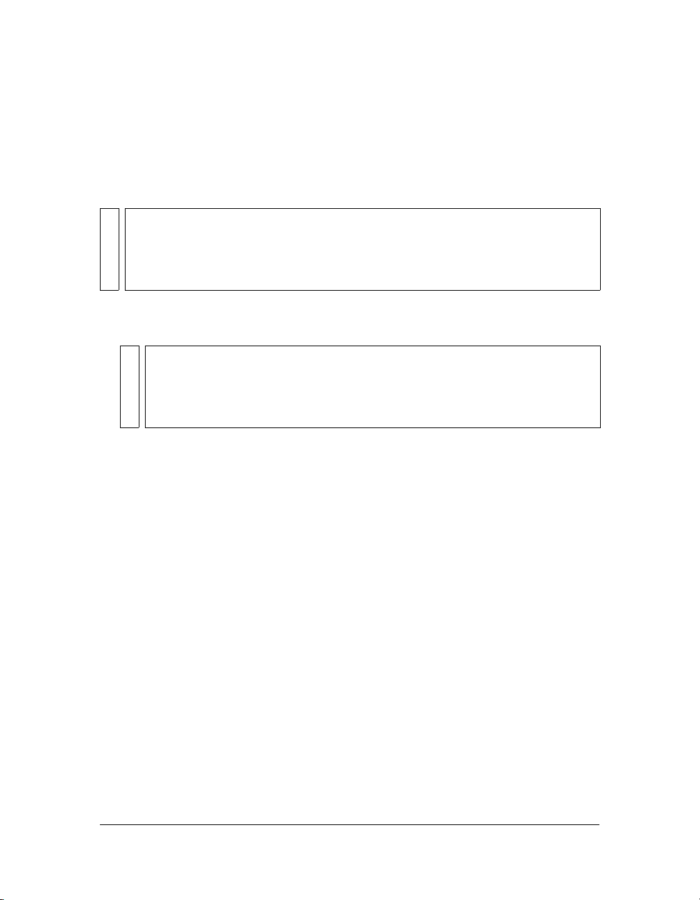
Alternatively, you can use the full package path, as follows:
mx.controls.Alert.show("The connection has failed", "Error");
For more information, see “About importing class files” in Learning ActionScript 2.0 in Flash.
You can use ActionScript methods to set additional parameters for dynamically added
components. For more information, see Components Language Reference.
NOTE
To add a component to a document at runtime, it must be in the library when the SWF
file is compiled. To add a component to the library, drag the component icon from the
Components panel to the library. Furthermore, if you are loading a movie clip containing
a dynamically instantiated (using ActionScript) component into another movie clip, the
parent movie clip must have the component in the library when the SWF file is compiled.
To add a component to your Flash document using ActionScript:
1. Drag a component from the Components panel into the library for the current document.
NOTE
Components are set to Export in First Frame by default (right-click for Windows, or
control-click for Macintosh, and select the Linkage menu option to see the Export in
First Frame setting). If you want to use a preloader for an application containing
components, you need to change the export frame, see “Using a preloader with
components” on page 60 for instructions.
2. Select the frame in the Timeline where you want to add the component.
3. Open the Actions panel if it isn’t already open.
4. Call createClassObject() to create the component instance at runtime.
This method can be called on its own, or from any component instance. The
createClassObject() method takes the following parameters: a component class name,
an instance name for the new instance, a depth, and an optional initialization object that
you can use to set properties at runtime.
You can specify the class package in the class name parameter, as in the following example:
createClassObject(mx.controls.CheckBox, "cb", 5, {label:"Check Me"});
Alternatively, you can import the class package, as in the following example:
import mx.controls.CheckBox;
createClassObject(CheckBox, "cb", 5, {label:"Check Me"});
For more information, see UIObject.createClassObject() on page 1323 and Chapter 4,
“Handling Component Events,” on page 63.
Adding components to Flash documents 53
Page 54

Components in the Library panel
When you add a component to a document, it is displayed as a compiled clip (SWC file)
symbol in the Library panel.
A ComboBox component in the Library panel
You can add more instances of a component by dragging the component icon from the library
to the Stage.
For more information about compiled clips, see “About compiled clips and SWC files”
on page 19.
54 Working with Components
Page 55

Setting component parameters
Each component has parameters that you can set to change its appearance and behavior. A
parameter is a property that appears in the Property inspector and Component inspector. The
most commonly used properties appear as authoring parameters; others must be set with
ActionScript. All parameters that can be set during authoring can also be set with
ActionScript. Setting a parameter with ActionScript overrides any value set during authoring.
All version 2 User Interface (UI) components inherit properties and methods from the
UIObject and UIComponent classes; these are the properties and methods that all
components use, such as UIObject.setSize(), UIObject.setStyle(), UIObject.x, and
UIObject.y. Each component also has unique properties and methods, some of which are
available as authoring parameters. For example, the ProgressBar component has a
percentComplete property (ProgressBar.percentComplete), and the NumericStepper
component has
NumericStepper.previousValue).
You can set parameters for a component instance using the Component inspector or the
Property inspector (it doesn’t matter which panel you use).
To enter an instance name for a component in the Property inspector:
1. Select Window > Properties > Properties.
2. Select an instance of a component on the Stage.
3. Enter an instance name in the text box under the word Component.
It’s a good idea to add a suffix to the instance name that indicates what kind of component
it is; this makes it easier to read your ActionScript code. In this example, the instance
name is states_cb because the component is a combo box that lists the U.S. states.
nextValue and previousValue properties (NumericStepper.nextValue,
Setting component parameters 55
Page 56
To enter parameters for a component instance in the Component inspector:
1. Select Window > Component Inspector.
2. Select an instance of a component on the Stage.
3. To enter parameters, click the Parameters tab.
4. To enter or view bindings or schemas for a component, click their respective tabs. For more
information, see “Data Integration (Flash Professional Only)” in Using Flash.
Sizing components
Use the Free Transform tool or the setSize() method to resize component instances.
Resizing the Menu component on the Stage with the Free Transform tool
56 Working with Components
Page 57

You can call the setSize() method from any component instance (see UIObject.setSize()
on page 1341) to resize it. The following code resizes the TextArea component to 200 pixels
wide and 300 pixels high:
myTextArea.setSize(200, 300);
NOTE
If you use the ActionScript _width and _height properties to adjust the width and height
of a component, the component is resized but the layout of the content in the
component remains the same. This might cause the component to be distorted in
movie playback.
A component does not resize automatically to fit its label. If a component instance that has
been added to a document is not large enough to display its label, the label text is clipped. You
must resize the component to fit its label.
A clipped label for the CheckBox component
For more information about sizing components, see their individual entries in the Components
Language Reference.
Deleting components from Flash documents
To delete a component’s instances from a Flash document, you must delete the component
from the library by deleting the compiled clip icon. It isn’t enough to delete the component
from the Stage.
To delete a component from a document:
1. In the Library panel, select the compiled clip (SWC) symbol.
2. Click the Delete button at the bottom of the Library panel, or select Delete from the
Library options menu.
3. In the Delete dialog box, click Delete to confirm the deletion.
Deleting components from Flash documents 57
Page 58

Using code hints
When you are using ActionScript 2.0, you can use strict typing for a variable that is based on
a built-in class, including component classes. If you do so, the ActionScript editor displays
code hints for the variable. For example, suppose you type the following:
import mx.controls.CheckBox;
var myCheckBox:CheckBox;
myCheckBox.
As soon as you type the period after myCheckBox, Flash displays a list of methods and
properties available for CheckBox components, because you have designated the variable as
type CheckBox. For more information, see “About assigning data types and strict data typing”
and “Using code hints” in Learning ActionScript 2.0 in Flash.
Creating custom focus navigation
When a user presses the Tab key to navigate in a Flash application or clicks in an application,
the FocusManager class determines which component receives input focus (for more
information see FocusManager class in the Components Language Reference). You don’t need
to add a FocusManager instance to an application or write any code to activate the
Focus Manager.
If a RadioButton object receives focus, the Focus Manager examines that object and all objects
with the same
to
true.
Each modal Window component contains an instance of the Focus Manager, so the controls
on that window become their own tab set. This prevents a user from inadvertently navigating
to components in other windows by pressing the Tab key.
To create focus navigation in an application, set the
(including buttons) that should receive focus. When a user presses the Tab key, the
FocusManager class looks for an enabled object whose
current value of
property, it returns to 0. For example, in the following code, the
TextArea component) receives focus first, and then the
var comment:mx.controls.TextArea;
var okButton:mx.controls.Button;
comment.tabIndex = 1;
okButton.tabIndex = 2;
You can also use the Accessibility panel to assign a tab index value.
groupName value and sets focus on the object with the selected property set
tabIndex property on any components
tabIndex value is greater than the
tabIndex. After the FocusManager class reaches the highest tabIndex
comment object (probably a
okButton instance receives focus:
58 Working with Components
Page 59

If nothing on the Stage has a tab index value, the Focus Manager uses the depth levels (z-
order). The depth levels are set up primarily by the order in which components are dragged to
the Stage; however, you can also use the Modify > Arrange > Bring to Front/Send to Back
commands to determine the final z-order.
To give focus to a component in an application, call
focusManager.setFocus().
To create a button that receives focus when a user presses Enter (Windows) or Return
(Macintosh), set the
FocusManager.defaultPushButton property to the instance of the
desired button, as in the following code:
focusManager.defaultPushButton = okButton;
The FocusManager class (API) overrides the default Flash Player focus rectangle and draws a
custom focus rectangle with rounded corners.
For more information about creating a focus scheme in a Flash application, see FocusManager
class in the Components Language Reference.
Managing component depth in a document
If you want to position a component in front of or behind another object in an application,
you must use the DepthManager class in the Components Language Reference. The methods of
the DepthManager class allows you to place user interface components in an appropriate
relative order (for example, a combo box drops down in front of other components, insertion
points appear in front of everything, dialog boxes float over content, and so on).
The Depth Manager has two main purposes: to manage the relative depth assignments within
any document, and to manage reserved depths on the root timeline for system-level services
such as the cursor and tooltips.
To use the Depth Manager, call its methods.
The following code places the component instance
component (and in the published SWF file it will appear “below” the button, if they overlap):
loader.setDepthBelow(button);
NOTE
You can also manage relative depths using Layers and the Modify > Arrange menu
options within your document. Components adhere to the same rules for runtime depth
management using layers and arrangement as do movie clips.
loader at a lower depth than the button
Managing component depth in a document 59
Page 60
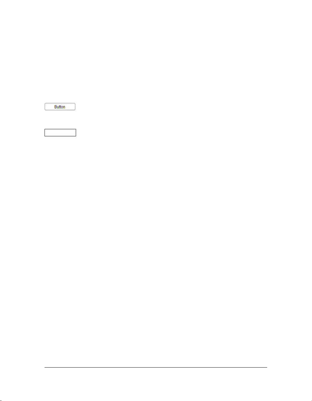
Components in Live Preview
The Live Preview feature, enabled by default, lets you view components on the Stage as they
will appear in the published Flash content; the components appear at their approximate size.
The live preview reflects different parameters for different components. For information
about which component parameters are reflected in the live preview, see each component
entry in the Components Language Reference.
A Button component with Live Preview enabled
A Button component with Live Preview disabled
Components in Live Preview are not functional. To test component functionality, you can use
the Control > Test Movie command.
To turn Live Preview on or off:
■ Select Control > Enable Live Preview. A check mark next to the option indicates that it
is enabled.
Using a preloader with components
Preloading involves loading some of the data for a SWF file before the user starts interacting
with it. By default, components and classes are set to export in the first frame of the document
that contains components. Because the components and classes are the first data to load, you
might have problems implementing a progress bar or loading animation. Specifically, the
components and classes might load before the progress bar, but you want the progress bar to
reflect the loading progress of all data (including classes). Therefore, you should load the
classes after other parts of the SWF file, but before you use components.
To do this, when you create a custom preloader for an application containing components, set
the file’s publish settings to export all the classes to the frame containing your components. To
see a list of all the components in the Halo and Sample themes that have their assets set to
Export in First Frame, see “Changing export settings” on page 116.
60 Working with Components
Page 61
To change the export frame for all your classes:
1. Select File > Publish Settings.
2. In the Flash tab of the Publish Settings dialog box, make sure the ActionScript version is
set to ActionScript 2.0.
3. Click the Settings button to the right of the ActionScript version.
4. In ActionScript 2.0 Settings, change the number for the Export Frame for Classes text box
to the frame where your components first appear.
You cannot use any classes until the playhead reaches the frame you choose to load them into.
Because components require classes for their functionality, you must load components after
the frame specified for loading classes. If you export your classes to Frame 3, you cannot use
anything from those classes until the playhead reaches Frame 3 and loads the data.
If you want to preload a file that uses components, you must also preload the components in
the SWF file. To accomplish this, you must set your components to export for a different
frame in the SWF file.
To change the frame into which components are exported:
1. Select Window > Library to open the Library panel.
2. Right-click (Windows) or Control-click (Macintosh) the component in the library.
3. Select Linkage from the context menu.
4. Deselect Export in First Frame.
5. Click OK.
6. Select File > Publish Settings.
7. Select the Flash tab and click the Settings button.
8. Enter a number into the Export Frame for Classes text box and click OK. The classes will
load into this frame.
9. Click OK to close the Publish Settings dialog box.
If components do not load on the first frame, you can create a custom progress bar for the first
frame of the SWF file. Do not reference any components in your ActionScript or include any
components on the Stage until you load the classes for the frame you specified in Step 7.
NOTE
Components must be exported after the ActionScript classes that they use.
Using a preloader with components 61
Page 62

About loading components
If you load version 2 components into a SWF file or into the Loader component, the
components may not work correctly. These components include the following: Alert,
ComboBox, DateField, Menu, MenuBar, and Window.
Use the
component. If you’re using the Loader component, add the following code:
myLoaderComponent.content._lockroot = true;
If you’re using a movie clip with a call to loadMovie(), add the following code:
myMovieClip._lockroot = true;
If you don’t set _lockroot to true in the loader movie clip, the loader only has access to its
own library, but not the library in the loaded movie clip.
The
see _lockroot (MovieClip._lockroot property) in the ActionScript 2.0 Language Reference.
_lockroot property when calling loadMovie() or loading into the Loader
_lockroot property is supported by Flash Player 7. For information about this property,
Upgrading version 1 components to version 2 architecture
The version 2 components were written to comply with several web standards (regarding
events [www.w3.org/TR/DOM-Level-3-Events/events.html], styles, getter/setter policies, and
so on) and are very different from their version 1 counterparts that were released with
Macromedia Flash MX and in the DRKs that were released before Macromedia Flash MX
2004. Version 2 components have different APIs and were written in ActionScript 2.0.
Therefore, using version 1 and version 2 components together in an application can cause
unpredictable behavior. For information about upgrading version 1 components to use
version 2 event handling, styles, and getter/setter access to the properties instead of methods,
see Chapter 6, “Creating Components,” on page 125.
Flash applications that contain version 1 components work properly in Flash Player 6 and
Flash Player 7, when published for Flash Player 6 or Flash Player 6 (6.0.65.0). If you want to
update your applications to work when published for Flash Player 7, you must convert your
code to use strict data typing. For more information, see “Writing custom class files” in
Learning ActionScript 2.0 in Flash.
62 Working with Components
Page 63

CHAPTER 4
Handling Component Events
Every component has events that are broadcast when a user interacts with it (for example, the
click and change events) or when something significant happens to the component (for
example, the
the event occurs.
Each component broadcasts its own set of events. This set includes the events of any class
from which the component inherits. This means that all components, except the media
components, inherit events from the UIObject and UIComponent classes, because they are
the base classes of the version 2 architecture. To see the list of events a component broadcasts,
see the component’s entry and its ancestor classes’ entries in the Components Language
Reference.
This chapter uses several versions of a simple Macromedia Flash application, TipCalculator,
to teach you how to handle component events. The FLA and SWF files are installed with
Flash to:
■ In Windows: the C:\Program Files\Macromedia\Flash 8\Samples and
Tutorials\Samples\Components\TipCalculator folder.
■ On the Macintosh: HD/Applications/Macromedia Flash 8/Samples and Tutorials/
Samples/Components/TipCalculator folder.
This chapter contains the following sections:
Using listeners to handle events . . . . . . . . . . . . . . . . . . . . . . . . . . . . . . . . . . . . . . . . . . . .64
Delegating events. . . . . . . . . . . . . . . . . . . . . . . . . . . . . . . . . . . . . . . . . . . . . . . . . . . . . . . . . 73
About the event object . . . . . . . . . . . . . . . . . . . . . . . . . . . . . . . . . . . . . . . . . . . . . . . . . . . . 77
Using the on() event handler . . . . . . . . . . . . . . . . . . . . . . . . . . . . . . . . . . . . . . . . . . . . . . . 78
load event). To handle an event, you write ActionScript code that executes when
4
63
Page 64

Using listeners to handle events
The version 2 component architecture has a broadcaster/listener event model. (A broadcaster is
sometimes also referred to as a dispatcher.) It is important to understand the following key
points about the model:
■ All events are broadcast by an instance of a component class. (The component instance is
the broadcaster.)
■ A listener can be a function or an object. If the listener is an object, it must have a callback
function defined on it. The listener handles the event; this means the callback function is
executed when the event occurs.
■ To register a listener to a broadcaster, call the addEventListener() method from the
broadcaster. Use the following syntax:
componentInstance.addEventListener("eventName",
listenerObjectORFunction);
■ You can register multiple listeners to one component instance.
myButton.addEventListener("click", listener1);
myButton.addEventListener("click", listener2);
■ You can register one listener to multiple component instances.
myButton.addEventListener("click", listener1);
myButton2.addEventListener("click", listener1);
■ The handler function is passed an event object.
You can use the event object in the body of the function to retrieve information about the
event type, and the instance that broadcast the event. See “About the event object”
on page 77.
■ A listener object remains active until explicitly removed using
EventDispatcher.removeEventListener(). For example:
myComponent.removeEventListener(“change”, ListenerObj);
64 Handling Component Events
Page 65

Using listener objects
To use a listener object, you can either use the this keyword to specify the current object as
the listener, use an object that already exists in your application, or create a new object.
■ Use this in most situations.
It’s often easiest to use the current object (
components that need to react when the event is broadcast.
■ Use an existing object if it is convenient.
For example, in a Flash Form Application, you may want to use a form as a listener object
if that form contains the components that react to the event. Place the code on a frame of
the form’s timeline.
■ Use a new listener object if many components are broadcasting an event (for example, the
click event) and you want only certain listener objects to respond.
If you use the
this object, define a function with the same name as the event you want to
handle; the syntax is as follows:
function eventName(evtObj:Object){
// your code here
};
If you want to use a new listener object, you must create the object, define a property with the
same name as the events, and assign the property to a callback function that executes when the
event is broadcast, as follows:
var listenerObject:Object = new Object();
listenerObject.eventName = function(evtObj:Object){
// your code here
};
If you want to use an existing object, use the same syntax as a new listener object, without
creating the new object, as shown here:
existingObject.eventName = function(evtObj:Object){
// your code here
};
TIP
The evtObj parameter is an object that is automatically generated when an event is
triggered and passed to the callback function. The event object has properties that
contain information about the event. For details, see “About the event object”
on page 77.
this) as a listener, because its scope contains the
Using listeners to handle events 65
Page 66

Finally, you call the addEventListener() method from the component instance that
broadcasts the event. The
addEventListener() method takes two parameters: a string
indicating the name of the event and a reference to the listener object.
componentInstance.addEventListener("eventName", listenerObject);
Here is the whole code segment, which you can copy and paste. Be sure to replace any code in
italics with actual values; you can use
identifiers, but you must change
var listenerObject:Object = new Object();
listenerObject.eventName = function(evtObj:Object){
// code placed here executes
// when the event is triggered
};
componentInstance.addEventListener("eventName", listenerObject);
listenerObject and evtObj or any other legal
eventName to the name of the event.
The following code segment uses the this keyword as the listener object:
function eventName(evtObj:Object){
// code placed here executes
// when the event is triggered
}
componentInstance.addEventListener("eventName", this);
You can call addEventListener() from any component instance; it is mixed in to every
component from the EventDispatcher class. (A “mix-in” is a class that provides specific
features that augment the behavior of another class.) For more information, see
“EventDispatcher.addEventListener()” in the Components Language Reference.
For information about the events a component broadcasts, see the component’s entry in the
Components Language Reference. For example, Button component events are listed in the
Button component section (or Help > Components Language Reference > Button
component > Button class > Event summary for the Button class).
To register a listener object in a Flash (FLA) file:
1. In Flash, select File > New and create a new Flash document.
2. Drag a Button component to the Stage from the Components panel.
3. In the Property inspector, enter the instance name myButton.
4. Drag a TextInput component to the Stage from the Components panel.
5. In the Property inspector, enter the instance name myText.
6. Select Frame 1 in the Timeline.
7. Select Window > Actions.
66 Handling Component Events
Page 67

8. In the Actions panel, enter the following code:
var myButton:mx.controls.Button;
var myText:mx.controls.TextInput;
function click(evt){
myText.text = evt.target;
}
myButton.addEventListener("click", this);
The target property of the event object, evt, is a reference to the instance broadcasting
the event. This code displays the value of the
target property in the TextInput
component.
To register a listener object in a class (AS) file:
1. Open the file TipCalculator.fla from the location specified in “Working with
Components” on page 49.
2. Open the file TipCalculator.as from the location specified in “Working with Components”
on page 49.
3. In the FLA file, select form1 and view the class name, TipCalculator, in the
Property inspector.
This is the link between the form and the class file. All the code for this application is in
the TipCalculator.as file. The form assumes the properties and behaviors defined by the
class assigned to it.
4. In the AS file, scroll to line 25, public function onLoad():Void.
The
onLoad() function executes when the form loads into Flash Player. In the body of the
function, the
percentRadio15, percentRadio18, and percentRadio20, call the
addEventListener() method to register a listener with an event.
5. Look at line 27, subtotal.addEventListener("change", this).
When you call
string indicating the name of the event that is broadcast—in this case,
subtotal TextInput instance and the three RadioButton instances,
addEventListener(), you must pass it two parameters. The first is a
"change". The
second is a reference to either an object or a function that handles the event. In this case,
the parameter is the keyword
this, which refers to an instance of the class file (an object).
Flash then looks on the object for a function with the name of the event.
6. Look at line 63, public function change(event:Object):Void.
This is the function that executes when the subtotal TextInput instance changes.
7. Select TipCalculator.fla and select Control > Test Movie to test the file.
Using listeners to handle events 67
Page 68

Using the handleEvent callback function
You can also use listener objects that support a handleEvent function. Regardless of the name
of the event that is broadcast, the listener object’s
use an
if..else or a switch statement to handle multiple events. For example, the following
code uses an
// define the handleEvent function
// pass it evt as the event object parameter
function handleEvent(evt){
// check if the event was a click
if (evt.type == "click"){
} else if (evt.type == "change"){
}
};
// register the listener object to
// two different component instances
// because the function is defined on
// "this" object, the listener is this.
instance.addEventListener("click", this);
instance2.addEventListener("change", this);
if..else statement to handle the click and change events:
// do something if the event was click
// do something else if the event was change
handleEvent method is called. You must
68 Handling Component Events
Page 69

Using listener functions
Unlike the handleEvent syntax, several listener functions can handle different events. So
instead of having the
myChangeHandler for the change event and myScrollHandler for the scroll event and
register them, as shown here:
myList.addEventListener("change", myChangeHandler);
myList.addEventListener("scroll", myScrollHandler);
To use a listener function, you must first define a function:
function myFunction:Function(evtObj:Object){
// your code here
}
TIP
The evtObj parameter is an object that is automatically generated when an event is
triggered and passed to the function. The event object has properties that contain
information about the event. For details, see “About the event object” on page 77.
Then you call the addEventListener() method from the component instance that
broadcasts the event. The
indicating the name of the event and a reference to the function.
componentInstance.addEventListener("eventName", myFunction);
You can call addEventListener() from any component instance; it is included in every UI
component from the EventDispatcher class. For more information, see
EventDispatcher.addEventListener().
For information about the events a component broadcasts, see each component’s entry in the
Components Language Reference.
if and else if checks in myHandler, you can just define
addEventListener() method takes two parameters: a string
Using listeners to handle events 69
Page 70

To register a listener object in a Flash (FLA) file:
1. In Flash, select File > New and create a new Flash document.
2. Drag a List component to the Stage from the Components panel.
3. In the Property inspector, enter the instance name myList.
4. Select Frame 1 in the Timeline.
5. Select Window > Actions.
6. In the Actions panel, enter the following code:
// declare variables
var myList:mx.controls.List;
var myHandler:Function;
// add items to the list
myList.addItem("Bird");
myList.addItem("Dog");
myList.addItem("Fish");
myList.addItem("Cat");
myList.addItem("Ape");
myList.addItem("Monkey");
// define myHandler function
function myHandler(eventObj:Object){
// use the eventObj parameter
// to capture the event type
if (eventObj.type == "change"){
trace("The list changed");
} else if (eventObj.type == "scroll"){
trace("The list was scrolled");
}
}
// Register the myHandler function with myList.
// When an item is selected (triggers the change event) or the
// list is scrolled, myHandler executes.
myList.addEventListener("change", myHandler);
myList.addEventListener("scroll", myHandler);
NOTE
The type property of the event object, evt, is a reference to the event name.
70 Handling Component Events
Page 71
7. Select Control > Test Movie; then select an item in the list and scroll the list to see the
results in the Output panel.
CAUTION
In a listener function, the keyword this refers to the component instance that calls
addEventListener(), not to the timeline or the class where the function is defined.
However, you can use the Delegate class to delegate the listener function to a
different scope. See “Delegating events” on page 73. To see an example of function
scoping, see the next section.
About scope in listeners
Scope refers to the object within which a function executes. Any variable references within that
function are recognized as properties of that object. You can use the Delegate class to specify
the scope of a listener. For more information, see “Delegating events” on page 73.
As discussed earlier, you register a listener with a component instance by calling
addEventListener(). This method takes two parameters: a string indicating the name of the
event, and a reference to either an object or a function. The following table lists the scope of
each parameter type:
Listener type Scope
Object Listener object.
Function Component instance broadcasting the event.
If you pass
addEventListener() an object, the callback function assigned to that object (or
the function defined on that object) is invoked in the scope of the object. This means that the
keyword
var lo:Object = new Object();
lo.click = function(evt){
}
myButton.addEventListener("click", lo);
this, when used inside the callback function, refers to the listener object, as follows:
// this refers to the object lo
trace(this);
However, if you pass addEventListener() a function, the function is invoked in the scope of
the component instance that calls
addEventListener(). This means that the keyword this,
when used inside the function, refers to the broadcasting component instance. This causes a
problem if you’re defining the function in a class file. You cannot access the properties and
methods of the class file with the expected paths because
this doesn’t point to an instance of
the class. To work around this problem, use the Delegate class to delegate a function to the
correct scope. See “Delegating events” on page 73.
Using listeners to handle events 71
Page 72

The following code illustrates the scoping of a function when passed to addEventListener()
in a class file. To use this code, copy it into an ActionScript (AS) file named Cart.as. Create a
Flash (FLA) file with a Button component,
myButton, and a DataGrid component, myGrid.
Select both components on the Stage and press F8 to convert them into a new symbol named
Cart. In the Linkage properties for the Cart symbol, assign it the class Cart.
class Cart extends MovieClip {
var myButton:mx.controls.Button;
var myGrid:mx.controls.DataGrid;
function myHandler(eventObj:Object){
// Use the eventObj parameter
// to capture the event type.
if (eventObj.type == "click"){
/* Send the value of this to the Output panel.
Because myHandler is a function that is not defined
on a listener object, this is a reference to the
component instance to which myHandler is registered
(myButton). Also, since this doesn't reference an
instance of the Cart class, myGrid is undefined.
*/
trace("this: " + this);
trace("myGrid: " + myGrid);
}
}
// register the myHandler function with myButton
// when the button is clicked, myHandler executes
function onLoad():Void{
myButton.addEventListener("click", myHandler);
}
}
72 Handling Component Events
Page 73

Delegating events
You can import the Delegate class into your scripts or classes to delegate events to specific
scopes and functions (see “Delegate class” in the Components Language Reference). To import
the Delegate class, use the following syntax:
import mx.utils.Delegate;
compInstance.addEventListener("eventName", Delegate.create(scopeObject,
function));
The scopeObject parameter specifies the scope in which the specified function parameter
is called.
There are two common uses for calling
■ To dispatch the same event to two different functions.
See the next section.
■ To call functions within the scope of the containing class.
When you pass a function as a parameter to
invoked in the scope of the broadcaster component instance, not the object in which it is
declared. See “Delegating the scope of a function” on page 76.
Delegating events to functions
Calling Delegate.create() is useful if you have two components that broadcast events of
the same name. For example, if you have a check box and a button, you would have to use the
switch statement on the information you get from the eventObject.target property in
order to determine which component is broadcasting the
Delegate.create():
addEventListener(), the function is
click event.
Delegating events 73
Page 74

To use the following code, place a check box named myCheckBox_chb and a button named
myButton_btn on the Stage. Select both instances and press F8 to create a new symbol. Click
Advanced if the dialog box is in basic mode, and select Export for ActionScript. Enter Cart in
the AS 2.0 Class text box. In the Property inspector, set the instance name for the new symbol
to anything you want. The symbol is now associated with the Cart class and an instance of the
symbol becomes an instance of this class.
import mx.controls.Button;
import mx.controls.CheckBox;
class Cart {
var myCheckBox_chb:CheckBox;
var myButton_btn:Button;
function onLoad() {
myCheckBox_chb.addEventListener("click", this);
myButton_btn.addEventListener("click", this);
}
function click(eventObj:Object) {
switch(eventObj.target) {
case myButton_btn:
// sends the broadcaster instance name
// and the event type to the Output panel
trace(eventObj.target + ": " + eventObj.type);
break;
case myCheckBox_chb:
trace(eventObj.target + ": " + eventObj.type);
break;
}
}
}
74 Handling Component Events
Page 75

The following code is the same class file (Cart.as) modified to use Delegate:
import mx.utils.Delegate;
import mx.controls.Button;
import mx.controls.CheckBox;
class Cart {
var myCheckBox_chb:CheckBox;
var myButton_btn:Button;
function onLoad() {
myCheckBox_chb.addEventListener("click", Delegate.create(this,
chb_onClick));
myButton_btn.addEventListener("click", Delegate.create(this,
btn_onClick));
}
// two separate functions handle the events
function chb_onClick(eventObj:Object) {
// sends the broadcaster instance name
// and the event type to the Output panel
trace(eventObj.target + ": " + eventObj.type);
// sends the absolute path of the symbol
// that you associated with the Cart class
// in the FLA file to the Output panel
trace(this)
}
function btn_onClick(eventObj:Object) {
trace(eventObj.target + ": " + eventObj.type);
}
}
Delegating events 75
Page 76

Delegating the scope of a function
The addEventListener() method requires two parameters: the name of an event and a
reference to a listener. The listener can either be an object or a function. If you pass an object,
the callback function assigned to the object is invoked in the scope of the object. However, if
you pass a function, the function is invoked in the scope of the component instance that calls
addEventListener(). (For more information, see “About scope in listeners” on page 71.)
Because the function is invoked in the scope of the broadcaster instance, the keyword
the body of the function points to the broadcaster instance, not to the class that contains the
function. Therefore, you cannot access the properties and methods of the class that contains
the function. Use the Delegate class to delegate the scope of a function to the containing class
so that you can access the properties and methods of the containing class.
The following example uses the same approach as the previous section with a variation of the
Cart.as class file:
import mx.controls.Button;
import mx.controls.CheckBox;
class Cart {
var myCheckBox_chb:CheckBox;
var myButton_btn:Button;
// define a variable to access
// from the chb_onClick function
var i:Number = 10
this in
function onLoad() {
myCheckBox_chb.addEventListener("click", chb_onClick);
}
function chb_onClick(eventObj:Object) {
// You would expect to be able to access
// the i variable and output 10.
// However, this sends undefined
// to the Output panel because
// the function isn't scoped to
// the Cart instance where i is defined.
trace(i);
}
}
76 Handling Component Events
Page 77

To access the properties and methods of the Cart class, call Delegate.create() as the second
parameter of
import mx.utils.Delegate;
import mx.controls.Button;
import mx.controls.CheckBox;
class Cart {
var myCheckBox_chb:CheckBox;
var myButton_btn:Button;
// define a variable to access
// from the chb_onClick function
var i:Number = 10
function onLoad() {
chb_onClick));
}
function chb_onClick(eventObj:Object) {
}
}
addEventListener(), as follows:
myCheckBox_chb.addEventListener("click", Delegate.create(this,
// Sends 10 to the Output panel
// because the function is scoped to
// the Cart instance
trace(i);
About the event object
The event object is an instance of the ActionScript Object class; it has the following properties
that contain information about an event.
Property Description
type
target
A string indicating the name of the event.
A reference to the component instance broadcasting the event.
When an event has additional properties, they are listed in the event’s entry in the
Components Dictionary.
The event object is automatically generated when an event is triggered and passed to the
listener object’s callback function or the listener function.
About the event object 77
Page 78

You can use the event object inside the function to access the name of the event that was
broadcast, or the instance name of the component that broadcast the event. From the instance
name, you can access other component properties. For example, the following code uses the
target property of the evtObj event object to access the label property of the myButton
instance and sends the value to the Output panel:
var myButton:mx.controls.Button;
var listener:Object;
listener = new Object();
listener.click = function(evtObj){
trace("The " + evtObj.target.label + " button was clicked");
}
myButton.addEventListener("click", listener);
Using the on() event handler
You can assign the on() event handler to a component instance, just as you would assign a
handler to a button or movie clip. An
for all applications, use event listeners, instead. For more information, see “Using listeners to
handle events” on page 64.
When you use the keyword
this within an on() handler attached directly to a component
(assigned to the component instance in the Actions panel),
instance. For example, the following code, attached directly to the Button component
instance
on(click){
}
myButton, displays “_level0.myButton” in the Output panel:
trace(this);
on() event handler can be useful for simple testing, but
this refers to the component
78 Handling Component Events
Page 79

To use the on() event handler:
1. Drag a User Interface component to the Stage.
For example, drag a Button component to the Sage.
2. On the Stage, select the component and open the Actions panel.
3. Add the on() handler to the Actions panel in the format:
on(event){
//your statements go here
}
For example:
on(click){
trace(this);
}
Flash runs the code inside the on() handler when the event for the on() handler occurs
(in this case, a button click).
4. Select Control > Test Movie and click the button to see the output.
Using the on() event handler 79
Page 80

80 Handling Component Events
Page 81

CHAPTER 5
Customizing Components
You might want to change the appearance of components as you use them in different
applications. You can customize component appearance using the following three approaches,
individually or in combination:
Styles User interface (UI) components have style properties that set the appearance of some
aspects of a component. Each component has its own set of modifiable style properties, and
not all visual aspects of a component can be changed by setting a style. For more information,
see “Using styles to customize component color and text” on page 82.
Skins A skin comprises the collection of symbols that make up the graphical display of a
component. Skinning is the process of changing the appearance of a component by modifying
or replacing its source graphics. A skin can be a small piece, like a border’s edge or corner, or a
composite piece like the entire picture of a button in its up state (the state in which it hasn’t
been pressed). A skin can also be a symbol without a graphic, which contains code that draws
a piece of the component. Some aspects of a component that cannot be set through its style
properties can be set by modifying the skin. For more information, see “About skinning
components” on page 96.
Themes A theme is a collection of both styles and skins that you can save as a FLA file and
apply to another document. For more information, see “About themes” on page 108.
This chapter contains the following sections:
Using styles to customize component color and text. . . . . . . . . . . . . . . . . . . . . . . . . . 82
About skinning components . . . . . . . . . . . . . . . . . . . . . . . . . . . . . . . . . . . . . . . . . . . . . . .96
About themes . . . . . . . . . . . . . . . . . . . . . . . . . . . . . . . . . . . . . . . . . . . . . . . . . . . . . . . . . . . 108
Combining skinning and styles to customize a component . . . . . . . . . . . . . . . . . . . .118
5
81
Page 82

Using styles to customize component color and text
Flash provides style properties that you can edit for every UI component. Within the
documentation for each specific component, you’ll see a table that lists the modifiable styles
for that component (for example, you can see a table of styles for the Accordion component in
“Using styles with the Accordion component” in the Components Language Reference).
Additionally, UI components inherit the
UIObject class (see
instance, you can use the
UIObject.setStyle() and UIObject.getStyle()). For a component
setStyle() and getStyle() methods to set and get style property
values, as shown later in “Setting styles on a component instance” on page 84.
NOTE
You cannot set styles for the media components.
Using style declarations and themes
In a broader scope, styles are organized within style declarations where you can control style
property values across multiple component instances. A style declaration is an object created
by the CSSStyleDeclaration class, and its properties are the style settings you can assign to
components. Style declarations in ActionScript are modeled after the way “cascading style
sheets” (CSS) affect HTML pages. For HTML pages, you can create a style sheet file that
defines style properties for the content in a group of HTML pages. With components, you
can create a style declaration object and add style properties to that style declaration object to
control the appearance of components in a Flash document.
Furthermore, style declarations are organized within themes. Flash provides two visual themes
for components: Halo (HaloTheme.fla) and Sample (SampleTheme.fla). A theme is a set of
styles and graphics that controls the appearance of components in a document. Each theme
provides styles to the components. The styles used by each component depend in part on
what theme the document uses. Some styles, such as
components regardless of the theme applied to the document. Other styles, such as
themeColor and symbolBackgroundColor, are used only by components if the
corresponding theme is in use. For example,
use, and
what style properties you can set for a component, you must know which theme is assigned to
that component. The style tables for each component in Components Language Reference
indicate whether each style property applies to one or both of the supplied themes. (For more
information, see “About themes” on page 108.)
symbolBackgroundColor is used only if the Sample theme is in use. To determine
setStyle() and getStyle() methods from the
defaultIcon, are used by the associated
themeColor is used only if the Halo theme is in
82 Customizing Components
Page 83

Understanding style settings
As you use styles and style declarations, you’ll notice that you can set styles in various ways (at
the global, theme, class, style declaration, or style property levels). And, some style properties
may be inherited from a parent component (for example, an Accordion child panel may
inherit a font treatment from the Accordion component). Here are a few key points about
style behavior:
Theme dependence The style properties you can set on a particular component are
determined by the current theme. By default, Flash components are designed to use the Halo
theme, but Flash also provides a Sample theme. So, when you read a style properties table, like
the one for the Button component in “Using styles with the Button component” in the
Components Language Reference, notice which theme supports the style you want. The table
indicates Halo, Sample, or Both (meaning both themes support the style property). To change
the current theme, see “Switching themes” on page 108.
Inheritance You cannot set inheritance within ActionScript. A component child is designed
either to inherit a style from the parent component, or not.
Global style sheets Style declarations in Flash don’t support “cascading” for Flash
documents the way CSS does for HTML documents. All style sheet declaration objects are
defined at the application (global) level.
Precedence If a component style is set in more than one way (for example, if textColor is
set at the global level and at the component instance level), Flash uses the first style it
encounters according to the order listed in “Using global, custom, and class styles in the
same document” on page 92.
Setting styles
The existence of style properties, their organization within style declarations, and the broader
organization of style declarations and graphics into themes enables you to customize a
component in the following ways:
■ Set styles on a component instance.
You can change color and text properties of a single component instance. This is effective
in some situations, but it can be time consuming if you need to set individual properties
on all the components in a document.
For more information, see “Setting styles on a component instance” on page 84.
■ Adjust the global style declaration that sets styles for all components in a document.
If you want to apply a consistent look to an entire document, you can create styles on the
global style declaration.
For more information, see “Setting global styles” on page 86.
Using styles to customize component color and text 83
Page 84

■ Create custom style declarations and apply them to several component instances.
You may want to have groups of components in a document share a style. To do this, you
can create custom style declarations to apply to the components you specify.
For more information, see “Setting custom styles for groups of components” on page 87.
■ Create default class style declarations.
You can define a default class style declaration so that every instance of a class shares a
default appearance.
For more information, see “Setting styles for a component class” on page 89.
■ Use inheriting styles to set styles for components in a portion of a document.
The values of style properties set on containers are inherited by contained components.
For more information, see “Setting inheriting styles on a container” on page 90.
Flash does not display changes made to style properties when you view components on the
Stage using the Live Preview feature. For more information, see “Components in Live
Preview” on page 60.
Setting styles on a component instance
You can write ActionScript code to set and get style properties on any component instance.
The
UIObject.setStyle() and UIObject.getStyle() methods can be called directly from
any UI component. The following syntax specifies a property and value for a component
instance:
instanceName.setStyle("propertyName", value);
For example, the following code sets the accent colors on a Button instance called myButton
that uses the Halo theme:
myButton.setStyle("themeColor", "haloBlue");
NOTE
If the value is a string, it must be enclosed in quotation marks.
84 Customizing Components
Page 85

You can also access the styles directly as properties (for example, myButton.color =
0xFF00FF
Style properties set on a component instance through
).
setStyle() have the highest priority
and override all other style settings based on style declaration or theme. However, the more
properties you set using
setStyle() on a single component instance, the slower the
component will render at runtime. You can speed the rendering of a customized component
with ActionScript that defines the style properties during the creation of the component
instance using
placing the style settings in the
UIObject.createClassObject() in the Components Language Reference, and
initObject parameter. For example, with a ComboBox
component in the current document library, the following code creates a combo box instance
named my_cb, and sets the text in the combo box to italic and aligned right:
createClassObject(mx.controls.ComboBox, "my_cb", 1, {fontStyle:"italic",
textAlign:"right"});
my_cb.addItem({data:1, label:"One"});
NOTE
If you want to change multiple properties, or change properties for multiple component
instances, you can create a custom style. A component instance that uses a custom style
for multiple properties will render faster than a component instance with several
setStyle() calls. For more information, see “Setting custom styles for groups of
components” on page 87.
To set or change a property for a single component instance that uses the Halo
theme:
1. Select the component instance on the Stage.
2. In the Property inspector, give it the instance name myComponent.
3. Open the Actions panel and select Scene 1, then select Layer 1: Frame 1.
4. Enter the following code to change the instance to orange:
myComponent.setStyle("themeColor", "haloOrange");
5. Select Control > Test Movie to view the changes.
For a list of styles supported by a particular component, see the component’s entry in the
Components Language Reference.
Using styles to customize component color and text 85
Page 86

To create a component instance and set multiple properties simultaneously
using ActionScript:
1. Drag a component to the library.
2. Open the Actions panel and select Scene 1, then select Layer 1: Frame 1.
3. Enter the following syntax to create an instance of the component and set its properties:
createClassObject(className, "instance_name", depth, {style:"setting",
style:"setting"});
So, for example, with a Button component in the library, the following ActionScript
creates a button instance
my_button at depth 1 with the text styles set to purple
and italicized:
createClassObject(mx.controls.Button, "my_button", 1, {label:"Hello",
color:"0x9900CC", fontStyle:"italic"});
For more information, see UIObject.createClassObject().
4. Select Control > Test Movie to view the changes.
For a list of styles supported by a particular component, see the component’s entry in the
Components Language Reference.
Setting global styles
By default, all components adhere to a global style declaration until another style declaration
is attached to the component (as in “Setting custom styles for groups of components”
on page 87). The global style declaration is assigned to all Flash components built with
version 2 of the Macromedia Component Architecture. The _global object has a
property (
_global.style) that is an instance of CSSStyleDeclaration, and acts as the global
style declaration. If you change a style property’s value on the global style declaration, the
change is applied to all components in your Flash document.
CAUTION
Some styles are set on a component class’s CSSStyleDeclaration instance (for
example, the
Because the class style declaration takes precedence over the global style declaration
when style values are determined, setting
declaration would have no effect on the TextArea and TextInput components. For more
information about style precedence, see “Using global, custom, and class styles in the
same document” on page 92. For more information about editing a component class’s
CSSStyleDeclaration, see “Setting styles for a component class” on page 89.
backgroundColor style of the TextArea and TextInput components).
backgroundColor on the global style
style
86 Customizing Components
Page 87

To change one or more properties in the global style declaration:
1. Make sure the document contains at least one component instance.
For more information, see “Adding components to Flash documents” on page 50.
2. Select a frame in the Timeline on which (or before which) the components appear.
3. In the Actions panel, use code like the following to change properties on the global style
declaration. You need to list only the properties whose values you want to change, as
shown here:
_global.style.setStyle("color", 0xCC6699);
_global.style.setStyle("themeColor", "haloBlue")
_global.style.setStyle("fontSize",16);
_global.style.setStyle("fontFamily" , "_serif");
4.
Select Control > Test Movie to see the changes.
Setting custom styles for groups of components
You can create custom style declarations to specify a unique set of properties for groups of
components in your Flash document. In addition to the _global object’s
(discussed in “Setting global styles” on page 86), which determines the default style
declaration for an entire Flash document, the _global object also has a
which is a list of available custom style declarations. So, you can create a style declaration as a
new instance of the CSSStyleDeclaration object, assign it a custom style name, and place it in
the
_global.styles list. Then, you specify the properties and values for the style, and assign
the style name to component instances that should share the same look.
Keep in mind that when you assign the style name to a component instance, the component
responds only to style properties that component supports. For a list of the style properties
each component supports, see the individual component entries in the Components Language
Reference.
To make changes to a custom style format, use the following syntax:
_global.styles.CustomStyleName.setStyle(propertyName, propertyValue);
Custom style settings have priority over class, inherited, and global style settings. For a list of
style precedence, see “Using global, custom, and class styles in the same document”
on page 92.
style property
styles property,
Using styles to customize component color and text 87
Page 88

To create a custom style declaration for a group of components:
1. Add at least one component to the Stage.
For more information, see “Adding components to Flash documents” on page 50.
This example uses three button components with the instance names
a, b, and c. If you
use different components, give them instance names in the Property inspector and use
those instance names in step 8.
2. Select a frame in the Timeline on which (or before which) the component appears.
3. Open the Actions panel.
4. Add the following import statement so you will have access to the constructor function for
creating a new style declaration from within the CSSStyleDeclaration class:
import mx.styles.CSSStyleDeclaration;
5.
Use the following syntax to create an instance of the CSSStyleDeclaration object to define
the new custom style format:
var new_style:Object = new CSSStyleDeclaration();
6.
Give your style declaration a name, like “myStyle,” in the _global.styles list of custom
style declarations, and identify the object containing all the properties for your new style
declaration.
_global.styles.myStyle = new_style;
7.
Use the setStyle() method (inherited from the UIObject class) to add properties to the
new_style object, which are in turn associated with the custom style declaration myStyle:
new_style.setStyle("fontFamily", "_serif");
new_style.setStyle("fontSize", 14);
new_style.setStyle("fontWeight", "bold");
new_style.setStyle("textDecoration", "underline");
new_style.setStyle("color", 0x666699);
8.
In the same Script pane, use the following syntax to set the styleName property of three
specific components to the custom style declaration name:
a.setStyle("styleName", "myStyle");
b.setStyle("styleName", "myStyle");
c.setStyle("styleName", "myStyle");
88 Customizing Components
Page 89

Yo u can also access styles on the custom style declaration using the setStyle() and
getStyle() methods through the declaration’s global styleName property. For example, the
following code sets the
_global.styles.myStyle.setStyle("themeColor", "haloOrange");
backgroundColor style on the myStyle style declaration:
However, steps 5 and 6 associated the new_style instance with the style declaration so you
can use the shorter syntax, like
For more information about the
UIObject.setStyle() and UIObject.getStyle().
new_style.setStyle("themeColor", "haloOrange").
setStyle() and getStyle() methods, see
Setting styles for a component class
You can define a class style declaration for any class of component (Button, CheckBox, and so
on) that sets default styles for each instance of that class. You must create the style declaration
before you create the instances. Some components, such as TextArea and TextInput, have class
style declarations predefined by default because their
properties must be customized.
CAUTION
If you replace a class style sheet, make sure to add any styles that you want from the old
style sheet; otherwise, they will be overwritten.
The following code first checks to see if the current theme already has a style declaration for
CheckBox, and, if not, creates a new one. Then the code uses the
define a style property for the CheckBox style declaration (in this case, “color” sets the color
for all check box label text to blue):
if (_global.styles.CheckBox == undefined) {
_global.styles.CheckBox = new mx.styles.CSSStyleDeclaration();
}
_global.styles.CheckBox.setStyle("color", 0x0000FF);
For a table of the style properties you can set on the CheckBox component, see “Using styles
with the CheckBox component” in the Components Language Reference.
Custom style settings have priority over inherited and global style settings. For a list of style
precedence, see “Using global, custom, and class styles in the same document” on page 92.
borderStyle and backgroundColor
setStyle() method to
Using styles to customize component color and text 89
Page 90

Setting inheriting styles on a container
An inherited style is a style that inherits its value from parent components in the document’s
MovieClip hierarchy. If a text or color style is not set at an instance, custom, or class level,
Flash searches the MovieClip hierarchy for the style value. Thus, if you set styles on a
container component, the contained components inherit these style settings.
The following styles are inheriting styles:
■ fontFamily
■ fontSize
■ fontStyle
■ fontWeight
■ textAlign
■ textIndent
■ All single-value color styles (for example, themeColor is an inheriting style, but
alternatingRowColors is not)
The Style Manager tells Flash whether a style inherits its value. Additional styles can also be
added at runtime as inheriting styles. For more information, see StyleManager class in the
Components Language Reference.
NOTE
One major difference between the implementation of styles for Flash components, and
cascading style sheets for HTML pages, is that the CSS inherit value is not supported
for Flash components. Styles are either inherited or not by component design.
Inherited styles take priority over global styles. For a list of style precedence, see “Using global,
custom, and class styles in the same document” on page 92.
The following example demonstrates how inheriting styles can be used with an Accordion
component, which is available with Flash Professional 8. (The inheriting styles feature is
supported by both Flash Basic 8 and Flash Professional 8.)
90 Customizing Components
Page 91

To create an Accordion component with styles that are inherited by the
components in the individual Accordion panes:
1. Open a new FLA file.
2. Drag an Accordion component from the Components panel to the Stage.
3. Use the Property inspector to name and size the Accordion component. For this example,
give the component the instance name accordion.
4. Drag a TextInput component and a Button component from the Components panel to
the library.
By dragging the components to the library, you make them available to your script
at runtime.
5. Add the following ActionScript to the first frame of the Timeline:
var section1 = accordion.createChild(mx.core.View, "section1", {label:
"First Section"});
var section2 = accordion.createChild(mx.core.View, "section2", {label:
"Second Section"});
var input1 = section1.createChild(mx.controls.TextInput, "input1");
var button1 = section1.createChild(mx.controls.Button, "button1");
input1.text = "Text Input";
button1.label = "Button";
button1.move(0, input1.height + 10);
var input2 = section2.createChild(mx.controls.TextInput, "input2");
var button2 = section2.createChild(mx.controls.Button, "button2");
input2.text = "Text Input";
button2.label = "Button";
button2.move(0, input2.height + 10);
The above code adds two children to the Accordion component and loads each with a
TextInput and Button control, which this example uses to demonstrate style inheritance.
6. Select Control > Test Movie to see the document before adding style inheritance.
7. Add the following ActionScript to the end of the script in the first frame:
accordion.setStyle("fontStyle", "italic");
8. Select Control > Test Movie to see the changes.
Notice that the
fontStyle setting on the Accordion component affects not only the
Accordion text itself but also the text associated with the TextInput and Button components
inside the Accordion component.
Using styles to customize component color and text 91
Page 92

Using global, custom, and class styles in the same document
If you define a style in only one place in a document, Flash uses that definition when it needs
to know a property’s value. However, one Flash document can have a variety of style
settings—style properties set directly on component instances, custom style declarations,
default class style declarations, inheriting styles, and a global style declaration. In such a
situation, Flash determines the value of a property by looking for its definition in all these
places in a specific order.
Flash looks for styles in the following order until a value is found:
1. Flash looks for a style property on the component instance.
2. Flash looks at the styleName property of the instance to see if a custom style declaration is
assigned to it.
3. Flash looks for the property on a default class style declaration.
4. If the style is one of the inheriting styles, Flash looks through the parent hierarchy for an
inherited value.
5. Flash looks for the style in the global style declaration.
6. If the property is still not defined, the property has the value undefined.
About color style properties
Color style properties behave differently than noncolor properties. All color properties have a
name that ends in “Color”—for example,
When color style properties are changed, the color is immediately changed on the instance
and in all of the appropriate child instances. All other style property changes simply mark the
object as needing to be redrawn, and changes don’t occur until the next frame.
The value of a color style property can be a number, a string, or an object. If it is a number, it
represents the RGB value of the color as a hexadecimal number (0xRRGGBB). If the value is
a string, it must be a color name.
backgroundColor, disabledColor, and color.
92 Customizing Components
Page 93
Color names are strings that map to commonly used colors. You can add new color names by
using the Style Manager (see StyleManager class in the Components Language Reference). The
following table lists the default color names:
Color name Value
black 0x000000
white 0xFFFFFF
red 0xFF0000
green 0x00FF00
blue 0x0000FF
magenta 0xFF00FF
yellow 0xFFFF00
cyan 0x00FFFF
haloGreen 0x80FF4D
haloBlue 0x2BF5F5
haloOrange 0xFFC200
NOTE
If the color name is not defined, the component may not draw correctly.
You can use any valid ActionScript identifier to create your own color names (for example,
"WindowText" or "ButtonText"). Use the Style Manager to define new colors, as shown
here:
mx.styles.StyleManager.registerColorName("special_blue", 0x0066ff);
Most components cannot handle an object as a color style property value. However, certain
components can handle color objects that represent gradients or other color combinations.
For more information, see the “Using styles” section of each component’s entry in the
Components Language Reference.
You can use class style declarations and color names to easily control the colors of text and
symbols on the screen. For example, if you want to provide a display configuration screen that
looks like Microsoft Windows, you would define color names like
WindowText and class style declarations like Button, CheckBox, and Window.
NOTE
Some components provide style properties that are an array of colors, such as
alternatingRowColors. You must set these styles only as an array of numeric RGB
values, not color names.
ButtonText and
Using styles to customize component color and text 93
Page 94

Customizing component animations
Several components, such as the Accordion, ComboBox, and Tree components, provide
animation to demonstrate the transition between component states—for example, when
switching between Accordion children, expanding the ComboBox drop-down list, and
expanding or collapsing Tree folders. Additionally, components provide animation related to
the selection and deselection of an item, such as rows in a list.
You can control aspects of these animations through the following styles:
Animation style Description
openDuration
openEasing
popupDuration
selectionDuration
selectionEasing
The duration of the transition for open easing in Accordion,
ComboBox, and Tree components, in milliseconds. The default value
is 250.
A reference to a tweening function that controls the state animation
in the Accordion, ComboBox, and Tree components. The default
equation uses a sine in/out formula.
The duration of the transition as a menu opens in the Menu
component, in milliseconds. The default value is 150. Note, however,
that the animation always uses the default sine in/out equation.
The duration of the transition in ComboBox, DataGrid, List, and Tree
components from a normal to selected state or back from selected to
normal, in milliseconds. The default value is 200.
A reference to a tweening function that controls the selection
animation in ComboBox, DataGrid, List, and Tree components. This
style applies only for the transition from a normal to a selected state.
The default equation uses a sine in/out formula.
The mx.transitions.easing package provides six classes to control easing:
Easing class Description
Back Extends beyond the transition range at one or both ends one time to
provide a slight overflow effect.
Bounce Provides a bouncing effect entirely within the transition range at one or
both ends. The number of bounces is related to the duration: longer
durations produce more bounces.
Elastic Provides an elastic effect that falls outside the transition range at one or
both ends. The amount of elasticity is unaffected by the duration.
None Provides an equal movement from start to end with no effects, slowing, or
speeding. This transition is also commonly referred to as a linear transition.
94 Customizing Components
Page 95

Easing class Description
Regular Provides for slower movement at one or both ends for a speeding-up
effect, a slowing-down effect, or both.
Strong Provides for much slower movement at one or both ends. This effect is
similar to Regular but is more pronounced.
Each of the classes in the mx.transitions.easing package provides the following three easing
methods:
Easing method Description
easeIn
easeOut
easeInOut
Provides the easing effect at the beginning of the transition.
Provides the easing effect at the end of the transition.
Provides the easing effect at the beginning and end of the transition.
Because the easing methods are static methods of the easing classes, you never need to
instantiate the easing classes. The methods are used in calls to
setStyle(), as in the following
example.
import mx.transitions.easing.*;
trace("_global.styles.Accordion = " + _global.styles.Accordion);
_global.styles.Accordion.setStyle("openDuration", 1500);
_global.styles.Accordion.setStyle("openEasing", Bounce.easeOut);
NOTE
The default equation used by all transitions is not available in the easing classes listed
above. To specify that a component should use the default easing method after another
easing method has been specified, call
setStyle("openEasing", null).
For more information see “Applying easing methods to components” in the Components
Language Reference.
Getting style property values
To retrieve a style property value, use UIObject.getStyle(). Every component that is a subclass
of UIObject (which includes all version 2 components except the Media components) inherits
the
getStyle() method. This means you can call getStyle() from any component
instance, just as you can call
The following code gets the value of the
oldStyle:
var myCheckBox:mx.controls.CheckBox;
var oldFontSize:Number
oldFontSize = myCheckBox.getStyle("fontSize");
trace(oldFontSize);
setStyle() from any component instance.
themeColor style and assigns it to the variable
Using styles to customize component color and text 95
Page 96

About skinning components
Skins are movie clip symbols a component uses to display its appearance. Most skins contain
shapes that represent the component’s appearance. Some skins contain only ActionScript code
that draws the component in the document.
Version 2 components are compiled clips—you cannot see their assets in the library. However,
the Flash installation includes FLA files that contain all the component skins. These FLA files
are called themes. Each theme has a different appearance and behavior, but contains skins with
the same symbol names and linkage identifiers. This lets you drag a theme onto the Stage in a
document to change its appearance. You also use the theme FLA files to edit component
skins. The skins are located in the Themes folder in the Library panel of each theme FLA file.
(For more information about themes, see “About themes” on page 108.)
Each component comprises many skins. For example, the down arrow of the ScrollBar
subcomponent consists of four skins: ScrollDownArrowDisabled, ScrollDownArrowDown,
ScrollDownArrowOver, and ScrollDownArrowUp. The entire ScrollBar uses 13 different skin
symbols.
Some components share skins; for example, components that use scroll bars—such as
ComboBox, List, and ScrollPane—share the skins in the ScrollBar Skins folder. You can edit
existing skins and create new skins to change the appearance of components.
The AS file that defines each component class contains code that loads specific skins for the
component. Each component skin corresponds to a skin property that is assigned to a skin
symbol’s linkage identifier. For example, the pressed (down) state of the down arrow of the
ScrollBar component has the skin property name
the
downArrowDownName property is "ScrollDownArrowDown", which is the linkage
identifier of the skin symbol in the theme FLA file. You can edit existing skins and apply them
to all components that use the skin by editing the skin symbol and leaving the existing linkage
identifier. You can create new skins and apply them to specific component instances by setting
the skin properties for a component instance. You do not need to edit the component’s AS file
to change its skin properties; you can pass skin property values to the component’s
constructor function when the component is created in your document.
The skin properties for each component are listed in each component’s entry in the
Components Dictionary. For example, the skin properties for the Button component are
located here: Components Language Reference > Button component > Customizing the
Button component > Using skins with the Button component.
downArrowDownName. The default value of
96 Customizing Components
Page 97

Choose one of the following ways to skin a component according to what you want to do.
These approaches are listed from easiest to most difficult.
■ To change the skins associated with all instances of a particular component in a single
document, copy and modify individual skin elements. (See “Editing component skins in a
document” on page 97).
This method of skinning is recommended for beginners, because it doesn’t require
any scripting.
■ To replace all the skins in a document with a new set (with each kind of component
sharing the same appearance), apply a theme. (See “About themes” on page 108.)
This method of skinning is recommended for applying a consistent look and feel across all
components and across several documents.
■ To link the color of a skin element to a style property, add ActionScript code to the skin to
register it as a colored skin element. (See “Linking skin color to styles” on page 100).
■ To use different skins for multiple instances of the same component, create new skins and
set skin properties. (See “Creating new component skins” on page 99 and “App l ying n e w
skins to a component” on page 101.)
■ To change skins in a subcomponent (such as a scroll bar in a List component), subclass the
component. (See “Applying new skins to a subcomponent” on page 103.)
■ To change skins of a subcomponent that aren’t directly accessible from the main
component (such as a List component in a ComboBox component), replace skin
properties in the prototype. (See “Changing skin properties in a subcomponent”
on page 106.)
Editing component skins in a document
To edit the skins associated with all instances of a particular component in a single document,
copy the skin symbols from the theme to the document and edit the graphics as desired.
The procedure described below is very similar to creating and applying a new theme (see
“About themes” on page 108). The primary difference is that this procedure describes copying
symbols directly from the theme already in use to a single document and editing only a small
number of all skins available. This is appropriate when your modifications are all in a single
document and when you are modifying skins for only a few components. If the edited skins
will be shared in multiple documents or encompass changes in several components, you may
find editing the skins easier if you create a new theme.
An article on advanced skinning can be found online in the Macromedia Developer Center at
www.macromedia.com/devnet/mx/flash/articles/skinning_2004.html.
About skinning components 97
Page 98

To edit component skins in a document:
1. If you already applied the Sample theme to a document, skip to step 5.
2. Select File > Import > Open External Library, and select the SampleTheme.fla file.
This file is located in the application-level configuration folder. For the exact location on
your operating system, see “About themes” on page 108.
3. In the theme’s Library panel, select Flash UI Components 2/Themes/MMDefault and
drag the Assets folder of any components in your document to the library for your
document.
For example, drag the RadioButton Assets folder to the ThemeApply.fla library.
4. If you dragged individual component Assets folders to the library, make sure the Assets
symbol for each component is set to Export in First Frame.
For example, the Assets folder for the RadioButton component is called RadioButton
Assets; it has a symbol called RadioButtonAssets, which contains all of the individual asset
symbols. If you set Export in First Frame on the RadioButtonAssets symbol, all individual
asset symbols will also export in the first frame.
5. Double-click any skin symbol you want to modify to open it in symbol-editing mode.
For example, open the States/RadioFalseDisabled symbol.
6. Modify the symbol or delete the graphics and create new graphics.
You may need to select View > Zoom In to increase the magnification. When you edit a
skin, you must maintain the registration point in order for the skin to be displayed
correctly. The upper-left corner of all edited symbols must be at (0,0).
For example, change the inner circle to a light gray.
7. When you finish editing the skin symbol, click the Back button at the left side of the
information bar at the top of the Stage to return to document-editing mode.
8. Repeat steps 5-7 until you’ve edited all the skins you want to change.
NOTE
The live preview of the components on the Stage will not reflect the edited skins.
9. Select Control > Test Movie.
In this example, make sure you have a RadioButton instance on the Stage and set its
enabled property to false in the Actions panel in order to see the new disabled
RadioButton appearance.
98 Customizing Components
Page 99

Creating new component skins
If you want to use a particular skin for one instance of a component, but another skin for
another instance of the component, you must open a theme FLA file and create a new skin
symbol. Components are designed to make it easy to use different skins for different
instances.
To create a new skin:
1. Select File > Open and open the theme FLA file that you want to use as a template.
2. Select File > Save As and select a unique name, such as MyTheme.fla.
3. Select the skins that you want to edit (in this example, RadioTrueUp).
The skins are located in the Themes/MMDefault/Component Assets folder (in this
example, Themes/MMDefault/RadioButton Assets/States).
4. Select Duplicate from the Library options menu (or by right-clicking the symbol), and give
the symbol a unique name, such as MyRadioTrueUp.
5. Click Advanced in the Symbol Properties dialog box, and select Export for ActionScript.
A linkage identifier that matches the symbol name is entered automatically.
6. Double-click the new skin in the library to open it in symbol-editing mode.
7. Modify the movie clip, or delete it and create a new one.
You may need to select View > Zoom In to increase the magnification. When you edit a
skin, you must maintain the registration point in order for the skin to be displayed
correctly. The upper-left corner of all edited symbols must be at (0,0).
8. When you finish editing the skin symbol, click the Back button at the left side of the
information bar at the top of the Stage to return to document-editing mode.
9. Select File > Save but don’t close MyTheme.fla. Now you must create a new document in
which to apply the edited skin to a component.
For more information, see “Applying new skins to a component” on page 101, “Ap pl yi ng
new skins to a subcomponent” on page 103, or “Changing skin properties in a
subcomponent” on page 106.
NOTE
Flash does not display changes made to component skins when you view
components on the Stage using Live Preview.
About skinning components 99
Page 100

Linking skin color to styles
The version 2 component framework makes it easy to link a visual asset in a skin element to a
style set on the component using the skin. To register a movie clip instance to a style, or an
entire skin element to a style, add ActionScript code in the timeline of the skin to call
mx.skins.ColoredSkinElement.setColorStyle(targetMovieClip, styleName).
To link a skin to a style property:
1. If you already applied the Sample theme to a document, skip to step 5.
2. Select File > Import > Open External Library, and select the SampleTheme.fla file.
This file is located in the application-level configuration folder. For the exact location on
your operating system, see “About themes” on page 108.
3. In the theme’s Library panel, select Flash UI Components 2/Themes/MMDefault, and
drag the Assets folder of any components in your document to the library for your
document.
For example, drag the RadioButton Assets folder to the target library.
4. If you dragged individual component assets folders to the library, make sure the Assets
symbol for each component is set to Export in First Frame.
For example, the Assets folder for the RadioButton component is called RadioButton
Assets; it has a symbol called RadioButtonAssets, which contains all of the individual asset
symbols. If you set Export in First Frame on the RadioButtonAssets symbol, all individual
asset symbols will also export in the first frame.
5. Double-click any skin symbol you want to modify to open it in symbol-editing mode.
For example, open the States/RadioFalseDisabled symbol.
6. If the element to be colored is a graphic symbol and not a movie clip instance, use Modify
> Convert to Symbol to covert it to a movie clip instance.
For this example, change the center graphic, which is an instance of the graphic symbol
RadioShape1, to a movie clip symbol; then name it Inner Circle. You do not need to
select Export for ActionScript.
It would be good practice, but it is not required, to move the newly created movie clip
symbol to the Elements folder of the component assets being edited.
7. If you converted a graphic symbol to a movie clip instance in the previous step, give that
instance a name so it can be targeted in ActionScript.
For this example, name the instance innerCircle.
100 Customizing Components
 Loading...