

Page 1

IBMEaseofUse
User Interface Architecture
Page 2

Page 3

IBMEaseofUse
User Interface Architecture
Page 4

Note
Before using this information and the product it supports, read the information in “Notices” on page 33.
Second Edition (December, 2001)
© Copyright International Business Machines Corporation 2001. All rights reserved.
US Government Users Restricted Rights – Use, duplication or disclosure restricted by GSA ADP Schedule Contract
with IBM Corp.
Page 5

Preface
Why is the Web changing the world? It is simple; it connects everybody to
everything in a single interface.
It is, however, not easy. Total connection requires universality and standards. You
probably don’t remember eWorld. You probably never used NoteCards or
InterMedia, two of the great hypertext systems in 1980s. Why? These systems
failed to deliver the promised universal networking. They might connect somebody
to something or even have better features than the Web, but they simply lacked the
power of universality that the Web possesses.
Many people acknowledge and accept the standards for such things as power
voltage, power plugs, and even e-mail headers, but deny the need for standardizing
user interfaces. They argue that users are intelligent and instinctive individuals and
can adapt to any given design. It is true that users can adapt to almost anything.
They surely had to do so in the past. Why should users have to adapt to machines?
Do they voluntarily or involuntarily adapt to machines? Research on human factors
in human-computer interaction shows that users of a new interface demonstrate a
consistent desire to ″get started right away″. This distinct desire or preference
forces them to ″figure out″ the interface without the benefits of a user-friendly
design.
This User Interface Architecture describes principles and guidelines for a
user-centered design for IBM
your project will provide the following main benefits:
v The architecture embodies recognized principles of human factors that are
proven to improve usability. These principles may appear ″obvious″ or ″simple,″
but they are often overlooked by designers and, consequently, missing from
consumer products, such as computers, electronics, and Websites. Your design
based on these principles will become easier to use.
v In addition to fundamental principles, the architecture also provides guidelines for
designing user interfaces. These guidelines are effective, practical, and
easy-to-follow. Specific conventions are also derived from the guidelines, telling
you what to do and what to avoid during your design process. These guidelines
and conventions will increase the efficiency of your work. More importantly, they
will help you avoid common design blunders and ease the use of your product.
v The principles and guidelines in the architecture are intended to set design
standards for IBM network-based products. The resulting universality in interfaces
will allow users to transfer their learning experience from one IBM network
product to another and give them a sense of accomplishment and control over a
system. This will ultimately increase their satisfaction and productivity.
You may think that your product is special, and you can deviate from the
recommended user interface architecture. You are not alone; all designers have the
same regard for their products. Indeed, every product has its unique features and
design considerations. However, if every design ″sub-optimizes″ the interface for its
own needs, the overall usability of all IBM network products will diminish, and users
will suffer from the increased inconvenience.
®
network-based products. Applying this architecture in
Just imagine this: You designed a product, disregarding this user interface
architecture, and IBM or affiliates had to pay for an extra amount of valuable
© Copyright IBM Corp. 2001 iii
Page 6

resources to train the users to use it. Your product might be excellent in its own
right, but without universality or standards, it was not good enough to your users or
IBM.
I urge you to comply with the User Interface Architecture described in this
document. You will save yourself energy, IBM resources, and users much hassle
and confusion. I bet that you will sell more products as well.
Jakob Nielsen
Nielsen Norman Group
http://www.useit.com
http://www.nngroup.com
iv User Interface Architecture
Page 7

Contents
Preface ............................iii
Introduction ..........................1
UIA overview ..........................1
Design considerations .......................2
Designer’s model .......................2
User-centered design ......................2
Writing systems ........................3
Platforms or enabling environments .................3
Product structure .......................4
Notational conventions ......................5
Typefaces ..........................5
Special characters .......................5
Diagrams ..........................5
Design principles ........................7
Affinity: Bring objects to life through good visual design ..........7
Assistance: Provide proactive assistance ................7
Availability: Make all objects available at any time ............8
Encouragement: Make actions predictable and reversible ..........8
Familiarity: Build on the user’s prior knowledge .............8
Obviousness: Make objects and controls visible and intuitive ........8
Personalization: Enable the user to customize an interface .........9
Safety: Keep the user out of trouble .................9
Satisfaction: Create a feeling of progress and achievement ........10
Simplicity: Do not compromise usability for functionality ..........10
Support: Place the user in control ..................10
Versatility: Support alternate interaction techniques ...........10
Design guidelines .......................13
Controls ...........................13
Predefined actions .......................16
Data transfer..........................18
Message handling ........................19
User assistance ........................23
Windows and layouts ......................25
Portfolio ...........................29
Accessibility ..........................30
Notices ...........................33
Trademarks ..........................34
Glossary ...........................35
Index ............................39
© Copyright IBM Corp. 2001 v
Page 8

vi User Interface Architecture
Page 9

Introduction
UIA overview
This section introduces the IBM User Interface Architecture (UIA) and defines its
underlying design principles and guidelines. It also briefly describes other design
factors you need to take into consideration. These design factors include, but are
not limited to, the following:
v Designer’s model
v User-centered design
v Writing systems
v Platforms or enabling environments
v Product structure
Finally, this section explains the notational conventions used in the UIA document.
The UIA specifies rules by which the user interface of IBM network-based products
must be built. The UIA rules are intended to achieve further consistency in design
and ease of use of IBM network-based products.
The UIA rules are categorized into principles and guidelines. The terms principles
and guidelines are defined as follows:
Principles The fundamental ideals and beliefs that guide your decision-making
and courses of action to achieve a predefined goal. Principles are
fairly abstract. You must have extensive interface design knowledge
and experience to understand and interpret them. For example, a
UIA principle governing user assistance reads like this: ″Assist the
user in performing a variety of tasks.″
Guidelines The specific courses of action, based broadly on a set of principles.
Guidelines can be construed as good practices within a general
design domain, such as Windows
generally more specific than principles and require less design
knowledge and experience on your part to understand and interpret
them. For example, a guideline for implementing the UIA user
assistance principle reads like this: ″Provide contextual help for
each choice or object that the cursor can be positioned on.″
Most platforms or enabling environments devise specific guidelines to govern the
design and production of their component products. This UIA draws on the most
effective guidelines currently adopted by these platforms. The principles and
guidelines are applicable to all products for these platforms.
®
GUI or Java™Swing. They are
© Copyright IBM Corp. 2001 1
Page 10

Design considerations
You need to take the following factors into consideration in your design of user
interfaces.
Designer’s model
The following three models are often used to describe a new interactive system:
Implementor’s
model Demonstrates how a new system is implemented.
User’s model Allows a user to try out and explain a new system. The learning
Designer’s
model Is based on multiple user’s models and describes the collective
This UIA presents a partial designer’s model, with its quintessence described in
“Design principles” on page 7 and “Design guidelines” on page 13 and its elements,
or objects, defined in “Glossary” on page 35. These objects are common to
applications that conform to the UIA.
It is critical that you first develop a designer’s model when you design a product. In
the designer’s model for the product, you define the way that a group, or class, of
objects will appear and behave. These specifications will help create a common
look and feel for the objects in an interface. The resulting consistency will make the
behaviors of the objects predictable and thus the interface intuitive and the product
easy to use.
experience of each user becomes a separate user’s model.
experience of all users with the same system.
Visit http://www-3.ibm.com/ibm/easy/eou_ext.nsf/Publish/569 for a detailed
description of the implementor’s model, the user’s model, and the designer’s model.
The designer’s model is often described in the context of the object view and
interaction design (OVID) method with the unified modeling language (UML). See
Designing for the User with OVID: Bridging User Interface Design and Software
Engineering (ISBN: 1-57870-101-5) for more information about OVID and the
designer’s model.
User-centered design
This UIA assumes that each conforming product will be created to meet the
requirements of the IBM user-centered design (UCD) or its equivalent. The following
table summarizes the UCD process and the UIA considerations relevant to each
step.
UCD Process Description UIA Considerations
Market definition Define the target audience, identify
Task analysis Identify and understand the user’s
the competitors, and determine the
core user needs that must be
fulfilled.
goals and tasks, the strategies they
use to perform the tasks, the tools
they currently use, the problems
they experience, and the changes
they want to see in their tasks and
tools.
Decide whether the UIA is an
appropriate approach tor the
product.
Design your product using the
identified tasks. Each task will be
embodied in the product as a
sequence of views. Analysis of the
frequency of a task will help you
decide if you should provide a
wizard for that task.
2 User Interface Architecture
Page 11

UCD Process Description UIA Considerations
Competitive
evaluation
Design and
walk-through
Evaluation and
validation
Benchmark
assessment
Determine the design strengths and
weaknesses of the competition.
Using the results from task and
competitive analyses, create
alternative solutions, solicit
feedback through design
walk-through sessions with users,
and choose a solution based on
user input.
Periodically solicit user feedback on
the evolving design, and iterate the
design based on analysis of users’
experiences with it.
Run a head-to-head benchmark
assessment against the competition
to verify that the product has met its
primary objectives. If a third-party
company conducts the benchmark
study, positive results can become
important selling points in product
promotions.
None
Create one or more models of your
product based on the “Designer’s
model” on page 2. Make sure that
all elements in your models
correspond and comply with those
in the UIA. Use design walk-through
sessions to see if the users
understand the models and to
choose a single model for
implementation.
Implement, evaluate, and validate
your design based on the UIA
“Design guidelines” on page 13 or
platform-specific guidelines.
None
Writing systems
This version of the UIA guidelines is intended for user interfaces designed for the
left-to-right, top-to-bottom writing systems. You may need to adjust the guidelines to
accommodate the directionality of languages, such as Arabic and Hebrew, that have
different writing systems.
Platforms or enabling environments
Though the UIA intends to provide a repertoire of rules, it does not normally repeat
those which are already common to all platforms or enabling environments. If you
cannot find a rule for a particular user interface of a particular product, follow the
platform-specific or environment-based guidelines. The ISO/IEC standards and
guidelines for Windows, Java, and UNIX
publications.
®
are available on the Internet and in
Introduction 3
Page 12
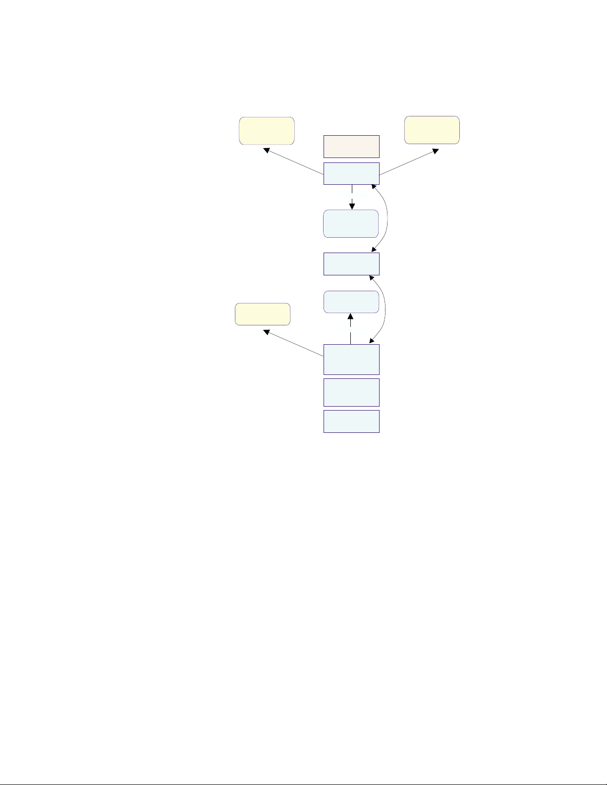
Product structure
The following diagram shows the structure of a typical product that conforms to the
UIA. Make sure that your design conforms to the UIA.
Renderer
architecture
conforms
to
UIA Designers
Model
conforms
to
Platform
Renderer
implements
Common
renderer
interface
Model renderer
Renderable
interface
implements
Exposed
Implementation
Model
Implementation
Model
UIA principles
and guidelines
conforms
to
Business logic
The diagram includes the following elements of a typical product structure:
v A UIA-conforming renderer is used to provide interaction between the system and
the user. It implements the common renderer interface and provides layout that
conforms to the UIA. It is also responsible for such tasks as validating user input
and ensuring that required properties are supplied.
v The model renderer is a key element of the user experience. It controls the
presentation of the exposed implementation model (EIM) to the user and
responds to the user’s actions by applying actions to the business logic through
the EIM. It also accesses the EIM using its renderable interface and the chosen
renderer through its common renderer interface. In addition, it defines the
methods of interaction, such as the choice between the cached and the instant
update of the business logic.
v Business logic is the basic function of any product. The elements of the business
are stored within databases or on other media. The implementation model
represents the software that provides access to the business logic. The first
stage of designing a user interface is to decide the parts of the business to be
exposed to the user. This can be done by creating an EIM that selects the
elements to be presented. By implementing the renderable interface, the EIM
conforms to the UIA designer’s model.
v An EIM provides access to the elements within the business logic with which the
user must work.
4 User Interface Architecture
Page 13
Notational conventions
This section describes the notational conventions used in this document.
Typefaces
The following typefaces are used to indicate emphases throughout this document:
boldface Text in boldface represents table column headings and definition
italics Text in italics indicates an important concept or term that is usually
monospace Text with monospace stands for the name of a menu item, push
Special characters
The following special characters are used to indicate reserved terms for UIA
designers and different types of UIA design guidelines:
small caps
or brackets Terms in
U Guidelines with a check mark are fundamental to creating a user
terms in a definition list.
defined within the same sentence or paragraph.
button, or keyboard key, a sample output, or a sample system
message.
SMALL CAPS or [ ] are reserved for use by the interface
designers, not their users. The term
ACTION CONTROL or [action
control] is an example of the reserved terms.
interface that is compliant with the UIA and its underlying principles.
You must follow these guidelines in your design work.
Diagrams
h Guidelines with a empty box are consistent with the UIA principles,
but not mandatory to creating a user interface. You are strongly
recommended to follow these guidelines for the overall ease of use
of your product.
The following diagrams or graphics are used to represent objects or views and
relationships among objects or views:
Symbolizes an object that is stored by the system and shown
as a rectangle containing the name of the object. A folder, for
example, is an object.
Symbolizes an aggregate relationship in which one object,
such as a folder, contains another object. This relationship is
shown as a line with a diamond at one end and an arrow at
the other. The folder contains zero-or-more objects. If the
folder is deleted, the contained objects are also deleted.
(from examples)
Folder
(from examples)
Folder
0..*
Object
(from UIA)
Introduction 5
Page 14
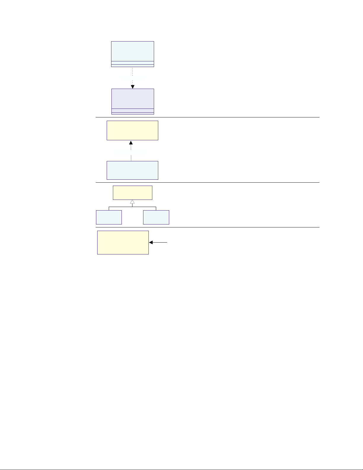
<<View>>
Pointer
moves on
<<View>>
Screen
Symbolizes a depends on or uses relationship in which one
object, such as the pointer, relies on another and is shown
as a dotted line with an arrow. In this example, the pointer
uses the screen.
<<View>>
Icon
(from UIA)
rendered by
Folder
(from examples)
<<View>>
[Action Control]
<<View>>
Menu
<<View>>
Information Area
1..*
<<View>>
Pushbutton
Symbolizes a rendered-by relationship between a view and
the object being viewed. In this example, a folder is rendered
by one-or-more icons.
Symbolizes a subclass relationship in which one object is a
special form of another and is shown as a line with a
triangle. The menu and push button, for example, are both
special forms of
ACTION CONTROL.
Symbolizes a view or mechanism by which the user can
interact with the system. It is shown as an object symbol with
<View> above the name. An information area is an interaction
mechanism.
6 User Interface Architecture
Page 15

Design principles
This section describes the following UIA design principles:
v Affinity: Bring objects to life through good visual design
v Assistance: Provide proactive assistance
v Availability: Make all objects available at any time
v Encouragement: Make actions predictable and reversible
v Familiarity: Build on the user’s prior knowledge
v Obviousness: Make objects and controls visible and intuitive
v Personalization: Enable the user to customize an interface
v Safety: Keep the user out of trouble
v Satisfaction: Create a feeling of progress and achievement
v Simplicity: Do not compromise usability for functionality
v Support: Place the user in control
v Versatility: Support alternate interaction techniques.
Affinity: Bring objects to life through good visual design
v Understand the principles of visual design. The visual design in a user interface
aims to embody all aspects of the UIA principles. It should support the user
model and communicate its functions without ambiguities. It should not be seen
as ″the icing on the cake,″ but an integral part of the entire design process.
v Follow the visual design principles below. These principles promote clarity and
visual simplicity in a user interface:
Subtractive design
Eliminate any visual element that does not contribute directly to
the intended visual communication.
Visual hierarchy
Establish a visual hierarchy of the user’s tasks in the order of
importance. Give extra visual prominence to a critical object. Use
relative position and contrast in color and size to increase the
visual prominence of an object.
Affordance Ensure an object displays good affordance. That is, the user can
easily determine the action to be taken with the object. Objects
with good affordance often mimic those in the real world.
Visual scheme
Design a visual scheme that maps to the User’s Model and
enables the user to customize the interface. Do not eliminate
extra space in an image just to save space. Use white space to
provide visual ″breathing room.″
Assistance: Provide proactive assistance
v Help the user perform a variety of tasks. The knowledge of the system and the
ability to handle a task vary from one user to another. Enable the system to
recognize the ability of an individual user and offer assistance as appropriate.
v Provide assistance in the forms of captions, hints, or system help. The
assistance information should be simple, concise, and task-oriented to allow the
user to complete a task with relative ease and efficiency. It should also be
© Copyright IBM Corp. 2001 7
Page 16

flexible. The system should be able to adapt to the improved capability of the
user and train the user to become independent.
Availability: Make all objects available at any time
v Enable the user to use all objects within a view in any sequence and at any time.
For example, the Open dialog in the Windows platforms allows the user to access
all objects in the view of an open object.
v Avoid using modes in which actions of an interface are no longer available or
cause unexpected results. Modes restrict the user’s ability to interact with the
system. For example, menu-driven systems use the modal dialog box, such as
Print and Save As, for the user to request command parameters, but this modal
dialog tends to lock the user out of the system. The user must complete or
cancel the modal dialog to return to the system, creating tremendous
inconvenience.
Encouragement: Make actions predictable and reversible
v Ensure that an action produces the expected results. Try to understand the
expectations, tasks, and goals of the user. Use terms and images that help the
user understand the objects and their relationships for completing a task.
v Encourage the user to explore the system, try out an action, view the result, and
undo or delete the action. The user feels more comfortable with and confident in
an interface if the featured actions do not cause irreversible consequences.
All user actions, including the seemingly trivial deselection should be reversible.
For example, the user spends several minutes deliberating and selecting
individual files to be archived. It frustrates the user if the selections are
accidentally deselected and the deselection cannot be undone.
v Avoid bundling actions together. The user may not anticipate the impact of
bundled actions. For example, do not group the Cancel and Delete functions
together. If the user chooses to cancel a request for sending a note, only cancel
the Send request; do not delete the note. Make actions independent and provide
mechanisms, such as wizards, to allow the user to combine actions for a certain
use.
Familiarity: Build on the user’s prior knowledge
v Allow the user to build on prior knowledge of the system. A user-friendly system
enables the user to learn new concepts and techniques by accomplishing one
task and apply them to a broad spectrum of tasks. In other words, the user does
not have to learn different techniques to perform similar tasks.
v Employ visual designs and interaction techniques in an interface to represent and
reinforce the user’s experience with other systems for the same platform or
environment. A new interface is easy to understand, learn, and use if the required
interaction techniques are consistent with what the user already knows and
expects. Try to discover and understand the experiences and expectations of the
user before you start your design.
Obviousness: Make objects and controls visible and intuitive
v Use realistic representations in the interface. The objects and concepts in an
object-oriented interface should resemble those in the real world. Whenever
possible, avoid artificial representations of objects.
Trash cans and telephones are good examples of realistic representations. In the
real world, a trash can is a receptacle for people to deposit trash. An object
8 User Interface Architecture
Page 17

shown as a trash can on the desktop speaks volumes of its function; it clearly
identifies itself as a place for the user to discard unwanted objects. The same
effectiveness can be said about a telephone image on a desktop. Based on
real-life experiences, the user instinctively knows that the object is intended for
performing telephone-related tasks.
v Make the controls of the system clearly visible and their functions easily
identifiable. Use visual or textual cues to help users understand functions,
remember relationships, and recognize the current state of the system. For
example, the numbered buttons on the telephone object indicate that they can be
used to key in a telephone number.
v Encourage direct or natural interaction. Enable the user to interact directly with
objects and minimize the use of indirect techniques or procedures. Identifying an
object and performing a task with it, such as picking up the handset of a phone
to answer it, are usually not separate actions in the real world. With direct action
or interaction techniques, the user of an interface does not have to make
explicitly separate selections for actions in a sequence. Real-world 3-D interfaces
are especially conducive to direct interaction.
Personalization: Enable the user to customize an interface
v Enable the user to tailor the interface to individual needs and desires. No two
users are exactly alike; users vary in terms of their background, interest,
motivation, level of experience, and physical ability. Customization helps the user
feel more comfortable with an interface.
Personalizing an interface can also lead to higher productivity and user
satisfaction. For example, allowing users to change default values can save them
time and hassle when accessing frequently-used functions.
v In an environment where multiple users share a single computer, enable each
user to create his or her own ″system personality″ and make it easy to reset the
system. In an environment where a single user uses multiple computers, make
the personalized information portable; the user can ″carry that personality″ from
one system to another.
Safety: Keep the user out of trouble
v Protect the user from making errors. The burden of keeping the user out of
trouble rests upon the designer. An interface should provide visual cues,
reminders, lists of choices, and other aids, either automatically or on request.
Contextual help and agents can deliver supplemental assistance. Help
information should be simple, concise, and task-oriented.
v Do not require the user to memorize information that the system already knows,
such as previous settings, file names, and other interface details. Provide such
information, if available, through the system.
v Enable two-way communication between the user and the system. This active
communication capability allows the user to clarify or confirm a request, correct a
problem, or make task-specific decisions. For instance, a spelling checker, as
designed in some systems, highlights potentially misspelled words while the user
works on the document. This allows the user to either correct a spelling error or
continue the work.
The ability of two-way communication can also help users define their task
objectives. It is not unusual that users know what they want to accomplish, but
find it difficult to describe. The system should be able to recognize the problem,
encourage the user to provide relevant information, and suggest possible
solutions.
Design principles 9
Page 18

Satisfaction: Create a feeling of progress and achievement
v Allow the user to make uninterrupted progress and enjoy a sense of
accomplishment. Report the results of actions immediately; any delay intrudes on
the user’s tasks and erodes his or her confidence in the system. Instant feedback
allows the user to assess whether or not the results meet his or her expectations
and, if not, to take alternative actions immediately. For example, when the user
chooses a new font, the font change to all applicable text should take place
instantaneously. The user can then decide whether or not to retain the change.
v Preview the results of an action so that the user can evaluate them. For
example, if the user wants to use a Helvetica font with the bold and underscore
effects for certain text in a large document, provide a sample with the requested
font change. The user can evaluate the change and decide whether or not to
implement it. In this way, the user does not have to spend time to reverse an
undesirable change.
v Instantly update information as the user makes changes to the system.
Communicate to the user in the event that the results of a refresh cannot be
immediately displayed. This becomes especially important in networked
environments where it is more difficult to maintain the dynamic state between
networked systems. For example, most Web browsers display a completion
percentage in the information area so that the user knows the status of the
page-loading progress.
Simplicity: Do not compromise usability for functionality
v Keep the interface simple and straightforward. The user benefits from intuitive
and usable functions. Make sure that basic functions are apparent to the user
and advanced functions are easy to learn.
v Minimize the number of objects and actions in an interface, but enable the user
to accomplish everyday tasks. Include a function only if a task analysis shows
the need for it.
v Organize the functions for easy access and use. Avoid designing an interface
cluttered with functions. A well-organized interface fades into the background and
allows the user to work efficiently.
Support: Place the user in control
v Give the user control over the system. Enable the user to apply self-defined
procedures to accomplish tasks. Do not impose your own notion of the ″correct″
way of doing things and limit the choices that should be available to the user.
v Ensure that the system permits the user to establish and maintain a constant
working context or a frame of reference. Make obvious the current state of the
system and the actions for the user to perform. If the user leaves the system for
a moment or longer, the state of the system should remain current or stable at
the time of his or her return. This contextual framework contributes to his or her
feeling of stability.
Versatility: Support alternate interaction techniques
v Enable the user to choose an interaction method appropriate for a specific
10 User Interface Architecture
situation. Each interaction device is optimized for certain uses or users, and no
single interaction method is best for every situation. For example, a microphone
with voice-recognition software can be helpful for a fast text entry or in a
hands-free environment, and pen input is helpful for people who sketch.
Page 19

Therefore, an interface with choices of interaction techniques accommodates a
wide range of user skills, physical abilities, interaction approaches, and work
environments.
v Enable the user to switch between methods to accomplish a single interaction.
For example, allow the user to swipe-select with the mouse and adjust the
selection with the keyboard.
v Do not require the user to alternate between input devices to accomplish a single
step or a series of related steps in a task. The user should be able to complete
an entire sequence of task steps with the same input device. For example, it is
tedious and insufficient for the user to scroll with the mouse while editing text
from the keyboard.
v Provide a broad range of interaction techniques for users with different abilities
and in different work environments.
v Increase interaction efficiency by allowing the user to create shortcuts for
frequently-used actions. For example, enable the user to print a document on his
or her default printer by clicking a single button.
v Preview the content of an object when the user selects it. This preview facilitates
the user’s scanning and decision-making.
v Enable the user to group objects based on a variety of task-derived criteria. For
example, the user should be able to group e-mail messages by categories of the
sender, subject matter, and so on.
Design principles 11
Page 20

12 User Interface Architecture
Page 21

Design guidelines
This section describes specific UIA guidelines for designing the following features of
a user interface:
v Controls
v Predefined actions
v Data transfer
v Message handling
v User assistance
v Windows and layouts
v Portfolio
v Accessibility
The UIA guidelines are characterized as fundamental and recommended. You are
required to follow the fundamental guidelines so that your design or product
conforms to the UIA. You are also urged to implement the recommended guidelines
to achieve the overall ease of use of your product.
As described in “Special characters” on page 5, fundamental guidelines are
identified with a U mark and recommended guidelines are prefixed with a h mark.
Controls
Controls are predefined views that provide standard ways for viewing and
manipulating data.
U Provide a control within a view to allow user interactions.
Implementing controls
U Provide a visual indication for a field that requires a user-specified value and a default
value whenever possible.
U Provide a visual indication for a field with an invalid user-specified value. Use hint text
to describe the range of valid values for the field.
h Use a white X symbol placed on a red background to indicate an invalid user-specified
value.
h Use visual cues for the user to distinguish different types of fields on monochrome
screens and ensure that the visual cues are readable to screen readers.
U Use a
© Copyright IBM Corp. 2001 13
CAPTION, such as a label, a column heading, or a window title, of the associated
object or property to identify each control or group of controls.
Page 22
h Instantaneously update a control when the value it represents changes. For example, if
both a slider and an entry field are provided to represent the same numerical value,
immediately change the slider to represent the new value in the entry field.
h Use the controls provided by the operating environment rather than creating new ones.
U Do not change the function, interaction technique, or appearance of a control provided
by the operating environment.
h Automatically adjust the size of a control when a window is resized. For example, make
the entry field longer or shorter as the window is enlarged or shrunk. Set a size
minimum, and when reached, clip, instead of resizing, the control.
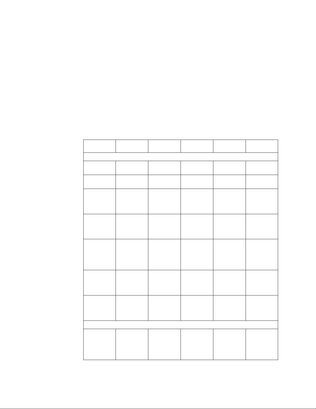
h Use text-entry, non-text-entry, and notebook controls as recommended in the following
table:
Controls
Text-entry controls
Entry field
(single line)
Entry field
(multiple line)
Combo box
(with first
letter
navigation
Combo box
(with type
ahead)
Drop-down
combo box
(with first
letter
navigation)
Drop-down
combo box
(with type
ahead)
Spin button
with an entry
field (or spin
box)
Non-text-entry controls
Push button 1 for each
Number of
choices
Not
applicable
Not
applicable
100 or fewer Variable
1,000 or
fewer
100 or fewer Variable
1,000 or
fewer
20 or fewer Settings
push button;
6 or fewer
choices per
field
Types of
choices
None Alphanumeric Low Text
None Alphanumeric Medium high Text
settings
choices or
objects
Variable
settings
choices or
objects
settings
choices or
objects
Variable
settings
choices or
objects
choices from
an ordered
list
Fixed action
or routing
Shown as
Alphanumeric High Single choice
Alphanumeric Medium high Single choice
Alphanumeric Low Single choice
Alphanumeric Low Single choice
Alphanumeric Low Single choice
Alphanumeric,
graphic
Relative
space used
Low Single
Selection
type
in list and text
in entry field
in list and text
in entry field
in list and text
in entry field
in list and text
in entry field
in list and text
in entry field
14 User Interface Architecture
Page 23

Controls
Number of
choices
Radio button 1 for each
radio button;
Types of
choices
Fixed settings
choices
Shown as
Alphanumeric Medium Single
6 or fewer per
field
Value set 20 or fewer Fixed settings
choices
Alphabetic,
numeric,
graphic
List box Any number Variable
settings
Alphanumeric,
graphic
choices or
objects
Drop-down
list
Any number Variable
settings
Alphanumeric,
graphic
choices or
objects
Check box 1 for each
check box; 6
Fixed settings
choices
Alphanumeric,
graphic
or fewer per
field
Menu bar 6 or fewer Fixed routing
choices
Pull-down
menu
10 or fewer Fixed action
or routing
Alphanumeric,
graphic
Alphanumeric,
graphic
choices
Cascaded
menu
10 or fewer Fixed action
or routing
Alphanumeric,
graphic
choices
Pop-up menu 10 or fewer Fixed action
or routing
Alphanumeric,
graphic
choices
Slider 60 or fewer
visible
Fixed setting
in a range
Numeric,
graphic
increments
Spin button
without an
entry field
20 or fewer Setting
choices from
an ordered
Alphanumeric Low Single
list
Container Any number Objects Alphanumeric,
graphic
Tree Any number Objects
(particularly
Alphanumeric,
graphic
folders)
Notebook controls
Notebook Any number Any (except
another
Alphanumeric,
graphic
notebook)
Relative
space used
Selection
type
Medium Single
Medium-high Single,
multiple
Low Single
medium multiple
Low Single
Low Single
Low Single
Low Single
Low Single
High Extended
High Single
Medium-high As
appropriate
for each
object or
control
Design guidelines 15
Page 24

Predefined actions
Predefined actions are set functions that are often provided on push buttons.
Implementing predefined actions
U Provide the following user assistance mechanisms and define their behaviors through
U Use an action choice for any of the following functions with the predefined label.
the Help menu.
Help menu item Description
Table of contents Opens to the table of contents of the help system
Index Opens to the topic index of the help system
Search Opens to the search engine of the help system
Label Function
Open Shows the default view of an object
Open in new
window
Properties Shows a view of an object that contains the properties of the object
OK For settings, accepts any changes made by the user in the window and
Apply Applies changes to setting choices without removing the window
Reset Restores the saved-state values of the changed setting choices
Cancel Removes the window without applying any changes in the window
Close Removes the window without resetting a process or changing any data
Stop Removes the window without resetting a process or changing any data
Pause Temporarily suspends a process
Resume Continues a process that has been paused by the user
Retry Tries to restart a process that was interrupted by the operating
Continue Resumes a process requested by the user but interrupted by the
Back Returns to the previous page in a browser or in a wizard-styled dialog
Next Moves to the next page in a wizard-styled dialog
Finish Completes in a wizard-styled dialog
Refresh Updates the content display in a view
Reload Refreshes the display of a page in a browser by fetching its content
Help Displays a window containing contextual help information
Opens an object or task in a new window through the menu bar or an
icon shortcut on the tool bar
removes the window; for messages, allows the user to indicate that they
have read the message
environment because of a correctable situation
operating environment
again from the server
U Add an ellipsis (...) to the end of an action name if an action window is used to collect
U Place the Cancel and Help push buttons, if provided, to the right of all other buttons.
16 User Interface Architecture
parameters before the action is started.
Page 25

U Place the OK and Apply push buttons, if provided, to the left of all other buttons.
h Provide a Reset push button whenever you provide an Apply push button.
h Return the saved-state values of the changed settings only in the window where Reset
or Cancel is selected.
U Return the object to the original saved-state when Reset is selected. Changes that
have been previously committed, for example, using Apply or OK, are not reset.
U Do not use both the Close and Cancel push buttons in the same window.
U Use the OK button on property dialogs. Do not use it where a more explicit term is
available. For example, on a dialog for a Print request, use a Print button instead of
an OK button.
h Use standard push buttons and the corresponding functions for the Close choice (on a
system menu), the Enter key, and the Esc key based on the following information.
Window type Push buttons
Object views Any action (e.g.,
print or undo)
1
Settings (in a
cached update
view)
Settings (in an
OK, Apply
Reset
Help
Close, Help Close Close Close
,
2
, Cancel,
immediate
update view)
Action window Window action
name
3
, Cancel
or Close, Help
Progress
indicator
Close, Stop
(optional), Pause
and Resume
(both optional),
Help
Information
OK, Help OK OK OK
message
Warning
message
Action name
(optional),
Continue
3
6
,
Cancel, Help
Close choice
result
Close (with an
optional
message for
Enter key
result
The action with
default
emphasis
saving or
discarding
outstanding
changes)
Cancel (resets
OK Cancel (resets
and closes)
Cancel or
4
Close
Default action
(withdraws the
request)
Close Pause (if
supported;
otherwise
Close)
Cancel (if
supported;
Non-destructive
action
otherwise a
non-destructive
action)
Esc key result
Close (if used,
with an optional
message for
saving or
discarding
changes)
and closes)
5
Cancel or
4
Close
(withdraws the
request)
Stop (if
supported;
otherwise
Close)
Cancel (if
supported;
otherwise a
non-destructive
action)
Design guidelines 17
Page 26

Window type Push buttons
Action message
(general use)
Action message
(simple case)
Notes:
1. Apply is used when the user wants to apply changes to a few of the many
available settings at a time.
2. Both Reset and Apply are provided in the same window.
3. One or more push buttons with the names of the actions must be available.
4. Cancel must remove the action window and return to the window from which the
action was requested.
5. This assignment is optional and provided for a useful, non-destructive action.
6. The window must have at least one action that continues the request and one
action that cancels the request.
7. Use Retry if necessary.
8. Use Cancel if necessary. The affected user data must be returned to its original
state or left in a useful state.
9. The window must have at least two from the set: ″[Action],″ Retry, Cancel.
10. Yes or No represents an action.
Action name
(optional),
7
, Cancel8,
Retry
9
Help
10
Yes, No
, Help Choice of Yes or
Close choice
result
Cancel (if
supported;
otherwise a
non-destructive
action)
No (does not
lose data)
Enter key
result
Retry (if
supported;
otherwise a
non-destructive
action)
Choice of Yes or
No (does not
lose data)
Esc key result
Cancel (if
supported;
otherwise a
non-destructive
action)
Choice of Yes or
No (does not
lose data)
Data transfer
Data transfer refers to the transmission of data from one object to another. Data
transfer operations include clipboard operations, such as Cut, Copy, and Paste, and
direct manipulation techniques, such as dragging.
h Do not change the date or the selected-state emphasis when the user selects and
copies data.
h If the source and target objects are of different types, add, insert, or combine the
source object into the target object or group of objects.
U Transfer both a simple container, such as a folder, and its content when the container
is dragged as a data transfer operation. For example, when the user moves or copies a
folder to another container, move or copy both the folder and its content to the
receiving container.
Providing direct manipulation
Direct manipulation is a set of techniques that enable the user to drag an object
with a pointing device, interact with its pop-up menu, or make direct alterations,
such as changing its name.
U Provide direct manipulation for all objects represented by icons in the work or navigator
area.
18 User Interface Architecture
Page 27

h Provide direct manipulation for as many items as possible. For example, enable direct
manipulation for text.
U Supply direct manipulation techniques other than drag and drop. For example, make it
possible to move items using cut and paste techniques. Provide alternative direct
manipulation techniques as described in “Accessibility” on page 30.
Implementing direct manipulation
U Cancel a direct manipulation operation if the user presses the Cancel (Esc) key or
drops an object onto its current position.
h Avoid changing the input focus (cursor position) as a result of a direct manipulation
operation.
U Do not change the status of an active window when a direct manipulation operation is
performed.
h Provide contextual help for a direct manipulation operation.
U Enable the user to display contextual help, if provided, about a direct manipulation
operation by pressing the Help button.
h Enable the user to transfer data through direct manipulation. For example, when the
user drags a document to a printer, prepare and schedule the document for print.
U Display the target emphasis on the target object and change the pointer when it is over
U Display the source emphasis, as defined by platform-specific conventions, on the target
U Display source emphasis, as defined by platform-specific conventions, on the source
h Enable the user to override the default of data transfer by pressing a set of keys,
Message handling
Messages are displayed in a window, responding to an unexpected event, such as
an error, or providing additional information on the status of a process. There are
three types of messages: information messages, warning messages, and action
messages.
the object. In this case, the target object is in a state to receive data as a result of a
direct manipulation operation, but cannot receive the object being directly manipulated.
For example, change the pointer to the ″do-not″ pointer.
object when it is in a state to receive data as a result of a direct manipulation
operation.
object during a direct manipulation operation.
including the following, during a direct manipulation operation.
Operation name Key set
Move Shift + Mouse manipulation button
Copy Ctrl + Mouse manipulation button
Link, shortcut Ctrl + Shift + Mouse manipulation button
Design guidelines 19
Page 28

h Use a message to report unexpected or undesirable situations.
h Display a message to indicate the successful completion of a process and to provide
additional information about the status of the completion.
Implementing message handling
U Display a warning message to indicate that an undesirable situation in a process could
occur but the user can choose to continue.
U Display an action message to indicate that a condition has occurred and the user must
correct the situation and retry, choose an alternative action, or withdraw the request.
U Display an urgent action message to indicate that a condition has occurred in a
process which has not been stopped and the user must correct the situation
immediately and retry, choose an alternative action, or withdraw the request.
U Display an information message to indicate that a condition beyond the user’s control
has occurred or that the user must see additional information about the status of a
completed process.
h Display a message in the progress indicator window to show the completion stage of a
process. For example, show Printed page 12 of 40 during a printing job.
U Display a busy-pointer over a view when a process starts. Restore a normal pointer
when the process completes or when the user is allowed to interact with the view
again.
U If the busy-pointer is shown for 2 seconds or longer, display the status information
about the process with a progress indicator.
h Use the following categories of progress indicators according to your design need.
Category Use when Display Control Comments
Normal
processing
Pointer change System
Expected system
response time is
<0.5 second
response time
may be slightly
delayed;
estimated time is
0.5 –>2
seconds
N/A N/A No special need
Display
hour-glass
pointer on the
affected object
or window; do
not disable
non-affected
components
Non-modal;
allow the user to
work on other
tasks
Non-modal wait
or ready pointer
preferred;
usually used for
local processing,
such as console
operations or
user actions that
do not require
extensive data
refresh or update
20 User Interface Architecture
Page 29

Category Use when Display Control Comments
Information area
indicator
System
response time
may be >2
seconds; other
operations can
continue as the
processing
completes; the
user can use the
primary console
and secondary
dialogs
Display
hour-glass
pointer on
affected objects
or windows;
display indicator
in the
information area;
choose one of
three progress
indicator types
based on status
Provide Stop and
Refresh buttons,
if possible, to the
user
Only show the
Stop button if
available
information
available to the
program
Status displayed in the primary
window
1 or fewer
tables; show the
status indicator
in the console
information area
Move the Stop or
Refresh buttons
to the Tool bar;
do not show the
buttons next to
the control
2 or more tables
in the primary
window; show
status indicators
at the bottom of
each table
If more than one
component is
displaying status,
provide menu
and toolbar
choices on
active the active
components
Status displayed in the secondary
window
Place status
indicators and
the Stop control
in the status
area across the
If a Refresh
button is
provided, place it
as a push button
on the dialog
bottom of each
dialog
Dedicated
process window
Processing
prevents the
user from
performing
Dedicated
process window
with a progress
indicator
Dedicated
process window
with Stop and
Close buttons
normal
operations;
complex
operations may
take several
minutes to
complete
U Phrase a message clearly and concisely so that the user can easily understand the
cause of a situation and, if necessary, quickly take corrective actions.
Design guidelines 21
Page 30

h Avoid phrasing a message for a Yes or No response from the user. For example, do not
use the message, ″Are you sure you don't want to save the file?″ Instead, use
″File has been modified. Select 'Discard Changes' to ignore changes or select
'Save Changes' to save changes.″ If push buttons are used for Yes and No responses,
avoid using negatives in the message text.
h Provide access to Help information from each message window through a Help push
button or a symbol defined by platform-specific conventions.
h Display a message for an associated window in a secondary window.
h Augment the icon of an object with a short version of the message symbol if no
associated window is open for which a message must be displayed. For example, if a
note cannot be successfully sent and no associated window is open, augment the mail
basket icon with an appropriate message symbol, such as an i or ?.
h Augment the container with a small version of the message symbol if no associated
window is open for which a message must be displayed and the object’s icon is
currently not visible. For example, if an object’s icon is contained in a currently visible
folder, augment the folder’s icon with an appropriate message symbol. If the folder’s
icon is not visible, augment the work area’s icon with an appropriate message symbol.
h Determine an appropriate symbol for a specific type of message. Display a message
symbol to the left of the message text.
Message Symbols
Symbol
Classification
Information
Warning
Windows
UNIX
Swing
!
Action
Urgent Action
h Include in the window title the name of the object and the action or situation that
caused the message to appear. For example, ″Drive A: - Format Diskette″ as a
message title may be displayed during a format operation.
h Make messages as modaless as possible. For example, if a message is associated
with an entry field in a window, make the message modaless for the user to enter data.
?
h Place a message identifier, if provided, in the bottom rightmost corner of the message
h Use additional modalities to alert the user to an action message, particularly when
22 User Interface Architecture
and display it in a font smaller than that for the message text.
immediate attention is required. For example, sound an alarm or send a message to a
vibrating pager.
Page 31

User assistance
h When using additional modalities to alert the user, follow platform-specific settings to
allow the user to change or disable these modalities.
User assistance refers to the alphabetic, graphic, or audible element that helps the
user to perform a task.
U Provide contextual help for each choice or object on which the cursor can be
positioned.
U Describe in contextual help why a choice, displayed with unavailable-state emphasis, is
unavailable and how the user can make it available.
U Display contextual help, if provided, when the cursor is on a choice or object and the
user presses the Help key designated by the implementation platform.
U Provide access to a Help index from every Help window.
h Follow the indexing conventions for IBM publications to create a Help index. Arrange
index entries in a hierarchical order.
h Provide synonyms for each Help index entry.
U Allow the user to search the Help index by specifying search criteria. For example,
provide a Search routing choice in a menu or on a push button.
h Do not include the phrase ″Help for″ in index entries.
U Provide a Help choice in the menu bar of a window.
h Allow the user to launch Help into a separate window by selecting the Open in new
window command.
U Provide a Help choice in any window which is modal, preventing the user from
accessing other application windows.
h Place a Help choice on a push button in a window that does not have a menu bar or in
a window, such as a browser, in which the menu bar is not available to the product.
Help
U Do not change the state or appearance of an object on which the user is requesting
assistance by selecting a Help choice or pressing the Help key. For example, do not
select the check-box choice if the user is requesting help about that choice.
U Reuse help and message text exactly. Text variations may cause confusion.
?
U Use simple, concise screen text or instructions so that the user does not have to
request assistance for clarification.
h List all key assignments in the Help for the window and indicate to the user the keys
that are available in the current state of the window.
Design guidelines 23
Page 32

h List shortcut key assignments in the Help menu. If the user adds or changes key
assignments, list the new or changed assignments in the Help menu.
U Provide links to wizards or other types of assistance to help the user complete a task.
Whenever necessary, refer the user to additional resources through document links.
U Provide a short hint text for each control. The hint text should be a declarative phrase
that answers such questions as ″Why is this field needed?″ or ″What type of values
can be entered in this field?″
h When the cursor is on a control, display the hint for the control in the information area.
h When the pointer pauses over a control for a short time, display the hint for the control
in a popup window.
U Provide a wizard to assist the user in completing a less frequently-performed task, such
as partitioning a hard drive.
U Use the same caption for an element that appears in both the wizard and elsewhere in
the interface.
h Ensure that the user has access to the wizard from the Help menu for the interface.
h Provide default values, when applicable, for all elements of a wizard.
U Do not require the user to visit all the pages in a wizard if default values are provided.
Ask the user to visit only those pages with elements that require user input.
U Place Back, Next, Finish, Cancel, and Help push buttons on all pages of a wizard. Use
unavailable-state emphasis for those push buttons that do not apply. For example,
show the Back button with unavailable-state emphasis on the first page.
Renting a car
Choose a car
Select the car you require
Class of car required
Step Caption
Step Hint
Economy
Compact
Choice
Mid-size
Full-size
Van
Automatic
Manual
No preference
Original
Help
Area
Caption
Type of transmission
24 User Interface Architecture
Back
Next
Finish
Cancel
Help
Page 33

h Show the help for the current element in the optional Help area of the wizard.
h Show the hint for the current step just below the step caption area of the wizard.
U Do not require the user to memorize information for one step of completing a task and
apply it for the next in a wizard-assisted sequence. Whenever necessary, repeat the
information for the user to move through the sequence with ease.
Windows and layouts
A window is a visible area with defined boundaries within a screen. A window
presents a view of an object and allows the user to interact with a computer
system.
Implementing windows and layouts
h Size and lay out a window so that the user does not have to scroll to see its entirety.
h Position the most important information in the left side of a resizable window for
prominent display. For example, place the object’s identifier as the leftmost element in
the window title. An application window clips in the right side when the user adjusts its
size; shrinking the window often hides the information in the right side.
h Place controls of less frequent use out of the view if the initial size of an action window
is not large enough to display all the controls.
h Ensure a logical or natural break between the visible and hidden portions of a large
window. For example, avoid clipping an entry field with a portion hidden from the initial
view.
h Clearly indicate the hidden information, if any, to the user. For example, show scroll
bars.
h Left-align all the controls within a column to the right of the longest field prompt.
h Provide the user with the option to scale or clip the scalable content within a resizable
window.
U Follow platform-specific conventions for the alignment and order of push buttons. For
example, left-align push buttons in a browser-based application at the bottom of the
page or window. Left-align push buttons in a Windows-based or GUI-based application
at the bottom of the window.
h For applications with a large number of similar dialogs or pages, place dialog-specific
push buttons to the right of those that appear on all dialogs or pages.
U For applications running within MMC, repeat the actions from any push button in the
Action menu.
h Avoid arranging push buttons in more than two rows.
U Place push buttons at the bottom of the window if they affect the entire window.
h Place a push button next to a component that is adjusted by, or associated with, the
action of the push button. For example, if a push button restores the initial value in an
entry field, place the push button beside that entry field.
Design guidelines 25
Page 34

h Avoid using a push button to change the size of a window; instead, allow the user to
resize the window using the size borders or the Maximize push button. For example, do
not provide a push button labeled More>> for the user to enlarge a window.
U Keep push buttons visible if they affect the entire window that can be scrolled vertically.
Allow the user to scroll to the area above the push buttons. For example, place push
buttons in a browser-based application on a bar at the bottom of the window.
h Use a notebook to organize groups of controls if they do not fit in a single window.
Avoid placing related controls in separate windows connected by routing choices on
push buttons.
Edit
^
^
Print EitxCreate
Update user
Reset
Cancel
Ready
h Right-align field prompts next to left-aligned entry fields in a high-volume data entry
window. The alignments create a narrow vertical column of space between the field
prompts and the entry fields. This space helps the user quickly scan the choices in the
window.
h Enable the user to adjust the size of each column in a window, as appropriate. For
example, provide column borders for the user to resize a column.
U Ensure that the width of a column, if not adjustable, is slightly greater than the length
of the column heading or items.
h Make a column, with an adjustable width, initially wide enough to display choices
allowed by the average column width.
h Enable the user to directly manipulate each column if the order of columns can be
changed. For example, allow the user to drag headings to reorder the columns in the
table or click headings to sort the data in the columns.
U Group controls in a window. For example, group the controls associated with the
recipient of a memo.
U Use white space and indentation to group controls. For example, group the controls
26 User Interface Architecture
To
Name
Organization
Phone Number
Fax Number
associated with the recipient of a memo under ″To ″ and indent them 2–3 characters
from the left margin.
Page 35

h Use a group box only when a group heading or white space does not visually
distinguish groups of fields in a window.
h Avoid using a group box around a field of push buttons or a single field. For example,
do not use a group box around a single list box.
h Place an information area, if provided, at the bottom of a window.
h Place an information area below the scroll bar and above the window border.
h Place a status area, if provided, between the title bar or the menu bar, if available, and
the rest of the window. For example, place a status area below the menu bar and
above column headings in a window.
h Provide a mnemonic for each choice in a window.
U Select a push button when the user presses the Alt key and types in the mnemonic
assigned to that push button.
U When the cursor is positioned on one of the push buttons in a group, allow the user to
select that push button by pressing the mnemonic character without the Alt key.
U When the user presses a key to move the cursor for selecting a choice in a field, place
the cursor on the selected choice; otherwise, place the cursor on the first choice or the
default choice.
U Place the cursor on the default push button when the user presses the Tab or Backtab
key to move the cursor to a group of push buttons. In browser-based applications,
make sure that the default button is the one where the browser normally starts.
U When the cursor is on a push button and the user presses the Tab or Backtab key in
non-browser-based applications, move the cursor to the next field in the window, not
another push button in the same field.
h Move the cursor between the fields, from left to right and top to bottom, in the window
when the user presses the Tab key. Move the cursor to the top leftmost field in the
window when the cursor is on the bottom rightmost field and the user presses the Tab
key. Note that the cursor movement is implemented by the browser in browser-based
applications.
U Move the cursor between the fields, from right to left and bottom to top, in the window
when the user presses the Backtab key. Move the cursor to the bottom rightmost field
in the window when the cursor is on the top leftmost field and the user presses the
Backtab key. Note that the cursor movement is implemented by the browser in
browser-based applications.
U Reset to the default push button when the cursor is moved away from a field of push
buttons. For example, if the user moves the cursor away from the OK push button (the
default) to the Help push button and then to a field of radio buttons, reset to the OK
push button.
h Do not implement unavailable-state emphasis for browser-based applications; continue
to display choices or fields.
h Enable the user to interact with a field that is displayed with unavailable-state
emphasis. If the user changes a setting to make the field available, apply the content
of that field.
Design guidelines 27
Page 36

h Always provide product identification information. Include the product identification at
the top left of the navigation area in browser-based applications. For applications with
menu bars, provide the product identification through the About choice on the Help
menu.
h Use the following fonts or font families for textual elements on a Web page:
v Arial or Helvetica, usually the default sans-serif font of a system, for messages and
navigation and orientation elements, such as labels and titles.
v Times New Roman, usually the default serif font of a system, for such elements as
task descriptions, entry field labels, tips, and introductory text.
When providing graphical user interfaces on such platforms as Windows, use the fonts
selected by the user in the control panel.
h Provide a splitter bar for the user to adjust the width or height of a pane within a
window.
U When the user moves the pointer over a splitter bar, change the pointer to a horizontal
or vertical arrow to indicate that the user can slide the bar to resize a pane.
U Provide a Task bar on the bottom of the console and a Window menu on the Menu bar
if the console supports multiple active tasks at the same time.
U List or display of all active tasks on the Task bar and the Window menu on the Menu
h Truncate each task title and add an ellipsis (...) as more tasks are listed on the Task
U Enable the user to easily switch between tasks by clicking on a task on the Task bar or
h Provide a Close shortcut (x) next to the title of each task on the Task bar.
28 User Interface Architecture
bar in the order as each task is opened.
bar. Display the full title of each task as the user moves the mouse over each
truncated task title.
selecting from the Window menu on the Menu bar.
Page 37

Portfolio
U Provide a Close all tasks option on the Window menu or on the Task bar. Provide a
confirmation dialog before closing all active tasks.
U Do not place document links in the caption or other text between the fields of a form in
browser-based applications. Placing a document link in the caption of a form, for
example, may cause the Tab or Shift-Tab key to behave in an unexpected manner.
U Provide the following items through the Context menu for each task on the Task bar:
Context menu item Description
Show task Displays a task in the console (the task window becomes active)
Close task Closes a task after confirmation from the user
Open in new window Starts a new console window for the selected task and removes
the selected task from the existing console
A portfolio is a customizable view area that displays role-based and category-based
tasks. The content of the task list varies depending on the roles that the
administrator has assigned to a user.
A portfolio is not intended as a navigation mechanism; it is designed for the user to
initiate, perform, and manage tasks in an efficient manner. You can include a
portfolio as an optional feature of your design.
Implementing portfolio
h Provide a portfolio on the left side of the console for the user to manage, initiate, and
conduct frequently-performed tasks.
U Make a portfolio pane retractable by allowing the user to open or close it. By default,
the portfolio is locked open.
Design guidelines 29
Page 38

U Enable the user to close the portfolio by clicking on the Close icon (X)onthe
upper-right corner of the portfolio pane.
U Enable the portfolio in transient state to automatically close after the user selects a
task.
U Provide a portfolio handle on the left edge of the console window after the user closes
the portfolio. The user can reopen the portfolio by left-clicking on or simply moving the
mouse over the handle. In this case, the portfolio is in transient state.
U Allow the user to lock open the portfolio by clicking on the push-pin icon on the
upper-right corner of the transient portfolio pane.
U Enable the user to customize the portfolio based on assigned roles.
U Provide meaningful category headings for the user to organize and group tasks.
h Use the right-pointing triangle to represent a collapsed or closed task group and the
upside-down triangle to indicate an expanded or opened task group.
U Replace the push-pin icon with a Close icon on the upper-right corner of the portfolio
pane after the user locks open the portfolio.
Accessibility
Accessibility is the capability of an application that makes all information and
technology accessible to users with disabilities.
For comprehensive accessibility guidelines and checklists, visit the IBM Accessibility
Center at the following Web address:
http://www.ibm.com/able/guidelines.html
Implementing accessibility
U Use the ALT="text" attribute for all visual aids, including graphics, tables, and charts,
and concisely describe their functions.
h Use the ALT="text" attribute for visuals that do not convey important information or
convey redundant information.
h Clearly associate form labels with the corresponding elements.
h Define the content of a Web page in terms of its function and control the presentation
with cascading style sheets.
h Use character sizes rather than pixels to design and size the layout of a window. The
user can change the size of characters on a Web page, but not the number of pixels,
for specific viewing needs.
h Summarize the content of a graphic or chart or use the Longdesc attribute to link to the
U Provide a title for each frame so that the user can track frames by their titles.
30 User Interface Architecture
description or data.
Page 39

U Use a descriptive text for links; avoid just saying Click here or Go.
U Update the descriptions and text alternatives as you change the dynamic content of a
Web page.
h Use the header, caption, and summary attributes for tabular data. Use the ID, row,
column, or group attributes to enhance cell-by-cell reading.
U Do not rely solely on colors to convey information to the user.
h Ensure that the screen does not flicker.
Design guidelines 31
Page 40

32 User Interface Architecture
Page 41

Notices
This information was developed for products and services offered in the U.S.A.
IBM may not offer the products, services, or features discussed in this document in
other countries. Consult your local IBM representative for information on the
products and services currently available in your area. Any reference to an IBM
product, program, or service is not intended to state or imply that only that IBM
product, program, or service may be used. Any functionally equivalent product,
program, or service that does not infringe any IBM intellectual property right may be
used instead. However, it is the user’s responsibility to evaluate and verify the
operation of any non-IBM product, program, or service.
IBM may have patents or pending patent applications covering subject matter
described in this document. The furnishing of this document does not give you any
license to these patents. You can send license inquiries, in writing, to:
IBM Director of Licensing
IBM Corporation
North Castle Drive
Armonk, NY 10504-1785
U.S.A
The following paragraph does not apply to the United Kingdom or any other
country where such provisions are inconsistent with local law:
INTERNATIONAL BUSINESS MACHINES CORPORATION PROVIDES THIS
PUBLICATIONS ″AS IS″ WITHOUT WARRANTY OF ANY KIND, EITHER
EXPRESS OR IMPLIED, INCLUDING, BUT NOT LIMITED TO, THE IMPLIED
WARRANTIES OF NON-INFRINGEMENT, MERCHANTABILITY OR FITNESS FOR
A PARTICULAR PURPOSE. Some states do not allow disclaimer of express or
implied warranties in certain transactions, therefore, this statement may not apply to
you.
This information could include technical inaccuracies or typographical errors.
Changes are periodically made to the information herein; these changes will be
incorporated in new editions of the publications. IBM may make improvements
and/or changes in the product(s) and/or program(s) described in this publication at
any time without notice.
IBM may use or distribute any of the information you supply in any way it believes
appropriate without incurring any obligation to you.
Information concerning non-IBM products was obtained from the suppliers of those
products, their published announcements or other publicly available sources. IBM
has not tested those products and cannot confirm the accuracy of performance,
compatibility or any other claims related to non-IBM products. Questions on the
capabilities of non-IBM products should be addressed to the suppliers of those
products.
© Copyright IBM Corp. 2001 33
Page 42

Trademarks
IBM is a registered trademark of International Business Machines Corporation in the
United States, other countries, or both.
Java and all Java-based trademarks are trademarks of Sun Microsystems, Inc. in
the United States, other countries, or both.
Microsoft, Windows, Windows NT, and the Windows logo are trademarks of
Microsoft Corporation in the United States and other countries.
UNIX is a registered trademark of The Open Group in the United States and other
countries
Other company, product, and service names may be trademarks or service marks
of others.
34 User Interface Architecture
Page 43

Glossary
This glossary defines the terms and concepts
used or referenced in the UIA.
A
accessibility. The capability of an application that
makes all information and technology accessible to
users with disabilities
ACTION CONTROL. A control, such as a push button or
menu, for immediately processing a user request or
applying new settings to an object.
action message. Information that indicates that a
condition has occurred and the user must correct the
situation by retrying, choosing an alternative action, or
withdrawing a request.
application element. An element in the view that is
created by the application.
C
CAPTION. A short text that identifies a field, such as an
entry field or a field of check boxes.
clipboard. A data storage area used for transferring
information within an object or between objects. A
clipboard is typically provided by the operating
environment.
combination box. A control, often referred to as a
″combo box,″ that combines the functions of an entry
field and a list box. A combination box contains a list of
objects for the user to scroll and select for completing
the entry field. Alternatively, the user can type input
directly into the entry field.
<<view>>
Console
console. A visual integration mechanism that provides
common actions applicable to the objects it manages.
CONSOLE navigator area. A view used to find objects
available to the user within a console. The
CONSOLE
navigator generally contains the views of objects,
favorites, and tasks for the console.
CONSOLE work area. The area of a console used to
display the views of the objects identified in the
CONSOLE
navigator area. Any available view of an object,
including icons, controls, or application elements, can
be displayed in the
CONSOLE work area. It is through
these views that the user creates, modifies, or inspects
any available object.
CONTAINER. An object for holding other objects. A folder
is an example of a container.
control. A visual user interface component that allows
the user to interact with data. Typical controls are push
buttons, radio buttons, notebooks, and entry fields.
Controls are often identified by text, such as headings,
labels in push buttons, field prompts, and titles in
windows.
<<View>>
[Control]
<<View>>
[Action Control]
<<View>>
Menu
<<View>>
List Box
<<View>>
Pushbutton
<<View>>
Check Box
<<View>>
[Setting Control]
<<View>>
Tree [View]
<<View>>
Radio Button
<<View>>
[Navigation Controls]
<<View>>
Scroll Bar
<<View>>
Entry Field
<<View>>
Notebook
<<View>>
Combo Box
1
<<View>>
[Console]
Navigator Area
1..*
<<View>>
[Console]
Work Area
switches
to
<<View>>
Task Bar
control box. A square box with associated text to
represent a
BINARY choice that toggles on and off. An ″X″
or ″a″ appears in the box if the user selects the control.
The user can cancel the selection by selecting the
control again.
conventions. Specific, widely accepted, or prescriptive
practices, typically in support of a set of guidelines and
principles. Conventions spell out the design details of a
user interface, such as the number of pixels for an
image. In fact, conventions are generally so specific and
base for
<<View>>
Tree [View]
(from Controls)
1 1..* 1..*
rendered by
<<View>>
Icon
(from UIA)
rendered by
<<view>>
View
(from UIA)
rendered by
understandable that they do not require any
Root
(from examples)
Folder
(from examples)
Object
(from UIA)
0..*0..*
interpretation on your part.
copy. An action choice for copying a selected object
onto the clipboard.
© Copyright IBM Corp. 2001 35
Page 44

cursor. A visible indication of the position where the
user interacts with the keyboard. The keyboard cursor
can be either the selection cursor or the text cursor.
cut. An action choice for removing a selected object
and placing it onto the clipboard.
D
data entry field. A specialized version of an entry field
with specific requirements for the input. For example, a
data entry field may restrict the input value to be
numeric or in a fixed pattern, such as a date or a
telephone number.
data transfer. The transmission of data from one
object to another, including clipboard operations, such
as Cut, Copy, and Paste, and direct manipulation
techniques, such as dragging.
E
entry field. A control, with clearly-defined boundaries,
for the user to enter certain data.
EIM. Exposed Implementation Model.
F
FAVORITES LIST. A list of stored objects that the user has
identified for frequent use.
favorites view. A view showing objects that the user
has identified for frequent use. The user can add any
object in the console to the favorites list.
file. A data object stored by the system. The file menu
provides access to action choices related to the current
file.
also be a graphical or audible element.
rendered by
(from RenderableInterface)
1..*
(from RenderableInterface)
(from RenderableInterface)
[Renderable]
[Caption]
(from RenderableInterface)
[Hint]
rendered by
[Hint]
rendered by
<<View>>
[Platform Help System]
<<View>>
[Quick Help View] Tool Tip
<<view>>
View
Help is available when the user requests it through
standard Help mechanisms. For example, on Windows,
the user can access to Help by pressing the Help key
(F1) or selecting a choice from the Help menu.
HINT. A simple sentence that describes the function of
an object or attribute. Hint help is available when
requested. However, it may automatically be displayed.
For example, hint text may be shown as a tool tip,
hover help, or a message in the information area of a
window.
I
icon. A graphic representation of an object, consisting
of an image, the background of the image, and a label.
information area. A part of the [console] work area for
displaying messages associated with the object or task
within the work area.
information message. Information that indicates that
a condition beyond the user’s control has occurred or
that the user must see additional information about the
status of a completed process.
folder. A container used to hold and organize objects.
Typically, a folder contains files and folders.
G
guidelines. Specific courses of action, based broadly
on a set of principles. Guidelines can be construed as
good practices within a general design domain, such as
Windows GUI or Java Swing. They are generally more
specific than principles and require less design
knowledge and experience on your part to understand
and interpret them.
H
HELP. One or more short paragraphs that explain in
detail the function of an object or attribute. Help can
36 User Interface Architecture
L
list box. A control that contains a list of objects or
settings controls for the user to select.
M
menu. A list of choices applicable to an object. A menu
may contain actions, settings, or both.
menu bar. A menu that contains choices for access to
pull-down menus.
message. Information displayed in a window
responding to an unexpected event, such as an error, or
providing additional information on the status of a
process. There are three types of messages:
information messages, warning messages, and action
messages.
Page 45

mouse. A commonly-used pointing device with one or
more buttons for the user to interact with a computer
system.
N
NAVIGATION CONTROL. A control that allows the user to
adjust a view or present a new view. Navigation controls
do not cause changes to the objects. Tree views,
notebooks, and scroll bars are all navigation controls.
notebook. A graphical representation of a tabbed
page in a notebook. Tabbed divider pages separate the
sections of the notebook.
O
object. A user interface component that enables the
user to perform a task. An object can appear as text or
an icon.
objects view. The main component of the navigator.
An objects view is based on the root object for the
console. The objects are displayed in a tree view. The
icons in the tree view represent the folders, files, and
resources that the user is administering.
The user selects an object from the views in the
navigator, and a view of that object is generated in the
work area. If the user subsequently selects another
object, the view for the new object replaces the current
one in the work area. The user then has an option to
start a new console with the selected object in the
navigator as its root.
pointer. A visible cue, typically in the shape of an
arrow, indicating the position of a pointing device. The
shape of the pointer changes as the user moves it for
special functions, such as sizing a window, positioning
the text cursor, or following a hyper-link.
pointing device. A device, such as a mouse, trackball,
or joystick, used to move a pointer on the screen.
pop-up menu. A menu that, when requested, is
displayed next to the associated object. A pop-up menu
contains choices appropriate for a given object or set of
objects in the current context. It is therefore also
referred to as a context menu or contextual menu.
portfolio. A customizable view area that displays
role-based and category-based tasks.
predefined actions. Set functions that are often
provided on push buttons.
principles. Fundamental ideals and beliefs that guide
your decision-making and courses of action in achieving
a predefined goal. Principles are fairly abstract. You
must have extensive interface design knowledge and
experience to understand and interpret them.
pull-down menu. A menu extended from a selected
choice on a menu bar or from the system menu symbol.
The choices in a pull-down menu are related in some
manner.
push button. A button, labeled with text, graphics, or
both, that represents an action to be initiated by the
user.
P
paste. An action choice for copying the content of the
clipboard and placing it into a target object.
<<View>>
Input
<<View>>
Pointing Device
<<View>>
Pointer
moves on
<<View>>
Screen
<<View>>
Keyboard
is represented byis represented by
<<View>>
Cursor
moves within
<<View>>
Screen
is delivered to
R
radio button. A button, often shown as a circle with
text beside it. Two or more radio buttons are usually
combined to represent a fixed set of choices. The user
can only select one choice. If selected, the circle
representing the choice becomes partially filled.
RENDERABLE ATTRIBUTES. The primitive data values
associated with a
RENDERABLE ATTRIBUTE is associated with a RENDERABLE
ATTRIBUTE TYPE
the values allowed for the former.
RENDERABLE OBJECT. The entities for the user to
manipulate. R
in the interface. For example, a file is a
object in most operating systems.
RENDERABLE OBJECT by name. Each
, with the latter representing a constraint on
ENDERABLE objects appear in many places
RENDERABLE
Glossary 37
Page 46

RENDERABLE OPERATION. An action that the user may
choose to invoke upon the
[Renderable]
RENDERABLE OBJECT.
U
user assistance and help. Textual, graphical, or
audible elements that describe the functions or
properties of an object and help the user perform a
task. It includes
CAPTION, HINT, and HELP.
[RenderableModel]
0..*
[RenderableOperation] Action
[RenderableObject] Object
0..*
0..*0..*
[RenderableAttribute] Property
0..*
1
[RenderableAttributeType]
root. A base object for a group of objects organized by
a console.
S
screen. The physical surface of a display device upon
which information is shown to the user.
SETTING CONTROL. A control that sets or displays the
characteristics of an object. Typical setting controls
include check boxes, list boxes, radio buttons, entry
fields, and combo boxes.
is displayed
on
<<View>>
Window
0..*
<<View>>
Screen
V
view. An interactive element that facilitates the
interaction between the system and the user. A view
may be visual or multimedia-based, such as an audio
stream through a telephone.
W
window. A visible area with defined boundaries within
a screen. A window presents a view of an object and
allows the user to interact with a computer system.
contains
<<view>>
View
0..n
T
task. A facility, such as a procedure or wizard, that
helps the user complete a piece of work.
task bar. An interactive elements that contains
shortcuts to all active tasks. The user can easily
navigate from one task to another through the task bar.
task view. The representation of a procedure for the
user to complete a task.
tree
VIEW. A control for a hierarchical display of a group
of related objects.
38 User Interface Architecture
Page 47

Index
Special Characters
ALT attribute 30
A
accessibility 30
action
choices 16, 17
menu 25
message 18, 20
window 16
affinity
affordance 7
subtractive design 7
visual hierarchy 7
visual scheme 7
affordance 7
alarm 22
assistance
captions, hints, system help 7
tasks, performing 7
availability
objects in sequence 8
use of modes, avoiding 8
B
bar, menu 15
benchmark assessment 2
box, check 15
box, combo 14
box, list 15
business logic 4
busy-pointer 20
button, push 14
button, radio 15
button, spin 14, 15
C
caption 14, 24
cascaded menu 15
cascading style sheets 30
character sizes 30
check box 15
check-box choice 23
column heading 14
column width 26
combo box 14
combo box, drop-down 14
common renderer interface 4
competitive evaluation 2
completion of a process 20
consistency
design 1
ease of use 1
container 15, 18
contextual help 19, 23
controls
providing 13
current state of the window 23
D
data transfer
direct manipulation 18
default value for a field 13
design and walk-through 2
design considerations
designer’s model 2
implementor’s model 2
platforms or enabling environments 3
product structure 4
UCD process 2
user’s model 2
writing systems 3
designer’s model 2, 4
direct manipulation
canceling 19
implementing 19
providing 18
techniques 19
directionality 3
drop-down combo box 14
drop-down list 15
E
edition notice ii
elements of a wizard 25
ellipsis 16
enabling environments 1
guidelines
Java 3
UNIX 3
Windows 3
ISO/IEC standards 3
encouragement
interfaces, exploring 8
user’s expectations and goals, understanding 8
entry field 14, 22, 25
evaluation and validation 2
exposed implementation model 4
F
familiarity
prior knowledge of the system 8
user-friendly system 8
visual designs and interaction techniques 8
field prompt 25
field, entry 14
fonts for textual elements 28
form labels 30
© Copyright IBM Corp. 2001 39
Page 48

fundamental guidelines 13
G
group box 26
grouping the controls 27
guidelines
accessibility 13, 30
controls 13
data transfer 13, 18
definition 1
fundamental 5, 13
guidelines marked with a h 5
guidelines marked with a U 5
message handling 13, 19
portfolio 13, 29
predefined actions 13, 16
recommended 5, 13
user assistance 13, 23
windows and layouts 13, 25
H
Help area 24
Help choice 23
Help index 23
hidden information 25
hint text 13, 24
message symbol 22
message text 22
mnemonic 27
model renderer 4
monochrome screens 13
N
network-based products 1
non-text-entry controls 14
notation conventions
diagrams 5
special characters 5
typefaces 5
notebook 15, 26
notebook controls 14
notices
edition ii
legal 33
O
obviousness
direct or natural interaction 8
object-oriented interfaces 8
realistic representations 8
visual or textual cues 8
I
IBM
network-based products 1
identification information 27
implementor’s model 2
indexing conventions 23
indicator window 20
information area 24, 26
information message 20
invalid user-specified value 13
K
key assignments 23
L
list box 15
list, drop-down 15
M
market definition 2
menu bar 15, 23, 27
menu bars 27
menu, cascaded 15
menu, pop-up 15
menu, pull-down 15
message handling 19
message identifier 22
P
partitioning a hard drive 24
personalization
individual needs and desires 9
system personality 9
platform-specific conventions 19, 25
platforms 1
guidelines
Java 3
UNIX 3
Windows 3
ISO/IEC standards 3
pop-up menu 15
portfolio 29
portfolio handle 30
portfolio pane 29
predefined actions 16
preface iii
principles
affinity 7
assistance 7
availability 7, 8
definition 1
encouragement 7, 8
familiarity 7, 8
obviousness 7, 8
personalization 7, 9
safety 7, 9
satisfaction 7, 10
simplicity 7, 10
support 7, 10
versatility 7, 10
40 User Interface Architecture
Page 49

product structure 4
progress indicator 20
progress indicators 20
property dialogs 17
pull-down menu 15
push button 14
push-pin 30
R
radio button 15
recommended guidelines 13
renderable interface 4
renderer 4
resizable window 25
routing choice 26
T
tabular data 31
target emphasis 19
task analysis 2
task bar 28
text-entry controls 14
trademark 34
transfer data
direct manipulation 19
transient state 30
tree 15
typefaces
boldface 5
italics 5
monospace 5
S
safety
active communication capability 9
contextual help 9
keeping the user of trouble 9
visual cues 9
satisfaction
instant feedback 10
results of user actions, previewing 10
uninterrupted progress 10
saved-state values 17
screen readers 13
screen text 23
scroll bars 25, 27
search criteria 23
secondary window 22
selected-state emphasis 18
shortcut keys 23
simplicity
functions for easy access, organizing 10
intuitive and usable functions 10
number of objects and actions, minimizing 10
size of a control 14
slider 14, 15
source and target objects 18
source emphasis 19
special characters
small caps
brackets 5
check marks 5
empty-boxes 5
spin button 14, 15
splitter bar 28
status area 27
subtractive design 7
support
constant working context, maintaining 10
user control over the system, ensuring 10
system menu 17
U
UCD process
benchmark assessment 2
competitive evaluation 2
design and walk-through 2
evaluation and validation 2
market definition 2
task analysis 2
UIA
consistency 1
design considerations 1
guidelines 1
introduction 1
notation conventions 1, 5
principles 1
unavailable-state emphasis 23, 24, 27
user assistance 16, 23
user’s model 2
V
versatility
interaction techniques, providing 10
situation-specific interaction methods 10
visual cues 13
visual hierarchy 7
visual indication 13
visual scheme 7
W
warning message 20
white space and indentation 26
window menu 28
window title 14
windows and layouts 25
wizards 24
work or navigator area 19
writing systems 3
Index 41
Page 50

42 User Interface Architecture
Page 51

Page 52

Printed in the United States of America
on recycled paper containing 10%
recovered post-consumer fiber.
 Loading...