

Page 1

VMware vCenter Operations Manager
Getting Started Guide
Custom User Interface
vCenter Operations Manager 5.7.1
This document supports the version of each product listed and
supports all subsequent versions until the document is
replaced by a new edition. To check for more recent editions
of this document, see http://www.vmware.com/support/pubs.
EN- 000929-01
Page 2

VMware vCenter Operations Manager Getting Started Guide
You can find the most up-to-date technical documentation on the VMware Web site at:
http://www.vmware.com/support/
The VMware Web site also provides the latest product updates.
If you have comments about this documentation, submit your feedback to:
docfeedback@vmware.com
Copyright © 2013 VMware, Inc. All rights reserved. This product is protected by U.S. and international copyright and
intellectual property laws. VMware products are covered by one or more patents listed at
http://www.vmware.com/go/patents.
VMware is a registered trademark or trademark of VMware, Inc. in the United States and/or other jurisdictions. All other marks
and names mentioned herein may be trademarks of their respective companies.
VMware, Inc.
3401 Hillview Ave.
Palo Alto, CA 94304
www.vmware.com
2 VMware, Inc.
Page 3

Contents
VMware vCenter Operations Manager Getting Started Guide 5
Introducing Custom User Interface Features and Concepts 7
1
Viewing Resources 7
Understanding How vCenter Operations Manager Collects Data 8
Understanding Alerts 8
Understanding Health Ratings 10
Monitoring Virtual Resources 11
Analyzing Performance and Capacity 13
Introducing Common Tasks 17
2
Logging In and Using vCenter Operations Manager 17
Monitoring Day-to-Day Operations 19
Handling Alerts 24
Optimizing Your Resources 33
Designing Your Workspace 41
3
Working with Dashboards 41
Working with Widgets 49
Using and Configuring Widgets 53
4
Edit a Widget Configuration 54
Supported Widget Interactions 55
Configure Widget Interactions 61
Advanced Health Tree Widget 62
Alerts Widget 64
Application Detail Widget 66
Application Overview Widget 67
Configuration Overview Widget 68
Custom Relationship Widget 69
Data Distribution Analysis Widget 71
Generic Scoreboard Widget 73
GEO Widget 76
Health Status Widget 77
Health Tree Widget 78
Health-Workload Scoreboard Widget 80
Heat Map Widget 81
Mashup Charts Widget 84
Metric Graph Widget 86
Metric Graph (Rolling View) Widget 90
Metric Selector Widget 93
VMware, Inc.
3
Page 4

VMware vCenter Operations Manager Getting Started Guide
Metric Sparklines Widget 94
Metric Weather Map Widget 97
Resources Widget 99
Root Cause Ranking Widget 101
Tag Selector Widget 102
Text Widget 103
Top-N Analysis Widget 104
VC Relationship Widget 107
VC Relationship (Planning) Widget 108
Define Metric Sets for a Widget 109
Index 111
4 VMware, Inc.
Page 5

VMware vCenter Operations Manager Getting Started Guide
The VMware vCenter Operations Manager Getting Started Guide (Custom User Interface) introduces the
VMware® vCenter™ Operations Manager Custom user interface, explains key terms and concepts, and
describes how to set up dashboards and configure widgets.
Intended Audience
This information is intended for anyone who uses or administers vCenter Operations Manager by using the
Custom user interface.
VMware, Inc. 5
Page 6

VMware vCenter Operations Manager Getting Started Guide
6 VMware, Inc.
Page 7

Introducing Custom User Interface
Features and Concepts 1
vCenter Operations Manager collects performance data from monitored software and hardware resources in
your enterprise and provides predictive analysis and real-time information about problems. The Custom
user interface presents data and analysis through alerts, in configurable dashboards, on predefined pages,
and in several predefined reports.
Before you start using the Custom user interface, become familiar with key features, concepts, and
terminology.
This chapter includes the following topics:
“Viewing Resources,” on page 7
n
“Understanding How vCenter Operations Manager Collects Data,” on page 8
n
“Understanding Alerts,” on page 8
n
“Understanding Health Ratings,” on page 10
n
“Monitoring Virtual Resources,” on page 11
n
“Analyzing Performance and Capacity,” on page 13
n
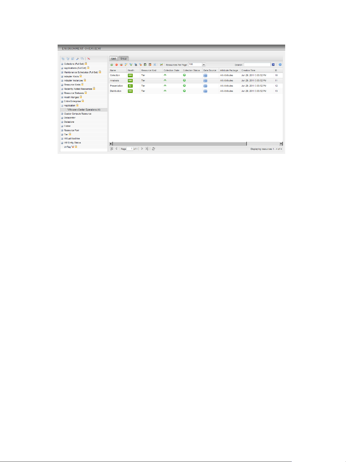
Viewing Resources
In vCenter Operations Manager, a resource is an entity in your computing environment for which
vCenter Operations Manager collects data. A resource can be a single entity, such as a router or database, or
a container that holds other resources.
Applications and tiers are types of container resources. An application defines an interdependent set of
hardware and software components. A tier is a group of resources that performs a specific task in an
application. An application can contain multiple tiers. With applications and tiers, you can combine, track,
and analyze metrics for related resources over a period of time.
To make resources easier to find in the Custom user interface, an administrator assigns resources to resource
tag values. A resource tag is a type of information, and a resource tag value is an individual instance of that
type of information.
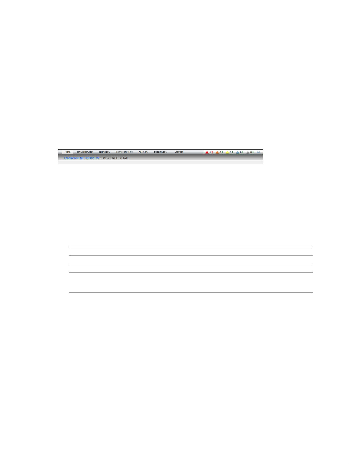
You can view resources in many places in the Custom user interface, including the Environment Overview
page. The list on the left side of the Environment Overview page contains the resource tags and resource tag
values. The List tab contains the resources.
In the example, the resource tag value called VMware vCenter Operations is selected in the left pane under
the Application resource tag, and the List tab shows the resources assigned to the VMware vCenter
Operations resource tag value. The resources are tiers in the VMware vCenter Operations application.
VMware, Inc.
7
Page 8
VMware vCenter Operations Manager Getting Started Guide
Figure 1‑1. Example of Resources on the Environment Overview Page
Understanding How vCenter Operations Manager Collects Data
vCenter Operations Manager can collect several types of data for a single resource. For example, for a
database server it might receive data on free disk space, CPU use, and average response time. Each type of
data that vCenter Operations Manager collects is called an attribute.
A metric is an instance of an attribute for a particular resource. For each metric,
vCenter Operations Manager collects and stores multiple readings over time. Each piece of data that
vCenter Operations Manager collects is called a metric observation or value.
A vCenter Operations Manager administrator creates attribute packages to define combinations of attributes
and assigns attribute packages to resources. An attribute package specifies the attributes to collect for the
resource to which it is assigned.
An administrator identifies the attributes that are most important in your enterprise as key performance
indicators (KPIs). A KPI is a high-priority metric that might indicate a severe problem in your infrastructure
if it exceeds its normal value range. vCenter Operations Manager treats KPIs differently from other
attributes.
A vCenter Operations Manager administrator might also create super metrics and super metric packages. A
super metric is useful when a single metric cannot tell you what you need to know about the behavior of
your enterprise. For example, you might have a super metric that tracks the average free disk space for all of
the database servers in your enterprise by averaging the free disk space metric for all servers. A super metric
package is similar to an attribute package, except that it defines combinations of super metrics.
Understanding Alerts
For each attribute, vCenter Operations Manager maintains thresholds of normal behavior and generates
anomalies when a metric violates a threshold. If vCenter Operations Manager determines that the current
combination of anomalies indicates a real problem, or if a KPI violates a threshold, it generates an alert.
An alert is a notification that informs you of an abnormal condition that might require attention. An alert
can describe a problem in a resource, including applications and tiers. Different combinations of conditions
cause different types of alerts.
For example, if CPU use for all of the servers in a tier exceeds a threshold, vCenter Operations Manager
generates an anomaly for each out-of-threshold metric value and sends an alert to notify you of the problem.
The alert lists all of the anomalies for each metric.
8 VMware, Inc.
Page 9
Chapter 1 Introducing Custom User Interface Features and Concepts
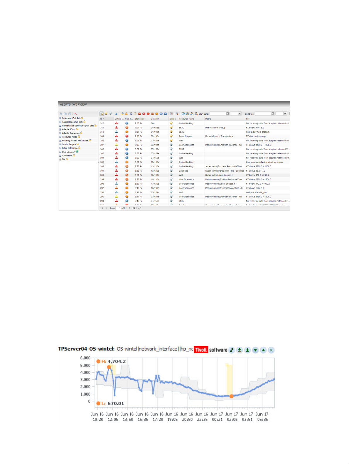
You can view alerts in several places in the Custom user interface, including the Alerts Overview page. If a
vCenter Operations Manager administrator sets up the alert notification feature, you might also receive
alerts in email messages.
On the Alerts Overview page, the list on the left side of the page contains resource tags and resource tag
values and the right pane contains alerts. By default, the alert list includes alerts for all resources. If you
select a resource tag value in the left pane, the alert list contains only the alerts for the resources that have
the selected resource tag value.
Figure 1‑2. Example of Alerts on the Alerts Overview Page
Using Thresholds to Identify Abnormal Behavior
A threshold is a value that marks the boundary between normal and abnormal behavior for a metric. When
a metric crosses a threshold, vCenter Operations Manager generates an anomaly.
vCenter Operations Manager uses dynamic thresholds and hard thresholds.
With dynamic thresholds, vCenter Operations Manager determines whether to generate an anomaly based
on how often a metric has violated its thresholds and by the amount of the violation.
vCenter Operations Manager calculates and continually adjusts a degree of abnormality for the metric. If the
metric value is within this degree of abnormality, vCenter Operations Manager does not generate an
anomaly, even if the value is outside of the dynamic threshold.
A hard threshold is a value that a vCenter Operations Manager administrator defines for a metric. A hard
threshold changes only when an administrator changes it.
The dynamic threshold for a metric appears as a shaded area in a metric graph. Out-of-range values that
generated anomalies appear as yellow areas. You can view metric graphs in several places in the Custom
user interface, including the Metric Graph widget.
Figure 1‑3. Example of a Dynamic Threshold for a Metric
VMware, Inc. 9
Page 10
VMware vCenter Operations Manager Getting Started Guide
Understanding KPI Alert Generation
When a KPI violates a threshold, vCenter Operations Manager always generates an alert. When they
configure attribute packages, vCenter Operations Manager administrators can identify any attribute for any
resource as a KPI.
The type of alert that vCenter Operations Manager generates depends on the type of threshold that the KPI
uses. When a KPI violates an internally calculated dynamic threshold, vCenter Operations Manager sends a
Smart KPI Breach alert. When a KPI violates a user-defined hard threshold, vCenter Operations Manager
sends a Classic KPI HT Breach alert.
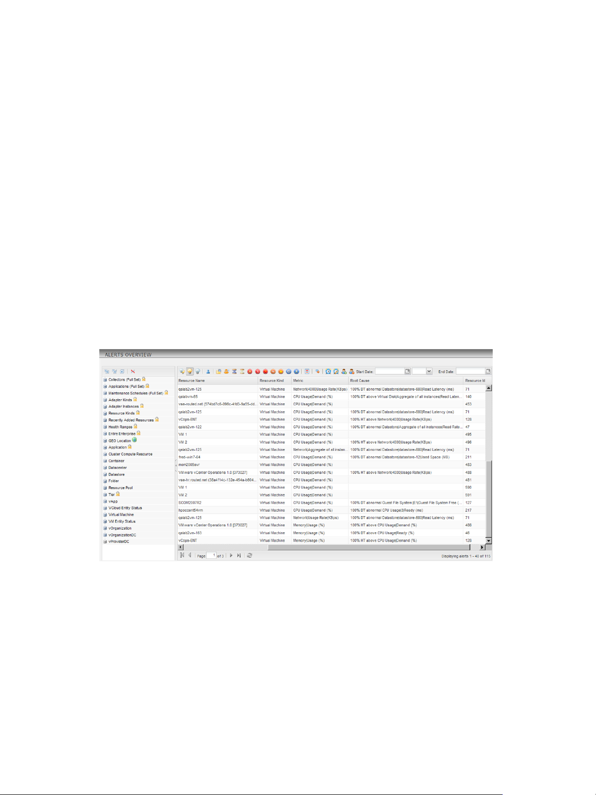
Identifying the Root Causes of Alert Symptoms
The root cause of an alert is the condition or symptom that was the first step in the chain of events that led to
the alert. For example, a slowdown in network traffic through a particular router could lead to an increased
time per transaction for users of your Web site, which in turn could cause vCenter Operations Manager to
generate an alert for the Web server resource.
For each alert, vCenter Operations Manager lists the most likely root causes of the symptoms that caused the
alert and ranks the causes in order of importance.
You can view root causes in the Root Cause column on the Alerts Overview page and in the Root Cause
Ranking widget.
Figure 1‑4. Example of Root Causes on the Alerts Overview Page
Understanding Health Ratings
vCenter Operations Manager examines internally generated metrics and uses its proprietary analytics
formulas to determine an overall health rating for a resource. The health rating, which ranges from 0 to 100,
gives you a quick overview of the current state of a resource.
vCenter Operations Manager generates and stores internally generated metrics for every resource. Internally
generated metrics include the total number of alerts and anomalies and the number of active alerts.
The health rating appears as a numeric rating and as a colored indicator in the Custom user interface. The
color is based on the range of the health rating. You can view the health rating for a resource anywhere that
a resource is listed and in the Health widget. For resources that VMware vCenter Server™ manages, health
ratings appear in the VC Relationship widget and on the Resource Detail page.
10 VMware, Inc.
Page 11
Chapter 1 Introducing Custom User Interface Features and Concepts
Figure 1‑5. Example of Health Ratings on the Environment Overview Page
Monitoring Virtual Resources
vCenter Operations Manager provides performance, relationship, and capacity data for objects in your
virtual environment. It uses badges to represent derived metrics and give you a high-level, broad view of
the performance and condition of your virtual environment.
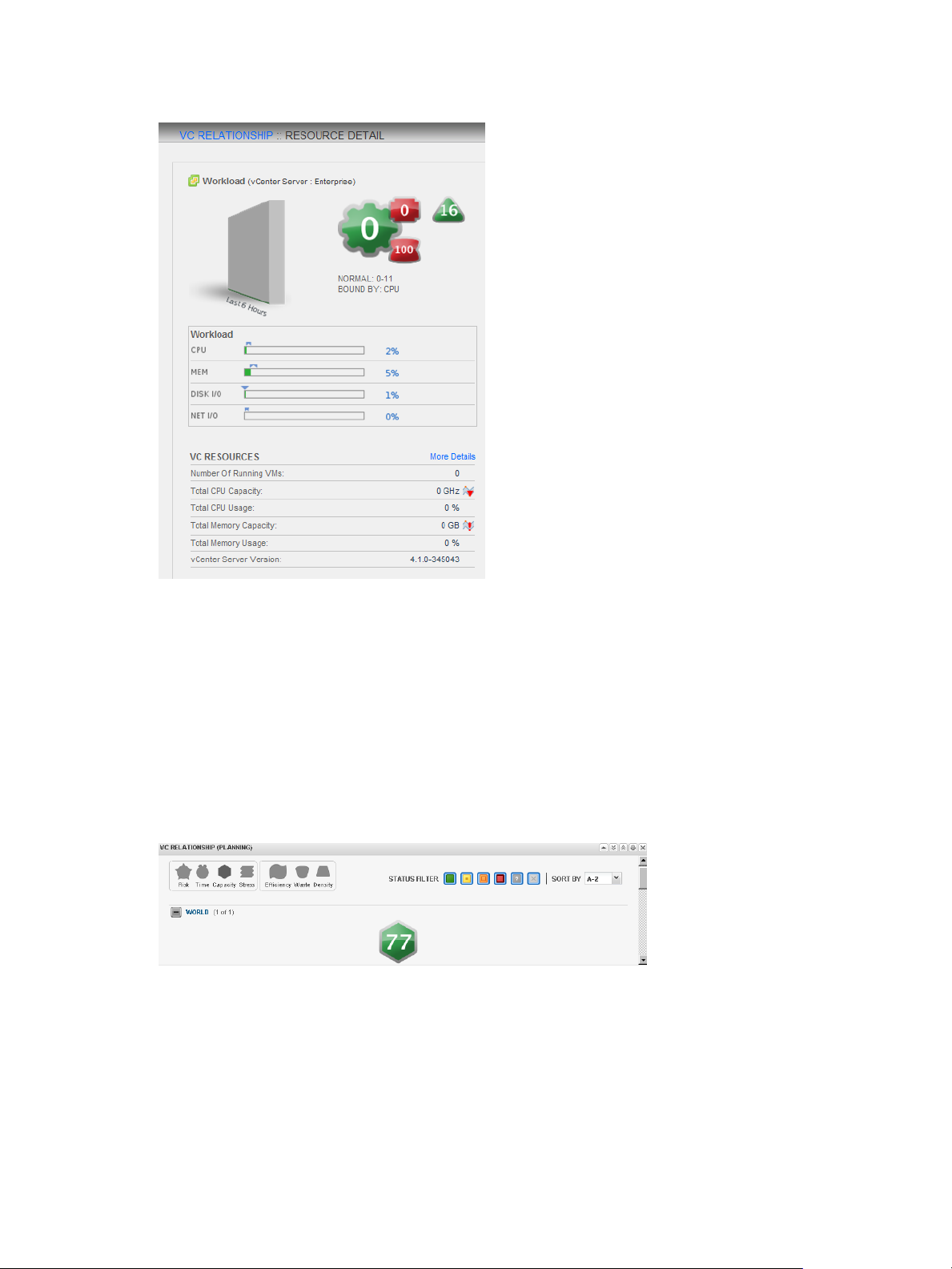
Interpreting Workload Scores for Virtual Resources
vCenter Operations Manager combines the metrics that show demand on virtual machines and other virtual
objects in a single value called a workload. These metrics include CPU use and memory use.
vCenter Operations Manager indicates workload as a numeric score and as a colored circle. The color is
based on the range of the workload score.
Workload scores typically range from 0 to 100. A score of 0 indicates that an object is not being used. A score
greater than 100 indicates that an object is trying to access more resources than are currently available.
When an object's workload score is greater than 100, you might need to allocate more resources to the object
or move some tasks to other objects.
You can view workload scores for virtual objects in the VC Relationship widget and on the Resource Detail
page.
VMware, Inc. 11
Page 12
VMware vCenter Operations Manager Getting Started Guide
Figure 1‑6. Example of a Workload Score on the Resource Detail Page
Interpreting Capacity Scores for Virtual Resources
The capacity score indicates how close a virtual object is to exhausting its available computing resources.
The computing resources include disk space, memory size, and network capacity.
To calculate the capacity score, vCenter Operations Manager combines applicable metrics from the object
and applies its analytics algorithms to determine long-term cycles and trends. It uses these results to
calculate when an object might run out of a type of resource.
vCenter Operations Manager indicates capacity as a numerical score and a colored hexagon. The color is
based on the range of the capacity score. You can view capacity scores for virtual objects in the VC
Relationship (Planning) widget.
Figure 1‑7. Example of a Capacity Score in the VC Relationship (Planning) Widget
Viewing Change Events for Virtual Resources
A change event is any change to the virtual infrastructure. It can include changes on virtual machines or
ESX hosts, such as adding, removing, connecting, or disconnecting an ESX host, and starting, stopping, or
reconfiguring a virtual machine.
vCenter Operations Manager can show change events on its performance graph on the Resource Detail page
for a virtual object. A vCenter Operations Manager administrator can configure whether change events
appear on performance graphs.
12 VMware, Inc.
Page 13
Analyzing Performance and Capacity
With vCenter Operations Manager forensics features, you can analyze the performance and capacity of your
resources and use this information to balance the resources in your environment. Forensics features include
cross-silo analysis, top-n analysis, the problem fingerprint library, capacity analysis, and VC analysis.
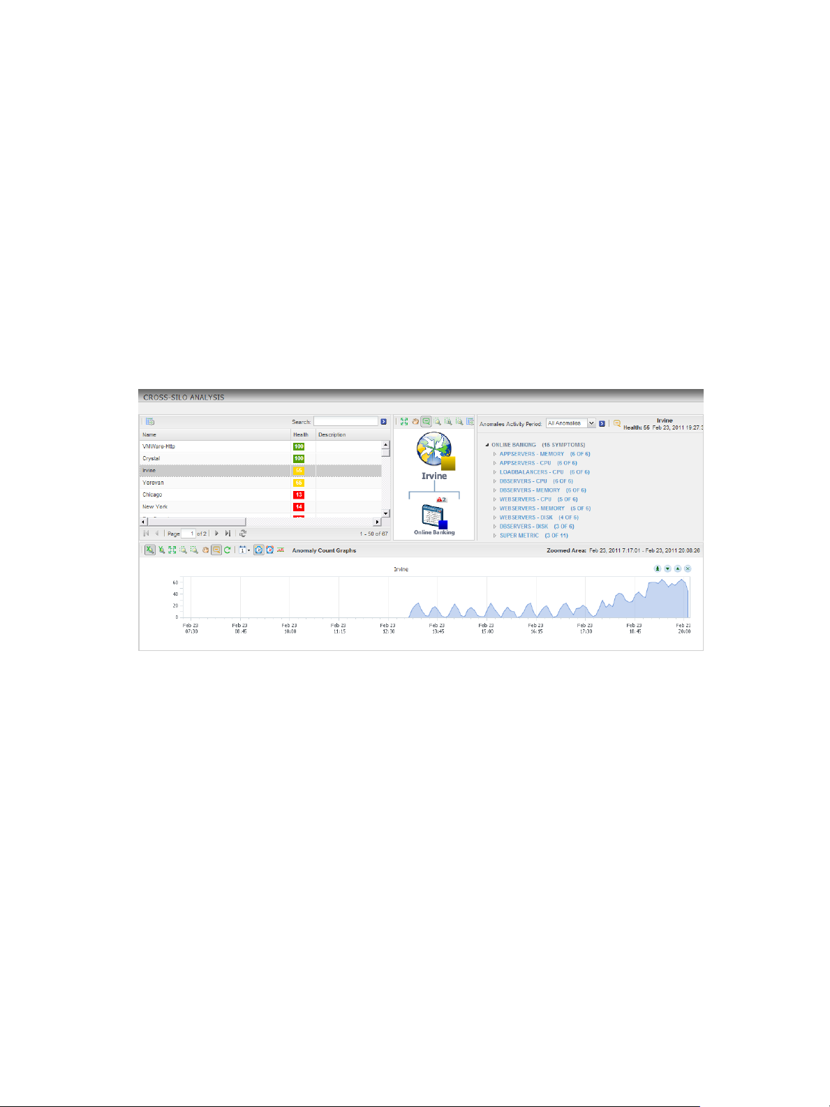
Examining Anomalies with Cross-Silo Analysis
With cross-silo analysis, you can examine graphs that show the number of anomalies over time for
particular resources. You can zoom in on a graph to focus on a specific period of time, such as immediately
before an alert. You can also click on a location in a graph to see a ranking of the likely root causes for the
anomalies at that specific time.
Cross-silo analysis information appears on the Cross-Silo Analysis page. For applications, the anomaly
graph includes a line that shows the internally determined 90 percent threshold. If the number of anomalies
exceeds this threshold, vCenter Operations Manager generates an early warning Smart Alert.
Figure 1‑8. Example of Cross-Silo Analysis
Chapter 1 Introducing Custom User Interface Features and Concepts
Using Top-N Analysis to Determine Best and Worst Performers
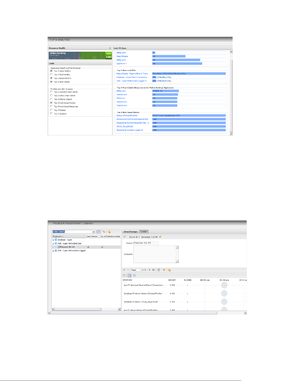
With top-n analysis, you can identify the top or bottom resources, metrics, or alerts in selected categories,
such as the five most or least healthy resources in a tier. You can also select the resource tag and time frame
to analyze and the categories to show.
Top-n analysis information appears on the Top-N Analysis page and in the Top-N Analysis widget. The
Resource Health pane shows the health of the resource. The information that you select in the Tools pane
appears in the right pane.
VMware, Inc. 13
Page 14
VMware vCenter Operations Manager Getting Started Guide
Figure 1‑9. Example of Top-N Analysis
Isolating and Resolving Issues with Problem Fingerprinting
When a KPI for an application or tier violates a threshold, vCenter Operations Manager examines the events
that preceded the violation. If it finds enough related information, it captures the set of events that preceded
the violation as a fingerprint. If vCenter Operations Manager finds a similar series of events in the future, it
can issue a predictive alert to warn of a likely KPI violation.
Fingerprinting helps you to quickly isolate and resolve problems by reducing the number of possible silos
and tiers in which a problem might have occurred, capturing the events that precede a problem for rootcause analysis, and notifying you of problems before they occur.
You can see fingerprint information on the Problem Fingerprint Library page. If you select a fingerprint
branch in the left pane, the details for that branch appear in the right pane.
Figure 1‑10. Example of Problem Fingerprints
14 VMware, Inc.
Page 15
Chapter 1 Introducing Custom User Interface Features and Concepts
Performing Capacity Analysis
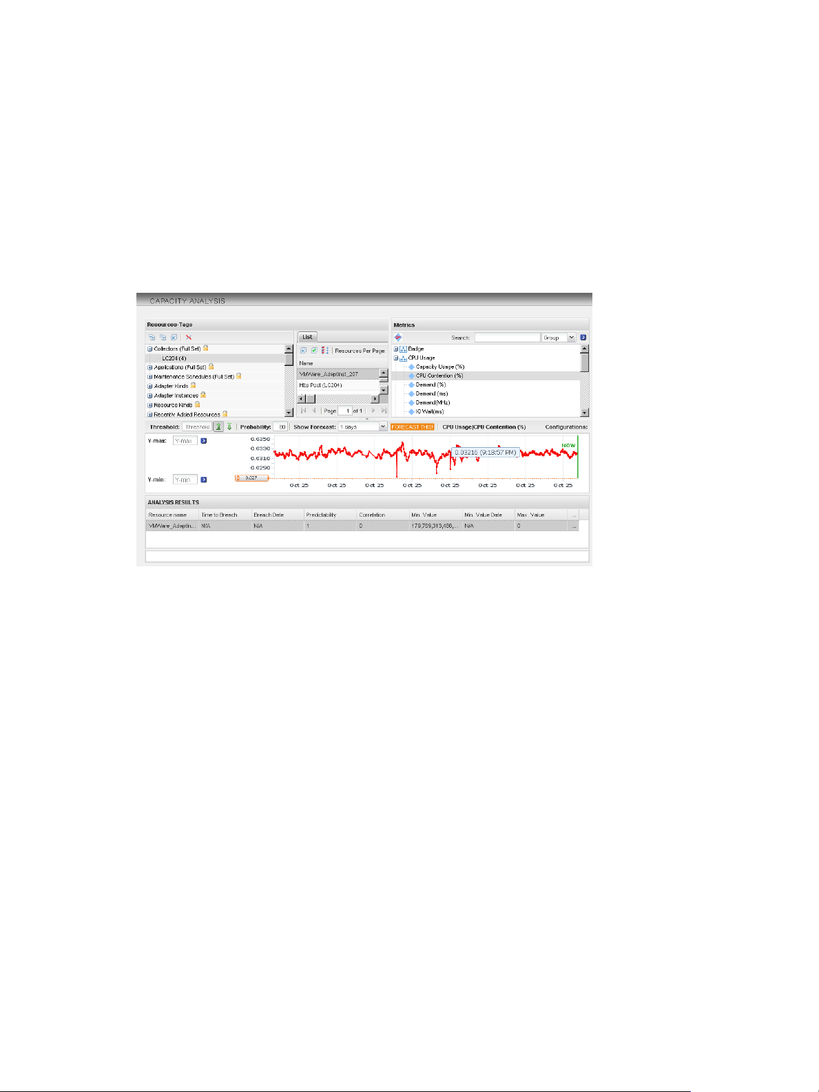
Some metrics, such as disk space use or network traffic measurements, frequently show long-term trends.
Short-term fluctuations can hide this data or make it difficult to calculate.
The capacity analysis feature looks at the overall value trend for a selected metric, tells you when a metric is
likely to reach a threshold, and indicates how confident vCenter Operations Manager is of the prediction.
This information can help you plan for infrastructure upgrades, such as adding additional storage and
network routers.
Capacity analysis information appears on the Capacity Analysis page.
Figure 1‑11. Example of Capacity Analysis Information
Analyzing and Balancing Virtual Resources
With the VC analysis feature, you can compare the metric values of different objects in your virtual
environment by using predefined heat maps or by creating your own custom heat maps.
A heat map contains rectangles of different colors and sizes, and each rectangle represents an object in your
virtual environment. The color of a rectangle represents the value of one metric, and the size of a rectangle
represents the value of another metric. For example, one of the predefined heat maps shows the total
memory and percentage of memory use for each virtual machine. Larger rectangles are virtual machines
that have more total memory. Green indicates low memory use and red indicates high memory use.
vCenter Operations Manager updates heat maps in real time as its collects new values for each object and
metric. The colored bar below a heat map is the legend. The legend identifies the values that the endpoints
represent and the midpoint of the color range.
Heat map objects are grouped by parent. A heat map that shows virtual machine performance groups
virtual machines by the ESX hosts on which they run.
VMware, Inc. 15
Page 16

VMware vCenter Operations Manager Getting Started Guide
16 VMware, Inc.
Page 17

Introducing Common Tasks 2
With vCenter Operations Manager, you can perform a large number of monitoring and troubleshooting
tasks, including tracking anomalies, handling alerts, and optimizing resources based on predictive
information that vCenter Operations Manager generates. The best way to learn the full feature set of
vCenter Operations Manager is to get hands-on experience with the system.
Before you can perform these tasks, a vCenter Operations Manager administrator must configure the
resources that vCenter Operations Manager monitors and start data collection. For information about
configuring vCenter Operations Manager, see the VMware vCenter Operations Manager Administration Guide
(Custom User Interface).
For information about all monitoring and troubleshooting tasks, see the vCenter Operations Manager online
help.
NOTE Your ability to use any vCenter Operations Manager feature depends on the access rights that a
vCenter Operations Manager administrator assigns to you. If you cannot use a feature, contact your
administrator to find out if your access rights should be adjusted.
This chapter includes the following topics:
“Logging In and Using vCenter Operations Manager,” on page 17
n
“Monitoring Day-to-Day Operations,” on page 19
n
“Handling Alerts,” on page 24
n
“Optimizing Your Resources,” on page 33
n
Logging In and Using vCenter Operations Manager
The vCenter Operations Manager client is a Web-based application. You use vCenter Operations Manager
by typing the URL of the Custom user interface in a Web browser.
Log In to the Custom User Interface
After you install vCenter Operations Manager and the vCenter Operations Manager services are running,
you can use a supported Web browser to connect to the vCenter Operations Manager server or vApp and
use the Custom user interface.
Prerequisites
Verify that you have a supported Web browser.
VMware, Inc.
17
Page 18

VMware vCenter Operations Manager Getting Started Guide
Procedure
1 In your Web browser, type the URL for the Custom user interface.
Option Description
Standalone version
vApp version
ip_address is the IP address or fully qualified host name of the vCenter Operations Manager server or
vApp.
2 Type your user name and password.
3 Click Login.
After you log in, the Home page appears in your browser window.
NOTE If your session is inactive for 30 minutes, it times out and you must log in again.
Using the Custom User Interface
After you log in to the Custom user interface, your Home page appears in the browser window.
Figure 2‑1. Example Home Page
https://ip_address
https://ip_address/vcops-custom
The Home page contains the following components.
Dashboards
The tabs near the top of the Home page are your dashboards. In the example,
the dashboards are Operations and Alerts by Type. The user groups to
which you belong determine which dashboards are available to you. A
vCenter Operations Manager administrator assigns you to one or more user
groups when he or she creates your user account. You can switch to a
different dashboard by clicking its tab or selecting it from the Dashboards
menu. You can click Home at any time to return to your Home page.
Widgets
The panes on a dashboard are called widgets. A widget is a collection of
related information about attributes, resources, applications, or the overall
processes in your environment. Each dashboard contains one or more
widgets. In the example, the Operations dashboard contains the Resource
Selector and Active Alerts widgets. If your user account has the necessary
access rights, you can customize dashboards and widgets.
18 VMware, Inc.
Page 19
Chapter 2 Introducing Common Tasks
Menus
You use the menus at the top of your Home page to select and use
vCenter Operations Manager features. For example, you use the Reports
menu to generate reports, the Alerts menu to view alerts, and the Forensics
menu to use forensics features.
Icons
You click icons on pages and widgets to perform tasks in the Custom user
interface. For example, you can click the icons in a widget to expand,
collapse, resize, or remove the widget. When you point to an icon, a tooltip
appears that describes the function of the icon.
Using Breadcrumbs
When you move away from your Home page, a breadcrumb appears in the top left corner of the page under
the menu bar. Breadcrumbs help you navigate the Custom user interface and determine where you are.
You click the link in a breadcrumb to return to a specific page in the user interface.
Modify User Preferences
You can change the color scheme for your workspace, specify the time zone that
vCenter Operations Manager uses when it displays times in your workspace, or edit the password for your
user account.
Procedure
1 Click User Preferences at the top of your Home page.
2 Modify your user preferences on the Manage User Account Settings window.
Option Action
Password
Scheme
Time Preference
Click change to change your password.
Select light or dark to change the color scheme for your workspace.
Select Browser to use the time settings on your computer or Host to sync
your vCenter Operations Manager session with the time on the
vCenter Operations Manager server.
You cannot change your user name, first name, last name, email address, or account description on the
Manage User Account Settings window. Only a vCenter Operations Manager administrator can change
these values for a user account.
3 Click OK to save your changes.
Monitoring Day-to-Day Operations
Monitoring day-to-day operations involves evaluating the overall health of your enterprise and identifying
health problems for specific resources.
For each resource, vCenter Operations Manager determines a health score, which is a 0 to 100 ranking. One
of the ways that vCenter Operations Manager indicates the health of a resource is to show a colored
indicator. The color is based on the range of the health score.
VMware, Inc. 19
Page 20

VMware vCenter Operations Manager Getting Started Guide
Table 2‑1. Default Health Color Ranges
Color Range
Green 76 to 100
Yellow 51 to 75
Orange 26 to 50
Red 1 to 25
Blue 0
View an Overview of Resource Health
You can view a graphical representation of the health of all vCenter Operations Manager resources that
have a specific resource tag value on the Environment Overview page.
Procedure
1 Select Environment > Environment Overview to view the Environment Overview page.
2 Select one or more resource tag values in the left pane.
3 Click the Group tab.
The Group tab shows a colored icon that represents the current health of each resource that has the
selected tag value. If you point to a colored icon, a tooltip appears that describes the resource that the
icon represents.
Option Action
View the health icons for any time
in the past six hours
View detailed information for a
resource
Move the slider at the bottom of the Group tab to the left. The slider moves
in five-minute increments.
Click the icon for the resource and click the Show Detail icon on the
toolbar.
Identify Health Problems for a Specific Resource
You can use the Resource Detail page to identify health problems for a specific resource. For a global
resource, the Resource Detail page contains information about the current state of the resource, its metrics,
and its place in the resource tree. For a virtual resource, the Resource Detail page shows information about
the main performance characteristics, key metrics, and events for the virtual resource.
Procedure
1 Select Environment > Environment Overview.
2 (Optional) In the left pane, expand a resource tag and select a tag value that is assigned to the resource.
Selecting a tag value can shorten the resource list and make it easier to find a specific resource.
3 Select the resource on the List tab.
4 Click the Show Detail icon.
The Resource Detail page appears for the resource.
20 VMware, Inc.
Page 21

Chapter 2 Introducing Common Tasks
Resource Detail Information for Global Resources
For global resources, the Resource Detail page contains information about the current state of the resource,
its metrics, and its place in the resource tree. Because problems might be related to or caused by the
behavior of related resources, the Resource Detail page also shows details for child or parent resources.
For complete information about using the Resource Detail page, see the online help.
Health Status Pane
Located in the upper left of the Resource Detail page, this pane shows the current health score of the
resource. A health score is a 0 to 100 ranking that vCenter Operations Manager determines for each
resource. The Health Status pane shows the current health score of a global resource and a graph that shows
how the health score has changed over the last six hours.
NOTE If vCenter Operations Manager does not receive metrics for a resource at a particular time, it cannot
calculate the health score for that time and it shows a score of -1 on the graph. A -1 score can occur if
collection is turned off for a resource or if vCenter Operations Manager encounters a data gathering
problem.
Root Cause Ranking Pane
This pane shows information about metrics on related resources that contributed to alerts, including the
percentage likelihood that the metrics contributed to a root cause. vCenter Operations Manager bases the
percentage likelihood that a metric contributed to a root cause on the number of symptoms and when the
symptoms occurred relative to the alert.
For more information about the information in the Root Cause Ranking pane, see “Understanding Health
Symptoms,” on page 23.
Health Tree Pane
This pane shows the section of the resource hierarchy around a global resource, including all of the parent
container resources that hold the resource. If the resource is a container, the health tree also shows all of the
child resources that the container resource holds.
Metric Selector and Metric Graph Panes
When you click a resource in the Health Tree pane, the metric groups for the resource appear in the Metric
Selector pane. You can expand a metric group to view the individual metrics in the group. You can doubleclick a metric in the Metric Selector pane to view a graph for the metric in the Metric Graph pane. Metric
graphs show the recent performance and predicted future performance of metrics for a resource.
Resource Detail Information for Virtual Resources
For virtual resources, the Resource Detail page shows information about performance characteristics, key
metrics, and events. The information on the Resource Detail page is organized in several panes.
For resource pools and folders, the Resource Detail page shows the same information that it does for global
resources.
Status Pane
Located in the upper left of the Resource Detail page, this pane contains aggregated information about the
health, workload, anomalies, and faults of the selected resource. The default history graph period is six
hours. You can click metric icons to switch the metric to view.
Metric Details Pane
This pane occupies the middle of the Resource Detail page. The information that appears in this pane
depends on the metric that you select to view in the Status pane.
VMware, Inc. 21
Page 22

VMware vCenter Operations Manager Getting Started Guide
Table 2‑2. Information in the Metric Details Pane
Metric Description
Health Shows information for workload, anomalies, and faults.
Workload Shows information for CPU and memory used by the currently selected resource, by the
hypervisor, and by the child objects of the selected resource. You can point to colored sections in
the bars to view information about the objects that they represent.
Anomalies Contains a list of symptoms for all child container objects of the currently selected resource. A
symptom is a metric that contributes to the health state of an objects. See “Understanding Health
Symptoms,” on page 23.
Faults Shows information for faults. A fault score indicates the degree of problems that the object is
experiencing. It includes events such as loss of redundancy in NICs or HBAs, memory checksum
errors, HA failover problems, and CIM events.
Workload Pane
This pane shows information about space use and read and write capacity. The Space bar represents the
amount of space used. The IOPs (input/output operations per second), Throughput, and Latency bars
provide read and write capacity information.
Key Metrics Pane
This pane contains the metrics of greatest interest related to the performance characteristic that you select.
In the Default key metrics view, vCenter Operations Manager selects the four most interesting metrics,
through bubbling, by following these criteria.
From all metrics, vCenter Operations Manager selects KPIs that are violating their thresholds. It sorts
n
KPIs by display order (CPU, memory, network I/O, and disk I/O).
From all remaining metrics, vCenter Operations Manager adds non-KPI metrics that are violating their
n
thresholds to the list by display order.
vCenter Operations Manager adds other metrics to the list by display order.
n
You can click All Metrics to view health status and resource hierarchy information, identify root causes of
health degradation, and view metric graphs that show recent performance and predicted performance of
metrics for the selected resource.
Resources Pane
This pane shows the current list of properties for the resource. You can click the More Details link to show
more available properties for the selected resource. The More Details link is not provided for certain virtual
resources.
Related Objects Pane
This pane shows values for the currently selected performance characteristic of all objects that are related to
the selected resource. Depending on the resource type that you selected (virtual machine, datacenter, or
vCenter Server system), this pane shows parent objects, peer objects, and child objects.
Events and Health Pane
This pane appears in the lower third of the Resource Detail page when you click Health in the Status pane.
You can expand this pane to view the graph of the current health metric values. If an administrator
configures it, the graph contains events that might affect the selected resource. You can use the icons at the
top of the pane to change the display.
22 VMware, Inc.
Page 23
Chapter 2 Introducing Common Tasks
Events and Workload Pane
This pane appears in the lower third of the Resource Detail page when you click Workload in the Status
pane. You can expand this pane to view the graph of recent workload metric values. If an administrator
configures it, the graph shows events that might affect the selected resource. You can use the icons at the top
of the pane to change the display.
Events and Anomalies Pane
This pane appears in the lower third of the Resource Detail page when you click Anomalies in the Status
pane. You can expand this pane to view the graph of anomalies. If an administrator configures it, the graph
shows corresponding events that might affect the selected resource. You can use the icons at the top of the
pane to change the display.
Events and Faults Pane
This pane appears in the lower third of the Resource Detail page when you click Faults in the Status pane.
You can expand this pane to view a graph of faults. If an administrator configures it, the graph shows
corresponding events that might affect the selected resource. You can use the icons at the top of the pane to
change the display.
Storage and Network Pane
For objects that have storage and network resources, this pane shows basic storage-related metrics. The pie
chart uses both volume and color to present information. The volume of the pie chart represents the amount
of used disk space. The color coding visualizes the nearness of the moment when disk space is exhausted.
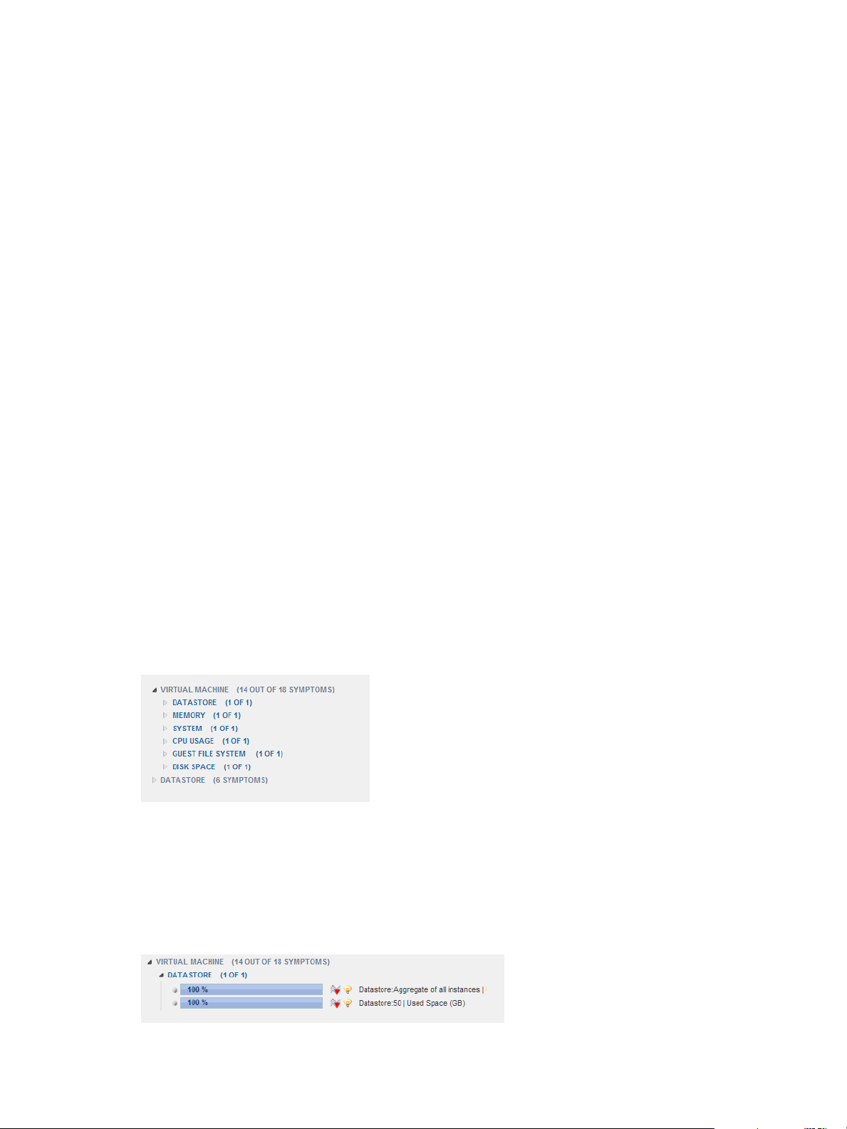
Understanding Health Symptoms
A symptom is a metric that contributes to the health state of an object. For a global resource, you view health
symptoms in the Root Cause Ranking pane on the Resource Detail page. For a virtual resource, you view
health symptoms in the Metric Details pane on the Resource Detail page.
The Resource Detail page lists symptoms by child resource kinds. The parentheses after the resource kind
name contain information about the number of symptoms that are violating their thresholds for the resource
group.
Figure 2‑2. Example of a Symptom Group
The example shows a portion of the type of information that you might see when you view health
symptoms. Metrics that are violating their thresholds appear in metric groups. The parentheses after the
metric group name contain the number of violations for the metrics in the metric group.
When you expand a metrics group, the list of metrics that are violating their thresholds appears. In each
metric row, you can check the percentage of objects that have threshold violations for the metric. A vertical
blue line represents the point in time when the first symptom became active.
Figure 2‑3. Example of an Expanded Symptom Group
VMware, Inc. 23
Page 24

VMware vCenter Operations Manager Getting Started Guide
The icons in a metric row add information about the metric values that the row contains. When you point to
an icon, a tooltip appears that describes the meaning of the icon. You can double-click a metric row to view
details about the selected symptom.
Handling Alerts
An alert is a notification that informs you of an abnormal condition that might require attention. Handling
alerts involves viewing alerts, determining which alerts to respond to, managing alerts in the Custom user
interface, and identifying alert trends.
View Alerts on the Alerts Overview Page
By default, the Alerts Overview page shows alerts for all resources. You can filter the alert list by resource,
alert type and subtype, and alert status. You can also search for alerts generated for particular resources and
during a specific time period.
Procedure
1 Select Alerts > Alerts Overview.
2 (Optional) Filter the alert list.
Option Action
Show alerts for resources that have
a specific value
Show alerts for resources that do
not have a specific value
Show alerts for resources that have
a specific resource name or
resource kind
Show alerts for a specific time
period
Show alerts that have a specific
type or subtype
Show alerts that have a specific
status
Remove an alert type or alert status
filter
Remove all resource filters
3 (Optional) Click a column header and use the controls in the pop-up menu to sort the alert list or add or
remove columns from the display.
Select one or more resource tag values in the resource tag list. If you select
more than one value for the same tag, the list includes resources that have
either value. If you select values for two or more different tags, the list
includes only resources that have all of the selected values.
Select one or more resource tag values in the resource tag list and click the
Invert Result icon. For example, if you select New York and London, alerts
for all resources that are not in either city appear in the list.
Type a full or partial name in the Search text box and click the right angle
bracket (>).
Select a date from the Start Date and End Date menus and click the right
angle bracket (>).
Click one or more of the alert type icons at the top of the alert list. For
example, click the Smart (Early Warning), Smart (KPI Breach), and Smart
(KPI Prediction) icons to show all smart alerts.
Click one or more of the alert status icons at the top of the alert list. For
example, click the Active Alerts icon and the Own Alerts icon to show the
active alerts assigned to you.
Click the icon again to toggle it off.
Click the Deselect All icon at the top of the resource tag list.
Alerts Overview Page Information
The information on the Alerts Overview page is organized in multiple columns.
Table 2‑3. Columns on the Alerts Overview Page
Column Name Description
Critical Level A color-coded icon that indicates the criticality level of the alert. See “Alert Criticality Levels,” on
page 25.
Sub-Type An icon that indicates the subtype of the alert. See “Alert Types and Subtypes,” on page 26.
24 VMware, Inc.
Page 25

Chapter 2 Introducing Common Tasks
Table 2‑3. Columns on the Alerts Overview Page (Continued)
Column Name Description
Start Time The date and time that vCenter Operations Manager first generated the alert.
Duration How long the alert lasted.
Status An icon that indicates whether the alert is active or canceled.
Resource Name The resource that is associated with the alert.
Resource Kind The kind of resource for which vCenter Operations Manager generated the alert.
Metric The metric that violated a threshold and triggered the alert.
Root Cause The symptom that most likely indicates the start of the chain of events that led to the alert.
Worst Sub
Containers
Id A sequential alert ID number.
Type An icon that indicates the type of alert. See “Alert Types and Subtypes,” on page 26.
Cancel Time The date and time that a user canceled the alert.
Info For external notification alerts, this column might contain additional information that was sent
Update Time The date and time that the alert was most recently updated.
Resource
Identifiers
Control State An icon that indicates whether the alert is open, assigned, suspended, or suppressed.
Resource Id The ID of the resource that is associated with the alert.
User Name If the alert is assigned to a user, the name of the user.
If the alert is for a resource that contains other container resources, such as an application that
contains tiers, this column contains icons that represent the subcontainers that most likely
contributed to the alert.
along with the alert message.
Up to five identifiers that uniquely identify the resource. Resource identifiers are often the same as
the resource name. Multiple resources can have the same name. The adapter type determines the
identifiers that appear.
Alert Criticality Levels
Every alert has a criticality level that specifies how serious the problem is and how quickly you should take
action.
Table 2‑4. Alert Criticality Levels
Level Color Value
Critical Red 4
Immediate Orange 3
Warning Yellow 2
Info Blue 1
None 0
vCenter Operations Manager predictive Smart Alerts, KPI prediction, and early warning alerts are always
critical alerts. Other types of alerts might be of any criticality, depending on the alert type and how the
attribute that trigged the alert is configured.
You can color code alerts by criticality on the Alerts Overview page and in the Alerts widget.
VMware, Inc. 25
Page 26

VMware vCenter Operations Manager Getting Started Guide
Alert Types and Subtypes
vCenter Operations Manager generates several types of alerts, and each alert type has its own triggers and
contents. An alert might be caused by abnormal behavior of one or more metrics for a resource, including a
tier or application, or when a fingerprint predicts an upcoming problem.
By default, vCenter Operations Manager generates all types of alerts except for classic abnormality alerts.
Because they do not involve KPIs, classic abnormality alerts are unlikely to require any action.
Smart Alerts
A Smart Alert is triggered when an internally calculated value indicates that a problem occurs, or soon will
occur. The internally calculated value can be a correlated prediction of future behavior or a dynamic
threshold breach on a KPI. Except for metrics that are designated as KPIs, Smart Alerts do not depend on
user-defined values. Smart Alerts have certain subtypes.
Table 2‑5. Smart Alert Subtypes
Subtype Description Determined By
KPI DT Breach A KPI breached one of its internally
calculated dynamic thresholds.
KPI Prediction vCenter Operations Manager predicts that a
KPI will soon breach a threshold. The current
combination of metrics might match a stored
metric fingerprint that predicts the breach, or
a metric that is correlated with the KPI has
breached its threshold.
KPI Prediction alerts are always critical.
Early Warning vCenter Operations Manager correlation
algorithms calculate a greater than 90 percent
chance above the noise threshold that there is
a problem with an application.
Early Warning alerts are always critical.
Analytics based on a user-defined
KPI.
Analytics based on a user-defined
KPI.
Analytics based on application
topology.
Classic Alerts
A classic alert is an alert that is generated by classic monitoring software. It relies on user-defined hard
thresholds, not vCenter Operations Manager dynamic thresholds or other advanced calculations. Classic
alerts have certain subtypes.
Table 2‑6. Classic Alert Subtypes
Subtype Description Reason
KPI HT Breach A user-defined KPI breached a user-
defined hard threshold.
Abnormality A non-KPI metric breached one of its
internally calculated dynamic
thresholds.
Notification A non-KPI metric breached a user-
defined hard threshold. Typical system
and network management applications
send this type of alert.
A user-defined KPI breached one of its
user-defined hard thresholds.
A single non-KPI metric breached one of its
dynamic thresholds.
A single non-KPI metric breached one of its
internally calculated dynamic thresholds.
Administrative Alerts
An administrative alert indicates a problem with vCenter Operations Manager, the monitoring software
from which it collects data, or the enterprise network. Administrative alerts have certain subtypes.
26 VMware, Inc.
Page 27

Chapter 2 Introducing Common Tasks
Table 2‑7. Administrative Alert Subtypes
Subtype Description
System A vCenter Operations Manager component failed.
Environment vCenter Operations Manager stopped receiving data from
one or more resources. A problem might exist with the
resource, the monitoring software, or the network
infrastructure.
Resolve an Alert
How you resolve an alert depends on the alert's type and criticality level and your organization's rules,
procedures, and priorities. You can view information about the event that triggered an alert, its effects, and
its likely causes, on the Alert Summary page. The Alert Summary page usually contains enough information
to determine who in your enterprise should respond to the alert.
The top of the Alert Summary page shows the alert type, when the alert started, the duration of the alert,
and the associated resource or metric. The rest of the page is divided into separate panes.
NOTE Do not follow this procedure to resolve administrative system alerts.
Procedure
1 Select Alerts > Alerts Overview and double-click the row for the alert in the alert list.
2 Examine the information in the Reason pane on the Alert Summary page and determine the action to
take.
The Reason pane contains specific information about the alert, including the type of trigger that caused
it, the resource or metric for the trigger, and details about the trigger. You can click More next to the
resource name to view all of the properties for the resource.
Option Action
The alert is for an application, tier,
or container
The alert is for a KPI
Identify the owner of the resource.
Identify the service level agreement (SLA) that is associated with the KPI.
3 Examine the information in the Impact pane on the Alert Summary page.
The Impact pane shows health information for the last six hours for the resource for which the alert was
generated, including any subcontainers in the resource. For a tier, the pane shows a health graph for the
application that contains the tier and the current health of all of the tiers in the application. The pane
also shows a graph for up to five metrics. Breaching KPIs appear first, followed by breaching super
metrics, non-breaching KPIs, and non-breaching super metrics.
4 If the information in the Impact pane indicates that KPIs were breached, identify the SLAs that are
associated with the KPIs.
VMware, Inc. 27
Page 28

VMware vCenter Operations Manager Getting Started Guide
5 Examine the information in the Root Cause pane on the Alert Summary page.
The Root Cause pane shows the likely root cause container resources, ranked by analytical algorithm on
the container resource. You can perform actions on the Root Cause pane to view symptom information.
Option Action
Show the symptom groups for a
resource
Show the top five individual
symptoms in a symptom group
List the individual anomalies that
comprise a symptom
6 Identify the owner of the root cause resource.
Option Action
The Root Cause pane indicates
multiple tiers
The Root Cause pane indicates a
single resource
7 Hand off resolution of the alert to the owner that you identified in Step 6.
Double-click the resource. Symptom groups are ranked by percentage of
possible resources that exhibit the symptoms in the group.
Double-click the symptom group. Symptoms are ranked by percentage of
possible resources that exhibit the symptom.
Double-click the symptom. A pop-up window opens that lists the
individual anomalies.
To copy the list to the clipboard, click the Copy to Clipboard icon.
n
This feature is useful if you are opening a problem ticket or sending an
email message about the alert.
To graph an anomaly, select an anomaly in the pop-up window and
n
click the Dynamic Dashboard icon.
Examine the first tier and identify its owner. Select all metrics that have 50
percent or greater probability.
Select all metrics that have 50 percent or greater probability.
Provide the highest-probability abnormal metrics from the Root Cause pane and the URL of the Alert
Summary page. For predictive alerts, also provide due time and probability information from the
Reason pane.
8 Notify the owner that you identified in Step 2 and any other interested parties.
Provide SLA and KPI breach information, the URL of the Alert Summary page, and the name of the
person responsible for resolving the alert.
Resolving Administrative System Alerts
An administrative system alert indicates a problem with one of the vCenter Operations Manager
components. When you resolve an administrative system alert, follow certain recommended procedures.
For information about resolving administrative system alerts, see the VMware vCenter Operations Manager
Administration Guide (Custom User Interface) or the online help.
Troubleshoot an Alert
The person responsible for fixing the condition that caused an alert typically uses the Alert Detail page to
troubleshoot the problem.
The Alert Detail page contains information that can help you diagnose the cause of the behavior that
resulted in the alert and determine how to prevent the alert from happening again.
Procedure
1 Select Alerts > Alerts Overview and double-click the row for the alert in the alert list.
2 On the Alert Summary page, click the Troubleshoot button.
The Alert Detail page appears for the alert.
28 VMware, Inc.
Page 29

Chapter 2 Introducing Common Tasks
Alert Detail Information
The Alert Detail page contains information that can help you diagnose the cause of the behavior that
resulted in the alert and determine how to prevent the alert from happening again.
For detailed information about using each pane and tab on the Alert Detail page, see the online help.
Reason Pane
This pane contains specific information about the alert, including the type of trigger that caused it, the
resource or metric for the trigger, and details about the trigger.
Impact Pane
This pane shows health information for the last six hours for the resource for which the alert was generated,
including any subcontainers in the resource. For a tier, the pane shows a health graph for the application
that contains the tier and the current health of all of the tiers in the application. The pane also shows a graph
for up to five metrics. Breaching KPIs appear first, followed by breaching super metrics, non-breaching
KPIs, and non-breaching super metrics.
Mashup Tab
This tab contains mashup charts, which show different aspects of the behavior of a resource. Mashup charts
include a health chart, an anomaly count graph, and metric graphs.
The health chart includes each alert for the specified time period.
n
The anomaly count graph shows the number of anomalies for the resource and its children at a specific
n
time. For an application, the anomaly graph shows the anomaly count for tiers that contain root cause
metrics for the resource. A red line marks the noise threshold for the resource. An anomaly count
higher than the red line indicates a 90 percent probability of a problem and triggers an early warning
alert.
Metric graphs appear for all of the KPIs for any resource that is listed as a root-cause resource. For an
n
application, the root-cause resource is the application and tiers that contain root causes.
Timeline Tab
This tab shows all of the anomalies that contributed to an alert. The anomalies appear in a dual-drag
timeline that starts with the beginning of the first anomaly and ends with the current time or, if the alert was
canceled, the cancel time.
Relationships Tab
This tab shows a resource relationship chart for the resource for which an alert was generated. Resource
relationship charts show the structure of the topography around a specific resource, including parent and
child resources.
Metric Charts Tab
This tab shows metric graphs for the resource for which an alert was generated. Metric graphs show the
recent performance and predicted future performance of metrics.
Correlations Tab
You can show the behavior or anomaly correlations to the KPI metrics that contributed to an alert on this
tab. Each metric has a percentage correlation. The larger the number, the more closely the metrics are
related.
Notes Tab
You can add and view notes for an alert on this tab.
VMware, Inc. 29
Page 30

VMware vCenter Operations Manager Getting Started Guide
Managing Alerts
You can suspend, suppress, and take or release ownership of multiple alerts on the Alerts Overview page.
When you perform an action on an alert, the alert's status changes. You can also manage a single alert on the
Alert Detail page.
Take Ownership of an Alert
When you take ownership of an alert, you acknowledge that the alert is yours. Taking ownership of an alert
is important if multiple operators manage alerts in your environment. You can take ownership of multiple
alerts on the Alerts Overview page.
You can also take ownership of alerts in the Alerts widget.
Procedure
1 Select Alerts > Alerts Overview and select the alert or alerts in the alert list.
You can press Ctrl+click to select multiple alerts or Shift+click to select a range of alerts.
2 Click the Take Ownership icon.
3 Click Yes in the confirmation dialog box.
When you own the alert, the Assigned Alerts icon appears in the Control State column and your user name
appears in the User Name column in the alert list.
Suspend an Alert
When you suspend an alert, you can specify a number of minutes. If the problem condition exists after the
time elapses, vCenter Operations Manager reactivates the alert. You can suspend multiple alerts on the
Alerts Overview page.
When you suspend an alert, you take ownership of it. You cannot suspend an alert that another user owns.
You can also suspend alerts in the Alerts widget.
NOTE Suspending an alert does not cancel its cancel cycle. The alert is still canceled according to the cancel
cycle value set when the resource or application was configured.
Procedure
1 Select Alerts > Alerts Overview and select the alert or alerts in the alert list.
You can press Ctrl+click to select multiple alerts or Shift+click to select a range of alerts.
2 Click the Suspend icon.
3 Type the number of minutes to suspend the alert and click OK.
When the alert is suspended, the Suspended Alerts icon appears in the Control State column in the alert list.
Suppress an Alert
When you suppress an alert, you can specify a specific number of days. If the problem condition exists after
the time has elapsed, vCenter Operations Manager reactivates the alert. You can suppress multiple alerts on
the Alerts Overview page.
When you suppress an alert, you take ownership of it. You cannot suppress an alert that another user owns.
30 VMware, Inc.
Page 31

Chapter 2 Introducing Common Tasks
You can also suppress alerts in the Alerts widget.
NOTE Suppressing an alert does not cancel its cancel cycle. The alert is still canceled according to the cancel
cycle value set when the resource or application was configured.
Procedure
1 Select Alerts > Alerts Overview and select the alert or alerts in the alert list.
You can press Ctrl+click to select multiple alerts or Shift+click to select a range of alerts.
2 Click the Suppress icon.
3 Type the number of days to suppress the alert and click OK.
When the alert is suppressed, the Suppressed Alerts icon appears in the Control State column in the alert
list.
Release Ownership of an Alert
You release ownership of an alert when you need to return a suspended or suppressed alert to the open
state. You can release ownership of multiple alerts on the Alerts Overview page.
You can also release ownership of alerts in the Alerts widget.
Procedure
1 Select Alerts > Alerts Overview and select the alert or alerts in the alert list.
You can press Ctrl+click to select multiple alerts or Shift+click to select a range of alerts.
2 (Optional) Filter the alert list.
Option Action
Show only assigned alerts
Show only alerts that you own
Click the Assigned Alerts icon.
Click the Own Alerts icon.
3 Select the alert in the alert list.
You can press Ctrl-click to select multiple alerts or Shift-click to select a range of alerts.
4 Click the Release Ownership icon.
5 Click Yes on the confirmation dialog box.
When ownership of the alert is released, the Open Alerts icon appears in the Control State column in the
alert list.
Cancel an Alert
You can cancel an alert on the Alerts Overview page.
NOTE You cannot cancel an alert on the Alert Detail page or in the Alerts widget.
Procedure
1 Select Alerts > Alerts Overview and select the alert or alerts in the alert list.
You can press Ctrl+click to select multiple alerts or Shift+click to select a range of alerts.
2 Click the Cancel Alert icon.
VMware, Inc. 31
Page 32

VMware vCenter Operations Manager Getting Started Guide
Manage a Single Alert
You can suspend, suppress, and take or release ownership of a single alert on the Alert Detail page.
Procedure
1 Select Alerts > Alerts Overview and double-click the row for the alert in the alert list.
2 On the Alert Summary page for the alert, click the Troubleshoot button.
3 On the Alert Detail page for the alert, click the icon for the alert operation.
Option Action
Take ownership of the alert
Release ownership of the alert
Suspend the alert
Suppress the alert
Click the Take Ownership icon. Owning an alert means that you
acknowledge the alert is yours. Taking ownership is important when
multiple operators manage alerts.
Click the Release Ownership icon. You release ownership of an alert when
you need to return a suspended or suppressed alert to the open state.
Click the Suspend This Alert icon. You can suspend an alert for a number
of minutes. If the problem condition exists after the time has elapsed,
vCenter Operations Manager reactivates the alert.
Click the Suppress This Alert icon. You can suppress an alert for a
number of days. If the problem condition exists after the time has elapsed,
vCenter Operations Manager reactivates the alert.
View Alerts in the Alert Watch List
The alert watch list shows the number of alerts for each criticality level and the trend.
vCenter Operations Manager determines the trend by comparing the sum of all alerts of a particular type
during the current time period to the average of the alerts during the previous three time periods. The trend
can be up, down, or no change.
You can change several alert watch list settings, including the refresh interval and baseline time period. You
can also filter the alerts that appear in the alert watch list. See “Change the Alert Watch List Settings,” on
page 32.
Procedure
1 Find the alert watch list in the upper right corner of the browser window.
The alert watch list appears on all vCenter Operations Manager pages.
2 Point to the icon for an alert criticality level.
The alerts that have that criticality level appear in a pop-up window.
3 Double-click an alert in the pop-up window to view the Alert Summary page for the alert.
Change the Alert Watch List Settings
You can change the default refresh interval and baseline time period for the alert watch list and the number
of alerts that appear when you point to a criticality icon. You can also filter the alerts in the alert watch list.
Procedure
1 Click Edit to the right of the alert watch list.
2 In the Refresh Time text box, type how often, in seconds, to refresh the alert watch list.
The default is 30 seconds.
32 VMware, Inc.
Page 33

Chapter 2 Introducing Common Tasks
3 In the Baseline Time text box, type the time period, in minutes, that the alert watch list uses when it
compares the total alerts in the current time period to the average number of the alerts in the previous
three time periods.
The default is 30 minutes.
4 Filter the alerts that appear in the alert watch list.
Option Description
Show alerts only for resources that
have certain tag values
Limit alerts to specific criticality
levels
Limit alerts to only values that you
specify
Select the tag values in the Select which tags to filter list. If you select
more than one value for the same tag, the alert watch list shows resources
that have either value. If you select values for two or more different tags,
the alert watch list shows resources that have all of the selected values.
Select the check boxes for the criticality levels to include in the alert watch
list in the Criticality Level Range pane.
Click the links in the Filter By pane and select the values to include in the
alert watch list. If you select a combination of the Open, Assigned,
Suspended, and Suppressed alert control states, all of the alerts that match
your selections appear in the alert watch list. If you select Own Alerts and
one or more other states, only the alerts that you own that match the other
states appear in the alert watch list.
5 In the Number of alerts to show in tooltip pane, select the number of alerts that appear when you point
to a criticality icon in the alert watch list.
6 Click Save to save your changes.
Optimizing Your Resources
You can use the information provided by the vCenter Operations Manager forensics features to analyze
performance and capacity and balance the resources in your environment. You can also use forensics
features to assess whether any mission critical resources are at risk of reaching capacity in the future.
View the Top and Bottom Performers
You can view the top or bottom performers in specific categories on the Top-N Analysis page. For example,
you can show the most or least healthy tiers in an application, the most volatile KPIs, or the top root cause
metrics. Viewing the extreme performers in a category can help you assess the overall performance of your
environment.
The Top-N Analysis widget contains similar information to the Top-N Analysis page, but it offers fewer
options.
Procedure
1 Select Forensics > Top-N Analysis.
2 Click the Configure icon at the top right of the Resource Health pane.
3 (Optional) Change the Top-N analysis default configuration settings.
Option Description
Time Period
Depth
Bars Count
Change the time period for the data that appears on the Top-N Analysis
page. The default is the last 30 days.
Select the number of levels to show for parent-child relationships for the
selected entity. For example, if you select 1, the widget shows information
for applications and tiers. If you select 2, the widget also shows
information for resources that are children of tiers. The default is 10.
Select the number of items to show on the page. The default is five items.
VMware, Inc. 33
Page 34

VMware vCenter Operations Manager Getting Started Guide
4 Select a resource in the resource tree.
You can use the icons at the top of the Configuration window to expand or collapse the tree and clear
your selection.
5 Click Save to save the Top-N analysis configuration.
The Configuration window closes, the Top-N Analysis page appears, and the Resource Health pane
shows the health of the selected resource for the configured time period.
6 In the Tools pane, select the check box for each type of information to view.
The information appears in the right pane.
7 Click an object in the right pane to view the Resource Detail page for the object.
Perform Capacity Analysis for a Selected Metric
The vCenter Operations Manager capacity analysis feature uses the performance history of a metric to
predict its future growth and when it is likely to reach a specified limit. You can use this information to plan
when to perform infrastructure upgrades, such as adding disk storage to a server or increasing your
network capacity.
To perform capacity analysis, you select a metric to use, such as PctUsedDiskSpace, and a limiting value,
such as 95 percent full. vCenter Operations Manager examines the past and current performance of the
metric and its analytics algorithms determine the cycles in the metric's values. vCenter Operations Manager
uses this analysis to extrapolate the metric's likely future performance.
The capacity analysis results show when the metric is likely to exceed the value you set, the predictability of
the metric (higher predictability indicates a higher signal-to-noise ratio), and other information about its
behavior. For more information, see “Interpreting Capacity Analysis Results,” on page 35.
NOTE Capacity analysis works best and is most useful with metrics that tend to show long-term trends in
one direction, such as disk space use and network traffic.
Procedure
1 Select Forensics > Capacity Analysis.
2 (Optional) Filter the resources on the List tab by selecting one or more tag values in the Resources-Tags
list.
Option Action
Show resources that have a specific
value
Show resources that do not have a
specific value
Select one or more resource tag values in the resource tag list. If you select
more than one value for the same tag, the list includes resources that have
either value. If you select values for two or more different tags, the list
includes only resources that have all of the selected values.
Select one or more resource tag values in the resource tag list and click the
Invert Result icon. For example, if you select New York and London, all
resources that are not in either of those cities appear in the resource list.
3 On the List tab, select the resource that contains the metric to use in the analysis.
The attribute groups for the selected resource appear in the Metrics pane.
4 (Optional) Filter the metrics in the Metrics pane.
Option Action
Show only KPI metrics
Find a particular metric group,
metric instance, or metric
Click the KPI Metric icon.
Type a full or partial name in the Search text box, select the value type
from the drop-down menu, and click >.
34 VMware, Inc.
Page 35

Chapter 2 Introducing Common Tasks
5 In the Metrics pane, expand the group that contains the metric and double-click the metric.
The performance information for the metric appears in the center pane.
6 (Optional) To change the graph's range, type the minimum and maximum values to show in the Y-max
and Y-min text boxes and click the arrow to the right of each text box.
By default, the graph's range depends on the past performance of the metric.
7 To set limit values for the graph, type a value in the Threshold text box and click the Upper or Lower
icon to indicate whether the value represents an upper or lower threshold.
You can also drag the slider to the left of the graph to set the limit value.
8 In the Probability text box, type the percentage of metric values that must be out of threshold within a
24-hour period before it is considered a breach.
9 Select the time period for the forecast from the Show Forecast drop-down menu.
10 Click the Forecast This! button.
The capacity analysis predictions appear in the Analysis Results pane.
11 (Optional) Save the current configuration.
a Click the Capture New icon.
b Type a name for the configuration in the Configuration text box.
c Click OK.
You can return to a saved configuration later by selecting it from the Configuration drop-down menu.
Only you can use configurations that you save.
12 (Optional) Click an icon at the top of the Analysis Results pane to save the forecast data.
You can save the data as a snapshot or full-screen snapshot, or download it to a tab-separated CSV file.
What to do next
After you perform a capacity analysis, you can change any criteria, such as the forecast period or the limit
value, and click Forecast This! again.
If you saved the configuration, you can select it from the Configuration drop-down menu and click the
Update selected configuration or Delete selected icon to update or delete the configuration.
Interpreting Capacity Analysis Results
Capacity analysis results appear in the Analysis Results pane on the Capacity Analysis page and include the
following information
The amount of time until vCenter Operations Manager predicts that the metric will breach the limit that
n
you set and the date and time it is predicted to occur.
The predictability of the metric’s behavior, which is expressed as a decimal between 0 and 1. Higher
n
values indicate more predictable behavior and more certainty in the predicted beach time.
If the analytics mechanisms detect a correlation between the behavior of the selected metric and another
n
metric, the degree of the correlation. You can click the value to open a pop-up window that shows the
correlated metrics, including the resource, the metric name, and the percentage of correlation. You can
also display a column that shows the type of correlation, either Anomaly, in which the metrics’
anomalies are correlated, or Behavior, in which the metrics’ behavior is correlated.
The predicted minimum and maximum values within the forecast period and when
n
vCenter Operations Manager expects them to occur.
VMware, Inc. 35
Page 36

VMware vCenter Operations Manager Getting Started Guide
A metric graph that shows recent behavior and the predicted behavior for the forecast period. The
n
graph includes a line that shows the most likely predicted value. A shaded area appears around the
area to indicate the confidence bound of the prediction.
A graph that shows the calculated cycles in the metric’s behavior. Captions below the graph indicate
n
the period and relative strength of each cycle. You can click All Cycles to show a pop-up window that
contains information about the cycles.
NOTE Depending on your screen resolution, you might need to click the thin bar at the top of the page to
collapse the Resources-Tags pane and Metrics pane to show the cycle graph.
Comparing Metric Values for Virtual Objects
With the VC Analysis view, you can compare the metric values of different objects in your virtual
environment by using predefined heat maps or creating your own custom heat maps.
A heat map contains rectangles of different colors and sizes. Each rectangle represents an object in your
virtual environment. The color of a rectangle represents the value of one metric, and the size of a rectangle
represents the value of another metric. For example, one predefined heat map shows the total memory and
percentage of memory use for each virtual machine. Larger rectangles are virtual machines that have more
total memory. Green indicates low memory use and red indicates high memory use.
vCenter Operations Manager updates heat maps in real time as it collects new values for each object and
metric. The colored bar below a heat map is the legend. The legend identifies the values that the endpoints
represent and the midpoint of the color range.
Heat map objects are grouped by parent. A heat map that shows virtual machine performance groups
virtual machines by the ESX hosts on which they run.
Compare the Performance of Selected Metrics
You can use the information provided by the heat maps on the VC Analysis page to compare the
performance of selected metrics in the virtual infrastructure and balance the load across ESX hosts and
virtual machines.
Prerequisites
If the combination of metrics to compare is not available in a predefined heat map, create a custom heat
map. See “Create a Custom Heat Map,” on page 38.
Procedure
1 Select Forensics > VC Analysis.
2 From the Focus Area drop-down menu, select a metric group.
All metric heat maps that are related to the selected group appear in the list of heat maps.
3 From the Smallest Box Shows drop-down menu, select the object type to be represented by the colored
boxes in the heat map.
The list of heat maps updates based on your selection.
4 Select a heat map from the list.
The heat map of the selected metrics appears, sized and grouped according to your selection.
5 Use the heat map to compare the resources and metric values for all of the objects in your virtual
environment.
36 VMware, Inc.
Page 37

Chapter 2 Introducing Common Tasks
6 (Optional) To view the list of names and metric values for all of the objects in the heat map, expand the
Details pane in the lower third of the VC Analysis page.
You can click column headers to sort the list by column. If you sort the list by a metric column, you can
view the highest or lowest values for the metric on top.
7 (Optional) To view more information about a particular object in the heat map, point to the rectangle
that represents the object and click the Details link in the pop-up window.
What to do next
Based on your findings, reorganize the objects in your virtual environment to balance the load among ESX
hosts, clusters, or datastores.
Find the Best or Worst Performing Objects
You can find the objects that have the highest or lowest values for a particular metric on the VC Analysis
page.
Prerequisites
If the combination of metrics to compare is not available in a predefined heat map, create a custom heat
map. See “Create a Custom Heat Map,” on page 38.
Procedure
1 Select Forensics > VC Analysis.
2 From the Focus Area drop-down menu, select a metric group.
All metric heat maps that are related to the selected group appear in the list of heat maps.
3 From the Smallest Box Shows drop-down menu, select the object type to be represented by the colored
boxes in the heat map.
The list of heat maps updates based on your selection.
4 Select a heat map from the heat map list.
The heat map of the selected metrics appears, sized and grouped according to your selection.
5 Expand the Details pane.
The name and metrics values for each object in the heat map appear in the list.
6 Click the column heading for the metric.
You can view the best or worst performing objects at the top of the column. The Details list is sorted
based on the metric value that you select. You can click the header again to reverse the sort order.
7 (Optional) To view more information about a particular object in the heat map, point to the rectangle
that represents the object and click the Details link in the pop-up window.
Identify Objects that Operate Outside of a Defined Metric Range
Objects must operate within a specified range of values to use resources efficiently. High metric values
might mean an overload, which can lead to performance problems, and low metric values indicate
inefficiency or waste of resources. You can analyze the operation of different object types within or outside
the defined range for each metric on the VC Analysis page.
Prerequisites
Create a custom heat map to track the metric and set the minimum and maximum values to the top and
bottom of the range for the metric. See “Create a Custom Heat Map,” on page 38.
VMware, Inc. 37
Page 38

VMware vCenter Operations Manager Getting Started Guide
Procedure
1 Select Forensics > VC Analysis.
2 Select a metric group from the Focus Area drop-down menu.
All metric heat maps that are related to the selected group appear in the list of heat maps.
3 Select the object type for the colored boxes in the heat map to represent from the Smallest Box Shows
drop-down menu.
The list of heat maps updates based on your selection.
4 Select your custom heat map in the heat map list.
Because you set the endpoints for the graphed colors in your custom heat map, any object that shows
the endpoint color, either green and red or orange and blue, is outside of the defined range. Objects that
operate within the defined range show intermediate colors.
5 (Optional) To view the list of names and metric values for all objects on the heat map, expand the
Details pane.
You can click column headings to sort the list by column. If you sort the list by a metric column, you
can view the highest or lowest values for that metric on top.
6 (Optional) If you notice an object in the heat map that operates outside of the defined range, point to the
rectangle that represents the object and click the Details link to view more information about the object
performance.
Create a Custom Heat Map
If the predefined heat maps do not meet your needs, you can create a custom heat map. When you create a
custom heat map, you select every aspect of the heat map, including the objects and metrics it tracks, the
colors that it uses, and the endpoints for its values. A custom heat map can analyze one metric or two
metrics in the same metric group.
Procedure
1 Select Forensics > VC Analysis.
2 Click Customize.
3 Click the Add new configuration icon in the upper right corner of the heat map configuration window.
4 In the confirmation dialog box, type a description for the custom heat map and click OK.
5 Select the type of object for which to display the metric from the Smallest Box drop-down menu.
You can select only objects that are parents to your selection.
6 Select how to group metric boxes in the custom heat map from the Group By drop-down menu.
7 From the Then By drop-down menu, select the next level of organization for metric boxes that are
already grouped by the criterion that you selected from the Group By drop-down menu.
8 Click in the Color By drop-down menu and double-click the metric to be represented in the heat map.
You can use these methods to find a metric in the list.
Option Action
Show the metrics in a group
Find a particular metric
Filter the list
Expand the metric group.
Type a full or partial name in the Search text box and click the right angle
bracket (>).
Select a value type from the drop-down menu.
38 VMware, Inc.
Page 39

Chapter 2 Introducing Common Tasks
9 Select the metric to be tracked by color in the heat map from the Color Focus drop-down menu.
The custom heat map appears under this category in the Focus Area drop-down menu on the VC
Analysis page.
10 (Optional) To analyze a second metric value in the same group, click in the Size By drop-down menu
and double-click the metric to use.
You can use these methods to find a metric in the list.
Option Action
Show the metrics in a group
Find a particular metric
Filter the list
Expand the metric group.
Type a full or partial name in the Search text box and click the right angle
bracket (>).
Select a value type from the drop-down menu.
11 (Optional) If you selected a second metric from the Size By drop-down menu, select the type of metric
to be tracked by the size of boxes in the heat map from the Size Focus drop-down menu.
12 Type the minimum and maximum values to represent the end colors of the heat map in the Color
Picker text boxes.
If you do not specify a minimum value, the custom heat map uses the lowest collected metric value for
the end color. If you do not specify a maximum value, the custom heat map uses the highest collected
metric value for the end color.
13 (Optional) If you specified a maximum value, select the Extend check box to extend the maximum color
range to the highest observable Color By value for the smallest boxes on the heatmap.
14 (Optional) To change the color scheme of the custom heat map, click the Templates link and select a
different color scheme.
15 Click Save to save the custom heat map.
The custom heat map appears in the Configuration drop-down menu.
16 Click Close to close the heat map configuration window.
The custom heat appears in the list of heat maps on the VC Analysis page.
VMware, Inc. 39
Page 40

VMware vCenter Operations Manager Getting Started Guide
40 VMware, Inc.
Page 41

Designing Your Workspace 3
You can customize your vCenter Operations Manager workspace to meet your specific needs. Depending on
your access rights, you can add, delete, and arrange widgets on your dashboards, create new dashboards,
import or export dashboards from other instances, edit widget configuration options, and configure widget
interactions.
This chapter includes the following topics:
“Working with Dashboards,” on page 41
n
“Working with Widgets,” on page 49
n
Working with Dashboards
When your user account is created, a vCenter Operations Manager administrator assigns you to one or more
user groups. These user groups determine which dashboards are available to you when you first log in to
vCenter Operations Manager. If your user account has the necessary access rights, you can modify your
dashboards and create new dashboards.
Administrators can use dbcli commands to manage dashboards and dashboard templates from the
command line. For more information, see the VMware vCenter Operations Manager Administration Guide
(Custom User Interface).
Create a Dashboard
You typically create a dashboard by selecting a dashboard template. A dashboard template contains all of
the information in a dashboard definition. You can also create a dashboard by defining and arranging the
widgets that the dashboard contains.
vCenter Operations Manager includes predefined dashboard templates. If the predefined templates do not
meet your needs, you can create your own templates. See “Create a Dashboard Template,” on page 44.
Prerequisites
Verify that you have the necessary access rights to perform this task. Your vCenter Operations Manager
n
administrator can tell you which actions you can perform.
If you are creating a dashboard by selecting widgets, become familiar with the available widgets. See
n
“Working with Widgets,” on page 49.
Procedure
1 Select Dashboards > Add.
VMware, Inc.
41
Page 42
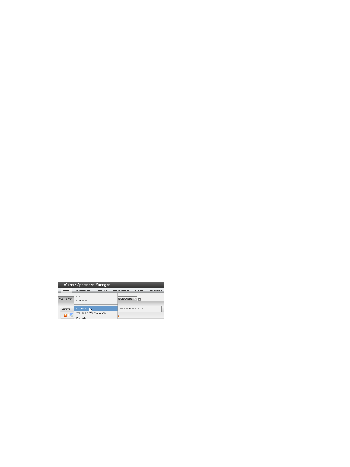
VMware vCenter Operations Manager Getting Started Guide
2 Create the dashboard by selecting widgets or by using a dashboard template.
Option Action
Create a dashboard by selecting
widgets
Create a dashboard from a template
3 Type a name for the new dashboard in the Tab Name text box.
To make the new dashboard appear in a group in the Dashboards menu, use the following syntax for
the dashboard name.
dashboard-group/dashboard-name
dashboard-group is the name of a dashboard group and dashboard-name is the name of the new
dashboard. If the dashboard group already exists, the new dashboard appears in the existing group. If
the dashboard group does not already exist, vCenter Operations Manager adds it. You can nest
dashboard groups by typing multiple dashboard group names, for example,
dashboard-group/dashboard-group/dashboard-name
a Drag each widget from the left pane to the right pane.
b Select the number of columns to use on the dashboard from the Select
Layout drop-down menu.
c (Optional) To change the size of the columns, drag the divider bars
under Drag to Change Layout.
a Click the Create Dashboard Using Templates icon in the corner of the
left pane to show the available dashboard templates.
b Drag a dashboard template to the right side of the window.
c Select the number of columns to use on the dashboard from the Select
Layout drop-down menu.
NOTE Only the dashboard name appears in the Dashboard menu and on the dashboard tab.
4 (Optional) Select Yes next to Mark as Default to make the new dashboard your default dashboard.
5 Click OK to save your changes.
Example: Creating a Multilevel Dashboard Menu
In the following example, a dashboard named Web Server Alerts appears in a dashboard group named
Alerts in the Dashboards menu.
To create this dashboard, type Alerts/Web Server Alerts in the Tab Name text box.
What to do next
The tab for the new dashboard appears to the right of the other dashboard tabs on your home page. To
change the order of the dashboard tab, see “Change the Order of Dashboard Tabs,” on page 45.
If you used a template to create the dashboard, you might want to change the layout or the widgets that it
contains. See “Edit a Dashboard,” on page 43 or “Working with Widgets,” on page 49.
42 VMware, Inc.
Page 43

Chapter 3 Designing Your Workspace
Clone a Dashboard
You can create a dashboard by making a copy of an existing dashboard.
Prerequisites
Verify that you have the necessary access rights to perform this task. Your vCenter Operations Manager
administrator can tell you which actions you can perform.
Procedure
1 Click the tab for the dashboard to clone.
2 Click Clone on the Dashboard Tools bar.
3 Type a name for the new dashboard and click OK.
What to do next
The tab for the new dashboard appears to the right of the other dashboard tabs on your Home page. To
change the order of the dashboard tab, see “Change the Order of Dashboard Tabs,” on page 45.
When you clone a dashboard, all of the widgets that are in the original dashboard appear in the new
dashboard. You might want to change the layout of the new dashboard or the widgets that it contains. See
“Edit a Dashboard,” on page 43 or “Working with Widgets,” on page 49.
Edit a Dashboard
You can change a dashboard name, select or deselect a dashboard as your default dashboard, and change
the number and size of the columns that appear on a dashboard.
For information about adding and removing widgets from a dashboard, see “Working with Widgets,” on
page 49.
Prerequisites
Verify that you have the necessary access rights to perform this task. Your vCenter Operations Manager
administrator can tell you which actions you can perform.
Procedure
1 Click the tab of the dashboard to edit.
2 Click Edit on the Dashboard Tools bar.
The available widgets appear in the left pane of the Dashboard Editing: Edit a Tab window.
3 Edit the dashboard.
Option Action
Change the name of the dashboard
Move the dashboard to a dashboard
group
Make the dashboard your default
dashboard
Type a different name in the Tab Name text box.
Type dashboard-group/dashboard-name in the Tab Name text box.
dashboard-group is the name of the dashboard group and dashboard-name is
the name of the dashboard. You can nest dashboard groups by typing
multiple dashboard group names, for example,
dashboard-group/dashboard-group/dashboard-name.
Select Yes next to Mark as Default.
VMware, Inc. 43
Page 44

VMware vCenter Operations Manager Getting Started Guide
Option Action
Change the number of columns on
the dashboard
Change the size of the columns on
the dashboard
4 Click OK to save your changes.
Delete a Dashboard
If you do not need a dashboard, you can delete it.
Prerequisites
Verify that you have the necessary access rights to perform this task. Your vCenter Operations Manager
administrator can tell you which actions you can perform.
Procedure
1 Click the tab for the dashboard to delete.
2 Click Delete on the Dashboard Tools bar.
3 Click Yes on the confirmation dialog box to delete the dashboard.
Select a different value from the Select Layout drop-down menu.
Drag the divider bars under Drag to Change Layout.
After the dashboard is deleted, its tab does not appear on your Home page.
Create a Dashboard Template
If the predefined dashboard templates do not meet your needs, you can create your own dashboard
templates. A dashboard template contains all of the information in a dashboard definition. You can use a
dashboard template to create dashboards.
Prerequisites
Verify that you have the necessary access rights to perform this task. Your vCenter Operations Manager
n
administrator can tell you which actions you can perform.
Select a dashboard to use for the template, or create a dashboard to use for the template. See “Create a
n
Dashboard,” on page 41.
Procedure
1 Click the tab for the dashboard to use for the template.
2 Click Create Template on the Dashboard Tools bar.
3 Type a name for the new dashboard template and click OK.
After the dashboard template is created, you and other users can use the template to create dashboards. See
“Create a Dashboard,” on page 41.
44 VMware, Inc.
Page 45

Chapter 3 Designing Your Workspace
Hide a Dashboard Tab
When you first log in to vCenter Operations Manager, you can see the tab for your default dashboard. An
additional tab appears each time you select a dashboard from the Dashboards menu. To optimize your
workspace, you might want to hide some of these dashboard tabs.
Prerequisites
Verify that you have the necessary access rights to perform this task. Your vCenter Operations Manager
administrator can tell you which actions you can perform.
Procedure
To hide a dashboard tab, click the close icon on the dashboard.
n
The close icon appears as an x after the dashboard name.
To show a dashboard tab that was previously hidden, select the dashboard from the Dashboards menu.
n
Visible dashboard tabs persist between sessions.
Change the Order of Dashboard Tabs
You can change the order of the dashboard tabs on your home page.
Prerequisites
Verify that you have the necessary access rights to perform this task. Your vCenter Operations Manager
administrator can tell you which actions you can perform.
Procedure
1 Select Dashboards > Reorder Tabs.
2 Drag and drop the tab to its new location.
3 Click OK to save your changes.
Delete a Dashboard Template
If you do not need a dashboard template, you can delete it.
Prerequisites
Verify that you have the necessary access rights to perform this task. Your vCenter Operations Manager
administrator can tell you which actions you can perform.
Procedure
1 Select Dasbboards > Add.
2 Click the Create Dashboard Using Templates icon in the corner of the left pane.
The available dashboard templates appear in the left pane.
3 Click the Manage Templates link.
4 Select the dashboard template to remove and click the Remove Selected Dashboard Template icon.
5 Click Yes on the confirmation dialog box to delete the dashboard template.
VMware, Inc. 45
Page 46

VMware vCenter Operations Manager Getting Started Guide
Configure Dashboard Switching
You can configure vCenter Operations Manager to switch from one dashboard to another. This feature is
useful if you have several dashboards that show different aspects of your enterprise's performance and you
want to look at each dashboard in turn.
Prerequisites
Verify that you have the necessary access rights to perform this task. Your vCenter Operations Manager
administrator can tell you which actions you can perform.
Procedure
1 Select Dashboards > Reorder Tabs.
2 Select On next to the dashboard.
3 Type the number of seconds to wait before switching the dashboard in the Seconds text box next to the
dashboard.
4 Select the dashboard to switch to from the To this Tab drop-down menu next to the dasbhoard.
5 Click OK to save your changes.
Share a Dashboard
You can share a dashboard with one or more user groups. When you share a dashboard, it becomes
available to all of the users in the user group that you select. The dashboard appears the same to all of the
users who share it. If you edit a shared dashboard, the dashboard changes for all users.
NOTE Other users can only view a shared dashboard. They cannot change it.
Prerequisites
Verify that you have the necessary access rights to perform this task. Your vCenter Operations Manager
administrator can tell you which actions you can perform.
Procedure
1 Click the tab for the dashboard to share.
2 Click Share on the Dashboard Tools bar.
3 Select the dashboard in the Shared Dashboards pane and drag it to one or more user groups in the
Accounts Groups pane.
4 Click OK to save your changes.
After you share a dashboard, an icon appears on the dashboard tab to indicate that you are sharing the
dashboard. When another user views the shared dashboard, a key icon on the dashboard tab indicates that
the user cannot edit the dashboard.
Stop Sharing a Dashboard
If you do not want other users to be able to use a dashboard that you previously shared, you can stop
sharing it.
Prerequisites
Verify that you have the necessary access rights to perform this task. Your vCenter Operations Manager
administrator can tell you which actions you can perform.
46 VMware, Inc.
Page 47

Chapter 3 Designing Your Workspace
Procedure
1 Click the tab for the dashboard to stop sharing.
2 Click Share on the Dashboard Tools bar.
3 Select the dashboard on the Shared Dashboards pane and click the Stop Sharing Dashboard icon.
4 Click OK to save your changes.
Export a Dashboard
You can export a dashboard from one vCenter Operations Manager instance and import it into another
vCenter Operations Manager instance.
When you export a dashboard, vCenter Operations Manager creates a dashboard file in XML format.
Procedure
1 Click the tab for the dashboard to export.
2 Click Export on the Dashboard Tools bar.
3 Select Save File and click OK to download the dashboard file to your computer.
What to do next
Import the dashboard file into another instance of vCenter Operations Manager. See “Import a Dashboard,”
on page 47.
Import a Dashboard
You can import a dashboard that was exported from another instance of vCenter Operations Manager. You
can import XML format and Java binary object (.bin) format dashboard files.
Prerequisites
Export a dashboard from another vCenter Operations Manager instance. See “Export a Dashboard,” on
page 47.
The dashboard to import must be exported from an instance that is running the same version of
vCenter Operations Manager as the target instance.
Procedure
1 Click Import on the Dashboard Tools bar.
2 Click Browse, select the exported dashboard file, and click Open.
3 Click Import to import the dashboard.
4 If the target instance contains a dashboard that has the same name as the dashboard you are importing,
click Yes to create a duplicate dashboard or click No to cancel the import.
The dashboard tab appears in the user interface after the import is finished.
VMware, Inc. 47
Page 48

VMware vCenter Operations Manager Getting Started Guide
vSphere Dashboards
The vSphere group in the Dashboards menu contains several default dashboards for managing virtual
objects in a vSphere environment. These default dashboards are available to all members of the
Administrators, Operators, and Users user groups.
Troubleshooting Dashboard
The Troubleshooting dashboard contains several widgets to help you troubleshoot virtual resources. For
example, you can use the VC Object widget to search for virtual resources and the VC Relationship widget
to view performance and relationship data for virtual resources. If you select a resource in the VC
Relationship widget, problem symptoms and important metrics for that resource appear in the Ordered
Symptoms and Interesting Metrics widgets.
VM Utilization Dashboard
The VM Utilization dashboard shows the top 25 virtual machines by CPU use, memory use, disk inputoutput per second (IOPS), network traffic received, and network traffic transmitted.
You can use the widgets that appear below the Top 25 widgets to identify trends. For example, if you select
a virtual machine in the Top 25 VMs by Mem Usage (%) widget, a memory use graph for that virtual
machine appears in the Select Above for Mem Usage (%) History widget. You can use the Date Controls
icon on the widget toolbar to select a specific time period for the history view.
VM Performance Dasbhoard
The VM Performance widget shows the top 25 virtual machines by CPU ready percentage, swap in and
swap out rate, read and write latency, disk commands per second, and packets received and transmitted per
second.
Host Utilization Dashboard
The Host Utilization dashboard shows the top 25 hosts by CPU use, memory use, disk IOPS, and
transmitted and received network traffic.
You can use the widgets that appear below the Top 25 widgets to identify trends. For example, if you select
a host in the Top 25 Hosts by CPU Usage (%) widget, a CPU use graph for that host appears in the Select
Above for CPU Usage (%) History widget. You can click the Date Controls icon on the widget toolbar to
select a specific time period for the history view.
Cluster Utilization Dashboard
The Cluster Utilization dashboard shows the top 25 clusters by CPU use, memory use, disk IOPS, and
transmitted and received network traffic.
You can use the widgets that appear below the Top 25 widgets to identify trends. For example, if you select
a cluster in the Top 25 Clusters by Mem Usage (%) widget, a memory use graph for that cluster appears in
the Select Above for Mem Usage (%) History widget. You can the Date Controls icon on the widget toolbar
to select a specific time period for the history view.
Datastore Performance Dashboard
The Datastore Performance dashboard shows the top 25 datastores by disk command latency and
commands per second and identifies the virtual machines that are causing latency.
48 VMware, Inc.
Page 49

Chapter 3 Designing Your Workspace
Datastore Space Dashboard
The Datastore Space dashboard shows datastore capacity and identifies the virtual machines that are using
disk space on each datastore. You can point to a datastore in the Datastore Capacity widget to view
available space and total capacity. If you select a datastore in the Datastore Capacity widget, the virtual
machines that use disk space in that datastore appear in the VM Using Diskspace widget.
The widget that appears below the Datastore Capacity widget identifies trends in datastore use. You can use
the Date Controls icon on the widget toolbar to select a specific time period for the historical view.
Heatmaps Dashboard
The Heatmaps dashboard includes heat maps for CPU, memory, disk, and network load. You can use the
Configuration drop-down menu on a heat map widget toolbar to change the display. For example, for the
CPU Load widget you can select configurations to show virtual machines by CPU use or CPU ready
percentage, hosts by CPU use, or clusters by CPU demand.
You can use the widgets that appear below the heat map widgets to identify trends. For example, if you
select a virtual machine in the Disk Load widget, a disk use graph appears for that virtual machine in the
Click Above to See Disk History View widget. The Date Controls icon on the widget toolbar lets you select a
specific time period for the history view.
Alerts Dashboard
The Alerts dashboard shows operational alerts for host systems and vCenter Server resources. If you select a
resource in the Operations Alerts widget, the Health Tree widget shows the section of your resource
hierarchy around that resource.
The Interesting Metrics widget helps you to identify the values of important metrics during a specific period
of time. You can use the Date Controls icon on the Interesting Metrics widget toolbar to select a specific
time period for the history view.
Host Memory Dashboard
The Host Memory dashboard shows the top 25 hosts by memory use and identifies the virtual machines that
are using memory on each host. If you select a host in the Top 25 Hosts by Memory Usage widget, the
virtual machines that use memory on that host appear in the Click Above to See VM Memory Usage widget.
Working with Widgets
A widget is a pane on a dashboard that contains information about configured attributes, resources,
applications, or the overall processes in your environment. Widgets can provide a holistic, end-to-end view
of the health of all of the applications in your enterprise. If your user account has the necessary access rights,
you can add and remove widgets from your dashboards.
Summary of Widgets
vCenter Operations Manager includes many types of widgets.
Table 3‑1. Summary of Widgets
Widget Name Description
Advanced Health Tree Similar to the Health Tree widget, but includes information about the
resource's grandchildren and indicates the health of each resource that it
shows.
Alerts Lists all alerts for all monitored resources.
Application Detail Shows the health and alert counts for each tier in a single selected
application.
VMware, Inc. 49
Page 50

VMware vCenter Operations Manager Getting Started Guide
Table 3‑1. Summary of Widgets (Continued)
Widget Name Description
Application Overview Shows the overall health and the health of each tier for one or more
Configuration Overview Shows statistics for the overall monitored environment.
Data Distribution Analysis Shows how often a metric had a particular value, as a percentage of all
Geo Shows the location of resources that are assigned to GEO Location tag values.
Health Status Shows health information for selected resources, or all resources that have a
Health Tree Shows the indicator for a selected resource, its parent resource, and its child
Health-Workload Scoreboard Shows color-coded health or workload scores for selected resources.
Heat Map Shows performance information for a selected application as a heat map.
Mashup Chart Brings together disparate pieces of information for a resource. It shows a
Metric Graph Shows the recent performance of selected metrics graphically.
Metric Graph (Rolling View) Cycles through selected metrics at an interval that you define and shows one
Metric Selector Shows all metrics for the resources that are selected in the Resources widget.
Metric Sparklines Shows the values collected for one or more selected metrics graphically over
Metric Weather Map Uses changing colors to show the behavior of a selected metric over time for
Resources Lists all defined resources.
Root Cause Ranking Shows the likely root causes for symptoms for a selected resource.
Generic Scoreboard Shows values for selected metrics, which are typically KPIs, with color
Tag Selector Lists all defined resource tags.
Text Reads text from a Web page or text file and shows the text in the user
Top-N-Analysis Shows the top or bottom five metrics or resources in various categories, such
VC Relationship Shows the performance status of objects in your virtual environment and
VC Relationship (Planning) Provides use and badge metric information (risk, time, capacity, stress,
applications.
values, within a given time period. It can also compare percentages for two
time periods.
selected tag.
resources.
health chart, an anomaly count graph, and metric graphs for key
performance indicators (KPIs). This widget is typically used for an
application.
metric graph at a time. Miniature graphs, which you can expand, appear for
all selected metrics at the bottom of the widget.
a time period that you select.
multiple resources.
coding for defined value ranges.
interface.
as the five applications that have the best or worth health score.
their relationships. You can click an object to highlight its related objects and
double-click an object to view its Resource Detail page.
efficiency, waste, and density) for the resources in your virtual environment.
You can use this information to plan for capacity upgrades or rebalance the
workload in your virtual infrastructure.
For detailed information about these widgets, see Chapter 4, “Using and Configuring Widgets,” on
page 53.
50 VMware, Inc.
Page 51

Chapter 3 Designing Your Workspace
Add a Widget to a Dashboard
You add a widget to a dashboard by editing the dashboard. You can add any widget to any dashboard. A
dashboard typically contains widgets that show related information, such as different views of the
performance of a particular group of resources or similar alerts for separate applications.
NOTE You can add any number of widgets to a dashboard, but the more widgets that you add, the further
you must scroll down the browser window to use a widget.
Prerequisites
Verify that you have the necessary access rights to perform this task. Your vCenter Operations Manager
n
administrator can tell you which actions you can perform.
Become familiar with the available widgets. See Chapter 4, “Using and Configuring Widgets,” on
n
page 53.
Procedure
1 Click the tab for the dashboard.
2 Click Edit on the Dashboard Tools bar.
The available widgets appear in the left pane of the Dashboard Editing: Edit a Tab window.
3 Drag the widget to add from the left pane to the right pane.
4 Click OK to save your changes.
The widget appears on the dashboard.
What to do next
If necessary, edit the widget configuration. See “Edit a Widget Configuration,” on page 54.
Remove a Widget from a Dashboard
You can remove a widget from a dashboard by editing the dashboard or by clicking an icon on the widget's
toolbar.
Prerequisites
Verify that you have the necessary access rights to perform this task. Your vCenter Operations Manager
administrator can tell you which actions you can perform.
Procedure
1 Click the tab for the dashboard that contains the widget to remove.
2 Remove the widget from the dashboard.
Option Action
Remove the widget by editing the
dashboard
Remove the widget by using the
widget toolbar
a Click Edit on the Dashboard Tools bar.
b Find the widget in the right pane and click its Delete Widget icon.
c Click OK to save your changes.
a Click the Close Widget icon on the widget's toolbar.
b Click Yes on the confirmation dialog box to remove the widget.
VMware, Inc. 51
Page 52

VMware vCenter Operations Manager Getting Started Guide
Resize a Widget
You can change the height of a widget on a dashboard.
The width of the column that contains a widget determines the width of the widget. To change the size of
the columns on a dashboard, see “Edit a Dashboard,” on page 43.
Prerequisites
Verify that you have the necessary access rights to perform this task. Your vCenter Operations Manager
administrator can tell you which actions you can perform.
Procedure
1 Click the tab for the dashboard that contains the widget to resize.
2 Resize the widget.
Option Description
Make the widget larger
Make the widget smaller
Click the Expand Widget icon on the widget's toolbar.
Click the Shrink Widget icon on the widget's toolbar.
Expand or Collapse a Widget
When you collapse a widget, its data is hidden and only its title bar is visible. You can expand a collapsed
widget to make its data visible again.
Prerequisites
Verify that you have the necessary access rights to perform this task. Your vCenter Operations Manager
administrator can tell you which actions you can perform.
Procedure
1 Click the tab for the dashboard that contains the widget to expand or collapse.
2 To expand a widget, or collapse an expanded widget, click the Expand/Collapse Widget icon on the
widget's toolbar.
The Expand/Collapse Widget icon arrow changes direction depending on whether the widget is
collapsed or expanded.
52 VMware, Inc.
Page 53

Using and Configuring Widgets 4
Widgets include configuration options that you can edit to customize them for your use. For example, you
can select the metrics that the Data Distribution Analysis widget shows by editing its configuration. The
available configuration options vary depending on the widget type. Some widgets do not show any data
until you configure them.
Most widgets can provide information to, or receive information from, other widgets. For example, you can
configure the Metric Sparklines widget to show a graph for a metric that you select in the Metric Selector
widget. These relationships are called widget interactions.
This chapter includes the following topics:
“Edit a Widget Configuration,” on page 54
n
“Supported Widget Interactions,” on page 55
n
“Configure Widget Interactions,” on page 61
n
“Advanced Health Tree Widget,” on page 62
n
“Alerts Widget,” on page 64
n
“Application Detail Widget,” on page 66
n
“Application Overview Widget,” on page 67
n
VMware, Inc.
“Configuration Overview Widget,” on page 68
n
“Custom Relationship Widget,” on page 69
n
“Data Distribution Analysis Widget,” on page 71
n
“Generic Scoreboard Widget,” on page 73
n
“GEO Widget,” on page 76
n
“Health Status Widget,” on page 77
n
“Health Tree Widget,” on page 78
n
“Health-Workload Scoreboard Widget,” on page 80
n
“Heat Map Widget,” on page 81
n
“Mashup Charts Widget,” on page 84
n
“Metric Graph Widget,” on page 86
n
“Metric Graph (Rolling View) Widget,” on page 90
n
“Metric Selector Widget,” on page 93
n
“Metric Sparklines Widget,” on page 94
n
53
Page 54

VMware vCenter Operations Manager Getting Started Guide
“Metric Weather Map Widget,” on page 97
n
“Resources Widget,” on page 99
n
“Root Cause Ranking Widget,” on page 101
n
“Tag Selector Widget,” on page 102
n
“Text Widget,” on page 103
n
“Top-N Analysis Widget,” on page 104
n
“VC Relationship Widget,” on page 107
n
“VC Relationship (Planning) Widget,” on page 108
n
“Define Metric Sets for a Widget,” on page 109
n
Edit a Widget Configuration
You customize a widget by editing its configuration options. Some widgets do not show data until you
configure them. The available configuration options vary depending on the widget type.
Prerequisites
Verify that you have the necessary access rights to perform this task. Your vCenter Operations Manager
n
administrator can tell you which actions you can perform.
Become familiar with the configuration options for the widget to edit.
n
Procedure
1 Click the tab for the dashboard that contains the widget to edit.
2 Click the Edit Widget icon on the widget's toolbar.
The content of the Edit Widget window depends on the type of widget.
3 Type another name in the Widget title text box to customize the name of the widget.
4 Select a Self Provider option to specify where the objects that the widget shows are defined.
This option is not available if the widget cannot receive data from other widgets.
Option Description
On
Off
Define the objects that the widget shows in the widget configuration.
You configured, or plan to configure, one or more other widget to provide
objects to the widget.
5 Select a Refresh Widget Content option to specify whether the widget refreshes data after a specific
time period.
The default setting is Off.
6 If you set Refresh Widget Content to On, type the refresh interval, in seconds, in the Widget Refresh
Interval text box.
7 Edit any remaining configuration options, if required.
For example, if you set Self Provider to On, you must define the objects that the widget shows.
8 Click OK to save the widget configuration.
54 VMware, Inc.
Page 55

Supported Widget Interactions
Many widgets can provide data to, and accept data from, other widgets. These relationships are called
widget interactions.
In the following table, the widgets in the Providing Widgets 1 column can provide a resource ID to the
widget in the Receiving Widget column, and the widgets in the Providing Widgets 2 column can provide a
metric ID to the widget in the Receiving Widget column.
If widgets appear in both the Providing Widget 1 and Providing Widget 2 columns, you can select one
providing widget from each column.
Table 4‑1. Widget Interactions
Receiving Widget Providing Widget 1 Providing Widget 2
Advanced Health Tree
Alerts
Application Detail
n
n
n
n
n
n
n
n
n
n
n
n
n
n
n
n
n
n
n
n
n
n
n
n
n
n
n
n
n
n
n
n
n
n
n
n
n
n
n
n
Alerts
Application Overview
Custom Relationship
Generic Scoreboard
Health Status
Health Tree
Health-Workload Scoreboard
Heat Map
Resources
Root Cause Ranking
Top-N Analysis
VC Relationship
VC Relationship (Planning)
Advanced Health Tree
Application Overview
Custom Relationship
Generic Scoreboard
Health Status
Health Tree
Heat Map
Health-Workload Scoreboard
Resources
Root Cause Ranking
Top-N Analysis
VC Relationship
VC Relationship (Planning)
Advanced Health Tree
Alerts
Application Overview
Custom Relationship
Generic Scoreboard
Health Status
Health Tree
Health-Workload Scoreboard
Heat Map
Resources
Root Cause Ranking
Top-N Analysis
VC Relationship
VC Relationship (Planning)
Chapter 4 Using and Configuring Widgets
Tag Selector
Tag Selector
VMware, Inc. 55
Page 56

VMware vCenter Operations Manager Getting Started Guide
Table 4‑1. Widget Interactions (Continued)
Receiving Widget Providing Widget 1 Providing Widget 2
Application Overview None
Configuration Overview
Custom Relationship
Data Distribution Analysis
Generic Scoreboard
Advanced Health Tree
n
Alerts
n
Application Overview
n
Custom Relationship
n
Generic Scoreboard
n
Health Status
n
Health Tree
n
Heat Map
n
Health-Workload Scoreboard
n
Resources
n
Root Cause Ranking
n
Top-N Analysis
n
VC Relationship
n
VC Relationship (Planning)
n
Advanced Health Tree
n
Alerts
n
Application Overview
n
Generic Scoreboard
n
Health Status
n
Health Tree
n
Health-Workload Scoreboard
n
Heat Map
n
Metric Sparklines
n
Resources
n
Root Cause Ranking
n
Top-N Analysis
n
VC Relationship
n
VC Relationship (Planning)
n
Alerts
n
Generic Scoreboard
n
Health-Workload Scoreboard
n
Heat Map
n
Metric Selector
n
Root Cause Ranking
n
Top-N Analysis
n
VC Relationship
n
VC Relationship (Planning)
n
Advanced Health Tree
n
Alerts
n
Application Overview
n
Custom Relationship
n
Health Status
n
Health Tree
n
Health-Workload Scoreboard
n
Heat Map
n
Resources
n
Root Cause Ranking
n
Top-N Analysis
n
VC Relationship
n
VC Relationship (Planning)
n
Tag Selector
56 VMware, Inc.
Page 57

Chapter 4 Using and Configuring Widgets
Table 4‑1. Widget Interactions (Continued)
Receiving Widget Providing Widget 1 Providing Widget 2
GEO
Health Status
Health Tree
Health-Workload Scoreboard
Tag Selector
n
Advanced Health Tree
n
Alerts
n
Application Overview
n
Custom Relationship
n
Generic Scoreboard
n
Health Tree
n
Health-Workload Scoreboard
n
Heat Map
n
Resources
n
Root Cause Ranking
n
Top-N Analysis
n
VC Relationship
n
VC Relationship (Planning)
n
Advanced Health Tree
n
Alerts
n
Application Overview
n
Custom Relationship
n
Generic Scoreboard
n
Health Status
n
Health-Workload Scoreboard
n
Heat Map
n
Resources
n
Root Cause Ranking
n
Top-N Analysis
n
VC Relationship
n
VC Relationship (Planning)
n
Advanced Health Tree
n
Alerts
n
Application Overview
n
Custom Relationship
n
Generic Scoreboard
n
Health Status
n
Health Tree
n
Heat Map
n
Metric Sparklines
n
Resources
n
Root Cause Ranking
n
Top-N Analysis
n
VC Relationship
n
VC Relationship (Planning)
n
Tag Selector
Tag Selector
VMware, Inc. 57
Page 58

VMware vCenter Operations Manager Getting Started Guide
Table 4‑1. Widget Interactions (Continued)
Receiving Widget Providing Widget 1 Providing Widget 2
Heat Map
Mashup Charts
Metric Graph
Advanced Health Tree
n
Alerts
n
Application Overview
n
Custom Relationship
n
Generic Scoreboard
n
Health Status
n
Health Tree
n
Health-Workload Scoreboard
n
Resources
n
Root Cause Ranking
n
Top-N Analysis
n
VC Relationship
n
VC Relationship (Planning)
n
Advanced Health Tree
n
Alerts
n
Application Overview
n
Custom Relationship
n
Generic Scoreboard
n
Health Status
n
Health Tree
n
Health-Workload Scoreboard
n
Heat Map
n
Resources
n
Root Cause Ranking
n
Top-N Analysis
n
VC Relationship
n
VC Relationship (Planning)
n
Advanced Health Tree
n
Alerts
n
Application Overview
n
Custom Relationship
n
Generic Scoreboard
n
Health Status
n
Health Tree
n
Health-Workload Scoreboard
n
Heat Map
n
Resources
n
Root Cause Ranking
n
Top-N Analysis
n
VC Relationship
n
VC Relationship (Planning)
n
Tag Selector
Alerts
n
Generic Scoreboard
n
Health-Workload Scoreboard
n
Heat Map
n
Metric Selector
n
Metric Sparklines
n
Root Cause Ranking
n
Top-N Analysis
n
VC Relationship
n
VC Relationship (Planning)
n
58 VMware, Inc.
Page 59

Chapter 4 Using and Configuring Widgets
Table 4‑1. Widget Interactions (Continued)
Receiving Widget Providing Widget 1 Providing Widget 2
Metric Graph (Rolling View)
Metric Selector
Metric Sparklines
Metric Weather Map None
Advanced Health Tree
n
Alerts
n
Application Overview
n
Custom Relationship
n
Generic Scoreboard
n
Health Status
n
Health Tree
n
Health-Workload Scoreboard
n
Heat Map
n
Resources
n
Root Cause Ranking
n
Top-N Analysis
n
VC Relationship
n
VC Relationship (Planning)
n
Advanced Health Tree
n
Alerts
n
Application Overview
n
Custom Relationship
n
Generic Scoreboard
n
Health Status
n
Health Tree
n
Health-Workload Scoreboard
n
Heat Map
n
Resources
n
Root Cause Ranking
n
Top-N Anaysis
n
VC Relationship
n
VC Relationship (Planning)
n
Advanced Health Tree
n
Alerts
n
Application Overview
n
Custom Relationship
n
Generic Scoreboard
n
Health Status
n
Health Tree
n
Health-Workload Scoreboard
n
Heat Map
n
Resources
n
Root Cause Ranking
n
Top-N Analysis
n
VC Relationship
n
VC Relationship (Planning)
n
Alerts
n
Generic Scoreboard
n
Health-Workload Scoreboard
n
Heat Map
n
Metric Selector
n
Root Cause Ranking
n
Top-N Analysis
n
Alerts
n
Generic Scoreboard
n
Health-Workload Scoreboard
n
Heat Map
n
Metric Selector
n
Root Cause Ranking
n
Top-N Analysis
n
VMware, Inc. 59
Page 60

VMware vCenter Operations Manager Getting Started Guide
Table 4‑1. Widget Interactions (Continued)
Receiving Widget Providing Widget 1 Providing Widget 2
Resources
Root Cause Ranking
Tag Selector None
Top-N-Analysis Tag Selector
Advanced Health Tree
n
Alerts
n
Application Overview
n
Custom Relationship
n
Generic Scoreboard
n
Health Status
n
Health Tree
n
Health-Workload Scoreboard
n
Heat Map
n
Root Cause Ranking
n
Top-N Analysis
n
VC Relationship
n
VC Relationship (Planning)
n
Advanced Health Tree
n
Alerts
n
Application Overview
n
Custom Relationship
n
Generic Scoreboard
n
Health Status
n
Health Tree
n
Health-Workload Scoreboard
n
Heat Map
n
Resources
n
Top-N Analysis
n
VC Relationship
n
VC Relationship (Planning)
n
Tag Selector
n
Alerts
n
NOTE For the Resources widget, the
Alerts widget is in a separate provider
category. If it is a provider, selecting
one or more alerts displays the
resources for those alerts. You can
select the Alerts widget and any
providing widget that is selected from
the other two categories.
Tag Selector
60 VMware, Inc.
Page 61

Chapter 4 Using and Configuring Widgets
Table 4‑1. Widget Interactions (Continued)
Receiving Widget Providing Widget 1 Providing Widget 2
VC Relationship
VC Relationship Planning
Advanced Health Tree
n
Alerts
n
Application Overview
n
Custom Relationship
n
Generic Scoreboard
n
Health Status
n
Health Tree
n
Health-Workload Scoreboard
n
Heat Map
n
Metric Sparklines
n
Resources
n
Root Cause Ranking
n
Top-N Analysis
n
VC Relationship (Planning)
n
Advanced Health Tree
n
Alerts
n
Application Overview
n
Custom Relationship
n
Generic Scoreboard
n
Health Status
n
Health Tree
n
Health-Workload Scoreboard
n
Heat Map
n
Metric Sparklines
n
Resources
n
Root Cause Ranking
n
Top-N Analysis
n
VC Relationship
n
Configure Widget Interactions
You can configure a widget to show information for resources, applications, tags, or metrics that you select
in another widget. For example, you can configure the Metric Sparklines widget to show a graph for a
metric that you select in the Metric Selector widget. Both widgets must appear on the same dashboard.
When you configure widget interaction, you specify the widget that provides the information, called the
providing widget, to the widget that shows the information, called the receiving widget.
For some widgets, you can define two providing widgets. For example, you can configure the Root Cause
Ranking widget to receive data from the Tag Selector widget and the Health Status widget. In this case, the
Root Cause Ranking widget shows root cause data for any resource that you select in the Health Status
widget or for resources that have the tag value that you select in the Tag Selector widget.
Widget interactions apply only to the dashboard where you define them. For example, on one dashboard,
the Root Cause Ranking widget might receive its resources from the Health Widget widget. On another
dashboard, the Root Cause Ranking widget might receive its resources from the Tag Selector widget.
Prerequisites
Verify that you have the necessary access rights to perform this task. Your vCenter Operations Manager
n
administrator can tell you which actions you can perform.
Become familiar with the widgets that can provide and receive data from other widgets. See
n
“Supported Widget Interactions,” on page 55.
VMware, Inc. 61
Page 62

VMware vCenter Operations Manager Getting Started Guide
Procedure
1 Click the tab for the dashboard that contains the widgets to interact.
2 Click Interactions on the Dashboard Tools bar.
The Receiving Widget column on the Configure Widget Interactions window lists the widgets on the
dashboard that can receive information from another widget on the dashboard.
3 For each receiving widget, select a providing widget or select None.
If the Providing Widget column has two drop-down menus for a receiving widget, you can select one
providing widget from each menu. When you select None for all of the providing widgets, that widget
does not show any data unless you configure it is as a self provider.
4 Click OK to save the configuration.
Advanced Health Tree Widget
The Advanced Health Tree widget shows the section of your resource hierarchy around any resources that
you select. The widget shows the selected resource and its parent and child resources. The Advanced Health
Tree widget is similar to the Health Tree widget, except that it includes information about the resource's
grandchildren and indicates the health of each resource.
Figure 4‑1. Advanced Health Tree Widget
The color of the icon for each resource indicates its current health. The Advanced Health Tree widget shows
the number of children for each child, by current health color. For example, it might show that one child
resource has five children that have good health (green), and three children that have abnormal health
(yellow).
You can click any resource to make it the center of the relationships. When a resource is the center of the
relationships, the widget shows the resource's parents, children, and grandchildren count.
The toolbar at the top of the Advanced Health Tree widget contains icons that you can use to change the
appearance of the hierarchy.
Table 4‑2. Advanced Health Tree Widget Toolbar Icons
Icon Description
Zoom to Fit Changes the size of the resource icons for the best possible fit in the widget.
Pan Click this icon and click and drag the hierarchy to show different parts of the
hierarchy.
Image Map Tooltip Click this icon and point to a resource to show its name and current health.
Zoom the view Click this icon and drag to outline a part of the hierarchy. The display zooms to
show only the outlined section.
Zoom in Zooms in on the hierarchy.
Zoom out Zooms out on the hierarchy.
62 VMware, Inc.
Page 63

Chapter 4 Using and Configuring Widgets
Table 4‑2. Advanced Health Tree Widget Toolbar Icons (Continued)
Icon Description
Reset To Initial Resource If you changed the central resource of the hierarchy, click this icon to return to the
initial resource. Clicking this icon also resets the initial display size.
Resource Detail Select a resource and click this icon to show the Resource Detail page for the
resource.
Show Alerts Select the resource in the hierarchy and click this icon to show alerts for the
resource. Alerts appear in a pop-up window. You can double-click an alert to
view its Alert Summary page.
Display Filtering Criteria Shows the filtering settings for the widget in a pop-up window.
Configure the Advanced Health Tree Widget
By default, the Advanced Health Tree widget includes all parent and child resources that match the selected
resource. You can edit the widget configuration to limit the parent and child resources that the widget
shows.
You can also configure other widgets to provide a resource to the Advanced Health Tree widget. See
“Configure Widget Interactions,” on page 61.
Prerequisites
Verify that you have the necessary access rights to perform this task. Your vCenter Operations Manager
n
administrator can tell you which actions you can perform.
Open the Edit Widget window for the Advanced Health Tree widget. See “Edit a Widget
n
Configuration,” on page 54.
Procedure
1 Set Self Provider to On to define a resource in the widget configuration.
2 In the Resource Selection pane, select the resource.
To find a specific resource, type all or part of the resource name in the Search text box and click the
right angle bracket (>).
The name of the resource that you select appears after Selected Resource.
3 (Optional) To limit the parent and child resources that the widget shows, select one or more tag values
in the Select which tags to filter pane.
You can use icons on the toolbar at the top of the pane to collapse, expand, and deselect all of the tags in
the list
When you select more than one value for the same tag, the widget shows resources that have either
value. When you select values for two or more tags, the widget shows only resources that have all of
the values that you select. When you click the Invert Result icon, the widget shows only resources that
do not match the tag values that you select.
4 Click OK to save the widget configuration.
5 (Optional) To verify the filtering settings that you configured for the widget, click the Display Filtering
Criteria icon on the widget's toolbar.
The filtering settings appear in a pop-up window.
VMware, Inc. 63
Page 64
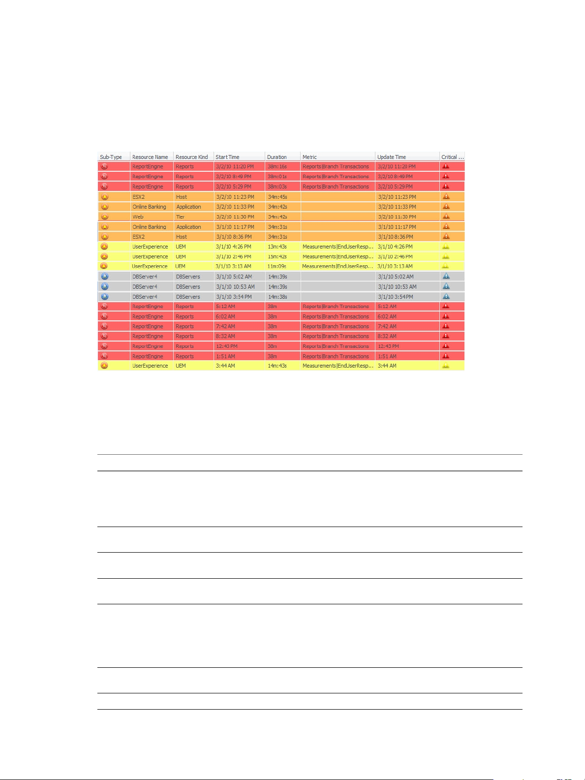
VMware vCenter Operations Manager Getting Started Guide
Alerts Widget
The Alerts widget lists alerts for selected resources and provides a convenient way to view and manage
alerts. When you double-click an alert in the Alerts widget, the Alert Summary page appears and shows
more detailed information about the alert.
Figure 4‑2. Alerts Widget
If the Alerts widget accepts resources from another widget, it shows alerts for the provided resource and all
of its children unless the resource is an application. For applications, it shows alerts for the application, its
tiers, and the resources in the tiers.
The toolbar at the top of the Alerts widget contains icons that you can use to view alert information.
Table 4‑3. Alerts Widget Toolbar Icons
Icon Description
RSS Feed Lets you receive RSS feeds of issued alerts in your Web browser. Only alerts that appear in the
widget as it is configured are included. For example, if the widget is set to show alerts only for a
particular application, only alerts for that application are included in the RSS feed. The detail
message of an individual alert appears in the feed's headline. Depending on the RSS client that
you use, details for all anomalies related to the alert appear in the feed's body.
Reset Grid Sort Returns the grid to the default sort order, which is set on the Edit Alerts Widget window, if you
changed it when you used the widget.
Reset Interaction Returns the widget to its initial configured state and undoes any interactions made from another
providing widget.
Perform Multi-Select
Interaction
Colorize Rows By
Alert Type
Cancel Alert Cancels the selected alert. You can cancel only one alert at a time. You can cancel an alert only if
Suspend Suspends the selected alerts. You can enter the number of minutes to suspend the alerts.
Press Ctrl+click to select multiple individual resources or Shift+click to select a range of resources
and click this icon.
Sets the background color for each alert’s row based on its criticality.
Critical is Red
n
Immediate is Orange
n
Warning is Yellow
n
Information is Blue
n
your user account name has administrative access rights.
64 VMware, Inc.
Page 65

Chapter 4 Using and Configuring Widgets
Table 4‑3. Alerts Widget Toolbar Icons (Continued)
Icon Description
Suppress Suppresses the selected alerts. You can enter the number of days to suppress the alerts.
Take Ownership Takes ownership of the selected alerts.
Release Ownership Releases ownership of the selected alerts.
Configure the Alerts Widget
You can configure the Alerts widget to show alerts for specific resources. You can also configure filters to
limit the alerts that the widget shows and specify the default sort order of the alerts.
The Alerts widget uses the filters that you configure whether you define resources in the Alerts widget
configuration or another widget provides resources to the Alerts widget. If you select a resource in the
providing widget that does not match the filters that you configure, its alerts do not appear in the Alerts
widget.
Prerequisites
Verify that you have the necessary access rights to perform this task. Your vCenter Operations Manager
n
administrator can tell you which actions you can perform.
Open the Edit Widget window for the Alerts widget. See “Edit a Widget Configuration,” on page 54.
n
Procedure
1 To limit the number of alerts that appear on each page of the Alerts widget, type a value in the
Pagination number text box.
The default value is 100.
2 To configure the Alerts widget to show alerts only for resources that have certain tag values, select the
tag values to monitor in the Select which tags to filter pane.
You can use icons on the toolbar at the top of the Select which tags to filter pane to collapse, expand,
and deselect all of the tags in the list.
When you select more than one value for the same tag, the widget includes resources that have either
value. When you select values for two or more tags, the widget includes only resources that have all of
the values that you select. When you click the Invert Result icon, the widget includes only resources
that do not match the tag values that you select.
3 Click one or more categories in the Filter By pane and select values to further limit the alerts that the
Alerts widget shows.
For example, if you click Time Range, you can select a range from the drop-down menu or type specific
dates and times in the From Date and To Date text boxes.
When you specify multiple filters, an alert must meet all of the criteria to appear in the widget.
4 Select sort criteria in the Sort Data By pane to set the default sort order for the alerts that the Alerts
widget shows.
You can use up to to four column values and any of the standard columns to sort by, except for
Resource Identifier.
5 Click OK to save the widget configuration.
VMware, Inc. 65
Page 66
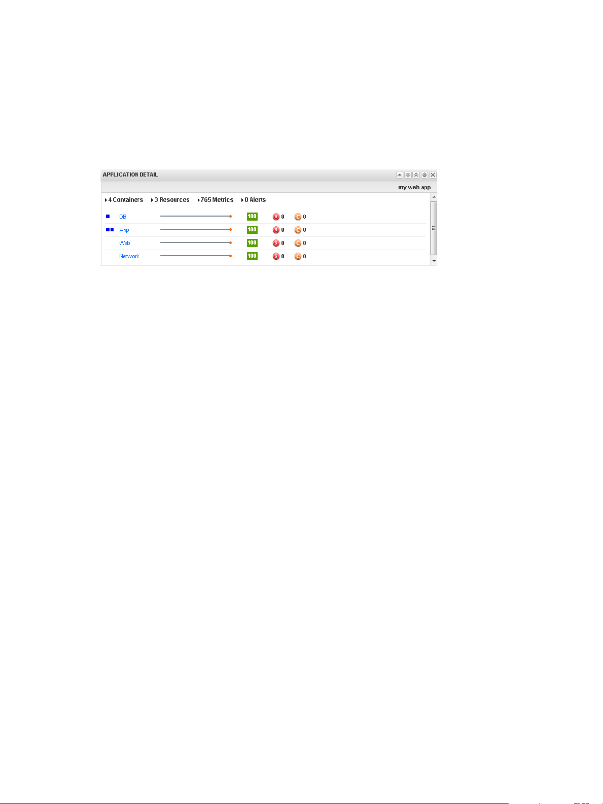
VMware vCenter Operations Manager Getting Started Guide
Application Detail Widget
The Application Detail widget shows information for a selected application or other container resources that
have at least one child container resource. The top of the widget shows the number of containers, resources,
and metrics that the application or container resource contains and the number of Smart Alerts and classic
alerts on the application or container resource.
Figure 4‑3. Application Detail Widget
For each container resource, the Application Detail widget shows the icons for the health of each resource in
that container, the container name, the metric sparkline for the last 24 hours, the container's current health
score, and the number of active Smart Alerts and classic alerts for the container itself.
The Application Detail widget shows only container resources that have at least one child container. It does
not show information for child resources.
Configure the Application Detail Widget
If the Application Detail widget is a self provider, you can select a tag value to monitor in the widget. You
can also configure the column arrangement in the widget.
You can also configure other widgets to provide an application or container resource to the Application
Detail widget. See “Configure Widget Interactions,” on page 61.
Prerequisites
Verify that you have the necessary access rights to perform this task. Your vCenter Operations Manager
n
administrator can tell you which actions you can perform.
Open the Edit Widget window for the Application Detail widget. See “Edit a Widget Configuration,”
n
on page 54.
Procedure
1 Set Self Provider to On to define applications in the widget configuration.
2 Select the tag value to monitor in the Select which tags to filter list.
You can use toolbar icons to collapse, expand, and deselect all tags in the list.
3 Use the Mode option to configure the Application Detail in Compact or Large mode.
The same information appears in both modes, but the column arrangement is different.
4 Click OK to save the widget configuration.
66 VMware, Inc.
Page 67
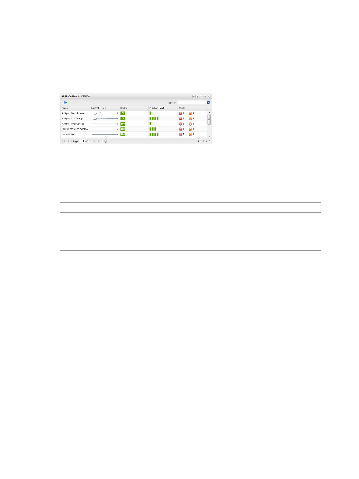
Application Overview Widget
The Application Overview widget can list all of the applications and other container resources in the
enterprise, or only applications and container resources that you select. The widget lists only application
and other container resources that have at least one child container resource.
Figure 4‑4. Application Overview Widget
The Application Overview widget shows a health graph for the last 24 hours, the current health score, the
current health of child container resources, and the number of alerts for the application or container
resource itself. You can double-click an application or container resource to open its Resource Detail page.
The toolbar at the top of the Application Overview widget contains icons that you can use to select multiple
widgets or to search for applications and container resources.
Chapter 4 Using and Configuring Widgets
Table 4‑4. Application Overview Widget Toolbar Icons
Icon Description
Perform Multi-Select
Interaction
Search To search for a particular application or container resource, type all or part of its name in
If the Application Overview widget is a provider for another widget on the dashboard,
you can click this icon to select multiple applications or container resources to display in
the receiving widget.
this text box and click the right angle bracket (>).
Configure the Application Overview Widget
You can filter the applications and container resources to show in the Application Overview widget by
editing the widget configuration. If you do not filter the applications and container resources in the widget
configuration, the Application Overview widget lists all of the applications and container resources in the
enterprise.
You cannot configure the Application Overview widget to accept applications or container resources from
other widgets.
Prerequisites
Verify that you have the necessary access rights to perform this task. Your vCenter Operations Manager
n
administrator can tell you which actions you can perform.
Open the Edit Widget window for the Application Overview widget. See “Edit a Widget
n
Configuration,” on page 54.
Procedure
1 Select one or more tag values in the Select which tags to filter list.
You can use toolbar icons to collapse, expand, and deselect all tags in the list.
2 Click OK to save the widget configuration.
VMware, Inc. 67
Page 68

VMware vCenter Operations Manager Getting Started Guide
Configuration Overview Widget
The Configuration Overview widget shows the current uptime functional status of defined resources,
applications, and collected metrics for the environment.
Figure 4‑5. Configuration Overview Widget
You can click the Reset Interaction icon on the toolbar at the top of the Configuration Overview widget to
return the widget to its initial configured state.
Configure the Configuration Overview Widget
You can filter the data and resources that the Configuration Overview widget shows by editing the widget
configuration.
You can also configure other widgets to provide resources to the Configuration Overview widget. See
“Configure Widget Interactions,” on page 61.
Prerequisites
Verify that you have the necessary access rights to perform this task. Your vCenter Operations Manager
n
administrator can tell you which actions you can perform.
Open the Edit Widget window for the Configuration Overview widget. See “Edit a Widget
n
Configuration,” on page 54.
Procedure
1 Set Self Provider to On to define resources in the widget configuration.
2 Select one or more categories or values to configure the data to include in the Configuration Overview
widget.
If you select the check box for a category, all of the data in that category is selected. If you do not make a
selection, all data appears in the widget.
3 Select the tag values for the resources in the Select which tags to filter list.
You can use toolbar icons to collapse, expand, and deselect all of the tags in the list.
4 Click OK to save the widget configuration.
68 VMware, Inc.
Page 69

Custom Relationship Widget
The Custom Relationship widget is a customizable widget that shows metric types for resource kinds that
you select. You specify the order in which the resource kinds appear in the widget display, set up metric
mappings for the resource kinds, define user interface labels, and set color range boundaries for each
mapped metric.
Figure 4‑6. Custom Relationship Widget
Chapter 4 Using and Configuring Widgets
The toolbar at the top left of the widget contains icons for each configured metric type. You can click these
icons to change the widget display.
The selected resource kinds appear in the widget display in the configured hierarchical order. You can use
the SORT BY drop-down menu to sort the resources of each resource kind by name or metric value. You
can move your mouse over a badge to see detailed metric information for a resource, or double-click a
badge to view the resource's Resource Detail page. Clicking a resource highlights the resource's parent and
child resources.
With the STATUS FILTER buttons at the top right of the widget, you can filter resources by resource state.
In large inventories, filtering resources by state can help you quickly find resources that have degraded
performance characteristics. A question mark (?) indicates an unknown metric and an X indicates an
unavailable resource.
Configure the Custom Relationship Widget
The Custom Relationship widget does not show any data until you configure it. You must select the metric
icons and resource kinds to show in the widget display, configure metric mappings for each selected
resource kind, and provide units of measure and color range boundaries for each mapped metric.
You can also configure other widgets to provide resources to the Custom Relationship widget. When you
select a resource in a providing widget, including resources that have resource kinds that are not configured
in the Custom Relationship widget, the Custom Relationship widget highlights the related resources. For a
list of providing widgets, see “Supported Widget Interactions,” on page 55.
Prerequisites
Verify that you have the necessary access rights to perform this task. Your vCenter Operations Manager
n
administrator can tell you which actions you can perform.
Open the Edit Widget window for the Custom Relationship widget. See “Edit a Widget Configuration,”
n
on page 54.
Procedure
1 Select the metric type icons to show in the widget display.
VMware, Inc. 69
Page 70

VMware vCenter Operations Manager Getting Started Guide
2 In the Resource Kinds pane, select the resource kinds to show in the widget display.
Option Action
Select a specific resource kind
Select multiple resource kinds
Select all resource kinds
Remove selected resource kinds
The resource kinds that you select appear in the Selected Resource Kinds pane.
3 (Optional) Change the order of the resource kinds in the Selected Resource Kinds pane.
To reorder a resource kind, drag it to a new location in the list.
4 (Optional) Filter resources that have certain tag values.
a In the Selected Resource Kinds pane, click Select Tags next to the resource kind name.
Double-click the resource kind.
a Press Ctrl+click to select multiple resource kinds or Shift+click to select
a range of resource kinds.
b Click the Perform Multi-Select Interaction icon on the toolbar at the
top of the Resource Kinds pane.
a Click the Select All icon on the toolbar at the top of the Resoure Kinds
pane.
b Click the Perform Multi-Select Interaction icon on the toolbar at the
top of the Resource Kinds pane.
Click the Clear Selections icon.
b Select the tag values to filter in the Select which tags to filter list.
You can use icons on the toolbar at the top of the list to collapse, expand, and deselect all of the tags
in the list. When you click the Invert Result icon, the widget shows only resources that do not
match the tag values that you select.
When you select more than one value for the same tag, the widget shows resources that have either
value. When you select values for two or more tags, the widget shows only resources that have all of
the values that you select.
5 Configure a metric mapping for each resource kind.
a In the Selected Resource Kinds pane, click Edit Metrics Mapping next to the resource kind name.
b For each metric type icon in the Metrics Mapping pane, click the Select Metric link.
The Pick Metrics with Resource Kind dialog box appears.
c Select a metric in the Metric Selector with Resource Selection pane.
The resource kind is preselected. You can select only one metric per metric type icon.
The metric that you select appears in the Selected Metrics pane.
d In the Selected Metrics pane, type a label for the selected metric.
e Click Save to save your changes.
6 In the Metrics Mapping pane, set values for each metric type icon.
To enter a value, move your cursor to the text box under the column heading, double-click in the text
box, and type the value.
Option Action
Box Label
Measurement Unit
Yellow Bound
70 VMware, Inc.
(Optional) Modify the label for the metric.
Type the measurement unit that appears after the metric value.
Type the highest or lowest value that should be yellow.
Page 71

Option Action
Orange Bound
Red Bound
Type the highest or lowest value that should be orange.
Type the highest or lowest value that should be red.
You cannot edit the color boundaries for health-related metrics, such as vCenter Operations Generated
| Self - Health Score, in the Metrics Mapping pane. The color boundaries for these metrics are
configured for you when you save the widget configuration. vCenter Operations Manager obtains color
range values for health-related metrics from global settings (select Admin > Global Settings) .
7 Click OK to save the widget configuration.
Data Distribution Analysis Widget
The Data Distribution Analysis widget shows a graph for selected metrics. For each metric, the graph shows
the data distribution of the metric, including how often it had a particular value.
Figure 4‑7. Data Distribution Widget
Chapter 4 Using and Configuring Widgets
You can use the Data Distribution Analysis widget to compare the values of a metric over two time periods.
By default, the widget compares the last seven days to the last 30 days. The x-axis of the graph shows the
range of received values for the metric, from lowest to highest, over the selected time period. The y-axis is
the percentage of the received metrics that had that value.
The graph has a Density mode and a Distribution mode.
Density mode
Distribution mode
Shows how often the metric had each particular value.
Shows the percentage possibility that the metric was at or below the x-axis
value. The y-axis always ranges from 0 to 1. The right edge of the graph
always reaches a value of 1, which shows that all received readings were at
or below the maximum value indicated on the x-axis. At any point in the
middle of the graph, the y-axis value is the percentage of collected values
that were at or below the x-axis value, or the probability that any one
collected value was at or below that value.
To change the graph to Distribution mode, click the Change to distribution mode icon.
If you graph only one time period in either mode, the graph might include vertical lines at the 75, 90, and 95
percent levels. You can edit the widget to add or remove the percentage lines.
You can click the Date Controls icon to change either or both time periods on the graph. In the two dropdown menus that appear, select the time periods for the graph. To show only one time period, select Not
Selected from the second drop-down menu. You can click the Date Controls icon again to hide the date.
VMware, Inc. 71
Page 72

VMware vCenter Operations Manager Getting Started Guide
Configure the Data Distribution Analysis Widget
You can select the metrics that the Data Distribution Analysis widget shows by editing the widget
configuration.
You can also configure other widgets to provide metric selections to the Data Distribution Analysis widget.
See “Configure Widget Interactions,” on page 61.
To define a fixed set of metrics for the widget to draw when you select a particular resource, see “Define
Metric Sets for a Widget,” on page 109.
Prerequisites
Verify that you have the necessary access rights to perform this task. Your vCenter Operations Manager
n
administrator can tell you which actions you can perform.
Open the Edit Widget window for the Data Distribution Analysis widget. See “Edit a Widget
n
Configuration,” on page 54.
Procedure
1 Set Self Provider to On to define metric selections in the widget configuration.
2 (Optional) Select one or more tag values in the Resources-Tags pane to filter the resources that appear
on the List tab.
You can use icons on the toolbar at the top of the list to collapse, expand, and deselect all of the tags in
the list.
When you select more than one value for the same tag, the list includes resources that have either value.
When you select values for two or more tags, the list includes only resources that have all of the values
that you select. When you click the Invert Result icon, the list includes only resources that do not match
the tag values that you select.
3 On the List tab, select one or more resources.
Option Action
Select a specific resource
Select multiple resources
Clear all of your selections
Select the resource in the list. You can type all or part of the resource name
in the Search text box and click the right angle bracket (>) to search for the
resource.
a Press Ctrl+click to select multiple resources or Shift+click to select a
range of resources.
b Click the Perform Multi-Select Interaction icon on the toolbar at the
top of the List pane.
Click the Clear Selection icon on the toolbar at the top of the List pane.
The metrics for the resources appear in the Metric Selector With Resource Selection pane.
4 In Metric Selector With Resource Selection pane, select the metrics to show in the widget.
Option Action
Select a specific metric
Select multiple metrics
Double-click the metric.
a Press Ctrl+click to select multiple metrics or Shift+click to select a
range of metrics.
b Click the Perform Multi-Select icon on the toolbar at the top of the
Metric Selector With Resource Selection pane.
72 VMware, Inc.
Page 73

Chapter 4 Using and Configuring Widgets
Option Action
List the metrics that are common to
multiple selected resources
Search for a specific metric
Click the Show Common Metrics icon on the toolbar at the top of the
Metric Selector With Resource Selection pane.
Type all or part of the metric name in the Search text box and click the
right angle bracket (>) to search for the metric.
The metrics that you select appear in the Selected Metrics pane.
5 (Optional) Manage the metrics in the Selected Metrics pane.
Option Action
Change the order of a metric in the
list
Remove a metric from the list
Select all of the metrics in the list
Remove all of the metrics from the
list
Select the metric and drag and drop it to another position in the list.
Select the metric and click the Remove Selected Metrics icon on the
toolbar at the top of the Selected Metrics pane.
Click the Select All icon on the toolbar at the top of the pane.
Click the Clear Selections icon on the toolbar at the top of the Selected
Metrics pane.
6 Select 75th percentile, 90th percentile, or 95th percentile to show a vertical line on the graph at the 75,
90, or 95 percent level.
7 Click OK to save the widget configuration.
Generic Scoreboard Widget
The Generic Scoreboard widget shows the current value for each metric that you select. Each metric appears
in a separate box. The value of the metric determines the color of the box. You define the values for each
color when you edit the widget. If you point to a box, the widget shows the source resource and metric data.
Figure 4‑8. Generic Scoreboard Widget
Configure the Generic Scoreboard Widget
You can select the metrics that the Generic Scoreboard widget shows by editing the widget configuration.
You can also configure other widgets to provide metric selections to the Generic Scoreboard widget. See
“Configure Widget Interactions,” on page 61.
VMware, Inc. 73
Page 74

VMware vCenter Operations Manager Getting Started Guide
To define a fixed set of metrics for the widget to draw when you select a particular resource, see “Define
Metric Sets for a Widget,” on page 109.
Prerequisites
Verify that you have the necessary access rights to perform this task. Your vCenter Operations Manager
n
administrator can tell you which actions you can perform.
Open the Edit Widget window for the Generic Scoreboard widget. See “Edit a Widget Configuration,”
n
on page 54.
Procedure
1 Set Self Provider to On to define metric selections in the widget configuration.
2 Set options to configure the layout of the metric display.
Option Description
Layout Mode
Box Height
Box Columns
Label size
Value size
Round Decimals
3 (Optional) Select one or more tag values in the Resources-tags pane to filter the resources that appear
on the List tab.
Select Fixed Size to define the height for each metric box in Box Height, or
Fixed View to have vCenter Operations Manager size the boxes so all
metrics fit in the displayed widget.
If Layout Mode is set to Fixed Size, this value is the height, in pixels, of
each metric box.
Number of boxes to include in each row, from 2 to 10. If Layout Mode is
set to Fixed View, vCenter Operations Manager changes the box width as
needed to fit this many columns in the widget width.
Point size to use for the label of each metric box.
vCenter Operations Manager decreases this value if needed to fit the label
in the box width.
Point size to use for the value in each metric box.
vCenter Operations Manager decreases this value if needed to fit the value
in the box width.
To round decimal values, select a value from 0 to 10.
You can use icons on the toolbar at the top of the list to collapse, expand, and deselect all of the tags in
the list.
When you select more than one value for the same tag, the list includes resources that have either value.
When you select values for two or more tags, the list includes only resources that have all of the values
that you select. When you click the Invert Result icon, the list includes only resources that do not match
the tag values that you select.
4 On the List tab, select one or more resources.
Option Action
Select a specific resource
Select multiple resources
Clear all of your selections
Select the resource in the list. You can type all or part of the resource name
in the Search text box and click > to search for the resource.
a Press Ctrl+click to select multiple resources or Shift+click to select a
range of resources.
b Click the Perform Multi-Select Interaction icon on the toolbar at the
top of the List pane.
Click the Clear Selection icon on the toolbar at the top of the List pane.
The metrics for the resources appear in the Metric Selector With Resource Selection pane.
74 VMware, Inc.
Page 75

Chapter 4 Using and Configuring Widgets
5 In the Metric Selector With Resource Selection pane, select the metrics to show in the widget.
Option Action
Select a specific metric
Select multiple metrics
List the metrics that are common to
multiple selected resources
Search for a specific metric
Double-click the metric.
a Press Ctrl+click to select multiple metrics or Shift+click to select a
range of metrics.
b Click the Perform Multi-Select icon on the toolbar at the top of the
Metric Selector With Resource Selection pane.
Click the Show Common Metrics icon on the toolbar at the top of the
Metric Selector With Resource Selection pane.
Type all or part of the metric name in the Search text box and click > to
search for the metric.
The metrics that you select appear in the Selected Metrics pane.
6 (Optional) Manage the metrics in the Selected Metrics pane.
Option Action
Change the order of a metric in the
list
Remove a metric from the list
Select all of the metrics in the list
Remove all of the metrics from the
list
Select the metric and drag it to another position in the list.
Select the metric and click the Remove Selected Metrics icon on the
toolbar at the top of the Selected Metrics pane.
Click the Select All icon on the toolbar at the top of the Selected Metrics
pane.
Click the Clear Selections icon on the toolbar at the top of the Selected
Metrics pane.
7 Set values for each metric in the Selected Metrics pane.
You can set a value for one metric and apply it to all metrics by clicking the Apply to all icon.
Option Action
Box Label
Measurement Unit
Yellow Bound
Orange Bound
Red Bound
Type a label to include in the box for the metric.
Type the text that appears after the metric value in the box.
Type the highest or lowest value that should be yellow.
Type the highest or lowest value that should orange.
Type the highest or lowest value that should be red.
You cannot edit the color boundaries for health-related metrics, such as vCenter Operations Generated
| Self - Health Score, in the Selected Metrics pane. The color boundaries for these metrics are configured
for you when you save the widget configuration. vCenter Operations Manager obtains color range
values for health-related metrics from global settings (select Admin > Global Settings).
8 Click OK to save the widget configuration.
VMware, Inc. 75
Page 76
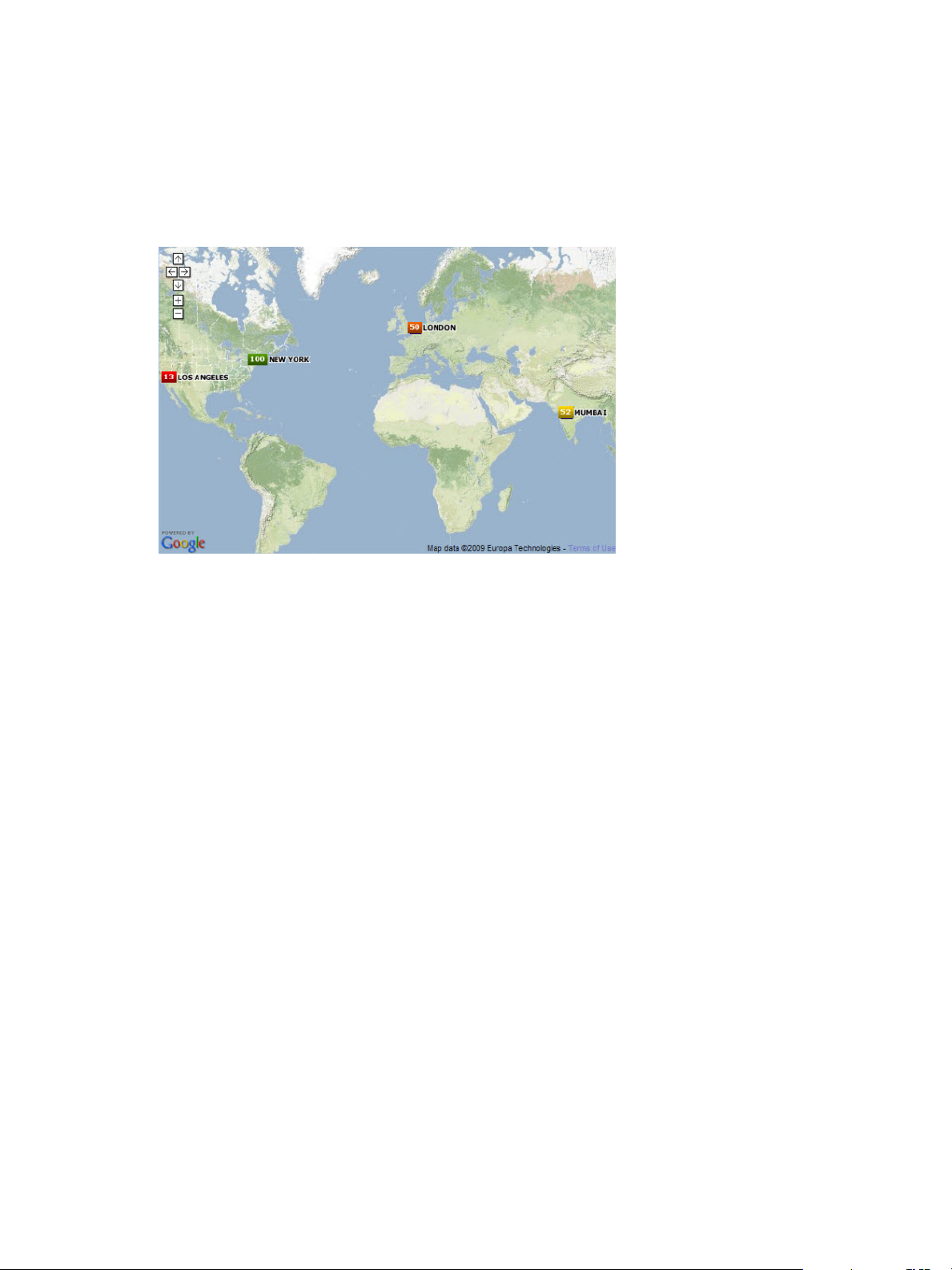
VMware vCenter Operations Manager Getting Started Guide
GEO Widget
If your configuration assigns values to the GEO Location resource tag, the GEO widget shows where your
resources are located on a world map. The GEO widget is similar to the GEO tab on the Environment
Overview page.
Figure 4‑9. GEO Widget
You can move the map and zoom in or out by using the controls on the map. The icons at each location
show the health of each resource that has the GEO Location tag value.
You can click the Auto Refresh icon on the GEO widget toolbar to refresh the widget data. Clicking the
Reset Interaction icon returns the widget to its initial configured state.
Configure the GEO Widget
You can filter the resources that the GEO widget shows by editing the widget configuration.
You can also configure other widgets to provide resources to the GEO widget. See “Configure Widget
Interactions,” on page 61.
Prerequisites
Verify that you have the necessary access rights to perform this task. Your vCenter Operations Manager
n
administrator can tell you which actions you can perform.
Open the Edit Widget window for the GEO widget. See “Edit a Widget Configuration,” on page 54.
n
Procedure
1 Set Self Provider to On to define resources in the widget configuration.
2 Select tag values in the Select which tags to show list to show only resources that have certain tag
values in the widget.
You can use icons on the toolbar at the top of the list to collapse, expand, and deselect all of the tags in
the list.
When you select more than one value for the same tag, the widget includes resources that have either
value. When you select values for two or more tags, the widget includes only resources that have all of
the selected values. When you click the Invert Result icon, the widget includes only resources that do
not match the tag values that you select.
3 Click OK to save the widget configuration.
76 VMware, Inc.
Page 77

Health Status Widget
The Health Status widget shows the health score for selected resources. You can also configure the widget to
show a custom metric and specify colors for metric ranges.
Health status is a 0 to 100 ranking that vCenter Operations Manager determines for each resource. For each
resource, the widget includes the current health score and a graph that shows how the health score has
changed over time. You can double-click the graph for a resource to view the Resource Detail page for that
resource.
Figure 4‑10. Health Status Widget
If vCenter Operations Manager does not receive metrics for a resource at a particular time, it cannot
calculate a health score for that time and it shows a score of -1 on the graph. A -1 score can occur if collection
is turned off for a resource or if vCenter Operations Manager encounters a data gathering problem.
Chapter 4 Using and Configuring Widgets
Configure the Health Status Widget
You can filter the resources that the Health Status widget shows by editing the widget configuration. You
can also configure the widget to show a custom metric.
You can also configure other widgets to provide resources to the Health Status widget. See “Configure
Widget Interactions,” on page 61.
Prerequisites
Verify that you have the necessary access rights to perform this task. Your vCenter Operations Manager
n
administrator can tell you which actions you can perform.
Open the Edit Widget window for the Health Status widget. See “Edit a Widget Configuration,” on
n
page 54.
Procedure
1 Set Self Provider to On to define resources in the widget configuration.
2 Configure options to control the appearance of the resource display.
Option Description
Mode
Sets the widget mode.
Self
Children
Parents
The widget shows the selected resources.
The widget shows child resources.
The widget shows parent resources.
If you select Children or Parents, the selected resources themselves do not
appear in the widget, whether you select resources by editing the widget
or the widget accepts resources from a providing widget.
Order By
VMware, Inc. 77
Sets whether the list is ordered by health score or resource name, and
whether the order is ascending or descending.
Page 78

VMware vCenter Operations Manager Getting Started Guide
Option Description
Pagination Number
Period Length
3 Select Health or Custom to specify whether the widget shows resource health or a custom metric.
You can search for a custom metric by typing the metric name in the text box next to Custom. When the
correct metric name appears, select it from the drop-down menu. You can also open the drop-down
menu, scroll through the list of available metrics, and select a metric. Pagination controls are provided
at the bottom of the drop-down list.
4 If you configured a custom metric, configure metric ranges.
You can configure the ranges in ascending or descending order.
Option Description
Yellow Bound
Orange Bound
Red Bound
5 Select tag values in the Select which tags to show list to show only resources that have certain tag
values in the widget.
Sets the number of resources that appear on each page of the widget.
Sets the amount of time that appears on the health graph for each resource.
Type the highest or lowest value that should be yellow.
Type the highest or lowest value that should be orange.
Type the highest or lowest value that should be red.
You can use icons on the toolbar at the top of the list to collapse, expand, and deselect all of the tags in
the list.
When you select more than one value for the same tag, the widget includes resources that have either
value. When you select values for two or more tags, the widget includes only resources that have all of
the selected values. When you click the Invert Result icon, the widget includes only resources that do
not match the tag values that you select.
6 Click OK to save the widget configuration.
Health Tree Widget
The Health Tree widget shows the section of your resource hierarchy around a resource that you select. The
widget shows all of the parent container resources that hold the resource. If you select a container resource,
the widget shows all of the child resources that the container holds.
Figure 4‑11. Health Tree Widget
Unless you are in Pan or Zoom the view mode, you can point to a resource to show its name and current
health. You can double-click a resource to shift the display to show its parents and children.
78 VMware, Inc.
Page 79

Chapter 4 Using and Configuring Widgets
If you configure a filter tag for the Health Tree widget, only the parent and child resources that match the
tag appear in the widget. You can double-click a resource to turn off the filter and show all of its parents and
children.
The toolbar at the top of the Health Tree widget contains icons that you can use to change the view.
Table 4‑5. Health Tree Widget Toolbar Icons
Icon Description
Zoom to Fit Changes the size of the resource icons for the best possible fit in the widget.
Pan Click this icon and click and drag the hierarchy to show different parts of the
hierarchy.
Image Map Tooltip Click this icon and point to a resource to show its name and current health.
Zoom the view Click this icon and drag to outline a part of the hierarchy. The display zooms to
show only the outlined section.
Zoom in Zooms in on the hierarchy.
Zoom out Zooms out on the hierarchy.
Reset To Initial Resource If you changed the central resource of the hierarchy, click this icon to return to the
initial resource. Clicking this icon also resets the initial display size.
Resource Detail Select a resource and click this icon to show the Resource Detail page for the
resource.
Show Alerts Select the resource in the hierarchy and click this icon to show alerts for the
resource. Alerts appear in a pop-up window. You can double-click an alert to
view its Alert Summary page.
Display Filtering Criteria Shows the filtering settings for the widget in a pop-up window.
Configure the Health Tree Widget
By default, the Health Tree widget includes all parent and child resources that match the selected resource.
You can edit the widget configuration to limit the parent and child resources that the widget shows.
You can also configure other widgets to provide a resource to the Health Tree widget. See “Configure
Widget Interactions,” on page 61.
Prerequisites
Verify that you have the necessary access rights to perform this task. Your vCenter Operations Manager
n
administrator can tell you which actions you can perform.
Open the Edit Widget window for the Health Tree widget. See “Edit a Widget Configuration,” on
n
page 54.
Procedure
1 Set Self Provider to On to define a resource in the widget configuration.
2 (Optional) To configure a fixed zoom level for resource icons in the widget display, set Auto Zoom To
Fixed Node Size to On and type an icon size, in pixels, in the Node Size (pixels) text box.
If your widget display contains many resources and you always need to use manual zooming, this
feature is particularly useful because it enables you to set the zoom level only once.
The widget shows resource icons at the pixel size that you configure. You can still click the Zoom to Fit
icon to change the size of the resource icons for the best possible fit in the widget. The fixed zoom level
feature is disabled by default.
VMware, Inc. 79
Page 80

VMware vCenter Operations Manager Getting Started Guide
3 Select the resource in the Resource Selection pane.
To find a specific resource, type all or part of the resource name in the Search text box and click the
right angle bracket (>).
The name of the resource that you select appears after Selected Resource.
4 (Optional) To limit the parent and child resources that the widget shows, select one or more tag values
in the Select which tags to filter pane.
You can use icons on the toolbar at the top of the pane to collapse, expand, and deselect all of the tags in
the list
When you select more than one value for the same tag, the widget shows resources that have either
value. When you select values for two or more tags, the widget shows only resources that have all of
the values that you select. When you click the Invert Result icon, the widget shows only resources that
do not match the tag values that you select.
5 Click OK to save the widget configuration.
6 (Optional) To verify the filtering settings that you configured for the widget, click the Display Filtering
Criteria icon on the widget's toolbar.
The filtering settings appear in a pop-up window.
Health-Workload Scoreboard Widget
The Health-Workload Scoreboard widget shows the health or workload score of selected resources. The
icons for each resource are color coded. Green indicates best performance, which is 100 for health or 0 for
workload. Red indicates worst performance, which is 0 for health or 100 for workload.
Figure 4‑12. Health-Workload Scoreboard Widget
The workload score applies only to specific resources monitored through the VMware adapter. If you
configure the widget to show the workload for resources that do not have the workload metric, those
resources have blue icons.
You can double-click a resource icon to show the Resource Detail page for the resource. A dashed red line
appears around a selected resource icon.
Configure the Health-Workload Scoreboard Widget
You can define resources for the Health-Workload Scoreboard widget by editing the widget configuration.
You can also configure other widgets to provide resource selections to the Health-Workload Scoreboard
widget. See “Configure Widget Interactions,” on page 61.
Prerequisites
Verify that you have the necessary access rights to perform this task. Your vCenter Operations Manager
n
administrator can tell you which actions you can perform.
Open the Edit Widget window for the Health-Workload Scoreboard widget. See “Edit a Widget
n
Configuration,” on page 54.
80 VMware, Inc.
Page 81

Chapter 4 Using and Configuring Widgets
Procedure
1 Set Self Provider to On to define resources in the widget configuration.
2 Configure the image type and metric type options.
Option Action
Select the image to show for each
resource
Set the metric to show for each
resource
Select an Image Type option.
Select a Metric option. If you select Workload, select the attribute to use
for the workload score. If the attribute you select is not collected for the
listed resources, those resources always show blue for unknown. You can
filter the attribute list by typing part of the attribute name and pressing
Enter to list only matching attributes.
3 Select one or more tag values in the list to the left of the List pane to filter the resources that appear in
the List pane.
You can use icons on the toolbar at the top of the list to collapse, expand, and deselect all of the tags in
the list.
When you select more than one value for the same tag, the list includes resources that have either value.
When you select values for two or more tags, the list includes only resources that have all of the values
that you select. When you click the Invert Result icon, the list includes only resources that do not match
the tag values that you select.
4 In the List pane, select the resources to show in the widget.
Option Action
Select a specific resource
Select multiple resources
Clear all of your selections
The resources that you select appear in the Selected Resources pane.
5 (Optional) Select the resource and click the Delete Resource icon to delete a selected resource.
6 Click OK to save the widget configuration.
Heat Map Widget
The Heat Map widget contains graphical indicators that show the current value of two selected attributes
for resources that belong to tag values that you select. In most cases, you can select only from internally
generated attributes that describe the general operation of the resources, such as health or the active
anomaly count. When you select a single resource kind, you can select any metric for that resource kind.
The Health Map widget has a General mode and an Instance mode.
General mode
Type a full or partial name in the Search text box, click the right angle
bracket (>), and double-click the resource in the search results.
Press Ctrl+click to select multiple resources or Shift+click to select a range
of resources and click the Perform Multi-Select Interaction icon on the
toolbar at the top of the List pane.
Click the Clear Selections icon on the toolbar at the top of the List pane.
The widget shows a colored rectangle for each selected resource. The size of
the rectangle indicates the value of one selected attribute. The color of the
rectangle indicates the value of another selected attribute.
Instance mode
Each rectangle represents a single instance of the selected metric for a
resource. A resource can have multiple instances of the same metric. The
rectangles are all the same size. The color of the rectangles varies based on
the instance value. You can use instance mode only if you select a single
resource kind.
VMware, Inc. 81
Page 82

VMware vCenter Operations Manager Getting Started Guide
In either mode, you can group the rectangles according to tag type and select the color range to use. By
default, green indicates a low value and red indicates the high end of the value range. You can change the
high and low values to any color and set the color to use for the midpoint of the range. You can also set the
values to use for either end of the color range, or let vCenter Operations Manager define the colors based on
the range of values for the attribute.
When you point to the rectangle for a resource, the widget shows the resource's name, group-by values, and
the current values of the two tracked attributes. You can click Show Sparkline in the pop-up window to see
a small sparkline of the tracked metric by the heat map color. You can click the Resource Detail icon to
show the Resource Detail page for a selected resource.
If you configure the Heat Map widget as a provider to another widget, such as the Metric Graph widget,
you can double-click a rectangle to select that resource for the widget. If the widget is in Metric mode,
double-clicking a rectangle selects the resource associated with the metric and provides that resource to the
receiving widget.
Configure the Heat Map Widget
The Heat Map widget contains graphical indicators that show the current value of two selected attributes
for resources that belong to tag values that you select.
You can configure the widget to show different combinations of data, and you can save multiple
configurations for the widget. You use the Configuration drop-down menu on the toolbar at the top of the
Heat Map widget to select the widget configuration to use.
You can also configure other widgets to provide a resource to the Heat Map widget. See “Configure Widget
Interactions,” on page 61.
Prerequisites
Verify that you have the necessary access rights to perform this task. Your vCenter Operations Manager
n
administrator can tell you which actions you can perform.
Open the Edit Widget window for the Heat Map widget. See “Edit a Widget Configuration,” on
n
page 54.
Procedure
1 Set Self Provider to On to define a resource in the widget configuration.
2 Select the tag to use for first-level grouping of the resources from the Group By drop-down menu.
If a selected resource does not have a value for this tag, it appears in a group called Other.
3 Select the tag to use to separate the resources into subgroups from the Then By drop-down menu.
If a selected resource does not have a value for this tag, it appears in a subgroup called Other.
4 Select a Mode option.
Option Description
Instance
General
Track all instances of a metric for a resource with a separate rectangle for
each metric.
Pick an individual instance of a metric for each resource and track only
that metric.
82 VMware, Inc.
Page 83

Chapter 4 Using and Configuring Widgets
5 If you selected General mode, select the attribute to use to set the size of the rectangle for each resource
in the Size By list and the attribute to use to determine the color of the rectangle for each resource in the
Color By list.
Resources that have higher values for the Size By attribute have larger areas of the widget display. You
can also select fixed-size rectangles. The color varies between the colors you set based on the value of
the Color By attribute.
In most cases, the attribute lists include only metrics that vCenter Operations Manager generates. If you
select a resource kind, the list shows all of the attributes that are defined for the resource kind.
6 To track metrics only for resources of a particular kind, select the resource kind from the Resource
Kinds drop-down menu.
7 If you selected Instance mode, select an attribute kind from the Attribute Kinds list.
The attribute kind determines the color of the rectangle for each resource.
8 Configure colors for the heat map.
a Click each of the small blocks under the color bar to set the color for low, middle, and high values.
The bar shows the color range for intermediate values. You can also set the values to match the
high and low end of the color range.
b (Optional) Type minimum and maximum color values in the Min Value and Max Value text
boxes.
If you leave the text boxes blank, vCenter Operations Manager maps the highest and lowest values
for the Color By metric to the end colors. If you set a minimum or maximum value, any metric at
or beyond that value appears in the end color.
9 To define the resources to show in the widget, select the tag values to monitor in the Select which tags
to filter list.
If you select a resource kind, the widget shows only resources of that kind that meet the tag filter
conditions.
When you select more than one value for the same tag, the widget includes resources that have either
value. When you select values for two or more tags, the widget includes only resources that have all of
the values that you select.
10 Click the Capture new configuration icon, type a name for the configuration, and click OK to save the
configuration.
You must save a Heat Map widget configuration before you can use it.
11 (Optional) Select the configuration from the Configuration drop-down menu on the widget's toolbar to
verify the Heat Map widget configuration.
Example: Heat Map Widget Configuration
Consider an environment that has these characteristics.
Multiple physical servers, in multiple data servers, that are running multiple virtual servers.
n
Each virtual server is defined as a resource in vCenter Operations Manager.
n
Each resource has several attributes for which vCenter Operations Manager collects data.
n
For this enviroment, the following Heat Map widget configuration shows at a glance which virtual
machines have anomalies, whether those anomalies are for KPIs, and on which physical servers the virtual
machines reside.
All resources that have a resource kind tag value of virtual machine are shown.
n
VMware, Inc. 83
Page 84

VMware vCenter Operations Manager Getting Started Guide
The resources are grouped by physical server and then by data center.
n
For each resource, the size of its rectangle is based on the number of current anomalies for that resource,
n
and the color of its rectangle is based on the number of KPI breaches.
What to do next
You can update a Heat Map widget configuration by selecting it from the Configuration drop-down menu
and clicking the Update selected configuration icon. You can delete a configuration by selecting it from the
Configuration drop-down menu and clicking the Delete selected configuration icon.
Mashup Charts Widget
The Mashup Charts widget contains charts that show different aspects of the behavior of a selected resource.
By default, the charts show data for the past six hours. The Mashup Charts widget shows the same
information as the Mashup tab on the Alert Detail page.
Figure 4‑13. Mashup Charts Widget
The Mashup Charts widget contains the following charts.
A Health chart for the resource, which can include each alert for the specified time period. Click an alert
n
to see more information, or double-click an alert to open the Alert Summary page.
An Anomaly Count Graph for the resource, which is similar to the anomaly graph that the cross-silo
n
analysis feature generates. The graph shows the number of anomalies for the resource and its children
at the indicated time. For an application, it also shows the count for each tier in a stacked chart. A red
line marks the noise threshold for the resource. An anomaly count higher than this threshold indicates a
90 percent probability of a problem and triggers an early warning alert.
Metric graphs for any or all of the KPIs for any resource listed as a root cause resource. For an
n
application, this chart shows the application and any tiers that contain root causes. You can select the
KPI to include by selecting Chart Controls > KPIs on the widget toolbar. Any shared area on a graph
indicates that the KPI violated its threshold during that time period. Click the top left of the shaded area
to see details about the anomaly.
The Anomaly Count Graph chart and metric graphs reflect up to five levels of resources, including the
selected resource and four child levels.
The toolbar at the top of the Mashup Charts widget contains icons that you can use to change the view.
84 VMware, Inc.
Page 85

Chapter 4 Using and Configuring Widgets
Table 4‑6. Mashup Charts Widget Toolbar Icons
Icon Description
Allow zoom by X axis When you click this icon, zooming the graph affects the X axis. You can use Zoom by X and
Zoom by Y simultaneously.
Allow zoom by Y axis When you click this icon, zooming the graph affects the Y axis. You can use Zoom by X and
Zoom by Y simultaneously.
Zoom to fit Changes all graphs to show the entire time period and value range.
Zoom the view Click this icon and drag to outline a part of the hierarchy. The display zooms to show only
the outlined section.
Pan When you click this icon, dragging in the graph changes the time period. It does not zoom
the graph.
Point Values Click this icon and point to a graphed KPI data point to see its time and exact value. You can
show values only if the selected time period is 24 hours or less.
Show All Alerts Click this icon to show both active and inactive alerts after clicking the Show Only Active
Alerts or Show Only Inactive Alerts icon. Inactive alerts appear grey in the display.
Show Only Active
Alerts
Show Only Inactive
Alerts
Chart Controls See Table 4-7.
Date Controls Select the time period to show on the graphs. You can select a period in the top box, or select
Filter the alerts to show only active alerts.
Filter the alerts to show only inactive alerts.
start and end dates and times.
You use the Chart Controls drop-down menu at the top of the widget to select which charts to view.
Table 4‑7. Chart Controls
Menu Item Description
Show Charts Select the types of graphs to include in the widget.
Layers Select the types and subtypes of alerts to show on the metric graph. You can show change
events, which are user-defined notifications that the vCenter Operations Manager
OpenAPI sends to vCenter Operations Manager.
Show in Stacked Mode Changes the Anomaly Count Graph to a single stacked graph that shows anomalies for all
selected resources.
Resources Select the resources to include in the Anomaly Count Graph.
KPIs Select the KPI for which to include metric graphs.
Configure the Mashup Charts Widget
You can define the resource that the Mashup Charts widget shows by editing the widget configuration.
You can also configure other widgets to provide a resource to the Mashup Charts widget. See “Configure
Widget Interactions,” on page 61.
Prerequisites
Verify that you have the necessary access rights to perform this task. Your vCenter Operations Manager
n
administrator can tell you which actions you can perform.
Open the Edit Widget window for the Mashup Charts widget. See “Edit a Widget Configuration,” on
n
page 54.
VMware, Inc. 85
Page 86

VMware vCenter Operations Manager Getting Started Guide
Procedure
1 Set Self Provider to On to define a resource in the widget configuration.
2 (Optional) Select one or more tag values in the list to the left of the List pane to filter the resources that
appear in the List pane.
You can use icons on the toolbar at the top of the list to collapse, expand, and deselect all of the tags in
the list.
When you select more than one value for the same tag, the list includes resources that have either value.
When you select values for two or more tags, the list includes only resources that have all of the values
that you select. When you click the Invert Result icon, the list includes only resources that do not match
the tag values that you select.
3 In the List pane, select the resource to show in the widget.
To find a specific resource, type all or part of the resource name in the Search text box and click the
right angle bracket (>).
The name of the resource that you select appears after Selected Resource.
4 Click OK to save the widget configuration.
Metric Graph Widget
The Metric Graph widget shows a graph of the recent performance, and predicted future performance, of a
metric. The important metrics count, which a vCenter Operations Manager administrator sets, determines
the number of metrics that appear in the Metric Graph widget. The key in the graph indicates the maximum
and minimum points on the line chart.
Figure 4‑14. Metric Graph Widget
The toolbar at the top of the Metric Graph widget contains icons that you can use to change the view of the
graphs.
Table 4‑8. Metric Graph Widget Toolbar Icons
Icon Description
Split Graphs When two or three time periods are selected, this icon shows the values for each
period on a different graph.
Stacked Graph Shows metrics in a stacked graph. This graph is useful for seeing how the total or
sum of the metric values varies over time. Not available in split mode.
Y Axis Shows or hides the Y-axis scale.
Metric Graph Shows or hides the line that connects the data points on the graph.
86 VMware, Inc.
Page 87

Chapter 4 Using and Configuring Widgets
Table 4‑8. Metric Graph Widget Toolbar Icons (Continued)
Icon Description
Trend Line Shows or hides the trend line. The trend line filters out metric noise along the
timeline by plotting each data point relative to the average of its adjoining data
points.
Dynamic Thresholds Shows or hides the dynamic threshold for each metric for the last 24 hours.
Show Entire Period Dynamic
Thresholds
Anomalies Shows or hides anomalies on the graph. Time periods when the metric violates a
Show data point tips Retrieves the metric readings for the graphed data points. Click the Show Data
Zoom by X When you click this icon, zooming the graph affects the X axis. You can use Zoom
Zoom by Y When you click this icon, zooming the graph affects the Y axis. You can use Zoom
Zoom to fit Changes all graphs to show the entire time period and value range.
Zoom to Dynamic Thresholds Changes the Y axis of the graphs to match the dynamic threshold of the metric.
Compress Graphs Compress
Graphs
Zoom All Graphs When you click this icon, zooming one graph changes all graphs to match.
Zoom the view Click this icon and drag to outline a part of the hierarchy. The display zooms to
Pan When you click this icon, dragging in the graph changes the time period. It does not
Show Data Values After you click the Show data point tips icon to retrieve the data, click this icon and
Auto Refresh Turns auto-refresh on or off.
Date Controls Select up to three time periods to show on the graph. For the first period, select a
Generate Dashboard Creates a new dashboard that contains only the Metric Graph widget, in self-
Remove All Removes all graphs.
Shows or hides dynamic thresholds for the entire time period of the graph.
threshold are shaded. The color indicates the criticality of the violation. You can
click the top-left corner of the shaded area to show details for an anomaly.
Values icon to show the values.
by X and Zoom by Y simultaneously.
by X and Zoom by Y simultaneously.
Shortens the Y axis of all graphs to use less vertical space.
show only the outlined section.
zoom the graph.
point to a graphed data point to show its time and exact value. In non-split mode,
you can hover over a metric in the legend to show the full metric name, the names
of the adapter instances (if any) that provide data for the resource to which the
metric belongs, the current value, and the normal range. If the metric is currently
alarming, the text color in the legend changes to yellow or red, depending on your
color scheme. Click a metric in the legend to highlight the metric in the display.
Clicking the metric again toggles its highlighted state.
value in the top box or select start and end times and dates. To graph multiple
periods, select the first period and select the previous periods to which to compare
it. All periods must be the same length. If you set a start date and time for the
second or third period, vCenter Operations Manager fills in the end time.
NOTE For most time periods, vCenter Operations Manager includes predicted
values for the near future. For example, if you select the last hour,
vCenter Operations Manager also shows 15 minutes into the future. If you select the
last day, vCenter Operations Manager predicts four hours into the future. Periods
longer than 30 days do not show any future time. If a user-defined time period
includes time in the future, vCenter Operations Manager shows predicted values
for the defined future period.
provider mode, which shows the currently displayed metrics.
Each graph has a toolbar at the top right. The icons on this toolbar affect only that graph.
VMware, Inc. 87
Page 88

VMware vCenter Operations Manager Getting Started Guide
Table 4‑9. Individual Graph Icons
Icon Description
Data Source Point to this icon to see the name of the data source, or adapter instance, for the metric.
For super metrics, the name is vCenter Operations Manager.
Show Correlated Metrics Appears only if vCenter Operations Manager determines that the behavior or anomalies
of other metrics are correlated to this metric. When you click this icon, a pop-up
window opens that shows the correlated metrics, including the resource, the metric
name, and the percentage of correlation. You can also display a column that shows the
type of correlation, either Anomaly, in which the anomalies of the metrics are
correlated, or Behavior, in which the behavior of the metrics is correlated. If the widget
is not in self-provider mode, you can select a correlated metric to add it to the widget
display.
Save a Chart Snapshot Downloads the current graph image as a PNG file, which you can display or save.
Save a Fullscreen Snapshot Downloads the current graph image as a full-page PNG file, which you can display or
save.
NOTE For both snapshots, the default file name contains the resource, attribute group,
and metric name.
Download tab-separated data Downloads the data points currently shown on the graph to a tab-separated CSV file.
Each file includes the resource name and metric name and, for each value, date and
time of the collected metric, the value, and the lower and upper bounds of dynamic
thresholds. You can open or save the file.
Move Down Moves the graph down one position.
Move Up Moves the graph up one position.
Close Removes the graph.
Configure the Metric Graph Widget
You can select the metrics that the Metric Graph widget shows by editing the widget configuration.
You can also configure other widgets to provide metric selections to the Metric Graph widget. See
“Configure Widget Interactions,” on page 61.
To define a fixed set of metrics for the widget to draw when you select a particular resource, see “Define
Metric Sets for a Widget,” on page 109.
Prerequisites
Verify that you have the necessary access rights to perform this task. Your vCenter Operations Manager
n
administrator can tell you which actions you can perform.
Open the Edit Widget window for the Metric Graph widget. See “Edit a Widget Configuration,” on
n
page 54.
Procedure
1 Set Self Provider to On to define metric selections in the widget configuration.
2 (Optional) Select one or more tag values in the Resources-Tags pane to filter the resources that appear
on the List tab.
You can use icons on the toolbar at the top of the list to collapse, expand, and deselect all of the tags in
the list.
When you select more than one value for the same tag, the list includes resources that have either value.
When you select values for two or more tags, the list includes only resources that have all of the values
that you select. When you click the Invert Result icon, the list includes only resources that do not match
the tag values that you select.
88 VMware, Inc.
Page 89

Chapter 4 Using and Configuring Widgets
3 On the List tab, select one or more resources.
Option Action
Select a specific resource
Select multiple resources
Clear all of your selections
Select the resource in the list. You can type all or part of the resource name
in the Search text box and click the right angle bracket (>) to search for the
resource.
a Press Ctrl+click to select multiple resources or Shift+click to select a
range of resources.
b Click the Perform Multi-Select Interaction icon on the toolbar at the
top of the List pane.
Click the Clear Selection icon on the toolbar at the top of the List pane.
The metrics for the resources appear in the Metric Selector With Resource Selection pane.
4 In Metric Selector With Resource Selection pane, select the metrics to show in the widget.
Option Action
Select a specific metric
Select multiple metrics
List the metrics that are common to
multiple selected resources
Search for a specific metric
Double-click the metric.
a Press Ctrl+click to select multiple metrics or Shift+click to select a
range of metrics.
b Click the Perform Multi-Select icon on the toolbar at the top of the
Metric Selector With Resource Selection pane.
Click the Show Common Metrics icon on the toolbar at the top of the
Metric Selector With Resource Selection pane.
Type all or part of the metric name in the Search text box and click the
right angle bracket (>) to search for the metric.
The metrics that you select appear in the Selected Metrics pane.
5 (Optional) Manage the metrics in the Selected Metrics pane.
Option Action
Change the order of a metric in the
list
Remove a metric from the list
Select all of the metrics in the list
Remove all of the metrics from the
list
Select the metric and drag and drop it to another position in the list.
Select the metric and click the Remove Selected Metrics icon on the
toolbar at the top of the Selected Metrics pane.
Click the Select All icon on the toolbar at the top of the Selected Metrics
pane.
Click the Clear Selections icon on the toolbar at the top of the Selected
Metrics pane.
6 Click OK to save the widget configuration.
VMware, Inc. 89
Page 90

VMware vCenter Operations Manager Getting Started Guide
Metric Graph (Rolling View) Widget
The Metric Graph (Rolling View) widget shows a full chart for one selected metric at a time. Miniature
graphs for the other selected metrics appear at the bottom of the widget. You can click a miniature graph to
see the full graph for that metric, or set the widget to rotate through all selected metrics at an interval that
you define. The key in the graph indicates the maximum and minimum points on the line chart.
Figure 4‑15. Metric Graph (Rolling View) Widget
The toolbar at the top of the Metric Graph (Rolling View) widget contains icons that you can use to change
the view of the graphs.
Table 4‑10. Metric Graph Widget Toolbar Icons
Icon Description
Y Axis Shows or hides the Y-axis scale.
Metric Graph Shows or hides the line that connects the data points on the graph.
Trend Line Shows or hides the trend line. The trend line filters out metric noise along the
Dynamic Thresholds Shows or hides the dynamic threshold for each metric for the last 24 hours.
Show Entire Period Dynamic
Thresholds
Anomalies Shows or hides anomalies on the graph. Time periods when the metric violates a
Show data point tips Retrieves the metric readings for the graphed data points. Click the Show Data
Zoom by X When you click this icon, zooming the graph affects the X axis. You can use Zoom
Zoom by Y When you click this icon, zooming the graph affects the Y axis. You can use Zoom
Zoom to fit Changes all graphs to show the entire time period and value range.
Zoom to Dynamic Thresholds Changes the Y axis of the graphs to match the dynamic threshold of the metric.
Zoom the view Click this icon and drag to outline a part of the hierarchy. The display zooms to
Pan When you click this icon, dragging in the graph changes the time period. It does not
timeline by plotting each data point relative to the average of its adjoining data
points.
Shows or hides dynamic thresholds for the entire time period of the graph.
threshold are shaded. The color indicates the criticality of the violation. You can
click the top-left corner of the shaded area to show details for an anomaly.
Values icon to show the values.
by X and Zoom by Y simultaneously.
by X and Zoom by Y simultaneously.
show only the outlined section.
zoom the graph.
90 VMware, Inc.
Page 91

Chapter 4 Using and Configuring Widgets
Table 4‑10. Metric Graph Widget Toolbar Icons (Continued)
Icon Description
Show Data Values After you click the Show data point tips icon to retrieve the data, click this icon and
point to a graphed data point to show its time and exact value. In non-split mode,
you can hover over a metric in the legend to show the full metric name, the names
of the adapter instances (if any) that provide data for the resource to which the
metric belongs, the current value, and the normal range. If the metric is currently
alarming, the text color in the legend changes to yellow or red, depending on your
color scheme. Click a metric in the legend to highlight the metric in the display.
Clicking the metric again toggles its highlighted state.
Date Controls Select up to three time periods to show on the graph. For the first period, select a
value in the top box or select start and end times and dates. To graph multiple
periods, select the first period and select the previous periods to which to compare
it. All periods must be the same length. If you set a start date and time for the
second or third period, vCenter Operations Manager fills in the end time.
NOTE For most time periods, vCenter Operations Manager includes predicted
values for the near future. For example, if you select the last hour,
vCenter Operations Manager also shows 15 minutes into the future. If you select the
last day, vCenter Operations Manager predicts four hours into the future. Periods
longer than 30 days do not show any future time. If a user-defined time period
includes time in the future, vCenter Operations Manager shows predicted values
for the defined future period.
Configure the Metric Graph (Rolling View) Widget
You can select the metrics that the Metric Graph (Rolling View) widget shows by editing the widget
configuration.
You can also configure other widgets to provide metric selections to the Metric Graph (Rolling View)
widget. See “Configure Widget Interactions,” on page 61.
To define a fixed set of metrics for the widget to draw when you select a particular resource, see “Define
Metric Sets for a Widget,” on page 109.
Prerequisites
Verify that you have the necessary access rights to perform this task. Your vCenter Operations Manager
n
administrator can tell you which actions you can perform.
Open the Edit Widget window for the Metric Graph (Rolling View) widget. See “Edit a Widget
n
Configuration,” on page 54.
Procedure
1 Set Self Provider to On to define metric selections in the widget configuration.
2 Configure the transition interval and chart toolbar options.
Option Description
AutoTransition Interval
Show Chart Toolbar
Type the metric graph rotation interval, in seconds. The graph switches
after the number of seconds that you specify.
Specify whether to include the toolbar on the widget display.
VMware, Inc. 91
Page 92

VMware vCenter Operations Manager Getting Started Guide
3 (Optional) Select one or more tag values in the Resources-Tags pane to filter the resources that appear
on the List tab.
You can use icons on the toolbar at the top of the list to collapse, expand, and deselect all of the tags in
the list.
When you select more than one value for the same tag, the list includes resources that have either value.
When you select values for two or more tags, the list includes only resources that have all of the values
that you select. When you click the Invert Result icon, the list includes only resources that do not match
the tag values that you select.
4 On the List tab, select one or more resources.
Option Action
Select a specific resource
Select multiple resources
Clear all of your selections
The metrics for the resources appear in the Metric Selector With Resource Selection pane.
Select the resource in the list. You can type all or part of the resource name
in the Search text box and click the right angle bracket (>) to search for the
resource.
a Press Ctrl+click to select multiple resources or Shift+click to select a
range of resources.
b Click the Perform Multi-Select Interaction icon on the toolbar at the
top of the List pane.
Click the Clear Selection icon on the toolbar at the top of the List pane.
5 In Metric Selector With Resource Selection pane, select the metrics to show in the widget.
Option Action
Select a specific metric
Select multiple metrics
List the metrics that are common to
multiple selected resources
Search for a specific metric
Double-click the metric.
a Press Ctrl+click to select multiple metrics or Shift+click to select a
range of metrics.
b Click the Perform Multi-Select icon on the toolbar at the top of the
Metric Selector With Resource Selection pane.
Click the Show Common Metrics icon on the toolbar at the top of the
Metric Selector With Resource Selection pane.
Type all or part of the metric name in the Search text box and click the
right angle bracket (>) to search for the metric.
The metrics that you select appear in the Selected Metrics pane.
6 (Optional) Manage the metrics in the Selected Metrics pane.
Option Action
Change the order of a metric in the
list
Remove a metric from the list
Select all of the metrics in the list
Remove all of the metrics from the
list
Select the metric and drag and drop it to another position in the list.
Select the metric and click the Remove Selected Metrics icon on the
toolbar at the top of the Selected Metrics pane.
Click the Select All icon on the toolbar at the top of the Selected Metrics
pane.
Click the Clear Selections icon on the toolbar at the top of the Selected
Metrics pane.
7 Click OK to save the widget configuration.
92 VMware, Inc.
Page 93

Metric Selector Widget
The Metric Selector widget shows attribute packages for one or more resources that you select in the Alerts,
Generic Scoreboard, Health Status, Health Tree, Health-Workload Scoreboard, Heat Map, Resources, Root
Cause Ranking, VC Relationship, or VC Relationship (Planning) widget.
Figure 4‑16. Metric Selector Widget
You can expand each attribute group to view its metrics. When the widget shows metrics for only one
resource, metrics that have anomalies are yellow.
The toolbar at the top of the Metric Selector widget contains icons that you can use to change the view.
Chapter 4 Using and Configuring Widgets
Table 4‑11. Metric Selector Widget Toolbar Icons
Icon Description
Move To Graph Select one or more metrics and click this icon to make the metrics appear in the
Metric Graph widget. You can also double-click any attribute to make it appear
in the Metric Graph widget.
Show Common Metrics If you selected multiple metrics in the providing widget, click this icon to show
only those metrics that are common to all resources. Click the icon again to list
all of metrics for the resources.
This icon appears only if you selected multiple metrics in the providing widget.
Show Metrics Collecting Shows only currently collected metrics for the resources. Click the icon again to
show all metrics.
Search To find a particular metric group, metric instance, or metric, type all or part of its
name in the Search text box, select the type of value you are searching for, and
click this icon.
The only configuration option for the Metric Selector widget is the widget title.
VMware, Inc. 93
Page 94

VMware vCenter Operations Manager Getting Started Guide
Metric Sparklines Widget
The Metric Sparklines widget shows simple graphs that contain the values of selected metrics over time and
provides a quick view of the trends in KPIs.
Figure 4‑17. Metric Sparklines Widget
If all of the metrics in the widget are for a resource that another widget provides, the resource name appears
at the top right of the widget.
If you select a metric in the widget display, the widget uses the metric and its corresponding resource as the
source for dashboard interactions.
The toolbar at the top of the Metric Sparklines widget contains icons that you can use to change the view.
Table 4‑12. Metric Sparklines Widget Toolbar Icons
Icon Description
Auto Refresh Refreshes the widget data.
Date Controls Select the time period to show on the graphs. You can select a period in the top box, or
select start and end dates and times.
Remove All Removes all graphs from the widget.
Configure the Metric Sparklines Widget
You can select the metrics that the Metric Sparklines widget shows by editing the widget configuration. You
can also specify whether the metric graph or metric label appears in the first column of the widget display
and configure metric labels, metric units of measure, and metric value color ranges.
You can also configure other widgets to provide metric selections to the Metric Sparklines widget. See
“Configure Widget Interactions,” on page 61.
To define a fixed set of metrics for the widget to draw when you select a particular resource, see “Define
Metric Sets for a Widget,” on page 109.
Prerequisites
Verify that you have the necessary access rights to perform this task. Your vCenter Operations Manager
n
administrator can tell you which actions you can perform.
Open the Edit Widget window for the Metric Sparklines widget. See “Edit a Widget Configuration,” on
n
page 54.
94 VMware, Inc.
Page 95

Chapter 4 Using and Configuring Widgets
Procedure
1 Set Self Provider to On to define metric selections in the widget configuration.
2 Select a Selector Mode option.
Option Description
Resource
Resource Kind
Enables you to select metrics for specific resources during widget
configuration.
Enables you to select metrics for specific resource kinds during widget
configuration. This option is useful if specific resources are not currently
available.
3 Select a Column Sequence option.
Option Description
Graph First
Label First
Metric graph appears in the first column in the widget display.
Metric label appears in the first column in the widget display.
4 (Optional) If you selected the Resource selector mode, select one or more tag values in the Resources-
Tags pane to filter the resources that appear on the List tab.
You can use icons on the toolbar at the top of the list to collapse, expand, and deselect all of the tags in
the list.
When you select more than one value for the same tag, the list includes resources that have either value.
When you select values for two or more tags, the list includes only resources that have all of the values
that you select. When you click the Invert Result icon, the list includes only resources that do not match
the tag values that you select.
5 If you selected the Resource selector mode, select one or more resources on the List tab.
Option Action
Select a specific resource
Select multiple resources
Clear all of your selections
Select the resource in the list. You can type all or part of the resource name
in the Search text box and click the right angle bracket (>) to search for the
resource.
a Press Ctrl+click to select multiple resources or Shift+click to select a
range of resources.
b Click the Perform Multi-Select Interaction icon on the toolbar at the
top of the List pane.
Click the Clear Selection icon on the toolbar at the top of the List pane.
The metrics for the resources appear in the Metric Selector With Resource Selection pane.
6 If you selected the Resource Kind selector mode, select a resource kind in the Resource Kinds pane.
The metrics for the resource kind appear in the Metric Selector With Resource Selection pane. You can
select multiple resource kinds
7 In Metric Selector With Resource Selection pane, select the metrics to show in the widget.
Option Action
Select a specific metric
Select multiple metrics
Double-click the metric.
a Press Ctrl+click to select multiple metrics or Shift+click to select a
range of metrics.
b Click the Perform Multi-Select icon on the toolbar at the top of the
Metric Selector With Resource Selection pane.
VMware, Inc. 95
Page 96

VMware vCenter Operations Manager Getting Started Guide
Option Action
List the metrics that are common to
multiple selected resources
Search for a specific metric
The metrics that you select appear in the Selected Metrics pane.
8 Set values for each metric in the Selected Metrics pane.
To enter a value, point to the text box under the column heading, double-click in the text box, and type
the value.
Option Action
Box Label
Measurement Unit
Yellow Bound
Orange Bound
Red Bound
If you do not provide color boundaries for a non-health-related metric, the color is green if the metric is
normal and yellow if the metric is abnormal.
Click the Show Common Metrics icon on the toolbar at the top of the
Metric Selector With Resource Selection pane.
Type all or part of the metric name in the Search text box and click the
right angle bracket (>) to search for the metric.
Type a label for the metric.
Type the measurement unit that appears after the metric value.
Type the highest or lowest value that should be yellow.
Type the highest or lowest value that should be orange.
Type the highest or lowest value that should be red.
You cannot edit the color boundaries for health-related metrics, such as vCenter Operations Generated
| Self - Health Score, in the Selected Metrics pane. The color boundaries for these metrics are configured
for you when you save the widget configuration. vCenter Operations Manager obtains color range
values for health-related metrics from global settings (select Admin > Global Settings).
9 (Optional) Manage the metrics in the Selected Metrics pane.
Option Action
Change the order of a metric in the
list
Remove a metric from the list
Select all of the metrics in the list
Remove all of the metrics from the
list
Apply settings from one metric to
all of the metrics in the list
Select the metric and drag it to another position in the list.
Select the metric and click the Remove Selected Metrics icon on the
toolbar at the top of the Selected Metrics pane.
Click the Select All icon on the toolbar at the top of the Selected Metrics
pane.
Click the Clear Selections icon on the toolbar at the top of the Selected
Metrics pane.
Select the metric and click the Apply to all icon on the toolbar at the top of
the Selected Metrics pane.
10 Click OK to save the widget configuration.
96 VMware, Inc.
Page 97

Metric Weather Map Widget
The Metric Weather Map widget provides a graphical display of the changing values of a single metric for
multiple resources over time. The widget uses colored icons to represent each value of the metric. Each icon
location represents the metric value for particular resources. The color of an icon changes to show changes
in the value of the metric.
Figure 4‑18. Metric Weather Map Widget
Chapter 4 Using and Configuring Widgets
Watching how the map changes can help you understand how the performance of the metric varies over
time for different resources.
The map does not show the real-time performance of the metrics. You select the time period, how fast the
map refreshes, and the interval between readings. For example, you might have the widget play the metric
values for the last day, refreshing every half second, and have each change represent five minute's worth of
metric values.
To view the resource that an icon represents, click the resource. A hyperlink of the resource name appears.
You can click the hyperlink to show the Resource Detail page for the resource.
The toolbar at the top of the Metric Weather Map widget contains the icons that you can use to view the
graph.
Table 4‑13. Metric Weather Map Widget Toolbar Icons
Icon Description
Pause and Play Start or stop the display. The icon remains in the same state if you leave the widget
display and return.
Display Filtering Criteria View the current settings settings for the widget, including the current metric.
Configure the Metric Weather Map Widget
You define the metric that the Metric Weather Map widget shows by editing the widget configuration. You
must edit the widget to select the metric to show. You cannot configure the Metric Weather Map widget to
accept a metric selection from another widget. The Metric Weather Map widget does not show data until
you configure it.
Prerequisites
Verify that you have the necessary access rights to perform this task. Your vCenter Operations Manager
n
administrator can tell you which actions you can perform.
VMware, Inc. 97
Page 98

VMware vCenter Operations Manager Getting Started Guide
Open the Edit Widget window for the Metric Weather Map widget. See “Edit a Widget Configuration,”
n
on page 54.
Procedure
1 Configure the appearance of the widget display.
Option Action
Image Redraw Rate
Metric History
Metric Sample Increment
Group by
Sort by
Frame transition interval
Start over delay (seconds)
Colors
2 (Optional) To filter the resource kinds in the Resource Kinds pane, select one or more tag values in the
left pane.
Select how often the widget gets new metric data and updates the display.
This option is the same as the Widget Refresh Interval for other widgets.
Select the time period for the weather map, from the previous hour to the
last 30 days.
Select the interval between metric readings. For example, if you set this
option to one minute and set the Metric History to one hour, the widget
has a total of 60 readings for each metric.
To group the resources by tag value, select the tag.
To sort the resources by resource name or metric value, select Resource
name or Metric value.
Type how fast the icons change to show each new value. You can select the
interval between frames or the number of frames per second (fps).
The number of seconds for the display to remain static when it reaches the
end of the Metric History period, the most current readings, before it starts
over again from the beginning.
Select the colors in the weather map. Click each of the small blocks under
the color bar to set the color for minimum, middle, and maximum values.
The bar shows the color range for intermediate values.
You can also set the values to match the high and low end of the color
range. If you do not type values in the Min Value and Max Value text
boxes, vCenter Operations Manager maps the actual minimum and
maximum values of the metric over the time period to the end colors. If
you set a minimum or maximum value, any metric at or beyond that value
appears in the end color.
You can use icons on the toolbar at the top of the list to collapse, expand, and deselect all of the tags in
the list.
When you select more than one value for the same tag, the list includes resource kinds that have either
value. When you select values for two or more tags, the list includes only resource kinds that have all of
the values that you select.
3 In the Resource Kinds pane, select a resource kind.
You can type all or part of the resource kind name in the Search text box and click the right angle
bracket (>) to search for a specific resource kind.
The metrics for the resource kind appear in the Metrics pane.
4 In the Metrics pane, select the metric to show in the widget.
You can click the Show Common Metrics icon at the top of the list to show only metrics that are shared
by all resources of the selected resource kind. You can also type all or part of the metric name in the
Search text box and click the right angle bracket (>) to search for a specific metric.
5 Click OK to save the widget configuration.
6 (Optional) To verify the filtering settings that you configured for the widget, click the Display Filtering
Criteria icon on the widget's toolbar.
The filtering criteria appears in a pop-up window.
98 VMware, Inc.
Page 99

Resources Widget
The Resources widget lists the resources that are defined in vCenter Operations Manager.
Figure 4‑19. Resources Widget
Chapter 4 Using and Configuring Widgets
The toolbar at the top of the Resources widget contains icons that you can use to set the data to view in the
widget.
Table 4‑14. Resources Widget Toolbar Icons
Icon Description
Reset Grid Sort Returns all column sorting to the default settings.
Reset Interaction Returns the widget to its initial configured state and undoes any widget interactions made
from providing widgets.
Resource Detail Select a resource and click this icon to show the Resource Detail page for the resource.
Perform Multi-Select
Interaction
Search To find a particular resource, type all or part of its name in the Search text box and click
Press Ctrl+click to select multiple individual resources or Shift+click to select a range of
resources and click this icon.
this icon.
Configure the Resources Widget
You can configure the Resources widget to show specific resources. By default, the widget shows Name,
Health, and Resource Kind columns for the resources that you select. You can configure the widget to show
additional columns for resources of a particular resource kind.
You can also configure filters to limit the resources that the widget shows and specify the default sort order
of the resources. The filtering criteria that you define applies whether you define resources in the Resources
widget configuration or another widget provides resources to the Resources widget. If a resource that
another widget provides does not meet the filtering criteria, it does not appear in the widget.
Prerequisites
Verify that you have the necessary access rights to perform this task. Your vCenter Operations Manager
n
administrator can tell you which actions you can perform.
Open the Edit Widget window for the Resources widget. See “Edit a Widget Configuration,” on
n
page 54.
VMware, Inc. 99
Page 100

VMware vCenter Operations Manager Getting Started Guide
Procedure
1 Type a value in the Pagination number text box to configure the number of resources that appear on
each page in the Resources widget.
2 Select a Mode option to specify whether the widget shows the selected child or parent resources.
If you select Children or Parents, the selected resources themselves do not appear.
3 Select the tag values in the Select which tags to filter list to configure the Resources widget to show
only resources that have certain tag values.
You can use icons on the toolbar at the top of the list to collapse, expand, and deselect all of the tags in
the list.
When you select more than one value for the same tag, the widget shows resources that have either
value. When you select values for two or more tags, the widget shows only resources that have all of
the values that you select. When you click the Invert Result icon, the widget shows only resources that
do not match the tag values that you select.
4 Click one or more categories in the Filter By list and select status values to configure the Resources
widget to show only resources that have specific status values.
5 To set the default sort order for the resources that the Resources widget shows, select sort criteria in the
Sort Data By pane.
You can sort up to four column values and by any of the standard columns, except for Resource
Identifier.
6 (Optional) Add one or more columns to the widget display.
This feature is useful if you want to show metrics, such as workload or capacity, that are specfiic to a
particular resource kind.
a Click Add/Remove in the Additional Column pane.
b Select a resource kind in the Resource Kinds pane.
The metrics for the resource kind appear in the Metric Selector With Resource Selection pane.
c Select the metrics to show in the new column in the Metric Selector With Resource Selection pane.
You can press Ctrl+click and click the Perform Multi-Select Interaction icon to select a range of
metrics. The metrics that you select appear in the Selected Metrics pane.
d Type a box label for each metric in the Selected Metrics pane.
To enter a value, move your cursor to the text box under the column heading, double-click in the
text box, and type the value.
e (Optional) Manage the metrics in the Selected Metrics pane.
You can click the Remove Selected Metrics icon to delete selected metrics, click the Select All icon
to select all of the metrics, or click the Clear Selections icon to deselect all of the selected metrics.
f Click Save to save the new column configuration.
7 Click OK to save the widget configuration.
8 (Optional) Click the Display Filtering Criteria icon on the Resources widget's toolbar to verify the
filtering settings that you configured for the widget.
The filtering settings appear in a pop-up window.
100 VMware, Inc.
 Loading...