

Page 1

Table of Contents
Welcome to Menu.Applet ................................................................................ 2
Why Java™-based menus? .............................................................................. 2
Basic terminology ........................................................................................... 2
Getting to know Menu.Applet .......................................................................... 4
Creating a new menu applet............................................................................ 5
Applet Properties Panel: General Tab.................................................................................................... 5
Background Tab ................................................................................................................................... 6
Options Tab (Slider menu only) ........................................................................................................... 7
Creating a new Slider menu ............................................................................ 8
Item Tab ............................................................................................................................................... 9
Level - General Tab ............................................................................................................................... 9
Level – Icon Tab ................................................................................................................................. 10
Level – Event Tab ................................................................................................................................ 10
Creating a Pop-up menu ............................................................................... 11
Item Tab ............................................................................................................................................. 12
Main Menu Tab (First level menu only) .............................................................................................. 12
Level - General Tab ............................................................................................................................. 13
Level – Color Tab................................................................................................................................ 13
Using HTML frames ....................................................................................... 14
Saving your work .......................................................................................... 15
1
Page 2
Welcome to Menu.Applet
Welcome to Ulead’s Menu.Applet, a powerful Java™-based application program
that lets you create active slider and pop-up menus for your Web pages with
maximum ease and a minimum of fuss. Menu.Applet is designed to help even novice
users create stunning Web sites and add impressive effects – without having to write
a single line of code.
Why Java™-based menus?
Menus rarely follow the one-level format of one parent item – many child items.
More often than not, one menu item leads to more options, creating multi-level
menus that would be difficult to lay out using traditional text and image–based
methods, as these require all menu items to be displayed simultaneously. This results
in increased Web page sizes and a cluttered appearance.
Java-based menus were developed to provide Web authors with an easy way to place
menus with 2 or more submenus by hiding submenu items and showing them only
when clicked. Not only are these menus functional; they are an eye-catching and
dynamic element in any Web site.
Basic terminology
Following is a list of common terminology used throughout this user guide:
Menu Interactive lists that display a
number of choices for users (in this case,
Internet Web surfers) to choose from.
When selected, each choice then displays a
graphic image, a media clip, a download
action, or another Web page.
Menu Items Options listed in a menu. In
most cases, further options (submenus) are
found within these choices, bringing about
a multi-level menu.
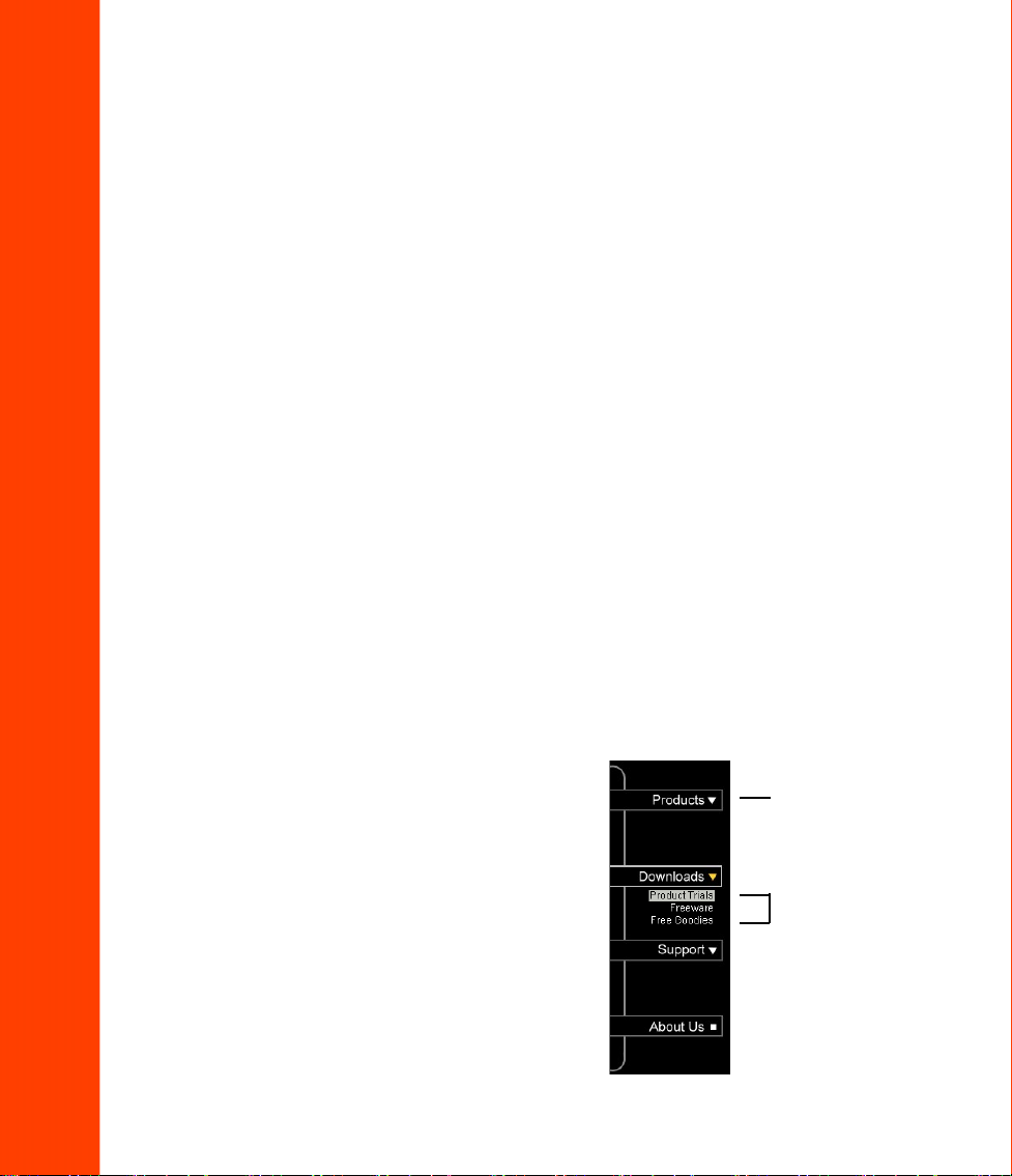
Pop-up Menu A menu that displays its
submenus only on mouseover.
2
Pop-up Menu example
menu item
submenu items
Page 3
Slider Menu example
These menu items are all Parent items. Menus found
under Children items are called submenus. For
example, “2000” is a submenu of “Archives”.
These menu items
These menu items
are Sibling items
of each other, and
Children items of
the “2000” menu
item.
are Sibling items of
each other, and
Children items of
the “Archives” menu
item. “2000” is a
Parent item of the
expanded green
menu.
Slider Menu expands its submenus by gliding its contents out from a specified
point.
Mouse actions Events that take place when users perform specific mouse-related
actions, such as mouseover and mousedown (see below). Common events include
change in text color, background image, text style or even the text itself.
Normal state
The state when there is
no mouse action.
Mouseover state
The state when the
mouse pointer is placed
on the menu item, but is
not clicked.
Mousedown state
The state when the menu item
is clicked.
3
Page 4
Getting to know Menu.Applet
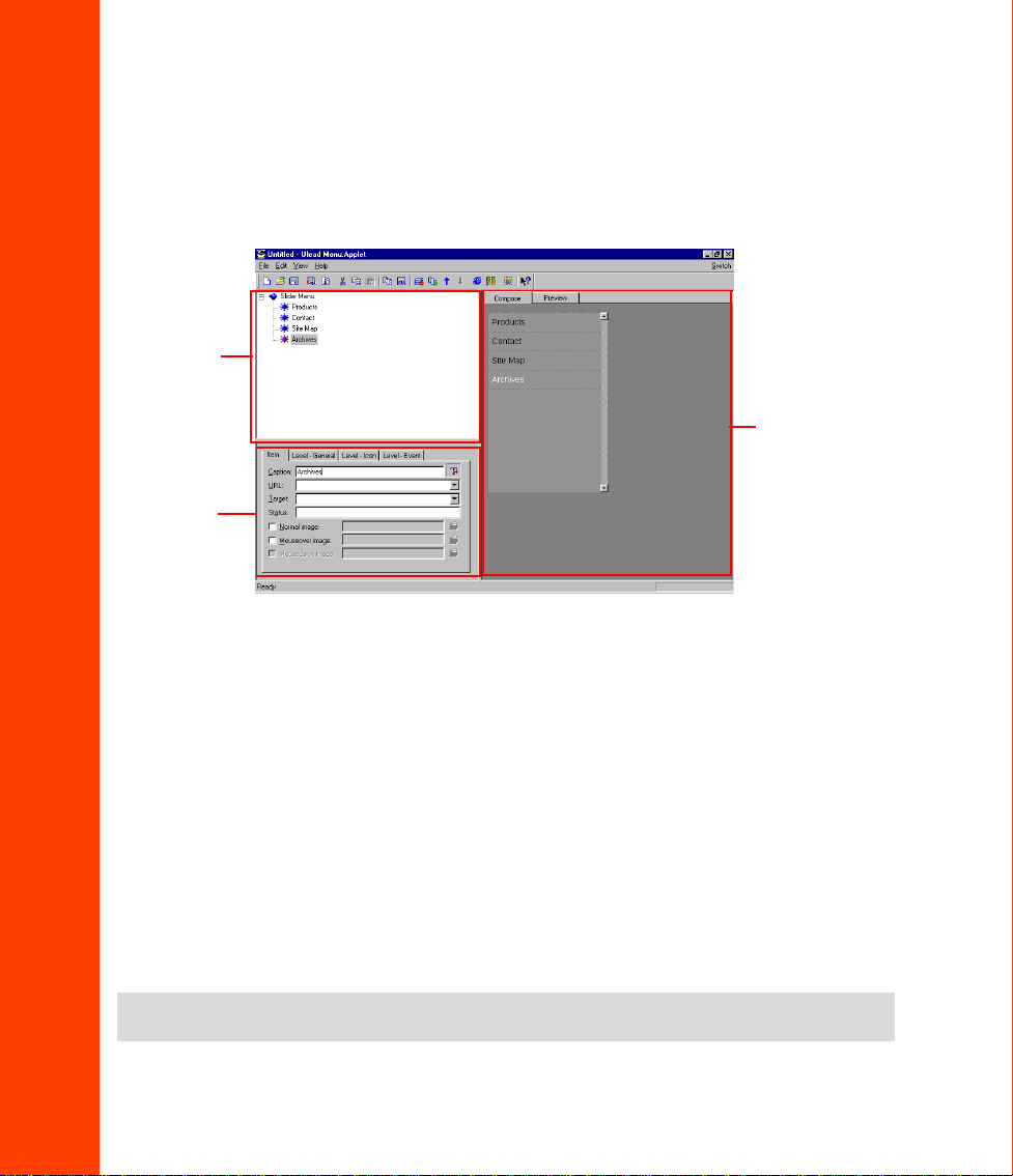
T o help you get started, this section provides an initial overview of the Menu.Applet
interface. First, let’s look at a typical Menu.Applet workspace:
Item Tree
View Panel
Compose/ Preview
Panel
Properties
Panel
The Menu.Applet workspace contains three main panels: Item Tr ee V iew Panel,
Properties Panel, and Compose/Pr eview Panel.
• Item T r ee View Panel Displays the layout of the menu items in a flowchart diagram
showing the various menu items and submenus. Add menu and submenu items (child
and/or sibling items) to your menu in this panel.
• Properties Panel Configure and customize the applet and menu items in this panel.
Preferences for dimension, color, background and behavior of each item can be set
using this panel.
• Compose/Preview Panel Display the layout of your menu in two modes: Compose
(layout only) or Preview (shows a running version). Correct errors, fine-tune
settings, and preview menus through this panel.
Note:
You must have Microsoft Internet Explorer 4 or above to be able to preview your work in
the Preview panel.
4
Page 5
Creating a new menu applet
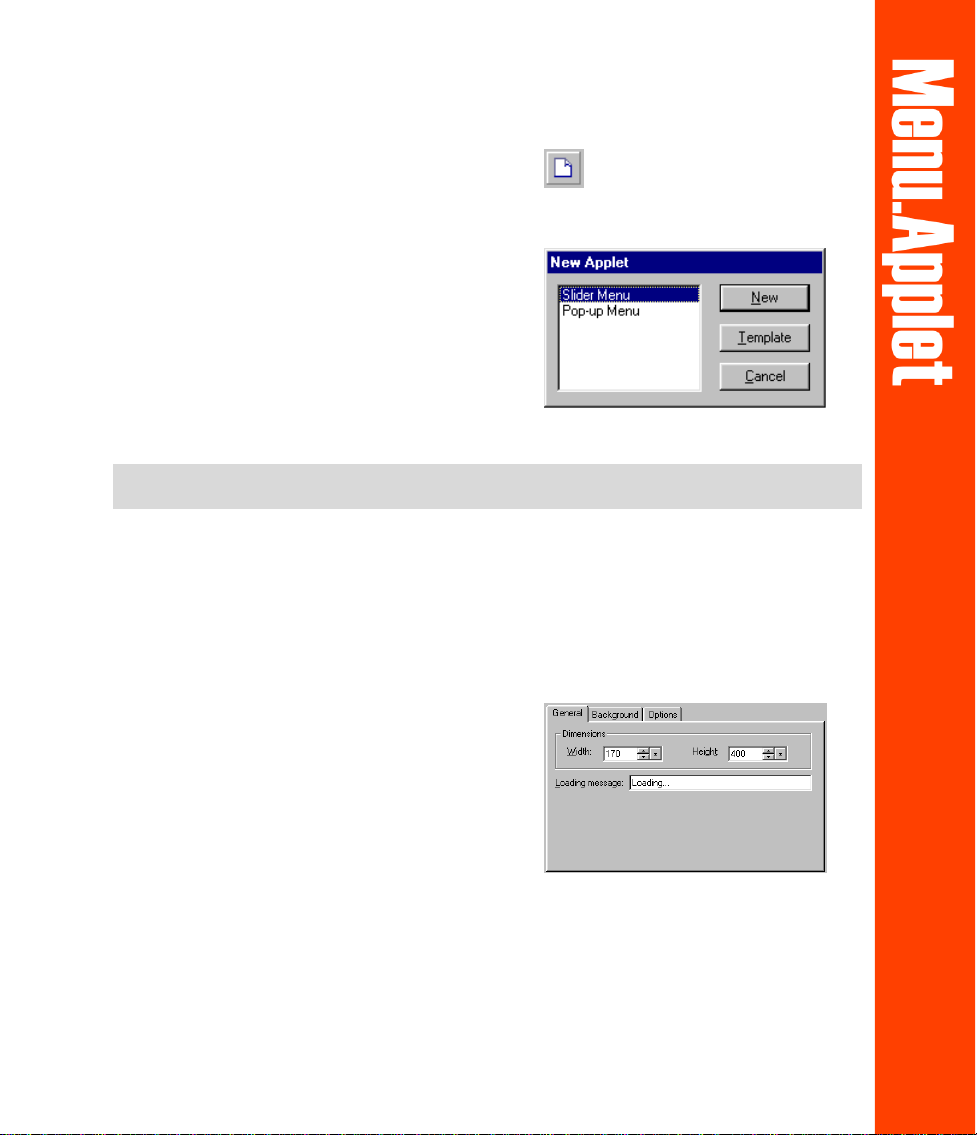
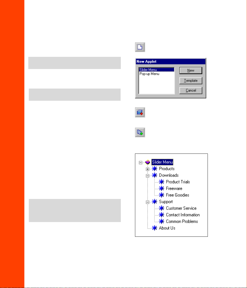
1. Click File : New or press [CTRL + N].
2. In the New Applet dialog box, select the
type of menu applet to create (Slider or
Pop-up), or click Template to open an
existing template.
3. A blank applet will be displayed. Its
attributes can be adjusted in the
Properties Panel. The following section
provides further details on defining the
applet’s attributes.
Note:
There are three tabs for Slider Menu: General, Background, and Options. For Pop-up
Menu, only the General and Background tabs are available.
Applet Properties Panel: General Tab
The General T ab for Slider Menus is dif ferent from the General Tab for Pop-up
Menus in that it has fewer options.
• Dimensions The applet’s width and
height in pixels.
• Loading message The message that
will be displayed while the applet is
being loaded into the W eb page.
• Smooth pop-up (Pop-up menu only)
If enabled, the pop-up submenu will
glide out on mouseover. Leaving this
box clear will cause the entire
submenu to be displayed instantly.
Slider Menu Applet Properties Panel:
General Tab
5
Page 6

• Pop-up speed (Pop-up menu only)
Only enabled if the Smooth pop-up
check box has been selected. The
speed of the gliding motion of the
submenu can be specified here.
Assign a low value to slow the slide
effect.
• Separator line (Pop-up menu only)
When selected, each submenu is
separated by a thin line.
Pop-up Menu Applet Properties Panel:
General Tab
Background Tab
The Background Tab is identical for both Slider and Pop-up Menus.
• Color Use a solid color for the
background. Click the color square to
change the current color.
• Image Use an image as the
background for your menu applet.
• Fit applet to image dimensions
Retain your image file’s original
dimensions and make the applet the
same size as the image.
• Tile Repeat the image throughout the
applet background if the image
dimensions are smaller than the
applet’s dimensions.
6
Page 7

Options Tab (Slider menu only)
• Retain mousedown state Maintain a
menu item’s mousedown state after it
has been selected. It will return to its
normal state when another menu item
on the same level is selected.
• Enable submenu glide Make
submenu items glide out when clicked.
Leaving this box clear will cause the
entire submenu to be displayed
instantly.
• Glide speed The speed at which
submenus glide out. Assign a low
value to slow the glide effect.
• Icon blink rate The rate at which the
icon blinks when the glide setting is
enabled. Assign a low value for a slow
blink.
• Show all submenus Keep submenus
expanded even when other submenus
have been clicked.
• Menu vertical position The anchor
point from which the menu glides out
with reference to the top edge of the
applet.
• If a scrollbar is to be used, specify the
Width of the scrollbar between 5 and
32 pixels.
Scrollbar options:
Always – A scroll bar is generated whether
or not it is required.
Never – The scroll bar is disabled.
Auto show/hide – Program detects if a
scrollbar is required and generates one
automatically
.
7
Page 8
Creating a new Slider menu
1. Select File: New or press [CTRL + N].
Select Slider Menu then click New.
Note:
Click Template to use a pre-defined
template.
2. Set up the applet’ s attributes using the
Properties Panel.
Note:
See pages 5 - 7 to know the different
settings available on the Properties Panel.
3. In the Tree Level View panel, click
Add Child Item or press
[CTRL + D] to add the first menu
item of the applet. You can add
additional same-level items by either:
a. Selecting the Slider Menu applet at
the Tree V iew Panel then clicking
Edit: Add Child Item, or
pressing [CTRL + D] or
b. Highlighting the first Child Item
then clicking the Add Sibling
Item button, or pressing
[CTRL + I].
Note:
Always select the parent menu item
before making child items of the same level.
If making sibling items from a child item,
select the original sibling first.
4. You will be able to adjust the settings
of each item in the Applet Properties
Panel. Following are details on how to
adjust the settings in each tab.
8
Page 9

Item Tab
Level - General Tab
• Caption The menu item’s text string.
When Show Caption T ext in Item is
disabled the text string is not
displayed.
• URL The Web page address that is
opened when the menu item is
selected.
• T arget The menu item’ s hyperlink
target frame.
• Status The message to appear in the
browser’s status window on
mouseover.
• Normal image The image file to be
displayed as the default background of
the menu item.
• Mouseover image The image file to
be displayed as the background of the
menu item on mouseover.
• Mousedown image The image file to
be displayed as the background of the
menu item on mousedown.
Specifications made to menu items on
this tab will apply to all items on that
menu item’s level:
• Text attributes The level’s universal
font, size and style.
• Background sound The sound file to
be played when any menu item on this
level is clicked. Click the folder icon to
loacte the sound file.
• Outline Place a border on your menu
item on mouseover.
• T ext indent The indentation of the
submenu item’s text in reference to the
left border of the parent item’s text.
• Icon indent The indentation of the
submenu item’s icon in reference to the
left border of the parent item’s icon.
• Item height The vertical space in
pixels to be allocated to the menu item.
The text will be vertically centered in
its allocated space.
9
Page 10
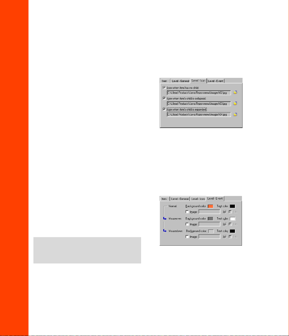
Level – Icon Tab
Icon settings determined in this tab will
affect all menu items on this level.
Image files can be specified for icons to
appear beside each menu item. Different
icons can be selected for menu items
with no child submenus; menu items with
unexpanded submenus; and menu items
with expanded menu items.
Level – Event Tab
Click the color squares to select the
colors of the background and text for the
default state, and for mouseover and
mousedown events. Settings determined
on this level will affect the whole level.
Note:
Select the Tile option to have the
image fill the the whole menu item’s alloted
space. This is useful when you are using a
patterned or textured image.
10
Page 11

Creating a Pop-up menu
1. Select File: New or press [CTRL + N].
Note:
Click Template to use a pre-defined
template.
2. Specify the Applet’s general attributes
using the Properties Panel.
Note:
See pages 5 - 6 to know the different
settings available on the Properties Panel.
3. In the T ree Level View panel, click
Add Child Item or press [CTRL
+ D] to add the first menu item of the
applet. You can add additional samelevel items by:
a. Selecting the Pop-up menu applet
at the Tree V iew Panel and clicking
Add Child Item or pressing
[CTRL + D] or
b. Highlighting the first Child Item
and clicking Add Sibling Item or
pressing [CTRL + I].
Note:
Always select the parent menu item
before making child items of the same level.
If making sibling items from a child item,
select the original sibling first.
4. Determine the settings of the first
generation child items using the
Properties Panel. The following
section describes the available settings
in further detail.
Note:
Attributes for Child Items in pop-up
menus are determined individually .
11
Page 12

Item Tab
Main Menu Tab (First level menu only)
Define settings for individual menu
items:
• Caption The menu item’s text string.
When Show Caption in Item is
disabled the text string is not
displayed.
• URL The W eb page address to be
opened when the menu item is
selected.
• T arget The menu item’ s hyperlink
target frame.
• Status The message to be displayed in
the browser’s status window on
mouseover.
• Submenu position The X and Y
coordinates of the starting position of
the selected item’s submenu, relative to
the the top left corner of the selected
item.
Specify an icon and icon attributes for
each child item:
• Normal The image to be displayed as
the menu item’s default background.
• Mouseover The image to be displayed
as the menu item’s background on
mouseover .
• Transpar ent backgr ound If enabled,
the background will be transparent.
• Item position and size The menu
item’s X and Y coordinates at the top
left corner, relative to the applet.
Specify also the height and width of
the menu item in pixels.
• Pop-up direction Use the arrows to
specify how the submenu pops up
when the parent item is selected.
12
Page 13

Level - General Tab
Specify text and attributes for all child
items within the same level:
• Text attributes The level’s universal
font, size and style.
• Margin left/right The size of the left
and right margins in pixels.
• Margin top/bottom (second level and
above menus only) The size of the
above and below margins in pixels.
• Background sound The sound (WAV
or AU) file to be played when the
menu item is clicked. Click the folder
icon to locate the sound file.
Level – Color Tab
Click the color squares to select the
colors of the background and text for the
Normal state and for mouseover events.
Also select the color of the border
around menu items. Settings determined
on this level will affect the whole level.
13
Page 14

Using HTML frames
Menu.Applet offers the choice of using frames in a Web page, providing greater
flexibility when creating menus. Frames allow the menu to remain static while links
are opened in the adjoining frame. Expanded menu items will therefore remain
expanded while a selected link opens in the adjoining frame. Each frame can be given
its own URL, enabling each frame to be loaded individually .
• Use Frames Output an HTML file
using frames.
• V ertical Split the browser window
vertically into two frames. Select one
of the two buttons to specify whether
the menu should be in the left frame or
in the right.
• Horizontal Split the browser window
horizontally into two frames. Select
one of the two buttons to specify
whether the menu should be in the top
Note:
frame or in the bottom.
• Menu frame The name of the frame in
which the menu is displayed.
Giving the frame a name will allow
that frame to be targeted by other URLs.
• Open undefined targets in the
Content frame Make target URLs
open in the adjoining frame.
• Content frame If the Open
undefined targets in the Content
frame option is enabled, assign a
name to the Content frame.
14
Page 15
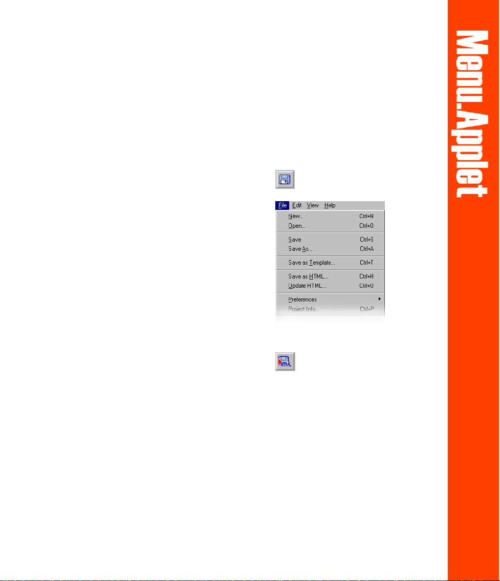
Saving your work
Menu.Applet files can be saved in two different ways; either as project files or as
HTML files. Project files contain information about source images and settings.
These can be opened again for editing at a later time. Java™ files are the final output
that will be seen on your W eb page.
To save a Menu.Applet project file:
1. Click File: Save As or Save on the
Standard T oolbar.
2. Locate the folder where you want to
save your project file. Assign a name
to the project. The file extension for
Menu.Applet files is UMA.
3. Click Save.
To save your work as Java:
1. Click File: Save as HTML or Output
HTML on the Standard toolbar .
2. Locate the folder where you want to
create a new HTML file. Assign a
name to the new HTML file.
3. Click Save.
To update existing Java components or
insert a new component in an existing
HTML file:
1. Click File: Update HTML.
2. Locate the HTML file to be updated.
3. Select the file and click Open.
15
 Loading...