

Page 1

A Guide to QuarkXPress
2017
Page 2

CONTENTS
Contents
About this guide.........................................................................15
What we're assuming about you.....................................................................15
Where to go for help.......................................................................................15
Conventions....................................................................................................15
Technology note..............................................................................................16
The user interface.......................................................................18
Tools................................................................................................................18
Scissors tool.............................................................................................................21
Starburst tool...........................................................................................................22
ShapeMaker tools....................................................................................................22
Menus..............................................................................................................41
QuarkXPress menu (Mac OS X only).......................................................................41
File menu.................................................................................................................42
Edit menu................................................................................................................42
Style menu...............................................................................................................44
Item menu...............................................................................................................47
Page menu..............................................................................................................49
Layout menu............................................................................................................49
Table menu.............................................................................................................50
View menu...............................................................................................................51
Utilities menu...........................................................................................................52
Window menu.........................................................................................................54
Help menu ..............................................................................................................56
Context menus................................................................................................56
Palettes...........................................................................................................56
Advanced Image Control palette............................................................................58
Books palette..........................................................................................................58
Callout Styles palette..............................................................................................59
Colors palette..........................................................................................................59
Conditional Styles palette.......................................................................................59
Content palette.......................................................................................................59
Content Variables palette.......................................................................................60
Footnote Styles palette...........................................................................................60
Glyphs palette.........................................................................................................61
Gradients palette....................................................................................................62
Grid Styles palette...................................................................................................62
Guides palette.........................................................................................................63
ii | A GUIDE TO QUARKXPRESS 2017
Page 3

CONTENTS
HTML5 Palette.........................................................................................................63
Hyperlinks palette...................................................................................................63
Image Editing palette..............................................................................................64
Index palette...........................................................................................................64
Item Styles palette...................................................................................................65
Layers palette..........................................................................................................65
Lists palette.............................................................................................................65
Measurements palette.............................................................................................66
Measurements palette - Mac OS X.........................................................................66
Measurements palette - Windows...........................................................................68
Page Layout palette................................................................................................70
Profile Information palette......................................................................................70
Redline palette........................................................................................................70
Reflow Tagging palette...........................................................................................71
Scale palette............................................................................................................71
Style Sheets palette.................................................................................................71
Table Styles palette.................................................................................................71
Text Shading Styles palette.....................................................................................72
Tools palette...........................................................................................................72
Palette groups and palette sets..............................................................................72
Layout controls................................................................................................74
Views and view sets........................................................................................75
Splitting a window...................................................................................................75
Creating a window..................................................................................................76
Using Story Editor view...........................................................................................76
View sets..................................................................................................................77
Projects and layouts...................................................................79
Working with projects.....................................................................................79
Options for Print layouts.........................................................................................80
Saving and naming a QuarkXPress project.............................................................81
Exporting layouts and projects................................................................................81
Custom page size....................................................................................................81
Working with layouts......................................................................................83
Project-level and layout-level resources..................................................................84
Adaptive scaling......................................................................................................84
Working with guides.......................................................................................86
Column and margin guides.....................................................................................86
Ruler guides............................................................................................................87
Snapping to guides.................................................................................................87
Dynamic Guides......................................................................................................88
Undoing and redoing actions..........................................................................89
Native QuarkXPress objects......................................................90
Convert an existing item to a native QuarkXPress object..............................90
A GUIDE TO QUARKXPRESS 2017 | iii
Page 4

CONTENTS
Import an object as a native QuarkXPress object...........................................91
Content variables.......................................................................93
Edit content variables.....................................................................................94
Create a custom content variable...................................................................95
Insert a content variable.................................................................................97
Boxes, lines, and tables..............................................................98
Understanding items and content...................................................................98
Understanding handles....................................................................................99
Understanding Bézier shapes........................................................................100
Drop Shadows...............................................................................................103
Item Find/Change..........................................................................................104
Working with boxes......................................................................................105
Creating text and picture boxes............................................................................105
Resizing boxes.......................................................................................................107
Locking box and picture proportions....................................................................107
Reshaping boxes...................................................................................................108
Adding frames to boxes........................................................................................108
Applying colors to boxes......................................................................................109
Applying gradients to boxes.................................................................................109
Specifying number of columns in text boxes........................................................109
Merging and splitting boxes.................................................................................110
Adding text and pictures to boxes........................................................................111
Changing box type................................................................................................111
Creating a box from a clipping path.....................................................................111
Copying attributes from one box to another........................................................111
Super Step and Repeat.........................................................................................113
ShapeMaker..........................................................................................................114
Working with lines.........................................................................................119
Creating lines........................................................................................................119
Line modes for orthogonal lines...........................................................................120
Resizing lines.........................................................................................................120
Reshaping lines.....................................................................................................121
Controlling line appearance..................................................................................121
Joining lines..........................................................................................................121
Joining, extending and closing open paths..........................................................122
Copying attributes from one line to another.........................................................122
Manipulating items........................................................................................123
Selecting items......................................................................................................123
Moving items.........................................................................................................123
Cutting, copying, and pasting items.....................................................................124
Controlling the stacking order of items.................................................................124
Grouping items.....................................................................................................125
Duplicating items..................................................................................................125
iv | A GUIDE TO QUARKXPRESS 2017
Page 5

CONTENTS
Spacing and aligning items ..................................................................................126
Rotating items.......................................................................................................126
Skewing items.......................................................................................................127
Locking and unlocking items.................................................................................127
Anchoring items and groups in text......................................................................127
Working with callouts....................................................................................127
Understanding callouts..........................................................................................128
Creating a callout..................................................................................................130
Configuring a callout anchor.................................................................................131
Working with callout styles....................................................................................131
Callouts and runaround.........................................................................................132
Working with tables......................................................................................132
Drawing a table.....................................................................................................133
Converting text to tables......................................................................................134
Importing Excel tables...........................................................................................135
Importing Excel charts...........................................................................................137
Inline tables...........................................................................................................137
Table styles............................................................................................................138
Adding text and pictures to tables........................................................................139
Editing table text ..................................................................................................140
Linking table cells..................................................................................................140
Formatting tables..................................................................................................141
Formatting gridlines..............................................................................................141
Inserting and deleting rows and columns.............................................................142
Combining cells.....................................................................................................143
Manually resizing tables, rows, and columns........................................................143
Converting tables back to text..............................................................................143
Working with tables and groups...........................................................................143
Continuing tables in other locations.....................................................................143
Table Import..........................................................................................................147
Text and typography................................................................149
Editing text...................................................................................................149
Fit Box to Text feature...........................................................................................149
Importing and exporting text.......................................................................150
Importing and exporting text with Unicode options.............................................151
Finding and changing text.............................................................................151
Special character codes.........................................................................................153
Working with footnotes and endnotes.........................................................154
Inserting footnotes and endnotes.........................................................................155
Footnote/Endnote styles.......................................................................................156
Footnote separators..............................................................................................158
Checking spelling..........................................................................................160
Auxiliary dictionaries.............................................................................................162
Counting words and characters.....................................................................162
Applying character attributes.......................................................................164
A GUIDE TO QUARKXPRESS 2017 | v
Page 6

CONTENTS
Applying a font......................................................................................................164
Choosing a font size..............................................................................................164
Applying type styles..............................................................................................165
Applying color, shade, and opacity......................................................................165
Applying horizontal or vertical scale.....................................................................166
Applying baseline shift..........................................................................................166
Applying text stroke..............................................................................................167
Applying multiple character attributes..................................................................168
Applying paragraph attributes......................................................................169
Controlling alignment...........................................................................................169
Controlling indentation.........................................................................................170
Controlling leading...............................................................................................171
Controlling space before and after paragraphs....................................................172
Controlling column flow........................................................................................172
Setting tabs...........................................................................................................179
Controlling widow and orphan lines.....................................................................180
Working with text shading............................................................................180
Creating and editing text shading styles...............................................................180
Applying text shading...........................................................................................183
Format painter..............................................................................................184
Controlling kerning.......................................................................................185
Kerning manually...................................................................................................185
Kerning automatically............................................................................................185
Controlling hyphenation and justification.....................................................186
Specifying hyphenation exceptions......................................................................188
Hyphenation exception files..................................................................................188
Using discretionary hyphens.................................................................................197
Controlling tracking.......................................................................................198
Tracking manually..................................................................................................198
Editing tracking tables...........................................................................................198
Working with style sheets.............................................................................199
Creating and editing paragraph style sheets........................................................199
Creating and editing character style sheets..........................................................201
Applying style sheets............................................................................................203
Appending style sheets.........................................................................................204
Working with conditional styles....................................................................204
Creating a conditional style...................................................................................206
Applying a conditional style..................................................................................208
Removing conditional styles..................................................................................209
Using conditional style markers.............................................................................209
Editing a conditional style.....................................................................................210
Bullets and numbering...................................................................................210
Working with bullet styles.....................................................................................211
Working with numbering styles.............................................................................212
Working with outline styles...................................................................................214
Bullets, numbering, outlines, and style sheets......................................................216
vi | A GUIDE TO QUARKXPRESS 2017
Page 7

CONTENTS
Positioning text in text boxes.......................................................................217
Using baseline grid................................................................................................217
Aligning text vertically...........................................................................................217
Specifying text inset..............................................................................................218
Controlling font usage...................................................................................218
Converting text to boxes..............................................................................219
Using text runaround....................................................................................219
Running text around all sides of an item...............................................................219
Running text around lines and text paths..............................................................220
Running text around text boxes ...........................................................................220
Running text around pictures................................................................................220
Fine-tuning a runaround path...............................................................................222
Editing a runaround path......................................................................................223
Working with text paths...............................................................................223
Creating drop caps........................................................................................224
Creating rules above and below paragraphs................................................224
Using anchored boxes...................................................................................224
Anchoring boxes and lines in text.........................................................................224
Cutting, copying, pasting, and deleting anchored boxes and lines.....................225
Unanchoring boxes and lines................................................................................225
Working with OpenType fonts......................................................................225
Applying OpenType styles....................................................................................226
Using ligatures.......................................................................................................228
Working with OpenType stylistic sets...................................................................228
Working with the Glyphs palette..................................................................231
Displaying invisible characters......................................................................232
Inserting special characters...........................................................................232
Inserting spaces.....................................................................................................232
Inserting other special characters..........................................................................232
Specifying character language......................................................................232
Using font fallback........................................................................................233
Working with font mapping rules.................................................................233
Working with design grids............................................................................234
Understanding design grids..................................................................................234
Design grid basics.................................................................................................237
Working with grid styles........................................................................................247
Using design grids.................................................................................................250
Working with hanging characters.................................................................251
Creating hanging character classes.......................................................................253
Creating hanging character sets ..........................................................................254
Applying hanging character sets...........................................................................255
Type Tricks....................................................................................................255
Make Fraction........................................................................................................255
Make Price.............................................................................................................256
Word Space Tracking............................................................................................256
Line Check.............................................................................................................257
A GUIDE TO QUARKXPRESS 2017 | vii
Page 8

CONTENTS
Custom Underline.................................................................................................257
Hyperlinks.....................................................................................................258
Creating a destination...........................................................................................259
Creating an anchor................................................................................................260
Creating a hyperlink using an existing destination...............................................260
Creating a hyperlink from scratch.........................................................................261
Showing links in the Hyperlinks palette.................................................................261
Formatting hyperlinks............................................................................................261
Editing and deleting destinations.........................................................................262
Editing and deleting anchors................................................................................262
Editing and deleting hyperlinks............................................................................262
Navigating using the Hyperlinks palette...............................................................262
Pictures.....................................................................................263
Working with pictures...................................................................................263
Importing a picture................................................................................................263
Moving pictures.....................................................................................................264
Resizing pictures....................................................................................................264
Cropping pictures.................................................................................................264
Rotating and skewing pictures..............................................................................264
Coloring and shading pictures..............................................................................264
Flipping pictures....................................................................................................265
Listing, verifying status of, and updating pictures.................................................265
Specifying background colors for pictures............................................................265
Maintaining picture attributes...............................................................................265
Editing the raster image........................................................................................266
Working with clipping paths.........................................................................271
Creating clipping paths.........................................................................................271
Using embedded clipping paths...........................................................................272
Manipulating clipping paths..................................................................................273
Creating special effects with clipping paths..........................................................273
Working with alpha masks............................................................................273
Working with PSD pictures...........................................................................274
Preparing PSD files................................................................................................275
Working with PSD layers.......................................................................................275
Working with PSD channels...................................................................................276
Working with PSD paths........................................................................................277
Printing PSD pictures.............................................................................................277
Cross references.......................................................................278
Inserting a cross reference............................................................................278
Synchronizing cross references.....................................................................280
Color, opacity, and drop shadows............................................282
Working with colors......................................................................................282
viii | A GUIDE TO QUARKXPRESS 2017
Page 9

CONTENTS
The Colors palette.................................................................................................282
The Colors dialog box...........................................................................................283
Creating a color.....................................................................................................283
Creating gradients.................................................................................................284
Editing a color.......................................................................................................287
Duplicating a color................................................................................................287
Deleting a color.....................................................................................................287
Adding colors using the color picker tool.............................................................288
Importing colors from another article or project...................................................290
Changing all instances of one color to another color...........................................290
Applying color and shade.....................................................................................290
Applying color and shade to text..........................................................................291
Applying color and shade to lines.........................................................................291
Applying transparency blend modes....................................................................291
Working with opacity....................................................................................296
Specifying opacity.................................................................................................296
Specifying opacity for groups...............................................................................296
Creating blends with transparency........................................................................297
Color management........................................................................................297
Source setups and output setups..........................................................................297
The color management experience for users........................................................297
Working with source setups and output setups from a color expert....................298
Working in a legacy color management environment..........................................299
Proofing color on screen (soft proofing)................................................................299
Color management for experts.............................................................................300
Creating a source setup........................................................................................300
Creating an output setup......................................................................................301
Managing profiles.................................................................................................302
Working with drop shadows.........................................................................303
Applying drop shadows........................................................................................303
Customizing drop shadows...................................................................................303
Incorporating drop shadows with items................................................................304
Custom Bleeds..........................................................................305
Using Custom Bleeds.....................................................................................305
Using Clip at Bleed Edge...............................................................................306
Item Styles................................................................................307
Using the Item Styles palette........................................................................307
Creating Item Styles......................................................................................308
Checking Item Style usage............................................................................309
DejaVu (Windows only)............................................................311
Document construction............................................................312
A GUIDE TO QUARKXPRESS 2017 | ix
Page 10

CONTENTS
Using automatic page numbering.................................................................312
Creating an automatic text box....................................................................312
Working with master pages..........................................................................313
Creating a master page.........................................................................................313
Applying master pages.........................................................................................317
Updating master pages.........................................................................................318
Master pages and layout families..........................................................................318
Working with layers......................................................................................318
Understanding layers.............................................................................................319
Creating layers......................................................................................................320
Selecting layers.....................................................................................................320
Showing and hiding layers....................................................................................320
Determining which layer an item is on..................................................................321
Deleting layers......................................................................................................321
Changing layer options.........................................................................................322
Moving items to a different layer..........................................................................323
Copying and pasting items between layers..........................................................323
Changing the stacking order of layers..................................................................324
Layers and text runaround.....................................................................................324
Duplicating layers..................................................................................................324
Merging layers.......................................................................................................325
Locking items on layers.........................................................................................325
Using master pages with layers.............................................................................325
Suppressing printout of layers...............................................................................326
Using PDF layers...................................................................................................326
Working with lists.........................................................................................327
Preparing for lists..................................................................................................327
Creating a list........................................................................................................327
Importing lists from another document................................................................328
Navigating with lists..............................................................................................328
Building lists..........................................................................................................329
Updating lists........................................................................................................329
Working with indexes...................................................................................329
Specifying the index marker color.........................................................................329
Creating index entries...........................................................................................330
Creating cross-references......................................................................................332
Editing an index entry...........................................................................................333
Deleting an index entry.........................................................................................333
Specifying the punctuation used in an index........................................................333
Building an index...................................................................................................334
Editing final indexes..............................................................................................335
Working with books......................................................................................336
Creating books......................................................................................................336
Working with chapters...........................................................................................337
Controlling page numbers....................................................................................339
Synchronizing chapters.........................................................................................340
x | A GUIDE TO QUARKXPRESS 2017
Page 11

CONTENTS
Printing chapters...................................................................................................341
Generate a PDF from a Book................................................................................341
Creating indexes and tables of contents for books..............................................342
Working with libraries...................................................................................343
Creating libraries...................................................................................................344
Adding library entries............................................................................................344
Retrieving library entries........................................................................................345
Manipulating library entries...................................................................................345
Working with labels...............................................................................................345
Saving libraries......................................................................................................346
Guides Palette...............................................................................................346
Using the Guides palette......................................................................................346
Guides palette menu.............................................................................................348
Creating guides with the Guides palette..............................................................348
Creating grids with the Guides palette.................................................................350
Creating rows and columns...................................................................................351
Creating bleed and safety guides.........................................................................352
Scale functionality.........................................................................................354
Cloner functionality.......................................................................................356
ImageGrid functionality.................................................................................357
Linkster functionality.....................................................................................359
Output......................................................................................361
Printing layouts.............................................................................................361
Updating picture paths.........................................................................................361
Setting Print dialog box controls...........................................................................361
Print dialog box.....................................................................................................363
Printing color separations......................................................................................368
Printing color composites......................................................................................369
Exporting layouts..........................................................................................370
Exporting a layout in EPS format...........................................................................370
Exporting a layout in PDF format..........................................................................371
Creating a PostScript file.......................................................................................373
Exporting a layout as an image.............................................................................373
Using Collect for Output...............................................................................373
Working with output styles...........................................................................375
App Studio output styles.......................................................................................375
HTML5 Publication output styles..........................................................................377
Working with trapping..................................................................................378
Understanding flattening and production issues..........................................379
PDF................................................................................................................379
Importing a PDF file into a picture box.................................................................379
Word Filter....................................................................................................381
Script XTensions software.............................................................................382
Box Tools submenu...............................................................................................383
Grid submenu........................................................................................................383
A GUIDE TO QUARKXPRESS 2017 | xi
Page 12

CONTENTS
Images submenu...................................................................................................383
Picture Box submenu............................................................................................384
Saving submenu....................................................................................................384
Special submenu...................................................................................................384
Stories submenu....................................................................................................384
Tables submenu....................................................................................................385
Typography submenu...........................................................................................385
Collaboration and single-sourcing............................................386
Working with shared content........................................................................386
Sharing and synchronizing content.......................................................................387
Understanding synchronization options................................................................389
Placing a synchronized item..................................................................................390
Placing synchronized content................................................................................390
Importing content into the shared content library................................................390
Working with Composition Zones.................................................................390
Understanding Composition Zones......................................................................390
Creating a Composition Zones item.....................................................................393
Placing a Composition Zones item................................................................395
Managing multiple pages in a placed Composition Zones item..........................396
Editing the attributes of a Composition Zones item.............................................397
Converting a Composition Zones item to a picture..............................................397
Unsynchronizing a Composition Zones item.........................................................398
Editing a composition layout: Content..........................................................398
Editing the contents of a composition layout...............................................398
Unsynchronizing a composition layout..........................................................399
Deleting a composition layout......................................................................399
Notes........................................................................................400
Creating notes...............................................................................................400
Working with notes.......................................................................................401
Opening and closing notes...................................................................................401
Showing and hiding notes.....................................................................................401
Deleting notes.......................................................................................................401
Converting between notes and text......................................................................401
Viewing notes by author, date, name, or color.....................................................401
Moving and resizing notes....................................................................................402
Printing notes........................................................................................................402
Notes in PDFs........................................................................................................402
Redline......................................................................................403
Tracking changes...........................................................................................403
Viewing tracked changes..............................................................................404
Accepting and rejecting changes..................................................................405
xii | A GUIDE TO QUARKXPRESS 2017
Page 13

CONTENTS
Job Jackets...............................................................................406
Understanding Job Jackets...........................................................................406
What are Job Jackets?..........................................................................................407
The structure of Job Jackets.................................................................................407
Sample Job Jackets workflow...............................................................................411
Working with Job Jackets.............................................................................412
Basic mode and Advanced mode.........................................................................412
Creating Job Jackets files.....................................................................................413
Working with Job Tickets..............................................................................417
Creating a Job Ticket template.............................................................................417
Adding a layout definition to a Job Ticket: Advanced mode...............................421
Applying a Job Ticket template to a project.........................................................422
Applying a layout definition to a project...............................................................425
Exporting and importing Job Tickets....................................................................425
The default Job Jackets file...........................................................................426
Editing the default Job Ticket template: File menu..............................................426
Editing the default Job Ticket template: Utilities menu........................................426
Editing the default Job Jackets file.......................................................................427
Working with Resources: Advanced mode...................................................427
Accessing Resources: Advanced mode.................................................................427
Configuring Resources: Advanced mode..............................................................428
Specifying the location of Resources: Advanced mode........................................429
Working with Layout Specifications..............................................................430
Creating a Layout Specification: Advanced mode................................................430
Applying a Layout Specification to a layout..........................................................431
Working with Rules and Rule Sets.................................................................433
Creating Rules: Advanced mode..........................................................................434
Adding Rules to a Rule Set: Advanced mode.......................................................436
Applying a Rule Set to a layout.............................................................................437
Evaluating a layout........................................................................................438
Job Jackets locking.......................................................................................440
Printing with JDF output...............................................................................441
Working with multiple languages.............................................443
Applying a character language......................................................................443
Changing the program language...................................................................444
XTensions software..................................................................445
Working with XTensions modules.................................................................445
Installing XTensions modules................................................................................445
Enabling and disabling XTensions modules.........................................................446
Working with XTensions sets (Windows only) ......................................................446
Preferences...............................................................................447
Understanding preferences...........................................................................447
A GUIDE TO QUARKXPRESS 2017 | xiii
Page 14

CONTENTS
Nonmatching Preferences alert.............................................................................447
Changes to QuarkXPress preferences...................................................................448
What's in the preferences files..............................................................................448
Application preferences................................................................................449
Preferences — Application — Display..................................................................450
Preferences — Application — Color Theme.........................................................450
Preferences — Application — Key Shortcuts........................................................450
Preferences — Application — Input Settings........................................................451
Preferences — Application — Font Fallback.........................................................452
Preferences — Application — Undo.....................................................................453
Preferences — Application — Open and Save.....................................................453
Preferences — Application — XTensions Manager..............................................454
Preferences — Application — Sharing..................................................................454
Preferences — Application — Fonts.....................................................................454
Preferences — Application — Text Highlighting..................................................454
Preferences — Application — East Asian..............................................................455
Preferences — Application — Dynamic Guides Color..........................................455
Preferences — Application — File List..................................................................455
Preferences — Application — Default Path..........................................................455
Preferences — Application — Index.....................................................................456
Preferences — Application — Job Jackets...........................................................456
Preferences — Application — Notes....................................................................456
Preferences — Application — PDF.......................................................................457
Preferences — Application — Redline..................................................................457
Preferences — Application — Spell-Check...........................................................458
Preferences — Application — Tables....................................................................458
Preferences — Application — Fraction/Price........................................................459
Project preferences.......................................................................................459
Preferences — Project — General.........................................................................459
Layout preferences.......................................................................................460
Preferences — Layout — General.........................................................................460
Preferences — Layout — Measurements..............................................................461
Preferences — Layout — Paragraph.....................................................................462
Preferences — Layout — Character......................................................................463
Preferences — Layout — Tools.............................................................................464
Preferences — Layout — Guides and Grid...........................................................465
Preferences — Layout — Color Manager..............................................................466
Preferences — Layout — Layers............................................................................466
Legal notices.............................................................................467
xiv | A GUIDE TO QUARKXPRESS 2017
Page 15

About this guide
You do not need to read the QuarkXPress® documentation from beginning to end.
Instead, use this guide to quickly look up information, find out what you need to
know, and get on with your work.
What we're assuming about you
In writing this guide, we assume that you are familiar with your computer and know
how to:
ABOUT THIS GUIDE
• Launch an application
• Open, save, and close files
• Use menus, dialog boxes, and palettes
• Work within a networked computing environment
• Use the mouse, keyboard commands, and modifier keys
Consult the documentation provided with your computer or other resources if you
need more information in any of these areas.
Where to go for help
If you're new to QuarkXPress, or if you want to explore one of its other longstanding
features, consult the following resources:
• Third-party books
• General books about desktop publishing
If your issues are at the system level — saving files, moving files, activating fonts, for
example — consult the documentation resources provided with your computer.
Conventions
Formatting conventions highlight information to help you quickly find what you
need.
A GUIDE TO QUARKXPRESS 2017 | 15
Page 16

ABOUT THIS GUIDE
• Bold type style: The names of all dialog boxes, fields, and other controls are set
in bold type. For example: "Click OK."
• References: In descriptions of features, parenthetical references guide you in
accessing those features. For example: "The Find/Change dialog box (Edit menu)
lets you find and replace text."
• Arrows: You will often see arrows (>), which map out the menu path to a feature.
For example: "Choose Edit > Style Sheets to display the Style Sheets dialog box."
• Icons: Although many tools and buttons are referenced by name, which you can
see by displaying ToolTips, in some cases icons are shown for easy identification.
For example, "Click the button on the Measurements palette to center text."
• Cross-platform issues: This application is quite consistent across operating systems.
However, some labels, buttons, key combinations, and other aspects of the
application must differ between Mac OS® and Windows® because of user interface
conventions or other factors. In such cases, both the Mac OS and Windows versions
are presented, separated by a slash, with the Mac OS version presented first. For
example, if the Mac OS version of a button is labeled Select, and the Windows
version is labeled Browse, you are directed to "Click Select/Browse." More complex
cross-platform differences are mentioned in notes or parenthetical statements.
Technology note
Quark developed QuarkXPress for Mac OS X and Windows to give publishers control
over typography, color, and collaboration. In addition to unique typographic controls,
QuarkXPress offers comprehensive font support, including support for TrueType®,
OpenType®, and Unicode®. Designers can use PANTONE® (the PANTONE MATCHING
SYSTEM®), Hexachrome®, Trumatch®, Focoltone®, DIC®, and Toyo to add color to
page layouts.
QuarkXPress acts as a hub for collaborative publishing environments because it allows
you to import and export content in multiple file formats, and to share design
components with other users. You can import files from applications such as Microsoft®
Word, Microsoft Excel®, Adobe® Illustrator®, and Adobe Photoshop®. QuarkXPress
supports copy paste of content from external applications, and allows the user to
convert the imported vector picture data to Native Objects. You can output content
as PostScript® or in PDF format for Adobe Acrobat® Reader®. QuarkXPress supports
export of digital output in ePub, Kindle format, and HTML5 Publications. The ePub
file is compatible with all prominent ePub Readers and Google Chrome. The Kindle
file is compatible with Kindle devices.You can also export files that can be viewed
using Internet Explorer®, Safari®, Google Chrome®, and Firefox®. Using features such
as Job Jackets® and Composition Zones®, you can be sure that multiple people share
specifications to produce consistent publications, even while working on a single
publication simultaneously.
The QuarkXPress software architecture lets you and software developers expand
publishing capability. Through XTensions® software technology, third-party developers
can create custom modules for QuarkXPress. QuarkXTensions® (Quark® XTensions
software) also provide a modular approach for meeting your particular publishing
16 | A GUIDE TO QUARKXPRESS 2017
Page 17

ABOUT THIS GUIDE
needs. And if you can write AppleScript® scripts, you can use this scripting language
from Apple® to automate many QuarkXPress activities.
A GUIDE TO QUARKXPRESS 2017 | 17
Page 18
THE USER INTERFACE
The user interface
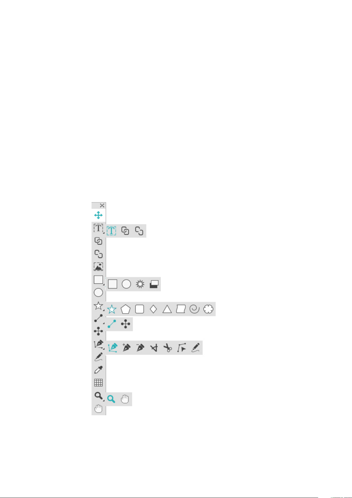
Tools
Skimming through the QuarkXPress user interface, you will find that many commands
are familiar or self-explanatory. Once you become familiar with QuarkXPress menus
and dialog boxes, you will discover that keyboard commands and palettes offer
convenient access to features that you can also access through menus.
The Tools palette
The Tools palette includes the following controls:
18 | A GUIDE TO QUARKXPRESS 2017
Page 19

THE USER INTERFACE
•
Use the Item tool to select, move, resize, and reshape items (boxes, lines, text
paths, and groups). When the Item tool is not selected, you can press
Command/Ctrl to temporarily access the Item tool.
•
Use the Text Content tool to draw text boxes and work with text in boxes.
•
Use the Text Linking tool to link text boxes. To maintain the text in their
respective boxes, hold down the Alt/Option key when using this tool.
•
Use the Text Unlinking tool to unlink text boxes. To maintain the text in their
respective boxes, hold down the Alt/Option key when using this tool. To move
the box out of the text chain, with its text, hold down the Shift+Option keys
when using this tool.
•
Use the Picture Content tool to draw picture boxes and work with pictures in
boxes.
•
Use the Rectangle Box tool to create a rectangular box. To draw a square box,
press and hold Shift while drawing.
•
Use the Starburst tool to create a star-shaped box.
•
Use the Composition Zones tool to create a Composition Zones box.
•
Use the Oval Box tool to create an oval box. To create a circular box, press and
hold Shift while drawing.
•
Use the Star tool to create a star shape.
•
Use the Polygon tool to create a polygon shape
•
Use the Rounded Rectangle tool to create a rounded corner rectanglular shape.
•
Use the Diamond tool to create a diamond shape.
•
Use the Triangle tool to create a triangle shape.
•
Use the Wave tool to create a wave shape.
•
Use the Spiral tool to create a spiral shape.
•
Use the Cloud tool to create a cloud shape.
•
Use the Line tool to create straight diagonal lines of any angle. To constrain a
line angle to 45 degrees, press and hold Shift while drawing.
•
Use the Orthogonal Line tool to create orthogonal lines.
•
Use the Bézier Pen tool to create Bézier lines and boxes. To constrain a line
angle to 45 degrees, press and hold Shift while drawing.
•
Use the Add Point tool to add a point to any type of path. Adding a point to
a content box automatically turns the content box into a Bézier item.
•
Use the Remove Point tool to remove a point from any type of path.
•
Use the Convert Point tool to automatically convert corner points to curve
points, and curve points to corner points. Click and drag to change the position
of a point, the curve of a curved line segment, or the position of a straight line
A GUIDE TO QUARKXPRESS 2017 | 19
Page 20
THE USER INTERFACE
segment. Select this tool and click a rectangular box or straight line to convert
the item to a Bézier box or line.
•
Use the Scissors tool to cut an item into distinct paths.
•
Use the Select Point tool to select curves or points so that you can move them
or delete them. Press Shift and click to select multiple points. Option-click/Alt-click
a point to make it symmetrical.
•
Use the Freehand Drawing tool to draw any shape line or box you want. If
you don't close a freehand box, it remains a line. To automatically close a freehand
box, press Option/Alt.
•
Use the Item Format Painter tool to copy all attributes applied to one item
and apply them to any other item.
•
Use the Tables tool to create a table.
•
Use the Zoom tool to enlarge or reduce the document view.
•
Use the Pan tool to reposition the active layout.
You can use key commands to declare the box content type as you draw using the
Rectangle Box tool: Press R while drawing to declare Picture content or press T while
drawing to declare Text content. To change the content type of an existing box,
right-click on the box and choose Content > Text, Picture or None
For more information about Bézier boxes and lines, see "Creating Bézier boxes" and
"Creating Bézier lines."
To pan the layout while a Pen tool is selected, press Shift+Space and then click and
drag.
To add text to a line or path, select the Text Content tool and double-click the line
or path.
For more information about Composition Zones, see "Creating a Composition Zones
item."
Users can display the Tools palette (Windows menu) horizontally, as well as vertically.
To display the palette horizontally, on Windows Ctrl+double-click the title bar and on
Mac OS X dock the tool palette to the top edge.
Tool key commands
When no text box or text path is active, you can switch tools quickly using the
following key commands:
20 | A GUIDE TO QUARKXPRESS 2017
Mac OS XWindowsTool
VVItem tool
TTText Content tool
Page 21
THE USER INTERFACE
Mac OS XWindowsTool
NTText Linking tool
NTText Unlinking tool
RRPicture Content tool
BBRectangle Box tool
BBOval Box tool
BBStarburst tool
MMShapeMaker tool
BLComposition Zones tool
LPLine tool
LPOrthogonal Line tool
PPBézier Pen tool
Scissors tool
Use the Scissors tool to cut the outline of a box and turn it into a line, or to cut a line
or text path into two.
The Scissors tool displays in the QuarkXPress Tools palette. To use the Scissors tool:
PPAdd Point tool
PPRemove Point tool
PPConvert Point tool
PPScissors tool
PPSelect Point tool
PPFreehand Drawing tool
IIItem Format Painter tool
GGTable tool
ZZZoom tool
XXPan tool
1
Select the Scissors tool .
• When a picture box is cut, it is converted to a Bézier line. As a result, the contents
of the box are not retained after the cut is made.
• When a text box is cut, it is converted to a text path.
• When a text path is cut, it is converted into two linked text paths.
2
Select the Select Point tool and click and drag the point to adjust it.
A GUIDE TO QUARKXPRESS 2017 | 21
Page 22

THE USER INTERFACE
Starburst tool
Use the Starburst tool to quickly and easily create star-shaped boxes.
Create a star-shaped picture box using the Starburst tool in two ways.
1 Select the Starburst tool , and then click and drag.
2 To define specific attributes as you create the star burst box, select the Starburst tool,
and then position the crosshair pointer where you want the star-shaped box and
click once. When the Starburst dialog box displays, enter values for the following
fields, and then click OK:
• Star Width
• Star Height
• Number of Spikes
• Spike Depth: Enter the desired distance from the tip of the spike to the base of
the spike as a percentage.
• Random Spikes: Enter a value between 0 and 100, where 0 is no randomness
applied and 100 is full randomness applied.
ShapeMaker tools
Use the following tools to quickly and easily create different shapes:
• Star tool
• Polygon tool
• Rounded Rectangle tool
• Diamond tool
• Triangle tool
• Wave tool
• Spiral tool
• Cloud tool
Press the m key to toggle through the different shape tools.
You can also access the ShapeMaker tools by selecting Utilities > ShapeMaker. See "
ShapeMaker."
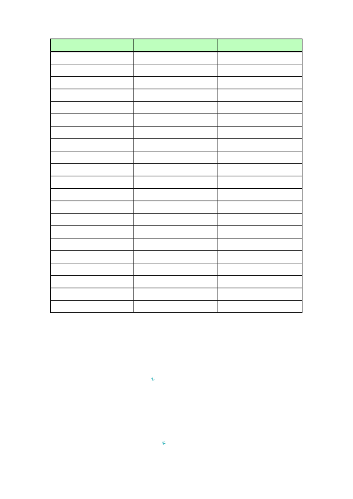
Using the Star tool
To create a star shape in two ways:
1 Select the Star tool , position the crosshair pointer where you want the star
and then click and drag.
2 Select the Star tool , position the crosshair pointer where you want the star and
click once. The Create Star dialog box displays:
22 | A GUIDE TO QUARKXPRESS 2017
Page 23
THE USER INTERFACE
Enter values for the following fields:
• Width
• Height
• Select Create From Center to specify that the center of the shape should be where
you placed the crosshair point.
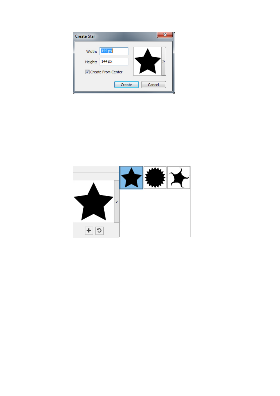
You can apply the default attributes or click the arrrow next to the shape preview to
select a predefined shape.
Click Create.
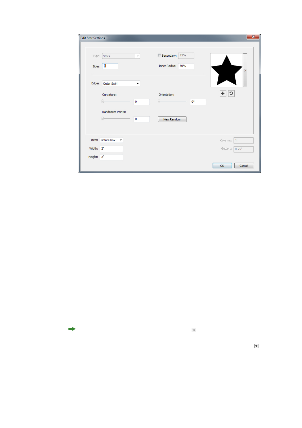
Default star settings
To edit the default star settings that will automatically be applied when using this
tool, double-click the Star tool. The Edit Star Settings dialog displays:
A GUIDE TO QUARKXPRESS 2017 | 23
Page 24
THE USER INTERFACE
Specify the default settings that will be applied when using this tool:
• Check Secondary to add additional secondary sides/points. This allows you to
add a different angle/shape in between the sides of a Star shape
• Sides: Specify the number of sides (points) the star will have .
• Inner Radius: Specify the inner radius of each point in the star.
• Edges: Specify the shape the edges of the star will be (Flat, Concave, Convex,
Outer Swirl, Inner Swirl, Opposite Swirl, or Tandem Swirl). If you choose an
option other than Flat, you can indicate the curvature of the edges with the
Curvature controls. If you choose one of the Swirl options, you can indicate the
direction of the swirl with the Orientation controls.
• Randomize Points: Lets you control the degree of randomness in the shape, from
0 (none) to 100 (maximum).
• New Random: Applies some randomness to the shape.
• Item: Specifies the type of box the shape should be placed into. The choices are
Text Box, Picture Box, None Box, Text Path, and Rule Path.
• Width, Height, Columns, and Gutters: Specifies the box attributes.
To revert to the default shape, click the Reset button .
Once you have defined the default attributes, you can click the Add Preset button
to save this customized shape to use later.
24 | A GUIDE TO QUARKXPRESS 2017
Page 25
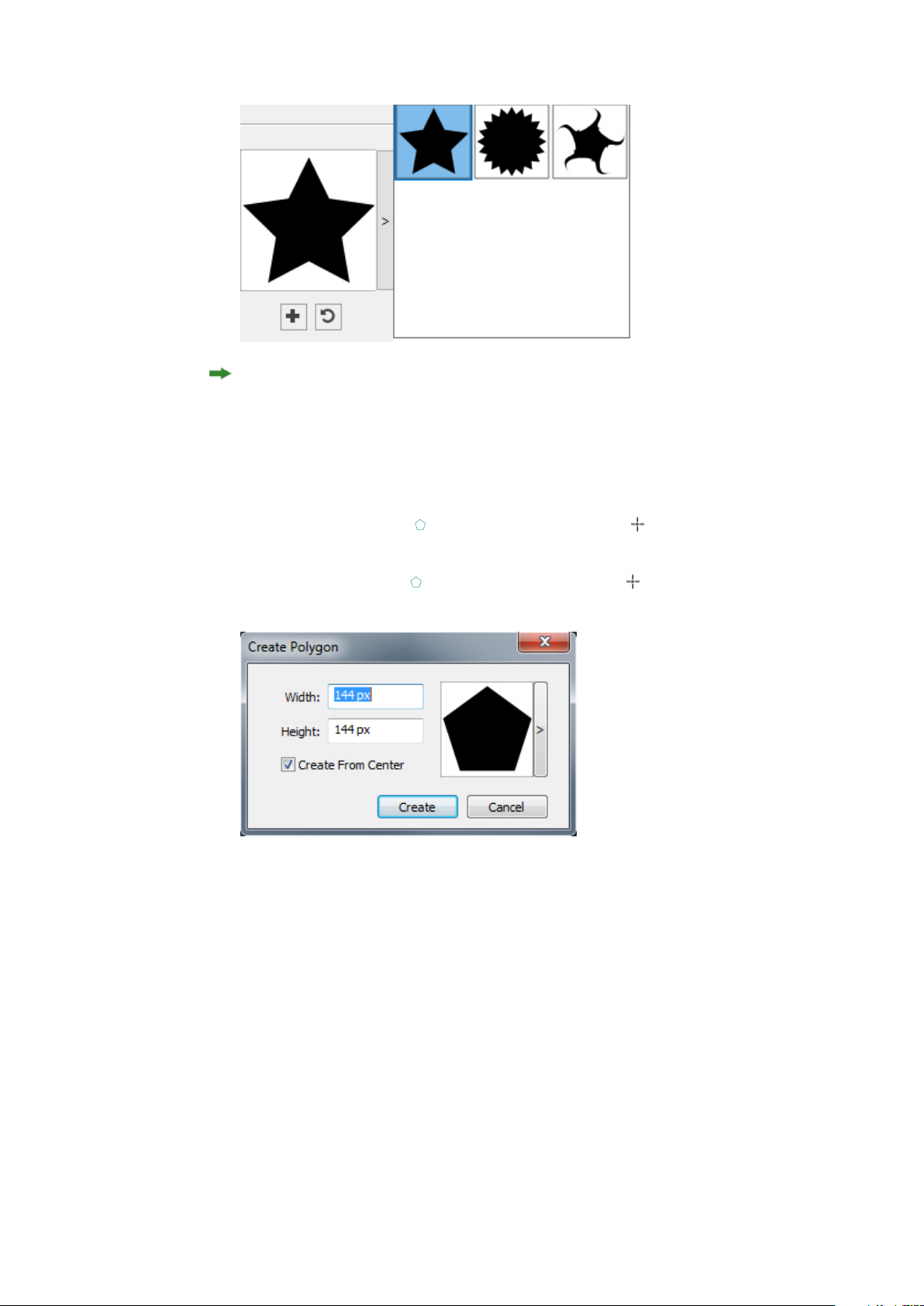
THE USER INTERFACE
To delete a predefined shape, hold down the Alt/Option key while selecting it from
the list.
Using the Polygon tool
To create a polygon shape in two ways.:
1 Select the Polygon tool , position the crosshair pointer where you want the
polygon and then click and drag.
2 Select the Polygon tool , position the crosshair pointer where you want the
polygon and click once. The Create Polygon dialog box displays:
Enter values for the following fields:
• Width
• Height
• Select Create From Center to specify that the center of the shape should be where
you placed the crosshair point.
You can apply the default attributes or click the arrrow next to the shape preview to
select a predefined shape.
A GUIDE TO QUARKXPRESS 2017 | 25
Page 26
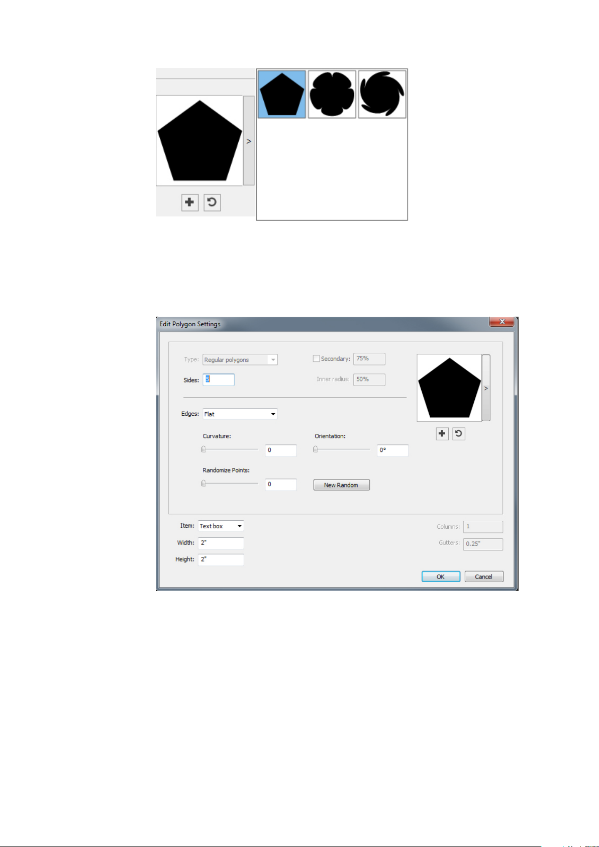
THE USER INTERFACE
Click Create.
Default polygon settings
To edit the default polygon settings that will automatically be applied when using this
tool, double-click the Polygon tool. The Edit Polygon Settings dialog displays:
Specify the default settings that will be applied when using this tool:
• Sides: Lets you specify how many sides the polygon has
• Edges: Lets you control whether the edges of the box are flat or curved. If you
choose an option other than Flat, you can indicate the curvature of the sides with
the Curvature controls. If you choose one of the Swirl options, you can indicate
the direction of the swirl with the Orientation controls.
• Randomize Points: Lets you control the degree of randomness in the shape, from
0 (none) to 100 (maximum).
• New Random: Applies some randomness to the shape.
26 | A GUIDE TO QUARKXPRESS 2017
Page 27
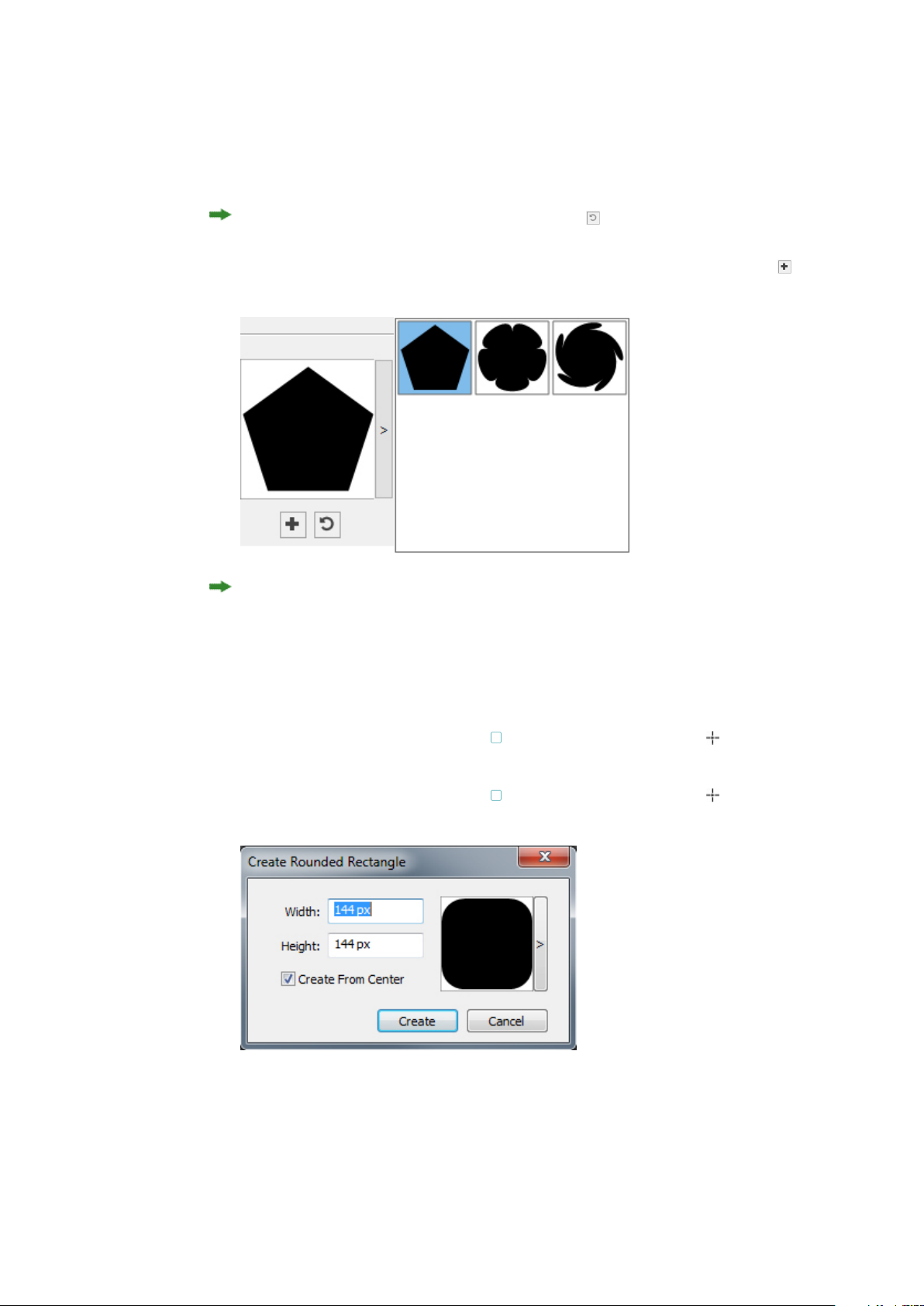
THE USER INTERFACE
• Item: Specifies the type of box the shape should be placed into. The choices are
Text Box, Picture Box, None Box, Text Path, and Rule Path.
• Width, Height, Columns, and Gutters: Specifies the box attributes.
To revert to the default shape, click the Reset button .
Once you have defined the default attributes, you can click the Add Preset button
to save this customized shape to use later.
To delete a predefined shape, hold down the Alt/Option key while selecting it from
the list.
Using the Rounded Rectangle tool
To create a rounded rectangle shape in two ways:
1 Select the Rounded Rectangle tool , position the crosshair pointer where you
want the star and then click and drag.
2 Select the Rounded Rectangle tool , position the crosshair pointer where you
want the rectangle and click once. The Create Rounded Rectangle dialog box displays:
Enter values for the following fields:
• Width
• Height
A GUIDE TO QUARKXPRESS 2017 | 27
Page 28
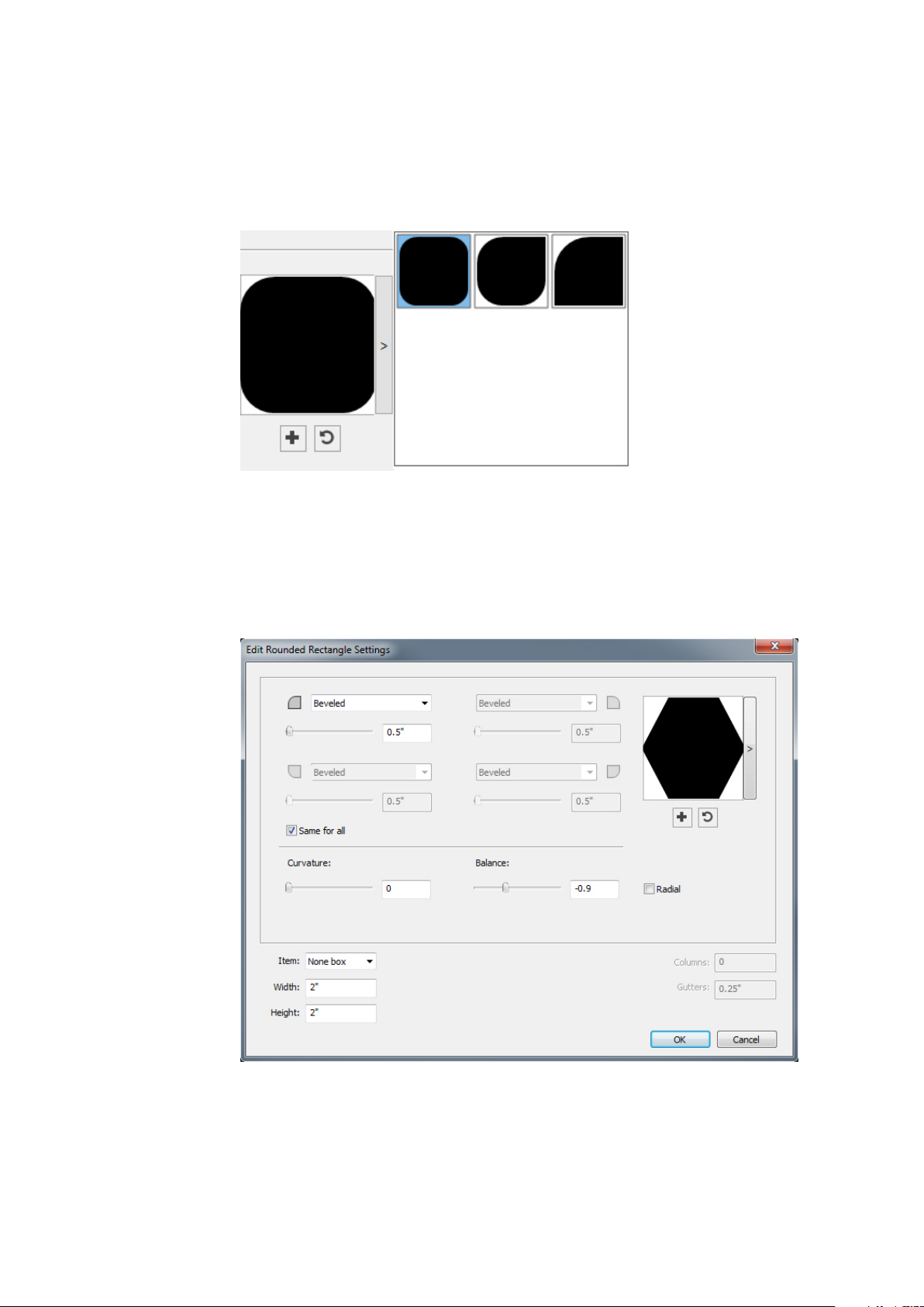
THE USER INTERFACE
• Select Create From Center to specify that the center of the shape should be where
you placed the crosshair point.
You can apply the default attributes or click the arrrow next to the shape preview to
select a predefined shape.
Click Create.
Default rounded rectangle settings
To edit the default rounded rectangle settings that will automatically be applied when
using this tool, double-click the Rounded Rectangle tool. The Edit Rounded
Rectangle Settings dialog displays:
Specify the default settings that will be applied when using this tool:
• Check Same for all to configure all four corners of the shape with a single set of
controls. To separately configure each corner of the box uncheck Same for all.
28 | A GUIDE TO QUARKXPRESS 2017
Page 29
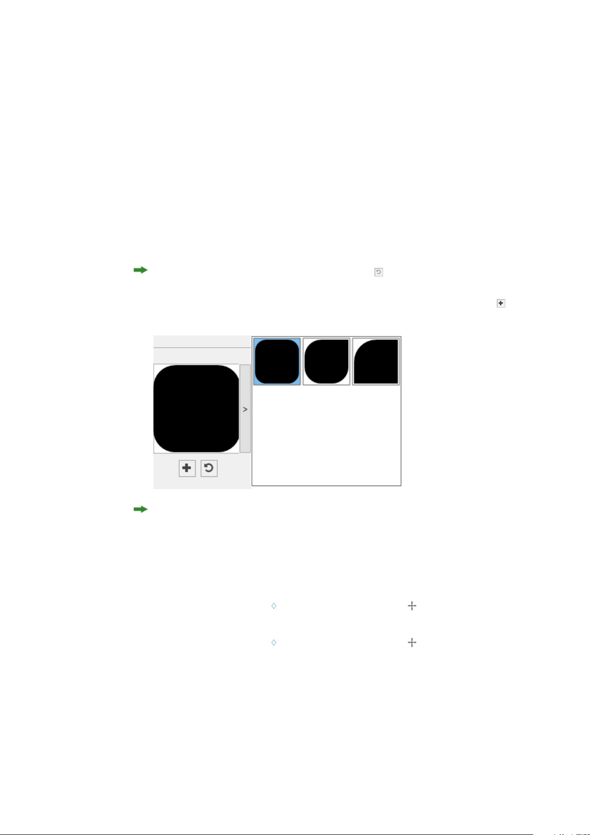
THE USER INTERFACE
• Use the drop-down menus to specify a corner type (Normal, Rounded, Beveled,
Concave, Pointed, or Inset) and a diameter (for options that involve a diameter).
• Curvature: Controls how curved the corners are if you select an option that
includes curvature.
• Balance: For some options, lets you control whether the corners lean toward the
sides of the box or toward the top.
• Radial: For some options, lets you control whether the corners of the box are
aligned with the center of the box or not.
• Item: Specifies the type of box the shape should be placed into. The choices are
Text Box, Picture Box, None Box, Text Path, and Rule Path.
• Width, Height, Columns, and Gutters: Specifies the box attributes.
To revert to the default shape, click the Reset button .
Once you have defined the default attributes, you can click the Add Preset button
to save this customized shape to use later.
To delete a predefined shape, hold down the Alt/Option key while selecting it from
the list.
Using the Diamond tool
To create a diamond shape in two ways:
1 Select the Diamond tool , position the crosshair pointer where you want the
diamond and then click and drag.
2 Select the Diamond tool , position the crosshair pointer where you want the
diamond and click once. The Create Diamond dialog box displays:
A GUIDE TO QUARKXPRESS 2017 | 29
Page 30
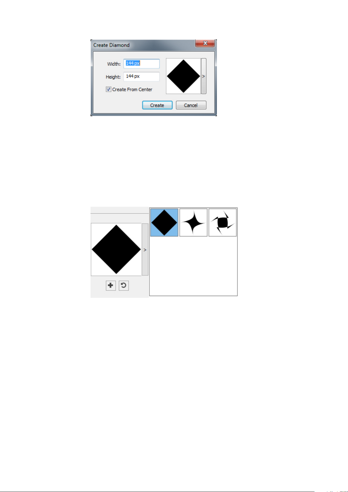
THE USER INTERFACE
Enter values for the following fields:
• Width
• Height
• Select Create From Center to specify that the center of the shape should be where
you placed the crosshair point.
You can apply the default attributes or click the arrrow next to the shape preview to
select a predefined shape.
Default diamond settings
To edit the default diamond settings that will automatically be applied when using
this tool, double-click the Diamond tool. The Edit Diamond Settings dialog displays:
30 | A GUIDE TO QUARKXPRESS 2017
Page 31

THE USER INTERFACE
Specify the default settings that will be applied when using this tool:
• Edges: Specify the shape the edges of the diamond will be (Flat, Concave, Convex,
Outer Swirl, Inner Swirl, Opposite Swirl, or Tandem Swirl). If you choose an
option other than Flat, you can indicate the curvature of the eges with the
Curvature controls. If you choose one of the Swirl options, you can indicate the
direction of the swirl with the Orientation controls.
• Randomize Points: Lets you control the degree of randomness in the shape, from
0 (none) to 100 (maximum).
• New Random: Applies some randomness to the shape.
• Item: Specifies the type of box the shape should be placed into. The choices are
Text Box, Picture Box, None Box, Text Path, and Rule Path.
• Width, Height, Columns, and Gutters: Specifies the box attributes.
To revert to the default shape, click the Reset button .
Once you have defined the default attributes, you can click the Add Preset button
to save this customized shape to use later.
A GUIDE TO QUARKXPRESS 2017 | 31
Page 32

THE USER INTERFACE
Using the Triangle tool
To delete a predefined shape, hold down the Alt/Option key while selecting it from
the list.
To create a triangle shape in two ways.:
1 Select the Triangle tool , position the crosshair pointer where you want the
triangle and then click and drag.
2 Select the Triangle tool , position the crosshair pointer where you want the
triangle and click once. The Create Triangle dialog box displays:
Enter values for the following fields:
• Width
• Height
• Select Create From Center to specify that the center of the shape should be where
you placed the crosshair point.
You can apply the default attributes or click the arrrow next to the shape preview to
select a predefined shape.
32 | A GUIDE TO QUARKXPRESS 2017
Page 33

THE USER INTERFACE
Default triangle settings
To edit the default triangle settings that will automatically be applied when using this
tool, double-click the Triangle tool. The Edit Triangle Settings dialog displays:
Specify the default settings that will be applied when using this tool:
• Edges: Specify the shape the edges of the triangle will be (Flat, Concave, Convex,
Outer Swirl, Inner Swirl, Opposite Swirl, or Tandem Swirl). If you choose an
option other than Flat, you can indicate the curvature of the sides with the
Curvature controls. If you choose one of the Swirl options, you can indicate the
direction of the swirl with the Orientation controls.
• Randomize Points: Lets you control the degree of randomness in the shape, from
0 (none) to 100 (maximum).
• New Random: Applies some randomness to the shape.
• Item: Specifies the type of box the shape should be placed into. The choices are
Text Box, Picture Box, None Box, Text Path, and Rule Path.
A GUIDE TO QUARKXPRESS 2017 | 33
Page 34

THE USER INTERFACE
• Width, Height, Columns, and Gutters: Specifies the box attributes.
To revert to the default shape, click the Reset button .
Once you have defined the default attributes, you can click the Add Preset button
to save this customized shape to use later.
To delete a predefined shape, hold down the Alt/Option key while selecting it from
the list.
Using the Wave tool
To create a wave shape in two ways:
1 Select the Wave tool , position the crosshair pointer where you want the wave
and then click and drag.
2 Select the Wave tool , position the crosshair pointer where you want the wave
and click once. The Create Wave dialog box displays:
Enter values for the following fields:
• Width
• Height
• Select Create From Center to specify that the center of the shape should be where
you placed the crosshair point.
34 | A GUIDE TO QUARKXPRESS 2017
Page 35

THE USER INTERFACE
You can apply the default attributes or click the arrrow next to the shape preview to
select a predefined shape.
Default wave settings
To edit the default wave settings that will automatically be applied when using this
tool, double-click the Wave tool. The Edit Wave Settings dialog displays:
Specify the default settings that will be applied when using this tool:
• Top, Left, Bottom, and Right: These controls let you configure the four sides of
the box. You can choose Wave 1, Wave 2, or Flat.
• Keep waves parallel: Keeps the waves on either side of the box parallel with one
another.
• The controls in the Wave 1 and Wave 2 areas let you choose which type of wave
to use, the frequency of the wave, the phase (starting point) of the wave, and the
amplitude (depth) of the wave.
A GUIDE TO QUARKXPRESS 2017 | 35
Page 36

THE USER INTERFACE
• Item: Specifies the type of box the shape should be placed into. The choices are
Text Box, Picture Box, None Box, Text Path, and Rule Path.
• Width, Height, Columns, and Gutters: Specifies the box attributes.
To revert to the default shape, click the Reset button .
Once you have defined the default attributes, you can click the Add Preset button
to save this customized shape to use later.
To delete a predefined shape, hold down the Alt/Option key while selecting it from
the list.
Using the Spiral tool
To create a spiral shape in two ways:
1 Select the Spiral tool , position the crosshair pointer where you want the spiral
and then click and drag.
2 Select the Spiral tool , position the crosshair pointer where you want the spiral
and click once. The Create Spiral dialog box displays:
Enter values for the following fields:
• Width
• Height
36 | A GUIDE TO QUARKXPRESS 2017
Page 37

THE USER INTERFACE
• Select Create From Center to specify that the center of the shape should be where
you placed the crosshair point.
You can apply the default attributes or click the arrrow next to the shape preview to
select a predefined shape.
Default spiral settings
To edit the default spiral settings that will automatically be applied when using this
tool, double-click the Spiral tool. The Edit Spiral Settings dialog displays:
Specify the default settings that will be applied when using this tool:
• Type: Choose what type of spiral too create from the drop-down menu.
• Archimedes: an evenly spaced circular spiral.
• Golden Spiral: a spiral built with the golden ratio.
• Custom: this makes the Winds field available.
A GUIDE TO QUARKXPRESS 2017 | 37
Page 38

THE USER INTERFACE
• Winds: Lets you control how many times the spiral goes around.
• Rate: Lets you control how quickly the width of the spiral increases.
• Segments: Lets you control how circular the spiral is allowing you to specify the
number of segments per wind.
• Smoothness: Lets you control how smooth the spiral is. You can get a harder-edged
shape by lowering the Segments value and decreasing the Smoothness value.
• Clockwise and Counterclockwise: Lets you control the direction of the spiral.
• Item: Specifies the type of box the shape should be placed into. The choices are
Text Box, Picture Box, None Box, Text Path, and Rule Path.
• Width, Height, Columns, and Gutters: Specifies the box attributes.
To revert to the default shape, click the Reset button .
Once you have defined the default attributes, you can click the Add Preset button
to save this customized shape to use later.
To delete a predefined shape, hold down the Alt/Option key while selecting it from
the list.
Using the Cloud tool
To create a cloud shape in two ways:
1 Select the Cloud tool , position the crosshair pointer where you want the cloud
and then click and drag.
2 Select the Cloud tool , position the crosshair pointer where you want the cloud
and click once. The Create Cloud dialog box displays:
38 | A GUIDE TO QUARKXPRESS 2017
Page 39

THE USER INTERFACE
Enter values for the following fields:
• Width
• Height
• Select Create From Center to specify that the center of the shape should be where
you placed the crosshair point.
You can apply the default attributes or click the arrrow next to the shape preview to
select a predefined shape.
Default cloud settings
To edit the default cloud settings that will automatically be applied when using this
tool, double-click the Cloud tool. The Edit Cloud Settings dialog displays:
A GUIDE TO QUARKXPRESS 2017 | 39
Page 40

THE USER INTERFACE
Specify the default settings that will be applied when using this tool:
• Sides: Specify the number of sides the cloud shape will have.
• Edges: Specify the shape the edges of the cloud will be (Flat, Concave, Convex,
Outer Swirl, Inner Swirl, Opposite Swirl, or Tandem Swirl). If you choose an
option other than Flat, you can indicate the curvature of the edges with the
Curvature controls. If you choose one of the Swirl options, you can indicate the
direction of the swirl with the Orientation controls.
• Randomize Points: Lets you control the degree of randomness in the shape, from
0 (none) to 100 (maximum).
• New Random: Applies some randomness to the shape.
• Item: Specifies the type of box the shape should be placed into. The choices are
Text Box, Picture Box, None Box, Text Path, and Rule Path.
• Width, Height, Columns, and Gutters: Specifies the box attributes.
To revert to the default shape, click the Reset button .
Once you have defined the default attributes, you can click the Add Preset button
to save this customized shape to use later.
40 | A GUIDE TO QUARKXPRESS 2017
Page 41

Menus
THE USER INTERFACE
To delete a predefined shape, hold down the Alt/Option key while selecting it from
the list.
The topics below describe the menus and menu items available in QuarkXPress.
QuarkXPress menu (Mac OS X only)
The QuarkXPress menu is a part of QuarkXPress for Mac OS X. This menu contains
the same commands as in the application menu for other Mac OS X applications —
to hide or show QuarkXPress and other applications, to access preferences, and to quit
QuarkXPress. This menu includes the following commands:
• About QuarkXPress: Use this command to display information about QuarkXPress,
such as the version number.
• Edit License Code: Use this command to change the validation code of an installed
copy of QuarkXPress. By changing this code, you can change a Test Drive
version (formerly called "evaluation copy") of QuarkXPress into a fully functional
version, change the languages supported by the user interface, or change
QuarkXPress into a Plus edition.
• Activate QuarkXPress: Use this command to activate QuarkXPress on your
computer. Available only when QuarkXPress is running in demo mode.
• Quark Cache Cleaner: Use this command to run the Quark Cache Cleaner when
the QuarkXPress application is invoked.You will be asked to save any open projects.
If any other version of QuarkXPress is also running at that time, you will be asked
to quit those applications before running the Quark Cache Cleaner.
• Check for Updates: Use this command to check for updates to QuarkXPress.
• Quark Update Settings: Use this command to configure automatic update settings.
• Preferences: Lets you modify default values and settings. For more information,
see "Preferences."
• Quit QuarkXPress: Use this command to exit the application.
A GUIDE TO QUARKXPRESS 2017 | 41
Page 42

THE USER INTERFACE
File menu
The File menu enables you to manipulate electronic files in a number of ways, including
the ability to create, open, print, and save. This menu includes the following
commands:
• New: Choose an option from the New submenu to create a project. If you choose
New Project from Ticket, you can select a Job Ticket from which you can create
the project. You can also use this submenu to create new libraries and books.
• Open: Use this option to open project files.
• Open Recent (Mac OS X only, on Windows, a list of the recently opened files are
displayed at the end of the File menu.): Use this option to open a project from a list
of recently opened files.
• Close: Use this option to close the active project.
• Save: Use this option to save the active project.
• Save As: Use this option to save a copy of the active project.
• Save a Copy As/Downsave: Use this option to export one or more layouts in the
active project or to save a copy of the active project as a lower version of
QuarkXPress.
• Revert to Saved: Use this option to return the active project to the state it was in
when it was last saved.
• Import: Use this command to import text into a text box or to import a picture
into a picture box.
• Export Picture: Use this command to export a copy of the picture contained in
the active picture box or all pictures in the project.
• Save Text: Use this option to save the contents of the active text box as a separate
file.
• Append: Use this option to append style sheets, colors, layouts, and a variety of
other types of resources from another file.
• Export As: Use this option to export a layout as PDF, EPS, Image, HTML5
Publication, iOS App, ePub, or Kindle.
• Collect for Output: Use this option to collect the layout/s, fonts, images, profiles,
output report, etc into a folder. Collect for output can be performed on all layouts
in the project.
• Job Jackets: Use this submenu to access the specifications and rules for creating
and inspecting a layout, link a project to a Job Jackets file, modify a Job Ticket,
and evaluate a layout.
• Print: Use this option to print the active file.
• Exit (Windows only): Use this option to exit the application.
Edit menu
The Edit menu includes the following commands:
• Undo: Undoes the last action.
42 | A GUIDE TO QUARKXPRESS 2017
Page 43

THE USER INTERFACE
• Redo: Redoes an undone action.
• Cut: Cuts the selected content.
• Copy: Copies the selected content to the clipboard.
• Paste: Pastes the clipboard contents on the active page.
• Paste Without Formatting: Pastes the clipboard contents as plain text.
• Paste In Place: Pastes a duplicated or copied item onto the active page at the same
position from which it was originally copied.
• Paste as Native Objects: To convert the item to be pasted to a native QuarkXPress
object.
• Select All: Selects all content in the active box or text path.
• Preferences (Windows only): Lets you modify default values and settings. For more
information, see "Preferences."
• Program Language (Windows only): Lets you change the language of the user
interface.
• Find/Change: Displays the Find/Change palette, which you can use to find and
change text based on content, formatting, or both.
• Item Find/Change: Displays and hides the Item Find/Change palette.
• Colors: Lets you add, edit, and delete color definitions. For more information,
see "Working with colors."
• Style Sheets: Lets you add, edit, and delete style sheet definitions. For more
information, see "Working with style sheets."
• Item Styles: Lets you add, edit, and delete item definitions that you can apply to
QuarkXPress items with the Item Styles palette (Window menu).
• Callout Styles: Lets you add, edit, and delete callout styles. For more information,
see "Working with callouts."
• Conditional Styles: Lets you add, edit, and delete conditional styles. For more
information, see "Working with conditional styles."
• Bullet, Numbering, and Outline Styles: Lets you add, edit, and delete bullet,
numbering, and outline styles. For more information, see "Bullets and numbering."
• Footnote Styles: Lets you add, edit, and delete footnote styles. For more
information, see "Working with footnotes and endnotes."
• Text Shading Styles: Lets you add, edit, and delete text shading styles. For more
information, see "Working with text shading."
• Hyperlinks: Lets you add, edit, and delete hyperlinks including URLs, anchors,
and page links.
• Underline Styles: Lets you access and modify underline styles.
• Hanging Characters: Lets you add, edit, and delete custom hanging character
definitions. For more information, see "Working with hanging characters."
• Lists: Lets you add, edit, and delete list definitions. The Lists feature is a tool for
automatically generating tables of contents and other types of listed content. For
more information, see "Working with lists."
A GUIDE TO QUARKXPRESS 2017 | 43
Page 44

THE USER INTERFACE
• H&Js: Lets you add, edit, and delete H&J (hyphenation and justification)
definitions. H&Js let you control how text breaks. For more information, see
"Controlling hyphenation and justification."
• Grid Styles: Lets you add, edit, and delete patterns of non-printing design grids
that you can apply to text components. For more information, see "Working with
design grids."
• Dashes and Stripes: Lets you add, edit, and delete custom line patterns.
• Mojigumi: Lets you add, edit, and delete Mojigumi sets and classes. For more
information, see "Working with Mojigumi sets and classes."
This feature is considered an East Asian feature and is only available when you
have the East Asian preference enabled (QuarkXPress/Edit > Preferences > East
Asian).
• Non-Breaking Character Sets: Lets you add, edit, and delete rules for two-byte
character sets.
This feature is considered an East Asian feature and is only available when you
have the East Asian preference enabled (QuarkXPress/Edit > Preferences > East
Asian).
• Kerning Pairs: Lets you control kerning for installed fonts.
• Font Tracking Tables: Lets you control tracking for installed fonts..
• Set Tool Preferences From Selected (Mac OS X only): Lets you set the tool
preferences to the currently selected box's attributes.
• Restore Tool Preferences To Default (Mac OS X only): Lets you restore the tool
preferences back to the defaults.
• Color Setups: Lets you access and modify setups for Source and Output Setups.
• Output Styles: Lets you add, edit, and delete output style definitions. Output
styles let you easily switch between different sets of output options. For more
information, see "Working with output styles."
Style menu
The Style menu changes depending on whether a text box, a picture box, or a line is
active.
Style menu for text
The Style menu for text includes commands for specifying character attributes and
paragraph formats. This menu includes the following commands:
• Font: Lets you change the font of selected text.
• Size: Lets you change the size of selected text.
• Type Style: Lets you apply type styles such as bold, italic, and underline to selected
text. The Type Style sub menu also contains Underline Styles, Make Fraction,
Make Price and Remove Custom Underline.
44 | A GUIDE TO QUARKXPRESS 2017
Page 45

THE USER INTERFACE
• Color: Lets you change the color of selected text.
• Shade: Lets you set the tint of an applied color.
• Opacity: Lets you control the transparency of selected text.
• Horizontal/Vertical Scale (Windows only): Lets you stretch selected text
horizontally or vertically.
• Kern (Windows only) : Lets you add or remove all manual kerning applied between
characters, or remove kerning from a kerning pair.
• Story Direction: Lets you specify horizontal or vertical story direction for the
selected text box.
This feature is considered an East Asian feature and is only available when you
have the East Asian preference enabled (QuarkXPress/Edit > Preferences > East
Asian).
• Rubi: Lets you control rubi characters applied to text.
This feature is considered an East Asian feature and is only available when you
have the East Asian preference enabled (QuarkXPress/Edit > Preferences > East
Asian).
• Group Characters: Lets you place horizontal text in a vertical story.
This feature is considered an East Asian feature and is only available when you
have the East Asian preference enabled (QuarkXPress/Edit > Preferences > East
Asian).
• Baseline Shift (Windows only): Lets you move selected text up or down in relation
to the baseline without changing line spacing.
• Character (Windows only): Displays the Character Attributes dialog box, which
lets you control every aspect of character formatting for selected text.
• Alignment: Lets you align active paragraphs to the left, right, or center. Also lets
you justify or force-justify selected paragraphs.
• Leading (Windows only): Lets you change the line spacing of selected paragraphs.
• Character Alignment: Lets you align active characters to the top, center, baseline,
or bottom.
In East Asian configuration, the options are: ICF Box Top, ICF Box Bottom,
Embox Top, Embox Center, Embox Bottom and Roman Baseline . These let
you align the small characters in a line to the ICF specified by the large characters.
In vertical text frames, ICF Top/Right aligns the text to the right of the ICF, and
ICF Bottom/Left aligns the text to the left of the ICF.
• Formats (Windows only): Displays the Paragraph Attributes dialog box, which
lets you control every aspect of paragraph formatting for selected text.
• Tabs (Windows only): Lets you set tab stops for selected paragraphs.
A GUIDE TO QUARKXPRESS 2017 | 45
Page 46

THE USER INTERFACE
• Rules (Windows only): Lets you create automatic lines above and below selected
paragraphs.
• Paragraph Style Sheet: Lets you apply paragraph style sheets to selected text.
• Character Style Sheet: Lets you apply character style sheets to selected text.
• Footnotes/Endnotes: Lets you view, add and edit footnotes and endnotes.
• Footnote Separator Style: Lets you apply a different footnote separator style.
• Update Style Sheet: Lets you update a character or paragraph style sheet definition
based on local changes to the applied style sheet.
• Item Styles: Lets you view and update applied item styles.
• Change Case: Lets you change case of selected text to uppercase, lower case, or
title case.
• Non-Breaking Attribute: Lets you apply the non-breaking attribute on the selected
text (i.e. the text will not hyphenate or wrap). To highlight all text that has the
non-breaking attribute applied to it, choose View > Highlight Non-Breaking.
• Flip Text Horizontal: Lets you flip selected text horizontally.
• Flip Text Vertical: Lets you flip selected text vertically.
• Cross Reference: Lets you insert and synchronize cross references.
• Hyperlink: Lets you modify and apply a hyperlink, page link, or anchor to selected
text.
• Anchor: Lets you create or modify an anchor for selected text.
• Remove Manual Kerning : Lets you remove all manual kerning applied between
characters.
Style menu for pictures
The Style menu for pictures includes commands for formatting and editing pictures.
This menu includes the following commands:
• Color: Applies a color to a selected grayscale or one-bit picture.
• Shade: Lets you set the intensity of an applied color.
• Opacity: Lets you control the transparency of a selected picture.
• Halftone (Windows only): Lets you apply a halftone screen pattern to a selected
grayscale picture.
• Center Picture: Centers the selected picture in its picture box.
• Stretch Picture To Fit Box: Reduces or enlarges the selected picture horizontally
and vertically to fill its picture box.
• Scale Picture To Box: Reduces or enlarges the selected picture proportionately
to fill its picture box.
• Fit Box To Picture: Reduces or enlarges the picture box to fit the size of the
selected picture.
• Convert to Native Objects: Convert the existing item to a native QuarkXPress
object.
46 | A GUIDE TO QUARKXPRESS 2017
Page 47

• Item Styles: Lets you view and update applied item styles.
• Flip Picture Horizontal: Flips the selected picture horizontally.
• Flip Picture Vertical: Flips the selected picture vertically.
• Hyperlink: Lets you modify and apply a hyperlink, page link, or anchor to a
selected picture or box.
• Anchor: Lets you create or modify an anchor for a selected picture or box.
• Image Editing: Lets you apply picture effects to the image in the box.
Style menu for lines
The Style menu for lines includes the following commands:
• Line Style: Lets you apply a line style to a selected line.
• Arrowheads: Lets you apply an arrowhead style to a selected line.
• Width: Lets you adjust the width of a selected line.
• Color: Lets you change the color of a selected line.
THE USER INTERFACE
• Shade: Lets you set the intensity of an applied color.
• Opacity: Lets you control the transparency of a selected line.
• Item Styles: Lets you view and update applied item styles.
• Hyperlink: Lets you modify and apply a hyperlink, page link, or anchor to a
• Anchor: Lets you create or modify an anchor for a selected line.
Item menu
The Item menu includes commands for controlling item attributes, positions, grouping,
sharing, and more.
• Modify (Windows only): Lets you access a comprehensive set of controls such as
• Frame (Windows only): Lets you specify frame attributes such as width, style, color,
• Runaround (Windows only): Lets you specify whether text runs inside, outside,
selected line.
color, shade, position, size, frame, runaround, clipping path, and more for an
item.
and opacity for an item.
or through a picture or its picture box.
• Clipping (Windows only): Lets you select the clipping type for a given item and
control its outset.
• Drop Shadow (Windows only): Lets you apply or modify an item's drop shadow.
• Duplicate: Lets you create a copy of an item and its contents.
• Step and Repeat (Windows only): Lets you duplicate an active item multiple times
and in any position you specify.
• Super Step and Repeat: Lets you duplicate an active item multiple times and
specify scale, rotation, and shading for the duplicates.
A GUIDE TO QUARKXPRESS 2017 | 47
Page 48

THE USER INTERFACE
• Delete: Lets you delete a selected item and its contents.
• Lock: Lets you prevent accidental changes to items and their contents by locking
its position or content.
• Fit Box to Text: Reduces or enlarges the text box to fit the size of the text it
contains.
• Send & Bring: Lets you move an item one level backward in the page or layer's
stacking order, move an item to the back of the page or layer, move an item to
the front of the page or layer, or move an item one level forward in the page or
layer's stacking order.
• Group/Ungroup: Lets you combine two or more active items (including lines,
boxes, text paths, tables, and other groups) into a group, or performs an Ungroup
on the currently selected grouped items.
• Ungroup All: Lets you break a group into its component items.
• Insert Inline Table: Lets you insert an inline table.
• Space/Align: Lets you position the selected items evenly with regard to each other
or with regard to the page or spread.
• Constrain/Unconstrain: Lets you restrict an item so that it cannot move beyond
the boundaries of the item to which it is constrained, or removes any constrains
applied to the item.
• Content: Lets you change the content type of an item.
• Shape: Lets you change the shape of an active item.
• Merge or Split Paths: Lets you merge or split selected items in a number of ways.
• Merge Text Boxes: Lets you merge the contents of multiple text boxes into a
single text box.
• Point/Segment Type: Lets you change the point or segment type of an item so
you can manipulate points, curve handles, and line segments.
• Convert Text To Boxes: Lets you convert the contents of a selected text box to
a Bézier box.
• Edit: Lets you modify item shape, runaround, or clipping path.
• Flip Shape: Lets you flip a Bézier shape in its frame either vertically or horizontally.
• Share: Lets you access sharing properties of an item and synchronize or re-use
content such as text, pictures, boxes, lines, and Composition Zones.
• Unsynchronize Size: Removes synchronization of a single instance of the item
without affecting other occurrences of that item (or the synchronization attributes).
• Unsynchronize Item/Content: Removes synchronization of a single instance of
the item without affecting other occurrences of that item (or the synchronization
attributes).
• Copy To Other Layouts: Lets you copy to selected items to another layout.
• Callout Anchor: Lets you configure callout anchors and callouts. For more
information, see "Working with callouts."
• Composition Zones: Lets you create or modify Composition Zones.
48 | A GUIDE TO QUARKXPRESS 2017
Page 49

• Digital Publishing: Lets you configure items for digital publishing in ePub, Kindle,
• New Box From Clipping: Lets you to create a box from a clipping path.
• Note: Lets you insert, delete, and navigate between notes. For more information,
• Scale: Lets you set the scale settings.
Page menu
The Page menu includes commands for inserting, deleting, and moving pages; working
with guides, grids, and sections; navigating through pages, and more.
• Insert: Lets you add new pages.
• Delete: Lets you delete pages.
• Move: Lets you move a page to a different location.
• Master Guides and Grid: Lets you modify the placement of page guides and
THE USER INTERFACE
App Studio and HTML5 Publication output formats. For more information, see
Digital Publishing with QuarkXPress.
see "Notes."
design grids on master pages.
• Section: Lets you change the numbering system for a layout or a range of pages
in a layout.
• Previous: Navigates to the preceding page.
• Next: Navigates to the following page.
• First: Navigates to the first page.
• Last: Navigates to the last page.
• Go to: Lets you navigate to a particular page.
• Display: Lets you display a page or a master page.
Layout menu
The Layout menu includes commands for working with and navigating to layouts.
• New: Lets you add a new layout.
• Duplicate: Lets you duplicate one layout to copy its items and content to another.
• Delete: Lets you remove a layout.
• New/Edit Layout Specification: Lets you create or modify Job Jackets properties
for a layout.
• Layout Properties: Lets you modify layout properties such as name, type, and
size.
• Advanced Layout Properties: Lets you modify sharing properties of a layout.
• eBook Metadata: Lets you apply metadata to the layout for eBook export. For
more information, see Digital Publish with QuarkXPress.
• Add Pages to Reflow: Lets you add page components to reflow tagging palette
to be able export to Reflow ePub.
A GUIDE TO QUARKXPRESS 2017 | 49
Page 50

THE USER INTERFACE
Table menu
• Previous: Activates the layout tab that was active prior to the current layout.
• Next: Activates the layout tab that is positioned to the immediate right of the
active layout.
• First: Activates the far-left layout tab.
• Last: Activates the far-right layout tab.
• Go to: Lets you activate a specific layout and then choose the layout from the
submenu.
The Table menu includes commands for adding rows and columns to tables, modifying
table attributes, converting tables, and more.
• Insert: Lets you add a row or column to a table.
• Select: Lets you select a pattern of rows and columns or other table elements. This
makes it easy to apply alternating formatting — such as shading every other row.
• Delete: Lets you delete a selection from the table.
• Combine Cells: Lets you combine a rectangular selection of adjacent table cells
— including entire rows or columns — into a single cell.
• Table Break: Lets you continue a table in another location. The table break is the
maximum size the table can reach before it splits into two linked tables.
• Make Separate Tables: Lets you sever the link between continued tables so each
table becomes completely separate. This prevents changes to one portion of the
table from affecting all the continued tables.
• Repeat As Header: Lets you specify a header row to repeat automatically in
continued instances of a table.
• Repeat As Footer: Lets you specify a footer row to repeat automatically in
continued instances of a table.
• Convert Text to Table: Lets you convert text that has already been imported or
typed into a text box to a table. This works best with text that is delimited in some
way to indicate how to divide the information into columns and rows.
• Convert Table: Lets you convert the information in a table to text or to a group
of related boxes. You might convert a table for easy exporting of the current data
or to save a document containing features that are not supported in earlier versions
of QuarkXPress.
• Table Direction: Lets you specify horizontal or vertical orientation for a table.
• Link Text Cells: Lets you link table cells to each other just as text boxes and text
paths can be linked. Text that is typed, imported, or pasted into a linked cell fills
the first text cell, and then flows on to each subsequent linked cell.
• Maintain Geometry: Lets you prevent the width and height of a table from
changing when you insert or delete rows or columns.
50 | A GUIDE TO QUARKXPRESS 2017
Page 51

View menu
The View menu provides options for viewing your document and specifying what
you see on screen when the menu item is checked. This menu includes the following
commands:
• Fit in Window: Automatically scales the view to fit (and center) an entire page
• 50%: Scales the layout view to 50%.
• 75%: Scales the layout view to 75%.
• Actual Size: Scales the layout view to 100%.
• 200%: Scales the layout view to 200%.
• Thumbnails: Displays small representations of each page that you can rearrange
• Enter Full Screen (Mac OS X only): Lets you switch to full screen mode.
• Dynamic Guides: Displays nonprinting lines that appear when you create or
THE USER INTERFACE
in the layout window.
and copy between projects.
manipulate item on pages. They help you align, edit, and transform items relative
to other items on the page by displaying location and measurement values.
Displays a submenu allowing you to turn Dynamic Guides on and off and specify
the type of dynamic guides and feedback that appear (such as Align to Center of
Item, Align to Edges of Item, Align to Center of Page, Show Equal Dimensions,
Show Equal Spacing, and Show Measurements for Dimensions/Spacing).
Unlike Guides, which are document settings, displaying Dynamic Guides are
application specific settings.
• Guides: Displays nonprinting lines used to position items on pages, including
margin guides, column block guides, the outlines of boxes, the "X" pattern in
empty picture boxes, and ruler guides.
• Hide Selection: Allows you to put QuarkXPress into a mode where selections are
not indicated visually in the document (no text highlighting, no handles), but
the selection is still honored by QuarkXPress.
• Page Grids: Displays nonprinting gridlines defined for the master page on which
the active layout page is based.
• Text Box Grids: Displays nonprinting gridlines applied to text boxes.
• Snap to Guides: Lets you quickly align items with guides so items will snap to
the nearest guide.
• Snap to Page Grids: Lets you quickly align items with page grids so items will
snap to the nearest guide.
• Rulers: Displays rulers, which you can use to position items and guides, along
the top and left edges or top and right edges of the layout window.
• Ruler Direction: Lets you position page rulers on the top and left or top and right
edges of the layout window.
• Invisibles: Displays editable, nonprinting characters such as spaces, tabs, and
paragraph returns in text.
A GUIDE TO QUARKXPRESS 2017 | 51
Page 52

THE USER INTERFACE
• Visual Indicators: Displays indicators for non-printing elements, such as
hyperlinks and missing font highlighting.
• Highlight Content Variables: Displays highlighting for the content variables.
• Highlight Cross References: Displays highlighting for cross references.
• Highlight Non-Breaking Text: Displays highlighting for text that has the
non-breaking attribute applied.
• Trim View: Simulates what the page will look like when trimmed by cropping
any items that extend beyond the page boundary. You can control the color of
the pasteboard that displays when this item is selected in the Display pane of the
Preferences dialog box (QuarkXPress/Edit > Preferences).
• Hide Suppressed: Hides all items for which the Suppress Output box is checked
in the Box, Line, Picture, or Layout pane of the Modify dialog box, including
the Measurements palette (Mac OS X only), as well as layers for which Suppress
Output is checked in the Attributes dialog box. In addition, this option hides
underlines on hyperlinks, hyperlink anchors, index markers, and the text overflow
symbol.
• Story Editor: Displays the active story in Story Editor view. For more information,
see "Using Story Editor view."
• Proof Output : Lets you preview how the layout will look when output to different
media and for different printing methods. This display simulation is accurate
enough for soft proofing.
• View Sets: Lets you create and easily switch between different view options.
• Show/Hide Notes: Allows you to hide or show notes in your project.
Utilities menu
The Utilities menu includes the following commands:
• Insert Character: Lets you easily insert special characters, including special
breaking and nonbreaking spaces.
• Content Variable: Lets you insert a content variable as well as create new, edit,
remove (not delete) and convert to text..
• Check Spelling: Use the submenu to display the Check Spelling palette to check
the spelling of a word, a selection of text, a story, a layout, or all master pages in
a layout. Auxiliary Dictionary and Edit Auxiliary are also part of Check Spelling
submenu.
• Word and Character Count: Use the submenu to display the Word and Character
Count dialog box. This dialog box displays the number of full-width characters,
half-width characters, and various other kinds of characters in the active text
component or in the layout.
• Line Check: Displays a submenu that lets you find widows, orphans, loosely
justified lines, lines that end with a hyphen, and overflow situations.
• Suggested Hyphenation: Displays the suggested hyphenation for the word
containing the text insertion point.
52 | A GUIDE TO QUARKXPRESS 2017
Page 53

THE USER INTERFACE
• Hyphenation Exceptions: Displays a submenu that allows you to edit the
exceptions and also import and export .xml files containing lists of
language-specific hyphenation exceptions. Displays the Hyphenation Exceptions
dialog box.
• Convert Project Language : Lets you convert all of the characters in the active
project that use a particular character language to a different character language.
• IME Reconversion: IME Reconversion is supported in the following ways:
On Mac OS X: IME Reconversion is supported through the IME Menu. However
1
it works for Japanese IME Only.
On Windows: IME Reconversion is supported through the IME Reconversion menu
2
option on the QuarkXPress Utilities Menu, as well as the Context Menu. It works
for all Japanese IME, Korean IMEs and a few Simplified and Traditional Chinese
IMEs.
IME Reconversion is also supported through the keyboard on both Windows and
Mac OS X.
• Usage: Lets you view and update the status of fonts, pictures, color profiles, tables,
Composition Zones, and assets used in layouts. Multiple missing digital files can
be updated all at once using the Usage dialog.
• Item Styles Usage: Lets you view and update applied item styles.
• Job Jackets Manager: Displays the Job Jackets Manager dialog box.
• Insert Placeholder Text: Generates random text in the active text box so that
you can preview how text will flow and be styled, even though you might not
have actual content yet.
• Build Index: Lets you create an index from the contents of the Index palette.
• Cloner: Displays the Cloner dialog box. For more information, see " Cloner
functionality."
• ImageGrid: Displays the ImageGrid dialog box. For more information, see "
ImageGrid functionality."
• Linkster: Displays the Linkster dialog box. For more information, see " Linkster
functionality."
• ShapeMaker: Displays the ShapeMaker dialog box. For more information, see "
ShapeMaker."
• Font Mapping: Lets you create and edit rules for substituting a new font for a
font that is requested by a project but which is not installed on your computer.
• Convert Old Underlines: Converts all underlines in the active text chain from
QuarkXPress 3.x (Stars & Stripes) format to Type Tricks format.
• PPD Manager : Lets you control which PostScript Printer Description files (PPDs)
are loaded in the Print dialog box.
• XTensions Manager: Lets you control which XTensions modules are loaded when
the application is launched.
A GUIDE TO QUARKXPRESS 2017 | 53
Page 54

THE USER INTERFACE
• Profile Manager: Lets you control which color profiles are loaded in the
application.
• Make QR Code: Lets you generate vector Quick Response (QR) codes directly
within QuarkXPress then style and color them the way you want.. You have the
choise between creating vector based QR codes or pixel based QR codes. If you
choose pixel based QR codes, they will be created in your Documents folder. When
you call the QR Code dialog again, the data behind the QR code will be shown.
• Redline: Use the submenu to turn automatic tracking and highlighting on and
off. You can also use this submenu to display the Redline palette.
• iOS App Build Status: Click this icon to check the build status for the iOS App
you last published from QuarkXPress. You may also use the "iOS App Build Status"
menu option under the Utilities menu. Once complete, you may view the
downloaded builds from the iOS App Export dialog. This icon will change to an
error icon, if the iOS app fails for some reason, you may then click it to get more
details.
• Proxy Settings: Lets you specify the proxy settings for connecting to the internet,
if required. These settings are used by the App Studio Publishing palette as well
as the Export as iOS App dialog.
Window menu
The Window menu enables you to control the on-screen display of open windows
and palettes. This menu includes the following commands:
• New Window: Displays the active project in a new window. You can then view
different parts of the project in each window.
• Split Window: Splits the project window into two parts. Allows you to split
horizontally or vertically. You can then view different parts of the project in each
part of the window.
• Cascade (Windows only): Layers multiple open projects so just a portion of each
project's menu bar displays.
• Tile: Tiles all open windows to fit on the screen. Contains the Tile Horizontally
and Tile Vertically sub menus.
• Arrange Icons (Windows only): Minimizes all active projects.
• Close All (Windows only): Closes all active projects.
• Palette Sets: Use the submenu to store and recall arrangements of palettes.
• Turn Hiding On (Mac OS X only): Allows you to display and hide groups of docked
palettes.
• Advanced Image Control: Displays and hides the Advanced Image Control
palette.
• App Studio Publishing: Displays and hides the App Studio Publishing palette.
For more information, see Digital Publishing with QuarkXPress.
• Books: Displays and hides the Books palette. For more information, see "Working
with books."
54 | A GUIDE TO QUARKXPRESS 2017
Page 55

THE USER INTERFACE
• Callout Styles: Displays the Callout Styles palette. For more information, see
"Working with callout styles."
• Colors: Displays and hides the Colors palette.
• Conditional Styles: Displays the Conditional Styles palette. For more information,
see "Working with conditional styles."
• Content: Displays and hides the Content palette.
• Content Variables: Displays and hides the Content Variables palette.
• Footnote Styles: Displays and hides the Footnote Styles palette. For more
information, see "Working with footnotes and endnotes."
• Glyphs: Displays and hides the Glyphs palette.
• Gradients: Displays and hides the Gradients palette. For more information, see
"Creating gradients."
• Grid Styles: Displays and hides the Grid Styles palette.
• Guides: Displays and hides the Guides palette.
• HTML5: Displays and hides the HTML5 palette.
• Hyperlinks: Displays and hides the Hyperlinks palette.
• Index: Displays and hides the Index palette.
• Item Styles: Displays and hides the Item Styles palette.
• Layers: Displays and hides the Layers palette.
• Lists: Displays and hides the Lists palette.
• Measurements: Displays and hides the Measurements palette.
• Page Layout: Displays and hides the Page Layout palette.
• Profile Information: Displays and hides the Profile Information palette.
• Redline: Displays and hides the Redline palette.
• Reflow Tagging: Displays the Reflow Tagging palette. For more information,
see "Working with Reflow."
• Scale: Displays and hides the Scale palette. For more information, see "Scale
functionality."
• Style Sheets: Displays and hides the Style Sheets palette.
• Table Styles: Displays and hides the Table Styles palette.
• Text Shading Styles: Displays and hides the Text Shading Styles palette.
• Tools: Displays and hides the Tools palette.
• Welcome Screen: Displays the welcome screen.
In addition, this menu includes an item for every open window. You can use these
menu items to easily switch between windows.
A GUIDE TO QUARKXPRESS 2017 | 55
Page 56

THE USER INTERFACE
Help menu
The Help menu provides access to the online help. This menu includes the following
commands:
• Search Use this command to search the local help file.
• Help Topics (Mac OS X only): Use this command to display the online help.
• Contents (Windows only): Use this option to view the Contents tab of the Help
window.
• Index (Windows only): Use this option to view the Index tab of the Help window.
• What's New: Use this option to explore What's New in this version of QuarkXPress.
• Convert Legacy Files: Use this option to be directed to the Quark website for
downloading the QuarkXPress Document Converter.
• Transfer QuarkXPress License (Windows only): Use this option to transfer your
license to another computer.
• About QuarkXPress (Windows only): Use this command to display information
about QuarkXPress, such as the version number and the build number.
• Edit License Code (Windows only): Use this command to change the validation
code of an installed copy of QuarkXPress. By changing this code, you can change
a Test Drive version (formerly called "evaluation copy") of QuarkXPress into a
fully functional version, or site license.
• Check for Updates (Windows only): Use this command to check for updates to
QuarkXPress.
• Quark Update Settings (Windows only): Use this command to configure automatic
update settings.
• Documents (Mac OS X only): Use this command to open additional documentation
for QuarkXPress:
Context menus
• Getting Started with QuarkXPress
• EULA
• Third Party Technologies
• Apple Scripting
QuarkXPress offers a wide variety of functionality through context menus. To display
a context menu, Control+click (Mac OS X) or right-click in text, on a picture, or on a
palette.
Palettes
To open or display a palette, check the palette name in the Window menu.
56 | A GUIDE TO QUARKXPRESS 2017
Page 57

THE USER INTERFACE
To close an open palette, click the close box in the upper-left corner of the palette,
uncheck the palette name in the Window menu, or use the appropriate keyboard
equivalent.
Keyboard Increments allow you to use the keyboard arrow keys to increase/decrease
the values in several fields in the Measurement palette as well as many fields in various
dialogs. Using the Shift/Alt key in conjunction with the up/down arrow keys changes
the amount the value is increased/decreased. This will work with any units that
QuarkXPress is currently set to use. Please refer to the following chart:
Type
columns
color opacity
Arrow Keys (up/down)Measuring Unit
Arrow keys (up/down) with
Alt key
Arrow keys (up/down) with
Shift key
5 agatesFirst decimal unit by 11 agateAgate
5 cms1 mm1 cmCentimetres
5 ciceroFirst decimal unit by 11 ciceroCiceros
25 degrees1 degree10 degreesDegrees
1 inch.1 inch.25 inchInches
No changeNo change1 inch decimalInches Decimal
5 picas1 pica point1 picaPicas
10 mmNo change1 mmMillimeters
5 pts.5 pt1 ptPoints
No changeNo change1Number - used for
25%1%10%Percent - used for
10 pixelsNo change1 pixelPixels
20 QsNo change1 QQ
Palettes can be vertically docked to the left and right edges of the screen, and docked
palettes on screen edges form a group and can be moved as a group. Docked palettes
contain snaps giving a unified look to the application. In the document window, the
maximize/restore (+) button can be used to unsnap / snap a window to the palettes.
A splitter is added between the window and palette edges so that resizing the palette
also resizes the window.
Due to its width, the Measurements palette can only be docked horizontally to the
upper or lower edge of the screen. The Tool palette can be docked either vertically or
horizontally.
(Mac OS X only) You can also hide groups of docked palettes by choosing Window >
Turn Hiding On.
A GUIDE TO QUARKXPRESS 2017 | 57
Page 58

THE USER INTERFACE
Advanced Image Control palette
Palettes can be dragged and merged into any palette groups. When dragging, a
thumbnail is shown indicating whether the palette will be merged or placed above. A
blue line indicator is shown in the palette group to indicate the location the palette
will be dropped.
The Advanced Image Control palette lets you control the display of imported images.
For more information, see "Working with PSD pictures."
The Advanced Image Control palette lets you manipulate imported images.
Books palette
The Books palette allows you to work with books. The buttons at the top of this palette
let you create and open books and add, edit, and delete chapters in books.
For more information, see "Working with books."
The Books palette lets you work with books.
58 | A GUIDE TO QUARKXPRESS 2017
Page 59

Callout Styles palette
The Callout Styles palette lets you work with callout styles. For more information,
see "Working with callout styles."
Colors palette
The Colors palette lets you view and apply colors defined in the active project. The
buttons at the top of this palette let you create, edit, and delete colors.
Users create colors through the Colors dialog box (Edit > Colors). For more
information, see "Working with colors."
THE USER INTERFACE
The Colors palette lets you view and apply colors.
Conditional Styles palette
The Conditional Styles palette lets you work with conditional styles. For more
information, see "Working with conditional styles."
Content palette
The Content palette provides access to items in the shared content library. From this
palette, you can duplicate and synchronize that content across different layouts. The
buttons at the top of this palette let you add, import, insert, edit, and control the
synchronization of content.
Users can create shared items through the Shared Item Properties dialog box (Item >
Share). For more information, see "Working with shared content."
A GUIDE TO QUARKXPRESS 2017 | 59
Page 60

THE USER INTERFACE
Content Variables palette
The Content palette provides access to items in the shared content library.
The Content Variables palette provides access to content variables. From this palette,
you can add, edit, and duplicate content variables. You can also search for content
variables and convert existing content variables to text. This palette lists the preefined
content variables and allows you to create new ones of various content variable types.
To highlight existing content variables, use the View > Highlight Content Variable
menu item. Users can also insert, add and edit content variables using the Utilities >
Content Variable menu item. For more information, see "Content variables."
The Content Variable palette provides access to the content variables.
Footnote Styles palette
The Footnote Styles palette allows you to:
• add, edit, delete and duplicate footnote styles.
• insert new footnotes and endnotes or modify existing footnotes and endnotes
using a custom Footnote/Endnote option/button.
60 | A GUIDE TO QUARKXPRESS 2017
Page 61

THE USER INTERFACE
• change between different footnote/endnote styles by selecting the
footnote/endnote reference in the parent text and clicking on the desired style
in the palette.
Users can also insert, add and edit footnote styles using the Edit > Footnote Styles
menu item.
Users can also insert footnotes and switch between footnotes and the reference text
using the Style > Footnotes/Endnotes menu item. For more information, see "Working
with footnotes and endnotes."
The Footnote Styles palette provides access to footnotes.
Glyphs palette
The Glyphs palette gives you easy access to every character in each font on your
computer. You can display all characters in the selected font or narrow down the
selection by choosing an option from the second drop-down menu. The selected
characters Unicode value is visible at the bottom right. You can add characters to a
story by double-clicking them. Using the Favorite Glyphs area at the bottom of the
palette, you can store often-used characters for easy access.
A GUIDE TO QUARKXPRESS 2017 | 61
Page 62

THE USER INTERFACE
The Glyphs palette gives you easy access to every character in every font.
Gradients palette
The Gradients palette lets you define and apply multi-color gradients.
For more information, see "Creating gradients."
The Gradients palette lets you define and apply gradients.
Grid Styles palette
A grid style is a named package of settings that describe a grid — like a style sheet for
a design grid. You can apply grid styles to text boxes and can use them as the basis for
master page grids. You can also base grid styles on other grid styles. Grid styles are
displayed in the Grid Styles palette (Window menu). For more information, see
"Working with grid styles."
62 | A GUIDE TO QUARKXPRESS 2017
Page 63

The Grid Styles palette lets you create and apply grid styles.
THE USER INTERFACE
Guides palette
The Guides palette lets you work with guides. For more information, see "Using the
Guides palette."
HTML5 Palette
The HTML5 palette lets you create and configure movies, slideshows, buttons, and
more for Digital layouts. For more information on creating a Digital layout, see Digital
Publishing with QuarkXPress.
Hyperlinks palette
The Hyperlinks palette lets you add and edit hyperlinks in your document. For more
information, see "Hyperlinks."
The Hyperlinks palette allows you to work with hypelinks in your document.
A GUIDE TO QUARKXPRESS 2017 | 63
Page 64

THE USER INTERFACE
Image Editing palette
The Image Editing palette lets you edit the raster image of an imported image in
QuarkXPress. For more information, see "Editing the raster image."
The Image Editing palette.
Index palette
The Index palette lets you tag text for indexing. When you create an index, all of the
tags you created with the Index palette are automatically turned into a customizable
index. For more information, see "Working with indexes."
The Index palette lets you tag text for inclusion in an automatically generated index.
64 | A GUIDE TO QUARKXPRESS 2017
Page 65

Item Styles palette
The Item Styles palette lets you work with item styles. For more information, see "Item
Styles."
Layers palette
The Layers palette lets you create layers, edit layer properties, control whether those
layers display and print, and move objects between layers. For more information, See
"Working with layers."
THE USER INTERFACE
The Layers palette lets you work with layers and the objects on those layers.
Lists palette
The Lists palette helps you view and generate lists. This feature is useful for creating
things like tables of contents. You can create lists in the Lists dialog box (Edit > Lists).
The List Name drop-down menu lets you choose from among the lists defined in the
active project and the Update button lets you refresh the list currently displayed in
the palette.
The Find button enables you to locate items in the Lists palette. You can also navigate
to a word or heading by simply double-clicking it in the palette.
The Build button lets you insert the active list into the active text chain. If the list
already exists in the story, you can update it rather than inserting another copy. The
Format As style sheets for the list are applied automatically.
A GUIDE TO QUARKXPRESS 2017 | 65
Page 66

THE USER INTERFACE
The Lists palette lets you create things like tables of contents
Measurements palette
With the Measurements palette (Window menu), you can quickly edit many
commonly used controls. Options in the Measurements palette change to reflect the
selected tool or item. When you select multiple items of the same type (such as three
separate picture boxes), the Measurements palette controls apply to all selected items.
Keyboard Increments allow you to use the keyboard arrow keys to increase/decrease
the values in several fields in the Measurement palette. Using the Shift/Alt key in
conjunction with the up/down arrow keys changes the amount the value is
increased/decreased. See the chart in "Palettes."
(Mac OS X only) You have the option to make the Measurements palette 50% larger,
perfect for smaller screens with high resolutions.
The Measurements palette displays a row of icons called the navigator tab above the
center of the palette. You can cycle left-to-right through the Measurements palette
navigator tab icons by pressing Command+Option+;/Ctrl+Alt+;. You can move in
reverse (right-to-left) by pressing Command+Option+,/Ctrl+Alt+,.
To continuously display the navigator tab, Control+click/right-click the Measurements
palette title bar and choose Always Show Tab Bar. To permanently hide the navigator
tab, Control+click/right-click the Measurements palette title bar and choose Always
Hide Tab Bar. To make the navigator tab bar display interactively.
Control+click/right-click the Measurements palette title bar and choose Show Tab
on Rollover.
Measurements palette - Mac OS X
The selection of tabs displayed on the Measurements palette depends on which items
are active, and the display of any tab changes to fit the item or items that are active.
The available tabs are as follows:
66 | A GUIDE TO QUARKXPRESS 2017
Page 67

THE USER INTERFACE
• Home tab: Contains often-used controls. Displays differently for text boxes, picture
boxes, lines, and tables.
• Character tab: Contains controls allowing you to set the character attributes of
the currently selected text.
• Paragraph tab: Contains controls allowing you to set the paragraph attributes of
the currently selected text box.
• Rules tab: Contains controls allowing you to set the rules attributes of the currently
selected text box.
• Tabs tab: Contains controls allowing you to set up the tabs in the currently selected
text box.
• Text Box tab: Contains controls allowing you to set the text attributes of the
currently selected text box.
• Picture Box tab: Contains controls allowing you to set the picture attributes of
the currently selected picture box.
• Clipping tab: Contains controls allowing you to set the clipping attributes of the
currently selected picture box.
• Frame tab: Contains controls allowing you to set the frame attributes of the
currently selected box.
A GUIDE TO QUARKXPRESS 2017 | 67
Page 68
THE USER INTERFACE
• Runaround tab: Contains controls allowing you to set the frame attributes of the
currently selected object. Displays differently for text boxes, picture boxes, and
lines.
• Space/Align tab: Contains controls from the Space/Align submenu (Item >
Space/Align).
• Text Shading tab: Contains controls allowing you to set the text shading attributes
attributes of the currently selected text:
• Column Flow tab: Contains controls allowing you to set the column flow
attributes of the currently selected text:
• Drop Shadow tab: Contains controls allowing you to set the drop shadow
attributes of the currently selected object.
• Table tab: Contains controls allowing you to set the table attributes of the currently
selected table.
• Composition Zones tab: Contains controls allowing you to set the attributes for
the currently selected composition zone .
Measurements palette - Windows
The selection of tabs displayed on the Measurements palette depends on which items
are active, and the display of any tab changes to fit the item or items that are active.
The available tabs are as follows:
68 | A GUIDE TO QUARKXPRESS 2017
Page 69

THE USER INTERFACE
•
Home tab: Contains often-used controls. Displays differently for text boxes,
picture boxes, lines, and tables.
•
Text tab: Contains controls from the Text tab of the Modify dialog box
(Item > Modify).
•
Frame tab: Contains controls from the Frame tab of the Modify dialog box.
•
Runaround tab: Contains controls from the Runaround tab of the Modify
dialog box. Displays differently for text boxes, picture boxes, and lines.
• Clipping tab: Contains controls from the Clipping tab of the Modify dialog
box.
• Character Attributes tab: Contains controls from the Character Attributes
dialog box (Style > Character).
•
Paragraph Attributes tab: Contains controls from the Formats tab of the
Paragraph Attributes dialog box (Style > Formats).
•
Text Path tab: Contains controls from the Text Path tab of the Modify dialog
box.
•
Space/Align tab: Contains controls from the Space/Align submenu (Item >
Space/Align).
•
Grids tab: Contains controls from the Grid tab of the Modify dialog box.
(selected tables only).
•
Text Shading tab: Contains controls from the Text Shading Styles palette.
•
Column Flow tab: Contains controls from the Column Flow tab of the
Paragraph Attributes dialog box.
• Drop Shadow tab: Contains controls from the Drop Shadow tab of the Modify
dialog box.
•
Tabs tab: Contains controls from the Tabs tab of the Paragraph Attributes
dialog box.
The tab bar displays above the center of the Measurements palette.
When you select a picture box that contains an image, the number next to the Effective
Image Resolution icon in the Home tab of the Measurements palette displays the
effective resolution of the image. The actual image resolution divided by the scale of
the image equals the effective resolution. For example, if you import an image with
an actual image resolution of 100 dpi and then increase the scale from 100% to 200%,
the effective resolution is 50 dpi. The higher the effective resolution is, the higher the
quality of the reproduced image will be. Note that if you select multiple picture boxes
with varying effective resolutions, no number displays next to the Effective Image
Resolution icon.
A GUIDE TO QUARKXPRESS 2017 | 69
Page 70

THE USER INTERFACE
Page Layout palette
The Page Layout palette provides a variety of features having to do with pages and
navigation.
The Page Layout palette lets you work with master pages and layout pages.
The top portion of the palette lets you create, duplicate, and delete master pages. To
view and edit a master page, double-click it; the master page displays in the active
project window. A single-sided master page displays as a rectangle, while a facing-page
master page displays with two folded corners.
The bottom portion of the palette lets you navigate through the pages in the active
layout. To go to a layout page, double-click in this portion of the palette.
To apply a master page to a layout page, drag the master page icon onto the layout
page icon. Alternatively, you can select the layout page icons in the palette and them
Command-click/Ctrl-click the master page icon.
Profile Information palette
The Profile Information palette lets you view and update color management settings
for pictures. For more information, see "Color management."
The Profile Information palette lets you precisely control color management settings for
pictures.
Redline palette
The Redline palette allows you to setup the tracking of changes in your projects.
For more information, see "Redline."
70 | A GUIDE TO QUARKXPRESS 2017
Page 71

The Redline palette lets you work with tracking.
Reflow Tagging palette
The Reflow Tagging palette lets you tag content for Reflow ePub.
Scale palette
The Scale palette lets you perform advanced scaling operations. For more information,
see "Scale functionality."
Style Sheets palette
The Style Sheets palette (Window > Style Sheets) enables you to apply character and
paragraph style sheets by clicking style sheet names. The buttons at the top of each
section of this palette let you create, edit, duplicate, update, and delete style sheets.
THE USER INTERFACE
A plus sign next to a style sheet indicates that local formatting has been applied.
The Style Sheets palette lets you view and apply paragraph and character style sheets.
Table Styles palette
The Table Styles palette allows you to add, edit, and delete table styles.
A GUIDE TO QUARKXPRESS 2017 | 71
Page 72
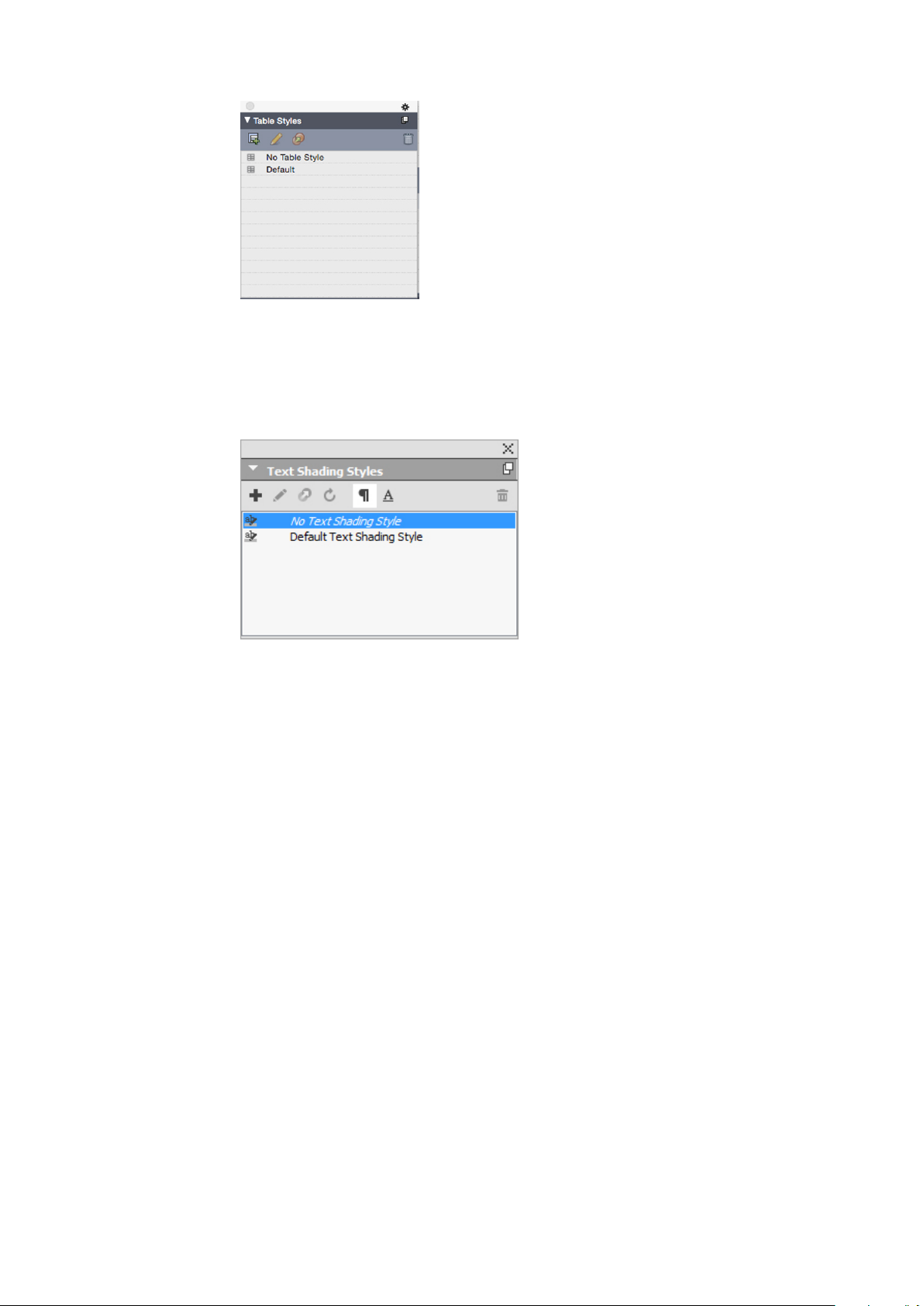
THE USER INTERFACE
Text Shading Styles palette
The Table Styles palette provides access to the table styles.
The Text Shading Styles palette allows you to add, edit, and delete text shading styles.
The Text Shading Styles palette lets you create, view and apply text shading styles.
Tools palette
The Tools palette lets you easily switch between a wide variety of tools for working
with layouts. For more information, see "Tools."
Palette groups and palette sets
QuarkXPress offers two features that help you to manage palettes: palette groups and
palette sets.
Using palette groups
The Palette Groups feature lets you combine several palettes into one.
72 | A GUIDE TO QUARKXPRESS 2017
Page 73

THE USER INTERFACE
This palette group shows the Colors, Text Shading Styles, and Advanced Image Control
palettes attached as one, which economizes space while providing easy access to functions.
(Windows only) To attach a palette to a palette group, Control+click/right-click the title
bar of a palette group and choose an unchecked palette name. When you attach a
palette that is already displayed, the palette moves to become part of the palette group.
To detach a palette from a palette group, Control+click/right-click the palette name
and choose Detach [palette name].
(Mac OS X only) To attach a palette to a palette group, click the icon in the top
right of a palette and choose an unchecked palette name from the list. Palettes that
are already displayed can also be dragged and merged into a palette group. When
dragging, a thumbnail is shown indicating whether the palette will be merged or placed
above. A blue line indicator is shown in the palette group to indicate the location the
palette will be dropped.
(Mac OS X only)Docked palettes on screen edges form a palette group and can be moved
as a group. Palette groups can be set to auto show/hide.
Using palette sets
The Palette Sets feature lets you store and recall the position and status of all open
palettes and libraries, so that you can easily switch between different palette
configurations.
A GUIDE TO QUARKXPRESS 2017 | 73
Page 74

THE USER INTERFACE
Layout controls
To create a palette set, first display all of the palettes you will need for a particular task
and hide all other palettes. Then choose Window > Palette Sets > Save Palette Set
As to display the Save Palette Set As dialog box, enter a name, and optionally assign
a key command.
To retrieve a palette set, choose Window > Palette Sets > [name of palette set] or
press the keyboard combination for that palette set.
When you open a project, you have immediate access to some basic features at the
bottom left of the project window.
Layout controls
Zoom: Enter a zoom percentage or choose a zoom value from the drop-down menu
1
(the maximum zoom limit is 8000%).
Page Number: Enter a page number in the Page Number field or choose a page from
2
the page list that displays when you click the upward facing arrow to the right of the
field.
Previous Page: Navigate to the previous page.
3
Next Page: Navigate to the next page.
4
View Master Page: Switch back and forth between the active layout page and its master
5
page.
Split Screen Horizontal: View the layout in two or more separate panes one above
6
the other.
Split Screen Vertical: View the layout in two or more separate panes side by side.
7
Export: Display the same export options that are available when you choose File >
8
Export.
Page Preview: Click the up arrow next to the Page Number field to see a thumbnail
9
view of all of the pages in the layout. Mac OS X users can continue to click the up
arrow to enlarge the thumbnails.
Preview HTML5 Publication: Click this icon to generate a preview of the layout as
10
an HTML5 Publication. This allows you preview your current layout in a browser,
before actually exporting or uploading to the portal.
74 | A GUIDE TO QUARKXPRESS 2017
Page 75

iOS App Build Status: Click this icon to check the build status for the iOS App you
11
last published from QuarkXPress. You may also use the "iOS App Build Status" menu
option under the Utilities menu. Once complete, you may view the downloaded builds
from the iOS App Export dialog. This icon will change to an error icon, if the iOS app
fails for some reason, you may then click it to get more details.
Views and view sets
QuarkXPress gives you multiple ways to view your layouts. You can split a window or
create a new window to show two different layouts, or two different views of the same
layout. You can use Story Editor view to concentrate on text without having to look
at the layout. And the View Sets feature lets you create and easily switch between
different view options.
Splitting a window
By splitting a window into two or more panes, you can display multiple views of one
project at the same time, and you can see changes in all panes simultaneously. You
can even use different view modes in each pane, and see your edits in one pane and
update in the other pane in real time. You can split multiple views horizontally or
vertically within a window.
THE USER INTERFACE
By splitting a window, you can view your work at different magnifications at the same time.
There are three ways to split a window:
• Choose Window > Split Window > Horizontal or Window > Split Window >
Vertical.
• (Windows only) Click the split bar to the right of the scroll bar (for a vertical split)
or at the top of the scroll bar (for a horizontal split).
• Click the split-screen icons in the layout controls bar at the bottom of the project
window.
A GUIDE TO QUARKXPRESS 2017 | 75
Page 76

THE USER INTERFACE
Creating a window
Using Story Editor view
Once a window has been split, you can change the width and height of the split by
dragging the bars between the splits.
To remove splits from a window, use one of the following techniques:
• Choose Window > Split Window > Remove All.
• Click the close button in the top right corner of the window.
To create a new window that displays the active project, choose Window > New
Window.
If you open multiple windows for a project, make changes to that project, and then
begin closing the windows, the application will not prompt you to save the project
until you attempt to close the last window that displays the project.
Story Editor view lets you concentrate on the text of a story without the distraction
of the layout. In Story Editor view, all text is the same size and the same font, the
text fills the entire window, and only the most basic character formatting (such as
bold and italic) are displayed. A red background indicates where text has overflowed
beyond the last text box or path in the story.
To display the contents of the active story in a new Story Editor window, select a box
or line that contains the target story and choose View > Story Editor. (If a Story Editor
window is already open, the selected item's story displays in that window.)
If you want to monitor the overall appearance of a page as you edit its text at an
easy-to-view size, you can position a Story Editor window next to a layout window
that shows the same story.
76 | A GUIDE TO QUARKXPRESS 2017
Page 77

THE USER INTERFACE
A story in layout view (left) and in a Story Editor window (right)
View sets
The View menu provides various options for how a layout displays. You can display
or hide guides, grids, invisible characters, visual indicators, and more. (For more
information, see "View menu.") The View Sets feature lets you store and recall different
combinations of these settings. The settings that are stored in a view set are as follows:
• View > Guides
• View > Page Grids
• View > Text Box Grids
• View > Rulers
• View > Ruler Direction
• View > Visual Indicators
• View > Invisibles
• View > Trim View
• View > Hide Suppressed
QuarkXPress ships with several default view sets:
• Default: This is the default set of view options that displays when you create your
first layout after launching QuarkXPress for the first time.
• Output Preview: This view set simulates a printed page as closely as possible.
Guides, grids, invisibles, and visual indicators are hidden. View > Trim View,
View > Hide Suppressed is turned on. The pasteboard displays using the color
you specify in the Display pane of the Preferences dialog box (QuarkXPress/Edit
> Preferences).
A GUIDE TO QUARKXPRESS 2017 | 77
Page 78

THE USER INTERFACE
• Authoring View: This view set displays guides, invisibles, visual indicators, and
the ruler.
To create a view set, first turn on only the view options you want to store in that view
set. Then choose View > View Sets > Save View Set As to display the Save View Set
As dialog box, enter a name, and optionally assign a key command.
To switch to a view set, do one of the following things:
• Choose View > View Sets > [name of view set].
• Press the keyboard combination for the view set.
• Display the View Sets palette (View > View Sets > Manage View Sets), click the
name of the view set in the palette, and then click Apply (or simply double-click
the view set name).
To manage the view sets you have created, choose View > View Sets > Manage View
Sets. The View Sets palette displays. You can use the buttons at the top of this palette
to Edit , Apply , and Delete the selected view set.
View Sets palette
View sets are saved at the application level. However, any view settings you apply to
a layout using view sets are saved with that layout.
78 | A GUIDE TO QUARKXPRESS 2017
Page 79

Projects and layouts
QuarkXPress files are referred to as projects, and each project contains one or more
layouts. Every layout is stored within a project, and every project contains at least one
layout. Each layout can contain as many as 2,000 pages, and can be as large as 224" x
224" in size (or 112" x 224" for a two-page spread). A project can contain an unlimited
number of layouts.
Because multiple layouts can be stored in a single file, you can easily share content
between different versions of a document — for example, a letter with identical text
in US letter and A4 layout sizes.
PROJECTS AND LAYOUTS
A QuarkXPress project can contain two types of layouts: Print and Digital. You can
use one project to create content for various media — such as print, PDF, ePub, native
apps, Kindle books and HTML5 Publications.
Working with projects
To create a project, choose File > New > Project. The New Project dialog box displays.
A GUIDE TO QUARKXPRESS 2017 | 79
Page 80

PROJECTS AND LAYOUTS
New Project dialog box for Print layout type
Every QuarkXPress project contains at least one layout. Therefore, when you create a
project, you must specify a default layout for the file. To indicate the type of the default
layout, choose Print or Digital from the Layout Type drop-down menu.
For more information about Digital layouts, see Digital Publishing with QuarkXPress.
A project created in any language edition of QuarkXPress can be edited, printed, and
saved in any other language edition of QuarkXPress. All available spell checking
dictionaries and hyphenation rules are supported by every language edition.
Options for Print layouts
You can use the default layout name or enter a new name for the layout in the Layout
Name field.
By default, tabs display at the top of the project window for each of the layouts in a
project. To prevent these tabs from displaying, check Single Layout Mode. (You can
still add layouts to a project, but this will turn off the Single Layout mode.)
The controls in the Page area let you set the page size and orientation for the default
layout.
To use custom page sizes see the information in "Custom page size."
The Facing Pages check box lets you create spreads. In a project with a horizontal
default story direction, the Allow Odd Pages On Left check box lets you control
80 | A GUIDE TO QUARKXPRESS 2017
Page 81

whether you can have odd pages on the left. In a project with a vertical default story
direction, the Allow Odd Pages On Right check box lets you control whether you
can have odd pages on the right.
The Automatic Text Box check box lets you add a text box to the default master page
for the layout.
The Margin Guides controls let you set default margins for the layout, and the controls
in the Column Guides area lets you create a multi-column page by default.
The Page Count allows you to specify the number of pages you want to initially create.
Saving and naming a QuarkXPress project
When you save a QuarkXPress project for the first time, the Save As dialog box displays.
Use this dialog box to specify a project name, location, and type.
When you save a QuarkXPress project, you can choose an option from the Type/Save
as type drop-down menu:
• Choose Project to save a project that you can modify.
PROJECTS AND LAYOUTS
• Choose Project Template to save a read-only version of the project.
Exporting layouts and projects
To export one or more layouts in the active project, choose File > Save a copy
As/Downsave. Enter a name in the File name field and choose a type and version in
the Save as Type and Version fields.
To export all the layouts in a project, check Select All in the Layouts area. To export
individual layouts, check them in this area.
To export selected layouts that you can open in an earlier version of QuarkXPress,
choose the earlier version number from the Version drop-down menu.
Custom page size
If you use a specific custom page size on a regular basis, you can define this page size
and add it to the Page Size drop-down menu in the New Project dialog. These custom
page sizes can be used for Print and eBook layouts.
To create a custom page size:
Choose File > New > Project. The New Project dialog box displays.
1
Choose either Print or Digital from the Layout Type drop-down menu.
2
A GUIDE TO QUARKXPRESS 2017 | 81
Page 82

PROJECTS AND LAYOUTS
Choose New from the Page Size: drop-down menu. The Custom Page Size dialog box
3
displays.
Fill in a Name for the new custom page size, and define the Width and Height. The
4
orientation will be assigned automatically, depending on the values input for Width
and Height.
To create multiple custom page sizes, click Add. The new custom page size will appear
in the list and you will be able to create another. To delete a custom page size, select
it from the list and click Delete.. To edit a custom page size, select it from the list and
redefine the Width and Height fields.
82 | A GUIDE TO QUARKXPRESS 2017
Page 83

Click OK.
5
Any custom page sizes you create will appear in the Page Size drop-down menu in
the New Project and the New Layout dialog boxes and can be selected when creating
new Print and eBook layouts, however, custom page sizes defined for Print layouts can
only be used selected when creating new Print layouts, and custom page sizes defined
for eBook layouts can only be used selected when creating new eBook layouts. The
custom page sizes will be removed when your preferences are deleted and new
preferences created.
Custom page sizes can also be created using the New Layout dialog. (Layout > New).
Working with layouts
It's easy to navigate between layouts, add layouts, duplicate layouts, and delete layouts.
By default, tabs display at the top of the project window for each of the layouts in a
project. On Mac OS X only, you can change the order of layouts displayed in the layout
tab by dragging and dropping the layout name tabs. This setting is saved with the
document and the order is maintained.
PROJECTS AND LAYOUTS
To navigate between layouts, use the tabs at the top of the project window.
To add a layout to the active project, choose Layout > New or click a layout tab and
choose New from its context menu.
To duplicate a layout, display the layout you want to duplicate, then choose Layout >
Duplicate or choose Duplicate from the Layout tab context menu. User can duplicate
a Print layout into a Digital layout by choosing Digital as the layout type. (For more
information, see Digital Publishing with QuarkXPress.)
To change a layout's properties, display the layout, then choose Layout > Layout
Properties or choose Layout Properties from the Layout tab context menu. The
Layout Properties dialog box displays. You can use this dialog box to change limited
layout properties based on the layout type, but you cannot change a layout to or from
a Digital layout type. (For more information, see Digital Publishing with QuarkXPress.)
To delete a layout, display the layout, then choose Layout > Delete or choose Delete
from the Layout tab context menu.
When you use the following commands, only the active layout is included in the
resulting output:
• File > Export As > PDF
• File > Export As > EPS
• File > Export As > Image
• File > Export As > HTML5 Publications
• File > Export As > iOS App
• File > Export As > ePub
• File > Export As > Kindle
A GUIDE TO QUARKXPRESS 2017 | 83
Page 84

PROJECTS AND LAYOUTS
Layers apply to the layout that is active when you create and edit them.
When you perform a project-level action (Edit > Undo), the action is added to the
Undo History in all layouts.
When you check spelling (Utilities menu), QuarkXPress checks only the active layout.
The Find/Change feature (Edit menu) can search only the active layout.
Project-level and layout-level resources
Some resources are defined at the project level, and others are defined at the layout
level.
Project-level resources
Project-level resources can be used by every layout in the project, and they are the
same in every layout where they are used. Project-level resources include application
preferences, style sheets, colors, H&Js, lists, and dashes and stripes.
Although every list definition you create can be used in any layout in the project, a
list only draws from the active layout when you build it.
Layout-level resources
Layout-level resources can be unique for every layout in the project. Layout-level
resources include the following:
• Layout preferences (QuarkXPress/Edit > Preferences > Layout )
• Kerning settings
• Tracking settings
• Hyphenation exceptions
• Zoom values
Adaptive scaling
This section describes the Apply Adaptive Scaling option available in the Duplicate
Layout, and Layout Properties dialogs.
This option is only available in the Layout Properties dialog for Print layouts.
This feature allows users to scale items based on a configurable set of rules, to get an
almost "ready to use" layout in the new size.
To apply adaptive scaling when duplicating a layout choose Layout > Duplicate. The
1
Duplicate Layout dialog displays.
84 | A GUIDE TO QUARKXPRESS 2017
Page 85

PROJECTS AND LAYOUTS
To apply adaptive scaling to the active Print layout choose Layout > Layout Properties.
The Layout Properties dialog displays.
Check Apply Adaptive Scaling.
2
Click Options to configure the rules for scaling items on the layout. The Adaptive
3
Scaling dialog displays.
A GUIDE TO QUARKXPRESS 2017 | 85
Page 86

PROJECTS AND LAYOUTS
Use the dialog to configure the rules for scaling the items on the layout. The Adaptive
4
Scaling dialog allows you to configure rules for the page properties, locked items, text,
pictures, boxes, lines, tables, and any interactivity items that may exist on the layout.
Click OK.
5
It is recommended that you create a copy of your file, before using adaptive scaling,
especially if you have checked the Synchronize Box Attributes & Content option on
the Text, Picture, and None tabs of the Adapive Scaling dialog. This option affects
the source layout, and the sharing cannot be undone. It adds a large number of items
to the Contents palette.
Working with guides
Guides are nonprinting guidelines that help you to line up items and text in a layout.
There are three types of guides: Ruler guides, column and margin guides and Dynamic
guides.
Design grids are nonprinting guidelines that you can use to align items and text
according to text size and position.
For more information, see "Guides Palette" and "Understanding design grids."
Column and margin guides
Column and margin guides show where a page's outside margins are and where columns
(if any) should be placed.
86 | A GUIDE TO QUARKXPRESS 2017
Page 87

QuarkXPress automatically places column guides and margin guides in all new Print
layouts. You can specify their position in the Column Guides and Margin Guides
fields in the New Project dialog box (File > New > Project) or in the New Layout
dialog box (Layout > New).
When a master page is displayed in the project window, you can use the Master Guides
& Grid dialog box (Page > Master Guides & Grid) to change the placement of column
guides and margin guides. If you check Automatic Text Box in the New Project dialog
box (File > New > Project) or the New Layout dialog box (Layout > New), the values
you specify in the Margin Guides area define the size and placement of the automatic
text box.
For information about creating column and margin guides, see "Configuring a master
page grid."
For more information, see "Guides Palette."
Ruler guides
Ruler guides (or simply "guides") are nonprinting guidelines that you can position
manually. You can create ruler guides by dragging them off the horizontal and vertical
rulers (View > Rulers). You can create ruler guides on master pages and on individual
layout pages.
PROJECTS AND LAYOUTS
•
To create a horizontal ruler guide, click the top ruler; when the pointer displays,
drag the ruler guide into position on the page. To create a vertical ruler guide,
click the vertical ruler, and then drag the ruler guide onto the page when the
pointer displays. If the Measurements palette is open when you drag a
ruler guide, the guide's position is indicated in the X field (for vertical ruler guides)
or the Y field (for horizontal ruler guides).
• If, as you create a horizontal ruler guide, you release the mouse button when the
ruler guide is positioned over the pasteboard, the ruler guide will extend across
the pasteboard and all the pages in the spread. If you release the mouse button
when the horizontal ruler guide is positioned over a document page, the ruler
guide will display only on that page.
• To reposition a ruler guide, click it, and then drag it to a different location when
the guide pointer displays. You can also double-click the ruler guide with the Item
tool selected and enter a new location into the Guide Manager Pro dialog box.
• To remove a ruler guide, drag the guide off the page.
• To remove all ruler guides from a page, scroll until a portion of the page displays,
then press Option/Alt and drag the guide back on to the ruler.
• To remove all ruler guides from a spread's pasteboard, scroll until a portion of the
pasteboard displays, then press Option/Alt and click a portion of the ruler.
See also "Guides Palette."
Snapping to guides
QuarkXPress lets you create a "magnetic field" around guides so that when you drag
an item close to a guide, it automatically aligns with it. This feature is called Snap to
Guides (View menu) and the width of the magnetic field is called the Snap Distance.
A GUIDE TO QUARKXPRESS 2017 | 87
Page 88

PROJECTS AND LAYOUTS
To control snapping with QuarkXPress controls, make sure View > Snap to Guides is
checked. To specify the distance, choose QuarkXPress/Edit > Preferences > Print
Layout > Guides & Grid and enter a pixel value in the Snap Distance field.
You can also choose View > Snap to Page Grids to force items to align with the master
page grid. The value in the Snap Distance field applies to master page grids as well.
For more information, see "Snapping items to design grids."
Dynamic Guides
Dynamic Guides are nonprinting temporary guides that appear when you create or
manipulate items on a page. They help you align items relative to other items and to
the page in a layout . You can specify the type of dynamic guides and the feedback
that appears.
When you create, transform or move an item, Dynamic Guides automatically appear
to assist in positioning the new item relative to an existing item or to the page.
Choose View > Dynamic Guides > Show/Hide Dynamic Guides to turn guides on
or off.
You can change when and how Dynamic Guides appear by using the View > Dynamic
Guides sub-menu to select the following options:
• Select Align to Center of Item to display guide lines that are generated when the
center of items are aligned with the center and/or edges of other items. These are
generated when you create and move items.
• Select Align to Edges of Item to display guide lines that are generated when the
edges of items are aligned with the edges of other items. These are generated when
you create and move items.
• Select Align to Center of Page to display guide lines that are generated when the
edges or center of items are aligned with the center of the page. These are generated
when you create and move items.
• Select Show Equal Dimensions to display guide lines that are generated when
the dimensions of items are equal to the dimensions of other items. These are
generated when you create and resize items.
• Select Show Equal Spacing to display guide lines that are generated when the
horizontal and/or vertical distance between items is equal to the distance between
other items on the page. These are generated when you create and move items.
• Select Show Measurements for Dimensions/Spacing) to display the value of the
dimensions when Show Equal Dimensions is selected and the value of the spacing
when Show Equal Spacing is selected.
This option is only available when Show Equal Dimensions or Show Equal
Spacing is selected.
Dynamic Guides are on and all options selected by default.
When Align to Center of Item and Align to Edges of Item are selected, guides are
generated not only when the center and edges of other text boxes are aligned, but will
88 | A GUIDE TO QUARKXPRESS 2017
Page 89

also appear when the center and edges of columns within the surrounding text boxes
are aligned.
In Windows, use the Dynamic Guides Color pane of the Preferences dialog box to
specify a color for each type of dynamic guide. See "Preferences — Application — Dynamic
Guides Color." In Mac OS X you set the color for the dynamic guides using the Color
Theme pane of the Preferences dialog box. See "Preferences — Application — Color
Theme."
Undoing and redoing actions
The Undo command (Edit menu) reverses the last action performed on an item. For
example, if you accidentally cut a picture box, the Undo command will bring the
picture box back into the layout from the Clipboard. The Redo command (Edit menu)
lets you reimplement an action you had undone.
Choose Edit > Undo (Command+Z/Ctrl+Z) to reverse the last action performed. The
menu item identifies the specific action that can be undone. For example, the Undo
Deletion command is available in the Edit menu after you have used the Item >
Delete command. Undo displays as gray text when the Undo feature is unavailable.
PROJECTS AND LAYOUTS
To reimplement the action, choose Edit > Redo (Command+Shift+Z/Ctrl+Y) after you
undo an action.
A GUIDE TO QUARKXPRESS 2017 | 89
Page 90

NATIVE QUARKXPRESS OBJECTS
Native QuarkXPress objects
QuarkXPress allows you to convert items from other application such as Excel,
Illustrator, PowerPoint and InDesign, as well as PDFs, Illustrator,WMF and EPS files to
native QuarkXPress objects.
This allows you to:
• Convert and edit vector data (like logos, etc) from supported file formats that
include AI, WMF, EPS and PDF.
• Convert editable PDFs, update content and republish as PDF or other formats that
are supported in QuarkXPress.
• Extract colors and typography from PDF's to use in QuarkXPress.
You can get native QuarkXPress objects in the following ways:
• Convert existing items Convert files that have been imported into your document
to native QuarkXPress objects.
• Import items Copy items and then paste them as native QuarkXPress objects.
This results in fully editable Bezier version of vector graphics and editable text. Colors
and font information are automatically extracted. Images can be either embedded in
the project or linked to the current project.
Convert an existing item to a native QuarkXPress object
To convert existing items to native QuarkXPress objects:
Right click on the object and choose Convert To Native Objects from the context
1
menu (or choose Style > Convert to Native Objects). The Convert to Native Objects
dialog displays.
90 | A GUIDE TO QUARKXPRESS 2017
Page 91

NATIVE QUARKXPRESS OBJECTS
The image you are attempting to convert must have vector or text components in it.
The Convert to Native Objects feature is not supported for Raster only images.
Check Retain Source Picture Box to compare the converted objects with the imported
2
source image.
Check Ignore Soft Masks to exclude the conversion of soft masks from the source
3
image.
Check Ignore Transparent Blend Modes to ignore transparent blends applied to the
4
source image.
Check Ignore Profile from Source Colors and the profile embedded with that image
5
in the source file will be ignored. It will be mapped to the QuarkXPress generic profile
instead.
Check Link Raster Images to save raster images from PDF to the disk as PDF images.
6
For saved projects, the linked images are saved in a folder with the project name added
with the image number appended. For unsaved projects it will be created in the temp
folder of the OS.
Click OK.
7
Import an object as a native QuarkXPress object
To import an item as a native QuarkXPress object:
Copy the object from its application to the clipboard
1
Right click in your project where you want to place the object and choose Paste as
2
Native Objects from the context menu (or Edit > Paste as Native Objects). The Paste
as Native Objects dialog displays.
A GUIDE TO QUARKXPRESS 2017 | 91
Page 92

NATIVE QUARKXPRESS OBJECTS
To skip the dialog, hold down the Option key (Mac OS X) or the Alt key (Windows)
when choosing Paste as Native Objects from the context menu.
The options you select in this dialog persist and will be used if you choose to suppress
the dialog.
Check Ignore Soft Masks to exclude the conversion of soft masks from the source
3
image.
Check Ignore Transparent Blend Modes to ignore transparent blends applied to the
4
source image.
Check Ignore Profile from Source Colors and the profile embedded with that image
5
in the source file will be ignored. It will be mapped to the QuarkXPress generic profile
instead.
Check Link Raster Images to save and link to the converting project of the raster
6
images from the source PDF for saved projects. For unsaved projects it will be created
in the temp folder of the OS..
Click OK.
7
The item is pasted into your project as a native QuarkXPress object.
If the item contains fonts not installed on your system, an alert will display. You can
list the fonts not available on your system and optionally, replace them at this time.
92 | A GUIDE TO QUARKXPRESS 2017
Page 93

Content variables
A content variable is an item you insert in your document that varies according to the
context. For example, the Last Page Number variable displays the page number of
the last page of the document. If you add or remove pages, the variable is updated
accordingly.
Content variables will line wrap and break just like text, including hyphenating when
appropriate.
The text within a content variable is searchable using the Find/Change palette. If the
text you are searching for is contained within a content variable, the entire variable
will be highlighted.
CONTENT VARIABLES
To highlight all content variables in the current project, choose View > Highlight
Content Variables.
QuarkXPress includes the following preset content variables that you can insert in
your document:
• Creation Date
• Current Page Number
• File Name
• Last Page Number
• Modification Date
• Next Page Number
• Output Date
• Previous Page Number
You can edit the format of these variables, or you can create your own.
In addition to the set of pre-defined variables, you can create the following additional
text type variables:
• Custom Variable: You can combine a text string with other pre-defined variables
to make a combination.
• Running Header: This variable type allows you to choose source data within the
document by referring to a paragraph or character style sheet. This variable type
can be applied in the master page so that the running headers are automatically
updated. For example, a left side page can have book title and on right side page can
have Chapter/Section title.
A GUIDE TO QUARKXPRESS 2017 | 93
Page 94

CONTENT VARIABLES
Edit content variables
• Page Reference: This variable is used to create a reference to an existing layout
object using the existing Anchors feature, and allows you to refer to that object
elsewhere in the document, including the page number for the referred to object.
• Static Text: With this you can create a simple static text variable that can be
inserted throughout the document. For example, if you want to refer to a company
name across a document consistently and want to make any changes to it in one
go, this variable can be useful.
To edit content variables, choose Window > Content Variables to display the Content
Variables palette. The buttons at the top of this palette let you add, edit and duplicate
content variables. Choose an existing content variable and click the button to edit
it, or click the button to add a new content variable.
The Edit Content Variable dialog displays.
If you are adding a new content variable, you can also display this dialog by choosing
Utilities > Content Variable and selecting New from the drop-down menu.
Enter a name in the Name field. If you are adding a new content variable or duplicating
an existing content variable , select the content variable Type from the drop-down
menu. Specify the attributes for your content variable, these will vary depending on
the type of content variable you are editing :
• Creation Date: Creation Date inserts the date or time the document was first saved.
You can insert text before and after the date, and you can modify the date format
for all date variables using the drop-down menus.
• Current Page Number: This variable inserts the current page number of the current
project into the document.
• Custom Variable: See "Create a custom content variable" for more information.
• File Name: This variable inserts the name of the current file into the document.
Select Include Extension to include the file name extension. The File Name
variable is updated whenever you save the file with a new name or to a new
location. The extension does not appear in the document until it is saved.
• Flow Box Page Number: This variable inserts the page number where the current
box continues (or where the current box is continuing from) if the current box
spans multiple pages that may not be contiguous. From the Context drop-down
menu, choose either Next Box or Previous Box to specify whether to insert the
page number where this box continues or where it is continuing from.
• Last Page Number: This variable inserts the last page number of the current project
into the document. The Last Page Number type is useful for adding the total
number of pages in a document to headers and footers using the common Page
3 of 12 format. In this case, the number 12 is generated by the Last Page Number,
and is updated whenever pages are added or removed. From the Scope drop-down
94 | A GUIDE TO QUARKXPRESS 2017
Page 95

CONTENT VARIABLES
menu, choose an option to determine whether the last page number in the section
or layout is used.
• Modification Date: Modification Date inserts the date or time the document was
last saved. You can insert text before and after the date, and you can modify the
date format for all date variables using the drop-down menus.
• Next Page Number: This variable inserts the next page number of the current
project into the document. From the Scope drop-down menu, choose an option
to determine whether the next page number in the section or layout is used.
• Output Date: Output Date inserts the date or time the document was printed or
exported. You can insert text before and after the date, and you can modify the
date format for all date variables using the drop-down menus.
• Page Reference: You can insert text before and after the page reference variable.
Select an Anchor Name from the drop-down menu. Select Create Hyperlink to
create a hyperlink in the text.
• Previous Page Number: This variable inserts the previous page number of the
current project. From the Scope drop-down menu, choose an option to determine
whether the previous page number in the section or layout is used.
• Running Header: Choose the source style sheet to display in your header and then
choose whether you want to display the first occurrence on the page, the last
occurrence on the page, the first occurrence on the spread or the last occurrence
on the spread.
• Static Text: Type in the text you want to appear when inserting this content
variable.
When you're done, click OK.
After you have added or updated a content variable, it will be listed in the Utilities >
Content Variable drop-down menu and also in the Content Variables palette
(Window > Content Variables). The new variable will be available when you attempt
to insert a content variable into the text.
Create a custom content variable
In addition to the existing preset content variables offered by QuarkXPress, you can
also create custom content variables to use in your projects. Custom variables are great
if you want to use text content somewhere within a text story and the same content
in a different story or at a different place. When you change the content of the custom
variable, it is changed everywhere where used.
To create a custom content variable:
Place the insertion point where you want the variable to appear.
1
Select Utilities > Content Variable and choose New from the drop-down menu.
2
The Edit Content Variable dialog displays.
Enter a name in the Name field.
3
A GUIDE TO QUARKXPRESS 2017 | 95
Page 96

CONTENT VARIABLES
Choose Custom Variable from the Type drop-down menu.
4
You can choose to insert a Text String or a Text Variable when using this custom
5
content variable.
• If creating a custom variable that inserts a text string, type in the text you want
to appear when inserting this content variable. Click the plus symbol to add more
lines to the text.
• If creating a custom variable that inserts a text variable, select the text variable
you want from the drop-down menu. You can combine 2 or more text variables
by clicking the plus symbol to add another.
Click OK.
6
After you have added a custom content variable, it will be listed in the Utilities >
Content Variable drop-down menu and also in the Content Variables palette
96 | A GUIDE TO QUARKXPRESS 2017
Page 97

(Window > Content Variables). The new variable will be available when you attempt
to insert a content variable into the text.
Insert a content variable
To insert a content variable in your project:
Place the insertion point where you want the variable to appear.
1
Select Utilities > Content Variable and choose the variable you want to insert from
2
the drop-down menu.
The variable appears on the page as if you'd typed it in the document.
Content variables can be inserted into lists and indexes.
CONTENT VARIABLES
A GUIDE TO QUARKXPRESS 2017 | 97
Page 98

BOXES, LINES, AND TABLES
Boxes, lines, and tables
To create a successful page layout, you need an orderly way to arrange text and pictures
— you need boxes. Boxes are items that can contain text or pictures; they can even
be created to contain no content at all, perhaps to create colorful design elements on
a page. Box boundaries give text and pictures a specific shape, size, and placement on
a page.
Understanding items and content
QuarkXPress works on the concept of items (containers) and content (things that go
inside of items).
Items are the building blocks of a page layout. The Item tool lets you do things like
move, resize, rotate, reshape, cut, copy, and paste items.
The basic types of items are as follows:
• Boxes, including text boxes, picture boxes, and no-content boxes. Boxes can come
in a variety of shapes, such as rectangular, round, and Bézier.
• Lines, including "plain" lines and text paths (which can include text). Lines, too,
can be straight or Bézier.
• Groups, which are sets of items that have been "glued" together so that they act
like a single item.
• Tables, which can contain both text and pictures.
Content is, basically, text and pictures. To create a layout, you will typically draw some
text boxes and picture boxes, and then insert text and pictures into those boxes.
Because items and content are different, you use separate tools for manipulating each:
•
The Text Content tool lets you create rectangular text boxes and format text
in text boxes or on text paths. You can also use the Text Content tool to cut,
copy, and paste text.
•
The Picture Content tool lets you create rectangular picture boxes and
manipulate pictures in picture boxes. You can also use the Picture Content tool
to cut, copy, and paste pictures.
98 | A GUIDE TO QUARKXPRESS 2017
Page 99

Understanding handles
The bounding boxes of selected text paths, lines, and boxes have small white squares
called item handles. You can use these handles to resize and rotate a selected item.
Item handles
To resize an item, click and drag its item handles. To rotate an item, click and drag
just outside one of the item's corner handles. The mouse pointer changes when you
move it over or near a handle to indicate which action you can perform:
BOXES, LINES, AND TABLES
You can use item handles to resize or rotate an item.
Picture handles
When you select the Picture Content tool and click a picture box that contains a
picture, the picture displays with large circles for handles. These handles are called
picture content handles. When you click any part of the picture overlay, you can use the
Move pointer to move the picture within its box.
Picture box displaying picture content handles
Picture content handles display even if the selected picture exceeds the size of its box
(see illustration above). The picture displays beyond the box boundary. You can crop
the image by resizing the picture box.
A GUIDE TO QUARKXPRESS 2017 | 99
Page 100

BOXES, LINES, AND TABLES
You can use picture content handles to resize or rotate a picture without changing the
size or angle of its picture box.
•
•
Resize pointers:
Rotation pointers:
Rotated picture in an unrotated box
If you want to move a picture box or see what its crop looks like without the transparent
overlay, press the Command/Ctrl key. This temporarily dismisses the overlay and
allows you to interact with the box as if the Item tool were selected.
If you click and drag with the Picture Content tool when the mouse pointer is
positioned over a spot where a picture box handle and picture content handle overlap,
only the picture is resized or rotated. If you want to move the item handle, select the
Item tool.
Understanding Bézier shapes
Before reshaping Bézier boxes and lines, make sure you understand the following
definitions.
Point: A point connects line segments and defines where line segments start and end.
Points connecting curved line segments have curve handles that control the shape of
the curves. QuarkXPress offers three types of points: Corner, smooth, and symmetrical.
Corner point: A corner point connects two straight lines, a straight line and a curved
line, or two noncontinuous curved lines. With curved lines, the corner point's curve
handles can be manipulated independently, usually to form a sharp transition between
the two segments:
100 | A GUIDE TO QUARKXPRESS 2017
 Loading...