

Page 1
Parallels® Plesk Sitebuilder
Page 2

Copyright Notice
ISBN: N/A
Parallels
660 SW 39th Street
Suite 205
Renton, Washington 98057
USA
Phone: +1 (425) 282 6400
Fax: +1 (425) 282 6444
© Copyright 1999-2008,
Parallels, Inc.
All rights reserved
Distribution of this work or derivative of this work in any form is prohibited unless prior written
permission is obtained from the copyright holder.
Product and service names mentioned herein are the trademarks of their respective owners.
Page 3

Contents
Preface 5
About Parallels Plesk Sitebuilder .................................................................................................. 5
What's New in This Version ................................................................................................ 6
About This Guide ........................................................................................................................... 6
Who Should Read This Guide ....................................................................................................... 7
Typographical Conventions ........................................................................................................... 7
Feedback ....................................................................................................................................... 8
Getting Started with Plesk Sitebuilder Wizard 9
Overview of Main Steps to Create Site ....................................................................................... 10
Logging In to Plesk Sitebuilder .................................................................................................... 10
Learning Plesk Sitebuilder Wizard Interface ............................................................................... 11
Working with Lists ............................................................................................................. 14
Starting to Work with Plesk Sitebuilder Wizard ........................................................................... 16
Getting Help ................................................................................................................................. 17
Choosing Type of Created Site 18
Creating Site Design 19
Selecting Design Template for Site ............................................................................................. 21
Removing Design Template from Page ...................................................................................... 22
Selecting Color Scheme .............................................................................................................. 23
Selecting Banner ......................................................................................................................... 23
Selecting Menu Style ................................................................................................................... 24
Uploading Logo ........................................................................................................................... 25
Specifying Site Title, Subtitle, and Footer Message .................................................................... 25
Buying Pictures from Fotolia ....................................................................................................... 26
Creating Site Structure 28
Types of Pages ............................................................................................................................ 31
Structuring Your Site ................................................................................................................... 32
Adding Pages .................................................................................................................... 33
Changing Position of Pages .............................................................................................. 33
Renaming Pages ............................................................................................................... 35
Hiding Pages in Site Navigation ........................................................................................ 35
Removing Pages ............................................................................................................... 37
Choosing Site Language, Currency, and Format of Numbers, Time and Date .......................... 37
Populating Site with Content 39
Working with Text ........................................................................................................................ 41
Applying Styles, Fonts, and Colors to Text ....................................................................... 42
Formatting Paragraphs ..................................................................................................... 42
Copying and Moving Text ................................................................................................. 43
Finding and Replacing Text Fragments ............................................................................ 44
Page 4

Preface 4
Checking Spelling on Page ............................................................................................... 45
Undoing and Redoing Actions........................................................................................... 45
Inserting Links ................................................................................................................... 46
Working with Images ................................................................................................................... 54
Inserting Image.................................................................................................................. 55
Editing Image .................................................................................................................... 59
Removing Image ............................................................................................................... 62
Working with Tables .................................................................................................................... 62
Inserting Table................................................................................................................... 63
Editing Table Properties .................................................................................................... 64
Adding or Removing Rows, Columns, and Cells .............................................................. 65
Editing Cell Properties ....................................................................................................... 67
Merging Cells .................................................................................................................... 68
Spanning Cell across Several Rows or Columns ............................................................. 68
Splitting Cell ...................................................................................................................... 69
Adding Content to Table ................................................................................................... 69
Removing Table ................................................................................................................ 70
Working with Modules ................................................................................................................. 70
Adding Blog ....................................................................................................................... 73
Adding Image Gallery ........................................................................................................ 80
Adding Online Store .......................................................................................................... 88
Providing Content for Download ..................................................................................... 118
Adding Flash Intro ........................................................................................................... 119
Adding Forum .................................................................................................................. 120
Adding Guestbook ........................................................................................................... 128
Providing Registration to Your Site Visitors .................................................................... 132
Incorporating Link to External Page into Your Site Menu ............................................... 138
Adding Maps ................................................................................................................... 138
Adding Feedback Form ................................................................................................... 143
Adding RSS News Feeds ................................................................................................ 148
Inserting Scripts into Your Web Pages ........................................................................... 150
Conducting Polls and Online Surveys ............................................................................. 152
Adding Online Status Indicator........................................................................................ 154
Adding SitePal Animated Character ............................................................................... 155
Adding Site Map .............................................................................................................. 159
Making Your Site Searchable 160
Specifying Keywords to be Used by Search Engines ............................................................... 160
Providing Description to be Displayed in Search Results ......................................................... 161
Submitting Site to Search Engines ............................................................................................ 161
Tracking Site Popularity 162
Enabling Statistics Count on Site .............................................................................................. 162
Viewing Site Visitors Statistics .................................................................................................. 163
Adding Visitors Counter to Site Pages ...................................................................................... 163
Publishing Site 164
Requirements to Host ................................................................................................................ 169
Appendix. Most Common Google Base Attributes 170
Page 5

Preface 5
In this section:
About Parallels Plesk Sitebuilder ....................................................................... 5
About This Guide ............................................................................................... 6
Who Should Read This Guide ........................................................................... 7
Typographical Conventions ............................................................................... 7
Feedback .......................................................................................................... 8
In this section:
What's New in This Version ............................................................................... 6
Preface
About Parallels Plesk Sitebuilder
Parallels Plesk Sitebuilder consists of two parts: the Wizard and the Administrator Panel.
With Plesk Sitebuilder Wizard, you can create sites by simply choosing the design preset you
like and adding text and images. Then you can add picture galleries, blogs and online stores
in a few clicks. You do not need to know any markup or scripting languages to have a site.
The Administrator Panel is a tool for managing and maintaining web sites created in the
Wizard.
Page 6

6 Preface
What's New in This Version
Plesk Sitebuilder 4.5 offers the following new features:
Site Map module. Allows you to display a clickable hierarchical model of your site structure
to visitors
Removing design template from pages. You can now remove design template's layout and
graphics from the desired pages.
External Page module. Allows you to link site menu items to external web sites.
Save button. A handy way to save changes you make while working on your site.
Counter settings are moved to the Wizard. You can now enable a counter on your site at the
Pages step of the Wizard, which previously required going to the Administrator Panel.
Site visitor management is moved to the Wizard. You can now manage your registered visitors
through the Registration module editor at the Edit step of the Wizard, which previously
required going to the Administrator Panel.
Updated WYSIWYG editor to fix a series of issues.
About This Guide
This guide instructs you how to create and publish sites on the Internet using Plesk
Sitebuilder Wizard.
This guide covers the following steps of creating and publishing your site:
1 Choosing the type of site to be created (see page 18)
2 Creating site design (see page 19)
3 Creating and editing site structure (see page 28)
4 Creating and editing site content (see page 39)
5 Publishing site on the Internet (see page 164)
Page 7
Preface 7
Who Should Read This Guide
Formatting
convention
Type of information
Example
Special Bold
Items you must select,
such as menu options,
command buttons, or items
in a list.
Go to the Content tab.
Titles of chapters, sections,
and subsections.
Read the Creating Site Design
chapter.
Italics
Used to emphasize the
importance of a point, to
introduce a term or to
designate a command line
placeholder, which is to be
replaced with a real name
or value.
Block modules. These modules
do not require dedicated site
pages...
Monospace
URLs, names of
commands, files, and
directories.
Go to
http://hostname/Wizard.
CAPITALS
Names of keys on the
keyboard.
SHIFT, CTRL, ALT
KEY+KEY
Key combinations for
which the user must press
and hold down one key
and then press another.
CTRL+P, ALT+F4
The target audience of this guide is regular users of Plesk Sitebuilder as well as guests, who
are working with Plesk Sitebuilder in the guest mode, creating trial sites without publishing
them on the Internet.
Typographical Conventions
Before you start using this guide, it is important to understand the documentation
conventions used in it.
The following kinds of formatting in the text identify special information.
Page 8

8 Preface
Feedback
If you have found a mistake in this guide, or if you have suggestions or ideas on how to
improve this guide, please send your feedback using the online form at
http://www.parallels.com/en/support/usersdoc/. Please include in your report the guide's title,
chapter and section titles, and the fragment of text in which you have found an error.
Page 9

This chapter describes your first steps with Plesk Sitebuilder Wizard.
In this chapter:
Overview of Main Steps to Create Site .............................................................. 10
Logging In to Plesk Sitebuilder .......................................................................... 10
Learning Plesk Sitebuilder Wizard Interface ...................................................... 11
Starting to Work with Plesk Sitebuilder Wizard .................................................. 16
Getting Help ...................................................................................................... 17
C H A P T E R 1
Getting Started with Plesk Sitebuilder
Wizard
Page 10

10 Getting Started with Plesk Sitebuilder Wizard
Overview of Main Steps to Create Site
As a rule, the process of creating a web site includes three main stages: planning,
implementation, and web site updating or maintenance.
Planning: The first and most essential stage in any project is planning. Before starting
with Plesk Sitebuilder, think about the purpose of your web site and its target audience.
After this, decide where your web site will be stored, or, in Internet terminology, hosted.
This stage is beyond the scope of this document. Since Plesk Sitebuilder is often
provided in a bundle with a web hosting package, we assume that you already have a
web space for publishing your site. Then, you create a detailed structure of your future
web site and prepare its contents, including text information and graphics. The planning
stage is extremely important because it eventually determines the usefulness of your
web site.
Implementation: The next stage is the implementation of your web site. The five-step
Plesk Sitebuilder Wizard takes you through the entire process of creating your site,
from initial design to publishing and maintenance. The following is an overview of the
main steps required to create a web site using Plesk Sitebuilder:
1 To create a web site, open Plesk Sitebuilder Wizard. You can start working with the
Wizard anonymously, without supplying login and password.
2 Complete the first four Wizard steps (choose the site type, select the design, create
the site structure, add web site content including text, graphics and site modules
and provide extra information for search engines).
3 Go to the Publish step and start the publishing process. If you do not have a Plesk
Sitebuilder account and work with the program in demo mode, the site you create is
temporary and cannot be published on the Internet until you register and buy
hosting for your site. Once you are done with this, you can log in to Plesk
Sitebuilder and assign your trial site to your account, thus making it possible to
permanently publish your site on the Internet.
Maintenance: When you complete the above steps, your site becomes available for
visitors. It is critical to keep your site content fresh because this is a good way to show
your attitude to customers and services. Therefore, we recommend to update your site
on a regular basis. All you need to do is to log in to the Plesk Sitebuilder Administrator
Panel, edit the site content in Plesk Sitebuilder Wizard, and click Publish. Sitebuilder will
automatically transfer the updated content to your hosting location.
For detailed instructions on what to do on every step of creating your site, see the
chapters below.
Logging In to Plesk Sitebuilder
The Plesk Sitebuilder Wizard access procedure is different for different user roles.
Below we describe the login process for site owners and anonymous users. The Plesk
Sitebuilder administrator and resellers access Plesk Sitebuilder Wizard from their
Administrator Panels.
Page 11

Getting Started with Plesk Sitebuilder Wizard 11
To log in to Plesk Sitebuilder Wizard using your site owner account:
1 Open your Internet browser.
2 Enter the URL you have received from your Plesk Sitebuilder provider
into the address bar of your browser and press ENTER.
For example, http://sitebuilder/login
where 'sitebuilder' is the domain name of the server where Plesk Sitebuilder is
installed.
3 Enter you user name and password, select the interface language and
click Log in.
If prior to gaining a Plesk Sitebuilder account you have created a trial site in Plesk
Sitebuilder Wizard (on the same computer that you are logging in from), you will be
prompted to assign the site to your account and thus upgrade it to regular. You can
skip this step and register your trial site later, but note that it may be deleted by your
Plesk Sitebuilder provider or automatically destroyed after the expiration date.
Plesk Sitebuilder Wizard opens on the Start page, from which you can start creating
your first site. You can proceed to your Administrator Panel by clicking the Go to
Admin Panel shortcut at the top of the screen.
To access Plesk Sitebuilder Wizard as an anonymous user (in demo mode):
1 Open your Internet browser.
2 Enter the URL to Plesk Sitebuilder demo version into the address bar
of your browser and press ENTER.
For example, http://sitebuilder/Wizard
where 'sitebuilder' is the domain name of the server where Plesk Sitebuilder is
installed.
The link may be distributed by a Plesk Sitebuilder provider, or obtained otherwise.
3 Select the language of Plesk Sitebuilder interface from the Interface
language list.
The Plesk Sitebuilder Wizard opens on the Overview page, which provides access to
all five steps of the Wizard.
Learning Plesk Sitebuilder Wizard
Interface
In Plesk Sitebuilder, a site is created in five steps. Each step has its own working and
navigation principles, which will be covered in respective sections further in this guide.
Here we will outline the general principles of working with the Plesk Sitebuilder Wizard
interface, and enumerate elements present on all Plesk Sitebuilder screens.
Page 12
12 Getting Started with Plesk Sitebuilder Wizard
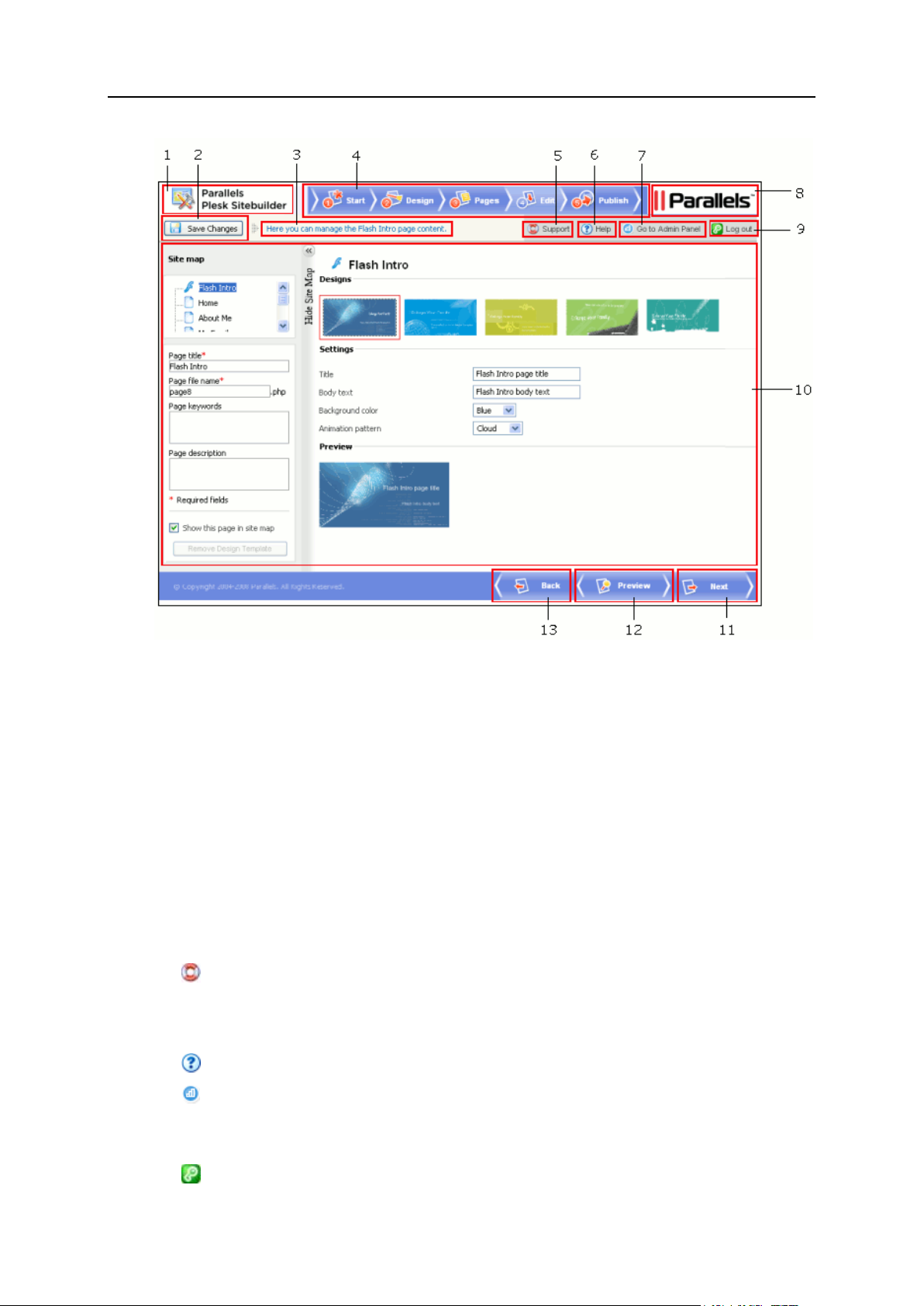
Figure 1: Plesk Sitebuilder Wizard Interface
Every Plesk Sitebuilder Wizard window contains the following elements:
1 Plesk Sitebuilder logo linked to the Sitebuilder page on the official Parallels web site.
This image can be customized by your Plesk Sitebuilder provider.
2 Save Changes button used for saving the results of actions performed on the page. If
no changes have been applied, the button is inactive. This button is also disabled
when editing the content of page modules on step Edit, since modules have their
own dialogs for saving changes.
3 Top help string, which provides short instructions about the operations you can
perform on the current page and displays the result of your last action.
4 Shortcuts used to switch between the five Wizard steps. The step you are currently
on is highlighted in color.
5 Support button, which, by default, opens Plesk Sitebuilder Online Server Support
screen on the official Parallels web site, where you can fill in the form to request the
help of Parallels technical support team. This link can be customized by your Plesk
Sitebuilder provider.
6 Help button opens the context-sensitive online help on the corresponding page.
7 Go to Admin Panel shortcut takes you to your Plesk Sitebuilder Administrator
Panel.
8 Parallels logotype image linked to Parallels web site.
9 Log out button finishes your current session with Plesk Sitebuilder.
Page 13

Getting Started with Plesk Sitebuilder Wizard 13
Note: The Go to Admin Panel and Log out buttons are not displayed to anonymous
In this section:
Working with Lists ..............................................................................................14
users. Instead of the Log out button, they see a shortcut Already a registered user?
Log in here..
10 Work area, where the interface options available on the current step of the Wizard
are displayed.
11 Back button, which enables you to get to the previous step of the Wizard (you
can also return to the previous step using the top navigation bar).
12 Preview button, which allows you to preview the site at any stage of its creation.
13 Next button, which switches you to the next step of creating your site (you can
also click the next tab in the top navigation bar).
Page 14
14 Getting Started with Plesk Sitebuilder Wizard
Working with Lists
When setting up page or block modules on the Edit step of Plesk Sitebuilder Wizard,
you will see lists of various system objects (blog posts, online store orders, etc.).
In such a list, each object record is a table row displaying the object name and the
relevant parameters of the object (for example, for each forum topic, the author of the
topic, the category the topic belongs to, the date of last the update, and the number of
replies to the topic are displayed). Above and below each list, the total number of items
contained in the list is displayed. Below the list, you can adjust the number of items to
be displayed per page (5, 10, 25, or 100). In multi-page lists, you can navigate between
the pages by clicking the page number shortcuts above and below the list. To go to the
first/last page of the list, click First Page or Last Page, accordingly.
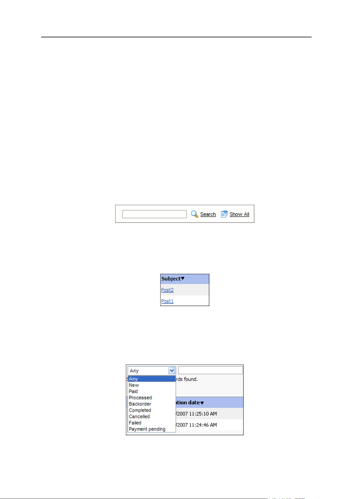
In lengthy lists, you can find items using the search function, or sort items by certain
parameters. To find an item, type a search criterion into the input box above the list,
and click Search. The list will show the items matching the search criterion. To return to
the full list of items, click Show All.
Figure 2: Searching for Objects
To sort list items by a certain parameter in ascending or descending order, click the
parameter's title in the column heading. The order of sorting will be indicated by a small
triangle displayed next to the parameter's title.
Figure 3: Sorting Objects
In some lists, you can filter items by a certain attribute by selecting one of them from
the drop-down list (for example, on the Orders tab of your eShop page, you can filter out
orders of certain status: New, Paid, Processed, Backorder, Completed, Cancelled, Failed, or
Any).
Figure 4: Filtering Objects
Page 15
Getting Started with Plesk Sitebuilder Wizard 15
Note: All the above described principles also apply to the list of design template
categories on the Design step of the Wizard. For information on using these options on
the Design step, read section Creating Site Design (on page 19).
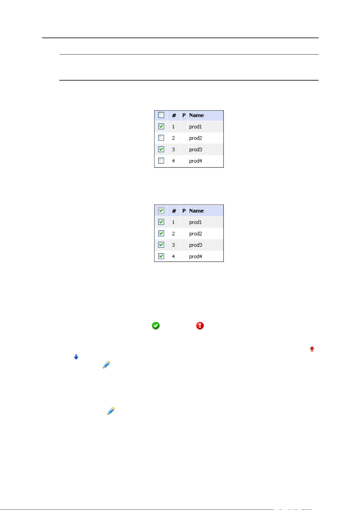
To choose a list object for further operation, select the check box to the left of the
object's name.
Figure 5: Selecting Particular Objects in a List
To choose all objects in the list, select the check box at the head of the column.
Figure 6: Selecting All List Objects at Once
To perform operations with certain objects in a list, select the required objects and click
an operation shortcut above the list (for example, Activate, Deactivate, Remove Selected,
etc.).
In the list of guestbook messages, the status of a message is indicated by icon in the
Status (S) column (not archived or archived ).
In most lists, individual operation shortcuts are displayed for each item. For example,
for each product category on the Categories tab on the eShop page, there are arrows (
and ) used to change the order in which the categories are displayed on the site
page; and the Edit icon used to open the categories in editing mode.
In most lists, you can configure or edit a list object by:
Clicking the object name, if it is clickable (for example, the post names on the
Content tab of the Blog page)
Clicking the Edit icon for this object in the list (for example, for a product on the
Products tab of the eShop page)
In some lists, you will also see shortcuts to managing the objects' dependent items such as the View/Edit Comments shortcut for each blog post on the Content tab of the Blog
page.
Page 16
16 Getting Started with Plesk Sitebuilder Wizard
In most object lists in the Wizard, you will find default objects created for your
convenience, which you can delete or reuse at a later stage.
Starting to Work with Plesk Sitebuilder
Wizard
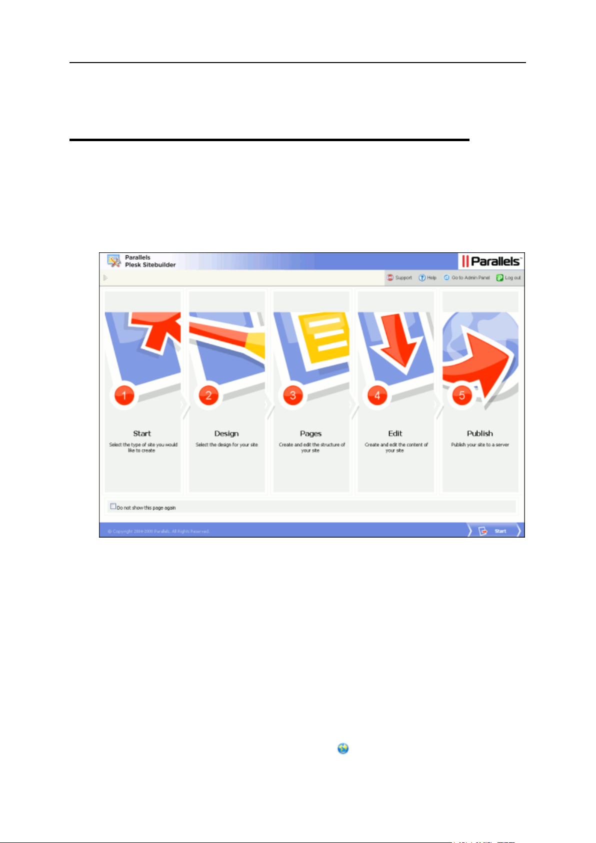
The Overview page provides quick access to and contains short description of each of
the five steps required for creating a site in Plesk Sitebuilder.
Figure 7: Plesk Sitebuilder Wizard Overview Page
The five Plesk Sitebuilder Wizard steps are as follows:
1 Start. On this step, you choose whether to create a site from scratch or create a site
using one of the proposed site templates (site-blog, site-photo gallery, etc.).
2 Design. On this step, you configure your site layout, color scheme, menu style, logo
and banner, as well as set up text elements appeared at the background of your
site, such as the title phrase and the copyright notice.
3 Pages. On this step, you configure the structure of your site and arrange the pages
hierarchy in the site map.
4 Edit. On this step, you create and edit the content of your site pages.
5 Publish. On this step, you publish your site on the Internet.
For anonymous users, on the Overview page, the Interface language box is displayed
allowing to select the language of the Wizard interface.
Page 17
Getting Started with Plesk Sitebuilder Wizard 17
To start creating your site, click Start at the bottom of the screen.
Getting Help
If you encounter a problem while using Plesk Sitebuilder, there are several resources
available to help you troubleshoot the problem:
Use on-screen context-sensitive help.
At the bottom of the navigation pane, you can find short instructions on the
operations that are available on the current page.
Refer to our knowledge base (http://kb.parallels.com/en/products/sitebuilderlinux).
The knowledge base provides solutions to the most common problems with Plesk
Sitebuilder.
Go to our forum
(http://forum.swsoft.com/forumdisplay.php?s=f2b895fc3636e705ec9b9a85ef81f040
&forumid=99).
Here all users can post questions, exchange ideas, and troubleshoot issues not
described in the knowledge base. Note that Parallels does not provide official
support through this forum.
Contact technical support.
If you have any problems or questions that are not covered in the user
documentation or knowledge base, you can click Support located on the
navigation pane and submit your problem to your technical support representative.
Page 18
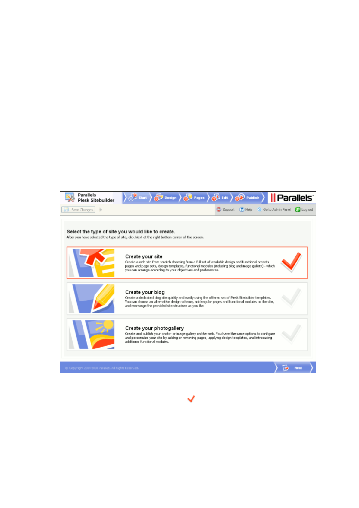
The first step of creating site with Plesk Sitebuilder is to choose whether you want to
C H A P T E R 2
Choosing Type of Created Site
start creating your site from scratch or use one of proposed site templates (the socalled site families). By default, there are two site templates available - blog and image
gallery, but the Plesk Sitebuilder administrator can extend this list by creating custom
site templates and including them in your service plan.
To choose the type of the created site, go to the Start step and click the required site
family to select it.
The Start page looks as follows:
Figure 8: Step 1. Choosing the Site Type
The chosen site family is indicated with the sign.
Having selected a site family, click Next at the bottom of the screen to proceed to
configuring the design of your site.
If you fail to select a certain site family (and you see it in the list as grayed out), contact
your Plesk Sitebuilder administrator for assistance.
Page 19
Creating Site Design 19
In Plesk Sitebuilder, you can build the graphic design of your site by combining the
Creating Site Design
provided presets with your custom design elements which you can upload to
Sitebuilder. Plesk Sitebuilder offers design presets of several types, including: design
templates, color schemes, page banners and site menu styles. You can personalize
your design by uploading a custom page banner and logo. Besides uploading your own
banner and logo, you can specify the title, subtitle and footer message for your site. In
this chapter you will find a step-by-step instruction on creating your site design in Plesk
Sitebuilder.
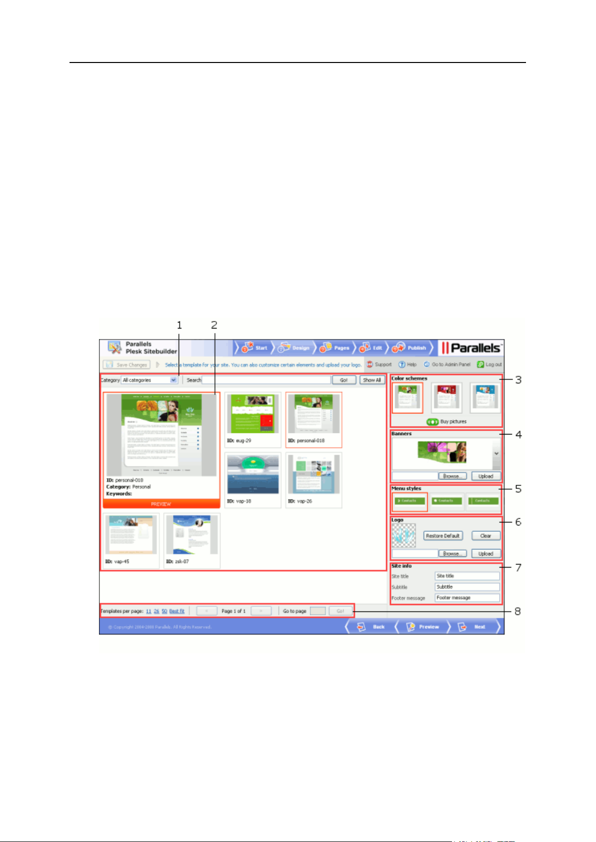
The Plesk Sitebuilder Design step screen looks as follows.
Figure 9: Step 2. Creating Site Design
The work area of the screen contains the following elements:
1 Design template selection area, which provides the functions facilitating the choice of a
site design template (see page 21). When you choose to display All categories, this
area shows all available design templates.
Page 20

20 Creating Site Design
2 Design template preview window displaying the currently selected template. Click this
In this section:
Selecting Design Template for Site ................................................................... 21
Removing Design Template from Page ............................................................. 22
Selecting Color Scheme .................................................................................... 23
Selecting Banner ............................................................................................... 23
Selecting Menu Style ......................................................................................... 24
Uploading Logo ................................................................................................. 25
Specifying Site Title, Subtitle, and Footer Message ........................................... 25
Buying Pictures from Fotolia .............................................................................. 26
window for full-size preview of the template. The chosen design template, color
scheme and menu style are shown in red frames in the corresponding areas of the
screen.
3 Color schemes area, where you can choose the colors for your site (see page 23).
4 Banners area enabling you to select or upload a banner for your site (see page 23).
5 Menu styles area, where you can choose the appearance of the site menu (see page 24).
6 Logo area enabling you to upload your custom logo (see page 25).
7 Site info area where you can provide the information to be displayed in the header and
footer of your site pages (see page 25).
8 The design template list navigation area.
Read this chapter to learn how to use these options to create your site design.
Page 21

Creating Site Design 21
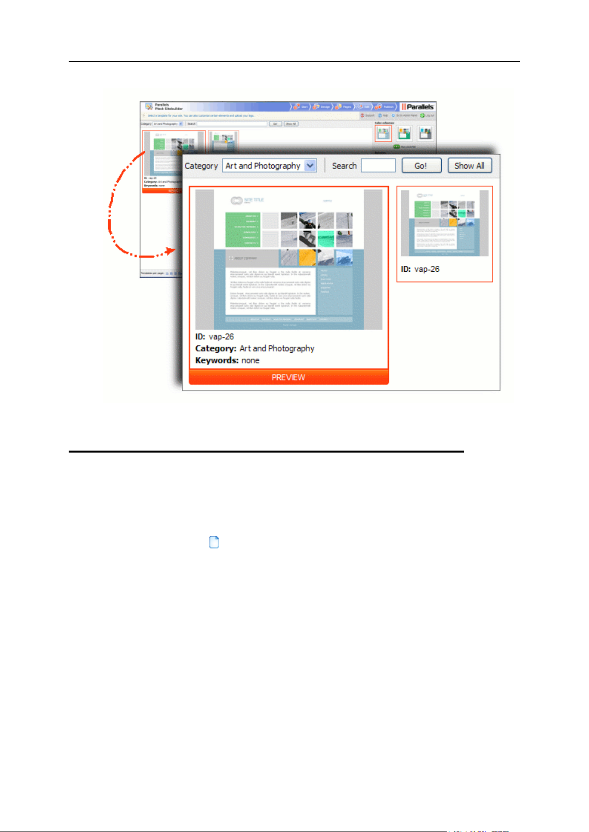
Selecting Design Template for Site
On this step, you choose the general graphic and layout concept of the site page - the
site design template. For more convenience, design templates are grouped into
categories which correspond to the most frequently encountered site types. Your
choice of the design template defines the choice of available color schemes, menu
styles and page banners further on this step.
The list of available site design templates is determined by your service plan.
To select a design template for your site:
1 On the Design step, select a template category from the Category list.
The default design template which goes with the category is displayed in the main
design preview window; the alternative ones - in smaller windows beside the main
window.
2 Click a design template to select it.
The selected template appears in the main design preview window. By selecting a
design template you can view the color schemes, menu styles and page banners
which go with it in the respective areas of the page.
Each design template has a unique alphanumeric code (for example, (vap-26, eug-
29, etc.) by which you can identify it in Plesk Sitebuilder.
To choose a design template on pure aesthetic grounds (not by category), select All
Categories from the Category list to display all available templates, and then click the
desired template to select it.
For some tips on working with the list of design templates, see section Working with Lists
(on page 14).
If necessary, you can remove the design template (see page 22) from selected standard
(HTML) pages of your site at a later stage.
Page 22
22 Creating Site Design
Figure 10: Selecting a Design Template
Removing Design Template from Page
All pages of your Plesk Sitebuilder site are built on the basis of a design template - the
one which you have applied on the Design step and which includes pre-configured page
graphics and layout. You can remove these elements from any common (standard)
page (indicated by the icon in the site map), turning it into a plain page with no
design.
To remove the design template from a page, go to the Edit step, select the page in the
Site map area and click Remove Design Template.
At any moment later you can get the page design back by clicking Restore Design
Template.
You cannot remove the design template from special pages (modules).
Page 23
Creating Site Design 23
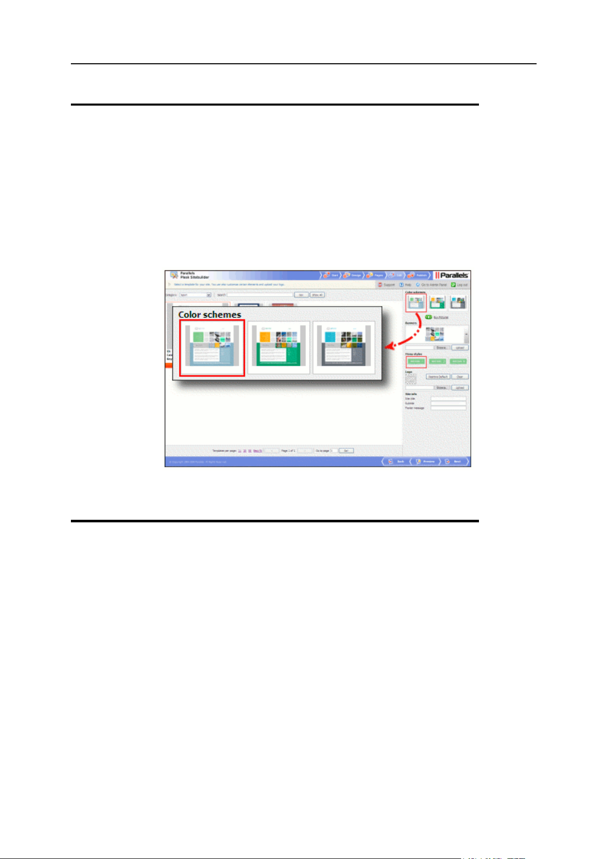
Selecting Color Scheme
For each design template, a number of color schemes are available. No custom color
schemes can be uploaded to Plesk Sitebuilder.
To select color scheme for your site, on the Design step, click the thumbnail image you
like in the Color schemes section.
The chosen color scheme is applied to the design template, and the results are
displayed on the design template preview.
Figure 11: Selecting a Color Scheme
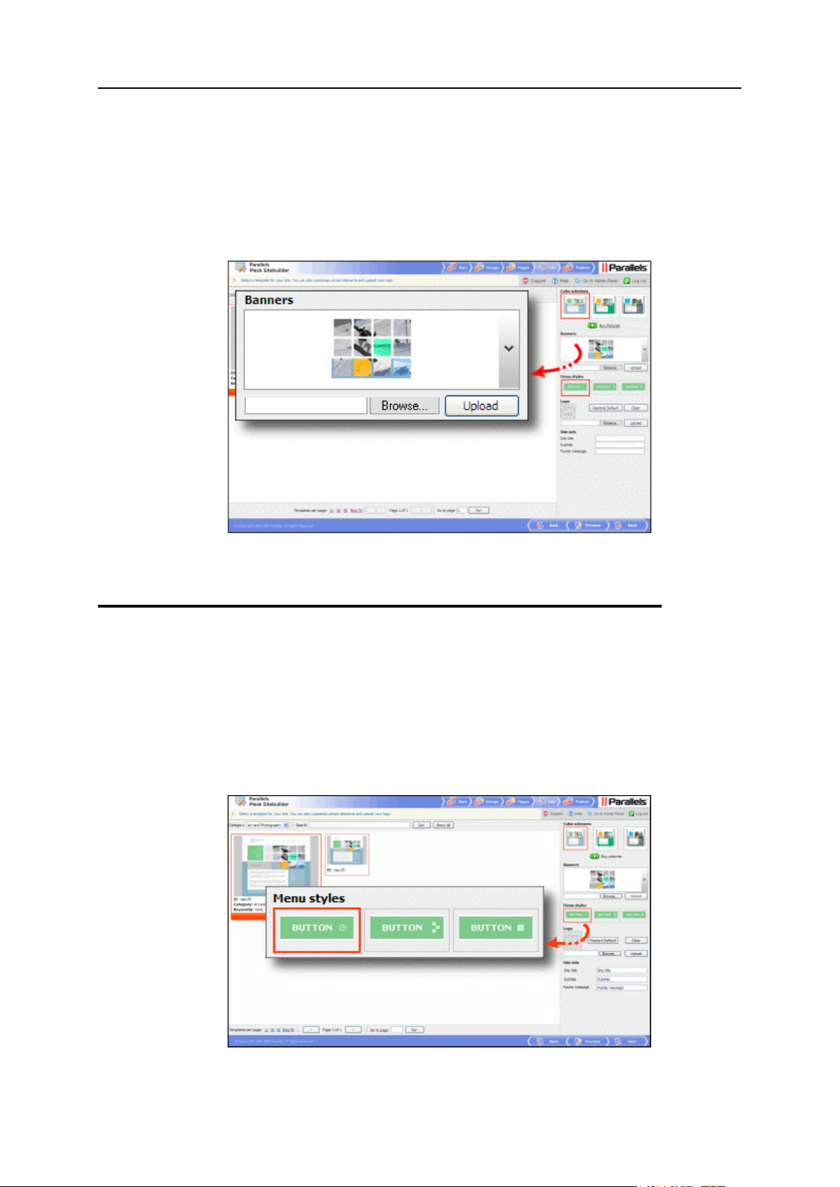
Selecting Banner
In Plesk Sitebuilder, a banner is a large image of rectangular shape which serves as a
central element of the page layout. Each design template offers a choice of available
banners.
To select a banner:
1 On the Design step, in the Banners area, click the downward arrow to
expand the list of available banners.
2 Select the banner you like.
The chosen banner is displayed it in the main design preview window.
You can also upload a custom banner for your site. The maximum allowed dimensions of
a banner vary depending on the selected template. To find out the maximum banner size
for a particular template, try uploading an image bigger than 1024x350 px - you will see a
warning message containing the maximum banner dimensions for the current template.
The supported file formats are *.jpg, *.bmp, *.gif, and *.png.
Page 24
24 Creating Site Design
To upload a new banner:
1 On the Design step, click Browse in the Banners area.
2 In the Browse window, navigate to the image file you want to upload.
3 Click Open in the Browse window.
4 Click Upload in the Banners area.
Figure 12: Selecting or Uploading a Banner
Selecting Menu Style
Menu style defines the visual appearance of the menu items on your site.
To select the menu style, on the Design step, choose the preferable style in the Menu
styles area.
For each design template, there are a number of menu styles to choose from.
Figure 13: Selecting a Menu Style
Page 25
Creating Site Design 25
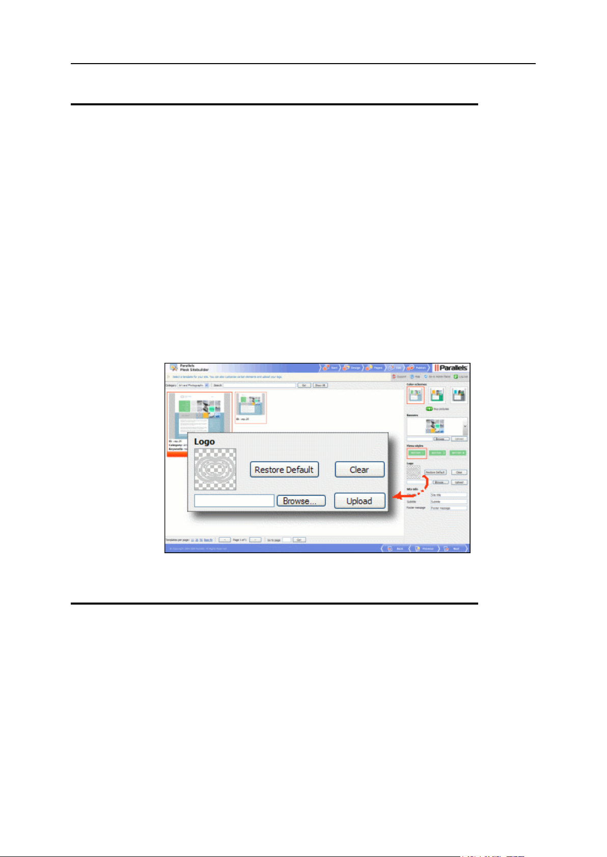
Uploading Logo
In Plesk Sitebuilder, a logo is a small image displayed at the top of each page, within
the page banner. The maximum size of logo image is 320x320 px; the supported file
formats are *.bmp, *.gif, *.jpg, *.png.
To upload a custom logo:
1 On the Design step, click Browse in the Logo area.
2 In the Browse window, navigate to the image file you want to upload.
3 Click Open in the Browse window.
4 Click Upload in the Logo area.
For each template, Plesk Sitebuilder provides its own default logo image. To restore
this logo, click Restore Default.
To remove logo from your site design, click Clear.
Figure 14: Uploading a Logo
Specifying Site Title, Subtitle, and Footer
Message
Site title, subtitle, and footer message are text elements appeared at the background of
your site: site title and subtitle are displayed within the site banner, and footer message
is put at the bottom of every page of your site.
To specify your site title, subtitle phrase and footer message, on the Design step, fill in
the fields in the Site info section:
Page 26
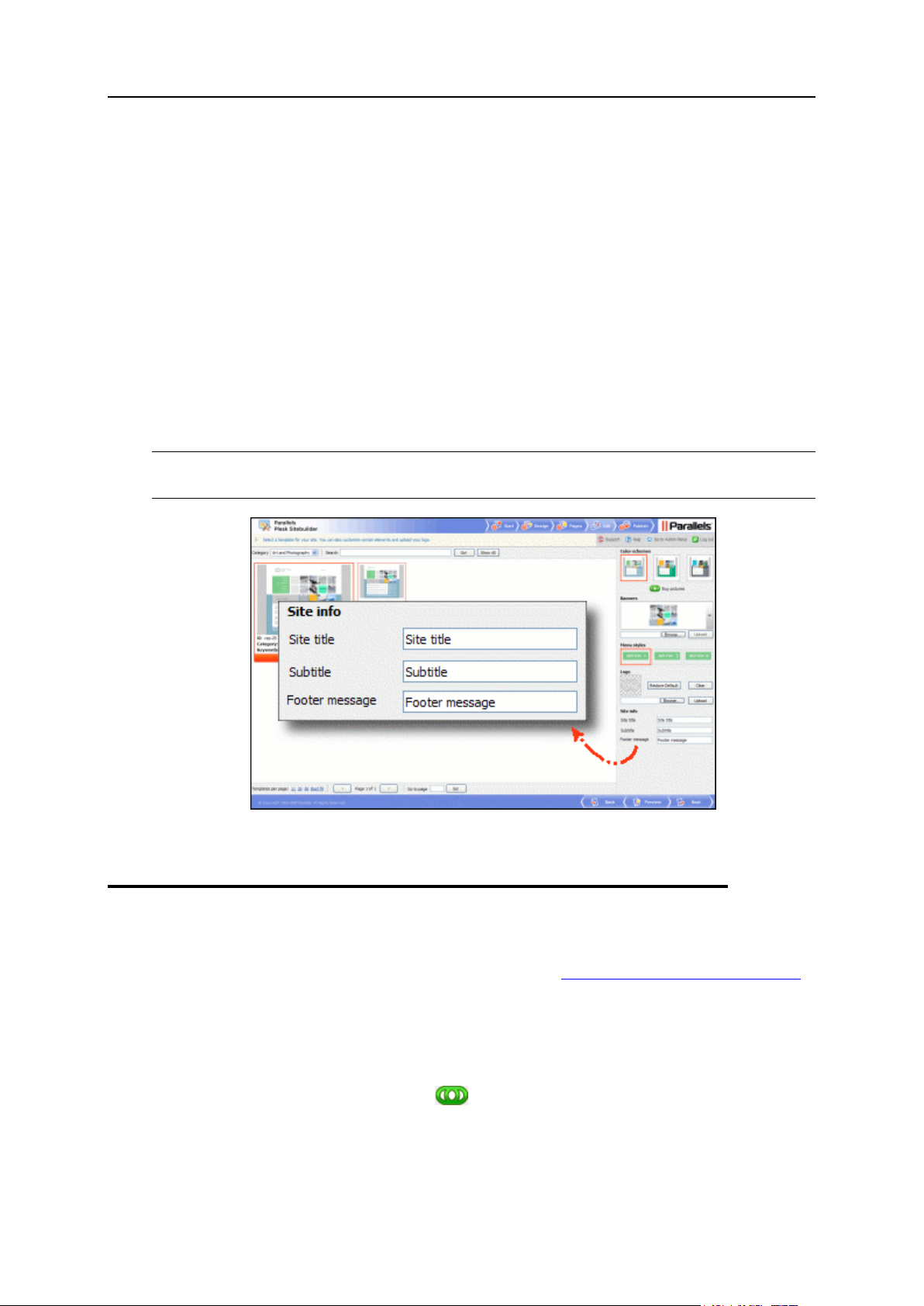
26 Creating Site Design
In the Site title field, provide your site name (maximum 255 characters). On
business sites, this is usually a company name.
In the Subtitle field, provide any phrase which reflects the concept and objectives of
the site. This phrase will be displayed below the site title in smaller font. On
business sites, this is usually a corporate slogan.
In the Footer message field, provide the copyright notice or any other information of
similar kind - disclaimers, contact information, etc., which you would like to place in
the page footer.
For each text element, it is possible to break the text into multiple lines. To do so, insert
the <br> tag where you want the line break to be. For example: first line<br>second
line<br>third line...
If you do not wish to specify the title, subtitle or footer message for your site, clear the
corresponding fields.
Note: Some design templates allow customizing only the site title. For these templates,
the Subtitle and Footer message fields are disabled.
Figure 15: Specifying Site's Title, Subtitle, and Footer Message
Buying Pictures from Fotolia
In Plesk Sitebuilder, you can buy images from Fotolia (http://www.fotolia.com/parallels/)
- the first worldwide social marketplace for royalty free stock images, directly from the
Wizard. As a Parallels customer, you have a 20% bonus when purchasing Fotolia
images.
To purchase images from Fotolia:
1 On the Design step, click the Buy pictures shortcut under the Color
schemes area.
2 Follow the instructions provided on Fotolia web site to purchase
images.
Page 27
Creating Site Design 27
Note: If you do not see this shortcut, it means that this option is disabled in the Plesk
Sitebuilder license.
Note that when filling your site with content on the Edit step, you can browse the Fotolia
gallery and buy images directly from Plesk Sitebuilder (see Inserting Image (on page
55)).
Figure 16: Buying Pictures from Fotolia
Page 28

A site consists of several pages linked together to present information in an ordered
C H A P T E R 3
Creating Site Structure
way. Using Plesk Sitebuilder, you can arrange the pages in the two levels of hierarchy:
top level pages and second level pages. Therefore, before this stage you must clearly
understand how you intend to structure your site.
Note: The maximum number of pages you can create in one site is determined by your
service plan.
To facilitate creating your site, you are provided with a number of pre-defined site
structures, or page sets, which can be used as templates for creating your own site
structure. The default page set of your site is determined by the type of site you chose
on the Start page of Plesk Sitebuilder Wizard.
On the Pages step, you can build any possible site structure by adding the desired
pages and arranging them as needed. Find out about the types of pages (see page 31)
offered by Plesk Sitebuilder and about the process of building site structure (see page
32).
The Pages step screen provides the following functionalities:
Page 29
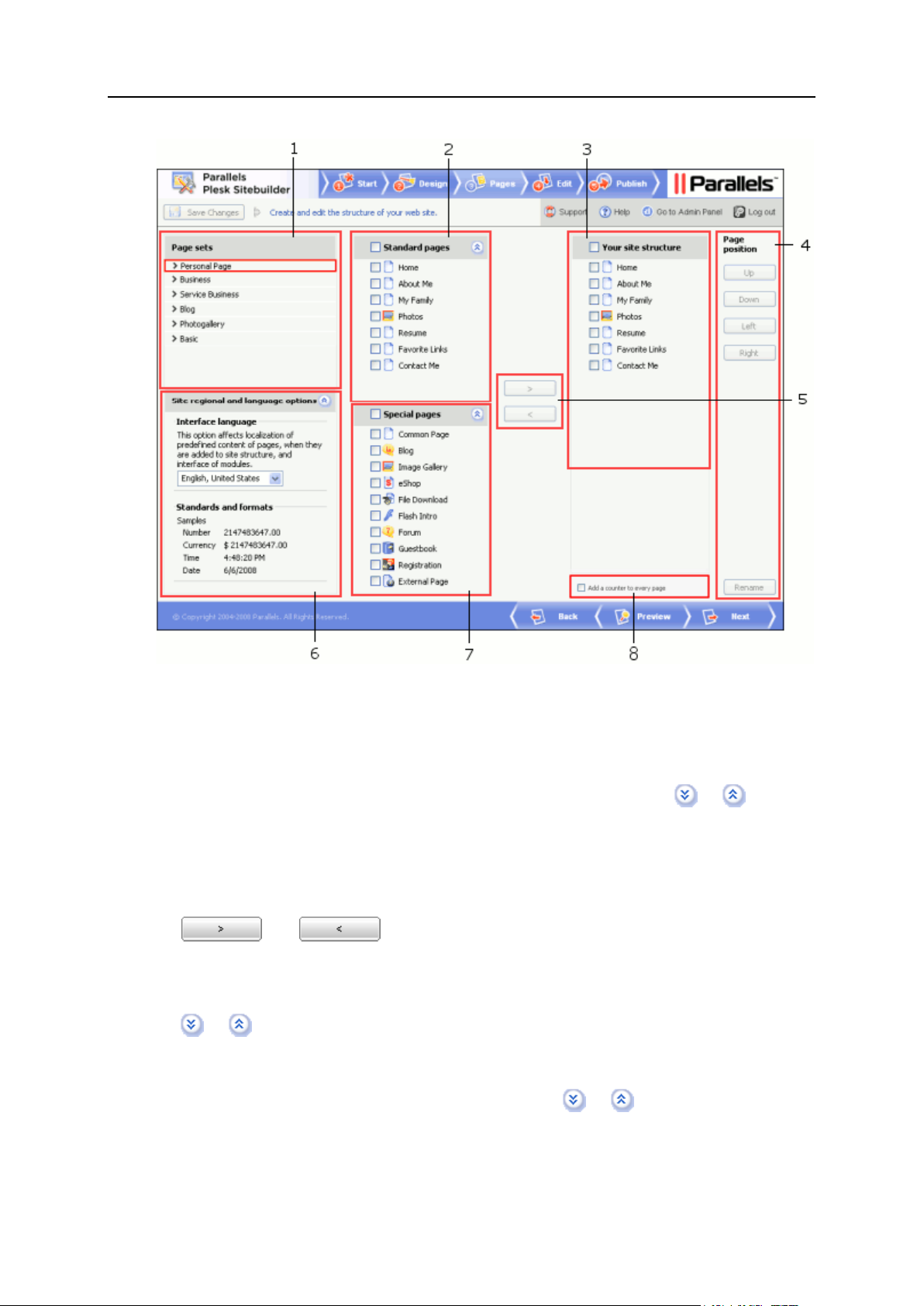
Creating Site Structure 29
Figure 17: Step 3. Creating Site Structure
1 The Page sets area allows you to choose a page set. The selected page set is
shown in red frame.
2 The Standard pages area displays the structure of the page set chosen in the Page
sets area. You can expand or collapse this section by clicking the or icons in
the top bar of the section.
3 The Your site structure area shows the final structure of your site.
4 The Page position area enables you to organize the hierarchy of pages (see page 33) in
the site map, and to rename pages (see page 35).
5 and buttons allow you add or remove pages from the site
structure.
6 The Site regional and language options area allows you to set the site language and
the format of numeric data. You can expand or collapse this section by clicking the
or icons.
7 The Special pages area displays all available types of pages which can be added to
your site structure: one common text page, and all available page modules. You
can expand or collapse this section by clicking the or icons.
8 The check box enabling you to add a visitors counter to your site (see page 163).
Page 30

30 Creating Site Structure
In this chapter:
Types of Pages ................................................................................................. 31
Structuring Your Site ......................................................................................... 32
Choosing Site Language, Currency, and Format of Numbers, Time and Date ... 37
Page 31

Creating Site Structure 31
Types of Pages
In Plesk Sitebuilder, there are two types of pages:
Standard (common) pages - ordinary HTML pages used for displaying text
information. Such pages are marked with icons in the site map.
Special pages - page modules which extend the site functionality. Each module is
designed for a certain purpose and is identified by its own icon. There are the
following types of page modules in Plesk Sitebuilder:
Blog (see page 73). Supports a standard set of blog functionality: posting,
commenting, content categorizing, etc. A Blog page is very convenient for
organizing the News, Events and similar pages on sites.
Image Gallery (see page 80). Allows you to share images or photos online.
Supports batch image upload with group editing functions, organizing images
into albums, etc.
eShop (see page 88). Online store creation and management tool featuring
shopping cart, multi-currency, categorized product catalog with thumbnail
upload capability, product inventory and shipping cost support, order
management. Provides integration with a number of online payment systems,
such as PayPal, Authorize.Net, and others.
File Download (see page 118). Allows providing content for download to site
visitors.
Note: Each File Download page can hold only one file. To provide several files
for download, it is necessary to add several File Download pages to the site
structure.
Flash Intro (see page 119). A pre-designed flash introduction to your site. It is
possible to choose between several designs of the intro and insert your own text
content into it.
Note: The Flash Intro module is the only page module that requires no PHP on
the publishing location and therefore can be included into a static site.
Forum (see page 120). Allows you to set up a forum where visitors can post
questions and participate in discussions.
Guestbook (see page 128). Allows you to create a guestbook and manage the
posted messages.
Registration (see page 132). Allows you to set up voluntary user
authentication on sites. After a registered site visitor opts in, their details are
automatically inputted in all forms they open on the site, for example, when
submitting a forum topic or shopping at the online store. You can suspend a
visitor account, thus restricting a visitor from authenticating under his or her user
name.
External Page (see page 138). Allows incorporating links to external pages into
the site menu.
The list of available modules is determined by your service plan.
Page 32

32 Creating Site Structure
In Plesk Sitebuilder, you can add several page modules of one type to a site (except for
In this section:
Adding Pages .................................................................................................... 33
Changing Position of Pages .............................................................................. 33
Renaming Pages ............................................................................................... 35
Hiding Pages in Site Navigation ........................................................................ 35
Removing Pages ............................................................................................... 37
Flash Intro and Registration).
Structuring Your Site
You can build and edit your site structure on the Pages step of Plesk Sitebuilder Wizard.
To facilitate creating your site, you are provided with a number of pre-defined site
structures, or page sets, which can be used as templates for creating your own site
structure. The default page set of your site is determined by the type of site you chose
on the Start page of Plesk Sitebuilder Wizard. You see this default page set highlighted
in the list of page sets, its structure is displayed in the Your site structure box on the right.
You can modify the proposed site structure as desired by adding pages from other
page sets (or even whole page sets), renaming pages, changing pages hierarchy, or
removing pages from the Your site structure box.
The list of page sets available depends on your service plan and can be extended only
by your Plesk Sitebuilder administrator. The structure of each page set is shown in the
Standard pages area after you select the page set in the list.
The Special pages area shows a list of special pages, or modules which you can add to
your site, plus one common site page which you can use as an ordinary text page. To
learn which modules are available, refer to Types of Pages (on page 31).
Page 33

Creating Site Structure 33
Adding Pages
To add pages to the site structure:
1 Select the necessary pages in the Standard pages, or in the Special pages
area.
Note: The module titles in the page set may differ from the original names of the
modules. For example, a page Photo may represent the Image Gallery module.
You can always identify a module by its icon.
2 Click .
Or just drag and drop needed pages into the Your site structure box.
You can add as many modules of one type to your site as you wish - except for the
Flash Intro and Registration modules. These modules can be added to your site only
once.
Figure 18: Adding Pages
Changing Position of Pages
To change the pages hierarchy:
1 Select the required page in the Your site structure box.
2 Use one of the buttons in the Page position area:
To move a page from the second level to the top level of the site structure, click
Left.
To move a page from the top level to the second level, click Right.
Page 34

34 Creating Site Structure
To move a page up at the same level, click Up.
To move a page down at the same level, click Down.
When you move a first level page Up or Down, all dependent second level pages are
moved together with it.
Note: In Plesk Sitebuilder, modules can be only first-level pages in the site structure,
and cannot have dependent second level pages. The only exception is the File
Download module, which you can set a second-level page, but you cannot depend other
pages on it.
Figure 19: Changing Position of Pages
Page 35

Creating Site Structure 35
Renaming Pages
To rename a page:
1 Select the page in the Your site structure box and click Rename.
Or just double-click the page's name to make it editable.
2 Provide a new name for the page.
3 Press ENTER.
If you choose to rename the page at a later stage, you can use the Page title field on the
Edit step of the Plesk Sitebuilder Wizard.
Figure 20: Renaming Pages
Hiding Pages in Site Navigation
You can make certain pages invisible in site menu. The page which you choose to hide
will be accessible only by clicking a link placed on other pages of your site (or wherever
you would like to place it). Note that when a site visitor actually accesses a hidden
page, it appears in the site menu, and when they switch to another (not hidden) page,
the hidden page disappears again.
To hide a page in the site navigation menu:
1 Go to the Edit step.
2 Go to the desired page.
3 Clear the Show this page in site map check box.
Hidden pages are highlighted with grey color in the Site map area and in the site
structure on the Pages step.
Page 36

36 Creating Site Structure
Active Page*
Visible Pages
Page 1
Page 1, Page 3
Page 2
Page 1, Page 2, Page 3
Page 3
Page 1, Page 3, Page 3.2
Page 3.1
Page 1, Page 3, Page 3.1, Page 3.2
Page 3.2
Page 1, Page 3, Page 3.2
Page 4
Page 1, Page 3, Page 4, Page 4.1
Page 4.1
Page 1, Page 3, Page 4.1
Page 4.2
Page 1, Page 3, Page 4.1, Page 4.2
Figure 21: Hiding Pages in Site Navigation
You can hide both first and second level pages.
To understand how hiding pages correlates with pages hierarchy, see the example
below:
Let the site structure look as follows:
Page 1
Page 2 (hidden)
Page 3
Page 3.1 (hidden)
Page 3.2
Page 4 (hidden)
Page 4.1
Page 4.2 (hidden)
To understand the dependency of pages' visibility and position in the hierarchy, see the
table below.
* active page is a page where the site visitor currently stands
Page 37

Creating Site Structure 37
Removing Pages
To remove a page from the site map, select the page in the Your site structure box and
click .
Note: You cannot delete all pages from the Your site structure area. In case you need to
clear the space - for example, before setting up a completely new site structure, we
recommend to select all pages, except one, delete them, add the necessary pages to
the site, and then delete or reuse the old page.
Figure 22: Removing Pages
Choosing Site Language, Currency, and
Format of Numbers, Time and Date
In Plesk Sitebuilder, you can create a site in the language which is different from the
language of your Wizard interface. The desired language is selected on the Pages step
of Plesk Sitebuilder Wizard.
The choice of the language determines the format of numbers, the site currency and
price format, and also the format of date and time records everywhere on your site.
To select the language for your site and the format of displaying numbers, currencies,
times and dates:
1 Go to the Pages step.
2 Select the language of your site from the Interface language list.
Page 38

38 Creating Site Structure
In the Standards and formats area, you will see the format of numbers, date and time, and
the currency associated with the chosen language.
If you do not see a required language in the list, check Parallels web site
(http://www.parallels.com/en/download/sitebuilder) to see if it is available. Only a user
with administrator's privileges can download and install language packs in Plesk
Sitebuilder. If you wish to use any of the available language packs, contact your Plesk
Sitebuilder provider for assistance.
Note that the currency and price format specified here will be applied to your online
store, if you add one to your site. You can alter these settings for your online store at a
later stage by configuring the eShop module accordingly (see page 100). The online store
settings and the regional and language settings of the whole site are independent of
each other.
Figure 23: Choosing Site Language and Customizing Settings for Display of Numbers,
Currencies, Time and Date
Page 39

In Plesk Sitebuilder, creating your site content means creating the content of each
C H A P T E R 4
Populating Site with Content
HTML page constituting your site, and setting up functional modules you added to your
site. You can do all this on the Edit step of Plesk Sitebuilder Wizard.
The Plesk Sitebuilder editor is organized in such a way that the information you type on
the pages and the design of the pages are independent. Therefore, you can completely
change the design for a page after you had typed a text on this page, without having to
retype the information.
The Edit step screen is structured in the following way:
Figure 24: Step 4. Populating Site with Content
Page 40

40 Populating Site with Content
1 Site map area shows the site structure created on the Pages step of the Wizard. By
In this chapter:
Working with Text ..............................................................................................41
Working with Images ..........................................................................................54
Working with Tables ...........................................................................................62
Working with Modules ........................................................................................70
selecting a page in this area, you open its content for editing in the work area of the
screen. To hide the Site map section, click the Hide Site Map icon. To restore the
Site map area on the screen, click the Show Site Map icon.
2 Work area provides access to different functions, depending on the type of the edited
page:
On ordinary text pages, the work area provides the space for creating the text
content of the page (see page 41) and inserting images (see page 54) with the help
of the WYSIWYG editor, like on the screenshot above.
On special pages, or page modules, the work area provides the module editor
screen, where you can configure various parameters of the module on the
respective tabs, and, in most cases, populate the module with content (for
example, fill your online store catalog with products). For information on working
with lists of objects on module management pages, read section Working with
Lists (on page 14). For more information about configuring and editing each
module, see respective sections further in this chapter.
3 Modules area allows to embed block modules in text pages, by drag-and-dropping
the module icon to the required spot on the page. For some tips on using block
modules, see section Working with Modules (on page 70). To hide the Modules
section, click the Hide Modules icon. To restore the Modules area on the screen,
click the Show Modules icon.
Note: When you edit special pages (page modules), the Modules area of the screen
is not displayed.
Page 41

Populating Site with Content 41
Working with Text
In this section:
Applying Styles, Fonts, and Colors to Text ........................................................ 42
Formatting Paragraphs ...................................................................................... 42
Copying and Moving Text .................................................................................. 43
Finding and Replacing Text Fragments ............................................................. 44
Checking Spelling on Page ............................................................................... 45
Undoing and Redoing Actions ........................................................................... 45
Inserting Links ................................................................................................... 46
Plesk Sitebuilder is empowered with a user-friendly WYSIWYG (What You See Is What
You Get) content editor, which enables you to see the content on the display screen
exactly as it appears on the Internet.
This subsection describes the ways of working with textual information on your web
pages. You will learn how to format characters and paragraphs, cut, copy, paste text,
insert images and links, check spelling, and more.
Figure 25: Working with Text
Page 42

42 Populating Site with Content
Applying Styles, Fonts, and Colors to Text
To apply formatting to a text:
1 On the Edit step, select the desired site page.
2 Select the text fragment you want to edit.
You can select the whole text on the page by clicking Select All.
3 Apply desired formatting options to the selected text:
Select a font from the Font list.
Select a font size from the Size list.
Click the Text Color icon and select a color.
Click the Background Color icon and select a color.
Click the Bold, Italic, Underline, Strike Through icons to make the
text bold, italic, underlined, or strikethrough respectively.
Click the Subscript or Superscript icon to make the text subscript or
superscript respectively.
4 To insert a special symbol into the text, place the mouse cursor on
the required spot on the page, click the Insert Special Character icon
and select a symbol.
To undo the last formatting action, click the Remove Format or Undo icon.
Formatting Paragraphs
To apply formatting to a paragraph:
1 On the Edit step, select the desired site page.
2 Place the cursor anywhere in the paragraph you want to format.
3 Apply necessary formatting:
To apply a text style, select it from the Format list.
To align the text, click the Align Left, Center, Align Right, or
Justify icon.
To change the indentation of the text, click the Increase Indent or
Decrease Indent icon.
4 To insert a horizontal line between two paragraphs, place the cursor
at the end of the first paragraph and click the Insert Horizontal Line
icon.
Page 43

Populating Site with Content 43
5 To split a paragraph with a page break, click the Insert Page Break
icon before the beginning of the new prospective paragraph.
Copying and Moving Text
To copy or move text:
1 On the Edit step, select the desired site page.
2 Select a text fragment.
You can select the whole text of the page by clicking the Select All icon.
3 Click the Cut or Copy, icon depending on the type of operation
(moving or copying).
4 Paste the text on the page using one of the three pasting options:
To simply paste the text from the current page, or from other pages of the site,
place the cursor in the appropriate spot on the page and click the Paste icon.
To paste the text from MS Word, and to retain the formatting applied to it, click
the Paste from Word icon, paste the text into the provided window, and click
OK.
To paste the text, and to discard all formatting applied to it, click the Paste
as Plain Text icon, paste the text into the provided window, and click OK.
Page 44

44 Populating Site with Content
Finding and Replacing Text Fragments
To find a particular text fragment on the page:
1 On the Edit step, select the desired site page.
2 Click the Find icon.
3 In the Find what field, enter the text you want to find.
4 Select the Match case check box to search only for text that exactly
matches the case (uppercase or lowercase character formatting) of
the specified search pattern.
5 Click Find to start the search.
To find and replace a text fragment on the page:
1 Click the Replace icon.
2 In the Find what field, enter the text you want to find.
3 In the Replace with field, enter the text to replace the searched fragment
with.
4 Select the necessary search options:
Match case - to search for text that exactly matches the case (uppercase or
lowercase character formatting) for the specified search pattern.
Match whole words - to search for the exact phrase as it is specified.
5 Click Replace to replace a particular found segment.
6 Click Replace All to replace all segments found on the page without
reviewing them.
Page 45

Populating Site with Content 45
Checking Spelling on Page
The Spell Checker feature can be used only with Internet Explorer version 5.5 or later.
To be able to use the Spell Checker, you need to install ieSpell - a free-of-charge spell
checker utility for Internet Explorer. To install ieSpell, download the application setup
package from the official ieSpell web site (http://www.iespell.com/download.php), run it
on your computer and complete the steps of the installation procedure as described,
then restart Internet Explorer.
The Spell Checker is available for English only.
To check spelling on the page:
1 On the Edit step, select the desired site page.
2 Click the Check Spell icon.
In the Not in dictionary field, possible spelling mistakes are shown.
3 If you are sure that the word found by the Spell Checker is not
misspelled, click Ignore to leave the word as is.
To ignore all occurrences of this word in the text, click Ignore All.
4 If you wish to add this word to the Spell Checker dictionary, click Add.
5 If you want to replace the misspelled word with the word in the
Suggestions field, click Change.
To replace this word in the whole text, click Change All.
6 If you wish to configure the Spell Checker parameters, click Options.
Undoing and Redoing Actions
To undo the last action, click Undo.
To redo the last undone action, click Redo.
Page 46

46 Populating Site with Content
Inserting Links
In this section:
Inserting External Link ....................................................................................... 47
Inserting Internal Link ........................................................................................ 50
Inserting Anchor ................................................................................................ 50
Inserting E-Mail Link .......................................................................................... 52
Using the Plesk Sitebuilder editor, you can insert both internal links leading to other
pages of your site, and external links. Internal links point to other pages of your site.
External links pointing to other sites are often used to improve your site popularity and
will direct visitors of your site to friendly sites (the so-called link exchange).
With the help of Plesk Sitebuilder link manager, you can add the following types of
links:
External links (see page 47)
Internal links, or links to other pages of your site (see page 50)
Anchors (see page 50)
E-mail links (see page 52)
To edit a link, right-click the selected link and click Edit Link.
To remove a link, right-click the selected link and click Remove Link, or select the link
text and click the Remove Link icon on the editor panel.
Page 47

Populating Site with Content 47
Inserting External Link
An external link is a reference in a hypertext document to another document on a
different web site.
To insert an external link:
1 Type/Select the text which you want to set as a hyperlink to another
web resource.
2 Click the Insert/Edit Link icon.
Figure 26: Inserting an External Link
3 On the Link Info tab, select URL from the Link type list.
4 Select the protocol from the Protocol list.
The available selections are:
http://
https://
ftp://
news://
<other>
5 In the URL field, enter the web address to which the link will point.
6 On the Target tab, select the way the link should open from the Target
list:
To open the link in same browser window (the target page replaces the page of
your site), leave the Target option in its default value <not set>, and leave the
Target Frame Name field blank.
Page 48

48 Populating Site with Content
To open the link in the new browser window, select New Window [_blank] from the
Target list.
To open the link as a pop-up window, select <popup window> from the Target list,
and specify the parameters of the pop-up in the Popup Window Features area
below.
Note: Other options in the Target list have been designed to work with the HTML
Frames technology, which is currently not used on Plesk Sitebuilder sites.
On non-frames sites, all these options open the link in the same window.
7 If you wish to specify additional attributes for the link, enter them on
the Advanced tab:
Id, this attribute assigns a name to the link. This name must be unique on the page.
Language Direction, this attribute specifies the base direction of directionally neutral
text. Direction can be Left-to-right or Right-to-left.
Access Key, this attribute assigns an access key to an element. An access key is a
single character from the document character set.
Name, this attribute names the current link as an anchor, so that it may be the
destination of another link. The value of this attribute must be a unique anchor
name within the current page.
Language Code, this attribute specifies the base language of the link's attribute
values and text content.
Tab Index, this attribute specifies the position of the current element in the tabbing
order for the current document. The tabbing order defines the order in which
elements receive focus when navigated by the user via the keyboard. The tabbing
order may include elements nested within other elements.
Advisory Title, this attribute offers advisory information about the link. The
information is displayed in the status bar of the browser when the mouse hovers
over the link.
Advisory Content Type, this attribute gives an advisory hint as to the content type of
the content available at the link target address. It allows user agents to opt to use a
fallback mechanism rather than fetch the content if they are advised that they will
get content in a content type they do not support.
Stylesheet Classes, this attribute assigns a CSS class name or set of class names to
the link.
Linked Resource Charset, this attribute specifies the character encoding of the
resource designated by the link.
Style, this attribute specifies style information for the current link. The information
should be formatted as follows: Content-Style-Type: text/css.
8 Click OK.
You can also provide a link to an image, document or a media file stored on your
computer.
To provide a link to a file on your computer:
1 Type/Select the text which you want to set as a hyperlink.
2 Click the Insert/Edit Link icon.
Page 49

Populating Site with Content 49
3 On the Link Info tab, select URL from the Link type list.
4 Select <other> from the Protocol check box.
5 Click Browse Server.
6 In the file uploading window, select the type of file from the Resource
type box: File, Image, Flash, or Media.
Inside each resource type, you can organize your files into a number of folders. To
do so, create the desired hierarchy of folders prior to uploading the files. To create
a folder in the root directory, click Add New Folder in the bottom part of the screen.
Having created a folder, click its name to open it. You can create a new folder
inside the opened folder, or upload a file to it.
When the folder is opened, the top bar of the file uploading screen shows the path
to this folder on the server, and the left frame provides navigation to the upper-level
folder. To navigate one level up, click the .. icon.
7 To upload a file of the selected type to the server, click Browse, locate
the file in your local file system, click Open and then click Upload.
For each uploaded file, size is shown.
To delete a file, click the corresponding icon.
8 To create a link to the file, click the file name.
Figure 27: Inserting a Link to a File
The path to the file on the server is automatically inputted into the URL field on the
Link screen.
9 Click OK.
Page 50

50 Populating Site with Content
Inserting Internal Link
An internal link is a link to another page of your site.
To insert an internal link:
1 Type/Select the text which you want to set as a link to another page.
2 From the Custom links box on the WYSIWYG panel, select the page to
which the link should point.
Figure 28: Inserting a Link to Another Page of Your Site
Inserting Anchor
Anchor is a word or a group of words that define the destination a hyperlink leads to.
Anchors are very helpful in facilitating navigation through a great amount of text located
on a single place. With this function you can provide the site visitors an easy way to
jump from one part of the text to another.
To insert an anchor:
1 Place the cursor where you want the link to lead to.
2 Click the Insert/Edit Anchor icon.
3 On the Anchor Properties form, enter the anchor name.
Figure 29: Inserting an Anchor
Page 51

Populating Site with Content 51
4 Click OK.
The anchor icon appears in the selected place in the text.
5 Select a text fragment which you want to link to the anchor to.
6 Click the Insert/Edit Link icon.
7 On the Link Info tab, select Anchor in this page from the Link type list.
Select an anchor from the list.
Figure 30: Creating a Link to the Anchor
8 If you wish to specify additional attributes for the anchor, enter them
on the Advanced tab:
Id, this attribute assigns a name to the anchor. This name must be unique on the
page.
Language Direction, this attribute specifies the base direction of directionally neutral
text. Direction can be Left-to-right or Right-to-left.
Access Key, this attribute assigns an access key to an element. An access key is a
single character from the document character set.
Name, this attribute names the current link as an anchor, so that it may be the
destination of another link. The value of this attribute must be a unique anchor
name within the current page.
Language Code, this attribute specifies the base language of the anchor's attribute
values and text content.
Tab Index, this attribute specifies the position of the current element in the tabbing
order for the current document. The tabbing order defines the order in which
elements receive focus when navigated by the user via the keyboard. The tabbing
order may include elements nested within other elements.
Page 52

52 Populating Site with Content
Advisory Title, this attribute offers advisory information about the anchor. The
information is displayed in the status bar of the browser when the mouse hovers
over an anchor.
Advisory Content Type, this attribute gives an advisory hint as to the content type of
the content available at the link target address. It allows user agents to opt to use a
fallback mechanism rather than fetch the content if they are advised that they will
get content in a content type they do not support.
Stylesheet Classes, this attribute assigns a CSS class name or set of class names to
the anchor.
Linked Resource Charset, this attribute specifies the character encoding of the
resource designated by the link.
Style, this attribute specifies style information for the current anchor. The information
should be formatted as follows: Content-Style-Type: text/css.
9 Click OK.
To remove a link to the anchor, select the link text and click the Remove Link icon.
To remove an anchor itself, select it on the page and click the DELETE key.
Inserting E-Mail Link
If you want visitors of your site to contact you by e-mail, insert an e-mail link into your
web page. On a web page, this looks like your e-mail address underlined, and when a
user clicks it, a mail program on his or her computer opens a "Compose New
Message" window with your e-mail address specified as the recipient address. When
placing e-mail links, you can also specify the default subject for the message.
To insert an e-mail link:
1 Select a text which you want to set as an e-mail link.
2 Click the Insert/Edit Link icon.
3 On the Link Info tab, select E-mail from the Link type list.
4 Enter an e-mail address in the E-mail address field.
5 In the Message subject field, enter the default subject of the message.
6 In the Message body field, enter the default text of the message.
Page 53

Populating Site with Content 53
Figure 31: Inserting an E-Mail Link
7 If you want to specify additional attributed for the link, you can do it
on the Advanced tab.
Id, this attribute assigns a name to the link. This name must be unique on the page.
Language Direction, this attribute specifies the base direction of directionally neutral
text. Direction can be Left-to-right or Right-to-left.
Access Key, this attribute assigns an access key to an element. An access key is a
single character from the document character set.
Name, this attribute names the current link as an anchor, so that it may be the
destination of another link. The value of this attribute must be a unique anchor
name within the current page.
Language Code, this attribute specifies the base language of the link's attribute
values and text content.
Tab Index, this attribute specifies the position of the current element in the tabbing
order for the current document. The tabbing order defines the order in which
elements receive focus when navigated by the user via the keyboard. The tabbing
order may include elements nested within other elements.
Advisory Title, this attribute offers advisory information about the link. The
information is displayed in the status bar of the browser when the mouse hovers
over the link.
Advisory Content Type, this attribute gives an advisory hint as to the content type of
the content available at the link target address. It allows user agents to opt to use a
fallback mechanism rather than fetch the content if they are advised that they will
get content in a content type they do not support.
Stylesheet Classes, this attribute assigns a CSS class name or set of class names to
the link.
Linked Resource Charset, this attribute specifies the character encoding of the
resource designated by the link.
Page 54

54 Populating Site with Content
Style, this attribute specifies style information for the current link. The information
In this section:
Inserting Image ................................................................................................. 55
Editing Image .................................................................................................... 59
Removing Image ............................................................................................... 61
should be formatted as follows: Content-Style-Type: text/css.
8 Click OK.
Working with Images
The Plesk Sitebuilder WYSIWYG editor allows you to insert images into the pages of
your site, and to adjust their properties as desired: resize, crop, set alignment, spacing,
add borders, specify meta information and configure advanced image settings, such as
long description and CSS styles.
You can insert images from your computer, or buy and upload professional images
from Fotolia (http://www.fotolia.com/parallels/) - the first worldwide social marketplace
for royalty free stock images. You can browse the Fotolia gallery, purchase and upload
any image of your choice directly from Plesk Sitebuilder Wizard. As a Parallels
customer, you have a 20% bonus when purchasing Fotolia images.
Page 55

Populating Site with Content 55
Inserting Image
To insert an image:
1 On the Edit step, select the desired site page.
2 Place the mouse cursor where you want to insert an image.
3 Click the Insert/Edit Image icon.
4 On the Image Info tab, click Browse Server.
Figure 32: Inserting an Image
5 Click Browse and select an image to upload.
Note: The maximum size of the image is 200KB. The supported graphics file
formats are *.gif, *.jpg, *.jpeg, *.png, *.bmp.
6 Click Open, then click Upload.
When inserting an image, only the Image file type is available in the Resource type
list.
For each uploaded image, size is shown.
If you plan to upload many images to the server, you can organize them in a
number of folders on the file uploading screen. To do so, you need to create the
desired hierarchy of folders prior to uploading the files. To create a folder in the root
directory, click Add New Folder in the bottom part of the screen and provide the folder
name on the pop-up window that appears. Having created a folder, click its name to
open it. You can create a new folder inside the opened folder, or upload a file to it.
Page 56

56 Populating Site with Content
When the folder is opened, the top bar of the file uploading screen shows the path
to this folder on the server, and the left frame provides navigation to the upper-level
folder. To navigate one level up, click the .. icon.
To delete an image, click the corresponding icon.
7 To insert an image into the page, click the image file name.
Figure 33: Uploading an Image to the Server
The image appears in the preview area of the Image Properties dialog; the image
dimensions appear automatically in the corresponding fields. The path to the image
on the server is placed in the URL field.
8 Click OK.
You can also buy and upload professional images from the Fotolia
(http://www.fotolia.com/parallels/) stock images marketplace.
To buy an image from the Fotolia gallery and insert it into a page:
1 On the Edit step, select the desired site page.
2 Place the mouse cursor where you want to insert an image.
3 Click the Insert/Edit Image icon.
4 On the Image Info tab, click Browse the Fotolia gallery.
5 Browse the gallery and click on the image of your choice.
For your convenience, images are arranged in categories and subcategories, by the
depicted subject (displayed on the Representative Categories tab), or by the idea they
express (on the Conceptual Categories tab). To view the category of interest, click its
name on either of the tabs. At the top of the page you can see the path to the
category or subcategory in both groups of categories (on both tabs).
Page 57

Populating Site with Content 57
You can also search for images by keywords or ID (if you know the ID of the image
in the Fotolia gallery) using the Search for option at the top of the window.
When you hover your mouse over an image, detailed information about it is
displayed, including the image ID, short description, author, the lowest available
price, and path on both tabs.
After you click on the image, it is highlighted in red.
Figure 34: Selecting an Image in the Fotolia Gallery
6 Click OK.
7 To purchase the image, click the Proceed to buying this image shortcut in
the upper part of the window.
Images not purchased from Fotolia are not displayed on the published site.
8 In the License column of the table, select the preferred dimensions and
resolution option for the image.
For each license, price in credits is displayed (1 credit = $1.00).
9 Click Next.
10 If you do not have a Fotolia account yet, click Register Now and
complete the registration procedure on the Fotolia web site.
After activating your account on the Fotolia web site, you can buy a number of
credits right away. You can pay for credits via your credit card, PayPal or Click &
Buy. Having registered an account and bought some credits, return to Plesk
Sitebuilder to purchase the desired image.
11 On the login and registration window, input your account credentials
and click Log In.
In the User info section, you see the number of credits you have on your account.
In the Image info section, you see the image preview, details and price.
Page 58

58 Populating Site with Content
If you do not have enough credits for buying the image, click the Buy more credits
shortcut and purchase credits on the Fotolia web site, or click Back to return to the
previous screen and choose a cheaper license.
12 Click Purchase Now.
13 On the confirmation screen, click Close.
Page 59

Populating Site with Content 59
Editing Image
To edit image size, alignment, spacing, border, alternate text, target URL, or advanced
settings:
1 Right-click on the image.
2 Choose Image Properties from the context menu.
3 To provide an alternate text for the image, enter it in the Alternate text
field.
This text replaces the image in conditions when it cannot be rendered normally when users' browsers are configured not to display images, or when the page is
visited by visually impaired users (the ones who use speech synthesizers).
Specifying this attribute is considered a requirement for most web resources. In
some browsers (for example, in Internet Explorer) the alternate text is displayed
when the mouse hovers over an image.
4 To resize the image, specify the image dimensions in the Width and
Height fields.
To reset the image size to its original one, click the Reset Size icon.
When resizing an image, you can choose whether to keep the proportions of the
original image or change the image width and height separately. To do so, use the
Lock aspect ratio icon.
The Preview window shows the image appearance after the resize.
5 To draw a border around the image, specify a desired border width in
pixels in the Border width field.
To set the color of the border, go to the Advanced tab and enter the color in the Style
field, in CSS style format (for example, color: black).
6 To set the width of white space to be inserted to the left and right of
the image, specify a desired value in pixels in the Horizontal spacing
field.
7 To set the width of white space to be inserted above and below the
image, specify a desired value in pixels in the Vertical spacing field.
8 To align the image on the page and set the desired word wrap type,
choose the appropriate option from the Align list.
9 On the Link tab, in the URL field, specify the link where the image will
point.
To point an image to a file on your computer, click Browse Server and upload a file as
described in Inserting External Link (on page 47).
10 From the Target list, choose the way the link should open:
To open the link in same browser window, leave the Target option in its default
value <not set>.
To open the link in the new browser window, select New window [_blank] from the
Target list.
Page 60

60 Populating Site with Content
Note: Other options in the Target list have been designed to work with the HTML
Frames technology, which is currently not used on Plesk Sitebuilder sites.
On non-frames sites, all these options open the link in the same window.
11 If you wish to specify additional attributes for the image, enter them
on the Advanced tab:
ID, this attribute assigns a name to the object element, which can be used, for
example, as a target anchor for a hyperlink. This ID must be unique on the page.
Text Direction, specifies the base direction of directionally neutral text. Direction can
be Left to right or Right to left.
Language Code, this attribute specifies the ISO code of the natural language in which
the image meta information is provided. This improves your image rendering by
search engines and helps visually impaired users. You can provide the language
code in the following formats:
As an ISO 639 two-letter abbreviation (en (English), fr (French), de (German), it
(Italian)); the full list of such abbreviations is available here
(http://en.wikipedia.org/wiki/List_of_ISO_639-1_codes).
As a combination of the ISO 639 language code and a two-letter ISO 3166
country code (for example, en-US). The full list of ISO 3166 two-letter codes can
be found here (http://en.wikipedia.org/wiki/ISO_3166-1).
Long Description URL, this attribute specifies a link to the image long description,
which opens upon clicking on the alternate text.
Stylesheet Classes, this attribute assigns a CSS class name or set of class names to
the image.
Advisory Title, this attribute offers advisory information about the image. The
information is displayed on a tool tip which appears when the mouse hovers over
the image. If you leave this field blank, in Internet Explorer, the tool tip contains the
image alternate text. In Mozilla Firefox, the tool tip is not displayed.
Style, this attribute specifies style information for the current image. The information
should be formatted as follows: Content-Style-Type: text/css.
12 Click OK.
To crop an image:
1 Click on the image and then click Crop on the WYSIWYG editor
toolbar.
Or, right-click on the image and choose Crop Image from the context menu.
2 In the crop window, with your mouse, drag the borders of the crop
area where desired using the resize handles at the sides.
Page 61

Populating Site with Content 61
Figure 35: Cropping the Image
To move the crop area use the move handle which appears when you hover your
mouse over the crop area.
When your are setting the crop area using the mouse cursor, you can see the size
of the resulting image and the size of the cropped areas on the left of the window.
You can adjust the sizes by specifying certain number of pixels in the
corresponding fields:
To set the width of the area to be cropped from the left or right of the image,
specify a desired number of pixels in the Left crop band size field. To crop from
the right, specify a negative number.
To set the width of the area to be cropped from the top or bottom of the image,
specify a desired number of pixels in the Top crop band size field. To crop from
the bottom, specify a negative number.
To adjust the dimensions of the resulting image, specify the desired width and
height in the Output image width and Output image height fields.
3 If you wish to keep the original image proportions after cropping,
select the Lock aspect ratio check box.
4 Click OK.
Note: The resize and crop operations are applied to the copy of the image. If you wish
to restore the original image, reload it from the server (right-click on the cropped image
> Image Properties > Browse Server > click the corresponding image file > OK).
Page 62

62 Populating Site with Content
Removing Image
In this section:
Inserting Table .................................................................................................. 63
Editing Table Properties .................................................................................... 64
Adding or Removing Rows, Columns, and Cells ............................................... 65
Editing Cell Properties ....................................................................................... 67
Merging Cells .................................................................................................... 67
Spanning Cell across Several Rows or Columns ............................................... 68
Splitting Cell ...................................................................................................... 69
Adding Content to Table .................................................................................... 69
Removing Table ................................................................................................ 70
To remove an image from the page, click on it and then press DELETE on your
keyboard.
Working with Tables
Tables are used to organize textual and numerical information in a convenient and
clear way. Besides, on web pages, tables are often used as a convenient tool for
building page layout. When you build your page on the basis of a table, you:
Have more freedom in positioning elements on a web page
Ensure that organized text is displayed correctly in all browsers and screen
resolutions
With table-based layout you may, for example, incorporate an RSS feed into your page
as a side frame, by drag-and-dropping the RSS module as described in section Adding
RSS News Feeds (on page 148), into one of the table columns.
The current section describes how to work with tables: insert tables, add and delete
rows, columns, and cells, merge and split cells, and resize tables and cells.
Page 63

Populating Site with Content 63
Inserting Table
To insert a table:
1 Place the cursor where you want to insert a table.
2 Click the Insert/Edit Table icon on the WYSIWYG editor toolbar.
3 Specify the number of columns and rows in the table.
4 Specify the table width and height.
In the Width field, enter the desired table width in pixels. The default value is 200 px.
We do not recommend creating tables wider than 760 pixels, so that your table is
displayed correctly in all screen resolutions.
Note: Some site design templates do not allow inserting tables wider than 450 px,
or even 280 px. In such templates, inserting wider tables causes odd look of the
page on preview. If inserting a wider table is critical for you, go to the Design step of
the Wizard and choose a different site design template.
In the Height field, specify the table height in pixels. If you leave this field blank, the
value is set automatically based on the number of rows. The default row height is
20 px.
5 In Border size field, specify the size of the table border in pixels.
The default value is 1 px.
Note: To make the borders invisible, specify "0" in the Border size field. You may
need this option if you are using a table for page layouting purposes.
6 Select the alignment type (Left, Center, or Right).
By default, the table is left aligned.
7 Specify cell spacing and padding.
Cell spacing is the distance between the cells. The default value is 1 px.
Cell padding is the distance between the border of the cell and the text
contained in the sell. The default value is 1 px.
8 Optionally, enter the table caption and description (summary).
The table caption is displayed on the site page above the table (center aligned).
By default, the caption is given in the same font as all other text information on
the page.
The table description (summary) is not shown on the site page - your users will
see it in a pop-up window after they right-click on the table and choose Properties
from the context menu. To see how it works, open the site preview. The
Properties option is displayed only for tables which have a description (summary)
specified.
9 Click OK.
10 Click Save on the WYSIWYG editor toolbar.
Page 64
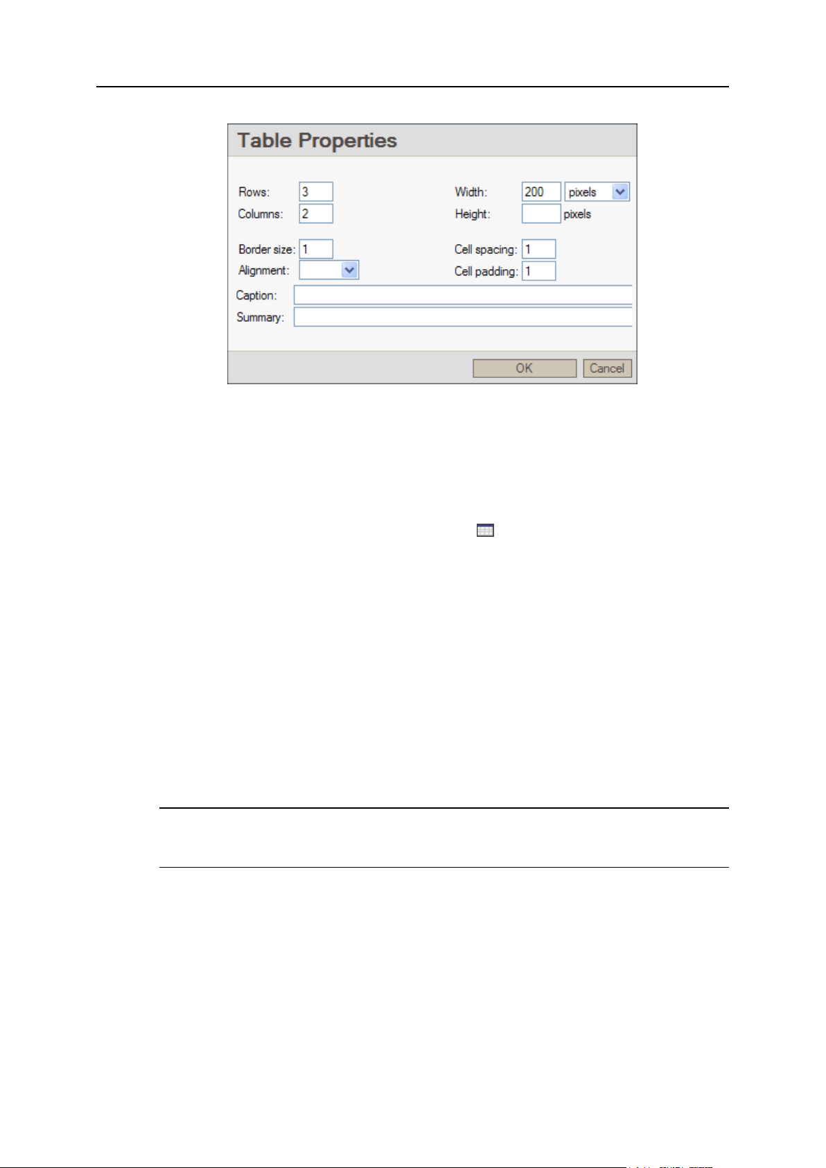
64 Populating Site with Content
Figure 36: Inserting a Table
Editing Table Properties
To edit the table properties:
1 Right-click inside the table and choose Table Properties from the
context menu.
2 In the Table Properties dialog , you can set the following properties:
Width. You can specify the new value in pixels, or as a percent from the original
width.
Height. Specify the new value in pixels.
Cell spacing and Cell padding.
Alignment.
Border size.
Table Caption and Summary.
For detailed information about setting these parameters, refer to section Inserting
Table (on page 63).
Note: You cannot edit the number of rows and columns in this dialog. Learn how to
change the number of rows and columns in section Adding or Removing Rows,
Columns and Cells (on page 65).
3 Click OK.
Alternatively, you can resize the table horizontally or vertically (edit table width, or
height, or both) with your mouse. To do so, click one of the table's resize handles and,
holding down your mouse, drag the border to the location you prefer.
Page 65

Populating Site with Content 65
Figure 37: Resizing a Table with the Mouse Cursor
Adding or Removing Rows, Columns, and Cells
To add a row or a column:
1 Place your mouse cursor in one of the table cells.
2 Right-click on the cell and choose the necessary operation from the
context menu:
To insert a row below the current row (containing a cursor), choose Insert
Row.
To insert a column to the right from the current column, choose Insert Column.
Note: When you add a row or column to the table, the table is not resized to
accommodate them. Instead, other columns and rows present in the table
are resized to fit into the specified table width or height. If you wish to
preserve the original column and row properties, resize the table prior to
adding a new column or row. For information on table resizing, refer to
Editing Table Properties (on page 64).
To insert a cell to the right from the current cell, choose Insert Cell.
The cell is added in the current row, immediately to the right from the highlighted
cell. Other cells in the row are shifted right.
To remove a row, column, or cell:
1 Place your mouse cursor in the cell you wish to delete.
2 Right-click on the highlighted cell. Depending on the operation you
wish to perform, select Delete Rows, Delete Columns, or Delete Cells
from the context menu.
After you delete a column or row, other columns and rows are resized to fill the
space. After you delete a cell, other cells in the row are shifted left.
In some web browsers, the table cell containing a cursor will be marked with quick
operation shortcuts - two small arrows and a circle . You can use these shortcuts to
edit your table in the following way:
To insert a row below the current row, click the downward pointing arrow. When
you hover your mouse over the arrow, the arrow's color is changed to red .
To insert a row above, click the upward pointing arrow .
Page 66

66 Populating Site with Content
To insert a column to the left, click the arrow pointing left .
To insert a column to the right, click the arrow pointing right .
To remove the current column, click the circle between the arrows on the top border
of the highlighted cell .
To remove the current row, click the same circle on the left border of the highlighted
cell .
Page 67

Populating Site with Content 67
Editing Cell Properties
To configure the parameters of a cell:
1 Place your mouse cursor in the desired cell.
2 Right-click on the cell and select Cell Properties from the context
menu.
3 On the Cell Properties tab, you can set the following properties:
Width/Height. Specify the width (in pixels, or percent from the original one) and
height (in pixels) of the selected cell.
Note: A cell is resized together with the row or column containing it.
The content positioning options:
Word Wrap. When word wrap is enabled (the default option), a word which
exceeds the cell width is automatically moved to the next line within the cell.
Vertical Alignment/Horizontal Alignment. Choose one of the provided options for
horizontal (Left, Right, or Center) and vertical alignment (Top, Middle, Bottom, or
Baseline).
By default, the content is left and top aligned.
Color options:
Background Color.
Border Color.
To set the color, click Select, choose the desired color from one of the provided
palettes and click OK.
4 Click OK.
Figure 38: Editing Cell Properties
Page 68

68 Populating Site with Content
Merging Cells
Sometimes, you may need to unify several rows or columns with a single horizontal or
vertical cell containing information common for these cells. To do this, you can either
span one cell across several rows or columns, or merge several cells into one
(horizontally or vertically). The difference between these two options is as follows:
When you merge cells, they are united in a single cell. The content of the cells is
merged as well.
When you span a cell across several rows or columns, the cell is stretched, and
shifts other cells together with their content to the right (when you span a row), or
downwards (when you span a column).
To merge cells:
1 Select the cells you wish to merge.
To select the cells, left-click your mouse on the first cell you wish to merge and,
holding down your mouse, drag it over other required cells. Alternatively, you can
place your mouse cursor in the far right cell to be merged and press SHIFT + <(left arrow) on your keyboard to select other required cells. The selected cells are
highlighted in color.
2 Right-click on the table and choose Merge Cells.
For details on spanning cells, refer to section Spanning Cell across Several Rows or
Columns (on page 68).
Spanning Cell across Several Rows or Columns
Sometimes, you may need to unify several rows or columns by a single horizontal or
vertical cell containing information common for these cells. To do this, you can either
span a cell across several rows or columns, or merge several cells into one
(horizontally or vertically).
The difference between these two options is as follows:
When you merge cells, they are just united in a single cell. The content of the cells
is merged as well.
When you span a cell across several rows or columns, the cell is stretched, and
shifts other cells, together with their content, to the right (when you span a row), or
downwards (when you span a column).
To span a cell across several rows or columns:
1 Place your mouse cursor in the desired cell.
2 Right-click on the table and select Cell Properties from the context
menu.
3 On the Cell Properties tab:
To span a cell across several rows, specify the number of rows in the Rows Span
field.
Page 69

Populating Site with Content 69
To span a cell across several columns, specify the number of columns in the
Columns Span field.
Figure 39: Spanning a Cell across Several Rows or Columns
For details on cells merging, refer to section Merging Cells (on page 67).
Splitting Cell
To split a cell (horizontally):
1 Place your mouse cursor in the cell you wish to split.
2 Right-click on the table and choose Split Cell from the context menu.
Later you can adjust the width of the new cells according to the instructions provided in
section Editing Cell Properties (on page 67).
Adding Content to Table
Tables are often used for building web page layouts. When building your page on the
basis of a table, you:
Have more freedom in positioning elements on a web page
Ensure that organized text is displayed correctly in all browsers and screen
resolutions
Note: If you wish to use tables for organizing your content, set the table Border Width
parameter to 0. For details on setting table parameters, refer to Inserting Table (on page
63).
Plesk Sitebuilder allows you to add all types of content to tables, including text, images,
and block modules.
To insert text in a table:
1 Place your mouse cursor in the desired table cell.
Page 70

70 Populating Site with Content
2 Enter your text.
You can either
Type in your text (see Working with Text (on page 41) for instructions on
performing various formatting and other operations with the text)
or
Paste it from the clipboard by right-clicking on the cell and choosing Paste
from the content menu, or by using the keyboard shortcut (CTRL+V)
The table cell is resized to accommodate the text. If necessary, you can enable or
disable the word wrap function; you can also set the text alignment in the cell. Refer
to Editing Cell Properties (on page 67) for details on both these operations.
To insert an image in a table:
1 Place your mouse cursor in the desired table cell.
2 Insert the image as described in section Inserting Image (see page 55).
The table cell is resized to accommodate the image.
To insert a block module, click on the desired block module in the Modules section of
the Edit page and, keeping down your mouse, drag it to the required table cell. For
information on further modules setup, refer to Working with Modules (on page 70).
Removing Table
To remove a table from the page, right-click it and select Delete Table from the context
menu.
Working with Modules
There are two types of modules you can configure in Plesk Sitebuilder Wizard:
Page modules, or special pages. These modules are added to your site as
separate web pages on the Pages step of the Wizard. There are the following
special pages in Plesk Sitebuilder:
Blog (see page 73)
Image Gallery (see page 80)
eShop (see page 88)
File Download (see page 118)
Flash Intro (see page 119)
Forum (see page 120)
Guestbook (see page 128)
Registration (see page 132)
External Page (see page 138)
Page 71

Populating Site with Content 71
All page modules available in Plesk Sitebuilder are described in section Types of
Pages (on page 31). For instructions on how to include special pages in your site
structure, see section Structuring Your Site (on page 32).
Block modules. These modules do not require dedicated site pages: they are
inserted into ordinary HTML pages, and work as embedded functional blocks.
There are the following block modules in Plesk Sitebuilder:
Area Map (see page 138). Allows you to insert fragments of geographical
maps into site pages. You can choose between two third-party GIS engines:
Google Maps API and Microsoft MapPoint Web Service.
Feedback (see page 143). Allows you to include a feedback form into the
page.
RSS Reader (see page 148). Allows you to automatically load favorite news
and information to you site from RSS news feeds (also called "channels").
Script (see page 150). Allows you to add custom PHP, Perl/CGI, JavaScript,
DHTML or any other code to your web pages.
Voting (see page 152). Allows conducting polls and online surveys.
Online Status Indicator (see page 154). Allows you to place an icon showing
your ICQ or Skype status on your site.
SitePal (see page 155). Allows adding SitePal speaking animated characters
to your site.
Site Map (see page 159). Allows displaying a hierarchical visual model of the
site structure to visitors.
Block modules are added and configured on the Edit step of the Wizard.
General rules for working with block modules are the following:
You can add any number of block modules to a page.
To insert a block module into the page, select the module icon in the Modules area
on the right, click and drag it to the desired location on the page.
To insert a block module in the beginning of the page, double click the module title
in the Modules area.
Block modules cannot be viewed directly on the Edit step. You can only configure
block modules there. To preview block modules as they are displayed on your site,
click Preview.
To delete a block module from the page, click Remove Module on the block
module dialog box.
For details on configuring each particular module, see the corresponding sections
further in this guide.
For information on how to operate with lists of objects appearing on module
management screens, refer to section Working with Lists (on page 14).
Page 72

72 Populating Site with Content
In this section:
Adding Blog ....................................................................................................... 73
Adding Image Gallery ........................................................................................ 80
Adding Online Store .......................................................................................... 88
Providing Content for Download ........................................................................ 118
Adding Flash Intro ............................................................................................. 119
Adding Forum .................................................................................................... 120
Adding Guestbook ............................................................................................. 128
Providing Registration to Your Site Visitors ....................................................... 132
Incorporating Link to External Page into Your Site Menu ................................... 138
Adding Maps ..................................................................................................... 138
Adding Feedback Form ..................................................................................... 143
Adding RSS News Feeds .................................................................................. 148
Inserting Scripts into Your Web Pages .............................................................. 150
Conducting Polls and Online Surveys................................................................ 152
Adding Online Status Indicator .......................................................................... 154
Adding SitePal Animated Character .................................................................. 155
Adding Site Map ................................................................................................ 159
Page 73

Populating Site with Content 73
Adding Blog
In this section:
Managing Posts in Your Blog ............................................................................ 74
Managing Comments to Blog Posts .................................................................. 76
Managing Categories of Blog Posts .................................................................. 77
Setting Up Blog Appearance ............................................................................. 79
A blog is a publicly accessible personal diary or journal consisting of messages (posts)
and visitors' comments. You can add a blog to your site and post your messages there.
The visitors of your site can read your blog posts and leave their comments. If you
have lots of posts in you blog, you can subdivide them into categories for convenience.
To add a blog to your site:
1 Go to the Pages step.
2 Select Blog in the Special pages box.
3 Click .
You can add several blogs to your site.
To proceed to setting up your blog:
1 Go to the Edit step.
2 Select Blog in the Site map area.
Figure 40: Blog Editor
Page 74

74 Populating Site with Content
Managing Posts in Your Blog
After you add a blog to your site, the next step is to fill it in with posts. The procedures
of adding and managing your blog posts are described in the current section.
By default, the module contains two default blog posts, which you can remove (see
page 75) or edit as desired (see page 75).
Posting to Your Blog
To add a blog post:
1 On the Blog page, go to the Content tab.
2 Click Add New Post.
3 Enter a post subject in the Subject field.
4 Enter the post text in the Content field.
If you wish to hide a part of your post under a cut, input it below the %placeToCut
tag.
5 If you want to add an image to the post, click the Insert/Edit Image
icon, navigate to the image file, click Send it to the Server and then click
OK.
Optionally, in the Alternative Text field, and type the text to be displayed when a user
hovers the cursor over the image.
6 Click OK.
By default, the blog contains two default categories. After you add some new categories
(see page 77), or edit the existing ones (see page 78), you can refer the created post to
the desired category, or to several categories.
Page 75

Populating Site with Content 75
Figure 41: Posting to Your Blog
Editing Post
To edit an existing blog post:
1 On the Blog page, go to the Content tab.
2 Click the Edit icon beside the post you want to edit.
3 Edit the post as desired.
4 Click OK.
Removing Post
To remove a post from the blog:
1 On the Blog page, go to the Content tab.
2 Select the post you want to remove.
3 Click Remove Selected.
Page 76

76 Populating Site with Content
Managing Comments to Blog Posts
All your posted entries can be commented by your site visitors. You can edit and
manage these comments, and add your own ones. The procedures of adding and
managing your blog comments are described in the current section.
Note: To prevent automated computer generated spam comments, anonymous users
will be required to enter a confirmation code to be able to comment on your blog.
Adding Comment
To add a comment:
1 On the Blog page, go to the Content tab.
2 Click View/Edit Comments beside the corresponding post.
3 Click Add New Comment.
4 Enter a comment subject in the Subject field.
5 Enter your name in the Posted by field.
6 Enter the text of the comment in the Content field.
7 Click OK.
To return to the list of posts, click Back to Posts.
Figure 42: Adding a Comment to a Blog Post
Editing Comment
As a blog owner, you can edit both your own and your blog visitors' comments.
Page 77

Populating Site with Content 77
To edit a comment:
1 On the Blog page, go to the Content tab.
2 Click View/Edit Comments beside the corresponding post.
3 Click the Edit icon beside the comment you want to edit.
4 Edit the comment as desired.
5 Click OK.
To return to the list of posts, click Back to Posts.
Removing Comment
To remove a comment:
1 On the Blog page, go to the Content tab.
2 Click View/Edit Comments beside the corresponding post.
3 Select the comment you want to remove.
4 Click Remove Selected.
To return to the list of posts, click Back to Posts.
Managing Categories of Blog Posts
After you add some messages to your blog, you can group them by the discussed
subject. In Plesk Sitebuilder, these subjects are referred to as categories. See the
following sections to learn how to create and manage categories.
Sitebuilder offers two default blog post categories, which you can remove (see page 79)
or edit as desired (see page 78).
Adding Category
To add a category:
1 On the Blog page, click the Categories tab.
2 Click Add New Category.
3 On the Main Properties tab, enter a name for the new category in the
Name field.
4 If you want to provide a short description for the category, enter it on
the Description tab.
5 Click OK.
Page 78

78 Populating Site with Content
Figure 43: Adding a Category for Blog Posts
Editing Category
To edit a category:
1 On the Blog page, click the Categories tab.
2 Click the Edit icon beside the category you want to edit.
3 Edit the category properties as desired.
4 Click OK.
Page 79

Populating Site with Content 79
Changing Order of Categories
You can change the order of categories as they appear in your blog by moving
particular categories up and down in the list.
To move a category up or down in the list:
1 On the Blog page, click the Categories tab.
2 Click an upward or a downward arrow against the category
name.
One click on the icon moves the category one position up or down respectively.
For categories which have reached the topmost or the bottom position of the list,
the upward or downward arrows are not displayed, correspondingly.
Removing Category
To remove a category:
1 On the Blog page, click the Categories tab.
2 Select a category you want to remove.
3 Click Remove Selected.
Note: After a category is removed, all posts which have been assigned to it remain
in the blog.
Setting Up Blog Appearance
To set up the appearance of your blog:
1 On the Blog page, click the Settings tab.
2 Enter the maximum number of posts on one blog page in the Posts per
page field.
3 Enter the maximum number of comments to be displayed on one post
page in the Comments per page field.
To preview your blog page appearance, click Preview at the bottom of the Plesk
Sitebuilder window and go to the blog page of your web site.
Figure 44: Setting Up Blog Appearance
Page 80

80 Populating Site with Content
Adding Image Gallery
In this section:
Managing Images .............................................................................................. 81
Managing Categories of Images ........................................................................ 85
Setting Up Image Gallery Appearance .............................................................. 87
The Image Gallery module allows you to place an image gallery or a series of photo
albums on your site in an easy and comfortable way. You can upload images, describe
and categorize them, set the order of images, etc.
To add an image gallery to your site:
1 Go to the Pages step.
2 Select Image Gallery in the Special pages box.
3 Click .
You can add several image galleries to your site.
To proceed to setting up your image gallery:
1 Go to the Edit step.
2 Select Image Gallery in the Site map.
Figure 45: Image Gallery Editor
Page 81

Populating Site with Content 81
Managing Images
After you add an image gallery to your site, the next step is to fill it in with images. The
procedures of managing images are described in the current section.
Uploading Images
Plesk Sitebuilder Image Gallery supports images in *.jpg, *.gif, and *.png formats. To
ensure correct operation of the module, we do not recommend uploading images of
more than 3 MB in size.
To upload several images:
1 On the Image Gallery page, click Image Upload on the Images tab.
2 Locate the images you wish to upload in the provided Image file fields.
To locate an image, click the corresponding Browse button, navigate to the image
file in your file system, and click Open.
3 Provide titles for the images in the corresponding Name fields.
By default, images are saved under the same names under which they are stored
on your computer. If you wish to save them under different names, clear the check
box Use the file name as default image name and specify the names you prefer.
4 To set the size of images as they appear in your gallery, select one of
the options from the Resize images box.
The available options are:
1152x864
1024x768
800x600
640x480
480x360
360x270
Do not resize
By default the 1024x768 image resize option is used.
5 Click OK.
You can view the list of images on the Images tab.
By default, the gallery contains two default categories. After you add some new categories
(see page 85), or edit the existing ones (see page 86), you can refer the image to a
desired category, or to several categories.
Page 82

82 Populating Site with Content
Figure 46: Uploading Images
Plesk Sitebuilder provides a possibility of batch image upload, allowing to publish many
images at once. You can upload the images from your local file system, and perform a
group resize operation on them. The maximum size of the batch is determined by the
disk space on the publishing server and by the parameters of the network.
To upload multiple images:
1 Arrange the images you want to upload in one folder on your
computer.
2 On the Image Gallery page, click Multiple Image Upload on the Images
tab.
3 In the left frame of the Multiple Image Upload window, navigate to the
required folder in your file system.
4 Select the images you want to upload in the work area of the screen.
When selecting images, follow these guidelines:
To select or deselect an image, click it.
To select all images in the folder, click Select All.
To deselect all images, click Deselect All.
5 From the Upload to category list, select a category to refer images to:
If you have already created a category for your images, select the required
category from the list.
If you want to create a new category for the images, select Create new category
and type the category name in the field that appears.
If you do not want to refer images to any category, select No category.
6 From the Resize images list, select the desired resizing option.
The available options are:
1024x768 px
Page 83

Populating Site with Content 83
800x600 px
640x480 px
Do not resize.
7 Click Upload.
8 After the upload is complete, click OK on the progress bar and on the
screen.
Figure 47: Uploading Multiple Images
You have an option of adding professional images from a worldwide stock images
marketplace, Fotolia (http://www.fotolia.com/parallels/), to your gallery. Click Buy
Pictures to proceed to the Fotolia web site, where you can browse the Fotolia gallery
and buy images. As a Parallels customer, you have a 20% bonus when purchasing
Fotolia images.
Previewing Images
To preview an image:
1 On the Image Gallery page, go to the Images tab.
2 Click the Preview icon against the image you want to preview.
The image opens in a new window.
Page 84

84 Populating Site with Content
Editing Image Properties
To edit an image:
1 On the Image Gallery page, go to the Images tab.
2 Click the Edit icon against the image you want to edit.
3 Configure the image parameters as desired.
4 Click OK.
Removing Images
To remove an image:
1 On the Image Gallery page, go to the Images tab.
2 Select the image you want to remove.
3 Click Remove Selected.
Page 85

Populating Site with Content 85
Managing Categories of Images
You can organize your images in photo albums, by arranging them in categories. One
image may belong to one or several categories at the same time. Splitting images into
categories is especially convenient when you have a large number of images. See the
following sections to learn how to create and manage categories.
Plesk Sitebuilder offers two default categories, which you can remove (see page 87) or
edit as desired (see page 86).
Adding Category
To add a category:
1 On the Image Gallery page, click the Categories tab.
2 Click Add New Category.
3 On the Main Properties tab, enter a name for the new category in the
Name field.
4 If you want to upload an image to be displayed beside the category
name, click Browse, select an image file on your computer and click
Open, then click Upload.
The maximum image size is 100x100 px; larger or smaller images will be resized
accordingly.
The uploaded image is displayed in the Current image area.
5 If you want to provide a short description for the category, enter it on
the Description tab.
Site visitors see this description beside the category name.
6 Click OK.
Figure 48: Adding a Category for Images
Page 86

86 Populating Site with Content
Editing Category
To edit a category:
1 On the Image Gallery page, click the Categories tab.
2 Click the Edit icon beside the category you want to edit.
3 Configure the category parameters as desired.
4 Click OK.
Page 87

Populating Site with Content 87
Changing Order of Categories
You can change the order in which categories appear in your gallery by moving
particular categories up and down the list.
To move a category up or down in the list:
1 On the Image Gallery page, click the Categories tab.
2 Click an upward or a downward arrow against the category
name.
One click on the icon moves the category one position up or down respectively.
For categories which have reached the topmost or the bottom position of the list,
the upward or downward arrows are not displayed, correspondingly.
Removing Category
To remove a category:
1 On the Image Gallery page, click the Categories tab.
2 Select the category you want to remove.
3 Click Remove Selected.
Note: After a category is removed, all images which have been assigned to it
remain in the gallery.
Setting Up Image Gallery Appearance
To set up image gallery appearance:
1 On the Image Gallery page, click the Settings tab.
2 Configure the following settings:
Category image width (px) - the width of the category image. When you set smaller
width than the original one, the picture height is resized accordingly to keep the
width-height ratio. You cannot set larger image width than the original one.
Image thumb width (px) - the width of the image thumbnail.
Image thumb height (px) - the height of the image thumbnail.
Preview width (px) - the width of the image preview (opened by clicking on the
image thumbnail). When you set smaller width than the original one, the picture
height is resized accordingly to keep the width-height ratio. You cannot set
larger image width than the original one.
Images per page - the number of images to be displayed per page.
To preview your image gallery, click Preview at the bottom of the Plesk Sitebuilder
window and go to the image gallery page of your web site.
Page 88

88 Populating Site with Content
Figure 49: Setting Up Image Gallery Appearance
Adding Online Store
In Plesk Sitebuilder you can set up your own online store by adding the eShop module
into your site.
You, as the online store owner, can offer your customers a feature-rich product catalog,
accept online payments from buyers, and manage orders submitted by them. You can
integrate your e-commerce resource with various payment gateways, so that
customers can pay for their purchases using their credit cards.
To add an online store to your site:
1 Go to the Pages step.
2 Select eShop in the Special pages box.
3 Click .
You can set up several online stores on your site by adding as many eShop page
modules to your site structure as necessary. Currency, payment settings, lists of
categories and products you create in different eShop modules are independent of
each other.
To proceed to setting up your online store:
1 Go to the Edit step.
2 Click eShop in the Site map area.
Page 89

Populating Site with Content 89
Figure 50: Online Store Editor
In this section:
Managing Products ........................................................................................... 89
Arranging Products in Categories ...................................................................... 95
Setting Up Catalog Appearance ........................................................................ 98
Configuring Payment Settings for Your Online Store ......................................... 99
Specifying Terms of Service for Your Customers .............................................. 105
Previewing Your Catalog ................................................................................... 106
Setting Up Customer Order Notification ............................................................. 110
Making Your Catalog Searchable by Google ..................................................... 111
Supplying Your Product Catalog as RSS Feed .................................................. 115
Managing Customers' Orders ............................................................................ 117
In this section:
Adding Product to Catalog ................................................................................. 90
Editing Product Properties ................................................................................. 94
Removing Product ............................................................................................. 94
Managing Products
After you add the eShop module to your site, the next step is to populate it with
products. The procedures of adding and managing products are described in the
current section.
Page 90

90 Populating Site with Content
Adding Product to Catalog
On the Products tab you will find two default products, which you can edit as desired (see
page 94), or remove (see page 94) from your catalog.
To add a new product:
1 On the eShop page, go to the Products tab.
2 Click Add New Product.
3 Enter the name under which the product is displayed in the catalog in
the Name field.
4 Enter the product price in the Price field (it will be displayed to site
visitors in the currency and format you select on the Payment Systems
tab).
5 If you want to control the flow of goods as you ship them to customers
and refill the stock, enter the quantity of this product on stock in the
Stock level field.
(By default, stock level tracking is enabled in your eShop. If you do not wish to use
this feature, you can disable it in your online store settings (eShop > Settings tab >
Enable stock level tracking check box). Product stock quantity remains visible on the
Products tab of your online store settings, but the quantity is not recalculated after
you change the order status.)
The stock level calculation is performed according to the following rules:
When your customer buys a certain quantity of products in your online store, the
fact of the purchase does not affect the product quantity record. Only after you,
as the online store owner, manually change the customer's order status to
Processed or Completed, the quantity of items in the order is subtracted from the
stock quantity record.
If later you change either of these two statuses to any other order statuses in
Plesk Sitebuilder (Backorder, Failed, Cancelled, etc.), the order quantity is added
back to the quantity record.
Stock level is not shown to your online store customers: it is intended for your
internal use only, so even if the quantity of the product turns to "0" (zero), your
customers will still be able to buy the product in any quantity they choose.
6 If you do not wish to sell the product, just to display information about
it, select the Advertise only check box.
Your e-shop buyers won't be able to add this product to their carts.
7 If you want to upload an image of the product, click Browse, navigate
to the image file and click Upload.
You can open the full-size preview of this image by clicking on it. Later you can
view this image by clicking the corresponding icon on the Products tab.
In your online store catalog, the image is shown as a thumbnail on the following
pages:
Beside the product name and description on the catalog page
Page 91
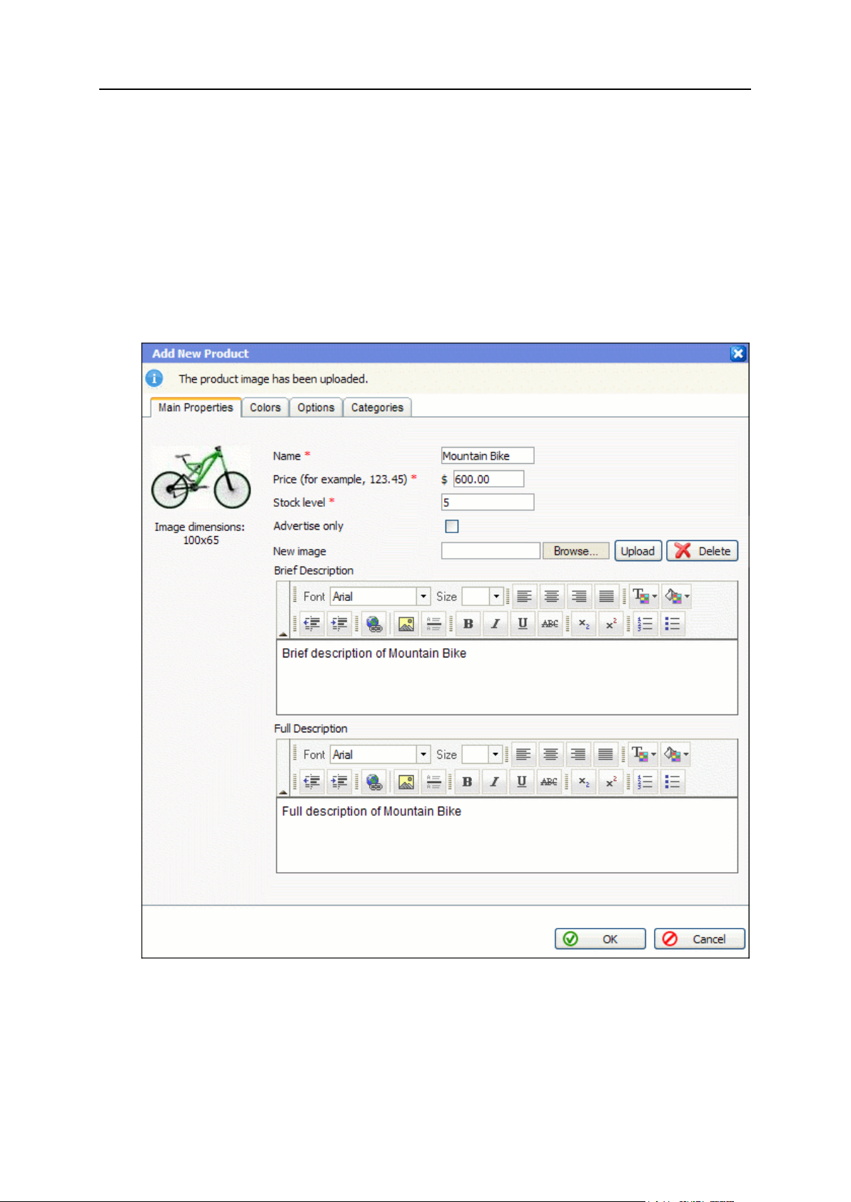
Populating Site with Content 91
On the product page
The full-size image is opened upon clicking the thumbnail.
8 If you want to add a short description of the product, enter it in the
Brief description text box.
The brief product description is displayed on the main catalog page, or on the page
of the category the product belongs to.
9 If you want to accompany your product with a detailed description,
enter it in the Full description text box.
The full product description is displayed on the product details page.
Figure 51: Adding a Product to Catalog
10 If you wish to specify several color options for the product, go to the
Colors tab and click Add New Color.
In the Color name field, specify a name that will be easy for you to associate with
this color.
Page 92

92 Populating Site with Content
Click the icon and choose a desired color from the palette. The color HEX
code automatically appears in the Color value field.
If you wish to upload a separate image illustrating the specified color
modification of the product, click Browse, navigate to the image file and click
Upload. The thumbnail is shown on the product page after a visitor clicks on the
corresponding color icon.
Note: If later you wish to remove the color modification image, click the Reset to
default image shortcut for the corresponding color on the Colors tab. In the
catalog, the main product image (the one from the Main Properties tab) is
shown for this color modification.
To set the order in which color options are displayed, use the upward and
downward arrows.
To remove a color option, click against the corresponding option.
Available color options are shown both on the main catalog page and on the
product page.
11 If you wish to specify other product options (such as size,
manufacturer, etc.), go to the Options tab, select the option type from
the drop-down list (Apparel size, Shoe size (US, UK, EU), or Custom option),
and click Add New Option.
Figure 52: Adding Color Options for a Product
Page 93

Populating Site with Content 93
For regular product options (Apparel size, Shoe size (US, UK, EU), Plesk Sitebuilder
suggests default size values.
Note: In the Name in RSS feed field, Plesk Sitebuilder automatically inputs a
Google Base RSS 2.0 attribute. This attribute may be useful if later you wish
to upload your catalog to the Google Base service (see page 111), to ensure your
products rank higher in main Google searches.
If you wish to provide your product catalog as an RSS feed (see page 115), you can
input any XML tag which is understandable by the RSS reader used by the
party you supply the feed to.
For custom options, specify a name for the option in the Name in catalog field and
enter modifications in the Values field (separated by comma or semicolon). If
necessary, specify a Google Base attribute (see Appendix (on page 170)), or any
XML tag in the Name in RSS field.
To set the order in which options are displayed, use the upward and
downward arrows.
To remove an option, click against the corresponding option.
Figure 53: Adding Product Options
12 If you wish to refer a product to a category (or categories), go to the
Categories tab and select the appropriate categories.
By default, the module contains two default categories. After you add some categories
(see page 95) of your own, or edit the existing ones (see page 97), you can refer the
created product to a desired category, or to several categories.
Page 94

94 Populating Site with Content
13 Click OK.
Editing Product Properties
To edit the properties of a product:
1 On the eShop page, go to the Products tab.
2 Click the Edit icon for the product you want to edit.
3 Edit the product properties as described in Adding Product to Catalog (on
page 90).
4 Click OK.
Removing Product
To remove a product from your online store:
1 On the eShop page, go to the Products tab.
2 Select the product you want to remove.
3 Click Remove Selected.
Page 95

Populating Site with Content 95
Arranging Products in Categories
After you add a number of products to your e-shop, you may need to arrange them in
categories, so that your customers could easily navigate in your catalog. On the
Categories tab you will find two default categories, which you can edit as desired (see
page 97), or remove from your catalog (see page 98).
For each product in your online store catalog, the following details are displayed to your
site visitors:
Category name. By clicking it a visitor proceeds to the category page.
The number of products contained in the category, in brackets beside the category
name.
Category image, if uploaded.
Category description.
By clicking the category name, your site visitor gets to the category page on which the
following information is shown:
Category description.
A list of products contained in the category.
A customer can navigate back to the catalog by clicking the Back to catalog shortcut.
Read the current section to know how you can configure all these parameters for a
category.
Adding Category to Catalog
On the Categories tab you will find two default categories, which you can edit as desired,
or remove from your catalog.
To add a product category:
1 On the eShop page, click the Categories tab.
2 Click Add New Category.
3 Enter a name of the new category in the Name field.
4 If you want to make this category a subcategory of an earlier created
category, select one from the Parent category list.
You can create as many levels of categories hierarchy as you wish.
Page 96

96 Populating Site with Content
Figure 54: Creating a Subcategory
5 If you want to add an image that will be displayed beside the category
name in the catalog, click Browse, locate an image file and click Upload.
Note: Later you can preview this image on the Categories tab by clicking the
icon for the product in the P (preview) column. For categories for which no image
has been uploaded, this icon is not displayed.
6 If you want to provide a short description for the category, enter it in
the Category description text box.
7 Click OK.
Newly created categories appear in your eShop catalog in the order of their creation.
For details about changing the order of categories in the catalog, see Changing Order of
Categories (on page 98).
Page 97

Populating Site with Content 97
Figure 55: Creating a Category for Products
Editing Category
To edit an existing category
1 On the eShop page, click the Categories tab.
2 Click the Edit icon for the category you wish to edit.
3 Edit the category properties as desired.
4 Click OK.
Page 98

98 Populating Site with Content
Changing Order of Categories
You can change the order in which categories appear in your catalog by moving
particular categories up and down in the list.
To move a category up or down in the list:
1 On the eShop page, click the Categories tab.
2 Click an upward or a downward arrow against the category
name.
One click on the icon moves the category one position up or down respectively.
For categories occupying the topmost or the bottom position of the list, the upward
or downward arrows are not displayed, correspondingly.
Removing Category
To remove a category:
1 On the eShop page, click the Categories tab.
2 Select a category you want to remove.
3 Click Remove Selected.
Note: When a category is removed, the products belonging to this category remain in
the catalog. These products are displayed in the uncategorized list, unless they have
been assigned to other categories.
Setting Up Catalog Appearance
The main page of your eShop displays the first page of the product catalog. To preview
your catalog appearance, click Preview at the bottom of the Plesk Sitebuilder Wizard
window and go to the online store page of your web site.
The catalog page is divided into two sections:
The product categories section
The uncategorized products list (products are shown one below another, in the
order of their creation).
To configure the appearance of your product catalog:
1 On the eShop page, go to the Settings tab.
2 To customize the number of columns displayed in the categories list,
select the desired value (from 1 to 5) from the field Number of columns in
the categories list.
By default, categories are shown in two columns. To show categories one below
another, like items in the uncategorized product section, set the number of columns
to "1".
Page 99

Populating Site with Content 99
3 To define the number of products to be displayed on one page, select
In this section:
Setting Currency and Price Format ....................................................................100
Configuring Payment Methods ...........................................................................101
Adding Shipping Costs .......................................................................................104
a desired value (from 5 to 55) from the Number of products per page list.
These settings apply to all product lists - to the list of uncategorized products shown
on the front page of your online store, and to the list of products contained in each
category. By default, 10 products per page are shown. You can set the number of
products per page to 5, 15, 20, 25 and so on, up to 55.
4 To customize the order of sections on the catalog page, select either
of the two options:
Show categories first (selected by default)
OR
Show uncategorized products first
5 If you wish to change the order of categories in your catalog, go the
Categories tab and set the desired order using the upward or
downward arrows.
Figure 56: Setting Up Catalog Appearance
Configuring Payment Settings for Your Online Store
You can configure the following payment settings for your online store:
Currency and price format
Payment systems and shipping methods
Page 100

100 Populating Site with Content
Setting Currency and Price Format
To set currency and price format for your store:
1 On the eShop page, go to the Payment Systems tab.
By default, the currency and price format of your online store are the same as for
the whole site (set on the Pages step, in the Site regional and language options area).
2 If you wish to change the currency and price format, click Change
Currency Settings.
3 Select a desired currency from the Currency list.
Note: When selecting currency, make sure it is supported by all payment gateways
you wish to integrate with your online store.
4 If the currency symbol should go before the numeric value, enter it
into the Symbol on the left field.
5 If the currency symbol should go after the numeric value, enter it into
the Symbol on the right field.
6 Enter the decimal point (period or comma) to be used with prices into
the Decimal point field.
 Loading...