

Page 1
vFoglight™ 5.2.4
Web Component Tutorial
Page 2

© 2008 Quest Software, Inc. ALL RIGHTS RESERVED.
This guide contains proprietary information protected by copyright. The software described in this guide is furnished
under a software license or nondisclosure agreement. This software may be used or copied only in accordance with
the terms of the applicable agreement. No part of this guide may be reproduced or transmitted in any form or by any
means, electronic or mechanical, including photocopying and recording for any purpose other than the purchaser's
personal use without the written permission of Quest Software, Inc.
If you have any questions regarding your potential use of this material, contact:
Quest Software World Headquarters
LEGAL Dept
5 Polaris Way
Aliso Viejo, CA 92656
www.quest.com
email: legal@quest.com
Refer to our Web site for regional and international office information.
Trademarks
Quest, Quest Software, the Quest Software logo, Aelita, Akonix, Akonix L7 Enterprise, Akonix L7 Enforcer,
AppAssure, Benchmark Factory, Big Brother, DataFactory, DeployDirector, ERDisk, Foglight, Funnel Web, I/Watch,
Imceda, InLook, IntelliProfile, InTrust, Invertus, IT Dad, I/Watch, JClass, Jint, JProbe, LeccoTech, LiteSpeed,
LiveReorg, MessageStats, NBSpool, NetBase, Npulse, NetPro, PassGo, PerformaSure, Quest Central, SharePlex,
Sitraka, SmartAlarm, Spotlight, SQL LiteSpeed, SQL Navigator, SQL Watch, SQLab, Stat, StealthCollect, Tag and
Follow, Toad, T.O.A.D., Toad World, vANALYZER, vAUTOMATOR, vCONTROL, vCONVERTER, vEssentials,
vFOGLIGHT, vOPTIMIZER, vRanger Pro, vReplicator, Vintela, Virtual DBA, VizionCore, Xaffire, and XRT are
trademarks and registered trademarks of Quest Software, Inc in the United States of America and other countries.
Other trademarks and registered trademarks used in this guide are property of their respective owners.
Disclaimer
The information in this document is provided in connection with Quest products. No license, express or implied, by
estoppel or otherwise, to any intellectual property right is granted by this document or in connection with the sale of
Quest products. EXCEPT AS SET FORTH IN QUEST'S TERMS AND CONDITIONS AS SPECIFIED IN THE
LICENSE AGREEMENT FOR THIS PRODUCT, QUEST ASSUMES NO LIABILITY WHATSOEVER AND
DISCLAIMS ANY EXPRESS, IMPLIED OR STATUTORY WARRANTY RELATING TO ITS PRODUCTS
INCLUDING, BUT NOT LIMITED TO, THE IMPLIED WARRANTY OF MERCHANTABILITY, FITNESS FOR A
PARTICULAR PURPOSE, OR NON-INFRINGEMENT. IN NO EVENT SHALL QUEST BE LIABLE FOR ANY
DIRECT, INDIRECT, CONSEQUENTIAL, PUNITIVE, SPECIAL OR INCIDENTAL DAMAGES (INCLUDING,
WITHOUT LIMITATION, DAMAGES FOR LOSS OF PROFITS, BUSINESS INTERRUPTION OR LOSS OF
INFORMATION) ARISING OUT OF THE USE OR INABILITY TO USE THIS DOCUMENT, EVEN IF QUEST HAS
BEEN ADVISED OF THE POSSIBILITY OF SUCH DAMAGES. Quest makes no representations or warranties with
respect to the accuracy or completeness of the contents of this document and reserves the right to make changes
to specifications and product descriptions at any time without notice. Quest does not make any commitment to
update the information contained in this document.
License Credits and Third Party Information
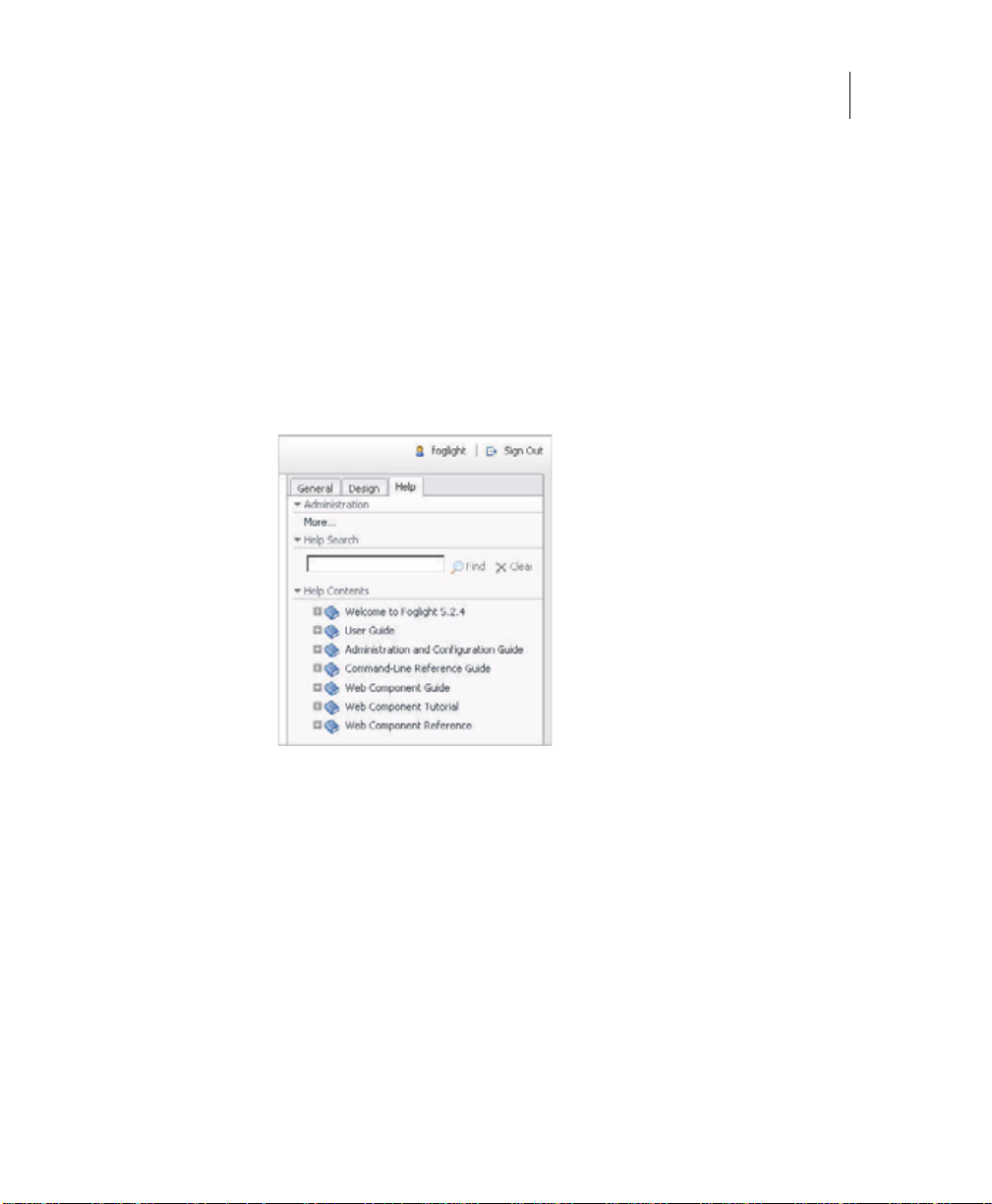
To view license credit information, click the License Credits link on the Welcome to vFoglight online help page.
Web Component Tutorial
March 2009
Version 5.2.4
Page 3

Table of Contents
Introduction to this Guide...................................................................................................................................7
About vFoglight ................................................................................................................................................................ 8
About this Guide............................................................................................................................................................... 8
vFoglight Documentation Suite ........................................................................................................................................ 9
Core Documentation Set......................................................................................................................................... 9
Cartridge Documentation Sets .............................................................................................................................. 10
Feedback on the Documentation........................................................................................................................... 10
Text Conventions........................................................................................................................................................... 11
About Vizioncore Inc. ..................................................................................................................................................... 11
Contacting Dell............................................................................................................................................................... 14
Using the Web Component Tutorial.................................................................................................................27
Introduction..................................................................................................................................................................... 28
vFoglight Browser Interface Views........................................................................................................................ 28
Why Configure the Default Views?........................................................................................................................ 29
What is the Web Component Framework?............................................................................................................ 30
How to Use this Tutorial................................................................................................................................................. 33
Printing the Tutorial........................................................................................................................................................ 33
Getting More Help.......................................................................................................................................................... 33
Tutorial 1: Creating a Dashboard .....................................................................................................................35
Before You Start............................................................................................................................................................. 36
Anatomy of a Typical Dashboard .......................................................................................................................... 36
UI Walkthrough...................................................................................................................................................... 37
Configuring a Query....................................................................................................................................................... 37
Configuring a Row-Oriented Table................................................................................................................................. 40
Building the Dashboard.................................................................................................................................................. 44
Page 4

4 vFoglight
Web Component Tutorial
Summary........................................................................................................................................................................47
Additional Activities.......... ....... ...... ....... ............................................................................ ......................................47
Saving the Tutorial1 Module..................................................................................................................................48
Tutorial 2: Adding a Drilldown Page................................................................................................................ 49
Objectives of Tutorial 2...................................................................................................................................................50
Adding an Alarm Icon to the Table .................................................................................................................................50
Adding a Dependent Page..............................................................................................................................................52
Overview................................................................................................................................................................52
Adding a Context-Sensitive Dependent Page for the Table of Hosts....................................................................52
Summary........................................................................................................................................................................57
Additional Activities.......... ....... ...... ....... ............................................................................ ......................................57
Tutorial 3: Adding Views .................................................................................................................................. 59
Objectives of Tutorial 3...................................................................................................................................................60
Designing the Page ........................................................................................................................................................61
Defining the Alarms Query..............................................................................................................................................61
Configuring a Table of Alarms........................................................................................................................................64
Configuring a Key-Value Listing Component..................................................................................................................68
Configuring a Chart Component.....................................................................................................................................71
Configuring a Label with an Action.................................................................................................................................73
Configuring the Drilldown Page......................................................................................................................................75
Configuring a Drop-Down List.........................................................................................................................................78
Flowing Monitored Hosts to Host Details T3...................................................................................................................80
Adding a Customizer ........................................................................................................... ...........................................81
Summary........................................................................................................................................................................82
Additional Activities.......... ....... ...... ....... ............................................................................ ......................................82
Tutorial 4: Using a Grid..................................................................................................................................... 83
Before Building the Dashboard:......................................................................................................................................84
Using a List as a Chooser...............................................................................................................................................86
Choosing the Views........................................................................................................................................................86
Building the Dashboard ..................................................................................................................................................86
Summary........................................................................................................................................................................93
Additional Activities.......... ....... ...... ....... ............................................................................ ......................................94
Page 5

Table of Contents 5
Tutorial 5: Reports.............................................................................................................................................95
Objectives of Tutorial 5 ...................................................................................................................................................96
Designing the Page.........................................................................................................................................................96
Configuring a Query........................................................................................................................................................97
Creating a Basic Report Page.........................................................................................................................................98
Creating a More Elaborate Hosts Table........................................................................................................................102
Adding a Header...........................................................................................................................................................106
Adding a Footer.............................................................................................................................................................109
Adding an Iterator for a Multi-Page Report ...................................................................................................................111
Choosing the Iterated View..................................................................................................................................113
Summary.......................................................................................................................................................................114
Additional Activities ..............................................................................................................................................114
Tutorial 6: Creating a Form.............................................................................................................................119
Objectives of Tutorial 6 .................................................................................................................................................120
Configuring the Query...................................................................................................................................................120
Overview.......................................................................................................................................................................121
Components in the Application.............................................................................................................................121
Order of Construction...........................................................................................................................................122
Notes on the Context Flow...................................................................................................................................122
Creating the Tasks and Forms......................................................................................................................................123
Create the groovy Tasks......................................................................................................................................123
Configure the Views.............................................................................................................................................128
Testing the Application..................................................................................................................................................137
Summary.......................................................................................................................................................................137
Additional Activities ..............................................................................................................................................137
Index..................................................................................................................................................................139
Page 6

6 vFoglight
Web Component Tutorial
Page 7

Introduction to this Guide
This chapter provides information about what is contained in the vFoglight Web
Component Tutorial. It also provides information about the vFoglight documentation
suite and Vizioncore.
This chapter contains the following sections:
About vFoglight..............................................................................................................................8
About this Guide............................................................................................................................8
vFoglight Documentation Suite......................................................................................................9
Text Conventions.........................................................................................................................11
About Vizioncore Inc....................................................................................................................11
Page 8

8 vFoglight
Web Component Tutorial
About vFoglight
vFoglight helps IT organizations understand the virtual infrastructure by managing the
relationships and interaction between all the components in the environment, includ ing
data centers, data stores, clusters, resource pools, hosts and virtual machines. With
vFoglight, administrators can quickly determine the root-cause of an incident or
problem, track virtual machine (VM) movements and understand their impact, and
identify contention for resources between virtual machines.
About this Guide
vFoglight is an application and services management solution that allows you to
monitor your distributed system. It has three levels of usability:
• Default settings for views and rules that are suitable for most situations
• Easily configurable views that allow you to modify or add pages to suit your
preferences
• Access to the Web Component library, where you can build your own pages to
organize the collected data the way you want to see it
You need to use vFoglight’s Web Component library to bui ld your own custom user
interface views. The task has been simplified by providing you with a visual dashboard
configuration tool, but it presumes a degree of familiarity with the framework. This
tutorial can be used as the first step in learning how to construct new pages using the
view components in vFoglight.
This guide is intended for any user who wants to custom build vFoglight views for use
in the browser interface.
The Web Component Tutorial is organized as follows:
Chapter 1, Using the Web Component Tutorial—An overview on usin g the tutorials
Chapter 2, Creating a Dashboard—The essentials of creating a basic dashboard
Chapter 3, Adding a Drilldown Page—Using flows to access a dependent page
Chapter 4, Adding Views—An introduction to some useful components
Chapter 5, Using a Grid—Further work on the Grid component
Chapter 6, Reports—Configuring and scheduling custom reports
Page 9
Chapter 7, Creating a Form—Using submit actions
vFoglight Documentation Suite
The vFoglight documentation suite is made up of the core documentation set, plus the
documentation set for each vFoglight cartridge that you deploy. Documentation is
provided in a combination of online help, PDF and HTML.
•
Online Help: You can open the online help by selecting the Help tab from
vFoglight’s action panel.
Introduction to this Guide 9
vFoglight Documentation Suite
PDF: The Getting Started Guide, What’s New Guide, System Requirements and
•
Platform Support Guide, Installation and Setup Guide set, Administration and
Configuration Guide, vFoglight User Guide, Command-Line Reference Guide,
Web Component Guide, and Web Component Tutorial, are provided as PDF files.
The PDF guides are included in the zip file downloaded from Vizioncore.
Adobe® Reader® is required.
•
HTML: Release Notes are provided in HTML.
Core Documentation Set
The core documentation set consists of the following files:
• Release Notes (HTML)
• Getting Started Guide (PDF)
Page 10

10 vFoglight
Web Component Tutorial
• What’s New Guide (PDF )
• System Requirements and Platform Support Guide (PDF)
• Installation and Setup Guide set (all in PDF format):
• Administration and Configuration Guide (PDF and online help)
• vFoglight User Guide (PDF and online help)
• Advanced Configuration Guide set
• Installation and Setup Guide—Installing on Windows with an Embedded
MySQL Database
• Installation and Setup Guide—Installing on Windows with an External
MySQL Database
• Installation and Setup Guide—Installing on Windows with an External Oracle
Database
• Command-Line Reference Guide (PDF and online help)
• Web Component Guide (PDF and online help)
• Web Component Tutorial (PDF and online help)
• Web Component Reference (online help)
Cartridge Documentation Sets
When you deploy a cartridge, the documentation set for the cartridge is installed. The
online help for the cartridge is integrated automatically with the core vFoglight help.
When you open the help, the name of the cartridge is displayed in a top level entry
within the table of contents.
Some cartridges include additional PDF guides, which may be one or more of the
following: a Getting Started Guide, an Installation Guide, a User Guide, and a
Reference Guide.
Feedback on the Documentation
We are interested in receiving feedback from you about our documentation. For
example, did you notice any errors in the documentation? Were any features
undocumented? Do you have any suggestions on how we can improve the
documentation? All comments are welcome. Please submit your feedback to the
following email address:
Page 11
info@vizioncore.com
Please do not submit Technical Support related issues to this email address.
Text Conventions
The following table summarizes how text styles are used in this guide:
Convention Description
Introduction to this Guide 11
Text Conventions
Code
Variables
Interface Bold text is used for interface options that you select (such as
Files, components,
and documents
About Vizioncore Inc.
Vizioncore was formed in July 2002 as a consulting and software-development
company with the mission to create easy-to-use software solutions that performed
reliable and repeatable automation of datacenter functions specifically for the Citrix
platform. A main corporate goal was to enable business partners to offer solutions that
targeted real-world IT issues and provided the best possible installation and automation
for their clients' systems.
Monospace text represents code, code objects, and commandline input. This includes:
• Java language source code and examples of file contents
• Classes, objects, methods, properties, constants, and events
• HTML documents, tags, and attributes
Monospace-plus-italic text represents variable code or
command-line objects that are replaced by an actual value or
parameter.
menu items) as well as keyboard commands.
Italic text is used to highlight the following items:
• Pathnames, file names, and programs
• The names of other documents referenced in this guide
Vizioncore's solutions have proved successful in organizations from small to mid-sized
businesses to large enterprises, in a wide variety of vertical industries, including
Page 12

12 vFoglight
Web Component Tutorial
Financial Services, Government, Healthcare, Manufacturing, and High Tech.
Vizioncore, Inc. can be found in offices around the globe and at www.vizioncore.com.
Page 13

Introduction to this Guide 13
About Vizioncore Inc.
Page 14
Contacting Dell
Note: If you do not have an active Internet connection, you can find contact information on your purchase invoice,
packing slip, bill, or Dell product catalog.
Dell provides several online and telephone-based support and service options. Availability varies by country and
product, and some services may not be available in your area. To contact Dell for sales, technical support, or customer
service issues:
1
Visit http://support.dell.com.
2
Verify your country or region in the Choose A Country/Region drop-down menu at the bottom of the page.
3
Click Contact Us on the left side of the page.Note: Toll-free numbers are for use within the country for which
they are listed.
4
Select the appropriate service or support link based on your need.
5
Choose the method of contacting Dell that is convenient for you.
Country (City)
International Access
Code
Country Code
City Code
Anguilla
Antigua and Barbuda
Aomen
Argentina (Buenos Aires)
International Access
Code: 00
Country Code: 54
City Code: 11
Aruba
Australia (Sydney)
International Access
Code: 0011
Country Code: 61
City Code: 2
Service Type Area Codes,
Web Address
E-Mail Address
Technical Support., Customer Service, Sales
Web Address
E-Mail Address
Technical Support., Customer Service, Sales
Technical Support
™
Dimension™, Dell Inspirion™, Dell
Dell
Optiplex
Precision
™
, Dell Lattitude™, and Dell
™
Servers and Storage
Web Address
E-Mail Address for Desktop/ Portable Computers
E-Mail Address for Servers and EMC
®
Storage
Products
Customer Service
Technical Support
Technical Support Services
Sales
Web Address
E-Mail Address
Technical Support., Customer Service, Sales
Web Address
Contact Dell Web Address
Technical Support., Customer Service, Sales
Local Numbers, and
Toll-Free Numbers
Web and E-Mail Addresses
www.Dell.com/ai
la‐techsupport@dell.com
toll-free: 800-335-0031
www.Dell.com.ag
la‐techsupport@dell.com
1-800-805-5924
0800-105
0800-105
www.dell.com.ar
la‐techsupport@dell.com
la_enterprise@dell.com
toll-free: 0-800-444-0730
toll-free: 0-800-444-0733
toll-free: 0-800-444-0724
0-800-444-3355
www.Dell.com/aw
la‐techsupport@dell.com
toll-free: 800-1578
support.ap.dell.com
support.ap.dell.com/contactus
13DELL-133355
Page 15
Austria (Vienna)
International Access
Code: 900
Country Code: 43
City Code: 1
Bahamas
Barbados
Belgium (Brussels)
Bolivia
Brazil
International Access
Code: 00
Country Code: 55
City Code: 51
British Virgin Islands
Brunei
Country Code: 673
Canada (North York,
Ontario)
International Access
Code: 011
Cayman Islands
Web Address
E-Mail Address
Home/Small Business Sales
Home/Small Business Fax
Home/Small Business Customer Service
Home/Small Business Support
Preferred Accounts/Corporate Customer
Service Preferred Accounts/Corporate Customer
Switchboard
Web Address
E-Mail Address
Technical Support., Customer Service, Sales
Web Address
E-Mail Address
Technical Support., Customer Service, Sales
Web Address
General Support
General Support Fax
Customer Service
Corporate Sales
Fax
Switchboard
Web Address
E-Mail Address
Technical Support., Customer Service, Sales
Web Address
E-Mail Address
Customer Service and Tech Support
Technical Support Fax
Customer Service Fax
Sales
Tech_support_central_europe@dell.com
Support.euro.dell.com
0820 240 530 00
0820 240 530 49
0820 240 530 14
0820 240 530 17
0820 240 530 16
0820 240 530 17
0820 240 530 00
www.dell.com/bs
la‐techsupport@dell.com
toll-free: 1-866-874-3038
www.dell.com/bb
la‐techsupport@dell.com
1-800-534-3142
Support.euro.dell.com
02 481 92 88
02 481 92 95
02 713 15 65
02 481 91 00
02 481 91 99
02 481 91 00
www.dell.com/bo
la_techsupport@dell.com
toll-free: 800-10-0238
www.dell.com/br
BR_TechSupport@dell.com
0800 970 3355
51 2104 5470
51 2104 5480
0800 722 3498
Technical Support, Customer Service, Sales toll-free: 1-866-278-6820
Technical Support (Penang, Malaysia)
Customer Service (Penang, Malaysia)
Transaction Sales (Penang, Malaysia)
Online Order Status Web Address
www.dell.ca/ostatus
604 633 4966
604 633 4888
604 633 4955
AutoTech (automated Hardware and Warranty
Support)
Customer Service
Home/Home Office
Small Business
Medium/Large Business, Government, Education
Hardware Warranty Phone Support
Computers for Home/Home Office
Computers for Small/Medium/Large Business
support.ca.dell.com
toll-free:1-800-247-9362
toll-free:1-800-847-4096
toll-free:1-800-906-3355
toll-free:1-800-387-5757
toll-free:1-800-847-4096
toll-free:1-800-387-5757
Government
Printers, Projectors, Televisions, Handheld,
1-877-335-5767
Digital
Jukebox, and Wireless Sales
Home and Home Office Sales
Small Business
Medium/Large Business, Government
toll-free:1-800-999-3355
toll-free:1-800-387-5752
toll-free:1-800-387-5755
1 866 440 3355
Spare Parts and Extended Service
E-Mail Address
Technical Support, Customer Service, Sales
la‐techsupport@dell.com
1-877-262-5415
Page 16
Chile (Santiago)
Country Code: 56
City Code: 2
China (Xiamen)
Country Code: 86
City Code: 592
Columbia
Costa Rica
Czech Republic (Prague)
International Access
Code: 00
Country Code: 420
Denmark (Copenhagen)
International Access
Code: 00
Country Code: 45
Dominica
Web Address
E-Mail Address
Sales and Customer Support
Technical Support Web Address
Technical Support E-Mail Address
Customer Service E-Mail Address
Technical Support Fax
Technical Support – Dimension and Inspiron
Technical Support – OptiPlex, Lattitude and Dell
Precision
Technical Support – Servers and Storage
Technical Support – Projectors, PDAs, Switches,
Routers, etc
Technical Support – Printers
Customer Service
Customer Service Fax
Home and Small Business
Preferred Accounts Division
Large Corporate Accounts GCP
Large Corporate Accounts Key Accounts
Large Corporate Accounts North
Large Corporate Accounts North Government and
Education
Large Corporate Accounts East
Large Corporate Accounts East Government and
Education
Large Corporate Accounts Queue Team
Large Corporate Accounts South
Large Corporate Accounts West
Large Corporate Accounts Spare Parts
Web Address
E-Mail Address
Technical Support, Customer Service, Sales
Web Address
E-Mail Address
Technical Support, Customer Service, Sales
Web Address
E-Mail Address
Technical Support
Customer Service
Fax
Technical Fax
Switchboard
Web Address
Technical Support
Customer Service – Relational
Home/Small Business Customer Service
Switchboard – Relational
Switchboard Fax – Relational
Switchboard – Home/Small Business
Switchboard Fax – Home/Small Business
Web Address
E-Mail Address
Technical Support, Customer Service, Sales
www.dell.com/cl
la‐techsupport@dell.com
toll-free: 1230-020-4823
support.dell.com.cn
support.dell.com.cn/email
customer_cn@dell.com
592 818 14350
toll-free: 800 858 2969
toll-free: 800 858 0950
toll-free: 800 858 0960
toll-free: 800 858 2920
toll-free: 800 858 2311
toll-free: 800 858 2060
592 818 1308
toll-free: 800 858 2222
toll-free: 800 858 2557
toll-free: 800 858 2055
toll-free: 800 858 2628
toll-free: 800 858 2999
toll-free: 800 858 2955
toll-free: 800 858 2020
toll-free: 800 858 2669
toll-free: 800 858 2572
toll-free: 800 858 2355
toll-free: 800 858 2811
toll-free: 800 858 2621
www.dell.com/co
la‐techsupport@dell.com
01-800-915-4755
www.dell.com/cr
la‐techsupport@dell.com
0800-012-0231
support.euro.dell.com
czech_dell@dell.com
22537 2727
22537 2707
22537 2714
22537 2728
22537 2711
Support.euro.dell.com
7023 0182
7023 0184
3287 5505
3287 1200
3287 1201
3287 5000
3287 5001
www.dell.com/dm
la‐techsupport@dell.com
toll-free: 1-866-278-6821
Page 17
Dominican Republic
Ecuador
El Salvador
Finland (Helsinki)
International Access
Code: 990
Country Code: 358
City Code: 9
France (Paris)
(Montpellier)
International Access
Code: 00
Country Code: 33
City Codes: (1) (4)
Germany (Frankfurt)
International Access
Code: 00
Country Code: 49
City Code: 69
Greece
International Access
Code: 00
Country Code: 49
Grenada
Web Address
E-Mail Address
Technical Support, Customer Service, Sales
Web Address
E-Mail Address
Technical Support, Customer Service, Sales
(Calling from Quito)
Technical Support, Customer Service, Sales
(Calling from Guayaquil)
Web Address
E-Mail Address
Technical Support, Customer Service, Sales
Web Address
E-Mail Address
Technical Support
Customer Service
Switchboard
Sales under 500 employees
Fax
Sales over 500 employees
Fax
Web Address
Home and Small Business
Technical Support
Customer Service
Switchboard
Switchboard (calls from outside of France)
Sales
Fax
Fax (calls from outside of France)
Corporate
Technical Support
Customer Service
Switchboard
Sales
Web Address
E-mail Address
Technical Support
Home/Small Business Customer Service
Global Segment Customer Service
Preferred Accounts Customer Service
Large Accounts Customer Service
Public Accounts Customer Service
Switchboard
Web Address
Technical Support
Gold Service Technical Support
Switchboard
Gold Service Switchboard
Sales
Fax
Web Address
E-Mail Address
Technical Support, Customer Service, Sales
www.dell.com/do
la‐techsupport@dell.com
1-800-156-1588
www.dell.com/ec
la‐techsupport@dell.com
toll-free: 999-119-877-655-3355
toll-free: 1800-999-119-877-655-3355
www.dell.com/sv
la‐techsupport@dell.com
800-6132
support@euro.dell.com
fi_support@dell.com
0207 533 555
0207 533 538
0207 533 533
0207 533 540
0207 533 530
0207 533 533
0207 533 530
Support.euro.dell.com
0825 387 270
0825 832 833
0825 004 700
04 99 75 40 00
0825 004 700
0825 004 701
04 99 75 40 01
0825 004 719
0825 338 339
55 94 71 00
01 55 94 71 00
support.euro.dell.com
tech_support_central_europe@dell.com
069 9792-7200
0180-5-224400
069 9792-7320
069 9792-7320
069 9792-7320
069 9792-7320
069 9792-7000
Support.euro.dell.com
00800-44 14 95 18
00800-44 14 00 83
2108129810
2108129811
2108129800
2108129812
www.dell.com/gd
la‐techsuppo@dell.com
toll-free: 1-866-540-3355
Page 18
Guatemala
Guyana
Hong Kong
International Access
Code: 001
Country Code: 852
India
Web Address
E-Mail Address
Technical Support, Customer Service, Sales
E-Mail Address
Technical Support, Customer Service, Sales
Web Address
Technical Support E-mail Address
Technical Support - Dimension and Inspiron
Technical Support - OptiPlex, Latitude, and Dell
Precision
Technical Support - Servers and Storage
Technical Support - Projectors, PDAs, Switches,
Routers, etc .
Customer Service
Large Corporate Accounts
Global Customer Programs
Medium Business Division
Home and Small Business Division
Dell Support Website
Portable and Desktop Support
Desktop Support E-mail Address
Portable Support E-mail Address
Phone Numbers
www.dell.com/gt
la‐techsupport@dell.com
1-800-999-0136
la‐techsupport@dell.com
toll-free: 1-877-270-4609
support.ap.dell.com
support.dell.com.cn/email
00852-2969 3188
00852-2969 3191
00852-2969 3196
00852-3416 0906
00852-3416 0910
00852-3416 0907
00852-3416 0908
00852-3416 0912
00852-2969 3105
support.ap.dell.com
india_support_desktop@dell.com
india_support_notebook@dell.com
080-25068032 or 080-25068034 or
your city STD code + 60003355 or
toll-free: 1-800-425-8045
Server Support
E-mail Address
Phone Numbers
Gold Support Only
E-mail Address
Phone Numbers
Customer Service
Home and Small Business
Large Corporate Accounts
Sales
Large Corporate Accounts
Home and Small Business
india_support_Server@dell.com
080-25068032 or 080-25068034 or
your city STD code + 60003355 or
toll-free: 1-800-425-8045
eec_ap@dell.com
080-25068033 or your city STD code +
60003355 or
toll-free: 1-800-425-9045
India_care_HSB@dell.com
toll-free : 1800-4254051
India_care_REL@dell.com
toll free : 1800-4252067
1600 33 8044
1600 33 8046
Page 19

Ireland (Cherrywood)
International Access
Code: 00
Country Code: 353
City Code: 1
Italy (Milan)
International Access
Code: 00
Country Code: 39
City Code: 02
Jamaica
Web Address
Technical Support
E-mail Address
Business computers
Home computers
At Home Support
Sales
Home
Small Business
Medium Business
Large Business
E-mail Address
Customer Service
Home and Small Business
Business (greater than 200 employees)
General
Fax/Sales fax
Switchboard
U.K. Customer Service (dealing with U.K.only)
Corporate Customer Service (dial within U.K.
only)
U.K. Sales (dial within U.K. only)
Web Address
Home and Small Business
Technical Support
Customer Service
Fax
Switchboard
Corporate
Technical Support
Customer Service
Fax
Switchboard
E-mail Address
Technical Support, Customer Service, Sales
(dial from within Jamaica only)
Support.euro.dell.com
dell_direct_support@dell.com
1850 543 543
1850 543 543
1850 200 889
1850 333 200
1850 664 656
1850 200 646
1850 200 646
Dell_IRL_Outlet@dell.com
204 4014
1850 200 982
204 0103
204 4444
0870 906 0010
0870 907 4499
0870 907 4000
Support.euro.dell.com
02 577 826 90
02 696 821 14
02 696 821 13
02 696 821 12
02 577 826 90
02 577 825 55
02 575 035 30
02 577 821
la-techsupport@dell.com
1-800-440-920
Page 20

Japan (Kawasaki)
International Access
Code: 001
Country Code: 81
City Code: 44
Korea (Seoul)
International Access
Code: 001
Country Code: 82
City Code: 2
Latin America
Luxemborg
International Access
Code: 00
Country Code: 352
Macao
Country Code: 83
Web Address
Technical Support - Dimension and Inspiron
Technical Support outside of Japan - Dimension
and Inspiron
Technical Support - Dell Precision, OptiPlex, and
Latitude
Technical Support outside of Japan - Dell
Precision, OptiPlex, and Latitude
Technical Support - Dell PowerApp™, Dell
PowerEdge™, Dell PowerConnect™, and Dell
PowerVault™,
Technical Support outside of Japan - PowerApp,
PowerEdge, PowerConnect, and PowerVault
Technical Support - Projectors, PDAs, Printers,
Routers
Technical Support outside of Japan - Projectors,
PDAs, Printers, Routers
Faxbox Service
24-Hour Automated Order Status Service
Customer Service
Business Sales Division - up to 400 employees
Preferred Accounts Division Sales - over 400
employees
Public Sales - government agencies, educational
institutions, and medical institutions
Global Segment Japan
Individual User
Individual User Online Sales
Individual User Real Site Sales
Switchboard
Web Address
Technical Support, Customer Service
T echnical Support - Dimension, PDA, Electronics,
and Accessories
Sales
Fax
Switchboard
Customer Technical Support (Austin, Texas,
U.S.A.)
Customer Service (Austin, Texas, U.S.A.)
Fax (Technical Support and Customer Service)
(Austin, Texas, U.S.A.)
Sales (Austin, Texas, U.S.A.)
SalesFax (Austin, Texas, U.S.A.)
Web Address
Support
Home/Small Business Sales
Corporate Sales
Customer Service
Fax
Technical Support
Customer Service (Xiamen, China)
Transaction Sales (Xiamen, China)
support.jp.dell.com
toll-free: 0120-198-26
81-44-520-1435
toll-free: 0120-198-433
81-44-556-3894
toll-free: 0120-198-498
81-44-556-4162
toll-free: 0120-981-690
81-44-556-3468
044-556-3490
044-556-3801
044-556-4240
044-556-1465
044-556-3433
044-556-5963
044-556-3469
044-556-1657
044-556-2203
044-556-4649
044-556-4300
Support.ap.dell.com
toll-free: 080-200-3800
toll-free: 080-200-3801
toll-free: 080-200-3600
2194-6202
2194-6000
512 728-4093
512 728-3619
512 728-3883
512 728-4397
512 728-4600 or 512 728-3772
Support.euro.dell.com
3420808075
+32 (0)2 713 15 96
26 25 77 81
+32 (0)2 481 91 19
26 25 77 82
toll-free: 0800 105
34 160 910
29 693 115
Page 21
Malaysia (Penang)
International Access
Code: 00
Country Code: 60
City Code: 4
Mexico
International Access
Code: 00
Country Code: 52
Montserrat
Netherlands
Antilles
Netherlands
(Amsterdam)
International Access
Code: 00
Country Code: 31
City Code: 20
New Zealand
International Access
Code: 00
Country Code: 64
Nicaragua
Norway (Lysaker)
International Access
Code: 00
Country Code: 47
Panama
Peru
Web Address
Technical Support - Dell Precision, OptiPlex, and
Latitude
Technical Support - Dimension, Inspiron, and
Electronics and Accessories
Technical Support - PowerApp, PowerEdge,
PowerConnect, and PowerVault
Customer Service
Transaction Sales
Corporate Sales
Web Address
E-mail Address
Customer Technical Support
Sales
Customer Service
Main
E-mail Address
Technical Support, Customer Service, Sales
E-mail Address
Web Address
Technical Support
Technical Support Fax
Home/Small Business Customer Service
Relational Customer Service
Home/Small Business Sales
Relational Sales
Home/Small Business Sales Fax
Relational Sales Fax
Switchboard
Switchboard Fax
Web Address
E-mail Address
Technical Support, Customer Service, Sales
Web Address
E-mail Address
Technical Support, Customer Service, Sales
Web Address
Technical Support
Relational Customer Service
Home/Small Business Customer Service
Switchboard
Fax Switchboard
Web Address
E-mail Address
Technical Support, Customer Service, Sales
Web Address
E-mail Address
Technical Support, Customer Service, Sales
Support.ap.dell.com
toll-free: 1800 880 193
toll-free: 1800 881 306
toll-free: 1800 881 386
toll-free: 1800 881 306 (option 6)
toll-free: 1800 888 202
toll-free: 1800 888 213
www.dell.com/mx
la‐techsupport@dell.com
001-877-384-8979 or 001-877-269-3383
50-81-8800 or 01-800-888-3355
001-877-384-8979 or 001-877-269-3383
50-81-8800 or 01-800-888-3355
la‐techsupport@dell.com
Toll-free: 1-866-278-6822
la‐techsupport@dell.com
support.euro.dell.com
020 674 45 00
020 674 47 66
020 674 42 00
020 674 43 25
020 674 55 00
020 674 50 00
020 674 47 75
020 674 47 50
020 674 50 00
020 674 47 50
Support.ap.dell.com
Support.ap.dell.com/contactus
0800 441 567
www.dell.com/ni
la‐techsupport@dell.com
001-800-220-1377
Support.euro.dell.com
671 16882
671 17575
231 62298
671 16800
671 16865
www.dell.com/pa
la‐techsupport@dell.com
011-800-507-1264
www.dell.com/pe
la‐techsupport@dell.com
0800-50-669
Page 22
Poland (Warsaw)
International Access
Code: 011
Country Code: 48
City Code: 22
Portugal
International Access
Code: 00
Country Code: 351
Puerto Rico
St. Kitts and Nevis
St. Lucia
St. Vincent and the
Grenadines
Singapore
International Access
Code: 005
Country Code: 65
Slovakia (Prague)
International Access
Code: 00
Country Code: 421
South Africa
(Johannesburg)
International Access
Code: 09/091
Country Code: 27
City Code: 11
Web Address
E-mail Address
Customer Service Phone
Customer Service
Sales
Customer Service Fax
Reception Desk Fax
Switchboard
Web Address
Technical Support
Customer Service
Sales
Fax
Web Address
E-mail Address
Technical Support, Customer Service, Sales
Web Address
E-mail Address
Technical Support, Customer Service, Sales
Web Address
E-mail Address
Technical Support, Customer Service, Sales
Web Address
E-mail Address
Technical Support, Customer Service, Sales
NOTE: The phone numbers in this section should
be called from within Singapore or Malaysia only.
Web Address
Technical Support - Dimension, Inspiron, and
Electronics and Accessories
Technical Support - OptiPlex, Latitude,
and Dell Precision
Technical Support - PowerApp, PowerEdge,
PowerConnect, and PowerVault
Customer Service
Transaction Sales
Corporate Sales
Web Address
E-mail Address
Technical Support
Customer Service
Fax
Tech Fax
Switchboard (Sales)
Web Address
E-mail Address
Gold Queue
Technical Support
Customer Service
Sales
support.euro.dell.com
pl_support_tech@dell.com
57 95 700
57 95 999
57 95 999
57 95 806
57 95 998
57 95 999
Support.euro.dell.com
707200149
800 300 413
800-300-410 or 800-300 -411 or
800-300-412 or 21-422-07-10
21-424-01-12
www.dell.com/pr
la‐techsupport@dell.com
1-877-537-3355
www.dell.com/kn
la‐techsupport@dell.com
toll-free: 1-866-540-3355
www.dell.com/lc
la‐techsupport@dell.com
toll-free: 1-866-464-4352
www.dell.com/vc
la‐techsupport@dell.com
toll-free: 1-866-464-4353
support.ap.dell.com
toll-free: 1 800 394 7430
toll-free: 1 800 394 7488
toll-free: 1 800 394 7478
toll-free: 1 800 394 7430 (option 6)
toll-free: 1 800 394 7412
toll-free: 1 800 394 7419
support.euro.dell.com
czech_dell@dell.com
02 5441 5727
420 22537 2707
02 5441 8328
02 5441 8328
02 5441 8328
02 5441 7585
support.euro.dell.com
dell_za_suppor@dell.com
011 709 7713
011 709 7710
011 709 7707
011 709 7700
Page 23
Spain (Madrid)
International Access
Code: 00
Country Code: 34
City Code: 91
Sweden (Upplands
Vasby)
International Access
Code: 00
Country Code: 46
City Code: 8
Switzerland (Geneva)
International Access
Code: 00
Country Code: 41
City Code: 22
Taiwan
International Access
Code: 002
Country Code: 886
Thailand
International Access
Code: 001
Country Code: 66
Trinidad/Tobago
Turks and Caicos Islands
Web Address
Home and Small Business
Technical Support
Customer Service
Sales
Switchboard
Fax
Corporate
Technical Support
Customer Service
Switchboard
Fax
Web Address
Technical Support
Relational Customer Service
Home/Small Business Customer Service
Employee Purchase Program (EPP) Support
Technical Support Fax
Web Address
E-mail Address
Technical Support – Home and Small Business
Technical Support – Corporate
Customer Service – Home and Small Business
Customer Service – Corporate
Fax
Switchboard
Web Address
E-mail Address
Technical Support - OptiPlex, Latitude, Inspiron,
Dimension, and Electronics and Accessories
Technical Support - Servers and Storage
Customer Service
Transaction Sales
Corporate Sales
Web Address
Technical Support (OptiPlex, Latitude, and Dell
Precision)
Technical Support (PowerApp, PowerEdge,
PowerConnect, and PowerVault)
Customer Service
Corporate Sales
Transaction Sales
Web Address
E-mail Address
Technical Support, Customer Service, Sales
Web Address
E-mail Address
Technical Support, Customer Service, Sales
Support.euro.com
902 100 130
902 118 540
902 118 541
902 118 541
902 118 539
902 100 130
902 115 236
91 722 92 00
91 722 95 83
support.euro.dell.com
08 590 05 199
08 590 05 642
08 587 70 527
020 140 14 44
08 590 05 594
Support.euro.dell.com
Tech_support_central_Europe@dell.com
0844 811 411
0844 822 844
0848 802 202
0848 821 721
022 799 01 90
022 799 01 01
support.ap.dell.com
support.dell.com.cn/email
toll-free: 0080 186 1011
toll-free: 0080 160 1256
toll-free: 0080 160 1250 (option 5)
toll-free: 0080 165 1228
toll-free: 0080 165 1227
Support.ap.dell.com
toll-free: 1800 0060 07
toll-free: 1800 0600 09
toll-free: 1800 006 007 (option 7)
toll-free: 1800 006 009
toll-free: 1800 006 006
www.dell.com/tt
la‐techsupport@dell.com
toll-free: 1-888-799-5908
www.dell.com/tc
la‐techsupport@dell.com
toll-free: 1-877-441-4735
Page 24
U.K.(Bracknell)
International Access
Code: 00
Country Code: 44
City Code: 1344
Uruguay
U.S.A. (Austin, Texas)
International Access
Code: 011
Country Code: 1
Web Address
E-mail Address
Customer Service Website
Sales
Home and Small Business Sales
Corporate/Public Sector Sales
Customer Service
Home and Small Business
Corporate
Preferred Accounts (500-5000 employees)
Global Accounts
Central Government
Local Government & Education
Health
Technical Support
Corporate/Preferred Accounts/PCA (1000+
employees)
Other Dell Products
General
Home and Small Business Fax
Web Address
E-mail Address
Technical Support, Customer Service, Sales
Automated Order-Status Service
AutoTech (portable and desktop computers)
Hardware and Warranty Support (Dell TV,
Printers, and Projectors ) for Relationship
customers
Consumer (Home and Home Office) Support for
Dell products
Customer Service
Employee Purchase Program (EPP) Customers
Financial Services Web Address
Financial Services (lease/loans)
Financial Services (Dell Preferred Accounts
[DPA])
Business
Customer Service
Employee Purchase Program (EPP)
Customer s Support for printers, projectors, PDAs,
and MP3 players
Public (government, education, and healthcare)
Customer Service and Support
Employee Purchase Program (EPP) Customers
Dell Sales
Dell Outlet Store (Dell refurbished computers)
Software and Peripherals Sales
Spare Parts Sales
Extended Service and Warranty Sales
Fax
Dell Services for the Deaf, Hard-of-Hearing, or
Speech-Impaired
upport.euro.dell.com
dell_direct_support@dell.com
support.euro.dell.com/uk/en/ECare/
form/home.asp
0870 907 4000
01344 860 456
0870 906 0010
01344 373 185
0870 906 0010
01344 373 186
01344 373 196
01344 373 199
01344 373 194
0870 908 0500
0870 353 0800
0870 907 4006
www.dell.com/uy
la‐techsupport@dell.com
toll-free: 000-413-598-2521
toll-free: 1-800-433-9014
toll-free: 1-800-247-9362
toll-free: 1-877-459-7298
toll-free: 1-800-624-9896
toll-free: 1-800-624-9897
toll-free: 1-800-695-8133
www.dellfinancialservices.com
toll-free: 1-877-577-3355
toll-free: 1-800-283-2210
toll-free: 1-800-624-9897
toll-free: 1-800-695-8133
toll-free: 1-877-459-7298
toll-free: 1-800-456-3355
toll-free: 1-800-695-8133
toll-free: 1-800-289-3355 or
toll-free: 1-800-879-3355
toll-free: 1-888-798-7561
toll-free: 1-800-671-3355
toll-free: 1-800-357-3355
toll-free: 1-800-247-4618
toll-free: 1-800-727-8320
toll-free: 1-877-DELLTTY
(1-877-335-5889)
Page 25

U.S. Virgin Islands
Venezuela
Web Address
E-mail Address
Technical Support, Customer Service, Sales
Web Address
E-mail Address
Technical Support, Customer Service, Sales
www.dell.com/vi
la‐techsupport@dell.com
toll‐free:1‐877‐702‐4360
www.dell.com/ve
la‐techsupport@dell.com
0800‐100‐4752
Page 26

Page 27

2
Using the Web Component Tutorial
This chapter contains the following sections:
Introduction..................................................................................................................................28
How to Use this Tutorial..............................................................................................................33
Printing the Tutorial.....................................................................................................................33
Getting More Help.......................................................................................................................33
Page 28

28 vFoglight
Web Component Tutorial
Introduction
You may already know how to view the performance of your servers and applications
with vFoglight and use it to monitor each component of the technology stack to detect
and alert application owners of problems before they affect performance.
With vFoglight, application and IT managers can understand end-user service levels for
their critical business applications, notify stakeholders when those service levels are
violated, and assign problem resolution tasks to the appropriate domain expert.
In addition to vFoglight's core performance management capabilities, vFoglight offers
specialized monitoring for all application tiers including: End-User Response,
Application, Web Servers, Application Servers, Databases, and Operating Systems.
That is a lot of capability , and the volume of data being collected can be overwhelming.
The views in the browser interface attempt to organize the data into meaningful
summaries, with drilldowns to increasingly specific information about a chosen
component, such as a single host or a particular database instance.
It is likely that you have organized the top-level screens around the concept of services,
you have chosen them to show a view that should be useful to a broad range of users—
those with typical environments. In all likelihood your environment is not quite typical,
and as you gain familiarity with the browser interface’s views you will imagine ways
that they could be improved to reflect the way that you would like to organize and
visualize your data.
Note You must have a vFoglight Dashboard Developer role to develop new dashboards.
vFoglight Browser Interface Views
Vizioncore’s designers anticipated your need to customize the vFoglight browser
interface, so they included the means to allow you to access the product’s component
framework and create your own custom views. You can populate these views with other
display components, such as charts and tables, and connect them to data sources. It is
the same data that the vFoglight agents have been configured to collect, but now it is
organized in a way that best fits your business model and its information needs.
The end result is a monitoring system that organizes data in a way that mirrors your
business model. Real-time monitoring data is presented the way you want to see it, and
you better control your application's availability. This also helps you with service level
management: because your custom views show services in a cleaner way, you can
Page 29

Using the Web Component Tutorial 29
Introduction
inform application and IT managers about end-user service levels, notify stakeholders
when those service levels are violated, and assign problem resolution tasks to the
appropriate domain experts. Custom views that focus on known trouble spots can help
establish processes for quick recovery from system failure.
Why Configure the Default Views?
Suppose your company’s rapid expansion has led to the addition of many different
application systems and groups, with each support team comfortable with their own
legacy systems. In total, your IT department is responsible for managing an ERP system
consisting of many servers and Oracle databases distributed across a number of major
locations.
Before the acquisition of vFoglight, homegrown scripts and applications were used to
monitor these distributed systems, which made it difficult for the support organization
to manage the information and care for the entire distributed environment.
Now you have vFoglight, a standardized monitoring system that provides centralized
management and allows people to attack problems from the same perspective,
proactively monitor a large heterogeneous environment, and offers access to this
distributed monitoring system via a Web browser. You and your team can see the big
picture and correlate events between systems for the entire application. With vFoglight,
the situation can be improved even further.
vFoglight uses a configurable Web-based interface. By doing your own custom
configurations, you can apply your detailed knowledge of your system to augment or
replace the out-of-the-box views vFoglight shows by default.
This helps vFoglight to notify you directly when something is broken, rather than
relying on a user notifying a help desk, getting a trouble ticket, and only then having the
support group notified. If a custom configuration presents a clearer view or better
correlation of events between all systems, and leads to pinpointing a problem that might
otherwise take longer to notice and to diagnose, then the time spent in crafting the
custom view is well spent.
The aim of this tutorial is to make the learning curve less steep. In it, you’ll see how to
create additional views, populate them with GUI components, and connect these
components to data sources.
Page 30

30 vFoglight
Web Component Tutorial
What is the Web Component Framework?
The Web Component Framework is a superset of the View Component collection that
contains other control components, such as renderers. It is used to build thin client
interfaces for products that are primarily (but not necessarily) in the systems
management domain. This is the framework you will use in this tutorial.
The Web Component Framework is written in Java and is capable of running in a web
container such as Tomcat. It can be used on contemporary web browsers without
requiring the use of a plug-in. It is portal-like, but is not a JSR-168 standard portal.
The top level of the Web Component Framework is comprised of panels.The items in
the left- and right panels can provide access to several different display types:
• A context-free view, which can be a dashboard or portal
• A specialized browser, which is a two-pane display—navigator and page
• A page, which is a special high-level construct that contains one or more views
• A custom display in which the application supplies an HTML fragment
View Components
for which a context is required, and is normally used for a drilldown view
View components are the visible components in the user interface. Multiple components
can be arranged on a page and some components can be nested within others. A view
contains both view components and configuration information.
Types of view components:
• Containers, such as various layouts, splitters, report generator
• Data visualization components, such as charts, tables, gauges, labels, trees
• Specialized components, such as RSS feeds
The configuration information includes flow control, contextual inputs, data binding,
and query specification.
There are two styles to choose from, a browser, which contains a navigator, or the plain
view that presents a simple page without a navigation component.
Pages can be decorated with headers, which may contain:
• Breadcrumbs: A Page Name preceded by other page names
• Time Region, which may contain
• Timestamp: if no time range is applied to the page
Page 31

Using the Web Component Tutorial 31
Introduction
• Time Range: if available, applies to all views
• Nothing: if multiple time ranges are represented
• Page Scope Actions, such as
• View menu: actions you can perform on the view
• Help menu: help for all components on the current page
• Optional Page Scope Actions, such as:
• Time Range: change the time range of the page
• View menu: in a browser, causes a switch to a different page
View Layouts
These layouts are available:
Grid
• Views can size themselves appropriately or be hard-coded to a fixed size.
• Views with title bars can be collapsed and expanded.
• Fixed size views grow their own scroll bars as necessary while variable sized
components cause the browser to grow scroll bars as necessary.
Fixed
• All views are exactly placed and sized. This layout is useful for monitoring
views with fixed real estate when you want to make sure that all the important
information is always on the screen.
Portal
• Allows the page to be dynamically configured by a user. The major drawback
of this layout is that the components cannot interact in any complex way.
Data Sources
Data sources encapsulate all that the system knows about the data and yet cleanly
separates knowledge of the data from how it is presented.
The data source is organized as a dynamic graph of objects, starting from a root that
represents the entire data model.
“Objects” are defined in the API and are not tied to the creation of any particular Java
Object.
Page 32

32 vFoglight
Web Component Tutorial
The implementation of the data source must provide a schema for the objects. The
schema can be changed dynamically.
Schema must provide:
• Object types
• Object properties
• Property units and bounds
• Localizations for property names, object types, unit labels
Data Source Queries
• Syntax resembles SQL, but queries return objects
• Strongly typed
• Not free-form
Page 33

How to Use this Tutorial
This tutorial will help you to learn how to use the vFoglight Configuration area to create
custom views that present collected data in a way that makes the most sense to you. It is
aimed at users who want to provide their clients with a specially-tailored set of views to
augment the default views.
The vFoglight default views are organized around the concept of services and can be
modified easily to suit any organization’s perception of its data interrelationships. There
may be situations that require special views—ones that demand more than the types of
reorganization afforded by vFoglight’s top-level edit mechanism. In this case, it
becomes necessary to work with the Web Component Framework, which was used to
build the UI for vFoglight. This tutorial serves as a starting place for learning how to use
the Web Component Reference, which describes all the components, renderers, and
other elements in the Web Component Framework.
You begin by creating a very simple view, called a dashboard, that contains a table
whose rows are all the hosts in your monitored space. From there, other examples
illustrate how most common services in your monitored space can be reconfigured to
suit your special circumstances.
The first part of the tutorial contains a discussion of the basic operations, such as
creating a view that presents some static data. Further examples illustrate more complex
objectives, such as creating a page that updates itself on the basis of a selection made in
a drop-down list on the page itself.
Using the Web Component Tutorial 33
How to Use this Tutorial
New users—those unfamiliar with vFoglight —should complete the first exercise to
familiarize themselves with the vFoglight user interface. Once you are familiar with the
various editing pages and dialogs, you can tackle the more complex examples.
Printing the Tutorial
To print topics in this tutorial, click the print icon on the browser’s menu bar.
Getting More Help
While this tutorial shows you how to use some of vFoglight’s W eb Component features,
you may have questions about additional components and features. You will find
information about using all of the components in the Vizioncore Web Component
Page 34

34 vFoglight
Web Component Tutorial
Reference. To access the Web Component Reference, open Web Component
Reference > View Components in online help. Use the table of contents in the left pane
to navigate to the information you need.
Page 35

3
Tutorial 1: Creating a Dashboard
The term dashboard is used in vFoglight to denote a container that presents a pre-set
collection of visual data, but does not necessarily require any user interaction to
complete the picture. Technically, a dashboard cannot have any required context inputs,
although it can define additional context entries. A dashboard can be used to present an
overall view of the health of a monitored system through the use of colored buttons,
tabular data, various icons representing system alerts, and other graphical components.
It supports a drilldown mechanism to show web pages containing more detailed
information about the selected item.
This tutorial shows you how to create a dashboard that shows a table of all the hosts in
the monitored system.
User actions that cause the view to update will be covered in a subsequent tutorial.
This chapter contains the following topics:
Before You Start..........................................................................................................................36
Configuring a Query....................................................................................................................37
Configuring a Row-Oriented Table..............................................................................................40
Building the Dashboard...............................................................................................................44
Summary.....................................................................................................................................47
Page 36

36 vFoglight
Web Component Tutorial
Before You Start
The first thing you have to decide is whether you want to take the top-down or the
bottom-up approach. In the top-down approach, you create the dashboard first, then you
populate it with components. In the bottom-up appro ach, you focus on the information
you want to display, which forces you to think about which query or queries you want to
build and how you want to present the results, such as in a table, or a chart, or some
other component. The dashboard is a container that holds the components, so you define
it after knowing what it will contain.
Since this is a tutorial, we will do a bit of both approaches. Our stated goal is to display
a hosts table in the dashboard. That is our design for the moment. It is not really a
design, just a bit of an outline, but it will serve to guide us as we build the view.
With that much of a goal in mind, we will start the bottom-up approach with a query.
Next, we will use the query to populate the rows of a table and then add the table to an
empty dashboard.
Anatomy of a Typical Dashboard
• A dashboard usually consists of a container, which in turn contains views.
• Views are assembled from Vizioncore View Components.
• View components are often required to display specific data, which may be set at
design time or may be based on dynamically-generated runtime values. It is
possible to configure a dashboard to respond to user interaction, which demands,
in addition to input components and query-based data retrieval, a mechanism for
passing information in the form of parameters.
• In the Web Component Framework, the query mechanism allows you to retrieve
data from a data source, for example, vFoglight data from a vFoglight data
source.
• Queries can be parameterized, allowing them to be modified at run time.
• A flow mechanism permits pages to be updated or linked to other pages.
• A context mechanism allows values, which may be objects, to be passed to
dependent pages. Thus, dynamically-retrieved data on a parent page can be
passed to a dependent page.
The starting place for working with View Components is to choose, from the left panel,
in the Dashboards group, Configuration > Definitions. Make this selection to follow
along with the tutorial. (Your user module is labeled My Definitions.)
Page 37

Tutorial 1: Creating a Dashboard 37
Configuring a Query
UI Walkthrough
We will be using the Configuration > Definitions page as shown in the figure. It
contains all the functionality needed to create new customized views as well as allowing
someone with proper permissions to edit existing modules. The Module List pane at the
upper left side of the window lists all the modules for which definitions exist.
W e are going to be configuring a user query in your user area, so select My Definitions.
Now focus your attention on the Module Contents pane in the lower left of the figure.
At the top of the pane on the left there is an Add button. You will use this button to add
your new query. Above the Add button there is a row of tabs. The first two on the left
are Views and Queries. We will be working with just these in this part of the tutorial.
We are going to start by defining a query, so ensure that the Queries tab is selected.
When it is, the Module Definition pane on the right side of the window will be used to
configure the query.
Configuring a Query
Web Component Reference queries are similar to SQL queries and perform a similar
function. They are used to select a subset of the information in a data source. vFoglight
agents collect a vast amount of data, so Web Component Reference queries are used to
access specific items. The Web Component Reference building blocks are used to
present this information in a readily understandable way.
Recall that these queries return objects. In most cases you will want to use only a
portion of the data returned by the query. The query we want to define will extract from
Figure 1
Page 38

38 vFoglight
Web Component Tutorial
the data source information about all the hosts in our monitored system. To accomplish
this task, it is helpful to understand something about Data Source Types, Data Source
IDs, Object Types, and paths in the data object graph.
Note There are other parameters that may be used with a query, such as Aggregations, filtering
Before you start the tutorial, choose the appropriate user name in the User V iews section
of the Module List Pane. You will probably choose the node that corresponds to your
login name, but this tutorial assumes that you are signed in as the generic vFoglight
user. You should make adjustments to the instructions to correspond to the node you are
using.
To build a query:
1
2
3
the top
N results, order by, and the familiar where clause. These parameters aren’t needed
for the simple query we are constructing as our first example, so we will not discuss them
here.
Select the Queries tab in the Module Contents pane and then click Add ().
The New Query dialog appears.
Ensure that Blank Query is chosen and set the Data Source Type to vFoglight.
Click OK.
The Definitions pane displays the query editor, which contains all the fields used
to construct a query. You don’t have to fill in every field, but those you do are
marked by an exclamation point icon on the right side of the field.
Type Active Hosts in the Name field.
You will use this name later on to refer to the query.
4
Leave Root Query unchecked.
Labeling a query as a root query causes the query to appear as a choice both in the
Data tab of the Action Panel when one of your user dashboards is selected and in
the Data menu choice under
Dashboards > Configuration > Data in the
Navigation Panel. You can browse the data structure returned by the query if you
label it as a root query.
5
Leave Public unchecked.
Labeling a query as public allows it to be used in other modules. Since the tutorial
is not meant to extend vFoglight’s functionality, your queries and views do not
need to be used in other modules.
6
Ensure that Deprecated is unchecked.
Page 39

Tutorial 1: Creating a Dashboard 39
Configuring a Query
Checking this box indicates that the view is likely to be deleted or replaced by
something else in the future. In addition, if selected, this property prevents the
component from being used as a child component in new views.
7
The Comments and Context Help text fields are for describing the purpose of
the query to developers and end users. You can supply descriptive text in these
fields if you wish, but they are not needed for the tutorial.
8
Leave Relevant Role(s) and Allowed Role(s) not set. This makes the query
available to everyone without restriction. See the section on Roles in the Web
Component Framework User Guide for more information about setting roles.
9
Observe that the Data Source Type is vFoglight.
10
Ensure that the Data Source ID field’s value is (Default).
11
Choose Host from the Object Type drop-down list.
The list contains the names of all the object types known to this running instance
of vFoglight. You’ will be able to browse this object as soon as we set the path in
the next step.
Note This list box responds to keystrokes, so you can type H to go to the Host option.
12
Searches normally start from the root (/), so ensure that Root Path, Root contains
a slash (/).
13
Objects are grouped at some level down from the root. In this example, the object
we want is in ModelInstances, so click the browse button ( ) and choose it
from the drop-down list in the with Path fi eld.
14
At this point we have constructed a valid query . Test it by clicking the Test
button, which is just below the bar containing the New Query tab.
The Query Results dialog appears, showing the name or names of the servers
returned by the query and, in this case, the Data Type of the object, which is Host.
The Value field is empty because there is no numerical value associated with
objects. Simple types have values, objects do not.
Note You can see that the query did return a list of objects by clicking the expand icon (+)
at the left of any host name in the
that some properties of the host have numerical values, others, which are
themselves objects, show their object data type.
Query Results dialog. When you do, you will see
Page 40

40 vFoglight
Web Component Tutorial
The Query Results dialog allows you to see all the properties of the object, which is
useful if you want to determine their names for use later on.
15
Click Close.
16
Click Save on the New Query’s menu to save the query. The tab is renamed to
Active Hosts.
Configuring a Row-Oriented Table
After completing the task in Configuring a Query you have a query that returns a list of
hosts. The next step is to use the query to populate the rows of a table.
To construct a Row-Oriented table:
1
Select the Views tab in the Module Contents pane.
2
Click the Add button in the Module Contents pane.
The New View dialog appears.
3
Select Blank View.
4
Click the browse button ( ) to display a list of view components.
5
Expand the Tables and Trees node.
6
Choose Row-Oriented Table from the drop-down list , and cli ck OK.
The Definitions pane displays the views editor, which contains all the fields that
can be used to construct a view . The required fields are marked by an exclamation
Page 41

Tutorial 1: Creating a Dashboard 41
Configuring a Row-Oriented Table
point icon at the right side of the field. In this case, only the Name field is
required.
7
Type Monitored Hosts in the Name field.
You will use this name to refer to the Row-Oriented Table component later.
8
Leave Public unchecked.
9
Ensure that Deprecated is unchecked.
10
Set Preferred Width and Preferred Height. You can edit these values later when
you have seen the table displayed, so you can choose any values you want. For
now, set Preferred Width to 300 and Preferred Height to 150.
11
Leave Refresh Interval blank.
To learn about the uses of refresh interval settings, see the Web Component
Framework User Guide.
12
Leave Priority at None.
To learn about the uses of priority settings, see the Web Component Framework
User Guide.
13
Set the Purpose(s) check boxes by clicking the Edit icon ( ). Since the table will
be placed in a dashboard, we will check the Pagelet check box and leave all the
other boxes unchecked. Click Apply to save the setting and close the popup.
14
Leave Custom Purpose(s), Relevant Role(s) and Allowed Role(s) untouched.
See the Administration and Configuration Guide for a discussion of these items.
The table isn’t fully configured yet, so if you try and save it now you will get an
error that informs you that column values have not been set. The next procedure
shows you how to choose columns for the table. The data in the columns’ cells
will be dynamically generated and will depend on the host.
15
Fill in the Comments and Context Help fields with any descrip tive text that you
feel is warranted. In a production environment, comments should contain
information for other developers and context help should contain information for
end users. It becomes part of the context sensitive help for the component.
Configuring the Table’s Columns
In the preceding steps you have given the table a name and you have set its size, but you
have not said what the table will contain. In other words, you need to define the columns
for the table. You do that in the Configuration tab.
Page 42

42 vFoglight
Web Component Tutorial
To define the columns for the table:
1
2
Select the Configuration tab.
The table designer page appears in the right Definitions pane.
Leave Show Advanced Properties unchecked.
We need to tell the table that its rows will be populated from a query. Locate the
row called Rows. Click the edit icon ( ) and choose Query Selection from the
popup.
The Edit - Rows dialog appears.
3
Click the Query browse button ( ), locate the Active Hosts query and select it.
(It is in My Queries > Active Hosts).
4
Click Save, leaving all the other fields untouched.
The table has been configured to get its information from a query that returns a
list of hosts, but we still have to define which property of a host will appear in a
column. For that, we will have to add a new column and define its content.
5
Expand the Columns node.
You will see a node called Column as well as a row called Add Column.
6
Expand the Column node.
The Value row becomes visible.
7
Click the Edit icon ( ) on the Value row.
Page 43

Tutorial 1: Creating a Dashboard 43
Configuring a Row-Oriented Table
8
Choose Context Selection from the popup list.
The Edit - Value dialog opens.
9
Click the button at the right of the Input Key field and choose currentRow from
the popup.
10
Click the browse button at the right of the Path field and choose name from the
popup.
We want the name of a host to appear in this column of the table, so you might
think you should choose <host>/name instead of <currentRow>/name. That
won’t work. The reason is that as it is being rendered the row has already been
passed one of the host objects via the row query, and thus the current row has
access to that host’s name parameter via the generated context whose key is
currentRow.
11
Click the Save button on the dialog.
12
Click Save, which is just below the bar containing the tabs, to save Monitored
Hosts.
13
You have satisfied the minimum requirements to allow the table to be displayed.
At this point you could continue to add columns, thus building a table that presents the
data you want to see presented for each host. We will leave the table for now and add
more columns later.
Page 44

44 vFoglight
Web Component Tutorial
Building the Dashboard
So far we have a query and we have a table to present some of the data that will be
returned by the query. Now we need to configure a dashboard and place the table in it.
To configure a dashboard and add the table:
1
Select the Views tab in the Module Contents pane and then click the Add butto n
().
The New View dialog appears.
2
Ensure that Blank view is selected and click the browse button ( ). Expand the
Containers group and choose Fixed Layout from the drop-down list. Click OK.
The views editor in the Definitions pane displays. The required fields are marked
by an exclamation point icon ( ). For this view component, the required fields are
Name, and the Preferred Width and Preferred Height fields, as well as the
Dashboard check box in Purpose(s).
3
Type All Hosts in the Name field.
4
Leave Public unchecked.
5
Ensure that Deprecated is unchecked.
6
Set Preferred Width and Preferred Height. Since you can edit these values later
when you have seen the table displayed, you can choose any values you want. For
now, set Preferred Width to 300 and Preferred Height to 300. These settings, as
their name implies, do not ensure that the table will fit in the component. In a
fixed layout container the actual table size can be set in the Layout tab.
7
Leave Refresh Interval blank.
Page 45

Tutorial 1: Creating a Dashboard 45
Building the Dashboard
8
Leave Priority at None.
9
Set the Purpose(s) check boxes by clicking the Edit icon ( ). Since the
component is a dashboard, check the Dashboard box and leave all the other
boxes unchecked. Click Apply to save the setting and close the popup.
10
Leave Custom Purpose(s), Relevant Role(s), and Allowed Role(s) untouched.
11
Fill in the Comments and Context Help fields with any descrip tive text that you
feel is appropriate.
12
Click Save to save your work so far.
The Definitions pane switches from edit mode to view mode and it presents the
work you have done so far, as shown in the following figure.
Note Become familiar with the correspondence between the changes you made while in
edit mode and the way those changes are presented in the view mode. Subsequent
procedures in this tutorial will show the contents of the view mode, which you will use
to make the required changes in edit mode.
13
Click Edit to continue modifying the dashboard.
Adding the Table to the Dashboard
By performing the steps in the preceding section you have created a dashboard and you
have set its size, but as yet you haven’t added any components to it. It is just an empty
container. First we will give the dashboard a title.
To do that you use the Configuration tab.
Page 46

46 vFoglight
Web Component Tutorial
To define the dashboard’s title:
1
2
3
Next we will add our table, Monitored Hosts, to the dashboard.
To add the table to the dashboard:
1
2
3
4
Select the Configuration tab.
Click the Edit icon ( ) in the Value column of the Title row and choose String
Template from the drop-down list.
The Edit - Title dialog opens.
Type All Monitored Hosts in the Value field and click Save.
Select the Layout tab.
The layout editor appears in the Definitions pane.
Click Add ( ) in the Layout menu bar.
The Add View dialog appears. Choose Select existing view and click Next.
The second page of the Add View dialog appears. In the View area, navigate to
Monitored Hosts and select it. (My Views > Monitored Hosts)
Click Next.
The third page of the Add View dialog appears. In it you set the position and size
of the table, whether you want scroll bars, and whether to show a title and a
border. Check Show Title and Show Border and leave the other settings at their
default values.
5
Click Finish. The dialog closes.
6
The dashboard has been configured and the table has been added. Click Save.
To see the dashboard, select the My Dashboards node in the navigation panel. Expand
it if necessary and select All Hosts to view your new dashboard. You see that All
Monitored Hosts appears in the breadcrumb trail at the upper left of the view and the
Dashboard contains a table titled All Monitored Hosts.
Page 47

Summary
In this tutorial you have constructed a query, used it to populate the rows of a table, and
presented that table in a fixed-layout view component that we are calling a dashboard.
You have viewed the component by navigating to All Hosts in the Dashboards area
under My Dashboards.
When you build a dashboard page with a real purpose in mind you will want to present
some useful information about each host, such as the state of applications running on it,
and to see if there are any alarms. You will want to add your newly-constructed page to
a place that already exists in the UI. Also, you may want to furnish a drilldown page that
contains extra information about a particular host that you select from the table. To
accomplish that, you will need to understand how to use context inputs and flows.
Those topics are covered in the next tutorial.
Tutorial 1: Creating a Dashboard 47
Summary
Figure 2
Additional Activities
Because you gave the dashboard a title, it appeared at the top of the component.
Experiment with giving the table another title.
To give the table another name:
1
Go back to the table’s configuration tab and edit its title.
2
Choose Stri ng Tem plate and in the Edit - Title dialog type Hosts Being
Monitored by vFoglight in the Value field.
3
Save your changes, both in the dialog and in the component.
To add a title to the table:
1
Whether the table’s title shows or not is a property that is set in All Hosts. Open it
for editing and select the Layout tab.
Page 48

48 vFoglight
Web Component Tutorial
2
3
4
5
6
Note You may have noticed that the column containing the host names has a heading whose
Click anywhere in the rectangle allocated to Monitored Hosts. Its border becomes
highlighted.
Click the Properties tab.
In the Properties dialog, clear the boxes for Show Title and Show Border.
Note You can change the width of the table here too. The value you enter here overrides
the preferred width in the General tab, so setting a width there doesn’t actually have
an effect.
Save the changes and view the result. Observe that there is no title and no border
around the table.
Return to the Properties dialog, check the boxes for Show Title and Show
Border, save your changes and view the result.
Observe that the title of the table is Hosts Being Monitored by vFoglight, which is
the title that we gave to the component.
value is “name,” which is derived from the property chosen for this column in the context
selection (
Header property. You will need to check Show Advanced Properties in Monitored Hosts and
navigate to Columns > Column > Header.
<currentRow>/name). The header can be changed by editing the column’s
Saving the Tutorial1 Module
This procedure assumes that your vFoglight installation is in the default location on a
Windows machine. Make the appropriate changes for other platforms.It also assumes
that you have created a special user account for working with the tutorial called
WCFTutorial1. Note that all objects in the module are saved.
To save your module using fglcmd:
• In a command window on the server machine, type:
cd C:\Vizioncore\vFoglight\bin
fglcmd -usr wcftutorial1 -pwd tutorial1 -cmd util:uiexport m user:wcftutorial1 -f \C:\pub\Tutorial\Tutorial1.zip.
If you were acting as the default foglight user, type:
• cd C:\Vizioncore\vFoglight\bin
fglcmd -usr foglight -pwd foglight -cmd util:uiexport -m
system:tutorial1 -f \C:\pub\Tutorial\Tutorial1.zip
Page 49

4
Tutorial 2: Adding a Drilldown Page
In Tutorial 1 you created a top level dashboard that contains a table of host names. Now,
in Tutorial 2, it is time to show you how to add more columns to the table and how to
create a dependent page that supplies information about any host selected from the
table. This is often called a drilldown page because the information it presents depends
on which host is selected in the parent page.
User actions that cause the view to update in some way will be covered in a subsequent
tutorial.
This chapter contains the following topics:
Objectives of Tutorial 2................................................................................................................50
Adding an Alarm Icon to the Table...............................................................................................50
Adding a Dependent Page..........................................................................................................52
Summary.....................................................................................................................................57
Page 50

50 vFoglight
Web Component Tutorial
Objectives of Tutorial 2
There are two main ways of presenting visual information about a group of objects. One
is to list the objects on a page and to organize it so that the information about each
object appears with it on the same page. We chose a table layout in Tutorial 1 with this
objective in mind. We can add other bits of information to the same row as the host and
keep things together that way.
The other way of presenting information is as separate pages, one for each item in the
original list. This way is appropriate when the visual component presenting the
information is too large to fit on the parent page.
The objectives of Tutorial 2 are:
• Add columns to the table of hosts to show the aggregate alarm state. This places
visual information about the host on the row adjacent to its name.
• Add a drilldown page that presents information about the chosen host. This
permits you to show much more information about each individual host.
The primary objective of this tutorial is to demonstrate the addition of a drilldown page
whose content depends on the particular choice made in the parent page, and in so
doing, demonstrate the use of a context and a flow. The terms context and flow are
described in detail in the Web Component Framework User Guide.
Adding an Alarm Icon to the Table
To add a column of aggregate alarms to the table of hosts:
1
Choose Configuration > Definitions.
2
Choose My Definitions in the list of modules and click the Views tab in the
Module Contents pane.
The group of views available for this module appears.
3
Choose Monitored Hosts.
The Definitions view pane fills with the parameters that currently define the table.
4
Click Edit.
The General tab of Monitored Hosts appears in the pane.
5
Since our purpose is to add a column to the table, select the Configuration tab.
Page 51

Tutorial 2: Adding a Drilldown Page 51
Adding an Alarm Icon to the Table
The pane shows the configuration property editor for Monitored Hosts. Since all
the properties we want to modify are not advanced ones, leave Show Advanced
Properties unchecked. This makes for easier viewing.
6
Expand Columns.
7
Click the Add Column ( ) button.
A Value row appears that contains an Edit icon ( ).
8
Click the Edit icon on the Value row.
9
Choose Context Selection from the drop-down list.
You are choosing Context Selection because you want the value that appears to
depend on the selected row in the table. Recall from Tutorial 1 that the row
supplies a context that identifies a particular host: the one whose name appears in
the selected row.
The Edit - Value dialog opens.
10
Click the button at the right of the Input Key field and choose Current Row from
the list.
11
Click the button at the right of the Path field and choose aggregateState from the
list.
By choosing aggregateState we are asking for a value that represents the highest
level alarm that has been raised for this host.
12
Click Save both in the dialog and in the edit pane to save the new configuration
for the table.
Page 52

52 vFoglight
Web Component Tutorial
When you view the All Hosts dashboard, you may notice that the area assigned to
the table may not be wide enough to show all of its columns without clipping the
rightmost column. If this happens, edit All Hosts by choosing the Layout tab,
selecting the rectangle for Monitored Hosts, and dragging its right edge.
Adding a Dependent Page
This task introduces the notion of Context. A required context input, which declares it
as essential for the operation of the drilldown page, is the kind we will use in this
example. Contexts are entities that have a data type, so a context must first be declared,
much like a variable in a programming language, by giving it a key, which is the name
by which it can be referenced, and a type, which is chosen from a list of available types.
You’ll see in this example how a value is assigned to a named context so that it can be
passed to the drilldown page via a flow.
Overview
Adding a dependent page that relies on a context supplied by the parent page involves
these steps:
• Create a dependent page.
• Define a Context Input.
• Define a flow from the parent page to the dependent page.
• Set a Flow Context Mapping on the table row that will supply the context to the
dependent page.
• Insert the desired component on the dependent page and specify the same context
in the component that needs it.
Adding a Context-Sensitive Dependent Page for the Table of Hosts
In the first tutorial we chose a fixed layout container because it has simple properties
that are easy to adjust. When, in this tutorial, we needed to widen the table it contains, it
was a simple matter of dragging the table’s right edge in the Layout tab.
In this example we’ll use a Grid to hold the component we plan to embed. This choice
has been made simply to introduce the Grid container, which permits the placement of
Page 53

Tutorial 2: Adding a Drilldown Page 53
Adding a Dependent Page
designated, already-existing views in cells. A later tutorial will illustrate more of the
Grid’s properties.
When adding a view, you can specify the row and column in which it is to be placed.
The row and column indices are zero-based, so the top-left cell is in column 0 of row 0.
We will place a single component, a host monitor page, in this cell.
The host monitor page is quite complex, but it has the advantage of being one that
already exists. You can find it in the Hosts module.
Create a Dependent Page
To create a dependent page called ‘Host Monitor’:
1
In the Dashboards section under Configuration > Definitions, ensure that the
Views tab in the Module Contents tab is selected.
2
Click the Add button in the Module Definitions pane.
The New View dialog appears.
3
Ensure that Blank view is selected, click ( ) and expand the Containers group
in the drop-down list.
4
Choose Grid from the drop-down list. Click OK.
Fill in the fields in the General tab using the values shown in the figure below.
Page 54

54 vFoglight
Web Component Tutorial
Define a Context Input
1
Still in Host Monitor, choose the Context tab.
2
Click the Add Context Input ( ) button under Inputs. A new row appears.
3
Click on it to launch the Edit dialog.
4
In the Edit dialog, type host in the Key field.
5
Set Usage to Required.
6
Set Data Source Type to Foglight.
7
Set Data Type to Host.
Page 55

Tutorial 2: Adding a Drilldown Page 55
Adding a Dependent Page
8
Ensure List is False. This key is being used to pass a single host to drilldown
pages.
9
Click Save on the dialog and on the tab on Host Monitor’s toolbar to save your
work so far.
Define a Flow
The following steps direct the rows of the table to a view called Host Monitor and pass
the required context.
To configure the flow:
1
Return to editing Monitored Hosts.
2
Select the Flow tab.
3
Choose Row Selection.
This establishes a flow action for every row of the table.
The Edit - Row Selection dialog opens.
4
Clear the Leave Unspecified check box.
5
Set the Flow Type to Next Page.
This sets the flow type to launch a new page when a row of the table is selected.
6
In the Selected Row text field under Flow Context Mappings, type host.
This ensures that the named context will be passed to the target page.
7
Click the button at the right of the View field. Under My Views, choose Host
Monitor.
This component is your container for Host Monitor in Hosts > Host Monitor. You
will add components to your version of Host Monitor later.
8
Click Save.
Page 56

56 vFoglight
Web Component Tutorial
9
10
Populate the Dependent Page
To add a view to Host Monitor:
1
2
Choose the Context tab and observe that an entry called host has been added to
the Inputs section.
Click Save on the toolbar to save the changes you made to Monitored Hosts.
If you test the page at this point, you’ll see that by clicking on a row of Monitored
Hosts you do go to a new, blank page. The breadcrumb history trail at the top
right side of the page displays “All Monitored Hosts > Host Monitor.”
Edit Host Monitor and choose the Layout tab.
Click the Add button.
3
In the Add View dialog, choose Select existing view and click Next.
4
Ensure the purpose and validity boxes are checked.
5
Expand Hosts > Common and choose Host Detail, then click Next.
We chose an existing page that displays useful data about a host rather than
attempting to build such a complex page from scratch. A later tutorial will
demonstrate how such a page can be constructed.
6
The next page of the Add View dialog allows you to change existing or define new
context entries. This is not needed for this tutorial, so click Next.
7
The Add View dialog appears. It allows you to set properties for the view. Since
we do not know the size of the embedded component, select Automatic for the
Width and Height properties.
8
Click Finish to close the Add View dialog.
9
Click Save on the toolbar to save the changes you made to Host Monitor.
10
View the result by going to the Dashboards tab and choosing My Dashboards,
All Hosts.
Page 57

Tutorial 2: Adding a Drilldown Page 57
Summary
11
Click a row of the table to drill down to Host Monitor.
The figure shows a sample result. In the top-left component in the figure there is a host
name, which is the one that was selected from Monitored Hosts. Each different row
selection in the table launches a view that presents data coming from the selected host.
The overall construction of the view is always the same, but the data presented in the
view comes from the chosen host.
Summary
In this tutorial you have been shown how to use a context input and a flow to present a
drilldown page in which the data depends on the context that was passed to the
dependent page.
Additional Activities
To move the alarm to the left side of the table:
To add one more column to the table between the alarm and the host name:
• Go to the Configuration tab for Monitored Hosts and locate the button ( ) in the
second row labeled Column under the Columns node. Click it to move the
column up in the list of columns, which will have the effect of shifting the column
to the left when the page is viewed.
1
Go to the Configuration tab for Monitored Hosts and expand the Columns node.
2
After the last column node is a row called Add Column. Click the Add Column
button.
Page 58

58 vFoglight
Web Component Tutorial
3
4
5
6
7
After you have added a new column to the table while keeping your previous settings
unchanged, and you test the result, you may notice that the table is too narrow to fit the
name column in the space that has been allotted to it. In fact, since the column has been
placed to the right of the host name, you may not even see it. This exposes a problem
with a fixed-layout container. The table’s allotted size can be inappropriate if columns
are added or if the text in a cell needs extra space.
You can widen the table by editing All Hosts. In the Configuration tab, click inside the
rectangle representing the Monitored Hosts table, and then click Properties on the
Layout tab’s toolbar. Change the Width to 400. Click Save in the Properties dialog and
then click Save on the All Hosts tab's toolbar.
A new group is created. Its expanded view appears. Click the Edit icon ( ) in
the new column’s Value row.
Choose Context Selection in the popup that appears.
In the Edit - Value dialog, choose currentRow as the Input Key, and
alarmTotalCount as the Path.
Click Save in the Edit - Value dialog.
Click the button ( ) to move the column up so that it appears between
aggregateState and name.
Save your changes and view the result.
To change the name of the hosts column.
1
Open Monitored Hosts for editing.
2
In the Configuration tab, click the Show Advanced Properties box, expand the
<currentRow>/name column, and then click the Edit icon on the Header row,
which is the last row under the third Column node.
3
Choose String Template in the popup, and enter Host Name in the Value field.
4
Click Save in the dialog.
5
Save the component.
Page 59

Tutorial 3: Adding Views
In Tutorial 1 you created a top level dashboard that contained a table of host names. In
Tutorial 2, you created a dependent page that contained a pre-built view. In Tutorial 3,
you will add views that you yourself create.
You will learn about five additional components: key-value listing, chart, button, dropdown list, and customizer.
This chapter contains the following topics:
Objectives of Tutorial 3................................................................................................................60
Designing the Page.....................................................................................................................61
Defining the Alarms Query..........................................................................................................61
Configuring a Table of Alarms.....................................................................................................64
Configuring a Key-Value Listing Component...............................................................................68
Configuring a Chart Component..................................................................................................71
Configuring a Label with an Action..............................................................................................73
Configuring a Drop-Down List.....................................................................................................78
Configuring the Drilldown Page................................................................................................... 75
Adding a Customizer...................................................................................................................81
Summary.....................................................................................................................................82
5
Page 60

60 vFoglight
Web Component Tutorial
Objectives of Tutorial 3
The objectives of this tutorial are to place components on a drilldown page whose
content depends on the particular choice made in the parent page, and also to introduce
three new components for you to work with.
The tasks you will complete are:
• Add a drilldown Grid page that presents information about the chosen host.
This first exercise is similar to Tutorial 2, but in this case you will populate the
drilldown page with components that you configure rather than simply choosing a
pre-built view.
• Add a Row-Oriented Table of alarms for the chosen host.
The first column of the Row-Oriented Table will show the severity of the alarm
and the second column will present an informative message about the alarm.
• Add a Key-Value Listing component that presents selected information about the
host.
• Add a chart component that shows CPU utilization.
This exercise introduces you to using a chart as a visualization component.
Charts that display information that depends on the context in which they are
launched are an essential UI component.
• Add a Drop-Down List.
Frequently, a user may be looking at a page that displays information about one
host and then decides to look at another host. This exercise shows you how to
place a chooser on the page that allows viewing a different host.
• Add a Label that provides an active link back to the parent page.
That is what the history trail (breadcrumbs) at the top of the page is for, but since
this is a tutorial, you will see how to define a flow on a label.
• Add a Customizer to the page.
This exercise introduces you to another linking mechanism, the Customizer.
Note While investigating Time Range settings is not an objective of this tutorial, ensure that the
default timeRange context key is set to its default value for all the components in this
exercise:
Key: timeRange, Usage: Required, Data Type: Time Range.
Page 61

Designing the Page
The objectives for Tutorial 3 have listed the components we are going to use, so all that
needs to be done to design the page is to specify its layout. The table below shows how
the components will be arranged.
My Hosts dependent page for Tutorial 3: a Grid layout with two columns
Tutorial 3: Adding Views 61
Designing the Page
Above the grid
A Customizer that places itself above
and to the left of the View and Help
buttons on the title bar.
Row 0, Column 0:
Host State: A Key-Value Listing
component.
Row 1, Columns 1 and 0 spanned:
Alarms table for <host>:
A Row-Oriented Table listing alarms for the chosen host.
The component will span two columns of the Grid container, similar to this row.
Row 2, Column 0:
Return to Hosts Page T3:
A Label component (with a flow action
that returns to the parent page).
Defining the Alarms Query
The drilldown page is going to display information about the alarms on a chosen host,
so a query is an obvious choice for getting the required data. However, the data retrieved
by the query should be for a specific host, but the host is only chosen at run time as a
result of user interaction. The solution is to use a parameterized query. The parameter’s
value will be assigned at run time by selecting a row in the My Hosts table.
Row 0, Column 1:
Memory - Utilization History:
A chart component.
Row 2, Column 1:
Host Chooser DDL T3:
A Drop-Down List component (whose
flow action is Update, which permits
choosing a new host. The current page
updates itself with new information
based on the chosen host.)
Page 62

62 vFoglight
Web Component Tutorial
To configure a query returning Alarms that is passed a Host as a parameter:
1
2
3
4
Choose Configuration > Definitions in the module you are using for this
tutorial.
Select the Queries tab in the Module Definitions pane.
Click the Add button in the Module Definitions pane.
The New Query dialog appears.
Ensure that Blank Query is chosen, select Foglight as the Data Source Type, and
click OK.
The Definitions pane displays the query editor, which contains all the fields that
can be used to construct a query. The required fields are marked by an
exclamation point icon on the right side of the field.
Configure the query using the information in the following screen:
Page 63

Tutorial 3: Adding Views 63
Defining the Alarms Query
Note that a Root Path of {host} was chosen. The query requires that a host be
passed to it and then only alarms for that host will be returned.
5
At this point we have constructed a valid query . Test it by clicking the Test
button, which is just below the bar containing the tabs.
No results can appear until you specify a host, which is the required input to the
query. Use the Input Values dialog to choose a host.
Note You can see that the query did return a list of objects by clicking the expand icon (+)
at the left any alarm name in the
that some properties of the host have numerical values, while others, which are
themselves objects, do not.
6
Click Set, then Results to see what the query returns.
Query Results dialog. When you do, you will see
Page 64

64 vFoglight
Web Component Tutorial
The Query Results dialog appears, showing a list of alarms.
7
Close the Query Results dialog.
8
Click Save to save the query.
Configuring a Table of Alarms
In this exercise you are going to build a generic table that lists alarms. When the table is
actualized, the data in the table will depend on which host was chosen from the parent
dashboard. Choosing a particular host in the parent dashboard is the action that triggers
the display of the alarm table.
To add a column of aggregate alarms to a table of hosts:
1
Choose Configuration > Definitions under Dashboards in the Navigation pane
and ensure that your tutorial module (My Definitions) is selected. Also ensure
that the Views tab is selected in the Module List pane. Add a Row-Oriented T able.
For more information, see “Configuring a Row-Oriented Table” on page 40. Fill
in the properties in the General tab.
2
In the Name field, type Alarm Table for Host T3.
3
Leave Custom Purpose(s), Relevant Role(s) and Allowed Role(s) untouched.
See the Administration Guide for a discussion of these items.
4
Enter “A table of alarms for a selected host.” in both the Comments and the
Context Help text fields.
5
In the Purpose field click the Edit button, select Pagelet, and then click Apply.
The table isn’t fully configured yet, so if you try and save it now you will get an error
that informs you that column values have not been set. The next procedure shows you
how to choose columns for the table. The data in the columns’ cells will be dynamically
generated and will depend on the host.
Page 65

Adding Columns to the Table
Tutorial 3: Adding Views 65
Configuring a Table of Alarms
To add columns you use the Configuration tab, but before you do, define a Context to
tell the component that it will require an object of type Host for its operation.
To set the context:
1
Select the Context tab.
2
Click the Add Context Input button ( ) and click on the new row to launch the
Edit dialog.
Declare a context using the information in the figure:
3
Click Save.
Page 66

66 vFoglight
Web Component Tutorial
To add a severity column to the table:
1
2
These steps cause the context key host to be made available to the table. As you
did in Tutorial 2, you will configure My Hosts page to pass Host values to the
table.
Select the Configuration tab.
The table designer page appears in the right pane.
We need to tell the table that its rows will be populated from a query. Locate the
row called Rows. Click the edit icon ( ) and choose Query Selection from the
popup.
The Edit - Rows dialog appears.
3
Click the Query drop-down button and navigate to Alarms for a given host and
select it. (My Queries > Alarms for a given host).
4
Click the Edit ( ) icon for Parameter {host} of type vFoglight: Host.
5
Choose Context Selection from the drop-down list.
6
Click the ( ) button for the Input Key field and choose host.
7
Click Save, leaving all the other fields untouched.
The table has been configured to get its information from a query that returns a
list of hosts, but we still have to define which property of a host will appear in a
column. For that, we will have to add a new column and define its content.
8
Expand the Columns node.
A row called Column appears. Expand the Column node.
The Value row becomes visible.
9
Click the Edit icon ( ) on the Value row.
Page 67

Tutorial 3: Adding Views 67
Configuring a Table of Alarms
10
Choose Context Selection from the drop-down list.
The Edit - Value dialog opens.
11
Click the button at the right of the Input Key field and choose Current Row from
the list.
12
Click the button at the right of the Path field and choose severity from the list.
This choice will place a severity icon in column one.
13
Click Save in the Edit - Value dialog.
Next, we will add a column to display alarm messages.
To add a message column:
1
Find the Add Column row and click the Add ( ) button.
The Value row becomes visible.
2
Click the Edit icon ( ) on the Value row.
3
Choose Context Selection from the drop-down list.
The Edit - Value dialog opens.
4
Click the button at the right of the Input Key field and choose currentRow from
the list.
5
Click the button at the right of the Path field and choose message from the list.
This choice will place an alarm message in column two.
6
Click the Save button on the dialog.
Page 68

68 vFoglight
Web Component Tutorial
We will illustrate another use of parameters by giving the table a title that contains the
name of the host.
To add a parameterized title to the table:
1
2
3
4
5
6
7
8
Click the Edit icon ( ) on the Title row.
Choose String Template.
The Edit - Title dialog appears.
Type Alarms Table for {0} in the Value field.
The construct {0} designates a positional parameter. After you have entered this
in the Value field a row appears in the dialog that allows you to set the parameter
with a runtime value.
Click the Edit icon ( ) on the Parameter {0} row.
Choose Context Selection from the drop-down.
The Edit - Parameter {0} dialog appears.
Choose host for the Input Key.
Choose name for the Path.
Click Save on the Edit - Parameter {0} dialog.
9
Click Save on the Edit - Title dialog.
10
Click Save on the bar containing the tabs to save Alarm Table for Host T3.
Configuring a Key-Value Listing Component
This section introduces the Key-Value component. You will use it to show more host
properties, this time pertaining to the CPU.
To add a Key-Value Listing component:
1
Choose Configure > Definitions and ensure that your tutorial module is selected.
Also ensure that the Views tab is selected for the Module List pane.
2
Click the Add ( ) button.
The New View dialog appears.
3
Click ( ) to expand the Tables and Trees node.
Page 69

Tutorial 3: Adding Views 69
Configuring a Key-Value Listing Component
4
Choose Key-Value Listing.
Note that this component is also available under the Common node.
Fill in the properties on the General tab as shown in the figure:
5
Since you are going to add this component to a page, check the Pagelet box in
Purpose(s).
Page 70

70 vFoglight
Web Component Tutorial
6
Configuring the Columns in the Key-Value Listing Component
This component needs a host context as well, so you will define it first.
To set the context:
• Follow the first procedure in Adding Columns to the Table to make a single Host
Now you can define the columns for the Key-Value Listing table.
To define the columns for the Key-V a lue Listing table:
1
2
3
Enter A key-value listing component for CPU state in both the Comments and
the Context Help text fields.
object a required input.
Select the Configuration tab.
We need to set each row. In this example, the row will be populated from a
context.
Ensure that the Show Advanced Properties check box is selected. You will want
to set the Label property later on in this procedure.
Expand Groups, Group, Items, and Item.
4
Click the Edit ( ) icon on the Item’s Value row and choose Context Selection
from the popup.
The Edit - Value dialog appears.
5
Select host for the Input Key.
6
Choose aggregateState for the Path.
7
Click Save in the Edit - Value dialog.
Note There are three values in the layout of the Key-Value Listing component, Label,
Value, and State. In this tutorial we aren’t going to set the State property, so we will
simply use the Value property to display the state.
8
Click the Edit ( ) icon on the Item’s Label row.
9
Choose String from the list.
10
Type Aggregate State in the String value field of the Edit - Label dialog.
11
Click Save in the Edit - Label dialog.
We will illustrate another use of parameters by giving the table a title that contains the
name of the host.
Page 71

Tutorial 3: Adding Views 71
Configuring a Chart Component
To add a title to the Key-Value Listing table:
1
Click the Edit icon ( ) on the Title row.
2
Choose Stri ng Tem plate.
The Edit - Title dialog appears.
3
Type Alarms for {0} in the Value field.
The construct {0} designates a positional parameter. After you have entered this
in the Value field a row appears in the dialog that allows you to set the parameter
with a runtime value.
4
Click the Edit icon ( ) on the Parameter {0} row.
5
Choose Context Selection from the drop-down.
The Edit - Parameter {0} dialog appears.
6
Choose host for the Input Key.
7
Choose name for the Path.
8
Click Save on the Edit - Parameter {0} dialog.
9
Click Save on the Edit - Title dialog.
10
Click Save on the bar containing the tabs to save Host State T3.
Configuring a Chart Component
Charts can have a large number of properties, but we will begin by constructing a simple
chart and introduce a more complex example in a later tutorial.
To add a chart component:
1
Choose Configuration > Definitions and ensure that your tutorial module is
selected. Also ensure that the Views tab is selected for the Module List pane.
2
Click the Add ( ) button.
The New View dialog appears.
3
Ensure that Blank view is selected. Click ( ) and expand the Charts and
Gauges node.
4
Choose Time Plot Chart from the drop-down list.
5
Click OK.
Page 72

72 vFoglight
Web Component Tutorial
6
To set the context:
• Follow the first procedure in Adding Columns to the Table to make a Host object
To set the chart’s data source:
Fill in the Time Plot Chart’s General properties using the information in the
figure:
Enter Memory utilization chart for the selected host in both the Comments and
the Context Help text fields.
a required input.
1
Select the Configuration tab.
Observe that this type of chart has as its principal properties a header, footer, time
axis and metric data. The time axis by default takes its settings from the current
time range, which leaves only the metric data as an essential setting.
2
Expand the Metric Data - Single Parent node.
3
Click the Edit icon on the Metric Parent row.
4
Select Context Selection from the drop-down list.
The Edit - Metric Parent dialog appears.
5
Choose host as the Input Key.
6
Click Save in the Edit - Metric Parent dialog.
7
Expand Single Metric Bindings.
8
Click the Add button ( ) in the Add Single Metric Binding row.
9
Click the edit icon on the Metric row and choose Context Selection from the
drop-down.
Page 73

Tutorial 3: Adding Views 73
Configuring a Label with an Action
10
Choose host in the Input Key field.
11
In the Path field, expand the memory node and choose utilization.
12
Click Save in the Edit - Metric dialog.
13
Click the edit icon on the Title row and choose String Template from the dropdown.
14
In the Edit - Title dialog, type Memory Utilization for {0} in the Value text box.
15
Edit the parameter. choose host for the Input Key and name for the Path.
16
Click Save.
17
Click Save on the bar containing the tabs to save CPU Memory Utilization Chart
T3.
Configuring a Label with an Action
There are times when you may find it useful to add a link back to a previous page even
though there are built-in ways, such as the history list (breadcrumbs) at the top of a
page, for accomplishing this task.
We will use a label with an action in this tutorial to show another choice for a flow.
To define a Label component:
1
Choose Configuration > Definitions and ensure that your tutorial module is
selected. Also ensure that the Views tab is selected for the Module List pane.
2
Click the Add ( ) button.
The New View dialog appears.
3
Ensure that Blank view is selected.
Page 74

74 vFoglight
Web Component Tutorial
4
5
6
7
Click ( ) and expand the Common node.
Choose Label from the drop-down list.
Click OK.
Configure the properties on the General tab as shown in the figure:
8
Enter A label acting as a button. Its action upon selection is to return to the
page containing a list of all hosts in the system in both the Comments and the
Context Help text fields.
To set the label’s text:
1
Select the Configuration tab.
2
Edit the Label by choosing String from the drop-down and typing Return to
Parent in the String value field.
3
Edit the Title by choosing String Template from the drop-down and typing
Return to Hosts in the Value fi eld.
Note The difference between a String and a String Template is that a String Template can
accept parameters. There was no need to use a String Template in this example
other than to familiarize you with its dialog.
Page 75

When you add this component to the Grid page you can choose to show the title. If not,
only the Label will appear.
To set a flow action on the label:
1
Select the Flow tab.
2
Click on the Selection row.
The Edit - Selection dialog appears.
3
Ensure that the Leave unspecified check box is unchecked.
4
In the Flow type drop-down, choose Previous.
5
Click Save in the Edit - Selection dialog.
6
Click Save on the toolbar to save the Label component.
Note that by assigning Previous to the flow type you have installed a link back to the
page that invoked the current page.
Configuring the Drilldown Page
Tutorial 3: Adding Views 75
Configuring the Drilldown Page
By now, you have configured some component views, so you need a page to hold them.
This section shows you how to create a page and place the required components in it. As
we have done before, we will use a Grid container.
To create a dependent page called ‘Host Details T3’:
• Follow the instructions in Tutorial 2, Create a Dependent Page up to but not
including Define a Flow, but in this case choose Host Details T3 in the Name
field when defining the flow. Ensure that you have set a host context.
• Type “A details page for the selected host.” in both Description fields.
Populate the Dependent Page
The first component we will add is the Key-Value Listing.
To add the Key-Value Listing component to Host Details T3:
1
Edit Host Details T3 and choose the Layout tab.
2
Click the Add button.
3
In the Add View dialog, choose Select existing view and click Next.
4
Ensure the purpose and validity boxes are checked.
Page 76

76 vFoglight
Web Component Tutorial
5
6
7
8
9
10
11
12
To add the Time Plot Chart component to Host Details T3:
1
2
3
4
Expand My Views.
Choose Host State T3 then click Next.
Now we are adding the chart.
Set Width to 350 pixels.
Set Height to Automatic.
Set Row to 0 and Column to 0.
This places the Key-Value Listing component just below the upper-left cell in the
table.
Check both Show Title and Show Border.
Leave all other fields with their default settings.
Click Finish on the Add View dialog.
Continue editing Host Details T3 in the Layout tab.
Click the Add button.
In the Add View dialog, choose Select existing view and click Next.
Ensure the purpose and validity boxes are checked.
5
Expand My Views if necessary.
6
Choose CPU Memory Utilization Chart T3 and then click Next.
7
Set Width to 400 pixels.
8
Set Height to 350 pixels.
9
Set Row to 0 and Column to 1.
This places the Time Plot Chart component in the cell to the right of the Key-
Value Listing component.
10
Check both Show Title and Show Border.
11
Leave all other fields with their default settings.
12
Click Finish on the Add View dialog.
To add the Row-Oriented Table component to Host Details T3:
1
Continue editing Host Details T3 in the Layout tab.
2
Click the Add button.
Page 77

Tutorial 3: Adding Views 77
Configuring the Drilldown Page
3
In the Add View dialog, choose Select existing view and click Next.
4
Ensure the purpose and validity boxes are checked.
5
Expand My Views.
6
Choose Alarm Table for Host T3 then click Next.
Now we are adding the table of alarms.
7
Set Width to 425 pixels.
8
Set Height to 400 pixels.
9
Set Row to 1 and Column to 0.
This places the Row-Oriented T able compon ent in the cell to the right of the Key-
Value Listing component.
10
Set the row span to 2.
11
Set Scrollbars to Auto.
12
Check both Show Title and Show Border.
13
Leave all other fields with their default settings.
14
Click Finish on the Properties dialog.
To add the Label component to Host Details T3:
1
Continue editing Host Details T3 in the Layout tab.
2
Click the Add button.
3
In the Add View dialog, choose Select existing view and click Next.
4
Ensure the purpose and validity boxes are checked.
5
Expand My Views.
6
Choose Return to Hosts Page T3 then click Next.
Now we are adding the table of alarms.
7
Set Width to 350 pixels.
8
Set Height to Automatic.
9
Set Row to 2 and Column to 0.
This places the Label component in the cell to the right of the Label component.
10
Check both Show Title and Show Border.
11
Leave all other fields with their default settings.
Page 78

78 vFoglight
Web Component Tutorial
12
Click Finish on the Properties dialog.
13
Click Save on the toolbar to save the changes you made to Host Details T3.
Configuring a Drop-Down List
This example illustrates another way of changing the contents of a page. In this case, the
page updates with information about another host that you choose from a Drop-Down
List component.
To define a Drop-Down List component:
1
Choose Configuration > Definitions and ensure that your tutorial module is
selected. Also ensure that the Views tab is selected for the Module List pane.
2
Click the Add ( ) button.
The New View dialog appears.
3
Ensure that Blank view is selected, click ( ), expand the Common node, and
choose Drop-Down List.
4
Click OK.
5
Configure the properties on the General tab as shown in the figure:
6
Enter An example of a drop-down list for choosing hosts in both the Comments
and the Context Help text fields.
Page 79

Tutorial 3: Adding Views 79
Configuring a Drop-Down List
To set the context:
• Follow the procedure (under To set the context) in Adding Columns to the Table
to make a Host object a required input.
To set the items for the drop-down list:
1
Select the Configuration tab.
2
Click the Edit icon on the Items row.
3
Choose Query Selection in the drop-down.
The Edit - Items dialog appears.
4
Choose Active Hosts in the Query field after expanding the My Queries node.
5
Click Save in the Edit - Items dialog.
6
Ensure that Show Advanced Properties is checked.
7
Click the Edit icon on the Item Label row.
8
Choose Context Selection from the drop-down list.
The Edit - Item Label dialog opens.
9
Choose currentItem in the Input Key field.
10
In the Path field, choose name.
11
Click Save in the Edit - Item Label dialog.
To set the flow for the drop-down list:
1
Select the Flow tab.
2
Click the Selection row.
3
In the Edit - Selection dialog, make sure that Leave unspecified is unchecked.
4
Select Update as the Flow type.
When an item in the list is selected, the view will update based on the chosen
host.
5
In Flow Context Mappings, Selected Item, type host.
6
Select Host Details T3 as the View.
7
Click Save on the Edit - Selection dialog.
8
Click Save on the bar containing the tabs to save Host Chooser DDL T3.
Page 80

80 vFoglight
Web Component Tutorial
To add the drop-down List component to Host Details T3:
1
2
3
4
5
6
7
8
9
10
11
12
Go back to editing Host Details T3 in the Layout tab.
Click the Add button.
In the Add View dialog, choose Select existing view and click Next.
Ensure the purpose and validity boxes are checked.
Expand My Views.
Choose Host Chooser DDL T3 then click Next.
Now we are adding the table of alarms.
Set Width to 350 pixels.
Set Height to Automatic.
Set Row to 2 and Column to 1.
This places the Label component in the cell to the right of the Key-Value Listing
component.
Check both Show Title and Show Border.
Leave all other fields with their default settings.
Click Finish on the Add View dialog.
13
Click Save on the toolbar to save the changes you made to Host Details T3.
Flowing Monitored Hosts to Host Details T3
All that remains is to edit Monitored Hosts to flow to the newly-created dependent page.
To edit Monitored Hosts to flow to Host Details T3:
1
Edit Monitored Hosts.
2
In the Flow tab, edit Row Selection and replace Host Monitor with Host Details
T3.
3
T est the new drill down page by going to My Dashboards and selecting All Hosts.
4
Click on a row in the table to initiate the flow action.
5
The dependent page, Host Details T3, appears.
Page 81

Adding a Customizer
The last exercise introduced you to the customizer component, which is a handy way to
add a link on a parent page to another related view. When you add the customizer to a
Portlet, the link appears at the top right of the component’s area.
To add a customizer to a page:
1
Edit Host Details T3.
2
Select the Layout tab.
3
Select ( )Define Customizer.
The Customizer dialog appears.
4
Click ( ) and choose any view you wish in the View field as long as it has a
Context Input key of host.
You may want to choose the All Alarms Chart page, which is found under the
Alarms node in the Available Views dialog for the customizer.
5
Choose None from the Icon drop-down.
6
Check Show Title.
7
In the Label field, enter Customizer Test.
Tutorial 3: Adding Views 81
Adding a Customizer
8
Click Set in the Customizer dialog.
9
Click Save on the bar containing the tabs to save Host Details T3.
When you view the page, the customizer link appears in the action panel as the
first item in the Actions group.
A Customizer has many useful purposes. For instance, it can be used as
• A filter—For example, an Alarm Filter for alarms tables
• A selector—For example, a Category Selector for Services pages or a Host
Selector in Hosts Table
It is not as useful for top level views with a Page designation, where it shows up in the
action panel. If you add a customizer to a Page that is not a top level view, it is visible
only if the view’s title bar is being shown by the container.
For views purposed as Dashboard or Page, alternatives to the Customizer are the two
choices in Configuration tab, Page Options: Navigation Panel Views and Page Panel
Views, by which you can add views directly to the left and right panels. These choices
appear only when the parent page is being viewed.
Page 82

82 vFoglight
Web Component Tutorial
Summary
In this tutorial you have been shown how to use parameters in queries and some new
components have been introduced.
At this point you can begin building more complex designs by consulting the Web
Component Framework pages, which are also available in the vFoglight online help.
Additional Activities
• Investigate what effect changing the time range has on CPU Memory Utilization
• Make a change to the height of Host State T3 by choosing by choosing Layout,
• You constructed a Customizer for Host Details T3. When you are viewing that
• Alarm Table for Host T3 may have more entries than the height of the component
Chart: T3 and possibly on Host State T3.
Properties in Host Details T3 and editing the Height property. Change it from
Automatic to some pixel value. When you chose Automatic, you relied on the
layout algorithm to adjust the height to a reasonable size, but you can override
that by forcing the component to have a specified height.
page, select the Active Hosts Summary Iterator from the General tab in the
Action panel. It presents summary information for all monitored hosts. Look for
other vFoglight components that take host as a context input and replace Active
Hosts Summary Iterator with your chosen view.
allows. Add scrollbars to the to the view and observe the change.
Page 83

Tutorial 4: Using a Grid
This tutorial illustrates some of the more advanced properties of the Grid component.
As well, the tutorial outlines how to perform a deep copy of an existing view and how to
place a component in the navigation panel.
This chapter contains the following topics:
Before Building the Dashboard:...................................................................................................84
Using a List as a Chooser...........................................................................................................86
Choosing the Views.....................................................................................................................86
Building the Dashboard...............................................................................................................86
Summary.....................................................................................................................................93
6
Page 84

84 vFoglight
Web Component Tutorial
Before Building the Dashboard:
Perform a deep copy of [chart] Disk I/O Utilization from the module Hosts > Host.
This gives you your own copy of the component, which you can edit any way you want.
Do this by navigating to Hosts > Host in the Module List pane and selecting the view in
the Module Contents Pane. When the component’s definition appears in the Definitions
pane, click Copy > Deep and select My Definitions in Select Target Module.
You will need to add this view to the grid, and by copying it now you will be able to
make changes to the copy without affecting the installed component.
Modify the Chart Properties
We’ll give the chart a title and ensure that the legend is enabled.
To edit the chart’s Header property:
1
Open your copy of [chart] Disk I/O Utilization for editing.
2
Select the General tab, remove the check mark from Public and set Priority to
None.
3
Select the Context tab and verify that host is an optional context input. You will
be passing a host object to the component in this tutorial.
4
Select the Configuration tab and ensure that Show Advanced Properties is
enabled.
5
Expand the Header node and click the Edit ( ) button for Text.
6
Choose String Template and type Disk I/O Utilization for {0} in the Value field.
The Parameter {0} row appears in the lower part of the dialog.
7
Select the Edit ( ) button on the Parameter {0} row and choose Context
Selection.
The Edit - Parameter {0} dialog appears.
8
Click the browse button ( ) in the Input Key field and choose host.
9
Click Save in the Edit - Parameter {0} dialog.
10
Click Save in the Edit - Text dialog.
To edit the chart’s Legend property:
1
Expand the Legend node.
Page 85

Tutorial 4: Using a Grid 85
Before Building the Dashboard:
2
Click the Edit ( ) button on the row for the property called Visible.
The Edit - Visible dialog opens.
3
Check the box labeled Boolean Value and click Save.
Save the changes you have made to the chart component.
These are the only changes you need to make to the chart after you have copied it from
the Hosts > Host system module.
Page 86

86 vFoglight
Web Component Tutorial
Using a List as a Chooser
One purpose of this tutorial is to help you investigate the layout properties of the Grid
component. Once more, we’ll choose the familiar example of a host. Rather than
limiting you to a single host, we’ll use a Drop-Down List to let you pick any host in
your monitored system. We could have built a top-level dashboard that listed all hosts,
as we did in Tutorial 1, and then configured a drill down page as a grid displaying host
information. This tutorial shows you how to update a top-level page by making a choice
within the page and then having all the other views update themselves.
When a host is selected in the drop-down list, the page is reloaded and the context is
now that of the chosen host. This is a simple but effective way to use one page to look at
the properties of a number of different hosts.
Choosing the Views
Because we are interested in Grid properties, we do not need to take the time to build all
the views that will be placed in the cells of the Grid. Instead, we will choose pre-built
views and investigate what shape they take when they are added to the cells in the Grid.
The views we’ll choose are:
•A Row-Oriented Table for choosing hosts. W e will build this one.
• Agents Running On A Given Host from the System module Hosts > Host
Analysis.
• CPU Memory Utilization Chart T3 from the module containing the tutorial views.
• Alarm List with Filter from the System module Alarms.
• [chart] Disk I/O Utilization from the System module Host > Host.
For the Customizer, we’ll choose Host Browser from the System module Hosts > Host
and insert it as the Customizer for this page.
Building the Dashboard
We begin by constructing the Grid component’s shell and then we will lay out the
contained views. After all the views have been added, you can experiment with various
layout settings to see how they affect the grid’s appearance.
Page 87

Tutorial 4: Using a Grid 87
Building the Dashboard
To configure the General page of the dashboard:
1
Ensure that the Views tab in the Module Contents pane is selected.
2
Click the Add button ( ) in the Module Contents pane.
The New View dialog appears.
3
Ensure that Blank view is selected.
4
Click the browse button ( ), expand the Containers group and choose Grid
from the drop-down list.
5
Click OK.
6
Fill in the General tab as shown in the figure:
7
Fill in the Comments and Context Help fields with any descrip tive text that you
feel is warranted, such as “A grid for investigating its layout properties.”
Page 88

88 vFoglight
Web Component Tutorial
8
Set a Context
Define a Context to tell the component that it may accept an object of type Host for its
operation and supply the component with an initial value for the Host object. You will
configure this dashboard to permit the choice of a different host and then update itself.
To set the context:
1
2
Click Save to save your work so far, and then click Edit to continue modifying
the dashboard.
Select the Context tab.
Click the Add Context Input button ( ) in the Inputs section and click on the
new row to launch the Edit dialog.
Declare a context using the information in the figure:
Note that a dashboard must not have any required inputs, so choose Optional for
Usage, and you will set an initial value in the context in a following step.
3
Click Save.
This host context setting is necessary because you will use it to supply the host
name and state to the dashboard’s title. By setting a default value, you supply the
dashboard with an initial host value. Without it, the view might show errors until
a host is chosen and an update action is triggered.
To supply an initial host value:
1
Select the Context tab.
2
Click the Edit ( ) button for the key host row in the Inputs section.
3
Choose Query Selection from the drop-down.
4
Click the Query Selection Runtime Value browse button ( ) to display a list of
queries.
Page 89

Tutorial 4: Using a Grid 89
Building the Dashboard
5
Select Active Hosts in My Queries. Copy it from WCFTutorial3 if necessary.
6
Check Return First Object in List.
7
As an example of setting an On Null value, complete this step. Null values occur
when a query fails to return any objects at all. In this case, you are setting a null
value in case the query fails to return any objects of type Host. Click the edit icon
for On Null and choose String Template. Type No Hosts! and click Save. Follow
a similar procedure to set On Null values for other objects.
Verify your settings using the information in the figure:
Adding the Views to the Dashboard
As in Tutorial 1, the first step here is to give the dashboard a title.
To define the dashboard’s title:
1
Select the Configuration tab.
2
Click the Edit icon ( ) on the Title row and choose String Template from the
drop-down list.
The Edit - Title dialog opens.
3
Type Host: {0} -- State {1} in the Value field.
4
Set parameter 0 to context selection <host>/name and parameter 1 to <host>/
aggregateState.
5
Click Save.
Page 90

90 vFoglight
Web Component Tutorial
Adding the Views
You will populate the grid with some existing views. First, we’ll add a host chooser by
placing a Drop-Down List in the dashboard.
To modify the Dr op -Do w n Li st for this tutorial:
1
2
3
To add the Drop-Down List to the dashboard:
1
2
3
4
5
6
Open Host Chooser DDL T3 for editing.
Select the Flow tab.
Switch Selection to Update, keeping host as the Selected Item.
This flow action updates the page and passes the selected host as a context input,
so that data for that host is displayed.
Select the Layout tab.
Click the Add button on the menu bar.
In the Add View dialog, choose Select existing view, and on the next screen
choose Host Chooser DDL T3 from the module My Views. If you do not have
this component in your current module, deep copy it from WCFTutorial3.
After ensuring that purpose and validity are checked, click Next.
Set both Width and Height to Automatic.
Set both Row and Column to 0.
7
Check Show Title and Show Border.
8
Click Finish to complete the layout of the Drop-Down List.
To add the CPU memory utilization chart
9
In a similar fashion, add CPU Memory Utilization Chart T3 from the My Views
module using the information in the following figure.
Page 91

Tutorial 4: Using a Grid 91
Building the Dashboard
To add an Alarm List with Filter:
1
Add Alarm Table for Host T3 from the module My Definitions using the
information in the following figure.
The last component to be added is another chart. Rather than building the chart from
scratch, copy an existing chart and place the copy in My Definitions.
To add a disk I/O utilization chart:
1
By now, you should have performed a deep copy of [chart] Disk I/O Utilization
from the module Hosts > Host. If you have not, save the grid, make a copy of the
Page 92

92 vFoglight
Web Component Tutorial
2
3
chart, and then resume editing the grid. The instructions for deep copying the
chart are given at the beginning of this chapter.
Add [chart] Disk I/O Utilization from the module My Definitions using the
information in the following figure.
Save the Grid.
The Grid is ready for testing. As you have done before, in Dashboards select the
module containing your work and choose Hosts T4.
You should see something similar to what is shown in the figure.
Page 93

Tutorial 4: Using a Grid 93
Summary
Note that there is a possible problem associated with the first component, the
drop-down list. If there are many hosts in the monitored system, the list will fill
the available space when it is opened and you might not be able to scroll down to
the lower items.
Also note the difference between the layout of the two chart components. The
chart showing disk utilization has a header but no border or title, while the
memory utilization chart has no header, but shows a border and a title. As a
general rule, views in the same grid should have consistent settings. You can
experiment by changing the settings on one or both components to achieve
consistency.
Adding a Customizer
To add a customizer to the page:
1
Edit Host T4.
2
Select the Layout tab.
3
Select ( )Define Customizer.
The Customizer dialog appears.
4
Click ( ) and choose Hosts, Common, Host Browser in the View field.
Summary
As shown in the preceding figure, there is quite a bit of unused space above the table.
One way of addressing this vertical height problem is to rearrange the order of the
components by placing both charts together on the same row because they are of fixed
size,
5
Choose None from the Icon drop-down.
6
Check Show Title.
7
In the Label field, enter Customizer Test.
8
Click Set in the Customizer dialog.
9
Click Save on the bar containing the tabs to save Host Details T3.
When you view the page, the customizer link appears in the action panel as the
first item in the Actions group.
Page 94

94 vFoglight
Web Component Tutorial
Another solution is possible. A Column layout can be chosen instead of a Grid. In a
Column layout, a cell’s dimension is independent of its neighbor on either side. Thus,
each cell in a column can have the vertical height that it needs without causing spacing
problems in adjacent columns.
In other cases, a Row layout may be appropriate. In this component, the width of a cell
is not tied to the one above or below
Additional Activities
• Reposition the components to achieve a better layout. You might want to
• Experiment with weights.
• Experiment with Row and Column Layout components.
concentrate on the layout of the alarms table.
Page 95

Tutorial 5: Reports
By now you should be comfortable with creating and using some of the commonly-used
components in the Web Component Framework. We’ll put them to work in this tutorial
to show you how to create a report.
There are a number of report examples that are included in the vFoglight user interface,
but it is likely that as you become more experienced you will want to create your own
reports that match your exact needs. This tutorial will get you started.
Along the way you’ll learn about these additional components: Report, Page
Decoration, and Iterator.
This chapter contains the following topics:
Objectives of Tutorial 5................................................................................................................96
Designing the Page.....................................................................................................................96
Configuring a Query....................................................................................................................97
Creating a Basic Report Page.....................................................................................................98
Creating a More Elaborate Hosts Table.....................................................................................102
Adding a Header........................................................................................................................106
Adding a Footer.........................................................................................................................109
Adding an Iterator for a Multi-Page Report................................................................................111
Summary...................................................................................................................................114
7
Page 96

96 vFoglight
Web Component Tutorial
Objectives of Tutorial 5
PDF reports are useful for archiving the status of your systems as well as for
communicating its recent operational level to interested parties. Whatever your needs,
the ability to create informative reports is important. The information needed in a report
and the way it should be displayed vary from one enterprise to another, so typically
reports are designed on site to meet local needs. This tutorial outlines the way that you
can create vFoglight reports using the Web Component Framework.
The objectives of Tutorial 5 are:
• Create a report. This task will require the creation of some context entries to set
the title of the report and to retrieve a list of hosts.
At first you’ll be asked to create a very simple report and then you’ll add to it.
• Add headers and footers to the report pages.
Headers and footers are required elements in most reports. You’ll see how to add
a company logo to the header of a report, and you’ll see how to add page numbers
to the footer.
• Design the content of the report body and choose the proper view components
based on that design.
• Embed a pair of body components in an Iterator so that similar body pages are
created simply by iterating a list of hosts.
The number of active hosts monitored by vFoglight is a variable. Using an
Iterator permits you to pass a list of hosts resulting from a runtime query and
generate a page for each host. Thus, the example serves as a paradigm for any
task that performs the same set of actions on objects in a dynamically-generated
list.
Designing the Page
You’ll begin by constructing the required query. Next, you’ll create a simple report page
that contains an existing view. Finally, you’ll create a more complete report that
contains a header, a footer, and an iterated view of host data. The design schematic is
shown in the table.
Page 97

Report layout for Tutorial 5:
Single page: Utilization Summary for All Hosts
Iterated page: System Load Summary. Each page presents a time plot of host
statistics and a table of high, low, and average values for selected metrics
for the chosen time period.
Configuring a Query
This tutorial requires a list of hosts, just as in Tutorial 1, but this time we’ll demonstrate
a way of accomplishing the objective by using both a query and a context setting. First,
you will build a query that returns a HostModel, and then you will define a context
setting to select hosts from the host model object returned by the query.
To build the Host Model T5 query:
Tutorial 5: Reports 97
Configuring a Query
Header
Footer
1
Ensure that the Queries tab in the Module Contents pane is selected.
2
Click the Add button in the Module Contents pane.
The New Query dialog appears.
3
Ensure that Blank Query is chosen with Data Source Type Foglight and click
OK.
The Definitions pane changes to an Edit pane. It fills with the query editor, which
contains all the fields that can be used to construct a query. You don’t have to fill
in every field, but those you do are marked by an exclamation point icon on the
right side of the field.
4
Type Host Model T5 in the Name field.
Now that the query has been named it can be referenced by that name when you
want to use it.
5
Leave Root Query and Public unchecked Comments and Context Help empty,
and Relevant and Allowed Role(s) untouched.
6
Ensure that the Data Source ID field’s value is <default>.
Page 98

98 vFoglight
Web Component Tutorial
7
Select the Object Type by clicking the drop-down arrow at the right of this field.
Choose HostModel from the drop-down list.
HostModel is the name of the object that contains a list of all the host model
objects known to vFoglight. Y ou’ll be able to browse this object as soon as we set
the path in the next step.
Note This list box responds to keystrokes, so you can type H and be taken close to the
desired entry. Type H repeatedly to advance to the entry you require.
8
Most objects are grouped at some level down from the root. In this example, the
object we want is in ModelRoots, so choose it from the drop-down list in the with
Path field.
9
Click Save to save the query.
Creating a Basic Report Page
Just to show you how it works, we’ll create a report page that uses an existing view for
its body page. We’ll leave the creation of a header and footer for later as well.
To create a simple report page:
1
Ensure that the Views tab in the Module Contents tab is selected.
2
Click the Add button ( ) in the Module Definitions pane.
The New View dialog appears.
3
Ensure that Blank view is selected, expand the Containers group and choose
Report from the drop-down list. Click OK.
4
Type Hosts Summary Report T5 in the Name field.
Page 99

Tutorial 5: Reports 99
Creating a Basic Report Page
5
Ensure that Public and Deprecated are unchecked.
6
Set Preferred Width and Preferred Height. Actually, the page size is controlled
elsewhere. For now, set Preferred Width to 540 and Preferre d Height to 500.
7
Leave Refresh Interval blank.
8
Leave Priority at None.
9
Set the Purpose(s) check boxes. Since the component is a report, check the box
labeled Report and leave all the other boxes unchecked. Click Apply.
10
Leave Custom Purpose(s), Relevant Role(s) and Allowed Role(s) untouched.
11
Fill in the Comments and Context Help fields with “A test that displays a simple
report page.”
Define a value for the context “title”:
You’ll find this context useful if you embed the report in a container, such as a
Grid, and then choose Show Title in the layout configuration for the report, which
in this case must be purposed as a Pagelet as well as a Report.
To set the contexts for the report title and to generate a list of host objects:
1
Select the Context tab.
2
In the Additional context section, click the Add Context Entry button ( ).
A new row appears.
3
Click on the Edit icon ( ) to launch the Edit dialog.
4
Choose String from the drop-down list.
5
Type title in the Key field.
6
Type Utilization Report - Hosts in the String Value text box.
7
In the dialog, click Save.
To define a context entry for the Host Model query that returns a single host model:
1
In the Additional context section, click the Add Context Entry button ( ).
A new row appears.
2
Click on the Edit icon ( ) to launch the Edit dialog.
3
Choose Query Selection from the drop-down list.
4
Type hostmodel in the Key field.
Page 100

100 vFoglight
Web Component Tutorial
5
6
7
You’ll use this context input to the table of hosts that you will construct shortly.
To define a context entry “hosts” for a list of hosts contained in the host model:
1
2
3
4
5
6
7
Choose Host Model T5 (from My Queries) in the Query Selection Runtime Value
text field.
Check Return First Object in List.
In the dialog, click Save.
Click the Add Context Entry button ( ) in the Additional section of the
Context tab.
A new row appears.
Click on the edit icon in the new row to show the items in the drop-down list.
Choose Context Selection from the drop-down list.
Type hosts in the Key field.
Choose hostmodel in the Context Selection Runtime Value, Input Key text box.
Select hosts in the Path drop-down list.
In the dialog, click Save.
The hosts context key references the list of hosts in the host model.
Note that there are two other internally-generated contexts associated with the
component, Page Number and Current Time, which are optionally used in header
and footer views. These appear in the Outputs section along with reportTitle.
Define a Page Orientation and Title for the Report
To define the report’s page orientation:
1
Select the Configuration tab.
2
Click the Edit icon ( ) from the Value column on the Page Orientation row.
The Edit - Page Orientation dialog opens.
3
Choose Landscape from the drop-down list and click Save.
To define the report’s title:
1
Select the Configuration tab.
2
Click the Edit icon ( ) from the Value column on the Title row and choose
Context Selection from the drop-down list.
 Loading...