

Shure SW6000-CDA User Manual
SW6000 Conference Management Software, Version 6.7.8
Customized Displays
SW6000-CDA
CDA Conference Display Application
@2018 Shure Incorp or ate d
SW6000 Conference Management Software User Manual
Table of Contents
Table of Contents ..................................................... 2
1 Introduction .................................................... 3
Licensing ............................................... 3
2 CDA Configuration>CDA Screen
Configuration>Custom Screens ........................ 4
Purpose ................................................. 4
CDA Screen Definition ............................ 4
3 XML description .............................................. 5
Syntax ................................................... 5
Screen ........................................................ 5
Controls ..................................................... 5
Comments ................................................. 5
Help ........................................................... 5
4 Screen Elements.............................................. 6
Screen Margin ....................................... 6
Grid definition ....................................... 6
Grid definition example ............................. 7
Row and column priorities ..................... 8
Priority example ........................................ 8
Placement of Controls............................ 9
Controls Definition ................................ 9
Control parameters ................................... 9
5 Formatted and list controls ........................... 10
ItemSize .............................................. 10
ItemFormat ......................................... 10
Field names ............................................. 10
Field options ............................................ 10
HorizontalContentAlignment,
VerticalContentAlignment ................... 13
6 List definition ................................................ 14
ColumnCount, ColumnPadding ............. 14
AlternationCount ................................. 14
ShowHeader, HeaderFormat,
HeaderTextId ....................................... 14
ListViewType ....................................... 14
AutoScroll ........................................... 15
SortDescriptor ..................................... 15
Filter option ............................................. 15
Order option ............................................ 16
GroupBy option ....................................... 16
GroupHeaderFormat ............................ 16
ItemsToSkip......................................... 17
MaxItemsBefore .................................. 17
7 Simple controls ............................................. 18
HorizontalLine, VerticalLine .................. 18
Image .................................................. 18
MessageViewer ................................... 19
MicrophoneList .................................... 19
RemainingRequestTime ....................... 19
Conference Variables ........................... 20
Text ..................................................... 21
Content properties .................................. 21
View properties ....................................... 21
Layout properties .................................... 21
Manual Clock ....................................... 21
8 Skin colors and styles ..................................... 22
9 Advanced objects’ properties ........................ 23
2D position properties ......................... 23
3D position properties ......................... 23
Mimic item-level properties ................. 24
Chart control-level properties .............. 24
Chart item-level properties .................. 24
10 Data tables .................................................... 25
Supported controls .............................. 25
ItemFormat fields ................................ 27
HeaderFormat fields ............................ 32
Default value notes .............................. 32
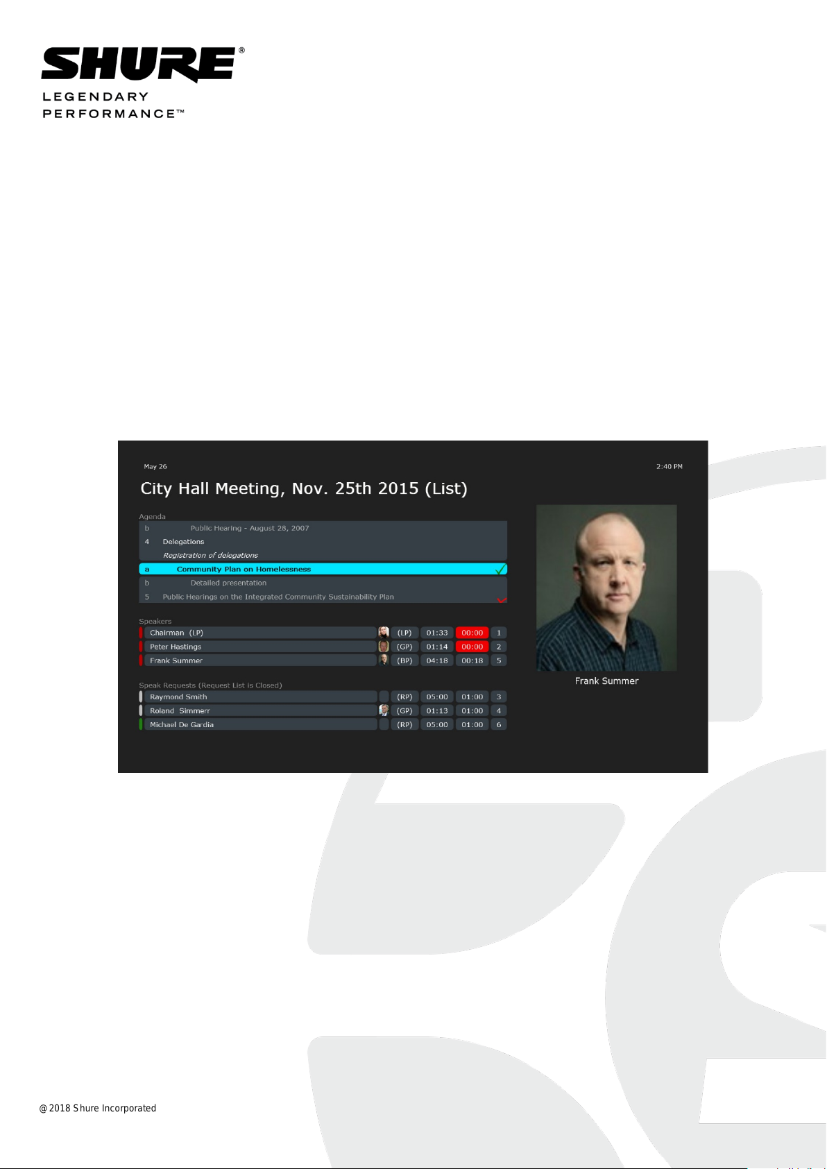
11 Customized displays, examples ...................... 33
Agenda ................................................ 33
Agenda and Speakers .............................. 33
Agenda and Speakers with Picture.......... 34
Agenda, Speakers and Mimic .................. 35
Agenda, Speakers and Mimic with lines .. 36
Long Description, Speakers ..................... 37
Long Description, Speakers, Group Time 38
Short Description, Speakers .................... 39
Speakers .............................................. 40
Speakers, Requests and Group ............... 40
Speech Time Display ................................ 41
Sub-title for croma key ............................ 42
Voting.................................................. 44
Voting, List and Pie .................................. 44
Voting, List and Individual ....................... 45
Voting, Individual .................................... 46
Conference Variables ........................... 47
@2018 Shure Incorp or ate d User Manual SW6000 CDA Customized ver 6.7.8.docx

SW6000 Conference Management Software User Manual
3
1 Introduction
The CDA Conference Displ a y Application is
an application in the SW6000 suite of
applications designed to show various
displays for a large audience like:
• Microphones (Speakers and speak
request lists)
• Microphone mimic diagram (Speakers
and speak request)
• Voting results (in list form,
graphically, pie chart, mimic and
individually)
• Agenda
• Logged in participants
The presentation is normally done by feeding
the VGA signal from the PC running the CDA
application to a large screen projector placed
inside the meeting room or hall.
The CDA application has when used in the
meeting no user i n t erface. Setup of the
displays on the CDA applications is done in
the CAA application and the selection of the
display to show is done in the CUA
application.
This manual describes the options for
making customized CDA screens.
Licensing
The CDA application is not included in
SW6000 Software (basic), but is licensed
separately.
SW6000 Conference Management Software User Manual
4
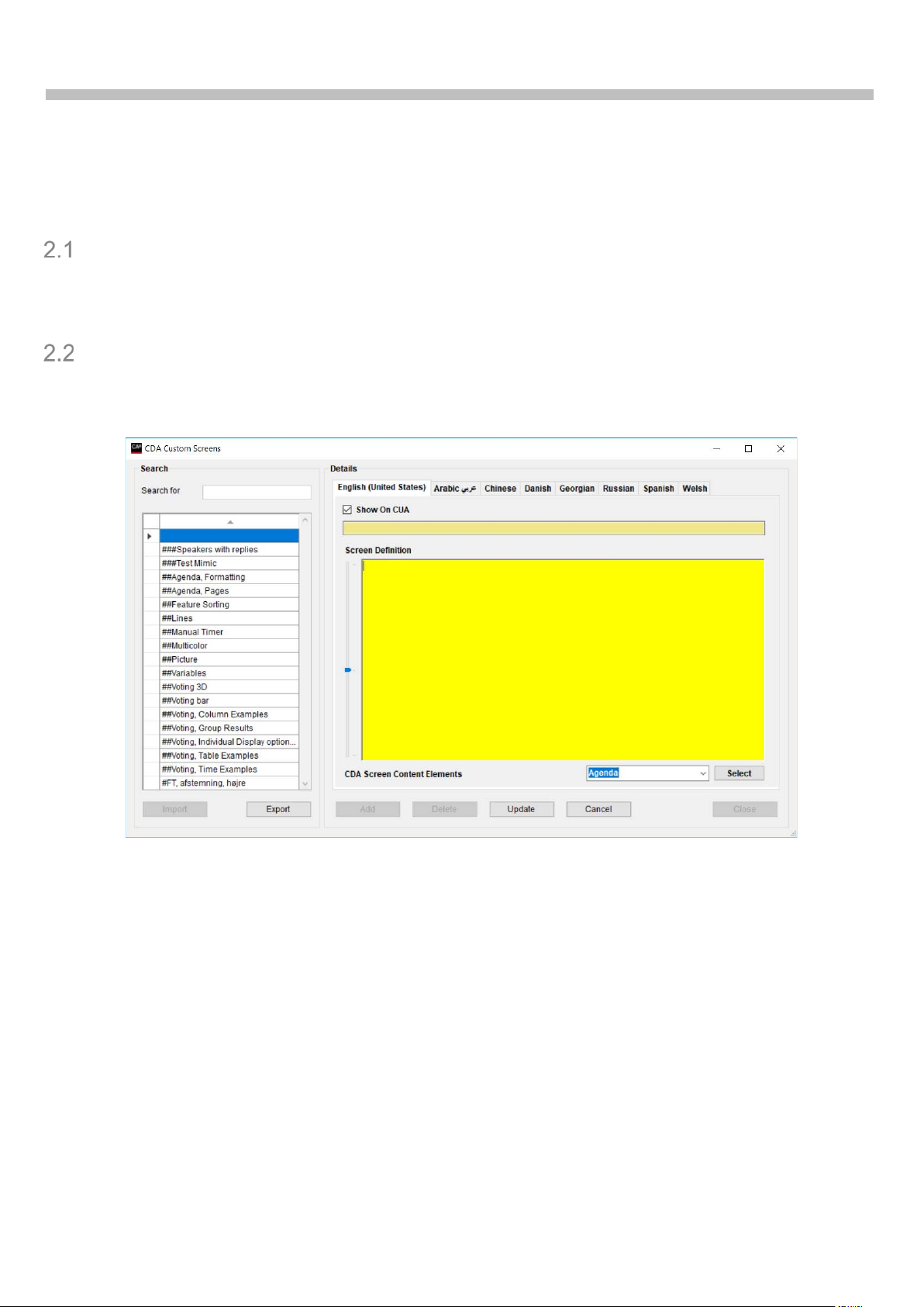
2 CDA Configuration>CDA Screen
Configuration>Custom Screens
Purpose
The purpose of this screen is to allow client-side customizations.
The editing is simple, not using special tools. The definition is essentially a small text file.
CDA Screen Definition
The ‘CDA Custom Screen’ window is opened by clicking the [Edit] – ‘Custom Screens’ button in
the CAA/CDA Screen Configuration window.
Figure 2.2-A
Name Screen name. The name is shown in CAA and CUA
Screen Definition Window for typing or pasting screen definitions. The screen definitions
are defined as XML elements. Refer to the next chapters for details
‘Slider’ Slider to the left of the ‘Screen Definition’ window to adjust the font size
in the ‘Screen Defi nition’ window
CDA Screen Content Elements Dropdown window for selecting controls to be inserted in the
Screen Definiti on window
SW6000 Conference Management Software User Manual
5
3 XML description
Syntax
A screen definition consi st of three types of elements:
• Screen D efinition
• Controls
• Comments
Screen
The main element in the screen definition is Screen. It has the following attributes:
• Name – sc r een n ame
• Margin – margin in pixels, default is 1/18 of the screen size
• ShowGridLines – a development flag for showing cell divisors (False/True), defaults to
“False”
• RowSizes – row sizes definition string, defaults to “*”
• ColumnSizes – columns sizes definition string, defaults to “*”
Attributes for the RowSizes and ColumnSizes are described in chapter ‘5.2 Grid Definition’.
All parameters are optional.
Syntax Example
<Screen Name="Agenda" RowSizes="1,*,*" ColumnSizes="*,0.5,*" ShowGridLines="true" Margin="10" >
..
Controls
..
</Screen>
Controls
The Controls are defined as XML elements inside Screen. Attributes for the controls are
described in Table 1.
Comments
Comments can be placed in the Screen Definition. A comment will not be executed but is useful
when creating screens.
Syntax Example
<!--
This is a comment
-->
Help
A help function is available for all controls. When the help function is invoked the CDA screen
will show the valid properties for the control.
Syntax Example
<ConferenceVariable Help=""/>
SW6000 Conference Management Software User Manual
6
a=1/18 total
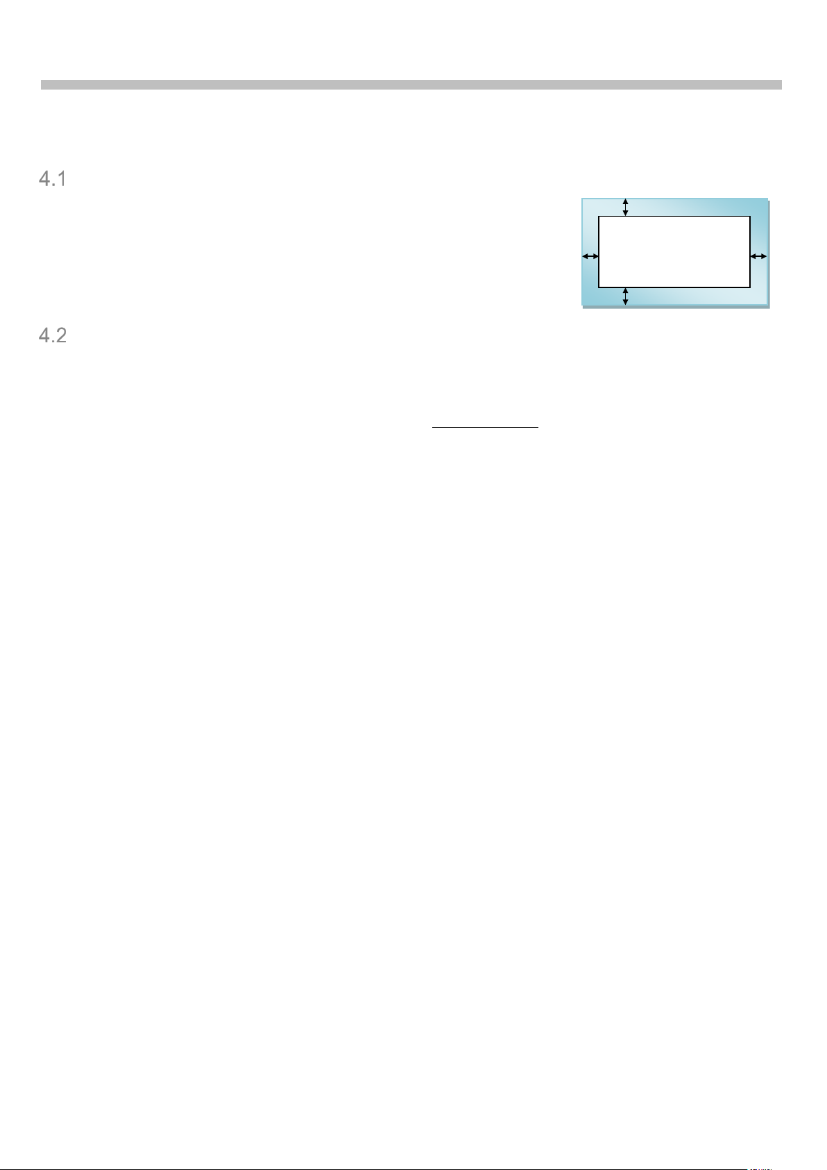
4 Screen Elements
Screen Margin
From the available CDA screen space a margin is subtracted. The
margin thickness is by default 1/18 of the screen height.
The rectangle within that margin is divided into a grid, where the
elements should be placed.
Refer to section ‘4 Syntax’ for setting the margin.
Grid definition
The main unit of grid layout is a unit, retrieved by dividing the grid size (height or width) by a
certain number. The defaults number is 16 for both dimensions. The actual values depend on
the CDA in question (defined in the CAA, Setup/Equipment/Meeting Displays, ‘Grid Units’) and
not on the meeting. The unit indirectly defines the font size used throughout the application.
This grid is then divided into a number of logical elements (rows and columns).
• RowSizes – row sizes definition string, defaults to “*”
• ColumnSizes – columns sizes definition string, defaults to “*”
The rows and columns sizes can be defined as:
• Absolute in pixels – e.g. 300 pixels (syntax: “300px”). Should not be used, unless really
needed.
• Absolute in units – e.g. 2 units (syntax: “2”). The font size is so one text line fits well into
one unit.
• Relative – the space left is divided into parts. E.g. if two rows shall have their heights in
ratio 1:2, one needs t o d efine them as “1*” (or just “*”) and “2*”.
• Auto-fit – the row or column takes as little space as it can (syntax: “Fit”). If this is a
column definition, all such columns will have the same width. Not recommended for rows.
If the definition is omitted, it is assumed that only one row/column is needed, with definition
“*”.
The visual elements (controls) are then placed in this grid.
SW6000 Conference Management Software User Manual
7
10 units
Real row
Logical
row
0
1
1
2
3
4
5
6
7 8 9
5
16 units
Real row
Logical
row
0 1 1 2 2
3
4 5 6
7 4 8 9 10
11
12
13
14
15
5
28 units
Real row
Logical
row
0 1 1 2 2
3 3 4 5 6 7 8 9 10
11 4 12
13
14
15
16
17
18
19
20
21
22
23
24
25
26
27
5
<Screen Name="VotingPieChart"
RowSizes="1/7,1/9,1/3,1/2,1/8,*,1" ColumnSizes="*,*">
<VoteConclusion Row="7" Column="2"/>
</Screen>
18 units
11 units
9 units
Grid definition example
To define a logical grid with 5 rows, of which first and last take up 1 unit, second – 2 units, and
the other two take up the available room and have 1:2 ratio, the following definition is used:
“1,2,1*,2*,1”.
This definition translates into the following sizes, if we take 10, 16 and 28 row units:
2
3
3
4
The same structure is valid for columns as well.
This example produces a simplified Voting Pie Chart page using primary standard settings.
<CurrentTime Row="1" ColumnSpan="0"/>
<CurrentConference Row="3" ColumnSpan="0"/>
<CurrentAgendaItem Row="4" ColumnSpan="0"/>
<VoteResultTable Row="6" RowSpan="2" ItemSize="Auto"/>
<VoteResultPieChart Row="6" Column="2"/>
Note the row priorities. This screen looks as following with different row units.
SW6000 Conference Management Software User Manual
8
#
Definition
Type and size
Minimum size
Priority
Alternative
1
1/9
1 unit
1 9 Disappear
2
2/6-1/5
2 units
2 6 1 unit with priority 5, then disappear
3
*(4)/3
1 part
4 3 Disappear
4
1/2
1 unit
1 2 Disappear
5
2*
2 parts
5 (default)
1
None (never adjusted)
6
1/9
1 unit
1 9 Disappear
Grid units:
17 units
16 units
15 units
14 units
13 units
12 units
5 units
4 units
Element 1
1 0 0 0 0 0 0
0
Element 2
2 2 2 1 0 0 0
0
Element 3
4
4.33 4 4 4 0 0 0
Element 4
1 1 1 1 1 1 0
0
Element 5
8
8.67 8 8 8 8 5 4
Element 6
1 0 0 0 0 0 0
0
Adjusted priority
∞ 9 9 6 5 3 2
2
Row and column priorities
Each logical element (row or column) has a priority, 1 or larger. Lower number means higher
priority, 1 is top priority. If no priority is defined, it defaults to 1.
Each logical grid element also has a minimum size. It is the unit size for unit elements, and
minimum size (default 5) for relative (“star”) elements. The pixel and fit types are ignored
(minimum size 0).
When the number of grid units goes down, and there is not enough space for the minimum size
of all defined logic al elements, the lower-pri ority elements get adjusted, until the screen can fit
the required information, or there is nothing more to adjust. None of the top-priority definitions
are ever adjusted. If several rows have the same priority, they are adjusted simultaneously.
For each adjusted element an alternative definition is used, if it exists. An unlimited number of
alternatives can be defined; each should have a higher priority than the definition it replaces.
The default alternative is to have height 0. Note, that the rows are not removed, so the controls
are not moved around – they just get shrank or disappear.
Priority example
Example “1/9, 2/6-1/5, *(4)/3, 1/2, 2*, 1/9” defines the following elements:
And here is what happens when the number of units is decreasing.
Sizes

SW6000 Conference Management Software User Manual
9
Placement of Controls
Each cell in this logical grid has two coordinates: row and column. Each coordinate is an integer
number 1 to Max.
Each control is placed in the space, occupied by crossing of a number of rows with a number of
columns. This rectangle is identified by the left-top cell and the number of rows and columns. By
default, the control is 1 row high and 1 column wide.
• Row – row of the top part of the control, mandatory
• Column – column of the left p art of the control, optional, defaults to 1
• RowSpan – how many rows the control takes, optional, defaults to 1
• ColumnSpan – how many columns the control takes, optional, defaults to 1; can be 0
meaning “all columns to the right”
Syntax Example
<Screen Name="Agenda" RowSizes="1,*,*" ColumnSizes="*,0.5,*" ShowGridLines="true" Margin="10" >
..
<Agenda" Row="2" RowSpan="2" Column="1" ColumnSpan="0" />
..
</Screen>
Controls Definition
A complete list of supported controls is given in Table 1.
Control parameters
Some controls require parameters. In this case, each parameter has a name and a value, and
these name-value pairs are given in the control definition. Possible parameters are described in
Table 1.
SW6000 Conference Management Software User Manual
10
5 Formatted and list controls
Most of the controls are either formatted controls or list controls. The former controls only show
one data item (or nothing), the latter — potentially many items.
Both kinds of controls share a number of properties:
• ItemSize
• ItemFormat
• HorizontalContentAlignment
• VerticalContentAlignment
ItemSize
ItemSize property makes an item larger. It can have one of these values:
• Normal (default) – the height of items is one row unit size.
• Large – the height of items (not list header) is row unit size multiplied 2
• Auto (for lists) – Large is used if all list items can fit with this font, otherwise – Normal.
• Auto (for n on-lists) – the height of the control is regulated by its row; the text adjusts to
the row height.
• Value – Used for defining the height of an item. The value ‘1’ is one row unit siz e.
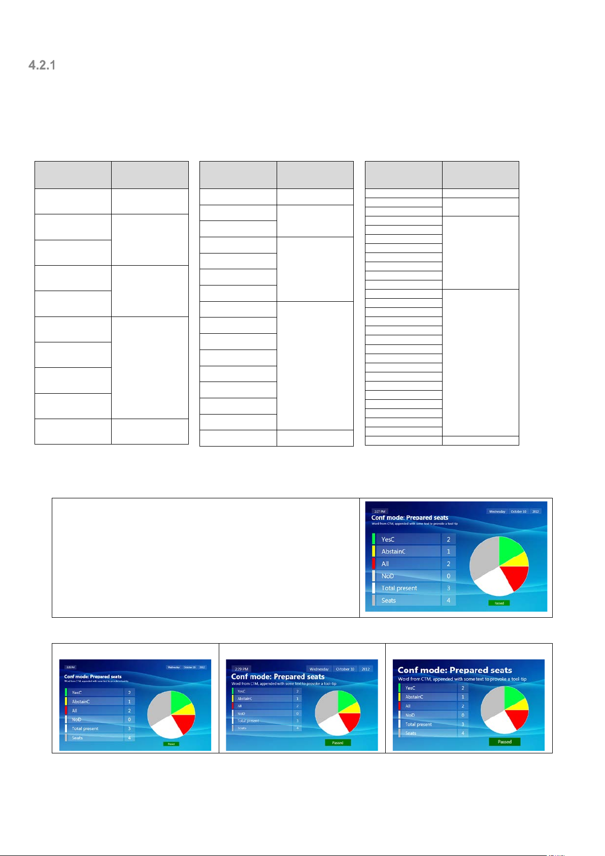
On the image below Speakers list’s ItemSize is set to Large, while group list keeps the default.
Figure 2. Normal-size and large-size lists
ItemFormat
ItemFormat makes up the definition of how the item is presented. Item format consists of any
number of field definitions. Each field in ItemFormat value becomes a single item (column for
lists) in the data representation.
Each field has the following format:
• ‘[‘ – opened square bracket
• Field name
• ‘,’ Options (optional set of comma-separated name-value pairs)
• ‘]’ – closed square bracket
Field names
The field names depend on which control is being customized. Table 2 gives all available fields.
Field options
The following options are available:
• Width

SW6000 Conference Management Software User Manual
11
[Text,Width=Rest][GroupName]
[Text,Width=ColumnFit]
[Text,Width=ItemFit]
[Text][GroupName,Align=Left]
[Text][GroupName]
[Text][GroupName,Align=Right]
• Align
• Format
• Overflow
By default, all same fields in the same list have the same width, which is just enough to show
the largest item in that column. This behavior can be modified by assigning the following values
to Width option:
• ItemFit – this field would take up just the space needed to show this very item, not the
whole column. As a result, the field width is variable – different on different lines.
• ColumnFit (default for most fields) – this field would take up the space needed to show all
items on all visible rows in this column.
• Rest – this field would take up all the space available after all other fields. Although it is
technically possible to have more than one field with Rest option, it hardly makes sense.
If there are any variable fields in this list definition, the Rest fields may not be of the
same size.
• Rest & WidthMultiplier – the Rest property can be combined with WidthMultiplier. This
property adjusts the relative size of the columns which are specified with the Rest
property.
Example
ItemFormat="[VotingState][Text,Width=Rest, WidthMultiplier=3][Result,Width=Rest]"
Note that if there is only one field in the definition, its default Width is set to Rest, unless
explicitly overwritten.
[GroupName]
Usually there is a default alignment for each field. It can be changed by using Align option.
Possible values a r e Left, Right and Center. For main texts default is Left, for the other fields –
Center.
[GroupName]
If some additional text needs to be shown in t h e field along (or even in s t ea d) of the field value,
Format option comes handy. Use ‘{0}’ as a value placeholder (see also .NET formatting links in
section 0 to adjust the presentation of the value).
For some controls and fields, one could build a string using ‘{PropertyName}’ in the Format
option. Same .NET formatting options are applied as mentioned above. Property names often,
SW6000 Conference Management Software User Manual
12
but not always correspond to ItemFormat fields defined ‘Table 1. Supported controls’ and ‘Table
2. ItemFormat fields’. They are also shown on the CDA screen in case of a mistyped property.
The format should not use characters ‘{‘, and ‘}’ for other purposes than described above.
Square brackets and commas should be preceded by a backslash (‘\[‘, ‘\]’, ‘\,’).
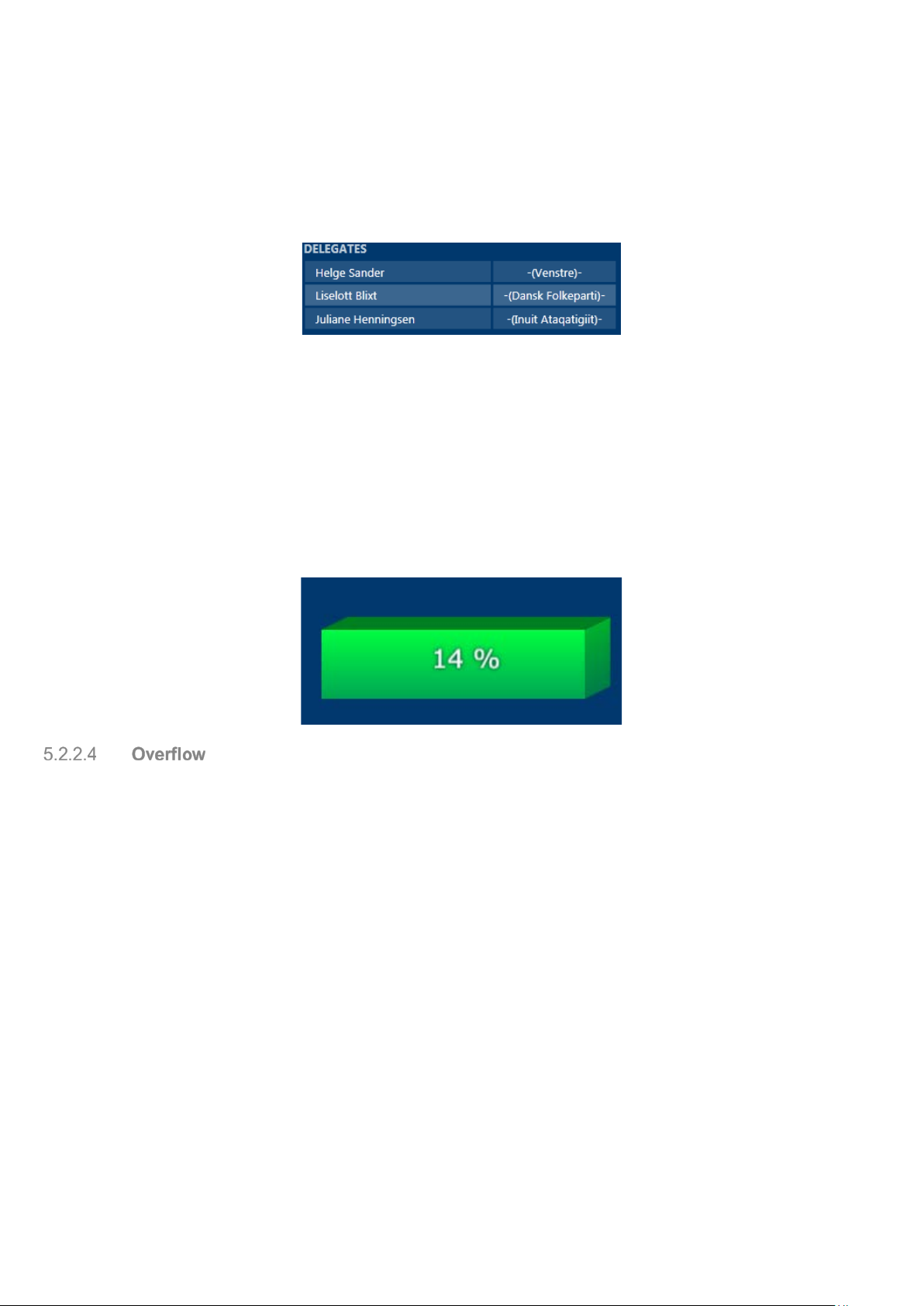
Example 1
<DelegateList Row="2" ItemFormat="[Text][GroupName, Format=-({0})-]"/>.
Figure 3. ItemFormat example
Example 2
<ConferenceVariable Row="3" ItemFormat="[Expression, Format=Logged on {DelegatesLoggedIn} of
{DelegatesOnList}]"/>
In more advanced scenarios, Format option can be used to set ItemFormat attribute for an
embedded control.
.
Example 3
Showing a percentage directly on a voting bar:
<VoteResultBarChart ItemFormat="[Bar, Format=[PercentOfSum]]"/>
This option tells the CDA, what to do in case there is more text in the field than there is screen
space. It can have one of t h e following values:
• OneLineNoScroll – the text is limited to one line, no scrolling occurs; default for most
fields
• OneLineScroll – the text is limited to one line and begins to scroll, if it can’t fit that one
line; default for important fields like participant names or meeting title
• MultiLine – the text is wrapped on as many lines as necessary to show the complete text
Example
<CurrentAgendaItem Row="1" Level="1" ItemFormat="[LongDescription, Overflow=MultiLine]" />

SW6000 Conference Management Software User Manual
13
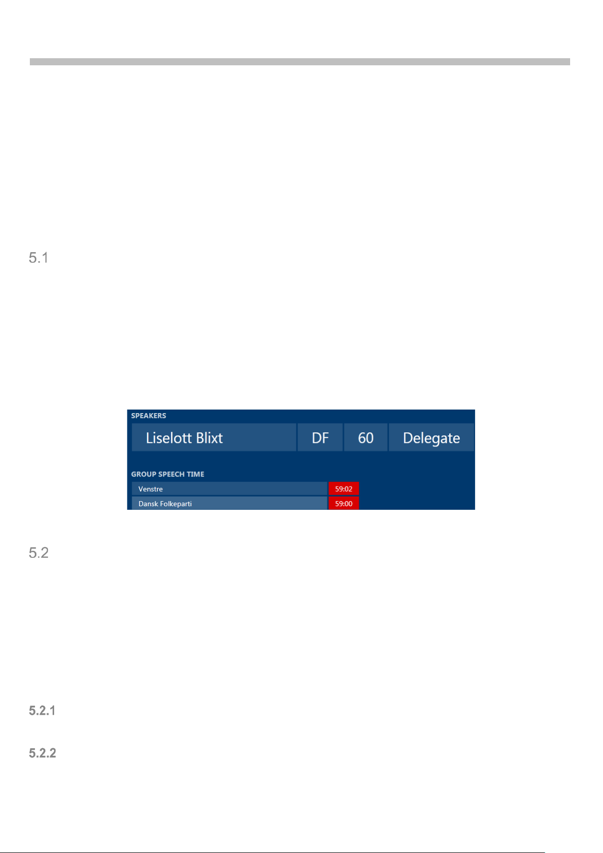
HorizontalContentAlignment, VerticalContentAlignment
These properties regulate how the list data area as a whole is placed inside its cell.
For lists HorizontalContentAlignment only has effect when ColumnCount is not 1 (see Figure 4).
For non-lists HorizontalContentAlignment only affects Text control.
Figure 4. Horizontal alignment in a multi-column list
For horizontal alignment of the data fields use [Space] field and Align option.
VerticalContentAlignment aligns the whole list to the Top (default), Center or Bottom of the cell.
For non-lists, VerticalContentAlignment aligns the text inside the field (default is Center).
SW6000 Conference Management Software User Manual
14
6 List definition
Many of the controls are lists (these are marked in Table 1). Most lists support the following
parameters:
• ColumnCount
• ColumnPadding
• AlternationCount
• ShowHeader
• HeaderFormat
• HeaderTextId
• GroupHeaderFormat
• ListViewType
• AutoScroll
• SortDescriptor
• ItemsToSkip
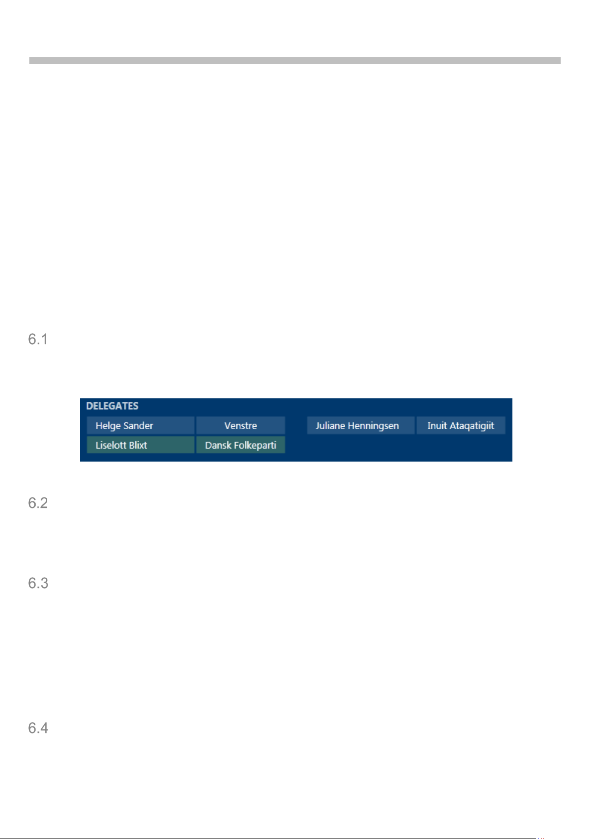
ColumnCount, ColumnP a dding
The lists are designed as multi-column lists. The number of columns is given by ColumnCount
property. The space in between the columns is defined by ColumnPadding, relative to row unit
height.
Figure 5. List with 2 col umns ColumnPadding=1
AlternationCount
AlternationCount can be 1 or 2. If it is set to 2, every second line of the list gets another
background, based on AlternatingBackgroundColor.
Generally, this parameter shouldn’t be changed.
ShowHeader, HeaderFormat, HeaderTextId
A list can display a header text, if ShowHeader is true (it is the default for most lists).
HeaderFormat defines in the same was as ItemFormat, what is shown in the header. See Table
3.
The header is displayed with no background and a brush based on HeaderForegroundColor color
as foreground.
The header text, if shown, is fetched from the label database for the current language with text
ID HeaderTextId. Generally, HeaderTextId shouldn’t be changed.
ListViewType
There are three kinds of lists defined: Continuous, Pages, and Horizontal (from 6.1). Continuous
is more applicable to lists with items of different vertical sizes (e.g. Agenda), the others – with

SW6000 Conference Management Software User Manual
15
identical vertical sizes. Horizontal (from 6.1) places its items on a single line. Generally, this
attribute shouldn’t be changed.
AutoScroll
Tells the list, whether it shall scroll automatically, or not scroll at all. The scrolling speed / delay
is predefined. It is usually set to True (except for Agenda and CurrentAgendaList lists) and,
generally, shouldn’t be changed.
SortDescriptor
Each list can be filtered, sorted and grouped by desired property name. It is possible to add
multiple sorting properties. SortDescriptor can be used on all lists.
Each field in sorting definition has the following format:
• ‘[‘ – opened square bracket
• Property name to sort by
• Optionally and multiply
o ‘,’ – comma
o Option name (Filter, Order, GroupBy)
o For Filter and Order
‘=’ – equal sign
Option value (one or multiple in a square-bracket list)
• ‘]’ – closed square bracket
Often, but not always, the property names correspond to fields defined in ‘Table 1. Supported
controls’ and ‘Table 2. ItemFormat fields’. They are also shown on the CD A sc r een in case of a
mistyped property.
Example
<QueueList SortDescriptor="[MicrophoneState, Filter=Reply] [GroupShortName, Filter=[RP,GP,BP,LP]] [Text]" />
Filter option
One can specify a single value (Filter=Speak) or several values, placed inside square brackets
and separated by commas (Filter=[Speak, Reply, Request]). If multiple values are given, value
‘*’ gives all the not yet put values (e.g. Filter=[Speak, *]). In this case, the items are grouped
in the order of Filter definition.
If the filtered property type is an enumeration, value names can be used. For numbers, the
1
numbers can be specified. For strings, regular expression syntax
is used (do not use com mas
unless in square brackets; the expression must match the whole string).
For filtering of Agenda items by level the values can be separated by semicolon or a dash.
Example
<Agenda SortDescriptor="[Level, Filter=1;4-6,Order=Original]"
Her is the agenda filtered to show agenda Level 1 and Level 4 to Level 6.
1
See http://msdn.microsoft.com/en-us/library/az24scfc.aspx for regular expression syntax. For instance, “[aA].*”
matches for all strings, that start with a small or capital A. ‘^’ is implicitly added to the beginning of the expression,
and ‘$’ – to the end.
 Loading...