

Page 1

Cat. No. W10E-EN-01
Software Release 2.0
CX-Supervisor
USERS MANUAL
Page 2

CX-Supervisor
User Manual
Software Release 2.0
Page 3

Page 4

OMRON CX-Supervisor – User Manual
Notice
OMRON products are manufactured for use according to proper procedures by a qualified operator
and only for the purposes described in this manual.
The following conventions are used to indicate and classify precautions in this manual. Always heed
the information provided in them. Failure to heed precautions can result in injury to people or
damage to the product.
DANGER! Indicates information that, if not heeded, is likely to result in loss of life or
serious injury.
WARNING Indicates information that, if not heeded, could possibly result in loss of
life or serious injury.
Caution Indicates information that, if not heeded, could result in relatively serious
or minor injury, damage to the product, or faulty operation.
OMRON Product References
All OMRON products are capitalised in this manual. The word “Unit” is also capitalised when it
refers to an OMRON product, regardless of whether or not it appears in the proper name of the
product.
The abbreviation “PLC” means Programmable Logic Controller and is not used as an abbreviation
for anything else.
Revision 2.0 Page i
Page 5

CX-Supervisor – User Manual OMRON
Page ii Revision 2.0
Page 6

OMRON CX-Supervisor – User Manual
Visual Aids
The following headings appear in the left column of the manual to help you locate different types of
information.
Note:
1, 2, 3…
OMRON, 2007
All rights reserved. No part of this publication may be reproduced, stored in a retrieval system, or
transmitted, in any form, or by any means, mechanical, electronic, photocopying, recording, or
otherwise, without the prior written permission of OMRON.
All copyright and trademarks acknowledged.
No patent liability is assumed with respect to the use of the information contained herein. Moreover,
because OMRON is constantly striving to improve its high-quality products, the information
contained in this manual is subject to change without notice. Every precaution has been taken in the
preparation of this manual. Nevertheless, OMRON assumes no responsibility for errors or omissions.
Neither is any liability assumed for damages resulting from the use of the information contained in
this publication.
Indicates information of particular interest for efficient and convenient
operation of the product.
Indicates lists of one sort or another, such as procedures, checklists etc.
Represents a shortcut on the Toolbar to one of the options available on the
menu of the same window.
Indicates a program must be started, usually by clicking the appropriate
option under the standard Windows ‘Start’ button.
Revision 2.0 Page iii
Page 7

CX-Supervisor – User Manual OMRON
Page iv Revision 2.0
Page 8

OMRON CX-Supervisor – User Manual
About this Manual
This manual describes the CX-Supervisor application and its ability to create, modify and run
SCADA applications.
This manual contains the following:
Chapter 1 - Graphics Editor. This chapter describes the Graphics Editor and its various tools and
controls.
Chapter 2 - Pages. This chapter describes the procedures involved in the creation and amendment of
pages.
Chapter 3 - Points. This chapter describes the procedures involved in the creation, amendment and
removal of points. The use of PLCs with points is also described.
Chapter 4 - Objects. This chapter describes procedures involved in the creation, amendment and
removal of objects.
Chapter 5 - ActiveX Objects. This chapter provides an overview of using ActiveX objects in CX-
Supervisor.
Chapter 6 - Projects. This chapter describes procedures involved in the creation, amendment and
removal of projects.
Chapter 7 - Graphics Library. This chapter describes the library of graphic objects and how to
create and amend new libraries.
Chapter 8 - Alarms. This chapter describes the procedures involved in the creation and amendment
of alarms.
Chapter 9 - Animation. This chapter describes the use of animations and how they can be applied to
a CX-Supervisor project.
Chapter 10 - Recipes. This chapter describes the creation of recipes, and how they can be used.
Chapter 11 - Data Logging. This chapter describes the data logging facilities, including setting up,
viewing and exporting
Chapter 12 - Databases. This chapter describes the Database facilities, including connections reading
and writing data.
Chapter 13 - Multilingual Features. This chapter describes the Multilingual features, including
creation of dynamically switching applications.
Chapter 14 - OPC Client. This chapter introduces OPC Server to a new user, and explains how to use
CX-Supervisor as an OPC Client
Revision 2.0 Page v
Page 9

CX-Supervisor – User Manual OMRON
Chapter 15 - Connecting to a Remote CX-Supervisor application. This chapter explains how to
create a distributed solution by connecting together CX-Supervisor applications on networked
PCs.
Chapter 16 - Connecting to Omron Industrial Components. This chapter details connecting CX-
Supervisor to Omron's Industrial Components.
Chapter 17 – Best Practices. This chapter details the best practices to get the most from CX-
Supervisor including how to plan and design your application.
Appendix A – Configuring a PC for remote connection. The appendix explains how to configure a
PC for remote connection.
Appendix B – Frequently asked questions. The appendix list some FAQs, and of course their
answers.
Appendix C – Troubleshooting. The appendix is a guide to troubleshooting and resolving problems.
Appendix D – CX-Server error codes. The appendix lists the error codes from the communication
software, CX-Server, and their meanings.
Appendix E – Using with the Omron DyaloX. The appendix lists information when using with the
Omron’s DyaloX Industrial PC.
Appendix F – Obsolete Features. The appendix details obsolete features for backwards
compatibility only.
A Glossary of Terms and Index are also provided.
Page vi Revision 2.0
Page 10

OMRON CX-Supervisor – User Manual
TABLE OF CONTENTS
CX-Supervisor ..................................................................................................Page
Chapter 1 - Graphics Editor.......................................................... 1
About the Graphics Editor ...................................................................................... 1
Palette .................................................................................................................... 1
Graphic Object Bar .................................................................................................4
Control Bar ............................................................................................................. 4
Status Bar............................................................................................................... 8
Text Bar ..................................................................................................................9
Grid....................................................................................................................... 11
Chapter 2 - Pages.......................................................................... 13
Creating a Page.................................................................................................... 13
Amending a Page .................................................................................................14
Defining the Properties of a Page ........................................................................ 14
Printing a Page .....................................................................................................16
Saving a Page to a Project................................................................................... 20
CX-Supervisor Preferences.................................................................................. 20
Chapter 3 - Points......................................................................... 23
What is a Point? ................................................................................................... 23
About the Point Editor .......................................................................................... 23
Viewing Points via the Point Editor....................................................................... 24
Creating a Point.................................................................................................... 27
Amending an Existing Point ................................................................................. 33
Deleting an Existing Point .................................................................................... 34
Quick creation of many points ..............................................................................35
Revision 2.0 Page vii
Page 11

CX-Supervisor – User Manual OMRON
Page viii Revision 2.0
Page 12

OMRON CX-Supervisor – User Manual
Table of Contents chapter 3 continued Page
Runtime Point Maintenance .................................................................................36
Point Import ......................................................................................................... 37
System Points....................................................................................................... 38
Printing Points ...................................................................................................... 41
Chapter 4 - Objects ...................................................................... 45
Objects ................................................................................................................. 45
Editing Objects ..................................................................................................... 45
Creating and Editing Graphic Objects .................................................................. 44
Creating and Editing Control Objects ................................................................... 48
Manipulating Objects ............................................................................................63
Chapter 5 – ActiveX Objects ....................................................... 69
Overview............................................................................................................... 69
Inserting a new object .......................................................................................... 69
Editing Properties at Design Time........................................................................ 70
Reading and Writing Properties at Run Time....................................................... 72
Calling Methods at Run Time ...............................................................................72
Responding to Events .......................................................................................... 72
Chapter 6 - Projects...................................................................... 75
Overview............................................................................................................... 75
Creating a Project................................................................................................. 75
Amending a Project .............................................................................................. 76
Saving a Project ................................................................................................... 76
Printing a Project ..................................................................................................77
Device Configuration ............................................................................................77
Settings................................................................................................................. 83
Runtime Settings ..................................................................................................84
Runtime Security ..................................................................................................91
Revision 2.0 Page ix
Page 13

CX-Supervisor – User Manual OMRON
Page x Revision 2.0
Page 14

OMRON CX-Supervisor – User Manual
Table of Contents chapter 6 continued Page
Exit Level ..............................................................................................................97
Compiling and Running a Project......................................................................... 95
Save Runtime As.................................................................................................. 98
Create Runtime Install Disc.................................................................................. 98
Project Information ............................................................................................... 99
Alias Definitions ....................................................................................................99
Find..................................................................................................................... 100
Navigating Projects with the Workspace ............................................................101
Project Editor ...................................................................................................... 101
Printing from the Project Editor .......................................................................... 104
Chapter 7 - Graphics Library ................................................... 105
Overview............................................................................................................. 105
Graphics Library .................................................................................................105
Manipulating Objects ..........................................................................................107
Printing the Graphics Library.............................................................................. 109
Chapter 8 - Alarms..................................................................... 111
What is an Alarm? ..............................................................................................111
Alarm Settings ....................................................................................................111
Viewing the Contents of the Alarm Database .................................................... 113
Creating a New Alarm ........................................................................................ 114
Updating an Existing Alarm ................................................................................118
Copying an Existing Alarm Definition .................................................................119
Deleting an Existing Alarm .................................................................................119
Printing Alarms ...................................................................................................119
Alarm Reporting In Runtime ...............................................................................120
Revision 2.0 Page xi
Page 15

CX-Supervisor – User Manual OMRON
Page xii Revision 2.0
Page 16

OMRON CX-Supervisor – User Manual
Table of Contents chapter 8 continued Page
Chapter 9 - Animation ............................................................... 123
Associating Points with Actions and Events....................................................... 123
Animation Editor .................................................................................................123
Runtime Actions ................................................................................................. 129
Chapter 10 - Recipes .................................................................. 157
What is a Recipe? .............................................................................................. 157
Recipe Components ...........................................................................................157
Viewing Recipes in the Recipe Editor ................................................................ 158
Creating a New Recipe ...................................................................................... 160
Revision 2.0 Page xiii
Page 17

CX-Supervisor – User Manual OMRON
Page xiv Revision 2.0
Page 18

OMRON CX-Supervisor – User Manual
Table of Contents chapter 10 continued Page
Updating an Existing Recipe .............................................................................. 162
Copying an Existing Recipe Definition ............................................................... 164
Deleting an Existing Recipe ............................................................................... 164
Recipe Security Levels .......................................................................................164
Printing Recipes ................................................................................................. 165
Using Recipes in Runtime ..................................................................................166
Chapter 11 - Data Logging ........................................................ 171
What is Data Logging? .......................................................................................171
Data Log Editor................................................................................................... 171
Data Logging at Runtime................................................................................... 176
Data Log View Component ................................................................................ 180
Remote Data Log Viewer ...................................................................................181
Data Log Export Facilities .................................................................................. 182
Data Logging ...................................................................................................... 184
Chapter 12 - Databases .............................................................. 189
Overview............................................................................................................. 189
Database Connection Editor .............................................................................. 189
Configuring a connection.................................................................................... 190
Configuring Recordsets ...................................................................................... 197
Configuring Field Associations ........................................................................... 199
Configuring Parameter Associations .................................................................. 201
Configuring Schemas ......................................................................................... 202
Using Transactions............................................................................................. 206
Saving Recordsets as XML ................................................................................ 207
Datashaping ....................................................................................................... 207
Revision 2.0 Page xv
Page 19

CX-Supervisor – User Manual OMRON
Page xvi Revision 2.0
Page 20

OMRON CX-Supervisor – User Manual
Table of Contents Page
Chapter 13 – Multilingual features........................................... 213
Development Features ....................................................................................... 213
Runtime Language Features.............................................................................. 214
Runtime Mulitlingual Features............................................................................ 215
Configuring Windows for Language Support ..................................................... 218
Data Log Viewer ................................................................................................. 222
Adding Unsupported Runtime Languages ......................................................... 222
Popup Keyboard Layout ..................................................................................... 223
Chapter 14 – Using CX-Supervisor as an OPC Client ........... 225
An Overview of OPC? ........................................................................................ 225
Using CX-Supervisor with OPC Servers ............................................................230
Using with Omron’s CX-Server OPC ................................................................. 235
Chapter 15 – Connecting to Remote Applications .................. 237
Two Tier, Client-Server or Master-Slave? .......................................................... 237
Peer to Peer ....................................................................................................... 238
Distributed Server............................................................................................... 238
Redundant Server .............................................................................................. 239
Creating a CX-Supervisor Server application .................................................... 239
Creating a CX-Supervisor Client application...................................................... 239
Chapter 16 – Connecting to Omron Industrial Components. 243
Adding a Point linked to a parameter .................................................................243
Chapter 17 – Best Practices....................................................... 249
Design ................................................................................................................ 249
Performance ....................................................................................................... 250
Points.................................................................................................................. 253
Drawing .............................................................................................................. 254
Scripts................................................................................................................. 255
Data Logging ...................................................................................................... 256
Revision 2.0 Page xvii
Page 21

CX-Supervisor – User Manual OMRON
Page xviii Revision 2.0
Page 22

OMRON CX-Supervisor – User Manual
Table of Contents Appendices Page
Appendix A – Configuring a PC for remote connection ........ 259
Configurating a Client PC running Windows XP Service Pack 2 ....................... 259
Configurating a Client PC running Windows XP ................................................ 260
Configurating a Client PC running Windows NT or 2000 ................................... 260
Configurating a Server PC running Windows XP Service Pack 2...................... 260
Configurating a Server PC running Windows XP............................................... 261
Configurating a Server PC running Windows NT or 2000 ................................. 261
Appendix B – Frequently asked questions............................... 266
Appendix C – Troubleshooting ................................................. 297
Appendix D – CX-Server error codes....................................... 305
Appendix E – Using with the Omron DyaloX.......................... 309
Appendix F – Obsolete Features ............................................... 311
Glossary of Terms....................................................................... 329
Index............................................................................................. 337
Revision 2.0 Page xix
Page 23

Page 24

OMRON CHAPTER 1 – Graphics Editor
CHAPTER 1 Graphics Editor
This chapter describes the Graphics Editor and the various tools and controls available. It also
provides instructions for using these tools and controls and is supported with suitable screen displays.
About the Graphics Editor
The Graphics Editor enables a variety of objects to be created on a page. Supported objects are:
♦ Graphical objects.
♦ Control objects.
♦ ActiveX objects.
Graphical objects are geometric shapes, for example ellipses and polygons, but also include Text
objects. Control objects allow information to be displayed and entered in clear way through the use
of Wizards. Examples of control objects include Pushbuttons and Trend Graphs. ActiveX objects or
controls are from sources external to CX-Supervisor.
Refer to chapter 4, Objects for further information regarding control objects and bitmap objects.
Refer to chapter 5 for further information on ActiveX Objects.
The tools are contained on a Control Bar, and within palettes. The palettes allow all similar types of
tool to be kept together, and are contained within a free floating window. The various tools and
palettes are discussed in the following chapters. Status and help information is presented in a Status
Bar located at the bottom of the main CX-Supervisor window.
Palette
The Palette is always displayed on top of any pages created within CX-Supervisor. If no pages are
open, the Palette is not displayed, and if there are no currently active pages, the Palette is rendered
inactive. An example of the Palette illustrating the position of various palettes and controls is shown
below:
Revision 2.0 Page 1
Page 25

CHAPTER 1 – Graphics Editor OMRON
The Palette can be removed or re-displayed at any time by selecting Palette from the View menu.
A tick next to the name indicates the Palette is currently displayed. CX-Supervisor saves the settings
when it is exited and restores them when it is next run.
Each of the palettes and controls is discussed in more detail in the following paragraphs.
Colour Palette
To create an object in a particular colour: before selecting the object’s tool from the Graphic Object
bar, first select the colour by clicking in the appropriate square in the Colour Palette.
Note: It is not strictly necessary to select a colour for an object before creating it, however
if no colour selection is made, the object retains the same colour as the last object.
To apply a colour to a previously created object, select the object on the page and click with the left
mouse button in the appropriate square in the Colour Palette.
Note: Colour may only be applied to some graphic objects. It cannot be applied to
embedded objects or bitmap graphics.
Line Style Palette
The Line Style Palette is located in the Palette just below the Colour Palette.
To create an object with a particular line style: before selecting the object from the Tool Palette, first
select the line style by clicking on the appropriate line in the Line Style Palette.
Note: It is not strictly necessary to select a line style for an object before creating it,
however if no line style selection is made, the object retains the default style of thin
solid.
To apply a line style to a previously created object, select the object on the page and click on the
appropriate line in the Line Style Palette.
Note: Line styles may only be applied to some graphic objects. They cannot be applied to
text, embedded objects, controls or bitmap graphics.
Page 2 Revision 2.0
Page 26

OMRON CHAPTER 1 – Graphics Editor
Fill Pattern Palette
The Fill Pattern Palette is located at the bottom of the Palette.
To create an object with a particular fill pattern: before selecting the object’s tool from the Tool
Palette, first select the fill pattern by clicking in the appropriate square in the Fill Pattern Palette.
Note: It is not strictly necessary to select a fill pattern for an object before creating it,
however if no fill pattern selection is made, the object retains the default of no
pattern.
To apply a fill pattern to a previously created object, select the object on the page and click in the
appropriate square in the Fill Pattern Palette. With a fill pattern applied to an object, clicking in the
Colour Palette with the left mouse button allows the foreground colour of the chosen fill pattern to be
changed. Clicking in the Colour Palette with the right mouse button allows the background colour of
the chosen fill pattern to be changed.
Note: Fill patterns may only be applied to solid graphic objects. They cannot be applied
to unfilled graphic objects, text objects, embedded objects, controls or bitmap
graphics.
Extended Colour, Line Style and Fill Pattern Palette
Each of the Colour, Line Style and Fill Pattern Palettes may be extended to allow access to more
choices. Only one palette may be extended at any one time. The Extended Selection tools are
located at the top of the Palette and are illustrated as follows:
The left hand square controls the extension of the Colour Palette; the line between the two squares
controls the Line Style Palette extension, and the right hand square control the Fill Pattern Palette
extension.
An example of the Extended Colour, Line Style, and Fill Pattern Palettes is shown below:
The operation of each of the extended palettes is identical to that of the non-extended palettes.
Revision 2.0 Page 3
Page 27

CHAPTER 1 – Graphics Editor OMRON
Graphic Object bar
The Graphic Object bar contains the tools to create the graphic objects which can be placed on pages
within CX-Supervisor.
In general terms, the operation of the Graphic Object bar is simple. With a page active the Graphic
Object bar is active, and operation involves merely clicking on the desired tool to select it, and then
clicking and dragging to the appropriate point in the page. This is not the case with the text, polygon
or polyline tools, however the operation of these tools is fully discussed in chapter 4, Objects.
Moving the mouse pointer over any of the tools causes CX-Supervisor to display a tooltip to describe
the tool.
By default, the cursor returns to Selection mode (an arrow) after drawing an object. If you would
prefer it to remain in its current state, clear the Return to select mode checkbox in the Editing
Preferences dialog, which is found on the CX-Supervisor file menu.
For further details concerning the tools contained within the Graphic Object bar refer to chapter 4,
Objects.
Control Bar
CX-Supervisor provides a Control Bar containing formatting and object manipulation tools. The
Control Bar can be activated or de-activated from the View menu. To activate the Control Bar, select
Control Bar from the View menu; CX-Supervisor places a check mark next to it signifying its active
status. To de-activate it, repeat the procedure (the check mark is removed), and the Control Bar is no
longer displayed. The various tools on the control bar allow the properties of objects to be modified.
A control may be activated with more than one object selected to change a particular attribute of all
of the selected objects, e.g. when all graphical objects on a page are selected and the Rotate button is
pushed in and the desired angle specified, all selected objects are rotated.
An illustration of the Control Bar is as follows:
The Control Bar may vary slightly from this according to the display resolution currently in use - the
number of buttons displayed depends on the available space - at higher resolutions more buttons are
displayed.
The Control Bar can be removed from the display at any time by selecting Control Bar from the View
menu.
Page 4 Revision 2.0
Page 28

OMRON CHAPTER 1 – Graphics Editor
A tick next to the name indicates that it is currently displayed. CX-Supervisor saves the settings
when it is exited and restores them when it is next run.
The specific operation of the controls on the Control Bar is described in the following paragraphs.
Object Identification
When an object is created, CX-Supervisor gives it a unique identifier. This identifier consists of the
object type and a sequential number (starting at 1). For example, a text object could have an
identifier of TEXT_1; a polygon object could have an identifier of POLYGON_3 etc. The Object
Identification field displays a list of all current objects on a page.
The identification of an object can be changed by clicking on the entry in the Object Identification
control, typing over the entry and pressing <Return>. A confirmation box is provided to double
check the operation, click the OK pushbutton to proceed with the name change or the Cancel
pushbutton to abort the operation.
It can at times be difficult to select a particular object if it is mostly obscured by other graphic
objects. The Object Identification control allows an object to be selected by simply selecting its
name from the presented list. Click on the arrow button to display the list and select the desired
object. On selection the object is highlighted.
The following illustration shows the Object Identification control in de-selected state:
The following illustration shows the Object Identification control in selected state:
Raise Up One
The Raise Up One button allows an object which forms part of an overlapping group of
objects to be moved nearer the top of the group, one layer at a time. With an object selected,
clicking the pushbutton once moves the object up one layer. This continues until the object
is at the top. Clicking the pushbutton with the object at the top of a group has no effect.
The following example illustrates the state of a group of two objects before and after clicking the
Raise Up One button with the black round rectangle selected:
Revision 2.0 Page 5
Page 29

CHAPTER 1 – Graphics Editor OMRON
Before After
Lower Down One
The Lower Down One button allows an object which forms part of an overlapping group of
objects to be moved nearer the bottom of the group, one layer at a time. With an object
selected, clicking the button once moves the object down one layer. This continues until the
object is at the bottom. Clicking the button with the object at the bottom of a group has no
effect.
The following example illustrates the state of a group of two objects before and after clicking the
Lower Down One button with the grey polygon selected:
Rotate
The Rotate button allows graphical and bitmap objects to be rotated. With an object
selected, clicking the button once opens the Rotate dialog box. Set the desired angle and
click the OK pushbutton to rotate the object.
Before After
The following example illustrates the state of an object before and after clicking the Rotate button
and defining a 10° rotation with the object selected:
Page 6 Revision 2.0
Page 30

OMRON CHAPTER 1 – Graphics Editor
Horizontal Mirror
The Mirror Horizontal button on the Control Bar allows graphical and bitmap objects to be
mirrored in the horizontal plane. With an object selected, clicking the button once “flips” the
object producing a horizontal mirror image.
The following example illustrates the state of an object before and after clicking the Mirror
Horizontal button with the object selected:
Vertical Mirror
The Mirror Vertical button allows graphical and bitmap objects to be mirrored in the
vertical plane. With an object selected, clicking the button once “flips” the object producing
a vertical mirror image.
The following example illustrates the state of an object before and after clicking the Mirror Vertical
button with the object selected:
Before Rotated 10°°°°
Before After
Before After
Transparency On/Off
The Transparency button changes an object from solid to outline and from outline to solid.
With an object selected, click the button and the object toggles from solid to outline (or
vice-versa).
Revision 2.0 Page 7
Page 31

CHAPTER 1 – Graphics Editor OMRON
The following example illustrates the state of an object before and after clicking the Transparency
button with the object selected:
Status Bar
CX-Supervisor provides help and status information in a Status Bar located at the bottom of the main
window.
The Status Bar has two main active areas: the Help Message area, and the Cursor Co-ordinates area.
The Help Message area is used by CX-Supervisor to display helpful information concerning menu
selections and controls. It is located at the left hand end of the Status Bar, and can display messages
similar to the following:
The Cursor Co-ordinates area provides position information for the current location of the mouse
pointer as it tracks around the active page within the CX-Supervisor window. If an object on a page
is selected, the status area displays the co-ordinates of the location of that object. An example of the
system status area is illustrated as follows:
Before After
Page 8 Revision 2.0
Page 32

OMRON CHAPTER 1 – Graphics Editor
The first two display panels show the current x and y co-ordinates of the mouse pointer within the
currently active page. As the mouse pointer leaves the confines of a page and moves into the client
area of the main CX-Supervisor window, the last recorded co-ordinates are held in these panels.
If an object is clicked on, all four panels are used by CX-Supervisor to display the co-ordinates of
that object, as follows:
x y Width Height
The first two panels contain the distance of the top left corner of the object from the top left of the
page in pixels. The second two panels show the extent of the object in pixels.
Text Bar
An illustration of the CX-Supervisor Text Bar is as follows:
Font Name
The Font Name field contains a list of fonts which are available on the host version of Windows. The
list is presented in alphabetical order, and only details typeface families. This does not include bold
or italic variants as this attribute is set by using the appropriate button.
The following illustration shows the control in de-selected state:
The following illustration shows the control in selected state:
Revision 2.0 Page 9
Page 33

CHAPTER 1 – Graphics Editor OMRON
The Font Name field displays the current font attribute for the selected object(s). To change the font
for a block of text, highlight it and click either: the down arrow adjacent to the edit part of the
control, or into the edit part of the control itself, for the Font Name field. The control then displays a
list of available fonts, from which the desired typeface may be selected.
If more than one block of text is selected with each having different font attributes, the edit part of the
control is empty. However, selecting a font from the supplied list still sets the font attribute for all
the selected group of text blocks.
Fonts and font families are printer dependent, therefore changing the printer within the Printer Setup
dialog (accessed from the File menu) changes the fonts which are available within the Font Name
field.
Font Size
The Font Size field contains a list of point sizes available on the host version of Windows for the
selected font. The list is presented in numerical order.
The following illustration shows the control in de-selected state:
The following illustration shows the control in selected state:
Either click the cursor into the editable area of the control and enter a new point size, or click the
down arrow and select a new point size from the presented list.
The control displays the current point size for the selected block of text. If more than one block of
text is selected having different point sizes, the edit part of the control is empty. However, selecting a
font from the supplied list (or typing in a new point size) still sets the point size for all the selected
blocks of text.
Page 10 Revision 2.0
Page 34

OMRON CHAPTER 1 – Graphics Editor
Text Bold On/Off
The Text Bold button allows any selected text objects to be set to bold when the Text Bold
button is pushed in, or normal when the Text Bold button is released. Text Bold only
applies to text, block text, and to text on buttons, other controls and graphics cannot be
emboldened.
Text Italic On/Off
The Text Italic button allows any selected text object(s) to be set to italic when the Text
Italic button is pushed in, or normal when the Text Italic button is released. Text Italic only
applies to text, block text, and to text on buttons, other controls and graphics cannot be
italicised.
Text Underline On/Off
The Text Underline button allows any selected text object(s) to be set to underline when the
Text Underline button is pushed in, or normal when the Text Underline button is released.
Text Underline only applies to text, block text, and to text on buttons, other controls and
graphics cannot be underlined.
Text Left Aligned
The Text Left Aligned button aligns any selected text object(s) to the left edge of the
bounding box. Text Left Justified only applies to text, block text, and to text on buttons,
other controls and graphics cannot be left justified.
Text Centred
The Text Centred button aligns any selected text object(s) to the centre of the bounding
box. Text Centre Justified only applies to text, block text, and to text on buttons, other
controls and graphics cannot be centre justified.
Text Right Aligned
The Text Right Aligned button aligns any selected text object(s) to the right edge of the
bounding box. Text Right Justified only applies to text, block text, and to text on buttons,
other controls and graphics cannot be right justified.
Grid
The use of the grid may be helpful in drawing and aligning the objects on the screen. Select
the Grid button from the toolbar to enable the grid.
The grid settings are available by selecting Grid from the View menu. All the available grid sizes are
shown along with a Snap to Grid option which forces graphical objects selected by the user to align
according to the current grid setting.
Revision 2.0 Page 11
Page 35

CHAPTER 1 – Graphics Editor OMRON
Note: The toolbar buttons can be customised to remove or add favourite functions.
Tip of the Day
On startup, a Tip of the Day dialog is displayed. All tips can be reviewed using the Next and Previous buttons.
This dialog can be turned off, or turned back on from the Help menu.
Page 12 Revision 2.0
Page 36

OMRON CHAPTER 2 – Pages
CHAPTER 2 Pages
This chapter explains the concept of pages. The chapter covers creating, amending, printing and
saving pages.
Creating a Page
A project may consist of several pages, but must contain at least one.
To create a new page, CX-Supervisor must currently have a project open. If no project is currently
open, either click on the Open button from the toolbar to open a previously saved project, or select
New from the Project menu to create a new project.
Note: When you first create a project, CX-Supervisor creates a new page for you
automatically. For more details concerning projects, refer to chapter 6, Projects.
With a project open, click the New Page button from the toolbar to create a new blank page.
An example of a new blank page is shown as follows:
Release 2.0 Page 13
Page 37

CHAPTER 2 – Pages OMRON
Amending a Page
To amend a page, it must first be open. If no pages are open click the Open Page button
from the toolbar. A standard File Open dialog with the caption Open Page is displayed. The
layout and usage depends on your operating system so see your Microsoft documentation for
details.
1, 2, 3…
Note: Loading a page does not automatically make it part of a project. It is therefore
The loaded page may now be edited as required using the CX-Supervisor editing tools.
1. Locate the drive and directory where the desired page is stored.
2. Select the desired page from the list presented.
3. Click the Open pushbutton to load the page.
perfectly feasible to load and edit pages from other projects. Use the Project Editor
to attach a page to a project. For more details concerning projects, refer to chapter
6, Projects.
Defining the Properties of a Page
A page has certain attributes, or properties. These properties may be viewed and edited in two ways.
The simplest way to access the properties of a page is to double click with the left mouse button in
the background area of the page.
This causes CX-Supervisor to display the following Page Properties dialog:
The Page Properties dialog allows the viewing and editing of various attributes.
Page 14 Release 2.0
Page 38

OMRON CHAPTER 2 – Pages
1, 2, 3…
1. Enter a title for the page in the Page Title: field up to a maximum of 32
characters.
2. Add a description (if required) in the Page Description field.
3. Enter the co-ordinates for the top-left corner of the page in the Top and Left
field. This value must be in pixels, and must be a positive integer between
0 and 2000. Alternatively, click on the Full Size pushbutton to fill the
runtime environment workspace.
4. Enter the height and width measurements for the page in the Height and
Width fields. These values must be in pixels, and must be a positive integer
between 0 and 2000. Click on the Centre pushbutton to centre the page to
the graphics workspace.
5. Select the border style for the page from the Border Style settings. The
default for this is Sizeable, as shown on the Page Properties dialog.
Changing the selection will update the shown preview.
6. To prevent the title from being displayed, click the Display Title setting to
remove the check mark. The following change occurs in the dialog:
7. To change the display mode, select Overlap, Replace or Popup in the
Display Mode setting. ‘Popup’ pages appear above all other page types,
‘Overlap’ pages can lie on top of other pages, and ‘Replace’ pages closes
any pages that overlap.
8. To alter the colour of the page, click in the Demo Page Window area or
click on the Colour pushbutton. CX-Supervisor displays the Colour Palette
dialog:
Release 2.0 Page 15
Page 39

CHAPTER 2 – Pages OMRON
Printing a Page
Print Setup
Before printing a page, ensure that the printer has been set up correctly. To check the printer settings,
select Print Setup from the File menu.
CX-Supervisor displays the Print Setup dialog in response:
9. Either select a colour from the palette area or click on a palette colour and
edit it using the three colour sliders. When the desired colour is displayed,
click the OK pushbutton to return to the Page Properties dialog.
10. Alternatively, to display an image or photograph as the background click the
Background pushbutton and select the desired file and note the Display
Background check box is automatically ticked.
Page 16 Release 2.0
Page 40

OMRON CHAPTER 2 – Pages
The current printer selection is defined in the Name: control box. To alter the settings, proceed as
follows:
1, 2, 3…
Note: The Properties pushbutton gives access to advanced printer configuration
1. To change the current printer selection, click the Name: field and select
from the list presented.
2. To change the page orientation from portrait to landscape click the
Landscape setting, (or vice-versa).
3. To change the paper size, click the Size: field, and select the desired paper
size from the list presented.
4. To change the paper source, click the Source: field, and select the desired
paper source from the list presented.
5. Click the OK pushbutton to exit from the Print Setup dialog when the
settings are correct.
functions for the selected printer. For details of these functions, refer to the
Windows User Manual, On-line Help, or the appropriate Manufacturer’s
handbook.
Print Preview
To preview the page before printing, select Print Preview from the File menu.
This results in a screen display similar to the following:
Release 2.0 Page 17
Page 41

CHAPTER 2 – Pages OMRON
Printing
1, 2, 3…
To print a page, click the Print Page button from the toolbar. The Print dialog is displayed.
1. To print the page, click the Print pushbutton, CX-Supervisor displays the
Print dialog.
2. To display the next page, click the Next Page pushbutton.
3. To display the previous page, click the Prev Page pushbutton.
4. To display the current page, side-by-side with the next page, click the Two
Page pushbutton. To return to a single page view click the same button
again which now carries the legend, One Page.
5. Click the Zoom In pushbutton. Click it a second time to zoom in to the
second level. This does not zoom into a specific area of the page.
6. To zoom out from a zoomed in view, click the Zoom Out pushbutton.
Click a second time to zoom right out.
7. To close the preview screen, click the Close pushbutton.
Page 18 Release 2.0
Page 42

OMRON CHAPTER 2 – Pages
1, 2, 3…
1. Set the print range by clicking one of the settings in the Print range
settings. The Selection setting is only enabled when an item (or items) are
selected on the page prior to starting the print process. Click the Pages
setting and enter a range of pages in the from and to fields.
2. To change the number of copies to be printed, enter a new value in the
Copies field.
3. If multiple copies are selected, click the Collate setting to instruct the
printer to collate the copies as they are printed.
4. To print to file, click the Print to file setting.
5. Click the OK pushbutton to activate printing. Whilst printing is in
progress, a dialog is displayed showing the status of the print job. Clicking
the Cancel pushbutton at this point aborts the printing. Once printed, the
dialog disappears. The final printed version should be similar to that shown
in the Print Preview dialog, with a header describing the project, and a
footer describing the page with a page number and date stamp.
Note: The Properties pushbutton on the Print dialog gives access to advanced printer
configuration functions for the selected printer. For details of these functions,
please consult the Windows User Manual, On-line Help, or the appropriate
Manufacturer’s handbook.
Release 2.0 Page 19
Page 43

CHAPTER 2 – Pages OMRON
Saving a Page to a Project
Once a page has been created it is wise to save it into the project in which it is planned to reside. It is
good practice to ensure that pages are saved regularly, for example to minimise the loss of work in
the event of a power failure.
To save a page click the Save Page button from the toolbar. If this is the first time the page
has been saved, the Save As dialog is displayed. This is a standard Windows dialog and
usage depends on your operating system. Please consult your Microsoft documentation.
1, 2, 3…
Subsequent saves do not cause the Save As dialog to be displayed.
After clicking the Save pushbutton, if the page is currently not assigned to a project, a confirmation
dialog is displayed. Alternatively, select Save Page from the File menu (or use the short-cut key
combination of <Ctrl>+S.
Save Page As
Should a copy of a page be required, (for incorporation into another project perhaps), select Save
Page As... from the File menu.
CX-Supervisor displays the File Save As dialog as described previously. After entering a new name
for the page, CX-Supervisor prompts to save the different page into the current project as above.
Closing a Page
To close a page after editing select Close Page from the File menu.
Alternatively, either click on the control box for the page, (located in the top left corner of the page)
and select Close from the Control menu, or simply double-click on the Control menu and the page
closes.
1. Move to the location where the page file is to be stored.
2. Ensure that the Save as Type: control is set to CX-Supervisor Pages
(*.PAG).
3. Enter a name in the File Name: field.
4. Click the Save pushbutton to save the file.
Should you attempt to close a page which has not been saved, CX-Supervisor displays a confirmation
dialog. If you want to save the changes, click the Yes pushbutton. Otherwise, click the No
pushbutton, or click the Cancel pushbutton to abort closing the page.
CX-Supervisor Preferences
CX-Supervisor allows a user to customise the working environment. To set or amend the CXSupervisor setup, select Preferences from the File menu, followed by the preference to set up.
Page 20 Release 2.0
Page 44

OMRON CHAPTER 2 – Pages
The types of customisation are described in the following paragraphs.
Startup Preferences
The Startup Preferences allows the project last accessed in the previous session of CX-Supervisor to
be automatically loaded in the next session. It is accessible by selecting Startup from the Preferences
menu. Click in the Load last project on startup setting to switch this preference as desired. Click the
OK pushbutton to accept the change, or Cancel to abort.
Editing Preferences
The Editing Preferences dialog provides a number of switches to enhance the use of the Graphics
Editor and CX-Supervisor animation. It is accessed by selecting Editing from the Preferences menu.
The number of undo operations in the Graphics Editor can be set in the Number of Available ‘Undo’
Operations: field. To make the Graphics Editor return to Select Mode after every drawing operation,
click in the Revert to ‘Select Mode’ after Drawing Operations setting. The use of double-clicking on
an object can be defined: when a check mark is present in the Enter Edit Mode field, a double-click
on an object of that type causes it to enter Edit Mode.
When a check mark is present in a Display Animation Editor field, a double-click on an object of that
type activates the Animation Editor. Click the OK pushbutton to accept the changes, or the Cancel
pushbutton to abort.
Release 2.0 Page 21
Page 45

CHAPTER 2 – Pages OMRON
General Preferences
General Preferences allow the default script language to be chosen. When new scripts are added, CXSupervisor will default to saving scripts in the select language.
Page 22 Release 2.0
Page 46
OMRON CHAPTER 3 – Points
CHAPTER 3 Points
This chapter describes CX-Supervisor points and the procedures associated with the creation,
amendment and removal of points using the Points Editing facility. The application of external
sources to points is also described.
What is a Point?
A point is a variable used internally by CX-Supervisor. All points within CX-Supervisor have a
name, group and type associated with them.
CX-Supervisor provides a set of pre-defined System ($) Points, which are detailed in chapter 3
Points.
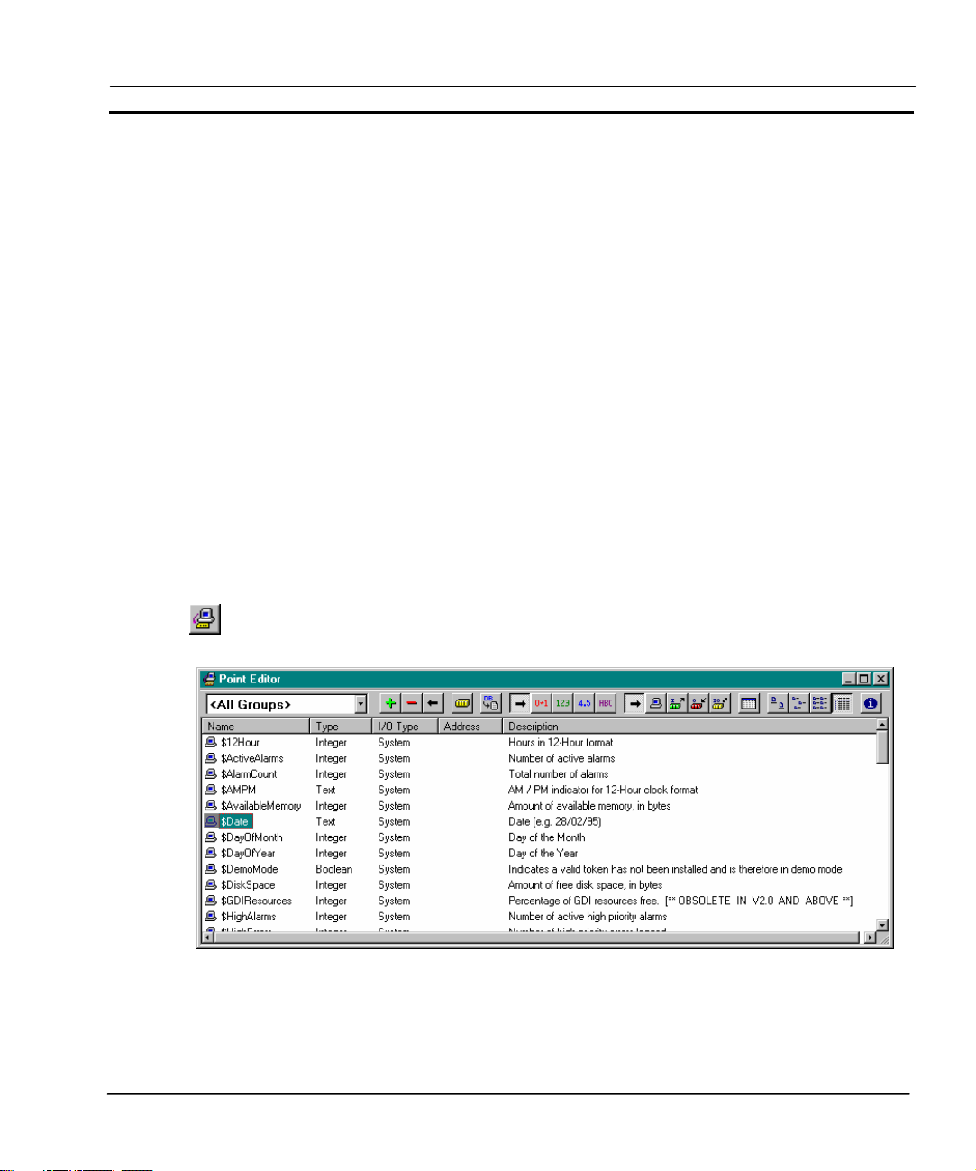
About the Point Editor
The Point Editor allows the viewing, creating, modifying and removing of points from the points
database.
Note: System Points cannot be modified.
To open the Point Editor dialog, select the Point Editor button from the toolbar.
An example of the Point Editor dialog is as follows:
The typeface of the editor can be amended by selecting Preferences from the File menu. This is
especially useful when printing.
Note: To select a range of points, click on a point to mark the start of the range and click
again with the <Shift> key down to mark the end.
Release 2.0 Page 23
Page 47

CHAPTER 3 – Points OMRON
Note: To individually select more than one point, click whilst holding the <Ctrl> key
down.
Note: The short-cut keyboard combinations for Cut, Copy and Paste operations are valid
within the Point Editor. Highlight one or more points and type <Ctrl>+X to cut or
<Ctrl>+C to copy; use <Ctrl>+V to paste. Since the cut and copy operations store
the information in the Windows Clipboard, points may be pasted to another CXSupervisor application. See also Chapter 3 Quick creation of many points.
Note: If the I/O type ends with ‘∗’ and a number, it is an array point with the shown
number of elements.
Viewing Points in the Point Editor
The Point Editor view of the points database can be tailored by filtering or sorting the available
points.
Filtering the Points in the View by Group
Points are separated into groups. To select a group, pick an entry from the Group field.
All points can be displayed by selecting <All Groups> from this list.
Filtering the Points in the View by Point Type
A selection of points can be displayed based on the point type. Selection of the All
Points button from the toolbar displays points of all types.
The Boolean Points button only displays points of a Boolean type. The Integer Points button, the
Real Points button and Text Points button, once selected, react in the same way.
Sorting the Points in the View by I/O Type
Points can also be filtered by I/O type. Respectively, these toolbar buttons display
All Points, Memory Points, Input Points, Output Points or Input/Output Points.
Sorting the Points in the View
Individual listed points are sorted, based on a designated field type: name, type,
input/output type or description. By clicking on the Name button, the points are
sorted alphanumerically by name. The Type button, the I/O Type button, the
Address button and Description button, once selected, react in the same way. In the
previous Point Editor example the list is sorted by Name.
The widths of the point fields can be widened or narrowed as required using the
mouse to drag the column boundaries:
A double click on the text boundaries causes the column to autosize.
Page 24 Release 2.0
Page 48

OMRON CHAPTER 3 – Points
Changing the Viewing Mode
Select the View Settings button to configure which columns of information are displayed in
the Point Editor.
Select the Large Icons button to view details with large icons.
Select the Small Icons button to view details with normal icons.
Select the List button to view details as a list.
Select the Details button to view details as a list including name, type, I/O type, address and
description information. The details can be sorted in ascending order by clicking once or in
descending order by clicking twice, in the appropriate field.
Summary of Point Information
A summary of point information is available by selecting the Display Information on
Points button from the toolbar. The resultant Point Information dialog shows an overall
summary, a breakdown on the number of points per type and the input/output type. To exit
the dialog, click the Close pushbutton. The Point Information dialog is shown as follows:
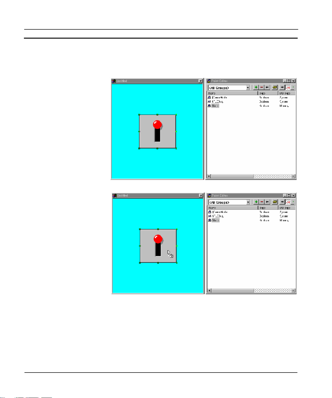
Drag and Drop of Points onto Control Objects
The Point Editor can be used to drag and drop points onto control objects. For instance, Integer
points can be dragged from the Point Editor onto a Linear Gauge, Rotary Gauge, Trend Graph and
Slider. Boolean points can also be applied to a Toggle.
Release 2.0 Page 25
Page 49
CHAPTER 3 – Points OMRON
To apply a point to a control object with the Point Editor:
1, 2, 3…
1. Arrange the CX-Supervisor windows so that the point to drag and the
target control object are both visible.
2. Select the point to associate and drag it onto the page.
3. Drop the point at the position of the target control object. An invalid
“drop” is denoted by the mouse pointer changing to a circular symbol.
For further information of the use of points with objects, refer to chapter 4, Objects.
Page 26 Release 2.0
Page 50

OMRON CHAPTER 3 – Points
Creating a Point
To add a new point, select the Add Point button from the toolbar. This results in the Add
Point dialog being displayed:
Once all the information has been provided for the new point, clicking the OK pushbutton commits
the new point to the points database, whilst the Cancel pushbutton aborts the add operation.
General Attributes
The name of the point is entered in the Point Name: field. The point name can be up to 20
alphanumeric characters, and must not begin with a digit or include mathematical operators such as
“+”, or be identical to a script reserved word such as “IF” or “cos”. Any invalid characters (including
spaces) generate an audible error, or an “Invalid Point Name entered” message when the OK
pushbutton is clicked.
The group to which this point belongs is selected from the Group: field. A new group can be entered
by typing in the Group: field.
A points description, detailing the use of the current point, may be inserted in the Description: field.
Point Type
The point type can be Boolean, Integer, Real or Text. The default type is Boolean.
Release 2.0 Page 27
Page 51

CHAPTER 3 – Points OMRON
Point Attributes
The attributes for a point vary according to the point type.
For a Boolean point, the following attributes are displayed:
The default state of the point is defined by selecting either the State 0: or State 1: setting.
Associative text (such as ‘OFF’ or ‘FALSE’ for state 0) can be applied in the related Default Text:
fields. The default text is associated with Toggle buttons and object animations such as Display
Value and Edit Point Value when they are configured to use the point.
For an Integer point, the following attributes are displayed:
The minimum threshold for the point is inserted into the Minimum Value: field.
The maximum threshold for the point is inserted into the Maximum Value: field.
The default value is inserted in the Default Value: field.
Note: Integer points are limited to -2,147,483,648 to 2147483647
For a Real point, the following attributes are displayed:
The minimum threshold for the point is inserted into the Minimum Value: field. The maximum
threshold for the point is inserted into the Maximum Value: field.
Page 28 Release 2.0
Page 52

OMRON CHAPTER 3 – Points
The default value is inserted in the Default Value: field.
Note: Real points are limited to 1.7E +/- 308 to a precision of 15 digits.
For a Text point, the following attribute is displayed:
Text is entered in the Text: field.
Note: Memory Text points can have 32768 characters but PLC I/O Text Points are limited to 1024
characters.
I/O Type
The I/O type states the scope of the point, i.e. whether it is purely an internal variable or whether it
communicates with a PLC.
♦ A Memory Resident point is provided internally by CX-Supervisor.
♦ An Input point receives data from an external device.
♦ An Output point sends data to an external device.
♦ An Input/Output point both sends data to and receives data from an external device.
Memory Attributes
The Array Size field allows Memory Point arrays to be created. If an Array Size of 1 is specified, a
single point is created. Specifying any other value creates an array of points of this type.
This option is only available to Memory Resident points.
Release 2.0 Page 29
Page 53

CHAPTER 3 – Points OMRON
I/O Update Rate
The I/O Update Rate specifies how and when communication with the PLC takes place.
This option is not available to Memory Resident points.
The On Change option specifies that communication with the PLC occurs automatically as a result
of a value change.
The On Request option specifies that data updates with the PLC will be manually requested using
the scripting commands InputPoint and OutputPoint. The point is updated internally but only
communicates with the PLC when requested to by the script commands.
The On Interval option specifies the frequency that communications occur with the PLC. When this
option is selected an list box appears allowing the frequency to be entered.
I/O Attributes
The I/O Attributes option specifies the external source or destination for the point.
This option is not available to Memory Resident points.
Page 30 Release 2.0
Page 54
OMRON CHAPTER 3 – Points
The external source is defined by selecting the appropriate I/O Attributes: setting. Further
configuration of the external source can be applied by clicking the Setup pushbutton.
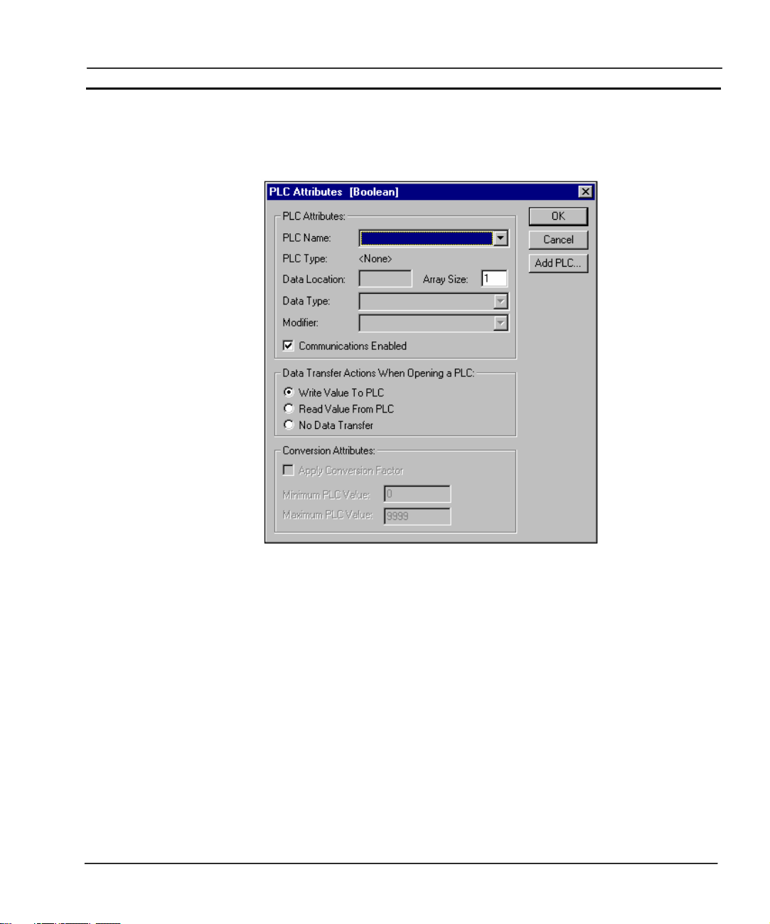
On clicking the Setup pushbutton for a PLC external source, the PLC Attributes dialog is displayed.
The point type associated with the PLC Connection attributes is shown in the title bar. The required
PLC can be selected from the PLC: field. If no PLCs exist in the PLC: field then one must be added.
This is achieved by clicking the Add PLC pushbutton and configuring one. A point cannot be
configured to have a PLC connection unless all the PLC connection attributes are correctly
configured. For more information on adding and configuring PLCs and devices see chapter 6
Projects, Device Configuration.
PLC Attributes
The Data Location: field identifies the area of memory to which this address applies and is dependent
upon the type and configuration of the PLC.
The Data Type: field identifies the type of data held at this address. The type determines how point
values are converted from a computer format into a PLC format. The field contains options
applicable to the Data Location.
Release 2.0 Page 31
Page 55

CHAPTER 3 – Points OMRON
The Modifier: field indicates the command to be performed on the data at this address. An example
of a modifier is for a bit: a modifier might declare that a bit is to be forced set and not to be written
normally. The field contains options applicable to the Data Location.
The Array Size: field specifies the number of data values associated with the point. A value greater
than 1 allows the point to be treated as an array. For more detail on array points and their uses see
Optimisation of PLC Communications.
The PLC Attributes dialog takes on a slightly different appearance if the point type is text, showing
the number of characters which start at the specified data location:
Data Transfer Actions When Opening a PLC
The type of data transfer action for the selected PLC can be specified by selection of the appropriate
setting. Options for Input and Input/Output points are Always Update Point Value and Only Update
Point Value When On Display. Options for an Output point are Write Value, Read Value and No Data
Transfer.
Conversion Attributes
The minimum and maximum PLC value and the application of a conversion factor is specified in the
Conversion Attributes: fields (these fields are not applicable for Boolean and text points).
Conversion Attributes can be used to convert in a linear fashion between a value in a PLC and the
point range. For example, if the possible range in the PLC is 0 to 1000, and the point range is 0 to
100, then a PLC value of 500 would correspond to a point value of 50. The conversion would be
performed just before the data is sent to the PLC, or immediately upon receipt of it from the PLC.
On completion of the PLC configuration connection, click the OK pushbutton to continue, or the
Cancel pushbutton to abort. Click the Add PLC pushbutton to create a new PLC connection.
Information relating to the selection of this pushbutton is described in chapter 6 Projects, Device
Configuration.
Advanced Point Settings
Advanced settings can be applied to a new point, by clicking the Advanced pushbutton in the Add
Point dialog. This results in the Advanced Point Settings dialog being displayed.
Page 32 Release 2.0
Page 56

OMRON CHAPTER 3 – Points
In order to access a CX-Supervisor point value via OLE2 Automation, it must be given OLE Read or
OLE Write access. The scope of the access can be defined by checking the appropriate setting in the
OLE Access.
The point value which is stored to disk may be Volatile or Non-volatile by selecting or deselecting
the Non-Volatile check-box. A Non-volatile point ensures the preservation of the point’s value at
regular intervals. If power is lost, or CX-Supervisor is shut down for any reason, then when the
application is restarted the point is initialised to the last saved value. These values are saved in a
project file with .NVP extension. To prevent unexpected operation, this file is automatically deleted if
further point changes are made in the Developer. In this case points revert to their Default value.
Select the Validate Point is Within Specified Range check-box. This option is only available for
Input or I/O points of type Integer or Real. When checked, an error message is displayed in the error
log if the data passed to CX-Supervisor is outside of the specified Minimum and Maximum range.
Click the OK pushbutton to accept the advanced settings, or the Cancel pushbutton to abort the
operation.
Amending an Existing Point
To modify an existing point, highlight the point from the points list and click the Modify
Point button from the toolbar.
This results in the View Point dialog being displayed as shown below, a dialog based on the Add
Point dialog:
Release 2.0 Page 33
Page 57

CHAPTER 3 – Points OMRON
The selected point can be redefined as described in chapter 3, Creating a Point.
Note: If a point is renamed then any animations or scripts that were using the previous point name
become invalid. Run the Analyse Application tool to check for References to non-existent points.
Deleting an Existing Point
To remove an existing point, highlight the point from the points list and click the Delete
Point button from the toolbar. This results in a confirmation dialog being displayed. Click
the Yes pushbutton to remove the point from the points database, or the No pushbutton to
abort the delete operation.
Note: It is possible to delete more than one point by either selecting points within a range or
by selecting individually several points.
To select a range click on a point to mark the start of the range and click again with the <SHIFT> key
down to mark the end.
To individually select more than one point click whilst holding the <CTRL> key down.
Note: If a point is deleted then any animations or scripts that were using the point become invalid.
Run the Analyse Application tool to check for References to non-existent points.
Page 34 Release 2.0
Page 58

OMRON CHAPTER 3 – Points
Quick creation of many points
CX-Supervisor supports up to 8,000 points, which could take much time to create. Within the Point
Editor you can use Copy/Paste which helpfully increments the point name automatically
(BoilerTemp1 becomes BoilerTemp2, BoilerTemp3 etc) but you still have to edit each point to
configure the PLC address and possibly other information. Using the Copy and Paste functions, Point
data can quickly be edited and created for example in grid form using Excel. This can prove
extremely quick when the design uses contiguous addresses.
1, 2, 3…
1. Open the Point Editor.
2. Select the points to edit, or a single point to act as a template and Copy to the Windows
Clipboard
3. Start Excel.
4. Position the cursor in column A and paste the CX-Supervisor Points into Excel. The
worksheet should resemble the following:
Each row is a single point, and each column is a setting of that point.
Note: Some settings may be hidden on the right. Use the scrollbar to view.
5. Edit the point details as required.
Note: To quickly create new points with the same settings, select the whole row by
clicking the row number on the left. A range can now be drawn to be filled by dragging the
black square box on the bottom left of the range selection:
Release 2.0 Page 35
Page 59

CHAPTER 3 – Points OMRON
Excel will automatically increment any data ending in a number. This can be very useful for
Names and PLC Addresses (columns A and F) but take care with other columns. If other
columns are wrongly incremented, like PLC Name, Array size and Data Range (columns E,
G and K) these can quickly be copied by selecting the correct value e.g. G1 then using the
square box to highlight the column of data to fill. To see the fill options hold down the right
mouse button before draging the square box. Repeat for each column.
6. When editing is completed, select the row(s) to required and select Copy
7. Switch back to the Point Editor and select Paste.
Note: If the pasted point names already exist, CX-Supervisor will automatically add or
increment a number on the end to prevent overwriting. If you wish to overwrite to replace
old point settings, simple delete (not Cut) the old points from the Point Editor before pasting.
Note: All pasted points will pasted into the group on view
Runtime Point Maintenance
It is possible to reconfigure points at runtime via the right mouse button floating menu option Points
Maintenance. The Point Maintenance dialog is displayed.
Page 36 Release 2.0
Page 60

OMRON CHAPTER 3 – Points
To monitor and change the value of a point in runtime, select a point from the Point Name: field.
The Filter Options: field and settings refines the points listed in the Point Name: field. Select the
Get Value pushbutton to retrieve the current value of the selected point. Specify a new point value in
the Point Value/Text: field and click the Set Value pushbutton. The Diagnostics button shows
details including communications statistics, useful for diagnosing communication problems. Note this
button is only available when a user with ‘Designer’ privileges is logged in. Select the Close
pushbutton to complete the operation.
Optimisation of PLC Communications
PLC communication speeds can be increased by creating “array” points which contain several
elements of the same type, rather than creating a large number of individual points. For instance, the
time taken to update an array point containing 50 elements are quicker than the time taken to update
50 individual points.
Creation of an “Array” Point
An “array” point can be created by specifying a value greater than 1 in the Elements: field of the
Setup PLC Connection dialog. The Data Location field specifies the memory address from which the
array of data begins.
Note: Elements of an array point are located at consecutive addresses after the address
specified in the Data Location field.
Accessing Elements of an “Array” Point
Direct access to array points can be achieved by applying a subscript to the pointname, e.g.
pointname[index]. For more information refer to the CX-Supervisor Script Language Reference
Manual.
Point Import
To import PLC points from other applications, click the Import PLC Points button from the
toolbar. This results in the Import PLC Points From Another CX-Server Project dialog being
displayed.
The Point Import tool can be used to import point information into the CX-Supervisor project that has
already been configured. The symbol name, symbol type and PLC address is imported from the
CDM file generated by other applications.
The CDM file can be generated from CX-Programmer by linking the project to the CDM file. The
CDM file can also be generated by exporting from a SYSWIN project to a CDM file. Refer to the
documentation supplied with the package for information on how to export or link the data to the
CDM file.
Release 2.0 Page 37
Page 61

CHAPTER 3 – Points OMRON
It is possible to import points from the CDM file of another CX-Supervisor project but this is not
recommended, as only the name, type and address are imported. A better method is to copy the
points from one application to the clipboard, and paste them in the required application. This way all
point information is copied.
Steps to import from another CDM file.
1) Open the Import PLC Points From Another CX-Server Project dialogue
2) Press Open Project and find the project to import from
3) Select the tab depending upon the I/O type required
4) Click the Add button and select the symbols required
5) Add these to the CX-Supervisor project by clicking the Add button
6) Press OK to return
7) Repeat for other I/O types
8) Press OK to finish
System Points
System Points are those points that are pre-defined within CX-Supervisor. They cannot be edited or
deleted, but their attributes can be viewed. All system points can be selected from the System Point
dialog.
System points are listed in the points list, and are denoted by a ‘$’ symbol preceding the point name.
To view system points only, select System Points from the Group: field. Once listed, the Boolean
Points, Integer Points, Real Points, Text Points and All Points pushbuttons on the toolbar are
unavailable for selection. To view other points, select All Groups from the Group: field.
Time Points
The following table describes system points for use with time based operations. Provisions are given
to both 12 hour and 24 hour time formats.
System point Point type Point range Remarks
$12Hour Integer 0-12 Hours in 12-hour format.
$AMPM Text — AM/PM indicator for 12-hour clock form.
$Hour Integer 0-23 Hours in 24-hour format.
$Millisecond Integer 0-999 Number of milliseconds.
$Minute Integer 0-59 Minutes.
Page 38 Release 2.0
Page 62

OMRON CHAPTER 3 – Points
$Second Integer 0-59 Seconds.
$Time Text — Time (e.g. 09:46).
Date Points
The following table describes system points for use with date based operations. Provisions are given
for numerical and alphanumerical formats.
System point Point type Point range Remarks
$Date Text — Date (e.g. 28/02/95).
$DayOfMonth Integer 1-31 Day of the month.
$DayOfYear Integer 1-366 Day of the year.
$Month Integer 1-12 Month ( 1 - January, 12 – Dec.).
$MonthName Text — Month name (e.g. February).
$ShortMonthName Text — Abbreviated month name (e.g. Feb).
$ShortWeekDayName Text — Abbreviated weekday name (e.g. Wed).
$ShortYear Integer 0-99 Abbreviated year (e.g. 95).
$WeekDay Integer 0-6 Day of the week (0 - Sun, 6 – Sat).
$WeekDayName Text — Weekday name (e.g. Wednesday).
$WeekOfYear Integer 0-51 Week number for the year.
$Year Integer 1970-2038 Year (e.g. 1995).
Internal Points
The following table describes system points for use with interrogating current system settings, such
as memory and disk space restrictions and other system resources.
System point Point type Point range Remarks
$AvailableMemory Integer 0-2,147,483,647 Amount of available memory, in bytes.
$DemoMode Boolean — Indicates whether a valid USB Dongle has
$DiskSpace Integer 0-2,147,483,647 Amount of free disk space available, in
$PCName Text - Computer name of PC as seen in Explorer
$ProjectName Text - Name of project file, without .SCS
$ProjectPath Text - Path to project on disk, without project
Release 2.0 Page 39
been installed.
bytes.
extension
Page 63

CHAPTER 3 – Points OMRON
name.
$SpoolCount Integer 0-2,147,483,647 Number of alarm entries currently spooled,
$Version Text - Version number of CX-Supervisor
awaiting printing to page printer.
Runtime program
Display Points
The following table describes system points for use with the display mode.
System point Point type Point range Remarks
$ScreenSizeX Integer 0-2,147,483,647 Screen width.
$ScreenSizeY Integer 0-2,147,483,647 Screen height.
Mouse Points
The following table describes system points for use in mouse movement and operation. They are
updated on a left button click.
System point Point type Point range Remarks
$MouseX Integer 0-65535 Mouse X co-ordinates.
$MouseY Integer 0-65535 Mouse Y co-ordinates.
Alarm Points
The following table describes system points for use with CX-Supervisor alarms.
System point Point type Point range Remarks
$ActiveAlarms Integer 0-2,147,483,647 Number of active alarms.
$AlarmCount Integer 0-2,147,483,647 Total number of alarms.
$HighestAlarms Integer 0-2,147,483,647 Number of active highest priority alarms
$HighAlarms Integer 0-2,147,483,647 Number of active high priority alarms
$MediumAlarms Integer 0-2,147,483,647 Number of active medium priority alarms
$LowAlarms Integer 0-2,147,483,647 Number of active low priority alarms
$LowestAlarms Integer 0-2,147,483,647 Number of active lowest priority alarms
$Unacknowledged
Alarms
Integer 0-2,147,483,647 Number of alarms currently unacknowledged
Error Logger Points
The following table describes system points for use with CX-Supervisor errors.
Page 40 Release 2.0
Page 64

OMRON CHAPTER 3 – Points
System point Point type Point range Remarks
$HighErrors Integer 0-2,147,483,647 Number of high priority errors logged.
$LowErrors Integer 0-2,147,483,647 Number of low priority errors logged.
$MediumErrors Integer 0-2,147,483,647 Number of medium priority errors logged.
PLC Communications Points
The following table describes system points for use in the communication between CX-Supervisor
and a PLC.
System point Point type Point range Remarks
$InputsActual Real — Reports average number of PLC input points
$PLCBusy Boolean — Indicates if PLC communications are busy.
$PLCFailures Integer 0-2,147,483,647 Total number of PLC failures.
read per second since application startup.
Security Points
The following table describes system points for use with user login, logout, and user privileges in the
runtime environment.
System point Point type Point range Remarks
$SecurityLevel Integer 0-4 Current user’s security level.
$SecurityName Text — Current user’s security name.
$UserName Text — User currently logged on.
Printing Points
Print Setup
The Point Editor can be printed in the same way pages can. Before printing, ensure that the printer
has been set up correctly. To check the printer settings, refer to chapter 2, Pages.
Print Preview
To preview the page before printing, select Print Preview from the File menu.
Refer to chapter 2, Pages regarding the use of the Print Preview display.
Printing
To print the contents of the Point Editor, select the Print button from the toolbar.
Release 2.0 Page 41
Page 65

CHAPTER 3 – Points OMRON
Refer to chapter 2, Pages regarding the use of the Print dialog.
Point Substitution
Overview
As well as using point names in expressions, in many cases where text is entered this can be made
dynamic by using point substitution. Part or all of the text may be a point name, enclosed in the Point
Substitution characters (double round brackets by default).
Examples of the way in which text is changed:
The shift foreman was ((ShiftForeman))
becomes:
The shift foreman was Fred Smith
and
The shift output was ((ShiftOutput)) litres
becomes:
The shift output was 5000 litres
Using Format specifiers
Format specifiers can be used, similar to the Format script command:
%s for text string points;
%d for integer points;
%f for real floating points.
Where ‘MyTextpoint=“Hello”’:
The text of ((“My text point is %s”,Mypoint))
becomes:
The text of My text point is Hello
Where MyRealpoint=5467.7658:
To two decimal places the value of MyRealpoint is
((“%4.2f”,MyRealpoint))
becomes:
To two decimal places the value of MyRealpoint is 5467.76
Combinations of format specifiers are possible:
((%s to two decimal places the value of MyRealpoint is
%4.2f”,MyTextpoint,MyRealpoint))
becomes:
Page 42 Release 2.0
Page 66

OMRON CHAPTER 3 – Points
Hello to two decimal places the value of MyRealpoint is 5467.76
The can be used in various fields, for example:
• In Alarm Raised and Cleared Messages e.g.
Alarm Raised: “Boiler Temperature too high. Current value is
((“%.1d”, BoilerTemp))”
• As captions for popup edit box animations. This is useful as the captions are then
dynamically translated e.g.
Caption: “((CaptionString))”
• As parameter to MessageBox. This is useful to help convert numbers to strings e.g.
MessageBox(“Error ((ErrorNum)) occurred”)
• As parameter to LogError or LogEvent. This too is useful to help convert numbers to strings
e.g.
LogError(“Error ((ErrorNum)) occurred”, priority)
• Titles in Graphs and Charts (useful for translations again) e.g.
Title: “((TitleString))”
• In Tooltips, for dynamic information
Tooltip text: “((ToolTipString))”
• In Report templates. See Script Reference GenerateReport() for more information.
See Chapter 6, Point Substitution Settings and FAQ – Creating Reports and HTML Reports for
related information
Release 2.0 Page 43
Page 67

Page 68

OMRON CHAPTER 4 – Objects
CHAPTER 4 Objects
This chapter describes the various objects available within CX-Supervisor. It also describes the
processes for creating, editing and manipulating objects.
Objects
Pages created with CX-Supervisor are constructed from objects that are inserted and linked together
to form a coherent interface. CX-Supervisor objects are divided into three groups: graphical, control
and embedded.
Generally, the procedures for creating objects are identical. A pushbutton representing the desired
object is clicked on the Graphic Object bar. The mouse pointer is then either clicked on the page (for
a default sized object), or clicked and dragged to the appropriate point on the page for a custom sized
object.
Editing Objects
Editing falls into three distinct categories:
♦ Re-sizing an object.
♦ Re-shaping an object.
♦ Modifying an object using a Wizard.
Re-sizing
To re-size an object, click on it with the left mouse button. This ‘selects’ it and brings up green
sizing grab handles. Click and drag the handles until the object is of the desired size.
Re-shaping
Re-shaping procedures are similar for all graphical objects which can be reshaped. Not all can.
Control objects can only be reshaped using Wizards.
To change the shape of a graphical object, choose Edit Object from the Edit menu to bring up the red
editing grab handles. Click and drag the handles until the object is of the desired shape.
The typeface of the editor can be amended by choosing Preferences from the File menu. This is
especially useful when printing.
CX-Supervisor preferences can be configured such that double-clicking on a graphical object also
brings up the red editing grab handles. Setting this preference is achieved by selecting Preferences
from the File menu. Refer to chapter 2, Pages for further details on preferences and CX-Supervisor
configuration.
Release 2.0 Page 45
Page 69

CHAPTER 4 – Objects OMRON
Wizards
Control objects cannot be re-shaped in the same way as a graphical object but are edited using
Wizards. Wizards customise control objects to display information in an easy to understand manner.
To edit a control object and activate a Wizard, double click on the object.
Note: The shortcut keyboard combinations for Cut, Copy and Paste operations are valid
within Wizards. Highlight part or all of a field and type <Ctrl>+X to cut the text or
<Ctrl>+C to copy the text; move the cursor to the desired field and type <Ctrl>+V
to paste the text. Since the cut and copy operations store the information in the
Windows Clipboard, they may be pasted to another Wizard, dialog or application.
Creating and Editing Graphic Objects
For details on re-sizing the graphic objects described in the following paragraphs, refer to chapter 3,
Editing Objects.
Arc
Arcs may be transparent or filled with a colour or pattern. To insert an Arc, select the Arc
button from the Graphic Object bar. Click or click and drag on the page.
To edit the arc, obtain the red grab handles. Click and drag to change the angle subtended by the arc.
To finish editing, click elsewhere on the page or press <Esc>.
Block Text
To insert block text, click the Block Text button, and then click on the page. Stretch the text
object to resize it. Standard text tools from the toolbar and the keyboard (e.g. bold, italic,
left-justify) can be used, and their effect applies to the whole content of the object.
To edit block text, double click on it. A Text-Editing dialog is displayed. The text can then be
changed, as can the word-wrap and border options. Standard Windows cut, copy and paste facilities
can be used.
Ellipse
Ellipses may be transparent or filled with a colour or pattern. To create a filled ellipse, click
the Ellipse button.
To create a transparent ellipse, click the Ellipse Frame button. Alternatively, select a filled
ellipse and click the Transparency.
Either click on the page to create a circle, or click and drag to create an ellipse. Ellipses cannot be
edited but can be re-sized.
Page 46 Release 2.0
Page 70

OMRON CHAPTER 4 – Objects
Line
To insert a line, click on the Line button. Click and drag on the page to draw a line of the
required length.
To edit the line, obtain the red grab handles. Click and drag to change the line. To finish editing
click elsewhere on the page or press <Esc>.
Polygon
Polygons may be transparent or filled with a colour or pattern. To create a polygon, click the
Polygon button. Click on the page to draw vertices. To finish creating the polygon either
click the right mouse button, press <Esc> or double click the left mouse button.
To edit the polygon obtain the red grab handles. Click on an edge to add a vertex or click and drag a
vertex to move it.
To finish editing, either click elsewhere on the page or press <Esc>.
To split a straight line into two, click at the point on the line where the split is required then drag the
mouse. CX-Supervisor creates a new handle which may be moved to the desired point. To remove a
red handle and the vertex on which it rests, click on it with the delete key held down on the keyboard.
Polyline
To create a polyline, click the Polyline button. Click on the page to draw vertices. To finish
creating the polyline, click the right mouse button.
To edit a polyline, obtain the red grab handles. Click on an edge to add a vertex. Press the <Delete>
key whilst moving a vertex to delete it.
To finish editing, click elsewhere on the page.
Rectangle
Rectangles can be transparent or filled with a colour or pattern. To create a filled rectangle,
click the Rectangle button.
To create a rectangle frame, click the Rectangle Frame button. Alternatively, select a filled
rectangle and click the Transparency button from the toolbar.
Click on the page to draw a square, or click and drag to create a rectangle of the required size. Once
created, rectangles can be edited exactly like polygons.
To finish editing, click elsewhere on the page.
Round Rectangle
Rounded rectangles can be transparent or filled with a colour or pattern. To create a filled
rounded rectangle, click the Round Rectangle button from the Tool Bar.
Release 2.0 Page 47
Page 71

CHAPTER 4 – Objects OMRON
To create a rounded rectangle frame, click the Round Rectangle Frame. Alternatively,
select a filled round rectangle and click the Transparency button from the Control Bar.
Click on the page to draw a rounded square, or click and drag to create a rounded rectangle of the
required size.
To edit the rounded rectangle, obtain the red grab handles. The radius of curvature of the rounding
can be adjusted by clicking on the single red grab handle and dragging it, as illustrated below:
Text
To insert text, click the Text button. Click on the page and type inside the red edit box. The
cursor is moved round the text using the arrow keys. Standard text editing tools from the
toolbar and the keyboard can be used, and their effect applies to the whole content of the
object.
To edit text, double click on it. A box is displayed round the text.
Press <Return> to finish editing and create a new text object on the line below. To finish editing,
click elsewhere on the page.
Creating and Editing Control Objects
Alarm Object
Click the Alarm button, then click or click and drag on the page to insert the alarm object.
The Alarm object displays alarm messages in runtime. These messages may be optionally filtered by
an alarm group and can be formatted to include the date, time and status of the alarm. If there are
more alarms to view than the space provided then you can scroll the alarm view.
To edit an Alarm object, double click on it. The Alarm Wizard dialog is displayed as follows:
Page 48 Release 2.0
Page 72

OMRON CHAPTER 4 – Objects
Alarms are defined using the Alarm Editor; refer to chapter 8, Alarms for information on using the
Alarm Editor.
The Alarm Wizard allows entry of the alarm group filter, alarm status colour codes and various style
attributes. The Alarm Wizard presents a preview of the alarm object, which immediately updates to
show the user selections as they are made.
1, 2, 3…
1. Select the name of the alarm group by which alarm messages are to be
filtered using the Group field to display the list of available groups. The
default selection is <All Groups>, which displays all alarm messages.
To display more than one group use the * wildcard character e.g. Group1*
will include all groups starting Group1.
2. From the Acknowledge On Click options select the level of security that is
required for acknowledgement. The default is All Users.
Release 2.0 Page 49
Page 73

CHAPTER 4 – Objects OMRON
3. From the Display Alarms from Selected Priorities, options select the range
of alarms that are to be displayed. The default selections are from the
Lowest to the Highest.
Note that the range ‘From’ must be the same or lower than the range ‘To’.
Use the check box ‘Highest Priority at Top’ to reverse the alarm order.
4. In Alarm Status Colours, the colour codes for each of the three alarm states
and blinking colours may be specified by clicking the appropriate colour
box and selecting a new colour from the resultant Colour dialog.
5. The Alarm Window Colours options allow you to select the colours for the
Alarms Windows Background, Title text and the Frame.
6. Select the font used by the alarm object using the Font pushbutton.
7. In Style Attributes, set the following options as desired:
Display Date: shows the date of the alarm.
Display Time: shows the time of the alarm.
Display Alarm Status: shows the status of the alarm.
Display Column Titles: shows the column headings.
3-D Frame: displays object with 3-D border.
Highest Priority at Top: shows highest priority at top.
Display Group: shows the groups of the alarm.
Display Priority: shows the priority of the alarm.
Date Width: number of characters in date field.
Time Width: number of characters in time field.
Group Width number of characters in priority field
Status: number of characters in status field.
8. Exit the Wizard by clicking the OK pushbutton to accept the new alarm
object attributes or click the Cancel pushbutton to leave the alarm object
unchanged.
Bar Chart
Click the Chart button, then click or click and drag on the page to insert the Chart.
To edit a Bar Chart, double click on it. The Chart Wizard dialog is displayed as follows:
Page 50 Release 2.0
Page 74

OMRON CHAPTER 4 – Objects
The Chart Wizard allows entry of configuration attributes and assignment of expressions.
1, 2, 3…
1. Enter a title for the chart in the Chart Title: field.
2. Select the chart style from the Chart Style: field.
3. Select the colour of the chart background.
4. Toggle the Project Colours, 3-D Frame and Auto Fit Bars fields as desired.
The Project Colours option allows the user to change the colour of the axis
using the toolbox. The 3-D Frame option enables the chart to appear with a
3-D frame. The Auto Fit Bars option forces the configured bars to resize
themselves to occupy all of the available chart area.
5. Change the fonts used for the chart via the Font pushbutton. The font size
used for the chart can be automatically calculated by selecting the Auto Size
Font option.
6. Enter an arithmetic trace expression for each point or select one by clicking
on a Browse pushbutton. An existing point can also be associated with the
Wizard by dragging a point directly from the Point Editor. Refer to chapter
3, Points regarding adding a new point and dragging from the Point Editor.
7. Exit the Wizard by clicking the OK pushbutton to accept the new chart
attributes, or click the Cancel pushbutton to leave the chart unchanged.
To select the chart scaling, click the Scaling pushbutton; the Axis Scaling dialog is displayed as
follows:
Release 2.0 Page 51
Page 75

CHAPTER 4 – Objects OMRON
The Configuration Attributes fields can be altered by typing over the existing entries. The Style
Attributes fields can be amended by clicking on the settings.
Exit the Axis Scaling dialog by clicking the OK pushbutton to accept the scaling attributes, or click
the Cancel pushbutton to leave them unchanged.
Pictures
Pictures and graphics can be inserted on a page in the form of bitmaps (.bmp) or Windows
metafiles (.wmf). Click the Picture button, then click or click and drag on the page to insert
a picture placeholder.
To insert a picture, double click on the placeholder. The Picture Wizard dialog is displayed as
follows:
Page 52 Release 2.0
Page 76

OMRON CHAPTER 4 – Objects
1, 2, 3…
Note: If the PC installation of CX-Supervisor is on a networked machine, a Network
A bitmap or Windows metafile image can be selected and resized just like a graphical object.
Linear Gauge
A Gauge provides a display of operational values. Click the Linear Gauge button, then
click or click and drag on the page to insert the gauge.
To edit a Linear Gauge object, double click on it. The Gauge Wizard dialog is displayed as follows:
1. Locate the drive and directory where the desired picture is stored using the
Directories: and Drives: controls.
2. Select the file type and then the picture from the list presented.
3. Use the Display picture at original size setting to specify whether the
picture is to be displayed at original size or scaled.
4. Click the OK pushbutton to load the page.
pushbutton is added to the dialog. For further information on the function of the
Network dialog, refer to the Microsoft Windows User Guide.
Release 2.0 Page 53
Page 77

CHAPTER 4 – Objects OMRON
The Gauge Wizard dialog allows entry of the Gauge Style:, Configuration Attributes:, Style
Attributes: and Style Specific Attributes: fields.
To select a style, click on an option from the appropriate field. To select an Expression Attribute,
click on the Browse pushbutton and select a point from the displayed list. The Select Required Item
dialog is displayed; click the OK pushbutton to accept the point or click the Cancel pushbutton to
leave the point unselected. Clicking the Add Point button from the toolbar allows a new point to be
created prior to association with the Gauge Wizard. An existing point can also be associated with the
Gauge Wizard by dragging a point directly from the Point Editor. Refer to chapter 3, Points
regarding adding a new point and dragging from the Point Editor.
To enter gauge values or display units, type over the existing field entries.
The Gauge can be displayed in linear or rotary format, either with or without ticks.
The text font used for the gauge title can be changed via the Title Font pushbutton. The text font
used for the gauge scale can be changed via the Scale Font pushbutton. The font size used by the
gauge can be automatically calculated for the user by selecting the Auto Size Fonts field.
Exit the Gauge Wizard by clicking the OK pushbutton to accept the new gauge attributes or click the
Cancel pushbutton to leave the gauge unchanged.
Pushbutton
Pushbuttons provide a simple means to start a set of actions. Click the Push Button button,
then click or click and drag on the page to insert a pushbutton.
To edit the pushbutton, double click on it. The Push Button Wizard dialog is displayed as follows:
The Wizard allows a pushbutton to be assigned a style or text or both to signify its purpose. To select
a style, click on an option in the Button Style field. To enter button text, type in the Button Text field
(the Style Attributes: dialog is automatically updated). The text font can be changed via the Font
pushbutton. Click the OK pushbutton to accept the new button attributes, or click the Cancel
pushbutton to leave the button unchanged. Examples of the different styles of pushbutton are
illustrated below:
Page 54 Release 2.0
Page 78

OMRON CHAPTER 4 – Objects
The colour of the coloured pushbutton is red by default, but can be changed by using the Palette.
Rotary Gauge
A Gauge provides a means of displaying the value of an operation or the value of a point.
Click the Rotary Gauge button, then click or click and drag on the page to insert a gauge.
To edit the Rotary Gauge, double click on it. The Gauge Wizard dialog is displayed as follows:
The Wizard allows entry in the Gauge Style:, Configuration Attributes:, Style Attributes: and Style
Specific Attributes: fields.
Release 2.0 Page 55
Page 79

CHAPTER 4 – Objects OMRON
To select a style, click on an entry in the Gauge Style field. To select an Expression Attribute, click
on the Browse pushbutton and select a point from the displayed list. The Select Required Item dialog
is displayed; click the OK pushbutton to accept the point or click the Cancel pushbutton to leave the
point unselected. Clicking the Add Point button from the toolbar allows a new point to be created
prior to association with the Wizard. An existing point can also be associated with the Wizard by
dragging a point directly from the Point Editor. Refer to chapter 3, Points regarding adding a new
point and dragging from the Point Editor.
To enter gauge values or display units, type over the existing field entries. Enter display angles by
typing over the existing field entries.
Check the boxes to choose the required style attributes. The Gauge can be displayed in linear or
rotary format, either with or without ticks.
The text font used for the gauge title can be changed via the Title Font pushbutton. The text font
used for the gauge scale can be changed via the Scale Font pushbutton. The font size used by the
gauge can be automatically calculated for the user by selecting the Auto Font Size option.
Exit the Wizard by clicking the OK pushbutton to accept the new gauge attributes or click the Cancel
pushbutton to leave the gauge unchanged.
Scatter Graph
Click the Scatter Graph button, then click or click and drag on the page to insert a graph.
To edit the graph, double click on it. The Scatter Graph Wizard dialog is displayed as follows:
Page 56 Release 2.0
Page 80

OMRON CHAPTER 4 – Objects
The Wizard allows entry in the Configuration Attributes: and Expressions fields.
1, 2, 3…
1. Enter the frequency of data sampling in the Sample Rate: field; in this
example the sample rate is every thirty seconds.
2. Enter the maximum number of samples to be displayed on the scatter graph
in the Max Samples: field.
3. Select the type of symbol to represent the data.
4. Select the colour of the symbol representing the data.
5. Select the colour of the scatter graph background.
6. Toggle the Project Colours and 3-D Frame settings as desired. If set, the
Project Colours field allows the colour of the axis to be changed using the
Palette. The 3-D Frame option enables the graph to appear with a 3-D
frame.
7. Either enter an arithmetic expression for the X and Y axis or select one
through the Browse pushbutton. An expression point can also be
associated with the Scatter Graph Wizard by dragging a point directly from
the Point Editor. Refer to chapter 3, Points regarding adding a new point
and dragging from the Point Editor.
8. Change the fonts used for the Scatter Graph via the Font pushbutton. The
font size used by the graph can be automatically calculated for the user by
selecting the Auto Size Font field.
9. Exit the Scatter Graph Wizard by clicking the OK pushbutton to accept the
new scatter graph attributes or click the Cancel pushbutton to leave the
scatter graph unchanged.
To configure the X axis, click the X-Axis pushbutton. To configure the Y-axis , click the Y-Axis
pushbutton. The Axis Scaling dialog is displayed:
Release 2.0 Page 57
Page 81

CHAPTER 4 – Objects OMRON
Configuration attributes can be altered by typing over the existing field entries. The style attributes
can be amended by clicking on the settings.
Exit the Axis Scaling dialog by clicking the OK pushbutton to accept the scaling attributes, or click
the Cancel pushbutton to leave unchanged.
Slider
Sliders allow values associated with them to increase or decrease between certain limits.
They can also ensure that values do not exceed previously set limits.
Click the Slider button, then click or click and drag on the page to insert a slider.
To edit the Slider, double click on it. The Slider Wizard dialog is displayed as follows:
The Wizard allows entry of in the Slider Style:, Style Attributes: and Configuration Attributes: fields.
To select a style, click on an option from the list box. The Style Attributes: can be either Display
Vertical or Display Horizontal. To select a Boolean point, click on the Browse pushbutton and select
a point from the displayed list. Click the OK pushbutton to accept the point or click the Cancel
pushbutton to leave the point unselected. Clicking the Add Point button from the toolbar allows a
new point to be created prior to association with the Wizard. An existing point can also be associated
with the Wizard by dragging a point directly from the Point Editor. Refer to chapter 3, Points
regarding adding a new point and dragging from the Point Editor.
Enter the maximum and minimum slider values and check the box to display the minimum value at
the left or bottom of the page.
Exit the Wizard by clicking on the OK pushbutton to accept the new slider attributes or click on the
Cancel pushbutton to leave the slider unchanged.
Page 58 Release 2.0
Page 82

OMRON CHAPTER 4 – Objects
Toggle Button
Toggle buttons are used to control and display the current value of a digital point. Click the
Toggle Button button, then click or click and drag on the page to insert a button.
To edit the Toggle Button, double click on it. The Toggle Button Wizard dialog is displayed as
follows:
The Toggle Button Wizard allows a Toggle Button to be assigned a style, State 0 text and State 1 text
to signify its purpose. It also allows selection of a Boolean point. To select a style, click on an
option from the list box. To enter button text, type in the Text fields for States 0 and 1, or select ON
and OFF (the Style Attributes: dialog is automatically updated). Some toggle buttons can have an
On/Off colour associated with them. The text font can be changed via the Font pushbutton. To
select a Boolean point, click on the Browse pushbutton and click on a point from the displayed list.
The Select Required Item dialog is displayed, as illustrated below:
Release 2.0 Page 59
Page 83

CHAPTER 4 – Objects OMRON
Only viable points can be viewed from a Select Required Item dialog. The list of items in the Point
Names: field can be refined by selecting an option from the Group: field. Click the OK pushbutton
to accept the new point or click the Cancel pushbutton to leave the point unchanged. Clicking the
Add Point pushbutton or Add Alias pushbutton allows a new point or alias to be created prior to
association with the Wizard. An existing point can also be associated with the Wizard by dragging a
point directly from the Point Editor. Refer to chapter 3, Points regarding adding a new point and
dragging from the Point Editor.
Select the Toggle While Pressed field if the value should only be set while the button is pressed (i.e.
the mouse button is held down when the toggle button is clicked). The value has its state toggled and
then set back when the mouse button is released.
The different styles of toggle button are the same as those for pushbuttons. Examples of some of the
different styles of toggle button are illustrated below:
Switch Blank Toggle Coloured In/Out Rotary On/Off
The colour of the coloured pushbutton is red by default, but can be changed by using the Palette.
Click the OK pushbutton to accept the new toggle button attributes or click the Cancel pushbutton to
leave the button unchanged.
Page 60 Release 2.0
Page 84

OMRON CHAPTER 4 – Objects
Trend Graph
Trend graphs allow the display of data over time. Click the Trend Graph button, then click
or click and drag on the page to insert the graph.
To edit the Trend Graph, double click on it. The Trend Graph Wizard dialog is displayed as follows:
The Wizard allows entry of Configuration Attributes: and assignment of line colours and expressions.
1, 2, 3…
Release 2.0 Page 61
1. Enter a title for the graph in the Trend Graph Title: field.
2. Enter the frequency of data sampling in the Sample Rate: field, in this
example it is every five seconds.
3. Enter the period displayed by the graph at any one time in the Visible Time
Span: field.
4. Enter the size of buffer for stored data of samples in the Total Time Span:
field.
5. Enter the number of samples on the X-axis in the Time Label Every: field.
6. Click on the background colour and select the required colour from the
palette.
Page 85

CHAPTER 4 – Objects OMRON
7. Toggle the Display Time Labels, Display Slider and Value Bar settings as
desired. Enabling the Value Bar allows the graph to be clicked during
runtime to display the data value at that point.
8. Enter an arithmetic trace expression for each point or select an expression
via a Browse pushbutton. An existing point can also be associated with the
Wizard by dragging the point directly from the Point Editor. See chapter 3,
Points regarding adding a new point and dragging from the Point Editor.
9. Change the fonts used for the Graph Title, Scale and Time axis via the
appropriate font button. Alternatively, font sizes can be automatically
calculated by selecting the Auto Font Size option.
10. Exit the Wizard by clicking the OK pushbutton to accept the new Trend
Graph attributes, or click Cancel to leave the Trend Graph unchanged.
The units of measurement of time are selected from the associated field.
To select graph scaling, click the Scaling pushbutton; the Trend Graph Scaling dialog box is
displayed as follows:
Configuration Attributes: can be altered by typing over the existing entries. The Style Attributes: can
be amended by clicking on the settings.
Exit the Trend Graph Scaling dialog by clicking the OK pushbutton to accept the scaling attributes,
or click the Cancel push button to leave unchanged.
An example of a trend graph is illustrated as follows:
Page 62 Release 2.0
Page 86

OMRON CHAPTER 4 – Objects
Web Browser Object
The Web Browser object allows web files, like HTML JPG or AVI files to be added to a
CX-Supervisor page. These files may be stored locally, on a File Server or be distributed
from any Web Server. The Web Browser object includes a Java Virtual Machine (JVM) allowing
execution of Java Script and Java Applets. Double click the object to show the property page, and
enter the file to be displayed either as a filename, or a fully qualified URL, for example with http:
prefix.
Manipulating Objects
Once inserted, objects can be manipulated to give the required results. An object must be selected
before it can be manipulated.
Select
To select an object, either click on it with the left mouse button or select it from the object
identification control, (for further details on this control refer to chapter 1, Graphics Editor). Eight
“grab handles” are displayed around the object.
To select several objects within a rectangular area, use a rubber band by clicking the left mouse
button and dragging over an area, as illustrated below:
It is also possible to select all the objects a rubber band intersects by holding down the <Ctrl> key
whilst rubber banding a selection, as illustrated below:
Release 2.0 Page 63
Page 87

CHAPTER 4 – Objects OMRON
Multiple objects can be selected by holding the <Shift> key down and clicking on each object in turn.
Objects can also be de-selected in similar fashion. Grab handles are displayed for each selected
object.
The most recent object to be selected from the group is denoted by its green grab handles, all other
grab handles are cyan. The co-ordinates of the most recent selection are displayed in the status bar.
All objects can be selected by clicking Select All from the Edit menu.
Move
To move an object or a number of objects, select them and click and hold the left mouse button
within the selection, the object(s) can now be ‘dragged’ to their new location.
Cut
Where objects are to be moved between pages, it is often useful to cut them without having to insert a
new object. CX-Supervisor has the ability to cut and paste objects. Objects which are cut and pasted
retain the properties assigned to them, for example animation or alarms.
To cut an object from the current page, select it and click the Cut button on the toolbar.
The object is removed from the page and is held on the “clipboard” until a new object is cut or
copied.
Copy
An object which is to appear on a number of pages can be copied from an original. To copy
an object, select it then click the Copy button on the toolbar.
A copy of the object is held on the clipboard, overwriting the previously copied or cut object.
Paste
To paste an object which has been cut or copied to the clipboard, click the Paste button on
the toolbar.
The object currently on the clipboard is pasted, either over the original if the object is to remain on
the same page, or positioned in a new page. Objects can then be re-positioned by selecting and
dragging using the mouse.
Delete
To delete an object or objects, select them and press the <Delete> key on the keyboard.
Page 64 Release 2.0
Page 88

OMRON CHAPTER 4 – Objects
Undo
The Undo button on the toolbar allows the most recent action (or actions) to be undone. To
undo the action, click the Undo button on the toolbar.
The number of undo operations stored by CX-Supervisor for retrieval can be amended from the
Preferences option on the File menu. This is especially useful when constructing complex pages.
Mirror Image
Some objects like Text and Control Objects cannot be mirrored. For further details of mirroring
objects refer to chapter 1, Graphics Editor.
There are various ways of mirroring objects:
• Via the Mirror Horizontal and Mirror Vertical buttons on the toolbar.
• By selecting Mirror from the Edit menu and clicking on either Horizontal or Vertical.
• By clicking on a grab handle and dragging it across the opposite side
Orientation
Lines, Rectangles, Polygons and Polylines can be rotated. To rotate an object, click the
Rotate button on the toolbar.
The Rotate Object dialog is displayed:
Enter the angle of rotation in degrees in the value entry box and click the OK pushbutton.
Transparency
Solid shapes, polygons and text boxes can be filled with colours and patterns from the tools
palette. When they are created solid objects are filled with the colour already selected on the
palette. Further details on transparency are contained in chapter 1, Graphics Editor.
Group
When there are a number of objects together they can be moved around in a group, keeping their
relative position.
To group a number of objects, select them, activate the Edit menu and click on Group.
Release 2.0 Page 65
Page 89
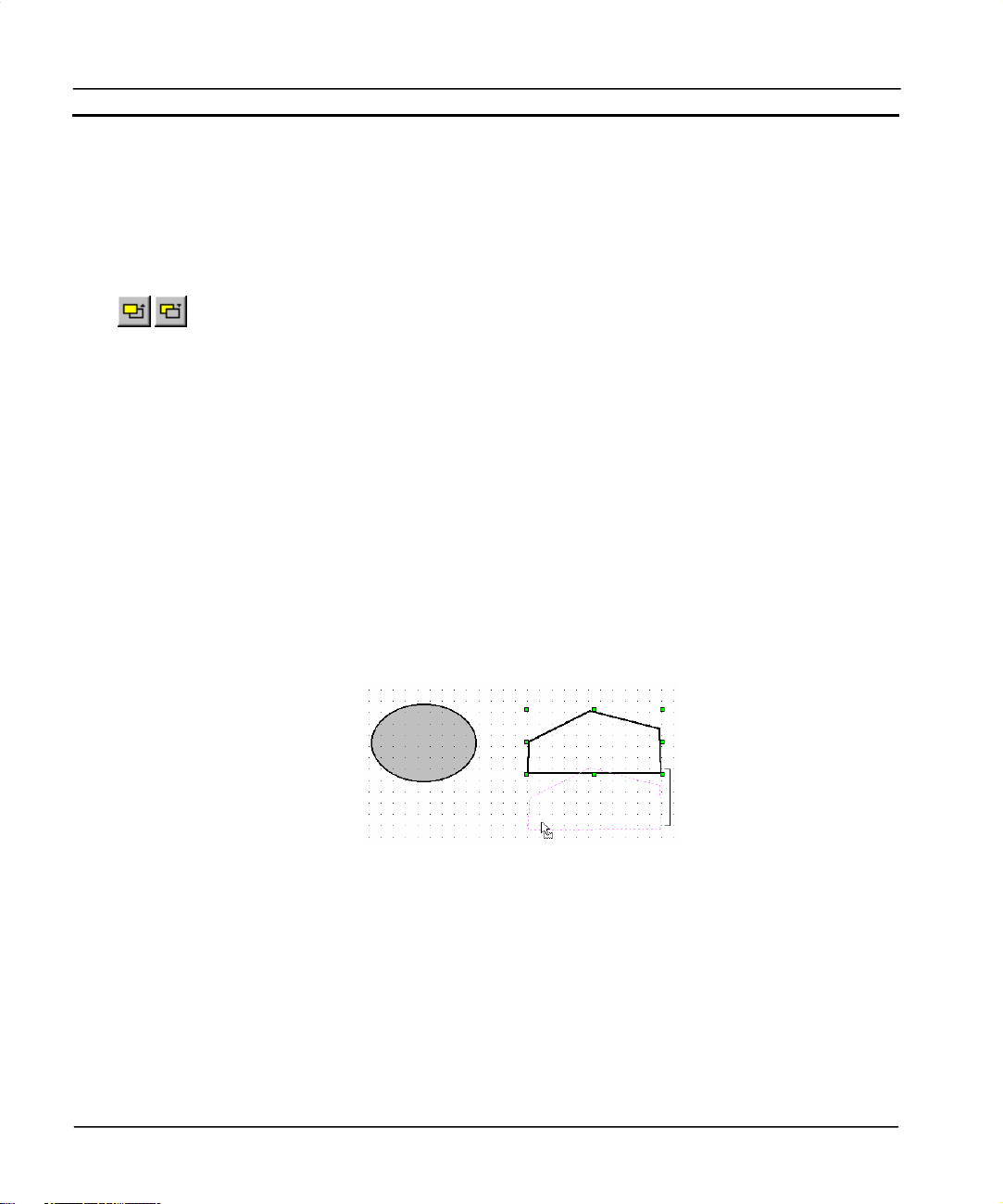
CHAPTER 4 – Objects OMRON
The selection is now regarded as one group with eight “grab handles” for the group rather than eight
for each object; the objects can now be moved together.
Once objects have been grouped they can be ungrouped by selecting the object, activating the Edit
menu and clicking on Ungroup.
Raise and Lower
Each new object inserted on a page is placed on top of the previous one. Although they may
appear to be on the same level, objects can overlap, so it may be necessary to ‘raise’ an
object so that it appears over the top of another object. For further details on raising and
lowering objects refer to chapter 1, Graphics Editor.
Alignment
Objects inserted on a page can look messy unless they are aligned relative to each other. CXSupervisor helps by allowing the contents of a page to align on a grid. The grid can be turned on and
off as required.
There are a number of different grid sizes available: 4, 8, 16, 32 and 64 pixels. The Snap To Grid
function snaps to the nearest grid.
To align page objects and view a grid, select Grid from the View menu.
Select the required grid size or click on Snap to Grid to align the most recently entered objects on the
chosen grid. The grid can be turned off by selecting Off.
An example of the use of the grid is illustrated as follows:
In this example, the selected polyline is in the process of being moved down. The presence of the
grid governs the movement of the object in all directions. As the object is moved, its position
“snaps” an equal distance from the original position of the object against the grid. Currently, the
object has been moved five grid steps down (shown by the bracket).
Alignment Toolbox
Objects on a page can be aligned in a variety of ways using the Alignment toolbar.
It is possible to:
Page 66 Release 2.0
Page 90

OMRON CHAPTER 4 – Objects
Click the Centre Horizontally on Page button from the toolbar to centre objects on a page
horizontally.
Click the Centre Vertically on Page button from the toolbar to centre objects on a page
vertically.
Click the Left Alignment button from the toolbar to align objects along their left edge.
Click the Right Alignment button from the toolbar to align objects along their right edge.
Click the Top Alignment button from the toolbar to align objects along their top edge.
Click the Bottom Alignment button from the toolbar to align objects along their bottom
edge.
Click the Centre Align Horizontal button from the toolbar to align objects on their
horizontal centres.
Click the Centre Align Vertical button from the toolbar to align objects on their vertical
centres.
Click the Make Same Width button from the toolbar to make objects the same width
Click the Make Same Height button from the toolbar to make objects the same height.
Click the Make Same Height and Width button from the toolbar to make objects the same
width and height.
Click the Align to Grid button from the toolbar to align objects to the grid.
When performing alignment operations, the Master Object determines how the other objects are
aligned. The Master Object, i.e. the last object clicked on, has green sizing handles.
To align objects:
1, 2, 3…
The alignment operations available at any one time vary according to the number of objects selected.
1. Select the objects to be aligned.
2. Ensure the correct master object is selected.
3. Choose the appropriate tool from the Alignment toolbar.
Zoom
It is often useful to be able to view an object in more detail. The Zoom option allows selected objects
to be magnified up to four times their normal size.
To enlarge an area of the screen, choose the View menu and select Zoom. Then select the required
magnification factor: Off, 2
A specific object can be zoomed in on by selecting that object and then performing the procedures
described above.
Release 2.0 Page 67
×
or 4.
Page 91

CHAPTER 4 – Objects OMRON
Applying Tooltips
In the runtime environment, it is possible to provide instant help for the object currently selected by
the cursor. This is achieved by tooltips that can be applied to all objects.
1, 2, 3…
An example of a tooltip in the runtime environment is as follows:
1. In the development environment, select the object to apply a tooltip.
2. Click on Tooltip Text from the Edit menu. The Tooltip Text is displayed.
3. Type the help text in the Tooltip text: field or select the Browse pushbutton
to apply the value of a point.
4. Click the OK pushbutton to accept the settings or the Cancel pushbutton to
abort the operation.
Using the Floating Menu
Clicking the right mouse button within CX-Supervisor brings up a context-sensitive menu known as
the Floating menu. There are two such menus, one in the development environment and one in the
runtime environment. The development environment Floating menu contains short-cuts for many
operations discussed in this chapter.
Page 68 Release 2.0
Page 92

OMRON CHAPTER 5 – ActiveX Objects
CHAPTER 5 ActiveX Objects
This chapter describes the process of using ActiveX objects within CX-Supervisor applications.
Overview
The Microsoft Windows ActiveX technology allows objects called ‘components’ to be developed,
and are used by inserting them into an ActiveX container, like CX-Supervisor. ActiveX components
may perform many different functions, which can be graphical or non-graphical, but they follow
standard rules for defining their Properties, Methods and Events. Properties are like settings, for
example a control’s colour would be a property. Methods are like functions or actions that can be
called for example a control might support a Redraw method. Events are actions the control may
create, like OnLeftClick. Following these standard rules allows any ActiveX control from any
manufacturer to work in any container.
Inserting a new object
A new ActiveX control may be inserted on the page as follows:
1, 2, 3…
Release 2.0 Page 69
1. Click on the page in which the object is to be inserted.
Page 93

CHAPTER 5 – ActiveX Objects OMRON
2. Turn on the ActiveX toolbar from the View – Toolbars menu
3. If the control you require already exists on the ActiveX toolbar:
a) Select the required control
or if the required control is not on the toolbar:
b) Click Configure ActiveX Toolbar button and select the required
4. Draw a rectangle in the desired position
component from the dialog:
Editing Properties at Design Time
The properties of ActiveX objects can be edited during the design stage using the following
procedure:
1, 2, 3…
Page 70 Release 2.0
1. Open the ActiveX Property Browser by clicking the ActiveX Property
Browser button in the toolbar or by selecting the ActiveX Property Browser
option from the Utilities menu.
2. With the ActiveX Property Browser displayed select the appropriate
ActiveX control. This will list the full range of property names available
for that control in the browser, and their values.
3. The Value of each Name can be changed as required by clicking in the
value box and entering the new value. Some options require you to enter
specific information, others provide a choice of entries from a drop down
menu.
4. To edit the values of other ActiveX controls simply click on the control to
select it. The values of the previous object will be replaced with those of
the new selection.
Page 94

OMRON CHAPTER 5 – ActiveX Objects
In addition to editing properties with the Property Browser, many ActiveX controls support their own custom
Property Pages. These may be accessed in design time by either double clicking the control, or right clicking
the control and selecting Properties from the Object’s popup menu:
Release 2.0 Page 71
Page 95

CHAPTER 5 – ActiveX Objects OMRON
Reading and Writing Properties at Run Time
ActiveX properties can be read and written at runtime, for example to change values or colours as
required. This can be achieved using the CX-Supervisor script functions GetProperty and
PutProperty, or alternatively in VBScript using the normal dot syntax for example
@VBSCRIPT
Display1.Value = 100
@ENDIF
For more details see the CX-Supervisor Script Language Reference Manual.
Calling Methods at Run Time
ActiveX methods can also be called at runtime. This is achieved by using the Supervisor script
function Execute or alternatively in VBScript using the normal dot syntax for example
@VBSCRIPT
CommonDialog1.ShowOpen
@ENDIF
Again for more details see the CX-Supervisor Script Language Reference Manual.
Responding to Events
Some ActiveX components are written to generate events on certain conditions, like mouse clicking
or user input or error conditions. You can write a script to execute whenever any event occurs. These
scripts are defined as subroutines in the page initialisation script as they may be called any time the
page is open. To easily add these subroutines, from the ActiveX property browser, click the ‘Events’
tab. This shows all the event types for this control and any parameters the event may pass, for
example the code number of the key pressed. Select the event name to add or edit the script for, and
click the square edit button.
Page 72 Release 2.0
Page 96

OMRON CHAPTER 5 – ActiveX Objects
Note: In previous versions Event scripts could be added from the Animation Editor but the method
above provides more efficiency as all event scripts are loaded just once on page
initialisation.
Release 2.0 Page 73
Page 97

Page 98

OMRON CHAPTER 6 – Projects
CHAPTER 6 Projects
This chapter describes the concept of projects. It details procedures for creating and amending
projects, and the process of associating users with projects. It also deals with the process of
compiling a project.
Overview
A CX-Supervisor application consists of a number of pages linked together. The pages may contain
passive or active graphics, text or animations, and may be grouped together logically to form a
project. A project may consist of many pages, or simply a single page. Projects may be built and
tested within the CX-Supervisor development environment, and run “stand-alone” under the CXSupervisor run-time environment.
Only one project at a time may be open for editing within the CX-Supervisor development
environment. An attempt to open a second project forces CX-Supervisor to close the current project
(prompting to save changes where there is unsaved information), and open the second project.
Runtime Editions
The Development package can create applications for different Runtime platforms. The target system
uses the same CX-Supervisor 'Runtime' software but needs a USB Dongle that matches the chosen
target. The type of project is either chosen on creation or changed from the Target Settings dialog.
CX-Supervisor Machine Edition
For most HMI and visulisation projects. These projects only require a Machine Edition USB dongle
for the Runtime.
CX-Supervisor PLUS
Where features additional to the Machine Edition are required. These projects require a PLUS USB
dongle for the Runtime.
Feature
ActiveX Yes Yes
VBScript Yes Yes
Release 2.0 Page 75
Machine
Edition
PLUS
Page 99

CHAPTER 6 – Projects OMRON
Recipes Yes Yes
Alarms 300 5000
Animations Yes Yes
Max no. Devices (PLCs etc.) 15 256
OPC Connections Yes Yes
Max user defined Points 500 8000
Max Regular Interval Scripts 10 100
Max no. Pages 100 500
Supported Databases MS Access
Note: Once the limits shown are reached, no more of those objects can be created.
Note: Remember that although either target can be chosen easily, you must purchase the correct USB
Dongle in order to run
Note: The CX-Supervisor Runtime no longer recognises Software Tokens, Hardlock (parallel port)
dongles or USB Dongles from older versions. Only USB Dongles for this version will active the
Runtime
Creating a Project
To create a new project within CX-Supervisor, select New followed by either Machine Edition
project or CX-Supervisor PLUS project. CX-Supervisor displays the following dialog:
SQL, ODBC, MS Access,
MS Excel, dBase, CSV
Page 76 Release 2.0
Page 100

OMRON CHAPTER 6 – Projects
1, 2, 3…
1. Locate the parent directory in which the project directory is to reside using
the Folder: and Drives: fields.
2. Enter a name for the project directory in the New Project Folder: field. If a
name is entered, the folder is created and used; otherwise the selected
folder is used. The directory name must be no more than 8 characters and
may only contain characters valid for use in MS-DOS file names.
3. Enter a name for the project in the Project Name: field. The project name
must be no more than 8 characters and may only contain characters valid
for use in DOS file names.
4. Click the OK pushbutton on the New Project dialog to create the project.
Alternatively, click the Project Info pushbutton to open the Project Information dialog, and enter a
title and some descriptive text for the new project. For details of using the Project Information dialog
refer to chapter 6, Project Information. Click the OK pushbutton on the New Project dialog to create
the project.
Note: If the PC installation of CX-Supervisor is on a networked machine, a Network
pushbutton is added to the dialog. For further information on the function of the
Network dialog, refer to the Microsoft Windows User Guide.
Release 2.0 Page 77
 Loading...