

Page 1

MMI-TS
P
WR
CPU
COM
MMI-1500, MMI-850, MMI-750, MMI-730
Installation & Operations Manual, Software Reference,
Kessler Ellis Products
10 Industrial Way East
Eatontown, NJ 07724
Phone: 732-935-1320 Fax: 732-935-9344
www.kep.com
and Connection Guide
Version 2.7.0
99676REV20JAN06
$70.00
1
Page 2

ii
Page 3

About this Manual
This document is based on information available at the time of its publication. While efforts have been made
to be accurate, the information in this document may not cover all details or variations in hardware or
software, nor does it provide for every possibility concerning installation, operation, or maintenance. Features
may be described herein which are not present in all hardware. Kessler Ellis Products assumes no obligation
of notice to holders of this document with respect to subsequent changes.
Information in this document is subject to change without notice and does not represent a commitment on the
part of Kessler Ellis Products.
Text Construction
Construction Comment
Bold Characters Keywords that are menu or system items or text that is part of EasyBuilder. Example: BitLamp
Italic Characters Italics are used to draw emphasis to a portion of text. Example: “Note:”
[characters] Characters within the [ ] are to be typed in exactly as they are printed. Example: “[c:\eb500\drivers]”
< Characters> Indicates user information is required. A description of the information is between the < > characters.
Example: “<project name>”
Key1+Key2
Click Tap the primary mouse button once on the indicated object. Example: “Click the OK button.”
Double Click Tap the primary mouse button twice on the indicated object. Example: “Double Click to call up the
Right Click Tap the secondary mouse button once. Example: “Right Click on the highlighted object to open the
CAPITAL Characters All capitals are used for Directory names, file names, and acronyms. Example: “EB500”
Menu|Menu item
The abbreviations MMI and HMI are used interchangeably in this manual both refer to the touchscreen
interface units.
Press and hold Key1 then press Key2 (then release both keys). Example: “Ctrl + N” Hold Control
down while pressing the N. (starts a new project)
Part Attributes.”
shortcut menu.”
This construction is used to specify menu commands. The main menu is on the left with submenus
after it separated by the “|” character. Example: “Edit|Align|Left”
iii
Page 4

Safety Instructions
Overview
This section states the safety instructions which must be followed when installing, operating and servicing the
MMI. If neglected, physical injury and death may follow, or damage may occur to controller and related
equipment. The material in this chapter must be studied before attempting any work on, or with, the unit.
Warnings and Notes
This manual distinguishes safety instructions. Warnings are used to inform of conditions, which can, lead if
proper steps are not taken, to a serious fault condition, physical injury or death. Notes are used when the
reader is required to pay special attention or when there is additional information available on the subject.
Notes are less crucial than warnings, but should not be disregarded. Readers are notified of the need for
special attention or additional in formation available on the subject with the following symbols:
Warnings
Warnings
CAUTION!
Note:
Readers are informed of situations that can result in serious physical injury and/or serious damage to
equipment with the symbol shown to the left. A Warning symbol indicates that the reader should pay
special attention to the accompanying text. Take precautionary steps to insure that the installation
complies with warnings before continuing. Warnings include hazardous conditions that could cause
personal injury or equipment damage if care is not taken. The text next to this symbol describes ways to
avoid the danger.
Dangerous Voltage Warnings: Warns of situations in which high voltage can cause physical injury and
or damage equipment.
General warning: Warns of situations, which can cause physical injury and or damage equipment by
means other than electrical.
Electrostatic Discharge Warning: Warns of situations in which an electrostatic discharge can damage
equipment.
Caution: Aims to draw special attention to the text. Be sure to understand the implications of the text
before proceeding.
Note: gives additional information or points out more information available on the subject.
APPLICATIONS ASSISTANCE
This manual is designed to provide the necessary information for trouble-free installation and operation of
HMI Touchscreens. Additional help is available when accessing the help functions in the EasyBuilder
software. If further assistance is needed, please call KEP at 1-800-631-2165 or visit our web site at
www.kep.com.
IMPORTANT
NOTE!
Backup project files (*.epj) as needed to insure the ability to modify a project in
the future!
iv
Page 5

PROPRIETARY NOTICE
The information contained in this publication is derived in part from proprietary and patent data. This
information has been prepared for the expressed purpose of assisting operating and maintenance personnel
in the efficient use of the instrument described herein. Publication of this information does not convey any
rights to use or reproduce or to use it for any purpose other than in connection with the installation, operation
and maintenance of the equipment described herein.
Copyright 2005 by
Kessler Ellis Products
We hope you will be pleased with our product. If you have any questions concerning our warranty, repair,
modification or returned goods process, please contact your local distributor.
WARRANTY
This product is warrantied against defects in materials and workmanship for a period of twelve months from
the date of shipment to Buyer.
The Warranty is limited to repair or replacement of the defective unit at the option of the manufacturer. This
warranty is void if the product has been altered, misused, dismantled, or otherwise abused.
ALL OTHER WARRANTIES, EXPRESSED OR IMPLIED, ARE EXCLUDED, INCLUDING BUT NOT
LIMITED TO THE IMPLIED WARRANTIES OF MERCHANTABILITY AND FITNESS FOR A PARTICULAR
PURPOSE.
v
Page 6

About this Manual............................................................iii
Text Construction ............................................................iii
Safety Instructions.......................................................... iv
WARRANTY............................................................. v
Section 1: Installation and Startup Guide ........................1
1.0 Getting Started ..........................................................1
1.1 The MMI-Touchscreen Series................................ 1
2.0 Installation Instructions ..............................................2
2.1 Mounting Instructions............................................. 2
2.1.1 Location Considerations .................................. 2
2.1.2 Making a NEMA-4 Mounting............................ 2
2.1.3 Environmental Considerations......................... 3
2.2 Power Connections................................................ 4
2.2.1 Power Requirements....................................... 4
2.2.2 Grounding Requirements ................................5
2.2.3 CE Requirements ............................................5
2.2.4 Safety Guidelines ............................................6
2.3 CE Requirements................................................... 6
2.3.1 EU directives that apply to MMI Series............ 6
2.3.2 Guide Lines for EU Installations ......................7
2.3.3 Safety Guide Lines for EU Installations ........... 7
2.4 Communications Connections ...............................8
2.4.1 Connection to an External Device ...................8
2.4.2 Connection to a Personal Computer................9
2.4.3 Connection to a Printer..................................10
2.4.4 Ethernet Connections.................................... 10
2.5 Dip Switch Settings .............................................. 12
2.6 HMI Indicator Lights .............................................12
2.7 Other Hardware Considerations........................... 12
3.0 Specifications ..........................................................13
3.1 General Specifications ......................................... 13
3.2 Hardware Specification 1500, 850 Models........... 13
3.3 Hardware Specification 750, 720 Models............. 14
3.3 Functional Specification ....................................... 14
4.0 Trouble Shooting .....................................................15
4.1 Power Problems................................................... 15
4.2 Communications Problems .................................. 15
4.3 Commonly Asked Questions................................16
4.4 Hardware Problems .............................................16
4.4.1 Black Screen after download......................... 16
4.5 Repairs and Returns ............................................17
5.0 Quick Startup Guide ................................................17
5.1 Connections ......................................................... 17
5.2 Installing EasyBuilder........................................... 19
5.3 Initial Start Up ......................................................20
5.4 Creating a project................................................. 21
Section 2: Software Reference Guide ...........................24
6.0 EasyManager Operations........................................ 24
6.1 COM Port Drop-Down Box...................................24
6.2 Communications Speed Drop-Down Box.............24
6.3 Project or Recipe Download/Upload ....................24
6.4 Complete or Partial Download/Upload .................24
6.5 EasyBuilder.......................................................... 24
6.6 Online-Simulator ..................................................25
6.7 Direct Online-Simulator........................................ 25
6.8 Offline-Simulator...................................................25
6.9 Download .............................................................25
6.10 Upload................................................................25
6.11 Mode Change.....................................................26
7.0 Software Fundamentals...........................................27
7.1 Screen Editor Overview........................................27
7.1.1 Changing Screen Appearance.......................28
7.2 System Parameters..............................................29
7.2.1 The PLC Tab Parameters ..............................29
7.2.2 The General Tab............................................33
7.2.3 The Indicator Tab...........................................37
7.2.4 The Security Tab ...........................................38
7.2.5 The Editor Tab ...............................................39
7.2.6 The Hardware Tab.........................................40
7.2.7 The Auxiliary Tab...........................................42
7.3 Part Placement.....................................................44
7.3.1 Part Placement Summary..............................44
7.3.2 Part ID Numbers ............................................44
7.3.3 Part Dialog Features......................................45
7.4 Window Operations ..............................................50
7.4.1 Creating New Windows .................................51
7.4.2 Adding Objects to a Window..........................54
7.4.3 Copying and Importing Windows from Other
Projects...................................................................54
7.4.4 Changing and Popping Up Windows .............55
7.5 Task Bar Operations ............................................56
7.5.1 Task Button Overview....................................56
7.5.2 Procedure to Setup Task Buttons ..................57
7.5.3 Creating the Fast Selection Window..............60
7.5.4 Using the Task Bar ........................................61
7.6 Library Operations................................................62
7.6.1 Library Overview............................................62
7.6.2 Shape Library Operations..............................63
7.6.3 Bitmap Library Operations .............................66
7.6.4 Group Library Operations ..............................69
7.6.5 System Libraries............................................71
7.6.6 Library Toolbar Functions ..............................71
7.6.7 Shortcut for changing a Part’s assigned Shape
or Bitmap ................................................................71
7.7 Tag Definition and Use.........................................72
7.7.1 Adding a Tag to the Tag Library ....................72
7.7.2 Editing Tags...................................................73
7.7.3 Deleting Tags.................................................73
7.7.4 Using Tags.....................................................74
7.7.5 Exporting and Importing Tags........................74
7.8 Label Definition and Use ......................................75
7.8.1 Adding a Label to the Label Library ...............75
7.8.2 Editing Labels ................................................76
7.8.3 Deleting Labels ..............................................76
7.8.4 Using Labels ..................................................77
7.8.5 Exporting and Importing Labels .....................77
7.9 Security ................................................................78
7.9.1 Security Levels ..............................................78
7.9.2 Passwords .....................................................78
7.9.3 Assigning Security .........................................78
7.9.4 System Reserved Local Word Usage with
Security...................................................................80
vi
Page 7

7.9.5 System Reserved Retentive Word Usage with
Security.................................................................. 80
7.9.6 How to Implement User Security................... 81
7.9.7 Additional Security Through the PLC ............ 81
7.10 Print Operations................................................. 82
7.10.1 Compatible printers ..................................... 82
7.10.2 Screen Printing with Function Buttons ........ 82
7.10.3 PLC Controlled Printing............................... 83
7.10.4 Printing Events............................................ 83
8.0 Drawing................................................................... 84
8.1 Line/Rectangle/Ellipse/Arc/Polygon.................... 84
8.1.1 Note on Pattern Options................................ 84
8.1.2 Note on Color Options................................... 85
8.1.3 Drawing Lines, Rectangles, Ellipses, Arcs and
Polygons ................................................................ 85
8.2 Text ..................................................................... 86
8.3 Shape .................................................................. 87
8.4 Bitmap ................................................................. 87
8.5 Scale.................................................................... 88
9.0 Editing Placed Objects ............................................ 89
9.1 Moving and Resizing Objects .............................. 89
9.1.1 The Profile Tab ............................................. 89
9.1.2 Object Order ................................................. 90
9.1.3 Nudge ........................................................... 90
9.1.4 Aligning Objects ............................................ 91
9.1.5 Resizing Objects ........................................... 91
9.1.6 Transformation Tools .................................... 91
9.2 Grouping Objects................................................. 92
9.3 Editing Object Attributes ...................................... 92
9.3.1 Text Editing tools: ......................................... 92
9.3.2 Editing Stacked Objects ................................ 93
9.3.3 Editing Grouped Objects Attributes............... 93
9.4 Multi. Copy Command ......................................... 94
9.5 Finding and Replacing Device Addresses with the
Find/Replace Addr… Utility........................................ 95
9.6 Using the Window No. Treebar............................ 96
9.6.1 Treebar Operations ....................................... 96
10.0 System Bit and Register Reference ...................... 97
10.1 Local memory .................................................... 97
10.2 Remote memory ................................................ 98
10.3 Reserved Local Words/Bits ............................... 98
10.3.1 Reserved Local Bits .................................... 98
10.3.2 Reserved Local Words.............................. 102
10.4 Retentive memory ........................................... 104
10.4.1 Reserved Retentive Word ......................... 105
10.4.2 System Information ................................... 105
11.0 EasyBuilder Operations....................................... 106
11.1 Project Operations........................................... 106
11.1.1 Compiling a Project................................... 106
11.1.2 Simulating a Project .................................. 107
11.1.3 Downloading a Project .............................. 107
11.1.4 System Error Messages............................ 108
11.2 Debugging with EasyWindow .......................... 109
11.2.1 PLC Monitor .............................................. 110
11.2.2 Data Monitor ............................................. 111
11.2.3 System Resource...................................... 112
11.2.4 Search....................................................... 113
12.0 Project Management and Documenting a Project 114
12.1 Compressing/Uncompressing a project ...........114
12.2 Decompiling a project ...................................... 115
12.3 Documenting a project ..................................... 116
12.3.1 Print Object Summary ............................... 116
12.3.2 EasyWindow Documentation..................... 116
12.4 Using Compact Flash to transfer a project....... 117
12.4.1 Transferring a project to CompactFlash
memory ................................................................ 117
12.4.2 Transferring a project from CompactFlash
TM
TM
to HMI................................................................... 117
12.5 Using Compact Flash to transfer retentive memory
................................................................................. 118
12.5.1 Transferring data to CompactFlash
............................................................................. 118
12.5.2 Transferring data from CompactFlash
TM
memory
TM
to
retentive memory.................................................. 118
Section 3: Object Reference Guide ............................. 119
13.0 Objects Summary................................................ 119
13.1 Bit Lamp........................................................... 120
13.2 Word Lamp ......................................................122
13.3 Set Bit .............................................................. 124
13.4 Set Word.......................................................... 127
13.5 Toggle Switch ..................................................131
13.6 Multi-State Switch ............................................ 133
13.7 Function key..................................................... 134
13.7.1 Character Codes and Creating a Keypad.. 135
13.7.2 Hard Copy (Print Function)........................ 136
13.7.3 Change Window ........................................ 136
13.7.4 Return to Previous..................................... 137
13.7.5 Change Common Window......................... 137
13.7.6 Popup Window .......................................... 137
13.7.7 Close Window ...........................................137
13.7.8 JOG FS-Window ....................................... 138
13.7.9 Window Bar............................................... 138
13.7.10 Minimize Window .................................... 139
13.7.11 Message Board ....................................... 139
13.8 Numeric Input Extend ......................................141
13.8.1 Numeric Display Format............................ 142
13.8.2 Font Alignment .......................................... 143
13.9 Numeric Data................................................... 146
13.10 ASCII Input Extend ........................................147
13.11 ASCII Data..................................................... 149
13.12 Moving Shape................................................ 150
13.13 Animation....................................................... 152
13.14 Indirect Window .............................................154
13.15 Direct Window................................................ 156
13.16 Alarm Display................................................. 157
13.17 Trend Display................................................. 159
13.18 XY Plot........................................................... 162
13.19 Bar Graph ......................................................164
13.20 Meter Display................................................. 166
13.21 Alarm Bar....................................................... 168
13.22 Recipe Transfer ............................................. 169
13.23 Event Display................................................. 171
System Tools............................................................... 173
vii
Page 8

13.24 Alarm Scan ....................................................173
13.25 System Message............................................174
13.26 PLC Control ...................................................174
13.26.1 Change Window ...................................... 175
13.26.2 Back light control ..................................... 175
13.26.3 Screen hardcopy .....................................175
13.26.4 Report printout......................................... 175
13.26.5 Back light control (write back).................. 175
13.26.6 Write data to PLC (base window) ............175
13.26.6 General PLC Control ............................... 176
13.26.6 Execute macro program ..........................176
13.27 Event Log....................................................... 176
13.28 Data Transfer .................................................179
Section 4 Macro Reference ......................................... 180
14.1 Overview.............................................................. 180
14.1.1 Triggering a Macro ........................................ 180
14.2 Editing Macros..................................................... 180
14.2.1 Macro Dialog Features.................................. 181
14.2.2 Workspace Macro Editor............................... 181
14.3 Syntax..................................................................182
14.3.1 Constants and Variables ............................... 182
14.3.2 Operators ......................................................184
14.3.3 Reserved Keywords...................................... 185
14.4 Statement Construction .......................................185
14.4.1 Definition Statement...................................... 185
14.4.2 Assignment Statement .................................. 185
14.4.3 Logical Statements........................................185
14.4.4 Reiterative Statements.................................. 186
14.4.5 Optional Keywords........................................ 187
14.5 Macro Construction .............................................187
14.5.1 Local and Global Variables ...........................187
14.5.1 Function Blocks............................................. 188
14.5.2 Built in Function Blocks ................................. 188
14.6 Compile error messages...................................... 190
Error_Number descriptions ...................................... 190
14.7 Sample Macro Code............................................ 192
Index............................................................................ 195
16.13 IDEC OpenNET [PDS] ...................................231
16.14 IIS ESC (INDUSTRIAL INDEXING SYSTEMS)
.................................................................................232
16.15 Jetter Nano.....................................................234
16.16 Keyence KV/Visual KV [PDS].........................235
16.17 KOYO Direct...................................................237
16.18 Lenze .............................................................240
16.19 LG GLOFA Cnet and LG GLOFA Cnet [PDS] 241
16.20 LG Master K10S1...........................................243
16.21 LG Master K60S.............................................245
16.22 LG Master K C-Net.........................................247
16.23 LG Master K300S...........................................248
16.24 Matsushita FP (Aromat) .................................249
16.25 Memory Map Protocol ....................................252
16.26 MITSUBISHI A1S, A2A, A2US, A3N/A1SH....255
16.27 MITSUBISHI AJ71 - AnA/AnU CPU ...............256
16.28 MITSUBISHI FX0n/2/2n COM, FX0n/FX2, FX2n,
FX2n D(bit) [PDS].....................................................258
16.29 MITSUBISHI J2-S100 ....................................261
16.30 MODICON MODBUS RTU / MODBUS RTU(485
2W)...........................................................................263
16.31 MODBUS RTU Extend [PDS].........................273
16.32 MODBUS RTU TCP/IP...................................274
16.33 OMRON / OMRON (485 2W) Host Link .........275
16.34 OMRON CQM1H-CPU61 [PDS].....................278
16.35 OMRON CS/CJ [PDS]....................................280
16.36 SAIA PCD Series [PDS] .................................282
16.37 Samsung SPC-10...........................................284
16.38 Sharp JW Series [PDS] ..................................285
16.39 SIEMENS S7-200...........................................286
16.40 SIEMENS S7/300 MMI ADAPTOR.................287
16.41 Siemens S7/300 PC ADAPTOR.....................288
16.42 SIMATIC TI505...............................................289
16.43 Telemecanique Unitelway ..............................291
16.44 Toshiba T Serial .............................................292
16.46 Yokogawa PLC Series [PDS] .........................297
Section 5 Controller Reference.................................... 199
Contents ......................................................................199
15.0 Communications Overview .................................. 200
15.1 Communications settings ................................. 200
15.2 Master-Slave Configuration.............................. 201
16.0 Driver Specifications............................................ 203
16.1 AB DF1 ............................................................204
16.2 AB DH485 ........................................................ 207
16.3 AB PLC5 .......................................................... 209
16.4 A-B Logix DF1 [PDS] .......................................213
16.5 DELTA DVP .....................................................215
16.6 EMERSON PLC EC20 [PDS]........................... 216
16.7 ENTERTRON MODBUS RTU v1.00 ................ 218
16.8 FACON FB....................................................... 220
16.9 FUJI NB Series [PDS]...................................... 222
16.10 GE Fanuc SNP-X........................................... 223
16.11 HITACHI......................................................... 226
16.12 IDEC Micro
3
................................................... 229
viii
Page 9

Section 1: Installation and Startup Guide
1.0 Getting Started
1.1 The MMI-Touchscreen Series
Purpose of the MMI Series
These are small touch screen interfaces for controllers. They are used to display pictorial information, data
and messages. They are preloaded with a users custom designed project via a Personal Computer. Touch
screen areas may be programmed to modify internal or controller data.
Equipment
Checklist
An MMI system should include:
An MMI Series base unit MMI-730T MMI-850T
MMI-750T MMI-1500T
Older Models
MMI-720 MMI-750
MMI-850 MMI-1050
MMI-1500M MMI-1500S
An interface cable to the controller Refer Section 5 for available cables or
to make one using the cable diagrams
Designed Use
A personal computer with EasyBuilder programming
software installed.
A special PC to MMI programming cable is required MT5_PC cable ships with each unit.
A 24VDC power supply User Provided
Provides a convenient way for a machine operator to:
• View machine status and parameters.
• Change machine status or applicable operating parameters of the machine.
• Maintain the running of the machine.
It also gives enhanced capabilities to the machine through:
• Printer output
• Direct touch screen interface
• Visually displayed prompts
Installation CD provided with each unit.
Software is also available from the KEP
website. (www.kep.com)
1
Page 10
2.0 Installation Instructions
2.1 Mounting Instructions
2.1.1 Location Considerations
Care should be taken when locating equipment behind the unit to ensure that AC power wiring, PLC output modules,
contactors, starters and relays, and any other source of electrical interference are located away from the back of the unit.
Particular note should be taken to the position of variable speed drives and switching power supplies. Their input and load
cables should be screened to a central star earth point.
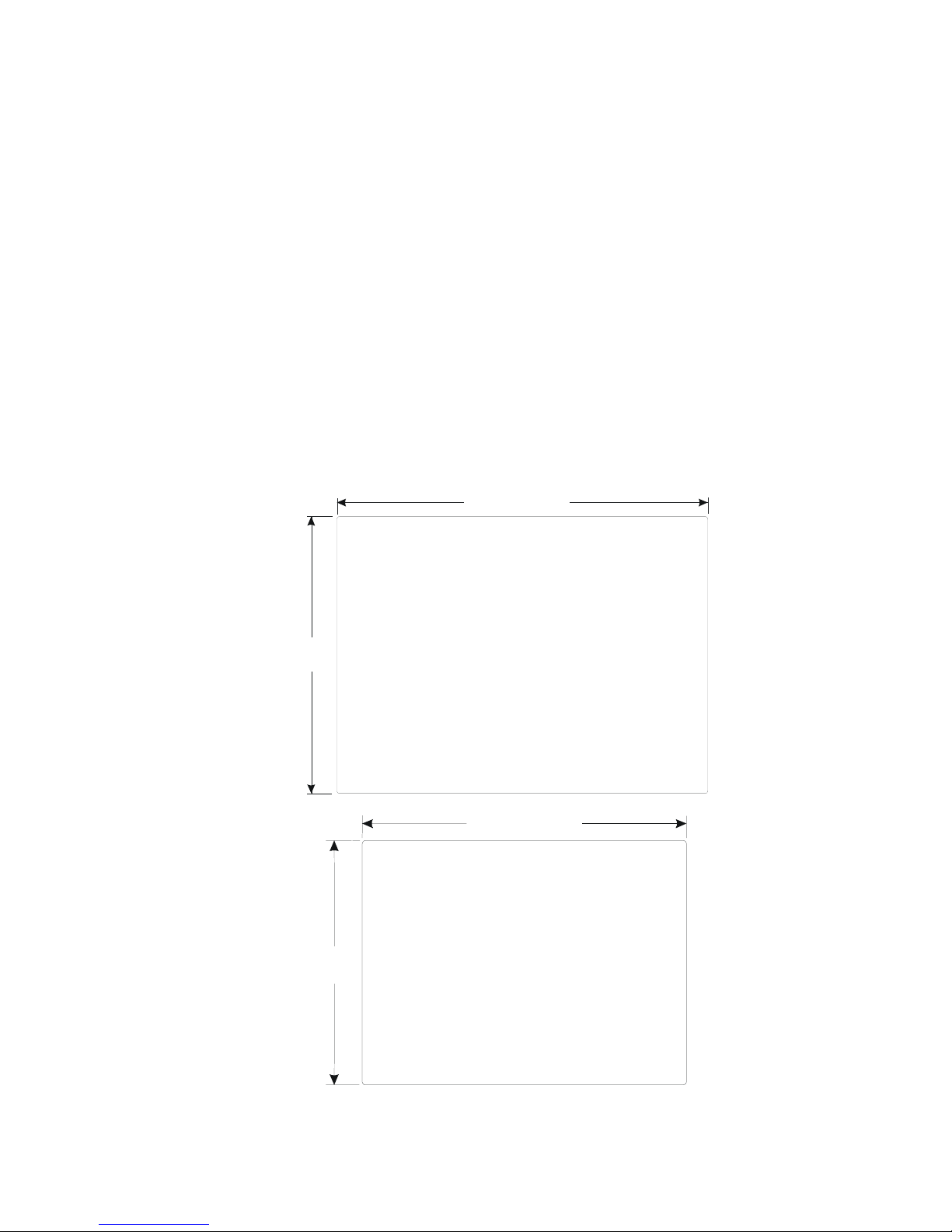
2.1.2 Making a NEMA-4 Mounting
Panel
Details
The unit can be mounted into panels with a depth of 4”(105mm). It is recommended that the unit
be mounted on the front panel of a steel enclosure, through an appropriate opening*. Allow a
clearance of 1”(25mm) around the sides of the unit for mounting hardware. Allow clearance for
cable connections to the back of the unit. Unit depth may vary according to cable type used.
Typically, plan a depth to accommodate at least 3”(105mm) behind the panel.
Note: Deburr and clean cutout before beginning installation.
*Cutout dimensions:
11. 89 [ 302 ]
8.86
[225]
MMI-1500M / MMI-1500T
11.89"(302mm) W x 8.86"(225mm) H
6.58
[167]
8.74[222]
MMI-850T
8.75"(222mm) W x 6.57"(167mm) H
2
Page 11
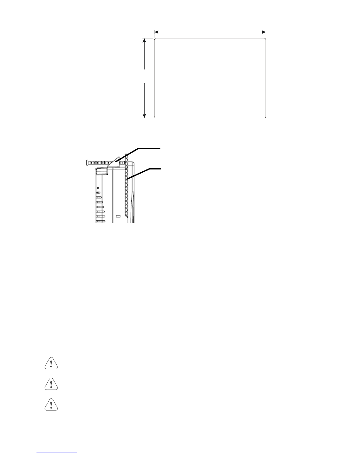
7.56 [192]
NEMA-4
Mounting
Caution!
5.43
[138]
MMI-720 / MMI-730 / MMI-750 Models
7.56"(192mm) W x 5.43"(138mm) H
Put the unit through the panel cut out. Slide the clamps into the 4 or 6 holes provided around the
case. Tighten the clamping screws in an even pattern until the unit is secured in the panel.
Panel Mounting clamp,
4or 6 places
Panel
Do not over tighten mounting clamps!
Note:
Specifications
To seal to NEMA-4 specifications, all supplied mounting clamps must be used and panel must
not flex more than 0.010”.
2.1.3 Environmental Considerations
See Specifications for environmental constraints.
Location
NEMA
Rating
The MMI Series is designed for use in a factory environment. It is designed to operate from 32 to 113 °F
(0 to 45 °C) temperatures, as found in most industrial environments. It may not be suitable for use in
certain outdoor applications. Please consult the factory for advised usage in outdoor applications.
The MMI Series front bezel is NEMA 4 rated. When installed properly in a NEMA 4 panel, the
NEMA 4 rating of the panel is not compromised. This means that fluids do not enter the panel
through the MMI series panel during wash downs.
Do not operate the unit in areas subject to explosion hazards due to flammable gases, vapors or dusts.
The unit should not be installed where fast temperature variations and/or high humidity are present.
This causes condensation of water in the device.
Avoid installing units in environments where severe mechanical vibration or shocks are present.
Vibration endurance: 10 to 25 Hz (X,Y,Z direction 2G 30 minutes)
3
Page 12
2.2 Power Connections
Make sure that all local and national electrical standards are met when the installing the unit. Contact your local authorities to
determine which codes apply.
2.2.1 Power Requirements
Power
Fusing
Requirements
Warning!
High Voltage
Supply Voltage
Condition
Wire Routing
The HMI can be powered by DC power only. The specified voltage range is +22 to 25
Volts DC. This insures compatibility with most controller DC systems.
The power conditioning circuitry inside the unit is accomplished by a switching power
supply. The peak starting current can be as high as 700mA.
It is recommended that all input power lines be protected from incorrect wiring or
product failure by a 2 Amp fuse or a breaker.
If the display does not come on within 2 seconds of power up, remove power. An
internal fuse prevents damage if the polarity of the DC power is incorrect. Check wiring
to insure proper connections and try to power up again.
Connecting high voltages or AC power mains to the DC input makes the unit unusable
and may create a hazard to personnel. Such a failure could result in serious personal
injury, loss of life and or equipment damage.
DC voltage sources should provide proper isolation from main AC power and similar
hazards.
Do not power the HMI and inductive DC loads, or input circuitry to the controller, with
the same power supply.
Note: The 24 VDC output from some controllers may not have enough current to power
the HMI.
Wire lengths should be minimized.
Electrical
Environment
Warning!
Emergency
Stop
Wires should be run in pairs with a neutral or common paired with a hot or signal line.
Always use shielded cable to prevent unwanted electrical interference.
If wiring is to be exposed to lightning or surges, use appropriate surge suppression
devices.
Keep AC, high energy, and rapidly switching DC wiring separate from signal wires by at
least 8 inches. If signal wires must cross AC power, cross at right angles.
Equip ungrounded DC supplies with a resistor and capacitor in parallel to earth ground.
This provides a path for static and high frequency dissipation. Typical values to use are
1MOhm and 4700pF.
The MMI Series has been tested to conform to European CE requirements. This means
that the circuitry is designed to resist the effects of electrical noise. This does not
guarantee noise immunity in severe cases. Proper wire routing and grounding insures
proper operation. The MMI Series is also UL certified.
A Hard-wired EMERGENCY STOP should be fitted in any system using an HMI to
comply with ICS Safety Recommendations.
4
Page 13
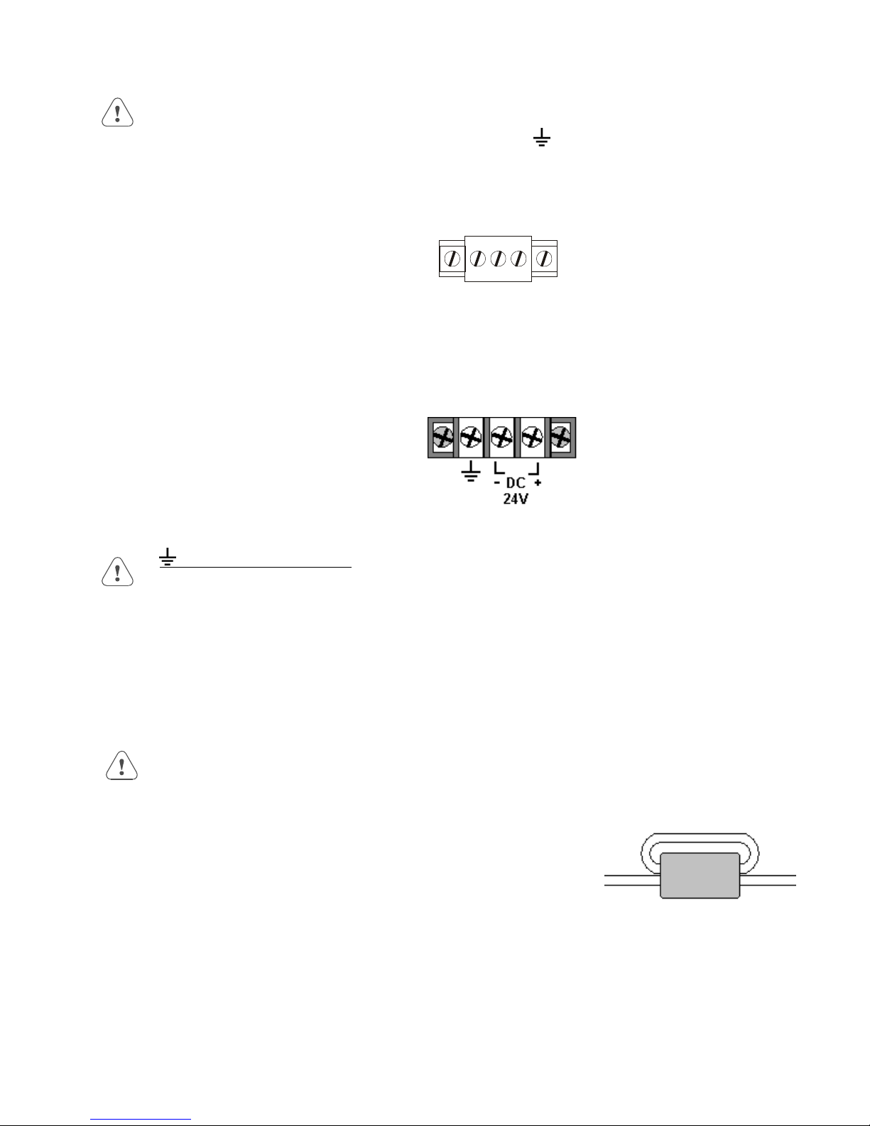
Connection
G
+24 VDC Wiring Diagrams
Use 18 AWG wire to connect positive DC line to the ‘+24V’ (DC+) terminal and the DC ground
to the ‘0V‘ (-DC) terminal. See text below about FG (
Terminal Plug: (MMI-720, 730, 750 Models) To make a connection, strip about 3/8” of
insulation off the end of the wire, and turn the connector screw counterclockwise until the gap
is wide open. Insert the wire all the way in, and turn the screw clockwise until it’s tight.
+24V 0V F
Terminal Block: (MMI-850, 1500 Models) To make a connection, strip about 3/8” of
insulation off the end of the wire, turn the connector screw counterclockwise until the hold
down plate is open wide enough to insert the wire. Insert the stripped portion of the wire
under the plate and turn the screw clockwise until it’s tight.
Chassis Ground).
2.2.2 Grounding Requirements
Chassis ground must be used. DC ground is not directly coupled to Earth ground internally. It
is preferable not to ground DC negative return to chassis ground. Poor site earths can introduce
noise into a system. If necessary, an earth connection should be made from the power supply
return point to the central star earth point.
Ground conductors should be as short and as large in diameter as possible. The conductors must
always be large enough to carry the maximum short circuit current of the path being considered.
Ground conductors should be connected to a tree from a central star earth ground point. This
ensures that no ground conductor carries current from any other branch.
2.2.3 CE Requirements
To make an HMI comply with EMC directives, and to reduce susceptibility to electrical interference, a separate
#14 AWG ground wire should be taken to the chassis ground terminal of the power connector. This ground
connection should be run directly to the central star earth connection point (as recommended in most Installation
Instructions).
Use a ferrite core on the power wiring to reduce radiated emissions from the
DC power lines. It is recommended to use a 140Ohm@100MHz ferrite core
with the DC power lines looped through the core once. Position the ferrite
core less than 1” away from the DC power connection points on the back of
the HMI.
140 Ohm @ 100MHz ferrite core
5
Page 14

2.2.4 Safety Guidelines
This section presents recommended installation practices, and procedures. Since no two applications are identical, these
recommendations should be considered as guidelines.
Hardware
Considerations
Programming
Considerations
ICS 3-304.81 Safety Recommendations:
Consideration should be given to the use of an emergency stop function, which is independent of the programmable
controller.
Where the operator is exposed to the machinery, such as in loading or unloading a machine tool, or where the
machine cycles automatically, consideration should be given to the use of an electromechanical override or other
redundant means, independent of the programmable controller, for starting and interrupting the cycle.
If provision is required for changing programs while the equipment is in operation, consideration should be giv en to the
use of locks or other means of assuring that such changes can be made only by authorized personnel.
These recommendations are intended as safeguards against the failure of critical components and the effects of such
failures or the inadvertent errors that might be introduced if programs are changed while the equipment is in operation. *
WARNING!
The system designer should be aware that devices in Controller systems could fail and thereby
create an unsafe condition. Furthermore, electrical interference in an operator interface, such as an
HMI, can lead to equipment start-up, which could result in property damage and/or physical injury to
the equipment operator.
If you, or your company, use any programmable control systems that require an operator or
attendant, you should be aware that this potential safety hazard exists and take appropriate
precautions. Although the specific design steps depend on your particular application, the following
precautions generally apply to installation of solid-state programmable control devices. In addition,
these precautions conform to the guidelines for installation of Controllers as recommended in the
NEMA ICS 3-304 Control Standards.
To conform with ICS Safety Recommendations, checks should be placed in the controller to ensure
that all writable registers that control critical parts of plant or machinery have limit checks built into the
program, with an out-of-limit safe shut down procedure to ensure safety of personnel.
* The ICS 3-304.81 Safety Recommendations are reproduced by permission of the National Electrical Manufacturers
Association from NEMA ICS 3-304
2.3 CE Requirements
2.3.1 EU directives that apply to MMI Series
• EMC Directive (89/336/EEC, 92/31/EEC, 93/68/EEC) electromagnetic emissions and immunity
• Machinery Directive (89/392/EEC, 91/368/EEC, 93/44/EEC, 93/ 68/EEC) machine safety
MMI products are CE-marked to indicate compliance with the EMC Directive. Declarations of Conformity that
specify the directive(s) and the catalog numbers of the products covered are available from Kessler Ellis Products.
6
Page 15

The MMI Series has been designed to operate satisfactorily in electromagnetic noise (immunity) and without emitting high
levels of electrical noise into the environment (emission). The units are designed to meet European Community standards
when installed per the wiring instructions in this manual.
Compatibility Standards
The MMI has been designed to meet electromagnetic compatibility for industrial environments.
Standard Description
CISPR (EN 55011) Group 1, Class A Radiated Emissions levels
EN50081-2 Generic emission standard, industrial environment (Also US FCC Class A)
EN50082-2 Generic immunity standard, industrial environment
2.3.2 Guide Lines for EU Installations
• Be aware that wiring leaving the cabinet where the unit is installed may be exposed to interference sources.
• The installation practices in the individual product installation manuals of other components in the system must also be
followed.
• Locally applicable grounding safety regulations and machinery directives should be followed for providing a protective
ground to earth. The EMC ground must be a low impedance, low inductance path to the machine chassis ground.
• Power supply to the unit must be through an IEC-rated isolation transformer.
• The Power supply to the controller must be controlled to ensure that it does not exceed over voltage category II per
EN60204-1 (IEC 240).
• Other requirements of the Machinery Directive involving displays, languages, instructions, Emergency Stop functions,
machine operation, protective guards and interlocks are the responsibility of the machine manufacturer.
• Use a ferrite core on the power wiring to reduce radiated emissions from the DC power lines. It is recommended to
use a 140Ohm@100MHz ferrite core with the DC power lines looped through the core once. Position the ferrite core
less than 1” away from the DC power connection points on the back of the UNIT.
2.3.3 Safety Guide Lines for EU Installations
• Only qualified personnel should be allowed to specify, apply, install, operate, maintain or perform any other function
related to HMI products. Qualified persons are defined as follows:
System application and design engineers who are familiar with the safety concepts of automation equipment.
Installation, start-up, and service personnel who are trained to install and maintain automation equipment.
Operating personnel trained to operate automation equipment and trained on the specific safety issues and
requirements of the particular equipment.
• Make sure that the voltage range for the equipment is correct before switching on the equipment.
• Emergency-tripping devices in accordance with EN60204/IEC204 must be effective in all operating modes of the
automation equipment. Resetting the emergency off device must not result in any uncontrolled or undefined restart of
the equipment.
• Automation equipment and its operating elements must be installed so that unintentional operation is prevented.
• Make sure that operating sequences, interrupted by a voltage dip or power supply failure, resume proper operation
when the power supply is restored. If necessary, the equipment must be forced into the “emergency off” state.
• Install the power supply and signal cables so that inductive and capacitive interference voltages do not affect
automation functions.
7
Page 16
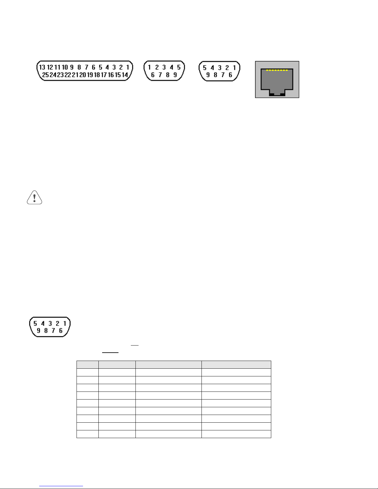
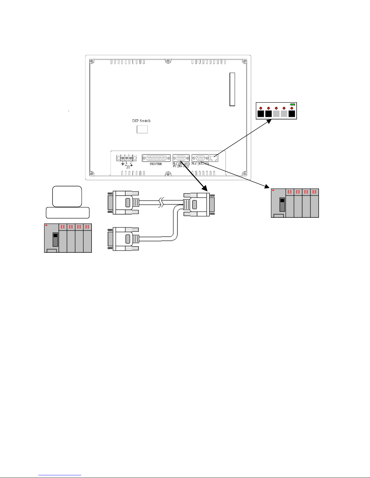
2.4 Communications Connections
The ports as you look at the back of the case, are the ports for connecting to a printer, PLC or some external device
(Controller Connectors).
Printer Port
(25p D-Female)
(Not Available on MMI-720, 730
and 750 models)
PLC [RS-232] Port
(9 pin D-Female)
2.4.1 Connection to an External Device
Cable
Requirements
Warning
Different cables are required for various devices. See Controller Reference Section for cable details.
The KEP part numbers have the SMIC prefix. Refer to a KEP catalog or data sheet for a complete
listing of MMI compatible devices.
These cables can be obtained from the same distributor where you purchased the MMI.
Communications problems cause the display to show PLC no response... until communications
can be established. During this time, the controller cannot be affected by the HMI. The COM light
on the front of the HMI turns on with each communication and should appear as if always on or
slightly flickering when communications are good.
Restrict cable length to avoid communications problems due to weak signals.
Recommended distances:
RS232:............................................................................................ less than 50’ (15m)
RS485/422: ..................................................................................... less than 500’ (150m)
Ethernet: ......................................................................................... less than 328’ (100m)
Shielded cable must be used for long lengths or cables run in an electrically noisy environment.
Use twisted pair cables for all Ethernet connections.
PC [RS-232] &
PLC [RS-485] Port
(9 pin D-Male)
Ethernet Port
(RJ-45 Male)
(Not Available on all
models)
Pin Designations
PLC [RS-232]
Do not run cables next to AC power lines or near sources of electrical noise.
Be sure that the cable ends have been inserted all of the way into mating connectors and are secure.
Pin assignment of the 9 Pin, Female, D-SUB, PLC [RS-232] Port. This port is used for connecting the
HMI to a controller or Master HMI unit. The Auxiliary (AUX) RS232 port is also accessed through this
connector. Both PLC and AUX ports share the common ground.
Note: This port is not used for programming the HMI or for printing functions.
Do not plug the MT5_PC’s PLC cable end into this port.
Pin # Symbol PLC[RS232] AUX[RS232]
1 AUX TxD Transmitted Data
2 PLC TxD Transmitted Data
3 PLC RxD Received Data
4 Not used Received Data
5 GND Signal Ground Signal Ground
6AUX RxD
7 PLC CTS Clear to send input
8 PLC RTS Ready to send output
9 Not used
8
Page 17
2.4.2 Connection to a Personal Computer
The 9 Pin, Female, D-SUB, PC [RS-232] & PLC [RS-485] Port on the back of the unit is the programming port (PC
Connector) and RS485/422 communications port for connecting to a controller. The Auxiliary (AUX) RS485 port is also
accessed through this connector.
Connection
Port Activation
Pin Designations
PC [RS-232] &
PLC [RS-485]
This port can be attached to a Computer via a special DB9 Female to DB9 Female cable provided
with the unit. (KEP P/N: MT5_PC)
This port is activated automatically by the PC during: On line simulation, Download and Upload
activities.
The Programmer Port cannot simulate, download or upload to the unit while it is on line with the
controller at the same time. The unit must be put into “RDS” mode with the EasyManager applet
first.
Pin assignment of the 9 Pin, Male, D-SUB PC [RS-232] & PLC [RS-485] Port
Pin # Symbol PLC[RS485] 2 Wire PLC[RS485] 4 Wire AUX[RS485] 2 Wire PC[RS232]
1 PLC RxD- Transmit/Receive - RS485 Receive
2 PLC RxD+ Transmit/Receive + RS485 Receive
3 PLC TxD- RS485 Transmit
4 PLC TxD+ RS485 Transmit
5 GND Signal Ground Signal Ground Signal Ground Signal Ground
6 AUX Data + Transmit/Receive +
7PC TxD RS232 Transmit
8 PC RxD RS232 Receive
9 AUX Data - Transmit/Receive -
HMI to PC, MT5_PC Cable Configuration
Connect to
Personal Computer (PC)
RS232 Serial Port
DB9 Female
1 Not used 1 RX- Æ 1 RX7 Not used 2 RX+ Æ 2 RX+
8 Not used 3 TX- Æ 3 TX4 Not used 4 TX+ Æ 4 TX+
5 GND Æ 5 GND Æ 5 GND
6 Not used 6 AUX Data + 6 AUX RS485+
2 TxD Æ 7 TxD 7 Not used
3 RxD Æ 8 RxD 8 Not used
9 Not used 9 AUX Data - 9 AUX RS485-
Connect to
HMI (HMI)
RS232/485 [PLC]
DB9 Female
Connect to
Controller
RS485 Port
DB9 Male
9
PC
HMI
PLC
RS485
Page 18
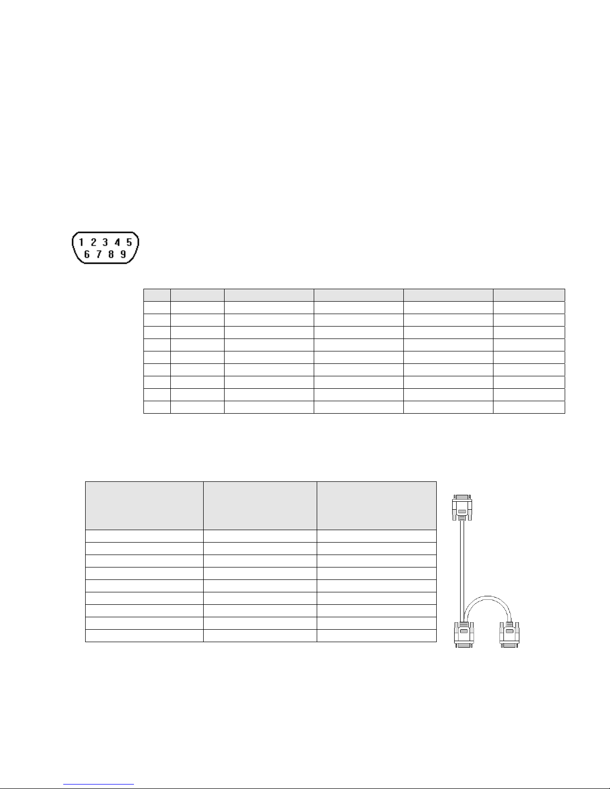
2.4.3 Connection to a Printer
The printer port on the back of the unit is a Parallel printer port and is compatible with most printers that accept parallel
connectors.
Print Out
Pin Designations
The MMI-1500 and 850 models have printout capabilities. The printer port
transmits data when a printable object is activated.
Pin assignment of the 25 Pin, D-SUB, Parallel Printer Port.
Pin # Symbol Function
1 STB Output
2 DATA0 Output
3 DATA1 Output
4 DATA2 Output
5 DATA3 Output
6 DATA4 Output
7 DATA5 Output
8 DATA6 Output
9 DATA7 Output
11 BUSY Input
15 ERROR Input
16 INIT Output
17-25 GND Signal Ground
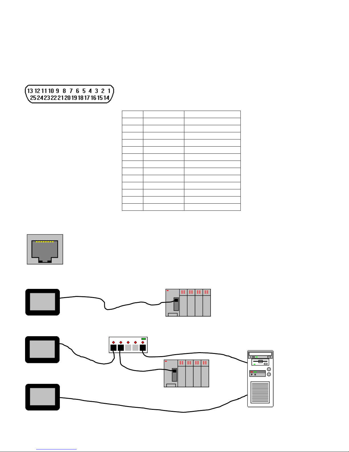
2.4.4 Ethernet Connections
Units equipped with the Ethernet port can be connected to Ethernet devices using standard 10T CAT5
Ethernet cables. Routing may pass through Hubs and Servers as needed to connect to the PLC.
The Ethernet port can also be used for HMI Master/Slave communications using the same type of
configurations.
Connect directly to PLC using 10T Crossover cable
Connect through Hub to PLC
Connecting through Server to PLC or Master
Hub
PLC
Server
PLC
10
Page 19
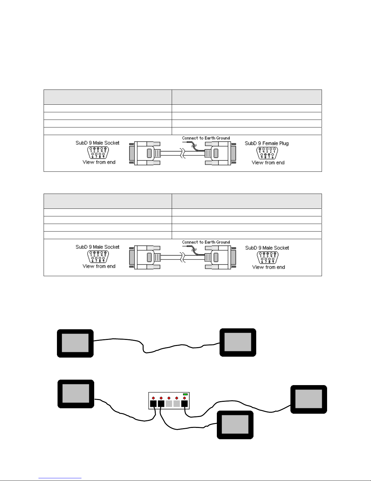
2.4.5 HMI to HMI Connections
The HMI supports a master - slave communications. One HMI is connected directly to the PLC and configured as the
Master. All the other HMIs are connected in series to it and are configured as Slaves. In theory there is no limitation to the
number of HMIs on a chain, however response time gradually decreases when more than three HMIs are linked together.
The HMI are configured with the EasyBuilder software to be the Master or a Slave.
Wiring between two HMIs
Case 1: Slave to Master, connecting PLC[RS232] directly to PC[RS-232]/PLC[RS485] combination port.
Connect to SLAVE HMI PLC[RS-232] port
Cable has D-SUB Male end
2 TxD Æ 8 RxD
3 RxD Æ 7 TxD
5 GND Æ 5 GND
Case 2: Slave to Master, connecting PLC[RS232] to PC side of split download cable (MT5_PC) with use of Male to Male Null
Modem cable.
Connect to SLAVE HMI PLC[RS-232] port
Cable has D-SUB Male end
2 TxD Æ 3 RxD
3 RxD Æ 2 TxD
5 GND Æ 5 GND
Connect to MASTER HMI PC[RS-232] port
Cable has D-SUB Female end
Shield Æ Earth Ground
Connect to MT5_PC to MASTER HMI PC[RS-232] port
Cable has D-SUB Male end
Shield Æ Earth Ground
Case 3: Ethernet Connections: Units equipped with the Ethernet port can be connected via Ethernet to a Master and Slaves
using standard 10T Ethernet cables. Slave to Master, connect the Ethernet ports with a standard (Category 5) Ethernet 10T
crossover cable (RJ-45 to RJ45). On the other hand, use standard cables with routing passing through Hubs and Servers as
needed.
Connecting a Master directly to a Slave using 10T Crossover cable
Master
Connecting a Master through a Hub to Slaves
Hub
Slave
11
Slave
Master
Slave
Page 20
2.5 Dip Switch Settings
All dipswitches should normally be in the OFF (down) position. Dipswitches 1 and 2 are used to perform testing and
recovery functions. Dip Switch 3 and 4 are not used and should be left in the off position.
SW1 SW2 Mode
OFF OFF Application mode (On line operations, use EasyManager or EasyBuilder to change modes)
ON OFF Force to Touch Adjust mode (Used for touchscreen calibration)
OFF ON Force to RDS mode (Remote Debug and Simulation, used to recover from invalid states
due to corrupt downloads. Refer to section on troubleshooting.)
ON ON Force to Touch Screen Test mode (Used to check accuracy of Touch Screen)
Note: It is normally not necessary to change dipswitches to put the HMI into programming (RDS) mode.
2.6 HMI Indicator Lights
PWR – Indicates if power has been applied to the unit. If this indicator fails to light, check power, check polarity
of wiring and check fusing. If all conditions are correct, contact the factory for help.
CPU – Indicates that the CPU is operating properly. If this indicator fails to light, please contact factory.
COM – Lights when a serial transmission is sent or received. This indicator appears to flicker when trying to
establish communications.
2.7 Other Hardware Considerations
2.7.1 Touchscreen Calibration
Normally the touchscreen is calibrated at the factory for proper functionality. If the touchscreen cannot be
calibrated, please contact the factory for assistance.
Run the EasyManager Utility to get to the Touch screen calibration (Touch Adjust) mode.
Click Jump to Touch Adjust to put the unit in this mode. This is used to calibrate the touch screen.
On the screen of the HMI unit:
Touch the crosshairs as displayed in sequence on the screen.
Touch anywhere outside to the rectangles to move the crosshairs to that location.
Touch inside the left rectangle to repeat the calibration process.
Touch inside the right rectangle to accept and end the calibration procedure.
Touch the screen again to jump to application mode.
2.7.2 CCFL and Battery Replacement
It is recommended that the factory replacement of these components in case of their failure. Use our toll free
number to contact KEP.
Telephone: 1-800-631-2165.
If the product must be returned, be sure to call KEP and get a Return Goods Authorization
(RGA) number first.
Units should be returned in their original packaging container, otherwise, any suitable rigid
container can be used as a substitute. Use appropriate packing material. Damage due to
shipment is not covered by the warranty. Be sure to include a description of the problem and
contact details for our repair department.
All returns are evaluated for proper operation. During evaluation, customer projects are not
retained in the units. If you need your project retained, please indicate this in the documentation
included with the unit.
12
Page 21
3.0 Specifications
3.1 General Specifications
Item
Input power 21-25 VDC, 500 mA @ 24VDC
CE Complies with EN50081-2 and EN50082-2 standards
EMI Complies with FCC Class A (Ferrite core required if using unshielded power supply wires)
Isolation resistance Exceeds 50 MΩ at 500VDC
Vibration endurance 10 to 25 Hz (X,Y,Z direction 2G 30 minutes)
Protection structure NEMA 4 / IP65 front panel (when mounted with gasket seal)
Operating Temperature
Operation humidity 10 to 90% RH Non Condensing
Enclosure Plastic: Polybutylene Terephthalate (PBT) and Polycarbonate(PC)
Specification
32 to 113
°F (0 to 45 °C)
3.2 Hardware Specification 1500, 850 Models
Item 1500T 1500M 850T 850
LCD Display 10.4” TFT, 256 color 10.4” STN, 4 color gray 7.7” TFT, 256 color 7.7” STN, 256 color
Display area (mm) 215(W) x 162(H) 162(W) x 123(H)
Contrast Ratio 150:1 18:1 250:1 30:1
Brightness cd/m2 300 100 400 150
Back light CCFLx2(MTBF 25,000 hr) CCFLx1(MTBF15,000 hr) CCFLx1 (MTBF 50,000 hr)
Resolution pixels 640(W) x 480(H)
Pixel size 0.33(W) x 0.33 (H) mm
Touch panel 4 wire resistive type
Touch granularity 2mm grid
Touch Feedback Beeper and or Graphic Indicator
Surface hardness 4H
Processor 32 bit RISC CPU 200 MHz
Flash ROM Memory 2 MB Standard, 4MB with Ethernet option
System Memory 4MB DRAM
Battery Held Memory 128kB with Y2K compliant Real Time Clock/Calendar
Compact Flash Slot Used for Project
transfers only
Serial ports 1 RS-232 (controller port) and 1 RS-232 / RS-485 (PC & controller port)
Parallel port Standard parallel printer port
Ethernet Port RJ-45 8 wire
(10 BaseT) TCP/IP
System diagnostic Watch dog timer, power failure detection
Dimensions
Bezel
H x W x D inches
(H x W x D) mm
Cutout
H x W inches
(H x W) mm
Weight Approx. 2.0 kg Approx. 1.2 kg
Bezel:
9.37 x 12.40 x 2.44
(238 x 315 x 62 )
Cutout:
8.86 x 11.89
(225 x 302 )
Not Available Used for Project transfers only
Not Available RJ-45 8 wire (10 BaseT) TCP/IP
Bezel:
6.93 x 9.09 x 2.16
(176 x 231 x 55)
Cutout:
6.57 x 8.75
(167 x 222 )
13
Page 22
3.3 Hardware Specification 750, 720 Models
Item 750T / 750T-HB 750 730T 720
LCD Display 5.7” TFT 256 color 5.7” STN 256 color 5.7” TFT 256 color 5.7” STN blue mode
Contrast Ratio 60:1 30:1 150:1 15:1
Brightness cd/m2 500 150 500 60
Back light CCFLx1 MTBF 30,000 hr MTBF 30,000 hr MTBF 30,000 hr MTBF 50,000 hr
Resolution pixels 320(W) x 240(H) 320(W) x 234(H) 320(W) x 240(H)
Pixel size 0.33(W) x 0.33 (H) mm
Display area (mm) 120(W) x 90(H)
Touch panel 4 wire resistive type
Touch granularity 1.5mm grid
Touch Feedback Beeper and or Graphic Indicator
Surface hardness 4H
Processor 32 bit RISC CPU 200 MHz
Flash Memory 1 MB Standard, 2MB with Ethernet Option
System Memory 4MB DRAM
Battery Held Memory 128kB with Y2K compliant Real Time Clock/Calendar
Compact Flash Slot Used for Project transfers only Not Available
Serial ports 1 RS-232 (controller port) and 1 RS-232 / RS-485 (PC & controller port)
Parallel Printer port No printer port available
Ethernet Port RJ-45 8 wire (10 BaseT) TCP/IP Not Available
System diagnostic Watch dog timer, power failure detection
Dimensions
H x W x D inches
(H x W x D) mm
Weight Approx. 0.84 kg
Bezel: 5.90 x 8.00 x 2.95 (150 x 204 x 75 )
Cutout: 5.43 x 7.56 (138 x 192 )
3.3 Functional Specification
Screen editor EasyBuilder Version 2.6.2 or later
(to be run under Windows 98 / NT / 2000 / ME / XP*)
No. of window 1 ~ 1999, limited by memory
No. of object Up to 500 per window, limited by memory
Text strings limited only by memory
Bitmap graphics 256 KB per graphic, limited by memory
Support PLC Most popular PLC’s
Support Printer EPSON ESC/P2, HP PCL/(Simple page mode) or compatible
Macro scripts Up to 256 Macro scripts per project, limited by memory
Computer requirements include at least a Pentium 90Mhz PC, 16MB RAM, 10MB available hard disk space,
minimum 800x600 resolution VGA, and one available RS-232 serial port.
14
Page 23

4.0 Trouble Shooting
4.1 Power Problems
Problems on power up: Unit does not light or unit lights but does not display any windows.
1. Check wiring for proper polarity.
2. Check power Supply for proper Voltage and Current capacity.
3. Check fuse.
Problems during operation: Faulty unit operation may be due to problems with power quality. The HMI has been
designed to work in environments where electrical noise is present. However, extreme electrical noise still causes
problems. Make sure that the system is properly earth grounded.
4.2 Communications Problems
Sometimes communications fail. When communications fail, the unit automatically tries to establish the
communications link again. During the time the unit is establishing communications, the touchscreen of the unit does
not respond. Function key operations are interrupted. The implication is that the unit should not be used for
Emergency Stop applications. A loss of communications can happen at any time. Using the function keys on the unit
for critical operations can lead to a potential disaster. It is good programming practice to allow for safe operation in
case of interface failure.
There are various reasons why this happens;
Improper programming: If the MMI window is programmed to access data from an invalid register or bit address
for the PLC, the unit receives an error message from the PLC. The unit interprets this as a loss in communications.
Be sure that all data points being displayed are valid for the PLC that is connected.
Loose or incorrect cables: Make sure that all cables are secured and configured properly for the PLC.
Time outs: Make sure that the PLC is responding to requests from the HMI in a timely manner.
Power loss: Make sure the PLC has power and is running properly.
Electrical noise: Faulty unit operation may be due to problems with power quality. The HMI has been designed to
work in environments where electrical noise is present. However, extreme electrical noise still causes problems.
Make sure that the system is properly earth grounded.
The use of proper grounding techniques insures reliable communications. Make sure the controller and the HMI are
connected to good earth ground sites. This allows EMI (Electro-Magnetic Interference, commonly called electrical
noise) to be channeled to ground where it can no longer disrupt electrical operations. Be sure to route
communications cables in separate bundles and locations from AC power and control wiring. Do not run
communications cables near solenoid and relay coils or AC and DC drive controllers. Care should also be taken to
locate the HMI itself away from sources of EMI.
15
Page 24

4.3 Commonly Asked Questions
Q. Can I have multiple MMIs connected to one Controller?
A. The ability to connect more than one HMI to a controller is accomplished through an HMI to HMI link. This is not
done through any PLC protocol. It is done through the master-slave protocol of the MMI.
Q. How do I call up windows with my PLC?
A. Use the PLC Control part configured as “Change window” to call up windows by word value. Additionally, Direct
and Indirect Window parts can be used to bring up windows.
Q. Do I need to change any jumpers to go from one Controller type to another?
A. No, the driver that is downloaded into the unit at programming time determines the Controller type. The dip
switches on the back of the unit should all be in the OFF position.
Q. Is there any way to completely erase the HMI user memory?
A. No, the HMI memory is initialized automatically before every download cycle.
Q. How Do I change the Battery?
A. Battery replacement requires disassembly of the unit in an ESD controlled environment. Battery life expectancy
is greater than 5 years.
The MMI-7XX takes one coin type of CR2032 lithium battery to backup the recipe data and keep the RTC
running. Battery specification: CR2032 3V lithium battery.
Steps for battery replacement:
1. Use EasyManager to backup the retentive memory data.
2. Turn off the HMI and remove its rear cover.
3. Remove the battery from the socket.
4. Insert a new battery into the socket.
5. Put on the rear cover.
6. Reset the RTC time and download the retentive memory data.
The MMI-850 and 1500x products have the battery soldered to the main board. We recommend that these
units be sent back to the factory for battery replacement.
Q. Can I change the Backlighting bulbs in the field?
A. We recommend that the unit be sent back to the factory for bulb replacement. Backlight bulb life expectancy is
greater than 5 years even if running 24 hours a day. Use the Backlight auto shutdown to conserve backlight bulb life.
Q. Why am I getting slow updates on my windows?
A. PLC communication speed controls the update speed. Try using a higher baudrate and adjusting the Block pack
settings. If an overloaded window is causing a slow update, we suggest changing the window design.
NOTE: EasyWindow has a tool called “SystemResource”. It displays object queue item numbers. Use this to help
detect communication problems. This problem might not show up in Offline Simulation because the PC may have
more CPU speed, more caches, and more VGA speed.
4.4 Hardware Problems
4.4.1 Black Screen after download
Symptom: After project downloaded to a new touchscreen a blank black screen is displayed.
Cause: Using the older versions of EasyBuilder to download to newer model touchscreens.
Any version prior to version 2.0.2 downloading to Hardware version 3
Any version prior to version 2.5.1 downloading to Hardware version 4
Any version prior to version 2.6.0 downloading to Hardware version 4.5
Fix: Install new version of EasyBuilder on your computer.
Set DIP Switch 2 ON in the HMI and reset Unit.
Load your project using new EasyBuilder.
Set DIP Switch 2 OFF and reset Unit.
Project should now operate normally.
16
Page 25

4.5 Repairs and Returns
An MMI is designed to provide years of trouble free service. An MMI under goes a full functional test before
shipment.
The MMI warranty is for one year under normal use.
The MMI does not require any “Routine Maintenance” by the user. If a problem should occur, and all troubleshooting
procedures have been exhausted, contact your local representative or distributor.
Use our toll free number to contact KEP if persistent problems are encountered.
Telephone: 1-800-631-2165.
If the product must be returned for any reason, be sure to call KEP and get a Return Goods Authorization
(RGA) number first.
Units should be returned in their original packaging container, otherwise, any suitable rigid container can be
used as a substitute. Use appropriate packing material. Damage due to shipment is not covered by the
warranty. Be sure to include a description of the problem and contact details for our repair department.
All returns are evaluated for proper operation. During evaluation, customer projects are not retained in the
units. If you need your project retained, please indicate this in the documentation included with the unit.
Products passing normal QC tests are returned to the customer and an evaluation charge is incurred.
If the problem is verified and the unit is in warranty, KEP will repair or replace the unit.
5.0 Quick Startup Guide
5.1 Connections
Set up the HMI with PC and PLC as described below.
a) Connect PC [RS-232] port of the HMI to the PC. Since the PC [RS-232] and PLC [RS-485] share the same D-SUB
connector, we recommend using the HMI to PC cable provided (MT5_PC). This splits the port into two separate connectors
to ease the program and test process.
b) Connect either the PLC [RS-485] or PLC [RS-232] port of the HMI to the PLC using the proper cable. (Check the PLC
signal type and cable listing in the back of this manual to assure proper port connections.)
c) Connect DC 24V power to the power connector. See Section 2.2.1 for power connection specifications.
Note: Check that all Dip switches are set to the “OFF” position.
d) Apply power and, if necessary, calibrate contrast adjust to the best viewing performance. (Not applicable for MMI-1500T)
Set new V4.5 hardware versions in RDS mode where contrast can be adjusted electronically.
17
Page 26
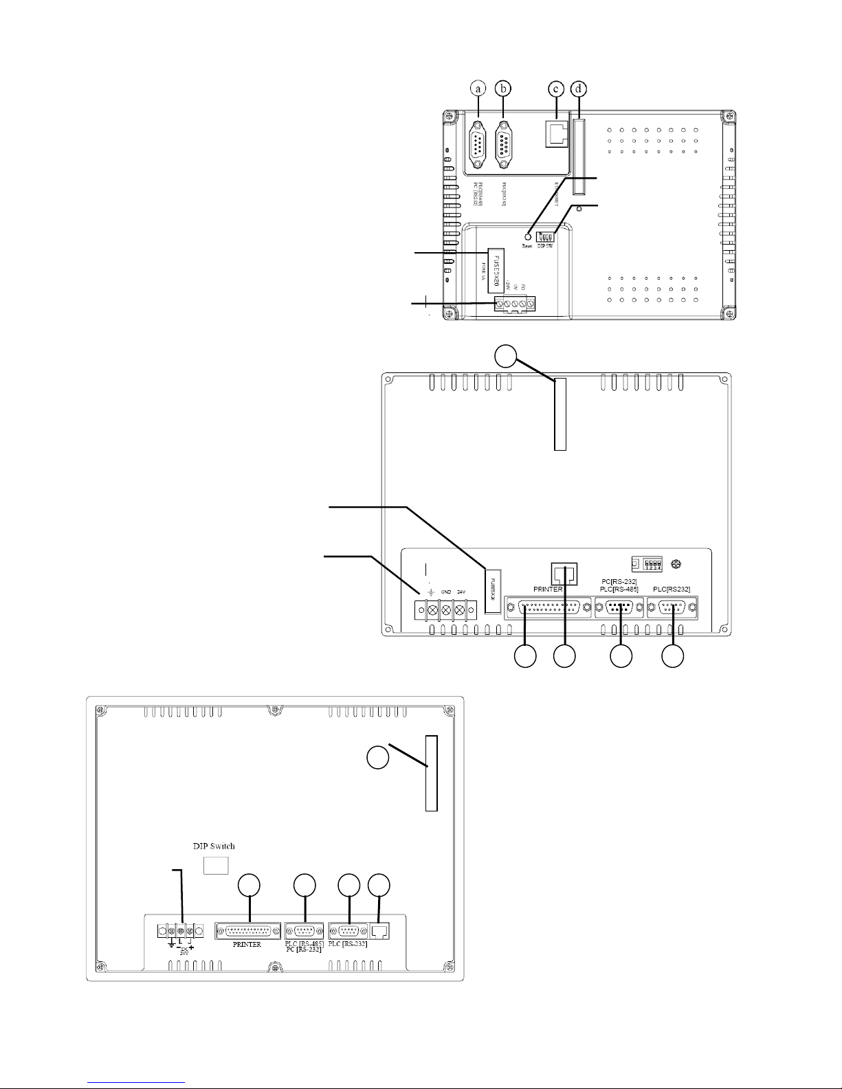
MMI-7XX Connection points
r
r
r
a. PLC[RS485]/PC[RS232]/AUX [RS485]
b. PLC[RS232]/AUX [RS232]
c. Ethernet port (RJ-45) (only on some models)
d. CF card slot (only on units with Ethernet ports)
Dip Switches
Fuse
Powe
Connections
MMI-850, MMI-1500 Connection Points
a. PLC[RS485]/PC[RS232]/AUX [RS485]
b. PLC[RS232]/AUX [RS232]
c. Ethernet port (RJ-45)
d. CF card slot
e. Printer port
Connections
Fuse
Powe
d
cb
e
a
Powe
Connections
d
c a be
18
Page 27
Typical connection
_
To Ethernet Port
To PLC RS-232
Interface
PC
PC
PLC
MT5
HMI
PC cable
To PLC RS-485
Interface
5.2 Installing EasyBuilder
Install EasyBuilder 500 on your PC. Software must be installed on a PC running Windows 98®, Windows 2000® or Windows
®
XP
software. PC screen resolution must be set to 800x600 or greater. Also, at least a Pentium 90Mhz CPU with 16MB
RAM, a CDROM drive, 15MB available hard disk space, VGA video controller, and one available RS-232 serial port is
required.
Put the EasyBuilder Installation CD into the CD drive. The autorun should bring up a screen showing an area to click to
begin the EasyBuilder Installation.
If the Autorun sequence does not start, browse the CD with Windows
the Installation process is done, the Start Menu has selections for starting EasyBuilder and EasyManager.
There is no need to restart your computer after installation, although this is recommended.
®
Explorer and start the installation from there. Once
19
Page 28
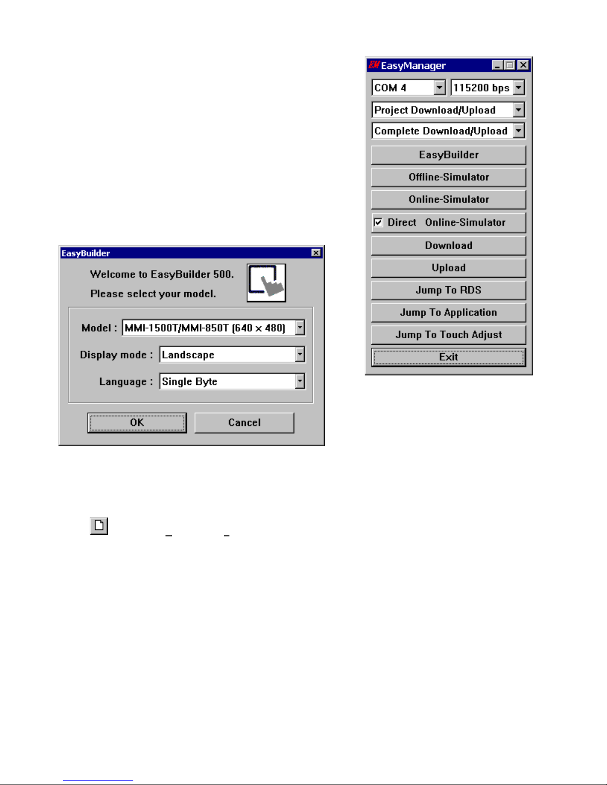
5.3 Initial Start Up
Use EasyManager to set the following:
1. COM Select Dropdown: Select the number of the RS232 Serial COM port
for communications to the MMI. Ports COM1 through COM10 are
available.
2. Click on EasyBuilder to start the screen editor for the MMI.
Note: See the Software Reference section for further details about the
EasyManager Application.
After clicking the EasyBuilder button, the following popup dialog appears if this is the first time running EasyBuilder.
Otherwise, the last open project is automatically opened for editing.
To start a new project, use the keyboard shortcut [Ctrl + N]
or click the
3. Select the appropriate Model number you are programming….
MMI1500T (640 x 480) 10.4” TFT 256 Color
MMI1500S (640 x 480) 10.4” STN 256 Color
MMI1500M (640 x480) 10.4” STN 4 Shade Grayscale
MMI850T (640 x 480) 7.7” TFT 256 Color
MMI850 (640 x 480) 7.7” STN 256 Color
MMI750T (320 x 240) 5.7” TFT 256 Color
MMI750 (320 x 240) 5.7” STN 256 Color
MMI730T (320 x 234) 5.7” TFT 256 Color
MMI720 (320 x 240) 5.7” STN 4 Shade Grayscale
tool or select [New] from the File menu and a new project is created from the project template.
20
Page 29
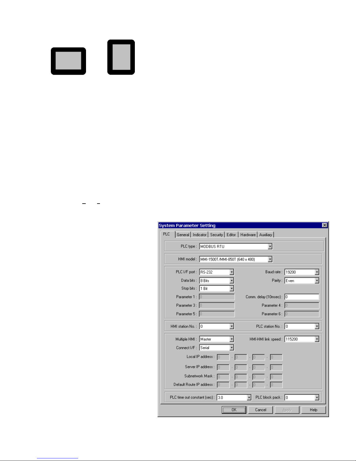
4. Select the Display Mode….
Landscape Portrait
5. Select the Language Mode….
This setting determines the character set that is used in project development.
Select Single Byte for European languages. These fonts are in the directory as Ascfont.8, Ascfont.16 and Ascfont.24.
These represent the 8, 16 and 24 point sizes. Larger sizes are generated from these base sizes (Example: Font size
32 is actually size 16 doubled).
Select Double Bytes for Asiatic languages. Use the Font setting in the System Parameters Editor Tab to select the
appropriate character set.
Then click, OK.
5.4 Creating a project
A project file (*.epj FILE) is simply a collection of all the windows and window data used by an application.
Step 1. Select Edit|System Parameters... and the following screen appears. Fill in the system parameters. Use the PLC
Tab to select the set up the parameters for communicating to the PLC.
a. Select the PLC type from the dropdown list.
b. Confirm that the HMI Model is the one you
are programming.
c. Check the communications settings:
Serial I/F port
Baud rate
Data bits
Parity
Stop bits
HMI station No.
PLC station No.
Set the communications parameters to match
the PLC. (See the Controller Reference Guide
for details.)
Note:
The General, Indicator, Security, Editor,
Hardware and Auxiliary Port tabs are used for
other settings. See Section 2.0 for full details.
For a quick start, these settings can be left at
their defaults.
21
Page 30
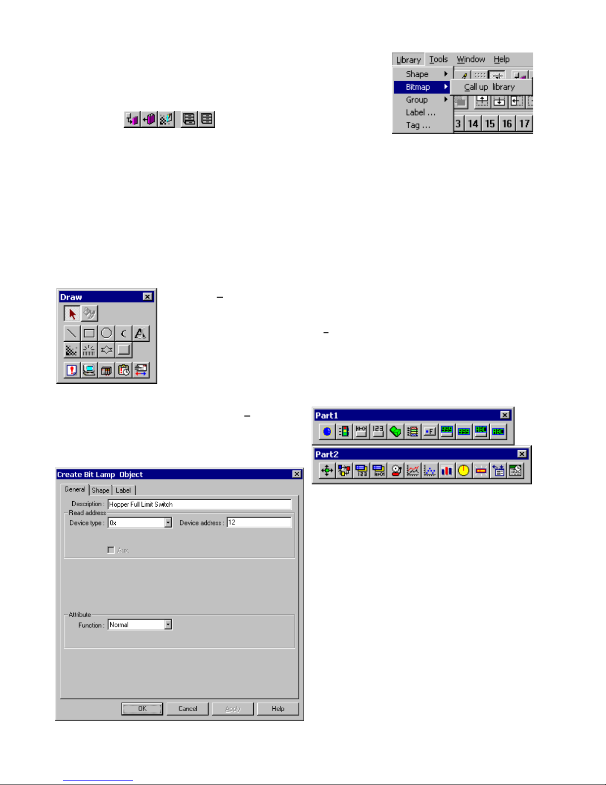
Step 2. Select any additional Group, BMP and/or Shape Libraries to attach to the
project. The default selection provides a good range of library objects. For a quick
start, no additional libraries are needed.
In the Library menu, select [Shape, Bitmap or Group] Æ [Call up Library] or use
the toolbar icons
EasyBuilder provides three types of libraries.
A Shape is a collection of drawing elements, those elements, when put together, defines a graphic symbol
representing a button, lamp, function key etc.
A Bitmap is a collection of pixel of data; each pixel can be 1, 4 or 8 bits.
A Group Library is a collection of shapes and bits that are frequently used and have been saved as a group.
.
Step 3. Design the windows
Using the parts and drawing elements, virtually any simple window display can be completed in 10 minutes. “Ease of
Use” is the greatest benefit of our EasyBuilder screen editor software.
a. Use the Draw menu/tools to put static text and shapes on the window. The drawing tools
are used in the similar fashion to most windows drawing packages.
For example: To draw a line: Select the Line tool. Change any attributes for the line. Click on
the screen where the line is to begin, move to where the line is to end and click again to set
the end point.
b. Put active parts on the screen by using the Parts
menu/tools. The parts automatically pop up a dialog for
entering information related to the part operation.
For example: Placing a Bit Lamp: Select Bit Lamp from
the Parts menu. Select the type of bit to access. Enter
the number of the bit. Go to the shape tab. Select Use
shape and click on the Shape Library button to select a
shape. Click OK to close the dialog. The Bit Lamp is
placed in the upper left corner of the display. Move it to
the desired position.
22
Page 31

Step 4. Save and Compile the project
In the menu, select File|S
In the menu select Tools|Compile… to compile the project.
ave to save the project.
Step 5. Simulate the project either On-line or Off-line.
Select Tool|O
the PLC through the unit and simulates operation. Before simulation, be sure to connect the unit and the PLC properly
and set the COM port in EasyManager.
Select Tool|Off-line S
emulates operations. The unit does not have to be connected to the PC for this type of simulation. Hint: Use this type
of simulation to demonstrate projects.
Using the Simulators before the
project is completely debugged,
saves time by avoiding repeated
downloads.
n-line Simulation operation in the menu. After the project is complied, the Simulator retrieves data from
imulation operation in the menu. After the project is complied, the PC simulates the PLC and
Step 6. Download the project
In the menu, select Tool|D
COM port in the Easy Manager menu. When the download is finished, click OK in response to the Mission complete
message. The HMI automatically switches to Application Mode.
This ends the Quick Start section. From here, it is up to you to design the
spectacular window displays that make life easier for your operators.
Sample Simulation Screen
ownload… to load the image file into the MMI. Before downloading, be sure to set the
23
Page 32

Section 2: Software Reference Guide
6.0 EasyManager Operations
The EasyManager is a software shell for launching several utilities. Some
functions are duplicated in the EasyBuilder screen-editing program. While the
EasyBuilder program can be run as a stand-alone program, it is advised to run
EasyManager first to set the COM port.
EasyManager has the following components:
6.1 COM Port Drop-Down Box
Select the number of the RS232 Serial COM port for communications to the
MMI. Ports COM1 through COM10 are available for selection.
Note: Make sure that some other program is not already using the selected
COM port. EasyManager and EasyBuilder will not take control of a COM
port that is used by another program. Communications time out errors will
be displayed when attempting EasyManager functions.
6.2 Communications Speed Drop-Down Box
This selection is used to determine the communications speed between the PC
and the unit during downloads and uploads. If you are using the MT5_PC cable
to download, the 115200 speed is recommended. When using extension
cables, the 38400 speed is recommended.
6.3 Project or Recipe Download/Upload
There are two types of communications: Downloading - sends data to the unit
and Uploading - retrieves data from a unit. The data that is sent or received
can be a compiled project’s object file (file with *.eob extension) or retentive
memory (recipe) data (file with *.rcp extension).
Select Project Download/Upload to transfer only project data.
Select Recipe Download/Upload to transfer only retentive memory (recipe) data.
6.4 Complete or Partial Download/Upload
The Complete or Partial Download/Upload is used to determine how much retentive memory (recipe) data is transferred to or
from the unit during Download or Upload.
A Complete Download/Upload sends/retrieves the full 65535 bytes of retentive memory (recipe) data from the MMI.
A 32K Partial Download/Upload sends/retrieves only the first 32767 bytes of retentive memory (recipe) data.
6.5 EasyBuilder
This button launches the EasyBuilder screen editor. This is used for project creation, editing, compiling, simulation and
downloading.
24
Page 33

6.6 Online-Simulator
The Online simulator retrieves data from the PLC through the unit and uses it to put a realistic image of the unit on the PC
screen. The image shows how a project appears after download. Use the Online-Simulator to view demonstration projects
and show how the windows look in actual operation. A Touchscreen and PLC are needed to simulate a project in this mode.
Note: The project must be compiled by EasyBuilder. This creates a file with extension *.eob. Uncompiled project files with
the *.epj extension cannot be simulated.
Note: When the Direct Online-Simulator option is checked the unit is not needed for Online simulation, the PC can be
connected directly to the PLC with an appropriate communications cable.
6.7 Direct Online-Simulator
When this option is checked the HMI is not needed for Online-Simulation. The PC is connected directly to the PLC with an
appropriate communications cable.
Note: Direct Online Simulator does not support AB DH485 or UniTelWay drivers.
6.8 Offline-Simulator
The Offline simulator emulates the operation of a project on the PC screen. The PC is used to simulate a PLC in a limited
fashion. Use the Offline-Simulator to create demonstration projects or view approximately, how the windows look in actual
operation. A Touchscreen and PLC are not needed to simulate a project in this mode.
Note: The project must be compiled by EasyBuilder. This creates a file with extension *.eob. Uncompiled project files with
the *.epj extension cannot be simulated.
6.9 Download
Download a project compiled by EasyBuilder to the MMI. Downloading a Project sends the object *.eob file and or recipe
*.rcp file to the MMI. Downloading a Recipe sends only the recipe *.rcp file to the MMI. You are prompted to select the files
as they are downloaded.
Note: The EasyManager download facility is ideal for sending out project updates. Most projects and EasyManager fit on a
1.44MB floppy disk. The user just needs to run EasyManager click on download and select the project file. The
download begins automatically.
6.10 Upload
Upload the project file from HMI to an object file (*.eob). Uploading a Project retrieves the object *.eob file and or retentive
memory (recipe) *.rcp file from the MMI. You are prompted to name the files as they are uploaded. Uploading Recipe
retrieves the retentive memory (recipe) *.rcp file only from the MMI. You are prompted to name the file as it is uploaded.
Note: The upload file can be transferred to another MMI. This is useful for retrieving data from installed units to make a
duplicate setup.
25
Page 34

6.11 Mode Change
The EasyBuilder operates in one of three modes. Click the buttons to switch to the corresponding mode.
Note: It is not necessary to change dipswitches for a mode change.
6.11.1 RDS (Remote Debug & Simulation) mode
The Jump to RDS mode is used for project development. Simulations and Up/Downloads are done in this mode. It puts the
unit in a state that displays 9 to 12 lines of unit information.
Line 0: Shows the status of the unit as reported from its internal initialization routine. This should say “Initial OK”.
If this line does not display the OK message, please contact the factory for assistance.
Lines 1 and 2: Show the unit’s internal firmware version information. The BootRom Version should be 1.12 with a
Version Id of 0x100a or greater for proper operation with EasyBuilder V2.6.x.
Line 3: The PC communication baudrate setting. This changes automatically to match the EasyManager setting.
Line 4: Shows if the unit has a project in it or not. If no project is present, the unit does not go to Application mode.
Line 5: The download support setting. This changes automatically to match the EasyManager setting.
Line 6: This should always be Fast Mode Simulation.
Line 7: Indicates if Retentive (Recipe) memory is installed in the unit. (Old units may not have memory installed.)
Line 8: Show the unit’s driver status. The unit should indicate that it accepts KEP drivers. If it does not, please
contact the factory for assistance.
Line 9: Shows the display resolution.
Line 10: Shows the unit’s MAC ID for Ethernet communications. (Old units do not display this information.)
Lines 11 & 12: Displays the OEM’s copyright notice.
Note: On new hardware platforms, below line 12, are two touch areas for contrast adjust and or a button for
initiating Compact Flash project transfer.
6.11.2 Application (On line operation) mode
Clicking Jump to Application runs the project in memory. This is the normal operating mode of a unit once it is
installed, programmed and ready for use.
Note: if there is no project in the unit the unit stays or jumps to RDS Mode.
6.11.3 Touch Adjust (Touch screen calibration) mode
Jump to Touch Adjust is used to calibrate the touch screen. Normally the touchscreen is calibrated at the factory for proper
functionality. If the touchscreen cannot be calibrated, please contact the factory for assistance.
6.12 EXIT
This button closes the EasyManager application.
26
Page 35

7.0 Software Fundamentals
j
7.1 Screen Editor Overview
Clicking on the Easy Manager’s [EasyBuilder] button causes the following window to appear. The functions of each screen
area are explained below.
a. Title Bar
b. Menu Bar
c. Library Tools
d. Tool Bar
i. Layer Control
. Position Adjust
k. Alignment
l. Text size & position
m. Size Adjust
n. Group
o. Rotate & Flip
p. Drawing Tools
q. Parts Tools
r. Cursor Position
s. Window Treebar
t. System Tools
e. State Selector
f. Project Tools
g. Label Language
h. Magnification
a. Title Bar: Displays the project’s file name, active
window number and title.
b. Menu Bar: Displays the menu used to select
EasyBuilder commands.
c. Library Tools: Displays tools for library operations.
d. Tool Bar: Displays the icons corresponding to File,
Edit, Option, Library, Tools and Help menu items.
e. State Selector: Clicking on this drop-down toggles all
the parts on the window to the specified state.
f. Project tools: Used for compiling, simulating and
downloading a project.
g. Language: Clicking on this drop-down toggles all the
labels on the window to the specified language.
h. Magnification: Used to double screen size for fine
editing and positioning.
i. Layer Control: Adjust the Layer of selected part – one
layer up, one layer down, to top layer and to bottom
layer.
j. Position Adjust: Adjust the position of selected parts.
k. Alignment: Make all the selected parts line up to the
top, bottom, left or right.
l. Text size & position: Change the font size and alignment
of the selected text.
m. Size Adjust: These tools make the dimension, width or
height, of all the selected parts the same size.
n. Group: The group function makes a collection of
selected parts and drawing elements as one object.
o. Rotate and Flip: Allows shapes to be flipped
horizontally or vertically and rotated in 90-degree
increments.
p. Drawing Tools: Icons representing each drawing tool
are shown.
q. Parts Tools: Icons representing each Part type are
shown. Clicking on one of these icons causes that
icon’s dialog box to appear. That Part’s attributes can
then be set and the Part can be placed on the window.
r. Cursor Position: Shows the current cursor position on
the active screen relative to the upper left corner of the
screen.
s. Window Treebar: Provides quick access to Window
properties, objects and organization.
t. System Tools: Used to set Alarm and Event messages,
PLC controls and Data Transfer.
27
Page 36

7.1.1 Changing Screen Appearance
The screen appearance can be changed to make project editing easier. This includes what toolbars are displayed, changing
grid constraint properties and magnification. These changes affect the screen but do not change a window’s properties.
7.1.1.1 View Menu
The View menu is used to Hide or show Toolbars, Status bar and Treebar. The functionality of the Treebar is
discussed further in the Editing Placed Objects section. Toolbars can be dragged to other sides of the editing window
or dragged away from the edge to be shown as floating. Check a toolbar’s name to open it. Uncheck a toolbar’s name
to close it.
The Size command is used to change the edited window’s magnification to 100 or 200%. Magnification makes it
easier to align objects manually and to make drawing objects intersect at appropriate coordinates.
7.1.1.2 Screen Settings
Use the Option|Grid/Snap menu to make object alignment and drawing easy.
X, Y Select or enter the pixels from one grid point
to the next in the X(Horizontal) or Y(Vertical)
direction.
Display Checkbox: Enables/Disables grid
visibility.
Snap Checkbox: Enables/Disables the snapping
of objects to the grid.
Fix objects checkbox: Enables/Disables the
anchoring of objects once they are placed. This
prevents inadvertent movement of objects when
selected by mouse click or rearrangement.
Use the Option|W
compile automation features.
indow Property dialog to set the Grid color, turn the object ID display on or off and sets project save and
Grid color: Select the color of the grid.
Note: If the grid color is the same as
the window color, it becomes invisible.
Display Object ID Checkbox:
Enables/Disables the object ID number
from being displayed in the upper left
corner of an object.
Enable the Object ID for easy reference
to objects listed in the Treebar.
Disable the Object ID to view how
objects appear when displayed on the
unit’s screen.
Note: Object ID’s may obscure the
locations of object labels.
Without Object ID With Object ID
28
Page 37

Allow Function Key frame when making Shapes Checkbox: Enables/Disables the automatic creation of a shape using a
function key assist. This is discussed further in the Library Operations Section.
Jump to application mode when download done Checkbox: Enables/Disables automatically forcing the HMI to the
application mode after a download. This avoids the process of going to EasyManager and pressing the Jump to Application
button or cycling power to the unit after download to put it in application mode. This is discussed further in the EasyBuilder
Operations Section.
Automatic save and compile at download and simulate checkbox: Enables/Disables automatically saving and compiling
a project before simulation or download. This shortens the usual 3-step process to one step. This is discussed further in the
EasyBuilder Operations Section.
The Option|Language menu sets the program for 1 or 2 byte font character sets. The particular font set is specified in the
Edit|SystemParameters/Editor Tab.
Note: The English version of EasyBuilder only supports single byte fonts as defined by EasyAsciiFontMaker.exe.
7.2 System Parameters
The first thing that should be done when starting a new project is to select the System Parameters for that project. The
System Parameters determine all of the characteristics of the project as it relates to the Operating System, Window
appearance and PLC.
Select the Edit|Sy
system parameters as required.
stem Parameters… menu and the System Parameter Setting dialog appears. Fill in all or some of the
7.2.1 The PLC Tab Parameters
PLC type: Select the type of PLC from
available PLC selection menu. The dropdown
displays all of the built in PLC drivers
available. Additional external “add on” drivers
located in the \Drivers - SubDirectory are
also displayed with the [PDS] suffix. Select
the driver that matches your PLC’s protocol.
Note: For additional information about
individual drivers, see the Controller
Reference Guide section.
29
Page 38

MMI model: Select the unit by model number from the dropdown.
KEP Part# Display Type OEM Part#
MMI1500T (640 x 480) 10.4” TFT 256 Color MT510T…
MMI1500S (640 x 480) 10.4” STN 256 Color MT510S…
MMI1500M (640 x 480) 10.4” STN 4 Shade Grayscale MT510L…
MMI1050 (640 x 480) 9.4” STN 4 Shade Grayscale MT509L…
MMI850T (640 x 480) 7.7” TFT 256 Color MT508T…
MMI850 (640 x 480) 7.7” STN 256 Color MT508S…
MMI750T (320 x 240) 5.7” TFT 256 Color MT506T…
MMI750 (320 x 240) 5.7” STN 256 Color MT506S…
MMI730T (320 x 234) 5.7” TFT 256 Color MT506T46
MMI720 (320 x 240) 5.7” STN 4 Shade Grayscale MT506L…
Notes:
Changing model type effects how windows are displayed.
EasyBuilder does not scale windows when display size is changed.
Example: Changing from a 640x480 to a 320x240 display clips the windows so that only the upper left corner is
shown. Changing from a 320x240 to a 640x480 display shows the window’s objects in the upper left corner.
EasyBuilder does not compensate colors so that the display is readable when changing from Color Models to Grayscale
Models.
Use the MMI850 selection to program the discontinued MMI1500S.
Use the MMI1500M selection to program the discontinued MMI1050.
Use the MMI750T selection to program the MMI750T and MMI750T-HB.
KEP recommends that you develop a project for its target hardware platform.
(There is no utility to automatically resize a project for a larger or smaller screen.)
Serial Port I/F: Select the PLC port’s type of hardware communications. The HMI activates the
corresponding port and configuration on the back of the unit.
Serial Port I/F Description
RS-232
RS-485 default
RS-485 4W
RS-485 2W
Ethernet (Option)
Note: RS-485 communications can be forced to 4 wire or 2 wire types. This is practical when communications adapters are
used to connect several devices to one PLC. If left at the default, it uses the PLCs default configuration.
Note: For additional information about communication configurations for a selected PLC, see the Controller Reference
Guide section that refers to that PLC.
Communications to the controller are through the PLC[RS-232] port. (Pins
2,3 & 5)
Communications to the controller are through the PLC[RS-485] PC[RS-232]
port. This can be 2 wire or 4 wire depending on the PLC type. When unsure
select RS-485 4W or RS-485 2W.
Communications to the controller are through the PLC[RS-485] PC[RS-232]
port. (Pins 1~5)
Communications to the controller are through the PLC[RS-485] PC[RS-232]
port. (Pins 1,2 & 5)
Communications to the controller are through the optional Ethernet port.
Note: The PLC[RS-485] PC[RS-232] port is a dual port and serves as the programming port for the MMI. This port is also
used for Master/Slave communications (see below).
30
Page 39

Baud rate, Parity, Data bits and Stop bits: Set the baud rate to match the PLC ports settings. These are disabled if
Ethernet communication is selected. (Ethernet communication uses 10 BaseT and TCP/IP parameters.)
Comm. delay and Additional Parameters:
The Comm. Delay parameter is used for setting an interval between communications requests to the controller. Enter a
number from 0 to 999. The number specifies the 10-millisecond intervals between communications. For example: a setting of
100 puts a 1-second interval between communications requests. This parameter will slow data update rate on a window. It
also gives slow controllers a way to meet processing demands without too many interruptions.
Set the other additional parameters as required by your driver. See the Controller Reference Guide section that references
the PLC driver for further details.
HMI station No.: This is used when PLCs require the HMI to have a node or station identifier. Set as needed or leave at 0 if
not used. Station numbers are 0-255 (Use the range as appropriate for PLC type).
PLC station No.: Used when PLCs have a node or station identifier. The HMI needs the station number to initiate
communications. Set as needed or leave at 0 if not used. Station numbers are 0-127 (Use the range as appropriate for PLC
type). If the PLC station number does not match the PLC, the “PLC no response” error message is displayed. Station
numbers above 127 (127~255) are reserved for the Auxiliary Port.
Multiple HMI: Allows more than one HMI to be connected to one PLC. Enable as a Master or a Slave, depending on
connection, or Disable as needed.
Selection
Description
Disable Disables the chaining of multiple MMIs to one PLC.
Slave Select this if this HMI connects to another HMI in the chain.
Master Select this when the HMI is the unit connected directly to the PLC.
Connect I/F: Select the unit to unit connection type. Ethernet is available for units with the optional Ethernet port. For all
others, use the Serial interface (I/F) selection.
31
Page 40

HMI-HMI link speed: This is used only when a Serial interface is used for connecting multiple HMIs. Higher communication
rates may cause faster window updates, but are diminished quicker by link distance and electrical interference.
Note: All linked HMIs must be set to the same link speed. Slave units ignore the communication parameters associated with
the PLC (Serial port I/F, Baud rate, Parity, etc.).
Ethernet IP settings: These settings are used whenever Ethernet communications is selected for Multiple HMI or HMI to
PLC connections. A working knowledge of TCP/IP networking and termino lo g y is neces sary to implement Ethernet
connections.
Setting Description
HMI Local IP address
Server IP address
Subnetwork Mask
Default Route IP address
These fields are the IP address of the HMI unit.
The IP address of the PLC or Slave HMI.
The mask for the network where the HMI and PLC or Slave are located.
This is used for HMI to PLC communications. It refers to network server IP settings.
PLC time out constant (sec): This setting determines how long the HMI waits for a response from the PLC. The range is
from 0.1 to 25.5 seconds. This setting is important when the PLC is normally slow to respond or several MMIs are linked to
one PLC.
Note: When communications are broken, the red COM LED on the front Panel of the HMI flashes at this interval.
PLC block pack: Used to determine how the unit communicates to the controller. By increasing this
number, larger blocks of registers can be fetched from the controller. In some cases, this speeds the
update of information on the display. The range is 0 to 255.
Note: Setting the Block Pack to 0 allows the HMI to determine the block size that best fits data retrieval.
This is the recommended setting.
Note: Certain PLCs have a limit as to how many data points can be uploaded at a time. If the Block pack number is set
higher than this limit, it has no effect on communications.
Hint: When creating project windows, it is advised to use consecutive registers whenever possible.
Note: Some of the project’s System Parameter/PLC Tab settings are stored in the retentive memory of the MMI. See the
System Bit and Register Reference section for further details.
32
Page 41

7.2.2 The General Tab
Task button
The Task button is used to pop up the Fast
Selection window or display the Task Bar.
Minimized window’s icons are put on the Task
Bar. This gives the project a familiar graphical
user interface.
Note: Refer to the Task Bar Operations
section for a full description of the Task Button
features.
Attribute: Enables or disables this feature. If
disabled, the Fast
Selection window
and Task Bar are not
available at run time.
Background color: This dropdown calls the
color selection dialog. Select 1 of 16 colors for
the Task Bar background.
Position: The Task buttons can be located on
the right or left side of
the display.
Text: Determines text alignment within the Task Buttons and minimized window icons.
Left adjust: Shifts text to the left side of the Task Buttons and minimized window icons.
Center: Centers the text to the center of the Task Buttons and minimized window icons.
Alarm Bar
The Alarm bar Part displays alarm text in single line scrolling fashion. These settings affect how the text is scrolled.
Pixels per scroll: Select 8, 16, 24 or 32 from the drop-down menu. This specifies how many pixels
are scrolled in each increment. For example: If the Pixels per scroll were set at 8 and the font size of
the Alarm Bar was set to 24 (characters are 12 pixels wide), 2/3 of a character would be scrolled in
with each elapse of the Scroll speed time. The larger the number the faster a given message is
displayed.
Scroll speed: This setting determines how fast each increment of the scroll is displayed (Range: 0.0
to 25.5). The setting is the time between characters. The smaller the number, the faster the alarm
messages are displayed. 0.0 is the fastest with no break between characters.
Note: Text blurs at high speeds!
Note: Refer to the Object Reference Guide for more details about Alarm Bar operation.
33
Page 42

No. of windows: This setting is used to specify the maximum number of windows allowed open at
any one time (1 - 6). The unit ignores attempts to open more windows than specified until an
existing window is closed.
When more windows are open than recommended, system resources may drop low enough to
trigger a "System severe error" message". When the error occurs, the unit must be reset or power
must be cycled to the unit before project execution can resume.
Note: The maximum number allowed is 6. It is recommended to reduce the maximum by one for each of the following
conditions:
• The project has a Common window.
• The project has a Message board window.
• The project has print screen functions.
• The project is using bitmap compression.
If all of the above conditions apply, restrict the maximum number of windows allowed to 2.
Note: The size of the minimized icon on the Task Bar is decreased as the minimum number of windows is increased. By
selecting a lower number, more room is given for a descriptive title in the minimized icon.
Startup window No.: This is the window displayed when the HMI is powered up. Valid window numbers are 10 - 1999.
Note: If the specified window does not exist, the unit displays "System severe error (error code 10101)" when started.
Cursor color: Determines the color of the cursor when displayed. The full range of colors is available for this parameter.
This is used with Data Input Extend and ASCII Input Extend parts. The cursor (a flashing block) indicates when data entry is
enabled for a selected value.
Password: Activate the password option by entering any number greater than 0. This locks the project after it is downloaded
so it cannot be uploaded without first entering the password.
Note: Password protection does not prevent the user
from Downloading. There is no protection to prevent
a project from being overwritten.
Back light saver: The HMI turns off back light power if there are no touch operations within the set
time (Range: 0 to 255, unit in minutes). A zero setting disables the back light “auto shutoff” function.
Buzzer: The buzzer sounds briefly every time the touchscreen is activated by touch. This selection
allows the programmer to turn off the buzzer. The buzzer can be annoying in some applications and
during development phases of a project.
Note: The buzzer cannot be assigned to alarms and is not associated with alarm functions.
Note: There are no provisions for the user to control the buzzer.
34
Page 43

Common Window: Window 6 is the default common window. Objects placed on a common window are always displayed
and active. The following settings determine how they appear.
Popup window: Determines where an indirect or direct popup window called from the common window is displayed.
Normal: The Popup window is displayed on the layer above the parent-calling window. If another
window is on top of the calling window, it may hide the popup.
Above any others: The popup window is displayed on the top layer when activated.
Attribute: Determines the location of the Common window.
Below base screen: The common window is always on the bottom layer of the display. All windows
cover the common window.
Above base screen: The common window is always in the top layer. All windows are below the
common window. Controls and objects on the Common window are always visible.
Extra No. of Event: Normally, 200 events are stored in the Event Log. If more than 200 events are needed, the additional
amount is entered here. Up to 2800 additional logs can be added. For example, if 1000 events need to be logged, enter 800
in this field. See the Event Log part for details on the Event Logger.
RTC Source: The RTC Source determines where the Event Log part and Printer obtains the real time information for their
display and printout.
Local Word: Uses the values in LW 9010 to LW9016. The RTC data from your PLC must be
transferred to LW9010 to LW9016 before use. This is done with a Data Transfer part.
Note: All values must be BCD coded.
LW Address Description Valid Values
9010 Real Time Clock second. 0 - 59
9011 Real Time Clock minute. 0-59
9012 Real Time Clock hour. 0-23
9013 Real Time Clock day. 0-31
9014 Real Time Clock month. 0-11
9015 Real Time Clock year. 0-9999
9016 Real Time Clock day of the week. 0-6
Internal RTC: Uses the RTC in the HMI (RW60000 to RW60006). All values are BCD coded.
RW Address Description Valid Values
60000 Real Time Clock second. (read and write allowed) 0 - 59
60001 Real Time Clock minute. (read and write allowed) 0-59
60002 Real Time Clock hour. (read and write allowed) 0-23
60003 Real Time Clock day. (read and write allowed) 0-31
60004 Real Time Clock month. (read and write allowed) 0-11
60005 Real Time Clock year. (read and write allowed) 0-9999
60006 Real Time Clock day of the week. (read and write allowed) 0-6
35
Page 44

Print: Use these settings to set the Printer protocol. This enables Function Key Screen and Event printing as well as the
display of printer errors. Time format for Event printing is also set here.
Printer: Select the printer protocol.
None: Printing disabled.
EPSON ESC/P2: Typically used with dot matrix line printers.
SP Printer: Simple printing used with ASCII type printers.
HP PCL/Simple Page Mode: Use with PCL compatible laser printers.
Note: Local Bit, LB 9017, is the control bit for printing. If LB9017 is set OFF/ON, printing is disabled/enabled.
Note: If None is selected, all print functions and LB9017 are disabled.
Print time tag: Print the time in Hours:Minutes:Seconds format along with the printed information.
Print date tag: Print the Date in Month:Day format along with the printed information.
Print Sequence number: Select to print the sequence number of the event along with the event occurrence.
Extended time format (D:H:/M): Change the time format in the time tag to Days/Hours/Minutes.
Extended date format (Y/M/D): Change the time format in the time tag to Year/Month/Day.
Error Detection: Select how printer errors are handled.
Local Bit LB 9016 is used for internal error reporting.
Setting Description
No error detection
Error detection (show message)
Error detection (set local bit)
Printer errors are ignored.
A message box pops up on the HMI display when printer errors occur.
LB 9016 is set to 1 when printer errors occur. LB 9016 remains high until reset by
some user action. It is up to the programmer to handle this error by popping up a
window or providing a way to reset the bit.
Message board window No. (0,10~1999): The message board allows the operator to draw a message within the
designated window, using the touchscreen. This is especially useful when the operator needs to leave a note about machine
status or the operator’s whereabouts when not at the machine. The operator can simply write “MACHINE DOWN” or
“Lavatory”. Or, some process note or calculation can be entered as a reminder; such as “Backlash +.005”. The message
window retains its data until power is lost. This allows the message window to be closed and then opened later without loss
of information.
Select the window number to be used as the message board.
Note: Selecting 0 disables the Message board feature.
Note: Only one Message board window per project is allowed.
Note: See the Function Key part section for information about Message board controls.
Note: Some of the project’s System Parameter/General Tab settings are stored in the retentive memory. See the System
Bit and Register Reference section for further details.
36
Page 45

7.2.3 The Indicator Tab
These are settings for the indicators shown on the Task Bar opposite to the Task Buttons.
Touch indicator: The Touch indicator
changes color every time a screen touch
is recognized. This allows the operator to
visually confirm that the touchscreen has
recognized the touch and is functioning
properly.
Attribute:
Enable makes the
Touch indicator
visible and active.
Disable makes the
indicator invisible and not active.
Non-configured area, Active area, and
Inactive area: Use these to set the
condition’s color that is displayed in Touch
indicator.
Frame: Use to set the color of the circular
outline in the Touch indicator
CPU indicator: The CPU indicator is a
bargraph that shows system resource
usage. Typically, the bargraph increases as
more windows are open. Operators can tell if a
resource failure is imminent.
Attribute: Enables or disables this feature. If disabled, the CPU indicator is not displayed at run time.
Color: This dropdown is used to select the color of the displayed CPU indicator.
Alarm indicator: The Alarm indicator comes on when there are alarms present. This indicator is a bargraph that
increases as the number of alarms increases. Operators are alerted to active alarms.
Attribute: Enables or disables this feature. If disabled, the Alarm indicator is not displayed at run
time.
Color: This dropdown is used to select the color of the displayed Alarm indicator.
Sample Task Bar showing Indicators.
Touch CPU Alarm
Note: The full range of colors is available for Indicator settings.
37
Page 46

7.2.4 The Security Tab
The Security tab is used for setting security levels and access codes.
Note: Reference the Security section for further details on Security Control.
Security Control This check box activates the
security feature. Security levels are assigned to
windows in their Window Settings dialog. There
are three levels of security.
Lowest - Level 0 is the lowest level of security.
Middle - Level 1 allows access to Level 1 and
Level 0 windows.
Highest - Level 2 is the highest level of security
and can access all levels.
Each level’s password is a double word value (0
to 99999999). Passwords are numeric digits
only and cannot contain any alphabet
characters.
Note: A password of 0 for a Security level
disables security for that level (all users can
access that level).
Note: The project’s Security level settings are
stored in the retentive memory of the MMI. See
the System Bit and Register Reference
section for further details.
38
Page 47

7.2.5 The Editor Tab
The Editor tab allows the programmer to change the project characteristics.
Beginning window
No.: Changes the
window numbering
so it starts with 1
instead of 10.
Internally, EasyBuilder maintains the initial
window of 10 but displays all window numbers
with an offset so they appear to start with an
initial window of 1.
Note: System windows that start with a
number less than 10, such as the Fast
Select window, now appear with negative
numbers in the Window Treebar.
Note: Changing this does not affect the
window numbering for specifying the
Startup window setting in the Set
System Parameters General Tab.
Compiler level: This
selection is used to
determine the compile
type. Older projects did
not have any checks for PLC address type. Use
Level 0 to recompile older projects and Level 1
for all new projects. Old projects work on new
units.
Part Layout: This selection determines what happens when a Part changes state, particularly when
the Part is in a lower layer, possibly covered by another window or object.
Select Control to have the part move to the topmost layer and become visible.
Select Nature to have the part stay in its original layer, still changing state, though partially or not
visible.
Address Mode: This selection is used to enable Read and Write Device address fields to accept
Extended notation. Extended notation is used when a touchscreen is connected to more than
one controller. This is used with RS485/422 communications schemes.
Note: The selected PLC in the Set System Parameters PLC Tab must have multiple PLC communications available.
For example: PLC type Modbus (485 2 wire) The addressing method is as follows:
Device type Address Description
0x: 1#06 PLC 1, Data Bit 00006
4x: 2#45 PLC 2, Holding Register 40045
3x: 12#54 PLC 12, Input Register 30054
Number before '#' is the
Station number: 0~255
39
Page 48

Font: The font selection drop-down shows the selection of available fonts. Font selection is only used for Asiatic Languages.
Font selection does not affect Western Languages. The fixed font files in EasyBuilder are always used.
Note: The Font selection works in conjunction with the Option|Language menu’s selection.
Option|Language: This setting determines the character set that is
used in project development.
Select Single Byte for European languages. Single Byte uses extended fonts (ALT key sequences) to type
characters used in some European countries. Single Byte uses the built in fonts. These fonts are in the directory as
Ascfont.8, Ascfont.16 and Ascfont.24. These represent the 8, 16 and 24 point sizes. Larger sizes are generated
from these base sizes (Example: Font size 32 is actually size 16 doubled).
Select Double Bytes for Asiatic languages. Use the Font setting in the System Parameters Editor Tab to select the
appropriate character set.
Note: The fixed western fonts can be edited using the EasyAsciiFontMaker editor included with the software. Use
EasyAsciiFontMaker to edit the Font files if a character is not found.
7.2.6 The Hardware Tab
Use the Hardware tab settings for configuring
TFT display characteristics, display orientation
and retentive memory use.
LCD
Display Mode:
Determines the orientation
of the project on the
display.
Landscape is for wide aspect
displays. The long edges of the
display are the top and bottom
of the windows. (Default)
Portrait gives a vertical orientation
to the project. The long edges of
the display are the left and right
sides.
TFT PCD Value: This setting applies to the
MMI1500T and MMI750T only. It allows the
user to change the PCD of the display. The
PCD is related to the scan frequency of LCD;
(the higher scan frequency, the more stable the
display).
Suggested use:
Set TFT PCD as High if there is no message board in the project.
Set TFT PCD as Low if there is a message board in the project.
40
Page 49

Retentive Memory
These settings apply to how the retentive memory is allocated in the unit.
EventLog DataBase: Enables user to keep EventLog information in retentive memory. When the HMI starts up, it
checks the in retentive memory and retrieves EventLog DataBase information.
DataBase Start Address: (0~59999). Information is stored in retentive memory starting with the specified address.
Note: LW9058-9059 contains the size in words of the EventLog in retentive memory. Keep in mind that once a
block of retentive memory has been reserved, your project cannot use it for other purposes. We recommend that
you specify the DataBase Start Address to be after stored recipes so they are not overwritten with Event Log data.
System Parameter: Enables the user to change some System Parameter Settings in the HMI. The parameters are
stored in retentive memory beginning with RW60040.
For example: RW60041 represents the PLC port baudrate. If you change this value, the next time the HMI is
powered up, the baudrate is set to the value in RW60041.
Note: Set LB9044 to ON to activate System Parameter changes from the Retentive Word area immediately.
Note: Caution should always be observed when changing System Parameters. There is the possibility of making
the unit unable to function in the application. When this happens, the project must be downloaded again to restore
the System Parameters.
Note: System Bit and Register Reference listing of System Reserved Words.
General Tab System Parameter
RW60061 Back light saver: 0(Disable)1~255 second(Enable)
RW60064 Buzzer: 0:None 1:Yes
Security Tab
RW60071 Security Control: 0:None 1:Yes
RW60072 Password: level 0 (two words)
RW60074 Password: level 1 (two words)
RW60076 Password: level 2 (two words)
41
Page 50

7.2.7 The Auxiliary Tab
The Auxiliary tab is used for configuring the auxiliary port. This port is configured in the same fashion as the PLC
communications port. Special drivers are needed for this port. This port does not support AB DH485 or TELEMECANIQUE
UniTelWay communications.
Aux. type: Select the type of PLC from
available PLC selection menu. The dropdown
displays all of the PLC drivers available. These
drivers are located in the \Drivers -
SubDirectory with the *.pds extension. Select
the driver that matches your PLC’s protocol.
Serial Port I/F: Select
the Auxiliary port’s
type of hardware
communications. The
HMI activates the corresponding port pins. Only
RS232 and 2 wire RS485 configurations are
available.
Note: For additional information about
communication configurations for a selected
PLC, see the Controller Reference Guide
section that refers to that PLC.
Note: The AUX[RS-485] PC[RS-232] port is a
dual port.
Baud rate, Parity, Data bits and Stop bits: Set
the baud rate to match the PLC ports settings.
Comm. delay and Additional Parameters:
The Comm. delay parameter is used for setting an interval between communications requests to the controller. Enter a
number from 0 to 999. The number specifies the 10-millisecond intervals between communications. Foe example: a setting
of 100 puts a 1-second interval between communications requests. This parameter will slow data update rate on a window. It
also gives slow controllers a way to meet processing demands without too many interruptions.
Set the other additional parameters as required by your driver. See the Controller Reference Guide section that references
the PLC driver for further details.
42
Page 51

Aux. Station: Used when PLCs have a node or station identifier. The HMI needs the station number to initiate
communications. Set as needed or leave at 0 if not used. Station numbers are 0-255 (Use the range as appropriate for PLC
type). If the PLC station number does not match the PLC, the “PLC no response” error message is displayed.
Aux. time out constant (sec): This setting determines how long the HMI waits for a response from the PLC. The range is
from 0 to 127 seconds. This setting is important when the PLC is normally slow to respond or several MMIs are linked to one
PLC.
Note: When communications are broken, the red COM LED on the front Panel of the HMI flashes at this interval.
Aux. block pack: Used to determine how the unit communicates to the controller. By increasing this number, larger blocks
of registers can be fetched from the controller. In some cases, this speeds the update of information on the display. The
range is 0 to 255.
Note: Setting the Block Pack to 0 allows the HMI to determine the block size that best fits data retrieval. This is the
recommended setting.
Note: Certain PLCs have a limit as to how many data points can be uploaded at a time. If the Block pack number is set
higher than this limit, it may effect communications.
Hint: When creating project windows, it is advised to use consecutive registers whenever possible.
43
Page 52

7.3 Part Placement
A
7.3.1 Part Placement Summary
A window is composed of a variety of parts such as Switches, Lamps, Numerical data and
Graphics. The procedure to add a part to the window is a simple, 3 step, procedure.
1. Select a Part by either clicking on a Parts toolbar icon, or dragging over to one of the Parts
menu’s selections.
2. When the Part’s dialog box appears, set the Part’s attribute data, such as PLC read/write
address, Shape or BMP, and Label as described in this section. Some Parts have
additional tabs that require more information.
3. After all of the Part’s attributes have been set, simply
click on the OK button to place it on the current window.
If desired, use the Part’s sizing handles to adjust its
size, or click on the Part to select it and drag it
anywhere on the window.
7.3.2 Part ID Numbers
An ID number is a code number that is assigned automatically to a Part or Object.
The number identifies the specific part on the current window.
The Part ID is shown in the upper left corner of the part.
WL-001
The 2-letter prefix identifies what type of object it is. The suffix identifies the number
of that object. Numbering begins at zero for each type on each window.
Objects are displayed by Part ID in the Window Treebar. Clicking on the part in the
Treebar highlights it in the window. See Treebar Operations for more details.
The displaying the Part ID is disabled by unchecking the Display setting in the
Option|Window Property menu item.
Bit Lamp
Typical Part’s Dialog Box
ID Number
Note: The programmer cannot change the ID number.
44
Page 53

7.3.3 Part Dialog Features
A
This section gives a brief overview about part definition. Some Parts have additional tabs that require additional information.
For full details about a particular part see Section 3, Object Reference Guide.
7.3.3.1 The General Tab
Enter your description here. A reference name (not
displayed) that you assign to the Part.
Device address: Bit or register number as is
applicable.
Device type: Click down arrow icon to show possible
address types.
Select to receive data as Binary or BCD encoded.
Check box to enable Device selection by Tag name.
Check box to redirect request to the Auxiliary port.
ttribute: Additional information for part characteristics
is entered here.
7.3.3.1.1 Attaching a Description
If desired, a comment can be attached to a Part. This is a good practice for future reference and useful when editing a
project. The maximum description length is 1023 characters.
Note: Descriptions are not downloaded to the MMI. An uploaded project has blank description fields.
Note: Descriptions are not included in the Object Summary printout..
7.3.3.1.2 Entering a PLC Read or Write address
Valid Device types and Device addresses depend on the individual PLC type. If you haven’t done so, select the
appropriate PLC type in the Edit|System Parameters menu item.
Direct Device Entry
Select the Device type from the drop down list. Usually these prefixes are the same as those used in the PLCs
documentation.
Next, enter the Device address. The Device address does not need the prefix repeated. The device address also
does not need leading zeroes.
Example: Selecting R00023 as a read address; Select R as the Device type, enter 23 as the Device address.
Note: Entering bit addresses.
Bits are usually entered as the bit word followed by the bit number. When entering bit numbers, delimiters
such as “space”, “.” and “/” should not be used. For example bit 11 of Input word 3 would be entered as “311”.
In some cases, a hexadecimal notation is required (3A). See the Controller Reference Section, for details on
bit format for your particular controller.
45
Page 54

Note: Extended address mode
When more than one unit is connected to
multiple PLCs of the same kind. (Available for
some RS485 models listed with the 485 2W
suffix.
The addressing method is as follows:
Device type, followed by the PLC ID number, a
'#', then the word or bit number.
As shown in diagram: PLC 3, 0x, bit 27 is used
for Device.
Example: Modbus RTU (485 2W)
Device type Address Description
0x: 1#06 PLC 1, Data Bit 00006
4x: 2#45 PLC 2, Holding Register 40045
3x: 12#54 PLC 12, Input Register 30054
Note: PLC ID number range is limited to: 0~255.
Note: HMI Internal registers and bits. (Reference the System Bit and Register section.)
• LB (Local Bit) and LW (Local Word) are the designations for internal bits and words of the MMI. The range for
general use is 0 to 8999. Bits and words from 9000 to 9999 are reserved for system use.
• RB bits and RW words are internal retentive memory options. RBI and RWI are the indexes to retentive memory
locations.
• Ms_RB, Ms_RW, Ms_LW and Ms_LB are bits and words located in the Master HMI when Master/Slave link ups
are used.
Using a Tag to enter a Read or Write Device
Check the Tag box to select a Tag for the Device
Type and Address. Select the Tag that corresponds to the
control bit or word for the Part.
Note: Tags must be predefined before use. The Tag
database is located in the Library|Tag… menu. See the
section on Tags for more details.
Retrieving Data from the Auxiliary Port
Check the Aux. box to direct the source of the
Read/Write address to the Auxiliary Port.
Note: Be sure the Auxiliary Port is set in the System
Parameters. If no device is present on the Auxiliary port,
an error will be returned.
46
Page 55

7.3.3.1.3 Data format types
BIN (binary format) Decimal numbers are encoded by bit weight
Bit number
Weight
15 0
2152142132122112102928272625242322212
0
BCD (binary coded decimal format) Decimal numbers are encoded by bit weight per 4-bit nibble
15 12 11 8 7 4 3 0
3
10
10
2
10
1
0
10
For example: The Read address raw data is 0000 0100 0010 0101.
The BIN format treats the data as 1061
The BCD format treats the data as 425
7.3.3.1.4 Attributes
Some Parts have Attribute parameters on the General Tab. Select the desired attribute from the dropdown and fill in
any information required. The attributes vary from part to part. Reference Section 3, Object Reference Guide, for
complete details about a Part’s attributes.
7.3.3.2 The Shape Tab
The Shape tab is used to assign a graphic background to an object. If no graphic is assigned then the object has a
transparent background. A frame is shown on the project window to indicate that a part is present. The frame is not visible in
simulations or the MMI.
Selecting a Shape or Bitmap
1. Click on the Shape tab
2. Select Use shape or Use bitmap
3. Click Shape library or Bitmap library
The shape/bitmap browser pops up. Select the desired
shape/bitmap. Shapes are stored in shape libraries (*.slb
files). Bitmap graphics are stored in Bitmap libraries (*.blb
files).
A maximum of 10 libraries can be attached to a project. By
calling up different shape or bitmap libraries, useful
graphics for almost any application can be found. Users
can also build up their own shape and bitmap libraries.
The State select buttons can be used to view
the various states of the selected shape.
The State dropdown can be used to view
additional states of the selected shape.
Note: If both shape and bitmap are selected for a part, the graphic shown in the preview box is the one displayed on the
window at run time. (Usually the Shape takes precedence.)
Note: Reference the Library Operations section for full details about the Library features.
47
Page 56

7.3.3.3 The Label Tab
play
Labels are text that is shown on the face of the Switch, Lamp or other object (part). Different text can be assigned to different
states of a part. Example: State 0 = ”OFF”, State 1 = ”ON”.
Select Tracking to place and move labels
of different states all at once and together.
Select Use Label Library to enable label
selection from a predefined set of Labels.
Select Use Label to enable label dis
Adding a Label to a Part
1. Click on Label tab
2. Select each state to label
3. Select Attributes for the label
4. Type the state’s label in the Content box
Color
Select a color for the text from the popup Color dialog. Colors can be changed from state to state. The Grayscale units have
a color selection of only 4 colors. If you have a color unit, there are 256 colors available. See the section on Drawing for
details about color selection.
Align (Justification)
Select the desired text alignment. Alignment can vary from state to state. When the text input for a
Label becomes 2 lines or more, the alignment can be defined as Left, Center or Right justified.
Note: Center justifies the lines of text only; it does not center the text on the object.
.
Note: Text alignment can be changed after a part is placed by using the text alignment tools in the tool bar.
Font
Select the desired font size. Font size can vary from state to state.
Font sizes 8, 16, 24, 32, 48, 64 and 96 are available.
Note: Font size can be changed after a part is placed by using the font tools in the tool bar.
State
States are displayed only for those objects with multiple states. The text displayed for each state can be set independently.
Simply select a state in order to set its text, font, color and alignment.
Note: The State can be viewed
after a part is placed by using
the State dropdown or State
Select buttons in the tool bar.
48
State 0
State 1
Page 57

Content Box
There are two options for applying text as the Label. The programmer can:
Enter text directly in the Content box (Use label)
Or
Select a predefined Label (Use Label Library).
Use label selected…
Type in the characters to be displayed on
the button in the Content field. The
“ENTER” key can be used to move to the
next line if desired. Text is limited by
screen size. If entered text exceeds the
screen size, it is automatically deleted
when the part is placed. Be sure to enter
text for all of the desired states.
Use Label Library selected…
Select the label to use for the state from
the Label Index dropdown. Text entry
into the Content Box is disabled. Click the
Label Library… button to add or view
predefined labels.
Note: All states must use the same method for entering the label. You cannot have a predefined label for one
state and a directly entered text for another within the same part.
Duplicate this label to other states
Click this button to copy the displayed Content to all of the other state Contents. This action cannot be reversed
using Undo.
7.3.3.4 Part Placement
Once all of the Attributes have been set as desired, click the OK button to place a new part on the screen. The part is shown
in the upper left corner of the editing window. The part can then be dragged into position and resized as desired.
Note: Label Position
Once the Part is placed on the window, the Label can be moved anywhere within the boundary of the object. Just click
on the label and drag the mouse to move it to the desired position. Toggle through the state designator to display the
predefined label in each state.
Note: If Tracking is enabled, the labels in all states are located where the current label is displayed.
Click on the
object
Click on the
label
Drag to move
label
49
Page 58

7.4 Window Operations
Every new project begins with a default window, window number 10. Usually more than one window is needed for a project.
There are three types of windows – Base, Fast and Common. Allowable window numbers are from 10 to 1999.
Window types
Base Window:
These are the normal windows displayed during HMI runtime operations. They are used as informational or control screens
that allow the operator manage a process. A PLC control or function key may call them up. They are also used with Direct
and Indirect Window parts to appear on the screen as needed. The possible range of Base window numbers is 10 to 1999
(1 to 1989 if starting window is set to 1).
Fast Selection Window:
The Fast Selection window is activated when the Screen Task Button is pressed. The size is limited to 10 to 200 pixels wide
by 10 to 480 pixels high. It is designated as window number 4 (-5 if starting window is set to 1). See the System Parameters
and Task Bar sections for more details about the Fast Selection window.
Note: Base windows can be reassigned to the Fast Select function through a Function Key with the Jog-FS action.
The Base window replacing the Fast Select window must be the same height and width as the Fast Select window 4.
Common Window:
Common windows are used as foregrounds or backgrounds to Base windows. All controls on the acting Common window
are active. In addition, any objects drawn on the common window and parts with shapes/bitmaps are visible when on top of
the controlling Base window. This saves memory by allowing the programmer to provide a common header or set of controls
that are always active no matter what base screen is called.
The default Common window is window 6 (-5 if starting window is set to 1).
Note: Base windows can be reassigned as the Common window through a Function Key with the Change
Common Window action. Base window numbers 10 to 1999 can also be assigned as Common windows. When called
as Common windows they behave as Common windows by replacing the default Common window (6).
Note: Base windows may be specified as smaller than full screen to facilitate a pop-up operation. These small
windows, when popped up, covers the Common window objects.
50
Page 59

7.4.1 Creating New Windows
7.4.1.1 Procedure for Creating a New
Window Number
In the Window menu, select the Open
Window command.
In the Open Window dialog click on New
Window….
Select the window type; Base Window or
Fast Selection or Common Window.
Or …
Right click on an undefined window number in the Treebar
Select Create from the popup menu.
Setup the window properties as desired
Name: Give each window a unique name in order to
identify it. The name is shown in the Window Treebar.
Note: Window Names are not downloaded to the
MMI. Uploaded projects shows the default window
name.
Window No: This value can be changed if creating the
Window from the Open Window dialog. Valid window
numbers are from 10 to 1999 (1 to 1989 if starting
window is set to 1).
Note: The window number cannot be changed
after a window is created.
Start Pos.: Set the coordinates of the upper left-hand
corner of the window when displayed on the MMI. This
applies only if the window is less than a full screen.
Size: Set appropriate width and height if it is going to be a pop-up window, otherwise, set window width as full screen size
(320x240 or 640x480 depending on model)
51
Page 60

Style:
Tracking, Monopoly Clipping and Coherence
These parameters specify the relationship between a child pop-up window and it’s base calling window.
Monopoly: If a child window is marked as Monopoly, the calling window is frozen when it is popped up.
Clipping: A child window marked as Clipping limits its boundary to the calling window. This means the child window’s
display area outside of the base calling window’s frame is cut off.
Tracking: A child Tracking window moves when the calling window is moved.
Note: Both the Clipping and Tracking must be selected or deselected.
Coherence: Coherence means that there can be no windows between the calling window and this window. One
cannot be brought to the foreground without the other; both are brought forward.
Security: This prevents unauthorized access to windows when the System Parameter, Security
feature is activated. Lowest is security level 0, Middle is security level 1 and Highest is security
level 2. See the Security Section for further details.
Underlay Window: Up to three windows can be specified as underlay windows. An underlay window adds its objects into
the base window being created. The Underlay window’s attributes (Style, Security, Underlay, Frame, etc.) are ignored for this
purpose.
LIMITATION NOTE: Trend displays cannot be on both an Underlay window and a Normal window. Projects with
underlay windows cannot be opened by EasyBuilder versions prior to 1.6.6 even if System Parameter Compile level is
set to 0.
Frame: A Frame is suggested for child windows. The width in pixels of the frame can be selected from the drop down (0, 4,
6, 8, 10, 12, 14, and 16). If the Frame is not set to 0, the 16 basic colors are available for the frame.
Note: Objects placed on top of the frame during project development are covered by the frame when the project is
running.
Background: Select the background Color, Pattern and Pattern Color for the window. The Filled option enables and
disables the Pattern in Design and Run modes. See the Drawing section for details about available patterns.
Note: If the Filled option is not checked the window’s background color is not shown during project design but is
shown during simulation and run modes.
52
Page 61

7.4.1.2 Opening Windows for Editing
After a window is created, with the Open Window
dialog box select it from the list and double click it or
press Open to open the window.
Note: The windows marked with an “*” are already
opened.
To edit a window that has already been opened, just select Window menu
then select the window.
Alternatively, Right click the
window number in the Treebar to
popup the shortcut menu. Then
select Open. If the window is
already open, double-click the
window number to bring it to the
front.
Note: The windows marked with
an “*” are already opened.
7.4.1.3 Modifying Window Properties
Select the Window|Open Window menu, Then select the window from the list and press Setting. The window properties
can now be modified.
Note: The window number cannot be changed after window is created.
7.4.1.4 Deleting a Window
Select the Window|Open Window menu.
Then select the window from the list and
press Delete.
Alternatively, Right click the window
number in the Treebar. Select Setting to
edit the properties or Delete to delete the
window.
Note: A window Delete cannot be
restored with the Undo command!
53
Page 62

7.4.2 Adding Objects to a Window
Once a window is opened and displayed, the programmer can draw shapes and add parts to the window. Use the Draw and
Parts menu or toolbars to create the look and feel desired.
Graphics placed with the Drawing Tools do not respond to touch actions. Some Parts do not react to touch actions. It is
advised that each part be reviewed and understood by going through the Parts Reference Section.
7.4.2.1 Drawing Graphics
Click on the drawing tool or select the item from the Draw Menu and drag the shape on the window. Once placed the
shape can be resized using its “handles”. Handles are the highlighted squares that appear around the graphic when it is
selected. An Attribute Dialog to adjust color and fill characteristics is available through Edit|Change Attribute… menu
or by double-clicking the graphic or clicking on the Edit tool.
7.4.2.2 Adding Parts
Click on the Part tool or select the item from the Part Menu. Fill in the Part’s Attributes in the popup dialog. Then, place
the Part on the window. Some Parts can be resized after placement. The Attribute Dialog can be recalled through
Edit|Change Atribute… menu or by double-clicking the Part, right clicking and selecting Attributes from the shortcut
menu, or clicking on the Attributes tool.
7.4.3 Copying and Importing Windows from Other Projects
Windows created in one project can be copied or imported into another project. This is done through the Edit|Window
copy… menu command. Selecting this menu item pops up the Window Copy dialog box.
Browse to the *epj file that has the window you want to copy or import. Fill in the Source Window No. from the *.epj project.
Select a window number in the open project where the window is to be placed (Desti. Window No.). If the Destination
window already exists, the program displays a warning dialog that allows you to cancel the operation or continue. If you
chose continue, it overwrites the window. Click OK to finish.
Note: Shapes and Bitmaps needed for the imported windows are not automatically brought into the open project. Be sure to
attach the appropriate libraries before importing windows.
Note: A window copy cannot be reversed with the Undo command!
The above example shows Window 11 from project EBPrj1 about to be copied to window 14 of the open project.
If the open project some project other than EBPrj1, the window is imported. If EBPrj1 is the open project then the window is
copied (duplicated) to the destination window number.
54
Page 63

7.4.4 Changing and Popping Up Windows
EasyBuilder has 4 ways to change or popup windows during simulation or run operation. See Section 3, Object Reference
Guide, for complete details about PLC Controls, Functions, Indirect and Direct windows, their attributes, and how to
implement them.
PLC controlled action:
Use the Change Window PLC Control to replace all other Base windows being displayed. Common and Fast
Selection windows are not affected.
Operator controlled action:
Use Function parts with the Change Window attribute to replace all other Base windows being displayed. Common
and Fast Selection windows are not affected.
Use Function Key parts with the Popup Window attribute to place another Base over top of the active window. The
only way to close a popup window is to put a Function button with the Close Window attribute in it.
Note: A popup window of this type cannot use a Function part to pop up another window.
Use Function Key parts with the Change Common Window attribute to replace the currently active common window.
Base and Fast Selection windows are not affected.
Use Function Key parts with the Jog FS-Window attribute to replace the currently active Fast Selection window.
Common and Base windows are not affected.
Use Function Key parts with the Return to Previous attribute to replace the current Base window with the last active
Base window. Common and Fast Selection windows are not affected.
PLC or Operator controlled action:
Use Indirect and Direct window parts to overlay popup windows over active windows in a predefined area. Windows
called by Indirect and Direct window parts do not replace full screen windows.
Note: Indirect and Direct windows can call up other Indirect and Direct windows.
Note: Indirect and Direct windows do not work properly when they are on the same Base window as a Function
key Popup Window part. Additionally, do not put Function key Popup Window parts on Indirect and Direct
windows.
55
Page 64

7.5 Task Bar Operations
r
A
The Task Bar allows the programmer to create projects with familiar graphic features. The Task Bar holds the buttons for a
pop-up menu and system tray. This allows the user to pop-up (maximize) or icon-ize (minimize) child windows and change
window displays. The “Task bar” must be enabled in the System Parameters for the Task buttons to be displayed.
7.5.1 Task Button Overview
Fast Selection
Window
Expands out Fast
Select Window
Expands out
Window Ba
Press the Screen task button to pop-up the Fast Selection window.
The Fast Selection window can have several Function parts (placed on it by the user) to change to different windows. Since
the Fast Selection window is global to all windows, it can be called up at any time. To change windows, press the function
part that targets the destination window.
The Window Bar accommodates up to six window icons. Double-click the Minimize function part of a window to shrink that
window to the Window Bar. Click it again to return the window to its original location and size.
Typical Task Buttons
(As shown above)
Screen Button
(Pops up Fast Selection Window)
Window Bar
Window Button
(Expands out the Window Bar)
larm, CPU
and Touch
Indicators
56
Page 65

7.5.2 Procedure to Setup Task Buttons
1. Select Edit|System Parameters menu. Click on the General Tab.
2. Select the different drop downs to determine how the task bar appears.
Select Attribute Enable.
Note: The task buttons are visible at run time in the lower right
or left corner of the display. The Task buttons are not visible when editing a window.
Select Background color from pop up dialog. Extended
colors are not available for the Task Bar background.
Position: This selection determines on which side the Fast Selection window and
Task Buttons are displayed.
Select Right or Left.
The Text attribute is used to determine how text is displayed in the task buttons and
Window Bar icons.
Select Left Adjust or Center.
57
Page 66

3. Once the selections in the System Parameters dialog have been set, select the Window menu, Open Window item.
Click Task
button….
Fill in the blanks of the Window Setting dialog.
Name: This is always fixed as Task Bar
Window No. This is always fixed at 2.
Start Pos.: Changes to X and Y have no effect.
The task bar is always positioned at the bottom
of the screen.
Size: Enter the size of the combined two Task
Bar buttons. Each is given half of the Width
specification.
Width: The range is 10 to 200
Height: The range is 10 to 100
Note: The Window Bar is the same height as
the Height specification. The Indicators are
displayed as square objects with the Height
specification determining their size.
Change of Style has no effect.
4. Click the Window.... and Screen.... buttons to setup the Task Buttons.
58
Page 67

The Window Attribute dialog has the settings for the
button that controls the Window Bar where window icons
are displayed.
The Screen Attribute dialog has the settings for the
button that controls the popup Fast Selection window.
A Description can be entered if desired.
Attribute: Show speed: Select Fast or Slow. This setting
determines the pop up animation speed.
Shape: Select a shape for the Screen or Window button.
Just like any other button object.
Label: Place a customized label on the Screen or Window
button. Just like any other label.
Note: Label text is limited to the button width. Use appropriate text Size and Color.
Once these 4 steps are completed, run the project in Off-line simulation to see how the Task Bar appears. Edit the Task Bar
as needed to obtain the desired appearance.
59
Page 68

7.5.3 Creating the Fast Selection Window
Every new project starts with a default Fast Selection Window. This window can be deleted and a new Fast Selection
window created to fit your needs. To create a new Fast Selection window first delete the existing Fast Selection window.
Select Window menu, Open Window
Click the New Window…. button, then click Fast Selection.
Alternatively, Right click window 4 in the Window
Treebar. Then select Create from the pop up menu.
Fill in the blanks of the Window Setting dialog.
Name: This is always fixed as Fast Selection
Window No. This is always fixed at 4.
Start Pos.: Changes to X and Y have no effect.
The Fast Selection is always positioned at the
bottom of the screen.
Size: Enter the size of the Fast Selection
Window. The Width and Height size are limited.
For 640 x 480 pixel displays range is:
Width: 10 to 200
Height: 10 to 480
For 320 x 240 pixel displays range is:
Width: 10 to 200
Height: 10 to 240
Change of Style has no effect.
Security Level has no effect on Fast Selection
windows. These windows are always
accessible.
Underlay Windows can be assigned as desired.
Set the Frame and Background attributes as desired.
Follow guidelines in the section on “Creating New Windows” to place buttons and parts on the Fast Selection Window.
Note: Any objects that can be placed on a Base window can be placed on the Fast Selection window.
60
Page 69

7.5.4 Using the Task Bar
The Task Bar is used to hold the window control buttons of pop-up child windows. Window control buttons only appear if a
Window Bar Function part is on the child window. Minimize window parts are not necessary but helps when multiple
windows are displayed to clear the screen.
Function Parts are used to create title bars and minimize icons for child windows. See the Object Reference Guide section
for more details about creating and using Function parts.
Base windows can be minimized by putting a Function part with the Minimize window attribute on them.
Base windows that have a Function part with the Window Bar attribute can be moved. The label text in the title bar is
truncated and shown in the reduced icon form in the window bar.
Example:
1. A Numeric Input Extend part is on a window.
2. A pop-up keypad is activated when the Numeric Input Extend part is
touched. The Keypad has a Window Bar and Minimize window
Function part in it.
3. The operator can minimize the keypad to view the original number if
desired.
4. Touching the Minimized button on the Task Bar restores the keypad
window.
Minimize Window Part
Window Bar Part
Window showing pop-up Keypad window
with Control button on Task Bar
Example: Part 2 and 4
Window showing Numeric Input Extend part
and Task Bar
Example: Part 1
Minimized window
Control button
Window showing minimized Keypad window
with Control button on Task Bar
Example: Part 3
61
Page 70

7.6 Library Operations
7.6.1 Library Overview
Libraries are a way to create a collection of bitmaps, shapes and groups that apply to
the project being developed. Library objects become available to a project when the
Library they are in is attached to the project.. To view attached libraries, go to the
Library menu, select the Shape, Bitmap or Group category and the Call up Library
submenu item.
Default libraries are automatically assigned to a new project. Libraries can be added or
deleted from a project at any time. Up to 10 libraries can be assigned to a project.
EasyBuilder provides three types of libraries:
1: Shape Library: A Shape is a collection of drawing elements put in by the programmer with the EasyBuilder drawing
tools. Those elements, when put together, define a graphic symbol representing a button, lamp, function key etc.
2: Bitmap Library: A Bitmap graphics (BMP) is a collection of pixel of data. This data can come from screen captures,
paint or drawing software packages that can generate *.bmp files. Bitmaps smaller than 250 KB and up to 256 colors
are allowed.
3: Group Library: A Group is a collection of objects. (i.e. A keypad would be a group of function buttons.) Common
groups can be saved to this library for use in other windows of the same project or for later use in other projects.
Comparison of Shape and Bitmap Attributes
Attribute Bit Mapped Graphics Shapes
Arbitrary Graphic Good Limited to those graphics that can be designed by
basic drawing elements
Memory capacity Very large Small
Effect of enlarge & shrink Fair to Bad Good
Display Speed* Good Good
* The MMIs 32 bit processor displays both bit map graphics and shapes extremely fast, even during resize operations.
Click Select Lib. ... To attach an existing library to the
current project. Libraries are found in the Library DSubdirectory where EasyBuilder is installed.
Shape libraries have the *.slb file extension.
Bitmap libraries have the *.blb file extension.
Group libraries have the *.glb file extension.
A sample library dialog
Shape Select Library Dialog
62
Page 71

7.6.2 Shape Library Operations
7.6.2.1 Shape Library Dialog
Shape Dialog Summary
Library Selector: Use dropdown to
select any Shape Library attached
to this project.
State Selector: Use dropdown to
select the viewing state of the shapes
displayed.
Cell: Each cell can have a maximum
of 32 shapes, the first shape in the
cell represents state zero (0), the
second state one (1) and so on.
Change the state selector to view
each shape in a cell. Each cell has a
number and displays an 8-character
name
Scroll bar: Use the scroll bar to
view above and below the displayed
cells. There are 48 cells available in
a library (0-47).
Item Description
Background
Frame
Select Lib.…
New Lib.…
Unattach Lib.
Delete shape
Place
Note:
Use the Shape Drawing Tool to place a shape on the screen as a background. Shapes placed with the Drawing tool
cannot be edited on the window.
Allows the background field of the library objects to be changed. This is used to see how a window’s
background color affects the way a shape appears. The background color of the shape object in the library
does not follow the shape when it is placed on the window. The color number 1~256 is displayed in box.
Used when viewing SYS_XXX libraries to uniformly change the color of all buttons in the library. This has
no effect on other libraries. The color number 1~256 is displayed in box.
Attach an existing library to the current project.
Attach a new (blank) library to the current project.
Remove a library from the current project. Objects that use shapes from the deleted library are displayed
as rectangle outlines. No warning is given when this happens. Be sure you want to do this operation.
Delete all the shapes from the selected cell.
Note: This action cannot be recovered with the Undo command.
Note: The result of this operation is a completely empty cell. If you want to delete only one shape out of a
cell, place all of the cell’s shapes on screens and delete the cell then put back into the empty cell the
shapes you want to keep.
Place the shape on the current window as a group of drawn objects. This is useful for editing a shape’s
color or using an existing shape as a base for a new shape.
Use the Shape Library Place command to put a shape on the screen broken into individual parts.
Shapes placed in this manner can have each part edited.
63
Page 72

7.6.2.2 Creating a Shape Library
Click on the New Lib.… button. A Dialog Box
for entering a file name appears.
Enter the name of the shape library to be
created.
Note: Be sure the library name is not already
used. Creating a new library with the same
name as an old library erases the old library.
Note: All shape libraries are automatically
assigned the *.slb file extension.
An empty new library dialog
NOTE: New and modified libraries are not saved to disk until the project is saved. Closing the
project without saving loses changed library data and new libraries!
7.6.2.3 Opening a Shape Library
Click on the Select Lib.… button. A Standard Dialog Box for selecting a file appears. Select the name of the shape library to
be opened.
7.6.2.4 Adding a Shape to a Library
1. Open a window and Draw the graphics by using the drawing tools in the EasyBuilder program. For
example, the following graphic uses the circle and arc tools.
2. Select the whole graphic by using the arrow tool and dragging a rectangle around it. White
handles should appear on all of the selected objects.
3. Select the Library menu Shape submenu Save to library item
or click the
tool.
64
Page 73

4. Fill in the Dialog information.
5. Click OK to finish.
Item Description
Shape library
Shape No.
State No.
Description
OK
Cancel
Used to select the Shape library for adding the shape.
Used to select the cell no. (Shape no.) for adding the
shape.
The State where the shape is to be added. This is
automatically set to the first empty location in the cell.
Field to enter an 8-character name for the cell.
Note: Individual names cannot be assigned for each
state.
Save the Shape to the specified cell and close the
dialog.
Close the dialog without saving the shape to the
specified cell.
7.6.2.5 Editing an Existing Shape
First, use the Place button and State dropdown to place all of the shapes for all states of the cell to be edited on windows.
The shapes are then edited using the drawing tools. The cell being edited must then be deleted from the shape library. The
Delete shape button deletes all shapes in a cell. (The shapes cannot be restored with the Undo command.) The modified
shapes are then saved back to the cell in state order sequence.
Note: There is no provision for editing or deleting only one state of a cell that has multiple states.
NOTE: New and modified libraries are not saved to disk until the project is saved. Closing the
project without saving loses changed library data and new libraries!
New library with example shape in cell 0
65
Page 74

7.6.3 Bitmap Library Operations
A Bitmap graphics (BMP) is simple pixel data. This data comes from screen captures, paint or drawing software packages
that can generate *.bmp files. Bitmaps smaller than 250 KB and up to 256 colors are allowed.
7.6.3.1 Bitmap Library Dialog
Library Selector: Use
dropdown to select any
Bitmap library attached
to this project.
State Selector: Use
dropdown to select the
viewing state of the
cell’s bitmaps.
Cell: Each cell can
have a maximum of 32
Bitmap graphics, the
first Bitmap in the cell
represents zero (0), the
second represents one
(1) and so on. Toggle
the state selector to
view each Bitmaps
state in a cell.
Bitmap Library Dialog Summary
Item Description
Bitmap name
Total states
Compressed
Image size
Background
Frame
Select Lib. … Attach an existing library to the current project.
New Lib. …
Unattach Lib
Add bitmap …
Delete bitmap
Export …
Close
A brief name assigned to the library cell. Names cannot exceed 8 characters.
Total number of states saved into the specified library cell. Up to 32 states can be assigned to a cell.
These check boxes indicate if the graphic is compressed. Compressed graphics typically take up less
memory. If compressed graphics are used, the No of windows setting in the System Parameters menu,
General tab, can only be a maximum of 5. Be sure the graphic does not exceed the 256K graphic limit
before compression.
This is the size in bytes of the graphic for download and memory purposes.
Allows the background field of the library objects to be changed. This is used to see how a window’s
background color affects the way a bitmap appears. The background color of the bitmap object in the
library does not follow the bitmap when it is placed on the window. The color number 1~256 is
displayed in box.
Used when viewing SYS_XXX libraries to uniformly change the color of all buttons in the library. This
has no effect on other libraries. The color number 1~256 is displayed in box.
Attach a new (blank) library to the current project.
Remove a library from the current project. Objects that use BMPs from the deleted library are displayed
as rectangle outlines. No warning is given when this happens. Be sure you want to do this operation.
Add Bitmap graphics to the specified cell.
Delete Bitmap graphics from the selected cell. The result of this operation is a completely empty cell.
Save the Bitmap to a file with *.bmp format. This is useful for editing a BMPs with graphic editing
programs.
Closes the Bitmap Library Dialog
66
Page 75

7.6.3.2 Creating a Bitmap Library
Click on the New Lib. … button. A Dialog Box for entering a file name
appears.
Enter the name of the bitmap library to be created.
Note: Be sure the library name is not already used. Creating a new library
with the same name as an old library erases the old library.
Note: All bitmap libraries
are automatically
assigned the *.blb
extension.
NOTE: New and
modified libraries
are not saved to
disk until the project
is saved. Closing
the project without
saving loses
changed library data
and new libraries!
An empty new library dialog
7.6.3.3 Opening a Bitmap Library
Click on the Select Lib… button. A Standard Dialog Box for selecting a file appears. Select the name of the bitmap library to
be opened.
7.6.3.4 Adding a BMP to a library
1. Click on the Add bitmap… button, the following dialog box pops up. Fill in cell no., assign a name to the bitmap, and enter
the number of Total states.
Item Description
Bitmap No.
Bitmap name
Total states
Next
Cancel
Note: Once a cell has bitmaps added, it cannot be updated later with additional bitmaps. To update a cell, the bitmaps
must first be exported, the cell deleted, and the updated graphics added; along with the exported bitmaps.
When done, click on Next button…
The cell where the bitmap graphics are to be imported.
A brief name for the bitmap that is displayed below the cell.
Up to 8 characters are displayed.
The total number of states to be in the cell. All states, up to
the number specified, must be assigned a bitmap.
Continue on to the Get Bitmap dialog.
Close the dialog without saving the bitmaps to the specified
cell.
The Get Bitmap Graphics Dialog opens.
67
Page 76

2. Enter the path to the *.BMP in the Bitmap file field
or click the Browse… button to select it with the
familiar file selection dialog.
The title of the frame shows the State of the bitmap
being imported. A preview of the bitmap is displayed
in the frame. The preview is sized to fit in the area of
the dialog. This may distort the bitmap image.
Note: When the bitmap is placed on the screen,
it is sized to the proper proportions.
Information about the bitmap is displayed along the
left side of the dialog.
Note: Width and Height values are in pixels.
3. One color of the bitmap can be selected as
transparent. This is useful for eliminating
background colors.
To make a color transparent simply select the
Transparent check mark and then click anywhere
in the area to be made transparent. In the
example, white is selected as the transparent color.
Note: The transparent fields cannot be filled in manually.
4. Click on Next and continue to import bitmaps until the specified State numbers are populated. The graphic importer
guides you through each state to get and install BMP graphics. The Back button can be used to review the entered bitmaps.
5. Click on Finished when final selection is
made.
New library with example bitmap in cell 0
7.6.3.5 Editing an Existing Bitmap
First, Export all of the bitmaps for all states of the cell to be edited to a directory.
Next, the bitmaps are then edited using a bitmap editing utility such as “MSPaint®”.
Then, the cell being edited must then be deleted from the bitmap library.
Note: The Delete bitmap operation deletes all bitmaps in a cell. There is no undo for this operation.
Finally, the modified bitmaps are then added back into the cell in State order sequence.
Note: There is no provision for editing or deleting only one state of a cell that has multiple states.
68
Page 77

7.6.4 Group Library Operations
“Group Libraries” enable multiple parts and drawing objects to be combined and saved, and then called up whenever
necessary. The Group objects saved in these libraries can be viewed and selected using the Browser function. Since groups
of objects may include parts that refer to Shape or Bitmap graphics, the related Shape and Bitmap libraries must be attached
to the project before calling up group objects.
7.6.4.1 Group Library Dialog
Cell: Each cell holds one group.
Each cell has a number with an 8
character name.
Group Dialog Summary
Item Description
Select Lib. …
New Lib. …
Unattach Lib.
Place…
Delete
Close
Attach an existing library to the current project.
Attach a new (blank) library to the current project.
Remove a library from the current project.
Place the group in the selected cell on the window. The group can then be moved into position as
desired. Groups cannot be resized. Placed Groups can be ungrouped and edited if desired.
Delete group from the selected cell. The result of this operation is a completely empty cell.
Closes the Group Library dialog.
Scroll bar: Use the scroll bar to
view above and below the displayed
cells. There are 48 cells available in
a library (0-47).
Library Selector: Use dropdown to
select any Group Library attached
to this project.
Including library: Use dropdowns
to view Shape and Bitmap libraries
used in creating the displayed
Group library. If the related Shape
and Bitmap libraries are not
included with the project, the group
objects are displayed as boundaries
of shapes and/or bitmaps. To
correct this, go to the Shape and
Bitmap Library’s dialog and Attach
the required libraries.
Shape and Bitmap Libraries must
be attached to the project before a
group that uses them can be
placed.
7.7.4.2 Creating a Group Library
Click on the New Lib. … button. A Dialog Box for entering a file name appears. Enter the name of the group library to be
created.
Note: Be sure the library name is not
already used. Creating a new library with
the same name as an old library erases
the old library.
Note: All group libraries are automatically
assigned the *.glb extension.
An empty new library dialog
69
Page 78

7.6.4.3 Opening a Group Library
Click on the Select Lib… button. A Standard Dialog Box for selecting a file appears. Select
the name of the Group library to be opened.
NOTE: New and modified libraries are not saved to disk until the project is
saved. Closing the project without saving loses changed library data and
new libraries!
7.6.4.4 Adding a Group to a Library
1. Open a window and Draw the graphics by using the drawing tools. Also, add any parts such as lamps, function keys, etc.
Example: The group shown below uses Shapes, a Numeric Data part and Rectangles.
2. Use the arrow tool to select all the candidate objects on the window by dragging
around them.
3. Then, in the Library menu, select the Group, Save to library submenu or click on the
tool.
4. Select the appropriate Group library. Then, fill in the Description and Group No. fields.
Item Description
Group Library
Description
Group No.
OK
Cancel
5. Click OK to save the selected objects to the group library.
Used to select the Group library to hold the group.
A brief name for the group that is displayed below the cell.
Up to 8 characters are displayed.
The cell where the bitmap graphics are to be imported.
Save the group to the specified cell and close the dialog.
Close the dialog without saving the group to the specified
cell.
New library with example group in cell 0
70
Page 79

7.6.4.5 Editing an Existing Group
First, place the group on a window.
Next, edit the group as desired.
Then, delete the cell that has the original group. There is no undo for this operation.
Finally, Save the edited group to the empty cell.
NOTE: New and modified libraries are not saved to disk until the project is saved. Closing the project
without saving loses changed library data and new libraries!
7.6.5 System Libraries
There are 4 built in System Libraries. 2 Shape libraries and 2 bitmap libraries These Libraries are available for every project
and do not count towards the 10 library limit. The libraries are not stored in the \Library sub-Folder and cannot be
Unattached from a project. System shapes cannot be edited or deleted. New shapes cannot be added to these libraries.
Note: Use System Shapes and Bitmaps to reduce the size of a project and to give it a consistent look.
7.6.6 Library Toolbar Functions
To call up an item from a library, either select one of the tool bar’s icons or use the pull down
menu’s [Library] command.
Save selected shape or bitmap to its respective library.
Call up a Shape library.
Call up a bitmap library.
Save group of objects to a Group library.
Call up a Group library.
7.6.7 Shortcut for changing a Part’s assigned Shape or Bitmap
Normally, a part is assigned a shape or bitmap when it is first edited, before placement on the window. The Shape or Bitmap
can then be changed by going to the Part’s attributes dialog, clicking on the Shape/Bitmap library button and then selecting
the shape/bitmap. All of the dialogs are then closed.
This process can be bypassed as follows.
1. Simply click on the Part so its handles are showing.
2. Then click on the library tool to call up the appropriate type of library,
3. Select the Library and Cell then click OK in the library dialog.
4. The dialog closes with the selected shape/bitmap automatically assigned to the part.
71
Page 80

7.7 Tag Definition and Use
A tag is a name that is used to reference a piece of data. Tags are assigned to any register or coil available. All of the
registers and coils used in your application can be defined beforehand.
The Tag Library is an important part of a touchscreen’s project. All Part definitions can be linked to this Tag Library. There
are many advantages of a centralized library. You can change the tag data reference in the Tag Library, and all the
instances where the tag is used are updated.
The Tag Library dialog box is used to
define new tags and edit the properties of
existing tags. You can access this dialog
box by selecting Tag… from the Library
menu.
Item Description
Add …
Delete
Modify …
Export …
Import …
Export CSV …
Import CSV …
Exit
Use to Add tags to the library.
Deletes a tag from the library.
Note: Tag cannot be recovered with Undo.
Edit an existing Tag’s properties.
Exports defined tags to a file in EasyBuilder format.
Imports previously defined and exported tags from a project.
Exports defined tags to a file in CSV format.
Imports previously defined and CSV exported tags from a project.
Save and close the Tag Library
Note: Tags exported in EasyBuilder format can not be edited by other programs. Tags exported as CSV can be edited by
programs that can view standard CSV files.
7.7.1 Adding a Tag to the Tag Library
1. In the Library menu, select the Tag… item or click on the tool.
72
Page 81

2. Click the Add … button. The Tag Dialog pops up. Fill in
the Tag Name, Address Type, Device Type and Device
address.
(Example shown to the right.)
Item Description
Tag Name
Address Type
Device Type
Address
OK
Cancel
3. Click OK to add the Tag to the Tag Library.
Note: Any changes that you make to tags are not saved until you save your project.
A brief name for the tag. Note: Only the first 18 characters are displayed in dialogs.
Select Bit or Word. This determines the type of Parts that have access to this tag.
Prefix for the data type. This is dependent on PLC type.
Data bit/word numerical address. Note: Extended Addressing is allowed when applicable.
Saves tag to Tag Library and closes dialog.
Close dialog without saving the entered information.
7.7.2 Editing Tags
Call up the Tag Library, select the tag to edit and click on the Modify … button. Change the fields as desired. If the Address
is changed, all places where the tag is used in the project are changed.
Note: If the Tag Name or Address Type fields are changed, all places where that Tag is used are changed to the first
Tag in the Tag Library. Once OK is clicked, this happens. This action cannot be recovered using the Undo command.
7.7.3 Deleting Tags
Call up the Tag Library, select the tag to delete and click on the Delete button.
Note: All places where that Tag is used are changed to the first Tag in the Tag Library. Once Delete is clicked this
happens. This action cannot be recovered using the Undo command.
Tag Library with example tag
73
Page 82

)
7.7.4 Using Tags
Once a tag is defined it can be used anywhere a Read or Write Device is needed.
Check the Tag box in the address frame to select a
Tag for the Device Type and Address. (Example
shown above.
The Device type dropdown becomes the list of
defined tags. Scroll through the list and select the
desired Tag.
7.7.5 Exporting and Importing Tags
Defined tags can be exported and imported to files for archiving, editing or use in other projects. Only tags exported to CSV
files can be edited by other programs.
Export …: Exports tags in EasyBuilder format. This is the preferred format for archiving tags. Tags in this format can be
imported into other projects but not edited with other programs.
Import …: Imports tags from a previous EasyBuilder formatted export operation.
Note: This does not import tags from a PLC’s project.
Note: If the imported tags were originally exported from a project with a different PLC driver, they will be converted to the
current PLC driver. Be sure to check tags for proper conversion.
Export CSV …: Exports defined tags to a file in CSV format. These tags can be viewed and edited with most text editors and
spreadsheet programs.
Import CSV …: Imports tags from an exported CSV file or new file in CSV format.
Note: If the CSV file has invalid data in one of the fields, One of the following occurs:
A “?” is substituted for the invalid field
The project compiles with an error
The project simulates/runs with errors
Be sure to check tags for proper format.
Note: If the imported tags were originally exported from a project with a different PLC driver, they will be converted to the
current PLC driver. Be sure to check tags for proper conversion.
Note: CSV Format
Field 1 Field 2 Field 3
Tag Name Device Type Device Address
74
Page 83

7.8 Label Definition and Use
A Label is displayed text that is used to identify data or states. Labels are assigned to any Part available. All of the possible
text for several languages or conditions can be pre-defined. The Label Library allows you to change the label texts. When
this is done, all instances of label use are updated.
The Label Library dialog box is
used to define new labels and edit
the properties of existing labels.
You can access this dialog box by
selecting Label … from the Library
menu.
Item Description
State No.
Add …
Modify …
Delete
Export
Import
Export CSV File …
Import CSV File …
Exit
Select the State of the listed labels for display.
Use to Add Labels to the library.
Edit an existing Label’s properties.
Deletes a Label from the library. Note: Label cannot be recovered with Undo.
Exports defined Labels to a file in EasyBuilder format.
Imports previously defined and exported Labels from a project.
Exports defined Labels to a file in CSV format.
Imports previously defined and CSV exported Labels from a project.
Save and close the Label Library.
7.8.1 Adding a Label to the Label Library
1. Select in the Library|Label … menu or click on the tool.
2. Click the Add … button. The Label Dialog pops up. Fill in the Label Name
and Number of States for the Label. Once this information is entered, the
Label appears in the Label Library with no text assigned. The Modify …
button must then be clicked to edit the label texts.
Item Description
Label Name
No. of State
OK
Cancel
A brief name for the tag. Note: Only the first 18 characters are ever displayed in dialogs.
Enter the number of States this label is to have. Note: The maximum number of States is 32
Saves Label information to Label Library and closes dialog.
Close dialog without saving the entered information.
75
Page 84

7.8.2 Editing Labels
Call up the Label Library, select the Label to edit and click on the Modify … button. The Label Content Setting dialog is
displayed. Change the fields as desired. If the Language text fields are changed, all places where the Label is used in the
project are changed. Use the State No. Dropdown to view the labels in their different states.
Note: Once OK is clicked, the label is saved
and the dialog closed. This action cannot be
recovered using the Undo command.
Example: Label entry for a label that displays OFF
and ON depending on state. The label is assigned 2
states. The Languages are English, Spanish, French
and German.
The text entry for the State 0 (“OFF”) is shown.
Use the Change State No. … button to edit the total
number of states for the label being edited.
7.8.3 Deleting Labels
Call up the Label Library, select the Label to delete and click on the Delete button.
Label Library showing the
example tag in State 1.
Note: Label text is truncated after 6
characters in the Label Library
display. In actual use, the full label
is visible.
Note: Once Delete is clicked, all places where that Label is used have blank text. This action cannot be recovered
using the Undo command.
76
Page 85

7.8.4 Using Labels
example Label created above
Once a Label is defined, it can be used anywhere text is needed. This includes all Parts that have Label Tabs, Text, and
Alarm Scan and Event Log objects.
1. Check the Use Label Library box to enable label use.
2. Select the desired Label from the Label Index
dropdown.
3. Fill in other settings as desired.
Note: The Label Library button can be used to call up the
Label Library for adding labels without exiting the Part or
Object dialog.
Example of Toggle Switch Object’s Label tab using the
.
After a label is assigned to a part, the Language displayed
is changed during Simulations or Application mode by
changing the value in System Reserved word LW 9130. (0
corresponds to Language State 0, 1 corresponds to
Language State 1, 2 corresponds to Language State 2,
and 3 corresponds to Language State 3.)
A convenient way for an operator to change language is to
assign LW 9130 to a Multistate Switch with the JOG+
Switch style and No. of states set to 4.
Hint: Make a Label in the Label Library for the Multistate
Switch so it is multi-language as well!
7.8.5 Exporting and Importing Labels
Defined Labels can be exported and imported to files for archiving, editing or use in other projects. Only Labels exported to
CSV files can be edited by other programs.
Export …: Exports Labels in EasyBuilder format. This is the preferred format for archiving Labels. Labels in this format can
be imported into other projects but not edited with other programs.
Import …: Imports Labels from a previous EasyBuilder formatted export operation.
Note: Labels that were originally exported from a project with a different PLC driver are imported with no detrimental effects.
77
Page 86

Export CSV …: Exports defined Labels to a file in CSV format. These Labels can be viewed and edited with most text
g
editors and spreadsheet programs.
Import CSV …: Imports Labels from an exported CSV file or new file in CSV format.
Note: CSV Format
Field 1 Fields 2~5 Fields 6~9 Fields 10~13 Fields … etc.
Label Name Language 0~3
text for State 0
Language 0~3
text for State 1
Language 0~3
text for State 2
Language 0~3 text
for State … etc.
7.9 Security
The HMI provides three user levels and one project level security settings. User security is activated by checking the
Security Control check box in the System Parameters’ dialog Security tab. Project security is activated in the System
Parameters’ General Tab Password setting.
7.9.1 Security Levels
7.9.1.1 Project Security: Project security has only one level.
7.9.1.2 User Security: There are 3 levels of user security. Level 0 is the lowest level of security (all have access to these
windows regardless of the password), Level 1 is a middle level allowing access to level 1 and level 0 windows. Level 2 is
the highest level of security and can access all levels.
7.9.2 Passwords
Passwords are Digits only (0-9); Characters cannot be part of a password. Passwords cannot be negative or numbers with
decimal points.
7.9.2.1 Project Security: Each levels password is a double word value 0 to 4999999999 (up to 10 digits). A password of 0
for a Project disables security for that project.
7.9.2.1 User Security: Each Level’s password is a double word value (0 to 99999999). A Security level password of 0 is a
valid password for locking out a level.
7.9.3 Assigning Security
7.9.3.1 Project Security: Go to the System
Parameters|General Tab, Password field to activate
project security. Activate the password option by
entering any number greater than 0. This locks the
project after it is downloaded so it cannot be uploaded
without first entering the password.
Note: Password protection does not prevent the user
from Downloading. There is no protection to prevent a
project from being overwritten.
Example showing a password of
12345 bein
assigned to a project.
78
Page 87

Dialog asking for Project password on upload.
7.9.3.2 User Security: Activate User security by selecting the System Parameters|Security Tab, and Security Control
option.
Once user security is enabled, all base
windows have a security level assigned to
them. A window can only be accessed if the
security level or higher for that window is
active.
Note: The only exception to this is the Startup window. That window comes up when the unit is started. The security
level is still at zero on startup, even if the startup window is set at a higher level. In this case, once the startup window
is closed, a password level change is required to get back to it.
Note: The HMI only checks the security level when the user tries to change base windows with a “Change window”
Function Key.
Note: Security does not inhibit Function Popup Windows, Direct Windows, Indirect Windows, and PLC Control Window
Change parts.
Fill in the Password Level fields to set the passwords for each level.
Level Window Setting Description Typical Use
0
1
2
Lowest All have access to these windows regardless of the password.
No Level 1 or 2 windows can be accessed from this level.
Middle Allows access to level 1 and level 0 windows. No Level 2
windows can be accessed from this level.
Operators and general
personnel
Setup and maintenance
personnel
Highest Allows access all levels Supervisors
Window Setting Dialog showing the
Security Level setting.
79
Page 88

7.9.4 System Reserved Local Word Usage with Security
This applies to User Security only.
Note: The Project Password is not stored in any user accessible memory location.
Internal Local Words LW9040~9043 are the reserved words for implementing security passwords.
Local Word Attribute Description
LW9040 LW9041
LW9042 Read only Contains the current active security level.
LW9043 Write only Allows the project to force the HMI to a lower security level.
Write/Read Double word, Different levels can be activated by changing the value in this register to a
corresponding security password. Contains the last password value.
Note: A lower level cannot be forced to higher level.
7.9.5 System Reserved Retentive Word Usage with Security
This applies to User Security only.
The security passwords are stored in retentive
memory locations when the System
Parameter|Hardware, System Parameter
dropdown is set to Yes.
Note: This allows the security passwords
to be changed if access to them is
provided in the project.
They also are available for review if the
project is uploaded out of the HMI and
decompiled.
Retentive Word Description
RW60071
RW60072
RW60074
RW60076
Local Bit
LB9044
Security Enable: 1: enables the security password feature, 0 disables it.
Level 0 password (Lowest). 2 Word value
Level 1 password (Middle). 2 Word value
Level 2 password (Highest). 2 Word value
Set to ON to activate Security Password System Parameter changes made in the Retentive Word area.
The System automatically resets this bit to 0 when done.
80
Page 89

7.9.6 How to Implement User Security
Use a data entry object that accesses LW9040. In the Numeric Tab select it to be displayed as “Mask” and as 9 digits above
the decimal point with the high limit as 999999999. Use an appropriate shape and for display. Be sure to provide a keypad in
the window for data entry and a way to activate the Trigger bit. See the Numeric Input Extend section for more details about
data entry objects.
Provide a way to force the level back to 0 when the secure operation is finished.
This is usually done by a Set Word part acting on LW9043
with Set style Set at window close and Set value of 0. No
Shape or Label needs to be assigned to the part (this makes
the part invisible). The part can be placed on any middle or
high security window. An example of such a Set Word Object
dialog is shown on the right.
7.9.7 Additional Security Through the PLC
Additional security can be provided by using PLC data to control Direct and Indirect windows. Program the PLC to prevent
these windows from being displayed unless a password compare is positive in the PLC.
These windows are put on the Common window for universal access or put only on special Base windows to further limit
their accessibility.
81
Page 90

7.10 Print Operations
Print Operations can be used for obtaining a hardcopy of events, tracking data during a process, documenting a condition for
data collection purposes and other various record keeping activities. Print functions facilitate the printing of data that is sent
out as a graphic through the parallel printer port.
Note: Actual printer setup is done in the System Parameter|General tab. If no printer is selected these features have no
effect.
Note: MMI-720 and MMI-750 models do not have print capabilities.
7.10.1 Compatible printers
Supported Printers
Protocol Impact Printers Inkjet Printers Laser Printers
EPSON ESC/P2 protocol
HP PCL/Simple Page Mode
HP PCL protocol
SP Printer
EPSON ESC protocol
LQ-300, LQ-300K+,
LQ-570, LQ-670,
LQ-1600
EPSON ESC protocol
compatible 9-pin printers
Point of Sale 9-pin
printers
Stylus Color 400, 800,
850, 900, 950
Stylus Photo 750
HP DeskJet 450, 640C,
656C, 845C, 920C,
930C, 1125C, 6122,
5550
EPL-5800, EPLN-N2010,
EPL-N2750, EPLN4000+, EPL-N2010
HP LaserJet 5L, 6L
HP LaserJet 2200D
None
Printing Disabled Printing Disabled Printing Disabled
7.10.2 Screen Printing with Function Buttons
Select the Function Key menu item or tool to define a window touch area for
triggering print output. Select the Hardcopy option in the Create Function
Key Object dialog. Use the Attributes .... button to select the desired print
action.
Selection Print action
Print Text & Meter & Trend
Print Text & Meter & Trend & All
Shape but not including pattern
Print Text & Meter & Trend & Bitmap
Print Text & Meter & Trend & Bitmap
& All Shape but not including pattern
Print Text & Meter & Trend & Bitmap
& All Shape
Form Feed
Place and size the part in the window as desired. During run operations, when the function object is touched, the print
action is triggered.
Prints bit and numerical data parts along with drawn objects and text
placed on the display.
Prints the outline of bit and numerical data parts along with drawn
objects, text and shapes placed on the display.
Prints bit and numerical data parts along with drawn objects, text and
bitmaps placed on the display.
Prints the outline of bit and numerical data parts along with drawn
objects, text, bitmaps and shapes placed on the display.
Prints bit and numerical data parts along with drawn objects, text,
bitmaps and shapes placed on the display.
Prints a Form Feed command.
82
Page 91

7.10.3 PLC Controlled Printing
There are two ways of printing by using a PLC data point. The Screen hardcopy control uses a bit in the PLC to
trigger the printout and the Report printout control uses a word. If internal Local or Retentive data points are used,
then the operator can trigger printing without the PLC getting involved.
7.10.3.1 Printing the currently active screen
This is used to dump the screen to the printer as a bitmap graphic. The Screen hardcopy PLC control monitors the
specified Read address. When the trigger bit turns ON, the unit prints the active base window. Once the printout is
done, the unit turns the controlling bit OFF. See the Object Reference Guide for more details about PLC
Controls.
7.10.3.2 Printing a window in the background
Windows can be printed in the background while touchscreen operations are being carried out. Use the Report
printout PLC control. This control prints the window number designated by its Read address. After the window is
printed, the Read address is set to 0. For example, suppose that the Read address is D100. When the value of
D100 is equal to 20, the unit prints out window 20 in the background. When the unit is finished printing, the zero is
written to address D100.
Note: System Register LW9054 specifies what is printed out in the report. Set this register before triggering
printouts.
Report printout options
0: All Text, Meters & Trends in the window
1: All Text, Meters, Trends & Shapes but no pattern fills
2: All Text, Meters, Trends & Bitmaps
3: All Text, Meters, Trends, Bitmaps, & Shapes but no pattern fills
4: All screen objects.
Note: System Register LW9055 acts as an offset for the Report printout control. Set this register before
triggering printouts.
Example: A PLC Control / Report printout uses D100. If (LW9055) = 6, and D100 = 24 then the unit prints out
window 30. After printing, the unit writes back 0 to D100.
7.10.4 Printing Events
The Event Logger control allows events to be printed. This is specified whenever an event is being defined. The
printing can occur when the Event is triggered or when the event returns to its normal state. The System
Parameters|General Tab settings determine what is printed along with the Event message. The information selected
is printed before the message.
Information Item Description
Print sequence number The number of the event. Event numbering starts at 0.
Print time tag
Print date tag
Extended time format (D:H:M)
Extended date format (Y:M:D)
Note: These settings are not the same as the settings in the Event Display Part. Those settings determine what is
displayed on the screen, not what is sent to the printer.
The time that the print was triggered. (Hours:Minutes:Seconds)
The date of the printing. (Month:Day)
Change the time format in the time tag to Days:Hours:Minutes.
Change the date format in the date tag to Year:Month:Day.
83
Page 92

8.0 Drawing
A
8.1 Line/Rectangle/Ellipse/Arc/Polygon
Line
Rectangle
Circle/Ellipse
rc
Text
Bit map
Graphics
Scale
Polygon
The following Attributes dialog box is displayed when drawing Line, Rectangle,
Ellipse, Arc and Polygon objects:
Interior: The Interior attributes are for objects that can be filled
(Rectangle, Ellipse and Polygon). For objects that cannot be
filled, this option is disabled. The filled attributes are not
displayed unless the Filled check box is selected.
If the Filled option is selected, the following attributes can be
set for Rectangle, Circle and Polygon.
Select Interior colors – Select a color from the 256-color (4
colors for grayscale units) selection (4 colors for grayscale
units).
Select pattern – Choose one of the 27 different patterns available. (See below for pattern selection.)
Select pattern colors – Select a color from the 256-color (4 colors for grayscale units) selection (See below for color
selection).
Frame: The Frame attributes are used to set how the lines for the object are displayed.
Select Line types – Choose one of the eight selections for the line or frame width.
Select a Color– Select a color from the 256-color (4 colors for grayscale units) selection (See below for color selection).
Shape
8.1.1 Note on Pattern Options
The Pattern Style dialog pops up when the Pattern
Style button is clicked. Select one of the 27 standard
patterns by clicking on it.
84
Page 93

8.1.2 Note on Color Options
The color window pops up when a color selection dropdown is activated. One of the standard colors may be chosen or click
on Customize color to access a full spectrum of color options. The color number is shown in small text inside each color’s
display. Additionally, the selected color’s RGB numbers are displayed.
256 Color options
The Color Table shows 128
colors, Click Next color table to
access another 128 colors.
16 of the 256 colors are available from the “basic” palette. Additionally, 16 more colors can be put in the Customized palette.
Click the Customize color button to customize the secondary palette. The “customized” palette can be changed during
project development without affecting objects that are already placed. This allows the full range of 256 colors to be used.
4 color options
8.1.3 Drawing Lines, Rectangles, Ellipses, Arcs and Polygons
To draw a line, rectangle, ellipse or arc simply click and drag the mouse across the window after the appropriate drawing tool
and attributes have been selected. Release the mouse and use the editing tools to resize or reposition as desired.
Note: To draw a polygon, click and drag the mouse across the window to the first point. Then click on the additional
points of the polygon. Right click the mouse to connect the last point to the first thus closing and ending the polygon.
Polygon points cannot be edited, but overall size and position can be, by using the editing tools.
Note: Use the Grid tools to help make straight lines and regular objects.
Note: Holding the Shift Key down while drawing has the following effects:
Line: Restricts to diagonals only
Rectangle: Constricts to a Square shape
Ellipse: Constricts to a Circle
Arc: Restricts to 90-degree segment
Polygon: Restricts to diagonal sides only
85
Page 94

8.2 Text
8.2.1 Placing Text
1. Click on the Text tool to display the Create Text Object dialog. Fill in the fields as indicated.
2. Fill in Text Tab as follows:
Color: 4 or 256 colors are available for selection,
depending on model type (See above).
Font: Several font sizes are available: 8, 16, 24, 32,
48, 64 and 96.
Align (Justification): When the text input for a display
or Label becomes 2 lines or more, the alignment can
be left, right or center justified.
Note: The Align setting does not determine where the
text is placed on the window.
Content: Type in the characters to be displayed. When typing in the characters, push the “ENTER” key to move to a
new line.
Optionally a Label can be used for the text.
To use a Label for the text, select the Use Label
Library checkbox. The Contents field is grayed out
and the Label Index dropdown appears.
Select the desired Label from the Label Index
dropdown.
If the dropdown does not have a suitable Label, a
new Label can be added to the Library by clicking
on the Label Library … button. Enter the Label
as desired. Exit the Label Library. The new label
is now available in the Label Index dropdown.
3. Click OK to place the text.
Note: Once text is placed, the Manager toolbar text editing tools can be used to change size and alignment.
86
Page 95

8.3 Shape
Refer to Library Operations section “Selecting a Shape”
8.3.1 Placing a Shape
1. Click on the Shape tool to display the Create
Shape Object dialog. Fill in the fields as indicated.
2. Click on the Shape library …. button and select a
shape from a Shape library.
3. Use the State buttons and dropdown to view the
states of the shape before placement.
4. Click OK to place the shape.
8.4 Bitmap
Refer to Library Operations section “Selecting a Bitmap”
8.4.1 Placing a Bitmap
1. Click on the Bitmap tool to display the Create
Bitmap dialog. Fill in the fields as indicated.
2. Click on the Bitmap library…. button and select a
bitmap from a Bitmap library.
Note: Once a bitmap is selected, the Statistics fields
shows information about the bitmap. Height and
Width are in pixels. Size is the uncompressed size of
the bitmap.
Note: The bitmap image in the display box may be
distorted to fit and does not depict actual window
appearance.
3. Use the State dropdown to view the states of the bitmap before placement.
4. Click OK to place the text.
87
Page 96

8.5 Scale
The Scale is used to draw lines at regular intervals on a window. This is particularly useful with bar graph, meter or trend
parts for measurement indication.
8.5.1 Drawing a Scale
1. Click Scale tool
2. Drag on the window to the desired size. Once the drag is
released, a Vertical scale is drawn.
3. Click on the Edit tool
4. Fill in Style Tab as follows:
Frame: Select the color and line style to be used for the
Scale.
Scale: Select the Style to be displayed: horizontal,
vertical or curved (Up, Down, Full, ¾). Curved scales
are used in conjunction with the Meter part.
Division: Select the number of Divisions on the
scale (Range is 1 to 255).
5. Fill in Profile tab to numerically adjust size if
necessary.
6. Click OK and adjust position if necessary.
Up Down Full ¾ Vert Horiz.
88
Page 97

9.0 Editing Placed Objects
All of the toolbar items depicted below are also available from the Edit menu. If tool bars are not visible, use the View Menu
to call them up.
Standard Windows editing functions
objects.
Undo, Redo, Cut, Copy, Paste and Delete are available for all
9.1 Moving and Resizing Objects
To move and resize drawing objects: Use the pointer to select the object by clicking on it. Drag a rectangle around
a group of objects to select them. Optionally, hold the Ctrl key down and click one at a time on the objects to move.
The object or group’s handles appear. The object or group can now be dragged around the window. A single object
can be resized by dragging its handle.
9.1.1 The Profile Tab
Once an object is placed on the window, its position can be set to a numerical position through the profile tab of the
Attributes Dialog for that part (object). Click on the Edit icon and adjust the Profile Tab settings as desired.
Position: X and Y are the location of the upper left
corner of the object.
Size: Width and Height are the overall size of the
object in pixels.
Note: The following parts do not have Profile tabs:
Numeric Input Extend
ASCII Input Extend
ASCII Data
Alarm Display
Alarm Bar
Recipe Display
Event Display
The Animation Parts have additional fields as described
below.
Shape rectangle size:
Width and Height are the overall size of the Shape
or Bitmap assigned to the part in pixels.
Below this are fields for setting the X and Y location each
Point along the animation path. (See Animation in the
Object Reference Guide for more details.)
89
Page 98

9.1.2 Object Order
Object order allows objects to be “layered” one on top of the other. An object may be brought to the front, back, front one
layer at a time or back one layer at a time. Object order can be selected from the Edit menu Layer submenu or by clicking
on the appropriate Toolbar icons.
Command Tool Description
Top Layer Brings the object to the top layer
(in front of all other objects).
Bottom Layer Sends the object to the bottom
layer (behind all other objects).
Previous Layer Brings the object one layer to the
forefront.
Next Layer Sends the object one layer
towards the background.
Note: Each object placed on a window resides on it’s own layer. The number of layers on a window is limited by the
number of objects allowed on a window (500 maximum).
9.1.3 Nudge
Press the cursor keys on the keyboard ( UP, DN, LT, and RT), to move an object or group one pixel
at a time. Object position moves can be called from the Edit menu Nudge submenu or by clicking on the appropriate Toolbar
icons.
Command Tool Description
Up Moves the object one pixel towards the
top edge of the window.
Down Moves the object one pixel towards the
bottom edge of the window.
Left Moves the object one pixel towards the
left side of the window.
Right Moves the object one pixel towards the
right side of the window.
Note: The Grid features do not hinder Nudge operations.
Note: When the Fix objects feature is active, the nudge commands do not move an object.
Handles
90
Page 99

9.1.4 Aligning Objects
The alignment tools are used to line up multiple objects that have been selected by dragging the cursor around them.
Objects can be aligned by their left edge, vertical center, right edge, top edge, horizontal center, or bottom edge. The
selected object that is in the top most layer is held in position while the other objects are aligned. Object alignment can be
called from the Edit menu Align submenu or by clicking on the appropriate Toolbar icons.
Command Tool Description
Left Aligns the selected objects to the left side
of the object in the topmost layer.
Right Aligns the selected objects to the right
side of the object in the topmost layer.
Top Aligns the selected objects to the top edge
of the object in the topmost layer.
Bottom Aligns the selected objects to the bottom
edge of the object in the topmost layer.
Horiz. Center Aligns the selected objects horizontally to
the center of the object in the topmost
layer.
Vert. Center Aligns the selected objects vertically to the
center of the object in the topmost layer.
9.1.5 Resizing Objects
9.1.5.1 Resizing objects is accomplished by clicking on the object to show its “handles”. Handles are the small rectangles
that appear around the object to show it is highlighted. The handles can be dragged to change the size of the object.
9.1.5.2 The Profile Tab in the objects Attribute Dialog (as shown above) can also be used to change the size of an object.
9.1.5.3 When multiple objects are selected they can all be constrained to the same size by using the “Make same size” tools.
Objects can be made the same width, height, or overall size. Object resizing can be called from the Edit menu Make
Same Size submenu or by clicking on the appropriate Toolbar icons.
Command Tool Description
Width Makes the selected objects to the same width
as the object in the topmost layer.
Height Makes the selected objects to the same height
as the object in the topmost layer.
Both Makes the selected objects to the same width
and height as the object in the topmost layer.
9.1.6 Transformation Tools
Single object shapes can be flipped horizontally, vertically and rotated using the transformation tools. Object transformation
can be called from the Edit menu Flip Vertical, Flip Horizontal or Rotate 90 degree items or by clicking on the appropriate
Toolbar icons.
Command Tool Description
Flip Vertical Flips the selected object from top to bottom.
Flip Horizontal Flips the selected object from left to right.
Rotate 90
Degrees
Note: Groups, Bitmaps and Parts cannot use these functions.
Rotates the selected object counterclockwise 90 degrees.
91
Page 100

9.2 Grouping Objects
When multiple objects are selected by dragging the cursor around them, they may be grouped by clicking on the group tool.
If an object is not fully encompassed by the drag, it is not selected. When a group is selected, it may be broken up into its
separate objects by clicking the ungroup tool. Object grouping can be called from the Edit menu Group or Ungroup items
or by clicking on the appropriate Toolbar icons.
Command Tool Description
Group Groups the selected objects.
Ungroup Breaks apart the selected group into objects.
Group Operations:
Once objects are grouped, they are moved as one object.
Clicking on any object of the group selects the entire group.
A Group selected by dragging around it can be saved to Group Library.
If the group only consists of drawn objects, it can be saved to the Shape Library.
9.3 Editing Object Attributes
Object attributes can be edited by clicking on the object to show its black “handles”. There are different ways to access
objects attributes.
1. Click on the
2. Double click on the object to call up its Attributes Dialog.
3. From the Edit menu, select the Change Attribute… command.
4. Alternately, the parts attributes can be edited by right clicking on the part and selecting
Attributes from the pop up shortcut menu.
5. Double-click on an object ID number in the Window Treebar Object tab.
Edit the different settings as desired.
Edit icon to call up its Attributes Dialog.
9.3.1 Text Editing tools:
Once a Text object is placed, the toolbar text editing tools can be used to change some of the characteristics.
Note: There are no corresponding menu commands for these tools.
Note: These tools can also be used on highlighted Part Labels as well.
Tool Description
This tool is used to change font size. Simply select the size you want from the dropdown.
These tools are used to increment and decrement the font size by one size.
Note: You cannot use these tools to reduce the font size to 8.
These tools are used for changing the text alignment for multiple lines of text. Options are Left,
Center and Right justify commands.
92
 Loading...