Page 1
Extron® TouchLink™
Design Themes
Reference Guide
Control Systems
68-1951-01 Rev. A
01 11
Page 2

Copyright
© 2011 Extron Electronics. All rights reserved.
Trademarks
All trademarks mentioned in this guide are the property of their respective owners.
Page 3

Contents
Introduction ......................................................... 1
Overview ...............................................................1
Resource Kits ........................................................ 2
Icons Images ....................................................... 3
Templates ............................................................. 3
Using This Guide ...................................................4
Elements and Colors Table ................................. 4
Fonts Table .......................................................... 4
Template Layouts ............................................... 4
Flash Theme ......................................................... 5
Elements and Color Palette .................................. 5
Fonts ...................................................................... 8
Flash Template Layouts ........................................9
TLP 700 ................................................................ 9
TLP 350 .............................................................. 12
Jet Theme ............................................................ 13
Elements and Color Palette ................................ 13
Fonts .................................................................... 15
Jet Template Layouts .......................................... 16
TLP 700 .............................................................. 16
TLP 350 .............................................................. 19
Power Theme ..................................................... 21
Elements and Color Palette ................................ 21
Power Template Layouts ................................... 24
TLP 700 .............................................................. 24
TLP 350 .............................................................. 27
University Theme ............................................. 37
Elements .............................................................. 37
Fonts .................................................................... 38
University Template Layouts ............................. 39
TLP 700 .............................................................. 39
TLP 350 .............................................................. 42
University Colors .................................................43
Vortex Black Theme ........................................ 47
Elements and Color Palette ................................ 47
Fonts .................................................................... 49
Vortex Black Template Layouts .......................... 50
TLP 700 .............................................................. 50
TLP 350 .............................................................. 53
Vortex Blue Theme .......................................... 55
Elements and Color Palette ................................ 55
Fonts .................................................................... 57
Vortex Blue Template Layouts ..........................58
TLP 700 .............................................................. 58
TLP 350 .............................................................. 61
Vortex Green Theme ....................................... 63
Elements and Color Palette ................................ 63
Fonts .................................................................... 65
Vortex Green Template Layouts ......................... 66
TLP 700 .............................................................. 66
TLP 350 .............................................................. 69
Speed Theme ..................................................... 29
Elements and Color Palette ................................ 29
Speed Template Layouts .....................................32
TLP 700 .............................................................. 32
TLP 350 .............................................................. 35
Extron GUI Configurator Fonts .................. 71
Notes: ................................................................... 72
Contact Information ....................................... 74
Extron TouchLink Design Themes • Contents iii
Page 4

Extron TouchLink Design Themes • Contents iv
Page 5
Introduction
Overview
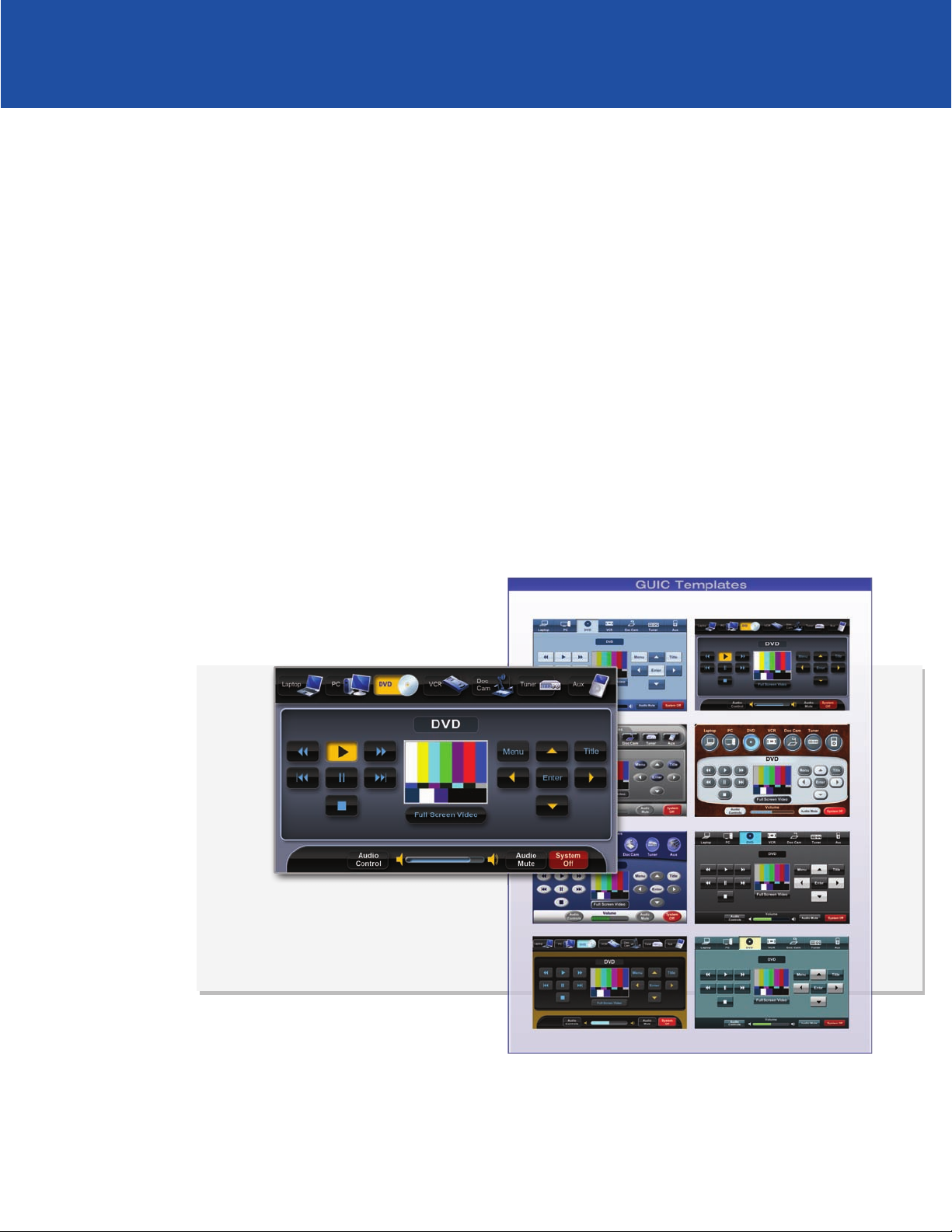
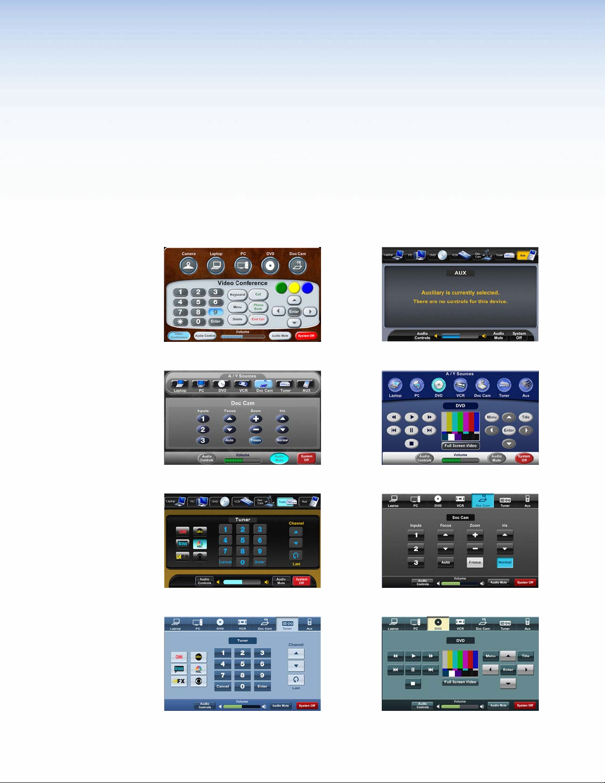
Extron® has developed a series of pre-configured design themes to help streamline and
accelerate the TouchLink™ user interface development process. Each design theme is a
complete collection of graphical elements used to create a cohesive-looking user interface.
At the time of this publication, Extron offers eight unique themes, including:
FLASH
POWER
UNIVERSITY
JET
SPEED
VORTEX BLACK
VORTEX BLUE
VORTEX GREEN
Extron TouchLink Design Themes • Introduction 1
Page 6
Resource Kits
The Extron TouchLink Design Themes Reference Guide documents each of these design
themes. This guide is a valuable resource for any TouchLink graphical user interface developer
wanting to maintain a consistent, professional look with the Extron TouchLink design themes.
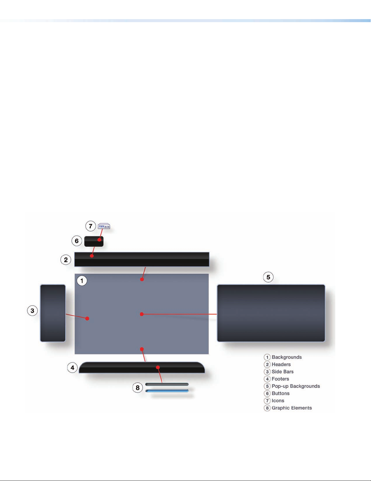
A resource kit is a complete themed collection of graphic elements and sound files that a
graphical user interface developer can download from the Extron website. They provide the
developer everything needed to make a consistent and cohesive user interface based on one
of the Extron design themes.
The graphic elements include:
• Backgrounds
• Headers
• Side Bars
• Footers
• Pop-up Backgrounds
• Button graphics in both their selected (on) and not selected (off) states
Audio files that can be used for feedback are also included. Each resource kit has a substantial
library of universal TV icons, as well as, common A/V icons that match the selected theme.
Figure 1. Using Resource Kit Elements
Extron TouchLink Design Themes • Introduction2
Page 7
Icons Images
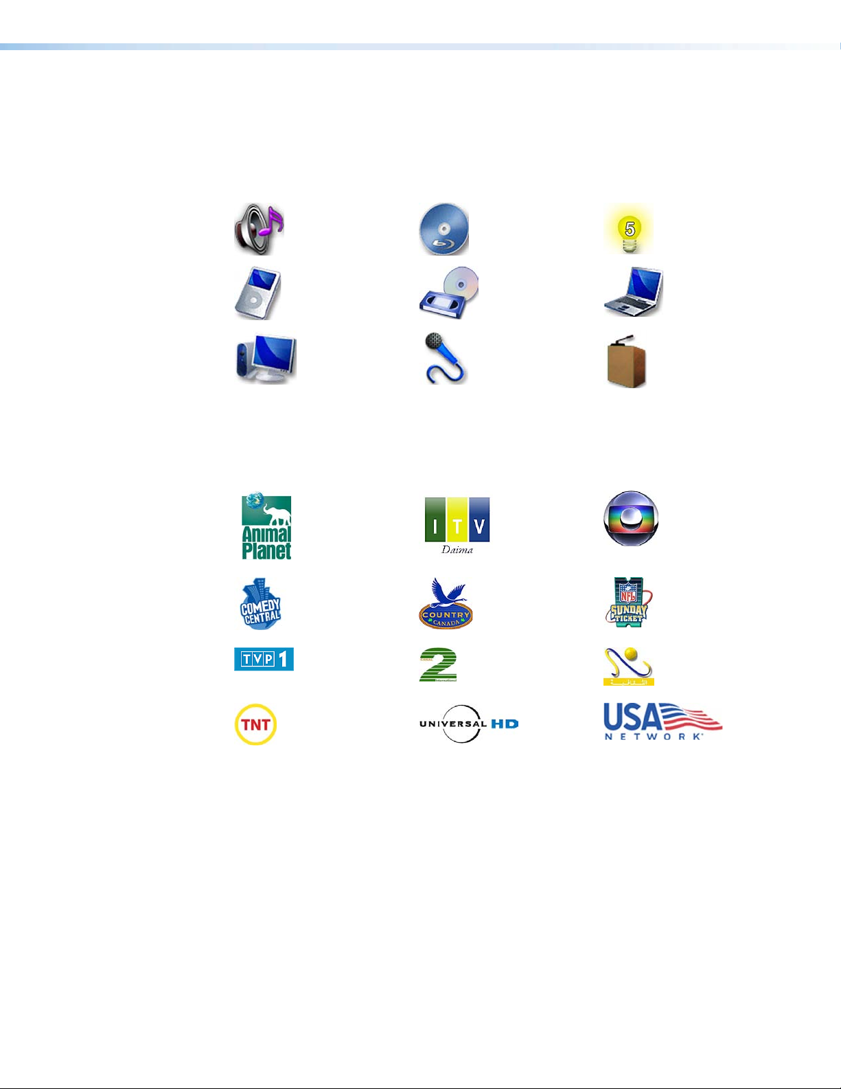
A/V Icons
Each theme resource kit has more than 70 themed basic A/V icons. Some examples of the
these icons are:
TV Icons
The theme resource library has more than 350 worldwide TV network icons. Some examples
of these icons are:
Templates
A template is a ready-to-use file imported into the Extron GUI Configurator software that
allows one to quickly develop a TouchLink Graphical User Interface project. When starting
a project the developer is first given the choice of what theme to use determined by the
application for the system. The developer then has the option to use the templates “as-is”
or modify them to create new pages. Elements and icons in the resource kits are included as
part of the template package. Several templates are available for download from the Extron
website.
Extron TouchLink Design Themes • Introduction 3
Page 8

Using This Guide
Elements and Colors Table
Fonts Table
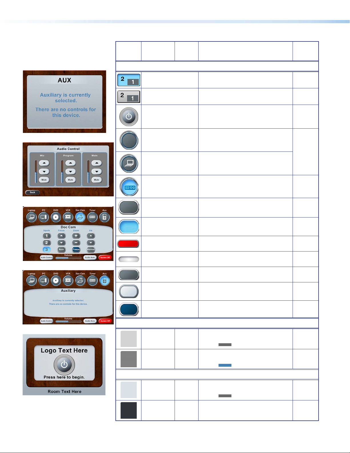
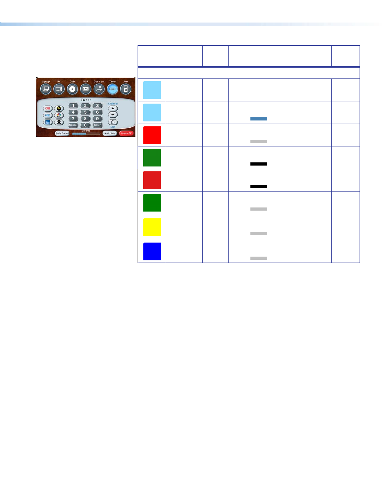
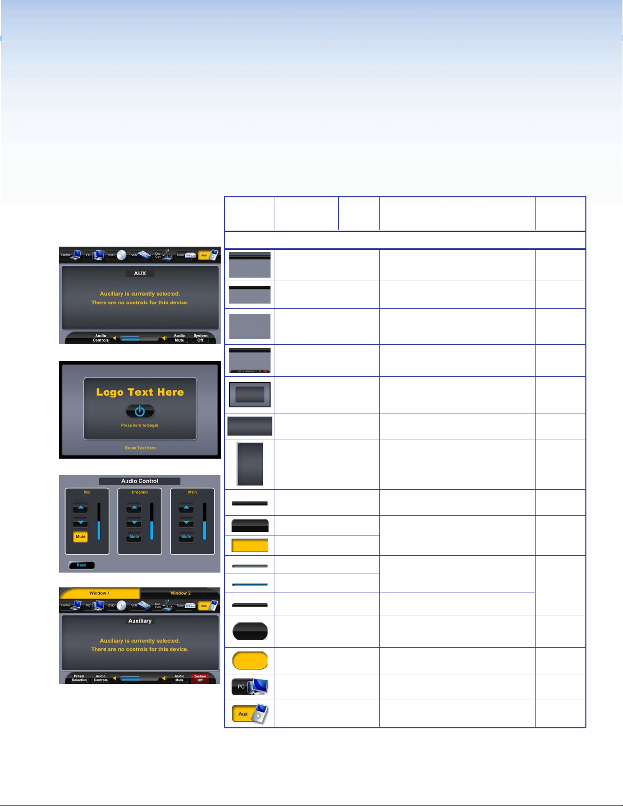
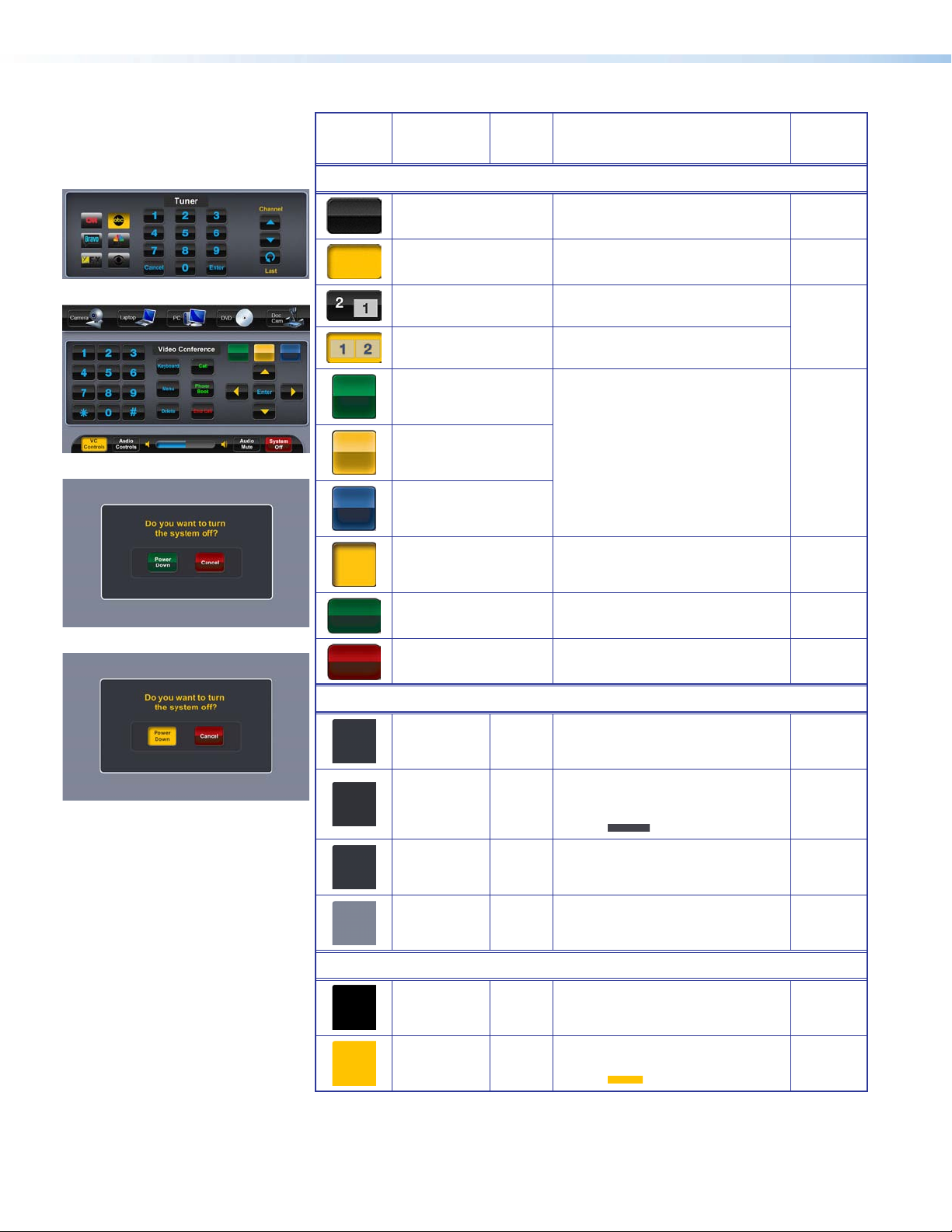
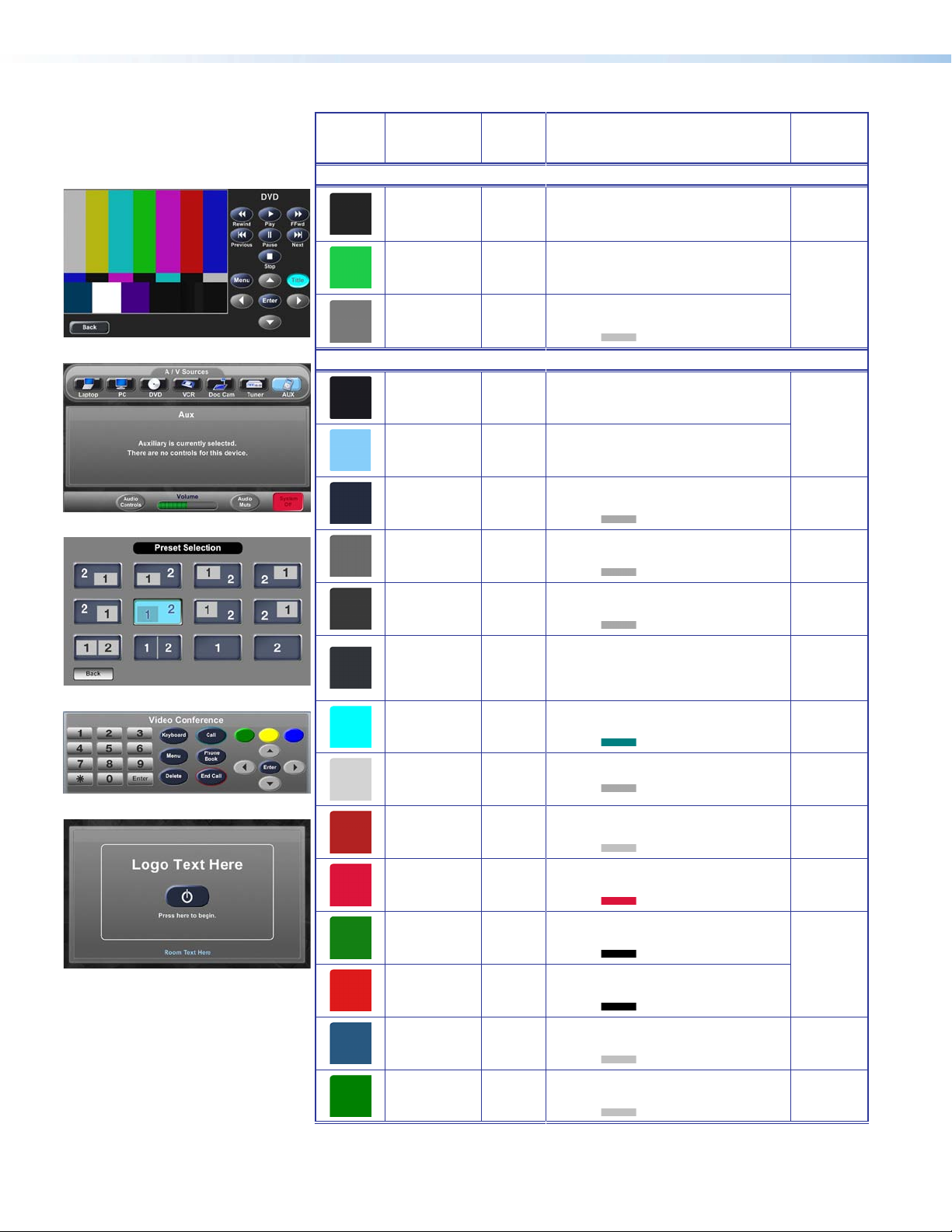
Tables throughout this guide show the elements and colors that make up a specific theme. To
the left of the Elements and Color Palette table are thumbnail images of the template pages
illustrating how these are used. All element files are in .png or .jpg formats. Several, but not
all, element files are shown.
NOTE: Each thumbnail image has a number that corresponds to the reference numbers
in the right column of the “Elements and Colors Palette” and the “Fonts” tables.
This table may be one to three sections depending on the theme.
• Elements — This section provides examples of design elements that are in both the
resource kit and in the template.
• Background Colors — This section provides RGB and HEX color codes for backgrounds
used in theme templates.
• Button Colors — This section provides RGB and HEX color codes for buttons used in
theme templates.
For each theme, this table lists the font sizes and colors used in a theme. Two font types are
used throughout: Arial Bold and Extron® GUI Congurator. The table gives examples of how
each font is used in a theme.
Template Layouts
Additional TLP 700 and TLP 350 template layout examples follow the tables for each theme.
Extron TouchLink Design Themes • Introduction4
Page 9
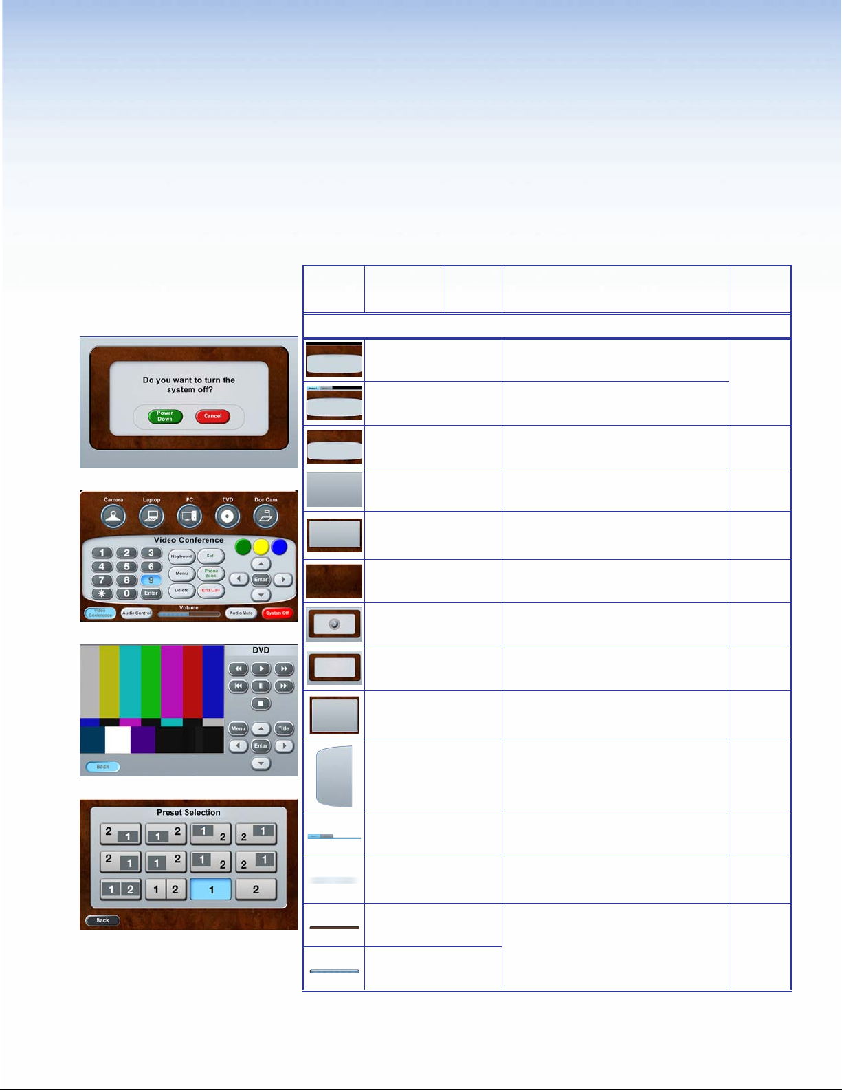
Flash Theme
Elements and Color Palette
a
b
c
Swatch RGB Code or
File Name
Elements
flash_bkgd_dual.png
flash_bkgd_window1.png
flash_bfgd_display1.png
flash_background.png
flash_video.png
flash_audio.png
flash_wood.png
flash_start.png
flash_shutdown.png
Hex
Code
Use For (an)
Background for dual display and window
display main pages — TLP 700
Background for window main page. There is
a similar dual display background — TLP 700
Background single, divisible room, and Video
Conference main pages — TLP 700
Background for full pages such as DVD and
VCR — TLP 700 and TLP 350
Preset Selection and Audio Control pages —
TLP 700 and TLP 350
Background for Preset Selection and Audio
Control — TLP 700
Start page with the power button in place —
TLP 700
Background for start, starting up, shutting
down, and confirmation pages — TLP 700
and TLP 350
Example,
See...
Figure 3
bgh
Figure 5
c
Figure 11
df
Figures
2, 6
d
a
Figure 7
a
d
flash_320px.png
flash_panel_leftside.png
flash_room1_sel.png
title.png
flash_vol_nsel.png
flash_volvert_nsel.png
flash_vol_sel.png
flash_volvert_sel.png
Background for Aux, Laptop, and PC —
TLP 350
Left side panel, a right side panel is in the
Resource Library — TLP 700
Tab bar over the black background for
Window display — TLP 700
Background for titles such as DVD — TLP 700
and TLP 350
Horizontal volume bar on main page and
vertical volume bar on Audio Control page —
TLP 700
Extron TouchLink Design Themes • Flash Theme
Figure 10
Figure 2
cde
bfg
e
Not
shown
f
hj
5
Page 10
Swatch RGB Code or
File Name
Hex
Code
Use For (an)
Example,
See...
e
f
g
Elements (Continued)
preset01_sel.png Preset Selection button (selected) — TLP 700
Preset01.png
flash_start_nsel.png
flash_input_nsel.png
flash_laptop_nsel.png
flash_tuner_sel.png
flash_transport_nsel.png Button (not selected) — TLP 700 and TLP 350
flash_transport_sel.png Buttons (selected) — TLP 700 and TLP 350
Preset Selection button (not selected) —
TLP 700
Power on button (not selected) — TLP 700
and TLP 350
A/V source button (not selected), use with
A/V icons in Resources Library
A/V source button icon (not selected) on main
page — TLP 700
A/V source button icon (selected) on main
page — TLP 700
d
df
Figure 6
i
bgh
j
j
cgj
g
Figure 5
flash_system_btn_nsel.png
flash_roomstatus.png
h
Background Colors
i
Button Colors
flash_dial_nsel.png
flash_scroll-light_nsel.png
flash_transport_drkblu_
nsel.png
211, 211, 211
105, 105, 105
128, 128, 128
70, 130, 180
218, 226, 232
105, 105, 105
49, 53, 58
255, 255, 255
D3D3D3
696969
808080
4682B4
DAE2E8
696969
31353A
FFFFFF
System Off button (not selected) on main
page — TLP 700
Combined and Individual button on status bar
(not selected and selected) — TLP 700
Button (not selected) on Tuner page —
TLP 700
Button (not selected) — TLP 700 and TLP 350
Freeze button (not selected) — TLP 700 and
TLP 350
Fill: Rectangle over background —
Border:
Fill: Rectangle around Audio Control
Border:
Fill: Buttons on status bar (not selected)
Border:
Fill: Back and Full Screen Video buttons
Border: White
TLP 700
buttons
— TLP 700
— TLP 700
(not selected)
— TLP 700
Not
shown
Not
shown
j
c
Figure 4
g
Figure 5
a
f
b
d
Extron TouchLink Design Themes • Flash Theme6
Page 11
Swatch RGB Code or
File Name
Hex
Code
Use For (an)
Example,
See...
j
Button Colors (Continued)
134, 218, 255
255, 255, 255
134, 218, 255
70, 130, 180
255, 0, 0
105, 105, 105
18, 128, 18
0, 0, 0
222, 27, 27
0, 0, 0
0, 128, 0
192, 192, 192
255, 255, 0
192, 192, 192
0, 0, 255
192, 192, 192
86DAFF
FFFFFF
86DAFF
4682B4
FF0000
C0C0C0
128012
000000
DE1B1B
000000
008000
C0C0C0
FFFF00
C0C0C0
0000FF
C0C0C0
Fill: VC Conference and System off
Border: White
Fill: All buttons (selected except as
Border:
Fill: System Off button (not selected) —
Border:
Fill: Power Down button (not selected)
Border:
Fill: Cancel button (not selected) —
Border:
Fill: VC Controls button (not selected)
Border:
Fill: VC Controls button (not selected)
Border:
Fill: VC Controls button (not selected)
Border:
buttons (selected)
noted)
— TLP 700
TLP 700
— TLP 700 and TLP 350
TLP 700 and TLP 350
and selected
and selected
and selected
— TLP 700
— TLP 700
— TLP 700
— TLP 700
b
c
gh
a
b
Extron TouchLink Design Themes • Flash Theme 7
Page 12
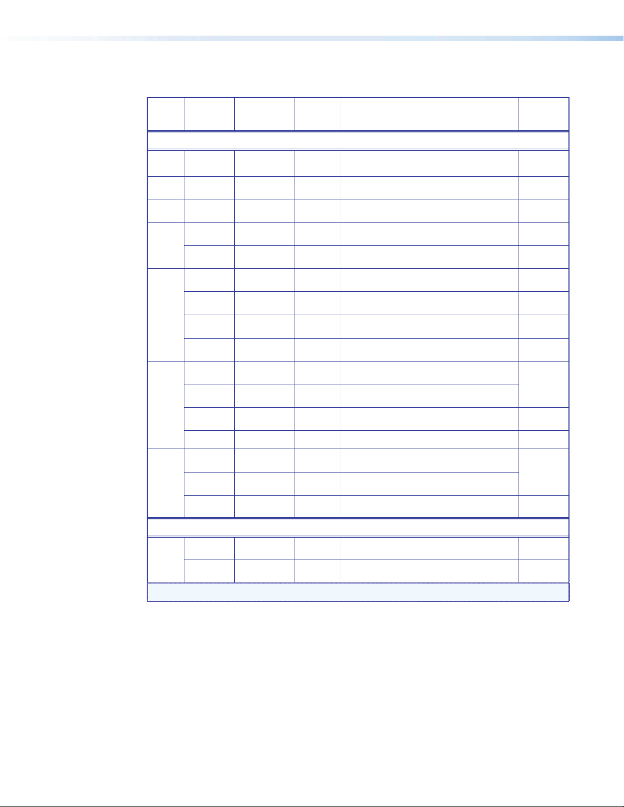
Fonts
Font
Arial Bold
Color RGB Code Hex Code Text for: For (an)
Size
Black 0, 0, 0 000000 Logo banner — TLP 700
36
Black 0, 0, 0 000000
22
Blue 70, 130, 180 4682B4
18
White 255, 255, 255 FFFFFF
Full page headings, pop-up page headings, and
text on pages such as shutting down — TLP 700
Logo banner — TLP 350
Labels on Audio Control page — TLP 700
Example,
See...
i
Figure 7
fgh
Figures
8, 9
f
16
Blue 70, 130, 180 4682B4
White 255, 255, 255 FFFFFF
Black 0, 0, 0 000000
14
Dim gray 105, 105, 105 696969
Blue 70, 130, 180 4682B4
Black 0, 0, 0 000000 Buttons (not selected) — TLP 700 and TLP 350
Dark green 0, 100, 0 006400
12
Blue 70, 130, 180 4682B4
Red 255, 0, 0 FF0000 End Call button (not selected) — TLP 700
White 255, 255, 255 FFFFFF
Black 0, 0, 0 000000
11
Text on pages such as Auxiliary — TLP 350
Labels over A/V source icons and button labels
— TLP 700
Text under power on button on start page —
TLP 700 and TLP 350
Buttons (selected except as noted) — TLP 700
and TLP
Labels above buttons and text on pop-ups pages
— TLP 700
Call and Phone Book buttons (not selected) —
TLP 700
Combined and Individual buttons on status bar
— TLP 700
System Off button (not selected) on status bar
— TLP 700
Status bar buttons (not selected except as noted)
— TLP 700
Figure 10
bcg
i
bc
g
b
Not shown
b
bcg
Dim gray 105, 105, 105 696969 Status bar buttons (selected) — TLP 700
Extron GUI Congurator
White 255, 255, 255 FFFFFF
24
Dim Gray 105, 105, 105 696969
NOTE:
See the Extron GUI Congurator Fonts section for symbols and keyboard equivalents.
Button symbols and numbers (not selected) —
TLP 700 and TLP 350
Buttons symbols and numbers (selected) —
TLP 700 and TLP 350
b
bcg
Figure 4
Extron TouchLink Design Themes • Flash Theme8
Page 13
Flash Template Layouts
TLP 700
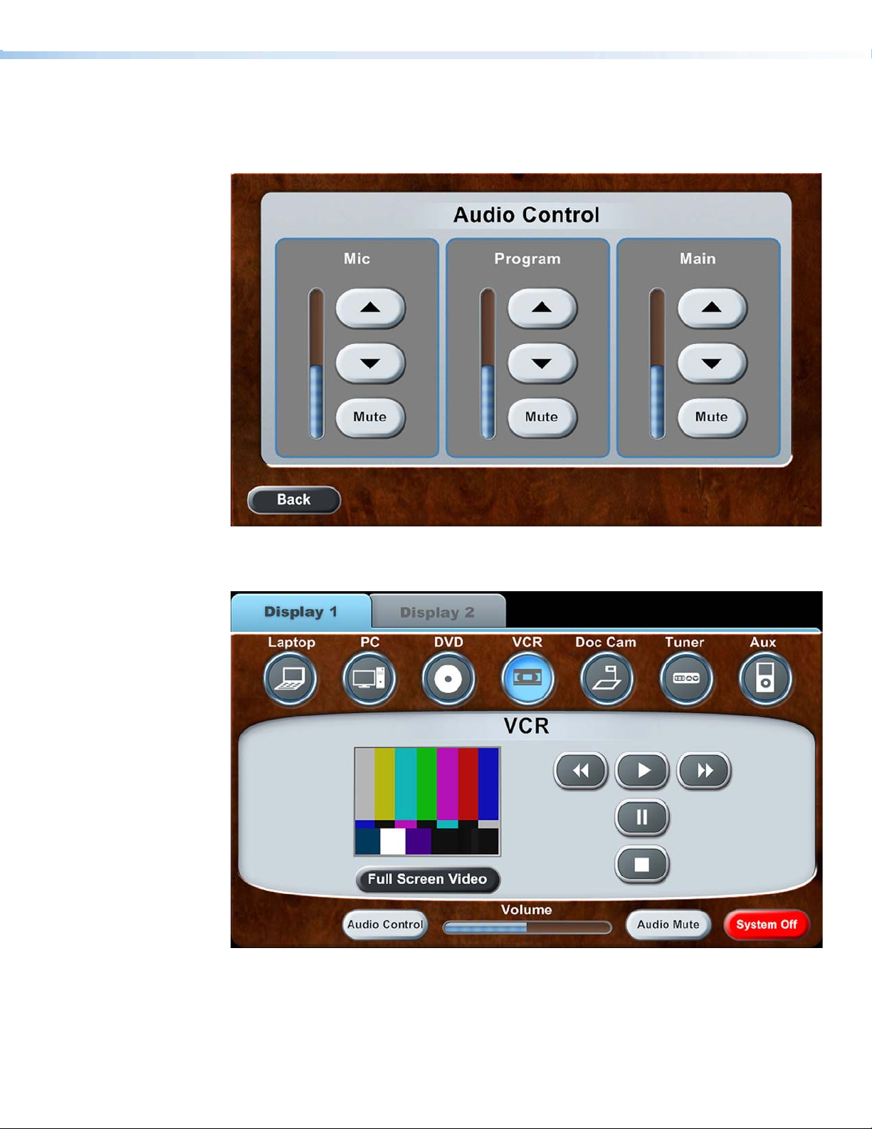
Figure 2. Audio Control page
Figure 3. Dual Display main page: Display 1, VCR selected, and VCR pop-up displayed
in the dynamic area
Extron TouchLink Design Themes • Flash Theme 9
Page 14
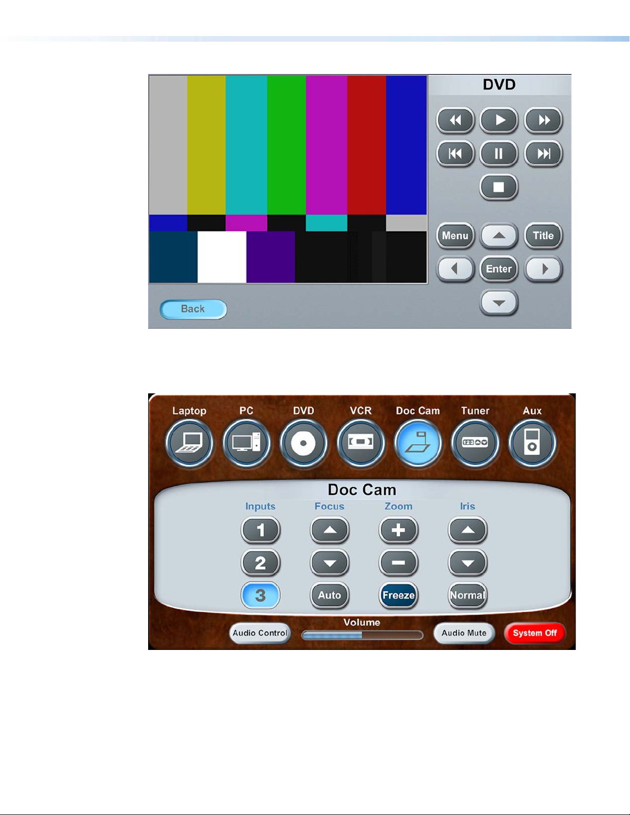
Figure 4. DVD full page, Back selected
Figure 5. Main page, Doc Cam selected, and Doc Cam pop-up displayed in the
dynamic area
Extron TouchLink Design Themes • Flash Theme10
Page 15
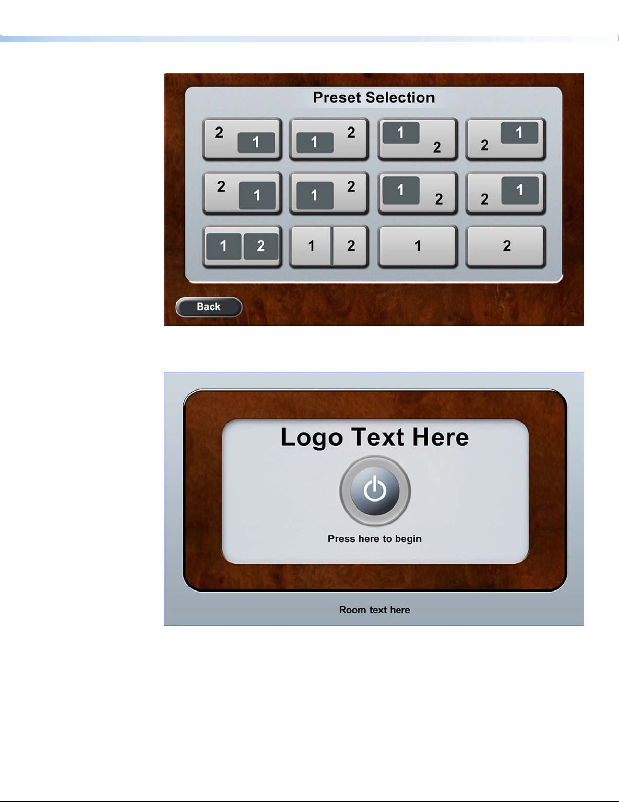
Figure 6. Preset Selection page
Figure 7. Start page
Extron TouchLink Design Themes • Flash Theme 11
Page 16
TLP 350
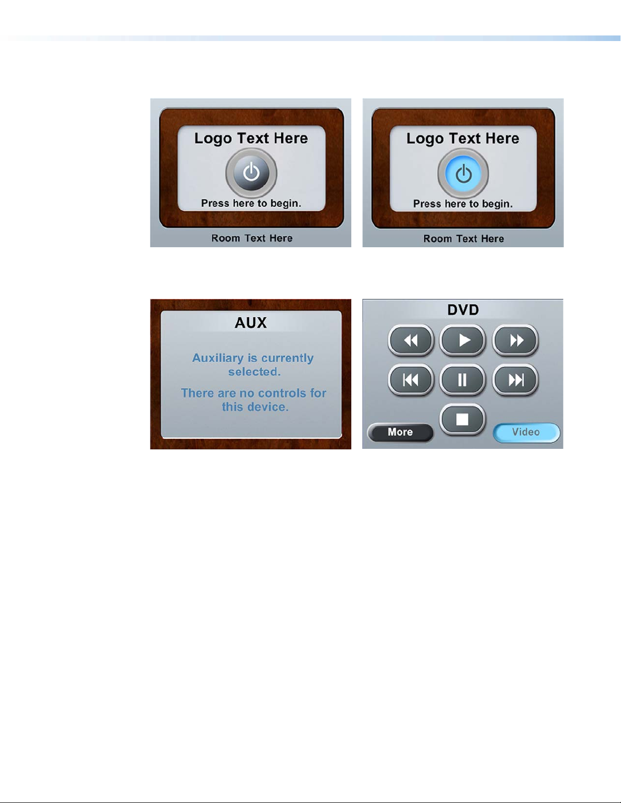
Figure 8. Start page Figure 9. Start page, power on selected
Figure 10. Auxiliary page
Figure 11. DVD page, Video selected
Extron TouchLink Design Themes • Flash Theme12
Page 17
Jet Theme
Elements and Color Palette
a
b
c
Swatch RGB Code or
File Name
Elements
Jet_dual_bkgd.jpg
jet_bkgd.jpg
jet_bkgr_nohead.png
jet_bkgd.jpg Master page — TLP 700
jet_start_bkgd.png
jet_panel_center.png Master popup page — TLP 700
jet_panel_rightside.jpg
jet_header.png
jet_tab_nsel.png
Jet_tabsq_sel.jpg
Hex
Code
Use For (an)
Background for dual display and window
display main pages — TLP 700
Background for single, divisible room, and
video conference main pages — TLP 700
Background for Audio Control, DVD,
Preset Selection, and VCR full pages
Example
See...
d
Figure 13
af
Figure 15
c
Figures
16, 17
af
Figure 15
Background for start, starting up,
confirmation, and shutting down pages
— TLP 700
bgh
Figure 14
adef
Right side panel, a left side panel is in the
Resource Library — TLP 700
Header for main page A/V sources
— TLP 700
Rounded or square tabs (not selected and
selected), for use with dual display and
window main pages.
Not shown
af
Figure 15
d
Figure 13
d
jet-volume_nsel.png
jet-volume_sel.png
footer.png Footer on main page — TLP 700
Start_Button_nsel.png_1
Start_Button_sel.png_1
Jet_pc_nsel.png
Jet_aux_sel.png
Volume bar on main page — TLP 700
Power on, Combined, and Individual
button (not selected) — TLP 700 and
TLP 350
Power on, Combined, and Individual
buttons (selected) — TLP 700 and TLP 350
A/V source button icon (not selected) on
main page — TLP 700
A/V source button icon (selected) on main
page — TLP 700
Extron TouchLink Design Themes • Jet Theme
adf
Figure 13
b
Figure 12
Figures
12, 18
adf
Figure 13
ad
Figure 13
13
Page 18
e
Swatch RGB Code or
File Name
Elements (Continued)
Hex
Code
Use For (an)
Example
See...
f
g
h
jet_nsel.png
jet_sel.png Button (selected) — TLP 700 and TLP 350
preset05.png
preset09.png
jet_85_grn.png
jet_85_orng.png
jet_85_blu-drk.png
jet_85_sel.png VC Control buttons (selected) — TLP 700 Not shown
jet_trnsprt_grn.png
jet_trnsprt_red.png
Button (not selected) — TLP 700 and
TLP 350
Preset Selection button (not selected) —
TLP 700
Preset Selection button (selected) —
TLP 700
VC Control buttons (not selected) —
TLP 700
Power Down button (not selected) —
TLP 700 and TLP 350
Cancel button (not selected) — TLP 700
and TLP 350
cef
Figure 13
ch
Figure 17
f
Figure 15
g
Figure 14
gh
Figure 14
Background Colors
Buttons Colors
53, 55, 62
255, 255, 255
48, 50, 56
67, 67, 75
53, 55, 62 2E2E2E
127, 133, 149 7F8595
0, 0, 0
255, 255, 255
255, 195, 0 FFC300
35373E
FFFFFF
303238
43434B
000000
FFFFFF
Fill: Rectangle layer 1 fill over
background — TLP 700
Border: White
Fill: Rectangle layer 2 fill over layer
1, Audio Control boxes around
buttons — TLP 700
Border:
Fill: Rectangle fill around page names
such as AUX — TLP 700
Fill: Background for full pages —
TLP 700 and TLP 350
Fill: TV icon button (not selected),
Tuner page — TLP 700
Border: White
Fill: TV icon button (selected), Tuner
page — TLP 700
Border: Same as fill
gh
bc
Figure 16
aef
Figure 13
cgh
Figure 16
e
Figure 13
e
Extron TouchLink Design Themes • Jet Theme14
Page 19
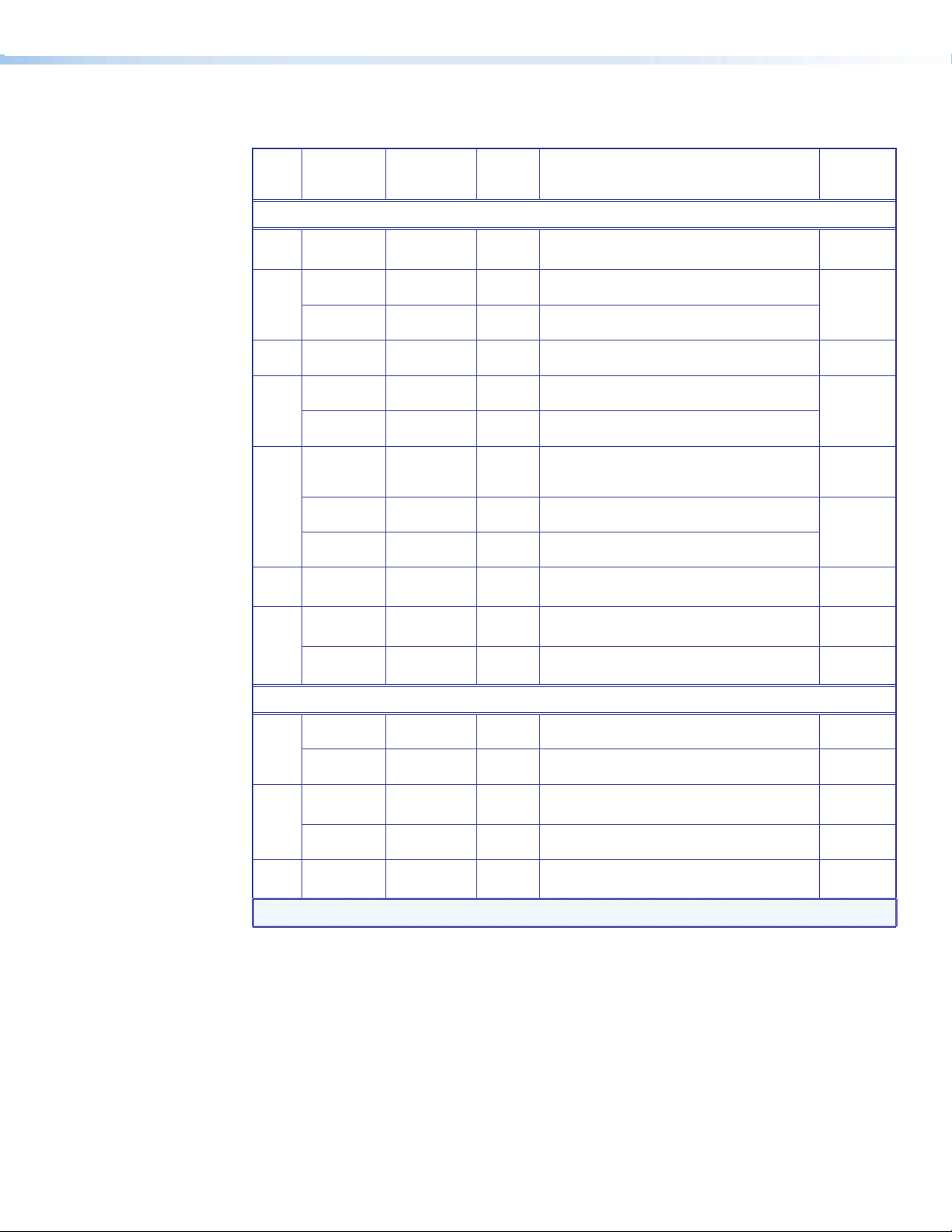
Fonts
Font
Size
Arial Bold
Color RGB Code Hex
Code
Text for: For (an)
Example
See...
Amber 255, 195, 0 FFC300 Logo banner — TLP 700
36
White 255, 255, 255 FFFFFF
20
Amber 255, 195, 0 FFC300 Text on pop-up pages — TLP 700
White 255, 255, 255 FFFFFF Headings, such as AUX — TLP 350
18
Amber 255, 195, 0 FFC300
16
Black 0, 0, 0 000000
Amber 255, 195, 0 FFC300
14
Blue 10, 170, 240 0AAAF0
Headings such as AUX — TLP 700 and logo
banner — TLP 350
Headings, display tab, and window tab (not
selected) — TLP 700
Headings, display tab, and window tab
(selected)— TLP 700
Text under the power on button on the start
page, labels, and text on the freeze button —
TLP 700 and text — TLP 350
Buttons (not selected) — TLP 700 and TLP 350
b
Figure 12
ae
Figure 19
Figures
20, 21
d
Figure 13
b
Figure 18
cef
Black 0, 0, 0 000000
White 255, 255, 255 FFFFFF
13
White 255, 255, 255 FFFFFF Status bar buttons (not selected) — TLP 700
Buttons (selected) — TLP 700 and TLP 350
Power Down and Cancel buttons (not selected) —
TLP 700 and TLP 350
12
Black 0, 0, 0 000000
Extron GUI Congurator
Black 0, 0, 0 000000
48
Blue 10, 170, 240 0AAAF0
Blue 10, 170, 240 0AAAF0 Buttons (not selected) — TLP 700 and TLP 350
Status bar buttons (selected) — TLP 700
Power on symbol (selected) — TLP 700 and
TLP 350
Power on symbol (not selected) — TLP 700 and
TLP 350
24
Black 0, 0, 0 000000
Buttons (selected) — TLP 700 and TLP 350 Not shown
Figure 21
gh
Figure 14
adf
Figure 13
f
Figure 15
Figure 18
b
ef
Figure 16
Amber 255, 195, 0 FFC300 Volume icons on status bar — TLP 700
18
NOTE:
See the Extron GUI Congurator Fonts section for symbols and keyboard equivalents.
Extron TouchLink Design Themes • Jet Theme 15
df
Figure 13
Page 20
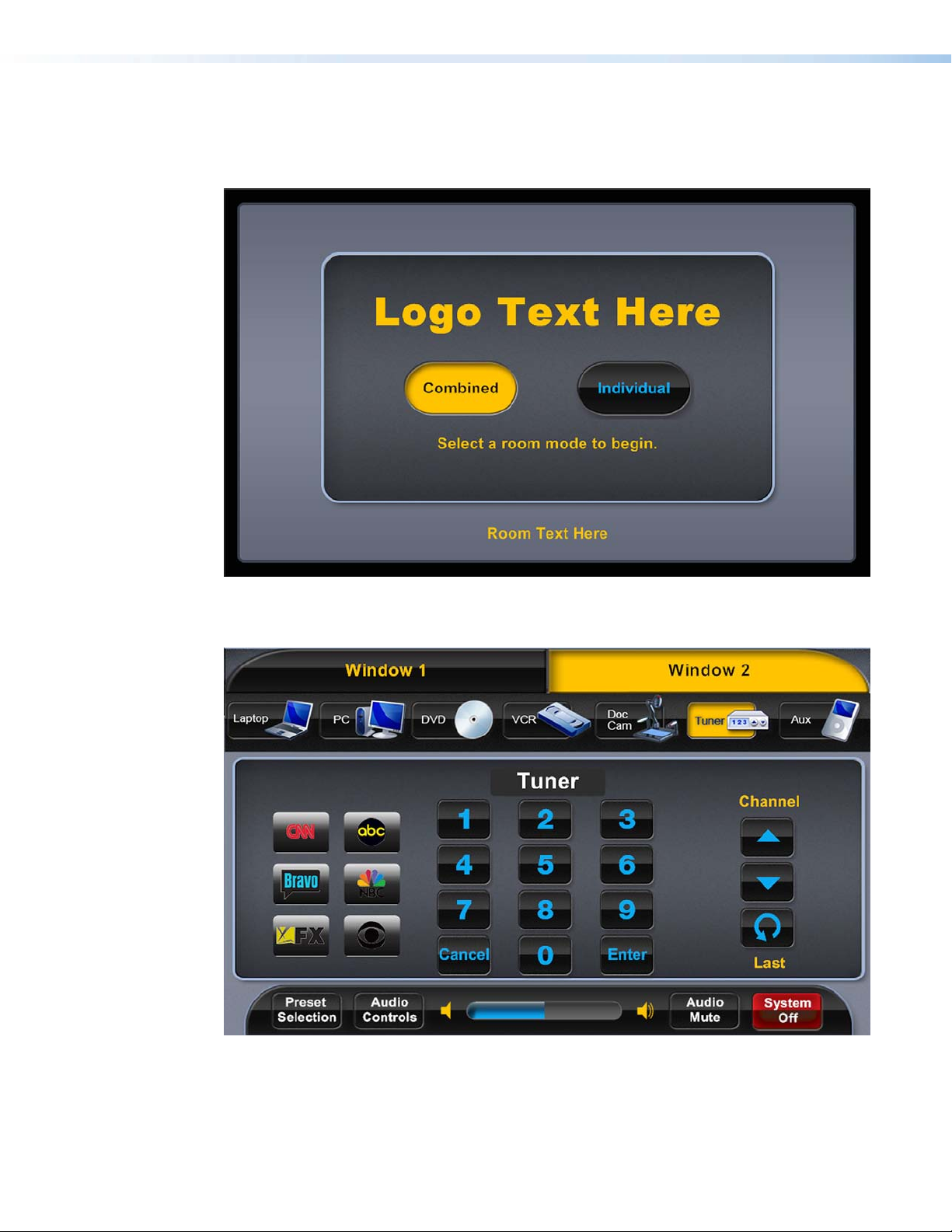
Jet Template Layouts
TLP 700
Figure 12. Start page, divisible room, Combined selected
Figure 13. Multi window main page, Window 2, Tuner selected, and Tuner pop-up
displayed in the dynamic area
Extron TouchLink Design Themes • Jet Theme16
Page 21
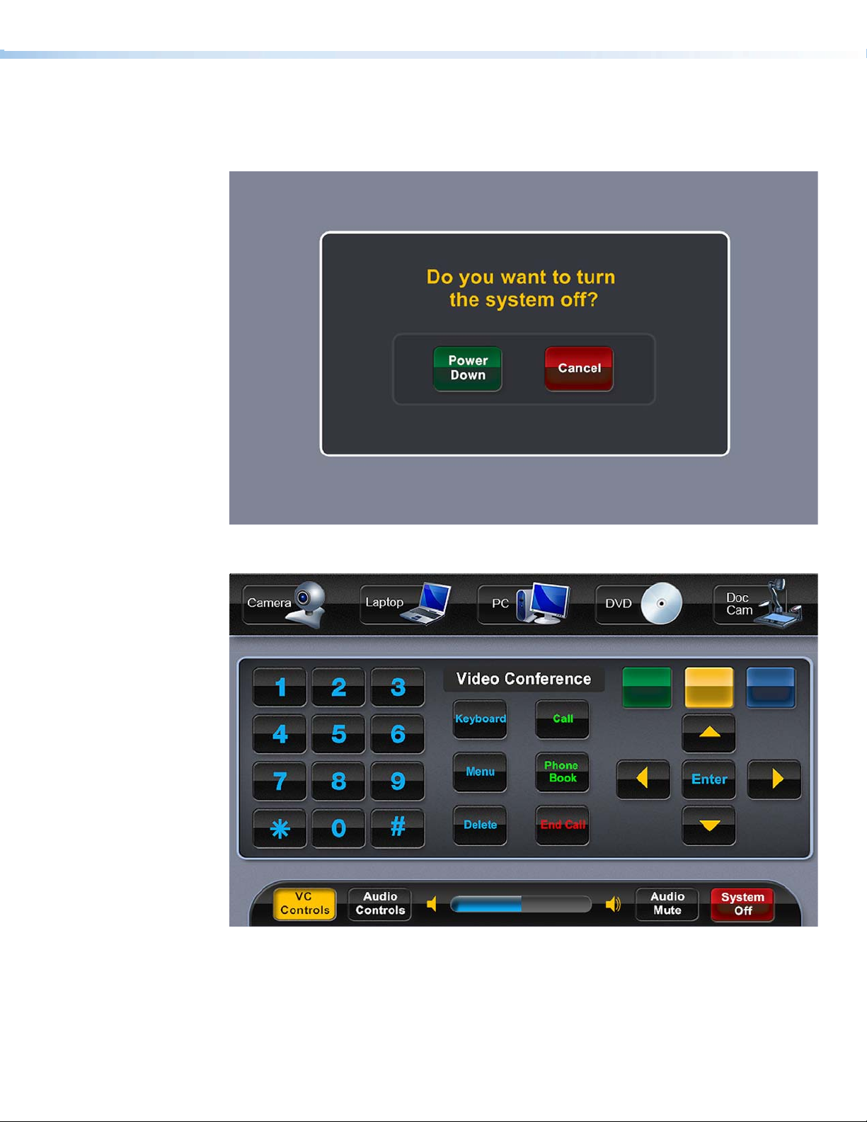
Figure 14. Conrmation page
Figure 15. Main page, VC Controls selected, and Video Conference pop-up displayed
in the dynamic area
Extron TouchLink Design Themes • Jet Theme 17
Page 22
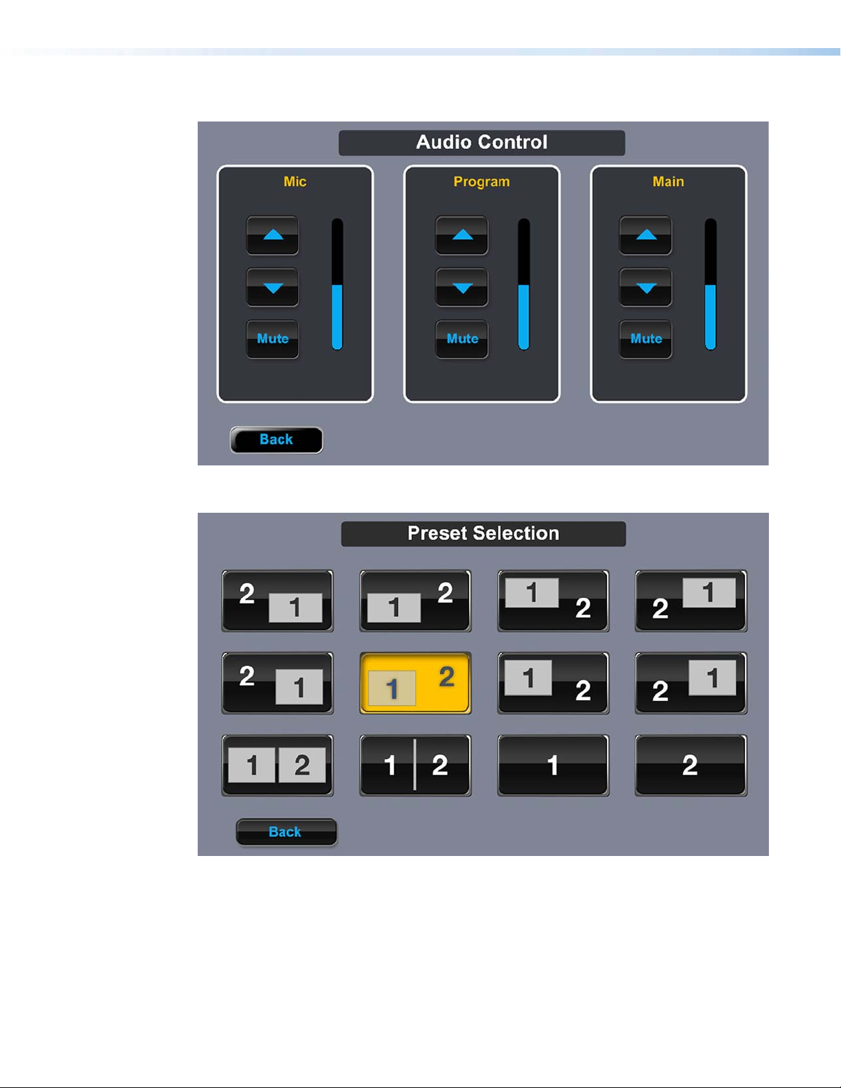
Figure 16. Audio Control page
Figure 17. Preset Selection page
Extron TouchLink Design Themes • Jet Theme18
Page 23
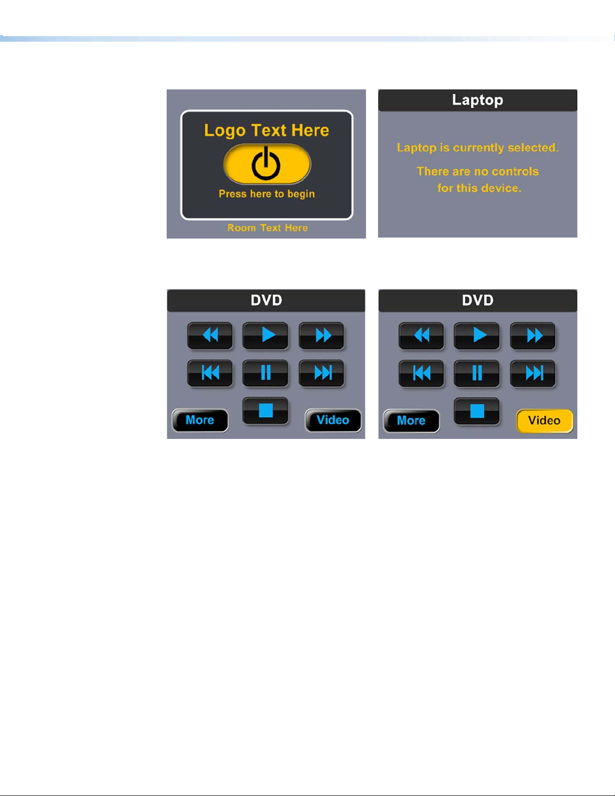
TLP 350
Figure 18. Start page
Figure 20. DVD page Figure 21. DVD page, Video selected
Figure 19. Laptop page
Extron TouchLink Design Themes • Jet Theme 19
Page 24

Extron TouchLink Design Themes • Jet Theme20
Page 25

Power Theme
Elements and Color Palette
a
b
c
d
Swatch RGB Code or
File Name
Elements
power_bkgd_nohead.png Background for main page — TLP 700 Not shown
Power_guic_bkgd.png Master page background — TLP 700
Power_guic_room1_sel.jpg
pwr_bkgd-320240.png
start_bkgd.png
popbkgd2.png
power_sidepanel_left.png
power_footer.png Status bar on the main page — TLP 700
power_header.png
Volume_ON_horizontal.jpg
Volume_OFFhorizontal.jpg
Power_noicon_small.jpg A/V source button icon — TLP 700
Hex
Code
Use For (an)
Example,
See...
af
Figure 23
Background for dual display and window
display main pages — TLP 700
Master page and main page background
— TLP 350
Background for start, starting up,
confirmation, and shutting down pages —
TLP 700
Background for pop-up pages — TLP 700
and TLP 350
Left side panel, a right side panel is in the
Resource Library — TLP 700
Header for main page A/V sources —
TLP 700
Volume bar on main page — TLP 700
Figure 22
Figures 29,
30, 31
bi
Figures
25, 28
ch
Not shown
af
Figure 23
Power-Laptop.png A/V source button icon — TLP 700
preset01.png
preset02_sel.png
Background Colors
Transparent
255, 255, 255 FFFFFF
105, 105, 105
133, 133, 133
Preset Selection button (not selected) —
TLP 700
Preset Selection button (selected) —
TLP 700
696969
858585
Fill: Rectangle layer 1 over background
Border: White
Fill: Rectangle layer 2 over layer 1 —
Border:
— TLP 700
TLP 700
Extron TouchLink Design Themes • Power Theme
g
Figure 27
b
Figure 25
21
Page 26
e
Swatch RGB Code or
File Name
Background Colors (Continued)
36, 36, 36 242424
Hex
Code
Use For (an)
Fill: Background for full pages; label
fill for Preset Selection — TLP 700
Border: None
Example,
See...
de
29, 204, 73 1DCC49
Fill: Vertical volume bar on Audio
Control page — TLP 700
d
Fill: Rectangle around Audio Control
buttons — TLP 700
Border:
Fill: A/V source icon fill (not selected)
— TLP 700
Border: Transparent
TLP 700
Border: Transparent
Fill: Buttons (not selected) — TLP 700
and TLP 350
Border:
Fill: Buttons (not selected) — TLP 700
and TLP 350
Border:
Fill: Buttons (not selected) — TLP 700
and TLP 350
Border:
Fill: Back and Full Screen Video
buttons (not selected) — TLP 700
and TLP 350
Border: White
Fill: Buttons (selected except as noted)
— TLP 700 and TLP 350
Border:
f
g
121, 121, 121
192, 192, 192
Button Colors
26, 26, 31
Transparent
135, 206, 250
Transparent
36, 43, 63
169, 169, 169
105, 105, 105
169, 169, 169
56, 56, 56
169, 169, 169
49, 53, 58
255, 255, 255
797979
C0C0C0
1A1A1F
87CEFA Fill: A/V source icon fill (selected) —
242B3F
A9A9A9
696969
A9A9A9
383838
A9A9A9
31353A
FFFFFF
h
0, 255, 255
0, 128, 128
00FFFF
008080
Figure 24
af
de
g
ae
c
ad
e
i
211, 211, 211
169, 169, 169
178, 34, 34
192, 192, 192
220, 20, 60 DC143C
18, 128, 18
0, 0, 0
222, 27, 27
0, 0, 0
40, 86, 128
192, 192, 192
0, 128, 0
192, 192 ,192
D3D3D3
A9A9A9
B22222
C0C0C0
128012
000000
DE1B1B
000000
285680
C0C0C0
008000
C0C0C0
Fill: Buttons — TLP 700
Border:
Fill: System Off button (not selected)
— TLP 700
Fill:
Fill: System Off button (selected) —
TLP 700
Border: Same as fill
Fill: Power Down button (not selected)
— TLP 700 and TLP 350
Border:
Fill: Cancel button (not selected) —
TLP 700 and TLP 350
Border:
Fill: Freeze button (not selected) —
TLP 700 and TLP 350
Border:
Fill: VC Control button (not selected
and selected) — TLP 700
Border:
c
a
f
Figure 25
Figure 23
h
Extron TouchLink Design Themes • Power Theme22
Page 27

Swatch RGB Code or
File Name
Button Colors (Continued)
255, 255, 0
192, 192 ,192
Hex
Code
FFFF00
C0C0C0
Use For (an)
Example,
See...
Fill: VC Controls button (not selected
and selected) — TLP 700
Border:
Fonts
0, 0, 255
192, 192 ,192
36, 43, 63
0, 128, 128
36, 43, 63
189, 0, 0
Font
Color RGB Code Hex
Size
Arial Bold
White 255, 255, 255 FFFFFF Logo banner — TLP 700
36
White 255, 255, 255 FFFFFF
20
White 255, 255, 255 FFFFFF
16
White 255, 255, 255 FFFFFF
Dark blue 13, 13, 60 0D0D3C Volume on status bar — TLP 700
Code
14
Dim gray 105, 105, 105 696969
Light blue 155, 213, 250 9BD5FA Text on bottom of start page — TLP 700
White 255, 255, 255 FFFFFF
Light blue 155, 213, 250 9BD5FA Text on bottom of start page — TLP 350 Figure 28
12
Dim gray 105, 105, 105 696969 Buttons (selected) — TLP 350 Figure 31
0000FF
C0C0C0
242B3F
008080
242B3F
BD0000
Text for: For (an)
Full page headings, pop-up page headings, text on
pages such as starting up — TLP 700 and logo banner
— TLP 350
Text on pop-up pages — TLP 700 and full page
headings — TLP 350
A/V source labels, start page labels, Power Down and
Cancel buttons — TLP 700 and TLP 350
Buttons (selected, except as noted) — TLP 700 and
TLP 350
Status bar buttons, labels near buttons and A/V
sources — TLP 700 and text below power button on
start page, Confirmation page buttons — TLP 350
Fill: VC Controls button (not selected
and selected) — TLP 700
Border:
Fill: Call button (not selected) on
VC Controls — TLP 700
Border:
Fill: End Call button (not selected) on
VC Controls — TLP 700
Border:
h
Example,
See...
i
afgh
defg
Figures
29, 30
af
e
i
adf
Maroon 128, 0, 0 800000 System Off button (selected) on status bar — TLP 700
Extron GUI Congurator
White 255, 255, 255 FFFFFF Power on symbol — TLP 700 and TLP 350
36
Dark blue 13, 13, 60 0D0D3C
24
White 255, 255, 255 FFFFFF
Dim gray 105, 105, 105 696969 Buttons (selected) — TLP 700 and TLP 350
NOTE: See the Extron GUI Congurator Fonts section for symbols and keyboard equivalents.
Button symbols and numbers (not selected) —
TLP 700 and TLP 350
Button symbols and numbers (not selected) —
TLP 700 and TLP 350
Extron TouchLink Design Themes • Power Theme 23
f
i
h
aceh
i
Page 28

Power Template Layouts
TLP 700
Figure 22. Dual Display main page: Display 1, DVD selected, and DVD pop-up
displayed in the dynamic area
Figure 23. Main page, Doc Cam selected, Doc Cam pop-up displayed in the dynamic
area, and Audio Mute selected
Extron TouchLink Design Themes • Power Theme24
Page 29
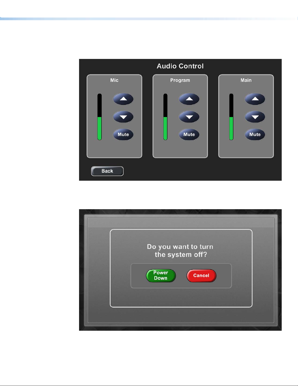
Figure 24. Audio Control page
Figure 25. Conrmation page
Extron TouchLink Design Themes • Power Theme 25
Page 30
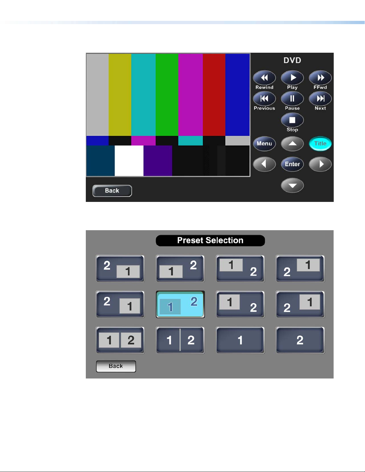
Figure 26. DVD full page, Title selected
Figure 27. Preset Selection page
Extron TouchLink Design Themes • Power Theme26
Page 31

TLP 350
Figure 28. Start page
Figure 30. DVD page Figure 31. DVD page, play selected
Figure 29. PC page
Extron TouchLink Design Themes • Power Theme 27
Page 32

Extron TouchLink Design Themes • Power Theme28
Page 33
Speed Theme
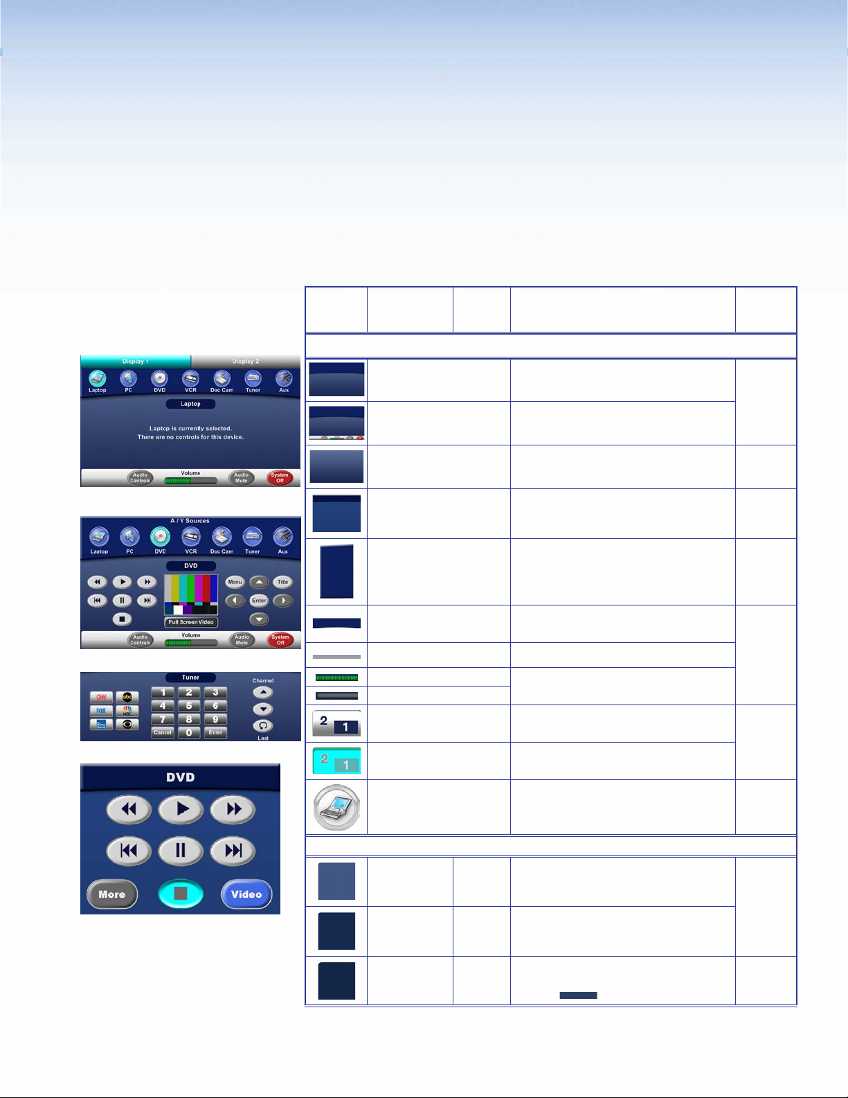
Elements and Color Palette
a
b
c
d
Swatch RGB Code or
File Name
Elements
speed_bkgd.png
bkgd_speed4.png
speed_bkgd_nohead.png
speed_bkgd_320px.png Background for main page — TLP 350
speed_panel_leftside.png
speed_header.png
bkgd_footer.png Status bar on the main page — TLP 700
Volume_ON_horizontal.jpg
Volume_OFF_horizontal.jpg
preset01.png
preset01_sel.png Preset Selection button (selected) — TLP 700
Hex
Code
Use For (an)
Background for main pages with header —
TLP 700
Example,
See...
abi
Master main page with footer bar —
TLP 700
Background page for full size pages —
TLP 700
Figure 33
g
d
Figures
38, 39
Left side panel, a right side panel is in the
resource library — TLP 700
Header bar for main pages A/V sources —
TLP 700
Not
shown
ab
Volume bar on main page — TLP 700
Preset Selection button (not selected) —
TLP 700
Figure 37
laptop_trans_80px.png
Background Colors
63, 87, 130 3F5782
21, 42, 79
255, 255, 255
19, 38, 71
44, 63, 96
A/V source button icon — TLP 700
Fill: Full page background — TLP 700
152A4F
FFFFFF
132647
2C3F60
Fill: Rectangle layer 1 over full page
Border: White
Fill: Rectangle layer 2 over layer 1 —
Border:
Extron TouchLink Design Themes • Speed Theme
and TLP 350
background
TLP 700
— TLP 700
ab
e
f
29
Page 34
e
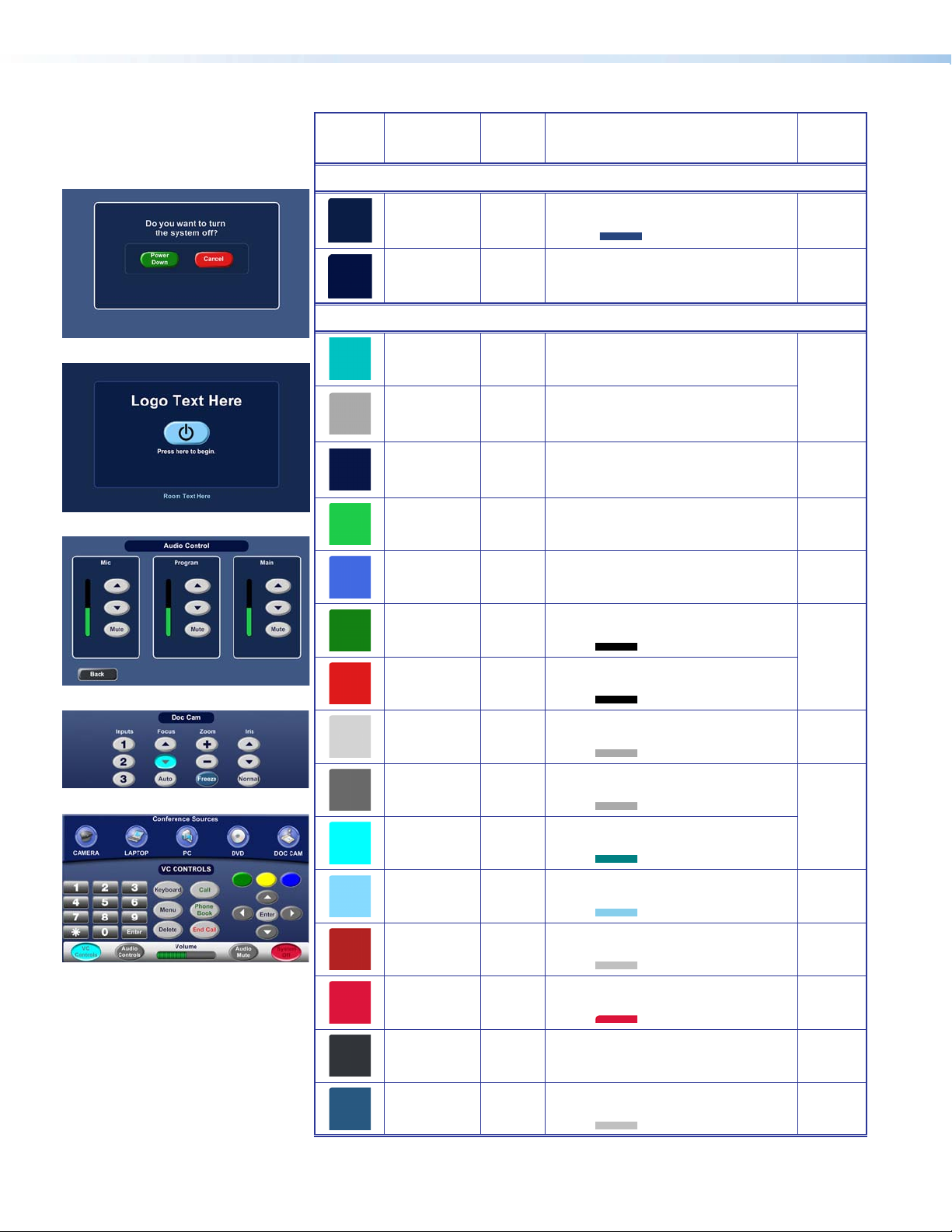
Swatch RGB Code or
File Name
Background Colors (Continued)
10, 29, 69
37, 68, 125
2, 17, 66 021142
Button Colors
Hex
Code
0A1D45
25447D
Use For (an)
Fill: Rectangle layer 1 over Background
start page — TLP 700
Border:
Fill: Label fill, such as Audio Control,
Doc Cam, DVD, and VC Controls
— TLP 700
Example,
See...
f
ghi
f
0, 194, 194 00C2C2
Fill: Dual display and window display
pages tabs (selected) — TLP 700
a
169, 169, 169 A9A9A9
7, 22, 70 071646
g
h
29, 204, 73 1DCC49
65, 105, 225 4169E1
18, 128, 18
0, 0, 0
222, 27, 27
0, 0, 0
211, 211, 211
128012
000000
DE1B1B
000000
D3D3D3
i
169, 169, 169
105, 105, 105
169, 169, 169
0, 255, 255
0, 128, 128
135, 206, 250
135, 206, 235
178, 34, 34
192, 192, 192
220, 20, 60 DC143C
49, 53, 58
255, 255, 255
40, 86, 128
192, 192, 192
A9A9A9
696969
A9A9A9
00FFFF
008080
87CEFA
87CEEB
B22222
C0C0C0
31353A
FFFFFF
285680
C0C0C0
Fill: Dual display and window display
Fill: Combined and Individual buttons
Fill: Audio Control volume level bar —
Fill: A/V source button background (not
Fill: Power Down button (not selected)
Border:
Fill: Cancel button (not selected) —
Border:
Fill: Button (not selected) — TLP 700
Border:
Fill: Button (not selected) — TLP 700
Border:
Fill: Buttons (selected, except as noted)
Border:
Fill: Power on button (not selected) —
Border:
Fill: System Off button (not selected) —
Border:
Fill: System Off button (selected) —
Border: Same as fill
Fill: Full Screen Video and Back buttons
Border: White
Fill: Freeze button (not selected) —
Border:
pages tabs (not selected) — TLP 700
on status bar of divisible room main
page — TLP 700
TLP 700
selected)
— TLP 700 and TLP 350
TLP 700 and TLP 350
and TLP 350
and TLP 350
— TLP 700 and TLP 350
TLP 700 and TLP 350
TLP 700
TLP 700
— TLP 700
TLP 700
— TLP 700
Figure 35
Not
shown
g
abi
e
Figure 40
bdg
abi
f
ab
Figure 33
i
gi
h
Extron TouchLink Design Themes • Speed Theme30
Page 35

Fonts
Swatch RGB Code or
Button Colors (Continued)
Font
Color RGB Code Hex
Size
Arial Bold
File Name
0, 128, 0
192,192,192
255, 255, 0
192,192,192
0, 0, 255
192,192,192
Code
Hex
Code
008000
C0C0C0
FFFF00
C0C0C0
0000FF
C0C0C0
Text for: For (an)
Use For (an)
Fill: VC Controls button (not selected
Border:
Fill: VC Controls button (not selected
Border:
Fill: VC Controls button (not selected
Border:
and selected)
and selected)
and selected)
— TLP 700
— TLP 700
— TLP 700
Example,
Example,
See...
i
See...
36
20
White 255, 255, 255 FFFFFF
16
Light blue 155, 213, 250 9BD5FA
Black 0, 0, 0 000000
White 255, 255, 255 FFFFFF
14
Dark blue 13, 13, 60 0D0D3C
Crimson 128, 0, 0 800000
Dark green 0, 100, 00 006400
Red 255, 0, 0 FF0000
Dim gray 105, 105, 105 696969
White 255, 255, 255 FFFFFF
13
White 255, 255, 255 FFFFFF Text on pages such as Aux — TLP 350 Figure 38
Dim gray 105, 105, 105 696969
12
Light blue 155, 213, 250 9BD5FA
Dark blue 13, 13, 60 0D0D3C
10
Logo banner
Logo banner — TLP 350 Not shown
Display and Window tabs, A/V Sources label, pop-up
page headings, text on pop-up pages — TLP 700
Text on start page
Combined and Individual (selected and not selected)
on divisible room start page
Labels above or on buttons, A/V Sources labels,
below power on button on start page — TLP 700
Buttons and Volume on status bar
System Off button (selected)
Call, Phone Book buttons (not selected)
End Call button (not selected)
Buttons (selected, except as noted)
Button labels (not selected)
Buttons (selected)
Text on start page
Text above Combined button on status bar for
divisible room
— TLP 700
— TLP 700
— TLP 350
— TLP 350
— TLP 700
— TLP 700
— TLP 700
— TLP 700
— TLP 700
— TLP 700
— TLP 700
— TLP 700
f
abdi
f
Not shown
cf
ab
i
b
af
Figure 41
Not shown
Not shown
Extron GUI Congurator Font
Black 0, 0, 0 000000
48
Black 0, 0, 0 000000
36
Dark blue 13, 13, 60 0D0D3C
24
White 255, 255, 255 FFFFFF
Dim gray 105, 105, 105 696969
NOTE: See the Extron GUI Congurator Fonts section for symbols and keyboard equivalents.
Power on symbol on Start page
Power on symbol on Start page
Button symbols and numbers (not selected)
TLP 700 and TLP 350
Button symbols and numbers (not selected)
TLP 700 and TLP 350
Buttons (selected)
— TLP 700 and TLP 350
— TLP 700
— TLP 350
Extron TouchLink Design Themes • Speed Theme 31
—
—
f
Not shown
bdf
ci
h
Page 36

Speed Template Layouts
TLP 700
Figure 32. Master Page
Figure 33. Main Page, DVD Selected and DVD Popup Displayed
Extron TouchLink Design Themes • Speed Theme32
Page 37
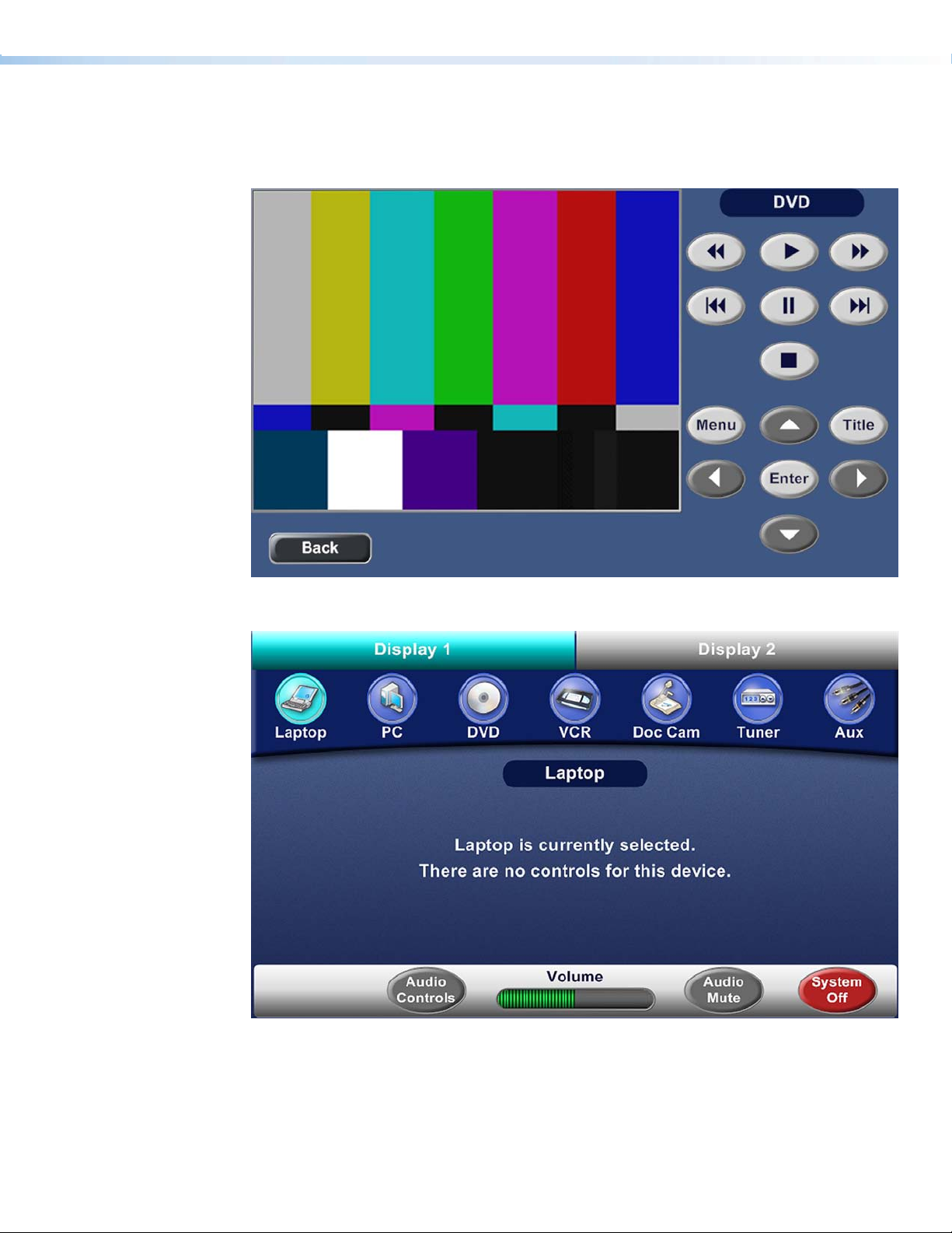
Figure 34. DVD Full Page
Figure 35. Dual Display main page: Display 1, Laptop selected, and Laptop pop-up
displayed in the dynamic area
Extron TouchLink Design Themes • Speed Theme 33
Page 38

Figure 36. Audio Control page
Figure 37. Preset Selection page
Extron TouchLink Design Themes • Speed Theme34
Page 39

TLP 350
Figure 38. Auxiliary page
Figure 40. Conrmation page
Figure 39. Doc Cam page
Figure 41. DVD page, stop selected
Extron TouchLink Design Themes • Speed Theme 35
Page 40

Extron TouchLink Design Themes • Speed Theme36
Page 41

University Theme
Elements
a
b
c
Swatch File Name Use For (an)
Elements
bkgd_nohead.jpg
Start_blgd.jpg
panel_center.png Background for pop-up pages — TLP 700
panel.png_2
footer.png Status bar on main page — TLP 700
jet-volume_nsel.png
jet-volume_sel.png
vortex_jet_nsel.png
Background for main and Audio Control
pages — TLP 700
Background for start, starting up,
confirmation, and shutting down pages —
TLP 700
Left side panel, a right side panel is in the
Resource Library — TLP 700
Volume bar on main page — TLP 700
Button (not selected) — TLP 700 and
TLP 350
Example,
See...
abe
Figure 46
d
ae
Figures
42, 44
Not shown
ae
Figures
42, 44
ab
Figure 46
d
Start_Button_nsel.png_1
University_120_55_sel.jpg
transport_sel png Buttons (selected) — TLP 700 and TLP 350
University_85_drk.png
University_85_grn.png
University_85_orng.png
University_85_sel.png VC Control button (selected) — TLP 700
Extron TouchLink Design Themes • University Theme
Start button (not selected) — TLP 700 and
TLP 350
Start button (selected) — TLP 700 and
TLP 350
VC Control button (not selected) — TLP 700
c
Figures
43, 48
Figure
43, 48
be
Figure 45
e
37
Page 42
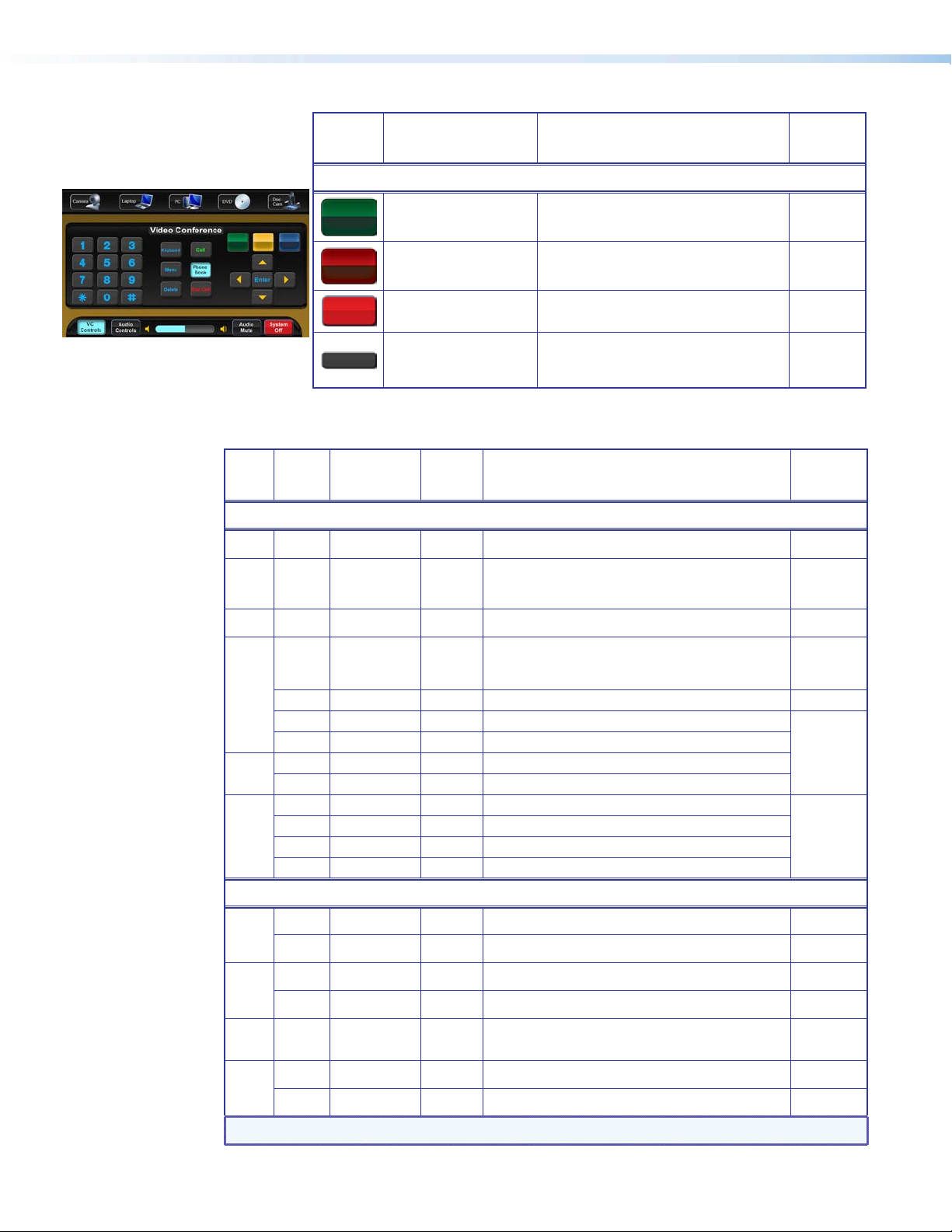
e
Swatch File Name Use For (an)
Example,
See...
Elements (Continued)
Fonts
Font
Color RGB Code Hex
Size
Arial Bold
White 255, 255, 255 FFFFFF Logo banner — TLP 700
36
White 255, 255, 255 FFFFFF
20
Blue 134, 247, 254 86F7FE Dual display and window tabs — TLP 700 Figure 44
16
White 255, 255, 255 FFFFFF
14
Amber 255, 195, 0 FFC300 Label near buttons and Freeze button — TLP 700 Figure 42
Blue 10, 170, 240 0AAAF0
Black 0, 0, 0 000000 Buttons (selected) — TLP 700 and TLP 350
White 255, 255, 255 FFFFFF Status bar buttons (not selected) — TLP 700
12
Black 0, 0, 0 000000 Status bar buttons (selected) — TLP 700
Blue 10, 170, 240 0AAAF0 Buttons (not selected), VC Controls — TLP 700
Green 0, 255, 0 00FF00 Call and Phone Book buttons (not selected) — TLP 700
11
Red 255, 0, 0 FF0000 End Call (not selected) — TLP 700
Black 0, 0, 0 000000
Extron GUI Congurator
University_Trnsprt_grn.
png
University_Trnsprt_red.png
systemoff_nsel.jpg System Off button (not selected) — TLP 700
Back.png
Text for: For (an)
Code
Full page heading, pop-up page heading, and text on
pages such as starting up — TLP 700 and Logo banner
for TLP 350.
Buttons on confirmation page and page names, such
as DVD, text on pages, labels near buttons — TLP 700
and text on start page — TLP 350
Buttons (not selected) — TLP 700 and TLP 350
VC Controls center buttons (selected) — TLP 700
Power Down button (not selected) —
TLP 700 and TLP 350
Cancel button (not selected) — TLP 700 and
TLP 350
Back and Full Screen Video buttons —
TLP 700
d
d
Figure 45
abe
Figure 44
b
Figures
44, 46
Example,
See...
c
abd
Figure 48
abd
abe
e
White 255, 255, 255 FFFFFF Power on button (not selected) — TLP 700
48
Black 0, 0, 0 000000 Power on button (selected) — TLP 700 Not shown
White 255, 255, 255 FFFFFF Power on button (not selected) — TLP 350 Figure 48
c
38
Black 0, 0, 0 000000 Power on button (selected) — TLP 350 Not shown
Amber 255, 195, 0 FFC300 Volume icons — TLP 700
18
Blue 10, 170, 240 0AAAF0 Buttons (not selected) — TLP 700 and TLP 350 Figure 42
Figures
42, 44
24
Black 0, 0, 0 000000 Buttons (selected) — TLP 700 and TLP 350
NOTE: See the Extron GUI Congurator Fonts section for symbols and keyboard equivalents.
c
Extron TouchLink Design Themes • University Theme38
Page 43

University Template Layouts
TLP 700
Figure 42. Main page, Tuner selected, and Tuner pop-up displayed in the dynamic area
Figure 43. Start page, divisible room, Combined selected
Extron TouchLink Design Themes • University Theme 39
Page 44

Figure 44. Dual Display main page: Display 1, VCR selected, and VCR pop-up displayed
in the dynamic area
Figure 45. Conrmation page, Power Down selected
Extron TouchLink Design Themes • University Theme40
Page 45
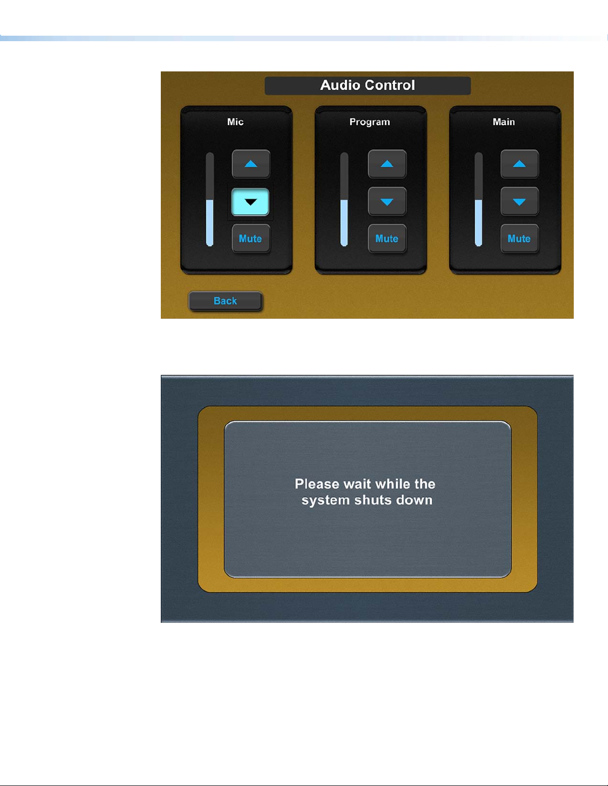
Figure 46. Audio Control page, Mic down arrow selected
Figure 47. Shutting down page
Extron TouchLink Design Themes • University Theme 41
Page 46
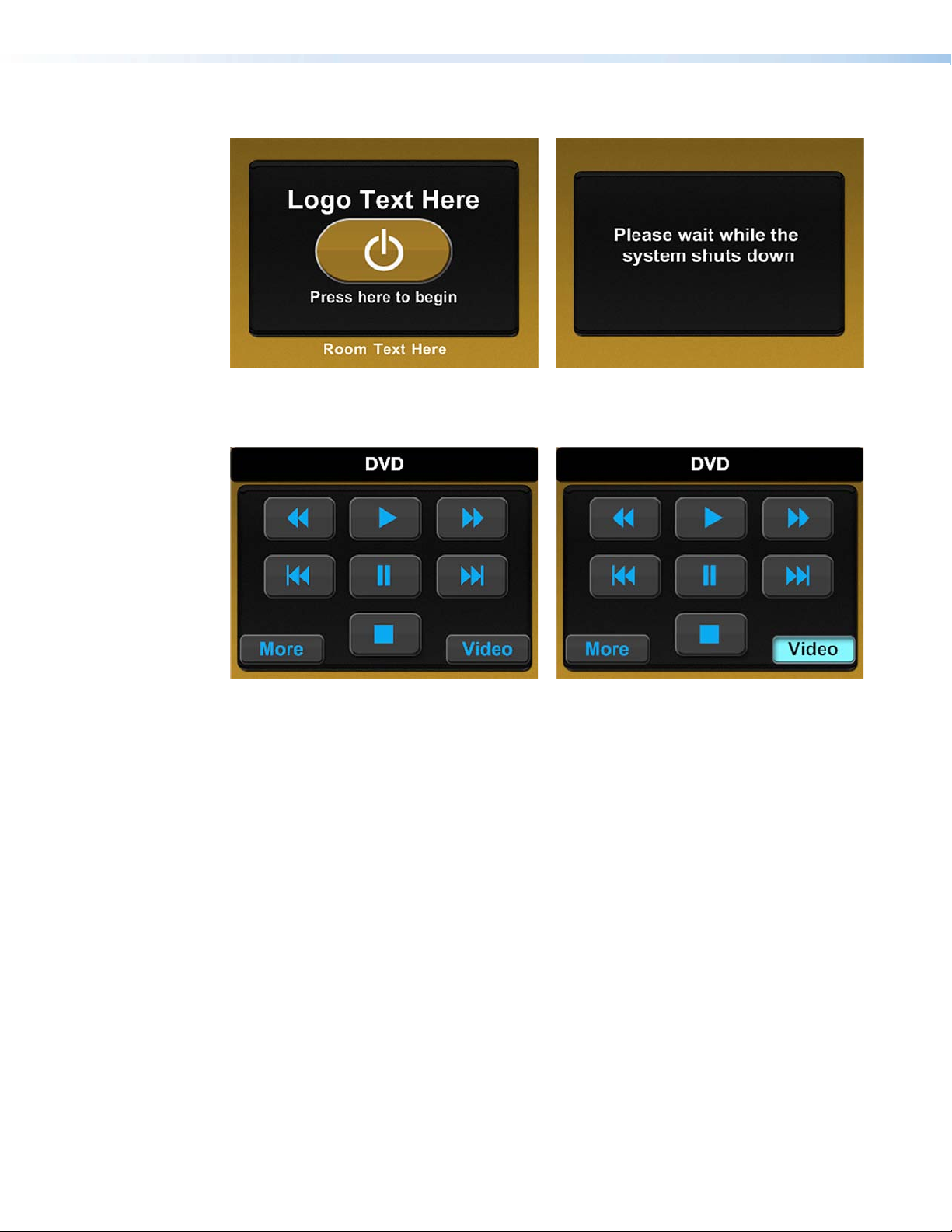
TLP 350
Figure 48. Start page Figure 49. Shutting Down page
Figure 50. DVD page
Figure 51. DVD page, Video selected
Extron TouchLink Design Themes • University Theme42
Page 47
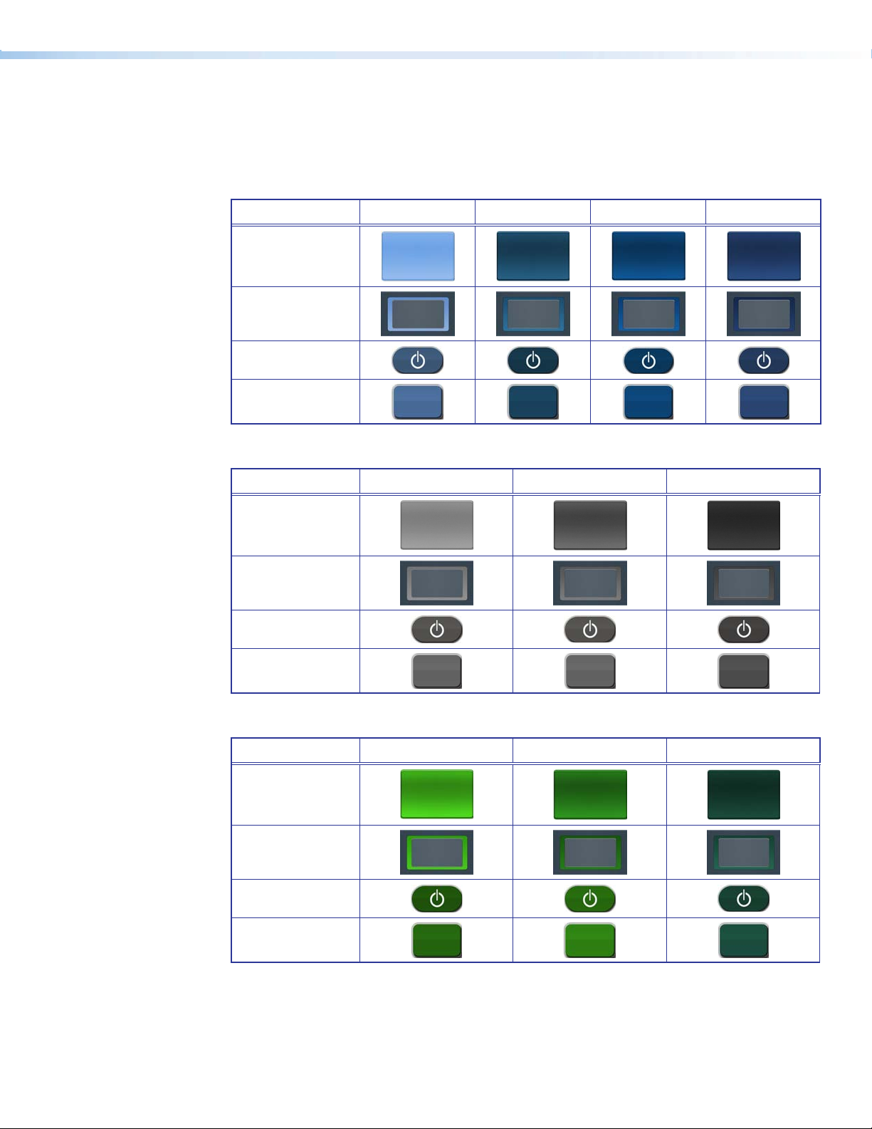
University Colors
The University Resources Kit provides graphic elements in a variety of colors. The following
tables show the options available in each color category.
Blue
Option 1 Option 2 Option 3 Option 4
Panel Center
Start Background
Start Button
Transport Button
Gray
Option 1 Option 2 Option 3
Panel Center
Start Background
Start Button
Transport Button
Green
Option 1 Option 2 Option 3
Panel Center
Start Background
Start Button
Transport Button
Extron TouchLink Design Themes • University Theme 43
Page 48

Orange
Panel Center
Start Background
Start Button
Transport Button
Red
Panel Center
Start Background
Option 1 Option 2 Option 3
Option 1 Option 2 Option 3 Option 4 Option 5
Start Button
Transport Button
Tan
Panel Center
Start Background
Start Button
Transport Button
Option 1 Option 2 Option 3 Option 4
Extron TouchLink Design Themes • University Theme44
Page 49

Violet
Panel Center
Start Background
Start Button
Transport Button
Yellow
Panel Center
Start Background
Option 1 Option 2 Option 3
Option 1 Option 2 Option 3 Option 4
Start Button
Transport Button
Black, Gold, and White
Panel Center
Start Background
Start Button
Transport Button
Black White
Option 1 Option 2
Gold
Selected State Options
Beige Blue Green Violet Yellow
Extron TouchLink Design Themes • University Theme 45
Page 50

Extron TouchLink Design Themes • University Theme46
Page 51

Vortex Black Theme
Elements and Color Palette
a
b
c
Swatch RGB Code or
File Name
Elements
vortex_black_bkgd_
nofooter.png
vortex_black_dual_bkgd.
png
vortex-black-start_bkgd.
png
vortex_black_bkgd.png Background for master page — TLP 700
vortex_black_panel_
leftside.png
vortex_black_footer.png Status bar on the main page — TLP 700
vortex_black_room_btn_
nsel.png
vortex_black_room_btn_
sel.png
vortex_black_vol_nsel.png
vortex_vol_sel.png
Hex
Code
Use For (an)
Background for Audio Controls, VCR, and
DVD pages — TLP 700
Background for dual display and window
display main page — TLP 700
Background for starting up, confirmation,
and shutting down pages — TLP 700
Example,
See...
cd
Figure 53
Figure 54
af i
b
Figure 52
Left side panel, a similar right side panel is
included in the Resource Library — TLP 700
Not shown
b
Figure 52
Background for dual display and window
display, not selected — TLP 700
Background for dual, and window display,
selected — TLP 700
Volume bar on main page — TLP 700
Figure 54
Figure 54
c
Figure 52
d
vortex-black_trns_nsel.
png
vortex_black_scrl_nsel.png
vortex_black_trns_sel.png
preset07_sel.png
preset10_sel.png Preset Selection button (selected) — TLP 700
Button (not selected) — TLP 700 and
TLP 350
Button (not selected) — TLP 700 and
TLP 350
Buttons (selected, except as noted) —
TLP 700 and TLP 350
Preset Selection button (not selected) —
TLP 700
Extron TouchLink Design Themes • Vortex Black Theme
dg
Figure 52
Figure 52
e
Figure 57
47
Page 52
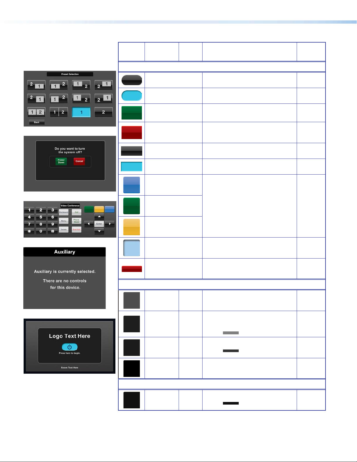
e
Swatch RGB Code or
File Name
Elements (continued)
Black_start_button.png
Hex
Code
Use For (an)
Power on button (not selected) — TLP 700
and TLP 350
Example,
See...
Not shown
f
g
h
Black_Start_Button_sel.
png
vortex_trnsprt_grn.png Power Down button — TLP 700 and TLP 350
vortex_trnsprt_red.png Cancel button — TLP 700 and TLP 350
vortex_black_input_160_
nsel.jpg
vortex_black_input_160_
sel.jpg
vortex_fav_blu.png
vortex_fav_grn.png
vortex_fav_orng.png
vortex_fav_vortx_blue_sel.
png
Power on button (selected) — TLP 700 and
TLP 350
Back and Full Screen Video buttons (not
selected) — TLP 700
Back and Full Screen Video buttons (selected)
— TLP 700
VC Control button (not selected) — TLP 700
VC Control button (selected) — TLP 700 Not shown
i
f
Figure 60
f
Figures
60, 61
de
Not shown
g
vortex_footer_red.png System Off button on main page
Background Colors
Fill: Background for full pages —
TLP 700 and TLP 350
Fill: Rectangle layer 1 and around Audio
Control buttons — TLP 700 and
TLP 350
Border:
Fill: Rectangular layer 2 fill — TLP 700
Border:
Fill: Background for page labels —
TLP 700
Fill: More button — TLP 350
Border: Same as fill
i
Button Colors
77, 77, 77 4D4D4D
30, 30, 30
128, 128, 128
27, 27, 27
52, 52, 52
0, 0, 0 000000
16, 16, 16 101010
1E1E1E
808080
1B1B1B
343434
b
Figures
52, 54
adfh
acf
Figure 55
af
Figure 55
cegh
Figure 59
Extron TouchLink Design Themes • Vortex Black Theme48
Page 53

Fonts
Font
Size
Arial Bold
Color RGB Code Hex
Code
Text for: For (an)
Example,
See...
36
White 255, 255, 255 FFFFFF
20
16
White 255, 255, 255 FFFFFF
Logo banner — TLP 700 and TLP 350
Starting up, shutting down, confirmation pages —
TLP 700
Dual display and Window tabs — TLP 700 Figure 54
Page names, such as Audio Control pop-up pages
with text only such as Laptop — TLP 700
i
Figure 55
ceg
14
Dark blue 2, 44, 84 022C54
White 255, 255, 255 FFFFFF
12
Dark blue 2, 44, 84 022C54
Buttons (selected, except as noted) — TLP 700 and
TLP 350
Labels below A/V sources and Volume in status bar
— TLP 700
System Off, Audio Mute, and Audio Control
(selected) in status bar — TLP 700 and TLP 350
e
Figure 52
b
Figure 52
11
White 255, 255, 255 FFFFFF Buttons on status bar — TLP 700 and TLP 350
Extron GUI Congurator
White 255, 255, 255 FFFFFF
48
Dark blue 2, 44, 84 022C54
White 255, 255, 255 FFFFFF Buttons (not selected) — TLP 700 and TLP 350
Power on button (not selected) — TLP 700 and
TLP 350
Power on button (selected) — TLP 700 and TLP 350
b
Figure 54
Not shown
i
dg
24
Dark blue 2, 44, 84 022C54 Buttons (selected) — TLP 700 and TLP 350
White 255, 255, 255 FFFFFF Volume icons — TLP 7000
18
See the Extron GUI Congurator Font section for symbols and keyboard equivalents.
NOTE:
e
Figure 52
b
Figure 54
Extron TouchLink Design Themes • Vortex Black Theme 49
Page 54

Vortex Black Template Layouts
TLP 700
Figure 52. Main page, Doc Cam selected, and Doc Cam pop-up displayed in the
dynamic area
Figure 53. Audio Control page
Extron TouchLink Design Themes • Vortex Black Theme50
Page 55

Figure 54. Dual Display main page: Display 1, an A/V source has not been selected
Figure 55. Starting up page
Extron TouchLink Design Themes • Vortex Black Theme 51
Page 56
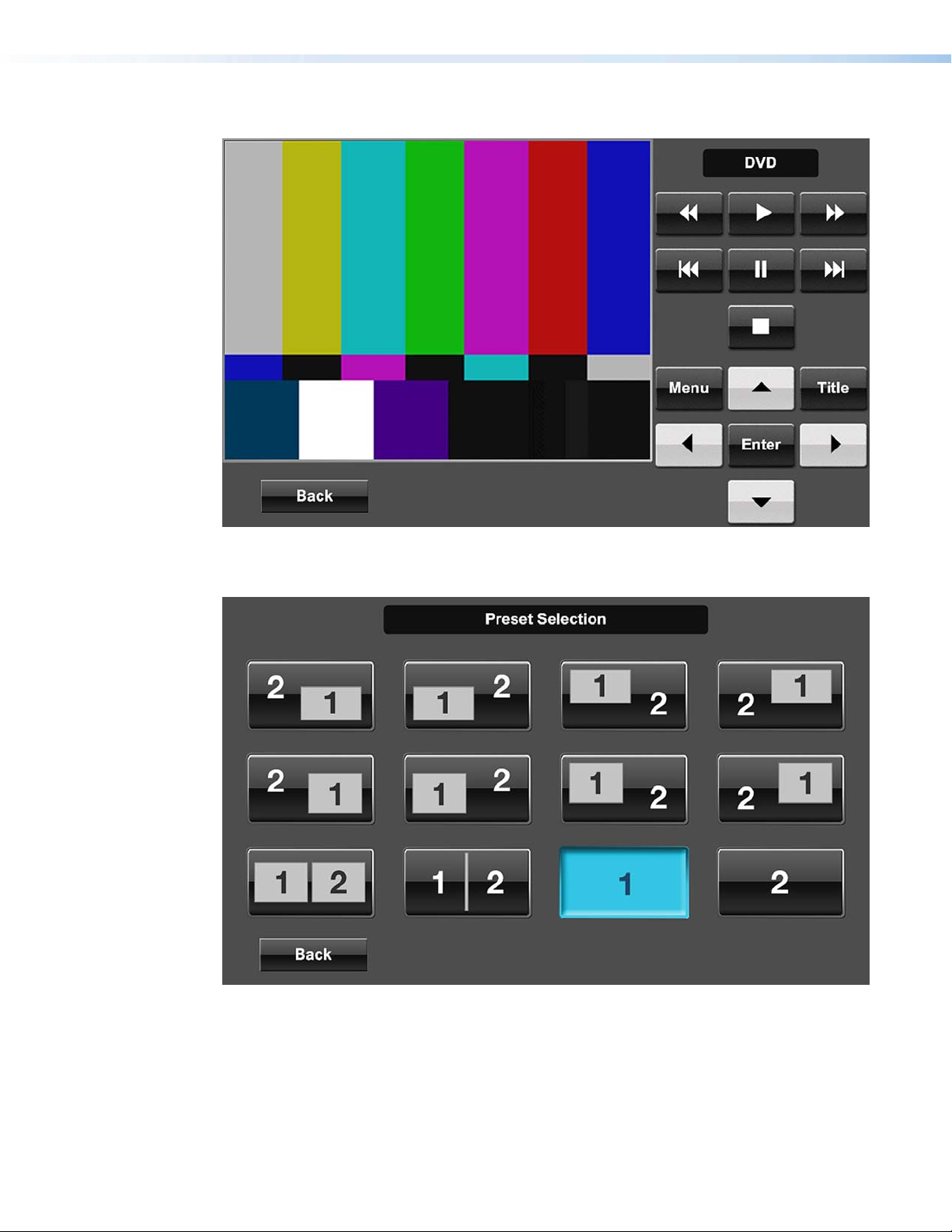
Figure 56. DVD full page
Figure 57. Preset Selection page
Extron TouchLink Design Themes • Vortex Black Theme52
Page 57

TLP 350
Figure 58. Auxiliary page
Figure 60. Conrmation page
Figure 59. Doc Cam page
Figure 61. Conrmation page, Power Down
selected
Extron TouchLink Design Themes • Vortex Black Theme 53
Page 58

Extron TouchLink Design Themes • Vortex Black Theme54
Page 59

Vortex Blue Theme
Elements and Color Palette
a
b
c
Swatch RGB Code or
File Name
Elements
vortex_blue_nofooter_
bkgd.png
vortex_blue_start_bkgd.png
vortex-blue.png
vortex_blue_dual.png
vortex_blue_panel_leftside.
png
vortex_blue_footer.png Status bar on the main page — TLP 700
vortex_blue_start_nsel.png
vortex_blue_start_sel.png
Hex
Code
Use Ref
Background for Audio Control, DVD, and Preset
Selections — TLP 700
Background for starting up, shutting down, and
confirmation pages — TLP 700
Background for single display main page — TLP
700
Background for dual display and multi window
— TLP 700
Left side panel, a similar right side panel is
included in the Resource Library — TLP 700
No.
cef
Not
shown
ag
Figure 66
Figure 64
Not
shown
ag
Figures
64, 66
Background for the Power on button (not
selected) — TLP 700 and TLP 350
Background for the Power on button (selected)
— TLP 700 and TLP 350
b
Figure 70
d
vortex_blue_room_nsel.png
vortex_blue_room_sel.png
Vortex_Blue_Vol_NS.png
Vortex_Blue_Vol_S.png
vortex_blue.png Audio Control buttons — TLP 700
vortex_blue_trns_nsel.png Buttons (not selected) — TLP 700 and TLP 350
vortex_blue_scrl_nsel.png Buttons (not selected) — TLP 700 and TLP 350
Extron TouchLink Design Themes • Vortex Blue Theme
Source bar, dual, and window display (not
selected) — TLP 700
Source bar, dual, and window display (selected)
— TLP 700
Volume bar on main page — TLP 700
ag
Figures
64, 66
c
eh
55
Page 60
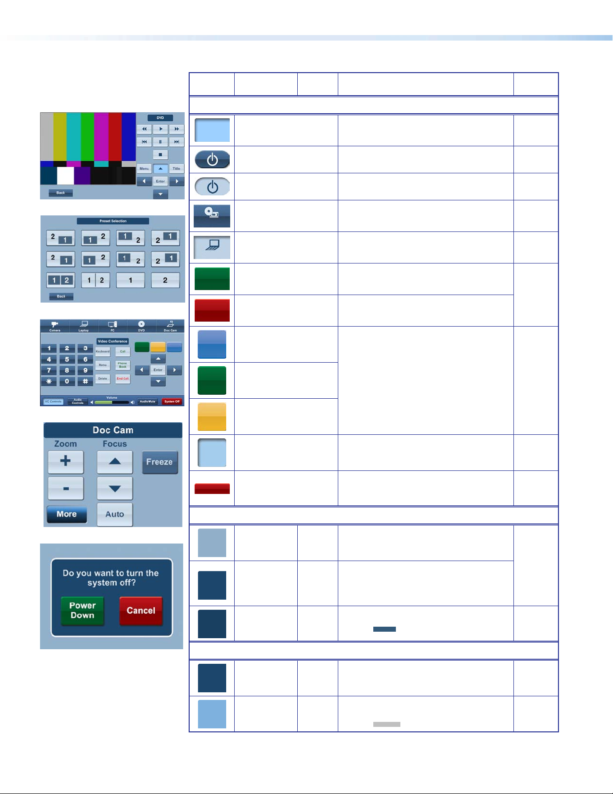
e
Swatch RGB Code or
File Name
Elements (Continued)
Hex
Code
Use Ref
No.
f
g
h
vortex_-blue_trns_sel.png Buttons (selected) — TLP 700 and TLP 350
Start_Button_nsel.png
Start_Button_sel.png
vortex_blue_dvd_nsel.jpg
vortex_blue_laptop_sel.jpg Laptop A/V source icon — TLP 700 and TLP 350
vortex_trnsprt_grn.png
vortex_trnsprt_red.png
vortex_fav_blu.png
vortex_fav_grn.png
vortex_fav_orng.png
Power on button (not selected) — TLP 700 and
TLP 350
Power on button (selected) — TLP 700 and
TLP 350
DVD A/V source icon example from — TLP 700
and TLP 350 resource library
Green Power Down button on Confirmation
page — TLP 700 and TLP 350
Red Cancel button on Confirmation page — TLP
700 and TLP 350
VC Control button (not selected) — TLP 700
e
Figure 71
Not
shown
Figure 70
ag
a
i
g
vortex_fav_vortx_blue_sel.
png
VC Control button (not selected) — TLP 700
vortex_footer_red.png System Off button on Master page — TLP 700
Background Colors
i
Button Colors
146, 175, 202 92AFCA
28, 70, 108
255, 255, 255
25, 63, 97
50, 88, 122
28, 70, 108
255, 255, 255
126, 177, 222
192, 192, 192
1C466C
FFFFFF
193F61
32587A
1C466C
FFFFFF
7EB1DE
C0C0C0
Fill: Background for full pages — TLP 700
and TLP 350
Fill: Label background, and rectangle layer
1, and around Audio Control buttons
— TLP 700 and TLP 350
Border: White (Audio Control only)
Fill: Rectangle layer 2 — TLP 700
Border:
Fill: Back button (not selected) — TLP 700
and TLP 350
Border: White
Fill: Buttons (not selected) — TLP 700 and
TLP 350
Border:
Not
shown
g
Figures
64, 66
cdi
d
c
a
Extron TouchLink Design Themes • Vortex Blue Theme56
Page 61
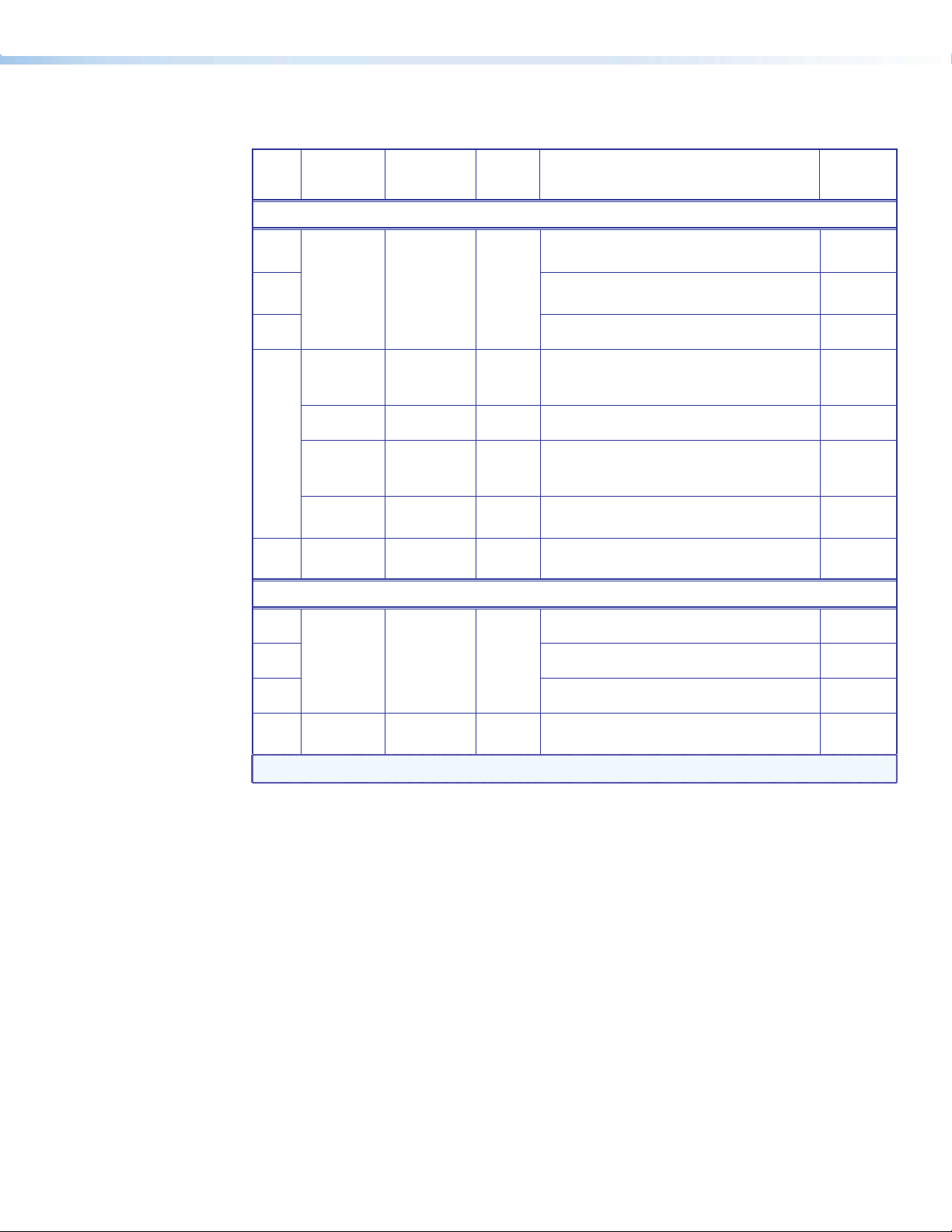
Fonts
Font
Size
Arial Bold
Color RGB Code Hex
Code
Text for: For (an)
Example,
See...
36
White 255, 255, 255 FFFFFF
20
16
White 255, 255, 255 FFFFFF
Dark green 0, 100, 0 006400 Power Down and Cancel buttons (selected)
14
Blue 28, 70, 108 1C466C
Light blue 205, 220, 234 CDDCEA
White 255, 255, 255 FFFFFF
12
Extron GUI Congurator
36
White 255, 255, 255 FFFFFF
24
18
Logo banner — TLP 700 Not shown
Text on starting up and shutting down pages —
TLP 700 and logo banner — TLP 350
Page names text only such as Auxiliary — TLP 350
Some buttons — TLP 700, Power Down and
Cancel buttons (not selected) — TLP 700 and
TLP 350
b
Figure 70
c
a
d
Buttons (selected, except as noted) — TLP 700
and TLP 350, and text on pages such as Laptop
— TLP 350
Freeze button (not selected) — TLP 700 and
TLP 350
Labels under A/V Source icons, labels beneath
buttons, and buttons on status bar
Power on symbol Figure 70
Button symbols and numbers (not selected)
Volume icons
f
Figure 68
h
Figure 71
a
ceg
ag
Blue 28, 70, 108 1C466C
24
Button symbols and numbers (not selected and
selected)
aeh
NOTE: See the Extron GUI Congurator Font section for symbols and keyboard equivalents.
Extron TouchLink Design Themes • Vortex Blue Theme 57
Page 62

Vortex Blue Template Layouts
TLP 700
Figure 62. Audio Control page
Figure 63. Conrmation page, Power Down selected
Extron TouchLink Design Themes • Vortex Blue Theme58
Page 63

Figure 64. Dual Display main page: Display 1, Tuner selected, and Tuner pop-up
displayed in the dynamic area
Figure 65. Shutting down page
Extron TouchLink Design Themes • Vortex Blue Theme 59
Page 64
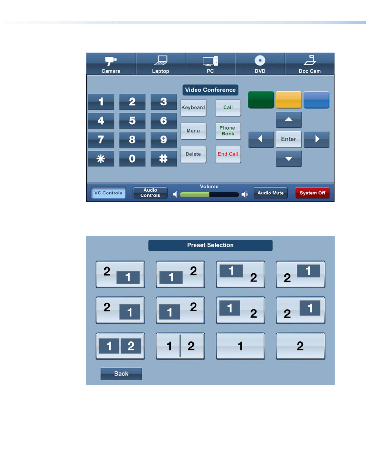
Figure 66. Main page, VC Controls selected, and Video Conference displayed in the
dynamic area
Figure 67. Preset Selection page
Extron TouchLink Design Themes • Vortex Blue Theme60
Page 65
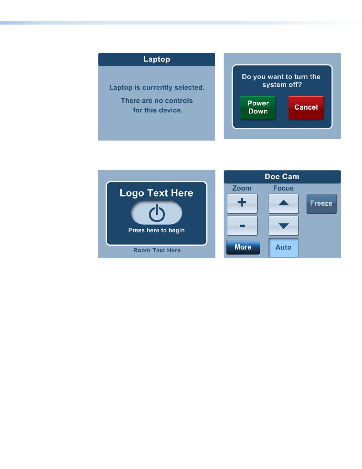
TLP 350
Figure 68. Laptop page
Figure 70. Start page, power on selected
Figure 69. Conrmation page
Figure 71. Doc Cam page, Auto selected
Extron TouchLink Design Themes • Vortex Blue Theme 61
Page 66

Extron TouchLink Design Themes • Vortex Blue Theme62
Page 67

Vortex Green Theme
Elements and Color Palette
a
b
c
Swatch RGB Code or
File Name
Elements
vortex_grn_bkgd_nofooter.
jpg
vortex_grn_panel_leftside.
png
vortex_grn_start_bkgd.png Background for start page — TLP 700
vortex_grn_dual.png
vortex-grn_room_nsel.png
vortex_vol_sel.png
vortex_grn_room_sel.png
vortex_grn_vol_nsel.png
vortex_vol_sel.png
Hex
Code
Use For (an)
Background for full size pages, including
main page — TLP 700
Left side panel, a similar right side panel is in
the resource library — TLP 700
Example,
See...
cde
f
Not
shown
a
Background for master page, dual, and multi
window display — TLP 700
A/V Source background for main page,
dual, and window display (not selected) —
TLP 700
A/V Source background for main page,
dual, and multi window display (selected) —
TLP 700
Volume bar on main page — TLP 700
b
bf
Figure 73
d
vortex_grn_footer.png Status bar on the main page — TLP 700
vortex_grn_start_nsel.png
vortex_grn_input_nsel.jpg
vortex-grn_trns_nsel.png
vortex_trnsprt_grn_lite.jpg Tuner buttons — TLP 700
vortex_grn_input_sel.jpg
vortex-grn_trns_sel.png
vortex-grn_scrl_nsel.png
Extron TouchLink Design Themes • Vortex Green Theme
Power on button (not selected) — TLP 700
and TLP 350
Buttons (not selected) — TLP 700 and
TLP 350 (NOTE: vortex-grn_trns_nsel.png is
a small version of vortex_grn_input_nsel.jpg)
Buttons (selected) — TLP 700 and TLP 350
(NOTE: vortex-grn_trns_sel.png is a small
version of vortex_grn_input_sel.jpg)
Freeze button (not selected) — TLP 700 and
TLP 350
b
a
cf
Figure 73
i
cf
Figure 73
f
63
Page 68

e
Swatch RGB Code or
File Name
Elements (Continued)
preset04.jpg
preset09_sel.jpg Preset Selection button (selected) — TLP 700
Vortex_grn_blueray.jpg Blu-ray A/V source icon example — TLP 700
vortex_grn_cam_sel.jpg
Hex
Code
Use For (an)
Preset Selection button (not selected) —
TLP 700
Example,
See...
Figure 76
bf
Camera A/V source icon selected example
— TLP 700
Figure 73
f
vortex_trnsprt_grn.png
Green Power Down button on Confirmation
page — TLP 700 and TLP 350
d
vortex_trnsprt_red.png
vortex_fav_blu.png VC Control button (not selected) — TLP 700
vortex_fav_grn.png VC Control button (not selected) — TLP 700
Red Cancel button on Confirmation page —
TLP 700 and TLP 350
g
g
vortex_fav_orng.png VC Control button (not selected) — TLP 700
vortex_fav_vortx_blue_sel.
png
h
vortex_footer_red.png
Background Colors
VC Control button (selected) — TLP 700
System Off button on Master page —
TLP 700
Fill: Background fill, full pages —
TLP 700 and TLP 350
Border: None
Fill: Rectangle layer 1 and around Audio
Control buttons — TLP 700 and
TLP 350
Border: White
i
100, 136, 141 64888D
28, 45, 48 1C2D30 Fill: Label background fill — TLP 700
28, 45, 48
255, 255, 255
1C2D30
FFFFFF
Not
shown
f
bcf
g
dh
c
25, 41, 43
50, 66, 68
19292B
324244
Fill: Rectangular layer 2 — TLP 700
Border:
h
Extron TouchLink Design Themes • Vortex Green Theme64
Page 69

Fonts
Font
Size
Arial Bold
36
Color RGB Code Hex
Code
Dark green 28, 45, 48 1C2D30 Logo banner — TLP 700
Text for: For (an)
Example,
See...
a
White 255, 255, 255 FFFFFF
20
White 255, 255, 255 FFFFFF Dual Display 1 and 2 and Window 1 and 2 tabs
16
White 255, 255, 255 FFFFFF Buttons (not selected, except as noted) and labels
14
Black 0, 0, 0 000000 Freeze button
Dark green 28, 45, 48 1C2D30 Buttons (selected, except as noted)
White 255, 255, 255 FFFFFF Status bar buttons
12
Confirmation, starting up, and shutting down text
— TLP700 and Logo banner — TLP 300
h
b
bef
Figure 72
f
Figure 78
fi
bf
White 255, 255, 255 FFFFFF A/V icons, status bar text
11
Extron GUI Congurator
White 255, 255, 255 FFFFFF Power on symbol (not selected)
48
Dark green 28, 45, 48 1C2D30 Power on symbol (selected) Figure 81
White 255, 255, 255 FFFFFF Button symbols
28
White 255, 255, 255 FFFFFF Volume icons on status bar
18
NOTE: See the Extron GUI Congurator Fonts section for symbols and keyboard equivalents.
Figure 73
a
ab
bf
Extron TouchLink Design Themes • Vortex Green Theme 65
Page 70

Vortex Green Template Layouts
TLP 700
Figure 72. Audio Control page
Figure 73. Main page, Doc Cam selected, Doc Cam pop-up displayed in the dynamic
area, and Normal button selected
Extron TouchLink Design Themes • Vortex Green Theme66
Page 71

Figure 74. VCR full page
Figure 75. Shutting down page
Extron TouchLink Design Themes • Vortex Green Theme 67
Page 72

Figure 76. Preset Selection page
Figure 77. Conrmation page
Extron TouchLink Design Themes • Vortex Green Theme68
Page 73

TLP 350
Figure 78. Don Cam page
Figure 80. Start page
Figure 79. Laptop page
Figure 81. Start page, power on selected
Extron TouchLink Design Themes • Vortex Green Theme 69
Page 74

Extron TouchLink Design Themes • Vortex Green Theme70
Page 75

Extron GUI
Configurator Fonts
The following is a complete list of the Extron GUI Configurator fonts and the keyboard letter or
character equivalent.
Symbol
Characters
Description
Symbol
Characters
Description
Symbol
Characters
Description
Symbol
Characters
Description
Symbol
Characters
Description
Numbers
a Rewind
a
b Fast Forward
b
c Previous
c
d Next
d
e Step Back
e
f Step Forward
f
g Eject
g
h Scroll Up
h
i Scroll Down
i
j Scroll Left
j
k Scroll Right
k
NOTE: Use only lowercase letters. Three exceptions are:
• Uppercase F (F, Security Cam)
• Uppercase G (G, Volume Off)
• Uppercase U (U, Microphone)
l Power
l
m Audio
m
n Close
n
o Open
o
p
p
q Volume Up
q
r Jump to Start
r
s Jump to End
s
t Pause
t
u Wall Plate
u
v Arrow Right
v
Volume
Down
w
x
y
z
F
G
U
`
!
@
#
w Arrow Left
x Arrow Up
y Arrow Down
z Return
F Security Cam
G Volume Off
U Microphone
Server
`
(back quote)
! Laptop
@ Stop
# Pound
%
&
*
(
)
}
^
+
|
]
$
% Aux
& PC
* Star
( Reject
) OK
} Doc Cam
^ Lectern
+ Plus
| Step
] DVD VCR
$ DVD
-
:
;
<
>
?
,
.
‘/
u
- Minus
: Video Conf
; Audio
< Back
> Play
? Record
Tuner
,
(comma)
Audio Conf
.
(period)
/ Blu-ray
VCR
‘
(single quote)
1
2
3
4
5
6
7
8
9
0
1
2
3
4
5
6
7
8
9
0
Extron TouchLink Design Themes • Extron GUI Congurator Font
71
Page 76

Notes:
Extron TouchLink Design Themes • Notes72
Page 77

Extron TouchLink Design Themes 73
Page 78

Extron USA - West
Headquarters
+800.633.9876
Inside USA/Canada Only
+1.714.491.1500
+1.714.491.1517 FAX
Extron USA - East
+800.633.9876
Inside USA/Canada Only
+1.919.863.1794
+1.919.863.1797 FAX
© 2011 Extron Electronics. All rights reserved. www.extron.com
Extron Europe
+800.3987.6673
Inside Europe Only
+31.33.453.4040
+31.33.453.4050 FAX
Extron Asia
+800.7339.8766
Inside Asia Only
+65.6383.4400
+65.6383.4664 FAX
Extron Japan
+81.3.3511.7655
+81.3.3511.7656 FAX
Extron China
+400.883.1568
Inside China Only
+86.21.3760.1568
+86.21.3760.1566 FAX
Extron Middle East
+971.4.2991800
+971.4.2991880 FAX
 Loading...