

Page 1

Spyder3Print User Guide Index
Welcome to Spyder3Print Here’s an overview of how the application works.
Print Guide Rule. Using the optional Rule for reading targets.
Preferences. Allows access to user configurable settings.
Tools. Describes the advanced functions available from the Tools menu.
Printer Definition. Allows you to define features of your printer for later use.
Configure Printer Settings. Offers assistance in determining the best printer settings
for your uses.
Print Quality Check. Checks that your printer is performing properly.
Media Setting Check. Assists in determining the optimal media setting for
Spyder3Print.
Select Target. Allows the selection, preview, and printing of profiling targets.
Spectro Calibration. Calibrates your spectro to the white tile in the calibration base.
Read Patches. Selects or creates color target measurements in Spyder3Print.
Build Profile Setup. Offers a range of profile settings and adjustments, and builds
profiles accordly.
SpyderProofTM. Provides SoftProofs and printed samples using your profile.
Page 2
Remote Profiling. This tutorial describes the process of profiling a printer at a remote
location.
Printing with Custom Profiles. This tutorial describes the process of using your printer
profiles to print your documents.
Methods of Black and White Printing. This tutorial describes the available range of
methods for printing black and white digital images using inkjet printers.
Creating Tinted Black and White Profiles. This tutorial describes the process and
options when creating tinted black and white profiles.
Color Gamuts and Rendering Intents. This tutorial offers advanced information on the
details of printer profiles and their use.
SoftProofing. This tutorial covers advanced SoftProof tools in profile building and
image viewing.
Color Workflow for Digital Photography. This tutorial explains how to control color from
your camera, to your computer, to your printer.
Datacolor License Agreement. Describes the licensing restrictions that apply to use of
Spyder3Print and the profiles built with Spyder3Print.
Further Information
For information such as a list of Frequently Asked Questions and details on all
Datacolor products be sure to visit our website:
http://www.datacolor.com/Spyder3
Page 3

Welcome to Spyder3Print
Skip to:
Help Index
The Purpose of This Application
This assistant-based application will help you choose optimal settings for your printer,
and build high quality ICC compliant RGB printer profiles. Profiling allows your prints
to match, from screen to print, and between different printers, inks, or papers. These
printer profiles are then used by ICC-aware applications such as Adobe® Photoshop®
so that colors can be printed as they are intended. Typically users build a profile for
each different paper they use.
The Long Answer
This assistant will help you choose the best printer driver and media settings for
printing with your printer, make sure your printer is printing properly, and build RGB
format printer profiles for each of your printer, ink, and media combinations to assure
accurate, optimal prints. It will step you through the process of:
Defining Your Printer Type
•
Optimizing Your Printer Settings
•
Properly Printing a Test Chart
•
Connecting Your Spectro
•
Reading Your Test Chart
•
Building Your Profile
•
Making Adjustments to Your Profile
•
Page Setup: Landscape (horizontal) orientation in Page Setup is recommended for
use with Spyder3Print. Previews of all targets and test images are shown in an
embedded preview, with a larger, resizable, preview available by clicking on the
Page 4

embedded preview. All previews are formatted according to your selected page size
and orientation; changes to your page size or orientation will be immediately reflected
in the previews.
Under Windows 2000 it is necessary to have a printer driver installed in order to
access Page Setup. Page Setup in Mac OS X, and Windows XP/Vista can be configured
without having a printer driver installed.
Mac OS X Classic Mode: Classic Mode (which allows Mac OS 9 applications to run
under OS X) captures USB devices, and sometimes does not release them for use by
OS X applications. It is recommended that you quit Classic Mode before running
Spyder3 applications. If Spyder3Print cannot find a properly connected Spectro or
Printer, quit Classic Mode, and try again.
Further Information
For information such as a list of Frequently Asked Questions and details on all
Datacolor products be sure to visit our website:
http://www.datacolor.com/Spyder3
Page 5
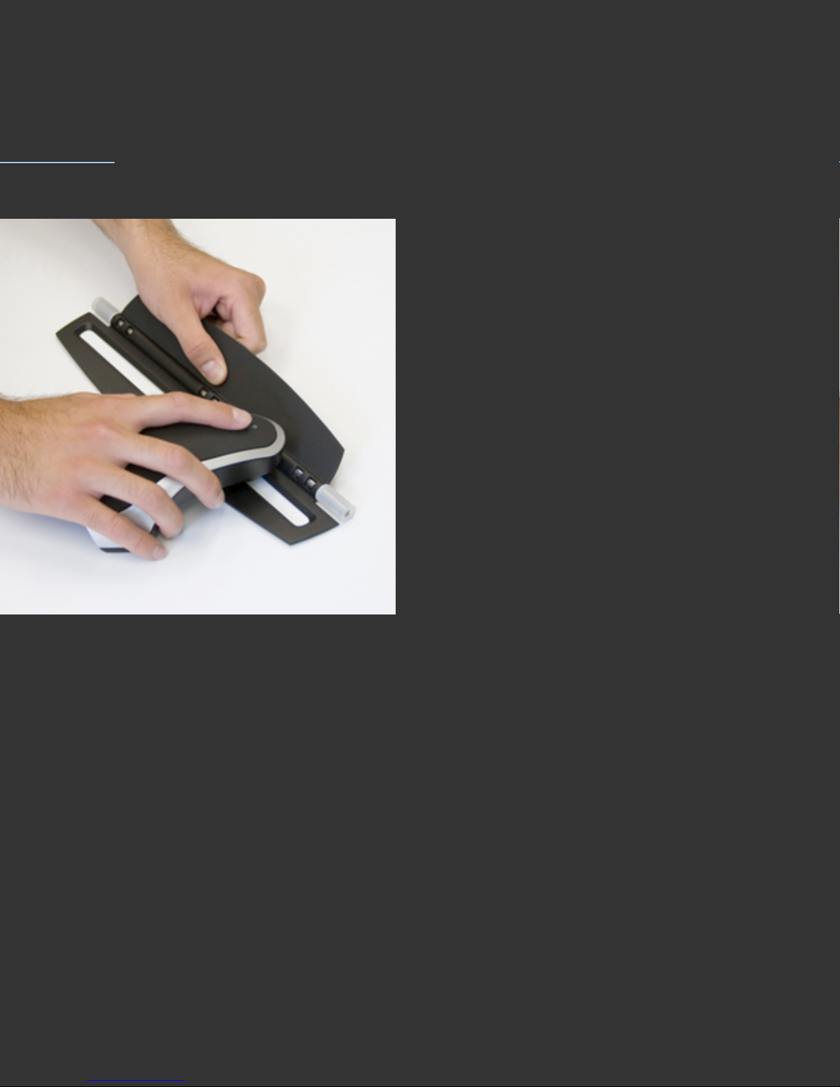
Print Guide Rule
Skip to:
Help Index
Usual Setting
Many users will find it faster to read patches freehand. But for those who prefer
assistance in keeping the patch reader in line vertically, the included Print Guide Rule
can be used.
The Purpose of This Step
To offer assistance for those who find freehand patchreading difficult or tiring.
The Long Answer
Many users will find it faster to read patches freehand. But for those who prefer
assistance in keeping the patch reader in line vertically, the included Print Guide Rule
will allow the users to focus on moving from patch to patch horizontally, while being
sure that the patch reader is correctly located vertically. The Rule can be rolled from
Page 6

row to row while retaining its orientation.
Further Information
For information such as a list of Frequently Asked Questions and details on all
Datacolor products be sure to visit our website:
http://www.datacolor.com/Spyder3
Page 7
Preferences
Skip to:
Help Index
Sensor
Communication Errors
Sensor Info
Sounds
Usual Setting
Preferences are located in the Spyder3Print menu. Default Preferences are ideal for
most users.
The Purpose of This Step
Preferences allows access to user configurable settings and special functions.
The Long Answer
Sensor: This popdown list allows you to toggle between two settings : Spectro, and
None. Choosing the None setting disconnects the Spectro from the application.
Choosing Spectro searches for and connects to the Spectro. Be sure the Spectro is
connected to a powered USB hub or directly to your computer to assure it will be
found, and will function properly. Do not connect the Spectro to your keyboard or
monitor, and theses are not fully powered locations. Some computers have front USB
ports that are not powered ports, so if your Specto fails to function from a front port,
connect to a powered hub or back port.
Communication Errors: If a communication error occurs and the Spectro is no
longer responding to commands, toggling to None, and back to Spectro should
Page 8

reestablish communication. After regaining communication with the Spectro, it may be
necessary to close the open measurement window, and reopen it from the saved
measurement files list to complete readings.
Sensor Info: The Sensor Information section displays Unit ID and Firmware version
information, which is useful if it is necessary to discuss hardware problems with
Datacolor Support. If the Spectro is not successfully connected to the software, these
lines display ???? instead of Hardware and Firmware informaton. It is not possible to
communicate with the Spectro while ???? values are displayed in this section.
Sounds: It is recommended that all three sounds options be checkmarked, to give
useful auditory prompts while using Spyder3Print. Individual users may have personal
preferences to turn one or more of these sound prompts off.
Further Information
For information such as a list of Frequently Asked Questions and details on all
Datacolor products be sure to visit our website:
http://www.datacolor.com/Spyder3
Page 9
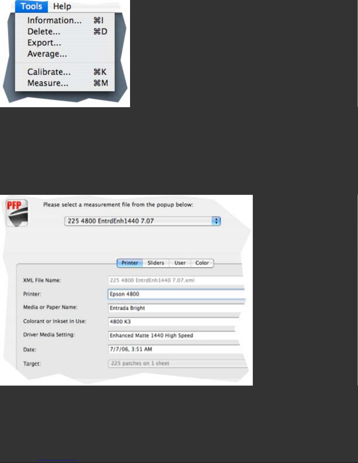
Tools
Skip to:
Help Index
Measurement File Information
Deleting Measurement Files
Exporting from Measurement Files
Averaging Existing Measurement Files
Calibrating the Spectro from the Tools menu
Taking Spot Measurements from the Tools menu
Exporting Measurement Logs
Usual Setting
Typical profile building occurs from the Wizard interface. The Tools menu is not
needed for standard profile building.
The Purpose of This Step
The Tools menu is used to access the specialty functions described below.
The Long Answer
Each Tools menu command and its uses are described below.
Page 10
Measurement File Information: Users can determine printer, ink, paper, media
setting and other important information about a Measurement File by selecting it with
the Information tool. It is possible to copy, paste, and manually edit much of the
device information using one or more Information Windows, and to save the adjusted
versions under a new new using the Save As command.
Deleting Measurement Files: Existing Measurement files (as found in the Existing
Measurements Popdown list in the Read Patches screen) can be deleted from the Tools
menu Delete command. If you have incomplete, invalid, or unneeded measurement
sets, deleting them from the list will simplify finding sets as you need them.
Page 11
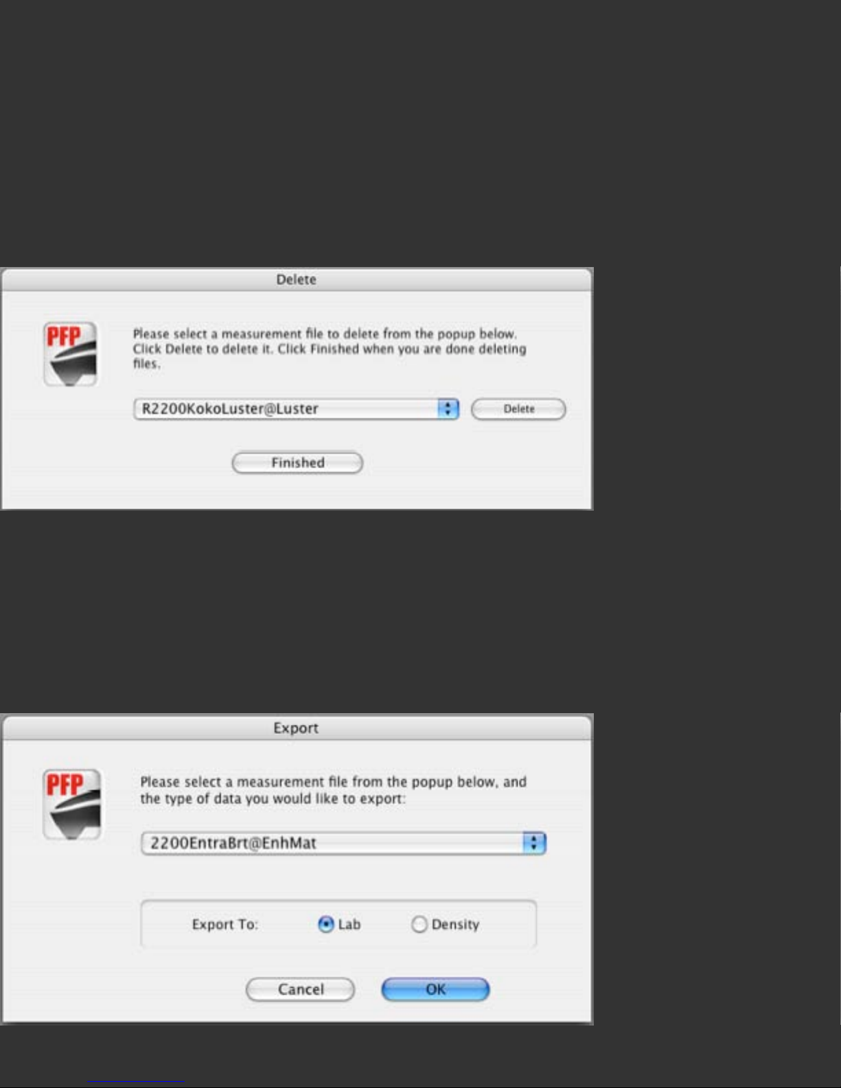
To delete a measurement set, choose the Delete command from the Tools menu. This
will open a floating window containing a popup menu listing all existing Spyder3Print
measurement sets currently in your Print Data folder. Choose the measurement set
you wish it delete, and click on the Delete button. A warning dialog asking if you are
sure you wish to delete this file will appear. A check box in this warning dialog allows
you to choose not to see this warning again, making deletion of multiple files faster.
Once you are finished deleting measurement sets, the Finish button allows you to exit
the Delete screen.
Exporting Measurements for Other Uses: If you have uses for measurement data
outside Spyder3Print, the Export command allows you to save out this information as
text files. Select Export from the Tools menu, and choose the existing Measurement
file from which you wish to export data, in the popup list the Export window provides.
Data can be exported in two forms: L*a*b* values, or Density values.
L*a*b* Export: L*a*b* values are the color measurements contained in the
Page 12
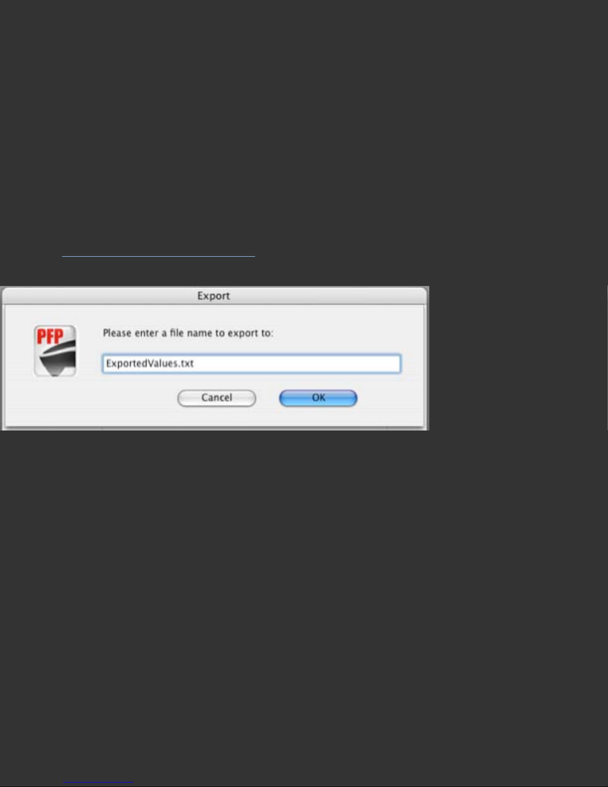
Measurement file, converted to a tab delineated text file, that will be written to the
Export subfolder in the application’s Data folder. After choosing the Lab radio button,
and then clicking the OK button, a second dialog will appear asking you to name your
new text file.
Density Export: Some uses require grayscale density values, instead of Lab values.
By selecting the Density radio button, visual density values suitable for certain
grayscale linearization and calibration purposes can be produced. Clicking the OK
button will bring up a second dialog asking you to name your new text file.
Other Export Formats: Other export formats are available by Creating Export Logs
with the
Spectro Measurements tool.
Averaging Existing Measurement Files: The Average command allows you to
produce a new measurement file containing averaged values for each measurement in
the two source files selected. This can be useful for smoothing out readings through
averaging two or more sets of files from the same target.
Select the first file you wish to average in the upper popup list. This will show all files
of the same format in the lower popup list. Only measurement sets with the same
number of measurements can be averaged. Once two compatible files have been
chosen, the OK button will become active, and you can name and save your averaged
measurement set. It will be saved to the PRO folder in the Data folder, and can be
used to build profiles like any other measurement file. To average four measurement
sets, first average two pair, then average the two resulting files.
Page 13
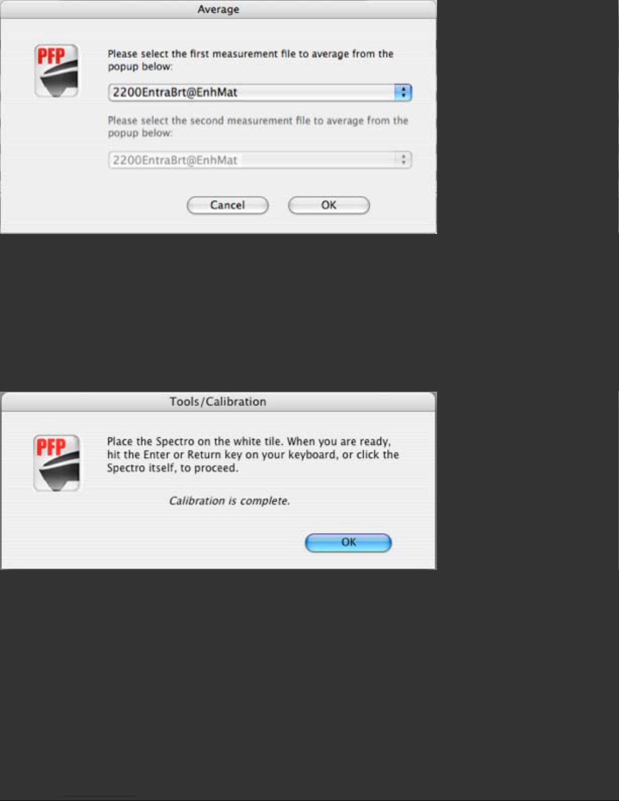
Tools Calibrate function: This button launches a calibration window that allows both
black and white tile calibrations. It is not necessary for standard use; the calibration
function occuring in the Wizard interface is all that is needed. Calibration from the
Tools menu is a for special testing and support purposes, or for calibration when using
the Tools Measure function.
Tools Measure function: This button launches a measure window that allows
measurements to be taken, and displays L*a*b* color values and Visual Density
values of for each patch after it is read. If a log of meaurements is desired, it can be
named, and exported as Lab, Visual Density, or special QTR linearization and QTR
CreateICC formats for use with QuadTone RIP®. Once the user completes the
measurement set, the Done button stops the export process, and closes the Measure
window.
Page 14

Further Information
For information such as a list of Frequently Asked Questions and details on all
Datacolor products be sure to visit our website:
http://www.datacolor.com/Spyder3
Page 15

Printer Definition
Help Index
Entering Information about Your Printer
Save Template
Skip to Profiling Process
Usual Setting
Type in Printer, Paper, and Inkset names, then select the Next Button
The Purpose of This Step
This screen allows you to define the type of printer you will be profiling, and to enter
information about it that will be used throughout the process. This information is only
for labeling your target prints, it does not affect profile building.
The Long Answer
Entering Information about Your Printer
Printer Name: Enter the printer make and model number here.
Media or Paper Name: Enter the name of the paper or media you will be profiling
here.
Colorant or Inkset in Use: Enter the name of the inkset or colorants you will be
using here.
Driver Media Setting (Paper Type Selection): Enter the media setting you will be
selecting in the printer driver here, or leave blank, and determine this later, at the
Media Setting step.
Date: Leave the automatic date information here, unless you have a special need to
adjust it.
Page 16

Save Template
This option allows users to batch process profiles. Set printer data as desired, choose
Save Template, name your Measurement Set, and select the desired Target. Repeat to
define other Measurement Sets. Printed targets with accurate information from these
batch-created templates can be printed by choosing the template in the lower half of
the Measure Patches screen, backing up one screen to the Select Target screen, and
printing. Repeating this process will print all the desired targets with the correct
printer info on each.
Skip to Profiling Process
If you do not need assistance checking that your printer is properly configured, and
that all inks or colorants are printing as desired, or assistance in determining the
optimal media setting for your chosen paper, then use this button to skip ahead to the
profiling process. We do recommend that you run through the process in its entirety at
least the first time you profile so that you have a complete understanding of the
program.
Further Information
For information such as a list of Frequently Asked Questions and details on all
Datacolor products be sure to visit our website:
http://www.datacolor.com/Spyder3
Page 17
Configure Printer Settings
Help Index
Print Settings in Spyder3Print
Printer Driver Settings
Epson Driver Settings
Canon Driver Settings
HP Driver Settings
Windows Specific Settings
Print Settings in Adobe PhotoShop
Print Settings in Adobe PhotoShop Elements
Settings in Other Applications
Usual Setting
Please use the same printer driver settings when printing profiling charts as when
printing final work, to assure maximum consistency and accuracy in profile usage. It is
also important to turn off color management at the printer driver to assure that profile
targets, as well as final prints, are not effected by driver color adjustments being
unintentionally added to the print process.
The Purpose of This Step
Using optimal and consistent printer settings is important to obtaining high quality,
consistent prints. Avoiding unintended driver color adjustments is necessary for
accurate color management.
The Long Answer
It is important to become familiar with the printer settings available for your printer,
and choose settings that work well with the types of media you use, for the types of
work that you print.
Some printers, such as color lasers, have few if any user configurable settings, so no
Page 18

choices are necessary. For printers with a wide range of choices, you will need to
experiment to determine which settings will be most effective for you. Use these
settings when printing profile charts, and continue to use them when printing with the
profiles you create. If you are not thoroughly familiar with your driver settings, it is a
good idea to note the settings, or make screenshots of them, for future reference, so
that you can be consistent in what settings you use.
It is a good idea to experiment with the driver options, and see what results they offer
with the type of papers you intend to print on and the type of files you print, in order
to assure that you obtain the best possible results.
Print Settings in Spyder3Print
Spyder3Print will automatically print your color charts without applying any
unintended color adjustments to them. The only configurations necessary, when
printing directly from Spyder3Print, are the printer driver settings. These driver
settings are very important. Review the driver settings section below to be sure you
are properly configuring them. Please note that driver settings must be set from the
Print command menus, unless they are saved in advance into a driver configuration
set. Always check your driver settings at time of printing, to be sure they have not
defaulted to unintended settings.
To print Spyder3Print color targets from remote printers, it is recommended that you
install Spyder3Print on the computer attached to the printer, and run the application in
Demo mode to check printer settings and print color targets.
Printer Driver Settings
Following the main print window, in Spyder3Print as well as other applications, there
are Printer Driver Settings windows. These vary with different brands and models of
printers. Typically there are resolution and quality related settings that the user must
test to determine appropriate choices. There are also color adjustments settings. For
working with custom ICC printer profiles, it is usually best to set these choices to Off
or None to allow the profile to do the color correction for you, without competition
from any driver color adjustments.
Page 19
Some typical drivers and settings will be shown here to give you an idea of where to
find the necessary items, and how to set them. Please note that these driver settings
vary between brands and models of printers, as well as between operating system
versions, so it is not possible to cover all possible examples.
This illustration is from a typical Epson inkjet driver under one version of Mac OS X.
Other drivers and OS versions will vary. There are two sections in the pop-down menu
that are important for color managed printing: Printer Settings, and Printer Color
Management. ColorSync might seem as though it would contain color management
settings, but it does not.
Page 20
This close-up from the above Epson driver window shows that the Print Settings
section included the Media Type list. This list is where choices of media type settings
occur, and is important for use with the Media Setting Check window.
This close-up from the above Epson driver window shows that the Printer Color
Management section included the option for disabling color corrections by the printer,
by choosing ‘Off (No Color Adjustment)’. This, or some similarly named setting, is
available in many inkjet drivers to perform this function.
This driver from a less complex Epson inkjet printer contains no Printer Color
Management section at all. In this case, users would use the standard color setting the
driver provided, and build their profiles on top of that color setting.
Page 21
This illustration of the Print Settings from the simple driver shows that the only choice
that would effect print color is the selection of ‘Color’ or ‘Black & White’ settings.
Please note that with many printers, using the ‘Color’ setting and a custom color
profile may produce more desirable Black & White prints than the Black & White
setting.
This is an illustration of a Canon inkjet driver under OS X. Similar to the more
advanced Epson driver above, there are two menu items that effect color
management: ‘Quality and Media’, and ‘Color Options’. While the names vary a bit
from the Epson versions, the functions are similar.
Page 22
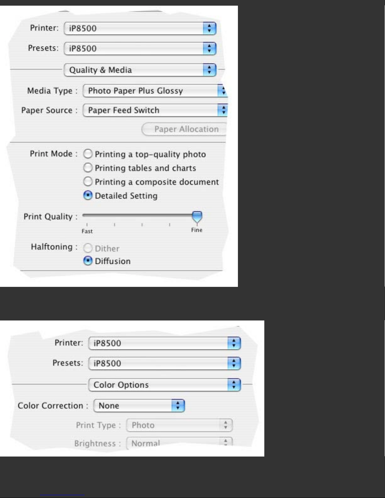
The ‘Quality and Media’ section of the driver contains the Media Settings, where paper
type would be chosen, and where Media Setting Checks would be performed.
Printer Color Management is turned off in the ‘Color Options’ section of the driver, by
choosing ‘None’. This is important both for printing color targets, and when printing
images through the resulting color profiles; interference from color adjustments at the
Page 23
printer driver level must be avoided.
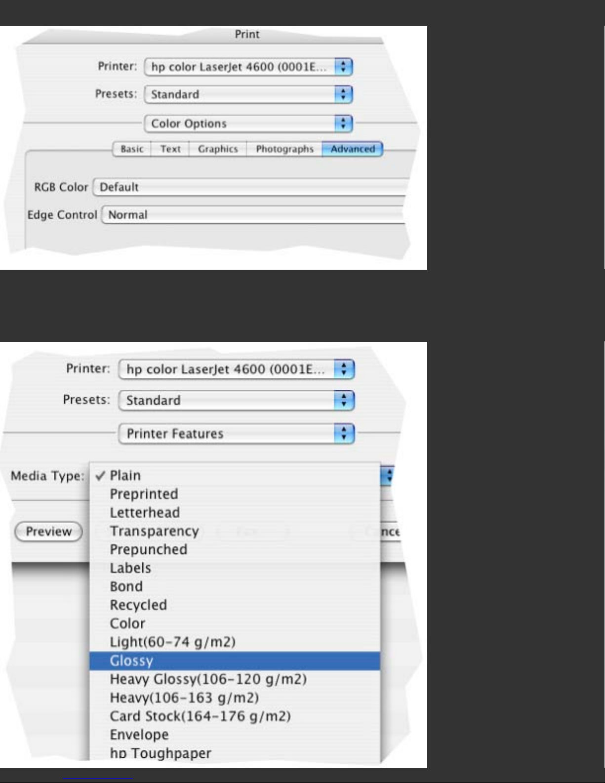
The HP Laserprinter driver shown above is typical of many laser drivers. It shows a
number of color options under different headings, but none of them are actually
configurable, so none need to be reviewed or set before printing.
Page 24
The only user selectable item in the above HP driver is media type, with a selection of
media that HP considers appropriate for laser printer uses. Users would want to
experiment with a range of these media types, to determine which one might be
optimal for the media in use. For laser printers, different media settings may effect
feeding of paper thicknesses more than they effect color densities.
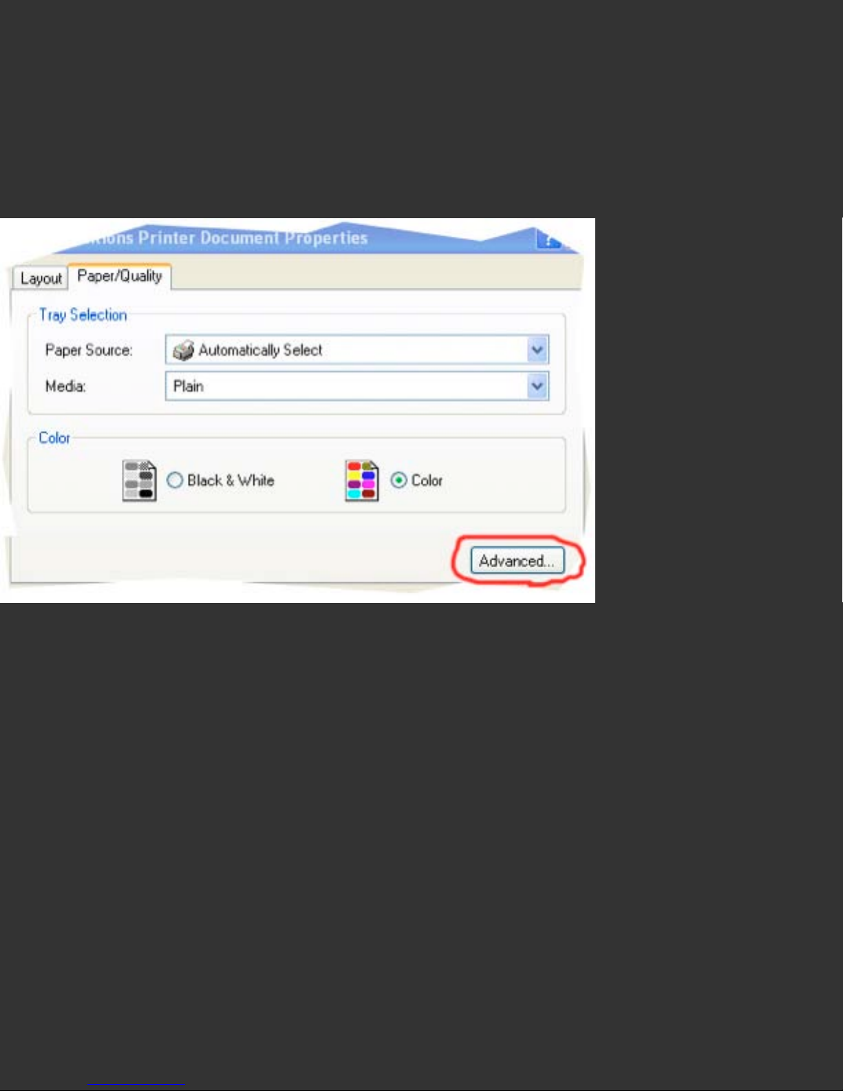
Windows driver settings can be in a somewhat different driver location.
They occur in the ‘Advanced Printer Options’, accessed from the ‘Advanced’ button in
the main printer driver window. Under Windows Vista printers options are no longer
configured from Page Setup, but from Print, similar to how it works on the Mac.
Page 25
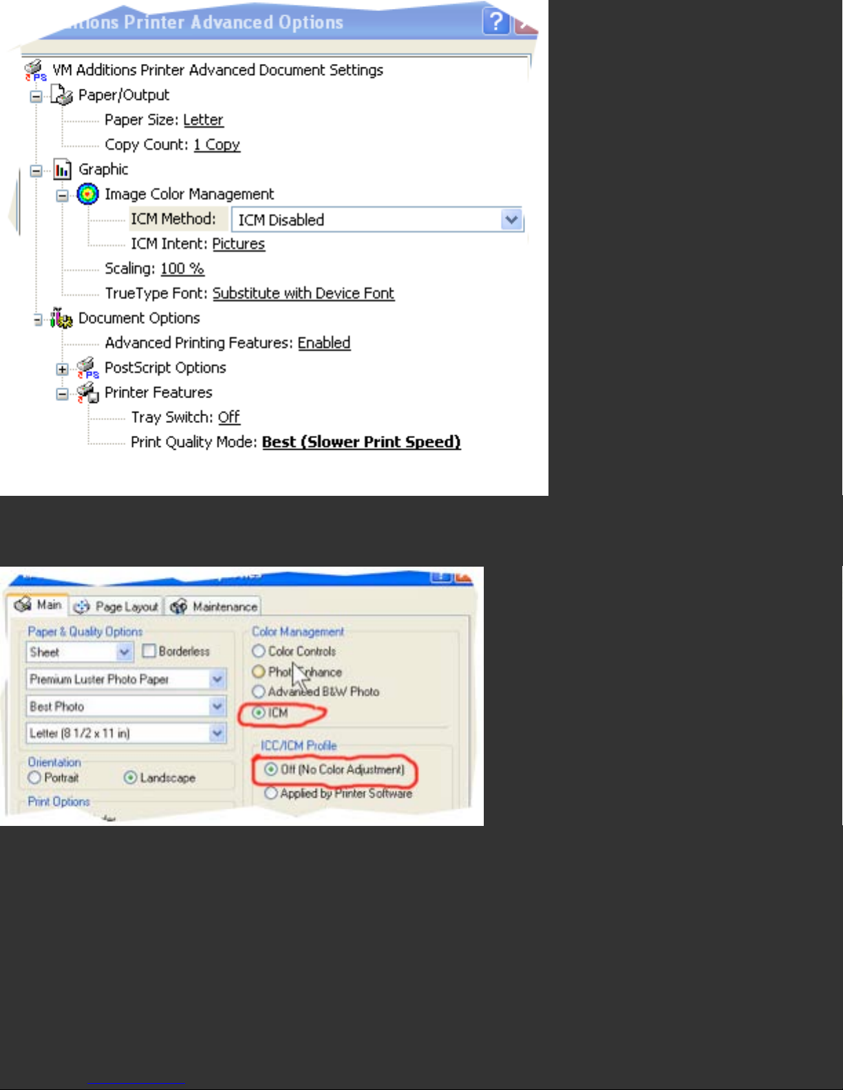
In this XP Advanced Printer Options Window ICM has been disabled.
Here is another XP driver with ICM selected, so that Driver Color Adjustment can be
turned Off. In most cases choosing ‘No Color Management’ or ‘ICM Disabled’; or in
some cases choosing ‘ICM’, then a subsetting of ‘None’ or ‘Off’ will assure that no
unintended color conversions occur.
Advanced Topic: Print Settings in Adobe PhotoShop®
When printing from Photoshop, always use the Print with Preview command, and
choose Show More Options’ at the bottom of the main print page, then Color
Page 26
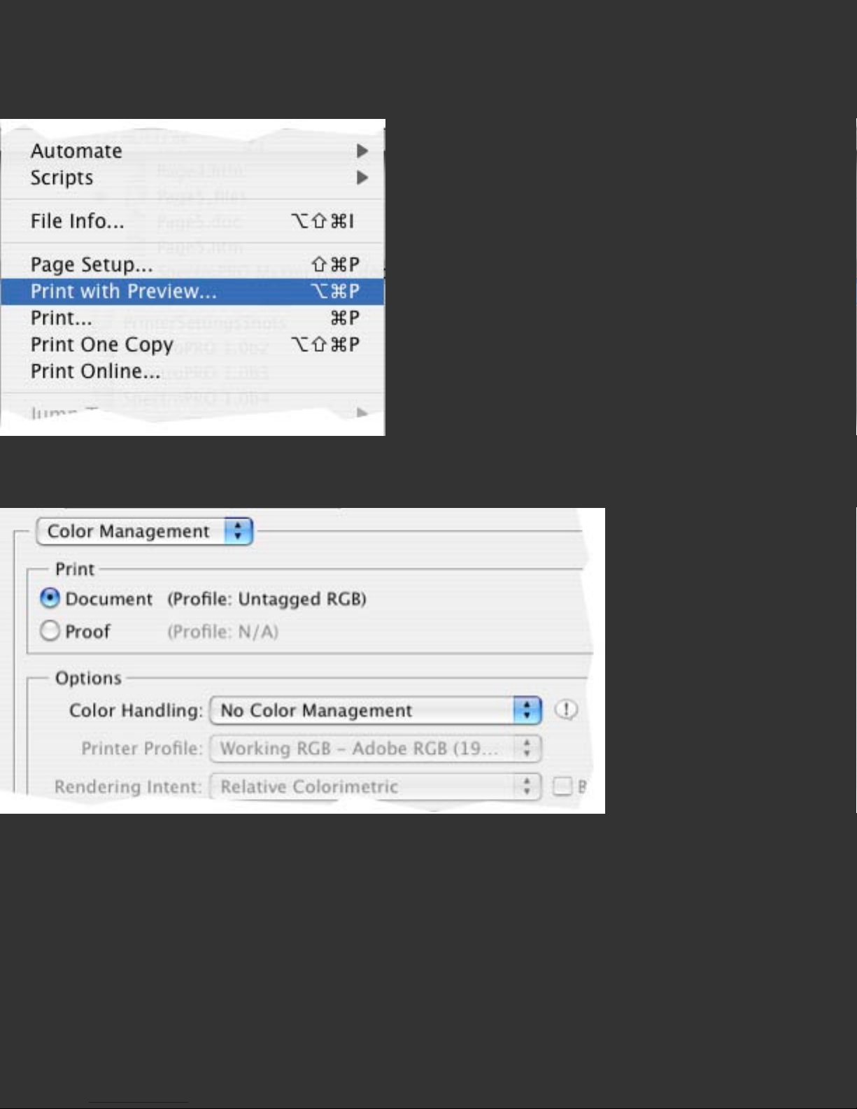
Management’ in the pop-down list that appears. Color Profiling Charts should be
printed with the Source Space set to Document, and Color Handling set to No Color
Management; or prior to CS2 set the Print Space to Same as Source which is at the
top of the popdown list.
Photoshop’s Print with Preview Command (Simplified to Print Command in CS3)
Photoshop Color Management settings as they would be set to print a color profiling
target.
Page 27
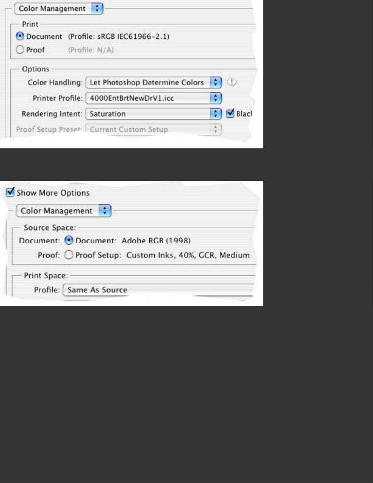
PhotoshopCS2’s Color Management Settings, as they would be set to print images (not
profiling targets) through a custom profile.
These are typical of settings used in previous versions of Photoshop to print profiling
targets without unintended color conversions.
Advanced Topic: Print Settings in Adobe PhotoShop Elements®
When printing from Photoshop Elements, set the Color Settings (found under the
Photoshop Elements Menu item) to Full Color Management.
Page 28
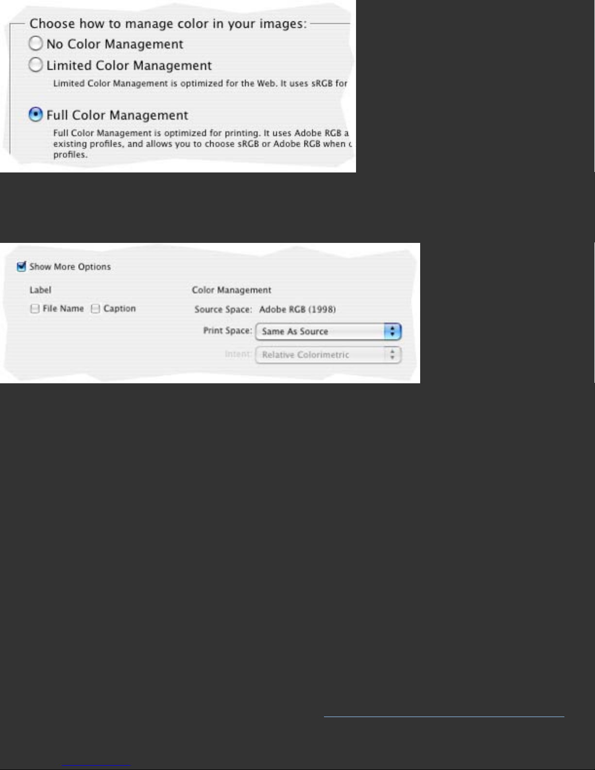
To print from Elements use the Print command, and choose Show More Options at the
bottom of the main print page, then under Color Management set the Print Space to
Same as Source when printing a profiling target.
Advanced Topic: Settings in Other Applications
Color managed applications offer some type of setting for choosing an output or
printer profile. This is where you will choose your custom profile, once it is built. But if
you need to print a Color Profiling Chart from such an application, it is important to set
the printer profile choice to Same as Source or None in order to avoid printing the
chart through a preexisting profile, which will invalidate the profiling process. Please
note that non-color managed applications, ones that do not offer a printer profile
choice when printing, cannot be used directly with ICC printer profiles. If you use such
an application, consider alternative applications that offer color management, at least
for your printing needs. Adobe Photoshop Elements® (Mac and Windows) or ACD
PhotoCanvas® are examples of low cost applications that offer simple color
management.
Further Information
For information such as a list of Frequently Asked Questions and details on all
Datacolor products be sure to visit our website: http://www.datacolor.com/Spyder3
Page 29

Print Quality Check
Skip to:
Help Index
Print Quadrant Function
Spotting Missing Ink Channels
Usual Setting
Print the Quality Check Print, examine for problems, then select the Next Button to
continue.
The Purpose of This Step
This screen allows you to print a Quality Check Print to assure that your printer is
printing correctly before printing a Color Profiling Chart. If your printer is not printing
properly, then the resulting profile will not correctly describe your printer.
The Long Answer
Print Quadrant Function: You can print up to four different Quality Checks on a
single Letter or A4 sheet by selecting different quadrant settings for each, and
reinserting the same sheet of paper, the same side up, and in the same orientation,
for each Quality Check print. The preview image on the right side of the window
indicates which quadrant the Quality Check image will be printed in.
Page Setup: Spyder3Print is designed to be used in Landscape (Horizontal) mode, so
it is recommended that you use it in that orientation. It is optimized for Letter or A4
paper, so it is most effective to print your media setting check prints on these sheet
sizes.
Examine the Quality Check Print for areas with skipped lines or poor print quality. If
such areas are evident, then use your printer’s cleaning command to clear up the
problem before continuing. If repeated clean commands (and rest periods after each
set of three cleaning commands) do not correct the problem, let the printer rest
Page 30

overnight (which may improve output) and try again the next day. If issues persist,try
replacing the ink or colorant supply, which may correct the problem. If, after repeated
cleaning and replacement attempts, the printer still is not producing clean, smooth,
output on a reasonable paper, then it may be necessary to contact the printer
manufacturer for further assistance. Please keep in mind that profiling a substandard
printer is not a solution to any color issues the problems may cause.
Quality Check Print with Misfiring Jets.
In this case the problem is in the Magenta ink channel, either with both Light and Dark
Magenta inks, or in the Magenta channel of a printer that does not use Light Magenta
ink. Most printers do not use Red ink, and it would be the Magenta channel that would
be causing the problems in the Red ramp. In those few printers that do use Red ink,
many colors in the Red range continue to be blended from Magenta and Yellow ink,
with few shades of Red being printed from the Red ink cartridge.
Page 31

Spotting Missing Ink Channels
Not all problems show as skips or uneven print areas. In some cases an entire ink or
toner color is missing, resulting in smooth, even Quality Check Prints, but not proper
image colors. Compare your Check Print to the image below to assure all colors are
printing. Keep in mind that not all printers’ inks are the same color. If your red is a bit
orange, or your blue a bit purple, that does not mean there is a problem, unless there
are missing colors somewhere else in the check image. Below is an example of a
correct Quality Check Print, followed by examples of problem prints.
Color Order: From left to right the diagram contains: Red, Green, Blue, Cyan,
Magenta, Yellow, and Black. Please note that the color called Red is usually a blend of
full Magenta and Full Yellow, and may not be precisely Red in tone, while the color
called Blue is usually comprised of full Cyan and full Magenta, and often appears more
purple than blue. The Black ramp will show whatever black generation method your
printer driver uses, so many of the patches in the gray areas of the black ramp will be
printed using combinations of colors other than the black colorant.
Page 32

Correct Quality Check Print, No Skips, No Missing Ink Colors
The image above illustrates the type of result you would see with the Light Magenta
ink empty or not printing. Note that only part of the Magenta ramp is blank, and that
the color of other (secondary) ramps is also effected.
Page 33

The image above illustrates the type of result you would see with the Dark Cyan ink
empty or not printing. Note that it effects far less of the print than a Light Ink failure.
It is important to look at the color initials at the top of the Check Print and be sure
that they match the colors printed below them; here they do not.
Page 34

The image above illustrates the type of result you would see with the Black ink empty
or not printing. Note that it effects far less of the print than either a Light or Dark Ink
failure. Printer problems with Light Black inks can be difficult to detect. Pay particular
attention to the ‘K’ ramp, to see that it gradates properly.
Page 35

The image above illustrates the type of result you would see if the jets were misfiring,
and printing color in areas that should be white. While it is worth attempting to clean a
printer that is showing such symptoms, it is likely that you will need to replace the
printheads. For many HP printers, the heads are part of the cartridge, and replacing
the cart will replace the problem jets, eliminating the issue. For many Canon inkjets
(and some HPs), the heads are separate, user replaceable components, and
purchasing replacement heads will eliminate the problem. For Epson inkjets, the heads
are not a user replaceable part, and it will be necessary to contact Epson customer
support.
Further Information
For information such as a list of Frequently Asked Questions and details on all
Datacolor products be sure to visit our website:
http://www.datacolor.com/Spyder3
Page 36

Media Setting Check
Skip to:
Help Index
What Media Settings Do
Print Quadrant Function
Media Setting Finalization
Color Density Sliders
Analyzing Media Setting Check Prints
Analyzing Photo-Content
Usual Setting
Print a series of Check Prints, four to a page, at varying media settings, including ones
with unrelated names, and review to see which offers the optimal output. Then use
this optimal setting when building and using your profile.
The Purpose of This Step
This screen allows users to print Media Setting Check Prints at different driver media
settings (paper type selections) to assure that the media setting choice is optimal
before profiling the printer. If the choice is not optimal, then the resulting profile will
not have the color range or detail it would have from an optimal setting.
The Long Answer
The optimal media setting for profiling and printing on a particular paper may not be
the media setting with the most likely name. It is worth testing a range of media
settings to determine which one will actually perform best with your combination of
settings, colorants, and media.
The Media Setting Check Print shows the entire color universe of your printer, colorant
and media combination, in nine slices of nine steps by nine steps. You can print this
image at different driver media (paper type) settings to assist you in determining
which is most suitable for your combination of printer, colorant, paper, and settings.
Page 37

Photographic content is included at the bottom of the Check Print to assist in
determining the photographic qualities of differing media settings
What Media Settings Do: Different media settings will lay down different densities of
ink in the various sections of the check print, and offer varying degrees of linearity
(consistancy) in the steps between adjacent patches. Printers which offer smoother,
more linear, gradients in the check print require fewer patches in the final profiling
target. Printers with significant local variations require more patches to profile
effectively.
Page Setup: This application is designed to be used in Landscape (Horizontal) mode,
so it is recommended that you use it in that orientation. It is optimized for Letter or A4
paper, so it is most effective to print your media setting check prints on these sheet
sizes.
Print: This button allows you to print the Media Setting Check Print in the currently
selected location, with the current Media Setting Notes listed below it. Please be sure
that the Media Setting name you have typed into the Media Setting box is the same as
the setting you select in the print driver. If it is not, cancel the print, return to the
Media Settings Check window, retype the correct Media Setting name, and choose
Print again.
Print Quadrant Function: You can print up to four different media settings on a
single Letter or A4 sheet by selecting different quadrant settings for each, and
reinserting the same sheet of paper, the same side up, and in the same orientation,
for each Media Setting Check print. The preview image on the right side of the window
indicates which quadrant the Media Setting Check image will be printed in. Be sure to
label each quadrant print with the correct media setting in the Media Setting box
before printing, so that you will know what media setting each quadrant represents.
Page 38

Letter size page with four Media Setting Check Prints on one sheet.
Media Setting Finalization: After determining the optimal media setting from those
tested, be sure to type that optimal setting name into the Media Setting box before
continuing, so that this information will be included on your Profiling Target. Then use
this media setting both when printing your profiling target, and when using your
custom profile.
Color Density Sliders: Some recent inkjet printers offer a color density slider that
can be used to adjust the overall density of ink; however these printers also have
excellent default ink densities for most media types, so it is not usually necessary to
adjust the slider to achieve good media setting results. Not adjusting the slider has
the added advantage of not requiring the user to remember what slider settings were
used for each paper profile. Most driver adjustments, excepting color density sliders,
are disabled when setting printers to the No Color Adjustment setting used with
custom profiles.
Advanced Topic: Analyzing Media Setting Check Prints
Overall, the goal is even, smooth gradients in all directions without undue breaks or
indistinguishable steps. The areas that deserve the most attention when reviewing a
Check Print are the gradations to black, the primary and secondary colors, and inking
Page 39

issues. Its important to keep in mind that lower quality papers often exhibit problems
in the areas described, and that for some paper, printer and ink combinations these
issues cannot be eliminated, only minimized. On better papers, there may be multiple
media settings that offer acceptable results. So consider your media setting tests a
check of whether you wish to use a particular paper with your printer, as well as what
setting to use when profiling it and printing through your custom profile.
Black Generation: check how your printer, colorant and media combination work with
the particular media setting to create near black tones. Patches near the black patch
in the upper left hand corner, and in the nearby planes may vary with different media
settings.
Near Black Patch Locations
Compare a range of likely media settings. Look for the following elements:
• A smooth gradation to black, this is ideal.
• Avoid settings that print too many near black patches, blocking up entire groups of
patches.
Page 40

Clogged Near Blacks
• Avoid settings that have a lack of near black patches, jumping directlyto medium
grays from black.
Weak Near Blacks
• Avoid settings that have excessively off-color near black patches, often occurring in
the third section. This is not as significant as other Black issues, but should be
considered.
Off - Color Near Blacks
• Look for a good color range in the patches leading into the Black Generation areas,
without any unexpected color shifts.
Primaries: check how your printer, colorant and media combination work with the
particular media setting to create near primary colors. The primary and secondary
colors, circled in these images, may vary with different media settings.
Page 41

Green, Cyan, and Blue Primaries occur in the same section as Black
Yellow, Red, and Magenta Primaries occur in the same section as White
Page 42

Comparing Settings: Compare a range of media settings. Look for the following
elements:
• Bright primary colors, without overinking
• Good color range and brightness in other colors in the image
• Good gradation from Primary colors into the rest of the color space.
This image shows a good gradation from Blue to Black, with distinct patches
throughout.
This image shows a problematic gradient from Blue to Black, with excess inking, which
causes several of the patches to print full Blue, with no visible steps. A media setting
that causes results such as this is best avoided, even though it offers bright primaries.
Page 43

This image shows a problematic gradient between blue and green, which results in a
visible stairstep pattern. This type of break is not as undesirable as overinked
primaries, but should be avoided if possible.
Inking issues: There are a range of possible inking issues that a particular
combination of printer, colorant and media may cause. Inking issues assume that you
are using an ink-based printer, though excess colorant and other related issues are
also possible with other printer types. Look for the following signs:
• Overinking most commonly shows as lack of patch distinction, as shown above, but
also results in many of the other problems noted below.
• Bleeding of inks outside their patch boundaries, blurring one patch to another, or
bleeding into the white surround.
Page 44

Here the blue areas have bled both between patches, and beyond the edge of the
chart.
• Mottling of inks within patches, showing grainy, uneven areas where the ink is
heaviest, often where two or more colors are mixed at high ink levels.
The above illustration shows what mottling might look like if it occurred where Dark
Page 45

Cyan, Yellow, and Black inks were all being used to create deep greens.
• Worming may look similar to mottling, but it occurs within the dither pattern of the
printer. Larger, often worm-like, shapes may occur in the printer’s dithering pattern in
certain flat color patches. This is a function of the printer’s dithering algorithm, and
while it may appear that profiles improve or worsen worming, they really only move it
from one place to another. If the place they move it to is not part of the test image, it
may appear to have been eliminated, but a different set of flat color patches could
make it reappear. Worming effects only flat color areas, so typically does not cause
problems in photographic images, unless flat areas such as clear skies display the
problem. Again: dithering based issues cannot be caused or cured by profiling, or even
printer settings, unless you are using a driver that offers multiple dithering choices, in
which case testing the dithering options may produce a choice that minimizes this
problem.
Worming artifacts in a printer’s dithering patterns.
• Bronzing is an effect that can be caused by excess ink in the near blacks. Bronzing
shows as a difference in color tone between black and near black areas of a print when
viewed at an angle to the light source, often showing a bronze sheen. In some cases
the only solution to bronzing is choosing a different paper or inkset, in other cases, a
lighter inking media setting can improve results.
Page 46

• Gloss Differential is similar in nature to bronzing, but occurs in the lighter areas of
prints. It is a difference in the glossiness of uninked paper and adjacent inked areas. It
is only an issue with Gloss and Luster surfaces. A few printer models offer a gloss
optimizer option, which applies an unpigmented ink to blank areas to reduce gloss
differential. Other recent printers utilize high gloss inks which also minimize the
difference in gloss between printed and unprinted areas. Gloss differential cannot be
controlled through choice of media settings, nor through using ICC profiles. If your
gloss and luster prints exhibit gloss differential, and you find it undesirable, then
consider changing papers, inks, or printers to find a more acceptable result, or spray
your prints with a quality archival fixative overspray after printing. This reduces gloss
differential, while at the same time providing increased water resistance, and in most
cases longer print life.
Analyzing Photo-Content
The photo content in the Media Setting Check Print allows for checking how well a
media setting’s gradiations and densities represent photographic content. A color cast
is not important here, as that can be corrected with the profiling process, but
problems with blown out hightlights, overinked dark areas, or posterization (visible
steps where none should be present) are more difficult for a profile to compensate for.
The above image shows good photo content.
Page 47

This version of the photo content shows blown out highlights.
This version of the photo content shows clogged shadows.
This version of the photo content shows posterization.
Further Information
For information such as a list of Frequently Asked Questions and details on all
Datacolor products be sure to visit our website:
http://www.datacolor.com/Spyder3
Page 48

Select Target
Skip to:
Help Index
Selecting a Profiling Target
Extended Grays Target
Changing Target Text
Target Drying
Usual Setting
The 150 patch Fast Target is recommended for first time users. Users looking for more
exacting results will prefer the 225 patch High Quality Target, which prints on the
same size sheet, and takes only an extra minute to read. Users planning to print Black
and White as well as Color images will want to augment their Color target with the
Extended Grays target. Please be sure you printed target is dry before measuring. For
more information see
Target Drying below.
The Purpose of This Step
This screen allows you to choose, preview, and print a Profiling Target for use in
building a custom printer profile.
The Long Answer
This step allows you to choose one of several printer profiling targets, preview what
that target will look like printed at your current Page Setup settings, adjust if
necessary, and print the target on the paper you wish to custom profile.
Page Setup: Spyder3Print is designed for landscape mode, so it is recommended that
you use it in that orientation. It is optimized for Letter or A4 paper, so it is most
effective to print your Profiling Targets on these sheet sizes, unless you are using the
Large Expert Target, which is designed for larger sheets and rolls.
Page 49

Selecting a Profiling Target
Initial Testing: When first becoming familiar with using Spyder3Print, it will save
considerable time, effort, paper, and colorant, if practice profiles are built at the 150
patch or 225 patch settings.
Which target for which uses? Most newer inkjet printers are quite linear, and offer
similar results at all three target resolutions. Minor improvements can sometimes be
seen in the more difficult near black areas with the 225 patch target over 150 patch
results.
Older, less linear inkjets, as well as many color lasers and dye subs, may profit by
additional patches. For these printers, comparing results from a 225 patch target to
those of a 729 patch target built for the same colorants and paper will show you
whether any improvements are possible from additional patches. Once you are aware
of which target is optimal for a particular printer, you can continue to use that target
for building future profiles for that device.
The Extended Grays target can be added to any color target to build a composite color/
grayscale profile. This can improve neutrality and detail in grayscale prints, but will
only be apparent in color images with large areas of subtle grayscale content.
Changing Target Text: To change the Printer Name and Media Setting text that will
print on your target, click the back button, and insert the new information in the text
entry boxes. Then use the Next arrow to return to the Select Profile Target screen. To
change other target info, depress the Control key while clicking the back arrow, to
return in one step to the Printer Definition page, where all text lines are accessible.
The Skip to Profiling Process button will allow you to return directly to the Select
Profile Target window from this screen.
150 Patch Target: This is the standard target, and produces excellent results for
many printers and uses. It samples the entire printer gamut at a 5 x 5 x 5 matrix, plus
additional patches in the most demanding areas. This target offers larger patches on
standard size sheets, allowing the user to move more quickly between patches, further
increasing speed and accuracy. Typically this target takes less than three minutes to
measure. This target is designed for printing on Letter or A4 paper in Landscape
Page 50

orientation for best results.
Sample 150 Patch Profiling Target, formatted on Letter size Landscape oriented paper.
225 Patch Target: This is the High Quality target, and produces improved results for
difficult printers and advanced uses. It samples the entire printer gamut at a 5 x 5 x 5
matrix, plus a larger range of additional patches in the most demanding areas. This
target offers more patches on standard size sheets, allowing the user to achieve
advanced profile accuracy without extra paper and ink usage, and only about a minute
in additional reading time. This target is designed for printing on Letter or A4 paper in
Landscape orientation for best results.
Page 51

Sample 225 Patch Profiling Target, formatted on Letter size Landscape oriented paper.
729 Patch 3 Page Target: This is the Expert target formatted to print on three
sheets of standard Letter or A4 paper, and produces improved results for difficult
printers and advanced uses in areas where the 225 patch target does not include extra
patches. It samples the entire printer gamut at a 9 x 9 x 9 matrix. This target offers
more patches on standard size sheets, allowing the user to achieve advanced profile
accuracy without oversize media, but requires significantly more measuring time than
lower patch targets. This target is designed for printing on Letter or A4 paper in
Landscape orientation for best results.
Page 52

Sample 729 Patch 3 Page Profiling Target, formatted on three sheets of Letter size
Landscape oriented paper.
729 Patch 1 Page Target: This is the Expert target formatted to print on a single
sheet of larger paper, and produces identical profile results to the 729 patch 3 Page
target described above. This target is designed for printing on a single sheet of 13x19
inch, 17x22 inch, SuperA3/B, or B, or C paper in Landscape orientation for best
results. For owners of large format printers, this target offers added convenience in
printing and measuring high patch targets on a single sheet. For printing on roll
media, select one of the page sizes noted above in landscape format to configure the
target onto the roll.
Page 53

Sample 729 Patch 1 Page Profiling Target, formatted on one sheet of 17x22 inch size,
Landscape oriented paper.
Extended Grays Target: This target augments any color target with extra data in the
gray and near gray areas, for improved printing of grayscale images and gray
elements in color images. Print both a color target and the gray target, and measure
both to build a gray augmented color profile. Print on letter or A4, in landscape
orientation. Be sure to print both color and extended gray targets for use together on
the same media, at the same settings for accurate results.
Page 54

Sample Extended Grays Target, formatted for Letter size Landscape Oriented Paper.
Target Preview: Choosing any of the available targets will generate a live preview of
that target at your current page setup. This avoids accidentally formatting in a difficult
to read manner. If an inappropriate format is generated, adjust your page setup to
reflect more effective page size and orientation.
Page 55

150 Patch Target formatted for A4 Portrait Orientation. Note that the patches are tall
and narrow, which is undesirable for reading along the rows. Changing to landscape
orientation in Page Setup would correct this problem.
Full Size: This button allows the user to view an enlarged version of the formatted
target. Using the arrow keys, the RGB values of each patch can be previewed in this
larger window as well. Clicking on the small, embedded, preview will also pop-up this
enlarged view.
Page Setup: This button allows the user to change the size or orientation of the
target print, by accessing the OS level Page Setup utility for your printer. For most
targets Letter or A4 pages oriented in a Landscape mode are recommended. For the
729 Patch one page target, 13 x 19, SuperA3/B or larger sheets are necessary. For
Page 56

these larger sheets, landscape mode is still recommended.
Print Target: This button allows the user to print the selected target, at the selected
page setup and orientation, complete with target information entered in previous
steps. Please review information in the
Configure Printer Settings section to assure
that optimal printer settings are selected, and that color correction is turned off in the
driver.
Advanced Topic: Target Drying
Some devices, such as color lasers, require no target drying time before
measurement. Some inkjet printer, ink and paper combinations are immediately dry,
or offer wet colors nearly identical to their dry colors. Epson UltraChrome inks, for
example, do not color shift during drying and require no more than ten minutes wait
before profiling on most papers. Dye inksets used in a wide range of printer makes
and models do require extended drying time on some papers. The reasons for this
include color shifting, which may render a profile build shortly after printing
inaccurate, and durability, which may mean that the process of running the Spectro
over sections that are not yet dry may damage the target print. In cases where the
target print is sensitive to Spectro contact, placing a sheet of non-sticking paper over
the lower section of the target, and moving it down as the rows are measured, can
improve results.
Drying Times: Typically matte media require less drying time than luster or gloss.
Pigment inks may require less drying time than dyes. A minimum wait of ten minutes
is recommended in all cases, but particularly sensitive ink and paper combinations
may require as long as two days in humid conditions.
To determine whether drydown is a problem with a specific printer, colorant, and
media combination, measure a medium gray, a bright red, and a dark blue patch
shortly after printing, and note the L*a*b* values. Patches M3, F6, and E1 on the 150
or 225 patch targets would be effective for this purpose. Remeasure 48 hours later,
and compare the results. Variations in L*, a*, or b* of much more than one unit
denote significant drydown changes, and indicate that this media and colorant
combination should be allowed to dry before being measured.
As long as a target print has not been damaged by measuring it wet, remeasurement
Page 57

of the same printed target at a later time will produce a corrected version of the
profile. To learn how to take spot measurements, see the Tools Measure Function
section in
Preferences Help.
Further Information
For information such as a list of Frequently Asked Questions and details on all
Datacolor products be sure to visit our website: http://www.datacolor.com/Spyder3
Page 58

Spectro Calibration
Skip to:
Help Index
Calibrating to the White Tile
Spectro Connection
Connection failure
Usual Setting
Place Spectro on the calibration base, checking that the white tile is situated below the
Spectro-head, press the Spectro button on the top of the device. Wait for calibration
to be completed, and the application will auto-forward to next step.
Spectro Positioning Note: Using a proper height table and chair eases the patch
reading process. If you find your hand slipping forward on the Spectro your chair may
be too high (or your table too low). If the back of the Spectro seems too high or too
large, your chair may be too low (or your table too high).
The Purpose of This Step
This screen allows you to calibrate your Spectro, prior to taking measurements with it,
to ensure accuracy.
The Long Answer
Attach your Spectro to a USB port prior to launching this application, in order to have
it auto-connect. If the Spectro Calibration screen tells you it does not find a Spectro
attached to your computer, then please follow the directions in the
section below. If Calibration is successful, you will automatically be forwarded to the
Read Patches screen.
Calibrating to the White Tile
Place the Spectro on the white tile in the calibration base. Check that the Spectro is
Spectro Connection
Page 59

correctly located, and press the top of the Spectro, or hit the enter or return key on
the computer to trigger calibration. When the calibration process is complete, the
application will automatically move forward to the Read Patches screen. If calibration
fails, an error message will appear. Should this occur, please check your connections,
and attempt calibration again.
Spectro Connection
First check that the device is properly connected. Next go to the application’s
preferences in the menu bar…
and choose the device from the Sensor popdown list. If a Spectro is connected, but
does not register in the Sensor Information section (showing ???? instead) then toggle
from Spectro, to None, then back again to trigger another search for the Spectro.
If the device is successfully found on the USB tree, then its information will now
register in the Sensor Information section of the window. You are now connected, and
ready to calibrate the device.
Page 60

Connection failure: If the Spectro fails to connect to the application, the Sensor
Information will not register. In such cases, please check that both ends of the
Sensor’s USB cable are firmly connected. The Spectro should be attached directly to a
USB port on the computer, or to a powered hub, which is currently plugged into a
power source. Do not use an unpowerd USB port, or connect the Spectro to your
keyboard or monitor, as these ports may not provide suffient power to run the Spectro.
Mac OS X Classic Mode: Classic Mode (which allows Mac OS 9 applications to run
under OS X) captures USB devices, and sometimes does not release them for use by
OS X applications. It is recommended that you quit Classic Mode before running
Spyder3 applications. If Spyder3Print cannot find a properly connected Spectro, quit
Classic Mode, and try again.
Cable Testing: If direct connection to a computer USB port does not allow the
Spectro to communicate to the application, test with a different USB cable, to
determine if the cable is the source of the problem. The Spectro connects with a
standard USB camera cable, so most digital camera owners will have at least one such
cable available for testing.
Further Information
For information such as a list of Frequently Asked Questions and details on all
Datacolor products be sure to visit our website:
http://www.datacolor.com/Spyder3
Page 61

Read Patches
Skip to:
Help Index
New Measurement File Naming
The Patch Reading Process
Checking for Patch Reading Errors
Saving the Measurements
Existing Measurement Files
Deleting Existing Measurement Files
Extended Grays Measurement Files
Selecting Blank Templates for Printing and Measuring
Usual Setting
Users will typically name their measurement file, then choose the Read Patches
button, to read the patches of their printed target into the floating template window,
then close the floating window to continue.
Backing Note: For thin papers it is recommended to read the patches on a white
surface, or ideally to have one or more further sheets of the same paper below the
sheet being read, to assure accurate readings. Reading thin media on backings of
other colors can effect reading results. For printing on canvas that will be stretched
and framed, a black backing for patch reading may be more representative of the final
image conditions.
Spectro Positioning Note: Using a proper height table and chair eases the patch
reading process. If you find your hand slipping forward on the Spectro your chair may
be too high (or your table too low). If the back of the Spectro seems too high or too
large, your chair may be too low (or your table too high).
Target Positioning Note: It is easiest to position the target sideways on the table,
Page 62

and move the Spectro towards you when measuring patches. This uses the body’s
most controlled motion when moving from patch to patch, and allows easier viewing of
the Spectro’s location on the target.
The Purpose of This Step
This screen allows you to measure the color patches of a printed profiling target into a
Measurement File, or to select a previously built Measurement File instead.
The Long Answer
Measurements for building a printer profile can be obtained either by reading all the
color patches in a printed target to a new Measurement File, or by selecting an
existing Measurement File, with or without remeasuring any of its patches. If you have
measured your patches previously, and wish to remeasure a few of them, or rebuild
your profile with different slider settings, then please go to the
Files section below.
Existing Measurement
New Measurement File Naming
To create a new Measurement File, first click on the Save Measurements to… button.
This will generate a new Measurement File. Name as appropriate to best describe your
combination of device, colorant, media, and settings.
The Patch Reading Process
Read Patches Button
Next click on the Read Patches button to start the reading process. This will open a
floating window containing the target previously chosen in Select Profiling Target
window. If the printed target you intend to read is not the same configuration as the
Patch Reading Template in the floating window, close the floating window, and use the
Back button to return to Select Profiling Target, and choose the appropriate target,
before returning to the Read Target window. This will generate the correct patch
Page 63

reading template.
Patch Reading Template: The patch reading template displays a rectangle for each
correlating color patch in the printed target. Each rectangle is divided diagonally into
an upper left section and a lower right section. The upper left section displays the pure
color value for this patch. The lower right section displays white, until a measurement
for the patch occurs, then displays that measured value. The pure and measured
values will not be identical, but the relative relationship between them is useful for
checking measurements. Multipage templates will have page buttons at the bottom
center to allow navigating from one page to another.
Patch Reading Navigation: At any time, the user can move to a different patch by
using the arrow keys on the keyboard. This allows for moving backwards to reread a
misread patch, or navigating throughout a target to view the values of measured
patches.
Portion of a target in Split Display mode, with patches measured through patch 7G;
patch 7H will be measured on the next click of the Spectro button.
Patch Display Modes: The popdown list in the lower right hand corner of the
Template allows the user to fill the entire square with either the pure or the measured
values. The pure RGB values will show the target as it displayed when sent to the
printer for printing. The measured values will show the L* a* b* values measured by
the Spectro for each patch. Selecting the Measured Display mode is useful to obtain a
clearer view of measurements to detect any errors in patch reading. It is
recommended that measurements be made in the Split mode, and reviewed in the
Measured mode prior to finalization. Toggling between Pure to Measured mode, using
Page 64

the 1 and 3 number keys, is an excellent way to check that the pattern of measured
patches matches the pattern of pure patches.
Patch Value Display: In the lower left hand corner of the screen values for the
currently selected patch are shown. The arrow keys can be used to navigate to any
patch. In Pure mode, the display shows the RGB values sent to the printer. In Split or
Measured modes, the display shows the measured L* a* b* value for the selected
patch, if that patch has been measured.
Using the Spectro: Now begin reading the patches on your printed target, beginning
in the upper left hand corner, and moving across each row, as the colored highlight
indicates. Place the nose of the Spectro flush on each patch, and push the top plate of
the Spectro (or the Enter or Return key) to initiate reading. There will be a click sound
when the measurement starts, and a different click sound when the measurement is
complete. The reading process takes less than a second per patch. Move the Spectro
to the next patch and repeat. With practice, reading rates of a patch per second are
possible on faster computers.
Backing Note: For thin papers it is recommended to read the patches on a white
surface, or ideally to have one or more further sheets of the same paper below the
sheet being read, to assure accurate readings. Reading thin media on backings of
other colors can effect reading results. For printing on canvas that will be stretched
and framed, a black backing for patch reading may be more representative of the final
image conditions.
Spectro Positioning Note: Using a proper height table and chair eases the patch
reading process. If you find your hand slipping forward on the Spectro your chair may
Page 65

be too high (or your table too low). If the back of the Spectro seems too high or too
large, your chair may be too low (or your table too high).
Target Positioning Note: It is easiest to position the target sideways on the table,
and move the Spectro towards you when measuring patches. This uses the body’s
most controlled motion when moving from patch to patch, and allows easier viewing of
the Spectro’s location on the target.
Sound System Requirements: Note that it is necessary to have a sound card in
your computer and internal or external speakers, with the volume turned up in order
to use the auditory cues for patch reading. Reading from visual cues only is a slower
process.
Sound Preferences: In the application preferences…
Page 66

the user can configure the measurements sound cues. The default setting is to have
all three sound cues on, and this is the recommended mode. With experience, users
may find they prefer to turn one or more of these sounds off. This can be done by
unchecking the associated preference item for that sound.
At the end of each row, a bell tone indicates that the row has been completed, like the
return bell of a typewriter. If the Spectro has not reached the final patch of the row
when this bell tone sounds, then a patch reading error has occurred. At completion of
the final row, if all patches of all rows have been read, a double bell tone will sound.
This double bell will not occur on rereadings; only on initial completion of the target.
Advanced Topic: Checking for Patch Reading Errors
Live updating as each patch is read allows the user to review the current location in
the template at any time. Column letters and row numbers allow for location of any
patch. The return bell tone indications completion of each row. Breaks in the color
pattern within rows highlight situations where a patch has been skipped or measured
twice. In any case where an error has occurred, the arrow keys can be used to back
up one or more patches, to a location before the error occurred, and reading can
Page 67

continue from that location.
In this example the circled patch does not fit the pattern of this page, indicating a
double reading in a previous patch. This type of error will cause the end of row tone to
sound at the wrong time, cuing the user that an error has occurred. Use the arrow
keys to return to the beginning of this row, and reread patches until the incorrect area
is overwritten.
When all patches (and for multipage templates, all pages) have been measured a
dialog box appears noting completion of measurements. It is recommended at this
point that the Patch Display mode be changed to Measured mode, and all measured
values be reviewed visually for possible errors. If a single patch does not align
properly with the gradients surrounding it, arrow to that location, and remeasure that
patch to see if remeasurment improves the result. It is possible that the Spectro was
not flush with the surface of the paper, or not entirely on the color patch, causing an
incorrect reading. If remeasurement does not change the value, then the variation is
probably correct, and may be visible in the printed target as well.
In this example, the circled patch is too dark, and does not fit the pattern of the
adjacent patches. It should be remeasured to check that this is not a patch reading
error.
Saving the Measurements
Page 68

Patch measurements are saved to the measurement file as they occur. Once
measuring and reviewing of the patch values is complete, close the floating template
window, and click the Next button to advance to the Build Profile Setup screen. It is
possible to use the Back button to return to the Read Patches screen for further review
or correction of patch values, or review and adjustment can occur at a later time by
selecting as an existing measurement file.
Existing Measurement Files
The Existing Measurement File option allows users to choose a previously measured
combination of device, colorants and media, for purposes such as remeasurement of
questionable areas, or for building variations of the original profile using the sliders
available in the following profile building section of the application. All previously
saved Measurement Files are available by name from the popdown list in this section.
Unless a file is intentionally deleted, it will remain available for later reuse.
Extended Grays Measurement Files
Building profiles using an Extended Grays measurement file in addition to a color
measurement file requires checking the Use Extended Grays Data checkbox. AFter
checking this box, select the correct color measurement file in the main popup list,
and the matching Extended Grays measurement file in the special Extended Grays
popup list. The Extended Grays popup will only appear if you have at least one
Extended Grays measurement file in your PRO Data folder. Only Extended Grays
measurement files will be visible in the Extended Grays popup list, as they are the
only type of file appropriate for this use.
Page 69

Selecting Blank Templates for Printing and Measuring
Blank templates with printer definition information and preselected targets can be
accessed from the Existing Measurement Files section on the lower half of the Read
Patches screen as well. Choose the template by name. This will display the blank patch
set, confirming that this is a batch template file. Move back one screen using the Back
arrow to then print the selected template file. Repeat for all template files to be
printed, and each will contain the correct printer, ink, paper, media setting
information, on the previously selected profiling target. Once printed and dried, these
batched targets can be read by selecting each again in the Select Existing
Measurements File section of the screen, and clicking on the View/Measure button.
Extended Grays targets would be selected in the main popup list for batch target
printing and measuring, not the cascade popup list, where they are selected before
building a composite color/grayscale profile.
Advanced Topic: Deleting Existing Measurement Files
Existing Measurement Files can be removed from the pop-down list by choosing the
desired measurement file in the popdown list, then pressing the Control key while
clicking on the Measurement File name. A dialog box will ask if you are sure you wish
to delete this file. Choosing Yes will remove the file.
Further Information
For information such as a list of Frequently Asked Questions and details on all
Datacolor products be sure to visit our website: http://www.datacolor.com/Spyder3
Page 70

Page 71

Build Profile Setup
Skip to:
Help Index
Naming your Profile
Choose Profile Resolution
Select a Location for Saving Your Profile
Reference White and Black Functions
Basic Slider Adjustments
Advanced Slider Adjustments
Adjustment Presets
Absolute Grays Checkbox
Curve Importing
Editing Profiles Using Curves
Building a Profile
Usual Setting
Users will typically choose the Profile Name button, adjust the profile name, and click
on the Next Button, to generate a custom ICC profile. Sliders are usually left at the
default (zero) position initially.
The Purpose of This Step
This screen allows you to name your profile, choose the profile resolution, select a
location for saving your profile (if your operating system offers more than one), and
build your profile, with or without slider adjustments and black and white preview
adjustments.
The Long Answer
Page 72

Naming Your Profile
Selecting the Name Profile button will bring up a floating window containing a default
profile name. Adjust this profile name as desired. Since it is possible to build a range
of profiles from this same set of measurements, users may choose to append further
information to clarify what version this particular profile represents.
If a series of profiles are to be build in Spyder3Print using different settings such as
Viewing Light Brightness and Color Temperature adjustments, then each could have VB
+6 or CT-5 appended to the profile name to indicate a Viewing Light Brightness setting
of +6, or a Color Temperature setting of –5. Similar abbreviations can be used for the
Brightness slider (BR), Contrast slider (CO), and Saturation slider (SA). The Cyan >
Red slider (CY), Magenta > Green slider (MA), and the Yellow > Blue slider (YE), each
have positive and negative values, so it is not necessary to note the second color in
the profile name.
Advanced Topic: Profile Name Length and Extensions
Profile names are limited to 27 characters for maximum compatibility, so abbreviations
will be necessary to store the maximum amount of information in the profile name.
Varying OS versions and applications allow different profile name lengths, and
popdown boxes and lists differ in the length available to display profile names.
Spyder3Print’s profile name length restrictions attempt to maximize compatibility with
all of these situations.
Names are automatically appended with a profile file name extension .icc on Mac and .
icm on Windows. File name extensions of .icm and .icc are interchangeable; the Mac
OS recognizes .icm profiles and Windows recognizes .icc profiles.
Advanced Topic: Profile Location
Page 73

Mac: Under Mac OS X, there are two recommended locations at which a user can
store ICC profiles: in the ColorSync profiles folder in the root level Library on your
main (OS containing) drive, or the ColorSync Profiles folder in the Library folder within
your personal user folder. This popdown allows you to toggle between these two
options.
Location of Mac OS X ColorSync Profiles folder.
Profiles stored in the Root Level Library are available to all users. Those stored in your
User Library are accessible only when you are logged in to your own account. Since
other users may wish to print with the profiles you create, it is generally
recommended that you store them in the Root Library, and this is the default setting.
If you have reasons to prefer to keep your profiles private, then you can change this
setting for any profile you create.
It is also possible to move profiles from one ColorSync folder to the other after they
have been created. Copying a profile so that it occurs in both locations can cause
confusion, when the profile appears in menus and lists twice.
Please note that it is the root library ColorSync Profiles folder that is opened by
Spyder3Print when the File Menu “Open Profiles...” command is selected. This
command simply gives users easy access to the main profiles folder in each supported
Operating System.
Page 74

Windows: Different versions of Windows locate the Color directory in differing
locations. Your printer profiles will be automatically placed in the correct Color
directory location for your version of the operating system. In some cases Color
directories will be located in more than one location. This generally occurs when an
application expects to find the Color directory in one location, and when it does not
find it there under a different version of Windows, the application creates an unofficial
Color directory in that location for its own profiles. This can cause confusion for users;
be sure to do a full search for folders named Color; Datacolor’s profiles will be found in
the official folder, in the proper location for your version of Windows.
Location of the Windows XP/Vista Color directory.
Location of the Windows 2000 Color directory.
Profile Bit Depth and Size
Two profile resolutions are available: Normal and High. Users can toggle between the
two choices using the Bit Depth popdown selector. The Normal setting builds standard
eight bit per channel profiles of the type Datacolor software has been building for
years. For many users this will continue to be all that’s needed. With faster computers,
larger hard disks, and more advanced printer drivers, it is now possible to use high-bit
Page 75

profiles as well. The new High Resolution profiles are 16 bits per channel, and offer 33
point grids on the preview tables as well as the printing tables, to offer the ultimate in
profile resolution. This creates a substantially larger profile size, so please keep this in
mind if you have need to send your printer profiles over the internet.
Reference White and Black Functions
These functions can be accessed either by clicking on the Ref White and Ref Black
buttons, or on the White and Black color patches to the right.
Reference White Adjustment: The Ref White button allows users to adjust the way
white previews on screen when using printer profile previewing functions such as
Photoshop’s Custom Proof Setup option to view a soft proof of how images will print to
a particular printer, colorant, and media combination. This adjustment does not effect
how images will print, its sole purpose is to adjust the on-screen preview of white.
Users can adjust the preview color of white in any way they choose through changing
the L*, a*, and b* values for white in this window. Adjustments will be reflected in the
white sample patch to the right.
Page 76

The Paper White Compensation checkbox offers automated correction for the most
common issue with white preview. It reduces the artificial blue tone that can occur
when artificial paper whiteners (which look blue to colorimetric reading devices) are
present in paper. This makes the paper color viewed on screen in a print preview
mode more natural and more similar to what the eye sees viewing the printed image.
If there is no blue component (negative b* value) present in the white measurement,
this function will be grayed out, and unavailable. Checking the Paper White
Compensation checkbox will grayout the preview b value. If you wish to manually
adjust the b value for futher fine tuning of the preview, simply uncheck the checkbox
Reference Black Adjustment: The Ref Black button allows users to adjust the way
black previews on screen when using printer profile previewing functions such as
Photoshop’s Custom Proof Setup option to view a soft proof of how images will print to
a particular printer, colorant, and media combination. This adjustment does not effect
how images will print, its sole purpose is to adjust the on-screen preview of black.
Users can adjust the preview color of black in any way they choose through changing
the L*, a*, and b* values for black in this window. The new value of black will be
shown for comparison.
Page 77

The Monitor Black Compensation checkbox offers automated correction for the most
common issue with black preview. It darkens the preview black to account for the less
than perfect black of the monitor. This makes the ink black viewed on screen in a print
preview mode more natural, and more similar to what the eye sees viewing the
printed image. If there is no lightness component (L* value of zero) present in the
black measurement, this function will be grayed out, and unavailable. Checking the
Monitor Black Compensation checkbox will grayout the preview L value. If you wish to
manually adjust the L value for futher fine tuning of the preview, simply uncheck the
checkbox.
To learn more about custom SoftProofing with Reference Black and White
adjustments, see the
SoftProofing Tutorial in the Help Index.
Show Edits in Preview
The Show Edits in Preview checkbox controls whether slider adjustments will effect the
previewed image or not. If what you see in a print preview mode is just how you want
your prints to look, but the prints themselves need adjustments, you would make
these adjustments with this box unchecked. In most cases Spyder3Print users will
need to adjust both the preview and the resulting prints, so will check this box.
PrintFIX PLUS users will be more likely to need to adjust the print, but not the
preview, so are more likely to uncheck the box.
Page 78

Basic Profile Adjustment Sliders
These sliders allow the user to adjust how a profile prints; and with the Show Edits in
Preview box checked, how it previews as well. Most Spyder3Print profiles need no
adjustment.
After printing a test image through your new profile, if you feel that adjustments
would further improve your results, then begin clicking the back arrow to return to the
Build Profile Setup page. Next rename your profile, and finally, build another profile,
this time using one or more of the profile adjustment sliders. If you do not give this
new profile a unique name, it will overwrite your previous, unadjusted profile. Slider
adjustments are not cumulative from profile to profile, so if a +5 brightness setting is
not bright enough, a higher brightness setting should be selected on the next attempt.
It is best to make adjustments to one slider at a time, until you become familiar with
the process. Recommended initial adjustments are ten units (+10 or –10) in the
desired direction. This amount is enough to make a visible change in the resulting
profile, allowing the user to determine if a lesser or greater adjustment would be more
effective. Each edit will require a new profile to be built, and a new test image to be
printed to check the result.
Brightness, Contrast and Saturation Sliders
Page 79

The Brightness slider adjusts how light or dark your prints will be. It does not force
colors to white or black, so no data is lost, though it may become less visible at one
end, as the adjustment is made. Use the Brightness slider to lighten your images with
a positive slider value if they consistently look like there is a gray film over them. Use
the Brightness slider to darken your images with a negative slider value if they
consistently look washed out.
The Contrast slider adds punch to images, or reduces it. With a positive Contrast slider
adjustment, dark areas become darker, while light areas become lighter. A negative
Contrast adjustment will make images more neutral, with fewer near white and near
black tones.
The Saturation slider adjusts how saturated the colors in your images will appear. It
cannot make color more brilliant than your ink and paper combination are capable of,
but within those limits, if your images look consistently dull and foggy, than a positive
Saturation slider adjustment will improve this condition. If colors look too punchy and
unreal in your images, and skintones are too heavily colored, then a negative
Saturation slider adjustment will improve your results.
Some types of uses require punchier, more colorful images. While it would be possible
to edit each image to make a special version for such uses, editing the printer profile
once will create a special profile version for producing this type of postcard image
whenever needed.
Color Adjustment Sliders
Page 80

The Cyan to Red slider adjusts color on that axis, reducing Cyan, while increasing Red
in all colors in an image, with a positive adjustment, and increasing Cyan, while
reducing Red with a negative slider adjustment. Use this slider when you feel there is
a global color cast in all your images that is on the Cyan to Red axis.
The Magenta to Green slider adjusts color similarly along that axis, while the Yellow to
Blue slider work on a third axis. Each of these three axes is 120 degrees apart on the
color wheel. It is possible to adjust two of these sliders at a time, for color casts at
some angle between two of the sliders.
These sliders do not selectively adjust one color, they effect all colors in all images.
They are a quick and easy way to adjust global color casts, for cases where images
consistently seem a bit green, a bit cool, or a bit warm, for instance. It is very fast to
adjust the sliders and build a new profile, so making a series of adjustments, with
descriptive names, and then testing these new profiles, first in a print preview mode,
then in actual test prints, is a simple process.
Viewing Conditions PreciseLightTM Sliders
For images to be viewed under optimal lighting conditions, these sliders need not be
used. Full spectrum lighting in a color temperature range between 5000k and 6500k
(the general range of sunlight/daylight) is considered ideal. If your images are to be
displayed in a known location, and its lighting conditions are not optimal, use the
PreciseLight
PreciseLight
TM
sliders to compensate for these conditions.
TM
Brightness Slider
This slider allows you to compensate for difficult viewing light conditions. If your
images are to be displayed in a dim environment, a profile compensating for this can
Page 81

be built with a negative slider value. For overly bright viewing conditions, a positive
adjustment may be in order. It takes only a couple of minutes to build a series of
profiles with different viewing light brightness settings. These can then be applied to
small test images, which can be used repeatedly to determine the optimal
PreciseLight
TM
Brightness setting for images to be displayed under any lighting
condition.
TM
PreciseLight
Color Temperature Slider
This slider allows you to compensate for warm or cool viewing lights. If your images
are to be displayed under warm lights, such as tungsten gallery lighting, a profile
compensating for this can be built with a negative slider value. For situations with very
cool viewing light, such as sky lights opening on the blue sky, a positive adjustment
may be in order. It takes only a couple of minutes to build a series of profiles with
different Viewing Light Color Temperature settings. These can then be applied to small
test images, which can be used repeatedly to determine the optimal PreciseLight
TM
Color Temperature setting for images to be displayed under any lighting condition.
Advanced Profile Adjustment Sliders
These sliders allow the user to adjust how a profile prints; and with the Show Edits in
Preview box checked, how it previews as well. Most Spyder3Print profiles need no
adjustment.
After printing a test image through your new profile, if you feel that adjustments
would further improve your results, then begin clicking the back arrow to return to the
Build Profile Setup page. Next rename your profile, and finally, build another profile,
this time using one or more of the profile adjustment sliders. If you do not give this
new profile a unique name, it will overwrite your previous, unadjusted profile.
It is best to make adjustments to one slider at a time, until you become familiar with
the process. Recommended initial adjustments are ten units (+10 or –10) in the
Page 82

desired direction. This amount is enough to make a visible change in the resulting
profile, allowing the user to determine if a lesser or greater adjustment would be more
effective. Each edit will require a new profile to be built, and a new test image to be
printed to check the result.
Shadow and HIghlight Tint Sliders
Shadow Tints: The Cyan to Red slider adjusts color on that axis, reducing Cyan,
while increasing Red in all colors in an image, with a positive adjustment, and
increasing Cyan, while reducing Red with a negative slider adjustment. Use this slider
when you feel there is a shadow-only color cast in all your images that is on the Cyan
to Red axis.
The Magenta to Green slider adjusts color similarly along that axis, while the Yellow to
Blue slider work on a third axis. Each of these three axes is 120 degrees apart on the
color wheel. It is possible to adjust two of these sliders at a time, for color casts at
some angle between two of the sliders.
These sliders do not selectively adjust one color, they effect all colors in all images.
They are a quick and easy way to adjust shadow-zone color casts, for cases where
images consistently seem a bit green, a bit cool, or a bit warm, for instance. It is very
fast to adjust the sliders and build a new profile, so making a series of adjustments,
with descriptive names, and then testing these new profiles, first in a print preview
mode, then in actual test prints, is a simple process.
Page 83

Highlight Tints: The Cyan slider adjusts color on that axis, increasing Cyan in the
highlights, with reduced effect in darker colors. Use this slider when you feel there is a
highlight-only color cast in all your images that is on the Cyan to Red axis.
The Magenta slider adjusts color similarly along that axis, while the Yellow slider work
on a third axis. Each of these three axes is 120 degrees apart on the color wheel. It is
possible to adjust two of these sliders at a time, for color casts at some angle between
two of the sliders.
Highlight Tint sliders work in only one direction. Reversing them would add color to
whites, resulting in a condition known as “scum-dot” where paper white is not
obtainable.
These sliders do not selectively adjust one color, they effect all colors in all images,
with emphasis on highlights. They are a quick and easy way to adjust highlight-zone
color casts, for cases where images consistently seem a bit green, a bit cool, or a bit
warm, for instance. It is very fast to adjust the sliders and build a new profile, so
making a series of adjustments, with descriptive names, and then testing these new
profiles, first in a print preview mode, then in actual test prints, is a simple process.
Shadow Detail Slider
Page 84

This slider allows you to compensate for nonlinear shadow detail. If your shadow detail
is clogged and dark, as often occurs on fine art papers, a profile compensating for this
can be built with a positive slider value; +5 is often effective for art papers. The less
common condition of lack of shadow punch can be corrected with a negative
adjustment.
Highlight Detail Slider
This slider allows you to compensate for nonlinear highlight detail. If your highlight
lack sparkle, a profile compensating for this can be built with a positive slider value.
Lack of highlight punch can be corrected with a negative adjustment.
Adjustment Presets
Adjustment Presets allow users to select predefined profile building settings. These
settings can include adjustments for specific paper types, or tints for building special
tinted black and white profiles. Users can save their own Presets using the Save
command in the Preset popdown. When a Preset is selected, its settings will show in
any sliders it effects, so that users can finetune Presets to save variations.
Curves Import
Curves Import allow users to select predefined profile building curve sets. These
settings can include adjustments for specific paper types, or tints for building special
tinted black and white profiles. Using Photoshop Users can create and save .acv
Page 85

Curves Sets including any combination of global, red, green, and blue curve
adjustments. After naming the curve set, it can be saved directly to the Spyder3Print
Data > Presets folder, for access from the Spyder3Print Import Curves function.
Absolute Grays Checkbox
This option is most visible in black and white printing. The default choice in
Spyder3Print is Absolute Grays. This setting calculates grays by direct calculation.
Unchecking the Absolute Grays checkbox offers a second option, Paper Relative Grays,
where paper tone is factored into gray calculations. If you paper is very close to a
neutral white, these options will not cause any significant difference in your grays.
Paper Relative Grays may offer more graceful gradation of grays to paper white on
non-brightened papers , while Absolute Grays should offer more literal gray values and
better ramping to white on brightened media.
Editing Profiles Using Curves
Users can edit profiles in Photoshop or compatable applications with a live preview of
their results by using .acv files. Start by opening your sample image in Photoshop, and
softproofing it through your printer profile, using the Custom Proof Setup command.
Now edit this image using a Photoshop .acv curve, at Image > Adjust > Curves.
Global curves adjustments will effect brightness in the selected tones. Red, Green, or
Blue curve adjustments will change color balance in the selected tones. Now name
your curve set and save the .acv file to Spyder3Print’s Data > Presets folder. Select
this curve set in Spyder3Print’s Build Profile Setup window to apply it to your profile.
Building a Profile
Once you have provided a profile name, choosing the Next button will automatically
build your profile using all the current settings, and move you to the application’s final
screen. This process takes only a few seconds. If you attempt to build a profile without
a valid set of measurement data selected, the application may take much longer trying
to work with this incorrect data. In such a case, force quitting the application is the
simplest solution. On the Mac there is a force quit option in the Apple menu. On
Windows press the ctrl, alt, and delete keys and end the Spyder3Print task in the Task
Manager.
Page 86

Further Information
For information such as a list of Frequently Asked Questions and details on all
Datacolor products be sure to visit our website:
http://www.datacolor.com/Spyder3
Page 87

SpyderProof
TM
Help Index
Test Image Descriptions
Previewing Slider-Adjusted Profiles
Previewing PreciseLightTM Adjusted Profiles
Usual Setting
SpyderProof will typically be used for a quick check of the results from building a
profile with your Spyder3 products. For more advanced analysis, see ‘The Long
Answer’ below.
The Purpose of This Step
To allow users to review the results of their new profile, before moving on to using it.
The Long Answer
SpyderProof is a software interface and feature set intended to replace the “Before
and After” and “Print Preview” screens in previous Datacolor products. It consists of a
matrix of 16 carefully selected images covering a wide range of subjects and lighting
conditions, and controls to manipulate how these images are viewed.
IMAGE WINDOW
Page 88

The image window shows a matrix of all 16 available images, grouped in four
quadrants. Quadrant One (upper left) contains saturated colors. Quadrant Two (upper
right) covers skintones. Quadrant Three (lower left) contains landscapes and
gradients. Quadrant Four (lower right) covers grayscale (black and white) images.
Clicking on any quadrant will bring that group of four images up to fill the window.
Clicking on an individual image in the quadrant view will further zoom to fill the
window with that single image. Clicking on the individual image will return to the
overview image. The ‘Enlarge Image’ button will open whichever image or group of
images is currently being viewed in a resizable floating window for a more detailed
view.
SPECIAL TIP: Using the Control key while clicking on the Image Window will replace
the Test Images with a 729 patch ordered color gradient for checking the full color
range of your profile.
CONTROLS
SpyderProof Controls in display calibration software contain two sections: a Display
Page 89

Profile section and a Print Emulation section. Both sections are for on-screen display
(not printing) only. Spyder3Print Controls offer both on-screen and print capabilities,
so that users can print any or all of the test images directly from Spyder3Print to
check profile results.
Display: Noneditiable text box will display name of monitor profile just built (S3) or OS
defined monitor profile (PFP). Both are actually the same, since just built profile has
already been set of OS monitor profile. Checkbox will allow user to toggle Video
Corrections on and off (flash and null VLUTs). Text box is not a popdown list to avoid
applying profiles for other monitors, or profiles for same monitor but with different
hardware adjustments, neither of which would be valid.
Print: Popdown list will default to printer profile just created (Spyder3Print) or short
list of typical device types to emulate (Spyder3Pro/Elite), such as photolabs and
typical inkjet inks and papers. Checkbox will allow user to toggle Print Proof on and
off. Changing profiles in popdown will proof to other printer profiles, but using same
monitor profile.
Device Emulation: Popdown will start with a short list of typical device types to
emulate, such as presses and photolabs, plus generic inkjet profiles. User built profiles
can be selected as well.
TEST IMAGE DESCRIPTIONS
Saturated Colors Quadrant:
This section is intended to show saturated colors, for use in checking how your display
or printer deals with very intense colors, both synthetic and photographic.
Page 90

Image One: Colors (q1i1).jpg. This image includes synthetic step gradients of
Magenta, Blue, Cyan, Red, Yellow, Green, and Black. The high saturation patches in
many of these gradients will be outside the gamut of most monitors, as well as most
printer/ink/paper combinations. They are useful to check your system against
intentionally out of gamut colors.
The photographic section of the image includes highly saturated photographic colors.
These are not as intense as synthetic colors, but can still be challenging to many
devices. Typical desktop monitors will fail to reach many of the reds, oranges, yellows,
and light greens in this image. Even AdobeRGB gamut monitors can’t reach some of
the most saturated yellows and light greens. Prints on glossy/luster media will reach
all but the most saturated reds in this image, but matte/art papers will also be unable
to accurately portray many of the dark green areas.
Image Two: Pottery (q1i2).jpg. This image offers an excellent range of unusual
saturated colors, lime greens, oranges, purples, golden yellows. Also excellent french
grays, black rims, and specular highlights. On screen this demonstrates monitor high
saturation channel blends. In print it tests high saturation ink blends with unusual
colors. A few of the most saturated deep yellows are out of gamut even on an
AdobeRGB monitor, with standard desktop LCDs a few of the most saturated orange
tones will also be out of device gamut. In Print this image is entirely in gamut with
many inkjet printers on glossy/luster papers, but has saturated dark tones that are
out of the range of matte/art papers, resulting in somewhat less saturated dark areas
in print than on screen.
Page 91

Image Three: NightShot(q1i3).jpg. This image exhibits the effects of colors too
bright for the camera’s dynamic range: many of the neon signs burn to white in the
image, but their less intense reflections on the water show the true colors of the signs.
Use this image to check saturated colors against a dark background, and to view
shadow noise or grain in the dark areas.
Image Four: Fabrics(q1i4).jpg. Extremely saturated, glossy colors folded to exhibit
ocular highlight band, and gradiate to shadows below. Textile detail can be used to
test for posterization and detail capabilites on screen and in print. This image was shot
in full sun at high altitude which further enhances color detail and saturation. On
screen this demonstrates monitor high saturation channels and blends. In print it tests
high saturation inks and blends in many colors. This image emphasizes detail, not
smoothness of gradients.
Skin Tones Quadrant:
Image One: PortraitColor(q2i1).jpg. This portrait shot offers a very yellow
skintone under very yellow lighting, so users can see what the yellow end of the
skintone range looks like on their device. Fine detail in fly-away hairs against a dark
colored background can be used to check for over-inking in prints, as dark mixed
colors create the highest ink loading, and fine light elements against them show over-
Page 92

inking by bleeding and eliminating the narrow light areas. Fabric detail in the jacket
can be used to check shadow detail capabilityt on screen and in print. Out of focus
flowers in the lower background can be used to check print gradiation from colors to
black, for breaks in gradient.
Image Two: GirlWithOrchids(q2i2)jpg. Pure, pink skintones with much cooler
skylighting, to test the red end of the skintone range. Denim blue running into deep
shadow offers a challenge for printer drivers in producing dark blues with texture
detail. The Orchids display a wide range of near white tones, and can be used to check
for highlight detail on screen and in print. Fabric detail in both the pink and blue
fabrics will show ability of device to produce differing tones in these colors.
Image Three: Cuba(q2i3).jpg. Another excellent check of highlight details in the
musicians sidelit white shirt, showing cool window lighting, and warm reflected
lighting. Shadow detail and shadow saturation check in face and shadowed mural.
Deep skintones into shadow test device’s ability to display color tones evenly into
darkness.
Page 93

Image Four: Reflections (q2i4).jpg. Tungsten highlights in hair burn to device (or
paper) white, clearly showing ramp of warm yellow tones to device white,
demonstrating the change that can occur when a color ramp ends in a mismatched
white. Mix of warm and cool highlights in maniquin and window reflections. Warm and
cool highlights in mirrorballs. Hot pink highlights in light gel. A challenging image to
print on many papers due to mixed lighting and multilayered transparency.
Landscape and Gradients Quadrant:
Image One: Stone Vase (q3i1).jpg. Exceptional range of greens from a yellowish
grass green to deep evergreen, with green shadow tones, and dark shadow detail,
plus stone vase neutrals gradiating from near highlights to shadow tones, with fine
detail throughout, to show posterization effects. Garden bench in the deep shadows in
the background provides exceptional shadow detail test. Difficult light purples in Hosta
blossoms. On screen this demonstrates monitor green gamut and hue, plus green
channel range to black. In print it tests Yellow/Cyan blended greens or ink carts
greens depending on device.
Page 94

Image Two: Adobe Church (q3i2)jpg. Pure, saturated sky gradient. Sunlit adobe
surfaces with detail and gradiation. Deep shadow detail in tower windows and on rear
ell. High contrast greenery in forground. Excellent sharp contrasts between sky and
crosses, rail and adobe, adobe and sky etc.
Image Three: Sunrise (q3i3)jpg . Unusually pure sky gradient from pink to purple
and white in sky. Subtle mountain blue gradient right to left. Unusual shadow detail in
ochre tones in forground which are particularly challenging to print without losing
saturation.
Image Four: Landscape (q3i4)jpg. Excellent pastel colors in full pallette: reds,
oranges, yellows, greens, blues, plus purple shadow details. Tells a great deal about
monitor whitepoint and hightlight tonality, shows light color blending in printer inks.
Black and White and Test Image Quadrant:
Page 95

Image One: B&Wportrait(q4i1).jpg. Detailed grayscale skin and hair textures and
gradients. This image tests neutrality and detail, with a focus on the skintone range.
Includes both sharply focussed, and out of focus elements, producing a range of detail
textures.
Image Two: Infinity(q4i2).jpg. This image focusses on the dark tones, and the
edges between light elements and darker backgrounds, as well as wood grain detail
and other darktone patterns. This image is a good test for gamma (how light or dark
the midtone on a device appear).
Image Three: ScooterB&W(q4i3).jpg. Very smooth gradients in a wide range of
tones. Highlight detail in white paint and upholstery, deep shadows in handgrip
texture. Selective focus produces smooth gradients in edge areas. The well distributed
range of grays, detail in all zones, and gradients combine to produce an image that
allows for easy visual determination of neutrality.
Page 96

Image Four: B&WTestImage(q4i4).jpg. Datacolor’s standard B&W Test Image
includes a wide array of pictoral and graphic elements. Use the long gray ramp at the
top and short radial grayscale at the bottom to judge smoothness and continuity. Use
the stepped gray ramp for checking distinct values. Review the enlarged details above
each image for highlights and shadows: The Trees in Fog detail checks fine distinction
in neutrals, while the Boat Planks Reflection checks the ability to distinguish deep
shadow details.
Advanced Topic: Previewing Slider-Adjusted Profiles
It is possible to build several variations of a profile, by using the Back button to return
to the profile builing screen, adjusting the desired sliders, and building a variation of
the profile. Be sure to rename the profile with a name that reflects these adjustments
to avoid overwriting the main profile, and to distinguish the various versions. Print a
test print of each profile after it is built using the print command before returning to
the Build Profile page to create your next variation.
Advanced Topic: Previewing PreciseLight
Create a series of profile variations adjusting either the PreciseLightTM Brightness or
the PreciseLight
TM
Color Temperature slider, and print each variation as it is created
TM
Adjusted Profiles
using the Print command. Take your sample prints on location to check the ideal
PreciseLight
there. Two pages of Brightness variations and two pages of Color Temperature
variations should be sufficient for determining the best settings for that colorant and
media combination at any location. Build a profile combining those Brightness and
Color Temperature settings for use at that location.
TM
Brightness and Color Temperature settings for prints to be displayed
Further Information
Page 97

For information such as a list of Frequently Asked Questions and details on all
Datacolor products be sure to visit our website:
http://www.datacolor.com/Spyder3
Page 98

Remote Profiling
Skip to:
Help Index
E-mailing Target Files
Printing from Demo Mode
Printing to Indirect Devices
Usual Setting
E-mail selected target from Targets subfolder to user for remote printing; or have
remote user download Spyder3Print from the Datacolor website (
in Demo mode to allow access to all the pre-profiling fuctions during the remote target
printing process.
URL below) and use
The Purpose of This Step
This step allows Spyder3Print owners to profile printers that are not at the same
physical location as their Spyder3Print installation. Please review the Spyder3Print
license agreement for details on profile usage.
The Long Answer
E-mailing Target Files
It is possible to e-mail the selected Spyder3Print profiling target, from the Targets
subfolder, to the remote location, where it will be printed and returned for patch
reading and profile building. However, there are a number of possible errors the
remote user could make when opening the target file, setting the printer up to print
the target file, or printing the target file, and there are settings choices that need to
be made for optimal results.
Page 99

Printing from Demo Mode
To minimize errors, offer maximum support to the remote user, and obtain optimized
target prints, it is best to have the remote user download a copy of Spyder3Print from
the Datacolor website (
spectro required) to print the necessary targets, at the optimal settings.
URL below) and use it in Demo mode (no serial number or
Advanced Topic: Printing to Indirect Devices
Some devices (most notably photo labs) do not have a function for printing directly
from applications, and can print only from saved files. For these uses, the
prerasterized target files saved as LZW compressed Tiff files can be used. If the device
in question cannot read LZW compressed Tiff files, open the selected target in
Photoshop or another imaging application, and resave in a different format, taking
care not to change the color numbers of the color patches in the process.
Further Information
For information such as a list of Frequently Asked Questions and details on all
Datacolor products be sure to visit our website:
http://www.datacolor.com/Spyder3
Page 100

Printing with Custom Profiles
Skip to:
Help Index
Print Settings in Adobe PhotoShop
Print Settings in Adobe PhotoShop Elements
Settings in Other Applications
Choosing a Rendering Intent
Usual Setting
Please use the same printer driver settings when printing your final work as when
printing profiling charts, to assure maximum consistency and accuracy in profile
usage. It is also important to turn off color management at the printer driver to assure
that your prints are not effected by color adjustments being unintentionally added to
the print process.
The Purpose of This Step
Using optimal and consistent printer settings is important to obtaining high quality,
consistent prints.
The Long Answer
It is important to become familiar with the printer settings available for your printer,
and choose settings that work well with the types of media you use, for the types of
work that you print. For assistance with this see
Configure Printer Settings
Print Settings in Adobe PhotoShop®
When printing from Photoshop, always use the Print with Preview command, and
 Loading...