

Page 1
User Manual
IKUGRAPH Application
User Interface Design Tool
www.danfoss.com
Page 2
User Manual
IKUGRAPH User Interface Design Tool
Revision history Table of revisions
Date Changed Rev
July 2019 First edition. 0101
2 | © Danfoss | July 2019 AQ307202838481en-000101
Page 3

User Manual
IKUGRAPH User Interface Design Tool
Contents
Introduction
General Information........................................................................................................................................................................ 4
Overview..............................................................................................................................................................................................4
Menu bar..............................................................................................................................................................................................5
Toolbox................................................................................................................................................................................................ 6
Navigator bar..................................................................................................................................................................................... 6
Canvas.................................................................................................................................................................................................. 7
Properties panel................................................................................................................................................................................8
Working with UI controls
XPos – YPos Properties...................................................................................................................................................................9
XSize – YSize Properties...............................................................................................................................................................10
Delete key......................................................................................................................................................................................... 10
Window tab properties
General tab window......................................................................................................................................................................11
Window view...................................................................................................................................................................................12
UI Controls
Text......................................................................................................................................................................................................13
Value...................................................................................................................................................................................................14
ProgressBar.......................................................................................................................................................................................15
Image..................................................................................................................................................................................................16
IconMenu..........................................................................................................................................................................................17
Input....................................................................................................................................................................................................19
IconArray...........................................................................................................................................................................................20
TextMenu..........................................................................................................................................................................................22
ImageFile...........................................................................................................................................................................................23
FileText...............................................................................................................................................................................................24
ImageTextCombo.......................................................................................................................................................................... 25
Speedometer...................................................................................................................................................................................26
File Upload Through F2B
Configuration file upload to TFT...............................................................................................................................................29
©
Danfoss | July 2019 AQ307202838481en-000101 | 3
Page 4
User Manual
IKUGRAPH User Interface Design Tool
Introduction
General Information
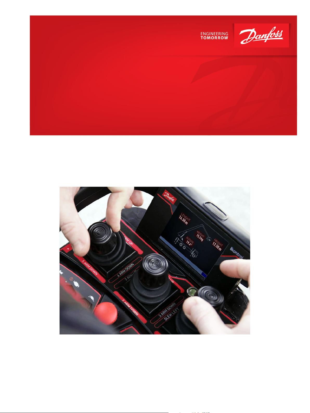
IKUGRAPH is a desktop application for Windows systems. This application is a user interface design tool
to create definitions of the set of windows to use in the embedded equipment distributed by Danfoss
RCT.
This document contains the full description of the interface and functionality included in the IKUGRAPH
application. Each xml file represents one project and can contain many elements (windows, text, value,
etc). The different elements that can be used are described in the document API_Ikugraph_v14.docx
•
To launch the application, run this executable: Ikusi.Ikugraph.Desktop.exe
•
To create a new project, select File > New from the menu bar.
•
To load an existing project, select File > Open from the menu bar.
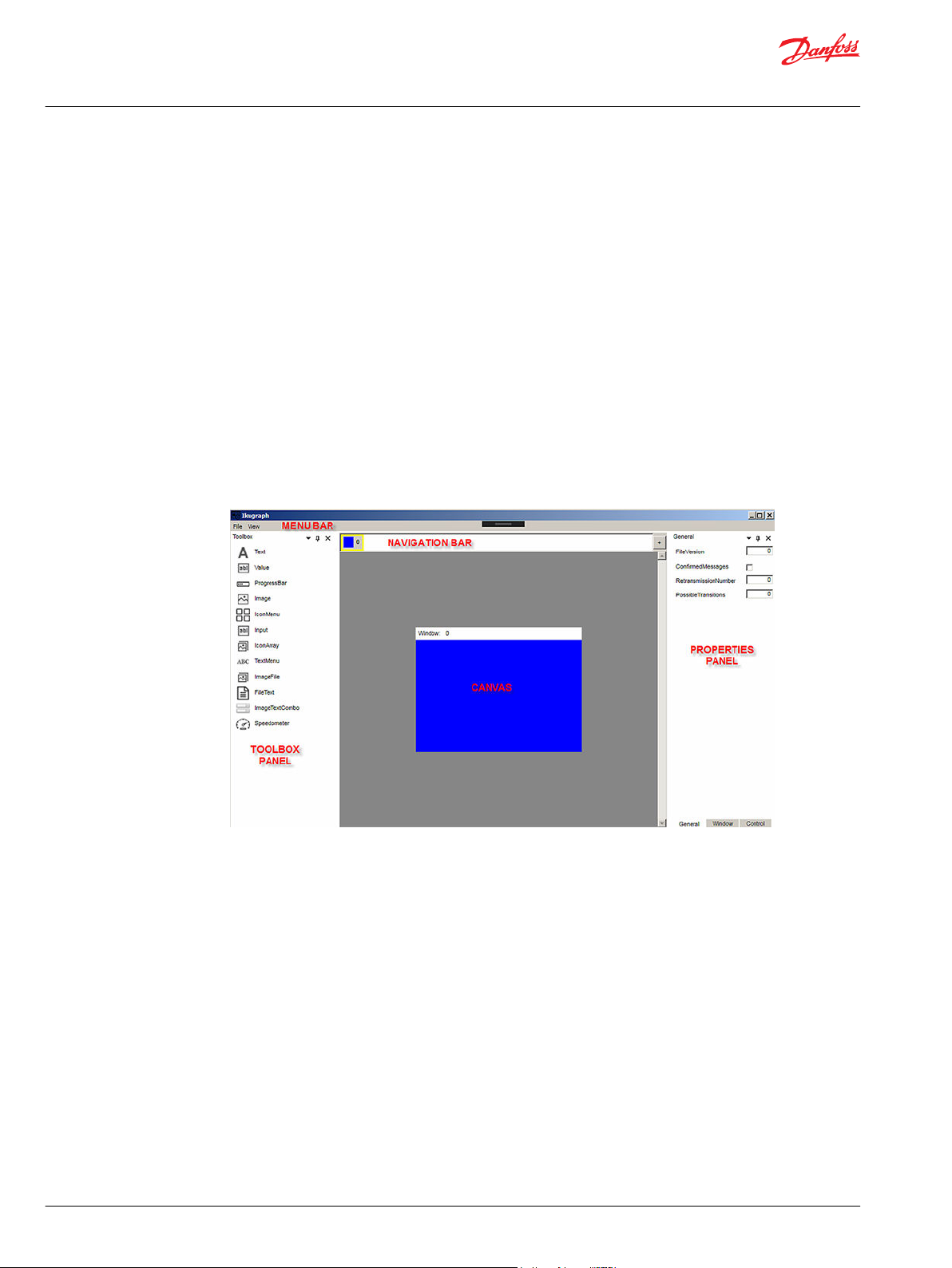
Overview
The Ikugraph user interface is made up of five primary areas: Menu and Navigation bars, Canvas, Toolbox
and Properties panels.
Ikugraph user interface
4 | © Danfoss | July 2019 AQ307202838481en-000101
Page 5
User Manual
IKUGRAPH User Interface Design Tool
Introduction
Menu bar
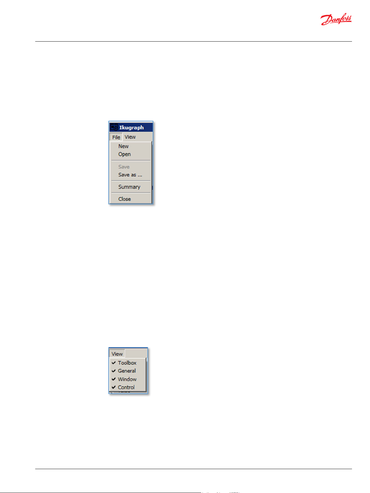
The menu bar contains the two main menu options: File and .
File menu
File menu performs actions on projects (create new, open previous project, save, etc). Each option is
enabled depending of the project’s state.
New Starts a new project. If there is a project loaded, ask the user to save it.
Open Shows the explorer to select a XML/TCM file that contains a project definition. If there is a
project loaded, ask the user to save it.
Save Shows the explorer to select a XML/TCM file that contains a project definition. If there is a
project loaded, ask the user to save it.
Save as The user is prompted for a new file name, and the project is saved in that file. It can be saved
in XML or TMC format.
Summary Obtain a word document with the API documentation, and the summary of the current
project, containing the windows, components and commands available in the project.
Close Closes the application.
View menu
View menu changes the visibility of the areas in the interface. If the option is checked, the area is visible.
In other case this area is hidden.
Toolbox Shows or hides the Toolbox panel.
General Shows or hides the General tab in Properties panel.
Window Shows or hides the Ventana tab in Properties panel.
Control Shows or hides the Control tab in Properties panel.
©
Danfoss | July 2019 AQ307202838481en-000101 | 5
Page 6
User Manual
IKUGRAPH User Interface Design Tool
Introduction
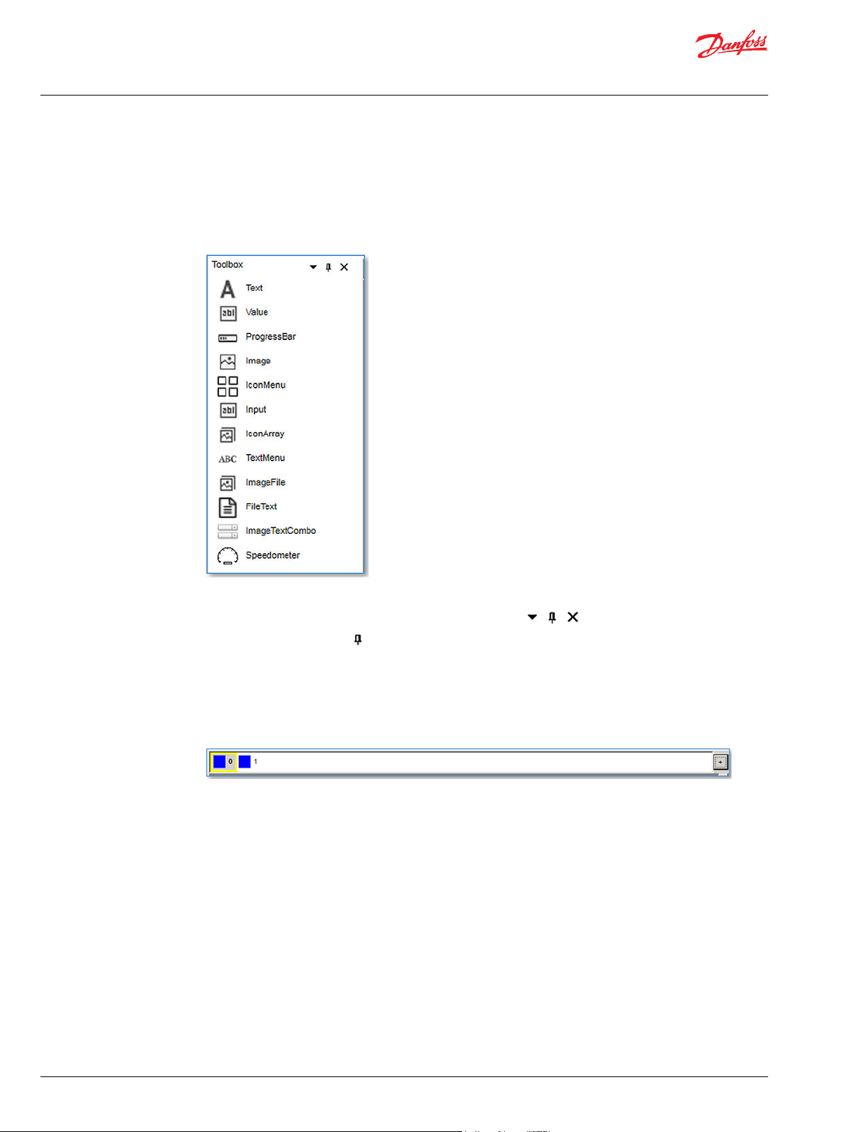
Toolbox
The Toolbox Panel is the long strip of UI controls in the left part of the window. It lists all of the UI control
types that can be used in the design.
The main goal of the Toolbox Panel is to let you add UI controls to the canvas. To add a new UI control to
the canvas, select the control type you wish to add then either drag it to the central canvas.
Navigator bar
The Toolbox panel can be toggled on and off in several ways:
•
clicking the icon X to the right of the panel (hide panel),
•
using the toggle option (minimize panel), or
•
by selecting View > Toolbox from the application menu (hide/show panel).
The navigator bar below toolbar shows the list of windows in your project.
The currently visible window is highlighted. The window with the “Visibility” property set to 1 is bordered
with a yellow square.
The + button in the right side adds a new window to the project.
6 | © Danfoss | July 2019 AQ307202838481en-000101
Page 7
User Manual
IKUGRAPH User Interface Design Tool
Introduction
Canvas
This is the main working area of the designer. Once you add UI controls to it, you can move them, resize
them and tweak them until your UI design is ready.
To move items, it can be used the drag and drop option (by clicking the item to move and drag&drop it),
or select the item and move it with the scroll keys of the keyboard.
You can select an item in the canvas by clicking it, moving between items with the tab key or selecting
the item in the control list in the Window tab in properties panel.
To remove a window, use the Delete button in the Window properties panel.
The size of the window canvas is fixed, but it can be extended with a zoom option by clicking Ctrl +
mouse central button.
©
Danfoss | July 2019 AQ307202838481en-000101 | 7
Page 8
User Manual
IKUGRAPH User Interface Design Tool
Introduction
Properties panel
The panel on the right side of the application (when shown) displays properties for the current project,
selected window or control.
General, Window and Control properties panels
Depending on which control is selected it shows different properties.
It can be hidden by de-selecting both General, Window and Control in the View menu. It can be toggled
with the icons on the right top of the panel
8 | © Danfoss | July 2019 AQ307202838481en-000101
Page 9
User Manual
IKUGRAPH User Interface Design Tool
Working with UI controls
To add UI controls to your canvas, click and drag a control from the Toolbox panel.
There are three different ways to select UI control from a canvas:
clicking on the control
•
using the keyboard’s TAB key the focus change between the controls inside the canvas.
•
selecting the control in the control list in the windows properties panel
•
XPos – YPos Properties
Once you have selected one control, there are a few different ways to move it on the canvas:
•
drag it with your mouse
•
move it with your keyboard’s UP/DOWN/LEFT/RIGHT keys
•
modify the XPOS – YPOS properties in the control properties panel
©
Danfoss | July 2019 AQ307202838481en-000101 | 9
Page 10
User Manual
IKUGRAPH User Interface Design Tool
Working with UI controls
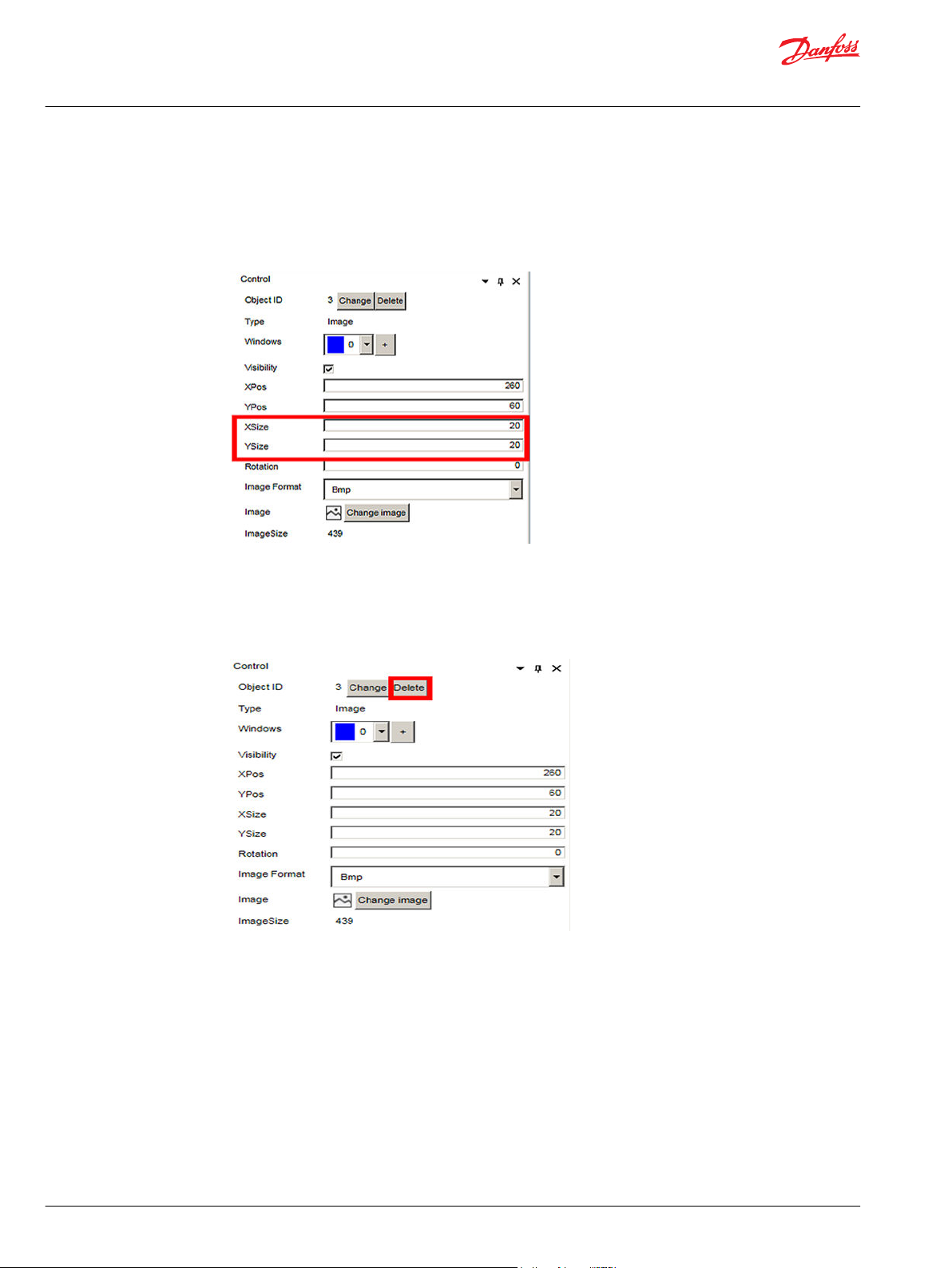
XSize – YSize Properties
To resize the selected control there are two ways:
•
you can just grab bottom right corner of the item and drag it.
•
change the XSize – YSize properties in the control properties panel.
Delete key
To remove some UI control from the canvas, select it and hit the Delete key.
Alternatively you can select Delete from the control properties panel.
10 | © Danfoss | July 2019 AQ307202838481en-000101
Page 11

User Manual
IKUGRAPH User Interface Design Tool
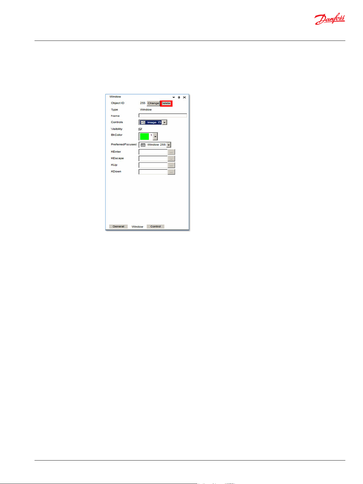
Window tab properties
The Window tab in properties panel contains the settings for the selected window.
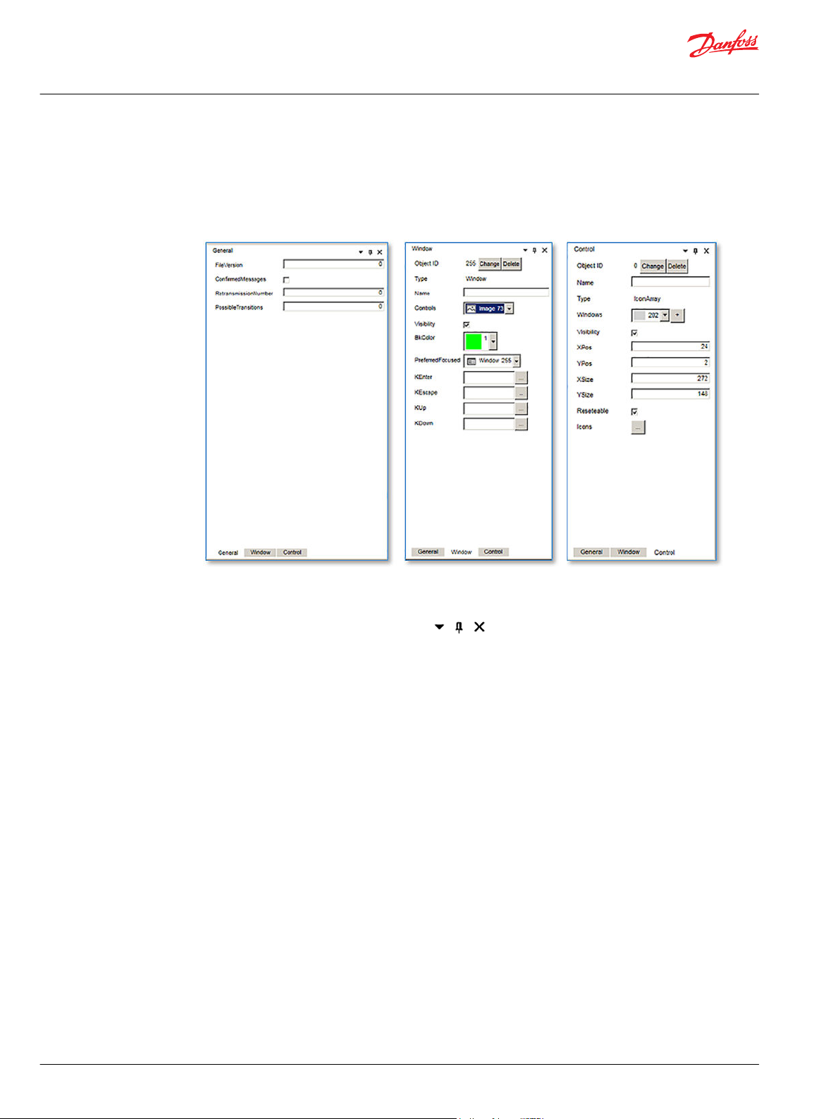
General tab window
The General tab in properties panel contains the settings for the project.
FileVersion
ConfirmedMessages the device use confirmation or not in its communications.
RetransmissionNumber number of retries when sending data to device.
PossibleTransitions maximum number of navigation options between windows.
version for the xml format generated. It depends on the software versión,
current value is 2. It can’t be modified.
©
Danfoss | July 2019 AQ307202838481en-000101 | 11
Page 12

User Manual
IKUGRAPH User Interface Design Tool
Window tab properties
Window view
ObjectID identifier for the element or window. It must be unique in the project. The application generates a default value,
and it can be changed using the Change ID button in the properties panel.
Name description name for the element or window. This property won’t be sent to the device.
Controls list of UI controls included in the design. You can select a control from the window with this list (for move it or
change it)
Visibility it defines if the window is visible by default in the device. Only one window can set Visibility = 1 in the project.
XSize – Ysize the element size.
BkColor background color for the window.
PreferredFocused set the control that has the focus when showing the window. By default is the window.
KEnter, KEscape set the navigation when the key is pressed.
KUp, KDown set the navigation when the key is pressed.
Delete click this button to remove the element.
12 | © Danfoss | July 2019 AQ307202838481en-000101
Page 13

User Manual
IKUGRAPH User Interface Design Tool
UI Controls
The different UI controls that can be used in design and its properties are defined below.
Text
The Text control shows a text in the window. Size and text and background and text colors are
configurable.
ProgressBar panel Description
ObjectID
Name
Windows
Visibility
XPos – YPos
XSize – Ysize
BkColor
FColor
Reseteable
Length
Prompt
Font
identifier for the element or window. It must be unique in the project. The
application generates a default value, and it can be changed using the Change ID
button in the properties panel.
description name for the element or window. This property won’t be sent to the
device.
it contains the list with the project’s windows in which the element is visible. You
can add a new window with the + button.
it defines if the element is visible or not in the window.
position for the element in the window.
the element size.
background color for the window.
text color.
it defines if the text of the element can be changed in the device.
number of characters of the text.
text to show.
font to use for the text.
©
Danfoss | July 2019 AQ307202838481en-000101 | 13
Page 14
User Manual
IKUGRAPH User Interface Design Tool
UI Controls
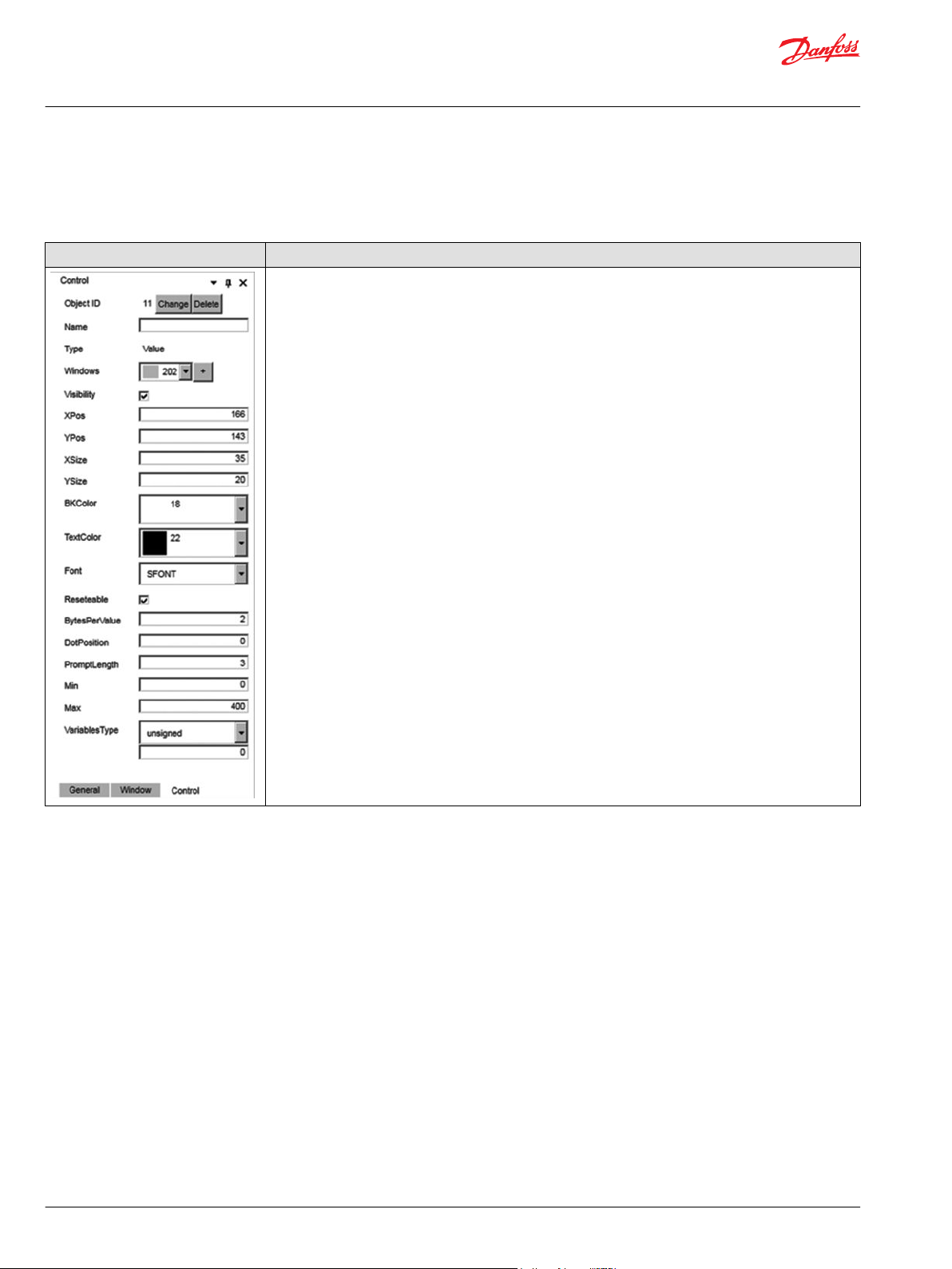
Value
The Value control shows a numeric value inside a little square. Size and background and text colors are
configurable.
Value panel Description
ObjectID
Name
Windows
Visibility
XPos – YPos
XSize – Ysize
BkColor
TextColor
Font
Reseteable
BytesPerValue
DotPosition
PromptLength
Min
Max
VariablesType
identifier for the element or window. It must be unique in the project. The
application generates a default value, and it can be changed using the
Change ID button in the properties panel.
description name for the element or window. This property won’t be sent to
the device.
it contains the list with the project’s windows in which the element is visible.
You can add a new window with the + button.
it defines if the element is visible or not in the window.
position for the element in the window.
the element size.
background color for the window.
text color for the number printed.
font to use for the text.
it defines if the text of the element can be changed in the device.
Number of bytes to represent the value data
position in the value of the dot character.
length for the printed value
minimum value
maximum value
0 = unsigned value, 1 = signed value.
14 | © Danfoss | July 2019 AQ307202838481en-000101
Page 15

User Manual
IKUGRAPH User Interface Design Tool
UI Controls
ProgressBar
The progress bar control shows a square bar with two zones with different colors, and a text in the middle
(only horizontal types). Empty and full part colors are configurable, apart from the color of the text.
There are four progress bar types:
•
Type 0: horizontal, from left to right
•
Type 1: horizontal, from right to left
•
Type 2: vertical, from down to up
•
Type 3: vertical, from up to down
ProgressBar panel Description
ObjectID
Name
Windows
Visibility
XPos – YPos
XSize – Ysize
Type
LeftBkColor
RightBkColor
LeftTextColor
RightTextColor
Reseteable
Min
Max
Text
identifier for the element or window. It must be unique in the project. The
application generates a default value, and it can be changed using the Change
ID button in the properties panel.
description name for the element or window. This property won’t be sent to the
device.
it contains the list with the project’s windows in which the element is visible. You
can add a new window with the + button.
it defines if the window is visible by default in the device. Only one window can
set Visibility = 1 in the project.
position for the element in the window.
the element size.
a type of bar.
back color for the full part.
back color for the empty part.
text color for the full part.
text color for the empty part.
it defines if the text of the element can be changed in the device.
minimum value
maximum value
a fixed text to show instead value. It’s only visible in the horizontal bars.
©
Danfoss | July 2019 AQ307202838481en-000101 | 15
Page 16

User Manual
IKUGRAPH User Interface Design Tool
UI Controls
Image
The Image control shows the selected image like a window background or as a part of the screen.
Image panel Description
ObjectID
Name
Windows
Visibility
XPos – YPos
XSize – Ysize
Rotation
ImageFormat
Image
Change image
ImageSize
Sent to back
Bring to front
identifier for the element or window. It must be unique in the project. The
application generates a default value, and it can be changed using the Change
ID button in the properties panel.
description name for the element or window. This property won’t be sent to
the device.
it contains the list with the project’s windows in which the element is visible.
You can add a new window with the + button.
it defines if the window is visible by default in the device. Only one window
can set Visibility = 1 in the project.
position for the element in the window.
the element size.
value of rotation for the image. Only value 0 is admitted.
type of image.
binary content of image. You can change the image with the Change image
button.
this button shows the explorer to select a new image.
not modifiable value, calculated from the selected image. Number of bytes for
the image.
this button change the image’s position in the XML/TMC file.
this button change the image’s position in the XML/TMC file.
16 | © Danfoss | July 2019 AQ307202838481en-000101
Page 17

User Manual
IKUGRAPH User Interface Design Tool
UI Controls
IconMenu
The IconMenu control shows a panel with little icons like buttons. A short description could also be
written under the icon.
IconMenu panel Description
ObjectID
Name
Windows
Visibility
XPos – YPos
XSize – Ysize
BkColor
TextColor
SelectionBkColor
DisabledColor
Icons
identifier for the element or window. It must be unique in the project. The
application generates a default value, and it can be changed using the
Change ID button in the properties panel.
description name for the element or window. This property won’t be sent
to the device.
it contains the list with the project’s windows in which the element is
visible. You can add a new window with the + button.
it defines if the window is visible by default in the device. Only one window
can set Visibility = 1 in the project.
position for the element in the window.
the element size.
background color for the window.
text color for the number printed.
back color for the selected element.
back color if an icon acts as a disabled option.
open the icon’s configuration window. The icon’s properties are:
• XSize – Ysize – size for the icon.
• Prompt – text to show under the icon
• PromptLength – length for the text.
• Image – id for the icon.
• Size – size in bytes for the loaded image.
• NextLevelIds – windows ids for navigation on pressed icon.
To add or remove icons to/from the control, click in the button in the Icons property.
MenuItem Icons, Selected Icon properties
+ click the + button to add a new element.
Image list The element shows the configured icons that can be used.
Delete click this button to remove the element.
©
Danfoss | July 2019 AQ307202838481en-000101 | 17
Page 18

User Manual
IKUGRAPH User Interface Design Tool
UI Controls
Accept click this button to modify the elements property.
Cancel click this button to cancel the modifications.
18 | © Danfoss | July 2019 AQ307202838481en-000101
Page 19

User Manual
IKUGRAPH User Interface Design Tool
UI Controls
Input
The Input control shows a little square with up – down arrows button, and contains a numeric value.
Input panel Description
ObjectID
Name
Windows
Visibility
XPos – YPos
XSize – Ysize
BkColor
TextColor
SelectionBkColor
Font
BytesPerValue
Min
Max
VariablesType
identifier for the element or window. It must be unique in the project. The
application generates a default value, and it can be changed using the
Change ID button in the properties panel.
description name for the element or window. This property won’t be sent
to the device.
it contains the list with the project’s windows in which the element is
visible. You can add a new window with the + button.
it defines if the element is visible or not in the window.
position for the element in the window.
the element size.
background color for the window.
text color for the number printed.
back color for the selected element.
font to use for the text.
Number of bytes to represent the value data
minimum value
maximum value
0 = unsigned value, 1 = signed value.
©
Danfoss | July 2019 AQ307202838481en-000101 | 19
Page 20

User Manual
IKUGRAPH User Interface Design Tool
UI Controls
IconArray
The IconArray element shows a group of images. In the device, it allows changing the visibility of more
than one icon in only one command. A mask will be used to hide or show icons, associating each bit to
one icon.
IconArray Description
ObjectID
Name
Windows
Visibility
XPos – YPos
XSize – Ysize
Reseteable
Icons
identifier for the element or window. It must be unique in the project. The
application generates a default value, and it can be changed using the Change ID
button in the properties panel.
description name for the element or window. This property won’t be sent to the
device.
it contains the list with the project’s windows in which the element is visible. You
can add a new window with the + button.
it defines if the element is visible or not in the window.
position for the element in the window.
the element size.
it defines if the text of the element can be changed in the device.
open the icon’s configuration window. The icon’s properties are:
• XPos – YPos – position for the icon.
• XSize – Ysize – size for the icon.
• Visibility – the icon is visible or not.
• Image – id for the icon.
• Size – size in bytes for the loaded image.
• NextLevelIds – windows ids for navigation on pressed icon.
• Icon – binary content for the icon. Can be changed with Change icon button.
• Size – size in bytes for binary data.
To change the icon configuration click in … button in the Icons property.
+ click the + button to add a new element.
Delete click this button to remove the element.
20 | © Danfoss | July 2019 AQ307202838481en-000101
Page 21

User Manual
IKUGRAPH User Interface Design Tool
UI Controls
Preview using this zone to move the icons.
Change icon click this button to change the icon.
Accept click this button to modify the elements property.
Cancel click this button to cancel the modifications.
©
Danfoss | July 2019 AQ307202838481en-000101 | 21
Page 22

User Manual
IKUGRAPH User Interface Design Tool
UI Controls
TextMenu
The TextMenu control shows a text menu, that allows submenus. It’s possible to configure a transition to
another window.
TextMenu panel Description
ObjectID
Name
Visibility
XPos – YPos
XSize – Ysize
BkColor
SelectionBkColor
PrevMenuId
Font
Texts
...
identifier for the element or window. It must be unique in the project. The
application generates a default value, and it can be changed using the
Change ID button in the properties panel.
description name for the element or window. This property won’t be sent to
the device.
it defines if the element is visible or not in the window.
position for the element in the window.
the element size.
background color for the window.
back color for the selected element.
parent’s menu ID.
font to use for the text.
values for menu elements. Text element’s properties are:
Prompt
Length
NextLevelId
click this button next to Texts label to edit text elements.
text to show.
number of characters of the text.
ID for next menu element.
+ click the + button to add a new element.
Delete click this button to remove the element.
Accept click this button to modify the elements property.
Cancel click this button to cancel the modifications.
22 | © Danfoss | July 2019 AQ307202838481en-000101
Page 23

User Manual
IKUGRAPH User Interface Design Tool
UI Controls
ImageFile
The ImageFile control shows an image in one position. It configures some images and shows one each
moment.
TextMenu panel Description
ObjectID
Name
Windows
Visibility
XPos – YPos
XSize – Ysize
ImageVisible
Image
identifier for the element or window. It must be unique in the project. The
application generates a default value, and it can be changed using the Change
ID button in the properties panel.
description name for the element or window. This property won’t be sent to the
device.
it contains the list with the project’s windows in which the element is visible. You
can add a new window with the + button.
it defines if the element is visible or not in the window.
position for the element in the window.
the element size.
index for the visible image between the loaded images.
loaded images in the container. You can add a new image with the + button. To
delete an image use Remove button in the image row. To edit an image, use Edit
button.
©
Danfoss | July 2019 AQ307202838481en-000101 | 23
Page 24

User Manual
IKUGRAPH User Interface Design Tool
UI Controls
FileText
The FileText control shows the content of a text file in a square. Size and text and background colors are
configurable. All text strings will be stored in the display, and only the index of the string to be shown will
be send from the PLC.
FileText panel Description
ObjectID
Name
Windows
Visibility
XPos – YPos
XSize – Ysize
BkColor
FColor
Font
Reseteable
Text items
identifier for the element or window. It must be unique in the project. The
application generates a default value, and it can be changed using the Change ID
button in the properties panel.
description name for the element or window. This property won’t be sent to the
device.
it contains the list with the project’s windows in which the element is visible. You
can add a new window with the + button.
it defines if the element is visible or not in the window.
position for the element in the window.
the element size.
background color for the window.
text color.
font to use for the text.
it defines if the text of the element can be changed in the device.
the list of elements to save in the file text.
You can add a new text item with the + button.
To delete a text item use Remove button in the image row.
24 | © Danfoss | July 2019 AQ307202838481en-000101
Page 25

User Manual
IKUGRAPH User Interface Design Tool
UI Controls
ImageTextCombo
The ImageTextCombo control shows a text area joined with an image area. It is used to build pairs of
images and text items. It stablishes a relationship between an image file and a text file, allowing the user
to define pairs of two items, one from each file.
ImageTextCombo panel Description
ObjectID
Name
Windows
Visibility
XPos – YPos
XSize – Ysize
Font
Reseteable
TextXPos/TextYPos
TextXSize/
TextYSize
ImageXPos/
ImageYPos
TextFile
ImageFile
ComboItems
identifier for the element or window. It must be unique in the project.
The application generates a default value, and it can be changed using
the Change ID button in the properties panel.
description name for the element or window. This property won’t be sent
to the device.
it contains the list with the project’s windows in which the element is
visible. You can add a new window with the + button.
it defines if the element is visible or not in the window.
position for the element in the window.
the element size.
font to use for the text.
it defines if the text of the element can be changed in the device.
position for the text element to show.
text element’s size.
position for the image element to show.
ID of the TextFile control to use to get the text elements.
ID of the ImageFile control to use to get the image elements.
definition for relationships between text and image. For each possibility
the properties are:
TextIndex
ImageIndex
Visibility
index for the text in the text file (row)
index for the image in the ImageFile
the element is show by default or not.
You can add a new element in the combo list by + button; use the Deletebutton to remove the element.
©
Danfoss | July 2019 AQ307202838481en-000101 | 25
Page 26
User Manual
IKUGRAPH User Interface Design Tool
UI Controls
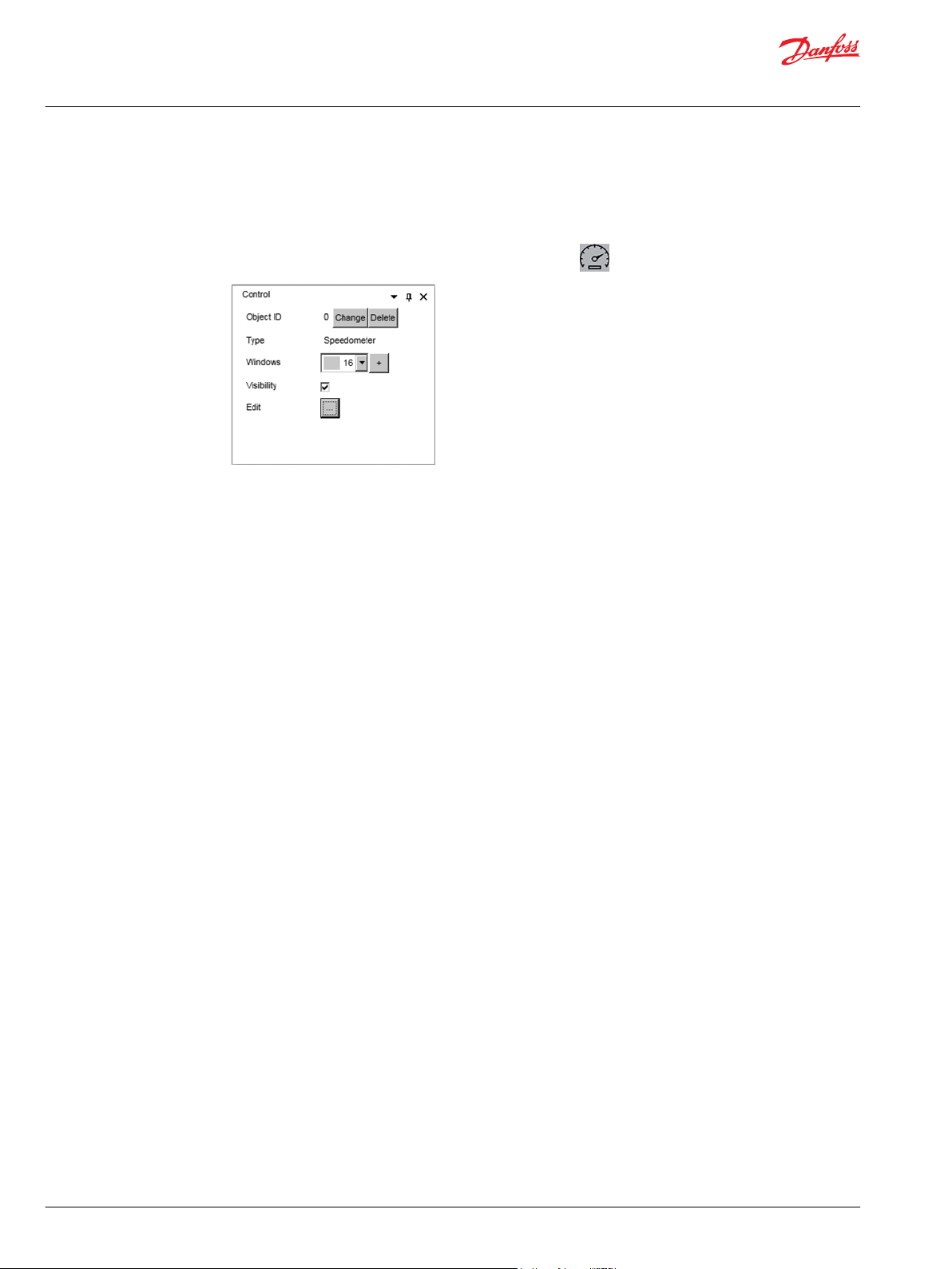
Speedometer
Background image and needle are configured or design by the user and all the management information
is included in the configuration file (variables length, range, etc.).
The speedometer control shows an element similar to this icon.
ObjectID identifier for the element or window. It must be unique in the project. The application
generates a default value, and it can be changed using the Change ID button in the
properties panel.
Name description name for the element or window. This property won’t be sent to the device.
Windows it contains the list with the project’s windows in which the element is visible. You can add a
new window with the + button.
Visibility it defines if the element is visible or not in the window.
Value properties for the value element content by the speedometer:
XPos – YPos position for the element in the window.
XSize – Ysize the element size.
Reseteable it defines if the text of the element can be changed in the device.
BytesPerValue Number of bytes to represent the value data
AnalogSetPoint1, 2
DotsPosition1, 2
BkColor background color for the window.
FColor text color.
Length number of characters of the text.
Font font to use for the text.
Reseteable it defines if the text of the element can be changed in the device.
position in the value of the dot character.
26 | © Danfoss | July 2019 AQ307202838481en-000101
Page 27

User Manual
IKUGRAPH User Interface Design Tool
UI Controls
Background
Needle
©
Danfoss | July 2019 AQ307202838481en-000101 | 27
XPos – YPos position for the element in the window.
XSize – Ysize the element size.
Image binary content for the image.
ImageSize size for the binary data.
Color color for the needle
Size size for the needle, selection with options: small, medium, large.
OriginCoord PosX – PosY: start point for the needle
Page 28

User Manual
IKUGRAPH User Interface Design Tool
UI Controls
Scale define the points for the scale to show in the component.
MinCoord PosX – PosY: point for the min. value
MaxCoord PosX – PosY: point for the max. value
Font font for the text in the scale fields.
Numpoint number of scale fields defined.
Point each point. You can add a new point with the + button, write the text to
show and move the field to the desired location.
To delete a point use Remove button in point’s row.
28 | © Danfoss | July 2019 AQ307202838481en-000101
Page 29

User Manual
IKUGRAPH User Interface Design Tool
File Upload Through F2B
Configuration file upload to TFT
How to upload a configuration file from a laptop to a Radio remote control TFT screen through F2B.
1. Pull up the E-STOP button to power on the transmitter.
2. Check TFT address. Go to the TFT menu > Bluetooth.
The address should be something like: IKU_XXXXXX_e1b6c1c8
3. Search the device at your computer.
Go to Settings > Devices. Go to Bluetooth and add a new device. The TFT address should be at the
list. Click on the device.
4. Pairing the device.
After clicking the device, there may be cases where it has to confirm a code, confirm it. Then we
should have a pairing confirmation.
©
Danfoss | July 2019 AQ307202838481en-000101 | 29
Page 30

User Manual
IKUGRAPH User Interface Design Tool
File Upload Through F2B
5. Check the COM port assigned to the device.
We need to know the COM port assigned to the device.
Go to More Bluetooth options > COM Ports > COM6.
Check for the Outgoing assigned COM Ports.
6. Send the configuration to the screen; the transmitter should be powered ON.
Danfoss recommends the TFT at Bluetooth screen showing the address to avoid going to power
saving mode.
Open F2B tool > Select the file (*.ik, *.xml or *.tmc) > Select the outgoing COM port (COM6 in this
example).
Check the box in order to upload images.
Do not check the box, if only modifying object properties from an already uploaded configuration
(for example: object size, value object “bytespervalue”, etc.).
30 | © Danfoss | July 2019 AQ307202838481en-000101
Page 31

User Manual
IKUGRAPH User Interface Design Tool
File Upload Through F2B
7. Restart the transmitter to load the new file.
After finishing the new configuration upload, restart the transmitter to allow the TFT loading the new
configuration.
If the uploaded configuration was OK, there will be a CRANE label at the screen and after linking with
the receiver, there will be a configured MAIN window.
©
Danfoss | July 2019 AQ307202838481en-000101 | 31
Page 32

Danfoss
Power Solutions GmbH & Co. OHG
Krokamp 35
D-24539 Neumünster, Germany
Phone: +49 4321 871 0
Danfoss
Power Solutions ApS
Nordborgvej 81
DK-6430 Nordborg, Denmark
Phone: +45 7488 2222
Danfoss
Power Solutions (US) Company
2800 East 13th Street
Ames, IA 50010, USA
Phone: +1 515 239 6000
Danfoss
Power Solutions Trading
(Shanghai) Co., Ltd.
Building #22, No. 1000 Jin Hai Rd
Jin Qiao, Pudong New District
Shanghai, China 201206
Phone: +86 21 3418 5200
Products we offer:
Hydro-Gear
www.hydro-gear.com
Daikin-Sauer-Danfoss
www.daikin-sauer-danfoss.com
DCV directional control
•
valves
Electric converters
•
Electric machines
•
Electric motors
•
Hydrostatic motors
•
Hydrostatic pumps
•
Orbital motors
•
PLUS+1® controllers
•
PLUS+1® displays
•
PLUS+1® joysticks and
•
pedals
PLUS+1® operator
•
interfaces
PLUS+1® sensors
•
PLUS+1® software
•
PLUS+1® software services,
•
support and training
Position controls and
•
sensors
PVG proportional valves
•
Steering components and
•
systems
Telematics
•
Danfoss Power Solutions is a global manufacturer and supplier of high-quality hydraulic and
electric components. We specialize in providing state-of-the-art technology and solutions
that excel in the harsh operating conditions of the mobile off-highway market as well as the
marine sector. Building on our extensive applications expertise, we work closely with you to
ensure exceptional performance for a broad range of applications. We help you and other
customers around the world speed up system development, reduce costs and bring vehicles
and vessels to market faster.
Danfoss Power Solutions – your strongest partner in mobile hydraulics and mobile
electrification.
Go to www.danfoss.com for further product information.
We offer you expert worldwide support for ensuring the best possible solutions for
outstanding performance. And with an extensive network of Global Service Partners, we also
provide you with comprehensive global service for all of our components.
Local address:
Danfoss can accept no responsibility for possible errors in catalogues, brochures and other printed material. Danfoss reserves the right to alter its products without notice. This also applies to products
already on order provided that such alterations can be made without subsequent changes being necessary in specifications already agreed.
All trademarks in this material are property of the respective companies. Danfoss and the Danfoss logotype are trademarks of Danfoss A/S. All rights reserved.
©
Danfoss | July 2019 AQ307202838481en-000101
 Loading...