

Page 1
ProVisionaire Control
Setup Guide
Thank you for downloading Yamaha ProVisionaire Control.
ProVisionaire Control is an application for remotely controlling a
system (consisting of devices that can be controlled by this application, such as CL/QL/TF devices, an MTX/MRX system, or an
RM-CG/RM-CR) from a Windows computer and iPad via a wired
LAN or Wi-Fi network.
You can design a control panel by freely arranging various widgets such as buttons and sliders, allowing you to create custom
panels to suit your needs.
Who should read this document
This is a guidebook intended for those who design, produce,
and set up custom control panels using this application. It is
not a guidebook for general users.
Note
• All copyrights for this software and setup guide are the property of Yamaha
Corporation.
• Unauthorized copying or modification of this software or setup guide in part
or in whole is prohibited.
• Please be aware that Yamaha Corporation accepts no responsibility for any
results or consequences that may follow from the use of this software and
setup guide.
• All of the illustrations and screen shots in this setup guide are provided for
the purpose of explaining operations. For this reason, they may differ from
the actual specifications.
• Windows is a registered trademark of Microsoft Corporation USA in the
United States and in other countries.
• iPad is registered trademarks of Apple Inc. in the United States and in other
countries.
• PostgreSQL is a registered trademark of PostgreSQL in the United States and
in other countries.
• Please be aware of copyright when using audio sources for a commercial purpose. Infringement of copyright is prohibited by law.
• Company names and product names appearing in this document are the
trademarks or registered trademarks of their respective owners.
• The application software may be updated without notice for improvement.
The latest application software can be downloaded from the Yamaha Pro
Audio website.
https://www.yamaha.com/2/provisionaire/
© 2018 Yamaha Corporation
Published 05/2022 PO-G0
1
EN
Page 2
Contents
What you can do using ProVisionaire Control............................................................. 5
Operating requirements of the software....................................................................... 6
Terms and concepts to understand .............................................................................. 7
Installation procedure .................................................................................................... 9
Screen structure.............................................................................................................10
Basic process.................................................................................................................12
Start up, and register devices .................................................................................................12
Placing widgets on a page ......................................................................................................14
Labeling widgets for easier recognition................................................................................... 16
Adding a page......................................................................................................................... 19
Specifying a background for the page.....................................................................................25
Adjusting the placement of the widgets ..................................................................................26
Saving the project file..............................................................................................................26
Testing operation.....................................................................................................................27
Making security settings..........................................................................................................28
Creating a controller file ..........................................................................................................32
Making KIOSK start automatically ..........................................................................................32
Adding parameters or meters for an MTX/MRX system ............................................ 33
Functions specific to initial mode ............................................................................... 34
“Transfer Controller File” dialog box ........................................................................................34
Title bar.......................................................................................................................... 36
Menu bar........................................................................................................................38
Tool bar .......................................................................................................................... 43
“Controllers” area ......................................................................................................... 44
Buttons ....................................................................................................................................44
Context menu ..........................................................................................................................45
Properties................................................................................................................................45
2
Page 3

“Devices” area............................................................................................................... 48
Buttons ....................................................................................................................................49
Context menu ..........................................................................................................................49
Properties................................................................................................................................49
“Widgets” area .............................................................................................................. 50
Work area.......................................................................................................................51
Buttons ....................................................................................................................................51
“Properties” area........................................................................................................... 53
Buttons ....................................................................................................................................53
Widgets.......................................................................................................................... 54
Buttons ....................................................................................................................................54
Button properties..............................................................................................................................55
Sliders .....................................................................................................................................59
Slider properties...............................................................................................................................59
Dials ........................................................................................................................................62
Dial properties..................................................................................................................................62
Meters .....................................................................................................................................64
Meter properties...............................................................................................................................64
Indicator ..................................................................................................................................66
Indicator properties ..........................................................................................................................66
SD memory-related.................................................................................................................69
SD memory-related properties .........................................................................................................69
Lines .......................................................................................................................................72
Line properties .................................................................................................................................72
Shapes and Images ................................................................................................................73
Shape and Image properties............................................................................................................73
Showing and entering values..................................................................................................75
Value properties ...............................................................................................................................75
System monitor .......................................................................................................................77
System monitor properties ...............................................................................................................77
About the Expansion Mode..............................................................................................................................79
3
Page 4

Dialog boxes and windows.......................................................................................... 80
“Setup” dialog box ...................................................................................................................80
[Network] tab ...................................................................................................................................................80
[Security] tab....................................................................................................................................................81
[Log] tab...........................................................................................................................................................82
[Other Settings] tab..........................................................................................................................................83
“New Project Wizard” dialog box..............................................................................................84
1/2 Create Controller........................................................................................................................................84
2/2 Add Device.................................................................................................................................................85
“Add Controller” dialog box......................................................................................................86
“Run Controller File” dialog box...............................................................................................87
“Import Controller File” dialog box...........................................................................................88
“Select Controllers to Import” dialog box.................................................................................88
“Export Controller File” dialog box...........................................................................................89
[To Your Computer] tab.....................................................................................................................................89
[To ProVisionaire Touch Kiosk] tab...................................................................................................................90
“Imported Images” dialog box .................................................................................................91
“Add Device” dialog box ..........................................................................................................92
“Target Editor” dialog box ........................................................................................................93
“Edit Text” dialog box...............................................................................................................94
“Edit Device Identifier” dialog box............................................................................................94
“Select Image” dialog box .......................................................................................................95
[From Folder] tab..............................................................................................................................................95
[From Project File] tab ......................................................................................................................................96
“Style” dialog box ....................................................................................................................97
“System Monitor” window ........................................................................................................98
Device list.........................................................................................................................................................98
Device details...................................................................................................................................................99
“ProVisionaire Monitoring Service Settings” view.................................................................. 103
Specifying the IP address ...........................................................................................104
Tips ...............................................................................................................................105
Troubleshooting...........................................................................................................107
4
Page 5
What you can do using ProVisionaire Control
• Using ProVisionaire Control, you can intuitively place widgets such as sliders, buttons, and images on the page
(screen) to create an original control panel that fits the requirements of your installation and your needs, all
without requiring any special programming.
• You can place widgets for multiple devices on a single page. Pages for ProVisionaire Control KIOSK (subsequently KIOSK) allow placement of up to 1024 widgets, and pages for ProVisionaire Touch KIOSK allow placement of up to 150 widgets. A maximum of 30,000 widgets can be placed for one KIOSK controller.
• Since you can create up to 50 pages for each controller, a separate control panel could be created for each
area and user, or you can create design pages for specific presets or parameter states.
You can restrict access to control panels and design pages, ensuring secure and convenient operation of the
controller.
• Data for a completed control panel can be exported as an individual controller file for KIOSK and ProVisionaire
Touch KIOSK. You can use separate controller files for multiple devices in the same location, or you can save
the data as a template and use or share it with other systems. This lets you create controllers efficiently and
conveniently.
• Since connection with the system being operated can also occur via Wi-Fi, the tablet PC does not have to be
mounted on the wall; it can be operated while held in the hand, and used as a convenient remote controller.
• The operating status and diagnostics information of applicable devices can be viewed using KIOSK’s System
Monitor.
5
Page 6
Operating requirements of the software
Refer to the Yamaha Pro Audio website for the operating requirements of the software.
https://www.yamaha.com/2/provisionaire/
6
Page 7
Terms and concepts to understand
Roles
ProVisionaire Control uses the following roles.
• Administrator
The person who designs and edits the control panel (mainly the installation contractor). This is the person reading this setup guide. This person
knows the Administrator Code (four digits) that lifts restrictions on functions.
•Power User
The sound engineer of the facility, etc. This person knows a Power User
Code (four digits) to enter a page that is protected by access control, or
to edit a controller file.
•Staff
A person who operates the parameters. This person knows an Unlock
Code (four digits) to unlock the screen lock.
• Guest
A person who has no operating privileges, such as a visitor.
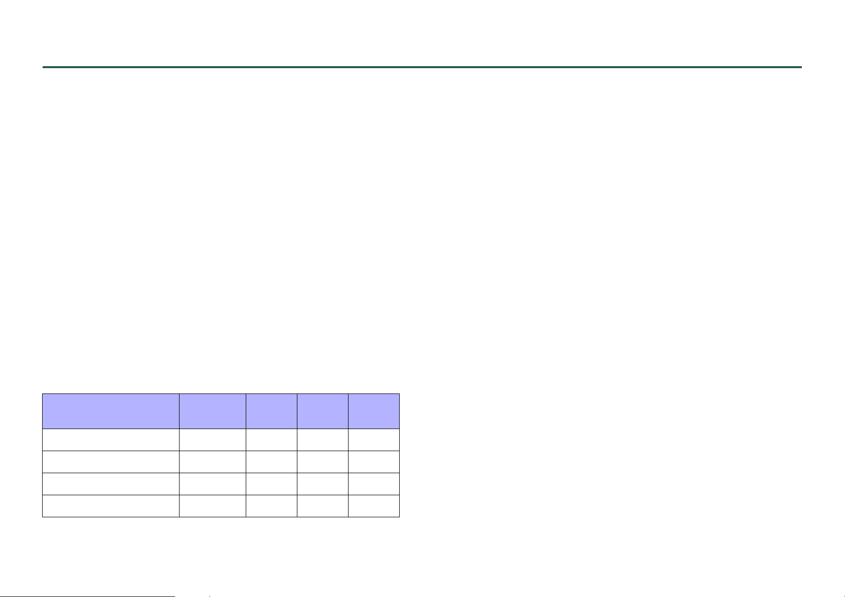
Each role can perform the following actions.
Administ-
rator
Power
User
Staff Guest
Software
The following software related to ProVisionaire Control is available.
• ProVisionaire Control
Software for designing remote controllers that operate on Windows or
on iPad. This is used by administrators.
• ProVisionaire Control KIOSK
Software optimized for remote control operating on Windows. This is
used by power users or staff. In this document, this is subsequently
abbreviated as KIOSK.
• ProVisionaire Touch KIOSK
Software optimized for remote control operating on iPad. This is used by
power users or staff. This is supported in ProVisionaire Control V3 and
later.
• ProVisionaire Monitoring Service
This is software that monitors the operating status of the applicable
devices. The operating status can be viewed using the [System Monitor]
widget. In order to view the operating status, there must be at least one
computer running this software within the same network.
Do not connect three or more computers running this software in the
same network. Since there are two ports for transmitting and receiving
the device’s operating data, the third and subsequent computer will not
be able to obtain operating data.
Unlock the screen lock — — —
Operate parameters —
Edit a controller file ——
Edit the design ———
Units
In ProVisionaire Control, the following units are used when discussing the
structure of a system.
• Project
The system being proposed. This corresponds to an entire building or
hall.
7
Page 8

• Controller
The unit used with KIOSK and ProVisionaire Touch KIOSK. This can
be created for separate locations such as a stage wing or FoH, or for separate users. You can create up to 20 controllers in one project.
•Page
A screen consisting of multiple widgets (such as buttons and sliders) that
control devices is called a “page.” You can create up to 50 pages for one
controller. The page that you specify as the home page is displayed when
the file is opened in KIOSK and ProVisionaire Touch KIOSK.
Files
ProVisionaire Control, KIOSK, and ProVisionaire Touch KIOSK use the
following files.
• Project file (extension .pvcpj)
This file contains all the settings of a ProVisionaire Control project. It
contains the settings for multiple controllers, pages, images, and devices
to control.
Modes
ProVisionaire Control and KIOSK have the following modes.
• Initial Mode
This is the mode in which no file has been loaded. From this mode, loading a settings file takes ProVisionaire Control to Design Mode or takes
KIOSK to Control Mode.
• Design Mode
In this mode you can use ProVisionaire Control to create or edit controllers and pages. KIOSK does not have this mode. You must have Administrator privileges to use this mode. In this mode, ProVisionaire Control
is not online with the system to be controlled.
• Control Mode
This mode is used by KIOSK to go online with devices on the network,
and control or monitor them. You must have Administrator or Power
User privileges to edit a controller file.
• Controller file (extension .ypvc)
This is the file loaded into KIOSK. It contains the settings for a single
controller and for multiple pages, images, and devices to control.
• Controller file for ProVisionaire Touch KIOSK (extension
.ypvtk)
This is the file loaded into ProVisionaire Touch KIOSK. It contains the
settings for a single controller and for multiple pages, images, and
devices to control.
• Style file (extension .ypvcs)
This is the default style for a project file. A style can be specified for
each widget. You can export this as a style file and import it into another
project to specify the same style.
Other
This setup guide also uses the following terms.
•Widget
GUI parts such as sliders, buttons, and images. You can assign parameters of the devices to these parts, and synchronize them to the faders or
on/off parameters.
•Style
This is the default style (information related to the color or shape of the
widget) for a project file. A style can be specified for each widget. You
can export this as a style file and import it into another project to specify
the same style.
8
Page 9
Installation procedure
Download the installers for ProVisionaire Control, KIOSK or the
ProVisionaire Monitoring Service from the Yamaha Pro Audio website.
https://www.yamaha.com/2/provisionaire/
Decompress the compressed file that you downloaded, double-click
“Install_PVControl.exe,” “Install_PVControlKIOSK.exe” or
“Install_PVMonitoringService.exe” and follow the installer’s directions.
NOTE
If you install ProVisionaire Monitoring Service, PostgreSQL is also
installed at the same time. If you uninstall “Yamaha ProVisionaire
Monitoring Service,” PostgreSQL is also uninstalled.
ProVisionaire Monitoring Service is used in the following types of
situation.
• When ProVisionaire Control or KIOSK as well as ProVisionaire Monitoring Service are installed on the same computer
You can leave monitoring online without needing to be specifically aware of it, and view the operating status of the applicable
devices by opening the “ProVisionaire Monitoring Service” window.
If PostgreSQL is already installed before ProVisionaire Monitoring Service is installed, you will be asked to enter the user name
and password of the already-registered PostgreSQL super user.
• When only ProVisionaire Control or KIOSK is installed, and
the operating status is obtained from an instance of ProVisionaire Monitoring Service that is installed on another computer
In the “Setup” dialog box [Log] tab, specify information for the
computer on which ProVisionaire Monitoring Service is installed.
• When only ProVisionaire Monitoring Service is installed
If PostgreSQL is already installed before ProVisionaire Monitoring Service is installed, you will be asked to enter the user name
and password of the already-registered PostgreSQL super user.
9
Page 10
Screen structure
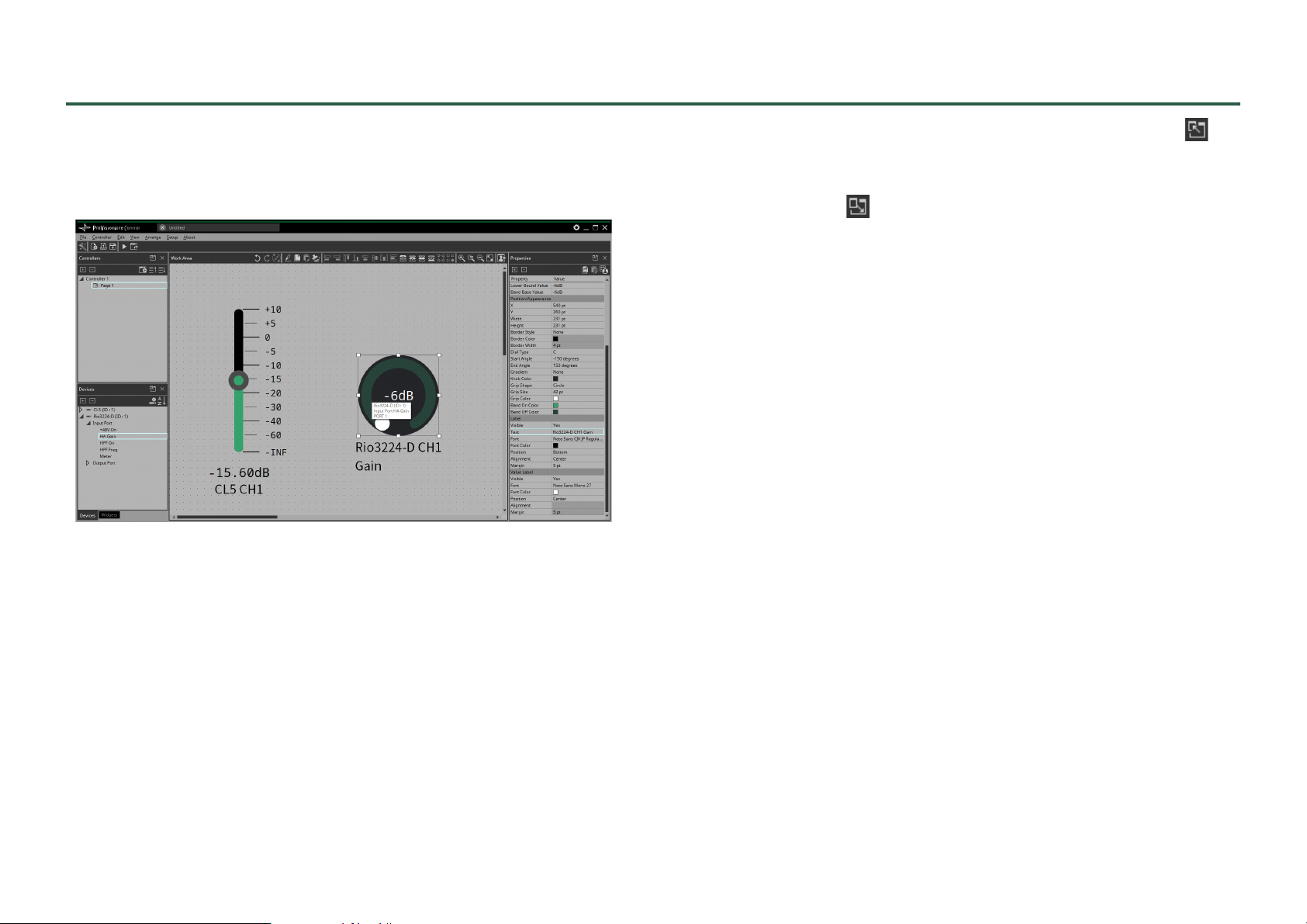
ProVisionaire Control’s design mode consists of a title bar, menu
bar, tool bar, controllers area, devices area, widgets area, work area,
and properties area.
In the upper right of areas other than the work area, there is a ;
clicking this will make the area float (undocking it), allowing you to
use a wider work area. To re-dock the area (that is, cancel the floating state), click the located in the upper right.
To re-dock all floating areas, execute the “View” menu command
[Dock All].
When the cursor is located at the border between work areas, the
cursor changes shape, letting you drag to change the width of the
area.
10
Page 11
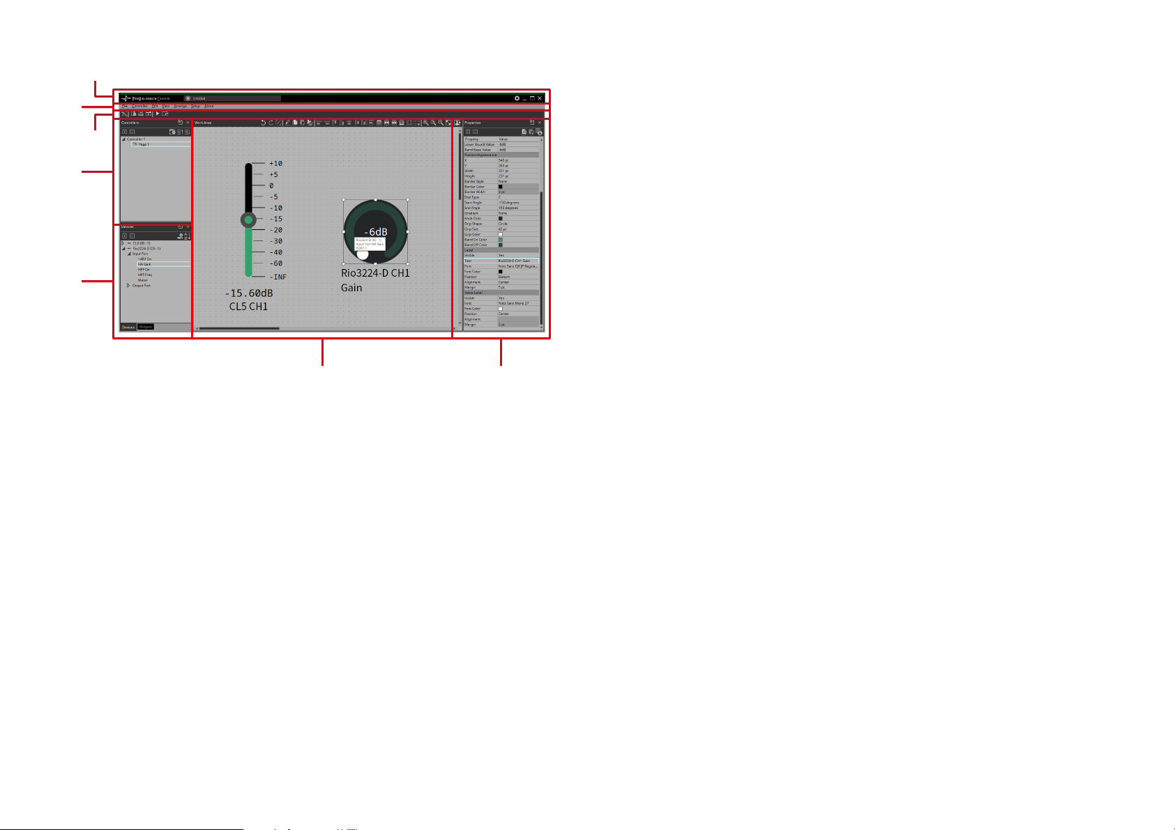
q Title bar
q
w
r
t
e
yu
r Controllers area
This lists the project’s controllers and pages. You can also use this area
to add controllers and pages. (page 44)
t Devices/Widgets area
Devices shows a list of the devices used in the project, and their
parameters. (page 48)
Widgets shows a list of the widgets that can be used. (page 50)
y Work area
Drag and drop from the Devices/Widgets area to place widgets in this
area. (page 51)
Frequently-used functions are shown at the top of this area as buttons.
u Properties area
This lists information about the currently selected widget, page, controller, or device. Click an item to edit it. For details, refer to the page
that explains each area or widget.
This shows the project file name. This also contains a [Setup] button,
etc. (page 36)
w Menu bar
This contains commands that can be executed by ProVisionaire Control, organized by category. (page 38)
e Tool bar
Frequently-used commands are placed here as buttons. (page 43)
11
Page 12
Basic process
Using the creation of a simple page as an example, this section
explains the process from startup to controlling a device. In this
example, we control the level and on/off for input channel 1 of a
CL5 (console ID=1).
In the case of an MRX, this procedure cannot be used to place a widget; refer to “Adding parameters or meters for an MTX/MRX sys-
tem.”
Start up, and register devices
Here’s how to start ProVisionaire Control, create a controller and
page, and register a device to control.
1. Start ProVisionaire Control.
To start, choose [Start] button[All Programs] or [All Apps][Yamaha
ProVisionaire Control][ProVisionaire Control Vx.x] (x.x is the version
number).
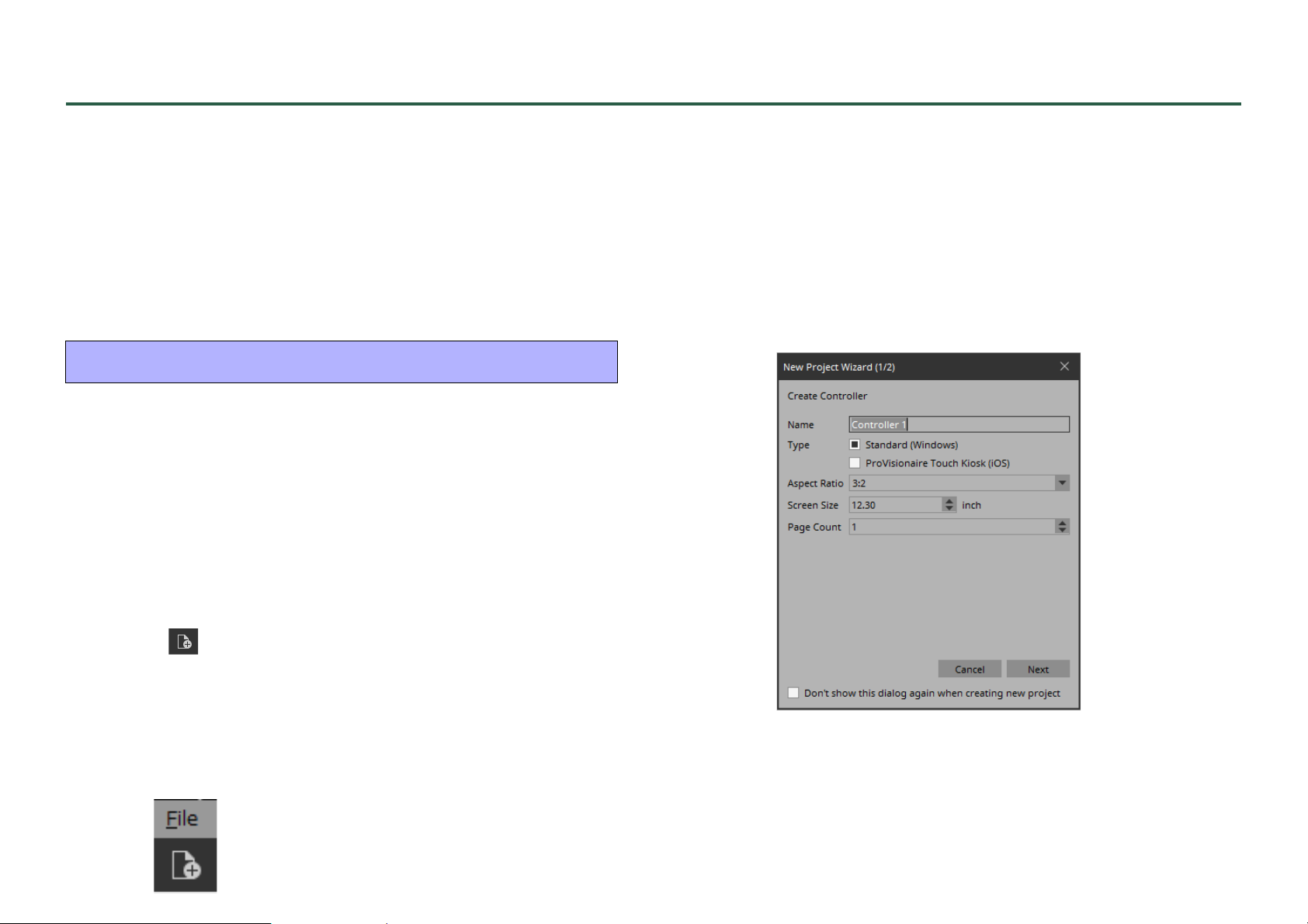
3. When the “Setup” dialog box appears, click [OK] or
[Cancel].
ProVisionaire Control transitions to design mode, and the “New Project Wizard” dialog box opens.
NOTE
Select the network adapter and click [OK], you can verify the
devices by connecting the computer in which ProVisionaire Control
is installed to the network. In the “Devices” area, right-click the
applicable device and choose [Add] to register it.
2. If you want to create a new project, click [New Project]
button .
If you want to load an existing file, choose the [File]
menu command [Open Project File], and select the file
that you want to load.
In this example, we explain the procedure when you click [New Project] button.
12
Page 13
4. Make settings as appropriate for the screen device
used to operate the controller (the screen of the computer on which KIOSK is installed), and click the
[Next] button.
In this example, we keep the default settings. Items other than [Type]
and [Aspect ratio] can be changed later.
NOTE
For the controller used with ProVisionaire Touch KIOSK, select “ProVisionaire Touch Kiosk” with the “Type” radio button.
Widgets that are not in ProVisionaire Touch can not be placed.
Tips
If you don’t know the aspect ratio of the screen, select [3:2] and
place the widgets accordingly.
After specifying the aspect ratio, create the appropriate controllers.
For each page, you can use the method of using <Ctrl>+<A> to
select all widgets, then using <Ctrl>+<C> to copy them, then
<Ctrl>+<V> to paste them on the new controller page, and then
rearranging them.
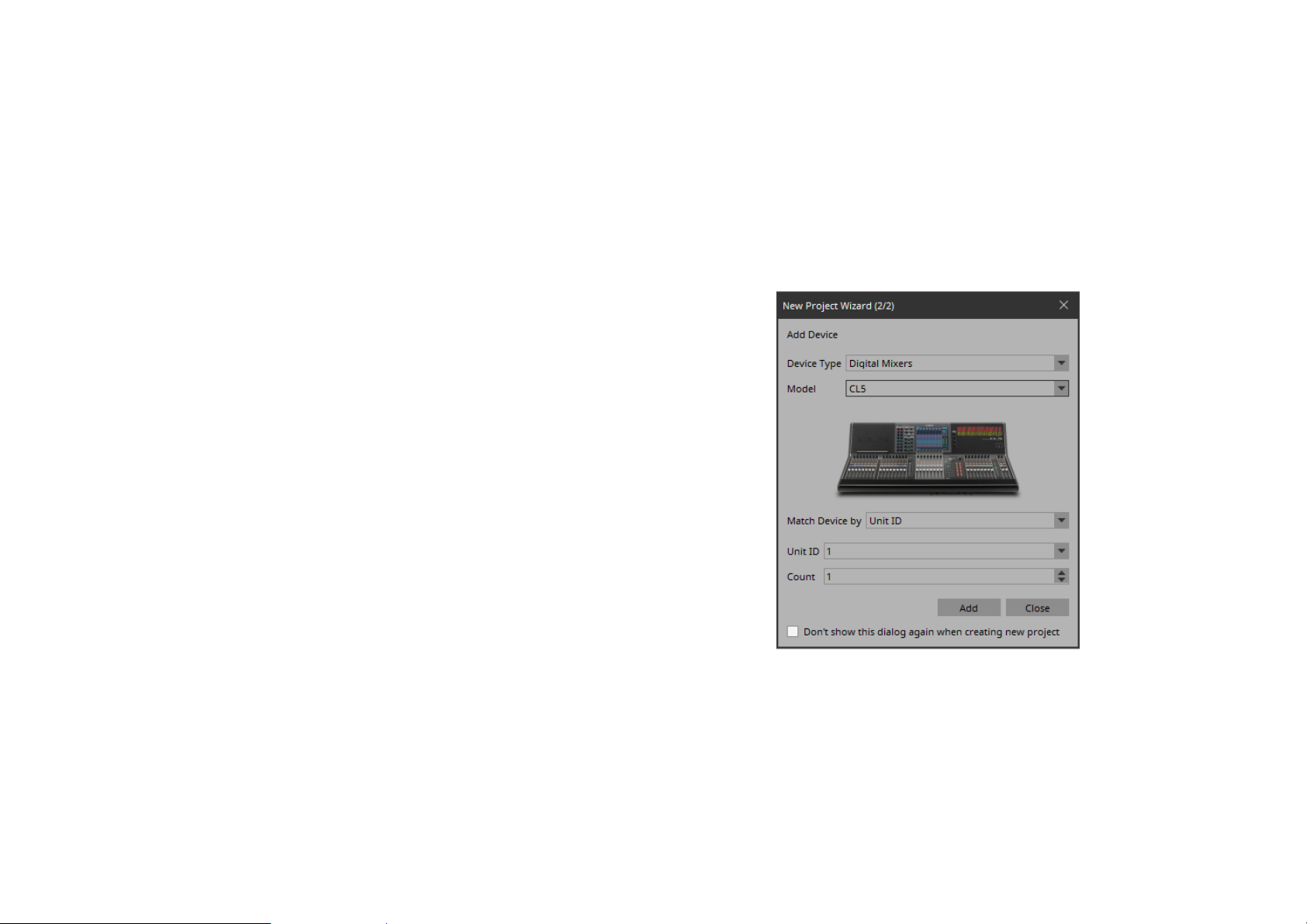
5. Make the following settings, and click the [Add] but-
ton.
“Device Type”=[Digital Mixers]
“Model”=[CL5]
“Match Device by”=[Unit ID]
“Unit ID”=[1]
“Count”=[1]
The CL5 with ID=1 is added to the “Devices” area, and the dialog
box closes.
13
Page 14
Placing widgets on a page
Here’s how to place widgets in the work area so that the parameters
of the CL5 can be controlled.
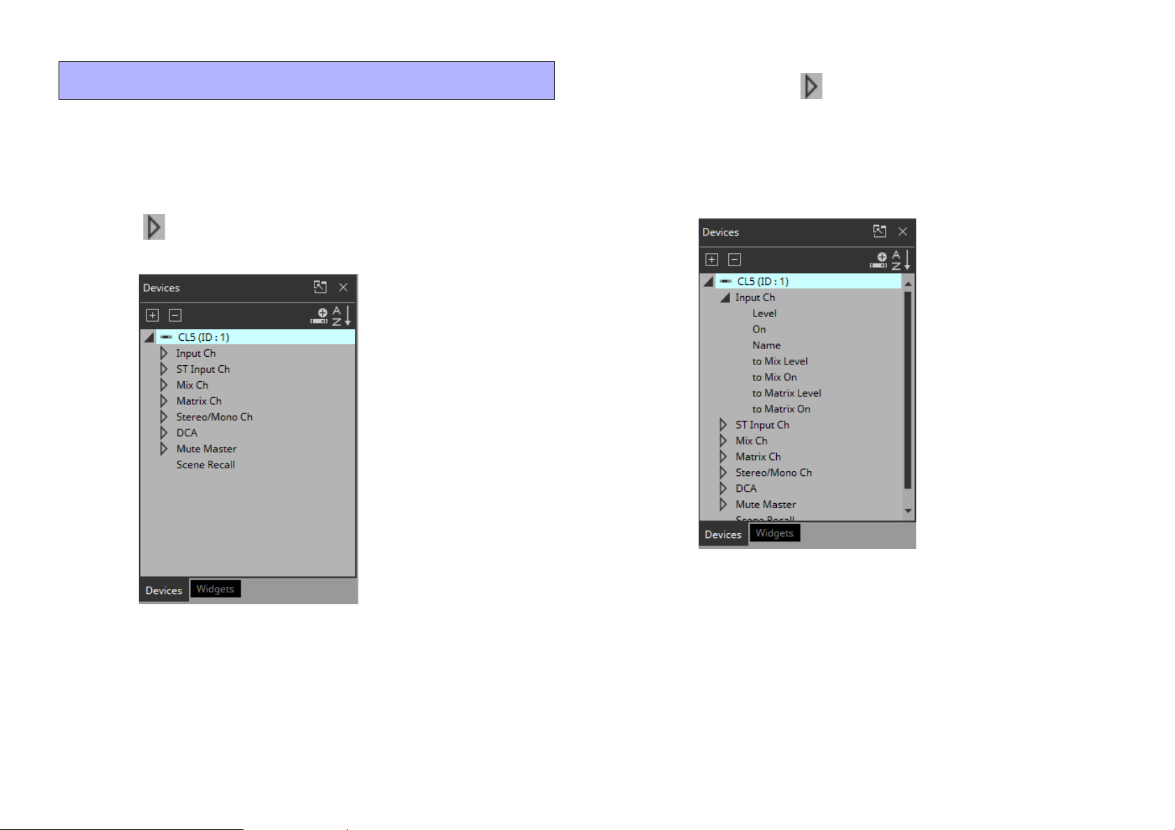
1. In the “Devices” area, in the “Device List,” click the tri-
angle located at the left of CL5.
The parameter group is expanded.
2. Click the triangle located at the left of the parame-
ter group containing the parameter that you want to
assign.
The parameters are expanded.
In this example, we want to control the level and on/off of input channel 1, so you’ll expand [Input Ch].
14
Page 15
3. Drag and drop [Level] in the work area.
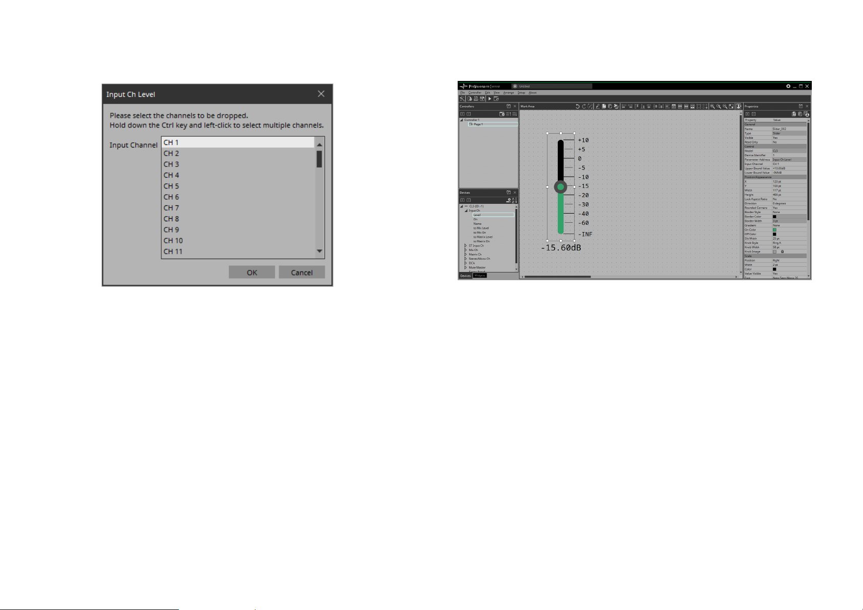
The “Input Ch Level” dialog box opens.
Tips
By holding down the <Ctrl> key or <Shift> key while you make a
selection, you can select multiple channels and place multiple sliders simultaneously.
4. Select [CH1] and click the [OK] button.
The slider is placed in the work area.
15
Page 16
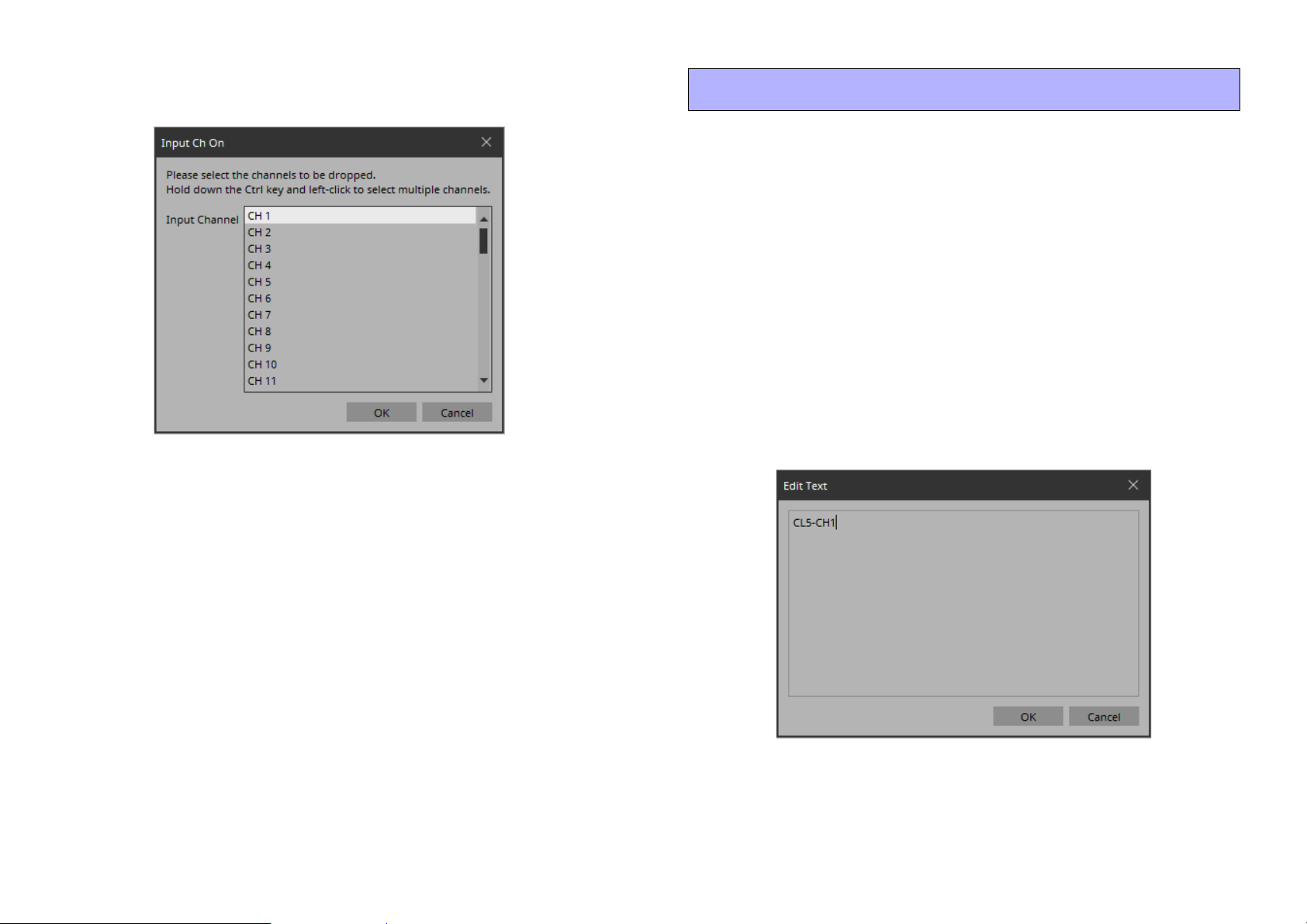
5. Drag and drop [On] into the work area.
The “Input Ch On” dialog box opens.
6. Select [CH1] and click the [OK] button.
The button is placed in the work area.
Labeling widgets for easier recognition
If you simply place a widget, KIOSK will not provide any indication
as to what that widget does; here’s how to add a label that will be
shown in KIOSK.
1. Click the slider.
The slider is selected.
2. In the “Properties” area’s “Label,” click the column at
the right of “Text.”
The “Edit Text” dialog box opens.
3. Enter a name for the slider.
For this example, specify “CL5-CH1.”
7. Drag and drop the slider and button to place them as
you like.
16
Page 17
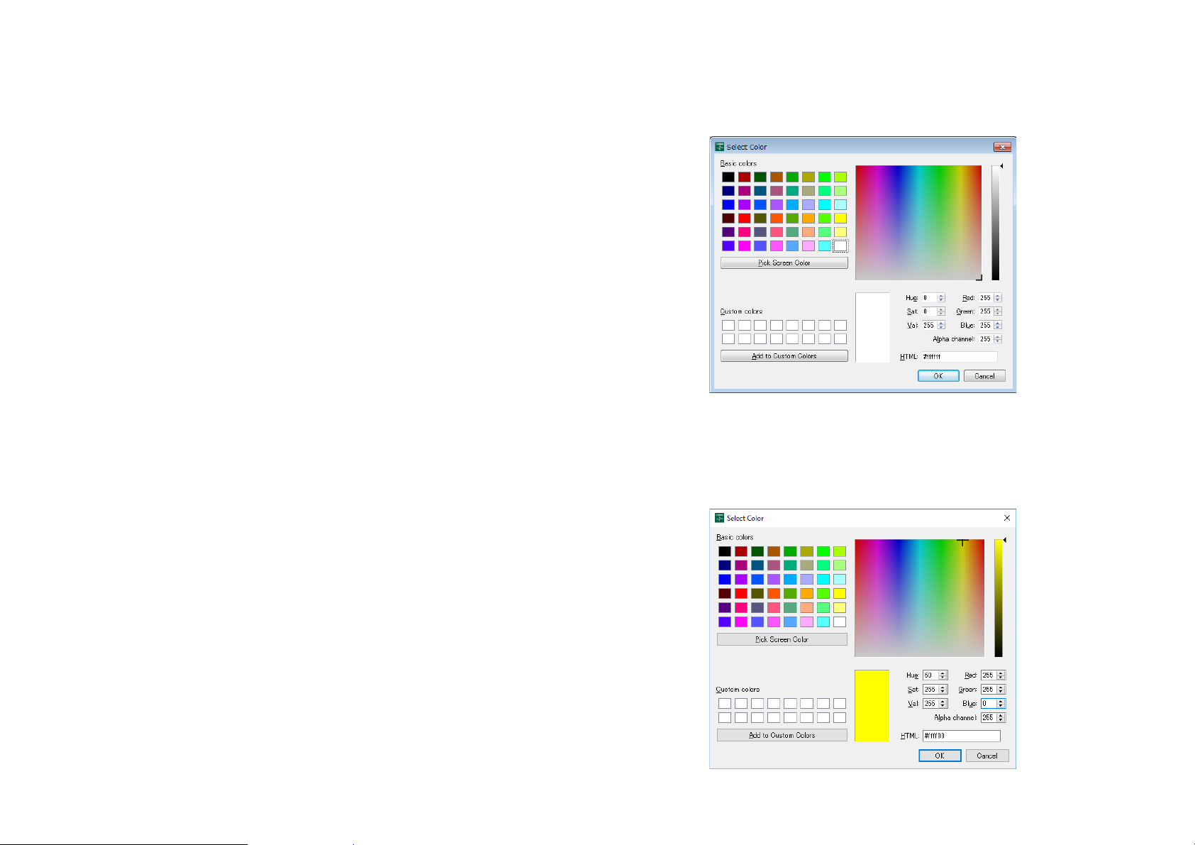
4. Click the [OK] button.
The input is confirmed, and the name is shown below the slider.
5. In the same way, assign the label “CL5-CH1” to the
button.
6. In the button’s “Properties” area, in “Text,” click the
column at the right of “On Text.”
The “Edit Text” dialog box opens.
7. Enter the text for when the button is on.
For this example, specify “ON.”
8. In the “Text” area, click the column at the right of “Off
Text.”
The “Edit Text” dialog box opens.
10. In the “Text” area, click the column at the right of
“Off Color.”
The “Select Color” dialog box opens.
9. Enter the text for when the button is off.
For this example, specify “OFF.”
11. Select a different text color for when the button is
off.
For this example, select yellow.
17
Page 18
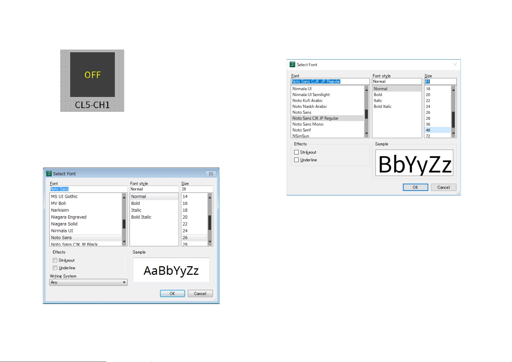
12. Click the [OK] button.
The dialog box closes, and the text color when off will be yellow.
13. In the “Text” area, click the column at the right of
“Font.”
The “Select Font” dialog box opens.
14. Adjust the font used for the text when the button is
on/off.
For this example, set the font size at 48 points.
15. Click the [OK] button.
The dialog box closes, and the text size when the button is on/off
will change.
18
Page 19
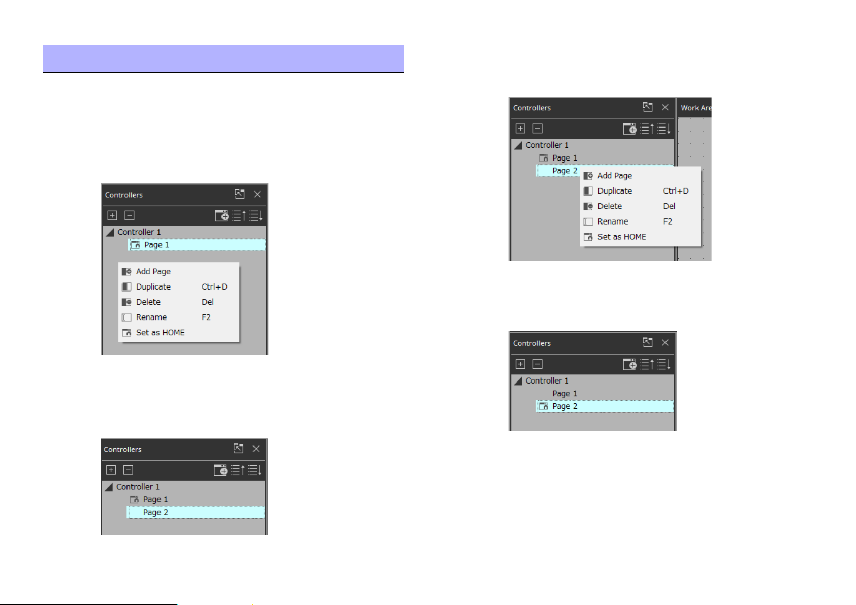
Adding a page
Let’s add a page to the controller, and add buttons for switching
between pages.
1. In the “Controllers” area, right-click any location.
The context menu appears.
3. Right-click the added page.
The context menu appears.
4. Select [Set as HOME].
The added page becomes the home page.
2. Select [Add Page].
A page is added to [Controller 1], and the work area switches to the
page that was added.
5. Right-click the added page.
The context menu appears.
19
Page 20
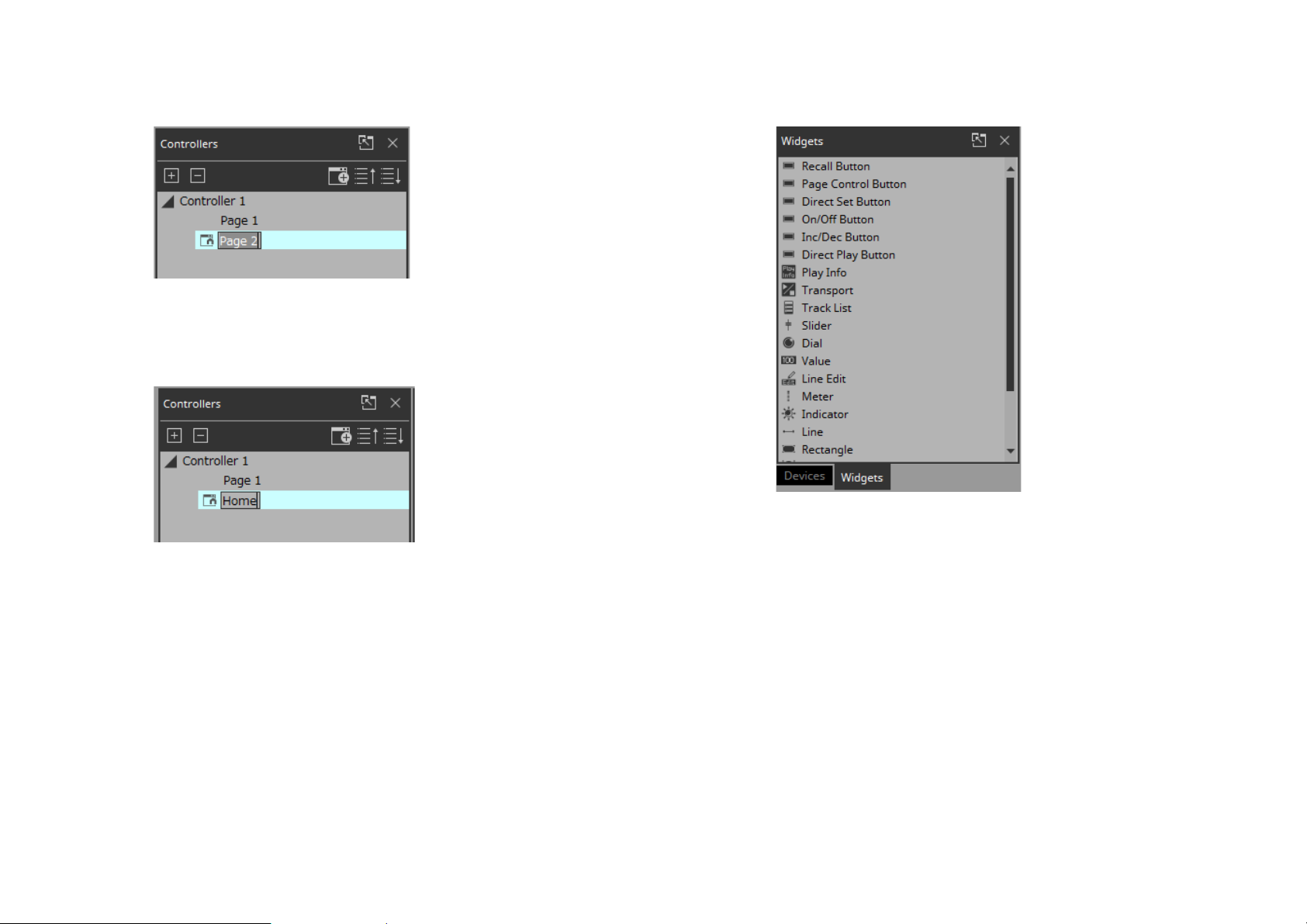
6. Select [Rename].
Now you can rename the page.
7. Enter a name for the page.
Since this is the home page for this example, specify “Home.”
8. In the “Devices” area, click the [Widgets] tab.
The area switches to the “Widgets” area.
9. Drag and drop [Page Control Button] into the work
area.
A button for switching pages is placed in the work area.
20
Page 21
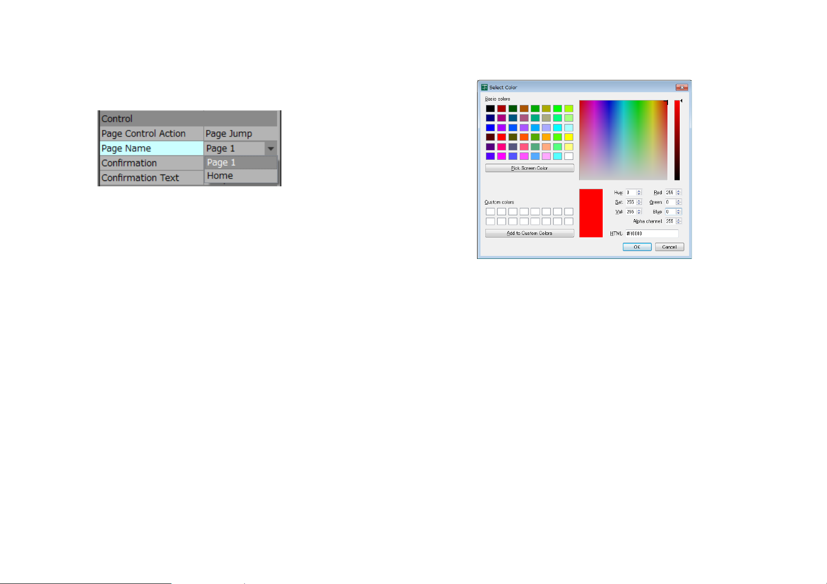
10. In the “Properties” area’s “Control,” click the col-
umn at the right of “Page Name.”
When you click the button, the pages that can be switched are
shown as a list.
11. Select [Page 1].
When in control mode, clicking the button will now switch to
“Page 1.”
12. In the “Position/Appearance” area, click the column
at the right of “Color.”
The “Select Color” dialog box opens.
13. Select the color for when the button is clicked.
For this example, select red.
14. Click the [OK] button.
The dialog box closes, and the button turns red.
15. In the “Label” area, click the column at the right of
“Text.”
The “Edit Text” dialog box opens.
21
Page 22
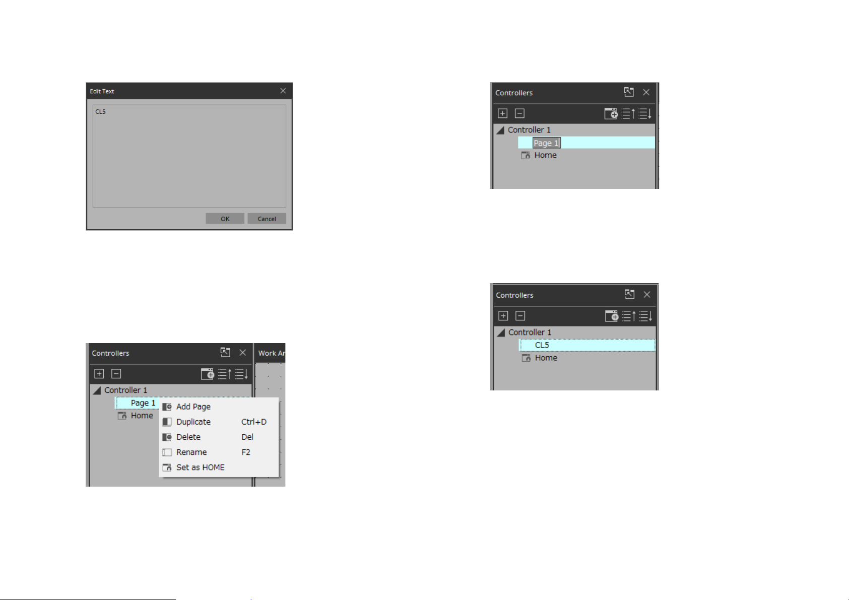
16. Enter a name for the button.
For this example, specify “CL5.”
17. Click the [OK] button.
“CL5” is shown below the button.
18. In the “Controllers” area, right-click [Page 1].
The Page 1 work area appears, and the context menu appears.
19. Select [Rename].
Now you can enter a name for “Page 1” from the keyboard.
20. Enter a name for the page.
In this example, this page is specifically for the CL5, so specify
“CL5.”
22
Page 23
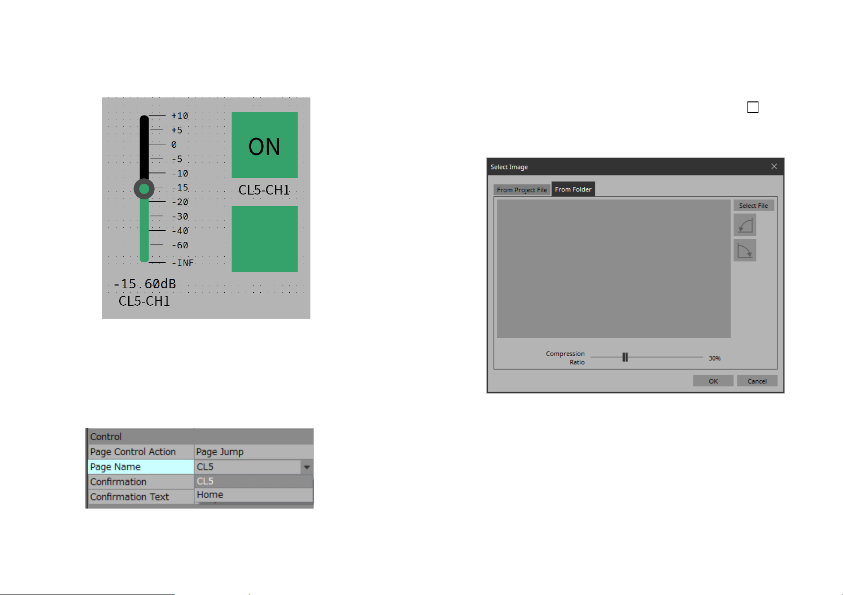
21. From the “Widgets” area, drag and drop [Page Con-
trol Button] into the work area.
A button for switching pages is placed in the work area.
23. Select [Home].
When in control mode, clicking the button will now switch to
“Home.”
24. In the “Position/Appearance” area, click the at the
right of “Image.”
The “Select Image” dialog box opens.
22. In the “Properties” area’s “Control,” click the col-
umn at the right of “Page Name.”
When you click the button, the pages that can be switched are
shown as a list.
23
Page 24
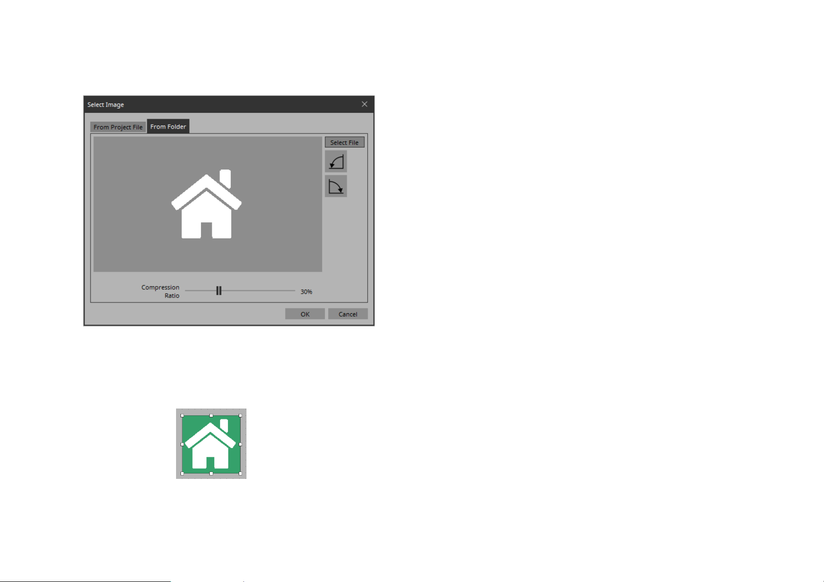
25. Click the [Select File] button, and select a desired
image file from the computer.
In this example, we use a white icon of a house.
26. Click the [OK] button.
The dialog box closes, and the image is applied to the button that
moves to the “Home” page.
24
Page 25
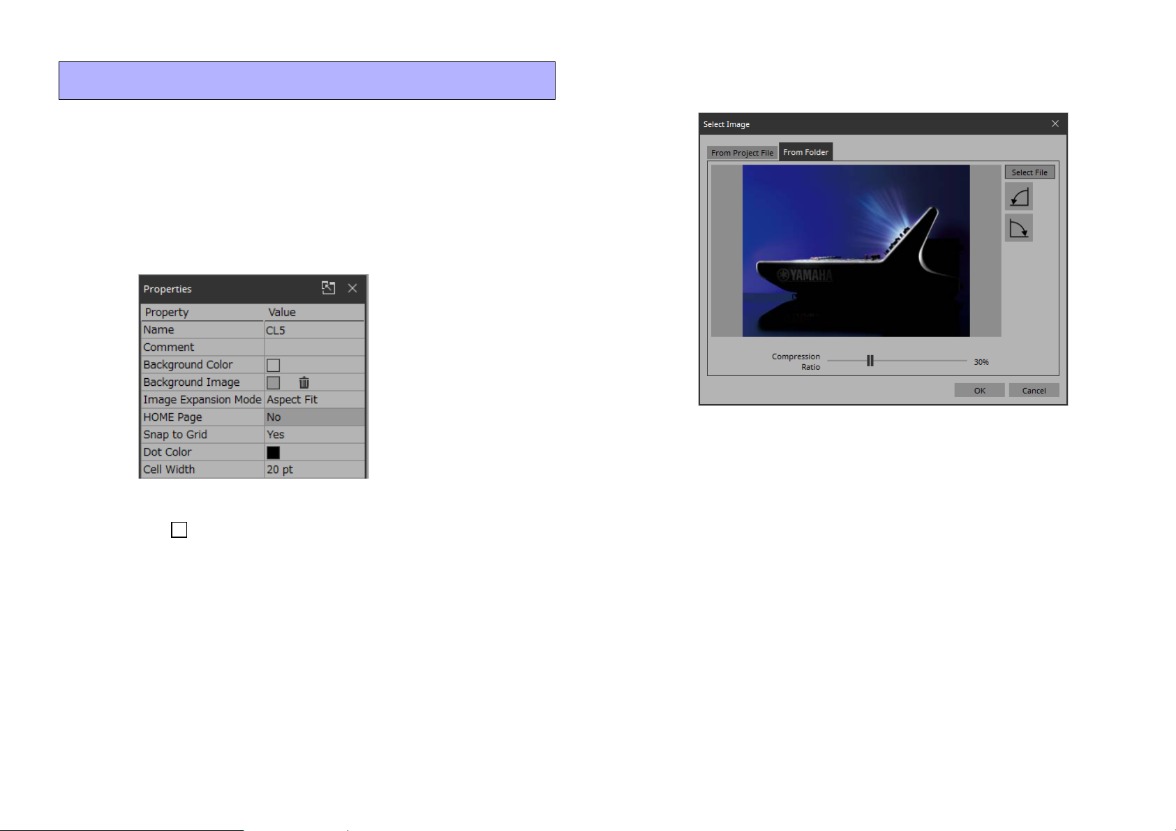
Specifying a background for the page
If you want to specify a background, you’ll save time by specifying
the background before you adjust the placement of the widgets.
1. Click somewhere in the work area where there is no
widget.
“Properties” shows the settings of the page.
2. Click the at the right of “Background Image.”
The “Select Image” dialog box opens.
3. Click the [From Folder] tab.
4. Click the [Select File] button, and select an image.
5. In the “Select Image” dialog box, use the [Compres-
sion Ratio] slider to change the compression ratio.
Since this image data is embedded in the project file or controller file,
a lower compression ratio will increase the size of the file.
A large file size will affect the operation of the overall application, so
we recommend that you compress the image a certain amount to
decrease the file size.
6. Click the [OK] button.
25
Page 26
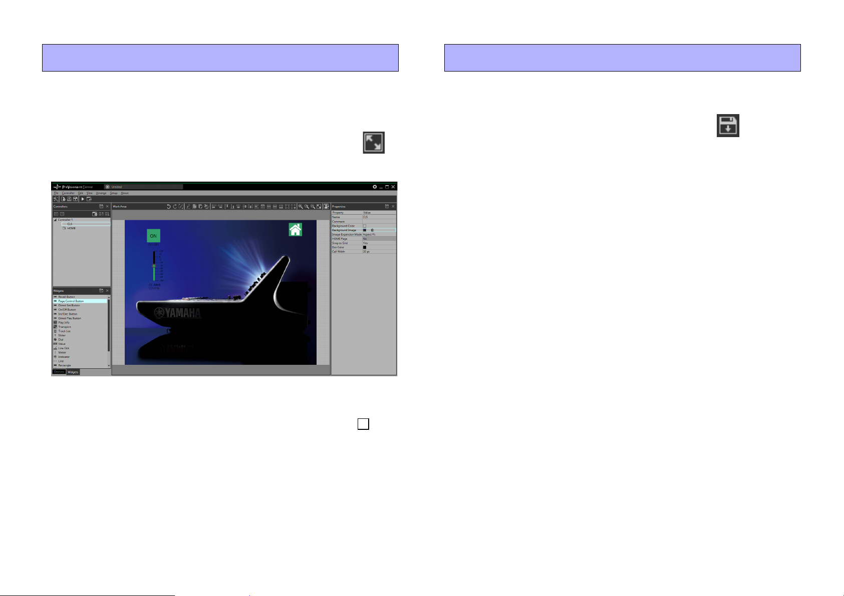
Adjusting the placement of the widgets Saving the project file
Now we’ll make adjustments while watching the widgets that we
placed.
1. On the menu bar, click the [Fit to Screen] button
so that the entire page is visible.
Let’s save the project that we created so far.
1. On the menu bar, click the [Save] button .
The “Save File” dialog box appears.
If file was saved, it is overwritten by the saved data.
2. If the “Save File” dialog box appears, specify a save
location for the file, assign a file name, and save it.
2. To change the size of the widget, and then adjust its
size by clicking and dragging the white squares that
are shown around its edges.
3. Drag and drop the widget to adjust its position.
4. As necessary, use the “Properties” area to adjust the
text size etc. of the label.
Perform these steps for each page.
26
Page 27
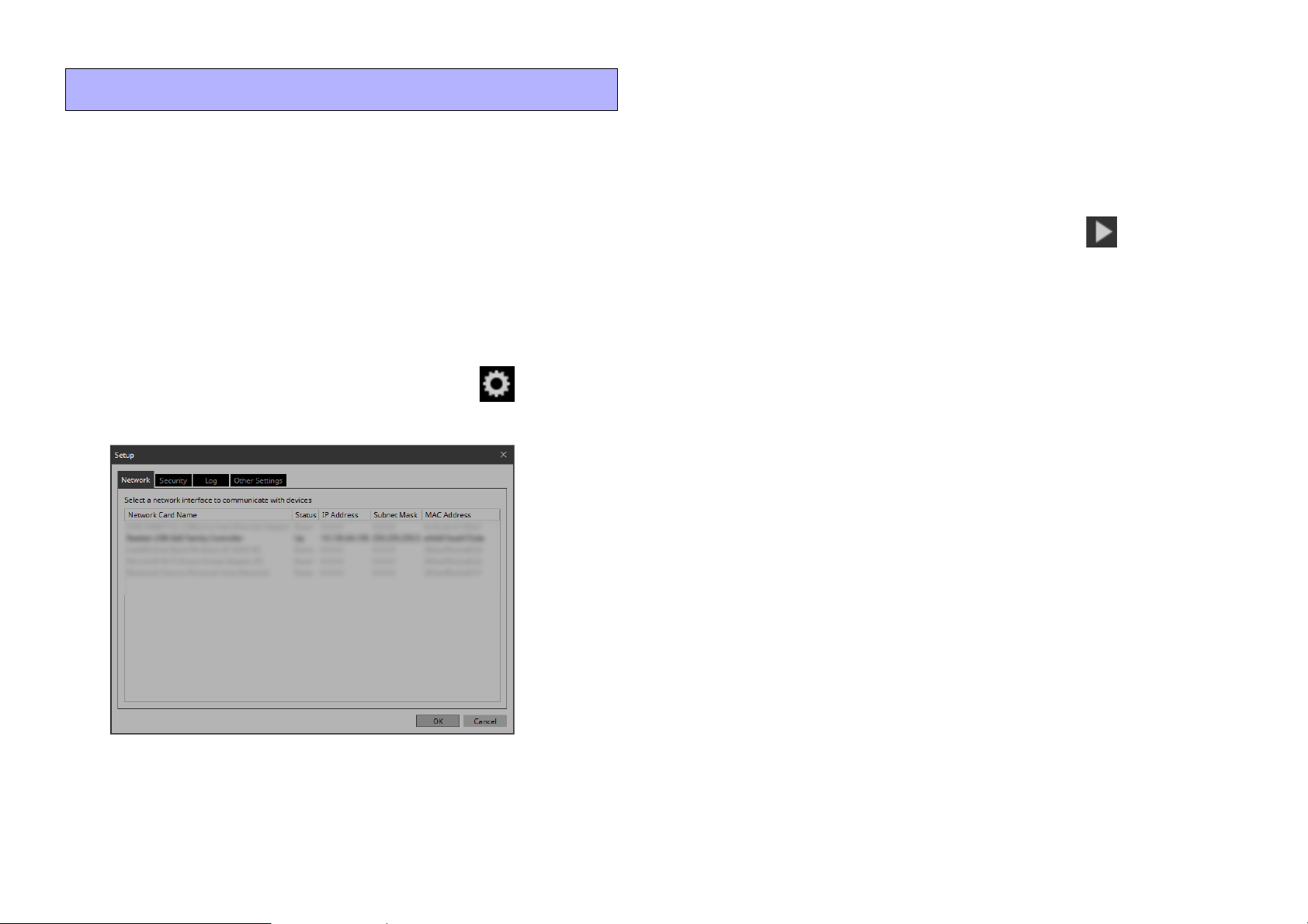
Testing operation
Let’s operate the widgets on each page to verify that they work. We
assume that there is a device that is being controlled.
5. Click the [OK] button.
The dialog box closes.
6. In the “Controllers” area, select the controller that you
want to operate.
1. Power-on the device.
2. Connect the computer to the network that is con-
nected to the device’s NETWORK port.
For details on settings for the computer, refer to “Specifying the IP
address.”
3. On the title bar, click the [Setup] button .
The “Setup” dialog box opens.
7. On the tool bar, click the [Run] button .
KIOSK starts.
NOTE
An instance of KIOSK that is started by clicking the [Run] button differs from a stand-alone instance of KIOSK; for example, it has no
[Setup] button.
8. Note that the indication “All Devices are ONLINE” is
shown in the upper right.
If this indicates “All Devices are OFFLINE,” then KIOSK has not
detected the devices. Make sure that the network settings of the
devices and the computer are correct.
9. Click the button labeled “CL5.”
The page changes.
10. Operate the fader and button, and verify that they
are linked with the device.
If you want to edit the placement etc., exit KIOSK and proceed as
described in “Adjusting the placement of the widgets.” The
changes are not applied if KIOSK is left running.
4. Select the network interface card that is connected to
the network that is connected to the device’s NETWORK port.
11. Exit KIOSK.
27
Page 28
Making security settings
Now we’ll specify the screen lock settings and the various pass
codes used to unlock restricted functions.
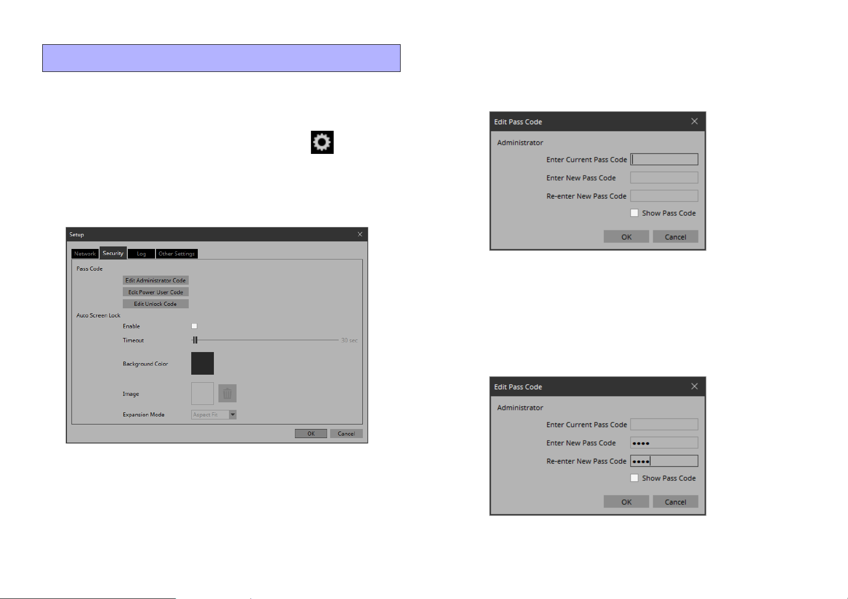
1. On the title bar, click the [Setup] button .
The “Setup” dialog box opens.
2. Click the [Security] tab.
The security settings screen appears.
3. Click the [Edit Administrator Code] button.
The “Edit Pass Code” dialog box appears, with “Administrator”
shown in the upper left.
4. Enter the same four-digit number into the [Enter New
Pass Code] text box and the [Re-enter New Pass
Code] text box.
The number that you entered will be the administrator pass code.
Since a pass code is not specified by default, leave the [Enter Current
Pass Code] text box blank.
28
Page 29
5. Click the [OK] button.
The administrator pass code is confirmed.
6. In the same way, click the [Edit Power User Code] but-
ton or the [Edit Unlock Code] button to specify pass
codes for power users or for staff.
Since the staff pass code can be changed by the power user, you don’t
need to specify the staff pass code if the power user will specify it.
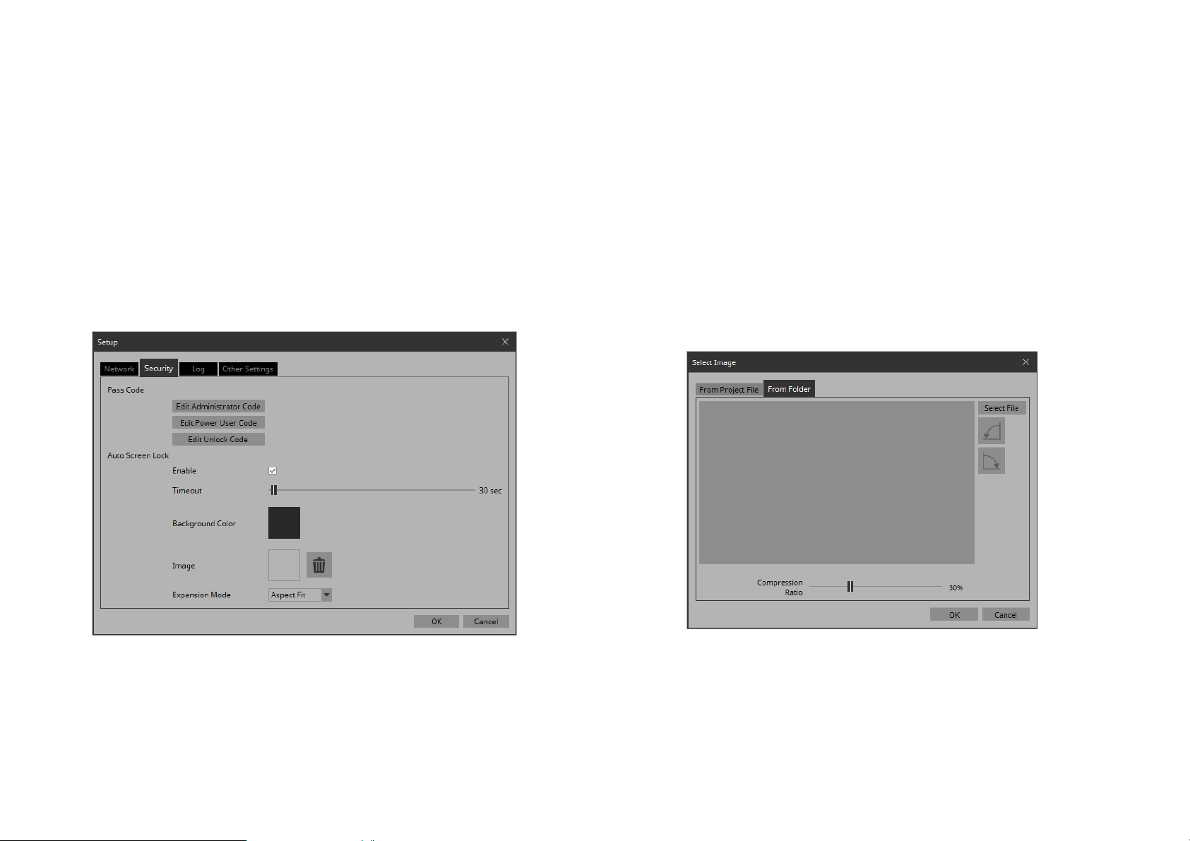
7. In the Screen Lock area, select the [Enable] check
box.
Now you can make screen lock settings.
8. Use the [Timeout] slider to specify the number of sec-
onds since the last operation until the screen is
locked.
9. Specify the display when the screen is locked.
If you want to specify a solid color, click the [Background Color]
field. The color selection screen appears.
If you want to specify an image, click the at the right of [Image]. In
this example we will specify an image, so click the .
10. Click the [From Folder] tab.
A screen appears, allowing you to apply an image file from the
computer.
29
Page 30
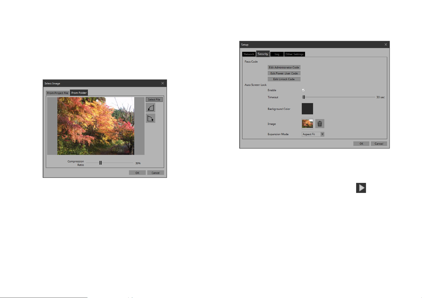
11. Press the [Select File] button, and select the image
file that is shown when the screen is locked.
12. In the “Select Image” dialog box, use the [Compres-
sion Ratio] slider to change the compression ratio.
Since this image data is embedded in the project file or controller
file, a lower compression ratio will increase the size of the file.
13. Click the [OK] button.
Close the dialog box to return to the “Setup” dialog box.
14. Click the [OK] button.
The dialog box closes.
15. On the tool bar, click the [Run] button .
KIOSK starts.
30
Page 31
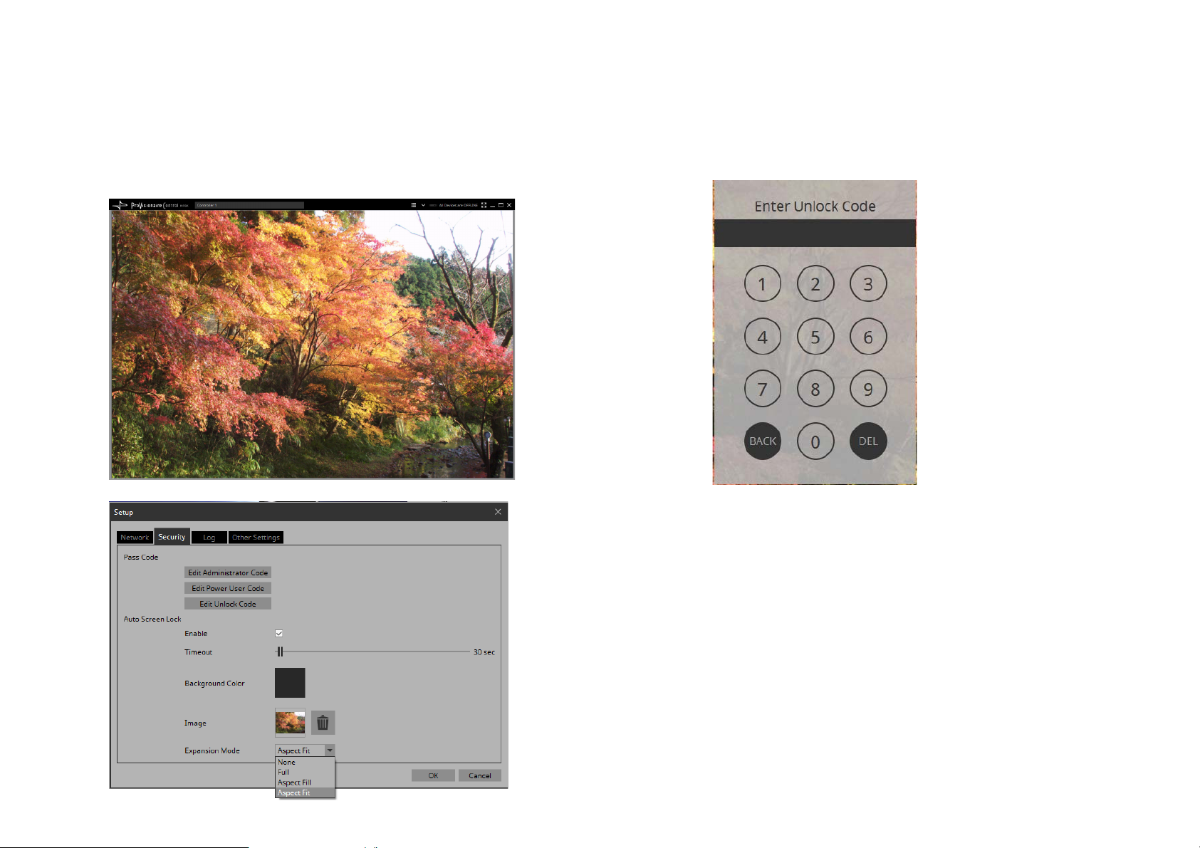
16. Refrain from performing any operation for the length
of time specified by the [Timeout] slider.
The lock screen appears.
If you want to change the appearance of the image, exit KIOSK,
and in the “Setup” dialog box’s [Security] tab, use [Expansion
Mode] to change the appearance.
17. Click the lock screen.
The screen indicates “Enter Unlock Code,” allowing you to unlock
the screen.
If you did not specify an “Edit Unlock Code” in step 6, you return
to the screen without any “Enter Unlock Code” indication.
18. Click to enter the Unlock Code that you specified in
step 6.
31
Page 32
Creating a controller file Making KIOSK start automatically
Here’s how to create a controller file for KIOSK installed on the
actual operating terminal.
For details on creating a controller file for ProVisionaire Touch
KIOSK and sending it to the iPad, refer to the “Export Controller
File” dialog box.
1. In the “Controllers” area, select the controller for
which you want to create a controller file.
2. On the tool bar, click the [Export] button .
The “Export Controller File” dialog box opens.
3. Assign a file name, and click [Save].
The controller file is saved.
Here’s how to make KIOSK automatically start up and open a specific controller file (ypvc) when Windows starts on the operating terminal.
For details on settings in ProVisionaire Touch KIOSK, refer to “ProVisionaire Touch Setup Guide.” You can download the setup guide
by searching from the following URL.
https://download.yamaha.com/
1. Start the operating terminal.
2. Install KIOSK.
3. Place the controller file in the following folder.
C:\Users\xxxx\AppData\Roaming\Microsoft\
Windows\Start Menu\Programs\Startup
xxxx is the user name when logging in to the computer.
In some cases, folder names might be shown translated into a different language.
If the AppData folder is not shown in Explorer, enter the folder name
directly into the address bar.
4. Restart the computer.
When you log in, KIOSK starts and the controller file opens. The first
time, the “Setup” dialog box will open; select the interface that is
connected to the same network as the device to be controlled, and
click the [OK] button.
This completes basic operations.
32
Page 33
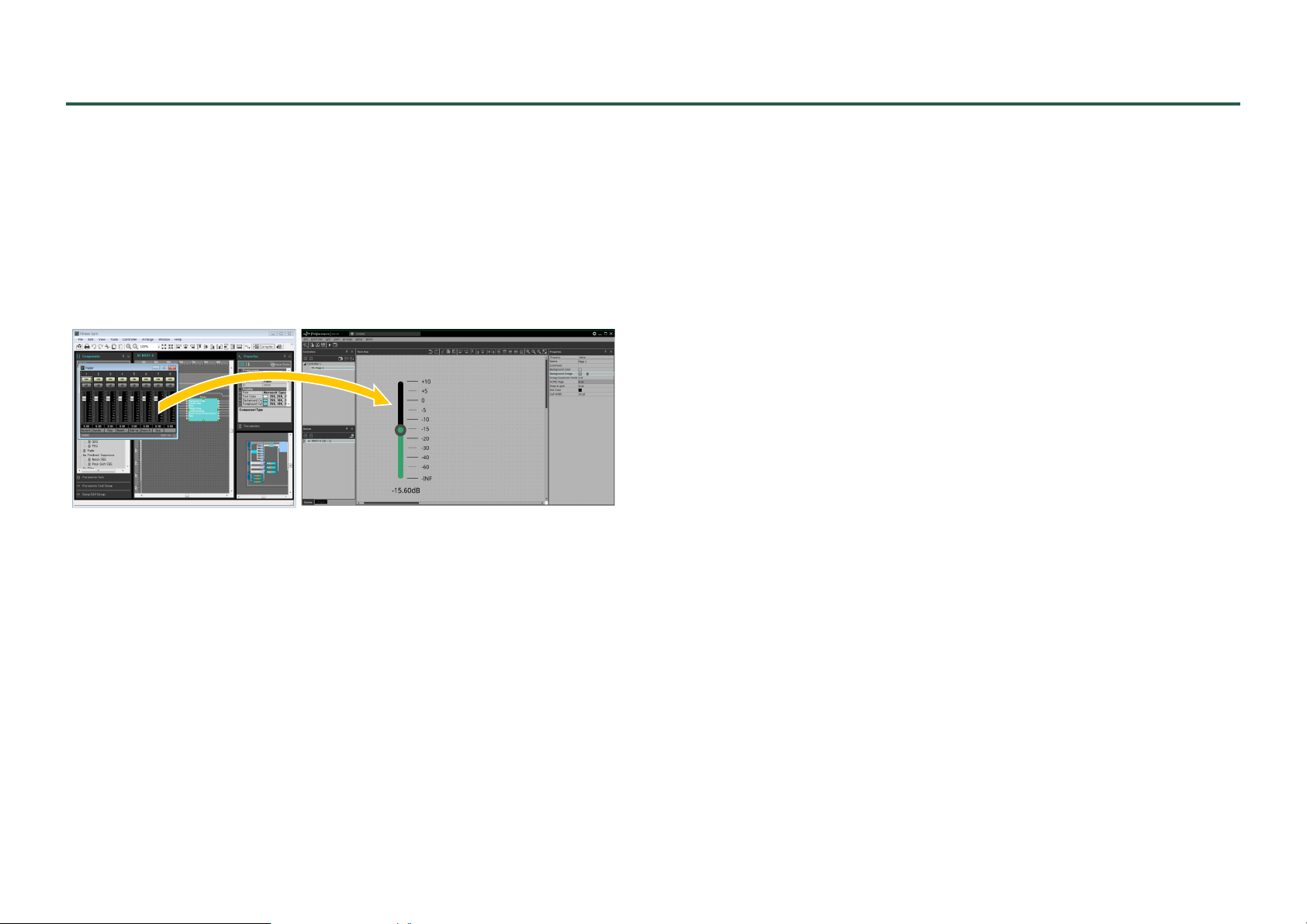
Adding parameters or meters for an MTX/MRX system
Since the MRX is freely configurable, it is not possible to register
parameters or meters in ProVisionaire Control ahead of time.
In order to place the MRX’s parameters or meters in the work area,
start MRX Designer; then from MRX Designer’s “Parameters” area
or from the component editor, drag and drop parameters or meters
into the ProVisionaire Control work area while holding down the
<Ctrl> key.
In the same way, parameters or meters of the MTX/MRX system
(except for the MRX) can be dragged and dropped from MTX-MRX
Editor into the work area of ProVisionaire Control while holding
down the <Ctrl> key to place them.
NOTE
If the controller’s “Type” is “ProVisionaire Touch Kiosk,” and you attempt
to place a widget that ProVisionaire Touch does not have, it is replaced
by a widget that has similar functionality.
33
Page 34
Functions specific to initial mode
Initial mode shows a list of the files that have been previously
opened.
In initial mode, a menu for handling the file list is shown in the
upper right.
Menu Summary
[Load] Opens the selected file.
[Favorite]
[Remove from
History]
To open a file that is not shown in the list, click the [Open Project
File] button in the upper left and open the file, or double-click
Adds a mark to the file.
Click once again to remove the mark.
Removes the selected file from the list.
The file itself is not deleted.
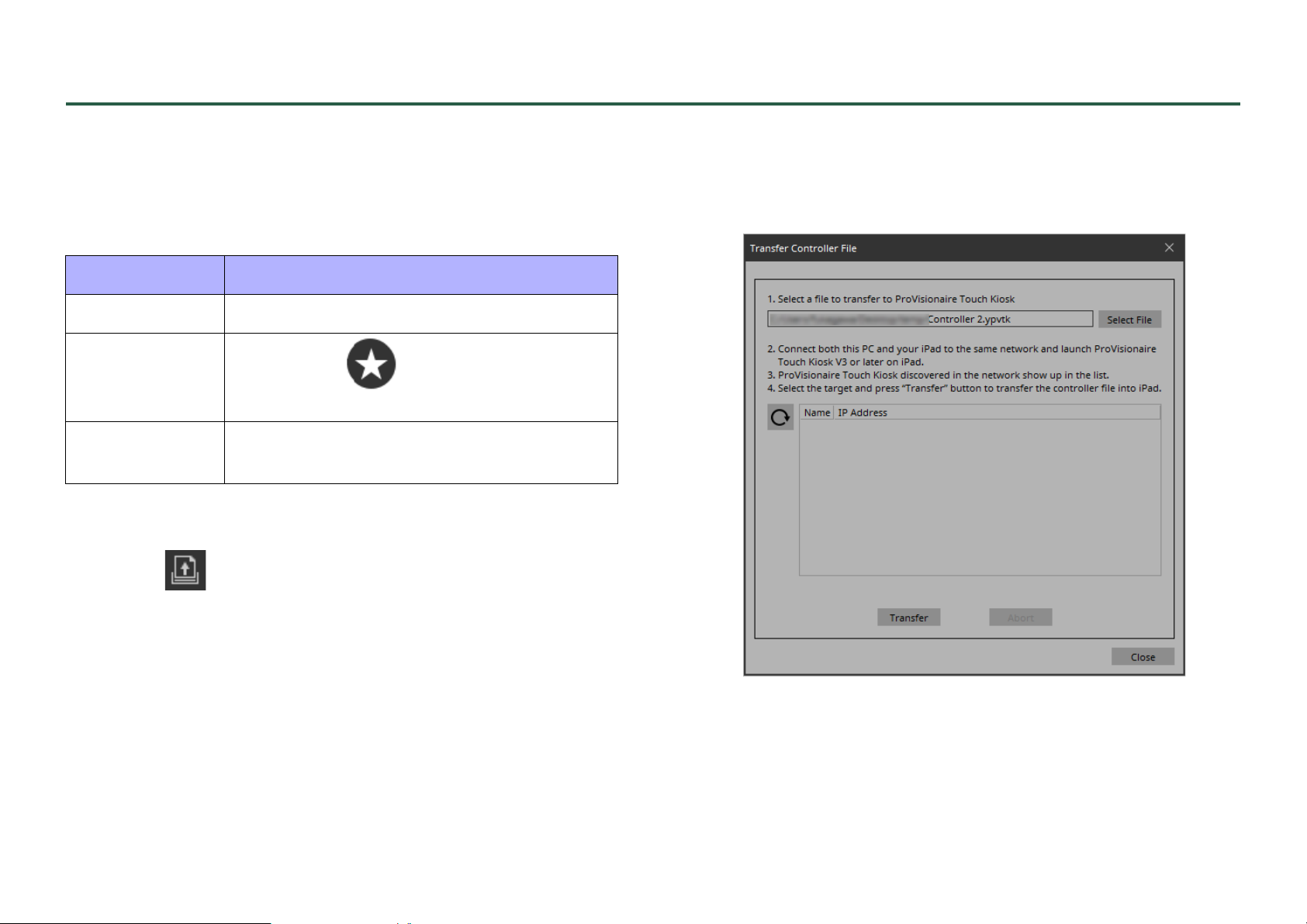
“Transfer Controller File” dialog box
Here you can transfer a controller file to an iPad that is running ProVisionaire Touch KIOSK and is on the same network.
the file.
To use the exported controller file for ProVisionaire Touch KIOSK,
send it to the iPad from the “Export Controller File” dialog box,
which is accessed via KIOSK’s [Controller] menu item [Export
Controller File].
• [Select File] button
Selects the controller file for ProVisionaire Touch KIOSK that
you want to transfer.
34
Page 35

• (Refresh) button
Updates the iPad list.
• [Name]/[IP Address]
Shows information about the iPad units that are connected to the
same network as the computer running KIOSK and is running
ProVisionaire Touch KIOSK. When transferring a controller
file, select the transfer-destination in this field.
• [Transfer] button
Transfers the currently selected controller file to the iPad that is
selected by [Name]/[IP Address].
• [Abort] button
Cancels controller file transfer.
• [Close] button
Closes the dialog box.
35
Page 36
Title bar
qw y
qw e t y
ru
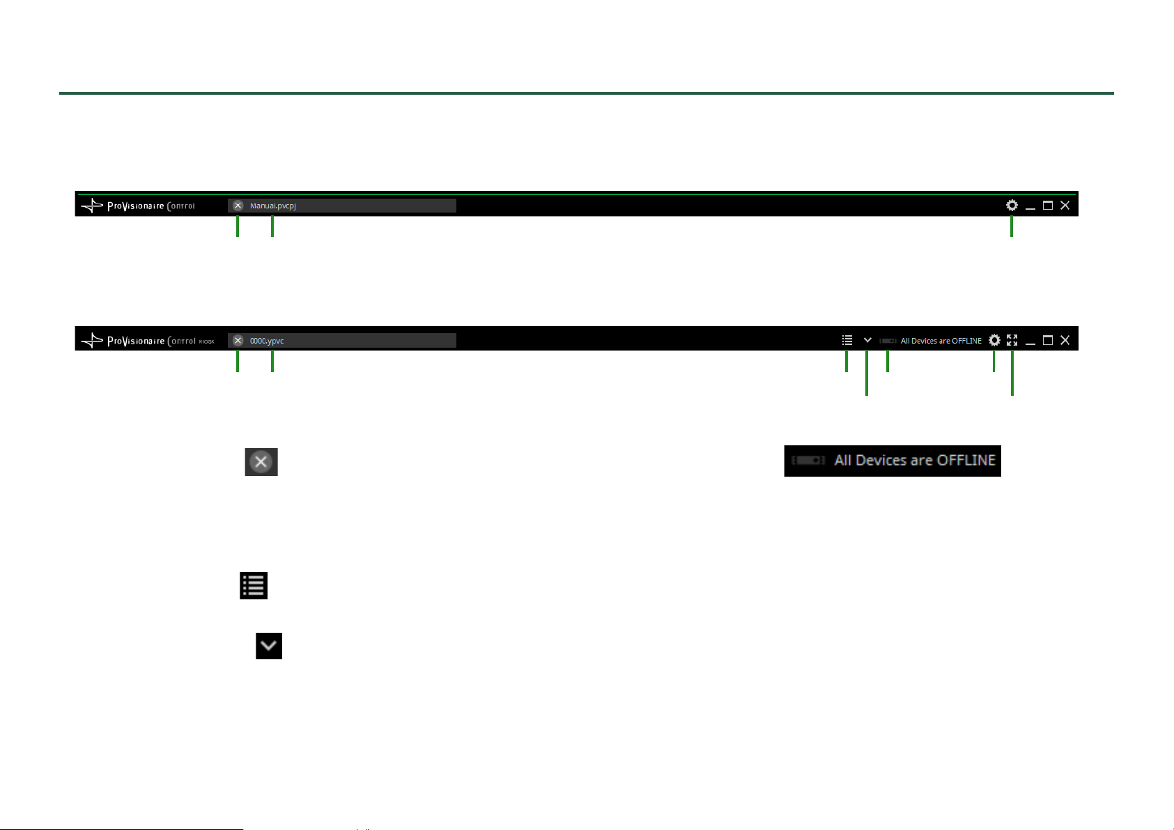
This shows the name of the currently open file, and provides buttons that let you change the screen display settings, etc.
• ProVisionaire Control
• KIOSK
q [Close File] button
Closes the open project file or controller file.
w File name
Shows the name of the opened file.
e [Page List] button
Shows a page list where you can switch pages.
r [Device Info] button
Shows information about the devices that are registered in the controller file.
t Online indicator
Indicates whether the devices registered in the controller file are
online.
Green icon: All devices registered in the controller file are online.
Yellow icon: Some of the devices registered in the controller file are
Red icon: The devices registered in the controller file are discov-
Gray icon: No devices are online.
36
online.
ered, but are not online.
Page 37
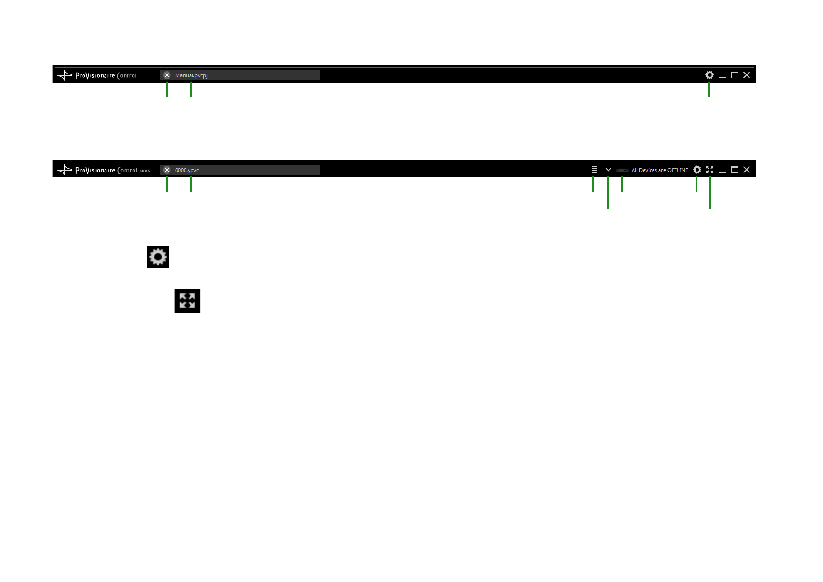
• ProVisionaire Control
qw y
qw e t y
ru
• KIOSK
y [Setup] button
Opens the “Setup” dialog box, allowing you to select a network interface and make security settings.
u [Fullscreen] button
Puts KIOSK’s display in full screen mode. To exit full screen mode, press the <Esc> key.
37
Page 38
Menu bar
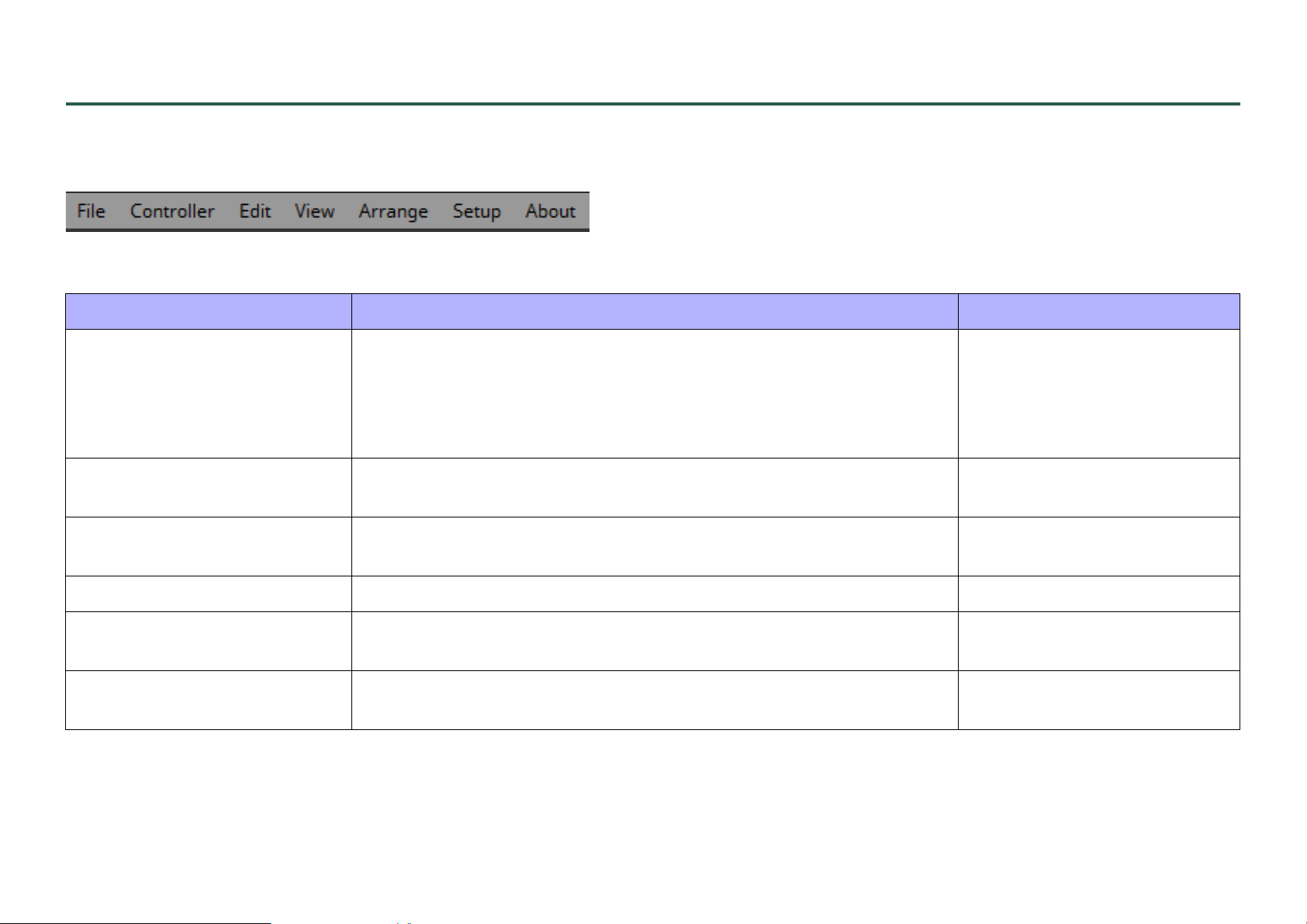
This contains commands that can be executed by ProVisionaire Control, organized by category. In initial mode, only some of the commands are
shown.
[File]
Command Summary Dialog box opened
[New Project] Creates a new project file. If you were editing the project file, a confir-
mation message appears. If the “New Project Wizard” dialog box’s
[Don’t show this dialog again when creating new project] check box is
selected, the “New Project Wizard” dialog box does not appear; the
project is created with the “Controllers” area and “Devices” area blank.
[Open Project File] Opens an existing project file. If you were editing the project file, a con-
firmation message appears.
[Save] Overwrite-saves the project file. The first time a file is saved, the “Save
File” dialog box opens; assign a name to the file and save it.
[Save As] Saves the project file as a different file. “Save File” dialog box
[Close Project] Closes the project file. If you were editing the project file, a confirmation
message appears.
[Exit] Exits ProVisionaire Control. If you were editing the project file, a confir-
mation message appears.
“New Project Wizard” dialog
box or “Setup” dialog box
“Open File” dialog box
—
Initial mode
—
38
Page 39
[Controller]
Command Summary Dialog box opened
[Add] Adds a controller. One page is added to the controller that is added. “Add Controller” dialog box
[Run] Runs the selected controller in control mode.
If the controller’s [Type] is ProVisionaire Touch KIOSK, this opens the
“Run Controller File” dialog box. Transfer the controller, and use ProVisionaire Touch KIOSK on the iPad to verify that it operates.
[Import] Selects the controller you want to copy from the project file. “Import Controller File” dialog
[Export] Creates a controller file for the selected controller. This also transfers
the ProVisionaire Touch KIOSK controller file to the iPad on which ProVisionaire Touch KIOSK is installed.
“KIOSK” or “Run Controller
File” dialog box
box or “Select Controllers to
Import” dialog box
“Export Controller File” dialog
box or “Transfer Controller File”
dialog box
[Edit]
Command Summary Dialog box opened
[Undo] Cancels the previous operation. Some items cannot be undone. —
[Redo] Re-executes the operation that was canceled by [Undo]. —
[Repeat] Repeats the most recent widget style-related operation that was exe-
cuted. Some items cannot be repeated.
—
[Cut] Moves the selected object into the copy buffer. —
[Copy] Copies the selected object into the copy buffer. —
[Paste] Pastes the object from the copy buffer. —
[Copy Style] Copies the style of the selected single widget to the copy buffer. —
39
Page 40
Command Summary Dialog box opened
[Paste Style] Pastes the Properties information from the copy buffer to the selected
widget.
[Save as Style] Registers the style of the selected widget as the style (default settings). —
[Apply Style] Applies the style to the selected widget. —
[Duplicate] Duplicates the selected widget. —
[Duplicate to Other Channels] Duplicates the selected single widget, and assigns it to a different chan-
nel. Multiple channels can be selected for duplication.
[Delete] Deletes the selected widget. —
[Select All] Selects all widgets on the page. —
[Imported Images] Shows/deletes the image data in the project file. “Imported Images” dialog box
[Create Multi Button] Creates a multi button that operates multiple buttons in a single action.
Before executing this command, select the buttons to which it will apply.
[Create Multi Slider] Creates a multi slider. Before executing this command, select the slider
to which it will apply.
—
—
—
—
40
Page 41
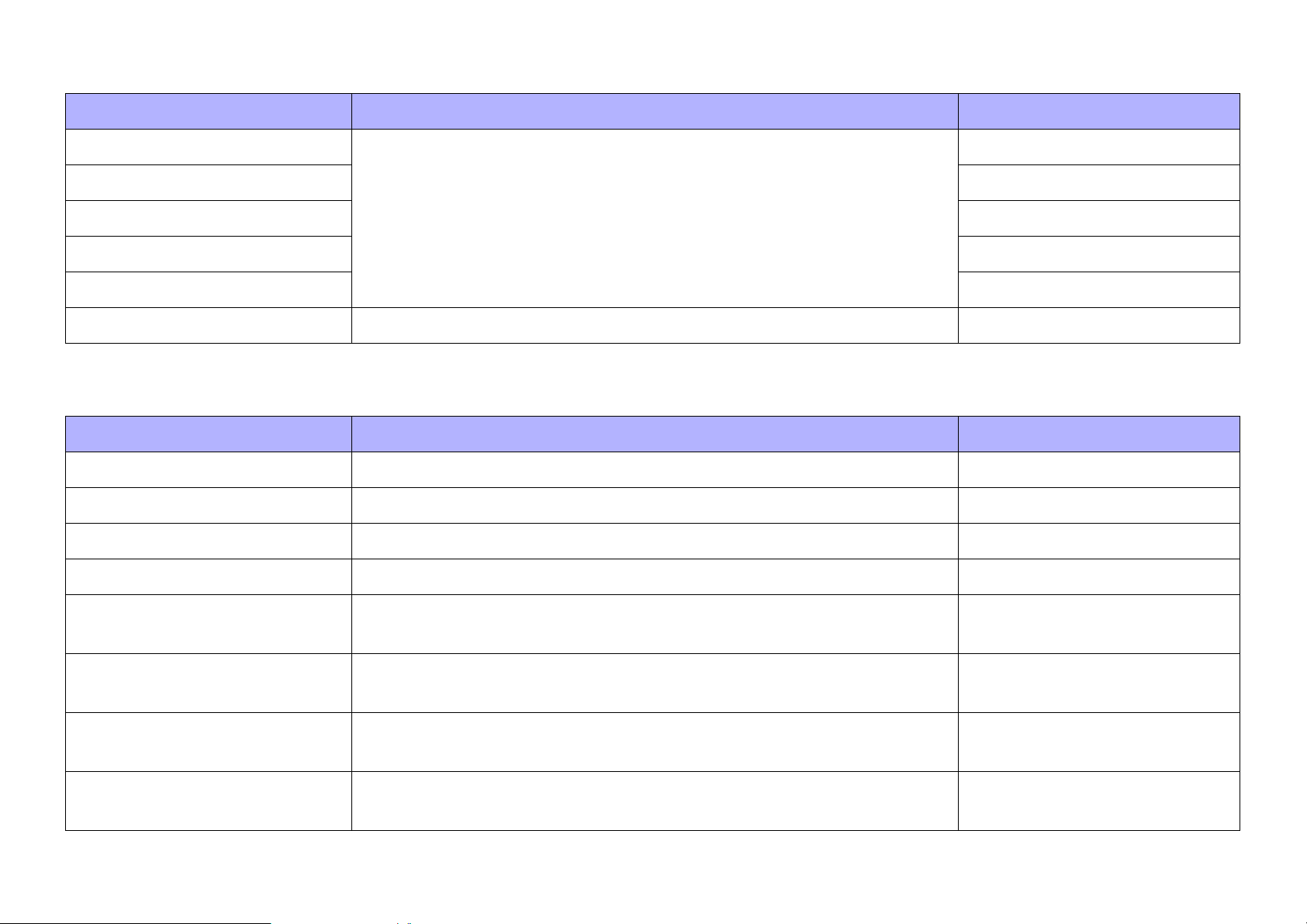
[View]
Command Summary Dialog box opened
[Devices] If this has a check mark, the corresponding area is shown. —
[Widgets] —
[Controllers] —
[Properties] —
[Tool Bar] —
[Dock All] Cancels the floating state of all areas. —
[Arrange]
Command Summary Dialog box opened
[Align Left] Aligns the left edge to the left-most of the multiple selected widgets. —
[Align Right] Aligns the right edge to the right-most of the multiple selected widgets. —
[Align Top] Aligns the top edge to the highest of the multiple selected widgets. —
[Align Bottom] Aligns the bottom edge to the lowest of the multiple selected widgets. —
[Align Horizontal Center] Aligns the center of the widget to the horizontal mid-point of the multiple
selected widgets.
[Align Vertical Center] Aligns the center of the widget to the vertical mid-point of the multiple
selected widgets.
[Distribute Horizontally] Equidistantly spaces the multiple selected widgets in the horizontal
direction.
[Distribute Vertically] Equidistantly spaces the multiple selected widgets in the vertical direc-
tion.
41
—
—
—
—
Page 42
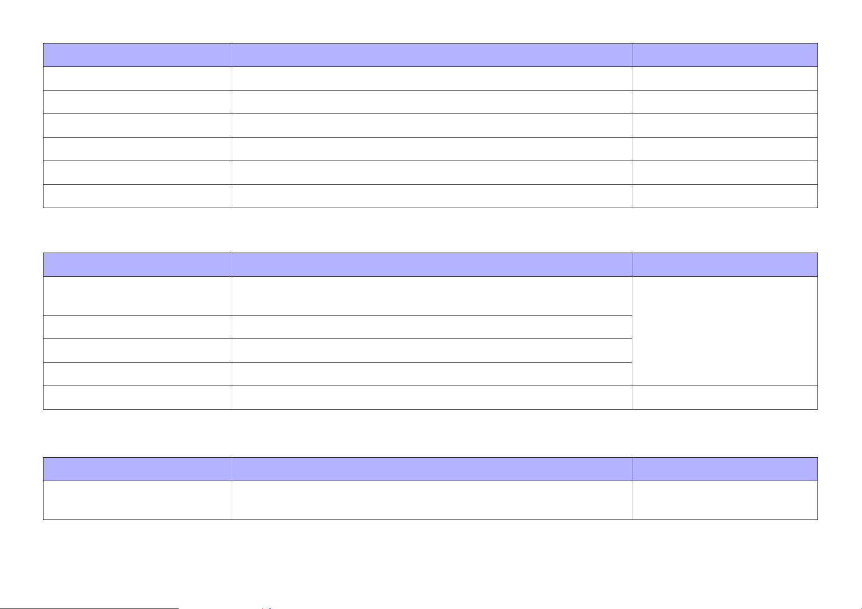
Command Summary Dialog box opened
[Bring to Front] Moves the selected widget all the way forward. —
[Bring Forward] Moves the selected widget forward. —
[Send Backward] Moves the selected widget backward. —
[Send to Back] Moves the selected widget all the way back. —
[Group] Groups the selected multiple widgets. —
[Ungroup] Cancels grouping for the selected group. —
[Setup]
Command Summary Dialog box opened
[Network] Selects a computer network interface card for communicating with
devices.
[Security] Makes security settings.
[Log] Makes settings related to ProVisionaire Monitoring Service.
[Others] Specifies the units for the size and position information of the widgets.
[Style] Confirms and edits the style of each widget in the project. “Style” dialog box
“Setup” dialog box
[About]
Command Summary Dialog box opened
[About ProVisionaire Control] Displays detailed information such as the version of ProVisionaire Con-
trol.
42
“About” dialog box
Page 43
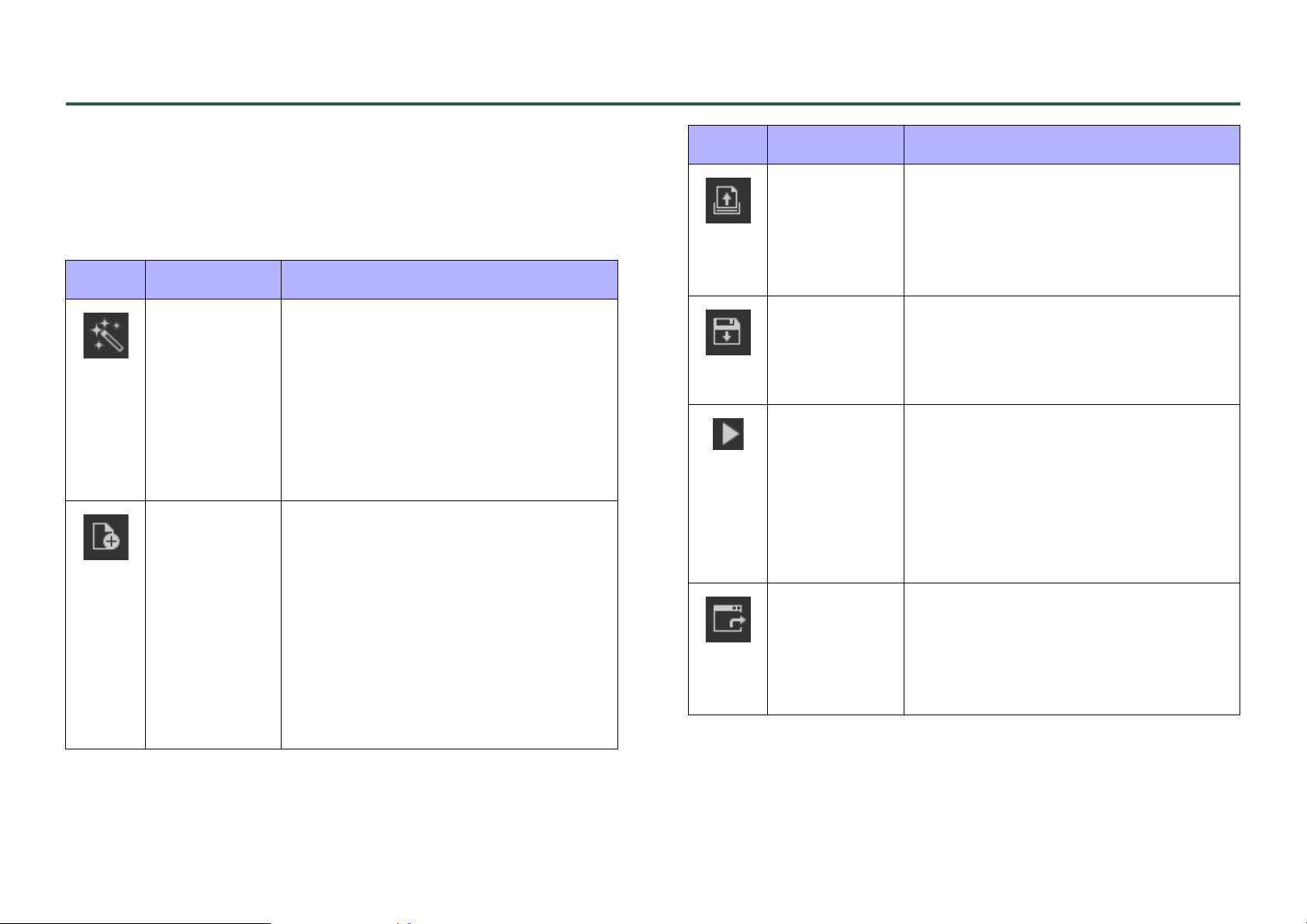
Tool bar
This contains buttons for commands that are frequently used with a
ProVisionaire Control project, such as [Open Project File] or [Save].
In initial mode, the two buttons [New Project] and [Open Project
File] are shown.
Button Command Summary
[New
Project
Wizard]
[New
Project]
Creates a new project file. If you were
editing the project file, a confirmation
message appears.
The “New Project Wizard” dialog box
appears even if the “New Project Wizard” dialog box’s [Don’t show this dialog again when creating new project]
check box is selected.
Creates a new project file. If you were
editing the project file, a confirmation
message appears.
If the “New Project Wizard” dialog
box’s [Don’t show this dialog again
when creating new project] check box
is selected, the “New Project Wizard”
dialog box does not appear; the project is created with the “Controllers”
area and “Devices” area blank.
Button Command Summary
[Open
Project File] /
[Open
Controller
File]
[Save] Overwrite-saves the project file. The
[Run] Runs the selected controller in control
[Export] Creates a controller file for the
Opens an existing project file or controller file.
If you were editing the project file, a
confirmation message appears.
first time a file is saved, the “Save File”
dialog box opens; assign a name to
the file and save it.
mode. If the controller’s [Type] is ProVisionaire Touch KIOSK, this opens the
“Run Controller File” dialog box. Transfer the controller, and use ProVisionaire Touch KIOSK on the iPad to verify
that it operates.
selected controller. This also transfers
the ProVisionaire Touch KIOSK controller file to the iPad on which ProVisionaire Touch KIOSK is installed.
43
Page 44
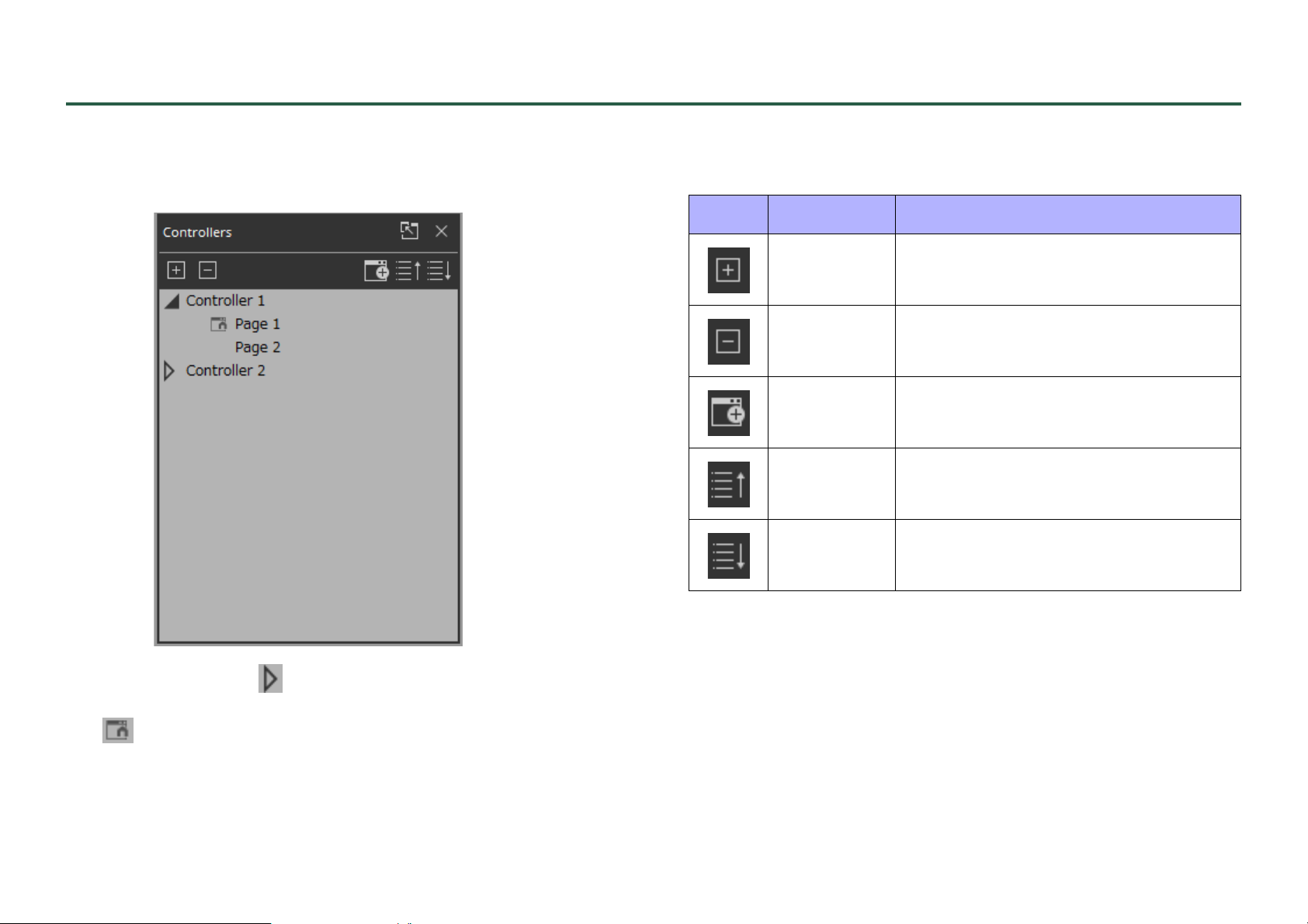
“Controllers” area
This area shows a list of the project’s controllers and pages. The
selected page is shown in the work area.
Buttons
Here we explain the buttons of the “Controllers” area.
Button Command Summary
[Expand All] Expands all controllers and pages.
[Collapse
All]
[Add] Adds a controller. One page is added to
[Move Page
Up]
[Move Page
Down]
Collapses all controllers and pages.
the controller that is added.
Move the selected page one position
upward.
Move the selected page one position
downward.
By clicking the triangle located at the left of a controller, you can
expand or collapse the pages for each individual controller.
The located at the left of a page indicates the home page of that
controller.
44
Page 45
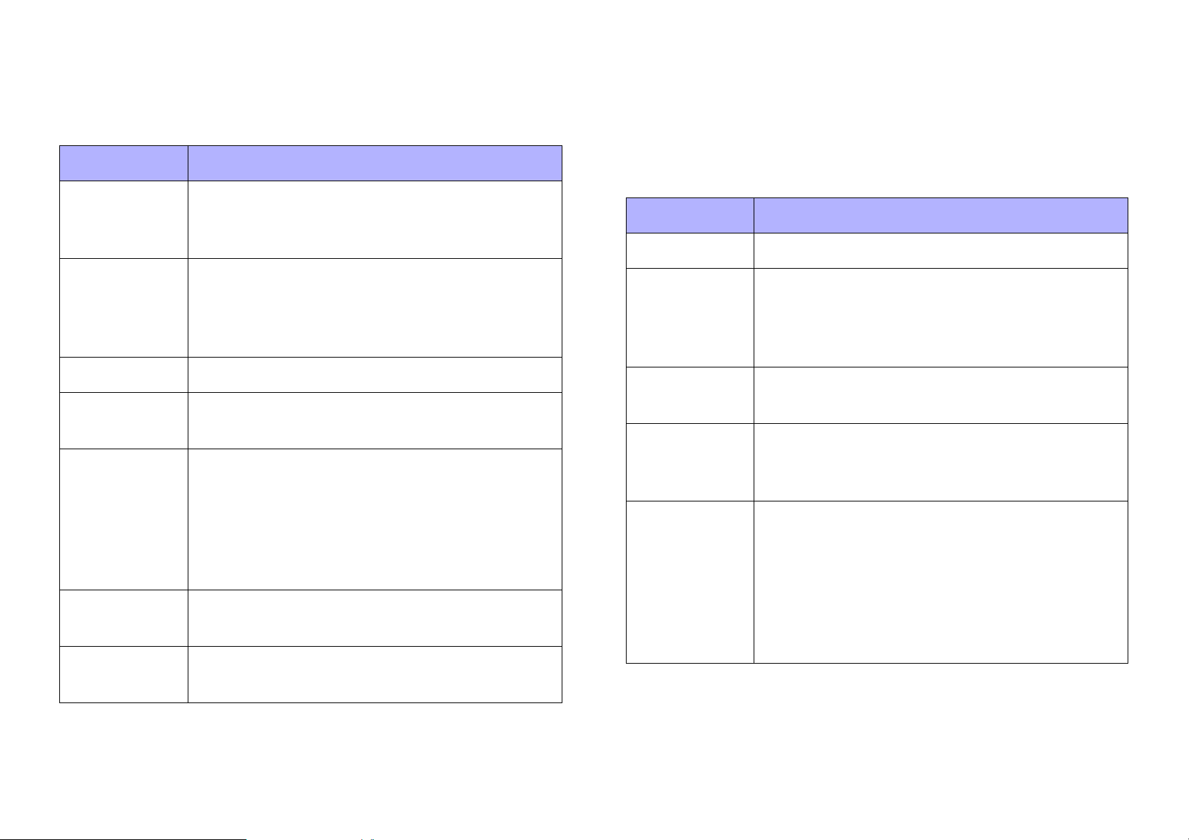
Context menu
Properties
When you right-click a controller or page, a context menu appears.
Depending on the selected item, some menu items are not shown.
Menu Summary
[Add Page] Adds a page to the selected controller. If a page
is selected, the page is added to the controller
that includes that page.
[Duplicate] Adds a duplicate of the selected controller or
page.
If a page is selected, the duplicate is added to
the controller that includes that page.
[Delete] Deletes the selected controller or page.
[Rename] Lets you rename the selected controller or
page.
[Run] Runs the selected controller in control mode.
If the controller’s [Type] is ProVisionaire Touch
KIOSK, this opens the “Run Controller File” dialog box. Transfer the controller, and use ProVisionaire Touch KIOSK on the iPad to verify that
it operates.
[Export] Creates a controller file for the selected control-
ler.
[Set as
HOME]
Sets the selected page as the home page of
that controller.
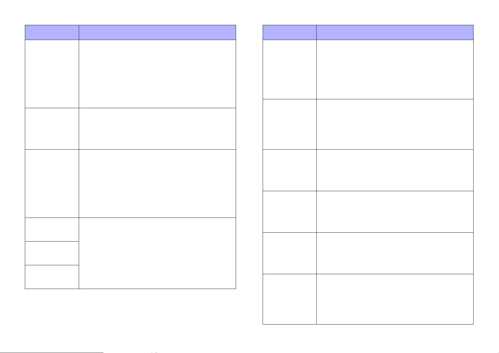
Here we explain the parameters that are shown in the “Properties”
area when the focus is on a controller or page.
Depending on the type of controller, some parameters are not shown.
Controller
Property Value
[Name] The name of the controller. Click this to edit it.
[Type] The type specified in the “New Project Wizard”
dialog box or the “Add Controller” dialog box.
This item cannot be edited; if it is incorrect,
you’ll need to recreate the controller.
[Administrator Comment]
[Comment] A comment for the controller. You can use this
[Display
Aspect Ratio]
A comment that can be input and edited only by
an administrator.
to enter explanatory content that is not sufficiently conveyed by the controller name.
The aspect ratio specified in the “New Project
Wizard” dialog box or the “Add Controller” dialog
box. This lets you verify the aspect ratio of the
screen for the installed computer on which
KIOSK is installed. This item cannot be edited; if
it is incorrect, you’ll need to recreate the controller.
45
Page 46
Property Value
Property Value
[Display Size] The screen size specified in the “New Project
Wizard” dialog box or the “Add Controller” dialog
box. When you click this, a spin box appears;
you can edit the setting by clicking or by directly
entering a value. When you change the screen
size, the size of previously-placed widgets
changes while maintaining the aspect ratio.
[Open with
Full Screen
Style]
[Pass Code
Setting]
[Administrator Code]
[Power User
Code]
[Unlock
Code]
When the controller file is opened or when control mode is selected, this setting selects
whether it operates in full-screen display (Yes)
or as a window (No).
Selects whether the controller’s pass code
matches the code specified in the “Setup” dialog box (Use Project Pass Code) or a code individually specified for the controller (Use
Controller Pass Code). If [Use Controller Pass
Code] is selected, the following three items editable.
If you want to set or change the pass code, do
so in the “Setup” dialog box [Security] tab.
[PV Monitoring Service
Setting]
[Destination
PV Monitoring Service]
[Destination
PV Monitoring Service IP
Address]
[Show Widget
Selection
Border]
[Enable File
Operations
for Power
User]
[Enable Menu
Auto-Close]
For each controller, this selects whether settings
for ProVisionaire Monitoring Service will use the
settings specified in the “Setup” dialog box
(User Project Setting) or the settings specified in
the controller's properties (Use Controller Setting).
When [PV Monitoring Service Setting] is set to
[Use Controller Setting], this setting selects
whether ProVisionaire Monitoring Service is
installed on the same computer as KIOSK (This
PC) or on a different computer (Other PC).
When [Destination PV Monitoring Service] is set
to [Other PC], this setting specifies the IP
address of the computer on which ProVisionaire
Monitoring Service is installed.
When the controller file is opened or when control mode is selected, this setting selects
whether the border showing that a widget is
selected is visible (Yes) or not visible (No).
Selects whether a Power User Code must be
entered when opening the file (Yes) or whether
an Administrator Code must be entered when
opening the file (No).
When ProVisionaire Touch KIOSK is in Control
Mode, this selects whether the menu button in
the upper left automatically closes after a certain length of time (Yes) or must be closed manually (No).
46
Page 47
Property Value
Property Value
[Time Until
Menu Closes]
[Offline Indication]
[No Assgin
Indication]
Specifies the time after a menu button operation
until the menu button is automatically closed
when Yes is selected for [Enable Menu AutoClose].
Specifies whether an indicator is shown (Yes) or
is not shown (No) at the upper right of a widget
assigned to a device’s parameter when offline.
Specifies whether a clip is shown (Yes) or is not
shown (No) at the upper right of a widget to
which a device’s parameter is not assigned in
KIOSK or ProVisionaire Touch KIOSK.
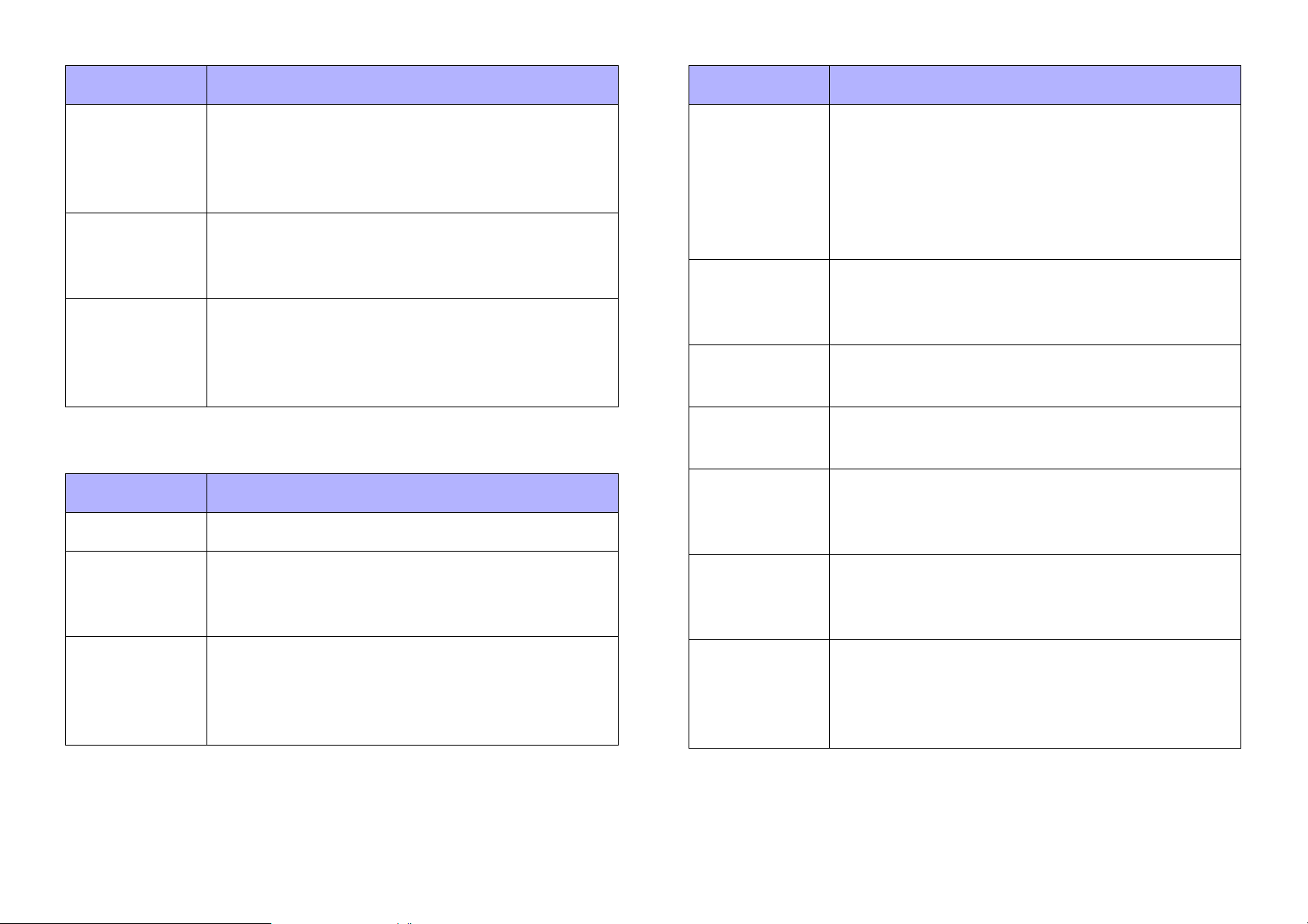
Page
Property Value
[Name] The name of the page. Click this to edit it.
[Comment] A comment for the page. When you click this,
the “Edit Text” dialog box opens, allowing you to
edit the comment.
[Background
Image]
[Image
Expansion
Mode]
[HOME Page] Indicates whether the selected page is the
[Snap to
Grid]
[Dot Color] The color of the grid’s dots. When you click the
[Cell Width] The spacing of the grid. When you click this, a
The background image of the page. When you
click the square, the “Select Image” dialog box
opens, allowing you to select image data that
will be shown above the background color. If
you click the trash can button, the background
image settings are discarded.
Specifies how the background image is shown.
For details on this setting, refer to “About the
Expansion Mode.”
home page (Yes) or not the home page (No).
Selects whether widgets will be aligned with the
grid (Yes) or can be placed freely (No).
square, the “Select Color” dialog box opens,
allowing you to select the dot color.
spin box appears; you can edit the setting by
clicking or by directly entering a value.
[Background
Color]
The background color of the page. When you
click the square, the “Select Color” dialog box
opens, allowing you to select a background
color.
47
[Power User
Code Enable]
Specifies whether authentication via power user
code is required (Yes) or not required (No) when
moving to the selected page.
This cannot be selected for the home page.
Page 48
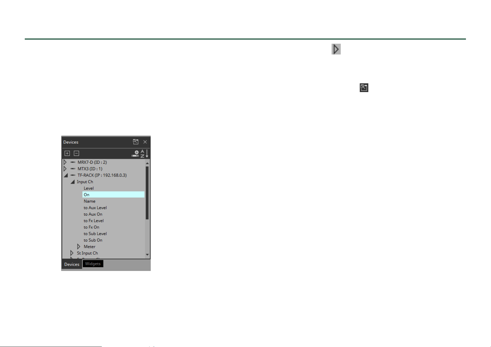
“Devices” area
This area shows the devices registered in the project and the parameters of those devices.
Place widgets in the work area by dragging and dropping parameters
into the work area.
If the parameter has multiple instances, such as the [On] switch of an
input channel, a dialog box asks you which should be assigned when
you drop the item. In the dialog box, you can use the <Ctrl> key or
<Shift> key to make a multiple selection.
By clicking the triangle located at the left of a device or parameter , you can expand or collapse the display for each individual
device or parameter.
Use the tab below to switch between showing the “Devices” area or
the “Widgets” area. If you click “ ,” the area floats, and the tab is
not shown.
If an unregistered device is detected, a “?” is shown at the left of that
device.
48
Page 49
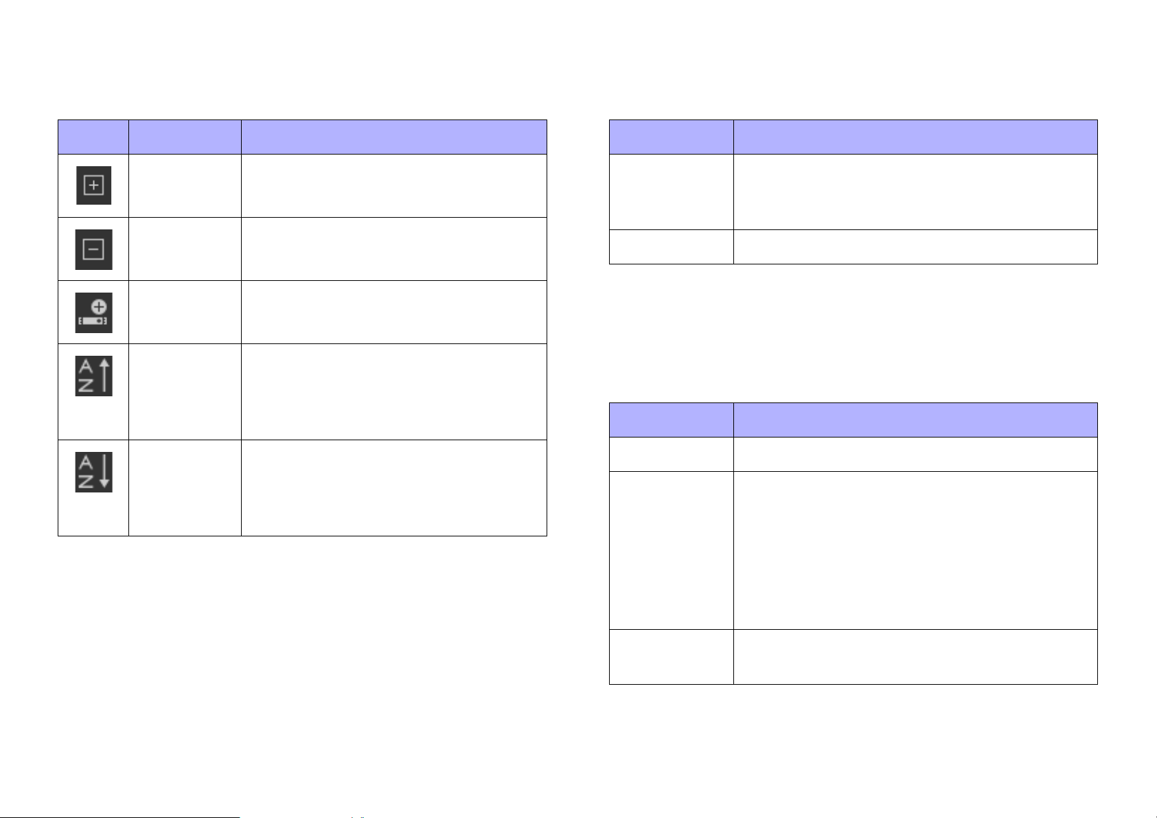
Buttons
Context menu
Here we explain the buttons of the “Devices” area.
Button Command Summary
[Expand All] Expands all devices and parameters.
[Collapse
All]
[Add
Device]
[Sort
Devices in
Ascending
Order]
[Sort
Devices in
Descending Order]
Collapses all devices and parameters.
Adds a device to the project.
Shows the devices in ascending order.
Shows the devices in descending order.
When you right-click a device, a context menu appears.
Menu Summary
[Add] If a device not registered in the project is
detected, the corresponding device is registered.
[Delete] Deletes the device from the project.
Properties
Here we explain the parameters that are shown in the “Properties”
area when the focus is on a device or parameter.
Property Value
[Model] Indicates the model name of the device.
[Identifier] Indicates the unit ID or IP address of the device.
When you click this, the “Edit Device Identifier”
dialog box opens, allowing you to edit the unit ID
or IP address. If a widget for the corresponding
device is already placed, the unit ID and IP
address of the widget change in response to
your edit.
49
[Device
Name]
Indicates the name of the device. Click this to
edit it.
Page 50
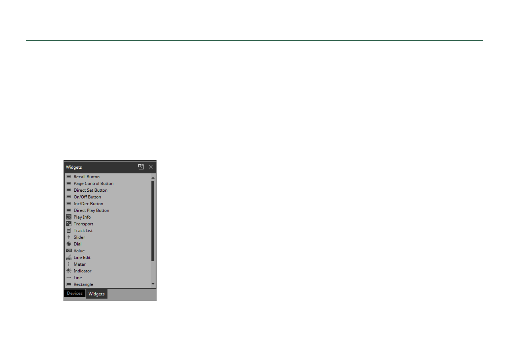
“Widgets” area
This area shows the widgets that can be placed in the work area.
Place widgets in the work area by dragging and dropping a widget
into the work area.
Although some widgets (such as on/off buttons and sliders) can be
placed by dragging and dropping parameters, there are widgets that
can be placed only by dragging and dropping from the this area
(such as page control button and rectangle).
Parameters can be specified by dragging and dropping a parameter
to a widget placed in the work area. The same operation can be used
to overwrite.
For details on each widget, refer to the chapter “Widgets.”
This area does not have buttons, a context menu, or property-related
items.
50
Page 51
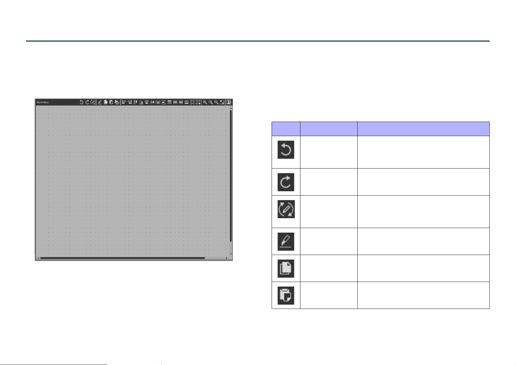
Work area
The currently selected page is shown here.
You can place parameters or widgets into this area by dragging and
dropping them (if from MRX Designer or MTX-MRX Editor, while
holding down the <Ctrl> key).
When you click in the work area on a location where there is no widget, the properties of the page appear in the “Properties” area.
Buttons
Commands that are frequently used for work area operations are
placed above the work area as buttons.
Button
Command Summary
[Undo] Cancels the previous widget-related
operation. Some items cannot be
undone.
[Redo] Re-executes the operation that was
canceled by [Undo].
[Repeat] Repeats the most recent widget style-
related operation that was executed.
Some items cannot be repeated.
When you drag and drop a parameter (if from MRX Designer or
MTX-MRX Editor, while holding down the <Ctrl> key) onto an
already-placed widget, the parameter of the widget is overwritten.
[Cut] Moves the selected object into the copy
buffer.
[Copy] Copies the selected object into the
copy buffer.
[Paste] Pastes the object from the copy buffer.
51
Page 52
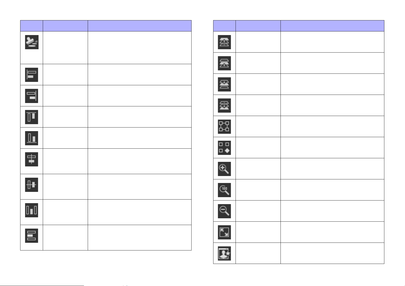
Button
Command Summary
Button
Command Summary
[Duplicate
to Other
Channels]
[Align Left] Aligns the left edge to the left-most of
[Align Right] Aligns the right edge to the right-most
[Align Top] Aligns the top edge to the highest of
[Align
Bottom]
[Align
Horizontal
Center]
Duplicates the selected single widget,
and assigns it to a different channel.
Multiple channels can be selected for
duplication.
the multiple selected widgets.
of the multiple selected widgets.
the multiple selected widgets.
Aligns the bottom edge to the lowest of
the multiple selected widgets.
Aligns the center of the widget to the
horizontal mid-point of the multiple
selected widgets.
[Bring to
Front]
[Bring
Forward]
[Send
Backward]
[Send to Back] Moves the selected widget all the way
[Group] Groups the selected multiple widgets.
[Ungroup] Cancels grouping for the selected
[Zoom In] Increases the magnification of the work
Moves the selected widget all the way
forward.
Moves the selected widget forward.
Moves the selected widget backward.
back.
group.
area display.
[Align
Vertical
Center]
[Distribute
Horizontally]
[Distribute
Vertically]
Aligns the center of the widget to the
vertical mid-point of the multiple
selected widgets.
Equidistantly spaces the multiple
selected widgets in the horizontal direction.
Equidistantly spaces the multiple
selected widgets in the vertical direction.
[Zoom Origin] Sets the work area display to 100%
magnification.
[Zoom Out] Decreases the magnification of the
work area display.
[Fit to Screen] Shows the entire page in the work
area.
[Open Style] Opens the “Style” dialog box.
52
Page 53
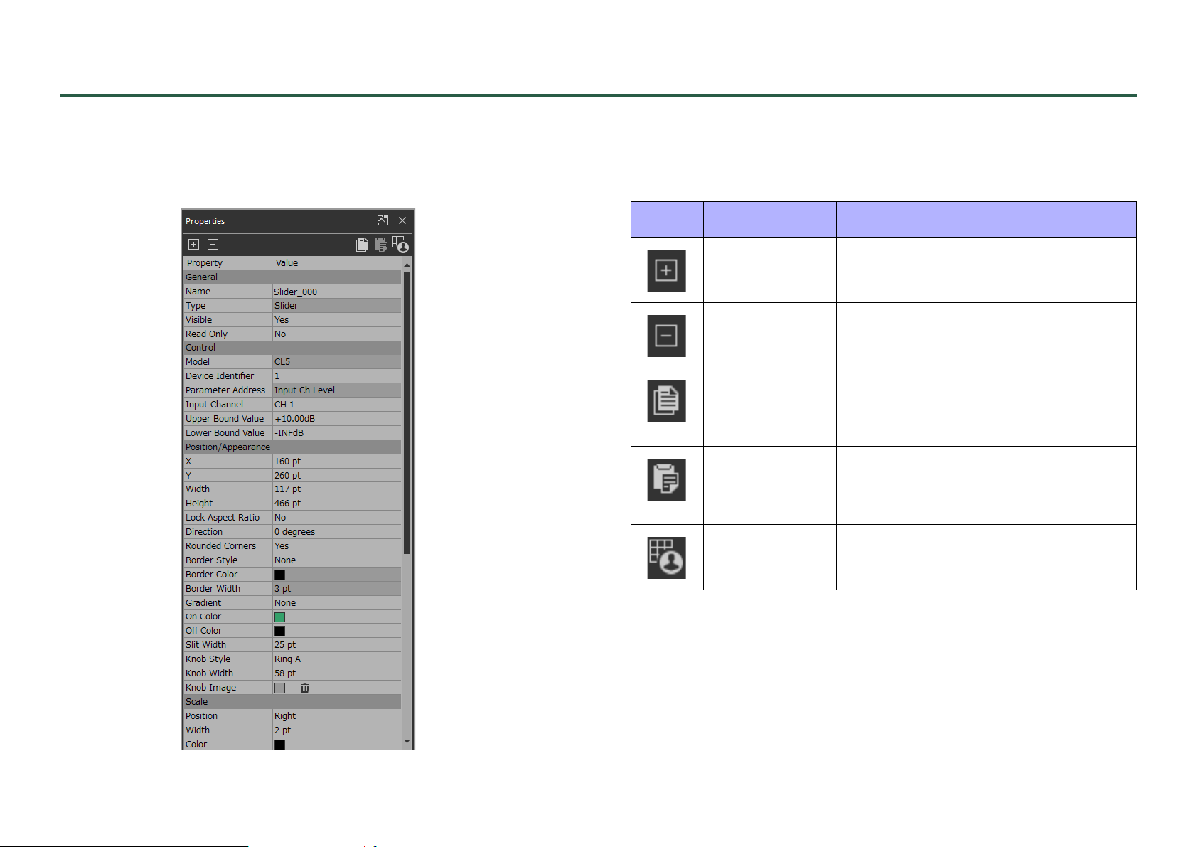
“Properties” area
This area shows the properties of a page or a widget.
You can edit items whose “Value” field is not shaded. To expand or
collapse individual items, double-click the entire properties area.
Buttons
Commands that are frequently used for properties operations are
placed at the top of the “Properties” area as buttons.
Button
Command Summary
[Expand All] Expands all of the properties items.
[Collapse All] Collapses all of the properties items.
[Copy Style] Copies the information about the
style of the selected widget to the
copy buffer.
[Paste Style] Pastes the information about the style
from the copy buffer to the selected
widget.
53
[Save as
Style]
Applies the style to the selected widget.
Page 54
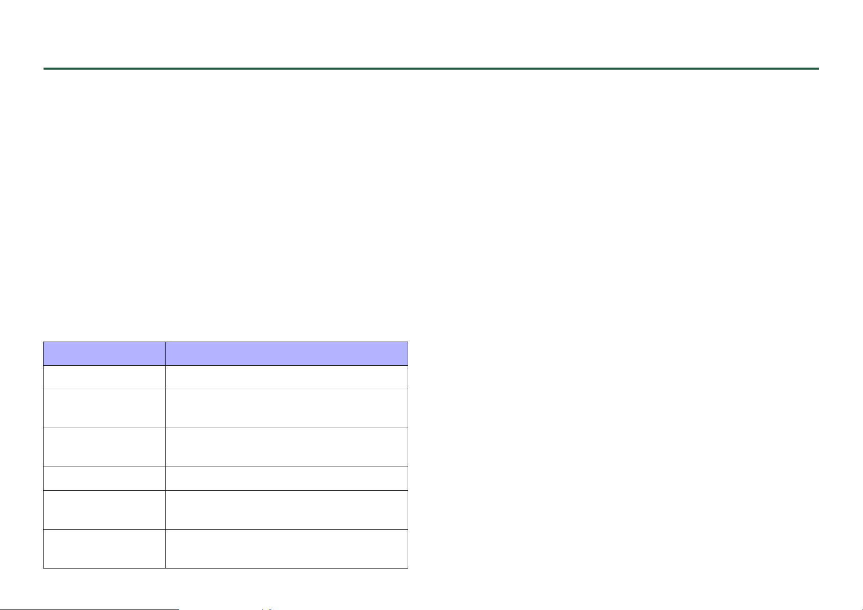
Widgets
Here we explain the various widgets, organized by category.
The “Edit Text” dialog box appears when you attempt to edit text.
The “Select Color” dialog box appears when you attempt to specify
a color.
The “Select Image” dialog box appears when you attempt to specify
an image.
When you click the trash can button in the Value area of an [Image] type item, display of the corresponding image is canceled, but the
image itself remains in the project file. If you want to delete the image
from the project file, use the “Imported Images” dialog box to delete it.
Undo/Redo are not available for [Control] -type items or [Image] type items (including On Image, etc.).
Buttons
The following button widgets are available.
Widget name Description
[Recall Button] Used to recall scenes or presets.
Parameters of multiple devices or multiple parameters of the same
device can be assigned to [Recall Button], [Direct Set Button], and
[On/Off Button] (a maximum of 16 parameters). A button to which
multiple parameters are assigned is called a multi button. When you
drag and drop a parameter to a button for which a parameter has
already been assigned, a confirmation dialog box asks whether you
want to replace (Replace), add (Add), or cancel (Cancel).
The assigned parameter can be viewed or edited in the “Target Editor” dialog box which is accessed by the [...] button shown in the
[Control] field of the “Properties” area.
This cannot be edited by a controller for ProVisionaire Touch
KIOSK.
[Page Control
Button]
[Direct Set
Button]
[On/Off Button] Switches a parameter on/off.
[Inc/Dec Button] Increments or decrements the parameter
[Direct Play
Button]
Used to move to another page.
Sets a parameter to a specific fixed value.
value.
Used to play or stop content from the SD
memory of the MTX or MRX.
54
Page 55
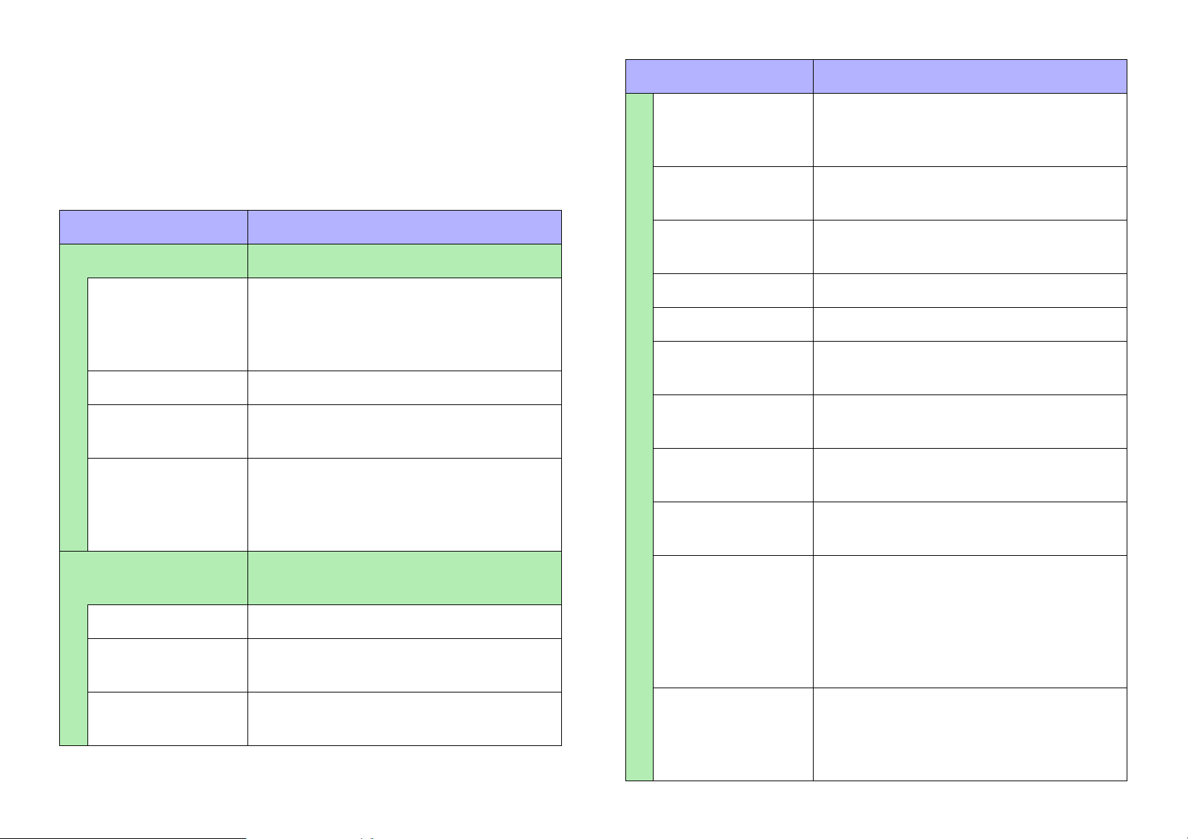
Button properties
Here we explain the parameters that are shown in the “Properties”
area if a button is selected. Depending on the button or setting, some
parameters are not shown.
Areas whose Value field is darkly shaded cannot be edited.
Items with an “*” in Property are style-related information.
Property Value
[General] Overall properties of the widget
Property Value
[Input Channel]
etc.
[Confirmation] Selects whether a confirmation screen
[Confirmation Text] The message of the confirmation screen
The parameter’s channel number, etc. The
name differs depending on the parameter
that is assigned.
appears when clicked.
that appears if [Confirmation] is set to [Yes].
[Name] The name of the widget. If you place the
widget first and assign a parameter later,
you can enter a name here to indicate the
parameter that you intend to assign.
[Type] The type of widget.
[Visible] Selects whether the widget is visible or
invisible in control mode.
[Read Only] Selects whether the widget can be oper-
ated.
If you select [Yes], the widget functions as
an indicator.
[Control] Overall information on what is con-
trolled
[Model] The model name of the device.
[Device Identifier] The identifier of the device. The unit ID or
the IP address is shown.
[On Value] The value when on.
[Off Value] The value when off.
[Switching Mode] Selects whether the button operates in
latched or unlatched mode.
[Page Control
Action]
[Page Name] The name of the page to which to move
[Press Value] Specifies the value that is assigned when
[Indicator Mode] Selects the conditions under which the but-
Selects the action that occurs when the
widget is clicked.
when the widget is clicked.
the widget is clicked.
ton changes color.
With the [Press] setting, the button is always
the [On Color]; with the [Stateful] setting,
the button is the [On Color] when it matches
the value of [Press Value].
[Parameter
Address]
The parameter name assigned to the widget.
55
[Preset No]/
[Scene No]/
[Scene A No]/
[Scene B No]
These select the number of the scene, preset, or snapshot that will be recalled.
Page 56
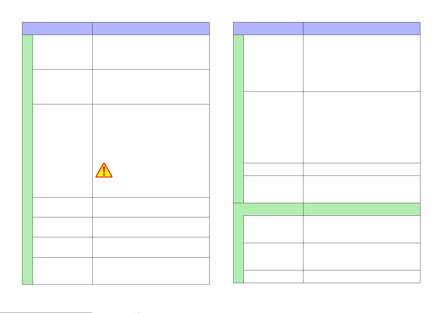
Property Value
CAUTION
If you assign a volume-type parameter (such
as Level) and specify Yes, the volume will
suddenly increase from the minimum value
to the maximum value, possibly causing
explosive sound.
Property Value
[Inc/Dec Step] Specifies the step unit by which the value is
incremented or decremented at each click.
Specifying a negative value causes the
value to decrease.
[Repeat] Selects whether to continuously increment
or continuously decrement for a long-press.
If you select [Yes], continuous increment or
continuous decrement will be possible.
[Rotation] Selects whether the value will wrap around
to the minimum (or maximum) value if you
click after reaching the maximum (or minimum) value. If you select [Yes], the value
changes from the maximum to the minimum, or from the minimum to the maximum.
[Upper Bound
Specifies the maximum value.
Value]
[Play Mode] Selects whether, when playing the songs in
a folder, the specified song or the songs in
the folder are played once (Normal), the
specified song or the songs in the folder are
played repeatedly (Repeat), or the songs in
the specified folder are repeatedly played
randomly (Shuffle Repeat).
[Go to the top
when playback
stops]
Selects whether, when you stop song playback, the position returns to the beginning
(Yes) or pauses at that location (No).
If you specify [Yes], playback starts from
the beginning of the song or the first song in
the folder the next time that playback starts.
If you specify [No], playback starts from the
previously-stopped position the next time
that playback starts.
[Interval Time] Specifies the time between songs.
[SD CARD:/] Specifies the folder on the SD card of the
MTX or MRX that contains song files or
songs.
[Position/Appearance] Overall appearance of the widget
[Lower Bound
Specifies the minimum value.
Value]
[Action] Selects whether to play (Play) or pause
(Pause) when clicked.
[Play Target] Selects whether to play one song (Play 1
Song) or play the songs in the folder (Play
Folder).
[X] Specifies the horizontal distance from the
top left of the screen and the top left of the
widget.
[Y] Specifies the vertical distance from the top
left of the screen and the top left of the widget.
[Width] Specifies the width of the widget.
56
Page 57
Property Value
Property Value
[Height] Specifies the height of the widget.
[Lock Aspect
Ratio] *
[Shape] * Selects the shape of the widget.
[Corner] * Specifies the roundness of the widget’s cor-
[Border Style] * Selects the type of border for the widget.
[Border Color] * Specifies the color of the widget’s border.
[Border Width] * Specifies the width of the widget’s border.
[Gradient] * Selects the type of gradation within the wid-
[Color] * Specifies the color within the widget.
[Image] * Specifies the image within the widget.
[Image
Expansion Mode] *
Selects whether the width/height ratio of
the widget will be fixed.
ners.
get.
Selects how the image is seen within the
widget.
[Off Image] * Specifies the image within the widget when
its status is “off.”
[Off Image
Expansion Mode] *
[Effect]*
[Text] Text within the widget
[Visible] * Selects whether the text within the widget is
[Text] Specifies the text within the widget.
[Color] * Specifies the color of the text within the wid-
[Font] * Specifies the font of the text within the wid-
[Vertical
Alignment] *
Specifies how the image is seen within the
widget when its status is “off.”
Specifies how a shadow is added to the
outer part of the widget.
visible.
get.
get.
Selects the vertical position of the text
within the widget.
[On Color] * Specifies the color within the widget when
its status is “on.”
[On Image] * Specifies the image within the widget when
its status is “on.”
[On Image
Expansion Mode] *
[Off Color] * Specifies the color within the widget when
Specifies how the image is seen within the
widget when its status is “on.”
its status is “off.”
57
[Horizontal
Alignment] *
[On Visible] * Selects whether the text within the widget is
[On Text] Specifies the text within the widget when its
[On Color] * Specifies the color of the text within the wid-
Selects the horizontal position of the text
within the widget.
visible when its status is “on.”
status is “on.”
get when its status is “on.”
Page 58
Property Value
[Off Visible] * Selects whether the text within the widget is
visible when its status is “off.”
[Off Text] Specifies the text within the widget when its
status is “off.”
[Off Color] * Specifies the color of the text within the wid-
get when its status is “off.”
[Direction] * Selects the direction of the text within the
widget.
[Label] Properties for the widget’s label
[Visible] * Selects whether the label is visible.
[Text] Specifies the label.
[Font Color] * Specifies the color of the label.
[Font] * Specifies the font of the label.
[Position] * Selects the position of the label.
[Alignment] * Selects the alignment of the label.
[Margin] * Specifies how far the label is separated
from the widget.
58
Page 59
Sliders
There is only one type of slider widget.
Property Value
[General] Overall properties of the widget
Slider properties
Here we explain the parameters that are shown in the “Properties”
area when the focus is on a slider. Depending on the settings, some
parameters are not shown.
Areas whose Value field is darkly shaded cannot be edited.
Items with an “*” in Property are style-related information.
You can assign parameters of multiple devices, or multiple parameters of the same device to a [Slider] (up to 16 parameters maximum).
A slider to which multiple parameters are assigned is called a “multi
slider.” When you drag and drop a parameter to a slider for which a
parameter has already been assigned, a confirmation dialog box is
displayed, asking whether you want to replace or add the parameter,
or cancel.
The assigned parameter can be viewed or edited in the “Target Editor” dialog box, which is accessed by the [...] button shown in the
[Control] field of the “Properties” area.
This cannot be configured with a ProVisionaire Touch KIOSK controller.
[Name] The name of the widget. If you place the
widget first and assign a parameter
later, you can enter a name here to indicate the parameter that you intend to
assign.
[Type] The type of widget.
[Visible] Selects whether the widget is visible or
invisible in control mode.
[Read Only] Selects whether the widget can be
operated. If you select [Yes], the widget
functions as an indicator.
[Control] Overall information on what is con-
trolled
[Model] The model name of the device.
[Device Identifier] The identifier of the device. The unit ID
or the IP address is shown.
59
[Parameter
Address]
[Input Channel]
etc.
[Upper Bound
Value]
[Lower Bound
Value]
The parameter name assigned to the
widget.
The parameter’s channel number, etc.
The name differs depending on the
parameter that is assigned.
Specifies the maximum value.
Specifies the minimum value.
Page 60
Property Value
Property Value
[Position/Appearance]
[X] Specifies the horizontal distance from
[Y] Specifies the vertical distance from the
[Width] Specifies the width of the widget.
[Height] Specifies the height of the widget.
[Lock Aspect
Ratio] *
[Direction] * Selects the direction of the widget.
[Rounded
Corners] *
[Border Style] * Selects whether the slit has a border.
[Border Color] * Specifies the color of the slit’s border.
[Border Width] * Specifies the width of the slit’s border.
Overall appearance of the widget
the top left of the screen and the top left
of the widget.
top left of the screen and the top left of
the widget.
Selects whether the width/height ratio
of the widget will be fixed.
Selects whether the corners of the slit
are rounded.
[On Color] * Specifies the color inside the slit below
the current value.
[Off Color] * Specifies the color inside the slit above
the current value.
[Slit Width] * Specifies the width of the slit.
[Knob Style] * Selects the type of knob.
[Knob Width] * Specifies the width of the knob.
[Knob Image] * Specifies the image of the knob.
[Scale] Scale properties
[Position] * Selects the position of the scale.
[Width] * Specifies the thickness of the scale.
[Color] * Specifies the color of the scale.
[Value Visible] * Selects whether numerals are shown
for the scale.
[Font] * Selects the font of the scale numerals.
[Font Color] * Selects the color of the scale numerals.
[Gradient] * Selects the type of gradation within the
slit.
60
Page 61
Property Value
[Label] Properties for the widget’s label
[Visible] * Selects whether the label is visible.
[Text] Specifies the label.
[Font Color] * Specifies the color of the label.
[Font] * Specifies the font of the label.
[Position] * Selects the position of the label.
[Alignment] * Selects the alignment of the label.
[Margin] * Specifies how far the label is separated
from the widget.
[Value Label] Properties for the widget’s current
value indication
[Visible] * Selects whether the current value is vis-
ible.
[Font Color] * Specifies the color of the current value.
[Font] * Specifies the font of the current value.
[Position] * Selects the position of the current
value.
[Alignment] * Selects the alignment of the current
value.
[Margin] * Specifies how far the current value is
separated from the widget.
61
Page 62
Dials
There is only one type of dial widget.
Dial properties
Property Value
[Device Identifier] The identifier of the device. The unit ID
or the IP address is shown.
Here we explain the parameters that are shown in the “Properties”
area when the focus is on a dial. Depending on the settings, some
parameters are not shown.
Areas whose Value field is darkly shaded cannot be edited.
Items with an “*” in Property are style-related information.
Property Value
[General] Overall properties of the widget
[Name] The name of the widget. If you place the
widget first and assign a parameter
later, you can enter a name here to indicate the parameter that you intend to
assign.
[Type] The type of widget.
[Visible] Selects whether the widget is visible or
invisible in control mode.
[Read Only] Selects whether the widget can be
operated.
If you select [Yes], the widget functions
as an indicator.
[Parameter
Address]
[Input Channel]
etc.
[Upper Bound
Value]
[Lower Bound
Value]
[Band Base
Value]
[Position/Appearance]
[X] Specifies the horizontal distance from
[Y] Specifies the vertical distance from the
The parameter name assigned to the
widget.
The parameter’s channel number, etc.
The name differs depending on the
parameter that is assigned.
Specifies the maximum value.
Specifies the minimum value.
Specifies the initial value specified
when the widget is placed.
Overall appearance of the widget
the top left of the screen and the top left
of the widget.
top left of the screen and the top left of
the widget.
[Control] Overall information on what is con-
trolled
[Model] The model name of the device.
[Width] Specifies the width of the widget.
[Height] Specifies the height of the widget.
[Border Style] * Selects whether the widget has a bor-
der.
62
Page 63
Property Value
Property Value
[Border Color] * Specifies the color of the widget’s bor-
der.
[Border Width] * Specifies the width of the widget’s bor-
der.
[Dial Type] * Selects the type of dial.
[Start Angle] * Specifies the starting position for the
value.
[End Angle] * Specifies the ending position for the
value.
[Gradient] * Selects the type of gradation within the
knob.
[Knob Color] * Specifies the color within the knob.
[Grip Shape] * Selects the shape of the grip.
[Grip Size] * Specifies the size of the grip.
[Label] Properties for the widget’s label
[Visible] * Selects whether the label is visible.
[Text] Specifies the label.
[Font Color] * Specifies the color of the label.
[Font] * Specifies the font of the label.
[Position] * Selects the position of the label.
[Alignment] * Selects the alignment of the label.
[Margin] * Specifies how far the label is separated
from the widget.
[Value Label] Properties for the widget’s current
value indication
[Visible] * Selects whether the current value is vis-
ible.
[Grip Color] * Specifies the color of the grip.
[Band On Color] * Specifies the color inside the band
below the current value.
[Band Off Color] * Specifies the color inside the band
above the current value.
[Font Color] * Specifies the color of the current value.
[Font] * Specifies the font of the current value.
[Position] * Selects the position of the current
value.
[Alignment] * Selects the alignment of the current
value.
[Margin] * Specifies how far the current value is
separated from the widget.
63
Page 64
Meters
There is only one type of meter widget.
Meter properties
Here we explain the parameters that are shown in the “Properties”
area when the focus is on a meter. Depending on the settings, some
parameters are not shown.
Areas whose Value field is darkly shaded cannot be edited.
Items with an “*” in Property are style-related information.
Property Value
Property Value
[Input Channel]
etc.
[Meter Type] Selects the meter’s display method.
[Bar Base Point] Selects the point from which the bar is
[Position/Appearance]
The parameter’s channel number, etc.
The name differs depending on the
parameter that is assigned.
solidly colored.
Overall appearance of the widget
[General] Overall properties of the widget
[Name] The name of the widget. If you place the
widget first and assign a parameter
later, you can enter a name here to indicate the parameter that you intend to
assign.
[Type] The type of widget.
[Visible] Selects whether the widget is visible or
invisible in control mode.
[Control] Overall information on what is con-
trolled
[Model] The model name of the device.
[Device Identifier] The identifier of the device. The unit ID
or the IP address is shown.
[Parameter
Address]
The parameter name assigned to the
widget.
[X] Specifies the horizontal distance from
the top left of the screen and the top left
of the widget.
[Y] Specifies the vertical distance from the
top left of the screen and the top left of
the widget.
[Width] Specifies the width of the widget.
[Height] Specifies the height of the widget.
[Lock Aspect
Ratio] *
[Direction] * Selects the direction of the widget.
[Rounded
Corners] *
[Border Style] * Selects whether the bar has a border.
[Border Color] * Specifies the color of the bar’s border.
Selects whether the width/height ratio
of the widget will be fixed.
Selects whether the corners of the bar
are rounded.
64
Page 65
Property Value
Property Value
[Border Width] * Specifies the width of the bar’s border.
[Gradient] * Selects the type of gradation within the
bar.
[Color Style] * Selects the pattern of color within the
bar.
[On Color] * Specifies the color inside the bar below
the current value.
If the [Meter Type] is [Bar], this will be
the color of the current value.
[Off Color] * Specifies the color inside the bar above
the current value.
If the [Meter Type] is [Bar], this will be
the color outside the current value.
[Bar Width] * Specifies the width of the bar.
[Scale] Scale properties
[Label] Properties for the widget’s label
[Visible] * Selects whether the label is visible.
[Text] Specifies the label.
[Font Color] * Specifies the color of the label.
[Font] * Specifies the font of the label.
[Position] * Selects the position of the label.
[Alignment] * Selects the alignment of the label.
[Margin] * Specifies how far the label is separated
from the widget.
[Position] * Selects the position of the scale.
[Width] * Specifies the thickness of the scale.
[Color] * Specifies the color of the scale.
[Value Visible] * Selects whether numerals are shown
for the scale.
[Font] * Selects the font of the scale numerals.
[Font Color] * Selects the color of the scale numerals.
65
Page 66
Indicator
There is only one type of indicator widget.
Indicator properties
Property Value
[Parameter
Address]
The parameter name assigned to the
widget.
Here we explain the parameters that are shown in the “Properties”
area when the focus is on an indicator. Depending on the settings,
some parameters are not shown.
Areas whose Value field is darkly shaded cannot be edited.
Items with an “*” in Property are style-related information.
Property Value
[General] Overall properties of the widget
[Name] The name of the widget. If you place the
widget first and assign a parameter
later, you can enter a name here to indicate the parameter that you intend to
assign.
[Type] The type of widget.
[Visible] Selects whether the widget is visible or
invisible in control mode.
[Control] Overall information on what is con-
trolled
[Model] The model name of the device.
[Device Identifier] The identifier of the device. The unit ID
or the IP address is shown.
[Indication
Threshold]
[Analog Input
Port] etc.
[Position/Appearance]
[X] Specifies the horizontal distance from
[Y] Specifies the vertical distance from the
[Width] Specifies the width of the widget.
[Height] Specifies the height of the widget.
[Lock Aspect
Ratio] *
[Shape] * Selects the shape of the widget.
[Corner] * Specifies the roundness of the widget’s
[Border Style] * Selects the type of border for the wid-
Specifies the threshold value at which
on/off is switched.
The parameter’s channel number, etc.
The name differs depending on the
parameter that is assigned.
Overall appearance of the widget
the top left of the screen and the top left
of the widget.
top left of the screen and the top left of
the widget.
Selects whether the width/height ratio
of the widget will be fixed.
corners.
get.
66
Page 67
Property Value
Property Value
[Border Color] * Specifies the color of the widget’s bor-
der.
[Border Width] * Specifies the width of the widget’s bor-
der.
[Gradient] * Selects the type of gradation within the
widget.
[On Color] * Specifies the color within the widget
when its status is “on.”
[On Image] * Specifies the image within the widget
when its status is “on.”
[On Image
Expansion
Mode] *
[Off Color] * Specifies the color within the widget
[Off Image] * Specifies the image within the widget
[Off Image
Expansion
Mode] *
Specifies how the image is seen within
the widget when its status is “on.”
when its status is “off.”
when its status is “off.”
Specifies how the image is seen within
the widget when its status is “off.”
[Text] Text within the widget
[On Visible] * Selects whether the text within the wid-
get is visible when its status is “on.”
[On Text] Specifies the text within the widget
when its status is “on.”
[On Color] * Specifies the color of the text within the
widget when its status is “on.”
[Off Visible] * Selects whether the text within the wid-
get is visible when its status is “off.”
[Off Text] Specifies the text within the widget
when its status is “off.”
[Off Color] * Specifies the color of the text within the
widget when its status is “off.”
[Font] * Specifies the font of the text within the
widget.
[Vertical
Alignment] *
[Horizontal
Alignment] *
Selects the vertical position of the text
within the widget.
Selects the horizontal position of the
text within the widget.
[Effect]* Specifies how a shadow is added to the
outer part of the widget.
[Direction] * Selects the direction of the text within
the widget.
67
Page 68
Property Value
[Label] Properties for the widget’s label
[Visible] * Selects whether the label is visible.
[Text] Specifies the label.
[Font Color] * Specifies the color of the label.
[Font] * Specifies the font of the label.
[Position] * Selects the position of the label.
[Alignment] * Selects the alignment of the label.
[Margin] * Specifies how far the label is separated
from the widget.
68
Page 69
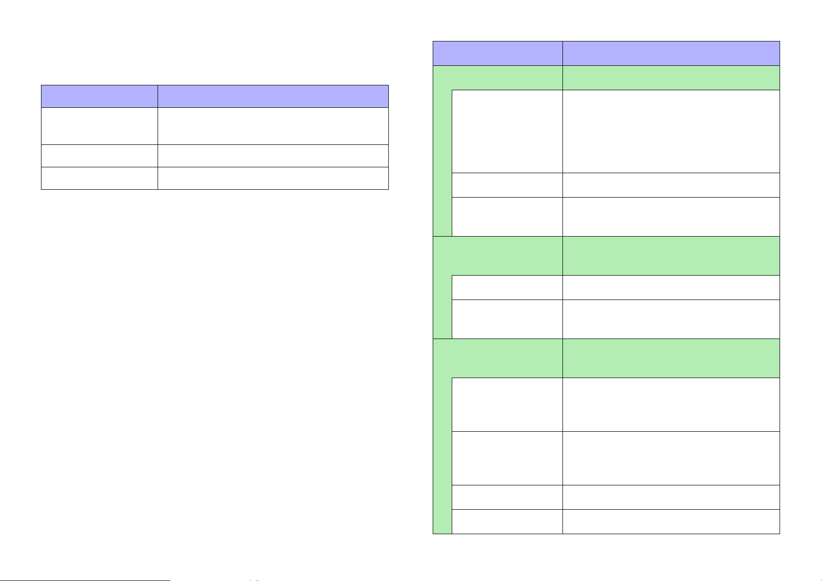
SD memory-related
The following SD memory-related widgets are available.
Property Value
[General] Overall properties of the widget
Widget name Description
[Play Info] Shows information related to the selected
content.
[Transport] Controls the selected content.
[Track List] Selects the content to play.
Additionally related to the SD memory is the [Direct Play Button].
Refer to the explanatory page for “Button.”
SD memory-related properties
Here we explain the parameters that are shown in the “Properties”
area when the focus is on an SD memory-related widget. Depending
on the widget or setting, some parameters are not shown.
Areas whose Value field is darkly shaded cannot be edited.
Items with an “*” in Property are style-related information.
[Name] The name of the widget. If you place the
widget first and assign a parameter
later, you can enter a name here to indicate the parameter that you intend to
assign.
[Type] The type of widget.
[Visible] Selects whether the widget is visible or
invisible in control mode.
[Control] Overall information on what is con-
trolled
[Model] The model name of the device.
[Device Identifier] The identifier of the device. The unit ID
or the IP address is shown.
[Position/Appearance]
Overall appearance of the widget
69
[X] Specifies the horizontal distance from
the top left of the screen and the top left
of the widget.
[Y] Specifies the vertical distance from the
top left of the screen and the top left of
the widget.
[Width] Specifies the width of the widget.
[Height] Specifies the height of the widget.
Page 70
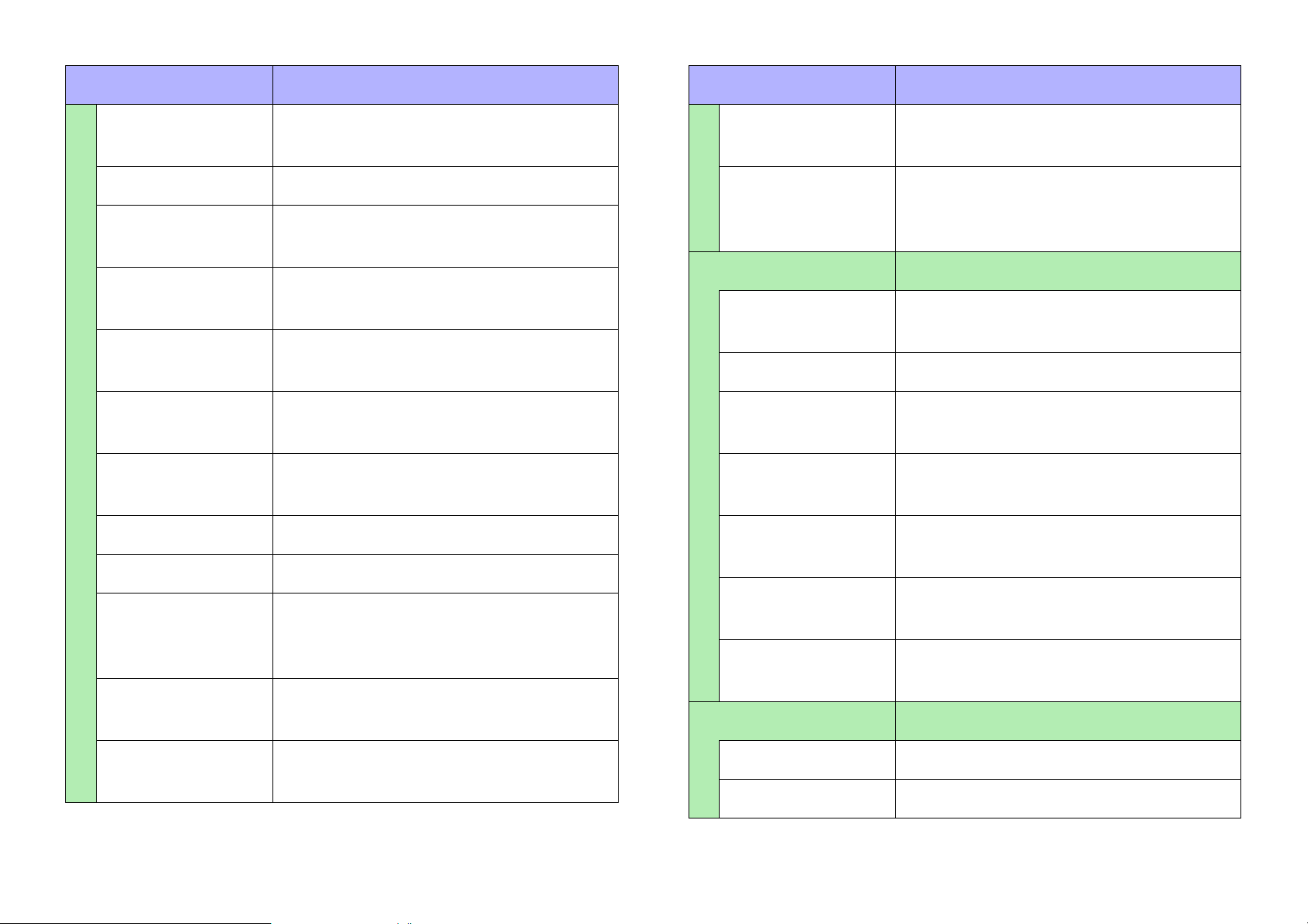
Property Value
Property Value
[Lock Aspect
Ratio] *
[Shape] * Selects the shape of the widget.
[Corner] * Specifies the roundness of the widget’s
[Border Style] * Selects the type of border for the wid-
[Border Color] * Specifies the color of the widget’s bor-
[Border Width] * Specifies the width of the widget’s bor-
[Gradient] * Selects the type of gradation within the
[Color] * Specifies the color within the widget.
[Image] * Specifies the image within the widget.
[Image
Expansion
mode] *
[Button Color] * Specifies the color of the buttons within
Selects whether the width/height ratio
of the widget will be fixed.
corners.
get.
der.
der.
widget.
Selects how the image is seen within
the widget.
the widget.
[Background
Image] *
[Background
Image Expansion
Mode] *
[Text] Text within the widget
[Visible] * Selects whether the text within the wid-
[Text] Specifies the text within the widget.
[Color] * Specifies the color of the text within the
[Font] * Specifies the font of the text within the
[Vertical
Alignment] *
[Horizontal
Alignment] *
[Direction] * Selects the direction of the text within
[Label] Properties for the widget’s label
Specify the background image within
the widget.
Selects how the background image is
seen within the widget.
get is visible.
widget.
widget.
Selects the vertical position of the text
within the widget.
Selects the horizontal position of the
text within the widget.
the widget.
[Background
Color] *
Specify the background color within the
widget.
[Visible] * Selects whether the label is visible.
[Text] Specifies the label.
70
Page 71
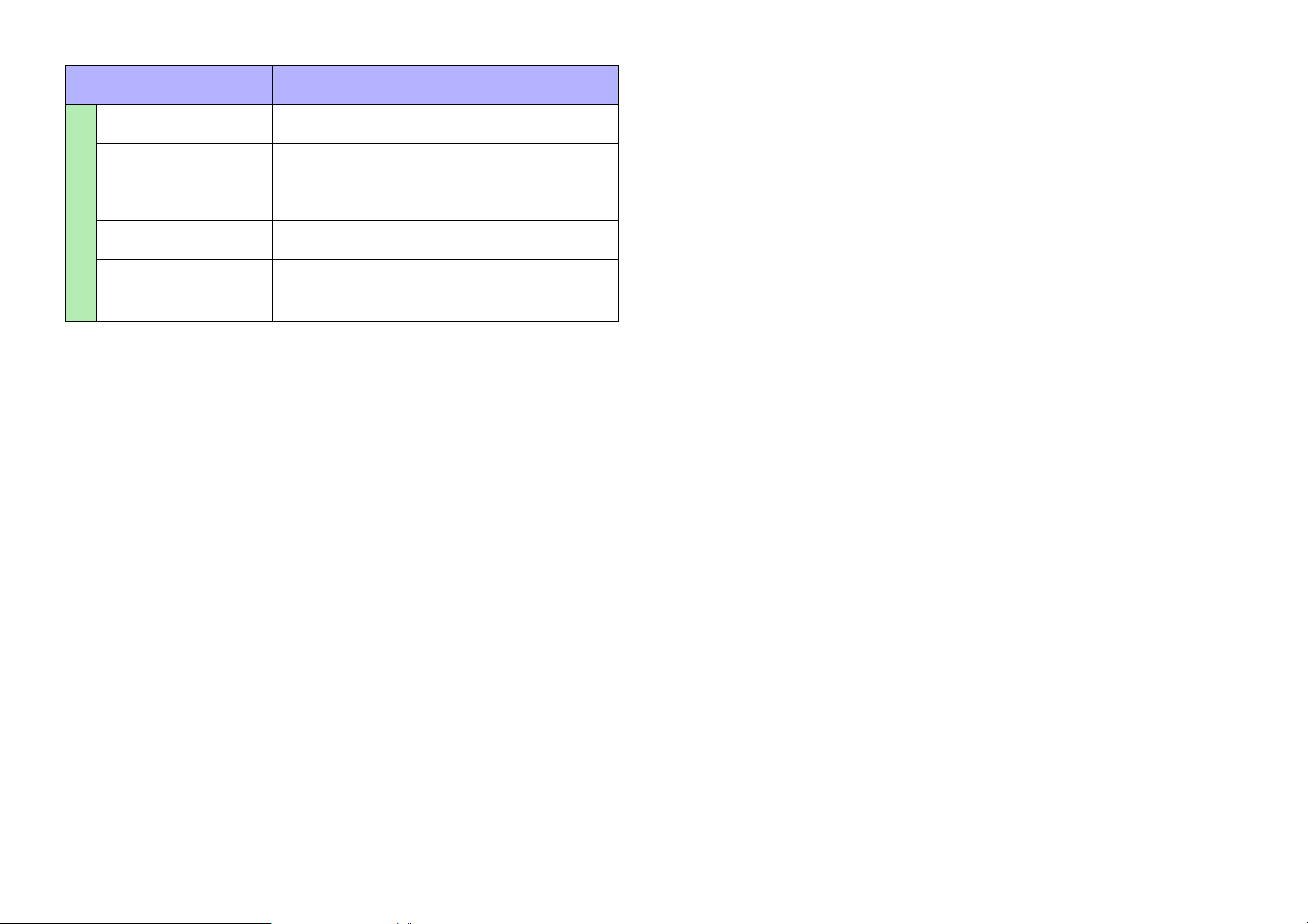
Property Value
[Font Color] * Specifies the color of the label.
[Font] * Specifies the font of the label.
[Position] * Selects the position of the label.
[Alignment] * Selects the alignment of the label.
[Margin] * Specifies how far the label is separated
from the widget.
71
Page 72
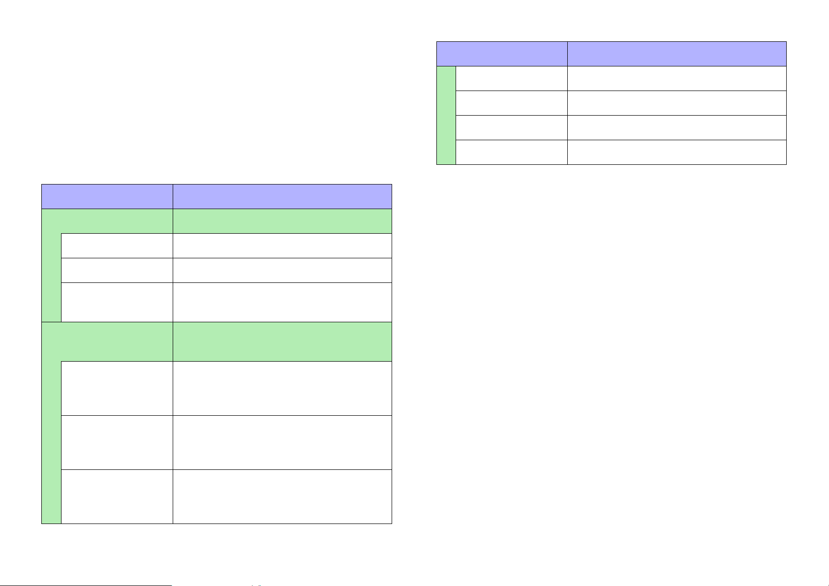
Lines
There is only one type of line widget.
Property Value
[Length] Indicates the length of the widget.
Line properties
Here we explain the parameters that are shown in the “Properties”
area when the focus is on a line .
Areas whose Value field is darkly shaded cannot be edited.
Items with an “*” in Property are style-related information.
Property Value
[General] Overall properties of the widget
[Name] The name of the widget.
[Type] The type of widget.
[Visible] Selects whether the widget is visible or
invisible in control mode.
[Position/Appearance]
[X] Specifies the horizontal distance from
Overall appearance of the widget
the top left of the screen and the point
at which the line starts being drawn.
[Style] * Selects the style of the widget.
[Color] * Selects the color of the widget.
[Width] * Specifies the width of the widget.
[Y] Specifies the vertical distance from the
top left of the screen and the point at
which the line starts being drawn.
[Angle] Indicates the angle of the widget, rela-
tive to the bottom edge when the widget
is placed.
72
Page 73
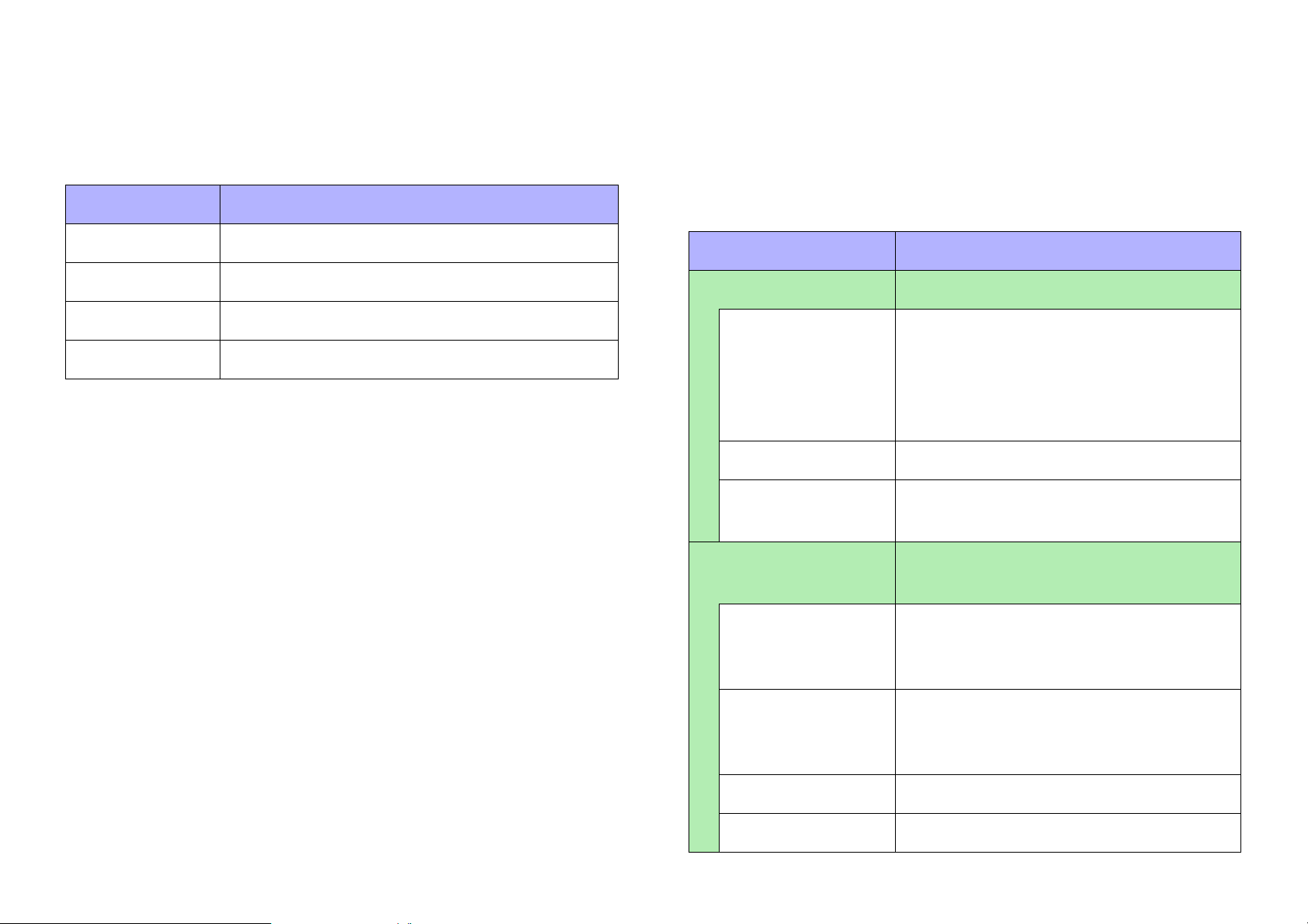
Shapes and Images
Shape and Image properties
These widgets are convenient for placing titles or comments. In
addition to text, you can also assign a logo or other image. The following shapes and images widgets are available.
Widget name Description
[Rectangle] Rectangle
[Ellipse] Ellipse
[Polygon] Polygon
[Image] Shows an image such as an icon or pattern.
For a polygon, you can right-click the widget to change the number
and shape of the angles. To increase the number of angles, rightclick where you want to add an angle. To decrease the number of
angles, right-click the peak that you want to remove.
Here we explain the parameters that are shown in the “Properties”
area when the focus is on a shape or an image. Depending on the
widget or setting, some parameters are not shown.
Areas whose Value field is darkly shaded cannot be edited.
Items with an “*” in Property are style-related information.
Property Value
[General] Overall properties of the widget
[Name] The name of the widget. If you place the
widget first and assign a parameter
later, you can enter a name here to indicate the parameter that you intend to
assign.
[Type] The type of widget.
[Visible] Selects whether the widget is visible or
invisible in control mode.
73
[Position/Appearance]
[X] Specifies the horizontal distance from
[Y] Specifies the vertical distance from the
[Width] Specifies the width of the widget.
[Height] Specifies the height of the widget.
Overall appearance of the widget
the top left of the screen and the top left
of the widget.
top left of the screen and the top left of
the widget.
Page 74
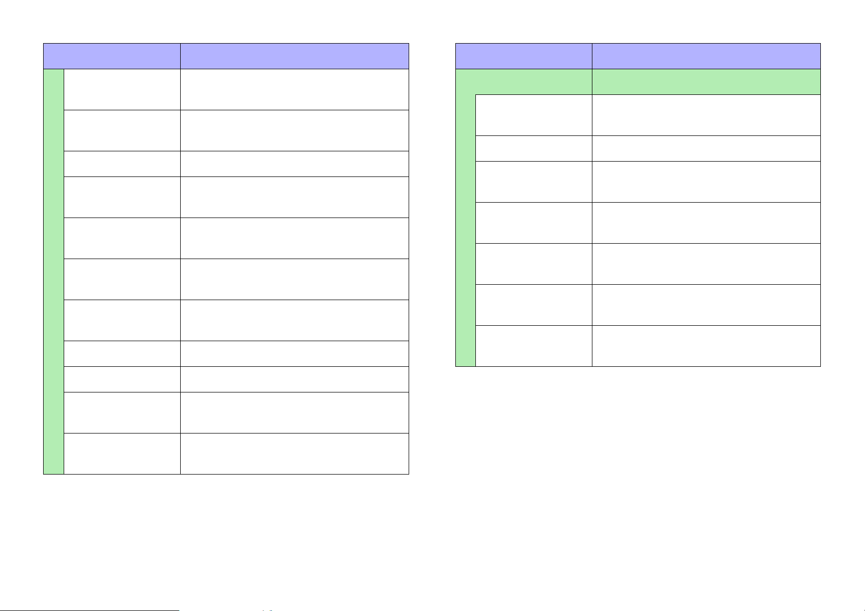
Property Value
Property Value
[Lock Aspect
Ratio] *
[Corner] * Specifies the roundness of the widget’s
[Shape] Selects the shape of the widget.
[Border Style] * Selects the type of border for the wid-
[Border Color] * Specifies the color of the widget’s bor-
[Border Width] * Specifies the width of the widget’s bor-
[Gradient] * Selects the type of gradation within the
[Color] * Specifies the color within the widget.
Selects whether the width/height ratio
of the widget will be fixed.
corners.
get.
der.
der.
widget.
[Text] Text within the widget
[Visible] * Selects whether the text within the wid-
get is visible.
[Text] Specifies the text within the widget.
[Color] * Specifies the color of the text within the
widget.
[Font] * Specifies the font of the text within the
widget.
[Vertical
Alignment] *
[Horizontal
Alignment] *
[Direction] * Selects the direction of the text within
Selects the vertical position of the text
within the widget.
Selects the horizontal position of the
text within the widget.
the widget.
[Image] * Specifies the image within the widget.
[Image
Expansion Mode] *
[Effect]*
Selects how the image is seen within
the widget.
Specifies how a shadow is added to the
outer part of the widget.
74
Page 75
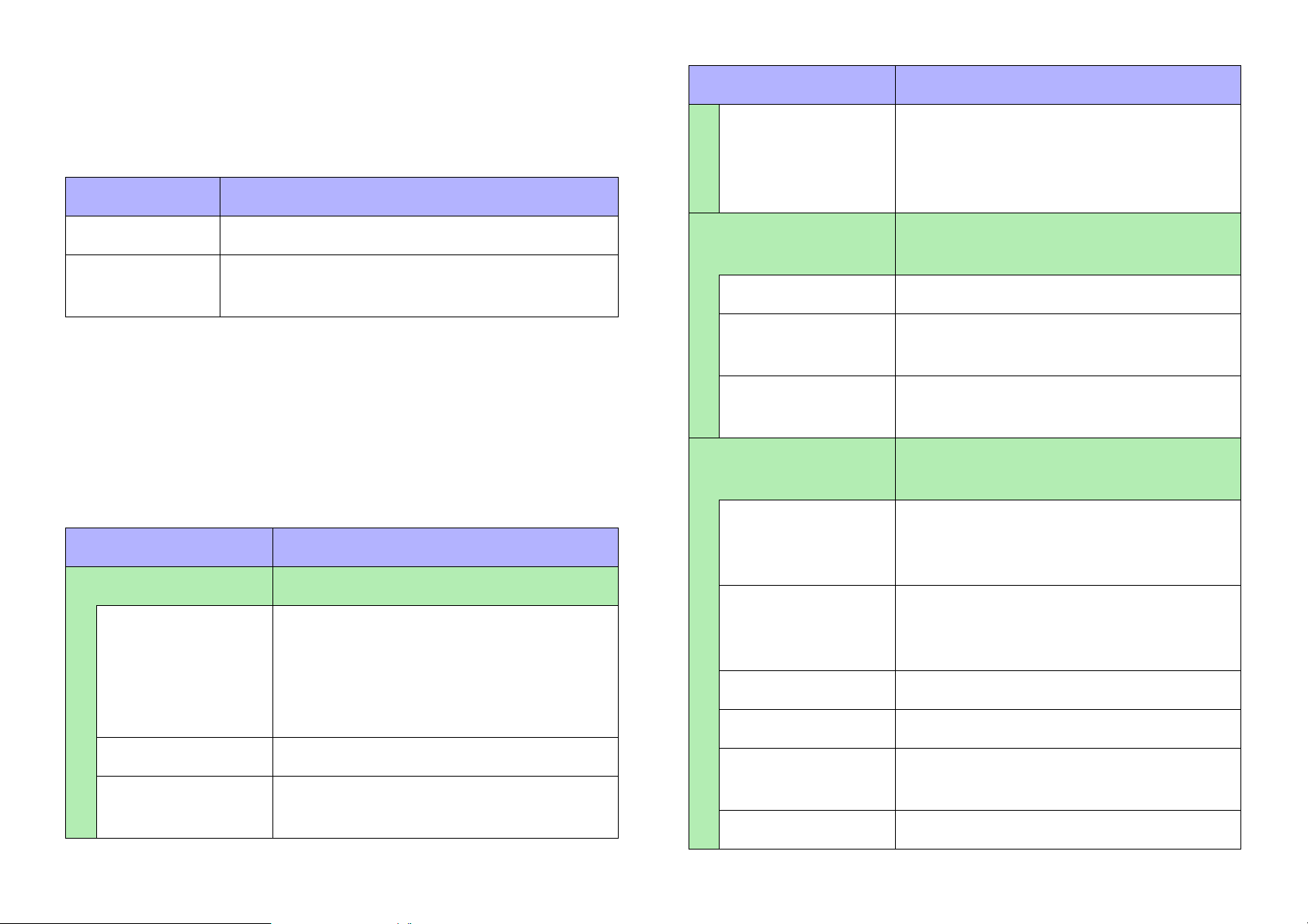
Showing and entering values
These widgets can show the current value of a parameter, or allow
direct input. The following value widgets are available.
Widget name Description
Property Value
[Read Only] Selects whether the widget can be
operated.
If you select [Yes], the widget functions
as a [Value] widget.
[Value] Shows the current value of a parameter.
[Line Edit] Directly inputs the numerical value of a param-
eter.
Value properties
Here we explain the parameters that are shown in the “Properties”
area when the focus is on a value. Depending on the settings, some
parameters are not shown.
Areas whose Value field is darkly shaded cannot be edited.
Items with an “*” in Property are style-related information.
Property Value
[General] Overall properties of the widget
[Name] The name of the widget. If you place the
widget first and assign a parameter
later, you can enter a name here to indicate the parameter that you intend to
assign.
[Control] Overall information on what is con-
trolled
[Model] The model name of the device.
[Device Identifier] The identifier of the device. The unit ID
or the IP address is shown.
[Parameter
Address]
[Position/Appearance]
[X] Specifies the horizontal distance from
[Y] Specifies the vertical distance from the
[Width] Specifies the width of the widget.
[Height] Specifies the height of the widget.
The parameter name assigned to the
widget.
Overall appearance of the widget
the top left of the screen and the top left
of the widget.
top left of the screen and the top left of
the widget.
[Type] The type of widget.
[Visible] Selects whether the widget is visible or
invisible in control mode.
75
[Lock Aspect
Ratio] *
[Shape] * Selects the shape of the widget.
Selects whether the width/height ratio
of the widget will be fixed.
Page 76
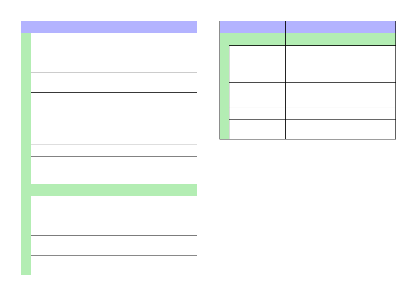
Property Value
Property Value
[Corner] * Specifies the roundness of the widget’s
corners.
[Border Style] * Selects the type of border for the wid-
get.
[Border Color] * Specifies the color of the widget’s bor-
der.
[Border Width] * Specifies the width of the widget’s bor-
der.
[Gradient] * Selects the type of gradation within the
widget.
[Color] * Specifies the color within the widget.
[Image] * Specifies the image within the widget.
[Image
Expansion
Mode] *
Selects how the image is seen within
the widget.
[Label] Properties for the widget’s label
[Visible] * Selects whether the label is visible.
[Text] Specifies the label.
[Font Color] * Specifies the color of the label.
[Font] * Specifies the font of the label.
[Position] * Selects the position of the label.
[Alignment] * Selects the alignment of the label.
[Margin] * Specifies how far the label is separated
from the widget.
[Text] Text within the widget
[Color] * Specifies the color of the text within the
widget.
[Font] * Specifies the font of the text within the
widget.
[Vertical
Alignment] *
[Horizontal
Alignment] *
Selects the vertical position of the text
within the widget.
Selects the horizontal position of the
text within the widget.
76
Page 77
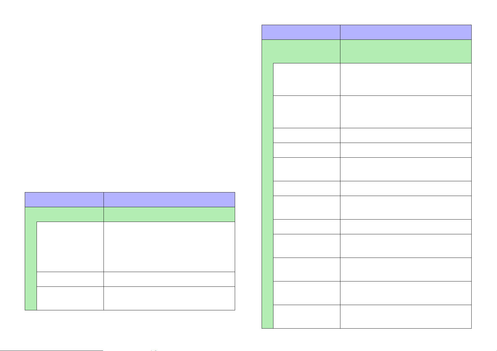
System monitor
There is only one type of system monitor widget.
When you click the [System Monitor] widget, the “System Monitor”
window appears, allowing you to check the device operating status
information that has collected by “ProVisionaire Monitoring Service.”
The color changes if a fault occurs in a device.
System monitor properties
Here we explain the parameters that are shown in the “Properties”
area when the focus is on a system monitor. Depending on the settings, some parameters are not shown.
Areas whose Value field is darkly shaded cannot be edited.
Items with an “*” in Property are style-related information.
Property Value
[Position/Appearance]
[X] Specifies the horizontal distance from
[Y] Specifies the vertical distance from the
[Width] Specifies the width of the widget.
[Height] Specifies the height of the widget.
[Lock Aspect
Ratio] *
[Shape] * Selects the shape of the widget.
Overall appearance of the widget
the top left of the screen and the top left
of the widget.
top left of the screen and the top left of
the widget.
Selects whether the width/height ratio
of the widget will be fixed.
Property Value
[General] Overall properties of the widget
[Name] The name of the widget. If you place the
widget first and assign a parameter
later, you can enter a name here to indicate the parameter that you intend to
assign.
[Type] The type of widget.
[Visible] Selects whether the widget is visible or
invisible in control mode.
77
[Corner] * Specifies the roundness of the widget’s
corners.
[Border Style] *
[Border Color] * Specifies the color of the widget’s bor-
[Border Width] * Specifies the width of the widget’s bor-
[Gradient] * Selects the type of gradation within the
[Effect]* Specifies how a shadow is added to the
Selects the type of border for the widget.
der.
der.
widget.
outer part of the widget.
Page 78
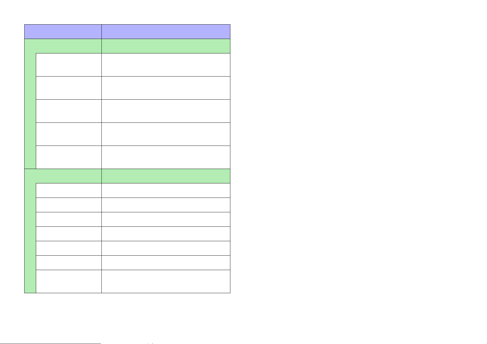
Property Value
[Text] Text within the widget
[Font] * Specifies the font of the text within the
widget.
[Color] * Specifies the color of the text within the
widget.
[Vertical
Alignment] *
[Horizontal
Alignment] *
[Direction] * Selects the direction of the text within
[Label] Properties for the widget’s label
[Visible] * Selects whether the label is visible.
[Text] Specifies the label.
[Font] * Specifies the font of the label.
[Font Color] * Specifies the color of the label.
[Position] * Selects the position of the label.
[Alignment] * Selects the alignment of the label.
Selects the vertical position of the text
within the widget.
Selects the horizontal position of the
text within the widget.
the widget.
[Margin] * Specifies how far the label is separated
from the widget.
78
Page 79
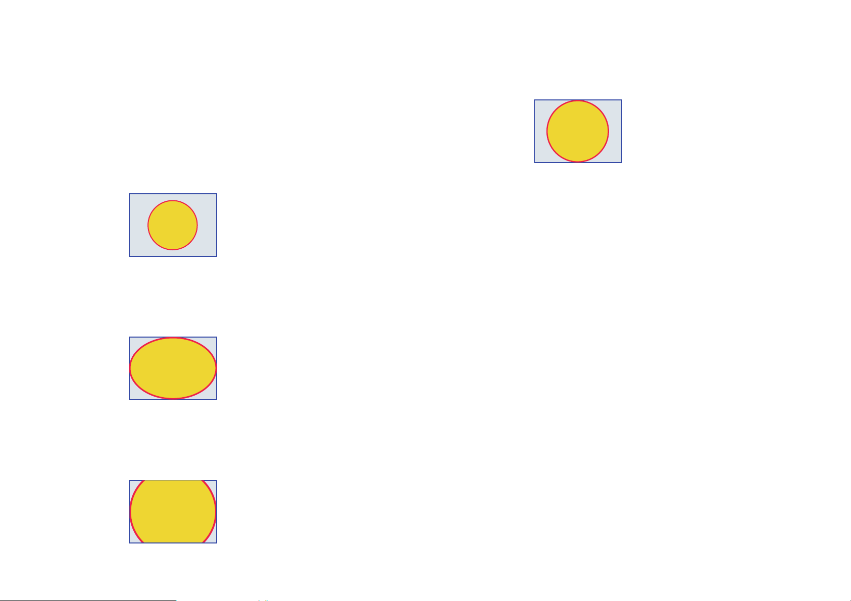
About the Expansion Mode
In the “Properties” area, below [Image], there will in some cases be
[Image Expansion Mode]; similarly in the “Setup” dialog box’s
[Security] tab, there will in some cases be [Expansion Mode]. These
items let you select how the image will be shown in the display area.
• None
The image is placed in the center of the area without any change
in size
•Full
The image is resized to fill the entire area vertically and horizontally
•Aspect Fit
The image is resized so that the longer dimension (height or
width) fits the full area
• Aspect Fill
The image is resized so that the shorter dimension (height or
width) fits the full area
79
Page 80
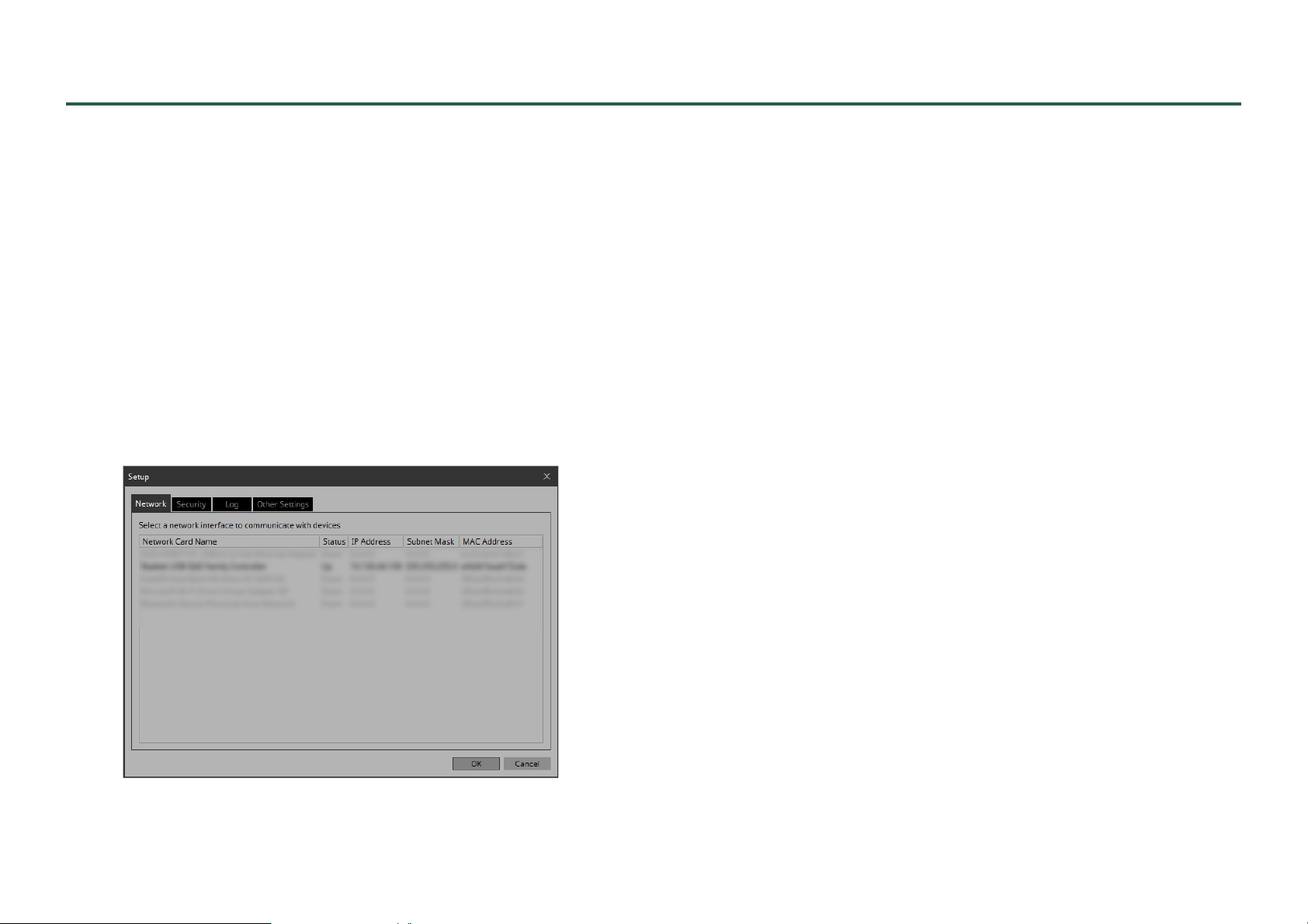
Dialog boxes and windows
Here we explain the dialog boxes and windows.
“Setup” dialog box
In this dialog box you make settings for the entire project or controller.
The displayed content differs between ProVisionaire Control and
KIOSK. Here we explain using the dialog box for ProVisionaire
Control.
[Network] tab
Here you can select the computer’s network interface card (subsequently called the “network card”) used for communicating with
devices.
If the computer is not connected to the network, click the [Cancel]
button to close the dialog box.
• Network Card Name
Indicates the name of the network card.
•Status
Indicates the status of the network card (Up or Down).
A network card indicated as “Down” cannot be selected.
• IP Address and Subnet Mask
Indicates the IP address and subnet mask that are assigned to the
network card.
If the network card is set to “obtain IP address automatically”
but there is no DHCP server and therefore the IP address is not
assigned, this indicates “0.0.0.0”.
Likewise, this indicates “0.0.0.0” if the network card is not
physically connected.
•MAC Address
Indicates the MAC address of the network card.
NOTE
Multiple network cards can be selected. When using more than one network card, each card must have a unique network address.
•[OK] button
Updates the settings and closes the dialog box.
• [Cancel] button
Closes the dialog box without updating the settings.
80
Page 81
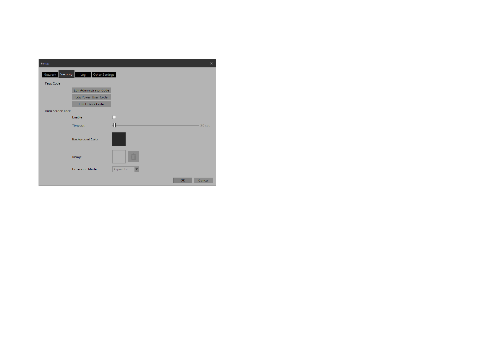
[Security] tab
Here you can make security settings.
• Auto Screen Lock [Background Color] button
Click this to open the “Select Color” dialog box. Specify a background color that is used when the image is not shown in the full
screen.
• Auto Screen Lock [Image] button
Click this to open the “Select Image” dialog box. Select an
image file that is shown when the screen is locked.
• Auto Screen Lock Image trash can button
Cancels the selection of the image specified by the Screen Lock
[Image] button. Even if this selection is canceled, the image
remains embedded into the project file.
• Auto Screen Lock [Expansion Mode] list box
From the list, select how the image will be shown in the display
area. For details on these choices, refer to “About the Expansion
Mode.”
•[OK] button
Updates the settings and closes the dialog box.
• Pass Code [Edit Administrator Code]/[Edit Power User
Code]/[Edit Unlock Code] buttons
Click a button to open the “Edit Pass Code” dialog box.
When entering a pass code for the first time, leave the [Enter
Current Pass Code] field empty when you specify the pass code.
• Auto Screen Lock [Enable] check box
If this is selected, you can make screen lock settings.
• Auto Screen Lock [Timeout] slider
Specifies the time until screen lock occurs.
• [Cancel] button
Closes the dialog box without updating the settings.
81
Page 82
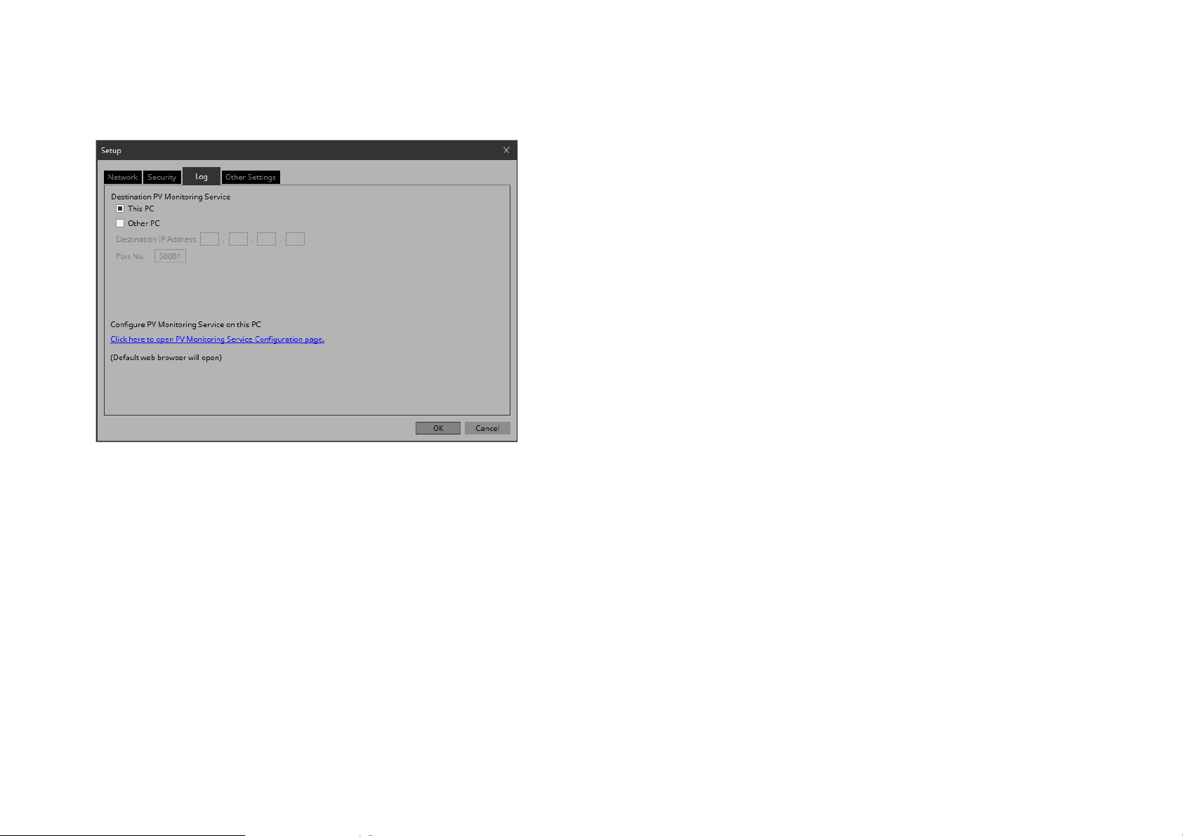
[Log] tab
Here you can make ProVisionaire Monitoring Service.
• [This PC] radio button
Makes the “System Monitor” window display the device operating status information collected by the computer that you are
currently operating.
• [Port No.] text box
Enter the port number used by “ProVisionaire Monitoring Service” on the other computer. The default value at installation is
50081.
If you manually change the port number that is used by “ProVisionaire Monitoring Service” on the other computer, you must
also change the firewall settings of the other computer.
• [Click here to Open PV Monitoring Service Configuration page] link
When you click this, the “ProVisionaire Monitoring Service
Settings” screen is displayed by the default web browser, allowing you to make settings for “ProVisionaire Monitoring Service” installed on the computer that you are currently operating.
This cannot be displayed if Internet Explorer is specified as the
default web browser, so you must specify a different web
browser as the default web browser.
•[OK] button
Updates the settings and closes the dialog box.
• [Cancel] button
Closes the dialog box without updating the settings.
• [Other PC] radio button
Makes the “System Monitor” window display the device operating status information collected by another computer.
• [Destination IP Address] text box
If the [Other PC] radio button is enabled, enter the IP address of
the computer.
82
Page 83
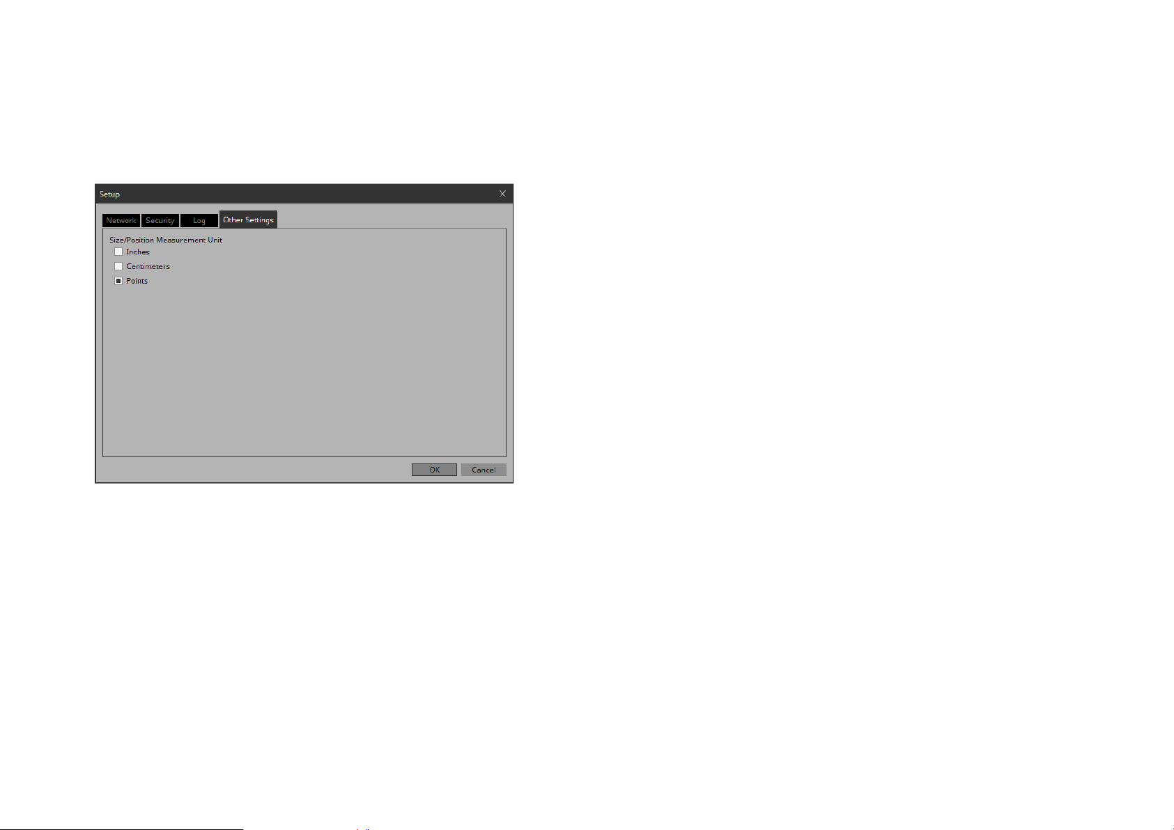
[Other Settings] tab
Here you can specify the units for the size and position information
of the widgets.
This setting is saved in the computer, not in the project file.
• “Size/Position Measurement Unit” radio buttons
Here you can select the units for the size and position information of the widgets.
•[OK] button
Updates the settings and closes the dialog box.
• [Cancel] button
Closes the dialog box without updating the settings.
83
Page 84
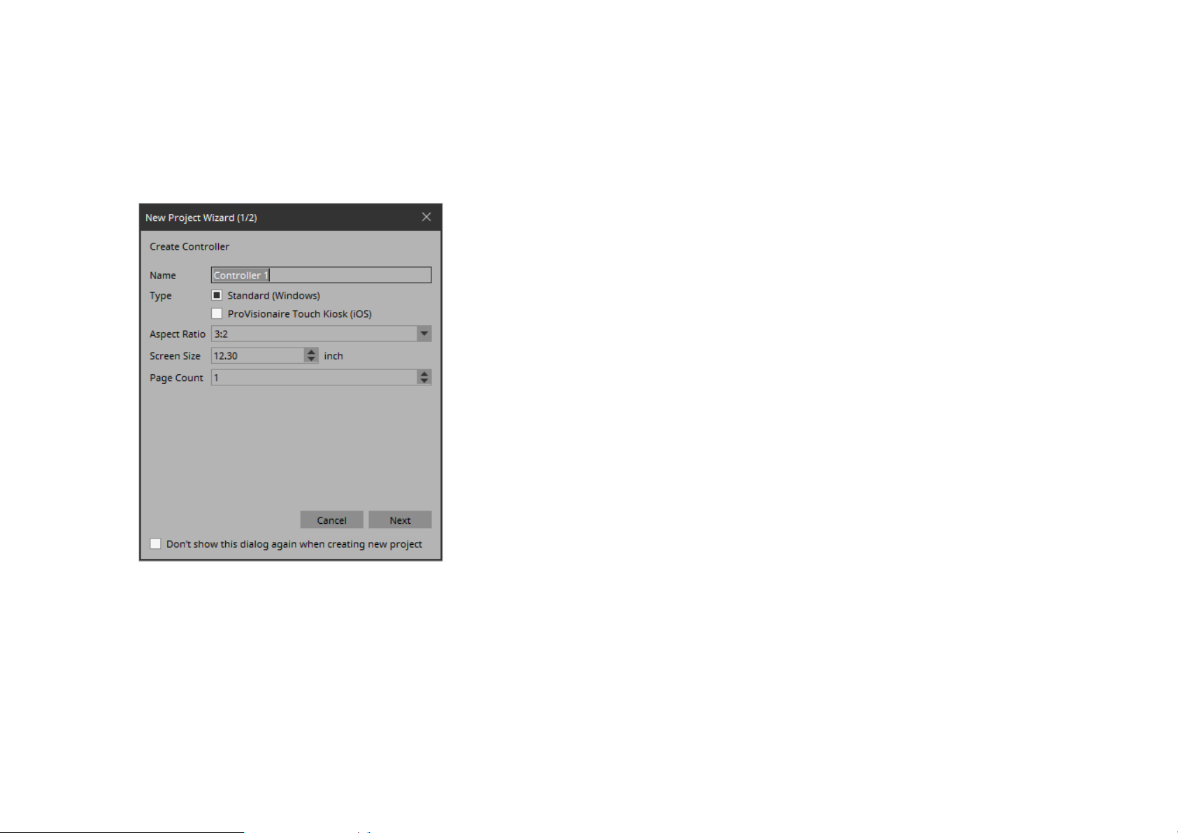
“New Project Wizard” dialog box
Use this dialog box to create a new project.
• [Aspect ratio] list box
Selects the aspect ratio of the screen in which KIOSK will run.
This setting cannot be changed later.
1/2 Create Controller
Here you can make settings for a new controller.
NOTE
You can create vertical controllers on V3.8 and above.
• [Screen size] spin box
Specifies the size of the screen in which KIOSK will run.
This will be the index by which the size or position of a widget
is specified in cm or inches.
• [Page count] spin box
Specifies the number of pages for the controller.
• [Cancel] button
Closes the dialog box without updating the settings.
•[Next] button
Moves to 2/2, where you can make device settings.
• [Don’t show this dialog again when creating new project] check box
If this check box is selected, the “New Project Wizard” does not
appear when you execute [New Project].
If you want to clear this check box, execute [New Project Wizard] and clear the check box.
•[Name] text box
Specifies the name of the controller.
• [Type] radio buttons
Select whether the controller is used in KIOSK (Windows) or in
ProVisionaire Touch KIOSK (iPad).
84
Page 85
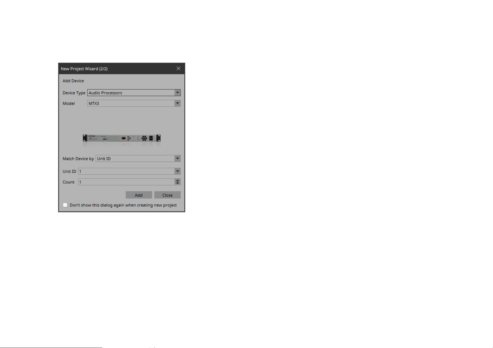
2/2 Add Device
Here you can make settings for the device(s) to be registered in the
project.
If you select [IP Address], the [IP Address] text box is shown
below.
If you want to control a device that is on a different subnet than
KIOSK, select [IP Address].
• [Unit ID] list box
Selects the starting unit ID of the devices that you want to register.
• [Count] spin box
Specifies the number of units of the devices that you want to
register.
• [IP Address] text box
Specifies the IP address of the device that you want to register.
• [Add] button
Registers the device(s) and closes the dialog box.
If you want to register another device, execute [Add Device] in
the “Devices” area.
• [Close] button
Closes the dialog box without registering a device.
• [Device Type] list box
Selects the type of device.
• [Model] list box
Selects the model name of the device.
• [Match Device by] list box
Selects how the device is identified.
If you select [Unit ID], the [Unit ID] list box and [Count] spin
box are shown below.
• [Don’t show this dialog again when creating new project] check box
If this check box is selected, the “New Project Wizard” does not
appear when you execute [New Project].
If you want to clear this check box, execute [New Project Wizard] and clear the check box.
85
Page 86
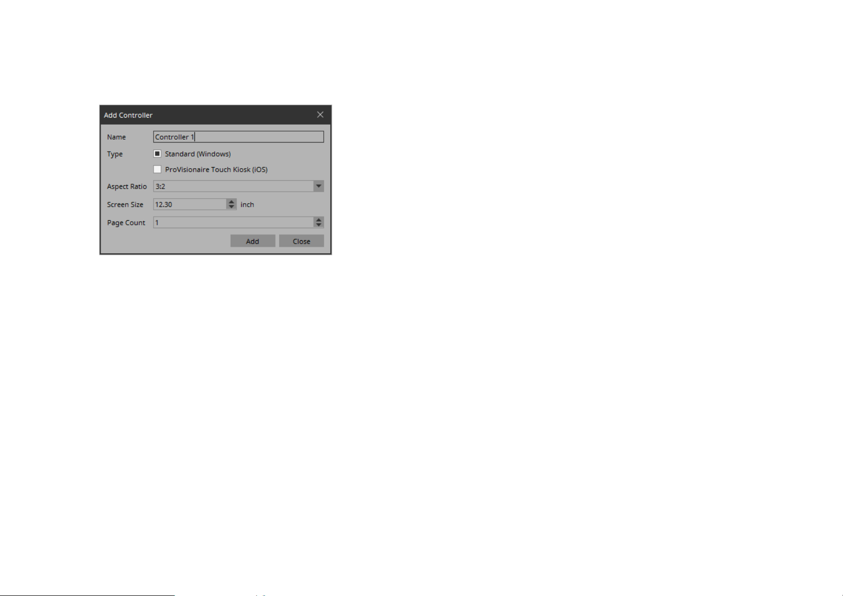
“Add Controller” dialog box
Here you can add a controller to the project.
•[Name] text box
Specifies the name of the controller.
• [Type] radio buttons
Select whether the controller is used in KIOSK (Windows) or in
ProVisionaire Touch KIOSK (iPad).
• [Add] button
Adds a controller and closes the dialog box.
• [Close] button
Closes the dialog box without adding a controller.
• [Aspect ratio] list box
Selects the aspect ratio of the screen in which KIOSK will run.
This setting cannot be changed later.
• [Screen size] spin box
Specifies the size of the screen in which KIOSK will run.
• [Page count] spin box
Specifies the number of pages for the controller.
86
Page 87
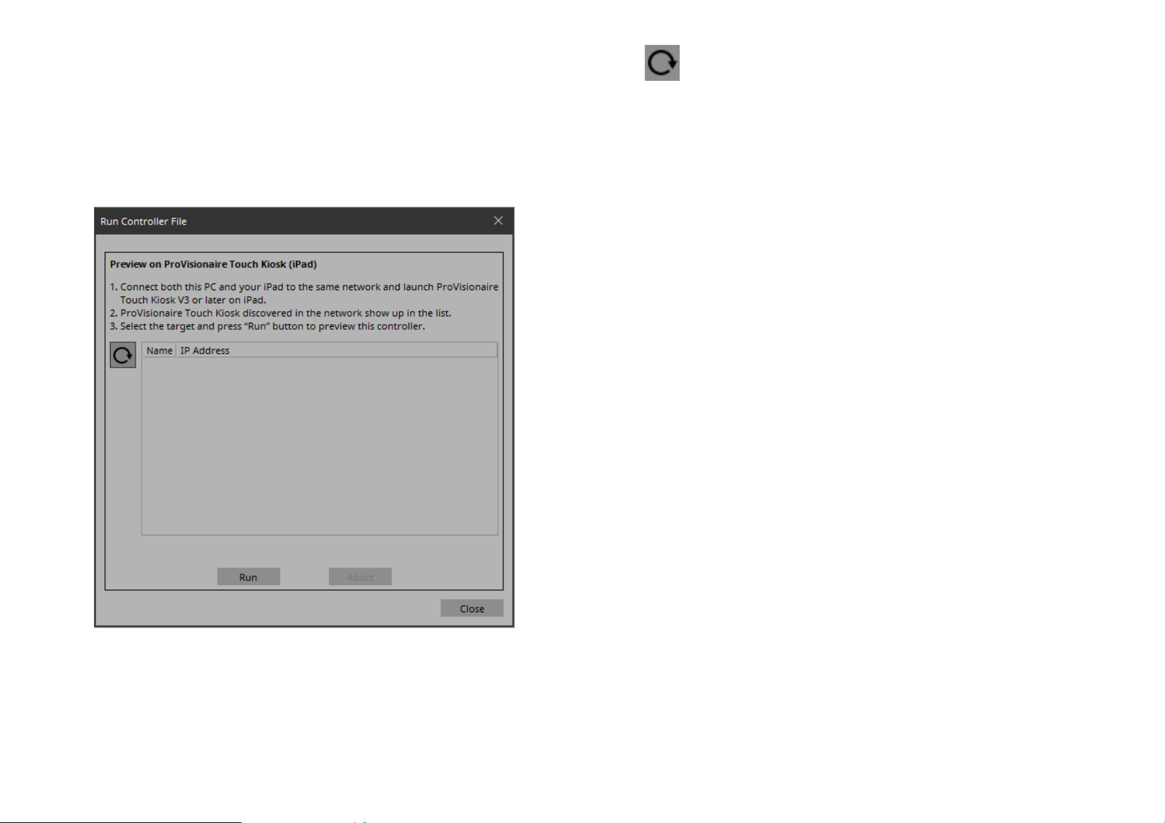
“Run Controller File” dialog box
• (Refresh) button
Here you can transfer a controller file to an iPad that is running ProVisionaire Touch KIOSK and is on the same network, and execute it
on the iPad. This is shown if the “Type” of the selected controller is
“ProVisionaire Touch Kiosk (iOS).”
Updates the iPad list.
• [Name]/[IP Address]
Shows information about the iPad units that are connected to the
same network as the computer running KIOSK and is running
ProVisionaire Touch KIOSK. When transferring a controller
file, select the transfer-destination in this field.
• [Run] button
Transfers the controller file to the iPad that is selected in the
[Name]/[IP Address] field. The receiving ProVisionaire Touch
KIOSK shows a confirmation screen.
• [Abort] button
Cancels controller file transfer.
• [Close] button
Closes the dialog box.
87
Page 88
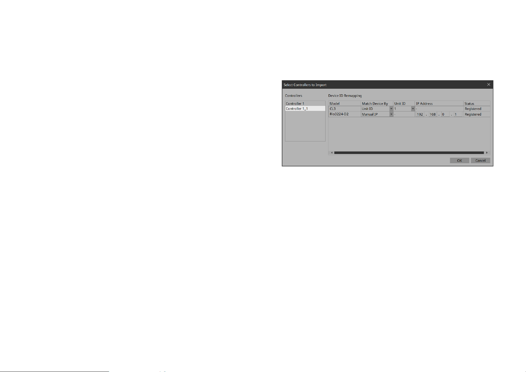
“Import Controller File” dialog box
“Select Controllers to Import” dialog
This dialog box is for importing a controller file.
• Leave blank if not entering a code.
If the file you are importing requires a passcode, input the passcode.
If the file doesn’t need a passcode, click OK.
box
This screen is for selecting the controller you want to import from
the project file.
• Controllers
Shows the list of controllers in the project file. Select the controller you want to import. When you select a controller, the
devices used by that controller are shown in “Device ID Remapping” on the right side.
88
• Match Device By
Changes the UNIT ID and Manual IP (manually assign IP
addresses) of the devices used in the controller.
Page 89
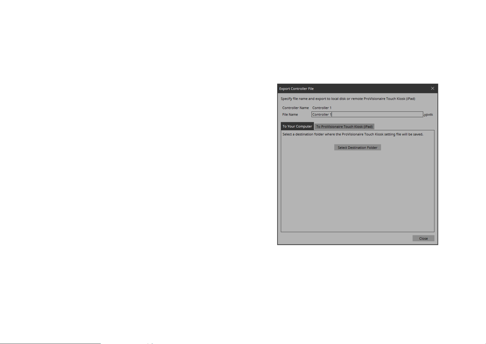
“Export Controller File” dialog box
Here you can create a control file for ProVisionaire Touch KIOSK,
or transfer a control file to an iPad that is running ProVisionaire
Touch KIOSK. This is shown if the “Type” of the selected controller
is “ProVisionaire Touch Kiosk (iOS).”
• [Controller Name]
Shows the name of the controller for which a file will be created.
•[File Name] text box
Enter the file name that you want to create.
• [Close] button
Closes the dialog box.
[To Your Computer] tab
Select this when you want to save the control file to the computer.
By using [Transfer Controller File] on the [File] menu of KIOSK,
the saved file can be transferred to an iPad that is running ProVisionaire Touch KIOSK.
89
• [Select Destination Folder] button
Selects the save-destination for the controller file and save the
controller file.
Page 90
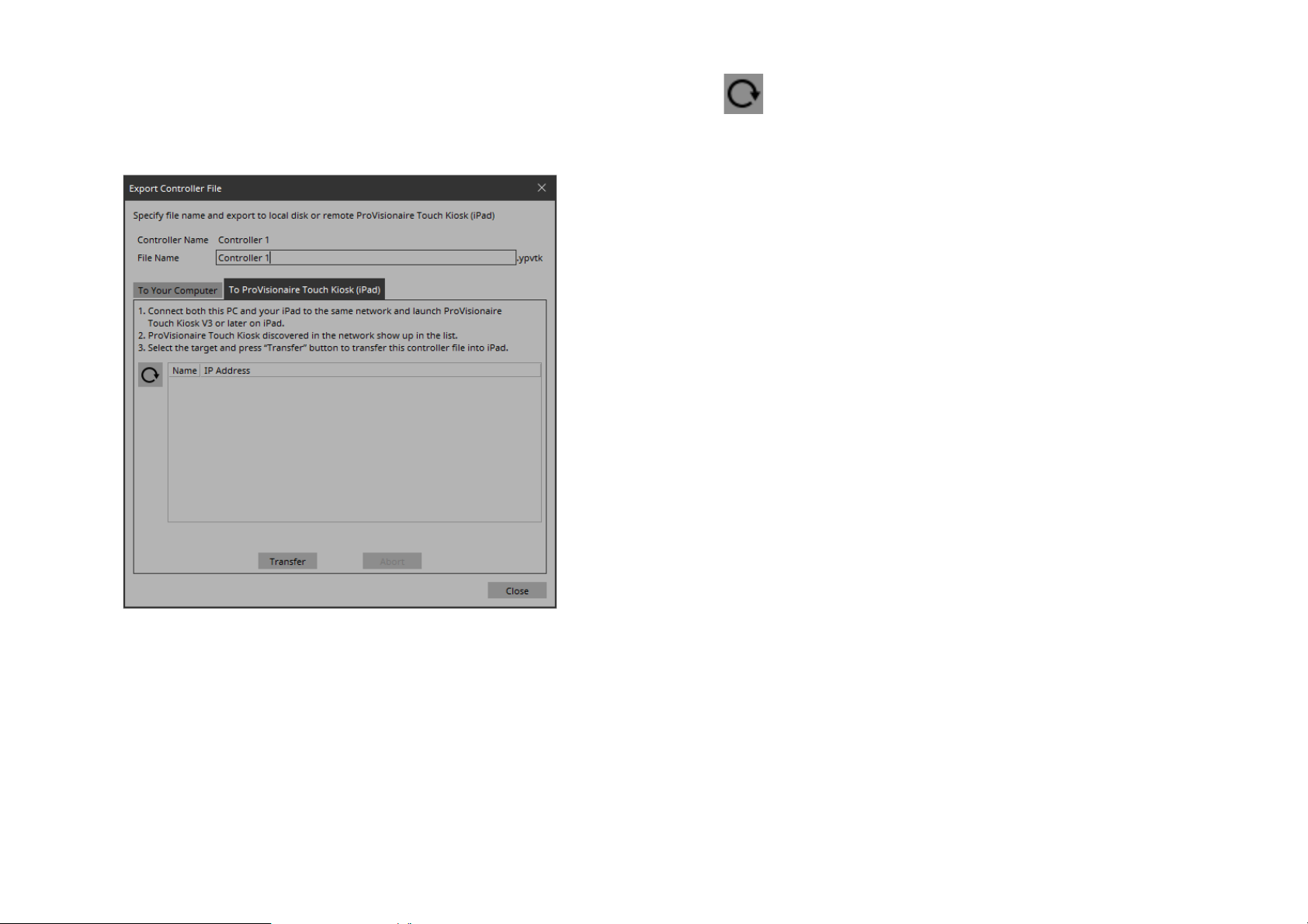
[To ProVisionaire Touch Kiosk] tab
Without saving the controller file to the computer, transfers it to the
iPad that is running ProVisionaire Touch KIOSK.
• (Refresh) button
Updates the iPad list.
• [Name]/[IP Address]
Shows information about the iPad units that are connected to the
same network as the computer running KIOSK and is running
ProVisionaire Touch KIOSK. When transferring a controller
file, select the transfer-destination in this field.
• [Transfer] button
Transfers the controller file specified by [File Name] to the iPad
that is selected by [Name]/[IP Address].
• [Abort] button
Cancels controller file transfer.
90
Page 91
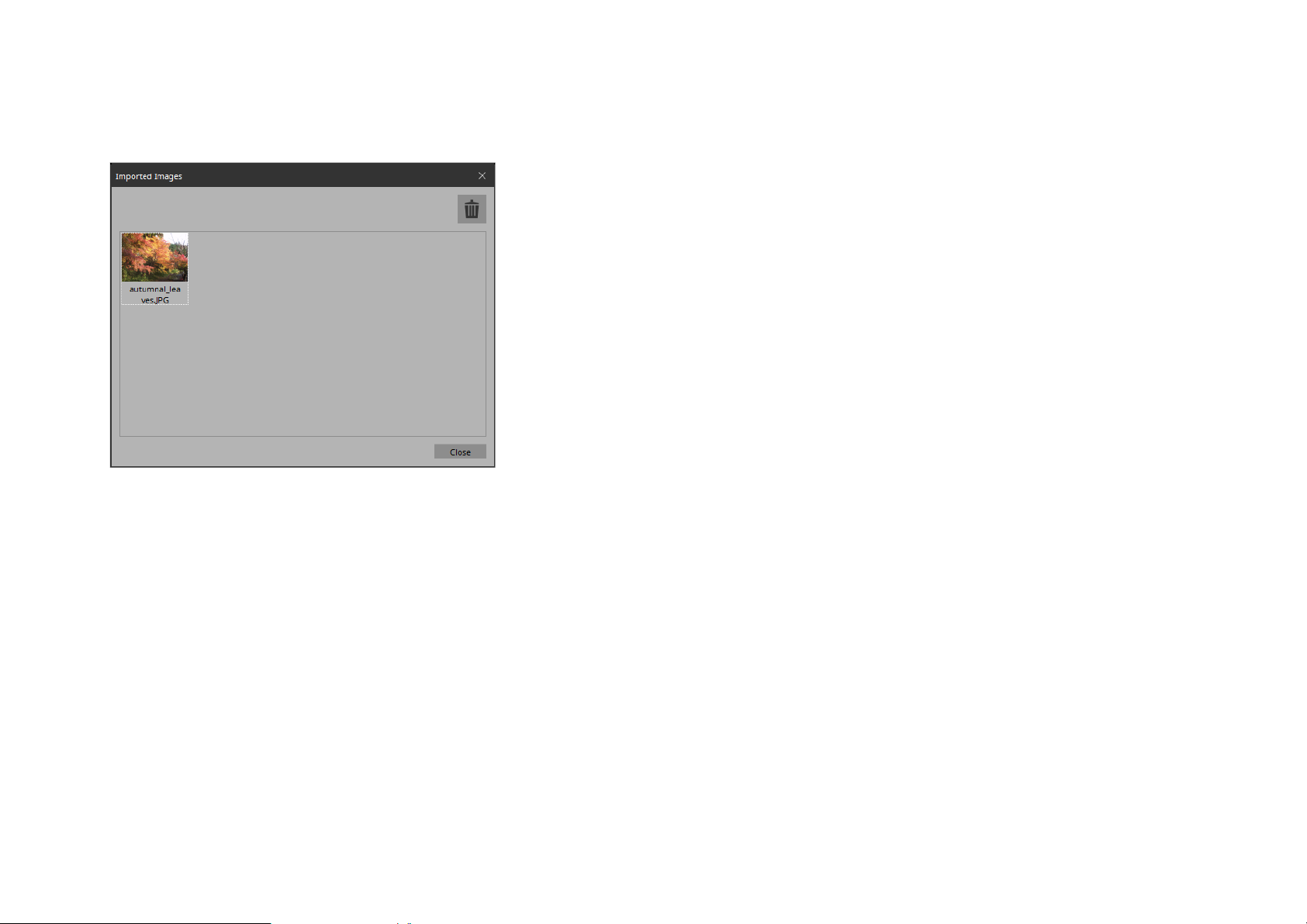
“Imported Images” dialog box
Here you can view or delete image data embedded in the project file.
• Image tile
Shows the image data embedded in the project file. To delete
data, select the tile of the file that you want to delete.
• Trash can button
Deletes the data whose image tile is selected from the project
file.
• [Close] button
Closes the dialog box.
91
Page 92
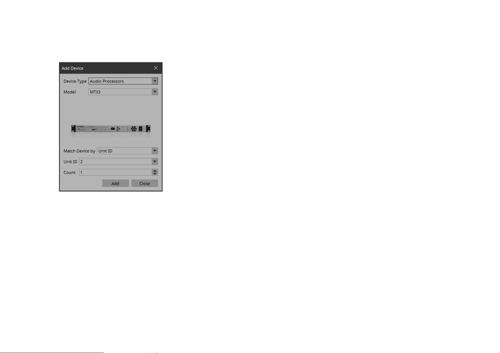
“Add Device” dialog box
Here you can add a device to the project.
• [Unit ID] list box
Selects the starting unit ID of the devices that you want to register.
• [Count] spin box
Specifies the number of units of the devices that you want to
register.
• [IP Address] text box
Specifies the IP address of the device that you want to register.
• [Add] button
Registers the device(s) and closes the dialog box.
• [Close] button
Closes the dialog box without registering a device.
• [Device Type] list box
Selects the type of device.
• [Model] list box
Selects the model name of the device.
• [Match Device by] list box
Selects how the device is identified.
If you select [Unit ID], the [Unit ID] list box and [Count] spin
box are shown below.
If you select [IP Address], the [IP Address] text box is shown
below.
If you want to control a device that is on a different subnet than
KIOSK, select [IP Address].
92
Page 93
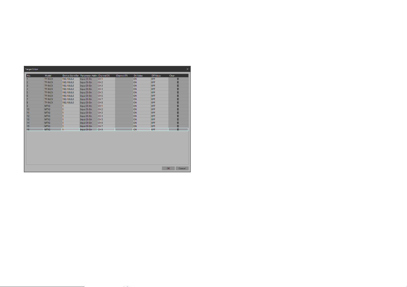
“Target Editor” dialog box
Here you can show or modify parameter information for buttons
(multi buttons) to which are assigned parameters of multiple devices
or multiple parameters of a single device.
• [Parameter Address](“On/Off” button, “Direct Set”
button)
Shows the type of the assigned parameter.
• [Channel(X)]/[Channel(Y)] (“On/Off” button, “Direct
Set” button)
Shows or changes the channel number of the assigned parameter.
• [On Value]/[Off Value] (“On/Off” button)
Shows or changes whether the assigned parameter is turned on
or off when the button is on or off.
• [Preset/Scene/Snapshot](“Recall” button)
Shows the type of the assigned parameter.
• Preset/Scene/Snapshot [No.](“Recall” button)
Shows or changes the recall number of the assigned parameter.
• [Press Value](“Direct Set” button)
Shows or changes the value that is specified when the button is
pressed.
•[No.]
Shows the number of the assigned parameter.
• [Models]
Shows the model name of the assigned parameter.
• [Device Identifier]
Shows or changes the UNIT ID or IP address of the assigned
parameter.
•[Clear]
Clears the assigned parameter.
•[OK] button
Applies the settings and closes the dialog box.
• [Cancel] button
Closes the dialog box without applying the settings.
93
Page 94
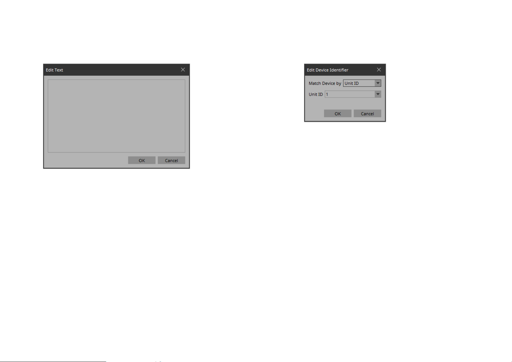
“Edit Text” dialog box
“Edit Device Identifier” dialog box
Here you can edit the text of a label, etc.
•Text box
Enter or edit text here. You might or might not be able to enter a
line-return, depending on the item.
•[OK] button
Applies the text and closes the dialog box.
• [Cancel] button
Closes the dialog box without applying the entered or edited
text.
Here you can edit the identifying information of a device.
• [Match Device by] list box
Selects how the device is identified.
If you select [Unit ID], the [Unit ID] list box is shown below.
If you select [IP Address], the [IP Address] text box is shown
below.
• [Unit ID] list box
Selects the starting unit ID of the devices that you want to register.
• [IP Address] text box
Specifies the IP address of the device that you want to register.
•[OK] button
Applies the settings and closes the dialog box.
• [Cancel] button
Closes the dialog box without applying the settings.
94
Page 95
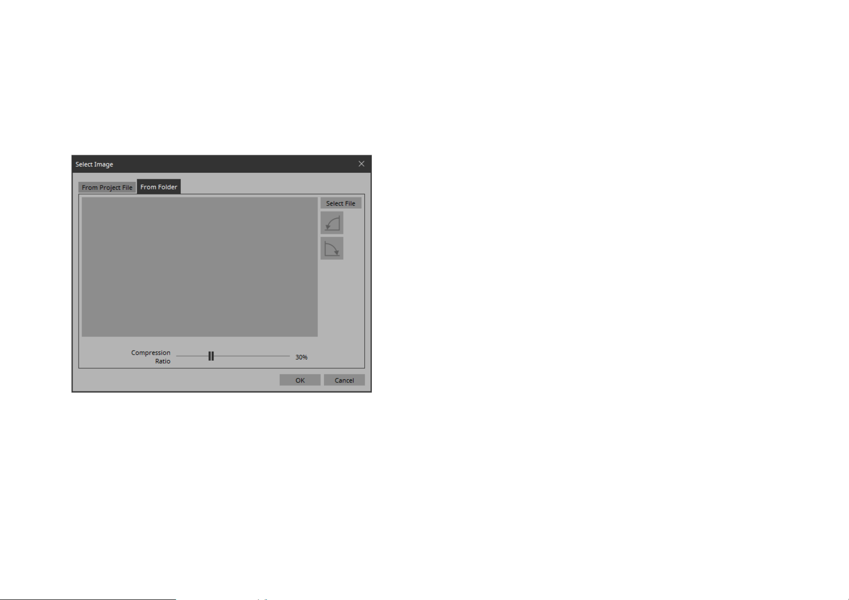
“Select Image” dialog box
Here you can select image data to use.
• [Compression Ratio] slider
Specifies the compression ratio when embedding the image in
the project file.
[From Folder] tab
Here you can select an image file from a folder of the computer.
•[OK] button
Applies the image and closes the dialog box.
• [Cancel] button
Closes the dialog box without applying the image.
• [Select File] button
Clicking this button opens a dialog box where you can select an
image file.
• Rotate counterclockwise button
Rotates the displayed image 90 degrees counterclockwise.
• Rotate clockwise button
Rotates the displayed image 90 degrees clockwise.
95
Page 96
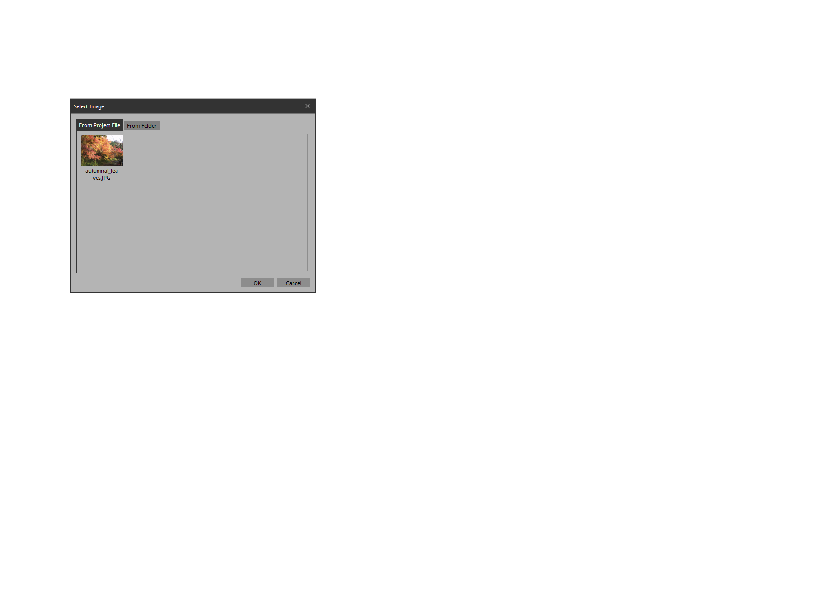
[From Project File] tab
Here you can select image data from the project file.
• Image tile
Shows the image data embedded in the project file. Select the
image that you want to use.
•[OK] button
Applies the selected image and closes the dialog box.
• [Cancel] button
Closes the dialog box without applying the selected image data.
96
Page 97
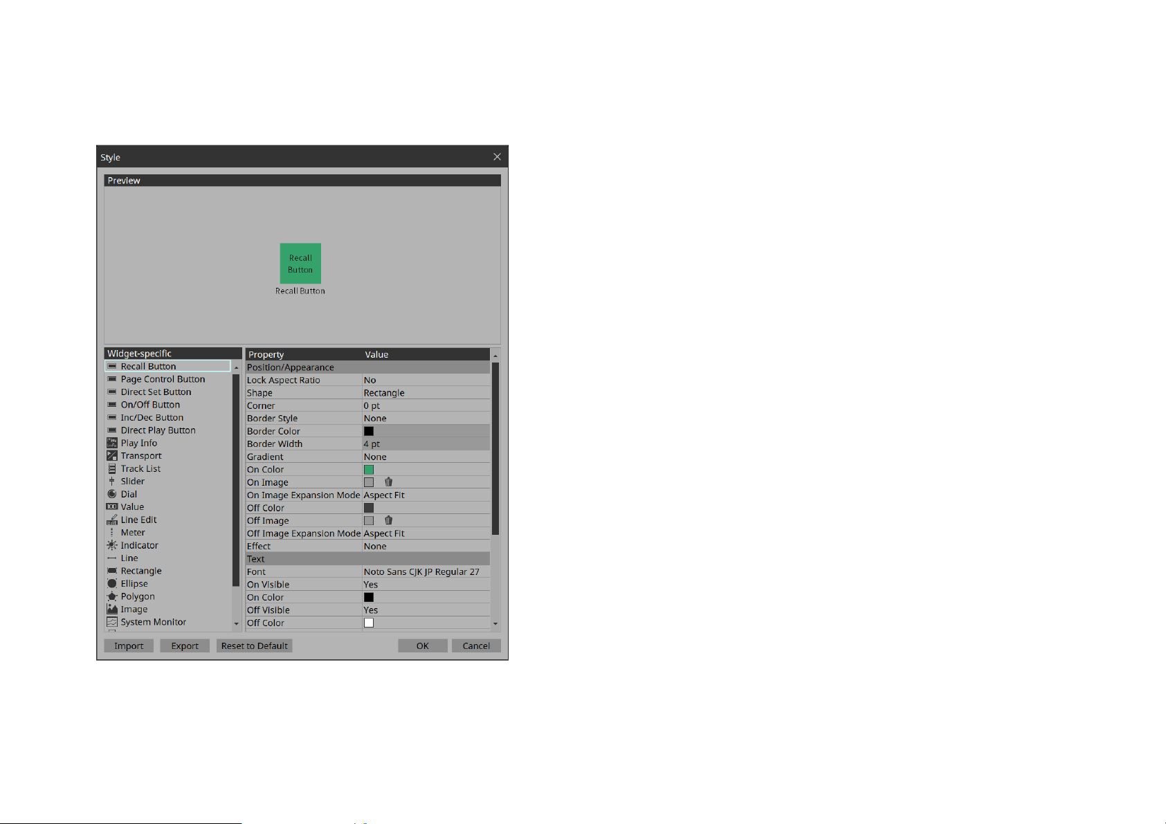
“Style” dialog box
Here you can confirm and edit the style of each widget in the project.
•Preview
Shows the shape etc. in the style for the widget selected by Widget-specific.
• Widget-specific
When you select a widget, the Preview widget is switched, and
style information for that widget is shown at the right.
• Property/Value
Style information of the selected widget. This can also be
edited.
• [Import] button
Imports and overwrites style information.
•[Export] button
Saves the current style information as a file.
• [Reset to Default] button
Returns to the style immediately after installation.
•[OK] button
Applies the settings and closes the dialog box.
97
• [Cancel] button
Closes the dialog box without applying the settings.
Page 98
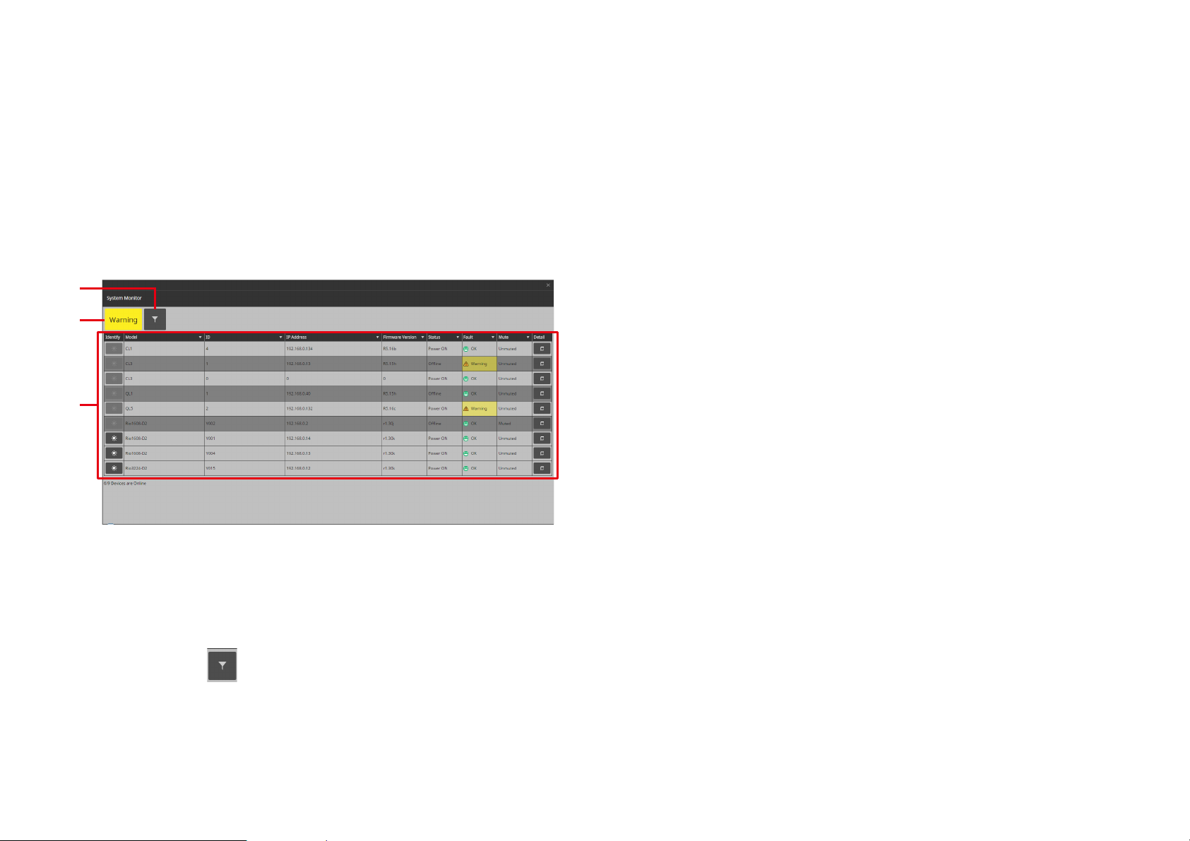
“System Monitor” window
q
e
w
e Device list
This shows the device operating status information that has been collected by ProVisionaire Monitoring Service.
Device list
Lists the compatible devices that are connected.
By clicking the [] in each column, you can sort or filter by keyword.
[Identify] button
When you click this, the indicators of the device flash for several
seconds.
[Model]
Indicates the model name of the device.
[ID]
Indicates the UNIT ID of the device.
[IP Address]
Indicates the IP address of the device.
[Firmware Version]
Indicates the MAIN firmware version of the device.
[Status]
Indicates whether the device is powered-on and whether it is online.
[Fault]
Indicates the fault that is occurring on the device.
[Mute]
Indicates whether the fault has caused the device to be muted.
Depending on the condition of the device, it might be muted or
unmuted automatically.
[Detail] button
Shows detailed information for the device.
q Status indicator
This indicates the highest level of fault for all connected devices. If
there is no fault, this indicates “OK.”
w Filter button ( )
Only the devices for which a fault has occurred are shown.
98
Page 99
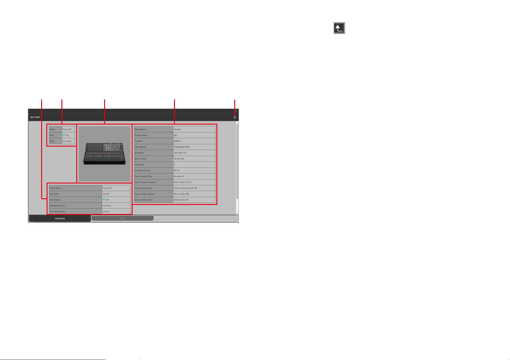
Device details
qwr e t
Shows detailed information for the device.
Overview shows information for the device, and Detail shows information about the device
’s operating status.
q Back button ( )
Returns to the device list.
w Summary of device status
Shows a simplified view of the device status.
• [Overview] tab
e Device image
Shows a graphic of the currently-viewed device.
r Status of entire device
Shows a simplified view of the overall status of the device.
t Device profile
Shows a profile of the device, including its firmware version.
99
Page 100
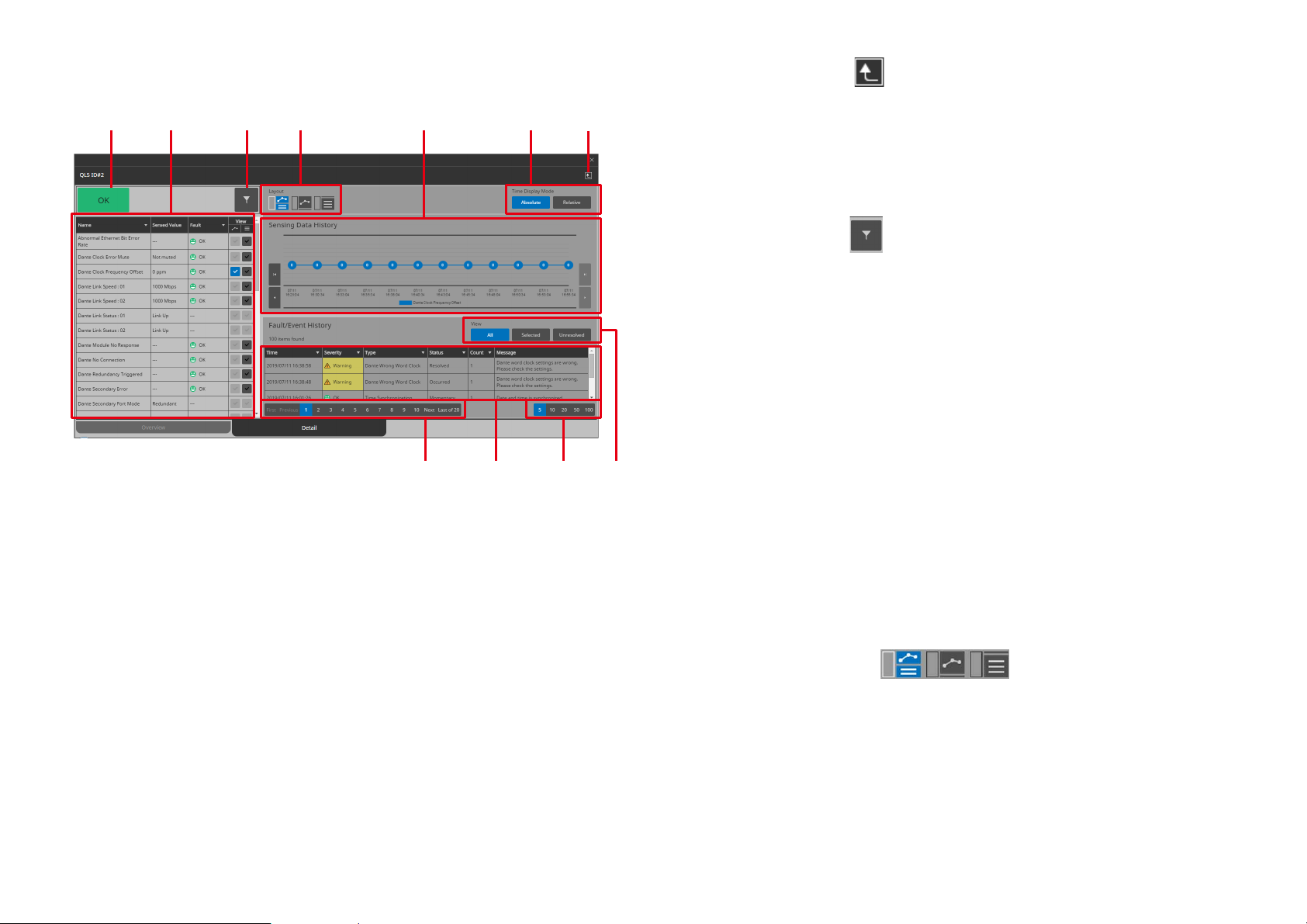
• [Detail] tab q Back button ( )
qw e t yr u
i!1o!0
Returns to the device list.
w Status indicator
This indicates the highest level of fault for the device. If there is no
fault, this indicates “OK.”
e Filter button ( )
Only the items for which a fault has occurred are shown.
r Item list
This is a list of the operating status information that is being monitored. By clicking the [] in each column, you can sort or filter by
keyword.
[Name]
These are the names of the operating status items that are being
monitored.
[Sensed Value]
This shows the operating status information.
[Fault]
Indicates the fault that is occurring on the device.
[View]
Add a check mark to the items that you want to be shown in “Sens-
ing Data History” or “Fault/Event History.”
t [Layout] button ( )
Switches the layout of the “Sensing Data History” and “Fault/Event
History” display.
100
 Loading...