

Page 1
Elementi
Quick Guide
Version 1 for Elementi 3.0.0
Page 2

!
2
Contents
3
4
5
6
7
8
9
10
11
12
13
14
15
16
17
18
19
20
21
22
23
24
25
26
27
28
29
30
31
32
33
34
35
36
37
38
39
40
41
42
Disclaimer
System Requirements
Getting Started
Toolbar
Project
Layout
Playlist
Publish
Import
Fonts
Interface Overview
Panels and Views
Preview Panel
Full Screen
Edit Panel
Timeline
Schedule Panel
Browse Panel
Library
Assets
Devices
Style Features
Text Properties
Media Properties
Formats
Effects
Transitions
User Role Overview
User Roles
Advanced Features
Locale
Feeds
Interactivity
Multiscreen
Fusion Skins and Templates
Developer Console
HMD Legacy
Licenses
Support
Glossary
Page 3

!
3
Disclaimer
THE SPECIFICATIONS AND INFORMATION REGARDING THE PRODUCTS IN THIS MANUAL ARE SUBJECT TO CHANGE WITHOUT NOTICE. ALL
STATEMENTS, INFORMATION, AND RECOMMENDATIONS IN THIS MANUAL ARE BELIEVED TO BE ACCURATE BUT ARE PRESENTED WITHOUT
WARRANTY OF ANY KIND, EXPRESS OR IMPLIED. USERS MUST TAKE FULL RESPONSIBILITY FOR THEIR APPLICATION OF ANY PRODUCTS.
THE SOFTWARE LICENSE AND LIMITED WARRANTY FOR THE ACCOMPANYING PRODUCT ARE SET FORTH IN THE INFORMATION PACKET
THAT IS SHIPPED WITH THE PRODUCT AND ARE INCORPORATED HEREIN BY THIS REFERENCE. IF YOU ARE UNABLE TO LOCATE THE
SOFTWARE LICENSE OR LIMITED WARRANTY, CONTACT YOUR SPINETIX REPRESENTATIVE FOR A COPY. NOTWITHSTANDING ANY OTHER
WARRANTY HEREIN, ALL DOCUMENT FILES AND SOFTWARE OF THESE SUPPLIERS ARE PROVIDED “AS IS” WITH ALL FAULTS. SPINETIX
DISCLAIMS ALL WARRANTIES, EXPRESSED OR IMPLIED, INCLUDING, WITHOUT LIMITATION, THOSE OF MERCHANTABILITY, FITNESS FOR A
PARTICULAR PURPOSE AND NONINFRINGEMENT OR ARISING FROM A COURSE OF DEALING, USAGE, OR TRADE PRACTICE. IN NO EVENT
SHALL SPINETIX OR ITS SUPPLIERS BE LIABLE FOR ANY INDIRECT, SPECIAL, CONSEQUENTIAL, OR INCIDENTAL DAMAGES, INCLUDING,
WITHOUT LIMITATION, LOST PROFITS OR LOSS OR DAMAGE TO DATA ARISING OUT OF THE USE OR INABILITY TO USE THIS MANUAL, EVEN
IF SPINETIX OR ITS SUPPLIERS HAVE BEEN ADVISED OF THE POSSIBILITY OF SUCH DAMAGES.
Elementi License Agreement
spinetix.com/legal
‘SpinetiX’, ‘Elementi’ and ‘Hyper Media Player (HMP)’ are registered trademarks, and all logo and graphic designs
are trademarks of SpinetiX SA. Other product and company names appearing in SpinetiX SA products and
materials are used for identification purposes only and may be trademarks or registered trademarks of their
respective companies. Registered and unregistered trademarks used in any SpinetiX SA products and materials
are the exclusive property of their respective owners
Page 4

!
4
System Requirements
Windows
• Microsoft® Windows® Vista with Service Pack 1 or later, Windows 7 with Service Pack 1 or later, or
Windows 8
• 32-bit or 64-bit processor (Elementi is a 32-bit application, but it also runs on a 64-bit processor)
• 100 MB of available hard-disk space for installation
• Intel® Pentium® 4 or AMD Athlon® 64 processor
• 4GB of RAM
• 1024x768 display or1280x720 with 32-bit color
Elementi cannot be used without activation. Internet connection is required for download, activation, and
reactivation.
Notes
• Mac OS is not supported, however Boot Camp (with or without Parallels Desktop) runs compatible versions of
Microsoft® Windows® or Intel-based Mac
• Linux OS is not supported
• Windows® Server OS is not supported
• Virtual machine is not recommended mostly for performance reasons
Page 5

!
5
Getting Started
Page 6
!
6
Toolbar
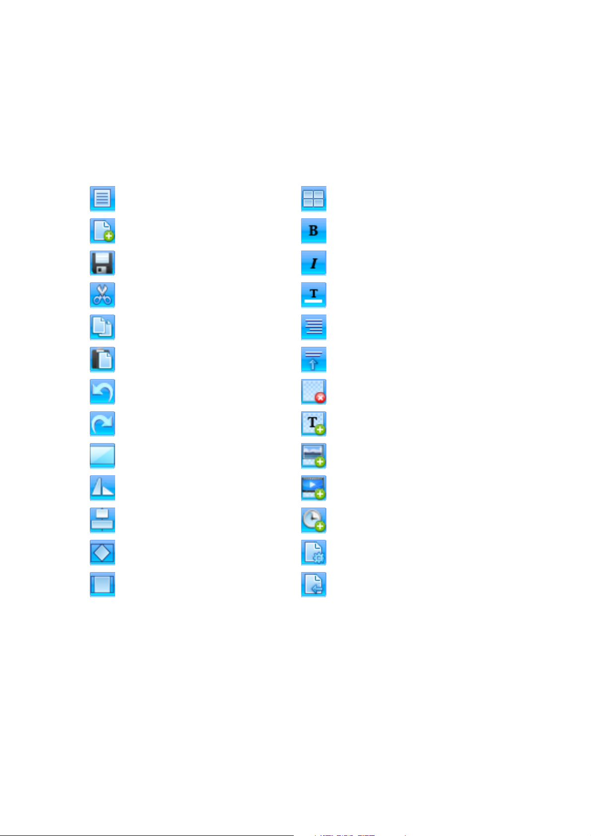
Toolbar contains icons used to perform the most frequent actions. The toolbar is context sensitive, and
depending on the task performed, only relevant icons will be shown. When hovering the cursor over an icon, a
tooltip will appear. Some icons offer more options, and these can be viewed by clicking on the downward
pointing arrow.
Menu
Access to main menu (file, edit, settings, etc.)
Multiscreen
Selecting screen to view
New
Creation of new project, layout, playlist, etc.
Text Bold
Style choice of bold
Save
Saving project, layout, playlist, etc.
Text Italic
Style choice of italic
Cut
Moving selected data to clipboard
Text Color
Style choice of color
Copy
Creation of duplicate data in clipboard
Text Horizontal Align
Left, center, right and justified text alignment
Paste
Placing of copied data from clipboard
Text Vertical Align
Top, center and bottom text alignment
Undo
Undoing the last change done
Delete Layer
Deletion of a layer
Redo
Reversing the Undo feature
Add Text Layer
Adding new text layer
Fit Screen
Making selection occupy an entire screen
Add Media Layer
Adding new media layer
Media Rotation
90CW, 90CCW, 180, horizontal and vertical mirroring
Add Streaming Layer
Adding new streaming layer
Media Align
Left, right, center, top and bottom selection alignment
Schedule Media
Adding media into schedule
Media within Selection Fit
Selection fit, boundaries meet, and media slice
Document Properties
Setup dialog (background color, transitions, etc.)
Media within Selection Align
Left, right, center, top and bottom media alignment
Back
Going back to previous document
Video Tutorial Elementi Interface
Page 7
!
7
Project
Project is all the files put together to create digital signage content for display/s.
Project Components
Project contains a master file, and any combination of images, videos, playlists, and/or layouts. Master file
(index.svg) allows viewing a project. Project may also contain schedule, scripts, data, etc. It is possible to place
any number of layouts and playlists, as well as a schedule within a project.
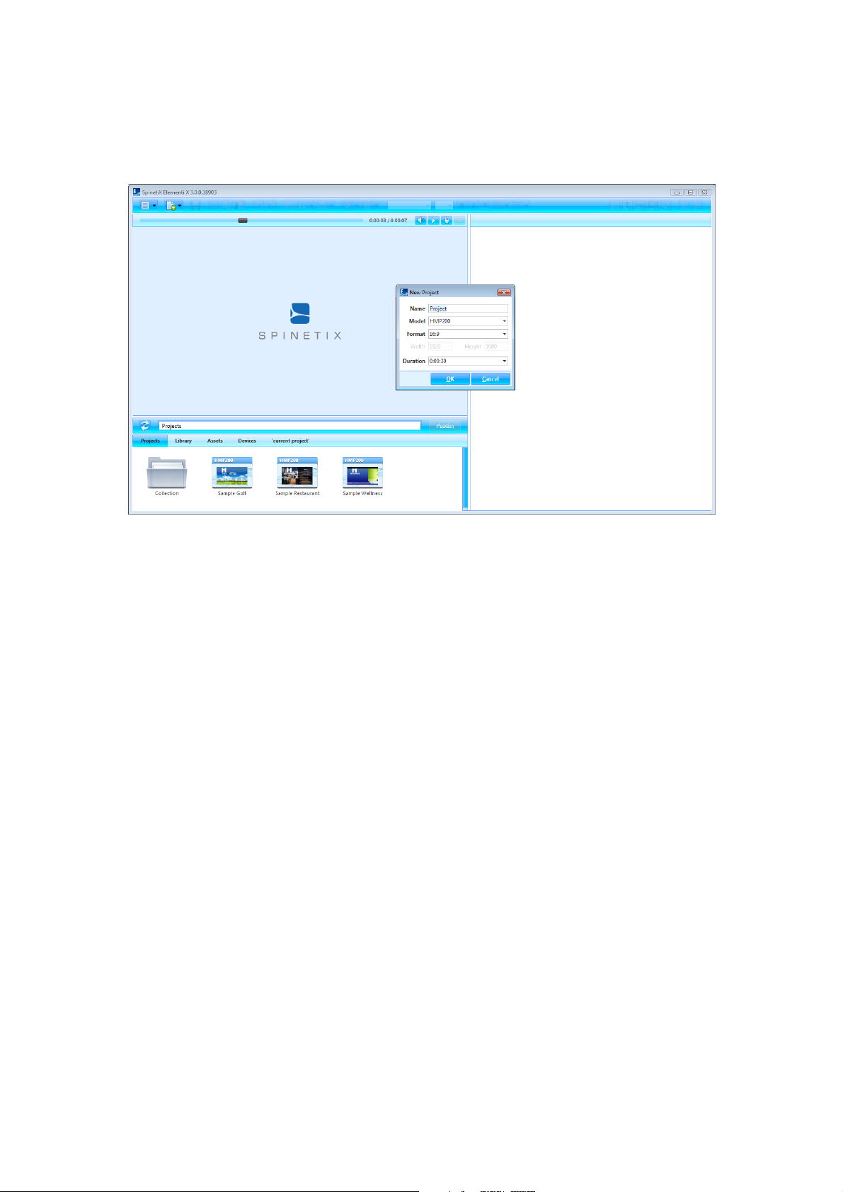
Creating New Project
To create a new project, select New Project (under New icon in the toolbar), and set project name, target device,
display format, duration, etc. These properties can be changed at any time. New project is automatically saved
under Projects (tab in the browse panel). Projects can be grouped together in a collection (folder).
Viewing Project
To view a project in the preview panel, double-click on the project (icon in the browse panel). All project files will
show up under ‘current project’ (the last tab in the browse panel). Project name will automatically appear as the
last tab name.
Properties
To view and modify properties, click on Document Properties (icon in the toolbar).
Video Tutorial Create Project
Page 8
!
8
Layout
Layout is media arranged in a particular way.
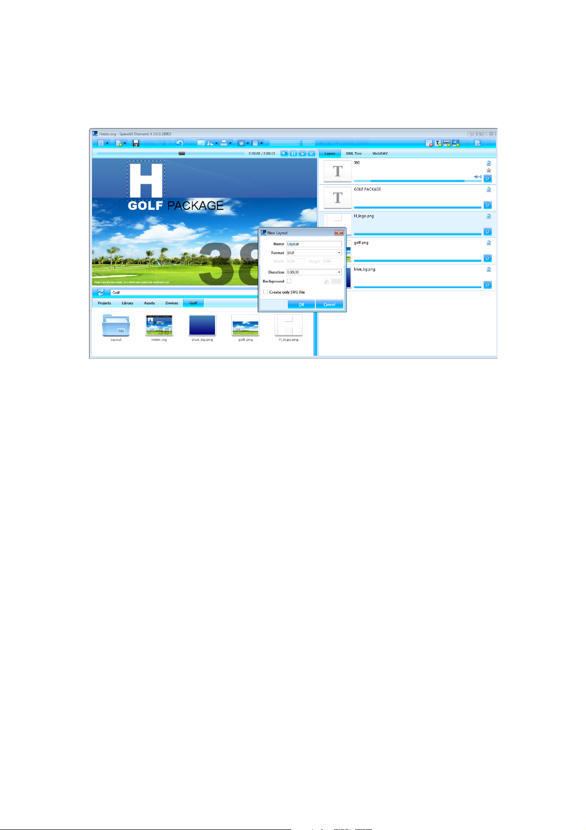
Creating New Layout
To create a new layout, select New Layout (under New icon in the toolbar), and set name, format, background
color, duration, etc. These properties can be changed at any time. New layout is automatically saved inside of the
current project.
Using Layout
Layout can be used in project, playlist or schedule. Layout can be dragged and dropped into the edit panel. Any
number of layouts can be created within a project.
Editing Layout
To edit a layout, double-click on the layout (icon in the browse panel). To view a layout in the preview panel,
double-click on the layout master file (index.svg). To add media, drag and drop media (file) from the browse
panel into the preview or edit panel. To add text, click on Add Text (icon in the toolbar). Each added media and
text automatically get their own layer in the edit panel.
Properties
To view and modify properties, click on Document Properties (icon in the toolbar).
Video Tutorial Create Layout
Page 9
!
9
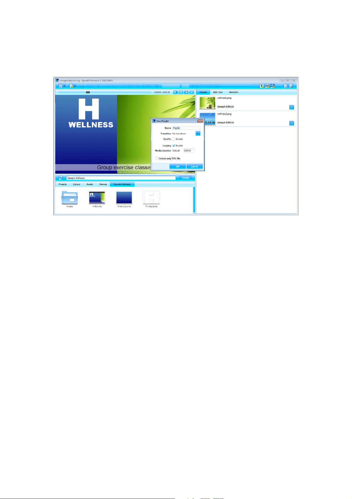
Playlist
Playlist is a list of items that play in sequential order.
Creating New Playlist
To create a new playlist, select New Playlist (under New icon in the toolbar), and set the name, transition,
duration, etc. These properties can be changed at any time. New playlist is automatically saved inside of the
current project.
Using Playlist
Playlist can be used in project, layout, another playlist or schedule. Playlist can be dragged and dropped into the
preview or edit panel. Any number of playlists can be created within a project.
Editing Playlist
To edit a playlist, double-click on the playlist (icon in the browse panel). To view a playlist in the preview panel,
double-click on the playlist master file (playlist.svg). To add media in a playlist, drag and drop the media (file)
from the browse panel into the edit panel.
Properties
To view and modify properties, click on Document Properties (icon in the toolbar).
Video Tutorial Create Playlist
Page 10
!
10
Publish
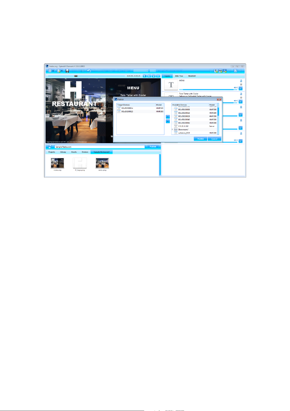
Publish is the action of copying project to one or multiple devices.
Publishing Project
To publish the current project, click on Publish (button). To publish a project within Projects (tab in the browse
panel), select the project to publish, and click on Publish (button). In both cases, the publish dialog opens.
Target Devices
To add or remove target device/s, click on Add/Remove (button). Select the target device/s for the project to be
copied to. Once added target device/s will remain in the Target Devices list until removed.
Republishing Project
Republishing the project will only copy the modified file/s.
Video Tutorial Publish Project
Page 11
!
11
Import
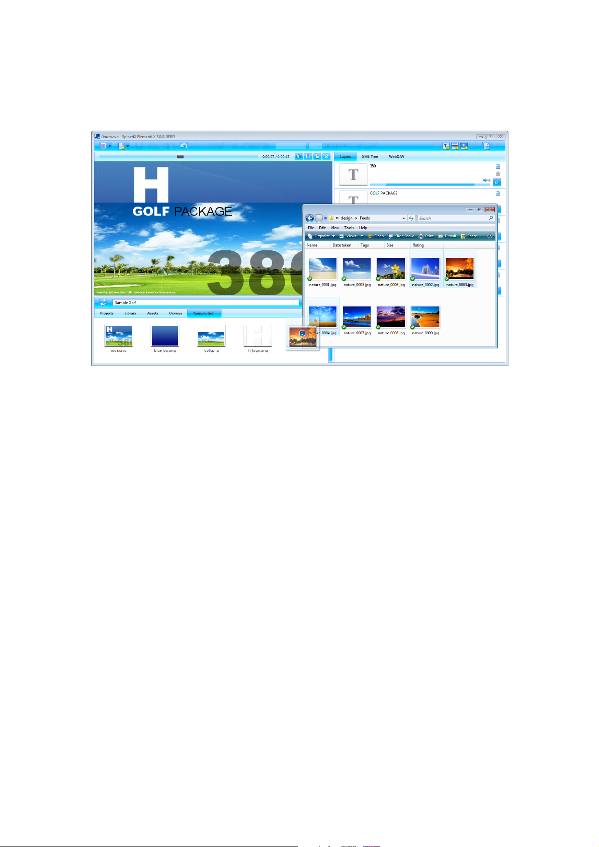
Import is bringing files from any location to a project.
Importing Files
To import the file/s, drag and drop file/s from Microsoft® Windows® Explorer to the browse panel, or use Import
(under Menu>Project in the toolbar) feature.
Image Formats
PNG and JPEG image formats, supported by Elementi, will be imported. All other image formats will be
automatically converted into either PNG or JPEG.
Video Formats
Videos within the player specification will be imported. All other videos will not be automatically converted. For
further info, please refer to SpinetiX Support Wiki.
Microsoft® PowerPoint Files
To import a Microsoft® PowerPoint file, Microsoft® PowerPoint Viewer 2007 needs to be installed.
Video Tutorial Import Media
Page 12
!
12
Fonts
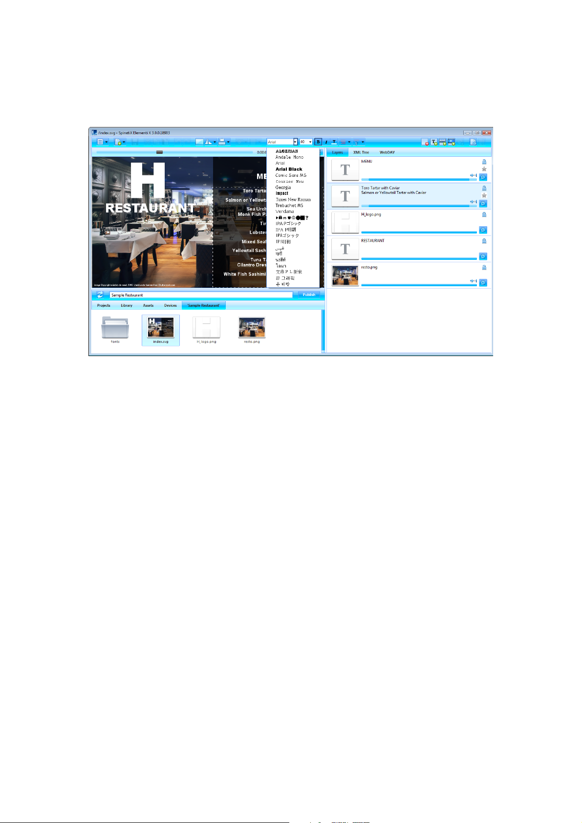
Fonts are included in Elementi, and new fonts can be added.
Adding Font
To add a new font, select Add Fonts (under Menu>Project in the toolbar). New font is automatically added to
the font selection (drop down menu in the toolbar), and saved under fonts (folder) created within the current
project.
Supported Font Types
Elementi supports TrueType and OpenType fonts.
Video Tutorial Add Fonts
Page 13

!
13
Interface Overview
Page 14

!
14
Panels and Views
Elementi consists of four panels, and allows horizontal and vertical view.
Panels
Preview Panel allows viewing projects, layouts and playlists (see Preview Panel, p15)
Edit Panel allows editing components such as properties, layers, playlist items and schedule (see
Edit Panel, p17)
Schedule Panel allows assigning the time slot for media to play at a particular time, or with certain
recurrence (see Schedule Panel, p19)
Browse Panel file repository (see Browse Panel, p20)
Views
To change a view, select Orientation (under Menu>View icon in the toolbar), and choose Horizontal or
Vertical.
Page 15
!
15
Preview Panel
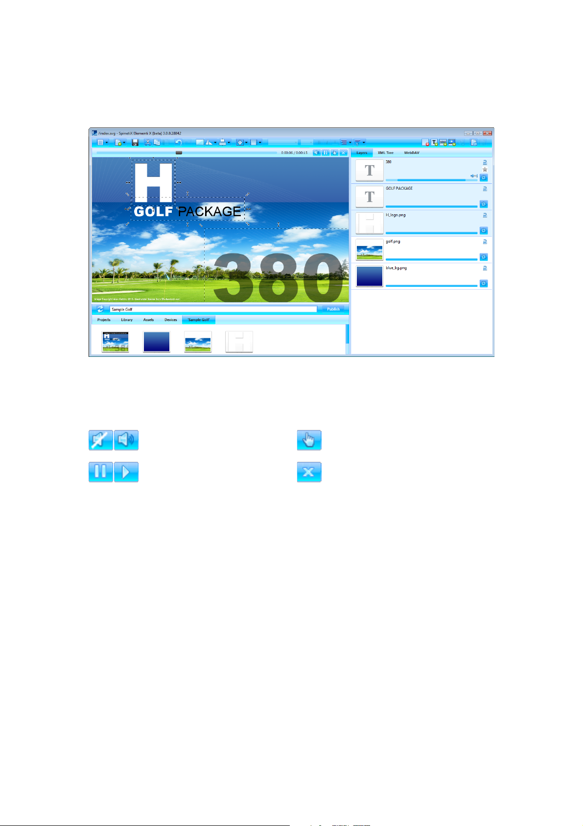
Preview panel allows viewing projects, layouts and playlists.
Preview Panel Features
Preview panel can be adjusted in size by dragging the dividers horizontally and/or vertically. Preview panel
includes playback, and the following actions:
Mute/Unmute
Muting or unmuting audio
Interactivity On/Off
Activating touch screen testing (On) or editing (Off)
Pause/Play
Pausing or playing
Close
Closing currently open document
Preview Panel Editing
You can move and resize media in the preview panel. It is not possible to edit locked (in the edit panel) media.
Placing new media on top of media in the preview panel, will replace it.
Editing Within Layout
To edit within a layout, double click on media (icon in the edit panel). When editing layout, playlist or schedule
within a layout, only the edited selection will be active, whereas the rest of the preview remains inactive.
Clicking on Back (icon in the toolbar) will revert to preview.
Video Tutorial Elementi Interface
Page 16
!
16
Full Screen
Full screen allows viewing content shown in the preview panel over an entire screen.
Enabling Full Screen
To enable full screen, select Full Screen (under Menu>View in the toolbar), or press the F12 keyboard key. To
exit full screen, press Escape (esc) on the keyboard.
Video Tutorial Full Screen Preview
Page 17
!
17
Edit Panel
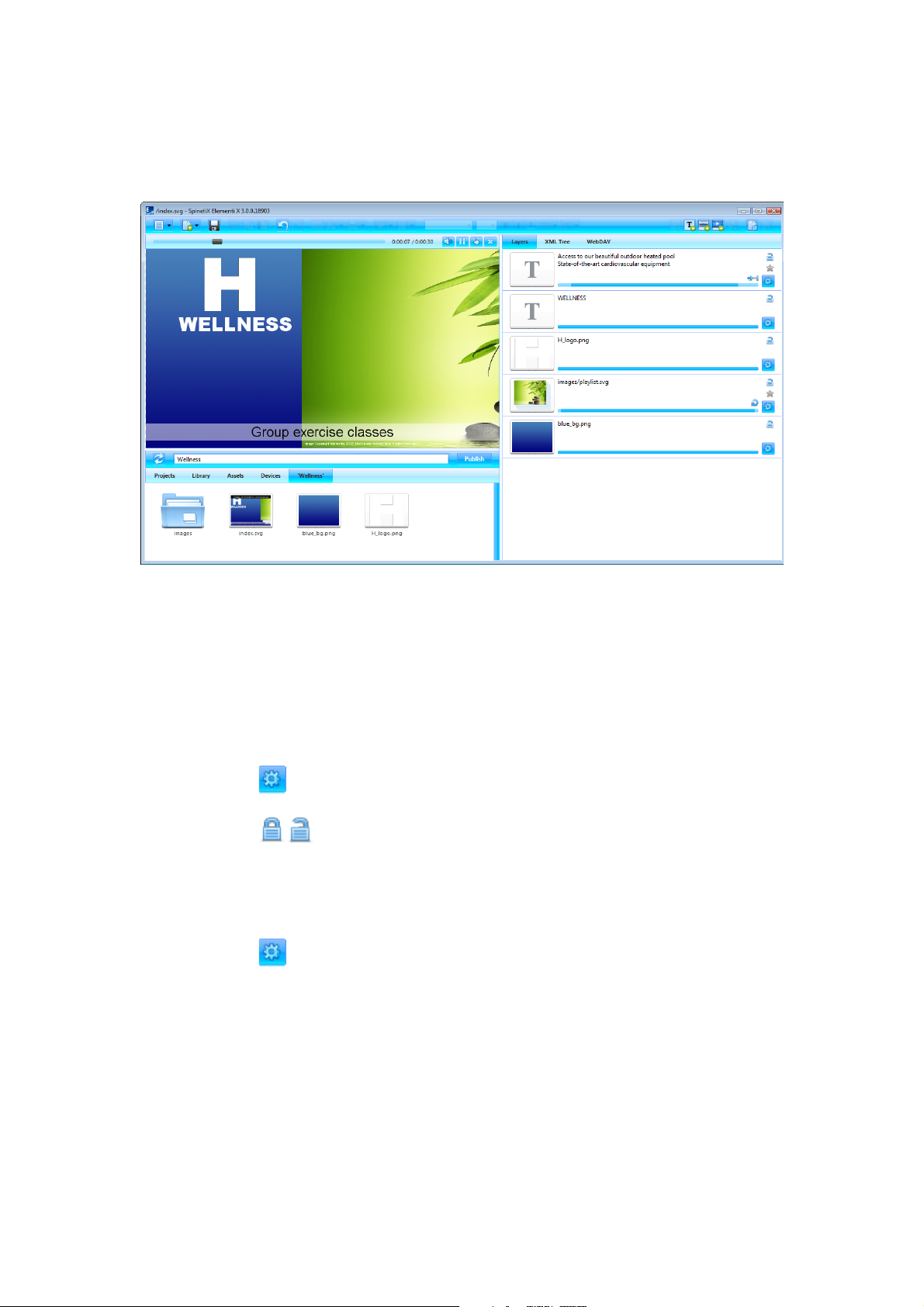
Edit panel allows editing components such as properties, layers, playlist items and schedule.
Edit Panel Components
Depending on the component, edit content is accordingly adjusted.
Properties Properties allows setting up color, locale, data source, etc.
Layers Layers allows ordering and editing media. Each media has its own timeline, and the
following actions:
Properties
Editing layer properties
Lock/Unlock
Locking or unlocking layer
Playlist Items Playlist items allows ordering and editing all playlist media. Each playlist media item has its
own duration, and the following action:
Properties
Editing item properties
Schedule Schedule allows assigning the time slot for each media to play.
Not Editable Components
In some cases, a document may not have any editable components, or they might be limited due to restricted
editing rights.
Video Tutorial Elementi Interface and Edit Content
Page 18
!
18
Timeline
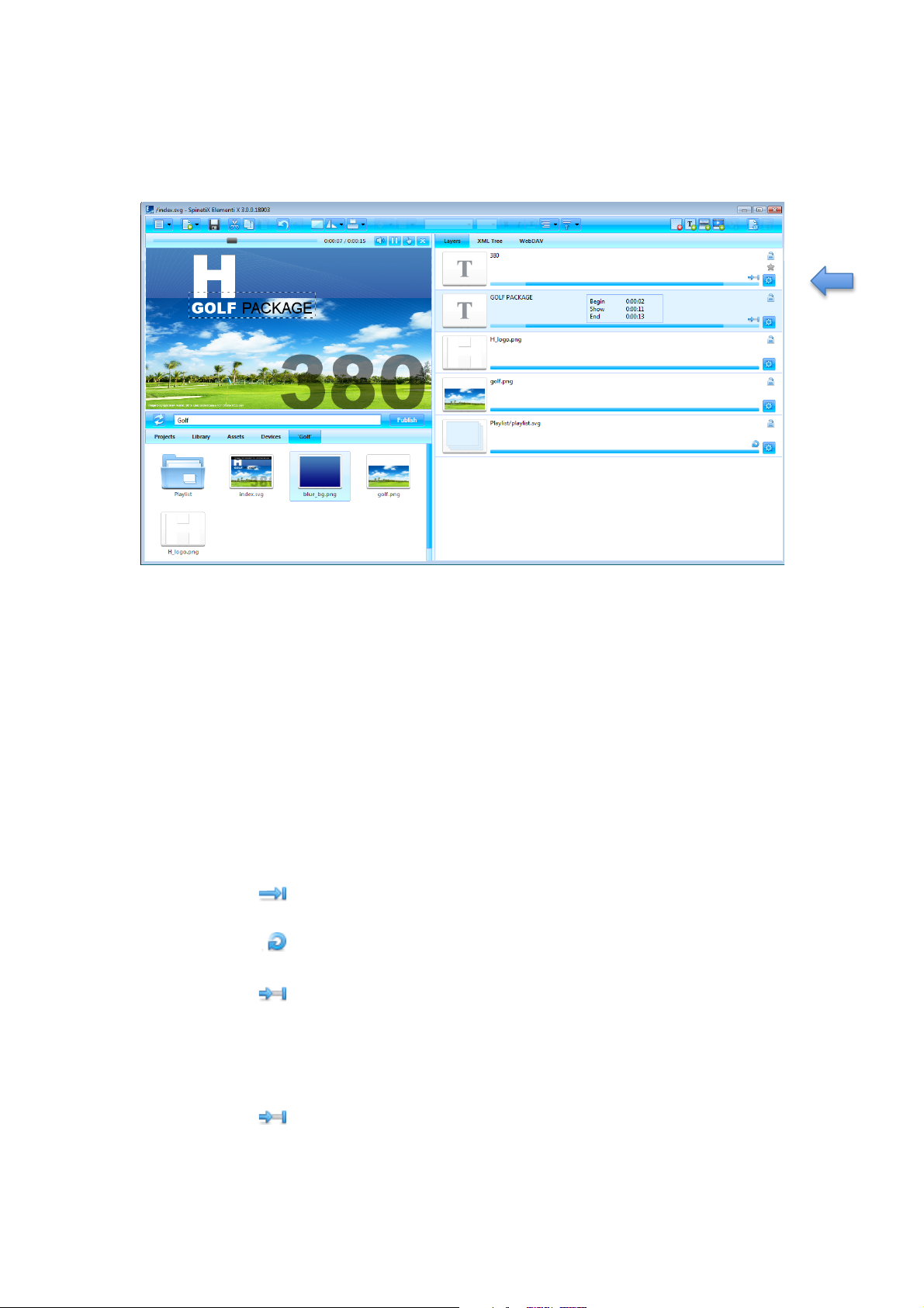
Timeline is a visual representation of a media start and end play time.
Timeline Duration
Timeline is shown only if the project or layout has its duration set to an exact value. By default, the project
duration is set to 30 seconds. Each media has its own timeline. By default, the duration of each media is 100%.
Timeline Features
The main timeline feature is to set start and end play time per media. Depending on media type, additional
features are available. Hovering the pointer over the timeline shows the following parameters: begin play time,
duration and end play time.
Video, Layout Video, layout and playlist can be set to play once or forever, or truncated.
and Playlist Play status is indicated by the following icons:
Play Once
Playing video, layout or playlist one time
Play Forever
Looping video, layout or playlist
Truncate
Truncating video, layout or playlist to inferior duration
All other media It is possible to adjust the start and end play time, as well as move the whole play time slot
per media. Media status is indicated by the following icon:
Duration
Duration is set
Video Tutorial Use Timeline
Page 19
!
19
Schedule Panel
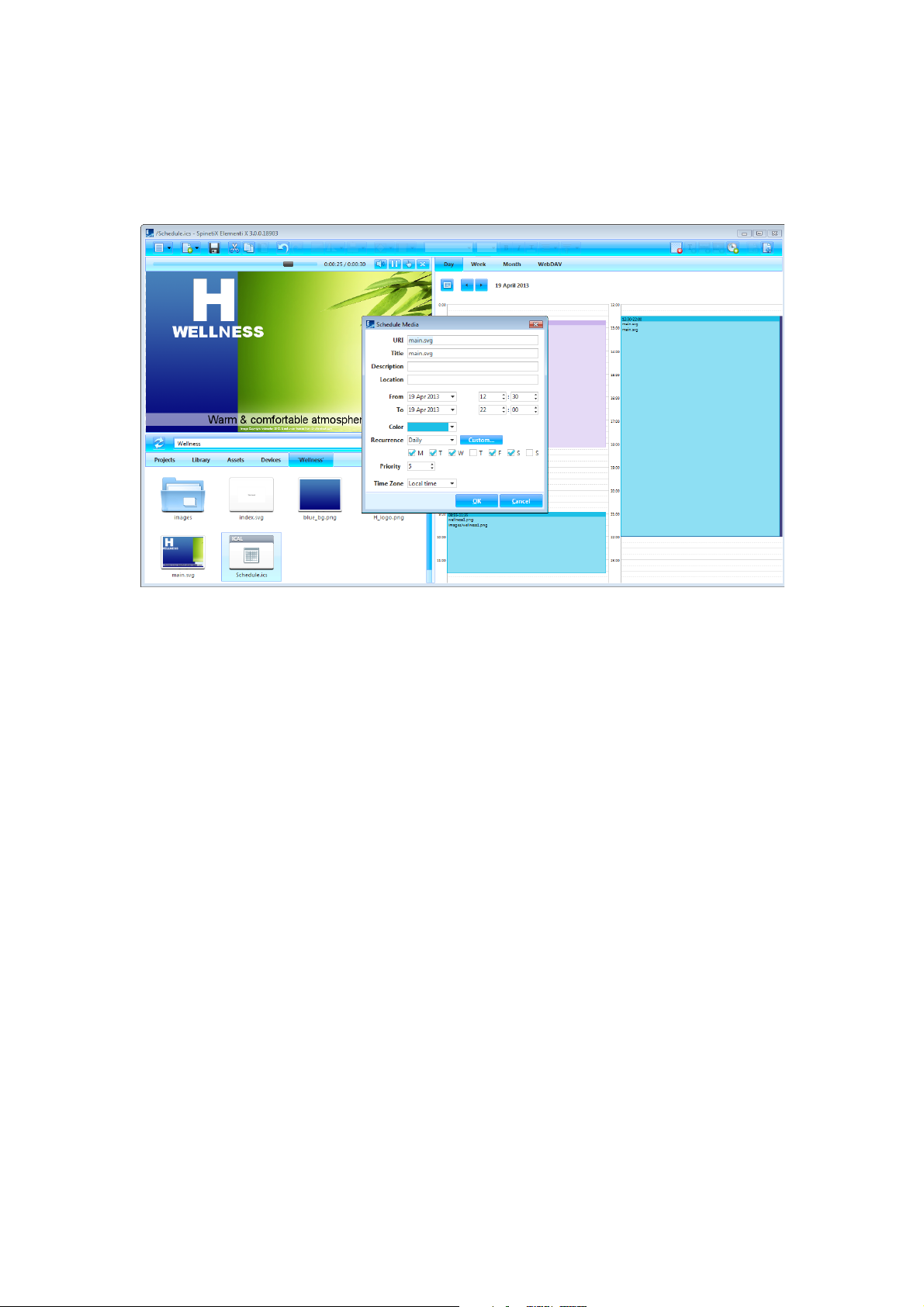
Schedule panel allows assigning the time slot for media to play at a particular time, or with certain recurrence.
Text is the only media that cannot be scheduled.
Creating New Schedule
To create a new schedule, select New Schedule (under New icon in the toolbar). To open a schedule, click on the
schedule (icon in the browse panel).
Schedule Views
Schedule has a daily, weekly and monthly view. Each view allows navigating to the previous and next day, week
or month.
Scheduling Media
To schedule media, drag and drop any media (file) into schedule, or click on Schedule Media (icon in the
toolbar). It is also possible to move already scheduled media by drag and drop. Also, the start and end play time
can be adjusted.
Scheduling Options
To edit scheduling options such as reoccurrence, time zone, etc., double-click on the scheduled media in the
schedule panel.
Video Tutorial Schedule
Page 20
!
20
Browse Panel
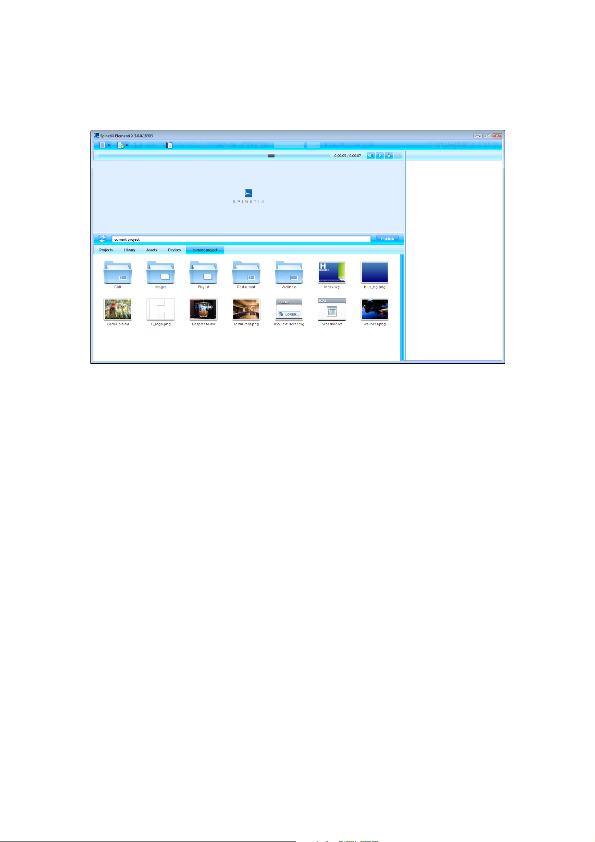
Browse panel is a file repository.
Browse Panel Components
The following components are included in the browse panel:
Projects repository of all the projects created, or imported
Library a selection of widgets, templates, etc. (see Library, p21)
Assets user content repository, available with Elementi M and X (see Assets, p22)
Devices repository of all available devices (see Devices, p23)
‘current project’ current project files under the last tab (named after the current project)
Browse Panel View
To set icon or list view, select View (under Menu icon in the toolbar), and choose Icon View or List View.
Browse Panel Features
Browse panel allows viewing, renaming and deleting file/s, as well as importing file/s.
Video Tutorial Elementi Interface
Page 21
!
21
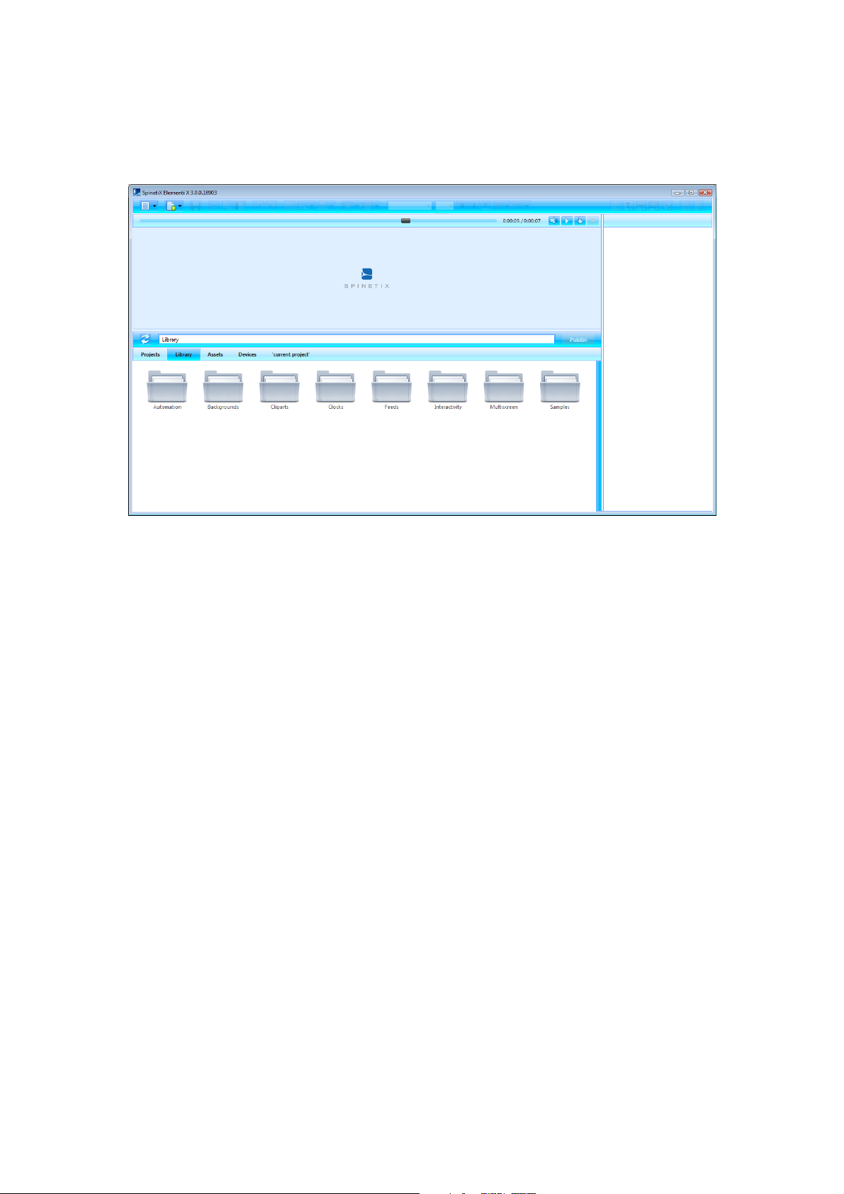
Library
Library is all the widgets, samples, etc. included in Elementi.
Library Components
The following components are included in the Library:
Automation selection of widget to control display/s (on/off, volume, etc.)
Backgrounds selection of background images
Cliparts selection of cliparts
Clocks selection of analogue and digital clock widgets
Feeds selection of widgets to show feeds (see Feeds, p34)
Interactivity selection of widgets to create interactivity content (see Interactivity, p35)
Multiscreen project for multiple synchronized displays (see Multiscreen, p36)
Samples selection of sample projects
Editing Library Widget
Widgets in the library are read only. To edit a library widget, it is necessary to drag and drop the chosen widget
to layout, playlist or schedule. The chosen widget will be automatically copied into the current project.
Documentation Support Wiki
Page 22
!
22
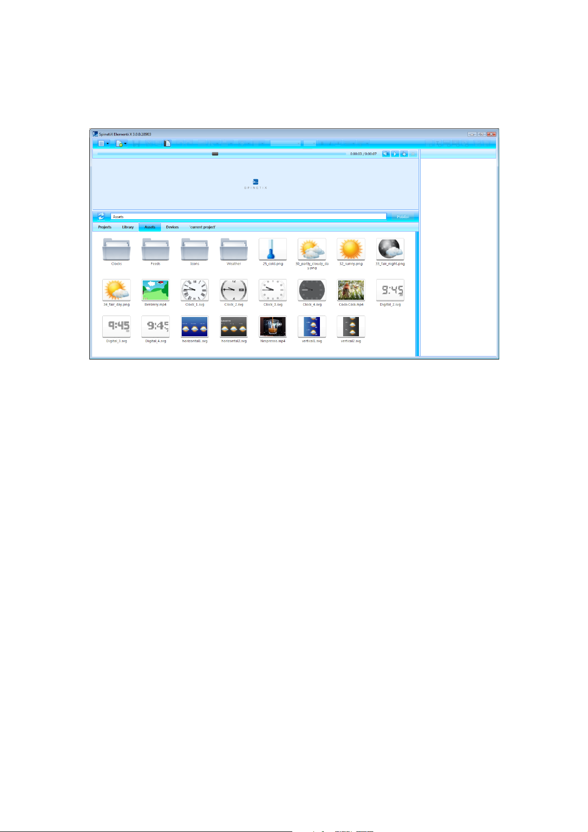
Assets
Assets are a user file repository that can be shared and modified. Assets are included in Elementi M and X.
One User
User can place any file into Assets. All the files placed in Assets can be shared between projects
Multiple Users
Assets location can be set as Microsoft® Windows® Share to enable users to share individual files and folders, or
projects with other users.
Using Files
To use files from Assets, drag and drop the chosen file to layout, playlist or schedule. The chosen file will be
automatically copied into the current project.
Page 23
!
23
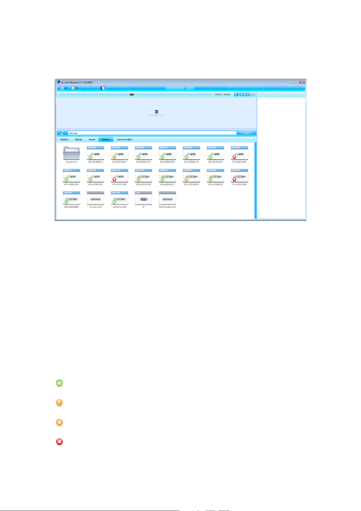
Devices
Devices are all compatible SpinetiX HMP devices, USBs and publish locations.
Adding Device
All compatible devices are automatically discovered, and available under Devices (tab in the browse panel) in
the browse panel. SpinetiX HMP devices are distinguished by model. Device name and photo appear on the icon.
Devices can be added, renamed or deleted, as well as organized into collections.
Adding Device Manually
To manually add a device, select New Device (under Menu>Devices in the toolbar), and set a device serial
number, IP address and password (optional).
Adding Publish Location
To add a publish location, select New Publish Location (under Menu>Devices in the toolbar), and set server
address, name and credentials (optional). Publish location is included in Elementi M and X.
Device Status
To view device content, double click on the device (icon in the browse panel). Devices status is indicated by the
following icons:
OK
Device is OK
Safe Mode
Device is in safe mode
Recovery
Device is in recovery
Not Responding
Device is not responding
!24
Page 24

Style Features
Page 25
!
25
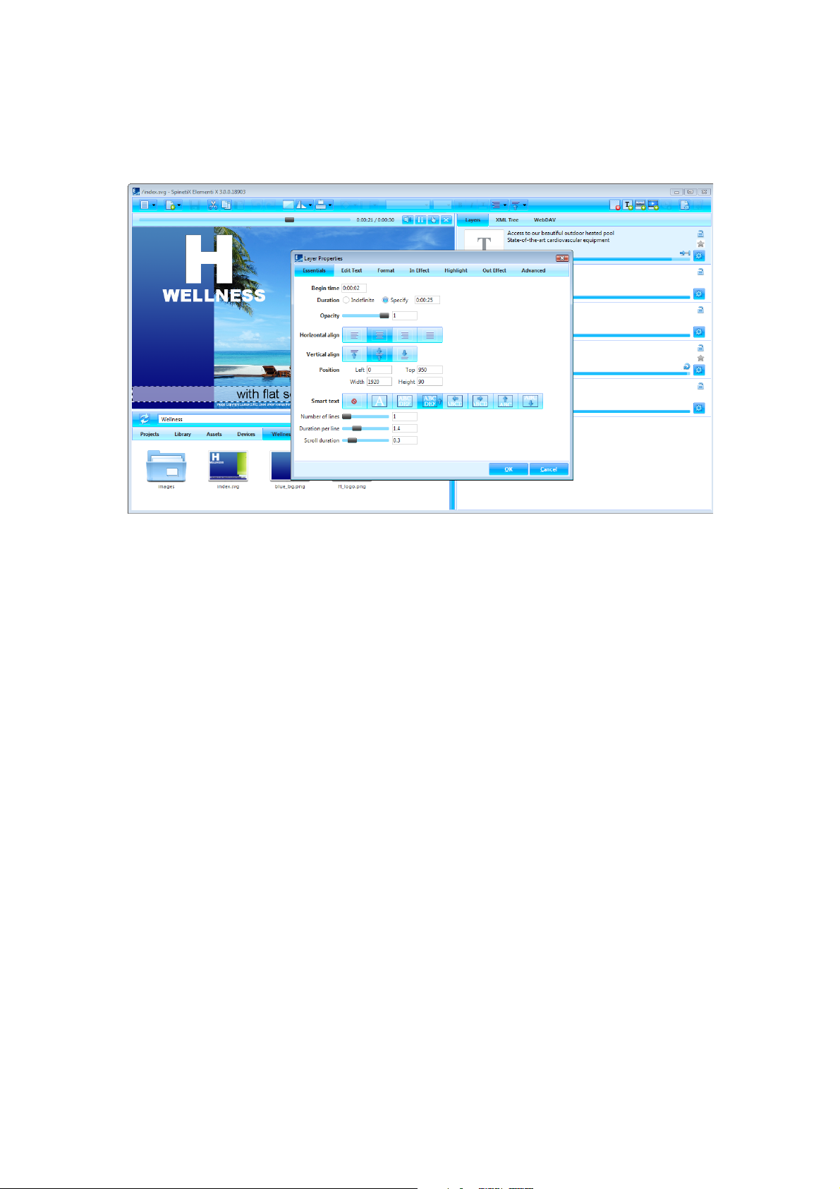
Text Properties
Text properties are any parameters applied to text.
Essentials
The following parameters are included in Essentials (tab in the edit panel):
Time begin time, and /or duration
Opacity 0-100%
Alignment horizontal and/vertical
Position exact position and size
Smart Text a selection of text effects such as motion, auto text size, etc.
Applying Properties
To apply properties, click on Layer Properties (icon in the edit panel), and choose Essentials. Sliders facilitate
adjusting particular options such as opacity.
Page 26
!
26
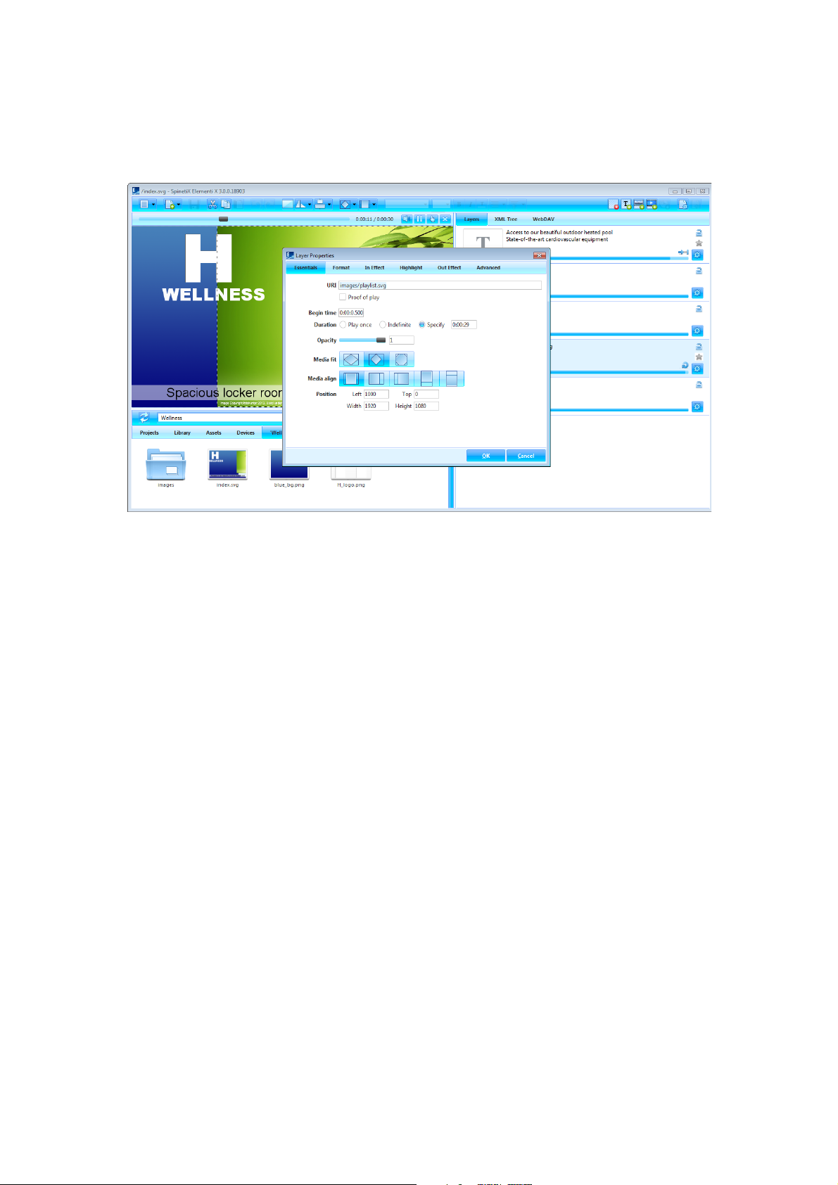
Media Properties
Media properties are any parameters applied to all media except text.
Essentials
The following parameters are included in Essentials (tab in the edit panel):
URI unique resource identifier, and option ‘proof of play’
Time begin time, and /or duration
Opacity 0-100%
Fit selection fit, boundaries meet, and media slice
Alignment horizontal and vertical
Position exact position and size
Applying Properties
To apply properties, click on Layer Properties (icon in the edit panel), and choose Essentials. Sliders facilitate
adjusting particular options such as opacity.
Page 27
!
27
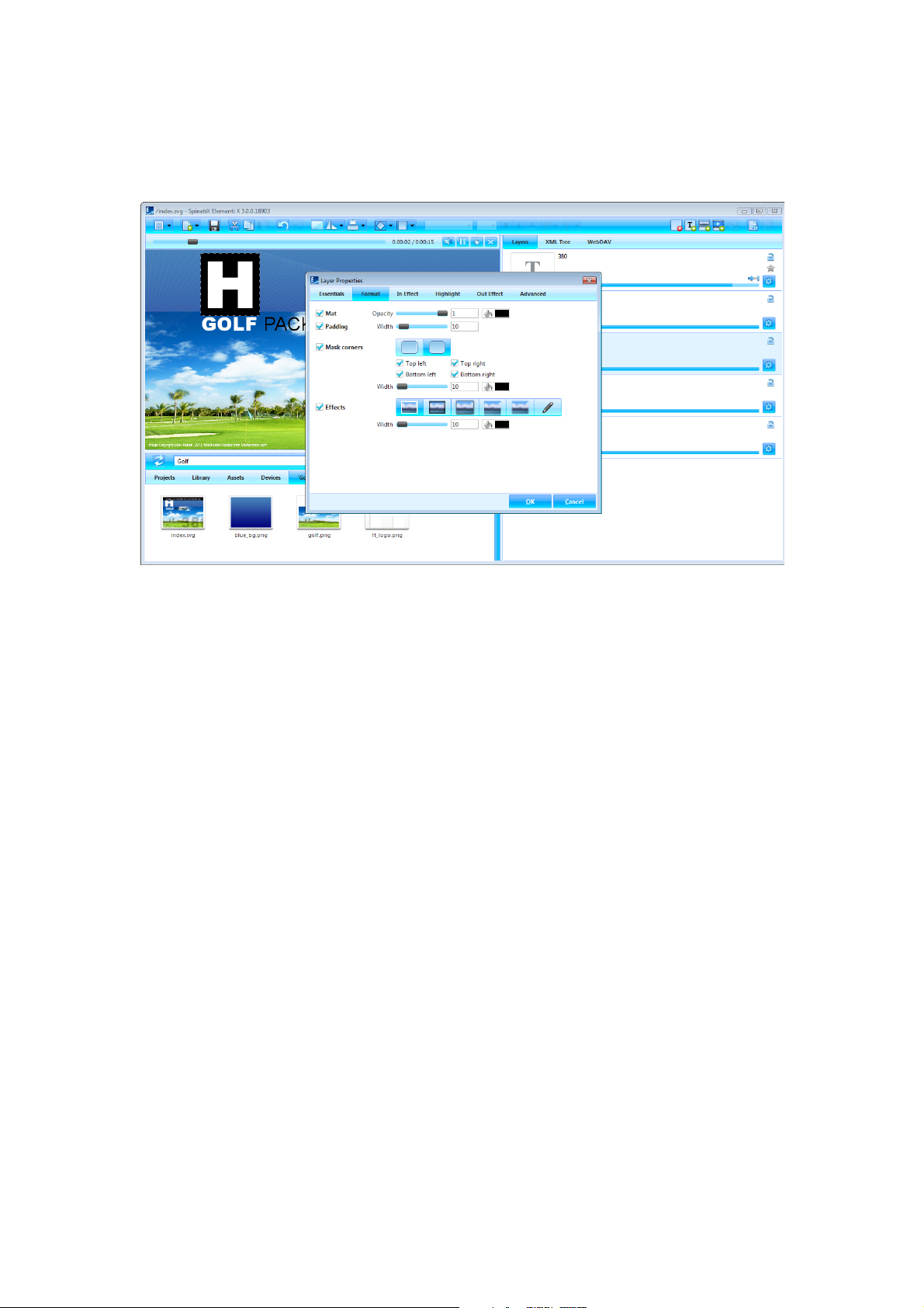
Formats
Formats are visual effects applied to media.
Format Types
There are four types of effects:
Mat selection background
Padding space between media and selection
Corners corner style
Effects shadow, frame, reflection, etc.
Applying Format
To apply a format, click on Layer Properties (icon in the edit panel), choose Format, and tick format type to
apply. Depending on format type, more options become available. Sliders facilitate adjusting particular options
such as width.
Video Tutorial Apply Format
Page 28
!
28
Effects
Effects are animations applied to media.
Effect Types
There are three types of effects:
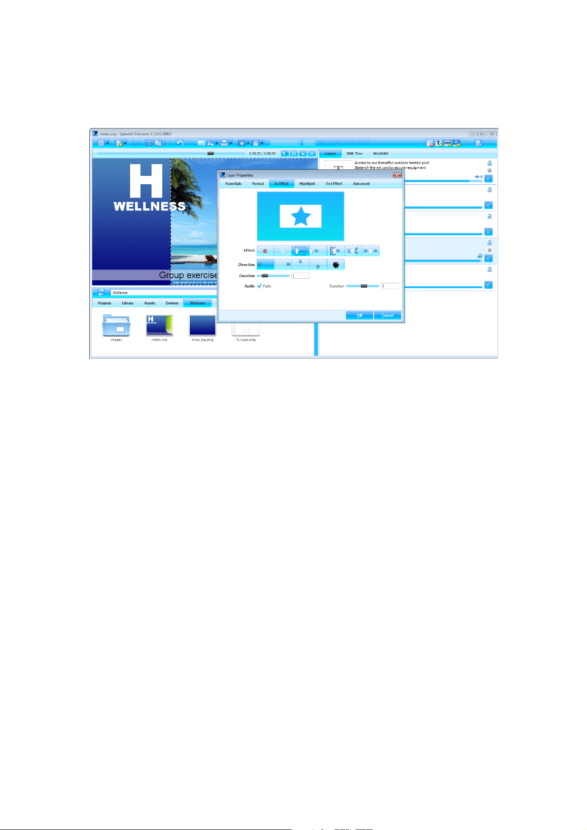
In Effect controls how media appears
Highlight animates media on the spot
Out Effect controls how media disappears
Applying Effect
To apply an effect, click on Layer Properties (icon in the edit panel), and choose the type of effect to apply. Icons
show all the effects available, including No effect to cancel effect. Depending on effect, more options such as
Direction show up. To set a random direction, click on Random (icon). Sliders facilitate adjusting particular
options such as In Effects and Out Effects duration and audio fade, and Highlight duration, offset, occurrence,
interval and amplitude. Mini preview shows the chosen effect.
Video Tutorial Apply Effect
Page 29
!
29
Transitions
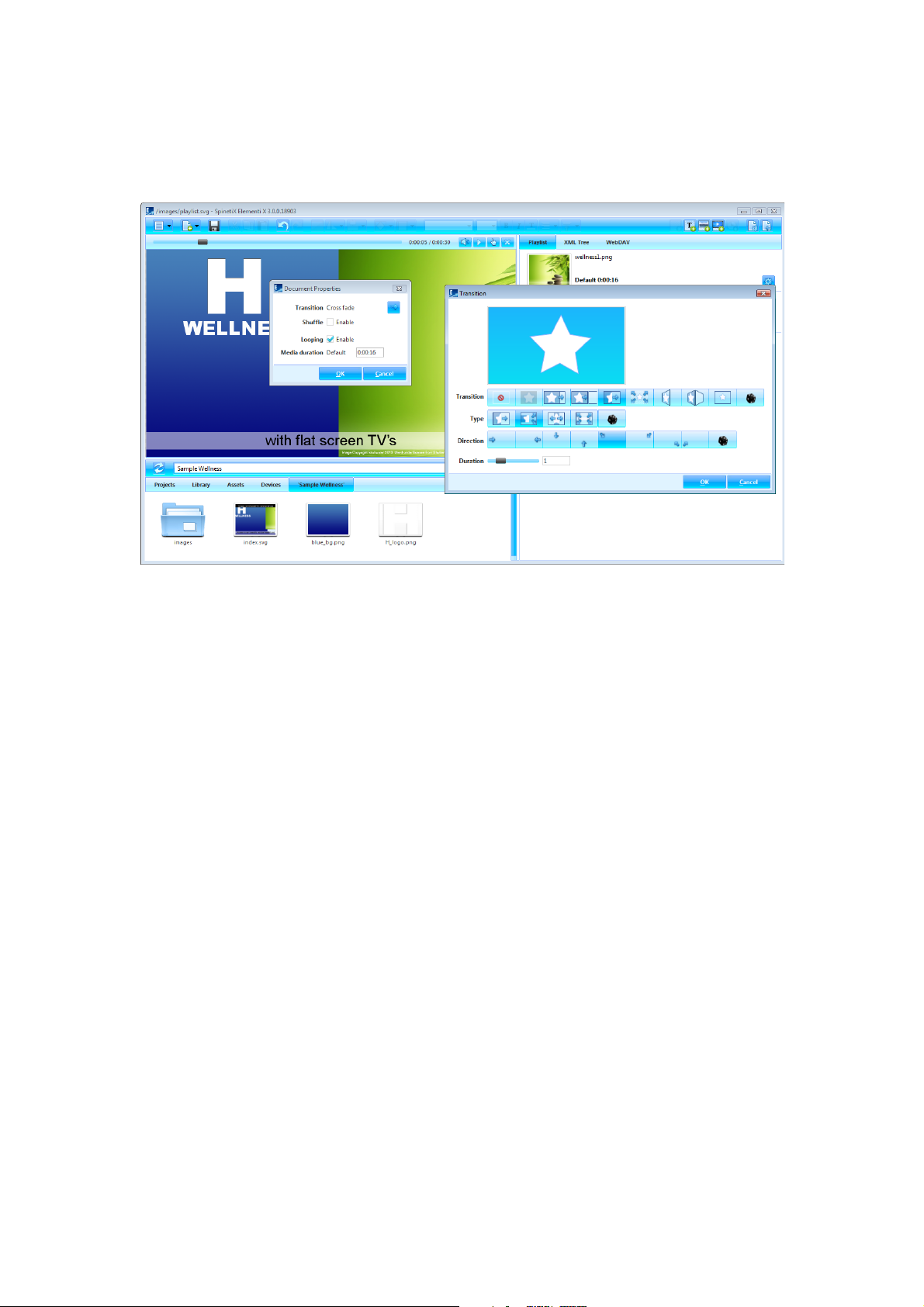
Transitions are playlist motion effects applied between media.
Applying Transition
To apply a playlist transition, click on Document Properties (icon in the toolbar), click on Transition (icon), and
choose transition to apply. Icons show all the transitions available, including No transition to cancel transition.
Depending on transition, more options such as Direction show up. To set a random transition, type and
direction, click on Random (icon). Sliders facilitate adjusting particular options such as duration. Mini preview
shows the chosen transition.
Video Tutorial Apply Transition
Page 30

!
30
User Role Overview
Page 31
!
31
User Roles
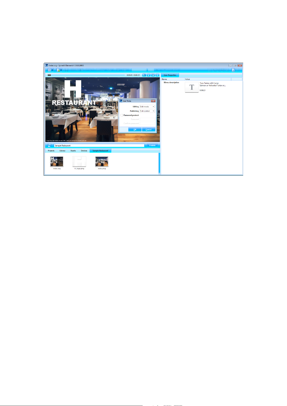
User roles are editing and publishing restrictions per user.
Setting User Roles
To set user roles, select User Roles (under Menu>Settings in the toolbar), and set the level of editing and
publishing restrictions. User Roles setup can be username and password protected.
Editing
There are three types of editing restrictions:
Full Control default, full editing rights
Edit Mode allows editing only media that is defined as editable (content created with Elementi X)
Read Only no possibility to edit, and no edit panel available
Publishing
There are three types of publishing restrictions:
Full Control default, full add/remove devices and publishing rights
Limited allows publishing only to predefined target device/s
Not Available no possibility to publish
Video Tutorial Setup User Roles
Page 32

!
32
Advanced Features
Page 33
!
33
Feeds
Feeds are the widgets used to display data from external sources.
Library
All feeds widgets are in the library, and they are ‘read only’. To edit library widgets, it is necessary to open Feeds
(folder in the library), and drag and drop the chosen widget to layout, playlist or schedule. The chosen widget
will be automatically copied into the current project.
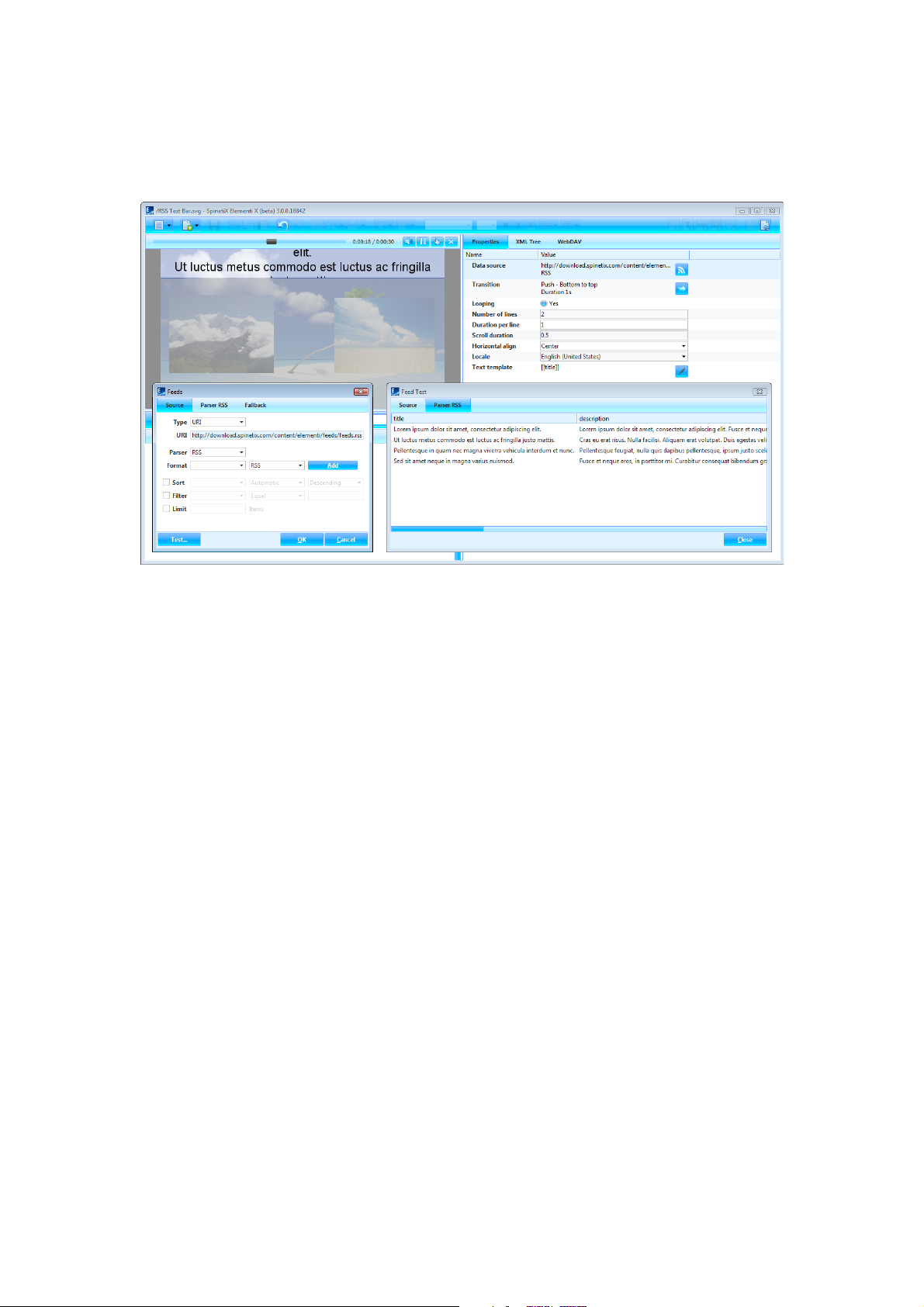
Customizing Data Source
Double-click on widget to open Properties (tab in the edit panel). To customize data source, click on Data
Source (icon in the edit panel). The level of customization will depend on license type:
Elementi S and M customizing location of data source
Elementi X full control: customizing data source, location, parser, etc.
To test data source, click on Test (button).
Video Tutorial Customize Feeds
Documentation Support Wiki
Page 34
!
34
Locale
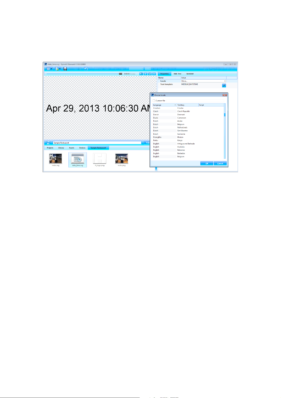
Locale is parameters that define date and time format, depending on user language, country, etc.
Widgets
All the widgets that display date and/or time can be configured using more than 200 locale variations.
Choosing Locale
To define locale, select Properties (tab in the edit panel), and choose locale in the drop down menu. Recently
viewed parameters will be shown in the locale dialog. To see all parameters, choose more.
Documentation Support Wiki
Page 35
!
35
Interactivity
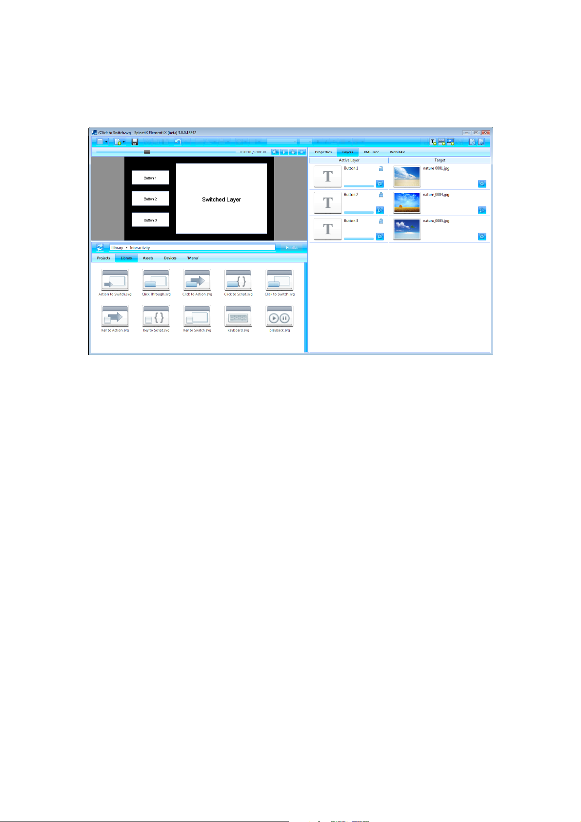
Interactivity is all the widgets used to establish a response to user action.
Library
All interactivity widgets are in the library, and they are ‘read only’. To edit library widgets, it is necessary to open
Interactivity (folder in the library), and drag and drop the chosen widget to layout, playlist or schedule. The
chosen widget will be automatically copied into the current project.
Customizing Widget
To customize a widget, double-click on the widget, and all widget components will open in Layers (tab in the
edit panel). To test a widget, click on Interactivity Mode (icon in the preview panel).
Documentation Support Wiki
Page 36
!
36
Multiscreen
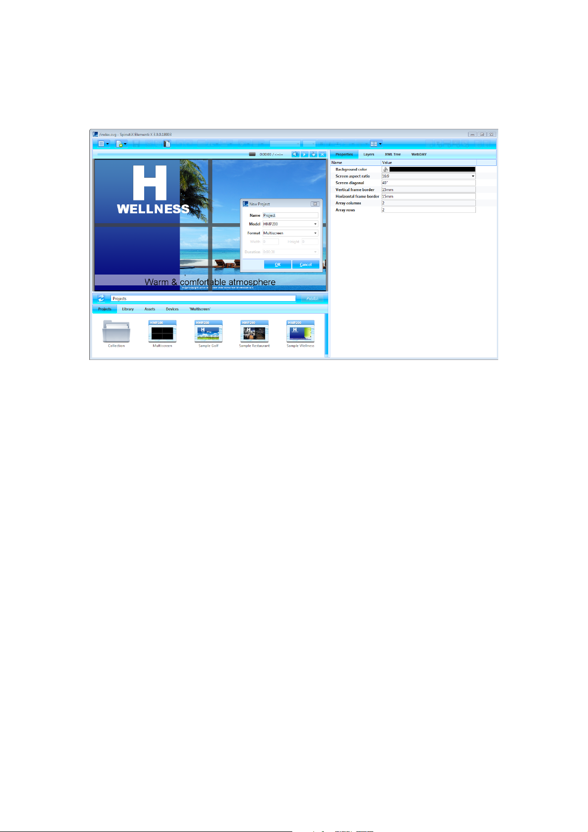
Multiscreen is a project for multiple synchronized screens.
Creating Basic Multiscreen
To create a basic multiscreen, select New Project (under New icon in the toolbar), set project name and target
device, and choose Multiscreen as the display format. Duration does not apply to multiscreen.
Multiscreen Parameters
To view properties such as number of screens, frame border, etc., select Properties (tab in the edit panel).
Viewing Screen
To view an individual screen, click on Multiscreen (icon in the toolbar), and choose from the list of screens.
Important
Prior to creating a multiscreen, please check TWiki Support documentation as certain restrictions apply.
Documentation Support Wiki
Page 37
!
37
Fusion Skin & Template
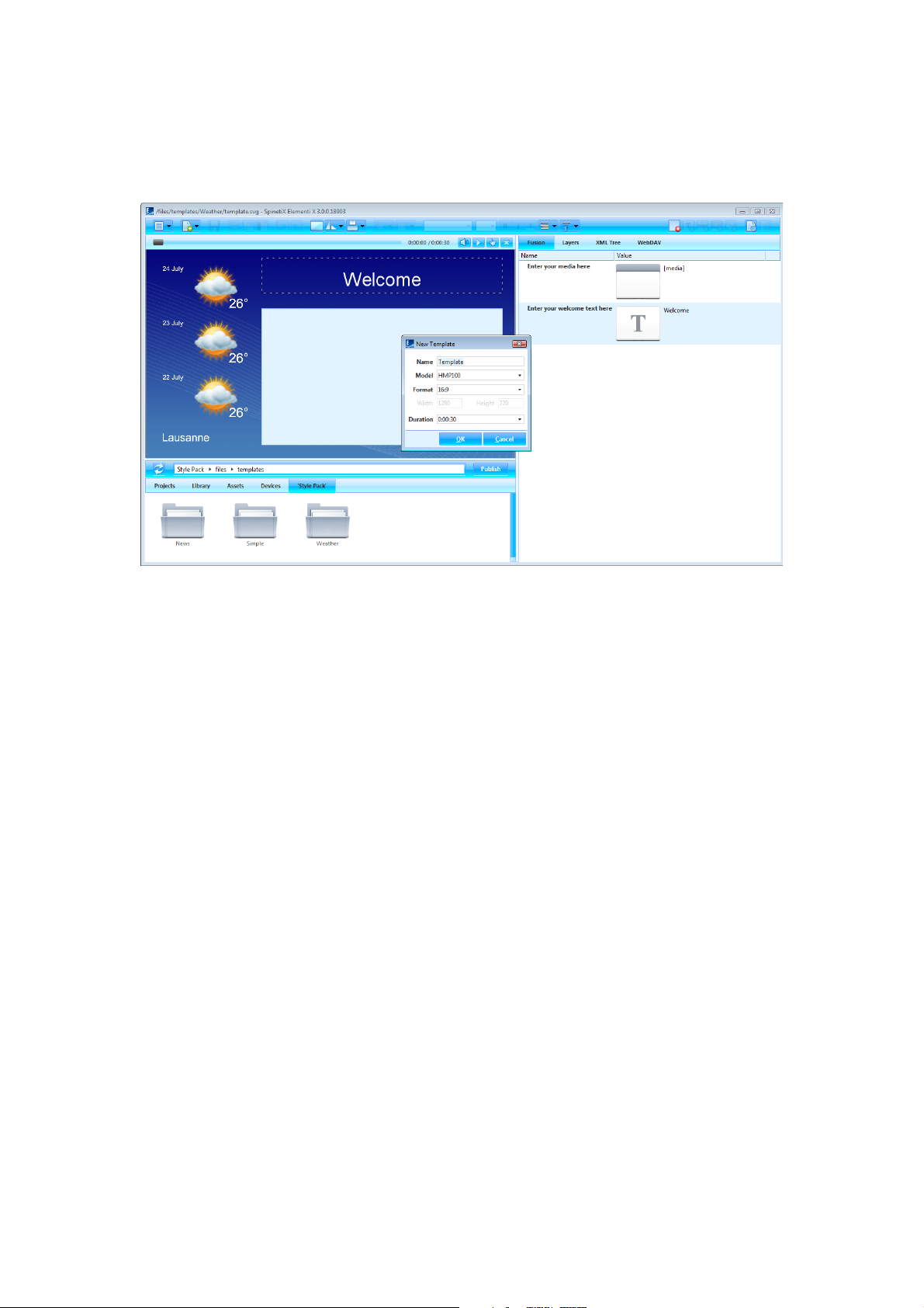
Elementi allows creation of Fusion skins and templates.
Compatibility with HMP
Fusion Style Pack contains everything needed for skins and templates, and its structure is compatible with HMPs.
Creating New Skin
To create a new skin, select New Style Pack (under New icon in the toolbar). Go to files (folder within the Style
Pack), go to skins (folder), right click (in the browse panel) to Create New Skin, and set name, target device,
display format and duration.
Creating New Template
To create a new template, select New Style Pack (under New icon in the toolbar). Go to files (folder within the
Style Pack), go to templates (folder), right click (in the browse panel) to Create New Template, and set name,
target device, display format and duration.
Editing Skins and Templates
Editing Skins and Templates is the same as editing Layout. The only difference is that is possible to decide what
media can be edited in Fusion.
Video Tutorial Create Fusion Skin and Create Fusion Template
Documentation Support Wiki
Page 38
!
38
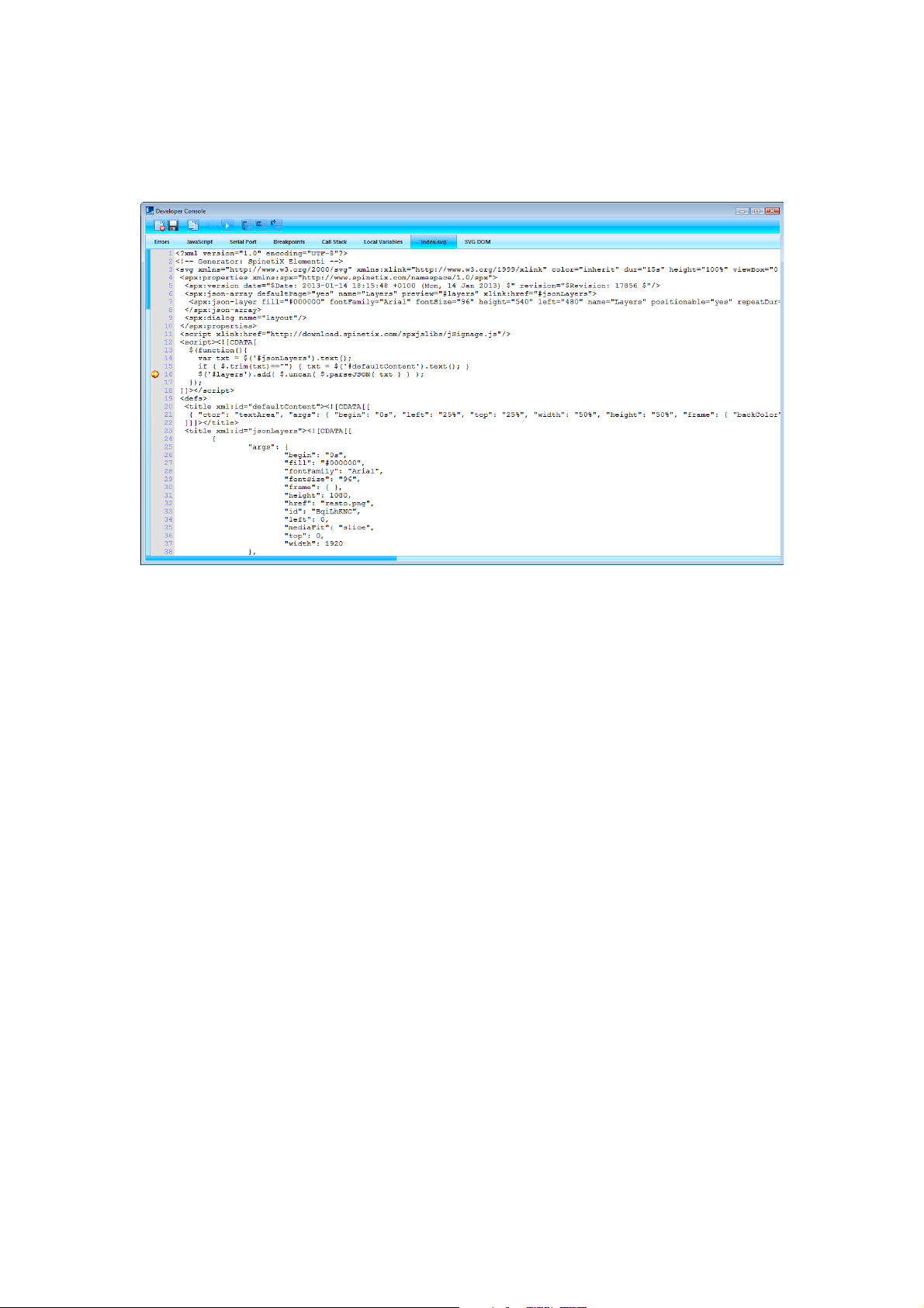
Developer Console
Developer console is a dedicated development tool for scripting, debugging and testing.
Features
The following features are included:
Errors list of errors such as ‘file not found’, etc.
JavaScript JavaScript errors and content of alert
Serial Port content sent to serial port
Breakpoint list of breakpoints
Call Stack information about calling stacks of subroutines
Local Variables list of variables and values
‘current file’ file currently being debugged (each file automatically opens in a new tab)
SVG DOM live state of SVG DOM
Viewing Developer Console
To view Developer Console, select Developer Console (under Menu>View icon in the toolbar).
Documentation Support Wiki
Page 39
!
39
HMD Legacy Support
All HMD projects are compatible with Elementi.
HMD vs Elementi Features
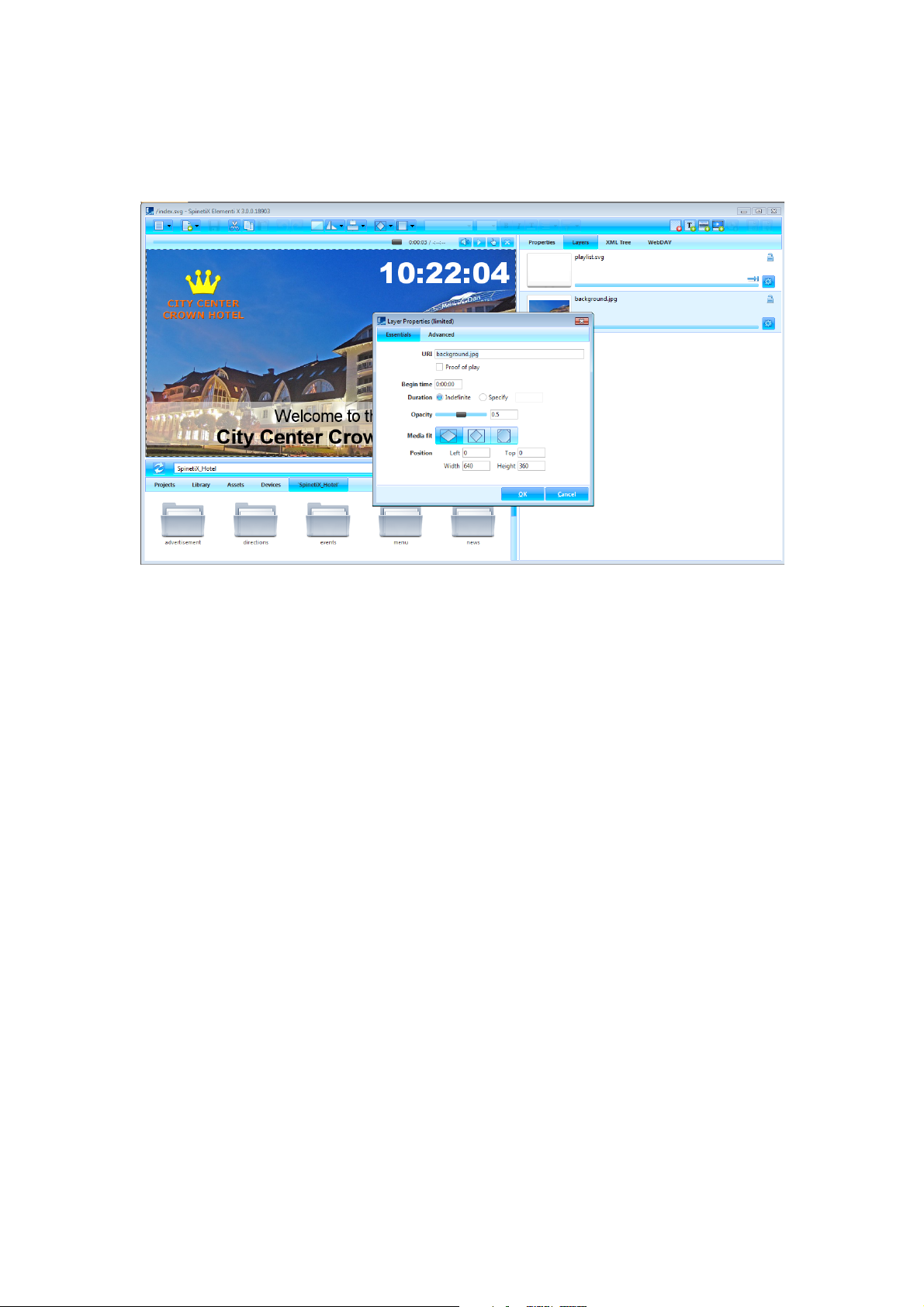
HMD legacy project can be viewed and edited in Elementi, but Elementi features will not be available. HMD
legacy project will open a dialog marked as Limited. SpinetiX recommends creating a new project with Elementi
to fully benefit from the features such as formats, effects, etc.
HMD Effects Templates
All effects created using HMD templates remain within HMD legacy project, but cannot be modified. HMD effects
template cannot be added.
Page 40

!
40
Licenses
!
!
Getting Started
!
Step 1 Download Elementi from spinetix.com/download
Step 2 Installation on PC
Step 3 Activation
!
!
Activation
There are two activation options:
Enter a license key valid license key needed to activate Elementi S, Elementi M or Elementi X
Get a 30 day free trial Elementi S free trial
Upon pressing OK (button), Elementi will automatically restart.
Elementi S, Elementi M or Elementi X license can be purchased at any SpinetiX reseller (see reseller list under
spinetix.com/where-to-buy). Purchased Elementi license can be activated on a single PC. 30 day free trial
Elementi license can be activated on a single PC, and that can be done only once.
Activation requires Internet connection. If the PC running Elementi does not have Internet access, manual
activation will start.
Deactivation
Elementi license is a ‘single node’ license, and can be activated on a single PC.
Step 1 Release: select Licenses (under Help menu), press Release (button) to release license
Step 2 Deinstall
License is ready to be activated on a new PC.
Reactivation
For security and product quality reasons, the license needs to be reactivated regularly.
Page 41

!
41
Support
SpinetiX provides the following Elementi support:
Sample Projects
There are three sample projects included within Elementi. They can be used to learn, and test most of the
features, including user roles in Elementi M. Please note that the images included in these projects cannot be
commercially used.
Video Tutorials
There are Elementi video tutorials made available under spinetix.com/elementi, as well as on YouTube (search:
SpinetiX Elementi). Each video tutorial covers a particular subject such as Create Project, Apply Effects, etc. They
can be used as a quick learning tool, and most of them last less than a minute. SpinetiX recommends starting
with Elementi Interface video tutorial.
Support Wiki
There is Elementi Wiki support available under support.spinetix.com/wiki/elementi, as well as generic
technical support under support.spinetix.com/wiki.
Page 42

!
42
Glossary
Activation License validation procedure
Assets User file repository
Browse panel File repository
Clock Analogue and digital clock widget
Collection Folder
Devices SpinetiX HMP devices, USBs and publish locations
Edit panel Properties, layout, playlist and schedule editing
Effect Animation applied to media
Feeds Widgets used to display data from external sources
Format Visual effect applied to media
Full screen Viewing content shown in the preview panel over an entire screen
Highlight Animation of media on the spot
HMP Hyper Media Player
Import Bringing files from any location to a project
In Effect Effect that controls how media appears
Interactivity Widgets used to establish a response to user action
Layer Transparent and stackable sheet-like media placeholder
Layout Media arranged in a particular way
Layout master file File that allows viewing a layout (index.svg)
Library Widgets, samples, etc. included in Elementi
Locale Parameters that define date and time format depending on user language, country, etc.
Master file File that allows viewing a project (index.svg)
Mat Background of a selection
Media Text, image, video, streaming, layout, playlist, etc.
Multiscreen Project for multiple synchronized displays
Out Effect Effect that controls how media disappears
Padding Space between media and selection
Playlist List of items that plays in sequential order
Playlist master file File that allows viewing a playlist (playlist.svg)
Preview panel Viewing project, layout and playlist panel
Project Files put together to create digital signage content
Projects Repository of all projects
Publish Action of copying project to device
Reactivation License revalidation procedure
Media property Parameter applied to media
Schedule panel Assigning the time slot for media (except text) to play at a particular time, or with certain recurrence
Selection Area surrounding media
Smart text Text effect
Target device Device to publish project to
Timeline Visual representation of a media start and end play time
Tooltip Message that appears when hovering the cursor over an icon
Transition Motion effect applied between media
URI Unique Resource Identifier used to identify media
User role Editing and publishing restrictions per user
 Loading...