

Page 1

SAS® Web Report Studio 3.1
User’s Guide
SAS® Documentation
Page 2

The correct bibliographic citation for this manual is as follows: SAS Institute Inc. 2006.
®
SAS
Web Report Studio 3.1: User’s Guide. Cary, NC: SAS Institute Inc.
®
SAS
Web Report Studio 3.1: User’s Guide
Copyright © 2006, SAS Institute Inc., Cary, NC, USA
ISBN 978-1-59994-102-8
All rights reserved. Produced in the United States of America.
For a hard-copy book: No part of this publication may be reproduced, stored in a
retrieval system, or transmitted, in any form or by any means, electronic, mechanical,
photocopying, or otherwise, without the prior written permission of the publisher, SAS
Institute Inc.
For a Web download or e-book: Your use of this publication shall be governed by the
terms established by the vendor at the time you acquire this publication.
U.S. Government Restricted Rights Notice. Use, duplication, or disclosure of this
software and related documentation by the U.S. government is subject to the Agreement
with SAS Institute and the restrictions set forth in FAR 52.227-19 Commercial Computer
Software-Restricted Rights (June 1987).
SAS Institute Inc., SAS Campus Drive, Cary, North Carolina 27513.
1st electronic book, May 2008
1st printing, January 2006
SAS Publishing provides a complete selection of books and electronic products to help
customers use SAS software to its fullest potential. For more information about our
e-books, e-learning products, CDs, and hard-copy books, visit the SAS Publishing Web site
at support.sas.com/publishing or call 1-800-727-3228.
®
SAS
and all other SAS Institute Inc. product or service names are registered trademarks
or trademarks of SAS Institute Inc. in the USA and other countries.
®
indicates USA
registration.
Other brand and product names are registered trademarks or trademarks of their
respective companies.
Page 3
Contents
What’s New vii
Overview vii
Improved Workflow for Reports
More Control over Report Creation
Improved Scheduling
More Control over Formatting Viewed Reports
New Filtering Capabilities for Tables, Graphs, and Maps
Ability to Distribute Reports via E-mail
Ability to Insert Geographical Maps
PART1 Introduction 1
Chapter 1 Introduction to SAS Web Report Studio 3
What Is SAS Web Report Studio?
Log On to SAS Web Report Studio
Log Off of SAS Web Report Studio
About the SAS Web Report Studio User Interface
Set SAS Web Report Studio Preferences
Integration with Other SAS Reporting Products
Get Help on SAS Web Report Studio
The Primary SAS Web Report Studio Menus
Tasks That Require Authorization
About This Documentation
vii
vii
viii
ix
ix
ix
ix
3
5
5
5
6
7
8
8
10
10
Chapter 2 Understanding the Reporting Elements 13
Overview of the Reporting Elements
About Relational and Multidimensional Data Sources
About Stored Processes
About Graphs
17
About Group Breaks
17
22
About Images 22
About Maps
22
About Tables 23
About Text Objects
25
13
Chapter 3 Understanding the Report Views 27
Overview of the Report Views 27
About the View Report View 27
About the Edit Report View 30
Chapter 4 Understanding the Report Types 33
Overview of the Report Types 33
14
Page 4

iv
About Saved Reports 34
About Direct Stored Process Output
About Quick Reports
34
About Manually Refreshed Reports
34
35
PART2 Working With Viewed Reports 37
Chapter 5 Viewing Reports and Running Stored Processes 39
Overview of Viewing Reports and Running Stored Processes
View a Saved Report
Run a Stored Process
View a Quick Report
Tips for Responding to Prompts
Tips for Searching for Reports and Stored Processes
39
42
44
45
39
46
PART
Chapter 6
Overview of Changing Data in a Viewed Report
Change the Current Prompt Values
Working with Tables
Working with Graphs
Working with Maps
Changing Data in a Viewed Report 47
48
48
49
61
71
Managing the Data Used for Synchronized Report Sections
Tips for Filtering and Ranking Tables, Graphs, and Maps
Tips for Working with Hidden Data Items
78
Chapter 7 Changing the Presentation of a Viewed Report 81
Overview of Changing the Presentation of a Viewed Report
Working with Tables
82
Working with Graphs 88
Set Properties for a Map
Set or Modify Properties for a Viewed Report
98
99
3 Creating and Editing Reports 101
Chapter 8 Creating and Editing Reports 103
Overview of Creating and Editing Reports
About the Tools Used to Create and Edit Reports
Create a Report
105
Edit a Saved Report 106
103
74
77
82
104
Chapter 9 Obtaining Data for a Report Section 107
Overview of Obtaining Data for a Report Section 107
Managing Standard Data Items 108
Managing Custom Data Items 121
Managing Stored Processes 125
Page 5
Chapter 10 Designing the Layout of a Report Section 127
Overview of Layout Design 129
Use a Report Template to Design a Layout
Managing Headers
Managing Footers
Managing Group Breaks
130
131
132
Managing the Body Grid of a Layout
Managing Tables
Managing Graphs
Managing Maps
Managing Text Objects
Managing Images
139
145
149
151
153
Tips for Defining Prompts in Report Linking
130
135
155
v
Chapter 11
Managing Report Sections
Add a New Section to a Report
Rename a Report Section
Reorder Report Sections
Delete a Report Section
Navigate Report Sections
Managing Report Sections 157
157
157
158
158
158
158
PART4 Managing Reports and Report Templates 159
Chapter 12 Managing Reports 161
Overview of Managing Reports
Exporting Reports and Report Data
Scheduling and Distributing Reports
Printing Reports 167
Save a Report
Share or Hide a Report
168
169
Organizing Reports 170
Publish a Report to a Publication Channel
Rename a Report
172
Copying Reports 173
Deleting Reports 174
Moving Reports 175
Archiving Reports
176
162
162
164
172
Chapter 13 Managing Report Templates 179
Overview of Managing Report Templates 179
Create a Report Template 179
Delete a Report Template 180
Edit a Report Template 180
Share or Hide a Report Template 181
Page 6

vi
PART5 Examples 183
Chapter 14 Example: Creating a Report 185
Scenario Overview 185
Creating the Report
Next Steps
195
186
PART
Chapter 15
Scenario Overview
Link the High-Level Report to the Detailed Report
View the Reports
Chapter 16
Example 1: Filtering an Alphanumeric Category in a List Table
Example 2: Filtering Measures in a Crosstabulation Table
Example 3: Ranking a Bar Chart Based on Multidimensional Data
Example: Linking a High-Level Report to a Detailed Report 197
197
197
199
Examples: Filtering and Ranking Tables and Graphs 203
203
205
6 Appendixes 213
Appendix 1 Guidelines for Naming Reports, Folders, and Templates 215
Guidelines for Naming Reports, Folders, and Templates
Appendix 2 Data Refresh: Manual vs. Automatic 217
Data Refresh: Manual vs. Automatic
217
Appendix 3 Tips for Using Reports Created with a Previous Version of SAS Web
Report Studio 219
Tips for Using Reports Created with a Previous Version of SAS Web Report Studio
215
210
219
Glossary 221
Index 225
Page 7
What’s New
Overview
New and enhanced features in SAS Web Report Studio include the following:
3
improved workflow for reports
3
more control over report creation
3
improved scheduling
3
more control over formatting viewed reports
3
new filtering capabilities for tables, graphs, and maps
3
ability to distribute reports via e-mail
3
ability to insert geographical maps
vii
Note: You must have permission to use some of the following features. If you have
questions about your authorization, contact your system administrator.
Improved Workflow for Reports
The following enhancements were made to the workflow:
3
The new Report Management page enables you to interact with the entire
repository of reports. Actions include viewing a list of reports that you have
scheduled, and moving, copying, and deleting multiple selected reports.
3
For existing reports, you can save without having to view the Save As dialog box.
3
You can maintain an archive for a report. Archived reports are saved in PDF file
format.
More Control over Report Creation
Improved Layout Design
You can exercise more control over layout design by using these new layout features:
4
Page 8

viii What’s New
3
The new drag-and-drop functionality enables you to place objects into the body
grid “cells.”
3
You can merge and split cells in the body grid to position objects exactly where you
want them to appear.
3
You can align objects within cells.
3
You can add visual elements such as headers, footers, images, and text to report
sections that contain a stored process. The visual elements are independent of the
stored process output. (Previously, a stored process section could contain only the
stored process.)
New Group Break Features
These new group break features enable you to refine your output:
3
For multidimensional data sources, you can specify group breaks for any level of a
hierarchy. For example, if a time hierarchy has the levels Year, Quarter, and
Month, you can select any level as a group break level. (Previously, you could only
select Year.)
3
You can include dynamic text with each group break level.
3
You can add an ascending or descending sort to each group break level.
3
You can select group breaks based on the number of categories or hierarchies in
the report section. For example, if there are six categories in the report section,
then you can select up to five group break levels. (Previously, you could specify a
maximum of three group breaks, regardless of the number of categories or
hierarchies used in the report section.)
More Flexibility in Defining the Query for a Report Section
Your ability to define the query that obtains the data for a report section has been
enhanced in the following ways:
3
For multidimensional data sources that contain a time hierarchy, you can create
custom data items that are based on relative time. You can calculate the difference
in a selected measure over a previous period or previous year, percentage change
of a selected measure over a previous period or previous year, and a selected
measure’s cumulative value to the current period.
3
You can reorder data items after you have selected them for the report section.
The order of the data items determines how they are assigned by default in tables,
graphs, and maps. (Previously, you could not move data items up or down in the
selection list after you selected them.)
3
You can add more than one stored process to a report section.
3
You can create a report section that uses both query methods: data items selected
from data sources and stored processes.
3
For categories in relational data sources, you can create prompted section filters
that enable users to query for prompt values.
Improved Scheduling
Report scheduling has been enhanced in the following ways:
3
A new Schedule Report Wizard makes it easier for you to specify scheduling
options.
Page 9

3
You can schedule stored processes and reports that use stored processes.
(Previously, you could only schedule reports that exclusively used data items from
a data source.)
3
You can schedule an entire folder of reports.
3
You can specify prompt values for reports and stored processes that have prompts.
More Control over Formatting Viewed Reports
When you are viewing a report, this additional functionality is available:
3
You can resize individual table columns by using your mouse.
3
You can resize graphs and maps by using your mouse.
3
You can modify table, graph, and map properties. (Previously, properties could be
changed only when editing or creating reports.)
New Filtering Capabilities for Tables, Graphs, and Maps
Your ability to filter tables, graphs, and maps has been improved in the following
ways:
3
For tables, graphs, and maps, you can filter on relative time periods. For example,
create a filter to see values based on a purchase date as of yesterday.
3
Data items that are assigned to the hidden function in tables, graphs, and maps
can be included in filters for those objects.
What’s New ix
Ability to Distribute Reports via E-mail
A new Distribute Report Wizard enables you to distribute reports via e-mail as a
PDF attachment or embedded HTML. Reports with group breaks can be distributed to
targeted recipients based on the breaks. For example, you have a sales report with
group breaks on regions. Each sales manager in the recipient list could receive
information on just his or her respective region.
Ability to Insert Geographical Maps
If geographic mapping is enabled for a multidimensional data source that is used in a
report section, you can insert a map object into the layout of a report. This means that
queries can consider spatial proximity as part of the analysis.
Page 10

x What’s New
Page 11

PART
1
Introduction
1
Chapter 1..........
Chapter 2..........
Chapter 3..........
Chapter 4..........
Introduction to SAS Web Report Studio
Understanding the Reporting Elements
Understanding the Report Views
Understanding the Report Types 33
27
3
13
Page 12

2
Page 13

CHAPTER
1
3
Introduction to SAS Web Report Studio
What Is SAS Web Report Studio?
Overview
Report Creation Tasks
Report Presentation Tasks
Report Management Tasks
Log On to SAS Web Report Studio 5
Log Off of SAS Web Report Studio
About the SAS Web Report Studio User Interface
Set SAS Web Report Studio Preferences
Integration with Other SAS Reporting Products
Get Help on SAS Web Report Studio
The Primary SAS Web Report Studio Menus
Report Menu 8
Help Menu 9
How Do I? Menu 10
Tasks That Require Authorization 10
About This Documentation 10
3
3
3
4
4
What Is SAS Web Report Studio?
5
5
6
7
8
8
Overview
As one of the business intelligence components of the SAS Intelligence Platform, SAS
Web Report Studio enables you to view, create, and share Web-based reports. The
reports, which obtain their data from data sources that are specially prepared for use
by nontechnical report builders, provide access to the analytical power of SAS without
requiring that you understand database complexity or have programming knowledge.
Report Creation Tasks
Here are the major tasks that you can perform:
3
create reports that contain data obtained from relational tables and cubes
3
create reports that contain multiple sections, each using different data
3
use a wizard to create simple, one-section reports that contain one table and one
graph
Page 14
4 Report Presentation Tasks Chapter 1
3
create automatically or manually refreshed reports
3
specify that tables, graphs, and maps are synchronized or independent
3
generate quick reports simply by selecting a data source
3
create report templates that contain layout information
3
for multidimensional data sources, specify a group break at any level of a hierarchy
3
for multidimensional data sources, create time-based measures
3
render data in any of six different graph types: bar charts, bar-line charts, line
graphs, pie charts, progressive bar charts, and scatter plots
3
render data in two different table types: list and crosstabulation
3
render multidimensional data that is enabled for geographic mapping in a map
3
link text, images, group break values, table values, and graph values to a report or
to a Web page
3
add images and formatted text to reports
3
filter relational data in a report section, including creating filters that prompt
users for values
Report Presentation Tasks
Here are the major tasks that you can perform:
3
filter and rank data in a table, graph, or map, including filtering on relative time
periods in tables and graphs
3
drill and expand tables, graphs, and maps
3
highlight table and graph values that meet specified conditions
3
sort tables and graphs
3
change data selections for tables, graphs, and maps
3
change the properties of tables, graphs, and maps
3
add percent of total calculations to tables based on relational data sources
3
show or hide totals in tables
Report Management Tasks
Here are the major tasks that you can perform:
3
schedule reports
3
distribute reports via e-mail as a PDF attachment or embedded HTML
3
copy reports
3
move reports
3
save reports as PDF files
3
save multiple versions of reports
3
save reports to publication channels
3
print reports (after displaying them as PDF files)
3
export formatted table, graph, and map data to Microsoft Excel
3
export an entire report to a zipped file whose contents can be opened in Microsoft
Excel or a Web browser
3
share saved reports or keep them private
Page 15
Introduction to SAS Web Report Studio About the SAS Web Report Studio User Interface 5
Log On to SAS Web Report Studio
To access SAS Web Report Studio, complete these steps:
1
To display the SAS Web Report Studio logon window, click on the URL that is
supplied by your system administrator. For example, you might click
server01.na.abc.com:8080/SASWebReportStudio/
2
To log on, complete these steps:
a
Type your
b
Type your
c
Click Log On
The Welcome to SAS Web Report Studio window is displayed (see “About the
SAS Web Report Studio User Interface” on page 5).
Note: Your password is case sensitive. Your user name might or might not be case
sensitive, depending on the operating system that is used to host the Web application
server. If you need assistance, contact your system administrator.
User name
Password.
.
.
http://
4
Log Off of SAS Web Report Studio
To log off of SAS Web Report Studio, click
user interface.
Note: If there is no activity for 30 minutes, SAS Web Report Studio automatically
logs you off. Thirty minutes of inactivity is the default setting. Your system
administrator can change this value.
4
Log Off
About the SAS Web Report Studio User Interface
When you log on to SAS Web Report Studio, you see the following Welcome to SAS
Web Report Studio window.
in the upper right corner of the
Page 16

6 Set SAS Web Report Studio Preferences Chapter 1
Display 1.1 The Main Features of SAS Web Report Studio That Are Available When You First Log On
1 2 3 4
5
7
1 Click Manage to access the Report Management page. The Report Management
6
8
page enables you to interact with the entire repository of reports. Actions include
viewing a list of reports that you have scheduled, and moving, copying, and
deleting multiple selected reports.
2 Click Preferences to personalize your use of SAS Web Report Studio (see “Set
SAS Web Report Studio Preferences” on page 6).
3 Click Log Off to exit SAS Web Report Studio.
4 Select the Help menu to get help on using SAS Web Report Studio (see “Get Help
on SAS Web Report Studio” on page 8).
5 Select the Report menu to access task options such as Quick Report and New
Using Wizard
6 Select the How Do I? menu to see a Help topic that relates to the currently active
.
feature.
7 Click Report > New to create a new report by using the Edit Report view (see
“About the Edit Report View” on page 30).
8 Click Report > Open to open an existing report or a stored process in the View
Report view (see “View a Saved Report” on page 39 and “Run a Stored Process” on
page 42).
Set SAS Web Report Studio Preferences
To set preferences for new reports, complete these steps:
Note: Changes in the Preferences dialog box do not affect existing reports.
1 Click Preferences in the upper right corner of the user interface to open the
Preferences dialog box.
4
Page 17

Introduction to SAS Web Report Studio Integration with Other SAS Reporting Products 7
2 On the General
a
Specify the folder that you want to
dialog box or the Report Management page. If you choose
My folders
b Specify the folder that you want selected by default in the Save As dialog box
when you
c
Specify your default
tab, complete these steps:
, then select the folder.
Save a new report.
Save reports as
Open
by default when you access the Open
Shared folders
preference. You can change your
preference for specific reports when you save them.
Note: For information about the save options, see “Data Refresh: Manual vs.
Automatic” on page 217.
3
On the
a
Report Creation
Select the
Data source
tab, complete these steps:
that you want selected by default for all new reports
that you create.
b Select the default
Report style
for creating new reports. The style that you
select affects the color and font text of report objects such as tables and graphs.
The three styles that are shipped with SAS Web Report Studio are
default),
Festival, and
Meadow.
Seaside
Note: You also can use the Report Properties dialog box to change the style
of a viewed report. For more information, see “Set or Modify Properties for a
Viewed Report” on page 99.
c
For the Report header
4
and Report footer, select one or both of the following
options:
or
(the
Banner
Select the name of the image that you want to include in the header or footer
of the new reports that you create. The list contains images that have been
prepared for you by your system administrator. If you do not want to include
an image in the header or footer of your reports, then select
system administrator did not make any images available, then
only choice for
Text
Banner.)
Type the text that you want to include in the header or footer of the new
reports that you create.
4
When you are done, click
OK.
Note: To restore the fields of the current tab to their default settings, click
Defaults
.
4
Integration with Other SAS Reporting Products
SAS Web Report Studio enables you to view reports that are created by using a
variety of other SAS products, including SAS Web OLAP Viewer for Java and SAS
Enterprise Guide. Some reports can be edited as if they had been created in SAS Web
Report Studio; other reports might support only some or no editing features.
This documentation focuses on tasks that you can perform on reports that were
created by using SAS Web Report Studio.
None. (If your
None
is your
Reset
Page 18

8 Get Help on SAS Web Report Studio Chapter 1
Get Help on SAS Web Report Studio
There are three ways to access Help from within SAS Web Report Studio:
3
Select
Help [Help option]
. Your Help options include viewing the table of
contents, viewing the index for the product Help, and accessing the SAS Technical
Support Web page.
3
Select
How Do I?
[topic]. This menu includes a list of Help topics that are
related to the currently active feature.
Help
3
Click the
button, which is available from any SAS Web Report Studio dialog
box and wizard page.
The Primary SAS Web Report Studio Menus
Report Menu
The Report
menu is available except when the Report Wizard and Report
Management page are active. These are the options:
New
opens the Edit Report view so that you can begin creating a new report.
New Using Wizard
launches the Report Wizard. You can use the Report Wizard to create a
one-section report with one table and one graph.
New From Template
enables you to select a template to use as the basis for a new report. All sections
in the template will be used.
Open
opens the Open dialog box. From the Open dialog box, you can perform tasks such
as viewing, copying, and moving reports, running stored processes, and creating
folders.
Quick Report
enables you to display a default view of a selected data source in one
crosstabulation table and one bar chart. You can save the display as a report.
Save
saves the currently displayed report without prompting. If the currently displayed
report exists, then
Save overwrites the report. If the currently displayed report
has not previously been saved, then the Save As dialog box opens.
Save As
opens the Save As dialog box, where you can enter information for a new report,
change information for an existing report, save a report to a publication channel,
or save a report as a template.
Export
exports the contents of the currently open report as a zipped file whose contents
can be opened in a Microsoft Excel spreadsheet or a Web browser.
Page 19

Introduction to SAS Web Report Studio Help Menu 9
Schedule
launches the Schedule Report Wizard. The Schedule Report Wizard enables you to
schedule a time for the currently displayed report or stored process output to be
pre-generated.
Note: The scheduling feature is not available if a scheduling server is not
available or if you do not have authorization to schedule reports.
Distribute
4
launches the Distribute Report Wizard. The Distribute Report Wizard enables you
to schedule a time for the currently displayed report to be distributed via e-mail as
a PDF attachment or embedded HTML. (The output is external only; it is not
saved to the report repository.)
Note: The distribution feature is not available if a scheduling server is not
available or if you do not have authorization to distribute reports.
Page Setup
4
enables you to set defaults for printing options such as margins.
Print
displays the current report as a PDF file that you can print.
Report Properties
enables you to set or modify report properties such as description, keywords,
report style, and display of filter information.
(the last four recently viewed reports and stored processes)
displays your selection in the View Report view.
Help Menu
The
Help menu is always available. These are the options:
Contents
displays the table of contents for the Help system.
Index
displays the index for the Help system.
Using this Window
displays a Help topic that is specific to the currently active feature.
Technical Support
displays the SAS Technical Support Resources Web page.
Submit Feedback
displays the SAS Technical Support Web page for providing feedback about SAS
software or services.
SAS Home
displays the SAS corporate home page.
View Log
displays a log about the results of running the currently displayed stored
process(es).
About SAS Web Report Studio
displays copyright and other information about SAS Web Report Studio.
Page 20

10 How Do I? Menu Chapter 1
How Do I? Menu
The How Do I?
menu is always available. This menu lists Help topics that explain
tasks that are applicable to the currently active feature.
Tasks That Require Authorization
You must have authorization in order to perform the following tasks:
3
Access the Edit Report view.
You need access to the Edit Report view in order to perform tasks such as
creating new reports and making report modifications such as changing the query
method, and adding or removing headers, footers, group breaks, and objects.
3
Copy reports.
3
Delete folders.
3
Delete reports.
3
Move reports.
3
Open quick reports.
3
Publish reports to publication channels.
3
Rename folders.
3
Rename reports.
3
Save modifications to viewed reports such as filtering, sorting, and conditional
highlighting.
3
Save archived copies of reports.
3
Save viewed reports as templates.
3
Use a report template to create new reports.
3
Use the Distribute Report Wizard to distribute reports via e-mail as a PDF
attachment or embedded HTML.
3
Use the Report Wizard to create new reports.
3
Use the Schedule Report Wizard to schedule reports to be pre-generated.
If you have questions about your authorization, contact your system administrator.
About This Documentation
This documentation is written for the following audiences:
3
persons responsible for designing and creating Web-based reports for their
enterprise
3
persons responsible for analyzing report data and making decisions based on that
data
Some report tasks require specific authorization (see “Tasks That Require
Authorization” on page 10); however, everyone can view saved reports and run stored
processes.
Note: Report content depends on your authorization. Your data source
administrator determines what data you are authorized to view.
4
Page 21

Introduction to SAS Web Report Studio About This Documentation 11
This documentation contains the following information:
Documentation Part Content
Introduction instructions for logging on and off, and setting
preferences; explanations of the primary menus,
the SAS Web Report Studio interface, the
reporting elements, the report views, and the
report types
Working with Viewed Reports instructions for viewing saved reports, stored
processes, and quick reports, and making
changes to viewed reports such as filtering,
highlighting, sorting, and showing or hiding
totals; tips for filtering and ranking tables,
graphs, and maps
Creating and Editing Reports
3
Managing Reports and Report Templates instructions for saving reports, organizing
Examples step-by step examples for creating a new report,
explanations of the report building tools;
instructions for obtaining data and designing
the layout of a report section; tips for creating
section filters and for defining prompts for
report linking; instructions for adding, deleting,
renaming, and reordering report sections
1
reports, scheduling reports
2
reports
, printing reports, renaming reports,
, distributing
exporting reports, and creating and saving
templates
for linking a high-level report to a more detailed
report, and for filtering and ranking
Appendixes an explanation of what it means to save reports
as manually or automatically refreshed;
guidelines for naming; tips for using reports
created with a previous version of SAS Web
Report Studio; a glossary
1 This documentation does not explain how to use the Schedule Report Wizard. For information
about using the Schedule Report Wizard, click
Help in any wizard page.
2 This documentation does not explain how to use the Distribute Report Wizard. For information
about using the Distribute Report Wizard, click
Help in any wizard page.
3 This documentation does not explain how to use the Report Wizard. For information about using
the Report Wizard, click
Help in any wizard page.
Page 22

12
Page 23

CHAPTER
2
13
Understanding the Reporting Elements
Overview of the Reporting Elements
About Relational and Multidimensional Data Sources
About Standard Data Items
About Custom Data Items
About Stored Processes
About Graphs 17
About Bar Charts 17
About Bar-Line Charts
About Line Graphs
About Pie Charts
About Progressive Bar Charts
About Scatter Plots
About Group Breaks 22
About Images 22
About Maps 22
About Tables 23
About Crosstabulation Tables 23
About List Tables 25
About Text Objects 25
17
19
19
21
13
15
16
18
20
Overview of the Reporting Elements
Reports can include the following elements:
14
Data
The data in a report section is the result of a query (a set of instructions) sent to a
source of data such as a relational table or a cube. Each section of a report can use
one or both of these query methods:
Data items from
data sources
Stored processes You also can submit a query by selecting one or more stored
One way to define a query is to select data items from a
relational or multidimensional data source that has been
prepared especially for use by SAS Web Report Studio report
builders. If you use this method, you can refine the query by
performing tasks such as creating filters, combining filters, and
changing data formats. Task availability depends on the type
of data source.
processes. A stored process is saved SAS code that defines a
query that can include filtering, formatting, sorting, and layout
information. You cannot modify the query from within SAS
Page 24

14 About Relational and Multidimensional Data Sources Chapter 2
Web Report Studio; however, you can perform some layout
design such as adding images, headers, and footers that are
independent of the stored process output.
Graphs
If you are using a relational or multidimensional data source, you can include six
different types of graphs in the layout of a report section: bar charts, bar-line
charts, line graphs, pie charts, progressive bar charts, and scatter plots.
Group Breaks
If you are using a relational or multidimensional data source, group breaks enable
you to divide report sections by distinct category or hierarchy level values.
Images
You can include images from a repository or from a local directory.
Maps
If you are using a multidimensional data source that has geographic mapping
enabled, you can include a map in the report section. Maps enable you to consider
spatial proximity as part of the analysis.
Tables
If you are using a relational or multidimensional data source, you can include two
different types of tables in the layout of a report section: list and crosstabulation.
Relational data can be displayed in either a list table or crosstabulation table.
Multidimensional data must be displayed in a crosstabulation table.
Text Objects
You can include text in the layout of a report section.
This chapter provides additional information about each element.
About Relational and Multidimensional Data Sources
The data in a report section is the result of a query sent to a source of data such as a
relational table or a cube. One way to define the query is to select data items from a
relational or multidimensional data source.
These data sources are a collection of data items and filters that hide the technical
complexity of databases while providing a business-relevant view of your company’s
data. They are created by a data source administrator for use by report builders. For
example, you might have a data source named Order Information that includes several
data items, including Order ID, Product ID, Order Date, and Order Amount.
There are two types of data sources: relational (two-dimensional) and
multidimensional. The following table provides comparison of the functionality that
might be available when building reports that are based on the two types of data
sources. The data source administrator determines whether a particular data item can
be filtered, ranked, sorted, drilled, or expanded.
Page 25

Understanding the Reporting Elements About Standard Data Items 15
Table 2.1 Functionality That Might Be Available for Each Type of Data Source
Feature Relational Data
Source
Filtering category values
in a report section
Filtering and ranking data
in tables, graphs, and
maps
Creating prompted report
section filters
Sorting in tables and
graphs
Modifying detail and
aggregation settings
Rendering in a list table yes no
Rendering in a
crosstabulation table
Rendering in a map no yes The data source must be enabled
yes no
yes yes
yes no
yes yes
yes no For multidimensional data, records
yes yes In a report section that is based on
Multidimensional
Data Source
Comments
are always grouped and the
aggregation method of a measure
cannot be changed.
a multidimensional data source,
crosstabulation tables might
provide the ability to drill down
into the data or to expand the data.
for geographic mapping.
Creating custom data
items
Viewing detail data no yes A data source administrator must
yes yes
enable the data source to support
this feature.
About Standard Data Items
Each data source includes one or more standard data items. You decide which data
items to use to define a query for a report section. You can use all the data items in the
data source or just a subset of data items.
The following table lists the types of standard data items, which data sources can
contain them, and a description of each type.
Page 26

16 About Custom Data Items Chapter 2
Table 2.2 Standard Data Item Descriptions
Data Source
Type Icon Relational Multidimensional
Category Yes Yes A data item whose distinct values are used to group
and aggregate measures. There are four types of
categories: alphanumeric, date (MM/DD/YYYY),
timestamp (MM/DD/YYY HH:mm:ss), and time
(HS:mm.ss). Alphanumeric categories can be made up
of all letters, all numbers,
Examples of alphanumeric categories include data
items such as Product ID, Country, Employee Number,
and Employee Name. Date, timestamp, and time
category examples are Order Year, Date of Sale, and
Delivery Time.
Measure
2
and
Yes Yes A data item whose values can be used in computations.
Usually these values are numeric. Examples of
measures include Sales Revenue, Units Sold, and
Salary.
The default format of a measure is specified by the
data source that contains it. You can modify the
format of some measures.
Every measure has a default aggregation method,
which is specified by the data source that contains it.
In some cases, you can change the method. However, if
you use a measure as part of a custom data item, then
each value of the measure is always calculated by
using the default aggregation method.
Description
1
or a combination of the two.
Hierarchy
No Yes An arrangement of the levels in a dimension from
general to specific. The first level in the hierarchy is
the root level.
For example, a commonly used hierarchy is Time.
Such a hierarchy enables a report user to look at data
for each Year (the root level), drill down to see the data
for each Quarter (second level) in a specific year, and
then drill down to see the data for the three Months
(third level) that make up a particular quarter.
1 Categories that have values that are all numbers might be classified as character or numeric data types. The
data type affects how values are handled in relation to some functionality such as filtering and formatting.
2 The
icon represents a measure that is a calculation.
For information about how to use standard data items in a report, see “Managing
Standard Data Items” on page 108.
About Custom Data Items
There are two types of custom data items that you can create:
3
You can use one or more measures in a selected data source to show data that is
based on data from other measures in the data source. For example, you could
create a custom data item called Profit, which is created by using this expression:
[Revenue]-[Cost] where Revenue and Cost are measures in a data source. You
Page 27

Understanding the Reporting Elements About Bar Charts 17
also could create this expression: [Total_Retail_Price] / 1000000
Total_Retail_Price is the measure divided by 1 million.
3
If you are using data items from a multidimensional data source with a time
hierarchy, then you can create a custom data item that is based on relative time.
You can calculate the difference in a selected measure over a previous period or
previous year, percentage change of a selected measure over a previous period or
previous year, and a selected measure’s cumulative value to the current period.
(The cumulative function starts over with each calendar year.) For example, you
might create these expressions:
year[Revenue]
Measures used in a custom data item expression are always calculated by using the
default aggregation method. (Within SAS Web Report Studio, it is not possible to
produce a detailed calculation.)
For information about how to use custom data items in a report, see “Managing
Custom Data Items” on page 121.
About Stored Processes
The data in a report section is the result of a query sent to a source of data such as a
relational table or a cube. One way to submit the query is to use a stored process.
A stored process is a SAS program that is stored in a central location and which can
be executed as requested by client applications. A stored process is created by a data
source administrator to provide a way for you to include the results of SAS code in your
reports. Some stored processes require that the user answer prompts before their
output is rendered.
You cannot modify a stored process query from within SAS Web Report Studio. You
also cannot edit the output of a stored process shown in the View Report view. However,
in the Edit Report view, you can perform some layout design tasks, such as adding
images, headers, and footers that are independent of the stored process output.
Percent change over previous
or
Cumulative[COST_N].
where
Note: Stored process reports that were created by using SAS Enterprise Guide do
not support any layout design. However, you can rename and delete sections (see
Chapter 11, “Managing Report Sections,” on page 157).
For information about how to include a stored process in a report section, see
“Managing Stored Processes” on page 125.
For information about how to run a stored process directly without first inserting it
into a report section, see “Run a Stored Process” on page 42.
About Graphs
About Bar Charts
A bar chart consists of a grid and some vertical or horizontal columns (bars). Each
column represents quantitative data. Bar charts are applicable when you are using
data items selected from relational or multidimensional data sources.
4
Page 28

18 About Bar-Line Charts Chapter 2
Display 2.1 A Bar Chart That Is Based on Relational Data
For information about how to use a bar chart in a report, see “Managing Graphs” on
page 145.
For information about how to make changes to a viewed bar chart, see Chapter 6,
“Changing Data in a Viewed Report,” on page 47 and Chapter 7, “Changing the
Presentation of a Viewed Report,” on page 81.
About Bar-Line Charts
A bar-line chart is a bar chart with an overlaid line graph. Bar-line charts are
applicable when you are using data items selected from relational or multidimensional
data sources.
Display 2.2 A Bar-Line Chart That Is Based on Relational Data
Page 29

Understanding the Reporting Elements About Pie Charts 19
For information about how to use a bar-line chart in a report, see “Managing
Graphs” on page 145.
For information about how to make changes to a viewed bar-line chart, see Chapter
6, “Changing Data in a Viewed Report,” on page 47 and Chapter 7, “Changing the
Presentation of a Viewed Report,” on page 81.
About Line Graphs
A line graph shows the relationship of one variable to another, often as movements or
trends in the data over a period of time. Line graphs summarize source data and
typically are used to chart response values against discrete categorical values. Line
graphs are applicable when you are using data items selected from relational or
multidimensional data sources.
Display 2.3 A Line Graph That Is Based on Multidimensional Data
For information about how to use a line graph in a report, see “Managing Graphs” on
page 145.
For information about how to make changes to a viewed line graph, see Chapter 6,
“Changing Data in a Viewed Report,” on page 47 and Chapter 7, “Changing the
Presentation of a Viewed Report,” on page 81.
About Pie Charts
A pie chart is a circular chart that is divided into slices by radial lines. Each slice
represents the relative contribution of each part to the whole. Pie charts are applicable
when you are using data items selected from relational or multidimensional data
sources.
Page 30

20 About Progressive Bar Charts Chapter 2
Display 2.4 A Pie Chart That Is Based on Multidimensional Data
For information about how to use a pie chart in a report, see “Managing Graphs” on
page 145.
For information about how to make changes to a viewed pie chart, see Chapter 6,
“Changing Data in a Viewed Report,” on page 47 and Chapter 7, “Changing the
Presentation of a Viewed Report,” on page 81.
About Progressive Bar Charts
A progressive bar chart shows how the initial value of a measure increases or
decreases during a series of operations or transactions. The first bar begins at the
initial value, and each subsequent bar begins where the previous bar ends. The length
and direction of a bar indicates the magnitude and type (positive or negative, for
example) of the operation or transaction. The resulting chart is a stepped cascade that
shows how the transactions or operations lead to the final value of the measure.
Progressive bar charts are applicable when you are using data items selected from
relational or multidimensional data sources.
Page 31

Understanding the Reporting Elements About Scatter Plots 21
Display 2.5 A Progressive Bar Chart That Is Based on Relational Data
For information about how to use a progressive bar chart in a report, see “Managing
Graphs” on page 145.
For information about how to make changes to a viewed progressive bar chart, see
Chapter 6, “Changing Data in a Viewed Report,” on page 47 and Chapter 7, “Changing
the Presentation of a Viewed Report,” on page 81.
About Scatter Plots
A scatter plot is a two-dimensional plot that shows the joint variation of two data
items. In a scatter plot, each marker (represented by dots, squares, and plus signs)
represents an observation. The marker position indicates the value for each
observation. Scatter plots are applicable when you are using data items selected from
relational or multidimensional data sources.
Display 2.6 A Scatter Plot that Is Based on Multidimensional Data
For information about how to use a scatter plot in a report, see “Managing Graphs”
on page 145.
Page 32

22 About Group Breaks Chapter 2
For information about how to make changes to a viewed scatter plot, see Chapter 6,
“Changing Data in a Viewed Report,” on page 47 and Chapter 7, “Changing the
Presentation of a Viewed Report,” on page 81.
About Group Breaks
Each report section can be divided by one or more group breaks. Each group break is
based on a category or hierarchy level, and causes the data to be grouped for each
distinct value of that category or hierarchy level. Group breaks are applicable when you
are using data items selected from a data source.
Here are some group break features:
3
You can include a measure value with each group break level.
3
You can sort each level in ascending or descending order.
3
If you select a page break to go with each group break, the report displays a table
of contents for navigation.
3
You can link group break values to a report or to a Web page.
3
Reports with group breaks can be distributed to targeted recipients based on the
breaks. For example, you have a sales report with group breaks on regions. Each
sales manager in the recipient list could receive information on just his or her
respective region.
For information about how to specify group breaks in a report, see “Managing Group
Breaks” on page 132.
About Images
You can insert images from a repository or from your local machine. If you select an
image from your local machine, it is saved to the repository.
Note: If you are authorized to save reports, you should be able to save images to the
repository. If you cannot save images, contact your system administrator.
You can add tool-tip text to an image and link the image to another report or to a
Web page.
For information about how to use an image in a report, see “Managing Images” on
page 153.
About Maps
A geographic information system (GIS) is a tool for organizing and analyzing data
that can be referenced spatially, that is, data that can be tied to physical locations.
Many types of data have a spatial aspect, including demographics, marketing surveys,
and customer addresses. A GIS helps you analyze your data in the context of location.
For example, if you need to evaluate population data for census tracts, you could
view the information in a table. However, it would be easier and more effective to view
the information in the context of the geography of the tracts. When viewing information
that has a spatial component, you might find it easier to recognize relationships and
trends in your data if you view the information in a spatial context.
4
Page 33

Understanding the Reporting Elements About Crosstabulation Tables 23
If you are using a multidimensional data source that is enabled for geographic
mapping, then you can insert a map object into the report layout. This means queries
can consider spatial proximity as part of the analysis.
Display 2.7 A Map Based on a Geography Hierarchy That Contains U.S. Data
For information about how to use a map in a report, see “Managing Maps” on page
149.
For information about how to make changes to a viewed map, see Chapter 6,
“Changing Data in a Viewed Report,” on page 47 and Chapter 7, “Changing the
Presentation of a Viewed Report,” on page 81.
About Tables
About Crosstabulation Tables
the intersections of two or more categories. In a crosstabulation table, categories are
displayed on both the columns and the rows, and each cell value represents the data
result from the intersection of the categories on the specific row and column.
Crosstabulation table are applicable when you are using data items selected from a
relational or multidimensional data source.
A crosstabulation table shows frequency distributions or other aggregate statistics for
Page 34
24 About Crosstabulation Tables Chapter 2
Display 2.8 A Crosstabulation Table That Is Based on Relational Data
Display 2.9 A Crosstabulation Table That Is Based on Multidimensional Data
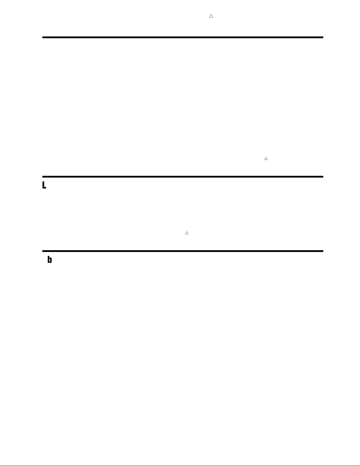
For crosstabulation tables that are based on multidimensional data sources, the
hierarchy level names are displayed in the table, rather than the hierarchy names. In
Display 2.9 on page 24,
YEAR is a level in a Time hierarchy and REGION is a level in a
Geography hierarchy.
Page 35

Understanding the Reporting Elements About Text Objects 25
For information about using a crosstabulation table in a report, see “Managing
Tables” on page 139.
For information about how to make changes to a viewed crosstabulation table, see
Chapter 6, “Changing Data in a Viewed Report,” on page 47 and Chapter 7, “Changing
the Presentation of a Viewed Report,” on page 81.
About List Tables
A list table is a two-dimensional representation of data, in which the data values are
arranged in unlabeled rows and labeled columns. List tables are applicable when you
are using data items selected from a relational data source.
Display 2.10 A List Table
For information about using a list table in a report, see “Managing Tables” on page
139.
For information about how to make changes to a viewed list table, see Chapter 6,
“Changing Data in a Viewed Report,” on page 47 and Chapter 7, “Changing the
Presentation of a Viewed Report,” on page 81.
About Text Objects
Text objects can be used to display static text, dynamic prompt values, and measure
values. You can also link selected text to another report or to a Web page.
For information about how to use text in a report, see “Managing Text Objects” on
page 151.
Page 36

26
Page 37

CHAPTER
3
27
Understanding the Report Views
Overview of the Report Views
About the View Report View
What Users Can Do in the View Report View
The View Report View Interface
How to Access the View Report View
About the Edit Report View 30
What Users Can Do in the Edit Report View
The Edit Report View Interface
How to Access the Edit Report View
27
Overview of the Report Views
SAS Web Report Studio displays reports in two different views:
View Report View
This is the view that all SAS Web Report Studio users can see. The View Report
view displays the output of a saved report or a stored process. Users who are
authorized to create and edit reports also can use the View Report view to open a
quick report and to preview new, unsaved reports.
Edit Report View
This is the view that enables report creators to define the query that will supply
the data for the report and to design the layout of the report, including placing
objects such as tables, graphs, maps, and images. The Edit Report view is also
used to make certain changes to existing reports such as adding new sections.
27
27
28
30
30
31
32
This chapter provides more details about each view.
About the View Report View
What Users Can Do in the View Report View
All SAS Web Report Studio users can display their own reports, shared reports, and
stored process output in the View Report view. If the report is based on a relational or
multidimensional data source, then users also can make changes to the default report
view. For example, users can perform these tasks:
Page 38

28 The View Report View Interface Chapter 3
3
show or hide totals in tables
3
drill and expand tables, graphs, and maps
3
add percent of total columns to tables
3
filter and rank tables, graphs, and maps
3
add or modify conditional highlighting
3
sort
3
move columns and rows in tables
3
change table, graph, and map properties such as size and color
Authorized users can save their modifications. Otherwise, the modifications are
removed when they exit the report. For information about how to make changes to a
viewed report, see Chapter 6, “Changing Data in a Viewed Report,” on page 47 and
Chapter 7, “Changing the Presentation of a Viewed Report,” on page 81.
Authorized users also can perform these tasks from the View Report view:
3
save stored process output as a new report.
3
open a quick report and save it as a new report.
3
display the viewed report in the Edit Report view. (From the Edit Report view,
users can save changes to the viewed report or use the viewed report as the basis
for a new report.)
Note: If you have questions about your authorization, contact your system
administrator.
4
The View Report View Interface
Depending on how the report creator designed the report, the View Report view
might contain the following items:
3
a header
3
one or more tables
3
one or more graphs
3
one or more images
3
a map
3
text
3
a footer
3
a data pane (for reports that contain synchronized objects, which includes quick
reports)
3
a table of contents (for reports with separate pages for group breaks)
Here is an example of a report displayed in the View Report view. The report
contains query results from a multidimensional data source. The main features of this
specific report and the View Report view interface are identified.
Page 39
Understanding the Report Views The View Report View Interface 29
Display 3.1 The View Report View with a Header, a Crosstabulation Table, and a Bar-Line Chart
1 2
6
7
8
3
5
4
9
10
1 Select the Report menu to access task options such as Export and Print.
2 Authorized users can click Edit Report to open the viewed report in the Edit
Report view.
3 View Report is bold when the View Report view is active.
4 Select the How Do I? menu to see a list of Help topics that relate to the View
Report view.
5 Click Refresh Data to re-generate the report section query and see the most
current results.
Page 40

30 How to Access the View Report View Chapter 3
6 A header that contains some dynamic text about when the report data was last
refreshed.
7 The table toolbar, which provides access to a variety of tasks such as setting table
properties, viewing table information, filtering, and conditional highlighting.
8
A crosstabulation table. For more information, see “About Crosstabulation Tables”
on page 23.
9
The graph toolbar, which provides access to a variety of tasks such as setting graph
properties, viewing graph information, filtering, and conditional highlighting.
10
A bar-line chart. For more information, see “About Bar-Line Charts” on page 18.
If the tables, graphs, and maps in the report do not contain a toolbar, or if users
cannot interact with the report objects, then one of these conditions is probably true:
3
the report needs to be refreshed
3
the table, graph, or map was generated from a stored process
3
the report was created in a SAS reporting application that does not support all
editing features
How to Access the View Report View
There are five ways to access the View Report view:
3
Select
Report Open to display the Open dialog box, then select the name of the
report or stored process.
3
Select one of the last four opened reports or stored processes from the
menu.
3
Click View Report
view.
3
Select
3
Click Manage in the upper right corner of the user interface to access the Report
Report
Quick Report.
Management page, and then select the report or stored process that you want to
view.
About the Edit Report View
What Users Can Do in the Edit Report View
Only authorized SAS Web Report Studio users can use the Edit Report view to create
new reports and edit saved reports.
Basically, creating reports involves performing these tasks for each report section:
3
selecting the query method or methods that will be used to obtain the data
3
selecting and placing the report objects that will contain the data such as tables
and graphs
3
adding optional group breaks, headers, footers, images, and text
Report
when you are creating or editing a report in the Edit Report
Users also must access the Edit Report view in order to make certain changes to
saved reports such as modifying the query method and layout for a report section,
adding new sections, adding report links, and synchronizing report objects.
Page 41

Understanding the Report Views The Edit Report View Interface 31
Note: If the Edit Report view cannot be used to edit a report, then the report was
created in a SAS reporting application that does not support all editing features.
However, users might be able to add, delete, rename, and reorder report sections.
The Edit Report View Interface
Authorized users can access the Edit Report view to create new reports or to edit
existing reports. Here are some of the main features of the Edit Report view.
Display 3.2 The Edit Report View Interface
4
10
11
1
5
7
9
12
2
6
3
4
8
13
14
1 Select the Report menu to access options such as Quick Report and New Using
Wizard
2 Edit Report is bold when the Edit Report view is active.
3 Click View Report when you are ready to view the report.
.
15
Page 42

32 How to Access the Edit Report View Chapter 3
4 Select the How Do I?
menu to see a list of Help topics that relate to the Edit
Report view.
5 There is a tab for each section in the report. To switch between report sections,
click the tab for the section that you want to see.
6 Use the
Section
menu to add new sections, switch between sections, and rename,
delete, or reorder existing sections. For more information, see “Managing Report
Sections” on page 157.
7 If you want to select data items from a data source to define a query for the report
section, then click
After you select the data items, an
Select data.
Options
menu is available. Depending on
the type of data source, you can use this menu to change the aggregation type of
selected measures, combine filters, and preview the results of the query. You might
also be able to select or define filters and change the default format.
For more information about defining a query that uses data items, see Chapter
9, “Obtaining Data for a Report Section,” on page 107.
8 Click
Apply a template
to select a template to use for the layout of the report.
For more information, see “Use a Report Template to Design a Layout” on page
130.
9 Click
Header
to enter header information for the report section. For more
information, see “Managing Headers” on page 130.
10
If you select data items from a data source, then you can specify group breaks for
the report section. For more information, see “Managing Group Breaks” on page
132.
11
The body of the report section consists of a grid for arranging objects such as
tables, graphs, and images, and two toolbars. For more information, see Chapter
10, “Designing the Layout of a Report Section,” on page 127.
The body can also include stored process objects that are used to obtain data for
the report section. For more information, see Chapter 9, “Obtaining Data for a
Report Section,” on page 107.
12
Use this vertical toolbar to delete and align objects, and merge, split, and add cells
to the body grid.
13 Use this horizontal toolbar to insert objects (tables, graphs, maps, stored processes,
text, and images), and to synchronize objects or make them independent.
14
Click Footer to enter footer information for the report section. For more
information, see “Managing Footers” on page 131.
15
Click View Report when you are ready to view the report.
How to Access the Edit Report View
There are six ways to access the Edit Report view:
3
Select Report New.
3
Select Report New from Template
and display it in the Edit Report view.
3
Click Edit Report
when a saved report, a quick report, or stored process output
is displayed in the View Report view.
3
Select Report
Finish on any wizard page to access the Edit Report view.
3
Select Report
report, click
3
Click Manage in the upper right corner of the user interface to access the Report
New from Wizard. After at least one data item is selected, click
Open to display the Open dialog box. Next to the name of a
in the Actions column, and then select Edit.
Management page. Navigate to the report that you want to edit. Next to the name
of a report, click
in the
Actions column, and then select
to select a report template from a gallery
Edit.
Page 43
CHAPTER
4
33
Understanding the Report Types
Overview of the Report Types
About Saved Reports
About Direct Stored Process Output
About Quick Reports
About Manually Refreshed Reports
34
34
Overview of the Report Types
The content that can be displayed in the View Report view can be placed into these
four categories:
Saved Reports
Saved reports are reports that you saved by completing the Save As dialog box.
You can save quick reports, the output of a stored process, and any content in the
Edit Report view, including content that is created by using the Report Wizard.
Manually Refreshed Reports
When you view a manually refreshed report, you are looking at the results of a
query that was pre-generated (that is, a query that was run at some time before
you opened the report). In order to interact with a manually refreshed report, you
must refresh the data.
Direct Stored Process Output
You can run a stored process directly, without first inserting it into a report.
33
34
35
Quick Reports
Quick reports use one crosstabulation table and one bar chart to present the
results of a query that is based on three standard data items from your selected
data source.
This chapter provides additional information about each type of report.
Note: Only authorized users can save reports or open a quick report. If you have
questions about your authorization, contact your system administrator.
Note: SAS Web Report Studio also enables you to view reports that are created by
using a variety of other SAS products, including SAS Web OLAP Viewer for Java and
SAS Enterprise Guide (for more information, see “Integration with Other SAS
Reporting Products” on page 7).
4
4
Page 44

34 About Saved Reports Chapter 4
About Saved Reports
To create a saved report, you select Report Save
complete the Save As dialog box. When you save a new report, you name it, provide an
optional description and keywords, and indicate whether the content should be
manually or automatically refreshed. You can share saved reports or keep them private.
You can save the following content:
3
any content in the Edit Report view, including content that is created by using the
Report Wizard
3
the output of a stored process that was run directly
3
a quick report
For information about how to complete the Save As dialog box, see “Save a Report”
on page 168.
Note: For existing reports, you can select
dialog box.
4
About Direct Stored Process Output
You can run a stored process directly from the Open dialog box or the Report
Management page as explained in “Run a Stored Process” on page 42.
When the results are displayed in the View Report view, you can choose to save the
stored process as part of a report. One advantage of saving the stored process in a
report is that you can use the Edit Report view to add some headers, footers, text, and
images that are independent of the stored process output.
For information about what a stored process is, see “About Stored Processes” on page
17.
Report
or Report
Save
to bypass the Save As
Save As
and then
About Quick Reports
A quick report uses one crosstabulation table and one bar chart to present the results
of a query that is based on three standard data items from a selected data source. The
data items are the first two categories or hierarchies and the first measure in the data
source. For multidimensional data sources, the hierarchies must be from different
dimensions.
Note: In order to display a quick report, the data source must have at least one
category or hierarchy and one measure.
The following table explains how each data item is used in the table and bar chart.
4
Page 45

Understanding the Report Types About Manually Refreshed Reports 35
Data Item Data Assignment Function in the
First category/
hierarchy
Second category/
hierarchy
Measure Columns Column Bar height
Columns Column Bars
Rows Row Vertical matrix
Quick reports are displayed with a data pane that can be used to change data
selections. For information about modifying data selections, see “Managing the Data
Used for Synchronized Report Sections” on page 74.
About Manually Refreshed Reports
Manually refreshed reports are saved reports (see “About Saved Reports” on page 34)
that contain data from a pre-generated query. Typically, a manually refreshed report
displays more quickly than a report that automatically queries the physical source of
data each time that it is viewed.
There are two ways to create a manually refreshed report from within SAS Web
Report Studio:
3
You can save the report as Data can be manually refreshed
3
You can schedule saved reports to be run at a specified time.
Crosstabulation
Table
Function in the Bar
Chart
.
When viewed, manually refreshed reports behave the same regardless of how they
were created.
You have the option to refresh the data in a viewed manually refreshed report. After
you refresh the data, you can perform these tasks:
3
Customize the view (for report sections that contain data items from a data source).
For more information, see Chapter 6, “Changing Data in a Viewed Report,” on page
47 and Chapter 7, “Changing the Presentation of a Viewed Report,” on page 81.
3
Save the report in order to embed the refreshed data as the new report content.
Page 46

36
Page 47

PART
2
Working With Viewed Reports
37
Chapter 5..........
Chapter 6..........
Chapter 7..........
Viewing Reports and Running Stored Processes
Changing Data in a Viewed Report
Changing the Presentation of a Viewed Report
47
39
81
Page 48

38
Page 49

CHAPTER
5
39
Viewing Reports and Running Stored Processes
Overview of Viewing Reports and Running Stored Processes
View a Saved Report
Run a Stored Process
View a Quick Report
Tips for Responding to Prompts
Tips for Searching for Reports and Stored Processes 46
39
42
44
45
39
Overview of Viewing Reports and Running Stored Processes
This chapter explains how to display the following content in the View Report view:
3
a saved report
3
a stored process
3
a quick report
Note: You must be authorized to view (and save) a quick report. If you have
questions about your authorization, contact your system administrator.
For more information about these report types, see the following topics:
3
“About Saved Reports” on page 34
3
“About Direct Stored Process Output” on page 34
3
“About Quick Reports” on page 34
For more information about the View Report view interface, see “The View Report
View Interface” on page 28.
View a Saved Report
To open a report, you can select one of the last four opened reports from the Report
menu, use the Open dialog box, or use the Report Management page.
Note: Report content depends on your authorization. Your data source
administrator determines what data you are authorized to view.
To use the Open dialog box or the Report Management page, complete these steps:
1 Perform one of these tasks:
3
Select Report Open to open the Open dialog box.
3
Click Manage in the upper right corner of the user interface to access the Report
Management page.
4
Page 50

40 View a Saved Report Chapter 5
The Open dialog box and the Report Management page contain a Search
for reports
Display 5.1 The Open Dialog Box Showing a List of Reports and a Folder Named StoredProcesses
section and a list of reports, stored processes, and folders.
2
Select a report. To search for a report, complete these steps:
a If the
b In the Search for
Search for reports section is not visible, click
field, type the text for which you want to search. (For
.
searching tips, see “Tips for Searching for Reports and Stored Processes” on
page 46.)
c
In the Search what
text in the
Name, Description,or
drop-down list, choose whether you want to search for the
Keywords fields.
Note: You cannot search the content of a report.
d
In the
e (Optional) To also search for reports in folders that are contained in the folder
you are searching, select
f
(Optional) To limit your search to a time frame, select
Modified
Search where drop-down list, select a folder name.
Search subfolders.
Search for Files
in the
Date/time limits drop-down list. Then specify the time
frame by using the fields that are below the drop-down list.
g Click Search.
If there are any reports that match your criteria, they are shown.
Note: After a search, the report list also includes
located report. To clear the search results, select an option in the
Path information for each
Location
drop-down list.
3
If necessary, respond to prompts. (For tips, see “Tips for Responding to Prompts”
on page 45.)
4 If the report that you opened has more than one section, click the section tabs in
order to view each section. If a section contains group breaks with page breaks,
you view each page by using the table of contents.
Page 51

Viewing Reports and Running Stored Processes View a Saved Report 41
Display 5.2 Table of Contents That Shows Page Navigation for Two Group Breaks (an Order Channel
Category and an Age Group Hierarchy Level)
To collapse the table of contents, click
. To expand the table of contents, click
.
The following report provides information about product group revenue, and includes
percentage contribution by channel and age group. Exceptional conditions are
highlighted for product group and age group combinations for a given channel where
the revenue contribution is less than 5% or greater than 40%. This information could
be used, for example, to decide which age groups to target for a promotional offering.
Display 5.3 Example of a Saved Report That Contains Query Results from a Data Source
Page 52

42 Run a Stored Process Chapter 5
For information about how to make changes to a report that contains query results
from a data source (including conditional highlighting as shown in Display 5.3 on page
41), see Chapter 6, “Changing Data in a Viewed Report,” on page 47, and Chapter 7,
“Changing the Presentation of a Viewed Report,” on page 81. If you are authorized, you
can save your modifications. Otherwise, the modifications are removed when you exit
the report.
Run a Stored Process
To run a stored process, you can select one of the last four opened stored processes
from the
Note: Report content depends on your authorization. Your data source
administrator determines what data you are authorized to view.
To use the Open dialog box or the Report Management page, complete these steps:
1
Report
Perform one of these tasks:
3
3
Select
Click
Report Open
Manage in the upper right corner of the user interface to access the Report
Management page.
The Open dialog box and the Report Management page contain a
for reports
menu, use the Open dialog box, or use the Report Management page.
4
to open the Open dialog box.
Search
section and a list of reports, stored processes, and folders.
Display 5.4 The Report Management Page with Three Stored Processes Listed
2 Select a stored process. To search for a stored process, complete these steps. (For
searching tips, see “Tips for Searching for Reports and Stored Processes” on page
46.)
a If the Search for reports section is not visible, click .
b In the Search for field, type the text for which you want to search.
c In the Search what drop-down list, choose whether you want to search for the
text in the
Name, Description,orKeywords fields.
Note: You cannot search the content of a stored process.
d In the Search where drop-down list, select a folder name.
e (Optional) To also search for stored processes in folders that are contained in
the folder you are searching, select
Search subfolders
.
Page 53

Viewing Reports and Running Stored Processes Run a Stored Process 43
f (Optional) To limit your search to a time frame, select Search for Files
Modified
in the
Date/time limits
drop-down list. Then specify the time
frame by using the fields that are below the drop-down list.
g
Click Search.
If there are any stored processes that match your criteria, they are shown.
Note: After a search, the list also includes
stored process. To clear the search results, select an option in the
Path
information for each located
Location
drop-down list.
3
If necessary, respond to prompts. (For tips, see “Tips for Responding to Prompts”
on page 45.)
Display 5.5 Prompt Window for the Stored Process Output Shown in Display 5.6
The following example of stored process output uses the predictive capabilities of
SAS to give executives a glimpse into the company’s financial future. After the user
enters preferences for the country, forecast variable (cost, profit, or sales), and the
number of months to forecast, SAS Web Report Studio displays a line chart by month,
including confidence intervals, and a supporting list table with values for the year,
month, actual sales, forecast, lower 95%, and upper 95%. (The prompt window for this
stored process is shown in Display 5.5 on page 43.)
Page 54

44 View a Quick Report Chapter 5
Display 5.6 Example of Stored Process Output
You cannot modify the output of a stored process. However, if you are authorized, you
can select
Report Save to save the output as a report. When a stored process is
saved as part of a report section, you can add visual elements such as headers, footers,
images, and text that are independent of the stored process.
View a Quick Report
A quick report uses one crosstabulation table and one bar graph to present the
results of a query that is based on three data items from selected data source. The data
items are the first two categories or hierarchies and the first measure in the data
source. Quick reports are synchronized by default (see “About Synchronized Reports” on
page 74).
Note: Report content depends on your authorization. Your data source
administrator determines what data you are authorized to view.
To open a quick report, complete these steps:
1 Select Report Quick Report.
2 In the Select Data Source dialog box, navigate the folder tree in order to select a
data source.
3 When you are done, click OK.
4
4 (Optional) Modify the default data assignments (see “Managing the Data Used for
Synchronized Report Sections” on page 74).
5 (Optional) If you are authorized, save the quick report. If you save the quick
report, you can make changes such as modifying the layout and adding sections.
Page 55
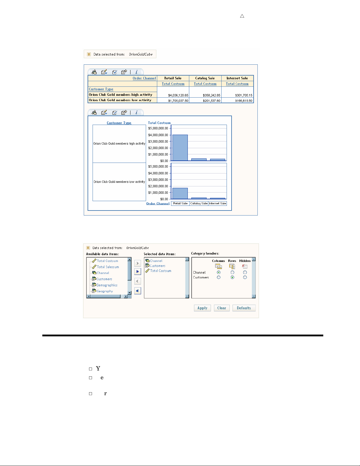
Viewing Reports and Running Stored Processes Tips for Responding to Prompts 45
Display 5.7 Example of a Quick Report Based on a Multidimensional Data Source
Display 5.8 Expanded Data Pane for the Quick Report Showing the Default Data Item Assignments
Tips for Responding to Prompts
Here are some tips for completing a prompt window for a report or a stored process.
3
You cannot use these characters in free-text prompts: <>()&#\
3
Depending on how the prompt was created, the prompt value might be case
sensitive.
3
To reset the prompts to the default values, click Reset to Defaults.
Note: When a report is saved, the most recently specified prompt values are also
saved. If the prompts are associated with a stored process that has been inserted
into a report section, the saved prompt values might be different from the default
Page 56

46 Tips for Searching for Reports and Stored Processes Chapter 5
prompt values that are stored with the stored process itself. To use the default
values that are stored with the stored process, you must click
Defaults
3
If a prompt enables you to query a data source for values, then a
.
button is available. Depending on how the prompt was defined by the report
creator, the values will be loaded either into an
a drop-down list. If the query does not return any values, then the prompts are
modified in these ways:
3
If the original prompt displayed
boxes, then the prompt becomes a multiple-value, text-entry field.
and
Remove All
3
If the original prompt was a drop-down list, then the prompt becomes a
buttons will be available.
text-entry field.
3
To obtain values for all prompts that enable you to query a data source, click
Values for All Prompts
3
To cancel out of the prompt window, use the
click
Manage.
3
To display the report after entering the required information, click
3
To change the prompt values after output is rendered, click
.
right corner of the user interface.
Reset to
Get Values
Available values
list box or into
Available values/Selected values
Add, Remove,
Report
menu, click Edit Report
View Report.
Refresh in the upper
list
Get
,or
Tips for Searching for Reports and Stored Processes
Here are some tips for searching for reports and stored processes in the Open dialog
box or the Report Management page.
3
The search is not case sensitive. For example, if you search for profit in the report
or stored process name, your search results will include reports and stored
processes such as Sports Equipment Profits as well as Company profits last year.
3
If you search for a single word, then SAS Web Report Studio assumes a wildcard
character before and after the word. For example, if you perform a search with low
in the
processes with names like Low Activity, Regions with Lowered Sales, and Monthly
Allowance.
3
Searching does not include report or stored process content.
Search for
field, then the search results will include reports and stored
Page 57

CHAPTER
6
47
Changing Data in a Viewed Report
Overview of Changing Data in a Viewed Report
Change the Current Prompt Values
Working with Tables
Specifying How Data Items Are Used in Tables
Assign Data Items to Functions in a Crosstabulation Table
Assign Data Items to Functions in a List Table 49
Drill or Expand Hierarchies in a Crosstabulation Table
Managing Filtering and Ranking in a List Table
Create a Filter or Ranking for a List Table
Remove a Filter or Ranking from a List Table
Managing Filtering and Ranking in a Crosstabulation Table
Create a Category or Hierarchy Filter for a Crosstabulation Table
Create a Measure Filter for a Crosstabulation Table 54
Create a Ranking for a Crosstabulation Table 55
Remove a Filter or Ranking from a Crosstabulation Table 56
Managing Percent of Total Columns in a Table 56
Add a Percent of Total Column to a Table 56
Remove a Percent of Total Column from a Table 58
Show or Hide Totals in a Table 58
View Detail Data in a Crosstabulation Table 59
View Table Information 60
Working with Graphs 61
Specifying How Data Items Are Used in Graphs 61
Assign Data Items to Functions in a Bar Chart 61
Assign Data Items to Functions in a Bar-Line Chart 62
Assign Data Items to Functions in a Line Graph 63
Assign Data Items to Functions in a Pie Chart 63
Assign Data Items to Functions in a Progressive Bar Chart 64
Assign Data Items to Functions in a Scatter Plot 65
Drill or Expand Hierarchies in a Graph 66
Managing Filtering and Ranking in a Graph 67
Create a Category or Hierarchy Filter for a Graph 67
Create a Measure Filter for a Graph 68
Create a Ranking for a Graph 69
Remove a Filter or Ranking from Graph 70
View Graph Information 70
Working with Maps 71
Drill or Expand the Geography Hierarchy in a Map 71
Managing Filtering and Ranking in a Map 72
Create a Filter for the Geography Hierarchy in a Map 72
Create a Measure Filter for a Map 72
49
48
48
49
49
50
51
51
52
53
53
Page 58

48 Overview of Changing Data in a Viewed Report Chapter 6
Create a Ranking for a Map
Remove a Filter or Ranking from a Map
Change the Measure Used in a Map
View Information about a Selected Region
Zoom and Pan a Map
Managing the Data Used for Synchronized Report Sections
About Synchronized Reports
Change Which Data Items Are Used for the Section Query
Change How Data Items Are Used in Tables and Graphs
About Mixed States for Categories and Hierarchies
Tips for Filtering and Ranking Tables, Graphs, and Maps
Filter Creation
Filter Application
Filter Restrictions
Consequences of Changing Data
Tips for Working with Hidden Data Items
73
77
77
78
72
73
73
73
74
76
78
78
Overview of Changing Data in a Viewed Report
In each report section that contains query results from a data source, you can use the
View Report view to make changes that affect what data is shown in tables, graphs,
and maps.
74
75
75
77
Note: With the exception of entering new prompt values, you cannot change the
output of a stored process.
4
Here are some of the changes that you can make:
3
show or hide totals in tables
3
add a percent of total column to tables
3
filter and rank tables, graphs, and maps
3
drill and expand tables, graphs, and maps
3
enter different prompt values
3
reassign individual data items to different functions in a table or graph
3
change the measure used for a map
Note: If the report was saved as manually refreshed, then you must refresh the
report in order to make changes.
Note: For more information about the View Report view, see “About the View Report
View” on page 27.
4
Note: Only authorized users can save changes to reports. If you have questions
about your authorization, contact your system administrator.
Change the Current Prompt Values
4
4
Some report sections and stored processes require that you answer prompts before
their output is rendered. To change the prompt values after output is rendered, click
Refresh in the upper right corner of the user interface. The prompt window will
reappear.
For more information about completing a prompt window, see “Tips for Responding to
Prompts” on page 45.
Page 59
Working with Tables
Specifying How Data Items Are Used in Tables
Assign Data Items to Functions in a Crosstabulation Table
To assign data items to specific functions in a crosstabulation table, complete these
steps:
1
On the crosstabulation table toolbar, click to open the Table Data dialog box.
Note: For crosstabulation tables that use relational data, some data items are not
supported and will not appear in the Table Data dialog box. The data items that
will not appear include measures that use the distinct aggregation type. In
general, if a data item is not shown in the Table Data dialog box, then you can
assume that it is not supported.
Changing Data in a Viewed Report Specifying How Data Items Are Used in Tables 49
2 Use the Move Items
drop-down list to assign each data item to one of these
functions.
Columns and Rows
Data items that are assigned to
that are assigned to
Rows appear on the rows. By default, if multiple categories
Columns appear on the columns and data items
or hierarchies have been selected from the data source, the first category or
hierarchy and all of the measures are assigned to the
Columns function. If only
one category or hierarchy is selected from the data source, then the category or
hierarchy is assigned to the
Columns function.
Note: Measures that are not assigned to
rows or all on the columns.
Hidden
Rows function and the measures are assigned to the
Hidden must be either all on the
4
Data items that are assigned to Hidden do not appear in the table but can be
used in filtering. For more information about working with hidden data items,
see “Tips for Working with Hidden Data Items” on page 78.
3 When you are done, click OK.
4 (Optional) Save the report.
Here are some filtering consequences of moving data items to different functions in a
crosstabulation table:
3
If you add or hide a category or hierarchy column, then any row filters and
rankings that are based on a column measure are removed. Filters are not
affected by adding or hiding measures.
3
If you add or hide a category or hierarchy row, then any column filters and
rankings that are based on a row measure are removed. Filters are not affected by
adding or hiding measures.
3
Filters are retained if you move all the data items that are currently on rows to
the columns and move all the data items that are currently on the columns to the
rows. In this case, any existing filters will remain and be evaluated based on the
new positions.
Assign Data Items to Functions in a List Table
To assign data items to specific functions in a list table, complete these steps:
Page 60

50 Drill or Expand Hierarchies in a Crosstabulation Table Chapter 6
1 On the list table toolbar, click to open the Table Data dialog box.
2 Use the Move Items drop-down list to assign each data item to one of these
functions.
Columns
By default, all data items are assigned to the Columns function.
Hidden
Data items that are assigned to Hidden do not appear in the table but can be
used in filtering. For more information about working with hidden data items,
see “Tips for Working with Hidden Data Items” on page 78.
3 When you are done, click OK.
4 (Optional) Save the report.
Drill or Expand Hierarchies in a Crosstabulation Table
You can perform these tasks on a crosstabulation table that is based on
multidimensional data:
3
Click
current member and the values for the next hierarchy level down for that member.
to expand a member of a hierarchy level. You will see the values for the
Display 6.1 In the Hierarchy Level ’Year,’ the Member ’2000’ Has Been Expanded to Display Values for the
’Quarter’ Hierarchy Level
3
Click to drill a member of a hierarchy level. You will see only the values for the
next hierarchy level down for that member.
Display 6.2 In the Hierarchy Level ’Year,’ the Member ’2000’ Has Been Drilled to Display Values for the
’Quarter’ Hierarchy Level
Page 61

Changing Data in a Viewed Report Managing Filtering and Ranking in a List Table 51
3
Click a hierarchy level heading, and then select Expand All
page 50, you would click on the hierarchy level
3
Click a hierarchy level heading, and then select
Year.)
Collapse All.
. (In Display 6.1 on
Managing Filtering and Ranking in a List Table
Create a Filter or Ranking for a List Table
To create a filter for a list table, complete these steps:
1
On the table toolbar, click , and then select Filter and Rank to open the Filter
and Rank dialog box.
2
In the
displays the data items that are used in the list table along with any currently
active filters.
Note: You cannot create measure filters or rankings if the table is part of a
synchronized group. If the table is in a synchronized group, then measures are not
included in the list. The list also does not include categories that are assigned to
group breaks, or percent of total columns.
Note: Data item names might wrap multiple lines.
Item,
Filter list, select the data item that you want to filter. This field
3 Select a Filter type
4 (Optional) If the selected data item is classified as a character data type and it is
.
not using the default format, then you can select the
values
option. In this case, formatted values will be used in all parts of the
current filter query.
Note: If the selected data item is using the default format and this option is
selected (which might be the true for reports that were created with a previous
version of SAS Web Report Studio), then clear this option to improve query
performance. Leave the option selected, however, if you cannot produce the desired
results by using unformatted values.
5 Depending on your filter type selection, take the appropriate action.
Table 6.1 Data Item Types, Filter Types, and Available Actions
Data Item Filter Type Action
any type
alphanumeric category
No filter
Select category
values
1
None. No filter will be applied to the selected data item.
Select one or more items from the Available
values
values
Type in category
values
2
Type a value and click
values
you want to filter for. To remove a value, select it in the
Multiple values box and click Remove.
date category
Filter on this date
Use one of these methods:
3
3
Filter on formatted
list and move them to the Selected
list.
Add to add it to the Multiple
box. Repeat this procedure for each value that
Select an Operator and enter a Day, Month,
Year.
and
Select an Operator, and then select a relative
time period. Options include
quarter
, and a user-specified number of periods.
Today, Previous
3
Page 62

52 Managing Filtering and Ranking in a List Table Chapter 6
Data Item Filter Type Action
timestamp category
time category
measure
4
Filter on this date
Filter on this time
Filter on this
measure
Rank on this measure
Use one of these methods:
3
Select an
Year, Hour,
3
Select an
time period. Options include
quarter
number of periods.
Use one of these methods:
3
Select an
and
3
Select an
time period. The options are
Previous hour, and a user-specified number of
periods.
Select an
BETWEEN operators, type a
value. You do not type a value for the
and
Is not missing operators.
Select
Top or Bottom
value next to the option that you choose (up to 999). The
Operator
Minute, and
and enter a
Second.
Operator, and then select a relative
Today,
,
Current hour
3
Operator
, and a user-specified
and enter a
Second.
Operator, and then select a relative
Current hour,
3
Operator and enter a
Value. For the
Minimum and Maximum
Is missing
from the Show
field. Then, type a
Day, Month,
Previous
Hour,
Minute,
percent check box is not available for relational data.
To exclude tied rankings, select the
option. For example, by default, if you request the top
five products and there are three products tied for fifth
place, then seven products are returned. If you select
Exclude ties
the
returned.
option, then only five products are
Exclude ties
1 The data source administrator controls whether you can select category values.
2 If you are filtering on unformatted values, then you must enter values that match the casing of the values
in the data source. If you select the
Filter on formatted values
option, then you must enter the
formatted values. If the filter does not return any results, then try using a different casing.
3 The filter is relative to the time that the section query is generated, not the time that the filter is imposed
on the table.
4 Enter values in the number format that is appropriate for the locale that is set for the browser.
6
When you are done, click
OK.
7 (Optional) Save the report.
Note: For a summary of filtering tips, see “Tips for Filtering and Ranking Tables,
Graphs, and Maps” on page 77.
4
Note: For a filtering example, see “Example 1: Filtering an Alphanumeric Category
in a List Table” on page 203.
4
Remove a Filter or Ranking from a List Table
To remove a filter or ranking from a list table, complete these steps:
1 On the list table toolbar, click , and then select Filter and Rank to open the
Filter and Rank dialog box.
Page 63

Changing Data in a Viewed Report Managing Filtering and Ranking in a Crosstabulation Table 53
2 In the Item,
filter
3
When you are done, click
4
(Optional) Save the report.
Filter list, for each data item that should not be filtered, select
as the
Filter type
.
OK.
Managing Filtering and Ranking in a Crosstabulation Table
Create a Category or Hierarchy Filter for a Crosstabulation Table
To create a category or hierarchy filter, complete these steps:
1 On the table toolbar, click
and Rank dialog box.
2 Click the
3
In the
Category Filters
Item, Filter
list, select a category or hierarchy. This field displays the
categories and hierarchies that are used in the table along with any currently
active filters.
Note: The list does not include categories and hierarchies that are assigned to
group breaks, or percent of total columns.
Note: Data item names might wrap multiple lines.
4 Select a Filter type
5 (Optional) For relational data sources, if the selected data item is classified as a
.
character data type and it is not using the default format, then you can select the
Filter on formatted values
in all parts of the current filter query.
, and then select Filter and Rank to open the Filter
tab.
option. In this case, formatted values will be used
No
Note: If the selected data item is using the default format and this option is
selected (which might be the true for reports that were created with a previous
version of SAS Web Report Studio), then clear this option to improve query
performance. Leave the option selected, however, if you cannot produce the desired
results by using unformatted values.
6 Depending on your filter type selection, take the appropriate action.
Table 6.2 Data Item Types, Filter Types, and Available Actions
Data Item Filter Type Action
any type
categories from
relational data
sources
No filter
Type in category
values
1
None. No filter will be applied to the selected data item.
Type a value and click Add to add it to the Multiple
values
want to filter for. To remove a value, select it in the
values
any category or
hierarchy
hierarchies in the
time dimension of a
multidimensional
data source (for
example, a Year
hierarchy)
Select category
values
2
Create filter
Select one or more items in the Select filter values
list. You can select and deselect items individually, or you can
use the
Select a Period type and enter Show and Select criteria.
In the
period information.
box. Repeat this procedure for each value that you
Multiple
box and click Remove.
Select All or Deselect All buttons.
Date Range section, specify your starting and ending
Page 64

54 Managing Filtering and Ranking in a Crosstabulation Table Chapter 6
Data Item Filter Type Action
date categories from
relational data
sources
time categories from
relational data
sources
timestamp
categories from
relational data
sources
Create filter
Create filter
Create filter
Use one of these methods:
3
Select an
3
Select an
period. Options include
and a user-specified number of periods.
Select an
Use one of these methods:
3
Select an
Hour,
3
Select an
period. Options include
Operator
and enter a
Day, Month, and
Operator, and then select a relative time
Operator
and enter a
Operator and enter a
Minute, and
Today,
Second.
Previous quarter,
Hour, Minute, and
Day,
Operator, and then select a relative time
Today, Previous quarter
3
Month, Year,
Current hour, and a user-specified number of periods.
Year.
Second.
,
3
1 If you are filtering on unformatted values, then you must enter values that match the casing of the values
in the data source. If you select the
Filter on formatted values
option, then you must enter the
formatted values. If the filter does not return any results, then try using a different casing.
2 For relational data sources, your data source administrator controls whether you can select category values.
3 The filter is relative to the time that the section query is generated, not the time that the filter is imposed
on the table.
When you are done, click
7
OK.
8 (Optional) Save the report.
Note: For a summary of filtering tips, see “Tips for Filtering and Ranking Tables,
Graphs, and Maps” on page 77.
4
Create a Measure Filter for a Crosstabulation Table
Note: The Measure Filter or Rank
synchronized group.
4
To create a measure filter, complete these steps:
1 Perform one of these tasks to open the Filter and Rank dialog box:
3
On the table toolbar, click
3
Click a measure heading in a row or column, and then select Filter by this
or Filter by this Column.
Row
Note: You cannot filter on percent of total values.
2 Click the Measure Filter or Rank tab,
3 Select the Filter a measure option.
4 In the Show values of drop-down list, select an option.
5 Depending on your Show values of selection, specify the criteria for the filter.
tab is not available if the table is part of a
, and then select Filter and Rank.
Page 65

Changing Data in a Viewed Report Managing Filtering and Ranking in a Crosstabulation Table 55
Table 6.3 Filter Criteria Options for Crosstabulation Tables
Show Value Selection Criteria
(rows)
1
(columns)
2
Select a value for each category or hierarchy level on the columns. Then, select a
Measure and an
Select a value for each category or hierarchy level on the rows. Then, select a
Measure
Operator, and type a
and an
Operator, and type a
Value
Value.
3
.
Outermost category or
hierarchy on the rows
Outermost category or
hierarchy on the columns
1 If the measures are on the columns, then a
2 If the measures are on the rows, then a
3 Do not include a currency symbol in the
appropriate for the locale that is set for the browser.
6
When you are done, click
7 (Optional) Save the report.
Select a
Measure and an
(rows)
(columns) option is available.
Value field. In addition, enter values in the number format that is
Note: For a filtering example, see “Example 2: Filtering Measures in a
Crosstabulation Table” on page 205.
Note: If the current filtering choices are not acceptable, you can use the Table Data
dialog box to assign data items to different functions (see “Assign Data Items to
Functions in a Crosstabulation Table” on page 49).
Note: For a summary of filtering tips, see “Tips for Filtering and Ranking Tables,
Graphs, and Maps” on page 77.
Create a Ranking for a Crosstabulation Table
Note: The
synchronized group.
Measure Filter or Rank
4
OK.
4
Operator, and type a
option is available.
4
Value.
4
tab is not available if the table is part of a
To create a ranking for a measure in a crosstabulation table, complete these steps:
1 Perform one of these tasks to open the Filter and Rank dialog box:
3
On the table toolbar, click , and then select Filter and Rank.
3
Click a measure heading in a row or column, and then select Rank by this
or Rank by this Column.
Row
Note: You cannot filter on percent of total values.
2 Click the
3 Select the Rank a measure option.
4 In the Show field, select Top or Bottom, and then type a value next to the option
Measure Filter or Rank tab.
that you chose.
5 (Optional) Choose one of these options:
3
To evaluate the data as a percentage, select the percent(%) option, and then
enter a value.
Note: This option is not available for relational data sources.
3
To exclude tied rankings, select the Exclude ties option. For example, by
default, if you request the top five products and there are three products tied for
Page 66

56 Managing Percent of Total Columns in a Table Chapter 6
fifth place, then seven products are returned. If you select the Exclude ties
option, then only five products are returned.
6
In the
7 Depending on your
Table 6.4 Ranking Criteria Options for Crosstabulation Tables
Show values of Selection Based on Values of Criteria
(rows)
(columns)
1
2
Show values of
drop-down list, select an option.
Show values of
Select a value for each category or hierarchy level on the columns, and then select
Measure.
a
Select a value for each category or hierarchy level on the rows, and then select a
Measure.
selection, specify the criteria for the ranking.
Outermost category or
hierarchy on the rows
Outermost category or
hierarchy on the columns
1 If the measures are on the columns, then a
2 If the measures are on the rows, then a
8
When you are done, click
9
(Optional) Save the report.
Select a
Measure.
(columns) option is available.
Note: If the current ranking choices are not acceptable, you can use the Table Data
dialog box to assign data items to different functions (see “Assign Data Items to
Functions in a Crosstabulation Table” on page 49).
Note: For a summary of ranking tips, see “Tips for Filtering and Ranking Tables,
Graphs, and Maps” on page 77.
Remove a Filter or Ranking from a Crosstabulation Table
To remove a filter or ranking from a crosstabulation table, complete these steps:
1 On the table toolbar, click
and Rank dialog box.
2 Remove category and hierarchy filters, measure filter, or ranking as described next:
3
On the Category Filters tab, for each data item that should not be filtered,
select
No filter as the Filter type.
3
On the Measure Filter or Rank tab, select No measure filter or rank.
(rows) option is available.
OK.
4
4
, and then select Filter and Rank to open the Filter
3 When you are done, click OK.
4
(Optional) Save the report.
Managing Percent of Total Columns in a Table
Add a Percent of Total Column to a Table
To add percentage calculations, totals, and comparisons to summary values to a
table, complete these steps:
1 On the table toolbar, click , and then select Percent of Total to open the
Percent of Total dialog box.
Page 67

Changing Data in a Viewed Report Managing Percent of Total Columns in a Table 57
Note: This menu item is not available if the table does not contain any measures
that can be used in a grand total; if the table is in a synchronized group; or if the
table uses multidimensional data.
2
In the
For measure
drop-down list, select a measure for the comparison. This list
contains one item for each measure in the current table. The first measure in the
table (reading left to right or top to bottom) is selected by default.
Note: This list does not contain measures that are added by using this dialog
box.
Note: You cannot create a percent of total calculation that is based on a hidden
data item.
Note: Only those measures that make sense for a grand total calculation are
available.
3
In the
Show percent of
drop-down list, select an option, depending on the type of
table:
3
For list tables, the
Column Total
option is the only type of percent of total that
is supported.
Note: If you change a crosstabulation table to a list table, any percent of total
value column will be discarded unless it is a
3
For crosstabulation tables, for the selected measure, select the value that you
Column Total.
want to calculate the measure as a percentage of. Your predefined choices are
Grand Total, Column Total
, and Row Total
. The drop-down list also contains
these options:
3
one option for the subtotal of each category in the columns of the table. The
options are listed in order from the top down.
3
one option for the subtotal of each category in the rows of the table. The
options are listed in order from the outside inward.
4
Type a Label
30 characters. By default, the
for the calculation that you are creating. You can use a maximum of
Label field is blank. The
Add button is not available
until you enter a value into this field.
5
Click Add to add your
For measure,
Show percent of, and
Label selections to
the box.
6 When you are done, click
OK.
When the measure that is used in the calculation appears in a column, the new
calculation appears immediately to the right of the measure. When the measure
that is used in the calculation appears in a row, the new calculation appears
immediately below the measure.
7 (Optional) Save the report.
Note: If you add a percent of total value column to a crosstabulation table, then any
row filters and rankings that are based on a column measure are removed.
4
Page 68

58 Show or Hide Totals in a Table Chapter 6
Display 6.3 List Table with a Percent of Total Column (Third Column) Calculated for Revenue
Remove a Percent of Total Column from a Table
To remove a percent of total column from a table, complete these steps:
1 On the table toolbar, click
, and then select Percent of Total
to open the
Percent of Total dialog box.
2
Select a calculation.
3
Click Remove.
4 When you are done, click
5 (Optional) Save the report.
OK.
Note: If you remove a percent of total value column from a crosstabulation table,
then any row filters and rankings that are based on a column measure are removed.
Show or Hide Totals in a Table
To show or hide totals, complete these steps:
1 On the table toolbar, click
2
Select one or more of these options:
Rows: Subtotals
Select this option to display row subtotals. This option is available only if the
table is a crosstabulation table and if there are at least two hierarchies or
categories assigned as columns.
Note: If a table contains row filters that are based on row subtotal values,
then those filters are removed when you turn off subtotals for the table.
, and then select Total to open the Total dialog box.
4
4
Rows: Totals
Select this option to display row totals. This option is available only if the table
is a crosstabulation table and if there is at least one hierarchy or category
assigned as a column.
Note: If a table contains row filters that are based on row total values, then
those filters are removed when you turn off totals for the table.
4
Page 69

Changing Data in a Viewed Report View Detail Data in a Crosstabulation Table 59
Columns: Subtotals
Select this option to display column subtotals. This option is available only if
the table is a crosstabulation table and if there are at least two hierarchies or
categories assigned as rows.
Note: If a table contains column filters that are based on column subtotal
values, then those filters are removed when you turn off subtotals for the table.
4
Columns: Totals
Select this option to display column totals. This option is available for both list
and crosstabulation tables.
Note: If a table contains column filters that are based on column total values,
then those filters are removed when you turn off totals for the table.
3
When you are done, click
OK.
By default, total and subtotal values are displayed in boldface type. In addition, their
table cells have a light blue background. For information about how to change the
properties for displaying totals, see “Set Properties for a Table” on page 86.
Display 6.4 List Table With Formatted Column Total Values
Display 6.5 Crosstabulation Table With Formatted Row Totals and Column Subtotals
View Detail Data in a Crosstabulation Table
When a crosstabulation report that is based on multidimensional data is displayed,
complete these steps to view the detail data:
1 Perform one of these tasks to open the View Detail dialog box:
3
To see the detail data behind a value in the crosstabulation table, click the
value (which will be underlined).
Page 70

60 View Table Information Chapter 6
3
To see the detail data behind a row or a column in the crosstabulation table,
click the row or column heading in the innermost level of the innermost
hierarchy in the row or column, and then select
Display 6.6 View Detail Option for the Revenue Column
View Detail
.
Note: If report linking has been enabled for the values in the crosstabulation
table, then, when you click on a value, you will be prompted to either view detail
data or follow the report link.
2 (Optional) To export the data into a Microsoft Excel spreadsheet, click Export.
3 To exit the View Detail dialog box, click Close Window.
Note: You cannot view detail in a crosstabulation table if the data source has not
been set up to support this feature by your data source administrator. In addition,
whether the columns show the column label or the column name is controlled by an
administrator.
4
View Table Information
To display information about a table, click
Information dialog box contains the following information:
Data source
This section contains the following information:
Name
This field displays the name of the data source that is being used for this
table.
Type
This field displays the type of data source (Relational or
Multidimensional). The data source type determines which options are
available for building and viewing reports.
on a table toolbar. The Table
Description
This field displays a description of the data source, if one is available.
Page 71

Applied filters
This field displays the following information:
3
The filters that are applied to the current report section. These filters affect
all of the tables in this section.
3
The filters and the rankings that are applied just to this table.
3
The expression that specifies how the filters and rankings are applied.
Data item, Physical name, Description/expression
For each data item in this table, this box lists the name of the data item as it
appears in the data source that was prepared by the data source administrator,
the name of the data item in the original data source, and either a description
(standard data items) or an expression (calculated data items).
Note: You can modify report properties so that filter information is displayed along
with the report. For more information, see “Set or Modify Properties for a Viewed
Report” on page 99.
Working with Graphs
Changing Data in a Viewed Report Specifying How Data Items Are Used in Graphs 61
4
Specifying How Data Items Are Used in Graphs
Assign Data Items to Functions in a Bar Chart
To assign data items to specific functions in a bar chart, complete these steps:
1 On the bar chart toolbar, click to open the Graph Data dialog box.
2 Use the Move Items drop-down list to assign each data item to one of these
functions.
Bar Height
Specify the measure that will be used to determine the height of each bar. Bar
Height
in the data source is assigned to
can only assign one measure to
Bars (Limit 1)
Select a category or hierarchy, each value of which will be represented by a bar.
Bars is required. By default, if data has been selected, then the first category or
hierarchy in the data source is assigned to
Bar Subgroup (Limit 1)
You can subdivide each bar across the values of the category or hierarchy that
you assign to this function.
is required. By default, if data has been selected, then the first measure
Bar Height.
Note: If you assign a category or hierarchy to the
Bar Height.
4
Bars.
Bar Subgroup, then you
Note: If you assign more than one measure to
add a category or hierarchy to the
Horizontal Matrix
Bar Subgroup.
Bar Height, then you cannot
4
You can create separate bar charts for each value of a selected category or
hierarchy. The charts appear side by side. For example, if you select a Gender
category for the horizontal matrix, a chart for each value of Gender is displayed
side by side along a horizontal line.
Page 72

62 Specifying How Data Items Are Used in Graphs Chapter 6
Vertical Matrix
You can create separate bar charts for each value of a selected category or
hierarchy. The charts appear stacked one on top of the other. For example, if
you select a
Gender category for the vertical matrix, a chart for each value of
Gender is stacked along a vertical line.
Hidden
By default, if data has been selected, then all the data items that have not been
assigned to
Bar Height
or
For tips related to hiding data items, see “Tips for Working with Hidden Data
Items” on page 78.
3
When you are done, click
4
(Optional) Save the report.
OK.
Assign Data Items to Functions in a Bar-Line Chart
To assign data items to specific functions in a bar-line chart, complete these steps:
Bars are assigned to
Hidden.
1
On the bar-line chart toolbar, click
2 Use the Move Items drop-down list to assign each data item to one of these
to open the Graph Data dialog box.
functions.
Bar Height (Limit 1)
Specify the measure that will be used to determine the height of each bar.
Height
in the data source is assigned to
Line Height (Limit 1)
is required. By default, if data has been selected, then the first measure
Bar Height.
Select the measure that will be used to determine the height of the line at each
bar.
Line Height is required. By default, if data has been selected, then the
second measure in the data source is assigned to
Bars (Limit 1)
Line Height.
Select a category or hierarchy, each value of which will be represented by a bar.
Bars is required. By default, if data has been selected, then the first category or
hierarchy in the data source is assigned to
Horizontal Matrix
Bars.
You can create separate bar-line charts for each value of a selected category or
hierarchy. The charts appear side by side. For example, if you select a Gender
category for the horizontal matrix, a chart for each value of Gender is displayed
side by side along a horizontal line.
Vertical Matrix
You can create separate bar-line charts for each value of a selected category or
hierarchy. The charts appear stacked one on top of the other. For example, if
you select a Gender category for the vertical matrix, a chart for each value of
Gender is stacked along a vertical line.
Bar
Hidden
By default, if data has been selected, then all the data items that have not been
assigned to
Bar Height, Line Height,orBars are assigned to Hidden.
For tips related to hiding data items, see “Tips for Working with Hidden Data
Items” on page 78.
3 When you are done, click OK.
4 (Optional) Save the report.
Page 73

Changing Data in a Viewed Report Specifying How Data Items Are Used in Graphs 63
Assign Data Items to Functions in a Line Graph
To assign data items to specific functions in a line graph, complete these steps:
1
On the line graph toolbar, click to open the Graph Data dialog box.
2 Use the Move Items drop-down list to assign each data item to one of these
functions.
Measure Axis
Select the measures that will determine the height of each plot point along the
line.
Measure Axis is required. By default, if data has been selected, then the
first measure in the data source is assigned to
Measure Axis.
Note: If you assign a category or hierarchy to the
you can only assign one measure to
Line (Limit 1)
Measure Axis
Multiple Lines, then
4
.
Select a category or hierarchy, each value of which will be represented by a plot
point on the lines shown in this graph.
Line
is required. By default, if data has
been selected, then the first category or hierarchy in the data source is assigned
to
Line.
Multiple Lines (Limit 1)
You can subdivide the line into several lines, one for each value of the category
or hierarchy that you assign to this function.
Note: If you assign more than one measure to the
cannot add a category or hierarchy to
Horizontal Matrix
Multiple Lines
Measure Axis
.
4
, then you
You can create separate line graphs for each value of a selected category or
hierarchy. The charts appear side by side. For example, if you select a Gender
category for the horizontal matrix, a chart for each value of Gender is displayed
side by side along a horizontal line.
Vertical Matrix
You can create separate line graphs for each value of a selected category or
hierarchy. The charts appear stacked one on top of the other. For example, if
you select a Gender category for the vertical matrix, a chart for each value of
Gender is stacked along a vertical line.
Hidden
By default, if data has been selected, then all the data items that have not been
assigned to
Measure Axis or Line are assigned to Hidden.
For tips related to hiding data items, see “Tips for Working with Hidden Data
Items” on page 78.
3 When you are done, click OK.
4 (Optional) Save the report.
Assign Data Items to Functions in a Pie Chart
To assign data items to specific functions in a pie chart, complete these steps:
1 On the pie chart toolbar, click to open the Graph Data dialog box.
2 Use the Move Items drop-down list to assign each data item to one of these
functions.
Segment Size
Select the measures that will determine the size of each segment. Segment
is required. By default, if data has been selected, then the first measure in
Size
the data source is assigned to
Segment Size.
Page 74

64 Specifying How Data Items Are Used in Graphs Chapter 6
Note: If you assign a category or hierarchy to the Pie Stacks
only assign one measure to
Segments (Limit 1)
Segment Size
4
.
, then you can
Select a category or hierarchy, each value of which will be represented by a
segment.
first category or hierarchy in the data source is assigned to
Pie Stacks (Limit 1)
Segments is required. By default, if data has been selected, then the
Segments.
You can subdivide the pie chart into a stack of pie charts, one for each value of
the category or hierarchy that you assign to this function.
Note: If you assign more than one measure to the
cannot add a category or hierarchy to
Horizontal Matrix
Pie Stacks
Segment Size
.
4
, then you
You can create separate pie charts for each value of a selected category or
hierarchy. The charts appear side by side. For example, if you select a Gender
category for the horizontal matrix, a chart for each value of Gender is displayed
side by side along a horizontal line.
Vertical Matrix
You can create separate pie charts for each value of a selected category or
hierarchy. The charts appear stacked one on top of the other. For example, if
you select a Gender category for the vertical matrix, a chart for each value of
Gender is stacked along a vertical line.
Hidden
By default, if data has been selected, then all the data items that have not been
assigned to
Segment Size or
Segments are assigned to
Hidden.
For tips related to hiding data items, see “Tips for Working with Hidden Data
Items” on page 78.
Note: If you hide a category or hierarchy that is being used in a report
linking prompt, then the prompt association is removed.
3 When you are done, click
4 (Optional) Save the report.
OK.
4
Assign Data Items to Functions in a Progressive Bar Chart
To assign data items to specific functions in a progressive bar chart, complete these
steps:
1 On the progressive bar chart toolbar, click to open the Graph Data dialog box.
2 Use the Move Items drop-down list to assign each data item to one of these
functions.
Bar Height (Limit 1)
Specify the measure that will be used to determine the height of each bar. Bar
Height
in the data source is assigned to
is required. By default, if data has been selected, then the first measure
Bar Height.
Bars (Limit 1)
Select a category or hierarchy, each value of which will be represented by a bar.
Bars is required. By default, if data has been selected, then the first category or
hierarchy in the data source is assigned to
Bars.
Page 75
Changing Data in a Viewed Report Specifying How Data Items Are Used in Graphs 65
Horizontal Matrix
You can create separate progressive bar charts for each value of a selected
category or hierarchy. The charts appear side by side. For example, if you select
Gender category for the horizontal matrix, a chart for each value of Gender is
a
displayed side by side along a horizontal line.
Vertical Matrix
You can create separate progressive bar charts for each value of a selected
category or hierarchy. The charts appear stacked one on top of the other. For
example, if you select a Gender category for the vertical matrix, a chart for each
value of Gender is stacked along a vertical line.
Hidden
By default, if data has been selected, then all the data items that have not been
assigned to
Bar Height
or
Bars are assigned to
Hidden.
For tips related to hiding data items, see “Tips for Working with Hidden Data
Items” on page 78.
3
When you are done, click
4 (Optional) Save the report.
OK.
Assign Data Items to Functions in a Scatter Plot
To assign data items to specific functions in a scatter plot, complete these steps:
1 On the scatter plot toolbar, click to open the Graph Data dialog box.
2 Use the Move Items drop-down list to assign each data item to one of these
functions.
Vertical Axis (Limit 1)
Specify the measure that will be used to determine the height of each marker.
Vertical Axis is required. By default, if data has been selected, then the
second measure in the data source is assigned to
Horizontal Axis (Limit 1)
Select the measure that will be used to determine the height of each marker.
Horizontal Axis is required. By default, if data has been selected, then the
first measure in the data source is assigned to
Marker Groups (Limit 1)
Select a category or hierarchy, each value of which will be a set of markers.
Marker Groups is required for multidimensional data sources. If detail data is
being used, then this function groups and colors the data points. If aggregated
data is used, there will be one point for each data value in the category or
hierarchy.
Note: By default, data is aggregated. For information about how to use
detail data, see “Use Detail Data Instead of Grouped and Aggregated Data” on
page 118.
4
Vertical Axis.
Horizontal Axis.
Marker Size (Limit 1)
Select the measure that will be used to determine the size of each marker.
Note: Users who are authorized to create reports can also use the
tab in the Graph Properties dialog box to specify a marker size that will be
constant for all markers in the graph.
4
Markers
Page 76

66 Drill or Expand Hierarchies in a Graph Chapter 6
Horizontal Matrix
You can create separate scatter plots for each value of a selected category or
hierarchy. The charts appear side by side. For example, if you select a Gender
category for the horizontal matrix, a chart for each value of gender is displayed
side by side along a horizontal line.
Vertical Matrix
You can create separate scatter plots for each value of a selected category or
hierarchy. The charts appear stacked one on top of the other. For example, if
you select a Gender category for the vertical matrix, a chart for each value of
gender is stacked along a vertical line.
Hidden
By default, if data has been selected, then all the data items that have not been
assigned to
Vertical Axis
For tips related to hiding data items, see “Tips for Working with Hidden Data
Items” on page 78.
3
When you are done, click
4
(Optional) Save the report.
OK.
or
Horizontal Axis
are assigned to
Hidden.
Drill or Expand Hierarchies in a Graph
You can perform these tasks on a graph that is based on multidimensional data:
3
Click the name of a member at the bottom of the graph, and then select
<member>. You will see the current member and the values for the next hierarchy
level down for that member.
Display 6.7 In the Hierarchy Level ’Catalog,’ the Member ’Pets’ Has Been Expanded to Display Values for
the ’Type’ Hierarchy Level
Expand
In this example, to undo the expansion, you select Pets and then Collapse
.
Pets
3
Click the name of a member at the bottom of the graph, and then select Drill
down on
<member>. You will see only the values for the next hierarchy level down
for that member.
Page 77

Changing Data in a Viewed Report Managing Filtering and Ranking in a Graph 67
Display 6.8 In the Hierarchy Level ’Catalog,’ the Member ’Pets’ Has Been Drilled to Display Values for the
’Type’ Hierarchy Level
In this example, to undo the drilling, you select TYPE, which is the current
hierarchy level, and then
Up to Catalog
, which is the next hierarchy level up.
Note: You cannot drill or expand an independent progressive bar chart that is based
on a multidimensional data source if the chart includes an initial and final bar. To
enable the functionality, edit the graph properties so that the chart does not include an
initial and final bar. If the progressive bar chart is in a synchronized section and you
drill or expand another report object, then the drilling or expansion also will be applied
to the progressive bar chart.
4
Managing Filtering and Ranking in a Graph
Create a Category or Hierarchy Filter for a Graph
To create a category or hierarchy filter, complete these steps:
1 On the graph toolbar, click
Filter and Rank dialog box.
2 Click the
3 Select a category or hierarchy in the
Category Filters tab.
categories and hierarchies that are used in the graph along with any currently
active filters.
Note: The list does not include categories and hierarchies that are assigned to
group breaks.
, and then select
Item, Filter list. This field displays the
Filter and Rank
to open the
Note: Data item names might wrap multiple lines.
4 Select a Filter type.
5 (Optional) If the selected data item is classified as a character data type and it is
not using the default format, then you can select the
values
option. In this case, formatted values will be used in all parts of the
Filter on formatted
current filter query.
Page 78

68 Managing Filtering and Ranking in a Graph Chapter 6
Note: If the selected data item is using the default format and this option is
selected (which might be the true for reports that were created with a previous
version of SAS Web Report Studio), then clear this option to improve query
performance. Leave the option selected, however, if you cannot produce the desired
results by using unformatted values.
6
Depending on your filter type selection, take the appropriate action as described in
Table 6.2 on page 53.
7 When you are done, click
8 (Optional) Save the report.
OK.
Note: For a summary of filtering tips, see “Tips for Filtering and Ranking Tables,
Graphs, and Maps” on page 77.
4
Create a Measure Filter for a Graph
Note: The
synchronized group.
Measure Filter or Rank
4
To create a measure filter, complete these steps:
1
On the graph toolbar, click
, and then select
Filter and Rank dialog box.
2 Click the Measure Filter or Rank
3 Select the
4 In the
5 Depending on your
Table 6.5 Filter Criteria Options for Each Graph Type
Graph Type Show Value Selection Criteria
Bar chart or
progressive bar
chart
Bar-line chart The category or hierarchy
Line graph The category or hierarchy
The category or hierarchy
that is assigned to the
bars function.
that is assigned to the
bars function
that is assigned to the
lines function
Filter a measure option.
Show values of
drop-down list, select an option.
Show values of
Select the measure that is assigned to the bar height
function. Then, select an
Select the measure that is assigned to the bar height function
or the measure that is assigned to the line height function.
Then, select an
Select the measure that is assigned to the measure axis
function. Then, select an
tab is not available if the graph is part of a
Filter and Rank
to open the
tab.
selection, specify the criteria for the filter.
Operator and type a Value.
1
Operator and type a Value.
Operator and type a Value.
Pie chart The category or hierarchy
that is assigned to the
segments function.
Scatter plot The category or hierarchy
that is assigned to the
optional marker group
function.
1 Do not include a currency symbol in the Value field. In addition, enter values in the number format that is
appropriate for the locale that is set for the browser.
2 If no category or hierarchy is assigned to the marker group function, then you cannot create the filter.
6
When you are done, click OK.
7 (Optional) Save the report.
2
Select the measure that is assigned to the segment size
function. Then, select an
Select the measure that is assigned to the vertical axis
function or the measure that is assigned to the horizontal
axis function. Then, select an
Operator and type a Value.
Operator and type a Value.
Page 79

Changing Data in a Viewed Report Managing Filtering and Ranking in a Graph 69
Note: If the current filtering choices are not acceptable, you can use the Graph Data
dialog box to assign data items to different functions.
4
Note: For a summary of filtering tips, see “Tips for Filtering and Ranking Tables,
Graphs, and Maps” on page 77.
4
Create a Ranking for a Graph
Note: The
synchronized group.
Measure Filter or Rank
4
To create a ranking for a measure in a graph, complete these steps:
1
On the graph toolbar, click , and then select Filter and Rank to open the
Filter and Rank dialog box.
2
Click the
3
Select the
4 In the
Measure Filter or Rank
Rank a measure
Show
field, select Top
that you chose.
5 (Optional) Choose one of these options:
3
To evaluate the data as a percentage, select the percent(%) option, and then
enter a value.
Note: This option is not available for relational data sources.
3
To exclude tied rankings, select the
default, if you request the top five products and there are three products tied for
fifth place, then seven products are returned. If you select the
option, then only five products are returned.
6 In the Show values of drop-down list, select an option.
7 Depending on your Show values of selection, specify the criteria for the ranking.
Table 6.6 Ranking Criteria Options for Each Graph Type
tab is not available if the graph is part of a
tab.
option.
or
Bottom, and then type a value next to the option
Exclude ties option. For example, by
Exclude ties
Graph Type Show values of Selection Based on Values of Criteria
Bar chart or
progressive bar
chart
Bar-line chart The category or hierarchy that
Line graph The category or hierarchy that
Pie chart The category or hierarchy that
Scatter plot The category or hierarchy that
1 If no category or hierarchy is assigned to the marker group function, then you cannot create the ranking.
The category or hierarchy that
is assigned to the bars
function.
is assigned to the bars
function
is assigned to the lines
function
is assigned to the segments
function.
is assigned to the optional
marker group function.
When you are done, click OK.
8
Select a measure that is assigned to the bar height
function.
Select a measure that is assigned to the bar height
function or the measure that is assigned to the line
height function.
Select a measure that is assigned to the measure axis
function.
Select a measure that is assigned to the segment size
function.
Select a measure that is assigned to the vertical axis
1
function or the measure that is assigned to the
horizontal axis function.
Page 80

70 View Graph Information Chapter 6
9 (Optional) Save the report.
Note: For a ranking example, see “Example 3: Ranking a Bar Chart Based on
Multidimensional Data” on page 210.
Note: If the current ranking choices are not acceptable, you can use the Graph Data
dialog box to assign data items to different functions.
Note: For a summary of ranking tips, see “Tips for Filtering and Ranking Tables,
Graphs, and Maps” on page 77.
Remove a Filter or Ranking from Graph
To remove a filter or ranking from a graph, complete these steps:
1 On the graph toolbar, click
Filter and Rank dialog box.
2
Remove category and hierarchy filters, measure filter, or ranking as described next:
3
On the
select
3
On the
Category Filters tab, for each data item that should not be filtered,
No filter
Measure Filter or Rank
as the
4
4
4
, and then select Filter and Rank
Filter type.
tab, select
No measure filter or rank
to open the
.
3 When you are done, click
4 (Optional) Save the report.
OK.
View Graph Information
To display information about a graph, click
Information dialog box contains the following information:
Data source
This section contains the following information:
Name
This field displays the name of the data source that is being used for this
graph.
Type
This field displays the type of data source (
Multidimensional). The data source type determines which options are
available for building and viewing reports.
Description
This field displays a description of the data source, if one is available.
Applied filters
This field displays the following information:
3
The filters that are applied to the current report section. These filters affect
all of the graphs in this section.
3
The filters and the rankings that are applied just to this graph.
3
The expression that specifies how the filters and rankings are applied.
on a graph toolbar. The Graph
Relational or
Data item, Physical Name, Description/Expression
For each data item in this graph, this box lists the name of the data item as it
appears in the data source that was prepared by the data source administrator,
the name of the data item in the original data source, and either a description
(standard data items) or an expression (calculated data items).
Page 81
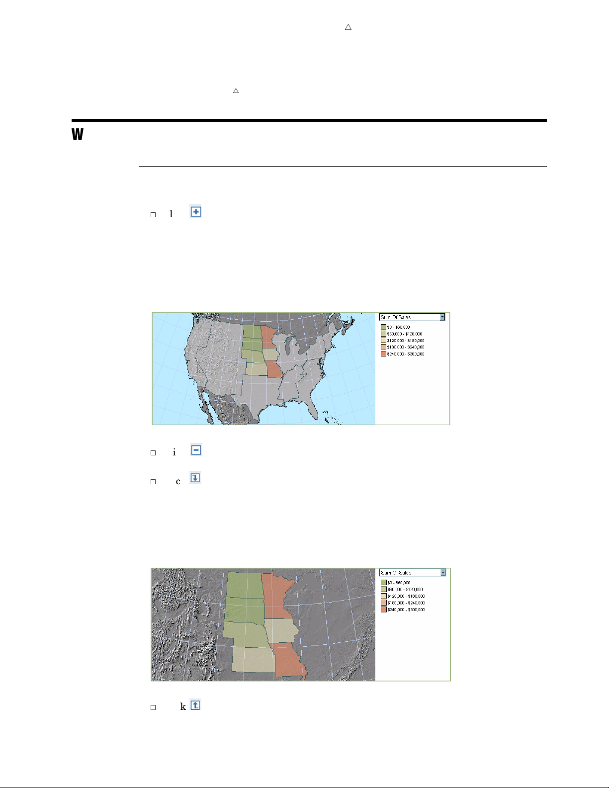
Note: You can modify report properties so that filter information is displayed along
with the report. For more information, see “Set or Modify Properties for a Viewed
Report” on page 99.
Working with Maps
Drill or Expand the Geography Hierarchy in a Map
You can perform these tasks on a map to drill or expand the geography hierarchy:
3
Click and then click a colored map region (which is a member in the currently
displayed geography hierarchy level). The map will be redrawn to display the
regions (members) for the next hierarchy level down while keeping the context of
the current hierarchy level. The legend on the right side of the map changes to
display the values for the expanded region.
Display 6.9 In the Hierarchy Level ’US Regions,’ the Member ’West N. Central’ Has Been Expanded to
Display Values for the ’State’ Hierarchy Level
Changing Data in a Viewed Report Drill or Expand the Geography Hierarchy in a Map 71
4
3
Click and then click an expanded region in order to collapse the expanded
region.
3
Click
and then click a colored map region (which is a member in the currently
displayed geography hierarchy level). The map will be redrawn to display the
regions (members) for the next hierarchy level down. The legend on the right side
of the map will change to display the values for drilled region.
Display 6.10 In the Hierarchy Level ’US Regions,’ the Member ’West N. Central’ Has Been Drilled to Display
Values for the ’State’ Hierarchy Level
3
Click to remove the last drill-down action that you performed.
Page 82

72 Managing Filtering and Ranking in a Map Chapter 6
Managing Filtering and Ranking in a Map
Create a Filter for the Geography Hierarchy in a Map
To create a filter for the geography hierarchy in a map, complete these steps:
1
On the map toolbar, click , and then select Filter and Rank to open the Filter
and Rank dialog box.
2 Click the Category Filters tab.
3 In the Item, Filter list, select the geography hierarchy. This field displays the
geography hierarchy along with any currently active filters.
4
In the
5
Select items in the
individually, or you can use the
6
When you are done, click
7
(Optional) Save the report.
Create a Measure Filter for a Map
Filter type
drop-down list, select
Select filter values
OK.
Select All
Select category values
.
list. You can select and deselect items
or Deselect All
buttons.
Note: The
synchronized group.
Measure Filter or Rank
4
tab is not available if the map is part of a
To create a measure filter, complete these steps:
1
On the map toolbar, click
, and then select
Filter and Rank
to open the Filter
and Rank dialog box.
2 Click the Measure Filter or Rank
3 Select the
4 In the
5 Select the
6 Select an Operator.
7 Type a
8 When you are done, click
9 (Optional) Save the report.
Filter a measure
Show values of
Measure that is being used in the map.
Value. (Do not include the currency symbol.)
drop-down list, select the geography hierarchy.
OK.
tab.
option.
Note: For a summary of filtering tips, see “Tips for Filtering and Ranking Tables,
Graphs, and Maps” on page 77.
4
Create a Ranking for a Map
Note: The
synchronized group.
To create a ranking for the measure used in a map, complete these steps:
1 On the map toolbar, click
and Rank dialog box.
2 Click the Measure Filter or Rank tab.
3 Select the Rank a measure option.
4 In the Show field, select Top or Bottom, and then type a value next to the option
that you chose.
5 (Optional) Choose one of these options:
Measure Filter or Rank tab is not available if the map is part of a
4
, and then select Filter and Rank
to open the Filter
Page 83

Changing Data in a Viewed Report Zoom and Pan a Map 73
3
To evaluate the data as a percentage, select the percent(%)
option, and then
enter a value.
3
To exclude tied rankings, select the
Exclude ties
option. For example, by
default, if you request the top five geographic areas for total revenue and there
are three areas tied for fifth place, then seven geographic areas are shown on
the map. If you select the
Exclude ties
option, then only five geographic areas
are shown on the map.
6
In the
7 Select the
8
When you are done, click
9
(Optional) Save the report.
Show values of
Measure
that is being used in the map.
drop-down list, select the geography hierarchy.
OK.
Note: For a summary of ranking tips, see “Tips for Filtering and Ranking Tables,
Graphs, and Maps” on page 77.
4
Remove a Filter or Ranking from a Map
To remove a filter or ranking from a map, complete these steps:
1
On the map toolbar, click
, and then select
and Rank dialog box.
2 Remove the geography hierarchy filter, measure filter, or ranking as described next:
3
On the
No filter.
3
On the Measure Filter or Rank tab, select No measure filter or rank.
Category Filters tab, select the geography hierarchy, and then select
Filter and Rank to open the Filter
3 When you are done, click OK.
4 (Optional) Save the report.
Change the Measure Used in a Map
To change the measure used for a viewed map, select the new measure in the
drop-down list located in the map legend.
View Information about a Selected Region
To view information about a selected region on a map, complete these steps:
1 On the map toolbar, click , and then click a map region.
2 In the Region Information dialog box, view the details.
In addition to details about the underlying data, such as field names and
values, this dialog box displays the name and aggregated value for the measure
currently being used.
3 When you are done, click
Close.
Zoom and Pan a Map
In order to focus in on a specific map area or zoom in or out on a selected region,
click these buttons on the map toolbar.
Page 84

74 Managing the Data Used for Synchronized Report Sections Chapter 6
Button Action
zooms in on a selected area. Click and drag the mouse pointer to select the area that
you want to zoom in on.
zooms out from a point. Click a point on the map to zoom out and center on that point.
moves the map content within the viewing area. Click and drag the map until the
viewer shows the area that you want to see.
resets the zoom level to undo any zooming or panning that has been done.
Managing the Data Used for Synchronized Report Sections
About Synchronized Reports
For report sections that use data items from a data source, report objects can be
synchronized. Synchronized tables and graphs will share category or hierarchy filters,
sorting (but not prioritizing), drilling, and expanding. Tables, graphs, and maps will
share filters, drilling, and expanding.
Synchronized objects are grouped within a shaded box, and the report is displayed
with a data pane that can be used to modify the data selections.
Display 6.11 Example of a Synchronized Report
Page 85

Changing Data in a Viewed Report Change How Data Items Are Used in Tables and Graphs 75
Display 6.12 Expanded Data Pane for the Synchronized Report Showing the Default Data Item Assignments
Change Which Data Items Are Used for the Section Query
You can use the data pane to change which data items are used in the section query.
To change which data items are used, use the arrow buttons to move data items into
and out of the
Selected data items
Here are some consequences of removing data items:
3
If you remove a custom data item, then that data item will no longer be available
to use in the report.
3
If you remove a time hierarchy, then any custom data items that are based on time
functions are removed from all objects in the report section.
3
If you remove the geography hierarchy, then any map in the section will become
invalid.
3
If you remove a category or hierarchy that is being used in a report linking
prompt, then the prompt association is removed.
3
If you remove a measure that is being used with a group break or in a text object,
then the measure information is removed from the report section. For example, if
you included
Profit with a group break for Product, then the Profit
information would be removed.
After you make a change, click
undo changes before you click
Apply, click Clear.
list box.
Apply to see the change reflected in the report. To
Note: To expand the data pane, click
. To collapse the data pane, click .
4
Change How Data Items Are Used in Tables and Graphs
You can use the data pane to change how categories and hierarchies are used in tables
and graphs. The only assignment change that you can make that affects maps is to hide
the geography hierarchy; however, if you do that, then the map will become invalid.
To change how categories and hierarchies are used in tables and graphs, select an
option next to the category or hierarchy name. Here are some guidelines:
Option Table Function Graph Functions
Columns
1
Rows
Hidden
1 If the report contains only list tables, then the Rows option is disabled.
Columns Bars, pie segments, lines, and markers, and also
as the horizontal matrix
Rows in crosstabulation tables Vertical matrix
None None
Page 86

76 About Mixed States for Categories and Hierarchies Chapter 6
For tips related to hiding data items, see “Tips for Working with Hidden Data Items”
on page 78.
To use default assignments as determined by SAS Web Report Studio, click
After you make a change, click
undo changes before you click
Apply to see the change reflected in the report. To
Apply, click
Defaults.
Clear.
Note: To expand the data pane, click
. To collapse the data pane, click
.
4
About Mixed States for Categories and Hierarchies
If all tables, graphs, and maps in the report are using a category or hierarchy in the
same way, then the radio button for the assigned option is green. If a category or
hierarchy has one assignment in a table, graph, or map and a different assignment in
another table, graph, or map, then the options in the data pane reflect a mixed state. In
a mixed state, all assignments for the category or hierarchy are indicated but the radio
buttons contain a gray dash.
As an example, assume that a synchronized report contains one crosstabulation table
and one bar chart, and that the following data assignments exist:
3
In the crosstabulation table, the categories State and Product Category are
assigned to the columns, and the categories Country and Year are assigned to the
rows.
3
In the bar chart, the category State is assigned to the bars function, and the
categories Country, Product Category, and Year are hidden.
The data pane would appear like this:
Display 6.13 A Data Pane in a Synchronized Report That Reflects a Mixed State
A mixed state can occur when you use individual data dialog boxes to set category or
hierarchy assignments for a table or graph. However, you cannot create a mixed state by
selecting radio buttons in the data pane. In the previous example, if you select the
Rows
option for Product Category, the Hidden option is cleared and the Rows option becomes
green. If you click
Apply, the bar chart will use Product Category as the vertical matrix.
Page 87

Changing Data in a Viewed Report Filter Application 77
Tips for Filtering and Ranking Tables, Graphs, and Maps
Here are some tips for filtering and ranking tables, graphs, and maps:
Filter Creation
3
If you are filtering on unformatted values, then you must enter values that match
the casing of the values in the data source. If you select the
formatted values
does not return any results, then try using a different casing.
3
When filtering dates, times, and timestamps in tables and graphs, you have the
option to specify time periods such as days, weeks, months, and years. When SAS
Web Report Studio counts by these time periods, it treats each period as a unit
and begins counting from the beginning of the specified period type in which the
current date falls. For example, if you use
Report Studio counts the specified number of whole months from the current
month, regardless of where the current date falls within the current month.
Here are two examples that illustrate how time periods are counted in this type
of filter.
3
Today is December 20, 2005, and you want to filter a table so that it includes
sales that were posted before three months ago. If you use
type, the table will include data from sales that were posted prior to September
1, 2005. This is because SAS Web Report Studio counts back three whole months
from the current month and returns data before the first day of that month. In
order to filter the table so that it includes sales that were posted prior to 90
days before December 20, 2005, use
days, the table will include sales that were posted prior to September 21, 2005.
3
Today is December 20, 2005, and you want to filter a graph so that it includes
employees who were born before 10 years ago. If you use
type, the graph will include employees who were born prior to January 1, 1995.
This is because SAS Web Report Studio counts back 10 whole years from the
current year and returns data before the first day of that year. In order to filter
the graph so that it includes employees who were born prior to 3650 days (365 *
10) before December 20, 2005, use
days, the graph will include employees who were born prior to December 23,
1995.
option, then you must enter the formatted values. If the filter
Months as the period type, SAS Web
Days as the period type. If you specify 90
Days as the period type. If you specify 3650
Filter on
Months as the period
Years as the period
Filter Application
3
Category and hierarchy filters are applied before rankings and measure filters.
3
When you are creating time or date filters, the filter is relative to the time that the
section query is generated, not to the time that the filter is imposed on the table or
graph.
Page 88

78 Filter Restrictions Chapter 6
Filter Restrictions
3
You cannot create measure filters or rankings if the report section is synchronized.
3
You cannot create filters that use categories and hierarchies that are assigned to
group breaks.
3
You cannot filter on percent of total values.
3
You cannot create a percentage ranking for relational data.
3
For relational data sources, the availability of the
Select category values
type is controlled by your data administrator.
3
For scatter plots, you cannot create a measure filter or ranking if there is no
category or hierarchy assigned to the optional marker group function.
Consequences of Changing Data
3
Here are some filtering consequences of moving data items to different functions in
a crosstabulation table:
3
If you add or hide a category or hierarchy column, then any row filters and
rankings that are based on a column measure are removed. Filters are not
affected by adding or hiding measures.
3
If you add or hide a category or hierarchy row, then any column filters and
rankings that are based on a row measure are removed. Filters are not affected
by adding or hiding measures.
3
Filters are retained if you move all the data items that are currently on rows to
the columns and move all the data items that are currently on the columns to
the rows. In this case, any existing filters will remain and be evaluated based
on the new positions.
3
For crosstabulation tables, if you add a percent of total column or remove a
percent of total column, then any row filters and rankings that are based on a
column measure are removed.
filter
Tips for Working with Hidden Data Items
Here are some tips related to assigning data items to the
Table Data dialog box, the Graph Data dialog box, the Map Data dialog box, and in the
data pane of a synchronized report.
3
Most data items that are hidden can be used in filters and rankings. However, a
crosstabulation table measure filter or ranking that is based on a category or
hierarchy that is located on the outermost column or the outermost row is removed
if the category or hierarchy is hidden. This is because the filter or ranking is tied
to the location of the data item. If the data item is removed from that location,
then the filter or ranking is also removed.
3
Data items that are selected for group breaks are automatically hidden. You
cannot assign the data items to different functions.
3
If you hide the geography hierarchy in a report section that contains a map, then
the map will become invalid.
Hidden function in the
Page 89

Changing Data in a Viewed Report Tips for Working with Hidden Data Items 79
3
If you hide a category that is being used in a report linking prompt, then the
prompt association is removed.
3
If you hide a data item that is being used in a conditional highlighting rule, then
the conditional highlighting rule is removed from the table or graph.
3
If you hide a time hierarchy, then any custom data items that are based on
relative time are also hidden.
3
If you hide a data item that is being used in a sort, then the list table or graph is
resorted but the sorting information is saved with the data item. Here are some
additional details:
3
If the hidden data item was the only sorted column, then the list table or graph
is resorted to use its defaults as determined by the underlying data source. If
you reassign the hidden data item to a function in the table or graph, the sort
will be restored.
3
For list tables, if the hidden data item is, for example, the first out of three
sorted columns, then the table is resorted so that the second sorted data item
becomes the first priority and the third sorted data item becomes the second
priority. If you reassign the first sorted data item to the
Columns function, then
the reassigned data item becomes the third priority in the sort.
3
You cannot hide a category that is being used in a percent of total calculation.
Page 90

80
Page 91

CHAPTER
7
81
Changing the Presentation of a Viewed Report
Overview of Changing the Presentation of a Viewed Report
Working with Tables
Managing Conditional Highlighting for Table Values
About Conditional Highlighting for Multidimensional Data
Add Conditional Highlighting to Table Values
Modify Conditional Highlighting for Table Values 84
Remove Conditional Highlighting from Table Values
Managing Sorting for Tables
Sort Data in a Table
Specify a Sort and a Sorting Priority in a List Table
Moving Columns and Rows in Tables
Move a Category or Hierarchy Level from a Column to a Row or from a Row to a
Column
Move a Table Column to the Left or Right 85
Move Measures from Rows to Columns or from Columns to Rows 85
Move a Row Up or Down 86
Rotate a Crosstabulation Table 86
Set Properties for a Table 86
Working with Graphs 88
Managing Conditional Highlighting for Graph Values 88
Add Conditional Highlighting to Graph Values 88
Modify Conditional Highlighting for Graph Values 89
Remove Conditional Highlighting from Graph Values 89
Managing Sorting for Graphs 90
Sort Ascending or Descending 90
Sort by Measure Values 90
Managing Properties for Graphs 91
Set Properties for a Bar Chart 91
Set Properties for a Bar-Line Chart 93
Set Properties for a Line Graph 94
Set Properties for a Pie Chart 95
Set Properties for a Progressive Bar Chart 96
Set Properties for a Scatter Plot 97
Set Properties for a Map 98
Set or Modify Properties for a Viewed Report 99
82
84
84
85
85
82
82
82
82
84
84
Page 92

82 Overview of Changing the Presentation of a Viewed Report Chapter 7
Overview of Changing the Presentation of a Viewed Report
In each report section that contains query results from a data source, you can use the
View Report view to make changes to the default presentation. Here are some of the
changes that you can make:
3
add or modify conditional highlighting
3
sort
3
move columns and rows in tables
3
change table, graph, and map properties such as size and colors
3
hide or display filter information
3
change the report style
Note: If the report was saved as manually refreshed, then you must refresh the
report in order to make changes.
Note: For more information about the View Report view, see “About the View Report
View” on page 27.
4
Note: Only authorized users can save changes to reports. If you have questions
about your authorization, contact your system administrator.
4
4
Working with Tables
Managing Conditional Highlighting for Table Values
About Conditional Highlighting for Multidimensional Data
In general, there are two types of rules that you can create:
3
Rules that compare a measure to a fixed value. For example, you might create a
rule for Sales > 1000.
3
Rules that compare one measure value relative to another measure value. For
example, you might create a rule for Sales > Budget.
SAS Web Report Studio processes these rules in the following ways:
3
For the first type of rule, the condition is applied at the current level of the data
source. For example, if you drill down into the data and then specify conditional
highlighting, then the condition applies to the level that is currently displayed.
3
For the second type of rule, the condition is applied at all levels of the data source,
regardless of the current level.
Add Conditional Highlighting to Table Values
To specify conditional highlighting for values in a table, complete these steps:
1 On the table toolbar, click , and then select Conditional Highlighting to
open the Conditional Highlighting dialog box.
2 Click New.
Three tabs appear in the Conditional Highlighting dialog box:
and Font
Rules, Color
, and Image and Text.
Page 93

Changing the Presentation of a Viewed Report Managing Conditional Highlighting for Table Values 83
3 On the Rules
a Select a
b
Select the
c
In the
you selected
value
tab, complete these steps:
Measure.
Condition
Value field, type in a value or select a measure in the drop-down list. If
Is between
. If you select
that you want the selected measure to match.
as the condition, then type a
Is missing value
as the condition, then this field is
Min value
and Max
unavailable.
Note: If you are creating a condition for percentages, you must enter the
conditional value as a decimal number. For example, if you want to filter for
values above 50%, enter
4
(Optional) On the
Color and Font
.5
as the conditional value.
tab, complete these steps to change the default
settings:
a
Select a
Fill color
that you want to use to highlight values that meet the
specified condition.
b
Select the
Font, including the font size and font color, that you want to use to
highlight values that meet the specified condition.
c
Select the
Font style
that you want to use to highlight values that meet the
specified condition.
5 (Optional) On the
a
Select the Highlight by adding an image or text
b Indicate whether you want to
Image and Text
Add an
tab, complete these steps:
option.
Image or Text
when the specified
conditions are met.
c Specify a Position
for the image or text. Indicate whether you want the image
or text to appear to the right or left of each cell that contains a value that meets
the condition, or in place of the value.
d If you are using an image, select the
Image
that you want to use to highlight
values that meet the specified condition.
e
If you are using text, type the text into the
Text
field, and then enter
font style information.
6 To hide the tabs, click
7 To close the Conditional Highlighting dialog box, click
8 (Optional) Save the report.
OK.
OK.
Font and
Display 7.1 Revenue Values That Are Greater Than $12,000 Are Highlighted
Note: Highlighting conditions are evaluated based on raw values. The use of raw
values affects how conditions are applied to rounded values. For example, in your table,
you have formatted product prices so that they are rounded up or down. The actual cost
of a pair of Eclipse running shoes is $49.65. In the table, the $49.65 price is rounded up
Page 94
84 Managing Sorting for Tables Chapter 7
to $50. If you specify that you want to highlight all products that cost less than $50, the
Eclipse running shoes are highlighted because their actual price is less than $50.
Modify Conditional Highlighting for Table Values
To modify conditional highlighting for values in a table, complete these steps:
1
On the table toolbar, click , and then select Conditional Highlighting to
open the Conditional Highlighting dialog box.
2 In the Rules list, select a rule.
3 Click Edit.
4 Make your changes on the Rule tab, the Color and Font tab, and the Image and
Text
tab, and then click
Note: For information about using the tabs, see “Add Conditional Highlighting to
Table Values” on page 82.
5
To hide the tabs, click
6 To close the Conditional Highlighting dialog box, click
7
(Optional) Save the report.
4
OK.
OK.
OK.
Remove Conditional Highlighting from Table Values
To remove conditional highlighting from table values, complete these steps:
1 On the table toolbar, click
, and then select
Conditional Highlighting
to
open the Conditional Highlighting dialog box.
2 In the
3
Click Delete.
4 In the confirmation message box that appears, click
5 When you are done, click
6 (Optional) Save the report.
Rules list, select a rule.
OK to delete the rule.
OK.
Managing Sorting for Tables
Sort Data in a Table
To sort individual columns in a table, complete these steps:
1 Click the heading of the column that you want to sort, and then select
Ascending
2 (Optional) Save the report.
or Sort Descending
.
For list tables, when you use this method to sort columns, the sort priority is in
reverse selection order. For example, if you select Order Year descending, then Product
Name ascending, and then Country ascending, the priority will be Country, then
Product Name, then Order Year.
Sort
Specify a Sort and a Sorting Priority in a List Table
Another way to specify a sort and a sorting priority for columns a list table is to use
the Sort dialog box. Complete these steps:
1
On the list table toolbar, click
, and then select Sort to open the Sort dialog box.
Page 95

Changing the Presentation of a Viewed Report Moving Columns and Rows in Tables 85
Note: The Sort
option is not available for list tables that are in a synchronized
group.
2
Select a column in the drop-down list to specify the initial sort, and then choose to
sort in
3 To sort additional columns in order of priority, select each column in the
field. There will be one
4 When you are done, click
5 (Optional) Save the report.
Ascending
or
Descending order.
Then by
OK.
field for each column in the table.
Then by
Moving Columns and Rows in Tables
Move a Category or Hierarchy Level from a Column to a Row or from a Row
to a Column
In a crosstabulation table, to move a category or hierarchy level column to a row or a
row to a column, complete these steps:
1 Click a category or hierarchy level heading in the table, and then select
<column name> to Rows
or Move
<row name> to Columns
.
The table is redisplayed with the row or column moved into its new position.
2 (Optional) Save the report.
Move
Note: You also can use the Table Data dialog box to move data items (see
“Specifying How Data Items Are Used in Tables” on page 49).
4
Move a Table Column to the Left or Right
To move a table column to the left or right, complete these steps:
1
Click the heading of the column that you want to move, and then select
<column name>
Left or Move
<column name> Right.
Move
The table is redisplayed with the column moved into the position that you
specified.
Note: Sometimes a move to the left or right is not valid, depending on the current
location of the column.
2 (Optional) Save the report.
Move Measures from Rows to Columns or from Columns to Rows
In a crosstabulation table, measures that are not hidden must be either all on the
rows or all on the columns. To move measures from rows to columns or from columns to
rows, complete these steps:
1
Click a measure heading in the table, and then select
Move Measures to Columns.
The table is redisplayed with the measures moved into their new position.
2 (Optional) Save the report.
Move Measures to Rows
or
Note: You also can use the Table Data dialog box to move data items (see
“Specifying How Data Items Are Used in Tables” on page 49).
4
Page 96

86 Set Properties for a Table Chapter 7
Move a Row Up or Down
In a crosstabulation table that has more than one row, to move a specific row up or
down, complete these steps:
1
Click a row heading in the table, and select
name>
Down.
The table is redisplayed with the row moved into its new position.
2
(Optional) Save the report.
Rotate a Crosstabulation Table
To rotate a crosstabulation table so that the columns are moved to the rows and the
rows are moved to the columns, complete these steps:
1
Click a row or column heading in the table, and then select
2 (Optional) Save the report.
Note: You also can use the Table Data dialog box to move data items (see
“Specifying How Data Items Are Used in Tables” on page 49).
Display 7.2 Before Rotation: The Measures and the Category Gender Are on the Columns
Move <row name>
Rotate Table
4
Up
or Move
<row
.
Display 7.3 After Rotation: The Measures and the Category Gender Are on the Rows
Set Properties for a Table
To set the properties for a table, complete these steps:
1 On the table toolbar, click to open the Table Properties dialog box.
2 Confirm or select the Table type. Your choices are List or Crosstab. If your
data source is multidimensional, then you must choose
Crosstab.
Page 97

Changing the Presentation of a Viewed Report Set Properties for a Table 87
Note: A crosstabulation table requires at least one category or hierarchy and one
measure.
Note: Not all data items are supported in crosstabulation tables that are based
on relational data. For example, if you change a list table to a crosstabulation
table, then any measures that use the distinct aggregation type are removed. That
is, they will not appear in the Table Data dialog box.
3
On the
a
General
If you want a
tab, complete these steps:
Title to appear above the table, type the text, and then set the
font, font size, font style, alignment, and color. You cannot use these characters:
<>&#
b
Select one of these options for displaying columns in the table:
Show all columns (up to system limit)
Select this option to display all columns in the table, up to the system limit
(which is managed by your system administrator). If necessary, the table will
scroll to the right.
Limit the number of columns displayed at once
Select this option and type a value in the box to specify the number of
columns that you want to view before scrolling is enabled.
Note: If you type a value that is the same as the current system limit,
then, when you reopen this dialog box, the
system limit)
Set a fixed table width
option will still be selected.
Show all columns (up to
4
Select this option to specify a minimum fixed size in pixels for the table.
Note: In the View Report view, you also can use your mouse to manually resize
table columns.
c Select one of these options for displaying rows in the table:
Show all rows (up to system limit)
Select this option to display all rows in the table, up to the system limit
(which is managed by your system administrator). If necessary, the table will
scroll down.
Limit the number of rows displayed at once
Select this option and type a value in the box to specify the number of rows
that you want to view before scrolling is enabled.
Note: If you type a value that is the same as the current system limit,
then, when you reopen this dialog box, the
limit)
d Select a
4 On the
a Select style properties for the
option will still be selected.
Border color for the table.
Text tab, complete these steps:
4
Headings in the table. (Headings are the
Show all rows (up to system
category, hierarchy level, and measure labels, for example, Year, Sales.) You can
set font, font size, color, and alignment. You also can select a
Background fill
for the heading cell.
b Select style properties for the Subheadings in the table. (Subheadings are the
values, for example, 2000, 2001 might be values for a Year category.) You can
set font, font size, color, and alignment. You also can select a
Background fill
for the subheading cell.
Note: This option is not available for list tables.
Page 98
88 Working with Graphs Chapter 7
c Select style properties for the Cells
color. You also can select a
5
On the
a
b
Total tab, complete these steps:
Select a font, font size, style, and color for
Background fill
color for the cells that contain the total values.
Select a font, font size, style, and color for
Background fill
color for the cells that contain the subtotal values.
Background fill
in the table. You can set font, font size, and
for the cells.
Totals. You also can select a
Subtotals. You also can select a
Note: This option is not available for list tables.
Note: Any user can choose to show or hide totals (see “Show or Hide Totals in a
Table” on page 58).
6
(Optional) If the report section has more than one table, select the
formatting to existing tables in the section
option to apply the following
Apply
settings to all of the tables:
3
total and subtotal style settings
3
heading, subheading, and cell style settings
3
title style settings and border color
7 When you are done, click
8 (Optional) Save the report.
OK.
Working with Graphs
Managing Conditional Highlighting for Graph Values
Add Conditional Highlighting to Graph Values
To specify conditional highlighting for values in a graph, complete these steps:
1 On the graph toolbar, click
open the Conditional Highlighting dialog box.
2 Select a Measure.
3 Select the Condition that you want the selected measure to match.
4 In the Value field, type in a value or select a measure in the drop-down list. If you
selected
you select
Note: If you are creating a condition for percentages, you must enter the
conditional value as a decimal number. For example, if you want to filter for
values above 50%, enter
5 When you are done, click OK.
6 (Optional) Save the report.
, and then select Conditional Highlighting to
Is between as the condition, then type a Min value and Max value.If
Is missing value as the condition, then this field is unavailable.
.5 as the conditional value.
Page 99
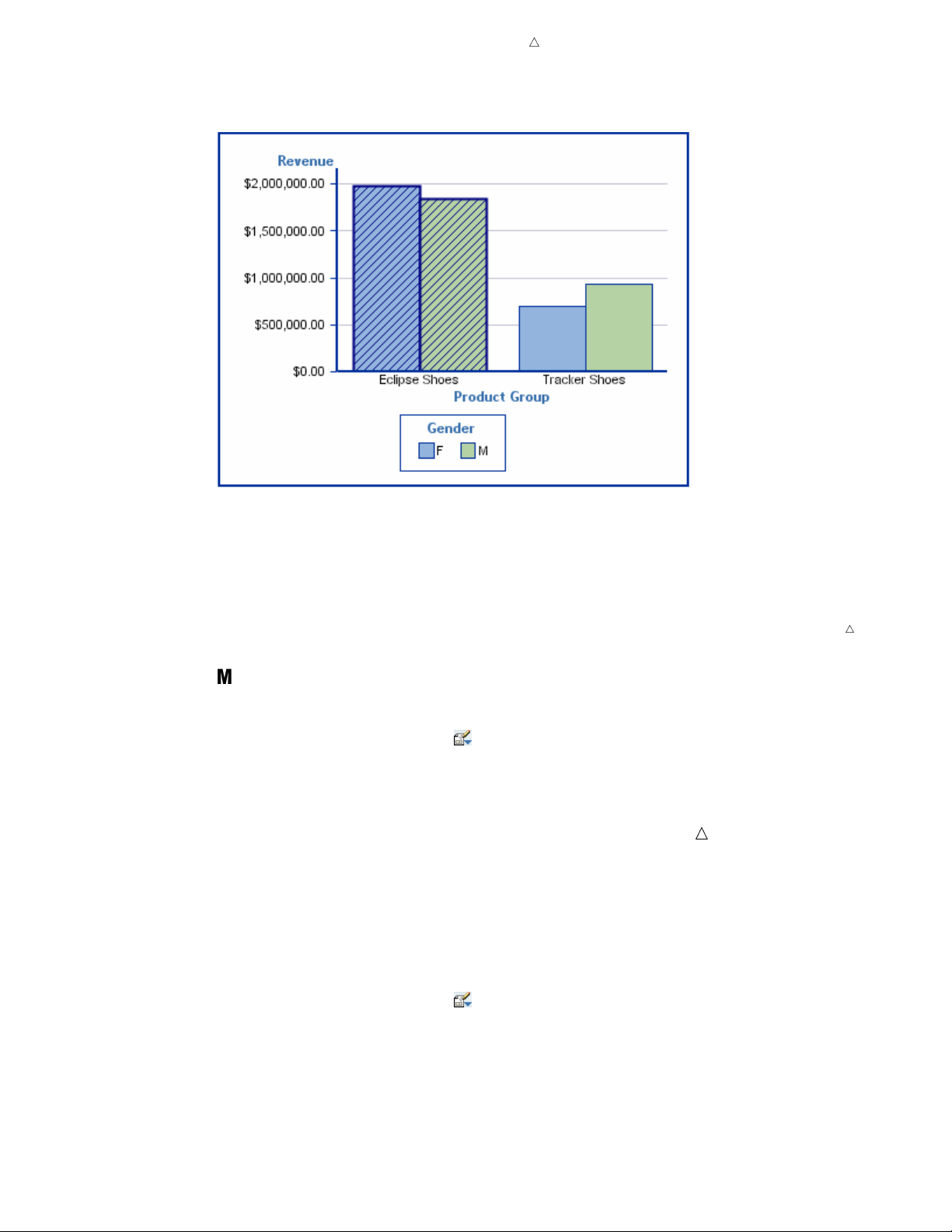
Changing the Presentation of a Viewed Report Managing Conditional Highlighting for Graph Values 89
Display 7.4 Product Groups with Revenues That Are Greater Than $1 Million Are Highlighted
Note: Highlighting conditions are evaluated based on raw values. The use of raw
values affects how conditions are applied to rounded values. For example, in your graph,
you have formatted product prices so that they are rounded up or down. The actual cost
of a pair of Eclipse running shoes is $49.65. In the graph, the $49.65 price is rounded
up to $50. If you specify that you want to highlight all products that cost less than $50,
the Eclipse running shoes are highlighted because their actual price is less than $50.
Modify Conditional Highlighting for Graph Values
To modify conditional highlighting for values in a graph, complete these steps:
1 On the graph toolbar, click
, and then select Conditional Highlighting to
open the Conditional Highlighting dialog box.
2
Make your changes.
Note: For information about using the Conditional Highlighting dialog box, see
“Add Conditional Highlighting to Graph Values” on page 88
3 When you are done, click
4
(Optional) Save the report.
OK.
Remove Conditional Highlighting from Graph Values
To remove conditional highlighting from graph values, complete these steps:
4
1 On the graph toolbar, click , and then select Conditional Highlighting to
open the Conditional Highlighting dialog box.
2 Click Clear.
3 When you are done, click OK.
4 (Optional) Save the report.
Page 100

90 Managing Sorting for Graphs Chapter 7
Managing Sorting for Graphs
Sort Ascending or Descending
Click the name of a category or hierarchy level in a graph, and then select either
Sort Ascending
If you are authorized, you can save the sort.
Sort by Measure Values
Click the name of a category or hierarchy level in the graph in order to sort the
category or hierarchy level by the values of the measure used in the graph. If the graph
has more than one measure, you can choose which one to sort by.
For scatter plots, you also can sort the measure that is assigned to the horizontal
axis by the values of the measure that is assigned to the vertical axis.
If you are authorized, you can save the sort.
Display 7.5 Before Sorting: A Bar Chart with the Sort Menu Expanded for the Continent Category
or
Sort Descending
.
 Loading...