

Page 1

SAS/IML®Studio 3.3 User’s
Guide
SAS®Documentation
Page 2

The correct bibliographic citation for this manual is as follows: SAS Institute Inc. 2010. SAS/IML®Studio 3.3 User’s
Guide. Cary, NC: SAS Institute Inc.
SAS/IML®Studio 3.3 User’s Guide
Copyright © 2010, SAS Institute Inc., Cary, NC, USA
ISBN 978-1-60764-676-1
All rights reserved. Produced in the United States of America.
For a hard-copy book: No part of this publication may be reproduced, stored in a retrieval system, or transmitted, in
any form or by any means, electronic, mechanical, photocopying, or otherwise, without the prior written permission of
the publisher, SAS Institute Inc.
For a Web download or e-book: Your use of this publication shall be governed by the terms established by the vendor
at the time you acquire this publication.
U.S. Government Restricted Rights Notice: Use, duplication, or disclosure of this software and related documentation
by the U.S. government is subject to the Agreement with SAS Institute and the restrictions set forth in FAR 52.227-19,
Commercial Computer Software-Restricted Rights (June 1987).
SAS Institute Inc., SAS Campus Drive, Cary, North Carolina 27513.
1st electronic book, November 2010
1st printing, November 2010
SAS®Publishing provides a complete selection of books and electronic products to help customers use SAS software to
its fullest potential. For more information about our e-books, e-learning products, CDs, and hard-copy books, visit the
SAS Publishing Web site at support.sas.com/publishing or call 1-800-727-3228.
SAS®and all other SAS Institute Inc. product or service names are registered trademarks or trademarks of SAS Institute
Inc. in the USA and other countries. ® indicates USA registration.
Other brand and product names are registered trademarks or trademarks of their respective companies.
Page 3

Contents
Chapter 1. Introduction to SAS/IML Studio . . . . . . . . . . . . . . . . 1
Chapter 2. Getting Started with SAS/IML Studio . . . . . . . . . . . . . . . 13
Chapter 3. Creating and Editing Data . . . . . . . . . . . . . . . . . . . 31
Chapter 4. Interacting with the Data Table . . . . . . . . . . . . . . . . . 39
Chapter 5. Exploring Data in One Dimension . . . . . . . . . . . . . . . . 63
Chapter 6. Exploring Data in Two Dimensions . . . . . . . . . . . . . . . 83
Chapter 7. Exploring Data in Three Dimensions . . . . . . . . . . . . . . . 111
Chapter 8. Interacting with Plots . . . . . . . . . . . . . . . . . . . . . 139
Chapter 9. General Plot Properties . . . . . . . . . . . . . . . . . . . . 153
Chapter 10. Axis Properties . . . . . . . . . . . . . . . . . . . . . . . 175
Chapter 11. Techniques for Exploring Data . . . . . . . . . . . . . . . . . 183
Chapter 12. Plotting Subsets of Data . . . . . . . . . . . . . . . . . . . . 211
Chapter 13. Distribution Analysis: Descriptive Statistics . . . . . . . . . . . . 229
Chapter 14. Distribution Analysis: Location and Scale Statistics . . . . . . . . . 239
Chapter 15. Distribution Analysis: Distributional Modeling . . . . . . . . . . . 247
Chapter 16. Distribution Analysis: Frequency Counts . . . . . . . . . . . . . 261
Chapter 17. Distribution Analysis: Outlier Detection . . . . . . . . . . . . . . 271
Chapter 18. Data Smoothing: Loess . . . . . . . . . . . . . . . . . . . . 279
Chapter 19. Data Smoothing: Thin-Plate Spline . . . . . . . . . . . . . . . 295
Chapter 20. Data Smoothing: Polynomial Regression . . . . . . . . . . . . . 305
Chapter 21. Model Fitting: Linear Regression . . . . . . . . . . . . . . . . 315
Chapter 22. Model Fitting: Robust Regression . . . . . . . . . . . . . . . . 337
Chapter 23. Model Fitting: Logistic Regression . . . . . . . . . . . . . . . . 351
Chapter 24. Model Fitting: Generalized Linear Models . . . . . . . . . . . . . 373
Chapter 25. Multivariate Analysis: Correlation Analysis . . . . . . . . . . . . 403
Chapter 26. Multivariate Analysis: Principal Component Analysis . . . . . . . . . 415
Chapter 27. Multivariate Analysis: Common Factor Analysis . . . . . . . . . . . 433
Chapter 28. Multivariate Analysis: Canonical Correlation Analysis . . . . . . . . 453
Chapter 29. Multivariate Analysis: Canonical Discriminant Analysis . . . . . . . . 465
Chapter 30. Multivariate Analysis: Discriminant Analysis . . . . . . . . . . . . 483
Chapter 31. Multivariate Analysis: Correspondence Analysis . . . . . . . . . . . 495
Chapter 32. Variable Transformations . . . . . . . . . . . . . . . . . . . 509
Chapter 33. Running Custom Analyses . . . . . . . . . . . . . . . . . . . 543
Chapter 34. Configuring the SAS/IML Studio Interface . . . . . . . . . . . . . 551
Appendix A. Sample Data Sets . . . . . . . . . . . . . . . . . . . . . 571
Appendix B. SAS/INSIGHT Features Not Available in SAS/IML Studio . . . . . . 585
Index 587
Page 4

iv
Page 5

Release Notes
The following release notes pertain to SAS/IML®Studio 3.3:
SAS/IML Studio was formerly named SAS®Stat Studio. SAS/IML Studio can run SAS
Stat Studio programs and modules without modification. For information about how to migrate your SAS Stat Studio files and directories to SAS/IML Studio, see the “Changes and
Enhancements” topic in the online Help.
SAS/IML Studio requires the second maintenance of SAS 9.2 or any later release.
SAS/IML Studio includes interface to the R language. The IMLPlus language includes func-
tions that transfer data between SAS data sets and R data frames, and between SAS/IML
matrices and R matrices.
You can now run portions of a program by highlighting certain statements and clicking
Program IRun. Only the highlighted statements are run.
SAS/IML Studio contains a new program editor.
SAS/IML Studio can now read and write JMP®data files.
The SAS/IML Studio user interface is available in the following languages: English,
Japanese, Korean, and Simplified Chinese.
If you need to open a data set that contains Chinese, Japanese, or Korean characters, it is
important that you configure the “Regional and Language Options” in the Windows Control
Panel for the appropriate country. It is not necessary to change the Windows setting called
“Language for non-Unicode programs,” which is also referred to as the system locale.
When you are running SAS/IML Studio on a Windows system configured for a language
other than English, you can still use English fonts. For details, search for the term
“IMLStudio_ForceEnglishUI” in the online Help.
Page 6

vi
Page 7

Chapter 1
Introduction to SAS/IML Studio
Contents
What Is SAS/IML Studio? . . . . . . . . . . . . . . . . . . . . . . . . . . . . . . 1
Related Software and Documentation . . . . . . . . . . . . . . . . . . . . . . . . 2
Exploratory and Confirmatory Data Analysis . . . . . . . . . . . . . . . . . . . . 3
How Many Observations Can You Analyze? . . . . . . . . . . . . . . . . . . . . . 4
Summary of Features . . . . . . . . . . . . . . . . . . . . . . . . . . . . . . . . . 4
Comparison with SAS/INSIGHT Software . . . . . . . . . . . . . . . . . . . . . 6
Accessibility Features of SAS/IML Studio . . . . . . . . . . . . . . . . . . . . . . 10
References . . . . . . . . . . . . . . . . . . . . . . . . . . . . . . . . . . . . . . 10
What Is SAS/IML Studio?
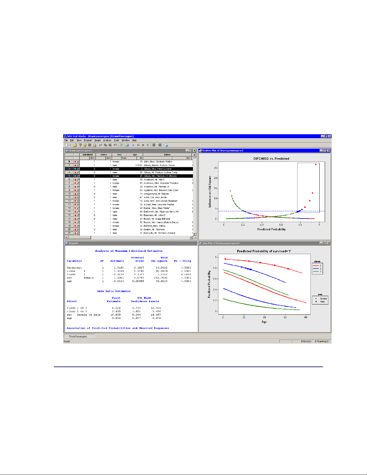
SAS/IML Studio is a tool for data exploration and analysis. Figure 1.1 shows a typical SAS/IML
Studio analysis. You can use SAS/IML Studio to do the following:
explore data through graphs linked across multiple windows
subset data
analyze univariate distributions
fit explanatory models
investigate multivariate relationships
In addition, SAS/IML Studio provides an integrated development environment that enables you to
write, debug, and execute programs that combine the following:
the flexibility of the SAS/IML®matrix language
the analytical power of SAS/STAT®procedures
the data manipulation capabilities of Base SAS®software
the dynamically linked graphics of SAS/IML Studio
Page 8
2 F Chapter 1: Introduction to SAS/IML Studio
the functions and user-contributed packages of the open-source R language
The programming language in SAS/IML Studio, which is called IMLPlus, is an enhanced version
of the SAS/IML programming language. The “Plus” part of the name refers to new features that
extend the SAS/IML language, including the ability to create and manipulate statistical graphs, to
call SAS procedures, and to call functions in the R programming language.
SAS/IML Studio requires that you have a license for Base SAS, SAS/STAT, and SAS/IML software.
SAS/IML Studio runs on a PC in the Microsoft Windows operating environment.
Figure 1.1 The SAS/IML Studio Interface
Related Software and Documentation
This book is one of three documents about SAS/IML Studio. In this book you learn how to use the
SAS/IML Studio GUI to conduct exploratory data analysis and standard statistical analyses.
A second book, SAS/IML Studio for SAS/STAT Users, is intended for SAS/STAT programmers.
In it, you learn how to use SAS/IML Studio in conjunction with SAS/STAT software in order to
Page 9

Exploratory and Confirmatory Data Analysis F 3
explore data and visualize statistical models. In particular, you learn to call procedures in other
SAS products such as SAS/STAT or Base SAS software by using the SUBMIT statement.
The third source of documentation is the SAS/IML Studio online Help. You can display the online
Help by selecting Help IHelp Topics from the main menu. The online Help includes documenta-
tion for all IMLPlus classes and associated methods.
SAS/IML Studio is part of SAS/IML software. The language used to write programs in SAS/IML
Studio is called IMLPlus. This language contains SAS/IML functions and statements implemented
in the IML procedure and documented in the SAS/IML User’s Guide. The IML procedure runs entirely on a SAS Workspace Server, whereas IMLPlus switches dynamically between a SAS server
(for computations) and the PC client (for graphics). In short, the IMLPlus language consists of
SAS/IML functions and subroutines “plus” additional syntax to support the creation and manipulation of statistical graphics. The SAS/IML Studio program windows uses color coding to display
keywords in the IMLPlus language.
Most SAS/IML programs run without modification in the IMLPlus environment. The SAS/IML
Studio online Help includes a list of differences between the SAS/IML language and IMLPlus.
For your convenience in referencing related SAS software, the SAS/IML User’s Guide, the
SAS/STAT User’s Guide, and the Base SAS Procedures Guide are available from the SAS/IML
Studio Help menu.
Exploratory and Confirmatory Data Analysis
Data analysis often falls into two phases: exploratory and confirmatory. The exploratory phase
“isolates patterns and features of the data and reveals these forcefully to the analyst” (Hoaglin,
Mosteller, and Tukey 1983). If a model is fit to the data, exploratory analysis finds patterns that
represent deviations from the model. These patterns lead the analyst to revise the model, and the
process is repeated.
In contrast, confirmatory data analysis “quantifies the extent to which [deviations from a model]
could be expected to occur by chance” (Gelman 2004). Confirmatory analysis uses the traditional
statistical tools of inference, significance, and confidence.
Exploratory data analysis is sometimes compared to detective work: it is the process of gathering
evidence. Confirmatory data analysis is comparable to a court trial: it is the process of evaluating
evidence. Exploratory analysis and confirmatory analysis “can—and should—proceed side by side”
(Tukey 1977).
Page 10

4 F Chapter 1: Introduction to SAS/IML Studio
How Many Observations Can You Analyze?
SAS/IML Studio provides the data analyst with interactive and dynamic statistical graphics. By
definition, interactive graphics must respond quickly to the changes and manipulations of the analyst. This quick response restricts the size of data sets that can be handled while still maintaining
interactivity.
Wegman (1995) points out that the number of observations you can analyze depends on the algorith-
mic complexity of the statistical algorithms you are using. For example, if you have n observations,
computing a mean and variance is O.n/, sorting is O.n log n/, and solving a least squares regression on p variables is O.np2/: Furthermore, visualization of individual observations is limited by
the number of pixels that can be represented on a display device.
Wegman’s conclusion is that “visualization of data sets say of size 106or more is clearly a wide open
field.” More recently, Unwin, Theus, and Hofmann (2006) discuss the challenges of “visualizing a
million,” including a chapter dedicated to interactive graphics.
On a typical PC (for example, a 1.8 GHz CPU with 512 MB of RAM), SAS/IML Studio can
help you analyze dozens of variables and tens of thousands of observations. Visualization of data
with graphics such as histograms and box plots remains feasible for hundreds of thousands of observations, although the interactive graphics become less responsive. Scatter plots of this many
observations suffer from overplotting.
SAS/IML Studio uses the RAM on your PC to facilitate interaction and linking between plots and
data tables. If you routinely analyze large data sets, increasing the RAM on your PC might increase
SAS/IML Studio’s interactivity. For example, if you routinely examine hundreds of thousands of
observations in dozens of variables, 1 GB of RAM is preferable to 512 MB.
Summary of Features
SAS/IML Studio provides tools for exploring data, analyzing distributions, fitting parametric and
nonparametric regression models, and analyzing multivariate relationships. In addition, you can
extend the set of available analyses by writing programs.
To explore data, you can do the following:
identify observations in plots
select observations in linked data tables, bar charts, box plots, contour plots, histograms, line
plots, mosaic plots, and two- and three-dimensional scatter plots
exclude observations from graphs and analyses
search, sort, subset, and extract data
transform variables
Page 11

Summary of Features F 5
change the color and shape of observation markers based on the value of a variable
To analyze distributions, you can do the following:
compute descriptive statistics
create quantile-quantile plots
create mosaic plots of cross-classified data
fit parametric and kernel density estimates for distributions
detect outliers in contaminated Gaussian data
To fit parametric and nonparametric regression models, you can do the following:
smooth two-dimensional data by using polynomials, loess curves, and thin-plate splines
add confidence bands for mean and predicted values
create residual and influence diagnostic plots
fit robust regression models and detect outliers and high-leverage observations
fit logistic models
fit the general linear model with a wide variety of response and link functions
include classification effects in logistic and generalized linear models
To analyze multivariate relationships, you can do the following:
calculate correlation matrices and scatter plot matrices with confidence ellipses for relation-
ships among pairs of variables
reduce dimensionality with principal component analysis
examine relationships between a nominal variable and a set of interval variables with discrim-
inant analysis
examine relationships between two sets of interval variables with canonical correlation anal-
ysis
reduce dimensionality by computing common factors for a set of interval variables with factor
analysis
reduce dimensionality and graphically examine relationships between categorical variables in
a contingency table with correspondence analysis
To extend the set of available analyses, you can do the following:
Page 12

6 F Chapter 1: Introduction to SAS/IML Studio
write, debug, and execute IMLPlus programs in an integrated development environment
add legends, curves, maps, or other custom features to statistical graphics
create new static graphics
animate graphics
execute SAS procedures or DATA steps from within your IMLPlus programs
develop interactive data analysis programs that use dialog boxes
call computational routines written in C, FORTRAN, Java, R, or the SAS/IML language
Comparison with SAS/INSIGHT Software
SAS/IML Studio and SAS/INSIGHT®Software have the same goal: to be a tool for data exploration and analysis. Both have dynamically linked statistical graphics. Both come with pre-written
statistical analyses for analyzing distributions, regression models, and multivariate relationships.
Figure 1.2 shows a typical SAS/INSIGHT analysis. Figure 1.3 shows the same analysis performed
in SAS/IML Studio. You can see that the analyses are qualitatively similar.
Page 13

Figure 1.2 A SAS/INSIGHT Analysis
Comparison with SAS/INSIGHT Software F 7
Page 14

8 F Chapter 1: Introduction to SAS/IML Studio
Figure 1.3 A Comparable SAS/IML Studio Analysis
However, there are three major differences between the two products. The first is that SAS/IML
Studio runs on a PC in the Microsoft Windows operating environment. It is client software that can
connect to SAS servers. The SAS server might be running on a different computer than SAS/IML
Studio. In contrast, SAS/INSIGHT software runs on the same computer on which the SAS software
is installed.
A second major difference is that SAS/IML Studio is programmable, and therefore extensible.
SAS/INSIGHT software contains standard statistical analyses that are commonly used in data analysis, but you cannot create new analyses. In contrast, you can write programs in SAS/IML Studio that
call any licensed SAS procedure, and you can include the results of that procedure in graphics, tables, and data sets. Because of this, SAS/IML Studio is sometimes referred to as the “programmable
successor to SAS/INSIGHT software.”
A third major difference is that the SAS/IML Studio statistical graphics are programmable. You can
add legends, curves, and other features to the graphics in order to better analyze and visualize your
data.
SAS/IML Studio contains many features that are not available in SAS/INSIGHT software. General
features that are unique to SAS/IML Studio include the following:
Page 15

Comparison with SAS/INSIGHT Software F 9
SAS/IML Studio can connect to multiple SAS servers simultaneously.
SAS/IML Studio can run multiple programs simultaneously in different threads; each pro-
gram has its own WORK library.
SAS/IML Studio sessions can be driven by a program and rerun.
SAS/IML Studio provides the following features of data views (tables and plots) which are not
included in SAS/INSIGHT software:
modern dialog boxes with a native Windows look and feel
a line plot in which the lines can be defined by specifying a single X variable and a single Y
variable, and one or more grouping variables
a polygon plot that can be used to build interactive regions such as maps
programmatic methods to draw legends, curves, or other decorations on any plot
programmatic methods to attach a menu to any plot. After the menu is selected, a user-
specified program is run.
arbitrary unions and intersections of observations selected in different views
SAS/IML Studio also provides the following analyses and options that are not included in
SAS/INSIGHT software:
a programming language that can call any licensed SAS analytical procedure and any
SAS/IML function or subroutine.
outlier detection in contaminated Gaussian data
robust regression models and detection of outliers and high-leverage observations
the generalized linear model with a multinomial response
graphical results for the analysis of logistic models with one continuous effect and a small
number of levels for classification effects
parametric and nonparametric methods of discriminant analysis
common factor analysis for interval variables
correspondence analysis for nominal variables
Features of SAS/INSIGHT software that are not included in SAS/IML Studio are presented in
Appendix B, “SAS/INSIGHT Features Not Available in SAS/IML Studio.”
Page 16

10 F Chapter 1: Introduction to SAS/IML Studio
Accessibility Features of SAS/IML Studio
The user interface of SAS/IML Studio includes accessibility and compatibility features that improve
the usability of the product for users with disabilities, with exceptions noted below. These features
are related to accessibility standards for electronic information technology that were adopted by the
U.S. Government under Section 508 of the U.S. Rehabilitation Act of 1973, as amended.
If you have questions or concerns about the accessibility of SAS products, send e-mail to
accessibility@sas.com.
SAS/IML Studio supports Section 508 standards with the following exceptions:
When you type data into a data table, the JAWS screen-reading software does not indicate
which cell in the table contains the focus.
As a partial workaround, you can access the data set in Base SAS software and create an
accessible HTML version of the data table, which is viewable in a browser. A SAS Note that
provides this code as a macro is available from SAS Technical Support.
In the New Data Set dialog box, the labels of the Width and Decimal boxes are not read
properly by JAWS screen-reading software.
You can view SAS/IML Studio in high-contrast mode. In high-contrast mode, text is displayed in
a larger font and is usually represented by white text on a black background. High-contrast modes
and themes are provided by the Microsoft Windows operating system for users who cannot easily
see subtle differences in shade.
You can turn on high-contrast mode by completing the following steps:
1. Open the Control Panel by selecting Start ! Settings !Control Panel.
2. Double-click Accessibility Options. The Accessibility Options dialog box appears.
3. Select the Display tab, and then select Use High Contrast.
4. Click OK to accept the high-contrast setting and close the Accessibility Options dialog box.
References
Gelman, A. (2004), “Exploratory Data Analysis for Complex Models,” Journal of Computational
and Graphical Statistics, 13(4), 755–779.
Hoaglin, D. C., Mosteller, F., and Tukey, J. W., eds. (1983), Understanding Robust and Exploratory
Data Analysis, Wiley series in probability and mathematical statistics, New York: John Wiley &
Sons.
Page 17

References F 11
Tukey, J. W. (1977), Exploratory Data Analysis, Reading, MA: Addison-Wesley.
Unwin, A., Theus, M., and Hofmann, H. (2006), Graphics of Large Datasets, New York: Springer.
Wegman, E. J. (1995), “Huge Data Sets and the Frontiers of Computational Feasibility,” Journal of
Computational and Graphical Statistics, 4(4), 281–295.
Page 18

12
Page 19

Chapter 2
Getting Started with SAS/IML Studio
Contents
Overview of SAS/IML Studio . . . . . . . . . . . . . . . . . . . . . . . . . . . . 13
Overview of the Sample Data . . . . . . . . . . . . . . . . . . . . . . . . . . . . . 14
Open the Data Set . . . . . . . . . . . . . . . . . . . . . . . . . . . . . . . . . . . 15
Create a Bar Chart . . . . . . . . . . . . . . . . . . . . . . . . . . . . . . . . . . 16
Exclude Observations . . . . . . . . . . . . . . . . . . . . . . . . . . . . . . . . . 18
Create a Histogram . . . . . . . . . . . . . . . . . . . . . . . . . . . . . . . . . . 19
Create a Box Plot . . . . . . . . . . . . . . . . . . . . . . . . . . . . . . . . . . . 22
Create a Scatter Plot . . . . . . . . . . . . . . . . . . . . . . . . . . . . . . . . . 24
Model Variable Relationships . . . . . . . . . . . . . . . . . . . . . . . . . . . . 26
References . . . . . . . . . . . . . . . . . . . . . . . . . . . . . . . . . . . . . . 30
Overview of SAS/IML Studio
SAS/IML Studio provides a powerful programming environment that enables you to combine
SAS/IML statements with calling SAS procedures, and also enables you to create and manipulate the attributes of dynamically linked statistical graphics. SAS/IML Studio also provides a GUI
that enables you to visualize the results of statistical analyses. Furthermore, SAS/IML Studio provides several prewritten analyses (all implemented in IMLPlus, the SAS/IML Studio programming
language) that you can access from the Analysis menu.
This chapter describes how you can use the SAS/IML Studio GUI for exploratory data analysis.
The example in this chapter uses a sample data set, Hurricanes, that is distributed with SAS/IML
Studio. The example covers the following activities:
1. Opening a data set. When you open a data set, the data are displayed in a data table. Features
of the data table are described in Chapter 4, “Interacting with the Data Table.”
2. Creating graphical views of the data, such as a bar chart, a histogram, a box plot, and a scatter
plot. SAS/IML Studio plots and data tables are collectively known as data views. All data
views are dynamically linked, which means that observations that you select in one data view
are displayed as selected in all other views of the same data. Several chapters of this book
are devoted to describing the SAS/IML Studio plots and how you can interact with them.
Page 20

14 F Chapter 2: Getting Started with SAS/IML Studio
Especially relevant to this example are Chapter 5, “Exploring Data in One Dimension,” and
Chapter 6, “Exploring Data in Two Dimensions.”
3. Modeling relationships between variables. The example uses the correlation analysis and the
polynomial regression analysis. These analyses are described further in Chapter 20, “Data
Smoothing: Polynomial Regression,” and Chapter 25, “Multivariate Analysis: Correlation
Analysis.”
Overview of the Sample Data
This example shows how you can use SAS/IML Studio to explore data about North Atlantic tropical
cyclones. (A cyclone is a large system of winds that rotate about a center of low atmospheric
pressure.) The data were recorded by the U.S. National Hurricane Center at six-hour intervals
during the years 1988 to 2003.
The example analyzes the following variables:
category indicator variable that corresponds to the Saffir-Simpson wind intensity scale
latitude latitude of observation, in degrees north latitude
min_pressure minimum central sea-level pressure, in hPa
radius_eye radius of eye (if an eye exists), in nautical miles
wind_kts maximum low-level sustained wind speed, in knots
The category variable is a measure of wind intensity, corresponding to the Saffir-Simpson wind
intensity scale in Table 2.1.
Table 2.1 The Saffir-Simpson Intensity Scale
Category Description Wind Speed (Knots)
TD Tropical depression 22–33
TS Tropical storm 34–63
Cat1 Category 1 hurricane 64–82
Cat2 Category 2 hurricane 83–95
Cat3 Category 3 hurricane 96–113
Cat4 Category 4 hurricane 114–134
Cat5 Category 5 hurricane 135 or greater
The analysis presented in this chapter is based on Mulekar and Kimball (2004) and Kimball and
Mulekar (2004). A full description of the Hurricanes data set is included in Chapter A, “Sample
Data Sets.”
Page 21
Open the Data Set F 15
Open the Data Set
This chapter analyzes the Hurricanes data set, which is distributed with SAS/IML Studio.
To use the GUI to open the data set:
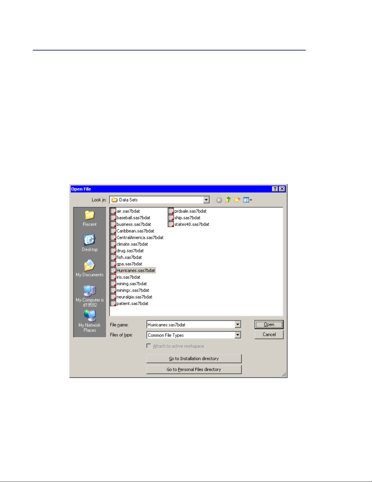
1 Select File IOpen IFile from the main menu. The Open File dialog box appears. (See Fig-
ure 2.1.)
2 Click Go to Installation directory near the bottom of the dialog box.
3 Double-click the Data Sets folder.
4 Select the Hurricanes.sas7bdat file.
Figure 2.1 Opening a Sample Data Set
5 Click Open.
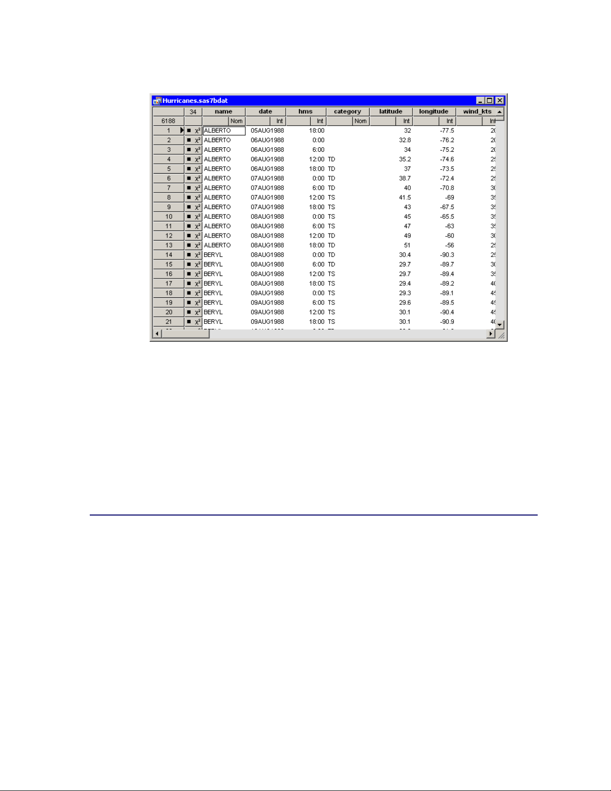
The data table in Figure 2.2 appears.
Page 22
16 F Chapter 2: Getting Started with SAS/IML Studio
Figure 2.2 The Hurricanes Data
The row heading of the data table includes two special cells for each observation: one that shows
the location of the observation in the data set, and the other that shows the status of the observation
in analyses and plots. The status of each observation is indicated by the presence or absence of a
marker and a 2symbol. The presence of a marker (by default, a filled square) indicates that the
observation is included in plots; observations that are excluded from plots do not display a marker.
Similarly, the 2symbol indicates that the observation is included in analyses. The Hurricanes data
initially has all observations included in plots and analyses. See Chapter 4, “Interacting with the
Data Table,” for more information about the data table symbols.
Create a Bar Chart
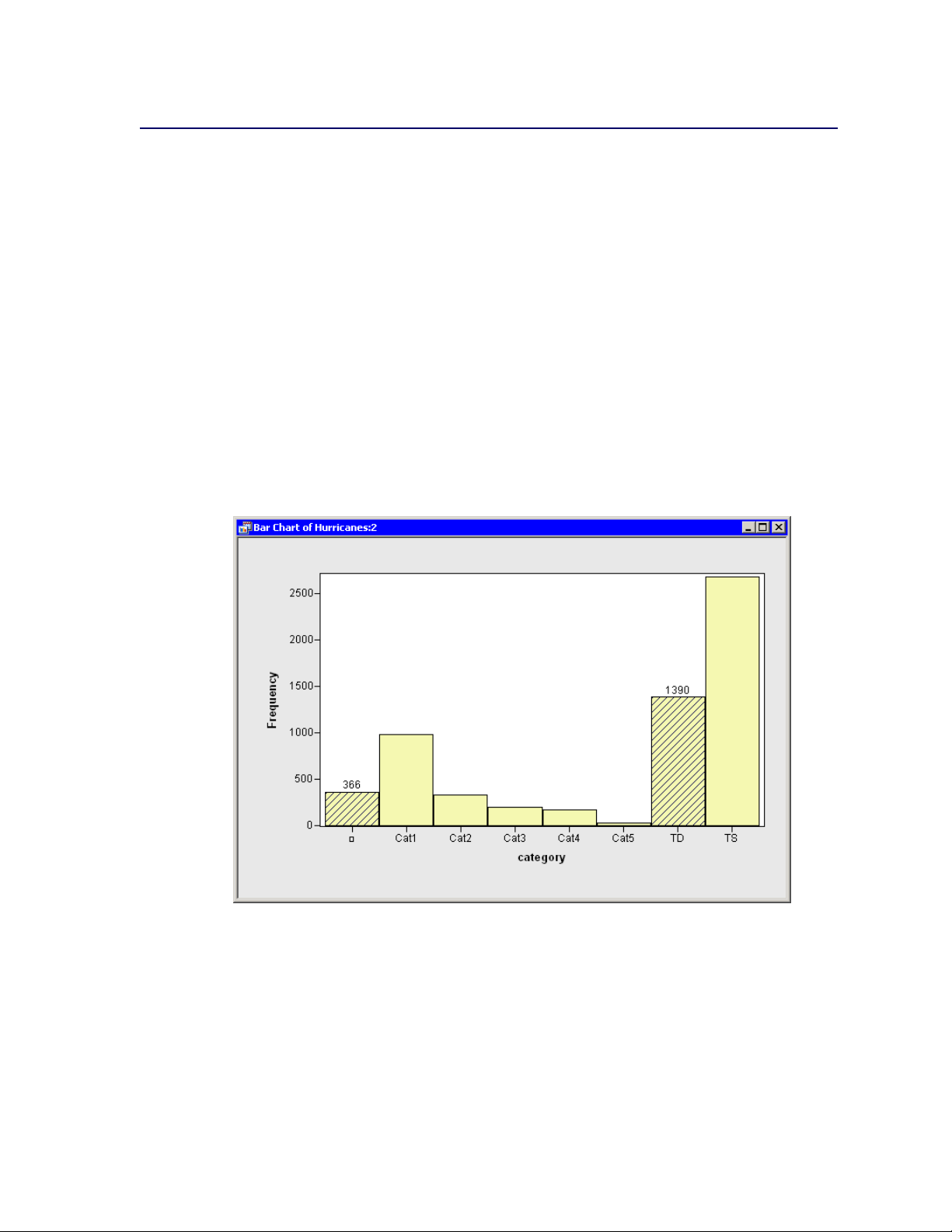
To create a bar chart of the category variable:
1 Select Graph IBar Chart from the main menu.
The Bar Chart dialog box appears. (See Figure 2.3.)
2 Select the variable category, and click Set X.
NOTE : In most dialog boxes, double-clicking a variable name adds the variable to the next ap-
propriate box.
Page 23

Figure 2.3 Bar Chart Dialog Box
Create a Bar Chart F 17
3 Click OK.
The bar chart in Figure 2.4 appears. The bar chart shows the number of observations for storms
in each Saffir-Simpson intensity category.
Figure 2.4 A Bar Chart
Page 24
18 F Chapter 2: Getting Started with SAS/IML Studio
Exclude Observations
To exclude observations of less than tropical storm intensity (wind speeds less than 34 knots):
1 In the bar chart, click the bar labeled with the symbol .
This selects observations for which the category variable has a missing value. For these data,
“missing” is equivalent to an intensity of less than tropical depression strength (wind speeds less
than 22 knots).
2 Hold down the CTRL key and click the bar labeled “TD.”
When you hold down the CTRL key and click, you extend the set of selected observations. In this
example, you select observations with tropical depression strength (wind speeds of 22–34 knots)
without deselecting previously selected observations. The bars that contain selected observations
are shown as crosshatched in Figure 2.5.
Figure 2.5 A Bar Chart with Selected Observations
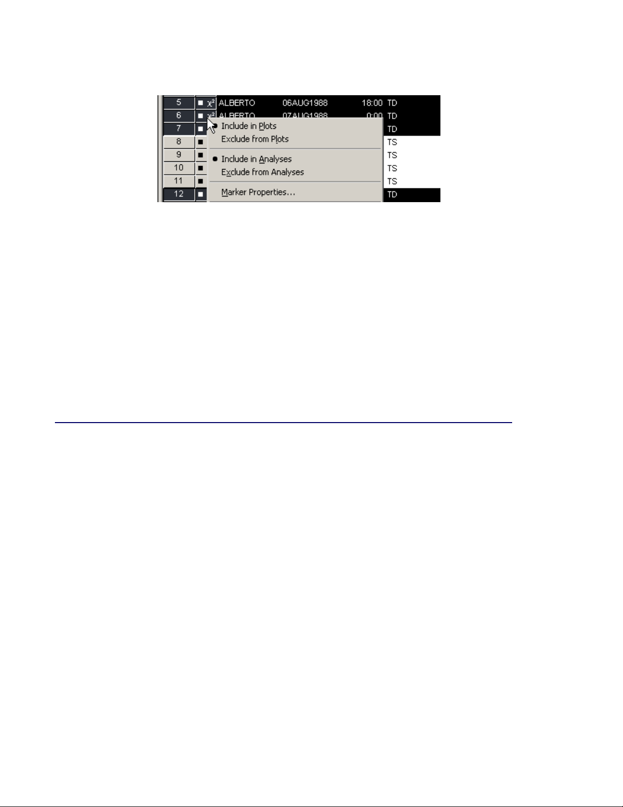
3 In the data table, right-click in the row heading (to the left) of any selected observation, and select
Exclude from Plots from the pop-up menu (shown in Figure 2.6).
Notice that the bar chart redraws itself to reflect that all observations being displayed in the plots
now have at least 34-knot winds. Notice also that the square symbol in the data table is removed
from observations with wind speeds less than 34 knots.
Page 25
Create a Histogram F 19
Figure 2.6 Data Table Pop-up Menu
4 In the data table, right-click in the row heading of any selected observation, and select Exclude
from Analyses from the pop-up menu.
Notice that the 2symbol is removed from observations with wind speeds less than 34 knots. Future analysis (for example, correlation analysis and regression analysis) will not use the excluded
observations.
5 Click any data table cell to clear the selected observations.
NOTE : You can also exclude selected observations by using a keyboard shortcut. Select a plot
and press the ‘e’ key to exclude selected observations from plots and from analyses. Additional
keyboard shortcuts are described in Chapter 8, “Interacting with Plots.”
Create a Histogram
In this section you create a histogram of the latitude variable and examine relationships between
the category and latitude variables. The figures in this section assume that you have excluded
observations with low wind speeds as described in the section “Exclude Observations” on page 18.
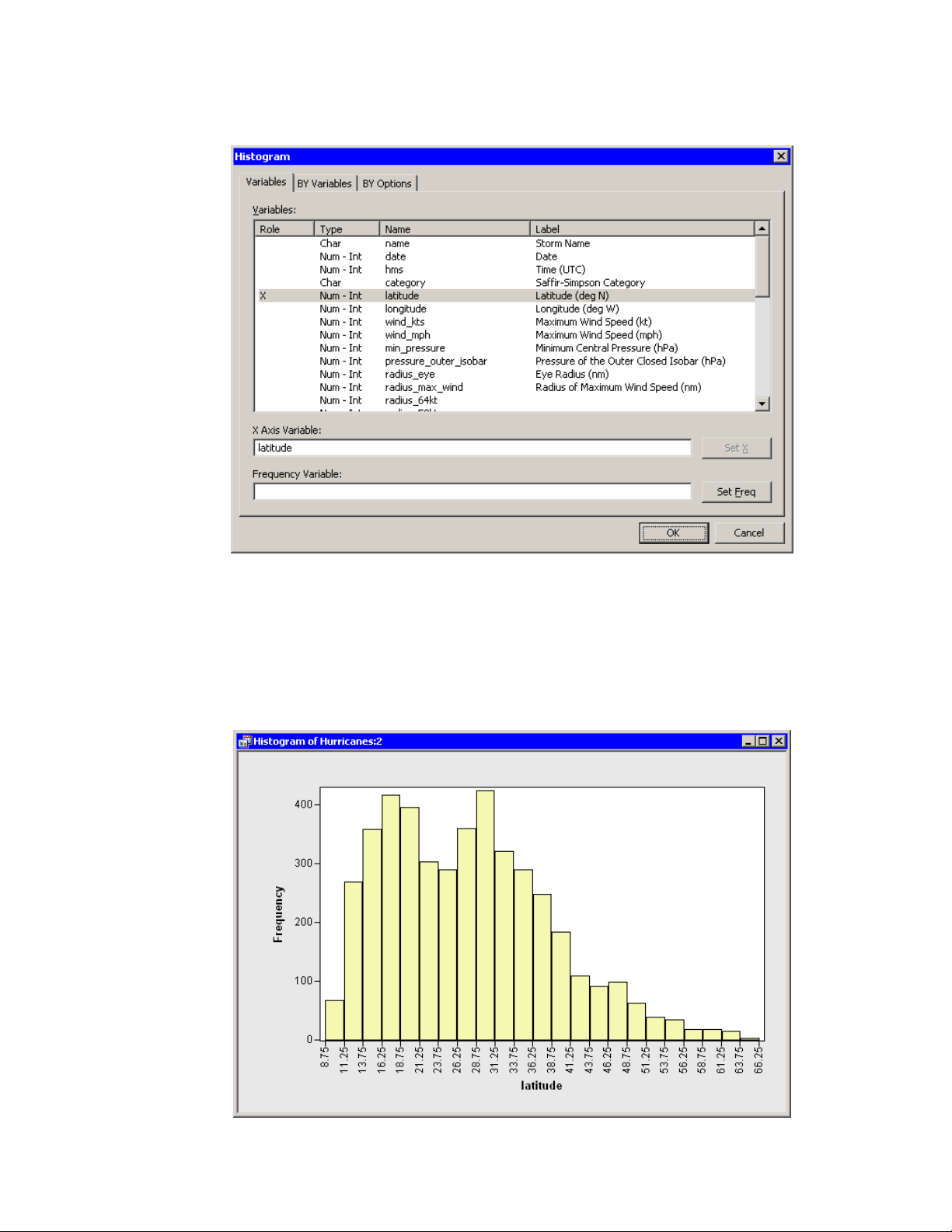
To create a histogram:
1 Select Graph IHistogram from the main menu.
The Histogram dialog box appears. (See Figure 2.7.)
2 Select the variable latitude, and click Set X.
Page 26
20 F Chapter 2: Getting Started with SAS/IML Studio
Figure 2.7 Histogram Dialog Box
3 Click OK.
A histogram (Figure 2.8) appears, which shows the distribution of the latitude variable for the
storms that are included in the plots. Move the histogram so that it does not cover the bar chart
or data table.
Figure 2.8 Histogram of Latitudes of Storms
Page 27
Create a Histogram F 21
You have seen that you can select observations in a plot by clicking bars or observation markers.
You can also select observations by drawing a selection rectangle. To draw a selection rectangle,
click in a graph and hold down the left mouse button while you move the mouse pointer to a new
location.
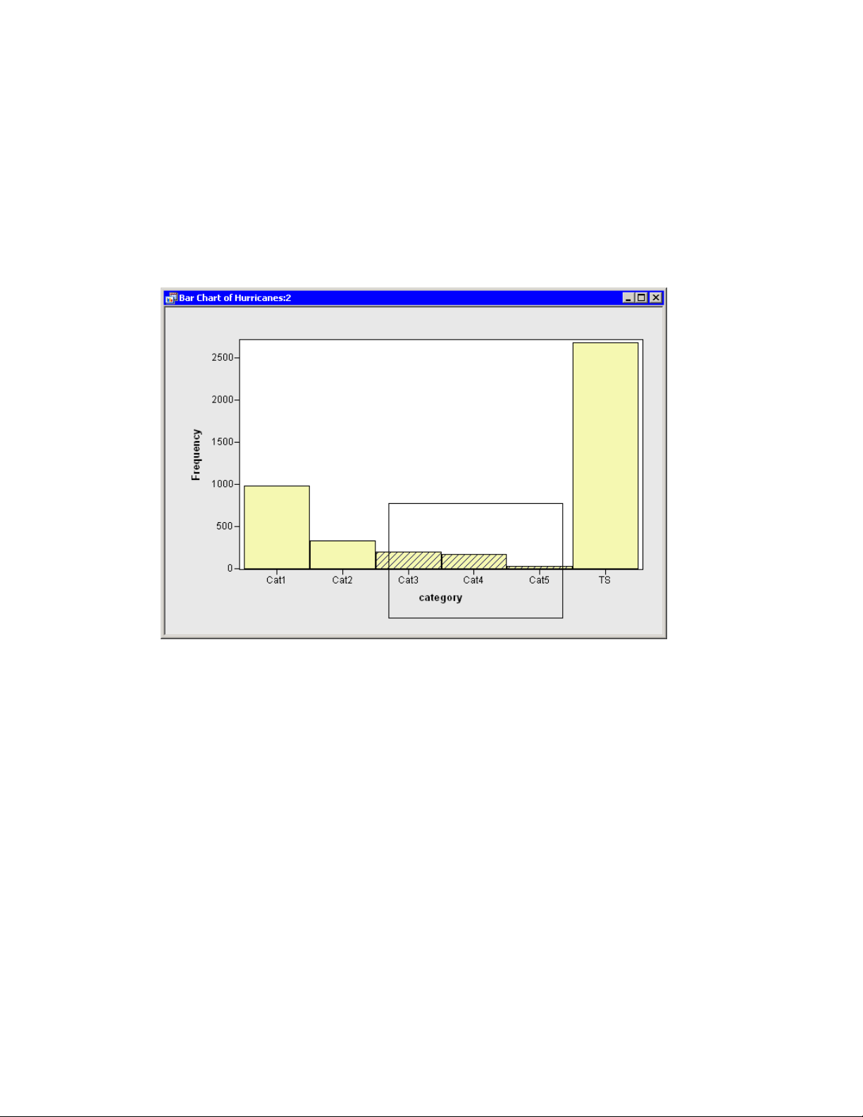
4 Draw a selection rectangle in the bar chart to select all storms of category 3, 4, and 5.
The bar chart looks like the one in Figure 2.9.
Figure 2.9 Selecting the Most Intense Storms
Note that these selected observations are also shown in the histogram in Figure 2.10. The histogram shows the conditional distribution of latitude, given that a storm is greater than or equal to
category 3 intensity. The conditional distribution shows that very strong hurricanes tend to occur
between 11 and 37 degrees north latitude, with a median latitude of about 22 degrees. If these
data are representative of all Atlantic hurricanes, you might conjecture that it would be relatively
rare for a category 3 hurricane to strike north of the North Carolina-Virginia border (roughly
36:5ınorth latitude).
Page 28

22 F Chapter 2: Getting Started with SAS/IML Studio
Figure 2.10 Latitudes of Intense Storms
Create a Box Plot
The data set contains several variables that measure the size of a tropical cyclone. One of these is
the radius_eye variable, which contains the radius of a cyclone’s eye in nautical miles. (The eye of
a cyclone is a calm, relatively cloudless central region.) The radius_eye variable has many missing
values, because not all storms have well-defined eyes.
The following steps create a box plot that shows how the radius of a cyclone’s eye varies with the
Saffir-Simpson category. The figures in this section assume that you have excluded observations
with low wind speeds as described in the section “Exclude Observations” on page 18.
1 Select Graph IBox Plot from the main menu.
The Box Plot dialog box appears. (See Figure 2.11.)
Page 29
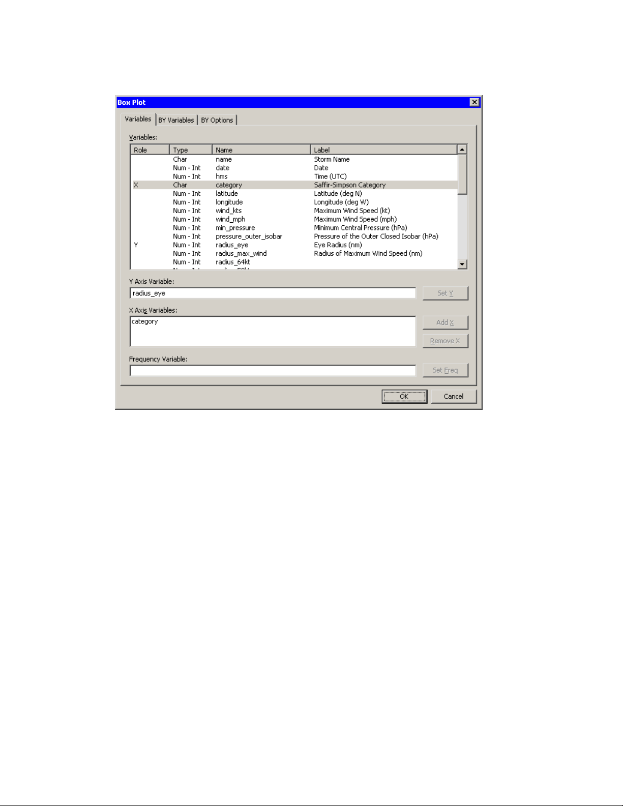
Figure 2.11 Box Plot Dialog Box
Create a Box Plot F 23
2 Select the variable radius_eye, and click Set Y.
3 Select the variable category, and click Add X.
4 Click OK.
A box plot appears as in Figure 2.12. Move the box plot so that it does not cover the data table
or other plots.
The box plot summarizes the distribution of eye radii for each Saffir-Simpson category. The plot
indicates that the median eye radius tends to increase with storm intensity for tropical storms,
category 1, and category 2 hurricanes. Category 2–4 storms have similar distributions, while the
most intense hurricanes (category 5) in this data set tend to have eyes that are small and compact.
The box plot also indicates considerable spread in the radii of eyes.
Recall that the radius_eye variable contains many missing values. These missing values are not
displayed by the box plot. You might wonder what percentage of all storms of a given SaffirSimpson intensity have well-defined eyes. You can determine this percentage by selecting all
observations in one of the box plots and noting the proportion of observations that are selected in
the bar chart.
5 Draw a selection rectangle in the box plot around the category 1 storms.
Page 30
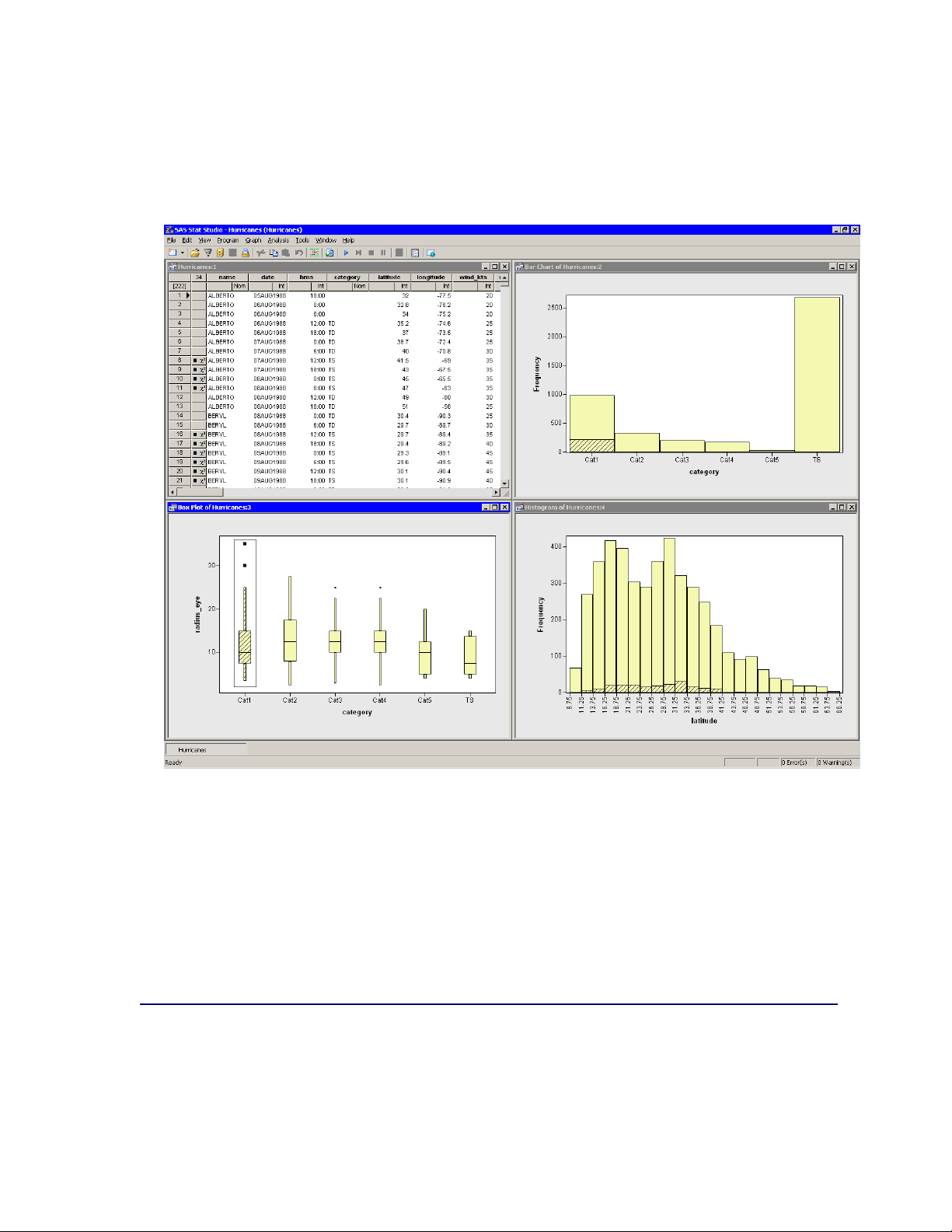
24 F Chapter 2: Getting Started with SAS/IML Studio
In the bar chart in Figure 2.12, note that approximately 25% of the bar for category 1 storms is
displayed as selected, which means that approximately one quarter of the category 1 storms in
this data set have nonmissing measurements for radius_eye.
Figure 2.12 Proportion of Category 1 Storms with Well-Defined Eyes
6 Drag the selection rectangle to select eye radii in other categories.
The selected observations displayed in the bar chart reveal the proportion of storms in each SaffirSimpson category that have nonmissing values for radius_eye. Note in particular that very few
tropical storms have eyes, whereas almost all category 4 and 5 storms have well-defined eyes.
7 Click outside the plot area in any plot to deselect all observations.
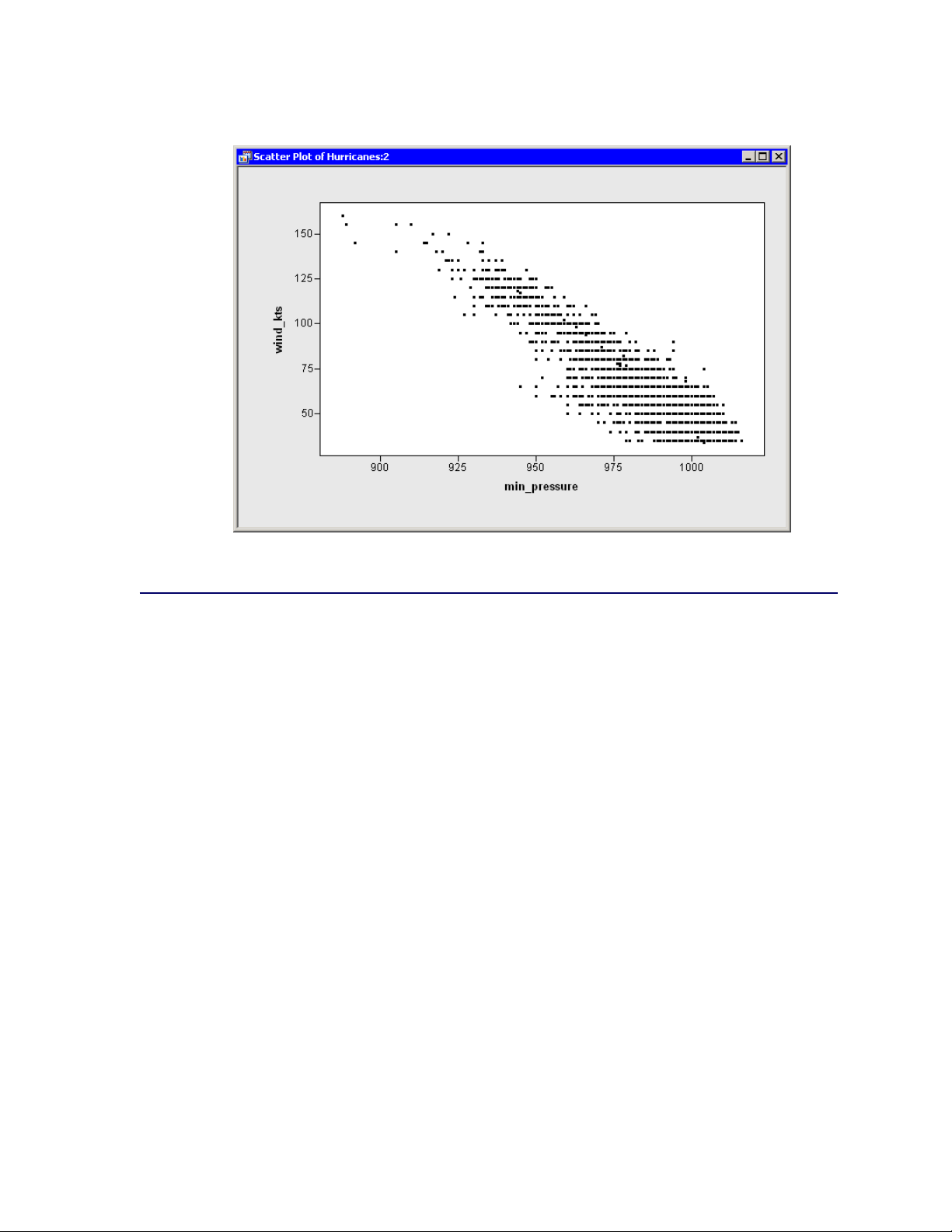
Create a Scatter Plot
The following steps examine the relationship between wind speed and atmospheric pressure for
tropical cyclones. The National Hurricane Center routinely reports both of these quantities as indi-
Page 31

Create a Scatter Plot F 25
cators of a storm’s intensity. The figures in this section assume that you have excluded observations
with low wind speeds as described in the section “Exclude Observations” on page 18.
1 Select Graph IScatter Plot from the main menu.
The Scatter Plot dialog box appears. (See Figure 2.13.)
Figure 2.13 Scatter Plot Dialog Box
2 Select the variable wind_kts, and click Set Y.
3 Select the variable min_pressure, and click Set X.
4 Click OK.
A scatter plot appears as in Figure 2.14.
Page 32
26 F Chapter 2: Getting Started with SAS/IML Studio
Figure 2.14 Wind Speed versus Minimum Pressure
Model Variable Relationships
In this section you model the relationship between wind speed and atmospheric pressure for tropical
cyclones. The scatter plot in Figure 2.14 shows a strong negative correlation between wind speed
and pressure. To compute the correlation between these variables, you can run SAS/IML Studio’s
correlation analysis. The results in this section assume that you have excluded observations with
low wind speeds as described in the section “Exclude Observations” on page 18.
NOTE : You can select from the Analysis or Graph menu only when the active window is a data
table or a graph. Click a window’s title bar to make it the active window.
To run an analysis in SAS/IML Studio:
1 Select Analysis IMultivariate Analysis ICorrelation Analysis from the main menu.
The Correlation Analysis dialog box appears. (See Figure 2.15.)
2 Click the wind_kts variable. Hold down the CTRL key and click the min_pressure variable.
Click Add Y.
Both variables are added to the list of Y variables.
Page 33
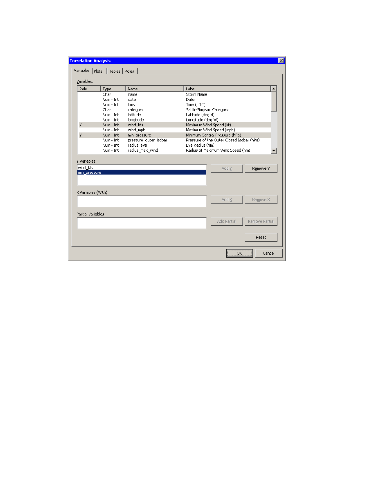
Figure 2.15 Correlations Analysis Dialog Box
Model Variable Relationships F 27
3 Click the Plots tab.
4 Clear the Pairwise correlation plot check box.
5 Click OK.
See Chapter 25, “Multivariate Analysis: Correlation Analysis,” for more information about the
correlations analysis.
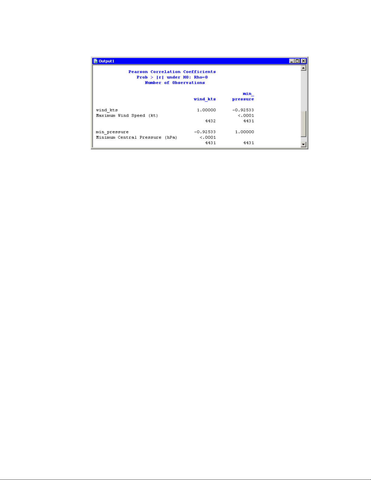
An output window appears (Figure 2.16), which shows the results from the CORR procedure.
The output shows that the Pearson correlation between wind_kts and min_pressure is –0.92533.
Page 34
28 F Chapter 2: Getting Started with SAS/IML Studio
Figure 2.16 Output from the CORR Procedure
Suppose you want to compute a linear model that relates wind_kts to min_pressure. Several
choices of parametric and nonparametric models are available from the Analysis IModel Fitting
menu. If you are interested in a response due to a single explanatory variable, you can also choose
from models available from the Analysis IData Smoothing menu.
NOTE : If the scatter plot of wind_kts versus min_pressure is the active window when you select
an analysis from the Analysis IData Smoothing menu, then the data smoother is added to the
existing scatter plot. Otherwise, a new scatter plot is created by the analysis.
6 Activate the scatter plot of wind_kts versus min_pressure. Select Analysis IData Smoothing
IPolynomial Regression from the main menu.
The Polynomial Regression dialog box appears. (See Figure 2.17.)
Page 35

Figure 2.17 Polynomial Smoother Dialog Box
Model Variable Relationships F 29
7 Select the variable wind_kts, and click Set Y.
8 Select the variable min_pressure, and click Set X.
9 Click OK.
A scatter plot appears (Figure 2.18), and output from the REG procedure is added at the bottom
of the output window.
Page 36
30 F Chapter 2: Getting Started with SAS/IML Studio
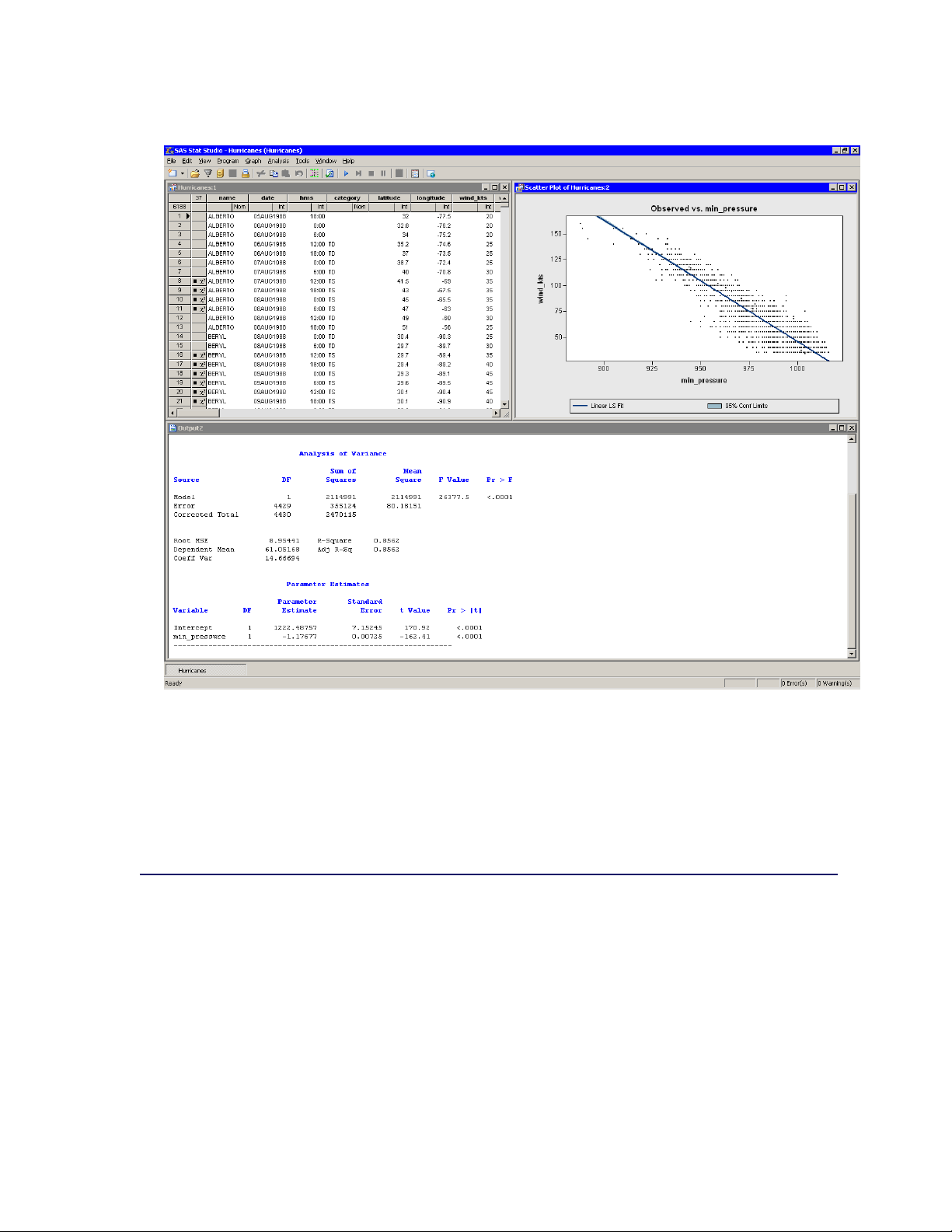
Figure 2.18 Least Squares Regression
The output from the REG procedure indicates an R-square value of 0.8562 for the line of least
squares given approximately by wind_ktsD 1222 1:177min_pressure. The scatter plot shows
this line and a 95% confidence band for the predicted mean. The confidence band is very thin,
which indicates high confidence in the means of the predicted values.
References
Kimball, S. K. and Mulekar, M. S. (2004), “A 15-year Climatology of North Atlantic Tropical
Cyclones. Part I: Size Parameters,” Journal of Climatology, 3555–3575.
Mulekar, M. S. and Kimball, S. K. (2004), “The Statistics of Hurricanes,” STATS, 39, 3–8.
Page 37

Chapter 3
Creating and Editing Data
Contents
Overview of Creating and Entering Data . . . . . . . . . . . . . . . . . . . . . . . 31
Entering Data . . . . . . . . . . . . . . . . . . . . . . . . . . . . . . . . . . . . . 31
Example: Create a Small Data Set . . . . . . . . . . . . . . . . . . . . . . . 31
Adding Variables . . . . . . . . . . . . . . . . . . . . . . . . . . . . . . . . 35
Adding and Editing Observations . . . . . . . . . . . . . . . . . . . . . . . 37
Overview of Creating and Entering Data
The SAS/IML Studio data table displays data in a tabular view. You can create small data sets
by entering data into the table. You can edit cells to examine “what-if” scenarios. You can add
new variables or observations, and you can cut and paste between cells of the data table and the
Microsoft Windows clipboard.
Entering Data
This section describes how you can use the data table to enter small data sets. You learn how to do
the following:
enter new variables
enter or edit observations
copy, cut, and paste to and from the Windows clipboard
Example: Create a Small Data Set
The following steps describe how to enter data into a data table. The data in this example are
quarterly sales for two employees, June and Bob.
Page 38

32 F Chapter 3: Creating and Editing Data
1 Create a new data set by selecting File INew IData Set from the main menu.
The New Data Set dialog box appears so that you can create the first variable.
The first variable will contain the name of the sales staff, so you must specify a valid SAS variable
name. Fill in the dialog box as follows (see Figure 3.1):
a In the Name box, type Employee.
b In the Type box, select Character.
c Click OK.
Figure 3.1 Creating a Character Variable
2 Create a new variable by selecting Edit IVariables INew Variable from the main menu.
The second variable will indicate the quarter of the financial year for which sales are recorded.
Because the only valid values for this numeric variable are the discrete integers 1–4, you specify
the measure level as nominal.
Fill in the dialog box as follows (see Figure 3.2):
a Type Quarter in the Name box.
b Select Nominal from the Measure Level menu.
c Click OK.
Page 39

Example: Create a Small Data Set F 33
Figure 3.2 Creating a Nominal Numeric Variable
3 Create a third variable by selecting Edit IVariables INew Variable from the main menu.
The third variable will contain the revenue, in thousands of dollars, for each salesperson for each
financial quarter.
Fill in the dialog box as follows (see Figure 3.3):
a Type Sales in the Name box.
b In the Label box, type Sales (Thousands).
c In the Format list, select DOLLAR. Type 4 in the W box.
d Click OK.
Page 40

34 F Chapter 3: Creating and Editing Data
Figure 3.3 Creating a Numeric Variable with a Format
4 Now you can enter the data shown in Table 3.1 as observations for each variable. Notice that the
new data set was created with one observation that contains a missing value for each variable. (A
missing values for a numerical variable is displayed as a dot.) Type the first observation in the
first row.
When you enter data in the data table row marked with an asterisk (), a new row is created. When
you are entering (or editing) data, the ENTER key takes you down to the next observation. The
TAB key moves the active cell to the right, whereas holding down the SHIFT key and pressing
TAB moves the active cell to the left. You can also use the keyboard arrow keys to navigate the
cells of the data table.
Table 3.1 Sample Data
Employee Quarter Sales
June 1 34
Bob 1 29
June 2 24
Bob 2 18
June 3 28
Bob 3 25
June 4 45
Bob 4 32
NOTE : When you enter the data for the Sales variable, do not type the dollar sign. The actual
data is f34; 29; : : : ; 32g, but because the variable has a DOLLAR4. format, the data table displays
a dollar sign in each cell.
The data table looks like the table in Figure 3.4.
Page 41
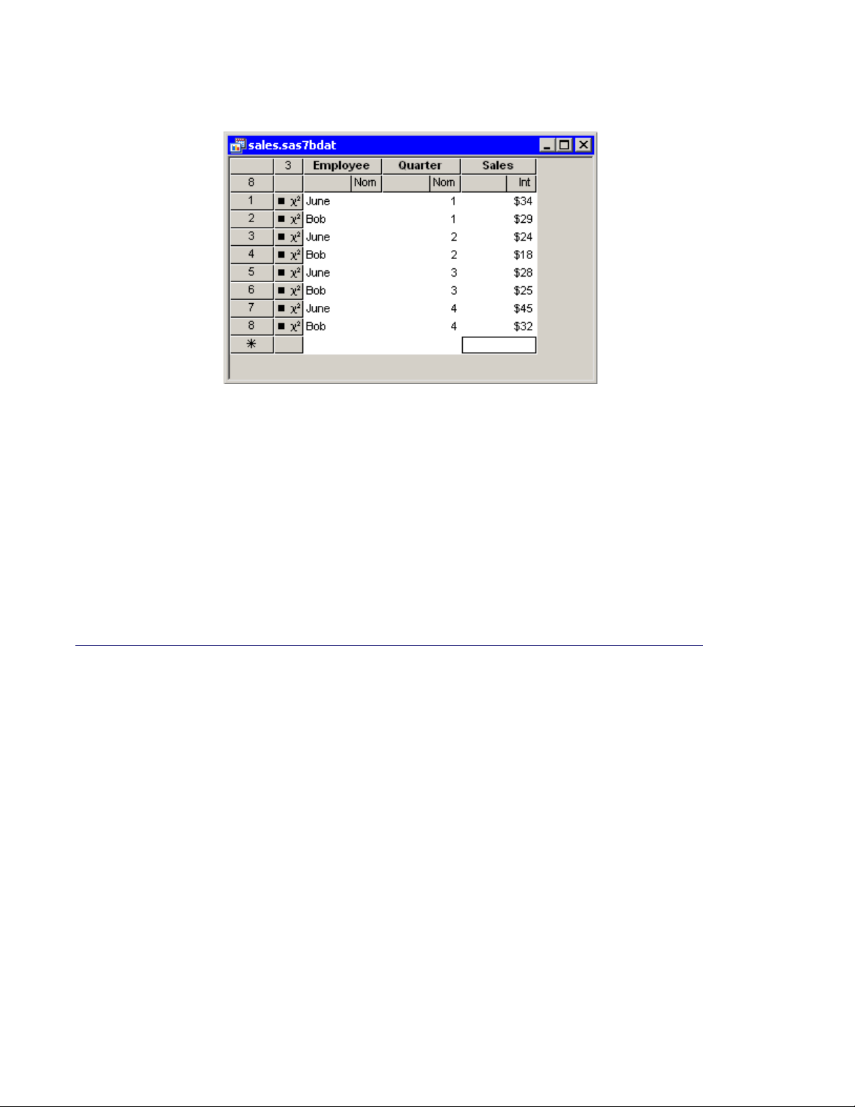
Figure 3.4 New Data Set
At this point you can save your data.
Adding Variables F 35
5 Select File ISave as File from the main menu. Navigate to the Data Sets subdirectory of
your personal files directory and save the file as sales.sas7bdat.
NOTE : The default location of the personal files directory is given in the “The Personal Files
Directory” section in Chapter 34, “Configuring the SAS/IML Studio Interface.” When you want
to open your data later, you can select File IOpen IFile from the main menu. The dialog box
that appears has a button near the bottom that says Go to Personal Files directory. For this
reason, it is convenient to save data in your personal files directory.
Adding Variables
You can add a new variable by selecting Edit IVariables INew Variable from the main menu.
Alternatively, you can right-click anywhere in the variable heading row. The New Variable dialog
box appears. (See Figure 3.5.)
Page 42

36 F Chapter 3: Creating and Editing Data
Figure 3.5 The New Variable Dialog Box
The New Variable dialog box enables you to define the variable properties. The following list
describes each element in the dialog box.
Name
specifies the name of the new variable. This must be a valid SAS variable name. This means
the name must satisfy the following conditions:
must be at most 32 characters
must begin with an English letter or underscore
cannot contain blanks
cannot contain special characters other than an underscore
Label
specifies the label for the variable.
Type
specifies the type of variable: numeric or character.
Measure Level
specifies the variable’s measure level. The measure level determines the way a variable is
used in graphs and analyses. A character variable is always nominal. For numeric variables,
you can choose from two measure levels:
Interval The variable contains values that vary across a continuous range. For example, a
variable that measures temperature would likely be an interval variable.
Nominal The variable contains a discrete set of values. For example, a variable that indicates
gender would be a nominal variable.
Format
specifies the SAS format for the variable. For many formats you also need to specify values
for the W (width) and D (decimal) boxes that are associated with the format. For more
information about formats, see the SAS Language Reference: Dictionary.
Page 43

Adding and Editing Observations F 37
Informat
specifies the SAS informat for the variable. For many informats you also need to specify
values for the W (width) and D (decimal) boxes that are associated with the format. For more
information about informats, see the SAS Language Reference: Dictionary.
NOTE : You can type the name of a format into the Format or Informat box, even if the name does
not appear in the list.
Adding and Editing Observations
To add a new observation, type data into any cell in the last data table row. This row is marked with
an asterisk ().
When you are entering (or editing) data, the ENTER key takes you down to the next observation.
The TAB key moves the active cell to the right, whereas holding down the SHIFT key and pressing
TAB moves the active cell to the left. You can also use the keyboard arrow keys to navigate the cells
of the data table.
It is possible to perform operations on a range of cells. If you select a range of cells, then you can
do the following:
Delete the contents of the cells with the DELETE key.
Cut or copy the contents of the range of cells to the Windows clipboard, in tab-delimited
format. This makes the contents of the cells available to all Windows applications (Excel,
Word, and so on).
Paste from the Windows clipboard into the selected range of cells, provided that the data on
the clipboard is in tab-delimited format. You can paste numeric data into cells in a character
variable (the data are converted to text), but you cannot paste character data into cells in a
numeric variable.
Typing in a cell changes the data for that cell. Graphs that use that observation will update to reflect
the new data.
NOTE : If you change data after an analysis has been run, you need to rerun the analysis; the analysis
does not automatically rerun to reflect the new data.
Page 44

38
Page 45

Chapter 4
Interacting with the Data Table
Contents
Overview of the Data Table . . . . . . . . . . . . . . . . . . . . . . . . . . . . . . 39
Data Table Menus . . . . . . . . . . . . . . . . . . . . . . . . . . . . . . . . . . . 40
The Variables Menu . . . . . . . . . . . . . . . . . . . . . . . . . . . . . . . . . 40
The _OBSTAT_ Variable . . . . . . . . . . . . . . . . . . . . . . . . . . . . 44
Using the _OBSTAT_ Variable in SAS Procedures . . . . . . . . . . . . . . 45
Sorting Observations . . . . . . . . . . . . . . . . . . . . . . . . . . . . . . . . . 46
Selecting Observations . . . . . . . . . . . . . . . . . . . . . . . . . . . . . . . . 47
The Observations Menu . . . . . . . . . . . . . . . . . . . . . . . . . . . . . . . 48
Changing Marker Properties . . . . . . . . . . . . . . . . . . . . . . . . . . 50
Changing Observation Labels . . . . . . . . . . . . . . . . . . . . . . . . . 51
Including and Excluding Observations . . . . . . . . . . . . . . . . . . . . 51
Examining Data . . . . . . . . . . . . . . . . . . . . . . . . . . . . . . . . . . . . 52
Finding Observations . . . . . . . . . . . . . . . . . . . . . . . . . . . . . 52
Examining Selected Observations . . . . . . . . . . . . . . . . . . . . . . . 56
Copying Selected Data . . . . . . . . . . . . . . . . . . . . . . . . . . . . . 57
Saving Data . . . . . . . . . . . . . . . . . . . . . . . . . . . . . . . . . . . . . . 58
Properties of Data Tables . . . . . . . . . . . . . . . . . . . . . . . . . . . . . . . 59
Keyboard Shortcuts in Data Tables . . . . . . . . . . . . . . . . . . . . . . . . . . 61
Overview of the Data Table
The SAS/IML Studio data table displays data in a tabular view. You can use the data table to change
properties of a variable, such as a variable’s name, label, or format. You can also change properties
of observations, including the shape and color of markers used to represent observations in graphs.
You can also control which observations are visible in graphs and which are used in statistical
analyses.
Page 46
40 F Chapter 4: Interacting with the Data Table
Data Table Menus
The first two rows of the data table are column headings (also called variable headings). The first
row displays the variable’s name or label. The second row indicates the variable’s measure level
(nominal or interval), the default role the variable plays, and, if the variable is selected, in what
order it was selected. Subsequent rows contain observations.
The first two columns of the data table are row headings (also called observation headings). The
first column displays the observation number (or some other label variable). The second column
indicates whether the observation is included in plots and analyses.
The effect of selecting a cell of the data table depends on the location of the cell. To select a variable,
click the column heading. To select an observation, click the row heading.
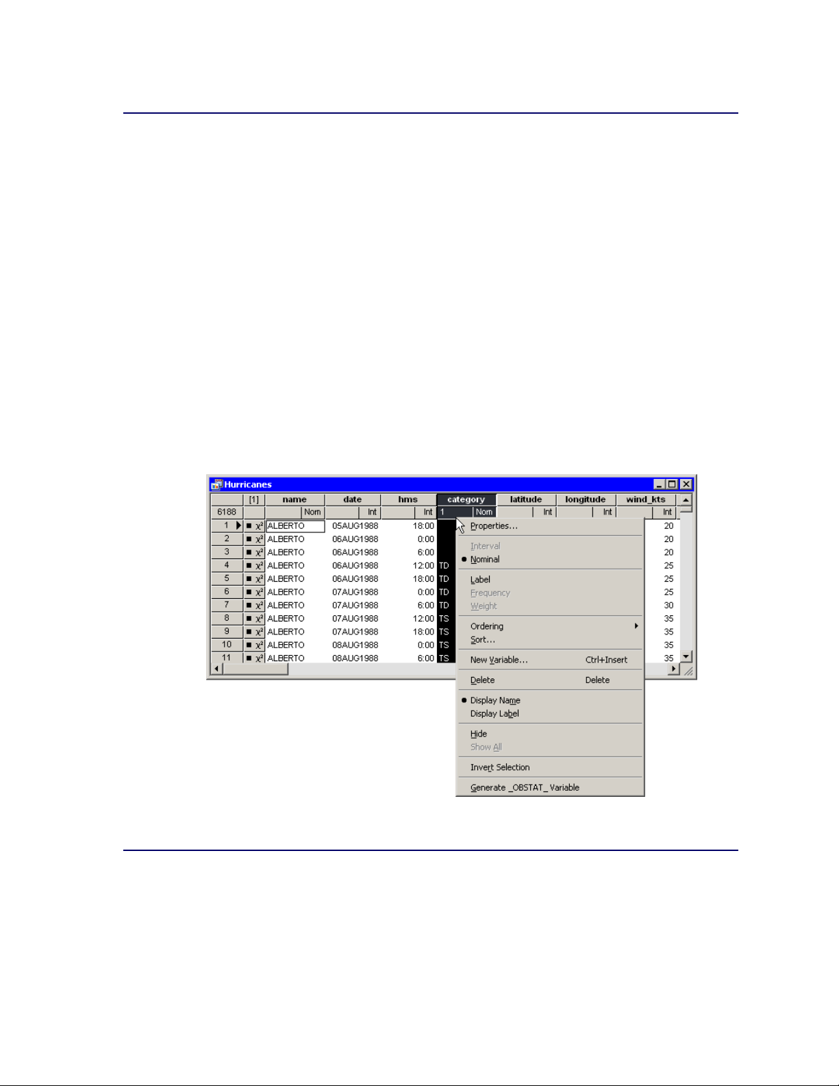
You can display a context menu as in Figure 4.1 by right-clicking a column heading or row heading.
A context menu means that you see different menus depending on where the mouse pointer is when
you right-click. For the data table, the Variables menu differs from the Observations menu.
Figure 4.1 Data Table with the Variables Menu
The Variables Menu
You can access the Variables menu (shown in Figure 4.2) by clicking a column heading and se-
lecting Edit IVariables from the main menu. Alternatively, right-clicking a variable heading (see
Figure 4.1) selects that variable and displays the same menu.
Page 47
The Variables Menu F 41
You can use the Variables menu to do the following:
change properties of existing variables
create a new variable
change the set of variables that are displayed in the data table
change the set of selected and unselected variables
set the role of an existing variable. You can assign three default roles:
Label The values of the variable are used to label the markers in a plot. Only the markers
that you have clicked are labeled.
Frequency The values of the variable are used as the frequency of occurrence for each obser-
vation. If you assign a variable to a Frequency role, then that variable is automatically
added to dialog boxes for analyses and graphs that support a frequency variable.
Weight The values of the variable are used as weights for each observation. If you assign a
variable to a Weight role, then that variable is automatically added to dialog boxes for
analyses and graphs that support a weight variable.
All roles are optional; you do not need to specify any roles. A variable can play multiple roles, but
there can be at most one variable assigned to each role.
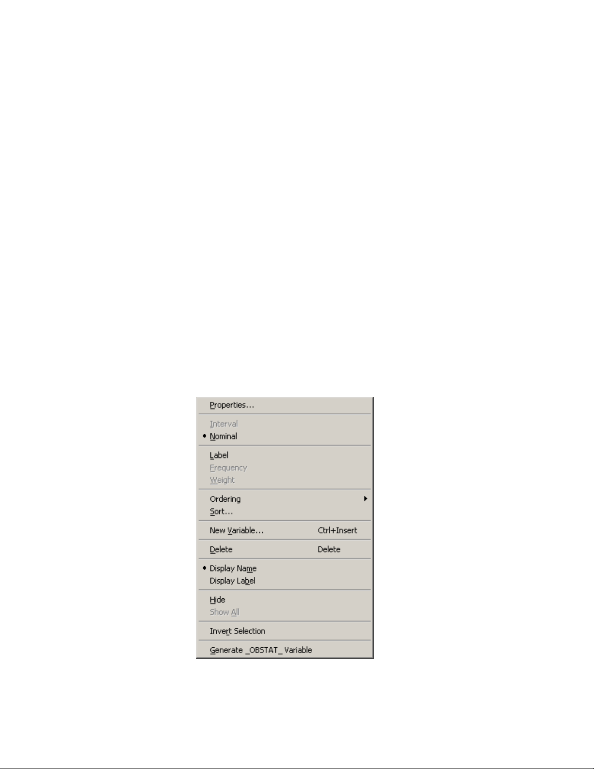
Figure 4.2 The Variables Menu
The following list describes each item on the Variables menu.
Page 48

42 F Chapter 4: Interacting with the Data Table
Properties
displays the Variable Properties dialog box, described in the section “Adding Variables” on
page 35 in Chapter 3, “Creating and Editing Data.” The dialog box enables you to change
most properties for the selected variable. However, you cannot change the type (character or
numeric) of an existing variable.
Interval/Nominal
changes the measure level of the selected numeric variable. A character variable cannot be
interval.
Label
makes the selected variable the label variable for plots. Only one variable can have this role.
Frequency
makes the selected variable the frequency variable for analyses and plots that support a frequency variable. Only a numeric variable can have a Frequency role.
Weight
makes the selected variable the weight variable for analyses and plots that support a weight
variable. Only a numeric variable can have a Weight role.
Ordering
specifies how nominal variables are ordered. This affects the way that a variable is sorted
and the order of categories in plots. If a variable has missing values, they are always ordered
first. See the “Ordering Categories of a Nominal Variable” section in Chapter 11 for further
details. The Ordering submenu is shown in Figure 4.3.
Figure 4.3 The Ordering Menu
Page 49

The Variables Menu F 43
You can order a variable in the following ways:
Standard specifies that categories be arranged in linguistic order by their unformatted val-
ues. In linguistic order, values are sorted according to the language rules for the locale that is specified in the Windows operating system. In English, punctuation marks
precede numerals, numerals precede letters, and a lowercase letter (for example, ‘a’)
precedes the same letter in uppercase (for example, ‘A’). For example, the following
English characters are sorted: ‘0’, ‘9’, ‘a’, ‘A’, ‘b’, ‘B’. The character for a missing
value (a blank character) precedes nonmissing characters.
by Frequency specifies that categories be arranged according to the descending frequency
count of formatted values in each category.
by Format specifies that categories be arranged in linguistic order by their formatted values.
by Data specifies that categories be arranged according to the data order of formatted values.
The data order is determined by traversing the values of a variable, starting from the
first observation. The first (nonmissing) value you encounter is ordered first, the next
unique (nonmissing) value of the variable is ordered second, and so on. Sorting the data
table does not affect this ordering; the ordering is based on the original sequence of
observations.
by Frequency (unformatted) specifies that categories be arranged according to the de-
scending frequency count of unformatted values in each category.
by Data (unformatted) specifies that categories be arranged according to the data order of
unformatted values. Sorting the data table does not affect this ordering; the ordering is
based on the original sequence of observations.
Custom specifies that this variable be ordered by calling the DataObject.SetVarValueOrder
method. See the SAS/IML Studio online Help for details about this method.
Sort
displays the Sort dialog box. The Sort dialog box is described in the section “Sorting Obser-
vations” on page 46.
New Variable
displays the New Variable dialog box to create a new variable as described in the section
“Adding Variables” on page 35 in Chapter 3, “Creating and Editing Data.” (See Figure 3.5.)
Delete
deletes the selected variables.
Display Name/Display Label
toggles whether the column heading displays the names of variables or displays their labels.
Hide
hides the selected variables. The variables can be displayed at a later time by selecting Show
All. Hidden variables cannot be selected.
Show All
displays all variables, including variables that were hidden.
Invert Selection
changes the set of selected variables. Deselected variables become selected, and selected
variables become deselected.
Page 50

44 F Chapter 4: Interacting with the Data Table
Generate _OBSTAT_ Variable
creates a new character variable called _OBSTAT_ that encodes the current state of each
observation. The values of the _OBSTAT_ variable are described in the next section.
The _OBSTAT_ Variable
The _OBSTAT_ variable is a character variable of length 20. It was introduced in SAS/INSIGHT
software as a way to capture the state of observations, including the color and shape of markers and
whether an observation is selected. The first few characters encode the state of binary options such
as whether an observation is selected. A character is ‘1’ if the corresponding property is true and
‘0’ if the related property is false. The properties are described in the following list:
Character 1 stores whether the observation is selected.
Character 2 stores whether the observation is included in plots.
Character 3 stores whether the observation is included in analyses.
Character 4 stores whether the observation has a label.
Character 5 stores the marker shape for an observation. This is a value between 1 and 8 that
corresponds to a shape, as given in the following table:
Value Shape
1
2 C
3 ı
4 Þ
5
6 4
7 5
8 ?
Characters 6–20 store the RGB value of the fill color for an observation marker. The RGB color
model represents colors as combinations of the colors red, green, and blue.
Each component is a five-digit decimal number between 0 and 65535. Characters
6–10 store the red component. Characters 11–15 store the green component.
Characters 16–20 store the blue component.
If you read a data set for which there is no associated DMM file and if that data set contains a
variable named _OBSTAT_, then the state of each observation is determined by the corresponding
value of the _OBSTAT_ variable.
If an _OBSTAT_ variable already exists when you select Generate _OBSTAT_ Variable from the
variable menu, then the values of the variable are updated with the current state of the observations.
Page 51

Using the _OBSTAT_ Variable in SAS Procedures F 45
Using the _OBSTAT_ Variable in SAS Procedures
The _OBSTAT_ variable is often used in conjunction with a SAS procedure to analyze observations
that satisfy certain criteria. For example, you might want to perform a linear regression only on
observations that have the Include in Analysis property. Or you might want to compute a correlation
matrix only for observations that are represented by a square marker shape.
The _OBSTAT_ variable contains information about the state of observations in SAS/IML Studio. It
is often convenient to use the DATA step to split the single _OBSTAT_ variable into several indicator
variables so that it is easier to use a WHERE clause to choose only observations that have a desired
property.
To use the _OBSTAT_ variable to select observations for analysis by a SAS procedure:
1 Create an _OBSTAT_ variable by selecting Generate _OBSTAT_ Variable from the variable
menu.
2 Save the augmented data to a SAS data set such as SASUSER.MyData.
3 Use the following DATA step to extract each observation property into its own variable:
/*Create numerical variables from an _OBSTAT_ variable.*/
data MyData;
set sasuser.MyData;
ObsIsSelected = inputn(substr(_obstat_, 1, 1), 1.);
ObsIsInPlots = inputn(substr(_obstat_, 2, 1), 1.);
ObsIsInAnalysis = inputn(substr(_obstat_, 3, 1), 1.);
ObsIsLabeled = inputn(substr(_obstat_, 4, 1), 1.);
ObsMarkerShape = inputn(substr(_obstat_, 5, 1), 1.);
ObsMarkerRed = inputn(substr(_obstat_, 6, 5), 5.);
ObsMarkerGreen = inputn(substr(_obstat_, 11, 5), 5.);
ObsMarkerBlue = inputn(substr(_obstat_, 16, 5), 5.);
run;
4 Use a WHERE clause to analyze only observations with a given set of properties. For example,
the following statements compute a correlation matrix for observations that are represented in
SAS/IML Studio by a marker shape:
data Subset;
set MyData(where=(ObsMarkerShape=1);
run;
proc corr data=Subset(drop=Obs:);
run;
Page 52
46 F Chapter 4: Interacting with the Data Table
Sorting Observations
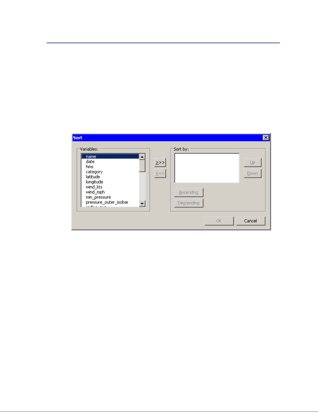
This section describes how to sort a data table by one or more variables.
To open the Sort dialog box, you can select Edit IVariables ISort from the main menu. Alterna-
tively, you can right-click a variable heading to display the Variables menu (shown in Figure 4.2),
and then select Sort. The Sort dialog box is shown in Figure 4.4.
The first time the Sort dialog box is created, any variables that are selected are automatically placed
in the Sort by list. Subsequently, the Sort dialog box remembers the Sort by list from the last sort.
Figure 4.4 The Sort Dialog Box
The following list describes each item in the Sort dialog box.
Variables
lists the variables in the data set that are not yet in the Sort by list. Select variables in this list
to transfer them to the Sort by list.
o
transfers the selected variables from the Variables list to the Sort by list.
n
removes selected variables from the Sort by list.
Sort by
lists the variables to sort by.
Up
moves a selected variable up one space in the Sort by list.
Down
moves a selected variable down one space in the Sort by list.
Page 53

Selecting Observations F 47
Ascending
marks the selected variables in the Sort by list to be sorted in ascending order.
Descending
marks the selected variables in the Sort by list to be sorted in descending order.
To carry out the sort operation, click OK.
As described in the section “The Variables Menu” on page 40, a nominal variable can be ordered
in different ways. If a variable has an ordering different from the standard ordering, then the sort
dialog box indicates that fact by marking the variable name with an asterisk.
Selecting Observations
You can select observations in a data table by clicking the row heading on the left side of the data
table. You can drag down or up to select contiguous observations. You can click while holding
down the CTRL key to select new observations without losing the ones already selected. Figure 4.5
shows selected observations.
NOTE : Highlighting a range of cells in the data table does not select the observations. The section
“Adding and Editing Observations” on page 37 in Chapter 3, “Creating and Editing Data,” lists
operations that you can perform on a range of cells.
Figure 4.5 Selected Observations
The four cells in the upper left corner of the data table are different from the other row headings, as
described in the following list:
Page 54
48 F Chapter 4: Interacting with the Data Table
Right-click in any of the four cells to display the Observations menu. The Observations
menu is described in the section “The Observations Menu” on page 48. Consequently, this is
a safe place to right-click when you want to change properties of the selected observations,
but no selected observations are currently visible.
Click in the upper left or lower right cell to deselect all observations and variables.
Click in the upper right cell to deselect all observations and select all variables.
Click in the lower left cell to deselect all variables and select all observations.
If no observations are selected, the lower left cell displays the total number of observations in the
data table. If observations are selected, the lower left cell displays (in brackets) the number of
selected observations.
If no variables are selected, the upper right cell displays the total number of variables in the data
table. If variables are selected, the upper right cell displays (in brackets) the number of selected
variables.
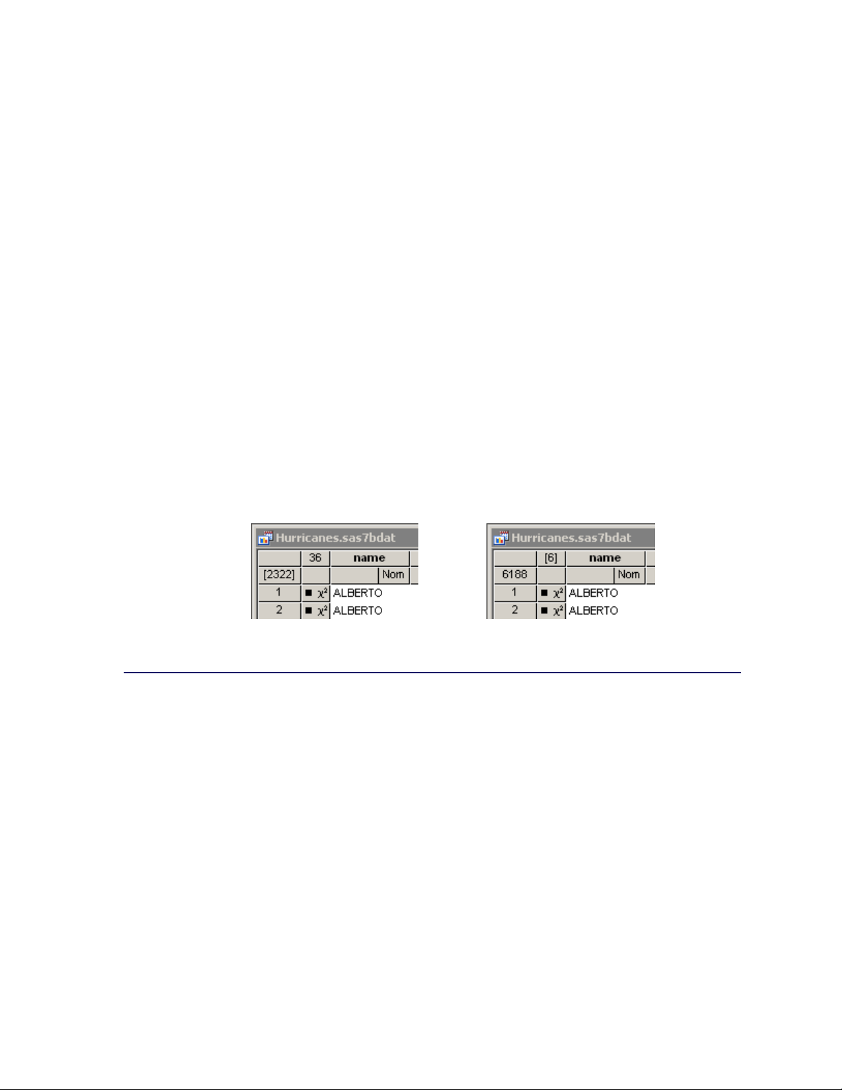
Figure 4.6 illustrates two possibilities. The left portion of the figure indicates a data table that has
2,322 selected observations; none of the 36 variables are selected. The right portion of the figure
indicates that 6 variables are selected, but none of the 6,188 observations are selected.
Figure 4.6 Indicating Selected Observations (Left) and Variables (Right)
The Observations Menu
The row heading on the left side of the data table gives the status of each observation. The heading indicates whether an observation is selected, which shape and color is used to represent the
observation in plots, and whether the observation is included in analyses.
You can change the properties of selected observations by using the Observations menu. You can
access the Observations menu by selecting Edit IObservations from the main menu. Alternatively, right-clicking the row heading of a selected observation displays the same Observations
menu, shown in Figure 4.7.
Page 55
Figure 4.7 The Observations Menu
The following list describes each item on the Observations menu.
Include in Plots
includes the selected observations in graphs.
The Observations Menu F 49
Exclude from Plots
excludes the selected observations from graphs.
Include in Analyses
includes the selected observations in statistical analyses.
Exclude from Analyses
excludes the selected observations from statistical analyses.
Marker Properties
displays the Marker Properties dialog box. The Marker Properties dialog box is described in
section “Changing Marker Properties” on page 50.
Label by Observation Number
sets the label that is displayed in the left-most column of the data table to be the observation
number. The observation number is also set as the default label that is displayed when you
click an observation marker in a graph.
Label by Variable
displays the Label by Variable dialog box. The Label by Variable dialog box is described in
section “Changing Observation Labels” on page 51.
Invert Selection
changes the set of selected observations. Deselected observations become selected, and selected observations become deselected.
Delete
deletes the selected observations.
Page 56

50 F Chapter 4: Interacting with the Data Table
Examine Selected Observations
displays the Examine Selected Observations dialog box. You can use this dialog box to view
and compare the selected observations. The Examine Selected Observations dialog box is
described in section “Examining Selected Observations” on page 56.
Changing Marker Properties
You can change the markers used to represent observations. You can use marker shapes and colors
to represent observations that share common properties.
Marker shapes are often used to discriminate observations with different values of a categorical
variable (for example, male versus female). Marker colors can also be used for this purpose, or
they can represent a continuous variable. Chapter 9, “General Plot Properties,” describes coloring
markers by a continuous variable.
Select Edit IObservations IMarker Properties from the main menu to open the Marker Properties dialog box. (See Figure 4.8.)
Figure 4.8 The Marker Properties Dialog Box
The Marker Properties dialog box contains the following UI controls:
Shape
sets the marker shape for the observations.
Outline
sets the marker outline color for the observations.
Fill
sets the marker fill color for the observations.
Sample
shows what the marker with the specified shape and colors looks like.
Apply to
specifies the set of observations whose markers will change. By default, changes are applied
to only the selected observations.
Page 57

Including and Excluding Observations F 51
Changing Observation Labels
You can change the label displayed in the left-most column of the data table. Observation numbers
are shown by default.
You can select Edit IObservations ILabel by Variable from the main menu to open the Label
by Variable dialog box. (See Figure 4.9.) You can use this dialog box to select the variable whose
values are displayed in the left-most column of the data table. The variable is also set as the default
label that is displayed when you click an observation marker in a graph.
Figure 4.9 The Label by Variable Dialog Box
The Hide Label Variable check box hides the label variable. This is especially useful if the label
variable is one of the first variables in the data table.
Including and Excluding Observations
You can choose which observations appear in plots and which are used in analyses.
To include or exclude observations, first select the observations. From the Edit IObservations
menu, you can then select Include in Plots, Exclude from Plots, Include in Analyses, or Exclude
from Analyses.
The row heading of the data table shows the status of an observation in analyses and plots. A marker
symbol indicates that the observation is included in plots; observations excluded from plots do not
have a marker symbol shown in the data table. Similarly, the 2symbol is present if and only if
the observation is included in analyses. If an observation is excluded from analyses but included in
plots, then the marker symbol changes to the symbol.
For example, Figure 4.10 shows what the data table would look like if you excluded some observations. In this example, the second observation is included in plots but excluded from analyses.
Page 58

52 F Chapter 4: Interacting with the Data Table
The third observation is excluded from plots but included in analyses. The fourth observation is
excluded from both plots and analyses.
Figure 4.10 Excluded Observations
Examining Data
This section describes how to do the following:
find observations that satisfy certain conditions
examine selected observations
copy selected observations into a separate data set
In analyzing data, you might want to find observations that satisfy certain conditions. For example,
you might want to select all sales to a particular company. Or you might want to select all patients
with high blood pressure.
After you have found the observations, you can examine the observations or copy them to a new
data set.
Finding Observations
You can select observations in the data table by using the Find dialog box. (For a way to graphically
and interactively select observations that satisfy multiple constraints, see Chapter 11, “Techniques
for Exploring Data.”) You can open the Find dialog box (shown in Figure 4.11) by selecting Edit
IFind from the main menu.
Page 59
Figure 4.11 The Find Dialog Box
Finding Observations F 53
The Find dialog box contains the following UI controls:
Variable
chooses the variable whose values are examined. The list includes each variable in the data
set.
Operation
selects the logical operation used to compare each observation with the contents of the Value
box.
Value
specifies the value used to select observations.
Apply variable’s informat to value
applies the variable’s informat to the contents of the Value box. If the variable does not have
an informat, then this item is inactive.
Apply format to each value during search
applies the variable’s format to the variable and then compares the formatted data to the
contents of the Value box. If the variable does not have a format, then this item is inactive.
Match case
specifies that each observation be compared to the contents of the Value box in a case-
sensitive manner. If the variable is numeric, then this item is inactive.
Use tolerance of
specifies that a tolerance, , be used in comparing each observation to the contents of the
Value box. Table 4.1 specifies how is used. If the chosen variable is a character variable,
then this item is inactive.
Page 60

54 F Chapter 4: Interacting with the Data Table
Clear existing selection
specifies that all observations be searched, but only the observations that match the search
criterion be selected.
Search within existing selection
specifies that only the observations that are selected be searched. You can use this option to
perform logical AND operations.
Add to existing selection
specifies that all observations be searched, but observations that were selected prior to the
search remain selected. You can use this option to perform logical OR operations.
For numeric variables, let v be the value of the Value box and let be the value of the Use tolerance
of box. (If you are not using a tolerance, then D 0.) Table 4.1 specifies whether an observation
with value x for the chosen variable matches the query.
Table 4.1 Find Operations for Numeric Variables
Operation Values Found Missing Selected?
Equals x 2 Œv ; v C No
Less than x < v C Yes
Greater than x > v No
Not equals x … Œv ; v C Yes
Less than or equals x v C Yes
Greater than or equals x v No
Is missing x is missing Yes
To remember whether missing values match the query, recall that SAS missing values are represented as large negative numbers. Table 4.1 is consistent with the WHERE clause in the SAS DATA
step.
For character variables, comparisons are performed according to the linguistic order of characters.
In English, punctuation marks precede numerals, numerals precede letters, and a lowercase letter
(for example, ‘a’) precedes the same letter in uppercase (for example, ‘A’). For example, the following English characters are sorted: ‘0’, ‘9’, ‘a’, ‘A’, ‘b’, ‘B’. The character for a missing value (a
blank character) precedes nonmissing characters.
Let v be the value of the Value box and let v x indicate that v precedes x in linguistic order.
Table 4.2 specifies whether an observation with value x for the chosen variable matches the query.
Page 61

Finding Observations F 55
Table 4.2 Find Operations for Character Variables
Operation Values Found Missing Selected?
Equals x D v No
Less than x v Yes
Greater than v x No
Not equals x ¤ v Yes
Less than or equals x v Yes
Greater than or equals v x No
Is missing x is missing Yes
Contains x contains v No
Does not contains x does not contain v Yes
Begins with x begins with v No
To help remember whether character missing values match the query, think of the character missing
value as being a zero-length string that contain no characters. Table 4.2 is consistent with the
WHERE clause in the SAS DATA step.
As a first example, Figure 4.11 shows how to find observations in the Hurricanes data set whose
latitude variable is contained in the interval Œ28; 32. This is a quick way to find observations with
latitudes between 28 and 32 in a single search.
A second example is shown in Figure 4.12. This search finds observations for which the date
variable strictly precedes 07AUG1988. The date variable has a DATE9. informat, so you can use
that informat to make it more convenient to input the contents of the Value box. (Without the
informat, you would need to search for the value 10445, the SAS date value that corresponds to
06AUG1988.) Recall that the date variable is a numeric variable, even though the formatted values
appear as text.
Figure 4.12 Searching for Dates
Page 62

56 F Chapter 4: Interacting with the Data Table
A related example is shown in Figure 4.13. This search finds all observations for which the date
variable contains the text “AUG”. To perform this search you must check Apply format to each
value during search. This forces the Find dialog box to apply the DATE9. format to the date
variable, which means comparing strings (character data) instead of numbers (numeric data). You
can then select Contains from the Operation list. Each formatted string is searched for the value
“AUG”.
Figure 4.13 Matching Text in a Formatted Variable
Examining Selected Observations
You can examine the values of selected observations. To do this, select Edit IObservations
IExamine Selected Observations from the main menu. Figure 4.14 shows the dialog box that
appears. By clicking observation numbers in the list on the left (or by using the UP and DOWN
arrow keys), you can examine each selected observation in turn.
Page 63

Figure 4.14 Examining Selected Observations
Copying Selected Data F 57
Copying Selected Data
You can subset your data by copying selected observations or variables to a separate data set. (You
can select variables without losing selected observations by holding down the CTRL key while you
click.) You can then analyze or save this new data set.
If no variables are selected, all variables are copied. If no observations are selected, all observations
are copied. After you have selected observations or variables or both, select File INew IData Set
from Selected Data from the main menu. A new data table (Figure 4.15) appears, which contains
only the selected subset of the original data.
Page 64

58 F Chapter 4: Interacting with the Data Table
Figure 4.15 Copying Selected Data
Saving Data
If you save data after changing variable or observation properties, then the changes are saved as
well. Most variable properties (for example, formats) are saved with the SAS data set, whereas
observation properties (for example, marker shapes) are saved in a separate metadata file. The
metadata file is stored on the client PC and has the same name as the data set, but with a dmm
extension.
For example, if you save a data set named MyData to your PC, then a file named MyData.dmm is
also created in the same Windows folder as the MyData.sas7bdat file.
If you have changed the data and try to exit SAS/IML Studio, you are prompted to save the data set
if you have done any of the following actions:
edited cells in the data table
changed a variable’s properties (name, label, format, informat)
changed a variable’s measure level (nominal, interval)
sorted a data set
added or deleted a variable
included or excluded observations
Page 65

Properties of Data Tables F 59
changed an observation’s marker properties (shape, color)
added or deleted an observation
Properties of Data Tables
When a data table is the active window, you can do the following:
create additional copies of the data table
change the default properties of data tables in the current workspace
You can select Windows INew Window from the main menu to create a copy of the current data
table. (The new table might appear on top of the existing data table, so drag it to a new location if
necessary.) This second data table can be scrolled independently from the first. This is useful, for
example, if you are interested in examining several variables or observations whose positions in the
data table vary widely. You can examine different subsets of the data simultaneously by using two
or more tabular views of the same data.
By default, if you sort one data table, then other data tables that view the same data are also sorted in
the same order. This is because a sort typically changes the order of the underlying data. (As mentioned in the section “Saving Data” on page 58, when you exit SAS/IML Studio you are prompted
to save the data if you have sorted it.) However, there might be instances when it is useful to view
the same data, but sorted in a different order. To accomplish this, you can locally sort a data table.
To locally sort a data table, select Edit IProperties from the main menu, which displays the dialog
box shown in Figure 4.16.
Page 66

60 F Chapter 4: Interacting with the Data Table
Figure 4.16 Data Table Ordering Properties
The Ordering tab contains the following UI controls:
Changes in observation order affect
gives you two choices. If you select Actual data, then sorting the data table results in a global
sort that reorders the observation in all views of the data. If you select This view only, then
sorting the data table results in a local sort that does not reorder the observations but only
changes the view of the data in the current data table.
Default sort order
gives you two choices. Your selection of Ascending or Descending determines the default
order in which variables are sorted.
The Selections tab has a single item, as shown in Figure 4.17. If you select Scroll selected obser-
vations into view, then the data table automatically scrolls to a selected observation each time an
observation is selected. To manually scroll a selected item into view, use the F3 key.
Figure 4.17 Data Table Selection Properties
Page 67

Keyboard Shortcuts in Data Tables F 61
Keyboard Shortcuts in Data Tables
When a data table is active, some keys are associated with certain actions, as shown in Table 4.3.
Table 4.3 Keys and Actions in Data Tables
Key Action
ESC When editing data, aborts the current edit and deselect cells.
ESC Deselects any selected observations and variables.
F1 Displays the online Help system.
F3 Moves the active cell to the row of the next selected observation.
SHIFT+F3 Moves the active cell to the row of the previous selected observation.
F10 If observations are selected, displays the Observations menu. If
variables are selected, displays the Variables menu. If observa-
tions and variables are selected, displays the Observations menu
followed by the Variables menu.
TAB Moves the active cell to the right.
SHIFT+TAB Moves the active cell to the left.
ENTER Moves the active cell down one row.
ALT+RIGHT ARROW
ALT+LEFT ARROW
ALT+DOWN ARROW
ALT+UP ARROW
SHIFT+ALT+RIGHT
ARROW
SHIFT+ALT+LEFT
ARROW
SHIFT+ALT+DOWN
ARROW
SHIFT+ALT+UP
ARROW
SHIFT+RIGHT
ARROW
SHIFT+LEFT ARROW
SHIFT+DOWN
ARROW
SHIFT+UP ARROW
HOME Edits the active cell and places the cursor at the beginning of the
END Edits the active cell and places the cursor at the end of the cell.
CTRL+SPACEBAR Clears selected observations and variables.
CTRL+HOME Sets the active cell to the first row and first column.
CTRL+END Sets the active cell to the last row and last column.
CTRL+INSERT Displays the New Variable dialog box.
Toggles selection of a variable without changing the active cell.
Toggles selection of an observation without changing the active cell.
Toggles selection of a variable and moves the active cell to the next
or previous variable.
Toggles selection of an observation and moves the active cell to the
next or previous observation.
Extends the selection of a range of cell columns.
Extends the selection of a range of cell rows.
cell.
Page 68

62 F Chapter 4: Interacting with the Data Table
Table 4.3 continued
Key Action
DELETE If observations or variables are selected, deletes the selected vari-
ables or observations. If cells are selected, deletes the contents of
the selected cells.
In addition, the data table supports the arrow keys for navigating cells, and it supports the standard
Microsoft control sequences shown in Table 4.4.
Table 4.4 Standard Control Sequences in Data Tables
Key Action
CTRL+A Selects all observations.
CTRL+C Copies contents of selected cells to Windows clipboard.
CTRL+F Displays the Find dialog box.
CTRL+P Prints the data table.
CTRL+V Pastes contents of Windows clipboard to cells.
CTRL+X Cuts contents of selected cells and paste to Windows clip-
board.
CTRL+Y Redoes last undo.
CTRL+Z Undoes last operation.
Page 69

Chapter 5
Exploring Data in One Dimension
Contents
Overview of Exploring Data in One Dimension . . . . . . . . . . . . . . . . . . . 63
Bar Charts . . . . . . . . . . . . . . . . . . . . . . . . . . . . . . . . . . . . . . . 63
Example: Create a Bar Chart . . . . . . . . . . . . . . . . . . . . . . . . . 64
Bar Chart Properties . . . . . . . . . . . . . . . . . . . . . . . . . . . . . . 66
Bar Charts of Selected Variables . . . . . . . . . . . . . . . . . . . . . . . . 68
Histograms . . . . . . . . . . . . . . . . . . . . . . . . . . . . . . . . . . . . . . 68
Example: Create a Histogram . . . . . . . . . . . . . . . . . . . . . . . . . 68
Histogram Properties . . . . . . . . . . . . . . . . . . . . . . . . . . . . . . 70
Histograms of Selected Variables . . . . . . . . . . . . . . . . . . . . . . . 72
Example: Change the Positions of Histograms Bins . . . . . . . . . . . . . 72
Interactive Histogram Binning . . . . . . . . . . . . . . . . . . . . . . . . . 74
Box Plots . . . . . . . . . . . . . . . . . . . . . . . . . . . . . . . . . . . . . . . 76
Example: Create a Box Plot . . . . . . . . . . . . . . . . . . . . . . . . . . 76
Box Plot Properties . . . . . . . . . . . . . . . . . . . . . . . . . . . . . . . 78
Box Plots of Selected Variables . . . . . . . . . . . . . . . . . . . . . . . . 80
References . . . . . . . . . . . . . . . . . . . . . . . . . . . . . . . . . . . . . . 81
Overview of Exploring Data in One Dimension
This chapter describes how to use SAS/IML Studio to examine univariate distributions. You can
explore the distributions of nominal variables by using bar charts. You can explore the univariate
distributions of interval variables by using histograms and box plots.
Bar Charts
This section describes how to use a bar chart to visualize the distribution of a nominal variable.
A bar chart shows the relative frequency of unique values of a variable. The height of each bar is
proportional to the number of observations with each given value.
Page 70
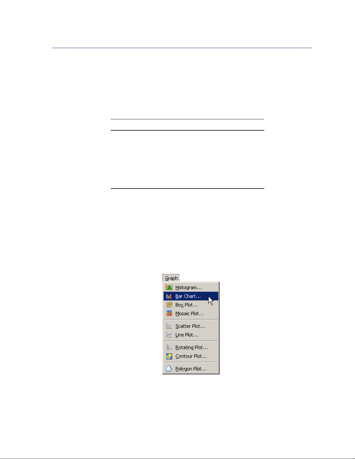
64 F Chapter 5: Exploring Data in One Dimension
Example: Create a Bar Chart
In this section you create a bar chart of the category variable of the Hurricanes data set. The
category variable gives the Saffir-Simpson wind intensity category for each observation.
The category variable is encoded according to the value of wind_kts, as shown in Table 5.1.
Table 5.1 The Saffir-Simpson Intensity Scale
Category Description Wind Speed (Knots)
TD Tropical depression 22–33
TS Tropical storm 34–63
Cat1 Category 1 hurricane 64–82
Cat2 Category 2 hurricane 83 –95
Cat3 Category 3 hurricane 96 –113
Cat4 Category 4 hurricane 114 –134
Cat5 Category 5 hurricane 135 or greater
The category variable also has missing values, which represent weak intensities (wind speed less
than 22 knots).
To create a bar chart:
1 Open the Hurricanes data set.
2 Select Graph IBar Chart from the main menu, as shown in Figure 5.1.
Figure 5.1 Selecting a Bar Chart
The Bar Chart dialog box appears. (See Figure 5.2.)
Page 71

Figure 5.2 The Bar Chart Dialog Box
Example: Create a Bar Chart F 65
3 Select the category variable, and click Set X.
4 Click OK.
NOTE : The bar chart also supports an optional frequency variable.
A bar chart appears (Figure 5.3), which shows the unique values of the category variable. The chart
shows that most of the observations in the data set are for tropical storms and tropical depressions.
There are relatively few category 5 hurricanes.
Page 72

66 F Chapter 5: Exploring Data in One Dimension
Figure 5.3 A Bar Chart
The category variable has missing values. The set of missing values are grouped together and
represented by a bar that is labeled with the symbol.
You can click a bar to select the observations contained in that bar. You can click while holding
down the CTRL key to select observations in multiple bars. You can draw a selection rectangle to
select observations in contiguous bars.
You can create bar charts of any nominal variable, numeric or character.
Bar Chart Properties
This section describes the Bars tab that is associated with a bar chart. To access the bar chart
properties, right-click near the center of a plot, and select Plot Area Properties from the pop-up
menu.
The Bars tab controls attributes of the bar chart. The Bars tab is shown in Figure 5.4.
Page 73

Figure 5.4 Plot Area Properties for a Bar Chart
Bar Chart Properties F 67
The Bars tab contains the following UI controls:
Fill
sets the fill color for each bar.
Fill: Use blend
sets the fill color for each bar according to a color gradient.
Outline
sets the outline color for each bar.
Outline: Use blend
sets the outline color for each bar according to a color gradient.
Fill bars
specifies whether each bar is filled with a color. When not selected, only the outline of the
bar is shown.
Show labels
specifies whether each bar is labeled with the height of the bar.
Y axis represents
specifies whether the vertical scale represents frequency counts or percentage.
“Other” threshold (%)
sets a cutoff value for determining which observations are placed into an “Others” category.
Page 74

68 F Chapter 5: Exploring Data in One Dimension
For a discussion of the remaining tabs, see Chapter 9, “General Plot Properties.”
Bar Charts of Selected Variables
If one or more nominal variables are selected in a data table when you select Graph IBar Chart,
then the Bar Chart dialog box does not appear. Instead bar charts are created of the selected nominal
variables.
You can also select nominal and interval variables and select Graph IBar Chart. A bar chart
appears for each nominal variable; a histogram appears for each interval variable.
If you create a matrix of plots from selected variables, you can close the matrix by pressing the F11
key while any plot is active and selecting from the pop-up menu. Alternatively, you can use the
Workspace Explorer to quickly close plots. (See the section “Workspace Explorer” on page 200.)
If a variable in the data table has a Frequency role, it is automatically used as the frequency variable
for the plots; the frequency variable should not be one of the selected variables.
Variables with a Weight role are ignored when you are creating bar charts. For more information
about the Frequency and Weight roles, see the section “The Variables Menu” on page 40.
Histograms
This section describes how to use a histogram to visualize the distribution of a continuous (interval)
variable. A histogram is an estimate of the density of data. The range of the variable is divided into
a certain number of subintervals, or bins. The height of the bar in each bin is proportional to the
number of data points that have values in that bin. A histogram is determined not only by the bin
width, but also by the choice of an anchor (or origin).
Example: Create a Histogram
In this section you create a histogram of the latitude variable of the Hurricanes data set. The latitude
variable gives the latitude of the center of each tropical cyclone observation.
To create a histogram:
1 Open the Hurricanes data set.
2 Select Graph IHistogram from the main menu, as shown in Figure 5.5.
Page 75

Figure 5.5 Selecting a Histogram
The Histogram dialog box appears. (See Figure 5.6.)
Figure 5.6 The Histogram Dialog Box
Example: Create a Histogram F 69
3 Select the latitude variable, and click Set X.
4 Click OK.
NOTE : The histogram also supports an optional frequency variable.
A histogram appears (Figure 5.7), which shows the distribution of latitudes for the tropical cyclones
in this data set. The histogram shows that most Atlantic tropical cyclones occur between 10 and 40
Page 76
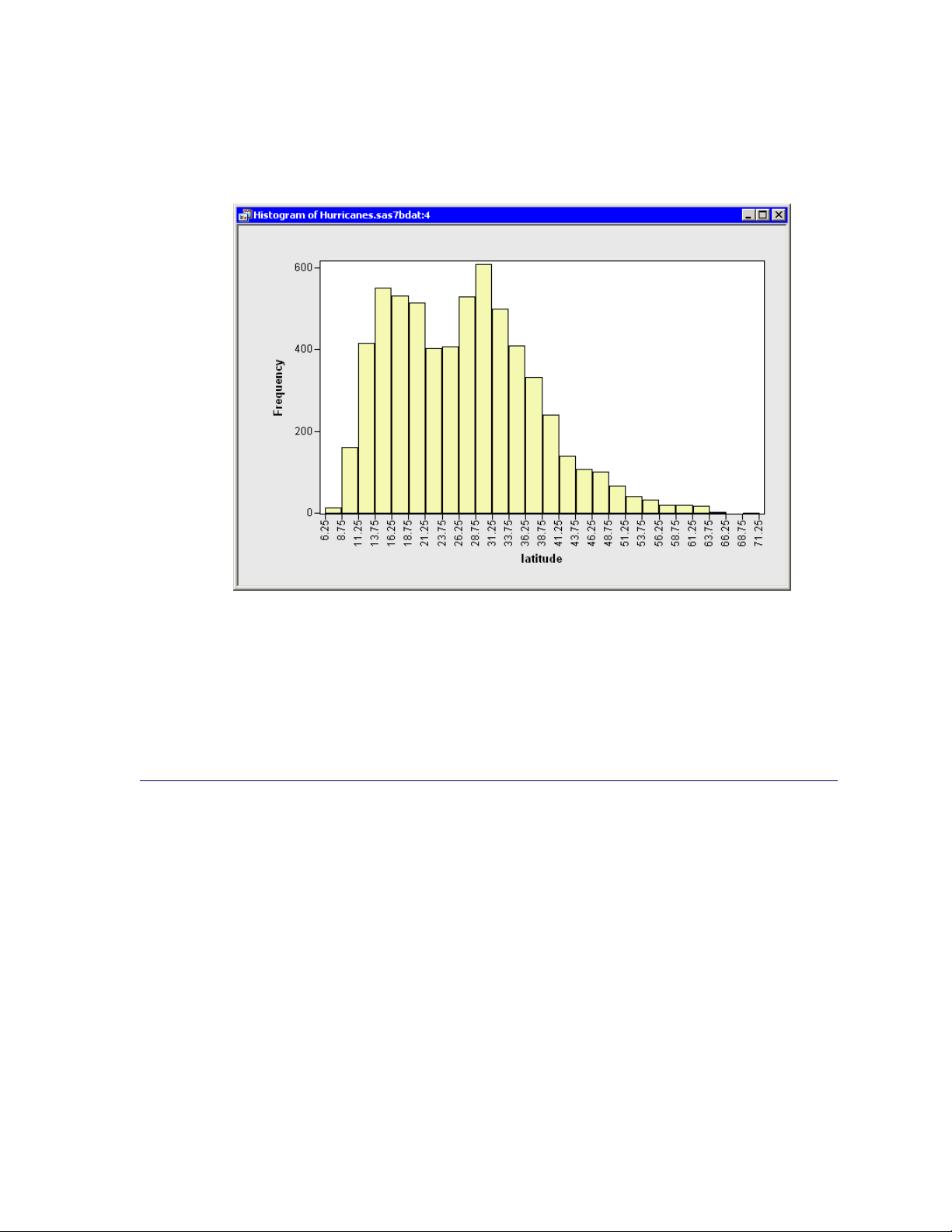
70 F Chapter 5: Exploring Data in One Dimension
degrees north latitude. The data distribution looks bimodal: one mode near 15 degrees and the other
near 30 degrees of latitude.
Figure 5.7 A Histogram
If a variable has missing values, those values are not included in the histogram.
You can click a histogram bar to select the observations contained in that bin. You can click while
holding down the CTRL key to select observations in multiple bins. You can draw a selection
rectangle to select observations in contiguous bins.
Histogram Properties
This section describes the Bars tab that is associated with a histogram. To access the histogram
properties, right-click near the center of a plot, and select Plot Area Properties from the pop-up
menu.
The Bars tab controls attributes of the histogram. The Bars tab is shown in Figure 5.8.
Page 77

Figure 5.8 Plot Area Properties for a Histogram
Histogram Properties F 71
The Bars tab contains the following UI controls:
Fill
sets the fill color for each bar.
Fill: Use blend
sets the fill color for each bar according to a color gradient.
Outline
sets the outline color for each bar.
Outline: Use blend
sets the outline color for each bar according to a color gradient.
Fill bars
specifies whether each bar is filled with a color. When not selected, only the outline of the
bar is shown.
Show labels
specifies whether each bar is labeled with the height of the bar.
Y axis represents
specifies whether the vertical scale represents frequency counts, percentage, or density.
For a discussion of the remaining tabs, see Chapter 9, “General Plot Properties.”
Page 78

72 F Chapter 5: Exploring Data in One Dimension
Histograms of Selected Variables
If one or more interval variables are selected in a data table when you select Graph IHistogram,
then the Histogram dialog box does not appear. Instead histograms are created of the selected
interval variables.
You can also select nominal and interval variables and select Graph IHistogram. A bar chart
appears for each nominal variable; a histogram appears for each interval variable.
If a variable has a Frequency role, it is automatically used as the frequency variable for the plots;
the frequency variable does not need to be selected.
If you create a matrix of plots from selected variables, you can close the matrix by pressing the F11
key while any plot is active and selecting from the pop-up menu. Alternatively, you can use the
Workspace Explorer to quickly close plots. (See the section “Workspace Explorer” on page 200.)
Example: Change the Positions of Histograms Bins
By default, SAS/IML Studio produces histograms with an anchor location and bin width chosen
according to an algorithm by Terrell and Scott (1985). This section describes how you can choose a
different anchor location or bin width for a histogram. The example in this section is a continuation
of the example in “Example: Create a Histogram” on page 68, in which you created a histogram of
the latitude variable in the Hurricanes data set.
For a histogram, the major tick unit is also the width of the histogram bins. For example, the tick
marks for the histogram in Figure 5.7 are anchored at 6.25 and have a tick unit of 2.5. You can
change the location of the histogram ticks so that the bins show the frequency of observations in the
intervals 5–10, 10–15, 15–20, and so on.
To change the location of the histogram ticks:
1 Right-click anywhere on the horizontal axis of the histogram, and select Axis Properties from
the pop-up menu, as shown in Figure 5.9.
Page 79

Example: Change the Positions of Histograms Bins F 73
Figure 5.9 The Axis Pop-up Menu
The Axis Properties dialog box appears as in Figure 5.10. This is a quick way to determine the
anchor location, tick unit, and tick range for an axis.
2 Change the Major tick unit value to 5.
3 Change the Anchor tick value to 10.
Figure 5.10 Dialog Box for Specifying Histogram Bins
Page 80

74 F Chapter 5: Exploring Data in One Dimension
4 Click OK.
The histogram updates to reflect the new histogram bin locations. The revised histogram is shown
in Figure 5.11. The Tick Range field shown in Figure 5.10 is automatically widened, if necessary,
so that all data are contained in bins.
Figure 5.11 Histogram with Customized Bins
Interactive Histogram Binning
Sometimes it is useful to explore how the shape of a histogram varies with different combinations
of anchor locations and bin widths. Interactively changing the histogram can help you determine
whether apparent modes in the data are real or are an artifact of a specific binning.
To interactively change the anchor location and bin width, right-click in the middle of the histogram
and select Bin Tool from the pop-up menu, as shown in Figure 5.12.
Page 81
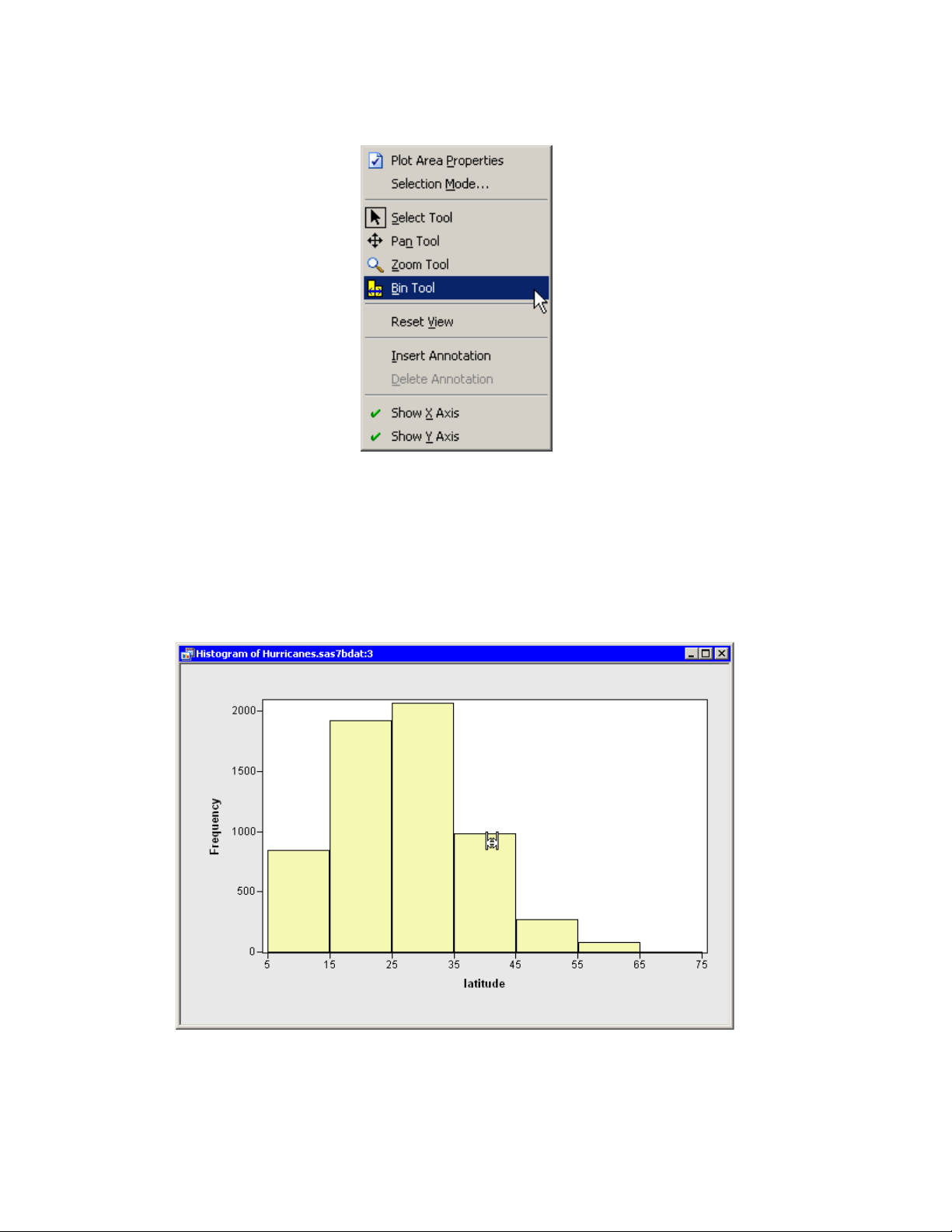
Interactive Histogram Binning F 75
Figure 5.12 The Histogram Pop-up Menu
The mouse pointer changes its shape, as shown in Figure 5.13. If you drag the pointer around in the
plot area, then the histogram rebins. Dragging the pointer horizontally changes the anchor position.
Dragging the pointer vertically changes the bin width. When the pointer is near the top of the plot
area, the bin widths are relatively small; when the pointer is near the bottom, the bin widths are
larger.
Figure 5.13 Interactively Rebinning a Histogram
Page 82

76 F Chapter 5: Exploring Data in One Dimension
Box Plots
A box plot summarizes the distribution of data sampled from a continuous numeric variable. The
central line in a box plot indicates the median of the data, while the edges of the box indicate the
first and third quartiles (that is, the 25th and 75th percentiles). Extending from the box are whiskers
that represent data that are a certain distance from the median. Beyond the whiskers are outliers:
observations that are relatively far from the median. These features are shown in Figure 5.14.
Figure 5.14 Schematic Description of a Box Plot
This section describes how to use a box plot to visualize the distribution of a continuous (interval)
variable. You can also use box plots to see how the distribution changes across levels of one or more
nominal variables.
Example: Create a Box Plot
In this section you create a box plot of the latitude variable of the Hurricanes data set, grouped by
levels of the category variable. The latitude variable gives the latitude of the center of each tropical
cyclone observation. The category variable gives the Saffir-Simpson wind intensity category for
each observation.
The category variable also has missing values, which represent weak intensities (wind speed less
than 22 knots).
To create a box plot:
1 Open the Hurricanes data set.
2 Select Graph IBox Plot from the main menu, as shown in Figure 5.15.
Page 83

Figure 5.15 Selecting a Box Plot
The Box Plot dialog box appears as in Figure 5.16.
Figure 5.16 The Box Plot Dialog Box
Example: Create a Box Plot F 77
3 Select the latitude variable, and click Set Y.
4 Select the category variable, and click Add X.
5 Click OK.
Page 84

78 F Chapter 5: Exploring Data in One Dimension
NOTE : X variables are optional. If you do not select an X variable, you get a box plot of the Y
variable. Only nominal variables can be selected as an X variable.
NOTE : The box plot also supports an optional frequency variable.
A box plot appears (Figure 5.17), which shows the distribution of the latitude variable for each
unique value of the category variable. The plot shows that the most intense hurricanes occur in
a relatively narrow band of southern latitudes. Intense hurricanes have median latitudes that are
farther south than weaker hurricanes. There is also less variance in the latitudes of the intense
hurricanes. Tropical storms and tropical depressions do not follow these general trends, and they
have the largest spread in latitude.
Figure 5.17 A Box Plot
The category variable has missing values. The set of missing values are grouped together and
represented by a bar labeled with the symbol.
You can click any box, whisker, or outlier to select the observations contained in that box. You can
click while holding down the CTRL key to select observations in multiple boxes. You can draw a
selection rectangle to select observations in adjacent boxes.
Box Plot Properties
This section describes the Boxes tab that is associated with a box plot. To access the box plot
properties, right-click near the center of a plot, and select Plot Area Properties from the pop-up
menu.
The Boxes tab controls attributes of the box plot. The Boxes tab is shown in Figure 5.18.
Page 85

Box Plot Properties F 79
The Boxes tab contains the following UI controls:
Box: Whisker length
sets the length of the whiskers. A length of w means that whiskers are drawn from the
quartiles to the farthest observation not more than w times the interquartile distance (Q3–
Q1).
Box: with serifs
specifies whether each whisker is capped with a horizontal line segment.
Box: with notches
specifies whether each box is drawn with notches. The medians of two box plots are significantly different at approximately the 0.05 level if the corresponding notches do not overlap.
Mean: with one standard deviation
specifies whether each box is drawn with mean markers that extend one standard deviation
from the mean. The central line of the mean marker indicates the mean. The upper and lower
extents of the mean marker indicate the mean plus or minus one standard deviation.
Mean: with two standard deviations
specifies whether each box is drawn with mean markers that extend two standard deviation
from the mean.
Mean: Shape
specifies whether the mean markers are drawn as a diamond or an ellipse.
Color: Fill
sets the fill color for each box.
Color: Outline
sets the outline color for each box.
Color: Mean
sets the color for mean markers.
Fill boxes
specifies whether each box is filled with a color. When not selected, only the outline of the
box is shown.
Page 86

80 F Chapter 5: Exploring Data in One Dimension
Figure 5.18 Plot Area Properties for a Box Plot
For a discussion of the Observations tab, see Chapter 6, “Exploring Data in Two Dimensions.” For
a discussion of the remaining tabs, see Chapter 9, “General Plot Properties.”
Box Plots of Selected Variables
If one or more interval variables are selected in a data table when you select Graph IBox Plot,
then the Box Plot dialog box does not appear. Instead box plots are created for each selected interval
variable.
You can also select nominal and interval variables and select Graph IBox Plot. A box plot appears
for each interval variable; nominal variables are assigned to the X axis.
If a variable has a Frequency role, it is automatically used as the frequency variable for the plots;
the frequency variable does not need to be selected.
If you create a matrix of plots from selected variables, you can close the matrix by pressing the F11
key while any plot is active and selecting from the pop-up menu. Alternatively, you can use the
Workspace Explorer to quickly close plots. (See the section “Workspace Explorer” on page 200.)
Page 87

References F 81
References
Terrell, G. R. and Scott, D. W. (1985), “Oversmoothed Nonparametric Density Estimates,” Journal
of the American Statistical Association, 80, 209–214.
Page 88

82
Page 89

Chapter 6
Exploring Data in Two Dimensions
Contents
Overview of Exploring Data in Two Dimensions . . . . . . . . . . . . . . . . . . 83
Mosaic Plots . . . . . . . . . . . . . . . . . . . . . . . . . . . . . . . . . . . . . 84
Example: Create a Mosaic Plot . . . . . . . . . . . . . . . . . . . . . . . . 84
Mosaic Plot Properties . . . . . . . . . . . . . . . . . . . . . . . . . . . . . 87
Mosaic Plots of Selected Variables . . . . . . . . . . . . . . . . . . . . . . 88
Scatter Plots . . . . . . . . . . . . . . . . . . . . . . . . . . . . . . . . . . . . . . 89
Example: Create a Scatter Plot . . . . . . . . . . . . . . . . . . . . . . . . . 89
Scatter Plot Properties . . . . . . . . . . . . . . . . . . . . . . . . . . . . . 91
Scatter Plots of Selected Variables . . . . . . . . . . . . . . . . . . . . . . . 93
Line Plots . . . . . . . . . . . . . . . . . . . . . . . . . . . . . . . . . . . . . . . 94
Example: Create a Line Plot from Multiple Y Variables . . . . . . . . . . . 95
Example: Create a Line Plot from a Group Variable . . . . . . . . . . . . . 100
Line Plot Properties . . . . . . . . . . . . . . . . . . . . . . . . . . . . . . 103
Line Plots of Selected Variables . . . . . . . . . . . . . . . . . . . . . . . . 104
Polygon Plots . . . . . . . . . . . . . . . . . . . . . . . . . . . . . . . . . . . . . 105
Example: Create a Polygon Plot . . . . . . . . . . . . . . . . . . . . . . . . 105
Polygon Plot Properties . . . . . . . . . . . . . . . . . . . . . . . . . . . . 109
Polygon Plots of Selected Variables . . . . . . . . . . . . . . . . . . . . . . 110
Overview of Exploring Data in Two Dimensions
This chapter describes how to use SAS/IML Studio to examine relationships between pairs of variables.
You can explore the relationship between two (or more) nominal variables by using a mosaic chart.
You can explore the relationship between two variables by using a scatter plot. Usually the variables
in a scatter plot are interval variables.
If you have a time variable, you can observe the behavior of one or more variables over time with a
line plot. You can also use line plots to visualize a response variable (and, optionally, fitted curves
and confidence bands) versus values of an explanatory variable.
You can create and explore maps with a polygon plot.
Page 90

84 F Chapter 6: Exploring Data in Two Dimensions
Mosaic Plots
This section describes how to use a mosaic plot to visualize the cells of a contingency table. A
mosaic plot displays the frequency of data with respect to multiple nominal variables.
A mosaic plot is a set of adjacent bar plots formed first by dividing the horizontal axis according to
the proportion of observations in each category of the first variable and then by dividing the vertical
axis according to the proportion of observations in the second variable. For more than two nominal
variables, this process can be continued by further horizontal or vertical subdivision. The area of
each block is proportional to the number of observations it represents.
Example: Create a Mosaic Plot
In this section you create a mosaic plot of the nation and industry variables of the Business data set.
The nation variable gives the nation of each business listed in the data set, and the industry variable
assigns each business to a category that describes the business.
To create a mosaic plot:
1 Open the Business data set.
2 Select Graph IMosaic Plot from the main menu, as shown in Figure 6.1.
Figure 6.1 Selecting a Mosaic Plot
The Mosaic Plot dialog box appears. (See Figure 6.2.)
3 Select the nation variable, and click Set Y.
4 Select the industry variable, and click Add X.
5 Click OK.
Page 91

Example: Create a Mosaic Plot F 85
NOTE : The mosaic also supports an optional frequency variable.
Figure 6.2 The Mosaic Plot Dialog Box
A mosaic plot appears (Figure 6.3), which shows the relative proportions of businesses in this data
set as grouped by nation and industry. The mosaic plot shows that the U.S. food companies make
up the largest subset, because that cell has the largest area. Other large cells include Japanese
automobile companies, Japanese electronics companies, and U.S. oil companies. The plot also
shows that there are no German food companies in the data set.
Page 92
86 F Chapter 6: Exploring Data in Two Dimensions
Figure 6.3 A Mosaic Plot
You can click a cell to select the observations contained in that cell. Clicking a cell also shows
you the number of observations in that cell. You can click while holding down the CTRL key to
select observations in multiple cells. You can draw a selection rectangle to select observations in
contiguous cells.
You can create mosaic plots of any nominal variables, numeric or character. However, the variables should have a small to moderate number of levels.
The cells in this mosaic plot represent the count (number of observations) of businesses in each
nation and industry. However, you might be more interested in comparing the revenue generated
by these businesses. You can make this comparison by re-creating the mosaic plot and adding
sales as a frequency variable.
6 Select Graph IMosaic Plot from the main menu.
The Mosaic Plot dialog box appears.
7 Select the nation variable, and click Set Y.
8 Select the industry variable, and click Add X.
9 Select the sales variable, and click Set Freq.
10 Click OK.
A mosaic plot appears (Figure 6.4), which shows the relative proportions of sales for each nation
and industry. The mosaic plot shows that the U.S. oil companies generate the most revenue,
followed by the U.S. and Japanese automobile companies. Companies from the U.S. and Japan
account for over two thirds of the sales.
Page 93

Figure 6.4 A Mosaic Plot with a Frequency Variable
Mosaic Plot Properties F 87
Similarly, if you were interested in comparing the number of employees in these businesses, you
could use employees as a frequency variable. However, note that you could not compare profits
in this way, because some profits are negative and the mosaic plot ignores any observation whose
frequency is negative. You should also make sure that the frequency variable contains integers;
noninteger values are truncated.
Mosaic Plot Properties
This section describes the Mosaic tab that is associated with a mosaic plot. To access the mosaic
plot properties, right-click near the center of a plot, and select Plot Area Properties from the pop-up
menu.
The Mosaic tab controls attributes of the mosaic plot. The Mosaic tab is shown in Figure 6.5.
The Mosaic tab contains the following UI controls:
“Other” threshold (%)
sets a cutoff value for determining which observations are placed into an “Others” category.
Layout
sets the method by which cells are formed from the X and Y variables.
2 way In this layout scheme, the X variables determine groups, and the mosaic plot displays
a stacked bar chart of the Y variable for each group.
Page 94

88 F Chapter 6: Exploring Data in Two Dimensions
N way This layout scheme is available only if there are exactly two X variables. In this
layout scheme, the plot subdivides in the horizontal direction by the first X variable,
then subdivides in the vertical direction by the Y variable, and finally subdivides in the
horizontal direction by the second X variable.
Show labels for all tiles
specifies whether each cell is labeled with the proportion it represents.
Show labels as
specifies whether a cell represents frequency or percentage.
Figure 6.5 Plot Area Properties for a Mosaic Plot
For a discussion of the remaining tabs, see Chapter 9, “General Plot Properties.”
Mosaic Plots of Selected Variables
If one or more nominal variables are selected in a data table when you select Graph IMosaic Plot,
then the Mosaic Plot dialog box does not appear. Instead mosaic plots are created for each pair of
the selected nominal variables.
If you create a matrix of plots from selected variables, you can close the matrix by pressing the F11
key while any plot is active and selecting from the pop-up menu. Alternatively, you can use the
Workspace Explorer to quickly close plots. (See the section “Workspace Explorer” on page 200.)
Page 95

Example: Create a Scatter Plot F 89
If a variable in the data table has a Frequency role, it is automatically used as the frequency variable
for the plots; the frequency variable should not be one of the selected variables.
Variables with a Weight role are ignored when you are creating mosaic plots.
Scatter Plots
This section describes how to use a scatter plot to visualize the relationship between two variables.
Usually each variable is continuous (interval), but that is not a requirement.
Example: Create a Scatter Plot
In this section you create a scatter plot of the wind_kts and min_pressure variables of the Hurri-
canes data set. The wind_kts variable is the wind speed in knots; the min_pressure variable is the
minimum central pressure for each observation.
The min_pressure variable has a few missing values; those observations are not included in the
scatter plot.
To create a scatter plot:
1 Open the Hurricanes data set.
2 Select Graph IScatter Plot from the main menu, as shown in Figure 6.6.
Figure 6.6 Selecting a Scatter Plot
The Scatter Plot dialog box appears. (See Figure 6.7.)
3 Select the variable wind_kts, and click Set Y.
Page 96

90 F Chapter 6: Exploring Data in Two Dimensions
4 Select the variable min_pressure, and click Set X.
5 Click OK.
Figure 6.7 The Scatter Plot Dialog Box
A scatter plot appears (Figure 6.8) that shows the bivariate data. The plot shows a strong negative
correlation ( D 0:93) between wind speed and pressure. The plot also shows that most,
although not all, wind speeds are rounded to the nearest 5 knots.
Page 97

Figure 6.8 A Scatter Plot
Scatter Plot Properties F 91
You can click any observation marker to select the observation. You can click while holding down
the CTRL key to select multiple observations. You can draw a selection rectangle to select a group
of observations.
Scatter Plot Properties
This section describes the Observations tab that is associated with a scatter plot. To access the
scatter plot properties, right-click near the center of a plot, and select Plot Area Properties from
the pop-up menu.
The Observations tab controls attributes of the scatter plot. The Observations tab is shown in
Figure 6.9.
The Observations tab contains the following UI controls:
Marker Attributes: Shape
sets the shape of the marker for each observation.
Marker Attributes: Outline
specifies the color of the marker boundary. If the Blend list is set to None, the Outline list
enables you to specify the outline color of observation markers. If the Blend list is not set to
None, the Outline list enables you to specify the color blend to be used to color the outlines
of observation markers.
Page 98

92 F Chapter 6: Exploring Data in Two Dimensions
Marker Attributes: Blend (Outline)
sets the variable whose values should be used to perform color blending for the outline colors
of observation markers. If this value is set to None, color blending is not performed.
Marker Attributes: Fill
specifies the color of the marker interior. If the Blend list is set to None, the Fill list enables
you to specify the fill color of observation markers. If the Blend list is not set to None, the
Fill list enables you to specify the color blend to be used to color the interiors of observation
markers.
Marker Attributes: Blend (Fill)
sets the variable whose values should be used to perform color blending for the fill colors of
observation markers. If this value is set to None, color blending is not performed.
Marker Attributes: Apply to
specifies whether marker shape and color changes are applied to all observations, or just to
the ones currently selected.
Marker Attributes: Size
specifies the size of observation markers. All observation markers in a plot are drawn at the
same size. Selecting Auto causes the size of markers to change according to the size of the
plot.
Show only selected observations
specifies whether observation markers are shown only for selected observations.
Label all observations
specifies whether labels are displayed next to each observation marker.
Label observations by
specifies the variable to use to label observations.
Page 99

Scatter Plots of Selected Variables F 93
Figure 6.9 Plot Area Properties for a Scatter Plot
For a discussion of the remaining tabs, see Chapter 9, “General Plot Properties.”
Scatter Plots of Selected Variables
If one or more variables are selected in a data table when you select Graph IScatter Plot, then
the Scatter Plot dialog box does not appear. Instead, a scatter plot matrix is created that shows each
pair of the selected variables. (See Figure 6.10.)
If you create a matrix of plots from selected variables, you can close the matrix by pressing the F11
key while any plot is active and selecting from the pop-up menu. Alternatively, you can use the
Workspace Explorer to quickly close plots. (See the section “Workspace Explorer” on page 200.)
Variables with a Frequency or Weight role are ignored when you are creating scatter plots.
Page 100
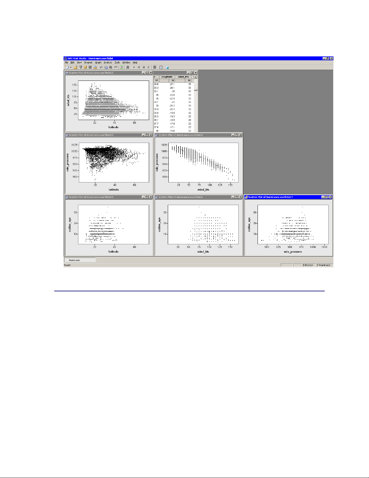
94 F Chapter 6: Exploring Data in Two Dimensions
Figure 6.10 A Matrix of Scatter Plots
Line Plots
This section describes how to use a line plot to observe the behavior of one or more variables over
time. You can also use line plots to visualize a response variable (and, optionally, fitted curves and
confidence bands) versus values of an explanatory variable.
You can create line plots when your data are in one of two configurations. The first configuration
(Table 6.1) is when you have an X variable and one or more Y variables. Each Y variable has the
same number of observations as the X variable. (Some of the Y values might be missing.) In this
configuration there are as many lines in the plot as there are Y variables.
 Loading...