

Page 1

Release 9
Discovering JMP
“The real voyage of discovery consists not in seeking new
landscapes, but in having new eyes.”
Marcel Proust
JMP, A Business Unit of SAS
SAS Campus Drive
Cary, NC 27513
Page 2

The correct bibliographic citation for this manual is as follows: SAS Institute Inc. 2010. JMP® 9
Discovering JMP. Cary, NC: SAS Institute Inc.
®
JMP
9 Discovering JMP
Copyright © 2010, SAS Institute Inc., Cary, NC, USA
ISBN 978-1-60764-600-6
All rights reserved. Produced in the United States of America.
For a hard-copy book: No part of this publication may be reproduced, stored in a retrieval system, or
transmitted, in any form or by any means, electronic, mechanical, photocopying, or otherwise, without
the prior written permission of the publisher, SAS Institute Inc.
For a Web download or e-book: Your use of this publication shall be governed by the terms established
by the vendor at the time you acquire this publication.
U.S. Government Restricted Rights Notice: Use, duplication, or disclosure of this software and related
documentation by the U.S. government is subject to the Agreement with SAS Institute and the
restrictions set forth in FAR 52.227-19, Commercial Computer Software-Restricted Rights (June 1987).
SAS Institute Inc., SAS Campus Drive, Cary, North Carolina 27513.
1st printing, September 2010
®
JMP
, SAS® and all other SAS Institute Inc. product or service names are registered trademarks or
trademarks of SAS Institute Inc. in the USA and other countries. ® indicates USA registration.
Other brand and product names are registered trademarks or trademarks of their respective companies.
Page 3

Gallery of JMP Graphs . . . . . . . . . . . . . . . . . . . . . . . . . . . . . . . . . . . . . . . . . . . . . . . . . . . . . . . . . . 1
About This Guide . . . . . . . . . . . . . . . . . . . . . . . . . . . . . . . . . . . . . . . . . . . . . . . . . . . . . . . . . . . . . . . 9
1 Introducing JMP
Basic Concepts . . . . . . . . . . . . . . . . . . . . . . . . . . . . . . . . . . . . . . . . . . . . . . . . . . . . . . . . . . . . . . . .11
Concepts You Should Know . . . . . . . . . . . . . . . . . . . . . . . . . . . . . . . . . . . . . . . . . . . . . . . . . . . . . . . . . 13
How Do I Get Started? . . . . . . . . . . . . . . . . . . . . . . . . . . . . . . . . . . . . . . . . . . . . . . . . . . . . . . . . . . . . 13
Starting JMP . . . . . . . . . . . . . . . . . . . . . . . . . . . . . . . . . . . . . . . . . . . . . . . . . . . . . . . . . . . . . . . . . 13
Using Sample Data . . . . . . . . . . . . . . . . . . . . . . . . . . . . . . . . . . . . . . . . . . . . . . . . . . . . . . . . . . . . . 16
Understanding Data Tables . . . . . . . . . . . . . . . . . . . . . . . . . . . . . . . . . . . . . . . . . . . . . . . . . . . . . . . . . 16
Understanding the JMP Workflow . . . . . . . . . . . . . . . . . . . . . . . . . . . . . . . . . . . . . . . . . . . . . . . . . . . . 18
Step 1: Launching a Platform and Viewing Results . . . . . . . . . . . . . . . . . . . . . . . . . . . . . . . . . . . . 19
Step 2: Removing the Box Plot . . . . . . . . . . . . . . . . . . . . . . . . . . . . . . . . . . . . . . . . . . . . . . . . . . . . 20
Step 3: Requesting Additional Output . . . . . . . . . . . . . . . . . . . . . . . . . . . . . . . . . . . . . . . . . . . . . . 21
Step 4: Interacting with Platform Results . . . . . . . . . . . . . . . . . . . . . . . . . . . . . . . . . . . . . . . . . . . . 22
How is JMP Different from Excel? . . . . . . . . . . . . . . . . . . . . . . . . . . . . . . . . . . . . . . . . . . . . . . . . . . . . 23
Formulas . . . . . . . . . . . . . . . . . . . . . . . . . . . . . . . . . . . . . . . . . . . . . . . . . . . . . . . . . . . . . . . . . . . . 23
Columns Names . . . . . . . . . . . . . . . . . . . . . . . . . . . . . . . . . . . . . . . . . . . . . . . . . . . . . . . . . . . . . . . 23
Tables and Worksheets . . . . . . . . . . . . . . . . . . . . . . . . . . . . . . . . . . . . . . . . . . . . . . . . . . . . . . . . . . 24
The Data Grid . . . . . . . . . . . . . . . . . . . . . . . . . . . . . . . . . . . . . . . . . . . . . . . . . . . . . . . . . . . . . . . . 24
Analysis and Graph Reports . . . . . . . . . . . . . . . . . . . . . . . . . . . . . . . . . . . . . . . . . . . . . . . . . . . . . . 24
Contents
Discovering JMP
How Do I Find Help? . . . . . . . . . . . . . . . . . . . . . . . . . . . . . . . . . . . . . . . . . . . . . . . . . . . . . . . . . . . . . 24
2 Working with Your Data
Preparing Your Data for Graphing and Analyzing . . . . . . . . . . . . . . . . . . . . . . . . . . . . . . . . . 27
Getting Your Data Into JMP . . . . . . . . . . . . . . . . . . . . . . . . . . . . . . . . . . . . . . . . . . . . . . . . . . . . . . . . 29
Copying and Pasting Data . . . . . . . . . . . . . . . . . . . . . . . . . . . . . . . . . . . . . . . . . . . . . . . . . . . . . . . 29
Importing Data . . . . . . . . . . . . . . . . . . . . . . . . . . . . . . . . . . . . . . . . . . . . . . . . . . . . . . . . . . . . . . . 29
Entering Data . . . . . . . . . . . . . . . . . . . . . . . . . . . . . . . . . . . . . . . . . . . . . . . . . . . . . . . . . . . . . . . . 31
Page 4

ii
Working with Data Tables . . . . . . . . . . . . . . . . . . . . . . . . . . . . . . . . . . . . . . . . . . . . . . . . . . . . . . . . . . . 34
Editing Data . . . . . . . . . . . . . . . . . . . . . . . . . . . . . . . . . . . . . . . . . . . . . . . . . . . . . . . . . . . . . . . . . . 34
Selecting, Deselecting, and Finding Values . . . . . . . . . . . . . . . . . . . . . . . . . . . . . . . . . . . . . . . . . . . 35
Viewing or Changing Column Information . . . . . . . . . . . . . . . . . . . . . . . . . . . . . . . . . . . . . . . . . . 39
Calculating Values With Formulas . . . . . . . . . . . . . . . . . . . . . . . . . . . . . . . . . . . . . . . . . . . . . . . . . 40
Filtering Data . . . . . . . . . . . . . . . . . . . . . . . . . . . . . . . . . . . . . . . . . . . . . . . . . . . . . . . . . . . . . . . . 42
Managing Data . . . . . . . . . . . . . . . . . . . . . . . . . . . . . . . . . . . . . . . . . . . . . . . . . . . . . . . . . . . . . . . . . . 44
Requesting Summary Statistics . . . . . . . . . . . . . . . . . . . . . . . . . . . . . . . . . . . . . . . . . . . . . . . . . . . . 45
Creating Subsets . . . . . . . . . . . . . . . . . . . . . . . . . . . . . . . . . . . . . . . . . . . . . . . . . . . . . . . . . . . . . . 49
Joining Data Tables . . . . . . . . . . . . . . . . . . . . . . . . . . . . . . . . . . . . . . . . . . . . . . . . . . . . . . . . . . . . . 51
Sorting Tables . . . . . . . . . . . . . . . . . . . . . . . . . . . . . . . . . . . . . . . . . . . . . . . . . . . . . . . . . . . . . . . . . 53
3 Visualizing Your Data
Graphing Data . . . . . . . . . . . . . . . . . . . . . . . . . . . . . . . . . . . . . . . . . . . . . . . . . . . . . . . . . . . . . . . . . 55
Looking at Single Variables . . . . . . . . . . . . . . . . . . . . . . . . . . . . . . . . . . . . . . . . . . . . . . . . . . . . . . . . . . 57
Histograms . . . . . . . . . . . . . . . . . . . . . . . . . . . . . . . . . . . . . . . . . . . . . . . . . . . . . . . . . . . . . . . . . . . 57
Bar Charts . . . . . . . . . . . . . . . . . . . . . . . . . . . . . . . . . . . . . . . . . . . . . . . . . . . . . . . . . . . . . . . . . . . . 59
Comparing Multiple Variables . . . . . . . . . . . . . . . . . . . . . . . . . . . . . . . . . . . . . . . . . . . . . . . . . . . . . . . . 61
Scatterplots . . . . . . . . . . . . . . . . . . . . . . . . . . . . . . . . . . . . . . . . . . . . . . . . . . . . . . . . . . . . . . . . . . 62
Scatterplot Matrix . . . . . . . . . . . . . . . . . . . . . . . . . . . . . . . . . . . . . . . . . . . . . . . . . . . . . . . . . . . . . 66
Side-by-Side Box Plots . . . . . . . . . . . . . . . . . . . . . . . . . . . . . . . . . . . . . . . . . . . . . . . . . . . . . . . . . . 69
Overlay Plots . . . . . . . . . . . . . . . . . . . . . . . . . . . . . . . . . . . . . . . . . . . . . . . . . . . . . . . . . . . . . . . . . . 71
Variability Chart . . . . . . . . . . . . . . . . . . . . . . . . . . . . . . . . . . . . . . . . . . . . . . . . . . . . . . . . . . . . . . . 75
Graph Builder . . . . . . . . . . . . . . . . . . . . . . . . . . . . . . . . . . . . . . . . . . . . . . . . . . . . . . . . . . . . . . . . 77
Bubble Plots . . . . . . . . . . . . . . . . . . . . . . . . . . . . . . . . . . . . . . . . . . . . . . . . . . . . . . . . . . . . . . . . . . 82
4 Analyzing Your Data
Distributions, Relationships, and Models . . . . . . . . . . . . . . . . . . . . . . . . . . . . . . . . . . . . . . . . 87
About This Chapter . . . . . . . . . . . . . . . . . . . . . . . . . . . . . . . . . . . . . . . . . . . . . . . . . . . . . . . . . . . . . . 89
The Importance of Graphing Your Data . . . . . . . . . . . . . . . . . . . . . . . . . . . . . . . . . . . . . . . . . . . . . . . 89
Understanding Modeling Types . . . . . . . . . . . . . . . . . . . . . . . . . . . . . . . . . . . . . . . . . . . . . . . . . . . . . . 92
Example: Modeling Type Results . . . . . . . . . . . . . . . . . . . . . . . . . . . . . . . . . . . . . . . . . . . . . . . . . . 92
Changing the Modeling Type . . . . . . . . . . . . . . . . . . . . . . . . . . . . . . . . . . . . . . . . . . . . . . . . . . . . 94
Analyzing Distributions . . . . . . . . . . . . . . . . . . . . . . . . . . . . . . . . . . . . . . . . . . . . . . . . . . . . . . . . . . . . . 95
Distributions of Continuous Variables . . . . . . . . . . . . . . . . . . . . . . . . . . . . . . . . . . . . . . . . . . . . . . 96
Distributions of Categorical Variables . . . . . . . . . . . . . . . . . . . . . . . . . . . . . . . . . . . . . . . . . . . . . . 98
Analyzing Relationships . . . . . . . . . . . . . . . . . . . . . . . . . . . . . . . . . . . . . . . . . . . . . . . . . . . . . . . . . . . . 101
Page 5

Using Regression with One Predictor . . . . . . . . . . . . . . . . . . . . . . . . . . . . . . . . . . . . . . . . . . . . . . . 101
Comparing Averages for One Variable . . . . . . . . . . . . . . . . . . . . . . . . . . . . . . . . . . . . . . . . . . . . . 106
Comparing Proportions . . . . . . . . . . . . . . . . . . . . . . . . . . . . . . . . . . . . . . . . . . . . . . . . . . . . . . . . 108
Comparing Averages for Multiple Variables . . . . . . . . . . . . . . . . . . . . . . . . . . . . . . . . . . . . . . . . . . 111
Using Regression with Multiple Predictors . . . . . . . . . . . . . . . . . . . . . . . . . . . . . . . . . . . . . . . . . . . 115
5 Saving and Sharing Your Work
Saving and Recreating Results . . . . . . . . . . . . . . . . . . . . . . . . . . . . . . . . . . . . . . . . . . . . . . . . . 121
Saving Platform Results in Journals . . . . . . . . . . . . . . . . . . . . . . . . . . . . . . . . . . . . . . . . . . . . . . . . . . . 123
Example: Creating a Journal . . . . . . . . . . . . . . . . . . . . . . . . . . . . . . . . . . . . . . . . . . . . . . . . . . . . . . 123
Adding Additional Analyses . . . . . . . . . . . . . . . . . . . . . . . . . . . . . . . . . . . . . . . . . . . . . . . . . . . . . 124
Creating Projects . . . . . . . . . . . . . . . . . . . . . . . . . . . . . . . . . . . . . . . . . . . . . . . . . . . . . . . . . . . . . . . . 124
Using Scripts . . . . . . . . . . . . . . . . . . . . . . . . . . . . . . . . . . . . . . . . . . . . . . . . . . . . . . . . . . . . . . . . . . . . 125
Example: Saving and Running a Script . . . . . . . . . . . . . . . . . . . . . . . . . . . . . . . . . . . . . . . . . . . . . 126
About Scripts and JSL . . . . . . . . . . . . . . . . . . . . . . . . . . . . . . . . . . . . . . . . . . . . . . . . . . . . . . . . . 127
Creating Adobe Flash Versions of the Profiler and Bubble Plot . . . . . . . . . . . . . . . . . . . . . . . . . . . . . . 127
Example: Saving an Adobe Flash Version of a Bubble Plot . . . . . . . . . . . . . . . . . . . . . . . . . . . . . . 128
iii
6 Special Features
Automatic Updating and Integrating with SAS . . . . . . . . . . . . . . . . . . . . . . . . . . . . . . . . . . . 131
Automatically Updating Analyses and Graphs . . . . . . . . . . . . . . . . . . . . . . . . . . . . . . . . . . . . . . . . . . . 133
Example: Using Automatic Recalc . . . . . . . . . . . . . . . . . . . . . . . . . . . . . . . . . . . . . . . . . . . . . . . . . 133
Changing Preferences . . . . . . . . . . . . . . . . . . . . . . . . . . . . . . . . . . . . . . . . . . . . . . . . . . . . . . . . . . . . . 136
Example: Changing Preferences . . . . . . . . . . . . . . . . . . . . . . . . . . . . . . . . . . . . . . . . . . . . . . . . . . 137
Integrating JMP and SAS . . . . . . . . . . . . . . . . . . . . . . . . . . . . . . . . . . . . . . . . . . . . . . . . . . . . . . . . . . 139
Example: Creating SAS Code . . . . . . . . . . . . . . . . . . . . . . . . . . . . . . . . . . . . . . . . . . . . . . . . . . . . 140
Example: Submitting SAS Code . . . . . . . . . . . . . . . . . . . . . . . . . . . . . . . . . . . . . . . . . . . . . . . . . . 140
Index
Discovering JMP . . . . . . . . . . . . . . . . . . . . . . . . . . . . . . . . . . . . . . . . . . . . . . . . . . . . . . . . . . . . . 143
Page 6

iv
Page 7

Credits and Acknowledgments
Origin
JMP was developed by SAS Institute Inc., Cary, NC. JMP is not a part of the SAS System, though portions
of JMP were adapted from routines in the SAS System, particularly for linear algebra and probability
calculations. Version 1 of JMP went into production in October 1989.
Credits
JMP was conceived and started by John Sall. Design and development were done by John Sall, Chung-Wei
Ng, Michael Hecht, Richard Potter, Brian Corcoran, Annie Dudley Zangi, Bradley Jones, Craige Hales,
Chris Gotwalt, Paul Nelson, Xan Gregg, Jianfeng Ding, Eric Hill, John Schroedl, Laura Lancaster, Scott
McQuiggan, Melinda Thielbar, Clay Barker, Peng Liu, Dave Barbour, Jeff Polzin, John Ponte, and Steve
Amerige.
In the SAS Institute Technical Support division, Duane Hayes, Wendy Murphrey, Rosemary Lucas, Win
LeDinh, Bobby Riggs, Glen Grimme, Sue Walsh, Mike Stockstill, Kathleen Kiernan, and Liz Edwards
provide technical support.
Nicole Jones, Kyoko Keener, Hui Di, Joseph Morgan, Wenjun Bao, Fang Chen, Susan Shao, Yusuke Ono,
Michael Crotty, Jong-Seok Lee, Tonya Mauldin, Audrey Ventura, Ani Eloyan, Bo Meng, and Sequola
McNeill provide ongoing quality assurance. Additional testing and technical support are provided by Noriki
Inoue, Kyoko Takenaka, and Masakazu Okada from SAS Japan.
Bob Hickey and Jim Borek are the release engineers.
The JMP books were written by Ann Lehman, Lee Creighton, John Sall, Bradley Jones, Erin Vang, Melanie
Drake, Meredith Blackwelder, Diane Perhac, Jonathan Gatlin, Susan Conaghan, and Sheila Loring, with
contributions from Annie Dudley Zangi and Brian Corcoran. Creative services and production was done by
SAS Publications. Melanie Drake implemented the Help system.
Jon Weisz and Jeff Perkinson provided project management. Also thanks to Lou Valente, Ian Cox, Mark
Bailey, and Malcolm Moore for technical advice.
Thanks also to Georges Guirguis, Warren Sarle, Gordon Johnston, Duane Hayes, Russell Wolfinger,
Randall Tobias, Robert N. Rodriguez, Ying So, Warren Kuhfeld, George MacKensie, Bob Lucas, Warren
Kuhfeld, Mike Leonard, and Padraic Neville for statistical R&D support. Thanks are also due to Doug
Melzer, Bryan Wolfe, Vincent DelGobbo, Biff Beers, Russell Gonsalves, Mitchel Soltys, Dave Mackie, and
Stephanie Smith, who helped us get started with SAS Foundation Services from JMP.
Acknowledgments
We owe special gratitude to the people that encouraged us to start JMP, to the alpha and beta testers of
JMP, and to the reviewers of the documentation. In particular we thank Michael Benson, Howard
Page 8

vi
Yetter (d), Andy Mauromoustakos, Al Best, Stan Young, Robert Muenchen, Lenore Herzenberg, Ramon
Leon, Tom Lange, Homer Hegedus, Skip Weed, Michael Emptage, Pat Spagan, Paul Wenz, Mike Bowen,
Lori Gates, Georgia Morgan, David Tanaka, Zoe Jewell, Sky Alibhai, David Coleman, Linda Blazek,
Michael Friendly, Joe Hockman, Frank Shen, J.H. Goodman, David Iklé, Barry Hembree, Dan Obermiller,
Jeff Sweeney, Lynn Vanatta, and Kris Ghosh.
Also, we thank Dick DeVeaux, Gray McQuarrie, Robert Stine, George Fraction, Avigdor Cahaner, José
Ramirez, Gudmunder Axelsson, Al Fulmer, Cary Tuckfield, Ron Thisted, Nancy McDermott, Veronica
Czitrom, Tom Johnson, Cy Wegman, Paul Dwyer, DaRon Huffaker, Kevin Norwood, Mike Thompson,
Jack Reese, Francois Mainville, and John Wass.
We also thank the following individuals for expert advice in their statistical specialties: R. Hocking and P.
Spector for advice on effective hypotheses; Robert Mee for screening design generators; Roselinde Kessels
for advice on choice experiments; Greg Piepel, Peter Goos, J. Stuart Hunter, Dennis Lin, Doug
Montgomery, and Chris Nachtsheim for advice on design of experiments; Jason Hsu for advice on multiple
comparisons methods (not all of which we were able to incorporate in JMP); Ralph O’Brien for advice on
homogeneity of variance tests; Ralph O’Brien and S. Paul Wright for advice on statistical power; Keith
Muller for advice in multivariate methods, Harry Martz, Wayne Nelson, Ramon Leon, Dave Trindade, Paul
Tobias, and William Q. Meeker for advice on reliability plots; Lijian Yang and J.S. Marron for bivariate
smoothing design; George Milliken and Yurii Bulavski for development of mixed models; Will Potts and
Cathy Maahs-Fladung for data mining; Clay Thompson for advice on contour plotting algorithms; and
Tom Little, Damon Stoddard, Blanton Godfrey, Tim Clapp, and Joe Ficalora for advice in the area of Six
Sigma; and Josef Schmee and Alan Bowman for advice on simulation and tolerance design.
For sample data, thanks to Patrice Strahle for Pareto examples, the Texas air control board for the pollution
data, and David Coleman for the pollen (eureka) data.
Translations
Trish O'Grady coordinates localization. Special thanks to Noriki Inoue, Kyoko Takenaka, Masakazu Okada,
Naohiro Masukawa and Yusuke Ono (SAS Japan); and Professor Toshiro Haga (retired, Tokyo University of
Science) and Professor Hirohiko Asano (Tokyo Metropolitan University) for reviewing our Japanese
translation; Professors Fengshan Bai, Xuan Lu, and Jianguo Li at Tsinghua University in Beijing, and their
assistants Rui Guo, Shan Jiang, Zhicheng Wan, and Qiang Zhao; and William Zhou (SAS China) and
Zhongguo Zheng, professor at Peking University, for reviewing the Simplified Chinese translation; Jacques
Goupy (consultant, ReConFor) and Olivier Nuñez (professor, Universidad Carlos III de Madrid) for
reviewing the French translation; Dr. Byung Chun Kim (professor, Korea Advanced Institute of Science and
Technology) and Duk-Hyun Ko (SAS Korea) for reviewing the Korean translation; Bertram Schäfer and
David Meintrup (consultants, StatCon) for reviewing the German translation; Patrizia Omodei, Maria
Scaccabarozzi, and Letizia Bazzani (SAS Italy) for reviewing the Italian translation. Finally, thanks to all the
members of our outstanding translation teams.
Past Support
Many people were important in the evolution of JMP. Special thanks to David DeLong, Mary Cole, Kristin
Nauta, Aaron Walker, Ike Walker, Eric Gjertsen, Dave Tilley, Ruth Lee, Annette Sanders, Tim Christensen,
Eric Wasserman, Charles Soper, Wenjie Bao, and Junji Kishimoto. Thanks to SAS Institute quality
assurance by Jeanne Martin, Fouad Younan, and Frank Lassiter. Additional testing for Versions 3 and 4 was
done by Li Yang, Brenda Sun, Katrina Hauser, and Andrea Ritter.
Page 9

Also thanks to Jenny Kendall, John Hansen, Eddie Routten, David Schlotzhauer, and James Mulherin.
Thanks to Steve Shack, Greg Weier, and Maura Stokes for testing JMP Version 1.
Thanks for support from Charles Shipp, Harold Gugel (d), Jim Winters, Matthew Lay, Tim Rey, Rubin
Gabriel, Brian Ruff, William Lisowski, David Morganstein, Tom Esposito, Susan West, Chris Fehily, Dan
Chilko, Jim Shook, Ken Bodner, Rick Blahunka, Dana C. Aultman, and William Fehlner.
Technology License Notices
vii
Scintilla is Copyright 1998-2003 by Neil Hodgson <neilh@scintilla.org>.
WARRANTIES WITH REGARD TO THIS SOFTWARE, INCLUDING ALL IMPLIED WARRANTIES OF
MERCHANTABILITY AND FITNESS, IN NO EVENT SHALL NEIL HODGSON BE LIABLE FOR ANY SPECIAL,
INDIRECT OR CONSEQUENTIAL DAMAGES OR ANY DAMAGES WHATSOEVER RESULTING FROM LOSS OF
USE, DATA OR PROFITS, WHETHER IN AN ACTION OF CONTRACT, NEGLIGENCE OR OTHER TORTIOUS
ACTION, ARISING OUT OF OR IN CONNECTION WITH THE USE OR PERFORMANCE OF THIS SOFTWARE.
XRender is Copyright © 2002 Keith Packard.
TO THIS SOFTWARE, INCLUDING ALL IMPLIED WARRANTIES OF MERCHANTABILITY AND FITNESS, IN NO
EVENT SHALL KEITH PACKARD BE LIABLE FOR ANY SPECIAL, INDIRECT OR CONSEQUENTIAL DAMAGES OR
ANY DAMAGES WHATSOEVER RESULTING FROM LOSS OF USE, DATA OR PROFITS, WHETHER IN AN ACTION
OF CONTRACT, NEGLIGENCE OR OTHER TORTIOUS ACTION, ARISING OUT OF OR IN CONNECTION WITH
THE USE OR PERFORMANCE OF THIS SOFTWARE.
KEITH PACKARD DISCLAIMS ALL WARRANTIES WITH REGARD
NEIL HODGSON DISCLAIMS ALL
ImageMagick software is Copyright © 1999-2010 ImageMagick Studio LLC, a non-profit organization
dedicated to making software imaging solutions freely available.
bzlib software is Copyright © 1991-2009, Thomas G. Lane, Guido Vollbeding. All Rights Reserved.
FreeType software is Copyright © 1996-2002 The FreeType Project (www.freetype.org). All rights reserved.
Page 10

viii
Page 11
Gallery of JMP Graphs
Various Graphs and their Platforms
Here are pictures of many of the graphs that you can create with JMP. Each picture is labeled with the
platform used to create it. For more information about the platforms and these and other graphs, see the
documentation on the
Help > Books menu.
Histogram
Analyze > Distribution
t Test
Analyze > Fit Y by X
Bivariate
Analyze > Fit Y by X
Logistic
Analyze > Fit Y by X
Oneway
Analyze > Fit Y by X
Mosaic Plot
Analyze > Fit Y by X
Page 12

2
LS Means Plot
Analyze > Fit Model
Neural Diagram
Analyze > Modeling > Neural
Matched Pairs
Analyze > Matched Pairs
MANOVA
Analyze > Fit Model
Actual by Predicted Plot
Analyze > Fit Model
Screening
Analyze > Modeling >
Screening
Partition
Analyze > Modeling > Partition
Time Series
Analyze > Modeling >
Time Series
Share Chart
Analyze > Modeling >
Categorical
Page 13
3
Self Organizing Map
Analyze >
Multivariate Methods >
Cluster
Principal Components
Dendrogram
Analyze >
Multivariate Methods >
Cluster
Analyze >
Multivariate Methods >
Principal Components
Canonical Plot
Analyze >
Multivariate Methods >
Discriminant
Characteristic Curves
Analyze >
Multivariate Methods > Item
Analysis
Loadings Plot
Analyze >
Multivariate Methods > PLS
Page 14
4
Dual Plot
Analyze >
Multivariate Methods > Item
Analysis
Scatterplot
Analyze > Reliability and
Survival > Fit Life by X
Compare Distributions
Analyze > Reliability and
Survival > Life Distribution
MCF Plot
Analyze > Reliability and
Survival > Recurrence
Analysis
Nonparametric Overlay
Analyze > Reliability and
Survival > Fit Life by X
Line Graphs
Graph > Graph Builder
Page 15
5
Pie Chart
Box Plots
Graph > Graph Builder
Stacked Bar Chart
Graph > Chart
Graph > Chart
Needle and Line Chart
Graph > Overlay Plot
Three Dimensional Scatterplot
Graph > Scatterplot 3D
Dot and Line Chart
Graph > Overlay Plot
Contour Plot
Graph > Contour Plot
Three Dimensional Scatterplot
Graph > Scatterplot 3D
Bubble Plot
Graph > Bubble Plot
Page 16
6
Parallel Plot
Graph > Parallel Plot
Scatterplot Matrix
Graph > Scatterplot Matrix
Cell Plot
Graph > Cell Plot
Ter n a ry P l o t
Graph > Ternary Plot
Tree Map
Graph > Tree Map
Ishikawa Chart
Fishbone Chart
Graph > Diagram
Individual Measurement Chart
Moving Range Chart
Graph > Control Chart > IR
XBar Chart
Graph > Control Chart > XBar
Variability Chart
Graph > Variability/Gauge
Chart
Page 17
7
Goal Plot
Graph > Capability
Prediction Profiler
Graph > Profiler
Pareto Plot
Graph > Pareto Plot
Contour Profiler
Graph > Contour Profiler
Surface Plot
Graph > Surface Plot
Mixture Profiler
Graph > Mixture Profiler
Page 18

8
Page 19

About This Guide
Discovering JMP provides a general introduction to the JMP software. This guide assumes that you have no
knowledge of JMP. Whether you are an analyst, researcher, student, professor, or statistician, this guide gives
you a general overview of JMP’s user interface and features.
This guide introduces you to the following information:
•Starting JMP
•The structure of a JMP window
• Preparing and manipulating data
• Using interactive graphs to learn from your data
• Performing simple analyses to augment graphs
• Customizing JMP and special features
This guide contains six chapters. Each chapter contains examples that reinforce the concepts presented in
the chapter. All of the statistical concepts are at an introductory level. The sample data used in this book are
included with the software. Here is a description of each chapter:
•Chapter 1, Introducing JMP, provides an overview of the JMP application. You learn how content is
organized and how to navigate the software.
• Chapter 2, Working with Your Data, describes how to import data from a variety of sources, and prepare
it for analysis. There is also an overview of data manipulation tools.
•Chapter 3, Visualizing Your Data, describes graphs and charts you can use to visualize and understand
your data. The examples range from simple analyses involving a single variable, to multiple-variable
graphs that enable you to see relationships between many variables.
•Chapter 4, Analyzing Your Data, describes many commonly used analysis techniques. These techniques
range from simple techniques that do not require the use of statistical methods, to advanced techniques,
where knowledge of statistics is useful.
•Chapter 5, Saving and Sharing Your Work, describes using journals and projects, and saving scripts.
•Chapter 6, Special Features, describes how to automatically update graphs and analyses as data changes,
how to use preferences to customize your reports, and how JMP interacts with SAS.
After reviewing this guide, you will be comfortable navigating and working with your data in JMP.
While JMP is available for both Windows and Macintosh operating systems, the material in this guide is
based on a Windows operating system.
Page 20

10
Page 21
Chapter 1
Introducing JMP
Basic Concepts
JMP (pronounced jump) is a powerful and interactive data visualization and statistical analysis tool. Use
JMP to learn more about your data by performing analyses and interacting with the data using data tables,
graphs, charts, and reports.
JMP is useful to the researcher who wants to perform a wide range of statistical analyses and modeling. JMP
is equally useful to the business analyst who wants to quickly uncover trends and patterns in data. With
JMP, you do not have to be an expert in statistics to get information from your data.
For example, you can use JMP to do the following:
• Create interactive graphs and charts to explore your data and discover relationships.
• Discover patterns of variation across many variables at once.
• Explore and summarize large amounts of data.
• Develop powerful statistical models to predict the future.
Figure 1.1 Examples of JMP Reports
Page 22

Contents
Concepts You Should Know . . . . . . . . . . . . . . . . . . . . . . . . . . . . . . . . . . . . . . . . . . . . . . . . . . . . . . . . . . . 13
How Do I Get Started? . . . . . . . . . . . . . . . . . . . . . . . . . . . . . . . . . . . . . . . . . . . . . . . . . . . . . . . . . . . . . . . 13
Starting JMP . . . . . . . . . . . . . . . . . . . . . . . . . . . . . . . . . . . . . . . . . . . . . . . . . . . . . . . . . . . . . . . . . . . . 13
Using Sample Data . . . . . . . . . . . . . . . . . . . . . . . . . . . . . . . . . . . . . . . . . . . . . . . . . . . . . . . . . . . . . . .16
Understanding Data Tables . . . . . . . . . . . . . . . . . . . . . . . . . . . . . . . . . . . . . . . . . . . . . . . . . . . . . . . . . . . .16
Understanding the JMP Workflow . . . . . . . . . . . . . . . . . . . . . . . . . . . . . . . . . . . . . . . . . . . . . . . . . . . . . . 18
Step 1: Launching a Platform and Viewing Results . . . . . . . . . . . . . . . . . . . . . . . . . . . . . . . . . . . . . . .19
Step 2: Removing the Box Plot . . . . . . . . . . . . . . . . . . . . . . . . . . . . . . . . . . . . . . . . . . . . . . . . . . . . . 20
Step 3: Requesting Additional Output. . . . . . . . . . . . . . . . . . . . . . . . . . . . . . . . . . . . . . . . . . . . . . . . .21
Step 4: Interacting with Platform Results. . . . . . . . . . . . . . . . . . . . . . . . . . . . . . . . . . . . . . . . . . . . . . 22
How is JMP Different from Excel? . . . . . . . . . . . . . . . . . . . . . . . . . . . . . . . . . . . . . . . . . . . . . . . . . . . . . .23
Formulas . . . . . . . . . . . . . . . . . . . . . . . . . . . . . . . . . . . . . . . . . . . . . . . . . . . . . . . . . . . . . . . . . . . . . . .23
Columns Names . . . . . . . . . . . . . . . . . . . . . . . . . . . . . . . . . . . . . . . . . . . . . . . . . . . . . . . . . . . . . . . . .23
Tables and Worksheets. . . . . . . . . . . . . . . . . . . . . . . . . . . . . . . . . . . . . . . . . . . . . . . . . . . . . . . . . . . . 24
The Data Grid. . . . . . . . . . . . . . . . . . . . . . . . . . . . . . . . . . . . . . . . . . . . . . . . . . . . . . . . . . . . . . . . . . 24
Analysis and Graph Reports . . . . . . . . . . . . . . . . . . . . . . . . . . . . . . . . . . . . . . . . . . . . . . . . . . . . . . . 24
How Do I Find Help? . . . . . . . . . . . . . . . . . . . . . . . . . . . . . . . . . . . . . . . . . . . . . . . . . . . . . . . . . . . . . . . 24
Page 23

Chapter 1 Introducing JMP 13
Concepts You Should Know
Concepts You Should Know
Before you begin using JMP, you should be familiar with these concepts:
• Enter, view, edit, and manipulate data using JMP data tables.
• Select a platform from the
use to analyze data and work with graphs.
• Platforms use these windows:
– Launch windows where you set up and run your analysis.
– Report windows showing the output of your analysis.
• Report windows normally contain the following items:
– A graph of some type (such as a scatterplot or a chart).
–Specific reports that you can show or hide using the disclosure button .
–Platform options that are located within red triangle menus .
Analyze and Graph menus. Platforms contain interactive windows that you
How Do I Get Started?
The general workflow in JMP is simple:
1. Get your data into JMP.
2. Select a platform and complete its launch window.
3. Explore your results and discover where your data takes you.
This workflow is described in more detail in “Understanding the JMP Workflow,” p. 18.
Typically, you start your work in JMP by using graphs to visualize individual variables and relationships
among your variables. Graphs make it easy to see this information, and to see the deeper questions to ask.
Then you use analysis platforms to dig deeper into your problems and find solutions.
•The “Working with Your Data” chapter shows you how to get data into JMP.
•The “Visualizing Your Data” chapter shows you how to use some of the useful graphs JMP provides to
look more closely at your data.
•The “Analyzing Your Data” chapter shows you how to use some of the analysis platforms.
Each chapter teaches through examples. The following sections in this chapter describe data tables and
general concepts for working in JMP.
Starting JMP
Start JMP in two ways:
• Double-click on the JMP icon, normally found on your desktop. This starts JMP, but does not open any
existing JMP files.
Page 24
14 Introducing JMP Chapter 1
How Do I Get Started?
• Double-click an existing JMP file. This starts JMP and opens the file.
The initial view of JMP includes the Tip of the Day window and the JMP Starter window. The JMP Starter
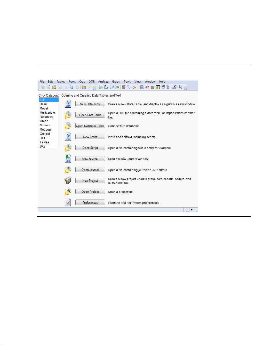
window classifies actions and platforms using categories.
Figure 1.2 The JMP Starter
On the left is a list of categories. Click a category to see the features and the commands related to that
category. For a description of all of the features in the JMP Starter, see Using JMP.
Another useful window is the Home window.
Page 25
Chapter 1 Introducing JMP 15
How Do I Get Started?
Figure 1.3 The Home Window
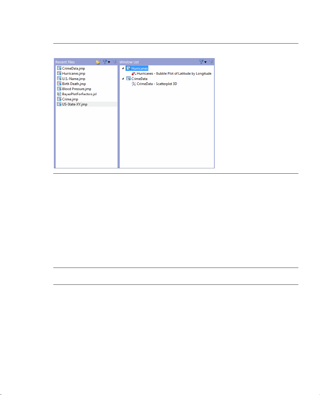
To open the Home window, select View > Home Window. This window includes links to the following:
• the data tables and report windows that are currently open
• files that you have opened recently
For more details about the JMP Starter window and the Home window, see Using JMP.
Almost all JMP windows contain a menu bar and a toolbar. You can find most JMP features in three ways:
• using the menu bar
• using the toolbar buttons
• using the buttons on the JMP Starter window
Note: By default, windows in JMP are not maximized. This enables you to see the interaction between the
windows.
About the Menu Bar and Toolbars
The menus and toolbars are hidden in many windows. To see them, hover your mouse cursor over the blue
bar under the window’s title bar. The menus in the JMP Starter window, the Home window, and all data
tables are always visible.
Page 26

16 Introducing JMP Chapter 1
Understanding Data Tables
Using Sample Data
The examples in this book and the other JMP books use sample data tables. The default location on
Windows for the sample data is here:
C:\Program Files\SAS\JMP\9\Support Files English\Sample Data
The Sample Data Index groups the data tables by category. Click a disclosure button to see a list of data
tables for that category, and then click a link to open a data table.
Opening a JMP sample data table
1. From the
2. Open the
3. Click the name of the data table to use it in the examples in this book.
Sample Import Data
Use files from other applications to learn how to import data into JMP.
The default location on Windows for the sample import data is here:
C:\Program Files\SAS\JMP\9\Support Files English\Sample Import Data
Help menu, select Sample Data.
Data Tables for Discovering JMP list by clicking on the disclosure button next to it.
Understanding Data Tables
A data table is a collection of data organized in rows and columns. It is similar to a Microsoft® Excel®
spreadsheet, but with some important differences that are discussed in “How is JMP Different from Excel?,”
p. 23. A data table might also contain other information like notes, variables, and scripts. These
supplementary items are discussed in later chapters.
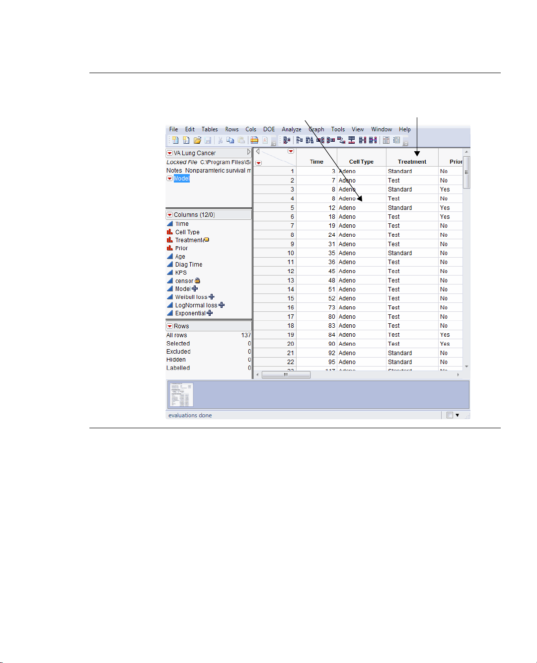
Open the VA Lung Cancer data table to see the data table described here.
Page 27
Chapter 1 Introducing JMP 17
The data grid has rows
and columns for data
Ta bl e
panel
Columns
panel
Rows
panel
Column names
Thumbnail links to
report windows
Understanding Data Tables
Figure 1.4 A Data Table
A data table contains the following parts:
Data grid The data grid contains the data arranged in rows and columns. Generally, each row in the
data grid is an observation, and the columns (also called variables) give information about the
observations. In Figure 1.4, each row corresponds to a test subject, and there are twelve columns of
information. Although all twelve columns cannot be shown in the data grid, the Columns panel lists
them all. The information given about each test subject includes the time, cell type, treatment, and
more. Each column has a header, or name. That name is not part of the table’s total count of rows.
Table panel The table panel can contain table variables or table scripts. In Figure 1.4, there is one
saved script called
Model that can automatically recreate an analysis. This table also has a variable
named Notes that contains information about the data. Table variables and table scripts are
discussed in a later chapter.
Page 28

18 Introducing JMP Chapter 1
Understanding the JMP Workflow
Columns panel
The columns panel shows the total number of columns, whether any columns are
selected, and a list of all the columns by name. The numbers in parentheses (12/0) show that there
are twelve columns, and that no columns are selected. An icon to the left of each column name
shows that column’s modeling type. Modeling types are described in “Understanding Modeling
Ty p es ,” p. 92 in the “Analyzing Your Data” chapter. Icons to the right show any attributes assigned
to the column. See “Viewing or Changing Column Information,” p. 39 in the “Working with Your
Data” chapter for more information about these icons.
Rows panel The rows panel shows the number of rows in the data table, and how many rows are
selected, excluded, hidden, or labeled. In Figure 1.4, there are 137 rows in the data table.
Thumbnail links to report windows This area shows thumbnails of all reports based on the data
table. Hover over one to see a larger preview of the report window. Double-click a thumbnail to
bring the report window to the front.
Interacting with the data grid, which includes adding rows and columns, entering data, and editing data, is
discussed in the “Working with Your Data” chapter. If you open multiple data tables, each one appears in a
separate window.
Understanding the JMP Workflow
Once your data is in a data table, you can create graphs or plots, and perform analyses. All features are
located in platforms, which are found primarily on the
because they do not just produce simple static results. Platform results appear in report windows, are highly
interactive, and are linked to the data table and to each other.
Analyze or Graph menus. They are called platforms
The platforms under the
Analyze and Graph menus provide a variety of analytical features and data
exploration tools.
The general steps to produce a graph or analysis are as follows:
1. Open a data table.
2. Select a platform from the Graph or Analysis menu.
3. Complete the platform launch window to set up your analysis.
4. Click OK to create the report window that contains your graphs and statistical analyses.
5. Customize your report by using report options.
6. Save, export, and share your results with others.
Later chapters discuss these concepts in greater detail.
The following example shows you how to perform a simple analysis and customize it in four steps. This
example uses the
Companies.jmp file sample data table to show a basic analysis of the variable Profits ($M).
Page 29
Chapter 1 Introducing JMP 19
Understanding the JMP Workflow
Step 1: Launching a Platform and Viewing Results
1. Open the Companies.jmp data table.
2. Select
3. Select
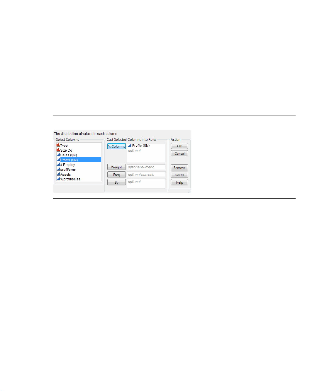
Figure 1.5 Assign Profits ($M)
Analyze > Distribution to open the Distribution launch window.
Profits ($M) in the Select Columns box and click the Y, Co l u m ns button.
The variable
Profits ($M) appears in the Y, C o lum n s role. See Figure 1.5 for the completed window.
Another way to assign variables is to click and drag columns from the Select Columns box to any of the
roles boxes.
4. Click OK.
The Distribution report window appears.
Page 30
20 Introducing JMP Chapter 1
Disclosure
buttons
Red triangle
menus
Blue bar that indicates
the hidden menu bar
and toolbars
Link to data table
Understanding the JMP Workflow
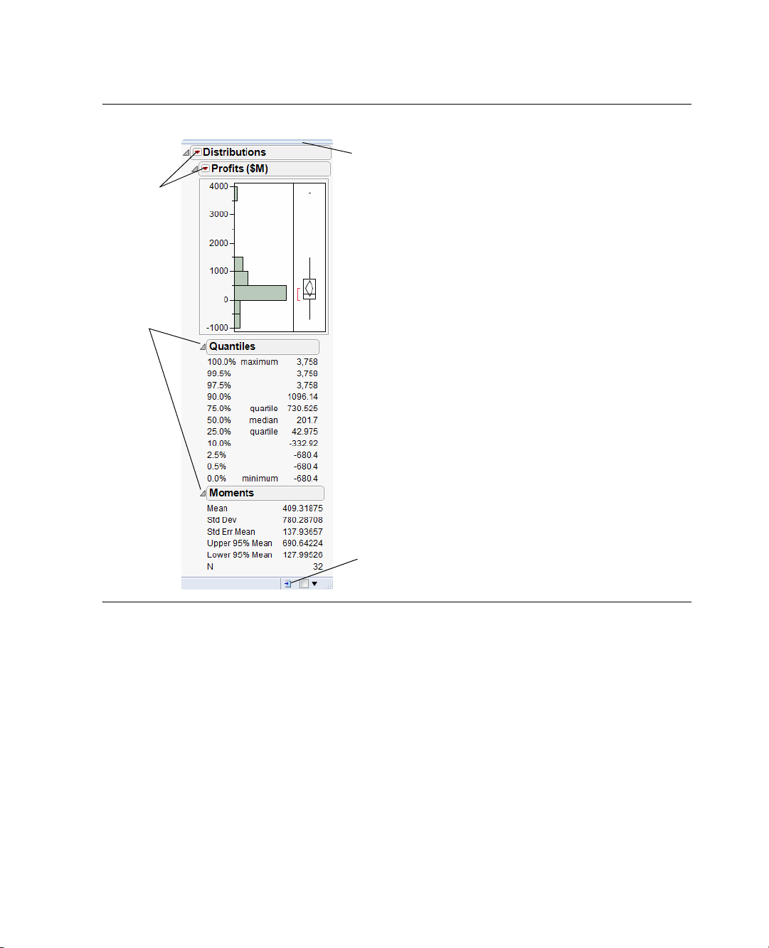
Figure 1.6 Distribution Report Window
Step 2: Removing the Box Plot
The report window contains basic plots or graphs and preliminary analysis reports. The results appear in an
outline format, and you can show or hide any report by clicking on the disclosure button.
Red triangle menus contain options and commands to request additional graphs and analyses at any time.
Hover over the blue bar at the top of the window to see the menu bar and the toolbars.
Click the data table button to bring the data table that was used to create this report to the front.
Continue using the Distribution report that you created earlier.
1. Click the red triangle next to
2. Deselect
Outlier Box Plot to turn the option off.
Profits ($M) to see a menu of report options.
The outlier box plot is removed from the report window.
Page 31
Chapter 1 Introducing JMP 21
Click here to remove the outlier box plot.
Understanding the JMP Workflow
Figure 1.7 Removing the Outlier Box Plot
Step 3: Requesting Additional Output
Continue to use the same report window.
1. From the red triangle menu next to
Profits ($M), select Test Mean.
The Test Mean window appears.
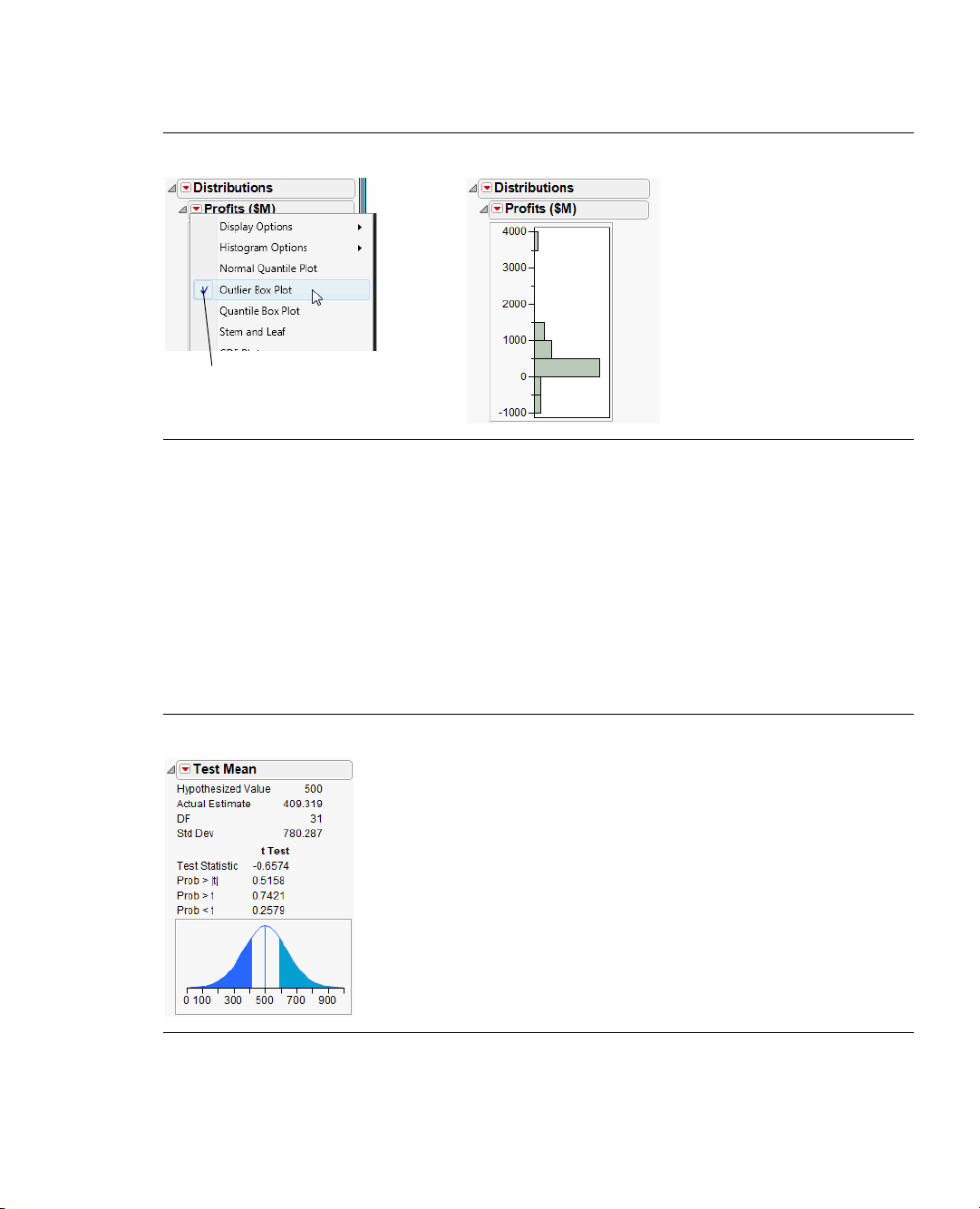
2. Enter 500 in the
3. Click
OK.
Specify Hypothesized Mean box.
The test for the mean is added to the report window.
Figure 1.8 Test for the Mean
Page 32

22 Introducing JMP Chapter 1
Click here to collapse
the Quantiles report
Understanding the JMP Workflow
Step 4: Interacting with Platform Results
All platforms produce results that are interactive. For example:
• Reports can be shown or hidden.
• Additional graphs and statistical details can be added or removed to suit your purposes.
• Platform results are connected to the data table and to each other.
For example, to close the
Figure 1.9 Close the Quantiles Report
Quantiles report, click the disclosure button next to Quantiles.
Platform results are connected to the data table. The histogram in Figure 1.10 shows that a group of
companies makes a much higher profit that the others. To quickly identify that group, click on the
histogram bar for them. The corresponding rows in the data table are selected.
Page 33

Chapter 1 Introducing JMP 23
Click the bar to select the corresponding rows
How is JMP Different from Excel?
Figure 1.10 Connection Between Platform Results and Data Table
In this case, the group includes only one company, and that one row is selected.
How is JMP Different from Excel?
There are a number of important differences between JMP and Excel or other spreadsheet applications.
Formulas
Excel Formulas are applied to individual cells.
JMP Formulas are applied only to entire columns. “Calculating Values With Formulas,” p. 40 in the
“Working with Your Data” chapter describes how to use formulas.
Columns Names
Excel Column names are part of the grid. Numbered rows and labeled columns extend past the data.
Numeric and character data reside in the same column.
JMP Column names are not part of the grid. There are no rows and columns beyond the existing data.
The grid is only as big as the data. A column is either numeric or character. If a column contains
both character and numeric data, the entire column’s data type is character, and the numbers are
treated as character data.
“Understanding Modeling Types,” p. 92 in the “Analyzing Your Data” chapter describes how data type
influences platform results.
Page 34

24 Introducing JMP Chapter 1
How Do I Find Help?
Tables and Worksheets
Excel A single spreadsheet contains several tables, or worksheets.
JMP JMP does not have the concept of worksheets. Each data table is a separate .jmp file and appears
in a separate window.
The Data Grid
Excel Data can be located anywhere in the data grid.
JMP Data always begins in row 1 and column 1.
Analysis and Graph Reports
Excel All data, analyses, and graphs are placed inside the data grid.
JMP Results appear in a separate window.
How Do I Find Help?
As you start using JMP, a variety of resources are available to supplement your learning. The JMP books,
Help, web information, sample data, and more are all available on the Help menu.
Ta bl e 1 .1 Help Menu Options
Option Description
Contents, Search,
and Index
Tip of the Day
Tutorials
These three menu items open the JMP Help system. The Help system provides
navigable and searchable documentation.
A collection of helpful tips and hints that enhance your experience with JMP.
Interactive tutorials that demonstrate how to use some of JMP’s statistical and
graphical features.
If you are not familiar with JMP, start with the Beginners Tutorial. Every new
JMP user should take this five-minute tutorial on the user-interface basics of
JMP.
Books
Contains links to the full documentation book set, a description of all the JMP
menus, and a quick reference describing keyboard shortcuts.
Sample Data
Provides links to all the sample data used in the documentation. The sample
data tables help when you are learning JMP.
Statistics Index
JSL Functions
Provides definitions of statistical terms.
Describes JSL functions and provides examples and topic help.
Page 35

Chapter 1 Introducing JMP 25
How Do I Find Help?
Ta bl e 1 .1 Help Menu Options (Continued)
Option Description
Object Scripting
DisplayBox
Scripting
JMP.com
JMP User
Community
About JMP
Describes JSL objects and messages and provides examples and topic help.
Describes JSL display box objects.
Takes you to the JMP Web site (www.jmp.com). The Web site contains
information about JMP and provides links to the JMP Blog, JMP Discussion
Forum, JMP User Community, the latest news and events, and file sharing. You
can register for free weekly webinars, and find podcasts and other JMP
literature. The Web site also contains videos that demonstrate the newest JMP
features. You can also learn how to join one of the regional JMP User’s Groups.
Takes you to the online user forum where you can download JMP files, read the
JMP Blog, and discuss JMP topics with other users.
Shows the release, copyright, operating system, and the owner of the copy of
JMP that is running.
Page 36

26 Introducing JMP Chapter 1
How Do I Find Help?
Page 37

Chapter 2
Working with Your Data
Preparing Your Data for Graphing and Analyzing
Before graphing or analyzing your data, the data has to be in a data table and in the proper format. This
chapter shows some basic data management tasks, including the following:
• creating new data tables
• opening existing data tables
• importing data from other applications into JMP
• managing your data
Figure 2.1 Example of a Data Table
Page 38

Contents
Getting Your Data Into JMP . . . . . . . . . . . . . . . . . . . . . . . . . . . . . . . . . . . . . . . . . . . . . . . . . . . . . . . . . . 29
Copying and Pasting Data. . . . . . . . . . . . . . . . . . . . . . . . . . . . . . . . . . . . . . . . . . . . . . . . . . . . . . . . . 29
Importing Data . . . . . . . . . . . . . . . . . . . . . . . . . . . . . . . . . . . . . . . . . . . . . . . . . . . . . . . . . . . . . . . . . 29
Entering Data . . . . . . . . . . . . . . . . . . . . . . . . . . . . . . . . . . . . . . . . . . . . . . . . . . . . . . . . . . . . . . . . . . . 31
Working with Data Tables . . . . . . . . . . . . . . . . . . . . . . . . . . . . . . . . . . . . . . . . . . . . . . . . . . . . . . . . . . . . .34
Editing Data . . . . . . . . . . . . . . . . . . . . . . . . . . . . . . . . . . . . . . . . . . . . . . . . . . . . . . . . . . . . . . . . . . . .34
Selecting, Deselecting, and Finding Values . . . . . . . . . . . . . . . . . . . . . . . . . . . . . . . . . . . . . . . . . . . . . 35
Viewing or Changing Column Information . . . . . . . . . . . . . . . . . . . . . . . . . . . . . . . . . . . . . . . . . . . .39
Calculating Values With Formulas. . . . . . . . . . . . . . . . . . . . . . . . . . . . . . . . . . . . . . . . . . . . . . . . . . . 40
Filtering Data . . . . . . . . . . . . . . . . . . . . . . . . . . . . . . . . . . . . . . . . . . . . . . . . . . . . . . . . . . . . . . . . . . 42
Managing Data . . . . . . . . . . . . . . . . . . . . . . . . . . . . . . . . . . . . . . . . . . . . . . . . . . . . . . . . . . . . . . . . . . . . 44
Requesting Summary Statistics . . . . . . . . . . . . . . . . . . . . . . . . . . . . . . . . . . . . . . . . . . . . . . . . . . . . . .45
Creating Subsets . . . . . . . . . . . . . . . . . . . . . . . . . . . . . . . . . . . . . . . . . . . . . . . . . . . . . . . . . . . . . . . . 49
Joining Data Tables . . . . . . . . . . . . . . . . . . . . . . . . . . . . . . . . . . . . . . . . . . . . . . . . . . . . . . . . . . . . . . . 51
Sorting Tables . . . . . . . . . . . . . . . . . . . . . . . . . . . . . . . . . . . . . . . . . . . . . . . . . . . . . . . . . . . . . . . . . . . 53
Page 39

Chapter 2 Working with Your Data 29
Getting Your Data Into JMP
Getting Your Data Into JMP
• To copy and paste data from another application, see “Copying and Pasting Data,” p. 29.
• To import data from another application, see “Importing Data,” p. 29.
• To enter data directly into a data table, see “Entering Data,” p. 31
• To open a data table, double-click on the file, or use the
You can also import data into JMP from a database. For more information, see Using JMP.
This chapter uses sample data tables and sample import data that is installed with JMP. To find these files,
see “Using Sample Data,” p. 16 in the “Introducing JMP” chapter.
Copying and Pasting Data
You can move data into JMP by copying and pasting from another application, such as Excel or a text file.
Example: Copying and pasting data
File > Open command.
1. Open the
2. Select all of the rows and columns, including the column names. There are 12 columns and 138 rows.
3. Copy the selected data.
4. In JMP, select
5. Select
Edit > Paste with Column Names to paste the data and column headings.
If the data that you are pasting into JMP does not have column names, then you can use
Importing Data
You can move data into JMP by importing data from another application, such as Excel, SAS, or text files.
The basic steps to import data are as follows:
1. Select
2. Navigate to your file’s location.
3. If your file is not listed in the Open Data File window, select the correct file type from the
4. Click
Example: Importing a Microsoft Excel File
1. Select
2. Navigate to the
3. Select VA Lung Cancer.xls.
4. Click
File > Open.
menu.
Open.
File > Open.
Open.
VA Lung Cancer.xls file in Excel. This file is located in the Sample Import Data folder.
File > New > Data Table to create an empty table.
Edit > Paste.
Files of type
Sample Import Data folder.
Page 40

30 Working with Your Data Chapter 2
Getting Your Data Into JMP
The Open Data File window has additional options:
• You can control whether JMP assumes that column headings are on row one in the Excel file.
• If your Excel file has multiple worksheets, choose which worksheets to import. Each worksheet is
imported to a separate data table.
• Select which version of Excel you need to import from the
All JMP Files does not show your Excel file, select the correct version from this menu.
Files of type menu. If the default setting of
When you import Excel files, JMP predicts whether columns headings exist, and if the column names are
on row one. The copy and paste method is recommended for the following situations:
• if the column names are located in a row other than row one
• if the file does not include column names and the data does not start in row one
• if the file contains column names and the data does not start in row two
See “Copying and Pasting Data,” p. 29.
Example: Importing a Text File
One way to import a text file is to let JMP assume the data’s format and place the data in a data table. This
method uses settings that you can specify in Preferences. See Using JMP for information about setting text
import preferences.
Another way to import a text file is to use a Text Preview window to see what your data table will look like
after importing, and make adjustments. The following example shows you how to use Text Import Preview
window.
1. Select
2. Navigate to the
3. Select
4. At the bottom of the Open window, select
5. Click
File > Open.
Sample Import Data folder.
Animals_line3.txt.
Data with preview.
Open.
Page 41

Chapter 2 Working with Your Data 31
Getting Your Data Into JMP
Figure 2.2 Initial Preview Window
This text file has a title on the first line, column names on the third line, and the data starts on line four. If
you opened this directly in JMP, the Animals Data line would be the first column name, and all the column
names and data afterward would be out of sync. The Preview window lets you adjust the settings before you
open the file, and see how your adjustments affect the final data table.
6. Enter 3 in the
7. Enter 4 in the
8. Click
In the second window, you can exclude columns from the import and change the data modeling of the
columns. For this example, use the default settings.
9. Click
The new data table has columns named
columns are character data. The
Entering Data
You can enter data directly in a data table. The following example shows you how to enter data that was
collected over several months into a data table.
File contains column names on line field.
Data starts on line field.
Next.
Import.
species, subject, miles, and season. The species and season
subject and miles columns are continuous numeric data.
Page 42
32 Working with Your Data Chapter 2
Click once to select the column.
Click again, and then type “Month”.
Getting Your Data Into JMP
Scenario
Table 2.1 shows the data from a study that investigated a new blood pressure medication. Each individual’s
blood pressure was measured over a six month period. Two doses (300mg and 450mg) of the medication
were used, along with a control and placebo group. The data shows the average blood pressure for each
group.
Ta bl e 2 .1 Blood Pressure Data
Month Control Placebo 300mg 450mg
March 165 163 166 168
April 162 159 165 163
May 164 158 161 153
June 162 161 158 151
July 166 158 160 148
August 163 158 157 150
Entering Data in a New Data Table
1. Select
File > New > Data Table to create an empty data table.
A new data table has one column and no rows.
2. Click the column name to select it, and then click again to edit the name.
Note: If you double-click too quickly, the Column Info window appears. You can change the column name
there as well.
3. Change the column name to
Figure 2.3 Entering a Column Name
Month. See Figure 2.3.
Page 43

Chapter 2 Working with Your Data 33
Columns panel
Modeling type icon
Double-click here, and then type the new name.
Getting Your Data Into JMP
4. Select Rows > Add Rows.
The Add Rows window appears.
5. Since you want to add six rows, type 6.
6. Click
7. Enter the
Figure 2.4 Month Column Completed
OK. Six empty rows are added to the data table.
Month information by double-clicking in a cell and typing.
In the columns panel, look at the modeling type icon to the left of the column name. It has changed to
reflect that
Month is now nominal (previously it was continuous). Compare the modeling type shown for
Column 1 in Figure 2.3 and for Month in Figure 2.4. This difference is important and is discussed in
“Viewing or Changing Column Information,” p. 39.
8. Double-click in the space on the right side of the Month column to add the
9. Change the name to
10. Enter the
Control data as shown in Table 2.1. Your data table now consists of six rows and two columns.
11. Continue adding columns and entering data as shown in Table 2.1 to create the final data table with six
rows and five columns.
Changing the data table name
1. Double-click on the data table name (Untitled) in the Table Panel.
2. Type the new name (Blood Pressure).
Figure 2.5 Changing the Data Table Name
Control column.
Control.
Page 44

34 Working with Your Data Chapter 2
Working with Data Tables
Working with Data Tables
This section contains the following information:
• “Editing Data,” p. 34
• “Selecting, Deselecting, and Finding Values,” p. 35
• “Viewing or Changing Column Information,” p. 39
• “Filtering Data,” p. 42
• “Calculating Values With Formulas,” p. 40
Editing Data
You can enter or change data, either a few cells at a time or for an entire column. This section contains the
following information:
• “Changing Values,” p. 34
• “Recoding Values,” p. 34
• “Creating Patterned Data,” p. 35
The examples in this section use the
table.
Changing Values
To change a value, select a cell and type the change. You can also double-click a cell to edit it.
Note: Double-clicking in a cell is not the same as selecting a cell. A single click selects a cell. You can select
more than one cell at the same time, and you can perform certain actions on selected cells. Double-clicking
only lets you edit a cell. For more information about selecting rows, columns, and cells, see “Selecting,
Deselecting, and Finding Values,” p. 35.
Recoding Values
Use the recoding tool to change all of the values in a column at once. For example, suppose you are
interested in comparing the sales of computer and pharmaceutical companies. Your current company labels
are Computer and Pharmaceutical. You want to change them to Technical and Drug. Going through all 32
rows of data and changing all the values would be tedious, inefficient, and error-prone, especially if you had
many more rows of data. Recode is a better option.
1. Select the
2. Select
3. In the Recode window, enter the desired values in the
Technical in the Computer row, and Drug in the Pharmaceutical row.
4. Select the
Companies.jmp sample data table. Before you continue, open this data
Ty pe column by clicking once on the column heading.
Cols > Recode.
New Values boxes. For this example, enter
In Place option from the menu.
Page 45

Chapter 2 Working with Your Data 35
Working with Data Tables
Figure 2.6 Recode Window
5. Click OK.
All cells are updated automatically to the new values.
Creating Patterned Data
Use the Fill options to populate a column with patterned data. The Fill options are especially useful if your
data table is large, and typing in the values for each row would be cumbersome.
Example: Filling a column with the pattern
1. Add a new column.
2. Enter 1 in the first cell, 2 in the second cell, and 3 in the third cell.
3. Select the three cells, and right-click anywhere in the selected cells to see a menu.
4. Select
Fill > Repeat sequence to end of table.
The rest of the column is filled with the sequence (1, 2, 3, 1, 2, 3, ...).
To continue a pattern instead of repeating it (1, 2, 3, 4, 5, 6, ...), select
table
. This command can also be used to generate patterns like (1, 1, 1, 2, 2, 2, 3, 3, 3, ...).
The Fill options can recognize simple arithmetic and geometric sequences. For character data, the Fill
options only repeat the values.
Selecting, Deselecting, and Finding Values
You can select rows, columns, or cells within a data table. For example, to create a subset of an existing data
table, you must first select the parts of the table that you want to subset. Also, selecting rows can make data
points stand out on a graph. Select rows and columns manually by clicking, or select rows that meet certain
search criteria. This section contains the following information:
• “Selecting and Deselecting Rows,” p. 36
• “Selecting and Deselecting Columns,” p. 36
• “Selecting and Deselecting Cells,” p. 37
• “Searching for Values,” p. 38
Continue sequence to end of
Page 46

36 Working with Your Data Chapter 2
To deselect all rows at
once, click here.
Working with Data Tables
Selecting and Deselecting Rows
Ta bl e 2 .2 Selecting and Deselecting Rows
Task Action
Select rows one at a time Click on the row number.
Select multiple adjacent rows Click and drag on the row numbers.
or
Select the beginning row, and then hold down the SHIFT key
and click the last row number.
Select multiple non-adjacent rows Select the first row, and then hold down the CTRL key and
click the other row numbers.
Deselect rows one at a time Hold down the CTRL key and click the row numbers.
Deselect all rows Click in the lower-triangular space in the top left corner of the
table. See Figure 2.7.
Figure 2.7 Deselecting Rows
Selecting and Deselecting Columns
Ta bl e 2 .3 Selecting and Deselecting Columns
Task Action
Select columns one at a time Click the column heading.
Select multiple adjacent columns Click and drag across the column headings.
or
Select the beginning column, and then hold down the
SHIFT key and click the last header.
Page 47

Chapter 2 Working with Your Data 37
To deselect all columns
at once, click here.
Working with Data Tables
Ta bl e 2 .3 Selecting and Deselecting Columns
Task Action
Select multiple non-adjacent columns Select the first column, and then hold down the CTRL key
and click the other column headings.
Deselect columns one at a time Hold down the CTRL key and click the column heading.
Deselect all columns Click in the upper-triangular space in the top left corner of
the table. See Figure 2.8.
Figure 2.8 Deselecting Columns
Selecting and Deselecting Cells
Ta bl e 2 .4 Selecting and Deselecting Cells
Task Action
Select cells one at a time Click each cell individually.
Select multiple adjacent cells Click and drag across the cells.
or
Select the beginning cell, and then hold down the SHIFT key
and click the last cell.
Select multiple non-adjacent cells Select the first cell, and then hold down the CTRL key and click
the other cells.
Deselect all cells Click in the upper and lower triangular spaces in the top left
corner of the table.
Page 48

38 Working with Your Data Chapter 2
Select your target
column here
Enter your search
criteria here
Working with Data Tables
Searching for Values
In a data table that has thousands or tens of thousands of rows, it can be difficult to locate a particular cell
by scrolling through the table. If you are looking for specific information, use the Search feature to find it. If
data is found that matches the search criteria, the cell is selected and the data grid scrolls to show it in the
window. For example, the
Companies.jmp data table contains information about a company that has total
sales of $11,899. Use the Search feature to find that cell.
Example: Searching for a value
1. Select
2. In the
3. Click
If multiple cells meet the search criteria, click
You can also search for multiple rows at once, with each row matching some criteria.
Example: Select all of the rows that correspond to medium-sized companies
1. Select
2. In the column list box on the left, select
3. In the text box on the right, enter medium.
4. Click
Figure 2.9 Select Rows Window
Edit > Search > Find to launch the Search window.
Find what box, enter 11899.
Find. JMP finds the first cell that has 11,899 in it, and selects it.
Find again to find the next cell that matches the search term.
Rows > Row Selection > Select Where to open the Select rows window.
Size Co.
OK.
Page 49

Chapter 2 Working with Your Data 39
Working with Data Tables
JMP selects all of the rows that have Size Co equal to medium. There are seven.
Viewing or Changing Column Information
Information about a column is not limited to the data in the column. Data type, modeling type, format,
and formulas can also be set.
To view or change column characteristics, double-click on the column heading. Or, right-click on the
column heading and select
Figure 2.10 Column Info Window
Column Info. The Column Info window appears.
v
Ta bl e 2 .5 Column Information
Option Description
Column Name
Enter or change the column name. No two columns can have the same
column name.
Data Type Select one of the following data types:
•
Numeric specifies the column values as numbers.
•
Character specifies the column values as non-numeric, such as letters or
symbols.
•
Row State specifies the column values as row states. This is an advanced
topic. See Using JMP.
Page 50

40 Working with Your Data Chapter 2
Working with Data Tables
Ta bl e 2 .5 Column Information (Continued)
Option Description
Modeling Type Modeling types define how values are used in analyses. Select one of the
following modeling types:
•
Continuous values are numeric only.
•
Ordinal values are either numeric or character, and are ordered
categories.
•
Nominal values are either numeric or character, but not ordered.
Format Select a format for numeric values. This option is not available for character
data. Here are a few of the most common formats:
•
Best lets JMP choose the best display format.
•
Fixed Dec specifies the number of decimal places that appear.
•
Date specifies the syntax for date values.
•
Time specifies the syntax for time values.
•
Currency specifies the type of currency and decimal points that are used
for currency values.
Column Properties Set special column properties such as formulas, notes, and value orders. See
Using JMP.
Lock Lock a column, so that the values in the column cannot be changed.
Calculating Values With Formulas
Use the Formula Editor to create columns that contain calculated values.
Scenario
The sample data table
data was collected for March, June, and August of 1999.
Creating the Formula
Suppose that you want to create a new column containing the average on-time percentage for each airline.
1. Add a new column.
2. Right-click on the column heading of the new column and select
appears.
On-Time Arrivals.jmp reflects the percent of on-time arrivals for several airlines. The
Formula. The Formula Editor window
Page 51

Chapter 2 Working with Your Data 41
Table Columns Keypad
Functions
If the red box is
not showing, click
here to show it.
Working with Data Tables
Figure 2.11 Formula Editor
Create the formula for the average on-time percentage of each airline:
3. From the Table Columns list, select
March 1999.
4. Click the button on the keypad.
5. Select
6. Select
Figure 2.12 Sum of the Months
June 1999, followed by another sign.
August 1999.
Notice that only August 1999 is selected (has the red box around it).
7. Click on the box surrounding the entire formula.
Page 52

42 Working with Your Data Chapter 2
Working with Data Tables
Figure 2.13 Entire Formula Selected
8. Click the button.
9. Type a 3 in the denominator box, and then click outside of the formula in any of the white space.
Figure 2.14 Completed Formula
10. Click OK
The new column contains the averages.
The Formula Editor has many built-in arithmetic and statistical functions. For example, another way to
calculate the average on-time arrival percentage is to use the
Mean( ) function in the Statistical functions list.
For details about all of the Formula Editor functions, see Using JMP.
Filtering Data
Use the Data Filter to interactively select complex subsets of data, hide these subsets in plots, or exclude
them from analyses. For example, look at profit per employee for computer and pharmaceutical companies.
1. Open the
2. Select
3. Select
4. Click
5. From the red triangle menu for profit/emp, select
Companies.jmp sample data table.
Analyze > Distribution.
profit/emp and click Y, Col u m ns .
OK.
Display Options > Horizontal Layout.
Page 53

Chapter 2 Working with Your Data 43
Working with Data Tables
Figure 2.15 Distribution of profit/emp
6. Turn on Automatic Recalc by selecting Script > Automatic Recalc from the red triangle menu for
Distributions.
When this option is on, every change that you make (for example, hiding or excluding points) causes
your report window to automatically update itself.
7. Select
8. Select
9. Clear
Rows > Data Filter.
Ty pe and click Add.
Select and select Include.
10. To filter out the Pharmaceutical companies from the Distribution results, and include only the
Computer companies, click the
Computer box in the Data Filter window.
The distribution results update to only include Computer companies.
Page 54

44 Working with Your Data Chapter 2
Click the Computer box to include only
computer companies in the
Distribution results.
The graph and the
statistics report
automatically reflect only
the rows that are
selected.
Managing Data
Figure 2.16 Filter for Computer Companies
Conversely, to change the Distribution results to include only the Pharmaceutical companies, click the
Pharmaceutical button on the Data Filter window.
Managing Data
The commands on the Tab le s menu summarize and manipulate data tables into the format that you need
for graphing and analyzing. This section describes five of the commands:
Summary Creates a table that contains summary statistics that describe your data.
Ta bu l at e Provides a drag and drop workspace to create summary statistics.
Subset Creates a table that contains a subset of your data.
Join Joins the data from two data tables into one new data table.
Sort Sorts your data by one or more columns.
For complete details about these and the other Tables menu commands, see Using JMP.
Page 55

Chapter 2 Working with Your Data 45
Managing Data
Requesting Summary Statistics
Summary statistics, such as sums and means, can instantly provide useful information about your data. For
example, if you look at the annual profit of each company out of thirty-two companies, it’s difficult to
compare the profits of small, medium, and large companies. A summary shows that information
immediately.
Create summary tables by using either the Summary or Tabulate commands on the Tables menu. The
Summary command creates a new data table. As with any data table, you can perform analyses and create
graphs from the summary table. The Tabulate command creates a report window with a table of summary
data. You can also create a table from the Tabulate report.
Summary
A summary table contains statistics for each level of a grouping variable. For example, look at the financial
data for computer and pharmaceutical companies. Suppose that you want to calculate the mean of sales and
the mean of profits, for each combination of company type and size.
1. Open the
2. Select
3. Select
4. Select
Figure 2.17 Completed Summary Window
Companies.jmp sample data table.
Tables > Summary.
Ty pe and Size Co and click Group.
Sales ($M) and Profits ($M) and click Statistics > Mean.
Page 56

46 Working with Your Data Chapter 2
Managing Data
5. Click OK.
JMP calculates the mean of
Size Co.
Figure 2.18 Summary Table
Sales ($M) and the mean of Profit ($M) for each combination of Typ e and
The summary table contains the following:
• There are columns for each grouping variable (in this example,
•The
N Rows column shows the number of rows from the original table that correspond to each
Ty pe and Size Co).
combination of grouping variables. For example, the original data table contains 14 rows corresponding
to small computer companies.
• There is a column for each summary statistic requested. In this example, there is a column for the mean
of
Sales ($M) and a column for the mean of Profits ($M).
Tabulate
The summary table is linked to the source table. Selecting a row in the summary table also selects the
corresponding rows in the source table.
Use the Tabulate command to drag columns into a workspace, creating summary statistics for each
combination of grouping variables. This example shows you how to use Tabulate to create the same
summary information that you just created using Summary.
1. Open the
2. Select
Companies.jmp sample data table.
Tabl es > Tab ulate.
Page 57

Chapter 2 Working with Your Data 47
Managing Data
Figure 2.19 Tabulate Workspace
3. Select both Ty pe and Size Co.
4. Drag and drop them into the
Figure 2.20 Dragging Columns to the Row Zone
Drop zone for rows to see a menu.
Page 58

48 Working with Your Data Chapter 2
Managing Data
5. Select Add Grouping Columns.
The initial tabulation shows the number of rows per group.
Figure 2.21 Initial Tabulation
6. Select both Sales ($M) and Profits ($M), and drag and drop them over the N in the table to see a menu.
Figure 2.22 Adding Sales and Profit
7. Select Add Analysis Columns.
The tabulation now shows the sum of
is to change the sums to means.
Figure 2.23 Tabulation of Sums
Sales ($M) and the sum of Profits ($M) per group. The final step
Page 59

Chapter 2 Working with Your Data 49
Managing Data
8. Right-click on Sum (either of them) and select Statistics > Mean.
The sums are replaced by the means for each group.
Figure 2.24 Final Tabulation
The means are the same as those obtained using the Summary command. Compare Figure 2.24 to
Figure 2.18.
Creating Subsets
If you want to look closely at only part of your data table, you can create a subset. For example, suppose that
you have already compared the sales and profits of big, medium, and small computer and pharmaceutical
companies. Now you want to look at the sales and profits of only the medium-sized companies.
Creating a subset is a two-step process. First select the target data, and then extract the data into a new table.
Subsetting with the Subset Command
1. Open the
Companies.jmp sample data table.
Selecting the rows and columns that you want to subset
2. Select
3. Select
Rows > Row Selection > Select Where.
Size Co in the column list box on the left.
4. Enter medium in the text enter box.
5. Click
6. Select the
OK.
Ty pe , Sales ($M), and Profits ($M) columns.
Creating the subset table
7. Select
Tables > Subset to launch the Subset window.
Page 60
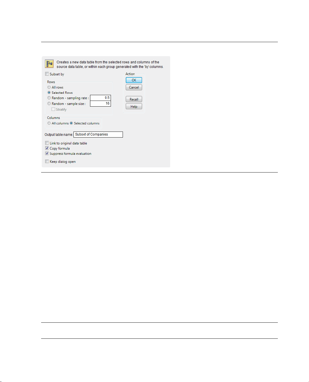
50 Working with Your Data Chapter 2
Managing Data
Figure 2.25 Subset Window
Your selections are already set up in this window. You could also set your subset selections in this
window.
8. Click
OK.
The resulting subset data table has seven rows and three columns. For complete details about the Subset
command, see Using JMP.
Subsetting with the Distribution Platform
Another way to create subsets uses the connection between platform results and data tables.
Example: Creating a subset using the Distribution command
1. Open the
2. Select
3. Select
4. Click
Companies.jmp sample data table.
Analyze > Distribution.
Ty pe and click Y, C o l u m ns.
OK.
5. Double-click on the histogram bar that represents Computer to create a subset table of the Computer
companies.
Caution: This method creates a linked subset table. This means if you make any changes to the data in the
subset table, the corresponding value changes in the source table.
Page 61

Chapter 2 Working with Your Data 51
Managing Data
Joining Data Tables
Use the Join option to combine information from multiple data tables into a single data table. For example,
suppose that you have a data table containing results from an experiment on popcorn yields. In another data
table, you have the results of a second experiment on popcorn yields. To compare the two experiments or to
analyze the trials using both sets of results, you need to have the data in the same table. Also, the
experimental data was not entered into the data tables in the same order. One of the columns has a different
name, and the second experiment is incomplete. This means that you cannot copy and paste from one table
into another.
Example: Joining two data tables
1. Open the
2. Click on
3. Select
4. In the
Trial 1. jmp and Little.jmp data tables.
Trial 1. jmp to make it the active data table.
Tables > J o i n .
Join ‘Trial1’ With box, select Little.
5. From the Matching Specification menu, select By Matching Columns.
6. In the
7. In the same way, match
Source Columns boxes, select popcorn in both boxes, and then click Match.
batch in both boxes, and then match oil amt for Trial1 and oil for Little.
Your matching columns do not have to have the same name.
8. Select
Include non-matches for both tables.
Since one experiment is partial, you want to include all columns, including any with missing data.
9. To avoid duplicate columns, select the
10. From
11. From
Trial1, select all four columns and click Select.
Little, select only yield and click Select.
Select columns for joined table option.
Page 62
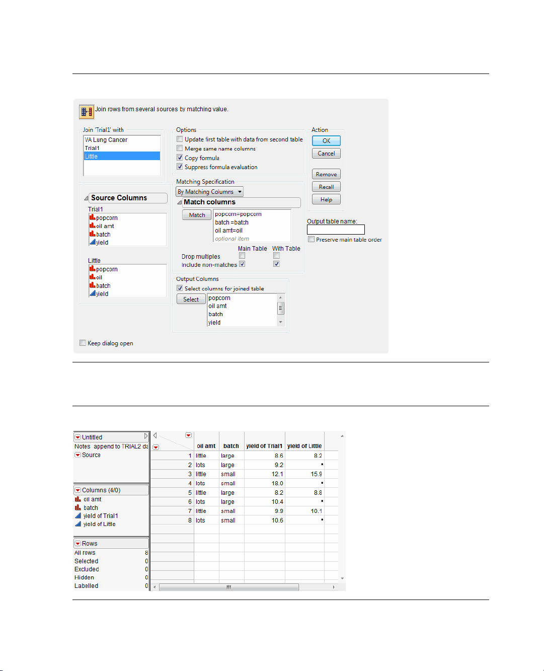
52 Working with Your Data Chapter 2
Managing Data
Figure 2.26 Completed Join Window
12. Click OK.
Figure 2.27 Joined Table
Page 63

Chapter 2 Working with Your Data 53
Ascending icon
Descending button
Managing Data
Sorting Tables
Use the Sort command to sort a data table by one or more columns in the data table. For example, look at
financial data for computer and pharmaceutical companies. Suppose that you want to sort the data table by
Ty pe , then by Profits ($M). Additionally, you want Profits ($M) to be in descending order within each Ty pe .
1. Open the
2. Select
3. Select
4. Select
Companies.jmp sample data table.
Tabl es > Sort.
Ty pe and click By to assign Ty pe as a sorting variable.
Profits ($M) and click By.
At this point, both variables are set to be sorted in ascending order. See the ascending icon next to the
variables in Figure 2.28.
Figure 2.28 Sort Ascending Icon
5. To change Profits ($M) to sort in descending order, select Profits ($M) and click the descending button.
Figure 2.29 Change Profits to Descending
The icon next to Profits ($M) changes to descending.
Page 64

54 Working with Your Data Chapter 2
Managing Data
6. Select the Replace Table check box.
When selected, the
Replace Table option tells JMP to sort the original data table instead of creating a
new table with the sorted values. This option is not available if there are any open report windows
created from the original data table. Sorting a data table with open report windows might change how
some of the data is displayed in the report window, especially in graphs.
7. Click
OK.
The data table is now sorted by type alphabetically, and by descending profit totals within type.
Page 65

Chapter 3
Visualizing Your Data
Graphing Data
Visualizing your data is an important first step. The graphs described in this chapter help you to discover
important details about your data. For example, histograms show you the shape and range of your data, and
help you find unusual data points.
This chapter presents several of the most common graphs and plots that enable you to visualize and explore
data in JMP. This chapter is an introduction to some of JMP’s graphical tools and platforms. Use JMP to
visualize the distribution of single variables, or the relationships among multiple variables.
Figure 3.1 Visualizing Data with JMP
Page 66

Contents
Looking at Single Variables . . . . . . . . . . . . . . . . . . . . . . . . . . . . . . . . . . . . . . . . . . . . . . . . . . . . . . . . . . . .57
Histograms . . . . . . . . . . . . . . . . . . . . . . . . . . . . . . . . . . . . . . . . . . . . . . . . . . . . . . . . . . . . . . . . . . . . .57
Bar Charts . . . . . . . . . . . . . . . . . . . . . . . . . . . . . . . . . . . . . . . . . . . . . . . . . . . . . . . . . . . . . . . . . . . . . .59
Comparing Multiple Variables. . . . . . . . . . . . . . . . . . . . . . . . . . . . . . . . . . . . . . . . . . . . . . . . . . . . . . . . . .61
Scatterplots . . . . . . . . . . . . . . . . . . . . . . . . . . . . . . . . . . . . . . . . . . . . . . . . . . . . . . . . . . . . . . . . . . . . 62
Scatterplot Matrix . . . . . . . . . . . . . . . . . . . . . . . . . . . . . . . . . . . . . . . . . . . . . . . . . . . . . . . . . . . . . . . 66
Side-by-Side Box Plots. . . . . . . . . . . . . . . . . . . . . . . . . . . . . . . . . . . . . . . . . . . . . . . . . . . . . . . . . . . . 69
Overlay Plots. . . . . . . . . . . . . . . . . . . . . . . . . . . . . . . . . . . . . . . . . . . . . . . . . . . . . . . . . . . . . . . . . . . .71
Variability Chart . . . . . . . . . . . . . . . . . . . . . . . . . . . . . . . . . . . . . . . . . . . . . . . . . . . . . . . . . . . . . . . . .75
Graph Builder . . . . . . . . . . . . . . . . . . . . . . . . . . . . . . . . . . . . . . . . . . . . . . . . . . . . . . . . . . . . . . . . . . 77
Bubble Plots . . . . . . . . . . . . . . . . . . . . . . . . . . . . . . . . . . . . . . . . . . . . . . . . . . . . . . . . . . . . . . . . . . . .82
Page 67

Chapter 3 Visualizing Your Data 57
Looking at Single Variables
Looking at Single Variables
Single-variable graphs, or univariate graphs, let you look closely at one variable at a time. When you begin
to look at your data, it’s important to learn about each variable before looking at how the variables interact
with each other. Univariate graphs let you visualize each variable individually.
This section covers two graphs that show the distribution of a single variable:
• “Histograms,” p. 57, for continuous variables
• “Bar Charts,” p. 59, for categorical variables
Use the Distribution platform to create both of these graphs. Distribution produces a graphical description
and descriptive statistics for each variable.
Histograms
The histogram is one of the most useful graphical tools for understanding the distribution of a continuous
variable. Use a histogram to find the following in your data:
• the average value and variation
•extreme values
Scenario
Figure 3.2 Example of a Histogram
This example uses the
A financial analyst wants to explore the following questions:
• Generally, how much profit does each company earn?
• What is the average profit?
• Are there any companies that earn either extremely high or extremely low profits compared to the other
companies?
To answer these questions, use a histogram of
Companies.jmp data table, which contains data on profits for a group of companies.
Profits ($M).
Page 68

58 Visualizing Your Data Chapter 3
Histogram
Box plot
Looking at Single Variables
Creating the Histogram
1. Open the
2. Select
3. Select
Figure 3.3 Distribution Window for Profits ($M)
Companies.jmp sample data table.
Analyze > Distribution.
Profits ($M) and click Y, Co l u m n s .
4. Click OK.
Figure 3.4 Histogram of Profits ($M)
Interpreting the Histogram
The histogram provides these answers:
• Most companies’ profits are between $-1000 and $1500.
All the bars except for one are located in this range. Additionally, more companies’ profits range from $0
to $500 than any other range. The bar representing that range is much longer than the others.
• The average profit is a little less than $500.
The middle of the diamond in the box plot indicates the mean value. In this case, the mean is slightly
lower than the $500 mark.
Page 69

Chapter 3 Visualizing Your Data 59
Looking at Single Variables
• One company has significantly higher profits than the others, and might be an outlier. An outlier is a
data point that is separated from the general pattern of the other data points.
This outlier is represented by a single, very short bar at the top of the histogram. The bar is small and
represents a small group (in this case, a single company), and it is widely separated from the rest of the
histogram bars.
In addition to the histogram, this report includes the following:
• The box plot, which is another graphical summary of the data. For detailed information about the box
plot, see Basic Analysis and Graphing.
•
Quantiles and Moments reports. These reports are discussed in “Analyzing Distributions,” p. 95 in the
“Analyzing Your Data” chapter.
Interacting with the Histogram
Data tables and reports are all connected in JMP. Click on a histogram bar to select the corresponding rows
in the data table.
Bar Charts
Use a bar chart to visualize the distribution of a categorical variable. A bar chart looks similar to a histogram,
since they both have bars that correspond to the levels of a variable. A bar chart shows a bar for every level of
the variable, whereas the histogram shows a range of values for the variable.
Scenario
Figure 3.5 Example of a Bar Chart
This example uses the
Companies.jmp data table, which contains data on the size and type of a group of
companies.
A financial analyst wants to explore the following questions:
• What is the most common type of company?
• What is the most common size for a company?
To answer these questions, use bar charts of
Ty pe and Size Co.
Page 70

60 Visualizing Your Data Chapter 3
Bar Charts
Summary
Information
Looking at Single Variables
Creating the Bar Chart
1. Open the
2. Select
3. Select
4. Click
Figure 3.6 Bar Charts of Type and Size Co
Companies.jmp sample data table.
Analyze > Distribution.
Ty pe and Size Co and click Y, C o l um n s .
OK.
Interpreting the Bar Charts
The bar charts provides these answers:
• There are more computer companies than pharmaceutical companies.
The bar that represents computer companies is larger than the bar that represents pharmaceutical
companies.
• The most common company size is small.
The bar that represents small companies is larger than the bars that represent medium and big
companies.
The additional summary output gives detailed frequencies. This report is discussed in “Distributions of
Categorical Variables,” p. 98 in the “Analyzing Your Data” chapter.
Page 71

Chapter 3 Visualizing Your Data 61
Click on this bar to select the corresponding data in the other chart.
Comparing Multiple Variables
Interacting with the Bar Charts
As is the case with histograms, click on individual bars to highlight rows of the data table. If more than one
graph is created, clicking on a bar in one bar chart highlights the corresponding bar or bars in the other bar
chart.
For example, suppose that you want to see the distribution of company size for the pharmaceutical
companies. Click on the Pharmaceutical bar in the
highlighted on the
Size Co bar chart. Figure 3.7 shows that although most companies in this data table are
Ty pe bar chart, and the pharmaceutical companies are
small, most of the pharmaceutical companies are medium or big.
Also, the corresponding rows in the data table are selected.
Figure 3.7 Clicking Bars
Comparing Multiple Variables
Use multiple-variable graphs to visualize the relationships and patterns between two or more variables. This
section covers the following graphs:
Ta bl e 3 .1 Multiple-Variable Graphs
“Scatterplots,” p. 62 Use scatterplots to compare two continuous variables.
“Scatterplot Matrix,” p. 66 Use scatterplot matrices to compare several pairs of continuous
“Side-by-Side Box Plots,” p. 69 Use side-by-side box plots to compare one continuous and one
variables.
categorical variable.
Page 72

62 Visualizing Your Data Chapter 3
Comparing Multiple Variables
Ta bl e 3 .1 Multiple-Variable Graphs
“Overlay Plots,” p. 71 Use overlay plots to compare one or more variables on the Y-axis to
another variable on the X-axis. Overlay plots are especially useful if
the X variable is a time variable, because you can compare how two or
more variables change across time.
“Variability Chart,” p. 75 Use variability charts to compare one or more Y variables to one or
more X variables. Variability charts show differences in means and
variability across several variables.
“Graph Builder,” p. 77 Use Graph Builder to create and change graphs interactively.
“Bubble Plots,” p. 82 Bubble plots are specialized scatterplots that use color and bubble
sizes to represent up to five variables at once. If one of your variables is
a time variable, you can animate the plot to see your other variables
change through time.
Scatterplots
The scatterplot is the simplest of all the multiple-variable graphs. Use scatterplots to determine the
relationship between two continuous variables and to discover whether two continuous variables are
correlated. Correlation indicates how closely two variables are related. When you have two variables that are
highly correlated, one might influence the other. Or, both might be influenced by other variables in a
similar way.
Scenario
Figure 3.8 Example of a Scatterplot
This example uses the
Companies.jmp data table, which contains sales figures and the number of employees
of a group of companies.
Page 73

Chapter 3 Visualizing Your Data 63
Comparing Multiple Variables
A financial analyst wants to explore the following questions:
• What is the relationship between sales and the number of employees?
• Does the amount of sales increase with the number of employees?
• Can you predict average sales from the number of employees?
To answer these questions, use a scatterplot of
Creating the Scatterplot
1. Open the
2. Select
3. Select
4. Select
Figure 3.9 Fit Y by X Window
Companies.jmp sample data table.
Analyze > Fit Y by X.
Sales ($M) and Y, Response.
# Employ and X, Factor.
Sales ($M) versus # Employ.
5. Click OK.
Page 74

64 Visualizing Your Data Chapter 3
Comparing Multiple Variables
Figure 3.10 Scatterplot of Sales ($M) versus # Employ
Interpreting the Scatterplot
One company has a large number of employees and high sales, represented by the single point at the top
right of the plot. The distance between this data point and all the rest makes it difficult to visualize the
relationship between the rest of the companies. Remove the point from the plot and recreate the plot by
following these steps:
1. Click on the point to select it.
2. Select
3. Select
Rows > Exclude/Unexclude. The data point is no longer included in calculations.
Rows > Hide/Unhide. The data point is hidden on all graphs.
Note: The difference between hiding and excluding is important. Hiding a point removes it from any
graphs but statistical calculations continue to use the point. Excluding a point removes it from any statistical
calculations but does not remove it from graphs. When you both hide and exclude a point, you remove it
from all calculations and from all graphs.
4. To recreate the plot without the outlier, select
Script > Redo Analysis from the red triangle menu for
Bivariate. You can close the original report window.
Page 75

Chapter 3 Visualizing Your Data 65
Comparing Multiple Variables
Figure 3.11 Scatterplot with the Outlier Removed
The updated scatterplot provides these answers:
• There is a relationship between the sales and the number of employees.
The data points have a discernible pattern. They are not scattered randomly throughout the graph. You
could draw a diagonal line that would be near most of the data points.
• Sales do increase with the number of employees, and the relationship is linear.
If you drew that diagonal line, it would slope from bottom left to top right. This slope shows that as the
number of employees increases (left to right on the bottom axis), sales also increases (bottom to top on
the left axis). A straight line would be near most of the data points, indicating a linear relationship. If
you would have to curve your line to be near the data points, there would still be a relationship (because
of the pattern of the points). However, that relationship would not be linear.
• You can predict average sales from the number of employees.
The scatterplot shows that sales generally increase as the number of employees does. You could predict
the sales for a company if you knew only the number of employees of that company. Your prediction
would be on that imaginary line. It would not be exact, but it would approximate the real sales.
Interacting with the Scatterplot
As with other JMP graphics, the scatterplot is interactive. Hover over the point in the bottom right corner
with the mouse to reveal the row number (in this example, 28).
Page 76

66 Visualizing Your Data Chapter 3
Comparing Multiple Variables
Figure 3.12 Hover Over a Point
Click on a point to highlight the corresponding row in the data table. Select multiple points by doing one of
the following:
• Click and drag with the mouse around the points. This selects points in a rectangular area.
• Select the lasso tool, and then click and drag around multiple points. The lasso tool selects an irregularly
shaped area.
Scatterplot Matrix
A scatterplot matrix is a collection of scatterplots organized into a grid (or matrix). Each scatterplot shows
the relationship between a pair of variables.
Figure 3.13 Example of a Scatterplot Matrix
Page 77

Chapter 3 Visualizing Your Data 67
Comparing Multiple Variables
Scenario
This example uses the
Solubility.jmp data table, which contains data for four chemical compounds that were
measured for solubility in different solvents.
A lab technician wants to explore the following questions:
• Is there a relationship between any pair of chemicals? (There are six possible pairs.)
• Which pair has the strongest relationship?
To answer these questions, use a scatterplot matrix of the four solvents.
Creating the Scatterplot Matrix
1. Open the
2. Select
3. Select
Figure 3.14 Scatterplot Matrix Window
Solubility.jmp sample data table.
Graph > Scatterplot Matrix.
Ether, Chloroform, Benzene, and Hexane, and click Y, C olu m n s .
4. Click OK.
Page 78

68 Visualizing Your Data Chapter 3
Comparing Multiple Variables
Figure 3.15 Scatterplot Matrix
Interpreting the Scatterplot Matrix
The scatterplot matrix provides these answers:
• All six pairs of variables are positively correlated.
As one variable increases, the other variable increases too.
• The strongest relationship appears to be between
The data points in the scatterplot for
imaginary line.
Interacting with the Scatterplot Matrix
If you select a point in one scatterplot, it is selected in all the other scatterplots.
For example, if you select a point in the
in the other five plots.
Benzene and Chloroform.
Benzene and Chloroform are the most tightly clustered along an
Benzene versus Chloroform scatterplot, the same point is selected
Page 79

Chapter 3 Visualizing Your Data 69
Select this point.
The same point is
selected in the other
scatterplots.
Comparing Multiple Variables
Figure 3.16 Selected Points
Side-by-Side Box Plots
Side-by-side box plots show the following:
• the relationship between one continuous variable and one categorical variable
• differences in the continuous variable across levels of the categorical variable
Figure 3.17 Example of Side-by-Side Box Plots
Page 80

70 Visualizing Your Data Chapter 3
Comparing Multiple Variables
Scenario
This example uses the
Analgesics.jmp data table, which contains data on pain measurements taken on
patients using three different drugs.
A researcher wants to explore the following questions:
• Are there differences in the average amount of pain control among the drugs?
•Does the variability in the pain control given by each drug differ? A drug with high variability would not
be as reliable as a drug with low variability.
To answer these questions, use a side-by-side box plot for the pain levels and the drug categories.
Creating the Side-by-Side Box Plots
1. Open the
2. Select
3. Select
4. Select
Figure 3.18 Fit Y by X Window
Analgesics.jmp data table.
Analyze > Fit Y by X.
pain and click Y, Response.
drug and click X, Factor.
5. Click OK.
6. From the red triangle menu, select Display Options > Box Plots.
Page 81

Chapter 3 Visualizing Your Data 71
Box
Whiskers
Comparing Multiple Variables
Figure 3.19 Side-by-Side Box Plots
Interpreting the Side-by-Side Box Plots
Box plots are designed according to the following principles:
• The line through the box represents the median.
• The middle half of the data is within the box.
• The majority of the data falls between the ends of the whiskers.
• A data point outside the whiskers might be an outlier.
The box plots in Figure 3.19 show these answers:
• There is evidence to believe that patients on drug A feel less pain, since the box plot for drug A is lower
on the pain scale than the others.
• Drug B appears to have higher variability than Drugs A and C, since the box plot is taller.
There is one point for drug C that is a lot lower than the other points for drug C. Hover over it with your
mouse to see that it is row 26 of the data table. That point looks like it is more similar to the data in drug
group A or B. The information in row 26 deserves investigation. There might have been a typographical
error when the data was recorded.
Overlay Plots
Like scatterplots, overlay plots show the relationship between two or more variables. However, if one of the
variables is a time variable, an overlay plot shows trends across time better than scatterplots do.
Page 82

72 Visualizing Your Data Chapter 3
Comparing Multiple Variables
Figure 3.20 Example of an Overlay Plot
Note: To plot data over time, you can also use Graph Builder, bubble plots, control charts, and variability
charts. For complete details, see Basic Analysis and Graphing or Quality and Reliability Methods.
Scenario
This example uses the
Stock Prices.jmp data table, which contains data on the price of a stock over a three
month period.
A potential investor wants to explore the following questions:
• Has the stock’s closing price changed over the last three months?
To answer this question, use an overlay plot of the stock’s closing price over time.
• How do the stock’s high and low prices relate to each other?
To answer this question, use another overlay plot of the stock’s high and low prices over time.
Create the first overlay plot to answer the first question, and then create a second overlay plot to answer the
second question.
Creating the Overlay Plot of the Stock’s Price over Time
1. Open the
2. Select
3. Select
Stock Prices.jmp data table.
Graph > Overlay Plot.
Close and click Y.
4. Select Date and click X.
Page 83

Chapter 3 Visualizing Your Data 73
Comparing Multiple Variables
Figure 3.21 Overlay Plot Window
5. Click OK.
Figure 3.22 Overlay Plot of the Closing Price Over Time
Interpreting and Interacting with the Overlay Plot
The overlay plot shows that the closing stock price has been decreasing over the last several months. To see
the trend more clearly, connect the points and add grid lines.
1. From the red triangle menu, select
Connect Thru Missing.
2. Double-click on the Y axis.
3. Select the
4. Click
Major Gridline check box.
OK.
Page 84

74 Visualizing Your Data Chapter 3
Comparing Multiple Variables
Figure 3.23 Connected Points and Grid Lines
The potential investor can see that although the stock price has gone up and down over the last three
months, the overall trend has been downward.
Creating the Overlay Plot of the Stock’s High and Low Prices
Use an overlay plot to plot more than one Y variable. For example, suppose that you want to see both the
high and the low prices on the same plot.
1. Follow the steps in “Creating the Overlay Plot of the Stock’s Price over Time,” p. 72, this time assigning
both
High and Low to the Y role.
2. Connect the points and add grid lines as shown in “Interpreting and Interacting with the Overlay Plot,”
p. 73.
Figure 3.24 Two Y Va r i abl e s
The legend at the bottom of the plot shows the colors and markers used for the High and Low variables in
the graph. The overlay plot shows that the
High price and Low price track each other very closely.
Page 85

Chapter 3 Visualizing Your Data 75
Comparing Multiple Variables
Answering the Questions
Both of the overlay plots answer the two questions asked at the beginning of this example.
• The first plot shows that the price of this stock has not remained the same, but has been decreasing.
• The second plot shows that the high and low price of this stock are not very different from each other.
The stock price does not vary wildly on any given day.
Variability Chart
In the graphs described so far, you specified only a single X variable. Use a variability chart to specify
multiple X variables and see differences in means and variability across all of your variables at once.
Figure 3.25 Example of a Variability Chart
Scenario
This example uses the
Popcorn.jmp data table with data from a popcorn maker. The yield (the volume of
popcorn for a given measure of kernels) was measured for each combination of popcorn style, batch size,
and amount of oil used.
The popcorn maker wants to explore the following question:
• Which combination of factors results in the highest popcorn yield?
To answer this question, use a variability chart of the yield versus the style, batch size, and oil amount.
Creating the Variability Chart
1. Open the
Popcorn.jmp data table.
2. Select Graph > Variability/Gauge Chart.
3. Select
yield and click Y, Response.
Page 86

76 Visualizing Your Data Chapter 3
Comparing Multiple Variables
4. Select popcorn and click X, Grouping.
5. Select
6. Select
batch and click X, Grouping.
oil amt and click X, Grouping.
Note: The order in which you assign the variables to the X, Grouping role is important, because the order
in this window determines their nesting order in the variability chart.
Figure 3.26 Variability Chart Window
7. Click OK.
The top chart is the variability chart, showing the yield broken down by each combination of the three
variables. The bottom chart shows the standard deviation for each combination of the three variables. Since
the bottom chart does not show the yield, hide it.
8. Deselect
Std Dev Chart on the red triangle menu.
Page 87
Chapter 3 Visualizing Your Data 77
X axis with
three variables
Comparing Multiple Variables
Figure 3.27 Results Window
Interpreting the Variability Chart
The variability chart for yield indicates that small, gourmet batches produce the highest yield.
To be more specific, the popcorn maker might ask this additional question: Is the yield high because those
batches are small, or because those batches are gourmet?
The variability chart shows the following:
• The yield from small, plain batches is low.
• The yield from large, gourmet batches is low.
Given this information, the popcorn maker can conclude that only the combination of small and gourmet
at the same time results in batches with high yield. It would have been impossible to reach this conclusion
with a chart that only allowed a single variable.
Graph Builder
Use Graph Builder to interactively create and modify graphs. So far, all of the graphs have been created by
launching a platform and specifying variables. Once the graph is created, you cannot change the variables.
To create a different type of graph, you must launch a different platform. In Graph Builder, you can change
the variables and change the graphs at any time.
Use Graph Builder to accomplish the following tasks:
• Change variables by dragging and dropping them in and out of the graph.
• Create a different type of graph with a few mouse clicks.
• Partition the graph horizontally or vertically.
Page 88
78 Visualizing Your Data Chapter 3
Comparing Multiple Variables
Figure 3.28 Example of a Graph that was Created with Graph Builder
Scenario
Note: Only some of the Graph Builder features are covered here. For complete details, see Basic Analysis and
Graphing.
This example uses the
Profit by Product.jmp data table, which contains profit data for multiple product
lines.
A business analyst wants to explore the following question:
• How is the profitability different between product lines?
To answer this question, use a line plot that displays revenue, product cost, and profit data across different
product lines.
Page 89

Chapter 3 Visualizing Your Data 79
Comparing Multiple Variables
Creating the Graph
1. Open the
2. Select
Figure 3.29 Graph Builder Workspace
Profit by Product.jmp data table.
Graph > Graph Builder.
3. Click on Quarter and drag and drop it into the X zone to assign Quarter as the X variable.
4. Click on
Revenue, Product Cost, and Profit, and drag and drop them into the Y zone to assign all three
variables as Y variables.
Note: The Y Zone is now the Y Axis.
5. Drag and drop the variables into the
Y zone to assign all three variables as Y variables.
You can also select variables and click the zones to assign them.
Page 90

80 Visualizing Your Data Chapter 3
Comparing Multiple Variables
Figure 3.30 After Adding Y and X Variables
Based on the variables that you are using, Graph Builder shows side-by-side box plots.
6. To change the box plots to a line plot, right-click on the plot and select
Box Plot > Change To > Line.
Figure 3.31 Line Plot
7. To create a separate chart for each product, click on Product Line, and drag and drop it into the Wrap
zone.
A separate line plot is created for each product.
Page 91

Chapter 3 Visualizing Your Data 81
Comparing Multiple Variables
Figure 3.32 Final Line Plots
Interpreting the Graph
Figure 3.32 shows revenue, cost, and profit broken down by product line. The business analyst was
interested in seeing the difference in profitability between product lines. The line plots in Figure 3.32 can
provide some answers, as follows:
• Credit products, deposit products, and revolving credit products produce more revenue than fee-based
products, third-party products, and other products.
• However, the profits of all the product lines are similar.
The data table also includes data on sales channels. The business analyst wants to see how revenue, product
cost, and profit differ between different sales channels.
1. To remove
Product Line from the graph, click the title of the graph (Product Line) and drag and drop it
into any empty area within Graph Builder.
2. To add
Channel as the wrap variable, click on Channel and drag and drop it into the Wrap zone.
Page 92

82 Visualizing Your Data Chapter 3
Comparing Multiple Variables
Figure 3.33 Line Plots Showing Sales Channels
Figure 3.33 provides this answer: revenue and profit for ATMs are the highest and are growing the most
quickly.
Bubble Plots
A bubble plot is a scatterplot that represents its points as bubbles (or circles). You can change the size and
color of the bubbles, and even animate them over time. With the ability to represent up to five dimensions
(x position, y position, size, color, and time), a bubble plot can produce dramatic visualizations and make
data exploration easy.
Page 93

Chapter 3 Visualizing Your Data 83
Comparing Multiple Variables
Figure 3.34 Example of a Bubble Plot
Scenario
This example uses the
or territories between the years 1950 to 2004. Total population numbers are broken out by age group, and
not every country has data for every year.
A sociologist wants to explore the following question:
• Is the age of the population of the world changing?
To answer this question, look at the relationship between the oldest (over 59) and the youngest (younger
than 20) portions of the population. Use a bubble plot to determine how this relationship changes over
time.
Creating the Bubble Plot
1. Open the
2. Select
PopAgeGroup.jmp data table.
Graph > Bubble Plot.
3. Select Portion60+ and click Y.
This corresponds to the Y variable on the bubble plot.
4. Select
Portion 0-19 and click X.
This corresponds to the X variable on the bubble plot.
5. Select
Country and click ID.
Each unique level of the ID variable is represented by a bubble on the plot.
PopAgeGroup.jmp data table, which contains population statistics for 116 countries
Page 94

84 Visualizing Your Data Chapter 3
Comparing Multiple Variables
6. Select Ye ar and click Time.
This controls the time indexing when the bubble plot is animated.
7. Select
Pop and click Sizes.
This controls the size of the bubbles.
8. Select
Region and click Coloring.
Each unique level of the Coloring variable is reflected by a bubble of that color. So in this example, all
the bubbles for countries located in the same region are the same color.
Figure 3.35 Bubble Plot Window
9. Click OK.
Page 95
Chapter 3 Visualizing Your Data 85
Comparing Multiple Variables
Figure 3.36 Initial Bubble Plot
Interpreting the Bubble Plot
Because the time variable (in this case, year) starts in 1950, the initial bubble plot shows the data for 1950.
Animate the bubble plot to cycle through all the years by clicking
data for that year. The data for each year determines the following:
•The X and Y coordinates
• The bubble’s sizes
• The bubble’s coloring
• Bubble aggregation
Note: For detailed information about how the bubble plot aggregates information across multiple rows, see
Basic Analysis and Graphing.
The bubble plot for 1950 shows that if a country’s proportion of people younger than 20 is high, then the
proportion of people over 59 is low.
Click
Go to animate the bubble plot through the range of years. As time progresses, the Portion 0-19
decreases and the
Stop stops the animation.
Step manually controls the animation forward one unit of time.
Prev manually controls the animation back one unit of time.
Year is used to change the time index manually.
Portion60+ increases.
Go. Each successive bubble plot shows the
Page 96

86 Visualizing Your Data Chapter 3
Comparing Multiple Variables
Speed
Circle Size controls the absolute sizes of the bubbles, while maintaining the relative sizes.
controls the speed of the animation.
The sociologist wanted to know how the age of the world’s population is changing. The bubble plot
indicates that the population of the world is getting older.
Interacting with the Bubble Plot
Click to select a bubble to see the trend for that bubble over time. For example, in the 1950 plot, the large
bubble in the middle is Japan.
To see the pattern of population changes in Japan through the years
1. Click in the middle of the Japan bubble to select it.
2. From the red triangle menu, select
3. Click
Go.
As the animation progresses through time, the Japan bubble leaves a trail of bubbles that illustrates its
history.
Figure 3.37 Japan’s History of Population Shifts
Trail Bubbles.
Focusing on the Japan bubble, you can see the following over time:
• The proportion of the population 19 years old or less decreased.
• The proportion of the population 60 years old or more increased.
Page 97

Chapter 4
Analyzing Your Data
Distributions, Relationships, and Models
Analyzing your data helps you make informed decisions. Data analysis often involves these actions:
• Examining distributions
• Discovering relationships
• Hypothesis testing
• Building models
Figure 4.1 Analysis Examples
Page 98

Contents
About This Chapter . . . . . . . . . . . . . . . . . . . . . . . . . . . . . . . . . . . . . . . . . . . . . . . . . . . . . . . . . . . . . . . . 89
The Importance of Graphing Your Data . . . . . . . . . . . . . . . . . . . . . . . . . . . . . . . . . . . . . . . . . . . . . . . . . 89
Understanding Modeling Types. . . . . . . . . . . . . . . . . . . . . . . . . . . . . . . . . . . . . . . . . . . . . . . . . . . . . . . . 92
Example: Modeling Type Results. . . . . . . . . . . . . . . . . . . . . . . . . . . . . . . . . . . . . . . . . . . . . . . . . . . . 92
Changing the Modeling Type . . . . . . . . . . . . . . . . . . . . . . . . . . . . . . . . . . . . . . . . . . . . . . . . . . . . . . 94
Analyzing Distributions. . . . . . . . . . . . . . . . . . . . . . . . . . . . . . . . . . . . . . . . . . . . . . . . . . . . . . . . . . . . . . .95
Distributions of Continuous Variables. . . . . . . . . . . . . . . . . . . . . . . . . . . . . . . . . . . . . . . . . . . . . . . . 96
Distributions of Categorical Variables . . . . . . . . . . . . . . . . . . . . . . . . . . . . . . . . . . . . . . . . . . . . . . . . 98
Analyzing Relationships. . . . . . . . . . . . . . . . . . . . . . . . . . . . . . . . . . . . . . . . . . . . . . . . . . . . . . . . . . . . . . 101
Using Regression with One Predictor . . . . . . . . . . . . . . . . . . . . . . . . . . . . . . . . . . . . . . . . . . . . . . . . 101
Comparing Averages for One Variable . . . . . . . . . . . . . . . . . . . . . . . . . . . . . . . . . . . . . . . . . . . . . . . .106
Comparing Proportions. . . . . . . . . . . . . . . . . . . . . . . . . . . . . . . . . . . . . . . . . . . . . . . . . . . . . . . . . . .108
Comparing Averages for Multiple Variables . . . . . . . . . . . . . . . . . . . . . . . . . . . . . . . . . . . . . . . . . . . . 111
Using Regression with Multiple Predictors . . . . . . . . . . . . . . . . . . . . . . . . . . . . . . . . . . . . . . . . . . . . 115
Page 99

Chapter 4 Analyzing Your Data 89
About This Chapter
About This Chapter
Before you analyze your data, review the following information:
• “The Importance of Graphing Your Data,” p. 89
• “Understanding Modeling Types,” p. 92
The rest of this chapter shows you how to use some basic analytical methods in JMP:
• “Analyzing Distributions,” p. 95
• “Analyzing Relationships,” p. 101
For a description of advanced modeling and analysis techniques, see Modeling and Multivariate Methods and
Quality and Reliability Methods.
The Importance of Graphing Your Data
Graphing, or visualizing, your data is important to any data analysis, and should always occur before the use
of statistical tests or model building. To illustrate why data visualization should be an early step in your data
analysis process, consider the following example:
1. Open the
data consists of four pairs of X and Y variables.
2. From the red triangle menu for the
The script creates a simple linear regression on each pair of variables using
option is turned off, so that none of the data can be seen on the scatterplots. Figure 4.2 shows the model
fit and other summary information for each regression.
Anscombe.jmp data table (F. J. Anscombe (1973), American Statistician, 27, 17-21). This
The Quartet script in the table panel, select Run Script.
Fit Y by X. The Show Points
Page 100

90 Analyzing Your Data Chapter 4
Model for
pair 1
Model for
pair 2
Model for
pair 3
Model for
pair 4
The Importance of Graphing Your Data
Figure 4.2 Four Models
Notice that all four models and the RSquare values are nearly identical. The fitted model in each case is
essentially Y = 3 + 0.5X, and the RSquare value in each case is essentially 0.66. If your data analysis took into
account only the above summary information, you would likely conclude that the relationship between X
and Y is the same in each case. However, at this point, you have not visualized your data. Your conclusion
might be wrong.
To visualize the data, add the points to all four scatterplots
1. Hold down the CTRL key.
2. From the red triangle menu for any one of the Bivariate Fits, select
Show Points.
 Loading...