

Page 1

Basic Analysis
and Graphing
Page 2

Get the Most from JMP
Whether you are a first-time or a long-time user, there is always something to learn about JMP.
Visit JMP.com and to find the following:
• live and recorded Webcasts about how to get started with JMP
• video demos and Webcasts of new features and advanced techniques
• schedules for seminars being held in your area
• success stories showing how others use JMP
• a blog with tips, tricks, and stories from JMP staff
• a forum to discuss JMP with other users
®
http://www.jmp.com/getstarted/
Page 3

Release 9
Basic Analysis
and Graphing
“The real voyage of discovery consists not in seeking new
landscapes, but in having new eyes.”
Marcel Proust
JMP, A Business Unit of SAS
SAS Campus Drive
Cary, NC 27513
Page 4

The correct bibliographic citation for this manual is as follows: SAS Institute Inc. 2009. JMP® 9 Basic
Analysis and Graphing. Cary, NC: SAS Institute Inc.
®
JMP
9 Basic Analysis and Graphing,
Copyright © 2010, SAS Institute Inc., Cary, NC, USA
ISBN 978-1-60764-596-2
All rights reserved. Produced in the United States of America.
For a hard-copy book: No part of this publication may be reproduced, stored in a retrieval system, or
transmitted, in any form or by any means, electronic, mechanical, photocopying, or otherwise, without
the prior written permission of the publisher, SAS Institute Inc.
For a Web download or e-book: Your use of this publication shall be governed by the terms established
by the vendor at the time you acquire this publication.
U.S. Government Restricted Rights Notice: Use, duplication, or disclosure of this software and related
documentation by the U.S. government is subject to the Agreement with SAS Institute and the
restrictions set forth in FAR 52.227-19, Commercial Computer Software-Restricted Rights (June 1987).
SAS Institute Inc., SAS Campus Drive, Cary, North Carolina 27513.
1st printing, September 2010
JMP®, SAS® and all other SAS Institute Inc. product or service names are registered trademarks or
trademarks of SAS Institute Inc. in the USA and other countries. ® indicates USA registration.
Other brand and product names are registered trademarks or trademarks of their respective companies.
Page 5

1 Preliminaries
Introducing JMP . . . . . . . . . . . . . . . . . . . . . . . . . . . . . . . . . . . . . . . . . . . . . . . . . . . . . . . . . . . . . . . . 1
Prerequisites . . . . . . . . . . . . . . . . . . . . . . . . . . . . . . . . . . . . . . . . . . . . . . . . . . . . . . . . . . . . . . . . . . . . . . 3
JMP Terminology . . . . . . . . . . . . . . . . . . . . . . . . . . . . . . . . . . . . . . . . . . . . . . . . . . . . . . . . . . . . . . 3
Learning about JMP . . . . . . . . . . . . . . . . . . . . . . . . . . . . . . . . . . . . . . . . . . . . . . . . . . . . . . . . . . . . . . . . 3
About JMP Documentation . . . . . . . . . . . . . . . . . . . . . . . . . . . . . . . . . . . . . . . . . . . . . . . . . . . . . . . 3
Use JMP Help . . . . . . . . . . . . . . . . . . . . . . . . . . . . . . . . . . . . . . . . . . . . . . . . . . . . . . . . . . . . . . . . . 6
Use Tutorials . . . . . . . . . . . . . . . . . . . . . . . . . . . . . . . . . . . . . . . . . . . . . . . . . . . . . . . . . . . . . . . . . . 7
Access Sample Data Tables . . . . . . . . . . . . . . . . . . . . . . . . . . . . . . . . . . . . . . . . . . . . . . . . . . . . . . . . 7
Learn About Statistical and JSL Terms . . . . . . . . . . . . . . . . . . . . . . . . . . . . . . . . . . . . . . . . . . . . . . . 7
Learn JMP Tips and Tricks . . . . . . . . . . . . . . . . . . . . . . . . . . . . . . . . . . . . . . . . . . . . . . . . . . . . . . . . 8
Access Resources on the Web . . . . . . . . . . . . . . . . . . . . . . . . . . . . . . . . . . . . . . . . . . . . . . . . . . . . . . 8
Conventions . . . . . . . . . . . . . . . . . . . . . . . . . . . . . . . . . . . . . . . . . . . . . . . . . . . . . . . . . . . . . . . . . . . . . . 8
Use JMP Platforms . . . . . . . . . . . . . . . . . . . . . . . . . . . . . . . . . . . . . . . . . . . . . . . . . . . . . . . . . . . . . . . . .8
Work with Multiple Data Tables and Platforms . . . . . . . . . . . . . . . . . . . . . . . . . . . . . . . . . . . . . . . . 8
How JMP Platforms Are Designed . . . . . . . . . . . . . . . . . . . . . . . . . . . . . . . . . . . . . . . . . . . . . . . . . . 9
Process for Analyzing Data Using Platforms . . . . . . . . . . . . . . . . . . . . . . . . . . . . . . . . . . . . . . . . . . . 9
Contents
JMP Basic Analysis and Graphing
Common Features Throughout Platforms . . . . . . . . . . . . . . . . . . . . . . . . . . . . . . . . . . . . . . . . . . . . . . 13
Launch Window Features . . . . . . . . . . . . . . . . . . . . . . . . . . . . . . . . . . . . . . . . . . . . . . . . . . . . . . . . 13
Script Menus . . . . . . . . . . . . . . . . . . . . . . . . . . . . . . . . . . . . . . . . . . . . . . . . . . . . . . . . . . . . . . . . . 15
Automatic Recalc Feature . . . . . . . . . . . . . . . . . . . . . . . . . . . . . . . . . . . . . . . . . . . . . . . . . . . . . . . . 17
2 Performing Univariate Analysis
Using the Distribution Platform . . . . . . . . . . . . . . . . . . . . . . . . . . . . . . . . . . . . . . . . . . . . . . . . . 19
Overview of the Distribution Platform . . . . . . . . . . . . . . . . . . . . . . . . . . . . . . . . . . . . . . . . . . . . . . . . . 21
Categorical Variables . . . . . . . . . . . . . . . . . . . . . . . . . . . . . . . . . . . . . . . . . . . . . . . . . . . . . . . . . . . 21
Continuous Variables . . . . . . . . . . . . . . . . . . . . . . . . . . . . . . . . . . . . . . . . . . . . . . . . . . . . . . . . . . . 21
Example of the Distribution Platform . . . . . . . . . . . . . . . . . . . . . . . . . . . . . . . . . . . . . . . . . . . . . . . . . 21
Launch the Distribution Platform . . . . . . . . . . . . . . . . . . . . . . . . . . . . . . . . . . . . . . . . . . . . . . . . . . . . 23
Page 6

ii
The Distribution Report . . . . . . . . . . . . . . . . . . . . . . . . . . . . . . . . . . . . . . . . . . . . . . . . . . . . . . . . . . . 24
Histograms . . . . . . . . . . . . . . . . . . . . . . . . . . . . . . . . . . . . . . . . . . . . . . . . . . . . . . . . . . . . . . . . . . . . . 26
Resize Histogram Bars for Continuous Variables . . . . . . . . . . . . . . . . . . . . . . . . . . . . . . . . . . . . . . 27
Highlight Bars and Select Rows . . . . . . . . . . . . . . . . . . . . . . . . . . . . . . . . . . . . . . . . . . . . . . . . . . . 27
Specify Your Selection in Multiple Histograms . . . . . . . . . . . . . . . . . . . . . . . . . . . . . . . . . . . . . . . . 28
Initial Reports . . . . . . . . . . . . . . . . . . . . . . . . . . . . . . . . . . . . . . . . . . . . . . . . . . . . . . . . . . . . . . . . . . . 29
The Frequencies Report . . . . . . . . . . . . . . . . . . . . . . . . . . . . . . . . . . . . . . . . . . . . . . . . . . . . . . . . . 29
The Quantiles Report . . . . . . . . . . . . . . . . . . . . . . . . . . . . . . . . . . . . . . . . . . . . . . . . . . . . . . . . . . . 31
The Moments Report . . . . . . . . . . . . . . . . . . . . . . . . . . . . . . . . . . . . . . . . . . . . . . . . . . . . . . . . . . . 32
Distribution Platform Options . . . . . . . . . . . . . . . . . . . . . . . . . . . . . . . . . . . . . . . . . . . . . . . . . . . . . . . 34
Options for Categorical Variables . . . . . . . . . . . . . . . . . . . . . . . . . . . . . . . . . . . . . . . . . . . . . . . . . . . . . 34
Display Options for Categorical Variables . . . . . . . . . . . . . . . . . . . . . . . . . . . . . . . . . . . . . . . . . . . . 34
Histogram Options for Categorical Variables . . . . . . . . . . . . . . . . . . . . . . . . . . . . . . . . . . . . . . . . . . 35
Mosaic Plot . . . . . . . . . . . . . . . . . . . . . . . . . . . . . . . . . . . . . . . . . . . . . . . . . . . . . . . . . . . . . . . . . . . 35
Test Probabilities . . . . . . . . . . . . . . . . . . . . . . . . . . . . . . . . . . . . . . . . . . . . . . . . . . . . . . . . . . . . . . . 36
Confidence Intervals for Categorical Variables . . . . . . . . . . . . . . . . . . . . . . . . . . . . . . . . . . . . . . . . . 39
Save Commands for Categorical Variables . . . . . . . . . . . . . . . . . . . . . . . . . . . . . . . . . . . . . . . . . . . . 39
Options for Continuous Variables . . . . . . . . . . . . . . . . . . . . . . . . . . . . . . . . . . . . . . . . . . . . . . . . . . . . . 39
Display Options for Continuous Variables . . . . . . . . . . . . . . . . . . . . . . . . . . . . . . . . . . . . . . . . . . . 39
Histogram Options for Continuous Variables . . . . . . . . . . . . . . . . . . . . . . . . . . . . . . . . . . . . . . . . 40
Normal Quantile Plot . . . . . . . . . . . . . . . . . . . . . . . . . . . . . . . . . . . . . . . . . . . . . . . . . . . . . . . . . . 42
Outlier Box Plot . . . . . . . . . . . . . . . . . . . . . . . . . . . . . . . . . . . . . . . . . . . . . . . . . . . . . . . . . . . . . . . 43
Quantile Box Plot . . . . . . . . . . . . . . . . . . . . . . . . . . . . . . . . . . . . . . . . . . . . . . . . . . . . . . . . . . . . . . 45
Stem and Leaf . . . . . . . . . . . . . . . . . . . . . . . . . . . . . . . . . . . . . . . . . . . . . . . . . . . . . . . . . . . . . . . . 46
CDF Plot . . . . . . . . . . . . . . . . . . . . . . . . . . . . . . . . . . . . . . . . . . . . . . . . . . . . . . . . . . . . . . . . . . . 47
Tes t M e a n . . . . . . . . . . . . . . . . . . . . . . . . . . . . . . . . . . . . . . . . . . . . . . . . . . . . . . . . . . . . . . . . . . . 48
Tes t S t d D e v . . . . . . . . . . . . . . . . . . . . . . . . . . . . . . . . . . . . . . . . . . . . . . . . . . . . . . . . . . . . . . . . . 50
Confidence Intervals for Continuous Variables . . . . . . . . . . . . . . . . . . . . . . . . . . . . . . . . . . . . . . . . 51
Save Commands for Continuous Variables . . . . . . . . . . . . . . . . . . . . . . . . . . . . . . . . . . . . . . . . . . . 52
Prediction Intervals . . . . . . . . . . . . . . . . . . . . . . . . . . . . . . . . . . . . . . . . . . . . . . . . . . . . . . . . . . . . . . . .54
Tolerance Intervals . . . . . . . . . . . . . . . . . . . . . . . . . . . . . . . . . . . . . . . . . . . . . . . . . . . . . . . . . . . . . . . . .55
Capability Analysis . . . . . . . . . . . . . . . . . . . . . . . . . . . . . . . . . . . . . . . . . . . . . . . . . . . . . . . . . . . . . . . .57
Fit Distributions . . . . . . . . . . . . . . . . . . . . . . . . . . . . . . . . . . . . . . . . . . . . . . . . . . . . . . . . . . . . . . . . . . 61
Example of Fitting a Lognormal Distribution . . . . . . . . . . . . . . . . . . . . . . . . . . . . . . . . . . . . . . . . . 61
Continuous Fit . . . . . . . . . . . . . . . . . . . . . . . . . . . . . . . . . . . . . . . . . . . . . . . . . . . . . . . . . . . . . . . 62
Discrete Fit . . . . . . . . . . . . . . . . . . . . . . . . . . . . . . . . . . . . . . . . . . . . . . . . . . . . . . . . . . . . . . . . . . 69
Page 7

Fit Distribution Options . . . . . . . . . . . . . . . . . . . . . . . . . . . . . . . . . . . . . . . . . . . . . . . . . . . . . . . . 71
Statistical Details . . . . . . . . . . . . . . . . . . . . . . . . . . . . . . . . . . . . . . . . . . . . . . . . . . . . . . . . . . . . . . . . . 77
Statistical Details for Quantiles . . . . . . . . . . . . . . . . . . . . . . . . . . . . . . . . . . . . . . . . . . . . . . . . . . . 77
Statistical Details for Prediction Intervals . . . . . . . . . . . . . . . . . . . . . . . . . . . . . . . . . . . . . . . . . . . . 78
Statistical Details for Tolerance Intervals . . . . . . . . . . . . . . . . . . . . . . . . . . . . . . . . . . . . . . . . . . . . 78
Statistical Details for Capability Analysis . . . . . . . . . . . . . . . . . . . . . . . . . . . . . . . . . . . . . . . . . . . . 79
3 Introduction to the Fit Y by X Platform
Performing Four Types of Analyses . . . . . . . . . . . . . . . . . . . . . . . . . . . . . . . . . . . . . . . . . . . . . 83
Overview of the Fit Y by X Platform . . . . . . . . . . . . . . . . . . . . . . . . . . . . . . . . . . . . . . . . . . . . . . . . . . 85
Launch the Fit Y by X Platform . . . . . . . . . . . . . . . . . . . . . . . . . . . . . . . . . . . . . . . . . . . . . . . . . . . . . . 85
Launch Specific Analyses from the JMP Starter Window . . . . . . . . . . . . . . . . . . . . . . . . . . . . . . . . 86
4 Performing Bivariate Analysis
Using the Fit Y by X or Bivariate Platform . . . . . . . . . . . . . . . . . . . . . . . . . . . . . . . . . . . . . . . . 87
Example of Bivariate Analysis . . . . . . . . . . . . . . . . . . . . . . . . . . . . . . . . . . . . . . . . . . . . . . . . . . . . . . . . 89
Launch the Bivariate Platform . . . . . . . . . . . . . . . . . . . . . . . . . . . . . . . . . . . . . . . . . . . . . . . . . . . . . . . 89
Example of a Bivariate Report . . . . . . . . . . . . . . . . . . . . . . . . . . . . . . . . . . . . . . . . . . . . . . . . . . . . . . . 90
iii
Overview of Fitting Commands and General Options . . . . . . . . . . . . . . . . . . . . . . . . . . . . . . . . . . . . . 91
Fitting Command Categories . . . . . . . . . . . . . . . . . . . . . . . . . . . . . . . . . . . . . . . . . . . . . . . . . . . . . 92
Fit the Same Command Multiple Times . . . . . . . . . . . . . . . . . . . . . . . . . . . . . . . . . . . . . . . . . . . . 93
Fit Mean . . . . . . . . . . . . . . . . . . . . . . . . . . . . . . . . . . . . . . . . . . . . . . . . . . . . . . . . . . . . . . . . . . . . . . . 93
Fit Mean Menu . . . . . . . . . . . . . . . . . . . . . . . . . . . . . . . . . . . . . . . . . . . . . . . . . . . . . . . . . . . . . . . 94
Fit Mean Report . . . . . . . . . . . . . . . . . . . . . . . . . . . . . . . . . . . . . . . . . . . . . . . . . . . . . . . . . . . . . . . 94
Fit Line and Fit Polynomial . . . . . . . . . . . . . . . . . . . . . . . . . . . . . . . . . . . . . . . . . . . . . . . . . . . . . . . . . 95
Linear Fit and Polynomial Fit Menus . . . . . . . . . . . . . . . . . . . . . . . . . . . . . . . . . . . . . . . . . . . . . . . 95
Linear Fit and Polynomial Fit Reports . . . . . . . . . . . . . . . . . . . . . . . . . . . . . . . . . . . . . . . . . . . . . . 96
Fit Special . . . . . . . . . . . . . . . . . . . . . . . . . . . . . . . . . . . . . . . . . . . . . . . . . . . . . . . . . . . . . . . . . . . . . . 103
Fit Special Reports and Menus . . . . . . . . . . . . . . . . . . . . . . . . . . . . . . . . . . . . . . . . . . . . . . . . . . . 105
Fit Spline . . . . . . . . . . . . . . . . . . . . . . . . . . . . . . . . . . . . . . . . . . . . . . . . . . . . . . . . . . . . . . . . . . . . . . 106
Smoothing Spline Fit Report . . . . . . . . . . . . . . . . . . . . . . . . . . . . . . . . . . . . . . . . . . . . . . . . . . . . 107
Smoothing Spline Fit Menu . . . . . . . . . . . . . . . . . . . . . . . . . . . . . . . . . . . . . . . . . . . . . . . . . . . . . 108
Fit Each Value . . . . . . . . . . . . . . . . . . . . . . . . . . . . . . . . . . . . . . . . . . . . . . . . . . . . . . . . . . . . . . . . . . 108
Fit Each Value Report . . . . . . . . . . . . . . . . . . . . . . . . . . . . . . . . . . . . . . . . . . . . . . . . . . . . . . . . . 108
Fit Each Value Menu . . . . . . . . . . . . . . . . . . . . . . . . . . . . . . . . . . . . . . . . . . . . . . . . . . . . . . . . . . 109
Page 8

iv
Fit Orthogonal . . . . . . . . . . . . . . . . . . . . . . . . . . . . . . . . . . . . . . . . . . . . . . . . . . . . . . . . . . . . . . . . . . 109
Fit Orthogonal Options . . . . . . . . . . . . . . . . . . . . . . . . . . . . . . . . . . . . . . . . . . . . . . . . . . . . . . . . 109
Example of a Scenario Using the Fit Orthogonal Command . . . . . . . . . . . . . . . . . . . . . . . . . . . . . 111
Orthogonal Regression Report . . . . . . . . . . . . . . . . . . . . . . . . . . . . . . . . . . . . . . . . . . . . . . . . . . . 112
Orthogonal Fit Ratio Menu . . . . . . . . . . . . . . . . . . . . . . . . . . . . . . . . . . . . . . . . . . . . . . . . . . . . . . 112
Density Ellipse . . . . . . . . . . . . . . . . . . . . . . . . . . . . . . . . . . . . . . . . . . . . . . . . . . . . . . . . . . . . . . . . . . 112
Correlation Report . . . . . . . . . . . . . . . . . . . . . . . . . . . . . . . . . . . . . . . . . . . . . . . . . . . . . . . . . . . . 113
Bivariate Normal Ellipse Menu . . . . . . . . . . . . . . . . . . . . . . . . . . . . . . . . . . . . . . . . . . . . . . . . . . . 114
Nonpar Density . . . . . . . . . . . . . . . . . . . . . . . . . . . . . . . . . . . . . . . . . . . . . . . . . . . . . . . . . . . . . . . . . . 114
Nonparametric Bivariate Density Report . . . . . . . . . . . . . . . . . . . . . . . . . . . . . . . . . . . . . . . . . . . . 115
Quantile Density Contours Menu . . . . . . . . . . . . . . . . . . . . . . . . . . . . . . . . . . . . . . . . . . . . . . . . . 115
Histogram Borders . . . . . . . . . . . . . . . . . . . . . . . . . . . . . . . . . . . . . . . . . . . . . . . . . . . . . . . . . . . . . . . 116
Group By . . . . . . . . . . . . . . . . . . . . . . . . . . . . . . . . . . . . . . . . . . . . . . . . . . . . . . . . . . . . . . . . . . . . . . 116
Example of Group By Using Density Ellipses . . . . . . . . . . . . . . . . . . . . . . . . . . . . . . . . . . . . . . . . 116
Example of Group By Using Regression Lines . . . . . . . . . . . . . . . . . . . . . . . . . . . . . . . . . . . . . . . . 117
Fitting Menus . . . . . . . . . . . . . . . . . . . . . . . . . . . . . . . . . . . . . . . . . . . . . . . . . . . . . . . . . . . . . . . . . . . 118
Fitting Menu Options . . . . . . . . . . . . . . . . . . . . . . . . . . . . . . . . . . . . . . . . . . . . . . . . . . . . . . . . . . 119
Statistical Details . . . . . . . . . . . . . . . . . . . . . . . . . . . . . . . . . . . . . . . . . . . . . . . . . . . . . . . . . . . . . . . . .122
Fit Line . . . . . . . . . . . . . . . . . . . . . . . . . . . . . . . . . . . . . . . . . . . . . . . . . . . . . . . . . . . . . . . . . . . . . 122
Fit Spline . . . . . . . . . . . . . . . . . . . . . . . . . . . . . . . . . . . . . . . . . . . . . . . . . . . . . . . . . . . . . . . . . . . . 123
Fit Orthogonal . . . . . . . . . . . . . . . . . . . . . . . . . . . . . . . . . . . . . . . . . . . . . . . . . . . . . . . . . . . . . . . 123
5 Performing Oneway Analysis
Using the Fit Y by X or Oneway Platform . . . . . . . . . . . . . . . . . . . . . . . . . . . . . . . . . . . . . . . . 125
Overview of Oneway Analysis . . . . . . . . . . . . . . . . . . . . . . . . . . . . . . . . . . . . . . . . . . . . . . . . . . . . . . . 127
Example of Oneway Analysis . . . . . . . . . . . . . . . . . . . . . . . . . . . . . . . . . . . . . . . . . . . . . . . . . . . . . . . . 127
Launch the Oneway Platform . . . . . . . . . . . . . . . . . . . . . . . . . . . . . . . . . . . . . . . . . . . . . . . . . . . . . . . 129
The Oneway Report . . . . . . . . . . . . . . . . . . . . . . . . . . . . . . . . . . . . . . . . . . . . . . . . . . . . . . . . . . . . . . 129
Oneway Platform Options . . . . . . . . . . . . . . . . . . . . . . . . . . . . . . . . . . . . . . . . . . . . . . . . . . . . . . . . . 130
Display Options . . . . . . . . . . . . . . . . . . . . . . . . . . . . . . . . . . . . . . . . . . . . . . . . . . . . . . . . . . . . . . 134
Quantiles . . . . . . . . . . . . . . . . . . . . . . . . . . . . . . . . . . . . . . . . . . . . . . . . . . . . . . . . . . . . . . . . . . . . . . . 136
Example of the Quantiles Option . . . . . . . . . . . . . . . . . . . . . . . . . . . . . . . . . . . . . . . . . . . . . . . . . 136
Means/Anova and Means/Anova/Pooled t . . . . . . . . . . . . . . . . . . . . . . . . . . . . . . . . . . . . . . . . . . . . . . 138
Examples of the Means/Anova and the Means/Anova/Pooled t Options . . . . . . . . . . . . . . . . . . . . 138
The Summary of Fit Report . . . . . . . . . . . . . . . . . . . . . . . . . . . . . . . . . . . . . . . . . . . . . . . . . . . . . 139
Page 9

The t-test Report . . . . . . . . . . . . . . . . . . . . . . . . . . . . . . . . . . . . . . . . . . . . . . . . . . . . . . . . . . . . . 140
The Analysis of Variance Report . . . . . . . . . . . . . . . . . . . . . . . . . . . . . . . . . . . . . . . . . . . . . . . . . . 142
The Means for Oneway Anova Report . . . . . . . . . . . . . . . . . . . . . . . . . . . . . . . . . . . . . . . . . . . . . 143
The Block Means Report . . . . . . . . . . . . . . . . . . . . . . . . . . . . . . . . . . . . . . . . . . . . . . . . . . . . . . . 144
Mean Diamonds and X-Axis Proportional . . . . . . . . . . . . . . . . . . . . . . . . . . . . . . . . . . . . . . . . . . 144
Mean Lines, Error Bars, and Standard Deviation Lines . . . . . . . . . . . . . . . . . . . . . . . . . . . . . . . . . . 145
Analysis of Means Methods . . . . . . . . . . . . . . . . . . . . . . . . . . . . . . . . . . . . . . . . . . . . . . . . . . . . . . . . 146
Compare Means . . . . . . . . . . . . . . . . . . . . . . . . . . . . . . . . . . . . . . . . . . . . . . . . . . . . . . . . . . . . . . 147
Compare Standard Deviations (or Variances) . . . . . . . . . . . . . . . . . . . . . . . . . . . . . . . . . . . . . . . . 147
Analysis of Means Charts . . . . . . . . . . . . . . . . . . . . . . . . . . . . . . . . . . . . . . . . . . . . . . . . . . . . . . . 148
Analysis of Means Options . . . . . . . . . . . . . . . . . . . . . . . . . . . . . . . . . . . . . . . . . . . . . . . . . . . . . . 149
Compare Means . . . . . . . . . . . . . . . . . . . . . . . . . . . . . . . . . . . . . . . . . . . . . . . . . . . . . . . . . . . . . . . . . 150
Using Comparison Circles . . . . . . . . . . . . . . . . . . . . . . . . . . . . . . . . . . . . . . . . . . . . . . . . . . . . . . . 151
Each Pair, Student’s t . . . . . . . . . . . . . . . . . . . . . . . . . . . . . . . . . . . . . . . . . . . . . . . . . . . . . . . . . . . 153
All Pairs, Tukey HSD . . . . . . . . . . . . . . . . . . . . . . . . . . . . . . . . . . . . . . . . . . . . . . . . . . . . . . . . . . . 155
With Best, Hsu MCB . . . . . . . . . . . . . . . . . . . . . . . . . . . . . . . . . . . . . . . . . . . . . . . . . . . . . . . . . . 157
With Control, Dunnett’s . . . . . . . . . . . . . . . . . . . . . . . . . . . . . . . . . . . . . . . . . . . . . . . . . . . . . . . . 159
Compare the Four Tests . . . . . . . . . . . . . . . . . . . . . . . . . . . . . . . . . . . . . . . . . . . . . . . . . . . . . . . . 160
Compare Means Options . . . . . . . . . . . . . . . . . . . . . . . . . . . . . . . . . . . . . . . . . . . . . . . . . . . . . . . . 161
v
Nonparametric . . . . . . . . . . . . . . . . . . . . . . . . . . . . . . . . . . . . . . . . . . . . . . . . . . . . . . . . . . . . . . . . . . 162
Nonparametric Report Descriptions . . . . . . . . . . . . . . . . . . . . . . . . . . . . . . . . . . . . . . . . . . . . . . . 164
Unequal Variances . . . . . . . . . . . . . . . . . . . . . . . . . . . . . . . . . . . . . . . . . . . . . . . . . . . . . . . . . . . . . . . 167
Example of the Unequal Variances Option . . . . . . . . . . . . . . . . . . . . . . . . . . . . . . . . . . . . . . . . . . 168
Equivalence Test . . . . . . . . . . . . . . . . . . . . . . . . . . . . . . . . . . . . . . . . . . . . . . . . . . . . . . . . . . . . . . . . . 172
Example of an Equivalence Test . . . . . . . . . . . . . . . . . . . . . . . . . . . . . . . . . . . . . . . . . . . . . . . . . . 172
Power . . . . . . . . . . . . . . . . . . . . . . . . . . . . . . . . . . . . . . . . . . . . . . . . . . . . . . . . . . . . . . . . . . . . . . . . . 173
Example of the Power Option . . . . . . . . . . . . . . . . . . . . . . . . . . . . . . . . . . . . . . . . . . . . . . . . . . . 173
Normal Quantile Plot . . . . . . . . . . . . . . . . . . . . . . . . . . . . . . . . . . . . . . . . . . . . . . . . . . . . . . . . . . . . 176
Example of a Normal Quantile Plot . . . . . . . . . . . . . . . . . . . . . . . . . . . . . . . . . . . . . . . . . . . . . . . 176
CDF Plot . . . . . . . . . . . . . . . . . . . . . . . . . . . . . . . . . . . . . . . . . . . . . . . . . . . . . . . . . . . . . . . . . . . . . . 177
Example of a CDF Plot . . . . . . . . . . . . . . . . . . . . . . . . . . . . . . . . . . . . . . . . . . . . . . . . . . . . . . . . 177
Densities . . . . . . . . . . . . . . . . . . . . . . . . . . . . . . . . . . . . . . . . . . . . . . . . . . . . . . . . . . . . . . . . . . . . . . 178
Example of the Densities Options . . . . . . . . . . . . . . . . . . . . . . . . . . . . . . . . . . . . . . . . . . . . . . . . 178
Matching Column . . . . . . . . . . . . . . . . . . . . . . . . . . . . . . . . . . . . . . . . . . . . . . . . . . . . . . . . . . . . . . . 180
Example of the Matching Column Option . . . . . . . . . . . . . . . . . . . . . . . . . . . . . . . . . . . . . . . . . . 180
Page 10

vi
Statistical Details . . . . . . . . . . . . . . . . . . . . . . . . . . . . . . . . . . . . . . . . . . . . . . . . . . . . . . . . . . . . . . . . .182
Comparison Circles . . . . . . . . . . . . . . . . . . . . . . . . . . . . . . . . . . . . . . . . . . . . . . . . . . . . . . . . . . . . 182
Power . . . . . . . . . . . . . . . . . . . . . . . . . . . . . . . . . . . . . . . . . . . . . . . . . . . . . . . . . . . . . . . . . . . . . . 183
6 Performing Contingency Analysis
Using the Fit Y by X or Contingency Platform . . . . . . . . . . . . . . . . . . . . . . . . . . . . . . . . . . . . 185
Example of Contingency Analysis . . . . . . . . . . . . . . . . . . . . . . . . . . . . . . . . . . . . . . . . . . . . . . . . . . . . 187
Launch the Contingency Platform . . . . . . . . . . . . . . . . . . . . . . . . . . . . . . . . . . . . . . . . . . . . . . . . . . . . 188
The Contingency Report . . . . . . . . . . . . . . . . . . . . . . . . . . . . . . . . . . . . . . . . . . . . . . . . . . . . . . . . . . . 188
Contingency Platform Options . . . . . . . . . . . . . . . . . . . . . . . . . . . . . . . . . . . . . . . . . . . . . . . . . . . . . . 189
Mosaic Plot . . . . . . . . . . . . . . . . . . . . . . . . . . . . . . . . . . . . . . . . . . . . . . . . . . . . . . . . . . . . . . . . . . . . . 191
Context Menu . . . . . . . . . . . . . . . . . . . . . . . . . . . . . . . . . . . . . . . . . . . . . . . . . . . . . . . . . . . . . . . . 192
Te s t s . . . . . . . . . . . . . . . . . . . . . . . . . . . . . . . . . . . . . . . . . . . . . . . . . . . . . . . . . . . . . . . . . . . . . . . . . . 195
Fisher’s Exact Test . . . . . . . . . . . . . . . . . . . . . . . . . . . . . . . . . . . . . . . . . . . . . . . . . . . . . . . . . . . . . 197
Analysis of Means for Proportions . . . . . . . . . . . . . . . . . . . . . . . . . . . . . . . . . . . . . . . . . . . . . . . . . . . . 197
Example of Analysis of Means for Proportions . . . . . . . . . . . . . . . . . . . . . . . . . . . . . . . . . . . . . . . . 197
Correspondence Analysis . . . . . . . . . . . . . . . . . . . . . . . . . . . . . . . . . . . . . . . . . . . . . . . . . . . . . . . . . . . 199
Understanding Correspondence Analysis Plots . . . . . . . . . . . . . . . . . . . . . . . . . . . . . . . . . . . . . . . 199
Example of Correspondence Analysis . . . . . . . . . . . . . . . . . . . . . . . . . . . . . . . . . . . . . . . . . . . . . . 199
Correspondence Analysis Options . . . . . . . . . . . . . . . . . . . . . . . . . . . . . . . . . . . . . . . . . . . . . . . . . 201
The Details Report . . . . . . . . . . . . . . . . . . . . . . . . . . . . . . . . . . . . . . . . . . . . . . . . . . . . . . . . . . . 202
Additional Example of Correspondence Analysis . . . . . . . . . . . . . . . . . . . . . . . . . . . . . . . . . . . . . 204
Cochran-Mantel-Haenszel Test . . . . . . . . . . . . . . . . . . . . . . . . . . . . . . . . . . . . . . . . . . . . . . . . . . . . . 206
Example of a Cochran Mantel Haenszel Test . . . . . . . . . . . . . . . . . . . . . . . . . . . . . . . . . . . . . . . . 206
Agreement Statistic . . . . . . . . . . . . . . . . . . . . . . . . . . . . . . . . . . . . . . . . . . . . . . . . . . . . . . . . . . . . . . 207
Example of the Agreement Statistic Option . . . . . . . . . . . . . . . . . . . . . . . . . . . . . . . . . . . . . . . . . 207
Relative Risk . . . . . . . . . . . . . . . . . . . . . . . . . . . . . . . . . . . . . . . . . . . . . . . . . . . . . . . . . . . . . . . . . . . 209
Example of the Relative Risk Option . . . . . . . . . . . . . . . . . . . . . . . . . . . . . . . . . . . . . . . . . . . . . . 209
Two Sample Test for Proportions . . . . . . . . . . . . . . . . . . . . . . . . . . . . . . . . . . . . . . . . . . . . . . . . . . . . . 211
Example of a Two Sample Test for Proportions . . . . . . . . . . . . . . . . . . . . . . . . . . . . . . . . . . . . . . . 211
Measures of Association . . . . . . . . . . . . . . . . . . . . . . . . . . . . . . . . . . . . . . . . . . . . . . . . . . . . . . . . . . . . 212
Example of the Measures of Association Option . . . . . . . . . . . . . . . . . . . . . . . . . . . . . . . . . . . . . . 213
Cochran Armitage Trend Test . . . . . . . . . . . . . . . . . . . . . . . . . . . . . . . . . . . . . . . . . . . . . . . . . . . . . . . 214
Example of the Cochran Armitage Trend Test . . . . . . . . . . . . . . . . . . . . . . . . . . . . . . . . . . . . . . . . 214
Page 11

Exact Test . . . . . . . . . . . . . . . . . . . . . . . . . . . . . . . . . . . . . . . . . . . . . . . . . . . . . . . . . . . . . . . . . . . . . . . 215
Statistical Details for the Agreement Statistic Option . . . . . . . . . . . . . . . . . . . . . . . . . . . . . . . . . . . . . 216
7 Performing Simple Logistic Regression
Using the Fit Y by X or Logistic Platform . . . . . . . . . . . . . . . . . . . . . . . . . . . . . . . . . . . . . . . 219
Overview of Logistic Regression . . . . . . . . . . . . . . . . . . . . . . . . . . . . . . . . . . . . . . . . . . . . . . . . . . . . . 221
Nominal Logistic Regression . . . . . . . . . . . . . . . . . . . . . . . . . . . . . . . . . . . . . . . . . . . . . . . . . . . . 221
Ordinal Logistic Regression . . . . . . . . . . . . . . . . . . . . . . . . . . . . . . . . . . . . . . . . . . . . . . . . . . . . . 221
Example of Nominal Logistic Regression . . . . . . . . . . . . . . . . . . . . . . . . . . . . . . . . . . . . . . . . . . . . . . 221
Launch the Logistic Platform . . . . . . . . . . . . . . . . . . . . . . . . . . . . . . . . . . . . . . . . . . . . . . . . . . . . . . . 223
Logistic Report . . . . . . . . . . . . . . . . . . . . . . . . . . . . . . . . . . . . . . . . . . . . . . . . . . . . . . . . . . . . . . . . . . 223
Logistic Plot . . . . . . . . . . . . . . . . . . . . . . . . . . . . . . . . . . . . . . . . . . . . . . . . . . . . . . . . . . . . . . . . . 225
Iterations . . . . . . . . . . . . . . . . . . . . . . . . . . . . . . . . . . . . . . . . . . . . . . . . . . . . . . . . . . . . . . . . . . . 225
Whole Model Test . . . . . . . . . . . . . . . . . . . . . . . . . . . . . . . . . . . . . . . . . . . . . . . . . . . . . . . . . . . . 225
Parameter Estimates . . . . . . . . . . . . . . . . . . . . . . . . . . . . . . . . . . . . . . . . . . . . . . . . . . . . . . . . . . . 227
Logistic Platform Options . . . . . . . . . . . . . . . . . . . . . . . . . . . . . . . . . . . . . . . . . . . . . . . . . . . . . . . . . 228
ROC Curves . . . . . . . . . . . . . . . . . . . . . . . . . . . . . . . . . . . . . . . . . . . . . . . . . . . . . . . . . . . . . . . . 229
Save Probability Formula . . . . . . . . . . . . . . . . . . . . . . . . . . . . . . . . . . . . . . . . . . . . . . . . . . . . . . . . 231
Inverse Prediction . . . . . . . . . . . . . . . . . . . . . . . . . . . . . . . . . . . . . . . . . . . . . . . . . . . . . . . . . . . . . . 231
vii
Example of Ordinal Logistic Regression . . . . . . . . . . . . . . . . . . . . . . . . . . . . . . . . . . . . . . . . . . . . . . . 233
Additional Example of a Logistic Plot . . . . . . . . . . . . . . . . . . . . . . . . . . . . . . . . . . . . . . . . . . . . . . . . 235
8 Comparing Paired Data
Using the Matched Pairs Platform . . . . . . . . . . . . . . . . . . . . . . . . . . . . . . . . . . . . . . . . . . . . . 239
Overview of the Matched Pairs Platform . . . . . . . . . . . . . . . . . . . . . . . . . . . . . . . . . . . . . . . . . . . . . . 241
Example of Comparing Matched Pairs . . . . . . . . . . . . . . . . . . . . . . . . . . . . . . . . . . . . . . . . . . . . . . . . 241
Launch the Matched Pairs Platform . . . . . . . . . . . . . . . . . . . . . . . . . . . . . . . . . . . . . . . . . . . . . . . . . . 242
Multiple Y Columns . . . . . . . . . . . . . . . . . . . . . . . . . . . . . . . . . . . . . . . . . . . . . . . . . . . . . . . . . . 243
The Matched Pairs Report . . . . . . . . . . . . . . . . . . . . . . . . . . . . . . . . . . . . . . . . . . . . . . . . . . . . . . . . . 243
Difference Plot and Report . . . . . . . . . . . . . . . . . . . . . . . . . . . . . . . . . . . . . . . . . . . . . . . . . . . . . . 244
Across Groups . . . . . . . . . . . . . . . . . . . . . . . . . . . . . . . . . . . . . . . . . . . . . . . . . . . . . . . . . . . . . . . 244
Matched Pairs Options . . . . . . . . . . . . . . . . . . . . . . . . . . . . . . . . . . . . . . . . . . . . . . . . . . . . . . . . . . . . 245
Example of Comparing Matched Pairs Across Groups . . . . . . . . . . . . . . . . . . . . . . . . . . . . . . . . . . . . 246
Page 12

viii
Statistical Details . . . . . . . . . . . . . . . . . . . . . . . . . . . . . . . . . . . . . . . . . . . . . . . . . . . . . . . . . . . . . . . . 247
Graphics for Matched Pairs . . . . . . . . . . . . . . . . . . . . . . . . . . . . . . . . . . . . . . . . . . . . . . . . . . . . . 247
Correlation of Responses . . . . . . . . . . . . . . . . . . . . . . . . . . . . . . . . . . . . . . . . . . . . . . . . . . . . . . . 249
Comparison of Matched Pairs Analysis to Other t-Tests . . . . . . . . . . . . . . . . . . . . . . . . . . . . . . . 249
9 Interactive Data Visualization
Using Graph Builder . . . . . . . . . . . . . . . . . . . . . . . . . . . . . . . . . . . . . . . . . . . . . . . . . . . . . . . . . . . 253
Overview of Graph Builder . . . . . . . . . . . . . . . . . . . . . . . . . . . . . . . . . . . . . . . . . . . . . . . . . . . . . . . . . 255
Example Using Graph Builder . . . . . . . . . . . . . . . . . . . . . . . . . . . . . . . . . . . . . . . . . . . . . . . . . . . . . . . 255
Launch Graph Builder . . . . . . . . . . . . . . . . . . . . . . . . . . . . . . . . . . . . . . . . . . . . . . . . . . . . . . . . . . . . . 261
The Graph Builder Window . . . . . . . . . . . . . . . . . . . . . . . . . . . . . . . . . . . . . . . . . . . . . . . . . . . . . . . . 262
Platform Buttons . . . . . . . . . . . . . . . . . . . . . . . . . . . . . . . . . . . . . . . . . . . . . . . . . . . . . . . . . . . . . 264
Graph Builder Options . . . . . . . . . . . . . . . . . . . . . . . . . . . . . . . . . . . . . . . . . . . . . . . . . . . . . . . . . . . 264
Graph Builder Right-Click Menus . . . . . . . . . . . . . . . . . . . . . . . . . . . . . . . . . . . . . . . . . . . . . . . . 264
Add Variables . . . . . . . . . . . . . . . . . . . . . . . . . . . . . . . . . . . . . . . . . . . . . . . . . . . . . . . . . . . . . . . . . . . 268
Example of Adding Variables . . . . . . . . . . . . . . . . . . . . . . . . . . . . . . . . . . . . . . . . . . . . . . . . . . . . . 268
Move Grouping Variable Labels . . . . . . . . . . . . . . . . . . . . . . . . . . . . . . . . . . . . . . . . . . . . . . . . . . 270
Separate Variables into Groups . . . . . . . . . . . . . . . . . . . . . . . . . . . . . . . . . . . . . . . . . . . . . . . . . . 270
Change Variable Roles . . . . . . . . . . . . . . . . . . . . . . . . . . . . . . . . . . . . . . . . . . . . . . . . . . . . . . . . . . . . . 271
Use the Swap Command . . . . . . . . . . . . . . . . . . . . . . . . . . . . . . . . . . . . . . . . . . . . . . . . . . . . . . . . 271
Use the Clicking and Dragging Method to Change Variable Roles . . . . . . . . . . . . . . . . . . . . . . . . 272
Remove Variables . . . . . . . . . . . . . . . . . . . . . . . . . . . . . . . . . . . . . . . . . . . . . . . . . . . . . . . . . . . . . . . .272
Use the Remove Command . . . . . . . . . . . . . . . . . . . . . . . . . . . . . . . . . . . . . . . . . . . . . . . . . . . . . . 272
Use the Clicking and Dragging Method to Remove Variables . . . . . . . . . . . . . . . . . . . . . . . . . . . . 273
Add Multiple Variables to the X or Y Zone . . . . . . . . . . . . . . . . . . . . . . . . . . . . . . . . . . . . . . . . . . . . 274
Example of Adding Multiple Variables to the X or Y Zone . . . . . . . . . . . . . . . . . . . . . . . . . . . . . . 275
Merge Variables . . . . . . . . . . . . . . . . . . . . . . . . . . . . . . . . . . . . . . . . . . . . . . . . . . . . . . . . . . . . . . 276
Order Variables . . . . . . . . . . . . . . . . . . . . . . . . . . . . . . . . . . . . . . . . . . . . . . . . . . . . . . . . . . . . . . 277
Replace Variables . . . . . . . . . . . . . . . . . . . . . . . . . . . . . . . . . . . . . . . . . . . . . . . . . . . . . . . . . . . . . 280
Create a Second Y Axis . . . . . . . . . . . . . . . . . . . . . . . . . . . . . . . . . . . . . . . . . . . . . . . . . . . . . . . . 280
Add Multiple Variables to Grouping Zones . . . . . . . . . . . . . . . . . . . . . . . . . . . . . . . . . . . . . . . . . . . . . 282
Example of Adding Multiple Variables to Grouping Zones . . . . . . . . . . . . . . . . . . . . . . . . . . . . . . 282
Replace Variables . . . . . . . . . . . . . . . . . . . . . . . . . . . . . . . . . . . . . . . . . . . . . . . . . . . . . . . . . . . . . . 284
Order Grouping Variables . . . . . . . . . . . . . . . . . . . . . . . . . . . . . . . . . . . . . . . . . . . . . . . . . . . . . . . 285
Modify the Legend . . . . . . . . . . . . . . . . . . . . . . . . . . . . . . . . . . . . . . . . . . . . . . . . . . . . . . . . . . . . . . . 285
Create Map Shapes . . . . . . . . . . . . . . . . . . . . . . . . . . . . . . . . . . . . . . . . . . . . . . . . . . . . . . . . . . . . . . . 286
Page 13

Example of Creating Map Shapes . . . . . . . . . . . . . . . . . . . . . . . . . . . . . . . . . . . . . . . . . . . . . . . . . 286
Built-in Map Files . . . . . . . . . . . . . . . . . . . . . . . . . . . . . . . . . . . . . . . . . . . . . . . . . . . . . . . . . . . . 287
Create Custom Map Files . . . . . . . . . . . . . . . . . . . . . . . . . . . . . . . . . . . . . . . . . . . . . . . . . . . . . . . 288
Additional Examples Using Graph Builder . . . . . . . . . . . . . . . . . . . . . . . . . . . . . . . . . . . . . . . . . . . . . 289
Measure Global Oil Consumption and Production . . . . . . . . . . . . . . . . . . . . . . . . . . . . . . . . . . . 289
Analyze Popcorn Yield . . . . . . . . . . . . . . . . . . . . . . . . . . . . . . . . . . . . . . . . . . . . . . . . . . . . . . . . . 296
Examine Diamond Characteristics . . . . . . . . . . . . . . . . . . . . . . . . . . . . . . . . . . . . . . . . . . . . . . . . 301
10 Creating Summary Charts
Using the Chart Platform . . . . . . . . . . . . . . . . . . . . . . . . . . . . . . . . . . . . . . . . . . . . . . . . . . . . . . 305
Example of the Chart Platform . . . . . . . . . . . . . . . . . . . . . . . . . . . . . . . . . . . . . . . . . . . . . . . . . . . . . 307
Launch the Chart Platform . . . . . . . . . . . . . . . . . . . . . . . . . . . . . . . . . . . . . . . . . . . . . . . . . . . . . . . . 309
Plot Statistics for Y Variables . . . . . . . . . . . . . . . . . . . . . . . . . . . . . . . . . . . . . . . . . . . . . . . . . . . . . 312
Use Categorical Variables . . . . . . . . . . . . . . . . . . . . . . . . . . . . . . . . . . . . . . . . . . . . . . . . . . . . . . . . 313
Use Grouping Variables . . . . . . . . . . . . . . . . . . . . . . . . . . . . . . . . . . . . . . . . . . . . . . . . . . . . . . . . 314
Adding Error Bars . . . . . . . . . . . . . . . . . . . . . . . . . . . . . . . . . . . . . . . . . . . . . . . . . . . . . . . . . . . . 316
The Chart Report . . . . . . . . . . . . . . . . . . . . . . . . . . . . . . . . . . . . . . . . . . . . . . . . . . . . . . . . . . . . . . . 317
Legends . . . . . . . . . . . . . . . . . . . . . . . . . . . . . . . . . . . . . . . . . . . . . . . . . . . . . . . . . . . . . . . . . . . . 317
Ordering . . . . . . . . . . . . . . . . . . . . . . . . . . . . . . . . . . . . . . . . . . . . . . . . . . . . . . . . . . . . . . . . . . . . 318
Coloring Bars in a Chart . . . . . . . . . . . . . . . . . . . . . . . . . . . . . . . . . . . . . . . . . . . . . . . . . . . . . . . . 318
ix
Chart Platform Options . . . . . . . . . . . . . . . . . . . . . . . . . . . . . . . . . . . . . . . . . . . . . . . . . . . . . . . . . . . 319
General Platform Options . . . . . . . . . . . . . . . . . . . . . . . . . . . . . . . . . . . . . . . . . . . . . . . . . . . . . . 319
Y Options . . . . . . . . . . . . . . . . . . . . . . . . . . . . . . . . . . . . . . . . . . . . . . . . . . . . . . . . . . . . . . . . . . . 321
Examples of Charts . . . . . . . . . . . . . . . . . . . . . . . . . . . . . . . . . . . . . . . . . . . . . . . . . . . . . . . . . . . . . . . 321
Plot a Single Statistic . . . . . . . . . . . . . . . . . . . . . . . . . . . . . . . . . . . . . . . . . . . . . . . . . . . . . . . . . . 322
Plot Multiple Statistics . . . . . . . . . . . . . . . . . . . . . . . . . . . . . . . . . . . . . . . . . . . . . . . . . . . . . . . . . 322
Plot Counts of Variable Levels . . . . . . . . . . . . . . . . . . . . . . . . . . . . . . . . . . . . . . . . . . . . . . . . . . . 323
Plot Multiple Statistics with Two X Variables . . . . . . . . . . . . . . . . . . . . . . . . . . . . . . . . . . . . . . . . 325
Create a Stacked Bar Chart . . . . . . . . . . . . . . . . . . . . . . . . . . . . . . . . . . . . . . . . . . . . . . . . . . . . . . 326
Create a Pie Chart . . . . . . . . . . . . . . . . . . . . . . . . . . . . . . . . . . . . . . . . . . . . . . . . . . . . . . . . . . . . 327
Create a Range Chart . . . . . . . . . . . . . . . . . . . . . . . . . . . . . . . . . . . . . . . . . . . . . . . . . . . . . . . . . . 329
Create a Chart with Ranges and Lines for Statistics . . . . . . . . . . . . . . . . . . . . . . . . . . . . . . . . . . . 330
11 Creating Overlay Plots
Using the Overlay Plot Platform . . . . . . . . . . . . . . . . . . . . . . . . . . . . . . . . . . . . . . . . . . . . . . . . . 333
Example of an Overlay Plot . . . . . . . . . . . . . . . . . . . . . . . . . . . . . . . . . . . . . . . . . . . . . . . . . . . . . . . . . 335
Launch the Overlay Plot Platform . . . . . . . . . . . . . . . . . . . . . . . . . . . . . . . . . . . . . . . . . . . . . . . . . . . 336
Page 14

x
The Overlay Plot Report . . . . . . . . . . . . . . . . . . . . . . . . . . . . . . . . . . . . . . . . . . . . . . . . . . . . . . . . . . . 337
Overlay Plot Options . . . . . . . . . . . . . . . . . . . . . . . . . . . . . . . . . . . . . . . . . . . . . . . . . . . . . . . . . . . . . 338
General Platform Options . . . . . . . . . . . . . . . . . . . . . . . . . . . . . . . . . . . . . . . . . . . . . . . . . . . . . . . 338
Y Options . . . . . . . . . . . . . . . . . . . . . . . . . . . . . . . . . . . . . . . . . . . . . . . . . . . . . . . . . . . . . . . . . . . 341
Additional Examples of Overlay Plots . . . . . . . . . . . . . . . . . . . . . . . . . . . . . . . . . . . . . . . . . . . . . . . . . 342
Function Plots . . . . . . . . . . . . . . . . . . . . . . . . . . . . . . . . . . . . . . . . . . . . . . . . . . . . . . . . . . . . . . . . 342
Plotting Two or More Variables with a Second Y-axis . . . . . . . . . . . . . . . . . . . . . . . . . . . . . . . . . . 343
Grouping Variables . . . . . . . . . . . . . . . . . . . . . . . . . . . . . . . . . . . . . . . . . . . . . . . . . . . . . . . . . . . . 345
12 Creating Three-Dimensional Scatterplots
Using the Scatterplot 3D Platform . . . . . . . . . . . . . . . . . . . . . . . . . . . . . . . . . . . . . . . . . . . . . . 347
Example of a 3D Scatterplot . . . . . . . . . . . . . . . . . . . . . . . . . . . . . . . . . . . . . . . . . . . . . . . . . . . . . . . . 349
Launch the Scatterplot 3D Platform . . . . . . . . . . . . . . . . . . . . . . . . . . . . . . . . . . . . . . . . . . . . . . . . . . 350
The Scatterplot 3D Report . . . . . . . . . . . . . . . . . . . . . . . . . . . . . . . . . . . . . . . . . . . . . . . . . . . . . . . . . 351
Spin the 3D Scatterplot . . . . . . . . . . . . . . . . . . . . . . . . . . . . . . . . . . . . . . . . . . . . . . . . . . . . . . . . . 352
Change Variables on the Axes . . . . . . . . . . . . . . . . . . . . . . . . . . . . . . . . . . . . . . . . . . . . . . . . . . . . 352
Adjust the Axes . . . . . . . . . . . . . . . . . . . . . . . . . . . . . . . . . . . . . . . . . . . . . . . . . . . . . . . . . . . . . . . 353
Assign Colors and Markers to Data Points . . . . . . . . . . . . . . . . . . . . . . . . . . . . . . . . . . . . . . . . . . . 354
Assign Colors and Markers in the Data Table . . . . . . . . . . . . . . . . . . . . . . . . . . . . . . . . . . . . . . . . 354
Scatterplot 3D Platform Options . . . . . . . . . . . . . . . . . . . . . . . . . . . . . . . . . . . . . . . . . . . . . . . . . . . . 355
Normal Contour Ellipsoids . . . . . . . . . . . . . . . . . . . . . . . . . . . . . . . . . . . . . . . . . . . . . . . . . . . . . . 357
Nonparametric Density Contours . . . . . . . . . . . . . . . . . . . . . . . . . . . . . . . . . . . . . . . . . . . . . . . . . 359
Context Menu . . . . . . . . . . . . . . . . . . . . . . . . . . . . . . . . . . . . . . . . . . . . . . . . . . . . . . . . . . . . . . . . 364
13 Creating Contour Plots
Using the Contour Plot Platform . . . . . . . . . . . . . . . . . . . . . . . . . . . . . . . . . . . . . . . . . . . . . . . . 367
Example of a Contour Plot . . . . . . . . . . . . . . . . . . . . . . . . . . . . . . . . . . . . . . . . . . . . . . . . . . . . . . . . . 369
Launch the Contour Plot Platform . . . . . . . . . . . . . . . . . . . . . . . . . . . . . . . . . . . . . . . . . . . . . . . . . . . 369
The Contour Plot Report . . . . . . . . . . . . . . . . . . . . . . . . . . . . . . . . . . . . . . . . . . . . . . . . . . . . . . . . . . 371
Contour Plot Options . . . . . . . . . . . . . . . . . . . . . . . . . . . . . . . . . . . . . . . . . . . . . . . . . . . . . . . . . . . . . 371
Fill Areas . . . . . . . . . . . . . . . . . . . . . . . . . . . . . . . . . . . . . . . . . . . . . . . . . . . . . . . . . . . . . . . . . . . . 372
Contour Specification . . . . . . . . . . . . . . . . . . . . . . . . . . . . . . . . . . . . . . . . . . . . . . . . . . . . . . . . . . 373
Contour Plot Save Options . . . . . . . . . . . . . . . . . . . . . . . . . . . . . . . . . . . . . . . . . . . . . . . . . . . . . . 375
Use Formulas for Specifying Contours . . . . . . . . . . . . . . . . . . . . . . . . . . . . . . . . . . . . . . . . . . . . . . 375
Page 15

14 Creating Bubble Plots
Using the Bubble Plot Platform . . . . . . . . . . . . . . . . . . . . . . . . . . . . . . . . . . . . . . . . . . . . . . . . 377
Example of a Dynamic Bubble Plot . . . . . . . . . . . . . . . . . . . . . . . . . . . . . . . . . . . . . . . . . . . . . . . . . . 379
Launch the Bubble Plot Platform . . . . . . . . . . . . . . . . . . . . . . . . . . . . . . . . . . . . . . . . . . . . . . . . . . . . 380
Interact with the Bubble Plot . . . . . . . . . . . . . . . . . . . . . . . . . . . . . . . . . . . . . . . . . . . . . . . . . . . . . . . 382
Control Animation for Dynamic Bubble Plots . . . . . . . . . . . . . . . . . . . . . . . . . . . . . . . . . . . . . . . 383
Specify a Time or ID Variable . . . . . . . . . . . . . . . . . . . . . . . . . . . . . . . . . . . . . . . . . . . . . . . . . . . 384
Select Bubbles . . . . . . . . . . . . . . . . . . . . . . . . . . . . . . . . . . . . . . . . . . . . . . . . . . . . . . . . . . . . . . . 388
Use the Brush Tool . . . . . . . . . . . . . . . . . . . . . . . . . . . . . . . . . . . . . . . . . . . . . . . . . . . . . . . . . . . . 389
Bubble Plot Platform Options . . . . . . . . . . . . . . . . . . . . . . . . . . . . . . . . . . . . . . . . . . . . . . . . . . . . . . 389
Show Roles . . . . . . . . . . . . . . . . . . . . . . . . . . . . . . . . . . . . . . . . . . . . . . . . . . . . . . . . . . . . . . . . . . 390
Additional Examples . . . . . . . . . . . . . . . . . . . . . . . . . . . . . . . . . . . . . . . . . . . . . . . . . . . . . . . . . . . . . 392
Example of a Static Bubble Plot . . . . . . . . . . . . . . . . . . . . . . . . . . . . . . . . . . . . . . . . . . . . . . . . . . 392
Example of a Bubble Plot with a Categorical Y Variable . . . . . . . . . . . . . . . . . . . . . . . . . . . . . . . . 396
15 Creating Cell-Based Plots
Using the Parallel and Cell Plot Platforms . . . . . . . . . . . . . . . . . . . . . . . . . . . . . . . . . . . . . . 399
xi
Example of a Parallel Plot . . . . . . . . . . . . . . . . . . . . . . . . . . . . . . . . . . . . . . . . . . . . . . . . . . . . . . . . . . 401
Launch the Parallel Plot Platform . . . . . . . . . . . . . . . . . . . . . . . . . . . . . . . . . . . . . . . . . . . . . . . . . . . . 402
The Parallel Plot Report . . . . . . . . . . . . . . . . . . . . . . . . . . . . . . . . . . . . . . . . . . . . . . . . . . . . . . . . . . . 403
Interpreting Parallel Plots . . . . . . . . . . . . . . . . . . . . . . . . . . . . . . . . . . . . . . . . . . . . . . . . . . . . . . . 404
Parallel Plot Platform Options . . . . . . . . . . . . . . . . . . . . . . . . . . . . . . . . . . . . . . . . . . . . . . . . . . . . . . 405
Additional Examples of Parallel Plots . . . . . . . . . . . . . . . . . . . . . . . . . . . . . . . . . . . . . . . . . . . . . . . . . 406
Examine Iris Measurements . . . . . . . . . . . . . . . . . . . . . . . . . . . . . . . . . . . . . . . . . . . . . . . . . . . . . 406
Examine Student Measurements . . . . . . . . . . . . . . . . . . . . . . . . . . . . . . . . . . . . . . . . . . . . . . . . . . 407
Example of a Cell Plot . . . . . . . . . . . . . . . . . . . . . . . . . . . . . . . . . . . . . . . . . . . . . . . . . . . . . . . . . . . . 409
Launch the Cell Plot Platform . . . . . . . . . . . . . . . . . . . . . . . . . . . . . . . . . . . . . . . . . . . . . . . . . . . . . . 410
The Cell Plot Report . . . . . . . . . . . . . . . . . . . . . . . . . . . . . . . . . . . . . . . . . . . . . . . . . . . . . . . . . . . . . 410
Cell Plot Platform Options . . . . . . . . . . . . . . . . . . . . . . . . . . . . . . . . . . . . . . . . . . . . . . . . . . . . . . . . . 411
Context Menu for Cell Plots . . . . . . . . . . . . . . . . . . . . . . . . . . . . . . . . . . . . . . . . . . . . . . . . . . . . 412
Additional Example of a Cell Plot . . . . . . . . . . . . . . . . . . . . . . . . . . . . . . . . . . . . . . . . . . . . . . . . . . . 413
16 Creating Tree Maps
Using the Tree Map Platform . . . . . . . . . . . . . . . . . . . . . . . . . . . . . . . . . . . . . . . . . . . . . . . . . . . 415
Example of Tree Maps . . . . . . . . . . . . . . . . . . . . . . . . . . . . . . . . . . . . . . . . . . . . . . . . . . . . . . . . . . . . 417
Page 16

xii
Launch the Tree Map Platform . . . . . . . . . . . . . . . . . . . . . . . . . . . . . . . . . . . . . . . . . . . . . . . . . . . . . . 419
Categories . . . . . . . . . . . . . . . . . . . . . . . . . . . . . . . . . . . . . . . . . . . . . . . . . . . . . . . . . . . . . . . . . . 420
Sizes . . . . . . . . . . . . . . . . . . . . . . . . . . . . . . . . . . . . . . . . . . . . . . . . . . . . . . . . . . . . . . . . . . . . . . . 421
Ordering . . . . . . . . . . . . . . . . . . . . . . . . . . . . . . . . . . . . . . . . . . . . . . . . . . . . . . . . . . . . . . . . . . . . 422
Coloring . . . . . . . . . . . . . . . . . . . . . . . . . . . . . . . . . . . . . . . . . . . . . . . . . . . . . . . . . . . . . . . . . . . 424
Tree Map Report Window . . . . . . . . . . . . . . . . . . . . . . . . . . . . . . . . . . . . . . . . . . . . . . . . . . . . . . . . . 426
Tree Map Platform Options . . . . . . . . . . . . . . . . . . . . . . . . . . . . . . . . . . . . . . . . . . . . . . . . . . . . . . . . 427
Context Menu . . . . . . . . . . . . . . . . . . . . . . . . . . . . . . . . . . . . . . . . . . . . . . . . . . . . . . . . . . . . . . . . 428
Additional Tree Map Examples . . . . . . . . . . . . . . . . . . . . . . . . . . . . . . . . . . . . . . . . . . . . . . . . . . . . . . 428
Examine Pollution Levels . . . . . . . . . . . . . . . . . . . . . . . . . . . . . . . . . . . . . . . . . . . . . . . . . . . . . . . . 428
Examine Causes of Failure . . . . . . . . . . . . . . . . . . . . . . . . . . . . . . . . . . . . . . . . . . . . . . . . . . . . . . . 430
Examine Patterns in Car Safety . . . . . . . . . . . . . . . . . . . . . . . . . . . . . . . . . . . . . . . . . . . . . . . . . . . 431
17 Creating Scatterplot Matrices
Using the Scatterplot Matrix Platform . . . . . . . . . . . . . . . . . . . . . . . . . . . . . . . . . . . . . . . . . . . 435
Example of a Scatterplot Matrix . . . . . . . . . . . . . . . . . . . . . . . . . . . . . . . . . . . . . . . . . . . . . . . . . . . . . 437
Launch the Scatterplot Matrix Platform . . . . . . . . . . . . . . . . . . . . . . . . . . . . . . . . . . . . . . . . . . . . . . . 437
Change the Matrix Format . . . . . . . . . . . . . . . . . . . . . . . . . . . . . . . . . . . . . . . . . . . . . . . . . . . . . . 439
The Scatterplot Matrix Report . . . . . . . . . . . . . . . . . . . . . . . . . . . . . . . . . . . . . . . . . . . . . . . . . . . . . 440
Scatterplot Matrix Options . . . . . . . . . . . . . . . . . . . . . . . . . . . . . . . . . . . . . . . . . . . . . . . . . . . . . . . . . 441
Example Using a Grouping Variable . . . . . . . . . . . . . . . . . . . . . . . . . . . . . . . . . . . . . . . . . . . . . . . . . 442
Create a Grouping Variable . . . . . . . . . . . . . . . . . . . . . . . . . . . . . . . . . . . . . . . . . . . . . . . . . . . . . 444
18 Creating Ternary Plots
Using the Ternary Plot Platform . . . . . . . . . . . . . . . . . . . . . . . . . . . . . . . . . . . . . . . . . . . . . . . . 445
Example of a Ternary Plot . . . . . . . . . . . . . . . . . . . . . . . . . . . . . . . . . . . . . . . . . . . . . . . . . . . . . . . . . 447
Launch the Ternary Plot Platform . . . . . . . . . . . . . . . . . . . . . . . . . . . . . . . . . . . . . . . . . . . . . . . . . . . 449
The Ternary Plot Report . . . . . . . . . . . . . . . . . . . . . . . . . . . . . . . . . . . . . . . . . . . . . . . . . . . . . . . . . . . 450
Mixtures and Constraints . . . . . . . . . . . . . . . . . . . . . . . . . . . . . . . . . . . . . . . . . . . . . . . . . . . . . . . 450
Ternary Plot Platform Options . . . . . . . . . . . . . . . . . . . . . . . . . . . . . . . . . . . . . . . . . . . . . . . . . . . . . . 451
Example of Using a Contour Function . . . . . . . . . . . . . . . . . . . . . . . . . . . . . . . . . . . . . . . . . . . . . . . . 452
Index
Basic Analysis and Graphing . . . . . . . . . . . . . . . . . . . . . . . . . . . . . . . . . . . . . . . . . . . . . . . . . . . 465
Page 17

Credits and Acknowledgments
Origin
JMP was developed by SAS Institute Inc., Cary, NC. JMP is not a part of the SAS System, though portions
of JMP were adapted from routines in the SAS System, particularly for linear algebra and probability
calculations. Version 1 of JMP went into production in October 1989.
Credits
JMP was conceived and started by John Sall. Design and development were done by John Sall, Chung-Wei
Ng, Michael Hecht, Richard Potter, Brian Corcoran, Annie Dudley Zangi, Bradley Jones, Craige Hales,
Chris Gotwalt, Paul Nelson, Xan Gregg, Jianfeng Ding, Eric Hill, John Schroedl, Laura Lancaster, Scott
McQuiggan, Melinda Thielbar, Clay Barker, Peng Liu, Dave Barbour, Jeff Polzin, John Ponte, and Steve
Amerige.
In the SAS Institute Technical Support division, Duane Hayes, Wendy Murphrey, Rosemary Lucas, Win
LeDinh, Bobby Riggs, Glen Grimme, Sue Walsh, Mike Stockstill, Kathleen Kiernan, and Liz Edwards
provide technical support.
Nicole Jones, Kyoko Keener, Hui Di, Joseph Morgan, Wenjun Bao, Fang Chen, Susan Shao, Yusuke Ono,
Michael Crotty, Jong-Seok Lee, Tonya Mauldin, Audrey Ventura, Ani Eloyan, Bo Meng, and Sequola
McNeill provide ongoing quality assurance. Additional testing and technical support are provided by Noriki
Inoue, Kyoko Takenaka, and Masakazu Okada from SAS Japan.
Bob Hickey and Jim Borek are the release engineers.
The JMP books were written by Ann Lehman, Lee Creighton, John Sall, Bradley Jones, Erin Vang, Melanie
Drake, Meredith Blackwelder, Diane Perhac, Jonathan Gatlin, Susan Conaghan, and Sheila Loring, with
contributions from Annie Dudley Zangi and Brian Corcoran. Creative services and production was done by
SAS Publications. Melanie Drake implemented the Help system.
Jon Weisz and Jeff Perkinson provided project management. Also thanks to Lou Valente, Ian Cox, Mark
Bailey, and Malcolm Moore for technical advice.
Thanks also to Georges Guirguis, Warren Sarle, Gordon Johnston, Duane Hayes, Russell Wolfinger,
Randall Tobias, Robert N. Rodriguez, Ying So, Warren Kuhfeld, George MacKensie, Bob Lucas, Warren
Kuhfeld, Mike Leonard, and Padraic Neville for statistical R&D support. Thanks are also due to Doug
Melzer, Bryan Wolfe, Vincent DelGobbo, Biff Beers, Russell Gonsalves, Mitchel Soltys, Dave Mackie, and
Stephanie Smith, who helped us get started with SAS Foundation Services from JMP.
Acknowledgments
We owe special gratitude to the people that encouraged us to start JMP, to the alpha and beta testers of
JMP, and to the reviewers of the documentation. In particular we thank Michael Benson, Howard
Page 18

xiv
Yetter (d), Andy Mauromoustakos, Al Best, Stan Young, Robert Muenchen, Lenore Herzenberg, Ramon
Leon, Tom Lange, Homer Hegedus, Skip Weed, Michael Emptage, Pat Spagan, Paul Wenz, Mike Bowen,
Lori Gates, Georgia Morgan, David Tanaka, Zoe Jewell, Sky Alibhai, David Coleman, Linda Blazek,
Michael Friendly, Joe Hockman, Frank Shen, J.H. Goodman, David Iklé, Barry Hembree, Dan Obermiller,
Jeff Sweeney, Lynn Vanatta, and Kris Ghosh.
Also, we thank Dick DeVeaux, Gray McQuarrie, Robert Stine, George Fraction, Avigdor Cahaner, José
Ramirez, Gudmunder Axelsson, Al Fulmer, Cary Tuckfield, Ron Thisted, Nancy McDermott, Veronica
Czitrom, Tom Johnson, Cy Wegman, Paul Dwyer, DaRon Huffaker, Kevin Norwood, Mike Thompson,
Jack Reese, Francois Mainville, and John Wass.
We also thank the following individuals for expert advice in their statistical specialties: R. Hocking and P.
Spector for advice on effective hypotheses; Robert Mee for screening design generators; Roselinde Kessels
for advice on choice experiments; Greg Piepel, Peter Goos, J. Stuart Hunter, Dennis Lin, Doug
Montgomery, and Chris Nachtsheim for advice on design of experiments; Jason Hsu for advice on multiple
comparisons methods (not all of which we were able to incorporate in JMP); Ralph O’Brien for advice on
homogeneity of variance tests; Ralph O’Brien and S. Paul Wright for advice on statistical power; Keith
Muller for advice in multivariate methods, Harry Martz, Wayne Nelson, Ramon Leon, Dave Trindade, Paul
Tobias, and William Q. Meeker for advice on reliability plots; Lijian Yang and J.S. Marron for bivariate
smoothing design; George Milliken and Yurii Bulavski for development of mixed models; Will Potts and
Cathy Maahs-Fladung for data mining; Clay Thompson for advice on contour plotting algorithms; and
Tom Little, Damon Stoddard, Blanton Godfrey, Tim Clapp, and Joe Ficalora for advice in the area of Six
Sigma; and Josef Schmee and Alan Bowman for advice on simulation and tolerance design.
For sample data, thanks to Patrice Strahle for Pareto examples, the Texas air control board for the pollution
data, and David Coleman for the pollen (eureka) data.
Translations
Trish O'Grady coordinates localization. Special thanks to Noriki Inoue, Kyoko Takenaka, Masakazu Okada,
Naohiro Masukawa and Yusuke Ono (SAS Japan); and Professor Toshiro Haga (retired, Tokyo University of
Science) and Professor Hirohiko Asano (Tokyo Metropolitan University) for reviewing our Japanese
translation; Professors Fengshan Bai, Xuan Lu, and Jianguo Li at Tsinghua University in Beijing, and their
assistants Rui Guo, Shan Jiang, Zhicheng Wan, and Qiang Zhao; and William Zhou (SAS China) and
Zhongguo Zheng, professor at Peking University, for reviewing the Simplified Chinese translation; Jacques
Goupy (consultant, ReConFor) and Olivier Nuñez (professor, Universidad Carlos III de Madrid) for
reviewing the French translation; Dr. Byung Chun Kim (professor, Korea Advanced Institute of Science and
Technology) and Duk-Hyun Ko (SAS Korea) for reviewing the Korean translation; Bertram Schäfer and
David Meintrup (consultants, StatCon) for reviewing the German translation; Patrizia Omodei, Maria
Scaccabarozzi, and Letizia Bazzani (SAS Italy) for reviewing the Italian translation. Finally, thanks to all the
members of our outstanding translation teams.
Past Support
Many people were important in the evolution of JMP. Special thanks to David DeLong, Mary Cole, Kristin
Nauta, Aaron Walker, Ike Walker, Eric Gjertsen, Dave Tilley, Ruth Lee, Annette Sanders, Tim Christensen,
Eric Wasserman, Charles Soper, Wenjie Bao, and Junji Kishimoto. Thanks to SAS Institute quality
assurance by Jeanne Martin, Fouad Younan, and Frank Lassiter. Additional testing for Versions 3 and 4 was
done by Li Yang, Brenda Sun, Katrina Hauser, and Andrea Ritter.
Page 19

Also thanks to Jenny Kendall, John Hansen, Eddie Routten, David Schlotzhauer, and James Mulherin.
Thanks to Steve Shack, Greg Weier, and Maura Stokes for testing JMP Version 1.
Thanks for support from Charles Shipp, Harold Gugel (d), Jim Winters, Matthew Lay, Tim Rey, Rubin
Gabriel, Brian Ruff, William Lisowski, David Morganstein, Tom Esposito, Susan West, Chris Fehily, Dan
Chilko, Jim Shook, Ken Bodner, Rick Blahunka, Dana C. Aultman, and William Fehlner.
Technology License Notices
xv
Scintilla is Copyright 1998-2003 by Neil Hodgson <neilh@scintilla.org>.
WARRANTIES WITH REGARD TO THIS SOFTWARE, INCLUDING ALL IMPLIED WARRANTIES OF
MERCHANTABILITY AND FITNESS, IN NO EVENT SHALL NEIL HODGSON BE LIABLE FOR ANY SPECIAL,
INDIRECT OR CONSEQUENTIAL DAMAGES OR ANY DAMAGES WHATSOEVER RESULTING FROM LOSS OF
USE, DATA OR PROFITS, WHETHER IN AN ACTION OF CONTRACT, NEGLIGENCE OR OTHER TORTIOUS
ACTION, ARISING OUT OF OR IN CONNECTION WITH THE USE OR PERFORMANCE OF THIS SOFTWARE.
XRender is Copyright © 2002 Keith Packard.
TO THIS SOFTWARE, INCLUDING ALL IMPLIED WARRANTIES OF MERCHANTABILITY AND FITNESS, IN NO
EVENT SHALL KEITH PACKARD BE LIABLE FOR ANY SPECIAL, INDIRECT OR CONSEQUENTIAL DAMAGES OR
ANY DAMAGES WHATSOEVER RESULTING FROM LOSS OF USE, DATA OR PROFITS, WHETHER IN AN ACTION
OF CONTRACT, NEGLIGENCE OR OTHER TORTIOUS ACTION, ARISING OUT OF OR IN CONNECTION WITH
THE USE OR PERFORMANCE OF THIS SOFTWARE.
KEITH PACKARD DISCLAIMS ALL WARRANTIES WITH REGARD
NEIL HODGSON DISCLAIMS ALL
ImageMagick software is Copyright © 1999-2010 ImageMagick Studio LLC, a non-profit organization
dedicated to making software imaging solutions freely available.
bzlib software is Copyright © 1991-2009, Thomas G. Lane, Guido Vollbeding. All Rights Reserved.
FreeType software is Copyright © 1996-2002 The FreeType Project (www.freetype.org). All rights reserved.
Page 20

xvi
Page 21
Chapter 1
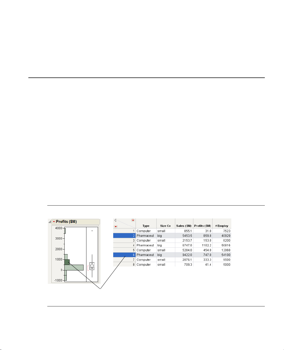
Clicking on a histogram bar highlights the
corresponding data in the associated data table.
Preliminaries
Introducing JMP
Using JMP statistical software, you can interact with your graphs and data to do the following:
Discover Using graphics, you can see patterns and relationships in your data, and find data that does
not fit identifiable patterns.
Interact Using JMP interactive features, you can follow up on clues and try different approaches. The
more approaches you try, the more you likely you are to discover trends in your data.
Understand Using graphics, you can see how the data and the model work together to produce the
statistics. Because JMP is a progressively disclosed system, you learn statistics methods in the right
context.
Here are just a few of the things you can do with JMP:
• Interact with data tables and reports.
• Compute values using the Formula Editor.
• Design experiments.
• Use scripting features to automate frequently used processes.
• Open SAS data sets, run stored processes, and submit SAS code.
Figure 1.1 Interacting with JMP
Page 22

Contents
Prerequisites . . . . . . . . . . . . . . . . . . . . . . . . . . . . . . . . . . . . . . . . . . . . . . . . . . . . . . . . . . . . . . . . . . . . . . . 3
JMP Terminology . . . . . . . . . . . . . . . . . . . . . . . . . . . . . . . . . . . . . . . . . . . . . . . . . . . . . . . . . . . . . . . . 3
Learning about JMP . . . . . . . . . . . . . . . . . . . . . . . . . . . . . . . . . . . . . . . . . . . . . . . . . . . . . . . . . . . . . . . . . 3
About JMP Documentation . . . . . . . . . . . . . . . . . . . . . . . . . . . . . . . . . . . . . . . . . . . . . . . . . . . . . . . . 3
Use JMP Help . . . . . . . . . . . . . . . . . . . . . . . . . . . . . . . . . . . . . . . . . . . . . . . . . . . . . . . . . . . . . . . . . . . 6
Use Tutorials . . . . . . . . . . . . . . . . . . . . . . . . . . . . . . . . . . . . . . . . . . . . . . . . . . . . . . . . . . . . . . . . . . . . 7
Access Sample Data Tables . . . . . . . . . . . . . . . . . . . . . . . . . . . . . . . . . . . . . . . . . . . . . . . . . . . . . . . . . 7
Learn About Statistical and JSL Terms. . . . . . . . . . . . . . . . . . . . . . . . . . . . . . . . . . . . . . . . . . . . . . . . . 7
Learn JMP Tips and Tricks . . . . . . . . . . . . . . . . . . . . . . . . . . . . . . . . . . . . . . . . . . . . . . . . . . . . . . . . . 8
Access Resources on the Web. . . . . . . . . . . . . . . . . . . . . . . . . . . . . . . . . . . . . . . . . . . . . . . . . . . . . . . . 8
Conventions . . . . . . . . . . . . . . . . . . . . . . . . . . . . . . . . . . . . . . . . . . . . . . . . . . . . . . . . . . . . . . . . . . . . . . . 8
Use JMP Platforms . . . . . . . . . . . . . . . . . . . . . . . . . . . . . . . . . . . . . . . . . . . . . . . . . . . . . . . . . . . . . . . . . . 8
Work with Multiple Data Tables and Platforms. . . . . . . . . . . . . . . . . . . . . . . . . . . . . . . . . . . . . . . . . . 8
How JMP Platforms Are Designed . . . . . . . . . . . . . . . . . . . . . . . . . . . . . . . . . . . . . . . . . . . . . . . . . . . 9
Process for Analyzing Data Using Platforms . . . . . . . . . . . . . . . . . . . . . . . . . . . . . . . . . . . . . . . . . . . . 9
Common Features Throughout Platforms. . . . . . . . . . . . . . . . . . . . . . . . . . . . . . . . . . . . . . . . . . . . . . . . . 13
Launch Window Features . . . . . . . . . . . . . . . . . . . . . . . . . . . . . . . . . . . . . . . . . . . . . . . . . . . . . . . . . . 13
Script Menus. . . . . . . . . . . . . . . . . . . . . . . . . . . . . . . . . . . . . . . . . . . . . . . . . . . . . . . . . . . . . . . . . . . . 15
Automatic Recalc Feature . . . . . . . . . . . . . . . . . . . . . . . . . . . . . . . . . . . . . . . . . . . . . . . . . . . . . . . . . .17
Page 23

Chapter 1 Preliminaries 3
Prerequisites
Prerequisites
Before you begin using JMP, note the following information:
• You can use many JMP features, such as data manipulation, graphs, and scripting features, without any
statistical knowledge.
• A basic understanding of central statistical concepts, such as mean and variation, is recommended.
• Analytical features require statistical knowledge appropriate for the feature.
JMP Terminology
• You can enter, view, edit, and manipulate data using data tables. In a data table, each variable is a column,
and each observation is a row.
• You can access a platform from the
that you can use to analyze data and work with graphs.
• Platforms use these windows:
– Launch windows where you set up and run your analysis.
– Report windows showing the output of your analysis.
• Report windows normally contain the following items:
– A graph of some type (such as a scatterplot or a chart).
–Specific reports that you can show or hide using the disclosure button .
–Platform options that are located within red triangle menus .
Analyze and Graph menus. Platforms contain interactive windows
For more about platforms, see “Use JMP Platforms,” p. 8.
Learning about JMP
JMP provides numerous resources to help you learn about the software. Most of them can be found within
the
Help menu. You can also access context-sensitive Help from within JMP.
Note: For further information about all of the options in the Help menu, see Using JMP.
About JMP Documentation
You can view the JMP documentation suite by selecting Help > Books.
Table 1.1 describes documents in the JMP documentation suite and the purpose of each document.
Page 24

4 Preliminaries Chapter 1
Learning about JMP
Ta bl e 1 .1 About JMP Documentation
Document Who Should Read This
Document
Discovering JMP If you are not familiar with
JMP, start here.
Using JMP If you want to understand
JMP data tables and how
to perform basic
operations in JMP, start
here.
Basic Analysis and
Graphing
If you want to perform
basic analysis and graphing
functions.
What this Document Covers
Introduces you to JMP and gets you
started using JMP
• General JMP concepts and features
that span across all of JMP
• Material in these JMP Starter
categories: File, Tables, and SAS
• These Analyze platforms:
– Distribution
–Fit Y by X
–Matched Pairs
• Many basic graphing platforms
• Material in these JMP Starter
categories: Basic and Graph
Page 25

Chapter 1 Preliminaries 5
Learning about JMP
Ta bl e 1 .1 About JMP Documentation (Continued)
Document Who Should Read This
Document
Modeling and
Multivariate Methods
If you want to perform
modeling or multivariate
methods
What this Document Covers
• These Analyze platforms:
–Fit Model
– Screening
–Nonlinear
–Neural
– Gaussian Process
– Partition
– Time Series
– Categorical
– Choice
– Multivariate
– Cluster
– Principal Components
– Discriminant
– PLS (Partial Least Squares)
–Item Analysis
• These Graph platforms:
–Profilers
–Surface Plot
• Material in these JMP Starter
categories: Model, Multivariate, and
Surface
Page 26

6 Preliminaries Chapter 1
Learning about JMP
Ta bl e 1 .1 About JMP Documentation (Continued)
Document Who Should Read This
Document
Quality and Reliability
Methods
If you want to perform
quality control or
reliability engineering
Design of Experiments If you want to design
experiments
What this Document Covers
• Life Distribution
• Fit Life by X
•Recurrence Analysis
• Degradation
• Survival
• Fit Parametric Survival
• Fit Proportional Hazards
• These Graph platforms:
– Variability/Gauge Chart
– Control Charts
– Capability
– Pareto Plot
– Diagram (Ishikawa)
• Material in these JMP Starter window
categories: Reliability, Measure, and
Control
• Everything related to the
DOE menu
• Material in this JMP Starter window
category: DOE
Scripting Guide If you want to use the JMP
In addition, the New Features document is available at http://jmp.com/support/downloads/
documentation.shtml.
Note: The Books menu also contains two reference cards: The JMP Menu Card describes JMP menus, and
the JMP Quick Reference Card describes JMP keyboard shortcuts. You can print these for ease of use.
Use JMP Help
You can access JMP Help in two ways:
• Access the context-sensitive Help by selecting the Help tool from the
tool anywhere in a data table or report window to see the Help for that area.
• Within a window, click on the
A reference guide for using JSL commands
Scripting Language (JSL)
Tools menu. Place the Help
Help button.
Page 27

Chapter 1 Preliminaries 7
Learning about JMP
Search and view JMP Help using the Help > Contents, Search, and Index options.
Use Tutorials
You can access JMP tutorials by selecting Help > Tutorials. The first item on the Tutorials menu is the
Tutorials Directory. This opens a new window with all the tutorials grouped by category.
If you are not familiar with JMP, then start with the
interface and explains the basics of using JMP.
The rest of the tutorials help you with specific aspects of JMP, such as creating a pie chart, using Graph
Builder, and so on.
Access Sample Data Tables
All of the examples in the JMP documentation suite use sample data. To access JMP’s sample data tables,
select
Help > Sample Data. From here, you can do the following:
• Open the sample data directory.
• Open an alphabetized list of all sample data tables.
• Find a sample data table within a category.
Alternatively, the sample data tables are installed in the following directory:
On Windows:
C:\Program Files\SAS\JMP\9\Support Files <language>\Sample Data
On Macintosh: \Library\Application Support\JMP\9\<language>\Sample Data
Learn About Statistical and JSL Terms
The Help menu contains the following indexes:
Ta bl e 1 .2 Descriptions of Help Menu Indexes
Beginners Tutorial. It steps you through the JMP
Statistics Index
JSL Functions
Object Scripting
Provides definitions of statistical terms.
Provides definitions of JSL functions.
Provides a list of JSL scriptable objects and the messages that can be sent to
those objects.
DisplayBox Scripting
Provides a list of the JSL objects that comprise a JMP report.
For more details about these indexes, see Using JMP.
Page 28

8 Preliminaries Chapter 1
Conventions
Learn JMP Tips and Tricks
When you first start JMP, you see the Tip of the Day window.
To turn off the Tip of the Day, clear the
Help > Tip of the Day. Or, you can turn it off using the Preferences window. See the Using JMP book.
You can use the JMP Quick Reference Card to learn more advanced commands in JMP. View this document
by selecting
Help > Books > JMP Quick Reference Card.
Access Resources on the Web
To access JMP resources on the Web, select Help > JMP.com or Help > JMP User Community.
The
JMP.com option takes you to the JMP Web site, and the JMP User Community option takes you to
JMP online user forums.
Conventions
The following conventions help you relate written material to information that you see on your screen.
• Most open data table names that are used in examples appear in
Animals.jmp) in this document. References to variable names in data tables and items in reports also
appear in
• Note: Special information, warnings, and limitations are noted as such in boldface.
• Reference to menu names (
• Words or phrases that are important or have definitions specific to JMP are in italics the first time they
occur in the text. For example, the word platform is in italics the first time you see it. Most words in
italics are defined when they are first used unless clear in the context of use.
Helvetica according to the way they appear on the screen or in the documentation.
File menu) or menu items (Save option) appear in Helvetica bold.
Show tips at startup check box. To view it again, select
Helvetica font (Animals or
Use JMP Platforms
JMP uses many statistical methods that are organized and consolidated into the platforms within the
Analyze and Graph menus.
Work with Multiple Data Tables and Platforms
As mentioned earlier, platforms use interactive windows that help you analyze data and work with graphs.
You can have any number of data tables open at the same time and any number of platforms open for each
data table. If you have several data tables open, then the platform that you launch analyzes the current data
table. The current data table is either the active data table window or the table corresponding to the current
report window.
Page 29

Chapter 1 Preliminaries 9
Use JMP Platforms
How JMP Platforms Are Designed
Before you use JMP’s statistical platforms, note the following design aspects of JMP:
• JMP implements general methods that are consistent with its key concepts. Although platforms produce
a variety of results that handle many situations, all platforms are consistent in their treatment of data and
statistical concepts.
• JMP methods are generic. They adapt themselves to the context at hand. The principal concept that
drives analyses is modeling type. For details, see “Assign Mod e ling Type s , ” p. 9. For example, JMP
automatically analyzes a variable with nominal values differently than it analyzes a variable with
continuous values.
• JMP platforms give you almost everything that you need at once. If this is more information than you
want, you can conceal the reports or graphs that you do not need. The advantage is that there is less
need to search for statistical commands.
Process for Analyzing Data Using Platforms
To begin analyzing your data, proceed as follows:
1. With your data table open, assign or change modeling types, as needed. See “Assign Modeling Types,”
p. 9.
2. Choose an analysis and launch the corresponding platform. See “Choose an Analysis and Launching a
Platform,” p. 11.
3. Complete the launch window. See “Complete a Launch Window,” p. 11.
4. View the report window. See “View a Report Window,” p. 11.
Assign Modeling Types
Note: For more details about working with modeling types, see Using JMP.
The modeling type of a variable can be one of the following types, shown with its corresponding icon:
• Continuous
•Ordinal
• Nominal
When you import data into JMP, it predicts which modeling types to use. Character data is considered
nominal, and numeric data is considered continuous. However, you might want to change the modeling
type, depending on which type of analysis you are performing.
To change the modeling type, click on the modeling type icon next to the variable and make your selection.
Page 30
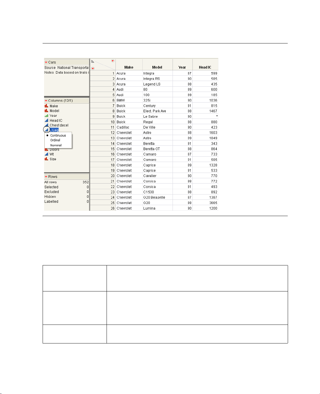
10 Preliminaries Chapter 1
Use JMP Platforms
Figure 1.2 Changing Modeling Type
About Modeling Types
The modeling type tells JMP how to treat its values during analyses. Changing the modeling type lets you
look at a variable in different ways in an analysis.
Ta bl e 1 .3 Descriptions of Modeling Types
Continuous
Columns can contain only numeric data types. Continuous values are
treated as continuous measurement values. JMP uses the numeric values
directly in computations.
Ordinal
Columns can contain either numeric or character data types. JMP analyses
treat ordinal values as discrete categorical values that have an order. If the
values are numbers, the order is the numeric magnitude. If the values are
character, the order is the sorting sequence.
Nominal
Columns can contain either numeric or character data types. All values are
treated in JMP analyses as if they are discrete values with no implicit order.
Page 31

Chapter 1 Preliminaries 11
Use JMP Platforms
Choose an Analysis and Launching a Platform
Choose the analysis that you want to perform. You can launch a platform from the
(or from the JMP Starter window).
Table 1.4 provides just a few examples of choosing an analysis and launching the corresponding platform.
For a full list of the platforms available within the
Ta bl e 1 .4 Examples of Choosing an Analysis and Launching a Platform
Purpose Analysis
Analyze a distribution of values
Analyze the relationship between two variables
Graph continuous X and Y variables
Animate points on a scatterplot over time
Complete a Launch Window
After you launch a platform, the launch window appears. See Figure 1.3. Use the launch window to set up
your analysis by moving columns into roles.
Figure 1.3 The Launch Window (Distribution Platform)
Analyze or Graph menu
Analyze and Graph menus, see Using JMP.
Analyze > Distribution
Analyze > Fit Y by X
Graph > Overlay Plot
Graph > Bubble Plot
For more details about the launch window, see “Launch Window Features,” p. 13.
View a Report Window
Once you have completed the launch window (which runs the analysis) you see a report window. For
example, see Figure 1.4. You can use the output in the report window to interpret your data.
Page 32

12 Preliminaries Chapter 1
Use JMP Platforms
Figure 1.4 Example of a Report Window (Distribution Platform)
• (Windows only) The JMP main menu bar is hidden by default. To see the JMP main menu bar, hover
over the bar below the window title. Alternatively, you can always show the main menu bar by changing
the Auto-hide menu and toolbars option in
File > Preferences > Windows Specific.
For more general information about using report windows, see Using JMP.
• For detailed information about a specific platform’s report window, see the chapter for that platform in
this book, or in one of these books:
– Modeling and Multivariate Methods
– Quality and Reliability Methods
Page 33

Chapter 1 Preliminaries 13
Use JMP Platforms
Common Features Throughout Platforms
All platforms share certain specific features, documented in these sections:
• “Launch Window Features,” p. 13
• “Script Menus,” p. 15
• “Automatic Recalc Feature,” p. 17
Note: Platforms have additional shared features that are not covered here, such as linked graphs, red triangle
menus, and hierarchical report organization. See Using JMP.
Launch Window Features
Each analysis platform prompts you with a launch window. Table 1.5 describes three panes that all launch
windows have in common.
Ta bl e 1 .5 Descriptions of Common Panes in Launch Windows
Select Columns
Lists all of the variables in your current data table. For
details about the red triangle menu, see “Columns Filter
Menu,” p. 14.
Cast Selected Columns into
Roles
Moves selected columns into roles (such as Y, X, and so
on.) You cast a column into the role of a variable (like an
actor is cast into a role). See “Cast Selected Columns
into Roles Buttons,” p. 13.
This pane does not exist in the Graph Builder platform.
Action
OK
Cancel stops the analysis and quits the launch window.
Remove deletes any selected variables from a role.
Recall populates the launch window with the last
analysis that you performed.
Help takes you to the Help for the launch window.
Cast Selected Columns into Roles Buttons
Table 1.6 describes buttons that appear frequently throughout launch windows. Buttons that are specific to
certain platforms are described in the chapter for the platform.
performs the analysis.
Page 34

14 Preliminaries Chapter 1
Use JMP Platforms
Ta bl e 1 .6 Descriptions of Common Buttons in Launch Windows
Y
X
Weight
Freq
By
Columns Filter Menu
In most of the platform launch windows there is a Column Filter menu. This menu appears as a red triangle
within the Select Columns panel.
Figure 1.5 Example of the Columns Filter Menu
Identifies a column as a response or dependent variable
whose distribution is to be studied.
Identifies a column as an independent, classification, or
explanatory variable whose values divide the rows into
sample groups.
Identifies the data table column whose variables assign
weight (such as importance or influence) to the data.
Identifies the data table column whose values assign a
frequency to each row. This option is useful when a
frequency is assigned to each row in summarized data.
Identifies a column that creates a report consisting of
separate analyses for each level of the variable.
Ta bl e 1 .7 Options within the Columns Filter Menu
Reset
Sort by Name
Continuous
Ordinal
Nominal
Resets the columns to its original list.
Sorts the columns in alphabetical order by name.
Shows or hides columns whose modeling type is continuous.
Shows or hides columns whose modeling type is ordinal.
Shows or hides columns whose modeling type is nominal.
Page 35

Chapter 1 Preliminaries 15
Use JMP Platforms
Ta bl e 1 .7 Options within the Columns Filter Menu
Numeric
Character
Match case
Name Contains
Name Starts With
Name Ends With
Script Menus
The red triangle menu at the top level of every JMP report contains a Script menu.
Figure 1.6 The Script menu
Shows or hides columns whose data type is numeric.
Shows or hides columns whose data type is character.
(Only applicable to the Name options below) Makes your search
case-sensitive.
Searches for column names containing specified text. To remove the text
box, select
Reset.
Searches for column names that begin with specified text. To remove the text
box, select
Reset.
Searches for column names that end with specified text. To remove the text
box, select
Reset.
Most of these options are the same throughout JMP. A few platforms add extra options that are described in
the specific platform chapters. Table 1.8 lists the Script menu options that are common to all platforms.
Ta bl e 1 .8 Descriptions of Script Options
Redo Analysis
If the values in the data table that was used to produce the report
have changed, this option duplicates the analysis based on the
new data. The new analysis appears in a new report window.
Page 36

16 Preliminaries Chapter 1
Use JMP Platforms
Ta bl e 1 .8 Descriptions of Script Options (Continued)
Relaunch Analysis
Automatic Recalc
Copy Script
Save Script to Data Table
Save Script to Journal
Save Script to Script Window
Save Script to Report
Save Script for All Objects
Save Script to Project
Opens the platform Launch window and recalls the settings used
to create the report.
Automatically updates analyses and graphics when data table
values change. See “Automatic Recalc Feature,” p. 17.
Places the script that reproduces the report on the clipboard so
that it can be pasted elsewhere.
Saves the script to the data table that was used to produce the
report.
Saves a button that runs the script in a journal. The script is
added to the current journal.
Opens a script editor window and adds the script to it. If you
have already saved a script to a script window, additional scripts
are added to the bottom of the same script window.
Adds the script to the top of the report window.
If you have By groups or similar multiple reports, a script for
each object is saved to the script window. Otherwise, this option
is the same as
Save Script to Script Window.
Saves the script in a project. If you have a project open that
contains the report, the script is added to that project. If you do
not have a project that contains the report, a new project is
created and the script is added to it.
Data Table Window
Brings the data table that was used to create the report to the
front and makes it the active window.
If you have specified a By variable in the platform launch window, the Script All By-Groups menu also
appears.
Figure 1.7 Example of the Script All By-Groups Menu
Page 37

Chapter 1 Preliminaries 17
Use JMP Platforms
If you specified a By variable, the script options in Table 1.8 apply to a report for a single level of a By
variable. The
Ta bl e 1 .9 Descriptions of Script All By-Groups Options
Script All By-Groups options apply to the reports for all the levels of the By variable.
Redo Analysis
Relaunch Analysis
Copy Script
Save Script to Data Table
Save Script to Journal
Save Script to Script Window
Automatic Recalc Feature
The Automatic Recalc feature immediately reflects changes that you make to the data table in the
corresponding report window. You can make any of the following data table changes:
• exclude or unexclude data table rows
• delete or add data table rows
If the values in the data table that was used to produce the
reports have changed, this option duplicates the analysis based
on the new data and produces new reports.
Opens the platform Launch window and recalls the settings used
to create the reports.
Places the script that reproduces the reports on the clipboard so
that it can be pasted elsewhere.
Saves the script to the data table that was used to produce the
reports.
Saves a button that runs the script in a journal. The script is
added to the current journal.
Opens a script editor window and adds the script to it. If you
have already saved a script to a script window, additional scripts
are added to the bottom of the same script window.
This powerful feature immediately reflects these changes to the corresponding analyses, statistics, and graphs
that are located in a report window.
To t ur n o n
Script > Automatic Recalc. See Figure 1.6. To turn it off, deselect the same option. You can also turn on
Automatic Recalc using JSL.
Automatic Recalc for a report window, click on the platform red triangle menu and select
Note the following:
• By default,
platforms in the
Chart > Run Chart
•For some platforms, the
Automatic Recalc is turned off for platforms in the Analyze menu and turned on for
Graph menu. The exceptions are the Capability, Variability/Gauge Chart, and Control
platforms.
Automatic Recalc feature is not appropriate, and therefore is not supported.
These platforms include the following: DOE, Profilers, Choice, Partition, Nonlinear, Neural, Neural
Net, Partial Least Squares, Fit Model (REML, GLM, Log Variance), Gaussian Process, Item Analysis,
Cox Proportional Hazard, and Control Charts (except Run Chart).
Page 38

18 Preliminaries Chapter 1
Use JMP Platforms
Page 39

Chapter 2
Performing Univariate Analysis
Using the Distribution Platform
The Distribution platform describes the distribution of variables using histograms, additional graphs, and
reports. You can examine the distribution of several variables at once. The report content for each variable
varies, depending on whether the variable is categorical (nominal or ordinal) or continuous.
The Distribution report window is interactive. Clicking on a histogram bar highlights the corresponding
data in any other histograms and in the data table. See Figure 2.1.
Figure 2.1 Example of the Distribution Platform
Page 40

Contents
Overview of the Distribution Platform . . . . . . . . . . . . . . . . . . . . . . . . . . . . . . . . . . . . . . . . . . . . . . . . . . .21
Example of the Distribution Platform . . . . . . . . . . . . . . . . . . . . . . . . . . . . . . . . . . . . . . . . . . . . . . . . . . . .21
Launch the Distribution Platform . . . . . . . . . . . . . . . . . . . . . . . . . . . . . . . . . . . . . . . . . . . . . . . . . . . . . . .23
The Distribution Report . . . . . . . . . . . . . . . . . . . . . . . . . . . . . . . . . . . . . . . . . . . . . . . . . . . . . . . . . . . . . 24
Histograms . . . . . . . . . . . . . . . . . . . . . . . . . . . . . . . . . . . . . . . . . . . . . . . . . . . . . . . . . . . . . . . . . . . . . . . 26
Initial Reports . . . . . . . . . . . . . . . . . . . . . . . . . . . . . . . . . . . . . . . . . . . . . . . . . . . . . . . . . . . . . . . . . . . . . 29
The Frequencies Report. . . . . . . . . . . . . . . . . . . . . . . . . . . . . . . . . . . . . . . . . . . . . . . . . . . . . . . . . . . 29
The Quantiles Report . . . . . . . . . . . . . . . . . . . . . . . . . . . . . . . . . . . . . . . . . . . . . . . . . . . . . . . . . . . . . 31
The Moments Report . . . . . . . . . . . . . . . . . . . . . . . . . . . . . . . . . . . . . . . . . . . . . . . . . . . . . . . . . . . . .32
Distribution Platform Options . . . . . . . . . . . . . . . . . . . . . . . . . . . . . . . . . . . . . . . . . . . . . . . . . . . . . . . . .34
Options for Categorical Variables . . . . . . . . . . . . . . . . . . . . . . . . . . . . . . . . . . . . . . . . . . . . . . . . . . . . . . .34
Mosaic Plot . . . . . . . . . . . . . . . . . . . . . . . . . . . . . . . . . . . . . . . . . . . . . . . . . . . . . . . . . . . . . . . . . . . . .35
Test Probabilities . . . . . . . . . . . . . . . . . . . . . . . . . . . . . . . . . . . . . . . . . . . . . . . . . . . . . . . . . . . . . . . . .36
Confidence Intervals for Categorical Variables. . . . . . . . . . . . . . . . . . . . . . . . . . . . . . . . . . . . . . . . . . .39
Options for Continuous Variables . . . . . . . . . . . . . . . . . . . . . . . . . . . . . . . . . . . . . . . . . . . . . . . . . . . . . . .39
Normal Quantile Plot . . . . . . . . . . . . . . . . . . . . . . . . . . . . . . . . . . . . . . . . . . . . . . . . . . . . . . . . . . . . 42
Outlier Box Plot . . . . . . . . . . . . . . . . . . . . . . . . . . . . . . . . . . . . . . . . . . . . . . . . . . . . . . . . . . . . . . . . .43
Quantile Box Plot . . . . . . . . . . . . . . . . . . . . . . . . . . . . . . . . . . . . . . . . . . . . . . . . . . . . . . . . . . . . . . . .45
Stem and Leaf . . . . . . . . . . . . . . . . . . . . . . . . . . . . . . . . . . . . . . . . . . . . . . . . . . . . . . . . . . . . . . . . . . 46
CDF Plot . . . . . . . . . . . . . . . . . . . . . . . . . . . . . . . . . . . . . . . . . . . . . . . . . . . . . . . . . . . . . . . . . . . . . 47
Tes t M e a n . . . . . . . . . . . . . . . . . . . . . . . . . . . . . . . . . . . . . . . . . . . . . . . . . . . . . . . . . . . . . . . . . . . . . 48
Tes t S t d D e v . . . . . . . . . . . . . . . . . . . . . . . . . . . . . . . . . . . . . . . . . . . . . . . . . . . . . . . . . . . . . . . . . . . 50
Confidence Intervals for Continuous Variables . . . . . . . . . . . . . . . . . . . . . . . . . . . . . . . . . . . . . . . . . . 51
Prediction Intervals . . . . . . . . . . . . . . . . . . . . . . . . . . . . . . . . . . . . . . . . . . . . . . . . . . . . . . . . . . . . . . . . . .54
Tolerance Intervals. . . . . . . . . . . . . . . . . . . . . . . . . . . . . . . . . . . . . . . . . . . . . . . . . . . . . . . . . . . . . . . . . . .55
Capability Analysis . . . . . . . . . . . . . . . . . . . . . . . . . . . . . . . . . . . . . . . . . . . . . . . . . . . . . . . . . . . . . . . . . .57
Fit Distributions . . . . . . . . . . . . . . . . . . . . . . . . . . . . . . . . . . . . . . . . . . . . . . . . . . . . . . . . . . . . . . . . . . . .61
Example of Fitting a Lognormal Distribution . . . . . . . . . . . . . . . . . . . . . . . . . . . . . . . . . . . . . . . . . . .61
Statistical Details. . . . . . . . . . . . . . . . . . . . . . . . . . . . . . . . . . . . . . . . . . . . . . . . . . . . . . . . . . . . . . . . . . . 77
Page 41

Chapter 2 Performing Univariate Analysis 21
Overview of the Distribution Platform
Overview of the Distribution Platform
The treatment of variables in the Distribution platform is different, depending on the modeling type of
variable, which can be categorical (nominal or ordinal) or continuous.
Categorical Variables
For categorical variables, the initial graph that appears is a histogram. The histogram shows a bar for each
level of the ordinal or nominal variable. You can also add a divided (mosaic) bar chart.
The reports show counts and proportions. You can add confidence intervals and test the probabilities.
Continuous Variables
For numeric continuous variables, the initial graphs show a histogram and an outlier box plot. The
histogram shows a bar for grouped values of the continuous variable. The following options are also
available:
• quantile box plot
• normal quantile plot
• stem and leaf plot
•CDF plot
• overlaid nonparametric smoothing curve
The reports show selected quantiles and moments. Report options are available for the following:
• saving ranks, probability scores, normal quantile values, and so on, as new columns in the data table
• testing the mean and standard deviation of the column against a constant you specify
• fitting various distributions
• performing a capability analysis for a quality control application
• confidence intervals, prediction intervals, and tolerance intervals
Example of the Distribution Platform
Suppose that you have data on 40 students, and you want to see the distribution of age and height among
the students.
1. Open the
2. Select
3. Select
4. Click
Big Class.jmp sample data table.
Analyze > Distribution.
age and height and click Y, Co l u mn s .
OK.
Page 42

22 Performing Univariate Analysis Chapter 2
Example of the Distribution Platform
Figure 2.2 Example of the Distribution Platform
From the histograms, you notice the following:
• The ages are not uniformly distributed.
• For height, there are two points with extreme values (that might be outliers).
Click on the bar for 50 in the height histogram to take a closer look at the potential outliers.
• The corresponding ages are highlighted in the age histogram. The potential outliers are age 12.
• The corresponding rows are highlighted in the data table. The names of the potential outliers are Lillie
and Robert.
Add labels to the potential outliers in the height histogram.
1. Select both outliers.
2. Right-click on one of the outliers and select
Row Label.
Label icons are added to these rows in the data table.
3. (Optional) Resize the box plot wider to see the full labels.
Page 43

Chapter 2 Performing Univariate Analysis 23
Example of the Distribution Platform
Figure 2.3 Potential Outliers Labeled
Launch the Distribution Platform
Launch the Distribution platform by selecting Analyze > Distribution.
Figure 2.4 The Distribution Launch Window
Ta bl e 2 .1 Description of the Distribution Launch Window
Y, C o lu m n s
Assigns the variables that you want to analyze. A histogram and associated
reports appear for each variable.
Weight
Assigns a variable to give the observations different weights. Any moment
that is based on the Sum Wgts is affected by weights (including the Mean,
Std Err Mean, and Upper and Lower 95% Mean).
Page 44

24 Performing Univariate Analysis Chapter 2
The Distribution Report
Ta bl e 2 .1 Description of the Distribution Launch Window (Continued)
Freq
By
Histograms Only
The Distribution Report
Follow the instructions in “Example of the Distribution Platform,” p. 21 to produce the report shown in
Figure 2.5.
The Distribution report window is divided into variables. For each variable, the initial Distribution report
contains a histogram and reports.
Assigns a frequency variable to this role. This is useful if you have
summarized data. In this instance, you have one column for the Y values and
another column for the frequency of occurrence of the Y values. The sum of
this variable is included in the overall count appearing in the Moments
report (represented by
deviation, and so on) are also affected by the
N). All other moment statistics (mean, standard
Freq variable.
Produces a separate report for each level of the By variable. If more than one
By variables is assigned, a separate report is produced for each possible
combination of the levels of the
By variables.
Removes everything except the histograms from the report window, which
includes the following:
• Quantiles and Moments reports for continuous variables
• Frequencies report for nominal and ordinal variables
• Outlier box plot
Page 45

Chapter 2 Performing Univariate Analysis 25
The Distribution Report
Figure 2.5 The Initial Distribution Report Window
Ta bl e 2 .2 Descriptions of Distribution Report Window Objects
Platform options The red triangle menu next to Distributions contains options that affect all
of the variables. See “Distribution Platform Options,” p. 34.
Variable options The red triangle menu next to each variable contains options that affect only
that variable. See “Options for Categorical Variables,” p. 34 or “Options for
Continuous Variables,” p. 39.
Note: If you hold down the CTRL key and select a variable option, the
option applies to all of the variables that have the same modeling type.
Histograms Histograms visually display your data. See “Histograms,” p. 26.
Page 46

26 Performing Univariate Analysis Chapter 2
Histograms
Ta bl e 2 .2 Descriptions of Distribution Report Window Objects (Continued)
Reports Each variable contains at least initial reports. Continuous variables contain a
Quantiles and a Moments report; categorical variables contain a Frequencies
report. See “Initial Reports,” p. 29. Variable options can create additional
reports.
Histograms
Histograms visually display your data. For categorical (nominal or ordinal) variables, the histogram shows a
bar for each level of the ordinal or nominal variable. For continuous variables, the histogram shows a bar for
grouped values of the continuous variable.
Ta bl e 2 .3 Interacting with the Histogram
Highlighting data Click on a histogram bar or an outlying point in the graph. The
corresponding rows are highlighted in the data table, and
corresponding sections of other histograms are also highlighted, if
applicable. See “Highlight Bars and Select Rows,” p. 27.
Creating a subset Double-click on a histogram bar, or right-click on a histogram bar and
select
Subset. A new data table is created that contains only the
selected data.
Resizing the entire histogram Hover over the histogram borders until you see a double-sided arrow.
Then click and drag the borders. For more details, see the Using JMP
book.
Rescaling the axis (Continuous variables only) Click and drag on an axis to rescale it.
Alternatively, hover over the axis until you see a hand. Then,
double-click on the axis and set the parameters in the Axis
Specification window.
Resizing histogram bars (Continuous variables only) There are multiple options to resize
histogram bars. See “Resize Histogram Bars for Continuous Variables,”
p. 27.
Specifying your selection Specify the data that you select in multiple histograms. See “Specify
Your Selection in Multiple Histograms,” p. 28.
To see additional options for the histogram or the associated data table:
• Right-click on a histogram. See the Using JMP book.
• Click on the red triangle next to the variable, and select
Histogram Options. Options are slightly
different depending on the variable modeling type. See “Histogram Options for Categorical Variables,”
p. 35 or “Histogram Options for Continuous Variables,” p. 40.
Page 47

Chapter 2 Performing Univariate Analysis 27
Histograms
Resize Histogram Bars for Continuous Variables
Resize histogram bars for continuous variables by using the following:
• the Grabber (hand) tool
• the Set Bin Width option
• the Increment option
Use the Grabber Tool
The Grabber tool is a quick way to explore your data.
1. Select
Tools > Grabber.
Note: (Windows only) To see the menu bar, you might need to hover over the bar below the window title.
You can also change this setting in File > Preferences > Windows Specific.
2. Place the grabber tool anywhere in the histogram.
3. Click and drag the histogram bars.
Think of each bar as a bin that holds a number of observations:
• Moving the hand to the left increases the bin width and combines intervals. The number of bars
decreases as the bar size increases.
• Moving the hand to the right decreases the bin width, producing more bars.
• Moving the hand up or down shifts the bin locations on the axis, which changes the contents and size of
each bin.
Use the Set Bin Width Option
The Set Bin Width option is a more precise way to set the width for all bars in a histogram. To use the Set
Bin Width option, from the red triangle menu for the variable, select
Change the bin width value.
Use the Increment Option
The Increment option is another precise way to set the bar width. To use the Increment option, double-click
on the axis, and change the Increment value.
Histogram Options > Set Bin Width.
Highlight Bars and Select Rows
Clicking on a histogram bar highlights the bar and selects the corresponding rows in the data table. The
appropriate portions of all other graphical displays also highlight the selection. Figure 2.6 shows the results
of highlighting a bar in the
Note: To deselect histogram bars, press the CTRL key and click on the highlighted bars.
height histogram. The corresponding rows are selected in the data table.
Page 48

28 Performing Univariate Analysis Chapter 2
Select a bar to highlight rows
and parts of other output.
Histograms
Figure 2.6 Highlighting Bars and Rows
Specify Your Selection in Multiple Histograms
Extend or narrow your selection in histograms as follows:
• To extend your selection, hold down the SHIFT key and select another bar. This is the equivalent of
using an or operator.
• To narrow your selection, hold down the ALT key and select another bar. This is the equivalent of using
an and operator.
Example of Selecting Data in Multiple Histograms
1. Open the
2. Select
3. Select
Companies.jmp sample data table.
Analyze > Distribution.
Ty pe and Size Co and click Y, C o lu m ns .
4. Click OK.
You want to see the type distribution of companies that are small.
5. Click on the bar next to small.
You can see that there are more small computer companies than there are pharmaceutical companies. To
broaden your selection, add medium companies.
6. Hold down the SHIFT key. In the Size Co histogram, click on the bar next to medium.
You can see the type distribution of small and medium sized companies. See Figure 2.7 at left. To
narrow down your selection, you want to see the small and medium pharmaceutical companies only.
7. Hold down the ALT key. In the Type histogram, click in the Pharmaceutical bar.
You can see how many of the small and medium companies are pharmaceutical companies. See
Figure 2.7 at right.
Page 49

Chapter 2 Performing Univariate Analysis 29
Broaden the selection using the
SHIFT key.
Narrow the selection using
the ALT key.
Initial Reports
Figure 2.7 Selecting Data in Multiple Histograms
Initial Reports
When you complete the Distribution launch window, the following reports appear automatically (unless
other preferences are in effect):
• “The Frequencies Report,” p. 29
• “The Quantiles Report,” p. 31
• “The Moments Report,” p. 32
The Frequencies Report
For nominal and ordinal variables, the Frequencies report lists the levels of the variables, along with the
associated frequency of occurrence and probabilities.
Example of a Frequencies Report
1. Open the
2. Select
3. Select
4. Click OK.
VA Lung Cancer.jmp sample data table.
Analyze > Distribution.
Cell Type and click Y, C o l u mn s .
Page 50

30 Performing Univariate Analysis Chapter 2
Initial Reports
Figure 2.8 Example of a Frequencies Report
For each level of a categorical (nominal or ordinal) variable, the Frequencies report contains the information
described in Table 2.4. Missing values are omitted from the analysis.
Ta bl e 2 .4 Description of the Frequencies Report
Level Lists each value found for a response variable.
Count Lists the number of rows found for each level of a response variable. If you
use a Freq variable (see Figure 2.4), the Count is the sum of the Freq
variables for each level of the response variable.
Prob Lists the probability (or proportion) of occurrence for each level of a
response variable. The probability is computed as the count divided by the
total frequency of the variable, shown at the bottom of the table.
StdErr Prob Lists the standard error of the probabilities. This column might be hidden.
To show the column, right-click in the table and select
Prob
.
Columns > StdErr
Cum Prob Contains the cumulative sum of the column of probabilities. This column
might be hidden. To show the column, right-click in the table and select
Columns > Cum Prob.
Page 51

Chapter 2 Performing Univariate Analysis 31
Initial Reports
The Quantiles Report
For continuous variables, the Quantiles report lists the values of selected quantiles (sometimes called
percentiles).
Example of a Quantiles Report
1. Open the
2. Select
3. Select
4. Click
Figure 2.9 Example of a Quantiles Report
Cities.jmp sample data table.
Analyze > Distribution.
OZONE and click Y, C o l um n s.
OK.
For details about how quantiles are computed, see “Statistical Details for Quantiles,” p. 77.
Page 52

32 Performing Univariate Analysis Chapter 2
Initial Reports
The Moments Report
For continuous variables, the Moments report displays the mean, standard deviation, and other summary
statistics.
Example of a Moments Report
1. Open the
2. Select
3. Select
4. Click
Figure 2.10 Example of a Moments Report
Cities.jmp sample data table.
Analyze > Distribution.
OZONE and click Y, C o l um n s.
OK.
Ta bl e 2 .5 Description of the Moments Report
Mean Estimates the expected value of the underlying distribution for the response
variable, which is the arithmetic average of the column’s values. It is the sum
of the nonmissing values divided by the number of nonmissing values. If you
assigned a Weight or Freq variable, the mean is computed by JMP as follows:
1. Each column value is multiplied by its corresponding weight or freq
2. These values are added and divided by the sum of the weights or freqs.
Page 53

Chapter 2 Performing Univariate Analysis 33
ss2 where =
s
2
wiyiyw–()
2
N 1–
-----------------------------
i 1=
N
=
y
w
weighed mean=
Initial Reports
Ta bl e 2 .5 Description of the Moments Report (Continued)
Std Dev Measures the spread of a distribution around the mean. It is often denoted as
s and is the square root of the sample variance, denoted s
2
.
The normal distribution is mainly defined by the mean and standard
deviation. These parameters provide an easy way to summarize data as the
sample becomes large:
• 68% of the values are within one standard deviation of the mean
• 95% of the values are within two standard deviations of the mean
• 99.7% of the values are within three standard deviations of the mean
Std Err Mean The standard error of the mean, which estimates the standard deviation of
the distribution of the mean.
Std Err Mean is computed by dividing the
sample standard deviation, s, by the square root of N. In the launch window,
if you specified a column for Weight or Freq, then the denominator is the
square root of the sum of the weights or frequencies.
Upper 95% Mean and
Lower 95% Mean
Are 95% confidence limits about the mean. They define an interval that is
very likely to contain the true population mean. If many random samples are
drawn from the same population and each 95% confidence interval is
determined, you expect 95% of the confidence intervals computed to
contain the true population mean.
N Is the total number of nonmissing values.
If you select Display Options > More Moments, additional statistics appear. See “Display Options for
Continuous Variables,” p. 39.
Page 54

34 Performing Univariate Analysis Chapter 2
Distribution Platform Options
Distribution Platform Options
The red triangle menu next to Distributions contains options that affect all of the reports and graphs in the
Distribution platform.
Ta bl e 2 .6 Descriptions of Distribution Platform Options
Uniform Scaling
Stack Changes the orientation of the histogram and the reports to horizontal and
Save for Adobe Flash
platform (.SWF)
Script This menu contains options that are available to all platforms. They enable
Scales all axes with the same minimum, maximum, and intervals so that the
distributions can be easily compared.
stacks the individual distribution reports vertically. Deselect this option to
return the report window to its original layout.
Saves the histograms as .SWF files that are Adobe Flash player compatible.
Use these files in presentations and in web pages. An HTML page is also
saved that shows you the correct code for using the resulting .SWF file.
For more information about this option, go to http://www.jmp.com/
support/swfhelp/en.
you to redo the analysis or save the JSL commands for the analysis to a
window or a file. See “Script Menus,” p. 15 in the “Preliminaries” chapter.
Options for Categorical Variables
The red triangle menus next to each variable in the report window contain additional options that apply to
the variable. This section describes the options that are available for categorical (nominal or ordinal)
variables.
Note: To see the options that are available for continuous variables, see “Options for Continuous
Variables , ” p . 39.
Display Options for Categorical Variables
Use the Display Options for categorical variables to show or hide the Frequency report and change the
orientation of the report.
Ta bl e 2 .7 Descriptions of Display Options for Categorical Variables
Frequencies
Horizontal Layout Changes the orientation of the histogram and the reports to vertical or
Shows or hides the Frequencies report. See “The Frequencies Report,” p. 29.
horizontal.
Page 55

Chapter 2 Performing Univariate Analysis 35
npi1 pi–()
Options for Categorical Variables
Histogram Options for Categorical Variables
Use the Histogram Options for categorical variables to change various aspects of the histogram, such as
orientation, color, size, and so on.
Ta bl e 2 .8 Descriptions of Histogram Options for Categorical Variables
Histogram
Vertical Changes the orientation of the histogram from a vertical to a horizontal
Shows or hides the histogram. See “Histograms,” p. 26.
orientation.
Std Error Bars Draws the standard error bar on each level of the histogram using the
standard error where p
Separate Bars Separates the histogram bars.
Histogram Color Changes the color of the histogram bars.
Count Axis Adds an axis that shows the frequency of column values represented by the
i=ni
/n.
histogram bars.
Note: If you resize the histogram bars, the count axis also resizes.
Prob Axis Adds an axis that shows the proportion of column values represented by
histogram bars.
Note: If you resize the histogram bars, the probability axis also resizes.
Density Axis The density is the length of the bars in the histogram. Both the count and
probability are based on the following calculations:
prob = (bar width)*density
count = (bar width)*density*(total count)
Mosaic Plot
Note: If you resize the histogram bars, the density axis remains constant.
Show Percents Labels the percent of column values represented by each histogram bar.
Show Counts Labels the frequency of column values represented by each histogram bar.
The Mosaic Plot option displays a mosaic bar chart for each nominal or ordinal response variable. A mosaic
plot is a stacked bar chart where each segment is proportional to its group’s frequency count.
Page 56

36 Performing Univariate Analysis Chapter 2
Options for Categorical Variables
Example of a Mosaic Plot
1. Open the
2. Select
3. Select
4. Click
VA Lung Cancer.jmp sample data table.
Analyze > Distribution.
Cell Type and click Y, C o l u mn s .
OK.
5. From the red triangle menu for Cell Type, select
Figure 2.11 Example of a Mosaic Plot
Mosaic Plot.
For a description of the options that appear when you right-click the mosaic plot, see the Using JMP book.
Test Probabilities
Use the Test Probabilities option to enter hypothesized probabilities. The Test Probabilities report contains
slightly different options, depending on whether your variable has more than two levels, or exactly two
levels. See Figure 2.12.
Examples of the Test Probabilities Option
Initiate a test probability report for a variable with more than two levels:
1. Open the
2. Select Analyze > Distribution.
VA Lung Cancer.jmp sample data table.
Page 57

Chapter 2 Performing Univariate Analysis 37
report options for a variable
with exactly two levels
report options for a variable
with more than two levels
Options for Categorical Variables
3. Select Cell Type and click Y, Co l u mn s .
4. Click
5. From the red triangle menu next to Cell Type, select
OK.
Test Probabilities.
See Figure 2.12 at left.
Initiate a test probability report for a variable with exactly two levels:
1. Open the
2. Select
3. Select
4. Click
Penicillin.jmp sample data table.
Analyze > Distribution.
Response and click Y, Co l u mns .
OK.
5. From the red triangle menu next to Response, select
See Figure 2.12 at right.
Figure 2.12 Examples of Test Probabilities Options
Test Probabilities.
The Test Probabilities option scales the hypothesized values that you type, so that the probabilities sum to
one. The easiest way to test that all of the probabilities are equal is to type a one in each field. If you want to
test a subset of the probabilities, then do not enter a value for any levels that are not involved. JMP
substitutes estimated probabilities.
Page 58

38 Performing Univariate Analysis Chapter 2
Options for Categorical Variables
Generate the Test Probabilities Report
To generate a test probabilities report for a variable with more than two levels:
1. Refer to Figure 2.12 at left. Type 0.25 in all four Hypoth Prob fields.
2. Click the
3. Click
Fix hypothesized values, rescale omitted button.
Done.
Likelihood Ratio and Pearson Chi-square tests are calculated. See Figure 2.13 at left.
To generate a test probabilities report for a variable with exactly two levels:
1. Refer to Figure 2.12 at right. Type 0.5 in both Hypoth Prob fields.
2. Click the
3. Click
probability less than hypothesized value button.
Done.
Exact probabilities are calculated for the binomial test. See Figure 2.13 at right.
Figure 2.13 Examples of Test Probabilities Reports
Page 59

Chapter 2 Performing Univariate Analysis 39
Options for Continuous Variables
Confidence Intervals for Categorical Variables
Confidence Interval options compute score confidence intervals. The score confidence interval is
recommended because it tends to have better coverage probabilities (1 - α), especially with smaller sample
sizes (Agresti and Coull 1998).
Save Commands for Categorical Variables
Use the Save options for categorical variables to add level numbers to the data table, and use the Script to log
command.
Ta bl e 2 .9 Descriptions of Save Options for Categorical Variables
Level Numbers
Script to log
Creates a new column in the data table called Level <colname>. The level
number of each observation corresponds to the histogram bar that contains
the observation. The histogram bars are numbered from low to high (or
alphabetically) beginning with 1.
In the log window, this option displays the script commands to generate the
current report. To see this option, you must have the log window open.
Select
View > Log to see the log window.
Options for Continuous Variables
The red triangle menus next to each variable in the report window contain additional options that apply to
the variable. This section describes the options that are available for continuous variables.
Advanced options for continuous variables are covered in the following sections:
• “Prediction Intervals,” p. 54
• “Tolerance Intervals,” p. 55
• “Capability Analysis,” p. 57
• “Fit Distributions,” p. 61
Note: To see the options that are available for categorical (nominal and ordinal) variables, see “Options for
Categorical Variables,” p. 34.
Display Options for Continuous Variables
Use the Display Options for continuous variables to show, hide, or add reports, or to change the orientation
of the report.
Page 60

40 Performing Univariate Analysis Chapter 2
w
i
3
2
-- -
z
i
3
N
N 1–()N 2–()
------------------------------------
z
i
xix–
s
------------
=
nn 1+()
n 1–()n 2–()n 3–()
-------------------------------------------------- -
w
i
2
xix–
s
------------
4
3 n 1–()
2
n 2–()n 3–()
--------------------------------- -
–
i 1=
n
Options for Continuous Variables
Ta bl e 2 .1 0 Descriptions of Display Options for Continuous Variables
Quantiles
Moments
More Moments
Shows or hides the Quantiles report. See “The Quantiles Report,” p. 31.
Shows or hides the Moments report. See “The Moments Report,” p. 32.
An extension of the Moments report that adds the following statistics:
Sum Wgt is the sum of a column assigned to the role of Weight (in the
launch window). Sum Wgt is used in the denominator for
computations of the mean instead of N.
Sum is the sum of the response values.
Variance is the sample variance, and the square of the sample
standard deviation.
Skewness measures sidedness or symmetry. It is based on the third
moment about the mean and is computed as follows:
where
is a weight term (= 1 for equally weighted items)
and w
i
Kurtosis measures peakedness or heaviness of tails. It is based on the
fourth moment about the mean and is computed as follows:
Horizontal Layout
Histogram Options for Continuous Variables
Use the Histogram Options for continuous variables to change various aspects of the histogram, such as
orientation, color, size, and so on.
Changes the orientation of the histogram and the reports to vertical or
horizontal.
where w
CV is the percent coefficient of variation. It is computed as the
is a weight term (= 1 for equally weighted items)
i
standard deviation divided by the mean and multiplied by 100. The
coefficient of variation can be used to assess relative variation, for
example when comparing the variation in data measured in different
units or with different magnitudes.
N Missing is the number of missing observations.
Page 61

Chapter 2 Performing Univariate Analysis 41
Options for Continuous Variables
Ta bl e 2 .1 1 Descriptions of Histogram Options for Continuous Variables
Histogram
Shadowgram
Vertical
Std Error Bars
Set Bin Width
Histogram Color
Shows or hides the histogram. See “Histograms,” p. 26.
Replaces the histogram with a shadowgram. To understand a shadowgram,
consider that if the bin width of a histogram is changed, the appearance of
the histogram changes. A shadowgram overlays smoothed histograms across
a range of bin widths. Dominant features of a distribution are less
transparent on the shadowgram.
Note that the following options are not available for shadowgrams:
• Std Error Bars
•Show Counts
•Show Percents
Changes the orientation of the histogram from a vertical to a horizontal
orientation.
Draws the standard error bar on each level of the histogram using the
standard error. The standard error bar adjusts automatically when you adjust
the number of bars with the hand tool (see “Resize Histogram Bars for
Continuous Variables,” p. 27.
Changes the bin width of the histogram bars. See “Resize Histogram Bars for
Continuous Variables,” p. 27.
Changes the color of the histogram bars.
Count Axis
Prob Axis
Adds an axis that shows the frequency of column values represented by the
histogram bars.
Note: If you resize the histogram bars, the count axis also resizes.
Adds an axis that shows the proportion of column values represented by
histogram bars.
Note: If you resize the histogram bars, the probability axis also resizes.
Page 62

42 Performing Univariate Analysis Chapter 2
Options for Continuous Variables
Ta bl e 2 .1 1 Descriptions of Histogram Options for Continuous Variables (Continued)
Density Axis
The density is the length of the bars in the histogram. Both the count and
probability are based on the following calculations:
When looking at density curves that are added by the Fit Distribution
option, the density axis shows the point estimates of the curves.
Note: If you resize the histogram bars, the density axis remains constant.
Show Percents
Show Counts
Labels the proportion of column values represented by each histogram bar.
Labels the frequency of column values represented by each histogram bar.
Normal Quantile Plot
Use the Normal Quantile Plot option to visualize the extent to which the variable is normally distributed. If
a variable is normally distributed, the normal quantile plot approximates a diagonal straight line. This type
of plot is also called a quantile-quantile plot, or Q-Q plot.
The normal quantile plot also shows Lilliefors confidence bounds (Conover 1980) and probability and
normal quantile scales. See Figure 2.14.
Example of a Normal Quantile Plot
prob = (bar width)*density
count = (bar width)*density*(total count)
1. Open the
2. Select
3. Select
4. Click
Cities.jmp sample data table.
Analyze > Distribution.
OZONE and click Y, C o l um n s.
OK.
5. From the red triangle menu next to OZONE, select Normal Quantile Plot.
Page 63

Chapter 2 Performing Univariate Analysis 43
normal quantile scale
probability scale
Lilliefors confidence
bounds
r
i
N 1+
-------------
Φ
1–
r
i
N 1+
-------------
Options for Continuous Variables
Figure 2.14 Example of a Normal Quantile Plot
Note the following information:
•The y-axis shows the column values.
•The x-axis shows the empirical cumulative probability for each value, computed as follows:
where r
is the rank of the ith observation, and N is the number of nonmissing (and nonexcluded)
i
observations.
• The normal quantile values are computed as follows:
where Φ is the cumulative probability distribution function for the normal distribution.
These normal quantile values are Van Der Waerden approximations to the order statistics that are
expected for the normal distribution.
Outlier Box Plot
Use the outlier box plot (also called a Tukey outlier box plot) to see the distribution and identify possible
outliers. Generally, box plots show selected quantiles of continuous distributions.
Page 64

44 Performing Univariate Analysis Chapter 2
median sample value
confidence diamond
1st quartile
3rd quartile
whisker
whisker
shortest half
Options for Continuous Variables
Example of an Outlier Box Plot
1. Open the
2. Select
3. Select
4. Click
Figure 2.15 Example of an Outlier Box Plot
Candy Bars.jmp sample data table.
Analyze > Distribution.
Tot a l fa t g and click Y, C o l umn s .
OK.
Note the following aspects about outlier box plots (see Figure 2.15):
• The vertical line within the box represents the median sample value.
• The confidence diamond contains the mean and the upper and lower 95% of the mean. If you drew a
line through the middle of the diamond, you would have the mean. The top and bottom points of the
diamond represent the upper and lower 95% of the mean.
• The ends of the box represent the 25th and 75th quantiles, also expressed as the 1st and 3rd quartile,
respectively.
• The difference between the 1st and 3rd quartiles is called the interquartile range.
• The box has lines that extend from each end, sometimes called whiskers. The whiskers extend from the
ends of the box to the outermost data point that falls within the distances computed as follows:
1st quartile - 1.5*(interquartile range)
3rd quartile + 1.5*(interquartile range)
If the data points do not reach the computed ranges, then the whiskers are determined by the upper and
lower data point values (not including outliers).
• The bracket outside of the box identifies the shortest half, which is the most dense 50% of the
observations (Rousseuw and Leroy 1987).
Page 65

Chapter 2 Performing Univariate Analysis 45
90%
10%
Options for Continuous Variables
Remove Objects from the Outlier Box Plot
To remove the confidence diamond or the shortest half, proceed as follows:
1. Right-click on the outlier box plot and select
2. Click
Box Plot.
3. Deselect the check box next to
For more details about the Customize Graph window, see the Using JMP book.
Quantile Box Plot
The Quantile Box Plot displays specific quantiles from the Quantiles report. If the distribution is
symmetric, the quantiles in the box plot are approximately equidistant from each other. At a glance, you can
see if the distribution is symmetric. For example, if the quantile marks are grouped closely at one end, but
have greater spacing at the other end, the distribution is skewed toward the end with more spacing. See
Figure 2.16.
Example of a Quantile Box Plot
1. Open the
2. Select
3. Select
4. Click
5. From the red triangle menu next to Total fat g, deselect
Candy Bars.jmp sample data table.
Analyze > Distribution.
Tot a l fa t g and click Y, C o l umn s .
OK.
Customize.
Confidence Diamond or Shortest Half.
Outlier Box Plot, and select Quantile Box Plot.
Figure 2.16 Example of a Quantile Box Plot
Page 66

46 Performing Univariate Analysis Chapter 2
Options for Continuous Variables
Quantiles are values where the pth quantile is larger than p% of the values. For example, 10% of the data lies
below the 10th quantile, and 90% of the data lies below the 90th quantile.
Stem and Leaf
The Stem and Leaf option constructs a plot that is a variation on the histogram.
Example of a Stem and Leaf Plot
1. Open the
2. Select
3. Select
4. Click
Candy Bars.jmp sample data table.
Analyze > Distribution.
Tot a l fa t g and click Y, C o l umn s .
OK.
5. From the red triangle menu next to Total fat g, select
Figure 2.17 Example of a Stem and Leaf Plot
Stem and Leaf.
Page 67

Chapter 2 Performing Univariate Analysis 47
Options for Continuous Variables
Each line of the plot has a Stem value that is the leading digit of a range of column values. The Leaf values
are made from the next-in-line digits of the values. You can see the data point by joining the stem and leaf.
In some cases, the numbers on the stem and leaf plot are rounded versions of the actual data in the table.
The stem-and-leaf plot actively responds to clicking and the brush tool.
CDF Plot
The CDF Plot option creates a plot of the empirical cumulative distribution function. Use the CDF plot to
determine the percent of data that is at or below a given value on the x-axis. See Figure 2.18.
Example of a CDF Plot
1. Open the
2. Select
3. Select
4. Click
Candy Bars.jmp sample data table.
Analyze > Distribution.
Tot a l fa t g and click Y, C o l umn s .
OK.
5. From the red triangle menu next to Total fat g, select
Figure 2.18 Example of a CDF Plot
CDF Plot.
Page 68

48 Performing Univariate Analysis Chapter 2
Options for Continuous Variables
For example, use the crosshair tool and position it at 10 on the x-axis. You can see that about 0.2778
percent of the data is at or below the value of 10.
Test Mean
Use the Test M e an option to perform a one-sample test for the mean. If you type a value for the standard
deviation, a z-test is performed. Otherwise, the sample standard deviation is used to perform a t-test. You
can also request the nonparametric Wilcoxon Signed-Rank test.
Example of Test Mean
1. Open the
2. Select
3. Select
4. Click
5. From the red triangle next to Total fat g, select
Candy Bars.jmp sample data table.
Analyze > Distribution.
Tot a l fa t g and click Y, C o l umn s .
OK.
Test M e an.
6. In the Test Mean window, type 12 next to Specify Hypothesized Mean.
7. Click
Figure 2.19 Example of the Test Mean Option
OK.
Page 69

Chapter 2 Performing Univariate Analysis 49
n 20≤
Options for Continuous Variables
Use the Test M e an option repeatedly to test different values. Each time you test the mean, a new Test Mean
report appears.
Ta bl e 2 .1 2 Description of the Test Mean Report
Statistics that are calculated for Test Mean
t Test (or z Test) Lists the value of the test statistic and the p-values for the two-sided and
one-sided alternatives.
Signed-Rank (Only appears for the Wilcoxon Signed-Rank test) Lists the value of the
Wilcoxon signed-rank statistic followed by the p-values for the two-sided and
one-sided alternatives. The test assumes only that the distribution is symmetric.
The Wilcoxon signed-rank test uses average ranks for ties. The p-values are exact
for where n is the number of values not equal to the hypothesized value.
For n > 20 a Student’s t approximation given by Iman (1974) is used.
Probability values
Prob>|t| The probability of obtaining an absolute t-value by chance alone that is greater
than the observed t-value when the population mean is equal to the
hypothesized value. This is the p-value for observed significance of the
two-tailed t-test.
Prob>t The probability of obtaining a t-value greater than the computed sample t ratio
by chance alone when the population mean is not different from the
hypothesized value. This is the p-value for an upper-tailed test.
Prob<t The probability of obtaining a t-value less than the computed sample t ratio by
chance alone when the population mean is not different from the hypothesized
value. This is the p-value for a lower-tailed test.
Red triangle options for Test Mean
PValue animation
Starts an interactive visual representation of the p-value. Enables you to change
the hypothesized mean value while watching how the change affects the p-value.
Power animation
Starts an interactive visual representation of power and beta. Enables you to
change the hypothesized mean and sample mean while watching how the
changes affect power and beta.
Remove Test
Removes the mean test.
Page 70

50 Performing Univariate Analysis Chapter 2
Options for Continuous Variables
Test Std Dev
Use the Test S t d D e v option to perform a one-sample test for the standard deviation (details in Neter,
Wasserman, and Kutner 1990).
Example of Test Std Dev
1. Open the
2. Select
3. Select
4. Click
5. From the red triangle next to Total fat g, select
Candy Bars.jmp sample data table.
Analyze > Distribution.
Tot a l fa t g and click Y, C o l umn s .
OK.
Test S t d De v.
6. In the Test Standard Deviation window, type 4 next to Specify Hypothesized Standard Deviation.
7. Click
Figure 2.20 Example of the Test Std Dev Option
OK.
Use the Test S t d D e v option repeatedly to test different values. Each time you test the standard deviation, a
new Test Standard Deviation report appears.
Page 71

Chapter 2 Performing Univariate Analysis 51
n 1–()s
2
σ
2
---------------------
Options for Continuous Variables
Ta bl e 2 .1 3 Description of the Test Std Dev Report
Test Statistic Here is the formula for calculating the Test Statistic:
The Test Statistic is distributed as a Chi-square variable with n - 1 degrees
of freedom when the population is normal.
Min PValue The probability of obtaining a greater Chi-square value by chance alone
when the population standard deviation is not different from the
hypothesized value. This is the p-value for observed significance of the
two-tailed test.
Prob>ChiSq The probability of obtaining a Chi-square value greater than the
computed sample Chi-square by chance alone when the population
standard deviation is not different from the hypothesized value. This is
the p-value for observed significance of a one-tailed t-test.
Prob<ChiSq The probability of obtaining a Chi-square value less than the computed
sample Chi-square by chance alone when the population standard
deviation is not different from the hypothesized value. This is the p-value
for observed significance of a one-tailed t-test.
Confidence Intervals for Continuous Variables
The Confidence Interval options display confidence intervals for the mean and standard deviation. The
0.90, 0.95, and 0.99 options compute two-sided confidence intervals for the mean and standard deviation.
Use the
confidence intervals. You can also type a known sigma. If you use a known sigma, the confidence interval for
the mean is based on z-values rather than t-values.
Example of Confidence Intervals for Continuous Variables
1. Open the
2. Select
3. Select
4. Click
5. From the red triangle next to Total fat g, select
Confidence Interval > Other option to select a confidence level, and select one-sided or two-sided
Candy Bars.jmp sample data table.
Analyze > Distribution.
Tot a l fa t g and click Y, C o l umn s .
OK.
Confidence Interval > 0.95.
Page 72

52 Performing Univariate Analysis Chapter 2
Options for Continuous Variables
Figure 2.21 Example of a Confidence Interval Report
The Confidence Intervals report shows the mean and standard deviation parameter estimates with upper
and lower confidence limits for 1 - α.
Save Commands for Continuous Variables
Use the Save menu commands to save information about continuous variables. Each Save command
generates a new column in the current data table. The new column is named by appending the variable
name (denoted <
Select the
circumstances, such as before and after combining histogram bars. If you use a
times, the column name is numbered (name1, name2, and so on) to ensure unique column names.
Ta bl e 2 .1 4 Descriptions of the Save Commands
Command Column Added
Level Numbers
Level Midpoints
colname> in the following definitions) to the Save command name. See Table 2.14.
Save commands repeatedly to save the same information multiple times under different
Description
to Data Table
Level <
colname> The level number of each observation corresponds to the
histogram bar that contains the observation. The histogram
bars are numbered from low to high, beginning with 1.
Midpoint
<
colname>
The midpoint value for each observation is computed by
adding half the level width to the lower level bound.
Save command multiple
Page 73

Chapter 2 Performing Univariate Analysis 53
Φ
1–
r
i
N 1+
-------------
Φ
XX–
S
X
------------
X
Options for Continuous Variables
Ta bl e 2 .1 4 Descriptions of the Save Commands (Continued)
Command Column Added
to Data Table
Ranks
Ranks Averaged
Prob Scores
Normal Quantiles
Ranked
<
colname>
RankAvgd
<
colname>
Prob <
colname> For N nonmissing scores, the probability score of a value is
N-Quantile
<
colname>
Description
Provides a ranking for each of the corresponding column’s
values starting at 1. Duplicate response values are assigned
consecutive ranks in order of their occurrence in the data
table.
If a value is unique, then the averaged rank is the same as the
rank. If a value occurs k times, the average rank is computed
as the sum of the value’s ranks divided by k.
computed as the averaged rank of that value divided by
N + 1. This column is similar to the empirical cumulative
distribution function.
The normal quantile values are computed as follows:
where:
• is the cumulative probability distribution function for
the normal distribution
• r
is the rank of the ith observation
i
• N is the number of nonmissing observations
Standardized
Std <
colname> Creates standardized values for numeric columns with the
formula editor, using the following formula:
where:
• X is the original column
• is the mean of column X
• S
is the standard deviation of column X
X
Spec Limits
(none) Stores the specification limits applied in a capability analysis
as a column property of the corresponding column in the
current data table. Automatically retrieves and displays the
specification limits when you repeat the capability analysis.
Script to Log
(none) Prints the script to the log window. Run the script to recreate
the analysis.
Page 74

54 Performing Univariate Analysis Chapter 2
Prediction Intervals
Prediction Intervals
Prediction intervals concern a single observation, or the mean and standard deviation of the next randomly
selected sample. The calculations assume that the given sample is selected randomly from a normal
distribution. Select one-sided or two-sided prediction intervals.
When you select the
Prediction Interval option for a variable, the Prediction Intervals window appears. See
Figure 2.22.
Example of Prediction Intervals
1. Open the
2. Select
3. Select
4. Click
Cities.jmp sample data table.
Analyze > Distribution.
OZONE and click Y, C o l um n s.
OK.
5. From the red triangle next to OZONE, select
Figure 2.22 The Prediction Intervals Window
Prediction Interval.
6. In the Prediction Intervals window, type 10 next to Enter number of future samples.
7. Click
OK.
Page 75

Chapter 2 Performing Univariate Analysis 55
Tolerance Intervals
Figure 2.23 Example of a Prediction Interval Report
In this example, you can be 95% confident about the following:
• Each of the next 10 observations will be between .013755 and .279995.
• The mean of the next 10 observations will be between .115596 and .178154.
• The standard deviation of the next 10 observations will be between .023975 and .069276.
For details about how prediction intervals are computed, see “Statistical Details for Prediction Intervals,”
p. 78.
Tolerance Intervals
A tolerance interval contains at least a specified proportion of the population. It is a confidence interval for
a specified proportion of the population, not the mean, or standard deviation. Complete discussions of
tolerance intervals are found in Hahn and Meeker (1991) and in Tamhane and Dunlop (2000).
When you select the
Figure 2.24. The calculations are based on the assumption that the given sample is selected randomly from a
normal distribution. JMP can produce one-sided or two-sided tolerance intervals.
Tolerance Interval option for a variable, the Tolerance Intervals window appears. See
Page 76

56 Performing Univariate Analysis Chapter 2
Tolerance Intervals
Example of Tolerance Intervals
1. Open the
2. Select
3. Select
4. Click
5. From the red triangle menu next to
Figure 2.24 The Tolerance Intervals Window
Cities.jmp sample data table.
Analyze > Distribution.
OZONE and click Y, C o l um n s.
OK.
OZONE, select Tolerance Interval.
6. Keep the default selections, and click OK.
Figure 2.25 Example of a Tolerance Interval Report
Page 77

Chapter 2 Performing Univariate Analysis 57
Capability Analysis
In this example, you can be 95% confident that at least 90% of the population lie between .057035 and
.236715, based on the Lower TI (tolerance interval) and Upper TI values.
For details about how tolerance intervals are computed, see “Statistical Details for Tolerance Intervals,”
p. 78.
Capability Analysis
The Capability Analysis option measures the conformance of a process to given specification limits. When
you select the
Figure 2.26.
Example of Capability Analysis
Capability Analysis option for a variable, the Capability Analysis window appears. See
1. Open the
2. Select
3. Select
4. Click
Cities.jmp sample data table.
Analyze > Distribution.
OZONE and click Y, C o l um n s.
OK.
5. From the red triangle menu next to OZONE, select
Figure 2.26 The Capability Analysis Window
6. Type 0 for the Lower Spec Limit.
7. Type 1 for the Targ et .
8. Type 2 for the
9. Keep the rest of the default selections, and click
Upper Spec Limit.
OK.
Capability Analysis.
Page 78

58 Performing Univariate Analysis Chapter 2
Capability Analysis
Figure 2.27 Example of the Capability Analysis Report
Note: To save the specification limits to the data table as a column property, select Save > Spec Limits.
When you repeat the capability analysis, the saved specification limits are automatically retrieved.
The Capability Analysis report is organized into two sections: Capability Analysis and the distribution type
(Long Term Sigma, Specified Sigma, and so on).
Capability Analysis Descriptions
Capability Analysis descriptions appear as follows:
• Table 2.15 describes the Capability Analysis window.
• Table 2.16 describes the Capability Analysis report.
• Table 2.17 describes the Capability Analysis red triangle options.
Page 79

Chapter 2 Performing Univariate Analysis 59
Capability Analysis
Ta bl e 2 .1 5 Description of the Capability Analysis Window
<Distribution type> By default, the normal distribution is assumed when calculating the
capability statistics and the percent out of the specification limits. To
perform a capability analysis on non-normal distributions, see the
description of Spec Limits under “Fit Distribution Options,” p. 71.
Long Term Sigma
Specified Sigma
Moving Range, Range Span
Short Term Sigma, Group by
Fixed Subgroup Size
Ta bl e 2 .1 6 Description of the Capability Analysis Report
Capability Analysis
Calculates capability indices using different estimates for sigma (σ).
See “Statistical Details for Capability Analysis,” p. 79.
Specification Lists the specification limits.
Value Lists the values that you specified for each specification limit and the
target.
Portion and % Actual Portion labels describe the numbers in the % Actual column, as follows:
• Below LSL gives the percentage of the data that is below the lower
specification limit.
• Above USL gives the percentage of the data that is above the upper
specification limit.
• Total Outside gives the total percentage of the data that is either below
LSL or above USL.
<Distribution type>
Capability Type of process capability indices. See Table 2.22 “Descriptions of
Capability Index Names and Formulas,” p. 80.
Note: There is a preference for Capability called Ppk Capability
Labeling
the Preference window (
Distribution to see this preference.
that labels the long-term capability output with Ppk labels. Open
File > Preferences), then select Platforms >
Index Process capability index values.
Upper CI Upper confidence interval.
Lower CI Lower confidence interval.
Page 80

60 Performing Univariate Analysis Chapter 2
Sigma Quality Normal Quantile 1
Expected # defects()
n
----------------------------------------------- -
–
1.5+=
Capability Analysis
Ta bl e 2 .1 6 Description of the Capability Analysis Report (Continued)
Portion and Percent Portion labels describe the numbers in the Percent column, as follows:
• Below LSL gives the percentage of the fitted distribution that is below
the lower specification limit.
• Above USL gives the percentage of the fitted distribution that is above
the upper specification limit.
• Total Outside gives the total percentage of the fitted distribution that
is either below LSL or above USL.
PPM (parts per million) The PPM value is the
Percent column multiplied by 10,000.
Sigma Quality Sigma Quality is frequently used in Six Sigma methods, and is also
referred to as the process sigma.
For example, if there are 3 defects in n=1,000,000 observations, the
formula yields 6.03, or a 6.03 sigma process. The above and below
columns do not sum to the total column because Sigma Quality uses
values from the normal distribution, and is therefore not additive.
Ta bl e 2 .1 7 Descriptions of the Capability Analysis Options
Z Bench
Shows the values (represented by Index) of the Benchmark Z statistics.
According to the AIAG Statistical Process Control manual, Z represents the
number of standard deviation units from the process average to a value of
interest such as an engineering specification. When used in capability
assessment, Z USL is the distance to the upper specification limit and Z LSL
is the distance to the lower specification limit. Here are the Benchmark Z
formulas:
Z USL = (USL-Xbar)/sigma = 3 * CPU
Z LSL = (Xbar-LSL)/sigma = 3 * CPL
Z Bench = Inverse Cumulative Prob(1 - P(LSL) - P(USL))
where
P(LSL) = Prob(X < LSL) = 1 - Cum Prob(Z LSL)
P(USL) = Prob(X > USL) = 1 - Cum Prob(Z USL)
Capability Animation
Interactively change the specification limits and the process mean to see the
effects on the capability statistics. This option is available only for capability
analyses based on the Normal distribution.
Page 81

Chapter 2 Performing Univariate Analysis 61
Fit Distributions
Fit Distributions
Use the Continuous or Discrete Fit options to fit a distribution to a continuous or discrete variable.
Example of Fitting a Lognormal Distribution
1. Open the Lipid Data.jmp sample data table.
2. Select
3. Select
4. Click
5. (Optional) Rotate the histogram vertically. From the red triangle menu next to Cholesterol, select
6. From the red triangle menu next to Cholesterol, select
Figure 2.28 Example of a Continuous Fit
Analyze > Distribution.
Cholesterol and click Y, Co l um n s .
OK.
Histogram Options > Vertical.
Continuous Fit > LogNormal.
A curve is overlaid on the histogram, and a Parameter Estimates report is added to the report window. A red
triangle menu contains additional options. See “Fit Distribution Options,” p. 71.
Note: The Life Distribution platform also contains options for distribution fitting that might use different
parameterizations and allow for censoring. See the Quality and Reliability Methods book.
Page 82

62 Performing Univariate Analysis Chapter 2
μ 0=
σ 1=
1
2πσ
2
-----------------
x μ–()
2
2σ
2
-------------------
–exp
∞– x ∞<<
∞– μ∞<<
XY()ln=
1
σ 2π
--------------
x()log μ–()–2[]exp 2σ2⁄
x
-------------------------------------------------------------- -
0 x≤
∞– μ∞<<
μσ22⁄+()exp
2 μσ
2
+()()exp 2μσ
2
+()exp–
Fit Distributions
Continuous Fit
Use the Continuous Fit options to fit a distribution (such as Normal, Lognormal, or Weibull) to a
continuous variable.
Normal
The
Normal fitting option estimates the parameters of the normal distribution. The normal distribution is
often used to model measures that are symmetric with most of the values falling in the middle of the curve.
Select the
The parameters for the normal distribution are as follows:
• μ (the mean) defines the location of the distribution on the x-axis
• σ (standard deviation) defines the dispersion or spread of the distribution
The standard normal distribution occurs when and . The Parameter Estimates table shows
estimates of μ and σ, with upper and lower 95% confidence limits.
Normal fitting for any set of data and test how well a normal distribution fits your data.
pdf: for ; ; 0 < σ
E(x) = μ
Var( x) = σ
2
LogNormal
The
lognormal distribution. A variable Y is lognormal if and only if is normal. The data must be
greater than zero.
Weibull, Weibull with threshold, and Extreme Value
The Weibull distribution has different shapes depending on the values of α (scale) and β (shape). It often
provides a good model for estimating the length of life, especially for mechanical devices and in biology. The
Weibull option is the same as the Weibull with threshold option, with a threshold (θ) parameter of zero. For
the Weibull with threshold option, JMP estimates the threshold as the minimum value. If you know what
the threshold should be, set it by using the
The pdf for the Weibull with threshold is as follows:
LogNormal fitting option estimates the parameters μ (scale) and σ (shape) for the two-parameter
pdf: for ; ; 0 < σ
E(x) =
Var( x) =
Fix Parameters option. See “Fit Distribution Options,” p. 71.
Page 83

Chapter 2 Performing Univariate Analysis 63
β
α
β
------ -
x θ–()
β 1–
x θ–
α
-----------
β
–exp
θ x<
θαΓ1
1
β
-- -
+
+
α2Γ 1
2
β
-- -
+
Γ21
1
β
-- -
+
–
Γ.)(
1
σ
---
x σ⁄–()exp
0 x≤
1
Γα()σ
α
------------------- -
x θ–()
α 1–
x θ–()– σ⁄()exp
θ x≤
Fit Distributions
pdf: for α,β > 0;
E(x) =
Var( x) =
where is the Gamma function.
The Extreme Value distribution is a two parameter Weibull (α, β) distribution with the transformed
parameters δ =1/β and λ =ln(α).
Exponential
The exponential distribution is especially useful for describing events that randomly occur over time, such as
survival data. The exponential distribution might also be useful for modeling elapsed time between the
occurrence of non-overlapping events, such as the time between a user’s computer query and response of the
server, the arrival of customers at a service desk, or calls coming in at a switchboard.
The Exponential distribution is a special case of the two-parameter Weibull when β = 1 and α = σ, and also
a special case of the Gamma distribution when α = 1.
pdf: for 0 < σ;
E(x) = σ
Var( x) = σ
2
Devore (1995) notes that an exponential distribution is memoryless. Memoryless means that if you check a
component after t hours and it is still working, the distribution of additional lifetime (the conditional
probability of additional life given that the component has lived until t) is the same as the original
distribution.
Gamma
The
Gamma fitting option estimates the gamma distribution parameters, α >0 and σ > 0. The parameter
α, called alpha in the fitted gamma report, describes shape or curvature. The parameter σ, called sigma, is
the scale parameter of the distribution. A third parameter, θ, called the
parameter. It is set to zero by default, unless there are negative values. You can also set its value by using the
Fix Parameters option. See “Fit Distribution Options,” p. 71.
pdf: for ; 0 < α,σ
E(x) = ασ + θ
Var( x) = ασ
2
Threshold, is the lower endpoint
Page 84

64 Performing Univariate Analysis Chapter 2
χ
ν()
2
α 1≤
α 1>
θ x θσ+()≤≤
1
B αβ,()σ
αβ1–+
-------------------------------------------
x θ–()
α 1–
θσx–+()
β 1–
θ x θσ+≤≤
θσ
α
αβ+
------------ -
+
σ2αβ
αβ+()
2
αβ1++()
------------------------------------------------ -
B.)(
π
i
σ
i
---- -
φ
x μ
i
–
σ
i
-------------
i 1=
k
π
i
i 1=
k
μ
i
Fit Distributions
•The standard gamma distribution has σ = 1. Sigma is called the scale parameter because values other
than 1 stretch or compress the distribution along the x-axis.
• The Chi-square distribution occurs when σ =2, α = ν/2, and θ =0.
• The exponential distribution is the family of gamma curves that occur when α =1 and θ =0.
The standard gamma density function is strictly decreasing when . When , the density function
begins at zero, increases to a maximum, and then decreases.
Beta
The standard beta distribution is useful for modeling the behavior of random variables that are constrained
to fall in the interval 0,1. For example, proportions always fall between 0 and 1. The
Beta fitting option
estimates two shape parameters, α >0 and β > 0. There are also θ and σ, which are used to define the lower
threshold as θ, and the upper threshold as θ + σ. The beta distribution has values only for the interval
defined by . The θ is estimated as the minimum value, and σ is estimated as the range. The
standard beta distribution occurs when θ = 0 and σ =1.
Set parameters to fixed values by using the
than or equal to the maximum data value, and the lower threshold must be less than or equal to the
minimum data value. For details about the Fix Parameters option, see “Fit Distribution Options,” p. 71.
pdf: for ; 0 < σ,α,β
E(x) =
Var( x) =
where is the Beta function.
Normal Mixtures
The
Normal Mixtures option fits a mixture of normal distributions. This flexible distribution is capable of
fitting multi-modal data.
Fit a mixture of two or three normal distributions by selecting the
options. Alternatively, you can fit a mixture of k normal distributions by selecting the
separate mean, standard deviation, and proportion of the whole is estimated for each group.
pdf:
Fix Parameters option. The upper threshold must be greater
Normal 2 Mixture or Normal 3 Mixture
Other option. A
E(x) =
Page 85

Chapter 2 Performing Univariate Analysis 65
π
i
μ
i
2
σ
i
2
+()
i 1=
k
π
i
i 1=
k
μ
i
2
–
φ.)(
Z γδfy()+=
fy() Y 1 Y2++
ln Y
1–
sinh==
Y
X θ–
σ
------------
= ∞– X ∞<<
fY()
Y
1 Y–
----------- -
ln=
Y
X θ–
σ
------------
= θ X θσ+<<
Fit Distributions
Var( x) =
where μ
, σi, and πi are the respective mean, standard deviation, and proportion for the ith group, and
i
is the standard normal pdf.
Smooth Curve
The
Smooth Curve option fits a smooth curve using nonparametric density estimation (kernel density
estimation). The smooth curve is overlaid on the histogram and a slider appears beneath the plot. Control
the amount of smoothing by changing the kernel standard deviation with the slider. The initial
estimate is formed by summing the normal densities of the kernel standard deviation located at each data
point.
Johnson Su, Johnson Sb, Johnson Sl
The Johnson system of distributions contains three distributions that are all based on a transformed normal
distribution. These three distributions are the Johnson Su, which is unbounded for Y; the Johnson Sb,
which is bounded on both tails (0 < Y < 1); and the Johnson Sl, leading to the lognormal family of
distributions.
Note: The S refers to system, the subscript of the range. Although we implement a different method,
information about selection criteria for a particular Johnson system can be found in Slifker and Shapiro
(1980).
Johnson distributions are popular because of their flexibility. In particular, the Johnson distribution system
is noted for its data-fitting capabilities because it supports every possible combination of skewness and
kurtosis.
Kernel Std
If Z is a standard normal variate, then the system is defined as follows:
where, for the Johnson Su:
where, for the Johnson Sb:
Page 86

66 Performing Univariate Analysis Chapter 2
σ 1±=
fY() Y()ln=
Y
X θ–
σ
------------
=
θ X ∞ if σ<< 1=
∞– X θ if σ<< 1–=
δ
σ
---
1
x θ–
σ
-----------
2+1– 2⁄
φγ δ
x θ–
σ
-----------
sinh
1–
+
∞– x θγ,, ∞<<
φγ δ
x θ–
σ x θ–()–
------------------------- -
ln+
δσ
x θ–()σx θ–()–()
-----------------------------------------------
δ
x θ–
--------------
φγ δ
x θ–
σ
-----------
ln+
φ.)(
φ
1
σ
---
xx
2λ2
++
2
------------------------------ -
log μ–
xx2λ2++
σ x
2λ2
xx2λ2+++()
----------------------------------------------------------
0 λ≤
∞– μ∞<<
Fit Distributions
and for the Johnson Sl, where .
Johnson Su
pdf: for ; 0 < θ,δ
Johnson Sb
pdf: for θ < x < θ+σ; 0 < σ
Johnson Sl
pdf: for θ < x if σ = 1; θ > x if σ = -1
where is the standard normal pdf. The E(x) and Var(x) are not given for any of the Johnson
distributions due to the complexity of finding a closed-form solution.
Note: The parameter confidence intervals are hidden in the default report. Parameter confidence intervals
are not very meaningful for Johnson distributions, because they are transformations to normality. To show
parameter confidence intervals, right-click in the report and select
95%.
Generalized Log (Glog)
This distribution is useful for fitting data that are rarely normally distributed and often have non-constant
variance, like biological assay data. The Glog distribution is described with the parameters μ (location), σ
(scale), and λ (shape).
pdf:
for ; 0 < σ;
The E(x) and Var(x) are not given due to the complexity of finding a closed-form solution.
Columns > Lower 95% and Upper
Page 87

Chapter 2 Performing Univariate Analysis 67
1
σ
---
xx2λ2++
2
------------------------------ -
log μ–
Fit Distributions
The Glog distribution is a transformation to normality, and comes from the following relationship:
If z = ~ N(0,1), then x ~ Glog(μ,σ,λ).
When λ = 0, the Glog reduces to the LogNormal (μ,σ).
Note: The parameter confidence intervals are hidden in the default report. Parameter confidence intervals
are not very meaningful for the GLog distribution, because it is a transformation to normality. To show
parameter confidence intervals, right-click in the report and select
95%.
Columns > Lower 95% and Upper
All
The
All option fits all applicable continuous distributions to a variable. The Compare Distributions report
contains statistics about each fitted distribution. Use the check boxes to show or hide a fit report and overlay
curve for the selected distribution. By default, the best fit distribution is selected. See Figure 2.29.
Example of the All Option
1. Open the
2. Select
3. Select
4. Click
Lipid Data.jmp sample data table.
Analyze > Distribution.
Cholesterol and click Y, Co l um n s .
OK.
5. From the red triangle menu next to Cholesterol, select
Continuous Fit > All.
Page 88

68 Performing Univariate Analysis Chapter 2
-2logL 2ν
2νν 1+()
n ν 1+()–
------------------------- -
++
Fit Distributions
Figure 2.29 Example of the All Option
The ShowDistribution list is sorted by AICc in ascending order. The formula for AICc is as follows:
AICc =
where:
– logL is the logLikelihood
– n is the sample size
– ν is the number of parameters
Page 89

Chapter 2 Performing Univariate Analysis 69
eλ–λ
x
x!
------------- -
0 λ∞<≤
n
x
p
x
1 p–()
nx–
0 p 1≤≤
Fit Distributions
If your data has negative values, the ShowDistribution list does not include those distributions that require
data with positive values. If your data has non-integer values, the list of distributions does not include
discrete distributions. Distributions with threshold parameters, like Beta and Johnson Sb, are not included
in the list of possible distributions.
Discrete Fit
Use the Discrete Fit options to fit a distribution (such as Poisson or Binomial) to a discrete variable.
Poisson
The Poisson distribution has a single scale parameter λ >0.
pdf: for ; x = 0,1,2,...
E(x) = λ
Var( x) = λ
Since the Poisson distribution is a discrete distribution, the overlaid curve is a step function, with jumps
occurring at every integer.
Binomial
The
Binomial option accepts data in two formats: a constant sample size, or a column containing sample
sizes.
pdf: for ; x = 0,1,2,...,n
E(x) = np
Var( x) = np(1-p)
where n is the number of independent trials.
Note: The confidence interval for the binomial parameter is a Score interval. See Agresti (1998).
Gamma Poisson
This distribution is useful when the data is a combination of several Poisson(λ) distributions, each with a
different λ. One example is the overall number of accidents combined from multiple intersections, when the
mean number of accidents (λ) varies between the intersections.
The Gamma Poisson distribution results from assuming that x|λ follows a Poisson distribution, while λ
follows a Gamma(α,β). The Gamma Poisson has parameters λ=αβ and σ=β+1. The σ is a dispersion
parameter. If σ > 1, there is overdispersion, meaning there is more variation in x than explained by the
Poisson alone. If σ = 1, x reduces to Poisson(λ).
Page 90

70 Performing Univariate Analysis Chapter 2
Γ x
λ
σ 1–
------------
+
Γ x 1+()Γ
λ
σ 1–
------------
------------------------------------------ -
σ 1–
σ
------------
x
σ
λ
σ 1–
------------
–
0 λ<
1 σ≤
Γ.)(
βˆσˆ1–=
α
ˆ
λ
ˆ
β
ˆ
-- -
=
λ
ˆ
py()
yr1–+
y
p
r
1 p–()
y
=
0 y≤
n 2≥
n
x
Γ
1
δ
-- -
1–
Γ xp
1
δ
-- -
1–
+ Γ nx– 1 p–()
1
δ
-- -
1–
+
Γ p
1
δ
-- -
1–
Γ 1 p–()
1
δ
-- -
1–
Γ n
1
δ
-- -
1–+
-------------------------------------------------------------------------------------------------------------------------- -
0 p 1≤≤
max
p
np– 1–
--------------------
–
1 p–
n 2– p+
-------------------- -
–(,)δ 1≤≤
Fit Distributions
pdf: for ; ; x = 0,1,2,...
E(x) = λ
Var( x) = λσ
where is the Gamma function.
Remember that x|λ ~ Poisson(λ), while λ ~ Gamma(α,β). The platform estimates λ=αβ and σ = β+1. To
obtain estimates for α and β, use the following formulas:
If the estimate of σ is 1, the formulas do not work. In that case, the Gamma Poisson has reduced to the
Poisson(λ), and is the estimate of λ.
If the estimate for α is an integer, the Gamma Poisson is equivalent to a Negative Binomial with the
following pdf:
with r = α and (1-p)/p = β.
Beta Binomial
This distribution is useful when the data is a combination of several Binomial(p) distributions, each with a
different p. One example is the overall number of defects combined from multiple manufacturing lines,
when the mean number of defects (p) varies between the lines.
The Beta Binomial distribution results from assuming that x|p follows a Binomial(n,p) distribution, while p
follows a Beta(α,β). The Beta Binomial has parameters p = α/(α+β) and δ =1/(α+β+1). The δ is a
dispersion parameter. When δ > 0, there is overdispersion, meaning there is more variation in x than
explained by the Binomial alone. When δ < 0, there is underdispersion. When δ =0, x is distributed as
Binomial(n,p). The Beta Binomial only exists when .
pdf:
for ; ; x = 0,1,2,...,n
E(x) = np
for
Page 91

Chapter 2 Performing Univariate Analysis 71
Γ.)(
αˆp
ˆ
1 δˆ–
δ
ˆ
-----------
=
β
ˆ
1 pˆ–()
1 δˆ–
δ
ˆ
-----------
=
p
Fit Distributions
Var( x) = np(1-p)[1+(n-1)δ]
where is the Gamma function.
Remember that x|p ~ Binomial(p), while p ~ Beta(α,β). The parameters p = α/(α+β) and δ =1/(α+β+1) are
estimated by the platform. To obtain estimates of α and β, use the following formulas:
If the estimate of δ is 0, the formulas do not work. In that case, the Beta Binomial has reduced to the
Binomial(p), and is the estimate of p.
The confidence intervals for the Beta Binomial parameters are profile likelihood intervals.
Fit Distribution Options
Each fitted distribution report has a red triangle menu that contains additional options.
Ta bl e 2 .1 8 Descriptions of Fitted Distribution Options
Diagnostic Plot
Density Curve
Goodness of Fit
Fix Parameters
Quantiles
Creates a quantile or a probability plot. See “Diagnostic Plot,” p. 73.
Uses the estimated parameters of the distribution to overlay a density
curve on the histogram.
Computes the goodness of fit test for the fitted distribution. See
“Goodness of Fit,” p. 75.
Enables you to enter parameters. The Fixed Parameters report reflects
the parameter values that you entered. An Adequacy LR (likelihood
ratio) Test report also appears, which tests your parameters to
determine whether they fit the data. Any parameters that remain
non-fixed are re-estimated considering the fixed constraints, and
confidence limits for non-fixed parameters are recomputed based on
the fixed parameters. The null hypothesis for the Adequacy LR Test is
that the new restricted parameterization adequately describes the data.
This means that small p-values reject this hypothesis and conclude
that the fixed parameters are not adequate.
Returns the unscaled and uncentered quantiles for the specific upper
and lower probability values that you specify.
Page 92

72 Performing Univariate Analysis Chapter 2
Fit Distributions
Ta bl e 2 .1 8 Descriptions of Fitted Distribution Options (Continued)
Set Spec Limits for K Sigma
Spec Limits
Use this option when you do not know the specification limits for a
process and you want to use its distribution as a guideline for setting
specification limits. Usually specification limits are derived using
engineering considerations. If there are no engineering considerations,
and if the data represents a trusted benchmark (well behaved process),
then quantiles from a fitted distribution are often used to help set
specification limits.
Type a K value and select one-sided or two-sided for your capability
analysis. Tail probabilities corresponding to K standard deviations are
computed from the Normal distribution. The probabilities are
converted to quantiles for the specific distribution that you have
fitted. The resulting quantiles are used for specification limits in the
capability analysis. This option is similar to the
Quantiles option, but
you provide K instead of probabilities. K corresponds to the number
of standard deviations that the specification limits are away from the
mean.
For example, for a Normal distribution, where K=3, the 3 standard
deviations below and above the mean correspond to the 0.00135
quantile and 0.99865
limit is set at the 0.00135
is set at the 0.99865
th
quantile, respectively. The lower specification
th
quantile, and the upper specification limit
th
quantile of the fitted distribution. A capability
th
analysis is returned based on those specification limits.
Computes generalizations of the standard capability indices, based on
the specification limits and target you specify. See “Spec Limits,”
p. 76.
Save Fitted Quantiles
Save Density Formula
Save Spec Limits
Saved Transformed
Remove Fit
Saves the fitted quantile values as a new column in the current data
table. For details about how the quantiles are computed, see the
Diagnostic Plot section on p. 74.
Creates a new column in the current data table that contains fitted
values that have been computed by the density formula. The density
formula uses the estimated parameter values.
Saves the specification limits as a column property.
Creates a new column and saves a formula. The formula can
transform the column to normality using the fitted distribution. This
option is available only when one of the Johnson distributions or the
Glog distribution is fit.
Removes the distribution fit from the report window.
Page 93

Chapter 2 Performing Univariate Analysis 73
Fit Distributions
Diagnostic Plot
The
Diagnostic Plot option creates a quantile or a probability plot. Depending on the fitted distribution,
the plot is one of four formats.
Ta bl e 2 .1 9 Descriptions of Plot Formats
Plot Format Applicable Distributions
The fitted quantiles versus the data • Weibull with threshold
• Gamma (see Figure 2.30)
•Beta
• Poisson
• GammaPoisson
• Binomial
• BetaBinomial
The fitted probability versus the data • Normal (see Figure 2.30)
• Normal Mixtures
•Exponential
The fitted probability versus the data on log scale • Weibull (see Figure 2.30)
•LogNormal
• Extreme Value
The fitted probability versus the standard normal quantile • Johnson Sl
• Johnson Sb (see Figure 2.30)
• Johnson Su
• Glog
Examples of Diagnostic Plots
1. Open the
2. Select
Lipid Data.jmp sample data table.
Analyze > Distribution.
3. Select Cholesterol and click Y, C ol u mn s .
4. Click
OK.
To create the Gamma Quantile plot in Figure 2.30
1. From the red triangle menu next to Cholesterol, select
2. From the red triangle menu next to Fitted Gamma, select
Continuous Fit > All.
Diagnostic Plot.
Page 94

74 Performing Univariate Analysis Chapter 2
Fit Distributions
To create the Normal Probability plot in Figure 2.30:
1. From the red triangle menu next to Cholesterol, select
2. From the red triangle menu next to Fitted Normal, select
Continuous Fit > Normal.
Diagnostic Plot.
To create the Weibull 2 Parameter Probability plot in Figure 2.30
1. From the red triangle menu next to Cholesterol, select
Continuous Fit > Weibull.
2. From the red triangle menu next to Fitted 2 parameter Weibull, select
To create the Johnson Sb Probability plot in Figure 2.30
1. From the red triangle menu next to Cholesterol, select
2. From the red triangle menu next to Fitted Johnson Sb, select
Figure 2.30 Examples of Diagnostic Plots
Continuous Fit > Johnson Sb.
Diagnostic Plot.
Diagnostic Plot.
The fitted quantiles in the Diagnostic Plot and the fitted quantiles saved with the Save Fitted Quantiles
command are formed using the following method:
Page 95

Chapter 2 Performing Univariate Analysis 75
Fit Distributions
1. The data are sorted and ranked. Ties are assigned different ranks.
2. Compute the percentile
3. Compute the quantile
= rank
[i]
= Quantiled(percentile
[i]
/(n+1).
[i]
) where Quantiled is the quantile function for the
[i]
specific fitted distribution, and i = 1,2,...,n.
Table 2.20 describes the options in the red triangle menu next to Diagnostic Plot.
Ta bl e 2 .2 0 Descriptions of Diagnostic Plot Options
Rotate
Confidence
Limits
Line of Fit
Median
Reference
Line
Goodness of Fit
The Goodness of Fit option computes the goodness of fit test for the fitted distribution. The goodness of fit
tests are not Chi-square tests, but are EDF (Empirical Distribution Function) tests. EDF tests offer
advantages over the Chi-square tests, including improved power and invariance with respect to histogram
midpoints.
• For Normal distributions, the Shapiro-Wilk test for normality is reported when the sample size is less
than or equal to 2000, and the KSL test is computed for samples that are greater than 2000.
• For Poisson distributions that have sample sizes less than or equal to 30, the Goodness of Fit test is
formed using two one-sided exact Kolmogorov tests combined to form a near exact test. For details, see
Conover 1972. For sample sizes greater than 30, a Pearson Chi-squared goodness of fit test is performed.
Reverses the x- and y-axes.
Draws Lilliefors 95% confidence limits for the Normal Quantile plot, and 95% equal
precision bands with a = 0.001 and b = 0.99 for all other quantile plots (Meeker and
Escobar (1998)).
Draws the straight diagonal reference line. If a variable fits the selected distribution, the
values fall approximately on the reference line.
Draws a horizontal line at the median of the response.
Ta bl e 2 .2 1 Descriptions of JMP Goodness of Fit Tests
Distribution Parameters Goodness of Fit Test
a
Normal
μ and σ are unknown Shapiro-Wilk (for n ≤ 2000)
Kolmogorov-Smirnov-Lillefors (for
n > 2000)
μ and σ are both known Kolmogorov-Smirnov-Lillefors
either μ or σ is known (none)
LogNormal μ and σ are known or
Kolmogorov's D
unknown
Page 96

76 Performing Univariate Analysis Chapter 2
C
pl
P
0.5
LSL–
P
0.5P0.00135
–
------------------------------------ -
=
Fit Distributions
Ta bl e 2 .2 1 Descriptions of JMP Goodness of Fit Tests (Continued)
Distribution Parameters Goodness of Fit Test
Weibull α and β known or unknown Cramer von Mises W
Weibull with threshold α, β and θ known or unknown Cramer von Mises W
Extreme Value α and β known or unknown Cramer von Mises W
2
2
2
Exponential σ is known or unknown Kolmogorov's D
Gamma α and σ are known Cramer von Mises W
2
either α or σ is unknown (none)
Beta α and β are known Kolmogorov's D
either α or β is unknown (none)
Binomial ρ is known or unknown and n
Pearson χ
2
is known
Beta Binomial ρ and δ known or unknown Kolmogorov's D (for n ≤ 30)
Poisson λ known or unknown Kolmogorov's D (for n ≤ 30)
Gamma Poisson λ or σ known or unknown Kolmogorov's D (for n ≤ 30)
Spec Limits
The
generalizations of the standard capability indices. This is done using the fact that for the normal
distribution, 3σ is both the distance from the lower 0.135 percentile to median (or mean) and the distance
from the median (or mean) to the upper 99.865 percentile. These percentiles are estimated from the fitted
distribution, and the appropriate percentile-to-median distances are substituted for 3σ in the standard
formulas.
Writing T for the target, LSL, and USL for the lower and upper specification limits, and P
percentile, the generalized capability indices are as follows:
Pearson χ
Pearson χ
Pearson χ
a. For the three Johnson distributions and the Glog distribution, the data are transformed to Normal, then
the appropriate test of normality is performed.
Spec Limits option launches a window requesting specification limits and target, and then computes
2
(for n > 30)
2
(for n > 30)
2
(for n > 30)
for the 100th
α
Page 97

Chapter 2 Performing Univariate Analysis 77
C
pu
USL P
0.5
–
P
0.99865P0.5
–
------------------------------------ -
=
C
p
USL LSL–
P
0.99865P0.00135
–
-----------------------------------------------
=
C
pk
min
P
0.5
LSL–
P
0.5P0.00135
–
------------------------------------ -
USL P
0.5
–
P
0.99865P0.5
–
------------------------------------ -
,
=
K 2
1
2
-- -
USL LSL+()P
0.5
–
USL LSL–
------------------------------------------------------ -
×=
C
pm
min
TLSL–
P
0.5P0.00135
–
------------------------------------ -
USL T–
P
0.99865P0.5
–
------------------------------------ -
,
1
μ T–
σ
------------ -
2
+
-------------------------------------------------------------------------------------------
=
q
p
1 f–()yif()y
i 1+
+=
Statistical Details
If the data are normally distributed, these formulas reduce to the formulas for standard capability indices.
See Table 2.22.
Statistical Details
This section contains the following information:
• “Statistical Details for Quantiles,” p. 77
• “Statistical Details for Prediction Intervals,” p. 78
• “Statistical Details for Tolerance Intervals,” p. 78
• “Statistical Details for Capability Analysis,” p. 79
Statistical Details for Quantiles
This section describes how quantiles are computed.
To compute the pth quantile of N nonmissing values in a column, arrange the N values in ascending order
and call these column values y
• If the result is an integer, the pth quantile is that rank’s corresponding value.
• If the result is not an integer, the pth quantile is found by interpolation. The pth quantile, denoted q
computed as follows:
where:
– n is the number of nonmissing values for a variable
, y2,...,yN. Compute the rank number for the pth quantile as p /100(N +1).
1
p
, is
Page 98

78 Performing Univariate Analysis Chapter 2
75
100
-------- -
15 1+()12=
90
100
-------- -
15 1+()14.4=
y
˜
m
y
m
˜
,[]X 1
1
n
-- -
+ t
1 α 2m⁄– n 1–;()
× s×±=
m 1≥
YlYu,[]Xt
1 α 2⁄ n 1–,–()
1
m
--- -
1
n
-- -
+ s××±=
m 1≥
slsu,[]s
1
F
1 α 2⁄ n 1 m 1–,–();–()
--------------------------------------------------------× sF
1 α 2⁄ m 1 n 1–,–();–()
×,=
m 2≥
xg's+
xg' s–
Statistical Details
– y1, y
– y
n+1
represents the ordered values of the variable
2, ..., yn
is taken to be y
n
– i is the integer part and f is the fractional part of (n+1)p.
–(n + 1)p = i + f
For example, suppose a data table has 15 rows and you want to find the 75th and 90th quantile values of a
continuous column. After the column is arranged in ascending order, the ranks that contain these quantiles
are computed as follows:
and
The value y
14th and 15th ranked values as y
is the 75th quantile. The 90th quantile is interpolated by computing a weighted average of the
12
=0.6y14+0.4y15.
90
Statistical Details for Prediction Intervals
The formulas that JMP uses for computing prediction intervals are as follows:
•For m future observations:
• For the mean of m future observations:
for
Statistical Details for Tolerance Intervals
for .
• For the standard deviation of m future observations:
for
where m = number of future observations, and n = number of points in current analysis sample.
• The one-sided intervals are formed by using 1-α in the quantile functions.
For references, see Hahn and Meeker (1991), pages 61-64.
One-Sided Interval
The one-sided interval is computed as follows:
Upper Limit =
Lower Limit =
where
Page 99

Chapter 2 Performing Univariate Analysis 79
g'
t 1 α– n 1– Φ1–p() n⋅,,()n⁄
Φ
1–
T
p
L
T
p
U
,[]xg
1 α 2⁄ pLn,;–()
s – xg
1 α 2⁄ pUn,;–()
+ s,[]=
g
1 α 2⁄ p, n;–()
Φ
xgsμ–+
σ
----------------------
Φ
xgs– μ–
σ
--------------------- -
–
P Φ
Xgsμ–+
σ
-----------------------
Φ
Xgs– μ–
σ
---------------------- -
– 1 γ–≥
1 α–=
σ
x
i
x–()
2
n 1–
------------------- -
i 1=
n
=
Statistical Details
= from Table 1 of Odeh and Owen (1980).
t is the quantile from the non-central t-distribution, and is the standard normal quantile.
Tw o - Si d e d I n t e r v a l
The two-sided interval is computed as follows:
where
s = standard deviation and is a constant that can be found in Table 4 of Odeh and Owen
1980).
To d et er mi ne g, consider the fraction of the population captured by the tolerance interval. Tamhane and
Dunlop (2000) give this fraction as follows:
where Φ denotes the standard normal c.d.f. (cumulative distribution function). Therefore g solves the
following equation:
where 1-γ is the fraction of all future observations contained in the tolerance interval.
More information is given in Tables A.1a, A.1b, A.11a, and A.11b of Hahn and Meeker (1991).
Statistical Details for Capability Analysis
All capability analyses use the same formulas. Options differ in how sigma (σ) is computed:
•
Long-term uses the overall sigma. This option is used for P
Note: There is a preference for Distribution called Ppk Capability Labeling that labels the long-term
capability output with P
Distribution.
•
Specified Sigma enables you to type a specific, known sigma used for computing capability analyses.
Sigma is user-specified, and is therefore not computed.
labels. This option is found using File > Preferences, then select Platforms >
pk
statistics, and computes sigma as follows:
pk
Page 100

80 Performing Univariate Analysis Chapter 2
σ
R
d
2
n()
-------------
=
R
σ
x
ij
xi.–()
2
i 1=
n
nr–
------------------------------------ -=
CP
χ
α 2⁄ n 1–,
2
n 1–
------------------------- -
CP
χ
1 α 2⁄– n 1–,
2
n 1–
--------------------------------- -
C
ˆ
pk
1 Φ1–1 α 2⁄–()
1
9n
C
ˆ
pk
2
--------------- -
1
2 n 1–()
------------------- -
+–
C
ˆ
pk
1 Φ1–1 α 2⁄–()
1
9n
C
ˆ
pk
2
--------------- -
1
2 n 1–()
------------------- -
++
Statistical Details
• Moving Range enables you to enter a range span, which computes sigma as follows:
where
is the average of the moving ranges
(n) is the expected value of the range of n independent normally distributed variables with unit
d
2
standard deviation.
Short Term Sigma, Group by Fixed Subgroup Size if r is the number of subgroups and each ith
•
subgroup is defined by the order of the data, sigma is computed as follows:
This formula is commonly referred to as the Root Mean Square Error, or RMSE.
Table 2.22 describes capability indices and gives computational formulas.
Ta bl e 2 .2 2 Descriptions of Capability Index Names and Formulas
Index Index Name Formula
CP process capability
CIs for CP Lower CI on CP
CPK (PPK for
AIAG)
CIs for CPK
See Bissell (1990)
ratio, C
p
Upper CI on CP
process capability
index, C
pk
Lower CI
Upper CI
(USL - LSL)/6s where:
• USL is the upper spec limit
• LSL is the lower spec limit
min(CPL, CPU)
 Loading...