

Rohde&Schwarz R&S®ESR-K55 Realtime Analysis User Manual

R&S®ESR-K55
Real-Time Analysis
User Manual
(;ÙÔØ2)
1175707402
Version 06

This manual applies to the following R&S®ESR options:
●
R&S®ESR-K55 (Realtime Analysis)
The contents of this manual correspond to the following R&S®ESR models with firmware version 3.66 or
higher:
●
R&S ESR3
●
R&S ESR7
●
R&S ESR26
© 2021 Rohde & Schwarz GmbH & Co. KG
Mühldorfstr. 15, 81671 München, Germany
Phone: +49 89 41 29 - 0
Email: info@rohde-schwarz.com
Internet: www.rohde-schwarz.com
Subject to change – data without tolerance limits is not binding.
R&S® is a registered trademark of Rohde & Schwarz GmbH & Co. KG.
Trade names are trademarks of the owners.
1175.7074.02 | Version 06 | R&S®ESR-K55
Throughout this manual, products from Rohde & Schwarz are indicated without the ® symbol , e.g. R&S®ESR is indicated as
R&S ESR.

R&S®ESR-K55
1.1 Conventions Used in the Documentation...................................................................5
1.2 How to Use the Help System........................................................................................6
2.1 Receiver Mode...............................................................................................................8
2.2 Spectrum Mode............................................................................................................. 8
2.3 I/Q Analyzer Mode......................................................................................................... 9
2.4 Real Time Mode.............................................................................................................9
2.5 Measurement Mode Root Menus (HOME Key)........................................................... 9
Contents
Contents
1 Preface.................................................................................................... 5
2 Measurement Modes..............................................................................8
3 Measurements and Result Displays...................................................10
3.1 The Realtime Spectrum Result Display.................................................................... 10
3.2 The Spectrogram Result Display...............................................................................12
3.3 The Persistence Spectrum Result Display............................................................... 24
4 Measurement Basics........................................................................... 33
4.1 Data Acquisition and Processing in a Realtime Analyzer.......................................33
4.2 Configuring Realtime Measurements........................................................................35
4.3 Triggering Measurements.......................................................................................... 38
4.4 Using Markers............................................................................................................. 44
4.5 Detector Overview.......................................................................................................46
4.6 ASCII File Export Format............................................................................................47
5 Configuration........................................................................................50
5.1 Result Display Selection............................................................................................ 50
5.2 Result Display Configuration.....................................................................................51
5.3 Common Measurement Settings............................................................................... 53
6 Analysis................................................................................................ 65
6.1 Working with Traces................................................................................................... 65
6.2 Using Markers............................................................................................................. 68
7 Remote Control Commands................................................................75
7.1 Selecting the Operating Mode................................................................................... 75
3User Manual 1175.7074.02 ─ 06

R&S®ESR-K55
7.2 Measurements and Result Displays..........................................................................76
7.3 Configuration...............................................................................................................88
7.4 Analysis......................................................................................................................111
7.5 Status Registers........................................................................................................149
Contents
List of commands.............................................................................. 158
Index....................................................................................................163
4User Manual 1175.7074.02 ─ 06
R&S®ESR-K55
1 Preface
1.1 Conventions Used in the Documentation
1.1.1 Typographical Conventions
Preface
Conventions Used in the Documentation
This chapter provides safety-related information, an overview of the user documentation and the conventions used in the documentation.
The following text markers are used throughout this documentation:
Convention Description
"Graphical user interface elements"
[Keys] Key and knob names are enclosed by square brackets.
Filenames, commands,
program code
Input Input to be entered by the user is displayed in italics.
Links Links that you can click are displayed in blue font.
"References" References to other parts of the documentation are enclosed by quota-
All names of graphical user interface elements on the screen, such as
dialog boxes, menus, options, buttons, and softkeys are enclosed by
quotation marks.
Filenames, commands, coding samples and screen output are distinguished by their font.
tion marks.
1.1.2 Conventions for Procedure Descriptions
When operating the instrument, several alternative methods may be available to perform the same task. In this case, the procedure using the touchscreen is described.
Any elements that can be activated by touching can also be clicked using an additionally connected mouse. The alternative procedure using the keys on the instrument or
the on-screen keyboard is only described if it deviates from the standard operating procedures.
The term "select" may refer to any of the described methods, i.e. using a finger on the
touchscreen, a mouse pointer in the display, or a key on the instrument or on a keyboard.
1.1.3 Notes on Screenshots
When describing the functions of the product, we use sample screenshots. These
screenshots are meant to illustrate as many as possible of the provided functions and
5User Manual 1175.7074.02 ─ 06

R&S®ESR-K55
1.2 How to Use the Help System
Preface
How to Use the Help System
possible interdependencies between parameters. The shown values may not represent
realistic usage scenarios.
The screenshots usually show a fully equipped product, that is: with all options installed. Thus, some functions shown in the screenshots may not be available in your particular product configuration.
Calling context-sensitive and general help
► To display the general help dialog box, press the [HELP] key on the front panel.
The help dialog box "View" tab is displayed. A topic containing information about
the current menu or the currently opened dialog box and its function is displayed.
For standard Windows dialog boxes (e.g. File Properties, Print dialog etc.), no contextsensitive help is available.
► If the help is already displayed, press the softkey for which you want to display
help.
A topic containing information about the softkey and its function is displayed.
If a softkey opens a submenu and you press the softkey a second time, the submenu
of the softkey is displayed.
Contents of the help dialog box
The help dialog box contains four tabs:
●
"Contents" - contains a table of help contents
●
"View" - contains a specific help topic
●
"Index" - contains index entries to search for help topics
●
"Zoom" - contains zoom functions for the help display
To change between these tabs, press the tab on the touchscreen.
Navigating in the table of contents
●
To move through the displayed contents entries, use the [UP ARROW] and [DOWN
ARROW] keys. Entries that contain further entries are marked with a plus sign.
●
To display a help topic, press the [ENTER] key. The "View" tab with the corresponding help topic is displayed.
●
To change to the next tab, press the tab on the touchscreen.
6User Manual 1175.7074.02 ─ 06

R&S®ESR-K55
Preface
How to Use the Help System
Navigating in the help topics
●
To scroll through a page, use the rotary knob or the [UP ARROW] and [DOWN
ARROW] keys.
●
To jump to the linked topic, press the link text on the touchscreen.
Searching for a topic
1. Change to the "Index" tab.
2. Enter the first characters of the topic you are interested in. The entries starting with
these characters are displayed.
3. Change the focus by pressing the [ENTER] key.
4. Select the suitable keyword by using the [UP ARROW] or [DOWN ARROW] keys
or the rotary knob.
5. Press the [ENTER] key to display the help topic.
The "View" tab with the corresponding help topic is displayed.
Changing the zoom
1. Change to the "Zoom" tab.
2. Set the zoom using the rotary knob. Four settings are available: 1-4. The smallest
size is selected by number 1, the largest size is selected by number 4.
Closing the help window
► Press the [ESC] key or a function key on the front panel.
7User Manual 1175.7074.02 ─ 06

R&S®ESR-K55
2 Measurement Modes
Measurement Modes
Spectrum Mode
The R&S ESR provides several measurement modes for different analysis tasks.
When you activate a measurement mode, a new measurement channel is created. The
channel determines the settings for that measurement mode. Each channel is displayed in a separate tab on the screen.
SCPI command:
INSTrument[:SELect] on page 76
To change the measurement mode
1. Press the MODE key.
A menu with the currently available measurement modes is displayed.
2. To activate a different mode, press the corresponding softkey.
2.1 Receiver Mode
In Receiver mode, the R&S ESR measures the signal level at a particular frequency. It
also provides tools (e.g. detectors or bandwidths) necessary to measure the signal
according to EMC standards. The Receiver mode is the default mode of the R&S ESR.
The R&S ESR also provides function for IF analysis if you have equipped your
R&S ESR with firmware application R&S ESR-K56. IF analysis is not a separate measurement mode but is integrated into the Receiver mode.
For more information on functionality available for the Receiver mode see the documentation of the R&S ESR.
SCPI command:
INST REC
2.2 Spectrum Mode
In Spectrum mode the provided functions correspond to those of a conventional spectrum analyzer. The analyzer measures the frequency spectrum of the RF input signal
over the selected frequency range with the selected resolution and sweep time, or, for
a fixed frequency, displays the waveform of the video signal.
The Spectrum mode also provides spectrogram measurements. The spectrogram is
not a separate measurement mode, but rather a trace evaluation mode. Note also that
the Spectrogram available in Spectrum mode is independent of that available in real
time mode. It provides similar functionality but uses different data acquisition methods.
For more information on functionality available for the Receiver mode see the documentation of the R&S ESR.
8User Manual 1175.7074.02 ─ 06

R&S®ESR-K55
2.3 I/Q Analyzer Mode
2.4 Real Time Mode
Measurement Modes
Measurement Mode Root Menus (HOME Key)
SCPI command:
INST SAN
The I/Q Analyzer mode provides measurement and display functions for digital I/Q signals.
For more information on functionality available for the Receiver mode see the documentation of the R&S ESR.
In Real Time mode, the R&S ESR performs measurements in the frequency spectrum
of a test signal without losing any signal data. You can evaluate the measurement
results in several result displays that are designed for the realtime analysis and complement one another.
Real Time analysis is available with firmware application R&S ESR-K55 and hardware
option R&S ESR-B50.
SCPI command:
INST RTIM
2.5 Measurement Mode Root Menus (HOME Key)
The HOME key provides a quick access to the root menu of the current measurement
mode.
9User Manual 1175.7074.02 ─ 06

R&S®ESR-K55
3 Measurements and Result Displays
Measurements and Result Displays
The Realtime Spectrum Result Display
The R&S ESR, when operated in realtime mode has several result displays. You can
select a result display with one of the softkeys in the "Home" menu that you can
access via the
figuration" dialog box that you can open with the "Display Config" softkey.
The dialog box has four tabs (Screen A through D) to configure up to four result displays. In the default state, Screen A and Screen B are active and show the realtime
spectrum and the spectrogram respectively. You can, however, customize the display
of the R&S ESR as you like.
You can add or remove a result display by checking or unchecking the "Screen Active"
item and define the corresponding result display with the radio button below.
The "Predefined" tab contains customized screen layouts. Some of those are already
provided with the firmware. You can also add your own screen layouts to the list in
order to avoid configuring the screen every time you start the R&S ESR.
The "Add" button adds a new screen layout to the list. Pressing the "Apply" button
applies the screen layout you have selected and the "Remove" button removes the
selected layout from the list. If you want to restore the default configurations, press the
"Restore" button.
key. An alternative way to configure the display is the "Display Con-
CALCulate<n>:FEED on page 77
● The Realtime Spectrum Result Display.................................................................. 10
● The Spectrogram Result Display............................................................................ 12
● The Persistence Spectrum Result Display..............................................................24
3.1 The Realtime Spectrum Result Display
In principle, the realtime spectrum result display looks just like the result display of a
conventional spectrum analyzer. It is a two-dimensional diagram that contains a line
trace that shows the power levels for each frequency for a particular bandwidth or span
with the horizontal and vertical axis representing frequency and amplitude. The big difference to a conventional spectrum analyzer is the way the realtime spectrum analyzer
gets its data.
CALCulate<n>:FEED on page 77
Displaying the data
The evaluation of the final displayed results again is standard spectrum analyzer functionality. The R&S ESR combines a spectrum consisting of 801 measurement points
and adjusts them to the number of pixels that the display has. The way it evaluates the
final results that you see on the display, depends on the type of detector that you have
set.
For more information refer to Chapter 4.5, "Detector Overview", on page 46.
10User Manual 1175.7074.02 ─ 06
R&S®ESR-K55
]
FFT
[.]SweepTime[N
sec
000250sec
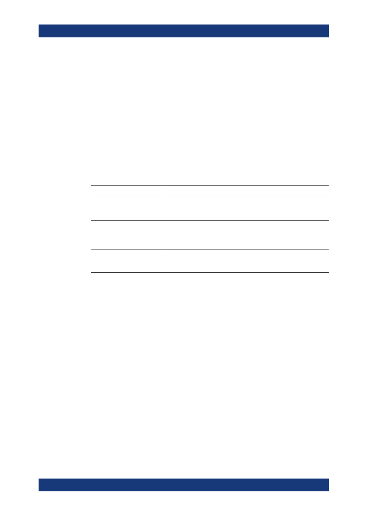
3.1.1 Screen Layout of the Realtime Spectrum Result Display
Measurements and Result Displays
The Realtime Spectrum Result Display
As the number of FFTs is considerably higher than the sweep time, the R&S ESR combines several FFTs in one trace. The number of FFTs combined in a trace at a bandwidth of 40 MHz depends on the sweep time and is according to the following formula.
1
= Window number: shows the window of the result display (A through D)
2 = Trace information: includes trace mode and detector
3 = Trace diagram
4 = Markers: Mx for normal markers and Dx for deltamarkers
5 = Marker information: trace number, marker frequency and corresponding amplitude
6 = Realtime trace (yellow line)
7 = Center frequency
8 = Span
3.1.2 Applications of the Realtime Spectrum
Just like the spectrum results of a conventional analyzer, you can find many applications for the realtime spectrum result display.
If you use it as a standalone result display, the advantage of the realtime spectrum
result display is the ability to monitor the spectrum without losing information.
The best way to use this feature, however, is to combine the realtime spectrum result
display with the spectrogram result display in split screen mode. The spectrogram
shows the results with a large history depth, but is not suited for detailed analysis of
the data. You can, however, select a particular frame in the spectrogram's history with
the marker and recall the spectrum of that frame for further and more detailed and full
analysis of the measured signal.
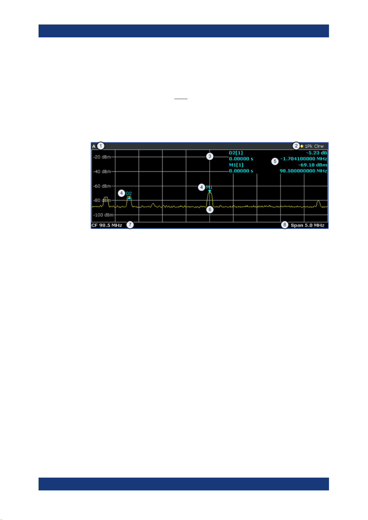
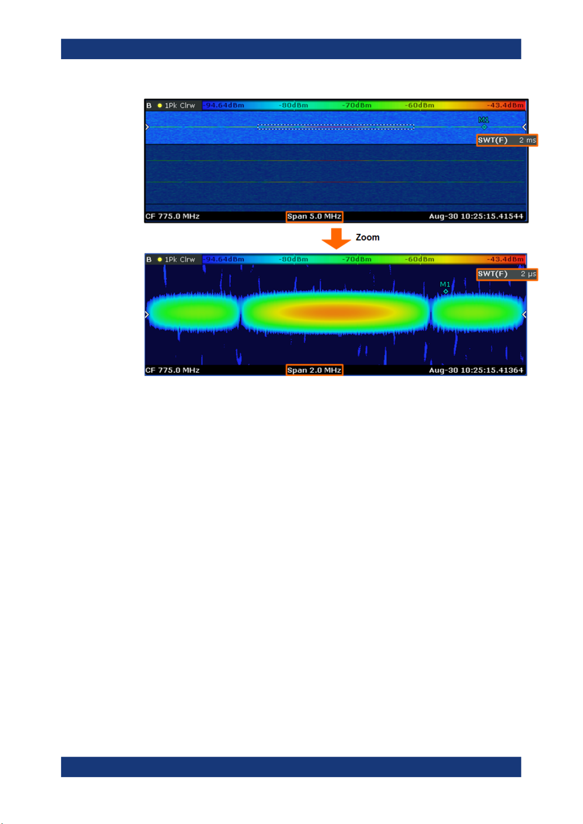
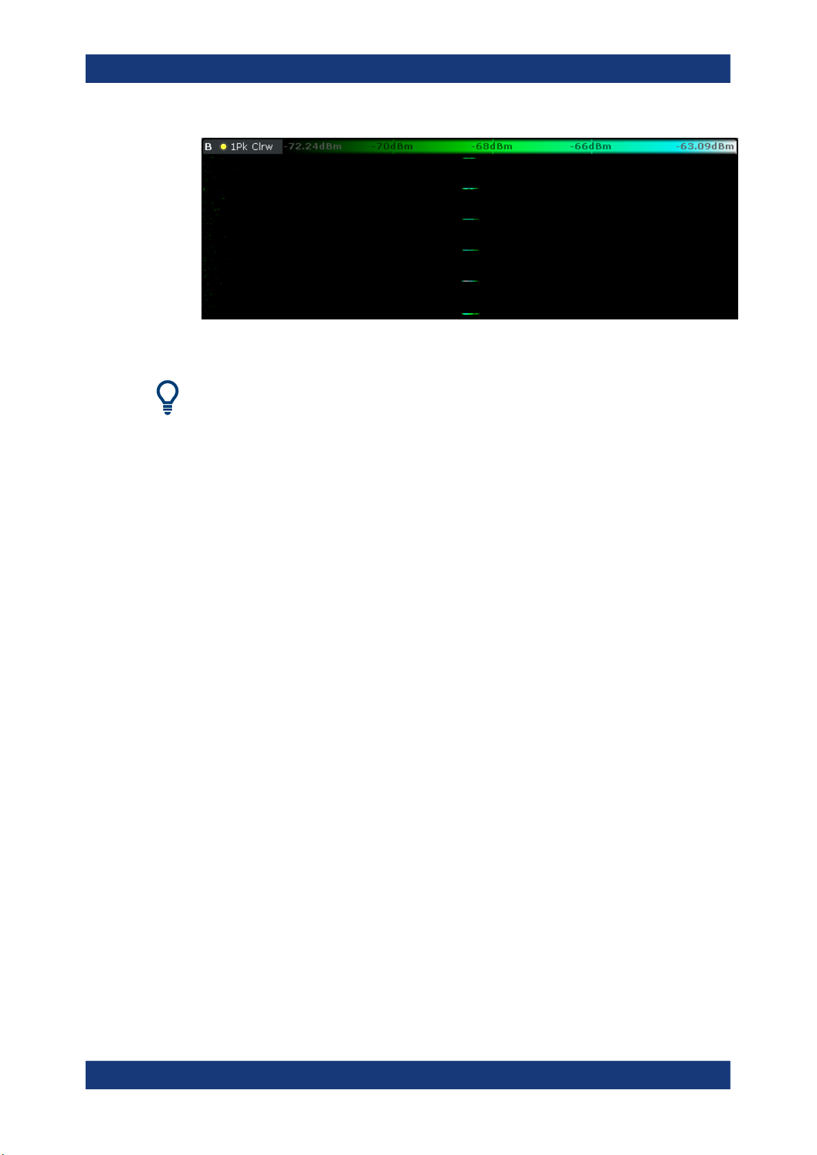
The picture below shows that application. The realtime spectrum is not the currently
measured spectrum, but the one that was measured at the time of marker 1. The realtime spectrum corresponds to the spectrogram frame of the marker position.
11User Manual 1175.7074.02 ─ 06
R&S®ESR-K55
Measurements and Result Displays
The Spectrogram Result Display
Figure 3-1: Simultaneous display of realtime spectrum and spectrogram showing a past spectrum
3.2 The Spectrogram Result Display
The spectrogram result display shows the spectral density of a signal in the frequency
domain and over time simultaneously. It provides an overview of the spectrum over
time and so allows for an easy detection of anomalies and interfering signals.
Like the realtime spectrum, the horizontal axis represents the frequency span. The vertical axis represents time. Time in the spectrogram runs chronologically from top to bottom. Therefore, the top of the diagram is the most recently recorded data. The spectrogram also shows the power levels for every realtime spectrum trace. To display the
level information, the R&S ESR maps different colors to each power level that has
been measured. The result is therefore still a two dimensional diagram.
CALCulate<n>:FEED on page 77
The process to get the spectrogram result display is as follows:
●
capturing the data from the realtime trace
●
coloring the results.
●
processing the data
The stages occur at the same time.
12User Manual 1175.7074.02 ─ 06

R&S®ESR-K55
Measurements and Result Displays
The Spectrogram Result Display
Capturing the data
The spectrogram uses the realtime spectrum traces as its data basis. The data capture
process is therefore the same as that of the realtime spectrum result display.
For more information, see Chapter 4.1, "Data Acquisition and Processing in a Realtime
Analyzer", on page 33
After the data has been captured, the R&S ESR transforms the data of the realtime
spectrum into the spectrogram result display.
Coloring the results
To get the final looks of the spectrogram, the R&S ESR applies colors to to visualize
the power levels in a two dimensional diagram.
Each color in the spectrogram corresponds to a particular power level that is shown in
the color map in the title bar of the result display. The color the R&S ESR assigns to
each power level depends on:
●
the color scheme you have selected
●
the (customized) color mapping settings
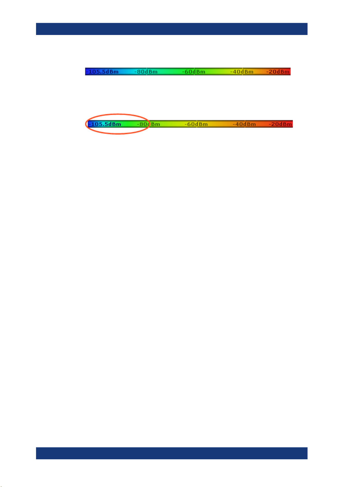
In the default configuration, the R&S ESR displays low power levels in 'cold' colors
(blue, green etc.) and higher power levels in 'warm' colors (red, yellow etc.).
For more information, see Chapter 3.2.3.3, "Customizing the Color Mapping",
on page 20
Displaying the results
Now that the data is available, the R&S ESR processes the data to display it in the
spectrogram result display.
To understand the structure and contents of the spectrogram, it is best to activate the
realtime spectrum result display in combination with the spectrogram, as the data that
is shown in the spectrogram is always based on the data of the trace in the realtime
spectrum result display.
The spectrogram is made up out of a number of horizontal lines, each one pixel high,
that are called (time) frames. Like the trace of the realtime spectrum, a spectrogram
frame contains several FFTs. The exact number of FFTs contained in a frame depends
on the sweep time. As the sweep time also sets the length of a realtime spectrum
trace, by default a frame in the spectrogram always corresponds to exactly one trace in
single sweep mode in the realtime spectrum result display. You can change this ratio
by changing the sweep count.
In the default state, a frame is added to the spectrogram after each sweep. As the
spectrogram in the R&S ESR runs from top to bottom, the outdated frame(s) move
down one position, so that the most recently recorded frame is always on top of the
diagram.
The number of frames the R&S ESR can display simultaneously is only limited by the
vertical screen size. The number of frames the R&S ESR stores in its history memory
is bigger. It depends on the history depth you have set, with the maximum being
100.000. You can then navigate to any of the frames stored in the history buffer.
13User Manual 1175.7074.02 ─ 06
R&S®ESR-K55
3.2.1 Screen Layout
Measurements and Result Displays
The Spectrogram Result Display
Note that the R&S ESR stores just the trace information in its memory, not the I/Q data
itself.
For more information, see Chapter 3.2.3.1, "Working with the Spectrogram History",
on page 15.
By default, the currently shown realtime spectrum trace corresponds to the spectrogram frame that has been recorded last. In single sweep mode, you can, however,
recall the spectrums up to a maximum of 100.000 frames and evaluate them at a later
time. The number of spectrums available depends on the history depth.
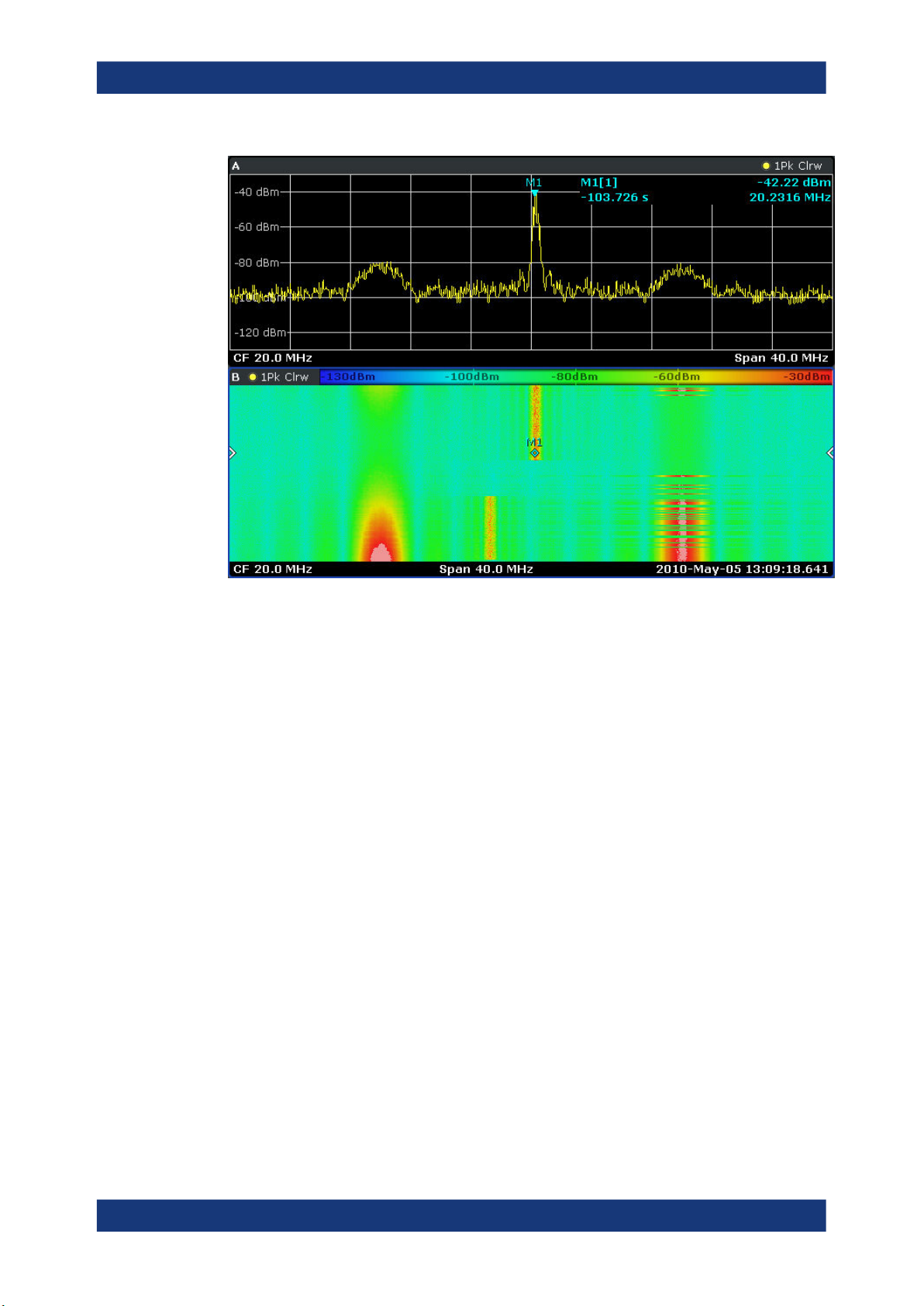
1
= Window number: shows the window of the result display (A through D)
2 = Trace information: includes trace mode and detector
3 = Color Map
4 = Spectrogram
5 = Marker indicator: shows the vertical position of the active marker
6 = Markers and deltamarkers
7 = Center frequency
8 = Span
9 = Time stamp information; if time stamp is inactive this shows the shows the currently active frame instead
3.2.2 Applications of the Spectrogram Result Display
The spectrogram provides an easy way to monitor the changes of a signal's frequency
and amplitude over time. Typically, it is used for measurements in which time is a factor. However, there are a lot of applications you could think of.
A typical applications of a spectrogram is the monitoring of telecommunications systems that are based on frequency hopping techniques, e.g. GSM. Using the spectrogram, you can see at a glance whether slots are allocated correctly or not. In addition,
the result display also provides information on the time a particular channel is in use.
Again in telecommunications systems that use frequency hopping techniques, you can
use the spectrogram to monitor the settling time to a new frequency after the channel
switching.
14User Manual 1175.7074.02 ─ 06

R&S®ESR-K55
3.2.3 Configuring the Spectrogram
3.2.3.1 Working with the Spectrogram History
Measurements and Result Displays
The Spectrogram Result Display
The spectrogram is also suited for more general measurement tasks like measuring
the settling time of a DUT or the detection of the time and statistical frequency of interfering signals.
The spectrogram has two distinctive features: information over a period of time and the
colors. That means that it is important that you can customize various things concerning these two features.
TRACe<n>[:DATA] on page 115
MMEMory:STORe:SGRam on page 86
In realtime mode, the spectrogram provides a record of the spectrum without gaps.
Because the R&S ESR stores the history of the spectrum in its memory, you can analyze the data in detail at a later time by recalling one of the spectrums in the spectrogram history.
Defining the History Depth
The "History Depth" softkey defines the number of frames that the R&S ESR stores in
its memory. The maximum history depth is 100.000 frames.
It is possible to recall the realtime traces to any of the frames that the R&S ESR has in
its memory.
For more information, see
●
Chapter 3.1.2, "Applications of the Realtime Spectrum", on page 11
●
Chapter 3.2.2, "Applications of the Spectrogram Result Display", on page 14
●
CALCulate<n>:SGRam:HDEPth on page 84
Defining a Frame Count
The frame count defines the number of traces the R&S ESR plots in the spectrogram
result display in a single sweep. The maximum number of possible frames depends on
the history depth.
The sweep count, on the other hand, determines how many sweeps are combined in
one frame in the spectrogram, i.e. how many sweeps the R&S ESR performs to plot
one trace in the Spectrogram result display.
You can set the frame count with the "Frame Count" softkey which is available in single
sweep mode.
CALCulate<n>:SGRam:FRAMe:COUNt on page 83
15User Manual 1175.7074.02 ─ 06

R&S®ESR-K55
Measurements and Result Displays
The Spectrogram Result Display
Selecting a Frame
To get more information, you can select any frame that is stored in the memory of the
R&S ESR with the "Select Frame" softkey. Depending on whether you have activated a
time stamp or not, you select the frame either by time in seconds from the most recent
recorded frame (time stamp On) or by directly entering the frame number you'd like to
see (time stamp Off).
To select a specific frame, the R&S ESR has to be in single sweep mode.
CALCulate<n>:SGRam:FRAMe:SELect on page 83
Using the Time Stamp
The time stamp shows the time information of the selected frame. The length of one
frame corresponds to the sweep time.
If the time stamp is active, the time stamp shows the time and date the selected frame
was recorded. To select a specific frame, you have to enter the time in seconds, relative to the frame that was recorded last. An active time stamp is the default configuration.
If you deactivate the time stamp with the "Time Stamp (On Off)" softkey, the time information is an index. The index is also relative to the frame that was recorded last, which
has the index number 0. The index ends with a negative number that corresponds to
the history depth. To select a specific frame, you have to enter the index number of the
frame you want to analyze.
CALCulate<n>:SGRam:TSTamp[:STATe] on page 85
CALCulate<n>:SGRam:TSTamp:DATA? on page 84
Exporting the Spectrogram Data
The R&S ESR allows you to export the spectrogram data to an ASCII file.
When you export the spectrogram to an ASCII file, the R&S ESR writes the complete
contents in its memory to an ASCII file. The amount of data depends on the history
depth.
To export the spectrogram, the spectrogram window has to be in focus (blue frame). To
perform the export itself, use the "ASCII Trace Export" softkey in the "Trace" menu.
File size
Depending on the contents of the capture buffer, the export may take some time and
the size of the ASCII file may be very large.
Clearing the Spectrogram
If you need to restart the spectrogram, you can clear the memory of the R&S ESR with
the "Clear Spectrogram" softkey at any time.
It is also possible to clear the spectrogram after each sweep automatically if you are in
single sweep mode. You can do so with the "Continue Frame (On Off)" softkey. If it is
16User Manual 1175.7074.02 ─ 06

R&S®ESR-K55
3.2.3.2 Zooming into the Spectrogram
Measurements and Result Displays
The Spectrogram Result Display
active, the spectrogram keeps filling up with data after a single sweep. If inactive, however, the R&S ESR clears the spectrogram after every single sweep.
CALCulate<n>:SGRam:CLEar[:IMMediate] on page 82
CALCulate<n>:SGRam:CONT on page 82
For further and more detailed analysis of the data you have captured, the R&S ESR
provides a zoom.
The zoom is available for the spectrogram result display, but has effects on other result
displays. The spectrogram has to be active and selected (blue border) for the zoom to
work.
You can activate the zoom with the
rectangle on the touchscreen. When you draw the zoom area, its boundaires are
shown as a dashed line. The R&S ESR stops the live measurement and enlargens the
area you have defined. The definition of the color map remains the same.
Inside the zoom area, you can use the spectrogram functionality as usual (like frame
selection or scrolling through the spectrogram).
For quick comparisons of the zoomed spectrogram and the unzoomed one, you can
use the "Replay Zoom (On Off)" softkey in the "Meas" menu.
Zooming into the spectrogram causes the R&S ESR to reprocess and reevaluate the
data that has been measured previously and stored in the R&S ESR memory. The
zoom also reduces the sweep time and/or resolution bandwidth and span. This in turn
improves the resolution of the data (while a graphical zoom merely interpolates the
data and thus reduces the resolution).
icon and define the zoom area by drawing a
17User Manual 1175.7074.02 ─ 06
R&S®ESR-K55
Measurements and Result Displays
The Spectrogram Result Display
Because the zoom is based on data that has already been captured, the zoom also
allows for faster sweep times (and thus spans) than those possible during live measurements (which are limited to 100 µs).
As mentioned above, selecting an area in the spectrogram to zoom into changes the
sweep time and span (and thus the start and stop frequencies of the diagrams). It may
also change the center frequency. The magnitude of the change depends on the size
of the zoom area. If the zoom is already active, this mechanism also works the other
way round. You can change the zoom factor by changing the sweep time or the span.
Zoom restrictions
Principally, the zoom is available for all measurement situations, whether you measure
continuously, in single sweep mode or use a trigger. However, possible zoom areas are
restricted by the size of the memory (4 seconds). If it is not possible to zoom into a
spectrogram area, the R&S ESR colors that area in a darker color when you touch it.
The zoom factor is restricted to 10% of the original span of the frequency axis.
18User Manual 1175.7074.02 ─ 06

R&S®ESR-K55
Measurements and Result Displays
The Spectrogram Result Display
In addition, the zoom is also restricted by the original bandwidth or span you have set.
Zooming into areas that are outside this bandwidth is not possible.
Note also that zoom availability depends on the trigger mode. Zooming while the measurement is running is possible only in Free Run mode. For all other trigger modes,
you have to wait until the measurement is paused.
Effects on other result displays
Zooming has an effect on the realtime spectrum result display. All other result displays
are unaffected.
●
The R&S ESR updates the range of horizontal axis of the realtime spectrum
according to the zoomed (new) spectrogram span. The range has an effect on the
start, stop and center frequency as well as the span.
The realtime spectrum still shows the spectrum of the currently selected spectrogram frame.
Updates in the result displays only take effect if they have been active while the spectrogram data has been reevaluated.
DISPlay:WINDow[:SUBWindow]:ZOOM:AREA on page 77
DISPlay:WINDow[:SUBWindow]:ZOOM:STATe on page 78
19User Manual 1175.7074.02 ─ 06
R&S®ESR-K55
3.2.3.3 Customizing the Color Mapping
Measurements and Result Displays
The Spectrogram Result Display
Colors are an important part of the both the persistence spectrum and the spectrogram. Therefore, the R&S ESR provides various ways to customize the display for best
viewing results.
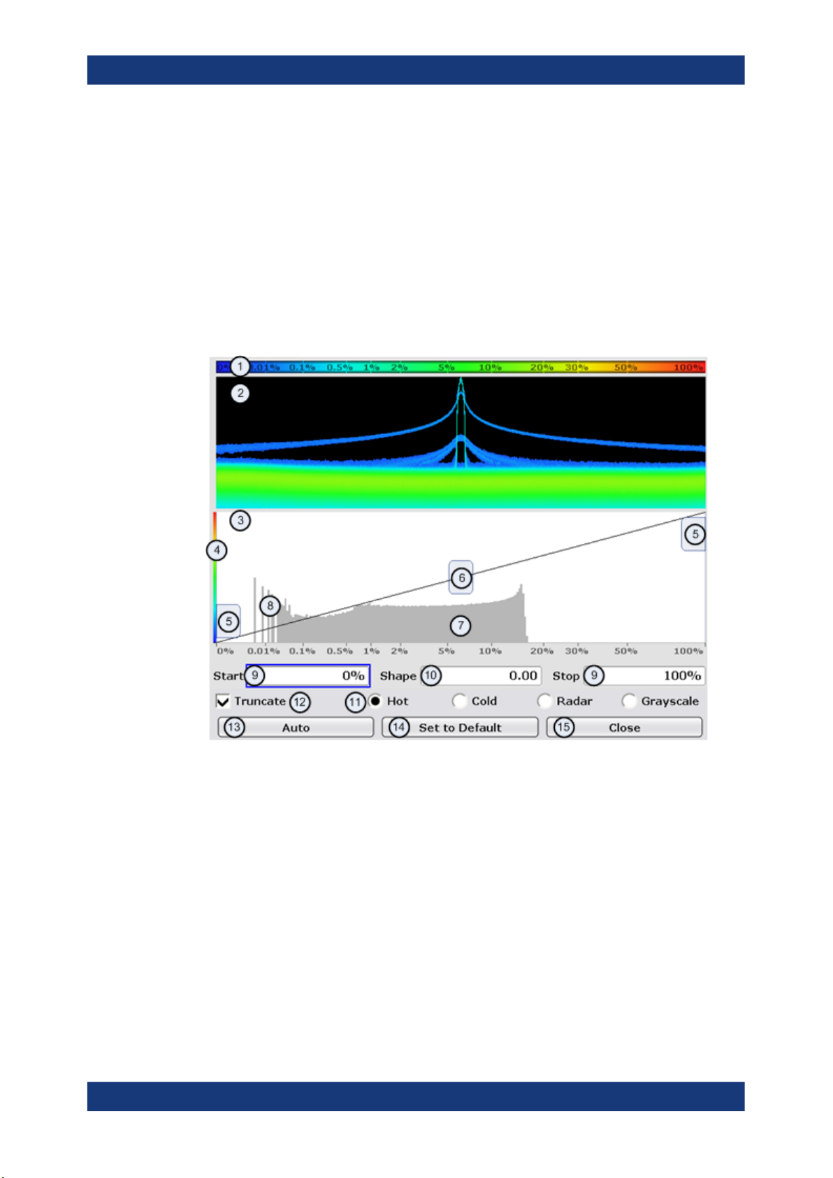
You can access the Color Mapping dialog via the "Color Mapping" softkey or by tapping on the color map. The dialog looks and works similar for the histogram and the
spectrogram, only the the scaling or unit of the color map is different. For the persistence spectrum the R&S ESR maps the colors to percentages, for the spectrogram it
maps power levels (dBm). In addition, the dialog box of the persistence spectrum
offers a truncate function.
1
= Color map: shows the current color distribution
2 = Preview pane: shows a preview of the histogram / spectrogram with any changes that you make to the
color scheme
3 = Color curve pane: graphic representation of all settings available to customize the color scheme
4 = Color curve in its linear form
5 = Color range start and stop sliders: define the range of the color map; percentages for the histogram or
amplitudes for the spectrogram
6 = Color curve slider: adjusts the focus of the color curve
7 = Histogram: shows the distribution of measured values
8 = Scale of the horizontal axis (value range): in the spectrogram this is linear, in the histogram it is the
function of the density
9 = Color range start and stop: numerical input to define the range of the color map
10 = Color curve: numerical input to define the shape of the color curve
11 = Color scheme selection
12 = Truncate: if active, only shows the results inside the value range; only available for the persistence
spectrum
20User Manual 1175.7074.02 ─ 06
R&S®ESR-K55
Measurements and Result Displays
The Spectrogram Result Display
13 = Auto button: automatically sets the value range of the color map
14 = Default button: resets the color settings
15 = Close button: closes the dialog box
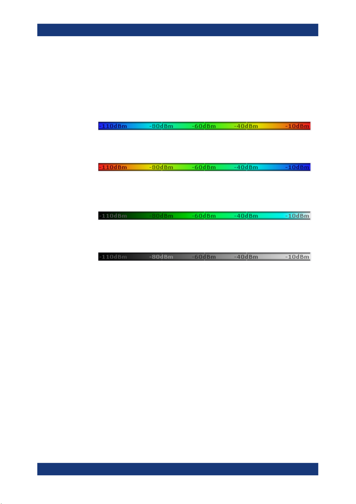
Setting the Color Scheme
Before adjusting the details of the color map, you should select the color scheme you
are most comfortable with. You can select from four different color schemes:
●
The "Hot" color scheme shows the results in colors ranging from blue to red. Blue
colors indicate low probabilities or levels respectively. Red colors indicate high
ones.
●
The "Cold" color scheme shows the results in colors ranging from red to blue. Red
colors indicate low probabilities or levels respectively. Blue colors indicate high
ones.
The "Cold" color scheme is the inverse "Hot" color scheme.
●
The "Radar" color scheme shows the colors ranging from black over green to light
turquoise with shades of green in between. Dark colors indicate low probabilities or
levels respectively. Light colors indicate high ones.
●
The "Grayscale" color scheme shows the results in shades of gray. Dark grays indicate low probabilities or levels respectively. Light grays indicate high ones.
If a result lies outside the defined range of the color map, it is colored in black at the
lower end of the color range. On the upper end of the color range it is always the lightest color possible, regardless of differences in amplitude (e.g. black and blue in case of
the "Cold" scheme).
DISPlay:WINDow:SGRam:COLor[:STYLe] on page 87
DISPlay:WINDow:SGRam:COLor:DEFault on page 87
Defining the Range of the Color Map
The current configuration could be a color map that you can optimize for better visualization of the measured signal, e.g. if the results cover only a small part of the color
map. In the resulting trace, it would be hard to distinguish between values that are
close together.
There are several ways to optimize the distribution of the colors over the results and
then get the best viewing results.
Note that the following examples are based on the "Hot" color scheme and the spectrogram. Color settings in the histogram are the same with the exception of the unit of the
21User Manual 1175.7074.02 ─ 06
R&S®ESR-K55
Measurements and Result Displays
The Spectrogram Result Display
color map that is % in the histogram. If something applies to the spectrogram only,
you'll find a note at that place.
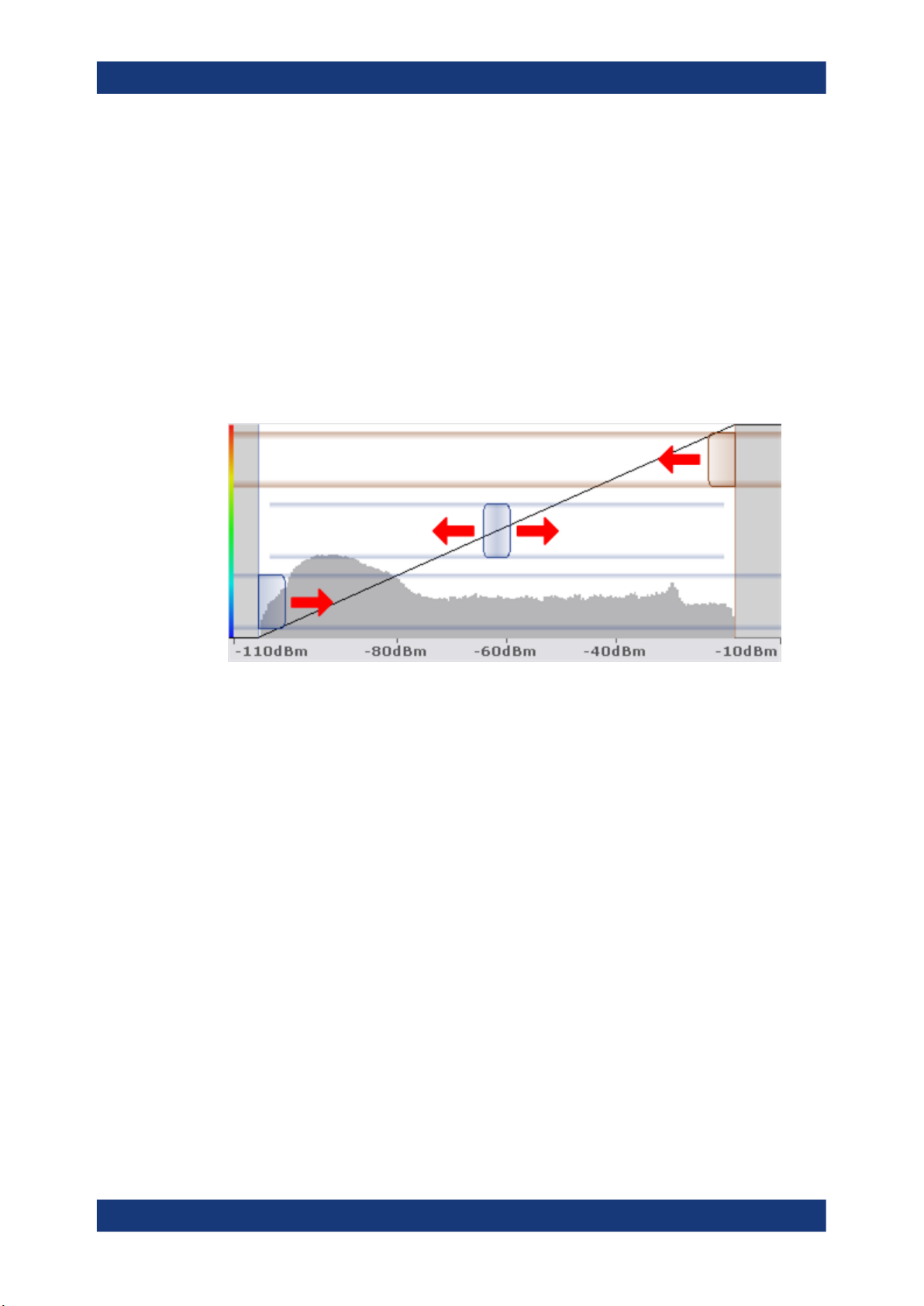
The easiest way to adjust the colors is to use the color range sliders in the "Color Mapping" dialog.
In the histogram that is in the background of the color curve pane (grey bars), you can
observe the distribution of measurement results. If no significant shifts in result distribution occur after evaluating this for a time, you can adjust the color map to the overall
shape of the measurement results. To do so and still cover the whole signal, move the
sliders in a way that the first and last bar of the histogram are still inside the range. You
can optimize the display further, if you suppress the noise by excluding the lower 10 to
20 dB of the distribution. Note that the color map has to cover at least 10% of the
range of the horizontal axis.
Alternatively, you can set the range in the numeric input field. For the spectral histogram, you enter the percentages as they are plotted on the horizontal axis and displayed in the spectral histogram itself. For the spectrogram however, you have to enter
the distance from the right and left border as a percentage.
Example:
The color map starts at -100 dBm and ends at 0 dBm (i.e. a range of 100 dB). You,
however, want the color map to start at -90 dBm. To do so, you have to enter 10% in
the Start field. The FSVR shifts the start point 10% to the right, to -90 dBm.
In the spectrogram, cutting the range as far as possible is also a good way if you want
to observe and put the focus on signals with a certain amplitude only. Then, only those
signal amplitudes that you really want see are displayed. The rest of the display
remains dark (or light, depending on the color scheme). It is also a good way to eliminate noise from the display. In the spectrogram you can do this easily by excluding the
corresponding power levels at the low end of the power level distribution.
In the histogram, cutting down the color range is also a good way to eliminate unwanted signal parts. Very frequent level and frequency combinations are most likely noise,
so cutting them away means that the color resolution for all other combinations is
enhanced and makes it more easy to detect, for example, weak and rare signals.
The persistence spectrum provides an additional truncate function. If active, all values
that are outside the color range are no longer displayed in the histogram.
22User Manual 1175.7074.02 ─ 06
R&S®ESR-K55
Measurements and Result Displays
The Spectrogram Result Display
Figure 3-2: Spectrogram that shows the peaks of a pulsed signal only
Adjusting the reference level and level range
Changing the reference level and level range also affects the color scheme in the
spectrogram.
Make sure, however, that you never adjust in a way that could overload the R&S ESR.
For more information, see AMPT menu
DISPlay:WINDow:SGRam:COLor:LOWer on page 87
DISPlay:WINDow:SGRam:COLor:UPPer on page 87
Defining the Shape of the Color Curve
Now that the color scheme and range of the color map suit your needs, you can
improve the color map even more by changing the shape of the color curve.
The color curve is a tool to shift the focus of the color distribution on the color map. By
default, the color curve is linear. The color curve is linear, i.e. the colors on the color
map are distributed evenly. If you shift the curve to the left or right, the distribution
becomes non-linear. The slope of the color curve increases or decreases. One end of
the color palette then covers a large amount results while the the other end distributes
a lot of colors on relatively small result range.
You can use this feature to put the focus on a particular region in the diagram and to be
able to detect small variations of the signal.
23User Manual 1175.7074.02 ─ 06
R&S®ESR-K55
Measurements and Result Displays
The Persistence Spectrum Result Display
Example:
Figure 3-3: Linear color curve shape = 0
The color map above is based on a linear color curve. Colors are distributed evenly
over the complete result range.
Figure 3-4: Non-linear color curve shape = -0.5
After shifting the color curve to the left (negative value), more colors cover the range
from -105.5 dBm to -60 dBm (blue, green and yellow). In the color map based on the
linear color curve, the same range is covered by blue and a few shades of green only.
The range from -60 dBm to -20 dBm on the other hand is dominated by various shades
of red, but no other colors. In the linear color map, the same range is covered by red,
yellow and a few shades of green.
The result of shifting the color curve is that results in a particular result range (power
levels in case of the spectrogram and densities in the case of the spectral histogram)
become more differentiated.
You can adjust the color curve by moving the middle slider in the color curve pane to a
place you want it to be. Moving the slider to the left shifts the focus in the direction of
low values. Most of the colors in the color map are then concentrated on the low power
levels (spectrogram) or densities (histogram), while only a few colors cover the upper
end of the color map or high power levels or densities. Moving the slider to the right
shifts the focus to the higher amplitudes or densities.
Alternatively, you can enter the shape of the color curve in the corresponding input field
below the color curve pane. A value of 0 corresponds to a linear shape, negative values up to -1 shift the curve to the left, positive values up to 1 shift the curve to the right.
DISPlay:WINDow:SGRam:COLor:SHAPe on page 87
3.3 The Persistence Spectrum Result Display
The persistence spectrum is a two dimensional histogram that shows the statistical frequency of any frequency and level combinations for every pixel on the display ('hits'
per pixel). As the number of FFTs used to create the histogram is very large, you can
also look at it as a probability distribution.
Note that the word 'density' in this context means how frequent a certain level and frequency combination has occured during the measurement.
In principle, the result display looks just like that of a conventional spectrum analyzer
with the horizontal and vertical axis representing the frequency and level respectively.
Unlike the trace in a conventional spectrum analyzer, the persistence spectrum
24User Manual 1175.7074.02 ─ 06

R&S®ESR-K55
]
FFT
[.]y[GranularitN
sec
000250sec
Measurements and Result Displays
The Persistence Spectrum Result Display
includes a third type of information (a virtual z-axis). This virtual axis represents the
number of hits that occured during a particular period of time. This would result in a
three dimensional diagram with the height of each bar on the z-axis representing the
number of hits per pixel. This makes the result display a (spectral) histogram.
However, in the final display of the results the R&S ESR still shows the trace in two
dimensions with the number of hits represented by different shades of color. The result
is a trace that covers an area instead of a line trace as you know it from the realtime
spectrum result display, for example.
CALCulate<n>:FEED on page 77
For better orientation, the R&S ESR also always shows the realtime spectrum line
trace in the histogram as a white line superimposed over the histogram.
You can turn off the realtime trace by setting the trace mode for that one to "Blank".
To get the final result display for a single frame, the R&S ESR sequentially runs
through a number of processing steps:
●
collecting the data
●
evaluating the data
●
calculating relative values of the data
●
coloring the results.
The stages occur at the same time.
Collecting the data
The persistence spectrum that the R&S ESR displays at any time always represents
the data it has collected in exactly one frame. That means that in single sweep mode, it
shows the data of one frame after it has finished the sweep. The number of FFTs in
one frame is variable and depends on the sweep time that you have set. You can calculate the number of FFTs in each frame for a 40 MHz bandwidth with the following
formula:
Example:
If you have set a granularity of 0.5 seconds, the number of FFTs that a frame (and the
trace) contains is 125.000.
Note that this number refers to the instantenuous histogram. If you work with an active
persistence, you can also see the shadows of past histograms on the display. The persistence functionality displays all spectrums that were captured within the persistence
time.
For more information on persistence, refer to
●
Chapter 3.3.3.1, "Using Persistence", on page 30
25User Manual 1175.7074.02 ─ 06
R&S®ESR-K55
Measurements and Result Displays
The Persistence Spectrum Result Display
Evaluating the data
After it has collected the data of one frame, the R&S ESR copies all the spectrums
included in that frame into the display. If all spectrums were identical, the resulting persistence spectrum would look like a line trace, but in color. However, in reality none of
the spectrums looks alike, therefore the fact that many spectrums are on top of each
other leads to a diagram that covers a two dimensional area on the screen instead of
just a line.
There will be pixels that the spectrum runs through more often than others, whose
spectral density is higher than elsewhere. To represent this fact, the R&S ESR copies
all spectrums into a virtual table whose dimensions correspond to the resolution of the
display with each cell representing one pixel. The horizontal represents the frequency,
the vertical axis the amplitude. In the case of the R&S ESR with a resolution of
600x801 pixels, this means that the table would have 480.600 cells. With a full span of
40 MHz and the default display range of 100 dB, one cell would cover about 50 kHz
and 0.16 dB.
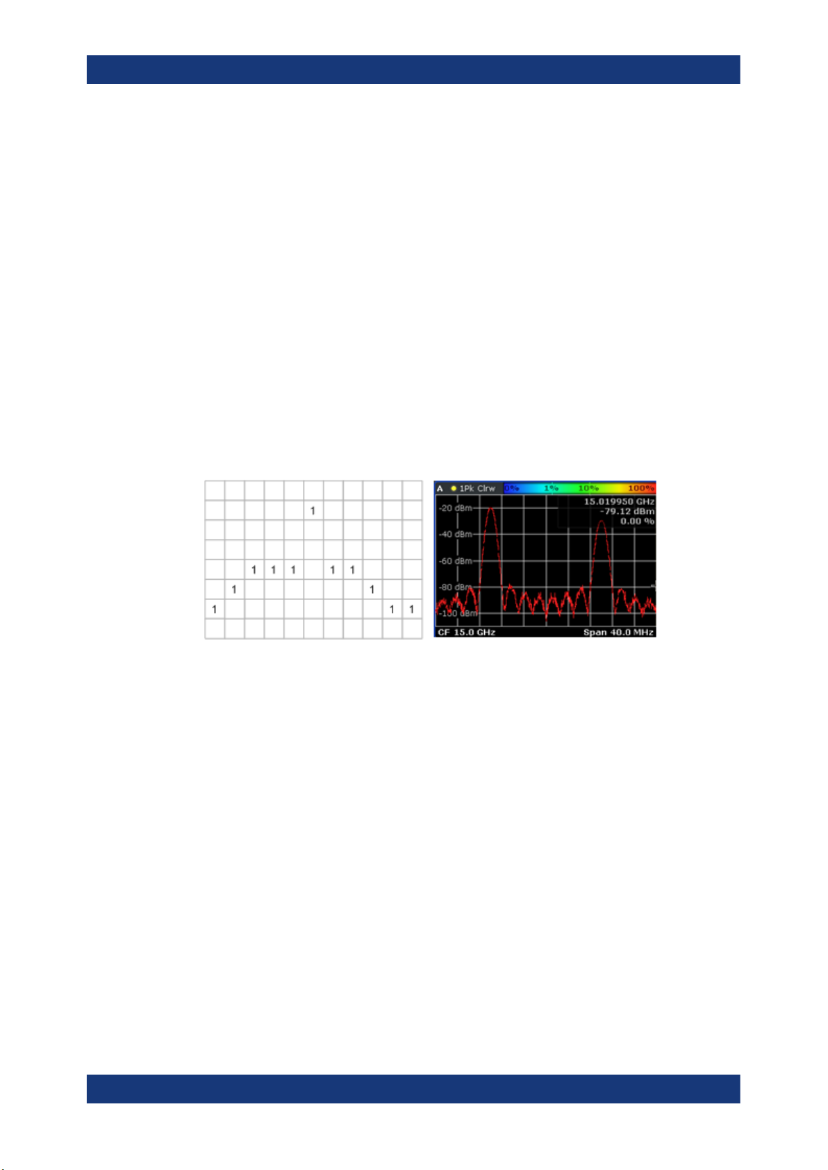
After the R&S ESR has performed the first FFT and has transferred the corresponding
spectrum, the table would, for example, look like this:
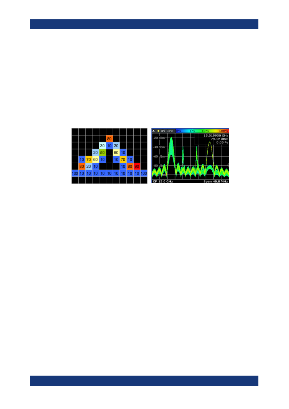
Figure 3-5: Virtual table and diagram containing the results after one FFT
Since there is only one spectrum and every number in the table represents the number
of hits in that cell, each column, at this point, has to contain exactly one value. The
sum of each column may not exceed the value '1', as, currently, there is only one spectrum. Additionaly, every column must include a number (one for each frequency/ level
combination). The display of the trace after this step would look like a line trace.
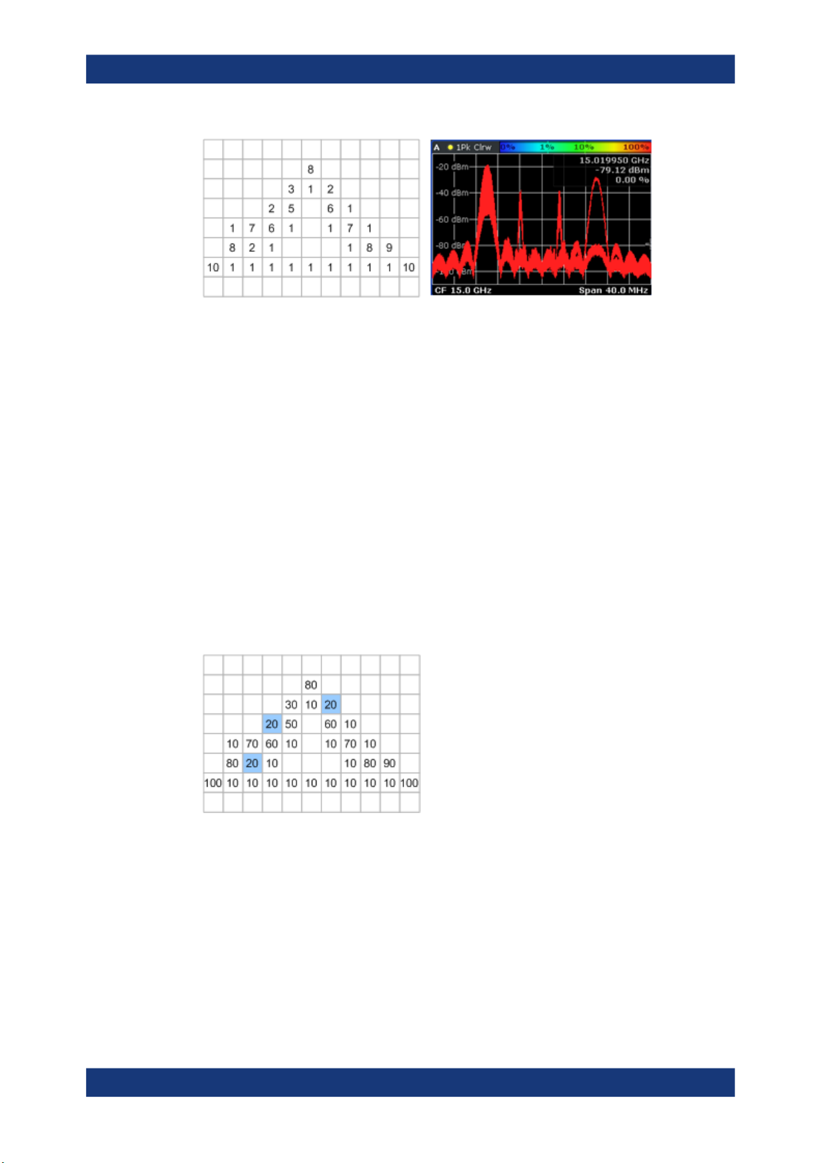
But as the frame consists of more than one spectrum, the R&S ESR accumulates all
spectrums it has captured. Let's assume a frame consists of 10 spectrums. After a single sweep, the table would, for example, look like this:
26User Manual 1175.7074.02 ─ 06
R&S®ESR-K55
Measurements and Result Displays
The Persistence Spectrum Result Display
Figure 3-6: Virtual table and diagram containing the results after one frame (n FFTs)
As you can see many cells contain a value greater than '1'. A number greater than one
expresses an overlap of several spectrums on this pixel. As the assumed frame consists of 10 spectrums, the sum of values in each column must equal '10'.
Calculating percentages
Now that all values have been transferred into the table, the R&S ESR converts the
absolute numbers into relative values or percentages. The percentages are the basis
of the final histogram that the R&S ESR shows on the display.
The percentage of one cell is simply the ratio of the number of hits in that cell over the
number of accumulated spectrums.
Example:
The percentage of, e.g., the value in the highlighted cells would be 0.2 or 20% (2 hits
and a total number of 10 spectrums, n=(2/10)*100%). After the R&S ESR has calculated all percentages, the table would look like this:
Figure 3-7: Virtual table containing the percentages of the results after one frame
The values in the table are the percentages, so that the sum of each column is always
100%.
With a long observation time, the percentage becomes a statistical value that shows
the probability of the occurence of a particular frequency/ level combination.
Coloring
To visualize the percentages in the persistence spectrum, the R&S ESR uses different
colors for different values. That means the final step of creating the persistence spec-
27User Manual 1175.7074.02 ─ 06
R&S®ESR-K55
Measurements and Result Displays
The Persistence Spectrum Result Display
trum is the mapping of colors to every pixel with each color representing a particular
percentage or probability that is shown in the color map in the title bar of the result display.
The color the R&S ESR assigns to the percentage depends on:
●
the color scheme you have selected
●
the color mapping settings you have set
In the default configuration (color scheme "Hot"), the R&S ESR shows low percentages
with 'cold' colors (blue, green etc.) and high percentages in 'warm' colors (red, yellow
etc.).
Applying colors to 3-7 would result in a picture like this:
Figure 3-8: Virtual table and result display containing the colored results
As you can see in
3-8, the most frequent spectral parts appear in red, while all others
appear in colder colors.
Up until now, the process was for one frame only and no active persistence and no
maxhold function. If you activate those, the process of drawing the persistence spectrum gets more complex.
For more information, see
●
Chapter 3.3.3.1, "Using Persistence", on page 30
●
Chapter 3.3.3.2, "Activating Maxhold", on page 31
28User Manual 1175.7074.02 ─ 06
R&S®ESR-K55
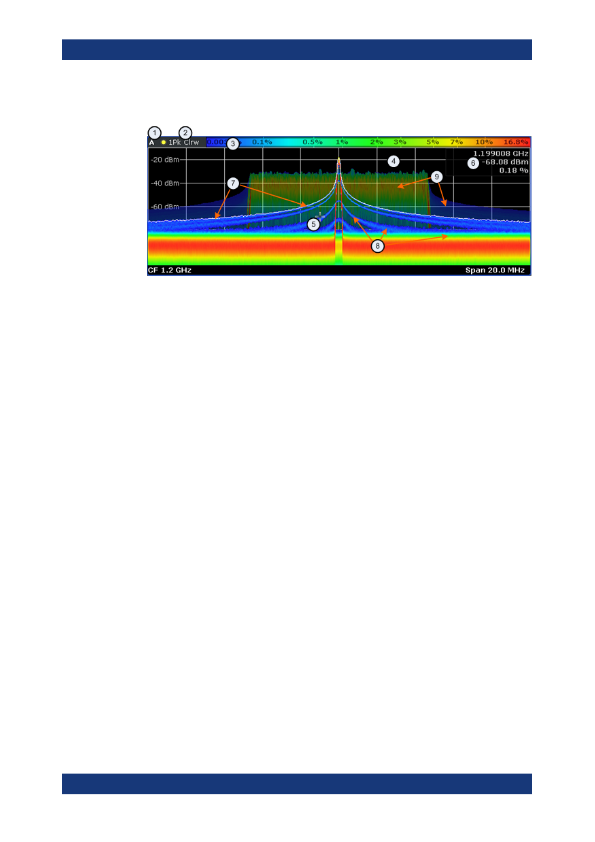
3.3.1 Screen Layout of the Persistence Spectrum
Measurements and Result Displays
The Persistence Spectrum Result Display
1 = Screen number
2 = Trace information for the realtime spectrum trace (trace mode and detector)
3 = Color map
4 = Trace window (or diagram area)
5 = Marker
6 = Marker information
7 = Realtime spectrum trace (white line)
8 = Persistence spectrum (colored trace)
9 = maxhold trace (weak color intensity)
The persistence spectrum has three 'layers':
●
the realtime spectrum trace. This trace is always white so that you can recognize it
inside the histogram. It is updated continuously.
●
the histogram. The histogram is the main feature of the result display. The colors
the histogram show the number of hits of level/frequency combinations. The number of FFTs each pixel in the measurement diagram contains depends on the granularity. The histogram is multicolored.
●
the maxhold trace. The maxhold trace is a transparent trace in the background of
the histogram that shows the maximum percentages that have been measured up
to the present. The maxhold trace is in the 'background' of the result display with a
lower intensity than the histogram. By default, the maxhold trace is inactive, i.e. it
has an intensity of 0. You can, however, adjust the color intensity to the point where
the maxhold trace has the same intensity as the regular histogram. The maxhold
trace is also multicolored.
3.3.2 Applications of the Persistence Spectrum
The persistence spectrum is useful for any measurement task that requires information
about the statistical frequency of a spectral event. When you know the relative frequency of an event, you can also deduce the probability with which that event will
occur.
A typical application for the persistence spectrum is the detection of weak or hidden
signals that occur infrequent. Weak signals may be hidden in the noise or occur in
between strong pulses and therefore cannot be detected with standard result displays.
29User Manual 1175.7074.02 ─ 06

R&S®ESR-K55
Measurements and Result Displays
The Persistence Spectrum Result Display
The persistence spectrum on the other hand shows those signals because they have a
different probability than other signals. With a different probability, the color mapping
also is different and it is easy for you to identify those signals.
You can also identify spurs more easily with the persistence spectrum because their
probability differs. With an active persistence, you can also see them or their shadows
for a longer time on the result display which makes it easier not to miss them.
This fact also makes it easier to monitor the spectrum and, e.g. observe interfering signals in a frequency band reserved for a particular application. When monitoring the
spectrum with the persistence spectrum, you can not only see interfering signals but
also observe the frequency with which they occur and therefore derive from the density
if it was a one time occurence only or if the interfering signal is transmitted regularily.
There are however limits to the information the persistence spectrum is capable to provide. If you need to know, for example, how long a particular frequency/level combination is present, you have to use another result display, because the persistence spectrum doesn't tell whether there is a single very long pulse (e.g. one 5 ms pulse) or several short ones (e.g. ten 50 µs pulses).
3.3.3 Configuring the Persistence Spectrum
You can customize the persistence spectrum in several ways. You can change the colors with which the densities are visualized, you can change the persistence of the data
and change the style of the displayed results.
TRACe<n>[:DATA] on page 115
3.3.3.1 Using Persistence
Persistence is a term to describe the time period shadows of past histogram traces
remain visible in the display before fading away.
The term persistence has its origins in cathode ray tube devices (CRTs). It describes
the time period one point on the display stays illuminated after it has been lit by the
cathode ray. The higher the persistence, the longer you could observe the illuminated
point on the display.
In the persistence spectrum, the persistence results from the moving 'density' (like a
moving average) over a certain number of traces. The number of traces that are considered for calculating the density depend on the persistence length that you can
define with the "Persistence" softkey. The longer the persistence, the more traces are
part of the calculation and the deeper the history of displayed information gets. A spectral event that has occured a single time is visible for up to 8 seconds. That means that
colors will change as densities get smaller at coordinates with signal parts that are not
constantly there, but still have the same intensity as the original signal. The rate of the
color change is high with a low persistence and small with a high persistence.
Note that a signal with constant frequency and level characteristics does not show the
effects of persistence on the trace. As soon as the power or frequency of a signal
change slightly, however, the effect of persistence gets visible through color changes or
changes in the shape of the trace.
30User Manual 1175.7074.02 ─ 06
 Loading...