

Page 1

MiG InfoCom AB
MiG Calendar™ JavaBeans Guide
______________________________________________________________
Release 6
MiG Calendar JavaBeans Guide Page 1 / 45
Page 2

MiG InfoCom AB
MiG InfoCom AB
S:t Olofsgatan 28a
753 32 Uppsala
Sweden
www.miginfocom.com
www.migcomponents.com
COPYRIGHT © MiG InfoCom AB.
All rights reserved.
Java is a trademark registered ® to Sun Microsystems.
http://java.sun.com
MiG Calendar JavaBeans Guide Page 2 / 45
Page 3

MiG InfoCom AB
Table of Contents
MiG Calendar Tutorial.................................6
Preface....................................................................... 6
Resources and Developer Support..............................6
Contacting Support via Email............................................6
Contacting support via online forums.................................6
MiG Calendar Product Site................................................6
Bug Reports................................................................... 7
Introduction............................................................... 8
Examples.................................................................... 8
Visual JavaBean Support in Different IDEs..................8
JFormDesigner (Stand alone & Eclipse/IDEA plugin)............9
NetBeans....................................................................... 9
JBuilder X.....................................................................10
JBuilder 2005................................................................11
Swing-Designer (Eclipse plug-in)..................................... 11
Visual Editor (Eclipse default GUI plugin)..........................11
Bean Builder 0.6 alpha & Bean Box 1.1............................12
Other IDEs................................................................... 12
MiG Calendar Approaches.........................................12
Normal or “Core” Approach.............................................12
Themed Approach (deprecated in 6.0, but it works)...........12
JavaBean Approach (Preferred from v6.0)........................ 13
How the Java Bean Classes Relate to the Core
Component............................................................... 13
Installing the JavaBean Components................................14
The JavaBean Classes............................................... 14
DateAreaBean...............................................................14
MiG Calendar JavaBeans Guide Page 3 / 45
Page 4

MiG InfoCom AB
DateHeaderBean........................................................... 15
CategoryHeaderBean..................................................... 15
DatePickerBean.............................................................15
DemoDataBean.............................................................15
GridDimensionLayoutBean..............................................16
ActivityAShapeBean.......................................................16
CategoryTreeBean......................................................... 16
PrintPreviewBean.......................................................... 16
PrintSpecificationBean...................................................16
DateSpinnerBean.......................................................... 17
DateComboBean........................................................... 17
DateGroupConnectorBean..............................................17
PaintPanelBean............................................................. 17
How Things Are Connected.......................................17
DateAreaBean...............................................................17
DateGrid Structure........................................................ 18
Connecting a GridDimensionLayoutBean...........................19
Sub Rows..................................................................... 20
Adding Date Headers..................................................... 21
Adding a Category Header..............................................24
SubRowLevels and HeaderRows......................................26
Some examples:........................................................... 28
Grid Lines.....................................................................30
The CategoryTreeBean..............................................30
Date Spinners/Combos and Date Groups..................32
Creating Demo Activities and Categories..................32
The ActivityCategories property......................................33
The Categories property.................................................33
Customizing how the Activities Look......................... 34
Sub Shapes.................................................................. 35
MiG Calendar JavaBeans Guide Page 4 / 45
Page 5

MiG InfoCom AB
Adding a Date Picker Component.............................. 35
Advanced Topics....................................................... 37
Adding Activities to your Application................................39
Tracking Changes to Activities......................................... 39
Setting Activity Look Dynamically.................................... 40
Adding Custom Visuals to a DateArea or Header...............42
Tool Tips for Activities.................................................... 44
Even More Advanced Topics...................................... 44
Mixing low level core component code with JavaBeans.......44
MiG Calendar JavaBeans Guide Page 5 / 45
Page 6

MiG InfoCom AB
MiG Calendar Tutorial
Preface
This document aims at providing enough information to get
started using the MiG Calendar JavaBeans components in
your application. The MiG Calendar Tutorial contains information
on how the component is structured including a overview of
the different parts.
The MiG Calendar Technical Specification (API JavaDoc) will provide
details and should be used as a reference. It can be found at
the web site indicated below and should also normally be
installed adjacent to this document.
Many IDE:s (Integrated Development Environment) of today
have good support for inline help using JavaDocs. The
standard HTML JavaDocs for the MiG Calendar component is
installed by default and can also be obtained from the site as
described below. We highly recommend using this feature as
it increases productively when creating applications with this
component.
Although all developers independent of prior experience can
benefit from reading this document, general knowledge of
the standard Java API and OOP (Object Oriented
Programming) will help understand some of the details and
why they are implemented in a certain way.
Resources and Developer Support
MiG InfoCom AB provides support through email and the
online forums. Information and updated tutorials will be
made available on the MiG Calendar product site
Contacting Support directly via Email
support@miginfocom.com
Submit a support ticket
http://www.migcalendar.com/support.php
MiG Calendar Product Site
MiG Calendar JavaBeans Guide Page 6 / 45
Page 7

MiG InfoCom AB
www.migcalendar.com
Bug Reports
Please submit a support ticket.
MiG Calendar JavaBeans Guide Page 7 / 45
Page 8

MiG InfoCom AB
Introduction
MiG Calendar's Visual JavaBean(s) makes the component
very easy to use and configure, especially in combination
with a visual programming tool, sometimes called a RAD-tool
(Rapid Application Development), such as IntelliJ IDEA,
NetBeans, JBuilder, JFormDesigner, SwingDesigner (Eclipse)
and Eclipse's Visual Editor .
The JavaBean classes are wrapper classes around the
different parts of the framework rather than sub classes of
the same. This is for increased decoupling, which means that
one part can be enhanced without being constrained by the
other, optionally more efficient packaging.
All JavaBean classes, including the support classes, reside in
the com.miginfocom.beans.* package. The API
documentation for all properties of these classes is as usual
in the provided JavaDoc HTML pages installed with the
component.
This document will provide information on how to use the
MiG Calendar component's JavaBean classes. For a more
thorough explanation of every property please use the
JavaDoc.
Examples
MiG Calendar comes with examples for the JavaBeans. They
are created with netBeans 5.5. and can be imported directly
and be used for testing, code copying or running.
They are in the installation folder under examples. E.g.
C:\Program Files\MiG InfoCom\MiGCalendar6\examples\
These examples are importable to Eclipse using the plugins
Visual Editor or Swing Designer (Note! In Swing Designer
there's a bug that makes all non-visual components nonparsable. This was confirmed in the daily build 2007-02-15).
Visual JavaBean Support in Different IDEs
MiG Calendar JavaBeans Guide Page 8 / 45
Page 9
MiG InfoCom AB
The support for handling advanced beans visually in a
designer is somewhat different for every IDE (Integrated
Development Environments). We expect this to improve
considerably in the short future as RAD (Rapid Application
Development) is getting more popular with Java.
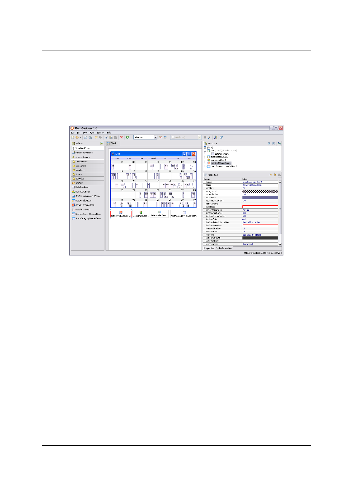
JFormDesigner (Stand alone & Eclipse/IDEA plugin)
Works flawlessly. JFormDesigner has excellent error reporting
if anything goes wrong with the bean in any situation. It also
supports all features of the MiG Calendar Beans.
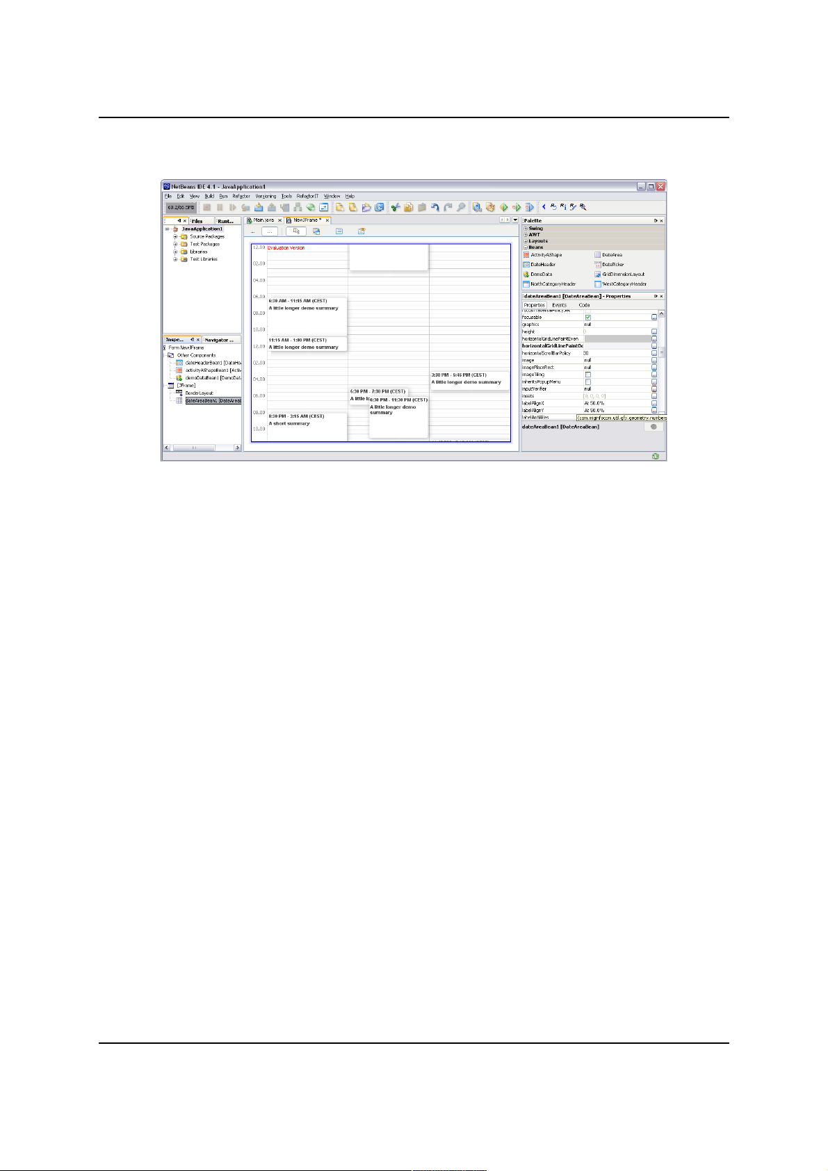
NetBeans
Works flawlessly. netBeans has almost as good error
reporting as JFormDesigner. Sometimes NB has to be
restarted to for instance see new created Beans and
connecting them to other beans.
The IDE doesn't have support for viewing how visual beans
look if they aren't in the visual JComponent tree (i.e. if they
are in the "Other Components", where all non-visual beans
are). This means that you may have to for instance configure
your DateAreaBean on the visual side even if it is supposed
to be non-visual (for a print preview or date picker) and then
move it to the "Other Components" tree when done.
MiG Calendar JavaBeans Guide Page 9 / 45
Illustration 1: JFormDesigner 2.0 when configuring MiG Calendar
Page 10
MiG InfoCom AB
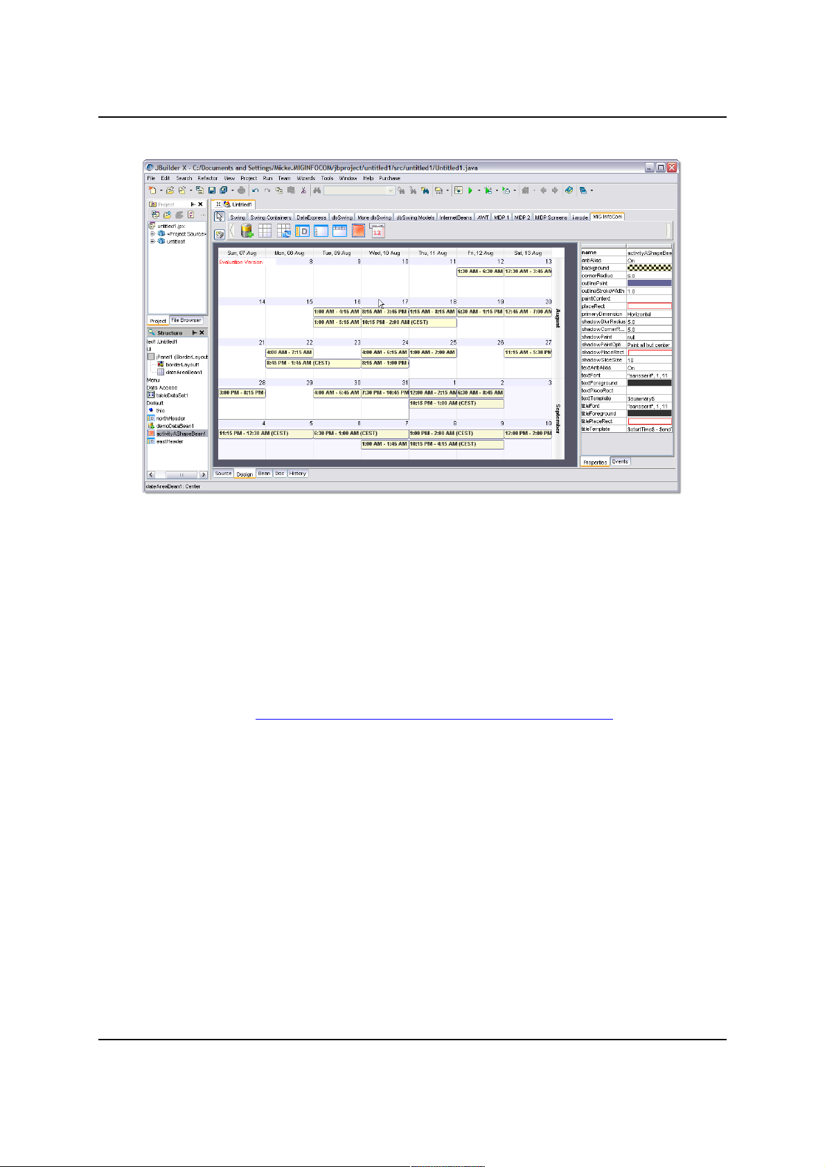
JBuilder X
Works flawlessly. Error handling is not as good as for those
above.
MiG Calendar JavaBeans Guide Page 10 / 45
Illustration 2: NetBeans 4.1 when configuring MiG Calendar
Page 11
MiG InfoCom AB
JBuilder 2005
Due to a JBuilder 2005 bug (Report # 9476) that prevents
custom components to work in many situations MiG Calendar
component is not usable in the designer. The component can
be handled in the code editor without problems. According to
Borland the bug will not be fixed until the next release.
The bug can be viewed here:
http://qc.borland.com/wc/qcmain.aspx?d=9476
Swing-Designer (Eclipse plug-in)
Works in the latest 6.0 release but there are a few smaller
bugs in the designer for the advanced property editors in the
daily builds (January 2007). This might have been fixed when
you read this. See their daily builds as they often contains
unannounced bug fixes.
Currently (January 2007) you can not add visual beans to the
non-visual workspace which means that DatePickerBean's
and PrintPreviewBean's DateAreaBean must be configured
manually or in the visual component tree and then
copy&pasted.
Visual Editor (Eclipse default GUI plugin)
MiG Calendar JavaBeans Guide Page 11 / 45
Illustration 3: JBuilder X when configuring MiG Calendar
Page 12

MiG InfoCom AB
Visual Editor works with MiG Calendar. It should be noted
though that VE doesn't have the possibility to have custom
beans on its JavaBean palette. You will have to "Choose
Bean.." for every bean you want to add, for every time. This
makes Swing-Designer or JFormDesigner a better choice for
Eclipse.
Bean Builder 0.6 alpha & Bean Box 1.1
These tools are reference tools provided by Sun. They are
not being maintained anymore and are very unfinished and
buggy. MiG Calendar does work to some degree in these
tools but for instance Bean Box does not accept null property
values and that we can't work around.
Other IDEs
If they support visual JavaBeans they will support the MiG
Calendar beans as well, however they are untested.
MiG Calendar Approaches
There are three main approached to choose from when
developing with the MiG Calendar component, this JavaBean
approach is one of them. What approach to use depends on
the expected complexity of the application to be created,
developer experience level and demands on flexibility.
Normal or “Core” Approach
This involves creating for instance DefaultDateArea,
DateAreaContainer and XxxHeader classes manually in code
and configuring these using the methods on them. This is the
most flexible approach but also the most code-centric which
means that the demands on the developer’s abilities are
higher than any of the other approaches.
The core approach enables all of the build in flexibility of the
MiG Calendar component. The other approaches can also
access this core flexibility, there are noting preventing that,
but parts of the core might be preconfigured.
Themed Approach (deprecated in 6.0, but it works)
This involves using the Theme Editor to visually, much like a
normal GUI editor, build a single date area with surrounding
headers. How the activities should look can not be set in the
MiG Calendar JavaBeans Guide Page 12 / 45
Page 13
MiG InfoCom AB
theme though, this has to be set manually if the default look
doesn’t fulfills the requirements. It is easy to tweak and build
in functionality but at the expense of extensibility.
JavaBean Approach (Preferred from v6.0)
This approach is what this guide is about. It means using
special wrapper JavaBeans that are delivered with the
component and visually configure these using your favorite
GUI tool, just like is commonly done in Visual Basic, Delphi or
Visual C++. Examples of such tools are:
netBeans – www.netbeans.org
JFormDesigner – www.jformdesigner.com
JDeveloper –
www.oracle.com/technology/products/jdev/
JBuilder – www.borland.com/jbuilder
Eclipse with Swing-Designer – www.eclipse.org and
www.swing-designer.com
This is the leanest of the different approaches when it comes
to the developer experience level. It is easy to get started
and still as flexible. It is still possible to get to the core
classes and configure and tweak those.
The wrapper layer introduced by the JavaBeans is extremely
thin and does not affect runtime speed or memory
requirements.
This approach is the preferred one from v6.0 and is the
interface that will get most updates in future releases.
How the Java Bean Classes Relate to the
Core Component
The JavaBean classes wrap the core classes and present a
new surface that is optimized to act as visual JavaBean
components that can reside in a GUI tool’s component
palette. This makes it a lot like the Themed approach.
There is also a core level in the component that is accessible
to the developer. It is more code-centric and more flexible
since the JavaBean framework imposes some, but not many,
limitations. This core level is still accessible if the JavaBean
MiG Calendar JavaBeans Guide Page 13 / 45
Page 14

MiG InfoCom AB
approach is chosen. See more about this as the “Mixing corelevel …” below.
Installing the JavaBean Components
To use the MiG Calendar component’s JavaBeans you must
add these beans to the tool’s palette. How this is done is
different for every tool and not explained here. Refer to the
GUI tool’s manual on how to do this, it is usually a very
simple task.
The JavaBeans that has full support to be visual JavaBeans in
a tool are:
com.miginfocom.beans.GridDimensionLayoutBean
com.miginfocom.beans.ActivityAShapeBean
com.miginfocom.beans.WestCategoryHeaderBean
com.miginfocom.beans.NorthCategoryHeaderBean
com.miginfocom.beans.DateHeaderBean
com.miginfocom.beans.DemoDataBean
com.miginfocom.beans.DateAreaBean
com.miginfocom.beans.DatePickerBean
com.miginfocom.beans.CategoryTreeBean
com.miginfocom.beans.PrintPreviewBean
com.miginfocom.beans.PrintSpecificationBean
com.miginfocom.beans.DateSpinnerBean
com.miginfocom.beans.DateComboBean
com.miginfocom.beans.DateGroupConnectorBean
com.miginfocom.beans.PaintPanelBean
They all exist in the .jar file “migcalendarbean.jar” that is
located in the “/lib” folder where the component was
installed (e.g. “C:/Program
Files/MiGInfoCom/MiGCalendar/lib/migcalendarbean.jar” on
Windows). This jar file isn't needed for redistribution of your
application, you still only need the migcalendar.jar.
All beans listed above have BeanInfo classes that specify
what they are capable of in the GUI tool. They also have
entries in the so called Manifest in the .jar file. This should
make adding them to the GUI tool a snap.
The JavaBean Classes
DateAreaBean
This class is the main class when using the MiG Calendar
JavaBeans. The other classes described here make little
MiG Calendar JavaBeans Guide Page 14 / 45
Page 15

MiG InfoCom AB
sense without being connected to an instance of this class. It
represents the date area and holds references to some other
beans.
DateHeaderBean
There can be up to four headers around a date area, one on
each side. They will get the time to present from the cells
closest to them in the date area and they do not define the
time themselves as sometimes seen in other frameworks. In
other words it’s the DateAreaBean that defines the visible
time and the headers follow that. Every header consists of
one or more CellDecorationRows. Every one of those rows
normally have cells that spans a date range, such as a year,
month, week, day, hour or minute. This is for instance how a
north header showing month, week number and day in three
rows is created; by giving that header three rows with those
date ranges.
CategoryHeaderBean
There are two kinds but they only differ by their default
settings: NorthCategoryHeaderBean and
WestCategoryHeaderBean. A category header is like a sub
header that shows labels and optionally images for the sub
rows in a row. Sub rows can be hierarchical (tree structure,
rows in rows) and the labels can as well. They can be made
click-able to fold/expand rows and also change their
properties (such as font, color and image) on mouse over or
mouse press. This means that this class is used in Gantt
charts and when activities must be divided into categories.
DatePickerBean
This is a normal date picker to visually pick a date or date
range. It can however host any DateAreaBean and can thus
be used to show/edit activities just as a normal
DateAreaBean. It tries to mimic the current Look&Feel but
contains overrides for all properties (such as borders) to
accommodate for unknown L&Fs.
The date picker can also be configured to hide the drop down
button and become a normal date enter text field with great
flexibility including date range notions.
DemoDataBean
To help with development this class can inject demo data into
MiG Calendar JavaBeans Guide Page 15 / 45
Page 16

MiG InfoCom AB
the framework. It contains a few properties to tweak how the
data should be generated, including the possibility to add the
generated activities to, also generated, categories.
GridDimensionLayoutBean
This bean holds information on how to layout the columns or
rows (all called rows since same class is used for both
dimensions) for one dimension in a DateAreaBean. It
manages min/preferred/max sizes for the rows and can even
contain compressed rows (known as GridSegments in the
core) which have a different set of min/preferred/max sizes.
ActivityAShapeBean
Not needing to be connected to the other beans directly this
bean configures the default AShape used to draw the
activities in the date area. It can tweak most parts of the
standard shape, including background paint and text
template.
CategoryTreeBean
It is a special panel containing a JTree for showing the
content of the CategoryDepository in a tree structure. It has
a lot of properties, all documented in the JavaDoc for the
class.
PrintPreviewBean
In v6.0 flexible and extensible print support was added. This
bean is a component that can be used as Print Preview. It
can be decorated with special PrintPainters to add for
instance footers, headers and watermarks. It is so simple to
add that it will not be explainer further below. You just add it
to your form and connect the DateAreaBean you want
previewed. See the JavaDoc for information about the
properties.
See the print example for sample code. Note that the
DateGridContainer (and thus the subclass DateAreaBean)
implements Printable, which means that you can use the
normal Swing printing through a PrintJob to print the bean.
PrintSpecificationBean
A PrintSpecification wrapped as JavaBean. It handles
page(s) layout in many ways. It is used as a configuration to
the PrintPreviewBean or DateAreaBean. See the JavaDoc
MiG Calendar JavaBeans Guide Page 16 / 45
Page 17

MiG InfoCom AB
for information about the properties.
DateSpinnerBean
This is a very customizable spinner component that holds a
date/time or a part thereof. It has a lot of properties that can
be used to set exactly how this bean should look and feel. It
can be be set to only show/edit a part of a day, say the
month, and other spinners can show/edit the other parts of
the total date. This is done by connecting the spinner to a
DateGroupConnectorBean as explained below.
DateComboBean
A simple JComboBox that holds a date/time or a part thereof.
It can be be set to only show/edit a part of a day, say the
day-of-month, and other combos can show/edit the other
parts of the total date. This is done by connecting the combo
to a DateGroupConnectorBean as explained below.
DateGroupConnectorBean
There are two main functionalities that this bean provides.
1. You can connect multiple date spinners (like
DateSpinnerBean and DateComboBean) so that they
remain synchronized and display a single date/time.
2. You can connect a DateAreaContainer (e.g.
DateAreaBean) so that a date selection in any of the
connected date spinners will set the visible date range
on the date area automatically.
PaintPanelBean
The is a bean that has nothing to do with dates or date
handling but it can be really usable in making beautiful
panels since it has a backgroundPaint property with the
advanced PaintPropertyEditor in MiG Calendar. This means
that it is easy to create JPanels with gradient or texture
backgrounds.
How Things Are Connected
DateAreaBean
There is only this one class for representing all types of views
in the JavaBean calendar component. Day(s), week(s),
MiG Calendar JavaBeans Guide Page 17 / 45
Page 18

MiG InfoCom AB
month(s) and year(s) views are all implemented by this
bean; it is only configured in different ways. This means that
the structure has to be expressed in a uniform and flexible
way. When you add a DateAreaBean to the GUI form it will
show a box with the most important information. This is a
good and simple way to see how the DateAreaBean is
configured.
DateGrid Structure
First there’s the notion of primary and secondary dimension,
both of which can be either horizontal or vertical but never
same. If the primary dimension is horizontal this means that
time progresses horizontally until (optionally) wrapped to the
next row. For instance text flows like this and normally year
and month views do as well. The secondary dimension is the
dimension that increases when time is wrapped at the border
of the date area. This is comparable to word wrap in normal
text. For a day(s) view that has the hours progressing
downwards the property PrimaryDimension would be set to
SwingConstants.VERTICAL.
Once primary/secondary dimension has been set (we only
need to set the primary as the secondary becomes the
“other” dimension) we must define how much time a cell
should represent. This is always seen in the primary
dimension. For instance in a month view this might be 1 day.
In a day view it might be 30 minutes or 1 hour. So if the
property PrimaryDimensionCellType is set to
DateRangeI.RANGE_TYPE_MINUTE and
PrimaryDimensionCellTypeCount is set to 30 we are on our
way to create a day(s) view where each cell span 30
minutes.
When we know how much time passes over a cell we need to
define if the time should wrap, and if so, at what date range
type to do so. In a day(s) view time will wrap to a new
column for every day so we would set WrapBoundary
property to DateRangeI.RANGE_TYPE_DAY. In a month view
normally one week is shown each row so then WrapBoundary
would be set to DateRangeI.RANGE_TYPE_WEEK. The wrap
boundary need to be a unit that is always of equal size, so
month would not work since months are of different sizes.
This is because the Grid structure always has to be “square”.
The properties explained so far defines the grid cells used to
MiG Calendar JavaBeans Guide Page 18 / 45
Page 19

MiG InfoCom AB
make all date calculations for the graphical mapping of
date/time to pixels. Cells can be of different sizes, in both
dimensions, to make time look compressed or expanded. For
instance to make 00:00 to 06:00 take up less screen space
per minute (compressed) or make Saturday and Sunday
smaller space wise.
Connecting a GridDimensionLayoutBean
To specify the size of the rows and columns in pixels we need
a layout. By default the DateAreaBean itself is just expanding
the rows/columns to the available bounds. By setting
GridDimensionLayoutBean on one or both of the dimensions
we can control the sizes of the rows/columns in those
dimensions.
To set a grid dimension layout on the DateAreaBean you
should create the GridDimensionLayoutBean as usual
(normally this means drag it to the GUI workspace) and
when it is created set it as either PrimaryDimensionLayout
or SecondaryDimensionLayout property on the
DateAreaBean.
There are two different types of rows (both rows and
columns are called rows since the class can be used
horizontally or vertically).
Normal rows are what you see in the date area when you
create it. Normal rows can only exist in one level (i.e. not
hierarchical). You can not have normal rows within other
normal rows. They always form an x by y square grid.
MiG Calendar JavaBeans Guide Page 19 / 45
Page 20

MiG InfoCom AB
This bean divides normal rows, for the sake of layout, into
regular and compressed. (in the core of the component you
can create any number of GridSegments). Basically all rows
are normal except the ones that are tagged as being
compressed. You can set which is to be compressed in many
ways. For instance “00:00-07:30,18:00-00:00” or “0-10,
26-40”. Which format to be used it specified with the
CompressRowsFormat property (e.g. absolute rows, time of
day, day of week, dates). The regular and compressed rows
can then be given different min/preferred/max row sizes. So
to create rows as in Illustration 4 you should set:
compressedRowsFormat: Time (HHmm)
compressedRowsRange: "00.00-06.00,18.00-24.00"
rowSizeCompressed: preferred: 2, max: 2
Sub Rows
Sub rows exist within a normal row, but only for the
secondary dimension. In a sense they divide the normal row
into several smaller ones. Sub rows can even be inside other
sub rows to describe a tree structure. This is commonly used
to create Gantt charts. Sub row “types” are named in a tree
like fashion. There are leafs and folder rows and the folder
rows can either be expanded or folded. The three rows can
be given different min/preferred/max row sizes to
accommodate for almost any sizing need.
MiG Calendar JavaBeans Guide Page 20 / 45
Illustration 4: Top and bottom rows are compressed. 06.00-18.00
normal.
Page 21

MiG InfoCom AB
Sub rows are given the row number the same way as a
JTree get its row number. This means that folder rows will
always be before its child rows.
The easiest way to add sub rows is to set a categoryRoot on
the DateAreaBean. Doing this will automatically create
hierarchical sub rows in the date area that reflects the
structure in the CategoryDepository. To test this create a
DemoDataBean and set that bean as the demoDateArea and
categoryRoot properties.
Adding Date Headers
There can be up to four date headers and a maximum of one
on each of the four sides around a DateAreaBean. Every date
header consist of one or more headerRows, all of which can
be interacted with using the mouse (MouseEffectsEnabled
property must be true). Below you can see a date header
with three rows; month, week and day.
MiG Calendar JavaBeans Guide Page 21 / 45
Illustration 5: Three sub rows per day
Illustration 6: DateHeaderBean with three header rows.
Page 22

MiG InfoCom AB
You create the DateHeaderBean as you would any other nonvisual bean, normally by dragging it to the GUI workspace.
Then you set the header as a property on the DateAreaBean.
There is one property per side and they are:
northDateHeader, southDateHeader, westDateHeader,
eastDateHeader.
If you add two adjacent date headers there will be a corner
that is either filled with one of the headers or it will be
painted in the date area’s background paint. Every date
header has a property expandToCorner which let it optionally
expand into the corner before, after or both. If two date
headers are both set to expand into the same corner the
order is undefined.
Note that you can also directly on the DateAreaBean set the
corner to any JComponent of your choosing (actually the
headers as well). This has to be done manually in code
though. See the addComponent(JComponent component,
String side, int order) for how to do this.
MiG Calendar JavaBeans Guide Page 22 / 45
Illustration 7: The rows in a
DateHeaderBean
Page 23

MiG InfoCom AB
Every row in the date header is specified by an element in
the property headerRows. For every row there are properties
to specify how that row should look and behave.
Some properties have a Normal, Mouse Over and Pressed
version of the setting. This is for live mouse over effects. If a
setting hasn’t been selected the one to the left or above is
used and thus there will be no live effect for it.
Range Type – The type of date range that one cell
represents. If for instance if set to Month the cells in that row
which are over the same month will be merged, just like the
top two rows in the screen shot of the header above.
Pattern – A normal date pattern used for the Java
DateFormat class. See Java API doc for info. Two extensions
exist for the MiG Calendar component. You can put a number
first (1-9) that specifies the maximum number of letters in
the resulting string. E.g “1EEE” would draw “M” for Monday.
Also more than one pattern can be specified by separating
them with a vertical bar “|”. The first one that fits the cell will
be used. For instance “EEEE|EEE|1EEE” would draw “Monday”
or “Mon” or “M” depending on what fits in the cell.
Background, Foreground, and Font – Properties of the
label.
MiG Calendar JavaBeans Guide Page 23 / 45
Illustration 8: Settings for one row in a
DateHeaderBean
Page 24

MiG InfoCom AB
Label Repetition – If selected this row will only draw the
labels that are specified. Can for instance be used to draw
only ever second label or/and not the first five or last ten or
so. How repetitions work can be read in the Technical FAQ
but it basically is an offset and modulo with optional lower
and upper bounds.
Label Alignment – How the label will be aligned within the
cell.
Row Size – The size of the row/level. Normally specified in
pixels but a relative value can be specified by selecting
“Fraction” in the combo. It will then be relative to a specified
size of the total available bounds.
Cell Resize – Optional resize of the cell before the
background and label are drawn. This can for instance be
used to offset the label.
For a description of the rest of the properties see the API
JavaDoc for DateHeaderBean.
Adding a Category Header
A category header is a header that shows labels of the
category sub rows in a DateAreaBean. There can only be one
category header in a date area and it is always decorating
the secondary dimension, since sub rows can only exist in
the secondary dimension.
There are actually two category header beans but they only
differ by their default values, it’s the same component. Their
names are NorthCategoryHeaderBean and
WestCategoryHeaderBean. All functionality is the same and
is inherited from the abstract CategoryHeaderBean.
You create the category header as you would any other nonvisual bean, normally by dragging it to the GUI workspace.
Then you set the header as the CategoryHeader property on
MiG Calendar JavaBeans Guide Page 24 / 45
Illustration 9: CategoryHeaderBean in a horizontal configuration
Page 25

MiG InfoCom AB
the DateAreaBean. Since the category header will always
decorate the secondary dimension the position is a function
of the primaryDimension property in the DateAreaBean.
The header doesn’t define which category labels to draw; it
only draws the names of the sub rows present in the
DateAreaBean. This is why the CategoryHeader in order to
show anything meaningful must be attached to a
DateAreaBean that has category sub rows defined. This can
easily be done with the DemoDataBean as is explained below.
You will need to set both the DemoDataBean and
CategoryRoot property on the DateAreaBean to the actual
demo bean instance you have created (more about
DemoDataBean below).
The CategoryShowRoot property on the DateAreaBean will
affect how the category header looks since it specifies
whether the root category should be visible or not.
MiG Calendar JavaBeans Guide Page 25 / 45
Illustration 10:
CategoryHeade
rBean in
vertical
configuration
Page 26

MiG InfoCom AB
The text drawn in the labels is defined with a template text.
Default is “$gridRowName$” which will be expanded with the
name of the sub row for every label. This template text can
be set to reflect any other property, or combination of
properties, of the sub grid row, but $gridRowName$ is the
only predefined property as of v5.5. It can be mixed with
normal characters though, so you can use “$gridRowName$:”
to add a colon after each label.
Note… You can set your own SubRowCreator with the
DefaultDateArea.setSubRowCreator(..) method. This
means that you would be in control of the sub row creation
process and be able to add properties of your choice to the
sub rows. Those properties can then textually be referenced
from the template text described above.
SubRowLevels and HeaderRows
The most important property of the category header is the
headerRows. It contains an array of SubRowLevel objects.
These levels define most of how the header will look and
behave. The concept of how these levels map to the rows in
the category header is very flexible and powerful. The reason
for this is that the label rows, their index and number, is very
dynamic and might easily be changed many times at
runtime. This is why there’s a need for a very flexible way to
describe how we want the labels to look like and possibly
change if the mouse is positioned on the label or cell.
MiG Calendar JavaBeans Guide Page 26 / 45
Illustration 11:
CategoryHeader
Bean in another
vertical
configuration
Page 27

MiG InfoCom AB
It is important to understand how this works in order to
create anything but a very basic category header. If you
understand the concept about a Repetition you are half way
there. You can read about how repetitions work in the
Technical FAQ that is installed with the component.
A header row can, as is quite common in this component, be
both a column and a row depending on which dimension the
header is oriented in. For a north header the rows are the
rows and for a west header it’s the columns. This is since the
header is the same for both header types, it’s only
transposed, which makes it more uniform to handle.
In addition to the normal Repetition concept the rows are
MiG Calendar JavaBeans Guide Page 27 / 45
Illustration 12: The sub row levels in a category
header
Illustration 13: The settings for a sub row level
Page 28

MiG InfoCom AB
also filtered on sub row type. There are five types of filter:
• All – Applies to all types of rows
• All Folders – Apples to all types of folder rows
• Folded Folder – Only applies to folder rows that are
expanded
• Expanded Folder – Only apples to folder rows that
are folded (collapsed)
• Leafs – Only applies to leaf rows. i.e. rows without
sub rows.
This means that the normal Repetition concept is expanded
into another dimension to set up sub groups of repetitions.
Those sub groups does not affect each other. If there are no
sub groups defined (all elements have “All” selected for
“Applies to:”) all cells in the category header will look the
same. There will thus be no difference between folder and
leaf cells.
You can see and select the filter type for the sub row element
you are editing on the upper left corner of the dialog.
Some examples:
Example 1
One DefaultSubRowLevel that applies to All cell types and all
rows.
Since all rows will use this single element, all rows will look
the same. There is no difference between the labels for folder
or leaf rows.
Example 2
Two DefaultSubRowLevels that applies to All cell types. The
first only applies to the first row and the second applies to all
rows (indexes).
The first header row will get the settings from the first
element (DefaultSubRowLevel) since it is asked before the
second one, even though the second element apples to all
rows. Row two and all following rows will get its settings from
the second element since the first element only apples to the
first row. There are no different settings for different folder
rows or leafs and there will thus be no different look for
folder and leaf cells.
MiG Calendar JavaBeans Guide Page 28 / 45
Page 29

MiG InfoCom AB
Example 3
DefaultSubRowLevel 0 – Applies to All Folders. Applies to
row 0-1.
DefaultSubRowLevel 1 – Applies to All Folders. Applies to
row 2-
DefaultSubRowLevel 2 – Apples to All Leafs. Applies to all
rows.
All cells that are labeling leaf rows (rows without sub rows)
will have the same settings, (DefaultSubRowLevel 2) since
all other elements are just targeting folder cells. Folder cells
in row 0 and 1 will get their settings from element 0 and all
other folder cells will get their settings from element 1.
Now that we are familiar with how the different sub row
levels are connected to the different rows/cells in the header
lets go through the properties. You can use the dialog screen
shot above as reference.
Some properties have a Normal, Mouse Over and Pressed
version of the setting. This is for live mouse over effects. If a
setting hasn’t been selected the one to the left or above is
used and thus there will be no live effect for it.
Applies to – What kind of cells this whole element apples to.
Explained above.
Template/Text – The template text that will be exchanged
at runtime with a property of the GridRow that is being
labeled. Property names may be specified between dollar
signs. Everything outside the dollar signs, or if the property
isn’t recognized, will be drawn as is. “$gridRowName$” is the
only built property but the application writer might set
custom properties. More information above.
Level Expand – How many extra rows/levels the currently
painted level should expand its bounds towards the date
area. Looking at the first screen shot of a north header above
you can for instance see the “Mona” cell is two rows/levels
high. This is because by default levels are expanded 999
levels, which usually means right to the edge of the date
area. Under normal circumstances this looks best but there
are situations where you might not want this.
Type – How the label will be rotated, if at all.
Background, Foreground, and Font – Properties of the
MiG Calendar JavaBeans Guide Page 29 / 45
Page 30

MiG InfoCom AB
label.
Label Repetition – If selected it constrains this element
(SubRowLevel) to certain rows. How this works can be read
in the Technical FAQ but it basically is an offset and modulo
with optional lower and upper bounds.
Label Alignment – How the label will be aligned within the
cell.
Row Size – The size of the row/level. Normally specified in
pixels but a relative value can be specified by selecting
“Fraction” in the combo. It will then be relative to a specified
size of the total available bounds.
Cell Resize – Optional resize of the cell before the
background and label are drawn. This can for instance be
used to offset the label to make room for an icon and have
the whole label/icon in the middle of the cell.
For a description of the rest of the properties see the API
JavaDoc for CategoryHeaderBean.
Grid Lines
Grid lines in the DateAreaBean can be specified in a very
flexible and customized way. To start with you normally set
the color for the even and odd grid lines in both dimensions.
If you want more control you can also add grid line
exceptions for both dimensions. Grid line exceptions is the
equivalent to Repetitions in the Themes and are extremely
flexible. You can for instance make every fifth grid line,
between number 10 and 25, to be two pixels wide and blue.
Exceptions can be based on the grid line number and/or the
time they represent.
Look at the API JavaDoc for
DateAreaBean.horizontalGridLineExceptions for a more
thorough explanation or just test it in the IDE.
The CategoryTreeBean
This is a new bean that was added for v6.0 of MiG Calendar.
It is a Swing JPanel that holds a customized JTree. The tree
is used to show the tree structure of the
CategoryDepository or parts thereof. There are a lots of
properties that you can change for this bean and they are all
MiG Calendar JavaBeans Guide Page 30 / 45
Page 31

MiG InfoCom AB
documented in the API JavaDoc for the class.
All properties are in two different versions, one for Folders
and one for a Leafs (a leaf is a category/node that doesn't
have any child categories/nodes). This means that leafs and
folders can look and feel different but it also means that if
they should look alike you must set a property on both the
LeafXxx and FolderXxx property.
If the categoryAutoRevalidate property of the tree is set to
true then the tree will always stay updated with the
CategoryDepository.
If you want to have Demo Data for testing you must set the
demoDataBean property to point to the the DemoDateBean you
have added to your project (see below). Demo data beans
should generally not be shared between beans as the results
are a bit unpredictable.
You can show only parts of the CategoryDepository by
setting the ID of the Category you want as root for the tree
on the rootCategoryId property. The tree will then only
show the categories from that Category and below. You can
also choose whether the root should be visible or if its child
categories should be at the top. You do this with the
rootVisible property.
You can filter which categories/nodes should be visible by
setting a CategoryViewFilter on the CategoryTreeBean.
You can with this filter easily using Java code hide and show
categories or whole category hierarchies.
MiG Calendar JavaBeans Guide Page 31 / 45
Page 32

MiG InfoCom AB
Date Spinners/Combos and Date Groups
There are two kinds of date spinners. One is a normal
JComboBox and can't be configured much regarding the
visuals. The other is a custom made spinner that can be
customized a lot. Both have approximately the same date
handling. You set the "active" calendar date/time field that
will be spinned/selected (i.e. MONTH) and also the date format
string that declares how the date will be shown (i.e. "yyyy-
MM-dd" or "'Year:' yyyy").
If you want to connect spinners to show/edit the same
date/time (e.g. one that shows the year, one that shows the
month and one that shows the day-of-month) you create a
DateGroupConnectorBean (which is non-visual) and set that
bean's reference in the dateGroupConnector property of the
spinner. This ensures that all spinners/combos will have the
exact date/time and if one is changed the all change.
The DateGroupConnectorBean can also be connected to a
date area (e.g. DateAreaBean) and if the date/time is
changed the visible date range in that date area will be
changed to reflect the date/time in the spinners/combo.
Since the spinners in a group only represents a single
date/time, and not a range, there are properties in the
connector bean that can be set to "expand" the date/time to
a boundary in a very flexible way. You can of course also
listen for the date changes with a DateChangeListener and
set the visual date range on the date area manually.
Creating Demo Activities and Categories
To be able to see how some properties affect for instance
activities there is a need to create demo activities and
categories. There is a JavaBean component created just for
MiG Calendar JavaBeans Guide Page 32 / 45
Illustration 14: Example of spinners. They are extremely
customizable.
Page 33

MiG InfoCom AB
this. It will create random activities for a selected date/time
range and optionally create a category tree. Many aspects of
this creation can be configured.
To create demo data create a DemoDataBean the same way
you normally create non-visual beans. You normally do this
by dragging the component to the GUI form. To activate the
demo creation process you need to set the created bean on
the DemoDataBean property on the DateAreaBean.
If you change the properties of this bean the demo data is
recreated to match the new properties.
The bean creates both activities and an optional category
tree. The activities are then (also optionally) connected to
one of these, or different set of, categories.
The created activities will get random IDs and the categories
will get their name as the set as the category ID as well.
The ActivityCategories property
Here you add a comma separated category list. E.g.
“Mark,Rick,Susan” or “Board Room 1,Board Room
2,Auditorium”. Every category created will be randomly
connected to one of these categories. These categories may
be, but don’t have to be, in the categories created with the
Categories property below.
The Categories property
This is a comma separated category list that will be added to
the global CategoryDepository under a demo root category
with a randomized name. To create a tree + and – signs can
be put in front of the category names. A plus “+” means that
the category will be created as a sub category to the
previous one. A minus “–” means that the category will be
added as a sibling to the parent rather than a sibling to the
previous category (i.e. it will be added to the parent’s parent
rather than to the parent). e.g. “+Cat1,+Cat2,Cat3,Cat4,-
Cat5,Cat6” will create a tree that looks like this:
Demoroot8924524
Cat1
Cat2
Cat3
Cat4
Cat5
Cat6
MiG Calendar JavaBeans Guide Page 33 / 45
Page 34

MiG InfoCom AB
The rest of the properties for DemoDataBean are pretty
straight forward and will not be reiterated here. For more info
on these properties please look at the API JavaDoc for the
bean.
Customizing how the Activities Look
The rendering of and interaction with the activities in the
date area is very flexible in the MiG Calendar component.
The implementation can be intercepted and/or exchanged at
many levels. Everything from exchanging the whole painting
cycle to just tweaking some colors on the activity.
By default there is a component-like framework called
AShape that handles the rendering and much of the plumbing
for the interactions. An AShape class (actually a RootAShape)
is used to draw and interact with the user. This default
AShape can with the ActivityAShapeBean be configured to
accommodate for many different kinds of looks, see the
demo application for some examples. For more information
about the flexible framework that AShape represents see the
AShape Developers Guide that is installed with this component.
The ActivityAShapeBean is a non-visual bean that is used to
configure an instance of a default AShape. Every
ActivityAShapeBean configures an AShape for a certain
PaintContext which is a property of the bean. All activities
when created can be set to use a certain paint context. An
activity with a certain paint context will be painted by an
AShape registered under that context. The null context is
the default one.
You create the bean as you would with all non-visual beans
which normally mean dragging it to the GUI form. The bean
doesn’t need to be set in any other bean; it operates on its
own.
There are three properties that take a PlaceRect type (an
interface) in this bean. Those are PlaceRect,
ShadowPlaceRect and TitlePlaceRect. They all define
where those rectangles reside relative to the total bounds of
the activity view. See the JavaDoc for PlaceRect and its
concrete implementations AbsRect, AlignRect and
AspectRatioRect to get a thorough explanation on how
MiG Calendar JavaBeans Guide Page 34 / 45
Page 35

MiG InfoCom AB
these types of properties works. Basically they define a
rectangle relative to another rectangle in a very flexible way.
For instance docking a rectangle in another or aligning it in
some way.
Having translucent (see through) colors for the activities is
usually a nice effect. Have in mind though that older
computers, especially with older graphics cards, render
translucent primitives pretty slowly. This is especially true
under other operating systems than Windows and if there are
old or buggy drivers installed. Same thing but to a slightly
lesser extent is true for anti-aliased primitives (e.g. text and
outline).
This bean is using the same AShape definition configured in
different ways. The AShape framework can do so much more
though, it is like a mini SVG (Scalable Vector Graphics)
component optimized for fast graphics in Java. For
information on how to create a completely custom AShape
see the AShape Developers Guide.
The rest of the properties for ActivityAShapeBean are pretty
straight forward and will not be reiterated here. For more info
on these properties please look at the API JavaDoc for the
bean.
Sub Shapes
From v6.0 you have the option to add sub shapes to the
configured AShape. This means that it is simple to add
support for icons or custom graphics. You do this by manually
creating the AShape and add it to the ActivityAShape object
through the addSubShape(AShape) method. You should
probably make room for the sub shape by changing the
PlaceRect for the title and text so they won't overlap with
the added sub shape. An example on how to do this is
included as an example netBeans project (BeanDemo).
Adding a Date Picker Component
The DatePickerBean is a component that can be used to
create a very flexible date picker that looks much like a
combo box. It can optionally contain forward and backward
buttons and/or a "show today" button.
MiG Calendar JavaBeans Guide Page 35 / 45
Page 36

MiG InfoCom AB
The look of the combo part (not popup) is automatically
configured to look like the current Look&Feel. Since it is only
possible to emulate known L&Fs this way all properties can
be overridden to accommodate for other L&Fs. Most of the
properties of the DatePickerBean are therefore used for this
purpose. If they are left blank (set to null) they are auto
configured by the component. The L&Fs that the date picker
emulates out of the box is Windows XP, Windows Classic,
JGoodies, Incors’ Alloy, Motif/CDE and Metal. Any other L&F
would probably need to be manually configured through the
properties to resemble the normal JComboBox. This is a
simple procedure and only involves setting the correct border
and similar properties.
The date area in the popup is a normal DateArea. The default
one is totally blank; it doesn’t contain any properties or
decorators. You can configure how the popup look just as
easily as you configure a normal date area, through a
DateAreaBean. You create a DateAreaBean as usual and then
set it as the DateAreaContainer property of the
DatePickerBean. Note that the DateAreaBean should
normally not be dragged onto the form since it is non-visual
until the popup is shown. It is therefore normally dragged
onto a free space in the GUI editor, outside the current form.
To add headers, activities and custom components you do
exactly as you would do when configuring a normal
DateAreaBean. This means that anything that can be done
with a DateAreaBean can be put in the popup, including
visualization and dragging of activities.
The size of the popup is decided through the properties
MiG Calendar JavaBeans Guide Page 36 / 45
Illustration 15:
DatePickerBean
Page 37

MiG InfoCom AB
MinimumPopupSize, PreferredPopupSize and
MaximumPopupSize together with the preferred size of the
DateAreaBean itself if they are are null.
You can listen for the same events as you can on a normal
DateAreaBean which includes listening for selection of dates,
activity move events and more generic interaction events.
How to add hooks for this is depending on your GUI
environment, but you usually can do this by right-clicking the
component.
The rest of the properties for DatePickerBean are pretty
straight forward and will not be reiterated here. For more info
on these properties please look at the API JavaDoc for the
bean.
Advanced Topics
The visual beans explained in this document are very flexible
but does not contain GUI properties that configures all
functionality to build a complete application. You normally
will need to do some manual coding to for instance:
• Create/update/remove activities and the category tree
to/from a backing store (e.g. a date base).
• Colour code activities for different categories.
• Add custom decorations to a date area or header.
• Add tooltips to activities in the date area.
• Set runtime user preferences for the component.
• Even more advanced things as exchanging core
component parts and logic.
Most of these tasks are trivial to do but it has to be done in
normal code and can not be configured visually in a GUI tool.
First there are a few key classes that you need to know how
to get a hold of and what they do.
DateAreaContainer – The main and most important
component in the framework together with its child
component; the DefaultDateArea. The DateAreaBean is
actually a sub class of the DateAreaContainer. It keeps
track if the DefaultDateArea and the headers around it as
well as custom JComponents in between these. It also
MiG Calendar JavaBeans Guide Page 37 / 45
Page 38

MiG InfoCom AB
handles the optional scroll bars.
Since the DateAreaBean is a DateAreaContainer you will
normally always have an instance of this class directly
accessible.
DefaultDateArea – The component directly responsible for
managing the grid where everything is painted relative to
(e.g. the activities). Everything that is painted in the date
area (and headers b.t.w.) are drawn using layered
Decorators. For instance the grid and the activities are both
painted with Decorators. More on those below.
You can get a hold of the date area by calling getDateArea()
on a DateAreaContainer (which includes DateAreaBean).
DateGrid – Contains the pixel to dates mapping. How a pixel
(x, y) corresponds to a date or a date range and vice versa.
There are a lot of convenience methods in the DateGrid to
convert between pixels and dates. The DateGrid contains the
date structure of the date area. The date grid’s structure is
immutable which means that it will be recreated if that
structure changes, for instance if the visual date range or
primary dimension changes.
You get the DateGrid by calling getDateGrid() on a
DefaultDateArea. Note that since it might be recreated at
any time it should not be cached in any way for later use.
Also see the interface DateGridContainer.
ActivityDepository – Holds all handled (also called
“broked”) activities. This means all the activities that the
component should be able to access. There can be many
depositories but a date area can only use one as a time. The
different depositories are accessed with a context. null is
the default context.
You normally move activities in and out of the depository and
to/from a backing store (e.g. a database).
You get an ActivityDepository by calling the static method
ActivityDepository.getInstance() or
ActivityDepository.getInstance(String context).
CategoryDepository – Resembles the ActivityDepository
but contains an application wide category tree with a single
Category root.
Get the CategoryDepository root by calling the static
MiG Calendar JavaBeans Guide Page 38 / 45
Page 39

MiG InfoCom AB
method CategoryDepository.getRoot(). Use this root to
handle the tree much like how you would with a normal
JTree. The Category nodes in the tree also implement the
TreeNode interface so they can be added to a JTree directly.
Adding Activities to your Application
The calendar component uses the ActivityDepository class
to manage the in-memory activities. All activities in this
depository can optionally be viewed in a date area. It is the
application builder’s job to move activities in and out of that
depository. Normally an importer/exporter of some kind will
read from a database and create DefaultActivity objects
from the records in the database and add them to the
depository with addBrokedActivity(..). When an activity
should not be handled by the component anymore you can
use removeBrokedActivity(..) to remove it.
The date areas in the application will automatically add
Subscriptions to the activity depository where they get
their activities from. You as the application developer can
monitor these subscriptions to know what date/time ranges
are currently being displayed and pull the relevant activity
records from a backing store. Your own components can also
add Subscriptions to this depository if they show activities.
This is a good centralized way to manage views of the
activity data, i.e. what date ranges a currently visible. Note
that the subscriptions are not used in any way by the MiG
calendar framework other than what’s explained above.
How the saving of changed activities is done is up to the
application developer. There are simply too many ways to do
this to include it into the component.
Tracking Changes to Activities
There are a number of ways to monitor changes to activities
and other important events happening in the component.
Here are the most important ones:
• Add a listener to all created Activity objects. This
listener will get notified of any changes to the
properties of that activity.
• Add a static listener with
AbstractActivity.addStaticPropertyChangeListe
ner(..) that tracks the changes for all activities that
MiG Calendar JavaBeans Guide Page 39 / 45
Page 40

MiG InfoCom AB
are sub classes of AbstractActivity. The changed
Activity is set at the source in the generated event.
• Add a PropertyChangeListener to the relevant
activity depository. It will receive events if any of the
activities in the depository changes. It will also fire
events when a Subscription to the activity
depository changes. See
ActivityDepository.addPropertyChangeListener(
..).
• Add an ActivityDragResizeListener to the
DefaultDateArea. It will notify listeners when the
move/resize of the activity is considered done. This
might be necessary to do since the normal listening
on the activities themselves gives no clue of when the
move/resize is actually done or if the change is just
one in many during a drag/resize.
• Add an AcitivityMoveListener to the
DefaultDateArea to monitor all moves/resizes before
they are set to the activity with an option to change
the resulting date range. This can be used to enforce
all kinds of rules on moves/resizes of activities.
• Add an InteractionListener to the
DefaultDateArea to track events that is graphically
happening to the activity. Those might be selection,
mouse over or start of a resize.
• Add a GridListener to the DefaultDateArea to get
notified when the structure of the DateGrid changes
or rather when it is recreated.
• Add a DateChangeListener to the DefaultDateArea
to track date range selection, mouse over and mouse
press events in the date area.
There are a lot more listeners that can be added trough out
the component framework. Use the API JavaDoc to see what
listeners can be added and where.
Setting Activity Look Dynamically
There are many ways to do this. One is to create your own
ActivityViewRenderer and set that on a DefaultDateArea.
Then you have total control but have to do everything
manually, including mouse handling support and such.
MiG Calendar JavaBeans Guide Page 40 / 45
Page 41

MiG InfoCom AB
Another way that can be used if there are different looks
(e.g. colors) depending on the Category the activities
belongs to (an activity can belong to any number of
categories) is this:
CategoryDepository.setOverride(<categoryID>, <targetSubshapeName>,
<propertyName>, <new value>);
for example:
CategoryDepository.setOverride(susanID, "defaultBackground", AShape.A_PAINT,
Color.PINK);
A more generic and flexible way is the new static generic
overriders introduced in v5.2.
For instance to set a yellow border on all recurring events:
ActivityInteractor.setStaticOverride("defaultOutline", AShape.A_PAINT,
new OverrideFilter() {
public Object getOverride(Object subject, Object defaultObject) {
if (((ActivityView) subject).getModel().isRecurrent()) {
return Color.YELLOW;
} else {
return defaultObject;
}
}
});
Since you have the Activity at hand you can base your
override on anything you like, such as for instance the value
of a custom property in the Activity. One of the things you
need to know for the above to work is the name of the sub
shape to target. If you create your own AShape that's no
problem since you are in control of everything, including the
names. The default shape created by the framework has
constants for the names. They are unlikely to change and
should be referenced.
public static final String DEFAULT_CONTAINER_SHAPE_NAME
public static final String DEFAULT_BACKGROUND_SHAPE_NAME
public static final String DEFAULT_TITLE_TEXT_SHAPE_NAME
public static final String DEFAULT_MAIN_TEXT_SHAPE_NAME
public static final String DEFAULT_OUTLINE_SHAPE_NAME
public static final String DEFAULT_SHADOW_SHAPE_SHAPE_NAME
MiG Calendar JavaBeans Guide Page 41 / 45
Page 42

MiG InfoCom AB
public static final String DEFAULT_SHADOW_SHAPE_NAME
Yet another way is to provide different AShapes (or rather
RootAShapes) for different PaintContexts. This is
automatically handled by the framework. You simply register
a RootAShape for a PaintContext by:
Statically for all DefaultAShapeProviders:
DefaultAShapeProvider.setShapeGlobally(<yourRootAShape>, <paintContext>)
or for a specific DefaultAShapeProvider instance:
provider.setShape(<yourRootAShape >, <paintContext>)
Then you just set the PaintContext for the activities to
match one of the registered contexts and the renderer will
use the appropriate AShape to paint it. null is the default
PaintContext is used for the default shape.
activity.setPaintContext(<paintContext>);
A much more advanced solution, but one that give you total
control, is to write new Interactors and InteractionBrokers
and set them on the RootAShape in the render stage. That is
not a route we recommend for simpler customizations
though.
Adding Custom Visuals to a DateArea or Header
All painting in both date areas and headers are implemented
with Decorators. A Decorator is an interface to implement
to be able to do custom painting in these places. All visuals
such as the grid lines, cell labels, month dividers,
background image etc. are implemented as Decorators in
the MiG Calendar component. This makes it easy for you to
add your own layer of information containing any decoration
you like and even mix it in between the framework’s provided
graphics.
The Decorators can even intercept InputEvents before they
reach the DefaultDateArea. This means that your decoration
layer can for instance react to mouse or key events and
MiG Calendar JavaBeans Guide Page 42 / 45
Page 43

MiG InfoCom AB
repaint them selves accordingly. This is a very powerful
design that makes fast and resource effective user
interactions possible with almost no restrictions.
There are quite a few Decorators in the framework, some of
them are abstract with helper functionality that can be
extended and used. See the JavaDoc for each class for how
to use it. AbstractGridDecorator is a good place to start.
Extend that to implement a generic Decorator. Note that
you will have to provide a reference to a GridContainer,
which can be DateArea or AbstractGridHeader.
All decorators should contain a layer index and in its
Comparable interface compare that layer index to the layer
index of another Decorator. The code normally looks like
this:
public int compareTo(Object o)
{
return getLayerIndex() - ((Decorator) o).getLayerIndex();
}
To add your custom decorator call addDecorator(..) on the
DefaultDateArea or AbstractGridHeader depending on
where you want your Decorator (i.e. if you are decorating
the date area or a header). Most Header classes are actually
descendants from AbstractGridHeader so they can have
decorators.
To for instance create a Decorator that paints the
background light blue between two date/times in the date
area it this simple:
Decorator decorator = new AbstractGridDecorator(dateArea, 20) {
public void doPaint(Graphics2D g2, Rectangle bounds)
{
DateGrid dateGrid = (DateGrid) getGrid();
DateRangeI dr = new DateRange(System.currentTimeMillis(),
DateRangeI.RANGE_TYPE_HOUR, 2, null, null);
Rectangle[] rects = dateGrid.getBoundsForDateRange(dr,
Grid.SIZE_MODE_INSIDE);
g2.setColor(new Color(240, 240, 255));
for (int i = 0; i < rects.length; i++)
g2.fill(rects[i]);
MiG Calendar JavaBeans Guide Page 43 / 45
Page 44

MiG InfoCom AB
}
public void gridChanged(PropertyChangeEvent e) {} // Not interested
public void dispose() {} // Nothing to dispose of
};
dateArea.addDecorator(decorator);
Note that we subclass AbstractGridDecorator that has
support for all boiler plate functionality. Even though the
code above is of more a “core” approach it is really simple.
Mixing core flexibility with JavaBeans is no problem.
Tool Tips for Activities
Since activities all are different it’s not as easy as just setting
the tooltip text on the date area to show an activity’s mouse
over tooltip. This is why the tooltip framework has been
made very flexible and dynamic. To add tooltip over activity
functionality you create a class that extends
ToolTipProvider. There is a singe method that has to be
implemented, for the other methods the Swing defaults will
be used. There is even sample code for this method in the
API JavaDoc for the ToolTipProvider class.
It is possible to create tooltips that follow the mouse
movement and it is very easy to set properties on the tooltip.
This includes font, background and foreground color and
border.
When you have created this class you set it on the
DefaultDateArea with the method setToolTipProvider(…).
Even More Advanced Topics
The MiG Calendar framework is made from scratch to be very
flexible and extensible. It is done much like the Swing
framework. It is almost always possible to swap in totally
customized functionality, sometimes at many levels, and it is
always possible to tweak the built in functionality.
How to add this advanced functionality is not covered in this
guide. Refer to the other guides installed with the
component. They all refer to the core component which is
more code-centric.
Mixing low level core component code with JavaBeans
MiG Calendar JavaBeans Guide Page 44 / 45
Page 45

MiG InfoCom AB
If you will work with the beans documented in this guide but
still want some of the functionality from the more advanced
core; that is entirely possible. You would normally create the
beans the normal way as close to what you want as possible.
The GUI tool will mostly create initialization code and after
that you are free to modify the core in whatever way you
like.
Note though that the JavaBeans configure the core
components during this initialization which means that there
might be some customizations in the core already. Mostly the
JavaBean sets properties on the core components and does
not install custom classes which would be harder to
customize.
MiG Calendar JavaBeans Guide Page 45 / 45
 Loading...