

Page 1
1
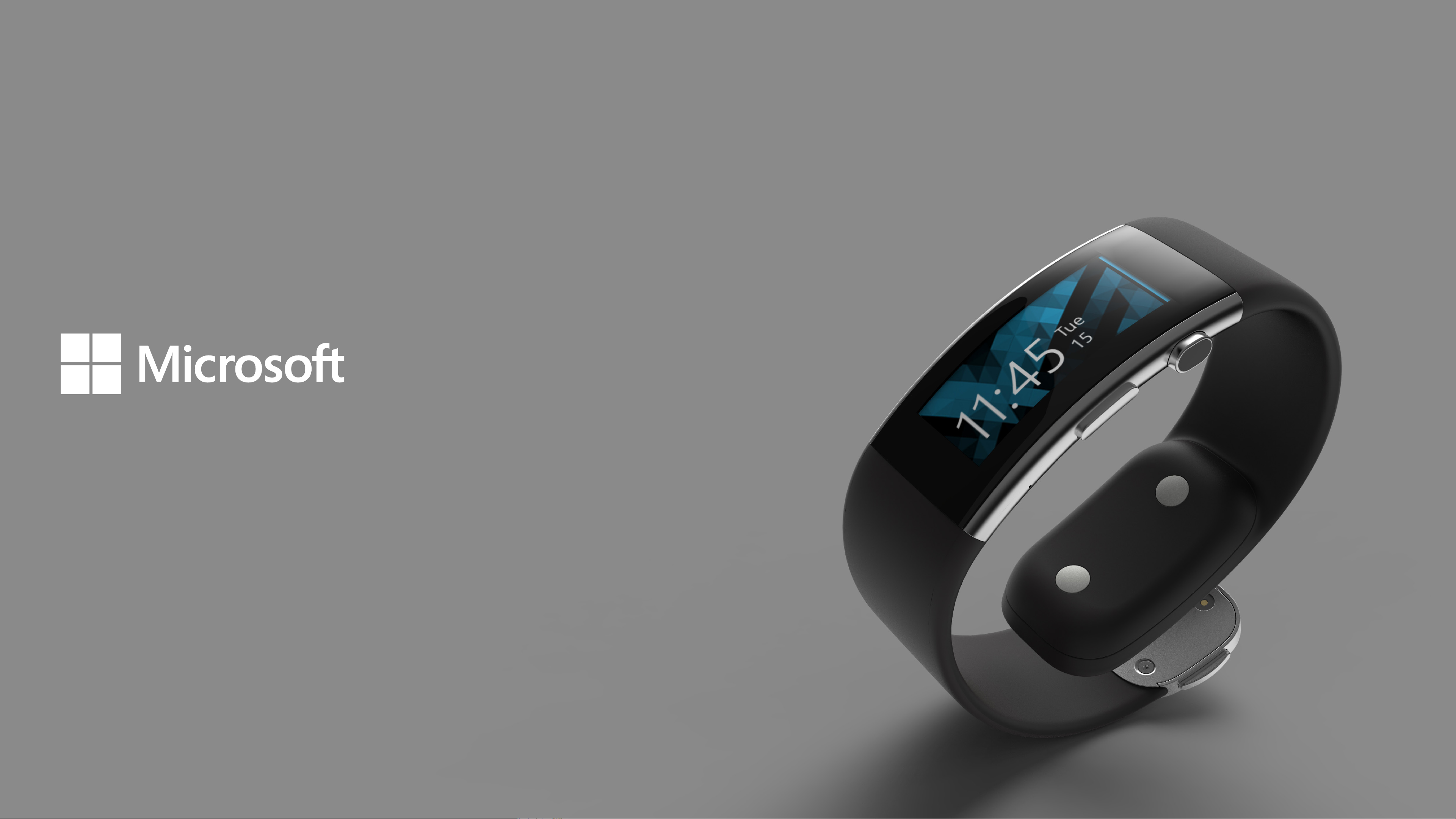
Microsoft Band 2
Experience Design Guidelines
Published for Third Party
Version 2.0
Microsoft Band 2
Page 2

2
Welcome
Microsoft Band 2 Experience Design Guidelines
These guidelines provide an overview of the Band,
and dene guidelines for the user experience for
developers of third party apps.
Microsoft Band 2
Page 3

3
Table of Contents
Introduction
Glossary
Interaction Patterns
Typography
Color
Iconography
Template Library
Microsoft Band 2
Page 4

Introduction 4
Microsoft Band 2
Experience Principals
The experience principles should be
taken into consideration when
creating app tiles for the
Microsoft Band.
Direct, yet discrete.
Notications are timely, not disruptive and quick to
dismiss. Information passes from you to the cloud and
back again in a direct, yet personal way.
Hyper-glanceable.
Buzz, ping, glance, swipe... Indoors or out, dark or
bright, the information most important to you is
always at arm’s length.
Forgiving.
Interactions are hyper-mobile. A nondestructive
interface tailored for the range of human motion.
Positive reactions to your actions. Compensates
for error.
In and out in eight.
Never break the stride of life... Glance, peek, and
decide all in less than eight seconds — the right
type and amount of information at the right time.
Not a mini-phone.
Free your hands from the fear of missing out. Provide
enough information in the moment so you know if
and when you need to dig into your phone. It’s all
about the right amount of information, so you’ll never
miss the moments that are most important to you.
About you.
Knows your patterns and what you’ve done.
Anticipates your needs through smart
recommendations and tracking.
Microsoft Band 2
Page 5
Brand
Introduction 5
8
4
7
3
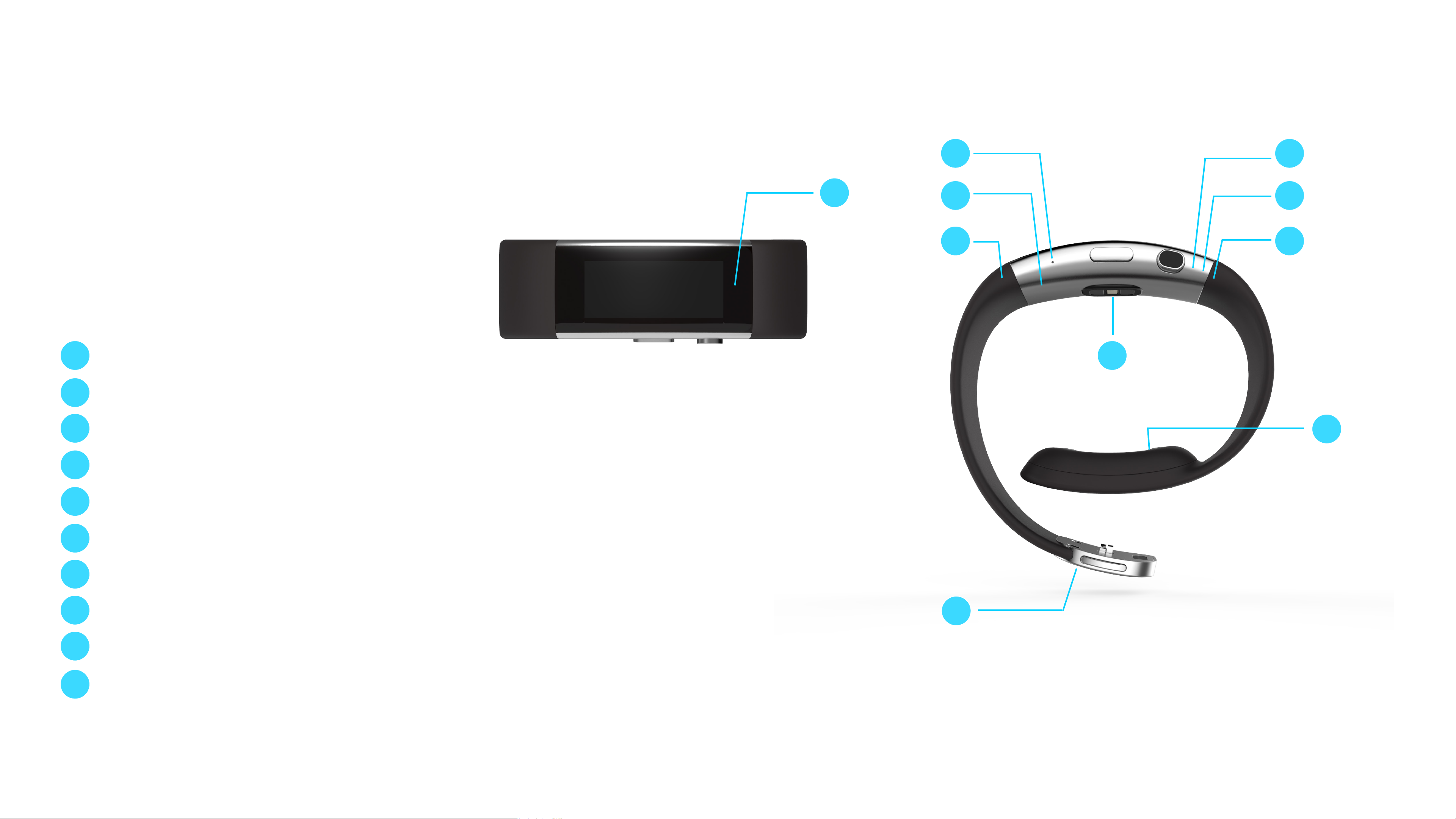
Technology
Understanding the technology and dierent
inputs will help you design the best
experience for your user.
1 1
Optical heart rate sensor
2
6
10
2
3
4
5
6
7
8
3-axis accelerometer/gyrometer
GPS
Ambient light sensor
UV sensor
Capacitive sensor
Haptic vibration motor
Microphone
9
5
9
10
Galvanic skin response
Barometer
Microsoft Band 2
Page 6
Brand
Introduction 6
7
Haptic Vibration Motor
The Microsoft Band SDK exposes nine
unique haptic vibration tones. These
tones are used throughout the band
experience, so use with care to align to
the standard haptic experience. Note
by using the device settings, users have
control over the intensity of haptic levels
and they can turn the haptic motor o.
Tones
1. Notication one tone:
2. Notication two tone:
3. Notication alarm:
4. Notication timer:
5. One tone high:
6. Two tone high:
One gentle notication tone
Two gentle notication tones
Three long high intensity tones
One long high intensity tone
One high intensity tone
Two high intensity tones
7. Three tone high:
8. Ramp up:
9. Ramp down:
Three high intensity tones
One tone with ascending intensity
One tone with descending intensity
Microsoft Band 2
Page 7
Brand
Introduction 7
Interaction Inputs
There are the three primary physical
interaction points with the Band:
Screen
1
The 254ppi screen size measures
320px wide by 128px high.
Power Button
2
The Power Button turns the
screen on and o. Pressing and
holding the button for three
seconds initiates the Power O
modal dialog.
1
320px x 128px
32
3
Action Button
The Action Button provides
contextual actions for the user.
Microsoft Band 2
Page 8
Brand
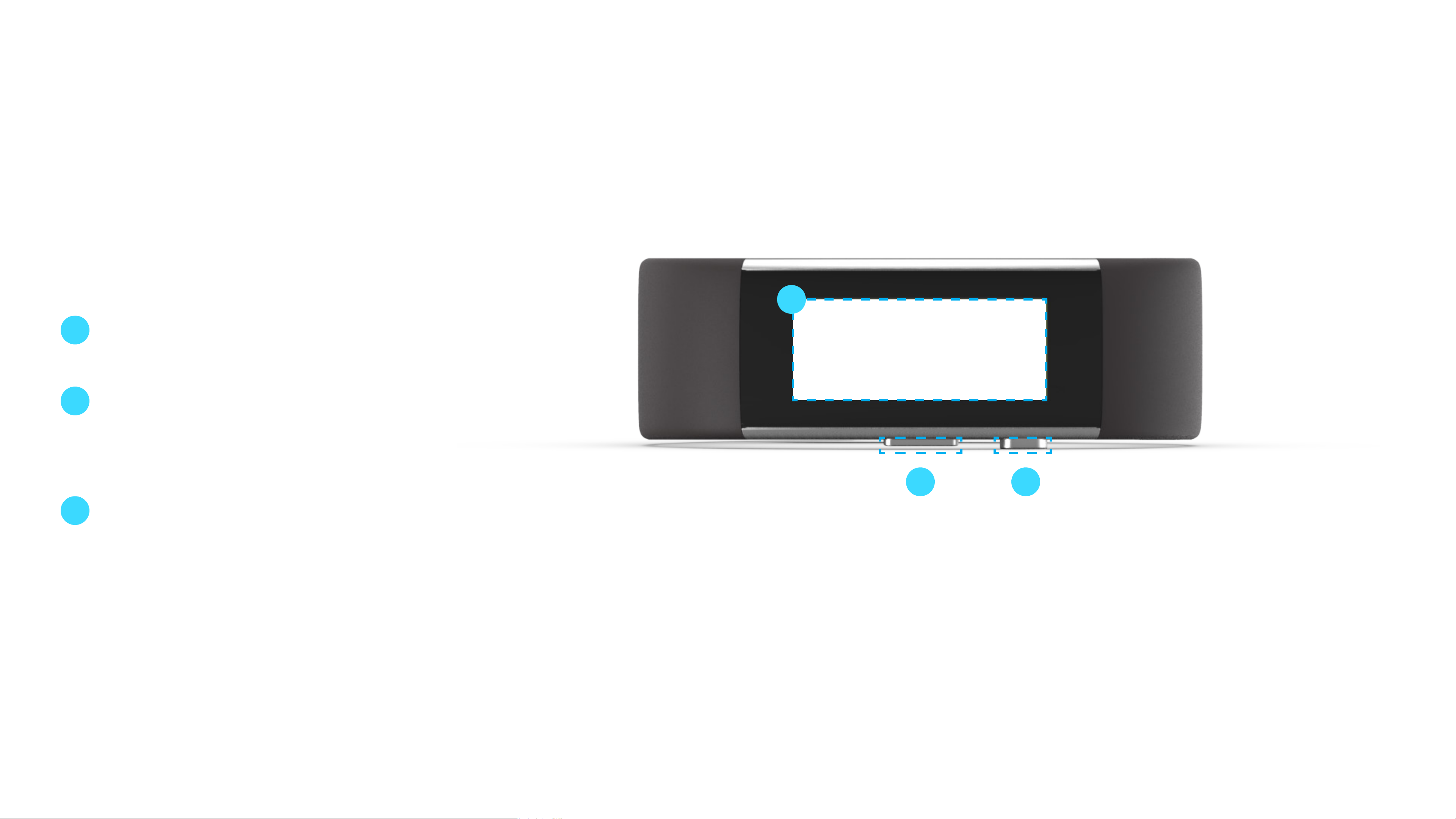
Introduction 8
1
2
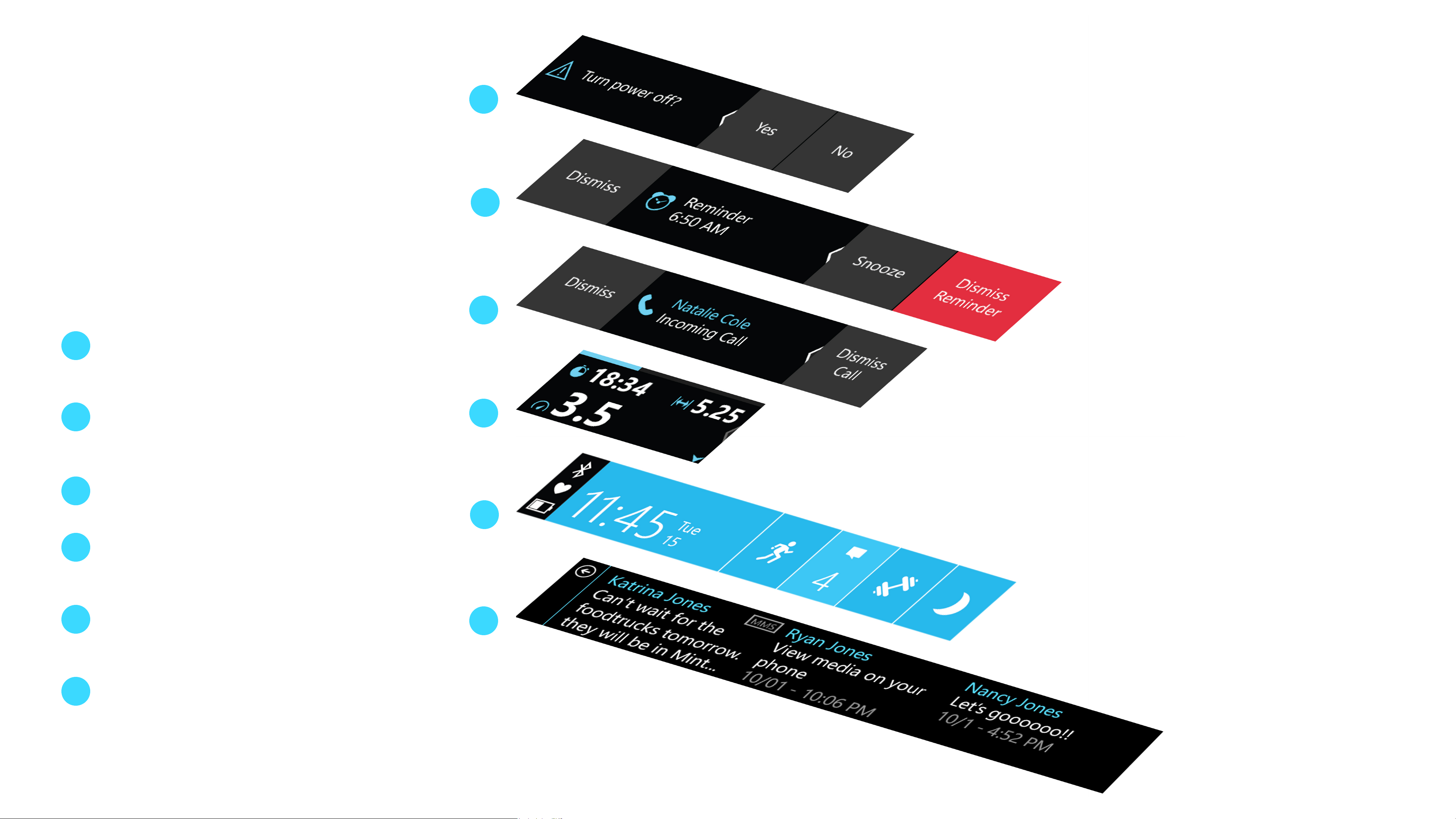
UI Layers
The UI system is comprised of the
following layers:
System Notications
1
Power O, Low Battery
notications, and so on
Alarms
2
Remain on-screen until user
interacts with them
Notications
3
Time out after a few seconds
3
4
4
5
6
5
Activity Screens
In-activity for tiles like Run,
Workout, Guided Workout
Start Strip
6
Default landing screen (on the Me
Tile)
Open Tile
Tapping on any Start Strip tile
opens up this layer
Microsoft Band 2
Page 9
Brand
Introduction 9
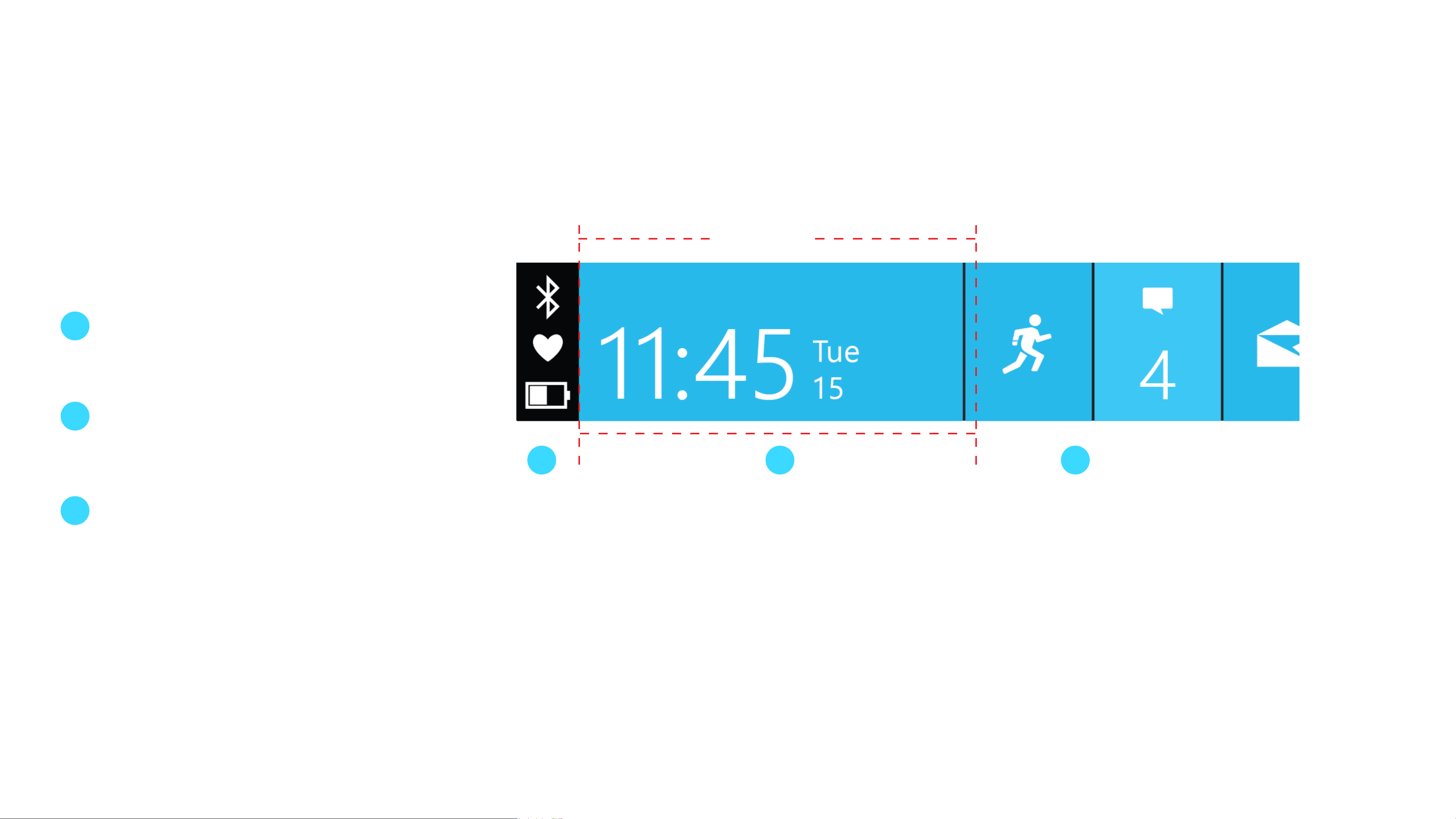
Visible screen area
Start Strip
The Start Strip is composed of three
main pieces:
System Bar
1
The System Bar oers a quick
peek of battery, heart rate, and
Bluetooth connectivity.
2
Me Tile
The primary tile on the Start Strip.
The Me Tile displays the current
320px
3
time, metrics, and system states.
App Tiles
Opening a tile launches you into
a specic experience or controls.
1
2 3
Microsoft Band 2
Page 10
Brand
Primary Content
Secondary Content
Introduction 10
Visible screen area
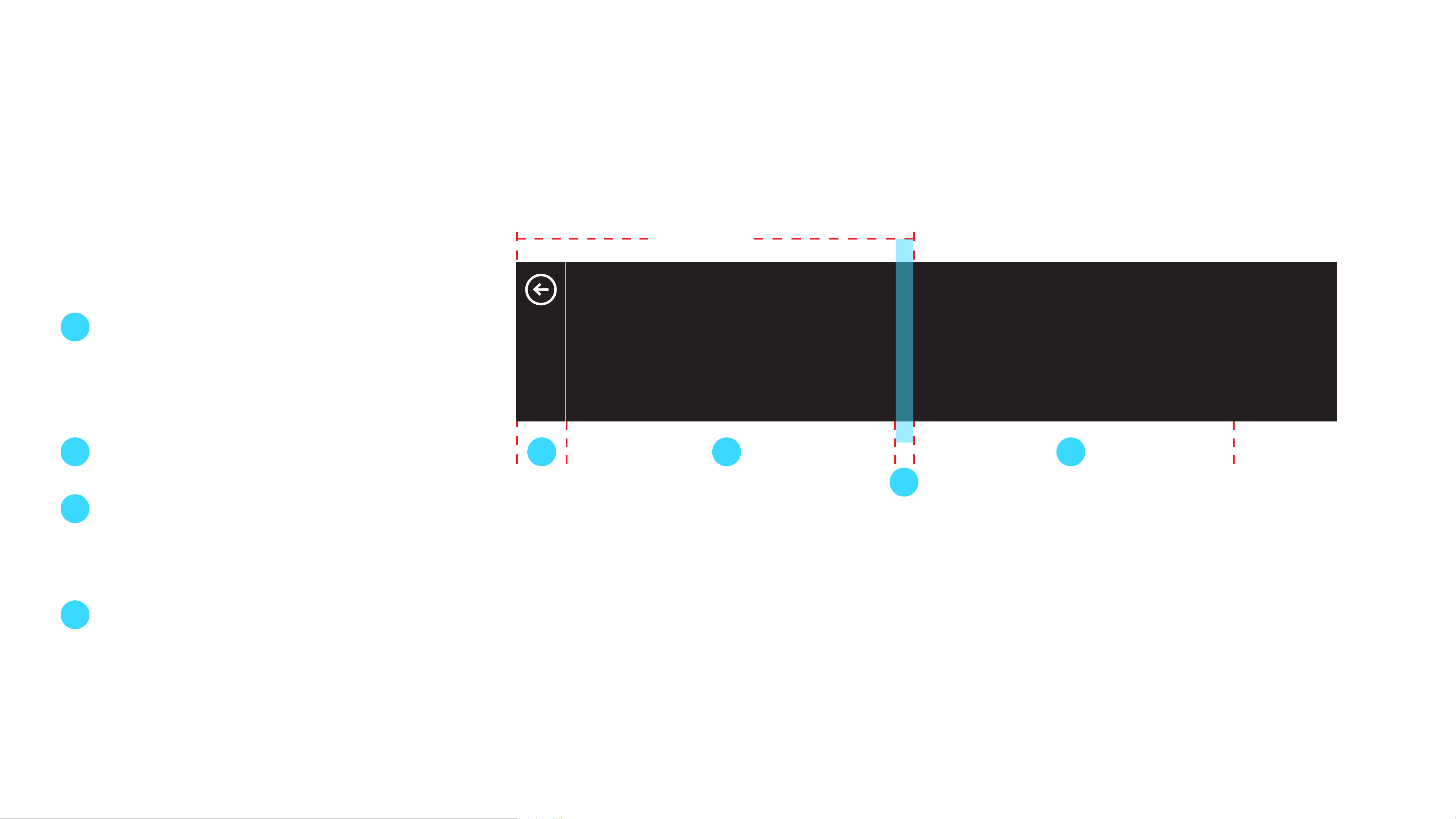
Open Tile
When a tile is open, it’s composed of the
following elements:
1
2
Back Bar
The back bar stays xed on
the screen in an open tile, with
content scrolling behind it. The
40px back bar includes a 1px line
in theme-color highlight.
Page 1
320px
Page 1 Page 2
Primary Content Primary Content
Secondary Content Secondary Content
1 2 4
Page 3
3
4
The rst page in the tile.
3
Peek
The peek is the rst 22px of the
next page that provides a visual
cue that there is more content to
the right.
Page 2
The second page of the tile.
Microsoft Band 2
Page 11

Introduction 11
Microsoft Band 2
Personality
Personality
Microsoft Band communicates in a straightforward,
honest and intimate way, like the voice of a trusted
friend. It speaks to you in the same way that you’d talk
to other people. Your Band should show empathy and
excitement.
Microsoft Band has more than one way
of communicating:
• UI text
• Iconography
Personality Goals
• Stickiness: provide reasons to come back
• Likeability: always have a positive attitude
• Facilitation of understanding: keep
communication simple
• Enable a sense of control
• Haptics vibrations
Microsoft Band 2
Page 12

12
Glossary
This section contains denitions and visual references for
elements that will be mentioned throughout this document.
Microsoft Band 2
Page 13
Glossary
Glossary
These are examples of common
elements that will be referred
to throughout this document.
13
Start Strip
The start screen of the Band UI is a strip
made up of the System Bar, Me Tile, App
Tiles, and the Settings Tile.
System Bar
The section located at the left end of the
Start Strip that contains the status of the
battery life, biometric sensors, and Bluetooth
connection.
Me Tile
App Tile
App tiles are the tiles on the Start Strip
that represent apps. Pressing an app tile
opens up that app on the band.
Settings Tile
The Me Tile is the default view of the Start
Strip. It’s the tile that contains the user’s
steps, distance, calories, oors climbed,
heart rate, and today’s date. The Me Tile also
displays the state of the Band.
The Settings Tile gives the user access
to the settings of the Band. The Settings
Tile is always the right-most tile on the
Start Strip.
Microsoft Band 2
Page 14
Glossary
Page 3
Primary Content
Secondary Content
Page 1
Primary Content
Secondary Content
Glossary
These are examples of common
elements that will be referred to
throughout this document.
14
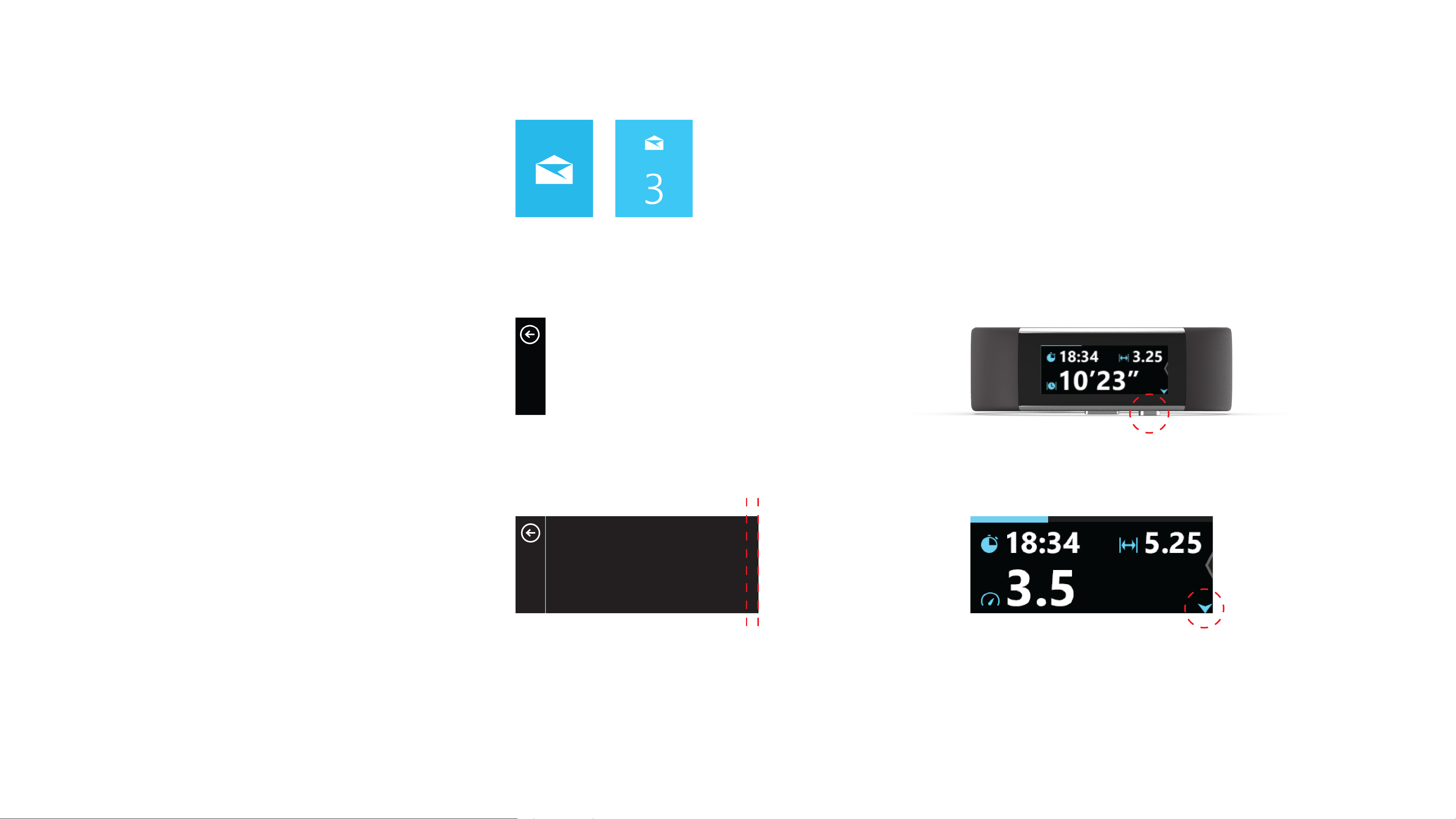
Badged Tiles
Tiles badge with numbers and a shift
in background color to show that new
content is available to the user.
Back Bar
In open tiles, the back bar allows the
user to close the tile and return to the
Start Strip.
Page 1
Primary Content
Secondary Content
Peek
The peek is the rst 22px of the next
Action Button
The hardware button that performs
contextual actions when pressed.
Action Button Indicator
The blinking arrow acts as a visual cue
page that provides a visual cue that
there is more content to the right.
that a contextual action is available.
Microsoft Band 2
Page 15

15
Interaction Patterns
The Band has a simple horizontal navigation structure.
Swiping right from the Me Tile, a user can interact with
a tile app by tapping on the corresponding tile. The
Start Strip tile order is congured in the “Manage Tiles”
menu in the Microsoft Health app.
Inside a tile, users are greeted by their most recent
content and can swipe over to see older information or
additional controls. Tapping on the Back Bar sends the
user back to the Start Strip.
Microsoft Band 2
Page 16
Interaction Patterns
16
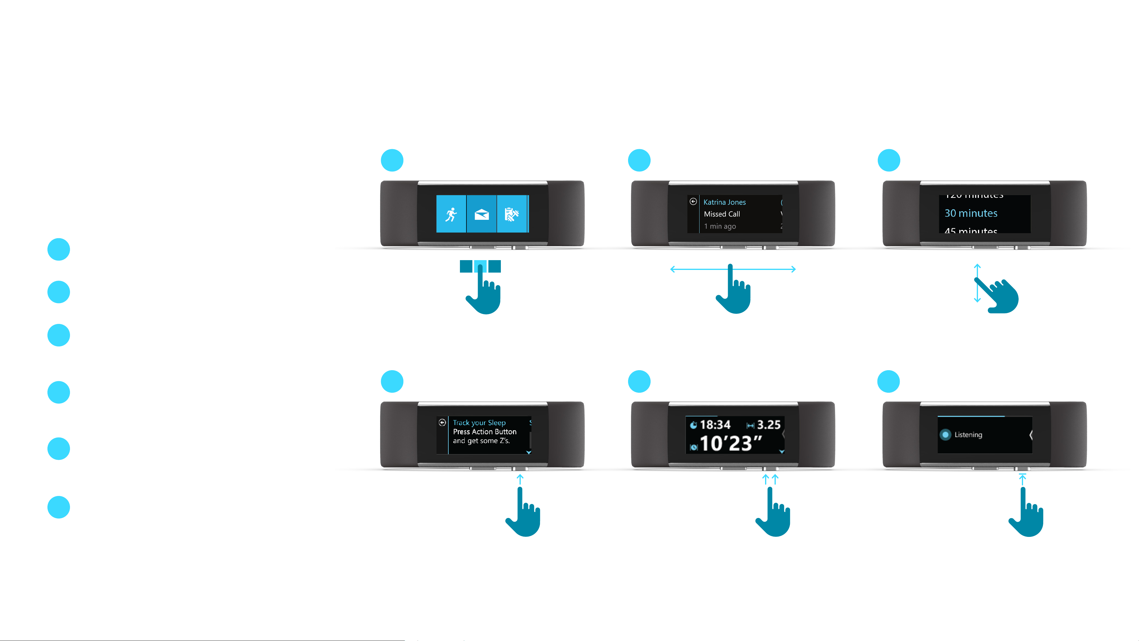
Interaction
There are 6 common patterns performed
when interacting with the Band:
1
Tap
Tap for selection.
2
Horizontal Swipe
Swipe left and right to navigate.
1
2
3
3
4
5
6
Vertical Swipe
Swiping up and down to read
more text.
Action Button: Single Press
Press to perform primary action
in given context.
Action Button: Double Press
Double-press to perform a
secondary action in given context.
Action Button: Press and Hold
4
5 6
Press and hold for 3 seconds to
access voice commands.
Microsoft Band 2
Page 17
Interaction Patterns
17
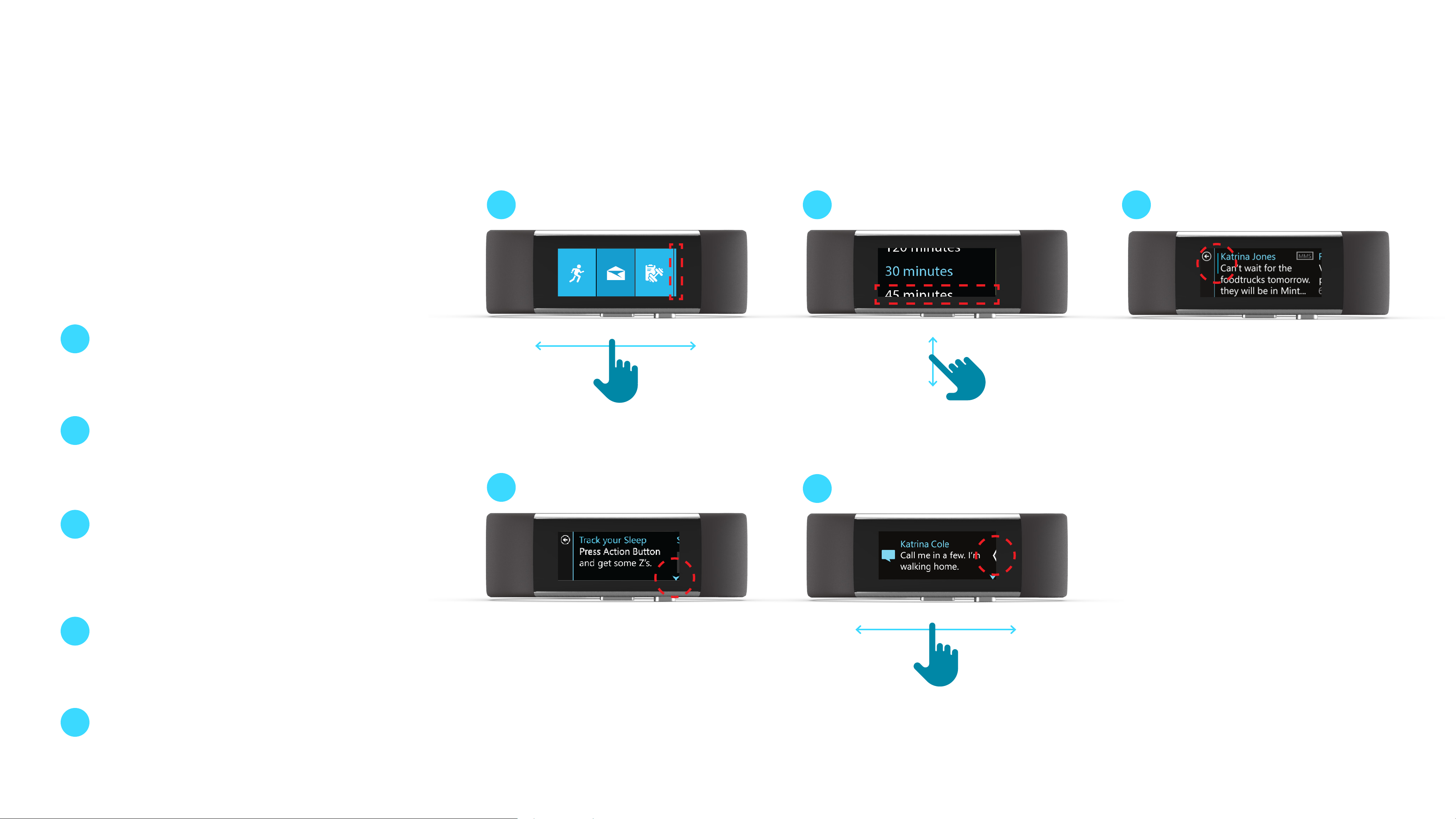
Visual Cues
To help guide users through the
experience, visual cues are used to hint
at available interactions.
1
Peek (Horizontal)
The Peek shows the user that
there is more content available by
swiping horizontally.
1
2
3
2
3
4
Peek (Vertical)
In a vertical list picker, there is a
peek of the options above and
below.
Scroll Bar
Upon a screen press, a scroll bar
appears to provide added context
that there is more text available
by swiping up and down.
Action Button Indicator
The Action Button indicator
4
5
5
arrow will always appear when a
primary action is available.
Chevron Indicator
When there are button options to
the right, there is an arrow peek
indicator.
Microsoft Band 2
Page 18

18
Typography
As the visual representation of language, typography’s main
task is to be clear. Its style should never get in the way of
that goal. But typography also has an important role as a
layout component, with a powerful eect on the density and
complexity of the design and on the user’s experience of that
design.
Our aim for services is rigor and reduction. We use a minimum
amount of weights and sizes and strive for the most ecient
approach across all screens. We align with Microsoft’s brand
personality and help to build a voice that’s friendly, authentic,
and conversational. And we ensure that the particulars of our
typography type ramp, sizes, and leading work in harmony with
tiles and other elements.
Microsoft Band 2
Page 19

Typography
19
Typography
The Microsoft Band contains 7
dierent font styles. Of these 7 font
styles, 2 have full character sets
and 5 contain only numbers and
Full Set
Limited Set
7R
11SB
11B
Segoe UI P Regular 7px
Segoe UI P Semibold 11px
Segoe UI P Bold 11px
punctuation.
http://msdn.microsoft.com/en-us/goglobal/cc305145.aspx
14SL
Segoe UI P Semilight 14px
19SL
Segoe UI P Semilight 19px
19B
23SL
Segoe UI P Bold 19px
Segoe UI P Semilight 24px
Microsoft Band 2
Page 20

Typography
Limited Character Set
20
SP
“
%
+
-
.
0
1
2
4
5
6
8
9
:
€
₩
∶
‘
/
3
7
°
Microsoft Band 2
Page 21

Typography
Typographic Hierarchy
Typographic hierarchy within content
21
is achieved with color. Headers use the
chosen color theme’s highlight color.
Primary content uses white to give it
the most visual prominence and focus.
Secondary content is slightly toned
down by using a gray color class
called “Secondary Text.”
For more information on color themes
and classes, reference the Color
section of this document that begins
on page 23.
Highlight Color
Header 1
Primary Content
Primary Content
Secondary Text
Secondary Content
Microsoft Band 2
Page 22

Typography
22
Letter Spacing
At this time, custom letter spacing
(tracking or kerning) can’t be achieved
on the band. Keep this in mind when
creating your app to be as realistic as
possible.
Do
Segoe UI P Default Spacing
Default Tracking 0
1234567890
Don’t
TRACKING SET AT 0
Segoe UI P Custom Spacing
Tracking set at -20
1234567890
TRACKING SET AT 100
Microsoft Band 2
Page 23

23
Color
Color provides intuitive waynding through the Band’s various
levels of information, and serves as a crucial tool for reinforcing
the interaction model. Color should be applied in consistent
patterns across the Band and is the primary way for users
to personalize their Band. First selected in the initial set-up
process, Theme Color controls and Me Tile background images
are accessible in the Microsoft Health app setting menu. Theme
Colors are used as the background of all tiles and should be
used internally in apps for content headers and icons.
Because the Band hosts a “wearable UI,” it is important to
protect the aesthetic decisions of the user and allow for the
reections of their tastes. We strongly recommend the use of
the user-selected Theme Color in your app.
The Band operates in the 16-bit RGB 565 color space.
Microsoft Band 2
Page 24

Theme Colors
24
24
App
Preview
Start Strip Tile High contrast
Base
Essentials
Electric Skyline LimeCyber Tangerine Tang Coral Tuxedo Killa Bee LasertagCalifornia PIzza
0DD1FF 37E27C F8A52E 252525 252525 252525252525 252525
00B9F2 39BF6F F79B16 E74856 151515 151515 151515151515 151515
1A6884
005776
Kale
1D8989
037C7C
BFE51F
A3CE19
ED763B
F16422
FF5267
Kool-Aid Berry
D83190
D10D7D
8B2593
771E7C
Cargo
8A5FCE
7842CF
Discreet
Storm
252525
151515
DJ
252525
151515
Lowlight
Inside Tile Highlight
Medium
Muted
009DCE 31A35E 111111 111111 111111111111 111111
5AE0FF B8FF1D1CF77F FF6C45 F2F2F2
009DCE 8AAC0D19CE78 CC4B19 E74856 7C7C7C
004A64
004A64
09B9D6
0498BA
005776
057070
48FFDC
0DBAB1
036861 873312 993344 333333
186637
99B71C
54680A
ED8E1D
FFBC00
EA9823
AD691F
D65421
C53D49
FF5252
B20B6A
FF43B6
D61D91
891054
5B1860
E845FF
AE3CC6
771E7C
6638B0
A869F9
904BF2
432474
111111
5AE0FF
009DCE
004A64
111111
1CF77F
19CE78
186637
B8FF1D
8AAC0D
54680A
FFBC00
EA9823
AD691F
FF5252
E74856
993344
FF43B6
D61D91
891054
Secondary Text
Button Gray (Default)
Button Gray (Pressed)
End/Cancel/Delete
969696
353535
202020
E0303E
Microsoft Band 2
Page 25

Color 25
Start Strip Colors
Base
Color Classes
For each color theme, there are dierent
color classes that are used to represent
various states of activity on the band.
Base Start Strip tile
High Contrast Badged Start Strip tile
(New content)
High
Contrast
3
Lowlight
Lowlight
Touch down-feedback
on Start Strip tiles
Microsoft Band 2
Page 26

Anthony
Missed
2 mi
3
Base Start Strip tile
Base
High Contrast Badged Start Strip tile
(New content)
High
Contrast
Lowlight
Touch down-feedback
on Start Strip tiles
Lowlight
Color 26
Color Classes
For each color theme, there are dierent
color classes that are used to represent
various states of activity on the band.
In-Tile Colors
Highlight
Header
Medium Toggle-on state
Highlight
Katrina Jones
Missed Call
1 min ago
Medium
Muted Fitness achievement
marker backgrounds
Muted
12
mi
10:14
Microsoft Band 2
Page 27

Missed Call
1 min ago
Anthony
Missed
2 mi
10:14
12
mi
Highlight
Header
Medium Toggle-on state
Medium
Muted Fitness achievement
marker backgrounds
Muted
Anthony
Missed
2 mi
Color 27
System Colors
Secondary System-wide
secondary text color
Secondary
Katrina Jones
Missed Call
1 min ago
Bike with GPS?
Color Classes
For each color theme, there are dierent
color classes that are used to represent
various states of activity on the band.
Button System-wide
button gray color
System-wide
Button Pressed
pressed button
gray color
Button Gray
Button Gray Pressed
Bike with GPS?
Yes
End/Cancel/Delete
System-wide
red end/cancel/
End/Cancel/Delete
delete
Microsoft Band 2
Page 28

Color 28
This is the base theme
color of the brand.
Color and Typography
When applying brand colors to
the Band, keep in mind that text
will commonly be viewed on black
backgrounds. In many cases, a
brighter “Highlight” version of a
brand or theme color will need to
be chosen to maximize legibility.
Highlight is a brighter
version of the base theme
color applied to text.
This is the base theme
color of the brand.
Highlight is a brighter
version of the base theme
color applied to text.
Microsoft Band 2
Page 29

29
Iconography
Icons are used extensively on the Band to represent the
underlying app, metric, and/or functions. On the Start Strip, it is
recommended that tiles use a single 48x48 px white PNG icon
centered on the tile’s background. Within individual apps, it is
recommended that no more than 10 distinct icons are used.
Microsoft Band 2
Page 30

Iconography
Tiles and Icons
30
Each app tile is visually represented on
the Start Strip by an icon that ts within
a 48x48px box.
Tiles that contain messaging content will
badge when new content arrives. When
badged, the tile icon scales down to
24x24px to accommodate the badging
system.
If your app requires both sizes, you may
need to redraw your icon to make sure it
is visually optimized for the smaller size.
Microsoft Band 2
Page 31

31
Template Library
The Start Strip has tiles with 2px of padding to the left and
right.
The in-tile grid is designed to provide all of the needed
navigational aordances (back to the Start Strip, content below,
and content to the right). To enable this structure, inside each
tile, the system maintains a 40px width back bar, 22px of peek
content, and an on-screen content page with a width of 258px.
The following templates are available in the Microsoft
Band SDK:
1 Simple Tile (page 32)
2 Metric (page 38)
3 Notication (page 44)
4 Control Layout (page 49)
Microsoft Band 2
Page 32

Template Library
32
Simple Tile Layout
Header / Primary / Secondary
The most basic page layout consists of
a header, a single line of content, and a
time stamp.
Your Brand’s Highlight Color
System White or Custom
15px
Body Segoe UI P / Regular / 7px / Sentence Case
Header 1
Primary Content
30px
42px
41px
System Secondary Text or
Custom
Secondary Content
15px
258px40px 22px
Example: Call Tile
Microsoft Band 2
Page 33

Template Library
33
Simple Tile Layout
Header / Scroll / Secondary
Your Brand’s Highlight Color
System White or Custom
15px
Body Segoe UI P / Regular / 7px / Sentence Case
Header 1
Scroll Content Line 1
Secondary Content
30px
30px
30px
System Secondary Text or
Custom
30px
258px40px 22px
Example: Messaging tiles
Microsoft Band 2
Page 34

Template Library
34
Simple Tile Layout
Single Page List with Multi-Headers
Your Brand’s Highlight Color
System White or Custom
15px
Body Segoe UI P / Regular / 7px / Sentence Case
Header 1
Content Line 1
Header 2
30px
30px
30px
Content Line 2
258px40px 22px
258px40px 22px
30px
Microsoft Band 2
Page 35

Template Library
35
Simple Tile Layout
Scroll Page with Multi-Line Header
Your Brand’s Highlight Color
System White or Custom
15px
Body Segoe UI P / Regular / 7px / Sentence Case
Header Line 1
Header Line 2
Scroll Content Line 1
30px
30px
30px
Scroll Content Line 2
258px40px 22px
30px
Example: First page in activity tiles with a header that wraps
Microsoft Band 2
Page 36

Template Library
36
Simple Tile Layout
Header / Scroll
Some tiles may have content that
extends out of the viewport. The user
can scroll up and down to view this
content.
Your Brand’s Highlight Color
System White or Custom
15px
Body Segoe UI P / Regular / 7px / Sentence Case
Header 1
Scroll Content Line 1
Scroll Content Line 2
30px
30px
30px
Scroll Content Line 3
258px40px 22px
30px
Example: Messaging tiles
Microsoft Band 2
Page 37

Template Library
37
Simple Tile Layout
Scroll
Some tiles may have content that
extends out of the viewport. The user
can scroll up and down to view this
content.
Your Brand’s Highlight Color
System White or Custom
15px
Body Segoe UI P / Regular / 7px / Sentence Case
Scroll Content Line 1
Scroll Content Line 2
Scroll Content Line 3
30px
30px
30px
Scroll Content Line 4
258px40px 22px
30px
Example: Messaging tiles
Microsoft Band 2
Page 38

Template Library
Metric Layout
Single Metric
38
15px Body Segoe UI P / Regular / 7px / Sentence Case
Your Brand’s Highlight Color
System White or Custom
30px
Header 1
0000
15px
258px40px 22px
19SL Segoe UI P / Semilight / 19px
Example: When timer is set and running in the Time tile
Microsoft Band 2
Page 39

Template Library
39
Metric Layout
Single Metric with Icon
Your Brand’s Highlight Color
System White or Custom
15px
10px
Body Segoe UI P / Regular / 7px / Sentence Case
Header 1
30px
Your Brand’s Highlight Color
or Custom
Icon Bounding Box 24x24px
0000
15px
258px40px 22px
19SL Segoe UI P / Semilight / 19px
Example: Activity tiles, Last Exercise metric summary
Microsoft Band 2
Page 40

Template Library
40
Metric Layout
Readout
Your Brand’s Highlight Color
System White or Custom
15px 10px Body Segoe UI P / Regular / 7px / Sentence Case
10px
Last: 09/21
30px
Your Brand’s Highlight Color
or Custom
Icon Bounding Box 24x24px
0000
15px
258px40px 22px
19SL Segoe UI P / Semilight / 19px
Example: Activity tiles, Last Exercise metric summary
Microsoft Band 2
Page 41

Template Library
41
Metric Layout
2 Metrics
Metrics should be displayed next to
their corresponding icon on a Header /
Primary / Secondary page layout.
Your Brand’s Highlight Color
System White or Custom
2px
15px 10px
Body Segoe UI P / Regular / 7px / Sentence Case
Header 1
02: Readout
30px
42px
41px
Your Brand’s Highlight Color
or Custom
Icon Bounding Box 24x24px
03: Readout
2px
15px
258px40px 22px
Body Segoe UI P / Regular / 7px / Sentence Case
Example: Activity tiles, Last Exercise metric summary
Microsoft Band 2
Page 42

Template Library
42
Metric Layout
3 Metrics
Metrics should be displayed next to
their corresponding icon on a Header /
Primary / Secondary page layout.
Your Brand’s Highlight Color
System White or Custom
2px
2px
15px Body Segoe UI P / Regular / 7px / Sentence Case
10px
01: Readout
02: Readout
30px
42px
41px
Your Brand’s Highlight Color
or Custom
Icon Bounding Box 24x24px
03: Readout
2px
15px
258px40px 22px
Example: Activity tiles, Last Exercise metric summary
Microsoft Band 2
Page 43

Template Library
43
Metric Layout
Metric with Secondary Content
Large metrics can be displayed,
providing that they respect page
padding concerns.
Your Brand’s Highlight Color
System White or Custom
Icon Bounding Box 48x48px
15px
10px
Header
10px 10px Body Segoe UI P / Regular / 7px / Sentence Case
30px
| Secondary
Your Brand’s Highlight Color
or Custom (for Icon)
System Secondary Text or
Custom
07°
15px
258px40px 22px
19SL Segoe UI P / Semilight / 19px
Example: Weather tile
Microsoft Band 2
Page 44

Template Library
Dismiss
44
Notication Layout
Notication / 1 Line
System White or Custom
Your Brand’s Highlight Color
9px 15px
Body Segoe UI P / Regular / 7px / Sentence Case
Notif Content Line 1
20px
72px
or Custom
46px
320 px
Content Wrap / Truncation LineIcon Bounding Box 36x36px
Microsoft Band 2
Page 45

Template Library
Dismiss
45
Notication Layout
Notication / 2 Lines
System White or Custom
Body Segoe UI P / Regular / 7px / Sentence Case20px
Notif Content Line 1
Notif Content Line 2
20px
59px
320 px
Content Wrap / Truncation Line
Microsoft Band 2
Page 46

Template Library
Dismiss
46
Notication Layout
Notication / 2 Lines / Icon
System White or Custom
Your Brand’s Highlight Color
9px 15px
Body Segoe UI P / Regular / 7px / Sentence Case
Notif Content Line 1
Notif Content Line 2
20px
59px
or Custom
46px
320 px
Icon Bounding Box 36x36px
Content Wrap / Truncation Line
Microsoft Band 2
Page 47

Template Library
Dismiss
47
Notication Layout
Notication / 3 Lines / Icon
System White or Custom
Your Brand’s Highlight Color
Body Segoe UI P / Regular / 7px / Sentence Case9px 15px
Notif Content Line 1
Notif Content Line 2
20px
43px
or Custom
46px
320 px
Notif Content Line 3
Icon Bounding Box 36x36px
Content Wrap / Truncation Line
Microsoft Band 2
Page 48

Template Library
Dismiss
48
Notication Layout
Notication / 3 Lines / Icon
Your Brand’s Highlight Color
System White or Custom
Body Segoe UI P / Regular / 7px / Sentence Case9px 15px
Primary Content
Secondary Content
20px
43px
Your Brand’s Highlight Color
or Custom
46px
320 px
11:00 AM
Icon Bounding Box 36x36px
Content Wrap / Truncation Line
Example: Calendar Notications
Microsoft Band 2
Page 49

Template Library
49
Control Layout
List Picker
Tapping the list picker button takes you
into a list picker modal where you can
make a selection.
Your Brand’s Highlight Color
System White or Custom
Control Bounding Box 243x55px
15px
15px
Body Segoe UI P / Regular / 7px / Sentence Case
Control Name
Left
30px
System Button Color
18px
20px
258px40px 22px
Body Segoe UI P / Regular / 7px / Sentence Case
Example: Settings controls that enter into list pickers
Microsoft Band 2
Page 50

Template Library
Control Layout
Header / Push Button
Single push buttons can be placed inside
50
15px Body Segoe UI P / Regular / 7px / Sentence Case
tiles. Add them below a descriptive
header string.
Your Brand’s Highlight Color
System White or Custom
System Button Color
30px
Control Name
Control Bounding Box 243x55px
10px of Internal Padding
Centered
18px
20px
258px40px 22px
Body Segoe UI P / Regular / 7px / Sentence Case
Example: Settings controls
Microsoft Band 2
Page 51

Template Library
Control Name
ashdaskp
Control Layout
Scroll Push Button
Push buttons can be located inside
51
15px Body Segoe UI P / Regular / 7px / Sentence Case
tiles as the bottom piece of scrollable
content.
Your Brand’s Highlight Color
System White or Custom
System Button Color
15px
Control Bounding Box 243x55px
10px of Internal Padding
Centered
18px
20px
System White or Custom
258px40px 22px
Body Segoe UI P / Regular / 7px / Sentence Case
Example: Reply options at the bottom of messaging tiles
Microsoft Band 2
Page 52

Template Library
Centered
Control Layout
Stacked Scroll Push Button
Push buttons can be stacked on top of
52
15px
each other at the bottom of a scroll list.
Padding between buttons should be at
least 15px.
Your Brand’s Highlight Color
System White or Custom
System Button Color
15px
Control Bounding Box 243x55px
10px of Internal Padding
Centered
18px
20px
System White or Custom
258px40px 22px
Body Segoe UI P / Regular / 7px / Sentence Case
Example: Options at the bottom of an email in Email tile
Microsoft Band 2
Page 53

Template Library
Control Layout
In-Tile Dialog
Dialog buttons can be placed inside tiles
53
15px Body Segoe UI P / Regular / 7px / Sentence Case
below a descriptive header string.
Your Brand’s Highlight Color
System White or Custom
System Button Color
30px
Control Name
Control Bounding Box 119x55px
10px of Internal Padding
Center Center
18px
20px
258px40px 22px
Body Segoe UI P / Regular / 7px / Sentence Case
Microsoft Band 2
Page 54

54
Thank you.
Microsoft Band 2
 Loading...