

Page 1

LYGOS VIDEO WALL SOFTWARE
INSTALLATION & SETUP GUIDE
For Version v.4.0.0
www.lygos.io
Page 2

1 TABLE OF CONTENTS
2 INTRODUCTION ................................................................................................................................ 10
3 SETUP ............................................................................................................................................... 10
3.1 Prerequisites and System Requirements .................................................................................... 10
3.1.1 Hardware Recommendations ................................................................................................. 10
3.1.2 Considerations and Suggestions ............................................................................................ 10
3.2 Setup Modes ................................................................................................................................. 11
3.2.1 Large TV Mode ......................................................................................................................... 11
3.2.2 Video Wall Mode ....................................................................................................................... 12
3.2.3 Signage/Dashboard Mode ...................................................................................................... 14
3.3 Installation & Configuration ......................................................................................................... 15
3.3.1 PC – Server Mode (Local) ........................................................................................................ 15
3.3.2 PC – Client Mode (Remote) ..................................................................................................... 16
3.4 Client Types .................................................................................................................................. 17
3.4.1 Screen Client ............................................................................................................................. 17
3.4.2 Management Client .................................................................................................................. 17
3.4.3 Control Client ............................................................................................................................ 18
3.5 Mobile Client ................................................................................................................................. 18
3.6 Access Levels & Keys ................................................................................................................... 19
3.6.1 Key Types & Access .................................................................................................................. 19
3.6.2 Ports ......................................................................................................................................... 19
4 DISPLAY ............................................................................................................................................ 20
4.1 Summoning Screens .................................................................................................................... 20
4.2 Creating and Managing Screenspaces ....................................................................................... 22
4.2.1 Creating a New Screenspace ................................................................................................... 23
4.2.2 Navigating Screenspace View ................................................................................................. 23
4.2.3 Summoning and Managing Screens ....................................................................................... 23
4.2.4 Loading and Arranging Screens .............................................................................................. 23
4.3 Creating and Managing Layouts on Screenspaces ................................................................... 24
4.3.1 Default Layout .......................................................................................................................... 24
4.3.2 Creating a Layout ...................................................................................................................... 25
4.3.3 Transferring Layouts Between Screenspaces ....................................................................... 25
4.3.4 Deploying Layouts .................................................................................................................... 25
4.3.5 Deploying Visualizations to the Video Wall ............................................................................. 25
4.3.6 Visualization Tab - Special Tools ............................................................................................ 26
4.3.7 Quick Controls on Visualization Cards................................................................................... 27
4.4 Power Options of Screenspace ................................................................................................... 27
4.4.1 Available Power Options: ......................................................................................................... 28
4.5 Video Wall Automations .............................................................................................................. 28
4.6 Point and Draw ............................................................................................................................. 29
4.6.1 Activating Point/Draw Mode ................................................................................................... 30
4.6.2 Multiplayer Drawing ................................................................................................................. 30
Page 3

4.6.3 Drawing Controls & Options .................................................................................................... 30
4.7 Visualization Labels ..................................................................................................................... 31
4.8 Custom Background .................................................................................................................... 31
4.8.1 Accessing the Background Settings ....................................................................................... 32
4.8.2 Background Options ................................................................................................................ 32
4.8.3 Additional Background Setting ............................................................................................... 32
4.9 Adjust Bezels ................................................................................................................................ 32
4.9.1 How to Adjust Bezels ............................................................................................................... 33
5 DATA ................................................................................................................................................. 34
5.1.1 File Based Data Types ............................................................................................................. 34
5.1.2 Streaming Data Types ............................................................................................................. 34
5.1.3 Other Data Types ..................................................................................................................... 35
5.2 Data Format .................................................................................................................................. 35
5.2.1 Summary of Data Tags: ........................................................................................................... 36
5.3 SpreadSheet ................................................................................................................................. 37
5.3.1 Importing and Exporting .......................................................................................................... 37
5.3.2 Editing the Table ...................................................................................................................... 37
5.3.3 Sorting and Filtering ................................................................................................................. 40
5.3.4 Data Formats and Visualization Integration........................................................................... 41
5.4 GeoData ........................................................................................................................................ 41
5.4.1 Importing and Editing GIS Data ............................................................................................... 41
5.4.2 Adding and Editing Layers ....................................................................................................... 42
5.4.3 Layer Tools ............................................................................................................................... 43
5.4.4 Dynamic Map and JSON Interaction ...................................................................................... 43
5.4.5 JSON Editing ............................................................................................................................ 44
5.4.6 Supported Formats .................................................................................................................. 44
5.4.7 Adding Properties to Map Elements ....................................................................................... 44
5.5 GraphData ..................................................................................................................................... 45
5.5.1 Importing and Editing Graph Data........................................................................................... 45
5.5.2 Adding Nodes and Links.......................................................................................................... 45
5.5.3 Editing Nodes and Links .......................................................................................................... 46
5.5.4 Auto Locate Feature ................................................................................................................ 47
5.5.5 Supported Data Format ........................................................................................................... 47
5.6 TreeData ....................................................................................................................................... 48
5.6.1 Importing and Editing Tree Data ............................................................................................. 48
5.6.2 Adding and Managing Nodes .................................................................................................. 48
5.6.3 Viewing and Filtering Nodes ................................................................................................... 49
5.6.4 JSON Editor Integration ........................................................................................................... 49
5.6.5 Supported Data Format ........................................................................................................... 50
5.7 FileWatch ...................................................................................................................................... 51
5.8 Database ....................................................................................................................................... 52
5.9 Rest API ........................................................................................................................................ 53
5.10 Sensor (MQTT) ......................................................................................................................... 55
Page 4

5.11 Data Window ............................................................................................................................ 56
5.11.1 Configuration Settings ............................................................................................................. 56
5.11.2 Operation Modes ..................................................................................................................... 56
6 MAPS ................................................................................................................................................ 57
6.1.1 Data & Logic ............................................................................................................................. 57
6.1.2 Datasets & Filters ..................................................................................................................... 57
6.1.3 Layers ....................................................................................................................................... 58
6.1.4 Settings ..................................................................................................................................... 58
6.1.5 Animation ................................................................................................................................. 59
6.1.6 Import Layers ........................................................................................................................... 59
6.2 Multiple Data Sources .................................................................................................................. 59
6.3 Filters and Layers ......................................................................................................................... 60
6.3.1 Layer Creation and Ordering ................................................................................................... 61
6.4 Marker Layer ................................................................................................................................. 61
6.4.1 Marker Layer Example Dataset ............................................................................................... 61
6.4.2 Getting Started ......................................................................................................................... 62
6.4.3 Marker Layer Settings .............................................................................................................. 62
6.5 Heatmap Layer ............................................................................................................................. 63
6.5.1 Getting Started ......................................................................................................................... 63
6.5.2 Heatmap Layer Settings .......................................................................................................... 63
6.6 Geo Json Layer ............................................................................................................................ 64
6.6.1 Supported Data Formats ......................................................................................................... 64
6.6.2 GeoJSON Layer Settings ......................................................................................................... 64
6.6.3 Tips ........................................................................................................................................... 65
6.7 Cluster Layer ................................................................................................................................ 65
6.7.1 Cluster Layer Settings .............................................................................................................. 65
6.7.2 Tips ........................................................................................................................................... 66
6.8 Territory Layer .............................................................................................................................. 66
6.8.1 How to Visualize Your Data ..................................................................................................... 67
6.8.2 Territory Layer Settings ........................................................................................................... 67
6.8.3 Tips ........................................................................................................................................... 68
6.9 Icon Layer ..................................................................................................................................... 68
................................................................................................................................................................ 68
6.9.1 How to Visualize Icon Markers ............................................................................................... 68
6.9.2 Example Use Case ................................................................................................................... 68
6.9.3 Icon Layer Settings .................................................................................................................. 68
6.9.4 Tips ........................................................................................................................................... 69
6.10 Tracking Layer .......................................................................................................................... 69
6.10.1 Features .................................................................................................................................... 69
6.10.2 How to Use ............................................................................................................................... 69
6.10.3 Use Case Examples ................................................................................................................. 70
6.11 Tile Layer .................................................................................................................................. 70
6.11.1 How to Add a Custom Tile Map .............................................................................................. 71
6.11.2 Tile Layer Settings ................................................................................................................... 71
Page 5

6.12 Configuration & Styling ............................................................................................................ 71
6.12.1 Base Layers Settings ............................................................................................................... 71
6.12.2 Layer Customization ................................................................................................................ 72
6.13 Animating Data & Real-time Data............................................................................................ 72
6.13.1 Animation Types ...................................................................................................................... 72
6.13.2 Animation Settings .................................................................................................................. 73
6.13.3 Animation Controls .................................................................................................................. 73
6.14 Deploy to Screens .................................................................................................................... 74
6.14.1 Editor Deployment Options ..................................................................................................... 74
7 VISUALIZATION ................................................................................................................................ 75
7.1.1 Visualization Types .................................................................................................................. 75
7.1.2 Data Integration ....................................................................................................................... 75
7.1.3 Animation & Real-Time Data ................................................................................................... 75
7.1.4 Remote Interaction .................................................................................................................. 75
7.2 Connect Data ................................................................................................................................ 75
7.2.1 How to Use ............................................................................................................................... 76
7.3 Filter and Sort ............................................................................................................................... 76
7.3.1 Sorting ...................................................................................................................................... 76
7.3.2 Filtering ..................................................................................................................................... 76
7.4 Configuration & Styling ................................................................................................................ 77
7.4.1 Settings Complexity ................................................................................................................. 77
7.4.2 Data Input ................................................................................................................................. 77
7.4.3 Base Parameters ..................................................................................................................... 77
7.5 Visualization Types ...................................................................................................................... 77
7.5.1 Table ......................................................................................................................................... 77
7.5.2 Chart ......................................................................................................................................... 78
7.5.3 Pie ............................................................................................................................................. 78
7.5.4 Box Plot .................................................................................................................................... 78
7.5.5 Candlestick ............................................................................................................................... 78
7.5.6 Graph ........................................................................................................................................ 78
7.5.7 Tree ........................................................................................................................................... 79
7.5.8 Radar......................................................................................................................................... 79
7.5.9 Polar .......................................................................................................................................... 79
7.5.10 Sunburst ................................................................................................................................... 79
7.5.11 Heatmap ................................................................................................................................... 79
7.5.12 Sankey ...................................................................................................................................... 80
7.5.13 Funnel ....................................................................................................................................... 80
7.5.14 Parallel Lines ............................................................................................................................ 80
7.5.15 Multi Line .................................................................................................................................. 80
7.5.16 Tree Map .................................................................................................................................. 80
7.5.17 Theme River ............................................................................................................................. 81
7.5.18 Gauge........................................................................................................................................ 81
7.5.19 Chart 3D .................................................................................................................................... 81
7.5.20 External Visualizations ............................................................................................................ 81
Page 6

7.5.21 Alert .......................................................................................................................................... 81
7.6 Animating & Real-time Data ........................................................................................................ 82
7.6.1 Animation Types ...................................................................................................................... 82
7.6.2 Animation Settings .................................................................................................................. 82
7.6.3 Animation Controls .................................................................................................................. 83
7.7 Interact Charts on Screens .......................................................................................................... 83
7.7.1 How it Works ............................................................................................................................ 83
7.8 Deploy to Screens ........................................................................................................................ 83
7.8.1 Editor Deployment Options ..................................................................................................... 84
8 MEDIA ............................................................................................................................................... 85
8.1 Images .......................................................................................................................................... 89
8.1.1 Import & Export ........................................................................................................................ 89
8.1.2 Image Cropping ........................................................................................................................ 89
8.1.3 Image Controls ......................................................................................................................... 90
8.1.4 Display Modes .......................................................................................................................... 90
8.1.5 Deploy on video walls and Dashboards .................................................................................. 90
8.2 Video ............................................................................................................................................. 90
8.2.1 Video Types .............................................................................................................................. 90
8.2.2 Video Controls .......................................................................................................................... 91
8.2.3 Deploy on video walls and Dashboards .................................................................................. 91
8.3 Documents ................................................................................................................................... 91
8.3.1 Upload....................................................................................................................................... 91
8.3.2 Display Modes .......................................................................................................................... 92
8.3.3 Document Controls .................................................................................................................. 92
8.3.4 Deploy on video walls and Dashboards .................................................................................. 92
8.4 Diagrams ...................................................................................................................................... 92
8.4.1 Insert Shapes ........................................................................................................................... 92
8.4.2 Format Panel ............................................................................................................................ 92
8.4.3 Export Options.......................................................................................................................... 93
8.4.4 Deploy on video walls and Dashboards .................................................................................. 93
8.5 Gallery ........................................................................................................................................... 93
8.5.1 Importing Images ..................................................................................................................... 93
8.5.2 Mode ......................................................................................................................................... 93
8.5.3 Sorting Options ........................................................................................................................ 94
8.5.4 Deploy on video walls and Dashboards .................................................................................. 94
8.6 Graphics ........................................................................................................................................ 94
8.6.1 Import / Export Format ............................................................................................................ 94
8.6.2 How to Use ............................................................................................................................... 95
8.6.3 Deploy on video walls and Dashboards .................................................................................. 95
8.7 Earth .............................................................................................................................................. 95
8.7.1 Features .................................................................................................................................... 95
8.7.2 Size Restrictions ...................................................................................................................... 96
8.7.3 Deploy on video walls and Dashboards .................................................................................. 96
8.8 Web ............................................................................................................................................... 96
Page 7

8.8.1 How to Use ............................................................................................................................... 96
8.8.2 Features .................................................................................................................................... 96
8.8.3 Limitations................................................................................................................................ 96
8.8.4 Deploy on video walls and Dashboards .................................................................................. 97
8.9 Page .............................................................................................................................................. 97
8.9.1 Import and Export Types ......................................................................................................... 97
8.9.2 Editor Features ......................................................................................................................... 97
8.9.3 Deploy on Video Walls and Dashboards................................................................................. 97
8.10 Boards ...................................................................................................................................... 98
8.10.1 Import and Export Types ......................................................................................................... 98
8.10.2 Board Features ......................................................................................................................... 98
8.10.3 Deploy on Video Walls and Dashboards................................................................................. 99
8.11 Weather .................................................................................................................................... 99
8.11.1 Location and Frequency .......................................................................................................... 99
8.11.2 Display Settings ....................................................................................................................... 99
8.11.3 Visibility Options .................................................................................................................... 100
8.11.4 Deploy on Video Walls and Dashboards............................................................................... 100
8.12 News ....................................................................................................................................... 100
8.12.1 Add RSS Feed ......................................................................................................................... 100
8.12.2 Customize View ..................................................................................................................... 100
8.12.3 Deploy on Video Walls and Dashboards............................................................................... 101
8.13 Quiz ......................................................................................................................................... 101
8.13.1 Quiz Editor .............................................................................................................................. 101
8.13.2 Style Settings and Usernames .............................................................................................. 102
8.13.3 How to Play ............................................................................................................................ 102
8.13.4 Control Quiz Flow ................................................................................................................... 102
8.14 Poll .......................................................................................................................................... 102
8.14.1 Poll Editor ............................................................................................................................... 103
8.14.2 Style Customization ............................................................................................................... 103
8.14.3 Settings ................................................................................................................................... 103
8.14.4 Poll Controls and Result Types ............................................................................................. 103
8.14.5 Deploy on Video Walls and Dashboards............................................................................... 104
8.15 Calendar ................................................................................................................................. 104
8.15.1 Import and Export Formats ................................................................................................... 104
8.15.2 Local Calendars ..................................................................................................................... 105
8.15.3 Remote Calendars ................................................................................................................. 105
8.15.4 Deploy on Video Walls and Dashboards............................................................................... 106
8.16 Watch ...................................................................................................................................... 106
8.16.1 Modes ..................................................................................................................................... 106
8.16.2 Style Settings ......................................................................................................................... 106
8.16.3 Animation and Timezone Mode Details ............................................................................... 107
8.16.4 Deploy on Video Walls and Dashboards............................................................................... 107
8.17 Wall ......................................................................................................................................... 107
8.17.1 Messaging Features .............................................................................................................. 107
Page 8

8.17.2 Creating/Managing Wall Users ............................................................................................. 108
8.17.3 Display Behavior .................................................................................................................... 108
8.17.4 Style Options .......................................................................................................................... 108
8.17.5 Deploy on Video Walls and Dashboards............................................................................... 108
8.18 Messages ............................................................................................................................... 109
8.18.1 Data & Logic ........................................................................................................................... 109
8.18.2 Style Options .......................................................................................................................... 109
8.18.3 Filters ...................................................................................................................................... 109
8.18.4 Deploy on Video Walls and Dashboards............................................................................... 110
8.19 Forex ....................................................................................................................................... 110
8.19.1 Getting Started ....................................................................................................................... 110
8.19.2 Layout & Cards ....................................................................................................................... 110
8.19.3 Time Span Selection .............................................................................................................. 111
8.19.4 Style Customization ............................................................................................................... 111
8.19.5 Deploy on Video Walls and Dashboards............................................................................... 111
8.20 IPTV ........................................................................................................................................ 112
8.20.1 How to Use ............................................................................................................................. 112
8.20.2 Controls & Behavior ............................................................................................................... 112
8.20.3 Deploy on Video Walls and Dashboards............................................................................... 112
8.21 Cast ......................................................................................................................................... 112
8.21.1 Connection Setup................................................................................................................... 112
8.21.2 How to Start Casting .............................................................................................................. 112
8.21.3 Managing Casts ..................................................................................................................... 113
8.21.4 Deploy on Video Walls and Dashboards............................................................................... 113
8.22 Stream .................................................................................................................................... 113
8.22.1 Deploy on Video Walls and Dashboards............................................................................... 113
8.23 Wordcloud .............................................................................................................................. 114
8.23.1 Data Input ............................................................................................................................... 114
8.23.2 Data Tab ................................................................................................................................. 114
8.23.3 Config Tab – Style Customization ........................................................................................ 114
8.23.4 Deploy on Video Walls and Dashboards............................................................................... 115
8.24 Blueprint ................................................................................................................................. 115
8.24.1 Supported File Formats ......................................................................................................... 115
8.24.2 Styling Options ....................................................................................................................... 115
8.24.3 Deploy on Video Walls and Dashboards............................................................................... 115
8.25 Deep Zoom ............................................................................................................................. 116
8.25.1 Supported File Formats ......................................................................................................... 116
8.25.2 Image Controls & Adjustments ............................................................................................. 116
8.25.3 Deploy on Video Walls and Dashboards............................................................................... 116
9 SIGNAGE ......................................................................................................................................... 118
9.1 Add Visualizations ..................................................................................................................... 118
9.1.1 How to Add Visualizations .................................................................................................... 118
9.2 Configure Loop/Schedule .......................................................................................................... 119
9.2.1 For Schedules: ........................................................................................................................ 119
Page 9

9.2.2 For Loops: ............................................................................................................................... 119
9.2.3 Arrange Order ......................................................................................................................... 119
9.3 Preview Loop and Visualizations .............................................................................................. 119
9.3.1 Preview a Single Visualization .............................................................................................. 119
9.3.2 Preview the Entire Loop ......................................................................................................... 119
9.4 Deploy to Screens ...................................................................................................................... 120
9.4.1 Editor Deployment Options ................................................................................................... 120
10 PRESENTATION ............................................................................................................................. 121
10.1 Create Slides .......................................................................................................................... 121
10.2 Add Visualizations/Texts ...................................................................................................... 121
10.2.1 How to Use ............................................................................................................................. 122
10.2.2 Add Texts ............................................................................................................................... 122
10.3 Configure Presentation .......................................................................................................... 122
10.3.1 Features .................................................................................................................................. 122
10.4 Control Presentation .............................................................................................................. 123
10.4.1 Slide Navigation Options ....................................................................................................... 123
10.5 Deploy to Screens .................................................................................................................. 124
10.5.1 Editor Deployment Options ................................................................................................... 124
11 CONTROL ........................................................................................................................................ 126
11.1 Control Dashboard ................................................................................................................. 126
11.1.1 Session Based Controls ........................................................................................................ 127
11.1.2 Customization ........................................................................................................................ 127
11.2 Temporal and Spatial Synchronization ................................................................................. 128
11.2.1 Temporal Synchronization .................................................................................................... 129
11.2.2 Spatial Synchronization ......................................................................................................... 129
11.3 Tablet Control......................................................................................................................... 129
11.3.1 How It Works .......................................................................................................................... 129
11.3.2 Key Features........................................................................................................................... 130
11.4 Mobile Control ........................................................................................................................ 130
11.4.1 Connect via QR Code ............................................................................................................. 130
11.4.2 Air Mouse Control .................................................................................................................. 131
11.4.3 Presentation Controls ............................................................................................................ 131
12 DISCLAIMER ................................................................................................................................... 132
Page 10
10
2 INTRODUCTION
Mode
GPU
CPU
Memory
Network
Single Client
High
Medium (i5)
Low (8GB)
100 Megabit
Multi-Client
Very High
High (i7)
Medium (16GB)
Gigabit
Only Server
Low
High (i7)
Medium (16GB)
Gigabit
Server & Client
High
Very High (i9)
High (32GB)
Gigabit
Lygos is a Video Wall Software for Control Rooms, Command Centers and Office
Dashboards. It is used for displaying collages of data visualizations, maps and multimedia
on video walls for collaborative data analytics, business intelligence, operation monitoring,
presentations and signage.
This guide walks through the process of video wall setup and installation of lygos. For the
most up-to-date information, refer to the official Lygos documentation
Key Capabilities:
Setup Seamless Video Wall Screen Area from Distributed Screen Nodes
Control and Manage Media and Visualizations on Video Walls
Connect or Import Data
Create, Configure, Display and Interact with Data Visualizations on Video Walls
Create, Configure, Display and Interact with Maps on Video Walls
Create, Edit, Display and Interact with Multimedia on Video Walls
Loop or Schedule Signages
Create and Navigate Video Wall wide Presentations
3 SETUP
3.1 Prerequisites and System Requirements
Before beginning installation ensure your environment meets the following requirements.
3.1.1 Hardware Recommendations
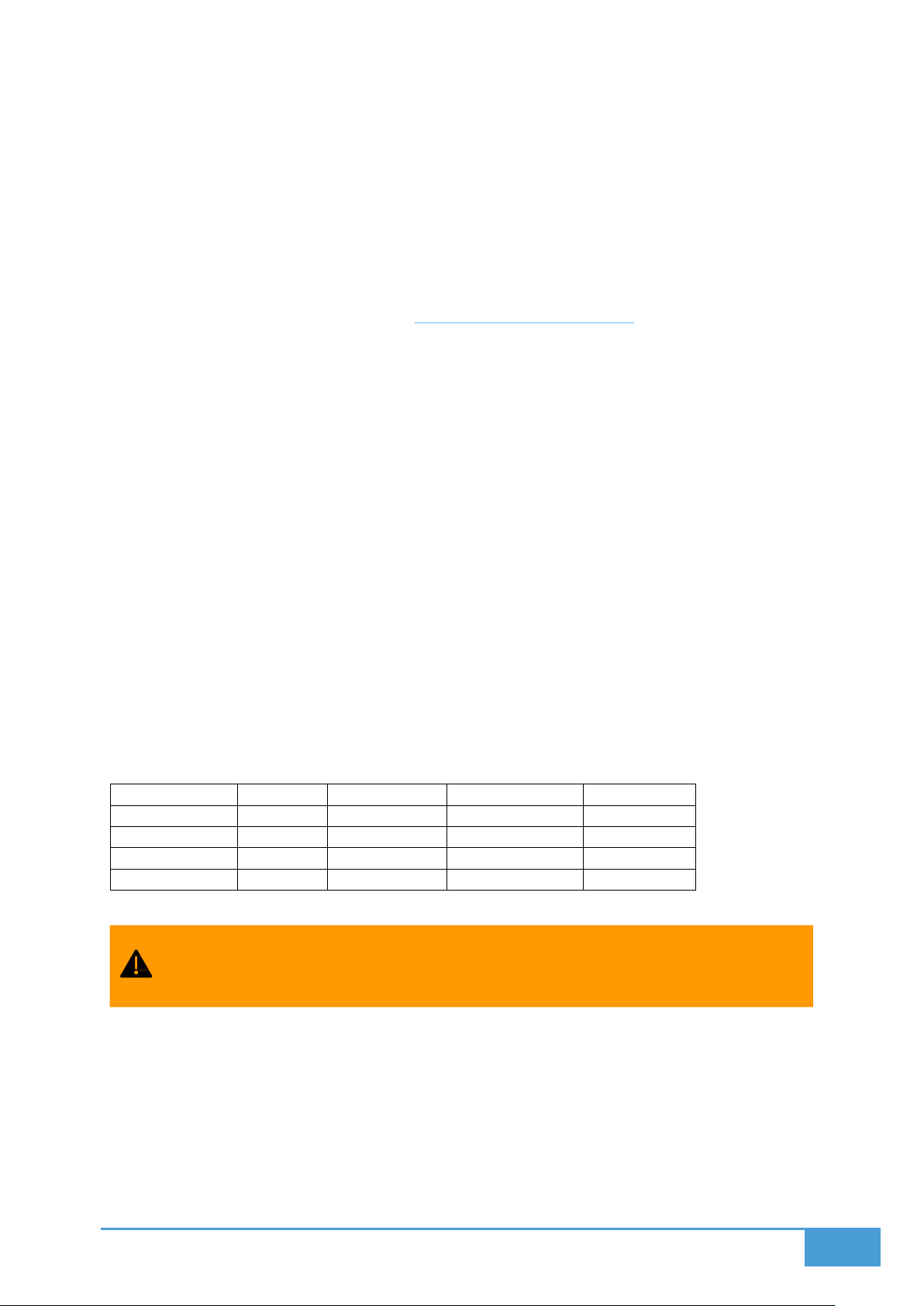
Below table shows hardware requirements for PCs used as Screen Node, Server,
Management or Control Clients.
Multiple client windows can be summoned on each computer. The total resolution
of these windows determine the actual requirement of that device.
3.1.2 Considerations and Suggestions
Use identical hardware for screen clients: Promotes better temporal and visual
synchronization across video walls.
Dedicated Server PC: Avoid using the server PC for screens or control clients to prevent
resource contention and control issues.
Page 11
11
High-End Server Device: Should have strong CPU/GPU/network, minimal background
processes, and run on a gigabit LAN.
If the server is also used as a screen client, turning off a screen might inadvertently
turn off the server. Best to separate server from screen roles.
3.2 Setup Modes
Lygos offers a highly flexible architecture to support various hardware and space
configurations. At its core:
One PC instance must run as the Server (Local Mode).
That server can summon Screen, Management, and Control Clients.
Other PC/Tablet instances can connect to this server and summon Screen,
Management, and Control Clients.
Even though you can create any setup with Lygos, here are some common ones as examples:
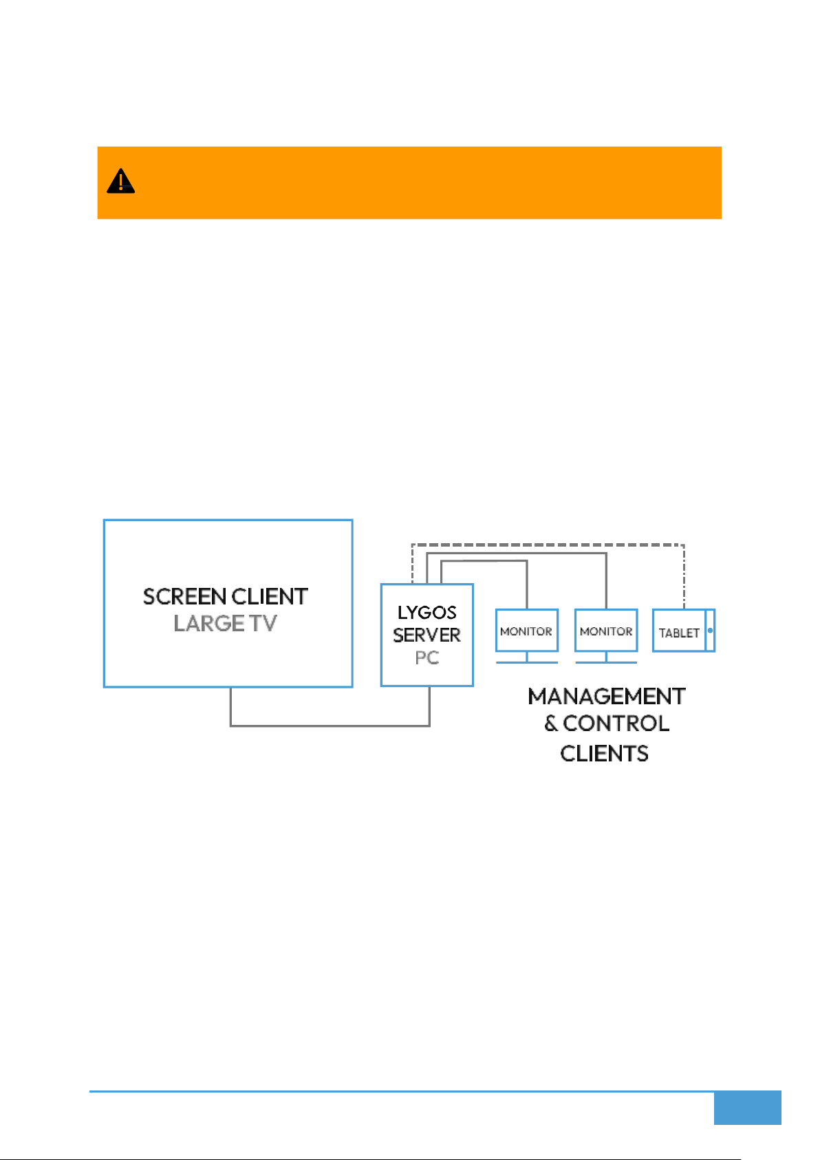
3.2.1 Large TV Mode
Acts as a single screenspace.
Multiple Maps, Visualizations, or Media elements can be deployed to its grid layout.
The screen client typically runs on the PC that runs on server mode.
Touchscreen or secondary displays on the server can run Control or Management
Clients.
Remote PCs and tablets can connect as additional control interfaces.
Best suited for:
Small setups
Professional data presentations
Single dashboards
Page 12
12
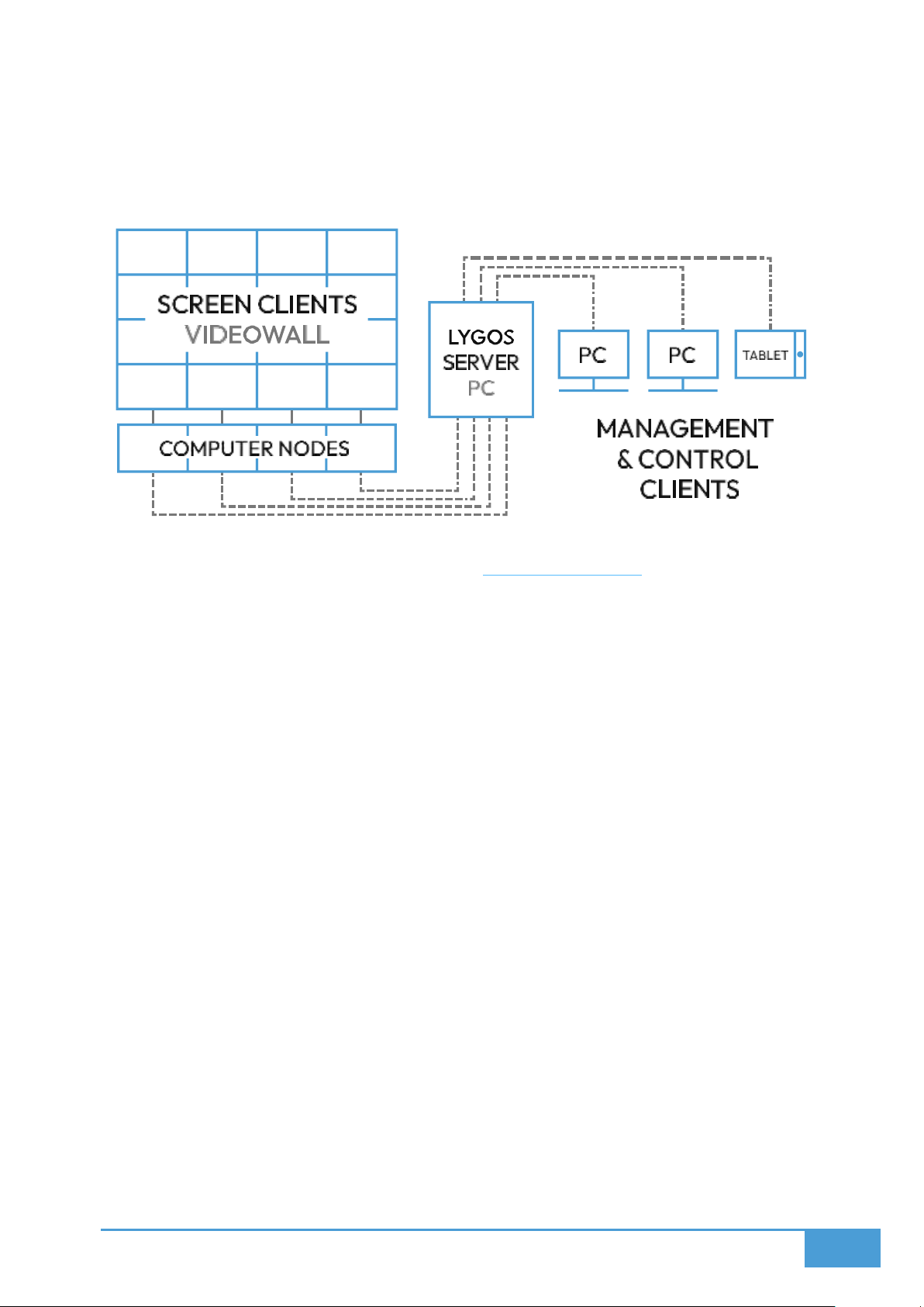
3.2.2 Video Wall Mode
Multi-screen display acting as a unified seamless screenspace
There are several general options for how you can set up your video wall:
Example Option 1:
o
Setup: Each video wall display can be connected to a separate PC
o
Installation: Lygos runs on each PC, summoning a single screen client
o
Resolution: Full
o
Processing Power Requirement: Low
o
Synchronization: Required
Example Option 2:
o
Setup: One PC per row of displays
o
Installation: Lygos runs on each PC, summoning multiple screen clients for
each monitor
o
Resolution: Full
o
Processing Power Requirement: Medium
o
Synchronization: Required
Example Option 3:
o
Setup: A single PC driving a small video wall (Each display is connected to PC
separately)
o
Installation: Lygos summons a single screen client for whole videowall
(Maximum 4 Displays)
o
Resolution: Full
o
Processing Power Requirement: Medium
o
Synchronization: Not Required
Example Option 4:
o
Setup: A single PC driving a small video wall (Videowall connected from
single connector)
Page 13
13
o
o
o
o
Example Option 5:
o
o
o
o
o
Warning Regarding Option 5:
Lygos screens will not be distributed and operate on a single screen client with full
resolution of the videowall, thus rendering thousands, maybe millions of UI
elements depending on how many displays on the videowall.
First of all, this requires very high GPU and CPU power.
Installation: Lygos summons a single screen client for whole videowall
Resolution: Limited (Videowall itself reduced its resolution to serve from a
single connector)
Processing Power Requirement: Medium
Synchronization: Not Required
Setup: A specialized PC or hardware equipment that connects to a large
videowall and treat it as a single high-resolution screen
Installation: Lygos summons a single screen client for whole video wall
Resolution: Full
Processing Power Requirement: Very High
Synchronization: Not Required
Furthermore, regardless of PC or equipment providing this required processing
power on a single device, it may still crash or lag due to limitations of operating
system and drivers for displaying large number of elements at such high resolution
on a single window.
Usually, software, including the various third party graphic or UI packages Lygos use,
are designed for normal resolutions: up to 4K. Therefore, Lygos prefer distribution
of screens, where each screen render no more than 1-8K and render only partial
amount of UI elements, rather than displaying such resolutions with ultra high
number of UI elements on a single window.
Screen clients can synchronize in <100ms for seamless map,
visualization and media render and control on seamless screen space made of
distributed screen client nodes.
A single lygos screen client can span up to 4 adjacent identical monitors. This is
used for having a single screen client for small video walls. This removes
requirement of synchronization on a small videowall, improving video
synchronization performance that span to multiple displays. You can access span
options through window control menu on top right of a screen client summoned
on a PC Version of the software
Page 14
14
Example Use Cases:
Control Centers
Command Centers
Operation Centers
Digital Art Installations
Open Offices
Conference Rooms
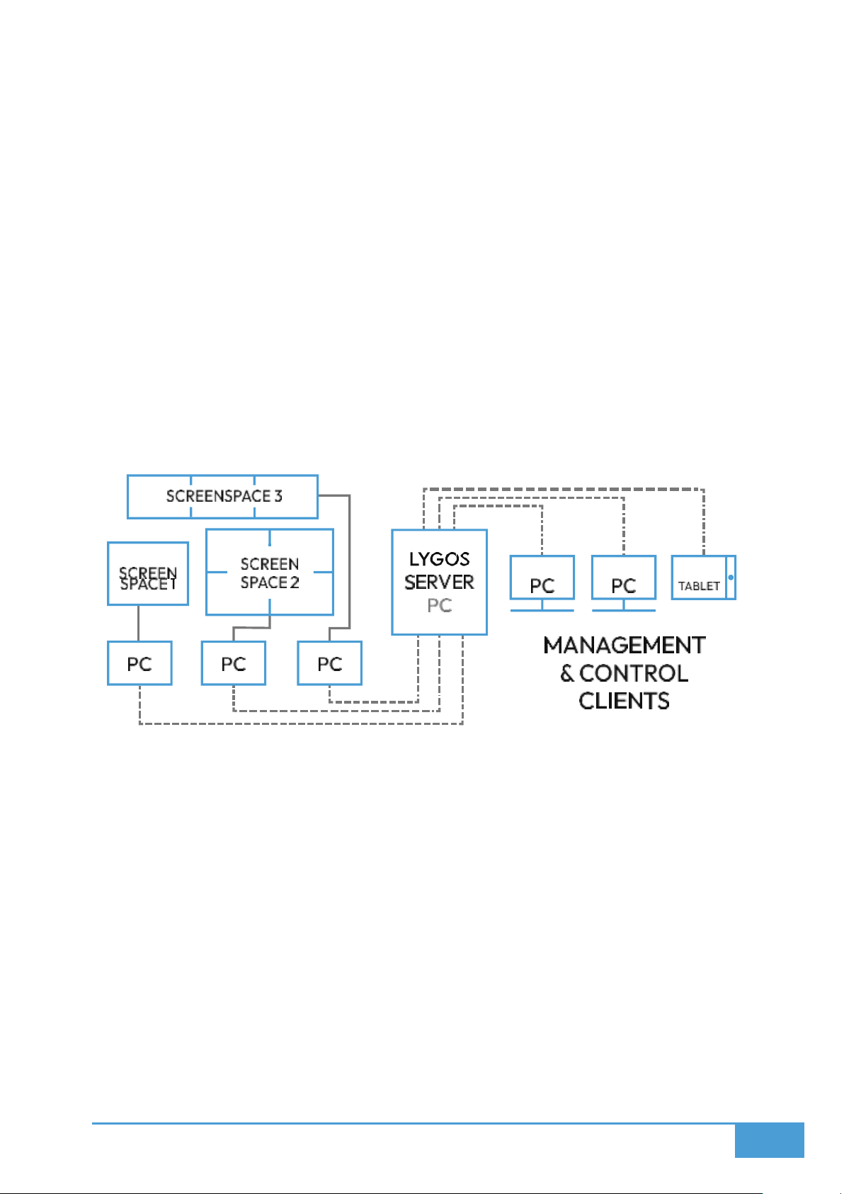
3.2.3 Signage/Dashboard Mode
Multiple independent screenspaces (of same or different sizes/configs) can connect to a
single Lygos server.
For example, you can use multiple regular TVs in an office space as dashboards which can
be controlled by selected few, or have multiple conference rooms each with its video wall or
large TV or have few displays at office corridors as signage looping through content.
Each of these screenspaces can access the same visualization resources on the server.
This setup can be in addition to your main video wall setup since Lygos provides flexibility on
connecting multiple screenspaces and displaying separate layouts on each screenspace.
Example Use Cases:
Office-wide Signage or Dashboards
A screenspace per meeting/conference room
Other
Page 15
15
3.3 Installation & Configuration
Lygos should be downloaded for each device you will be using, these include devices
connected to screens, devices that will act as control or management clients and also device
that will act as the server. Each Lygos Network should contain 1 server instance. That means
one of the PC devices running Lygos Software should be in local mode (server) and others
should connect to it with remote mode.
You can use one of the devices that display screen, control or management clients as the
server. However, we recommend having a separate PC other than videowall screen nodes to
assign as server if you have a large videowall.
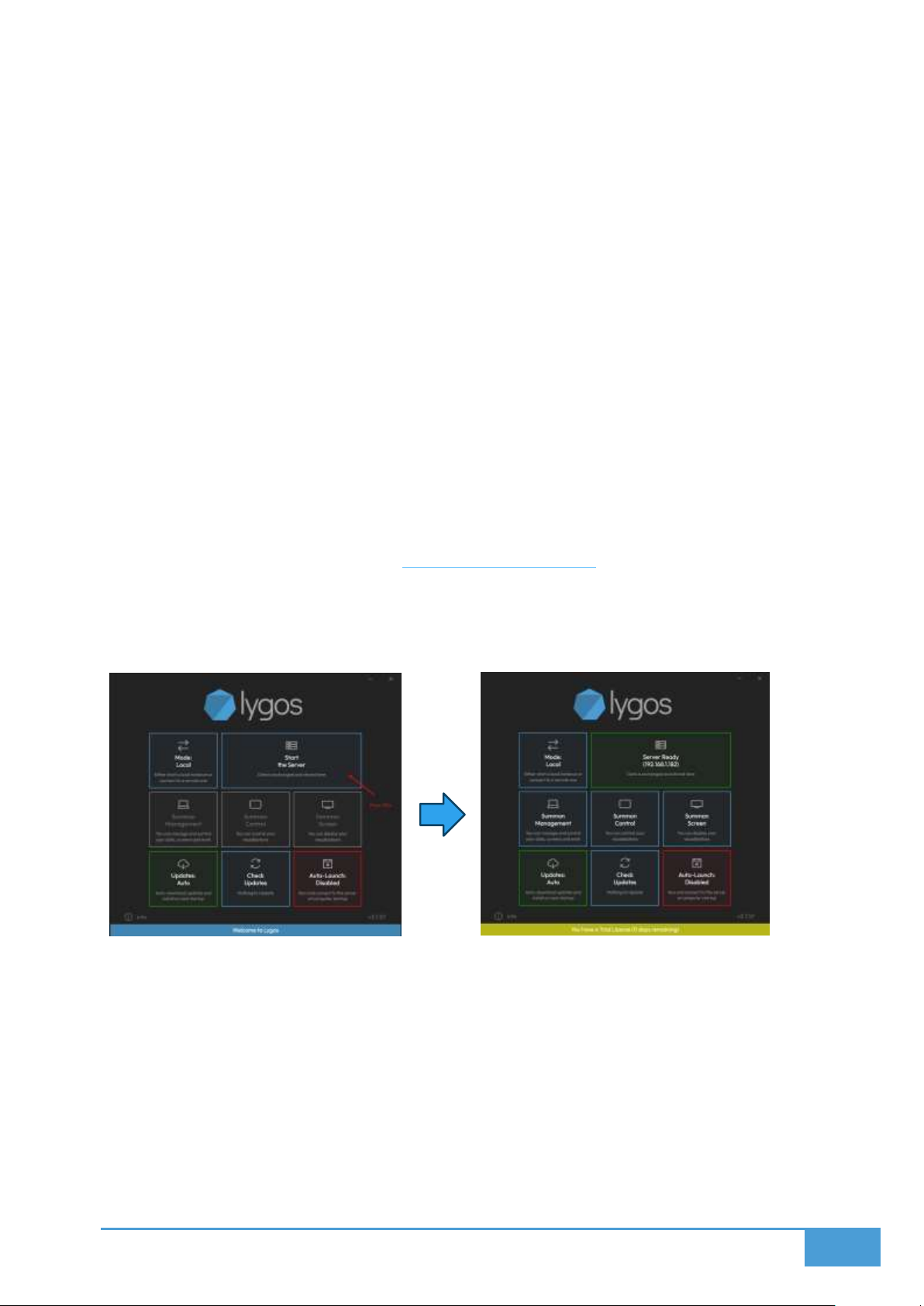
3.3.1 PC – Server Mode (Local)
A PC version of the software in Local (Server) Mode
Steps:
1. Download Lygos Software from https://lygos.io/download
2. Install it on a PC (Windows/MacOS/Linux)
3. Launch the software
4. Select Mode: Local (which is default)
5. Press Start the Server Button
Once successfully started the button will show “Server Ready” and IP address of the Server.
Afterwards, you can create clients on the same computer.
Screen Clients
Management Clients (without restrictions)
Control Clients
All screen clients, whether launched locally or remotely, will appear in the Display Module and
can be added to Screenspaces to form seamless videowalls where each act as a distributed
screen node.
Page 16
16
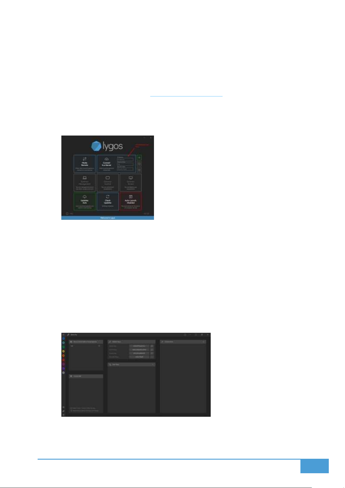
3.3.2 PC – Client Mode (Remote)
A PC version of the software in Remote (Client) Mode
Steps:
1. Download Lygos Software from https://lygos.io/download
2. Install it on a PC (Windows/MacOS/Linux)
3. Launch the software
4. Select Remote Mode
5. Fill the Connection Info on the Button and Press to Connect
a. IP Address: Can be obtained from the launcher of the server
b. Password/Key: You can use either
i. Master Keys: Can be obtained from an admin level management
clients
ii. User Keys: User keys can be created at admin level management
clients
c. Security Token: This is optional security measure. It enables secure
communication between server and that client. If not entered, the client will
send communication obfuscated but not secure, also all file communication
will be in plain.
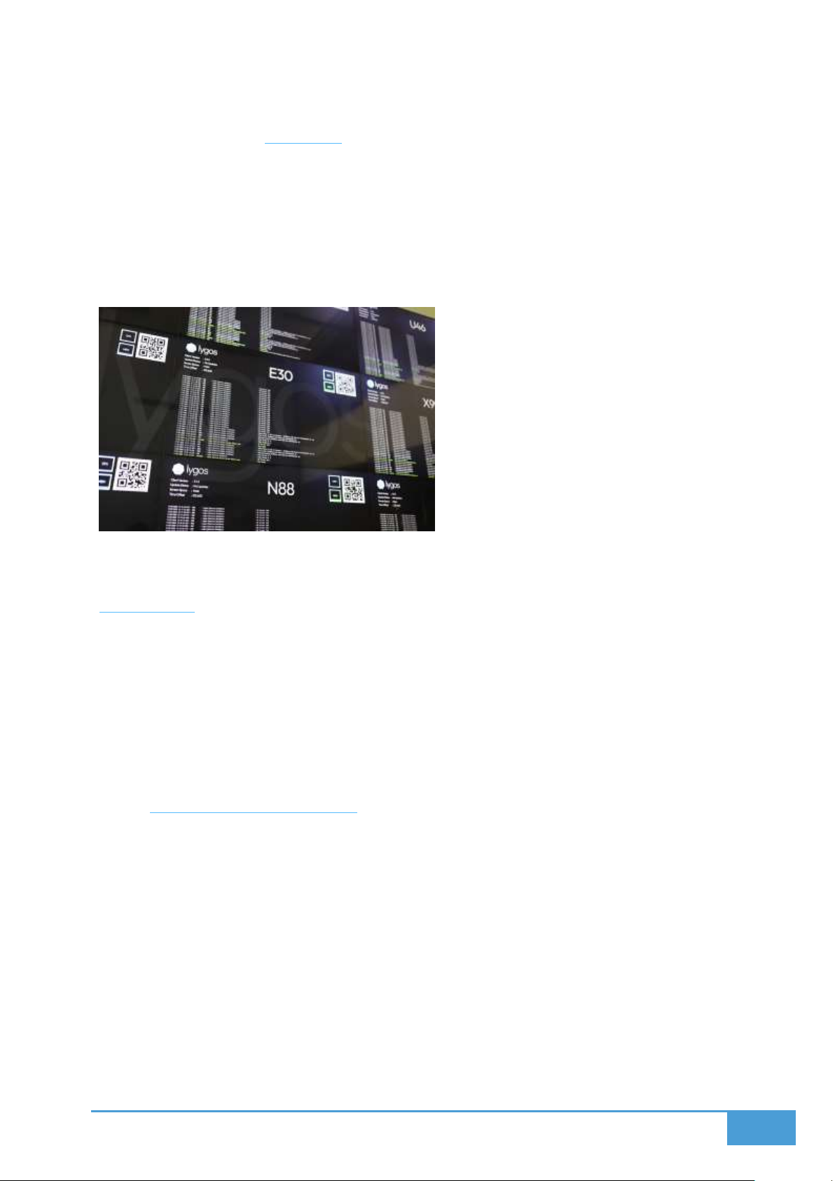
Security Tab on Admin Level Management Client where Master Keys are shown and
User Keys can be created:
6. Afterwards, that client can summon Management, Control or Screen windows
depending on Access Level
Page 17
17
3.4 Client Types
Lygos supports multiple client types to accommodate different management and control
scenarios.These three main client types, all summoned from the same software. PC Version of
the software can summon multiple clients. Tablet Versions can display a single client of
choice.
3.4.1 Screen Client
A screen area where maps, visualizations and media can be deployed to it remotely from
Management Clients. Multiple visualizations can be deployed to screens in a grid format.
Screen can be single or part of a larger screenspace (video wall) and allows displaying partial
or full visualizations.
Screen clients are synchronized, so if you deploy a visualization to a region of a screenspace
that corresponds to multiple screen clients even on different devices, they
animate/interact/render collectively as in one seamless screen. You can simply summon
these clients from launcher and move their windows to any monitor/display you want. Lygos
remembers locations of these clients on restart or relaunch and resummon them on their
last location.
3.4.2 Management Client
Management client is the core of the application where users can:
Setup/Configure screenspaces for your video walls and dashboards.
Remotely turn on and off the PCs of your screen nodes or restart them.
Add/Connect Data Files, APIs, Databases.
Create/Edit custom Visualizations or with connected Data (maps, sensors, media,
charts, etc.)
Control and Configure Maps and Visualizations through their editors.
Create Signage Loops and Multi-screen Presentations that span to whole video wall.
Create Data Analytics.
Access to Lygos Server Settings.
Page 18
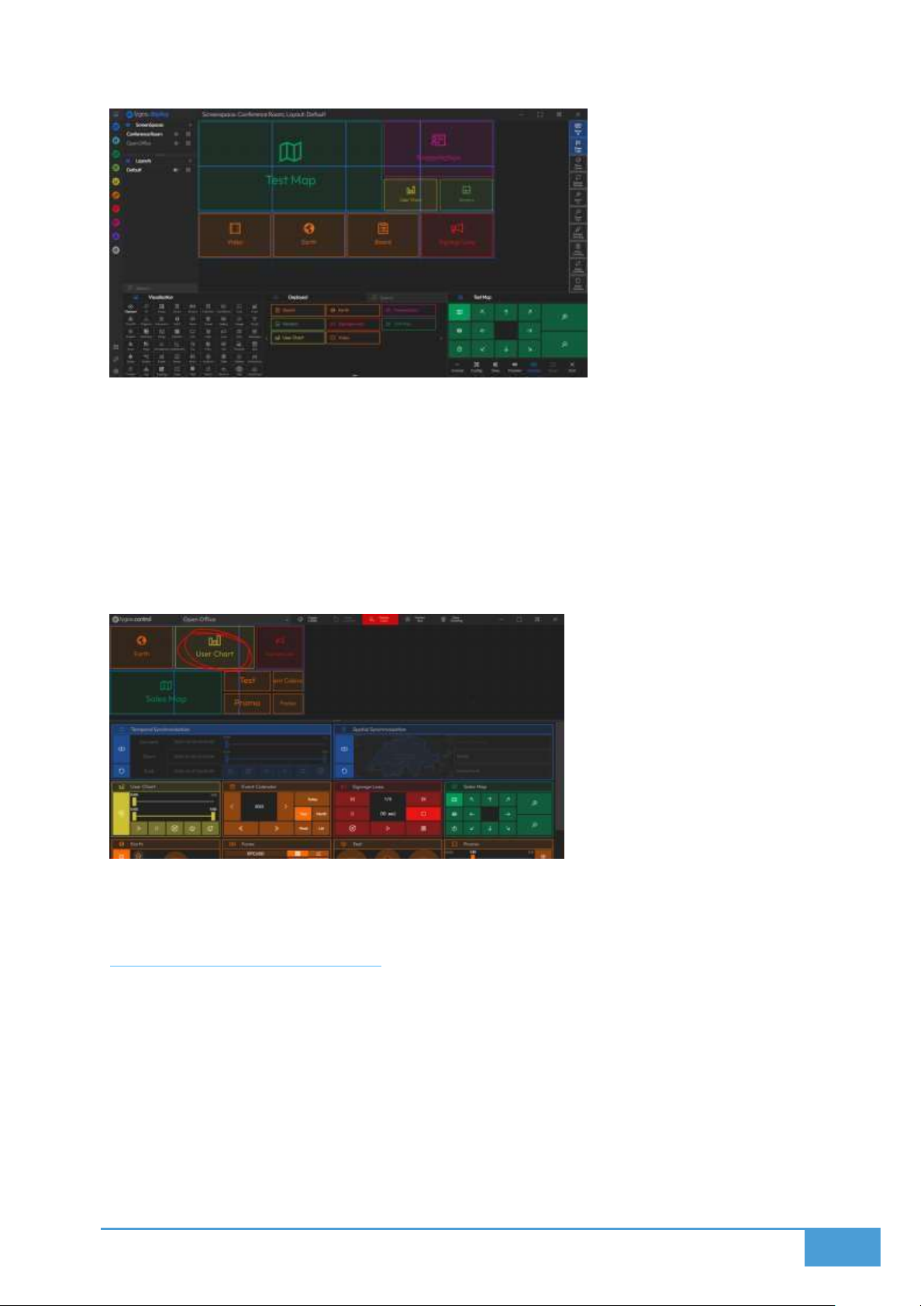
18
3.4.3 Control Client
By summoning a Control Client users can:
Interact with deployed visualizations through simplified control UIs
Point and draw on the videowalls/dashboards through mouse or touch
All controls and interactions can be reverted as they are temporary for that session.
Users can access Control Client by either using master control key, which gives
access to control to all screenspaces or use a Control QR of a screenspace on a
tablet to access to control of that screenspace only.
3.5 Mobile Client
Mobile clients include an Air Mouse to point and draw on the video wall screens and
simplified controls for presentations. Multiple users can use Air Mouse simultaneously.
Mobile client can be accessed through scanning a control QR from a smart phone.
Use your smart phone as an Air Mouse for your video walls or dashboards (does not
require an application to be installed on the device.)
Control Deployed Presentations
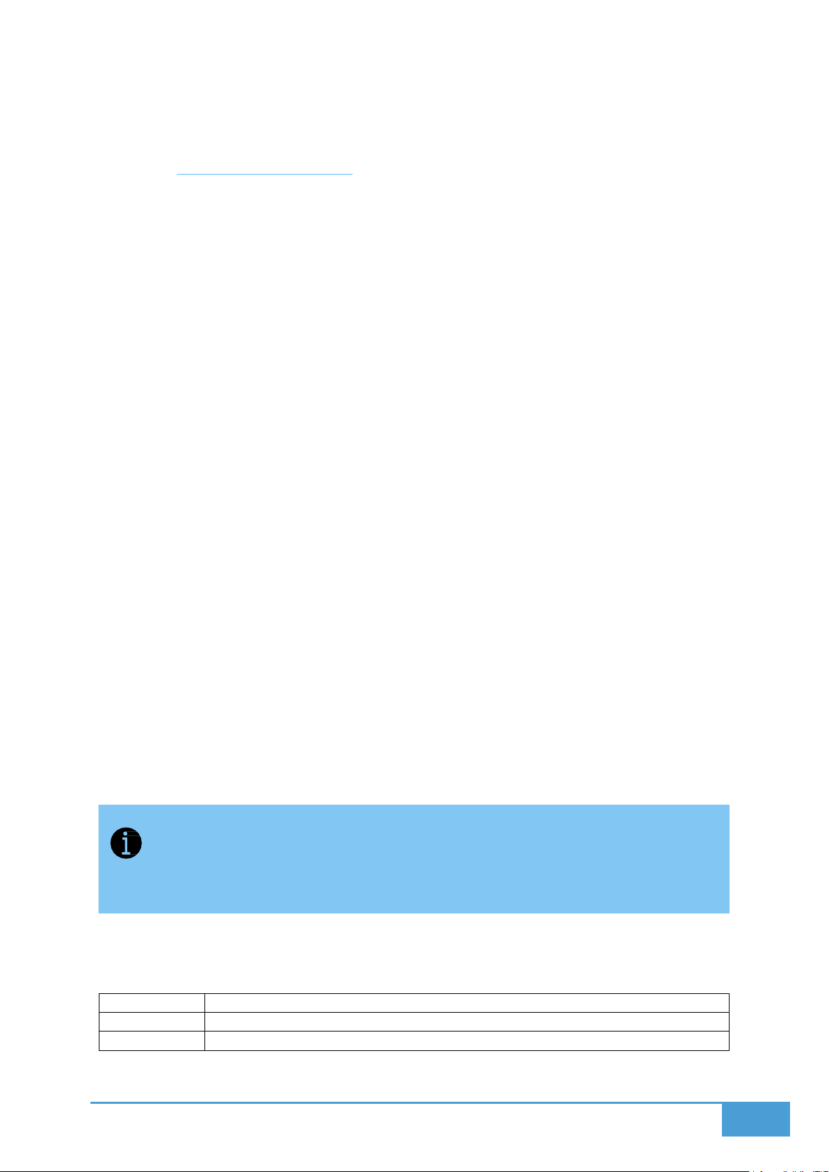
To Access Control QR From Management Client, Open Security or QR page depending on
your access level on bottom left of your screen. From This page you can display a control QR
Control QRs provide controls per Screenspace access.
Page 19
19
3.6 Access Levels & Keys
37349
Server – Client Communication
37777
Server – Client Communication
37214
Server – Client File Transfer
Lygos uses level-based access control, not permission or role-based authentication. Access is
managed through different keys, each granting a specific level of functionality.
3.6.1 Key Types & Access
Screen Key
Can only summon screen clients
Shown on the Launcher window of the Server or Settings in Management Clients
Minimal access to system resources (security-wise)
To be used on screen clients who are not supposed to control or manage
Control Key
Can summon control clients
Shown on the Launcher window of the Server or Settings in Management Clients
These clients interact with visualizations and control screenspaces on limited scale
which can be reverted after sessions.
Cannot edit/configure layouts, visualizations, media
Compared to the Control QR, this can control all scnreenspaces
User Keys
Created via Management Clients with higher privileges
Limited editing abilities: Can edit layouts, cannot edit screenspaces (Videowall
Setup), Cannot use power functions (e.g., wake/restart/shutdown) of screens
Ideal for non-admin users needing access to visualization, media, map configuration
and layout deployment.
Management Key
Allows full use of Management Clients.
Can configure/edit/control all visualization, media, maps, layouts.
Super Admin Access (Management Client summoned from Server itself)
Full administrative privileges
Can create and manage all keys, screenspaces, and configurations
Only Remote Users connecting with Management Key and Management Clients
summoned from Server itself are Admin Level Management Clients. These clients
compared to other management clients can add, edit, delete screens, layouts,
screenspaces and have other admin level privileges.
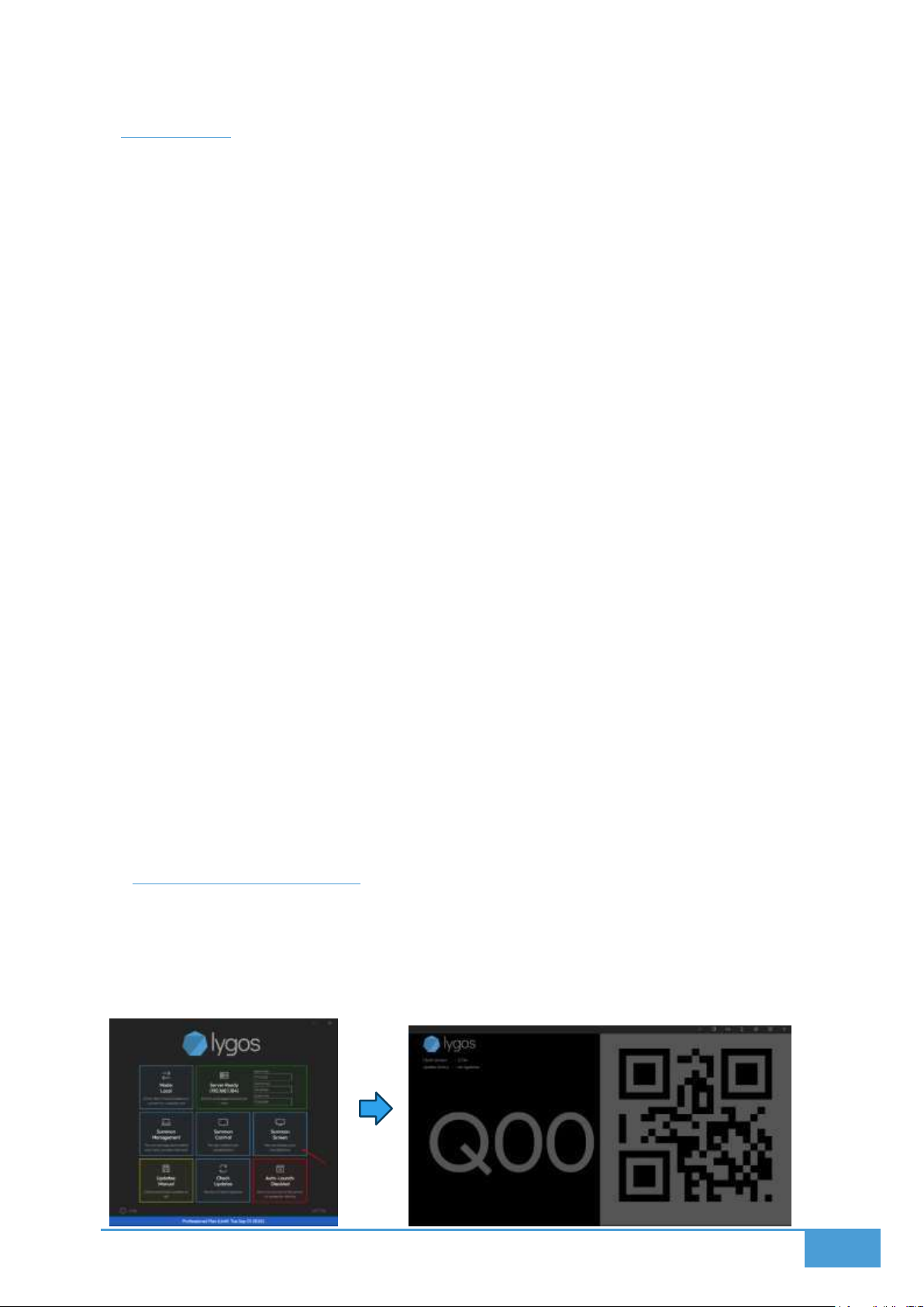
3.6.2 Ports
These Ports have to be open on Server, Clients and in between to Lygos to operate:
Page 20
20
4 DISPLAY
The Display Module relies on three primary components to function: the Screen, the
Screenspace, and the Layout.
Screen: This is where screen clients, initiated from both remote and local Lygos
applications connected to the server, are displayed. These screens can then be added to
your designated Screenspaces.
Screenspace: Think of this as a digital canvas that mirrors your physical dashboard or
video wall. You populate this area by loading screens and organizing them into a
structured grid.
Layout: These are the visual arrangements placed onto your screenspaces. You can
design layouts, position visualizations anywhere on the grid, and easily load, switch, or
remove them.
Key Features:
Create Screenspaces: Build and administer the areas used to organize your display
hardware.
Load Screens: Allocate individual screens from your video walls or dashboards into your
chosen screenspaces.
Replace & Resize Screens: Modify the grid placement and dimensions of your screens.
Create Layouts: Craft specific design arrangements tailored for your screenspaces.
Switch Layouts: Transition smoothly between various layout designs whenever required.
Load Visualizations: Push your content and data visuals directly into active layouts.
Replace & Resize Visualizations: Tweak the position and size of your visual content
across the layout grid.
4.1 Summoning Screens
Screen Clients are summoned from Lygos Software Instances and act as a full or partial
screen area that visualizations and media can be deployed remotely.
There are various options to setup your videowalls and dashboards.
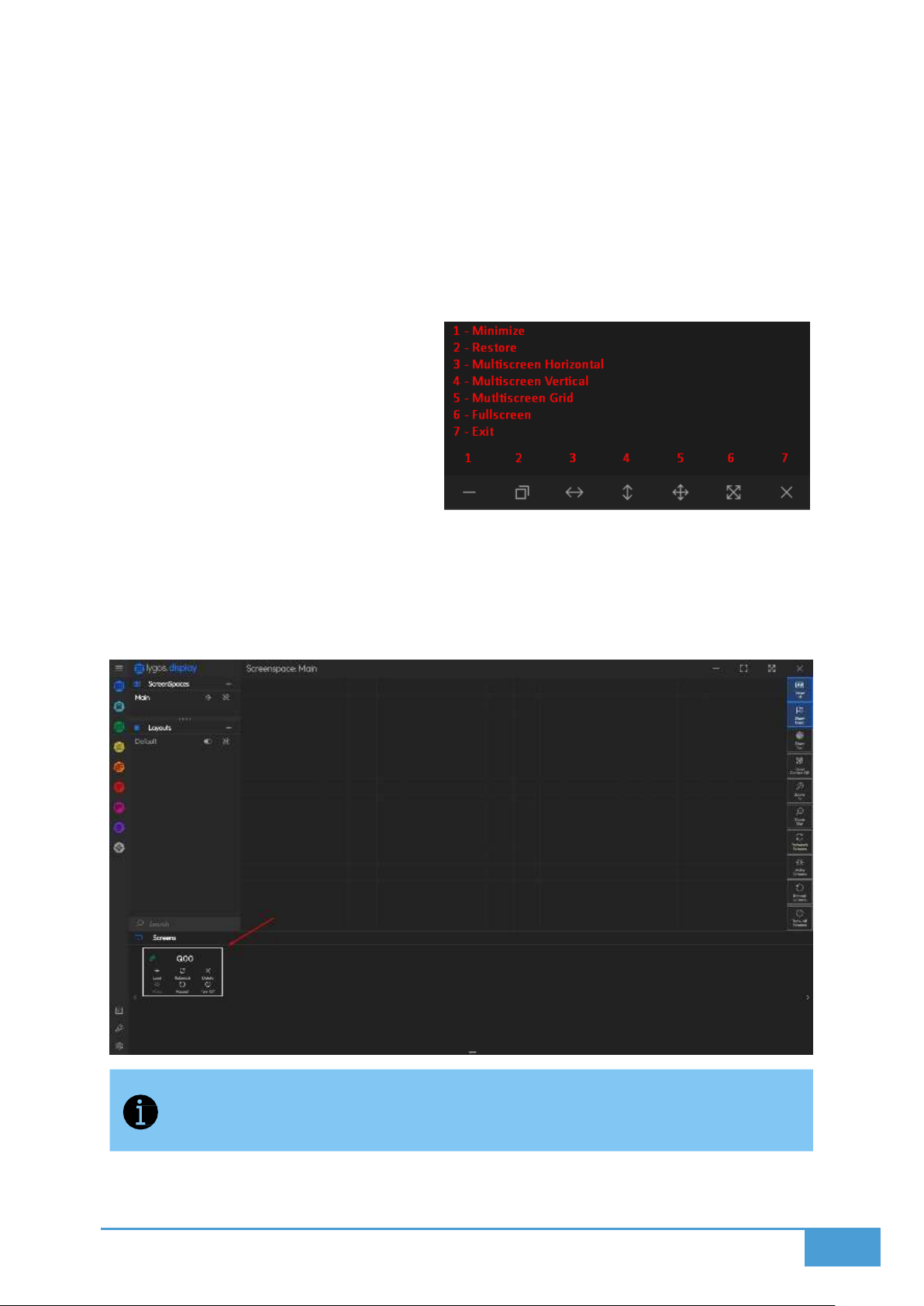
In Lygos Launcher, press Summon Screen, This will create a screen window:
Page 21
21
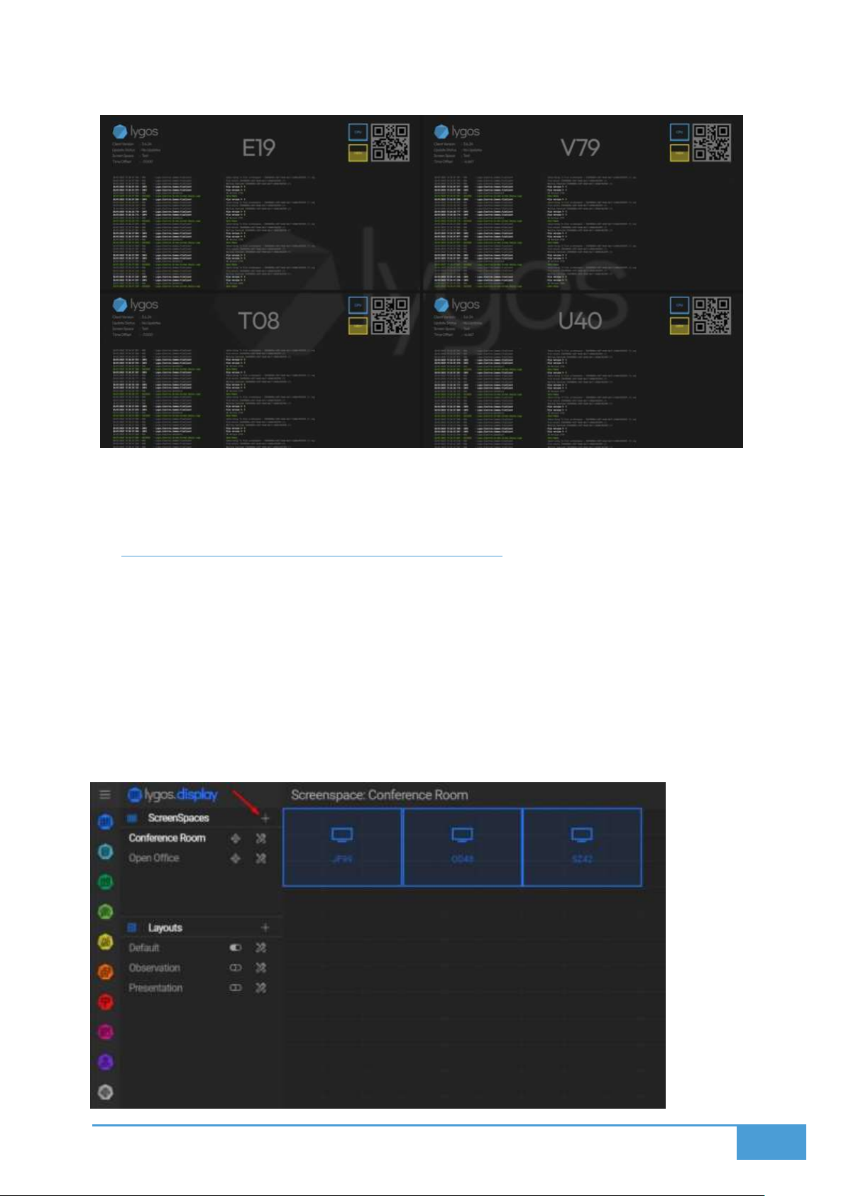
On the left you can see ID of the screen, on the right, you can see QR code of the screen. On
this mode, the screen is not assigned to a screenspace yet.
You can either manually place screens on screenspaces, or use a tablet client to auto place
them by scanning QRs (On Management Client of a Tablet Client → Display Module -> On Right
Action Menu → Scan Screens).
You can drag this screen to anywhere from its toolbar and than fullscreen or multiscreen it.
Fullscreen: It puts the screen on the
fullscreen mode on the display/monitor it is
on. Multiscreen: It puts the screen on
fullscreen on multiple displays. There are 3
modes, horizontal, vertical and grid (2x2).
These displays should be at same resolution
and adjacent to each other. You can use
horizontal and vertical for videowall
columns and rows. As a result, it creates a
single screen client per row or column. For small videowalls up to 4
screens, you can use the grid mode to create 1 screen client that covers all 4
displays/monitors of the small videowall.
Here is button on the top right of a screen and their functionality:
The summoned screen clients will appear on Management Clients of that Lygos Server. You can
add these screens to screenspaces, deploy partial/full visualizations to them.
Screens clients created on Lygos software connected to the server automatically
show on this tab.
As a result, screen clients become a seamless screen area to deploy visualization:
Page 22
22
You can see these screens are part of screenspace, compared to the unloaded mode on the
top of the page and show id is toggled on for this screenspace so they show an info overlay.
4.2 Creating and Managing Screenspaces
Screen clients summoned on distributed computer nodes connected to the video wall
displays or dashboards can be virtually assigned to a grid.
This assignment allows us to seamless synchronization and dynamic visual deployment
across group of screens.
For example, you can represent 12 videowall displays in 3x4 as a seamless screenspace, or 3
dashboards on office corridor, this flexible screenspace formation enables users to represent
any screen group as a screenspace.
Page 23
23
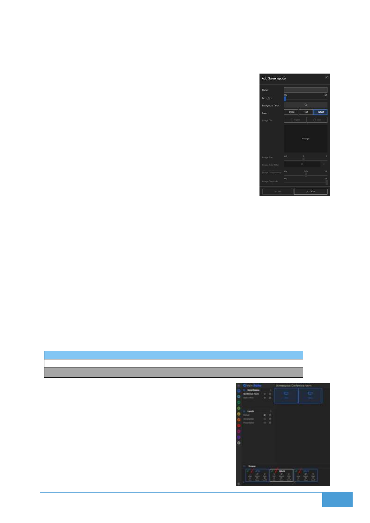
Blue: Screen is loaded to this screenspace
White: Screen is not loaded to any screenspace
Gray: Screen is loaded to a different screenspace
4.2.1 Creating a New Screenspace
Press the “+” button in the Screenspaces Menu to create a new
screenspace.
During creation, you can configure:
Screenspace Name
Bezel Size
Logo
These settings can be revisited and modified anytime by pressing the
Settings button next to a name of the screenspace in the menu.
4.2.2 Navigating Screenspace View
Select a screenspace from the menu by clicking on its name.
The Screenspace View displays:
A grid layout of the screenspace
A list of screens currently connected to the server
4.2.3 Summoning and Managing Screens
Screens can be summoned from any computer connected to the same server via the
“Summon Screen” button on their launchers.
Once a screen is created on the server, it will appear as a card in the Screens tab of the
Screenspace View.
Screen Status Indicators:
4.2.4 Loading and Arranging Screens
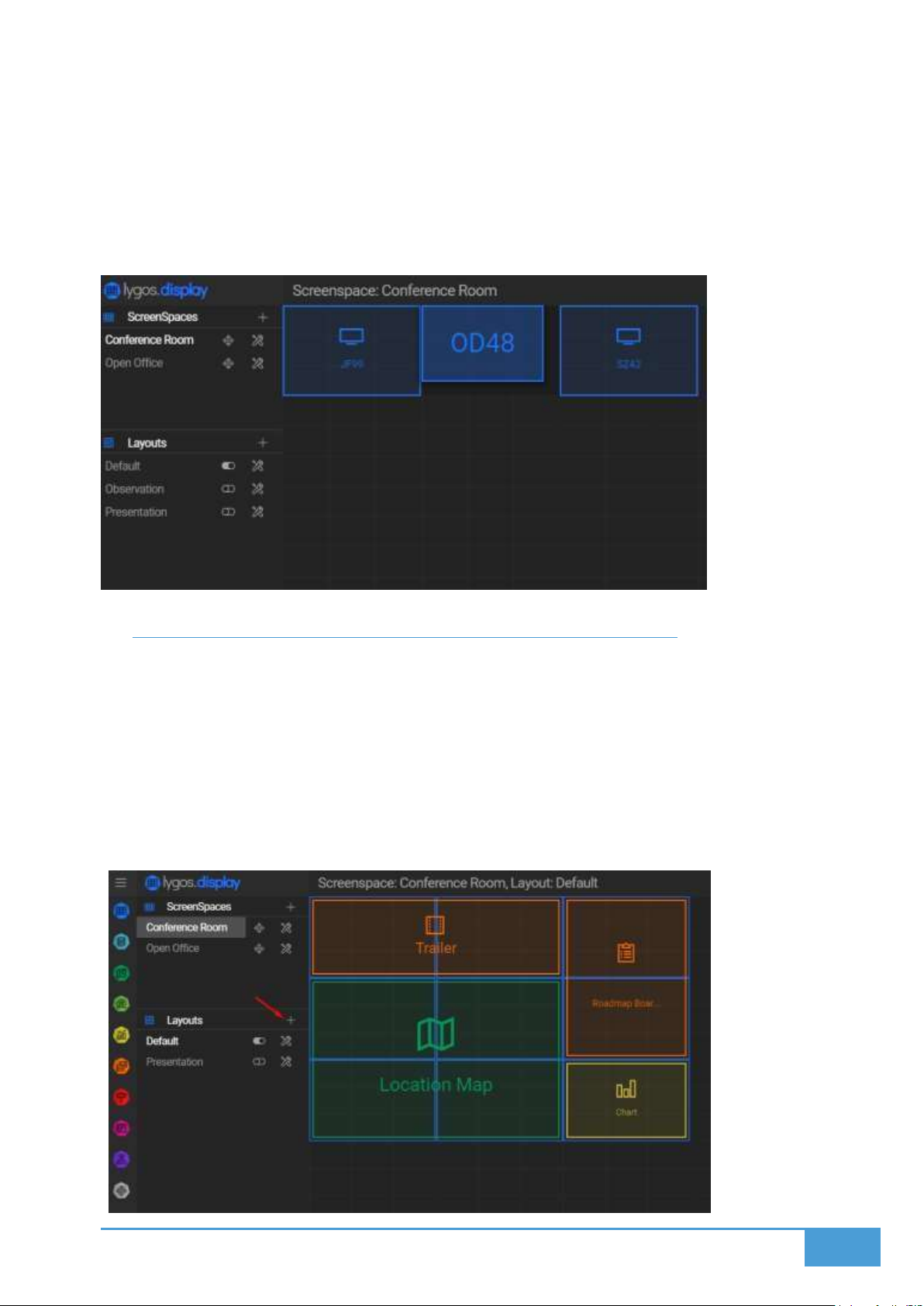
Use the Load and Unload buttons on each screen card to
assign or remove screens from the screenspace.
Adjust screen positions by dragging them from the center.
Resize inner grid dimensions by dragging from the corners.
Page 24
24
The inner grid dimensions define the layout capacity of visualizations on that screen
1×1 grid: One visualization can be deployed
2×2 grid: Up to four visualizations (1×1 each) or one large 2×2 visualization, or any
valid combination within the space
This layout system allows flexible arrangement and sizing of visuals to match your display
strategy.
4.3 Creating and Managing Layouts on Screenspaces
Layouts define how visualizations are arranged across a screenspace. You can manage and
create layouts via the Layouts Menu in the Display Module.
Visualizations that span into multiple screen clients render/interact/animate synchronously.
As a result, you can use a videowall as a seamless screen and deploy collages of
visualization in any formation.
4.3.1 Default Layout
When a new screenspace is created, a blank layout named “Default” is automatically
generated for it.
Page 25
25
4.3.2 Creating a Layout
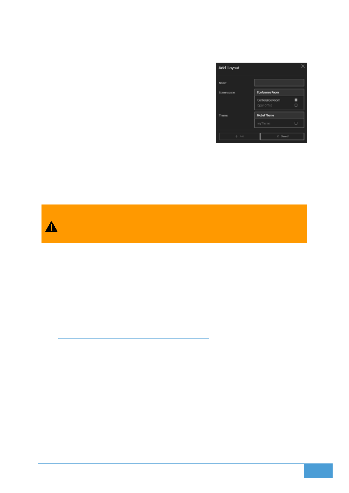
Select a screenspace to create a layout (It can be migrated
to other screenspaces later on)
In the Layouts Menu, press “+” to create a new layout. During
layout creation, you can:
Name your layout
Select the target screenspace
Choose a custom theme for the layout (or use the
global theme if preferred – see Themes)
These settings can be updated anytime by pressing the Settings button next to the layout in
the Layouts Menu.
4.3.3 Transferring Layouts Between Screenspaces
You can reassign a layout to a different screenspace from the layout’s settings.
Keep in mind: Screen configurations (like screen count, grid sizes, or positions)
may vary between screenspaces. Transferring a layout could affect the relative
positioning of visualizations.
4.3.4 Deploying Layouts
Use the toggle on button next to a layout to deploy it to its assigned screenspace.
This action automatically undeploys the currently active layout in that screenspace.
Only one layout can be active in a screenspace at any given time.
To clear a layout and show a blank screenspace, press the toggle off button on the active
layout.
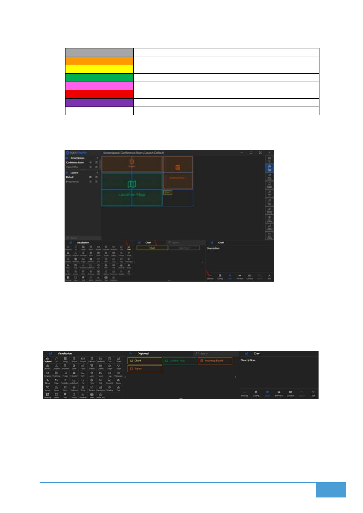
4.3.5 Deploying Visualizations to the Video Wall
Once in the Layout View:
1. Go to the Visualizations Tab.
2. Select a visualization type from the menu. A list of visualizations of that type will
appear.
3. You can:
o
Drag a visualization card to the layout grid, or
o
Click the card to open a right-side options menu and use Load/Unload to
deploy it.
o
Alternatively, you can press "All" button on Visualization menu, and text search
the visualization from all visualizations.
Page 26
26
Card Border Colors Indicate Module Types:
Gray
Not deployed in the current layout
Orange
Media
Yellow
Visualization (Charts)
Green
Map
Pink
Story
Red
Signage Loop
Purple
Expert
White
Assignable Region
Deployed visualizations will appear on the layout grid. You can:
4. Drag and resize them freely
5. See screen outlines in the background (blue rectangles) for reference
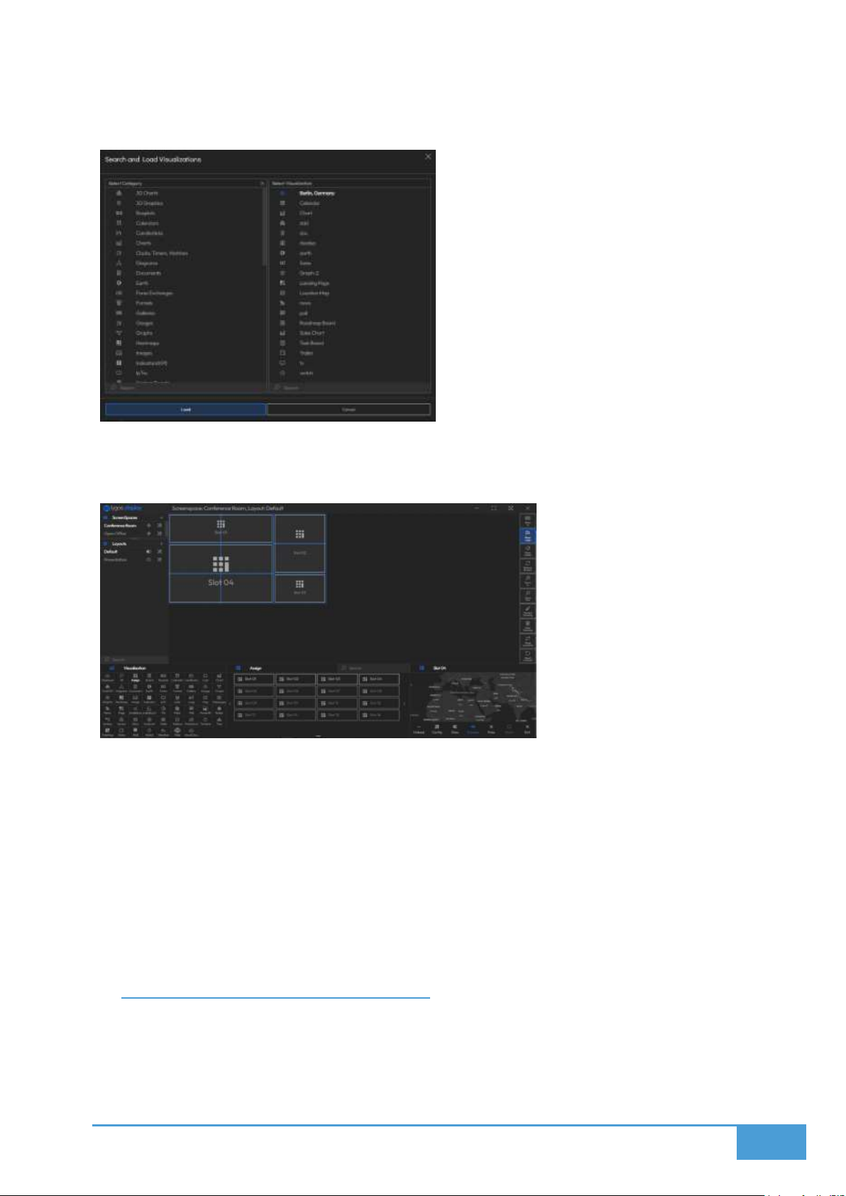
4.3.6 Visualization Tab - Special Tools
The first three options in the Visualization Tab are tools (not visualizations):
Deployed: Shows a list of visualizations already deployed in the layout.
Page 27
27
All: Lets you search and access any visualization in the system:
Assign: Allows you to load slots into the layout grid. You can then assign or replace
visualizations within these slots using the Visualization Editor’s Assign function.
4.3.7 Quick Controls on Visualization Cards
When you select a visualization card, you’ll see the following options:
Load / Unload – Add or remove the visualization from the layout.
Config – Opens the full editor for that visualization.
Control – Opens a compact control panel.
Preview – Shows a live preview of the visualization.
Reset – Resets all control changes made (Reverting a Session).
Exit – Deselects the visualization.
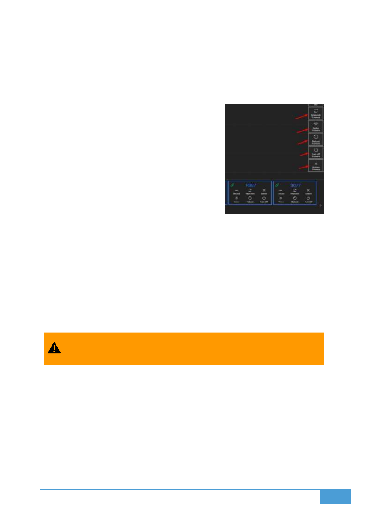
4.4 Power Options of Screenspace
In the Display Module > Screenspace View, you can manage the power settings for
computers hosting connected screen nodes.
You can perform these actions:
Page 28
28
Deleting a Screen Only closes the screen window on the target machine. It does not
Individually: via each screen’s card
Collectively: via the right-side Quick Menu for the entire screenspace (videowall or
dashboard group)
4.4.1 Available Power Options:
Relaunch Screens
o Restarts the Lygos application on the selected
machines.
o The app will reopen windows in their last saved
positions.
Wake Screens
o Sends Wake-on-LAN packets to power on
machines remotely.
o Requires Wake-on-LAN enabled in BIOS
o Devices must be on the same local network
o If Auto-Launch is enabled, Lygos starts with
the OS and restores windows to their last
positions.
Reboot Screens
o Reboots the entire OS of the target machines.
o If Auto-Launch is enabled, the Lygos app will start automatically on boot and
restore previous window positions.
Turn Off Screens
o Shuts down the operating systems of the selected machines.
o Devices can be powered back on using Wake Screens (if Wake-on-LAN is enabled
in BIOS).
Update Screens
o Checks for updates on the screen launchers.
o Installs any updates and relaunches screen clients afterward.
exit the Lygos application on that machine.
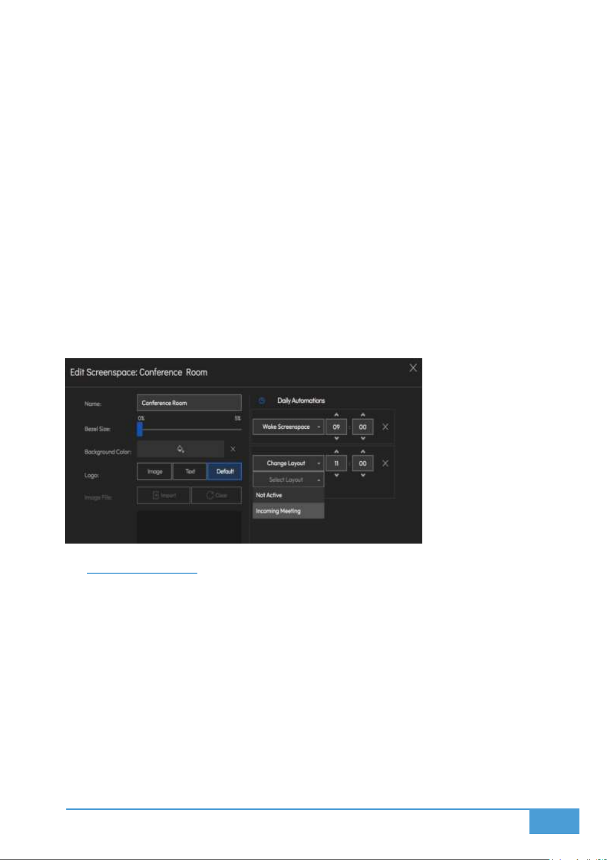
4.5 Video Wall Automations
You have the ability to automate your screenspaces through the use of scheduled event
triggers. By linking a predetermined action to a specific time, your display environment can
manage itself autonomously, removing the requirement for manual user input.
Available Actions:
The software allows you to queue up the following automated actions:
Change Layout: Automatically swaps the screenspace over to a pre-configured,
Page 29
29
designated layout at the set time.
Wake Screenspace: Triggers the network to power up the connected computers and
launch the screens.
Relaunch Screenspace: Completely restarts the connected hardware and screen clients
to clear memory and refresh the system.
Shutdown Screenspace: Initiates a safe power-down sequence for the screen clients
and their host computers.
Clear Drawing: Automatically wipes out any digital annotations currently drawn on the
display.
Reset Controls: Restores all interactive elements back to their baseline default
configurations.
Show Labels: Turns on the informational identification labels across all visuals on the
screenspace.
Hide Labels: Turns off the identification labels to provide a pristine viewing canvas.
4.6 Point and Draw
The Point and Draw functionality, accessible via the Control and Management Clients,
transforms your standard dashboard or video wall into a highly interactive whiteboard
environment.
Key Features:
Every distinct Layout possesses an independent Drawboard.
Whenever a Layout is pushed live, its associated Drawboard is automatically activated
alongside it.
Any digital pointers or ink lines are rendered as a top-layer overlay, floating above your
active media and data.
Page 30
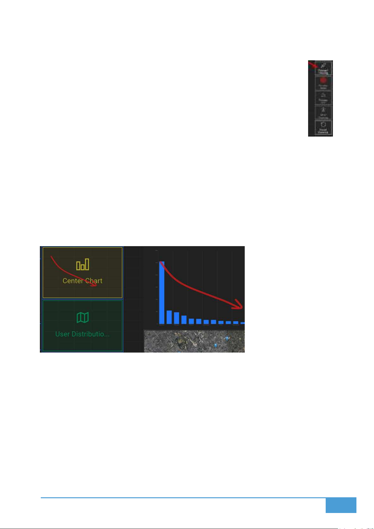
30
4.6.1 Activating Point/Draw Mode
1. Navigate to your Layout View.
2. Click the Pointer/Drawing button to turn the system on.
a. You will see a shadow overlay appear over the layout grid, confirming
the system is active.
3. Drag your finger or mouse across the grid:
a. Hovering will project a corresponding pointer directly onto the physical
displays.
b. Clicking and dragging your cursor will actively draw lines that render on both the
layout interface and the live screens simultaneously.
4.6.2 Multiplayer Drawing
The software supports multiple clients engaging with the drawing and pointing tools at
the exact same time on a shared layout.
When utilizing tablets, the system relies entirely on touch gestures, meaning no floating
cursor will be visible.
4.6.3 Drawing Controls & Options
You have access to a suite of customization tools via the right quick action menu found inside
the Layout View:
Change Pointer Color
Adjust Pointer Size
Clear All Drawings
To cease drawing interactions:
Click the Pointer/Drawing button to toggle it off.
Page 31
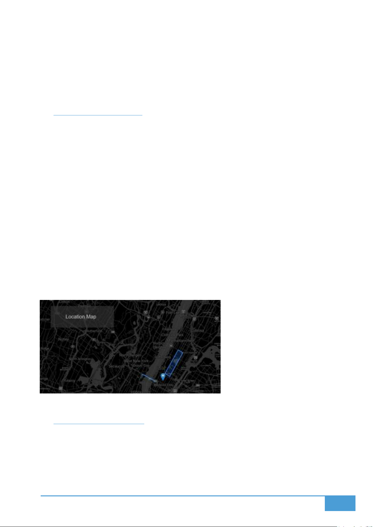
31
o This action simply hides the control overlay on your device only.
o Any existing ink remains visible on the video wall until it is manually wiped.
To completely wipe all ink from the physical displays:
o Click the Clear Drawings button situated in your Layout View.
4.7 Visualization Labels
You have the ability to attach labels to your deployed content, supplying a customized name
and a supplementary description. These textual labels serve to define and identify the various
elements occupying your video wall.
You can toggle these labels on and off utilizing the Show Labels toggle located within
the right-side menu of your selected layout.
When this feature is active, the visualization's current state, description, and name are
rendered directly onto the display as a text box.
Certain media elements and interactive visualizations feature an additional, independent
label window designed specifically for their state. For instance, a document might
broadcast its current page number, or a video might show its timestamp and total
duration. The software allows you to disable these specific state labels independently
via the item's configuration settings.
The visual styling of these labels—such as their colors, text format, location, and size is
governed by the Theme linked to the active Layout. If no specific layout theme is chosen,
the system defaults to the Global Theme. You can modify Themes via the Settings menu,
and apply them to Layouts through the Layouts Edit Menu.
4.8 Custom Background
Enhance your setups by applying custom backgrounds, such as brand messaging or corporate
logos, directly to your dashboards and video walls. These backgrounds render behind your
visualizations, injecting a layer of branding and personalization into the space. The software
intelligently scales the background to fit the entirety of the screenspace. This means a video
wall will display one large, continuous logo stretching across all connected displays.
Page 32
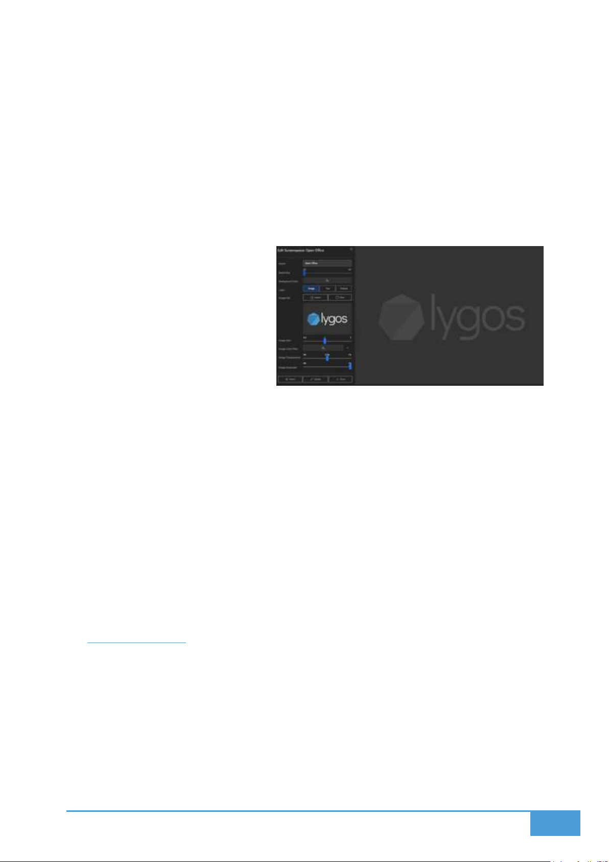
32
4.8.1 Accessing the Background Settings
1. Navigate into the Screenspaces Menu.
2. Locate the specific screenspace and click its Configure/Settings button (the gear icon).
3. Scroll down to the Custom Background category.
4.8.2 Background Options
The system provides three background types to choose from:
1. Default: This renders the standard Lygos logo.
2. Image: This allows you to upload a
personalized SVG image. You gain
access to tweak the following
attributes:
a. Size
b. Color Filter
c. Transparency
d. Grayscale Mode
3. Text: This option projects custom text onto the background canvas. You can freely
customize the:
a. Text Size
b. Text Color
c. Font
d. Transparency
4.8.3 Additional Background Setting
You maintain the ability to alter the underlying background color, independent of the
logo or text type you have selected.
4.9 Adjust Bezels
When broadcasting visuals over a grid of monitors, ignoring bezel sizes typically introduces
visual artifacts. This is highly disruptive when shapes, lines, or text block span across multiple
screens, becoming especially jarring at the corners and edges of the displays. Lygos mitigates
this issue by calculating the bezel width and creating an overdraw effect equal to the bezel size
in relation to the physical screen. You can inspect these artifacts and calibrate your bezels
directly from the Screenspace View within the Display Module.
Page 33
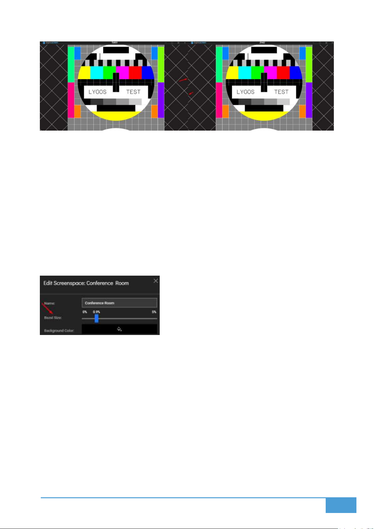
33
4.9.1 How to Adjust Bezels
1. Navigate to the Screenspace View located in your Display Module.
2. Expand the Quick Action Menu and click on Show Test.
a. This action projects calibration test patterns onto all of the physical screens,
making misalignments obvious.
3. If the white test lines appear disjointed or broken across the screen gaps, a bezel
adjustment is needed.
4. Click the Configure gear icon associated with that screenspace.
5. Manipulate the bezel size sliders until the test pattern aligns perfectly across all
connected displays.
Page 34

34
5 DATA
As a visual data analytics software designed for video walls and dashboards, Lygos provides
several methods to import or stream information from various sources. You can use these
sources to feed your interactive and real-time data visualizations. There are multiple categories
of data that Lygos can handle:
5.1.1 File Based Data Types
These data types can be created and modified using custom local editors built into the
software. You can also import and export these datasets in several file formats. Supported
formats include:
Spreadsheet: Tabular Data with Columns and Rows
GeoData: Spatial Data corresponding to KML or GeoJSON
GraphData: Nodes with Links/Edges
TreeData: Trees with Children and Branches.
5.1.2 Streaming Data Types
This category allows you to pull live information directly into your visualizations from local or
remote databases and APIs. Supported Databases include:
MongoDB
Azure SQL
MySQL
Oracle
DynamoDB
SQLite
IBM Db2
Cassandra
Microsoft SQL Server
Elasticsearch
BigQuery
MariaDB
Neo4j
PostgreSQL
Page 35
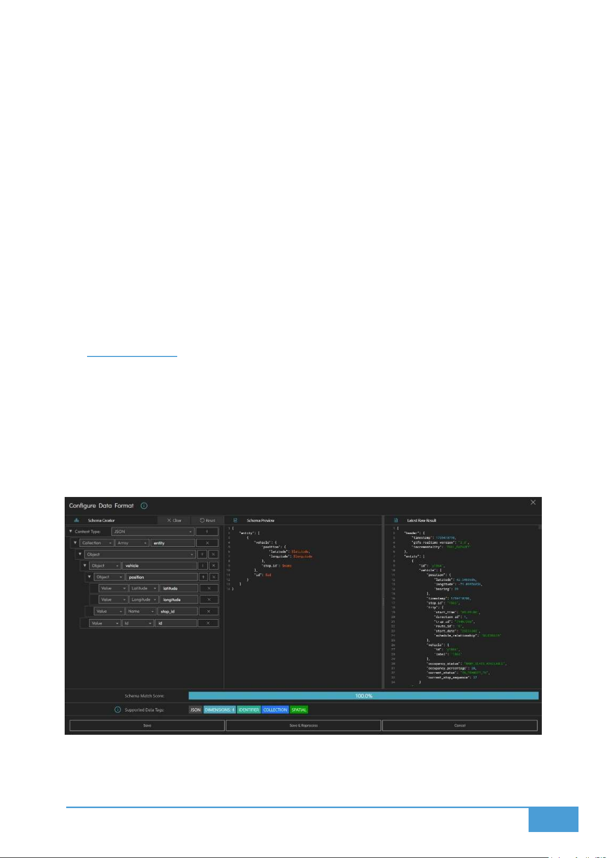
35
Redis
Snowflake
Other Streaming Sources include:
REST API: Periodic Queries to Remote Rest API endpoints.
REST Service: Creating REST API endpoint at the Lygos Instances for Remote
Connections.
MQTT: Sensor and IoT Publish/Subscribe
Filewatch: Watching Files
5.1.3 Other Data Types
TileSource: Remote Map Tile Sources
5.2 Data Format
Data formats are essential because they dictate exactly which visualizations are compatible
with your information on the video wall. For example, map data containing geographical
coordinates is classified as Spatial, whereas yearly sales figures containing dates are
categorized as Temporal.
You can determine your proper format easily by using the Data Format UI tool. This tool lets you
analyze raw information, define its underlying structure, and assign dimensions to build a proper
schema.
Once your schema is set, the system calculates all compatible visualizations and summarizes
the results using specific data tags. These tags act as a guide to show you exactly where your
data will work, since certain visualizations require highly specific formatting.
Page 36
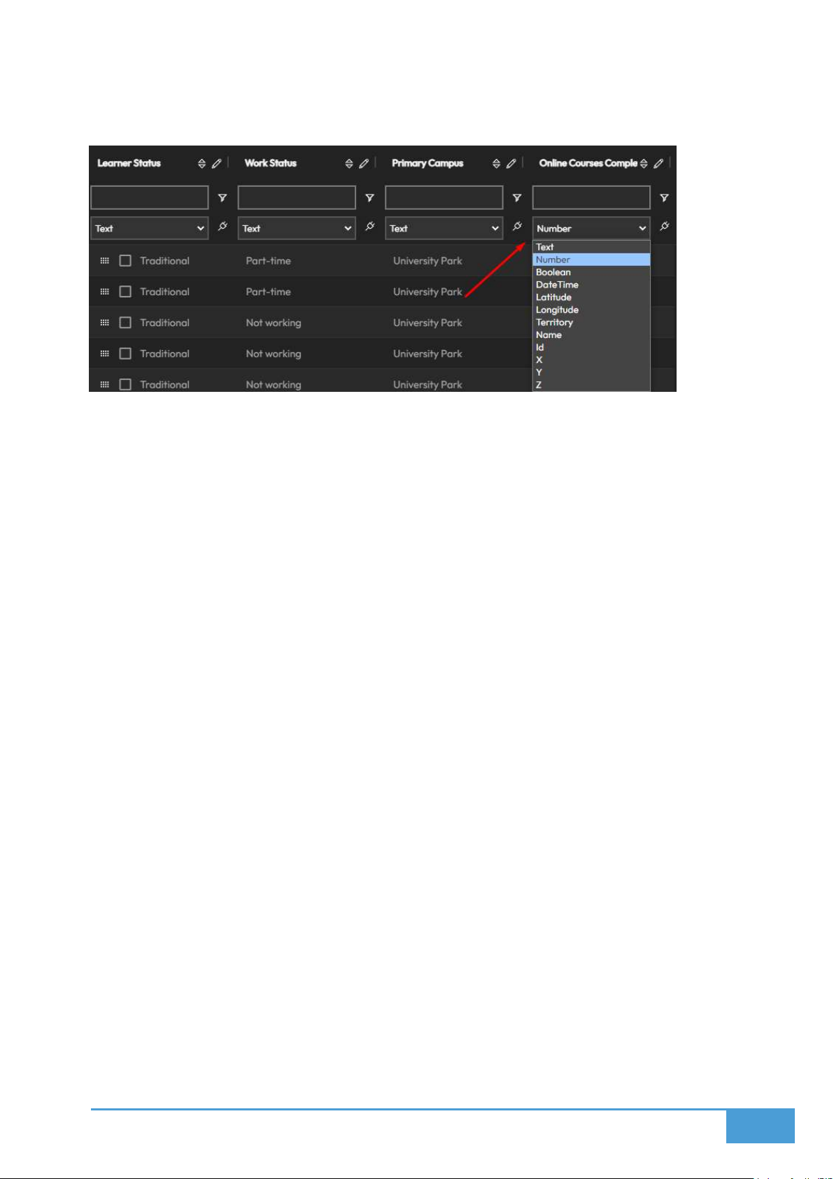
36
Note: For file based sources, Lygos determines the format automatically. The only exception is
spreadsheets, where you must manually assign a type for each individual column.
5.2.1 Summary of Data Tags:
Dimensions: This represents the number of columns or value fields in your data.
Visualizations like Boxplot, Candlestick, Chart3D, ParallelLine, ParallelScatter, and
ThemeRiver require two or more dimensions. Options like Chart, Funnel, Gauge,
Indicator, Pie, Polar, Radar, and Timeline need at least one dimension.
Temporal: This indicates data containing DateTime values. It is required for any
visualization that supports animation.
Collection: This tag applies when data is structured as an array or dictionary. While it
does not restrict specific visualizations directly, it can impact your available dimensions.
Spatial: This denotes geographical GIS data requiring latitude and longitude coordinates.
It is necessary for map visualizations utilizing marker, icon, cluster, or heatmap layers.
Identifier: This tag means the data contains a specific name or ID, which is required for
map tracking layers.
Territorial: This identifies choropleth map data and requires a specified territory like a
country, city, or region.
PointCloud: This represents Lidar data and strictly requires X, Y, and Z coordinates to
function.
Graph: This denotes data containing nodes and edges, required for Graph and Sankey
visualizations.
Tree: This tag applies to flat or nested tree structures used in Tree, Treemap, and
Sunburst visuals.
Sensor: This requires a name and a reading value to properly feed Sensor visualizations.
Geojson: This utilizes GeoJSON or KML files specifically for map layers.
Messages: This format handles events or messages that require a title and a
description, with optional string categories.
Page 37
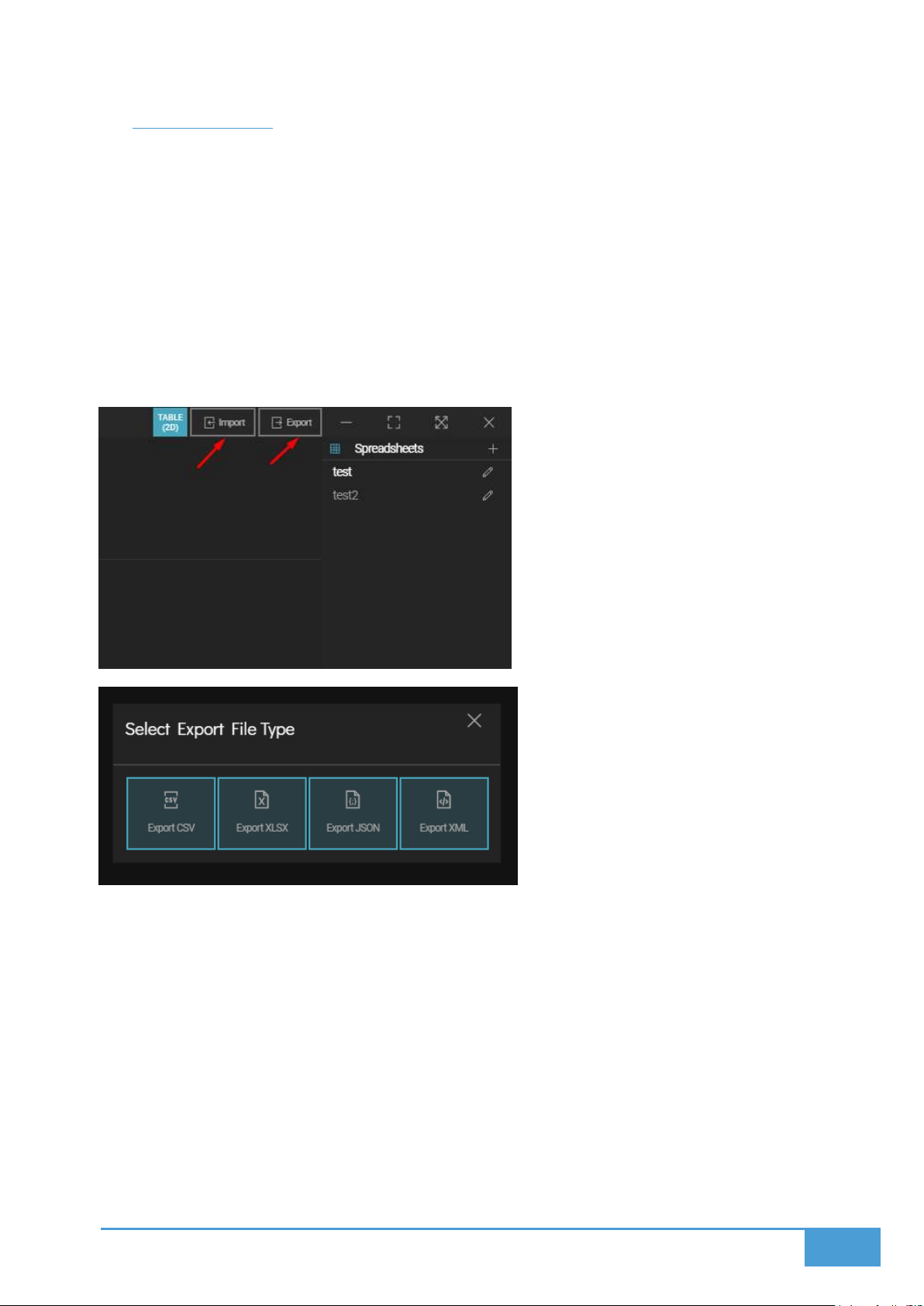
37
5.3 SpreadSheet
The Spreadsheet tool functions as a local data source built specifically for handling and editing
tabular information. Once populated, this data feeds directly into your video wall visualizations
to construct map layers and charts.
5.3.1 Importing and Exporting
Supported Formats: You can bring in or export your spreadsheets utilizing CSV, XLSX,
JSON, and XML file types.
Exporting: When you are ready to export your information, you must specify your chosen
format among CSV, XLSX, JSON, or XML.
5.3.2 Editing the Table
Adding and Removing Rows:
Add Rows: Simply press the Add Row button located on the bottom menu bar to insert a
new line.
Remove Rows: Highlight the rows you wish to delete and press the Remove Row button.
Page 38
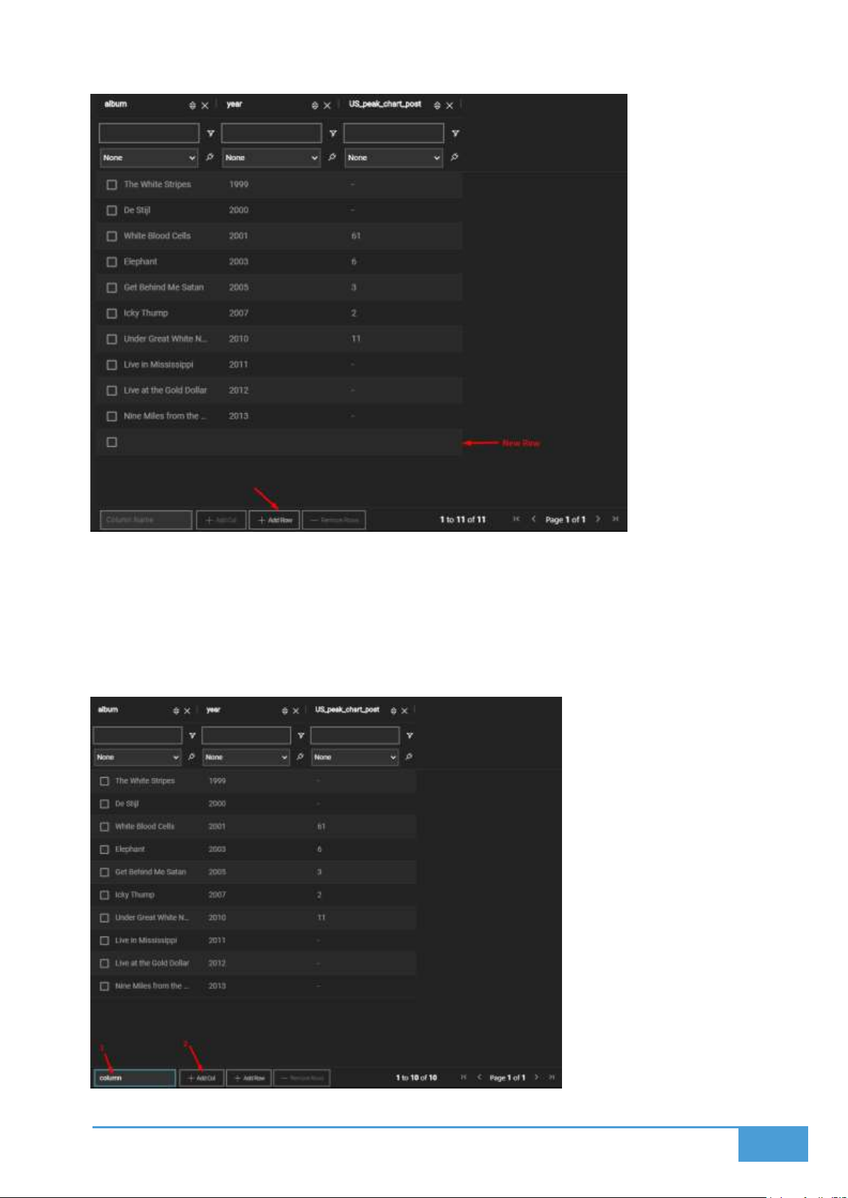
38
Adding and Removing Columns:
Add Columns: Type in your desired column name and press the Add Col button to create
it.
Remove Columns: Press the X icon situated in the top right corner of any column to
delete it.
Page 39
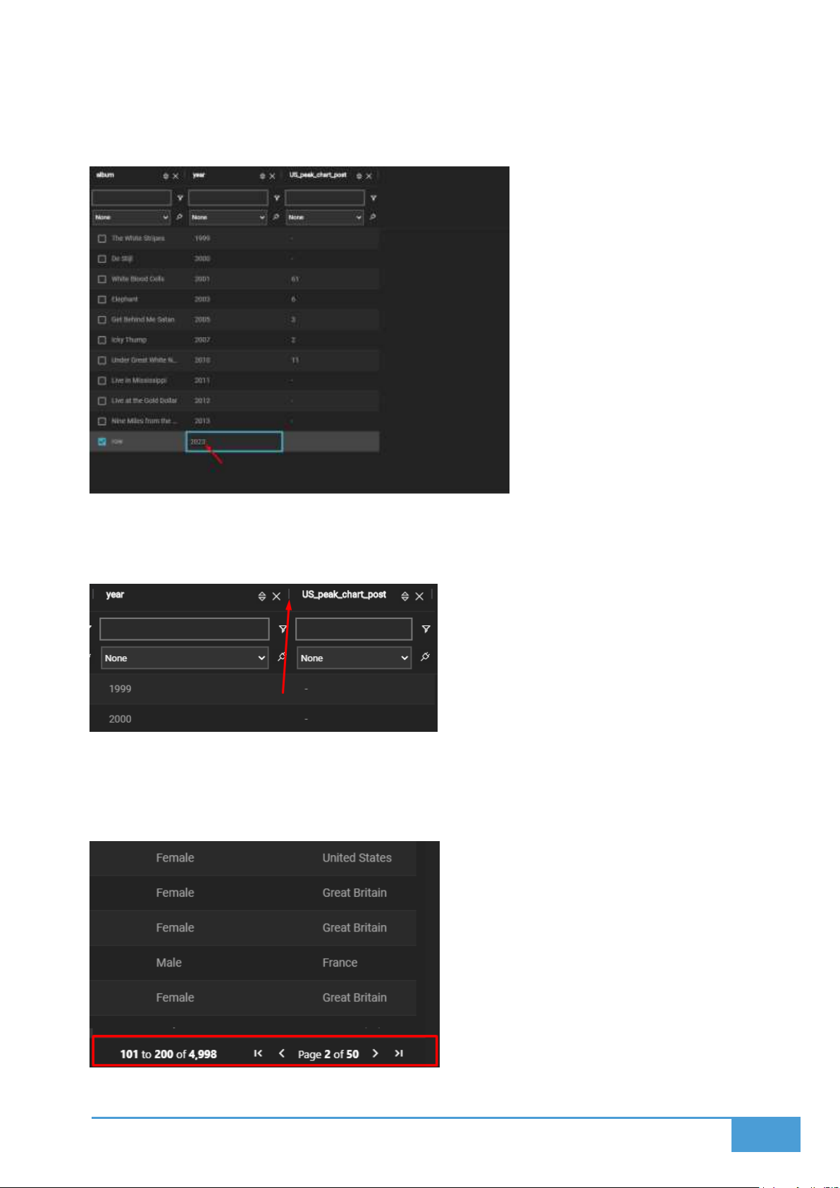
39
Editing Cells:
Click on any individual cell and type your new value to update its contents.
Resizing Columns:
Click and drag the vertical separators between columns to manually adjust their width.
Navigating the Table:
Utilize the pagination controls situated at the bottom of the editor to flip through pages
or skip immediately to the beginning or end of your document.
Page 40
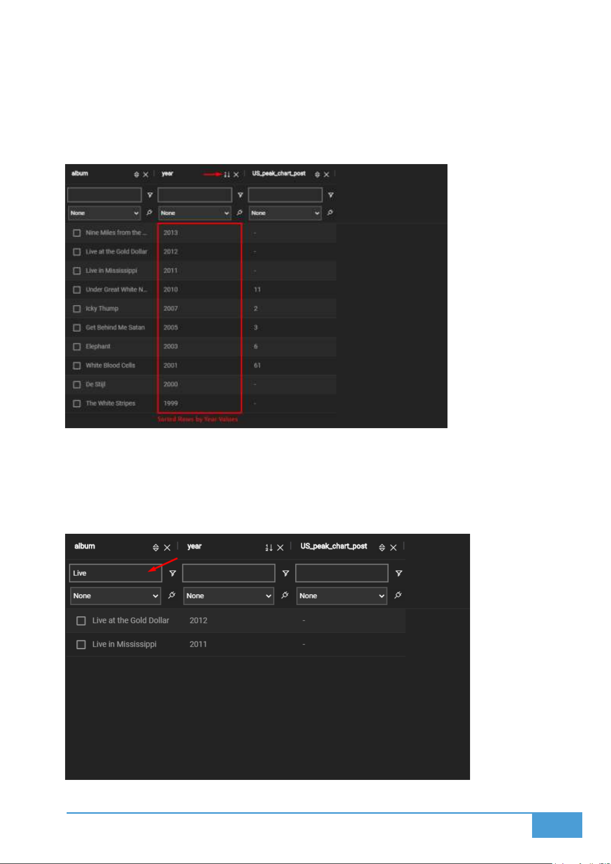
40
5.3.3 Sorting and Filtering
Sorting Rows:
You can organize your rows by picking a specific column and selecting either
descending or ascending order.
Filtering Rows:
You can filter your rows based on specific cell values. Keep in mind that applying filters
within this editor does not alter the data being sent to your active maps or visualizations.
You can customize these filters utilizing logical operators and search strings.
Page 41
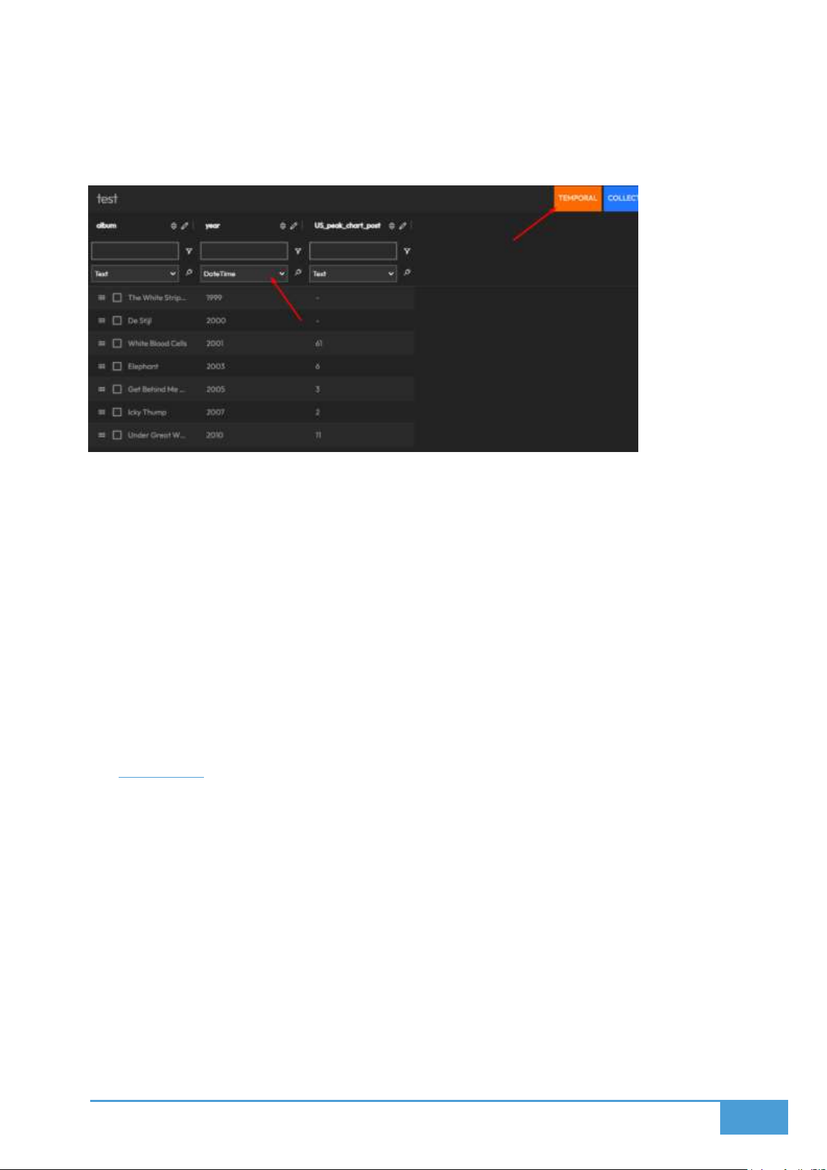
41
5.3.4 Data Formats and Visualization Integration
Assign Data Formats: You must assign specific data formats to your columns before
they can be utilized in visualizations.
Examples:
o Labeling a column as Time unlocks temporal animations within your
visualizations.
o Labeling a column as Coordinates permits the data to function correctly on map
layers.
DataFormat Tags: These indicator tags are visible in the top right corner of your editor
and display the formats currently supported by your source.
o Certain visualizations demand specific tags to function properly.
o If your data source is missing from the visualization selection menu, you should
verify that it possesses the required tags.
5.4 GeoData
GeoData acts as a local editor and data source specifically for the GeoJSON format, allowing
you to manipulate and import GIS data. This information is primarily used to populate GeoJSON
layers on your video wall maps.
Note: Because this is strictly a data source and not a visualization editor, any map settings you
adjust here, such as the view center or styling, are temporary. These visual settings will not
translate to the final visualizations utilizing this data.
5.4.1 Importing and Editing GIS Data
You can export or import your GIS files utilizing KML and GeoJSON formats. You also have the
option to generate a completely blank map and manually construct elements using either the
map interface itself or the JSON editor panel located on the right.
Page 42
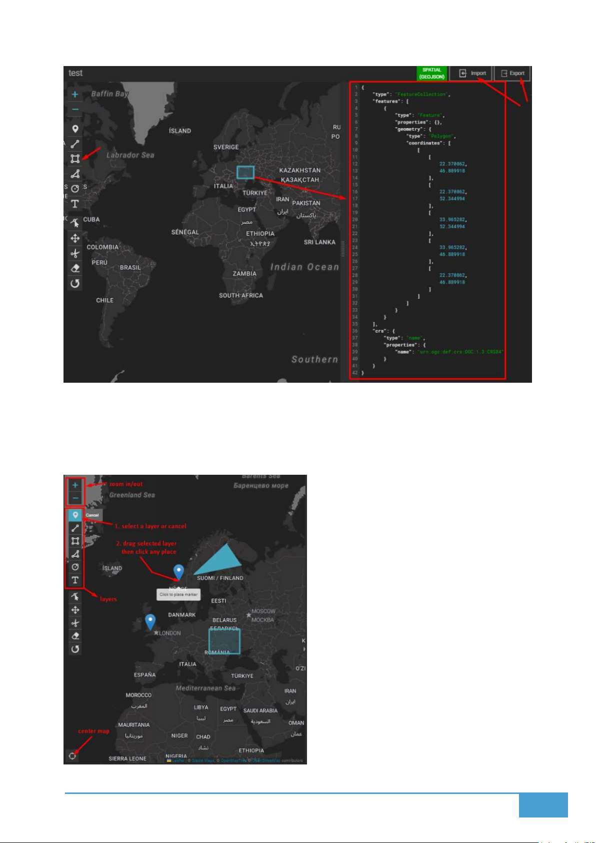
42
5.4.2 Adding and Editing Layers
The left menu within the map editor provides tools to modify or add specific layers, including
polylines, polygons, and markers. You can also use this area to establish a default center view
and adjust your zoom level.
Page 43
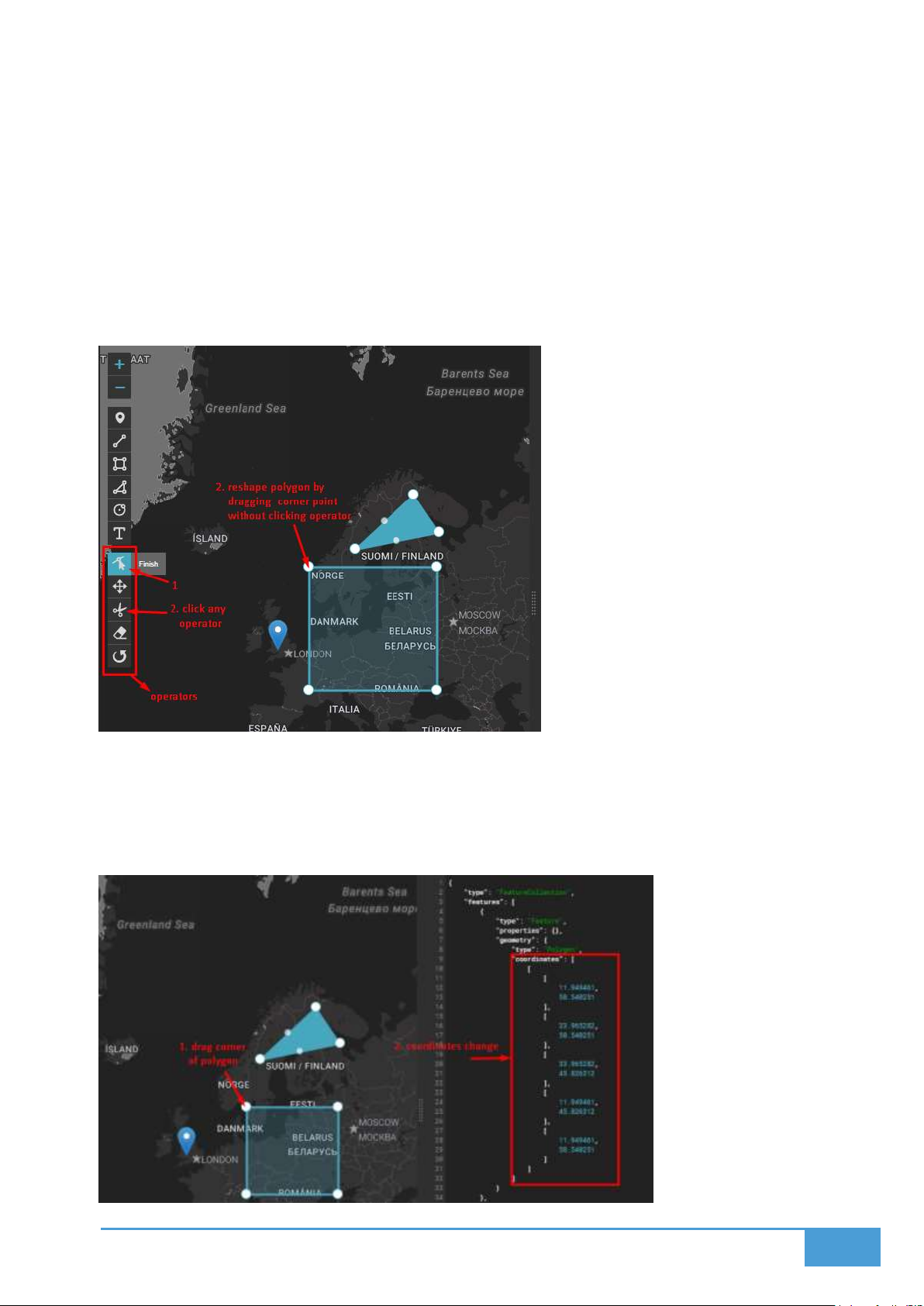
43
5.4.3 Layer Tools
Pressing the Edit Layers button unlocks several manipulation actions:
Cut layers
Drag layers
Remove layers
Rotate layers
5.4.4 Dynamic Map and JSON Interaction
Whenever you make a visual change to the map, the corresponding JSON data on the right
panel updates in real-time. Conversely, altering the raw JSON data will instantly update the
shapes and layers on the visual map.
Page 44
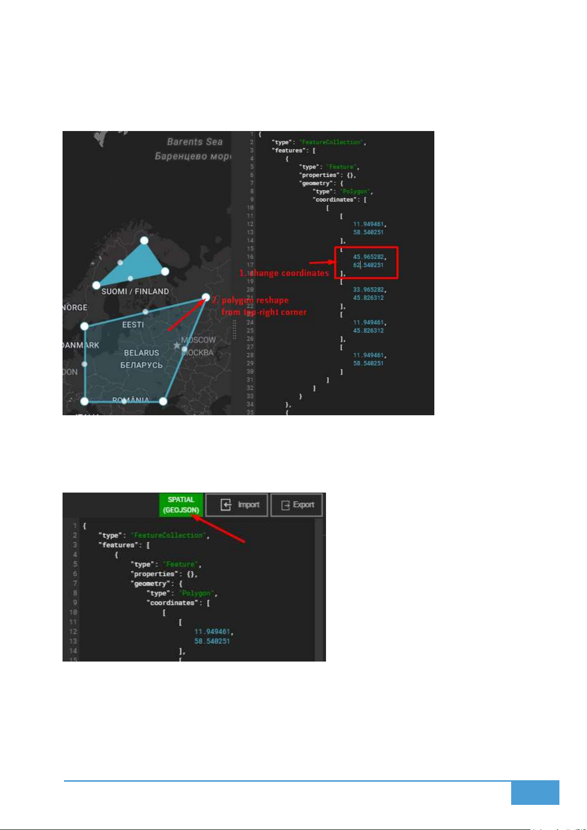
44
5.4.5 JSON Editing
Typing new values directly into the JSON editor immediately repositions or alters the properties
of your map layers.
5.4.6 Supported Formats
This specific data source exclusively supports spatial information structured in the GeoJSON
format.
5.4.7 Adding Properties to Map Elements
If you want to attach specific data values to your map elements, your GeoJSON features must
contain properties. Imported files may already have these properties attached to their features.
If they are missing, you can insert them manually via the JSON editor. Once added, these values
become available for your maps and visualizations.
Page 45
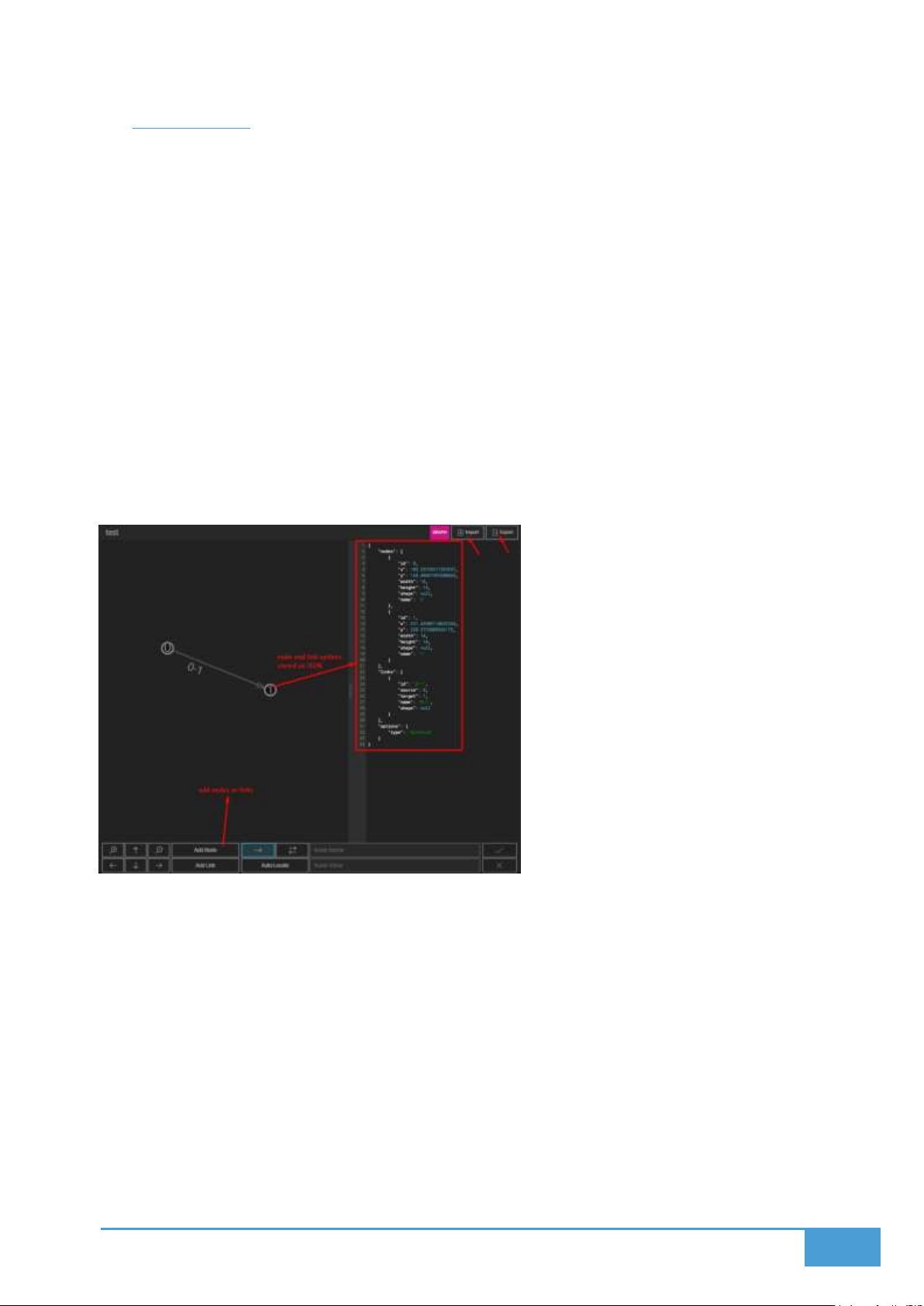
45
5.5 GraphData
GraphData serves as your local editor and source for graph based information. This data type
feeds directly into Sankey and Graph visualizations on your video wall.
5.5.1 Importing and Editing Graph Data
You can bring in or export your graph files using JSON, GRAPHML, and GEXF formats. You can
also launch a blank canvas and construct your graph manually by dropping links and nodes, or
by coding them directly into the JSON editor.
5.5.2 Adding Nodes and Links
Adding Nodes:
Activate the Add Node toggle located on the bottom menu. Next, simply click any empty space
on your graph canvas to drop a node into that exact spot.
Adding Links:
To connect two points, activate the Add Link toggle, pick your starting node, and drag the
connection over to your destination node:
Mouse Input: Click your source node, hold the button down while dragging to the target,
and release to connect.
Touch Input: Tap the source node, slide your finger to the destination node, and lift to
connect.
Page 46
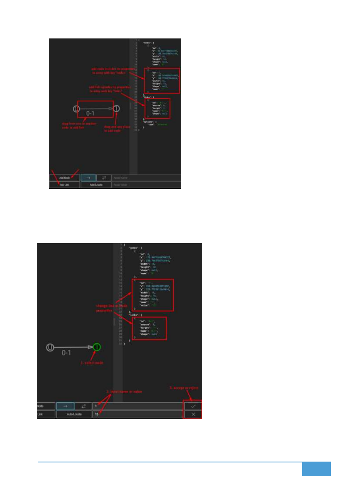
46
5.5.3 Editing Nodes and Links
Node Properties:
You can modify the Value and Name of any node by selecting it and utilizing the bottom menu
to input your new data.
Link Properties:
You can define your links as undirected or directed by adjusting the setting in the bottom menu.
Page 47
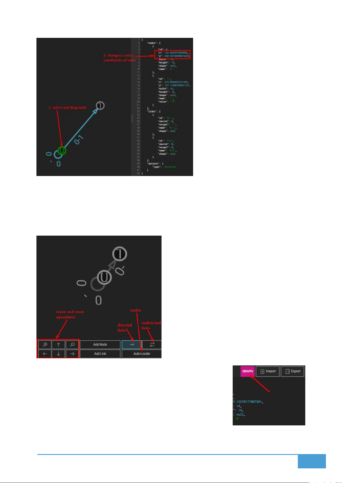
47
5.5.4 Auto Locate Feature
The Auto Locate function automatically calculates and reorganizes the positions of all your
nodes based on their connecting links.
Warning: Once triggered, this reorganization cannot be undone!
5.5.5 Supported Data Format
This editor strictly utilizes the Graph format, which is essential for
Graph Visualizations and Sankey diagrams.
Page 48
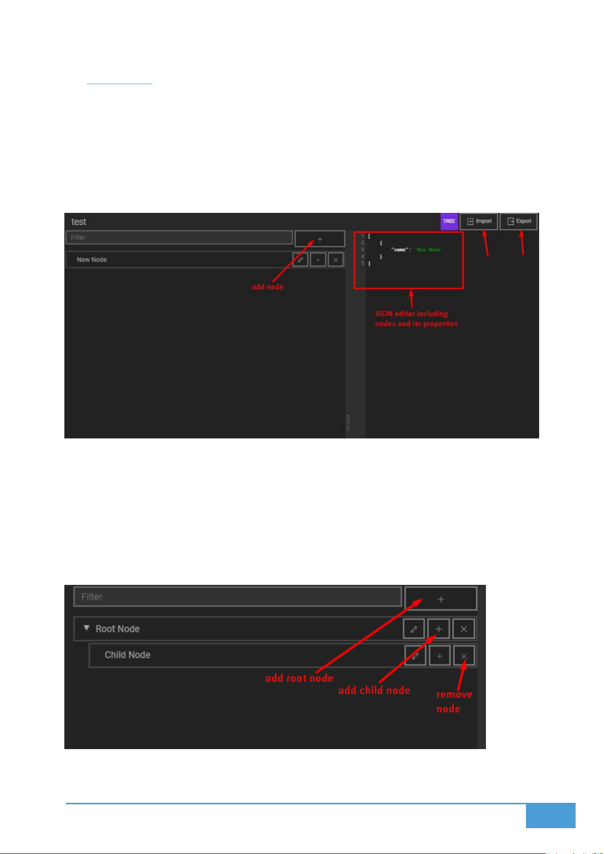
48
5.6 TreeData
TreeData operates as a local editor and source for hierarchical tree structures. This specific
data feeds your Sunburst, Treemap, and Tree visualizations.
5.6.1 Importing and Editing Tree Data
You can export and import your tree files exclusively in the JSON format. You may also open a
blank tree structure and manually append child nodes.
5.6.2 Adding and Managing Nodes
Adding Nodes:
Add Root Node: Press the plus button located in the top frame to generate a new root
node.
Add or Remove Child Nodes: Utilize the remove or add buttons situated on the right side
of any existing node to manipulate its children.
Page 49
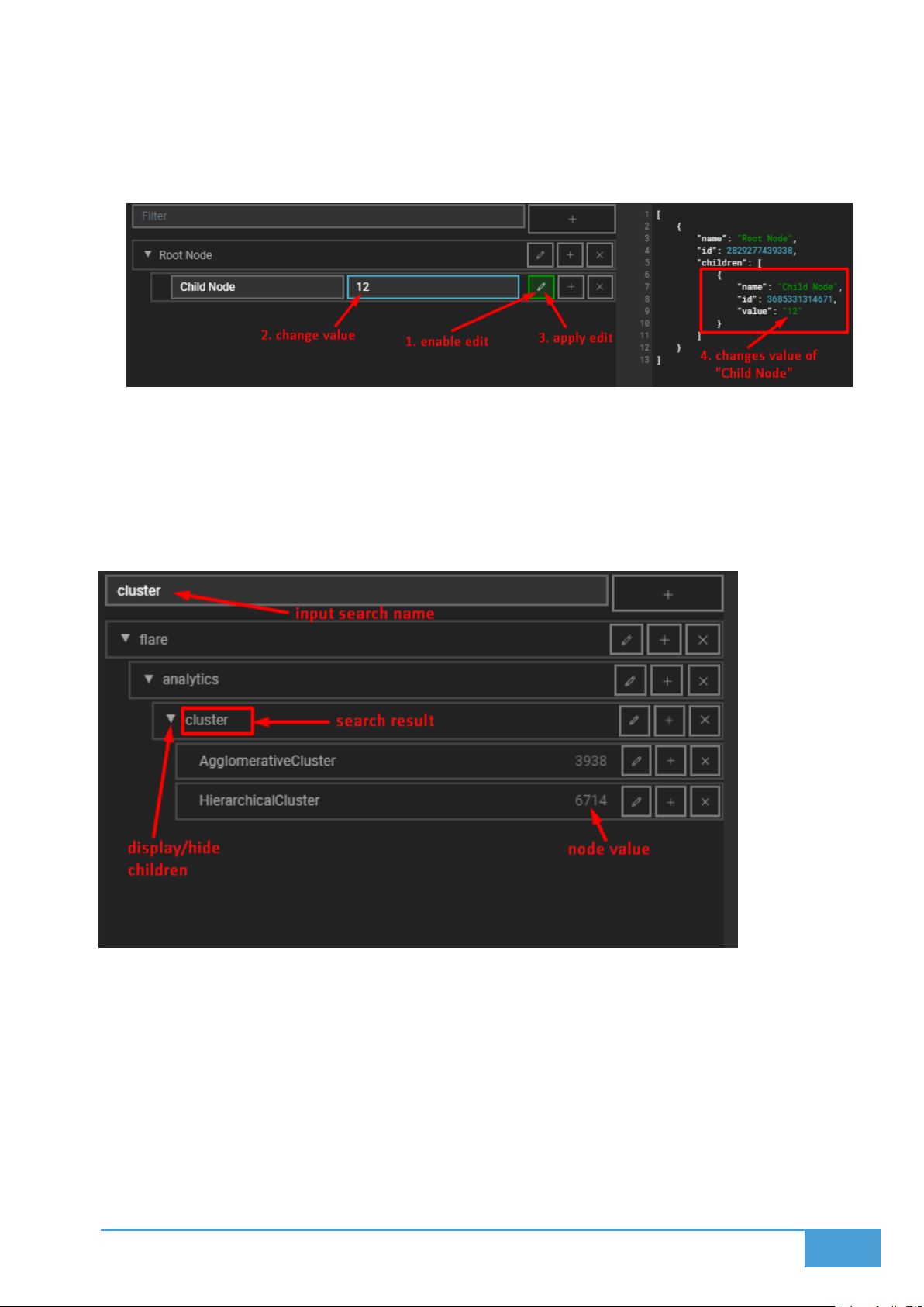
49
Editing Nodes:
Edit Name and Value: Press the pen icon to alter the assigned value and name of your
selected node.
5.6.3 Viewing and Filtering Nodes
Display or Hide Child Nodes: You can easily collapse or expand the visibility of any
parent node's children.
Filter Nodes by Name: Utilize the search filter to quickly locate specific nodes based on
their assigned names.
5.6.4 JSON Editor Integration
You can modify node values, names, and other custom fields directly within the JSON editor
panel.
Root nodes populate as objects within a primary array.
Child nodes exist inside their parent's object under a dedicated children key.
Page 50
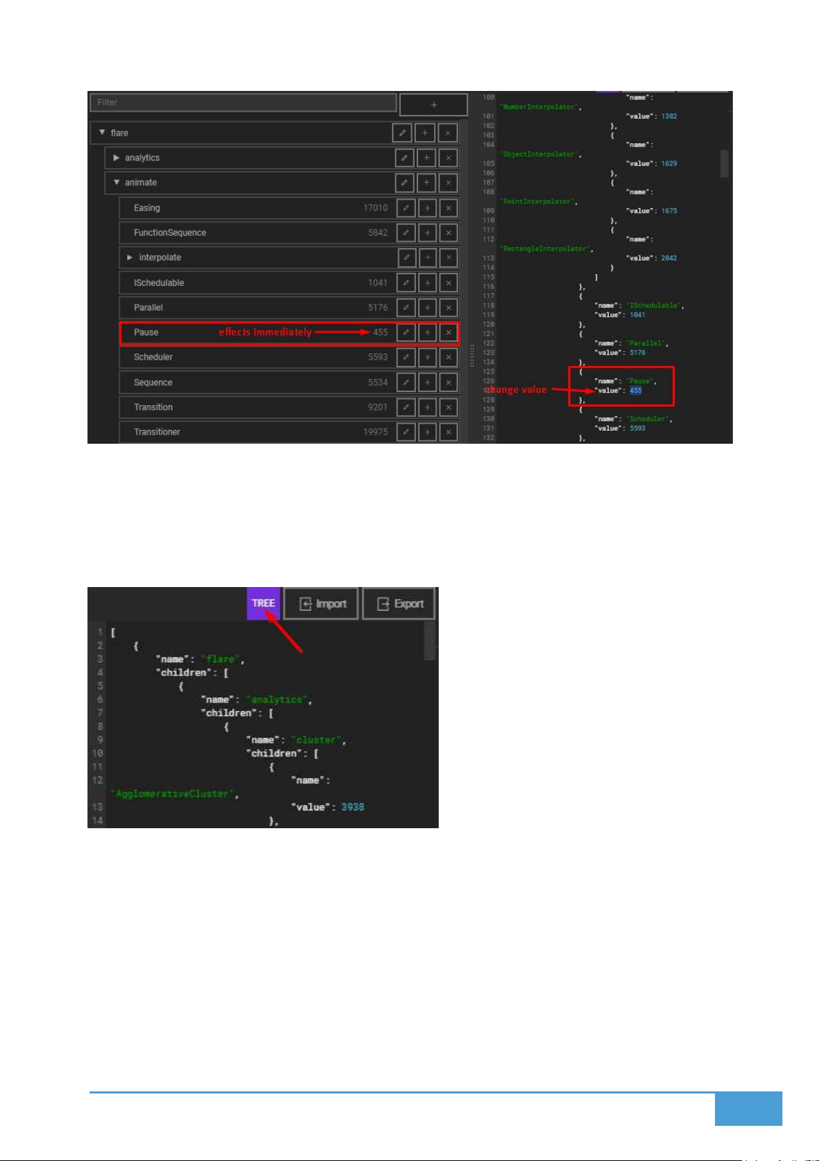
50
5.6.5 Supported Data Format
This tool exclusively outputs the Tree data format, which is required for Sunburst, TreeMap, and
Tree Visualizations.
Page 51
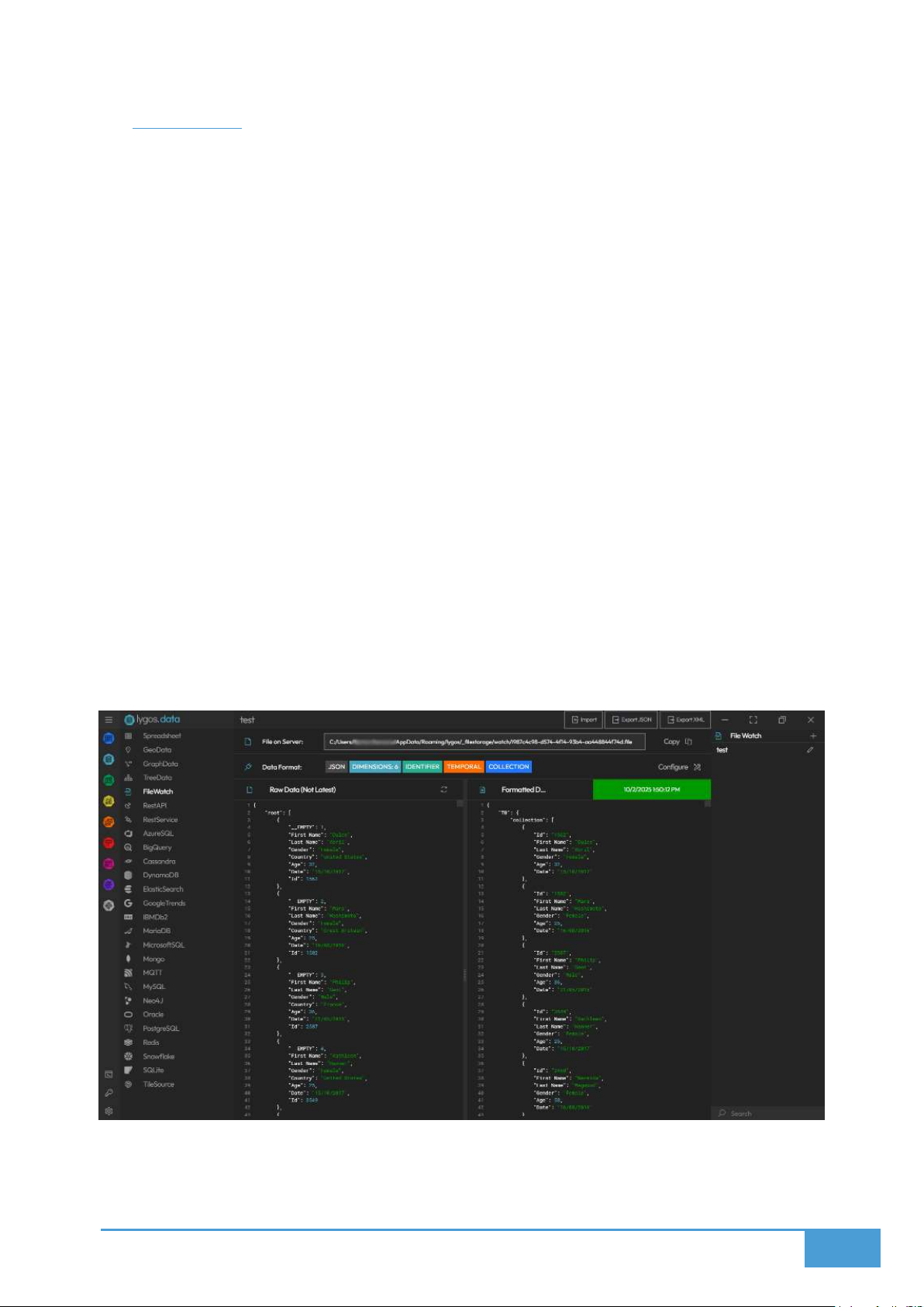
51
5.7 FileWatch
The FileWatch tool allows you to monitor specific files stored on your server and utilize them as
dynamic data sources. Whenever the watched file undergoes a change, Lygos processes it as a
data update and feeds it directly to the visualizations on your dashboards.
Supported File Types
CSV
XLSX
JSON
XML
TXT
Live Data Updates Once you import a file, the FileWatch system creates a copy on the server
and monitors it continuously. Any external edits or changes made to this server copy are
automatically pushed to your active visualizations in real-time.
Use Cases If you utilize an external analytics process that constantly dumps new information
into a file, you can link Lygos to watch that specific document. You can specify the exact format
of this file using the Data Format Tool. The tool converts the file contents into JSON format so it
can be structured and read easily by the software.
Page 52

52
5.8 Database
You can connect directly to a massive variety of databases to stream information to your video
walls.
Supported Databases
Relational: Oracle, MySQL, Microsoft SQL, PostgreSQL, SQLite, MariaDB, IBM DB2, Azure
SQL, Google Bigtable, and Snowflake
NoSQL: MongoDB, Redis, Amazon DynamoDB, Cassandra, and Neo4J
Search Engines: Elasticsearch
Key Features
You can establish multiple unique queries for every connected database.
Every query counts as its own Data Source that can be assigned to your visualizations.
Connection parameters will vary depending on the specific database type you are using.
Query Options: You can input specific connection options like targeting a particular table
or collection.
Database Query: You have a dedicated pane to enter the exact query you wish to
execute.
Polling Frequency: You completely control how often Lygos checks for refreshed
information.
Data Window Size: This dictates how many past results the system stores in memory,
which is essential for data animation. If your data lacks DateTime values, the system
uses the exact time it was received instead. For instance, polling every minute with a
window size of 60 gives you a full hour of animated data points on your maps.
Data Polling Mode: You can set your query to run On Demand or On Background. On
Demand pulls data temporarily and only when a visualization is actively rendering it on
screen. On Background pulls data persistently and saves your data window even if the
application closes or relaunches.
Data Format: You determine the structure of incoming database results using the Data
Format Tool.
Preview Results: You can view the Raw Data to see exact query results or database
errors, and you can view the Formatted Data to see exactly how your source will look
before applying it to a layout.
Page 53
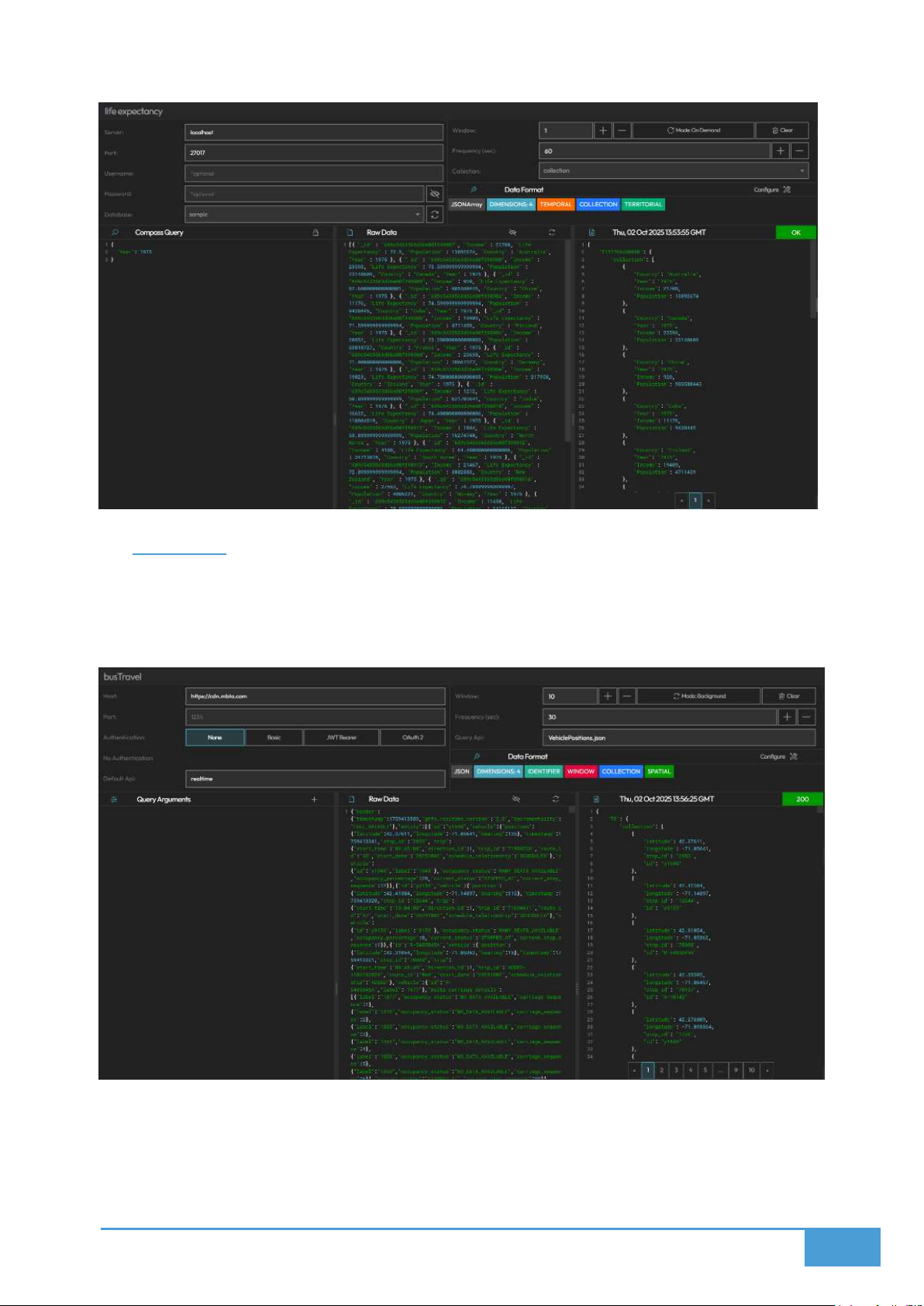
53
5.9 Rest API
The Rest API feature connects to external endpoints to periodically poll information, while the
Rest Service feature allows outside systems to post information directly to local APIs hosted on
your Lygos Server. Both methods relay data updates to the visualizations on your video walls.
Rest API: You can establish connection options via a URL link or input them manually into the
configuration menu. Lygos supports three Basic Authentication types:
Basic (Username and Password)
Page 54
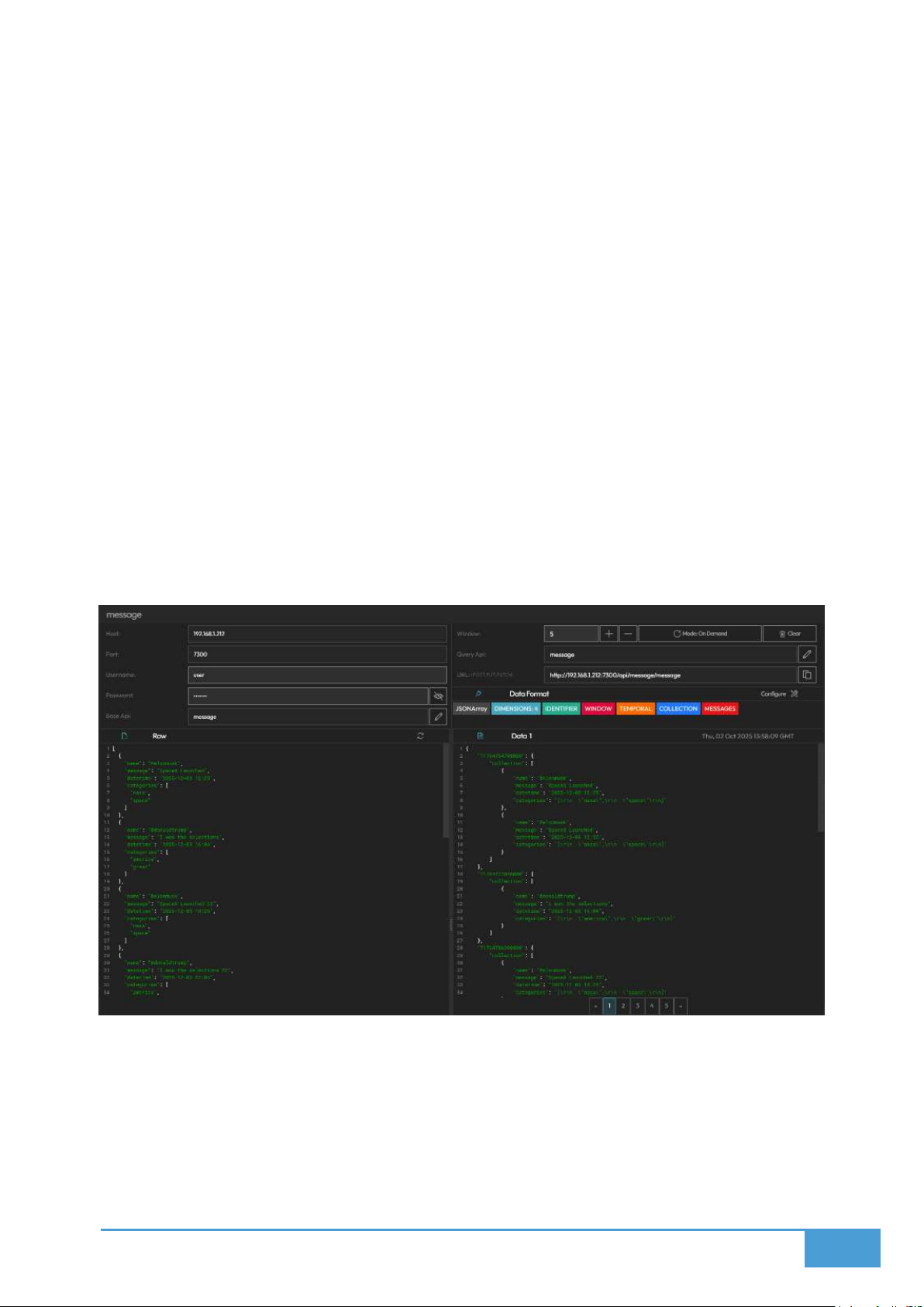
54
JWT Bearer (Token)
OAuth2 (API Key)
You can define the Default API, the Query API, and any Query Parameters. The software allows
you to create multiple queries targeting the same host, port, authentication, and API. Additional
configurations include:
Polling Frequency: Controls how often data is refreshed.
Data Window Size: Dictates how many past results are stored for animation purposes.
Without DateTime values, the receival time is used.
Data Polling Mode: Choose between On Demand for temporary active polling or On
Background for persistent polling.
Data Format: Formats the incoming feed via the Data Format Tool.
Rest Service: You can generate local Rest API points on your Lygos server utilizing your server
IP address and a specific port. External clients can then Post, Put, and Patch to this URL. Clients
posting data to this endpoint must provide Basic Authentication credentials. Because the data
arrives directly at this endpoint, it processes according to your Data Format immediately and
relays to your visualizations without relying on a Polling Frequency. Additional configurations
include:
Data Window Size: Dictates how many past results are stored for animation purposes.
Data Polling Mode: Choose between On Demand or On Background data retention.
Data Format: Determines how the incoming post is structured.
Page 55
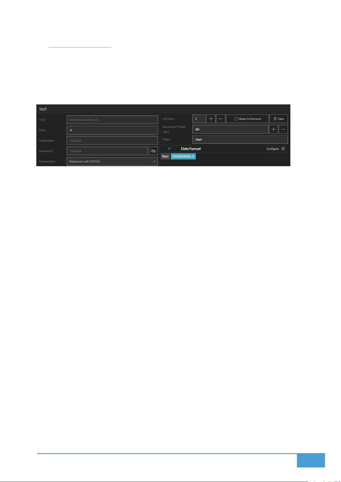
55
5.10 Sensor (MQTT)
This module allows you to subscribe and connect to real-time data feeds utilizing the MQTT
protocol. It is the perfect solution for pulling live data from sensors, IoT devices, or any other
external system utilizing MQTT. The setup process functions very similarly to configuring a
standard Database. The continuous live updates streaming from your sensors can be routed
directly into the maps and visualizations active on your video walls.
Host and Port: The URL address of your MQTT Broker and The specific port of your
MQTT Broker.
Connection: Choose from MQTT Unsecure, MQTT with TCP or SSL, Websocket
Unsecure, or Websocket with TCP or SSL.
Username and Password: Input these credentials if authentication is required.
Reconnect Timer: This function pings the connection at your defined second interval
and automatically resubscribes if the connection drops.
Data Window Size: This dictates the volume of past results kept in memory.
o This stored window is essential for driving visualization animations.
o If your incoming data lacks datetime values, the system will substitute the exact
receival time to allow for temporal animation.
o As an example, if you poll data every minute and set a window size of 60, you will
have a full hour of animatable data points.
Data Polling Mode: Choose how your query operates in the background.
o On Demand keeps data temporary, only polling when an active visualization is
currently displaying it on a screen.
o On Background makes the data persistent, polling constantly and saving the
window memory even if the application is restarted or closed.
Data Format: Utilize the Data Format Tool to structure the incoming MQTT feed.
Preview Results: Validate your stream instantly.
o Raw Data displays the unedited incoming MQTT feed.
o Formatted Data shows the finalized structure after your formatting is applied.
Page 56

56
5.11 Data Window
The Data Window is a core configuration setting that dictates exactly how the software
manages, retains, and receives all incoming data streams. You can tweak these parameters to
ensure your dashboards always have the proper historical context while maintaining optimal
performance. Data sources including Sensor MQTT, RestService, RestAPI, FileWatch, and
Databases all rely on this window parameter. As new data flows into a document, it is stored in
the window; once that window reaches maximum capacity, the oldest data point is deleted to
make room. You can define this maximum size by the total number of elements, raw file size, or
a set time duration. The primary purpose of this window is to power data animations across
your video wall. A window size set to one means the system discards everything except the
absolute newest data point, resulting in a strictly real-time display. Expanding the window size
and activating animation mode allows users to scrub through historical points or watch the data
evolve over time. These animations synchronize across the entire video wall, meaning all maps
and visuals will animate together across a shared timeline via Temporal Synchronization.
5.11.1 Configuration Settings
Window Size: This limits the absolute number of recent data updates the system holds.
Setting the Window Size to 3 means Lygos keeps the three newest updates and purges
anything older. This parameter is vital for Multi dimensional Charts and Animations.
Window Capacity: This limits the total volume of retained data by megabytes. If the
incoming data pushes past this MB limit, the oldest items are deleted to maintain the
threshold.
Window Duration: This sets a strict lifespan for your data. Any stored update that ages
past your defined duration is automatically deleted, ensuring your window only contains
relevant recent history.
5.11.2 Operation Modes
Lygos offers two distinct modes for handling your data fetching operations:
On Demand: Data is only accepted or fetched when it is actively needed. This happens
when a visualization tied to the data is live on a screenspace, or when a user has the
management client or editor actively open.
Background: Data fetching begins automatically the moment your Lygos server boots
up, and it continues to collect uninterrupted for as long as the server runs. Crucially, the
data stored in this mode persists through complete server shutdowns and restarts,
guaranteeing you never lose your historical context.
Page 57

57
6 MAPS
Lygos allows you to deploy interactive, multiple layer, and real-time or animated maps across a
portion or the entirety of your video wall. This dedicated GIS mapping module is a critical
component for executing visual data analytics within control room environments. Because the
system utilizes distributed screen nodes, it can render these maps at full scale and resolution,
achieving over 100 million pixels while seamlessly displaying thousands of individual elements
or markers.
Operators can easily pan and zoom the video wall maps utilizing their control and management
clients. Any interactions, user inputs, or configuration adjustments are instantly mirrored on the
live video wall displays.
Key Features
Operators can import data and apply specific filters.
You can construct map layers utilizing your datasets and created filters.
You have full control to configure each layer.
The system supports deep interaction and data animation.
6.1.1 Data & Logic
Before you can utilize geographical GIS information on your maps, you must first import the
data into the Data Module using a supported geographical format. Once processed, these
datasets become available to load directly into the Maps module. To understand the specific
data requirements for each layer type, simply click the circled 'i' icon located in the header of the
Data Tab to view examples and prerequisites.
6.1.2 Datasets & Filters
This section showcases all of your currently loaded data sources.
Use the toggle switch to activate the specific filters or datasets you wish to render on
the map.
Activating a dataset automatically reveals the Add Layer menu.
Within the Add Layer menu, you can:
o Assign a name to your new layer.
o Pick an appropriate layer type that matches your dataset's underlying structure.
o Apply various conditions and multiple filters to refine the dataset.
Any filters you generate can be quickly toggled on or off as your requirements change.
Page 58

58
6.1.3 Layers
The Layers tab provides a comprehensive list of every layer currently added to your map.
You can toggle the visibility of individual layers to hide or show them.
You can reorganize their visual stacking order by dragging and dropping them within the
list.
The designated Base Layer will always remain positioned on top of the stack.
Available Layer Types:
Tile Layer
Geo Json Layer
Territory Layer
Marker Layer
Icon Layer
Cluster Layer
Heatmap Layer
Tracking Layer
6.1.4 Settings
Animation Settings:
This section allows you to define the start and end times for your playback. These parameters
correlate directly to the time values present within your data. Therefore, setting a start time of
2023 and an end time of 2025 will animate the mapped data occurring strictly within that two
year window. The Animation Tab also provides controls for playback duration and other related
adjustments.
Base Layers:
Base Layer: This serves as the foundational tile layer for your entire map.
o You can select a pre existing layer or utilize a TileSource to generate a
customized tile background.
Base Overlay: This functions as an optional secondary overlay layer.
Preset Overlays: Traffic, Weather (Precipitation, Clouds, Wind, Temperature and
Pressure), Graticule and Day Night Cycle on Video Walls.
Layer Settings:
This area houses the general configuration options for your map layers.
Page 59

59
The available settings will shift dynamically depending on the specific layer type you
have selected.
6.1.5 Animation
The animation tab contains all of your playback controls. You may need to configure animation
settings prior to using this and also have temporal data for animations.
You can loop, stop, pause, or play your data animations.
You can modify the overall duration of the playback sequence.
You can crop the animation to focus on a highly specific time interval.
6.1.6 Import Layers
If you have meticulously styled layers that you frequently rely on across various maps, you can
utilize the import function to pull in those existing layers without needing to rebuild them from
scratch.
6.2 Multiple Data Sources
The Map Module empowers you to load and visualize information sourced from several
different geographical GIS datasets onto your video walls simultaneously.
You can load multiple data sources provided they utilize recognized geographical
formats, such as KML, GeoJSON, or CSV files containing coordinate columns.
The system allows you to fluidly transition between these different sources or stack
them across multiple layers, enabling you to thoroughly analyze and compare diverse
sets of information on a single, unified map.
How to Use:
1. Launch a Map Visualization from within the Visualization Editor.
2. Proceed to the Data section of the interface.
3. Add one or multiple compatible data sources to your project.
4. Click the circled 'i' icon to review the specific Examples and Data Requirements
associated with your chosen Layers.
5. Utilize the Toggle Switch to actively insert or remove these datasets from your visual
map.
6. Once a dataset is added, you can utilize it to construct Custom Filters, and subsequently
build new Layers derived from both those Filters and the original datasets.
Page 60
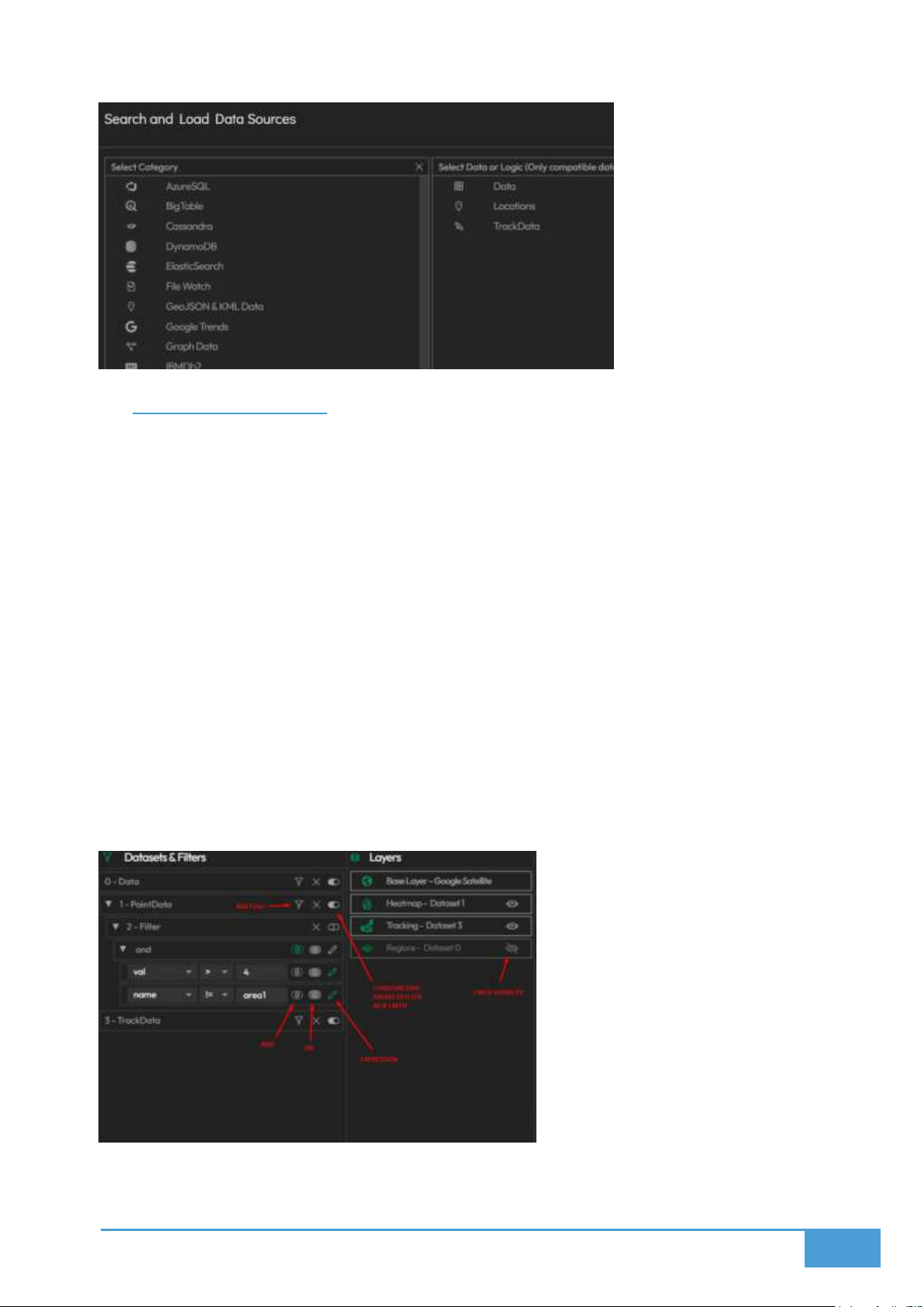
60
6.3 Filters and Layers
You can build specialized filters to narrow down and refine your map visuals based on specific
data properties.
How to Create a Filter:
1. Navigate to the Datasets & Filters tab within the interface.
2. Press the Add Filter Button located next to your chosen dataset.
3. Configure the following parameters:
a. Dimension: Pick a specific data field from your underlying dataset to evaluate.
b. Expression: Choose your desired comparison operator, such as =, >, <, or !=.
c. Value: Type in the exact value you wish the system to compare against.
4. You can construct highly complex filters by linking multiple conditions together using OR
and AND operators.
Page 61
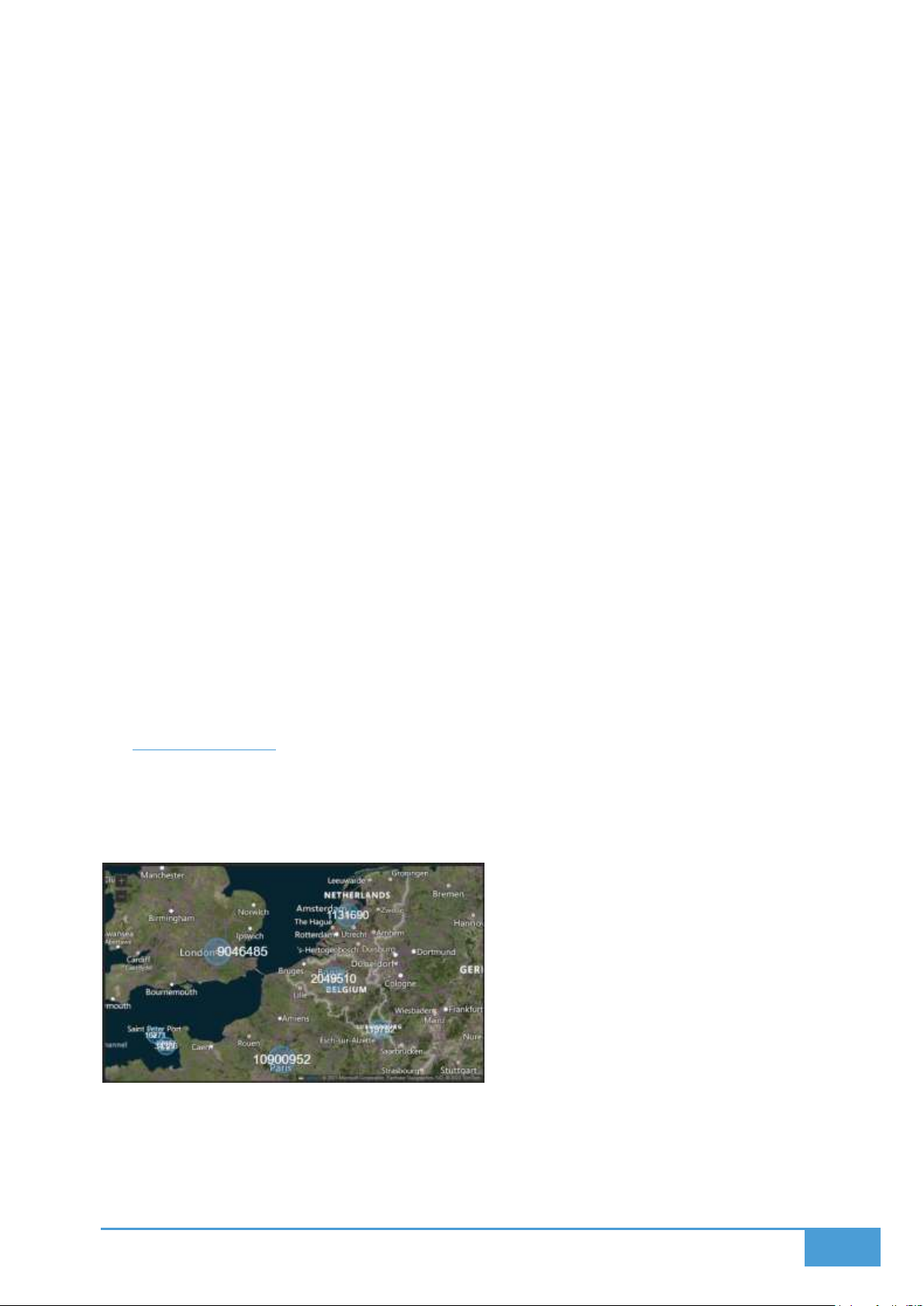
61
6.3.1 Layer Creation and Ordering
Both your original datasets and your custom filters can be deployed onto the map as
independent Layers.
Add a Layer:
1. Inside the Datasets & Filters tab, toggle your desired filter or dataset to the active "on"
position.
2. This action prompts the Add Layer tab to appear on screen.
3. You must provide:
a. A custom Layer Name
b. A specific Layer Type, keeping in mind that the available options are dictated by
your data's format.
4. Press Add to finalize and insert the layer onto your map.
Manage Layers:
You can manage, view, and reorganize your layers from within the Layers tab.
Simply click and drag the items in the list to alter their visual stacking order.
Click the eye icon to instantly hide or reveal a specific layer.
The system fully supports displaying multiple different layers simultaneously.
6.4 Marker Layer
The Map Marker Layer provides methods to display 3 dimensional spatial data as circular or
rectangular markers. These markers scale according to value of the marker and optionally show
the value within.
6.4.1 Marker Layer Example Dataset
As an example, consider a dataset tracking capital city populations. This dataset would include:
Territory: The name of the capital city.
Page 62
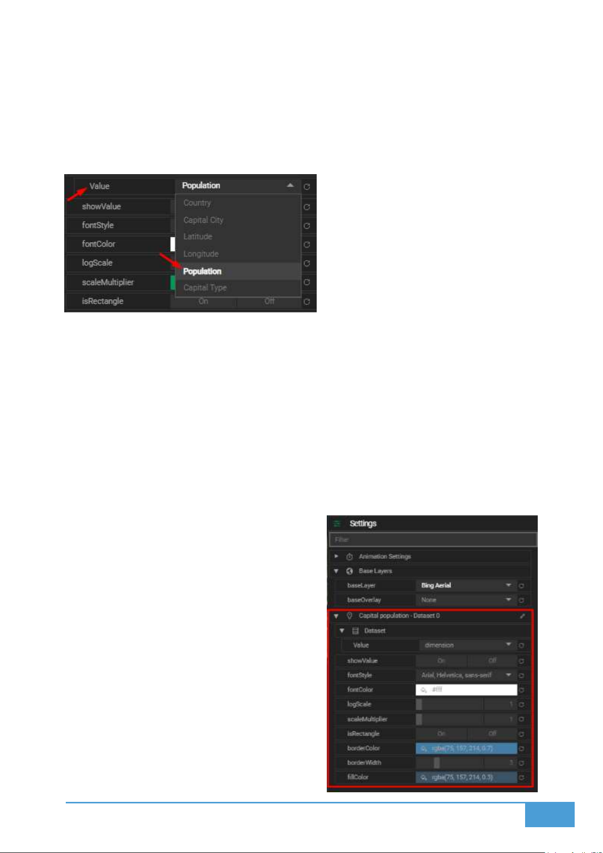
62
Latitude: The geographic latitude coordinate.
Longitude: The geographic longitude coordinate.
Population: The numeric value utilized to determine the size of the marker.
6.4.2 Getting Started
1. Load your chosen dataset into the system by following the standard data loading
procedures.
2. Navigate to the Layouts View and open the Marker Layer settings located within the
Settings tab.
3. Select the specific data dimension you wish to visualize, such as the Population column.
Once you assign the value dimension, the scaled markers will immediately populate across the
map.
6.4.3 Marker Layer Settings
You can extensively customize the behavior and appearance of your markers utilizing the
following configuration options:
Show Value: This toggle projects the
numeric value as visible text directly on top
of the marker.
Font Style: This allows you to select the
font family utilized for the displayed value
text.
Font Color: This defines the specific color
of the value text.
Log Scale: This applies logarithmic scaling
algorithms to the marker sizes, where a
value of 1 equals no scaling applied.
Scale Multiplier: This setting multiplies the
final size result after the logarithmic scaling
has been calculated.
Page 63
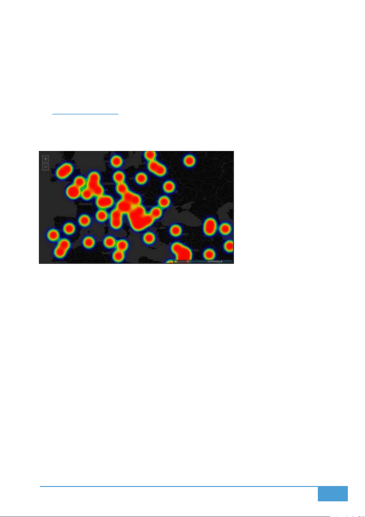
63
Is Rectangle: Enabling this option transforms the default circle markers into rectangles.
Border Color: This allows you to alter the outline color of your markers.
Border Width: This adjusts the pixel thickness of the marker's outline border.
Fill Color: This defines the interior color filling the marker shape.
6.5 Heatmap Layer
The Heatmap Layer translates coordinate based values into color coded gradients to effectively
visualize data intensity and concentration across geographic regions.
6.5.1 Getting Started
1. Load your dataset into the software using the standard import steps.
2. Navigate to your Layout View and access the Heatmap Layer Settings situated under the
Settings tab.
3. Within the Dataset configuration section, select a specific Value to drive your heatmap,
such as traffic volume, activity levels, or population.
The moment a value is selected, the system will automatically render the Heatmap based on
those values and their associated coordinates.
6.5.2 Heatmap Layer Settings
You can fine tune the behavior and visual style of your heatmap by adjusting the following
parameters:
Gradient: Establish a customized color gradient utilizing up to four distinct colors to
clearly represent varying levels of intensity.
Max: Determine the maximum point intensity, where higher numerical values generate
stronger visual heat points.
Page 64
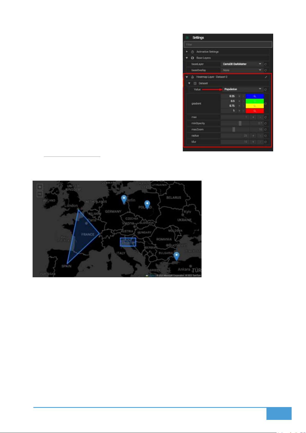
64
Min Opacity: Set the minimum transparency
threshold for the heatmap, which is highly useful
for crafting subtle data visualizations.
Max Zoom: Define the specific zoom level where
the data points reach their absolute maximum
intensity, which defaults to the map's overall
maximum zoom capability.
Radius: Adjust the specific radius of influence that
each individual data point projects onto the
heatmap.
Blur: Modify the blur level to sharpen or smooth
out the visual transitions bridging different heat
areas.
6.6 Geo Json Layer
The GeoJSON Layer can display polygons and markers similar to GeoJSON or KML formats.
6.6.1 Supported Data Formats
GeoJSON
KML
Once your spatial data is successfully loaded into an active layout, the GeoJSON Layer Settings
menu will populate under the Settings tab.
6.6.2 GeoJSON Layer Settings
You can heavily customize the behavior and visual aesthetics of your GeoJSON features
utilizing the following options:
Page 65
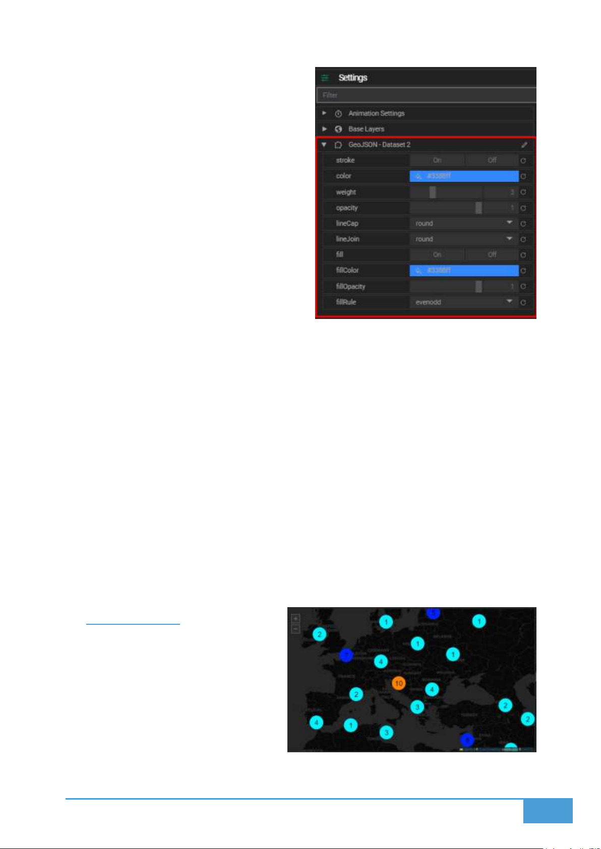
65
Stroke: Toggle the visibility of the stroke.
Setting this parameter to false
completely removes the borders from
your circles or polygons.
Color: This setting dictates the stroke
border color.
Weight: This defines the exact width of
the stroke measured in pixels.
Opacity: This controls the transparency
level of the stroke.
LineCap: This determines the visual
shape rendered at the end of a line.
Available options include square, round,
and butt.
LineJoin: This establishes the shape
rendered at the corners where lines intersect. Available options include bevel, round, and
miter.
Fill: Toggle the visibility of the fill located inside circles or polygons. Setting this to false
disables the inner fill entirely.
Fill Color: This parameter dictates the inner fill color.
Fill Opacity: This setting adjusts the exact transparency of the inner fill.
Fill Rule: This algorithm determines exactly how the interior space of complex shapes is
filled, offering nonzero and evenodd options.
6.6.3 Tips
Utilize property filters to specifically highlight features based on their underlying data,
such as a category or region name.
For significantly richer geographic visualizations, try combining your GeoJSON layers
alongside other distinct layer types.
6.7 Cluster Layer
The Cluster Layer aggregates markers into
clusters of markers and display number of
markers with a visual gradient.
6.7.1 Cluster Layer Settings
You can customize exactly how these
clustered data points render on your map:
Page 66
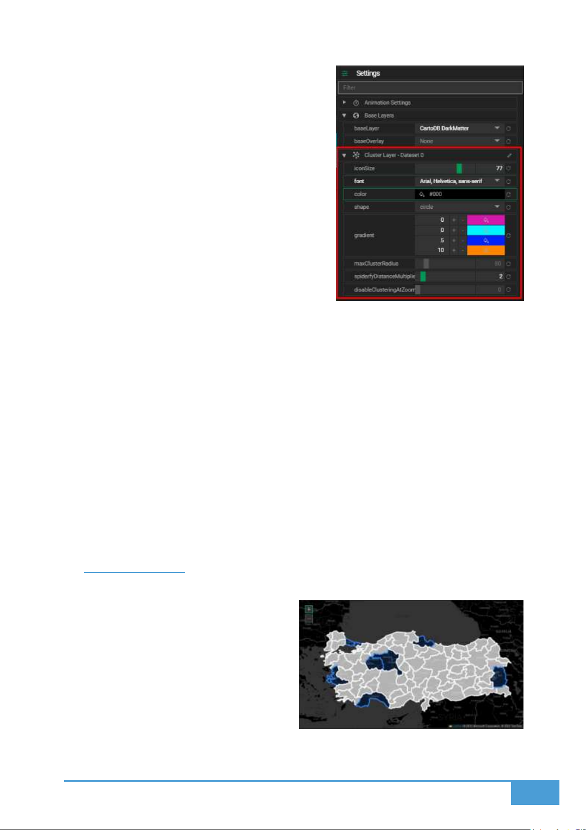
66
Icon Size: Adjust the physical size of the
rendered cluster icons.
Font: Modify the font family utilized for the
count labels displayed on the markers.
Color: Establish the font color for the marker
text.
Shape: Select a specific shape to represent the
cluster icon, such as a square or circle.
Gradient: Allocate specific color intervals to
visually differentiate clusters based on their
total size. The system provides four preset
options to help visually distinguish these scale
differences.
Max Cluster Radius: Define the maximum pixel
radius a cluster is allowed to span outward from its core center. Inputting smaller values
will generate more frequent, smaller clusters across the map.
Spiderfy Distance Multiplier: Increasing this numerical value forces the individual
markers to space further out when a cluster is clicked and expanded or spiderfied. This
is exceptionally useful when deploying large marker icons.
Disable Clustering At Zoom: Establish a strict zoom level threshold where clustering is
automatically disabled. Once the user zooms at or past this specific level, the unified
clusters break apart and the individual markers render separately.
6.7.2 Tips
Deploy clustering functionality for datasets featuring highly dense marker distributions
to drastically cut down on visual clutter.
Combine this tool alongside Marker Layers to simultaneously display detailed individual
points and broad cluster overviews depending on the active zoom level.
6.8 Territory Layer
Territory Layer is a choropleth map where
spatial data is administrative regions, such as
provinces, states, or countries instead of
coordinates. It displays corresponding value
for the region through visual color mapping via
gradient.
After loading your data into a layout and
designating Territory Layer, you can access the
Territory Layer Settings menu from the
Settings tab.
Page 67
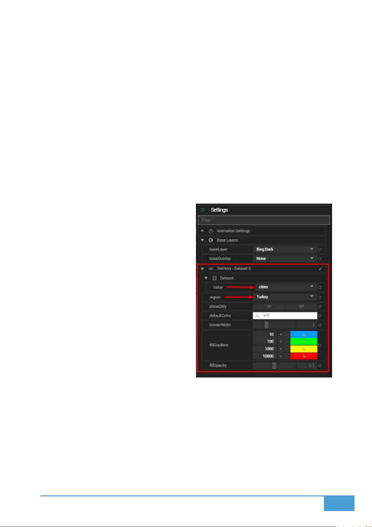
67
6.8.1 How to Visualize Your Data
To activate the Territory Layer:
1. Navigate to the Dataset setting.
2. Select a specific Value from your data source, which will be utilized to color the regions.
3. Choose the correct Region setting based on your data structure:
a. If your dataset utilizes country names, select World.
b. If your dataset utilizes regions or states, select the corresponding country.
Once configured, your data will render across the map regions accordingly.
6.8.2 Territory Layer Settings
Customize the visual appearance of your territory map utilizing the following options:
Region: This defines the overall scope of
your map:
o World is utilized for country based
data.
o Selected Country is utilized for
regional or state data within a
specific country.
Show Only:
o On forces the map to only display
the regions that exist within your
dataset.
o Off forces the map to show all
regions, rendering regions that
lack data in the default color.
Default Color: This determines the
background color applied to regions that
are not included in your active dataset.
Border Width: This adjusts the pixel thickness of the borders separating regions.
Fill Gradient: Establish a color gradient utilizing up to four distinct color intervals to
represent varying value ranges across the regions.
Fill Opacity: This controls the transparency level of the region fills, where 0 is fully
transparent and 1 is fully opaque.
Page 68
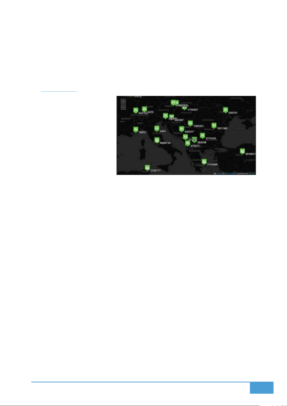
68
6.8.3 Tips
Ensure the region names present in your dataset strictly match standard naming
conventions (for example, use "United States", not "USA").
Utilize the Show Only option to drastically declutter the map when you need to focus on
specific regions.
6.9 Icon Layer
The Icon Layer displays icon
marker for spatial data from an
icon collection provided to user.
User can either select a general
icon for all the markers in the layer
or connect a data dimension to
icon selection so each data point
can determine its own icon
dynamically. Moreover, it can
display name and value of the
data point near icon marker.
6.9.1 How to Visualize Icon Markers
1. Within the Dataset Settings menu, select the Name field.
2. This field selection dictates the text label that will render next to each icon.
3. Choose your desired Marker Icon from the provided options.
Your icons will immediately render on the map at their corresponding coordinates.
6.9.2 Example Use Case
As a demonstration, you can visualize capital city populations by utilizing two distinct filters:
Cities boasting a population over 2 million.
Cities with a population under 2 million.
You can assign a totally different icon to each filter, and deploy both filters onto the map as
separate Icon Layers to create a highly readable visual.
6.9.3 Icon Layer Settings
You can customize exactly how your icons and their corresponding labels appear:
Font: This dictates the font family utilized for the label text.
Font Size: This establishes the pixel size of the label text.
Page 69
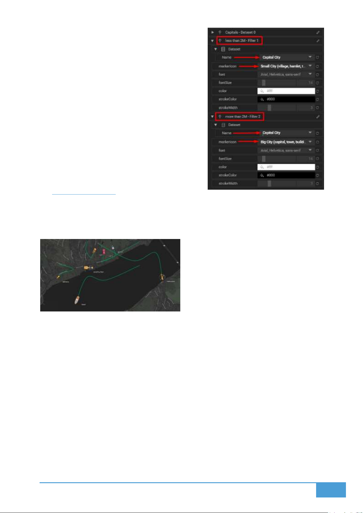
69
Color: This determines the color of the label
text.
Stroke Color: This changes the outline color
bordering the text.
Stroke Width: This adjusts the width of the text
outline.
6.9.4 Tips
Combine your Icon Layers with custom Filters
to produce highly detailed visualizations, such
as assigning different icons to denote
escalating severity thresholds.
6.10 Tracking Layer
The Tracking Layer enables users to track vehicles. Users can either from configuration or from
data itself determine icon of the vehicle and line options and live or path history data of the
vehicle is animated on the screens.
6.10.1 Features
Live Tracking: Display the exact current position of your tracked entities in real-time.
Path History: Display the historical route each entity has traveled based on its
timestamped coordinates.
6.10.2 How to Use
1. Load your tracking data directly into the layout.
2. Your dataset must contain at a minimum:
a. Longitude and Latitude fields to determine position.
b. A timestamp field to accurately order the movement path.
c. A device ID or vehicle ID to properly distinguish between different tracked items.
Page 70
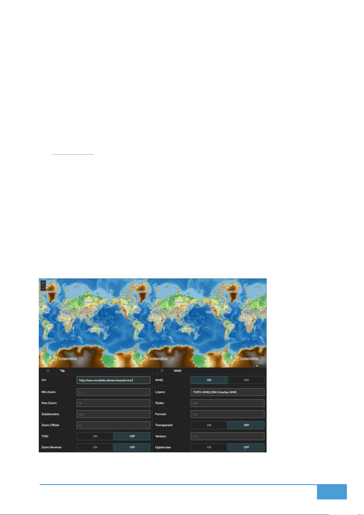
70
3. The Tracking Layer Settings menu will become available within the Settings tab.
4. Configure exactly how the paths and markers render on screen, utilizing custom settings
to adjust marker icons, line widths, and line colors.
6.10.3 Use Case Examples
Fleet vehicle tracking.
Delivery route visualization.
Mobile asset movement history.
6.11 Tile Layer
The Tile Layer enables administrators to integrate specialized geographic contexts and custom
map aesthetics by linking directly to external tile services. This capability is exceptionally
valuable when standard base maps fail to provide the cartographic details or specific styling
required for your operational environment.
When you need to display highly specialized cartography—such as custom municipal blueprints,
topographical data, or high contrast dark mode maps—across a massive operations center
video wall, leveraging a dedicated TileSource ensures your foundational map perfectly
complements your overlying data.
This feature guarantees an efficient and seamless integration of third party map tiles by
providing opacity controls and the ability to disable default base layers to optimize overall
rendering performance.
Page 71
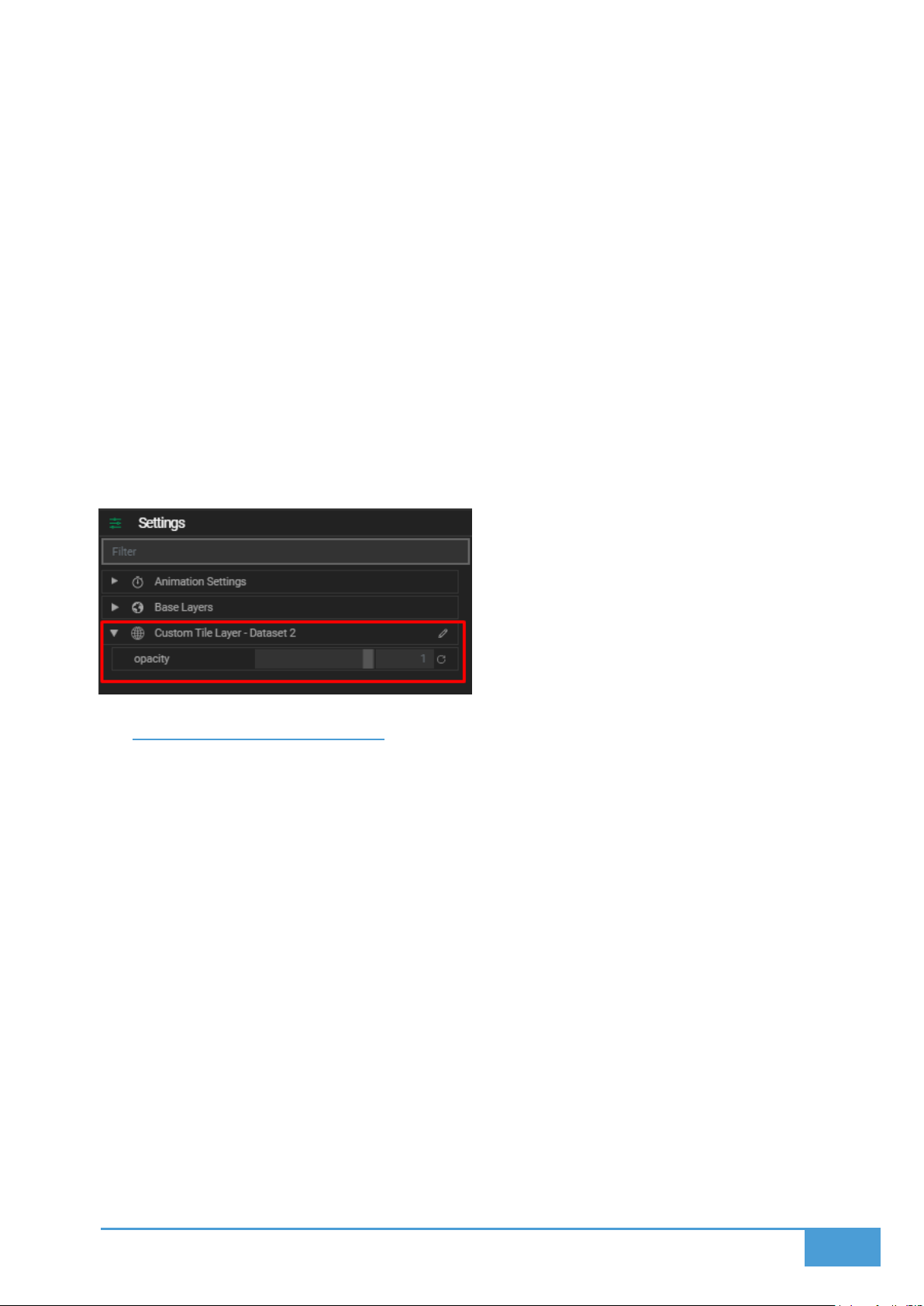
71
6.11.1 How to Add a Custom Tile Map
1. Navigate to the Data Module (not the Data Tab) and select TileSource.
2. Input your custom tile service URI.
3. After loading your new tile source, assign it directly to your map by adding the TileSource
as Data within the Maps Data tab.
4. The layer you generate from the tile source will immediately render on your map.
5. To avoid performance issues, consider disabling the default base layer from the Base
Layers tab. If you do not, the system will continuously fetch and render the default base
layer underneath your custom tile layer.
6.11.2 Tile Layer Settings
Opacity: Adjust the transparency level of your custom tile layer to properly contrast or
blend with your other map layers.
6.12 Configuration & Styling
Configuration of the Map Module enables users to determine base and overlay layers and
customize existing layers visual settings.
6.12.1 Base Layers Settings
Base Layer:
o Select the primary tile layer to function as your base map.
o You can pick from the built in tile options or import a customized tile layer
utilizing the TileSource function.
Base Overlay:
o This is an optional setting that adds a secondary overlay layer on top of your
selected base map.
Preset Overlays:
o Traffic, Weather (Precipitation, Clouds, Wind, Temperature and Pressure),
Graticule and Day Night Cycle on Video Walls.
Page 72

72
6.12.2 Layer Customization
Every individual layer you add to the map can be styled independently. The available
customization options will change based on the specific layer type you are working with, such
as GeoJSON, Heatmap, or Marker. To edit these settings and styles:
1. Select the specific layer you wish to edit from the Layers tab.
2. Open the Settings tab.
3. Select the Layer and expand its menu.
4. Adjust the available properties based on that layer's unique capabilities.
Refer to the documentation for each specific Layer type for detailed breakdowns of
configuration options.
6.13 Animating Data & Real-time Data
You can animate your time series data to accurately visualize dynamic changes over time
directly on the Map. This functionality is crucial for observing live updates from real-time data
sources, tracking movement, or analyzing trends as part of your control room video wall
analytics.
6.13.1 Animation Types
The system provides two distinct animation types, dictated by whether your data source
includes time based temporal information:
1. Realtime
The Map will automatically update whenever there is a data change detected on the
connected sources.
The manual animation controls—such as Loop, Pause, and Play—are completely
disabled in this mode.
Realtime mode is selected automatically if your dataset does not contain a time column.
If your data does include temporal information, this mode will only display the absolute
latest data point.
2. Animation
This mode can be utilized if your data includes temporal information like timestamps.
This mode permits the playback of simulated or historical data changes over time.
You can select your preferred Animation type from the Data Input item located within the
Settings menu.
Page 73
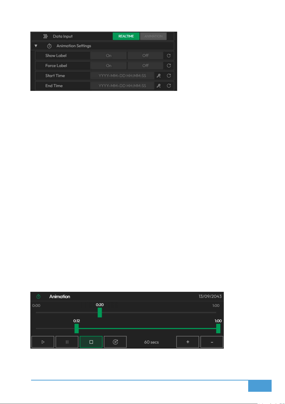
73
6.13.2 Animation Settings
Show Label: This toggle displays the current time of the running animation on the
screens.
Force Label: This toggle forces the label to render even if labels have been globally
disabled for the active layout.
Start / End Time: This defines the specific time interval the system will animate. The
times you input here must match the available time range existing in your dataset.
6.13.3 Animation Controls
You can thoroughly customize the visual appearance and behavior of your animation:
You can dictate the total duration of the animation sequence.
You can utilize the Min Max Window slider to crop the overall duration and strictly limit
playback to a specific window.
You can manually drag the Play slider to instantly seek to a certain point in time within
the data.
The top right of the interface displays the current time within the data sequence.
The bottom left of the interface houses the AutoPlay, Stop, Pause, and Play buttons.
The AutoPlay function does not initiate animation within the editors; instead, it
automatically starts the animation sequence the moment a layout containing this map is
deployed to a screenspace on the video wall.
Page 74

74
6.14 Deploy to Screens
Users can deploy to Video wall screens from editor itself by pressing deploy button or use
Display Module to deploy to screens of the video wall.
6.14.1 Editor Deployment Options
1. Deploy
Select a specific Screenspace to target for your Map Visualization.
Choose between two placement options:
o Add to First Available Space: This option automatically drops the Visualization
into the first empty Layout slot it detects.
o Replace Visualization: This option allows you to select and replace an existing
Deployed Visualization. A list of existing deployments is provided for easy
selection.
2. Assign
You can manually Assign the Visualization to a specific Dynamic Slot ranging from 1 to
16.
Once assigned, these slots can be:
o Resized
o Repositioned
o Replaced
Utilize the Display Module Layout interface for advanced Dynamic Slot Management.
Page 75

75
7 VISUALIZATION
Lygos Visualization Module offers over 20 different interactive and animated visualization
formats for video walls. You can utilize robust logic to implement complex sorting expressions
and AND or OR filters. Additionally, you can remotely interact with your data using PC and tablet
clients, allowing you to easily explore, animate, and curate real-time data environments that
perfectly suit your displays.
7.1.1 Visualization Types
Basic Charts: Box Plot, Pie, Table, Chart, and Candlestick.
Network & Hierarchy: Sankey, Sunburst, Tree, and Graph.
Statistical & Comparison: Funnel, Polar, and Radar.
Heatmaps & Trends: Multi Line, Parallel Lines, Theme River, and Heatmap.
Specialty Charts: Chart3D, Gauge, Indicator, Tree Map, and Alerts.
7.1.2 Data Integration
You can connect data sources as long as they are compatible with your chosen
visualization type.
You can apply sorting logic and filters by utilizing Sort, Filter, OR, and AND expressions.
You can deeply style and configure display options for your data series and the
visualization itself.
7.1.3 Animation & Real-Time Data
You can animate time series data.
You have full control to loop, pause, or play these animations.
You can watch live data changes stream directly into your visualizations from real-time
sources.
7.1.4 Remote Interaction
You can manipulate the visualizations on your large video walls utilizing touch gestures
or a mouse via your PC and tablet clients.
7.2 Connect Data
You can seamlessly connect and display information from a variety of data sources that are
compatible with your chosen visualization format across your dashboards and video walls.
Page 76

76
7.2.1 How to Use
1. Add Data
Navigate to the Data & Logic tab within the interface.
Introduce your new data source here.
2. Toggle Data to Visualize
Move over to the Datasets & Transform tab.
Switch the toggle to the ON position for the specific dataset you wish to render.
3. Select Visualization Type
Pick a visualization format that accurately matches the underlying structure of your
data:
o Bar Series
o Line Series
o Scatter Series
Keep in mind that every visualization format has highly specific configuration options
and requirements, so you must ensure your data is a proper match before proceeding.
7.3 Filter and Sort
You can effortlessly implement sorting rules and filters to refine exactly how your dataset is
presented. You can also hide or show these filters whenever necessary to perform deeper data
analysis or maintain a cleaner visual layout.
7.3.1 Sorting
Customize the presentation sequence of your information:
Select Dimension: Pick the specific data field you wish to organize.
Select Order: Decide between a Descending or Ascending order.
7.3.2 Filtering
Narrow down your dataset utilizing logical conditions:
Select Dimension: Choose the specific data field you want to filter.
Add Logical Operators: Apply specific conditions such as less than, greater than, or
equals.
Enter Values: Input the exact values you are filtering your data against.
Page 77
77
7.4 Configuration & Styling
Users can configure visual and data encoding settings of the visualization series from
Configuration and Styling Tab.
7.4.1 Settings Complexity
You can choose between two primary configuration modes:
Simple: This mode reveals only the most essential settings regarding your data settings
and base parameters.
Advanced: This mode unlocks every single available setting for your data settings and
base parameters.
7.4.2 Data Input
All: This renders the complete data series in its entirety.
Latest: This restricts the displayed data points for each specific category. This setting is
highly effective for isolating the absolute newest inputs within continuously streaming
datasets.
Animate/Realtime: This renders temporal data and permits playback across a timeline.
The real-time mode exclusively shows the current data as it continuously updates.
7.4.3 Base Parameters
You can deeply edit styles and configure specific display options for both the visualization itself
and its underlying data series:
Color Schemes
Title style and text content
Legend Visibility (adjusting its position or toggling it on and off)
Axes Appearance (modifying gridlines, ticks, and labels)
Text Styles (customizing the color, size, and font)
7.5 Visualization Types
Lygos supports a massive array of data visualization and chart
formats. The majority of these formats require you to properly
configure your Dataset Settings before they can render on
screen.
7.5.1 Table
This displays your data in a traditional tabular format.
Page 78
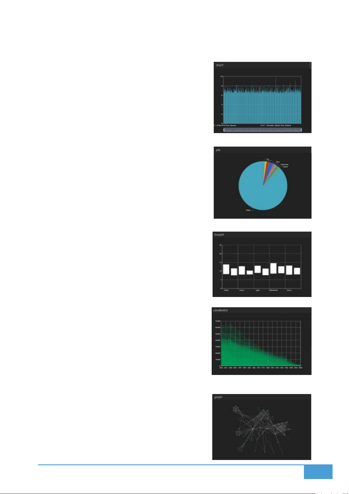
78
Features include the ability to filter data, sort columns, and apply style configurations
such as borders, colors, and fonts.
7.5.2 Chart
This category includes Scatter Series, Line Series,
and Bar Series.
Dataset Settings require an X Axis and a Y Axis.
Full style customization is available.
7.5.3 Pie
This displays your data as a proportional pie chart.
Dataset Settings require a numerical Value and a
category Name.
Full style customization is available.
7.5.4 Box Plot
This visualizes data distribution utilizing quartiles.
Dataset Settings require an X Axis alongside Q0, Q1,
Q2, Q3, and Q4 values.
Full style customization is available.
7.5.5 Candlestick
This format is commonly utilized for analyzing
financial data.
Dataset Settings require an X Axis alongside
Highest, Lowest, Close, and Open values.
Full style customization is available.
7.5.6 Graph
This displays complex nodes and edges.
It loads immediately and does not require specific
dataset settings.
Page 79
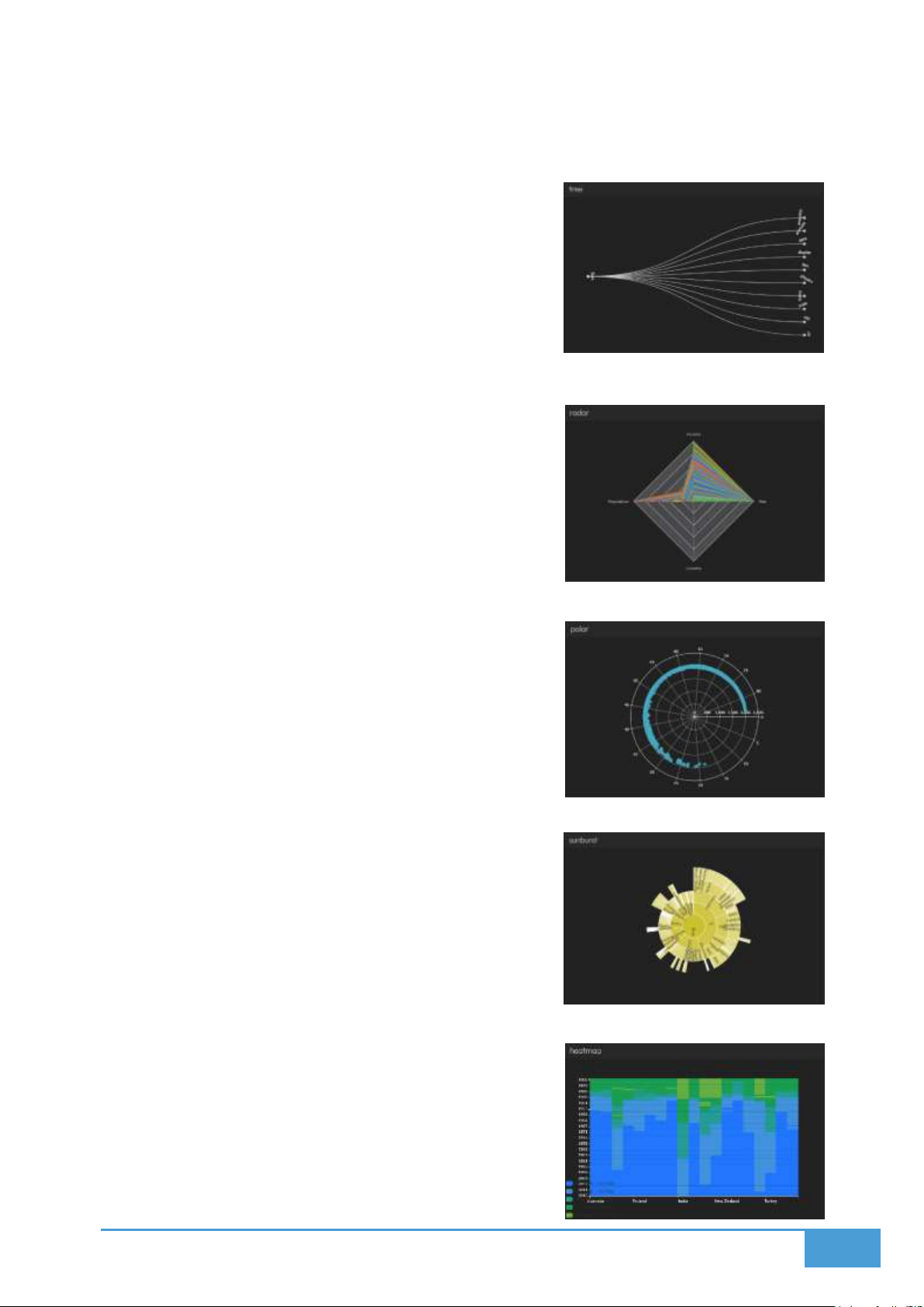
79
Full style customization is available.
7.5.7 Tree
This displays highly hierarchical data structures.
It loads immediately and does not require specific
dataset settings.
Full style customization is available.
7.5.8 Radar
This plots your values along radial axes.
Dataset Settings strictly require a Name.
Full style customization is available.
7.5.9 Polar
This plots your data directly onto circular
coordinates.
Dataset Settings require an Angle and a Radius.
Full style customization is available.
7.5.10 Sunburst
This displays hierarchical data using proportional
concentric circles.
It loads immediately and does not require specific
dataset settings.
Full style customization is available.
7.5.11 Heatmap
This visually represents data intensity or density.
Dataset Settings require an X Axis, a Y Axis, and a Z
Page 80
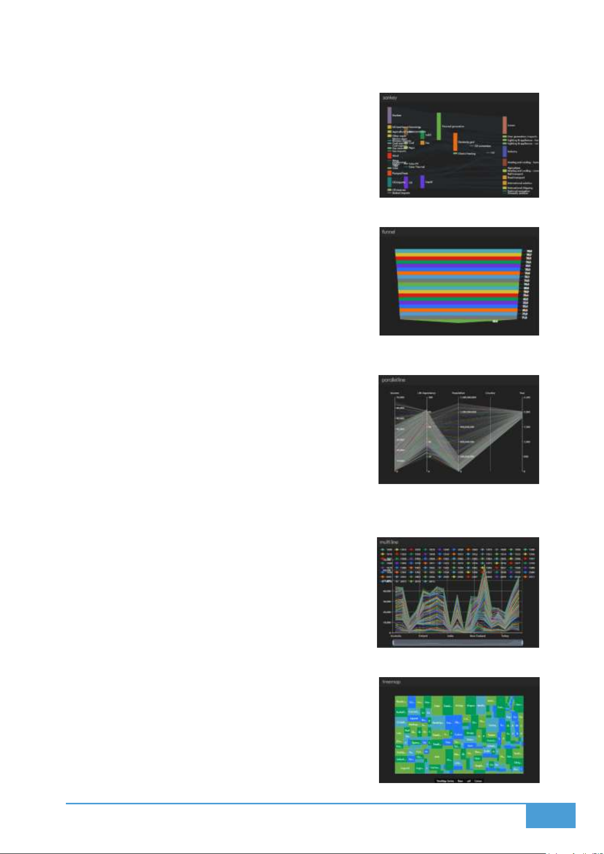
80
Axis to represent the intensity value.
Full style customization is available.
7.5.12 Sankey
This generates a flow diagram to showcase
proportional paths.
It loads immediately and does not require specific
dataset settings.
Full style customization is available.
7.5.13 Funnel
This visualizes progression through specific stages.
Dataset Settings strictly require a Value.
Full style customization is available.
7.5.14 Parallel Lines
This displays complex multi dimensional data
comparisons.
It loads immediately and does not require specific
dataset settings.
Full style customization is available.
7.5.15 Multi Line
This format also displays multi dimensional data
comparisons.
Dataset Settings require an X Axis, a Y Axis, and a
Category Dimension.
Full style customization is available.
7.5.16 Tree Map
This utilizes nested rectangles to visually represent
hierarchical proportions.
It loads immediately and does not require specific
Page 81
81
dataset settings.
Full style customization is available.
7.5.17 Theme River
This showcases trends over a timeline utilizing layered
visual streams.
Dataset Settings require an X Axis, a Y Axis, and a Z
Axis.
Full style customization is available.
7.5.18 Gauge
This generates a circular dial to broadcast a single data
value.
Dataset Settings strictly require a Value.
Full style customization is available.
7.5.19 Chart 3D
This provides fully three dimensional charting
capabilities.
Dataset Settings require an X Axis, a Y Axis, and a Z
Axis.
Full style customization is available.
7.5.20 External Visualizations
This specialized format displays your existing PowerBI and Tableau reports directly as
visualizations.
7.5.21 Alert
This allows you to generate custom alerts directly from your datasets.
You must add data and assign specific data dimensions to act as rules.
Rule Settings include:
o Text
o Type (Secondary, Primary, Danger, Warning, Info, or Success)
o Comparison
o Value
Page 82

82
o Timeout
o Sound
o Volume
Full style customization is available.
7.6 Animating & Real-time Data
You can effortlessly animate your time series data to observe dynamic shifts over time directly
within your Visualization. This is highly effective for monitoring live updates from real-time
sources, tracking movement, or analyzing trends across your dashboards and video walls.
7.6.1 Animation Types
The system provides two distinct animation types, which are dictated by whether your data
includes time based temporal information:
1. Realtime
The Visualization will automatically update the moment a data change occurs on your
connected sources.
The manual animation controls, including Loop, Pause, and Play, are completely disabled
in this mode.
The Real-time mode is selected automatically if your dataset lacks a time column.
If your data does include temporal information, this mode will only display the absolute
newest data point.
2. Animation
This mode becomes available if your data contains temporal information, such as
timestamps.
It allows for the complete playback of simulated or historical data changes over a
timeline.
You can choose your preferred Animation type from the Data Input item located within the
Settings menu.
7.6.2 Animation Settings
Show Label: This toggle displays the current time of the running animation on your
screens.
Force Label: This ensures the label renders even if you have globally disabled labels for
the active layout.
Start / End Time: This establishes the precise time interval you wish to animate. The
times you input here must match the available time range existing in your dataset.
Page 83
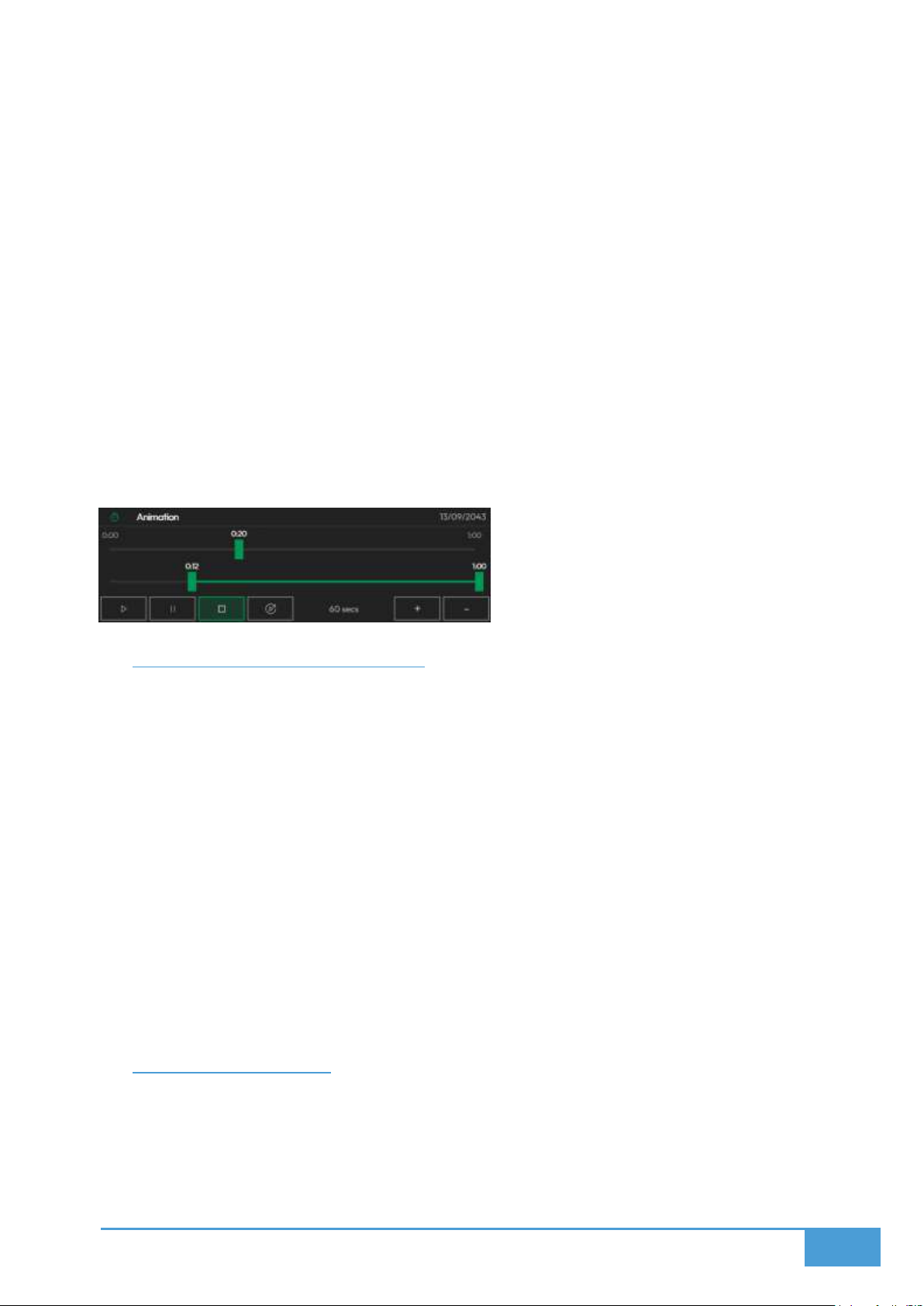
83
7.6.3 Animation Controls
You can thoroughly customize the visual appearance and behavior of your animation sequence:
You can dictate the overall duration of the animation playback.
You can utilize the Min Max Window slider to crop the duration and restrict playback to a
specific window.
You can manually drag the Play slider to instantly seek to a specific moment within your
data timeline.
The top right of the interface displays the current time within the data sequence.
The bottom left of the interface houses the AutoPlay, Stop, Pause, and Play buttons.
The AutoPlay function does not trigger playback within the editors; instead, it
automatically starts the animation the moment the layout is deployed to a screenspace
on your dashboards or video wall.
7.7 Interact Charts on Screens
You can remotely control and interact with the visualizations deployed on your video walls
utilizing touch or mouse inputs from your PC or tablet clients through a simplified and unified
control dashboard on Management and Control Clients.
7.7.1 How it Works
Select the specific Visualization you wish to manipulate from your Client interface.
Utilize the dedicated controller area provided on your device screen to hover, zoom, or
pan across the visualization.
This capability functions flawlessly across all client devices, including desktop PCs and
touch enabled tablets.
Your mouse or touch events are mirrored instantly on the video wall screens, permitting
the dynamic exploration of your data.
7.8 Deploy to Screens
You can seamlessly push your customized Visualizations to any Dashboard or Video Wall
Screenspace utilizing the Display Module or straight from the Visualization Editor. Simply
choose the specific size and layout that aligns with your display strategy. This functionality
serves as a flawless bridge connecting your configured data visualizations directly to your
physical display hardware.
Page 84

84
7.8.1 Editor Deployment Options
1. Deploy
Select a specific Screenspace to target for your Visualization.
Choose between two distinct placement options:
o Add to First Available Space: This option automatically drops the Visualization
into the first empty Layout slot it detects on the grid.
o Replace Visualization: This option allows you to select and swap out an existing
Deployed Visualization. The system provides a list of existing deployments for
easy selection.
2. Assign
You can manually Assign your Visualization to a specific Dynamic Slot ranging from 1 to
16.
Once assigned, these dynamic slots can be:
o Resized
o Repositioned
o Replaced
You can utilize the Display Module Layout interface for advanced Dynamic Slot
Management.
Page 85

85
8 MEDIA
The Media provides 20+ multimedia applications to be deployed to video walls. These
applications come with their own editors/viewers. Here are the supported applications and
formats:
Images
You can display and upload images onto your screens and video walls.
You can crop, rotate, and flip your visual assets.
You can fine tune the saturation, contrast, and brightness.
Video
You can link or upload videos for playback on the video walls.
The system supports YouTube links, HTML5 videos, and MP4 uploads.
Playback controls include Loop, Stop, Pause, and Play.
Documents
You can display and upload PDF files.
Display mode options include Play Once, Loop, or Single Page.
You can configure specific page visibility durations for the Play Once and Loop modes.
Diagrams
You can construct diagrams utilizing a simple drag and drop interface.
The tool provides images, BPMN, UML, text, arrows, and shapes.
You can connect your elements using arrows or lines.
Gallery
You can showcase, manage, and curate dynamic image collections across multi screen
setups.
You can organize tailored galleries using Free or Auto layout modes.
You can sort your loaded images by Random, Color, Name, Creation Date, or Uploading
Date.
Graphics
You can upload GLB files to render 3D objects and scenes.
You can pilot the camera utilizing a virtual joystick.
Page 86

86
Earth
You can render an interactive 3D globe on your video walls.
You can explore the globe freely utilizing touch or mouse controls.
You can drop custom GLB models onto specific geographic coordinates.
Web
You can display external web pages, which are converted into static content for security
purposes.
Certain actions and navigations might experience limitations.
Pages
You can import or create rich text documents and HTML pages.
You can style these pages utilizing tables and images.
Boards
You can display and create Kanban boards.
Users can edit these boards collaboratively.
Weather
You can broadcast weather data for any chosen location.
View options include Humidity, Wind, Min Max, Hourly, and Weekly.
The system utilizes animated backgrounds that match the current weather.
News
You can display and add RSS feeds to your screens.
These feeds render as customizable cards.
You can set a specific update frequency.
Quiz
You can display and generate custom quizzes.
The system utilizes a gamified leaderboard based on user scores.
Participants join using their mobile devices by scanning a QR code.
Administrators control quiz progression, including Restart, Show Scoreboard, Show
Answers, Show Question, Start, and Show QR.
Page 87

87
Poll
You can construct polls for multi screenspace or single screenspace deployments.
You can configure the voting mode, multiple selection options, and voting security.
Users cast their votes via QR code on their mobile devices.
Results can be visualized as a Ranking Chart, Grid, TreeMap, or Pie Chart.
Calendar
You can connect or upload calendars for display on the video walls.
Supported views include Weekly, Monthly, and Yearly.
You can edit and add events utilizing local ICS files only.
You can customize the overall calendar styling.
Watch
You can display timezone, countdown, timer, or clock modes.
These are controlled via the Control Module or Editor.
You can customize the style settings.
Wall
You can host a real-time message wall.
This acts as an internal sharing and chat system for Lygos users.
Users can post images and messages.
Messages
You can display and connect message streams pulled from APIs.
You can configure sorting, filtering, and message styles.
Forex
You can display commodities, cryptocurrency, US stocks, and exchange rates.
You can generate charts or KPI grids.
The font, color, and background styles are completely customizable.
Data updates ranging from daily to every 15 minutes depending on your source.
Page 88

88
IPTV
You can add M3U streams for display on the screens.
You have full control over start stop, playback, and volume functions.
Cast
You can cast directly from a management client to the screens.
You can opt to display content between open tabs or screens.
Stream
You can securely connect RTSP video streams and render them as scalable
visualizations.
You can monitor multiple simultaneous live camera feeds in real-time.
You can control the video stream volumes.
WordCloud
You can generate and display word clouds on your video walls.
These can be sourced from custom text, XLSX, PPT, DOCX, or PDF files.
You can customize the styling.
Blueprint
You can automatically convert DWG CAD files into scalable SVG formats for high fidelity
reviews.
You can adjust Stroke Proportion and Background Color to maximize visibility.
Deep Zoom
You can navigate and upload high resolution zoomable images in DWG, SVG, JPEG, PNG,
or SZI formats.
You can seamlessly flip, rotate, pan, and zoom massive files across the X and Y axes.
You can optimize styling with real-time adjustments for Greyscale, Invert, Gamma,
Contrast, and Brightness.
Page 89
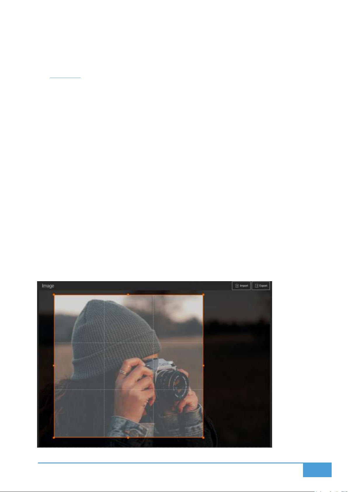
89
8.1 Images
The Images module provides images and photos to be loaded to video walls, users also can edit
images on the local editor.
To begin, you must create a new image document using the Management Client. Once created,
you import your desired image. This image document is then ready to be deployed to any layout
across your screenspaces.
8.1.1 Import & Export
Supported Import Formats: GIF, BMP, TIFF, PNG, and JPEG.
Export Formats: PNG and JPEG.
You can manually import the file or use drag and drop.
Note: The system only permits one image per Image document.
8.1.2 Image Cropping
You can crop your image by physically adjusting the crop area. You have the option to:
Utilize Free mode for custom cropping.
Select a fixed aspect ratio such as 4:3 or 16:9.
Page 90
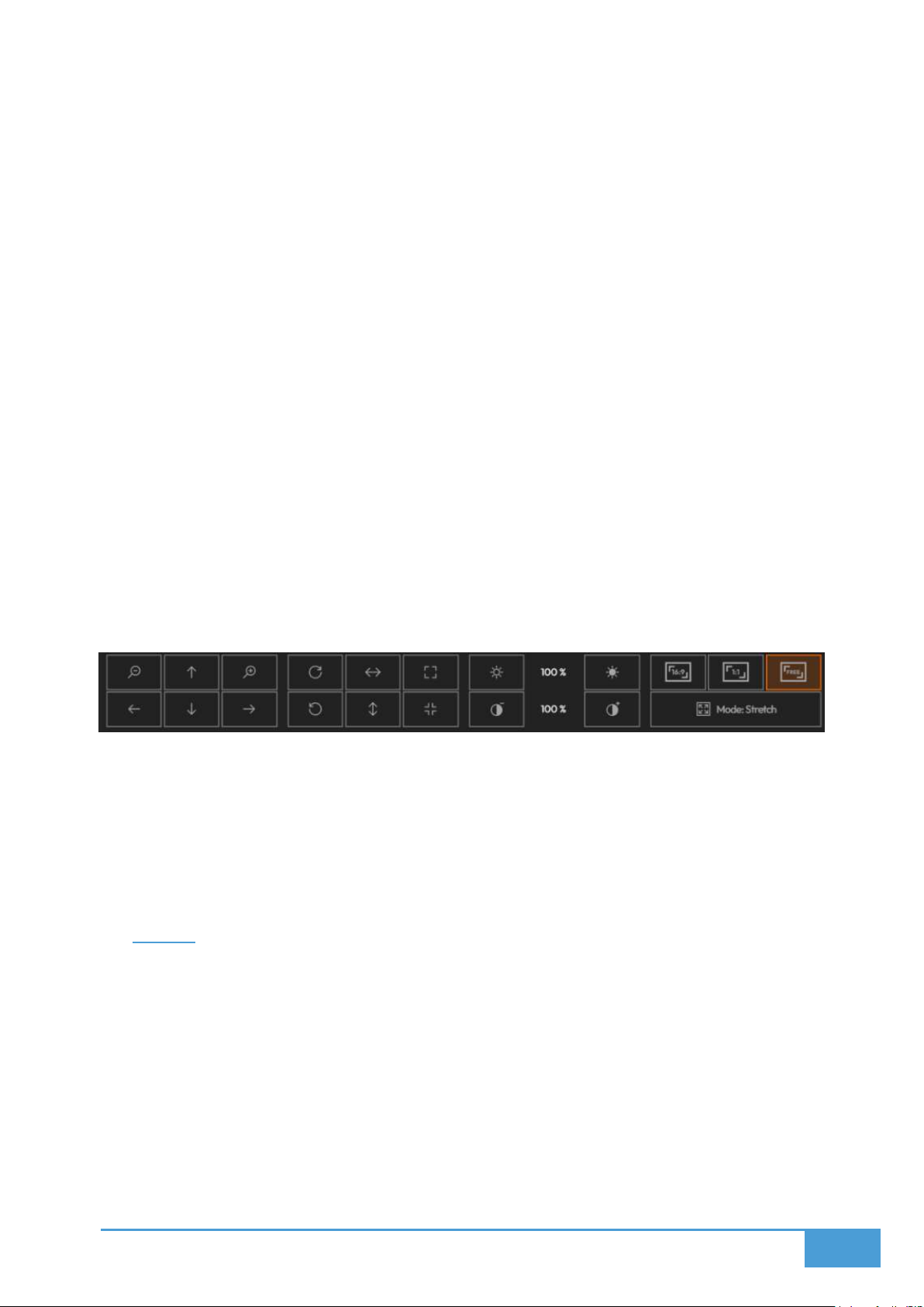
90
8.1.3 Image Controls
Zoom: Magnify or shrink the image view.
Move: Shift the image utilizing the arrow buttons.
Rotate: Turn the image 90 degrees right or left.
Flip: Mirror the image vertically or horizontally.
Fullscreen: Expand the image to full view.
Adjust: Fine tune the saturation and brightness.
8.1.4 Display Modes
These settings dictate exactly how the image renders on the deployed screens:
Stretch: This forces the image to fill its container entirely, which may distort the aspect
ratio.
Fit: This fits the image entirely inside the container while maintaining its original aspect
ratio.
Fill: This fills the entire container but crops portions of the image to preserve the aspect
ratio.
8.1.5 Deploy on video walls and Dashboards
You can deploy directly through the Image Editor by pressing Deploy. Simply choose a
screenspace and select whether to swap it with an active visualization or load it into the first
available slot. Alternatively, you can deploy via the Display Module. Navigate to the Display
Module, select your desired layout and screenspace, then choose your visualization and drag
and drop it into the grid area.
8.2 Video
The Video module enables you to play MP4 files, HTML5 or Youtube videos on your video wall.
To begin, create a new video document within the Management Client. Link or import your video
to this document, and it becomes ready for deployment to any layout.
8.2.1 Video Types
File: Upload your local MP4 files. Export and import are fully supported.
HTML5: Provide a link to online WEBM or MP4 videos.
Page 91
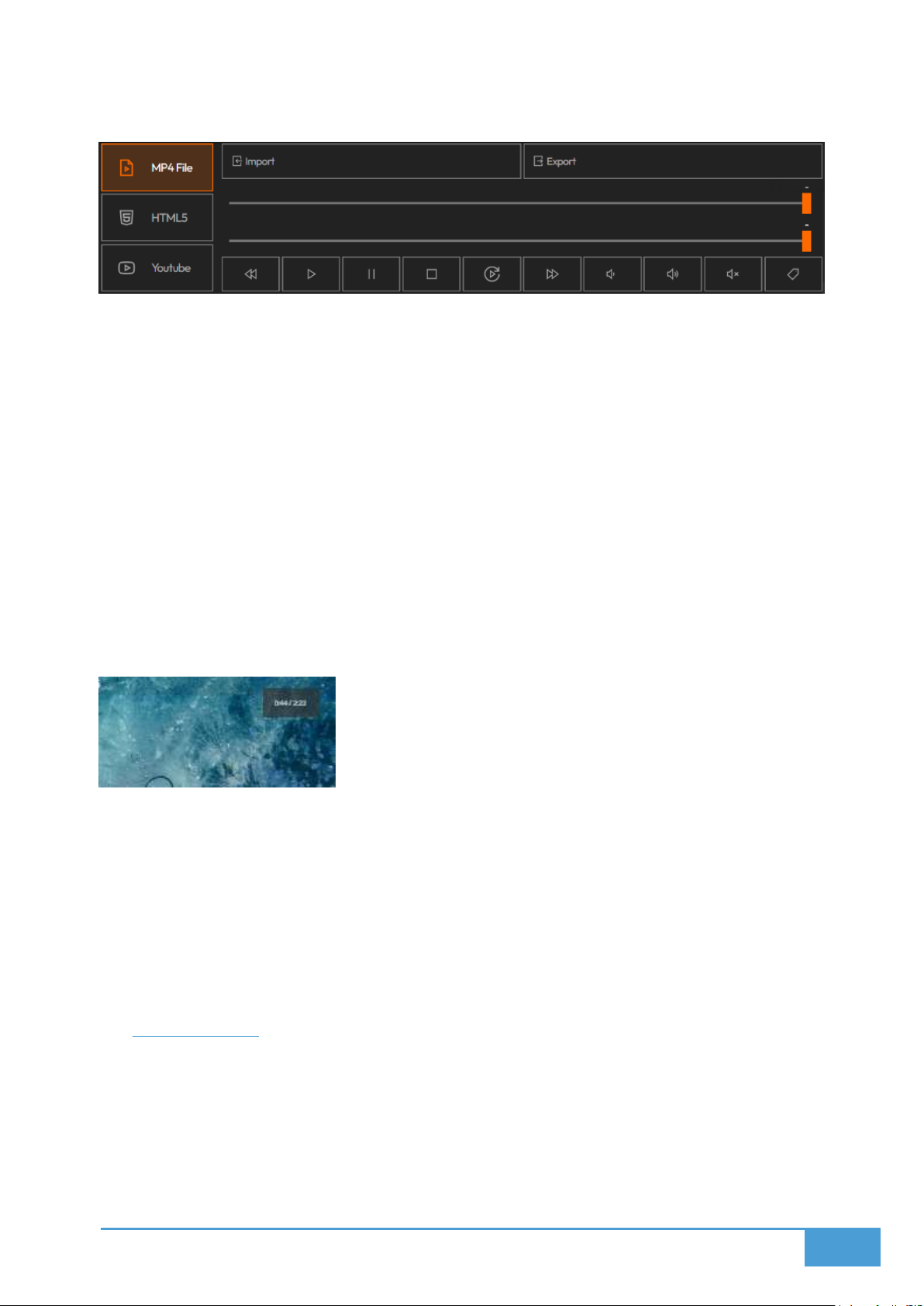
91
YouTube: Embed a YouTube video utilizing its URL.
8.2.2 Video Controls
Once your video is added, you can manipulate the following controls:
Progress Bar: This displays the total duration and the current time of the video.
Crop Slider: You can trim the video duration by moving the start and end points on this
secondary slider.
Playback Controls: Includes Rewind, Fast Forward, Stop, Pause, and Start.
Loop Toggle: Enable this to force the video to loop continuously.
Volume Control: Toggle the mute function or manually adjust the volume.
Show Label: This visually displays the video duration and current time on the deployed
screen.
Important: These controls remain synchronous across all clients, meaning your adjustments will
directly affect the video currently playing on the video wall.
8.2.3 Deploy on video walls and Dashboards
Deploy directly from the Editor by clicking Deploy, picking your screenspace, and choosing to
either load into an empty spot or swap with an active visualization. You can also deploy utilizing
the Display Module. Navigate to the Display Module, pick your layout and screenspace, then
drag and drop your selected visualization into the grid.
8.3 Documents
The Documents module allows you to display PDF documents on video walls.
8.3.1 Upload
Supported Format: PDF.
Page 92
92
You can import your files via the file picker or simply drag and drop them.
8.3.2 Display Modes
You can dictate exactly how the PDF renders on your screens:
1. Single: This displays one selected page. You utilize the right and left arrows to select
which page to show.
2. Play: This automatically cycles through every page in sequence exactly one time. You
must specify the duration per page in seconds.
3. Loop: This cycles through the document pages continuously. You must specify the
duration per page in seconds.
8.3.3 Document Controls
Utilizing the Control interface, you can:
Zoom In / Zoom Out: Magnify or shrink the document view.
Rotate: Spin the document to a different orientation.
8.3.4 Deploy on video walls and Dashboards
You can deploy through the Editor by pressing Deploy, choosing your screenspace, and
selecting whether to swap it with an existing visualization or drop it into the first open spot. You
can also utilize the Display Module by navigating to it, picking your screenspace and layout, and
then dragging your chosen visualization into the grid.
8.4 Diagrams
The Diagrams module allows you to create basic diagrams from local diagram editor and
display it at video walls.
8.4.1 Insert Shapes
Shapes are organized into specific Shape Libraries, such as network, flowchart, or basic.
You can collapse or expand these libraries by clicking on their names.
To place a shape, you can either drag and drop it onto your canvas, or simply click it to
insert.
8.4.2 Format Panel
Positioned on the right side of the screen, the Format Panel is context sensitive, adapting its
options based on what element you currently have selected:
Style shapes: Adjust shadows, borders, and fill colors.
Page 93

93
Connectors: Modify routing options, arrows, and line types.
Text: Change the alignment, size, and font.
Layout: Alter the layering, rotation, size, and position.
8.4.3 Export Options
You can export your completed diagram in two formats:
PNG: Ideal for utilizing the diagram as an image within presentations or reports.
SVG: Ideal for retaining editable, scalable vector graphics.
8.4.4 Deploy on video walls and Dashboards
Deploy directly from the Editor by clicking Deploy, selecting a screenspace, and choosing to
either load into an empty slot or swap out a live visualization. You can also deploy via the
Display Module by navigating there, selecting your layout and screenspace, and dragging the
visualization into the active grid.
8.5 Gallery
The Gallery module enables users to deploy gallery of images as a grid to video walls.
8.5.1 Importing Images
You can import files directly or use drag and drop.
Your uploaded images will populate in the Images tab.
These imported images are not automatically displayed on your screens.
To push the images to your displays:
Highlight the selected images and press Load.
The loaded assets will then render on the deployed screens.
From within the Images tab, you have the ability to:
Delete images
Preview images
8.5.2 Mode
You can define exactly how your images arrange themselves inside the deployed layout:
Export images
Auto: The system automatically arranges and sizes the images to optimally fill the
layout space.
Page 94
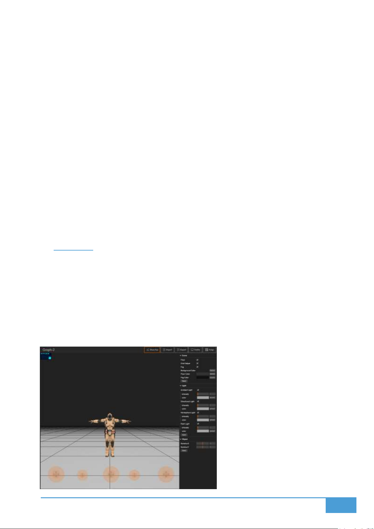
94
Free: You can manually arrange the images, giving you control over image sizes, the
gaps between images, and the specific image order.
8.5.3 Sorting Options
You can sort your loaded images by:
Uploading Date
Creation Date
Name
Color
Random
8.5.4 Deploy on video walls and Dashboards
Deploy directly via the Editor by clicking Deploy, choosing your screenspace, and picking
whether to fill an open spot or swap with an existing visual. You can also deploy using the
Display Module by selecting your layout and screenspace, then dragging the visualization into
the grid area.
8.6 Graphics
The Graphics module enables to display 3D interactive scenes on video walls in format of GLB.
8.6.1 Import / Export Format
Supported Format: .glb (The binary version of gLTF).
About GLB: This is an open source format designed for 3D models and scenes. It
encapsulates every asset, including animations, textures, and meshes, directly into a
single binary file. Because it requires no external files, it is highly efficient and portable.
Page 95
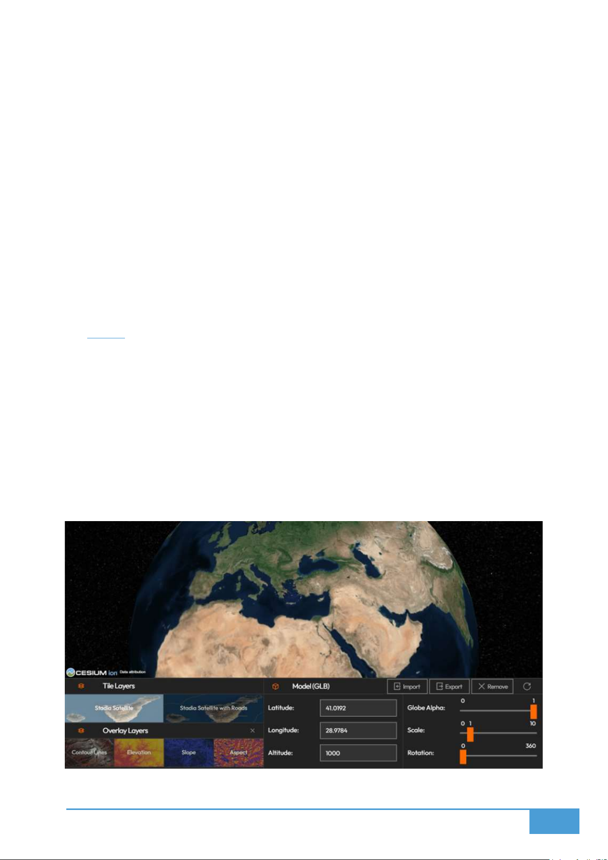
95
8.6.2 How to Use
1. Import your .glb file into the system.
2. Customize the environment utilizing the settings panel on the right side:
a. Camera Settings
b. Lighting Options
c. Scene Configurations
8.6.3 Deploy on video walls and Dashboards
You can deploy from the Editor by pressing Deploy, picking your screenspace, and deciding to
either swap out an active visualization or drop it into the first empty spot. Alternatively, utilize
the Display Module to select your layout and screenspace, then drag and drop the visualization
directly into the grid.
8.7 Earth
The Earth module delivers an interactive, powerful 3D globe designed for geospatial data
representation and comprehensive visual exploration.
8.7.1 Features
You can interact with and navigate the 3D Earth map freely.
You can customize your perspective by altering the Overlay Layers and Base Tile Layers.
You can place and import your custom 3D Models (.glb files) straight onto the Earth
view.
Page 96
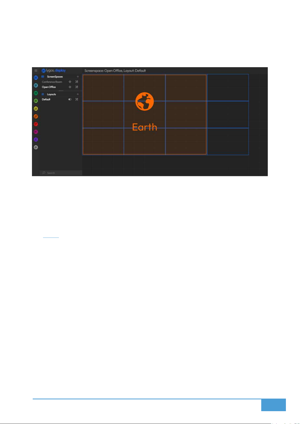
96
8.7.2 Size Restrictions
The Earth element carries a strict maximum layout size of 3 screens high by 3 screens
wide.
8.7.3 Deploy on video walls and Dashboards
Deploy directly from the Editor by clicking Deploy, choosing a screenspace, and selecting
whether to load into the first open slot or swap with an active visual. You can also deploy via the
Display Module by picking your screenspace and layout, then dragging your visualization into
the grid area.
8.8 Web
The Web module enables you to embed and display external websites directly on video walls.
8.8.1 How to Use
1. Type your required web URL into the designated input field.
2. Press the tick icon to process and display the web page on your layout.
8.8.2 Features
This module supports live web page viewing.
It is perfect for displaying embeddable web content, news feeds, reports, or external
dashboards.
8.8.3 Limitations
To ensure security, Web Pages are converted into Static Sources before rendering on
screen. This conversion process may introduce limitations to the page's standard
navigation and functionality.
Page 97
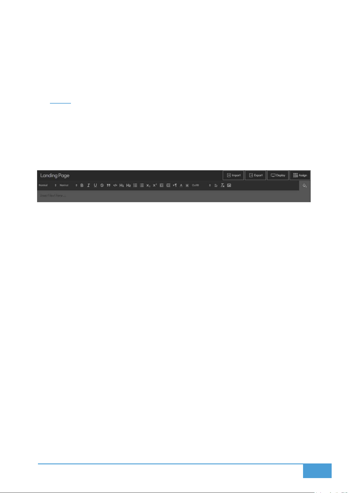
97
8.8.4 Deploy on video walls and Dashboards
Deploy directly through the Editor by pressing Deploy, choosing a screenspace, and deciding to
load into an available spot or swap out a current visualization. You can also deploy utilizing the
Display Module by selecting your layout and screenspace, and dragging the visualization into
the grid.
8.9 Page
The Page module provides a built in rich text editor for constructing custom HTML information
pages to be displayed on video walls.
8.9.1 Import and Export Types
Supported Format: HTML.
8.9.2 Editor Features
Text Formatting: Utilize headings, paragraphs, horizontal lines, and block quotes.
Font Modes: Apply strikethrough, underline, italic, bold, superscript, and subscript
formatting.
Font Settings: Adjust the background color, font color, font family, and font size.
Alignment: Align your text to the right, center, or left.
Lists and Structure: Create numbered lists, bulleted lists, and to do lists with clickable
checkboxes.
Indentation: Control text indentation for better structure.
Advanced Elements: Insert interactive tables, code snippets, full code blocks, and
draggable images.
Utilities: Utilize undo and redo functions, find and replace, set custom background
colors, and directly edit the HTML source code.
Important Note: You must avoid uploading excessively large image files, as the system
enforces a strict file size limit for image uploads.
8.9.3 Deploy on Video Walls and Dashboards
You can deploy straight from the Editor by clicking Deploy, selecting a screenspace, and
choosing to either load into the first available spot or swap out an active visualization.
Alternatively, navigate to the Display Module, select your layout and screenspace, and
drag and drop the visualization directly into the grid area.
Page 98
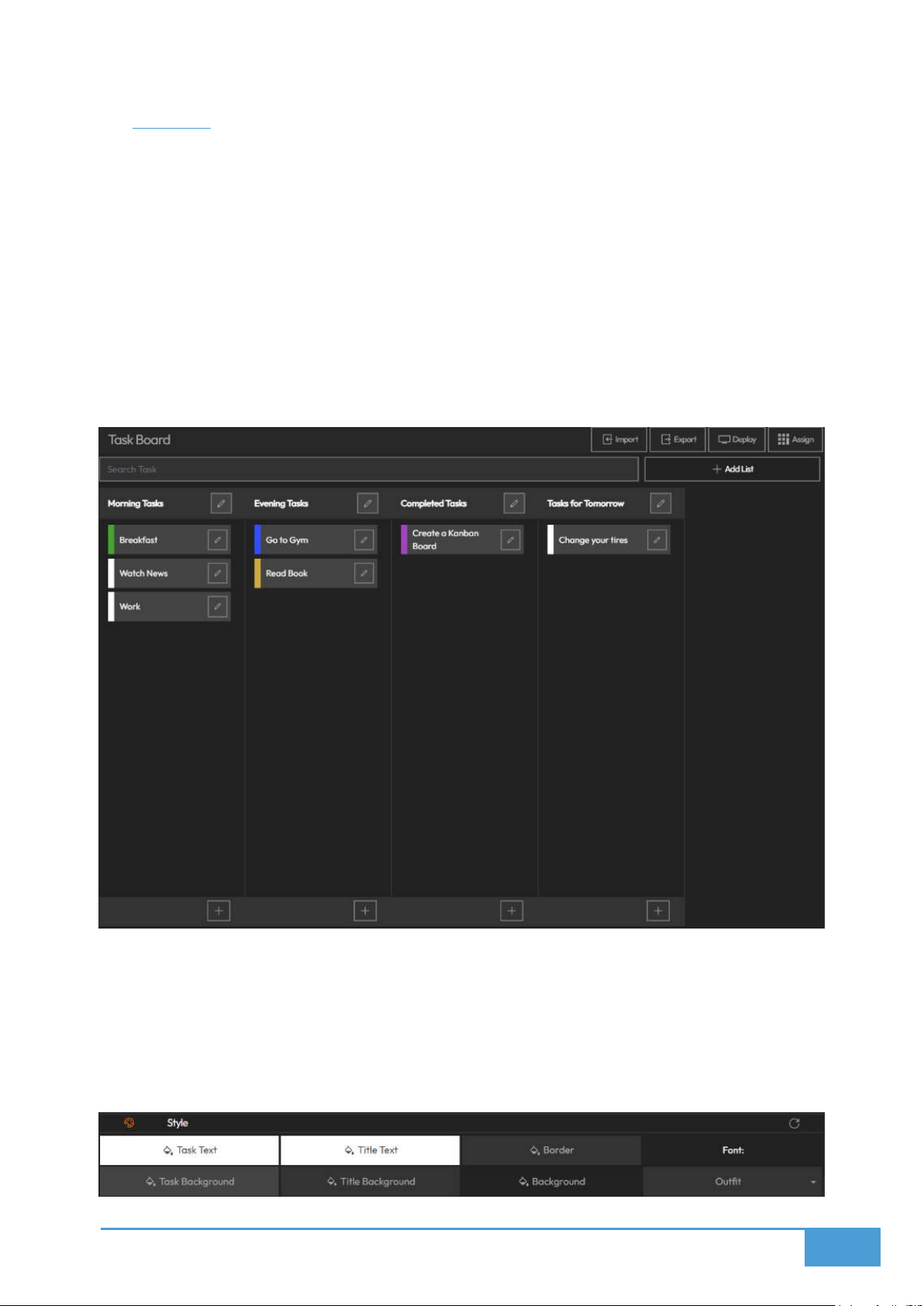
98
8.10 Boards
The Boards module enables you to seamlessly manage and integrate interactive Kanban style
task boards into your display environment.
8.10.1 Import and Export Types
Export from Trello: Open your Trello Board, navigate through Menu to More, select Print
& Export, click Export as JSON, and save the file to your device.
Import to Lygos: Go to Import and upload your saved Trello JSON file.
Lygos Board JSON Format: You can export and import directly utilizing Lygos' native
JSON structure.
8.10.2 Board Features
Drag & Drop: You can move tasks between different lists and freely reorder the lists
themselves utilizing drag and drop support.
Customization: You can visually style your Kanban board to perfectly match your brand
or personal preferences.
Page 99
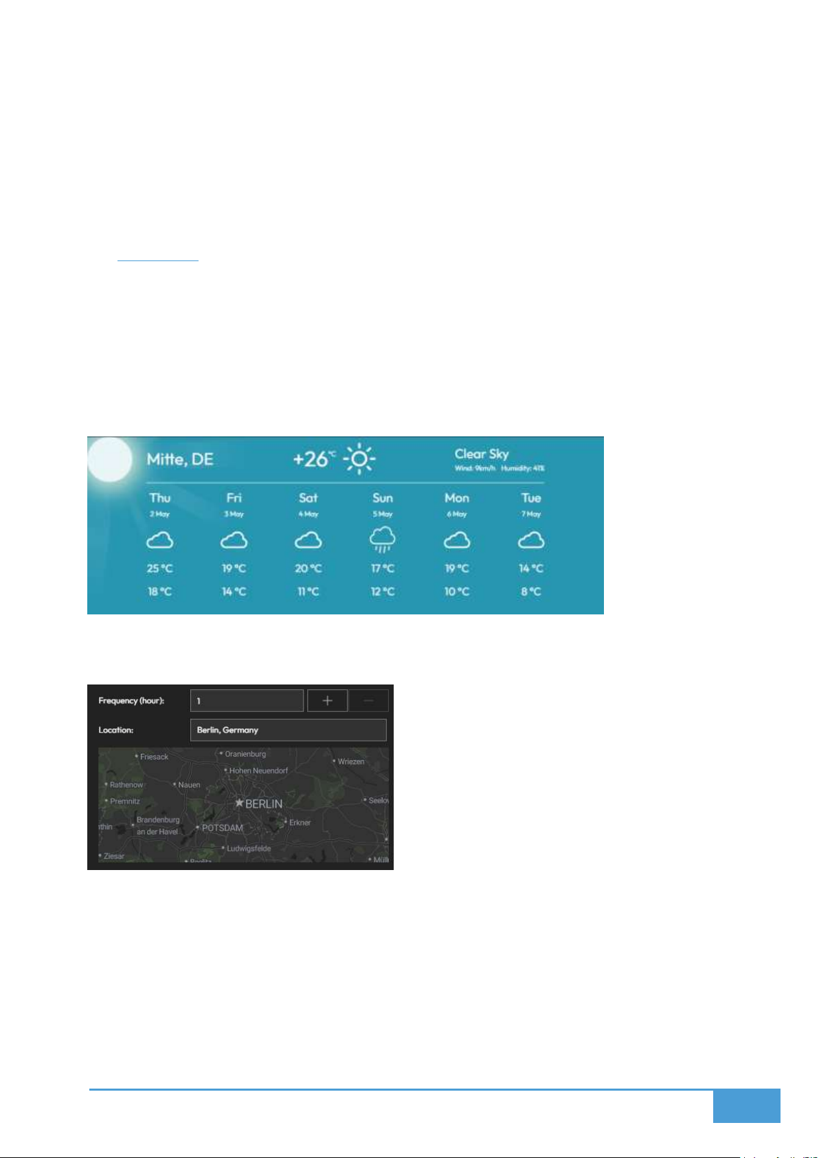
99
8.10.3 Deploy on Video Walls and Dashboards
Deploy from the Editor by pressing Deploy, choosing a screenspace, and selecting
whether to swap with a deployed visualization or load into an empty slot.
You can also deploy via the Display Module by selecting your screenspace and layout,
then dragging your visualization into the active grid.
8.11 Weather
The Weather module allows you to integrate dynamic forecasts and real-time meteorological
data onto your displays.
8.11.1 Location and Frequency
Location: Enter the specific location you wish to monitor, which can be changed at any
time.
Update Frequency: Establish exactly how often the weather data should refresh, such as
hourly or every 15 minutes.
8.11.2 Display Settings
Temp Scale: Choose between Fahrenheit and Celsius.
Icon Set: Select distinct icon styles to represent weather indicators.
Background Images: Toggle animated background visuals, noting that this only
functions when your layout size is equal to or smaller than the screen.
Background Color: Establish a solid background color to be utilized when background
Page 100
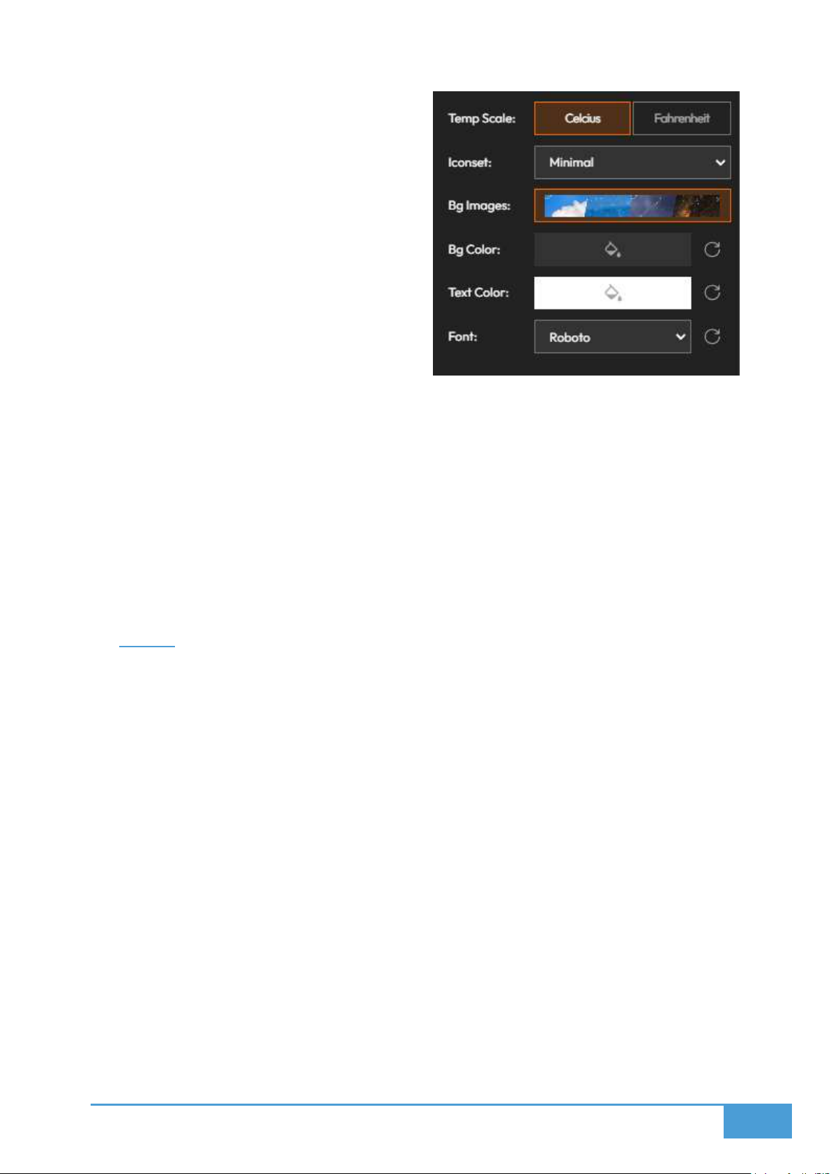
100
images are disabled.
Text Color & Font: Customize the text
color and font style.
8.11.3 Visibility Options
Weekly View: Displays the weather
forecast for the upcoming six days.
Weekly Min/Max: Displays the maximum
and minimum temperatures when the
Weekly View is active.
Hourly View: Displays the forecast broken down into three hour intervals.
Hourly Data Toggles: Show or hide specific hourly data points, including Humidity, Wind,
and Temperature.
8.11.4 Deploy on Video Walls and Dashboards
Deploy directly through the Editor by clicking Deploy, picking a screenspace, and
choosing to swap with a current visual or load into the first open spot.
Alternatively, utilize the Display Module to select your layout and screenspace before
dragging the visualization into the grid.
8.12 News
The News module provides a streamlined method for integrating external updates and live
information feeds into your workspace..
8.12.1 Add RSS Feed
Step 1: Enter your target RSS Feed URL into the provided input field.
Step 2: Click the Confirm checkmark button.
Step 3: The news items from your selected feed will immediately render in the view.
8.12.2 Customize View
You can adjust the visual style to dictate exactly how your news feed renders on screen.
You can personalize the colors, layout, and fonts to perfectly match your overall screen
design.
 Loading...