

KLA 482-22-0800 User Manual
Chapter 4 Analyzing Data
Using the Zoom Mode
To enter zoom mode, click on the Zoom icon and choose a zoom mode from the
pop-up menu.
In zoom mode, the cursor becomes a magnifying glass as you move it over the line plot
graph. The following table describes zoom mode options you can select from the pop-up
menu.
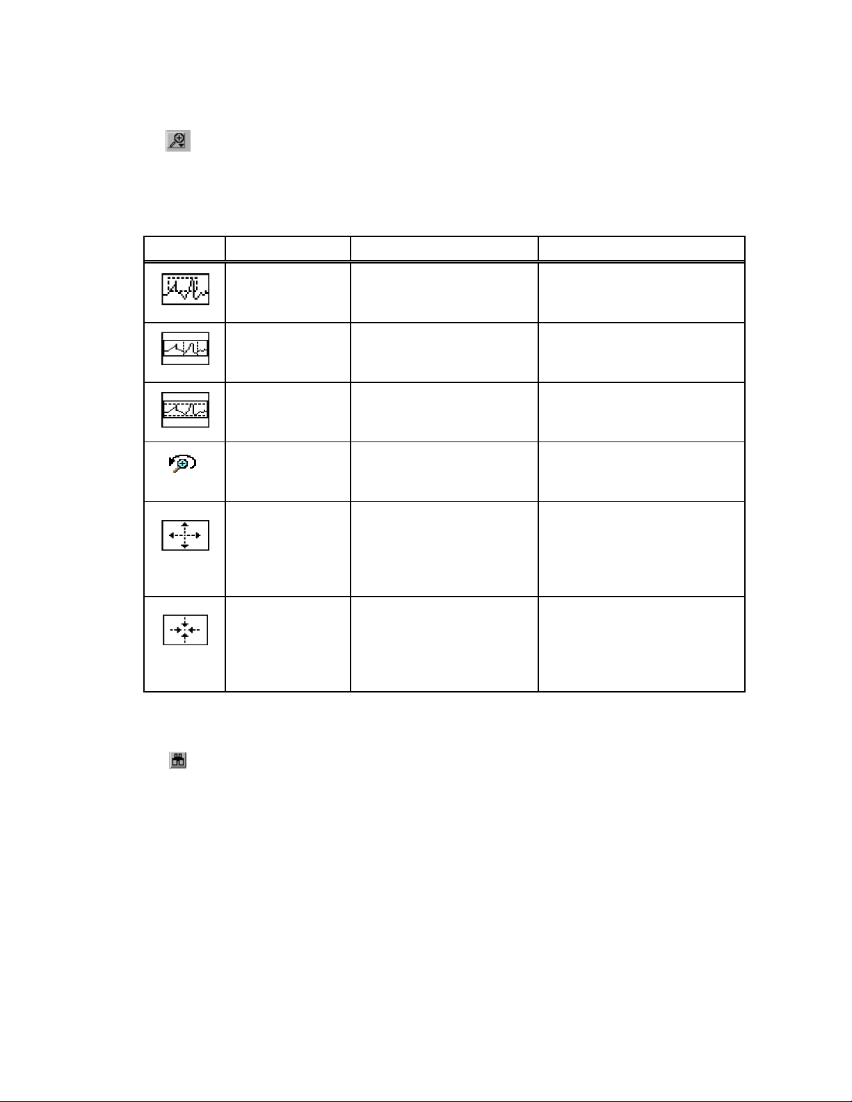
Icon Name Function How to Use
Zoom on Area Magnifies a selected
Zoom on x-axis Magnifies a portion of the
Zoom on y-axis Magnifies a portion of the
Undo Zoom Reverses the last zoom
Zoom In Repeatedly zooms in
Zoom Out Repeatedly zooms out
rectangle of the graph
x axis
y-axis
action
towards the cursor
away from the cursor
Click near an area of interest
and drag the mouse to select
a rectangular region
Click to one side of the area
of interest and drag the
mouse horizontally
Click above or below the
area of interest and drag the
mouse vertically
Click on this icon to undo the
last zoom action—this is a
single level undo
Click on the point on the
graph from which to zoom
in. Pressing and holding the
mouse button causes
repeated zooming.
Click on the point on the
graph from which zoom out.
Pressing and holding the
mouse button causes
repeated zooming.
Returning to the Default View
After using the Zoom mode, you can return to the original display—where all data
displays in the window—by clicking on Binocular icon.
Accura°C User Manual 4-8 °SensArray
Chapter 4 Analyzing Data
Selecting Data with Graphical Cursors
With cursors, you can view specific data or a range of data on the line plot graph.
Thermal MAP has two types of cursors: crosshairs and selection bars. This section
discusses using and positioning both types.
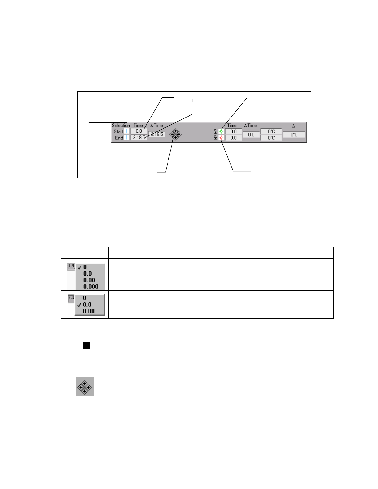
Selection
Bars
Arrow Controls
Figure 4-4. Crosshair and Selection Bar Controls
When generating numeric, surface, and contour maps, the displays are generated for the
leftmost, or “Start” selection bar. When generating an Animation or Derived file, you
select a range of samples or time using both selection bars.
Precision
This section describes how to change the precision of the displays.
Control Description
With the y.yy icon, you can set the y scale precision for zero to three decimal
places. If you enable the right-hand scale, a separate y.yy menu appears under
the scale. You control the right- and left-hand scale precision independently.
Time/Sample Controls
Green Crosshair
Red Crosshair
Use the x.xx icon to set the precision of the x scale from zero to two decimal
places. This function applies only when the x-axis is a factor of time, not
sample number.
Display Options
Click on the black (or white) box to change the graph background from white to
black (or vice versa).
Arrow Controls
With the arrow controls, you can move the selection bar or crosshair in small
increments.
°SensArray 4-9
Accura°C User Manual
Chapter 4 Analyzing Data
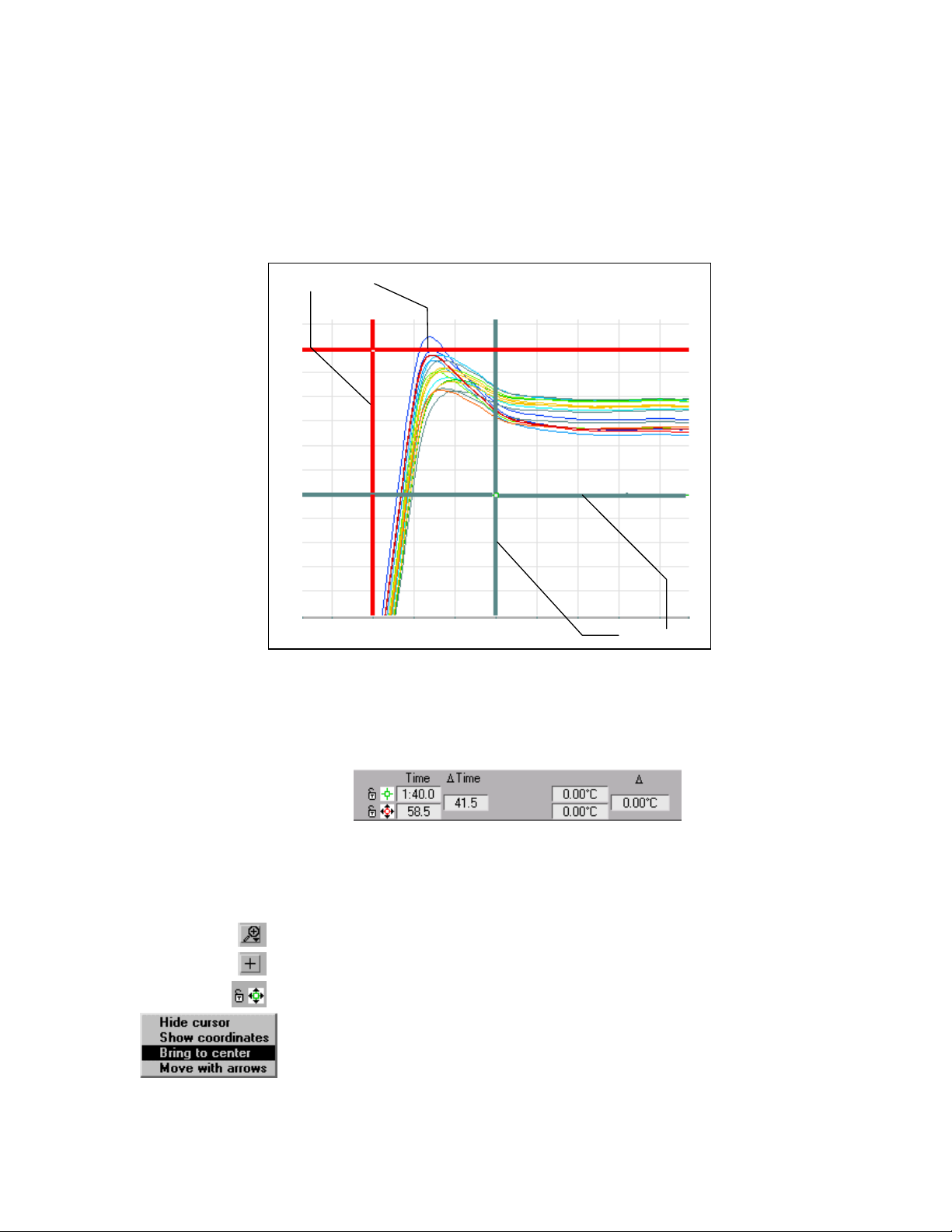
Using Crosshairs
With crosshairs, you can select points on a line plot for a specific sensor. The line plot
graph includes a pair of crosshairs that are useful for determining the values of points on
the graph. Two crosshairs with open dots in the center are illustrated in Figure 4-5. You
can use both crosshairs to observe the difference in time and temperature between two
points on a plot.
Red Crosshair
Green Crosshair
Figure 4-5. Crosshairs on a Line Plot Graph
You can position crosshairs and read the corresponding values from the control window.
The red and green crosshairs appear in the plot area of the line plot graph. The color of
the crosshair corresponds to the color in the crosshair controls. The crosshair controls
displays the x and y coordinates of the crosshair intersection, as shown below.
Positioning Crosshairs
To position the crosshairs in a specific area of the line plot graph, complete the following
steps.
Using the Zoom icon, zoom in on a portion of graph
Click on the Crosshair icon
Click on the green crosshair control
Select the Bring to Center item from the pop-up menu. At this point, You can
position the crosshairs, with the arrow control buttons, or by entering a value in the
sample/time field, or by moving the crosshair directly
Accura°C User Manual 4-10 °SensArray
Chapter 4 Analyzing Data
• To move the crosshairs directly, you must grab the crosshair within the graph and
drag it to the desired location. Grabbing and dragging a crosshair along either of its
axes moves the crosshair along only vertically or horizontally. To move the crosshair
along both axes, grab and drag within the symbol at the intersection of the crosshair’s
axes.
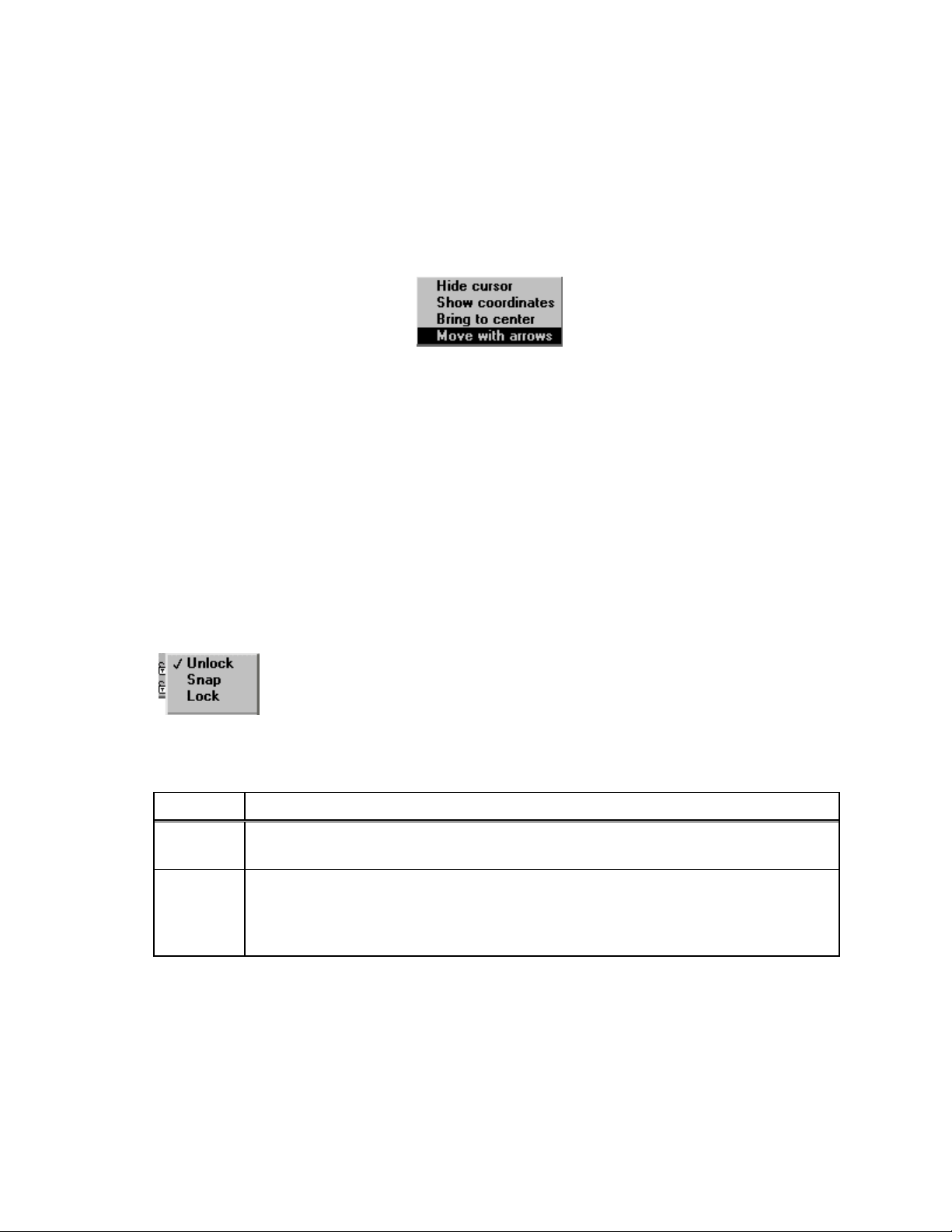
• To use the arrow control buttons, first select the crosshair. Click on the Crosshair
icon in the graphic window or click on the associated Red or Green Crosshair icon
and select the Move with Arrows item from the pop-up menu.
You have selected the icon successfully if black or white arrows appear around the icon.
To select both crosshairs, first select one crosshair and then open the pop-up menu for the
second one and select the Move with Arrows option. You move the crosshair left, right,
up or down by pressing the appropriate arrow control button. The crosshair continues to
move as long as you hold down the mouse button. The difference between the x positions
and y positions of the two crosshairs can be read from the delta time and delta value
columns on the crosshair controls.
Depending on setting of the “Scroll Graph with Cursors” Preference, when positioning
crosshairs, if you drag the crosshair outside the graph area in any direction, the graph
may pan in that direction. If the crosshairs are not visible on the graph, click on the Red
or Green Crosshair icon and select Bring to center from the pop-up menu.
Locking Crosshairs on Sensors
To view measurements from a specific sensor, you can lock a crosshair to that
sensor. You access the lock menu items by clicking on the Padlock icons
beside the green and red crosshair icons.
The following table describes options from the pull-down menu.
Item Description
Unlock
Snap Snaps the crosshair to a specific sensor. When Snap is selected, the crosshair snaps
Drag the crosshair anywhere on the graph. You can also move an unlocked
crosshair by entering the coordinates into crosshair controls, shown below.
to the closest sensor. When a Snapped crosshair is dragged horizontally, it will
follow the trace. When it is dragged vertically, it will snap from one sensor trace to
another.
°SensArray 4-11
Accura°C User Manual
Chapter 4 Analyzing Data
Item Description
Lock Locks the crosshair to a specific sensor. When Lock is selected, the crosshair locks
to the closest sensor. Alternately, you can select a specific sensor in the bottom
portion of the menu, and the crosshair will lock to that sensor. When a Locked
crosshair is dragged horizontally, it will follow the trace. Locked crosshairs cannot
be dragged vertically, and can only be moved to another sensor trace with the popup menu.
Note: Sensor names appear in gray on the menu if they are not enabled. Sensors can be
When the crosshair is locked or snapped, you can drag the crosshair to a specific
location on the line or use the left and right arrow controls to move the crosshair in
increments. The up and down arrow controls have no effect.
enabled or disabled on the Sensor Map or Calculated and System Channels
Legend.
The Padlock icon indicates if the crosshair is locked or snapped to a specific
sensor. If the crosshair is snapped, the padlock is closed and gray. If neither option
is selected, the padlock is open.
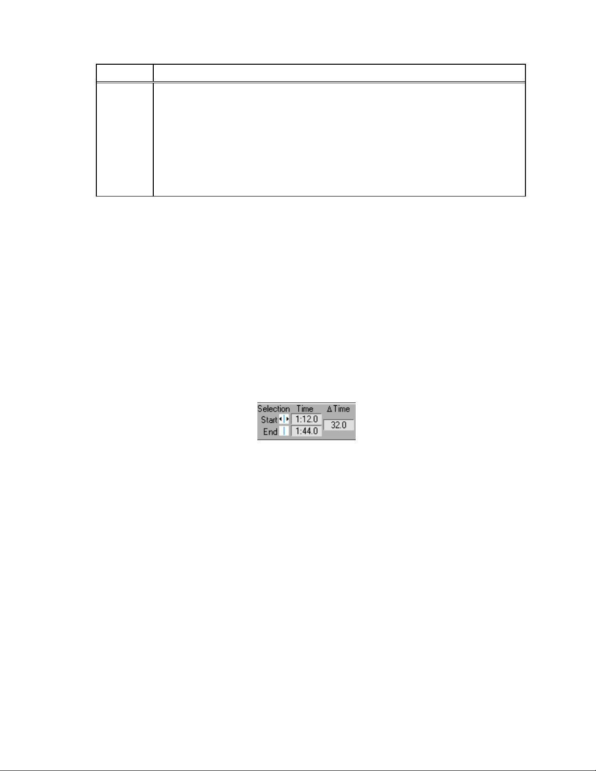
Using Selection Bars
With Selection Bars, you can view a scan or a specific range of time/sample readings.
You can position selector bars with the following methods.
• Grab the bar and move manually.
• Select the bar and use the arrow control buttons.
• Enter values into the start and end times in the selection bar controls, shown below.
You can use the pair of selector bars (shown in blue) to select scans on the line plot
graph. The selector bars are initially located at the left and right edges of the plot, as
shown in Figure 4-6.
Accura°C User Manual 4-12 °SensArray

Chapter 4 Analyzing Data
Figure 4-6. Using Selection Bars
To view sensor data for a single sample in a point in time, called a scan, you use the lefthand selector bar.
You can also position both bars to select a range of data for creating an Animation or
Derived file.
Printing Line Plots
You can print the line plot display, legends, and data file information.
To print the current line plot, select File»Print Window to print the current line plot or
File»Print Report to print the current line plot, along with information and comments
about the file.
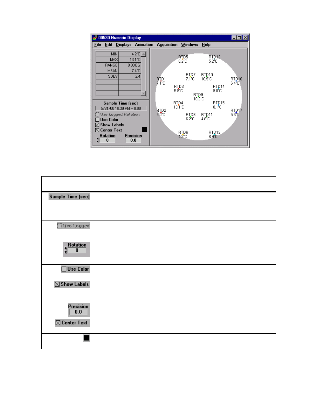
Using the Numeric Display
You can view temperature values superimposed on a graphic of the wafer using the
Numeric display, shown in Figure 4-7, by selecting Displays»Numeric on the Analysis
window.
The leftmost selection bar on the line plot (or the first scan selected in the data table)
determines which sample is displayed in the Numeric display window. The temperature
of each sensor is displayed at each sensor location. When you move a selection bar, the
display updates automatically. You can move the selection bar without closing the
Numeric display.
°SensArray 4-13
Accura°C User Manual
Chapter 4 Analyzing Data
The following table describes fields, buttons, and checkboxes on the Numeric display
window.
Figure 4-7. Numeric Display
Field/Button/
Checkbox
Definition or Result
The date and sample time (expressed as the start time plus elapsed time).
For example, 5/31/00 10:39 PM + 0:00 means that the data
acquisition was started on May 31
st
, 2000 at 10:59 PM, and this scan is 0 (zero)
seconds into the run.
Uses the rotation logged with the sample. If no rotation is logged with the
sample, the field is dimmed and cannot be checked.
Rotates the display map relative to a centered position at the 0° value. To rotate
the map clockwise, select decreasing values. Alternately, you can rotate the
map counter clockwise by increasing the counter value. In addition, you can
rotate the map by clicking directly on the wafer map and dragging.
Displays the sensor identifier and temperature reading in the color related to the
sensor on the line plot
When checked, labels identify each specific sensor and the associated
temperature value. If you do not check the box, the labels show only
temperature values.
The number of decimal places in which sample data is represented. You can
select a new decimal place from the precision pop-up menu.
When checked, centers the text over the colored dot representing the sensor.
When unchecked, places the text above or to one side of the dot.
The reverse video option for the wafer display. Clicking on this square toggles
the map background color between black and white.
To print the numeric display, chose File>Print Window or File>Print Report.
Accura°C User Manual 4-14 °SensArray
Chapter 4 Analyzing Data
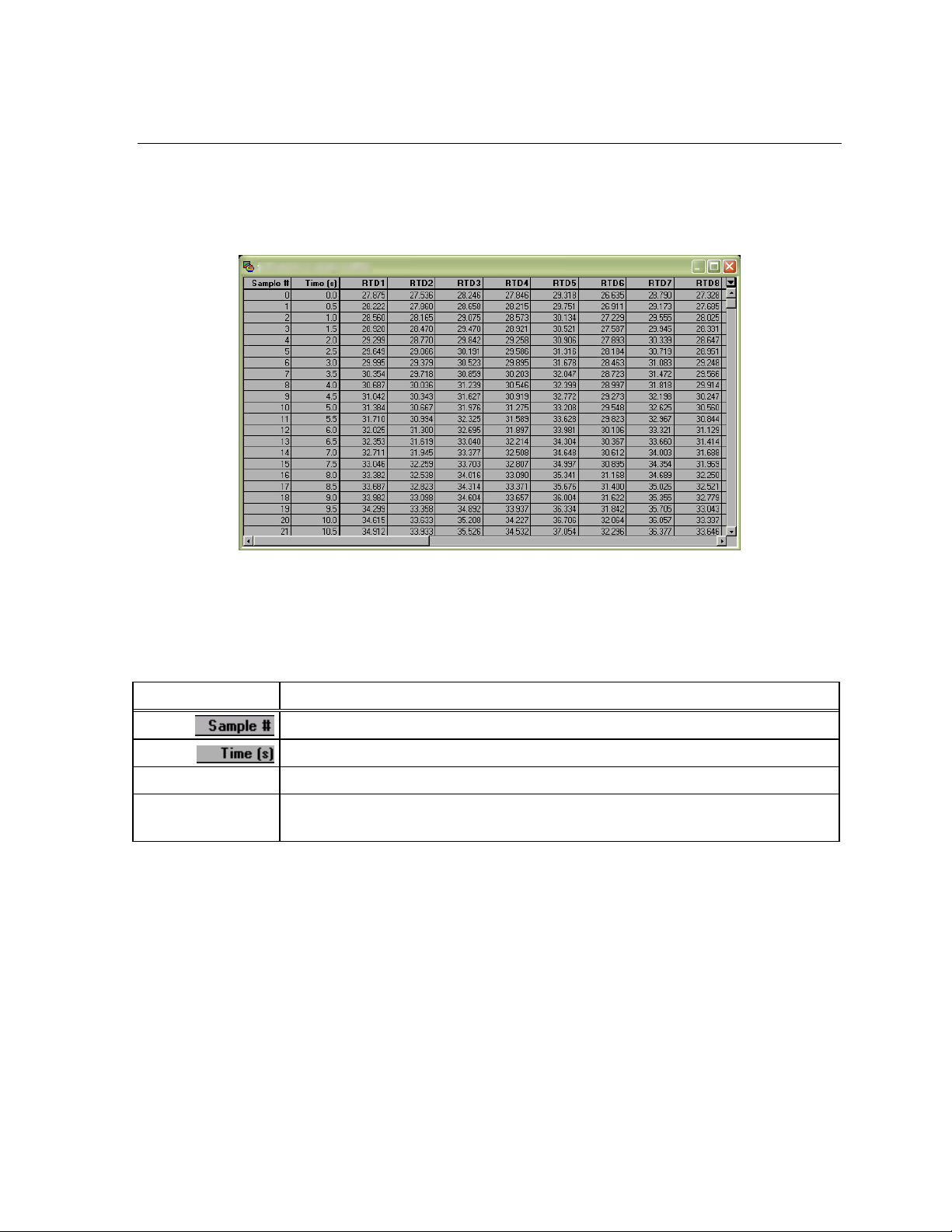
Using Data Tables
The data table presents the temperature data in a spreadsheet-like format in which each
row shows readings taken during one sample, as shown in Figure 4-8.
To open a Data Table window, select Displays»Table on the Analysis window. The
tabular data corresponds to the data that appears in the Analysis window.
Figure 4-8. Data Table Window
Note: The cells in the data table are display only. You cannot enter or update information
in the cells.
The data in the table appears in rows and columns. The headings appear across the
spreadsheet in the following order.
Column Heading Description
Sample number of each row.
Starting time of the sample relative to the start of acquisition.
RTD1, RTD2, etc.
Calculated
Channels
Data from the sensors of the Process Probe wafer.
Calculated channel values, if specified.
Selecting Data
With the data table, you can select data that you want to view. Selected data is reflected
by the position of the Selection Bars in the Analysis window. You have the option of
selecting one sample, all samples, or a range of samples.
• Select one sample—Click on the row where the sample is listed. This action
automatically de-selects previous selections.
• Select all samples—Use the Data Table arrow menu.
• Select a range of samples—Click on the sample, hold down the <Shift> key and
select another sample. The samples do not need to be adjacent. Using this procedure,
you can also extend the range of a selected set of samples.
°SensArray 4-15
Accura°C User Manual
Chapter 4 Analyzing Data
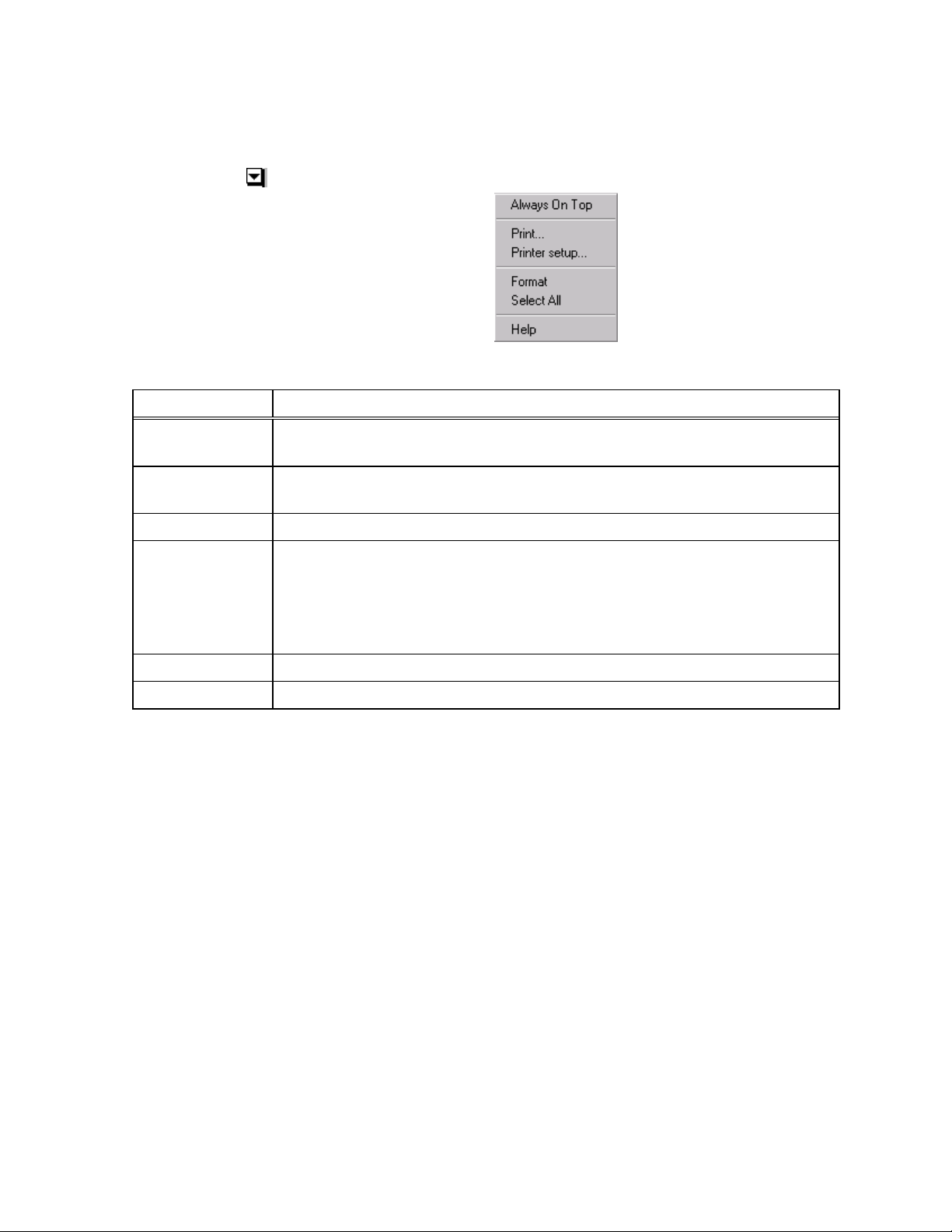
Data Table Options
You can control the data table display using options from a pull-down menu.
To access options menu, click on the Arrow icon on the Data Table window.
The following table describes the options.
Option Result
Always on Top
Print
Printer Setup
Format
Select All
Help
When this option is checked, the table will float on top of all open
Thermal MAP windows.
Prints the data table. A Print dialog box appears in which you can set parameters
and proceed or cancel the print job.
Opens a dialog box where you can select printer options.
This command opens a window where you can change the number of digits each
data column in the data table displays. (The format of the Sample Number and
Time columns is determined automatically and cannot be changed).
To save the settings as the default for viewing the data table, check the Make
Current Setting Default check box.
Selects every sample in the data table.
Opens online help for this window.
Accura°C User Manual 4-16 °SensArray
Chapter 4 Analyzing Data
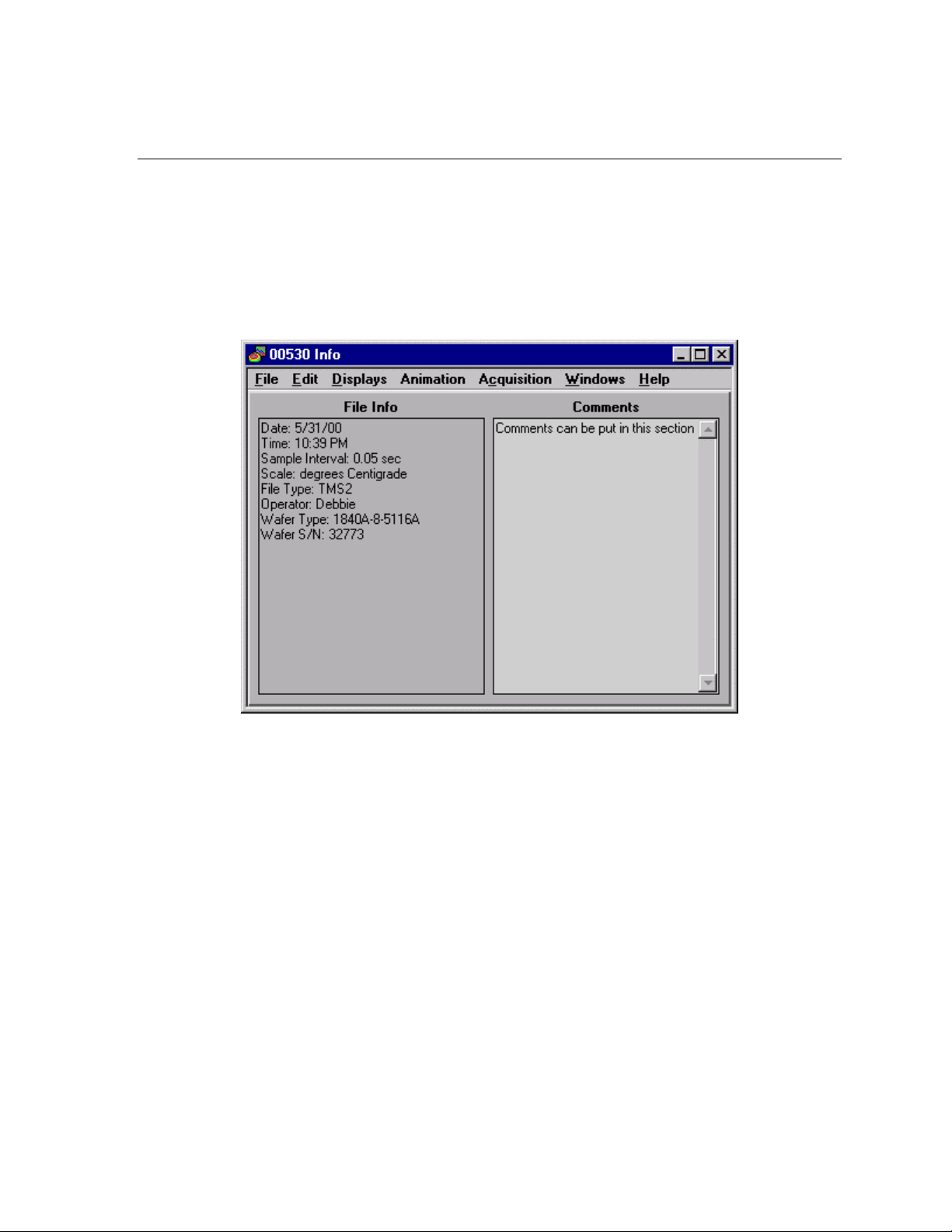
Displaying Information about the Data File
To view information about the data file, select Displays»Info on the Analysis window to
open the Data Info window, as shown in Figure 4-9.
The left side of this window displays information such as operator name, time and date of
creation, and parameters established before acquisition. This is display-only information;
you cannot edit or update information.
In the Comments section, you can edit or update the comments by clicking in the box and
entering changes.
Figure 4-9. Data Info Window
°SensArray 4-17
Accura°C User Manual
 Loading...