

Fiery TASKalfa 3051ci, TASKalfa 3551ci, TASKalfa 4551ci, TASKalfa 5551ci, Color Server Reference Manual
Page 1
Fiery®Color Server
Fiery Color Reference
Page 2

© 2009 Electronics for Imaging, Inc. The information in this publication is covered
under Legal Notices for this product.
45087207
1 September 2009
Page 3

CONTENTS
CONTENTS
CONTENTS 3
INTRODUCTION 7
About this document 7
For additional information 7
OVERVIEW OF COLOR MANAGEMENT CONCEPTS 8
Understanding color management systems 8
How color management works 9
Using ColorWise and application color management 10
Using ColorWise color management tools 11
USING COLOR MANAGEMENT WORKFLOWS 12
Understanding workflows 12
Standard recommended workflow 14
Choosing colors 15
Understanding color models 16
Optimizing for output type 17
Maintaining color accuracy 18
MANAGING COLOR IN OFFICE APPLICATIONS 19
Using office applications 19
Color matching with office applications 20
Working with office applications 20
Defining colors 20
Working with imported files 21
Selecting options when printing 21
Output profiles 22
Ensuring color accuracy when you save a file 22
Page 4

CONTENTS 4
MANAGING COLOR IN POSTSCRIPT APPLICATIONS 23
Working with PostScript applications 23
Color matching with PostScript applications 24
Using color reference pages to match color 24
Using the CMYK Color Reference 24
Using the PANTONE reference 25
Working with imported objects 25
Mixing object types (Advanced color management) 26
Using CMYK source profiles 26
Using application-defined halftones 27
Ensuring color accuracy when you save a file 27
MANAGING COLOR IN ADOBE PHOTOSHOP 28
Specifying color settings 28
Configuring Photoshop color settings 28
Saving files from Photoshop 31
Choosing a file format 31
Selecting options when printing 34
Advanced tips for using PostScript color management 36
MANAGING COLOR IN PAGE LAYOUT APPLICATIONS 38
Adobe InDesign 39
InDesign color settings 39
Importing objects 41
Selecting options when printing 42
QuarkXPress 45
Importing objects 45
Selecting options when printing 45
Optional color management from QuarkXPress 46
Page 5

CONTENTS 5
MANAGING COLOR IN ILLUSTRATION APPLICATIONS 47
Adobe Illustrator 47
Note about color models in Illustrator 47
Illustrator color settings 48
Saving files for importing into other documents 50
Specifying print options 50
Using Illustrator color management 53
CorelDRAW 53
Defining colors 53
Importing objects 54
Saving files for importing into other documents 54
Specifying print options 54
Optional color management in CorelDRAW 55
MANAGING COLOR IN ADOBE ACROBAT 56
Specifying color settings 57
Selecting options when printing 58
DESKTOP COLOR PRIMER 60
The properties of color 60
The physics of color 61
CIE color model 62
Hue, saturation, and brightness 62
Additive and subtractive color systems 64
Understanding color gamut 67
Printing techniques 67
Halftone and continuous tone devices 68
Using color effectively 68
General guidelines 69
Color wheel 69
Color and text 71
Page 6

CONTENTS 6
Raster images and vector graphics 72
Optimizing files for processing and printing 73
Resolution of raster images 73
Scaling 74
BIBLIOGRAPHY 75
GLOSSARY 77
INDEX 89
Page 7

INTRODUCTION
About this document
INTRODUCTION 7
This document provides a reference for information about optimizing color printing
with the Color Server and improving color quality and performance for all Color Server
models. Specific features and options may vary, depending on the Color Server model at
your site.
NOTE: The term “printer” is used throughout this document to denote a supported printer
or copier. The term “toner” refers to toner or ink.
This document provides an overview of general color concepts, with a specific focus on color
management for print output. It describes multiple scenarios (called workflows) during which
color information can be specified. It also provides application notes that explain how to print
to the Color Server from popular Microsoft Windows and Apple Mac OS applications.
Color terms and concepts, such as “color space,” “spot color,” “gamut,” and “source profile”
appear in bold throughout this document. If you are new to desktop color, or if any terms are
unfamiliar, see the “Glossary” on page 77.
For additional information
This document is one in a set of documentation that includes documents for both users and
system administrators. For a description of all of the available documentation, see Wel co me .
All other documents should be available at your site. For more information, see the following
documents as directed.
For additional information about the topics discussed in this document, see:
• Color Printing: For detailed information about the color printing options and settings
available with your Color Server, as well as the ColorWise color management system built
into your Color Server.
• Printing: For information about how to set the ColorWise print options.
For information about performing color management tasks and using
Command WorkStation, see Command WorkStation Help.
For general information about printing in color, see “Desktop Color Primer” on page 60 and
the sources in the “Bibliography” on page 75.
Page 8

OVERVIEW OF COLOR MANAGEMENT CONCEPTS 8
OVERVIEW OF COLOR MANAGEMENT CONCEPTS
To create successful color documents and presentations, you can take advantage of the features
of color management software as they are implemented by the Color Server and on your
desktop computer. This chapter is devoted to various elements of color management that
contribute to predictable color results.
Understanding color management systems
A color management system (CMS) is a “translator” between the color space of the source
device (for example, a monitor or scanner) and the color space of the destination device
(for example, the printer). It compares the color space in which the source object is created
to the color space in which the job is output, and adjusts the colors in the document to
maintain consistency across different devices. A CMS typically uses a device-independent
color space, such as CIELAB, as its intermediate color space. To perform its translation,
a CMS needs information about the color space of the source object and the gamut of the
printer. This information is provided through profiles, often created by the manufacturers
of the computer monitor or printer. The end product of a CMS conversion is a printed
document or object file in the gamut of a particular printer.
Progress is being made toward standardization in the field of digital color management
systems. Windows and Mac OS operating systems support an industry standard format
developed by the International Color Consortium (ICC). This ICC format is implemented
on Windows and Mac OS computers. Other software developers are also incorporating CMSs
into high-end applications. The Color Server CMS, ColorWise, supports this standard
profile format.
You can use the EFI Color Profiler Suite (an optional software package) to create color profiles
that are fully compliant with ICC standards, evaluate the profiles, edit them, and test them.
EFI Color Profiler Suite includes a spectrophotometer that you can use to create profiles.
Page 9

OVERVIEW OF COLOR MANAGEMENT CONCEPTS 9
Col
How color management works
Before you can print a color document, the color data in it must be converted to the gamut
of the printer. Whether performed by the Color Server or a host-based CMS, the process of
converting color data for a printer is the same: the CMS interprets RGB object data according
to a specified source profile and adjusts both RGB and CMYK data according to a specified
output profile, also called a destination profile by some color management systems.
or
m
a
m
n
t
n
e
e
a
sys
g
tem
Source
profile
Device-independent
color space
Input data Printed data or file
Output
profile
The source profile defines the RGB color space of the object’s source: characteristics such as
the white point, gamma, and type of phosphor used. The output profile defines the gamut of
an output device, such as a printer. The Color Server (or host-based CMS) uses a deviceindependent color space to translate between the source color space and the color space of
the output device.
The Color Server allows you to specify default and override settings for the source color
space information and the output profile information (see Color Printing). When you use
these settings, you do not need to use the features of other color management systems.
Your Color Server software includes ICC profile for use with other color management
systems, although conflicts may arise when the Color Server CMS is used in conjunction
with a host CMS.
You can also use color management systems to adjust color data to the gamut of an output
device other than the one to which you are printing. This process of simulating another
output device is commonly used for proofing jobs that are printed on an offset press.
For more information about the Color Server simulation feature, see Color Printing.
The type of print job and the final output device, Color Server or offset press, determines
the workflow that provides the best results. For information about choosing workflows,
see “Using Color Management Workflows” on page 12.
Page 10

OVERVIEW OF COLOR MANAGEMENT CONCEPTS 10
Using ColorWise and application color management
The Color Server CMS, ColorWise, is designed to provide casual and expert users the best
color output for a variety of purposes. Several applications also provide their own CMS.
This document describes how to optimize print output using ColorWise color management
and application color management.
The Color Server intelligently manages the printed appearance of RGB, CMYK, and spot
colors. You can allow the Color Server to manage color for most color printing jobs without
adjusting any settings.
A desktop (host-based) CMS uses ICC profiles to convert colors from one device gamut to
another (see “Desktop Color Primer” on page 60). The color data is converted when it passes
from one application to another or when the job is sent to the printer; thus, the processing
occurs on your computer, as opposed to the Color Server.
Conventional color management systems typically address only color conversions, and they
occupy your computer processor. When you use ColorWise, jobs leave your computer and
are processed faster on the Color Server.
The advantages to ColorWise color management versus desktop (application) color
management include the following:
• Relieving your computer from performing additional processing. Delaying color
conversions until the color data reaches the Color Server frees your computer so that
you can continue working. Color conversions on the Color Server are, in most cases,
much faster than similar conversions on a host computer.
• Eliminating the potential for undesirable color management-related conflicts, such as
iterative color conversions and inconsistent color between applications. The Color Server
applies global corrections to specific groups of RGB, CMYK, and spot colors to avoid
such conflicts.
• Accepting RGB files in addition to larger CMYK files from applications, which minimizes
network traffic and enables jobs to print faster.
ColorWise uses ICC profiles to convert colors to the device gamut or simulate other devices,
such as an offset printing press. ColorWise manages color conversions for all users printing
to the Color Server from Windows and Mac OS computers. It allows users to follow a simple
workflow with minimal intervention using robust default settings, while giving advanced
users the control and precision that they need.
Page 11

OVERVIEW OF COLOR MANAGEMENT CONCEPTS 11
Using ColorWise color management tools
Your Color Server user software includes several types of color reference pages that allow you
to see the range of colors that can be printed on your printer. For predictable color, use the
color reference pages when defining the colors in your document.
The available resources are as follows:
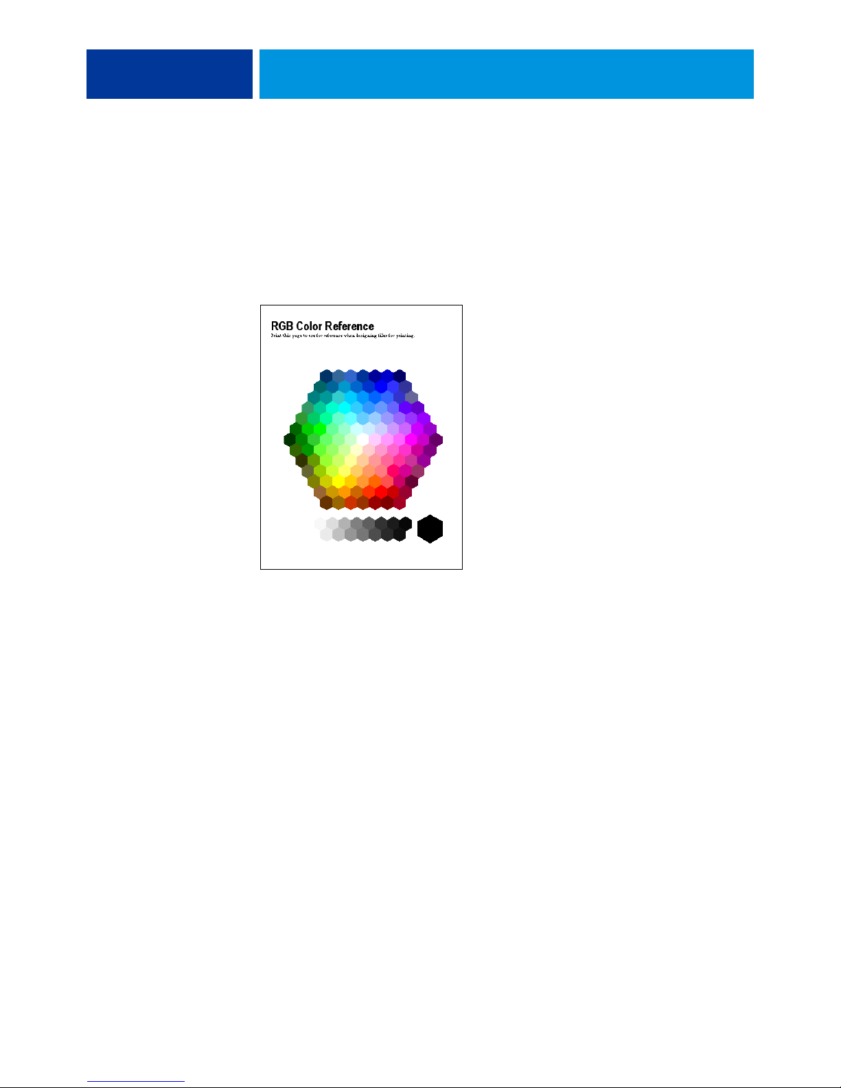
RGB Color Reference: A Microsoft Word file and a Microsoft PowerPoint file that allow you
to view the colors available in the standard palettes of office applications and see how those
colors print on the Color Server (see “Color matching with office applications” on page 20).
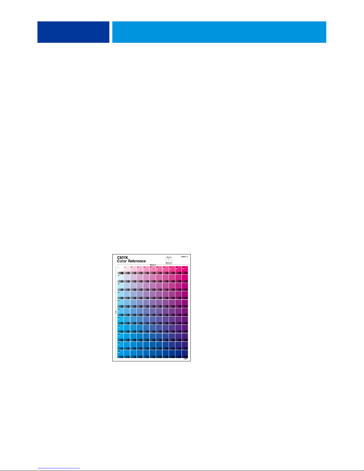
CMYK Color Reference: An 11-page, downloadable PostScript file of CMYK color patches
(see “Using the CMYK Color Reference” on page 24).
Process Simulation of PANTONE Solid Coated Colors: A 19-page, downloadable PostScript
file of color patches showing the CMYK equivalents of PANTONE Coated colors.
This file prints differently, depending on the setting of the Spot Color Matching option
(see “Using the PANTONE reference” on page 25).
In addition, you can print RGB, CMYK, and PANTONE color charts from the Color Server.
Page 12

USING COLOR MANAGEMENT WORKFLOWS 12
USING COLOR MANAGEMENT WORKFLOWS
A workflow is the path a print job follows from creation to destination. The workflow of any
job includes points at which decisions are made about how to define, use, and translate color.
The choices made, and the point at which they are made, impact the color output produced.
This chapter introduces issues with color management in specific desktop applications and
discusses the interaction between those applications and ColorWise color management.
Understanding workflows
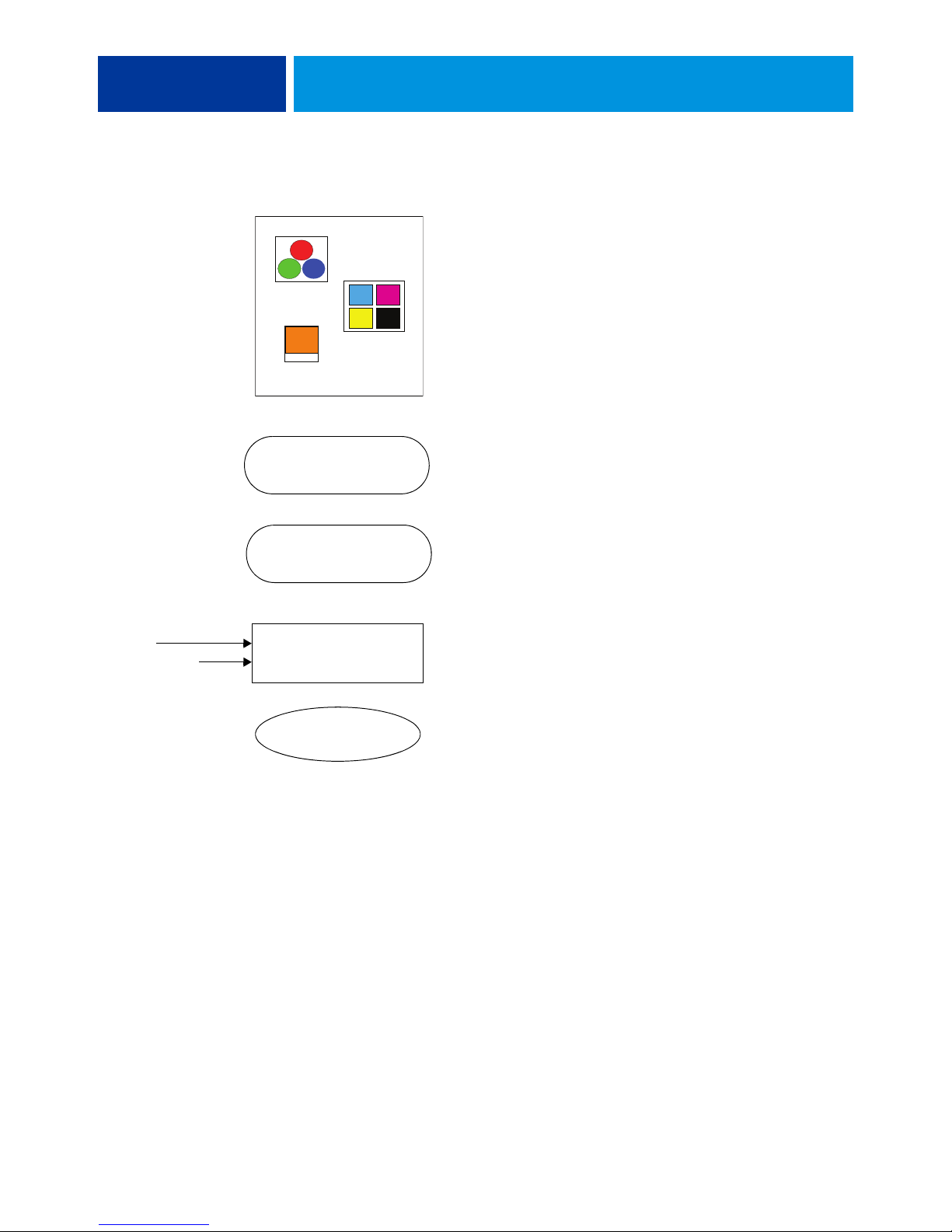
The term “workflow” is used to describe the path a job follows from its creation in a desktop
application to final printed output. The Color Server supports a variety of workflows with
different levels of complexity. There are several points at which color management can be
performed on a job (see the illustration on page 13). The information provided at each step
(for example, the type of color used) impacts the workflow of the job.
Always consider the complexity of the workflow. Every time colors are converted,
performance and color accuracy are affected. A workflow with a minimum number of steps
minimizes the risk of error.
Page 13
USING COLOR MANAGEMENT WORKFLOWS 13
Calibration
Device maintenance
DOCUMENT
RGB
CMYK
Spot
SAVE AS (File Format)
PRINT
Set ColorWise print options
Color Server
Application and operating system color management:
Turn off
Disable any CMS provided by the application or operating
system to ensure that the Color Server receives color data
properly and prints it accurately. For information, see the
documentation that accompanies your application.
NOTE: Color management between the display device
and the application cannot be disabled.
Select colors based on the desired output (see “Choosing
colors” on page 15).
Select file format based on the desired output. EPS data
is not manipulated. Other formats can be used if the file is
saved with the appropriate settings.
Use the ColorWise CMS as described in this document
and Color Printing.
Operating system color options: Disabled
Disable any CMS provided by the operating system.
Calibrate as described in Color Printing. Perform regular
maintenance as recommended by the printer manufacturer.
Use the paper stock, toner, and other materials
recommended by the printer manufacturer.
Optimal output
Page 14

USING COLOR MANAGEMENT WORKFLOWS 14
Standard recommended workflow
The Color Server is highly optimized for the specific printer it supports. ColorWise addresses
issues unique to your printer, including halftones, individual toner response, interactions
among toners, natural smoothness of blends, and the capability to render spot and custom
colors. The Color Server distinguishes text and graphics from image elements, so that black
channel information can be preserved while parameters used for CMYK color separations are
maintained.
The recommended standard color workflow uses ColorWise calibration and color
management. The Color Server comes into play near the end of the color workflow.
For this workflow:
• Bypass any color management of printed output in the application and operating system.
This ensures that the colors you select reach the Color Server and ColorWise in a
usable form. Consider, however, that ColorWise fully supports color management from
applications and printer drivers (see “Using ColorWise and application color
management” on page 10).
• Set the CMYK/Grayscale Source option in ColorWise to match the CMYK color space
used in the application to select the colors. Any CMYK/Grayscale Source setting (except
ColorWise Off, if available) applies calibration, so the response of the printer appears
stable.
Some examples of CMYK/Grayscale Source settings are SWOP or ISO Coated in the
U.S., Euroscale in Europe, and DIC or Japan Color in Japan. If colors have been selected
specifically for your calibrated Color Server, set CMYK/Grayscale Source to None.
• Set other ColorWise print options as appropriate. For a list and descriptions of ColorWise
print options that affect CMYK, RGB, spot, and other colors, see Color Printing.
Page 15

USING COLOR MANAGEMENT WORKFLOWS 15
Choosing colors
When working with color materials, whether they are presentations, illustrations,
or complicated page designs, you make aesthetic decisions about the colors you use. After you
set a goal, you must make the best use of the capabilities of your Color Server to realize your
design in print. Your color printing system becomes an ally in this creative process to the
extent that results are predictable:
• If you designed a poster to print on the Color Server, you want the printed colors to match
the design specification.
• If you are printing presentations on the Color Server, you want to preserve the vivid colors
that you see on the monitor.
• If you are working with color that is to be printed on an offset press, you want
the Color Server output to match other prepress proofs or PANTONE color swatch
books.
The colors that you define when creating a file in an application, and the color management
tools within the application that you use, impact how the file is processed (workflow) and the
final output that you can expect.
Use color management to control color output by performing the following tasks:
• Select a color model: Different types of applications use different color models. The color
model you select, and whether or when data is converted from one color model to another,
influences the final color output.
• Optimize for output type: The type of final output influences your color and application
choices.
• Use color matching tools: The Color Server provides several tools to preview colors
available on a device and define them within an application.
Page 16

USING COLOR MANAGEMENT WORKFLOWS 16
Understanding color models
You can define colors in several different color models, most commonly RGB, CMYK, and
a spot color matching system (such as PANTONE). Depending on the application you use,
you may or may not have a choice of the color model.
RGB colors are used when you take output from an RGB device such as a digital camera
or scanner. Another use of the RGB color model is for displaying colors on a monitor.
CMYK colors are what most printers use.
spot colors, such as PANTONE, are special inks manufactured to run on an offset printing
press. Spot colors can be simulated using CMYK toners (also known as process colors). With
the Spot Color Matching print option, you can determine how spot colors are printed at the
Color Server:
•
Spot Color Matching On uses color tables built into the Color Server to simulate the spot
color with the closest equivalent available using the CMYK toners of the copier/printer
connected to the Color Server.
If your Color Server supports the Spot-On application in Command WorkStation, you
can customize the spot color definitions used by ColorWise.
•
Spot Color Matching Off instructs the Color Server to simulate the spot color using CMYK
equivalents defined by the spot color manufacturer. These are the same CMYK values used
by applications that include spot color libraries. This CMYK combination is then printed
with the CMYK/Grayscale Source setting that you choose, such as SWOP or DIC.
The color model used by your application determines the methods available for choosing
colors, as well as the way color data is transmitted to the Color Server:
• Office applications, such as word processing, spreadsheet, and presentation graphics
applications, use the RGB color model. They typically transmit only RGB data to the
Color Server.
• Illustration applications use both the RGB and CMYK color models, but typically
transmit only CMYK data to the Color Server.
• Pixel-editing applications use both the RGB and CMYK color models. They transmit
RGB or CMYK data to the Color Server.
Page 17

USING COLOR MANAGEMENT WORKFLOWS 17
Optimizing for output type
You can use the Color Server for on-demand color printing and color proofing. On-demand
color printing refers to those jobs for which the Color Server is the final print device. Printing
jobs to the Color Server in preparation for printing on an offset press is referred to as color
proofing. Both types of Color Server print jobs can use RGB, CMYK, and spot colors.
Characteristics of on-demand jobs Characteristics of offset proofs
Bright, saturated colors are often desirable. Require the printed colors to match those from
another set of CMYK printing conditions.
Colors are achieved using the full range
of colors available, referred to as the full
gamut of the printer or, more simply,
device CMYK.
NOTE: The term “on-demand” applies to producing printed output when it is needed.
Colors that are specified for an offset press require
CMYK simulation that is optimized for proofing
on the printer.
You may be familiar with the term “short-run,” which usually applies to the volume of a
printing task. Although these terms do not mean exactly the same thing, “on-demand” in this
document applies also to short-run printing scenarios. Because you can print as many pages as
you need and reprint jobs quickly, the Color Server performs equally well in either
environment.
The type of printing you plan for a document, on-demand color printing on the Color Server
versus color proofing for eventual printing on an offset press, determines the way you define
colors, as well as the print option settings you choose.
• For on-demand color printing on the Color Server, use any application and define colors
in RGB or CMYK. If your application supports it, you can also choose colors from the
PANTONE color library. Choose the appropriate settings for print options affecting
color output (for descriptions of the print options, see Color Printing).
• For color proofing, use a PostScript-defined color in CMYK or choose colors from color
libraries, such as the PANTONE color library. Placed objects can also be defined in RGB
or CMYK. Choose the appropriate settings for print options affecting color output (see
Color Printing).
NOTE: The Color Server allows you to use RGB or CMYK data when printing proofs for an
offset press run. However, sending data to an imagesetter usually requires CMYK data.
Page 18

USING COLOR MANAGEMENT WORKFLOWS 18
Maintaining color accuracy
For the colors you see on your monitor to match those on your printed output, they must go
through color management, including precise calibration of your monitor and Color Server.
If viewing colors on the monitor is critical, consider using a professional profiling software
package and instrument, such as the EFI Color Profiler Suite, to create a monitor profile.
A monitor profile enables the application to compensate for the color behavior of the monitor
when displaying colors. As a result, colors previewed on the monitor more closely match the
colors in your printed output.
If you are not equipped or inclined to maintain accurate monitor color management, you can
opt for an easier approach. Determine which is more important to you: printed colors or
on-screen colors.
• If printed colors are your priority, choose colors from printed samples. By using sample
colors, you ensure that your printed output remains consistent, regardless of how the
colors appear on different monitors. Print the palette of available colors from business
applications and select colors from the printed samples. Color reference files are included
on the User Software CD or DVD. (For more information, see “Color matching with
office applications” on page 20 and “Color matching with PostScript applications” on
page 24.) You can also print color charts from the Color Server and select colors by name
or number from the printed samples. Advanced applications allow you to define colors
in the easier-to-control spot and CMYK color spaces. For more information about color
selection, see “Choosing colors” on page 15.
• If on-screen (displayed) colors are more important, trust your eyes and your monitor.
Visually select colors on your monitor, but be aware that colors are optimized only for your
monitor. When the document is opened on other monitors, the colors may look different.
Even though printed colors may not match those on your monitor, they still print to the
Color Server with good results.
Page 19

MANAGING COLOR IN OFFICE APPLICATIONS 19
MANAGING COLOR IN OFFICE APPLICATIONS
The ColorWise color management system provides complete color management for jobs
printed from office applications and other applications that do not generate PostScript.
This chapter provides instructions for printing color documents from applications such as
word processing, spreadsheet, and presentation graphics applications. Use these instructions
with the Microsoft Office applications.
Using office applications
The Color Server must receive PostScript instructions to print a document. Many
applications do not create these PostScript instructions, relying on the printer driver to create
them. Included in this category are most word processing, spreadsheet, and presentation
graphics applications. These applications use operating system features to render images for
display or printing. The term “office applications” is used in this document to refer to these
types of applications.
All office applications handle color similarly, using the same RGB color model used for
the color monitor. Most office applications allow you to choose colors from a palette of
preselected colors. Some allow you to add new colors to the palette using a color picker.
Although some applications allow you to specify color using the CMYK, HSL, and
HSV color models, these applications always send RGB color data to the Color Server.
(An exception to this is a CMYK EPS format file placed in a document, which is sent
as CMYK data.)
When working with color in office applications, consider the following:
• The range of colors that can be displayed in RGB on your monitor is much larger than
the range of colors that can be printed on your printer. When you print the document,
out-of-gamut RGB colors are mapped to the colors your printer can produce.
• Office applications send only RGB data to the Color Server. You control the rendering
style of the color conversion with your selection of a rendering intent.
Each rendering intent uses a different color rendering style and has a different way of
mapping unprintable colors to the color gamut of your printer. For more information
about color rendering intents, see Color Printing.
Page 20
RGB Color Reference
(Microsoft PowerPoint)
MANAGING COLOR IN OFFICE APPLICATIONS 20
Color matching with office applications
Your Color Server user software includes two RGB color reference pages, a Microsoft Word
file and a Microsoft PowerPoint file. You can print these files using different RGB print
options to see how the colors appear when printed to the Color Server. For best results, print
the color reference page using the same print options you plan to use for your final document.
Select the colors that you want to use from the printed version of the RGB color reference
page and use those colors in your document.
Working with office applications
Before printing from these applications, make sure that the appropriate printer driver and the
Color Server PPD (PostScript Printer Description) are installed on your computer, as
described in Printing.
Defining colors
Office applications use the RGB color model. The only way to use CMYK or PANTONE
colors is to define them in Encapsulated PostScript (EPS) format files with an illustration or
page layout application, and then place these files in Microsoft Office documents. Colors in
EPS files are preserved until they reach the Color Server (assuming no PostScript color
management information was included).
Office applications display EPS files at low resolution, but the EPS objects are printed at full
resolution. In general, use EPS files only when RGB colors are impractical in your specific
workflow. EPS files are useful when large or complex objects must be printed at full resolution
or exceed the memory allocation of some office applications.
Page 21

MANAGING COLOR IN OFFICE APPLICATIONS 21
Working with imported files
Your application may allow you to import a variety of file formats. If you encounter printing
problems when using other imported file formats, such as TIFF and PICT, EPS files are
recommended.
NOTE: If you cannot import EPS elements, it may be necessary to perform a “custom install”
of your office applications.
Even when there are no user-defined color management options within office applications,
color conversions occur when you import objects or page elements that were not defined in
RGB. To avoid such conversions with imported files, use the EPS file format for non-RGB
artwork that is to be imported into office applications.
All RGB objects placed in a document are affected by the settings you choose for the RGB
print options.
Mixing imported object types (Advanced color management)
If you place multiple RGB objects, mixed non-photographic and photographic, into an
office application file, a single rendering intent may not optimize output for all the objects.
In this case, you can have the photographic objects bypass the rendering intent altogether.
To accomplish this, open the photographic object in CMYK mode with a pixel-editing
application, such as Adobe Photoshop, save the object in an EPS format file, and then
import it into the document.
Selecting options when printing
With regard to Color Server printing, all office applications behave in the same manner.
To specify print options and color management settings, follow the instructions in
Color Printing. To specify these options, you must use a PostScript Level 2 (or later)
printer driver, such as an Adobe PostScript printer driver.
Because office applications send RGB data to the Color Server, your choice of RGB print
option settings is important. Specify the appropriate RGB print options for the desired
color effect (see Color Printing).
Page 22

MANAGING COLOR IN OFFICE APPLICATIONS 22
Output profiles
All color data in a job is affected by the output profile on the Color Server. This profile may
be the one designed for your device and shipped with the Color Server, or it may be a custom
profile created at your site (see Color Printing). If necessary, print the Test Page to see which
profile is the active default on the Color Server.
Ensuring color accuracy when you save a file
To ensure color accuracy, take the following steps:
• When saving CMYK EPS files, do not include PostScript color management information.
This minimizes the risk of conflicting data and multiple color conversions. PostScript
color management causes your CMYK colors to be interpreted by the Color Server as
though they were supplied in the Lab color space and, as a result, processed by RGB print
options, rather than your CMYK Source and CMYK Processing Method settings.
• Include ICC color information in files. ColorWise does not conflict with this information,
and such data is useful for identifying the specific color space used by your files.
• Do not include halftone and transfer functions.
• Turn off color management in the printer driver.
On Windows computers, on the Color Management tab of the printer’s Properties, make
sure that no color profiles are associated with the printer.
On Mac OS computers, in the ColorSync settings of the printer driver, set the Color
Conversion option to In Printer and the Quartz Filter option to None.
Page 23

MANAGING COLOR IN POSTSCRIPT APPLICATIONS 23
MANAGING COLOR IN POSTSCRIPT APPLICATIONS
This chapter provides guidelines for using applications that can write their own PostScript,
such as some illustration, pixel editing, and page layout applications. For information
about using specific applications, see “Managing Color in Adobe Photoshop” on page 28,
“Managing Color in Page Layout Applications” on page 38, or “Managing Color in
Illustration Applications” on page 47.
Working with PostScript applications
Most applications used for illustration, pixel editing, and page layout can create the PostScript
information they send to a PostScript printer or save in PostScript files. Adobe Illustrator,
Photoshop, Adobe InDesign, and QuarkXPress are all PostScript applications.
PostScript applications work with color in many different ways. Most allow you to choose
process colors (by entering percentages for cyan, magenta, yellow, and black), as well as
named colors from a spot color system, such as PANTONE. When you print composites,
these applications send process-color equivalents for named spot colors to the Color Server.
In some applications, you can also choose colors using the RGB, HSB, HSL, or other color
models.
Generally, PostScript applications send color information to the Color Server as CMYK data.
An exception to this is an RGB object placed in a document, which is sent directly to the
Color Server (unless you specify special color management settings in the application). In
addition, some PostScript applications that allow you to define colors in RGB or other color
models also send data to the Color Server in those color spaces.
NOTE: If your Color Server supports the Postflight application, you can use PostFlight to
analyze the color spaces used in a particular job.
Color controls in PostScript applications are typically designed for printing on an offset press.
Some adjustments may be required for printing to the Color Server. Displayed versions of
colors you choose in these applications may not match Color Server output exactly, and
named colors may not print accurately on the Color Server, since these colors typically require
custom inks.
Page 24
MANAGING COLOR IN POSTSCRIPT APPLICATIONS 24
Color matching with PostScript applications
All PostScript applications support CMYK. Some also support RGB and other color models
based on monitor display values. PostScript applications also allow you to choose named
colors using one or more color libraries, such as PANTONE (see page 25).
We highly recommend that you use printed color reference pages to ensure predictable color
printing results with the Color Server or match your Color Server output to colors produced
by other printers.
Using color reference pages to match color
Your Color Server user software includes several color reference pages. By choosing colors for
your documents from these printed reference pages and specifying the corresponding CMYK
values, you ensure that you print the same color from your device.
NOTE: For best results, calibrate the Color Server before printing the reference pages.
NOTE: Using the reference pages does not match monitor colors to printed colors. For this,
you must use a color management system and calibrate your monitor.
Using the CMYK Color Reference
Use the CMYK Color Reference included with your Color Server user software to see how
various cyan, magenta, yellow, and black combinations look when printed on your printer.
To print the CMYK Color Reference, download the file to a recently calibrated Color Server.
The printed pages display groups of color patches in graduated combinations of yellow,
magenta, and cyan, and smaller patches that include 25%, 50%, and 75% black. Use these
pages to pick colors and specify process color values in your application. The file is included
on the User Software CD or DVD.
Page 25

MANAGING COLOR IN POSTSCRIPT APPLICATIONS 25
Using the PANTONE reference
Use the PANTONE reference (Process Simulation of PANTONE Solid Coated Colors)
included with your Color Server user software to help ensure predictable results with colors
chosen from the PANTONE color library.
The information printed by this reference varies depending on the Spot Color Matching
setting.
•
Spot Color Matching On prints patches that simulate the spot color with the closest
equivalent available using the CMYK toners of the copier/printer connected to the
Color Server. The CMYK values used to produce the color, as well as the PANTONE
color name/number, are printed below each patch.
•
Spot Color Matching Off prints patches of the CMYK equivalents of PANTONE colors as
defined by PANTONE. (These are the same CMYK values defined in applications that
include PANTONE libraries.) The CMYK values used to produce the color, as well as the
PANTONE color name/number, are printed below each patch.
To print the reference, download the file to the Color Server. The file is included on the User
Software CD or DVD. If the default Spot Color Matching setting on the Color Server is not
the setting that you want to use for printing the PANTONE colors, download the file to the
Hold queue, and then override the Spot Color Matching setting using
Command WorkStation.
For more information about using Command WorkStation, see Command WorkStation
Help.
Working with imported objects
You can import objects into documents created in illustration applications (such as Illustrator)
and page layout applications (such as QuarkXPress). The recommended formats for objects
imported into page layout documents are EPS (also known as EPSF) and TIFF (Tag Image
File Format). If you encounter a problem using a TIFF format object, use the EPS file format.
Support for importing other file formats may be provided by individual applications.
All RGB objects placed in a document are affected by the RGB print options. The ColorWise
CMS applies the specified RGB/Lab Source setting to all RGB data, and then uses the
specified rendering intent to perform a color conversion. An exception to this occurs if you
assign ICC profiles to RGB objects using the application’s color management tools (see the
following section). In this case, the application performs the color conversion of the object
and sends CMYK data to the Color Server.
Page 26

MANAGING COLOR IN POSTSCRIPT APPLICATIONS 26
Mixing object types (Advanced color management)
If you place multiple RGB objects, mixed non-photographic and photographic, in a file, a
single rendering intent may not optimize output for all the objects. In this case, you can have
the photographic objects bypass the rendering intent altogether. To accomplish this, separate
the object into CMYK data with a pixel-editing application, such as Photoshop, and perform
color correction. Save the file as an EPS or TIFF format file, and then import it into the
document.
You can save the RGB object in TIFF format and assign it an ICC profile and rendering
intent when you import it into the document, if your application supports this feature.
Using CMYK source profiles
You can specify a CMYK source profile and a CMYK processing method for a job
(see Color Printing). The CMYK print options affect all CMYK color data sent by the page
layout or illustration application, and can also affect RGB data in a page layout application if
the Separate RGB/Lab to CMYK Source option is enabled.
• If the document contains CMYK objects that were separated for an offset press standard,
apply the corresponding CMYK source profile. For example, for objects separated for
SWOP, choose SWOP as the CMYK source profile.
NOTE: If you print separations to the Color Server and choose to use the Combine Separations
feature in conjunction with the Full (Source GCR) or Full (Output GCR) CMYK processing
methods, the result may not match that of the same page printed as composite.
• If the document contains CMYK objects that were separated according to the color
characteristics of a custom ICC profile (not a press standard profile), specify the
corresponding profile as the CMYK source profile on the Color Server.
For more information about copying CMYK source profiles to the Color Server with
Command WorkStation, see Command WorkStation Help.
Page 27

MANAGING COLOR IN POSTSCRIPT APPLICATIONS 27
Using application-defined halftones
If your site has installed the Graphic Arts Package (not available for all Color Server models),
you can define halftones from several PostScript applications and use them when printing.
The results may vary, depending on the application.
To define a halftone, use the application to adjust the Frequency and Angle values of the
halftone. When you print the job, choose Application Defined for the halftone screen print
option.
The Frequency and Angle settings in the Application Defined halftone are used regardless of
whether the setting for Combine Separations is set to On or Off. For special instructions on
printing separations with Photoshop, see “Selecting options when printing” on page 34.
NOTE: In general, using halftones is not recommended, because the printed output will have
visible dots of toner, rather than smooth blends. Use halftones only when necessary to achieve
a specific style of printed output.
Ensuring color accuracy when you save a file
To ensure color accuracy, take the following steps:
• When saving CMYK EPS files, do not include PostScript color management information.
This minimizes the risk of conflicting data and multiple color conversions. PostScript
color management causes your CMYK colors to be interpreted by the Color Server as
though they were supplied in the Lab color space and, as a result, processed by RGB print
options, rather than your CMYK Source and CMYK Processing Method settings.
• Include ICC color information in files. ColorWise does not conflict with this information,
and such data is useful for identifying the specific color space used by your files.
• Do not include halftone and transfer functions.
• Turn off color management in the printer driver.
On Windows computers, on the Color Management tab of the printer’s Properties, make
sure that no color profiles are associated with the printer.
On Mac OS computers, in the ColorSync settings of the printer driver, set the Color
Conversion option to In Printer and the Quartz Filter option to None.
Page 28

MANAGING COLOR IN ADOBE PHOTOSHOP 28
MANAGING COLOR IN ADOBE PHOTOSHOP
This chapter covers features of Adobe Photoshop CS3 for Windows and Mac OS.
The illustrations show the Windows user interface, but the information and instructions
apply equally to the Mac OS version of Photoshop, unless otherwise specified.
Before using Photoshop, install the RGB source profile and CMYK source profile or output
profile that you will use when printing to the Color Server. For more information about
transferring profiles to or from the Color Server, see Command WorkStation Help.
Before printing from Photoshop, make sure that the appropriate printer driver and
Color Server PPD (PostScript Printer Description) are installed on your computer, as
described in Printing.
Specifying color settings
The following sections outline the recommended color settings for Photoshop in a
Color Server workflow. These color settings include:
Working Spaces: Default color spaces used when working with RGB, CMYK, grayscale, and
spot colors. ICC color profiles describe the gamut and color characteristics of these working
spaces.
Color Management Policies: Instructions that tell Photoshop what to do when it encounters
color data from a color space other than the specified working space.
Configuring Photoshop color settings
Photoshop uses a sophisticated CMS that handles document colors for a variety of colormanaged workflows. By customizing color settings, you specify the amount of color
management that you want to use while working in Photoshop.
Page 29
MANAGING COLOR IN ADOBE PHOTOSHOP 29
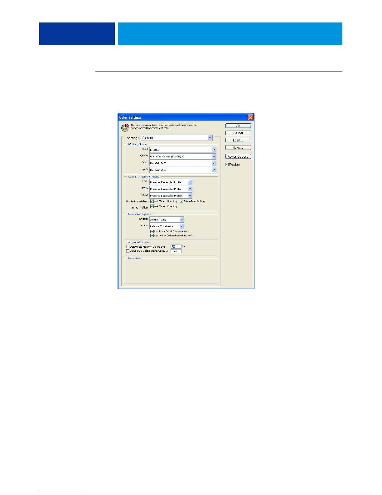
TO SPECIFY COLOR SETTINGS FOR PHOTOSHOP
1 Choose Color Settings from the Edit menu.
The Color Settings dialog box appears.
NOTE: If More Options appears (rather than Fewer Options), click More Options.
2 Choose the desired working space profile for each color mode in the Working Spaces area.
A working space specifies the color profile for documents that have no color profile
associations or documents that are newly created. It also defines the color space of a document
converted to RGB, CMYK, or Grayscale color modes, and the spot colors in a document.
Page 30

MANAGING COLOR IN ADOBE PHOTOSHOP 30
Choose an appropriate ICC profile to embed when saving a file for each color space. Use the
following guidelines for specifying working spaces:
• For RGB, choose the profile for the default RGB color space used by the Color Server, for
example, Fiery RGB or EFIRGB. New RGB documents you create in Photoshop will use
this working space.
• For CMYK, choose a profile that describes your target press (such as SWOP, DIC, or
Japan Color) if you are a prepress user. If you are a user who prints final output, choose an
output profile that describes the device connected to the Color Server. To use a devicespecific output profile, you must copy the profile from the Color Server to your computer
(see Command WorkStation Help). New CMYK documents you create in Photoshop will
use the specified working space.
• For guidelines on specifying the Gray working space, see the documentation that
accompanies Photoshop.
3 In the Color Management Policies area, choose Preserve Embedded Profiles from the RGB,
CMYK, and Gray menus.
4 Select the following options:
Profile Mismatches:
Missing Profiles: Ask When Opening
Ask When Opening, Ask When Pasting
These options allow you to override the color management policies when opening documents
or importing color data.
We recommend that you use these settings so that you are notified before any application
color management is applied.
5 In the Conversion Options area, choose settings for converting between color spaces.
Choose Adobe (ACE) from the Engine menu to use the built-in color management engine
for Photoshop.
Choose a rendering intent from the Intent menu that optimizes the color quality of the
conversion. For information about choosing the rendering intent, see the documentation that
accompanies Photoshop.
Select the Use Black Point Compensation and Use Dither (8-bit/channel images) options to
optimize the quality of color conversions.
Page 31

MANAGING COLOR IN ADOBE PHOTOSHOP 31
6 Clear the Desaturate Monitor Colors By and Blend RGB Colors Using Gamma options in the
Advanced Controls area.
Clearing these options helps to ensure a match between your monitor display and the
printed output.
7 Click Save to save the current group of color settings.
The Save dialog box appears.
8 Name the settings file, accept the default saved location, and then click Save.
Switch to your saved settings at any time by choosing the group name from the Settings menu
at the top of the Color Settings dialog box.
NOTE: You can apply the saved color settings in other Adobe Creative Suite applications.
You can also apply the saved color settings to all Adobe Creative Suite applications at once
using Adobe Bridge.
9 Click OK to apply the settings and close the Color Settings dialog box.
Saving files from Photoshop
Before saving a file from Photoshop, perform any necessary rotating, cropping, and resizing.
This speeds processing when printing from the application in which the object is placed.
When saving a document, you have the option to embed a color profile in the document.
If you will send the document to the Color Server, we recommend that you disable this
option.
Choosing a file format
We recommend that you use EPS or TIFF file formats to save RGB objects that will be
imported into other documents and printed to the Color Server. You can import EPS and
TIFF files into virtually all page layout applications.
NOTE: Although TIFF files generally display better when imported into other applications,
their color and resolution characteristics may be altered by the application into which they are
imported. EPS files are not modified by the applications into which they are imported.
Page 32
MANAGING COLOR IN ADOBE PHOTOSHOP 32
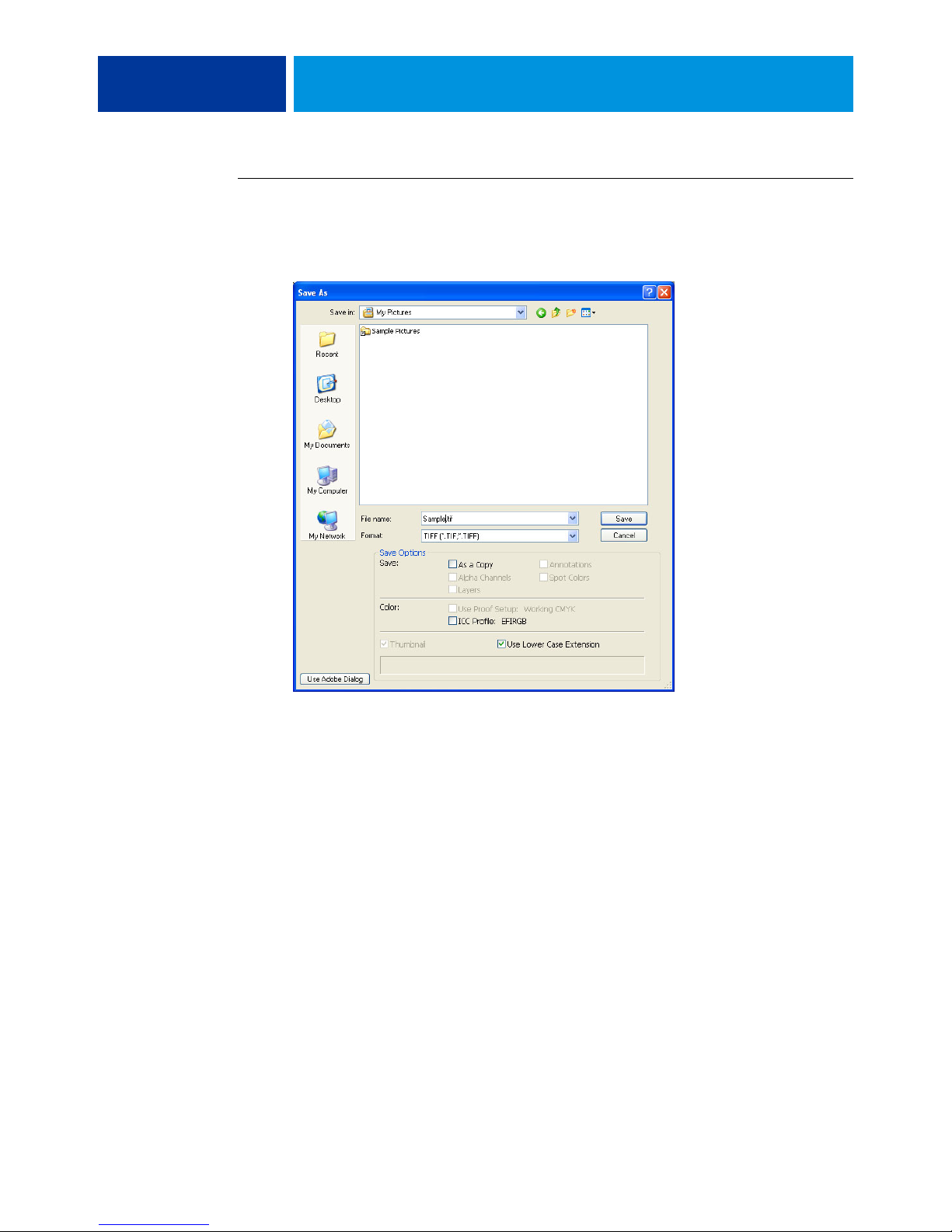
TO SAVE A DOCUMENT FROM PHOTOSHOP
1 Choose Save As from the File menu.
The Save As dialog box appears.
2 Specify settings in the Save As dialog box.
• Browse to a location for the document.
• Specify a file name and format.
• Clear the ICC Profile option (Windows) or Embed Color Profile option (Mac OS).
Page 33
MANAGING COLOR IN ADOBE PHOTOSHOP 33
3 Click Save.
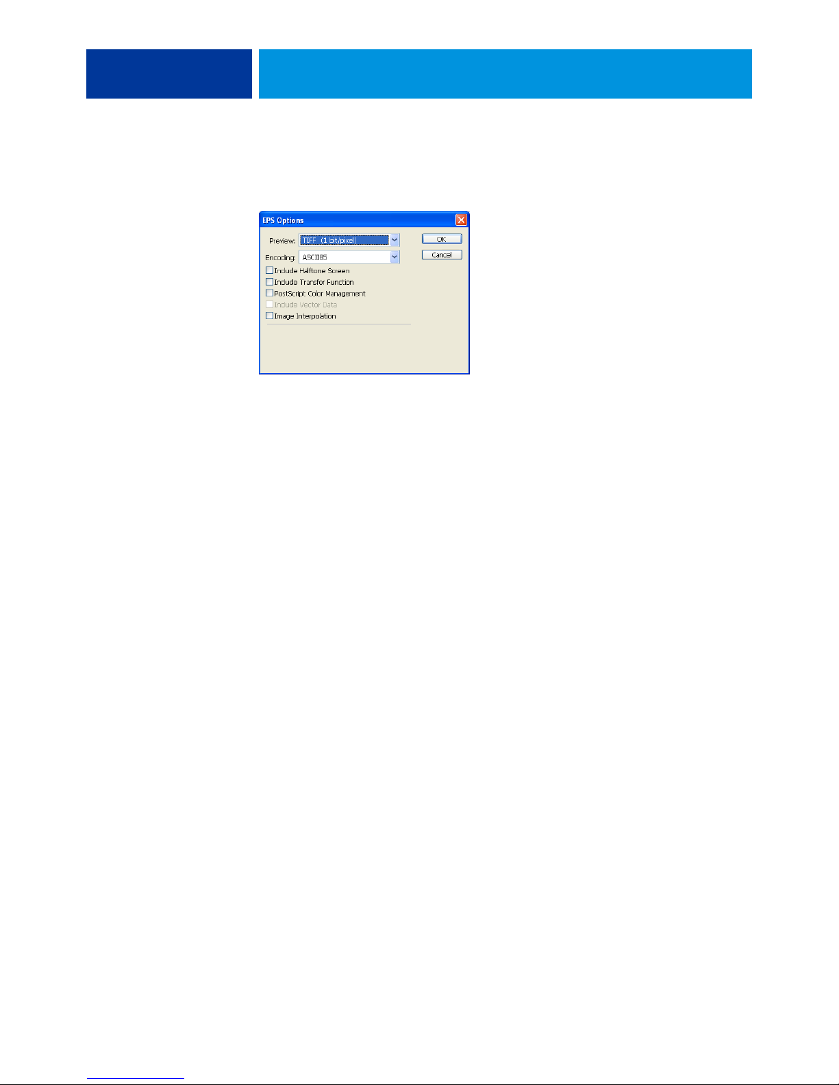
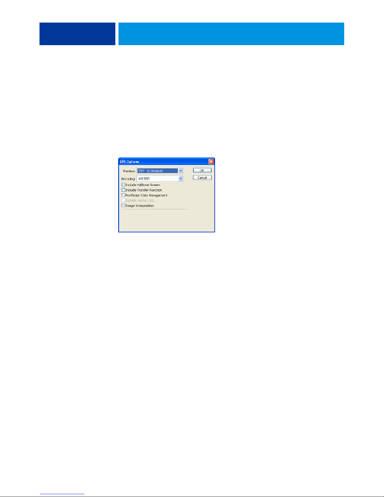
If you chose Photoshop EPS as the format, the EPS Options dialog box appears.
4 Specify EPS options, and then click OK.
• Choose a TIFF preview option. A TIFF preview is compatible with Windows and Mac OS
computers.
•Do not select the PostScript Color Management option. For more information about
PostScript color management, see the following section.
•Do not select Include Transfer Function or Include Halftone Screen.
NOTE: If you choose JPEG encoding, save a backup of the original object with Binary
encoding until you see the printed results of the JPEG file. Occasionally, the compression
used for JPEG encoding produces unwanted artifacts. If you see unexpected results in the
printed output of a JPEG file, revert to Binary encoding.
If you experience problems printing the document in which you placed the object, substitute
an ASCII version of the same object and reprint the document. Binary encoding is much
more compact than ASCII encoding, but occasionally causes printing problems with some
system configurations.
Page 34
MANAGING COLOR IN ADOBE PHOTOSHOP 34
Selecting options when printing
You can p r i n t RG B o r C MYK objects from Photoshop.
• When you print an RGB object, you choose whether the conversion to CMYK is
performed by the Color Server (using ColorWise RGB print options), PostScript (using
the PostScript Color Management option), or Photoshop built-in color management.
• When you print a CMYK object, you can print composites or color separations.
NOTE: Make sure that the Color Server Combine Separations print option is set to Off.
To print separations, use the Separation option in the Photoshop pane of the print dialog box.
For instructions, see the documentation that accompanies Photoshop.
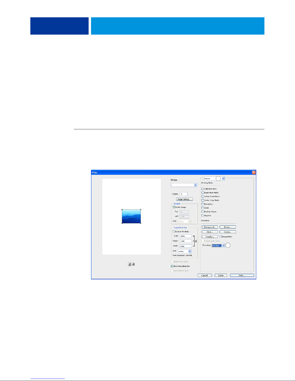
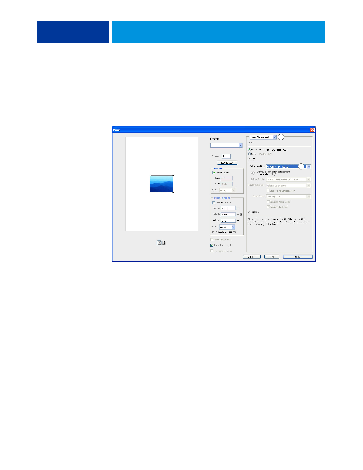
TO PRINT OBJECTS FROM PHOTOSHOP
1 Choose Print (or Print with Preview in Photoshop CS2) from the File menu.
The Print dialog box appears.
2 Choose Output.
1 Choose Output
2 Choose Encoding method
1
2
Page 35
1 Choose Color Management
2 Choose Color Handling
MANAGING COLOR IN ADOBE PHOTOSHOP 35
3 Choose an Encoding method.
NOTE: If you choose JPEG encoding, save a backup of the original object with
Binary encoding until you see the printed results of the JPEG file. Occasionally, the
compression used for JPEG encoding produces unwanted artifacts. If you see unexpected
results in the printed output of a JPEG file, revert to Binary encoding.
4 Choose Color Management.
1
2
5 Choose No Color Management from the Color Handling menu to specify the color space for
printing the object.
Photoshop does not convert object data to another color space before sending it to the
Color Server.
6 Click Print.
The operating system Print dialog box appears.
7 Windows: Click Preferences, and then click the Fiery Printing tab in the dialog box that
appears.
8 Select the desired print options.
For information about setting ColorWise print options, see Color Printing.
9 Windows: Click OK.
10 Click Print.
Page 36
MANAGING COLOR IN ADOBE PHOTOSHOP 36
Advanced tips for using PostScript color management
Use the following information to implement alternative, more complex, color workflows
with Photoshop.
Saving EPS documents with PostScript color management
If you select the PostScript Color Management option (in the EPS Options dialog box) when
you save a CMYK or RGB EPS file, Photoshop embeds PostScript color information, which
is independent of ICC profiles, in the resulting document. This information is intended for
PostScript devices like the Color Server.
Printing RGB EPS files saved with PostScript color management
When you print an RGB EPS file that contains an embedded profile to the Color Server, you
can use the working space information from the embedded RGB profile as an RGB source
definition for Color Server rendering intents. To use this source color space information from
the embedded profile with Color Server rendering intents, choose None as the ColorWise
RGB/Lab Source when you print. This applies when you print directly from Photoshop or
when the same RGB EPS file is output from another application.
To override the embedded profile in an EPS file using an RGB source profile on the
Color Server, choose anything except None as the Color Server RGB source profile.
Printing RGB objects with Photoshop PostScript color management
If you select an RGB color space and decide to use PostScript color management, Photoshop
sends RGB data to the Color Server along with the PostScript color information defining this
RGB color space. When you select the PostScript Color Management option, a rendering
intent is used to perform color conversions to CMYK.
NOTE: The included RGB source color space information is overridden by the ColorWise
RGB/Lab Source setting, unless it is set to None. The ColorWise Rendering Intent option
specified takes effect if the ColorWise RGB/Lab Source option is set to None.
For fastest print times, choose JPEG encoding, but inspect printed output carefully for
unwanted artifacts that may appear as a result of JPEG compression. If you see unexpected
results in the printed output, reprint the job using Binary or ASCII encoding.
Page 37

MANAGING COLOR IN ADOBE PHOTOSHOP 37
Printing CMYK EPS files saved with PostScript color management
If you select the Photoshop PostScript Color Management option when you save a CMYK
EPS object, Photoshop embeds PostScript color information that defines the CMYK source
color space of the object. When you print a CMYK EPS file that contains PostScript color
information to the Color Server, RGB print options are used instead of ColorWise CMYK
source profile and processing method options. Choose the appropriate setting for the
Rendering Intent option.
Printing CMYK objects with Photoshop PostScript color management
If you select a CMYK color space and decide to use PostScript color management, Photoshop
sends CMYK data to the Color Server along with the PostScript color information defining
this CMYK color space. When you select the PostScript Color Management option,
a rendering intent is used to perform color conversions to the CMYK color space of the
Color Server.
The destination color space for the rendering intents is determined by the Separate RGB/Lab
to CMYK Source print option. If the Separate RGB/Lab to CMYK Source option is enabled,
the CMYK object is printed according to all specified CMYK/Grayscale Source and CMYK
Processing Method settings. If the Separate RGB/Lab to CMYK Source option is not enabled,
the CMYK object is converted to the CMYK color space of the selected output profile.
Setting the Color Server print option Spot Color Matching to On has an effect only if you use
the Photoshop Multi-Channel feature to define spot channels, and then save the object in
EPS format and open it in another application. For more information, see the documentation
that accompanies Photoshop.
Photoshop converts spot colors to CMYK values when you work in CMYK mode.
• If the object was separated for an offset press standard, apply the corresponding CMYK/
Grayscale Source setting. For example, if the object is separated for SWOP, choose SWOP
as the CMYK/Grayscale Source setting.
• If Photoshop is configured for a custom separation using an ICC profile, choose the
corresponding profile for the ColorWise CMYK/Grayscale Source option.
The previous custom CMYK setting requires that the same profile used for separation in
Photoshop also reside on the Color Server. For more information about downloading CMYK
Source profiles to the Color Server with Command WorkStation, see Command WorkStation
Help.
Page 38

MANAGING COLOR IN PAGE LAYOUT APPLICATIONS 38
MANAGING COLOR IN PAGE LAYOUT APPLICATIONS
This chapter provides instructions for printing color documents from Adobe InDesign CS3
and QuarkXPress 7 for Windows and Mac OS. The illustrations show the Windows user
interface, but the information and instructions apply equally to the Mac OS version of each
application, unless otherwise specified.
Before using these applications, install the RGB source profile and the CMYK source profile
or output profile that you will use when printing to the Color Server. For more information
about transferring profiles to or from the Color Server, see Command WorkStation Help.
Before printing from these applications, make sure that the appropriate printer driver and
Color Server PPD (PostScript Printer Description) are installed on your computer, as
described in Printing.
Page 39
MANAGING COLOR IN PAGE LAYOUT APPLICATIONS 39
Adobe InDesign
The following sections outline the recommended settings for using Adobe InDesign CS3 with
the Color Server.
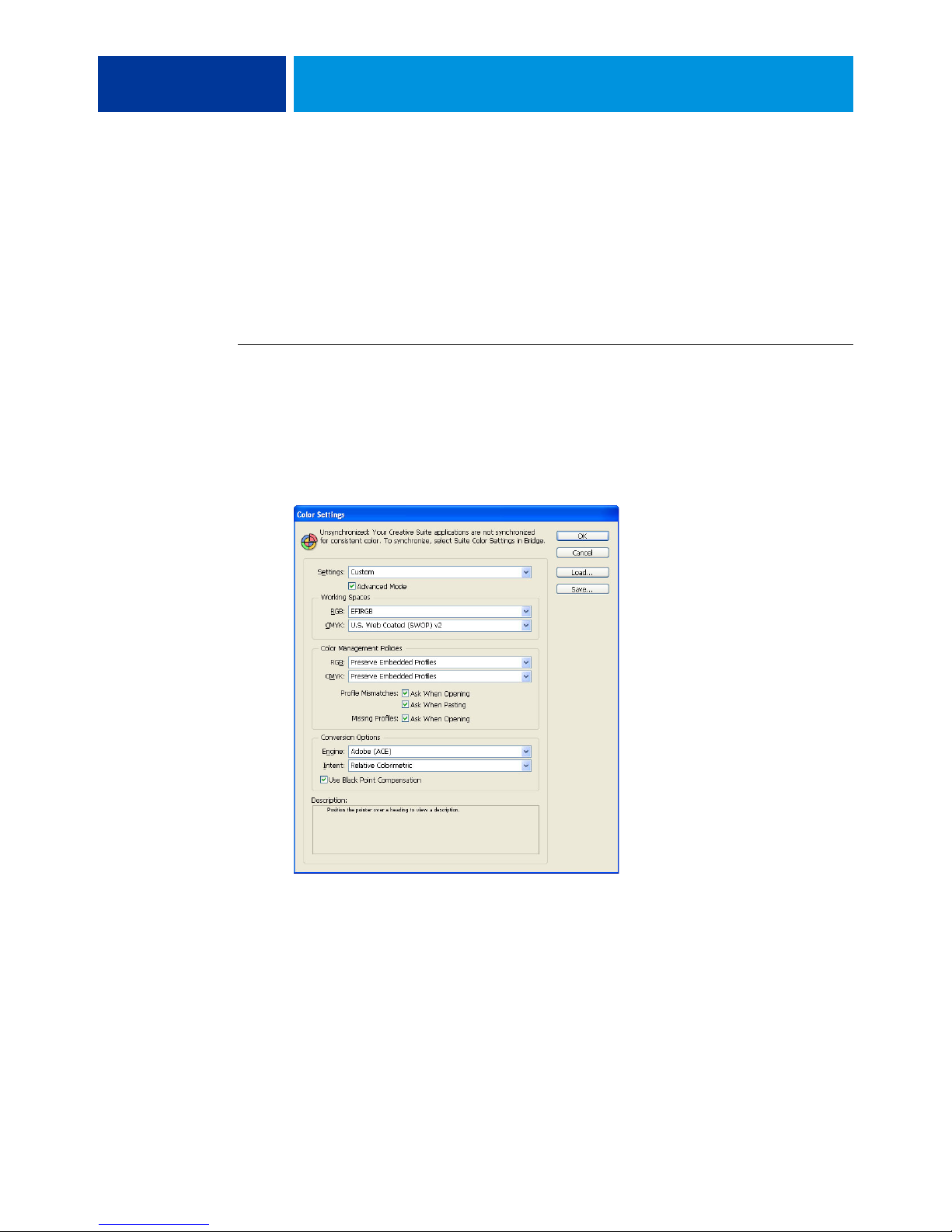
InDesign color settings
When using ColorWise color management, turn off the InDesign color management features.
TO DISABLE INDESIGN COLOR MANAGEMENT
1 Choose Color Settings from the Edit menu.
The Color Settings dialog box appears.
2 Select Advanced Mode.
In Advanced Mode, a more extensive list of options is displayed.
Page 40

MANAGING COLOR IN PAGE LAYOUT APPLICATIONS 40
3 Choose the desired working space profile for each mode in the Working Spaces area.
Use the following guidelines for specifying working spaces:
• For RGB, choose the profile for the default RGB color space used by the Color Server, for
example, Fiery RGB or EFIRGB.
• For CMYK, choose a profile that describes your target press (such as SWOP, DIC, or
Japan Color) if you are a prepress user. If you are a user who prints final output, choose an
output profile that describes the device connected to the Color Server. To use a devicespecific output profile, you must copy the profile from the Color Server to your computer
(see Command WorkStation Help).
4 In the Color Management Policies area, choose Preserve Embedded Profiles from the RGB and
CMYK menus.
5 Select the following options:
Profile Mismatches:
Missing Profiles: Ask When Opening
Ask When Opening, Ask When Pasting
These options allow you to override the color management policies when opening documents
or importing color data.
We recommend that you use these settings so that you are notified before any application
color management is applied.
6 In the Conversion Options area, choose settings for converting between color spaces.
Choose Adobe (ACE) from the Engine menu to use the built-in color management engine for
InDesign.
Choose a rendering intent from the Intent menu that will optimize the color quality of the
conversion. For information about choosing the rendering intent, see the documentation that
accompanies InDesign.
Select the Use Black Point Compensation option to optimize the quality of color conversions.
7 Click Save to save the current group of color settings.
The Save dialog box appears.
8 Name the settings file, accept the default saved location, and click Save.
Switch to your saved settings at any time by choosing the group name from the Settings menu
at the top of the Color Settings dialog box.
NOTE: You can apply the saved color settings in other Adobe Creative Suite applications.
You can also apply the saved color settings to all Adobe Creative Suite applications at once
using Adobe Bridge.
9 Click OK to apply the settings and close the Color settings dialog box.
Page 41
MANAGING COLOR IN PAGE LAYOUT APPLICATIONS 41
Importing objects
All RGB objects placed in a document, except for RGB TIFF objects, are affected by your
RGB print settings. For best results with placed objects, follow the instructions in “Working
with imported objects” on page 25.
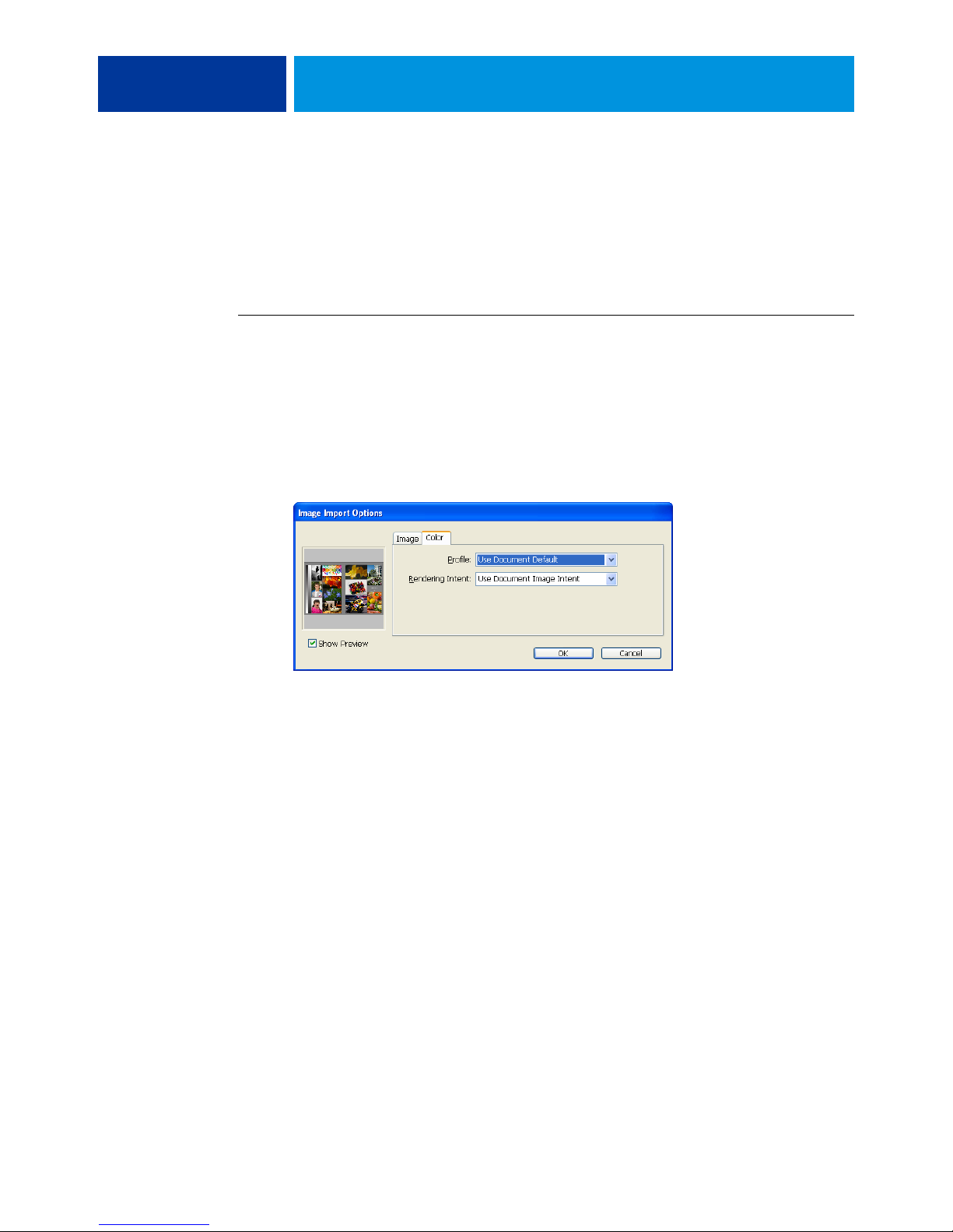
Disable InDesign color management when placing objects in a document.
TO DISABLE INDESIGN COLOR MANAGEMENT WHEN IMPORTING OBJECTS
1 Choose Place from the File menu.
The Place dialog box appears.
2 Select the Show Import Options option.
3 Select the file that you want to import and click Open.
4 Click the Color tab.
5 Choose Use Document Default from the Profile menu.
6 Choose Use Document Image Intent from the Rendering Intent menu.
7 Click OK.
Page 42
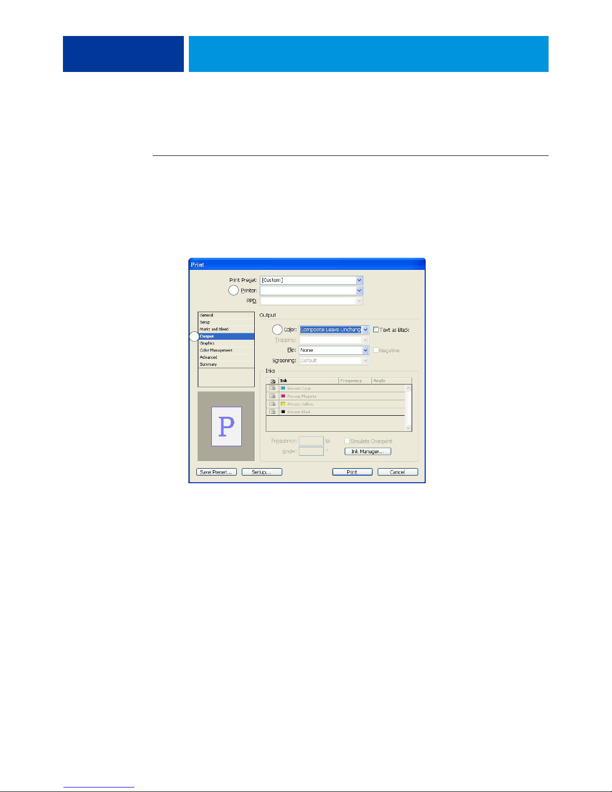
1 Choose the device name
2 Select Output
3 Choose Color setting
MANAGING COLOR IN PAGE LAYOUT APPLICATIONS 42
Selecting options when printing
Use the standard Color Server printer driver interface to select print options from InDesign.
TO SET PRINT OPTIONS FROM INDESIGN
1 Choose Print from the File menu.
2 Choose the Color Server device name from the Printer menu.
3 Select Output.
Output options appear.
1
2
3
4 Choose Composite Leave Unchanged from the Color menu.
Page 43
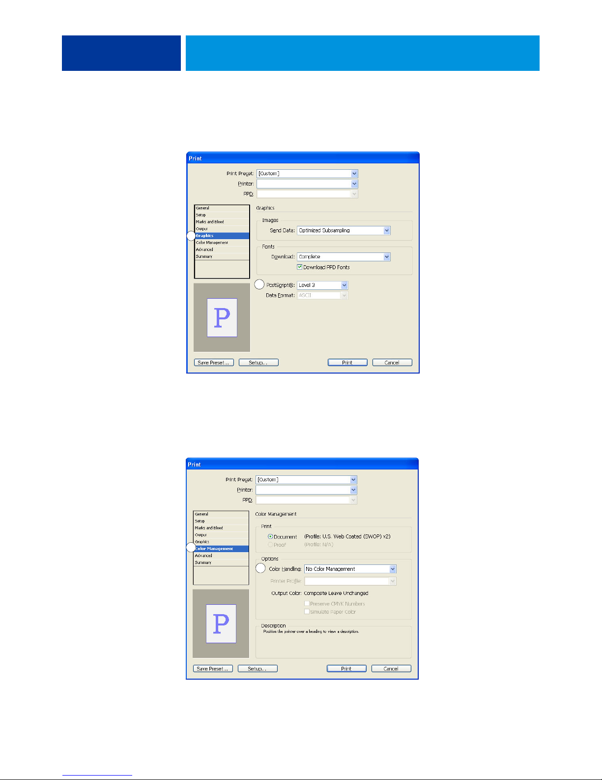
1 Select Graphics
2 Choose PostScript setting
MANAGING COLOR IN PAGE LAYOUT APPLICATIONS 43
5 Select Graphics.
Graphics options appear.
1
2
1 Select Color Management
2 Choose Color Handling
setting
6 Choose Level 3 from the PostScript menu. If you encounter problems, you can also use
Level 2.
7 Select Color Management.
Color management options appear.
1
2
Page 44

MANAGING COLOR IN PAGE LAYOUT APPLICATIONS 44
8 Confirm that Color Handling is set to No Color Management.
9 Click Setup (Windows) or Printer (Mac OS) at the bottom of the dialog box.
The operating system Print dialog box appears.
10 Windows: Click Preferences, and then click the Fiery Printing tab in the dialog box that
appears.
11 Select the desired print options.
For information about setting ColorWise print options, see Color Printing.
12 Windows: Click OK.
13 Click Print, and then click Print again.
Page 45
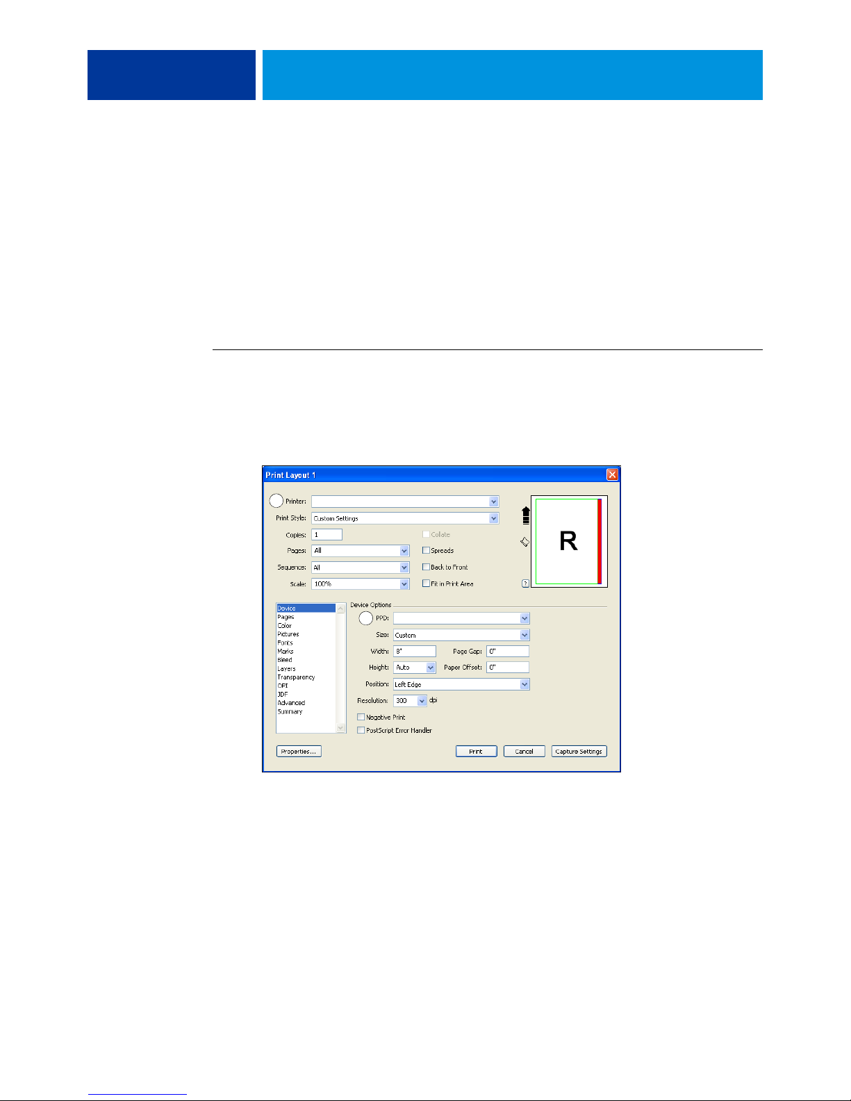
QuarkXPress
Importing objects
Only RGB objects saved in EPS format are affected by RGB print options. For best results
with placed objects, follow the instructions in “Working with imported objects” on page 25.
Selecting options when printing
The following procedure provides instructions on printing files to the Color Server.
TO SET PRINT OPTIONS IN QUARKXPRESS
1 Choose Print from the File menu.
2 Choose the Color Server device from the Printer menu.
3 Choose the Color Server PPD from the PPD menu.
MANAGING COLOR IN PAGE LAYOUT APPLICATIONS 45
1 Choose the Color Server
2 Choose PPD for the
Color Server
1
2
Page 46
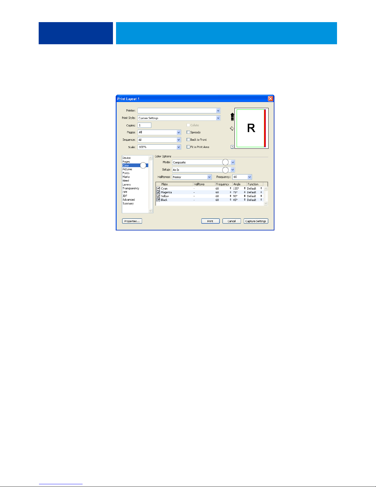
1 Select Color
2 Choose Mode setting
3 Choose Setup setting
MANAGING COLOR IN PAGE LAYOUT APPLICATIONS 46
4 Select Color.
Color management options appear.
1
5 Choose Composite from the Mode menu.
6 Choose As Is from the Setup menu.
2
3
Use this setting if you want the color managed by the Color Server. This means that each
color in the document should be described in the space from which the color was created.
7 Click Properties.
8 Click the Fiery Printing tab in the dialog box that appears.
The standard printer driver interface for the Color Server appears.
9 If the document contains spot colors, choose the appropriate Spot Color Matching setting.
10 Select the desired print options, and then click OK.
For information about setting ColorWise print options, see Color Printing.
11 Click Print.
Optional color management from QuarkXPress
If you have color management requirements that are not offered by ColorWise, such as
managing color on devices not controlled by the Color Server, consider using the
QuarkXPress color management features. For more information, see the documentation that
accompanies QuarkXPress.
Page 47

MANAGING COLOR IN ILLUSTRATION APPLICATIONS 47
MANAGING COLOR IN ILLUSTRATION APPLICATIONS
This chapter provides instructions for using Illustrator for Windows and Mac OS and
CorelDRAW for Windows. The illustrations show the Windows user interface, but the
information and instructions apply equally to the Mac OS version of Illustrator, unless
otherwise specified.
You can print directly from an illustration application or use it to create and save files that will
be imported into a page layout document. To print from an illustration application, use the
printer driver and print settings recommended in Color Printing. As a general rule, use the
EPS file format when saving files with an illustration application. When an EPS file is
imported into another application, the color information in the imported object is not
changed by the application.
Before using these applications, install the RGB source profile and CMYK source profile or
output profile that you will use when printing to the Color Server. For more information
about transferring profiles to or from the Color Server, see Command WorkStation Help.
Before printing from these applications, make sure that the appropriate printer driver and
Color Server PPD (PostScript Printer Description) are installed on your computer, as
described in Printing.
NOTE: This document provides instructions for printing composites only. For information
about printing color separations, see the documentation that accompanies the application.
Adobe Illustrator
The following sections provide guidelines for working with Adobe Illustrator CS3.
Note about color models in Illustrator
In Illustrator, you can set the Document Color Mode to RGB color or CMYK color. All
elements in a file are created in the selected color model. When you print the file, the data is
sent to the Color Server in the color model that you specified.
Page 48
MANAGING COLOR IN ILLUSTRATION APPLICATIONS 48
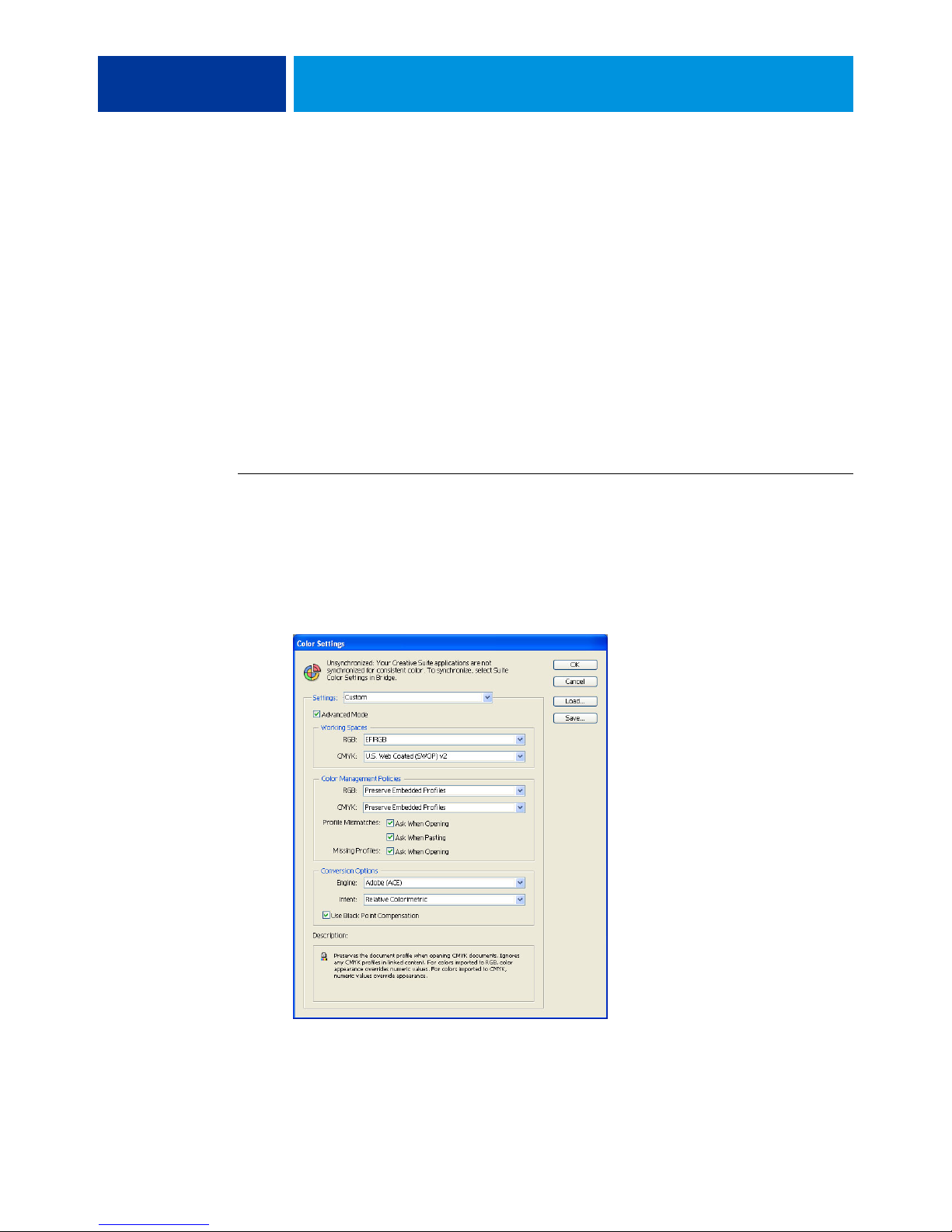
Illustrator color settings
Illustrator uses a sophisticated color management system that can handle both RGB and
CMYK colors for a variety of color-managed workflows. By customizing color settings, you
specify the amount of color management that you want to use while working in Illustrator.
Illustrator color settings include the following:
Working spaces: Default color spaces to use when working with RGB and CMYK documents.
ICC color profiles describe the gamut and color characteristics of these working spaces.
Color management policies: Instructions that tell Illustrator what to do when it encounters
color data from a color space other than the specified working space.
The following procedure outlines the recommended color settings for Illustrator in a
Color Server workflow.
TO SPECIFY COLOR SETTINGS
1 Choose Color Settings from the Edit menu.
The Color Settings dialog box appears.
2 Select Advanced Mode.
In Advanced Mode, a more extensive list of options is displayed.
Page 49

MANAGING COLOR IN ILLUSTRATION APPLICATIONS 49
3 Choose the appropriate working space profile for each mode in the Working Spaces area.
• For RGB, choose the profile for the default RGB color space used by the Color Server, for
example, Fiery RGB or EFIRGB. New RGB documents you create in Illustrator will use
this working space.
• For CMYK, choose a profile that describes your target press (such as SWOP, DIC, or
Japan Color) if you are a prepress user. If you are a user who prints final output, choose an
output profile that describes the device connected to the Color Server. To use a devicespecific output profile, you must copy the profile from the Color Server to your computer
(see Command WorkStation Help). New CMYK documents you create in Illustrator will
use the specified working space.
4 In the Color Management Policies area, choose Preserve Embedded Profiles from the RGB and
CMYK menus.
5 Select the following options:
Profile Mismatches:
Missing Profiles: Ask When Opening
Ask When Opening, Ask When Pasting
These options allow you to override the color management policies when opening documents
or importing color data.
We recommend that you use these settings so that you are notified before any application
color management is applied.
6 In the Conversion Options area, choose settings for converting between color spaces.
Choose Adobe (ACE) from the Engine menu to use the built-in color management engine
for Illustrator.
Choose a rendering intent from the Intent menu that optimizes the color quality of the
conversion. For information about choosing the rendering intent, see the documentation that
accompanies Illustrator.
Select the Use Black Point Compensation option to optimize the quality of color conversions.
7 Click Save to save the current group of color settings.
The Save dialog box appears.
8 Name the settings file, accept the default saved location, and then click Save.
Switch to your saved settings at any time by choosing the group name from the Settings menu
at the top of the Color Settings dialog box.
NOTE: You can apply the saved color settings in other Adobe Creative Suite applications.
You can also apply the saved color settings to all Adobe Creative Suite applications at once
using Adobe Bridge.
9 Click OK to apply the settings and close the Color settings dialog box.
Page 50
MANAGING COLOR IN ILLUSTRATION APPLICATIONS 50
Saving files for importing into other documents
When saving files in Illustrator for importing into other types of documents, use the EPS file
format. Illustrator can save color information in both RGB and CMYK. The ColorWise RGB
print options affect color output of RGB artwork saved in Illustrator EPS and imported into
other kinds of documents (even when both RGB and CMYK artwork exist in the same file).
In the case of Illustrator files imported into Photoshop, however, vector data from the
Illustrator file is rasterized into bitmap (or raster) format in Photoshop, and the final color
space of the bitmap data is determined by the color mode that you set in Photoshop.
Specifying print options
The following procedure explains how to set print options when printing a document from
Illustrator to the Color Server.
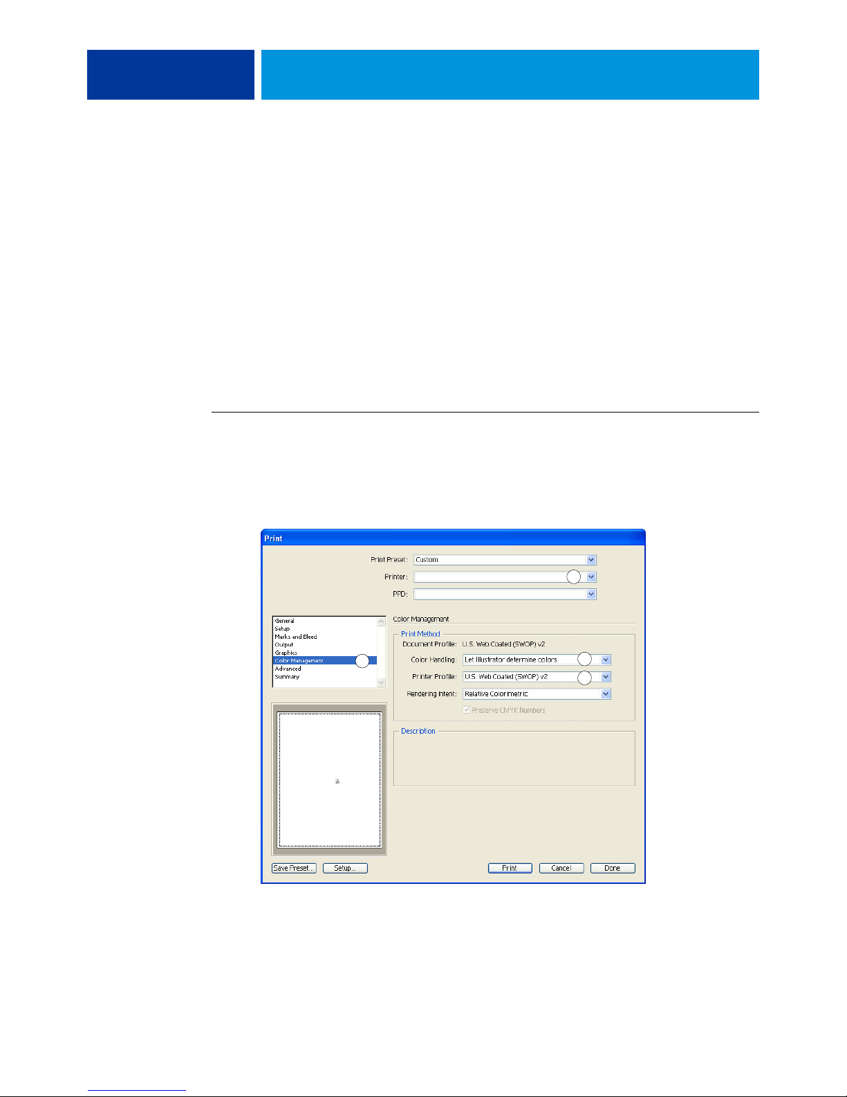
TO SET PRINT OPTIONS IN ILLUSTRATOR
1 Choose Print from the File menu.
1 Choose the device name
2 Select Color Management
3 Choose Color Handling
setting
4 Choose Printer Profile
The Print dialog box appears.
2 Choose the Color Server device from the Printer menu.
2
1
3
4
3 Select Color Management.
Color management options appear.
4 Choose Let Illustrator determine colors from the Color Handling menu.
Page 51
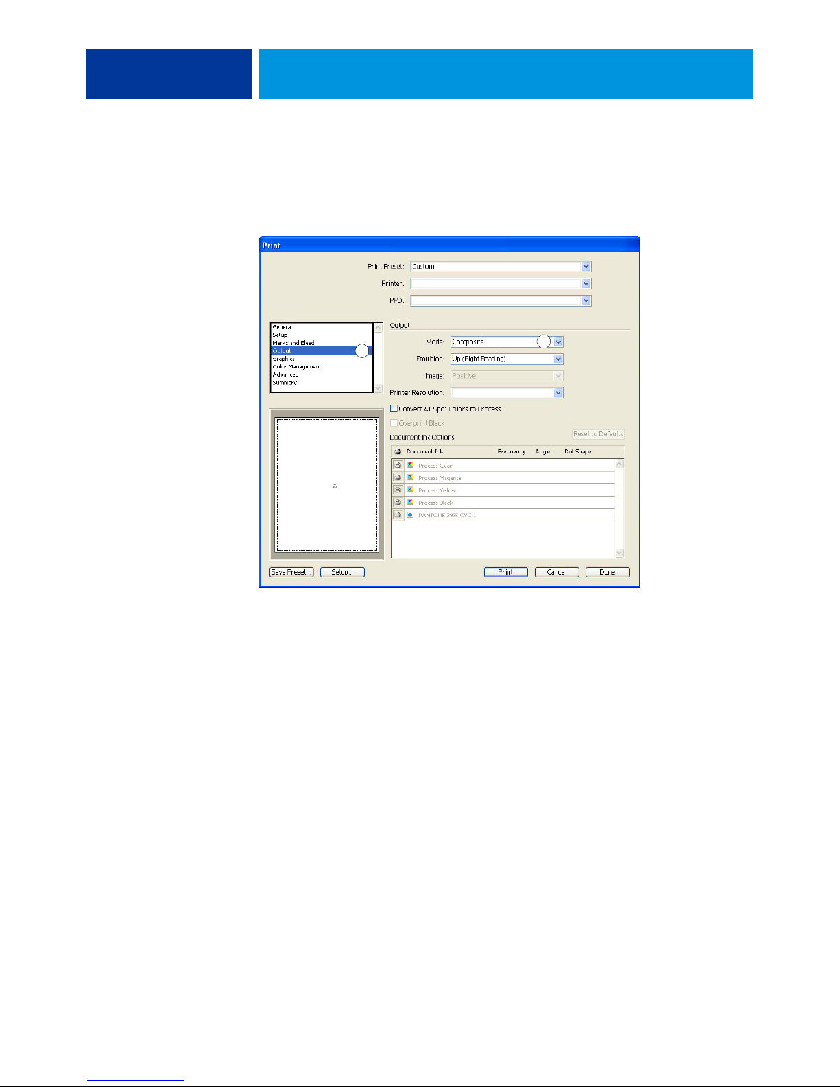
1 Select Output
2 Choose Mode setting
MANAGING COLOR IN ILLUSTRATION APPLICATIONS 51
5 Make sure that the Printer Profile setting matches the displayed Document Profile setting.
6 Select Output.
Output options appear.
1
7 Choose Composite from the Mode menu.
2
Page 52
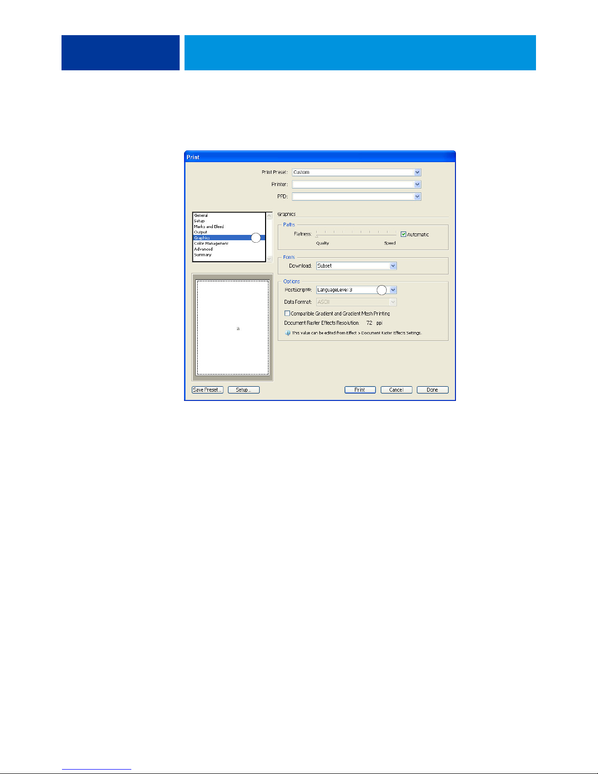
1 Select Graphics
2 Choose PostScript setting
MANAGING COLOR IN ILLUSTRATION APPLICATIONS 52
8 Select Graphics.
Graphics options appear.
1
2
9 Choose Language Level 3 from the PostScript menu. If you encounter problems, you can also
use Level 2.
10 Click Setup (Windows) or Printer (Mac OS) at the bottom of the dialog box.
The operating system Print dialog box appears.
11 Windows: Click Preferences, and then click the Fiery Printing tab in the dialog box that
appears.
12 If necessary, click ColorWise and select RGB print settings.
Specify these settings only if your CMYK document contains placed RGB objects. In all other
cases, colors remain unaffected by the settings.
13 If the document contains spot colors, choose the appropriate Spot Color Matching setting.
14 Select the desired print options.
For information about setting ColorWise print options, see Color Printing.
15 Windows: Click OK.
16 Click Print, and then click Print again.
Page 53
CorelDRAW
MANAGING COLOR IN ILLUSTRATION APPLICATIONS 53
Using Illustrator color management
If you have color management requirements that are not offered by ColorWise, such as
managing color on devices not controlled by the Color Server, consider using the Illustrator
color management features. For more information, see the documentation that accompanies
Illustrator.
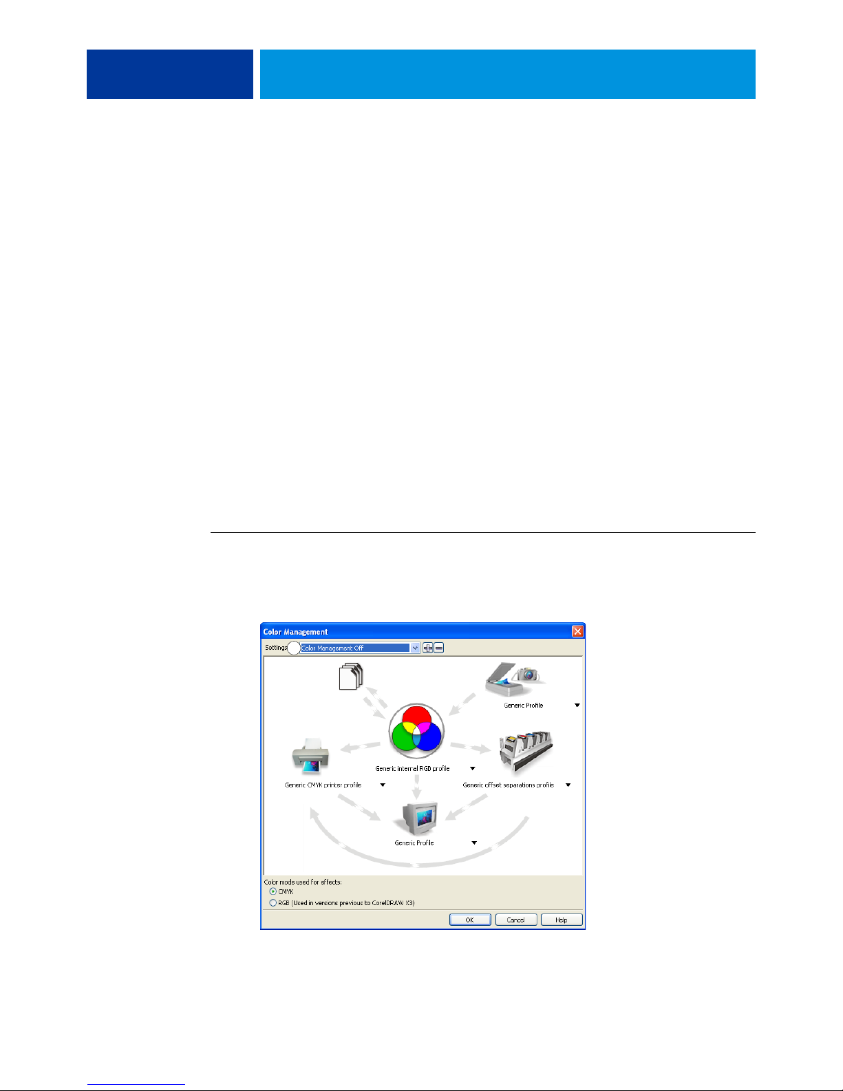
The following sections describe the recommended color settings for CorelDRAW X3
for Windows.
Defining colors
Any colors defined in CorelDRAW X3 are sent to the device in CMYK, even those colors
defined using other color models. For best results, use the color definition methods described
in “Color matching with PostScript applications” on page 24.
1 Color Management Off
You can control the conversion of RGB colors defined in CorelDRAW by specifying settings
in the Color Management dialog box. To display the Color Management dialog box,
choose Color Management from the Tools menu in the CorelDRAW main window.
TO DISABLE COLOR MANAGEMENT IN CORELDRAW
1 Choose Color Management from the Tools menu.
2 Choose Color Management Off from the Settings list and click OK.
1
Page 54
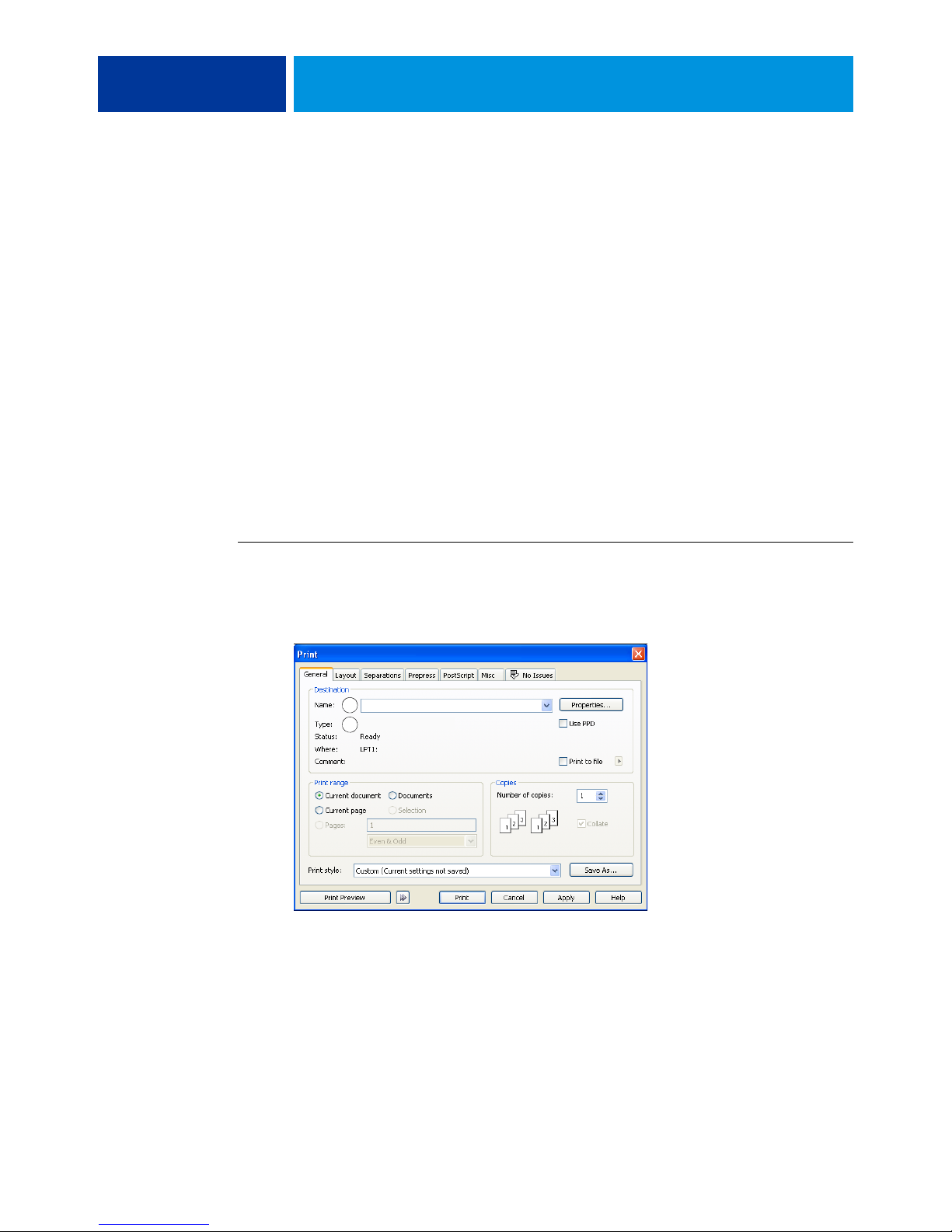
MANAGING COLOR IN ILLUSTRATION APPLICATIONS 54
Importing objects
All RGB objects placed in a document are affected by the RGB print settings. For best results
with placed objects, follow the instructions in “Working with imported objects” on page 25.
Saving files for importing into other documents
When saving files in CorelDRAW for importing into other types of documents, use the EPS
file format. CorelDRAW saves all color information in CMYK, so RGB print options have no
effect on color output of artwork saved with CorelDRAW and imported into other kinds of
documents. In the case of CorelDRAW files imported into Photoshop, however, vector data
from the CorelDRAW file is rasterized into bitmaps in Photoshop, and the final color space
of the bitmap data is determined by the color mode that you set in Photoshop.
Specifying print options
This section explains how to set print options when printing from CorelDRAW to the
Color Server.
1 Print device name
appears here
2 Printer driver/PPD name
appears here
TO SET PRINT OPTIONS IN CORELDRAW
1 Choose Print from the File menu.
2 On the General tab, select the correct print device from the Name list.
1
2
Page 55
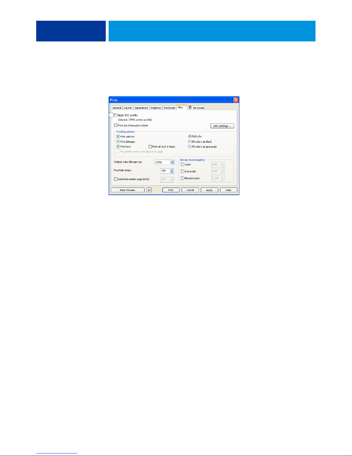
1 Clear this option
to use ColorWise
color management
MANAGING COLOR IN ILLUSTRATION APPLICATIONS 55
3 On the Misc tab, clear the Apply ICC profile option.
If this option is selected, CorelDRAW color management settings are used to convert RGB
colors and objects to CMYK.
1
4 On the General tab, click Properties.
The Properties window appears.
5 Click the ColorWise icon, and then click Expert Settings to specify ColorWise print options.
6 If a document contains placed RGB objects, choose RGB print settings for your device.
With the exception of placed RGB objects, these settings have no effect on colors printed with
CorelDRAW.
7 If the document contains spot colors, choose the appropriate Spot Color Matching setting.
8 Click OK, and then click Print to print the document.
Optional color management in CorelDRAW
If you have color management requirements that are not offered by ColorWise, such as
managing color on devices not controlled by the Color Server, consider using the
CorelDRAW color management features. For more information, see the documentation that
accompanies CorelDRAW.
Page 56

MANAGING COLOR IN ADOBE ACROBAT 56
MANAGING COLOR IN ADOBE ACROBAT
This chapter covers features of Adobe Acrobat 7.0 Professional for Windows and Mac OS.
The illustrations show the Windows user interface, but the information and instructions
apply equally to the Mac OS version of Acrobat, unless otherwise specified.
Before using Acrobat, install the RGB source profile and CMYK source profile or output
profile that you will use when printing to the Color Server. For more information about
transferring profiles to or from the Color Server, see Command WorkStation Help.
Before printing from Acrobat, make sure that the appropriate printer driver and the
Color Server PostScript printer description file (PPD) are installed on your computer, as
described in Printing.
Page 57
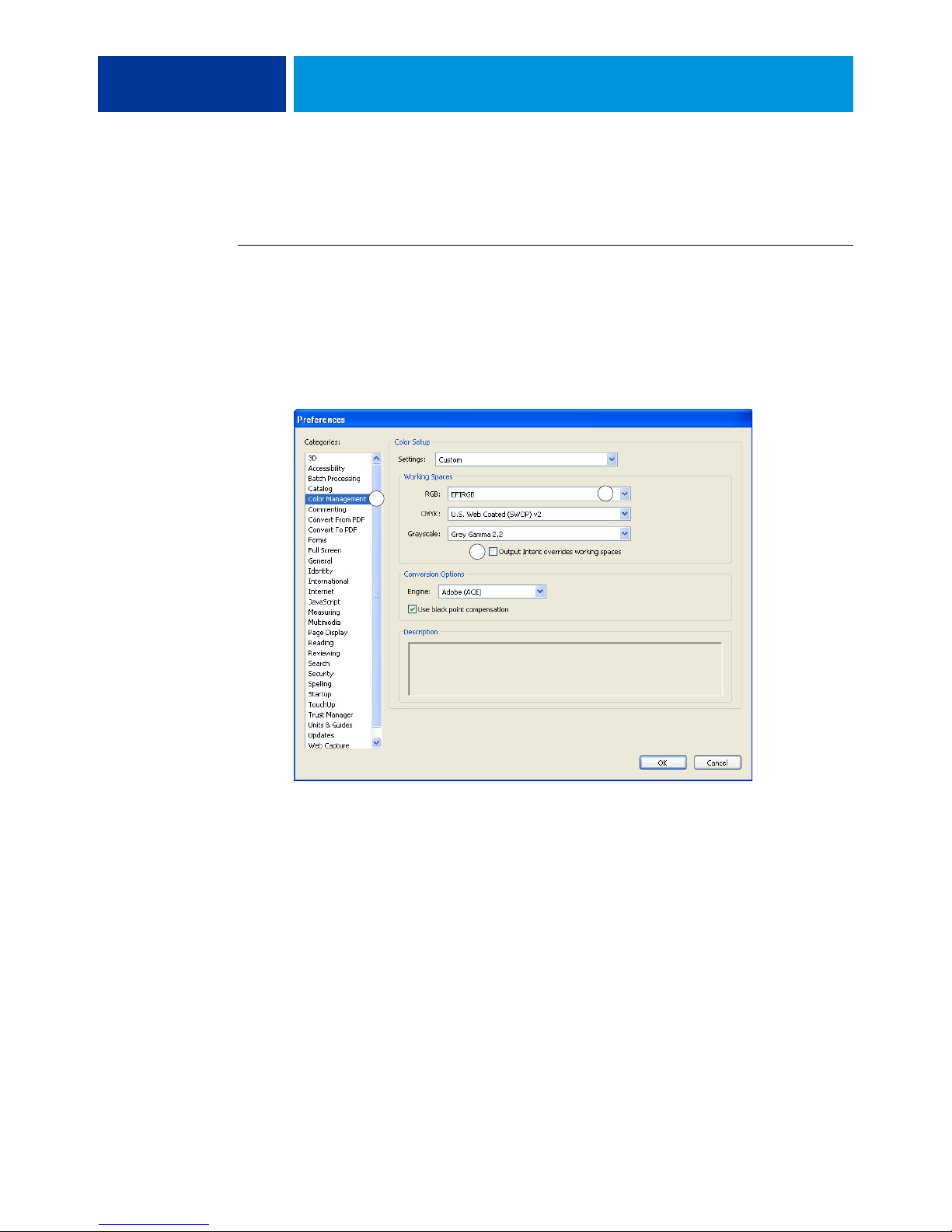
Specifying color settings
1 Select Color Management
2 Choose profiles
3 Clear Output Intent
overrides working spaces
MANAGING COLOR IN ADOBE ACROBAT 57
When using ColorWise color management, turn off the Acrobat color management features.
TO SPECIFY COLOR SETTINGS FOR ACROBAT
1 Choose Preferences from the Edit menu (Windows) or Acrobat menu (Mac OS).
NOTE: If Enfocus Pitstop is installed, choose Preferences > General from the Edit menu.
2 Select Color Management.
Color management preferences appear.
1
3
3 Choose the desired working space profile for each color mode in the Working Spaces area.
2
• For RGB, choose the profile for the default RGB color space used by the Color Server,
for example, Fiery RGB or EFIRGB.
• For CMYK, choose a profile that describes your target press (such as SWOP, DIC, or
Japan Color) if you are a prepress user. If you are a user who prints final output, choose an
output profile that describes the device connected to the Color Server. To use a devicespecific output profile, you must copy the profile from the Color Server to your computer
(see Command WorkStation Help).
• For guidelines on specifying the Grayscale working space, see the documentation that
accompanies Acrobat.
4 Clear the Output Intent overrides working spaces option.
5 Click OK.
Page 58
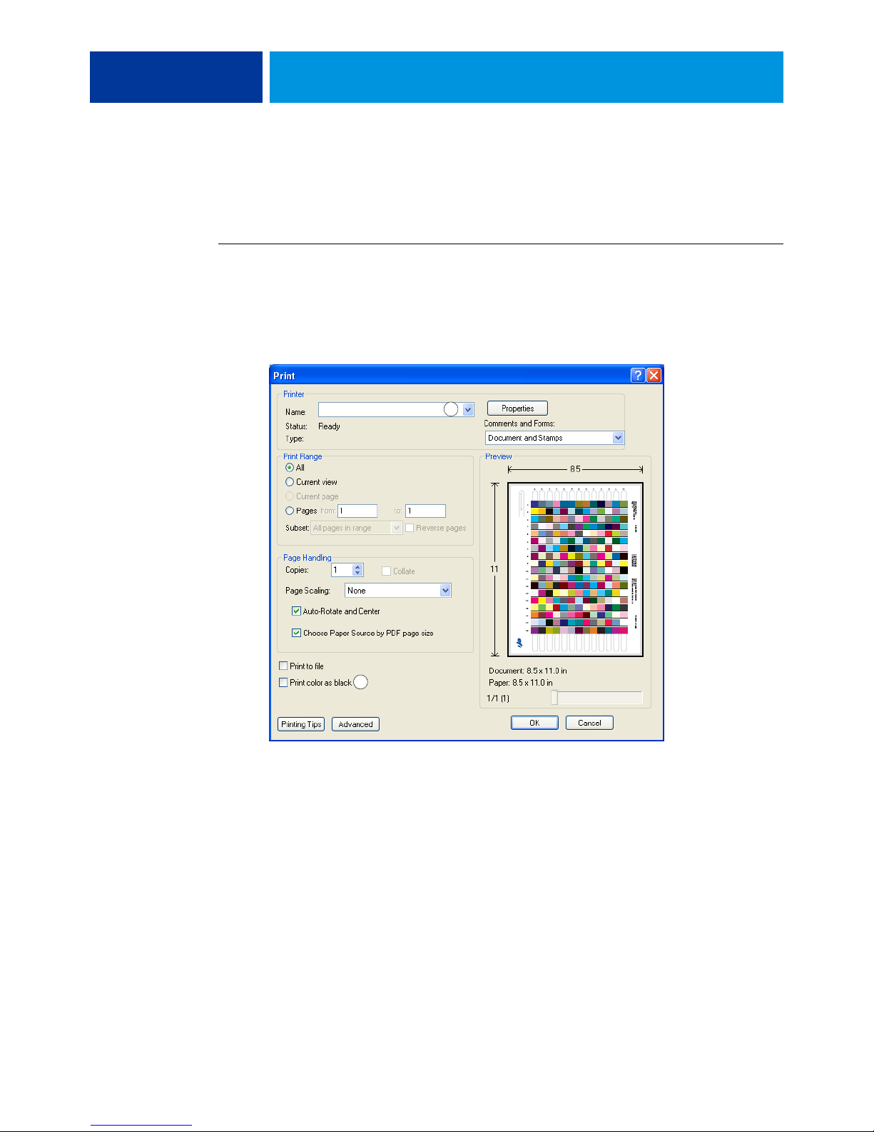
Selecting options when printing
1 Select Color Server
2 Clear Print color as black
MANAGING COLOR IN ADOBE ACROBAT 58
You can use the standard Color Server printer driver interface to select print options from
Acrobat.
TO PRINT A PDF DOCUMENT FROM ACROBAT
1 Choose Print from the File menu.
The Print dialog box appears.
2 Choose the Color Server device from the Name menu (Windows) or Printer menu (Mac OS).
1
2
3 Windows: Clear the Print color as black option.
4 Click Advanced.
Page 59
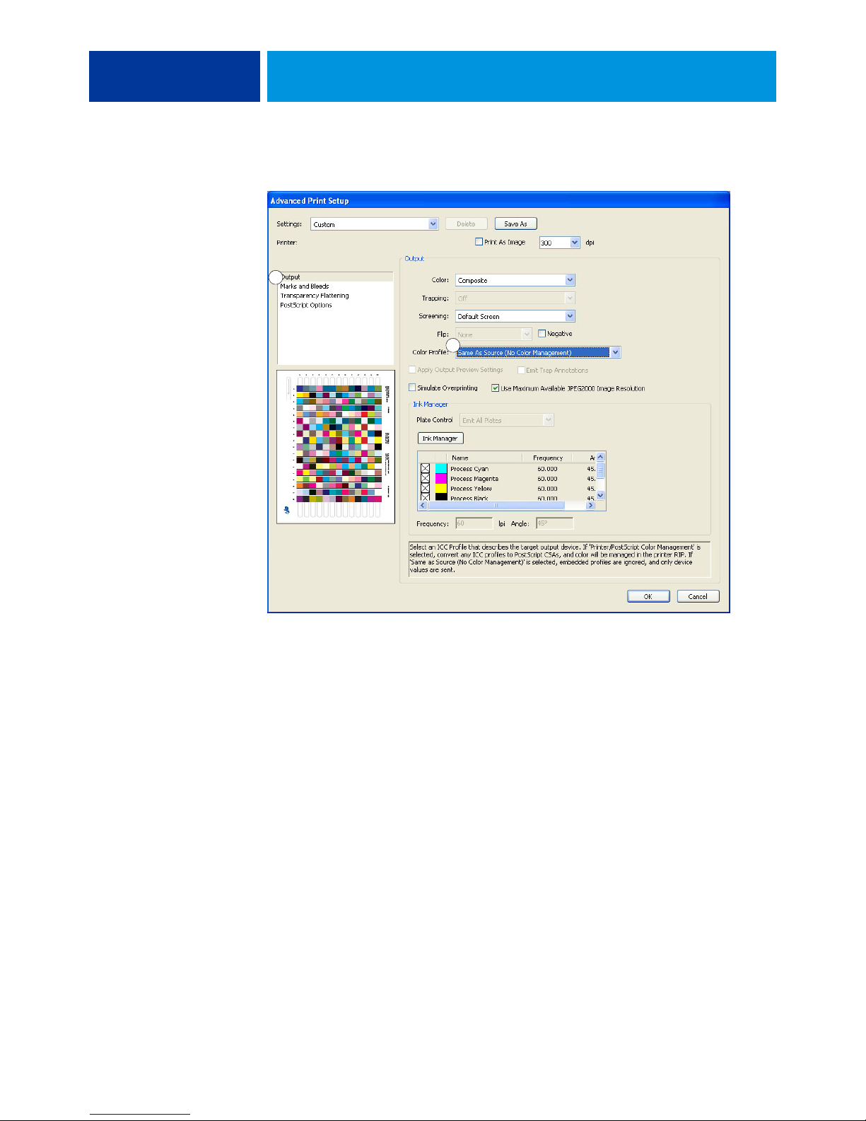
1 Select Output
2 Choose Color Profile
MANAGING COLOR IN ADOBE ACROBAT 59
5 Select Output.
1
2
6 Choose Same as Source (No Color Management) from the Color Profile list.
Acrobat does not convert object data to another color space before sending it to the
Color Server.
7 Click OK, and then click OK again (Windows) or click Print (Mac OS).
Page 60

DESKTOP COLOR PRIMER 60
DESKTOP COLOR PRIMER
This chapter covers concepts that are basic to printing in color, including:
• Properties of color
•Printing techniques
• Effective use of color
• Raster images and vector graphics
• File optimization for processing and printing
If you are already familiar with color theory and digital color printing, proceed to
“Optimizing files for processing and printing” on page 73 for information about optimizing
files for printing.
The properties of color
This section introduces concepts that are basic to color theory. You will encounter some
of these concepts (such as hue, saturation, and brightness) when you work with color in
applications; others provide useful background information. Color is a complex topic, so
consider this a starting point for experimentation and further research.
Page 61

DESKTOP COLOR PRIMER 61
The physics of color
The human eye can see electromagnetic radiation at wavelengths between 400 nanometers
(purplish blue) and 700 nanometers (red). This range is called the visible spectrum of light.
We see pure spectral light as intensely saturated or pure colors. Sunlight at midday, which we
perceive as white or neutral light, is composed of light from across the visible spectrum in
more or less equal proportions. Shining sunlight through a prism separates it into its spectral
components, resulting in the familiar rainbow of colors illustrated in the following figure.
Like the sun, most light sources we encounter in our daily environment emit a mixture of
light wavelengths, although the particular distribution of wavelengths can vary considerably.
Light from a tungsten light bulb, for example, contains much less blue light than sunlight.
Tungsten light appears white to the human eye, which, up to a point, can adjust to the
different light sources. However, color objects appear different under tungsten light than they
do in sunlight because of the different spectral makeup of the two light sources.
The mixture of light wavelengths emitted by a light source is reflected selectively by different
objects. Different mixtures of reflected light appear as different colors. Some of these mixtures
appear as relatively saturated colors, but most appear as grays or impure hues of a color.
Page 62
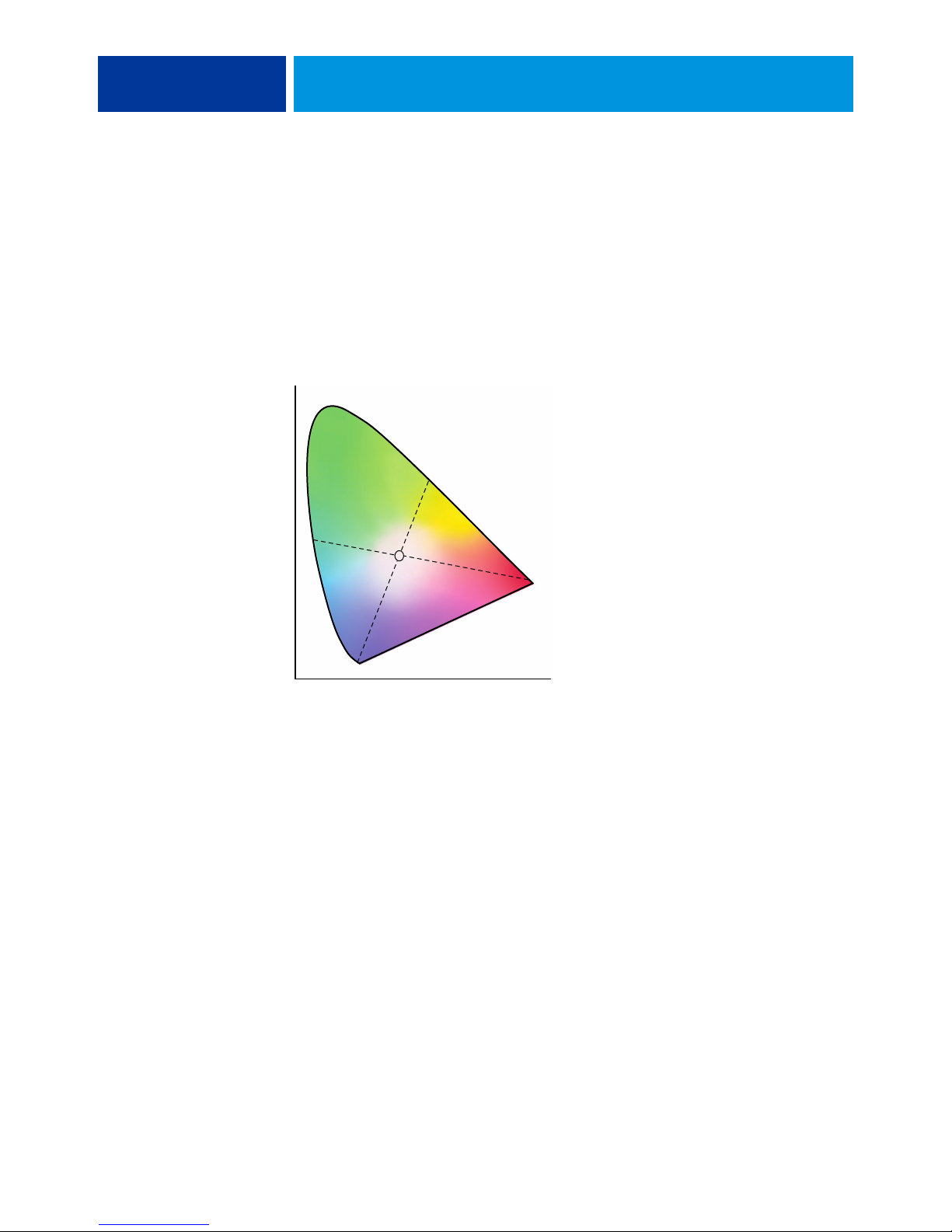
DESKTOP COLOR PRIMER 62
CIE color model
In the 1930s, the Commission Internationale de l’Eclairage (CIE) defined a standard color
space, a way of defining colors in mathematical terms, to help in the communication of color
information. This color space is based on research on the nature of color perception. The
following CIE chromaticity diagram is a two-dimensional model of color vision. The arc
around the top of the horseshoe encompasses the pure, or spectral, colors from blue-violet to
red. Although the CIE chromaticity diagram is not perceptually uniform, some areas of the
diagram seem to compress color differences relative to others, it is a good tool for illustrating
some interesting aspects of color vision.
By mixing any two spectral colors in different proportions, we can create all the colors found
on the straight line drawn between them in the diagram. It is possible to create the same gray
by mixing blue-green and red light or by mixing yellow-green and blue-violet light. This is
possible because of a phenomenon peculiar to color vision called metamerism. The eye does
not distinguish individual wavelengths of light. Therefore, different combinations of spectral
light can produce the same perceived color.
Purple colors, which do not exist in the spectrum of pure light, are found at the bottom of the
diagram. Purples are mixtures of red and blue light—the opposite ends of the spectrum.
Hue, saturation, and brightness
A color can be described in terms of three varying characteristics, called the HSB color model:
• Hue: Tint (the qualitative aspect of a color—red, green, or orange)
• Saturation: The purity of the color
• Brightness: Relative position between white and black
Page 63
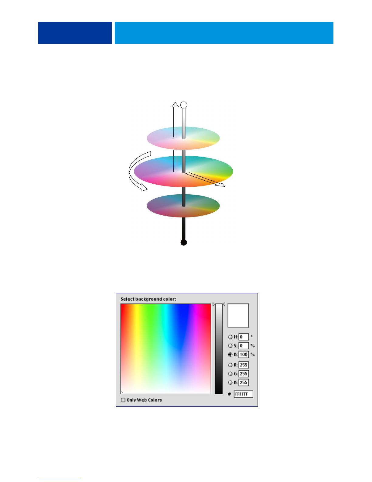
DESKTOP COLOR PRIMER 63
While the CIE chromaticity diagram illustrated earlier conveys hue and saturation,
a three-dimensional color model is required to add the brightness component, as illustrated in
the following figure.
Brightness
Hue
Saturation
Many computer applications include dialog boxes in which you choose colors by
manipulating hue, saturation, and brightness. For example, some applications use a color
picker that can be reconfigured according to your preference (as illustrated in the following
figure).
Page 64

DESKTOP COLOR PRIMER 64
Additive and subtractive color systems
Color devices used in desktop publishing and printing simulate the range of visible colors
using a set of primary colors that are combined to create other colors. There are two methods
for creating a range of colors from a set of primary colors. Computer monitors and scanners
are based on the additive color model. Printing technologies, including the Color Server and
offset presses, are based on the subtractive color model.
Additive (RGB) color
Color devices that use the additive color model create a range of colors by combining varying
amounts of red, green, and blue light. These colors are called the additive primaries
(illustrated in the following figure). White is created by adding the maximum amount of red,
green, and blue light available. Black occurs wherever all three colors are absent. Grays are
created by adding equal amounts of all three color together. Combining varying amounts of
any two of the additive primaries creates a third, saturated hue.
Page 65

DESKTOP COLOR PRIMER 65
A familiar device that is based on this color model is the computer monitor, illustrated in the
following figure. Monitors have red, green, and blue phosphors that emit varying amounts of
light to display a given color. Scanners create digital representations of colors by measuring
their red, green, and blue components through colored filters.
Subtractive (CMY and CMYK) color
The subtractive color model is the basis for color printing, color photographic prints, and
transparencies. While the additive color model simulates the visible spectrum of color by
adding light of three primary hues, the subtractive color model starts with a “white” or neutral
light source containing light of many wavelengths. Inks, toners, or other colorants are used to
selectively absorb (subtract) certain wavelengths of light that otherwise would be reflected or
transmitted by the media in use.
Page 66
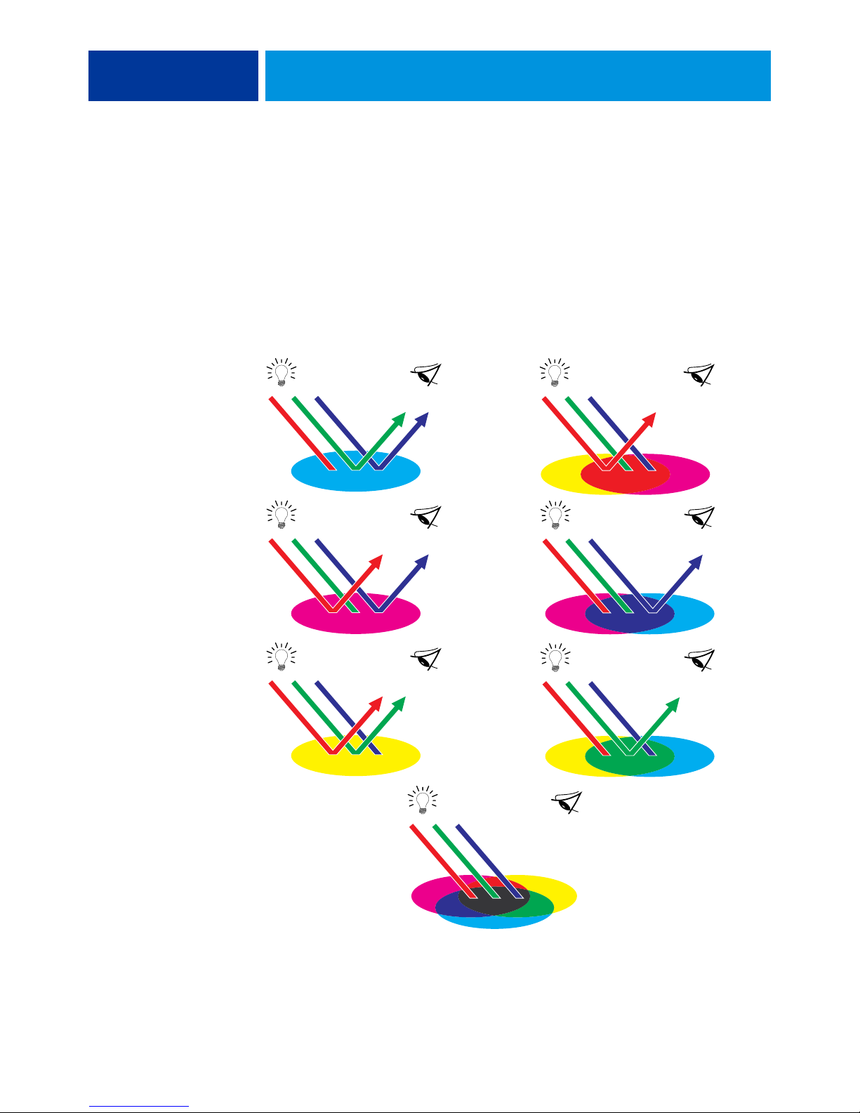
DESKTOP COLOR PRIMER 66
The subtractive primaries are cyan, magenta, and yellow; they absorb red, green, and blue
light, respectively (as illustrated in the following figure). Combining any two subtractive
primaries creates a new color that is relatively pure or saturated. For example, you can make
red by combining magenta and yellow, which absorb green and blue light, respectively. White
occurs when no colorant is applied. In theory, combining all three subtractive primaries yields
black, but due to deficiencies of cyan, magenta, and yellow colorants, combining these three
primaries actually yields a muddy brown. Black colorant is added to compensate for the
deficiencies of cyan, magenta, and yellow colorants. Consequently, color printing uses four
process colors: Cyan, Magenta, Yellow, and blacK (CMYK). The use of black toner produces
neutral solid blacks and allows for improved rendering of black text.
Page 67

DESKTOP COLOR PRIMER 67
Understanding color gamut
Different color reproduction techniques have different color capabilities, or gamuts. Color
transparency films have comparatively large gamuts, as do color monitors. The color gamut
that can be produced using process inks or CMYK toners on paper is smaller. This is why
some colors that can be displayed on a color monitor, especially bright saturated colors,
cannot be reproduced exactly by your Color Server, nor can they be reproduced on a press
using process colors. Moreover, different printers have different gamuts. Some colors your
printer can produce cannot be reproduced on an offset press, and vice versa. The following
figure illustrates this concept of differing gamuts.
1 Color transparency film
2 RGB monitor
3 Offset press (white)
4 Other print device
Printing techniques
1
2
3
4
You must account for the gamut of your printer when designing on a color monitor. When
printed, colors that fall outside the printer gamut are “mapped” to printable colors. This
process, referred to as gamut mapping, takes place when color data is converted or adjusted to
meet the gamut requirements of a printer.
The Color Server is specially designed to perform gamut mapping at high speed with
high-quality results. It provides these color management features automatically, using either
built-in default settings or settings you select for a particular print job. For added flexibility,
you can also use the Color Server color management system in combination with the color
management systems on Windows and Mac OS computers.
Until recently, most color printing was done on printing presses using one of several printing
techniques, such as offset lithography, flexography, or gravure. All traditional printing
techniques require lengthy preparation before a press run can take place. Short-run color
printing, including Color Server printing, eliminates most of this preparation. By
streamlining the process of color printing, the Color Server makes short print runs
economically feasible.
In contemporary offset lithographic printing, digital files from desktop computers are output
to an imagesetter, which creates film separations. The film is used to make a prepress proof,
which is an accurate predictor of the final print job and allows you to make corrections before
going to press. Once the proof is approved, the printer makes plates from the film and runs
the print job on the press.
Page 68

DESKTOP COLOR PRIMER 68
With the Color Server, you simply print the file. The Color Server processes the PostScript
information in the file and sends four bitmaps (one each for cyan, magenta, yellow, and black)
to the printer. The ease of Color Server printing makes possible experimentation that would
be too costly on a press, allowing unlimited fine-tuning of color and design elements.
Halftone and continuous tone devices
Halftoning is used in offset printing to print each process color at a different intensity,
allowing millions of different colors to be reproduced using only the four process colors.
Depending on the required intensity of a given color, toner is placed on paper in dots of
different size. The grid of dots used for each toner color is called a screen. Halftone screens are
aligned to unique angles designed to eliminate interference patterns called moiré that can arise
with halftoning.
Some color printers are commonly referred to as continuous tone (contone) devices. They do
not use traditional halftone patterns and angles. Contone devices are capable of varying the
intensity of individual dots.
Even if your color printing is done exclusively on the Color Server, you will encounter
concepts from offset printing if you use high-end graphics applications. For example, color
controls in illustration applications, such as Adobe Illustrator, are geared toward specifying
color for offset printing using process and spot colors. Many applications allow you to specify
the halftone used for each printing plate.
Using color effectively
The ability to print in color can greatly increase the effectiveness of your message, whether
you are printing a presentation or newsletter (short-run printing), or proofing an ad concept
that will later be printed on a press (color proofing). Some potential benefits of using color
include:
• Conveying information rapidly by using color cues
• Making use of the emotive aspects of different colors
• Increasing impact and message retention
Color can also be a source of distraction and discord if it is used poorly. This section outlines
some guidelines and concepts to consider as you approach designing color materials.
Page 69

DESKTOP COLOR PRIMER 69
General guidelines
To create successful color materials, consider the following:
• Use color to aid comprehension, rather than applying colors indiscriminately.
In presentations, graphs, and charts, use color to highlight patterns and
emphasize differences.
• Use color sparingly. In general, fewer colors work better than many colors.
• Use red as an accent color. Red is particularly effective when used in otherwise
monochromatic materials.
• Consider the tastes of your target audience when choosing colors.
• Keep a file of printed color pieces that appeal to you or strike you as effective. Refer to it
for ideas when designing your own documents.
Color wheel
A color wheel like the one in the following figure is a helpful tool for understanding the
interrelation of colors. The colors on one side of the color wheel, from magenta to yellow,
appear to most people to be warm colors, while those on the other side, from green to blue,
appear to be cool. The distance between two colors on the color wheel can help predict how
they will appear when seen side by side.
Page 70
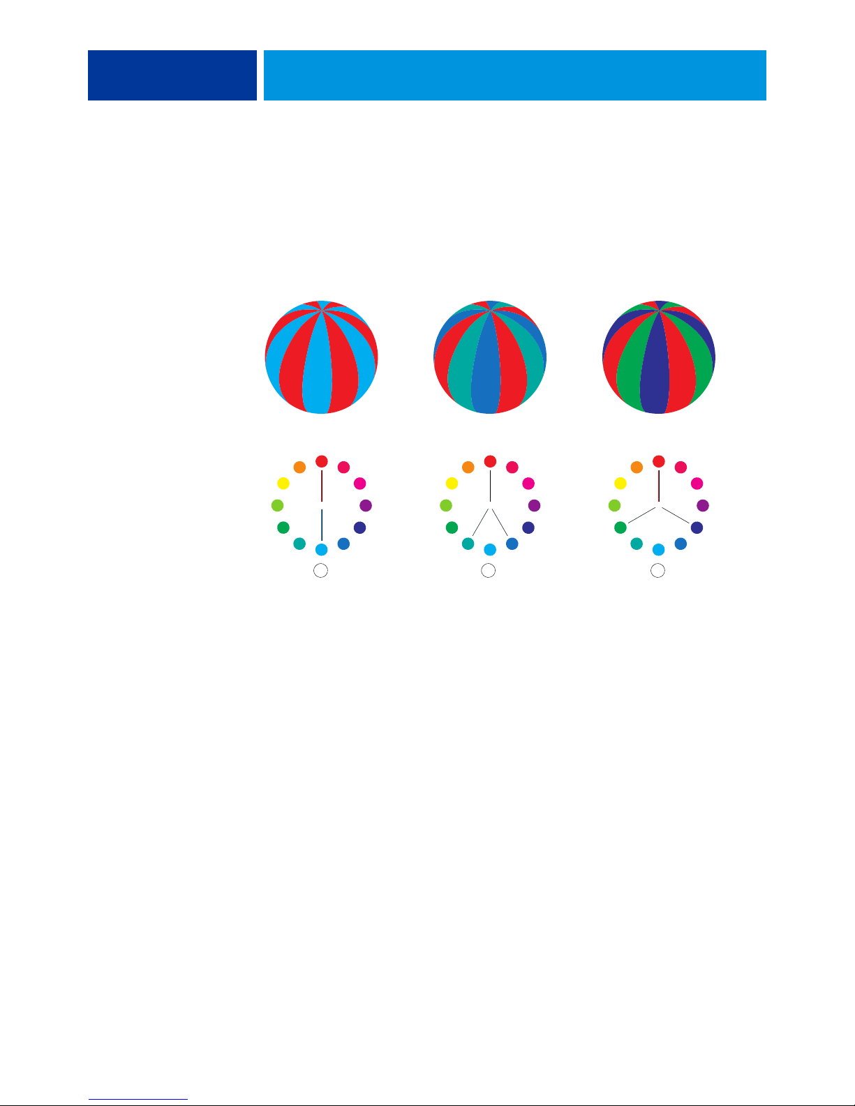
DESKTOP COLOR PRIMER 70
Colors opposite one another on the color wheel are called complements (see example a in the
following figure), and create a striking contrast side by side. This can be the basis for a bold
graphical design, but it is an effect you should use with discretion, since it can be visually
fatiguing. Other bold combinations to consider are split complements—a color and the two
colors adjacent to its complement (example b)—and triads (three colors evenly spaced on the
color wheel (example c). Colors adjacent to one another on the color wheel result in subtle
harmonies.
a b c
The color wheel simplifies color relationships for the purpose of clarity, showing only
saturated or pure colors. Adding the myriad variations of each hue to the palette (more or less
saturated, darker, or lighter) creates a wealth of possibilities. Taking a pair of complements
from the color wheel and varying the saturation and brightness of one or both colors produces
a very different result from the pure complements. Combining a light tint of a warm color
with a darker shade of its cooler complement often gives pleasing results. Combining a darker
shade of a warm color with a light tint of its cooler complement produces an unusual effect
that may appeal to you.
Once you have mastered the concept of the color wheel, you have a good framework for
experimenting with color combinations. Many books targeted at graphic designers show
groups of preselected color combinations. Some are organized by themes or moods, and some
are based on a custom color system, such as PANTONE. The more you develop a critical
facility for judging color combinations, the more you will trust your own eye for color. For a
selection of books about design, see the “Bibliography” on page 75.
Page 71

DESKTOP COLOR PRIMER 71
Color and text
It is not a coincidence that the overwhelming majority of text you see is printed in black on
white paper. Text in black on white is highly legible and is not fatiguing to read for extended
periods. For many color materials, using black text on a white background and confining
color to graphic elements and headings is a good choice.
When used skillfully, color text can add flair to documents printed on paper. This technique
is widely used in presentations. When using color text, avoid dazzling text and background
combinations created from primary complements, especially red and cyan or red and blue.
They are visually fatiguing and hard to read. Color text is more legible when distinguished
from its background by a difference in lightness, for example, dark blue text on a light beige
background. In addition, using many different colors in a string of text makes for a confused
appearance and is hard to read. However, using a single highlight color is an effective way to
draw the reader’s eye to selected words. For color text samples, see the following figure.
STOP! STOP!
STOP! STOP!
De gustibus
De gustibus
non est
non est
disputandum.
disputandum.
When using color text, keep in mind that small font sizes typically do not print in color with
the same sharpness as in black. In most applications, black text prints exclusively in black
toner, while color text usually prints with two or more toners. Any misregistration between
the different toners on paper causes color text to lose definition. You can make test prints to
find the smallest point size at which color text prints clearly. When using high-end graphics
applications that allow you to specify color as percentages of cyan, magenta, yellow, black, you
can create pure cyan or pure magenta text that prints with the same sharpness as black text.
(Pure yellow text is extremely hard to read on anything but a dark or complementary
background.)
Exceptio probat
Exceptio probat
regulam de rebus
regulam de rebus
non exceptis.
non exceptis.
Page 72

DESKTOP COLOR PRIMER 72
Raster images and vector graphics
Two broad categories of artwork can be printed from a personal computer to a color printer:
raster images and vector graphics.
A raster image, also referred to as a bitmap, is composed of a grid of pixels, each assigned a
particular color value (as illustrated in example a in the following figure). The grid, when
sufficiently enlarged, resembles a mosaic made from square tiles. Examples of raster images
include scans and images created in painting or pixel-editing applications, such as Photoshop
and Corel Painter.
The amount of data found in a raster image depends on its resolution and bit depth. The
resolution of a raster describes the compactness of the pixels and is specified in pixels per inch
(ppi). The bit depth is the number of bits of information assigned to each pixel. Black and
white raster images require only one bit of information per pixel. Grayscale images require
8 bits per pixel. For photographic quality color, 24 bits of RGB color information are required
per pixel, yielding 256 levels of red, green, and blue. For CMYK images, 32 bits per pixel are
required.
When printing raster artwork, the quality of the output depends on the resolution of the
source raster. If the raster resolution is too low, individual pixels become visible in the printed
output as small squares. This effect is sometimes called “pixelation.”
In vector graphics, picture objects are defined mathematically as lines or curves between
points—hence the term “vector” (see example b). Picture elements can have solid, gradient, or
patterned color fills. Vector artwork is created in illustration and drawing applications, such as
Illustrator and CorelDRAW. Page layout applications, such as QuarkXPress, also allow you to
create simple vector artwork with their drawing tools. PostScript fonts are vector-based,
as well.
Vector artwork is resolution-independent. You can scale it to any size and resolution without
danger of pixels becoming visible in printed output.
a b
Page 73

DESKTOP COLOR PRIMER 73
Optimizing files for processing and printing
The following sections provide information about how to create image files that produce
the highest possible print quality while minimizing the processing time and disk space
they require.
Resolution of raster images
While a 72-ppi raster image appears sharp on a monitor, the same image would likely appear
pixelated when printed to the Color Server. Color printers are capable of much greater detail
than computer monitors, and require correspondingly higher resolution image files. However,
high-resolution files can be large and, therefore, cumbersome to transmit over a network,
process for printing, store on disk, and edit.
Beyond a certain threshold, a higher image resolution greatly increases file size while having a
minimal effect on output quality. The optimal image resolution depends on the resolution of
the final print device. Aim for the resolution that optimizes both file size and output quality.
The resolution of a raster image, along with its bit depth and physical dimensions, determine
its file size. The following table shows the file sizes of color raster images at different
dimensions and resolutions.
File size at
100 ppi 150 ppi 200 ppi 400 ppi 600 ppi
Image size RGB/CMYK RGB/CMYK RGB/CMYK RGB/CMYK RGB/CMYK
3"
x 4" 0.4/0.5 MB 0.8/1.0 MB 1.4/1.8 MB 5.5/7.3 MB 12.4/16.5 MB
5"
x 7" 1.0/1.3 MB 2.3/3.0 MB 4.0/5.3 MB 16.0/21.4 MB 36.1/48.1 MB
8.5"
x 11" 2.7/3.6 MB 6.0/8.0 MB 10.7/14.3 MB 42.8/57.1 MB 96.4/128.5
MB
11"
x 17" 5.4/7.1 MB 12.0/16.1 MB 21.4/28.5 MB 85.6/114.1
MB
192.7/256.9
MB
In this table, the shaded areas indicate that 200 ppi is typically the best trade-off between
image quality and file size. However, higher resolutions (for example, 250 to 300 ppi) may be
necessary for offset printing, when quality is of the utmost importance, or for images
containing sharp diagonal lines.
To find the best image resolution for your purposes, make test prints of some raster artwork at
different resolutions. Start with a high-resolution image (400 ppi) and save versions at
progressively lower resolutions, down to 100 ppi, using a pixel-editing application, such as
Photoshop. Always save a copy of the original high-resolution version, in case you must revert
to it. The high-resolution data cannot be recreated from a lower resolution version.
Page 74

DESKTOP COLOR PRIMER 74
I
li
Print the files and examine the output. You will likely begin to see a marked deterioration in
output quality at resolutions below 200 ppi, while above 200 ppi the improvement may be
very subtle.
ty
mage qua
100 ppi 200 ppi 300 ppi 400 ppi 500 ppi 600 ppi
Image resolution
Raster images prepared for offset printing may need to be at higher resolutions than necessary
for proofing on your Color Server.
Scaling
Ideally, each raster image should be saved at the actual size, and it will be placed in the
document at the optimal resolution for the printer. If the image resolution is correct for the
printer, there is no quality advantage to be gained by scaling an image to a percentage of its
actual size. If you scale a large image to a percentage of its actual size, you incur unnecessary
file transfer time, because the image data for the entire large image is sent to the printer. If an
image is placed multiple times at markedly different sizes in a document, save a separate
version of the image at the correct size for each placement.
If you must place an image at greater than 100% in a document, remember that the output
image resolution is affected. For example, if you scale a 200 ppi image to 200%, the image is
printed at 100 ppi.
Page 75

BIBLIOGRAPHY
BIBLIOGRAPHY 75
Books
Bruno, Michael H., ed. Pocket Pal : A Graphic Arts Production Handbook. Nineteenth Edition.
International Paper, 2004.
Fraser, Bruce and Blatner, David. Real World Adobe Photoshop CS2. Berkeley: Peachpit Press,
2006.
Hunt, R.W.G. The Reproduction of Colour. Sixth Edition. Wiley, 2004.
Kieran, Michael. The Color Scanning Success Handbook. Toronto: DPA Communications
Corp., 1997. (Out of print)
Kieran, Michael. Understanding Desktop Color. Second Edition. Berkeley: Peachpit Press,
1994.
Lawler, Brian P. Adobe Print Publishing Guide. Second Edition. Adobe Press, 2006.
Margulis, Dan. Professional Photoshop: The Classic Guide to Color Correction. Fifth Edition.
Berkeley: Peachpit Press, 2006.
Miller, Marc D. and Zaucha, Randy. The Color Mac. Second Edition. Hayden Books, 1995.
(Out of print)
The Color Guide and Glossary: Communication, measurement, and control for Digital Imaging
and Graphic Arts. X-Rite Incorporated, 2004. (Available from X-Rite dealers or via the X-Rite
web site, www.xrite.com.)
World Wide Web sites
International Color Consortium: www.color.org
Graphic Arts Information Network: www.gain.net
Seybold Seminars Online: www.seyboldseminars.com
Adobe Systems Incorporated: www.adobe.com
Page 76

Page 77

GLOSSARY
A
GLOSSARY 77
This Glossary contains some terms that are industry concepts and may not be explicitly
referenced in the documentation set.
additive color model
A system in which colors are produced by combining red, green, and blue light (the additive
primaries). An RGB video monitor is based on an additive color model.
additive primaries
Red, green, and blue light used in additive color systems. When blended together in proper
amounts, these colors of light produce white.
B
artifact
A visible defect in an image, usually caused by limitations in the input or output process
(hardware or software); a blemish or error.
banding
Visible steps between shades in a color gradient.
bit depth
Amount of information used for each pixel in a raster image. Black-and-white images require
only one bit per pixel. Grayscale images with 256 shades of gray require 8 bits (or 1 byte) per
pixel. Photographic quality color images can require 24 bits per pixel (RGB images) or 32 bits
per pixel (CMYK images).
Bitmap (BMP)
A graphics file format established by Microsoft; native to the Windows operating system.
bitmap (or raster)
An image made up of small squares arranged in a grid. Each square in the grid is a pixel.
The number of pixels per inch defines the resolution of a bitmap.
Page 78

GLOSSARY 78
blasting
An undesirable effect that occurs when excess amounts of toner, possibly combined with
certain types of paper stock, cause objects in an image to spread beyond the boundaries
defined in the file.
brightness
Both the saturation and lightness of product color.
C
calibration
The process of adjusting the basic setting of a monitor, printer, or other device to standard
values in order to ensure uniform and consistent results over time. Calibration helps assure
predictable and consistent printing results.
calibration target (or calibration set)
A set of measurements that describe the expected density response of a printing device.
Calibration targets are associated with the output profile of the device.
CIE
The International Commission on Illumination, abbreviated as CIE from its French title
Commission Internationale de l’Eclairage, is an organization devoted to international
cooperation and exchange of information among its member countries on all matters relating
to the science and art of lighting. The CIE developed mathematical models to quantify light
sources, objects and observers as a function of wavelength, which led to the development of a
basic color space for plotting colors.
CIEbased colors (A, ABC, DEF, DEFG)
Device-independent color spaces that are produced by color management outside of the
Color Server, such as application software, operating systems, or printer drivers, and are
applied at the user’s computer.
CMS
See color management system.
CMYK
A subtractive color model that uses cyan, magenta, yellow, and black (process colors), and is
used in color printing; a color model used in the printing of colors in four-color process
printing.
coated media
Media that is coated to enhance print quality. The coating allows the media to be printed
without allowing significant toner or ink absorption, thereby preventing blurriness or lack
of contrast.
Page 79

GLOSSARY 79
color channel
A single-color image that can be edited separately from the other color channels in a color
space; for example, the red channel of an RGB image.
color gamut
See gamut.
color management system (CMS)
System used to match color across different input, display, and output devices.
color rendering dictionary
See CRD (Color Rendering Dictionary).
color separation
The process of separating a color image into the color components for printing: cyan,
magenta, yellow, and black. Also refers to the four sheets of film that result from the process
of separating a color image.
color space
A model for representing color in terms of measurable values, such as the amount of red,
green, and blue in an image. RGB and CMYK color spaces correspond to color devices
(monitors and printers, respectively). Other color spaces, such as CIE Lab, are based on
mathematical models and are device-independent (that is, not based on the color response of
a particular device). See gamut.
colorant
An ink, dye, toner, paint, or other pigment that modifies the color of media to which it
is applied.
ColorWise
See ColorWise color management.
ColorWise color management
An ICC-open color management solution, which is an easy-to-use system that addresses the
needs of both casual and experienced color management users.
component
In variable data printing, an element such as text, a graphic, or a photograph that is printed
on a page.
composite printer
Any output device that can print directly in color without first creating color separations.
A composite print can be used as an early proof of an offset print job.
Page 80

GLOSSARY 80
consumable
Material such as ink, toner, paper, or lubricants that must be replenished regularly in order for
the print device to function properly.
continuous tone (contone)
A photographic image that contains gradient tones from black to white (such as a 35mm
transparency or a photograph). Continuous tones cannot be reproduced in that form for
printing, but must be screened to translate the image into dots.
CRD (Color Rendering Dictionary)
A feature that maintains the best possible translation of color from one color device to
another. A CRD is used by the color management system or the PostScript interpreter of the
Color Server when converting data between color spaces. The Color Server includes several
CRDs, each of which provides a different color rendering intent.
custom color system
A system of named color swatches that can be matched on press using spot colors or
approximated using process colors. PANTONE and TruMatch are examples of custom
color systems.
D
DCS (Desktop Color Separation)
A data file standard that assists in making color separations with desktop publishing systems.
Five files are created: four color files (one each for C, M, Y, and K) and a composite color
preview file of the color image. DCS allows an image-editing application to perform color
separation and pass it through to final output with its integrity intact.
densitometer
An instrument commonly used in the graphic arts industry to measure density according to a
specified standard.
density
A measurement of the light-absorbing quality of a photographic or printed image.
desktop color separation
See DCS.
device-dependent colors
Colors directly related to their representation on an output device. Color values map directly
or via simple conversions to the application of device colorants, such as quantities of ink or
intensities of display phosphors. Device-dependent colors are controlled precisely for a
particular device, but the results may not be consistent between different devices. Examples of
device-dependent color spaces are DeviceRGB, DeviceCMYK, and DeviceGray.
Page 81

GLOSSARY 81
device-independent colors
Colors described using a model based on human visual perception instead of being
device-specific.
DIC
A Japanese standard of specifications for separations, proofs, and color printing.
E
Encapsulated PostScript (EPS)
A PostScript file format designed to be embedded in another PostScript stream.
Euroscale
A European standard of specifications for separations, proofs, and color printing.
F
G
flexography
A printing technology that uses flexible raised-image plates. Flexography can be used to print
on non-flat materials such as cans.
four-color printer
A printing device that uses cyan, magenta, yellow, and black ink or toner.
gamma
A numeric value representing the relationship (gamma curve) between the input and output
values of a color device. If gamma equals 1, input values are mapped exactly to output values.
gamut
A range of colors. A device gamut is the range of colors that a print device can produce.
An image gamut is the range of colors in a particular image.
gamut mapping
The conversion of color coordinates from one device’s gamut to another, usually
accomplished with algorithms or look-up tables.
GCR
See gray component replacement.
Page 82

GLOSSARY 82
GDI (Graphics Device Interface)
Graphics and display technology used by Windows computers. GDI applications rely on
GDI (rather than the PostScript language) to send text and pictures to a print device.
GIF (Graphics Interchange Format)
A standard for bitmap graphics of up to 256 colors used for posting photographic images on
Internet or intranet pages; rarely used for professional printing.
gradient
A smooth transition between two different colors or two shades of a color.
Graphics Device Interface
See GDI.
Graphics Interchange Format
See GIF.
gravure
A printing technology that uses an etched cylinder that has been immersed in ink. The ink
that remains in the etched areas is applied to the paper. The non-etched surfaces of the
cylinder are non-printing areas.
H
gray component replacement (GCR)
A method for improving wet ink trapping and reducing ink costs in process color printing.
In shadow, midtone, and quarter-tone areas where all three process colors (C, M, Y)
overprint, the gray components of those colors are reduced and replaced by black.
halftoning
A method for representing an original continuous tone image using a pattern of dots, lines, or
other patterns.
HSB
A color model where each color is represented by its hue, saturation, and brightness
components; supported by most color applications.
HSL
A color model in which each color is represented by its hue, saturation, and lightness
components.
Page 83

GLOSSARY 83
I
ICC profile
An industry standard color profile format developed by the International Color Consortium
(ICC) that describes the color capabilities, including the gamut, of a color device based on the
differences between an ideal and the current device. The ideal is often provided by the
manufacturer as a color reference file. ICC profiles are implemented on Mac OS computers in
ColorSync and on Windows computers in Image Color Matching (ICM). The Color Server
color management system, ColorWise, supports ICC profiles.
imagesetter
Raster-based film output device; a high-resolution laser output device that writes bitmapped
data onto photosensitive paper or film.
J
JPEG
A graphics file format defined by the Joint Photographic Experts Group committee of
International Standards Organization (ISO); a standard for digital compression of still image
graphic data.
L
M
Lab
A uniform device-independent color space in which colors are located within a threedimensional rectangular coordinate system. The three dimensions are lightness (L), redness/
greenness (a) and yellowness/blueness (b). (Also referred to as L*a*b* and CIELab.)
metamerism
Phenomenon in which two colors composed of different combinations of light wavelengths
appear identical under a specific light source, but may look different under other light
sources. The colors are called “metamers.”
moiré
An undesirable pattern in images made using halftone screens. Moiré can be caused by the
improper line frequency of the screens, improper screen angles, improper alignment of
halftone screens, or by the combination of a halftone screen with patterns in the image.
Page 84

N
O
GLOSSARY 84
named color
A color that is defined according to a custom color system. For example, PANTONE 107 C
is a named color; also referred to as a spot color.
office applications
Software applications commonly used for business purposes, including presentation,
spreadsheet, and word processing applications.
offset lithography
Printing in which ink is transferred from printing plates to a rubber blanket, and then from
the blanket to paper.
output
See output profile.
output profile
A file that describes the color characteristics of a printing device. The output profile is
associated with a calibration target that defines the expected density response of the
print device.
P
PANTONE System
One of the best known color specification systems used by designers and printers to
communicate color. Available in Coated, Uncoated, and Matte, each swatch book contains a
series of colors that can be referenced based on the assigned PANTONE notation.
PDF (Portable Document Format)
An open file format specification that describes text and graphics in documents.
phosphor
Material used in making computer monitors; phosphors glow and emit red, green, and blue
light when struck by an electron beam, thus creating an image.
photographic rendering
A color rendering intent that preserves tonal relationships in images. Unprintable colors are
mapped to printable colors in a way that retains differences in lightness, sacrificing color
accuracy as necessary.
Page 85

GLOSSARY 85
pixel
The smallest distinct element of a raster image. The term is a combination of the words
“picture” and “element.”
PostScript
A device-independent page description language that is used to print and display pictures and
text. PostScript 3 includes many enhancements to older versions of PostScript, including
improved image quality and color.
PPD (PostScript Printer Description)
A file containing information about particular PostScript capabilities of the print device.
The information in the PPD is presented via the printer driver.
prepress proof
A print made from a set of film separations or other file to simulate the results of printing.
A prepress proof is the last opportunity to catch problems before the print job goes to press.
presentation graphics rendering
A color rendering intent that creates saturated colors but does not match printed colors
precisely to displayed colors. It is appropriate for bright saturated colors used in illustrations
and graphs.
process colors
The colors used in printing to simulate full-spectrum color images: Cyan, Magenta, Yellow,
blacK (CMYK).
profile
Systematically describes how a color maps to a particular space. By identifying a source profile
and an output profile, you initiate the appropriate workflow to maintain consistent color
values.
R
raster image
Electronic representation of a page or image using a grid of points called pixels.
rendering intent
The style of color rendering, or gamut mapping, designed for a particular type of color job.
An example of a rendering intent is Photographic rendering (also referred to as Image
rendering or Contrast rendering), which is designed for photographic images.
Page 86

GLOSSARY 86
resolution
The number of pixels per inch (ppi) in a bitmap image or the number of dots per inch (dpi)
that a device can render.
RGB
An additive color model that makes a range of colors by combining red, green, and blue light,
called the additive primaries. Commonly used to refer to the color space, mixing system, or
monitor in color computer graphics.
S
solid color rendering
A color rendering intent intended for use when color accuracy is crucial. Unprintable colors
are mapped to the closest printable colors. Solid color rendering does the best job of
preserving the saturation of displayed colors.
source color space
The color environment of the originating source of a colored element, including scanners and
color monitors.
source profile
A file used by a color management system to determine the characteristics of the color values
specified in a source digital image.
spectral light
The wavelengths of electromagnetic radiation emitted by a given light source that can be seen
by the human eye.
spectrophotometer
An instrument commonly used in the graphic arts industry to measure spectral light
according to a specified standard.
spot color
A color that is printed on its own separation plate when separations are specified. A spot color
is printed using a custom ink for that color, in contrast to process colors, which are printed
using combinations of cyan, magenta, yellow, and black. (Also referred to as a named color.)
Status T
A spectral response for graphic arts reflection densitometers defined by ANSI (American
National Standards Institute).
substrate
The material upon which a job is printed.
Page 87

GLOSSARY 87
subtractive color model
A system in which color is produced by combining colorants such as paint, inks, or dyes
on media such as paper, acetate, or transparent film. All printing devices use the subtractive
color model.
subtractive primaries
Cyan, magenta, and yellow colorants used in subtractive color systems for color printing.
Combining the subtractive primaries produces darker colors. Black is added to the subtractive
primaries to compensate for deficiencies of the toners or inks, and for more efficient black
printing.
SWOP
The abbreviation for Specifications for Web Offset Publications. A standard of specifications
for separations, proofs, and color printing on a web offset press (not a sheet-fed press).
T
U
V
TIFF (Tag Image File Format)
A common format for exchanging raster graphics (bitmap) images between applications.
trapping
Printing technique in which some objects are printed slightly larger or smaller than you have
specified in an application in order to prevent white edges around these objects.
undercolor removal (UCR)
A method for improving wet ink trapping and reducing ink costs in process color printing.
In shadow areas where all three process colors (C, M, Y) overprint, the amounts of those
colors are reduced and replaced by black.
vector graphic
Graphic illustration created on computers where picture objects are defined mathematically as
lines or curves between points. These mathematical definitions are interpreted by an image
language such as PostScript. Vector images include artwork created with illustration
applications (such as Adobe Illustrator or Macromedia FreeHand) and page layout
applications (such as Adobe PageMaker).
W
white point
The color temperature of any white light source, typically expressed in degrees Kelvin
(for example, 6500 K, typical for the white of a monitor).
Page 88

Page 89

INDEX
INDEX 89
A
accent color 69
Acrobat 56 to 59
additive color model 64
additive primaries 64
Adobe (ACE) conversion option
Illustrator 49
InDesign 40
Photoshop 30
Adobe Acrobat, see Acrobat
Adobe Illustrator, see Illustrator
Adobe InDesign, see InDesign
Adobe Photoshop, see Photoshop
B
bit depth, of raster images 72, 73
Blend RGB Colors Using Gamma, Photoshop
setting 31
brightness 60, 62
C
charts, using color in 69
choosing color 15
CIE
chromaticity diagram 62, 63
color model 62
CIELAB color space 8
CMY color model 19
CMYK Color Reference 11, 24
CMYK EPS, Photoshop 37
CMYK processing method 26
CMYK source profile 26
color
accent color 69
additive model 64
CMY model 19
complements 70
controlling printing results 15
custom color systems 23
HSB model 23, 62
HSL model 19, 23
HSV model 19
physics of 61
process colors 68
properties of 60
reference pages 11
RGB model 19, 23
split complements 70
subtractive model 64, 65
subtractive primaries 66
text 71
theory 60
triads 70
using effectively 68 to 71
wheel 69
color management
Acrobat 57
basics 8 to 9
ColorWise 10
CorelDRAW 53
Illustrator 48
InDesign 39
monitor 18
Photoshop 28
QuarkXPress 46
color management system (CMS) 8
color matching systems, see custom color systems
color monitors, see monitors
Color Profiler Suite 8, 18
color proofing 17
color theory 60
color wheel 69
ColorSync 8
ColorWise 8, 10
Combine Separations, Photoshop 34
Commission Internationale de l’Eclairage, see
CIE
complements, color 70
compression, JPEG 33, 35, 36
computer monitors, see monitors
continuous tone devices 68
Conversion Options, Photoshop setting 30
CorelDRAW 53 to 55
custom color systems 23, 70
Page 90

INDEX 90
D
Desaturate Monitor Colors by, Photoshop
setting 31
device profiles 8
Document Color Mode, Illustrator 47
documentation
7
E
EFIRGB
Photoshop 30, 40, 49, 57
Encoding, Photoshop setting 35
EPS (Encapsulated PostScript)
about 25
defining colors 21
imported objects 25
PostScript color management 36
with CorelDRAW 54
with illustration applications 47
with Illustrator 50
with Photoshop 31
EPS CMYK, Photoshop 37
EPS RGB 36
Excel, see Microsoft Office
F
file size, of raster images 10, 73
font size, for color text 71
G
gamma 9
gamut
of monitors 67
of photographic transparencies 67
Graphic Arts Package 27
graphs, using color in 69
gravure 67
H
halftone screen 27
halftoning 68
HSB color model 23, 62
HSL color model 19, 23
HSV color model 19
hue, saturation, and brightness 60, 62
I
ICC profiles
about 30
included with user software 9
ICC standard for color management systems 8
illustration applications 47
Illustrator 23, 47
InDesign 39 to 44
International Color Consortium 8
J
JPEG 33, 35, 36
L
light 61 to 62
line art, see vector graphics
M
metamerism 62
Microsoft Excel, see Microsoft Office
Microsoft Office 19 to 22
Microsoft PowerPoint, see Microsoft Office
Microsoft Word, see Microsoft Office
misregistration of colors 71
moiré 68
monitor color management 18
monitors
color model 65
gamut of 67
phosphors 65
Multi-channel, Photoshop 37
N
named colors 23
O
office applications 16, 19 to 22
offset lithographic printing 67
offset press print jobs, workflow issues 17
offset press printing 67
on-demand printing 17
output profile
color conversion 9
with office applications 22
P
page layout applications 38
painting applications 72
PANTONE
color system 23, 24
reference 11
phosphors 9, 65
photographic prints 65
photographic transparencies 65, 67
Photoshop
color management with 23
importing CorelDRAW data 54
using 28 to 37
Page 91

INDEX 91
Photoshop Multi-channel 37
physics of color 61
pixel-editing applications 72, 73
Postf light 23
PostScript applications
color handling 23
using color in 23 to 27
PostScript Color Management, Photoshop
option 33, 36
PostScript printer drivers 21
PowerPoint, see Microsoft Office
prepress proof 67
presentation print jobs, using color in 69
printing
raster images 72
techniques 67
prism 61
process colors 24, 66, 68
profiles, device 8
proofing
color 17
prepress 67
Q
QuarkXPress 23, 45
QuarkXPress color management 46
R
raster images
about 72 to 74
bit depth 72, 73
file size 73
for offset press printing 74
printing 72
resolution 73 to 74
scaling of 74
registration of colors 71
rendering intent 19
bypassing 21, 26
RGB color model 19, 23
RGB Color Reference 11, 20
RGB EPS 36
RGB source color space, see source color space
S
saturation 60, 62
scaling of raster images 74
scanners 64, 65
screens, used in halftoning 68
Separations, printing with Photoshop 34
short-run printing 17
source color space 9
spectral colors 62
spectral components of light 61, 62
split complements 70
Spot Color Matching option
with Photoshop 37
with PostScript applications 25
spot colors 23, 24
Spot-On 16
subtractive color model 64, 65
subtractive primaries 66
sunlight 61
T
text
font size 71
using color with 71
TIFF objects
assigning ICC profiles to 26
preview 33
recommended for imported objects 25, 31
tint 62
transparencies (photographic) 65, 67
triads 70
V
vector graphics 72
visible spectrum of light 61
W
white point 9
Word , see Microsoft Office
workflow, recommended 14
working space
Illustrator 48
Photoshop 28
 Loading...