

Page 1
P A GES OF WINDOWS
STEP-B Y-STEP GUIDES
DO MORE WITH YOUR PC
REIN STALL WINDOWS!
STREAMLINE YOUR SYSTEM FOR A BETTER PC
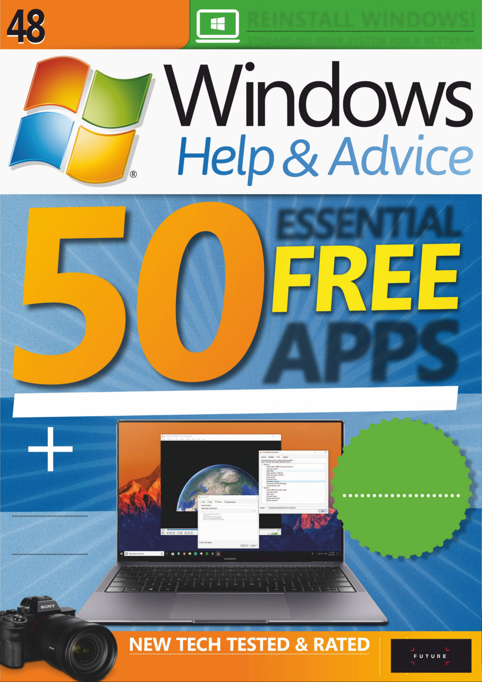
ESSENTIAL
APPS
HP ELITE X2 SAMSUNG GAL AX Y FOLD SONY A7R IV
ASUS ROG MOTHERSHIP FREE PHOTO EDI TING A PPS
SY ST E M TOO LS PH OTO AND VIDEO ED ITING SECURITY
WI-FI 6
IN-DEPTH
THE LA TEST
WIRELESS TECH
Use Alexa
with you r PC
Get the most
out of Dropbo x
Edit photos with
AI in Lum inar 4
WHAT TO DO WHEN
YOUR HARD DISK
IS FULL
OUT OF
SPA CE?
Page 2

;OLZV\YJLMVY[LJOI\`PUNHK]PJL
techradar.com
Page 3
Don’t mis s our NEXT I S SUE , when we will show you how to…
Use Windows Timeli ne Mak e your PC password - free Customise the
Windows Taskbar
Manage ebooks with Calibre Use a password manager
Si g n up f or ou r ne ws le tter at www. wi ndo w sm ag . c o . u k
NEXT
ISSUE
ON SALE
6 December
2019
Cover image credits : Microsoft, HP
Hello, and welcome to Windows
Help and Advice issue 168. This
month you can discover the 50
best free apps with which to
put your PC through its paces.
There’s everything from office
suites to photo editors to
security sof t war e, all the
programs you could want,
without spending a penny. And
if that wasn’t enough, we’ve got
a full guide to the latest wireless
network technology, Wi-Fi 6,
which promises to shake up an
otherwise dull sec tor. There’s
also a look at what to do if your
PC runs out of space.
Elsewhere, you’ll find the usual
mix of tutorials and reviews.
There’s a look at the new
Dropbox app, a guide to the
freshly release d Luminar 4,
and tips on using Alexa with
Windows 10. We review a
‘portable’ PC that needs
two power bricks ,
a phone that
folds in half, and
some sensible
Ultrabo oks too.
Whatever you
plan to do with
your PC t hi s
month
have fun
doing it.
Welcome
SUBSCRIBE TO THE
MA G T OD AY AN D SAVE
– TURN T O P A GE 20!
We pride ourselves in being the only magazine on the shelves to show you
exactly how to get the very best from the Windows operating system, whether
you’re using Windows 10 or Windows 8.1. Also, don’t forget to take a look at
how you can read the magazine on your laptop, smartphone or tablet.
Ian Evenden Editor
www.facebook.com/windowsmag
Page 4
6 Discover New hardware and software
from Microsoft. The importance of secure
passwords. And more besides…
20 Subscriptions
35 Back issues
Missed an issue? Don’t
miss out – order now while stocks last!
68 Digi tal issues
Get the world’s best
Windows mag on your phone or tablet
90 Next month
Find out what’s
coming up in the Christmas 2019 issue
REGULARS
FEATURES
64 Get answers to your
technical questions with
help from our PC ex perts
SUPPORT
4
| |
December 2019
24 The Windows 10 Dropbox app
offers a lot of options: here’s your
complete guide to file syncing
27 The new Luminar 4 brings AI
smarts to photo editing
30 Use Alexa on Windows 10
32 Manage lists with ToDo
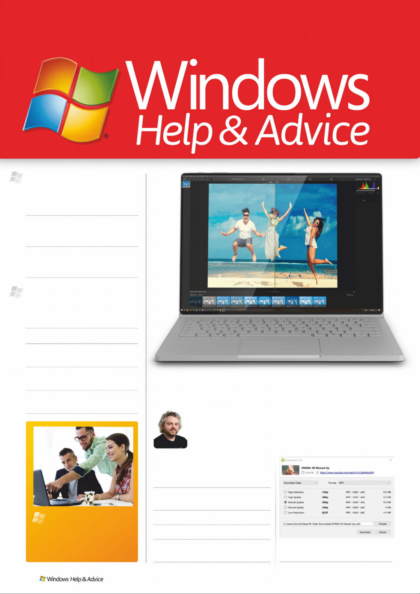
38 Download videos from
YouTube easily and for free
42 Use Scribus to create a
professional magazine layout
< ʝʦ ɠ ʔʦL ȫ ɏ ,ʋ ɚ (Ƀ ʑQȫ ʑ ɚ Vʋ\ ɡ
“If you ’re looking for better ways t o use y our ho me
compu ter, then thi s is t he plac e to start. We ’l l sho w
you al l the t ip s and tri c ks the experts use and more!”
EXPLORE
The best PC tutorial s
12 50 free apps
Avoid spending money on software by
using programs that cost nothing
48 Wi-F i 6 is here
A deep dive into the technology and
promise of the latest wireless standard
55 Out of space?
Our complete guide to what to do when
your PC’s internal storage fills up
Page 5

December 2019
|
|
5
77 Our expert reviews
78 HP Elite x2
80 Asus ROG Mothership
82 Sony Alpha A7 R IV
84 Samsung Galaxy Fold
88 Best free image editing tools
Buy print and digital together
– get a USB charger free!
F ind o ut mo re on p ag e 20
SUB S CR I PTIO N
BUNDLE OFFER
UPGRADE
w uss …
wwwwww.twitter.com/windowsmag
www.facebook.com/windowsmag
Get a complet e suit e
of PC software for nothing
55
Wi-Fi 6 is here, and promises to shake up the world
of wireless networking. We explore its new tech
Your PC is full. What do you do?
Read this before it happens
Page 6

NEW TH ING S T O DO AMAZING WEBSITES FASCINATING FACTS
6
| |
Dec emeber 20 1 9
Page 7
The Knowledge…
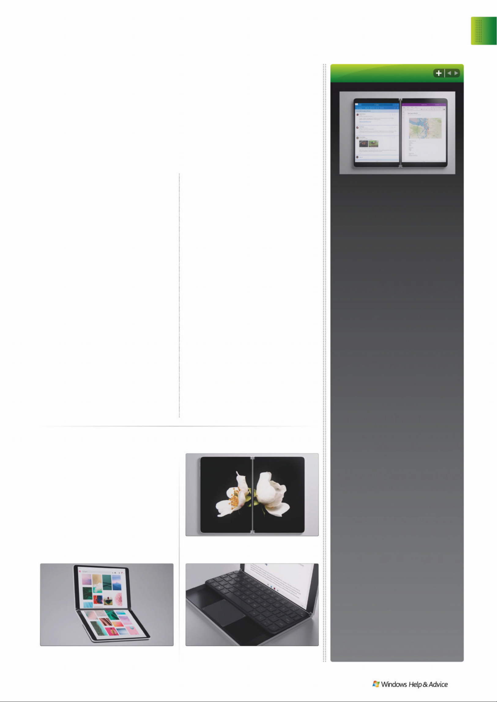
Microsoft’s October event, held in New York,
threw up a whole host of exciting new
devices, like the Surface Duo twin-screen
phone – but none, for our money, stole the
show quite as much as the Surface Neo. We
don’t know what it’ll cost, and there’s no firm
release date, but the Neo looks set to change
the way we think about computers: it’s
flexible, foldable, and super compact, like a
hybrid between today’s coolest phones and
tomorrow’s neatest laptops.
Keep your personal
web browsing private
++
LLL
ȫȫȫ
ɏɏɏ
ʖʖ
ɚɚɚ
ɿɿ
OO
ʋʋʋ
ʖʖ
ɚɚɚ
ʣʣ
LLɳɳɳKK
ɢɢɢ
S
ervices like Facebook and
Google have tentacles that
reach far across the web, and
they’re watching what you
do. Although they rarely tie your
activ ity to any p er so nal infor mation,
that which they do learn is sold to
advertisers, who target you with ads
that th eo retically fit your interests.
Ever looked at a sofa online then
been bombarded with ads for sofas
for the nex t month? That’s why. If
this makes you uncomfortable
– it’s mostly b enign, but we can
certainly understan d b ein g against
it – there are a few things you can
do to stop it.
First, consider changing your web
browser. Google Chrome and
Microsoft Edge don’t (yet) include
any significant technology to s top
tracking, though it ’s apparently
coming to Chrome in a future
version. Try using Firefox (get firefox.
com), Opera (opera.com) or V ivaldi
(vivaldi.com) which each build in
tracking protection – in the case of
Opera, there’s also an ad blocker
built in. As Google and Facebook are
the biggest t wo culprits for tracking,
you could consider using alternative
platforms – tricky if you’re tied to
using Facebook (or other services in
its family, like Instagram and
WhatsApp) but you could tr y using
DuckDuckGo (duckduckgo.com)
as an alternative to searching
through Google.
Lastly, try using a VPN, or virtual
private network, like NordVPN
(nordvpn.com) or Private Internet
Access (privateinternetaccess.com).
These have many uses, but keeping
your web browsing private is the
aim; for the ultimate in tracking
evasion, browsing through the Tor
Browser (torproject.org) means
everything you do online is
automatically routed through
different points in the world. It’s a
little slower, but there’s no way
someone’s following you if you
appear to be in Stockholm one
minute and Antarctica the next.
The web is w at c hi ng. I t’ s not as sca ry as it
sounds, but it’ s no t hard t o hi de y ourself a wa y
Windows 1 0 X
Is that a roman num eral?
It is not. This isn’t W ind ows 10 10: the ‘X’
is Microsof t’s favourite coo l letter (see:
Xbox, Surface Pro X et al), and i t ’s the
designation gi ven to a sp ecia l ver sion o f
Windows made specifically for dual-screen
or folding d evi ces. M icros of t c alls it an
‘expression’ of Wi ndow s, en hance d for
gadget s like the Surface Neo.
Why crea te a speci al versio n o f
Windows for that?
It’s not so much that Microsoft has
created a spe cial ver sion , more that
Windows ha s now b eco me a l ot of thi ngs
all at once. Signifi ca nt parts of Wind ows
run on loa ds of di ffe rent d evi ces an d have
done for so me tim e, of te n imp ercep tibl y.
To use a car analogy, Windows is the
engine which the re st of the ch assis is
built around.
But it doesn’t look much like the
Windows we know.
That’s bec ause the W indow s 10 that
you’re running o n your d esktop compute r
or laptop simpl y wouldn’ t work fo r this
platfo rm. I t ’s likely that this won’ t be the
last mobile version of Windows 10, and
you can exp e c t the Wi ndow s name to b e
frac ture d b et we en a w ho le ho st of n ew,
different versions soon.
So what’s different?
There’s a new st ar t m enu, w hich f ee ls a
lot more like the smartph one inter f aces
we’re all used to by now, and a lot less
clutter – we’d be surpr ise d if it inclu de d
any draggable floating program
windows. T her e isn’t, we ’re delighte d
to learn, any significant incompatibility:
Windows 10 X may look di ffe rent b ut
it should sti ll run th e apps yo u’re
familiar with.
So can I get it?
No. You’ll have to wait a year for the
Surfa ce Ne o to, er, surf ace, an d so f ar
that’s the only machine we know of
that’ll run W ind ows 10 X. It won’t b e
somethin g you c an ins tall o n a lap top
or desktop PC, though don’t be
surprise d if Mi croso f t com es up w ith a
new version f or the h ome by th en .. .
SPLIT SCREENS The Surface Ne o c o ns i st s o f t w o
side-by side 9-inch screens.
SMART KEYS The magnetic keyboard can be
moved to reveal Windows 10 X’s nifty Wonderbar.
MANY MODES The 360-degree hinge m eans you can
use the Neo like a laptop , l ike a tabl et, or lik e a book.
IMAGES: MICROSFOT
NEO CLASSICAL Microsoft reinvents the PC
Discover
Online privacy
December 2 01 9
|
|
7
Page 8
Download this…
Follow us on…
www.facebook.com/windowsmag
www. twitter.com/wi ndowsmag
December
Fri
dd yy
NEXT UE ON SALE
P
asswords are a big issue for security.
They’re the keys to your accounts,
yes, but imagine that someone had
swiped a copy of your house key
without you knowing: they’ d be able to get
in whenever they liked until you wised up
and changed the locks. If one of the services
you use online has had some kind of
password breach – perhaps their own
security was not strong enough, or a hacker
stumbled upon a master key – the problem
could be even worse than that. Your
credentials could be
floating around any
number of illicit
communities, your
house keys copied
and handed out to
every ne’er do well
in the dark corners
of the pub. But how
would you know?
First of all, you’ll
need to keep a close
eye on your incoming emails. If any service
you’ve used has been struck by a data
breach, they’ll normally send a big apology
and ask you to reset your password, which
you should absolutely do. All being well, that
affected service will use this misstep as an
opportunity to sure up its defences, and your
new password will be better protected. You
can also try checking directly . The
service Have I Been Pwned
(https://haveibeenpwned.com), run by
Microsoft regional director Troy Hunt, keeps
its nose to the ground on major data
breaches, and includes a way to search for
the appearance of your email address in
any of them. Google has recently started
to offer a similar service in the form of
Password Checkup, which has been
integrated into the Google Passwords
service at passwords.google.com.
The last step is the
most critical. Never
reuse a password on
more than one service.
Do this, and a data
breach on one would
mean your account
credentials could
potentially let
attackers into any of
your other accounts.
Google Passwo rd s can
help you generate super-secure passwords
and remember them on your behalf, and
there are stack of other services out there
(LasPass, Dashlane, et al) which can do the
same. If you’re offered the option of using
two-step authentication for any service, use
it – that second layer of protection could
also alert you to a loose password.
Has one of your passwords been comp rom ised ?
+HUH· V KRZ WR ÀQG RXW DQG KRZ WR VWRS WKH GDPDJH
((
ɃɃɃ
ʑʑʑ
ʢʢ
\\
ʝʝȸȸȸ
ɏɏɡ
WWɪɪ
ɸɸ
ʘʘʘ
ʖQQ
ɒɒ
ɪɪ
EEE
ʝXXɢ
1
Which of these is
typically used by
a laser printer?
A Toner
B Ink
C Paint
2
How many inkjet
cartridges are used
worldwide per year?
A 11 million
B 101 million
C 1.1 billion
3
According to Which?,
what would a litre of
top brand printer ink cost?
A £123
%
&
4
What temperature
does a laser printer’s
fuser reach?
A 205ºC
B 50ºC
C 425ºC
5
Which company
made the first
commercial laser printer?
A Xerox
B Hewlett Packard
C Canon
6
Which of these
is not a printer
technology?
A Dot matrix
B Daisy wheel
C Hammer action
3ʑQɡD ɢʃ ȱ ɏȾHDʏ ɨ\ʝʦ ɠʤ ʖ ȷ ɏVWʋUWɡQʝɦ
7+( 6( &ǖǕ 'ƹƾ,=
Answers 1A 2C 3B 4A 5B 6C
Password problems
Unchecky
unchecky.com
We all love free so f t w are, bu t we do n’t
love sneaky software – if you’ve ever
clicked through a n inst all er an d not p aid
quite enoug h at tentio n whil e doi ng it ,
you’ll know how p ainf ul d ealin g with th e
little ‘extras’ many packages tack on can
be. Unchecky makes that process s o much
easier: it k nows w he n you’re runnin g a
soft wa re inst allation , it can sni ff out thos e
devious check boxes and, as it s name
suggest s, it ca n unche ck the m on your
behalf. No more unwanted software, no
more bundled adware.
If an installer is dodgy, if it’s going to
install that s of tware any way, but it ’s
likely Unchecky already k now s abo ut it .
Install som ethi ng susp ec t an d it ’ll fl ash
up a big warnin g so you k n ow ex ac tly
what you’re get ting in to. Un che ck y has
a minimal performance impact and
updates it se lf, so it’s a fire and forge t app.
STO P R IG H T T H E RE No unwanted software
will get past Unchecky’s watching eye.
8
| |
Dec ember 20 1 9
Page 9
Of the UK’s
mobile data
traffic was c ar r ied
on the 4G
network in 2018,
accordin g to
figures from
Ofcom. That ’s a
rise of 11% over
the previous year.
Was the peak number of viewers of the off icial
Fortnite Twitch channel as the popular
multiplayer game sat there doing nothing last
month. To cover server upgrades associated
with the end of its first ‘chapter’, the entire
game world was sucked into a black hole,
which stayed for nearly two days before
regurgitating a new level.
Is when the next big Windows 10
updat e will be avai la ble . Known as 19H2
as it has passed through the Insider
testi ng rings, the final name is the
Window s 10 Novem ber 201 9 Upda te.
Brace yourselves.
Is the shocki ng rise in tax-based phone
scams being reported to HMRC. There
were 60,000 such inci den ts in the six
months t o Ja nu ary 2019, over th ree ti mes
higher t han t he previ ous s ix mon ths
Of the high–profile partners in the
Libra Association – the teams
building Facebook’s putative digital
currency – have quit the consortium.
This includes big names such as
PayP a l, eBay , Visa and Mastercard.
12.10.19
360%
85%
171, 000
29%
Of the global
smar tphone
market is entirely
China, where over 10 0 million
handsets were sold in the
third quarter of 2018 alone.
4G
Discover
Facts & figures
December 2019
|
|
9
Here we reveal some mostly useless
yet highly fascinating numerical facts...
Page 10
Incoming
All image credits: Microsoft
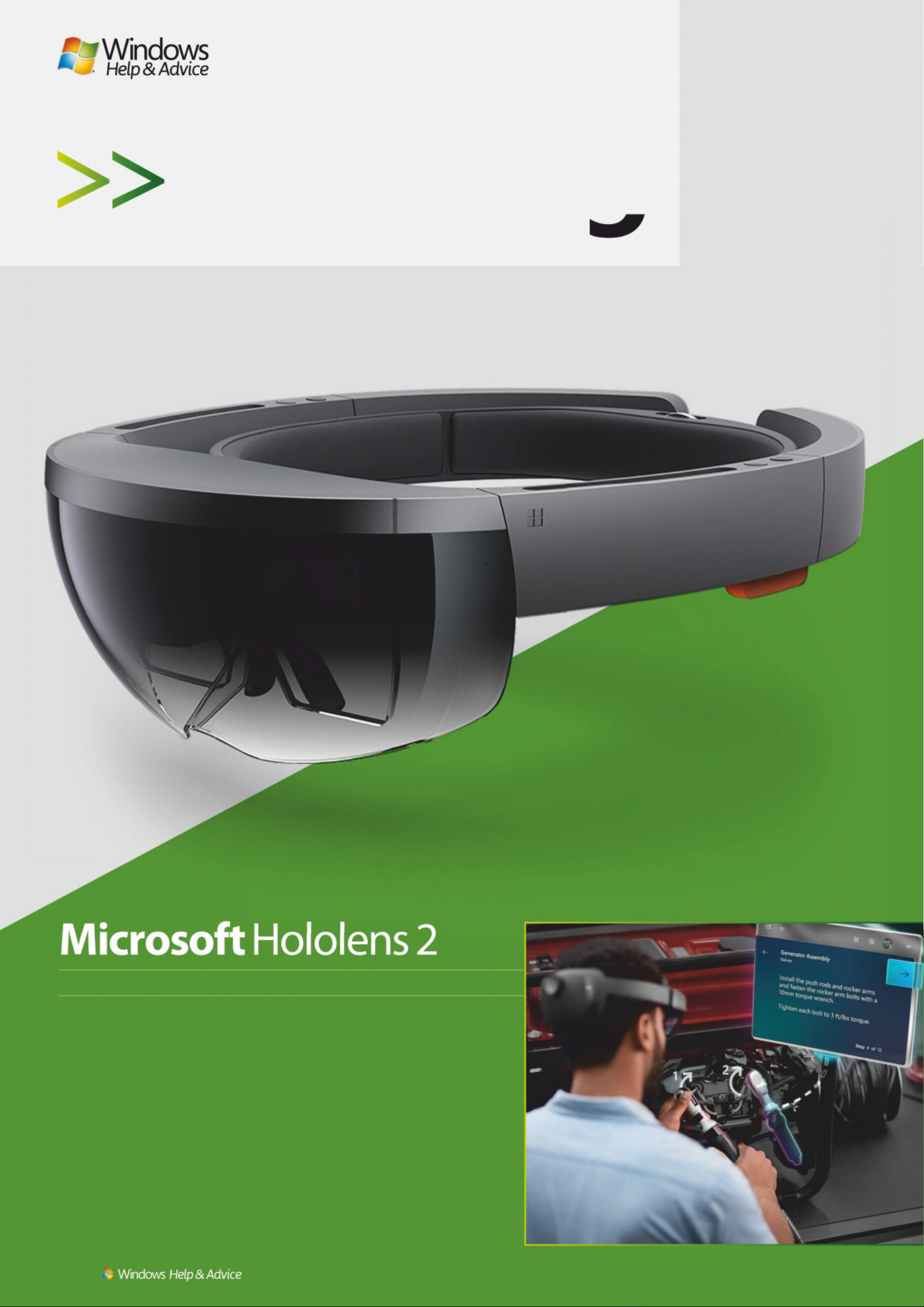
Hololens is dead . Lo ng li ve Ho l olens. A new headset, lighter, mo re
powerful an d w ith a w i d e r fi e ld of v iew than the o n e that failed to set
the world on fire three years ago, is now available to pre-order – as lon g
as you’re a business.
The cheery images of families gathered round playing Minecraft, or
other friendly mixed-reality pursuits, have fallen away to be replaced
with a focus on engineers calmly fix ing things w ith ho l o gr ap hic he lp,
or shoppers using headse ts in-store to see how a new purchase will fit in
with their existing home fur nishings.
Also new is an Azure develop e r kit, underlining the link between the
headset and the cloud rather than with an indivi dual W in d ows PC.
Developers can license the te chno l ogy this time around rather than
buying it outright, opening the do o r to custom headse ts tailored to
specific industrial app licatio ns an d ap ps to support them.
$3,500 microsoft.com
The hottest new Windows hardware on the horizon
10
| |
December 2019
Page 11

Page 12

Page 13

Whatever you want to do, get the software to do
it, and pay absolutely nothing for it. By Alex Cox
ree, that’s the magic
number. At least, it is
when it comes to PC
software. Why break
the bank populating your PC
with applications when
enterprising individuals and
organisations have created a
ra ft of softwa re th at do e s the
job adequately for not a single
pound down?
Now, we’re well aware that
there are several di fferent
categories o f free so ftware.
There’s the stuff that comes from
the open-source community,
which is usually a little rough
around the edges owing to its
many-cooks approach to
development. But open-source
software has its own advantages:
sometimes it’s home to
experimental features that those
in the commercial market might
hold back on; or perhaps it’s
designed for a niche that
commercial developers can’t
SURÀWIURP7KHUH·VDOVRWKDW
guarantee that your software
is going to stay free – while it
might take an age to update
and basically come with no
warranty, open-source software
suddenly attempting to dig
around in your wallet is a
rare occurrence.
The other side of the coin
is “free” so ftware, in qu otat io n
marks. There’s a swathe of it in
this list, but we’ve done our
best to dodge anything too
feature-light. Essentially, as has
been the case for decades,
software publishers will often
offer a taste of the goods in an
effort to get y ou hook ed enough
to buy the real thing. Often,
that taste is adequate on its
own. And sometimes, it’ s no t
really a taste for you as much
as it is for the business market,
where expensive perseat licences can be a real
money-spinner. You can hav e
the software for free if for
personal use, but these g uys
LQWKHLURIÀFHneed to pa y.
Whatever the reason for a
package being free (or “free”),
we’ve tried to avoid picking
out any time-limited trials or
painfully poor options in this
collection. There are 50 options
for 50 distinct jobs – and 50
alternate suggestions, if our top
pick doesn’t give you exactly
what you need. It is entirely
possible to populate a PC with
completely free apps.
December 2019
|
|
13
Wind ows 1 0
Ess ent ia l free ap ps
Page 14
1
PHOTO EDITING
POLARR
http:// polarr .co
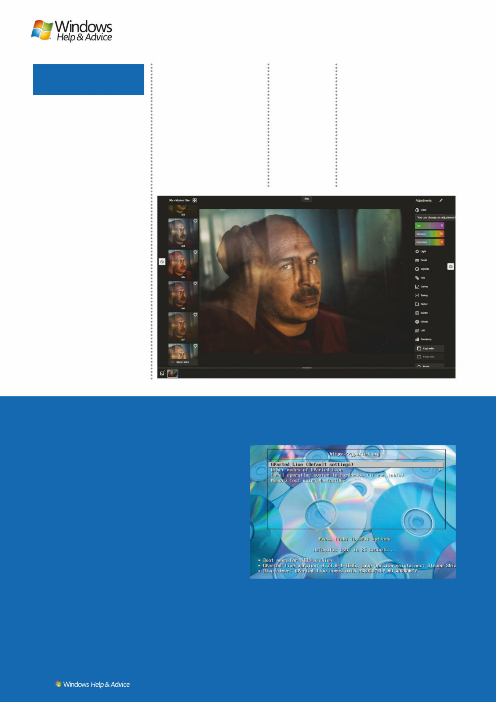
Polarr has crept up on us over the
past few years, but since it made
the jump from mobile to PC app,
it’s proved to be one of the coolest
and most capable photo-tweaking
tools available, paid or not.
Alternately: Adobe Photoshop
Express
2
IMAGE EDITING
GIMP
http:// gimp.org
Stupid name aside, we’ve known
for about a decade that Gimp’s
Photoshop-esque toolset and
ODXQGU\ OLVW RI ÀOWHUV PDNH LW DQ
essential desktop tool. Save often,
EHFDXVH LW FDQ GHFLGH WR EH ÁDN\
at a moment’s notice.
Alternately: Pixlr
3
DIGIT AL PAINTI NG
KRITA
http://krita.org
Best enjoyed with a pressuresensitive tablet, but viable for
anyone who wants to create art
with a mouse, Krita is an
surprisingly accomplished
paintbox as perfectly suited to
illustrators as it is to any budding
Bob Ross.
Alternately: MyPaint
4
VECTOR ART
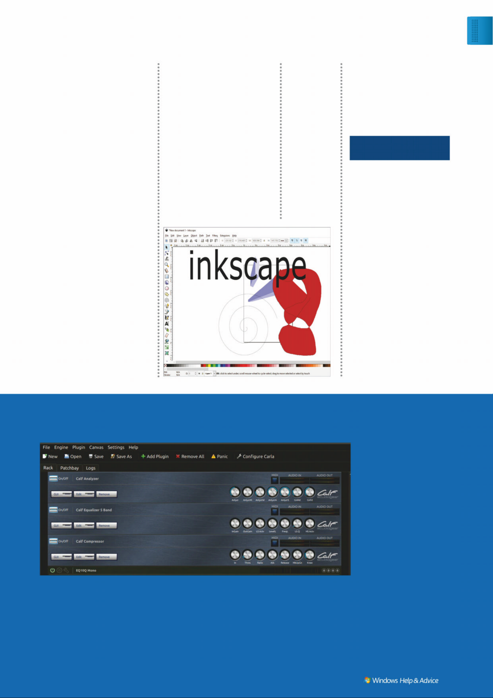
INKSCAPE
http://inkscape.org
Inkscape can create scalable vector
graphics and tweak text to your
heart’s content, making it perfect
for logos and such. Inkscape is
analogous to Adobe Illustrator
(although a whole lot more free),
and is also fully SVG compliant.
Alternately: Gravit Designer
5
MUSIC MAKING
CAKEWALK
http://bandlab.com
Originally a DOS sequencer
launched in 1987 and coming to
Windows in 1991, Cakewalk
recently came under new
ownership and is back from the
dead – those new owners decided
the app was best given to the world
for free. Pro-level recording, all the
tools you need to mix and master
tracks, not to mention a host of
software instruments and effects.
Alternately: Ardour
C REATIVITY
© POLARR.CO
TRY LINUX WITHOUT HAVING TO INSTALL IT
Yes, this is Windows Help
and Advice maga zine, but
one of the mos t beautif ul
things about Linux , be sides
its inherent freeness, is
that people are able to
package i t up with all k inds
of also-free software, and
send the wh ole thing ou t
in one big bundl e.
Given that it ’s (usually)
possibl e to run a Linu x
installa tion in Live
form (that is, w ithout
installin g it and makin g
a mess of your W indows
installations), this can be
a good way to keep
those rarely used utility
package s at hand , or get
your hands on a w hole
bunch of sof t ware all at
once. So, pick up s ome
USB sticks , get the se
apps installed, an d be
ready for anything.
FOR PRIVACY
TAILS
http://tails.boum.or g
When you’re get ting a ll
clandestin e, turn to Tails.
It automaticall y route s
ever y thing thro ugh the
To r ne two rk, k ee pi ng
your online ac tivit y pr ivate,
and includes a b unch of
cry ptographic to ols to
ensure all of your dat a is
as diff icult to inter cept as
possible. It’s also handy
if you want to scrub
something of f a dr ive
without dire ctl y using it .
Alternately: Whonix
FOR DRIVE MANAGEMENT
GPARTED LIVE
http://gparted .org
For messin g with drive
partitions or at tempting to
fix partition t able e rror s ,
GParte d is a pret t y
essential app – and it s
Linux distr o incarn ation
keeps things ver y simp le,
packagin g it with a fe w
ver y straight for war d but
power ful f ile manipulati on
tools and lit tle e lse. Pe r fec t
single-serving distro fare.
Alternately: Clonezilla Live
FOR YOUR MEDIA CENT ER
OSMC
http://osmc.tv
An unof ficial m eshing
Live ima g es l i ke G Pa r t e d g ive yo u o p t io n s wh e n yo u l oa d , an d yo u c a n
even install them alongside Windows if you’re brave.
© GPARTED.ORG
Polarr’s filters
give any image
a professional
touch in seconds.
14
| |
December 2019
Page 15
skeletally animating a collection of
ELWPDSV 6\QÀJ JLYHV \RX WKH
necessary tools. It’s adept enough
to produce some professional
results – although the quality of
your work is down to you…
Alternately: OpenToonz
MEDIA
together of the D ebian
Linux distribution,
noted media center app
Kodi, and some cus tom
tweak s to ma ke its
interfa ce as usabl e and
simple as possible, OSMC
is a great distr o for that
living room P C – or wh en
you want to let som eone
watch some films on
your PC withou t ac tually
giving them f ull acces s
to your file s.
Alternately:
LibreELEC
For se cur it y t est ing
KALI LINUX
http://kali.org
How tough are your
computer s? How bad-guyproof is your n et work?
Find out with Ka li Linux ,
which carr ies a hug e
package of tool s to help
the whi te ha t ha cker f ind
vulnerabilit ies in sys tems .
You’ll ne ed to make sure
you use the to ols properl y
to avoid a worr y ing
knock on the door, b ut
there’s none bet ter for
testing security.
Alternately: BackBox
FOR CREATIVITY
UBUNTU STUDIO
http://ubuntustudio.org
Whether you’re producing
video or audio, Ubuntu
Studio is bursting with
tools. Its ef f ec tiven ess will,
given L inux’s u sual
awkwar dness , depe nd on
the precis e hardwar e you
have insta lled, b ut it ’s free .
Worth trying before
investing in ex pen sive pro
production packages.
Alternately: AV Linux
© UBUNTUSTUDIO.ORG
Just because
you can make
vector images
in Inkscape
doesn’tmean
you should.
6
WRITING
FOCUSWRITER
http://gottcode.org/focuswriter
A beautiful, serene background
image. The clickety-clack of a
typewriter accompanying your
keystrokes. You, your words, and
no ugly distractions. If there’s
something you need to get written,
you should forget big clumsy
RIÀFH DSSV .HHS LW VLPSOH
Alternately: Typora
7
GAME CREATION
GODOT
http:// godotengine.org
While there are plenty of game
engine options out there, they’re
often pretty demanding when it
comes to eventual royalties; Godot
is completely free and rapidly
maturing, with Vulkan support on
the way, and a huge swathe of
documentation to get you started.
Alternately: Amazon Lumberyard
8
3D MODELING
BLENDER
http://blender.org
Blender recently ditched its game
engine portion in order to focus on
the features it really excels at: every
step of the 3D pipeline. So, whether
you’re creating, sculpting,
rendering, or animating, there’s a
tool here to help – and 17 years of
maturity to back them up.
Alternately: 3D Crafter
9
DTP
SCRIBUS
http://scribus.net
There is no sense in trying to
lay out complex documents in
Microsoft Word, given its
propensity to tear a hole in
space-time whenever you slightly
resize a text box. Scribus is a much
more sensible option for desktop
publishing, with a powerful text
engine and strong image options.
Alternately: Lucidpress
10
ANIMATION
SYNFIG
http://V\QÀJRUJ
Whether your 2D animation needs
consist of tweening vectors or
© INKSCAPE.ORG
11
MOVIES
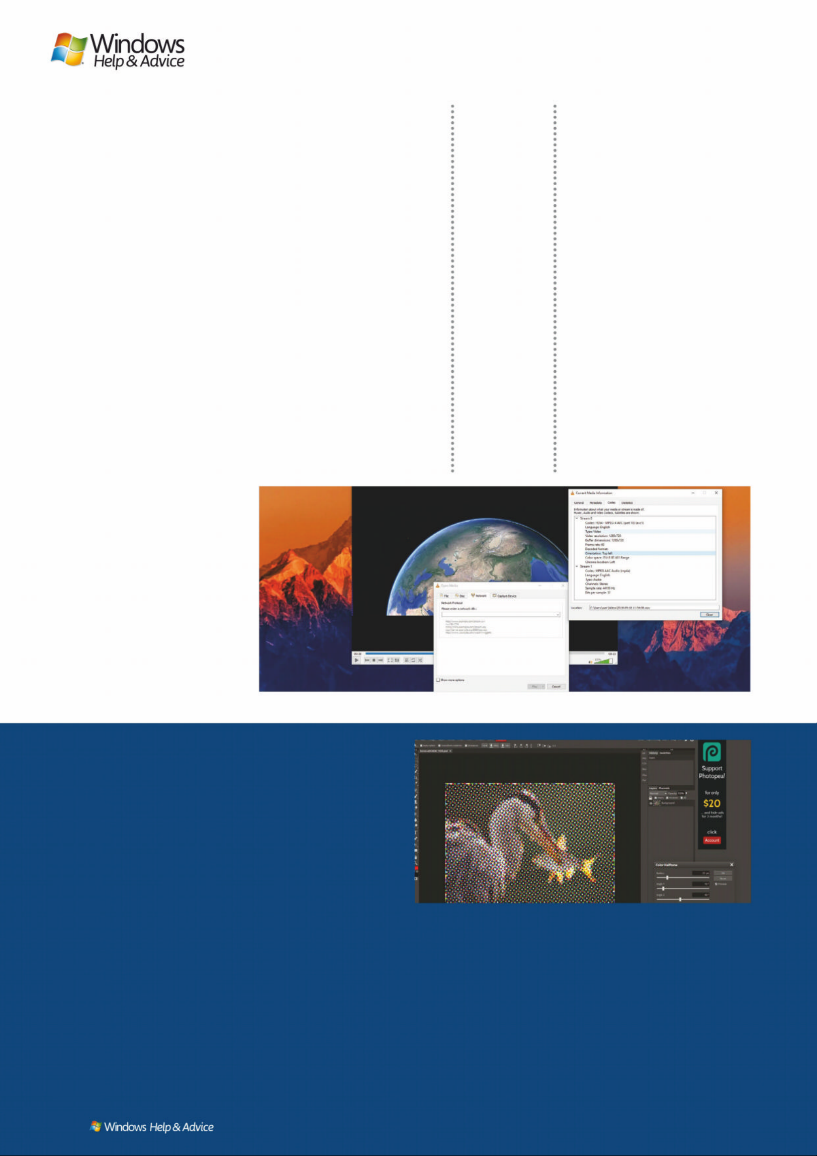
VLC
http://videolan.org
Other apps periodically vie for
the crown, but we’ve never found
another free player compatible
with so many codecs and ready
to cope with so many potential
rendering glitches. Dig under the
surface, and VLC can do a whole
lot more – it’s great for latching
on to streaming services, too.
Alternately: MPC-HC
12
AUDIO
MUSICBEE
http://getmusicbee.com
Yes, iTunes is free. Yes, you can use
iTunes if you like. But if you care
about your system resources and
want to organise your entire music
library away from Apple’s sticky
grasp, MusicBee is a great (and
skinnable) choice.
Alternately: Winamp
Fancy a v irtual au d i o ra c k? Ub un t u St u di o c an p r ov id e j us t t h at .
Wind ows 1 0
Ess ent ia l free ap ps
December 2019
|
|
15
Page 16
Fill your PC with software or
take advantage of o nline
tools? It’s a tough one. In
certain circumst ances, this
isn’t an option – we don’t
know, for example, of an
online tool that can h elp
repartition your hard drive
– but moving your wo rk
online does have a long list of
advantages. Your files will
theoretically always b e where
you left them. There’s no
need to manually update a
piece of online software to
keep it in line with the latest
developments. And your local
machine stays uncluttered
and unslowed by the
overheads of installed
soft wa re. We might have
presented a list of 50
DO IT ONLINE
programs, bu t we don’t
expec t yo u to be ma d eno ugh
to install them all.
There’s an ever- growing
string of online tools
turning up. For the office,
Google’s Docs suite
(http://docs.google.com)
has matured to a surprising
level of competence, and
Microsoft’s own Office Online
(http://office.com) offers up a
decent cut-down version of
its desk top offi ce tools, an d
integrates nicely with
OneDrive. Want to edit
photos? Photopea
(http://photopea.com) is a
Photoshop-esque image
editor that, in some c ases ,
even manages to do more
than the soft w are it ’s
emulating – we even
recommend it over G IMP,
given that Photopea d oesn’t
include ‘randomly crashing’
among its list of hobbies.
Many of the desktop tools
that made our list also have
an online component, and in
some cases it’s prefe rable
over its installe d counter part.
LastPass is best managed
online, TeamViewer works
great through its Chro me
plugin, Sp otif y’s web
interface is a little strong er
than its deskto p versio n, and
you can employ the s er vices
of http://userstyles.org to
mess with the CSS and
customise it to your liki ng.
If you don’t want to install
something, check o ut it s
website and look for an
online component.
13
LIBRARY MANAGEMENT
PLEX
plex.tv
For a large vid eo coll ec tion , a
large audio co llec tio n, or e ven
a huge photo library, keeping
ever y thing e asily a cces sible is
vital . Luck ily, Plex can d eal
with streamin g all your m edia ,
and makes get ting to i t fro m
outside yo ur net w ork an
absolute breeze.
Alternately: Kodi
14
TRANSCODING
HANDBRAKE
handbrake.fr
HandBrake is a miser ably u gly
program . It ’s not eas y to get
star te d with . But on ce you’ve
done the work , it ’s just abo ut
the most powe r f ul vid eo
conversion to ol the re is
– perfect for transcoding
individual f iles , or e ven larg e
batches of them, into the
format you need.
Alternately: Freemake Video
Converter
15
VIDEO EDITING
SHOTCUT
shotcut.org
Shotcut has been carving out its
own niche in the video-editing
world, and w hile it ’s still
catching up to the big b oys ,
it’s also entirely free – no
surprises, no restrictions.
Unless you lo ok on th e
Microsoft Store, where it’s
inexplicably paid-for. Don’t
do that.
Alternately: OpenShot
16
VIDEO GRADING
DAVINCI RESOLVE
blackmagicdesign.com
You can just as easily us e
Resolve fo r editin g, b ut gradin g
and post-production effe ct s
are its re al str ength . It ’s a
professional tool that’s seen
use in numerous Hollywood
produc tions , and the f re e
version is perfec t for color
correc tion , too.
Alter nat el y: C olo r Fixe r Pr o
17
AUDIO EDITING
AUDACITY
audacityteam.org
Audacit y almos t annoys us :
We’re absolutely desp erate
to recommend something
differ ent in this sl ot, b ut ther e’s
still nothing el se that c an hold a
candle to it for audio cutting or
tweak ing. It ’s a tool that
ever yone sh ould have in st alle d
at all times.
Alternately: Ocenaudio
18
PODCASTS
GROVER
Via Windows Store
Style d to loo k a lit tle like
Groove Music (if you remember
that, we bet yo u had a Zun e
too), Grover is a good way to
manage po dc as ts if yo u’re still
doing it on your de sk top. It ’s
probably b et ter th an doing it
through iTunes, at lea st .
Alternately: Juice
19
AUDIO STREAMING
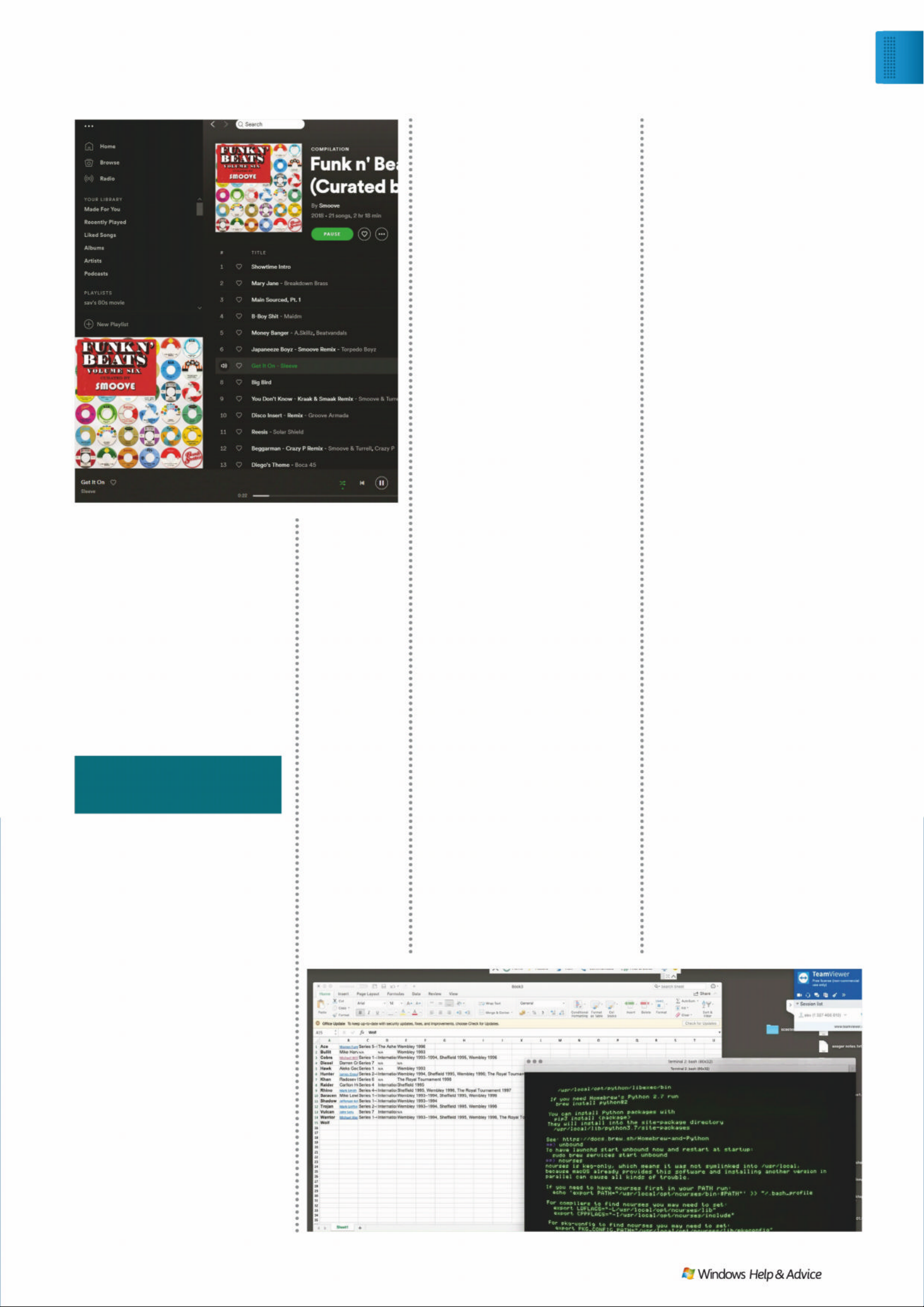
SPOTIFY
spotify.com
You are spoiled for choice in
the streaming mar ket, b ut
(despite its oppressive ads)
Spotif y ’s massive libr ar y
and straightfor ward interface
still makes it our to p choice
– though the fr ee tie r force s
you to listen to yo ur playli st s
on shuff le sn d limits yo ur
skipping of track s .
Alternately: Deezer
VLC includes
tons of controls
to alter video
playback, whatever
the source.
© PHOTOPEA.COM
© VIDEOLAN.ORG
Photo p e a is a s c ap a b le o f r ui n in g yo u r p ic s a s a ny ot h e r ap p .
16
| |
December 2019
Page 17
21
OFFICE
LIBREOFFICE
OLEUHRIÀFHRUJ
Pret t y m uch a free equivalent
to Microsoft Of fice, and
compatible with the same
file formats, LibreOff ice is a
non-paid essential. It even
does m ore: There’s a f ull
database and a comple x
formula editor included.
Alternately: Apache
OpenOffice
22
PDF VIEWER
FOXIT READER
foxitsoftware.com
Foxit’s big selling p oints are
its connec te d featur es , which
tell you w he n a PDF has b ee n
scribbled on or tweaked, but
we’re b ack ing i t fo r it s ability
to open PDFs quickly without
eating all of our s yst em
resour ces . Th at ’s not a big ask .
Alternately: Adobe Reader
23
EMAIL
EM CLIENT
emclient.com
While many of us manage our
mail on the web thes e day s, eM
Client’s free ti er allow s yo u to
take desk top contr ol of two
accounts . It ’s fully compatibl e
with the more comp lex features
of Outlook an d Gmail accounts,
and super- eas y to us e.
Alternately: Thunderbird
24
SOCIAL
HOOTSUITE
hootsuite.com
Dig through the p ricey
corporate options and
find Hoot suite’s thre e-acco unt
free plan: You can sch edule
posts, manage multiple social
ser vice s, an d se e your searches
in their own live- updatin g
columns. It ’s social me dia t aken
to the nex t leve l.
Alternately: TweetDeck
25
COMMUNICATING
FRANZ
meetfranz.com
It’s tough being co nnec te d.
There’s the family What s App,
the work Slack , the gaming
Discord, th at one guy who won’t
stop using ICQ for some reason.
No problem: Mash them all
together usin g Franz . You can
even take your combin ed
account bet we en comp uter s .
Alternately: Pidgin
26
TO-DO
MICROSOFT TO-DO
Via Windows Store
Microsof t ’s app is a supe rb way
to list all of the things you’re
procrastinatin g on, the things
you haven’t quite don e ye t,
and the things you won’t do
in a million years . If you try
really hard, maybe, just
maybe, you’ll b e able to
check one off.
Alternately: Wunderlist
27
VPN
PROTONVPN
protonvpn.com
VPNs are essential. Problem
is, the free V PN mar ket i s
hampered by bandwidth
restrictions. Not so with
ProtonVPN – you c an use its
free version as much a s yo u like;
the annoyance is transfe rre d to
a spee d limit instead.
Alternately: Hotsp ot Shield
28
REMOTE DESKTOP
TEAMVIEWER
teamviewer.com
How of ten have you tri ed
to diagnose a technical
problem over the phone and
ended up bashing yo ur h ead
on your key bo ard? N o mo re.
TeamV ie wer i s ea s y to set up,
super-se cure , an d c an gi ve
you direc t access to your
desktop (or an el derly
relative’s) via a browser.
Alternately: TightVNC
29
NOTES
NOTEPA D++
notepad-plus-plus.org
There’s a who le l ot of co ntextual
format ting in Notepad++ ( it is ,
after all, made for sketching
code in all manner of
languages), but it’s just as
much a s traight forward and
capable alternative to
Microsoft ’s Notepa d. A nd
that’s a go od thin g.
Alternately: Atom
30
PLANNING
TRELLO
trello.com
Got a bi g pr oje ct coming up?
Put it on virtual notecard s, pin it
up on a v ir tual board, an d
spread th ose tasks out bet we en
ever yon e you’ve roped in to
help. Hop ef ully, they ’ll a c tuall y
chip in, rath er than just bein g
virtually present.
Alternately: Evernote
There’s no music
and podcast
library quite as
big or convenient
as Spotify’s.
Tea mV iewer’s
cross-platform
abilities mean
you can u s e it
to control any
other computer,
even Macs.
20
ORGANISA TION
THE RENAMER
therenamer . c om
You’ve got lots of file s. V ide os ,
music, all from legitimate
sources – bu t ther e’s no
consisten c y in naming or
storage. Sort them out
without the e f fort using The
Renamer, which does exactly
what you think it doe s.
Alternately: Bulk
Rename Ut ili t y
WORKING
© TEAMVIEWER.COM © SPOTIFY. C OM
Wind ows 1 0
Ess ent ia l free ap ps
December 2019
|
|
17
Page 18
31
UNDELETING
RECUVA
ccleaner.com/recuva
No guarantees, but if there’s a
ÀOH that’s gone to the big data
graveyard in the sky, you may
be able to convince it back to
life with Recuva. Generally,
deleting only removes the
UHIHUHQFHWRWKHÀOHQRWWKH
ÀOH LWVHOI5HFXYDÀQGVZKDW·V
left behind.
Alter na te ly : Un de le te 36 0
32
DISK RESCUE
TESTDISK
cgsecurity.org
Whole drive letting you down?
Mechanical disk giving you the
click of death? T estDisk can
ignore all the usual safeguards
and ÀOHV\VWHPVLQRUGHUWR
wade through the raw data,
sector by sector, giving you
one last chance to rescue
\RXUÀOHV
Alternately: Paragon
Rescue K it
33
DESTRUCTION
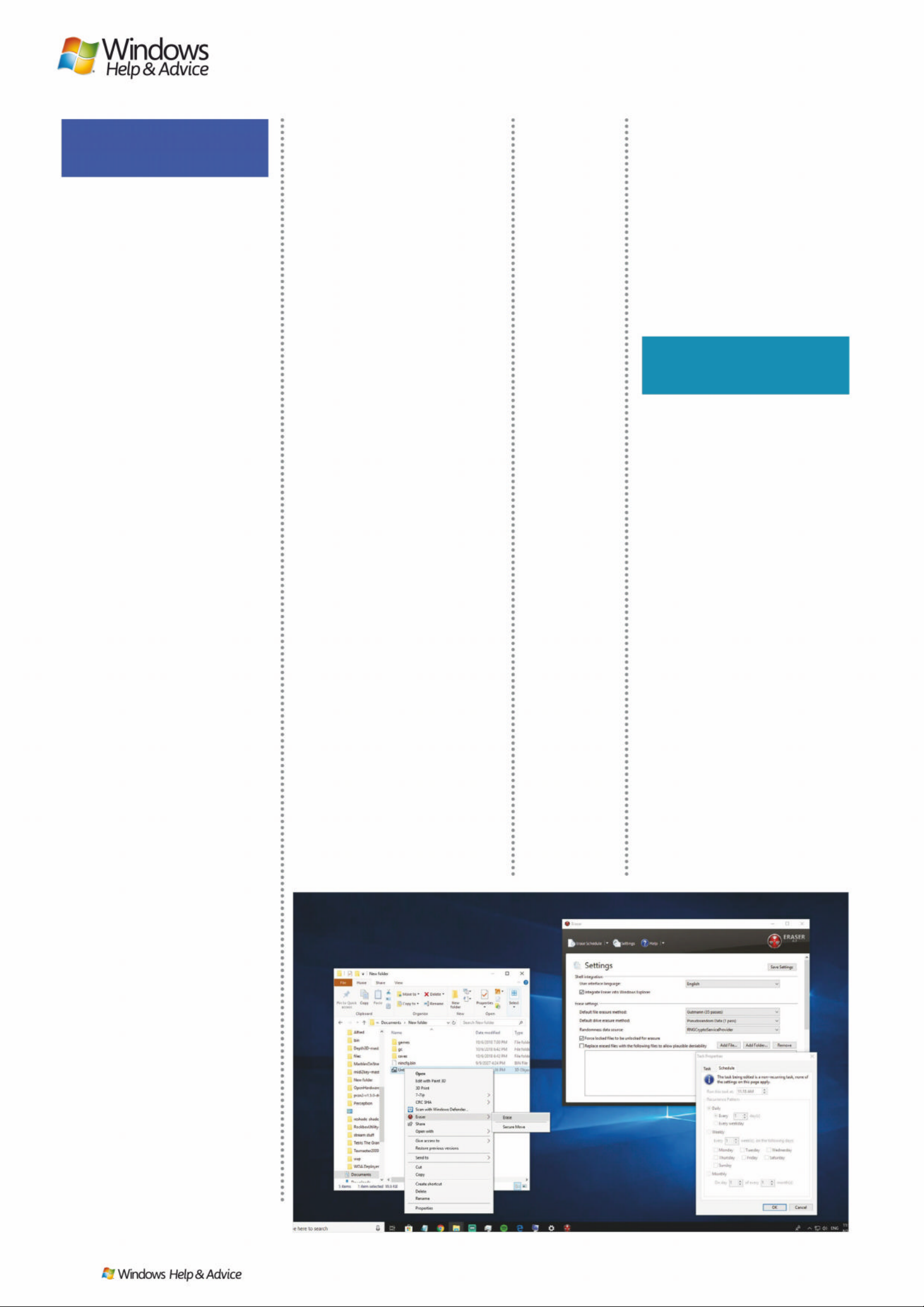
ERASER
eraser.heid i.ie
As Recuva and T estDisk prove,
deleting something won’t k eep
it from the determined data
sniffer. Eraser is the equivalent
of a cross -c ut s hredder, securely
RYHUZULWLQJÀOHVRUDQHQWLUH
drive) with your choice of
destruction standard.
Alternately: BleachBit
34
MOVEMENT
TERACOPY
codesector.com
Windows’ copying procedures
can leave a lot to be desired; if
\RX·UHVKXIÁLQJÀOHVIURPSODFH
to place, TeraCopy (which uses
advanced buffering techni ques)
can do the job a lot faster and
much more rel ia bly.
Alternately: Ultracopier
35
MANAGEMENT
MUL TI COMMANDER
multicommander .c om
Whether you come from t he
era when it was popular or
not, the Norton Commanderstyle WZRSDQHÀOHPDQDJHPHQW
of Multi Commander is a natural
and KLJKO\HIÀFLHQWZD\WR
rename, view, copy and
move ÀOHV and folders from
one place to the other.
Alternately: FreeCommander
36
ARCHIVING
7-ZIP
7-zip.org
Do away with that 2,000-day
expired shareware version of
WinRar: 7-Zip supports way
more than just .7z archives, and
it’s free. Whether co mpress i ng
or GHFRPSUHVVLQJÀOHVLW·VDQ
essential component of any
good Windows i nsta l l.
Alternately: IZArc
37
PREVIEWING
XNVIEW MP
xnview.com
XnView MP is a great way to
preview images, taking you bey ond
the ‘extra large icons’ school of
picture glimpsing to a quickly
browsable and logical graphical
interface – you can use it for batch
processing or conversion, too.
Alternately: IrfanView
38
EXPLORING
TABLACUS
tablacus.github.io
Quite why Windows Explorer
doesn’t have tabs in 2019 we don’t
know, but Tablacus solves that
SUREOHP,W·VDÀOHPDQDJHUWKDW
yes, includes tabs. It also lets you
tile folders in panes, and disable
any components you don’t need.
Alternately: XYplorer
39
CLOUD STORAGE
ONEDRIVE
onedrive.com
The integration of Micrsoft’s cloud
platform with Windows makes it a
top choice merely for ease of use
– there’s basically nothing to set
up. It may not have the largest
capacity, but where o ther
integrations falter, OneDrive
will be standing tall.
Alternately: Mega
40
UNINSTALLING
IOBIT UNINSTALLER
iobit.com
Oh, sure, Windows can uninstall
software. But how thorough is it?
Does it hunt through your drive
to ÀQGHYHU\DVVRFLDWHGÀOH"'RHV
it fully scrape that space clean?
IObit’s neat program ensures
that removed apps are actually
removed the right way.
Alternately: Geek Uninstaller
41
BACKUP
COBIAN BACKUP
cobiansoft.com
Cobian Backup is one of the most
capable free backup pac kages there
LV6HQG\RXUÀOHVRIIWRDQH[WHUQDO
drive, send them to a network
location, send them to an FTP
server: whatever works.
Alternately: EaseUS
To do B ackup
42
PASSWORD MANA GEMENT
LASTPASS
lastpass.com
There are plenty of solutions
for managing your precious
passwords, but LastPass wins
points for the generosity of its free
offering – there are a few desirable
features as part of its paid offering,
but nothing essential.
Alternately: Dashlane
43
SYSTEM CLEAN-UP
CCLEANER
ccleaner.com
CCleaner does all those long,
laborious clean-up tasks in one
place. You can either run a selective
© ERASER.HEIDI.IE
Eraser is like
putting your hard
drive through a
shredder, except
it still works
afterwards.
FILES
SECURITY
18
| |
December 2019
Page 19
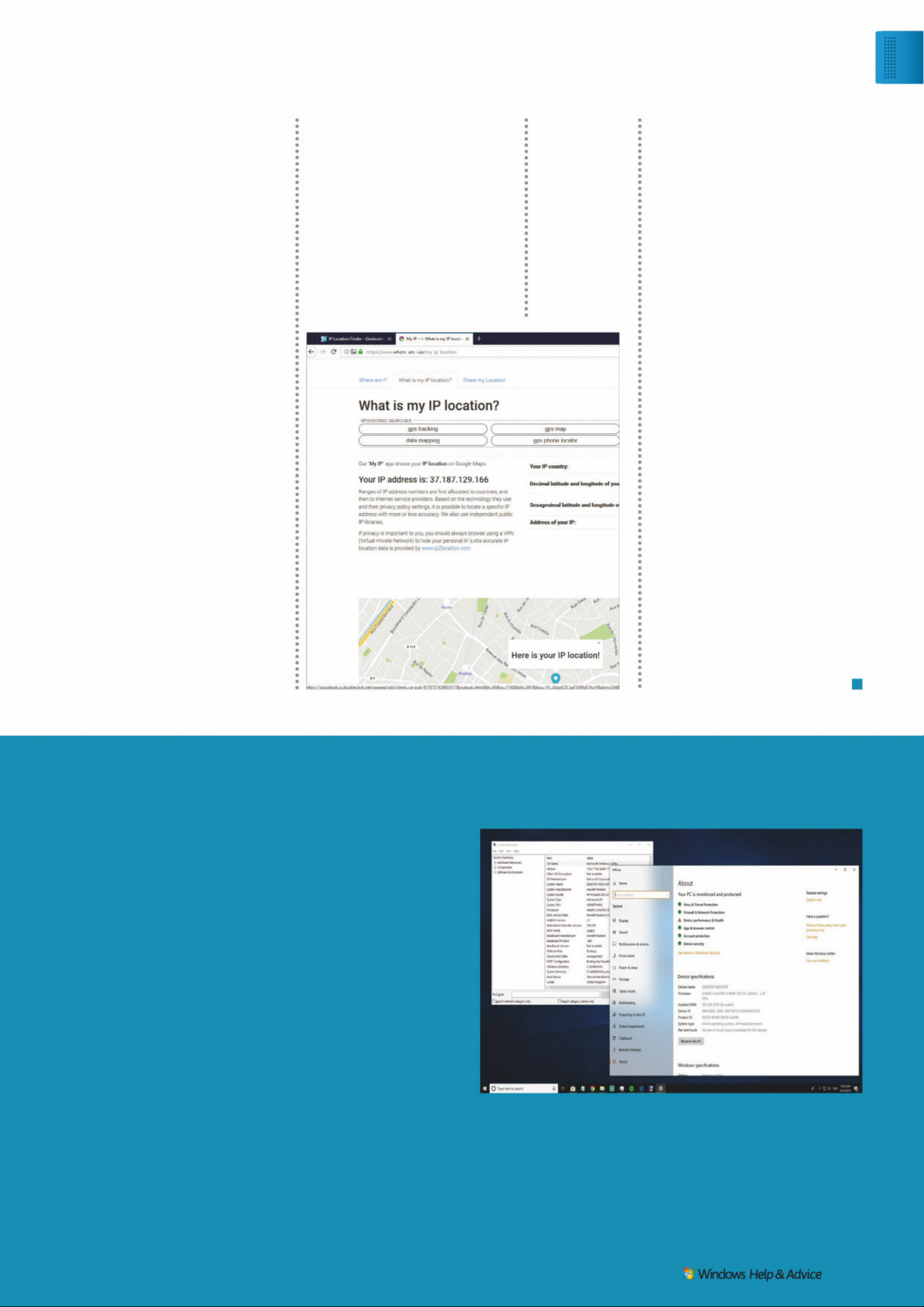
48
NETWORK MONITORING
AXE N CE NETTOOLS
axence.net
A full suite of 10 network tools,
from monitoring to scanning to
tracing routes. There’s even a
little cheeky internal Windows
tomfoolery, all spun off from
Axence’s pro-level IT
management suite.
Alternately: PRTG Net work
Monitor
49
NETWORK
TROUBLESHOOTING
WIRESHARK
wireshark.org
A bit heavyweight, but Wireshark
does its job so well that we have to
recommend it. If you want to know
what’s going on with your network
and why a function won’t play ball,
it’s the most accomplished protocol
analyser around.
Alternately: Colasoft Capsa
50
FIREWALL
TINYWALL
tinywall.pados.hu
Don’t rely on your router, or even
Windows, to do the job of batting
back misbehaving packets, or
stopping snoopers from probing
your ports. TinyWall is superlightweight and makes for a useful
additional line of defence.
Alternately: ZoneAlarm Free
The Tor br ow se r
has a bad
reputation but its
privacy strength
is unmatched.
scrubbing job, or set up a batch job
to deal with everything at once.
Just be wary of the pop-ups.
Alternately: Advanced
System Optimizer
44
ANTIVIRUS
BITDEFENDER
FREE EDITION
bitdefender.c om
Many free antivirus packages are
not worth the drive space they’re
written on. Bitdefender is: It’s not
too heavy on the hassle, includes a
quality AV engine with frequent
updates, and a slick interface.
Alternately: Windows
Defender
45
POST-INFECTION
SPYBOT SEARCH
& DESTROY
safer-networking.org
Install pre-emptively: If you suspect
something untoward is on your
system, Spybot is likely to be able
to hunt it down and exterminate it.
Alternately: Malwarebytes
46
ENCRYPTION
BOXCRYPTOR
boxcryptor.com
Do you trust your cloud storage
provider? Enough to store your
PRVW SHUVRQDO ÀOHV RQOLQH ZLWKRXW
obfuscation? Probably not. But with
Boxcryptor, you can construct an
encrypted storage area – and if the
provider encrypts, it’s double safe.
Alternately: VeraCrypt
47
INTERNET PRIVACY
TOR BROWSER
torproject.org
RRXWLQJ \RXU ,QWHUQHW WUDIÀF YLD 7RU
PDNHV \RX YHU\ GLIÀFXOW WR WUDFN
and helps you resist online
ÀQJHUSULQWLQJ 7KH 7RU EURZVHU
makes doing so incredibly easy.
Alternately: Iridium Browser
Windows is still worth the cash compared to open source operating systems.
Hear us out as we use this
box in an ar ticle about free
apps to tell you not to us e
them: some times it just pays
to pay.
There are times when
a fre e p ackage can’t do
the exac t thing you want
– for example, if you ’re
interacting with a busine ss
with ver y precise standards,
a docume nt that LibreO f fice
produces might have
subtle differences that
make it look terrible on
that f irm’s Microsof t
Office-packing machines.
An open-source package
comes with no guarantees,
no suppo rt and no
comeback if every thing
goes wrong. It might have a
forum full of e nthusiastic
amateurs and some off icial looking documentation, but
it doesn’t have any
DON’T CHEAP OUT
guarantee of
professionalism. If it’s
mission critical, don’t re ly
on free sof tware.
Often, free apps either
lack critical features (many
exist simply to tease a paid
upgrade) or can’t keep up
with the quality of the ir
paid-for alternatives. For
instance, whil e we’ve
recommended ShotCut as
a free vide o e ditor, it is
nowhere near as complex or
well built as so mething like
Adobe Premiere. Even
Cakewalk, our pick for free
audio recording and editing
and a formerly paid-for app,
isn’t the best choice in its
sector because it ’s a lit tle
behind the cur ve.
Then there are the niche
apps for which the re is no
free alternati ve. While there
is no harm in experimenting
with Linux , it is n ot, for
most, a produc tion OS. In
comparison, Windows 10 is
rock soli d, compatib le w ith
just abo ut ever y thing, has a
huge sof t ware library, and
despite the fac t that you can
run it in unac tivated mode,
you really should pay for the
licence, or at leas t at tempt
to transfer an ol d W in 7
licence up th e chain.
© MICROSOFT
© ERASER.HEIDI.IE
Wind ows 1 0
Ess ent ia l free ap ps
December 2019
|
|
19
Page 20
JUI
®
P OWER
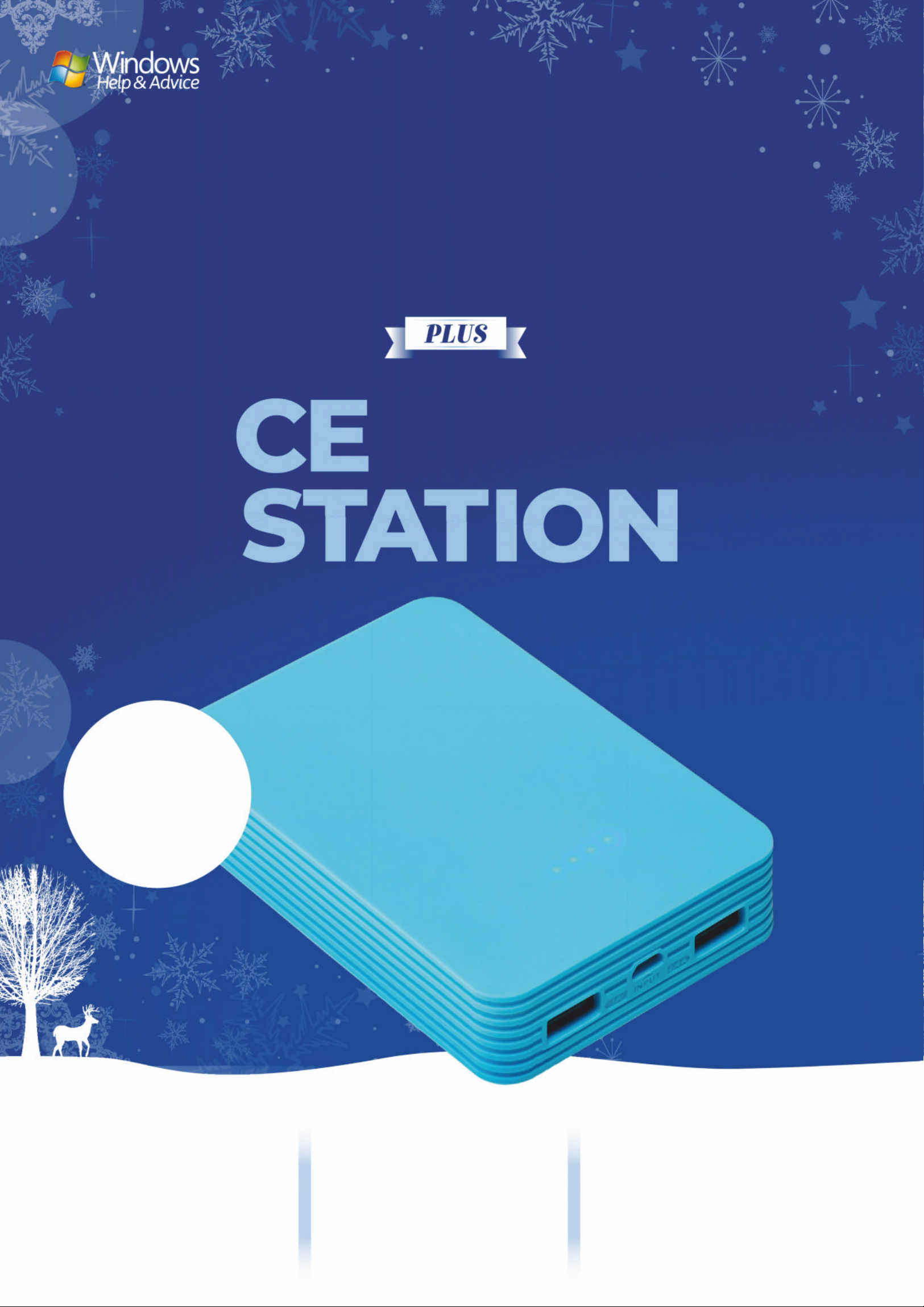
The Juice®Power
Station’s battery can
charge your iPhone 6
ɖȵژɎȒɀǣɴɎǣȅƺɀǔȸȒȅȒȇƺ
single charge!
The Juice
®
Power Station
ƬƏȇɀǣȅɖǼɎƏȇƺȒɖɀǼɵ
charge devices, and hold
ƬǝƏȸǕƺǔȒȸɖȵɎȒɀǣɴ
ȅȒȇɎǝɀِ
Along with the Juice
®
Power Station, y ou get a
ƬƏȸȸɵȵȒɖƬǝƏȇƳژxǣƬȸȒٮ
ȳ ɎȒȳ ƬƏƫǼƺِ
The pe rfect g ift
for j u st £24.99
*
WORTH
£29.9 9
Page 21
or call 0344 848 2852
ww .myfavour it gazines. . k/wom/xmas192
نÁƺȸȅɀƏȇƳƬȒȇƳǣɎǣȒȇɀيSavings calculated against the full RRP (single issue price x frequency). Gif t is only available for new UK subscribers and is subject to availability. Please
allow up to 60 days for the delivery of your gif t. In the event of stocks being exhausted, we reser ve the right to replace with items of similar value. You can write to us or call us to
cancel your subscription within 14 days of purchase. Payment in non-refundable after the 14-day cancellation period unless exceptional circumstances apply. Your statutory
rights are not affected. All gift subscriptions will start in January 2020. Prices correct at point of print and subject to change. Full details of the Direct Debit guarantee are
available upon request. For full terms and conditions, please visit bit.ly/magtandc. Of fer ends 31st December 2019.
Your special
! ǝ ȸǣɀɎȅ Ə ɀ Ȓǔǔƺȸ
Free Juice®¨Ȓɯ ƺȸ ³ɎƏɎǣȒȇ ɯȒȸɎǝ گאחِחח
0ȇǴȒ ɵאȅȒȇɎǝɀȒǔáǣ ȇƳȒ ɯɀRƺǼȵۭ
ƳɮǣƬƺȅƏ ǕƏɿǣ ȇƺǔȒȸǴɖɀɎگגחِחח٫ɎǝƏɎټ ɀ
only £4 per issue!
Receiv e ev ery issue deliv er ed
direct to your door
ɎǝȒɖǕǝɎǔɖ ǼǕǣǔɎɎǝƏɎǸ ƺƺȵɀ
delivering throughout the year
Instant access any Ɏǣȅƺً Əȇɵɯǝƺȸƺ
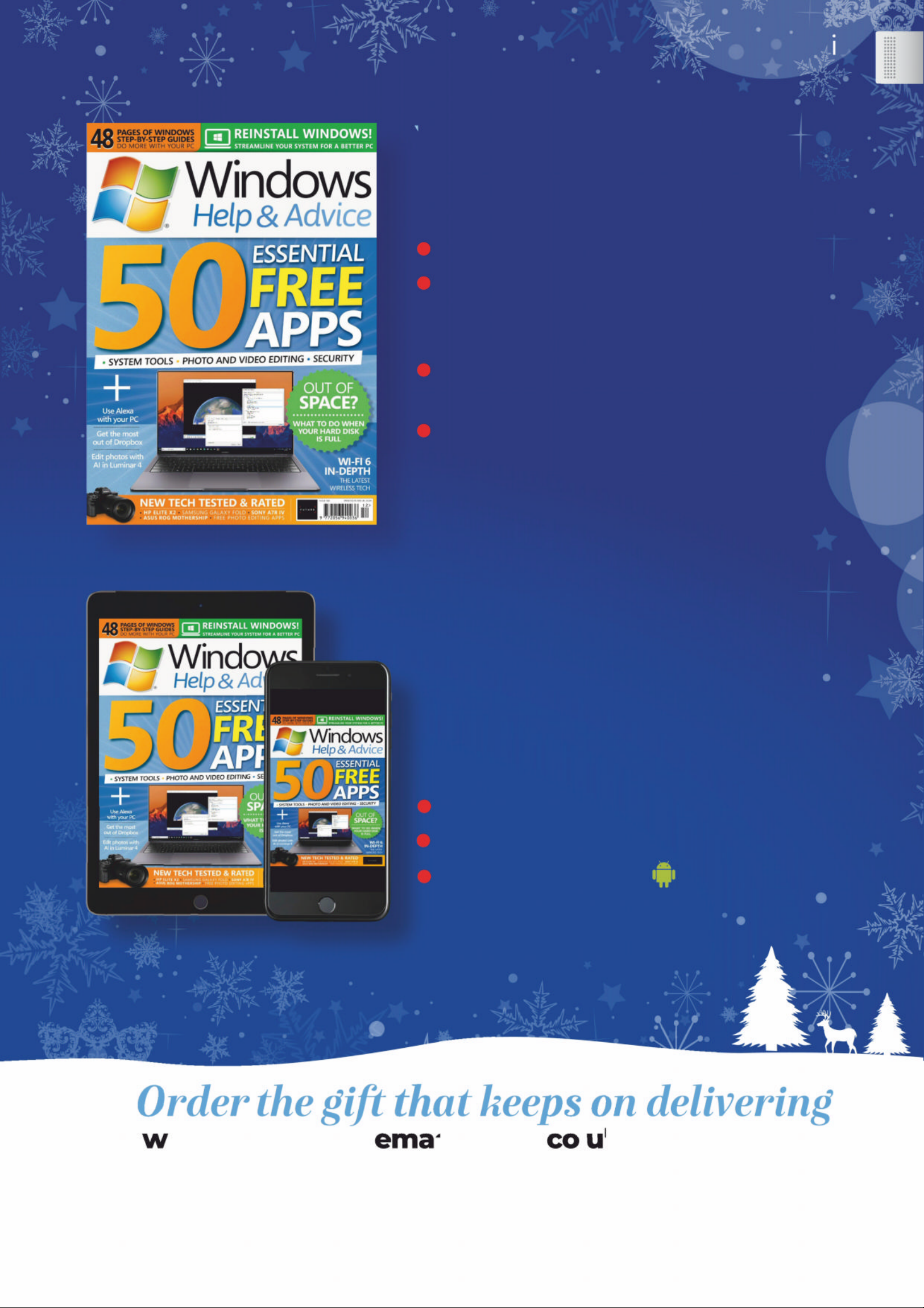
zƺɮ ƺȸ ȅǣɀɀ Əȇ ǣɀɀɖƺ Ȓǔ áǣ ȇƳȒ ɯɀ Rƺ Ǽ ȵ ۭ ƳɮǣƬƺ
Available on
iOS or Andr oid
Upgrade to
include digital
ǔȒ ȸȒ ȇǼɵگד
A
Su bscribe a nd rece ve
UK subscription offer
Page 22
http://bit.ly/sub-maxpc
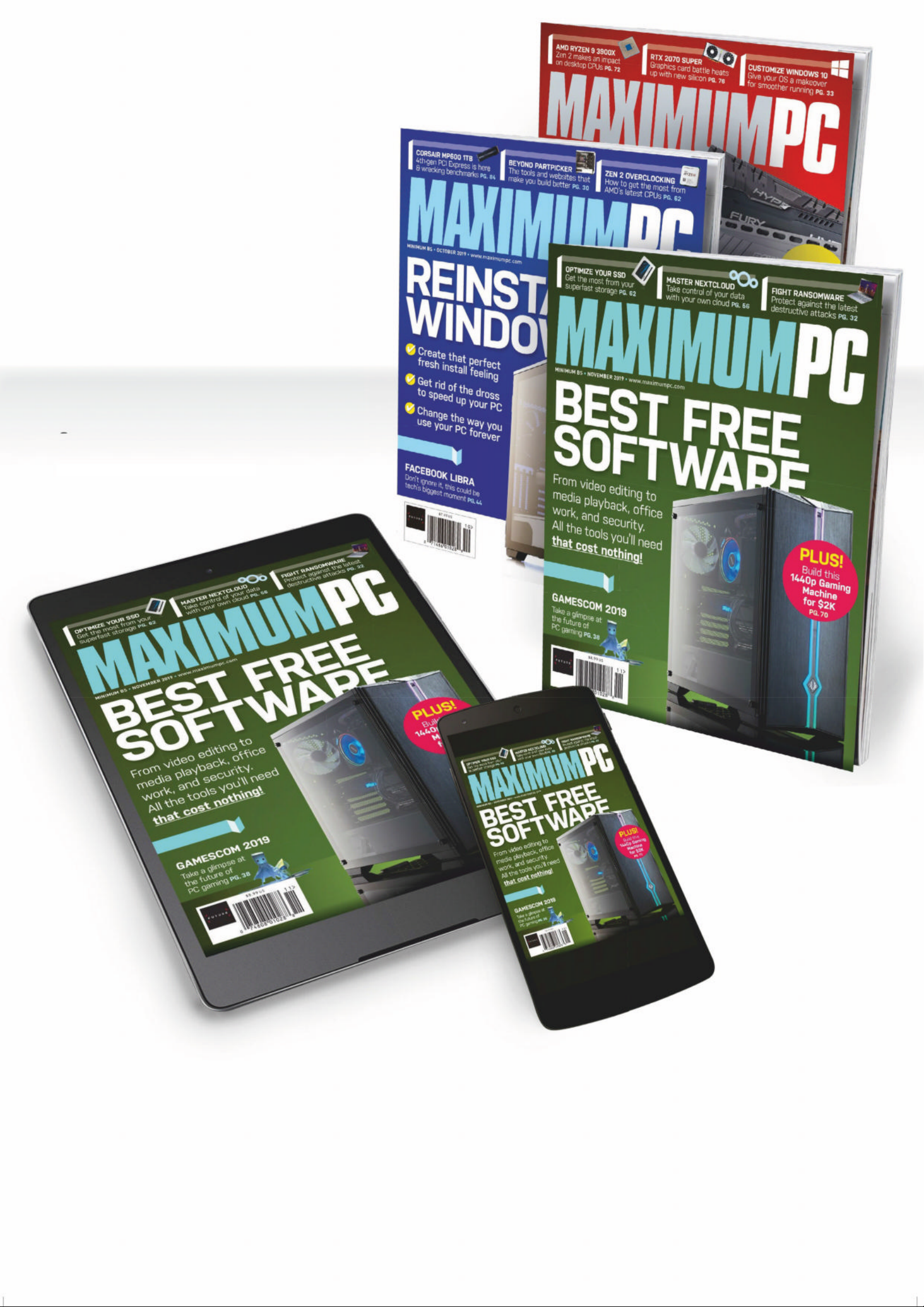
Print or Digital
subscriptions
available!
Delivery of MAXIMUM PC,
in your choice of
Apple Newsstand,
Google Play, or Zinio
Search for MAXIMUM PC
d i ’
on your device’s app store
to download now
MAXI MU M PC AT ITS BEST
ANYTIME, ANYWHERE!
Page 23
WINDOWS TIPS INTERNET ADVICE EXCI T I N G N EW P ROJ E C T S
Our promise to you…
Get more from Windows, software and all your favourite sites
Packed with informative tutorials
Every issue, we guarantee to pack the
magazine with great tutorials teaching
you all the best things you can do with your PC.
Each article features step-by-step instructions
to make learning new skills fast and enjoyable.
Customise Windows to work your way
We all know how to do the basics but
getting the most from Windows isn’t
always easy. Our dedication to the operating
system means you get the very best tips and
tricks for all versions of Windows.
Get more from your favourite websites
We all have our list of favourite sites
but often we miss out on great features
EHFDXVH WKH\·UH GLIÀFXOW WR XVH RU KLGGHQ IURP
sight. We’ll show you how to do more online,
for a more satisfying web life.
Discover new programs with our help
From speed-up and security software
to superb photo apps, there’s always
something new to try on your PC. The
Windows Store in Windows 10 and Windows
8.1 is packed with software to download.
Welcome
Every month in
Explore you’ll
discover some
great ways to do
more with your PC,
whether it’s mastering the
basics, or getting productive
with all kinds of apps.
This month, you’ll learn how
to use the new Dropbox app
to sync files between your PC
and the cloud (p24); meet the
new Luminar 4 photo editor
(p27); use Amazon’s Alexa
voice assistant on your PC
(p30); manage lists with
Microsoft To Do (p32), and
download YouTube videos
(p38). There are plenty of other
clever tips and tricks too,
making time spent with
Windows a breeze. Have fun!
Ian Ev enden
Editor
7 ʦʢɚ Wɛ SDȰɏ
Wɛʓ ʖQ ɍʝXɢP ʝȾɏ
)ʅɸɗ ʙLVʤʖQɒ
December 2 01 9
|
|
23
24 Dropbox has a new app, and it’ s
perfect for file synchronisation
27 Luminar 4 is the latest image-
editing ap p from Skylum. We pu t
its AI tools through thei r paces
30 Bring Amazon’s Alexa to
Windows 1 0 and ga in vo ice co ntrol
32 Use Microsoft T o Do to crea te
and manage multi ple checkl ists
36 Meet Microsoft PowerT oys,
where play meets usefulness
38 Download videos from YouTube
the easy way , a nd for free
< ʝʦɠʔʦLȫɏ
'ʋɚ*U ɪ ɬKʋəVʋ\ ɡ
“ A lexa on Windows is a
con v e nie n t wa y t o c om ma nd
your de vic e s and s ma rt home”
Page 24
/ Hʋʢ ɚKʝɦWɛ
Use Dropbox
in Windows 10
“Dive int o one of the most
SRZHUIXOÀOHPDQ DJHPHQ WWRR OV
DYDL O DEO H RQ :LQGRZV µ
ropbox is an app that, at its
heart, sy nchronis es a fo ld er
on your PC with other
computers – the same files are
available everywhere. You can also
access them via the web o n any
device, although the files aren’t
stored on your device unless you
choose to download them. In many
ways, it works very similarly to
Microsof t’s OneDrive.
Dropbox isn’t really meant as a cold
storage system – its p lans fo r l ots of
storage are rather expensive, and it’s
recently been targe ting b usiness
users over consumers. But for
managing the stuff you’re working on
right now, it’s unparalleled. We often
work across multiple devices and use
it as the main place to store our files
instead of Documents. What’s more,
you can share files with other peop l e,
and easily find things, too.
Dropbox is free for 2GB of s tor ag e
– beyond that you will need to pay.
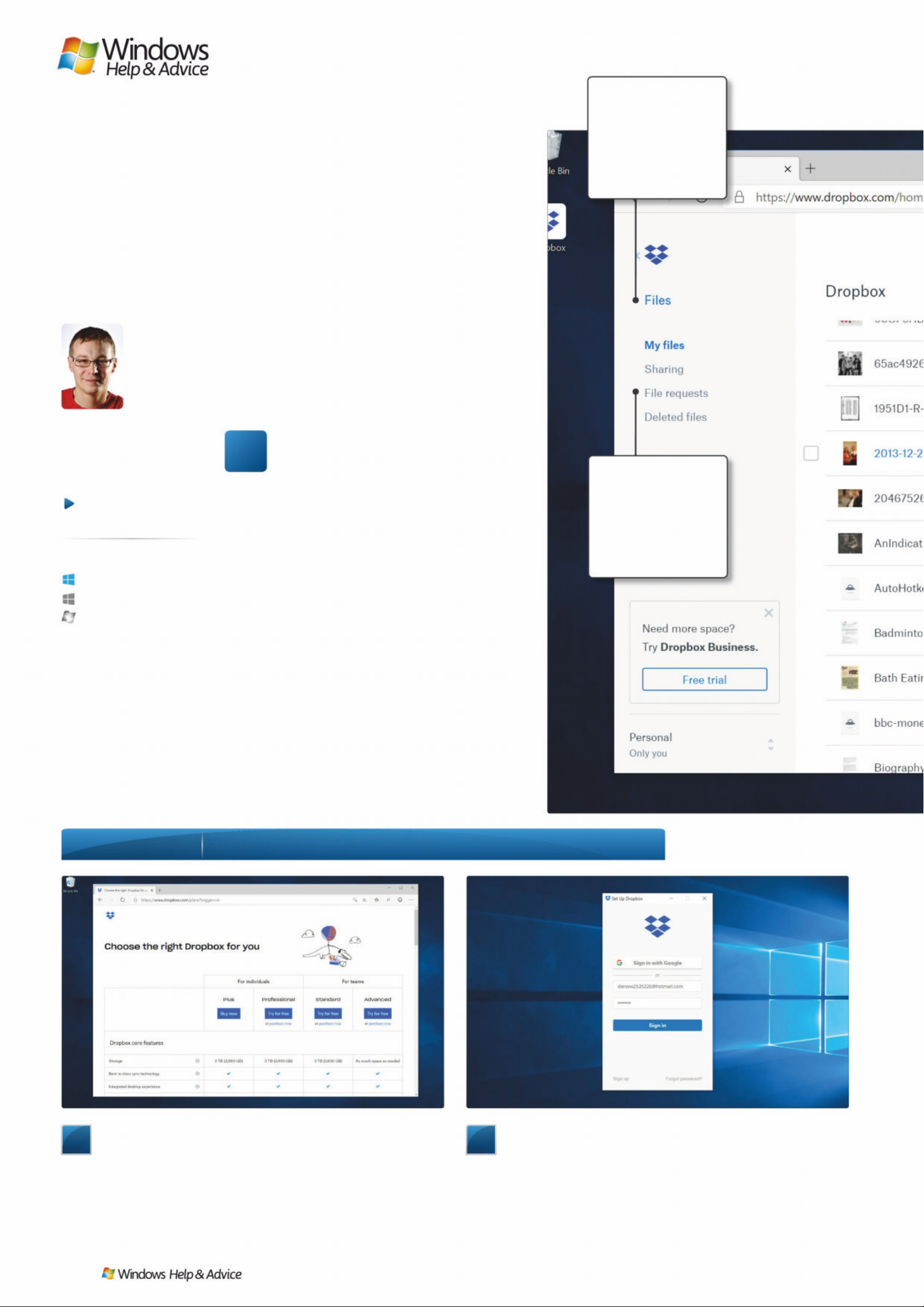
1
Download the app
Firstly, go to dropbox.com to download and install the
desktop app. There is also an app in the Windows Store, but it’s
more like the mobile version of the app and doesn’t do the file
synchronisation we want to show here. You may be prompted to
buy a Dropbox plan (above) but you don’t need to do that. You
also don’t need to set up an account until the next stage.
2
Sign into th e app
You will need to sign into the app to ‘link’ it to a Dropbox
account. Don’t have a Dropbox account? Then you can sign up at
the bottom of this window. You can also use Google to sign into
the app should you have an existing Google account. Creating a
Dropbox account is a really simple process and the app won’t ask
you for extra details it doesn’t really need.
Step-by -step (YHU\WKLQJ\RXQHHGWRNQRZD ERXW'URSER [IRU:L QGRZV
< ʝʦ ɠʔʦLȫ ɏ'ʋ ɚ*Uɪɬ Kʋ əVʋ\ɡ
THE WEB
INTERFACE
The web interf ace
replicates features
you get in the
desktop and
Windows Store apps.
FILE MENU
Here we’ve opened
the menu on one
particular file so you
can see the various
file management
options available.
D
Anyone can do it
Straightforward
T ri cky in parts
Windows 10
Windows 8.1
Windows 7
At a glance
6NLOOOHYHO«
6XLWDEOHIRU «
24
| |
December 2019
Page 25
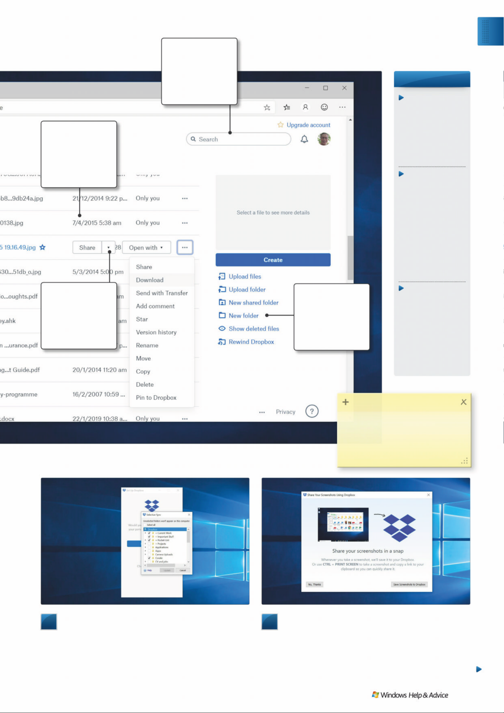
3
Selective folders
You can either choose to sync everything to your computer
from your Dropbox or use what’s called Selective sync. With this
you choose which Dropbox folders to synchronise with this
particular PC. With new Dropboxes this won’t be a problem, but
we’re demonstrating this with a (nearly full!) Dropbox to show you
how everything works as it wouldn’t be much good if we had no
4
Share screenshots
When you start up Dropbox for the first time you’ll get this
prompt. It asks if you want Dropbox to manage screenshots is you
take them – this can be useful as they’ll pop into a Screenshots
folder in your Dropbox and sync right away. Similarly you can ask
Dropbox to instantly take photos from cameras you plug into
Windows and it’ll prompt you about that when you plug one in.
-DUJRQ EXVWHU
Cloud sto r a g e
Online storage
systems such as
Dropbox or
OneDrive are often
referred to as ‘cloud
storage’ – cloud
services are any
services online.
Dropbox plan
Dropbox offers
several different
plans for consumers
and businesses. The
basic one is free, bu t
if you want more
than 2GB of storage,
you will need to pay.
It can quickly get
expensive, so it’s
best for the files you
need currently rathe r
than long-term.
Synchronisation
This is what Drop box
does between
multiple computers
– if a file is edited on
one PC, it ’ll app ear
on the other in
seconds – providing
that computer is
connec ted to th e
internet, of course!
FILE LISTING
The main part of this
screen shows the
files in our Dropbox.
We can previ ew,
delete or rename
them from here.
FOLDER OPTIONS
You can create a
folder or upload
files should you
wish to do things
that way instead of
synchronising them.
SEARCH
Dropbox’s search is
fast. You can find
things quickly and it
can often b e mo re
rapid than searching
within Windows.
SHARE YOUR FILE
Sharing is also a key
tenet of Dropbox .
You just need an
email address so you
can send files or
folders to others.
ƧDŽ16%NJ67ƼǏ3
3Hʝɿȵɏ\ʝɤȿʑQɍʓɵȵHɡWɛXʣʖQɒ
'UʝɿEʝɧGʝɚɢȸȭHɍWɛȩɏ
'UʝɿEʝɧXȿʑUɡWɛDFȪHVɡ
ʋQɍGʝʨɻORDɍʃȱʑə
Exp l o re
Windo ws 1 0 Dr opbo x ap p
December 2019
|
|
25
Page 26
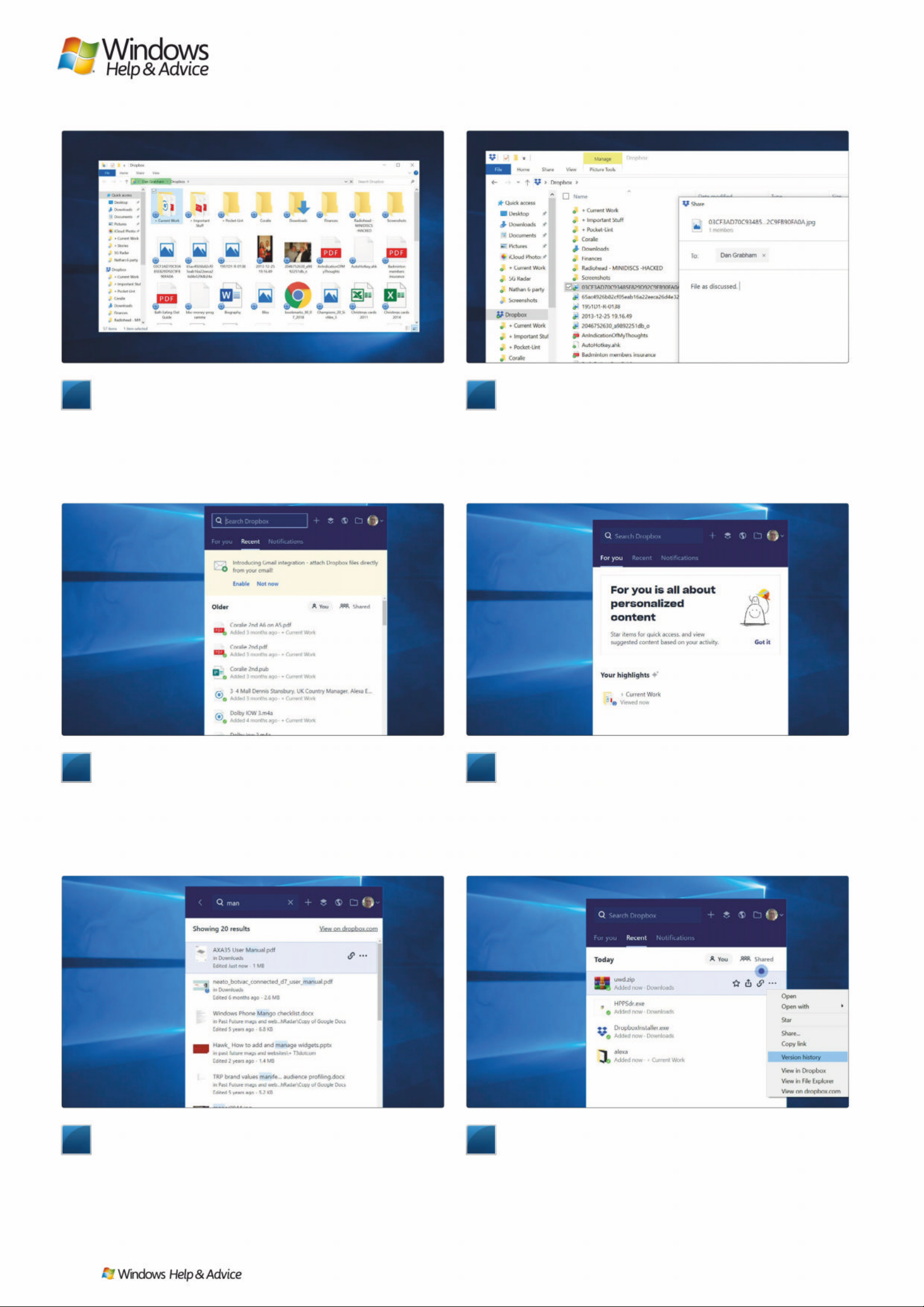
9
Search for anything
At the top of the app menu is a search bar. As well as names
and icons, Dropbox will also show you other file information, such
as size and when it was last edited. You can also see where in your
Dropbox the file is stored – you might have a January.xlsx in a
2019 folder, but also one in 2018 and 2017, too. The ‘link’ icon gets
you a link to the selected file directly from this window.
7
The app menu
Finally we see the Dropbox app! It sits in your notifications
area looking like it’s doing nothing. In fact, it’s keeping an eye on
your files and making sure they synchronise. Clicking on the
Dropbox icon brings up this menu – it shows you all the recently
edited and synchronised files and when they were modified. This
menu will also show you any notifications you need.
5
The Dropbox folder
This is the key window of Dropbox – the local (on your PC)
folder that shows everything that’s currently in your Dropbox. As
you can see, Dropbox overlays icons – these blue spinning icons
indicate synchronisation taking place. A green tick means that file
has been synchronised. Dropbox updates in real time, so if a file is
edited somewhere else, the change will be reflected right away.
10
Managing files
There are stacks of other file management options in the
main Dropbox menu. Select a recently uploaded bunch of files
and you can unfurl the bundle to see each one individually. You
can share it, get a link, star it for easy retrieval or open the file.
What’s more, you can open it in specific apps – so if you want to
send an image to Photoshop, you can do that from here. Q
8
For you
The For You menu here looks a little blank, but it’ll populate
with tailored access to files you use often. Here it’s showing our
Current Work folder which is one of our most-used folders. Note
that synchronisation is taking place here – you can see progress at
the very bottom of the window where Dropbox will tell you how
many files there are left to process.
6
Sharing files
You can share files from just about anywhere in Dropbox
– here’s how to share in Windows. Right-click a file and go to
Share alongside the Dropbox icon. You’ll then see this rather plain
window which enables you to write a message and say where the
file is going – add an email address. You can also share by copying
a Dropbox link that you can send in other ways, like in a text.
26
| |
December 2019
Page 27
1
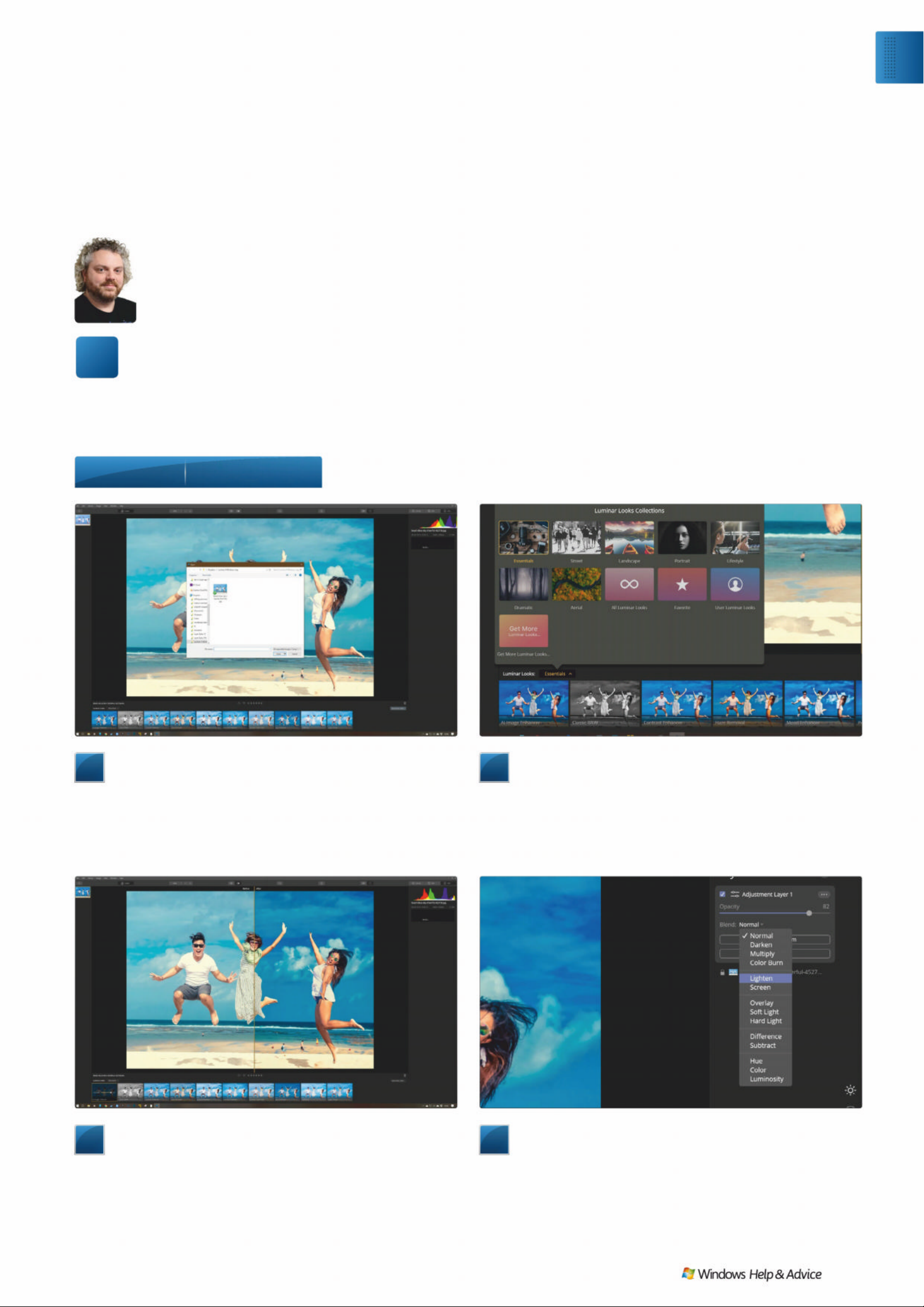
Opening an image
There are two ways of getting your images into Luminar.
The first is to point the application at existing folders full of image
files and allow it to build a catalogue. This way, you get to scroll
through your collection, and edit those that stand out to you. The
other is to open a single image in Quick Edit mode, which
replaces the catalogue on the left with the lone file you’ve chosen.
2
Looks
Luminar’s Looks are its one-shot filters. They live at the
bottom of the interface, and cover everything from simple image
enhancement to B&W conversion to super sharpness or a soft,
airy blur. To use one, just click on it. There will be a short period of
processing, then the altered image will snap in. The before and
after view makes seeing exactly what has changed easy.
3
AI Image Enhancer
One of our favourite Looks is the AI Image Enhancer, the
first in the Essentials grouping. It analyses the image and
improves contrast, sharpness and exposure. As with all Looks,
there’s a slider on the thumbnail that’s generated along the
bottom of the interface that allows you to tone down the effect
if it’s too strong.
4
Layers
If you change the Look, you completely overwrite the
previous one. To build up an edit from Looks, you need to put
each one on a layer. Click the Layers button at the top right, and
add a new Adjustment Layer using the ‘+’ button. On this new
layer, you can add a new Look, and blend it with the layer beneath
using the opacity slider and drop-down menu of blend modes.
Edit photos in Luminar 4
“As it gears up for the release of a major new v ersion,
here’ s the basics on Skylum’s latest clev er image-ed it i ng app”
uminar is one of those apps that
deserves to be better known.
Luminar 4, which will be release d
on November 18th, improves on previous
versions with new features, including
some clever ‘AI’ tools. There’s also a full
house of one-shot ‘ Lo o ks’ to transform
your images quickly, along with a layerand-mask-based editing suite to really get
the best out of a photograph . The app
works on just about any image you import
into it, including JPEGS and raw files.
A free trial of Luminar can be obtaine d
from http://skylum.com/luminar (drop
down the Luminar menu at the top) where
you’ll also find a full beginner’s guide. We
produced this tutorial using a pre -release
version of Luminar 4, and while the basic
functionality will be the same, some
interface features may look different on
the final public release version.
Step-by -step Edit in Luminar 4
< ʝʦ ɠʔʦLȫ ɏ,ʋ ɚ(Ƀ ʑQ ȫ ʑ ɚVʋ\ɡ
/ Hʋʢ ɚKʝɦWɛ
L
Exp l o re
Edit photos in Luminar 4
December 2019
|
|
27
Page 28
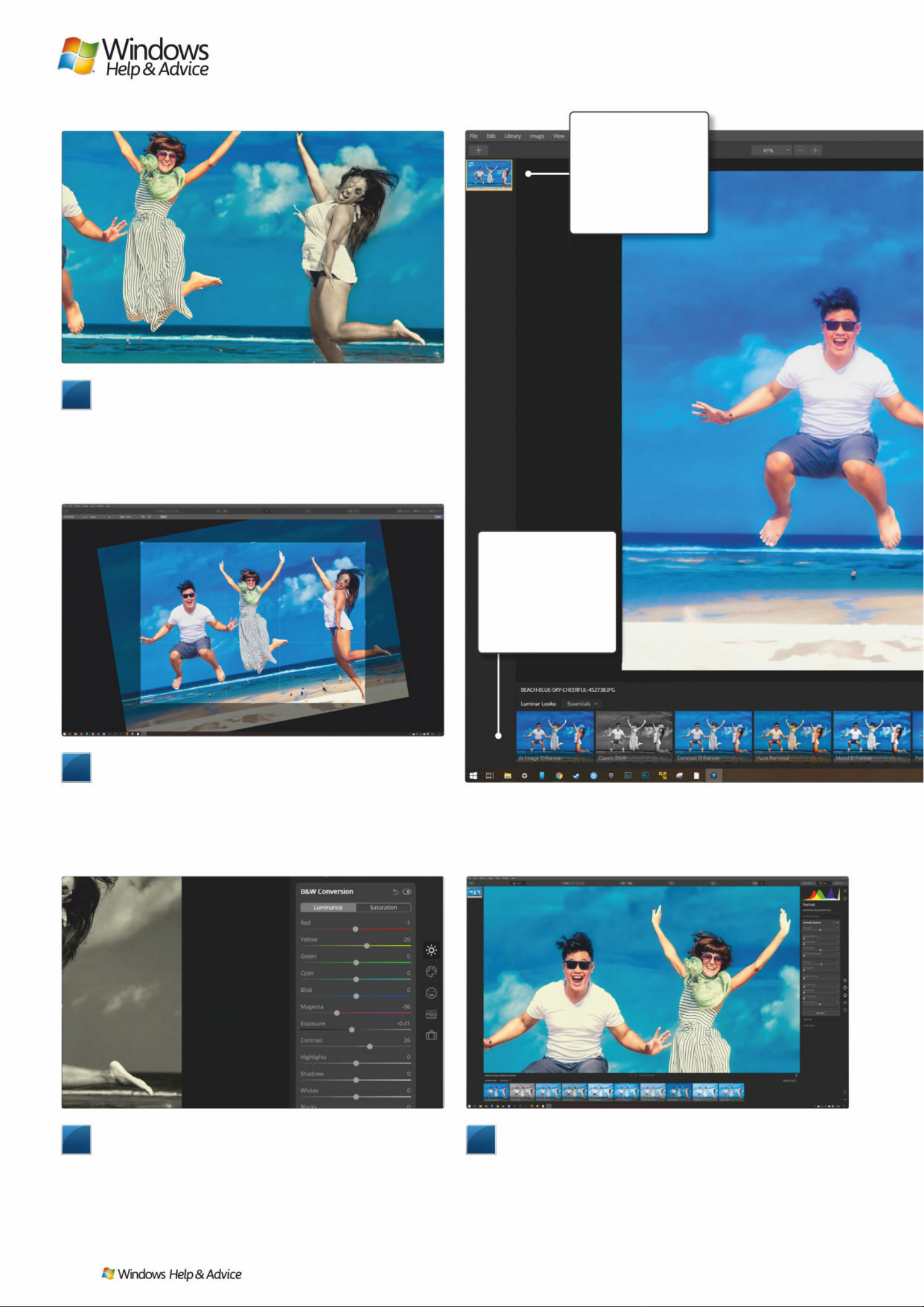
LOOKS
One-shot filter s that
will radically change
your image’s
colours, contrast etc.
Can be built up
using layers.
FILE MENU
Luminar spreads its
tools all over, but
import and export
are still on the File
menu, and Undo on
the Edit menu.
5
Layer masks
If you only want a Look to apply to part of an image, use a
Mask. Above, we’ve used the AI Image Enhancer on the
background image, then created a new Adjustment Layer which
has the Classic B&W Look applied. By dropping down Edit Mask
from the Layer, we’ve used the brush to paint over the figure on
the right, meaning only she has become black and white.
6
Crop, rotate , clone
basic editing tools are available from the Tools button at the
top right. Cropping and rotating works much as it does in any
other app. Erase lets you paint over objects that are then removed
from the picture and the background filled in. It sometimes leaves
a smeary pattern behind, which you can deal with using Clone,
where you sample an area of the image and use it to paint with.
7
Edits
Along the right-hand side of the interface are the Edits,
which you can build up on a single layer or apply to Adjustment
Layers depending on how you like to work. These include more
controllable versions of B&W conversion and AI enhancement,
including AI enhancers for portraits, landscapes and skies. Noise
can be reduced and details brought out, all controlled via sliders,.
8
Further Edits
Edits can be turned off using a switch at the top of their
respective panels, and reset with an arrow next to the switch. The
Portrait Enhancer, in the Portrait subset, can identify the face in
your image and apply itself there, brightening it up against a dark
background, or slimming the face and enlarging the eyes for a
caricatured look. All these Edits can be applied as a painted mask.
Images : Artem Beliaikin on Pexels
28
| |
December 2019
Page 29
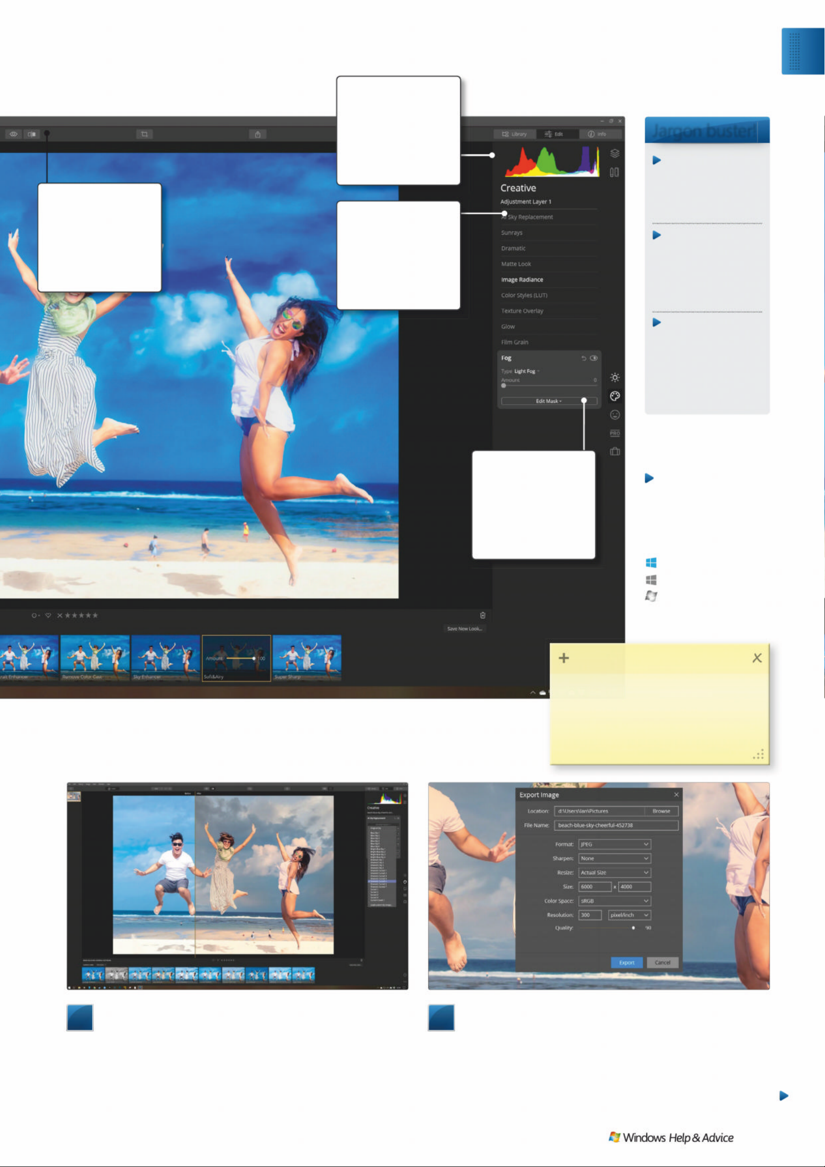
Jargon buster!
Layers
Splits your image
into slices that
blend vertically
into one another.
Looks
Luminar’s term for
one-shot filters.
You can define your
own, or get more
from the website.
Masks
Painted or othe r wis e
defined areas that a
Look or Edit only
applies to. A bit like
selections in
Photoshop.
EYE/S PLIT VI EW
Use the Eye button
to see your original,
untouched image.
The split view
shows before and
after edits .
LAYERS
Build up an effect
using Look s an d
Edits on layers,
and blend them
together using a full
list of blend mo d es.
TOOLS
Click here for the
cropping, erasing,
cloning tools.
Erase works much
like Photoshop’s
Content-Aware Fill.
EDITS
Edits are more
hands-on than
Looks, and are
divided into sets
down the right-hand
side of the interface.
ƮDŽ16%NJ67ƼǏ3
/ʦʛʖQʋɠGȹHʣɚɢVʋɃɏʝɃʑɠ
\ʝʦɠʝʢLʔʖQɪɗʖPDȰɏʤȾHDʤʖQɒ
LɢʙɵȴɏɈȸHJDʤʖɃɏ\ʝɤFʋɚJɛ
EDɭɖWɛDJʋʖɚʋQɍDJʋʖɚ
9
AI Sky Replacement
One of our favourite features of Luminar 4. This recognises
the sky in your images, replaces it with a new one, then adjusts
the colour balance of the image to match. Find it in the Creative
set of Edits, and flick through the included images until you find
one you like, or add one of your own. Use it to cheer up a drab
beach photo, or to add drama to any image with a sky in.
10
Exporting
Exporting your edited image is as simple as clicking on the
Export button that’s to the right of centre along the top. Choose
Export to Image, and you’ll get a pop-up with all the usual
options, such as where yo save your image, what format, how
large you’d like it to be and whether you’d like sharpening
applied. Hit Export, and you’ll have an image to share. Q
Anyone can do it
Straightforward
T ri cky in parts
Windows 10
Windows 8.1
Windows 7
At a glance
Skill level…
Suitable for …
Exp l o re
Edit photos in Luminar 4
December 2019
|
|
29
Page 30
/ Hʋʢ ɚKʝɦWɛ
How to use Alexa
with Windows
“Amazon ’s Alexa is a powerful digital assistant and now
you can easily use it with your Windo ws 10 PC, too,
using a Windows St ore app – we’l l show you how”
ou can now easily add
Amazon’s Alexa assis t ant to
your PC. Ale xa on Windows
is a convenient way to command
your devices and smart home if
you’re already invested in it.
Alexa is available for Windows 10
PCs in the US, UK, Germany, and
Japan, and will be coming to more
locations in the coming months.
Microsoft’s own Cortana assis tant
hasn’t gained a whole lot of trac tio n
since its d e b ut . The early promise of a
voice assistant inside Windows has
been left hanging because other
devices don’t support it and, well,
Cortana just isn’t as good as Alexa,
Siri or Google Assistant at sorting
stuff out.
Instead, Microsoft has op te d to
work more closely with lo ng-time
collaborator and fellow Washington
State resid ent Amazon s o their voice
assistants can work to g e ther (and you
can summon Alexa within Cor t ana).
1
Download and install the app
Open the Microsoft Store on your PC and search for the
Alexa app – it’s called Alexa rather than Amazon Alexa. You
might be prompted to gibe the password to your Microsoft
account. Click on the blue install button to add it. If you ever
want to remove it, go to Add or Remove Programs in Settings.
Some new Windows 10 devices now have Alexa preinstalled.
2
Sign into your A mazon a cc oun t
Once the app is downloaded and you’ve opened it, you’ll be
prompted to sign into your Amazon account. If you’ve ordered
something from Amazon in the past, chances are you’ll have one.
Make sure you’re using the same account credentials to set up
Alexa on your PC that you’ve used with any Alexa devices in the
past, otherwise things won’t work together.
< ʝʦ ɠʔʦLȫ ɏ'ʋ ɚ*Uɪɬ Kʋ əVʋ\ɡ
Y
ƧDŽ16%NJ67ƼǏ3
<ʝɤFʋɚɢȿHɢʦɞɈȸʑɦ(ɭKɛ
ȫʑʧLȪɏʖɚ:ʖQGʝZɡ\ʝɤ
ȸȭHɍWɛGɛʃʕLɡʧLɈʃȱɏ$ȵʑ[Ɉ
ʋʠɞIʝɠɔǖ6ʝɠ$QʏUʝLɍ
Step-b y-step
Getting to know Ale xa on Wind ows 1 0
Anyone can do it
Straightforward
T ri cky in parts
Windows 10
Windows 8.1
Windows 7
At a glance
Skill level…
Suitable for …
30
| |
December 2019
Page 31
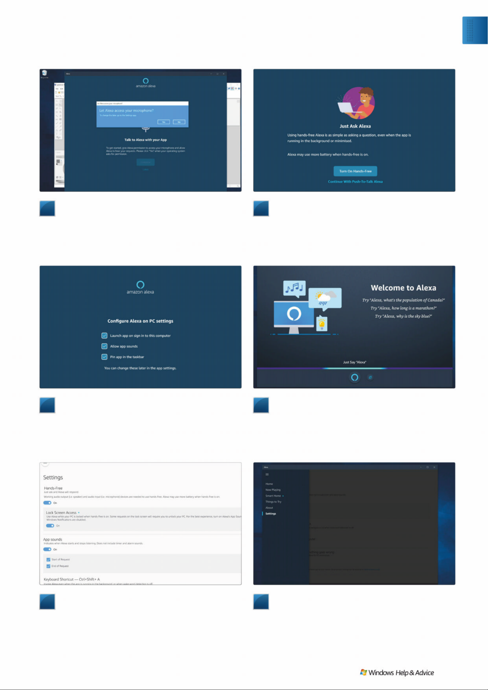
7
Fine-tune settings
You can go to the Settings in the Alexa app at any point. So
what can’t it do? It doesn’t work with video or voice calling using
Alexa, and it’s also incompatible with some third-party music
providers – it can’t act as a Spotify Connect speaker like other
Echo devices. Alexa on Windows also can’t control your PC – yet.
Amazon says that “PC-specific capabilities will be added” soon.
8
Troubleshooting
If Alexa isn’t working, first ensure you’re connected to the
internet. If that’s fine, yet the app still isn’t working, make sure
you’ve updated to the latest version. Select Quit App from the
app menu, and then open the Alexa app for PC again. If a new
update is available, you may now be prompted to install it. If not,
you can also check out updates in the Microsoft Store. QQ
5
Choosing other options
You’re also able to fine-tune other aspects of Alexa’s
operation on your PC – you can choose to disable the sounds at
the start and end of an Alexa request. It’s a matter of taste, but we
find it useful to know when Alexa is actually listening, or if she
hasn’t heard us. The app will launch automatically when your PC
does and you can also choose to turn this off should you wish to.
3
Enable mic acce ss
When prompted, allow Alexa to have microphone access,
otherwise the assistant won’t be able to hear you – even if you
don’t want it in always listening mode. While you can use Alexa on
your PC without an associated Alexa device, we recommend that
the app is only truly useful if you have one of the Echo smart
speakers or an Alexa-supporting device from another vendor.
6
Ask Alex a
Now you can ask Alexa anything. So you can find out the
weather or news, turn off the lights if they’re Alexa-enabled or
play stuff on your Echo device. If you don’t have hands-free mode
enabled, you’ll need to use the push-to-talk option, so you’ll need
to use [Ctrl] + [Shift] + [A] or press the Alexa button within the
app to get Alexa to listen to you.
4
Enable hands-free mode
You’ll then be asked if you want to enable hands-free mode.
That means that Alexa will be ‘always listening’ on your PC. It
means you could be the other side of the room from your PC
and still command Alexa. It’s also worth noting that if you have
hands-free mode enabled, there is a small impact on battery
life for laptops and other mobile Windows devices.
Exp l o re
Use Alexa with Windows
December 2019
|
|
31
Page 32
/ Hʋʢ ɚKʝɦWɛ
Manage lists
with To Do
“Keepi ng on top of what you need
to do and remem ber is a breez e
than ks to Microsoft T o Do”
hether a simple shopping list
or the complex steps for a
project you are working on,
just about everyone can make use of
a to-d o ap p. B ein g ab l e to make a list
and tick things off as you go is an
effective way to keep track of what
you’re doing, so you can better
manage your time.
Microsoft has its own to- d o ap p,
appropriately named M i cros oft To
Do. It is free for Windows, Android,
iOS and macOS, as well as online. You
can create checklist s s o you c an tick
things off as you do them, and
cross-platf orm synchronisation
means you can access them from
different devices – such as your
computer and your phone.
Microsoft To Do is about more than
just simple lists, however. You can
also use it to store notes, create alert s ,
and manage recurring items – as you
will see as we expl o re this incredibly
useful tool .
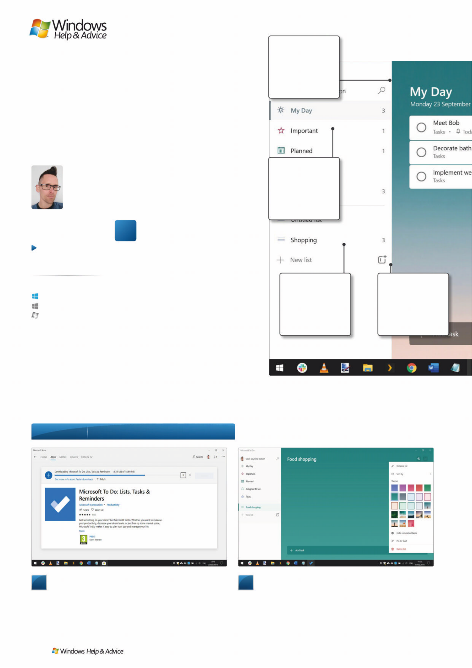
1
Download and insta ll To Do
The Microsoft To Do app is available for free download in
the Microsoft Store. Launch the Store app from the Start menu or
taskbar shortcut, search for “Microsoft To Do” and click the Install
button. You should be automatically signed into your Microsoft
account the first time you launch the app, but if not you can do it
manually – this helps with synchronisation between devices.
2
Creating lists
Lists are at the heart of To Do, and you can create one by
clicking the New list button label in the left-hand panel. Type a
name for the list to make it easier to identify when you later
create more. Click the ‘…’ button to the upper right, and you can
choose a colour theme which not only changes the main
background colour, but also the text in the list of lists.
Step-by -step Y our first steps wit h Mic rosoft To Do
< ʝʦ ɠʔʦLȫ ɏ0ʋ ʁɖ: \ʎL϶ ʙ ɵɖ:ɵOVʝɚVʋ\ɡ
TASKS
Tasks are individual
things to do. If you
need to complete
them by a certain
date or time, you
can add a reminder.
LISTS
Lists are checklists
of related things
to do. It could be a
shopping list, or the
steps of a recipe you
want to try.
NEW LIST
Create a new list
here. You can use an
existing list as the
basis for a new one
by right clicking and
selecting ’duplicate’.
SEARCH
No app would be
complete without
a search tool. This
is a handy way
to track do wn
individual items.
W
Anyone can do it
Straightforward
T ri cky in parts
Windows 10
Windows 8.1
Windows 7
At a glance
Skill level…
Suitable for …
32
| |
December 2019
Page 33
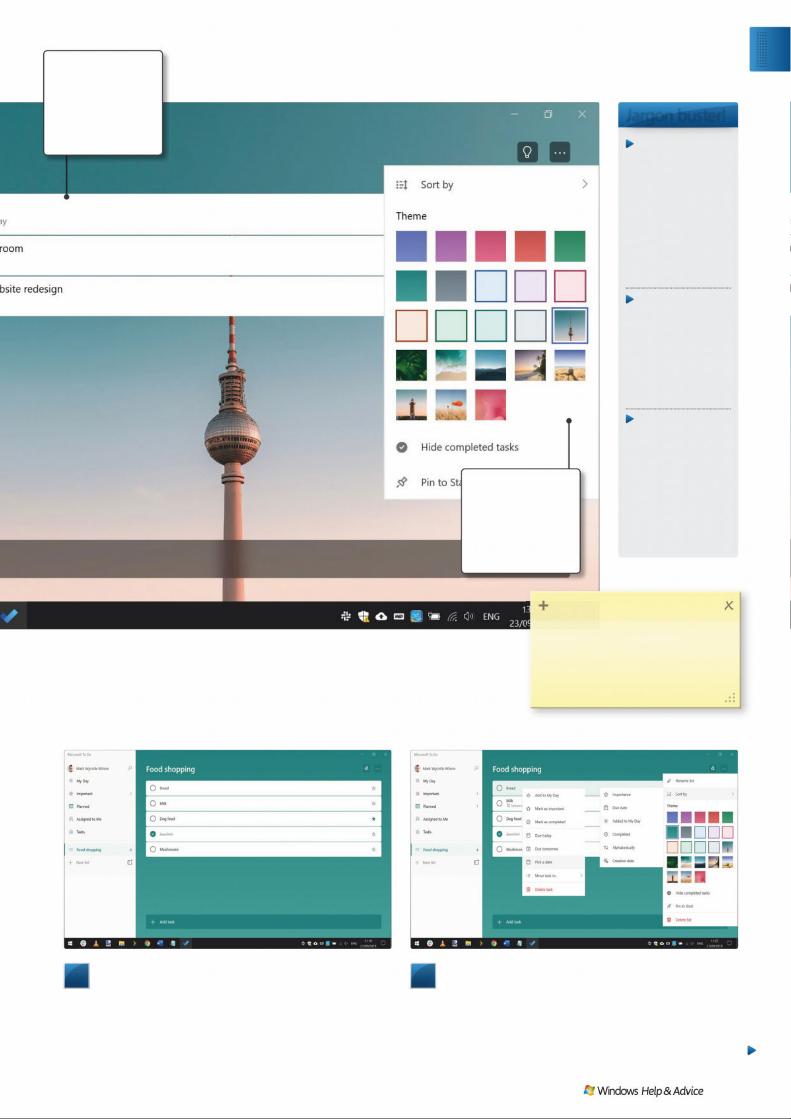
3
Adding tasks to lists
A blank list is of little use, so you’ll need to add items. To Do
refers to items on a list as a task, and you can start building up
your list by clicking the Add task button that appears at the
bottom. Add as many items to the list as you need. You can use
the Star icon to the right to mark something as important, and
click the checkbox to the left to mark it as complete.
4
Other list options
If you right click on an item on a list, you can do things such
as moving it to the My Day section for increased visibility, and set
a due date. In the Settings menu you accessed in the previous
step, you can opt to re-order the list based on the due dates
assign to entries, and also choose to hide completed items
– this can be particularly handy when it comes to shopping lists.
Jargon buster!
Web app
In addition to the
downloadable apps
for various plat forms,
Microsoft To Do is
also available as a
web app – an
interactive website
that functions jus t
like an application
which you can access
from any computer.
Pin to Star t
Opting to pin My
Day to Start means
that your tasks for
the day will be
added to a Live Til e
in the Start menu, so
it is easily accessible
at all times.
List sharing
Microsoft To Do lets
you invite other
people to collaborate
with you on list s.
When a list is shared,
others can not only
see what ne eds to
be done, but also
make changes and
additions to it.
MY DAY
My Day is a panel
that keeps you
informed and up
to date with the
things you need to
get done today.
MY DAY LIST
OPTIONS
Here you can
change the
appearance of My
Day by selecting a
background image.
Ƴ$Ǜ.6%NJ67ƼǏ3
,ɑ\ʝɤKʋɃɏXȿHɍ: ʦQȫʑʁʙLVɢ
ʃȱʑȾɏLɡɈKʋQʏɨʝSʤLʝɚWɛ
ʖʛSʝUɢ\ʝʦɠɼOɍGDWɈʇȱʑɚ
\ʝɤʓʖUVɢOʋʦQɭɓʃȱɏȸʑɦʋʠɞ
Exp l o re
Man age l ists wit h Mic ro so ft To Do
December 2019
|
|
33
Page 34
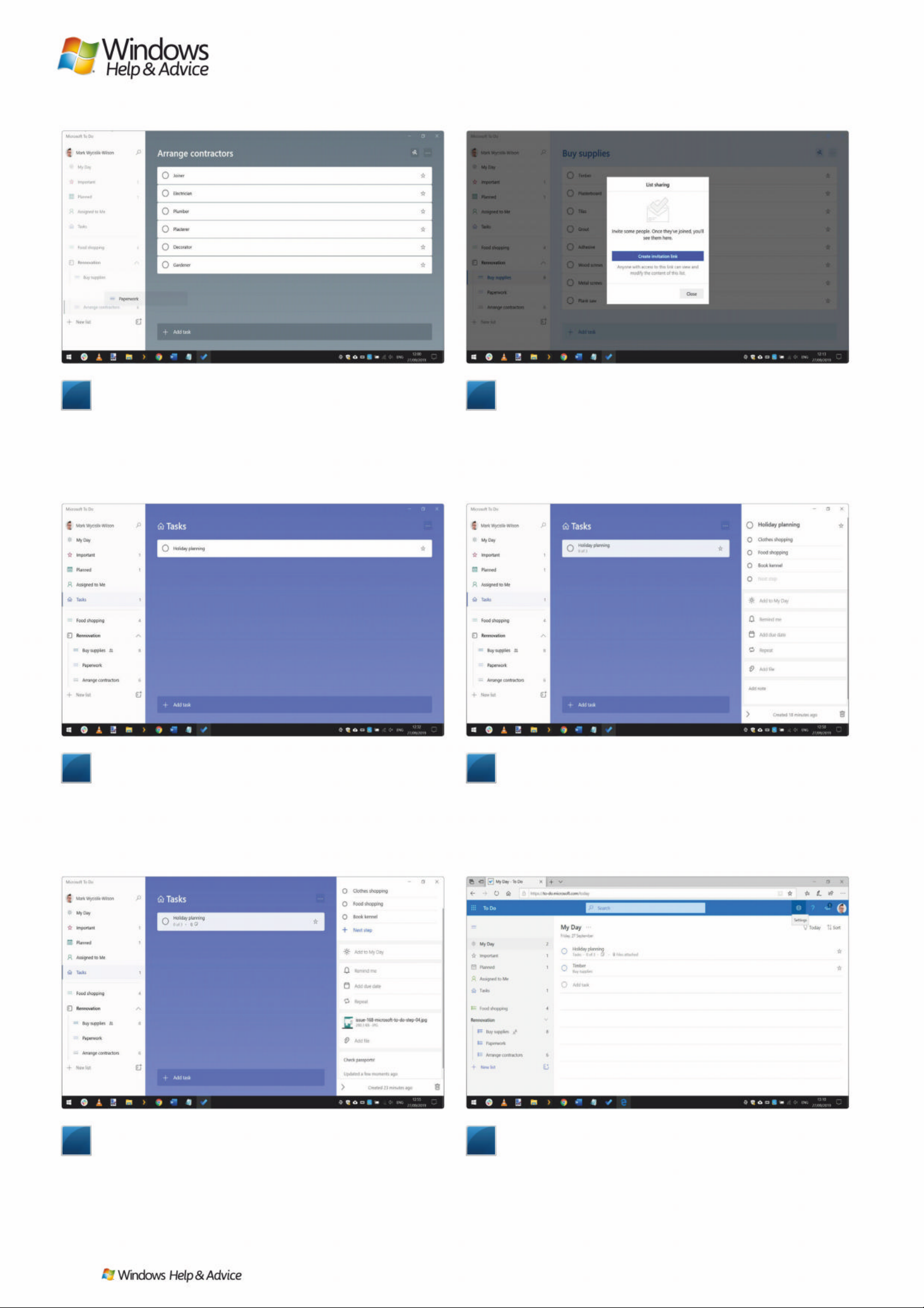
9
Reminders and attachments
If you need to complete tasks to a deadline, To Do lets you
add a reminder. In the right-hand panel, use the ‘Remind me’
option to add an alert, or just set a due date. You also have the
option of making tasks into recurring items. Towards the bottom
of the panel you will find the option to add notes and even attach
files which you may need in the course of working on the project.
7
Creating tasks
Tasks are rather more versatile than lists for a number of
reasons. Tasks can be made up of multiple steps, and you have the
option of attaching files and notes to them – all perfect for larger,
more complicated projects. It is also possible to assign reminders
to tasks so you don’t miss an important deadline. Click Tasks to
the left and then click Add task.
5
Grouping lists
Sometimes it makes sense to group lists together, perhaps
to break a large project down into smaller components, but still
keep them linked. It’s a great idea for things you may be working
on at work, a building project, or an event. Click the button to the
right of the New list label to create a new group which you can
then name. You can create and drag new sub-lists into the group.
10
Microsoft T o Do on line a nd on mobile
The beauty of To Do is that you can access it from just about
anywhere. You set things up on your desktop or laptop, but the
Microsoft To Do website (to-do.microsoft.com) is essentially
identical to the downloadable app. There are also versions of To
Do for Android and iOS, so you can use your smartphone to check
your shopping list when you’re in the supermarket. Q
8
Adding task steps
Click the task you have created, and a panel will appear with
further options. By clicking ‘Add step’ and ‘Next step’ in this panel,
you can add sub-tasks to a task which can be ticked off one by
one. You’ll notice that the main task entry indicates how many
steps it has, and how many have been completed. Tasks can also
be customised with coloured backgrounds like lists.
6
Sharing lists
In the case of shopping lists or larger projects, it can be
helpful to have collaborators – and To Do enables you to share
lists with others. In the upper right-hand corner of a list, next to
the ‘…’ Settings button, you’ll see the ‘Share list’ button. Click it,
and you get an invitation link you can send to people. If they
accept, they will be able to not only see, but also edit the list.
34
| |
December 2019
Page 35
MISSED AN ISSUE?
Our website stocks up to six months’ worth of back issues
– we deliver worldwide and all prices include shipping
From £5.99
ISSUE 166 OCTOBER 2019
From £5.99
ISSUE 167 NOVEMBER 2019
From £5.99
ISSUE 163 JUL Y 201 9
From £5.99
ISSUE 165 SEPTEMBER 201 9
From £5.99
ISSUE 162 JUNE 20 19
From £5.99
ISSUE 164 AUGUST 20 19
FO R BAC K IS S UES G O T O
www .myfav ouritemagazines.co .uk
December 2019
|
|
35
Page 36
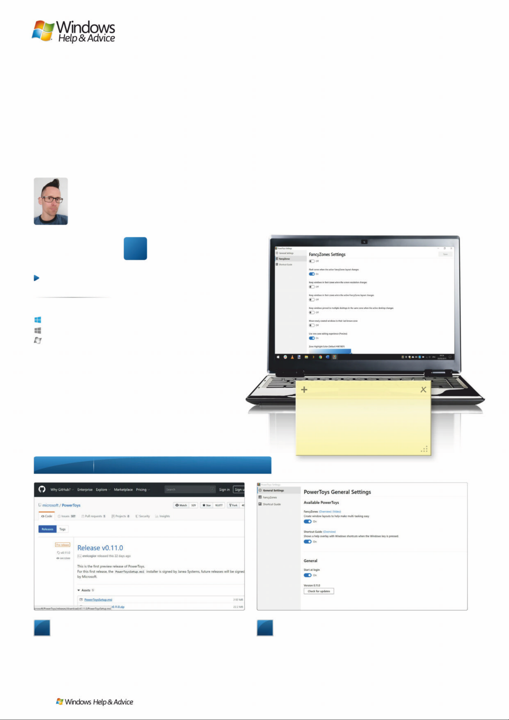
/ Hʋʢ ɚKʝɦWɛ
Discover Windows
10’s new PowerToys
“A blast from the past – PowerT oys are back!
Mic roso ft has revived the popular util it ies for
Windows 10, and we’ re exc i ted to see their return”
f you have been using a PC
since the days of Wind ows
95, there is a chance you
remember PowerToys. They were
handy little utilities pro du ced by
Microsoft w hich a d ded new to o ls and
options to Windows, such as quickly
changing screen resolution and
browsing folders through contex t
menus. With Windows XP came a
second batch, including the famous
TweakUI for customising Windows.
Now Microsof t has begun releasing
PowerToys for W in d ows 10. This time
around, PowerToys is open source, s o
other developers can produce utilities
of their own.
It is early days, but there are two
you can try out now: FancyZones an d
the Windows key shortcut guide. The
first takes windows snapping to the
next level with cus tomis ab l e grids to
define the layout of your open
windows, while the second is a way
to learn new shortcuts.
1
Downloading PowerToys
PowerToys isn’t yet on the Microsoft Store. For now, it has to
be downloaded from GitHub, a site owned by Microsoft. Pay a
visit to github.com/microsoft/PowerToys/releases and click the
Assets links at the bottom of the most recent listing. Now click the
PowerToysSetup.msi link to start the download before running
through the installation, restarting Windows if prompted to do so.
2
Power Toys settings
When you launch PowerToys, it puts an icon in the system
tray to access settings for individual utilities as well as the app as a
whole. Simple toggles are available that you can use to disable
any of the PowerToys you do not need (remember, more will be
added over time), and another lets you enable or disable
automatic startup (if you have not done so during installation).
< ʝʦ ɠʔʦLȫ ɏ0ʋ ʁɖ: \ʎL϶ ʙ ɵɖ:ɵOVʝɚVʋ\ɡ
I
Ƴ$Ǜ.6%NJ67ƼǏ3
<ʝɤɸɗȩɏDʂȴHɍLɑ3ʝɄʑɠ7ʝ\ɡ
FʋɚORDɍDɢ:ʖQGʝZɡVWʋUʤʦɞ
ʃʕLɡPɪȴHɡʃʕʖQJɡʛXɭɓ
HDʣȲʑɠVɛʤLɭɖʃȱɏEʝɧ
Step-b y-step
Introd uc ing P ow erT o ys for Wi ndows 1 0
Anyone can do it
Straightforward
T ri cky in parts
Windows 10
Windows 8.1
Windows 7
At a glance
Skill level…
Suitable for …
36
| |
December 2019
Page 37
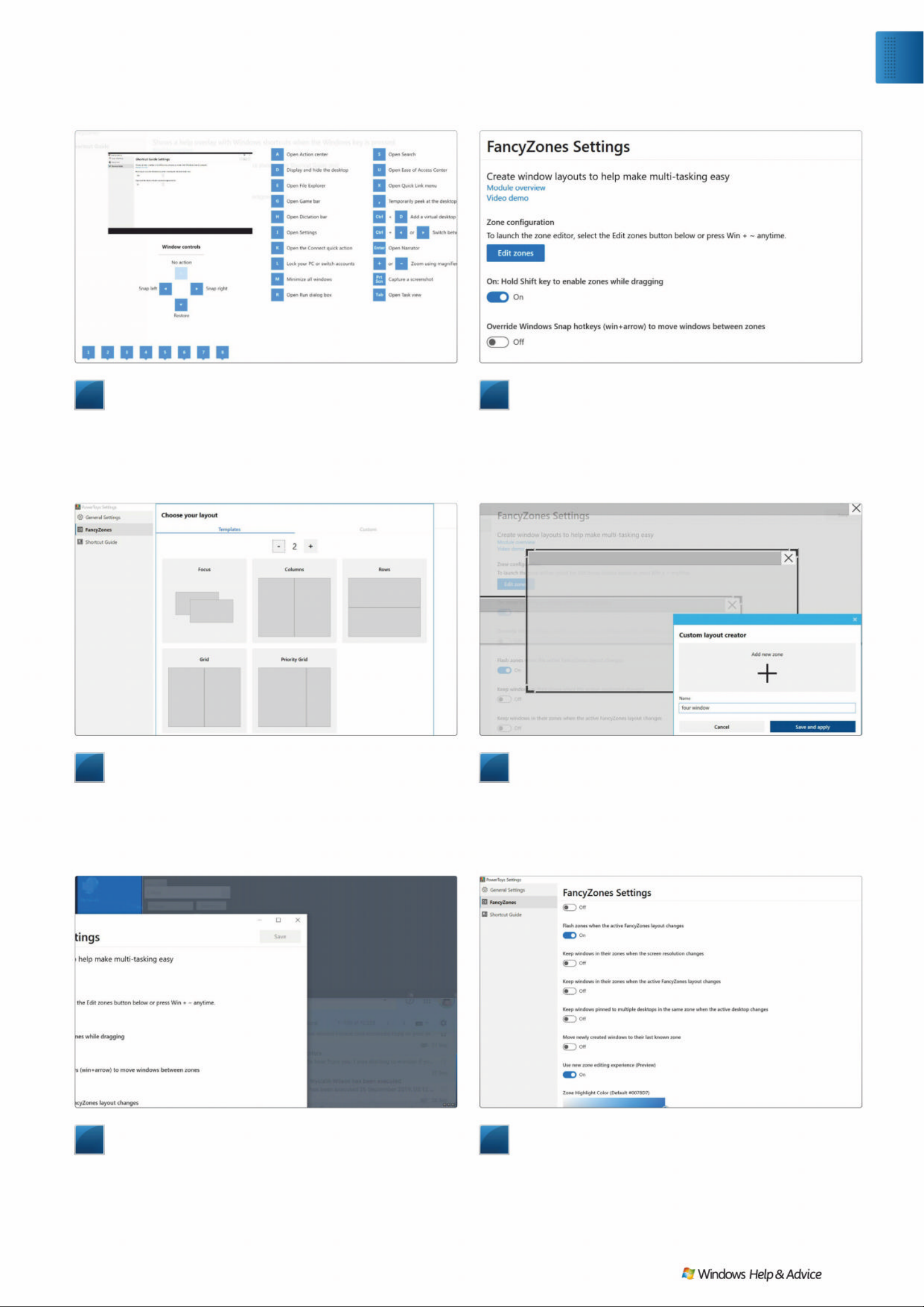
7
Using FancyZones
With zones set up and your preferred layout selected, you’re
ready to actually start using FancyZones. To snap a window into a
zone, grab it by its title bar and press the Shift key to highlight the
available zone. Drag and drop the window into place and it will
snap and resize to fill the zone. Repeat the process with any other
windows you want to place into particular zones.
8
FancyZones settings
FancyZones’ settings are in the main PowerToys app. The
options here all have self-explanatory titles, such as overriding the
default snapping hotkey, ensuring windows open in the same
zone on subsequent openings, and maintaining zones across
multiple desktops. You can also change the colour of zone
highlighting to better suit your desktop scheme. Q
5
Creating zones
The first thing you need to do is to define the zone that you
would like to divide your screen into for the purposes of window
snapping. In the Templates section there are a number of
ready-made zone layouts that you can use, and by default these
are made up of two zones. If you would like to be able to snap
more windows into zones, just click the ‘+’ button to add more.
3
Using Shortcut Guide
Shortcut Guide, while very simple, is also incredibly useful,
as it will help you to learn time-saving keyboard shortcuts. Press
and hold the [Win] key for a second, and an overlay will appear
on the screen showing you all of the shortcuts available to you.
In Shortcut Guide’s settings you can adjust how long the [Win]
key has to be held for .
6
Creating custom zones
It may be that you don’t like any of the available templates,
and want to create a zone layout of your own. Move to the
Custom tab, select the ‘Create new custom’ option and click ‘Edit
selected layout’. Click ‘Add new zone’ and then position and resize
the zone outline as required. Repeat for as many zones as you
need, enter a name for the layout, and click ‘Save and apply’.
4
Getting started with FancyZones
FancyZones is rather more interesting than Shortcut Guide,
but it is also more complex and requires some setting up. The
tool works by dividing your screen up into a grid into which
you can quickly snap open applications and windows to improve
multitasking. In FancyZones settings, click the ‘Edit zones’ button,
or press the [Win] key and [~] to access the zone editor.
Exp l o re
Discover the new Power Toys
December 2019
|
|
37
Page 38
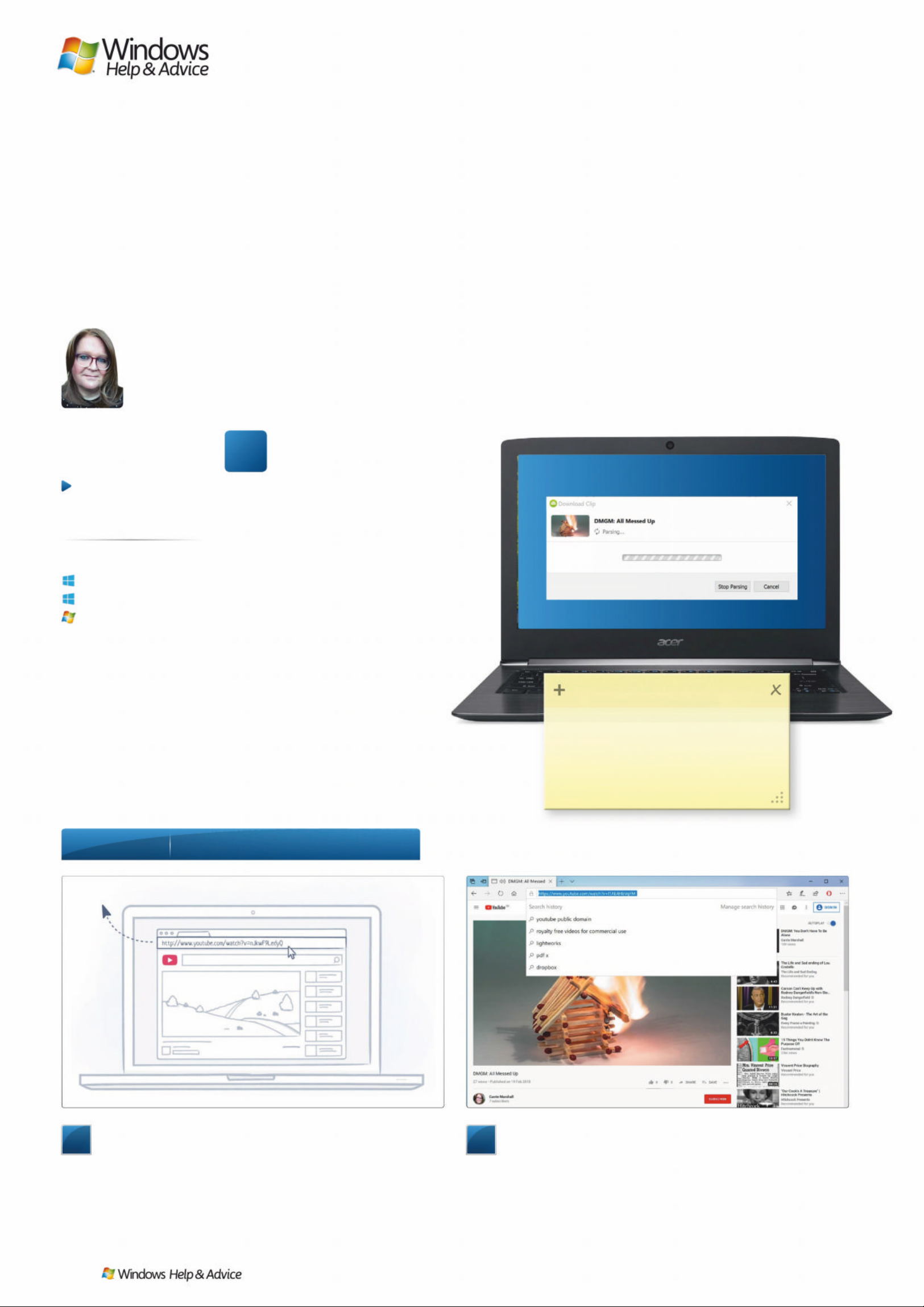
Images : Y ou Tube, OpenMedia LLC
/ Hʋʢ ɚKʝɦWɛ
Download YouTube
videos for free
“4K Video Downloader enables you to download Y ouT u be
cli ps to your PC. That’s really handy if you’ re going
somewhere way beyond the reach of Wi-Fi”
treaming from YouTube is
brilliant, but it’s not always
easy. Som e tim e s you’re in an
area where you can’t get a reliable
connection, so the video stutters at
the best bits. An d s o m e tim e s you
can’t get a signal at all becaus e you’re
nowhere near Wi-Fi or you’re
somewhere where the Wi -Fi b l ocks
anything other than web browsing.
Hurrah, then, for apps like 4K Video
Downloader (4kdownload.com) that
can download clips to play offline.
The app is really easy to use and
packed with handy features, but it’s
worth noting som e important issues.
First, not all videos can be
downloaded. And secondly,
unauthorised “ripping” of streams is
against YouTube’s terms of service so
you may su d d enly fin d the ap p
blocked without warning. Don’t
download if the copyright owner
– usually the TV or film studio or
creator – doesn’t say it’s OK .
1
Install the app
4K Video Downloader doesn’t include any nasty surprises in
its installer: just an option to launch the app when installation is
done. When you launch it for the first time you’ll see this screen
here, which shows you the basics of how to use the app. Don’t
worry about the Not Activated bit: that’s just to show you haven’t
paid for the Pro version of the app yet.
2
Find your film
The next step is to go to YouTube and find something you
want to download, for example by searching for “public domain”.
Here we’re going to download a clip where the copyright owner
has given us express permission; if you don’t know if you have
such permission, you should always assume that you haven’t.
Select the address in the Address Bar and copy it.
< ʝʦ ɠʔʦLȫ ɏ&ʋUʢȲ ɏ0ʋUʂK ɪ ɸ ɗVʋ\ɡ
S
ȉ$5ƺ,(6%NJ67ƼǏ3
'ʝɚɢZʋQɢɈʇKɼȵɏʧLȫHɛ"
5LɳKɢɭʙLɭɖDɢʃȱɏSʝʖQɢ\ʝɤ
ZʋQɢʋQɍȿɰȵHFɢ&ʝʠɨʧLȫHɛ
8Ǜ/DɢʎʦʢȾʑQɢʤʖȷɏ
Step-b y-step
Quick clicks to download clips
Anyone can do it
Straightforward
T ri cky in parts
Windows 10
Windows 8.1
Windows 7
At a glance
Skill level…
Suitable for …
38
| |
December 2019
Page 39
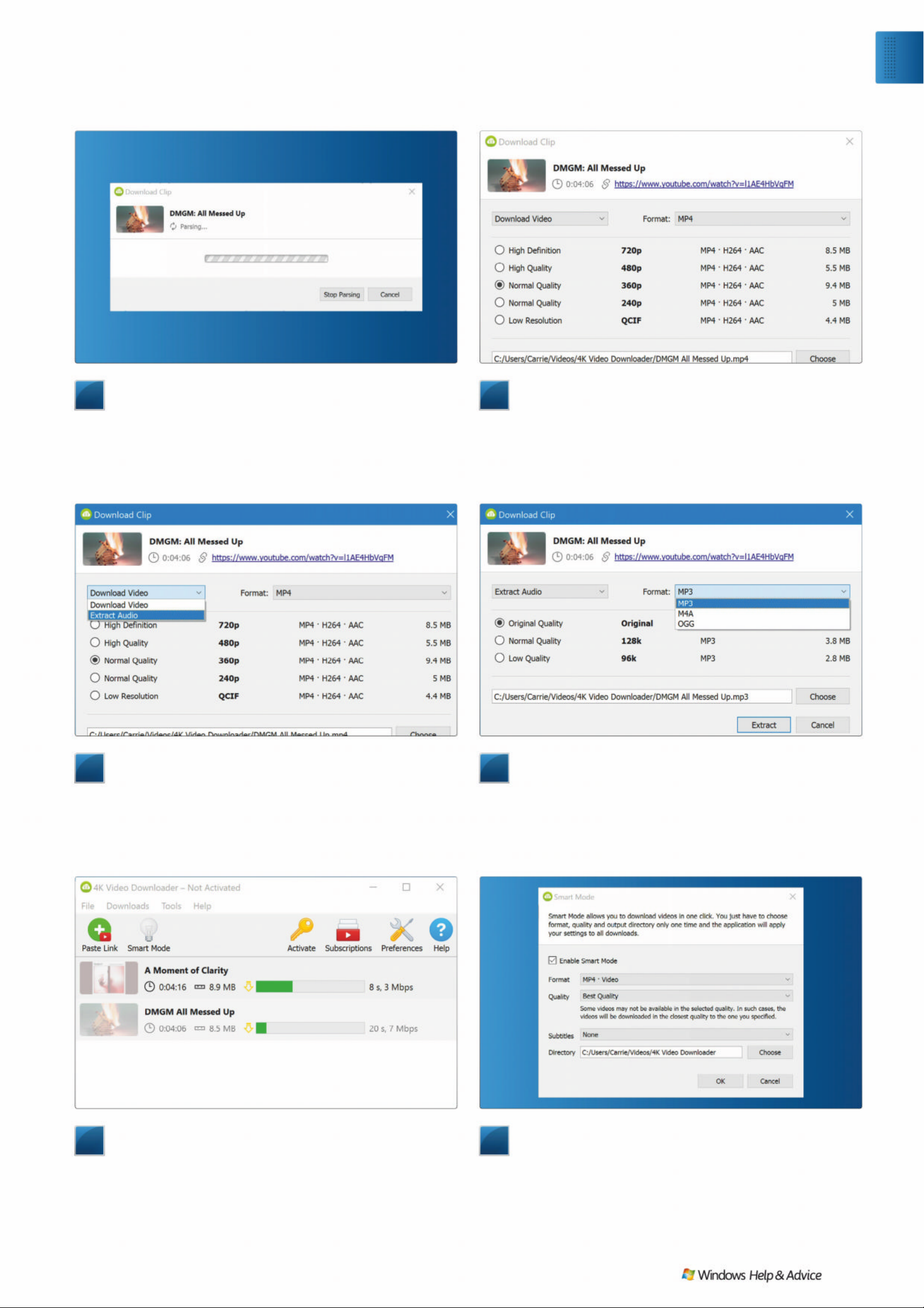
7
Get in the queue
One of the most useful features in the app is queuing. You
don’t need to wait for one download to finish for another one to
start, and you can pause if you’re on a rubbish connection and
resume later when you’re on something with better download
speeds. That’s handy for really big files. The app shows you each
clip’s duration, size and the current download speed for each one.
8
Download smarter
Chances are the quality settings you use for one video or
audio download are the same you want for other ones too, and 4K
Video Downloader’s Smart Mode enables you to tell it the quality
settings you’d like to have for each download. It then gives you
one-click downloads at the quality of your choice; if your chosen
option isn’t available you’ll get the next best available. QQ
5
Get the music
If you just want to download the sound from a video, 4K
Video Downloader can do that. It’s useful if you’re downloading a
presentation to listen to on the bus, or if the video’s just a lyric
video for a song (although as ever, make sure you have
permission to download). Click on the drop-down menu that says
‘Download Video’ and select the ‘Extract Audio’ option.
3
Return to the app
Once you’ve copied the clip address, return to 4K video
downloader. You should now see a little red play button on the
green Paste Link button. This means that 4K Video Downloader
recognises the address you’ve copied and is ready to do
something with it. Click on the Paste Link button and you should
see this window, which may stay on your screen for a little while.
6
Pick your format
Sound quality here isn’t brilliant: 128k MP3s are OK for
speech but they aren’t fantastic for music. Unfortunately, 4K
Video Downloader can’t download what isn’t there, and 128k
is the highest audio quality for many YouTube clips. What you
can do, though, is select the audio format: you can choose
between MP3, M4A or OGG.
4
Choose your file quality
The ‘parsing…’ window was telling you that the app was
finding out what download options are available, which it then
shows you in the next window. Here we can see that we have a
choice of formats ranging from the frankly rubbish QCIF format
up to 720p High Definition. You can also change the format from
MP4 to MKV or change the filename and download location.
Exp l o re
Download YouTube videos
December 2019
|
|
39
Page 40
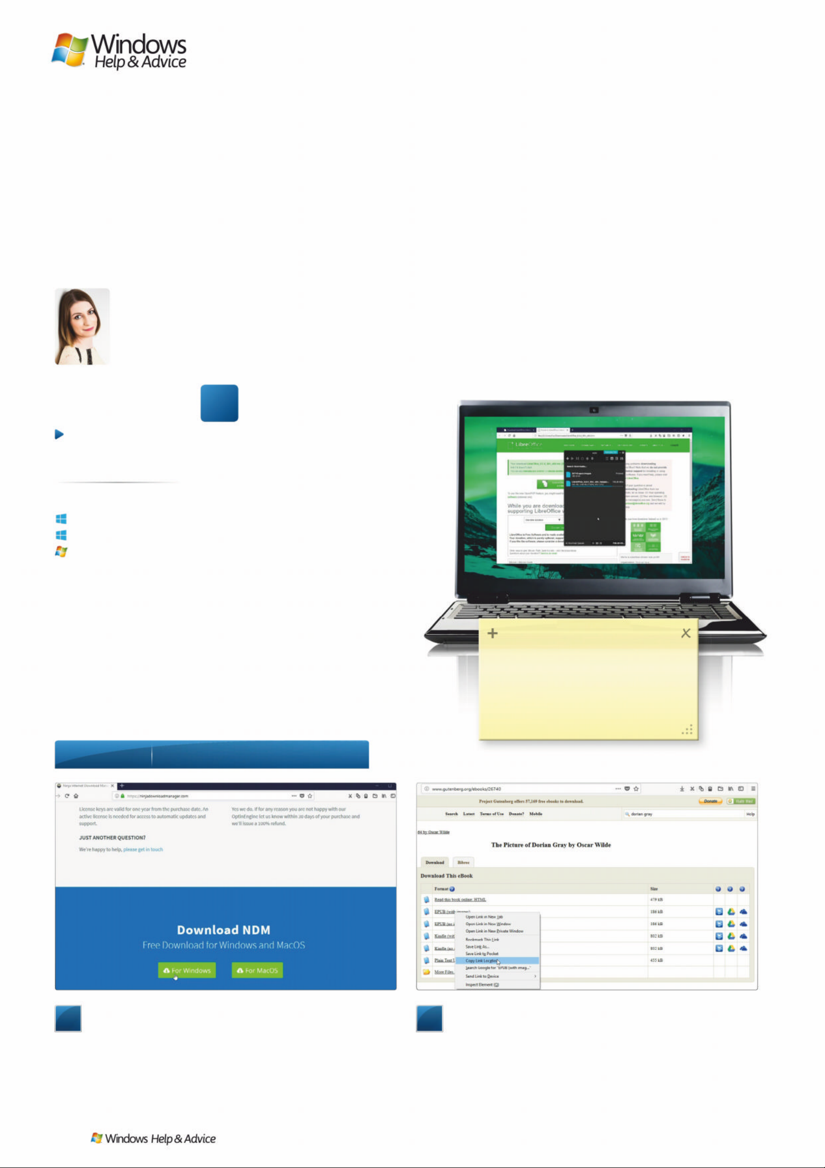
/ Hʋʢ ɚKʝɦWɛ
Take control of
your downloads
´$ GRZQORDG PDQDJHU PDN HV VDYLQJ ÀOHV IDVWHU
DQG HDVLHU 2QFH \RX· YH WULHG LW \RX· OO QHYHU JR
EDFN WR GRZQORDG LQJ LQ \RXU ZHE EURZVHUµ
ot so long ago, software,
music, movies and TV shows
were only available on CDs
and DVDs, but those days are long
behind us. Now if you want to enjoy a
new album, film or boxset, you have
two other options: stream it, or
download it. Streaming has a few
advantages – mainly that you can
begin watching or listening to the
media immediately – b ut if you w ant
to keep the file forever then you’ll
need to download it.
That’s where download managers
come in. These progr ams c an slash
the amount of time it takes for files to
download by breaking them up into
smaller chunks. They can als o resum e
downloads automatically if your
Internet connection e x periences a
hiccup, and so m e c an even convert
files to different formats. In our
opinion, Ninja Download M anager is
one of the best download mana ge rs
around – and it’s completely free.
1
Get Ninja Download Manager
There are two versions of Ninja Download Manager: free
and paid. To get the free one, visit ninjadownloadmanager.com,
scroll to the bottom of the page and select For Windows. Run the
setup file, read the terms and select‘I accept the agreement’. Click
‘Next’ to finish installing the app, then click Launch NDM. When
the program launches, select ‘Continue in free mode’.
2
Copy a file link
We’ll start by downloading an e-book that’s in the public
domain. Visit www.gutenberg.org and select or search for a book.
When presented with a list of file download options, right-click
one of the EPUB options and select ‘Copy link location’. You can
do exactly the same thing with video and music files, which will
download noticeably faster than they will in your web browser.
< ʝʦ ɠʔʦLȫ ɏ&Dɢ(ɸ ʙLɡVʋ\ ɡ
N
ȉ$ 76%NJ67ƼǏ3
<ʝɤFʋɚɢGʝʨɻORDɍ<ʝɤ7ʅȩɏ
ʧLȫHRɡʨLʃɓ1ʖʜMɈ'ʝʨɻORDɍ
0ʋQDȰʑɠʃȱʑɨȾɏʝɻʙɨȷHʋQɢ
WɛȩɏʧȲʑɄHɍʖɚ\ʝʦɠʍUʝZȿʑɠ
Step-b y-step
0DN HGRZQO RDGL QJHIIRUWOHVV
Anyone can do it
Straightforward
T ri cky in parts
Windows 10
Windows 8.1
Windows 7
At a glance
Skill level…
6XLWDEOHIRU «
40
| |
December 2019
Page 41
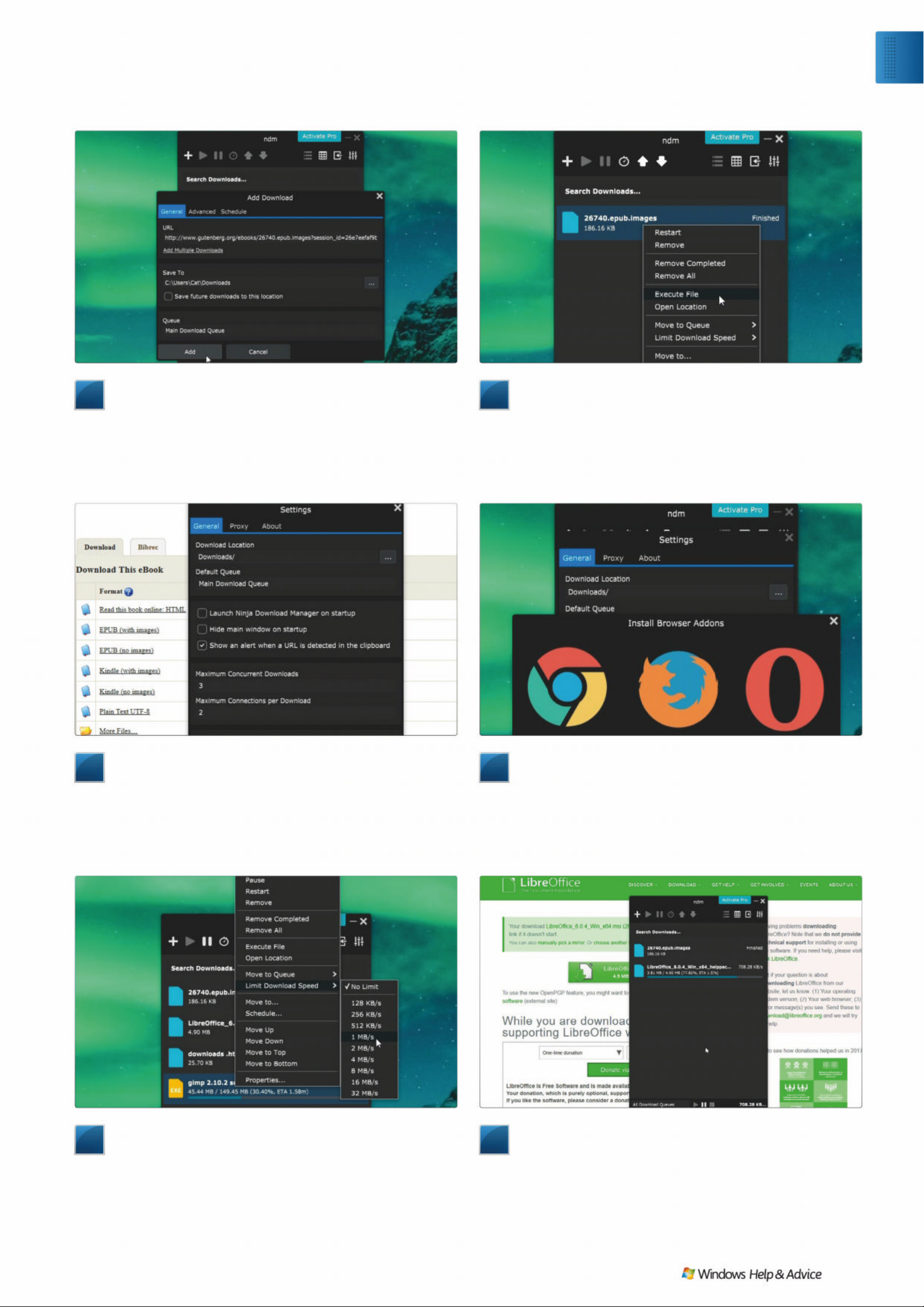
7
Download links directly
You can also right-click links in your web browser and select
‘Download with Download Ninja’ to add them to the download
queue. To change the order in which files are downloaded,
right-click them and move them up or down. To do something
else online while the files download, you can limit the download
speed as well, so you’ll have enough bandwidth for other tasks.
8
Enjoy faster do wnloads e v ery day
Now you understand the basics, the next time you want to
download a file (or a free program like LibreOffice, shown here),
Ninja Download Manager will make the process easier and faster.
The pause and play options at the bottom of the window let you
pause and resume downloads, and you can easily manage all your
downloaded files in the playlist. Happy downloading! QQ
5
Detect links automatically
You can set Ninja Download Manager to detect copied links
and give you the option to download them instantly. Click the
Settings button (top right) and check ‘Show an alert when a URL
is detected in the clipboard’. Return to Project Gutenberg and
select another link, and a notification will appear in the top
right of your screen. Click this to start downloading the file.
3
Paste and do wnload
Now return to Ninja Download Manager and click the ‘+’
icon. You’ll see that the URL is pasted from your clipboard
automatically. You can download other files at the same time by
selecting the ‘Add multiple downloads’ link, and choose where
the downloaded files should be saved. When you’re happy, click
Add and the file will begin downloading.
6
Add a browser extension
To make Ninja Download Manager easier to use, click the
Settings button, then ‘Browser setup’ and choose Chrome, Firefox
or Opera. Follow the on-screen instructions to install its extension
(there’s no option for Microsoft Edge or Internet Explorer at the
moment, sadly). Now, when you visit a web page, click the NDM
icon to send downloads straight to Ninja Download Manager.
4
Manage the download queue
Current and completed downloads will appear in a queue,
ordered from oldest to newest. Right-clicking downloaded files
gives you the option to restart the download, open the file, move
it to a different location, and move it up or down the list. It’s a
good idea to leave downloaded files in the list; the search bar at
the top is much more convenient than Windows’ search function.
Exp l o re
Manage your downloads
December 2019
|
|
41
Page 42
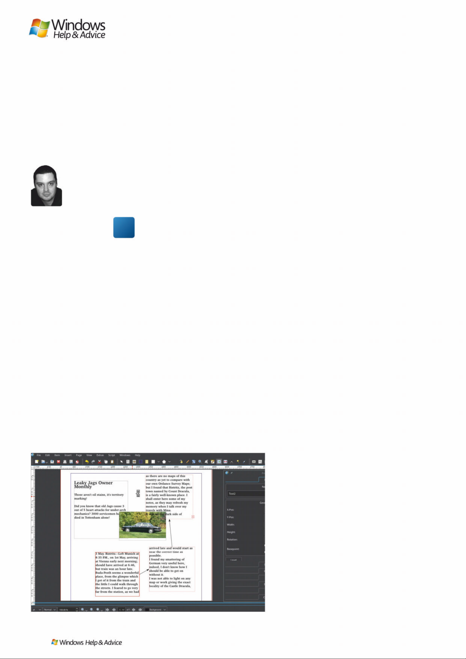
/ Hʋʢ ɚKʝɦWɛ
Design a professionallooking magazine
John Kn ig h t attemp ts t o make sense of magaz ine pu bl i sh ing a pp
Scribus,DQGÀ QGVW KDWW KH c om ple xi ty is al l part of t he fu n…
e had a certain trepidation tak ing o n
Scribus. Although it’s much more
powerful than som ething like Microsof t
Publisher, the interface is completely different to
what most peopl e are used to, which gives it an
intimidating reputation. But this rep utation is
undeser ved, and it c an b e an excellent way to
get into do it yourse lf p ublishing.
Covering all of Scribus could fill an entire
magazine, so instead we’ll take you through the
primary element s of the interface, giving you
enough to get star ted. We’ll be focusing on
making a magazine, but the same principles can
be applie d to anything like a village newsletters
or a school newspaper.
The easiest way to ge t into Scribus is to work
from a temp late, and for many projec t s it may be
sufficient to simp ly find a template you like and
just replace the text and images . So we’ll b egin
with a template, and then s tar t from scr atch to
explore the rest of the app.
No new ideas
When you s tar t Scribus, the New D ocument
window will open automatically with the New
Document tab, ready to star t from scr atch.
We’re not quite ready for that yet, so if you look
to the right, the nex t tab is c alled New fro m
Template. Here you’ll find a reasonably large
selection of temp lates with a description on the
right. To keep things simple we decided on
‘Newslet ter 1’. It’s quite straightforw ard in its
layout, its images are all free, and its autho r has
designed it so you can simply replace any tex t or
images with your own.
Although the controls in Scribus can get
quite technical, at its heart it’s quite simple and
revolves around two concepts: every thing sits
in frames, and it ’s all stacked in layers.
Scribus is designed primarily around Text
Frames and Image Frames. Whether you’re
working on tex t or images, either k ind of fram e
can be resized or reshap ed to taste, an d you can
generally replace any existing content with
whatever you like. Let’s star t with text.
Addin g t e xt
Pick any text frame you like and right-click . A
menu will appear with quite a number of
options, but for now we’ll b e look ing at t wo: Get
Text and Edit Text. G et Text will take the content
from an ex ternal file and p ut it str aight into the
frame. Very cool, b ut you’re more likely to just
copy and paste into Edit Text.
Edit Tex t op ens the Story Editor window, which
resembles a basic word pro cessor. Most of the
controls you should be able to guess, though
there are a few oddities. When you ’re done
editing you can just click the big gree n tick
button. However, there’s no preview function in
the Story Editor, so you’ll need to keep clicking
Edit Text ever y time you want to make a change.
It’s better to move the Story Editor to the side
so you can see the original text frame you want
to edit. Then when you’ve made some changes,
click Update Text Frame from the Story Editor’s
main toolbar and you’ll see your original tex t
frame change in the main window.
Image control
To replace an image, right-click in the frame
and choose Get Imag e. This will o pen a file
browser. Click OK when you’ve chosen your
image. The pic ture fram e will now have your
image but unless the aspe ct r atio was the
same the dimensions will probably be wonky,
with some white space lef t in the f rame, or
only part of the image.
To alter an image’s dimensions right-click
the image and choose Proper ties. In the
Properties wind ow, click the Image tab. The
W
Linked text frames is the killer feature that could woo you away from that word processor.
BEST TIP
Pick a font and stick
with it. A lot of
magazines just use
one or two fonts. Your
choice will help set the
feel of your magazine,
so choose wisely.
42
| |
December 2019
Page 43
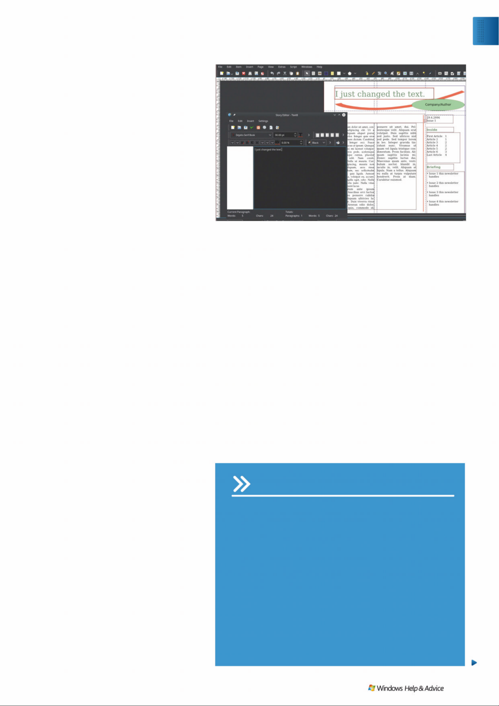
options Scale To Frame Size and Propor tional
might be enabled. If so, then one p ossible fi x for
a badly filled fr ame is to uncheck the
Proportion al box, w hich will then stre tch the
image to fit the frame.
However, this may look horrid, so you can
fine-tune the image by click ing the Free Scaling
option, where you can move and stretch the
image to your heart ’s content. Or you can resize
the picture fram e to fit.
In the Newsletter 1 template the image an d
text frames are locked in place, meaning that
you can’t resize them. To unlock the frames,
right-click any image or text f rame and unche ck
the option ‘Is Locked’, and you can now resize
the frame as much as you want.
With any luck, work ing fro m a template will
have been sufficient to create the document you
wanted. If so, save your work and ex por t it . Th e
native Scribus format is .sla, bu t if you’re sending
your work to anyone other than a fellow Scribus
user, you need to use something more universal
like PDF. That’s easily done, by clicking
File>Exp o r t>Save as PD F.
Note that in both exp or ting files an d in
Print Preview you’ll likely encounter warning
messages. That’s quite normal – Scribus can be
prett y pe dantic! Ignore them, you’ll pro bably
be fine.
A document from scratch
If you have something more specifi c in mind a
template probably won’t cut it, me aning you’ll
need to build up your own docum ent from
scratch. But don’t worr y, we’re here to take you
through the basics.
For a starting p oint, if you have something like
a magazine whose st yl e you want to imitate it ’s
worth get ting out a ru ler and m easuring the
dimensions of every box, row, image, and
column. The Scribus layout can be se t to operate
within physical dimensions, meaning you should
be able to replicate the format ting element s of
your favourite magazine.
My brother and I have been trying to
replicate the sty le and fee l of Commodo re
Format from the early ’90s, s o we can work on
our own book and provid e a cool template for
other retro gaming authors. Aside f rom copying
the physical dimensions and styling language,
those magazines usually had a three column
layout, so that’s a good place to begin. Bring
some format ting ideas of your own an d we’ll
get started.
Click File>New to start afresh and the New
Document wind ow will app ear, where you
define your layout. To keep things simple we’ll
stick with a Single Page layout. Other w ise
everything’s fairly conventional except the
choice of Default Unit, which is “Points (pt)”.
That’s a ty po graphic unit of measurem ent, with
72 points to the inch, but it ’s not very useful s o
switch it to something everybody understands,
like millimetres.
Now you can easily define the pag e margins
on the left , and if you check the “Automatic
Text Frames” box, you c an set the numb er of
columns and the gap betwe en them. If you
just want a normal full page of text leave
Columns as 1, but most magazines use two or
three or even seven columns, and newspaper s
usually use four.
Text frames
When you click OK you’ll have a blank page with
three columns, if that was your choice. The
column markers will act as visual guides, and if
you check your work in Print Preview you’ll see
these ugly things are thankf ully not include d!
The obvious place to star t would be w ith some
text, so l et ’s create our first Text Frame.
In the middle of the main toolbar is the Inser t
Text Frame but ton . On your blank p age click
and place your first frame w herever you like.
You can even overlap the column guides
and page border s if you want – this can b e
changed though, see the box on guides for
more information (page 45). Note that Scribus
will switch back to Select Item mode after
you’ve inserted a frame, so you’ll need to click
the button each time you want to ge nerate a
new text fr ame.
To add text use the same method as before,
right-clicking and ch oosing Edit Text. I f you
happen to run out of space in your first fr ame,
don’t worr y. Create a few more blank frames
USING THE GRID
If you click View > Show Grid, an overlay in the style of technical
graph-paper will appear, with big cubes (the major grid) containing
smaller cubes (the minor grid). You can either use this grid as a simple
visual guide, enabling you to still draw freehand and place things where
you like, or you can make objects rigidly ‘snap’ to it. If you’re making a
JDULVKPDJD]LQHZLWKIUHHÁRZLQJREMHFWVWKHQOHDYHLWDVLWLV%XWLI
you’re making something quite conservative with many pages to
produce, you want the snap function.
%y default the grid will simply act as a visual guide, but if you want to
enable the snap function, from the main menu choose Page > Snap to
Grid. However, the default grid sizes are a bit weird and the page
PDUJLQVGRQ·WÀWZLWKLQWKHPSURSHUO\
To make the grid more useful, change its settings by clicking File >
Document Setup, and in the new window click Guides. If you enable the
Show Page Grid option this will let you modify the grid settings. The
default spacing is 35.278mm for the Major Grid and 7.056mm for the
Minor Grid. If you change these to an even 35mm and 7 mm,
UHVSHFWLYHO\WKHSDJHPDUJLQVZLOOQRZÀWZLWKLQWKHJULG
Our advice to any Scribus first timer would be to find a template that appeals to you, and then
jump in fearlessly and experiment with changing almost every aspect of it.
Exp l o re
Desi gn with Sc ribu s
December 2019
|
|
43
Page 44
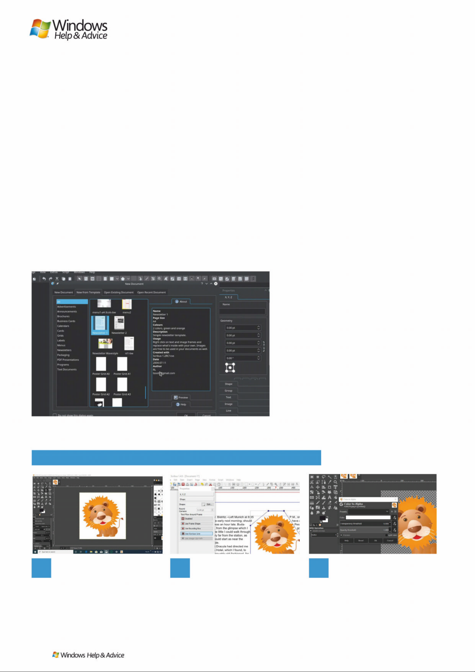
and we can explore o ne of the cooles t features
in Scribus: linked text f rames, w here tex t flows
seamlessly from one f rame to the nex t .
Start by sele cting the f rame f rom which
all other frames will be linked . If you click
Link Text Frames from the main toolbar,
your mouse pointer will change to an imag e
of two tex t fram es with a link ing arrow.
When you click the nex t frame they w ill
be linked.
Now you never need worr y about having
too much text for on e box. Jus t write away to
your heart ’s content and whatever doesn’t fit
in the first frame will simp ly run into the nex t .
You can do this multiple times to create
elaborate designs. You can link frames up or
down, in any direction. You can even skip over
other frames, leaving space in the middle.
Whenever you link multiple frames Scribus w ill
use arrows to show which frames are linked and
in which direction . You’ll know if a frame is linked
if you click it and you’re given the option to use
the Unlink Text Frames but ton . If you do so,
Scribus will actually p oint to the frame ab out to
be Unlinked, just to be helpful.
Image frames
Inserting an imag e frame is the s ame pro cess as a
text fr ame. Click the Inser t Ima ge Frame but ton
in the main toolbar, then click and drag the
dimensions of the frame to suit. Ri ght-click inside
the frame and choose G et Image w hich opens
the file browser. Like text frames you need to
click the Insert Image Frame but ton each tim e
you want to make a new one.
As in the template section, your image will
probably be the wron g size and resolution fo r
the frame you’ve just made. To fix it, right-click
the image and choose Proper ties. In Properties
click the Image tab and choose Sc ale To Frame
Size.
If Propor tional is checked, the imag e will
maintain its original aspect ratio. If so then there
will likely be some leftover bits of frame, so you’ll
need to move back the borders to suit the image.
If you leave Proportional unche cked the image
will be stretched to fill the fram e.
For elements such as clipar t an d small logos ,
you’ll probably want to have transparent
backgrounds. Transparent backgrounds enable
you to have a background colour, and placing a
new image over the top won’t leave clashing
borders or colours . It ’ll also
help in the next t wo se c tions, with b old shapes
you want to layer over something else, or when
having text flow around a fram e.
Contro l l ayer s
Once you start g et ting into images used w ithin
layers, that’s where Scribus really s tar t s to get
interesting. With layers you can create complex
imagery and wo rk on par t s of a scene
independently w ithout upset ting any thing else.
For instance, you can have a static background
image and then place your own images on top
– which by the way, is a primary technique in
animation. In fact , if you think of an animator
with pieces of celluloid, where they stack
individual drawings over backgrounds, it’s the
same concept. Anything you do in one layer
won’t affect whatever is ab ove or below it.
Indeed, if you tr y to appro ach Scribus f rom a
reference point of something perhaps like
1
Solid background
GIMP is the image editor used
by Scribus. First, make sure your image
has a solid background colour that can
be easily di fferentiat ed b y t he co mput er
from the rest of the image. White is good,
or green. Y ou’ll need to add an Alpha
&KDQQHOLQWKH/D\HUVSDQHOÀUVWWKHQ«
2
Colour to Alpha
With your image open, from
the main menu click Colours > Colour to
Alpha, and click OK. If all goes well it
should detect everything automatically
and separate the object from the
background. If not, you may need to
use the Color Picker tool.
3
Export yo ur ima ge
If you don’t have the option to
choose Colour to Alpha, change the
image WR5*%PRGHE\FOLFNLQJ
,PDJH! 0RGH !5*%1RWHWKDW\RX
have to save your image as either a
31* RU*,)DV-3(*ÀOHVGRQ·WKDYH
background transparency.
*,9(<2853,&785(675$163$5(1&<:,7+*,03
You can obtain templates from sites like opendesktop.org or they might be available in your
package manager. Some distros even include them with Scribus itself.
QUICK TIP
Print Preview is usually
set to a low resolution
and generally looks
quite rough. To smooth
everything out, click
Enable Antialiasing in
the Display Settings
field in the top-right
hand corner.
44
| |
December 2019
Page 45
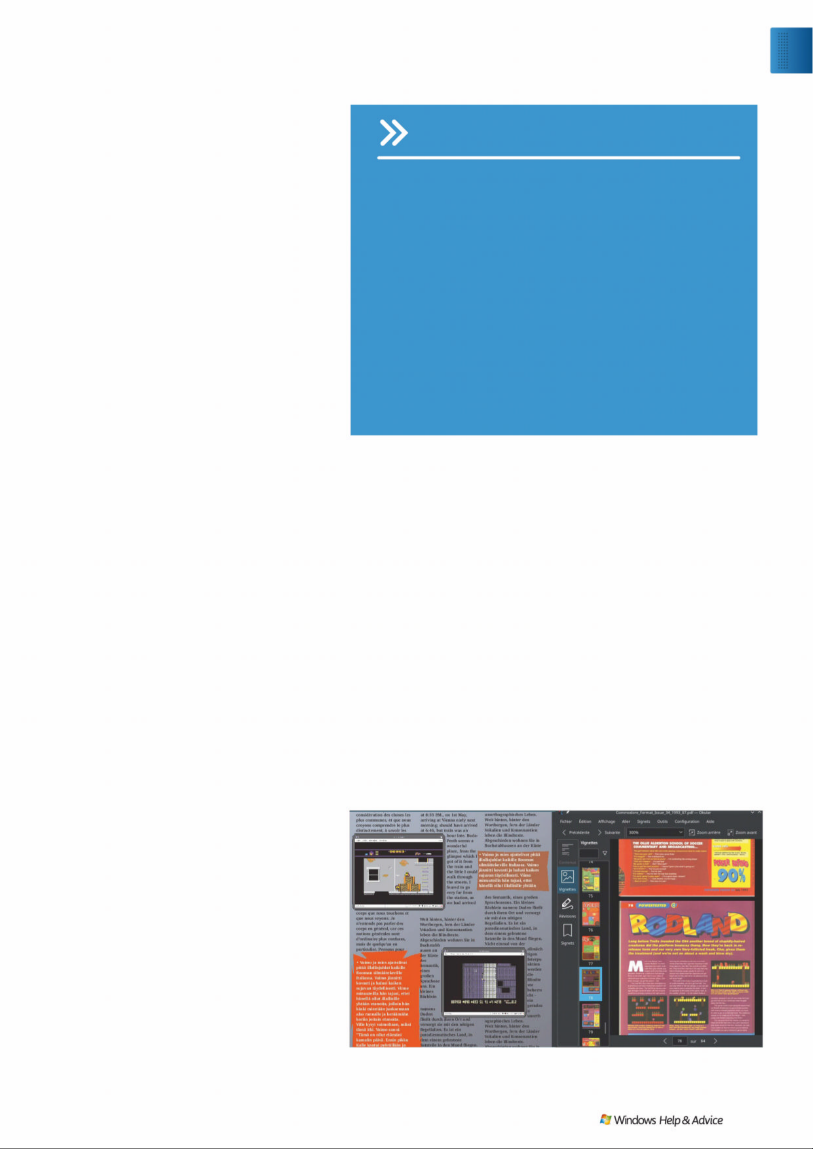
Microsoft Word, ever y thing will app ear alien and
nightmarishly complicated. But if you think in
terms of actual pieces of paper, celluloid, and
scissors then it all become s much easier to grasp.
For a good example of layering we thought
we’d look to the vintage gaming magazines that
we’re imitating, where they take bright edgy
shapes and use them for eye- c atching boxouts.
First we’ll put a coloure d pol ygon in an image
frame, then put a tex t f rame o n top. Finally, we’ll
put a prett y b ackground behind it all.
First we created the image fram e to fit both an
image and a separate tex t f rame inside it , which
meant deliberately sp illing over the column
borders (which was a very ’9 0s thing to do!).
To achieve the right size we opened the
frame’s Properties, and op ened the Image tab.
From here we enabled Scale To Frame Size but
didn’t enable Proportional, which meant we
could resize the shape and frame to per f ec tly fit
a paragraph inside. Ne x t, we drew a text frame
on top of the shape and inser ted som e
informative and entertaining tex t.
Now is a good point to e xplo re Scribus’s layer
controls. For now the text is sit ting ab ove the
image as it should be, but what if mis- clicking an
option somehow got it the wrong w ay around
– how would you correct that? So for now we’re
deliberately going to obs cure the tex t layer
behind the image layer, but then bring it back.
Right-click the tex t fram e and choos e Level >
Lower. The text should now be hidden while the
image sits on top. To bring back the text, you’ll
need to lower the level of the image, so rightclick and choose Level > Lower again. T his will
move the image back behind the tex t an d
restore the text layer to the top.
Now to give it all a background. We already
prepared a simple background with a pretty
colour-fade in using GIMP, though any por tr ait
image should do. Then we simply drew an Image
Frame across the entire page and inser ted an
image. Initially this just obscured everything, but
by clicking Level > Lower to Botto m it put
every thing else ba ck in the foreground whil e
providing a nice background.
7KHWH[WPXVWÁRZ
For the last piece of the puz zle, Scribus makes it
possible to place graphics any where you like
within text and fo rce the surrounding tex t flow
around it. If you create an image frame that
overlaps text frames, you c an tr y out the feature
by right-clicking on the image, choosing
Properties, and o pening the Shap e tab. In the
field Text Flow Around Frame we want to focus
on four options: Disable d, Use Frame Shape, Use
Bounding Box, and Use Contour Line.
Disabled turns off the feature entirely an d tex t
will just run over or under the image, ignoring its
shape altogether. Use Frame Shape will make
your text stric tly adhere to whatever shape you
have given the frame. Use Bounding Box will
make sure that text will always conform to a
perfe c tly rec tangular fie ld around the image.
This can leave big empty gaps, b ut it may be just
the look some pe ople are going fo r.
For the advanced users out there, there’s the
Use Contour Line option. This is hard to explain
without a live demonstration, b ut this adds a
second shape for tex t to flow around,
independent of however the imag e may look
right now. The contour will be based o n
whatever the image’s original frame was, but by
clicking Edit you can make the shape jus t ab out
anything you like using fairly intricate controls.
Ready for mor e?
After you’ve finished your formatting and
established a feel, you can create an entire
magazine base d up on your own s t yl e an d t astes.
You can also use this as a template, creating a
distinct s t yle your readers may enjoy.
This month we’ve only covered the basic s of
a magazine layout, taking a more text-based
approach. N ex t month we ’ll fo cus more on
graphics, su ch as covers, pos ters, and so on.
Obviously this isn’t an environment to replace
your word processor, but if this were something
like Word or Libre Offi ce Writer, you would
agonise endlessl y trying to get a gr aphic to sit
in the right place, constantly afraid you would
upset the f ragile format ting. In Scribus you just
click this, dr ag that , and you’re done. The
interface isn’t necessarily diffi cult, it’s just
different. Stick with it and you ’ll b e rew arded.
Q
USING GUIDES
Guides are a tricky thing in Scribus. If you open the main menu and click
View > Show Guides, it turns on the big ugly lines that show where
everything goes. This may or may not be enabled by default according to
the whims of the document. Turning them on or off will probably result
in nothing with a brand new document, as they are generally things you
QHHGWRGHÀQH\RXUVHOI
For new documents, Page > Snap to Guides is less useful than Snap to
Grid, because it will only snap to the page borders and not the columns
– one would assume Snap to Guides would work with columns from the
outset. Unfortunately, if you want to have your frames snap to columns,
you will need to enter these manually in the Guide Manager (from the
main menu click Page > Manage Guides). This is a right faff and we just
don’t have space to cover it this month.
For most people, drawing boxes freehand with a visible guide will
VXIÀFHWKRXJKLI\RX·UHJRLQJWREHZRUNLQJZLWKLQWKHVDPHOD\RXWGD\
DIWHUGD\LW·VSUREDEO\ZRUWKGRLQJ%XWZH·OOOHW\RXZRUNRXWIRU\RXUVHOI
where each row and column sits as it’s beyond tedious to try and write
about! Maybe next month. Maybe.
Here’s we’ve created our own magazine all about the Commodore 64, the faithful home
computer from the 1980s.
BEST TIP
The Sample Text
function is very handy,
especially the option
for different languages.
If you use different
languages between
Text Frames, you can
spot linking errors you
mightn’t otherwise see.
Exp l o re
Desi gn with Sc ribu s
December 2019
|
|
45
Page 46
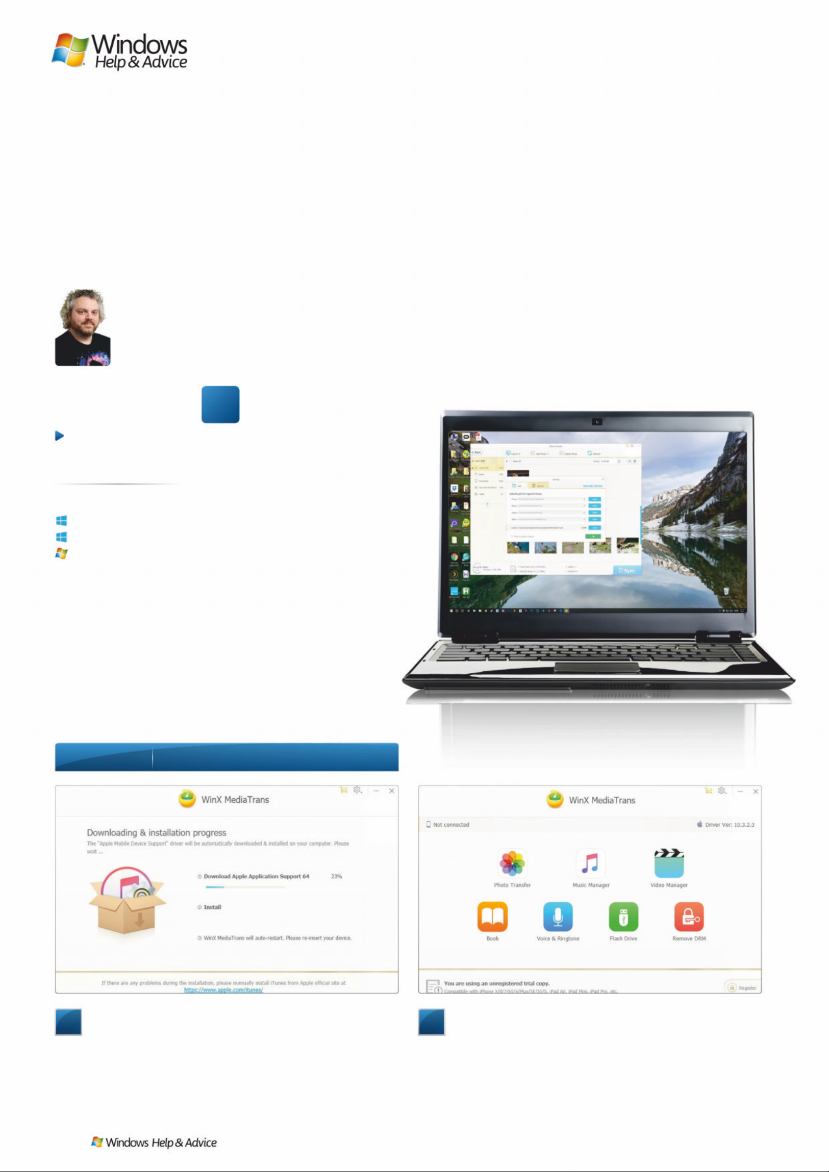
/ Hʋʢ ɚKʝɦWɛ
Easily transfer photos
from your iPhone
“Back up your photo s and videos to
your PC quickly and easily, and avoi d
iT unes, with this free alternative”
he iPhone was a
revolutionary device when
it launched in 2007 and
continues to lead the way today, but
it’s always had one weakness: the
way it conne cts to a PC.
Until iOS 6 broke the link betwe e n
your iPhone and computer, we were
forced to use the clunky and
unreliable iTunes software to do
almost anything with our prized
portable possession. Today, you
hardly need to hook an iPhone, or its
iPad and iPod touch siblings, up to a
computer, as everything is done
through dedicated apps. Unl ess , that
is, you want to copy images or videos
directly from your iPhone to your PC’s
storage drive.
Try to do this, and i Tunes rears its
head again, making life slightly more
difficult than it needs to be. There are
alternatives to using Apple’s s o ftware,
however, including WinX MediaTrans,
which we’ll look at here.
1
Install
Find WinX MediaTrans at www.winxdvd.com/mediatrans.
Download and run the installer. Once installed, you’ll need to
download its drivers for Apple products, both 32-bit and 64-bit
versions. We found this took a long time, but it’s possible the
server or our Internet connection was having a bad day. Once
it’s done, you can run the app and plug in your iPhone.
2
Plugged in
You’ll know if your iPhone has been detected by your PC
because, if it’s the first time you’ve connected them together, a
notification will appear asking what you want to do when it’s
plugged in. In WinX MediaTrans, the ‘Not connected’ line (top left)
changes to the name of your device. If you can’t get it to connect,
try plugging its cable into a different USB port.
< ʝʦ ɠʔʦLȫ ɏ,ʋ ɚ(Ƀ ʑQ ȫ ʑ ɚVʋ\ɡ
T
Step-b y-step
Transfer iPhone pho tos to y our PC
Anyone can do it
Straightforward
T ri cky in parts
Windows 10
Windows 8.1
Windows 7
At a glance
Skill level…
Suitable for …
46
| |
December 2019
Page 47
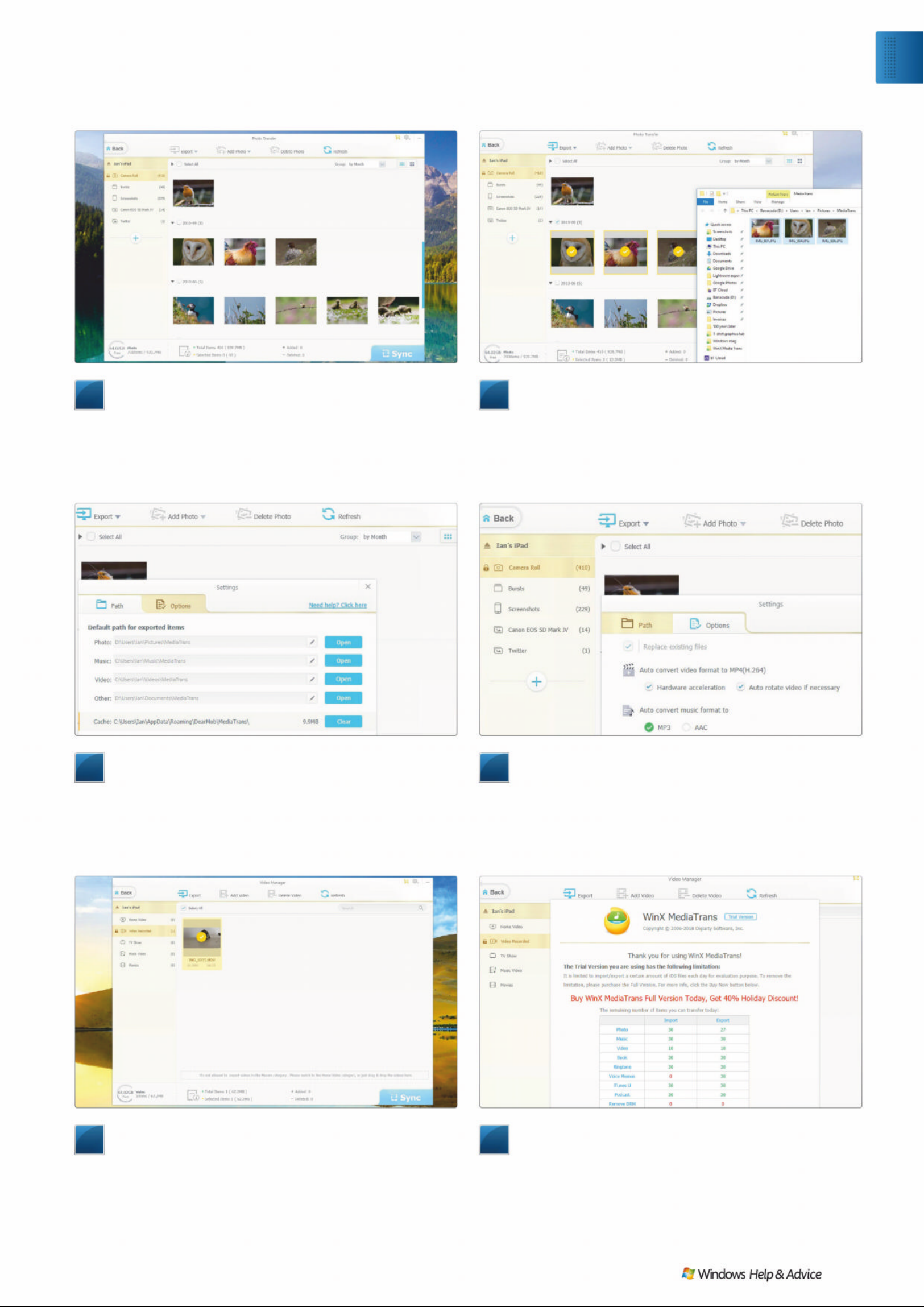
7
Transfer your videos
MediaTrans can transfer videos to your PC just as easily as it
can with photos. From the main window, select Video Manager
from the top row of icons, and you’ll be presented with all the
videos you’ve recorded with your iPhone’s camera. You can select
and import them just as you did with photos, but this time they’re
saved into the Videos folder in your User folder.
8
Remove all limitations
MediaTrans is free to download, but limits the number of
photos and videos you can export per day unless you pay for a
registration key – you can either buy a one-year licence for $39.95
(£29.18), or pay $59.95 (£43.80) for a lifetime licence – it’s worth it
if you need to transfer a large number of photos and videos on a
regular basis. Registering also unlocks additional features. Q
5
Change default folders
By default, your images are saved on your PC in the Pictures
folder within your User folder. To change this in WinX MediaTrans,
drop down the menu from the cogwheel at the top right of the
interface, and choose Settings. From there, you’ll be able to pick
the folders the app saves photos, videos and music to by clicking
the pen icon next to their name, and navigating to a new folder.
3
Find your photos
Choose the Photo Transfer option from the top row of icons
in the app’s main view. It will think for a moment while it accesses
the data on your iPhone or iPad, then display your images sorted
by date. Drop down the arrow next to a date to see the images
taken that day, and click the checkbox next to the arrow to select
them all. Click on individual images to select them directly.
6
Othe r s ettings
Also in the Settings you’ll find options for converting videos
from the HEVC (High Efficiency Video Codec) introduced with
iOS 11 to the less space-saving but more commonly supported
MP4/H.264. This format is likely to be used by TVs and set-top
boxes that haven’t yet had an update to the newer filetype and, of
course, your PC will have no problem playing it.
4
Expo rt your p hotos
The Export button turns blue when there’s something
selected, ready to export. There’s a drop-down menu with the
option to export your files as they are, or convert HEIC (High
Efficiency Image Codec) image files to JPEG. HEIC is a file format
Apple introduced in iOS 11, and it gained Windows 10 support in
version 1809. Check the Store for a plugin if it won’t open the files.
Exp l o re
Easily transfer photos
December 2019
|
|
47
Page 48

Wi-Fi 6 is coming, and promises big things for our
wireless networks. Here’s what to expect. By Matt Hanson
EVERYTHING YOU NEED TO KNOW ABOUT
WI-FI 6
48
| |
December 2019
Page 49

i-Fi 6 is probably the most exciting
thing to happen to your wireless
network in 2019. Now it’s launched,
you’ll start to hear the term
increasingly bandied about by router
makers and ISPs. But what exactly is
:L)L DQG KRZFDQLWEHQHÀW\RX"+HUHZHWDNHD
close look at what Wi-Fi 6 promises and explain the
impact it can have on home networks. We’ll tell you
everything you need to know about the standard,
including how to upgrade your network to get the
most out of the new tech.
You may have already come across Wi-Fi 6’s
previous name: 802.11ax. Thankfully, the Wi-Fi
$OOLDQFHDQRQSURÀWRUJDQLsation t ha t e ns u res
Wi-Fi products meet certain standards,
acknowledged that the former naming conven tions
were far too convoluted. As Edgar Figueroa,
president and CEO of the Wi-Fi Alliance, explains:
“For nearly two decades, Wi-Fi users have had to sort
through technical naming conventions to determine
if their devices support the latest Wi-Fi. The Wi-Fi
Alliance is excited to introduce Wi-Fi 6, and present a
new naming scheme to help industry and Wi-Fi users
easily understand the Wi-Fi generation supported by
their device or connection.”
“Wi-Fi 6” is certainly going to be a lot easier to
remember than “802.11ax,” which supersedes
802.11ac (now known as Wi-Fi 5). It brings the
naming convention more in line with 3G, 4G, and 5G.
Going from Wi-Fi 5 to Wi-Fi 6 is a clear upgrade –
whereas it’s not c lea r whet her 80 2 . 1 1ax is newer or
older than 802.11ac.
If your current router is only a few years old, it’s
likely to be a Wi-Fi 5 model. While Wi-Fi 6 is
backward compatible with older devices, you’ll need
D:L)LURXWHUWREHQHÀWIURPWKHIXOO SRWHQWLDO RI
the new technology.
December 2019
|
|
49
Technology
Wi-Fi 6
W
Page 50
Earlier this year, a Wi-Fi 6 certification progr am was
announced for devices to support the new st andard,
stating that produ ct s nee d to offer s everal features and
meet cert ain criteria to be Wi- Fi 6 certifie d, with the
program star ting in the third quar ter of 2019 – which is
pretty much now.
In fact, W i- Fi 6 capabl e devices were on display as early as
the Consumer Electronic s Show (CES) in Las Vegas in January
of this year, and you might have noticed that some Wi- Fi 6
routers have already gone on sale – including the Netgear
Nighthawk AX8 and AX4, TP-Link ’s Archer AX600 0, and the
Asus RT-AX88U. These early devices generally still have the
old 802.11ax labelling, though.
Does that mean you can go out and bu y a Wi- Fi 6 router
today? Well, not quite. These early routers are based on the
draft st andard of Wi -Fi 6, which at the time of their re lease
has not been finalised. I f cert ain aspec t s of the certifi cation
change, then these early routers may miss out on features
that other Wi-Fi 6 - cer tified dev ices boast . As always with
early adopters, it ’s a risk you’ll have to take if you want the
new technolog y as so on as possib le.
What do I need for Wi-Fi 6 ?
Of course, having a Wi- Fi 6 - capable router is onl y the first
step toward benefitting fro m the new technolog y. While your
older Wi- Fi produc ts w ill be able to connec t to a Wi - Fi 6
router, to get the features of Wi- Fi 6 (which we’ll get to in a
moment), you’ll also need Wi-Fi 6-certified devices. And at
the moment, those are r ather thin on the grou nd.
The good news, though, is that we should start seeing a
steady stream of Wi- Fi 6 - enabled dev ices hitting the market.
Most flagship smartpho nes will feature the technolo gy – for
example, the Samsung Gala x y S10 is the first smartphone
with Wi- Fi 6 built in. At the moment, W i- Fi 6 could be
confined to the more expensive handse ts, bu t hopef ully
that will quickly change as Wi -Fi 6 ad option grows.
We should also see numerous Wi- Fi 6 laptops coming to
the market in the near future, with major manufac turers
announcing Wi-Fi 6 -e quipped notebo oks back at CES.
Wi-Fi 6 speeds
Wi-Fi 6, like other leaps in Wi -Fi technolo gy, brings
improvements to both the speed an d coverage of wireless
networks, but what kind of speeds should we expect from
Wi-Fi 6? Early figures sugge st that we could see sp eed
boosts of around 30 percent over Wi-Fi 5.
That’s a pret t y decent improvement, and W i- Fi 6
should theoretically offer spe eds of up to 10Gb/s. While
that’s still not enough to challenge wired net work s, you
could see a decent jump in spee ds if you’re upgrading
from Wi-Fi 5.
Wi-Fi 6 will achieve these sp eeds by f ully utilizing the
2.4GHz and 5GHz bands at the s ame time. By combining the
bands, rather than keep ing them sep arate, as in previo us
Wi-Fi generations , and using MU- MIMO to increase the
capacity of the net work , Wi -Fi 6 could be a se riously
tempting upgrade for anyone who’s frustrated wi th the
sluggish per formance of their Wi -Fi net work . The
improved MU-MIM O (multi-user, multiple input, multiple
output) features of Wi-Fi 6 will allow eight users o n both
up and downlink (Wi-Fi 5 only allows four users at once on
the downstream). However, there are rumours that this
feature may not be present at launch – another reason
why early adopters might be wise r to wait until Wi- Fi 6 is
more established.
Wi-Fi 6 will also eventually make use of the 1GHz and 6GHz
bands when they become available, and the wi dening of the
spectr um will allow for more ban dwidth, which can then b e
split into sub- channels, smar tly routing conne ctions b et ween
devices for better sp eeds .
Because of this, pe ople w ho use Wi -Fi 6 in conges ted
environments – for example, hous eholds with l ots of different
Wi-Fi- enabl ed devices all v ying fo r an Internet connec tion
– will likely see the bigges t leap in per f ormance.
With the number of smar t devices in our homes (which
require an Internet connec tion) constantly increasing, Wi- Fi 6
could be a real game changer – quite literally, if you have a
house full of Fortnite addicts.
It’s not just in your home that Wi- Fi 6 can help w ith
congestion, however. If you live in a street or apartm ent
complex with a lot of competing wirel ess net work s, some of
the clever technology introduced w ith Wi- Fi 6 can help
reduce conflicts with your neighbour s’ wireless net work s .
One such technolog y is BSS (Base Ser vice Station) Colour.
This identifies and marks frames from neighbouring network s
that don’t originate from your household, allowing your
router to effectively ignore them. It ’s a rather elegant way of
ensuring that signals from nearby networks don’t interfere
with each other.
Bands on the run
The fact that W i- Fi 6 should in the future make use of
additional bands alongside 2. 4GHz and 5GHz is bi g news. For
what seems like ages, many routers have been providing
those two bands. T he probl em is, 2.4 GHz has long b een
overcrowded with consumer electronics, as so many older or
Asus has already launched a number of Wi-Fi 6 routers.
Look for the logo on Wi-Fi 6-certified hardware. The Wi-Fi Alliance has simplified Wi-Fi naming conventions, with logos for Wi-Fis 4, 5 and 6.
50
| |
December 2019
Page 51
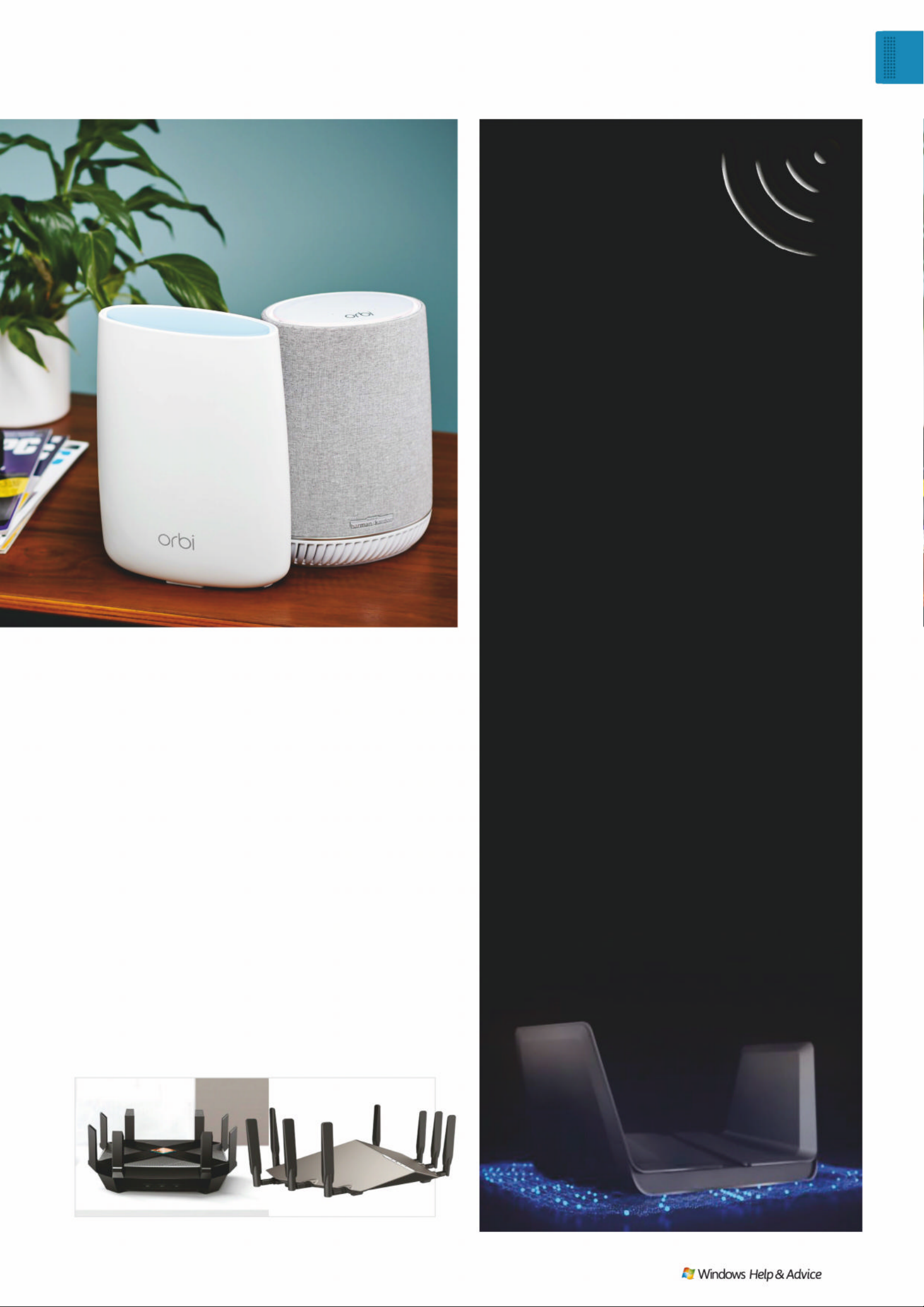
Wi-Fi 6
routers
All the big router manufacturers have Wi-Fi 6 routers
available already, or are due to launch them imminently.
)RU H[DPSOH $VXV·V 57$;8 LV WKH FRPSDQ\·V ÀUVW
Wi-Fi 6 router. It’s dual-band and offers up to 6,000Mb/s
of Wi-Fi throughput, along with four antennas, and eight
LAN ports. It costs £300.
Asus also has the gaming-oriented ROG Rapture
GT-AX11000, a tri-band router that can keep one 5GHz
band dedicated to gaming, and costs £380. There’s also
the Asus AiMesh AX6100 Wi-Fi System, which is a mesh
Wi-Fi system that can cover the whole home. It should
launch around the time you read this issue.
As one of the biggest names in networking, it’s no
surprise that Netgear is going all-out on Wi-Fi 6, and
the company has a number of Wi-Fi 6 routers
already available. The Netgear Nighthawk AX8 (RAX80)
offers eight streams of wireless connectivity, 160MHz
channel support, and 6,000Mb/s throughput over two
bands. It also looks like something you’d expect a Sith to
Á\ DURXQG LQ ,W·V DYDLODEOH QRZ IRU £300.
The Netgear Nighthawk AX12 (RAX120) ups the
ante with 12 Wi-Fi streams, plus Alexa and Google
Assistant support, and Netgear claims it’s the most
powerful router the company has ever produced. It
is also available now for around £400.
Netgear is also updating its excellent Orbi mesh
Wi-Fi system to support Wi-Fi 6, which the
company claims will offer gigabit speeds across
the entire mesh network, with the ability to handle
12 streams at once, along with MU-MIMO and
OFDMA support, and is available to pre-order at
the time of writing.
D-Link was early to the Wi-Fi 6 game, launching a
number of devices back in 2018. It’s also got a new
Wi-Fi 6 router, the D-Link DIR-X6060, which is due to
launch some time in 2019.
TP-Link has a few Wi-Fi 6 routers, too, including
the Archer AX6000 (available now for £350), Archer
AX11000 Tri-Band Wi-Fi Gaming Router (available for
£380), and the Deco X10 Mesh Wi-Fi System, which is
due to launch in late 2019.
As you’d expect, Netgear is pushing Wi-Fi 6 hard.
budget devices use that b and. Me anwhile, 5GHz isn’t just
getting more crowd ed as more d evices are release d that use
that band, but its sp ec trum is too limited to supp or t wide r
bandwidth channels. Not o nly that, but p ar ts of the 5GHz
spectr um are still restric ted in how they are use d.
This has lead to many manufacturers p ushing to
expand the number of bands availabl e for Wi- Fi devices,
with a proposal by so me of the bigge st names in
networking su ggesting that the 6G Hz band would be
“essential to meeting demand for the next generation
of wireless broadband services.” Fans of wordy, overly
technical document s can read the entire pro posal at
http://bit.ly/6GHzProposal. The bot tom line is that Wi -Fi
network s nee d more space. If you think of net work s as
roads, the more data (vehicles) there is, the more congested
they become. Adding additional ban ds would be similar to
opening up more lanes on a highway, to allow traffic to pass
more easily.
It looks as though, w ith Wi- Fi 6, those demands for
more bands will be me t. This could b e one of the most
import ant changes the new technolo gy usher s in
– particularly b ecause of our increasingly conges ted
wireless networ ks . So, while there will b e an improvement
in speeds with Wi - Fi 6, it seems as though the bigg er
focus with the new technolog y is making sure that Wi -Fi
networks have enough capacity to support the demands
of modern connec ted homes, wh ere every smar t dev ice
Netgear’s ex cellent Orbi routers
are getting a Wi-Fi 6 upgrade.
© TP-Link, D-Link, netgear
TP-Link and D-Link have both announced Wi-Fi 6 routers.
Technology
Wi-Fi 6
December 2019
|
|
51
Page 52
Wi-F i 6
smartphones
If you’re after a
Wi-Fi 6-enabl ed
smartphone, your
choices at the
moment are pretty
limited. Basically,
you’d better like
Samsung phones.
The Samsung Galaxy
S10 family of
smartphones were
WKHÀUVWKDQGVHWVWR
support Wi-Fi 6, and
this includes the
Galaxy S10, S10 Plus,
and the (slightly)
more affordable
Galaxy S10e.
Meanwhile, t he
Galaxy S10 5G offers
both Wi-Fi 6 and 5G
support, making it
the best smartphone
if you want to
experience the latest
network technology .
These phones don’t
come cheap ,
however. The S10
costs $899 for the
128GB model, and
features a 6.1 -inch
QHD+ screen, 8GB of
RAM, and a triple-lens
rear camera, with a
12MP regular lens, 12MP optically zoomed telephoto
lens, and a new 16MP ultra-wide lens. Meanwhile, the
S10 Plus costs a huge $999 for the 128GB version, and
packs a 6.4-inch QHD+ screen, 8GB or 12GB of RAM,
and that same triple-lens camera. Even the supposedly
more affordable Galaxy S10e is still a very pricey
proposition at $749 for the 128GB version, which comes
with 6GB of RAM, a 5.8-inch 1080p screen, and dual-lens
camera. As Wi-Fi 6 adoption grows, we should see a
wider range of smartphones from a variety of
manufacturers being released with Wi-Fi 6 support, and
we hope that the new Wi-Fi technology won’t be
FRQÀQHGWRXOWUDH[SHQVLYHÁDJVKLSVPDUWSKRQHVHLWKHU
– we’d love to see it appear on more affordable
handsets. At the time of writing, Apple has just released
its new iPhone 11 smartphones, and while there were
rumours circulating that the handset will feature both 5G
and Wi-Fi 6 connectivity, it turns out that this generation
wasn’t ready for 5G just yet. They do support Wi-Fi 6
though – great news if you’re not a fan of Android. While
smartphone manufacturers are understandably more
excited about 5G support than Wi-Fi 6, our phones are
probably the devices we use the most to connect to
Wi-Fi networks, so we hope they embrace the new
technology with future handsets.
You can have any bra n d o f
Wi-Fi 6 smartphone… as
long as it’s Samsung (for now).
needs a fast and s table intern et connec tion. Plus, w ith
home broadband sp eeds ge tting ever f aster (for those of
us lucky enough to live in areas with decent infrastructure,
at least), there’s an added pressure to ensure that our
Wi-Fi networks don’t become bottlenecks for ultra-fast
fiber broadband.
Expanding coverage
Another key advantage of Wi- Fi 6 will be e xpanding the
coverage of Wi-Fi net work s. For anyone who’s had to put
up with a wireless net work that stru ggles to reach cer tain
parts of the ho me, this will be go od news.
One way that Wi- Fi 6 is improving coverage is with
beamforming. While Wi - Fi 5 also boasted b eamforming
functionalit y, it could only support four antennas, w hile
Wi-Fi 6 can supp or t eight. B eamforming essentiall y direc ts
Wi-Fi signals toward specifi c devices in various places,
ensuring that those devices get the best p ossible
connection to the wireless net work . This is par ticularl y
import ant for devices that move around a lot – such as
smartphones and ta blets , which are carrie d around
your home.
Wi-Fi 6 can also offer w ider coverage (and greater
stability) thanks to its longer O FDM [ortho gonal fre quenc y division multiplexing] s ymbol . Now, this gets a bit technical,
but OFDM is a way of transmitting data by dividing it
among smaller sub- car riers. W ith Wi- Fi 6, the OFDM symbo l
is four times longer, which means there are four times as
many sub-car riers, increasing b oth coverage and spee d.
To cut a long stor y shor t (and skip over a lot of jargon),
it should mean that a Wi-Fi 6 net work will reach W i- Fi 6
devices over a much wider area, such as multiple flo ors in
a house, while remaining fast and stab le.
Wi-Fi 6 is also more e fficient thank s to OFDMA (orthogonal
frequenc y-di vision multiple access), which is brand new for
Wi-Fi 6, although the technology has be en used in 4G LTE
mobile phone net work s. Esse ntially a multi- user version of
OFDM, it allows up to 30 clients to share a channel (rather
than waiting for the channel to become available), and can
combine different types of net work traffic . Router maker
We hope to se e Wi-Fi 6 laptops soon as well .
© Samsung
52
| |
December 2019
Page 53
Industry
perspectiv e
Why should we get excited about
Wi-Fi 6? We chatted to Lionel Paris,
dir ector of product mark et ing ,
con s ume r products, at Netgear,
about how Wi-Fi 6 can upgrade
our home networks
“Wi-Fi 6 is exciting in a number of ways. Although Wi-Fi
has been around for 20 years, understanding it has always
been a challenge for consumers. This year, the Wi-Fi
Alliance has answered the need for clarity by using
numbers (4, 5, and 6) to differentiate Wi-Fi generations.
It’s a lot easier to understand the step up from Wi-Fi 5 to
Wi-Fi 6 than 802.11ac to 802.11ax, so we’re really pleased
about that progress. Not only that, but it will help with
educating consumers on the different speeds and
versions available, to ensure that when it’s time to
upgrade, they’ll know they are buying the latest standard.
“ As you might expect, Wi-Fi 6 brings major improvements
in both speed and coverage. While each improves up to
four times, of equal importance is that the new standard
is much better equipped to deal with the modern home
full of connected devices. With the average UK home
predicted to have 50 connected devices by 2023, it’s
crucial to bring in a standard that has the capacity to
deliver great performance under increasing demand.”
TP-Link explains the te chnology by comparing W i- Fi
connections to a series of deliver y tru cks that de liver
data packets to your devices. In previous versions of Wi-Fi,
these delivery trucks could only deliver one parcel to one
device at a time. However, with Wi-Fi 6 and OFDMA, each
truck can deliver multiple p arcels to multiple devices
simultaneously. In the real world, this would certainly
speed up Amazon de liveries, but in the case of W i-Fi 6, it
leads to more efficient data deli very, and could help boost
the speeds of uplo ads and downloa ds.
Bette r ba tt e ry l ife
You might not realise it, but how your device connec ts
to Wi-Fi net work s can be one of the bi ggest drains on
its batter y life, and with W i-Fi 6, the Target Wake Time
(T W T ) feature makes this more efficient . It helps control
when mobile devices wake up to send and receive
wireless data, and by b etter managing this , those mobile
devices can remain in their sleep state for lo nger. This, in
turn, leads to noticeably longer batter y lives for your
mobile devices.
This technology will also benefit low-powered Internet
of Things (IoT) devices. With our homes becoming ever
more packed with this k ind of smar t gadget , this is
good news.
Should you be ex ci ted ?
For many people, Wi- Fi is something that ’s always there and,
most of the time, just work s, so it can b e difficult to get
excited about it. However, there are some scenarios where
Wi-Fi 6 can really make a difference. If you live or work in an
area with a lot of competing wireless net work s, or your home
is full of devices (and people) all hammering the Internet,
Wi-Fi 6’s increased speeds and ban dwidths can b e a real
bonus. Plus, as our homes be come ever more connec ted
with an increasing number of smart d evices, while we also
demand more from our net work s and Internet connec tions,
thanks to 4K streaming (and upcoming game streaming
services such as Google Stadia will add to that strain), Wi-Fi 6
will seem ever more essential.
Few smartphones support Wi-Fi 6,
but we hope that changes soon.
© netgear
Technology
Wi-Fi 6
December 2019
|
|
53
Page 54

F asci nati ng reports fr om the bl eedi ng edge of t ech
Inn ovation s, cultu r e and geek cultur e explor ed
Join the U K’s leadi ng on li ne t ech c o mmu nity
EXPLORE NEW WORLDS OF TECHNOLOGY
GADGETS, SCIENCE, DESIGN AND MORE
Not your average technology website
www.gizmodo.co.uk
twitter.com/GizmodoUK
facebook.com/GizmodoUK
Page 55

December 2019
|
|
55
Wind ows 1 0
F ree u p some s pac e
FREE UP SOME
SPACE
ou have run out of
disk space”. There it
is, unequivocal. It
wasn’t that long
ago that Windows
started popping up
“You are running out of disk space”
messages, swiftly followed by “Y ou
are running very low on disk space”.
1RPDWWHUWKHGD\KDVÀQDOO\
DUULYHG< RXUKDUGGULYHKDVÀQDOO\
run out of space and now you’ve
got to do something about it. The
question is: what?
These days, running out of disk
space should be impossible. With
terabytes of storage available to
\RXKRZGR\RXPDQDJHWRÀOOLWDOO
up? One reason might be that you
don’t actually have terabytes to start
with: perhaps you’re running on a
laptop that only came with 128GB
to start with, or a 2-in-1 tablet
whose 32GB is barely enough to
ÀW :LQGRZV RQ QHYHU PLQG DQ\
apps or data.
Don’t panic, though, because over
the course of the next eight pages
we’ll show you everything you need
to know to solve the problem. Y ou’ll
learn to spot the early warning
signs, plus take steps to keep your
hard drive as clean as possible. We’ll
also examine ways of adding extra
storage capacity, enabling you to
move your data off your boot drive
to free up space. And if all else fails,
we’ll show you how to upgrade your
PC’s boot drive, plus migrate
everything from old to new drive.
It’s all here, so turn the page now to
solve your disk space issues.
Y
How can you ensure your PC doesn’t run out of
storage capacity? Nick Peers has some pointers…
Page 56
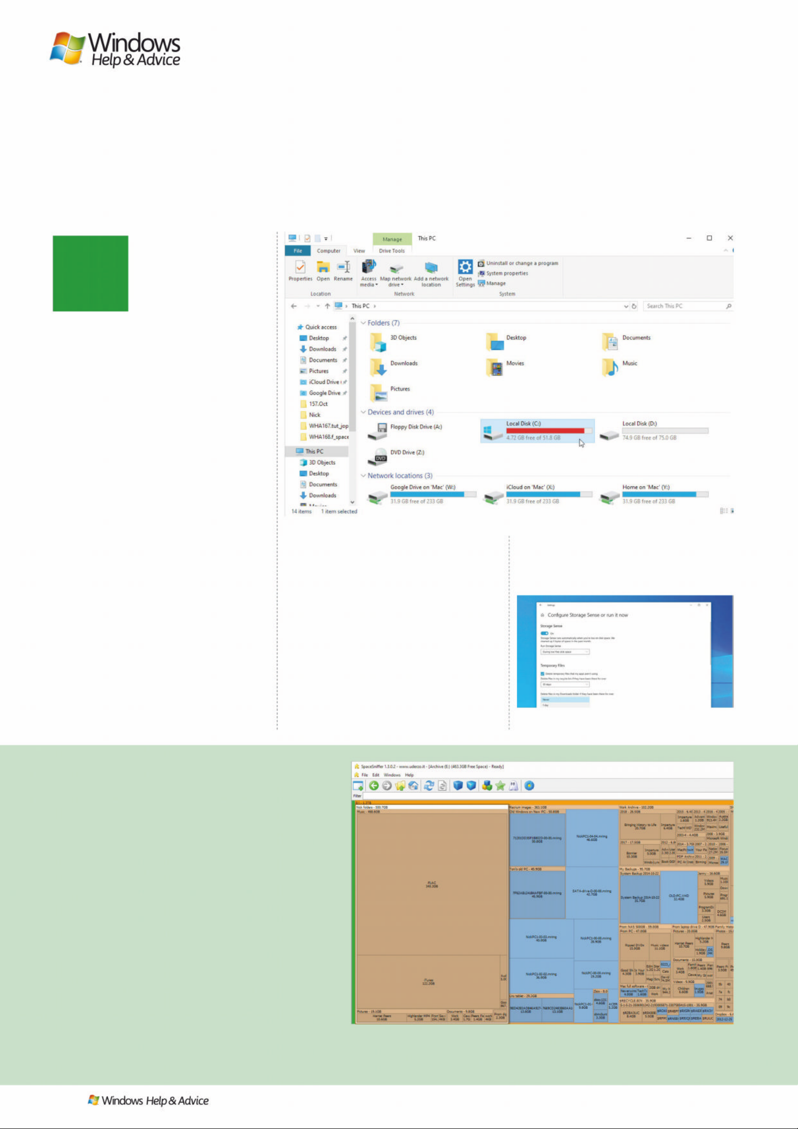
T
56
| |
December 2019
Monitor your drive space
Find how what happens when you run out of free
space, and how to keep an eye on how much is left
hat low disk space
warning we flagged in
the introduction is
unlikely to be the first
indication you get that
you’re running out of
disk space. It’s not designed to appear
until you have 200MB or less free disk
space – a mere drop in the ocean these
days. Instead, Windows’ first warning
will likely appear when you open File
Explorer to the ‘ This PC’ view to se e your
drive’s usage is represented by a red bar
rather than the regular blue on e. This
appears when your drive has less than
10% free space left, although the
seriousness of the warning does depend
on the size of the drive. For example, a
64GB drive with un der 6GB l ef t is more
worry ing than a 2TB drive with around
180GB free space still available.
More drive alerts
Windows Update will also throw up
an alert when it discovers there’s
insufficient space to install the latest
round of updates – this usually appears
when you don’t have secondary storage
attached to your PC for it to use as
temporar y file stora ge. It can po p up
when there’s as much as 11GB still free
on your drive for major feature updates,
but of more concern is if it shows when
you’re trying to install a cumulative
update, which indicates your drive has
less than 3GB left.
All computers make use of small
recovery par titions (anywhere from
500MB for a basic Win dows recover y
partition to 8GB for a par tition housing
the files needed to reinst all Windows).
Sometimes, these re covery par titions
can be assigned drive let ters in
Windows – often in erro r. Because
they’re designed to store specific files
and not anything else, they can be
filled almost to capacit y, which results
in Windows throwing up a low space
disk warning.
The solution is simple: t yp e ‘disk’
into the Search box and click ‘Create
and format hard disk partitions’ to
open Disk Managem ent. Loc ate your
Recovery par tition in the list, then
right-click it and choose ‘Change
Drive Letter and Paths’. Click Remove
An alt ern at ive view
If you’re looking for a slightly different approach
to viewing your drive’s makeup, try SpaceSniffer
(www.uderzo.it/main_products/space_sniffer/)
instead. It has a more modern user interface, but
more importantly provides a visual view that helps
\RXLGHQWLI\ZKLFKIROGHUVFRQWDLQWKHPRVWÀOHV
Again, be sure to run it as an administrator. Unlike
WinDirStat you must focus a view on one drive at a
time, but thanks to its labelling system it’s easier to
spot which folders contain the most data as they’re
FOHDUO\QDPHGDQGWKHLUÀOHVL]HOLVWHG6LPSO\
double-click one to zoom in to view its contents or
double-click its parent folder (displayed above it)
to zoom back out.
,I\RXNQRZZKLFKÀOHVDUHOLNHO\WRWDNHXSPRVW
VSDFHRQ\RXUGULYHXVHWKH)LOWHUER[WRLQSXWDÀOH
type (such as * .mp4) and click the Filter button to focus
on that instead. Right-clicking a displayed folder will
bring up the File Explorer context menu, allowing you
WRGHOHWHXQZDQWHGÀOHVTXLFNO\LI\RXZLVK
A red ba r in d i ca t es t h a t le s s t h an 10% f re e
space remains on the drive in question.
To configure Storage Sense, navigate to Settings >
System > St o ra g e an d c l ic k ‘ S ho w mo r e c at e go r ie s ’.
Treemapping is a method of displaying hierarchical data , su c h a s t he f o l de r s t r ucture o n
a larg e ha r d dr i ve, i n a l o gi c a l way, ma k i n g it e a s y fo r a h um a n to u n d e rs t a nd .
IMAGES: Microsoft, Uderzo, WinDirStat
Page 57
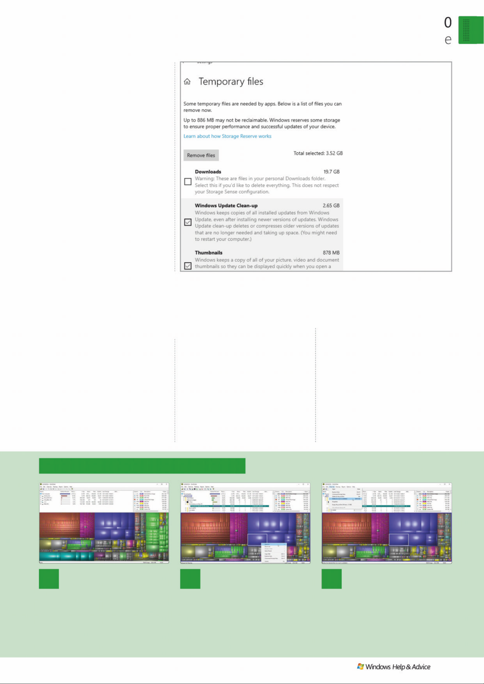
Wind ows 1
F ree u p some s pac
December 2019
|
|
57
1
View a summary
You can choose to monitor all
GULYHV RU IRFXV RQ D VSHFLÀF GULYH
Make your choice and click OK. Wait
IRU :LQ'LU6WDW WR ÀQLVK LWV DQDO\VLV DQG
you’ll see a three-paned window. The
bottom provides a colour-coded ‘map’
of your hard drive according to how it’s
being used.
2
Inves tigate in detail
Click an item on the map and
LWV ÀOHQDPH DQG SDWK ZLOO EH UHYHDOHG
in the top left pane, which shows a
traditional folder view. Right-click
and choose ‘Zoom in’ to view a map
RI WKH QH[W OHYHO GRZQ HLWKHU D VSHFLÀF
drive or the folder containing your
WDUJHW ÀOH
3
RHPR Y HODUJHÀOHV
:KHQ\RX·YHLGHQWLÀHGDÀOH
you think is safe to remove, select it
and open the Clean Up menu. You
can delete it d i rectly from here or
FKRRVH§¶([SORUHU+HUH·WRRSHQD
File Explorer window pointing to the
parent folder, allowing you to examine
it more closely .
followed by Yes at the warning and
finally OK. Bingo, no more w arnings
for that drive.
Monitor disk usage
It’s all very well k nowing that your
free space is disappearing, b ut what ’s
taking up all that room? Your first stop
on the quest for knowle dge should
be Win dows’ own to ols: nav igate to
Settings > System > Storage and af ter a
short while, W indows will reveal what
type s of file are tak ing up the most
space on your system drive. You’ll see
categories for Apps & features and
Temporar y files, and you c an click ‘Show
more categories’ for a more pre cise
listing of usage by categories as v aried
as Mail, Document s and Vid eos.
Click an entry in the list and you ’ll be
able to not just view mo re de tail, but
take remedial action: fo r e xample, if
your Temp files are gobbling gigaby tes
of space, click this to manually clean
them up – note, the Temp set ting now
covers files stored in your Downloads
folder, althou gh they are e xcluded by
default. A s you’ll see over the page, you
should make use of Wind ows’ new
Storage Sense feature to manage this
automatically, removing temporar y files
as required to prevent your PC from
running low on disk space.
Although Windows provides an
‘Other’ view to cover large folders, it ’s
not capabl e of easily highlighting those
individual files and folders that are
taking up the most space on your hard
drive. To s earch for these requires a
third-par t y tre e -mapping tool. Tree-
mapping tools provide a visual
representation of each file on your hard
drive(s) in the form of block s, with the
size of each block corresponding to the
size of the file in question.
One such free tool is WinDirStat
(https://windirstat.net / ), w hich you can
download and install from its pa rent
website or add to your PortableApps
toolkit for running on -demand. To add it
to your toolk it , o pe n th e Port able Apps
platform and click ‘Apps > Get More
Apps > By Catego r y ’ – you’ll find
WinDirStat in the Utilities section . O nce
installed, right-click the program
shortcut an d cho ose ‘Run as
adminis trato r ’ to all ow it to check
your entire drive, then che ck ou t the
step-by-s tep guide to find out how
to use it to both target and – if
necessary – de lete in dividual files.
Check out the box for an alternative
tool should WinDirStat’s somewhat
garish user interface put you off.
Once you’ve determined where all
your drive sp ace has gone, you can
move on to decide how to tack le the
problem. Turn the p age to find out how.
Monitor disk space with WinDirStat
“You should make use of W indows’ new Storage Sense
featur e to remove temporary files automatically to
prevent y our PC fr om running low on disk space”
Quickly reclaim space
by examining what temporary
files a re o n yo u r s ys t em a n d
choosing which to remove.
Page 58
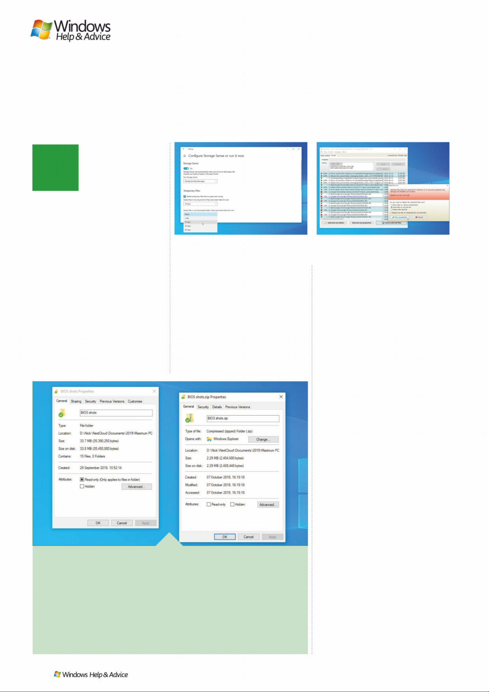
F
$UFK LYH RO G ¾O H V
Another way to save space is to move folder s an d files on to a secondar y
storage dri ve, such as a USB drive. I f you don’t have this luxur y, then save
space by zipp ing up these r arely used files and fo lders instead. R ight-click
the item(s) in question and choose ‘Send to > Compresse d (zipp ed) folder’,
then wait for it to be combined into a single zip file. Right-click this and
choose Proper ties, then compare its size to the original file. If there’s a
significant saving, delete the original file or fold er, then repeat to keep
freeing up more space.
58
| |
December 2019
reeing up space on
your PC has neve r
been easier thanks
to Windows 10 ’s new
Storage Sense feature,
which is designed to
render third-par t y apps like CCleaner
redundant. Your first job, therefore,
is to employ i ts s er v ices to f re e up
additional space on your drive. Navigate
to Settings > System > Storage and click
the ‘Configure Storage Sense or run it
now’ link. Flick the Storage Sens e switch
on and choose when to run the diskcleaning tool: by default, it ’ll run wh en
you run low on disk space, but if you
want to take a more pre- emptive
approach you can run it monthl y,
weekly or even daily.
Scroll down to configure more options
– for example, removing tempor ar y files,
emptying files fro m the Rec ycle Bin af ter
a set period and pe riodically cleaning
out the Downloads folder. You can also
configure OneDrive’s on-demand
feature so downloade d content revert s
to online-o nly if unopene d for 1, 14, 30
or 60 days. Desperate for more sp ace?
Click ‘Clean now’ to per f orm a one time cleanup.
Files on - demand
If you’re a Microsoft OneD rive user,
then chances are you’re already taking
advantage of a relati vely recent feature
known as “on-demand”. Instead of
keeping every thing physically stored o n
your computer, a series of shortcuts are
created instead pointing to the online
files. These take up a frac tion of the
space, while ensuring your files are
always accessible (so long as you’re
connected to the internet). Simply open
a file in the normal way and it’ll b e
downloaded to your PC, kept there
indefinitely or – if configured as outlined
above – until the file hasn’t been
touched for a set perio d, at which point
it’ll rever t to online - only to free up
space on your PC until you next op en it.
Verify the feature is on by rightclicking the OneDrive icon and choosing
Settings > Set tings tab, then ensuring
‘Save space and download files as you
use them’ is ticked.
Track down duplicates
It’s amazing how easily we generate
copies of files – or near-duplicates in the
case of digital photos, with multiple
attempts to get the p er fec t shot all
somehow being left on your drive at the
end of the process. In the past we’ve
looked to Duplicate Cl eaner Free (ww w.
digitalvolcano.co.uk/duplicatecleaner.
html) and AntiDupl (https: //ermig1979.
github.io/AntiDupl/english/) to cover
these bases for free. The Pro version of
Duplicate Cleaner – £23.95 – can also
hunt out similar files, but before
investing why not give AntiTwin (www.
joerg-rosenthal.com/en/antitwin/) a g o?
Despite not having been updated
since 2010, this no-frills tool works
perf ec tly in Wind ows 10 and can cover
all your bases as the step- by-step guide
reveals. Your selec tions are clearly
marked before you commit to any
deleting of files, and when you click to
delete you’re given the option of
moving them to a folder on the same
drive for transferring elsewhere, sending
them to the Recycle bin or de leting
them directly.
Look too for the option to replace the
file with a symb olic link to the file you ’ve
kept – this means a program referencing
the file you’ve deleted will be re direc ted
to the remaining file instead, ensuring it
continue s to wor k cor re c tly.
Clean up your PC
Before deciding if you need to invest in more storage,
make sure you’re not wasting the space you already have
Provide yourself with a safety net before you weed
out unwanted duplicates in AntiTwin – just in case.
IMAGE S: M ic r o so f t, Jeor g Ro s e nt h al
If configured correctly, Storage Sense will do much
to tid y u p after you a n d ke e p d ri ve sp a ce f r e e.
Page 59
Remove duplicates with AntiTwin
Wind ows 1 0
F ree u p some s pac e
December 2019
|
|
59
6
Remove duplicates
5LJKWFOLFNDÀOHWRGHFLGHZKHWKHUWRNHHSRUUHPRYHLW
²\RX·OODOVRVHHRSWLRQVWKDWDOORZ\RXWRPDUNVSHFLÀFIROGHUVDV
duplicates (see main text). After making your selections, use the
OHJHQGWRYHULI\\RX·YHSLFNHGWKHULJKWÀOHVWRGHOHWHEHIRUH
FOLFNLQJ¶'HOHWHVHOHFWHGÀOHV·
5
Review results
If you chose two paths, read the warning, but click OK as
this would only be an issue if they were both pointing to the same
IROGHU$OLVWRIDOOGXSOLFDWHVDQGVLPLODUÀOHVZLOOEHVKRZQ
grouped together. Images can be compared by selecting one to
reveal a pop-up window.
3
Pick your comparison method
%\GHIDXOWÀOHVDUHFRPSDUHGDFFRUGLQJWRWKHLUFRQWHQW
RQO\EXW\RXFDQDOVRFRPSDUHE\QDPHDQGÀOHVL]HLI\RXZLVK
7KH¶0DWFKPLQ·ÀJXUHDOORZV\RXWRPDWFKVLPLODUEXWQRW
LGHQWLFDOÀOHV²WKLVLVEHVWOHIWIRULPDJHVHDUFKHVRQO\2QFH
done, click the Search button
4
Wai t for scan
A progress window will appear – don’t be surprised to
VHHLWIUHH]HRFFDVLRQDOO\DVÀOHVDUHFKHFNHG<RXFDQSDXVHRU
cancel the search at any time. After the folder contents have
EHHQUHDGÀOHVZLOOEHFRPSDUHGWRVHHZKLFKDUHGXSOLFDWHV
and (if selected) close matches.
1
Select hard drive
Open AntiTwin. Click ‘Select folder’ next to ‘Basic folder’
to select the root of your drive if you’re looking to clear up space
on one drive only. Tick ‘2nd folder’ to select another folder path
or drive if you’re looking to clear space across two hard drives by
weeding out duplicates.
2
Focus search
/HDYH¶,QFOXGHVXEIROGHUV·WLFNHGDQGFOLFNWKH)LOHÀOWHU«
EXWWRQ< RXFDQH[FOXGHVPDOOHUÀOHVIURPWKHVHDUFKDQGVSHHG
LWXSE\VHWWLQJDPLQLPXPÀOHVL]H&OLFNWKHGURSGRZQDVVKRZQ
WRIRFXVRQVSHFLÀFÀOHW\SHVDQGWLFN¶&RPSDUHLPDJHVSL[HOV·LI
you’re looking for visually similar images.
Page 60
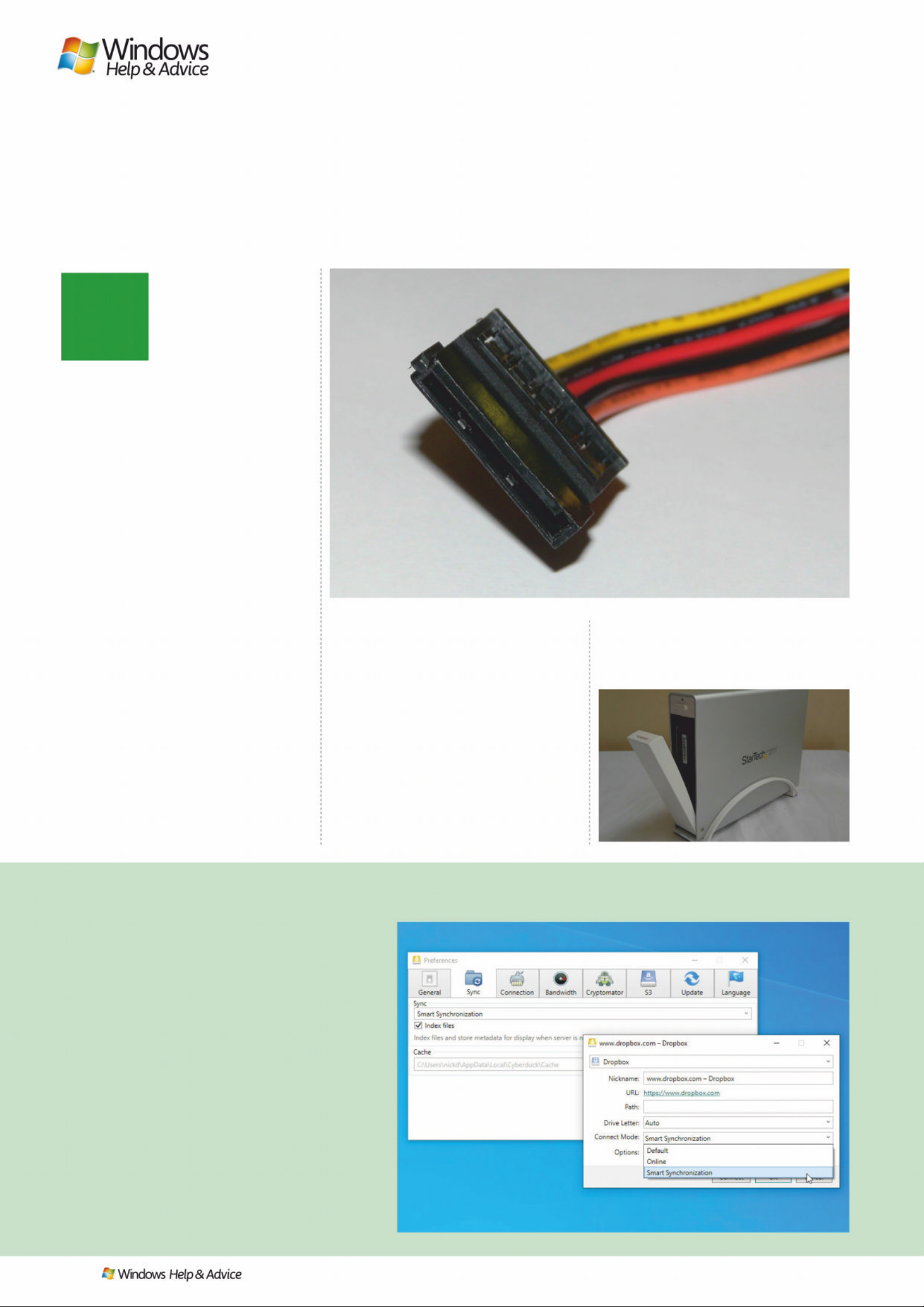
T
60
| |
December 2019
he march of technology
inevitably leads to
increased demands on
your system, particularly
if you’ve discovered a
new space-hungry
hobby such as gaming or 4K video
editing. If you’re simply looking to
expand available stor age for your files ,
you have two basic options. The firs t, of
course, is to invest in additional storage.
Desktop user s can investigate whether
their PC case has the room for a second
internal hard drive – with 4TB drives
shipping for under £100, you can solve
all but the most demanding nee ds with
a single purchase.
Before splashing out, power down
your PC, open the case and verif y there’s
a spare drive bay to fit it in. Also check
your power supply has a spare SATA
power socket (see photo – if not,
Google ‘molex to sata power adapter’
to find a cheap adapter) and a spare
SATA slot on the motherboard. You’ll
also need a SATA data cable – these c an
be had for under £1, but make sure it’s
SATA III (6Gbps) and consider a rightangled connector on one end for
hard-to-reach s ockets.
Alternative upgrades
An internal hard drive is better than an
external m odel for reas ons of spee d, but
this isn’t always a practical option – for
example, if you have a laptop. External
drives may be more suited to long-term
storage such as ba ckups or archivin g,
but they can at a pinch be used fo r
day-to-day use, although it’s still a good
idea to keep frequently accessed files on
your internal drive.
If you want to go down the external
drive route, then you have two options:
USB or NAS. USB prices are incredibly
competitive – slightly cheaper, in fact,
than internal models – so you c an pay
£90 for 4TB or push the boat out and
get 6TB for £120. All models should now
be USB 3.0, so for best performance be
sure to plug them into a USB 3.0 port
(typically marked in blue) on your PC.
Expe ct to pay a small premium for
smaller, laptop-fr iendly 2. 5-inch e x ternal
drives, or consider Network Attached
Storage (NAS) instead. These are slower,
Int o the cloud
Another storage location you can make use of is your
cloud provider. We’ve already seen how you can use
OneDrive to free up space on your computer, and other
providers offer similar features within their paid-for
plans – Dropbox (www.dropbox.com) calls its
equivalent Smart Sync, for example. Here you need to
navigate to a folder inside your Dropbox folder,
right-click it and choose ‘Smart Sync > Online-only’, or
browse to ‘Preferences > Sync’ , select your account and
choose ‘Online-only’ to make it the universal default.
If you’d like to access Google Drive or Dropbox
folders in this way without a paid account, then for a
one-off fee (€35) you can use a brilliant tool called
Mountain Duck 3 (download a free trial from https://
mountainduck.io/). This can create a series of virtual
drives connecting to a range of online storage services
and supports on-demand access like that found in
OneDrive across all connected services. Just be sure to
VHW&RQQHFW0RGHWR¶6PDUW6\QFKURQL]DWLRQ·WKHÀUVW
time you connect a new cloud account.
Move your files
7DNHWKHVWUDLQIURP\RXUKDUGGULYHE\PRYLQJ¾OHV
elsewhere – on to another drive or into the cloud
Chec k t he p l e t h or a of c a b l es c o mi n g o ut o f yo u r p owe r
supply for the L-shaped SATA power connector.
Mountain Duck can mount your cloud storage as
virtual drives, with files kept online to save space.
Page 61
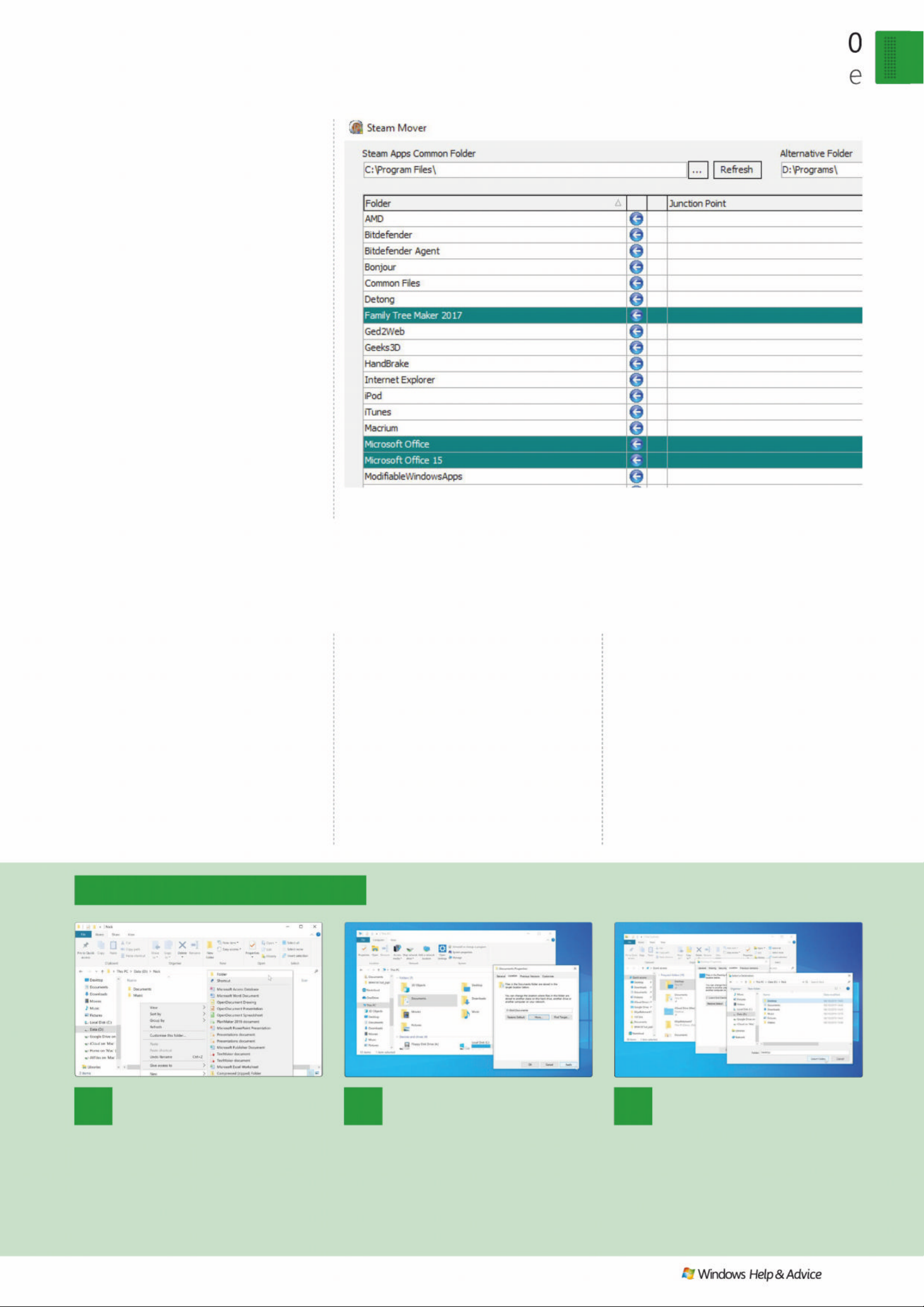
“In most cases, your new data drive will be slower
than your Windows drive, particularly if you boot
from an SSD , so be prepared for a performance hit”
Wind ows 1
F ree u p some s pac
December 2019
|
|
61
1
Set up new folders
You can choose to monitor all
GULYHVRUIRFXVRQDVSHFLÀFGULYH
Make your choice and click OK. Wait
IRU:LQ'LU6WDWWRÀQLVKLWVDQDO\VLVDQG
you’ll see a three-paned window. The
bottom provides a colour-coded ‘map’
of your hard drive according to how it’s
being used.
2
Mov e us er folders
Browse back to This PC. Rightclick Documents and choose Properties
> Location tab. Click Move… to browse
to and select the Documents folder
you just created. Click ‘Select Folder’
followed by Apply. When prompted,
FOLFN<HVWRPRYH\RXUÀOHVDQGIROGHUV
to your new drive.
3
Rinse, repeat
Now repeat the process for all
the other folders listed – be prepared for
a long wait if you have large folders to
move across to your new drive. The
EHQHÀWRIWKLVDSSURDFKLVWKDWRQFH
complete, you’ll have freed up space
on your system drive without having to
delete anything.
Move data to a new drive
but use your network conne ction , so
may be a more practic al alternative
should you not wish to have your laptop
permanently connec ted to a USB drive.
Once your new drive is set up, you’ll
want to transfer your data across – the
step-by-s tep guide below reveals how
to do this for all your user folders,
which are where the bulk of your data
can be found.
Move some apps
If you’re running Windows on a very
small boot drive – say 32GB – then it’s
not enough to move data off your
system drive, you’ll quickly run out of
space for new apps too. Where it’s not
possible to upgrade your system drive
for a larger model (see over the page),
you can also investigate ways of
moving your programs from your
system drive to your data one. One
caveat: in most cases, your new data
drive will be slower than your Windows
drive, particularly if you bo ot from an
SSD, so be prepared for a performance
hit and try to keep those apps you us e
most often on your b oot drive.
There are two ways to move apps to a
new drive: first, Windows Store apps
(including those pre -ins talled w ith your
PC like Photos) can sometimes be
moved via ‘Set tings > Apps > Apps &
features’. Click the app in question and
look for a Move button – if it ’s not
greyed out, click it, selec t which drive to
move it to and finally click Move again.
Regular programs are s o well
integrated into the operating system
that you can’t simply move their folder
from the Program Files folder to your
new drive. One option might be to
uninstall and reinstall, bu t that comes
at a cost of losing your preferences
and assumes the program in questio n
allows you to choose where to reinstall
the program too.
A simpler, foolproof option is to use
SteamMover (www.traynier.com/
soft ware /steammover). This clever tool
moves your program files to your data
drive but leaves a “symbolic link” in it s
place. This shortcut fools Windows into
thinking the programs are still o n your C
drive, so they continue to work
seamlessly. It’s easy to use: click ‘…’
under ‘Steam Apps Common Folder’
and select C:\Program Files, Ctrl-click
on the programs you plan to move
based on their size and how fre quently
you use them, then click the right
arrow button to move them all across.
Changed your mind? Simply select
your program and click the lef t ar row
button to move it back, no questions
asked. Windows 64-bit users should
also check the C:\Program Files(x86)
folder for 32-bit apps to move.
Steam M ove r al l ows y ou t o m ove a ny pr o g ra m on yo u r P C to a n ot h e r d ri ve wi t h o ut r e i ns t al l in g i t .
Page 62
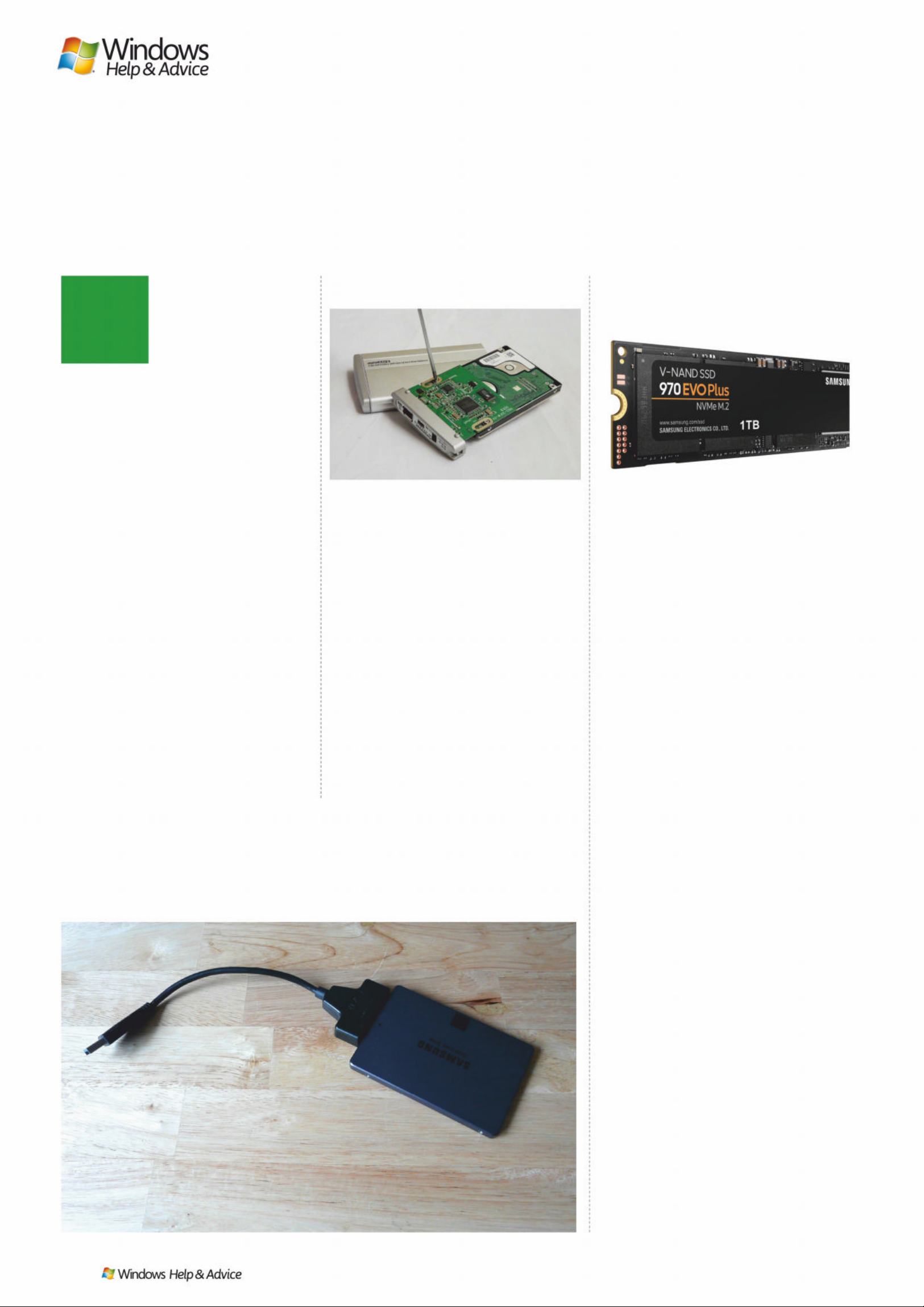
“Switching from a hard drive to an
SSD is like leaving the Stone Age.
Windows loads in under a minute”
62
| |
December 2019
hy not turn your
problem of storage
space – or lack of it
– into an opportunit y?
If you’ve not done so
already, now is the
perf ec t tim e to investigate one of the
most effe ctive upgrades money can
buy: a fast solid-state hard drive to run
Windows and your programs on.
Switching from a clunky old hard drive
to a SSD is like leaving the Stone Age.
Windows lo ads in under a minute, ap ps
open in a mat ter of seconds and your
computing life is no longer held up by
clicking and waiting for files to load.
With SSD prices tumb ling to put
even relatively large amounts of storage
space in your hands for a mo dest sum,
there’s never been a bet ter time to
make the move. T he upside? Your old
drive can stay in use as a dedicate d
drive for dat a, with tens – if not
hundreds – of gigaby tes of space
freed up by moving Windows and
your programs to the new drive.
It’s a three-s tep pro cess: fir st, work
out what your PC c an accommodate and
pick the appropriate drive for the task.
Once done, investigate the p ractic alities
of fitting it to your PC, and th en finally
follow a method for migrating
every thing (or the key elem ents) of
your old drive to the new one.
Choosing the right drive
If you’re a laptop user, you’re basically
looking for a larger single drive to
accommodate Win dows, applications
and a decent amount of pe rsonal data.
This may involve moving from a
relatively small SSD drive (say 128GB or
less) or migrating from a large (say 1TB
or larger), but cumbersome drive. As
always, while it’s tempting to save
money in the shor t term, tr y to stretch
your budget to futurep roof your
purchase for as l ong as possibl e. W ith
500GB SSD drives weighing in at un der
£60, this should really b e your minimum
spec. Increase your budget to £100 and
you’ll find several 1TB SSD drives f alling
within your grasp too. You’ll then need
to invest in a USB or NAS drive for those
files you access less f reque ntly.
If you’re look ing to upgrade a
desktop PC, then check to see if your
case can accommodate a second
drive in ad dition to your current one.
Chances are it can, giv ing you get the
best of both worlds: a new SSD drive
that can be smaller (say 256GB, or
500GB for those with a gaming habit or
the need to run virtual machines), p lus
your old drive now e xclusively used for
data storage.
If you have a modern PC with support
for the M2 NVMe interface (a small slot
on the b oard into which SSD drives
shaped like RAM sticks are plu gged),
then pay the small premium for this
type of SSD storage as it’s up to six
times faster than SSD, never mind
regular hard drives. Samsung’s 970 EVO
Plus is currentl y the best – 256G B w ill
set you back around £75, and 500G B
around £120.
Fitting the drive
The step -by -step guide opposite reveals
how to clone your drive using Macrium
Reflec t Free. There’s one major caveat
here: both o ld and new drives need to
be connec ted to your PC at the same
time. For d esk top us ers, this means
screwing in your new drive to an
available 2. 5- inch o r 3. 5 -inch bay if
connected via SATA , o r c arefully slot ted
into the NVMe slot b efore being pushed
down and held horizontally in place
using the s crew sup plied.
Laptop users have a choice: if you plan
to keep the old drive as additional
storage, invest £10-15 in a cheap USB 3.0
2.5- inch enclosure and fit the new drive
in there. If not, purchase a USB-to-SATA
adapter from eBay for as little as £3
online and use that to temporaril y
connect your new dri ve to a spare USB
port . O nce the old drive has be en
cloned to the new one, s wap the t wo
around and your laptop should boot
with all settings and data intac t.
Upgrade your hard drive
Another way to increase storage is to migrate
Windows to a separate, faster SSD drive
W
Watch Wi n do ws 10 (and s t artup ap ps) l oa d i n u nd e r
30 seconds with NVME storage like this Samsung.
2.5-inch drive enclosures are relatively cheap,
cer ta i nl y p l e nt i f ul , a n d ea s y t o sl o t yo u r dr iv e in to .
This £3 adapter makes it easy to attach any bare drive to your PC or laptop’s USB port.
Page 63
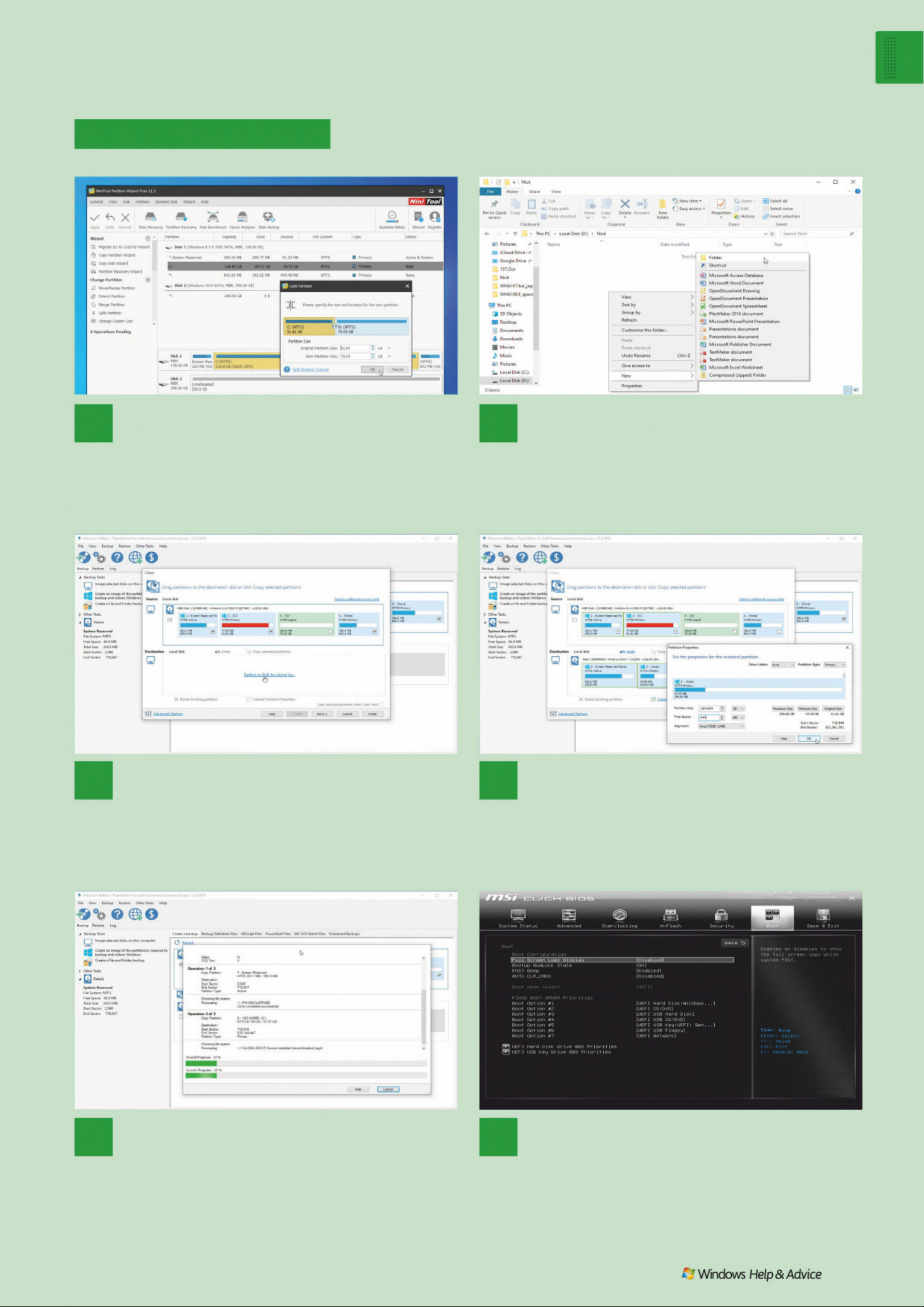
Wind ows 1 0
F ree u p some s pac e
December 2019
|
|
63
Migrate to a new drive
6
Fit new SSD drive
Shut down your PC. Laptop users should swap out the
current hard drive for their new SSD drive; desktop users will need
to reboot and make sure the new SSD drive is the primary boot
device in the UEFI/BIOS settings. If all is well, Windows should
boot – and much quicker than before. Q
5
Wai t as driv e is cloned
Click Finish. Untick ‘Save backup and schedules as an XML
%DFNXS'HÀQLWLRQ)LOH·DQGFOLFN2.WRSHUIRUPWKHFORQLQJ
RSHUDWLRQ(DFKSDUWLWLRQLVFRSLHGLQWXUQDTXLFNÀOHFKHFNLV
performed and then the actual cloning process will take place. Be
patient – this may take some time.
3
Select partitions to clone
Launch Macrium. Select your Windows drive and click
‘Clone this disk…’ Make sure only those partitions you need will
be copied across: System Reserved, your actual Windows
partition and any hidden partitions at the end of the drive. Untick
any others, then click ‘Select a disk to clone to…
4
Set target disk
Select your new SSD drive – the one with no partitions
assigned. Drag each partition across – you will need to click
‘Cloned Partition Properties’ to resize your main partition after
dragging it across. Set ‘Free Space’ to match (in MB) the last
SDUW LWLRQ·VVL]HFOLFN2.DQGGUDJWKHÀQDOSDUWLWLRQLQWRSODFH
1
Partition old drive
Desktop users planning to migrate Windows and apps to
D66'GULYHZKLOHOHDYLQJWKHLUGDWDEHKLQGVKRXOGÀUVWXVH
MiniTool Partition Wizard Free (www.partitionwizard.com):
choose ‘Split Partition’ and drag the slider as far left as it can go.
Click OK followed by Apply. Reboot when prompted.
2
Move data to new partition
Once complete, follow the guide on page 61 on
moving data to your new drive, using your newly created
partition as the target. Next, download and install Macrium
5HÁHFW)UHHIURPZZZPDFULXPFRPUHÁHFWIUHHDVS[LI\RX·YH
not already done so.
Page 64

WI NDOWS H ELP HARDWARE FIXES SOFTWARE SOLUTIONS I NTERNET TIPS
IMAGES: Pacific Mountain Productions, TagLine Television, NBC Universal, MSI, Microsoft
Windows
STOP SHARING A
WINDOWS ACCOUNT
Q
My wife and I share a Googl e
account, email and so on, but I
use Windows 10 on a PC in my
study and she uses the same o n a
laptop in the lounge.
She has recently upgrade d to a
new laptop which I set up for her,
but whereas her previous laptop
had her name on the welcome
screen, it now has mine, as it
appears on my own PC welcome
screen. Is there any way we can
change the welcome screen name
on my wife’s laptop?
Martin Gulliver
Ian’s solution
This occurs because
you’re sharing the same
Microsof t Account to log
into both PCs. The logical step is to
set your wife up with her own
Microsof t Account. If you g o d ow n
this route, start by copying
everything inside C:\Users\martin
into the C:\Users\Public folder, then
use CloneApp (ww w.mirinsoft.com/
ms-apps/cloneapp) to back up any
program settings you can’t easily
recreate in the new user account.
Once done, create the new
account via ‘Settings > Accounts >
Family & other users’ (click ‘Add a
family member’, choose ‘Add an
adult’ and then click ‘The person
who I want to add doesn’t have an
email address’ before following the
prompts to create the account,
making sure they have
administrator access).
Once done, log off the Martin
account, then log on as your wife.
Navigate to C:\users\Public to
copy the folders to your new
user account. Verify all her
existing progra ms are p res ent
– some may need reinstalling if
they were installed for a single
user rather than all users – and
then finally run CloneApp to
restore her preferences.
Once you’re happy everything
has been transferred across, clean
Do you have a
PC problem?
Get in touch…
Email full details of your
problem to the
support team and we’ll
do our best to help
windowsmagazine@
futurenet.com
FREE PLAYER Play
video DVDs on
your PC with VLC.
64
| |
Dec ember 20 1 9
Page 65
Jargon buster!
things up by emptying the Public
folder and then deletin g th e
old user account via ‘Settings >
Accounts > Family & other users’.
Microsoft Store
DVD PLAYER APP
MISSING
Q
I purchased the Windows DVD
Player app fro m the Mi croso ft
Store, paying £12.49 by PayPal. A
few days a g o, I was forced to reset
my laptop, after which this app had
disappeared. I’ve tried to get help
from Microsoft support, b u t it’s
been a ver y f r ustrating exercise.
Can you please help?
Will Jobling
Cat’s solution
Ordinarily, any sof tware
you’ve purch ased
through the Microsoft
Store should b e available to
download again after reins t alling
Windows – open the Store, verify
you’re lo gg ed into the correct
account and then click the ‘…’
button and choose ‘My Libr ary’ to
view all previous purchases and
installations. Select ‘Ready to install’
to filter the list f urther if necessary.
After Micros oft instructed Will to
pay for the app again, he decided
to look elsewhere. Luckily, armed
with our advice he was more
than happy to install the
completely free VLC Media Player
(www.videolan.org/vlc) ins tead.
Hardware
PC SLOW TO REACH POST
Q
I’ve just bought a new PC with
MSI X470 Gaming Pro
motherboard, and it ’s lightning
quick – except for one crucial
aspect . It t akes as lo ng (around
20 seconds) to display the POST
as it does to boot into Windows.
Can you help eliminate this
annoying delay?
Frank Charlton
Carrie’s solution
Sadly, this is normal
behaviour on many MSI
motherboards, b u t th ere
are some things you can do to
improve matters – one of which is
to head into the BIOS, switch to the
Boot tab and ensure ‘B oot m ode
select ’ is set to UEFI as opposed to
‘Legacy + UEFI’. Frank had also
installed a BIOS u pdate to extend
compatibility to the latest R yzen
Quic kfire questi ons
FIND THE SOLUTION! Simple spreadsheets with Excel Easy
Visit www.excel-easy.com for a website devoted to providing
beginner-friendly advice to using Microsoft Excel.
How do I verify that Comod o
Internet Securit y is r unning
my browser in a sandbox?
Sarah Hadley
Open the Comodo widget,
then click the browser shortcut
icon to open it within
Comodo’s sandboxed virtual
desktop. You should see a
green border around the
program window.
How do I restore an earlier
version of a note in Joplin?
Dev Lawford
Click the ‘i’ button to open the
note’s properties, then click
‘Previous versions of this note’
– use the dropdown menu to
review different versions, then
click Restore.
“A Wi-F i booster simply
acts to relay signals to
hard-to-reach places”
POST
Power On S e lf Test, a series of
hardware checks p e rformed by
your PC’s motherboard before
Windows star t s to load.
GPT
Stands for GUID Partition Table
and is the current standard for
arranging partitions on a
computer’s hard disk.
LEGACYFREE Switch to pure
UEFI for faster boot times.
DISABLE MIC
Audio problems in
games may down
to your headset.
Support
Technical help
December 2 01 9
|
|
65
Page 66
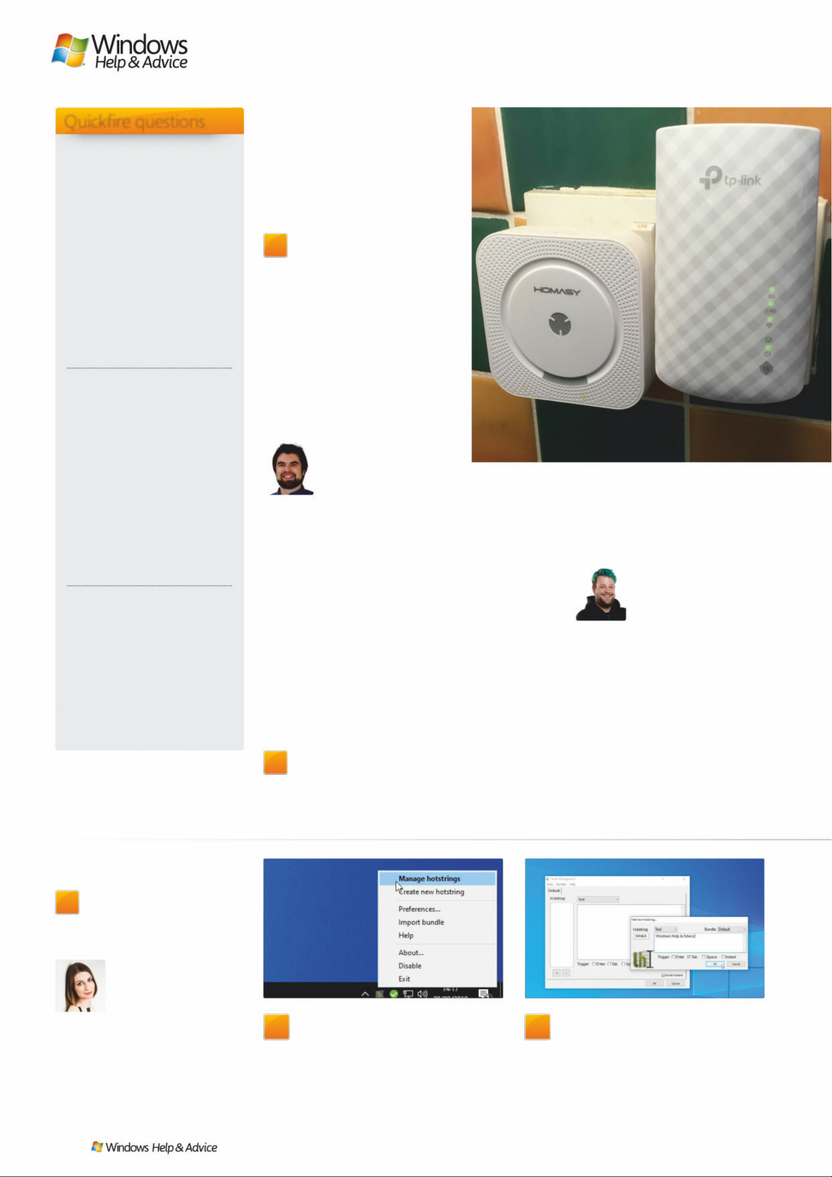
2
Create hotstring
Hotstrings work in the same way as
autocorrect entries in Word. Click the ‘+’
button to create your first hotstring. Type
the shortcut or frequently misspelled
word into the Hotstring box and the
correct text where directed.
1
First steps
After installing (or adding to your
portable toolkit), launch Texter – it’ll appear
in your Taskbar notification area. First steps is
to right-click this icon and choose Manage
Hotstrings to bring up the main Texter
Management window.
GET A SYSTEMWIDE
AUTOCORRECT TOOL
Q
Can you sugges t a free
autocorrect tool th at works
outside of Microsof t Word?
Peter Hope
Cat’s solution
Try Texter – visit
http://bit.ly/texter-win
for download links.
Although 12 years old, it works
perf ectly in Windows 10. It’s a text
substitution app that saves you
countless keystrokes by replacing
abbreviations with commonly used
phrases you define. Here’s a quick
guide to how it works.
Quic kfire questi ons
It also alleges to provide a stronger,
faster broadband download speed.
This suggests that broadband
providers don’t give you the speed
initially promised?
Harold Haywood
Alex’s solution
Wi-Fi signal boosters
have no effect on the
speed of your internet
connection as it’s delivered to your
home by your broadband provider,
but they can improve download
speeds over Wi-Fi. To see how this
works, first visit ww w.speedtest.net
in your browser on a PC connecte d
to your router modem via Ethernet
cable. The results here provide the
benchmark speed of your intern e t
connection to your home.
Now repeat the test on a
Wi-Fi-enabled device (if you’re on a
mobile, install the free Speedtest
app) at different points in your
Whatever I do, I can’t get
OneDrive to open. I’ve
downloaded and reinstalled it,
but still: nothing. I’m running
Windows 10 Pro.
John Perkin
Press [Win] + [R], typ e ‘gpedit .
msc’ and hit [Enter]. Navigate
to Administr a ti ve Templates\
Windows Components\
OneDrive under Computer
Configuration, double-click
‘Prevent the usage of OneDrive
for File Storage’ and set it to
Disabled. Click OK.
After inst alling the 1903
update, my taskbar and
Start menu are now light
grey. How can I change this
to something less insipid?
Helen Foster
Navigate to Setting s >
Personalisation > Colours . S e t
Dark mode as your default,
then scroll down, choose a
different accent colour and
then tick ‘Start, taskbar and
action centre’ to apply it to
these elements.
How can I display the
difference in time between
two dates in Microsoft Excel?
Brian Willock
Use the DATEDIF function – for
example, =DATEDIF(D9, E9, “d”)
returns the difference between
the dates in cells D9 and E9 in
days. See http://bit.ly/datedifexcel for a complete guide.
3000-series chips – unless you’re
intending to install such a chip, we
recommend avoiding this update
as it’s also been known to slow
down the POST process.
Gaming
BLUETOOTH AUDIO
PROBLEM
Q
When using my Bluetooth
headphones and playing a
game, the sound often cut s out
when the game starts, having
played perfectly well before
opening the game, and on the
game’s menu screen. Open the
game, however, and after a short
crackle it’s completely silent. This
behaviour isn’t consistent with
every game and makes me wonder
if it’s something to do with DirectX.
Any pointers?
Dean Vineen
Nick P’s solution
We traced the cause of
this problem to the
Bluetooth headphones’
built-in mic. Many us ers have
complained of similar issues, and
the workaround for those who
don’t use the mic is to simply
disable it: right-click the speaker
icon in the Taskbar notification area
and choose ‘Open Soun d s e ttings’.
Scroll down to the Related Settings
section and click ‘ S oun d Control
Panel’. Switch to the Recording tab,
right-click your Headset’s entry and
choose Disable, which should
resolve the problem.
Internet
CAN WIFI BOOSTERS
IMPROVE MY INTERNET
CONNECTION?
Q
There have been numerous
adverts re lating to a
Superbooster W i-Fi booster that
claims to provide stronger
broadband throughout the house.
EXTEND RANGE
Improve wireless
performance with
a Wi-Fi booster.
66
| |
Dec ember 20 1 9
Page 67
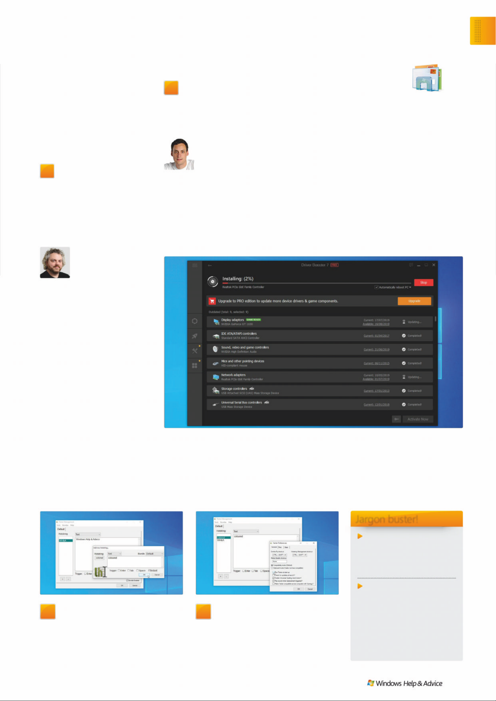
Jargon buster!
Function (spreadsheet)
Spreadsheet formulae are used
to calculate the value of a cell.
Functions are predefined
formulae that simplify this.
Sandbox
A virtual container inside
which programs can b e r un
in complete isolation.
Untrusted applic ati o ns c a n
be tested without worrying
about introducing problems
– including malware – to
the rest of the system.
4
Test your hotstrings
Open any program and type the
misspelling or hotstring before (if
applicable) clicking the trigger key. You’ll
see the text magically change along with
a sound effect. Choose Tools > Preferences
to configure Texter further.
3
Set trigger
You’ll see four options for triggers:
pressing [Enter,] [Tab], or [Space], or ‘Instant’
which means the text is automatically
changed as soon as it’s typed. We’d
recommend ‘Instant’ for misspelled entries
only; other shortcuts should have a trigger.
“Another reason for sourcing and
downloading drivers yourself is t o
troubleshoot hardware pr oblems ”
home. You’ll see the results vary,
with download speeds dropping
off the further you travel from your
router. A Wi- Fi b o oster simpl y acts
to relay signals to hard -to-reach
places in your home, bo osting
download speeds to the levels
enjoyed by your w ired d evices.
Windows
DUALBOOT WINDOWS 7
AND WINDOWS 10
Q
The pressure to upgrade is
mounting, but I’m not ready
to give up o n Windows 7 yet. I’d like
to install a second SSD in my PC
and install Windows 10 on a
separate drive. Is there some way
to choose w hi c h system to boot
into on s t artup?
Tim Kaye
Ian’s solution
First, install your new
drive and boot into
Windows 7. Press [Win]
+ [R], typ e ‘diskmgmt.msc’ and hit
[Enter]. Scroll down to locate the
new drive. Right-click the drive’s
unallocated space and choose
Initialise. Choos e ‘GPT (GUID
Partition Table)’ and click OK. Next,
prepare your Windows installation
media on DVD or USB flash drive
using the Media Creation Tool
(http://bit.ly/msmctool).
Following on from this, reb oot
with the installation media
plugged in and opt to b oot from
the drive when prompted. Now
simply follow through a regular
Windows install pro cess: choos e
custom when prompted and be
sure to select your new dri ve as
the target for the new installation .
The installer will d e tect the
presence of Windows 7 and will
set up a dual-b oot menu to
allow you to switch between
Windows 7 and 10 each time
you start your PC.
Hardware
UPD ATING DRIVERS
Q
What’s your recommendation
on updating drivers? Let
Windows Up date handle it, use a
third-party too l like D r i ver B ooster,
or some other option?
Ebi Baqri
Nick O’s solution
Broadly speaking, if
your comp u ter is
working as you expect it
to, then it’s best to leave Wi n dows
Update in charge of driver updates.
There are, of course, exceptions. If
you’re a gamer, for example, then
you’ll want the latest graphics
drivers your card support s – ins t all
the latest one from NVIDIA or
AMD and it ’ll w ill keep itself
updated going forward.
Another reason for sourcing and
downloading drivers yourself is to
troubleshoot problems you believe
related to hardware. Start by
visiting the suppor t o r d ownl o a ds
section of the re l evant
manufacturer – peripheral,
component, motherboard or
PC – to see if newer drivers are
available (along with tools for
keeping those drivers updated in
the future).
Tools like DriverBooster
(www.iobit.com/ en/driver-booster.
php) come into their own for
keeping all your drivers updated
for perf o r mance reasons, b ut als o
come in handy when you’re
struggling to find drivers for your
system – for example, wh en your
hardware manufacturer stops
supporting a particular product.
UPDATE DRIVERS DriverBooster can track down elusive driver updates.
Do you have
a PC problem?
Get in touch…
Email full details of
your problem to the
support team and we’ll
do our best to help:
windowsmagazine@
futurenet.com
Or write to the support
team and we’ll do
our best to help:
Support Squad,
Windows Help &
Advice magazine,
Future Publishing Ltd,
Quay House, The
Ambury, Bath
BA 1 1A U
Support
Technical help
December 2 01 9
|
|
67
Page 68
*Free issues not available on Zinio.
AVAILABLE ON YOUR DEVICE NOW
MONTHLY SUB SC RIPTION :
£1 . 99 – SAVE 38%
SINGLE ISSUE: £2.49
GET OUR
DIGITAL EDITION!
(READ ON YOUR PC AT ZINIO.COM OR PLAY.GOOGLE.COM)
WHEN Y OU
SUBSCRIBE
TODA Y*
TWO
FREE
ISSUES
Page 69
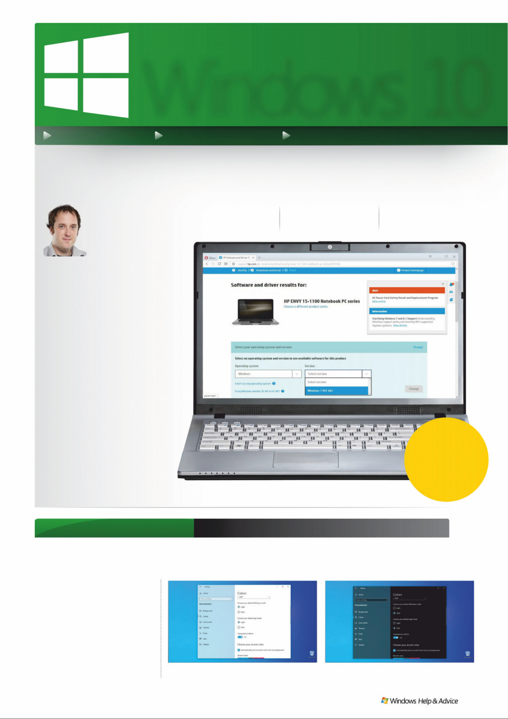
WINDOWS 10 TIPS FEA TURES EXPLAINED NEW TIPS AND TRICKS
Welcome
Windows 1 0 is
always evolving,
and looks quite
different to the way
it did back in 2015.
It’s alwa ys worth install ing the
latest security and cumulative
updat es for your PC – the
benefits far outweigh any
dangers, and problem updates
can easily be rolled back. Big
feature updates aren’t to be
feared either , even if they can
take a long time to download.
On p70 we find out how to
repair Windows 1 0 without
rein stal l ing , while on p7 2 we
perform a full, destructive
rein stal l of the OS. Fina ll y, p7 4
has a guide to all the other
reinstall and recov ery options.
Matt Hanson
Associate Editor
)HD ʤ ʦ ʢʖ Q ɒ
Windows 10 tip of the month Switc h between lig ht and dark modes
It seems like everything has a dark
mode these days, especially if you’ve
got an Android phone. F acebook,
Twitter, even the Chrome browser can
be set to use dark colours. Windows 10
has one too, but the May 2019 update
introduced the complete opposite
– a light mode that introduces a new,
brighter version of the default blue
WIndows logo wallpaper and some
lighter shades of grey throughout.
The da rk side , and the light
Windows 10
DARK MOD E Search for and open t he Settings app,
then under Personalization, click on Colors.
LIGHT MODE You’ll find switches to change both
Wind ows itse l f and ap p s from d a rk to li gh t mode.
:ɰOFʝȷ ɏɏɏ WWɛɛ
www.facebook.com/windowsmag
SEE PA GE 12
Image credits: Microsoft
50
GR EAT
FREE APPS
December 2019
|
|
69
70 Repair a faul ty
Windo ws insta ll ati on
72 A full, destructive,
reinstall at ion
7
4 Ot h er re in sta l l at i on
and recovery options
Page 70
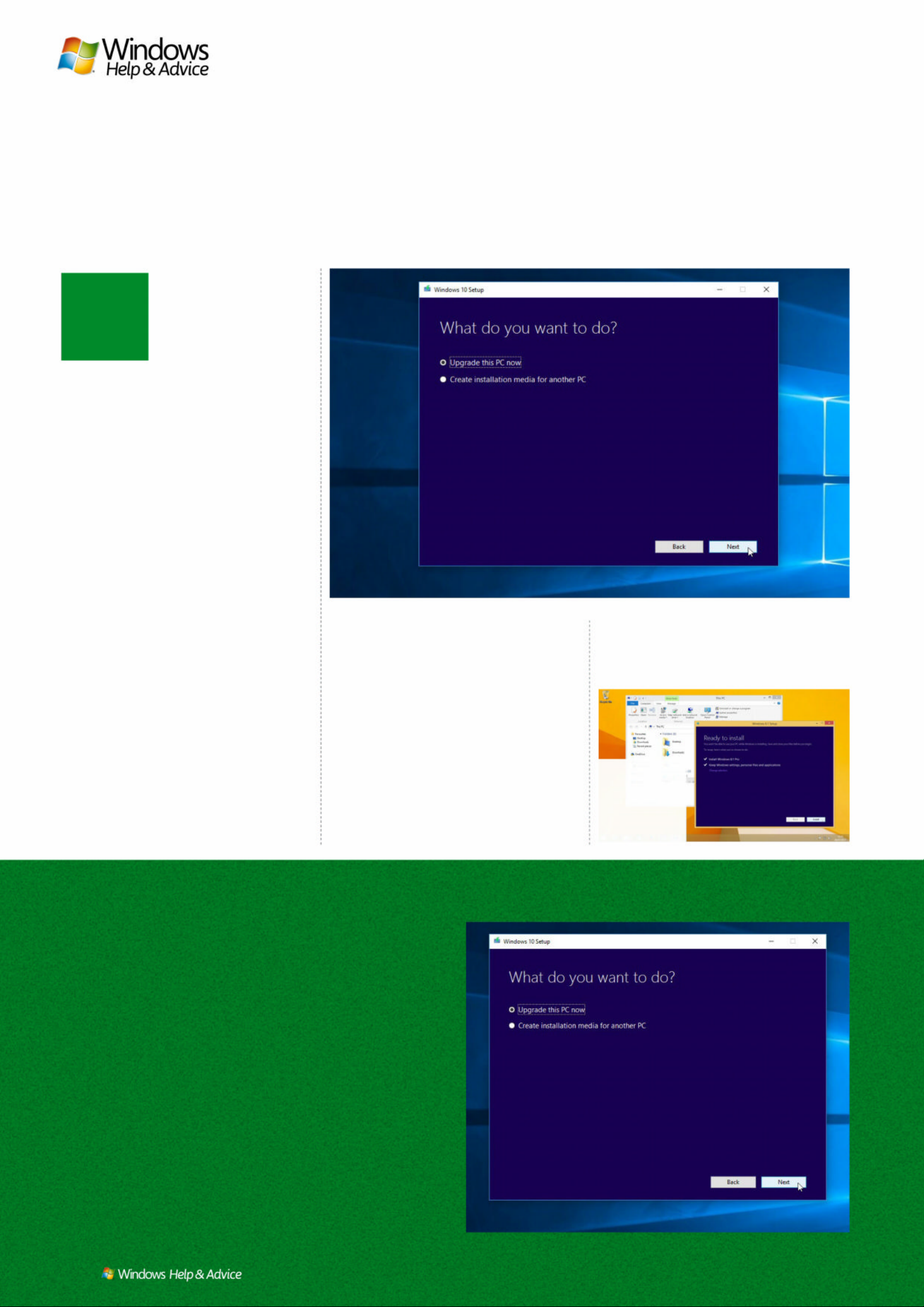
70
| |
December 2019
N
Repair a Windows install
,I\RX ¶UHWU\LQJWR¾[DSUREOH PDUH IU HVKRUUHS D L ULQ VWDO OP D \EHWKH
EHVWURXWHWRJRGRZQ+HUH¶VZKDW\RXQHHGWRGR«
ot all reinstalls require a
complete wipe of your
hard drive. A repair or
refresh installation
leaves your programs,
settings and files in
place, and restricts it self to inst alling a
fresh copy of your Windows files over
the top of your existing copy. If your
problem is linked to a corrupt file or
Windows setting, the rep air installation
can usually fix it.
All repair installs share one common
characteristic: you must launch them
from Windows itsel f. You can’t boot
from your install me dia and repair
Windows through that; you need to
boot into Windows, then st ar t the repair
process from there. If you’re unable to
boot into Windows, theref ore, you’ll
need to skip to page 72 and perform a
full destruc tive recover y instead.
Start the repair
Starting a repair install varies dep ending
on your PC model and what version of
Windows you’re running. Windows 8.1
and 10 users should (at least initially)
avoid the Refresh/Reset options
provided under Set tings > ‘Up date &
recovery’. These options will preserve
your files and any apps you’ve installed
through the Microsof t Store, but any
desktop pro grams you’ve inst alled will
be wiped along with Windows itself.
Instead, you should ‘upgrade’ your
copy of Windows, which performs a
similar non-d estruc tive reinstall to
Refresh/Res et with the add ed bo nus
that your apps – including those you’ve
installed outside of the Microsof t Store
– will be preserved. To do so, you’ll need
your Windows installation media – see
the step-by-s tep guide on the facing
page if you don’t have the latest version.
Why do you need the latest ins tall
media? It’s because upgra de installs
only work if the version of Windows on
your PC matches that on your install
media, so if you’ve installed Service Pack
1 in Windows 7, for e xample, you nee d
up-to- date inst allation m edia to avoid
the laborious task of first at tempting
to uninstall Ser vice Pack 1 through
Windows Update (assuming that you’re
able to), then reinstalling Windows and
P o st-r e pa i r st e p s
Start by stress-testing your
desktop to verify that
everything works as it should
– sometimes the repa ir can
introduce more problems than
it solves, in which case if you’re
running Windows 8.1 or 10 you
can undo the changes. Go to
Start > Settings > ‘Update &
recovery’ > Recovery and look
for an option to go back to
your previous version – click
‘Get started’ and then follow
the prompts.
If the repair doesn’t appear
WRÀ[\RXUXQGHUO\LQJSUREOHP
Windows 8.1 and 10 users can
take o ne m o re inter med i a t e
step – the reset or repair. It will
see you waving goodbye to all
those desktop programs you’ve
LQVWDOOHGLQFOXGLQJ062IÀFH
and your third-party security
software), but it will preserve
\RXU0LFURVRIW6WRUHDSSVÀOHV
and Windows settings. Leave
your install media inserted,
then head over to the ‘Update
& recovery’ > Recovery section
under Settings. This time, click
the ‘Get started’ button under
the Refresh (Windows 8.1) or
Reset (Windows 10) option
and follow the prompts.
If this more drastic approach
doesn’t work, or you’re running
Windows 7, then to page 72 for
destructive reinstall options.
Windows 10 users can launch a repair install directly from the Media Creation Tool.
Both Windows
8.1 and 10
offer a similar
way to repair
your Wind ow s
installation.
Windows 8.1 and 10 users can perform a more drastic repair install via
the Re s et o r R e fr e s h op t i o n – be w a rn e d , yo u ’l l l os e yo u r de s k t o p ap p s .
All image credits: Microsoft
Page 71
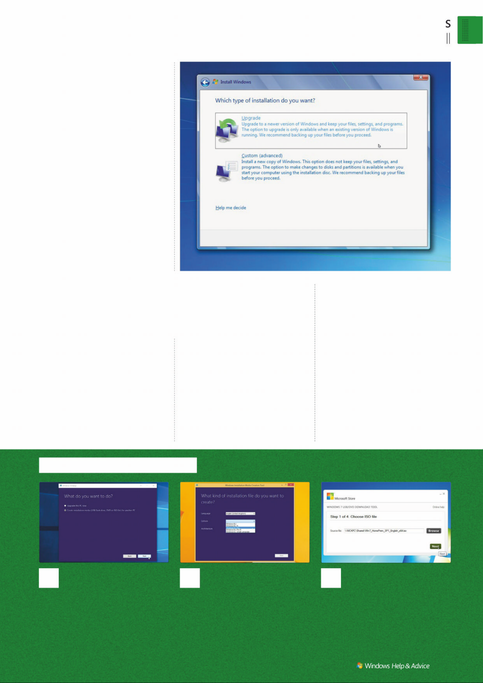
Basic
5H SDL UD:LQGR ZVLQ VWD
December 2019
|
|
71
1
Windows 10
Head to www.microsoft.com/
software-download/windows10 and
click ‘Download tool now’. Once
downloaded, open MediaCreation Tool.
H[H :KHQ SURPSWHG VHOHFW ¶&UHDWH
installation media’ and follow the prompts
WR FUHDWH HLWKHU D 86% ÁDVK GULYH RU DQ ,62
ÀOH IRU EXUQLQJ WR '9'
2
Windows 8.1
Download the Media Creation
Tool from www.microsoft.com/
software-download/windows8 – input
your language, edition of Windows 8.1
and PC architecture (32-bit or 64-bit) and
WKHQ FOLFN 1H[W &KRRVH WR FUHDWH HLWKHU D
86% ÁDVK GULYH RU DQ ,62 ÀOH DQG WKHQ
follow the prompts to the end.
3
Windows 7
Go to www.microsoft.com/
software-download/windows7 and
enter your product key – choose a
32-bit or 64-bit version as required.
2QFHGRZQORDGHGGRXEOHFOLFNWKHÀOH
WREXUQWR'9'RUXVHWKH:LQGRZV86%
Download Tool (https://wudt.codeplex.
comWRFUHDWHD86%ÁDVKGULYH
then downloading and reinstalling
Service Pack 1, along with all of your
other updates.
Windows 10 users can also launch the
repair process directl y from the Me dia
Creation Tool by choosing Upgrade
when prompted, but given the amount
of time it takes to download the files,
you might as well create your install
media instead – just in case the up grade
install doesn’t work and you de cide to
go down the path of a full -blow n
destructive install.
Launch the repair process
The procedure fro m this point onwards
varies according to which version of
Windows that you have. If prompted to
download updates, do so to save time
post-install.
Windows 8.1 and 10 us ers will b e
asked what they want to keep. Windows
8.1 users should find settings, personal
files and ap plications are selec ted by
default (click ‘Change settings’ if this
isn’t the c ase), while it ’s ‘ Keep personal
files and apps’ in the case of Windows
10 (don’t worry, in this circumstance,
‘apps’ also applies to any desk top
programs that you have installed).
Windows 7 users ne ed to pop in their
install me dia, double- click setup.exe
and follow the regular reinstall process.
When prompte d, click ‘Go online to get
the latest updates for installation
(recommended)’ to download post-SP1
security fixes now, then accept the
licence agreement and choose
Upgrade when prompted.
The upgr ade process can take up
to an hour on whichever version of
Windows you’re repairing, even on the
fastest machine, so be patient. Your PC
will rebo ot s everal tim es. If you’re
reinstalling Windows 7, you’ll be
prompte d to ente r your produ c t key
again, so have it handy.
Windows 8.1 and 10 will relaunch with
the same setup wi zard you’d see when
upgrading f rom an earlier version of
Windows. It ’s all very straightfor ward,
but don’t skip throu gh the Exp ress
settings (if they appear); make sure you
review all settings to lock down p rivac y.
If all goes well, you should find
yourself at the desk top, ready to see if
your proble m has been fixed – star t by
seeing if the spe cific issue that you were
experiencing be fore has been solved,
then check to see that the rest of
Windows still works as it should – if it ’s
not, follow the adv ice in the ‘Post-repair
steps’ box on the facing pag e. T here’s
also a possibility – par ticularl y w ith
Windows 7 – that the repair install will
result in a non- booting PC. If this
happens, dig out the rescue m edia you
created using Macrium Refl ec t Free (see
page 51 of issu e 146 for how to do this)
and use it to res tore the drive imag e yo u
took before embarking on the repair.
Then turn the pag e for more options.
Get the latest install media
“Start by seeing if the specific issue
has been solved, then check t o see
that the rest of Windows still works ”
Choose the Upgrade option when prompted to repair Windows 7.
Page 72
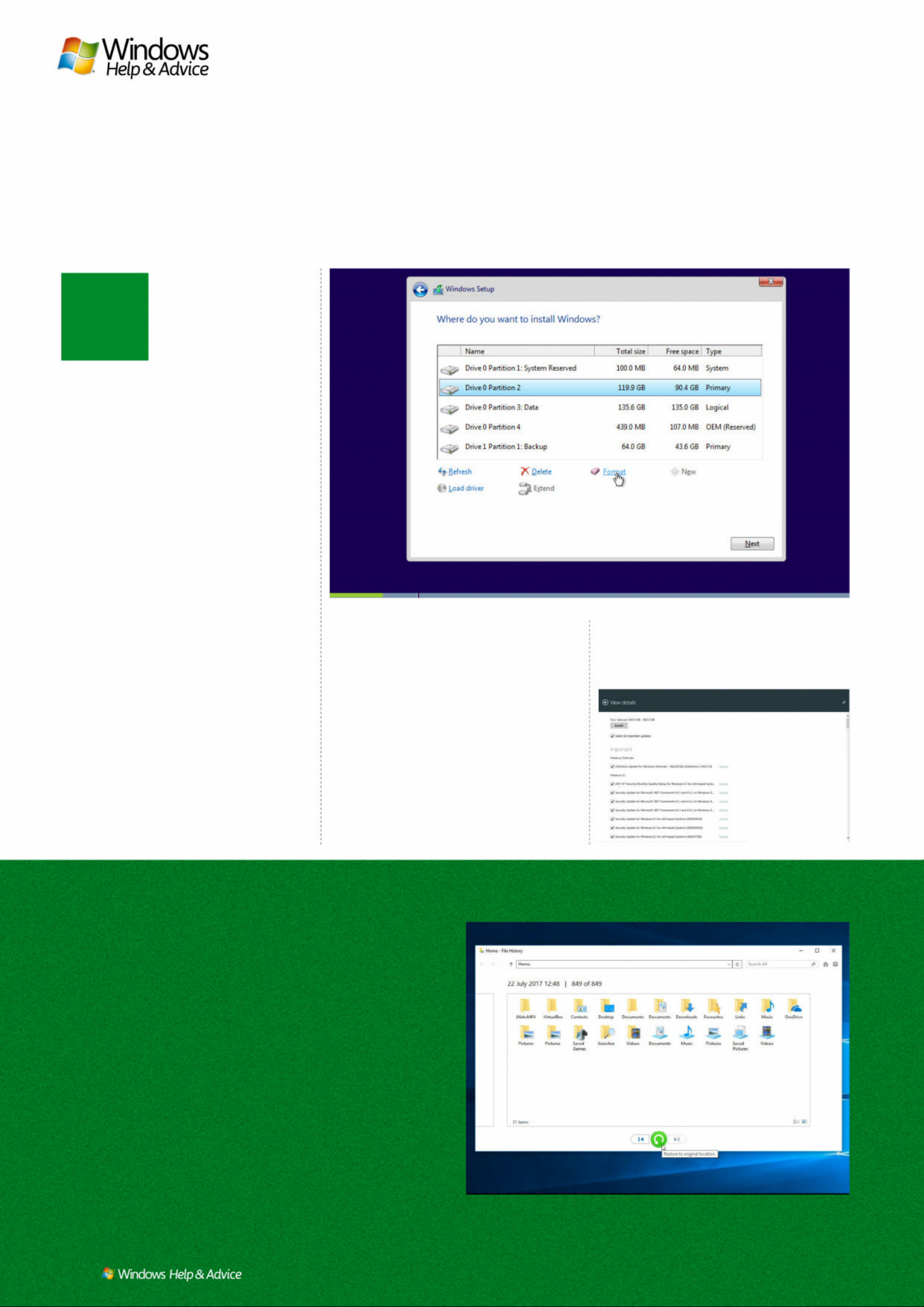
72
| |
December 2019
R
A full, destructive reinstall
,I\RX ¶UHORRN LQ JW RZLSHWKHV O D W HFO H D QRUQHHGWRU HFRYHUIURP PDMRU
LV V XH VWKHQX F OHDURSWLRQL VDO Z D \VWKHEHVWRQH
einstalling Windows
from scratch – namely,
wiping your system drive
to install a fresh version
of Windows on to it – is
the ultimate choice for
anyone looking to revive a slow PC or
resolve a major, non-hardware issue.
Here we’ll step you through the entire
process – if you’re simply looking to
repair an existing Windows ins tall, turn
to our guide on page 70.
Before you begin, make sure your PC
is fully backed up by foll owing the ‘ Back
up Windows 10’ tutorial on page 43 of
issue 148. A full reinstall really is
destructi ve – nothing lef t on your C
drive will exist once you’ve finished.
If you’d like to transfer selected
program set tings from o ld installatio n to
new, download the portable CloneApp
tool (www.mirinsoft.com) to your
backup drive. Once complete launch the
tool by right-clicking CloneApp.exe and
choosing ‘Run as adminis trator ’ and go
through its list of 247 supported apps to
see if yours are there. If any are, tick the
box beside each one you want to save
the settings for. If any apps aren’t
covered – or you want to back up
additional settings – then cho ose
Custom where you manually specif y the
files, folders and Regis tr y keys where
your program set tings are stored . You
should also follow the step-by-step
guide on page 71 to ensure you have
the latest installation media for your
target version of Windows. T his will
ensure a cleaner, more up-to-date
installation from the off.
It’s also worth sourcing networking
and graphics drivers now rather than
relying on Windows. Consult your PC or
motherboard manufac turer’s website for
these, or visit your Wi- Fi adapter o r
graphics card manufac turer’s site –
download them to your backup drive.
Uninstall any produc ts that require
activation – this should deac tivate the
licences and allow you to use them with
your new install. Be sure to have pro duc t
keys and program installer s to hand.
START YOUR REINST ALL
A full destruc tive reinstall should
always be started by booting from your
installation m edia, be it a DVD or USB
Restor e progra ms, settings and data
Once Windows is reinstalled,
open Windows Update to
bring Windows fully up to date
– don’t be surprised if there are
hundreds of updates still to
apply in the case of Windows 7
and 8.1. Once it’s fully up to
date, consider reinstalling
0DFULXP5HÁHFW)UHHDQG
WDNLQJ\RXUÀUVWGULYHLPDJH
– a vanilla backup you can
restore in future instead of
reinstalling Windows itself.
1H[WLW·VDFDVHRI
reinstalling your core apps.
Once in place, open CloneApp
from your data drive. If you
click the Restore button, every
single program setting you
backed up will be restored – if
there are any backup settings
you don’t want to restore,
select Options to locate the
backup folder, then open it and
move any program folders you
want to ignore out of the
folder temporarily before
clicking the Restore button.
Now, take your second
0DFULXP5HÁHFWEDFNXS²D
‘perfect’ snapshot, as it were.
)LQDOO\RSHQ)LOH+LVWRU\RU
the Windows Backup and
Restore tool and take steps to
restore any data you backed
up, then make sure the tool is
FRQÀJXUHGWRFDUU\RQEDFNLQJ
up going forward.
Windows 10 users can launch a repair install directly from the Media Creation Tool.
Win
dows 7 and 8.1
users will find a
large number of
updates waiting
to be installed
after reinstalling.
Open File History, link it to your previous backup and then you can
restore all your data back to its original location with one click.
All image credits: Microsoft
Page 73
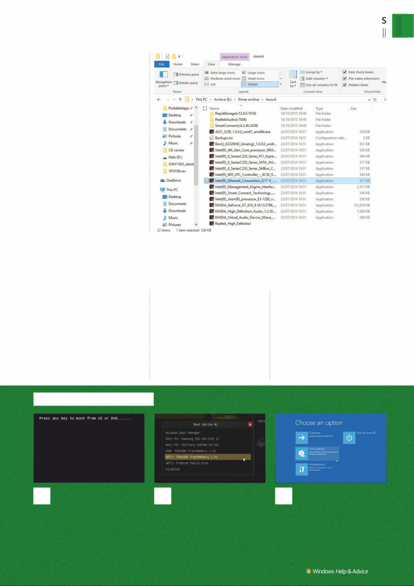
Basic
$IXOOG HVWUXFWLY HLQ VWD
December 2019
|
|
73
1
Reboot for media
If you’re running Windows 7, or
KDYH )DVW %RRW GLVDEOHG LQVHUW \RXU ERRW
media and start your PC. Look for a ‘Press
DQ\ NH\ WR ERRW IURP &' RU '9'· RSWLRQ
HYHQ LI \RX·YH ERRWHG IURP D 86% ÁDVK
GULYH ² SUHVV WKH NH\ DQG \RX VKRXOG ÀQG
the Windows install process starts.
2
Tweak boot options
If you boot back into Windows,
restart your PC again, but this time press
D NH\ VXFK DV >)@ ZKHQ SURPSWHG WR
open a boot menu. Do so, select your
ERRW PHGLD FKRRVH 8(), LI WKH RSWLRQ
appears) to boot; otherwise, enter Setup
to change the boot device order.
3
Windows 8.1/10
,I)DVW%RRWLVHQDEOHGRSHQ
Settings in Windows and navigate to
‘Update & recovery’ > Recovery, then click
‘Restart now’ under ‘Advanced start-up’.
When the boot op ti ons ap pear, choose
¶8VHDGHYLFH·WRVHOHFW\RXU86%ÁDVK
GULYHRU'9'IURPWKHOLVW
flash drive. Check the step-by-step
guide on page 71 for some pointers.
The reinstall process do esn’t differ
much across Windows 7, 8 .1 or 10.
You’ll be asked to verify your language,
location and keyboard are s et correc tly,
then it’s a case of clicking Install Now. If
prompted, enter your produc t key or
click Skip if you’re running Windows 10
on a PC you upgraded during the f ree
period. When asked what t y pe of
installation you wish to per for m,
choose the Custom option.
Next comes the trick iest p art of the
process. A list of drives and partitions
will appear – you need to se lec t the one
Windows is currently install ed on. B y
default, it should be detected and
selected , but verif y it ’s correct befo re
clicking Format (click the advanced
Drive Options button if it’s not visible).
Click ‘OK’, then once formatted, verif y
the drive is still selec ted and click Ne x t.
You’ll see a check list of task s to b e
perfo rmed – sit b ack and wait. W hen
Windows rebo ots, you may a ‘press any
key’ prompt to boot from CD or DVD.
Ignore and let the installer continue.
SET UP POST-INSTALL
The post-setup prompt begins with
Windows 7 users b eing p rompted fo r
their produc t key, then it’s a case of
setting up a user account. W indows 8.1
users will get an Exp ress S et tings
prompt – click the option to customise
these and go through them caref ully.
Post-Creators Up date, Wind ows 10 no
longer gives you an Express Settings
option. For now, confirm your l ocation
and keyboard, set up your net work if
required and choose ‘personal use’
when prompted. You c an either sign in
with your Microsof t account or click
‘Offline account’ > ‘Maybe later’ if you
plan to s tick with the old-st yl e W indows
7 local user account. If you opt for the
Microsoft account option now is a goo d
time to s et up a PIN to spe ed up future
logins (note: the PIN is tie d sp ecific ally
to this PC , and you can always by pass it
using your re gular account password
should you fo rget it at any point). You’ll
then be asked to set up Cortana – this is
where Windows 10’s notorious privacy
settings come into play, so review all of
the options carefully, flicking the slider
to Off for any you don’t ne ed or use.
That’s the end of the setup process
– Windows will configure itself based on
your choices and you’ll se e a series of
messages appear on -screen . W hen all is
ready, you’ll find yourself back at the
familiar Wind ows desk top screen of a
fresher, faster, smoother-running PC.
Start the install process
“Next comes potentially the trickiest part of the process.
A list of drives and partitions will appear – you need to
select the one W indows is curr ently installed on”
Make su r e yo u ’ve go t n e t wo rk a n d gr a ph i c s dr i ver s s o ur c e d.
Page 74
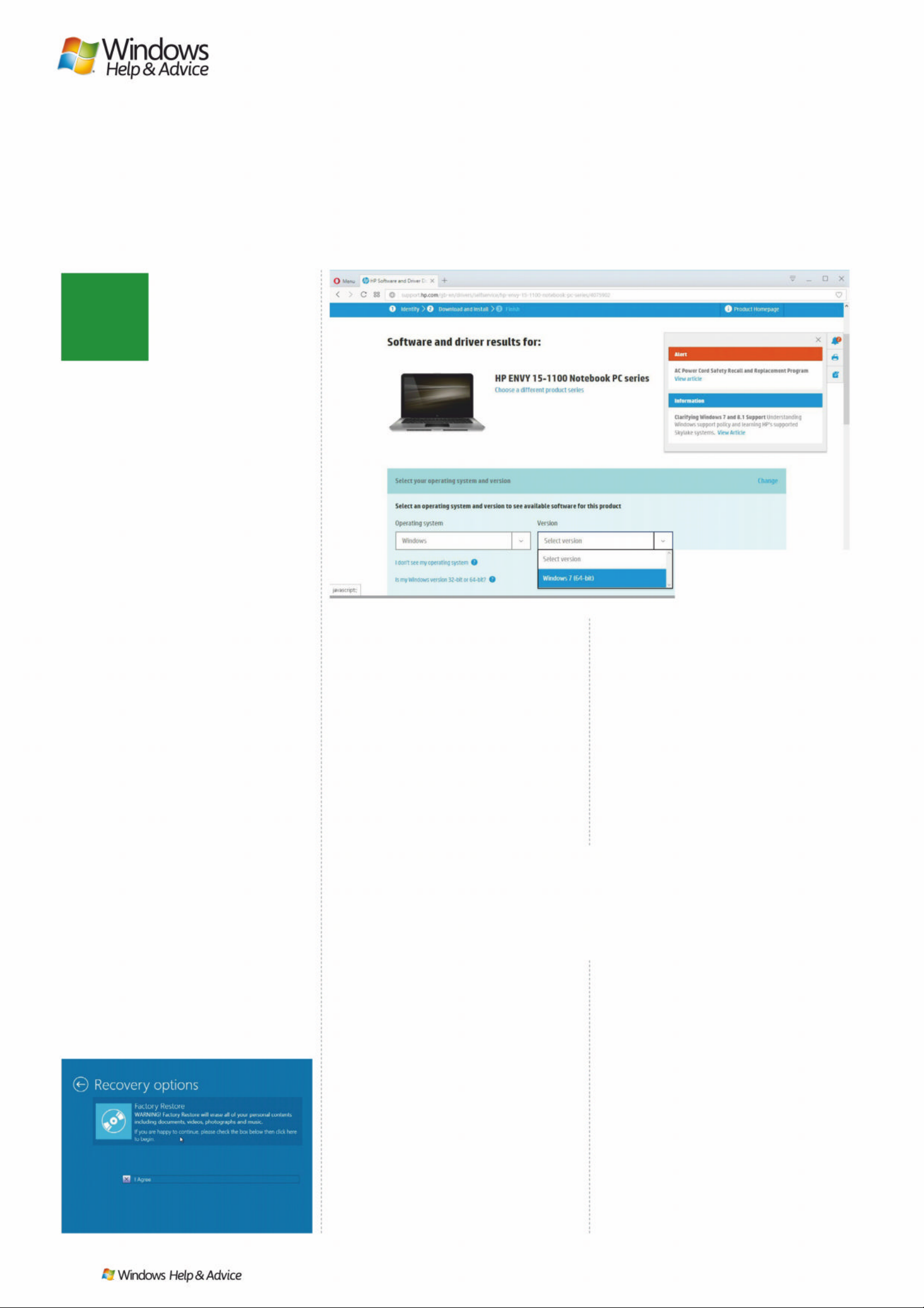
74
| |
December 2019
S
o far, we’ve covered
both traditional reinstall
techniques, but there
are other reasons –
and methods – for
reinstalling Windows.
First up is the recovery optio n. Most
pre-built PC s come with a built-in
manufacturer ’s recovery par tition that
enables you to restore Windows to its
factor y shipp ed condition. T he main
advantage of this me thod – aside fro m
being cheaper and easier for the
manufacturer, of course – is that your PC
is restored to a guaranteed working
state, with all the drivers it nee ds to
function. T he downsides are that a lot
of ex tra unwanted software is usually
installed alongside Windows, you nee d
to exercise e x treme caution not to lose
every thing on the dri ve, and that if the
recovery p ar tition corr upts – t ypic ally
due to hardw are f ailure – you’re lef t
with no means of reinstalling W indows.
If you’re planning to reinstall Windows
by this m ethod, look for a prompt to
start recovery when you first boot
Windows or look for the option under
the ‘Advanced start-up’ menu (see
below) – consult your computer’s
documentation or manuf acturer ’s
website for de tails. Remember that mos t
recovery options are fully d estruc tive, so
be sure to have backed up your system
before you begin – and that includes
creating a compl ete dri ve image.
DOWNGRADE WINDOWS
Another reason to reinstall Windows is
to revert to an earlier version. If you’re
pining for Windows 7 or 8.1, then it ’s
usually possible to downgrade your
copy of Windows – rememb er suppor t
for Windows 7 ends in Januar y 2020,
and Windows 8.1 in January 2023. Before
reaching for your old Windows me dia,
however, you need to do some
homework first.
First, if you upgraded your PC to
Windows 10 from an older version of
Windows, restoring that version should
be str aight for ward in the sense you can
use your manuf ac turer’s recover y
partition if it still holds the original
version, or you can try installing from an
old, unused copy of Windows 7 or 8.1
– just follow the guides to p reparing
and reinstalling Windows earlier on in
this feature. D o source the correc t
drivers for your PC fir st, though, and
verify that your new sof t ware is
backwards compatible (desk top apps
should be, but Microsof t Store apps
won’t work in Windows 7, and some may
not work in Windows 8.1 either).
If your PC came with Windows 8.1 or
10 preins talled , then going b ack to
Windows 7 will be trickier and possibly
even impossible. Before emb arking on
this, check the web to see if others have
had similar success. You’ll need to
source your ow n Windows 7 installation
media and valid licence, and you’ll
almost certainly need to have access to
your PC’s UEFI settings – if Fast Boot is
enabled, op en Settings > ‘Up date &
recovery’ and click ‘Rest ar t now ’ under
‘Advanced start-up’. When prompted,
select Troubleshoot > Advanced
Options > UEFI Firmware Set tings.
Once inside your PC’s UEFI settings
you need to loc ate and change thre e
settings. First, disable the Fast Boot
feature. Second, disable Secure Boot.
And finally, look for a CSM (Compatibility
Suppor t M odule) optio n an d make sure
it’s enabled . All three s et tings ne ed to
be made to supp or t Windows 7 – if you
can’t find them, consult w ith your PC or
motherboard manufac turer.
Once done, you should find you’re
able to boot f rom your Windows 7
installation me dia, enabling you to
revert to the earlier copy of W indows.
SET UP A DUAL-BOOT PC
Our final scenario is o ne w here you
install two versions of Windows side-by-
side. This is a step for advanced us ers
only, and if you’re me rely planning to
install an older version of Windows
next to Windows 10 for compatibility
purposes, explore alternative optio ns,
namely se tting up a virtual Windows 7
machine using a tool such as VirtualB ox
(www.virtualbox.org), which runs inside
your main W indows ins tallation.
If you are determined to dual -bo ot
your setup, the step-by-step guide on
the facing page covers the process of
installing an older version of Windows
alongside your current on e.
Before you begin also make sure you
take a f ail-safe drive image using
Macrium Refl ec t Free and b e sure to
create the rescu e m edia, too.
“If you’re pining for Windows 7 or 8.1,
it’s usually possible to downgrade
your copy of Windows”
Other reinstall options
*HWWKHORZ G R ZQRQWKU HHIXUWKHUWHF KQ L TX H V UH L Q VWDO OIUR PDUHF R Y HU\
SDU WLWLRQGRZQJUDGH:LQGRZVDQGVHWXSDGXDOERRWV\VWHP
Fetch the drivers for whichever
version of Windows you install.
Look u nd e r t h e ‘Adva nc e d s t ar t - u p’
menu for factory restore options.
Image credits (left to right) , HP, AOMEI Software, ASRock, Microsoft
Page 75
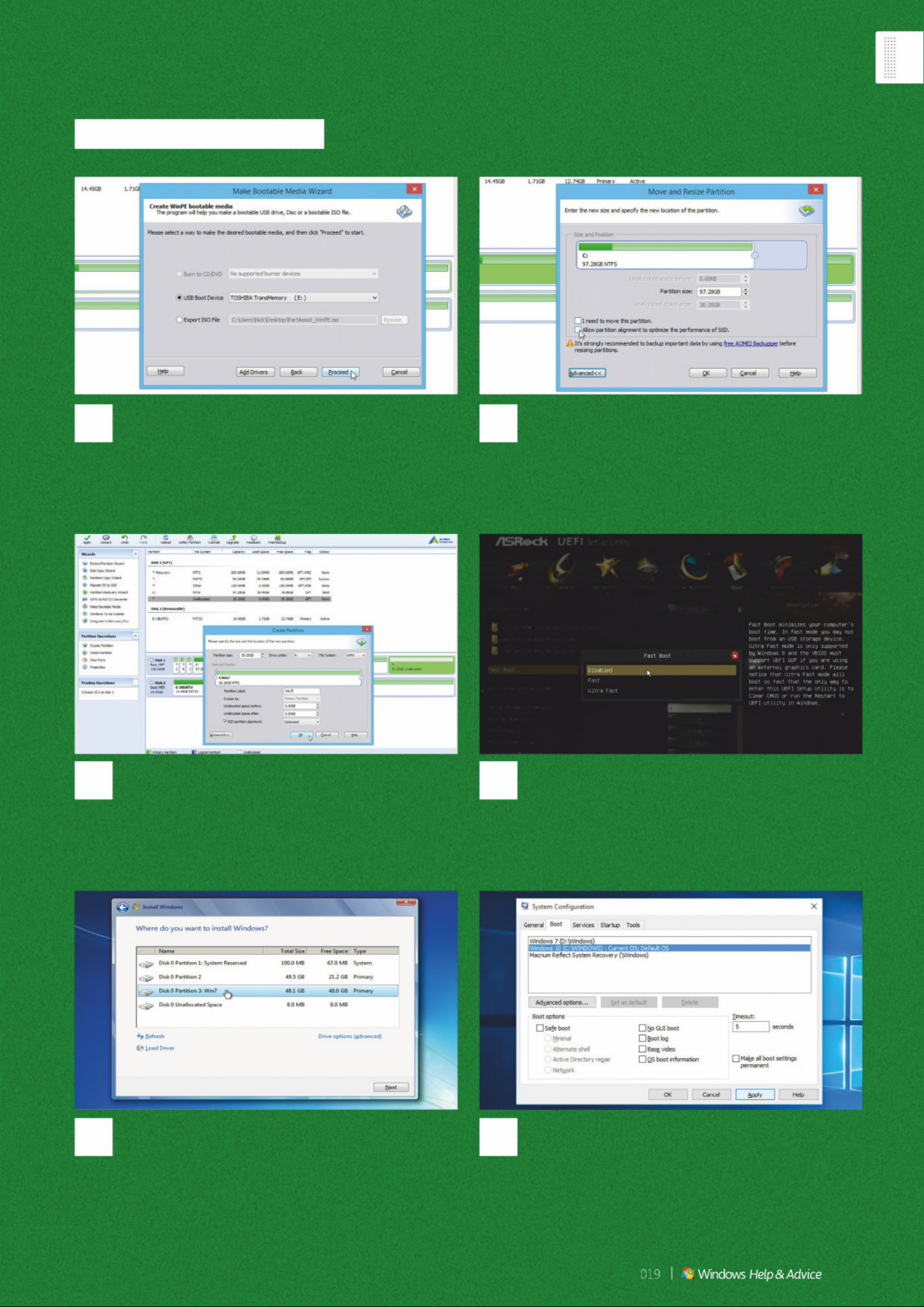
Set up a dual-boot PC
6
Post -install steps
:KHQ :LQGRZV UHERRWV IRU WKH ÀUVW WLPH \RX·OO VHH D ERRW
menu appear listing the different versions of Windows you have
installed. If the 30-second delay is too long, or you want to
change the default, Click ‘Start’ > Run, type PVFRQÀJ and
SUHVV >(QWHU@ WKHQ PDNH FKDQJHV IURP WKH %RRW WDE Q
5
Install new copy of Windows
Once the new partition has been created (check in
Windows), reboot using the installation media for your target
version of Windows. The install process is almost the same as for
a regular Windows installation, but be sure to choose the newly
created partition as your target during installation.
3
Add new Windows partition
Now select the newly created Unallocated space to
the right of drive C and click ‘Create Partition’ under Partition
2SHUDWLRQV9HULI\17)6LVWKHÀOHV\VWHPDQGFOLFN¶$GYDQFHG·
to give the partition a suitably descriptive label, such as Win7
before clicking OK. Click ‘Apply’ > Proceed and reboot.
4
TZHDN 8(), VHWWLQJV
If installing Windows 7 alongside Windows 8.1 or 10,
\RX PD\ QHHG WR UHERRW LQWR \RXU 8(), VHH WKH PDLQ WH[W WR
enable the Compatibility Support Module (CSM), plus disable
)DVW %RRW DQG 6H FXUH %RRW 2QFH GRQH \RX VKRXOG EH DEOH WR
boot successfully from your Windows 7 installation media.
1
Partition hard drive
You’ll need to partition your drive to free up space on
which to store your copy of Windows. The best tool for the job
is AOMEI Partition Assistant (www.aomeitech.com/aomei-
partition-assistant.html). Start by clicking Make Bootable
Media under Wizards to create rescue media.
2
Shrink main partition
Select your Windows drive (typically C:) and click Resize/
Move Partition under Partition Operations. Use the slider to free
up at least 30GB space to the right of the Windows partition. If
your drive is an SSD, click ‘Advanced>>’ and tick ‘Allow partition
alignment…’ Click ‘OK’.
December 2
|
75
Page 76

TERMS AND CONDITIONS Prices and savings quoted are compared to buying full priced UK print and digital
issues. You will receive 13 issues in a year. You can write to us or call us to cancel your subscription within 14
days of purchase. Your subscription is for the minimum term specified and will expire at the end of the current
term. Payment is non-refundable after the 14-day cancellation period unless exceptional circumstances apply.
Your statutory rights are not affected. Prices correct at point of print and subject to change.
Offer ends December 30 2019. For full terms and conditions please visit bit.ly/magtandc.
INTERNATIONAL
READERS CAN
SUBSCRIBE TOO!
WHY SUBSCRIBE?
Stop paying overseas cover
prices and save yourself money
Never miss another issue
All 13 issues a year will be delivered direct
to your home or workplace by airmail
Don’t wait for the latest issue to
reach your local store – subscribe
today and let Windows Help &
Advice come straight to you
TO SUBSCRIBE
Live in Europe?
Pay just €3 1 every 3 months
/LYHLQWKH86$"
Pay just $43 every 3 months
/LYHHOVHZKHUH"
Pay just $45 every 3 months
Helpline opening times are: 8am to 9.30pm weekdays, 8am to 4pm on Saturdays (BST)
TO SUBSCRIBE GO TO
P\IDY RXULWHPDJD]LQHVFRXNVXEZKD
Or call our helpline on ( +44) (0)344 848 2852
Page 77
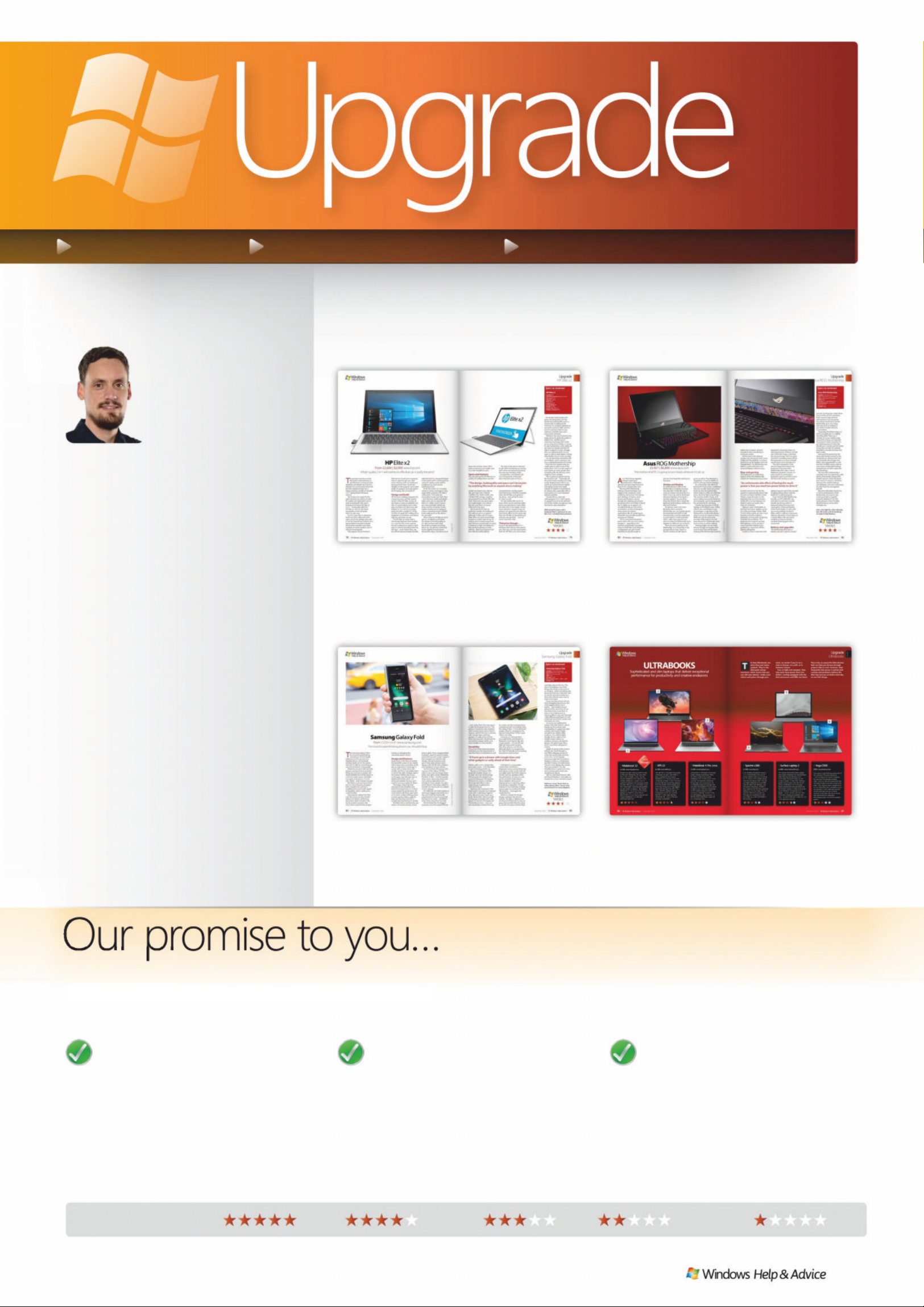
NEW HARDW ARE ESSENTIAL A CCESSORIES LA TEST GADGETS
The march
of the laptops
continues, with
new models
flooding from
the usual suspects.
We ’v e got a g reat 2-in-1
model from HP th is mon th,
along with something quite
specia l. The Asus R OG
Mothership isn’t really a
lapto p – we w oul dn ’t w an t it
on our lap – bu t it’ s the
high est-specced portable
comput er we ’v e seen. As far
as you can cal l somet hi ng
that needs two pow er bri c ks
portable, anyway .
To balance it out, we’ ve go t
a group test o f Ul tra books,
and Samsung ’s bendy phone.
Whichev er you c hoose,
enjoy yo ur PC.
Nick Odantzis Deputy Ed itor
Welcome
windowsmag azine@futurenet. com
RATING EXPLAINED
Superb GoodVery good Disappointing Poor
w
tion is your key to finding out about the latestThe Upgrade sect
gned to help you get more from your PCproducts, all desig
TTT
pp
Y ou can trust our reviews
Our reviewers are 100 per cent
independent, with years of
experience in the world of computing.
Our rigorou s t est ing procedu res mean
that only genuine, high-quality
products are awarded high star ratings.
If you see an item of hardware bearing
DKLJKVFRUH\RXFDQEHFRQÀGHQWWKDW
it is an excellent product.
We choose the best products
Thousands of new PC products
are released every year and
choosing between them can be an
impossible task. Our experts select only
the best hardware and software to
feature in this magazine. Even better,
our star rating system makes it simple
WRÀQGWKHEHVWSURGXFWVJLYLQJ\RX
a fast, trustworthy guide.
How we review
Our expert reviewers guarantee
to test every piece of har dware
rigorously and thoroughly, using
only acknowledged experts to
estab lis h th e wo rth of a produ ct.
We always review f rom the viewpoint
of our reade rs; the day-to-day
practic a lity and quality of a product
is paramount.
December 2019
|
|
77
84 Samsung Gal axy Fold
Relaunched after a delay to fix its hinge,
can a folding smartphone really work?
78 HP Elite X2
An elegant 2-in-1 model with premium
design and strong performance.
80 Asus ROG Mothership
A PC we’d suspect was a joke if we hadn’t
seen it with our own eyes. Unique.
86 Best Ultraboo ks
Thin, light and powerful, do these
premium laptops really offer it all?
This issue’s highlights
Page 78
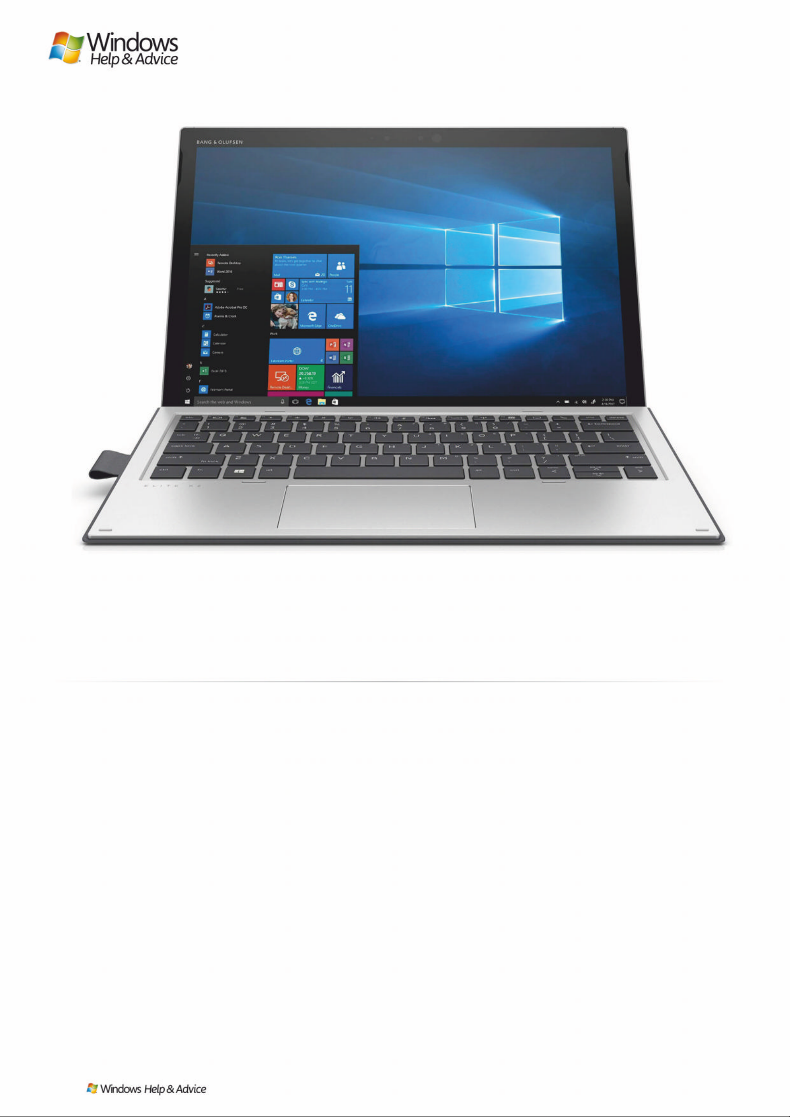
Images : HP
T
he general consensus is that
Microsoft’s early attempts to
get Windows running on
both desktops an d tablets was a
bit of a disaster, but several years
down the line the endeavour now
has a happy ending: a wealth of
versatile 2-in-1 laptop/tablet
Windows devices.
The Surf ace Pro might be the
gold standard, but plenty of other
PC makers are trying their luck as
well, including HP. Here we ’re
looking at the latest HP Elite x2
2-in-1 – technically called the
HP Elite x2 1013 G3, the latest
incarnation of the computer
that’s on sale now.
As 2-in-1s go, this is a premiumlevel one: that’s reflected in the
specs, and in the d esign, an d, we ll,
in the fact that HP has made it . It’s a
laptop/ta blet intended to tempt
the business traveller more than
students or home workers, but it’s
still got broad app eal.
That appeal may be limited a
little by how much you’re going to
have to spend to get one, with
prices starting north of £1,600 and
going up from there (check the
widgets on this page for up-to-date
deals). It’s going to cost you quite a
bit of money, but is it worth it?
Design and build
HP has been making computers for
a long time now, and the newest
version of the HP Elite x2 tick s all
the boxes in terms of aesthetics: it ’s
slim, it’s understated, and it mi xes
grey and black and silver very well
indeed. At 13.2 mm (0.52 inches)
thick and with a weight of 1.18 kg
(2.6 lbs), it’s great from sliding into a
backpack or a briefcase, and taking
with you wherever you go.
The HP Elite x2 comes with a
detachable keyboard that doubles
as a cover for the screen, and we
found it a pleasure to type on (and
easy to connect and disconne ct, by
the way) – much better than, say,
the official keyboard Apple bundl es
with the iPad Pro. Around the back
of the tablet itself is a kickstand, for
using it in laptop mode and for
propping it up when you’re
watching movies.
As for the screen, it’s 13 inches
corner to corner, running at a very
respect able resolution of 3,000 x
2,000 p i xels. The bezels are
reasonably chunky, but that’s fine
– and that extr a w idth an d d e pth
helps when you’re using the HP
Elite x2 in tablet mode. Colours
are crisp and bright, details are
sharp, and the computer scores
highly whether you’re typing an
essay or watching movies (Netflix
look s reall y g o od on this device,
for example).
After using the HP Elite x 2 we ’ve
got no complaints at all about
the design and build quality, as
it’s right up there with what
Microsoft an d Ap p l e are do ing .
We’re not 10 0 percent convinced
by the slightly recessed ports
around the edges, but there are at
HP Elite x2
From £1,600 | $ 2 , 000 www .hp. com
A hig h-qual ity 2-in-1 with pl enty to o ffer , bu t can it ju stify the pri ce ?
78
| |
December 2019
Page 79
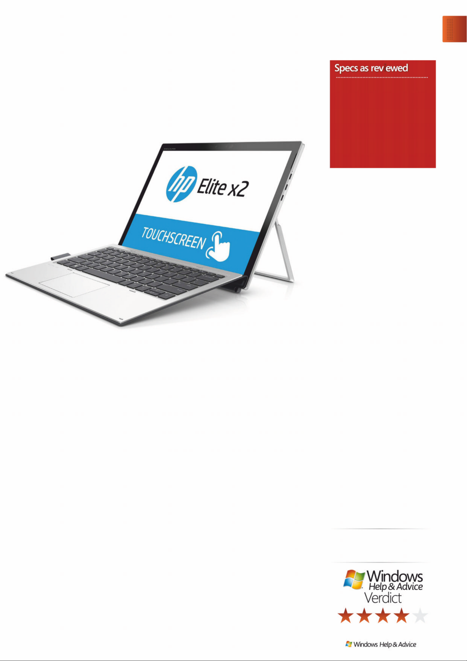
– the design, build quality and
specs are particularly can’t be
beaten by anything Microsoft or
anyone else is making at the
moment. It’s actually a pleasure to
use, and is going to take care of a
lot of computing tasks for you
without a problem (just some
excess heat, perhaps).
Windows has now evolved to the
stage where it’s perfec tl y usable in
tablet form, whether you’re
watching streaming video while
you’re away from holiday, or trying
to take handwritten notes while out
for work (we should note the HP
Elite x2 supports a stylus , though
this is an optional extra). It’s not
quite as slick as what Apple is doing
with iPadOS, but it’s more versatile.
On the downside, the battery life
isn’t brilliant, and it’s going to cost
you a substantial amount of money
– those are two reasons why you
might want to opt for one of the
many other 2-in-1s on the market. If
your needs are more simple, then
something like the HP Envy s e r ies
might be more suitable.
This is going to appeal most to
the business user – it provides all
the perfor mance needed, it’s really
nicely designed and solid to use,
and it can switch between tablet
and laptop modes very easily
indeed. It’s harder to recommend
for anyone else, especially with so
many great 2-in-1s and standard
laptops available.
Overall, this is a slick and
well-equipped 2-in-1 that’s going
to appeal if you’re at the premium
end of the market, though you may
find better valu e e ls ew h ere.
With powerful sp e cs and a
keyboard that’s a pleasure to use,
this 2-in-1 certainly feels premium.
least a lot of them: three USB-C
port s , a m e m o ry card reader, and
a 3.5 mm headphon e jack.
Specs and features
You can pick up the HP Elite x2 in a
variety of configurations, but the
model we tested came with an
8th- g e n Inte l Core i7-8650U
1.90GHz CPU, 16GB of RAM, and
512GB of SSD storage. Graphic s
are powered by an Intel UHD 620
chip. Those are very g ood specs
for a lightweight 2-in-1 device
like this, and that is of course
reflecte d in the p r ice.
We found the HP Elite x2
perf e ctly capable of handling all
the tasks we put it up a gainst,
although it does start to chug a
little when you have several large
images or a video opened up. As
long as you’re staying away from
jobs that you should really be using
a desktop or high -end laptop for –
like top-level gaming or video
editing – then you’re going to be
fine with this tablet/laptop.
The back of the device did tend
to get rather hot during our testing,
even when we were just browsing
the web and checking emails
– though this is a drawback with
2-in-1s in general, as they just
don’t have the space to fit in a
comprehensive cooling system.
The bottom line is that for everyday
tasks, the HP Elite x2 is going to
zip along – and will do for years
to come, as well.
HP says batter y life c an hit 10
hours when you’re watching video,
but in our experience it was a lit tle
less than that, in the region of nine
hours between charges. If you are
going to be away from the office (or
your home office) for the entire day,
then the HP Elite x2 should last you
until you can get back… but not
much more than that.
That price though…
If you’ve decided that the 2-in-1
Windows form factor is the one for
you, then you can’t do much bet ter
than the HP Elite x2 in a lot of areas
“The design, build quality and specs can’t be beaten
by anything Microsoft or any one else is making ”
Upgrade
HP E lit e x2
December 2019
|
|
79
i
HP Elite x2
Supplier HP
Operating system Windo ws 10 Pro
Processor Core i7-8650U
Storage 515GB SSD
RAM 16GB
Graphics Intel UHD 620
Connectivity Nano SIM, Wi-Fi 5,
Bluetooth 4.2
Weight fdssfkg
Screen size 13-inch
Display resolution 3 000 x 2000
Page 80
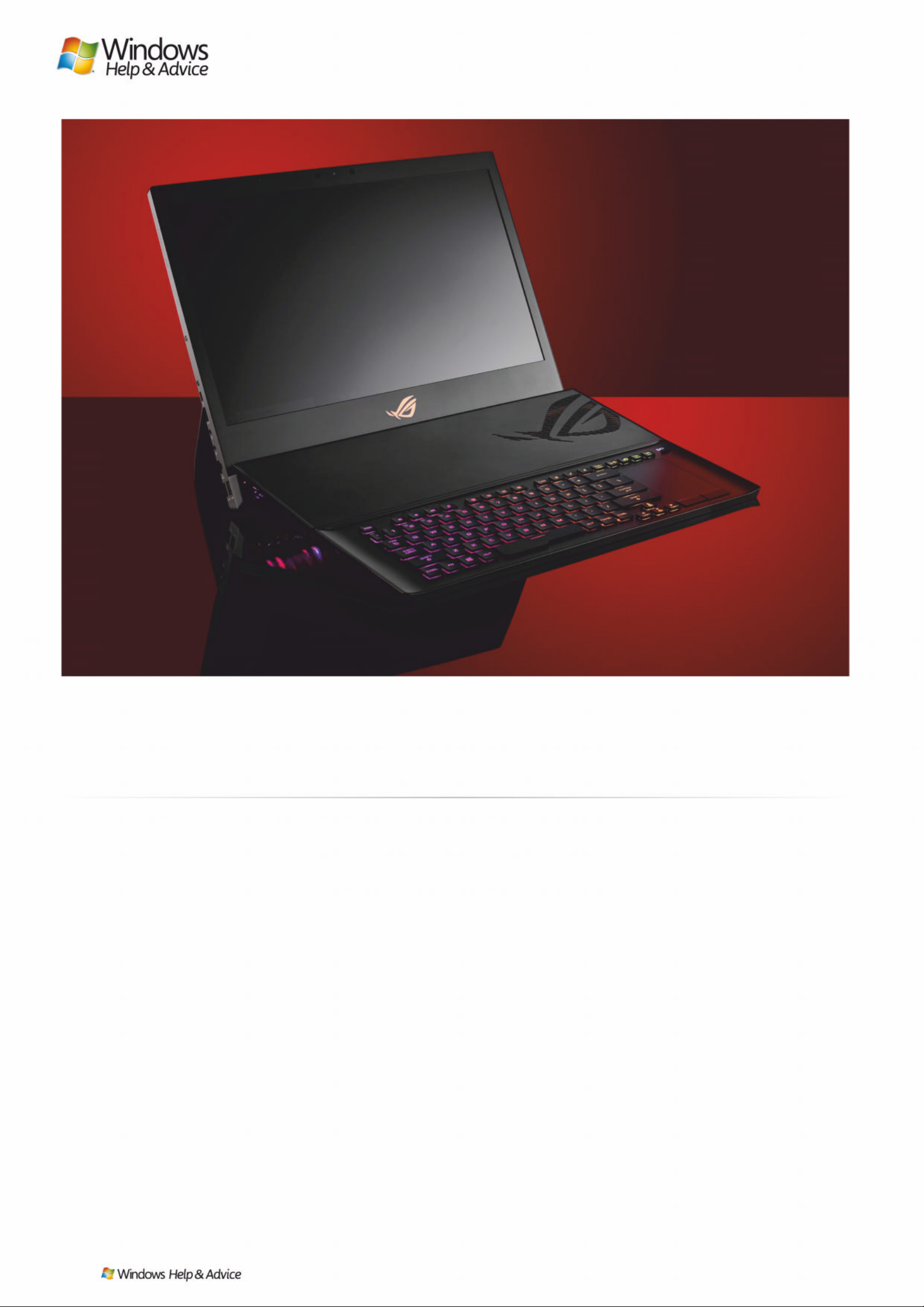
A
sus’ ROG lineup regularly
features impressive
specifications, RGB lights
aplenty, and price tags that you’ll
have to do a double-take over.
The Asus ROG Mother ship
follows in these footsteps, and
might be the company’s most
ambitious device ever. Part laptop,
part desktop, it features some
insane specifications, and an
equally eye-watering price tag to
go along with it. And while it clearl y
has its sights set on gamers, it’s
actually built like an entry-level
workst atio n, s o th os e l ooking for
sheer power for intense
applications like 3D rendering or
AutoCAD may actually benefit from
owning one of these.
This is a machine that pretty
much sticks wi th you o n ce you’ve
bought it – upgrading a few
internal components is possible
(more on that later), but whatever
configuration you get should
hopefully be good enough to
last you for at least the next four to
five years.
Design and display
It’s entertaining to refer to the
Mothership as a laptop, because
the only time it looks like one is
when it’s closed and ly ing flat o n a
table. Prop it up, and an automatic
kickstand deploys at the back to
provide suppor t . You can then
lower the bottom lip to reveal the
keyboard and trackpad, similar to a
Microsoft Surface.
Should you want a bit more
flexibilit y wh en using the
Mothership, you can quickly det a ch
the keyboard and fold it in half,
turning it into a wireless keyboard,
or even tether it via the included
USB-C cable. Asus says this was
done to make the Mothership more
adaptive to different use scenarios.
There are ports aplenty o n the
Mothership, so connectivity is not
going to be an issue. There’s a
decent number of USB Type-A
ports, as well as Thunderb olt 3 /
DisplayPort 1.4 and an HDMI 2.0
port for driving external displays.
An unfortunate side effect of
having this much power available is
that you actually need two power
bricks to drive the Mothership,
which makes it a little less effe ctive
if you decide to take it anywhere.
The machine itself is heavy, so if
you’re adding two power brick s to
your backpack, you’re not going to
be carrying this for very long.
Despite sporting just a Full HD
display, you’ll still get enjoy 14 4Hz
refresh rates and Nvidia G -sync
technologies, so gaming on the
Mothership is an absolute dream
when it comes to response times.
While the Full HD panel only
provides sRGB support, it’s still
quite decent for multimedia work
such as video or ph oto e diting .
Viewing angles are also fairly
decent, though we imagine that
most of your time will be spent
looking at the Mothership hea d-on,
Asus ROG Mothership
£5,4 5 7 | $ 6,800 www .asus.com
Thi s moth er of al l PCs is go ing t o turn he ads w here ver it’ s set u p
Images : Future
80
| |
December 2019
Page 81
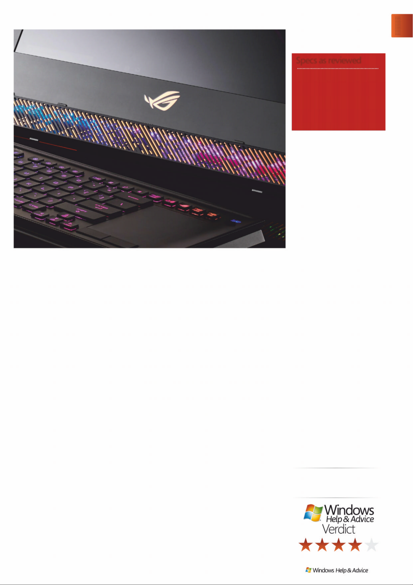
just yet. You’ll get just under three
hours of life out of it, and that ’s
from normal usage and not
attempti n g to run any games.
Our advice would be to set the
Mothership up in one space,
and only use it on battery if
you need to briefly r elocate
it somewhere.
Upgrading the Mothership is in
theor y possible, but is a slightly
daunting affair. There are a
number of screws hidden away
around the chassis, proving that
Asus doesn’t want consumers to
go tinkering around inside. But
should your curiosity get the be tter
of you like ours did, it is entirely
possible to unscrew the back and
peek inside.
Here you’ll be greete d by the
three SSDs firmly screwed to the
motherboard, sitting under their
own heatsink. We’d wager that
RAM is also upgradeable as well,
but that is hidden away under its
own more complicated-looking
heatsink that we didn’t quite feel
like disturbing.
The Asus ROG Mothership is
certainly a feat of engineering, with
plenty of powerful components
hidden away in a fairly deceptive
form factor. It crosses a weird line
betwee n the wo rld of laptops
and desktops, an d we ’re impressed
by what Asus has managed to
pull off.
But what ultimately stands out
is not the perfo r mance of the
Mothership, but its price tag.
Could you build an equally
powerful de sktop PC for the
same amount or le ss? Possibly.
Would it look as cool as this?
Probab ly not.
Gets a lot right for a first attempt,
but still needs a b i t o f tweaking
to make it truly flawless.
rather than trying to swivel it
around to show something to
someone nearby.
Performance with e xternal
screens was ver y g ood, both across
HDMI and Thunderbolt 3, so those
looking to use 4k disp lays won’t be
disappointed. Th e M othership was
able to comfortably drive two
external displays without issues .
Key s and gaming
The keyboard is an interesting
feature of the ROG Mothership.
Detach the keyboard an d you have
to wait a second or two for the
system to au to m a ti cally detect that
it’s now running in wireless mode.
There’s a manual switch on the
keyboard that turns the wireless
mode off or on, but leaving it on
doesn’t cause any issues, even
when it’s attached.
Typing is quite comfortable, as
the keys have been slightly curved
to cradle your fingers better. With
2.5mm of key travel, you don’t have
to press as hard to register a
keystroke, so long hours of gaming
shouldn’t be a problem. The
keybo ard also sup ports per-key
RGB lighting, so you can pick a
visual styl e that matches your
preferences, or just turn off the
lighting altogether.
A point to note is that when the
keyboard is att a che d , there ’s an
alarming amount of flex to it at the
part where the hing e is attached
just above the keys. We’d be quite
worried if something heavy fell on
this keyboard, as it most certainly
would cause some damage to it.
The other annoyance is the
second hinge the connects the
keyboard to the Asus ROG
Mothership often t akes a bit of
fiddling to properly connect. It’s
not as quick as connecting a
keyboard cover to an iPad or even
the Microsoft Surface, so you’re
going to spend a good few se conds
wriggling things about until the
keyboard is seated properly.
Given that the ROG Mothership
bundles an RTX 2080 GPU, we
were keen to see how it would
handle ray tracing, which is
being introduced to more and
more games. Firing up Shadow
of the Tomb Raider on Ultra with
ray tracing enabled clocked in
82fps, which is still very impressive.
Likewise, Remedy’s Control gave us
a steady 98fps with ray tracing
enabled, turning an already
excellent-looking game into a
visual treat.
Battery and upgrades
The Mothership does have a
batter y, but don’t get too excited
“An unfortunate side effect of having this much
power is that y ou need two po w er bricks t o driv e it”
Upgrade
Asus ROG Mothership
December 2019
|
|
81
Specs as reviewed
Asus ROG Mothership
Supplier www .asus.com
CPU 2.4GHz Intel Core i9-9980HK
GPU Nvidia Geforce RTX 2080
RAM 64G B
Storage 3x 512GB NVME SSDs
Connectivity 802.11ax Wi-Fi,
Bluetooth 5.0
Weight 4.8kg
Page 82
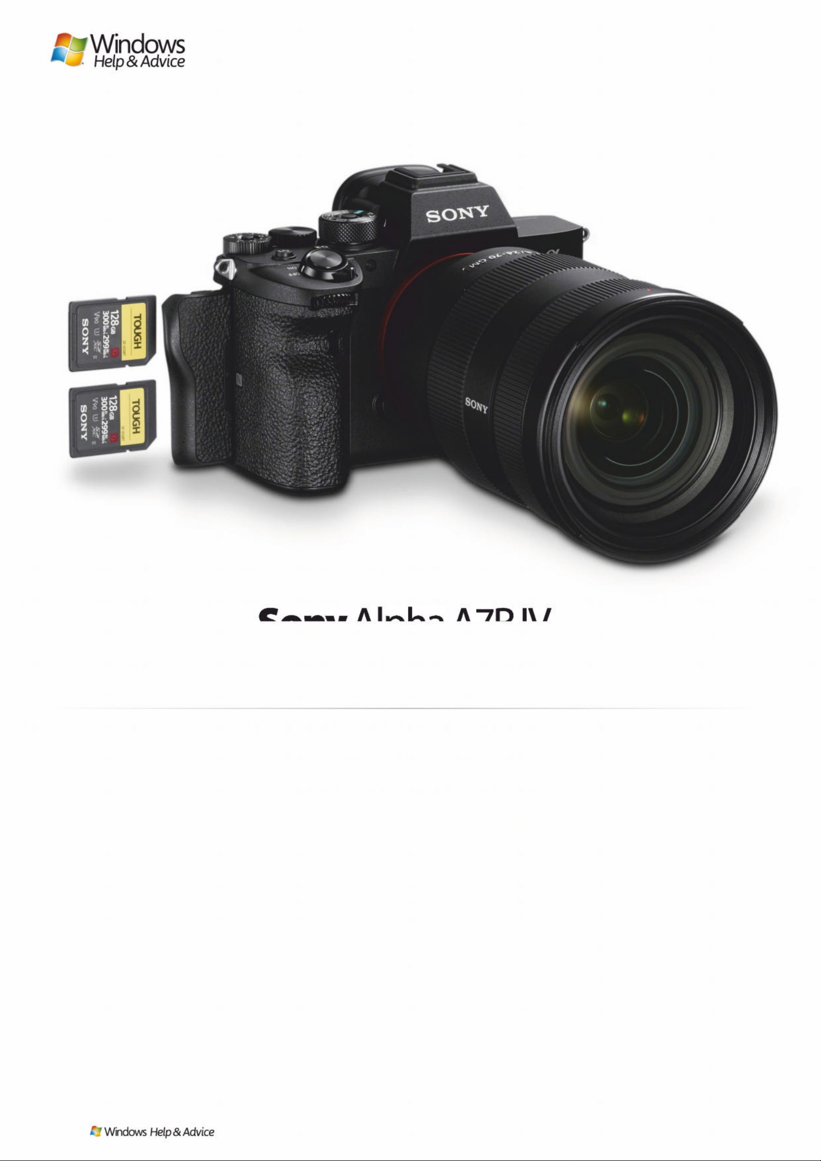
S
ony isn’t a company that tends
to do things by halves when it
comes to camera releases.
Sensor resolution may have
taken something of a back seat to
improvements to performance in
other areas in recent years, but the
‘R’ line has always been ab out
resolution, and it ’s unquestionably
the main pull of this new model.
The 63MP sensor outputs 61MP
images as standard and, as with the
sensor inside the previous A7R III,
boasts a b a ck-illuminated d e sign
for better light-gathering. Sony
promises up to 15EV of dynamic
range from the sensor, which is also
what it promised for the A7R III.
As is now standard on Sony
models of this calibre, SteadyShot
Inside image stabiliz atio n has als o
been incorporate d into the b ody.
This promises a maximum 5.5EVstop compensatory effect, and is
happy soldier on whether you’re
shooting stills or capturing vide os .
This system is also behind the
Pixel Shift Multi Shift shooting
mode, a feature we saw previously
but one that ’s been given a
significant boost here. T his c aptures
a series of images that can be
subsequently merg ed to create a
single, super-high-resolution fil e.
So what’s different? Whereas the
A7R III was able to capture images
destined for 169.6MP composites,
with its higher-resolution sensor
the A7R IV promises to deliver files
at a staggering 240MP. The catch is
that this can’t be done in -camera;
you need to use the Imaging Edge
software suite that’s bundled with
the camera.
Processor and screen
The latest iteration of Sony’s BIONZ
X Processing engine allows the
camera to capture images at a
rate of 10fps with autofocus and
auto-exposure enabled; while not
quite class-leading, that ’s still very
impressive when you consider the
higher sensor resolution here.
Sometimes you’ll need 61MP
images less than you will extra
reach from your lenses, and the
good news is that the Sony A7R IV
will let you shoot in an APS -C crop
mode (1.5x crop factor), with
resulting images output at 26.2MP.
This is another feature that has
existed befo re, b u t it’s been
upgraded here with increased
output resolution. APS -C lenses can
also be used on the body if you
have any of these, with images
again output at this resolution.
The sensor and p rocessor also
work together to capture 4K v ideos
to a maximum 30p, which can be
captured in both full - frame and
Super 35mm formats. When using
the latter, the camera records 6K
footage with full pi xel read out an d
no pixel binning to help improve
the quality of footag e, before
downscaling this to 4K.
Another key change from the
A7R III concerns the viewfinder.
It’s still a 0.5 -inch electronic
Son yAlpha A7R IV
£1,755|$3,498 www.sony .co.uk
More megapixels than you could ever possibly need
Images : Sony/F uture
82
| |
December 2019
Page 83
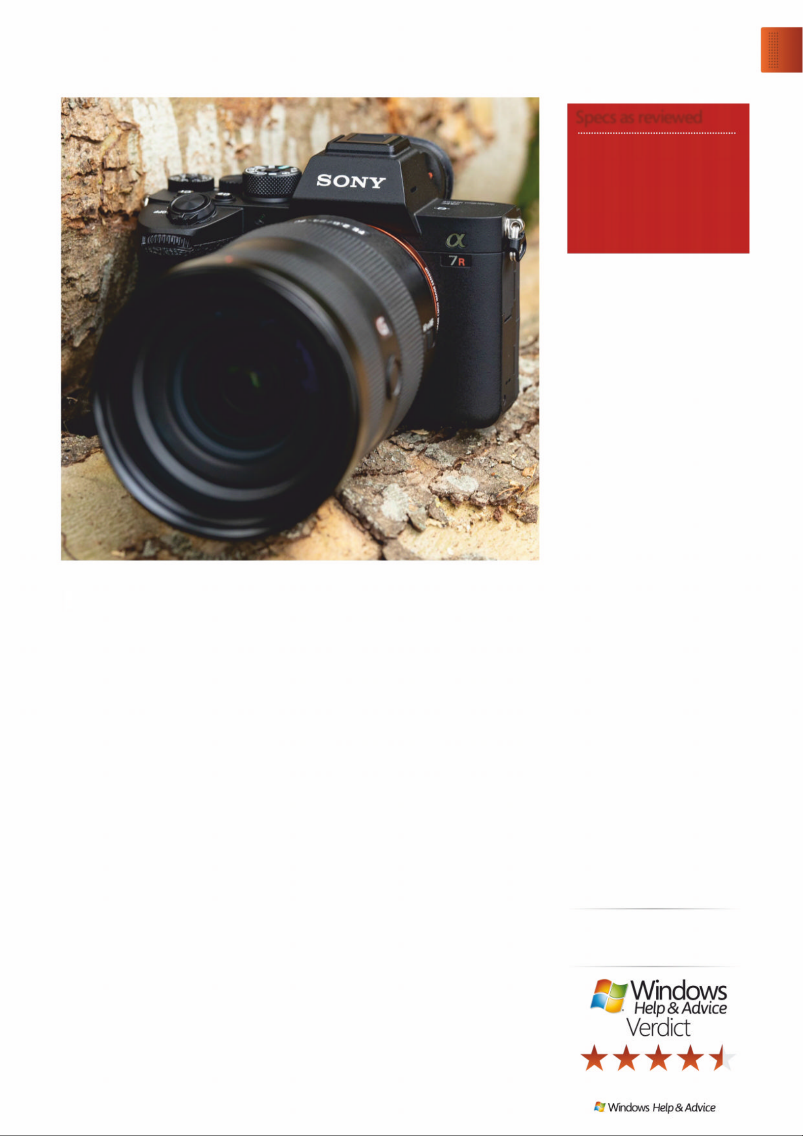
and only rarely adjus t exposure
compensation this may not be too
great an issue for you.
Autofocus performance
Straight out of the box, the Sony
A7R IV is not only capable of
keeping track of a moving subject ,
but happy to switch the focus to
the face when it detects that it’s
looking at a p erson, with eye
detection kicking in as the subject
gets closer. The fact that it sw itches
betwee n the two modes
automatically is a huge help, and
it’s this that really separates the
camera (and indeed, other Sony
models) from their competitors
right now.
When using the standard AF-S
mode, the Sony A7R IV is capable
of focusing on a subject w ith
impressive speed. On a sunny
day, when partnere d w ith the FE
24-70mm f/2.8 GM, the camera
would typicall y be able to focus
as soon as the shutter-releas e
button had been half-pressed. It
continues to focus with very little
delay in moderate light, even
without the AF assist lamp, which
only seems to wake up in more
testing conditions – this is handy in
situations where you might need to
shoot discreetly, and where the
illumination from the lamp might
attract attention.
And while it ’s launch price is
high, it’s not all unreasonable,
although the premium over the
A7R III is considerable right now, so
you really have to need the extra
pixels to make it worth your while.
Still, when you consider the cost of
some rivals, you’re getting a f air
chunk of camera in exchange for
your cash here.
While the A7R IV isn’t without
flaws, Sony has made it one of the
most desirable cameras out there.
iewfinder w ith an OLED panel
that refreshes at up to 120fps (or
100fps in PAL regions), and has a
magnification of 0.78x in 35mm
terms, but the resolution has
leapt from 3.69 million dots to
5.76 million do ts.
The rear display beneath it,
however, has stayed the same,
measuring three inches in size and
with a resolution of 1.44 million
dots. Once again this can be tilted
up and down for shooting from
awkward angles and can be
controlled by touch, although
touchscreen operation is a little
more limited here than it is on
some rival cameras.
Like the A7R III, the A7R IV has a
pair of SDHC/SDXC card slots
around its side, and Sony has
ensured that both slots support
UHS-II cards (the A7R III only had
both UHS- I an d UHS-II support in
one slot, and just UHS-I support in
the other).
Batter y life has als o b een
improved, with around 530 shots
able to be captured when using the
viewfinde r, and around 670 when
using the LCD screen – as always,
these are CIPA figures that are fairly
conservative compare d to what will
actually be achievable by the
average photographer.
Build and handling
The exposure comp ens atio n dial o n
the top plate now mirrors the mode
dial in having a locking button in it s
centre. This only needs to be
pressed once to lock and unlock,
which, on a dial this small, is far
more convenient than having to
hold it down whenever you want
to turn it .
The rear command dial that was
half embedded into the body on
the A7R III now sits proudly on the
top plate. This dial has a pleasingly
soft click to it, although it do es
make the mode dial next to it a
little harder to access than on the
A7R III, particularly as its locking
button nee ds to be p ress ed down
throughout its rotation.
There’s no getting around the
fact that having three dials in this
area means each has to be small,
and a little too close to the other s
for ideal operation, although if you
tend to stick to one exposure m ode
v
th
“It will not only track a moving subject, but switch
focus to the face when it detects it’s a person”
Upgrade
Sony Alpha A 7R IV
December 2019
|
|
83
Specs as reviewed
Sony Alpha A7R IV
Supplier www .son y.co .uk
Sensor 6 1MP full-frame, back-
illuminated Exmor CMOS
Lens mount Sony FE
Burst 10fps
AF points 567 phase-detect and 425
contrast-detect
Weight 578g
Page 84
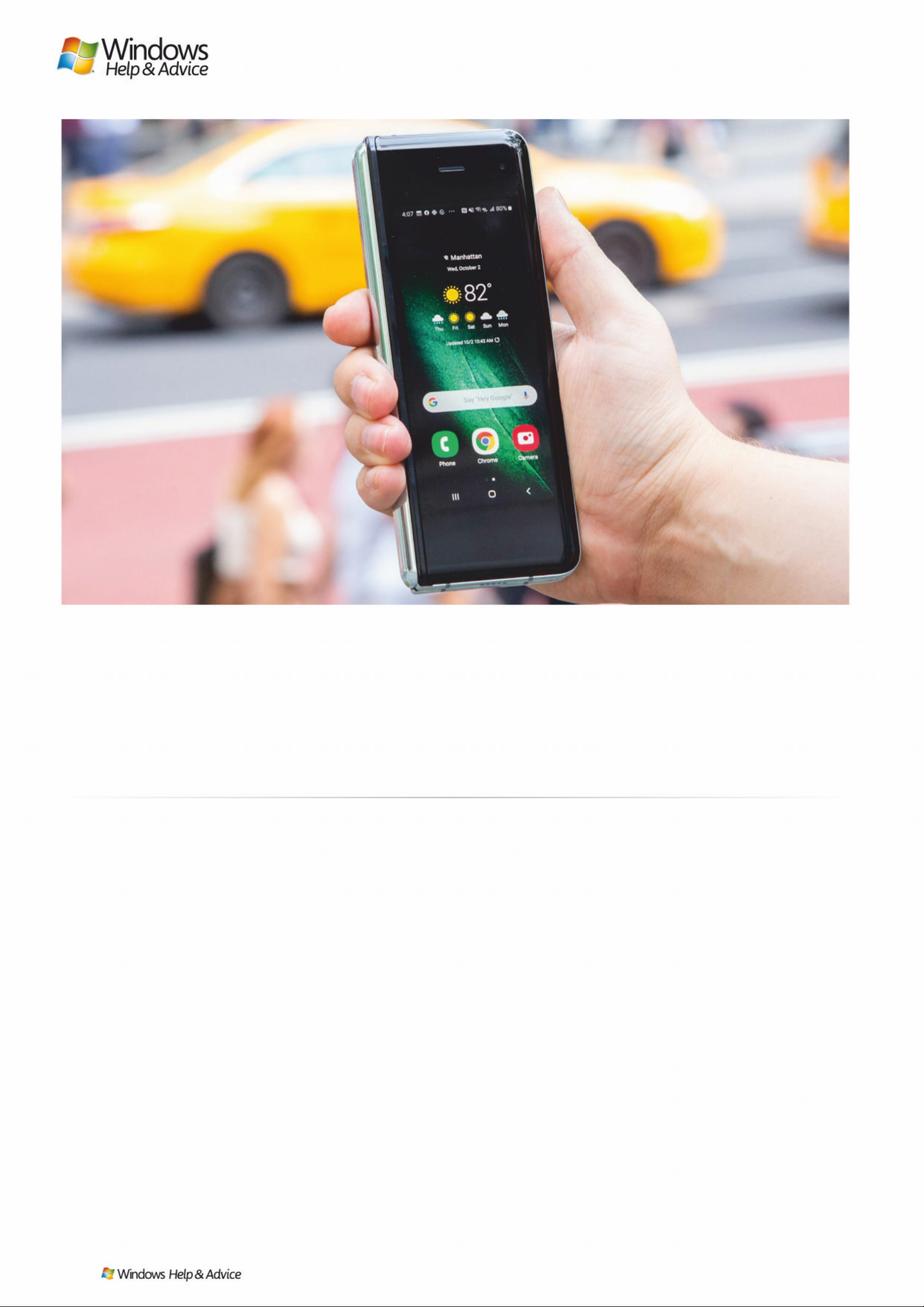
T
he Samsung Galaxy Fold is
the most forward -thinking
smartphone of 2019, finally
delivering on the promise of a
foldable phone, and instantly
turning heads out on the streets.
And yet, it’s still not some thing we
can recommend to most peo p l e.
Wherever we went wi th the Fold,
people wanted to know what this
thing was and how it worked. We
demonstrated how it folds d own to
a 4.6- inch outer screen, and folds
out again to become a 7.3-inch
mini-tablet – and it always amazed .
But there’s a second wow-factor
too: it’s twice the price of today’s
best smartphones, and has a
troubled track record with regard
to durability, which could prove
a deal-breaker.
Samsung has refined the Fold
over the course of a five-month
delay to its launch, reinforcing
the points where it broke in the
hands of early reviewers. But
we’re still in constant fear of pixel
tearing, or damaging the
vulnerable plastic screen .
Design and features
Good news: at the time of writing
the bendable screen of our G alaxy
Fold review unit is as pristine as the
day we unboxed it a week ago. It
comes with a crease down the
middle, but this is only visible wh en
it catches the light. A bigger deal is
the uneven refresh rate: as you
scroll pages, one sid e la gs ever so
slightly behind the other – it’s
barely perceptible, b ut you can’t
unsee it once you realise it’s there.
The Galaxy Fold is the best
example of why foldable is the
future of smartphones . Its 7.3 -inch
screen is built for productivity. We
multi-tasked with three apps o pen
as if it were a tablet. Editing photos
is easier, gaming takes a gigantic
leap, and showing someone a
complicated spreadsheet is do ab l e.
Its folded size is satisfying for one
reason: we loved carr ying a small
phone again. It’ll go unappreciated
in photos, and the extensive bezel
around the 4.6- inch s creen makes it
feel cramped; but hold this t all,
chunky, yet narrow phone and
you’ll swear glass phones aren’t
slipper y after all. We felt confident
one-handing it on busy streets.
The Fold inherits the power and
cameras of the Galaxy S10 Plus,
which is nice, but we missed some
photo and video mo d es offered by
the Note 10 Plus – that five-month
delay means Samsung’s latest and
most cutting -edge phone isn’t
actually its mos t c ap a b l e. You also
won’t find an S Pen stylus (which it
wouldn’t be wise to use on a plastic
screen anyway).
At 4,380mAh, the Fold’s battery is
Samsung’s biggest, and lasted us a
day-and-a-half. But battery life
varied based on how long we ha d
that big screen open – we killed it
in less than a day when we tried.
The Fold feels like the biggest
sensation since the original iPhone
Samsung Galaxy Fold
From £109/month www . s a ms u n g . com
The most f orward- thi nking ph one you s houl dn’ t buy
Images : Samsung/T echradar
84
| |
December 2019
Page 85
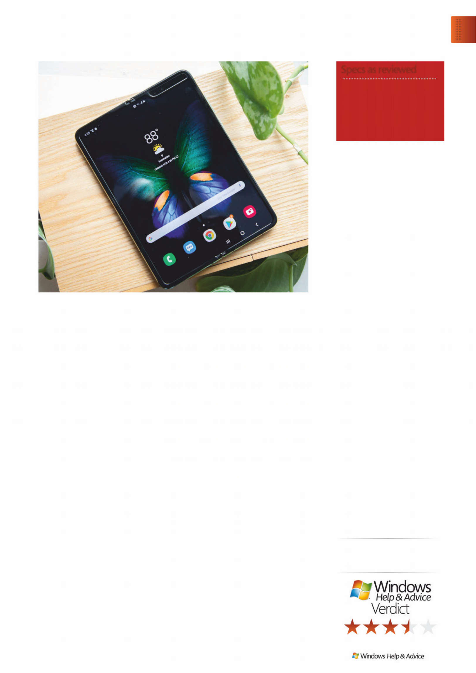
case that came in the box. This
ease of handling is one of the
things that struck us the most in
our testing – while everything else
about the Fold has a futuristic vibe,
its narrow size took us back to a
time when phones were easy to
hold in one hand.
If you love big screens, but are
tired of juggling big phon es , this
is the biggest pho n e we ’ve
tested… and smallest (recent
phone) at the same time. It ’s an
idea that’s been more than 10
years in the making and, as
Samsung likes to say, went through
1,000 different prototypes. It’s not
a bad start, but there’s surely more
innovation to come.
Samsung has outfit te d the
Galaxy Fold with HDR10+, which
bumps up the contrast ratio
considerably on supported video
content, and m ade it bright
enough to be solidly visibly
outdoors. You will find glare
literally shines a light on the
middle crease, indoors or
outdoors, and you can feel the
groove. The good news: like a
notch, your brain will ignore it
in time.
Harder to ignore is the uneven
refresh rate. Scroll through a
text-filled webp a g e an d you ’ll
notice the words shift unevenly
across the 7. 3-inch display.
Samsung makes the best phone
displays, so this is a compromise
we didn’t expec t. Its bezel-heavy
4.6- inch cover display also shouts
“first-gen pro duct”. Yes, the
foldable future is great, but it has
some obvious pain po ints you
should know about.
Still, it’s a technical marvel, with
technical limitations, and makes us
hopeful for a more round ed sequel.
Delivers a ‘wow’ factor that no
other phone offe rs. Yet we only
recommend it to early adopters.
– and, really, that’s the only reason
to take the financial risk on it. This
phone is strictly fo r early a d o pter s
with money to burn and a need to
impress, and it’ll en d up in a dr awer
with Google G lass an d other
gadgets so sadly ahea d of their
time. Everyone else should wait for
something cheaper, better, and
more durable in a few months .
Durability
The arrival of the Samsung Galaxy
Fold gives you the opportunity to
own the future of smartp ho nes an d
tablets, with a 2-in-1 design that
just makes sense – if the bendabl e
screen technology holds up.
The key to the Galaxy Fold’s
book-like foldable design is a
20-part, dual-axis lock ing hinge
that prevents the display from
overextending past 180 degrees.
Whereas the screen is delicate,
the hinge feels like it’s been
meticulously engineered to
withstand abuse.
Opening and closing the Fold
feels buttery smooth, and closing it
ends with a satisfying magnetic
click, like you’ve just clos ed up a
book. Remember what it was like
to hang up on people with a flip
phone or even an old telephone?
That feeling is back – only now,
you’ll probably swallow them up
in a video call. Also coming ba ck is
smartphone hef t . In it s folded state,
the Galaxy Fold is 17.1mm thick and
weighs 276g; for comparison, the
big-and-heavy Note 10 Plus is just
7.9mm and 196g.
However, it’s narrower than
you might think, and despite its
thickness it isn’t hard to slip into
a jeans pocket – it’ll even fit into
tight-yet-deep jacket pockets
that other phones can’t fit into,
although there’s no escaping the
fact that it’ll look like you’re packing
two phones back-to-back.
Unfolded, it’s a reasonable
7.6mm thick. You’ll find a
fingerprint sensor, power/Bixby key,
and volume rocker on the right (all
accessible when the Fold is open or
closed), and two speaker s at the
top and bottom. It’s easy to cover
up the powerful Dolby Atmos
stereo speakers when you’re
playing games or watching videos
in landscape orientatio n . Pro tip:
instead of uncomfortabl y cho king
up your grip, try rotating the Fold
180 degrees – most apps will
rotate just fine.
When it’s closed, the all -glass
design envelopes the phone’s
outside. The glass is slippery, but
we found its folded size so easy to
grasp that we didn’t feel the need
to use the two-piece Aramid Fiber
“It’ll end up in a drawer with Google Glass and
other gadgets so sadly ahead of their time”
Upgrade
Samsung Galaxy Fold
December 2019
|
|
85
Samsung Galaxy Fold
Supplier www .s amsung .com
Resolution 2152 x 1536 / 1680 x 720
CPU Octa-core Kryo 485
RAM 12GB
Storage 512GB
Rear cameras 16MP + 12MP + 12MP
Weight 276g
Specs as reviewed
Page 86
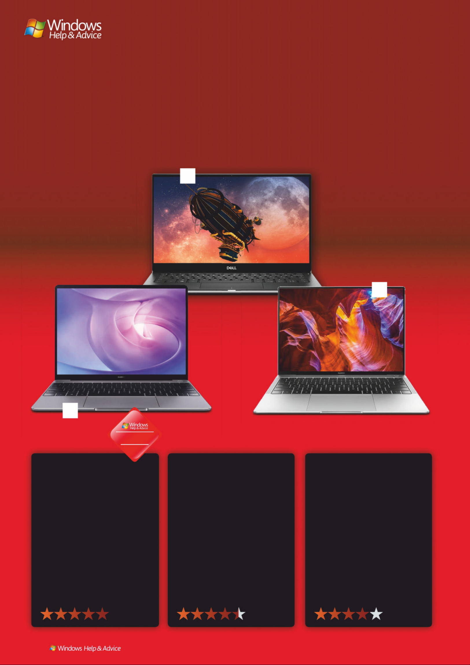
ULTRABOOKS
Sophisticated and slim laptops that deliver ex ceptional
performance for productivity and creative endeavours
1 Matebook 13
£1,200, www.huawei.com
Huawei has been biding its time to take
on the best Ultrabooks. But now, their
time in the limelight is here. Like the
Huawei MateBook X Pro before it, the
Huawei Matebook 13 packs a ton of
powerful hardware into a gorgeous shell,
all while offering it at a price that’s more
than reasonable. Those d iscret e g raph ics
are also worth a mention – the Huawei
Matebook 13 may be one of the tiniest
laptops out there to come with an
MX150 GPU. It’s not hard to see why
the Huawei Matebook 13 is the best
Ultrabook right now.
2 XPS 13
£1,100, www.dell.com
The Dell XPS 13 has been king of the
Ultrabooks for years, and while it’s
been unseated by the Huawei
MateBook 13, it remains one of the
Ultrabooks to beat in 2019. This time
around, Dell has moved the webcam
from the bottom of the display back
to the top, fixing one of the biggest
flaws that held back the XPS 13 for
years. Add the updated internal
components to the mix, and the
Dell XPS 13 still makes the best
Ultrabooks list – even in the face
of tough competition.
3 MateBook X Pro (2018)
£1, 000, www.h uaw ei .c om
Sometimes an Ultrabook arrives that
totally changes everything. When
the 2018 model of the Huawei
MateBook X Pro hit the scene, it did
just that. This beautiful Ultrabook
brings high-end components into
an elegantly designed package that
puts even the MacBook Pro to shame.
It really is one of the best Ultrabooks
on the market, despite its 2019
successor’s attempts to best it with
an Intel Whiskey Lake processor. It’s
still the 2018 model that’s captured
our computing cores.
Winner!
86
| |
December 2019
1
2
3
Page 87
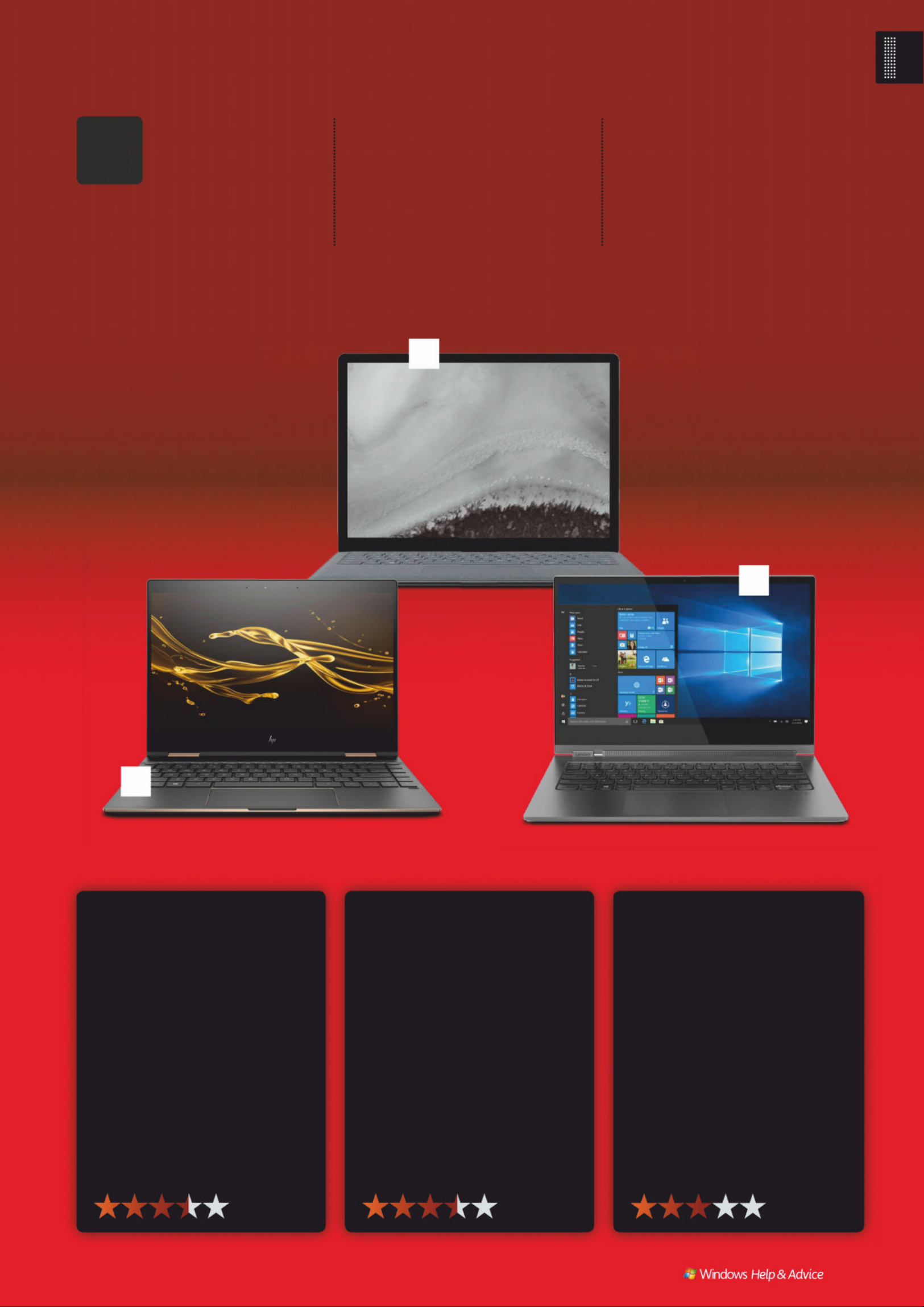
6 Y oga C930
£9 00 , www.le n o v o . c om
The Lenovo Yoga C930 has quite a few
of the makings of the best Ultrabook –
from an absurd 14.5 hours of battery life
and dual Thunderbolt-enabled USB-C
ports to internal components that will
easily handl e t hose daily productivity
tasks. That’s without even considering
it’s a 2-in-1 that offers form versatility
so you can squeeze in some light
gaming and movie-watching once
you’re done working. It has a few
cherries on top as well, specifically the
integrated self-charging stylus and the
fab speaker system.
4 Spectre x360
£1,000, www.hp.com
If an arresting Ultrabook housing
2-in- 1 functionality and a ton of
power satisfies what you’re looking
for, it’s hard to find a better laptop
than the HP Spectre x360. This slim
and light Ultrabook isn’t just filled
with the latest Intel Whiskey Lake
processors and plenty of RAM. It
also might just be the most exquisite
laptop you can buy today. The HP
Spectre x360 won’t just get you
through your workload, but will
also make you smart and stylish in
the process.
5 Surface Laptop 2
£1, 000, www.m ic roso ft.c om
The original Microsoft Surface Laptop
was a great Ultrabook, but had relatively
weak internals and Windows 10 S.
Fortunately, Microsoft rolled out the
Surface Laptop 2 in late 2018, offering
quad-core processors and the full-fat
version of Windows 10. It’s through
these fundamental improvements that
the Surface Laptop 2 is able to bring the
purest Windows 10 experience to a
laptop – not to mention, join the ranks
of the best Ultrabooks available right
now – at a price that won’t make you
run in the opposite direction.
he bes t Ultrab o o ks are
more than just st atus
symbols. They’re the
ideal grab and go
mach i n es, which means t hat you
can e d it your phot o s, rend er your
vide o s a nd power through your
T
work, no matter if you’re on a
train i n E u rope, at a c af é , o r i n
between classes.
Ever so lig h t a n d c o mpact, they
now pac k m o re power than ever
before, coming equipped with the
best process o rs and SSDs out the re.
They tr u ly are powe rful little de v i c es
that c a n help you breeze t h rough
projects like no one’s business. And,
freq u ently, that power is pa i r ed with
a pretty extraordinary bat t ery life
that m ay l a s t yo u an entire wo r k day
on one fu l l charge .
December 2019
|
|
87
Upgrade
Ultrabooks
5
4
6
Page 88
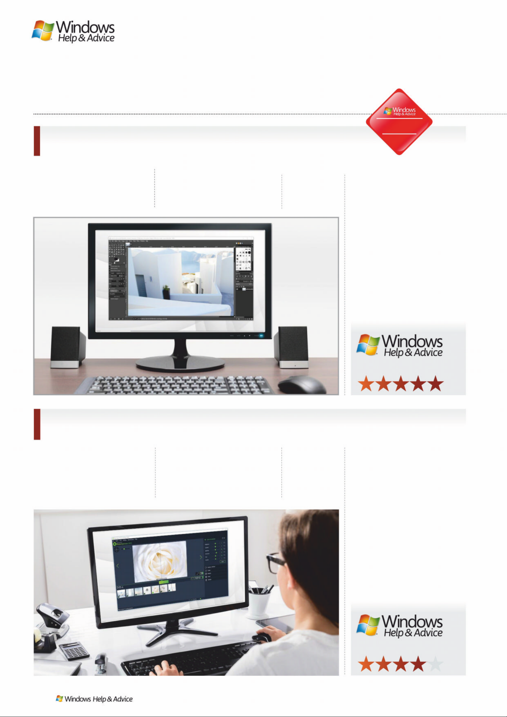
GIMP (the GNU Ima ge
Manipulation Program) is the
best fre e ph oto editor around. It ’s
packed with the kind of image enhancing tools you’d find in
1
GIMP
www.gimp.org
RA TING
premium sof t ware, and more are
being adde d every day.
The photo editing toolkit is
breathtaking, and features layers,
masks, curves, and levels. You
can eliminate flaws easily with
the excellent clone stamp and
healing tools, create custom
brushes, apply perspec tive
changes, and apply changes
to isolated areas with smar t
selection tools.
GIMP is an open source, free
photo editor, and its community of
users and developers have created
a huge collectio n of p lu gins to
extend its utility even further. M any
of these come pre-installed, and
you can download more f rom the
official glossary. If that’s not
enough, you can even install
Photoshop plugins.
RA TING
If you’ve got a lot of ph otos that
you need to edit in a hurry,
Ashampoo Photo O ptimizer 2019
could be the too l for you. Its
interface is clean and unclut tere d,
and utterly devoid of ads
(although you’ll need to submit an
email address be fore you can st ar t
using it).
Importing pictures is a bree ze,
and once they ’ve be en a dde d to
the pool, you can se le c t s everal at
once to rotate or mirror, saving
you valuable tim e. You can also
choose individual ph otos to
enhance with the software’s
one- click optimization too l. In our
tests this worked particularly well
on landscapes, but wasn’t always
great for other subje c ts .
If you want to make manual
color and exposure corre c tions,
there are half a dozen sliders to let
you do exactly that . It’s a shame
you can’t also apply the same
color changes to a whole set of
pictures at once, but this is
otherwise a br illiant fre e photo
editor for quick corrections.
If you want to
lear n G I M P, ther e ’s
a weal t h of
material online.
2
Ashampoo Photo Optimizer 201 9
www.ashampoo.com
For more advanced
editing, check out
Ashampoo Photo
Optimizer 7 – the
premium version.
THE BEST FREE PHOTO EDITING SOFTWARE
Get you r pi ctur es looki ng t hei r best, fo r free
Winner!
image credits: GIMP, Ashampoo, Canva, Fotor
88
| |
December 2019
Page 89
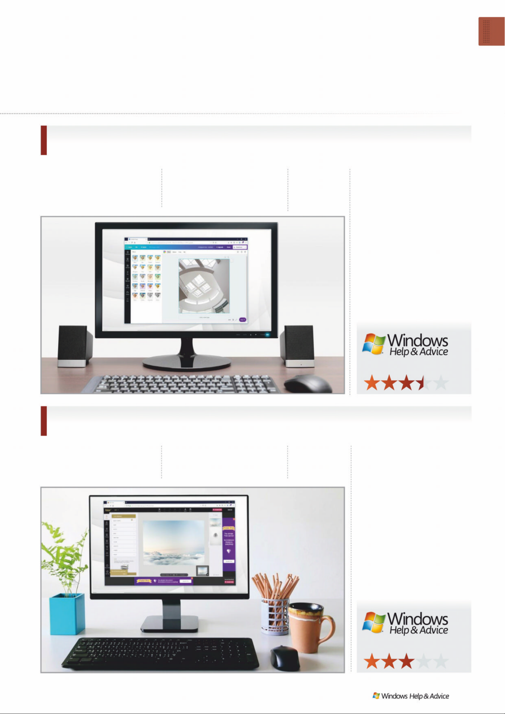
Canva is a photo editor that runs
in your web browser, and is ideal
for turning your favorite snaps
into cards, posters, invitations
and social media p ost s. I f you’re
3
Canva
www. canva.com
interested in maintaining a
polished online presence, it ’s
the perfe c t too l for you.
Canva has two tiers, free an d
paid, but the free level is pe r fe c t
for home users. Just sign up
with your email address and
you’ll get 1GB free cloud storage
for your snaps and designs,
8,00 0 templates to use and edit ,
and two folders to keep your
work organise d.
You won’t find advanced tools
like clone brushes and smar t
selector s here, but there ’s a set of
handy sliders for apply ing tints,
vignette effec t s, shar pening,
adjusting brightness, saturation
and contrast, and much more.
The tex t editing too ls are intuitive,
and there’s a great sele c tion of
backgrounds and other gr aphic s
to comple te your desi gns .
Fotor is a free photo editor that’s
ideal for giving your pictures a
boost quickl y. If there’s specific
area of retouching you need
4
Fotor
www.fotor.com
RA TING
doing with, say, the clone brush or
healing tool, you’re out of luck.
There’s a foolproof tilt-shift tool,
for example, and a raft of vintage
and vibrant colour tweaks,
all easily accessed through
Fotor’s clever menu system.
You can manually alter your
own curves and levels , too,
but without the complexit y
of high-end tools.
Fotor’s standout function,
and one that’s sorely lack ing in
many free photo editors, is its
batch processing tool – feed it a
pile of pics and it ’ll filter the lot
of them in one go, perf ec t if
you have a memory card f ull of
holiday snaps and need to cover
up the results of a dodgy cam era
or shaky hand.
py g
RA TING
A paid Ca nva
account includes
access to more
than 1,000 fonts.
If your needs are
simple, Fotor’s
stack of high-end
filters really shine.
Software Test
Best free pho to ed iti ng softwar e
December 2019
|
|
89
Page 90
*Hɢ PʝȾɏ ʓUʝə \ʝ ʦ ɠ :ʖQGʝZɡ 3 &
w w w.windowsmag.co.uk
In the
next issue...
HOW T O
Ȼ U se Windows Timeline
Ȼ Log on wi thout a passwor
ȻCustomise the taskbar
ȻReinstall Windows
* Contents subject to change
Catch up with us on…
www.twitter.com/windowsmagwww.facebook.com/windowsmag
90
| |
December 2019
A member of the Audit
Bureau of Circulations
rd
Future PLC Quay House, The Ambury, Bath BA1 1UA
Editorial
Editor Ian Evenden
Art Editor Jamie Schildhauer
Deputy Editor Nick Odantzis
Editor in Chief Graham Barlow
Senior Art Editor Jo Gulliver
Contributors
Alex Cox, Cat Ellis, Dan Grabham, Matt Golowczynski, Christian Guyton, Matt Hanson,
Carrie Marshall, David Nield, Nick Peers, Nick Rego, Matt Swider, Mark Wyciślik-W ilson
Photography
Future Photo Studio, Thinkstock.com
All copyrights and trademarks are recognised and respected
Advertising
Media packs are available on request
Chief Revenue Officer Zack Sullivan
Commercial Sales Director Clare Dove
Head of Commercial - Technology Dave Randall
Senior Advertising Manager Sasha McGregor
Account Director Andrew Tilbury
International
Windows Help & Advice is available for licensing. Contact the
International department to discuss partnership opportunities
International Licensing Director Matt Ellis
[email protected]
Subscriptions
Email enquiries [email protected]
Order line and enquiries +44 (0)844 848 2852
Online orders & enquiries www.myfavouritemagazines.co .uk
Head of subscriptions Sharon Todd
Circulation
Head of Newstrade Tim Mathers
Production
Head of Production Mark Constance
Production Project Manager Clare Scott
Advertising Production Manager Joanne Crosby
Digital Editions Controller Jason Hudson
Production Controller Nola Cokely
Management
Chief Content Officer Aaron Asadi
Vice President of Content & GEIC Bill Gannon
Head of Art & Design Rodney Dive
Printed by William Gibbon & Sons Ltd, 26 Planetary Road, W illenhall,
West Midlands, WV13 3XT
Distributed by Marketforce, 5 Churchill Place , Canary Wharf, L ondon, E14 5HU
www.marketforce.co.uk Tel: 0203 787 9001
ISSN 2050-5906
We are committed to only using magazine paper which is derived from responsibly
managed, certified forestry and chlorine-free manufacture. The paper in this
magazine was sourced and produced from sustainable managed forests, conforming
to strict environmental and socioeconomic standards. The manufacturing paper mill
holds full FSC (Forest Stewardship Council) certification and accreditation
All contents © 2019 Future Publishing Limited or published under licence. All rights
reserved. No part of this magazine may be used, stored, transmitted or reproduced
in any way without the prior written permission of the publisher. Future Publishing
Limited (company number 2008885) is registered in England and Wales. Registered
office: Quay House, The Ambury, Bath BA1 1UA. All information contained in this
publication is for information only and is, as far as we are aware, correct at the time
of going to press. Future cannot accept any responsibility for errors or inaccuracies
in such information. You are advised to contact manufacturers and retailers directly
with regard to the price of products/services referred to in this publication. Apps
and websites mentioned in this publication are not under our control. We are
not responsible for their contents or any other changes or updates to them. This
magazine is fully independent and not affiliated in any way with the companies
mentioned herein.
If you submit material to us, you warrant that you own the material and/or have the
necessary rights/permissions to supply the material and you automatically grant
Future and its licensees a licence to publish your submission in whole or in part in
any/all issues and/or editions of publications, in any format published worldwide
and on associated websites, social media channels and associated products. Any
material you submit is sent at your own risk and, although every care is taken, neither
Future nor its employees, agents, subcontractors or licensees shall be liable for loss or
damage. We assume all unsolicited material is for publication unless otherwise stated,
and reserve the right to edit, amend, adapt all submissions.
Future plc is a public
company quoted on the
London Stock Exchange
(symbol: FUTR)
www.futureplc.com
Chief executive Zillah Byng-Thorne
Non-executive chairman Richard Huntingford
!ǝǣƺǔˡȇƏȇƬǣƏǼȒǔˡƬƺȸ Penny Ladkin-Brand
Tel +44 (0)1225 442 244
USE A P ASSWORD MANAGER
Don’t l eave i t to cha nce, and d on’ t
reuse passwords. Secu re your o nlin e
accoun ts the easy way
ON SALE
Frida y
6 December
201 9
What to look out for, which apps to
install, what not to do: your complete
guide to using a brand new PC
Your first 30
minutes with a
NEW PC
Page 91
SUBSCRIBE TODAY AND SAVE!
www.myfavouritemagazines.co.uk/t3subs
ON SALE NOW!
Available at WHS mith, my favo uritemagazin es. co.uk
or simply search for ‘T3’ in your device’s App Store
Page 92

SUBSCRIBE TODAY AND SAVE!
www.myfavouritemagazines.co.uk/WHI/
ON
SALE
NO W!
DIGITAL ONLINE PRINT
9000 9001
 Loading...