

Page 1
CG-300/350
User Guide
Page 2

Page 3

Information in this document is subject to change without notice. No part of this document may be reproduced or
transmitted in any form or by any means, electronic or mechanical, for any purpose, without the express written
permission of Datavideo.
© Datavideo. All rights reserved. All Datavideo products are trademarks or registered trademarks of Datavideo.
Other brand and product names are trademarks or registered trademarks of their respective holders.
Limited Warranty
Datavideo warrants for a period of three (3) months after the date of delivery to you, (the “Warranty Period”),
the following: (a) that the Software will perform in substantial compliance with the “Users Guide”, provided that
it is used on the computer and with the hardware for which it was designed; (b) that the magnetic media on
which the software is distributed is substantially free from significant defects in materials and workmanship; and
(c) that the “Hardware Key” is substantially free from significant defects in materials and workmanship.
In the event of a breach of this warranty, Datavideo sole obligation is to replace or repair, at Datavideo option,
any product or component thereof, free of charge. Warranty claims must be made in writing during the
Warranty Period, accompanied by evidence satisfactory to Datavideo. All products should be returned to the
distributor from which they were purchased (if not purchased directly from Datavideo) and shall be shipped by
the returning party with freight and insurance paid.
This warranty does not cover abuse, shipping damage, neglect, tampering by unauthorized personnel, damage
inadvertently caused by the user, or any system or part thereof whose serial number has been removed or
defaced.
EXCEPT AS STATED ABOVE, THERE IS NO OTHER WARRANTY, EXPRESSED OR IMPLIED, REGARDING THE
PRODUCT INCLUDING, BUT NOT LIMITED TO, THE IMPLIED WARRANTIES OF MERCHANTABILITY AND
FITNESS FOR A PARTICULAR PURPOSE.
Datavideo Technologies Co., Ltd.
10F, 176 Jian-Yi Rd,
Chung Ho City,
Taipei Hsien,
Taiwan 235
Tel: +886 2 8227 2888
info@datavideo.com.tw
www.datavideo.com
Page 4

Page 5

Table of Contents
INSTALLATION ......................................................................................... 1
System Requirements .............................................................................. 1
Operating System ................................................................................................. 1
Processor CPU...................................................................................................... 1
RAM ................................................................................................................... 1
Hard Disk Space .................................................................................................. 2
Graphics Card ..................................................................................................... 2
Video Interface Card ............................................................................................ 2
USB Port .............................................................................................................. 2
Installing the Software ............................................................................ 3
Installing the Hardware Key .................................................................... 3
Checking the Installation ......................................................................... 3
Connecting to your facility ....................................................................... 3
Downstream Connection ....................................................................................... 4
Upstream Connection ............................................................................................ 4
INTRODUCTION TO CG-300/350 .............................................................. 7
CG-350 User Interface ............................................................................. 7
Graphic Composer Tab ............................................................................ 9
Menu ................................................................................................................ 11
Toolbar ............................................................................................................. 11
Page Manager ................................................................................................... 13
Project Pages .................................................................................................. 14
Page Templates .................................................................................................. 14
Graphic Compose Window ................................................................................. 14
Layer Manager .................................................................................................. 15
On Air Buttons ................................................................................................... 16
Layer Controls ……………………………………………………………………………… 16
Text Control Tabs ………………………………………………………………………….. 17
Color Box Controls ……………………………………………………………………... 18
Background Graphic Controls .......................................................................... 19
Animation Controls …………………………………………………………………...... 19
Status Bar …………………………………………………………………………………… 20
Main ON AIR Tab ………………………………………………………………………… 21
Media Catalogs ……………………………………………………………………………. 21
Playlist ………………………………………………………………………………………. 21
I
Page 6

Preview Window ………………………………………………………………………….. 22
ON AIR Controls ................................................................................................ 23
Animations Tab ..................................................................................... 24
Animation Catalog ………………………………………………………………………… 24
Animation Controls ............................................................................................. 25
Banner Crawl Tab ……………………………………………………………………….. 26
Crawl Catalog ……………………………………………………………………………. . 27
Banner Crawl Controls ……………………………………………………………………. 27
TUTORIAL .............................................................................................. 29
Editing Text ........................................................................................... 29
Create a new Project .......................................................................................... 29
Create New Page ............................................................................................... 30
Graphic Compose Window ................................................................................. 30
Typing Text ........................................................................................... 31
Moving the Cursor .............................................................................................. 31
Editing .............................................................................................................. 31
Saving the Page ................................................................................................. 32
Erasing Text ....................................................................................................... 32
Backspace ......................................................................................................... 33
Row Space Allocation ......................................................................................... 33
Setting Cursor Position with Mouse ....................................................................... 33
Text Attributes Styles …………………………………………………………………… 34
Cursor Handles ..................................................................................... 37
Scope Selection ..................................................................................... 38
Row Spacing (Leading) .......................................................................... 39
Grabbing and Applying Attributes ......................................................... 39
Text Style Gallery .................................................................................. 40
Changing Preset Text Styles ................................................................................. 40
Layers ................................................................................................... 41
Main ON AIR …………………………………………………………………………...... 44
Animations ………………………………………………………………………………… 47
Banner Crawl …………………………………………………………………………….. 53
II
Page 7

Chapter
1
Installation
This chapter explains how to install the Software and Hardware Key (dongle) for the
Software. It also describes the type of system you will need before you can run the
program.
System Requirements
Operating System
CG-300/350 is designed to run under Windows XP, Vista, Windows 7, or Windows 8.
You will need one of these operating systems (or later versions) on your computer in order
to run the program.
Processor CPU
The type of processor that you will need depends on what you will be doing with the
program. If you are going to display still titles and images without any animation, then a
single core 1GHz 32-bit processor will be sufficient. However, if you will be running full
screen animations with multiple layers you should have at least a Dual Core 64-bit CPU
running at a speed of at least 3GHz.
RAM
The RAM requirements also depend on what you are using the program for. If you are
displaying Standard Definition stills, then 2GB of ram is sufficient, providing your copy of
Windows will run with that much of ram. For High Definition stills, you should have at
least 3GB. If you are displaying animations you must have at least 4GB.
Although the CG-300/350 will play animations with only 4GB of memory, please keep in
mind that if you are displaying large animation files, the animations will run smoother if
there is enough memory to load the entire Animation before it starts. Otherwise the
Animation may pause while the rest of the file is loaded from the disk drive. In most cases
10GB should allow the software to perform to its full potential.
1
Page 8

Chapte
r 1 –Installation
Hard Disk Space
You must have at least 100 Mbytes of unused Hard Disk space to install the CG300/350. If you intend to create many Background Graphics, or save a lot of pages as
graphic images (i.e. BMP, TGA, etc), make sure that you have enough Hard Disk space
available. Saving pages in the CG-300/350 Page (PAG) format doesn’t require large
amounts of disk space (approx. 2-4 Kbytes per page) unless logos or textures are added
to the page.
Graphics Card
The graphics card is connected to the computer’s monitor and is used to display the
program’s User Interface. The Graphics card must be set to 16, 24, or 32 bits per pixel.
If you run your graphics card in 16 bits per pixel mode, the color gradients may not
appear smooth on your computer monitor. This will not affect the quality of the Title
Graphics that are produced. They should appear very smooth in 24 or 32 bits per pixel
mode. The program will not run if the Graphic mode is set to 8 (or less) bits per pixel.
The Graphics Card should also be set to a resolution of at least 1280 by 720 pixels. The
program will still run at lower resolutions, but you may not be able to see the entire User
Interface.
Video Interface Card
This card is different than the Graphics card. This card is used to generate the output of
the CG-300/350 and to connect it to the rest of your facility. If you intend to key the
graphics over video, this card must either be capable of doing this, or of generating the
signals required by an external Keyer (typically your switcher).
The Video Interface cards that are currently supported by CG-300/350 are:
Black Magic Design’s - Decklink Cards
Black Magic Design’s – Intensity Cards
AJA Video’s – Kona Cards (LHe and LHe+)
A second Video Output of your computer. (Does not support keying)
The choice of which card you should use is determined by your studio setup, requirements,
budget and personal preferences.
USB Port
The computer must have at least 1 unused USB port to install the Hardware Key (Dongle).
2
Page 9

Chapte
r 1 –Installation
Installing the Software
NOTICE: DO NOT INSTALL THE HARDWARE KEY (DONGLE) UNTIL THE
SOFTWARE HAS BEEN INSTALLED.
The software can be installed from either a CD or from a Setup file that has already been
copied to your system by downloading from the Datavideo website or by other means. To
install from a CD, place the CD into the drive. If the “Install Window” does not
automatically appear after a few seconds, run the “SETUP.EXE” program from the CD.
Select the program to install (CG-300/350) and the system will begin installing the
software. If you are installing the software from a Setup file that has already been copied
to your system, run it to begin installing the software. Follow the installation instructions on
the screen until the software is completely installed. Once the software installation is
complete, your computer may restart.
Installing the Hardware Key
Once the software is installed and the computer has restarted (if necessary), the Hardware
Key (dongle) can now be inserted into one of your computer's unused USB Ports. A
“Found New Hardware” window may appear the first time that the dongle is inserted.
Once this window goes away, the program is ready to run.
Checking the Installation
Run the program to test the installation by double clicking the “CG-300/350” Icon on the
desktop. The program will start and the program's windows should appear after a few
seconds.
Connecting to your facility
There are two different ways to connect a Character Generator into your television facility.
The simplest configuration is to connect the CG to the output of your switcher or camera
and let the CG overlay (key) the graphics over the video. This is called “Downstream” or
“Internal” keying. The other method is “Upstream” or “External” keying. In this mode, you
use your switcher to do the keying. This mode requires that both the “Key” and “Fill”
outputs of the CG be connected to the switcher. Not all video cards support both of these
two outputs.
3
Page 10

Chapte
r 1 –Installation
Downstream Connection
When using the CG in a downstream configuration, the system uses the Internal Keyer of
the video card. To configure the system for downstream mode you will need to connect the
video that you want the graphics to be keyed over to the input of the video card. Different
video cards have different types of video input connections. These may include one or
more of the following:
1. Serial Digital Interface (SDI/HD-SDI)
2. HDMI
3. Analog Component – YPrPb
4. S-Video – Y/C
5. Composite Video – CVBS
Only one video input type is active at one time. For example, you cannot key over an SDI
and composite video source at the same time. If your video card has multiple types of
inputs, you will need to select which one you want to use. This is usually selected in the
Video Settings window. Some video cards (such as the Decklink) have a control panel
where you can select the desired input. The Video Card will now output the input video
with the graphics keyed over the top of it. Most video cards have multiple types of video
outputs (SDI, Analog, etc). These are frequently simultaneously active so that you don't
need to configure the video outputs. However, some cards do use the same connectors for
different video output types. For example, the same connectors on the AJA Kona LHe+
card can be configured as either component or composite outputs. In these instances you
will need to configure the outputs. See the documentation that comes with your video card
for more information. Warning: When connecting a video source to the input of the CG
from a switcher or a video router, make sure that it is not derived from the video output.
This causes a video feedback loop and your video will become very unstable.
Upstream Connection
To configure your system for upstream mode you will need to feed the Character
Generator a “Reference” sync signal. This is used to synchronize the output of the CG to
the rest of the video in your facility. The requirements for this reference signal varies
depending on the video format and the video cards that you are using. See the
documentation that came with your video card for more information.
The Upstream configuration uses a Keyer that is external to the Character Generator. In
order for this external Keyer to work properly, it needs a “Key” and a “Fill” signal from
the video card. The Fill signal contains the graphics to be keyed. The Key signal tells the
Keyer which pixels to display as background and which pixels to display as the graphic. It
should also be able to control the “ratio” of background video and foreground graphic to
display semi-transparent graphics and anti-aliased text.
4
Page 11

Chapte
r 1 –Installation
Not all video cards support both Key and Fill outputs. These cards cannot be configured
for upstream keying.
5
Page 12

Page 13

Chapter
2
Introduction to CG-300/350
The CG-300/350 is an extremely powerful Video Titling Program designed specifically for
the Live Broadcast and Video Post Production environment. It comes with a very flexible,
easy to use Graphic Composer for creating High Quality Title Pages. Once the page has
been composed, they can be displayed automatically or completely under manual control.
A Playlist can be created ahead of time to make On Air usage a simple one Keystroke
Operation, or you can randomly select the Title Pages while On Air. Even with a Playlist,
you still maintain the flexibility for those “Last Minute” changes.
CG-350 can also be used to display Standard Format Graphic Images as well as
Animation Sequences. Animation sequences can be created in your favorite Animation
program and played On Air using CG-350. Title Pages, Graphic Images, and Animation
Sequences can be freely intermixed with one another in any order.
Title Pages can contain Text (of course), Background Color boxes, Geometric Shapes, Full
Color Graphic Images as Logos or Background. With the Snyper option (CG-350 only)
you can also add both Foreground and Background Animations to the page.
CG-300/350 User Interface
If you don’t have the software installed yet, please follow the directions in Chapter 1. The
first time that you run the program you will be asked to setup the Video Interface Card(s).
This includes settings such as Video Format (NTSC, PAL, 1080i 59.94, etc.), Video
Inputs/outputs, Internal/External keying, etc. These settings vary depending on which
type of Video Interface Card(s) you have installed. See the Chapter 13 – Video Hardware
Settings for more information.
7
Page 14
C
Chapte
oductio
CG
3
00/3
50
r 2 – Intr
Start the program just like you would any other program under Windows. After a few
seconds, the CG-300/350’s User Interface will appear. The software will automatically
adjust the User Interface to fit your screen. It will appear similar to the figure shown
below.
n to
-
The User Interface is made up of two or more tabs depending on which options are
enabled in the software. These tabs are “Graphic Composer”, Main ON AIR”, the
optional “Animations” and “Banner Crawl” tabs. Animations and Banner Crawl are
available only on the CG-350.
The Graphic Composer tab is used to Compose Title Graphics. This tab is normally used
to create Title Graphics before going On Air, although Graphics can still be composed
“Live” while On Air.
The Main ON AIR tab is used to display the Title Pages, Graphic Images, and Animations
On Air. A Playlist can be created if you know the order that the graphics will be used, or
you can skip the Playlist and select the next graphic to display at any time. Even if you do
create a Playlist, you can still randomly select the next graphic to display for those “Last
Minute” changes.
If you have the “Snyper” option (CG-350 only), the “Animations” tab will appear. An
Animation or “Snipe” is a graphic animation that is usually displayed at the beginning of
a program or just after a commercial break. The Program can display two Animations
simultaneously (Foreground and Background) in addition to whatever the main graphic
layer may be doing. It's almost like having two CG's in one.
8
Page 15

Chapte
oductio
CG
3
00/3
50
r 2 – Intr
The Foreground Snipe is commonly used to let the viewer know of coming attractions
without using your valuable Air Time that could otherwise be sold to advertisers. The
Background Animation can be used to display an animated background behind a Title
Graphic.
If you have the “Banner Crawl” option, the “Banner Crawl” Tab will appear. The Banner
Crawl option gives CG-350 the ability to crawl text anywhere on the screen, completely
independent of any other function that the system may be performing. The Banner Crawl
can be used to display Stock Tickers, News Tickers, Emergency Alert Messages, or just
about anything else you can think of. There is even an EAS option that will interface the
program to a DASDEC decoder from Digital Alert Systems to automatically display
Emergency Alert Messages.
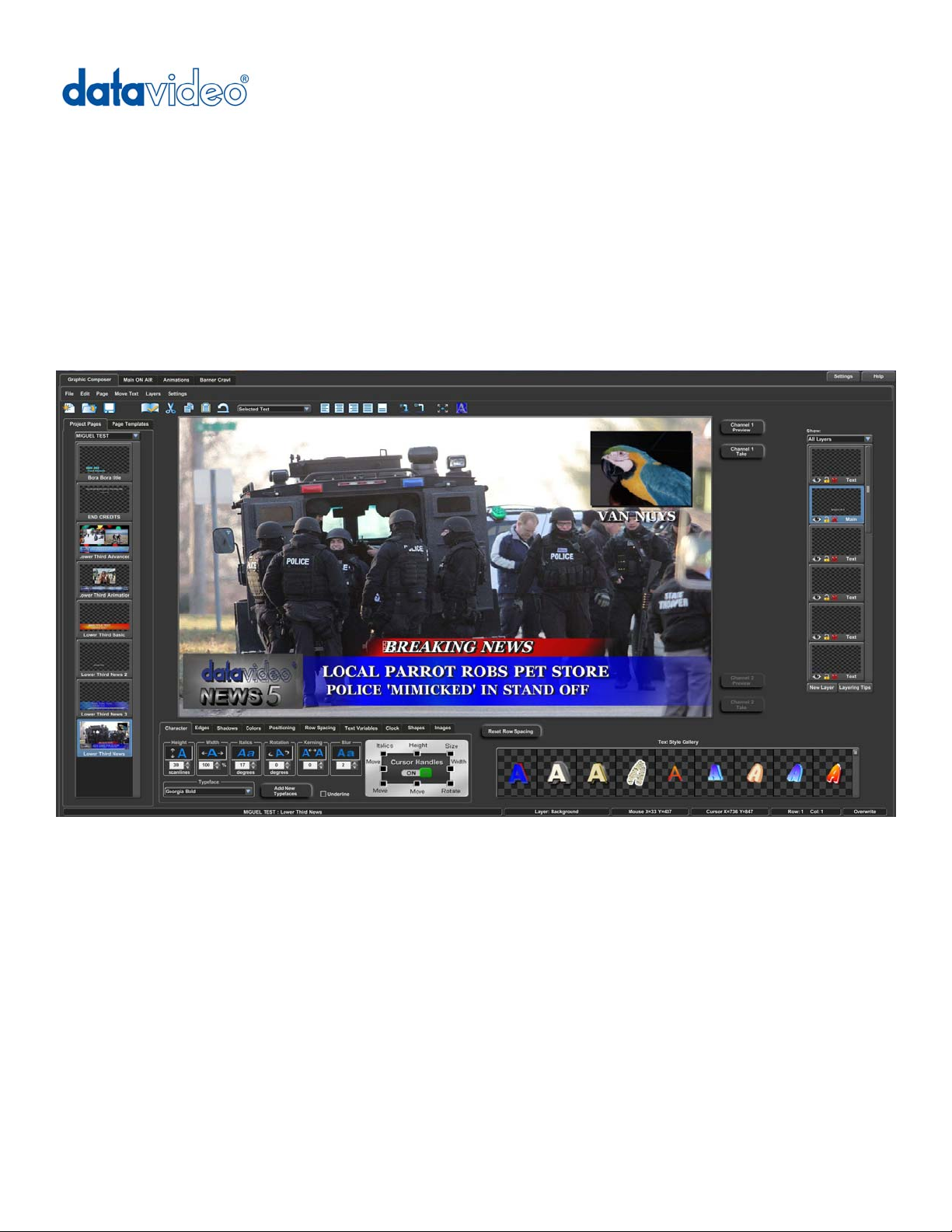
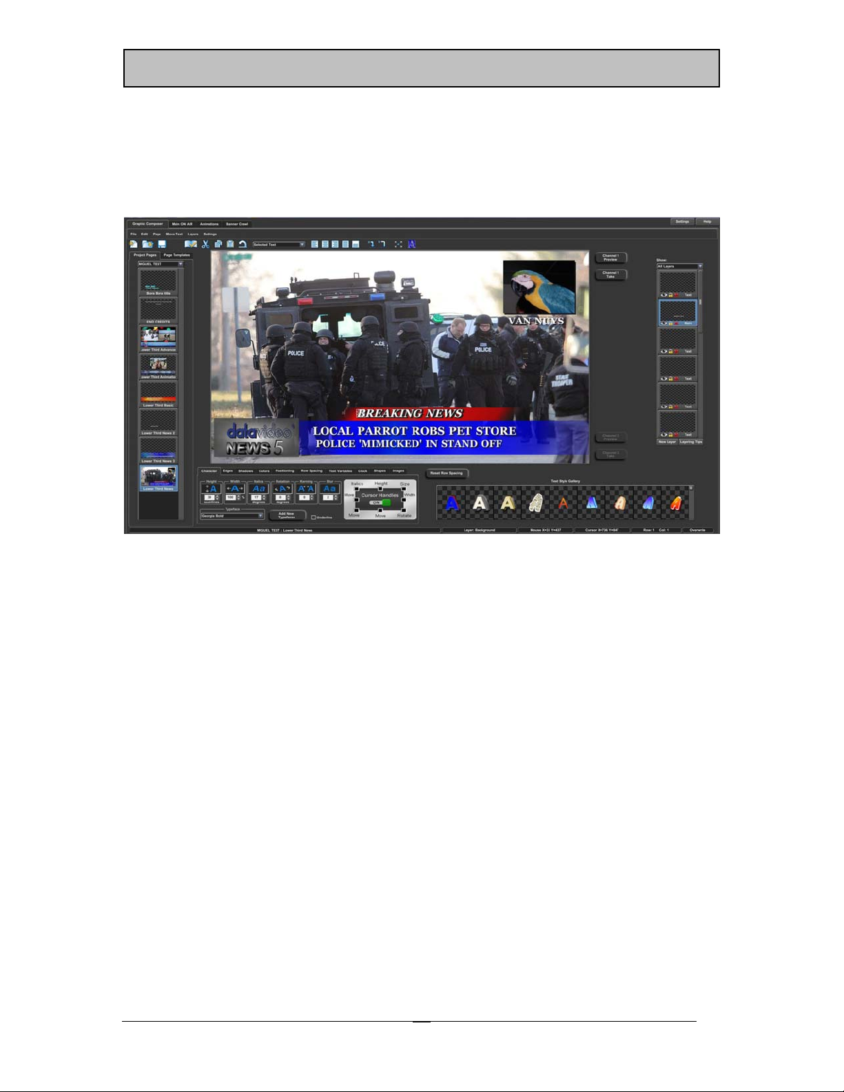
Graphic Composer Tab
The Graphic Composer is used to create Title Graphics. The Title Graphics can contain
Text (of course), Color Boxes, Geometric Shapes, full-color Graphic Images as logos or a
Background, all keyed over External Video. If you have the Snyper option you can even
add Background Animations and Animated Logos to your Title Graphic pages.
The text can be created using TrueType typefaces and can be sized, rotated, and
italicized. Each character can have up to two edges and three shadows. The character’s
edges and shadows can be colorized with a solid color, a vertical color spread, a color
gradient (4pt, 5pt, or linear), or with a texture.
Background color boxes can be created any size and position on the screen. They can
be colorized with all of the same color options as the characters, they can even be made
semi transparent.
Geometric shapes can be created at any size and position on the screen. The roundness
of the shape can be controlled. The shape can be made square, completely round (as a
circle or ellipse), or anywhere in between. Shapes can be sized, rotated, italicized,
edged, and colorized just like any other character.
Standard graphic format graphics can be loaded as either full-color logos or as a
background image. When graphic images are loaded as logos, they can be sized,
edged, and positioned anywhere on the screen.
n to
-
9
Page 16
C
Chapte
oductio
CG
3
00/3
50
r 2 – Intr
The Graphic Composer tab is the default tab that is displayed when CG-300/350 is first
started. It will be similar to the image shown below.
n to
-
10
Page 17
Chapte
oductio
CG
3
00/3
50
r 2 – Intr
From this tab you can compose your Graphics and Display them On Air. This tab is
divided into 8 sections:
1. The Menu – at the top of the tab
2. Toolbar – below the menu
3. Page Manager – at the left side of the screen
4. Graphic Compose Window – in the center of the screen
5. Layer Manager – at the right side of the screen
6. ON AIR buttons – either above or to the right of the Graphic Compose Window
depending on your screen configuration
7. Layer Controls – Below the Graphic Compose Window and Layer Manager
8. Status Bar – at the bottom of the screen
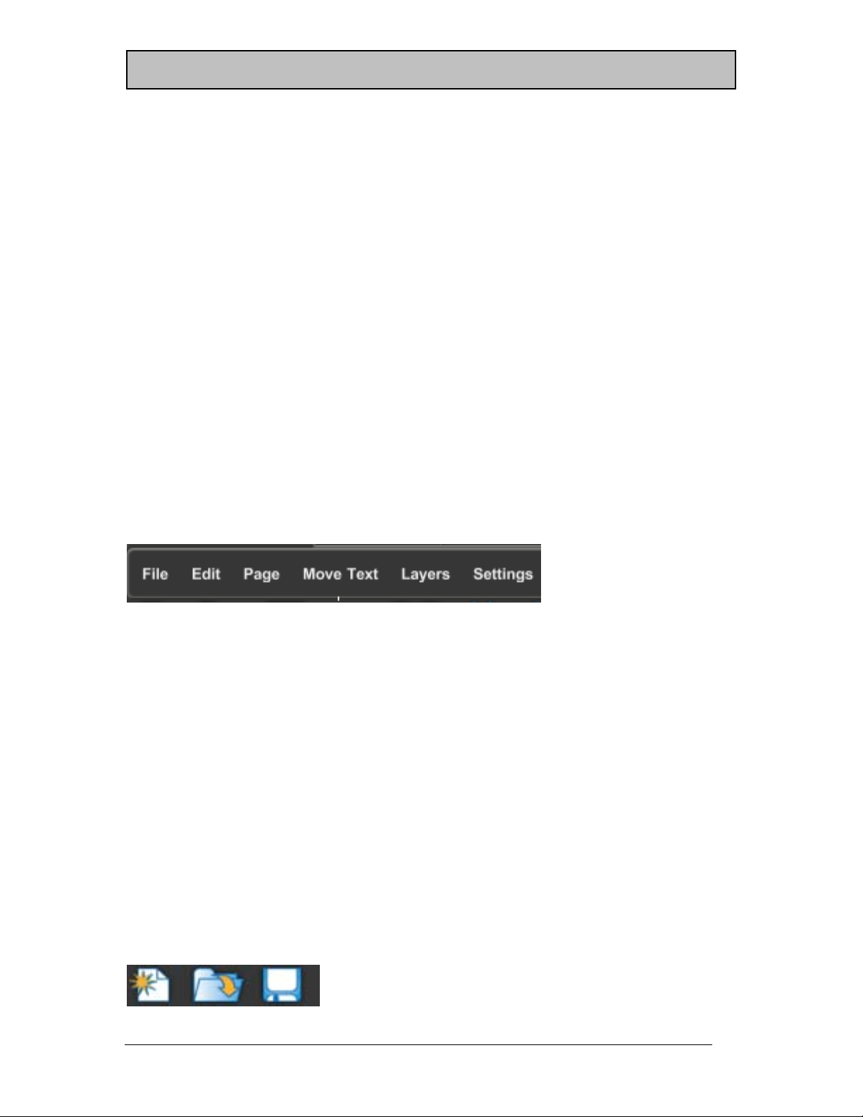
Menu
The menu (shown below) is just what you would expect in a Windows program. It has a
“File” entry that can be used to open, create, and save the types of files that the Graphic
Composer uses. It has an “Edit” entry that is used for the normal Undo, Cut, Copy, Paste,
Insert, Delete, and Erase functions.
n to
-
The “Page” menu is used to set the various Page Attributes that can be stored with a page
such as Transition Type, Audio to play, etc. The “Move Text” menu has commands for
Word Wrap/Unwrap, Centering, Justifying, and Positioning. The “Layers” menu can be
used to change the priority of each layer as well as to navigate between layers. The
“Settings” menu is used to setup the Graphic Composer. This includes things like setting
User Preferences, Loading Typefaces, Setting Tabs, Adjusting Margins, among other
things.
Toolbar
The Toolbar (shown below the menu) is a quick way to access common functions. The
Graphic Composer actually displays up to two Toolbars at once. The first Toolbar is the
Main Toolbar (shown below) that is always displayed. The Main Toolbar includes buttons
used to create a new Page, Open an Existing Page, and Save the Existing Page. If you
move the mouse over these buttons and let it sit there, it displays a prompt that helps to
remind you what that button does.
11
Page 18
C
Chapte
oductio
CG
3
00/3
50
r 2 – Intr
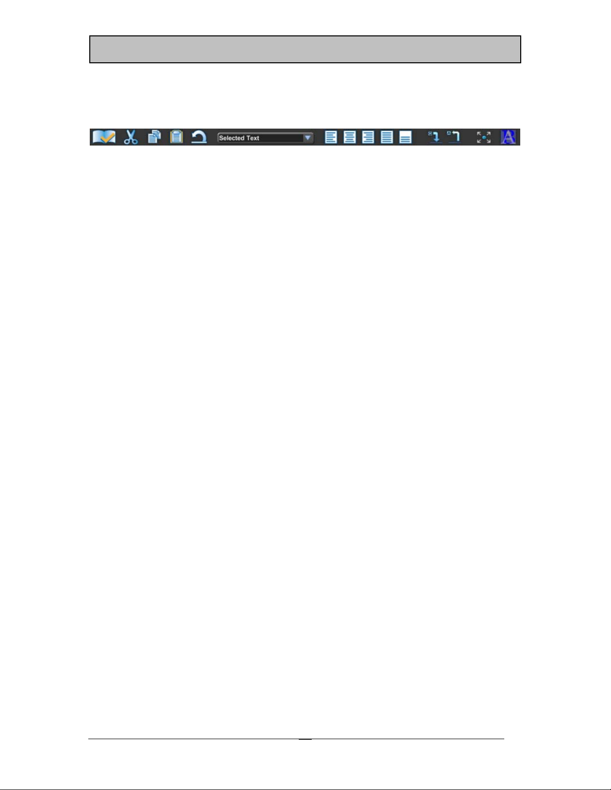
The Second Toolbar is the Text Toolbar. This Toolbar (shown below) only appears when
the cursor is on a Text Layer.
This Toolbar has buttons that allow you to quickly Check Spelling, Cut/Copy/Paste Text,
Center and Justify Text, Grab and Apply Text Attributes, Expand the Graphic Compose
Window, and Change the Transition Type and speed that the Page will be displayed with.
The Text Toolbar also has a mode selection box that defaults to “Selected Text”. This
determines which text will be affected when Character Attributes (font, size, edge, color,
etc.) are changed or when text is repositioned. The options include the following:
1. Selected Text – Changes the text selected by the cursor
2. to End of Word – Changes the text from the cursor position to the end of word
3. Entire Word – Changes the entire word
4. to End of Row – Changes the text from the cursor position to the end of the row
5. Entire Row – Changes the entire row
6. to End of Layer – Changes the text from the cursor position to the of the layer
7. Entire Layer – Changes all of the text on the layer
n to
-
12
Page 19
Chapte
oductio
CG
3
00/3
50
r 2 – Intr
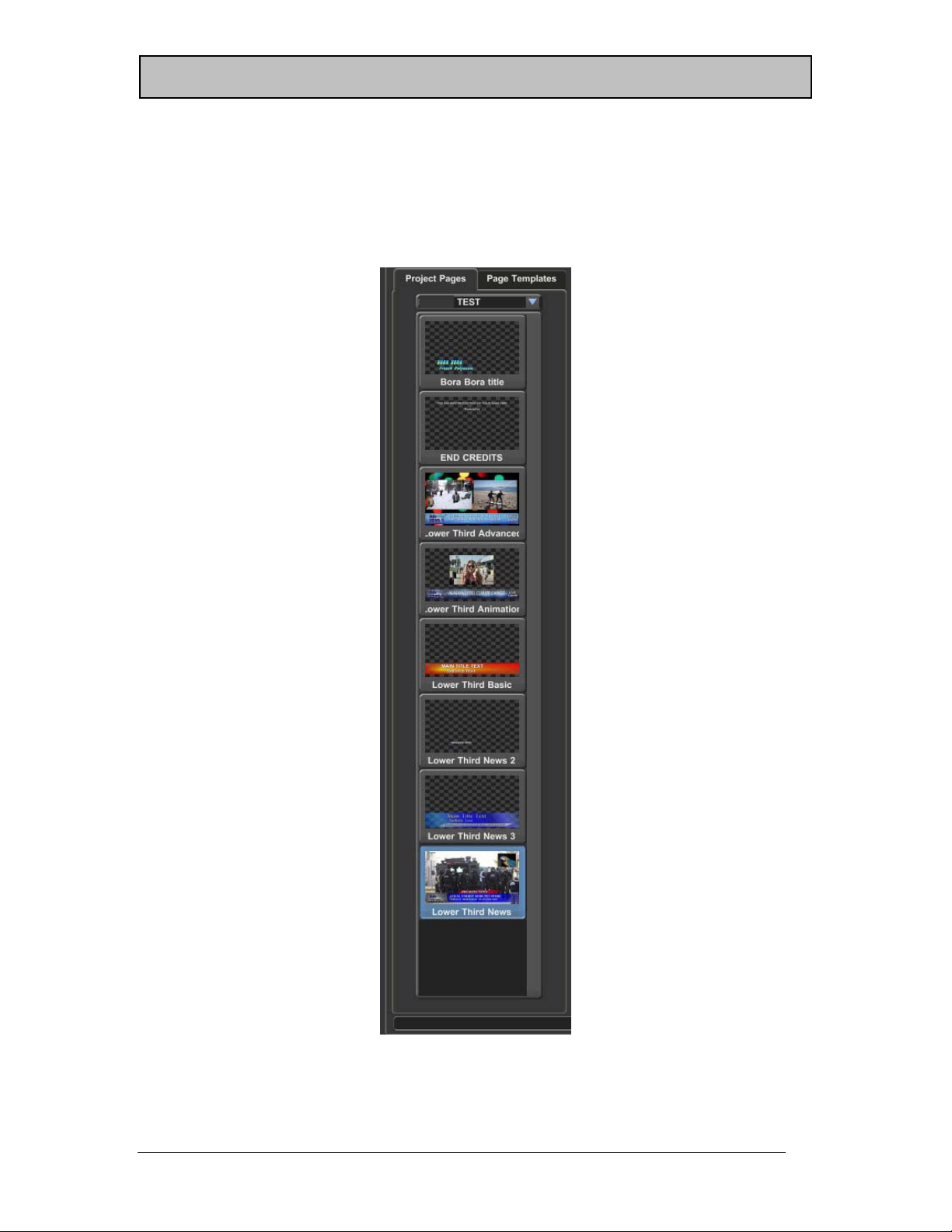
Page Manager
The Page Manager (shown below) has two tabs. One is the Project Pages tab and the
other is the Page Templates tab.
n to
-
Project Manager
13
Page 20

C
Chapte
oductio
CG
3
00/3
50
r 2 – Intr
Project Pages
Projects keep the settings and pages from different projects separate from one another.
The Project Pages tab displays the Current Project and gives you quick access to all of the
pages in the project.
A selection box that displays the name of the current project is at the top of the Project
Pages tab. This selection box can be used to quickly select a different project as the
Current Project. When a Title Graphic Page is saved, a miniature image of the page
(Picon) is created. These Picons, along with the name of the Title Graphic in the Project is
displayed in the Project Manager. Just click on a Picon to select a new Title Graphic
Page.
Page Templates
Page Templates are Title Graphic Pages that have Text Fields that can be entered when
the Page Template is recalled. These are used to quickly create pages with a preset
format by just be entering the text in each character field. The text may even by cut and
pasted from another document.
The Page Templates Tab displays all of the Page Templates that are on your system. To
create a page from one of these templates, click on the desired template; enter the text for
each field in the window that appears, and press OK.
Graphic Compose Window
The Graphic Compose Window is where the Title Graphic Pages are composed. The
flashing rectangle is the cursor. It indicates where text will appear when it is typed. If the
cursor is positioned over existing text, the attributes and position of the selected text can
be changed.
n to
-
14
Page 21
Chapte
oductio
CG
3
00/3
50
r 2 – Intr
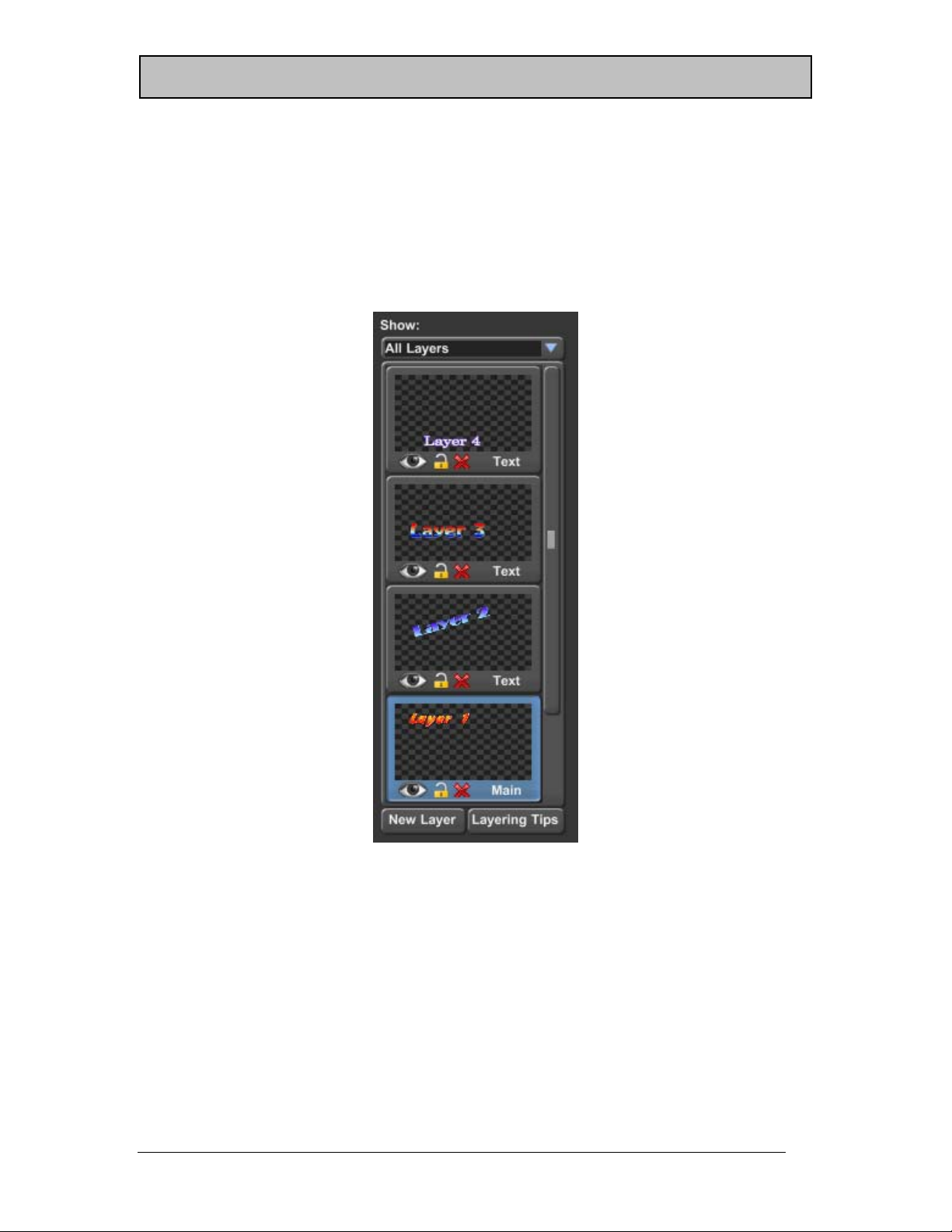
Layer Manager
The Graphic Composer can place Text, Color Boxes, Images, Shapes, etc. on multiple
layers. Up to 1000 layers can be used on each Title Graphic Page. Changing something
on one layer will not affect the text on the other layers.
The Layer Manager (shown below) helps you to keep track of and control the layers.
n to
-
Layer Manager
15
Page 22

C
Chapte
oductio
CG
3
00/3
50
r 2 – Intr
The selection box at the top of this window allows you to select which layers will appear
in the Graphic Compose Window. Normally “All Layers” are shown. There will be times
however when you will want to work on a layer that is behind other layers. The layers in
front of the layer that you are working on are just in the way. When this happens you can
select “Current Layer & Below” to hide all of the layers that are above the current layer, or
you can select “Current Layer Only” to hide all layers but the one that you are currently
working on.
For each layer on the page, the Layer Manager will display a miniature image (Picon) of
what is on each layer. The order that they appear in the list indicates which order they
will appear in the Title Graphic. The layer at the top of the list will appear in front of all
other layers, the layer at the bottom of the list will appear behind all other layers.
You can move the cursor to another layer simply by clicking on the Picon that represents
the layer that you want to move the cursor to. You can change the order of a layer by
clicking on the desired layer and dragging it to the position in the list you want it to
appear. Dragging the layer up will move the layer in front of the other layers. Dragging
the layer down will move the layer behind the other layers.
Press the “New Layer” button to add a new layer to the Title Graphic. This will display a
window that allows you to select the type of layer that you want to add.
On Air Buttons
You can Preview and Display the current Title Graphic on air without switching to the
Main ON AIR tab. To do this, use the On Air Buttons. These buttons appear either above
or to the right of the Graphic Compose Window depending on your screen configuration.
There are two sets of these buttons. The first set labeled “Channel 1” while display the
Title Graphic on the Channel Outputs. The other set labeled “Channel 2” will be enabled
if you purchased the dual channel option of the software and you have multiple Video
Interface Cards installed.
When a Title Graphic is previewed, it will be preloaded and displayed on the Preview
monitor/window. When “Take” is pressed the page is displayed on the Program Video
Output. A Title Graphic does not need to be previewed before you can “Take” it to Air,
but there might be a slight delay while the page is preloaded if you don’t preview it first.
Layer Controls
The Layer Controls are below the Graphic Compose Window and the Layer Manager.
Different types of layers require different types of controls. So the controls that appear will
change based on the type of layer that is currently selected. The CG-300/350 supports 4
different types of layers. These are Text, Color Boxes, Background Graphics, and
Animation Layers.
n to
-
16
Page 23
Chapte
oductio
CG
3
00/3
50
r 2 – Intr
Text Control Tabs
The Text Control Tabs (shown below) appear when a Text layer is selected.
Text Control Tabs
CG-300/350 gives you a lot of control over the appearance of the text. So much so, that
all of the controls required to set all of the different parameters, that can be controlled,
would not fit in the Layer Controls area of the screen at one time. So we have divided
them into groups and placed each group of controls on its own separate tabbed box.
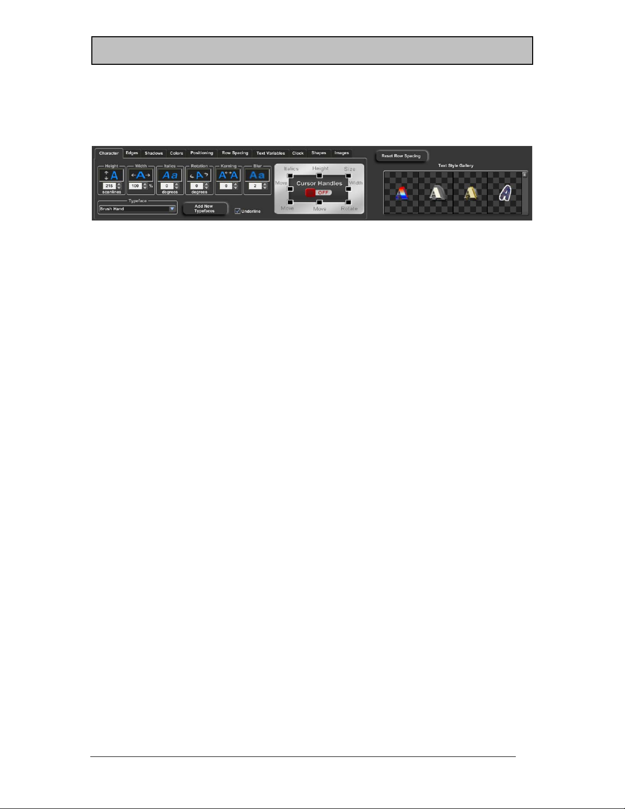
The “Character” tab is used to set the Typeface, Size, Italics, Rotation, Kerning, Blur, and
Underline of the text. The “Edges” tab is used to set the Edge Type, Direction, Depth, and
Blur of both of the edges. The “Shadows” tab is used to set the Shape and Offset of the 3
different shadows that can be applied to the text. Use the “Colors” tab to change the
color of each of the components of the character (character, edges, shadows, etc.). Each
of the components can be set to a solid color, semi-transparent, color gradient, or a
texture.
The “Positioning” tab can be used to fine position the text, wrap and unwrap words, as
well as to center and justify the text. The “Row Spacing” tab is used to adjust the amount
of spacing (leading) between the rows of text.
Text Variables are used to display data that comes from an external data source that may
change from time to time. These can be things like Temperature, Vote Counts, Sports
Scores, or any other data that you may want to automatically update. When a text
variable is added to a page, that page will appear with the current value that is assigned
to that variable. If the value of a text variable changes while the page is displayed On
Air, the screen will automatically update to show the new value. The “Text Variables” tab
is used to add these variables to the page. This tab is also used to add Template Fields
when editing a page template.
The “Clock” tab is used to add “Time”, “Date”, and “Timer” information to a page. It can
also be used to set the format that the time and date are displayed with. The Timer
information can be controlled using the CG-300/350 Timer application or any other
compatible timer program.
Use the “Shapes” tab to add geometric shapes to your Title Graphic Page. Shapes are
boxes that you can control the roundness and aspect ratio of. Once a shape has been
placed on a page you can size it, colorize, add edges and shadows to it, and even rotate
n to
-
17
Page 24
C
Chapte
oductio
CG
3
00/3
50
r 2 – Intr
it. In fact you can do anything to a shape that you can do to any other character (except
change its’ typeface of course).
The “Images” tab is used to add full color logos to the page. Up to 16 logos can be
added to a page. The logos can be loaded directly from GIF, TIF, TGA, BMP, PNG, JPG,
or JPEG files. If the logo includes an alpha channel, the alpha channel will be used as a
“mask” to determine shape of the logo.
As text is entered, sized, and repositioned, rows may begin to overlap each other, or may
appear with too much spacing between them. This may or may not be what you want.
To set the row spacing back to what it should be (based on the text on the row), press the
“Reset Row Spacing” button. This will reset the height of every row on the layer.
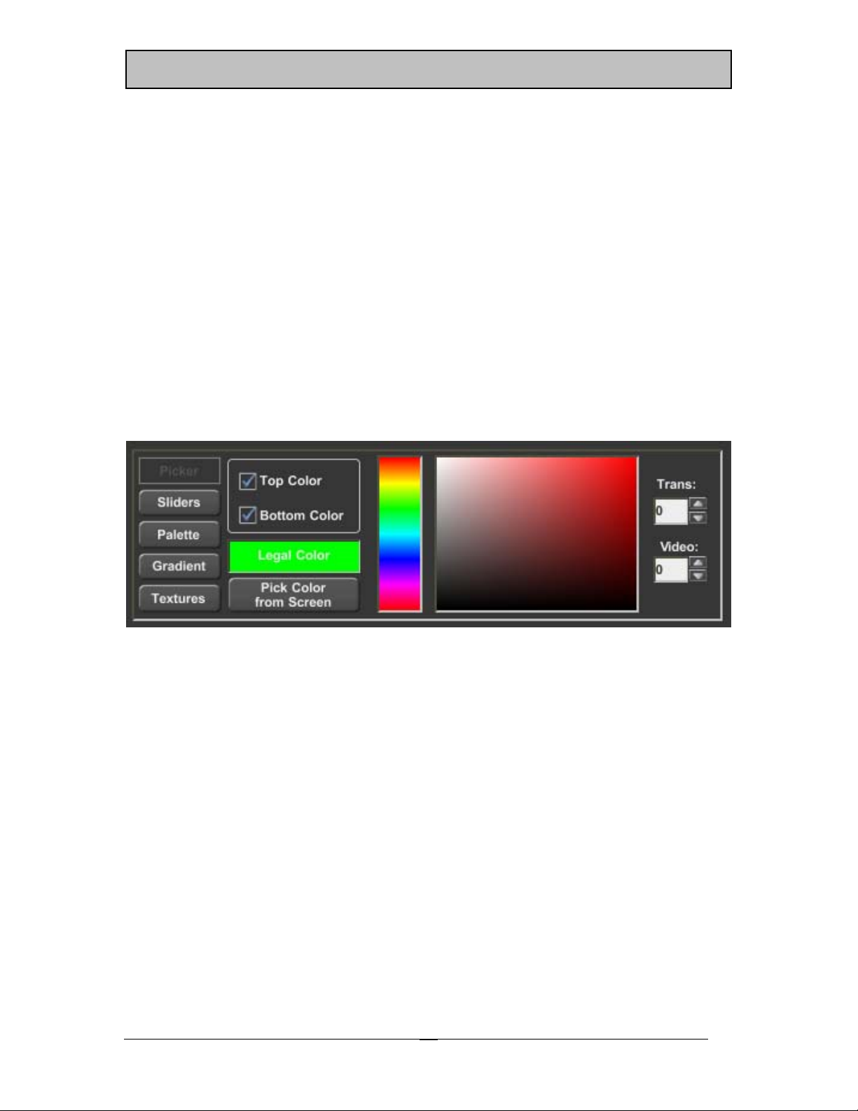
Color Box Controls
When a Color Box layer is selected, the Color Box Controls (shown below) will appear.
n to
-
Color Box Controls
The Color Box can be sized and positioned using the handles that appear with the cursor
around the color box. The color of the box is controlled using the Color Box Controls.
You can give the Color Box a solid color (with transparency and background video), a
color gradient, or even a texture. Solid colors can be selected using the Picker, Sliders, or
a preset color palette.
18
Page 25
Chapte
oductio
CG
3
00/3
50
r 2 – Intr
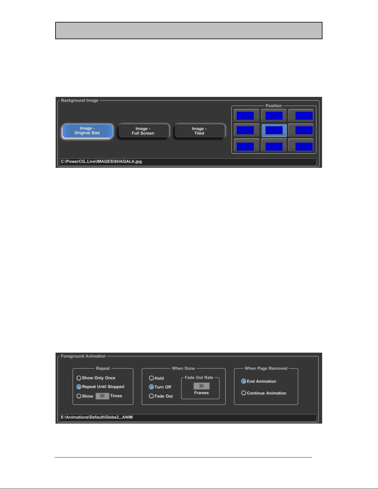
Background Graphic Controls
The Background Graphic Controls (shown below) are displayed when the background
graphic layer is selected.
Background Graphic Controls
A Background Graphic can be added to the Background of your Title Graphic. This
Background Graphic can be displayed Full Screen, Original Size, or Tiled. When a
Background Graphic is loaded as a full screen image, it is scaled to match the size of the
screen. When an Image is loaded in its original size, it will not be scaled. But a set of
positioning buttons will appear to allow you to set the position of the image on the page.
Tiling a Background Image that is smaller than the screen will repeat the graphic
horizontally and vertically to fill the entire screen.
Animation Controls
If your program has the Snyper option (CG-350 only) enabled, you can add Animations
to the Title Graphic. Each Title Graphic can have a Foreground Animation and a
Background Animation. A Foreground Animation will appear in front of all other layers.
A Background Animation will appear behind all other layers. These animations will be
played automatically when the page is displayed.
When an Animation layer is selected, the Animation Controls (shown below) will appear.
n to
-
Animation Controls
19
Page 26
C
Chapte
oductio
CG
3
00/3
50
r 2 – Intr
Use these controls to select how many times the animation will repeat, what it will do
when it is done. When the page is removed from the output you have the option of
Ending the Animation or allowing the animation to continue.
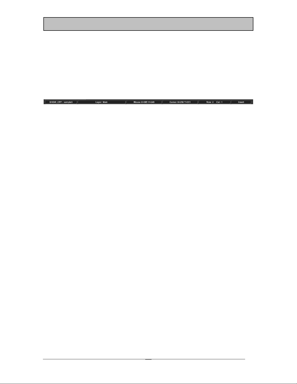
Status Bar
The Status Bar (shown below) appears at the very bottom of the Graphic Composer tab.
Status Bar
The Status Bar displays the current page and project name, the current layer, the mouse
position in the Graphic Compose Window, the cursor position, and the current typing
mode.
n to
-
20
Page 27
Chapte
oductio
CG
3
00/3
50
r 2 – Intr
Main ON AIR Tab
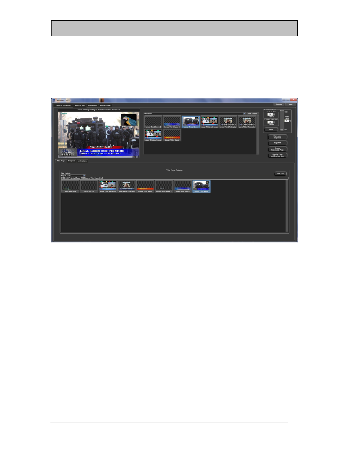
The Main ON AIR tab (shown below) is used to display the Title Pages, Graphic Images,
and Animations On Air. This tab is divided into 4 sections. These sections are Preview
Window, Playlist, ON AIR Controls, and the Media Catalogs.
n to
-
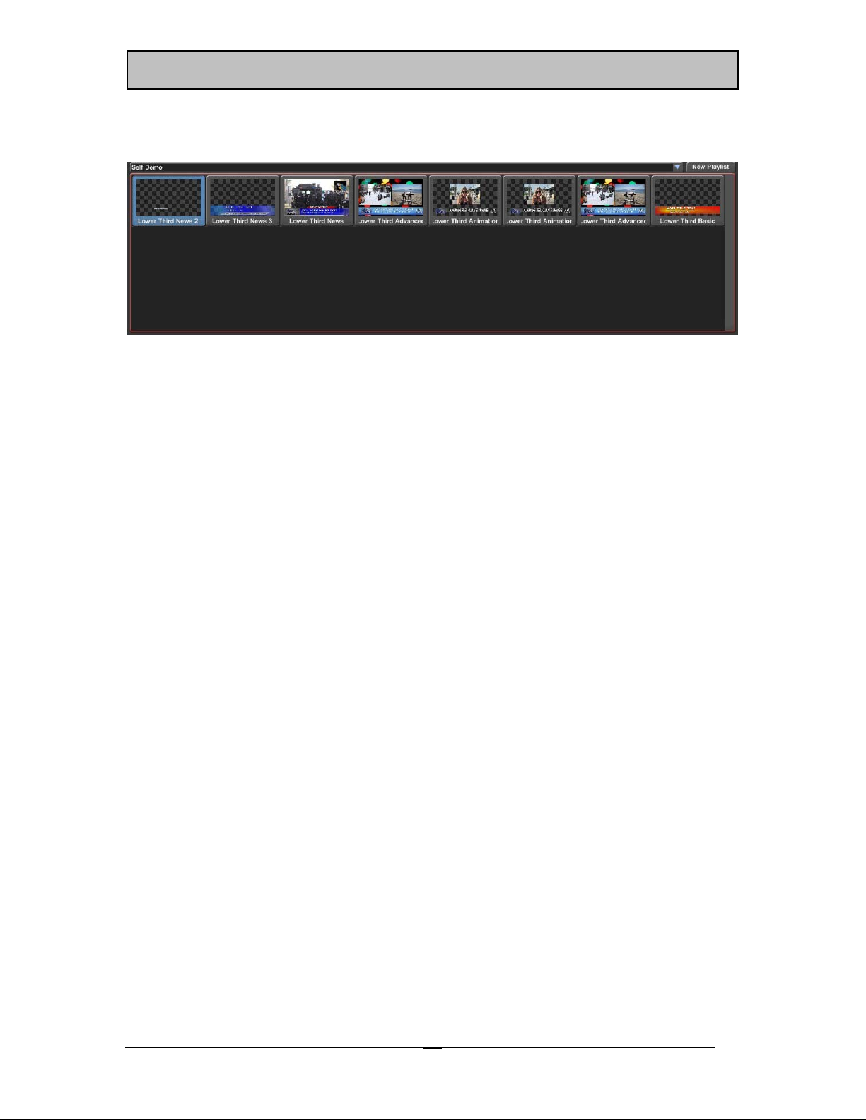
Media Catalogs
The Media Catalogs normally appear at the bottom of the User Interface Screen. In some
screen configurations they may appear on the right side of the Screen. The Media
Catalogs are divided into 3 catalogs (tabs) based upon the type of media each one
contains.
There are separate catalog tabs for Title Pages, Graphics, and Animations. The Title Page
Catalog shows the pages that are in the current Title Page project. The Graphics Catalog
displays the graphic images that are stored in the folders that have been included in the
catalog. The Animation Catalog shows the Text Animations that have already been
imported into CG-350.
Playlist
The Playlist (shown below) allows you to organize your graphics ahead of time. Once a
Playlist is created, the graphics can be displayed On Air by simply pressing the <Enter>
key. This will Take the previewed graphic image to Air, and preview the next graphic in
21
Page 28
C
Chapte
oductio
CG
3
00/3
50
r 2 – Intr
the Playlist. This reduces On Air operation to a single key operation, thus cutting down on
"On Air" errors.
Playlist
Using a Playlist does not limit your flexibility for those “Last Minute” changes. You can
change the order of the images in the Playlist by clicking on the entry and dragging to the
desired location. You are also free to randomly select the next graphic to Air from the
Playlist or the Media Catalogs.
The selection box at the top of the Playlist displays the name of the Playlist that is currently
selected. Use this selection box to select a different Playlist.
Preview Window
Before a Title Page, Graphic, or Animation can be displayed On Air, it must be
previewed. This gives you the opportunity to catch embarrassing errors before they are
broadcast. There are 3 ways to preview an image. You can drag it from the Media
Catalog and drop it into the Preview Window, select it from the Playlist, or right click in
the Preview Windows and select “Select Page for Preview” from the Pop Up Menu.
The Previewed image can also be displayed on a video output if you have multiple Video
Interface Cards installed on your system and configure one of them as the Preview Output.
n to
-
22
Page 29
Chapte
oductio
CG
3
00/3
50
r 2 – Intr
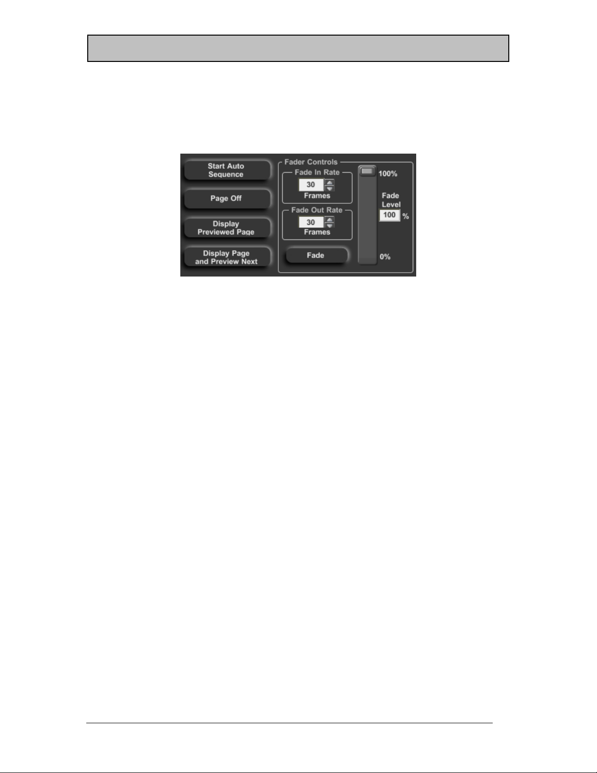
ON AIR Controls
Once a graphic image has been selected and previewed, you are now ready to display it
on the Program Output. This is done using the On Air Controls (shown below).
ON AIR Controls
There are four ways to display the previewed page On Air. They are as follows:
1. Press the “Display Previewed Page” button or the <+> key on the 10 keypad.
2. Press the “Display Page and Preview Next” button or the <Enter> key on the 10
keypad. This will display the image and preview the next image in the Playlist.
3. Press the “Fade” button. This will make the image “Fade In’ at the rate specified
by “Fade In Rate”.
4. Press the “Start Auto Sequence” button. This will display the previewed image
followed by all of the other images in the Playlist. When the end of the Playlist is
reached, it will begin playing from the beginning of the Playlist. When the
program starts Automatically Sequencing a Playlist, the button is changed to “Stop
Auto Sequence”. Press this button again to stop Auto Sequencing.
There are three ways to remove an image from the Program Output while it is being
displayed.
1. Replace it using one of the methods above. The new image will replace the
existing image using the specified Page Transition that the page was created with.
2. Press the “Page Off” button or the <-> key on the 10 keypad.
3. Press the “Fade” button. This will make the image “Fade Out” at the rate specified
by “Fade Out Rate”.
You can adjust the transparency of an image over the background video source by
moving the slider in the “Fader Controls” or by changing the “Fade Level” value.
n to
-
23
Page 30
C
Chapte
oductio
CG
3
00/3
50
r 2 – Intr
Animations Tab
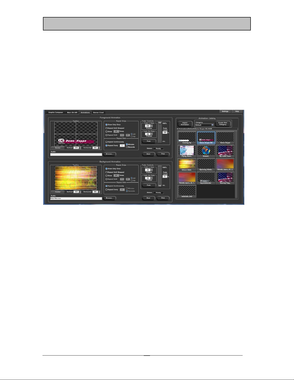
If your software has the Snyper option (CG-350 only) enabled, the “Animations” tab will
appear in the User Interface. Selecting this tab will display the “Animations” control
screen (shown below). This screen is used to control Foreground and Background
Animations (also known as Snipes). These animations can be played completely
independently of anything else the CG-350 is currently doing, whether it is performing a
Credit Roll or displaying a Static Title. It’s almost like having two CG’s that you can use
simultaneously without having to pay for the hardware.
n to
-
Animations Tab
The Animations Control tab is divided into 3 sections. Foreground Animation Controls
(top left), Background Animation Controls (lower left), and the Animation Catalog on the
right.
Your screen may appear different from that shown above depending on your screen
layout. If your screen is too small to display all of these controls, the Foreground and
Background Controls may be merged into a single control with tabs added to switch
between them.
Animation Catalog
Animations can be created in any Animation program as long as it can export the
Animation as a sequence of still images. The best graphic format to use is either TGA or
PNG because they can support an Alpha Channel. The Alpha Channel tells the program
which pixels are parts of the Animation, and which pixels are transparent and should
show the background behind it. This allows the Animation to have a shape other than just
a rectangle.
24
Page 31

Chapte
oductio
CG
3
00/3
50
r 2 – Intr
Before an Animation Sequence can be displayed, it must be imported into CG-350. See
Chapter 10 (Media Catalogs) for more information about importing Animation Sequences.
The Animation Catalog shows the Text Animations that have already been imported into
CG-350. This is the same Animation Catalog that is included in the “Media Catalog” on
the Main ON AIR tab.
Animation Controls
There are two sets of Animation Controls (shown below). The Foreground and
Background Controls are the same, so only the Foreground controls will be discussed. The
only difference is the Foreground Controls are used for Animations in front of the Main
ON AIR layer, while the Background Controls play are used for Animations behind the
Main ON AIR layer. The Foreground and Background Animations are completely
independent of each other and can even be played at the same time.
n to
-
Animation Controls
The first step needed to display an Animation (after the Animation Sequence has been
imported into CG-350) is to select it in the Animation Catalog and drag it to either the
Foreground Animation or Background Animation controls. When this is done, the selected
Animation will appear in the Positioning Window. Once the Animation is finished
loading, the Status will be set to “Ready”. You can now adjust the Animation’s position
on screen as well as set how many times and how often that it will repeat. You can also
add an Audio file to play along with the Animation. Some of these settings may have
been preset when the Animation Sequence was imported.
Press the “Start” or “Fade” button when you are ready to display the Animation. The
Animation will begin playing. When the Animation is finished, the last frame will hold on
the screen until you press the “Stop” or “Fade” button.
25
Page 32

C
Chapte
oductio
CG
3
00/3
50
r 2 – Intr
Banner Crawl Tab
If your software has the Banner Crawl option (CG-350 only) enabled, the “Banner Crawl”
tab will appear in the User Interface. Selecting this tab will display the “Banner Crawl”
control screen (shown below). This screen is used to control a Crawl that is completely
independent of anything else the CG-350 is currently doing; whether it is displaying a
Title, playing Animations, or all of the above.
n to
-
Banner Crawl Tab
The Banner Crawl can be used to display Stock Tickers, News Tickers, Emergency Alert
Messages, or just about anything else that you can think of. It can be configured to do
text crawl directly from a standard ASCII or Unicode text file. If you change the text in this
file, it will automatically update the Banner Crawl the next time that it is displayed.
The Banner Crawl will appear in front of all other layers including Foreground Animations.
The Banner Crawl Control tab is divided into 2 sections. These are Controls (shown at the
top) and the Crawl Catalog, which normally appears at the bottom of the screen. Your
screen may appear different from that shown above depending on your screen layout.
26
Page 33

Chapte
oductio
CG
3
00/3
50
r 2 – Intr
Crawl Catalog
The Crawl Catalog contains all of the crawl pages from all of the different Title Page
projects on your system. The Title Page must have a “Crawl” Page Transition or it will not
appear in this catalog.
Banner Crawl Controls
To display a crawl, select it in the Crawl Catalog and it will appear in the Preview
Window of the Crawl Controls. Select how many times and how often you want it to
repeat, and press the “Start” or “Fade” button. The Banner Crawl will begin and will
continue to repeat the requested number of times. To end the crawl early, press the
“Stop” or "Fade” button and the crawl will end.
n to
-
27
Page 34

Page 35

Chapter
3
Tutorial
The easiest way to learn how to use CG-300/350 is to use it. That is what we are going
to do here. We will create some pages, create a Playlist, and display some Titles,
Graphics, Animations, and Banner Crawls On Air.
Okay, now for some “Hands on”. If you don’t have the program running yet, start it just
like you would any other Windows Program. After a few seconds the User Interface will
appear on your computer monitor. It defaults to the Title Composer tab, which is
convenient because that is where we are going to start.
Editing Text
The first thing we are going to do is to create some Title Pages and type some text on
them. They may not always be pretty, but they will demonstrate how to do the various
functions that the Graphic Composer has to offer.
Create a new Project
Before we begin creating Title Pages, let’s create a new project for them. Selecting the
“New Project” command from the “File” menu does this. When this is done, a window
like the one shown below will appear.
Let’s call our project TUTORIAL. Enter the name of the new project here and press the
“Create” button. The name of the new project now appears at the top of the project
29
Page 36

Chapter 3
– Tutorial
manager. Since we haven’t created any pages for the new project yet, no pages appear
in the list. During this tutorial we will create pages for the TUTORIAL project.
Create New Page
Create a new page by selecting the “New Page” command from the “File” menu. This
can also be done by pressing the first button on the Toolbar. If you have modified text on
the current page, and “Always Ask First” is checked under “Automatically Save Pages” in
the “Graphic Composer Preferences”, then a window like the one below will appear.
This reminds you to save any changes to the page before you create the new one. Once
you have selected “Yes” or “No” the old page will be erased and you will be asked
which type of page you want to create by a window like the one shown below.
You can choose between 3 different types of pages, Still, Roll, and Crawl. Some systems
may not support rolls and crawls. If your system does not, the appropriate buttons will be
disabled. Create a Still image by pressing the “Still” button. This will create a new page
that is blank.
Graphic Compose Window
The Graphic Compose Window is where you compose your Title Graphic Pages. This
window displays the Title Graphic that you are working on as you compose it.
If you would like to make this window larger, try one of the following:
30
Page 37

Chapter 3
1. Maximize the program.
2. Use a higher resolution video mode (i.e. 1440x900) on your computer monitor.
3. Press the “Full Screen Mode” button in the Toolbar.
Typing Text
To enter text in this window, point the mouse to where you want the text to appear, and
press the left button. If the text cursor does not appear where you clicked the mouse, you
will need to create a new text layer at that position. Do this by holding the <Ctrl> key
down while you left click where you want the new text layer to be positioned. The
flashing rectangle that appears where you clicked is the Text Cursor. It shows where the
text will be entered when you type it in.
Now, type the message “I really like the CG-350”, the text will appear in the
Graphic Compose Window as you type it. If the text is too big to fit on the screen, select
a smaller text style from the Text Style Gallery (to the right of the Text Control Tabs) and
throw away the page with the big characters by creating a new page again. Then re-type
the message “I really like the CG-350” with the smaller text style.
Moving the Cursor
You can use the cursor movement keys to move the cursor around this window, or you can
use the mouse to point to where you want the cursor to be placed and click the left mouse
button. The arrow keys move the cursor one character or row in the direction of the
arrow. The <Home> key moves the cursor to the beginning of the row if it’s not already
there. If the cursor is at the beginning of the row and you press the <Home> key, it will
move the cursor to the first row of the current layer. The <End> key moves the cursor to
the end of the current row if it is not already there. If the cursor is already at the end of
the row, it will be moved to the end of the current layer.
The Up Arrow and Down Arrow keys will not move the cursor off of the current layer
unless you press and hold down the <Ctrl> while pressing the Arrow keys.
Editing
Move the mouse over the “r” in “really” and press down and hold the left button of the
mouse. While holding down the left button, drag the mouse to the “i” in “like” and
release the mouse button. Notice how the cursor expands to cover the text “really li”.
This is the text that is now selected. Any operations done to the text will be done to the
selected text. Press the <Del> key. The text that was selected was deleted. To get the text
back, hold down the <Ctrl> key and press the <Z> key (you could also press the “Undo”
button on the Toolbar). The last operation (delete in this case) is undone. The Graphic
Composer will let you Undo as many as 1000 operations.
– Tutorial
31
Page 38

Chapter 3
– Tutorial
Move the cursor to the “C” in “CG-350”. Hold down one of the <Shift> keys and press
the <Ins> key. This inserts a row of text at the cursor position. Now type “Datavideo”.
Let’s delete this new row. We could use the Undo function, but let’s use the delete row
function instead. Hold down one of the <Shift> keys again and press the <Del> key. The
cursor row is deleted and all the rows underneath it move up to take its place.
Move the cursor to the “r” in “really”. Delete this word by holding down the <Ctrl> key
while pressing the <Del> key. The Entire word is deleted and all of the text to the right of
it moves over to fill in the space.
The CG-300/350 has two typing modes. These are Insert and Overwrite. The right hand
section of the Status Bar shows the current Typing mode. Change the typing mode by
pressing the <Ins> key. This will toggle between the two modes. If the software is in the
Insert mode, press the <Ins> key to set it to “Overwrite” mode. Move the cursor to the “i”
in “like”, and type the characters “ove”. The new letters replace (overwrites) the text
already on the screen.
Move the cursor to the beginning of the second word on the row. Insert five (5) spaces by
holding down the <Ctrl> key while pressing the <Ins> key 5 times. Now type the
characters “just”. This enters a new word in the space that you just inserted (4 characters
for the word, 1 character for the space).
Now press the <Enter> key. This will create a second row of text underneath the row that
we have been working on and type the text “from Datavideo”.
The functions that you just learned (as well as others) could also be invoked by using the
commands in the “Edit” menu. This menu also shows the keyboard short cut keys for these
commands just in case you forget them.
Saving the Page
Before we go through the “Erase Text" functions, let’s save the page so we can use it later.
Select the “Save Page” command from the “File” menu, or press the third button (the one
with the disk icon) on the Toolbar. Since this page has not been named yet, you will be
prompted to enter a name for it. Once the name has been entered (let’s name it after my
macaw and call it FIRST) press the “Save” button and the page will be saved to the current
project. Notice that a small Picon of the page appears in the Project Manager along with
the name of the page.
Erasing Text
The Edit menu has commands for erasing text. You can erase text from the cursor position
to the end of the row, from the cursor position to the end of the layer, or all of the text on
the layer.
32
Page 39

Chapter 3
Move the cursor to the “v” on the first row, then go to the “Erase Text” entry in the “Edit”
menu. Select the “to End of Row” command. Notice that all of the text from the cursor
position to the end of the row is erased.
Select the “to End of Layer” entry from the “Erase Text” menu. All of the text from the
cursor position to the end of the layer is erased. Now select “Entire Layer”, and all of the
text on the layer is erased.
Backspace
If you make a mistake while typing (such as typing the wrong character) just press the
<Backspace> key. This will move the cursor to the previous position and erase the
character there. If the program is in “Insert” mode, the character will be deleted. You
can then type the correct character.
Row Space Allocation
As text is entered, sized, and repositioned, rows may begin to overlap each other, or may
appear with too much spacing between them. This may or may not be what you want.
To set the row spacing back to what it should be (based on the text on the row), press the
“Reset Row Spacing” button. This will reset the height of every row on the layer.
Setting Cursor Position with Mouse
The cursor can be moved with the mouse. Move the mouse pointer to the desired position
and click the left button. The cursor will move to the character that was pointed to when
the left button was pressed. If multiple characters of the same layer overlap at the selected
position, a different character will be selected each time that the mouse is clicked. If
characters from multiple layers overlap at the selected position, the cursor will not be
moved to a different layer unless you hold down the <Alt> key while clicking the text.
– Tutorial
33
Page 40

Chapter 3
– Tutorial
Text Attributes Styles
One of the most amazing things about CG-300/350 is the amount of control that you
have over the text style. Each character is made up of seven different components. These
are the following: character, underline, two edges, and three shadows. Each of these
character components can be set to either a solid color, a vertical color spread from the
top to the bottom of the character, a color gradient (area or linear) that you can define, or
a texture.
You can select a TrueType typeface for the character and control the Height, Width, Italics
Angle, Rotation, Kerning, and the Blur of the character. For each edge, you can select the
Edge Type, Direction, Depth and Blur. For any of the three shadows, you can select the
shape (to be the same as the Character, Edge 1, or Edge 2) and the offset from the
character. The shadow can be offset from the character by as much as 100 pixels
horizontally and vertically.
Many of the text style attributes (height and width) for example are represented
numerically. These numerical values can be modified by controls that are either absolute
or relative. An absolute control will set all of the selected text to the new value. A relative
control will change all of the text by the same amount.
34
Page 41

Chapter 3
To illustrate the difference between absolute and relative values, let’s assume there is a
word on the screen. The size of the first character of the word is 50 scanlines; the other
characters in the word have a height of 25 scanlines. If you select the entire word and
use a relative control to increase the height of the first character by 25 scanlines (from 50
to 75 scanlines), the height of the rest of the word will also be increased by 25 scanlines
(from 25 to 50 scanlines).
If you use an absolute control to set the height of the first character to 60 scanlines, the
height of the entire word will be set to 60 scanlines (they won’t maintain their height
relative to each other).
– Tutorial
Original
W –50 Scanlines
ORD – 25 Scanlines
Each group of numerical controls is made up of 4 controls. Let’s use the Height controls
(shown below) as an example. The top control in the group (the one with the Icon) is a
drag button. The drag button is the relative control of the group. To use the drag button,
move the mouse over it, press the left mouse button, and drag the mouse. Moving the
mouse up or to the right will increase the value. Moving the mouse down or to the left will
decrease the value. The other three controls in the group are the absolute controls.
The absolute controls consist of a number box and two small buttons to the right of it for
increasing and decreasing the value. The value in the box can be entered directly by
clicking on the number (this will highlight all of the digits in the number), and entering a
new value. The new value will be applied to the text when you press the <Enter> key.
This value can also be adjusted by positioning the mouse over the number box and
turning the Scroll Wheel on the mouse.
Pressing the increase button to the right of the number box will increase the value. If you
hold this button down, the value will continue to increase until you release the button or
the maximum value is reached. To decrease the value, press the decrease button.
Holding down this button will continue to decrease the value until you release it, or the
minimum value is reached.
After Relative Sizing
W – 75 Scanlines
ORD – 50 Scanlines
Height Controls
After Absolute Sizing
W – 60 Scanlines
ORD – 60 Scanlines
35
Page 42

Chapter 3
– Tutorial
Let’s explore these controls a little closer. Create a new page by pressing the “New
Page” icon in the toolbar and select a “Still” page type. Select a reasonably sized text
style from the Text Style Gallery. Then type the word “TEST” in all capital letters. Press
the <Home> key to move the cursor to the first “T” in the word “TEST”.
Move the cursor over the Height Drag Button, press and hold down the left mouse button
and move the mouse up. Notice that the size of the character increases. Release the left
mouse button.
Drag the cursor across the entire word to select it. Move the mouse over the Height Drag
Button again, press and hold down the left mouse button, and move the mouse down.
Notice that the height of every character in the word decreases by the same amount. The
value shown by the number box is updated to display the current height of the first
character that is selected.
Now let’s see how the absolute controls behave differently. Move the mouse to the height
number box and click it. This will highlight all of the digits. Re-enter the digits exactly as
they were before (if they were originally 48, enter 48) and press the <Enter> key. Notice
that all of the characters became the same size as the first character; they did not maintain
their relative character heights.
The heights of the characters can be varied and set to any size between 600 scanlines
high and negative 600 scanlines high. A negative character height will draw the
characters inverted (upside down). Try experimenting with the height controls to see how
they affect the characters.
Changing the width of the characters will make them appear thinner or wider. The Width
can be varied anywhere between 10 percent of normal (very thin) to 500 percent of
normal (five times their normal width). A width of 100% is the normal width for the
character. Try experimenting with the width controls to see how they affect the characters.
The Italics angle of the text can be varied up to 45 degrees in either direction. A
negative italics angle will slant the characters to the left; a positive value will slant the
characters to the right. Try experimenting with the italics controls to see how they affect
the characters.
Each individual character, or group of characters, can be rotated up to 360 degrees in
either direction. A positive value will rotate the text clockwise, while a negative value will
rotate the text counter clockwise.
The kerning controls allow you to change the spacing between the characters. A negative
value will move them closer together. A Positive value will move them further apart.
36
Page 43

Chapter 3
The amount of blur on the character can be changed using the blur controls. A blur value
of 2 gives you a crisp sharp character; a blur value of 24 gives you a very fuzzy
character. The blur of the character and blur of each of the two edges can be set
independently of each other.
Cursor Handles
Cursor handles are small rectangles on different parts of the cursor that you can click and
drag around. With these handles you can move, size, rotate, and italicize the text. The
Cursor Handle Button (shown below) is on the right hand side of the character tab
window, and is used to turn the cursor handles on and off. It also has a little diagram that
shows what each handle is used for.
– Tutorial
Cursor Handle Button
Turn the cursor handles on by pressing the Cursor Handle Button. Notice that eight small
boxes appear around the cursor. Each of these small boxes is a handle. You can move
the selected text by clicking on the handle in the lower left hand corner and dragging the
mouse. As you drag the mouse around the screen, the selected text will move with it. If
you only want to move the text horizontally (without accidentally affecting the baseline
alignment) you can use the handle on the left side of the cursor. Using the handle on the
bottom of the cursor will move the text vertically without changing the horizontal position.
The handle at the top of the cursor will change the height of the text without affecting the
width. Using the handle on the right side of the cursor will change the relative width of
each of the selected characters. You can use the handle in the upper right hand corner of
the cursor to change both the Height and Width of the text. Dragging any of these sizing
handles will change the size of each character so that it maintains its size in direct
proportion to the other characters that are selected.
Dragging the handle in the lower right hand corner of the cursor will rotate the selected
text. Dragging the handle in the upper left hand corner will change the italics angle of the
text.
When you are through using the cursor handles, and you no longer want them to be
displayed, press the Cursor Handle Button again to turn them off.
37
Page 44

Chapter 3
– Tutorial
Scope Selection
Now that we have the basics of character attributes down, let’s try something a little more
advanced. Create a new page and set the Page Type to Still. Set the character Height to
24 scanlines, the Width to 100%, Italics and Rotation to 0 degrees. Set the Kerning to 0
and the Character Blur to 2. Use the Typeface Selection box on the Character Tab to
select a clean/easy to read typeface such as Boston Black, Futurist, or Basset Bold. Now
type the following three lines of text:
The quick brown fox
jumped over the
lazy dog’s back.
Place the cursor on the “m” in the word “jumped”. Use the Typeface selection box to
select a different typeface. Notice that only the character under the cursor is changed.
The Text Toolbar has a selection box that defaults to “Selected Text”. This is called the
Scope Selection Box. This selection box is used to determine how much text will be
affected by Text Style changes. Open the selection box by pressing the down arrow and
the following choices will appear:
Selected Text
to End of Word
Entire Word
to End of Row
Entire Row
to End of Layer
Entire Layer
Change this selection to “to End of Word”, and then change the rotation angle to minus
10 degrees. Notice that every character from the “m” to the end of the word is rotated.
Go back to the Scope Selection Box and change the selection to “Entire Word”. Increase
the height to 48 scanlines. The height of the entire word is changed. Now select the “to
End of Row” entry from the Scope Selection Box and set the Width to 50 percent. Notice
that all of the text from the cursor position (the “m” in “jumped”) to the end of the row
changed its width.
Now set the scope to “Entire Row” and select a new typeface. Every character on the row
was changed to the new typeface. Select “to End of Layer” from the Scope Selection Box
and set the height to 60 scanlines. Every character from the cursor position to the end of
the row, and every row after the cursor changed to the new height. Now select “Entire
Layer” as the scope and select a new typeface. Since this Title Graphic only has one text
layer, every character on the page changes.
38
Page 45

Chapter 3
When “Selected Text” is chosen, the changes are applied to the character or group of
characters that are selected by the cursor. To select multiple characters, move the mouse
to the first character to select, hold down the left mouse button, and drag the mouse to the
last character to select. Dragging the mouse to a different row will not select text on
multiple rows unless the <Shift> key is held down while the mouse is being dragged.
The entire row of text can be selected by double clicking on any character on the row.
You can select the entire layer by pressing down holding the <Ctrl> key and pressing the
<A> key.
Row Spacing (Leading)
When we increased the size of the text, the rows of text overlapped each other.
Sometimes we want this effect, other times we don’t. If you want to adjust the row
spacing to match the text, press the “Reset Row Spacing” button (down by the Text Style
Gallery). This will adjust the row spacing (AKA Leading) so that the rows don’t overlap.
With “Entire Layer” selected as the scope, set the Height to 24 scanlines and the Rotation
angle to 0 degrees. Now there is too much spacing between the rows. Press the “Reset
Row Spacing” button again to fix this.
Grabbing and Applying Attributes
When you enter new text, it is entered with the Current Text Attributes. The text attributes
specify how the characters, edges, and shadows will appear. The Current Text Attributes
are the values displayed in the Character, Edges, Shadows, and Colors control tabs in the
Text Controls. These include the following:
Typeface
Character Size (height and width)
Italics and Rotation angles
Kerning
Blur (character and edges)
Edge Style (type, depth, and direction)
Shadow Appearance (shape and offset)
Colors (character, edges, shadows, and underline)
When you overwrite text, the text keeps the attributes of the text that you are overwriting.
The CG-300/350 has a temporary buffer for Text Attributes. This lets you grab attributes
from text on the page and apply it to other text. There are two buttons on the text toolbar
– Tutorial
that are used to access this buffer. These are the “Grab”
Press the “Grab” button to copy the current attributes to the temporary buffer. Pressing the
“Apply” button will copy the attributes from the temporary buffer to the cursor text.
39
and “Apply” buttons.
Page 46

Chapter 3
– Tutorial
Text Style Gallery
All of the Text Attributes are combined to make up the Style of the text. The Text Style
Gallery is designed to give you quick access to text styles that you will use frequently
throughout the project. This is the window at the right side of the Text Controls with all of
the different “A’s” in it. You can save up to 64 different preset text styles with each
project.
Before we begin, create a new page by pressing the “New Page” button on the toolbar
and set the page type to “Still”. You now have a blank page to work with.
To enter text using one of the preset styles, select the desired text style (by clicking on it in
the Style Gallery) and start typing. Any new text that is entered will appear with the
selected text style. To select a different preset style, click on it and start typing again.
Select a text style that looks interesting and type “This is my first preset style”. Select
another preset style and type, “This is another one”.
To change the style of text that is already on the screen, select the text, then click on the
style that you want to set it to. Move the cursor to the first character and select another
style from the style gallery, now move the cursor to the next character and select another
style. Continue to do this for every character of the first two words of the page.
Select the word “first” by moving the mouse to the “f”, press the left mouse button, and
drag the mouse over to the “t” until the entire word is selected. Now select another text
style. Notice that the entire word has changed.
Select the Character tab in the Text Control window and adjust the Height of the word
“first”. Now select a different font. See that even though the text style was set using a
preset style, you can still modify the style of the text. So if you have a text style that is
almost what you want, go ahead and select it, then modify the attributes of the text you
just changed the style of, doing this will not affect the preset style in the style gallery.
Changing Preset Text Styles
You can change the preset text styles. Create a character on the page that has the style
that you want to use as a preset, place the cursor on it, and move the mouse pointer to the
entry in the Text Style gallery that you want to replace with this style, and press the right
mouse button. A pop-up menu will appear. Select the “Set Style” entry. The text style of
the cursor character will be copied to the style gallery. After you modify the Style gallery
you need to save the Project Settings. Otherwise the new style will only be temporary. It
will revert to the old style the next time that the project is opened.
40
Page 47

Chapter 3
There are too many presets to be shown at one time in the Text Style gallery. You can use
the scroll bar to scroll through the preset styles. I like to group styles that are used together
near each other in the gallery.
Save this page to disk by pressing the “Save Page” button on the toolbar. Give the page
the name “Styles” and press the “Save” button. You should see its Picon in the project
manager window.
Layers
The software supports up to 1000 layers per Title Graphic page. There are 4 different
types of layers. These are Text, Color Boxes, Background Graphics, and Animation
Layers. Animation Layers are only available if the Snyper option (CG-350 only) is
enabled.
Up until now, everything we have done has been limited to a single text layer. Let’s
create a page with multiple layers on it now. Open the “Styles” page that we just
finished with if it isn’t already opened. Make a copy of this page by selecting “Save
Page As…” from the “File” menu. Give it the name “Layers” and press the “Save”
button. It will be added to the list in the Project Manager.
Create a new text layer by moving the mouse pointer to the middle of the “t” in “style”,
hold the <Ctrl> key and click the left mouse button. The cursor moved to where you
clicked the mouse, and a new entry was added to the Layer Manager’s list of layers.
Notice that the “Main” layer was moved down, and the new “Text” layer appears above
it. This indicates that the new layer will appear above (in front of) the original text layer.
Select a different text style and type “New Layer”. It appears in front of the existing
text. Adjust the size of the text until it is easy to differentiate from the text on the other
layer.
Press the “New Layer” button that is below the Layer Manager’s list of layers. The
following window will appear:
– Tutorial
41
Page 48

Chapter 3
– Tutorial
This window is used to add a new layer to the Graphic Title page. Press the “Color Box
At Cursor Position” button. A Color Box, the height of the cursor and the full width of the
image will appear behind the text on the selected row. The new layer for the color box
also appears in the Layer Manager List. The Layer Controls at the bottom of the Graphic
Composer screen will also be changed so that you can modify the color of the new Color
Box.
Use the Cursor Handles to move and size the color box. The handles on the top and right
side of the cursor will size it. The handles on the bottom and left side of the cursor will
move it. Size and position the Color box so that it does not extend all the way to the
edges of the image. You should size it first. Otherwise moving it will move the sizing
handles off of the screen.
Use the Layer Controls at the bottom of the Graphic Composer screen to change the color
of the box. Press the “Sliders” button to display the slider method of changing colors. The
sliders have the range 0-255. Set the Transparency (Trans.) level to 100. You can now
see what is behind the semi-transparent box. Then set the Red level to 255, this will give
the box a red tint.
Press the “New Layer” button that is below the Layer Manager’s list of layers again, and
press the “Background Graphic Image” button. Use the window that appears to select
which image to use as the background Graphic. There is a file named Car.jpg in the
IMAGES sub-directory that is in the directory that the program is installed in
(C:\PowerCG_Live\IMAGES by default), select this image.
If the aspect ratio of the image is not the same as the aspect ratio of the screen, a window
like the one shown below will be appear. Press “No” and the Graphic Image will fill the
entire screen.
An entry showing the background graphic will be added to the bottom of the Layer List,
and the “Background Image” controls will be displayed. The Background Image can be
displayed at the Original size, Full Screen, or Tiled across the entire screen.
We now have a Title Graphic Page with 4 layers on it. The 4 layers are displayed in the
Layer Manager List as shown here:
42
Page 49

Chapter 3
The Layer currently selected is highlighted in blue. Move the mouse pointer to the top
layer labeled “Text” and click it. This selects the layer. The blue highlight moves to the
selected layer, the cursor is moved to the first character of the layer, and the Layer
Controls change to the Text Control tabs.
As you select different layers, the cursor is moved to that layer in the Graphic Compose
window and the Layer Controls and Toolbars change to those needed to work with the
type of layer that is selected.
Layers can also be selected by clicking on items in the Graphic Compose window. Click
on different objects on the screen. You will notice that the cursor moves to that object and
the layer that it is on is selected. If you have items from multiple layers that overlap each
other, the cursor will not move off of the current layer unless you hold down the <ALT> key
while you click the left mouse button.
Move the mouse pointer to a position in the Compose window where characters from the
two text layers overlap. At this point the mouse is actually positioned over 4 different
layers, 2 text layers, the color box, and the background graphic. Click the left mouse
button and one of the objects underneath the mouse pointer is selected. If you click it
again, the cursor will not move to another layer (remember that double clicking on a layer
will select the entire row). Press and hold down the <ALT> key then click the left mouse.
The cursor will be moved to an object on another layer.
Sometimes when you want to edit something on one layer, objects on layers in front of it
get in the way. The selection box at the top of the Layer Manager can solve this problem.
– Tutorial
43
Page 50

Chapter 3
– Tutorial
Select the “Main” layer. This should be the third one down. Select “Current Layer &
Below” from the selection box. All layers in front of the selected layer will disappear.
When you are finished making changes to the “Main” layer you can select “All Layers”
again to redisplay the hidden layers. You can also display just the currently selected layer
by selecting “Current Layer Only” from the selection box.
The order of layers can also be changed. Notice that the Main layer is behind the red
tinted color box on our current page. Move the mouse pointer over the Main layer entry
in the Layer Manager List, press the left mouse button and drag the mouse up so that the
Main layer entry is over the Color Box entry and release the mouse button. The Main
Layer and the Color Box have now switched positions in the Layer list and the Color Box
now appear behind the Main layer’s text.
Main ON AIR
Now that we’ve learned how to create Title Page Graphics, it’s time to show them ON
AIR. This is done using the controls in the “Main ON AIR” tab. Select this tab. If you
haven’t already done so, you should familiarize yourself with this tab by reviewing the
overview of this tab in Chapter 2.
Although not absolutely necessary (unless you want to do Auto Sequencing), you will
probably want to create a Playlist before going ON AIR. The easiest way to do this is to
double click the Graphics in the Media Catalogs in the order that you want them to
appear.
Create a new Playlist by pressing the “New Playlist” button just above the Playlist window.
This will display the New Playlist Creation window (shown below). There are two ways of
creating a new Playlist in CG-300/350. You can either create a new Playlist that is
empty, or one that already has all of the entries from the current Playlist in it. In this case
we want an empty one, so press the “Create a New List that is Empty” button. Enter the
name of the Playlist. Let’s call it “Tutorial”. Now press the OK button. The Playlist
window will be cleared, and the name “Tutorial” will appear in the Selection box above
the Playlist.
New Playlist Creation Window
44
Page 51

Chapter 3
The “Title Page” Catalog has a selection box that displays the name of the current Title
Project. Select the “Show Off” title project and the Title Pages from that project will
appear. You can use the scroll wheel on the mouse to scroll through the Title Page Picons
by placing the mouse over the picons and rolling the scroll wheel up or down. Double
click on the “Intro” page in the Title Catalog. It then appears at the first position in the
Playlist Editor window. Continue to double click the following pages in the Title Catalog
in the following order: CGPOWER, INTROA, Introb, INTRO1, INTRO1A, INTRO2,
INTRO2A, Intro2b, INTRO3, and Intro3a. Every time that you double clicked a page, it
appeared at the end of the Playlist. You should now have a Playlist that looks similar to
the one shown below.
– Tutorial
Notice that we missed the page “Intro2c”. You can add this to the Playlist using one of
two methods. To use the first method, double click on the “Intro2c” page. It appears at
the end of the Playlist. To place this page between Intro2b and Intro3, move the mouse
over the page that you want to move, press and hold down the left mouse button, drag the
page until it is on top of the Intro3 page, and release the mouse button. The Intro2c page
is now placed in front of the Intro3 page and will be displayed before it in the display
sequence. To use the second method, drag the page directory from the Title Page
Catalog and drop it on top of the Intro3 page.
Congratulations, you have just created your first Playlist. To save it, right click on the
Playlist window and select “Save Play List” from the pop-up menu that appears.
Now it’s time to go ON AIR. Press the “Start Auto Sequence” button. The first page in the
Playlist is displayed on the Program Video Output, and the next page in the Playlist is
shown in the Preview window. After a few seconds the next page will be displayed.
These pages are displayed with the “Page Transition” that was selected when the page
45
Page 52

Chapter 3
– Tutorial
was created, at the selected Display Speed. The page will appear for the duration
specified by the Dwell Time of the page.
This Auto Sequence will continue until you press the “Stop Auto Sequence” button.
To manually display a page on the Program Video Output, click on the page in the Playlist
that you want to display. The selected page will appear in the Preview window. Press the
“Display Previewed Page” button (or press the <+> key on the 10 Keypad). This page is
then shown on the Program Video Output. To remove the page, press the “Page Off”
button (or press the <-> key on the 10 Keypad), and the page will be removed. This gives
you full random access to any page in the Playlist.
Most of the time when displaying pages, you know beforehand which order that you want
them to appear. This is a good reason to use the Playlist. When the Playlist is loaded, the
first page in the Playlist is previewed; you can preview a different page just by clicking on
it in the Playlist. When you are ready to Take it to Air, press the “Display Page and
Preview Next” button (or press the <Enter> key on the 10 Keypad). The previewed page
is displayed on the Program Video Output and the next page in the Playlist will be
previewed. You can continue on through the Playlist by pressing this button (or the
<Enter> key) each time you want the next page to appear. This makes the ON AIR
operation of the CG-300/350 a single key operation. This can really cut down on "ON
AIR" errors.
46
Page 53

Chapter 3
Animations
If your software has the Snyper option enabled, the “Animations” tab will appear in the
User Interface. Selecting this tab will display the “Animations” control screen. This screen
controls both the Foreground and Background Animations (AKA Snypes). This screen is
divided into 3 sections. These sections are “Foreground Animation” controls,
“Background Animation” controls, and the “Animation Catalog”.
An Animation sequence is a sequence of still images that has been exported by your
favorite Animation program. These can be in TGA, PNG, TIF, JPG, or BMP format. The
best graphic format to use is either TGA or PNG because they will support an Alpha
Channel. The Alpha channel defines the “Shape” of the Graphic. If the image does not
have an Alpha channel it will be displayed as a rectangle over the background, with
either a black or white background behind it.
An Animation must be imported into the CG-350 before you can display it. The
Animation Catalog displays the Animations that have been imported into the software.
You can create multiple “Categories” of Animations to help keep them organized. The
top part of the Animation Catalog (shown below) has the controls needed to manage
Categories and to import image sequences.
– Tutorial
Import and Category Management controls
Before we import our first animation, let’s create a new Category for it. Press the “Create
New Category” button. When this is done, the “Create a New Category” window
(shown below) will be displayed.
Create a New Category window
We will call our new Animation Category “Tutorial”. Type the name “Tutorial” into the
“New Category Name” box and press the “Create” button. The selection box will now
indicate that the “Tutorial” Category is selected and the Animation Catalog will be empty
because we haven’t imported any Image Sequences into it yet.
47
Page 54

Chapter 3
– Tutorial
To import an Image Sequence into this category press the “Import Animation” button.
When this is done, a window (such as the one shown below) will be displayed.
Use this window to Navigate to the directory that contains the image sequence that you
want to import. Each frame in an image sequence is a separate file. These files must all
be in the same directory and have a common name that contains a number that indicates
which frame it is in the sequence. This could be something like “Demo Snype0001.tga”,
“Demo Snype0002.tga”, “Demo Snype0003.tga”, etc. You only need to select one of
the files. The program will then check all of the files in this directory and select the images
that are part of the sequence as well as the first and last frame of the sequence. Once this
is done the “Import Image Sequence Animation” window (similar to the one shown below)
will appear.
48
Page 55

Chapter 3
– Tutorial
Import Image Sequence Animation Window
This window has the controls that allow you to do the following:
1. Select the image to use as a Picon
2. Assign a name to the Animation that you are creating
3. Select an audio file to play along with the animation
4. Select what to do when the Animation is done
5. Select Which frames of the sequence to include
6. Size and Position the animation on the screen
The top of this window displays 5 different frames of the Animation Sequence.
These are the first and last frames, and the frames at the 25%, 50%, and 75% of
completion position of the sequence. Select the frame that best represents the Animation,
and it will appear in the “Size and Position” section of this window. This image will also
be used as the Picon for the Animation in the Animation Catalog.
49
Page 56

Chapter 3
– Tutorial
The name of the Animation defaults to the same name as images in the sequence without
the number portion of the name. You can change this by editing the name in the “File
Name” box.
You can select an Audio File that will be played whenever the Animation is displayed.
The Path/Filename of this audio file can be entered in the box labeled “Audio”, or you
can press the “Browse…” button to display the “Select Audio File” browse window.
The “When Animation is Complete” controls allow you to select the Animations behavior
when the last frame of the sequence is displayed. You can have the Animation repeat.
Hold until the Animation is manually stopped, or hold for a preset number of frames
before it goes away. If you select the last option (hold for a preset number of frames) you
can also select whether you want the Animation to immediately “Turn Off” or “Fade Out”
over a specified number of frames.
By default, all of the frames in the sequence are included in the Animation. In some cases
you may want to “trim” the animation so that the frames at the beginning and/or end of
the sequence are not displayed with the Animation. You can change this by changing the
“First Frame” and “Last Frame” values.
The Size and Positioning controls (shown below) in the lower right corner of the Import
Image Sequence Animation window is used to change the Size and default Position of the
Animation.
Size and Positioning Controls
The Animation can be sized and positioned either numerically or visually. The controls
along the left side are used to make changes numerically. The “Vert Posn” and “Horz
Posn” controls indicate the position of the center of the animation. The “Height” and
“Width” controls indicate the size of the Animation. The Animation cannot be made
larger than the original images in the image sequence used to create the Animation.
50
Page 57

Chapter 3
When one of these values is changed, the size and position of the Animation in the
positioning window will be updated to reflect the new values.
To reposition the Animation using the positioning window, simply move the mouse over
cursor until the mouse pointer becomes a 4-way pointer, press the left mouse button and
drag it to the desired position. The “Vert Posn” and “Horz Posn” values will be updated
when the Animation is moved.
The cursor in the positioning window is displayed with handles. These handles can be
used to size the Animation. The handles at the corners of the cursor can be used to
change both the height and width of the Animation. The handles at the top and bottom
are used to change the height, and the handles on the sides are used to change the width.
Dragging the handles closer to the center makes the animation smaller; moving it away
from the center will make it larger.
Many times when sizing graphics, you want to ensure that the proportions of the height
and width (aspect ratio) of the image remain the same so that the image is not distorted.
Pressing the “Preserve Aspect Ratio” button will help you do this. When this button is
pressed, all but the top and bottom handles will disappear so that you can only change
the height of the image. The width of the image will automatically be adjusted to the
correct value whenever the height is changed.
Press the “Original Height” button to restore the Animation to the original size of the
images in the Image Sequence. You can move the Animation to the center of the screen
by pressing the “Center Image” button.
Find the “Hold For:” button in the “When Animation is Complete” group of controls and
press it. This will enable the “frames” control next to the “Hold For” button as well as the
controls in the “After Hold Delay” group. Enter “30” frames as the length of time to hold
after the Animation is displayed. Press the “Fade Out” button and enter “60” frames as
the Fade Out Rate. When the Animation is displayed it will now hold for 30 frames and
then fade out over 60 frames.
Now that we have set all of the parameters for the Animation, let’s import it. This is done
by pressing the “Import” button. The CG-350 will then begin importing the Animation.
As the Image Sequence is being imported to create the Animation a status indicator will
be shown that lets you know which frame is being processed, the percentage of
completion, and an estimate of how much longer the task will take.
– Tutorial
Import Progress
51
Page 58

Chapter 3
– Tutorial
Once the Animation has been imported the following message will appear:
Press the “OK” button and the “Import Image Sequence Animation” window will close and
the Animation will appear in the Animation Catalog.
Move the mouse pointer over the Animation in Animation Catalog, press the left mouse
button, and drag it to the “Foreground Animation” controls, and release the mouse button.
The Animation will be loaded into the “Foreground Animation” controls (shown below)
with the default values that it was created with.
Foreground Animation Controls
Click on the Animation in the “Position” window and drag it to the lower right corner of
the window and press the “Start” button. The animation will be shown once and then
fade out. Press the “Show” button in the “Repeat Animation” group and enter “5” times
in the box next to the button. Press the “Start” button again and the Animation will be
shown 5 times.
Press the “Repeat Every” button in the “Repeat Rate” group and enter a value of “20” in
the box next to the button. Press the “Seconds” button. Press the “Start” button again.
The Animation will now be shown 5 times again, but it won’t play continuously as before.
It will now be shown every 20 seconds.
52
Page 59

Chapter 3
Banner Crawl
If your software has the Banner Crawl option (CG-350 only) enabled, the “Banner Crawl”
tab will appear in the User Interface. Select this tab to display the “Banner Crawl” control
screen.
The Banner Crawl control screen is divided into 2 sections. These are the “Banner Crawl”
controls (shown below) and the “Crawl Page Catalog”, which normally appears at the
bottom of the screen.
The Crawl Page Catalog displays all of the crawl pages from all of the different Title Page
projects on your system. The Title Page must have a “Crawl” page Transition, or it will not
appear in this catalog.
– Tutorial
Banner Crawl Controls
To display a Banner Crawl, select the page that you want to crawl from the Crawl Page
Catalog. It will appear in the Banner Crawl control window. Use the controls in the
“Repeat Crawl” group to select how many times and how often you want the crawl to
repeat. Press the “Start” button and the crawl will begin. The crawl will repeat according
to the parameters that you selected, or until you press the “Stop” button.
53
Page 60

Chapter
4
Graphic Composer
The Graphic Composer is used to create the Title Graphic Pages that Power CG can
display “keyed” over a background video source. These Title Graphic Pages can contain
Text, Color Boxes, Geometric Shapes, and Graphic Images. If your software has the
Snyper option installed, Background Animations and Animated Logos can also be added
to your Title Graphic Pages.
The text is created using TrueType typefaces. Individual characters can be sized, rotated,
and italicized. Each character can have two edges and three shadows. The characters,
edges, and shadows can each be assigned an independent color, gradient, or texture.
Color Boxes can be created at any size and position on the screen. They can be a solid or
semi-transparent color, gradient, or texture.
Geometric shapes can be created at any size and position on the screen. The shape can be
made square, completely round (as a circle or ellipse), or anywhere in between. Shapes
can be sized, rotated, italicized, edged, and colorized just like any other character.
The program can load standard format graphic images such as BMP, JPG, GIF, PNG,
TIFF, and TGA images as logos or background images. The logos can be sized, edged,
and positioned anywhere on the screen.
If your software has the Snyper option installed, each Title Graphic Page can have both a
Foreground and Background Animation.
The Graphic Composer’s User Interface appears similar to the image shown below. The
appearance on your screen may vary depending your screen settings. Each section of the
User Interface was described in Chapter 2 – Introduction to Power CG.
51
Page 61

&
Chapter 4 – Graphic Composer
Graphic Composer’s Graphical User Interface
Projects and Pages
Project Settings
Projects are a convenient way of keeping groups of pages and project settings separate
from each other. When a new project is created the Graphic Composer creates a new
folder (with the same name as the project) on your system. Whenever you are working in
this project, the pages will be read from and written to this folder as the default. All
pages that are in this folder will appear in the Project Manager window.
The system default settings are saved in the project settings file. This file has the same
name as the project with a .SET extension (for example, the project MY_PROJECT
would be defined in a file called MY_PROJECT.SET). This file contains the following
system default settings:
• Character Attributes
• Style Gallery
• Color Gradients
• Default Color Palette
• Loaded Typefaces
• Loaded Textures
• Default Directory/Folders
• Safetitle Margins
• Tab Settings
52
Page 62

Chapter 4 – Graphic Composer
When a new project is created, the current system settings are saved as the Project
Defaults. When the project is opened again, these settings will be restored as the default
settings.
You can update the default settings of the project by selecting the "Save Project
Settings" command from the "File" menu. The current settings will be saved as the
Project Defaults.
When you exit the program, or you open another project, a message window may appear
(depending on your Preference Settings) asking you if you want to save the current
settings. This window is shown below:
If you press the "Yes" button, the project settings will be updated to match the current
settings. Pressing the “Change Preferences” will display the “Set Graphic Composer
Preferences” window. This window allows you to change your Preferences as to whether
or not you will continue to be prompted with this message.
53
Page 63

&
Chapter 4 – Graphic Composer
Project Manager
The Project Manager is used to give you quick access to all of the pages in the project.
This window (shown below) is on the left hand side of the screen.
All of the pages in the current project are displayed in this window. The pages are
represented both by Picons and the name of the pages. A PICON (Picture ICON) is a
miniature picture of the page. With Picons you can tell at a glance what the page looks
like. You can open any page in the project just by clicking on it in the Project Manager
window. If there are too many pages in the project to be displayed at one time, you can
scroll through the list of pages using the Project Managers scroll bar, or by placing the
mouse over the page Picons and adjusting the Scroll Wheel on the mouse.
Pages can be created, opened, saved, copied, deleted, and exported from the menu that
appears when you position the mouse over the project manager and click the right mouse
button. This menu is shown below.
54
Page 64

Chapter 4 – Graphic Composer
Creating a New Project
When a new project is created, the current systems settings are saved as the new project
defaults. So, before you create a new project, you should open an existing project that
has systems settings similar to the default system settings that you want the new project
to have.
To create a new project, select the "New Project" command from the "File" or “Project
Manager” menus. When this is done a window (like the one shown below) is displayed.
Enter the name of the new project where it says "New Project Name" and press the
"Create" button. The name of the new project now appears in the Project Selection Box
at the top of the project manager. Since we haven't created any pages for the new project
yet, no pages appear in the list. As you create pages for this new project they will appear
in the Project Manager window.
Open an Existing Project
To open a project that already exists, select it from the Project Selection Box at the top of
the Project Manager. You may be prompted to Save the Current Project Settings
(depending on your preference settings).
When the new project is selected, the new project’s system settings will be loaded and the
pages in the new project will appear in the Project Manager window.
Save Project Settings
To save the current settings as the project defaults, select the “Save Project Settings”
command from the “File” or Project Manager menus. The current project settings will be
saved to the Settings (.SET) file so that they can be restored the next time this project is
opened.
55
Page 65

&
Chapter 4 – Graphic Composer
Pages
When pages are saved on the disk, they are each saved in a separate file. The sizes of
these files are determined by the amount of text and the complexity of the page. Most
pages are smaller than 1 or 2 Kbytes unless they contain logos or textures. Hundreds of
pages can be stored on a floppy disk and millions can be stored on a hard drive. Each
page file can be given a unique name. The “. PAG” extension is added to the page name
to create the file name that the page will be stored under.
The pages are stored in a format that allows them to be fully edited, even after they are
saved. You don’t need to worry about things getting “locked down” after the page has
been saved. The pages can also be saved in both Windows Bitmap (BMP) and Targa
(TGA) formats. This lets you use the Title Graphics that you create in other graphics
programs. Saving the page as one of these graphics formats automatically saves it in the
Page (PAG) format as well. This keeps the page in a format that can still be edited. Have
you ever tried to correct the spelling of a word in a Bitmap?.
All information needed to display the page is stored in the page file except for the
Typefaces, the background graphic, , and the Animations. When a page has a Logo or
multiple Logos on it, the logo is stored in the page file. This is done to speed up the Page
Recall time. The page file does keep track of which background graphic and typefaces
are used in the page. When a page is recalled, the system will automatically load the
needed typefaces and the background image.
All of the pages in a project are stored in the same directory. By default, this is a subdirectory of the “Projects” directory that is created when a new project is created. This
default page directory can be changed. See the section “Default Directories” in Chapter
11 for more information on how to do this.
The Graphic Composer can only have one page opened at a time. When you create a new
page, or open an existing page, any changes made to the old page will be discarded unless
it is saved to the disk before loading the new page. You can set your preferences to
automatically save your page, or to always ask first. See the section “Graphic Composer
Preferences” in Chapter 5 for more information.
If your preference is to be prompted each time you are about to discard changes to a page,
a window will be displayed (shown below) to remind you to save the changes to the
existing page whenever you create a new page or open and existing page. If you want to
save the changes to the old page press <Yes>, otherwise press <No> and the changes
will be discarded.
56
Page 66

Chapter 4 – Graphic Composer
Creating a New Page
Please Note: some systems may not support rolls and crawls. If your system does not,
the appropriate menu entries will not be displayed in the menu.
To create a new page, use one of the following commands:
Press the “New Page” button on the Toolbar.
Select the “New Page” entry from the “File” menu.
Select the “New Still Page” entry from the “File” menu.
Select the “New Roll Page” entry from the “File” menu.
Select the “New Crawl Page” entry from the “File” menu.
Select the “New Page” entry from the Project Managers menu.
Press and hold down the <Ctrl> key while pressing the <N> key.
If you did not use a command that specified the page type, the “Select the Page Type”
dialog box (shown below) will appear.
Select the Page type dialog box
Some systems may not support rolls and crawls. If your system does not, the appropriate
buttons will be disabled. Use this box to select which type of page you want to create.
This gives you a fresh page to start with.
57
Page 67

&
Chapter 4 – Graphic Composer
Opening an Existing Page
To open an existing page, use one of the following commands:
Select it from the listed pages in the Project Manager window.
Select the “Open Page” entry from the “File” menu.
Select the “Open Page” entry from the Project Managers menu.
Press the “Open Page” button in the Toolbar.
Press and hold down the <Ctrl> key while pressing the <O> key.
Using any command, other than clicking on its Picon in the Project Manger, the program
will display a window similar to the one shown below. Using this window allows you to
open a page that may not be in the current project.
Use this dialog box to select which page to open. Once a page is opened it will appear in
the “Graphic Compose” window. You can now edit the page.
Saving a Page
When you are finished editing a page, you need to save it to the disk. To do this, select
the “Save Page” entry from the “File” menu (or press the “Save Page” button on the
Toolbar). If the page already has a name, it will be saved back to the disk under the
existing name. If the page does not yet have a name, the Save Page As dialog box will
appear (see Saving a Page with a New Name) so that you can name the page.
Every once in a while, while editing a page you should save it to disk. This protects your
work from things like power failures. This function can also be accomplished by holding
down the <Ctrl> key and pressing <S>.
58
Page 68

Chapter 4 – Graphic Composer
Saving a Page with a New Name
To save a page with a new page name, select the “Save Page As” entry from the “File”
menu.
When this is done, the Save Page As dialog box (shown below) will appear.
Save Page As dialog box
Use this dialog box to set the name for the page. The “Save as type” control allows you
to select which format to save the page as. This can be any of the following:
• Page (*.PAG)
• Windows Bitmap (*.BMP)
• Targa format (*.TGA)
Some systems may also have other formats to choose from.
If you save the page as either a Windows Bitmap or Targa format file, then other graphics
programs can use the image. Since text stored in these formats cannot be edited (without
a great deal of difficulty), the page will also be saved in the “Page (*.PAG)” format. This
keeps the page in a format that you can edit.
If the page is saved under a new name, the old page will remain on the disk under the old
page name.
59
Page 69

&
Chapter 4 – Graphic Composer
Deleting a Page from the Disk
Before you can delete a page from the disk you must use the Open Page function to recall
the page to the screen. This forces you to “look at it” to make sure it’s the right page
before you delete it. Once the page has been opened, select the “Delete Page” entry
from the “File” or “Project Manager” menu. A warning such as the one below will
appear.
The second line in the warning box shows the directory and page name of the page about
to be deleted. If you don’t want to delete this page, press the “No” Button. Pressing the
“Yes” button will delete the page from the disk. Once this is done you will not be able to
open the page again
Export Page
Sometimes you want to use the Title Graphics created by the Graphic Composer in other
applications. To do this you need to export the Title Graphic in a standard graphic format
that the other application understands.
Power CG can export the Title Graphics in either Windows Bitmap (BMP) or Targa
(TGA) format. If you are exporting the graphic for use in a video program you will
probably export it as a TGA image because this format supports an Alpha channel.
Otherwise you will probably export it as a BMP images. The file format of the exported
Title Graphics can be set using the “Graphic Composer Preferences”. (See Chapter 5 for
more information).
To export a page, select the “Export Title Graphic” entry from the “File” or “Project
Manager” menu. The page must be named before it can be exported. If the page is not
named, a message (like the one below) will appear to remind you to give the page a
name.
60
Page 70

Chapter 4 – Graphic Composer
If you press the “OK” button the “Save Page As” dialog box will appear to allow you
to give the page a name.
Once the page is named, you can then export it. The exported image will have the same
name as the page you are exporting (except with a different file extension). For example:
if the page named "TITLE.PAG" were exported in Targa (TGA) format, the page would
be exported as "TITLE.TGA".
Layer Manager
The program has 1000 layers available for Text, Shapes, Images, Color Boxes, etc.
These layers are completely independent of each other. Changing something on one
layer will not affect objects on the other layers. Each Layer (except Foreground and
Background layers) can be moved in front of, or behind other layers. Individual layers
can be temporarily hidden so that they don’t cover up other layers that you are working
on.
The Layer Manager (shown below) helps you to keep track of and control the layers.
Layer Manager
The Layer Manager will display a miniature image (Picon) of what is on each layer for
each layer on the page,. It also shows the type of layer that it is, and three icons that are
used to Hide, Lock, and Delete the layer. The order that they appear in the list indicates
which order they will appear in the Title Graphic. The layer at the top of the list will
appear in front of all other layers, the layer at the bottom of the list will appear behind all
other layers.
61
Page 71

&
Chapter 4 – Graphic Composer
When a new layer is created it is assigned a priority position. A layer that has a higher
priority position will always appear in front of layers that have a lower priority. The
order of the layers in the Layer List indicates their priority. The top layer in the list is the
highest priority and will appear in front of all other layers. The bottom layer in the list
has the lowest priority and will appear behind all of the other layers on the page.
Text layers are created in front of the currently selected layer; Color Boxes are created
behind the current layer. Backgrounds are always created as the bottom layer, and only
one background layer is allowed on each Title Graphic Page. A page can also have only
one foreground layer and it will always be in front of all of the other layers.
Creating a New Layer
A New Text layer can be created by holding down the <Ctrl> key while left clicking in
the Graphic Compose Window. When this is done, a new Text Layer will be created in
front of the current layer at the position on the screen that you clicked.
To create a different type of layer, do one of the following.
1. Press the “New Layer” button at the bottom of the Layer Manager
2. Select the “Add New Layer” entry from the “Layers” menu.
3. Hold down the <Alt> key while pressing the <Ins> key.
When this is done the New Layer window (shown below) will appear. Use this window
to select the type of Layer that you want to create.
New Layer Window
Pressing the “Text Layer” button will create a new text layer in front of the current layer.
62
Page 72

Chapter 4 – Graphic Composer
Pressing the “Full Screen Color Box” button will create a new Color Box behind the
current layer that covers the entire screen. You can use the Color Box Controls to change
the Color and Transparency of this color box.
Press the “Color Box At Cursor Position” to create a Color Box behind the cursor row.
This new Color Box will be the full width of the screen. You can use the Color Box
Controls to change the Color and Transparency of this color box.
To create a new Background Graphic layer, press the “Background Graphic Image”
button. This layer will be created as a background to all other layers and cannot be
moved from this position. Each Title Graphic Page can only have a single Background
layer.
If the Snyper option is enabled in your software, pressing the “Background Animation”
button will create a Background Layer that contains an Animation. This layer will be
created as a background to all other layers and cannot be moved from this position. Each
Title Graphic Page can only have a single Background layer. The Animation will
automatically be displayed as a Background Animation when the page is displayed ON
AIR.
If the Snyper option is enabled in your software, pressing the “Foreground Animation”
button will create a Foreground Layer that contains an Animation. This layer will be
created in front of all other layers and cannot be moved from this position. Each Title
Graphic Page can only have a single Foreground layer. The Animation will
automatically be displayed as a Foreground Animation when the page is displayed ON
AIR.
Selecting a Layer
There a 4 ways to navigate between layers. You can use the selections in the “Layers”
menu, use the shortcut keys, select it in the Layer Manager List, or click on the layer in
the Graphic Compose Window. Each time a new layer is selected, the Layer Controls at
the bottom of the screen and the Toolbar will be changed to display the controls needed
to work with the type of layer that was selected. The layer selection in the Layer
Manager’s list will also indicate the new layer, and the cursor will be moved to the first
object on the layer.
To select a new layer, move the mouse pointer to the desired layer in the Layer List and
click the left button.
The “Select Prior Layer” entry in the “Layers” menu will select the layer above (in front
of) the current layer. Holding down the <Ctrl> key while pressing the <Cursor Up> key
will also do this.
63
Page 73

&
Chapter 4 – Graphic Composer
The “Select Next Layer” entry in the “Layers” menu will select the layer below (behind)
the current layer. This can also be done by holding down the <Ctrl> key will pressing the
<Cursor Down> key.
Layers can also be selected by clicking on items in the Graphic Compose Window. If
you have items from multiple layers that overlap each other, the cursor will not move off
of the current layer unless you hold down the <ALT> key while you click the left mouse
button.
Changing Layer Priority
The priority of foreground and background layers is fixed. No other layer can be placed
in front of a foreground layer, or behind a background layer. You can however change
the priority of all of the layers in between. To do this, locate the entry of the Layer that
you want to change the priority of in the Layer List, position the mouse pointer over it,
press the left mouse button and drag the mouse up or down until it is in the desired
position, and release the mouse button. The image in the Graphic Compose window will
be redrawn with the new layering priorities.
If you try to move a layer below a background layer, or in front of the foreground layer,
an error message such as the one shown below will appear.
Hiding Layers
When you start getting a lot of layers on a page, and you need to make a change to
something that is on a lower priority layer, the things that you need to change my be
difficult to see because of the layers in front of it. You can temporarily “Turn Off” the
layers that are in the way.
Each Layer Entry (see below) has an Icon that looks like an eye. Clicking this Icon will
hide the layer. When this is done the “eye” will turn red and the image in the Graphic
Compose window will be redrawn without the hidden layer. Click the “eye” Icon again
to restore the layer.
64
Page 74

Chapter 4 – Graphic Composer
One of the really neat things that hidden layers allow you to do is to easily create multiple
pages that all have common information. Place the items that are common to all pages on
one or more layers. Place items that are common to more than one (but not all) pages on
other layers. Then compose items that are unique to each page on its own separate layer.
This gives you a master page.
Copy the master page once for each page that you want to create (using the “Save Page
As" function). And hide the layers that you do not want to show on each individual page.
If you ever need to modify the text, you can modify the master page (instead of each
individual page) then copy the pages and hide the appropriate layers again. This helps to
avoid any differences (such as positioning errors) in the pages.
Locking Layers
Once you have a layer that is “just right” you can lock it to prevent you from making
inadvertent changes. Do this by clicking on the “Padlock” Icon. The Icon will change to
appear locked. If you try to edit a layer that is locked, an error message such as the one
shown below will appear.
You will not be able to edit the layer until you click the “Padlock” Icon again to unlock
the layer.
65
Page 75

&
Chapter 4 – Graphic Composer
Deleting Layers
To delete a layer, press the “X” Icon on the Layer List Entry. If the layer is empty it will
be deleted. If it is not empty, a warning message such as the one shown below will
appear.
If you don’t want to delete this layer, press the “No” button and the delete command will
be canceled. If you still want to delete this layer, press the “Yes” button and the layer
and everything on it will be deleted.
When a layer is deleted, all of the layers in the Layer List move up in priority, and the
image in the Graphic Compose window is redrawn without the deleted layer.
Graphic Compose Window
The Graphic Compose Window is where the Title Graphic Pages are composed. It
displays the Title Graphic Page that you are working on as you compose it.
This window displays the cursor as a flashing rectangle which indicates where text will
be added to the page when it is entered. It is also used to select which text will be
affected when the text attributes are changed, the text is moved, edited, deleted, etc. The
cursor may have as many as 8 small rectangles arranged around the cursor. These are
cursor handles that can be used to move, size, rotate, and italicize the text.
To add text to a Title Graphic, position the cursor to where you want the text to appear,
and type it. The system has both Insert and Overwrite typing modes. The current Typing
mode is displayed in the right hand section of the Status Bar. You can switch between
the two typing mode by pressing the <Ins> key.
Cursor Handles
Cursor Handles are points on the cursor that allow you to click and drag the text around
the screen, size it, rotate it, and italicized it. The handles that appear are determined by
which type of layer is currently selected. For example, if the selected item on the layer
cannot be italicized, the Italics handle will not be displayed. The handles can be
enabled/disabled when the cursor is on a text layer by pressing the “Cursor Handles”
button on the “Character” control tab. The “Cursor Handles” button also has a legend
that shows what each handle can be used for.
66
Page 76

Chapter 4 – Graphic Composer
You can move the selected Text/Object by clicking the handle in the lower left hand
corner of the cursor and dragging the mouse. As you drag the mouse around the screen,
the selected text will move with it. If you only want to move the text horizontally
(without accidentally changing the baseline alignment), use the handle of the left side of
the cursor. Using the handle at the bottom of the cursor will move the text vertically
without changing the horizontal positioning.
The selected Text/Object can dragged around the screen even without the cursor handles.
This is done by holding down the right mouse button and dragging the mouse. The
selected Text/Object will move whenever the mouse is moved around the Graphic
Compose Window with the right button pressed.
The handle at the top of the cursor changes the height of the selected text/objects without
affecting the width. The handle on the right side of the cursor will change the width of
each of the selected characters/objects. You can use the handle in the upper right hand
corner of the cursor to change both the Height and Width. Dragging any of the sizing
handles will change the size of each character/object so that they maintain their size in
proportion to the other selected objects.
Dragging the handle in the lower right hand corner of the cursor will rotate the selected
text. Dragging the handle in the upper left hand corner will change the Italics Angle.
Cursor Movement
The position of the cursor can be changed by clicking the mouse in the Graphic Compose
Window or by using the cursor movement keys.
To position the cursor on an object in the Graphic Compose Window, position the mouse
pointer over the text/object that you want to set the cursor on and click the left mouse
button. If multiple objects on the same layer overlap at the selected position, a different
object will be selected each time that the mouse is clicked. If objects from multiple layers
overlap at the selected position, the cursor will not be moved off of the current layer
unless the <ALT> key is held down while you click the mouse.
Cursor Up
The <↑> key moves the cursor up one row unless it is already on the top row of the layer.
If the cursor is on the top row of the screen and you are editing a Credit Roll page, the
text will scroll down. This allows you to re-edit the text that has been scrolled off the
screen.
Cursor Down
The <↓> key moves the cursor down one row. If this moves the cursor below the bottom
margin, and you are editing a Credit Roll page, the page will scroll up to keep the cursor
within the margins,
67
Page 77

&
Chapter 4 – Graphic Composer
Cursor Left
The <←> key moves the cursor left one character position. If the cursor is at the left
margin, the cursor will move to the end of the next row up (provided it’s not already on
the top row). If the page is a Crawl, the text will scroll right to let you re-edit the text that
has already crawled off the left side of the screen.
Cursor Right
The <→> key moves the cursor right one character position. If this moves the cursor
beyond the end of the row, the cursor will move to the beginning of the next row unless
the page is a Crawl page. In this case the text will scroll to the left to keep the cursor
within the margins.
Home
Press the <Home> key to move the cursor to the first character of the row. If the cursor
is already on the first character of the row, pressing the <Home> key will move the
cursor to the first character position of the first row of the layer. If the page is a Credit
Roll, it will scroll down until the very first row of the page is shown. If the page is a
Crawl, the page will scroll right to show the first character.
End
Press the <End> key to move the cursor to the last character of the row. If the cursor is
already on the last character of the row, Pressing the <End> key will move the cursor to
the last character of the layer. If the page is a Credit Roll or a Crawl page, it will scroll
until the last character appears.
Page Up
Pressing the <Page Up> key will move the cursor to the last character on the screen
unless the page is either a Credit Roll or a Crawl. If it is a Credit Roll, it will scroll up
the height of the screen. If the page is a Crawl, the text will scroll left the width of the
screen.
Page Down
Pressing the <Page Down> key will move the cursor to the home position screen unless
the page is either a Credit Roll or a Crawl. If the page is a Credit Roll, the page will
scroll down the height of the screen (if there is text above the screen). If the page is a
Crawl, it will scroll right the width of the screen (if there is text to the left of the screen).
68
Page 78

Chapter 4 – Graphic Composer
Text Selection
If the current layer has multiple objects (such as a Text layer), you can select multiple
objects (characters). Once this is done, all of the selected text will be affected when
Character Attributes (font, size, edge, color, etc.) are changed or when text is sized,
deleted, or moved.
To select multiple characters, move the mouse to the first character to select, hold down
the left mouse button, and drag the mouse to the last character that you want to select.
Dragging the mouse to a different row will not select text on that row unless the <Shift>
key is held down while the mouse is being dragged.
The entire row of text can be selected by double clicking on any character on the row.
You can select the entire layer by pressing down holding the <Ctrl> key while pressing
the <A> key.
You can also select multiple characters with the Cursor Movement keys. Position the
cursor to the first character that you want to select, hold down the <Shift> key and use
the Cursor Movement keys to move the cursor to the last character that you want to
select.
Scope Selection
The Text Toolbar also has a mode selection box that defaults to “Selected Text”. This
determines which text will be affected when Character Attributes (font, size, edge, color,
etc.) are changed or when text is repositioned. The options include the following:
1. Selected Text – Changes the text selected by the cursor.
2. to End of Word – Changes the text from the cursor position to the end of word
3. Entire Word – Changes the entire word
4. to End of Row – Changes the text from the cursor position to the end of the row
5. Entire Row – Changes the entire row
6. to End of Layer – Changes the text from the cursor position to the of the layer
7. Entire Layer – Changes all of the text on the layer.
Full Screen
If you would like to make the Graphic Compose Window larger, press the “Full Screen
Mode” button in the Toolbar. This will expand the Window so that it covers most of the
Graphic Composer Tab. Pressing the “Full Screen Mode” button again will restore the
window to its normal size
69
Page 79

&
Chapter 4 – Graphic Composer
Layer Controls
The Layer Controls are below the Graphic Compose Window and the Layer Manger.
The Layer Controls will change depending on which type of Layer is currently selected.
The software supports 3 different types of layers, so there are 3 different sets of controls
that can be displayed here. There are controls to control Text Layers, Color Boxes, and
Background Images. If the software has the Snyper option, you can also add Animation
Layers to the Title Graphic Pages.
Text Layer Controls
The program gives you almost unlimited control over the appearance of your text. Each
character is made up of seven different text components. These are the character,
underline, two edges, and three shadows. Each component of the text can be set to a
solid color, a smooth color spread from the top to the bottom of the character, a color
gradient (area or linear) that you can define, or even a texture.
You can select a TrueType typeface for the character and control the Height, Width,
Italics Angle, Rotation, Kerning, and the Blur of the character. For each edge, you can
select the Edge Type, Direction, Depth, and Blur. For any of the three shadows you can
select the shape (to be the same as the Character, Edge 1, or Edge2) and the offset from
the character. The shadow can be offset from the character by as much as 100 pixels both
horizontally and vertically.
All of this flexibility needs a lot of different controls to set all of the parameters that you
are able to vary. All of these controls would normally take up a lot space in the User
Interface. To minimize the space required, we have divided them up into groups and
placed each group of controls on its own separate tabbed box. The Text Layer controls
with all of its tabs appears below:
Text Control Tabs
Many of the text style attributes (height and width for example) are represented
numerically. These numerical values can be modified by controls that are either absolute
or relative. An absolute control will set all of the selected text to the new value. A
relative control will change all of the selected text by the same amount.
For a good illustration of the difference between absolute and relative values, see the
“Text Attributes Styles” section of the Tutorial in Chapter 3.
70
Page 80

Chapter 4 – Graphic Composer
Each group of numerical controls is made up of 4 controls. Let’s use the Height controls
(shown below) as an example. The top control in the group (the one with the Icon) is a
drag button. The drag button is the relative control of the group. To use the drag button,
move the mouse over it, press the left mouse button, and drag the mouse. Moving the
mouse up or to the right will increase the value. Moving the mouse down or to the left
will decrease the value. The other three controls in the group are the absolute controls.
Height Controls
The absolute controls consist of a number box and two small buttons to the right of it for
increasing and decreasing the value. The value in the box can be entered directly by
clicking on the number (this will highlight all of the digits in the number), and entering a
new value. The new value will be applied to the text when you press the <Enter> key.
This value can also be adjusting by positioning the mouse over the number box and
turning the “Scroll Wheel” on the mouse.
Pressing the increase button to the right of the number box will increase the value. If you
hold this button down, the value will continue to increase until you release the button or
the value reaches its maximum value. To decrease the value, press the decrease button.
Holding down this button will continue to decrease the value until you release it, or the
minimum value is reached.
Character Styles
To change the character style, select the Character Tab. The controls for adjusting the
character style will be displayed as shown below.
Character Style Tab
71
Page 81

&
Chapter 4 – Graphic Composer
This control tab window has 6 groups of controls to control numerical character
attributes. It also has a Cursor Handle Button, a Typeface selection box, a button that
you can press when you want to load new Typefaces, and a check box to turn the
underline on and off.
The numerical control groups are:
Height
Width
Italics
Rotation
Kerning
Blur
The Cursor Handle Button performs two functions. It allows you to turn the cursor
handles on and off. It’s also there as a reminder as to what each cursor handle is used for.
The Typeface selection box lets you select a different Typeface and there is an "Add New
Typefaces" button that you can press when none of the 25 typefaces that are currently
loaded are what you want.
Height
The height of the characters can be varied and set to any size between 600 scan lines high
and negative 600 scan lines high. The negative character height will draw the characters
inverted (upside down). Try experimenting with the height controls to see how they
affect the characters.
Width
Changing the width of the characters will make them appear thinner or wider. The width
can be varied anywhere between 10 percent of normal (very thin) to 500 percent of
normal (five times their normal width). A width of 100% is the normal width for the
character. Try experimenting with the width controls to see how they affect the
characters.
Italics
The italics angle of the text can be varied up to 45 degrees in either direction. A negative
italics angle will slant the characters to the left, the positive italics angle will slant the
characters to the right. Try experimenting with the italics controls to see how they affect
the characters.
Rotation
Each individual character, or group of characters, can be rotated up to 360 degrees in
either direction. A positive value will rotate the text clockwise, while a negative value
will rotate the text counter clockwise.
72
Page 82

Chapter 4 – Graphic Composer
Kerning
The kerning controls allow you to change the spacing between the characters. A negative
value will move the characters closer together. A positive value will move the characters
further apart.
Character Blur
The amount of blur on the characters can be changed using the blur controls. A blur
value of 2 gives you a crisp sharp character; a blur value of 24 gives you a very fuzzy
character. The blur of the character and the blur on each of the two edges can be set
independently of each other.
Typeface Selection
The typeface selection box shows the current typeface. If you open this box up by
pressing the down arrow on the right hand side, all of the typefaces that are currently
loaded will appear. Click on any typeface in this list to select it. When a new typeface is
selected, the selected text will be redrawn with the new typeface.
Underline
The Underline check box turns the underline on or off. When this box is checked the
selected text will be underlined. Un-checking the box will remove the underline from the
selected text.
Cursor Handles
Cursor Handles are points on the cursor that allow you to click and drag the text around
the screen. With these handles you can move, size, rotate, and italicize the text. The
Cursor Handle Button (on the right hand side of the character tab window) is used to turn
the Cursor Handles on and off. It also has a little diagram that shows what each handle is
used for.
The handle at the top of the cursor will change the height of the text without affecting the
width. Using the handle on the right side of the cursor will change the relative width of
each of the selected characters. You can use the handle in the upper right hand corner of
the cursor to change both the Height and Width of the text. Dragging any of these sizing
handles will change the size of each character so that it maintains its size in proportion to
the other characters that are selected.
Dragging the handle in the lower right hand corner of the cursor will rotate the selected
text. Dragging the handle in the upper left hand corner will change the italics angle of the
text.
When you are through using the cursor handles, and you no longer want them to be
displayed, press the Cursor Handle Button again to turn them off.
73
Page 83

&
Chapter 4 – Graphic Composer
Edges
To change the Edge Styles, select the Edges Tab in the Control Tab Window. The
controls for changing the edges will be displayed as shown below.
Edges Tab
This control tab window has 2 complete sets of controls for controlling both edges. The
controls on the left are used to set Edge 1; the controls on the right are used to set Edge 2.
Since both sets of controls are identical, we will discuss both of them at the same time.
Each set of edge controls are made up of four groups of controls. One group selects the
Edge Type, another group selects the Direction of the edge, and there are two groups
used to control the numerical values Edge Depth and Edge Blur.
Edge Type
The Edge Type is controlled by a group of five buttons. These buttons are called radio
buttons because only one button can be selected at a time (just like buttons on the car
radio). Pressing one button will deselect the others. These buttons are used to select the
edge type and to indicate the current edge type. The edge types that can be selected are
as follows:
No Edge
Shows just the characters without any
edge.
Full Surround Border
Extruded Shadow
Displays the characters with a border around them. The border has equal depth
on all sides of the character. The depth of the border is set by the Depth
controls.
Extruded Shadows appear connected to the character. This gives the characters
sort of a three-dimensional look. The direction of the shadow is determined by
the Direction controls, and the depth is set by the Depth controls.
74
Page 84

Chapter 4 – Graphic Composer
Highlighted Shadow
Offset Shadow
Pressing the appropriate button selects the edge type. The button then appears depressed
to indicate the current edge type.
Edge Direction
The direction of the extruded shadow, highlight shadow, and offset shadows can be
controlled. The direction control group (shown below) controls the direction.
A Highlighted Shadow is very similar to an extruded shadow. However a fine
border appears to highlight the character. The direction of the shadow is
determined by the Direction controls, and the depth of the shadow is set by the
Depth controls.
An Offset Shadow is separated from the character. This makes it appear as
though the character is above the background and is casting a shadow on it.
The direction of the shadow is determined by the Direction controls, any offset
of the shadow is set by the Depth controls.
There are eight buttons around the outside of this group. Each button represents one of
the eight possible directions (Upper Left, Up, Upper Right, Right, Lower Right, Down,
Lower Left, and Left). Pressing one of these buttons will select the corresponding
Shadow Direction. When the direction is selected, the button appears depressed to
indicate the current direction.
There is also a button/indicator in the middle of the Direction Selection Buttons. This
also indicates the current shadow direction. Pressing this button will advance the shadow
direction clockwise to the next direction.
75
Page 85

&
Chapter 4 – Graphic Composer
Edge Depth
The depth of the edge is a numerical parameter that can be varied from 0 to 99 pixels. An
edge depth of zero will not be seen unless you make the edge blurrier than the character.
Setting the edge depth to 99 scan lines will make an extremely deep edge that may slow
down the drawing of the characters. If you want a really deep edge like this, and you
have a slower CPU, I suggest that you compose the page using a smaller edge first. This
lets you compose the page without being slowed down too much. After the text is typed,
you can make the edges as deep as you want. The edge depth will not have any effect on
the edge if the Edge Type is No Edge.
The numerical controls in this group have both Relative and Absolute controls. They
work just like the numerical controls on the Character Tab.
Edge Blur
The amount of blur on the edges can be changed by the controls in this numerical control
group. A Blur setting of 2 gives a crisp sharp edge; a blur setting of 24 gives you a fuzzy
edge. The Blur of each edge and the character can be set independently of each other.
Shadows
The Title Composer can display each character with 3 independent shadows. These are
called Shadow 1, Shadow 2, and Shadow 3. Shadow 1 is drawn behind the character and
in front of Edge 1. Shadow 2 is drawn between Edge 1 and Edge 2. Shadow 3 is drawn
behind Edge 2. You can control the shape and offset (horizontal and vertical) of each
shadow independently.
To change the Shadow Styles, select the Shadows Tab in the Control Tab Window. The
controls for changing the shadows will be displayed as shown below.
Shadows Tab
This control tab window has 3 complete sets of controls for controlling all three shadows.
The controls on the left are used for Shadow 1, the controls in the middle are used for
Shadow 2, and the controls on the right are used for Shadow 3. Since all three sets of
controls are identical, we will discuss all three of them at the same time.
76
Page 86

Chapter 4 – Graphic Composer
Each set of shadow controls are made up of 2 groups of controls. One group selects the
Shape of the shadow; the other group selects the shadows’ offset.
To help demonstrate the Shadows, we should make both of the edges look significantly
different from the character as well as each other. Select the “Character” Tab. Set the
Height to 48 scan lines, the Width to 100%, the Italics and Rotation angles to 0 degrees,
and the Blur setting to 2. Now select the “Edges” Tab. Set the Edge 1 type to “Full
Surround”, set the Depth to 8 pixels, and set its Blur to 7. Set the Edge 2 type to
“Extruded Shadow”, set the direction to “Lower Right”, set its’ Depth to 30 pixels, and
its’ Blur to 12.
We also need to set the character, edge, and shadow colors so we can easily tell them
apart. Warning - this could end up looking ugly. Select the “Colors” Tab; this will
display the color controls. Press the “Palette” button to display the preset color palette.
Press the “Character” button in the “Component” control group to tell the system that we
want to change the Character color (make sure both the “Top Color” and “Bottom Color”
check boxes are marked). Scroll down in the color palette until the “White” entry
appears and select it as the character color. Press the “Edge 1” button, make sure both
the “Top Color” and “Bottom Color” check boxes are marked, and select a “Reddish”
color for it from the color palette. Press the “Edge 2” button, make sure both the “Top
Color” and “Bottom Color” check boxes are marked and select a “Greenish” color for it
from the color palette.
Let’s set the Shadow colors now. Press the “Shadow 1” button; make sure that both the
“Top Color” and “Bottom Color” check boxes are marked, and select a “Blue” color for
it. Press the “Shadow 2” button; make sure that both the “Top Color” and “Bottom
Color” check boxes are marked, and select a “Magenta” color for it. Press the “Shadow
3” button, make sure that both the “Top Color” and “Bottom Color” check boxes are
marked, and select a “Yellow” color for it. Now we can definitely tell which component
(Character, Edge, and Shadow) is which.
Select the “Shadows” tab to display the “Shadows Control Window”. Type the word
“SHADOWS” on the screen then drag the mouse over the word to select the entire word.
Select “None” as the shape of all three shadows. Use the “Offset” controls for each
shadows to set the offsets of each shadow to the following:
Vertical Offset Horizontal Offset
Shadow 1 8 9
Shadow 2 -26 -27
Shadow 3 -40 30
77
Page 87

&
Chapter 4 – Graphic Composer
Shadow Shape
The Shadow Shape control group is made up of 4 buttons (used to select the shape of the
shadow) and an indicator (to indicate the current shadow shape).
A shadow can be set to be the same shape as the Character, Edge 1, Edge 2, or it can be
turned off. To turn the shadow off, press the “None” button. To make the shadow the
same shape as the character, press the “Character” button. To make the shadow the same
shape as edge 1, press the “Edge 1” button. And so on.
As each shape is selected, the Current Shadow Shape Indicator (below the shape selection
buttons) will change to indicate the current shadow shape. You can also click on the
Current Shadow Shape Indicator to advance the shape of the shadow to the next shape.
Select the different shapes for Shadow 1. Notice that when you select the shape for the
shadow, it appears as blue (earlier, we selected blue as the shadow one color) behind the
Character and in front of Edge 1 (the red edge). Do the same for Shadow 2 and Shadow
3. Notice that Shadow 2 (magenta) is drawn behind Edge 1 (the red edge) and in front of
Edge 2 (the green edge). Shadow 3 (yellow) is drawn behind Edge 2.
Set the shape of Shadow 1 to “Character”, the shape of Shadow 2 to “Edge 1”, and the
shape of Shadow 3 to “Edge 2”.
Shadow Offset
The shadows can be offset from the character in any direction in single pixel increments.
The shadows can be offset horizontally from the character by as much as 100 pixels in
either direction. A negative value offsets the shadow to the left. A positive value offsets
the shadow to the right. The shadows can be offset vertically from the character by as
much as 100 scan lines. A positive value places the shadow above the character; a
negative value places the shadow below the character
The shadow offset controls for each shadow work very similar to the numerical controls
in the “Character” and “Edges” tabs. The Offset Drag Button (shown below) can be used
to control both the vertical and horizontal offsets.
Dragging the mouse left or right will adjust the horizontal offset. Dragging the mouse up
or down will adjust the vertical offset.
Click on the "H" in shadows to select it. Click on the Shadow 1 Offset Drag Button Box
and drag the mouse down and to the right. The blue shadow (Shadow 1) moves when
you drag the mouse.
78
Page 88

Chapter 4 – Graphic Composer
Notice that Shadow 1 on the “H” character is in a different position than Shadow 1 on the
other characters. Drag the mouse across the entire word to select all the characters.
Position the mouse over the Shadow 1 Offset Drag Button and press the left mouse
button. Now move the mouse around while holding down left button. Notice that
shadow 1 on all of the characters moves with the mouse, and that Shadow 1 on the “H”
maintains its position relative to the rest of the characters.
Try experimenting with the offsets for Shadow 2, and Shadow 3. You'll see that they
work exactly the same way as Shadow 1.
Save this page with the name “SHADOWS”.
Text Colors
Select the “Colors” Tab in the Control Tab Window to adjust the Text Colors. This will
display the Colors Control Window (shown below).
The Colors Control Window has three main sections. The first section (on the left) is
used to select which component of the text (character, underline, shadow 1,edge
1,shadow 2, edge 2, or shadow 3) to change the color of. The next section is a group of
buttons used to select the method of choosing a color (color picker, color sliders, color
palette, color gradient, or textures). The last section has the controls used in choosing a
color. These controls change based on the method of choosing a color that you have
selected.
Text Components
The component group of controls contains seven buttons for selecting which component
of the text to change the color of, (character, edges, or shadows). To change the character
color, press the “Character” button. To change the color of edge 1, press the “Edge 1”
button, and so on. When a new text component is selected, the color indicator box in the
lower left corner of this group is changed to display the current color. The color indicator
box displays the current color as it is being modified.
79
Page 89

&
Chapter 4 – Graphic Composer
The component section of the Colors Control Window has an indicator to show the
current color of each text component. These boxes display the text components in the
same order that they will appear on the screen. The front box of this indicator shows the
current Character color. The line below it shows the current Underline Color. The box
behind it (that is offset down and to the right of it) shows the current Shadow 1 color.
The box that is behind to both the Character and Shadow 1 indicators, displays the
current Edge 1 color. The box behind and offset down to the right of the Edge 1
indicator, displays the current Shadow 2 color. The box that is behind both the Edge 1
and Shadow 2 indicators, displays the current Edge 2 color. The box behind all of the
others is the Shadow 3 color indicator.
If you click on any of these indicators, the component that it represents will be selected.
The appropriate component selection button will appear depressed to indicate the current
component. The color indicator box will also be changed to the color of the selected
component.
Color selection methods
There are five different methods of selecting a color. These methods are as follows:
Color Picker
The Color Picker lets you select the color using a visual approach
Color Sliders
The Color Sliders lets you select the color using a numerical approach.
Color Palette
The Color Palette lets you select a color from a palette of 64 preset colors.
Color Gradient
A color can be selected from a group of 64 user defined color gradients. This may be
either a linear gradient with up to 16 color points that can be rotated up to 90 degrees in
either direction. It can also be an area gradient that can have four or five color points
defined.
Color Texture
A Color Texture can be selected from any of the 16 textures that are currently loaded.
Before we begin experimenting with changing colors of the text, we should have some
text that uses both of the edges and all three of the shadows. Let's open the “Shadows”
page (if it isn't already open) that we created earlier. Drag the mouse across the entire
word to select all of the characters. We are now ready to play with the colors.
80
Page 90

Chapter 4 – Graphic Composer
Color Picker
Press the “Picker” button to display the color picker controls. The color picker controls
are shown below.
Color Picker
The top and bottom of each character component can each be set to different colors.
There are two boxes to select whether we want to change the top color, the bottom color,
or both. If the top and bottom colors are different, the text will be drawn with a smooth
color gradient between the two colors.
Below these check boxes is an Illegal Color Indicator. If the selected color exceeds
NTSC or PAL limitations, this box will appear red to indicate that you have selected an
illegal color. Otherwise this box will appear green.
Below the illegal color indicator is the “Pick Color From Screen” button. Pressing this
button will change the appearance of the mouse to look like an eyedropper. Move the
mouse to any position on-screen that you want to copy the color of, press the left mouse
button and the color under the mouse will be selected.
To the right of these controls is the Hue Picker. This lets you select the hue (red, green,
blue, etc.) of the color. Place the mouse over this control, and press the left mouse button
to select the desired hue. When the new hue is selected, the text will be redrawn with the
new color, and the Color Picker Area (to the right of the Hue Picker) will also be drawn
with the new hue.
Once the Hue is selected you can now pick the color. Place the mouse over the Color
Picker Area and press the left mouse button. This will select the color under the mouse.
If you hold down the left mouse button while you move the mouse, the text will be
redrawn with new color each time you select a new color by moving the mouse.
You can also control the Transparency of the color. The transparency setting can make
the color fully opaque, semi-transparent, or fully transparent. When a color is semitransparent, the text component is drawn as tinted over whatever is behind it. When the
color is fully transparent, it can’t even be seen on the screen. Setting the transparency
level to 0 makes the object fully opaque. Setting the level to full (255) makes the object
fully transparent. Any value in between makes a color that is semi-transparent.
81
Page 91

&
Chapter 4 – Graphic Composer
There are a variety of ways to change the Transparency level. Pressing the increase
button to the right of the transparency number box will increase the level. If you hold
this button down the level will continue to increase until you release the button. To
decrease this value, press the decrease button. Holding down this button will continue to
decrease the value until it is released.
The value of the transparency level can be entered directly. Do this by clicking the
transparency number box (this will highlight all of the digits in the number), type in the
new value and press the enter key.
The color can also be mixed with background video. Setting the video level to a value of
zero makes the object the selected color. Setting the video level to full (255) draws the
object with background video. Any value in between makes the object appear as
background video that is tinted by the selected color. For some very interesting effects,
try blending colors, background video, and transparency over a background graphic
image.
The background video level can be adjusted in the same way as the transparency level.
Color Sliders
Press the “Sliders” button to display the Color Slider controls. The Color Slider controls
are shown below.
Color Sliders
The top and bottom of each character component can be set to different colors. There are
two check boxes to select whether we want to change the Top Color, the Bottom Color,
or both the top and bottom colors. If the top and bottom colors are different, the text will
be drawn with a smooth gradient between the two colors.
Below these check boxes is the Illegal Color Indicator. If the selected color exceeds the
NTSC or PAL limitations, this box will appear red to indicate that you have selected an
illegal color. Otherwise this box will appear green.
82
Page 92

Chapter 4 – Graphic Composer
The program has two (2) numerical systems for defining colors. These are RGB (Red,
Green, Blue) and HLS (Hue, Luminance, Saturation). Both of these systems are used to
define the same thing (like yards and meters). Adjusting one will automatically change
the other. You can select which method to use by pressing either the RGB or HLS
button. You can switch back and forth between the 2 color systems at any time just by
pressing the appropriate button.
The RGB and HLS values can be adjusted by dragging the sliders, or by clicking the
number box and entering the new value with the keyboard. These values can also be
changed by moving the mouse over the number boxes and adjusting the mouse’s scroll
wheel.
Color Palette
Press the “Palette” button to display the preset color palette. The Color Palette is shown
below.
Color Palette
The preset Color Palette can hold 64 preset colors. These preset colors are displayed in
this window. Not all of the preset colors can be displayed at one time, so there is a scroll
bar on the right hand side of the color palette entries. Use this scroll bar to scroll through
all of the preset colors.
The top and bottom of each character component can be set to different colors. There are
two check boxes to select whether we want to change the Top Color, the Bottom Color,
or both the top and bottom colors. If the top and bottom colors are different, the text will
be drawn with a smooth gradient between the two colors.
Below these two check boxes is the Illegal Color indicator. If the selected color exceeds
the NTSC or PAL limitations, this box will appear red to indicate that you have selected
an illegal color. Otherwise this box will appear green.
To select a color from the preset color palette, position the mouse over the desired color
and click the left mouse button. You can change a color in the preset Color Palette by
double clicking the entry that you want to change. For more information about
modifying the preset Color Palette, see the section "Modifying the Color Palette" in
chapter 5.
83
Page 93

&
Chapter 4 – Graphic Composer
This window also has a button labeled "Background Video". Pressing this button will set
the color so that the text will be drawn with background video.
Color Gradients
Press the "Gradient" button to display the color gradients. The Color Gradients selection
window is shown below.
Color Gradients
64 color gradients can be loaded into the system at one time. The Color Gradients that
are currently set are displayed in this window. Not all of the color gradients can be
displayed at one time, so there is a scroll bar on the right hand side of the Color Gradient
entries. Use this scroll bar to scroll through all of the color gradients that are currently set
for the project.
To select a color gradient, position the mouse over the desired gradient and click the left
mouse button. The text will then be drawn with the selected color gradient. You can edit
a Color Gradient, or build a new one, with the gradient builder. To do this, double-click
the Color Gradient that you want to modify. For more information about using the
gradient builder, see the section "Building Color Gradients" in chapter 5.
Color Textures
Press the "Textures" button to display the Color Textures selection window. The Color
Textures selection window is shown below.
Color Textures
84
Page 94

Chapter 4 – Graphic Composer
16 full Color Textures can be loaded into the system at one time. The Color Textures that
are currently loaded are displayed in this window. The Textures are displayed large
enough so that you can easily see what the texture looks like. Not all 16 textures can be
displayed in this window at one time, so there is a scroll bar on the right hand side of the
textures. Use this scroll bar to scroll through all of the textures that are currently loaded.
To select a Color Texture, position the mouse over the desired texture and click the left
mouse button. The text will then be drawn with the selected texture. You can load a new
texture by a double-clicking on the one that you want to replace. When this is done you
will be asked to specify which graphic image you want to load as a texture. For more
information about loading graphic images as Color Textures, see the section "Loading
Textures" in chapter 5.
Moving Text
Once the text has been entered, it can be moved around and positioned. This can be done
either automatically or manually. Automatic positioning of pages consists of word
wrapping, word unwrapping, centering the text between the margins, justifying the text to
the margins, or removing excess row spacing from between the rows.
Manual positioning of the text allows you to move the text to nearly any position on the
screen.
To do automatic text positioning, use the “Positioning Controls” (shown below). You
can display these controls by selecting the “Positioning” tab in the Control Tab Window.
Positioning Tab
Word Wrapping and Unwrapping
Let's start with a fresh page by pressing the "New Page" button on the toolbar. Some
system configurations will display a dialog box asking you to select the page type. If this
happens, press the "Still" button. You now have a new page to work with.
85
Page 95

&
Chapter 4 – Graphic Composer
Set the character height to 64 scanlines, and the character width to 100%. Now enter the
following text without pressing the <Enter> key "This Graphic Composer software is
really pretty easy to use". Notice that when you got to the right side of the screen, the
cursor automatically went to the beginning of the next row.
Some of the words extend beyond the right margins. There are two common methods of
fixing this. The first method is to make the text smaller so that it will fit. The other
method is to wrap the words that extend beyond the margin to the next row. Since this
section deals with word wrapping and unwrapping, let's try wrapping the words.
The "Word Wrap " section of the “Positioning Controls Window" has four buttons.
These buttons are as follows:
Wrap One Word
Wrap All Words
Unwrap One Word
Unwrap All Words
Word Wrap checks to see if the last word of the row extends beyond the right margin. If
it does, the word is moved to the beginning of the next row. Word Unwrap checks to see
if the first word of the next row will fit on the current row. If it will, the word gets
moved up to the row above.
Move the cursor to the home position by pressing the <Home> key twice. Press the
"Wrap One Word" button (in the positioning controls window). If the last word of the
cursor row extends beyond the right margin, it gets moved to the next row.
If there is a word that needs to be wrapped, one word gets wrapped to the next row each
time you press this button. If there is not a word that needs to the wrapped, pressing this
button will move the cursor to the beginning of the next row. Press the "Wrap One
Word" button until all words that need it are wrapped to the next row and the cursor
moves to the next row. You could continue to wrap the entire page this way, but there is
an easier way to do it. Press the "Wrap All Words" button. All of the words on the page
that need to be word wrapped are moved to the next row.
Select all of the text on the page by selecting "Entire Layer" in the scope selection box on
the toolbar. Decrease the height of the text to 32 scanlines using any method that you
prefer. The rows of text got narrower so that you can now fit more text on each row.
86
Page 96

Chapter 4 – Graphic Composer
Move the cursor back to the home position by pressing the <Home> key twice. Press the
Unwrap One Word button. The first word of the next row should move up to the end of
the cursor row if there's room for it. Press the Unwrap All Words button. Every word on
the page will unwrap to fill in the excess space at the end of each row.
Centering and Justifying Text
The Positioning Tab Window has 8 types of centering and justifying controls. These are:
Left Justify
Notice how all of the lines are lined up with the left margin.
Right Justify
Notice how all of the lines are lined up with the right margin.
Horizontal Centering
Notice how all of the lines are centered between the left and right margins.
Justify to Left and Right Margins
Notice how all of lines are lined up with both the left and right margins.
Vertical Centering
The text is adjusted vertically to position it in the center of the screen.
Center Horizontally and Vertically
The text is adjusted horizontally and vertically to position it in the center of the screen.
Top Justify
The text is adjusted vertically so that the top row is placed at the top margin.
Bottom Justify
The text is adjusted vertically so that the bottom row is placed at the bottom margin.
The "Row" section of the "Positioning Controls Window" (shown below) has four
buttons.
These buttons are used to control individual rows of text. Each row can be centered
horizontally or justified to the left margin, right margin, or both margins at the same time.
To center a row, place the cursor on the row that you want to center and press the
Horizontal Centering button. The row is now centered horizontally between the left and
right margins.
87
Page 97

&
Chapter 4 – Graphic Composer
To justify the row to the right margin, press the Right Justify button in the "Row" section
of the "Positioning Controls Window". This moves the text to the right so that it is
aligned to the right margin. Press the Left Justify button in the "Row" section. The text
moves to the left so that it is aligned to the left margin.
To justify the row to both margins at the same time, press the "Justify to Left and Right
Margins" button in the "Row" section. The first character of the row is placed at the left
margin, and the spacing between the characters is adjusted so that the last character of the
row is aligned to the right margin.
To perform the centering and justifying functions on all of the rows of text on the entire
layer, use the corresponding buttons in the "Layer " section of the "Positioning Controls
Window" (shown below).
Try pressing the Horizontal Centering, Right Justify, Left Justify, and Justify to Left and
Right Margins buttons in the "Layer " section. Notice that the functions are now done to
every row on the layer.
Press the Center Horizontal and Vertical button (shown here) to center the entire layer
both horizontally and vertically.
Press the Top Justify button (shown here) to move the entire layer to the top margin.
Press the Bottom Justify button (shown here) to move the entire layer to the bottom
margin.
Press the Vertical Centering button (shown here) to center the layer vertically between
the top and bottom margins.
88
Page 98

Chapter 4 – Graphic Composer
Fine Positioning Text
Individual characters, words, rows, and layers can be fine positioned in single
pixel/scanline increments. Characters can be moved to any position on the row and can
be made to completely overlap each other. Smaller characters can be positioned inside of
larger characters. Rows can even be positioned to allow text to overlap the text of other
rows.
There are three ways to fine position text around the screen. One method is to use the
cursor handles. Another method is to drag the text by moving the mouse while holding
down the right mouse button. The final method is to use the fine positioning buttons in
the positioning control tab window.
To use the cursor handles, select the Character tab in the control tab window and turn the
cursor handles on by pressing the “Cursor Handles” button. Little rectangles will appear
around the cursor. These are the cursor handles. The handle in the lower left hand corner
will move the text both horizontally and vertically. The handle on the left side of the
mouse will move the text horizontally only. Any accidental vertical movement of the
mouse will not move the text vertically. The handle on the bottom of the cursor will only
move the text vertically. Accidental horizontal movement of the mouse will not move
the text horizontally.
To move text with these handles, select the text to move by dragging the mouse over the
desired text. Position the mouse over the handle that you want to use and the cursor will
change to arrows that show which direction the text can be moved. Press and hold down
the left button of the mouse, then move the mouse. The text will follow the mouse until
you release the left mouse button.
If the Cursor Handles clutter up the screen too much for your taste, you can turn them off
by pressing the “Cursor Handles” button again (once you are finished moving the text).
You can quickly move the text (both horizontal and vertical) without turning on the
cursor handles. To do this, select the text that you want to move and press and hold down
the right hand button of the mouse. As you move the mouse, the text will follow it until
you release the right mouse button.
To use the fine positioning buttons to move the text, display the Fine Positioning Buttons
by selecting the "Positioning" tab in the control tab window. This will display the
Positioning Controls Window. The Fine Positioning controls of this window are shown
below.
89
Page 99

&
Chapter 4 – Graphic Composer
Use these buttons to do fine incremental positioning of text. The single arrow buttons
will move the selected text one pixel each time you press it. The double arrow buttons
move the selected text in bigger steps.
The "Reset Text Position" button will restore the text to its original (before it was moved)
position.
Row spacing (Leading)
When the size of the text is changed the height of the rows do not automatically change.
When the height is increased the rows of text may overlap. When it is decreased the
space between the rows is left empty. Sometimes we want this effect, other times we
don’t. The “Row Spacing” Tab (shown below) allow you to change the row spacing
(AKA Leading) on individual rows or the entire layer.
Row Spacing Tab
These controls are used to increase/decrease the spacing between the rows. The row
spacing can be increased by pressing the "More" buttons. The row spacing can be
decreased by pressing the "Less" buttons. To set the row spacing back to what it should
be (based on the text on the row) press the "Set Default Row Spacing" button.
The buttons in the "Change Row Spacing of" section of this window are used to select
which row(s) we are going to change the row spacing of. When “Cursor Row” is
selected, only the leading of the row that the cursor is on will be changed. When “Entire
Layer is selected, the leading of all of the rows on the current layer will be adjusted.
90
Page 100

Chapter 4 – Graphic Composer
Text Variables
The Text Variables Tab (shown below) is used to control the Text Substitution Variables
and the Template Fields on a page.
Text Variables Tab
Text Substitution variables are used to display data that may change from time to time.
These can be things like Temperature, Vote Counts, Sports Scores, or any other data that
you may want to automatically update. To enable this feature you must have an optional
plug in that may be purchased from Cayman Graphics, Third Party Vendors, or you can
write your own.
Template Fields are used when creating Template pages. This is the text that the user
will be prompted for when a Template Page is used to create a Title Page.
Substitution Variables
If substitution variables are enabled on your system, the controls for these will be
displayed. To add a variable to a page, move the cursor to the desired position and press
the "Add New Variable" button. The value of the first variable in the list will appear on
the screen and the Variable selection box will be enabled. Select the variable that you
want displayed at this position and its value will appear. The variable will be displayed
with its current value (such as current temperature) whenever this page is displayed.
Variables on a page are treated as single characters. When you place the cursor over a
variable, it will appear over all of the characters in the variable and the name of the
current variable will appear in the Variable selection box. Any changes to the text
attributes of a variable will be applied to all characters of the variable.
91
 Loading...