

Page 1
User Manual
PLUS+1® GUIDE Software
Widget Library
www.danfoss.com
Page 2
User Manual
PLUS+1® Library—Widget
Revision history Table of revisions
Date Changed Rev
December 2019 First edition 0101
2 | © Danfoss | December 2019 AQ321680357590en-000101
Page 3
User Manual
PLUS+1® Library—Widget
Contents
Library Introduction
Large Dial Gauges
Linear Gauges
Small Dial Gauge
Scroll Bar
Text Gauge
Page Indicator
Keypad
Before You Begin.............................................................................................................................................................................. 4
Install Fonts................................................................................................................................................................................... 4
Add the COLOR Data Type.......................................................................................................................................................6
Use Widgets in Screen Display Editor....................................................................................................................................... 8
Inputs ...................................................................................................................................................................................................9
Example Widget Use ....................................................................................................................................................................11
Inputs..................................................................................................................................................................................................12
Example Widget Use ....................................................................................................................................................................13
Inputs..................................................................................................................................................................................................14
Example Widget Use ....................................................................................................................................................................15
Inputs..................................................................................................................................................................................................16
Example Widget Use.....................................................................................................................................................................17
Inputs..................................................................................................................................................................................................18
Example Widget Use ....................................................................................................................................................................19
Inputs..................................................................................................................................................................................................20
Outputs..............................................................................................................................................................................................20
Example Widget Use ....................................................................................................................................................................21
Inputs..................................................................................................................................................................................................22
Outputs..............................................................................................................................................................................................23
Example Widget Use.....................................................................................................................................................................23
©
Danfoss | December 2019 AQ321680357590en-000101 | 3
Page 4
User Manual
PLUS+1® Library—Widget
Library Introduction
Before You Begin
The Widget library contains widgets that you can use in a display application.
The Widget library offers a collection of widgets to use in the screens of PLUS+1® GUIDE display
applications. Using this library, developers can quickly introduce adjustable value readouts or user
interactions into applications.
Before adding widgets to an application, make sure you install and use the required software tools.
Download, install, and open PLUS+1® GUIDE version 11.1 or later.
•
Download and install the Widget library in PLUS+1® GUIDE.
•
Install the fonts included in the Widget library. For more information, see the topic Install Fonts.
•
Add the GUIDE Extensions' COLOR data type. For more information, see the topic Add the COLOR
•
Data Type.
Only use these widgets in the Vector-Based Screen Editor (VBSE) in PLUS+1® GUIDE.
•
Install Fonts
The widgets use DejaVu Sans fonts that you must install before using the library.
Make sure the Widget library is installed before you install the fonts it contains.
4 | © Danfoss | December 2019 AQ321680357590en-000101
Page 5
User Manual
PLUS+1® Library—Widget
Library Introduction
©
Danfoss | December 2019 AQ321680357590en-000101 | 5
Page 6
User Manual
PLUS+1® Library—Widget
Library Introduction
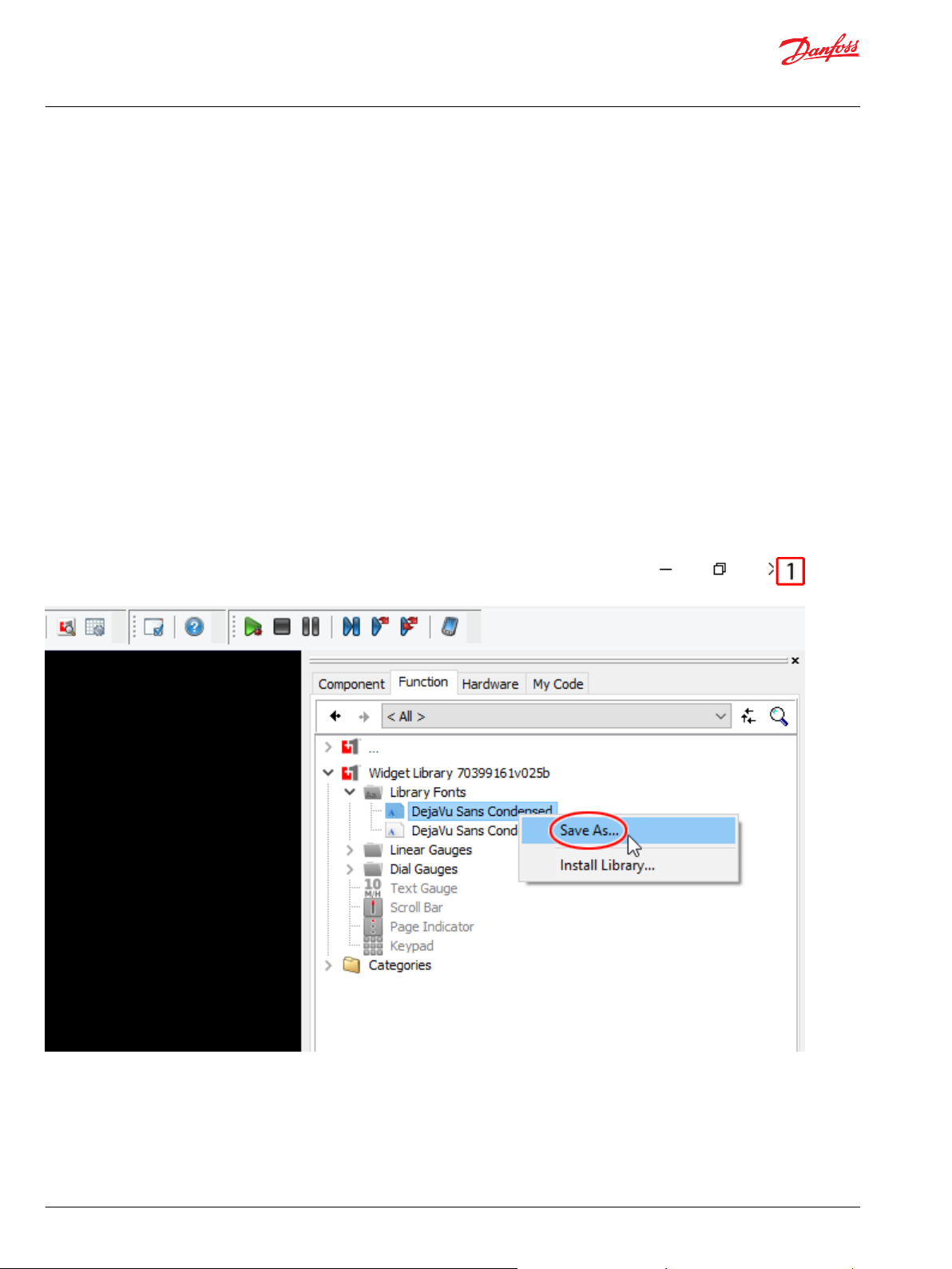
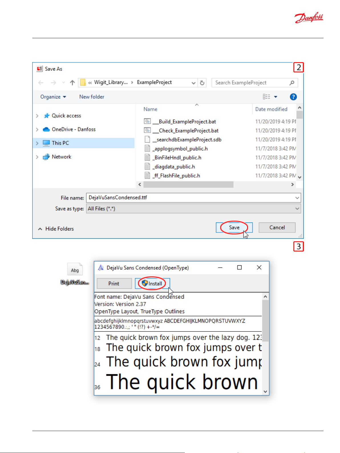
1. From the Functions tab, open Widget Library, Library Fonts. Right-click on a font and select Save
As....
2. Navigate to the location where you want to save the font, then click Save.
3. Navigate to the font, double-click it, then click Install. The font is installed in your computer's font
directory. PLUS+1® GUIDE can access the fonts installed here.
4. Repeat steps 1, 2, and 3 for all fonts included in the library, then restart PLUS+1® GUIDE.
Add the COLOR Data Type
Add the COLOR data type to your application.
The widgets in this library use the GUIDE Extensions' COLOR data type. Follow these steps to correctly
add this into your project.
6 | © Danfoss | December 2019 AQ321680357590en-000101
Page 7
User Manual
PLUS+1® Library—Widget
Library Introduction
©
Danfoss | December 2019 AQ321680357590en-000101 | 7
Page 8
User Manual
PLUS+1® Library—Widget
Library Introduction
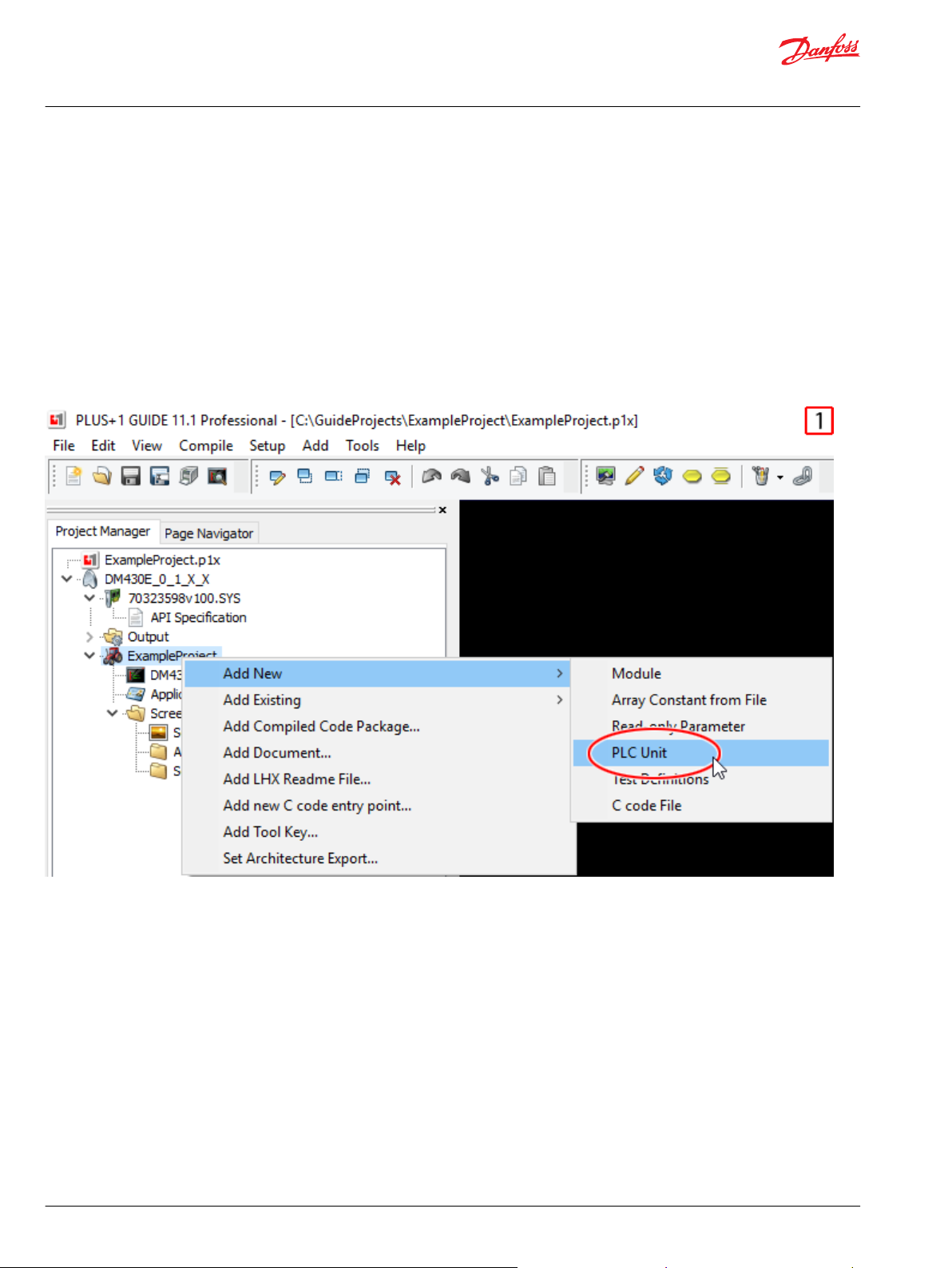
1. On the Project Manager tab, right-click the application name, then select Add New > PLC Unit.
2. Right-click on the PLC Units folder then select Add GUIDE PLC Extensions.
3. GUIDE extensions.xml is added to the PLC Units folder. The COLOR data type appears inside GUIDE
extensions.xml.
Use Widgets in Screen Display Editor
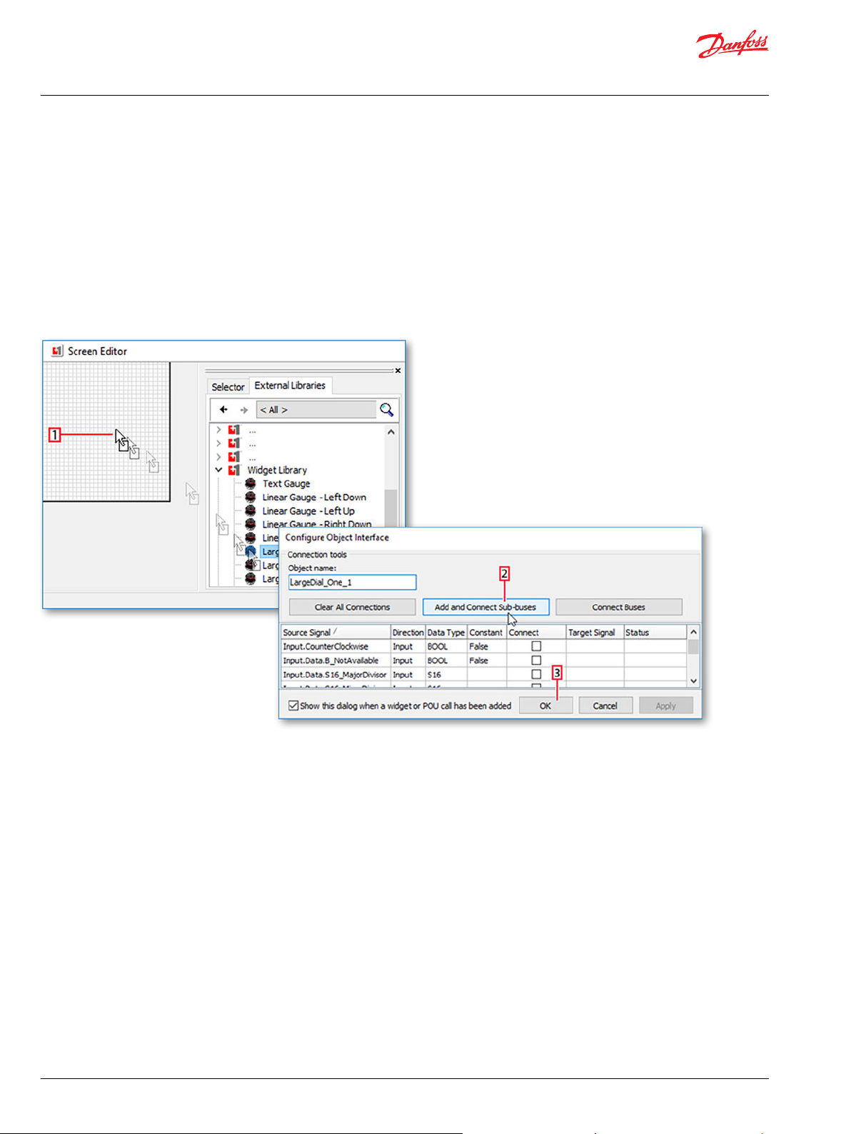
Graphical widgets can only be used in the screen editor.
You cannot drag a widget into the drawing area. To get started using a widget, create a screen and
complete these steps:
1. Click on the External Libraries tab in the Screen Editor and drag the desired widget into the screen. If
prompted to map languages, click OK. There are no translatable words in this library's widgets, this
ensures that the library's language is mapped to the project's main language.
2. When the Configure Object Interface window opens, click Add and Connect Sub-buses.
3. Click OK.
A sub-bus in your screen's Input bus (and Output bus if applicable) is created, containing all the
connected buses and signals for the widget.
8 | © Danfoss | December 2019 AQ321680357590en-000101
Page 9

User Manual
PLUS+1® Library—Widget
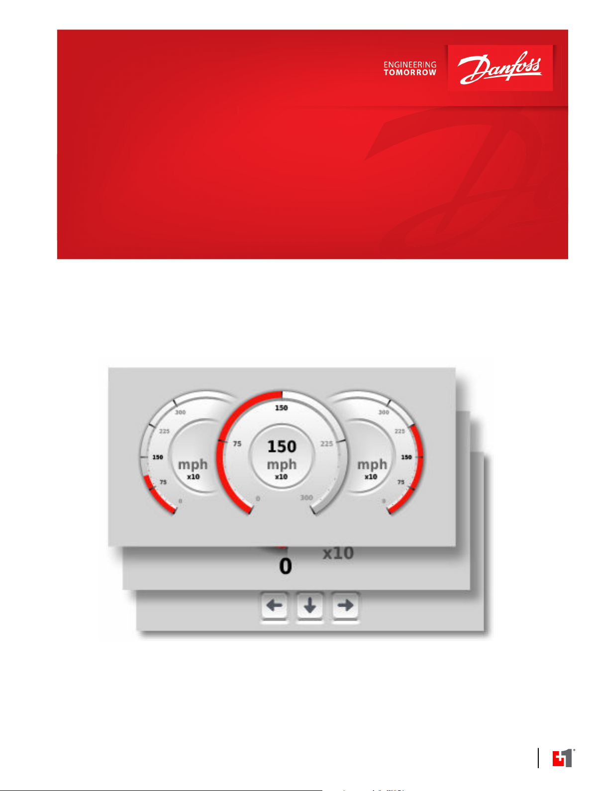
Large Dial Gauges
The Large Dial Gauge has three layout options: one dial, two dials, and three dials.
None of the Large Dial Gauge variations are scalable.
The Large Dial Gauge - One widget provides an adjustable readout to the "S32_Value" signal in the form
of a radial sweep-fill needle and a numeric gauge.
Widget width: 234px
Widget height: 232px
The Large Dial Gauge - Two widget provides two adjustable readouts to the "S32_Value" signals in the
form of two radial sweep-fill needles and numeric gauges. The individual gauge signals are sorted under
accordingly titled sub-buses.
Widget width: 480px
Widget height: 232px
The Large Dial Gauge - Three widget provides three adjustable readouts to the "S32_Value" signals in
the form of three radial sweep-fill needles and numeric gauges. The individual gauge signals are sorted
under accordingly titled sub-buses.
Widget width: 480px
Widget height: 232px
Inputs
The inputs to the Large Dial Gauge widgets are described.
Item Type Range Description [Unit]
Data BUS —— Sub-bus for Data signals.
B_NotAvailable BOOL T/F T: Shows a red glow around the widget. The needle does not show.
F: The widget functions as normal.
©
Danfoss | December 2019 AQ321680357590en-000101 | 9
Page 10

User Manual
PLUS+1® Library—Widget
Large Dial Gauges
Item Type Range Description [Unit]
S16_MajorDivisor S16 0-8
S16_MinorDivisor
S32_Divisor
S32_Max
S32_Min
S32_Multiplier
S32_Value
String_ Text String —— The widget's units displayed under the widget's readout.
Theme BUS —— Sub-bus for Theme signals.
Color_Theme
Gauge_Needle_Color COLOR 0x00000000-0xFFFFFFFF Hexadecimal color (0xRRGGBBAA) of the widget's needle.
Gauge_Units_Color COLOR 0x00000000-0xFFFFFFFF Hexadecimal color (0xRRGGBBAA) of the widget's unit text.
Gauge_Value_Active_Color COLOR 0x00000000-0xFFFFFFFF Hexadecimal color (0xRRGGBBAA) of the widget's major tick value text
Gauge_Value_Close_Color COLOR 0x00000000-0xFFFFFFFF Hexadecimal color (0xRRGGBBAA) of the widget's major tick value texts
Gauge_Value_Inactive_Color COLOR 0x00000000-0xFFFFFFFF Hexadecimal color (0xRRGGBBAA) of the widget's major tick texts that
CounterClockwise BOOL T/F T: Needle sweeps from right to left.
S16
S32
S32
S32
S32
S32
U8
0-7
-2147483648-2147483647 Scales the S32_Value signal by dividing it by the given value. If
-2147483648-2147483647 When S32_Multiplier = 1, this is used to scale the gauge's readout to a
-2147483648-2147483647 When S32_Multiplier = 1, this is used to scale the gauge's readout to a
1, 10, 100, 1000, 10000 Scales the readout numbers on the widget. For example, if Value
-2147483648-2147483647
0,1 Used to select the color theme for the graphics.
Changes the amount of major tick marks on the dial.
0: No tick marks
1: 1 tick mark
2: 2 tick marks
3: 3 tick marks
4: 4 tick marks
5: 5 tick marks
6: 10 tick marks
7: 15 tick marks
8: 20 tick marks
Changes the amount of minor tick marks on the dial.
0: 10 tick marks
1: 20 tick mark
2: 30 tick marks
3: 50 tick marks
4: 60 tick marks
5: 75 tick marks
6: 100 tick marks
7: 150 tick marks
S32_Divisor is 0, the gauge readout is set to 0.
value between 0 and 100. Gauge readout value = (100 x (S32_Value S32_Min)/(S32_Max - S32_Min))
value between 0 and 100. Gauge readout value = (100 x (S32_Value S32_Min)/(S32_Max - S32_Min))
equals 1000 and Multiplier equals 10 then Scaled Value equals 100. If
S32_Multiplier is 0, the tick mark values change to fractions between 0
and 1.
The widget's unscaled input value.
0: Light theme.
1: Dark theme.
[Hexadecimal]
[Hexadecimal]
closest to the needle value and the color of the widget's value text.
[Hexadecimal]
that are close to the needle value.
[Hexadecimal]
are not close to the needle value.
[Hexadecimal]
F: Needle sweeps from left to right.
10 | © Danfoss | December 2019 AQ321680357590en-000101
Page 11

User Manual
PLUS+1® Library—Widget
Large Dial Gauges
Item Type Range Description [Unit]
InsertX
InsertY
Example Widget Use
S16
S16
-32768-32767 The X position of the widget on the screen.
[Pixels]
-32768-32767 The Y position of the widget on the screen.
[Pixels]
Use this example to determine how the signal values affect the Large Dial Gauge widgets in display
applications.
Number Bus Signal Value
1 Input → Left_Gauge → Data S32_Multiplier 10
2 Input → Center_Gauge → Data B_NotAvailable TRUE
3 Input → Center_Gauge → Data S32_Max 1000
4 Input → Right_Gauge → Data Gauge_Needle_Color 0x0000FFFF
©
Danfoss | December 2019 AQ321680357590en-000101 | 11
Page 12

User Manual
PLUS+1® Library—Widget
Linear Gauges
The Linear Gauge widget provides an adjustable readout to the S32_Value signal in the form of a
horizontal fill needle.
None of the Linear Gauge variations are scalable.
There are 4 orientation options for this gauge:
•
Left Up - The tail of the gauge is pointing left and the units are listed on the top.
•
Right Up - The tail of the gauge is pointing right and the units are listed on the top.
•
Left Down - The tail of the gauge is pointing left and the units are listed on the bottom.
•
Right Down - The tail of the gauge is pointing right and the units are listed on the bottom.
Widget width: 240px
Widget height: 116px
Inputs
The inputs to the Linear Gauge widgets are described.
Item Type Range Description [Unit]
Data BUS —— Sub-bus for Data signals.
B_NotAvailable BOOL T/F T: Shows a red glow around the widget. The needle does not show.
F: The widget functions as normal.
S32_Divisor
S32_Max
S32_Min
S32_Multiplier
S32_Value
String_Text String —— The widget's units displayed under the widget's readout.
Theme BUS —— Sub-bus for Theme signals.
Color_Theme
Gauge_Needle_Color COLOR 0x00000000-0xFFFFFFFF Hexadecimal color (0xRRGGBBAA) of the widget's needle.
Gauge_Units_Color COLOR 0x00000000-0xFFFFFFFF
Gauge_Value_Active_Color COLOR 0x00000000-0xFFFFFFFF
S32
S32
S32
S32
S32
U8 0, 1
-2147483648-2147483647 Scales the S32_Value signal by dividing it by the given value. If
-2147483648-2147483647 When S32_Multiplier = 1, this is used to scale the gauge's readout to a
-2147483648-2147483647 When S32_Multiplier = 1, this is used to scale the gauge's readout to a
1, 10, 100, 1000, 10000 Scales the readout numbers on the widget. For example, if Value equals
-2147483648-2147483647 The widget's unscaled input value.
S32_Divisor is 0, the gauge readout is set to 0.
value between 0 and 100. Gauge readout value = (100 x (S32_Value S32_Min)/(S32_Max - S32_Min))
value between 0 and 100. Gauge readout value = (100 x (S32_Value S32_Min)/(S32_Max - S32_Min))
1000 and Multiplier equals 10 then Scaled Value equals 100. If
S32_Multiplier is 0, the tick mark values change to 0.
Used to select the color theme for the graphics.
0: Light theme.
1: Dark theme.
[Hexadecimal]
Hexadecimal color (0xRRGGBBAA) of the widget's unit text.
[Hexadecimal]
Hexadecimal color (0xRRGGBBAA) of the widget's value text.
[Hexadecimal]
12 | © Danfoss | December 2019 AQ321680357590en-000101
Page 13

User Manual
PLUS+1® Library—Widget
Linear Gauges
Item Type Range Description [Unit]
InsertX
InsertY
Example Widget Use
S16
S16
-32768-32767 The X position of the widget on the screen.
[Pixels]
-32768-32767 The Y position of the widget on the screen.
[Pixels]
Use this example to determine how the signal values effect the Linear Gauge widgets.
Number Bus Signal Value
1 Input ->Data B_NotAvailable TRUE
2 Input ->Theme Gauge_Value_Active_Color 0xFFFFFFFF
3 Input ->Theme Color_Theme 1
©
Danfoss | December 2019 AQ321680357590en-000101 | 13
Page 14

User Manual
PLUS+1® Library—Widget
Small Dial Gauge
The Small Dial Gauge widget provides an adjustable readout to the S32_Value signal in the form of a
small radial sweep-fill needle.
This widget is not scalable.
Widget width: 240px
Widget height: 120px
Inputs
The inputs to the Small Dial Gauge widget are described.
Item Type Range Description [Unit]
Data BUS —— Sub-bus for Data signals.
B_NotAvailable BOOL T/F T: Shows a red glow around the widget. The needle does not show.
F: The widget functions as normal.
S32_Divisor
S32_Max
S32_Min
S32_Multiplier
S32_Value
String_Text String The widget's units displayed under the widget's readout.
Theme BUS —— Sub-bus for Theme signals.
Color_Theme
Gauge_Needle_Color COLOR 0x00000000-0xFFFFFFFF Hexadecimal color (0xRRGGBBAA) of the widget's needle.
Gauge_Units_Color COLOR 0x00000000-0xFFFFFFFF Hexadecimal color (0xRRGGBBAA) of the widget's unit text.
Gauge_Value_Active_Color COLOR 0x00000000-0xFFFFFFFF Hexadecimal color (0xRRGGBBAA) of the widget's value text.
S32
S32
S32
S32 1, 10, 100, 1000, 10000
S32
U8 0, 1
-2147483648-2147483647 Scales the S32_Value signal by dividing it by the given value. If
-2147483648-2147483647 When S32_Multiplier = 1, this is used to scale the gauge's readout
-2147483648-2147483647 When S32_Multiplier = 1, this is used to scale the gauge's readout
-2147483648-2147483647 The widget's unscaled input value.
S32_Divisor is 0, the gauge readout is set to 0.
to a value between 0 and 100. Gauge readout value = (100 x
(S32_Value - S32_Min)/(S32_Max - S32_Min))
to a value between 0 and 100. Gauge readout value = (100 x
(S32_Value - S32_Min)/(S32_Max - S32_Min))
Scales the readout numbers on the widget. For example, if Value
equals 1000 and Multiplier equals 10 then Scaled Value equals
100. If S32_Multiplier is 0, the tick mark values change to 0.
Used to select the color theme for the graphics.
0: Light theme.
1: Dark theme.
14 | © Danfoss | December 2019 AQ321680357590en-000101
Page 15

User Manual
PLUS+1® Library—Widget
Small Dial Gauge
Item Type Range Description [Unit]
InsertX
InsertY
Example Widget Use
S16
S16
-32768-32767
-32768-32767 The Y position of the widget on the screen.
Use this example to determine how the signal values effect the Small Dial Gauge widget.
The X position of the widget on the screen.
[Pixels]
[Pixels]
Number Bus Signal Value
1 Input ->Data String_Text "mph"
2 Input ->Theme Gauge_Tick_Color 0x0000FFFF
3 Input ->Data B_NotAvailable TRUE
©
Danfoss | December 2019 AQ321680357590en-000101 | 15
Page 16

User Manual
PLUS+1® Library—Widget
Scroll Bar
The Scroll Bar widget provides a visual indicator for the scroll amount on your screen.
The S16_Value signal describes a percentage of the widget's scroll height.
This widget is not scalable.
Widget width: 5px
Widget height: 800px
Inputs
The inputs to the Scroll Bar widgets are described.
Item Type Range Description [Unit]
Control BUS —— Sub-bus for Control signals.
Enable BOOL T/F T: Visible and functional.
F: Invisible and non-functional.
Data BUS —— Sub-bus for Data signals.
S16_Value
U16_ScrollHeight
S16
U16
0-100 The widget scroll bar's vertical position in percentage of ScrollHeight.
0: Bar at top.
100: Bar at bottom.
[%]
0-800 The widget's maximum vertical scroll distance from Y:0.
[Pixels]
16 | © Danfoss | December 2019 AQ321680357590en-000101
Page 17

User Manual
PLUS+1® Library—Widget
Scroll Bar
Example Widget Use
Use this example to determine how the signal values effect the Scroll Bar widgets in display applications.
Number Bus Signal Value
1 Input → Data U16_ScrollHeight 136
2 Input → Data S16_Value 100
3 Input → Control Enable FALSE
©
Danfoss | December 2019 AQ321680357590en-000101 | 17
Page 18

User Manual
PLUS+1® Library—Widget
Text Gauge
Inputs
The Text Gauge widget provides an adjustable readout to the S32_Value signal in the form of a numeric
gauge.
This widget is not scalable.
Widget width: 240px
Widget height: 116px
The inputs to the Text Gauge widgets are described.
Item Type Range Description [Unit]
Data BUS —— Sub-bus for Data signals.
B_NotAvailable BOOL T/F T: Shows "–" where the value would otherwise be displayed.
F: The widget functions as normal.
S32_Divisor
S32_Max
S32_Min
S32_Multiplier
S32_Value
String_Text String —— The widget's units displayed under the widget's readout.
Theme BUS —— Sub-bus for Theme signals.
Gauge_Units_Color COLOR 0x00000000-0xFFFFFFFF Hexadecimal color (0xRRGGBBAA) of the widget's unit text.
Gauge_Value_Active_Color COLOR 0x00000000-0xFFFFFFFF Hexadecimal color (0xRRGGBBAA) of the widget's value text.
InsertX
InsertY
S32
S32
S32
S32
S32
S16
S16
-2147483648-2147483647 Scales the S32_Value signal by dividing it by the given value. If
S32_Divisor is 0, the gauge functions as if S32_Divisor is 1.
-2147483648-2147483647 Maximum value of the gauge.
-2147483648-2147483647 Minimum value of the gauge.
1, 10, 100, 1000, 10000 Scales the readout numbers on the widget. For example, if Value
equals 1000 and Multiplier equals 10 then Scaled Value equals
100. If S32_Multiplier is 0, the gauge readout is set to 0.
-2147483648-2147483647 The widget's unscaled input value.
[Hexadecimal]
[Hexadecimal]
-32768-32767 The X position of the widget on the screen.
[Pixels]
-32768-32767 The Y position of the widget on the screen.
[Pixels]
18 | © Danfoss | December 2019 AQ321680357590en-000101
Page 19

User Manual
PLUS+1® Library—Widget
Text Gauge
Example Widget Use
Use this example to determine how the signal values effect the Text Gauge widgets in display
applications.
Number Bus Signal Value
1 Input → Data S32_Value 1125
2 Input → Data S32_Max 3000
3 Input → Data S32_Multiplier 10
4 Input → Data B_NotAvailable TRUE
©
Danfoss | December 2019 AQ321680357590en-000101 | 19
Page 20

User Manual
PLUS+1® Library—Widget
Page Indicator
The Page Indicator widget provides a visual indicator for the currently visible page from a selection of
pages.
This widget is scalable.
Widget width: 15px
Widget height: 48px
Inputs
The inputs to the Page Indicator widget are described.
Item Type Range Description [Unit]
Control BUS —— Sub-bus for Control signals.
Enable BOOL T/F T: Visible and functional.
F: Invisible and non-functional.
Data BUS —— Sub-bus for Data signals.
CurrentPage
NumIndicators
NumPages
Theme BUS —— Sub-bus for Theme signals.
ColorTheme
U8
U8
U8
U8
0-7 The selection for the page to be indicated. The first page is page 0.
2-8
1-8 The total number of pages to be indicated.
0,1 Used to select the color theme for the graphics.
The number of indicator dots to show. If CurrentPage is less than
NumPages and is greater than NumIndicators then indicator dots are
replaced with a ratio, for example "6/10".
0: Light theme.
1: Dark theme.
Outputs
The outputs of the Page Indicator widget are described.
Item Type Range Description [Unit]
Fault
U16
—— If NumPages is greater than 8 then Fault equals 0x8002.
If ColorTheme is greater than 1 then Fault equals 0x8002.
Otherwise Fault equals 0x0000.
[Hexadecimal]
20 | © Danfoss | December 2019 AQ321680357590en-000101
Page 21

User Manual
PLUS+1® Library—Widget
Page Indicator
Example Widget Use
Use this example to determine how the signal values effect the Page Indicator widgets in display
applications.
Number Bus Signal Value
1 Input → Data NumIndicators 8
2 Input → Data CurrentPage 2
3 Input → Data NumIndicators 4
4 Input → Data CurrentPage 4
5 Input → Data NumPages 8
6 Input → Data CurrentPage 7
©
Danfoss | December 2019 AQ321680357590en-000101 | 21
Page 22

User Manual
PLUS+1® Library—Widget
Keypad
The Keypad widget provides a user input for numeric values.
This widget is scalable.
Keypad Button Up: Adds 1 to the selected digit.
Keypad Button Down: Subtracts 1 from the selected digit. This is the only way to produce a negative
value.
Keypad Button Right: Moves the digit selection to the right. The digit selection does not move further
than 9 digits to the right.
Keypad Button Left: Moves the digit selection to the left. The digit selection does not move further than
9 digits to the left.
Keypad Number Buttons: Places the selected number in the rightmost digit's place. If the Keypad's
output value is greater than 0, the current digits move to the left if space allows. If there are no more
empty digit places, no digits change.
Keypad Delete Button: Deletes the rightmost digit and moves any other digits to the right. If only one
digit exists, that digit changes to 0.
Widget width: 126px
Widget height: 227px
Inputs
The inputs to the Keypad widget are described.
Item Type Range Description [Unit]
Control BUS —— Sub-bus for Control signals.
Enable BOOL T/F T: Visible and functional.
F: Invisible and non-functional.
Looptime
U16
Reset BOOL T/F Pulse to True to reset the output value and readout.
0-65535 Connect to the device's OS signal ("Loop_Time" or "ExecTime"). When Touchdisplay
equals true, Looptime is used to calculate how long a button is highlighted after
being touched. The selection time is (500 / Looptime) application loops.
22 | © Danfoss | December 2019 AQ321680357590en-000101
Page 23

User Manual
PLUS+1® Library—Widget
Keypad
Item Type Range Description [Unit]
Touchdisplay BOOL T/F T: Widget's touch screen mode enabled.
F: Widget's touch screen mode disabled.
Data
Theme BUS —— Sub-bus for Theme signals.
ColorTheme
BUS
Down BOOL T/F Pulse to True to move the button selection down. The selection wraps around
Minus BOOL T/F Pulse to True to move the button selection left. The selection wraps around
Plus BOOL T/F Pulse to True to move the button selection right. The selection wraps around
Select BOOL T/F Pulse to True to "press" the selected button.
Up BOOL T/F Pulse to True to move the button selection up. The selection wraps around vertically.
U8
—— Sub-bus for Data signals.
vertically.
horizontally.
horizontally.
0,1 Used to select the color theme for the graphics.
0: Light theme.
1: Dark theme.
Outputs
The outputs of the Keypad widget are described.
Item Type Range Description [Unit]
Result
Fault
S32
U16
-2147483648-2147483647 The resulting value from the widget's inputs.
—— If ColorTheme is greater than 1 then Fault equals 0x8002.
Otherwise Fault equals 0x0000.
[Hexadecimal]
Example Widget Use
Use this example to determine how the signal values effect the Keypad widgets in display applications.
©
Danfoss | December 2019 AQ321680357590en-000101 | 23
Page 24

User Manual
PLUS+1® Library—Widget
Keypad
Number Bus Signal Value
1 Input → Data Down Positive Transition
2 Input → Data Select Positive Transition
3 Output Result 8
24 | © Danfoss | December 2019 AQ321680357590en-000101
Page 25

Danfoss
Power Solutions GmbH & Co. OHG
Krokamp 35
D-24539 Neumünster, Germany
Phone: +49 4321 871 0
Danfoss
Power Solutions ApS
Nordborgvej 81
DK-6430 Nordborg, Denmark
Phone: +45 7488 2222
Danfoss
Power Solutions (US) Company
2800 East 13th Street
Ames, IA 50010, USA
Phone: +1 515 239 6000
Danfoss
Power Solutions Trading
(Shanghai) Co., Ltd.
Building #22, No. 1000 Jin Hai Rd
Jin Qiao, Pudong New District
Shanghai, China 201206
Phone: +86 21 2080 6201
Products we offer:
Hydro-Gear
www.hydro-gear.com
Daikin-Sauer-Danfoss
www.daikin-sauer-danfoss.com
DCV directional control
•
valves
Electric converters
•
Electric machines
•
Electric motors
•
Gear motors
•
Gear pumps
•
Hydrostatic motors
•
Hydrostatic pumps
•
Orbital motors
•
PLUS+1® controllers
•
PLUS+1® displays
•
PLUS+1® joysticks and
•
pedals
PLUS+1® operator
•
interfaces
PLUS+1® sensors
•
PLUS+1® software
•
PLUS+1® software services,
•
support and training
Position controls and
•
sensors
PVG proportional valves
•
Steering components and
•
systems
Telematics
•
Danfoss Power Solutions is a global manufacturer and supplier of high-quality hydraulic and
electric components. We specialize in providing state-of-the-art technology and solutions
that excel in the harsh operating conditions of the mobile off-highway market as well as the
marine sector. Building on our extensive applications expertise, we work closely with you to
ensure exceptional performance for a broad range of applications. We help you and other
customers around the world speed up system development, reduce costs and bring vehicles
and vessels to market faster.
Danfoss Power Solutions – your strongest partner in mobile hydraulics and mobile
electrification.
Go to www.danfoss.com for further product information.
We offer you expert worldwide support for ensuring the best possible solutions for
outstanding performance. And with an extensive network of Global Service Partners, we also
provide you with comprehensive global service for all of our components.
Local address:
Danfoss can accept no responsibility for possible errors in catalogues, brochures and other printed material. Danfoss reserves the right to alter its products without notice. This also applies to products
already on order provided that such alterations can be made without subsequent changes being necessary in specifications already agreed.
All trademarks in this material are property of the respective companies. Danfoss and the Danfoss logotype are trademarks of Danfoss A/S. All rights reserved.
©
Danfoss | December 2019 AQ321680357590en-000101
 Loading...