

Page 1

Operation/Reference Guide
TPDesign4
Touch Panel Design Program
(v2.10 or higher)
Software
Last Revised: 8/21/2008
Page 2

Software License and Warranty Agreement
• LICENSE GRANT. AMX grants to Licensee the non-exclusive right to use the AMX Software in the manner described in this
License. The AMX Software is licensed, not sold. This license does not grant Licensee the right to create derivative works of the
AMX Software. The AMX Software consists of generally available programming and development software, product documentation, sample applications, tools and utilities, and miscellaneous technical information. Please refer to the README.TXT file on
the compact disc or download for further information regarding the components of the AMX Software. The AMX Software is subject to restrictions on distribution described in this License Agreement. AMX Dealer, Distributor, VIP or other AMX authorized
entity shall not, and shall not permit any other person to, disclose, display, loan, publish, transfer (whether by sale, assignment,
exchange, gift, operation of law or otherwise), license, sublicense, copy, or otherwise disseminate the AMX Software. Licensee
may not reverse engineer, decompile, or disassemble the AMX Software.
• ACKNOWLEDGEMENT. You hereby acknowledge that you are an authorized AMX dealer, distributor, VIP or other AMX authorized entity in good standing and have the right to enter into and be bound by the terms of this Agreement.
• INTELLECTUAL PROPERTY. The AMX Software is owned by AMX and is protected by United States copyright laws, patent
laws, international treaty provisions, and/or state of Texas trade secret laws. Licensee may make copies of the AMX Software
solely for backup or archival purposes. Licensee may not copy the written materials accompanying the AMX Software.
• TERMINATION. AMX RESERVES THE RIGHT, IN ITS SOLE DISCRETION, TO TERMINATE THIS LICENSE FOR ANY REASON UPON WRITTEN NOTICE TO LICENSEE. In the event that AMX terminates this License, the Licensee shall return or
destroy all originals and copies of the AMX Software to AMX and certify in writing that all originals and copies have been
returned or destroyed.
• PRE-RELEASE CODE. Portions of the AMX Software may, from time to time, as identified in the AMX Software, include PRERELEASE CODE and such code may not be at the level of performance, compatibility and functionality of the GA code. The
PRE-RELEASE CODE may not operate correctly and may be substantially modified prior to final release or certain features may
not be generally released. AMX is not obligated to make or support any PRE-RELEASE CODE. ALL PRE-RELEASE CODE IS
PROVIDED "AS IS" WITH NO WARRANTIES.
• LIMITED WARRANTY. AMX warrants that the AMX Software (other than pre-release code) will perform substantially in accordance with the accompanying written materials for a period of ninety (90) days from the date of receipt. AMX DISCLAIMS ALL
OTHER WARRANTIES, EITHER EXPRESS OR IMPLIED, INCLUDING, BUT NOT LIMITED TO IMPLIED WARRANTIES OF
MERCHANTABILITY AND FITNESS FOR A PARTICULAR PURPOSE, WITH REGARD TO THE AMX SOFTWARE. THIS LIMITED WARRANTY GIVES LICENSEE SPECIFIC LEGAL RIGHTS. Any supplements or updates to the AMX SOFTWARE,
including without limitation, any (if any) service packs or hot fixes provided to Licensee after the expiration of the ninety (90) day
Limited Warranty period are not covered by any warranty or condition, express, implied or statutory.
• LICENSEE REMEDIES. AMX's entire liability and Licensee's exclusive remedy shall be repair or replacement of the AMX Software that does not meet AMX's Limited Warranty and which is returned to AMX in accordance with AMX's current return policy.
This Limited Warranty is void if failure of the AMX Software has resulted from accident, abuse, or misapplication. Any replacement AMX Software will be warranted for the remainder of the original warranty period or thirty (30) days, whichever is longer.
Outside the United States, these remedies may not available. NO LIABILITY FOR CONSEQUENTIAL DAMAGES. IN NO
EVENT SHALL AMX BE LIABLE FOR ANY DAMAGES WHATSOEVER (INCLUDING, WITHOUT LIMITATION, DAMAGES
FOR LOSS OF BUSINESS PROFITS, BUSINESS INTERRUPTION, LOSS OF BUSINESS INFORMATION, OR ANY OTHER
PECUNIARY LOSS) ARISING OUT OF THE USE OF OR INABILITY TO USE THIS AMX SOFTWARE, EVEN IF AMX HAS
BEEN ADVISED OF THE POSSIBILITY OF SUCH DAMAGES. BECAUSE SOME STATES/COUNTRIES DO NOT ALLOW
THE EXCLUSION OR LIMITATION OF LIABILITY FOR CONSEQUENTIAL OR INCIDENTAL DAMAGES, THE ABOVE LIMITATION MAY NOT APPLY TO LICENSEE.
• U.S. GOVERNMENT RESTRICTED RIGHTS. The AMX Software is provided with RESTRICTED RIGHTS. Use, duplication, or
disclosure by the Government is subject to restrictions as set forth in subparagraph ©(1)(ii) of The Rights in Technical Data and
Computer Software clause at DFARS 252.227-7013 or subparagraphs ©(1) and (2) of the Commercial Computer Software
Restricted Rights at 48 CFR 52.227-19, as applicable.
• SOFTWARE AND OTHER MATERIALS FROM AMX.COM MAY BE SUBJECT TO EXPORT CONTROL. The United States
Export Control laws prohibit the export of certain technical data and software to certain territories. No software from this Site may
be downloaded or exported (i) into (or to a national or resident of) Cuba, Iraq, Libya, North Korea, Iran, Syria, or any other country to which the United States has embargoed goods; or (ii) anyone on the United States Treasury Department's list of Specially
Designated Nationals or the U.S. Commerce Department's Table of Deny Orders. AMX does not authorize the downloading or
exporting of any software or technical data from this site to any jurisdiction prohibited by the United States Export Laws.
This Agreement replaces and supersedes all previous AMX Software License Agreements and is governed by
the laws of the State of Texas, and all disputes will be resolved in the courts in Collin County, Texas, USA. For
any questions concerning this Agreement, or to contact AMX for any reason, please write: AMX License and
Warranty Department, 3000 Research Drive, Richardson, TX 75082.
Page 3

Table of Contents
Table of Contents
TPDesign4 Program ............................................................................................ 1
Overview .................................................................................................................. 1
What's New in Version 2.10 ............................................................................................ 1
Supported Operating Systems ....................................................................................... 1
Supported Operating System Languages ...................................................................... 1
PC Requirements ............................................................................................................ 2
Supported Panel Types ................................................................................................... 2
Intercom Capabilities for Modero Panels ........................................................................ 3
Supported Screen Resolutions ........................................................................................ 3
TPDesign4 Work Area............................................................................................... 3
Toolbars.................................................................................................................... 5
Show/Hide Toolbars........................................................................................................ 5
Design View Windows .............................................................................................. 6
Using the Zoom Controls ................................................................................................ 7
Workspace Navigator ............................................................................................... 8
Properties Control Window ...................................................................................... 9
Properties Control Window - General Tab ...................................................................... 9
Properties Control Window - Programming Tab ............................................................. 9
Properties Control Window - States Tab......................................................................... 9
State Manager Window .......................................................................................... 10
Transfer Status Window.......................................................................................... 10
Button Preview Window ......................................................................................... 11
Button Preview Context Menu ...................................................................................... 11
Magnifier Window .................................................................................................. 12
Working With Dockable Windows .......................................................................... 12
Moving, Docking and Resizing Dockable Windows ....................................................... 12
Toggling the Windows .................................................................................................. 12
Status Bar ............................................................................................................... 12
Default View.................................................................................................................. 13
Secondary View............................................................................................................. 13
Print Preview Window ............................................................................................ 14
Workspace Context Menu............................................................................................. 15
WebUpdate ............................................................................................................ 15
G4 PanelBuilder ...................................................................................................... 15
G4 PanelPreview..................................................................................................... 16
TPDesign4 Touch Panel Design Software (v2.10 or higher)
i
Page 4

Table of Contents
TPDesign4 Project Files ....................................................................................17
Overview ................................................................................................................ 17
Inappropriate File Name Characters ............................................................................. 17
Creating a New Project........................................................................................... 17
Using The New Project Wizard ............................................................................... 18
System-Generated File Names................................................................................ 20
Edit Focus...................................................................................................................... 21
Setting Project Properties ...................................................................................... 22
Project Properties dialog - Project Information tab ................................................ 22
Applying Password Protection to Your Project File....................................................... 23
Project Properties dialog - Panel Setup Information tab ........................................ 24
Setting a Power Up Page .............................................................................................. 25
Setting Power Up Popup Pages .................................................................................... 25
Setting an Inactive Page Flip ......................................................................................... 26
Project Properties dialog - Sensors tab................................................................... 27
Project Properties dialog - IR Emitters and Receivers tab ...................................... 28
Working With R-4 Remote Controllers.................................................................... 29
Creating a TPD4 Project for R-4 Remote Controllers .................................................... 29
R-4 Remote Devices - Unsupported Button Types ........................................................ 30
Using Quick Input ................................................................................................... 30
Undo/Redo Support ...................................................................................................... 31
Using the Workspace Navigator ............................................................................. 31
Workspace Navigator - Pages tab........................................................................... 31
Opening pages/popup pages via the Workspace Navigator......................................... 32
Renaming Pages via the Workspace Navigator ............................................................. 32
Workspace Navigator - Edit Focus ................................................................................ 32
Workspace Navigator - Function Maps tab............................................................. 32
Cutting, Copying and Pasting ................................................................................. 33
Copying States to the Clipboard ................................................................................... 33
Pasting States from the Clipboard ................................................................................ 33
Cutting Objects ............................................................................................................. 34
Saving the Active Project as a Different Panel Type ............................................... 34
Working With Multiple Projects.............................................................................. 34
Opening Multiple Projects Simultaneously .................................................................... 34
Copying/Pasting Across Projects ................................................................................... 34
Copying/Pasting Pages, Popup Pages and Buttons Across Projects ............................. 35
Project Migration (from previous versions of TPDesign4)....................................... 35
Converting TPD3 files to TPD4 ............................................................................... 35
Using the TPD Conversion Wizard................................................................................. 35
ii
TPDesign4 Touch Panel Design Software (v2.10 or higher)
Page 5

Table of Contents
Errors and Warnings Report dialog ............................................................................... 36
Working With Pages ......................................................................................... 37
Overview ................................................................................................................ 37
Creating a Page ...................................................................................................... 37
Page General Properties......................................................................................... 38
Creating a Page Flip...................................................................................................... 38
Drag & Drop To Set Page Flips ..................................................................................... 38
Page Flip Actions .......................................................................................................... 39
Page Programming Properties................................................................................ 39
Page State Properties............................................................................................. 40
Adding a Fill Color to a Page ........................................................................................ 41
Adding Text to a Page .................................................................................................. 41
Adding a Bitmap to a Page ........................................................................................... 41
Adding an Icon to a Page .............................................................................................. 42
Working with Transparent Backgrounds................................................................. 42
Supported Image File Types ......................................................................................... 43
Displaying a Video Source on a Page............................................................................ 43
Copying Pages........................................................................................................ 44
Pasting Pages ......................................................................................................... 44
Copying / Pasting a State From a Page......................................................................... 44
Opening pages/popup pages via the Workspace Navigator......................................... 44
Renaming a Page .................................................................................................... 44
Renaming Pages via the Workspace Navigator ............................................................. 44
Deleting Pages From a Project ............................................................................... 45
Exporting Pages as Image Files .............................................................................. 45
Printing Pages......................................................................................................... 46
Working With Popup Pages .............................................................................47
Overview ................................................................................................................ 47
Creating a Popup Page........................................................................................... 47
Using the Popup Draw Tool.................................................................................... 48
Drawing Assist Support for Popup Pages ............................................................... 49
Popup Page General Properties ............................................................................. 50
Popup Page Programming Properties .................................................................... 51
Popup Page State Properties ................................................................................. 51
Adding a Fill Color To a Popup Page ............................................................................ 53
Adding a Bitmap to a Popup Page................................................................................ 53
Adding an Icon to a Popup Page .................................................................................. 53
Adding Text to a Popup Page ....................................................................................... 54
Displaying a Video Source on a Popup Page ................................................................ 54
TPDesign4 Touch Panel Design Software (v2.10 or higher)
iii
Page 6

Table of Contents
Copying Popup Pages............................................................................................. 54
Pasting Popup Pages .............................................................................................. 54
Copying / Pasting a State From a Popup Page ............................................................. 55
Popup Page Groups................................................................................................ 55
Show/Hide Popup Pages ........................................................................................ 55
Deleting Popup Pages From a Project .................................................................... 56
Printing Popup Pages ............................................................................................. 56
Working With Buttons ......................................................................................57
Overview ................................................................................................................ 57
Selection Tool................................................................................................................ 57
Setting Default Parameters for New Buttons ......................................................... 58
Drawing Tools Toolbar............................................................................................ 58
Creating New Buttons ............................................................................................ 59
Drawing a Button .......................................................................................................... 59
Using the Drawing Assist Features ................................................................................ 60
Alignment & Sizing Tool ................................................................................................ 62
Generated Button Names ....................................................................................... 64
Setting General Button Properties ......................................................................... 65
Setting Button Programming Properties ................................................................ 66
Level Control Types....................................................................................................... 66
Setting State Properties ......................................................................................... 67
Editing Button Properties ....................................................................................... 68
Editing Multiple Selections............................................................................................ 68
Apply To All................................................................................................................... 68
General Buttons...................................................................................................... 69
Multi-State General Buttons ................................................................................... 69
Bargraph Buttons.................................................................................................... 69
Multi-State Bargraph Buttons ................................................................................. 69
Custom sliders on Multi-state Bargraph Buttons ........................................................... 69
Formatting Codes (Bargraph and Multi-Bargraph buttons only) ................................... 70
Using Touch Maps for Multi-State Bargraphs Buttons................................................... 70
Joystick Buttons...................................................................................................... 71
Text Input Buttons .................................................................................................. 71
Input Mask Characters (Text Input button only) ............................................................ 71
Input Mask Ranges (Text Input button only).................................................................. 71
Input Mask Operators (Text Input button only)............................................................. 71
Input Mask Next Field Characters (Text Input button only)........................................... 72
Computer Control Buttons ..................................................................................... 72
TakeNote Buttons................................................................................................... 72
iv
TPDesign4 Touch Panel Design Software (v2.10 or higher)
Page 7

Table of Contents
List Box Buttons...................................................................................................... 72
Adding Text to a Button ......................................................................................... 72
Additional Foreign Language Support .......................................................................... 73
Pre-rendered graphics................................................................................................... 73
True Type Font Support ................................................................................................ 73
Changing Button Text Color ................................................................................... 73
Adding a Bitmap to a Button.................................................................................. 74
Adding an Icon to a Button..................................................................................... 74
Changing the Button Fill Color ............................................................................... 74
Border Styles .......................................................................................................... 75
Creating a Time Button........................................................................................... 75
Creating a Date Button........................................................................................... 75
Working With Touch Styles and Active Touch ........................................................ 76
Displaying a Video Source on a Button................................................................... 76
Copying/Pasting Buttons ........................................................................................ 76
Paste Controls dialog .................................................................................................... 77
Searching and Replacing Button Properties ........................................................... 77
Using Quick Input ................................................................................................... 78
Button Preview Window ......................................................................................... 79
External Controls (Pushbuttons/LEDs) .................................................................... 80
Setting Global General Properties for External Pushbuttons and/or LEDs ................... 81
Setting Global Programming Properties for External Pushbuttons and/or LEDs .......... 81
Setting Page-Specific General Properties for External Pushbuttons and/or LEDs......... 82
Setting Page-Specific Programming Properties for External Pushbuttons and/or LEDs 82
Copy/Convert External Controls Between Panels ......................................................... 82
List Box Buttons ...............................................................................................83
Overview ................................................................................................................ 83
G4 Devices That Support List Box Buttons ............................................................. 84
List Box Buttons: Managed Mode........................................................................... 85
List Box Buttons - Container.......................................................................................... 85
List Box Toolbar ............................................................................................................ 85
Creating List Box Buttons (Managed Mode) ........................................................... 86
Using the Drawing Tools Toolbar With List Box Buttons............................................... 87
Setting List Box Container Button Properties......................................................... 87
List Box Container Properties vs. Column Properties (Managed Mode)........................ 87
Setting General Properties: List Box Container Buttons ............................................... 88
Setting Programming Properties: List Box Container Buttons ...................................... 89
Setting State Properties: List Box Container Buttons ................................................... 89
List Box Buttons - Subordinate Buttons .................................................................. 90
TPDesign4 Touch Panel Design Software (v2.10 or higher)
v
Page 8

Table of Contents
List Box Buttons - Columns............................................................................................ 90
Setting List Box Button Column Properties ............................................................ 91
Setting General Properties: List Box Button Columns................................................... 91
Setting State Properties: List Box Button Columns ....................................................... 92
Adding Rows and Columns to a List Box (Managed Mode) .................................... 92
Adding Rows ................................................................................................................. 92
Adding Columns ............................................................................................................ 93
Deleting Rows and Columns from a List Box (Managed Mode) .............................. 93
Deleting Columns .......................................................................................................... 93
Deleting Rows ............................................................................................................... 93
Cutting, Copying and Pasting a List Box (Managed Mode)..................................... 93
Subordinate Button Placement ..................................................................................... 94
Subordinate Buttons - Drag and Drop Capability.......................................................... 94
List Box Buttons - Resizing Capability ........................................................................... 94
List Box Buttons - Navigation Buttons .................................................................... 95
Creating Navigation Buttons ......................................................................................... 95
Navigation Buttons - Channel Code values ................................................................... 96
List Box Buttons: Unmanaged Mode ...................................................................... 96
Rules for Unmanaged List Box Buttons................................................................... 97
List Box Buttons - Z-Order............................................................................................. 97
Creating List Box Buttons (Unmanaged Mode) ............................................................. 97
Editable Button Properties of an Unmanaged List Box Container button .................... 98
Editable Button Properties of an Unmanaged List Box Subordinate button ................ 98
List Data Table ........................................................................................................ 99
Edit List Tables dialog ................................................................................................... 99
Creating a Static List Data Table ................................................................................. 100
List Data Table Column Types ..................................................................................... 101
Attaching a Static List Data Table to a List Box Button............................................... 101
Editing Cell Data ......................................................................................................... 101
Changing the Port and Address Assignments for a Data List Table ............................ 102
Deleting a List Data Table ........................................................................................... 102
Working With Dynamic List Box Data ................................................................... 103
Dynamic List Box Data................................................................................................. 103
Creating a Dynamic List Data Table ............................................................................ 103
List Box Commands .............................................................................................. 103
Data List Commands .................................................................................................. 103
^LDN ...........................................................................................................................103
^LDA ...........................................................................................................................104
^LDR ...........................................................................................................................104
^LDC ...........................................................................................................................104
vi
TPDesign4 Touch Panel Design Software (v2.10 or higher)
Page 9

Table of Contents
^LDD ...........................................................................................................................104
Data List Commands - Rules ........................................................................................ 105
^LDT ...........................................................................................................................105
^LDL ............................................................................................................................ 105
Command Structure List View Commands ................................................................. 106
^LVO ...........................................................................................................................106
^LVL ............................................................................................................................ 106
^LVP ............................................................................................................................ 106
^LVS ............................................................................................................................ 107
^LVC ...........................................................................................................................107
^LVF ............................................................................................................................ 107
Attaching a Dynamic List Data Table to a List Box Button .......................................... 108
Example NetLinx Code with List Data ......................................................................... 108
Working With Properties ................................................................................ 111
Properties Control Window .................................................................................. 111
Using the Apply To All option ..................................................................................... 112
Using the Prev and Next buttons ................................................................................ 112
General Properties................................................................................................ 113
Above Popups ............................................................................................................. 113
Animate Time Down .................................................................................................... 113
Animate Time Up ........................................................................................................ 113
Auto-Repeat ................................................................................................................ 113
Border Style ................................................................................................................ 113
Color Depth ................................................................................................................ 113
Column Display Order ................................................................................................. 113
Column Sort Order ...................................................................................................... 114
Compression ............................................................................................................... 114
Cursor Color ................................................................................................................ 114
Cursor Name ............................................................................................................... 114
Description .................................................................................................................. 114
Disabled ...................................................................................................................... 114
Display Type ................................................................................................................ 114
Group ..........................................................................................................................114
Height .........................................................................................................................114
Hidden ........................................................................................................................ 114
Hide Effect .................................................................................................................. 115
Input Mask .................................................................................................................. 115
Left .............................................................................................................................. 115
List Column ................................................................................................................. 115
List Column Padding ................................................................................................... 115
TPDesign4 Touch Panel Design Software (v2.10 or higher)
vii
Page 10

Table of Contents
List Display .................................................................................................................. 116
List Table Port ............................................................................................................. 116
List Table Address ....................................................................................................... 116
List Table Wrap ........................................................................................................... 116
List Filter Column ........................................................................................................ 116
List Managed ............................................................................................................... 116
List Offset Enabled ...................................................................................................... 117
List Preferred Row ....................................................................................................... 117
List Preferred Row Height ........................................................................................... 117
List Row .......................................................................................................................117
List Row Height ........................................................................................................... 117
List Row Padding ......................................................................................................... 117
List Selectable ............................................................................................................. 117
Lock Button Name ....................................................................................................... 118
Max Text Length ......................................................................................................... 118
Modal ..........................................................................................................................118
Name ...........................................................................................................................118
Page Flip ..................................................................................................................... 118
Password ..................................................................................................................... 118
Password Character ..................................................................................................... 118
Password Protection ................................................................................................... 118
Remote Host ............................................................................................................... 118
Remote Port ................................................................................................................ 118
Reset Pos. On Show: ................................................................................................... 118
Scale To Fit .................................................................................................................. 119
Show Effect ................................................................................................................. 119
Slider Color ................................................................................................................. 119
Slider Name ................................................................................................................. 119
State Count ................................................................................................................. 119
TakeNote Enabled ....................................................................................................... 119
TakeNote Host ............................................................................................................ 119
TakeNote Port ............................................................................................................. 119
Top .............................................................................................................................. 119
Touch Map ................................................................................................................... 119
Touch Style .................................................................................................................. 120
Type ............................................................................................................................ 120
Value Direction ............................................................................................................ 120
Width/Height .............................................................................................................. 120
viii
TPDesign4 Touch Panel Design Software (v2.10 or higher)
Page 11

Table of Contents
Programming Properties....................................................................................... 121
Address Code .............................................................................................................. 121
Address Port ............................................................................................................... 121
Channel Code .............................................................................................................. 121
Channel Port ............................................................................................................... 121
Command Output ....................................................................................................... 121
Command Port ............................................................................................................ 121
Feedback ..................................................................................................................... 121
Level Aux .................................................................................................................... 121
Level Code .................................................................................................................. 121
Level Control Repeat ................................................................................................... 121
Level Control Type ...................................................................................................... 121
Level Control Value ..................................................................................................... 121
Level Function ............................................................................................................. 121
Level Port .................................................................................................................... 121
Range Aux Inverted ..................................................................................................... 121
Range Drag Increment ................................................................................................ 121
Level Control Parameters............................................................................................ 122
Level Code .................................................................................................................. 122
Level Control Repeat ................................................................................................... 122
Level Control Value ..................................................................................................... 122
Level Port .................................................................................................................... 122
Range High .................................................................................................................. 122
Range Low .................................................................................................................. 122
Range Time Down ....................................................................................................... 122
Range Time Up ............................................................................................................ 122
Range High .................................................................................................................. 122
Range Inverted ............................................................................................................ 122
Range Low .................................................................................................................. 122
Range Time Down ....................................................................................................... 122
Range Time Up ............................................................................................................ 122
String Output .............................................................................................................. 122
String Output Port ...................................................................................................... 122
Level Functions............................................................................................................ 123
Display Only ................................................................................................................ 123
Active .......................................................................................................................... 123
Active Centering ......................................................................................................... 123
Drag ............................................................................................................................ 123
Drag Centering ........................................................................................................... 123
TPDesign4 Touch Panel Design Software (v2.10 or higher)
ix
Page 12

Table of Contents
Address Codes...................................................................................................... 123
Basic Address Codes: Date Display ............................................................................. 123
Basic Address Codes: Time Display ............................................................................. 124
Channel Codes...................................................................................................... 124
Navigation Buttons - Channel Code values ................................................................. 124
Basic Channel Codes: Page Flip................................................................................... 125
NXP-PLV Reserved Channel Codes (1-7) ..................................................................... 125
Level Codes .......................................................................................................... 125
NXP-PLV Reserved Level Codes (1-11) ........................................................................ 125
State Properties.................................................................................................... 126
Bitmap .........................................................................................................................126
Bitmap Justification ..................................................................................................... 126
Bitmap X and Y Offsets ............................................................................................... 126
Border Color ................................................................................................................ 126
Border Name ............................................................................................................... 126
Chameleon Image ........................................................................................................ 127
Draw Order ................................................................................................................. 127
Fill Color ...................................................................................................................... 127
Font ............................................................................................................................. 127
Icon Justification ......................................................................................................... 127
Icon Slot ......................................................................................................................127
Icon X and Y Offsets .................................................................................................... 127
Marquee Direction ...................................................................................................... 128
Marquee Repeat .......................................................................................................... 128
Overall Opacity ........................................................................................................... 128
Scale Bitmap To Fit ..................................................................................................... 128
Sound ..........................................................................................................................128
Streaming Source ........................................................................................................ 128
Text ............................................................................................................................. 128
Text Color ................................................................................................................... 128
Text Effect ................................................................................................................... 129
Text Effect Color ......................................................................................................... 129
Text Justification ......................................................................................................... 129
Text X and Y Offsets ................................................................................................... 129
Video Cropping ........................................................................................................... 129
Video Fill .....................................................................................................................129
Video Pass-Thru ........................................................................................................... 129
Word Wrap .................................................................................................................. 129
All States option.......................................................................................................... 130
Workspace Navigator Context Menu .......................................................................... 130
x
TPDesign4 Touch Panel Design Software (v2.10 or higher)
Page 13

Table of Contents
Working With The Property Painter...................................................................... 130
Property Painter dialog ............................................................................................... 131
Saving a Properties Set ............................................................................................... 132
Working With States ......................................................................................133
Overview .............................................................................................................. 133
Setting State Properties ....................................................................................... 134
State Manager context menu...................................................................................... 134
Adding States To a Multi-State Button ................................................................. 135
Duplicating an Existing State on the Button ............................................................... 135
Adding States From the Clipboard ............................................................................. 135
Adding States Through Drag-and-Drop ...................................................................... 136
State Manager Drag-and-Drop Menu.......................................................................... 136
Removing States From A Multi-State Button ........................................................ 137
Deleting States............................................................................................................ 137
Cutting States To the Clipboard ................................................................................. 137
Changing the Order Of States .............................................................................. 137
Reordering States Through the Clipboard .................................................................. 137
Reordering States Through Drag-and-Drop ................................................................ 137
Choose Display State dialog ....................................................................................... 138
Replacing States On a Page, Popup Page or Button ............................................ 138
Replacing States From the Clipboard.......................................................................... 138
Replacing States Through Drag-and-Drop .................................................................. 138
Draw Order (Z-Order) ........................................................................................... 139
Changing the draw order for selected states .............................................................. 139
Working With Function Codes ........................................................................ 141
Overview .............................................................................................................. 141
Function Maps tab ...................................................................................................... 141
Display Function Codes ............................................................................................... 142
Function Codes - Limitations ....................................................................................... 143
0-Setup Port................................................................................................................ 143
Power Assign ........................................................................................................ 143
The Power Assign dialog............................................................................................. 143
Using Power Assign: 1) Clear Channels ....................................................................... 144
Using Power Assign: 2) Assign Codes ......................................................................... 144
Begin Assignment At................................................................................................... 144
Ensure Contiguous Code Assignment ......................................................................... 145
Wrap Within Port ID .................................................................................................... 145
Colors and Palettes ........................................................................................147
Working With Colors ............................................................................................ 147
TPDesign4 Touch Panel Design Software (v2.10 or higher)
xi
Page 14

Table of Contents
Working With Multiple Color Palettes .................................................................. 148
Creating New Palette Entries ...................................................................................... 148
Creating Custom Palettes............................................................................................ 149
Renaming Palettes....................................................................................................... 149
Changing the Active Palette........................................................................................ 149
Importing Palette Files ................................................................................................ 149
Exporting Palette Files ................................................................................................ 150
Copying Palettes ......................................................................................................... 150
Copying Palette Entries............................................................................................... 150
Using Custom Palettes to Enable Color Schemes in G4 PanelBuilder ......................... 150
Using the Grab and Paint Properties Tools........................................................... 151
Using the Property Painter ................................................................................... 152
Animations and Tweening ..............................................................................155
Using the Animation Wizard ................................................................................. 155
Animation Wizard - Select Type (Step 1 of 6).............................................................. 156
Animation Wizard - Create Sequence (Step 2 of 6) ..................................................... 156
Animation Wizard - Size & Position (Step 3 of 6)......................................................... 156
Animation Wizard - Assign Frames (Step 4 of 6) ......................................................... 157
Animation Wizard - Appearance (Step 5 of 6) ............................................................. 157
Animation Wizard - Finish (Step 6 of 6) ....................................................................... 157
Tweening .............................................................................................................. 158
Creating Color Transition Effects ................................................................................ 159
Creating Animated Bitmap Effects .............................................................................. 160
Creating Animated Text Effects .................................................................................. 161
Tweeners sub-menu .................................................................................................... 161
Chameleon Images................................................................................................ 162
Requirements for Chameleon Images.......................................................................... 162
Working With Chameleon Images ............................................................................... 163
Chameleon Images, Custom Palettes and G4 PanelBuilder......................................... 164
Working With Templates ................................................................................167
Importing Template (*.VAT or *.TPT) Files............................................................ 167
Working With the System Page Template ............................................................ 167
Copying/Pasting Entire System Pages into a Project .................................................. 168
Copying/Pasting System Page Elements into a Project page...................................... 168
Working with System Page Keyboards and Keypads .................................................. 169
System Page Template Reference ............................................................................... 169
Exporting Your Project as a G4 PanelBuilder Template........................................ 171
Creating a New Project Using G4 PanelBuilder........................................................... 173
Importing G4 PanelBuilder Templates......................................................................... 174
xii
TPDesign4 Touch Panel Design Software (v2.10 or higher)
Page 15

Table of Contents
Creating G4 PanelBuilder Templates .......................................................................... 174
Template Requirements .............................................................................................. 175
Required Template Elements ...................................................................................... 175
Optional Template Elements....................................................................................... 177
Element Specific Conventions ..................................................................................... 177
Rules for Navigating A Template ................................................................................ 178
Template Wide Conventions ....................................................................................... 178
Creating Navigation Elements .................................................................................... 178
Creating Placeholder Elements ................................................................................... 179
Placeholder Element Conventions .............................................................................. 181
Creating Preview Images ............................................................................................ 181
Alternate Screen Names for Template Elements ........................................................ 182
Element Specific Conventions ..................................................................................... 182
Navigation Element Conventions ............................................................................... 183
Sub-Navigation Element Conventions ...................................................................... 184
Splash Element Conventions ...................................................................................... 184
Device Element Conventions ...................................................................................... 185
Feature Element Conventions .................................................................................... 185
Sub-Feature Element Conventions ............................................................................. 185
Exporting Your Project as a VisualArchitect Template.......................................... 186
VA Templates - Navigations as Pages ......................................................................... 186
VA Templates - Logical Page Scroll Bar Elements ....................................................... 186
VA Templates - Logical Page Info Element.................................................................. 186
VA Templates - Logical Page Up and Down Elements ................................................ 187
VA Templates - List Box Page Up and Down Elements ............................................... 187
Working With the Resource Manager .............................................................189
Resource Manager dialog - Images tab................................................................. 190
Resource Manager dialog - Dynamic Images tab .................................................. 190
Resource Manager dialog - Slots tab .................................................................... 190
Resource Manager dialog - Sounds tab ................................................................ 191
Editing Image and Sound Files Using External Programs ..................................... 192
To edit image files:...................................................................................................... 192
To edit sound files:...................................................................................................... 192
Adding an External Editing Program for Image Files .................................................. 192
Adding an External Editing Program for Sound Files.................................................. 192
Changing the Default External Image or Sound Editor Program ................................ 193
Working With Images ........................................................................................... 193
Supported Image File Types ....................................................................................... 193
Importing Image Files To Your Project ........................................................................ 194
Assigning Images to Slot Positions.............................................................................. 194
TPDesign4 Touch Panel Design Software (v2.10 or higher)
xiii
Page 16

Table of Contents
Working With Dynamic Images ............................................................................. 195
Adding Dynamic Image Files To Your Project ............................................................. 195
Assigning Dynamic Images to Slot Positions ............................................................... 195
Preserve Dynamic Images (Refresh only at Panel Startup) .......................................... 195
Working With Dynamo Video ............................................................................... 196
Setting Up a DynaMo Video Image ............................................................................. 196
Motion JPEG Cameras and Servers that provide Motion JPEG streaming output ...... 198
Network Path Information........................................................................................... 198
Working With Trendnet IP Cameras ............................................................................ 200
Bitmaps vs. Icons .................................................................................................. 201
Working With Icons............................................................................................... 201
Working With Slot Assignments ........................................................................... 201
Assigning Image and Sound Files to Slot Positions ..................................................... 202
State Draw Order (Z-Order).................................................................................. 202
Working With Sound Files..................................................................................... 203
Importing Sound Files To Your Project........................................................................ 203
Assigning Sound Files to Slot Positions ....................................................................... 203
Exporting Image and Sound Files From Your Project To a Specified Directory........... 204
Working With Video Fills ...................................................................................... 204
Streaming Video Fill .................................................................................................... 204
File Transfer Operations .................................................................................205
Working With Communications Configurations .................................................... 205
Saving and Recalling Communication Configurations.................................................. 205
Editing the Settings on an Existing Communication Configuration ............................. 205
Connecting to a NetLinx Master ........................................................................... 205
Connecting to a NetLinx Master via TCP/IP ................................................................ 206
Connecting to a NetLinx Master via Serial Port........................................................... 206
Connecting to a NetLinx Master via Modem............................................................... 206
Secure NetLinx Connections ................................................................................. 207
Transferring Touch Panel Files to/from a NetLinx Master..................................... 207
Panel File Transfers via TCP/IP .................................................................................... 207
Panel File Transfers via Serial Port .............................................................................. 208
Panel File Transfers via Modem................................................................................... 210
Virtual NetLinx Master TCP/IP Transfers............................................................... 211
Configuring TPDesign4 for Virtual NetLinx Master TCP/IP Transfers .......................... 211
Powering Up and Connecting the Panel...................................................................... 212
Configuring the Touch Panel for Virtual NetLinx Master TCP/IP Transfers.................. 212
Transferring Files Using a Virtual NetLinx Master TCP/IP Connection .................. 212
Sending Files To the Panel .......................................................................................... 212
xiv
TPDesign4 Touch Panel Design Software (v2.10 or higher)
Page 17

Table of Contents
Receiving Files From The Panel ................................................................................... 213
Virtual NetLinx Master USB Transfers................................................................... 213
Configuring the Touch Panel for Virtual NetLinx Master USB Transfers...................... 213
Configuring TPDesign4 for Virtual NetLinx Master USB Transfers .............................. 213
Transferring Files Using a Virtual NetLinx Master USB Connection ...................... 214
Sending Files To the Panel .......................................................................................... 214
Receiving Files From The Panel ................................................................................... 214
Sending a Project Without Opening the File............................................................... 214
Transfer Status Window........................................................................................ 214
Transfer Status Context Menu .................................................................................... 214
Program Preferences ...................................................................................... 217
Preferences Dialog ............................................................................................... 217
Preferences Dialog - Application tab .......................................................................... 217
Preferences Dialog - Appearance tab ......................................................................... 218
Preferences Dialog - Directories tab ........................................................................... 219
Preferences Dialog - Editor Selection tab ................................................................... 220
Customizing the Menus and Toolbars................................................................... 220
Adding or Removing Command Shortcuts from the Toolbars/Menus ......................... 220
Customize dialog .................................................................................................. 220
Customize dialog - Commands tab.............................................................................. 220
Customize dialog - Toolbars tab ................................................................................. 221
Customize dialog - Tools tab ....................................................................................... 221
Customize dialog - Keyboard tab................................................................................ 222
Customize dialog - Menu tab ...................................................................................... 222
Customize dialog - Options tab................................................................................... 223
Command Context Menu ............................................................................................ 223
Adding Buttons To Existing Toolbars .......................................................................... 223
Removing Buttons From Existing Toolbars ................................................................. 224
Creating a New Custom Toolbar ................................................................................. 224
Renaming Custom Toolbars ........................................................................................ 224
Deleting Custom Toolbars........................................................................................... 224
Adding a Shortcut To an Application In the Tools Menu............................................. 224
Creating a New Custom Menu .................................................................................... 225
Adding Commands To Existing Menus........................................................................ 225
Associating an Icon With a New Command................................................................. 225
Removing Commands From Existing Menus ............................................................... 226
Hotkey Shortcuts .................................................................................................. 226
Help Keyboard dialog ................................................................................................. 226
Setting Custom Hotkeys.............................................................................................. 226
Visual Style Options.............................................................................................. 227
TPDesign4 Touch Panel Design Software (v2.10 or higher)
xv
Page 18

Table of Contents
Appendix A: G4 Computer Control ................................................................229
System Requirements for G4CC ........................................................................... 229
Supported Operating Systems: ................................................................................... 229
System Requirements:................................................................................................. 229
Setting Up G4CC .................................................................................................. 229
1: TPD4 Touch Panel File............................................................................................. 229
2: Source Code............................................................................................................ 229
3: G4CC (Computer Control) Configuration: ............................................................... 230
Using configCC.exe to Configure G4CC ............................................................... 230
Setting Programming Properties: Computer Control Buttons .............................. 231
Running the G4CC Application ............................................................................. 232
Appendix B: G4 PanelBuilder .........................................................................233
Creating a New Project Using G4 PanelBuilder .................................................... 233
Importing G4 PanelBuilder Templates .................................................................. 233
Creating G4 PanelBuilder Templates .................................................................... 234
Template Requirements .............................................................................................. 234
Optional Template Elements ....................................................................................... 234
Rules for Navigating A Template ................................................................................ 235
Template Wide Conventions ....................................................................................... 236
Creating Navigation Elements .............................................................................. 236
Creating Placeholder Elements ............................................................................. 238
Placeholder Element Conventions .............................................................................. 239
Creating Preview Images ...................................................................................... 239
Alternate Screen Names for Template Elements......................................................... 240
Element Specific Conventions............................................................................... 241
Navigation Element Conventions ............................................................................... 241
Sub-Navigation Element Conventions ...................................................................... 243
Splash Element Conventions ...................................................................................... 243
Device Element Conventions ...................................................................................... 243
Feature Element Conventions .................................................................................... 245
Sub-Feature Element Conventions ............................................................................. 245
Appendix C: TakeNote ...................................................................................247
Introduction .......................................................................................................... 247
USB Stick Specifications ............................................................................................. 247
Pre-Configuration Procedures............................................................................... 248
Updating AMX Hardware and Software...................................................................... 248
Developing a TPD4 project with G4CC and TakeNote Support .................................. 248
Modifying the Source Code on your Master ............................................................... 249
Configuring Computer Control.................................................................................... 250
xvi
TPDesign4 Touch Panel Design Software (v2.10 or higher)
Page 19

Table of Contents
Running the Computer Control Application ................................................................ 251
Running the TakeNote Application ............................................................................. 251
TPDesign4 Touch Panel Design Software (v2.10 or higher)
xvii
Page 20

Table of Contents
xviii
TPDesign4 Touch Panel Design Software (v2.10 or higher)
Page 21
T
TPDesign4 Program
Overview
The TPDesign4 Touch Panel Design (TPD4) program is designed to assist you in creating a state-of-theart touch panel interface for AMX's G4 Level touch panels (see the Supported Panel Types section on
page 2 for details).
This instruction manual contains instructions for using TPDesign4, and describes the main elements of
the program. For more detailed program reference-type material (i.e. descriptions of each menu, toolbar,
dialog and options), refer to the on-line help.
Click the AMX.COM toolbar button on the help window to visit www.amx.com.
Click the TPD4 On-line Help toolbar button on the help window to launch the on-line version
of the help file (recommended).
What's New in Version 2.10
New panel devices:
• MVP-5100, 5.2" Modero ViewPoint IR Touch Panel
• MVP-5150, 5.2" Modero ViewPoint Lite Touch Panel
• NXD-500i: 5" Modero Wall/Flush Mount Touch Panel
TPDesign4 Program
Support for Windows Vista-Business
Many other enhancements (see Tools > ReadMe).
Supported Operating Systems
• Windows 2000® (Service Pack 4 or greater)
• Windows XP® Professional (Service Pack 2 or greater)
• Windows Vista-Business
You must have Power User (or Administrator) rights to install and run all required System files.
Supported Operating System Languages
Windows XP Professional /
Windows 2000:
• English • English • French
• Spanish • German • Italian
• French • Chinese (Simplified, PRC) • Russian
• German • Arabic • Portuguese
•Spanish •Flemish (Dutch)
• Japanese • Greek
• Chinese (Classic, HK) • Turkish
Windows Vista-Business:
PDesign4 Touch Panel Design Software (v2.10 or higher)
1
Page 22
TPDesign4 Program
PC Requirements
• Pentium 750 MHZ processor (minimum requirement); 1.5 GHz or faster recommended.
• 75 MB of free disk space (minimum requirement); 150 MB recommended.
• 256 MB of installed memory (RAM) (minimum requirement); 512 MB recommended.
• Minimum (VGA) screen resolution of 800x600.
• Windows-compatible CD-ROM drive.
• Windows-compatible mouse (or other pointing device).
Note: If the scroll wheel on your Microsoft® IntelliMouse® doesn’t work with TPD4, try
downloading the latest IntelliMouse drivers from Microsoft.
Supported Panel Types
TPDesign4 (v2.10 or higher) supports the following AMX (G4) touch panel types:
Supported Panel Types
• MVP-5100: 5.2" Modero ViewPoint IR Touch Panel (New)
• MVP-5150: 5.2" Modero ViewPoint Lite Touch Panel (New)
• MVP-5200i: 5.2" Modero ViewPoint Touch Panel with Intercom
• MVP-7500: 7.5" Modero ViewPoint Wireless Touch Panel
• MVP-8400i: 8.4" Modero ViewPoint Wireless Touch Panel with VoIP Intercom
• MVP-8400: 8.4" Modero ViewPoint Wireless Touch Panel
• NXD-CV5: 5" Modero Touch Panel
• NXD-700vi: 7" Wall/Flush Mount Touch Panel with VoIP Intercom
• NXD-500i: 5" Modero Wall/Flush Mount Touch Panel (New)
• NXD/NXT-CV7: 7" Modero Touch Panel
• NXD-1000vi: 10" Modero Touch Panel with VoIP Intercom
• NXD/NXT-CV10: 10" Modero Touch Panel
• NXT-CV10/PB: 10" Table Top Touch Panel with Pushbuttons
• NXD/NXT-1200V: 12" Modero Video
• NXD/NXT-1200VG: 12" Modero VG Series with RGB Option
• NXD/NXT-CA12: 12" Modero Touch Panel
• NXD/NXT-CV12: 12" Modero Touch Panel with video capabilities
• NXD/NXT-1500VG: 15" Modero VG Series with RGB Option
• NXD/NXT-CA15: 15" Modero Touch Panel
• NXD/NXT-CV15: 15" Modero Touch Panel with video capabilities
• NXD/NXT-1700VG: 17" Modero VG Series with RGB Option
• NXD/NXT-CV17: 17" Modero Touch Panel with video capabilities
•NXD-PLV: PosiTrack Video Touch Panel
• NXP-TPI/4: NetLinx Touch Panel Interface
•TPI-PRO: Total Presentation Interface - Pro Edition
•R4: Mio R-4 handheld ZigBee remote controller
The prefix " NXT" indicates the table-top (tilt) model, and "NXD" indicates the Wall/Flush mount
version.
2
TPDesign4 Touch Panel Design Software (v2.10 or higher)
Page 23
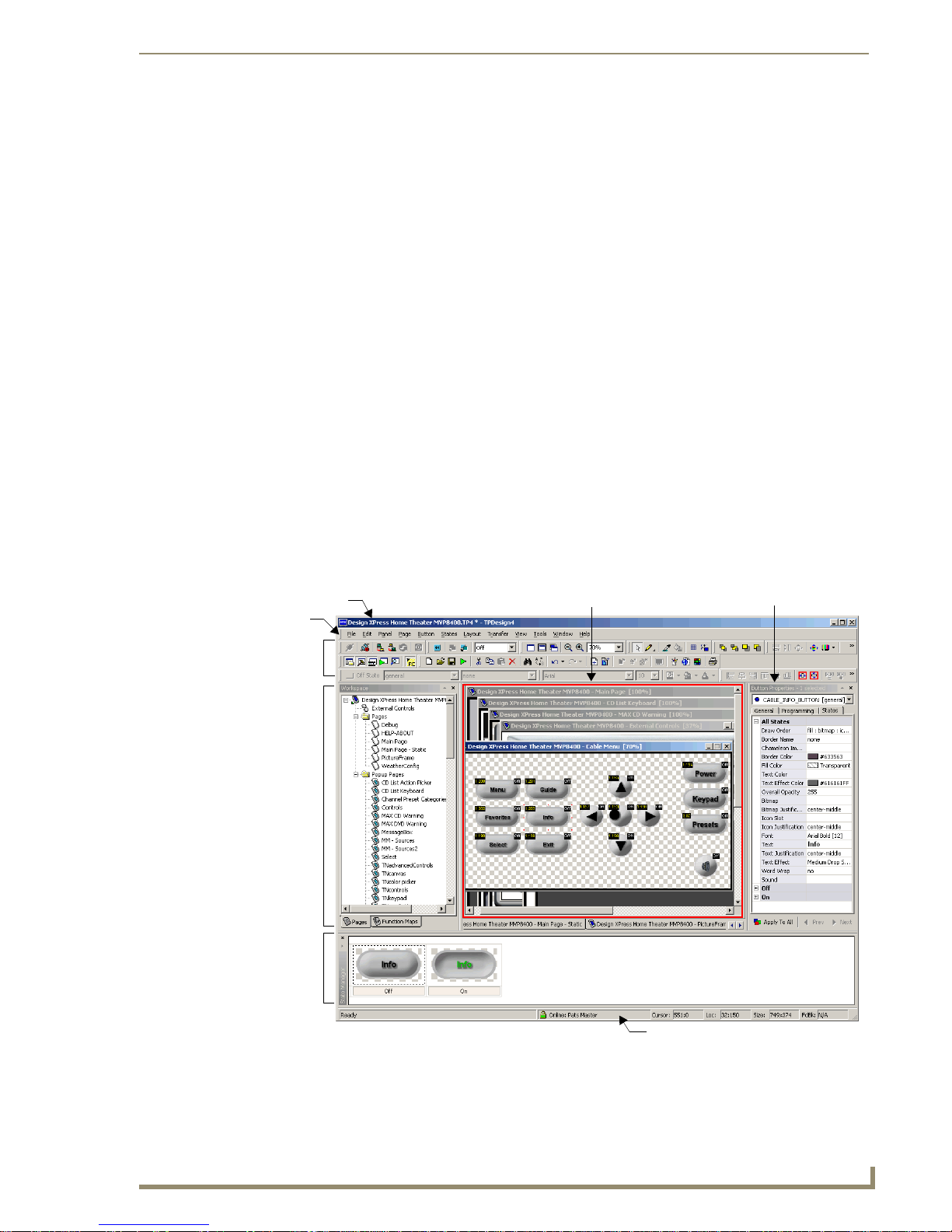
TPDesign4 Program
T
Intercom Capabilities for Modero Panels
Intercom-equipped Modero Panels support 2-way full-duplex intercom capabilities. These panels
include:
• MVP-8400i: 8.4" Modero ViewPoint (wireless) Touch Panel
• NXD-1000vi: 10" Modero Touch Panel
• NXD-700vi: 7" Modero Touch Panel
Supported Screen Resolutions
The application supports 24-bit RGB color at the following screen resolutions (based on Panel definition
file information):
• 1280x1024
• 1024x768
• 800x600
• 640x480
TPDesign4 provides scrolling if a Design View is larger than the available visible work area.
TPDesign4 Work Area
The TPDesign4 work area (FIG. 1) is composed of several main components:
Title Bar
Menu Bar
Toolbars
Workspace
Navigator
Window
State
Manager
Window
Design View Windows Properties Control Window
TPDesign4 Work Area
FIG. 1
PDesign4 Touch Panel Design Software (v2.10 or higher)
Status Bar
3
Page 24
TPDesign4 Program
Refer to the online help for detailed descriptions of each menu item and toolbar button.
In its default configuration, from top to bottom, left to right, the work area main components are:
TPDesign4 Work Area Components
Item Description
• Title Bar Lists the name of the active Project file.
•Menu Bar Contains the main menu options (File, Edit, Panel, Page, Button, States, Lay-
out, View, Window, and Help).
•Toolbars The toolbars provide shortcuts to various program functions and controls. You
can choose which toolbars to show in the workspace via the View > Toolbars
sub-menu.
See the Toolbars section on page 5 for details.
• Design View Windows Each tabbed Design View Window represents a Touch Panel page or popup
page. Note that a MDI tab is displayed for each opened page.
Use the View > MDI Page Tabs option to toggle the page tabs. When this
option is enabled, a tab is displayed for each open page.
See the Design View Windows section on page 6 for details.
• Workspace Navigator Contains two tabs:
• The Pages tab contains a tree structure representing all open projects, and
their pages and popup pages. Use the Pages tabs to open/edit the pages /
popup pages in each project.
• The Function Maps tab allows you to view/edit the function codes
associated with each page.
See the Workspace Navigator section on page 8 for details.
• Properties Control Window Contains three tabs: the General tab allows you to view/edit general (non-
state oriented) button properties, the Programming tab allows you to edit program-related parameters, and the States tab allows you to view/edit button
state information.
See the Properties Control Window section on page 9 for details.
• State Manager Window Displays each state of the selected button as a thumbnail image in this window. The State Manager window allows you to view/edit the various states of
a selected button.
See the State Manager Window section on page 10 for details.
• Transfer Status Window Displays the status of each file transfer in queue.
See the Transfer Status Window section on page 10 for details.
•Status Bar Located along the bottom edge of the application window, the Status Bar can
show the current XY cursor position, and (for the button the mouse is over):
Channel code, Address code, Level code, button size, panel revision, Feedback and Initial page file target information. The status bar also indicates the
status of your connection to the NetLinx Master.
See the Status Bar section on page 12 for details.
4
TPDesign4 Touch Panel Design Software (v2.10 or higher)
Page 25

TPDesign4 Program
T
Toolbars
The toolbars in TPDesign4 are dockable, so they can be arranged within the application window
(FIG. 2). To undock any toolbar, double-click anywhere inside the toolbar (but not on a toolbar button).
Double-click again to dock the toolbar. To move the toolbar, click and drag using the handle (the single
vertical bar) at the far-left side of the toolbar.
To view a brief description of each toolbar button, place the mouse cursor directly over a button, without
clicking.
Main toolbar
Transfer toolbar
View toolbar
Selection/Drawing Tools
Button Display
Zoom toolbar
Drawing toolbar
Order Assist toolbar
Position Assist toolbar
Size Assist toolbar
List Box Tools
FIG. 2 Toolbars
Show/Hide Toolbars
You can choose which toolbars to show in the workspace via the View > Toolbars sub-menu.
Click in the checkboxes to select/de-select the listed toolbars (including custom toolbars). If a toolbar
has a check next to it in the sub-menu, then it is displayed. These settings are saved, so they'll apply the
next time the application is launched.
Try placing the Main toolbar vertically, along the right side of the Workspace Navigator. This
configuration is especially efficient in terms of cursor movement back and forth between the
toolbar buttons and the Design View Window(s).
PDesign4 Touch Panel Design Software (v2.10 or higher)
5
Page 26

TPDesign4 Program
Design View Windows
Design View windows represent pages or popup pages in the panel file you are creating. They provide a
canvas upon which you may place buttons of any size that will fit within the confines of the windows.
FIG. 3 Example Design View Window (with function codes showing)
The page tabs normally appear along the bottom edge of the Design View window area, but can be
moved, toggled or modified via the MDI tabs context menu (right-click inside any of the tabs to open).
Since Design View windows represent the pages on the panel themselves, Design Views that
represent pages are not resizable. Use the Zoom and Magnifier Window (page 12) features to
control the size of the view.
Popup pages are resizable through the Properties Control by adjusting their Left, Top, Width
or Height properties. Alternatively, you can set their size and dimensions manually by first
enabling the Show Popup Page option in the Page menu. Once the Popup is displayed on the
page, you can click and drag to resize and position it manually.
Use the View > MDI Page Tabs option to toggle the page tabs. When this option is enabled, a
tab is displayed for each open page. The page tabs normally appear along the bottom edge of
the Design View window area, but can be moved, toggled or modified via the MDI tabs
context menu (right-click inside any of the tabs).
TPDesign4 will display up to a maximum of 15 page tabs. If you open more than 15 pages,
only the most recently opened 15 pages will remain open (the others will be automatically
closed). No data will be lost, only the view is closed.
Right mouse click anywhere within a Design View window to open the Design View context
menu. This context menu contains shortcuts to many key design tools.
Select Display from the Design View context menu to access the Display sub-menu,
containing options that allow you to select which state of a selected button to display in the
Design View.
6
TPDesign4 Touch Panel Design Software (v2.10 or higher)
Page 27

TPDesign4 Program
T
Select Layout from the Design View context menu to access the Layout sub-menu, containing
options for layout/design control (send to front/back, align, center, etc). This menu is identical
to the Layout menu, accessible from the main menu bar.
Using the Zoom Controls
The Zoom toolbar (FIG. 4) contains shortcuts to the Zoom Controls. Use these options (also available
via the Window > Zoom sub-menu) to control the zoom factor on the selected page or popup page. The
Zoom controls do not affect the actual size of the selected object, only the way it is represented in the
workspace area.
FIG. 4 Zoom toolbar
Full Page: Automatically adjusts the zoom to show the entire page at 100% size.
Fit Page: Automatically adjusts the zoom to fit inside the Design View window.
Actual Size: Automatically adjusts the zoom to represent how large a page will appear when
actually displayed on the target panel type. To use this option, you must first specify the
monitor’s visible size (in the Monitor Size field of the Appearance tab of the Preferences
dialog). The monitor size should represent the diagonal measurement of the visible portion of
the monitor or of the space occupied by a full-screen image, as opposed to the monitor’s
overall diagonal size. For example, most 21” monitors typically have between a 19.5” and 20”
viewable area.
Zoom Out: With a page or popup page selected, click the Zoom Out toolbar button to reduce
the display size of the selected object, in the increments listed in the Zoom Control dropdown.
Zoom In: With a page or popup page selected, click the Zoom In toolbar button to increase the
display size of the selected object, in the increments listed in the Zoom Control drop-down.
Zoom Control Drop-down: Click the down-arrow to open the Zoom control options list. Use
this list to manually set the zoom to by incremental percentages (25%, 50%, 75%, 100%,
150%, 200% or 400%), or by Fit Page, For Width or Fit Height.
The Custom option opens the Custom Window Zoom dialog, where you can specify any
zoom percentage within the range of 25 - 400%.
Use the Magnifier window to magnify a specific area of a design view. See the Magnifier
Window section on page 12 for details.
PDesign4 Touch Panel Design Software (v2.10 or higher)
7
Page 28

TPDesign4 Program
Workspace Navigator
The Workspace Navigator is used to open the pages / popup pages in the file (establishing edit focus),
and to view/edit the function codes associated with each page.
The Workspace Navigator contains two tabs: Pag es and Function Maps (FIG. 5).
Pages tab
FIG. 5 Workspace Navigator Window
Function Maps tab
Refer to the Using the Workspace Navigator section on page 31 for details.
Pages Tab - Click the Pages tab (at the bottom of the Workspace Navigator window) to view
the pages/popup pages contained within each open Project, in the Workspace Navigator. Each
Project is represented by a folder (each one with a different colored panel icon). Use the
Workspace Navigator to view/open and rename panel pages.
See the Workspace Navigator - Pages tab section on page 31for details.
Function Maps Tab - Click the Function Maps tab (at the bottom of the Workspace Navigator
window) to view the Function Code Map. The Function Code Map is a representation of the
Channel codes, Address codes, Level codes, String Outputs and Command Outputs utilized in
the panel file, displayed in a hierarchical tree format in the Function Map tab of the
Workspace Navigator window. This list is sorted by Port, and within Port by Code.
See the Workspace Navigator - Function Maps tab section on page 32 for details on
using the Function Maps tab.
See the Working With Function Codes section on page 141 for details on Function Codes.
8
TPDesign4 Touch Panel Design Software (v2.10 or higher)
Page 29
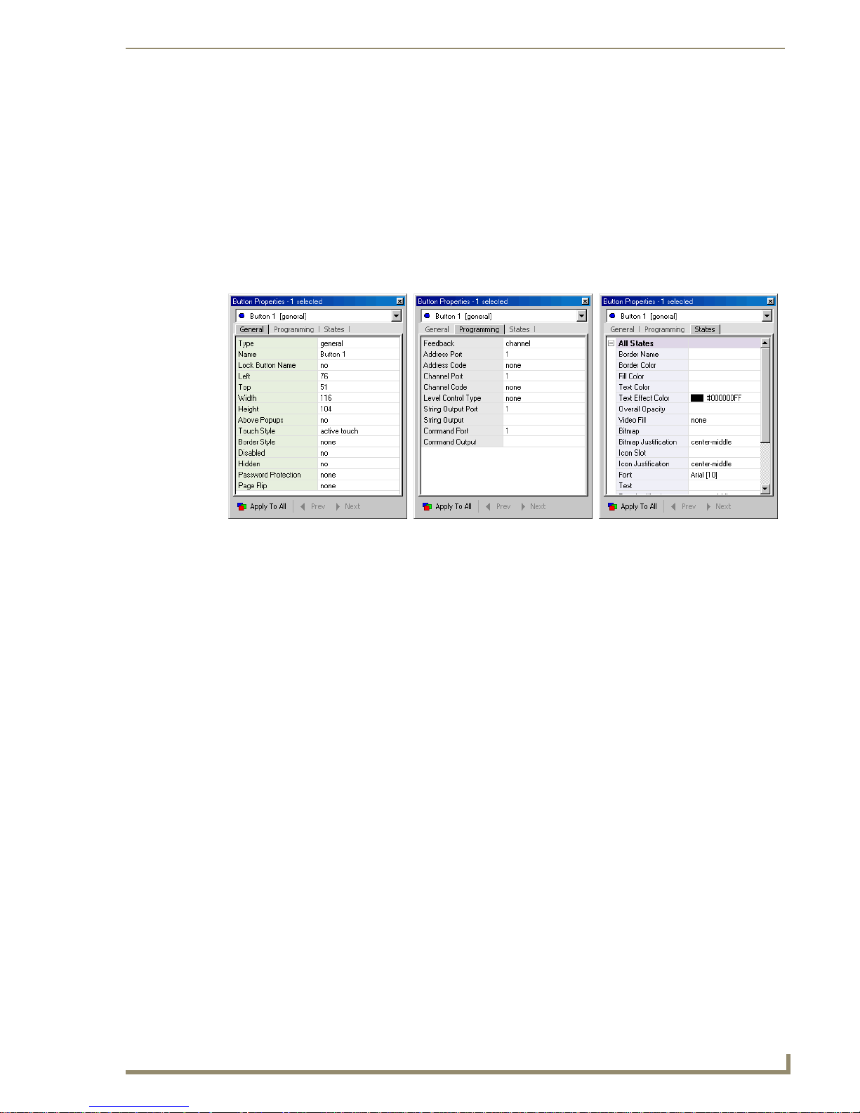
TPDesign4 Program
T
Properties Control Window
Select View > Properties (or click the toolbar button) to display the Properties Control window (FIG. 6).
Use the Properties Control window to view/edit page, popup page and button properties, and to view/edit
the programming and states information associated with each element in your project.
The Properties Control contains three tabs:
General tab
Programming tab
States tab
General tab Programming tab States tab
FIG. 6 Properties Control Window
Properties Control Window - General Tab
Click the General tab (at the top of the Properties Control window) to set/edit general properties for the
selected button. Refer to the General Properties section on page 113 for a listing of General properties.
Properties Control Window - Programming Tab
Click the Programming tab (at the top of the Properties Control window) to view/edit programmingrelated information for the selected button. Refer to the Programming Properties section on page 121 for
a listing of Programming properties.
Properties Control Window - States Tab
Click the States tab (at the top of the Properties Control window) to view/edit the state information for
each state for the selected button. Refer to the State Properties section on page 126 for a listing of State
properties.
PDesign4 Touch Panel Design Software (v2.10 or higher)
9
Page 30

TPDesign4 Program
State Manager Window
The State Manager window (FIG. 7) is used to view/edit the various states of a selected button. Each
state of the selected button is displayed as a thumbnail image in this window. To display the State
Manager window, select View > State Manager.
FIG. 7 State Manager Window
The State Manager interacts with the Properties Control window to allow the visual aspects of a page,
popup page or button to be set. Select a Page, Popup page or button to view the state or states associated
with it. Double-click on any thumbnail in the State Manager window to view/edit the properties for the
selected state, in the Properties Control window (States tab).
See the Working With States section on page 133 for details.
Transfer Status Window
The Send To Panel and Receive From Panel dialogs place the requested transfer into a queue, the status
of which is displayed in the Transfer Status window, which may be docked/undocked from the main
application window. This window displays the following data for each transfer:
Status - The status bars indicate the progress of each file in the transfer, and the overall status
of the transfer.
Device - This column gives the Device # and a description of the target/source device.
Project - This column indicates the name of the Project to which the files belong.
Refer to the File Transfer Operations section on page 205 for information on transferring files from
TPD4.
10
TPDesign4 Touch Panel Design Software (v2.10 or higher)
Page 31

TPDesign4 Program
T
Button Preview Window
Select View > Button Preview to open the Button Preview window (FIG. 8). Like the other windows in
TPDesign4, the Button Preview window is fully dockable, but initially it opens undocked. Double-click
inside the title bar to dock the window.
FIG. 8 Button Preview Window
The Button Preview window displays a preview of the selected button. Initially the button is
shown in its Off state.
Click on the button in the Button Preview window to "push" the button in an identical fashion
to utilizing the Push command button.
Button Preview is not available for Joystick or List Box Buttons.
This window includes three command buttons:
• Disable • Click the disable button to disable the button preview, but not close the Button
Preview window. Click again to enable the preview.
•Mute • Click to Mute any sounds associated with this button.
•Push • Click the Push button to simulate a push on the selected button. This allows you to
visually preview the On/Off states (and all states in between, for multi-state buttons).
Button Preview Context Menu
Right-click inside the preview area of the Button Preview window to access the Button Preview context
menu:
•Size Click to open the Size fly-out menu, where you can specify the size of the preview image (25%, 50%, 75%, 100%, or Auto). The default size setting is Auto,
which automatically scales the preview image to fit the Button Preview window (which is also scalable). These options only affect the size of the preview
image, not the button itself.
• Background Click to open the Background fly-out menu, where you can specify the way
that the background color in the button preview windows appears. Depending
on the colors used, you may want to experiment with these options to help
you view the various aspects of the button (text, icon and/bitmap).
•None no background color is displayed (so it appears white).
• Checkerboard renders the background in a checkerboard pattern (helpful when dealing with
transparent buttons).
• Page Fill Color renders the background in the same color as was assigned to the page containing the selected button.
PDesign4 Touch Panel Design Software (v2.10 or higher)
11
Page 32

TPDesign4 Program
Magnifier Window
The Magnifier window allows you to magnify a given area of a design view for temporary viewing in a
separate floating window, without zooming the entire design view (FIG. 9).
FIG. 9 Magnifier Window
Select View > Magnifier Window (or click the toolbar button) to access the Magnifier Window.
Right-click inside the Magnifier window to access the Magnify Control context menu, where
you can select a zoom factor from 2 to 8 times actual size.
This floating window is resizable and dockable.
Working With Dockable Windows
All windows in TPDesign4 are fully dockable. Dockable windows can be re-arranged within the
application window.
Moving, Docking and Resizing Dockable Windows
To move the windows, click on the title bar and drag and drop the window into the desired position.
Dockable windows automatically snap into place once they are positioned near an available docking area
(along the edges of the application window, or along the edge of another dockable window.
To dock the windows, drag the window to reposition it next to any border or window frame
and the window will automatically snap to the nearest border. As a shortcut, double-click in
the title bar of the window to dock/undock it.
To stretch the windows, click on any border and drag the border either vertically or
horizontally.
To resize the windows, click on the bottom-left corner of the window border in the area shaded
with parallel diagonal lines and drag the corner in any direction.
Toggling the Windows
Each of the windows can be toggled on/off via the options in the View menu or the Workspace context
menu - see page 15). Select or de-select each window to toggle by checking or un-checking the window
listings in this menu (checked = window is on/displayed).
Status Bar
There are two views available for the status bar (located along the bottom edge of the application
window). The default view, and the secondary view which is available via a double-click anywhere on
the status bar.
All position (X-Y) values in TPDesign4 are zero-based (measured in pixels), meaning that the
upper-left corner of each page is represented by the X-Y value of 0, 0.
12
TPDesign4 Touch Panel Design Software (v2.10 or higher)
Page 33

TPDesign4 Program
T
Default View
In the default view (FIG. 10), it shows the current Cursor, and (for the button the mouse is over):
Location, Size, and Feedback.
FIG. 10 Status Bar - default view
Cursor: Displays the current X-Y cursor position.
Loc: Displays the X-Y location of the button that the cursor is over (relative to the upper-left
corner of the page).
Size: Displays the size of the button that the cursor is over.
FbBk: Displays the type of feedback associated with the button that the cursor is over.
Secondary View
Double-click anywhere on the status bar to view this secondary position. In the secondary view
(FIG. 11), it shows the current XY cursor position, and (for the button the mouse is over): Cursor,
Channel code, Address code and Level code.
FIG. 11 Status Bar - secondary position
Cursor: Displays the current X-Y cursor position.
Ch: Displays the Channel code (port number:channel code) associated with the button that the
cursor is over.
Add: Displays the Address code (port number:address code) associated with the button that
the cursor is over.
Lvl: Displays the Level code (port number:level code) associated with the button that the
cursor is over.
The Status Bar also indicates connection status as follows:
not connected
connected to an unsecured master
connected to a secured but unencrypted master
connected to a secured and encrypted master
FIG. 12 Status bar icons reflect the status of the connection to the NetLinx Master
PDesign4 Touch Panel Design Software (v2.10 or higher)
13
Page 34

TPDesign4 Program
Print Preview Window
Select File > Print Preview to display a preview of the pages and popup pages in the active project, as
they will appear when printed (FIG. 13).
FIG. 13 Print Preview Window
Each page and popup page in the project is printed one per page. The printed output maintains a constant
scaling factor across all pages, with the image centered on the printed page.
The options in the Print Preview window toolbar include:
•Print: Prints the current page view
• Next Page: Displays the next page of the selected file
• Prev Page: Displays the previous page of the selected file
• One Page/Two Page: Toggles the page view to one or two pages. This option is enabled only
if the active file is longer than one page.
• Zoom In: Zooms in on the page view
• Zoom Out: Zooms out from the page view
• Close: Closes the Print Preview window
If you don't have a printer installed on your PC, the File > Print and File > Print Preview options
invoke a message alerting you to install a printer.
14
TPDesign4 Touch Panel Design Software (v2.10 or higher)
Page 35

TPDesign4 Program
T
Workspace Context Menu
Right mouse click on the title bar of any of the windows or in any empty area of the workspace to open
the Workspace context menu (FIG. 14). This context menu contains shortcuts to key toolbars and
dialogs. Click to display any of the items listed this menu.
FIG. 14 Workspace Context Menu
WebUpdate
The AMX WebUpdate program is a stand-alone application that communicates with the AMX website,
allows a user to select from a list of available AMX Software programs to choose for updating,
determines the latest version of the selected applications, returns a listing of available updates, allows a
user to download the selected installation files, and upon request, launches the installation of those
downloads.
The WebUpdate application is not installed by TPDesign4, and must be installed separately. If
not found, TPDesign4 will prompt you to download the application from www.amx.com.
Select Help > Web Update to launch this application.
Refer to the WebUpdate on-line help for details and instructions.
G4 PanelBuilder
G4 PanelBuilder is a stand-alone application (installed separately) from AMX that allows you to quickly
create TPDesign4 projects for G4 touchpanels, using either pre-fabricated templates from AMX, or userdesigned templates.
The G4 PanelBuilder application is designed to do the bulk of the basic layout and navigational design of
a touch panel design. TPD4 is required to complete the project by specifying channel mapping
information, and to generally fine-tune the project as needed.
PDesign4 Touch Panel Design Software (v2.10 or higher)
15
Page 36

TPDesign4 Program
The G4 PanelBuilder setup application is available for download from www.amx.com.
Although G4 PanelBuilder is installed separately, it is fully integrated with TPDesign4. For example, the
File > New From G4 PanelBuilder option (available only if G4 PanelBuilder is installed) launches the
G4 PanelBuilder application to allow you to create a new TPD4 project.
Use the set of options in the File menu to access the key functions of the G4 PanelBuilder application:
Click File > New From G4 PanelBuilder to create a new TPD4 panel project using G4
PanelBuilder. Note that this item is disabled if G4 PanelBuilder is not installed.
Refer to the Creating a New Project Using G4 PanelBuilder section on page 233 for details.
Click File > Import Touch Panel Template to import an existing PanelBuilder (*.TPT) or
Visual Architect template file (*.VAT) into TPDesign4 as a starting point for your panel
design.
Refer to the Importing G4 PanelBuilder Templates section on page 174 for details.
Click File > Export G4 PanelBuilder Template to export the active TPD4 project as a
PanelBuilder Template file (*.TPT).
Refer to the Exporting Your Project as a G4 PanelBuilder Template section on page 171 for
details.
G4 PanelPreview
G4 PanelPreview is a stand-alone application (installed separately) from AMX that allows you to
preview TPDesign4 projects for G4 touchpanels.
To preview your panel project, select Panel > Send To G4 PanelPreview (or click the toolbar button) to
launch the G4 PanelPreview application, where you can preview the project and simulate push and
release of buttons, (including multi-state and bargraph buttons) via the mouse and keyboard on your PC.
The G4 PanelPreview application is available from www.amx.com, and must be installed in
order to activate this menu option.
Refer to the G4 PanelPreview online help file for details on using G4 PanelPreview.
16
TPDesign4 Touch Panel Design Software (v2.10 or higher)
Page 37

T
TPDesign4 Project Files
Overview
TPD4 Project (or Panel) files are created in the folder specified in the application preferences, unless you
explicitly choose to save them in another location.
Project Files contain all of the information required to define the user-interface that is displayed on the
touch panel, including pages and popup pages and associated navigation/page-flip information, buttons
including function code information, and all image and sound-related files that are used in the design.
Each page / popup page name must be unique within their respective panel files in order to be
accepted by the program.
All name collision checks in the program are case insensitive.
When creating a new Project file, avoid using inappropriate file name characters (see below).
Inappropriate File Name Characters
Avoid using the following characters when naming TPDesign4 project files:
Inappropriate File Name Characters
•Vertical Bar
• Question Mark
•Asterisk
• Less Than Sign
• Greater Than Sign
• Forward Slash
• Back Slash
• Double Quotes
• Colon
•Period
|
?
*
<
>
/
\
"
:
.
TPDesign4 Project Files
Creating a New Project
TPDesign4 includes a New Project Wizard, to quickly guide you through the process of setting up a new
project. To launch the New Project Wizard, select File > New, or click the toolbar button.
The New Project Wizard is designed to be simple and intuitive. Simply fill in the fields in each New
Project Wizard dialog, and click Next to proceed to the next dialog.
Click the Finish button in the last dialog in the wizard to close the wizard. At this point, the project is
created with one generic page, and is ready for you to start adding pages, popup pages and buttons
(including External Controls, if the selected panel type features external pushbuttons).
PDesign4 Touch Panel Design Software (v2.10 or higher)
17
Page 38

TPDesign4 Project Files
Using The New Project Wizard
The New Project Wizard steps you through the process of creating a new Project file (also known as a
Panel file), complete with a start page. Use the New Project Wizard as a shortcut to starting new
TPDesign4 projects.
To launch the New Project Wizard, select File > New. To cancel the wizard at any point in the process,
click Cancel. The New Project Wizard is by its nature self-explanatory and intuitive, and consists of up
to three dialogs:
1. The first dialog to appear (New Project Wizard - Step 1) contains fields to allow you set up the
basics of your new project (FIG. 15).
FIG. 15 New Project Wizard - Step 1
Fill out this information and click Next to proceed.
•Job Name: Enter a name for the new project.
• Panel Type: Click the down-arrow to view a list of supported panel types
• Resolution: Click the down-arrow to select the target resolution for the project.
• Use System Generated
File Name:
Click this checkbox to use a System Generated File Name for this
project. See the System-Generated File Names section on
page 20 for details.
Click Finish to close the wizard. If you close the wizard after step 1, you will have
created a project with a single page. Every project created will have at least one
page. You can add pages manually via the Panel > Add Page command.
The next dialog in the wizard (New Project Wizard - Step 2) contains fields for System-Generated
2.
File Names (FIG. 16).
18
TPDesign4 Touch Panel Design Software (v2.10 or higher)
Page 39

TPDesign4 Project Files
T
FIG. 16 New Project Wizard - Step 2
If the Use System Generated File Names option (in the Step 1 dialog) is not selected, this
dialog is skipped since the information entered here would not apply.
Fill out this information and click Next to proceed. If you choose not to populate one or more
of these fields, they will not be included in the System Generated File Name.
• Designer: Enter the name of the project designer in this field.
• Dealer ID: Enter the Dealer ID in this field.
• Sales Order: Enter the Sales Order number in this field.
• Purchase Order: Enter the Purchase Order number in this field.
• Revision: Enter the Revision identifier in this field.
• Job Comments: Enter any project-related comments in this field.
3. The last dialog in the wizard (New Project Wizard - Final Step) contains fields for setting up the
initial touch panel page in the project (FIG. 17).
FIG. 17
New Project Wizard - Step 3
Fill out this information and click Finish to exit the New Project Wizard.
PDesign4 Touch Panel Design Software (v2.10 or higher)
19
Page 40

TPDesign4 Project Files
When you finish the New Project Wizard, note that the new project appears in the Workspace Navigator
window (Pages tab). The initial page is listed under the Pages folder, and has the edit focus.
System-Generated File Names
When you are creating a new Project, you are given the option to use System Generated File Names (in
the New Project Wizard dialog). System-generated file names are generated automatically based on
several fields that hold various types of project information (Designer, Dealer ID, Sales Order, Purchase
Order, and Revision).
When you utilize System-Generated File Names, the resulting filename for this project file consists of
each of these entries separated by commas. These fields are all optional. If you leave any of the fields
blank, they are simply omitted from the file name. For example, if all fields are filled in as shown in
below,
• Name: Enter a name for the page.
• Colors (Page background
and Text):
•Font: Click the down arrow to select the Page Font, from a list of all
•Font Size: Click the down arrow to select the Page Font size.
You can change the target panel type for any existing panel file via the File > Save as
Click the browse button (...) to open the Colors dialog, where
you can select the colors for the Page Background and Page
Te xt .
available fonts on your PC.
Different Panel Type option (see the Saving the Active Project as a Different Panel
Type section on page 34).
Use the Panel > Send to G4 PanelPreview option to preview the resulting panel file in the G4
PanelPreview application. Refer to the G4 PanelPreview online help file for details on using
G4 PanelPreview.
FIG. 18
System Generated File Names
The resulting file name would be:
"1234,My TP Project,5678-9876,rev a,Super-Dave Osborne.TP4"
20
TPDesign4 Touch Panel Design Software (v2.10 or higher)
Page 41

TPDesign4 Project Files
T
The Purchase Order field and the (optional) Job comments field are not incorporated
into the generated filename. Use these fields to enter this additional information for
this project. All information entered in this dialog can be viewed/edited at any time via
the Panel Properties dialog.
If you select not to use System-Generated File Names, the file name will match the Job Name entered in
the first dialog of the New Project Wizard.
Edit Focus
The page, popup page, or button(s) that are the target for change actions are said to have the Edit Focus.
For pages and popup pages, edit focus is indicated in the Workspace Navigator (Pages tab) by a small
arrow at the lower-left corner of the icon for the selected page or popup page. The following example
shows that "Page 1" has the edit focus.
Active Project
Active Page
FIG. 19 Edit focus - pages
For buttons, edit focus is indicated in the design view window with small red squares with yellow
outlines on the edges of the selected button. Buttons that do not currently have the Edit Focus are
displayed with selection handles that are black squares with white outlines (FIG. 20):
Edit focus indicated No edit focus indicated
by red handles
FIG. 20 Edit focus - buttons
by black handles
The Copy and Paste functions in TPDesign4 always work on the element which has the current edit
focus. This means the last thing selected, which is not always necessarily a button displayed in the
Design View windows, has the edit focus.
For example, if you have selected an item in the Properties Control window (let's say you've selected
"Channel Port", and you perform a "Copy", then you will have copied only the Channel Port entry in the
Properties Control window, and not the associated button (even though it is selected in the Design View
window). You can then paste the Channel Port number anywhere else in the Properties Control window
(where the copied data is considered to be a valid entry).
If for example you had copied the value "410" from the Left (position) field in the Properties Control
window, you are not allowed to paste it to the Address Port field, since it is not a valid Address Port
number (these errors are indicated by a TPDesign4 error dialog).
PDesign4 Touch Panel Design Software (v2.10 or higher)
21
Page 42

TPDesign4 Project Files
Setting Project Properties
Select File > Project Properties to open the Project Properties dialog. This is a multi-tab dialog
allowing you to view and edit the target touch panel’s properties. Depending upon the panel selected,
each panel will support all or part of the following properties at the panel level:
Project Properties dialog - Project Information tab
Use the options in the Project Information tab of the Project Properties dialog (FIG. 21) to view/edit file
information associated with the active project file. The information in this tab was set up when the
project was created, in the New Project Wizard. These items represent the various components of the
System-Generated File Name.
Project Information tab: Includes basic project information, the Use system generated
filenames option and Protection options with Password fields. See the Project Properties
dialog - Project Information tab section on page 22 for details.
Panel Setup Information tab: Includes touch panel setup options including Refresh
Frequency, Marquee Speed, Panel Strings (Startup, Wakeup and Sleep), Power-up and
Inactivity Settings and Feedback Blink Rate. See the Project Properties dialog - Panel Setup
Information tab section on page 24 for details.
Sensors tab: Includes Channel/Level and Port settings for Light Sensors, Motion Sensors,
Battery Levels and Cradle Sensors. See the Project Properties dialog - Sensors tab section on
page 27 for details.
IR Emitters and Receivers tab: Includes Channel Port information for AMX IR Emitters,
AMX IR Receivers and User (non-AMX) IR Emitters. See the Project Properties dialog - IR
Emitters and Receivers tab section on page 28 for details.
FIG. 21 Project Properties dialog - Project Information tab
If the Use System-Generated File Names option was not selected in the New Project Wizard, these fields
will be blank.
The options in this tab include:
22
TPDesign4 Touch Panel Design Software (v2.10 or higher)
Page 43

TPDesign4 Project Files
T
Project Properties dialog - Project Information tab
•Job Name: This editable field displays the current Job Name associated with this project.
• Designer ID: This editable field displays the current Designer associated with this project.
• Dealer ID: This editable field displays the current Dealer ID (identifier) associated with
this project.
• Sales order: This editable field displays the current Sales Order (identifier) associated with
this project.
• Purchase order: This editable field displays the current Purchase Order (identifier) associated
with this project.
• Created: This read-only field displays the creation date for this project, and the build
number of the TPD4 used to create this project.
• Modified: This read-only field displays the last date on which this project was saved
(and the build number of the TPD4 used to create this project).
• File revision: This editable field displays the current Revision (identifier) associated with
this project.
• Revision date: This read-only field displays the date of the current revision of this project.
• File name: This read-only field displays the full path and disc filename of the project.
• Job comments: This editable field displays any comments that were added in the New Project
Wizard.
•Protection: Click the down-arrow to select one of three levels of password protection for
this project file:
• none- this is the default setting (no password protection).
• read-only - the next time this panel file is opened, the Enter Access
Password dialog appears, prompting the user to enter the correct password
in order to gain write access to the file. To simply view the file (as readonly), click on the Read-Only command button (in the Enter Access
Password dialog). If the file is opened in read-only mode, the word
"[Locked]" appears immediately to the right of the project name in the
Workspace Navigator and no edits on the panel file are allowed. Also, files
opened as read-only cannot be saved to another file name.
• locked - the next time the panel file is selected to open; the Enter Access
Password dialog appears, prompting the user to enter the correct password
to open the file.
Note: These protection options are not Windows file attributes, and are only
relevant within the context of the TPDesign4 application.
• Password: Use this text field to enter the password (1 - 259 characters) to use if the file is
•Confirm: Use this text field to confirm the password by re-typing the password exactly
• Use system generated file
names for this project:
set as either read-only or locked. Once the password has been typed, it must
be re-typed in the Confirm text field.
as it was entered in the Password field. If the passwords don't match, a
"Passwords do not match" message box is displayed.
Click this option to apply system-generated filenames to this project. If the
project was originally set up to use system-generated file names, then selecting this option will replace the original information with the updated information from this dialog. If system-generated file names were not used for the
project, this information will be added on the next save.
Applying Password Protection to Your Project File
TPDesign4 supports two levels of password protection for Project (.TP4) files:
Read-only - the next time this Project file is opened, the Enter Access Password dialog
PDesign4 Touch Panel Design Software (v2.10 or higher)
appears, prompting the user to enter the correct password in order to gain write access to the
file. The password is not required to open and view the file. Note that if a read-only file is
opened without using the password, it cannot be saved under a new file name.
23
Page 44

TPDesign4 Project Files
These protection options are not Windows file attributes, and are only relevant within
the context of the TPDesign4 application.
To apply password protection to the open Project file:
1. Select File > Project Properties to open the Project Properties dialog - Project Information tab.
2. Click the down-arrow next to Protection to select a level of password protection from the drop-
3. Enter the password in the Password text field. Passwords can be from 1 to 259 characters in length.
4. Re-type the password in the Confirm field. If the passwords don't match, a "Passwords do not
5. Click Apply to save the changes and apply the specified password to the Project file.
Project Properties dialog - Panel Setup Information tab
Use the options in the Panel Setup Information tab (FIG. 22) to view/edit setup information associated
with the active project.
Locked - the next time the panel file is selected to open; the Enter Access Password dialog
appears, prompting the user to enter the correct password to open the file. If the password is
not entered correctly, the file will not be opened at all.
down list (either read-only, locked or none).
match" message box is displayed, in which case you'll need to re-enter the password, or re-confirm
the password, or both.
FIG. 22 Project Properties dialog - Panel Setup Information tab
Use the options in the Panel Setup Information tab of the Project Properties dialog to view/edit setup
information associated with the active project/panel file. This dialog identifies the panel for which this
project was designed, and indicates it's screen resolution.
24
TPDesign4 Touch Panel Design Software (v2.10 or higher)
Page 45

TPDesign4 Project Files
T
The options in this tab include:
Project Properties dialog - Panel Setup Information tab
• Refresh Frequency: Select the desired refresh frequency for the selected panel, from the drop-down list of
supported refresh frequencies (based on the selected panel).
• Marquee Speed: Sets the speed of motion for Marquee text (1=slowest, 8 = fastest; default = 1).
• Panel Strings: Use these three fields to specify text strings to appear on the panel, during these
three conditions (Startup, Wakeup and Sleep).
For example, if you entered "Hello!" for the Wakeup string, the panel will send this
string to the NetLinx Master on wakeup.
Note: In order to receive strings from a device, the programmer typically creates a
buffer or adds a DATA_EVENT/STRING: handler for the device. This will cause an
RXON command to be sent to the device, then the master will pass the strings from
the device.
• Power up page: Click the down-arrow to select a particular page in your project to be displayed when
the panel is turned on, from a drop-down list of all pages currently saved in this
project.
See the Setting a Power Up Page section on page 25 for details.
• Power up popups: This field indicates the Power-Up popup pages that will appear over the Power up
• Inactivity page: Click the down arrow to select which page to flip to after the specified period of inac-
• Feedback blink rate: If you are using blinking button feedback in your project, use this field to specify the
page when the panel is turned on.
See the Setting Power Up Popup Pages section on page 25 for details.
tivity (set on the touch panel).
blink frequency, in 1/10th-second increments (default = 5).
Setting a Power Up Page
Use the Power-up page option in the Panel Setup Information tab of the Project Properties dialog to
specify a particular page in your project to be displayed when the panel is turned on:
1. Select File > Project Properties to open the Project Properties dialog.
2. In the Panel Setup Information tab, click the down arrow next to the Power up page field to display
a list of all of the pages in this project.
3. Select the page that you want to be used as the Power-up page from this list.
4. Click Apply to apply this change.
Setting Power Up Popup Pages
Use the Power-up popups option in the Panel Setup Information tab of the Project Properties dialog to
specify one or more popup pages in your project to be displayed over the Power up page when the panel
is turned on:
1. Select File > Project Properties to open the Project Properties dialog.
2. In the Panel Setup Information tab, click the green Plus sign icon below the Power up popups field
to invoke the Add Power Up Popup dialog, presenting a list of all popup pages in the active Project
(FIG. 23).
3. Select a popup page that you want to be displayed over the Power-up page from this list and click
OK.
4. The selected popup page is indicated in the Power up popups field.
To display multiple popups over the Power up page, repeat steps 2 and 3 to select another
popup. If you select more than one popup page, you can specify the display order via the up/
down arrow buttons below the Power up popups field. The popup at the top of the list is the
first to be displayed.
PDesign4 Touch Panel Design Software (v2.10 or higher)
25
Page 46

TPDesign4 Project Files
FIG. 23 Add Power Up Popup dialog
5. Click Apply to apply this change.
Setting an Inactive Page Flip
To remove a popup from the Power up popups list, click the Remove Popup (X) button below
the Power up popups field.
Use the Inactive Page Flip option in the Panel Setup Information tab of the Project Properties dialog to
specify a particular page in your project to be displayed when the panel is inactive for a specified period
of time:
1. Select File > Project Properties to open the Project Properties dialog.
2. In the Panel Setup Information tab, click the down arrow next to the Inactive page flip field to
display a list of all of the pages in this project.
3. Select the page that you want the panel to flip to when the panel is inactive for the amount of time
specified on the panel.
You can create a "screen-saver" for the panel as part of your project by using the
Inactivity Page Flip option in the Panel Setup Information tab of the Project Properties
dialog.
26
TPDesign4 Touch Panel Design Software (v2.10 or higher)
Page 47

TPDesign4 Project Files
T
Project Properties dialog - Sensors tab
Use the options in the Sensors tab of the Project Properties dialog (FIG. 24) to view/edit Channel/Level
and Port settings for Light Sensors, Motion Sensors, Battery Levels and Cradle Sensors associated with
the active panel file.
FIG. 24 Project Properties dialog - Sensors tab
The options in this tab include:
Project Properties dialog - Sensors tab
• Light Sensor: Use these fields to specify the Level and Channel port/code assignments for the
on-board light sensor.
• Motion Sensor: Use these fields to specify the Channel port/code assignments for the on-board
motion sensor.
• Battery Levels: Use these fields to specify the Level port/code assignments for the on-board bat-
tery charger.
• Cradle Sensor
(MVP panels only):
Use these fields to set the Channel port/code assignments for the Cradle Sensor
on MVP panels. The channel will be turned on when the panel is docked (either in
the tabletop docking station or in the wall cradle).
Note: The cradle sensor uses the same device number as the MVP panel.
PDesign4 Touch Panel Design Software (v2.10 or higher)
27
Page 48

TPDesign4 Project Files
Project Properties dialog - IR Emitters and Receivers tab
Use the options in the IR Emitters and Receivers tab (FIG. 25) to view/edit port information associated
with the active panel file for AMX 38KHz IR emitting and receiving, AMX 455KHz IR emitting and
receiving, and up to two user-defined ports for IR emitting using custom IR files.
FIG. 25 Project Properties dialog - IR Emitters and Receivers tab
This tab is only present if the target panel selected for this project supports an IR emitter or an IR
receiver.
The options that are available in this tab depend on the IR capabilities of the target touch panel for this
project. For example, the Modero CV7 panel has an IR receiver, but does not have an IR emitter. In this
case, the only fields that are enabled in this tab would be the AMX IR Receivers (38KHz and 455KHz)
fields, where you could specify a channel port assignment for either 38KHz or 455KHz IR reception.
The NXD/T-CV7 have AMX IR receivers, and the MVP-7500 and MVP-8400(i) have AMX and Userdefined IR emitters, as well as a cradle sensor.
The options in this tab include:
Project Properties dialog - IR Emitters and Receivers tab
• AMX IR Emitters
(MVPs only):
• AMX IR Receivers
(CV7 and CV10s
only):
• User IR Emitters
(MVPs only):
• Additional User
IR Emitters
(MVP-5220 &
MVP-5200i only)
These options allow you to specify the IR Channel port (either 38KHz or 455KHZ) to be
used for standard AMX IR emitting for MVP-7500 and MVP-8400(i) panels.
These options allow you to specify the IR Channel port (either 38KHz or 455KHZ) to be
used for AMX IR receiving for NXD/T-CV7 and NXD/T-CV10 panels.
These options allow you to specify the IR Channel port (either 38KHz or 455KHZ) to be
used for user-defined IR emitting for MVP-7500 and MVP-8400(i) panels.
These options allow you to use up to six additional IR Emitters (for a total of 8 IR
Emitters) with the panel. The User IR Emitters table displays a grid of user IR ports
(Ports column) and their respective IR Channel Port values (Value column) in two columns:
28
TPDesign4 Touch Panel Design Software (v2.10 or higher)
Page 49

TPDesign4 Project Files
T
• Additional User
IR Emitters
(MVP-5220 &
MVP-5200i only) Cont.
• The default value for each port is zero (0 = not used).
• The value associated with each port can be modified in-place (double-click on any of
the Value numbers to edit).
• The edit field only accepts integer values ranging from 0 -100. Non-numeric values will
be rejected and the value reset to zero.
• All (non-zero) IR Channel Ports must be unique. TPD4 will alert you if a value entered
in the Value column is already assigned to an IR Emitter.
Note: Values in the Port column cannot be edited.
Click Apply to save any changes.
The IR receivers and transmitters on G4 panels share the device address number of
the panel.
Working With R-4 Remote Controllers
AMX R-4 (ZigBee) Remote Controllers (FIG. 26) feature a color LCD touch screen that can be
programmed and customized like any other touch panel type.
FIG. 26 R-4 (ZigBee) Remote Controller
The pushbuttons on R-4 remotes are treated in TPD4 the same as external pushbuttons on any other
panel type, and can be customized as External Controls. See the External Controls (Pushbuttons/
LEDs) section on page 80 for details.
The display area on R-4 remotes is 240 X 320 (pixels).
Creating a TPD4 Project for R-4 Remote Controllers
The process of creating a TPD4 project for R-4 remote controllers is essentially the same as for any other
panel type, with a few caveats:
1. Select File > New to launch the New Project Wizard (New Project Wizard - Step 1 dialog -
FIG. 15 on page 18).
See the Using The New Project Wizard section on page 18 for details.
Select R-4 as the Panel Type, and fill in the other information on the dialog.
2.
PDesign4 Touch Panel Design Software (v2.10 or higher)
29
Page 50

TPDesign4 Project Files
3. Select Next to proceed to the New Project Wizard - Step Two dialog (FIG. 16 on page 19). Fill in the
4. Select Next to proceed to the New Project Wizard - Final Step dialog (FIG. 17 on page 19). Fill in
5. Select Finish to close the New Project Wizard.
At this point, the initial page is opened in the Design View, ready for you to:
R-4 projects do not support all button types (see R-4 Remote Devices - Unsupported
Button Types below).
fields in this dialog as desired.
the fields in this dialog as desired.
Add Pages and Popup Pages (note that the display area on R-4 remotes is 240x320 pixels).
See the Worki n g Wit h Pages section on page 37 for details.
Add Buttons
See the Working With Buttons section on page 57 for details.
Set General, Programming and States properties for Buttons, Pages and Popup Pages (keep in
mind that R-4 projects work just like any other panel type).
See the Working With Properties section on page 111 for details.
Configure the external pushbuttons.
See the External Controls (Pushbuttons/LEDs) section on page 80 for details.
R-4 Remote Devices - Unsupported Button Types
Computer Control, TakeNote, and Text Input buttons are not supported by R-4 remote controllers, and
are not displayed in the Properties Control Window (when an R-4 project is active).
All button types continue to be available in the Drawing Toolbar. However, TPDesign4
will display an error message if you attempt to add an unsupported button type in an
R-4 project.
Using Quick Input
Select Quick Input from the Edit menu or Design View context menu to access the Quick Input submenu.
The Quick Input setting determines how typing directly into a Design View or into the State Manager
will be handled:
Current Property - This setting redirects keyboard input to the currently selected property on
the currently visible tab of the Properties Control (assuming one is selected). For example, if
you select the Name property (in the General tab of the Properties control window), any time
you select a button in the Design View, you can just type and press the Enter key to enter a
new button name for the selected button.
The result of the keystroke will depend on the property selected.
Tex t - This setting redirects keyboard input to the button Text property for all selected button
states (in the States tab of the Properties Control window). For example, if you select several
states on a Multi-State button (in the State Manager window), you can type and press the
Enter key to enter new button text for the selected states. If no states are selected, text is will
be applied to all states of the button selected in the Design View.
30
TPDesign4 Touch Panel Design Software (v2.10 or higher)
Page 51

TPDesign4 Project Files
T
The Text setting is the replacement for the Quick Text Tool found in TPDesign3
Disabled - Disables the Quick Input option.
Undo/Redo Support
TPDesign4 supports full Undo / Redo functionality at the panel level. This means that each panel file
that is open in the program maintains a separate undo/redo stack and manages this for the user. You may
either click the Undo or Redo toolbar icons, or click Edit > Undo or Edit > Redo.
Click the down-arrows to view a history list that lists up to 25 of the most recent actions. Click to select
one or more actions to be undone/redone.
The commands alter their text dynamically to indicate which action is next in the undo/redo list.
Selecting either option will immediately undo/redo the last action. These actions are independent of any
file saves, therefore you may undo past a save if you so desire. Once a panel file is closed, it's undo/redo
stack is flushed and is no longer available. The following actions may be undone/redone:
• Button Property Changes
• Page / Popup Page Renames
• Button Deletions / Cuts
• Button Creations / Pastes
• Page / Popup Page Deletions / Cuts
• Page / Popup Page Creations / Pastes
• State Deletions / Cuts
• State Creations / Pastes
• Copying/Cutting/Pasting images and sounds
Using the Workspace Navigator
The Workspace Navigator is typically located on the left side of the screen (although you may move it
anywhere you like) and is used to open the pages / popup pages in the file, and to view/edit the function
codes associated with each page.
The Workspace Navigator window contains two tabs: Pages and Function Maps.
Workspace Navigator - Pages tab
Click the Page s tab (at the bottom of the Workspace Navigator window) to view the pages/popup pages
contained within each open Project, in the Panel Navigator. Use the Panel Navigator to view/open and
rename panel pages.
Each Project is represented by a folder, each one with a different colored panel icon (FIG. 27):
Note that each Project folder contains two folders: Pag es and Popup Pages. Click the + symbol next to
the folders, or double-click on the folders to view the pages and popup pages they contain.
In the Pages tab of the Workspace Navigator you will see that there are two panel level folders, one for
Pages and one for Popup Pages. Inside the Popup Page folder you may also see additional folders. These
folders represent Popup Page Groups, and the presence of a Popup Page in one of these folders indicates
that the particular Popup Page belongs to that group. Popup Pages can belong to only one group at a
time, and of course they can live outside of any group at the same level as the group folders (See “Popup
Page Groups” on page 55.)
PDesign4 Touch Panel Design Software (v2.10 or higher)
31
Page 52

TPDesign4 Project Files
FIG. 27 Workspace Navigator - Pages tab
There are also a couple of actions that you can do simply by selecting an item in the tree and choosing
the appropriate command or toolbar button:
Opening pages/popup pages via the Workspace Navigator
You can open a page or popup page in the Workspace Navigator by double-clicking on the page. If you
have a button or buttons copied into the Windows clipboard you can also single click on any page or
popup page, then paste the buttons into that page without having to open the page. You can delete a page
or popup page (as long as it is not the only page in the panel file) by single clicking on the page and
clicking the delete key.
Renaming Pages via the Workspace Navigator
You can rename a Page or Popup Page by single clicking on the Page or Popup Page name, then single
clicking again. This will allow for in-place editing of the name value for the item.
Workspace Navigator - Edit Focus
When the Workspace Navigator has an item highlighted, that item has the focus and menu's and toolbar
buttons will act on that item. When the Workspace Navigator only has an item that is selected in grey, the
commands and toolbar buttons will act on whatever is selected in the Design View.
Certain cut, copy and paste items may be limited depending on what you have in the Windows clipboard
and which item you currently have selected (see Cutting, Copying and Pasting section on page 33 for
more details).
A green arrow in the Workspace Navigator indicates which Project and page (or popup page) is currently
in focus (the one you are currently working on in the current Design View).
Workspace Navigator - Function Maps tab
Click the Function Maps tab at the bottom of the Workspace Navigator window to view the Function
Code Map (FIG. 28).
The Function Code Map is a representation of the Channel codes, Address codes, Level codes, String
Outputs and Command Outputs utilized in the panel file, displayed in a hierarchical tree format in the
Function Map tab of the Workspace Navigator window. This list is sorted by Port, and within Port by
Code.
See the Working With Function Codes section on page 141 for details.
32
TPDesign4 Touch Panel Design Software (v2.10 or higher)
Page 53

TPDesign4 Project Files
T
FIG. 28 Function Maps tab
Cutting, Copying and Pasting
There are several items that can be cut, copied or pasted in TPDesign4. The ability to utilize these
features effectively can greatly increase your productivity.
The Copy and Paste functions in TPDesign4 always work on the element (including buttons, bitmaps,
even individual button properties displayed in the Properties Control window) which has the current Edit
Focus. This means the last thing selected, which is not always necessarily a button displayed in the
Design View windows, has the edit focus.
For example, if you have selected an item in the Properties Control window (let's say you've selected
"Channel Port", and you perform a "Copy", then you will have copied only the Channel Port entry in the
Properties Control window, and not the associated button (even though it is selected in the Design View
window). You can then paste the Channel Port number anywhere else in the Properties Control window
(where the copied data is considered to be a valid entry).
If for example you had copied the value "410" from the Left (position) field in the Properties Control
window, you are not allowed to paste it to the Address Port field, since it is not a valid Address Port
number (these errors are indicated by an error dialog).
Copying States to the Clipboard
Copying a state or states from a page, popup page or button is possible by selecting the desired states in
the State Manager then either clicking Edit > Copy from the main menu or clicking on the Copy button
from the main toolbar. You may also right click and select copy from the context menu.
Pasting States from the Clipboard
You may paste (by either clicking Edit > Paste from the main menu or by clicking the Paste button from
the main toolbar) a previously copied state or states onto any corresponding state or states in the State
Manager, whether it be for a page, a popup page, a different button or the same button. Pasting a state or
states on the panel name in the Panel Navigator (which is for pages or popup pages only), on the folder
named Pages (which is for pages only), on the folder named Popup Pages (which is for popup pages
only) or on a button in the design view is not allowed.
PDesign4 Touch Panel Design Software (v2.10 or higher)
33
Page 54

TPDesign4 Project Files
Cutting Objects
Cutting an object or objects is identical in nature to copying, with the exception that the selected object
or objects will be removed. You may cut by selecting Edit > Cut from the main menu, using the Ctrl + X
hotkey, or by clicking the Cut toolbar button.
Saving the Active Project as a Different Panel Type
Select File > Save As Different Panel Type to open the Save As Different Panel Type dialog. Use the
options in this dialog to save the active panel project to be compatible with a different panel type than
was specified when the file was created (in the New Project Wizard). The options in this dialog include:
Panel Type: This field initially shows the panel type currently associated with this project.
Click the down arrow to open a drop-down list of all supported panel types, and select a
different panel type from the list.
Screen Size: This field initially shows the screen size (resolution) currently associated with
this project. Each panel type has its own specific resolution, so this is a read-only field unless
you have selected the NXP-TPI/4 (Touch Panel Interface), which supports four resolution
settings (640 x 480, 800 x 600, 1024 x 768 and 1280 x 1024). Move the slider to select the
desired resolution.
New Filename: Use this field to rename the project file, if desired. Use the browse button to
navigate to a different target directory if you need to.
Working With Multiple Projects
TPDesign4 supports working on multiple projects simultaneously, with a few limitations:
Opening Multiple Projects Simultaneously
Each project page has its own tab along the bottom of the Design View window (known as MDI Page
Tabs). TPDesign4 will display up to a maximum of 15 page tabs. If you open more than 15 pages, only
the most recently opened 15 pages will remain open (the others will be automatically closed).
Use the View > MDI Page Tabs option to toggle the page tabs. When this option is enabled, a tab is
displayed for each open page. The page tabs normally appear along the bottom edge of the Design View
window area, but can be moved, toggled or modified via the MDI tabs context menu (right-click inside
any of the tabs).
You can copy/paste pages, popup pages and buttons across projects to save time and effort (see below).
Copying/Pasting Across Projects
TPDesign4 allows you to copy and paste pages, popup pages and buttons, including all of their various
attributes across projects. This can obviously be a major time saver, and there are a few key points to
keep in mind in doing so:
Use the Paste Control Options dialog to specify whether to retain Function Codes (Address, Channel and
Level codes), Page Flip Options, and Images/Slots/Sounds when the page, popup page or buttons are
pasted into a separate project. This a powerful tool. Give some thought to which elements of the page,
popup page or button you want to retain in the target project.
When you copy/paste across projects, if the selected pages, popup pages and/or buttons contain bitmaps,
icons and/or sounds, those elements are copied into the target project along with the page, popup page or
button (assuming that Retain image references, Retain slot references and Retain sound references are all
selected in the Paste Control dialog). Once the buttons are pasted into the target project, the bitmaps,
icons and sounds that came over with the pasted buttons are available in the Resource Manager for the
target project.
If you copy/paste a page or popup page containing buttons, the buttons are copied along with the page.
34
TPDesign4 Touch Panel Design Software (v2.10 or higher)
Page 55

TPDesign4 Project Files
T
Copying/Pasting Pages, Popup Pages and Buttons Across Projects
Open the Paste Control Options dialog (Button > Paste Controls) to specify whether to retain
1.
Function Codes (Address, Channel and Level codes), Page Flip Options, and Images/Slots/Sounds
when the copied buttons are pasted into a page in a separate project.
2. Click to select the source page or popup page (the one that you want to copy to another project), in
the Workspace Navigator window (Pages tab). and Copy.
You don't have to actually open a page to copy it: simply select the desired page with
a single click in the Workspace Navigator window and copy the page.
3. In the Workspace Navigator (Pages tab), click to select the target project (the one that you want to
paste the page or popup page into), and Pa ste. Pages and Popup pages are automatically pasted into
the correct folders.
Project Migration (from previous versions of TPDesign4)
If a TP4 project file created with a previous version of TPDesign4 is opened (File > Open), the Project
Migration dialog appears, prompting you to continue with the migration process.
Click Ye s to continue, then save the file.
Click Cancel to abort the file open command.
Once the migration process is complete and the project file has been saved, this process will not have to
be performed again.
Converting TPD3 files to TPD4
TPDesign4 is backward-compatible with TPDesign3. However, project files that were created in
TPDesign3 must be converted in order to be compatible with TPDesign4, for use with G4 panels.
Using the TPD Conversion Wizard
TPDesign4 includes a TPD Conversion Wizard tool that makes it easy to convert your existing
TPDesign3 files for use with TPDesign4. The TPD Conversion Wizard steps you through the conversion
process in three dialogs:
1. Step 1 of 3 (Select Source and Destination): In the first dialog, select the TPD3 project file that
you want to convert (use the browse button to navigate to the desired file, via the Open dialog).
Then click the down arrows next to Panel Type and Resolution to specify the target G4 panel for the
project file. If you selected a panel that supports multiple resolutions (i.e. NXP-TPI4), you can
specify the target resolution for the project. A description and image of the selected panel is
displayed. Click Next to proceed.
2. Step 2 of 3 (View Warnings and Substitute Fonts): The second dialog in the wizard contains two
read-only text fields:
The Pre-Conversion Warnings list box alerts you to any possible conflicts that will exist in the
selected file, once the conversion process is applied. For example, if the target panel/
resolution differs from the original target of the TPDesign3 file, you will see a Pre-Conversion
warning message indicating that scaling will occur. The conversion wizard handles most of
these issues for you automatically.
The lower list box indicates any fonts that were specified in the original TPDesign3 file, but
that are not available to TPDesign4 (i.e. are not currently installed on your PC). For each
unmatched font listed, you can select a substitute font to use instead. If all fonts used in the
original file are still available, the message "No unmatched fonts" is displayed.
PDesign4 Touch Panel Design Software (v2.10 or higher)
35
Page 56

TPDesign4 Project Files
3. Step 3 of 3 (Finish): The final dialog in the wizard lists the selected file, the original panel/
4. Click Finish to launch the conversion process and open the Errors and Warnings Report dialog
When the TPD file is converted and opened in TPDesign4, the pages and popup
pages may appear in a different order than they occurred in TPDesign3, since TPD4
sorts the page and popup pages alphabetically (rather than the order in which they
occur in the project file).
Alternatively, you can simply open a TPD3 file in TPD4, via the File > Open command. In this case,
TPDesign4 automatically launches the TPDesign4 Conversion Wizard and populates the first dialog to
indicate the selected file.
Errors and Warnings Report dialog
When you convert a TPDesign3 project to a TPDesign4 project via the TPD Conversion Wizard,
TPDesign4 generates a report that lists errors and warnings relating to the conversion process. The Errors
and Warnings reports are displayed in the Error and Warnings Report dialog. Neither errors or warnings
will prevent the file from being compiled, but will probably require that the issues be resolved in order to
have buttons and pages that look and function as expected.
Double-click on any item (with a few exceptions) to open the page or popup page, with edit focus on the
selected item so you can quickly fix the indicated problem.
Click the Finished button to close the Errors and Warnings Report dialog. As long as the project file is
not closed, you can access the error and warnings reports in this dialog by selecting
View > Errors and Warnings Report (or by pressing the F10 hotkey).
resolution association, and the target panel/resolution. Following the conversion process, any
warnings and/or errors encountered will be displayed in the Errors and Warnings report dialog.
Click Filter Warnings to select which warning messages to display or suppress (via the Filter
Conversion Warnings dialog).
where you can view/fix the resulting warnings.
Errors are issues that result in unexpected button borders, usually because there are button or
buttons in the project that are smaller than the minimum size of the selected border.
Warning s are issues that represent potential visual/formatting problems, like minor shifts in
shape and size on some buttons. The bottom text box lists all Warnings encountered during the
conversion process.
36
TPDesign4 Touch Panel Design Software (v2.10 or higher)
Page 57

T
Working With Pages
Overview
Pages are not only containers for buttons, but can also have up to one address port / address code and up
to one channel port / channel code combination.
Pages cannot have borders and possess only one state.
You may place text directly on a page outside the context of a button.
You can select the name for the page, the page background color, the text color for text applied
directly to the page, and a font for any text specified (including the font size and settings). If
you change any of these properties (except the name) your changes will be saved and future
page creations will carry those selections forward.
Each page must be uniquely named within its respective panel file in order to be accepted by
the program; all name collision checks in the program are case insensitive.
The maximum number of pages in a panel file = 500.
The active project/page is indicated in the Workspace Navigator window by a green wedge to the left of
the panel and page icons. Double-click on any page contained in any open project to set it as the active
project. In the example below, "CP4 test" is the active project, and "Page 1" is the active page in the
project:
Working With Pages
FIG. 29 CP4 test" is the active project, and "Page 1" is the active page in the project.
Creating a Page
1. Select Page > Add Page (or click the toolbar icon) to open the Add Page dialog.
2. Enter a descriptive name for the new page in the Name field. Avoid using inappropriate file name
characters (see the Inappropriate File Name Characters section on page 17).
3. Set the Page Background color:
a. Click the browse button (...) next to "Page Background" to open the Colors dialog.
b. Single-click to select a new color from the list. Note the current and new color selections are
shown together for comparison on the left side of the dialog.
4. Set the Page Text color (for text applied directly to the page):
a. Click the browse button (...) next to "Tex t" to open the Colors dialog.
b. Single-click to select a new color from the list. Note the current and new color selections are
shown together for comparison on the left side of the dialog.
5. Set the Font Name and Size. A sample of the selected font type and size is displayed in the window
beneath these fields.
6. Click OK to add the new page to the active project. The new page will be appear in the Workspace
Navigator in the Pages folder, under the project to which the page was added (as the active page).
PDesign4 Touch Panel Design Software (v2.10 or higher)
37
Page 58

Working With Pages
Because the RGB Color palette supports more colors than the Palette Index, you
might see some slight variation in some colors if you switch from the RGB Color
palette to Palette Index. In most cases, any variation that occurs in the translation is
extremely subtle, since TPDesign4 tries to match the color exactly.
Page General Properties
Use the General tab of the Properties Control window to set/edit general page properties. To edit any of
the listed properties, click on an item in the right-hand column to activate the field. Depending on the
item selected, you can either set the item manually, select from a drop-down menu, or both.
The following General properties are supported at the page level:
Page General Properties
• Name: By default, the first page generated in the project is named "Page 1" (in the New Project
Wizard), and all subsequent pages are automatically named "Page 2", "Page 3", etc.
Note: You must use a unique name for each page, and you cannot apply the Job name (set
in the New Project Wizard) to a page.
• Description: Enter a description of the page (optional).
Creating a Page Flip
A basic touch panel page design concept is the page flip. A page flip is a button attribute that allows the
user to press a button to "flip" through different panel pages. A basic example would be a button labeled
"DVD Player" on a main page that when touched, opens a DVD Player page, containing only buttons
that control the DVD player. Typically you would set up a different control page for each piece of
equipment. Organization of device controls is essential to good touch panel design, and page flips allow
you to separate, organize and cross-link your control pages.
To create a page flip:
1. Select (or create a new) button.
2. In the Properties Control window (General tab), click on Page Flip to enable the editable field.
3. Click the browse button to open the Button Page Flip Actions dialog.
4. Click the Add Page Flip button to create a new page flip for this button. This activates the two
drop-down lists at the top of the dialog.
5. Click the down-arrow in the first list box to select from a list of page flip types.
6. Depending on the type of page flip selected, you may need to also specify the target page or popup
page to open.
7. Repeat this process as desired to create multiple page flips on the button. You can apply multiple
page flips to any button. Use the up and down arrows to re-arrange the order of the page flips.
Drag & Drop To Set Page Flips
TPD4 supports a shortcut for adding page flips: Simply select the target page or popup page for the flip
in the Workspace window (Pages tab), drag it into a Design View window and drop it onto a button to
create a flip to that page or popup page.
Alternatively, you can also drag and drop a page or popup page from the Workspace window onto the
Page Flip property in the Properties Control window (General tab).
By default, dropping a page will add a ‘standard page’ flip action, and dropping a popup will
add a ‘show popup’ flip action to that button.
If dragged with the right mouse button, the drop will offer a list of all applicable page flip
actions.
38
TPDesign4 Touch Panel Design Software (v2.10 or higher)
Page 59

Working With Pages
T
Page Flip Actions
With a button selected in a Design View window, click Page Flip in the Properties Control window
(General tab) to open the Button Page Flip Actions dialog, where you can set the type of page flip to
apply to the selected button, and specify the target page.
Click the Add command button to access the Page Flip Actions drop-down list which allows you to
select from a list of available page flip actions:
• Standard Page This selection populates the Target list box with a list of standard
pages in your project. Select a target page for the page flip. Multiple
Standard page flips are allowed.
• Previous Page This selection sets the page flip to go to the previous page (relative to
• Show Popup This selection populates the Target list box with a list of popup pages
•Hide Popup This selection populates the Target list box with a list of popup pages
• Toggle Popup This selection populates the Target list box with a list of popup pages
• Hide Popup Group This selection populates the Target list box with a list of popup page
• Hide Popups on Page This selection populates the Target list box with a list of standard
• Hide All Popups This selection sets the page flip to clear all popup pages when the
• Page Flip Forget This selection flips to the page specified, but does not retain the
the order of existing page flips) when the button is touched.
in your project. Select a target popup page for the page flip (to show
when the button is touched).
in your project. Select a target popup page for the page flip (to hide
when the button is touched).
in your project. Select a target popup page for the page flip (to toggle
hide/show when the button is touched).
groups in your project. Select a target popup page group for the page
flip (to hide when the button is touched).
pages in your project. Select the page that you want to hide the popups on when the button is touched.
button is touched.
source page in the page flip stack (which is used to execute previous
page flips).
Use this option when you do not wish to return to the page that initiated the page flip when a subsequent previous page flip action is performed.
This allows the user start on page one, flip to page two, flip to page
three, then with a previous page flip go directly back to page one.
Page Programming Properties
Use the Programming tab of the Properties Control window to set/edit programming properties for the
active page. To edit any of the listed properties, click on an item in the right-hand column to activate the
field. Depending on the item selected, you can either set the item manually, select from a drop-down
menu, or both.
The following Programming properties are supported at the page level:
Page Programming Properties
• Address Port: Enter a unique Address Port assignment for this page.
• Address Code: Enter a unique Address Code assignment for this page.
• Channel Port: Enter a unique Channel Port assignment for this page.
• Channel Code: Enter a unique Channel Code assignment for this page.
PDesign4 Touch Panel Design Software (v2.10 or higher)
39
Page 60

Working With Pages
Page State Properties
Use the State tab of the Properties Control window to set/edit page state properties. The State tab
contains a table that lists the page state properties for the active page. To edit any of the listed properties,
click on an item in the right-hand column to activate the field. Depending on the item selected, you can
either set the item manually, select from a drop-down menu, or both.
The following State properties are supported at the page level:
Page State Properties
• Draw Order: This field allows you to specify the order in which the elements of a button, page or
popup page are drawn. By default, the draw order is: 1) fill, 2) bitmap,3) icon, 4) text,
5) border.
Click the browse button (...) to access the State Draw Order dialog to change the
draw order.
• Fill Color: To change the fill color for the selected state, click the browse button (...) to open the
Colors dialog.
•Text Color: To change the text color for the selected state, click the browse button (...) to open
the Colors dialog.
• Text Effect Color: If you have selected to apply a text effect, use this field to specify the color of the
selected effect. Click the browse button (...) to open the Colors dialog.
• Video Fill: To apply a video fill to the selected state, click the down-arrow to open the list of
available video sources (1-4). This option is only available for video-capable panels.
• Video Pass-Thru: This option is available only if a Video Fill has been selected (select Yes from the
drop-down menu to enable).
With Video Pass-Thru enabled, the panel's touch coordinates are passed from the
RGB card on a TPI/4 to the connected PC as USB commands.
• This feature works only if the TP4-RGB card is connected directly to the PC, via
the USB port on the RGB card.
• The touch coordinates are scaled to fit the resulting window. This feature allows
you to "synch" the touch actions on the panel to those on the connected PC.
•Bitmap: To apply an image file as the background image to the active page, click the browse
button to open the Select Resource dialog, where you can select an image file from
among those imported into the project.
• Bitmap Justification: To set or reset the justification setting for the bitmap, click the down-arrow and select
an option from the list.
•Icon Slot: To apply an icon to the active page, click the browse button to open the Select
Resource dialog, where you can select a slot assignment (icon) to apply.
• Icon Justification: To set or reset the justification setting for the icon, click the down-arrow and select
an option from the list.
•Font: To change the font used for text on the active page, click the browse button to open
the Font dialog, where you can select a Font, Style and Size for the page text.
•Text: To change or enter the text to be displayed on the active page, click the browse button to open the Enter Text dialog, where you can type the new page text. Use the
Preview Using Font option to view the text as it will appear in the selected font, style
and size (on by default).
Note: The maximum Command, String and Text length is 4096 characters.
• Text Justification: To set or reset the justification setting for the page text, click the down-arrow and
select an option from the list.
• Text Effect: Use the option to select from over eight different text effects in a variety of sizes.
•Word Wrap: Use this option to enable the wrapping of text strings that are too long to be dis-
played across the page on one line. Click the down-arrow and select Yes or No from
the drop-down list (default = No).
40
TPDesign4 Touch Panel Design Software (v2.10 or higher)
Page 61

Working With Pages
T
Page State Properties (Cont.)
• Sound: To change or apply a new sound file to the page, click the browse button to open the
Select Resource dialog, where you can select a sound file (WAV or MP3) from
among those imported into the project. The sound will be played when the page is
opened.
Adding a Fill Color to a Page
To add a fill color to a page:
1. Create a new Page (Panel > Add Page), or open an existing one (via the Workspace Navigator -
Pages tab).
2. With the Page selected, click on Fill Color, in the States tab of the Properties Control window to
activate the browse button (...).
3. Click the browse button to open the Colors dialog, and select the color that you want to apply to the
Page.
Adding Text to a Page
Since G4 panels utilize address and channel port/address codes (and possess a single state), you can
display text directly on a Page in your project. If you are also displaying a bitmap on the Page, the text
will automatically be displayed on top of the bitmap (unless otherwise directed via the Draw Order
selection by the user - see the Changing the draw order for selected states section on page 139).
To add text to a Page:
1. Create a new Page (Panel > Add Page), or open an existing one (via the Workspace Navigator -
Pages tab).
2. With the Page selected, click Text Color in the States tab of the Properties Control window to
enable the browse button. Click the browse button to open the Colors dialog where you can select a
color for the Page text.
3. Click on Font in the States tab of the Properties Control window to enable the browse button, and
select the desired font (in the Font dialog).
4. Click on Te xt , in the Properties Control window to open the Enter Text dialog.
5. Type the text to be displayed on the Page (up to 4096 characters), and click OK.
6. Click Text Justification (in the Properties Control window) to set the justification of the text on the
page. Select Absolute to manually position the text.
7. Click Wor d W rap, and select whether to wrap text that doesn't fit on a single line on the selected
Page (Yes or No). If you select No, any text that won't fit on the selected Page may not be visible,
depending on the text justification setting and the size of the Page.
Adding a Bitmap to a Page
You can apply a bitmap directly to a Page in your project, to serve as the background image. To add a
bitmap to a Page:
1. Create a new Page (Panel > Add Page), or open an existing one (via the Workspace Navigator -
Pages tab).
2. With the Page selected, click on Bitmap, in the States tab of the Properties Control window to
activate the browse button (...).
3. Click the Browse button to open the Select Resource dialog, and select the bitmap that you want to
apply to the Page.
PDesign4 Touch Panel Design Software (v2.10 or higher)
41
Page 62

Working With Pages
If you don't see the desired image file listed in the Select Resource dialog, you need
to import the image file into the project first.
4. Click Bitmap Justification (in the Properties Control window) to set the justification of the image
on the page. Select Absolute to manually position the image.
TPDesign4 does not automatically scale or stretch images to fit the Page. To scale an
image to fit a target Page/panel, open the image in any graphics editor program, and
scale the image to the exact size (in pixels) of the Page/panel.
To check the size of the Pages in your project, open the Display tab of the Panel Properties dialog (select
File > Properties to open). Match the image size to the screen size indicated there.
Adding an Icon to a Page
You can apply an Icon directly to a Page in your project, to serve as the foreground image. To add an icon
to a Page:
1. Create a new Page (Panel > Add Page), or open an existing one (via the Workspace Navigator -
Pages tab).
2. With the Page selected, click on Icon Slot in the States tab of the Properties Control window to
activate the Browse button.
3. Click the browse button (...) to open the Select Resource dialog, and select the icon that you want to
apply to the Page.
If you don't see the desired image file listed in the Select Resource dialog, you need
to import the image file into the project first and apply it to a slot position.
4. Click Icon Justification (in the Properties Control window) to set the justification of the image on
the page. Select Absolute to manually position the image.
Working with Transparent Backgrounds
When you are applying an icon, you can take advantage of transparency support in TPD4. Typically
transparency is used in images for the background color, to accommodate layering of images without
trying to match colors across layers.
Raster images are always created in the shape of a rectangle. However, by making the background color
transparent, you can effectively change the shape of the image. For example, if you have a button with a
background image (FIG. 30),
FIG. 30 A button with a background image
and you apply an icon that doesn't use transparent as the background color, you'll wind up with
something like this (FIG. 31):
42
TPDesign4 Touch Panel Design Software (v2.10 or higher)
Page 63

Working With Pages
T
FIG. 31 An icon that doesn't use transparent as the background color
Obviously you don't want that unsightly box framing the icon! You need to edit the icon's fill color and
make the background color transparent. With a transparent background color, the icon actually retains its
original rectangular shape, but will display without the background (FIG. 32):
FIG. 32 Icon with a transparent background color
Check the documentation for your image-editing program to learn about applying transparency to your
images. Generally speaking, you will apply a fill to the areas that you want to appear transparent (in most
cases the background), and select transparent as the fill color, just like you would for any other color in
the palette.
When using bitmaps with transparencies in TPDesign4, there are a few key concepts to understand:
Of all the image file formats supported by TPDesign4, only one accommodates transparency
as a color: PNGs.
For the transparent color to be interpreted correctly by TPDesign4, the PNG file must be saved
with RGB colors.
Unless you are actually using transparency, JPGs are recommended over PNGs, since they are
usually slightly smaller in size.
Supported Image File Types
TPDesign4 supports the following image file types:
Supported Image File Types
•BMP Windows bitmap •PNG Portable Network Graphic
•IFF Interchange File Format • PSD Photoshop
•JPG Joint Photographic Expert Group •TGA TrueVision Targa
•PCT Macintosh Pict •WMF Windows Meta File
•PCX PC (Zsoft) Paintbrush • EPS Encapsulated Post Script
•FPX FlashPix •
Displaying a Video Source on a Page
TPDesign4 allows you to assign a video source as the background image on a Page, Popup Page or
Button.
To apply a video fill to a Page:
1. Select (or a create) a Page in your project.
2. In the Properties Control window - States Tab, click Video Fill to activate the drop-down list of
available video sources (Source 1-4). If you are working with an existing page with buttons, be sure
PDesign4 Touch Panel Design Software (v2.10 or higher)
43
Page 64

Working With Pages
to click on the page (not on a button) to bring up the State Properties for the Page, and not a button
on the page.
3. Select a video source from the list to apply the video fill to the Page.
Copying Pages
In the Workspace Navigator (Pages tab), at the top most level are Panel Names. Immediately below the
panel names is a Pages folder (containing Pages), and a Popup Pages folder (containing Popup pages).
You can copy a page either by selecting a Page only (ensuring that no buttons are selected) in an active
Design View window, or by single-clicking on a page in the Workspace Navigator (Pages tab) then
clicking Edit > Copy from the main menu (or the Copy button in the main toolbar).
Pasting Pages
You may paste by clicking Edit > Paste from the main menu (or the Paste button in the main toolbar) a
previously copied page onto:
An active Design View window
The panel name in the Workspace Navigator
The folder named Pages
Pasting a page onto the Popup Pages folder (which is for popup pages only) is not
allowed.
Copying / Pasting a State From a Page
Copying a state from a page is possible by selecting the desired states in the State Manager then either
clicking Edit > Copy from the main menu or clicking on the Copy button from the main toolbar. You
may also right click and select copy from the context menu.
You may paste (by either clicking Edit > Paste from the main menu or by clicking the Paste toolbar
button) a previously copied state onto a corresponding state in the State Manager (for the page).
Pasting a state on the panel name in the Panel Navigator (which is for pages or
popup pages only), on the folder named Pages (which is for pages only), or on the
folder named Popup Pages (which is for popup pages only) is not allowed.
Opening pages/popup pages via the Workspace Navigator
You can open a page or popup page in the Workspace Navigator by double-clicking on the page.
If you have a button or buttons copied into the Windows clipboard you can also single click on any page
or popup page, then paste the buttons into that page without having to open the page.
Renaming a Page
To rename any Page in the active project, simply click on a Page entry in the Workspace and type directly
into the text field.
Renaming Pages via the Workspace Navigator
You can rename a Page or Popup Page by single clicking on the Page or Popup Page name, then single
clicking again. This will allow for in-place editing of the name value for the item.
44
TPDesign4 Touch Panel Design Software (v2.10 or higher)
Page 65

Working With Pages
T
Deleting Pages From a Project
To delete a page from the active project, select the page to delete in the Workspace Navigator (Pages
tab), and select Edit > Delete. The program will prompt you to verify the page deletion first.
All panels must include at least one page, therefore, deleting the last remaining page
is not allowed.
Exporting Pages as Image Files
Use the options in the Export Page Images dialog to export one or more Pages in the active Project as
image files:
1. Select Panel > Export Page Images to open the Export Page Images dialog.
2. Use the checkboxes in the Pages & Popups list to select which Pages and Popup Pages to export.
3. Specify a target directory for the exported image files in the Export Directory field. Use the browse
button (...) to navigate to a target directory via the Browse For Folder dialog.
4. Specify a template for the resulting filenames in the Filename Template field. By default, the
template is set to include the Panel file name and the Page name into the generated image's file
name. As described on the dialog, use $P to insert the Panel name and $p to insert the Page name
into the exported file's name. The file extension is automatically, based on the File Format selection.
5. Use the Scale% up and down arrows indicate a percentage to down-scale the exported images. The
default setting is 100% (no scaling).
6. Select a image file type (JPG, PNG or BMP) for the resulting image files from the File Format
drop-down. If JPG is selected, you can select the desired level of image compression
7. Select Export current display state for buttons to capture the Pages as they are currently displayed
in the Design View, with the button's current display state. If this option is not selected, it will export
the buttons in the (default) Off state. By default, this option is enabled.
8. Select Export popup pages shown on pages to include any Popup Pages that are being displayed
on the Design View at the time of selection in the exported Page image file. If this option is not
selected, only the Page underneath any currently viewed Popup Pages will be exported. By default,
this option is enabled.
9. Select Export information overlay to include any function code information this is currently being
displayed on the Design View at the time of selection in the exported Page image file. If this option
is not selected, only the Page underneath any currently displayed function codes will be exported.
By default, this option is disabled.
PDesign4 Touch Panel Design Software (v2.10 or higher)
45
Page 66

Working With Pages
Printing Pages
Select File > Print Preview to display a preview of the pages and popup pages in the active project, as
they will appear when printed. Each page and popup page in the project is printed one per page. The
options in the Print Preview window toolbar include:
•Print: Prints the current page view
• Next Page: Displays the next page of the selected file
• Prev Page: Displays the previous page of the selected file
• One Page/Two Page: Toggles the page view to one or two pages. This option is enabled only
if the active file is longer than one page.
• Zoom In: Zooms in on the page view
• Zoom Out : Zooms out from the page view
• Close: Closes the Print Preview window
If you don't have a printer installed on your PC, the File > Print and File > Print
Preview options invoke a message alerting you to install a printer.
46
TPDesign4 Touch Panel Design Software (v2.10 or higher)
Page 67

T
Working With Popup Pages
Overview
Popup pages are similar to pages in some respects as they are a container for buttons, they may have up
to one address port / address code and up to one channel port / channel code combination, and contain
only one state. Beyond these properties popup pages have many typically button-specific properties, as
well as some special properties that apply only to popup pages.
Popup pages, unlike pages, can be assigned a border style and border color, as well as left, top, width or
height values.
The minimum size for popup pages is 15 pixels in height or width.
The active project/page is indicated in the Workspace Navigator window by a green
wedge to the left of the Panel and Page icons. Double-click on any page contained in
any open project to set it as the active project.
Creating a Popup Page
To add a new popup page to the active project:
1. Select Page > Add Popup Page (or click the toolbar icon) to open the Add Popup Page dialog.
Working With Popup Pages
If a button is selected in a Design View window when you invoke the Add Popup
Page dialog, then the initial values for Left, Top, Width and Height of the new popup
page will match the selected button. Use this feature as a shortcut, especially in
cases where you plan to create several popup pages of the same size and position.
2. Enter a descriptive name for the new popup page in the Name field (avoid using inappropriate file
name characters).
3. Click the down-arrow to open the Border Style drop-down menu, and click to select the desired
border style for the popup page.
4. In the Position fields, enter Left and Top coordinates (in pixels, relative to the upper-left corner of
the page which is 0,0) for the desired placement of the popup page when it displayed on the panel.
Use the Position fields when you need to achieve exact positioning.
You can also set it's position manually by dragging it wherever you want it to appear. To position the
Popup manually, you must first enable the Show Popup Pages option in the Page menu. Once the
Popup is displayed on the page, you can click and drag to position it manually.
Note that once you specify the position of the Popup on the page, any time you display the Popup
(via the Page > Show Popup Pages option), the Popup will always appear in the position specified,
regardless of the page that you display on.
5. In the Size fields, enter the desired Width and Height dimensions (in pixels) for the popup window.
Popup Pages may be created in any size beyond the minimum and up to the maximum size of the
panel. If you create a popup page with either the width dimension or the height dimension smaller
than 100, you will begin to see a crosshatched background to the Design View window. This feature
prevents the creation of a Design View window so small that you would be unable to move the
window around the desktop with the mouse. The design area is inside the crosshatched area.
PDesign4 Touch Panel Design Software (v2.10 or higher)
47
Page 68

Working With Popup Pages
The minimum size for popup pages is 15 pixels in height or width.
You can also set the dimensions manually by dragging the sizing handles on the Popup. To resize
the Popup manually, you must first enable the Show Popup Pages option in the Page menu. Once the
Popup is displayed on the page, you can click and drag the red handles on the Popup to resize it
manually.
Note that once you resize the Popup on the page, any time you display the Popup (via the Page >
Show Popup Pages option), the Popup will retain the dimensions specified, regardless of the page
that you display on.
6. Set the Page Background color:
a. Click the browse icon next to "Page Background" to open the Colors dialog.
b. Single-click to select a new color from the list. Note the current and new color selections are
7. Set the Border color:
a. Click the browse icon next to "Border" to open the Colors dialog.
b. Single-click to select a new color from the list. Note the current and new color selections are
8. Set the Text color (for text applied directly to the popup page):
a. Click the browse icon next to "Text" to open the Colors dialog.
b. Single-click to select a new color from the list. Note the current and new color selections are
9. Set the Font Name and Size. A sample of the selected font type and size is displayed in the window
beneath these fields.
10. Use the Group drop-down list to assign the newly created popup page to an existing group, if
desired.
11. Click OK to add the new Popup page to the active project. The new Popup page will be appear in
the Workspace Navigator in the Pages folder, under the project to which the popup was added, as the
active page.
shown together for comparison on the left side of the dialog.
shown together for comparison on the left side of the dialog.
shown together for comparison on the left side of the dialog.
Because the RGB Color palette supports more colors than the Palette Index, you
might see some slight variation in some colors if you switch from the RGB Color
palette to Palette Index. In most cases, any variation that occurs in the translation is
extremely subtle, since TPDesign4 tries to match the color exactly.
Using the Popup Draw Tool
The Popup Draw tool allows you to draw Popup Pages directly onto a page. The technique is similar to
drawing a button, and the result is the same as through standard means:
1. Select Edit > Popup Draw Tool (or click the toolbar button) to activate the Popup Draw tool.
To access the Popup Draw toolbar button, click and hold the Button Draw tool (in the
Selection/Drawing Tools toolbar) for one second to open the drop-down menu
containing the Popup Draw tool.
48
TPDesign4 Touch Panel Design Software (v2.10 or higher)
Page 69

Working With Popup Pages
T
2. Left-click inside the desired page (in the active Design View window), and while holding the left
mouse button down, drag to draw the popup page to the desired size and shape. The minimum
popup page size is 15 pixels in height or width.
When using the Button Draw or Popup Draw tools, hold down the SHIFT key while drawing
to constrain the item to a square.
When using the Selection tool, hold down the ALT key while clicking and dragging in a
Design View window to move the current selections without selecting anything new on the
mouse press (useful for moving popup pages whose entire area is filled with buttons).
When using the Selection tool, hold down the CTRL key while clicking and dragging to force
a "lasso" selection to occur (even if the mouse was clicked over a button or Popup Page shown
on the Page). Lasso selection forces you to draw a square around the outside of the item to
select it, as opposed to clicking on the item.
With an item selected in a Design View window, hold down the CTRL key while moving the
item with the keyboard arrow keys to move by the grid size instead of a single pixel
(regardless of the grid visibility or snap to grid setting). Holding the CTRL key while resizing
the selected items with the keyboard will resize by the grid size.
3. Upon the creation of a popup page, you will see selection handles appear on the outsides of the
popup that are small yellow squares with red interiors. This is a visual indication that the newly
created popup has the Edit Focus.
4. The General tab of the Properties Control window displays general (non-states related) properties
for the popup page in a editable table. Use this table to set the popup page's general properties.
5. The Programming tab of the Properties Control window displays programming-related properties
for the popup page in a editable table. Use this table to set the popup page's programming
properties.
6. The States tab of the Properties Control window displays state-related information for the new
popup in a editable table. Edit the (Off) state property as desired.
7. Select File > Save to save your changes.
Because the RGB Color palette supports more colors than the Palette Index, you
might see some slight variation in some colors if you switch from the RGB Color
palette to Palette Index. In most cases, any variation that occurs in the translation is
extremely subtle, since TPDesign4 tries to match the color exactly.
Drawing Assist Support for Popup Pages
Once a popup page is displayed on a main Page in the Design View, you can utilize several of the
Drawing Assist tools (available via the Position and Size Assist toolbars (FIG. 33) and the Layout menu)
to edit the size and position of the popup page. With only the popup page selected, you can use the
Center Horizontal and Center Vertical, the Size to Image tool (if an image has been placed on the popup
page), all five border tools (if a border has been applied to the popup page), as well as apply any of the
options from the Aspect Ratio tool.
Position Assist Toolbar
Size Assist Toolbar
FIG. 33 Position and Size Assist toolbars
With the selection of one or more buttons on the page in conjunction with a popup page selection, all of
the existing Drawing Assist tools are available to allow you to size and align their popup page(s) with
existing buttons on the page.
PDesign4 Touch Panel Design Software (v2.10 or higher)
49
Page 70

Working With Popup Pages
Popup Page General Properties
Use the General tab of the Properties Control window to set/edit popup page properties. The General tab
contains a table that lists the properties for the active popup page.
To edit any of the listed button properties, click on an item in the right-hand column to activate the field.
Depending on the item selected, you can either set the item manually, select from a drop-down menu, or
both.
The following general properties are supported at the popup page level:
Popup Page General Properties
• Name: By default, the first popup page generated in the project is named "Popup Page
• Description: Enter a description of the popup (optional).
•Left/Top: Position values. The Left and Top rows indicate the position of the selected
• Width/Height: Size values. The Width and Height rows indicate the dimensions of the selected
• Reset Pos. On Show: If this option is turned on, the popup page will always appear at the position
•Group: To add a group you type any value in the Group field. This will create a corre-
•Timeout: Popup page timeout is set in 1/10th second increments, and specifies how long a
•Modal: This setting (Yes/No) controls the user's ability to press a button outside the
• Show Effect: This field allows you to apply a transition effect to the popup page, to be invoked
• Show Effect X/Y Pos: Measured in pixels, the Show Effect X/Y Pos (position) fields allow you to specify
1" (in the New Project Wizard), and all subsequent popup pages are automatically named "Popup Page 2", "Popup Page 3", etc.
Note: You must use a unique name for each popup page, you cannot duplicate a
page name for a popup page, and you cannot apply the Job name (set in the
New Project Wizard) to a popup page.
popup page, in pixels, relative to the upper-left corner of the Design View window. You can edit these fields to apply specific positioning info for the popup
page. Note that if you select the popup page and manually move it around on the
page, these constantly update to indicate the current position.
popup page, in pixels. You can edit these fields to apply specific dimension info
for the popup page. Note that if you select the popup page and manually resize it
on the page, these constantly update to indicate the current dimensions.
established during popup page design each time it is displayed. This might be
desirable if the popup page contains a button which provides the end user with
the ability to move the popup page at will.
sponding folder under the Popup Pages folder in the Workspace Navigator
(Pages tab). To place a popup page in a particular popup group, simply drag the
desired popup pages into the desired group folder.
popup page will remain open and active without a button press (default = 0).
boundaries of the popup page when the popup page is visible.
when the popup is opened (shown). The Slide effects cause the popup page to
appear to slide across the page when invoked, the Fade effect causes the popup
to appear to fade into view on the page.
the starting point on the page for the selected "show" transition effect. Depending
on the Show Effect selected, either the Show Effect X Pos. or Show Effect Y
Pos. option may become available:
• If you have selected a left or right slide effect (including slide/fade effects), you
can set the X position for the start of the slide transition effect (range = 0 -
9999). The default is 0 (the left edge of the page). In some cases, depending
on the page design and graphics, you may decide to start the slide at some
other point than the absolute left edge of the page.
• If you have selected a top or bottom slide effect (including slide/fade effects),
you can set the Y position for the start of the slide transition effect
(range = 0 - 9999). The default setting is 0 (top edge of the page).
• Neither of these options apply to the Fade effect.
50
TPDesign4 Touch Panel Design Software (v2.10 or higher)
Page 71

Working With Popup Pages
T
Popup Page General Properties (Cont.)
• Show Effect Time: This field allows you to specify the total amount of time it will take to execute the
• Hide Effect: This field allows you to apply a transition effect to the popup page, to be invoked
selected effect, measured in 1/10th-second increments. Use this option to synchronize your popup page transition effects.
when the popup is closed (hidden).
• Hide Effect X/Y Pos - Measured in pixels, the Hide Effect X/Y Pos (position)
fields allow you to specify the starting point on the page for the selected "hide"
transition effect. Depending on the Hide Effect selected, either the Hide Effect
X Pos. or Hide Effect Y Pos. option may become available:
If you have selected a left or right slide effect (including slide/fade effects), you
can set the X position for the start of the hide effect (range = 0 - 9999). The
default is 0 (the left edge of the page). In some cases, depending on the page
design and graphics, you may decide to start the slide at some other point than
the absolute left edge of the page.
If you have selected a top or bottom slide effect (including slide/fade effects),
you can set the Y position for the start of the hide effect (range = 0 - 9999). The
default setting is 0 (top edge of the page).
Neither of these options apply to the Fade effect.
Popup Page Programming Properties
Use the Programming tab of the Properties Control window to set/edit popup page properties. The
Programming tab contains a table that lists program-related properties (Address and Channel Port/
Channel Code assignments) for the active popup page.
To edit any of the listed button properties, click on an item in the right-hand column to activate the field.
Depending on the item selected, you can either set the item manually, select from a drop-down menu, or
both. The following programming properties are supported at the popup page level:
Popup Page Programming Properties
• Address Port: Enter a unique Address Port assignment for this popup page.
• Address Code: Enter a unique Address Code assignment for this popup page.
• Channel Port: Enter a unique Channel Port assignment for this popup page.
• Channel Code: Enter a unique Channel Code assignment for this popup page.
Popup Page State Properties
Use the State tab of the Properties Control window to set/edit popup page state properties. The State tab
contains a table that lists the state properties for the active popup page.
To edit any of the listed button properties, click on an item in the right-hand column to activate the field.
Depending on the item selected, you can either set the item manually, select from a drop-down menu, or
both. The following state properties are supported at the popup page level:
Popup Page State Properties
• Draw Order: This field allows you to specify the order in which the elements of a button, page
or popup page are drawn. By default, the draw order is: 1) fill, 2) bitmap,3) icon,
4) text, 5) border.
Click the browse button (...) to access the State Draw Order dialog to change the
draw order.
• Border Name: This field displays the border style that was set in the General tab for the popup
page in the drop-down list.
• Border Color: To change the border color for the selected popup page, click the browse button
to open the Colors dialog.
• Fill Color: To change the fill color for the selected popup page, click the browse button to
open the Colors dialog.
PDesign4 Touch Panel Design Software (v2.10 or higher)
51
Page 72

Working With Popup Pages
Popup Page State Properties (Cont.)
•Text Color: To change the text color for the selected popup page, click the browse button to
• Text Effect Color: If you have selected to apply a text effect, use this field to specify the color of the
• Overall Opacity: Use this field to specify the level of opacity for the selected button or popup (0 -
• Video Fill: To apply a video fill to the selected popup page, click the down-arrow to open the
•Bitmap: To apply an image file as the background image to the active popup page, click
• Bitmap Justification: To set or reset the justification setting for the bitmap, click the down-arrow and
• Bitmap X and Y Offsets: (available only if the bitmap justification has been set to Absolute). To apply an X
•Icon Slot: To apply an icon to the active popup page, click the browse button to open the
• Icon Justification: To set or reset the justification setting for the icon, click the down-arrow and
• Icon X and Y Offsets: (available only if the icon justification has been set to Absolute). To apply an X
•Font: To change the font used for text on the active popup page, click the browse but-
•Text: To change or enter the text to be displayed on the active popup page, click the
• Text Justification: To set or reset the justification setting for the popup page text, click the down-
• Text X and Y Offsets: (available only if the text justification has been set to Absolute). To apply an X
• Text Effect: Use the option to select from over eight different text effects in a variety of sizes.
•Word Wrap: Use this option to specify whether to wrap text strings that are too long to be dis-
• Sound: To change or apply a new sound file to the popup page, click the browse button to
open the Colors dialog.
selected effect. Click the browse button (...) to open the Colors dialog.
255, where 0 is totally transparent, and 255 is totally opaque). The default is 255.
list of available video sources (1-4). This option is only available for video-capable panels (NXP-TPI/4).
the browse button to open the Select Resource dialog, where you can select an
image file from among those imported into the project.
select an option from the list.
and/or Y offset to the bitmap, enter the value for the desired offset (in pixels) in
these text fields. Alternatively, you can click the browse button to open the Image/
Text Positioning dialog where you can make several alignment adjustments to the
bitmap, icon and text elements of the Popup.
Select Resource dialog, where you can select a slot assignment (icon) to apply.
select an option from the list.
and/or Y offset to the icon, enter the value for the desired offset (in pixels) in
these text fields. Alternatively, you can click the browse button to open the Image/
Text Positioning dialog where you can make several alignment adjustments to the
bitmap, icon and text elements of the Popup.
ton to open the Font dialog, where you can select a Font, Style and Size for the
page text.
browse button to open the Enter Text dialog, where you can type the new popup
page text. Use the Preview Using Font option to view the text as it will appear in
the selected font, style and size (on by default).
Note: The maximum Command, String and Text length is 4096 characters.
arrow and select an option from the list.
and/or Y offset to the text, enter the value for the desired offset (in pixels) in these
text fields. Alternatively, you can click the browse button to open the Image/Text
Positioning dialog where you can make several alignment adjustments to the bitmap, icon and text elements of the Popup.
played across the popup page on one line. Click the down-arrow and select Yes
or No from the drop-down list.
open the Select Resource dialog, where you can select a sound file (WAV or
MP3) from among those imported into the project. The sound will be played when
the popup page is opened.
52
TPDesign4 Touch Panel Design Software (v2.10 or higher)
Page 73

Working With Popup Pages
T
Adding a Fill Color To a Popup Page
To add a fill color to a Popup Page:
1. Create a new Page (Panel > Add Popup Page), or open an existing one (via the Workspace
Navigator - Pages tab).
2. With the Popup Page selected, click on Fill Color, in the States tab of the Properties Control
window to activate the browse button (...).
3. Click the browse button to open the Colors dialog, and select the color that you want to apply to the
popup.
Adding a Bitmap to a Popup Page
With TPDesign4, you can apply a bitmap directly to a Popup Page in your project, to serve as the
background image.
To add a bitmap to a Popup Page:
1. Create a new Popup Page (Panel > Add Popup Page), or open an existing one (via the Workspace
Navigator - Pages tab).
2. With the Popup Page selected, click on Bitmap, in the States tab of the Properties Control window
to activate the browse button.
3. Click the browse button to open the Select Resource dialog, and select the bitmap that you want to
apply to the Popup Page.
If you don't see the desired image file listed in the Select Resource dialog, you need
to import the image file into the project first.
4. Click Bitmap Justification (in the Properties Control window) to set the justification of the image
on the Popup. Select Absolute to manually position the image.
TPDesign4 does not automatically scale or stretch images to fit the Popup. To scale
an image to fit a target Popup Page, open the image in any graphics editor program,
and scale the image to the exact size (in pixels) of the Popup Page.
To check the size of the Popup Pages in your project, check the Width and Height values in the
Properties Control window (General tab). Match the image size (in pixels) to the size indicated there.
Adding an Icon to a Popup Page
With TPDesign4, you can apply an Icon directly to a Popup Page in your project, to serve as the
foreground image.
To add an icon to a Popup Page:
1. Create a new Popup page (Panel > Add Popup Page), or open an existing one (via the Workspace
Navigator - Pages tab).
2. With the Popup Page selected, click on Icon Slot in the States tab of the Properties Control window
to activate the Browse button.
3. Click the browse button (...) to open the Select Resource dialog, and select the icon that you want to
apply to the popup.
If you don't see the desired image file listed in the Select Resource dialog, you need
to import the image file into the project first and apply it to a slot position.
PDesign4 Touch Panel Design Software (v2.10 or higher)
53
Page 74

Working With Popup Pages
4. Click Icon Justification (in the Properties Control window) to set the justification of the image on
the popup. Select Absolute to manually position the image.
Adding Text to a Popup Page
Since G4 panels utilize address and channel port/address codes (and possess a single state), you can
display text directly on a Popup Page in your project. If you are also displaying a bitmap on the Popup
Page, the text will automatically be displayed on top of the bitmap (unless otherwise directed via the
Draw Order selection by the user - see the Changing the draw order for selected states section on
page 139).
To add text to a Popup Page:
1. Create a new Popup Page (Panel > Add Popup Page), or open an existing one (via the Workspace
Navigator - Pages tab).
2. With the Popup Page selected, click Text Color in the States tab of the Properties Control window
to enable the browse button. Click the browse button to open the Colors dialog where you can select
a color for the Popup Page text.
3. Click on Font in the States tab of the Properties Control window to enable the browse button, and
select the desired font (in the Font dialog).
4. Click on Te xt , in the Properties Control window to open the Enter Text dialog.
5. Type the text to be displayed on the Popup Page (up to 4096 characters), and click OK.
6. Click Text Justification (in the Properties Control window) to set the justification of the text on the
Popup Page. Select Absolute to manually position the text.
7. Click Wor d W rap, and select whether to wrap text that doesn't fit on a single line on the selected
Popup Page (Yes or No). If you select No, any text that won't fit on the selected Popup may not be
visible, depending on the text justification setting and the size of the Popup.
Displaying a Video Source on a Popup Page
TPDesign4 allows you to assign a video source as the background image on a Page, Popup Page or
Button.
To apply a video fill to a Popup Page:
1. Select (or a create) a Popup Page in your project.
2. In the Properties Control window - States Tab, click Video Fill to activate the drop-down list of
available video sources (Source 1-4). If you are working with an existing popup page with buttons,
be sure to click on the popup page (not on a button) to bring up the State Properties for the popup
page, and not a button on the popup page.
3. Select a video source from the list to apply the video fill to the popup page.
Copying Popup Pages
You can copy a popup page either by selecting a Popup Page only (ensuring that no buttons are selected)
in an active Design View window, or by single-clicking on a page in the Workspace Navigator (Pages
tab) then clicking Edit > Copy from the main menu (or the Copy button in the main toolbar).
Pasting Popup Pages
You can paste (by either clicking Edit > Paste from the main menu or the Paste button in the main
toolbar) a previously copied popup page onto:
1. an active Design View,
2. the panel name in the Panel Navigator or
54
TPDesign4 Touch Panel Design Software (v2.10 or higher)
Page 75

Working With Popup Pages
T
3. the folder named Popup Pages.
Pasting a popup page onto another page or popup page in the Panel Navigator
(which is only a paste target for buttons) or onto the folder named Pages (which is for
pages only) is not allowed.
Copying / Pasting a State From a Popup Page
Copying a state from a popup page is possible by selecting the desired states in the State Manager then
either clicking Edit > Copy from the main menu or clicking on the Copy button from the main toolbar.
You may also right click and select copy from the context menu.
You may paste (by either clicking Edit > Paste from the main menu or by clicking the Paste toolbar
button) a previously copied state onto a corresponding state in the State Manager (for the popup page).
Pasting a state on the panel name in the Panel Navigator (which is for pages or
popup pages only), on the folder named Pages (which is for pages only), or on the
folder named Popup Pages (which is for popup pages only) is not allowed.
Popup Page Groups
Popup Page Groups provide a mechanism to group popup pages into mutually exclusive groups for
display purposes.
To create a Popup Page group:
1. Select a popup page in the Workspace Navigator (Pages tab).
2. In the Properties Control window (General tab), click Group to activate the down-arrow.
3. Click the down-arrow to open the editable field, and enter a name for the popup group folder.
4. The named Popup Group folder is created under the Popup Pages folder in the Workspace Navigator
(Pages tab).
5. To place a popup page in a particular popup group, simply drag the desired popup page(s) into the
desired group folder, or set the group association via the Group field in the Properties Control
window.
FIG. 34 Popup Page Groups
To remove a popup page from a group, select the popup page in the Workspace Navigator, and drag it out
of the group, or set the Group field to None in the Properties Control window.
Show/Hide Popup Pages
The Show Popup Page and Hide Popup Page options can be selected via the Page menu, the
Workspace Navigator context menu or the toolbar buttons (contained in the Main toolbar). The Hide All
Popup Pages option is available via the toolbar button on the Main toolbar only.
To show a Popup Page: Select a Popup Page in the Popup Pages tab of the Workspace
PDesign4 Touch Panel Design Software (v2.10 or higher)
Window, and select Show Popup Page (or click the toolbar button).
55
Page 76

Working With Popup Pages
Alternatively, you can drag and drop a Popup Page from the Workspace Window onto a Design View
window to show the selected Popup Page.
Deleting Popup Pages From a Project
To delete a popup page from the active project, select the popup page to delete in the Workspace
Navigator (Pages tab), and select Edit > Delete. The program will prompt you to verify the popup page
deletion first.
Printing Popup Pages
Select File > Print Preview to display a preview of the pages and popup pages in the active project, as
they will appear when printed. Each page and popup page in the project is printed one per page.
The options in the Print Preview window toolbar include:
To hide a selected Popup Page: Select a Popup Page in the Popup Pages tab of the Workspace
Window, and select Hide Popup Page (or click the toolbar button).
To hide all Popup Pages: Select Hide All Popup Pages in the Page menu, Design View
context menu, or click the Hide All Popup Pages toolbar button).
•Print: Prints the current page view
• Next Page: Displays the next page of the selected file
•Prev Page: Displays the previous page of the selected file
• One Page/Two Page: Toggles the page view to one or two pages. This option is enabled
only if the active file is longer than one page.
•Zoom In: Zooms in on the page view
•Zoom Out : Zooms out from the page view
•Close: Closes the Print Preview window
If you don't have a printer installed on your PC, the File > Print and File > Print
Preview options invoke a message alerting you to install a printer.
56
TPDesign4 Touch Panel Design Software (v2.10 or higher)
Page 77

T
Working With Buttons
Overview
TPDesign4 supports the following button types:
General: Basic dual-state buttons that can be used for most touch panel functions, not
associated with any specific functionality (see General Buttons section on page 69 for
details).
Multi-State General: Basic multi-state buttons that can also be used for most touch panel
functions, and support up to 256 states. Multi-state buttons are used to create animation
effects (see Multi-State General Buttons section on page 69 for details).
Bargraph: Level monitors and adjustable level controls that can be configured to monitor or
adjust audio outputs and lighting levels (see Bargraph Buttons section on page 69 for details).
Multi-State Bargraph: Level monitors and adjustable level controls that can be configured to
monitor or adjust audio outputs and lighting levels, and support up to 256 states. Multi-state
bargraph buttons also allow you to create custom bargraph sliders (see Multi-State Bargraph
Buttons section on page 69 for details).
Joystick: Vertical and horizontal direction controllers that can be used for pan and tilt control
(typically for camera operation). Because Joystick buttons don't work in the same way as the
other button types (in that they don't generate pushes/releases), there is no On state associated
with them. Joystick buttons only use the Off state (see Joystick Buttons section on page 71 for
details).
Text Input: Intended only to display (non-interactive) text on the panel (see Text Input
Buttons section on page 71 for details).
Computer Control: Allow you to connect to a PC running a VNC server for remote control
applications (see Computer Control Buttons section on page 72 for details).
Tak eN ot e: Allow you to use a G4 panel to annotate to either a windows desktop or on other
G4 panels (see TakeNote Buttons section on page 72 for details).
List Box: Utilizes a collection of subordinate buttons to display either dynamic or static data
as a scrollable list. List box buttons can be used to allow end-users to view data in list form,
and select from the list (see the List Box Buttons section on page 83 for details).
Working With Buttons
Selection Tool
Use the Selection Tool to select elements in the Design View windows (FIG. 35).
FIG. 35 Selection Tool
When using the Selection Tool, hold down the ALT key while clicking and dragging in a
When using the Selection Tool, hold down the CTRL key while clicking and dragging to force
PDesign4 Touch Panel Design Software (v2.10 or higher)
Design View window to move the current selections without selecting anything new on the
mouse press (useful for moving popup pages whose entire area is filled with buttons).
a "lasso" selection to occur (even if the mouse was clicked over a button or Popup Page shown
on the Page). Lasso selection forces you to draw a square around the outside of the item to
select it, as opposed to clicking on the item.
57
Page 78

Working With Buttons
Setting Default Parameters for New Buttons
Use the Drawing toolbar (FIG. 36) to set new button parameters. The settings that are specified in this
toolbar become the default settings for all new buttons, until the settings are changed. This way, you can
quickly create sets of buttons that are visually consistent.
FIG. 36 Drawing toolbar
To set new button parameters:
1. Select the Button Draw tool from the Button Selection/Draw toolbar. When the Button Draw tool is
2. Buttons are always drawn in the Off State. The Drawing toolbar (shown above) allows you to
3. Click the down-arrow on the first drop-down menu to the right of the State button to select the type
4. Click the down-arrow on the second drop-down menu (to the right of the Button Type drop-down)
5. Use the next two drop-down menus to specify a Font and Font Size as the default text attributes for
6. Click the down-arrow on the first palette button to set the Border Color for the button. Again, this
7. Click the down-arrow on the second palette button to set the Fill Color for the button. This selection
8. Click the down-arrow on the third palette button to set the Text Color for the button. Of course, this
With an item selected in a Design View window, hold down the CTRL key while moving the
item with the keyboard arrow keys to move by the grid size instead of a single pixel
(regardless of the grid visibility or snap to grid setting). Holding the CTRL key while resizing
the selected items with the keyboard will resize by the grid size.
selected, the Drawing toolbar becomes activated.
control certain new button creation properties for both the Off and the On state of a button.
of button you want to create (default = general). This selection becomes the default for all
subsequent buttons, until the Button Type selection is changed.
to select a Border Style for the button. This selection becomes the default for all subsequent buttons,
until the Border Style selection is changed.
new buttons. These selections become the default text settings for all subsequent buttons, until the
Font and Font Size specifications are changed.
selection becomes the default for all subsequent buttons, until the Border Color setting is changed.
becomes the default for all subsequent buttons, until the Fill Color setting is changed.
selection becomes the default for all subsequent buttons, until the Tex t Col o r setting is changed.
Drawing Tools Toolbar
The Drawing Tools toolbar (FIG. 37) contains shortcuts to several of the main drawing tools. All
toolbars in TPDesign4 are dockable, so they can be arranged within the application window. To undock
any toolbar, double-click anywhere inside the toolbar (but not on a toolbar button). Double-click again to
dock the toolbar.
This toolbar is normally at the top of your screen, and can either be free floating or docked, but cannot be
docked in a vertical fashion, as the drop down lists contained on the toolbar do not support this type of
docking. To move the toolbar, click and drag using the handle (the single vertical bar) at the far-left side
of the toolbar.
58
TPDesign4 Touch Panel Design Software (v2.10 or higher)
Page 79

Working With Buttons
T
On/Off State
Font type Font size
FIG. 37 Drawing Tools Toolbar elements
Button StyleBorder Style
Border color
Fill color
Select View > Toolbars > Drawing Toolbar to show/hide this toolbar:
• On/Off State: Click to view and select the state-specific button property settings for
• Button Style drop-down: Click the down arrow to view a list of all available button types. The
• Border Style drop-down: Click the down arrow to view a list of all available border styles. The
• Font type drop-down: Click the down arrow to view a list of all available fonts. The selected
• Font size drop-down: Click the down arrow to view a list of all available fonts sizes. The
• Border color palette: Click to select a border color to apply to buttons to be created.
• Fill color palette: Click to select a fill color to apply to buttons to be created.
• Text color palette: Click to select a text color to apply to buttons to be created.
buttons that are to be created.
selected button style will apply to all newly created buttons.
selected border style will apply to all newly created buttons.
font will apply to all newly created buttons.
selected font size will apply to all newly created buttons.
Tex t c o l or
Because the RGB Color palette supports more colors than the Palette Index, you
might see some slight variation in some colors if you switch from the RGB Color
palette to Palette Index. In most cases, any variation that occurs in the translation is
extremely subtle, since TPDesign4 tries to match the color exactly.
Creating New Buttons
Drawing a Button
Within the Selection/Drawing Tools toolbar is the Button Draw Tool. Click and hold the Button Draw
Tool to access a drop-down of the other types of Draw Tools (FIG. 38):
Button Draw Tool
Popup Draw Tool
List Box Draw Tool
FIG. 38 Button Draw Tools
Alternatively, select Edit > Button Draw Tool from the main menu.
1. Select the Button Draw Tool (used for all button types other than List Box Buttons).
2. Open the Page (or Popup page) that the button will be added to, and place your cursor within the
boundaries of an open Design View.
PDesign4 Touch Panel Design Software (v2.10 or higher)
59
Page 80

Working With Buttons
3. Hold down the left mouse button and drag the mouse diagonally. You will see a sizing rectangle as
4. To complete the button draw action, release the left mouse button.
The maximum number of buttons per page / popup page = 500.
When using the circle, oval or diamond border types, you may notice the slider bar
appearing partially outside of the button border. This is a result of scaling the button
smaller than what the selected border requires to accommodate the slider bar. If you
see this, try using a "smaller" border (i.e. try using "Circle 50" rather than "Circle
100"). Experiment with different border types to get the results you're after.
you drag the mouse, indicating the size of the button you are drawing.
Hold down the SHIFT key while drawing to constrain the button to a square.
With an item selected in a Design View window, hold down the CTRL key while moving the
item with the keyboard arrow keys to move by the grid size instead of a single pixel
(regardless of the grid visibility or snap to grid setting). Holding the CTRL key while resizing
the selected items with the keyboard will resize by the grid size.
Minimum button size is 4 x 4 pixels.
Buttons are always drawn in the Off State. The Button Selection/Draw toolbar allows you to
control certain new button creation properties for both the Off and the On state of a button.
To toggle between Off and On states, single-click the State button.
5. Upon the creation of a button on a page (or popup page) you will see selection handles appear on the
outsides of the button that are small yellow squares with red interiors, indicating edit focus.
6. Use the fields and options in the General, Programming and States tabs of the Properties Control
window to specify general, programming, and state-specific properties for the selected button.
Refer to the Working With Properties section on page 111 for details.
7.
Select File > Save to save your changes.
8. Select View > Button Preview to preview the button (click Push to simulate a button press).
Using the Drawing Assist Features
The Order Assist, Position Assist and Size Assist toolbars contains shortcuts to many layout and design
control options for controlling various elements of existing button(s) size and position:
Drawing Assist Tools
Button(s) Button Name Description
Send to Front/Send To Back When you have one or more buttons that overlap on
the page, use these commands to place the selected
button(s) to either the top or bottom layer on the
page.
Shift Up/Shift Down When you have one or more buttons that overlap on
the page, use these commands to shift the selected
button(s) up and down just one layer on the page (as
opposed to placing them on just the top or bottom
layer).
60
TPDesign4 Touch Panel Design Software (v2.10 or higher)
Page 81

T
Drawing Assist Tools (Cont.)
Button(s) Button Name Description
Align: Left, Horizontal Center, Right,
Top, Vertical Center, Bottom
Center Horizontal/Vertical Use these commands to quickly center one or more
Make Same Width/Height/Size Select a button that has the width or height that you
Size To Image Select a button that has either a bitmap or icon image
Aspect Ratio This tool allows you to set the aspect ratio (for use
Horizontal Spacing (Equal,
Increase, Decrease, Remove)
Use the Align commands to quickly align selected
buttons on the page, relative to each other (not relative to the area of the page). Choose which Align tool
to use based on the shape and size of the selected
buttons, and the desired design effect. You must
select at least two buttons to enable the Align options,
and note that the first button you select becomes the
controlling button (all other buttons are moved to
align with the controlling button).
selected buttons either Horizontally or Vertically on
the page.
want to match, then select the button(s) that you want
to resize, and click one of these commands. All
selected buttons are resized to match the width or
height of the controlling button (the first button
selected).
assigned to it, and click Size To Image to automatically resize the button to the same size as it's associated bitmap or icon. Note that the border uses some
of the interior area of the button. Depending on the
size of the button, and the selected border type, Size
To Image may appear to resize the button to be too
small to display the entire image (because part of the
image is hidden, or cropped by the border style). As a
design concept, try to choose button border styles
that accommodate and compliment the button image
(if there is one). For example, the Circle and Oval
border types are more problematic in terms of potential image cropping than are rectangular borders
(assuming the associated image is rectangular).
with video fills). Click this button to select from the
drop-down menu:
• 4:3 Video
• 16:9 Letterbox Video
• 16:9 Anamorphic Video
• 1.85:1 Letterbox Video
• 1.85:1 Anamorphic Video
• 2.35:1 Letterbox Video
• 2.35:1 Anamorphic Video
Use these commands to control the horizontal spacing between selected buttons. To distribute buttons
evenly on the page, select equal spacing, then
increase or decrease spacing as necessary. You
must have at least three buttons selected to enable
these options, and note that the first button you select
becomes the controlling button (all other buttons are
moved to align with the controlling button).
Working With Buttons
PDesign4 Touch Panel Design Software (v2.10 or higher)
61
Page 82

Working With Buttons
Drawing Assist Tools (Cont.)
Button(s) Button Name Description
Vertical Spacing (Equal, Increase,
Decrease, Remove)
Make Ideal For Border This command automatically resizes the selected
Increase/Decrease Width/Height
For Border
Use these commands to control the vertical spacing
between selected buttons. To distribute buttons
evenly on the page, select equal spacing, then
increase or decrease spacing as necessary. You
must have at least three buttons selected to enable
these options, and note that the first button you select
becomes the controlling button (all other buttons are
moved to align with the controlling button).
button(s) to the smallest size possible that still
accommodates the selected border. This option is
typically for use with the Circle, Oval and Diamond
border types. For example, if you create a button with
the border "Circle 150", and draw a circle that is
smaller than 150 pixels in diameter (or not perfectly
round), the resulting button will not appear as a perfect circle. Click this command to resize the button to
become a perfect circle.
These commands are like nudge controls for button
width and height. Click these buttons to adjust the
button width/height in increments specific to the
selected border. Note that since all measurements in
TPDesign4 are zero-based, the Increase/Decrease
Width commands will always adjust the width on the
right side of the selected button(s), and the Increase/
Decrease Height command will always adjust the
height on the bottom side of the selected button(s).
Alignment & Sizing Tool
Select Layout > Alignment & Sizing to open the The Alignment & Sizing dialog. The options in this
dialog offers additional design tools (FIG. 39).
FIG. 39
Alignment & Sizing dialog
To access this dialog, you must have more than one button selected (in a Design View window). Use the
options in this dialog to align and/or resize the selected buttons. The options in this dialog include:
Alignment - These options allow you to align the selected buttons horizontally, vertically (or both) along
either the centers of the buttons, or along any edge (top, bottom, left or right). Note that the order in
which the buttons are selected in the Design View window controls how several of these options work.
62
TPDesign4 Touch Panel Design Software (v2.10 or higher)
Page 83

Working With Buttons
T
Horizontal - select the type of horizontal alignment to apply to the selected buttons:
•none: No alignment (default setting).
• left edges: Aligns the left edges of all selected buttons.
• centers: Aligns the centers of all selected buttons.
• right edges: Aligns the right edges of all selected buttons.
• left edges to right: Aligns the left edges of selected buttons to the right edge of the button
that was selected first.
• right edges to left: Aligns the right edges of selected buttons to the left edge of the button
that was selected first.
• left to right spacing: Aligns the left edge of the first selected button to the right edge of the
next selected button. All selected buttons are aligned this way in the
order in which they were selected.
• right to left spacing: Aligns the right edge of the first selected button to the left edge of the
next selected button. All selected buttons are aligned this way in the
order in which they were selected.
• Offset: The horizontal alignment values may be offset either absolutely or
incrementally. Indicate the number of pixels to offset the alignment
options (range = 0 - the horizontal measurement of the selected panel in
pixels).
Default = 0.
Positive values offset the selections to the right, negative values offset
them to the left.
Vertical- select the type of vertical alignment to apply to the selected buttons:
•none: No alignment (default setting).
• top edges: Aligns the top edges of all selected buttons.
• centers: Aligns the centers of all selected buttons.
• bottom edges: Aligns the bottom edges of all selected buttons.
• top edges to bottom: Aligns the top edges of selected buttons to the bottom edge of the
button that was selected first.
• bottom edges to top: Aligns the bottom edges of selected buttons to the top edge of the
button that was selected first.
• top to bottom spacing: Aligns the top edge of the first selected button to the bottom edge of
the next selected button. All selected buttons are aligned this way in
the order in which they were selected.
• bottom to top spacing: Aligns the bottom edge of the first selected button to the top edge of
• Offset: - The vertical alignment values may be offset either absolutely or
the next selected button. All selected buttons are aligned this way in
the order in which they were selected.
incrementally. Indicate the number of pixels to offset the alignment
options (range = 0 - the vertical measurement of the selected panel
in pixels). Default = 0.
PDesign4 Touch Panel Design Software (v2.10 or higher)
63
Page 84

Working With Buttons
Sizing - These options allow you to resize the selected buttons to make them match in width,
height or both. Note that the order in which the buttons are selected in the Design View
window controls how several of these options work.
• Make Same Width: Resizes all selected buttons to match the width of the button that was
•Change: specify a number of pixels to add or subtract from the selections width
• Make Same Height: Resizes all selected buttons to match the height of the button that was
•Change: specify a number of pixels to add or subtract from the selections height
selected first.
(positive values add pixels, negative values subtract). Specify whether
to adjust the sizing values absolutely or incrementally.
selected first.
(positive values add pixels, negative values subtract). Specify whether
to adjust the sizing values absolutely or incrementally.
Generated Button Names
When new buttons are created, by default the buttons are automatically given a sequential name
composed of the button number (relative to the number of buttons already created in the Project).
However, TPDesign4 goes further in automatically generating a descriptive name for the button, based
on the text and/or bitmap applied to the button:
If you apply text to the button, the button text is substituted for the button number. For
example if you create a new button (which is automatically named "Button 9"), then add the
text "Welcome", note that the button is automatically renamed to "Welcome". Note that this
name change occurs on the fly, and does not require a Save operation.
Text on a button always overrides the presence of a bitmap. If there is text associated with a
button, and you add a bitmap, the button name will not change. However, if the button has no
text, when you apply a bitmap to the button, the button is automatically renamed to reflect the
bitmap file name (i.e. "Background").
Additionally, if there is text associated with a button and you add an icon, the button name
will not change. However, if the button has no text, when you apply an icon to the button, the
button is automatically renamed to reflect the icon's name.
Note that if you change the text, the button is again renamed to reflect the updated text.
Furthermore, any time you change the bitmap or the text on the button, the button name is
automatically updated with either the latest text or bitmap assignment.
This is where the Lock Button Name option (in the General tab of the Properties Control Window)
comes into play.
By default, the Lock Button Name option is set to Off. At any point in the design process, click Lock
Button Name and select Ye s to prevent the button from being automatically renamed by the program
when you edit the text or bitmap assignment(s). However, Lock Button Name does not prevent you from
manually renaming the button, via the Name field.
64
TPDesign4 Touch Panel Design Software (v2.10 or higher)
Page 85

Working With Buttons
T
Setting General Button Properties
Once you have created a new button, you can use the General tab of the Properties Control window
(FIG. 40) to set/edit general (non-state oriented) button properties. The General tab contains a table that
lists the button properties for the selected button type.
FIG. 40 General tab of the Properties Control window
To edit any of the listed button properties, click on an item in the right-hand column to activate the field.
Depending on the item selected, you can either set the item manually, select from a drop-down menu, or
both.
See the General Properties section on page 113 for a description of supported properties (some
properties only apply to certain button types, as indicated in the descriptions).
PDesign4 Touch Panel Design Software (v2.10 or higher)
65
Page 86

Working With Buttons
Setting Button Programming Properties
Once you have created a new button, you can use the Programming tab of the Properties Control window
(FIG. 41) to view/edit programming-related information for the selected button. This information is
displayed in a table format, similar to the General tab.
FIG. 41 Programming tab of the Properties Control window
To edit any of the listed button properties, click on an item in the right-hand column to activate the field.
Depending on the item selected, you can either set the item manually, select from a drop-down menu, or
both.
Level Control Types
The Level Control Type options (set in the Programming tab of the Properties Control Window) allow
General and Multi-State General buttons to directly control a level without the need for NetLinx code.
Select a level control type for the selected button (Absolute, Relative or None):
Absolute: The button acts like a preset and sets the level to the desired value.
Relative: The button increments or decrements the current level value by a fixed amount.
These options require that additional parameters be defined (see the Level Control
Parameters section on page 122).
See the Programming Properties section on page 121 for a description of supported properties (some
properties only apply to certain button types, as indicated in the descriptions).
66
TPDesign4 Touch Panel Design Software (v2.10 or higher)
Page 87

Working With Buttons
T
Setting State Properties
Once you have created a new button, you can use the States tab of the Properties Control window to set/
edit state-oriented button properties. The States tab contains a table that lists the button properties for the
selected button type (FIG. 42).
FIG. 42 States tab of the Properties Control window
See the State Properties section on page 126 for a description of supported properties (some properties
only apply to certain button types, as indicated in the descriptions).
The States tab of the Properties Control window works in conjunction with the State Manager window.
Note that if the State Manager is not displayed, or if no state(s) are selected in the State Manager, the
States tab shows a list of all states associated with the selected button.
Each state represented in the States tab is a collapsed folder containing the state properties for that
particular state. Click the + symbol to expand each folder. If you select a state (or multiple states) in the
State Manager, then the States tab only represents the selected state(s).
The State Manager window allows you to view/edit individual states on a selected button. This interface
supports full Cut, Copy, Delete, Insert, Replace and Paste as well as drag and drop capabilities. Right
mouse click support allows the user to Add single or multiple states, Replace states, Insert single or
multiple states and Remove states.
For Multi-General buttons the different states are used to animate a button from Off to On
(Animate Time Up) and back again to Off (Animate Time Down). When the button is turned
on it will display all the assigned states from first to last with a specified time interval between
each state's display. When the button is turned back off, the states will be displayed in reverse
order. The interstate time intervals are user definable in 1/10th second increments. A zero
entry will automatically advance / retreat to the ending / beginning state without displaying
any intervening states.
For Multi-Bargraph buttons, the level will directly reflect the displayed state. You can set an
allowable range within a bargraph that has states. Anything outside of that range will not be
represented by a state.
PDesign4 Touch Panel Design Software (v2.10 or higher)
67
Page 88

Working With Buttons
Editing Button Properties
Edit Button Properties via the Properties Control window: select the button property that you wish to
modify, and enter (type or select) a new value in the corresponding field.
Once a property has been modified, either press the Enter key, the Prev or Next button, or left click the
mouse in any box other than the current box to apply the change.
If the value is inappropriate for the selected object, you will be notified via a message, and the previous
value will be replaced in the box.
Editing Multiple Selections
For buttons with multiple states, Send Commands can set the state number, provided it is not a
level type button.
If the State Manager is not visible, or if no states have been selected, the State Properties will
show a list of all of the states for the selected button, page, or popup page. The individual
properties for a state can be shown or hidden by clicking either on the "State n" category item
or by clicking the +/- tree control for that state.
If states have been selected in the State Manager, the State Properties will represent the
intersection of the selected states, reflected by the text of the title item. Setting a property
value will propagate that value across all selected states.
Buttons may be acted upon individually by clicking the Selection Tool from the toolbar or selecting Edit
> Selection Tool from the main menu, then clicking on the desired button.
You can also select multiple buttons, using any of the following techniques:
Hold the Shift key and left-click.
Click and drag outside the boundaries of the desired buttons to perform a marquis selection.
To select all available buttons on a page or popup page you may either use the Ctrl+A hotkey,
or select Edit > Select All from the main menu. Although you may select and retain the
selection of buttons on multiple pages, you may only act on the selected buttons on one page /
popup page at a time.
You can de-select a button by either selecting another button, or by left-clicking on
the background of the page or popup page.
Apply To All
In the Properties Control window, you may turn the Apply To All toggle button (located at the bottom of
the Properties Control window) On, then individually select each desired button.
If the Apply To All button is not depressed, and you select more than one button to act on, the
Prev or Next buttons will activate on the Properties Control window. Also note that while you
have multiple buttons selected, only one of them has the edit focus at any given time. Use the
Prev and Next buttons to cycle through the selected buttons to view each button's properties in
the Properties Control window. The button represented in the Properties Control window is
the one with edit focus. All modifications are always on the button with the edit focus.
If the Apply To All button is depressed and you select more than one button to act on, the Prev
or Next buttons are unavailable and that every selected button has the edit focus. You may also
notice that one or more (if not all) of the property values in the grid are blank. The only values
that will display in the grid while the Apply To All button is depressed are those values that
are common among all selected items. Typing in or changing a value in any property box will
68
TPDesign4 Touch Panel Design Software (v2.10 or higher)
Page 89

Working With Buttons
T
immediately affect all selected buttons, provided that the change can be applied to them all. In
the event that a value is appropriate for one (or more) buttons but inappropriate for others, you
will see a message that states that the value was only applied to those buttons for which it was
valid.
General Buttons
"General" buttons are basic dual-state buttons that can be used for most touch panel functions, and are
not associated with a specific functionality (as opposed to other button types, which have specific
functionalities).
Multi-State General Buttons
"Multi-State General" buttons are basic multi-state buttons that can be used for most touch panel
functions, and that support up to 256 states. Use multi-state buttons when you want to utilize animation
effects.
Bargraph Buttons
"Bargraph" buttons are level monitors and adjustable level controls that can be configured to monitor or
adjust audio outputs and lighting levels.
Multi-State Bargraph Buttons
Unlike regular Bargraph buttons, when you draw a Multi-State Bargraph button there is no slider
indicated on the button (in the Design View window). Also note that unlike regular bargraph buttons,
there are no slider-oriented settings to make in the Properties Control window.
This is because multi-state bargraph buttons, like multi-state General buttons, use up to 256 states to
animate the button action. In the case of Bargraph buttons, you'll be animating a change in levels as
opposed to a push/release, as on Multi-State General buttons. Rather than assign a prepared slider, like
you would for a normal Bargraph button, you can animate an icon across the states to serve as a custom
slider.
Custom sliders on Multi-state Bargraph Buttons
Custom sliders on Multi-state Bargraph Buttons work on the panel basically the same as regular sliders.
You adjust a level, you touch the bargraph button and move the slider up and down (or side to side on a
horizontal Bargraph button).
To create a custom slider:
1. Create a Multi-State Bargraph button.
2. Select State 1 in the Properties Control Window (States tab), or in the State Manager window.
3. Apply a Icon Slot assignment to State 1.
4. Set the Icon Justification to Absolute.
5. In the Image and Text Positioning dialog (right-click on the button and select Image and Text
Positioning), move the icon into the position that you want to be the "start position" for the bargraph
slider. The start position for Multi-State Bargraph buttons is always the bottom of the bargraph
(representing the minimum level setting).
PDesign4 Touch Panel Design Software (v2.10 or higher)
69
Page 90

Working With Buttons
One key difference between regular and Multi-State Bargraph buttons is the way they
work on the panel. The button action is the same (press the bargraph slider and drag
to adjust the level), but while regular bargraph buttons can be set as either horizontal
or vertical, Multi-State Bargraph buttons are always oriented vertically. The user will
always press and drag the slider up and down to adjust the level. Keep this in mind
when setting up a custom slider. Always begin the icon animation starting (at State 1)
at the bottom position, and ending at the top.
6. Add States to the button (up to 256 total), duplicating State 1 (containing the icon). Generally, you'll
Keep in mind that the more states used to animate the movement of the icon, the
smoother and more accurate the slider will be. The range of motion (i.e. the size of
the button that the icon will travel across) needed for the slider should be taken in to
consideration as well. A "short" bargraph button would require less states to create a
smooth motion than a "long" one (that for example spans the entire touch panel
page).
7. In the State Manager window, Ctrl+click to select just the first and last states.
8. Right-click on either of the selected states and select Slot Position from the Tweeners sub-menu.
To preview the custom slider in action, open the Button Preview window, and click and drag with the
mouse cursor to move the slider up and down.
Remember, you can also utilize the other tweeners in conjunction with the custom slider to create
complex color transition effects.
want to delete the "extra" state at the end of the sequence, which does not contain the icon (the
original State 2 setting).
The results of the tweening are displayed in the State Manager window.
Formatting Codes (Bargraph and Multi-Bargraph buttons only)
Formatting codes can be used in the state text for bargraph and multi-bargraph buttons. The following
formatting codes will be replaced with the identified values:
• $P level percentage
• $V raw level value
• $L range low
• $H range high
• $A adjusted level value (raw level value - range low)
• $R range (range high - range low)
• $$ $ character
Using Touch Maps for Multi-State Bargraphs Buttons
TPDesign4 supports Touch Maps for Multi-State Bargraph buttons (only). Touch Map images allow you
to use irregular shapes for active bargraph buttons.
If you select Touch Map as the Value Direction in the States tab of the Properties Control window, an
additional state property is displayed called Touch Map.
Click the browse button (...) next to Touch Map to select an image to use as a Touch Map via
the Resource Manager.
The alpha values in the selected image represent the areas where touch will be registered, and
the red-channel values represent the overall value to change the control to.
70
TPDesign4 Touch Panel Design Software (v2.10 or higher)
Page 91

Working With Buttons
T
Joystick Buttons
"Joystick" buttons are vertical and horizontal direction controllers that can be used for pan and tilt
control (typically for camera operation). Because Joystick buttons don't work in the same way as the
other button types (in that they don't generate pushes/releases), there is no On state associated with them.
Joystick buttons only use the Off state, as is reflected in the States tab of the Properties Control window.
Text Input Buttons
Text Input Buttons are intended only to display (non-interactive) text on the panel.
Text Input buttons are not supported on R-4 remote controllers.
Input Mask Characters (Text Input button only)
The following table lists the available input mask characters, and which characters each input mask
allows in any given position (for use with the Input Mask property):
0 Digit (0 to 9, entry required, plus [+] and minus [–] signs not allowed).
9 Digit or space (entry not required, plus and minus signs not allowed).
# Digit or space (entry not required; plus and minus signs allowed).
L Letter (A to Z, entry required).
? Letter (A to Z, entry required).
A Letter or digit (entry required).
a Letter or digit (entry required).
& Any character or a space (entry required).
C Any character or a space (entry required).
Input Mask Ranges (Text Input button only)
Input Mask Ranges allow a user to specify the minimum and maximum numeric values for a given field.
Only one range is allowed per field and the use of a range implies numeric entry only. The following
table lists the available input mask ranges (for use with the Input Mask property):
[ Start Range
] End Range
| Range Separator
Input Mask Operators (Text Input button only)
Input Mask Operators allow you to convert all characters to lower/uppercase, and set the overflow flag
for the input field. The following table lists the available Input Marks Operators (for use with the Input
Mask property):
< Causes all characters to be converted to lowercase.
> Causes all characters to be converted to uppercase.
^ Sets the overflow flag for this field.
PDesign4 Touch Panel Design Software (v2.10 or higher)
71
Page 92

Working With Buttons
Input Mask Next Field Characters (Text Input button only)
Input Mask Next Field characters allow the user to specify a list of characters that caused the keyboard to
advance the focus to the next field when pressed instead of inserting the test into the text area. The
following table lists the available Input Mask Next Field characters (for use with the Input Mask
property):
Computer Control Buttons
Computer Control buttons provide a remote desktop to an attached PC running a VNC server, allowing
you to control the PC via the Touch Panel interface (for remote control purposes).
Computer Control buttons are constrained to one of three predefined and hard-coded sizes (640x480,
800x600 or 1024x768).
These buttons support password protection separate from any additional username/password credentials
that the user may require to access the remote system once the connection has been made.
Unlike most other button types, Computer Control buttons only use one state: Off.
{ Start Next Field List
} End Next Field List
Computer Control buttons are not supported on R-4 remote controllers.
TakeNote Buttons
TakeNote buttons work in conjunction with G4 Computer Control to provide a remote desktop to an
attached PC running a VNC server, allowing you to use a G4 panel to annotate to either a windows
desktop or on other G4 panels.
TakeNote buttons are not supported on R-4 remote controllers.
List Box Buttons
The List Box button is a special-purpose button type for G4 devices/panels which utilizes a collection of
subordinate buttons to display either dynamic or static data as a scrollable list (referred to as a “list box
view”).
List box buttons can be used to allow the end-user to view data in list form, and make
selections from the list.
The data displayed in List Box buttons comes from an associated List Data Table.
Refer to the List Box Buttons section on page 83 for details.
Adding Text to a Button
Since button text is a state-specific property, you can add or change the button text via the States tab of
the Properties Control window:
1. Select the button that you want to add or change the text on (with the selection tool).
2. In the States tab of the Properties Control window, click on the Tex t field in the state that you want
add the text to. This enables the button.
72
TPDesign4 Touch Panel Design Software (v2.10 or higher)
Page 93

Working With Buttons
T
Button text is state-specific, so keep in mind whether you want the text to occur on all states, or
only on specific states. Each state of the selected button is represented individually in the
States tab of the Properties Control window, so use the Te xt field in the state that you want to
change, or use the Text field under All States to add the text to every state in the button.
3.
Type the button text in the editable field. You don't have to click the browse button to open the Enter
Text dialog unless you intend to enter multiple lines of text.
Also use the Enter Text dialog to edit existing button text, if any exists.
4. Click anywhere outside of the Text field to set the button text (or click OK to close the Enter Text
dialog, if it was opened).
Additional Foreign Language Support
For page and button state text properties, TPDesign4 supports non-complex scripts (those that can be
printed correctly without the use of a rendered script) to the extent that the True Type font currently
selected for that state supports the language in question.
The size of the font required to support the language (particularly in the case of East Asian languages
that utilize ideograms) might be prohibitive due to limits of available memory on the target device. If the
size of the font exceeds the memory available on the device, the panel designer may be forced to use a
pre-rendered graphic to display the desired text (see below).
Pre-rendered graphics
TPDesign4 (and the G4 firmware itself) do not provide explicit support for languages that utilize
complex scripts. These languages include (but are not limited to) Arabic, Hebrew, and Devangari.
In order to display such languages on a page or button state, the panel designer must create a prerendered graphic of the desired text (using a suitable graphics application) that can then be imported into
the TPDesign4 panel project as a graphic (icon or bitmap).
Once imported into the panel project, the graphic can be assigned to one or more page or button states.
True Type Font Support
Since G4 panels have the ability to decode and display Windows True Type Font files (TTF), TPDesign4
directly utilizes TTF files. Fonts are presented in the Properties Control window (States tab), as well as
the Button Selection/Draw toolbar and the Add Page and Add Popup Page dialogs. The TTF files listed
represent TTF files installed in Windows and their available point sizes.
Changing Button Text Color
Since button text color is a state-specific property, you can add or change the button text color via the
States tab of the Properties Control window:
1. Select the button that you want to add or change the text color on (with the selection tool).
2. In the States tab of the Properties Control window, click on the Text Color field in the state that you
want add the text to. This enables the button.
Button text color is state-specific, so keep in mind whether you want the text color to occur on
all states, or only on specific states. Each state of the selected button is represented individually
in the States tab of the Properties Control window, so use the Text Color field in the state that
you want to change, or use the Text Color field under All States to add the text to every state in
the button.
3.
Click the browse button to open the Colors dialog, where you can change the text color.
4. Click OK to close the Colors dialog.
PDesign4 Touch Panel Design Software (v2.10 or higher)
73
Page 94

Working With Buttons
Adding a Bitmap to a Button
Since bitmap assignment is a state-specific property, you can add or change the button bitmap
assignment via the States tab of the Properties Control window:
1. Select the button that you want to add or change the text on (with the selection tool).
2. In the States tab of the Properties Control window, click on the Bitmap field in the state that you
3.
4. Click OK to close the Select Resource dialog.
Adding an Icon to a Button
want add the bitmap to. This enables the browse button.
Button bitmaps are state-specific, so keep in mind whether you want the bitmap to occur on all
states, or only on specific states. Each state of the selected button is represented individually in
the States tab of the Properties Control window, so use the Bitmap field in the state that you
want to change, or use the Bitmap field under All States to add the bitmap to every state in the
button.
Click the browse button to open the Select Resource dialog, where you can select the desired
bitmap. Note that only bitmaps that have already been imported into the project are listed in the
Select Resource dialog. Use the Import button (at the lower-left of this dialog) to import new
bitmaps into the project.
With TPDesign4, you can apply Icons to buttons in your project, to serve as the foreground image (See
“State Draw Order (Z-Order)” on page 202.) This can be a powerful design tool, new to TPDesign4 and
G4 panels. Since Icon assignment is a state-specific property, you can add or change the button Icon
assignment via the States tab of the Properties Control window.
To add an icon to a button:
1. Select the button that you want to add an Icon to (with the Selection tool).
2. In the States tab of the Properties Control window, click on the Icon Slot field in the state that you
want add the bitmap to. This enables the browse button.
Button icons are state-specific, so keep in mind wether you want the icon to occur on all states,
or only on specific states. Each state of the selected button is represented individually in the
States tab of the Properties Control window, so use the Icon Slot field in the state that you want
to change, or use the Icon Slot field under All States to add the icon to every state in the button.
3.
Click the browse button (...) to open the Select Resource dialog, where you can select the desired
icon.
If you don't see the desired image file listed in the Select Resource dialog, you need
to import the image file into the project first and apply it to a slot position.
4. Click Icon Justification (in the Properties Control window) to set the justification of the image on
the popup. Select Absolute to manually position the image.
Changing the Button Fill Color
Since button fill color is a state-specific property, you can add or change the button fill color via the
States tab of the Properties Control window:
1. Select the button that you want to add or change the fill color on (with the selection tool ).
2. In the States tab of the Properties Control window, click on the Fill Color field in the state that you
want to change the fill color on. This enables the browse button.
74
TPDesign4 Touch Panel Design Software (v2.10 or higher)
Page 95

Working With Buttons
T
Button fill color is state-specific, so keep in mind whether you want the fill color to occur on
all states, or only on specific states. Each state of the selected button is represented individually
in the States tab of the Properties Control window, so use the Fill Color field in the state that
you want to change, or use the Fill Color field under All States to change the fill color on every
state in the button.
3.
Click the browse button to open the Colors dialog, where you can change the fill color.
4. Click OK to close the Colors dialog.
Border Styles
Anytime you create a new popup page or button, you'll have to assign a border name. If you don't want a
border on the object, you can select "none" as the border name. There are several types of border names
to choose from, and they all can all be assigned to both popup pages and buttons.
Creating a Time Button
A Time Button is a button that displays the current time on the panel. It is a read-only non-interactive
button.
1. Create a new button. The button can be of any type, but normally you would use the General button
type.
2. In the Programming tab of the Properties window, click the Address Port field to enable the drop-
down menu.
3. Select 0-setup port from the drop-down menu.
4. Click the Address Code field to enable the drop-down menu (none, Date Display, Time Display).
5. Click the plus (+) symbol next to Time Display to expose a drop-down menu of time display
formats to choose from.
6. Select the desired display format (24-hour, Standard or Standard AM/PM).
Creating a Date Button
A Date Button is a button that displays the current date on the panel. It is a read-only non-interactive
button.
1. Create a new button. The button can be of any type, but normally you would use the General button
type.
2. In the Programming tab of the Properties window, click the Address Port field to enable the drop-
down menu.
3. Select 0-setup port from the drop-down menu.
4. Click the Address Code field to enable the drop-down menu (none, Date Display, Time Display).
5. Click the plus (+) symbol next to Date Display to expose a drop-down menu of time display
formats to choose from.
6. Select the desired display format (Weekday, dd/mm/yyyy, yyyy-mm-dd, etc).
Time and Date buttons do not display any text when viewed in TPDesign4. The time
or date is only visible once the project is loaded on a touch panel.
PDesign4 Touch Panel Design Software (v2.10 or higher)
75
Page 96

Working With Buttons
Working With Touch Styles and Active Touch
TPDesign4 supports Active Touch technology, which allows you to control the way buttons behave when
pressed, in terms of the shape and border style used. For example, by using transparencies you could
create a button that appears to be round (although the actual shape of the button is rectangular), in which
case you may not the button to respond if the user presses outside of the circular border.
The use of Active Touch is set via the Touch Style button property (in the General tab of the Properties
Control Window). There are three touch styles to choose from:
Active Touch requires total transparency on the button in order to work. To make a
button totally transparent, set the Overall Opacity (state) setting to 0. If Overall
Opacity is set to any other value (for partial transparency), Active Touch will not work.
Active touch: This touch style limits the active touch area to the visible area of the button.
Areas of the button that are totally transparent will not respond to a press. For example, if you
created a totally transparent button with no border and an icon, only the icon would respond to
a press. Similarly, if a transparent button has a visible border but no icon, only the border will
respond to a press. Touching the transparent areas of the button does not active the button.
Bounding box: This touch style forces the panel to respond to a press anywhere within the
rectangular boundaries of the button (regardless of transparencies or border styles).
Pass through: This style allows the user to press "through" one button to press another button
underneath. If there is no other button underneath the pass through button, the user simply
presses the page (with no resulting action).
Displaying a Video Source on a Button
TPDesign4 allows you to assign a video source as the background image on a Page, Popup Page or
Button.
To apply a video fill to a Button:
1. Select (or a create) a Button in your project.
2. In the Properties Control window - States Tab, click Video Fill to activate the drop-down list of
available video sources (Source 1-4). Since this is a state-oriented setting, be sure to consider all of
the button states when applying the video fill. To apply the video fill across all states, use the All
States option in the Properties Control window (States tab). Alternatively, you can use Ctrl+A to
select all states in the State Manager window.
3. Select a video source from the list to apply the video fill to the button.
Copying/Pasting Buttons
Copying a button or buttons from a page or popup page is possible by selecting the desired buttons in an
active Design View window then either selecting Edit > Copy from the main menu or by clicking the
Copy button in the Main toolbar.
You can paste (by either clicking Edit > Paste from the main menu or the Paste button in the main
toolbar) a previously copied button or buttons onto:
1. a page or popup page name in the Workspace Navigator window (no open Design View window
required) or
2. the active Design View window.
While copying buttons from a page to a popup page and the location or dimensions of the copied buttons
exceeds the boundaries of the target popup page, the pasted items will attempt to maintain their size,
only adjusting the properties required for them to properly fit on the target popup page. Pasting a button
76
TPDesign4 Touch Panel Design Software (v2.10 or higher)
Page 97

Working With Buttons
T
or buttons on the panel name in the Panel Navigator (which is for pages or popup pages only), on the
folder named Pages (which is for pages only) or on the folder named Popup Pages (which is for popup
pages only) is not allowed.
The Copy and Paste functions in TPDesign4 always work on the element (including
buttons, bitmaps, even individual button properties displayed in the Properties
Control window) which has the current Edit Focus.
This means the last thing selected, which is not always necessarily a button
displayed in the Design View windows.
For example, if you have selected an item in the Properties Control window (let's say
you've selected "Channel Port", and you perform a "Copy", then you will have copied
only the Channel Port entry in the Properties Control window, and not the associated
button (even though it is selected in the Design View window). You can then paste
the Channel Port number anywhere else in the Properties Control window (where the
copied data is considered to be a valid entry).
If for example you had copied the value "410" from the Left (position) field in the
Properties Control window, you are not allowed to paste it to the Address Port field,
since it is not a valid Address Port number.
Paste Controls dialog
Select Button > Paste Control to open the Paste Control Options dialog. Use the options in this dialog
to specify exactly which elements of copied buttons you want to retain when they are pasted back to the
project. The options in this dialog include:
Function Codes: Click these options to select which aspects of function codes (Address
Codes, Channel Codes, and Level Codes) will be retained when the button is pasted from
clipboard memory. By default, all three options are checked, and all function codes are
retained when pasting the button.
Page flip options: Click this option to retain page flip references (if any) when pasting the
button (default = enabled).
Images, slots and sounds: Click these options to select which collateral information (Image
references, Slot references, and Sound references) will be retained when the button is pasted
from clipboard memory. By default, all collateral information is pasted with the button.
You can also select whether to overwrite image names, occupied slots and utilized sounds, in case you
are pasting over existing buttons that have their own image/slot/sound associations. By default, all
"overwrite" options are disabled.
Searching and Replacing Button Properties
Select Edit > Find (or click the toolbar button) to access the Find dialog, which allows you to search for
any button property value either within the currently open Page, or across the entire Project. You can
specify to search for any General or State button property. For example, you can perform a search based
on button type, name, border style, and state count (among many others), or any combination of search
criteria.
To search for button properties:
1. Open the Find dialog (see above).
2. In the Search Criteria table, select the button properties to use as the search criteria. You can include
any General or State button property as search criteria. General and State properties are separated
into two sections.
Scroll down to view all of the available button properties that can be used as search criteria.
Click the minus symbol (-) next to the General and States headings to collapse the sections.
PDesign4 Touch Panel Design Software (v2.10 or higher)
Click the plus symbol (+) to expand the views.
77
Page 98

Working With Buttons
3. In the Search Scope area, select either Entire Panel or Current Page.
4. When the first instance of the criteria is found, the Find In Page dialog is compressed to only show
To select all General button properties, click in the checkbox next to the General heading; to
select all State-oriented button properties, click in the checkbox next to the States heading.
If the scope of the search is set to Entire Panel, the Select All button is disabled, in which case
you can use the Find Next button to cycle through the pages that contain buttons whose
values match the search criteria.
If the scope of the search is set to Current Page, use Find Next to search the current page only,
based on the specified criteria and scope.
the buttons that satisfy the search criteria, and the first button found that satisfies the search criteria
is selected in the Design View.
Select Find Next to continue the search.
Click Select All to close the Find dialog and select every button that meets the criteria.
Select Replace All to close the Find dialog select every button that meets the criteria. The
program informs you of the number of buttons affected by this change.
All replace actions support full Undo / Redo capabilities.
The program will inform you if no buttons are found that match the search criteria.
When you select a General as well as a State-oriented search criteria only buttons
that match the General criteria, and within that set, the states that match the State
criteria will be candidates for the replace operation. For example, if you set the
search criteria to include both the Glow-S border style (a General property) and
yellow as the Fill Color (a State property), only those buttons with a Border Style of
Glow-S are candidates, and within that set of candidates, only those states whose Fill
Color is set to yellow satisfy the search criteria.
Using Quick Input
Select Quick Input from the Edit menu or Design View context menu to access the Quick Input submenu. The Quick Input setting determines how typing directly into a Design View or into the State
Manager will be handled:
Current Property: This setting redirects keyboard input to the currently selected property on
the currently visible tab of the Properties Control (assuming one is selected). For example, if
you select the Name property (in the General tab of the Properties control window), any time
you select a button in the Design View, you can just type and press the Enter key to enter a
new button name for the selected button.
The result of the keystroke will depend on the property selected.
Tex t: This setting redirects keyboard input to the button Text property for all selected button
states (in the States tab of the Properties Control window). For example, if you select several
states on a Multi-State button (in the State Manager window), you can type and press the
Enter key to enter new button text for the selected states. If no states are selected, text is will
be applied to all states of the button selected in the Design View.
78
TPDesign4 Touch Panel Design Software (v2.10 or higher)
Page 99

T
The Text setting is the replacement for the Quick Text Tool found in TPDesign3
Disabled: Disables the Quick Input option.
Button Preview Window
Select View > Button Preview to open the Button Preview window (FIG. 43).
Working With Buttons
FIG. 43 Button Preview Window
Like the other windows in TPDesign4, the Button Preview window is fully dockable, but initially it
opens undocked. Double-click inside the title bar to dock the window. The Button Preview window
displays a preview of the selected button. Initially the button is shown in its Off state.
Button Preview is not available for Joystick Buttons.
This window includes three command buttons:
Click the Disable button to disable the button preview, but not close the Button Preview
window. Click again to enable the preview.
Click the Mute button to mute any sounds associated with this button.
Click the Push button to simulate a push on the selected button. This allows you to visually
preview the On/Off states (and all states in between, for multi-state buttons).
Right-click inside the preview area of the Button Preview window to access the Button Preview context
menu.
PDesign4 Touch Panel Design Software (v2.10 or higher)
79
Page 100

Working With Buttons
Size Click to open the Size fly-out menu, where you can specify the size of the preview
Background Click to open the Background fly-out menu, where you can specify the way that
image (25%, 50%, 75%, 100%, or Auto). The default size setting is Auto, which
automatically scales the preview image to fit the Button Preview window (which is
also scalable). These options only affect the size of the preview image, not the
button itself.
the background color in the button preview windows appears. Depending on the
colors used, you may want to experiment with these options to help you view the
various aspects of the button (text, icon and/bitmap).
• None - no background color is displayed (so it appears white).
• Checkerboard - renders the background in a checkerboard pattern (helpful
when dealing with transparent buttons).
• Page Fill Color - renders the background in the same color as was assigned to
the page containing the selected button.
External Controls (Pushbuttons/LEDs)
TPDesign4 supports editing the properties for programmable external controls for panels that feature
external pushbuttons and LEDs (including R-4 remote controllers).
You can edit external control properties on both a panel-wide basis and on a page specific
button-by-button basis.
The global, panel-wide settings for external controls can be accessed and edited through the
External Controls entry in the Pages tab of the Workspace Navigator Window. Double-click
this entry to access External Pushbuttons Design View window, representing the size and
placement of the external buttons and LEDs, which may be selected like any other button for
editing (FIG. 44).
FIG. 44
External Pushbuttons Design View window
Page specific external controls settings are accessed via each page's Design View (with the
Page > Show External Controls option enabled).
TPDesign4supports copying and converting external controls between panels: When copying
a page between panels, or when converting between panel types that both support external
buttons, the configuration of the source external controls are copied to the destination controls
according to the type of control (general, LED, cursor up, cursor down, cursor left, cursor
right, or cursor select).
80
TPDesign4 Touch Panel Design Software (v2.10 or higher)
 Loading...