

Page 1
G4 PanelBuilder
v1.1
instruction manual
Software
Page 2

AMX Limited Warranty and Disclaimer
AMX Corporation warrants its products to be free of defects in material and workmanship under normal use for three
(3) years from the date of purchase from AMX Corporation, with the following exceptions:
• Electroluminescent and LCD Control Panels are warranted for three (3) years, except for the display and touch
overlay components that are warranted for a period of one (1) year.
• Disk drive mechanisms, pan/tilt heads, power supplies, and MX Series products are warranted for a period of one
(1) year.
• AMX Lighting products are guaranteed to switch on and off any load that is properly connected to our lighting
products, as long as the AMX Lighting products are under warranty. AMX Corporation does guarantee the
control of dimmable loads that are properly connected to our lighting products. The dimming performance or
quality cannot be guaranteed due to the random combinations of dimmers, lamps and ballasts or transformers.
• Unless otherwise specified, OEM and custom products are warranted for a period of one (1) year.
• AMX Software is warranted for a period of ninety (90) days.
• Batteries and incandescent lamps are not covered under the warranty.
This warranty extends only to products purchased directly from AMX Corporation or an Authorized AMX Dealer.
All products returned to AMX require a Return Material Authorization (RMA) number. The RMA number is
obtained from the AMX RMA Department. The RMA number must be clearly marked on the outside of each box.
The RMA is valid for a 30-day period. After the 30-day period the RMA will be cancelled. Any shipments received
not consistent with the RMA, or after the RMA is cancelled, will be refused. AMX is not responsible for products
returned without a valid RMA number.
AMX Corporation is not liable for any damages caused by its products or for the failure of its products to perform.
This includes any lost profits, lost savings, incidental damages, or consequential damages. AMX Corporation is not
liable for any claim made by a third party or by an AMX Dealer for a third party.
This limitation of liability applies whether damages are sought, or a claim is made, under this warranty or as a tort
claim (including negligence and strict product liability), a contract claim, or any other claim. This limitation of
liability cannot be waived or amended by any person. This limitation of liability will be effective even if AMX Corpo-
ration or an authorized representative of AMX Corporation has been advised of the possibility of any such damages.
This limitation of liability, however, will not apply to claims for personal injury.
Some states do not allow a limitation of how long an implied warranty last. Some states do not allow the limitation or
exclusion of incidental or consequential damages for consumer products. In such states, the limitation or exclusion of
the Limited Warranty may not apply. This Limited Warranty gives the owner specific legal rights. The owner may
also have other rights that vary from state to state. The owner is advised to consult applicable state laws for full
determination of rights.
EXCEPT AS EXPRESSLY SET FORTH IN THIS WARRANTY, AMX CORPORATION MAKES NO
OTHER WARRANTIES, EXPRESSED OR IMPLIED, INCLUDING ANY IMPLIED WARRANTIES OF
MERCHANTABILITY OR FITNESS FOR A PARTICULAR PURPOSE. AMX CORPORATION
EXPRESSLY DISCLAIMS ALL WARRANTIES NOT STATED IN THIS LIMITED WARRANTY. ANY
IMPLIED WARRANTIES THAT MAY BE IMPOSED BY LAW ARE LIMITED TO THE TERMS OF THIS
LIMITED WARRANTY.
Page 3

Software License and Warranty Agreement
LICENSE GRANT.
AMX grants to Licensee the non-exclusive right to use the AMX Software in the manner described in this License. The AMX Software
is licensed, not sold. The AMX Software consists of generally available programming and development software, product
documentation, sample applications, tools and utilities, and miscellaneous technical information. Please refer to the README.TXT
file on the compact disc or download for further information regarding the components of the AMX Software. The AMX Software is
subject to restrictions on distribution described in this License Agreement. YOU MAY NOT LICENSE, RENT, OR LEASE THE AMX
SOFTWARE. You may not reverse engineer, decompile, or disassemble the AMX Software.
INTELLECTUAL PROPERTY.
The AMX Software is owned by AMX and is protected by United States copyright laws, patent laws, international treaty provisions,
and/or state of Texas trade secret laws. Licensee may make copies of the AMX Software solely for backup or archival purposes.
Licensee may not copy the written materials accompanying the AMX Software.
TERMINATION. AMX RESERVES THE RIGHT, IN ITS SOLE DISCRETION, TO TERMINATE THIS LICENSE FOR
ANY REASON AND UPON WRITTEN NOTICE TO LICENSEE.
In the event that AMX terminates this License, the Licensee shall return or destroy all originals and copies of the AMX Software to
AMX and certify in writing that all originals and copies have been returned or destroyed.
PRE-RELEASE CODE.
Portions of the AMX Software may, from time to time, as identified in the AMX Software, include PRE-RELEASE CODE and such
code may not be at the level of performance, compatibility and functionality of the final code. The PRE-RELEASE CODE may not
operate correctly and may be substantially modified prior to final release or certain features may not be generally released. AMX is
not obligated to make or support any PRE-RELEASE CODE. ALL PRE-RELEASE CODE IS PROVIDED "AS IS" WITH NO
WARRANTIES.
LIMITED WARRANTY.
AMX warrants that the AMX Software will perform substantially in accordance with the accompanying written materials for a period of
ninety (90) days from the date of receipt. AMX DISCLAIMS ALL OTHER WARRANTIES, EITHER EXPRESS OR IMPLIED,
INCLUDING, BUT NOT LIMITED TO IMPLIED WARRANTIES OF MERCHANTABILITY AND FITNESS FOR A PARTICULAR
PURPOSE, WITH REGARD TO THE AMX SOFTWARE. THIS LIMITED WARRANTY GIVES YOU SPECIFIC LEGAL RIGHTS.
Any supplements or updates to the AMX SOFTWARE, including without limitation, any (if any) service packs or hot fixes provided to
you after the expiration of the ninety (90) day Limited Warranty period are not covered by any warranty or condition, express, implied
or statutory.
LICENSEE REMEDIES.
AMX's entire liability and your exclusive remedy shall be repair or replacement of the AMX Software that does not meet AMX's
Limited Warranty and which is returned to AMX. This Limited Warranty is void if failure of the AMX Software has resulted from
accident, abuse, or misapplication. Any replacement AMX Software will be warranted for the remainder of the original warranty period
or thirty (30) days, whichever is longer. Outside the United States, these remedies may not available.
NO LIABILITY FOR CONSEQUENTIAL DAMAGES. IN NO EVENT SHALL AMX BE LIABLE FOR ANY DAMAGES
WHATSOEVER (INCLUDING, WITHOUT LIMITATION, DAMAGES FOR LOSS OF BUSINESS PROFITS, BUSINESS
INTERRUPTION, LOSS OF BUSINESS INFORMATION, OR ANY OTHER PECUNIARY LOSS) ARISING OUT OF THE USE OF OR
INABILITY TO USE THIS AMX SOFTWARE, EVEN IF AMX HAS BEEN ADVISED OF THE POSSIBILITY OF SUCH DAMAGES.
BECAUSE SOME STATES/COUNTRIES DO NOT ALLOW THE EXCLUSION OR LIMITATION OF LIABILITY FOR
CONSEQUENTIAL OR INCIDENTAL DAMAGES, THE ABOVE LIMITATION MAY NOT APPLY TO YOU.
U.S. GOVERNMENT RESTRICTED RIGHTS. The AMX Software is provided with RESTRICTED RIGHTS. Use, duplication, or
disclosure by the Government is subject to restrictions as set forth in subparagraph (c)(1)(ii) of The Rights in Technical Data and
Computer Software clause at DFARS 252.227-7013 or subparagraphs (c)(1) and (2) of the Commercial Computer Software
Restricted Rights at 48 CFR 52.227-19, as applicable.
This Agreement replaces and supercedes all previous AMX Software License Agreements and is governed by the laws
of the State of Texas, and all disputes will be resolved in the courts in Collin County, Texas, USA. Should you have any
questions concerning this Agreement, or if you desire to contact AMX for any reason, please write: AMX Corporation,
3000 Research Drive, Richardson, TX 75082.
Page 4

Page 5

Table of Contents
Table of Contents
G4 PanelBuilder Overview .......................................................................................1
Welcome to G4 PanelBuilder ............................................................................................ 1
System Requirements ....................................................................................................... 1
The G4 PanelBuilder Work Area ....................................................................................... 2
G4 PanelBuilder Application Interface ..................................................................................... 2
File Menu ................................................................................................................................. 3
Edit Menu ................................................................................................................................. 3
Project Menu ............................................................................................................................ 3
Toolbox Menu .......................................................................................................................... 3
Diagram Menu.......................................................................................................................... 4
View Menu ............................................................................................................................... 4
Help Menu................................................................................................................................ 4
Diagram Area ........................................................................................................................... 5
Toolbar ..................................................................................................................................... 5
Tasks Pane .............................................................................................................................. 6
Quick Links............................................................................................................................... 7
Toolbox .................................................................................................................................... 7
Color Schemes......................................................................................................................... 8
Status Bar ................................................................................................................................ 8
Viewing Panes ......................................................................................................................... 8
Changing Visual Style .............................................................................................................. 8
Basic Operations ......................................................................................................9
Getting Started .................................................................................................................. 9
Creating A New Project............................................................................................................ 9
Adding A Toolbox Element to The Diagram............................................................................. 9
Adding Elements via The Diagram Menu............................................................................... 11
Connecting Elements ............................................................................................................. 11
Editing Diagram Element Properties via The Diagram Menu................................................. 11
Generating A TPDesign4 Project ........................................................................................... 11
Saving A Project..................................................................................................................... 12
Closing A Project.................................................................................................................... 12
Templates........................................................................................................................ 13
Preview A Template via Template Manager .......................................................................... 13
Opening A Most Recently Used Template ............................................................................. 13
Install A Template via Template Manager.............................................................................. 13
Install Templates from AMX.com ........................................................................................... 13
Install A Template from File ................................................................................................... 14
G4 PanelBuilder
i
Page 6

Table of Contents
Remove A Template from G4 PanelBuilder ........................................................................... 14
Opening A Project ........................................................................................................... 14
Changing Color Schemes ............................................................................................... 15
Creating A New Project from File.................................................................................... 15
Editing Project Properties................................................................................................ 15
Alternate Screen Names ................................................................................................. 16
Using Unicode Text......................................................................................................... 16
Preview Diagram Element............................................................................................... 16
Preview A Toolbox Element ............................................................................................ 17
Globally Remove An Element Instance........................................................................... 17
Undo, Redo And Delete .................................................................................................. 17
Create Snapshots to Clipboard ....................................................................................... 18
Show and Hide Grid ........................................................................................................ 18
Snap To Grid................................................................................................................... 18
Zoom in And out of Diagram ........................................................................................... 18
Using Web Updates ........................................................................................................ 19
Exiting G4 PanelBuilder .................................................................................................. 19
Creating Templates for G4 PanelBuilder .............................................................21
Creating Templates with Alternate Screen Names ......................................................... 24
Creating Templates with Color Schemes........................................................................ 24
Define The Color Scheme...................................................................................................... 24
Create A Preview Image ........................................................................................................ 24
Template Requirements.................................................................................................. 25
Required Template Elements.......................................................................................... 25
Optional Template Elements........................................................................................... 27
Rules for Navigating A Template .................................................................................... 30
Template Wide Conventions ........................................................................................... 31
AMX Element Naming Conventions................................................................................ 31
Program Reference ................................................................................................33
Dialogs ............................................................................................................................ 33
AMX.com Template Library Dialog Window........................................................................... 33
Close Project Dialog Window................................................................................................. 34
Color Schemes Dialog Window.............................................................................................. 34
Diagram Preview Dialog Window ........................................................................................... 35
Diagram Properties Dialog Window ....................................................................................... 35
Errors And Warnings Report Dialog Window ......................................................................... 36
Generate TPDesign4 Project Dialog Window ........................................................................ 36
Install Templates from File Dialog Window ............................................................................ 37
ii
G4 PanelBuilder
Page 7

Table of Contents
New From File Dialog Window ............................................................................................... 37
New Project Dialog Window ................................................................................................... 38
Open Project Dialog Window ................................................................................................. 39
Project Properties Dialog Window.......................................................................................... 39
Replace Template Dialog Window ......................................................................................... 40
Save As Dialog Window......................................................................................................... 40
Template Manager Dialog Window ........................................................................................ 41
Template Sample Images Dialog Window ............................................................................. 42
Unicode Edit Window ............................................................................................................. 42
Context Menus ................................................................................................................ 43
Diagram Area Context Menu.................................................................................................. 43
Toolbox Context Menu ........................................................................................................... 43
View Context Menu ................................................................................................................ 44
G4 PanelBuilder
iii
Page 8

Table of Contents
iv
G4 PanelBuilder
Page 9

G4 PanelBuilder Overview
Welcome to G4 PanelBuilder
With the advent of G4 PanelBuilder, AMX enables proficient G4 panel programmers to enjoy sleek
touch panel designs without the need for a graphic artist. Dealers now have the choice of using
AMX created panel templates or implementing their own TPDesign4 creations.
System Requirements
G4 PanelBuilder will supports the following platforms:
Windows 2000 (Service Pack 3 or greater)
If you are installing on a Windows 2000 machine, you must have Administrator rights
to install and run all required System files.
Windows XP Home and Professional (Service Pack 1 or greater)
Other PC requirements:
G4 PanelBuilder Overview
Pentium 233 MHZ processor (minimum requirement); 300 MHZ or faster recommended.
75 MB of free disk space (minimum requirement); 150 MB recommended.
128 MB of installed memory (RAM).
Minimum (VGA) screen resolution of 800x600
Windows-compatible CD-ROM drive.
Windows-compatible mouse (or other pointing device).
G4 PanelBuilder
1
Page 10
G4 PanelBuilder Overview
The G4 PanelBuilder Work Area
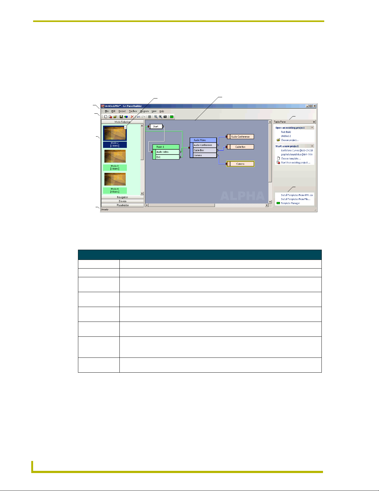
G4 PanelBuilder Application Interface
The G4 PanelBuilder Application Interface is the main view you work with when creating a new
panel file (*.PB4), as you can see it is visually driven.
Menu
Bar
Toolbar
Toolbox
Status
Bar
FIG. 1 G4 PanelBuilder Application Interface
Instance Counter
Diagram Area
Tasks
Pane
Quick
Links
G4 PanelBuilder Application Interface
Menu Bar The menu bar is the location of all functions for G4 PanelBuilder.
Toolbar The toolbar contains icons for the commonly used functions.
Toolbox All elements available within a selected template reside in the toolbox. The toolbox is only
available when a template is open.
Status Bar In addition to giving you the current status of G4 PanelBuilder, i.e., Ready. The status bar
also provides a brief description of toolbar and menu items via mouse over.
Instance Counter The instance counter tracks and displays the number of times an element is used within the
current project.
Diagram Area The Diagram area is the graphical representation of the flow your panel file will follow. After
pulling the elements from the Toolbox you can connect and develop the elements.
Tasks Pane The tasks pane is a collection of links to commonly used functions. In addition to opening
projects (both new and existing), tasks pane tracks recently opened projects and templates.
To access anything listed in the tasks pane, click on any of the items listed.
Quick Links Located within the Tasks Pane is a small sub-section quick links. These links allow you
quick access to adding and managing templates within G4 PanelBuilder.
2
G4 PanelBuilder
Page 11
G4 PanelBuilder Overview
File Menu
The File menu serves as a location for file management, project information and template
management.
File Menu
New Launches the New Project dialog window.
New From File Launches the New From File dialog window.
Open Launches the Open Project dialog window.
Close Closes the project currently open.
Save Saves the current project. If the project has not been previously saved it will
Save As Launches the Save As dialog window.
Generate TPDesign4 Project Launches the Generate TPDesign4 Project dialog window.
Install Templates From
AMX.com
Install Templates From File Launches the Install Templates from File dialog window.
Template Manager Launches the Template Manager dialog window.
Most Recently Used List A list of most recently opened project file names.
Exit Closes the G4 PanelBuilder application.
launch the Save As dialog window.
When an internet connection is present, connects to AMX.com and launches
the AMX.com Template Library dialog window.
Edit Menu
The Edit menu governs the actions within the Diagram area.
Edit Menu
Undo Undoes action taken in diagram area. Undo does not apply to text changes within elements.
Redo Reverses the undo action taken within the diagram area.
Delete Deletes the element currently selected in the Diagram area.
Project Menu
The Project menu is a set of features covering the project properties and related items.
Project Menu
Project Properties Launches the Project Properties dialog window.
Project Template Sample Images Launches the Template Sample Images dialog window.
Color Schemes Launches the Color Schemes dialog window.
Toolbox Menu
The Toolbox menu is a set of features for interacting with the Toolbox area.
Toolbox Menu
Add Element To Diagram Adds the element currently selected within the Toolbox to the Diagram area.
Remove All Instances From
Diagram
Element Preview Launches the Templates Sample Images dialog window with the currently
Removes all instances of the currently selected element from the Diagram
area.
selected element shown.
G4 PanelBuilder
3
Page 12
G4 PanelBuilder Overview
Diagram Menu
The Diagram menu interacts directly with the Diagram area.
Diagram Menu
Add Element A complete list of available elements within your selected template. Select any
Properties Launches the Diagram Properties dialog window. This feature views the
Preview Launches the Diagram Preview dialog window.
Show Grid Shows the grid in the Diagram area.
Snap To Grid Locks all element placements to grid lines.
Zoom Out Decreases the magnification of the diagram area. Increments are 150%, 125%,
Zoom In Increases the magnification of the diagram area. Increments are 150%, 125%,
Zoom A list of available increments to zoom into or out of the diagram area. Click on
Copy Snapshot To Clipboard Copies only the diagram area to your computer's clipboard.
View Menu
element to have it placed within the Diagram area.
properties of the selected element within the Diagram area.
100%, 75% and 50% of work area.
100%, 75% and 50% of work area.
the desired magnification to implement.
The View menu allows you to toggle different aspects of the G4 PanelBuilder Application Interface
on and off. Additionally, you can change the appearance of the application itself. A check next to
the title indicates it is visible.
View Menu
Visual Style A list of visual appearances for the G4 PanelBuilder. Select one of the following:
• Default (Windows 2000®)
• Office XP®
• Office 2003®
Help Menu
The Help menu contains features for updating the application and connecting with AMX for a
demo on how to use G4 PanelBuilder.
Help Menu
Contents Launches the G4 PanelBuilder help, Contents section.
AMX Training Demo Connects to AMX.com for the online demo for using G4 PanelBuilder.
Web Update Launches the AMX Web Update utility. Internet connection is necessary.
About G4 PanelBuilder Displays the about G4 PanelBuilder dialog containing information pertaining to
version and copyright.
4
G4 PanelBuilder
Page 13
G4 PanelBuilder Overview
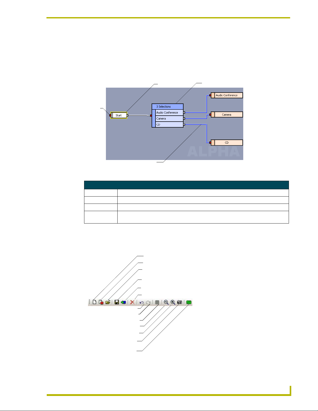
Diagram Area
The Diagram area is the graphical representation of the flow your panel file will follow. After
pulling the elements from the Toolbox you can connect and develop the elements. You can either
click and drag or nudge the elements within the Diagram area. Select an element and use your
arrow keys to nudge.
Exiting Node
Entering
Node
Connection Line
Element
FIG. 2 Diagram Area
Diagram Area
Entering Node This node receives the connection line from another element.
Exiting Node This node connects out to another element.
Element The building block of the panel files, i.e., Modes, Navigation, Devices, and etc.
Connection Line The graphical representation of the connection between two elements. The color of the
connection line is dictated by the element it is exiting.
Toolbar
The toolbar contains icons for the commonly used functions:
New
New From File
Open
Save
Generate TPDesign4 Project
Delete
Undo
Redo
Color Schemes
Zoom Out
Zoom In
Copy Snapshot To Clipboard
Template Manager
FIG. 3 Toolbar
G4 PanelBuilder
5
Page 14
G4 PanelBuilder Overview
Toolbar
New Launches the New Project dialog window.
New From File Launches the New From File dialog window.
Open Launches the Open Project dialog window.
Save Saves the current project. If the project has not been previously saved it will
Generate TPDesign4 Project Launches the Generate TPDesign4 Project dialog window.
Delete Deletes the element currently selected in the Diagram area.
Undo Undoes action taken in diagram area. Undo does not apply to text changes
Redo Reverses the undo action taken within the diagram area.
Color Schemes Launches the Color Schemes dialog window.
Zoom Out Decreases the magnification of the diagram area. Increments are 150%, 125%,
Zoom In Increases the magnification of the diagram area. Increments are 150%, 125%,
Copy Snapshot To Clipboard Copies only the diagram area to your computer's clipboard.
Template Manager Launches the Template Manager dialog window.
Tasks Pane
launch the Save As dialog window.
within elements.
100%, 75% and 50% of work area.
100%, 75% and 50% of work area.
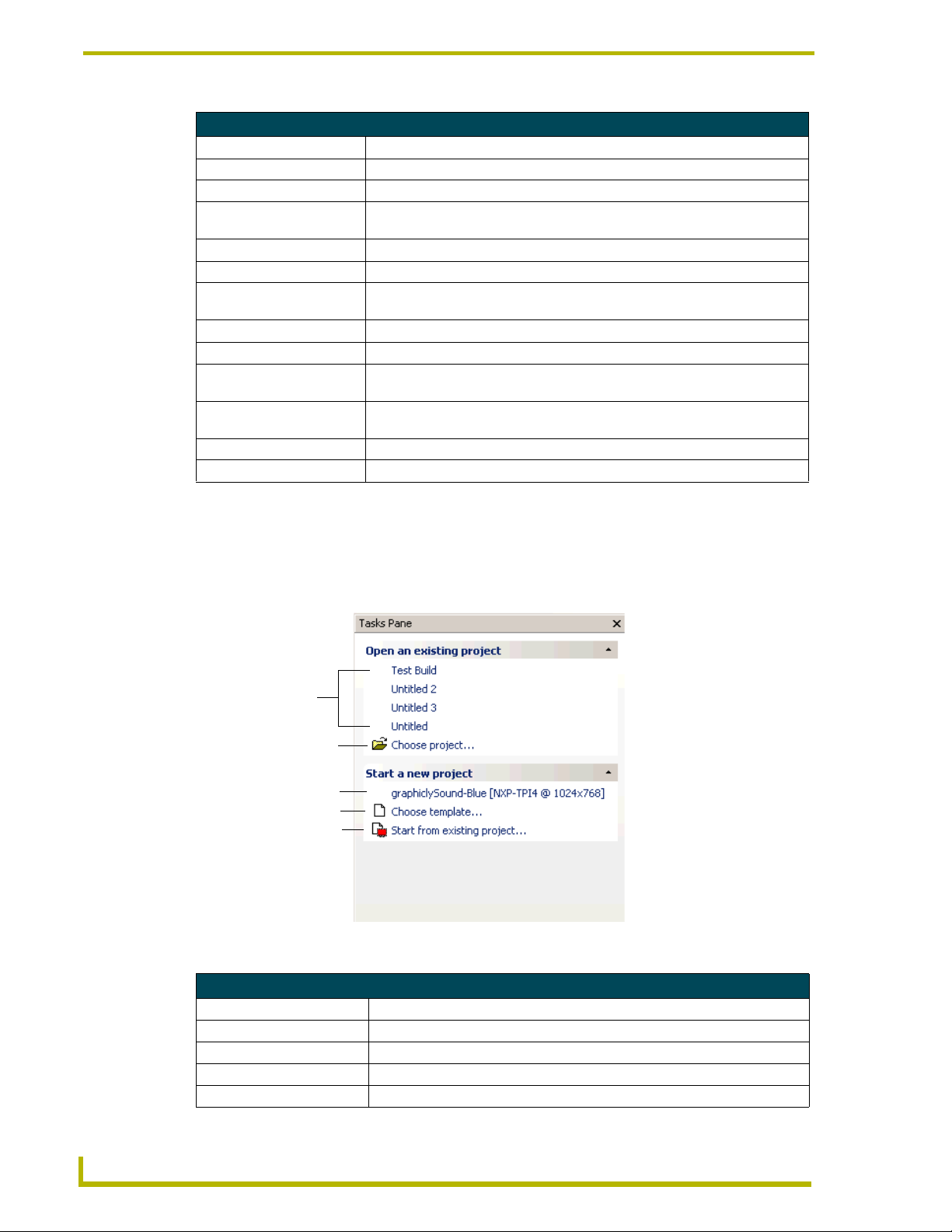
The tasks pane is a collection of links to commonly used functions. In addition to opening projects
(both new and existing), tasks pane tracks recently opened projects and templates. To access
anything listed in the tasks pane, click on any of the items listed.
Recently
Opened
Projects
Open Project
Recently Opened Templates
New File
New from File
FIG. 4 Tasks Pane
Tasks Pane
Recently Opened Projects A list of file names for recently opened existing projects.
Open Project Launches the Open Project dialog window.
Recently Opened Templates A list of file names for recently opened templates.
New File Launches the New Project dialog window.
New from File Launches the New From File dialog window.
6
G4 PanelBuilder
Page 15
G4 PanelBuilder Overview
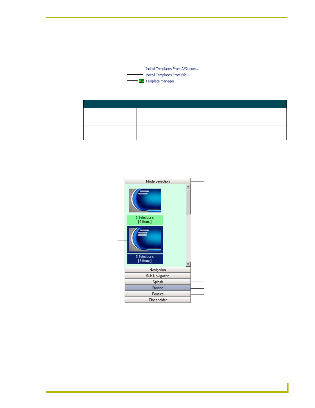
Quick Links
Located within the Tasks Pane is a small sub-section quick of links. These links allow you quick
access to adding and managing templates within G4 PanelBuilder.
AMX.com Template Library
Install Template from File
Open Template Manager
FIG. 5 Quick Links
Quick Links
Install Templates From
AMX.com
Install Templates From File Launches the Install Templates From File dialog window.
Template Manager Launches the Template Manager dialog window.
If a internet connection is available, G4 PanelBuilder connects to AMX's
collection of online templates. The templates are found in AMX.com Template
Library dialog window.
Toolbox
All elements available within a selected template reside in the toolbox. The toolbox is only
available when a template is open.
Element
(i.e., Mode Element
with 3 items)
FIG. 6 Toolbox
Element Sections
As you can see, the toolbox is divided into elements with specific pages contained therein. Click on
the element you would like to add, i.e., Navigation, Device, etc. All available elements will be
shown. When available, a thumbnail representation of the page will appear within the toolbox;
otherwise a general image will be shown for the thumbnail. Mouseover the element to get a
description. Once you have found the element you would like to use, you can right-click on the
thumbnail to access the toolbox context menu or drag-and-drop the element into the diagram area.
G4 PanelBuilder
7
Page 16

G4 PanelBuilder Overview
Only contained within the template are represented within the toolbox. If the template does not
contain a particular element, you will not see it in the toolbox.
Color Schemes
Templates can contain multiple color palettes, allowing you to switch from one color scheme to
another within one template. The current scheme is reflected in the element preview but the
elements in the toolbox will remain the main color scheme.
Used either with Chameleon buttons or standalone, you can use a single template that can deliver
different predefined color schemes.
Status Bar
Located at the bottom of the G4 PanelBuilder Application Interface is the status bar. In addition to
giving you the current status of G4 PanelBuilder, i.e., Ready. The status bar also provides a brief
description of toolbar and menu items via mouse over.
Viewing Panes
The G4 PanelBuilder Application Interface is composed of panes, sections containing tools for
creating a panel project. To reveal or hide different panes:
Select View > (any of the panes listed; a check mark indicates the pane is in view)
Toolbar, Tasks Pane, Toolbox or Status Bar.
Changing Visual Style
So, you love everything G4 PanelBuilder does for you and just could not be more impressed. Well,
you would rather it fit in with the Windows 2000® theme you have. To change the appearance of
G4 PanelBuilder:
Select View > Visual Style and select from the following
Default
Office XP®
Office 2003®
8
G4 PanelBuilder
Page 17
Basic Operations
Getting Started
Creating A New Project
The first step towards designing a new *.TP4 file is creating a new project file (*.PB4).
1. Launch the G4 PanelBuilder application.
2. Select File > New. This launches the New Project dialog window.
3. Type the Job Name in the corresponding field.
4. Select the Panel Type and Resolution from the drop down menus.
5. Select your desired template family from the thumbnails listed.
If no templates are shown you will need to load them. You can either Install A
Template from File or Install Templates from AMX.com.
6. After you have clicked on your desired template, click OK.
Basic Operations
7. Your new project is now open to the G4 PanelBuilder Application Interface. A Start element is
in place within the Diagram area.
If a project is already open and you select open a new or existing project, you are
prompted by the Save As dialog window. The previous project will remain on screen
until you are done setting up the new project.
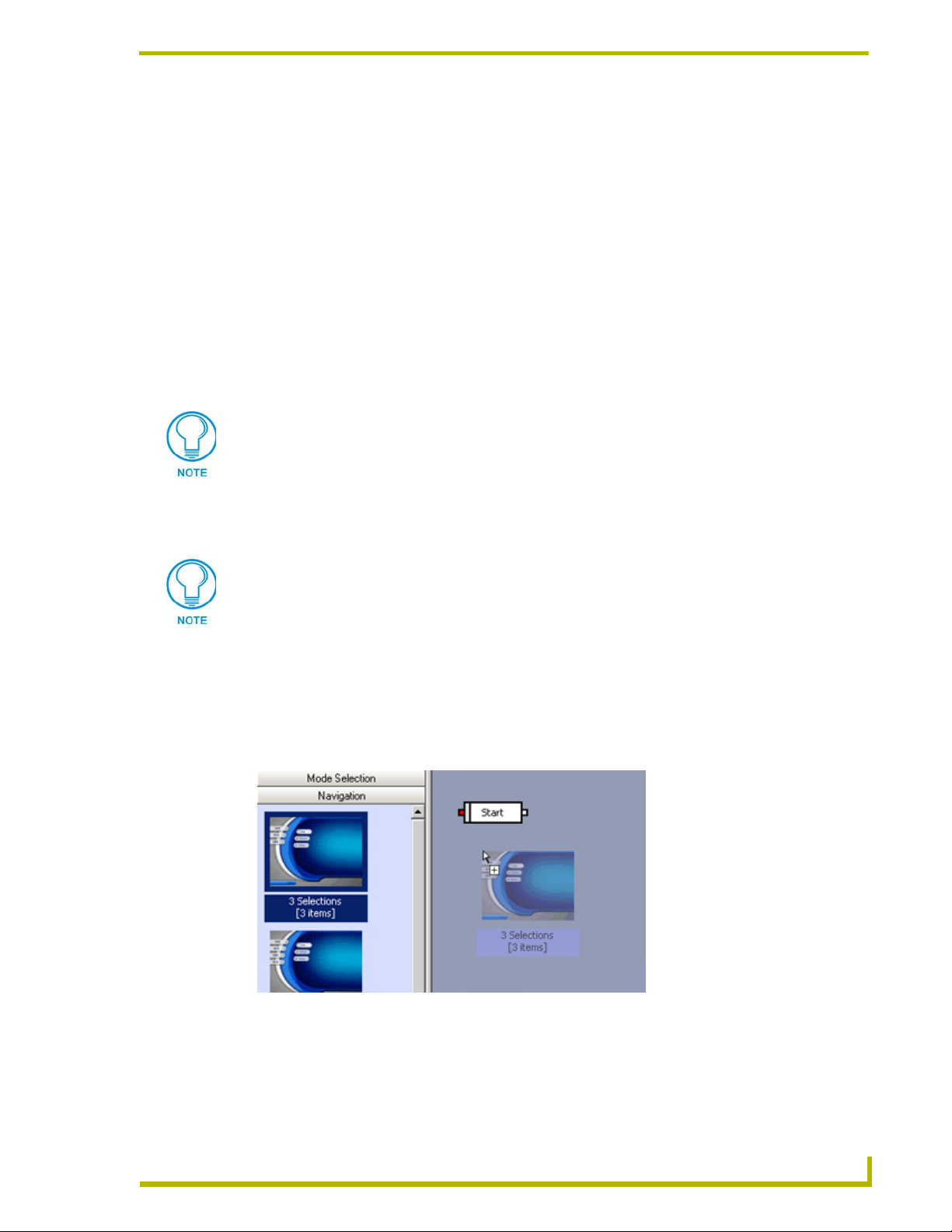
Adding A Toolbox Element to The Diagram
Once you have a project file open you can add elements to the panel file.
1. Select the element type within the Toolbox.
2. Find the desired element, click-and-drag the element to the Diagram area.
G4 PanelBuilder
FIG. 7 Drag a Navigation element to the Diagram area
9
Page 18

Basic Operations
3. Now connect the Start element to the Navigation element. Click on the Exiting node (white) on
the Start element and drag it to the other element. All possible connections are indicated by a
green outline. If the connection cannot happen the outline is red. A connection line appears
between the two elements.
FIG. 8 Drag Start node to Navigation element node
4. You can now edit the properties for the Navigation element or select another element to add to
the diagram area.
An element will populate the corresponding appropriate field, when connecting. This
saves you the trouble of naming element properties.
Navigation populated by Device element
FIG. 9 Drag Navigation element node to Device element node
10
G4 PanelBuilder
Page 19

Basic Operations
Adding Elements via The Diagram Menu
Designing G4 PanelBuilder projects is done through graphic representation. The flow between the
pages is done through the Diagram area. Connections are then made between the elements in the
Diagram area. To add an element using the Diagram menu:
1. Open a project or create a new project file.
2. Select Diagram > Add Element, then select the element with the appropriate number of
selections or device for your criteria.
You can either click and drag or nudge the elements within the Diagram area. Select an element and
use your arrow keys to nudge.
Connecting Elements
Developing flow between pages is made possible by creating lines from one element's exiting node
to another element's entering node.
1. With a template open and elements present in the diagram area, left-click and hold on the
exiting node of a desired element.
2. Drag your mouse over any part of another element. If a connection is permissible, the element
highlights in green. If the connection is not possible the element highlights in red.
You have now created the flow from one page to another.
Editing Diagram Element Properties via The Diagram Menu
Once an element is in place in the Diagram area, it is necessary to name the node and place text for
the corresponding buttons.
1. Select an element in the Diagram area.
2. Select Diagram > Properties to open the Diagram Properties dialog window.
3. Click within the text fields to edit. You can either type the name or use the browse (...) button to
edit the Connections fields.
4. Once all fields are edited, click OK.
Generating A TPDesign4 Project
After your new project has all the necessary elements, their nodes are connected and the element
properties are set; you are ready to generate a .TP4 file.
1. Select File > Generate TPDesign4 Project to launch the Generate TPDesign4 Project dialog
window.
2. Select the location to save the file and place a check next to Open project in TPDesign4 if you
want G4 PanelBuilder to launch the newly created file within TPDesign4.
3. Click Save.
When you generate a TPDesign4 project G4 PanelBuilder stores information to the
.PB4 file. As a result the file will indicate being "dirty" or changed. You will need to
save the .PB4 file.
G4 PanelBuilder
11
Page 20

Basic Operations
Saving A Project
To save a G4 PanelBuilder project file (*.PB4):
1. Select File > Save. If this is the first instance of a save for your project, the Save As dialog
window launches.
2. Type the File name in the field provided.
3. Locate the directory you would like to save within.
4. Place a check next to Package template with project file if you would like to include the .TPT
file with the .PB4 file. Doing this will allow you to open the G4 PanelBuilder file on other
machines running the application.
5. Click Save.
Select Save As if you would like to save your project under another name or different location.
1. Select File > Save As to launch the Save As dialog window.
2. Type the File name in the field provided.
3. Locate the directory you would like to save within.
4. Place a check next to Package template with project file if you would like to include the .TPT
file with the .PB4 file. Doing this will allow you to open the G4 PanelBuilder file on other
machines running the application.
5. Click Save.
When you generate a TPDesign4 project G4 PanelBuilder stores information to the
.PB4 file. As a result the file will indicate being "dirty" or changed. You will need to
save the .PB4 file.
Closing A Project
To exit an open project but leave G4 PanelBuilder running:
Select File > Close. If you have not already saved, the Close Project dialog window will
prompt you.
If the file save is current the file closes.
When you generate a TPDesign4 project G4 PanelBuilder stores information to the
.PB4 file. As a result the file will indicate being "dirty" or changed. You will need to
save the .PB4 file.
12
G4 PanelBuilder
Page 21

Basic Operations
Templates
Preview A Template via Template Manager
G4 PanelBuilder pages derive their look from templates (*.TPT files). Template Manager allows
you access to all template files located on your computer. To preview any template located on your
computer using Template Manager:
1. Select File > Template Manager to launch the Template Manager dialog window.
2. Double-click on the thumbnail of a template family.
3. Select a thumbnail for one of the panel types within the family.
4. Click on the Samples button to launch the Template Samples Images dialog window.
Opening A Most Recently Used Template
The Tasks Pane is a collection of frequently used functions. This is intended to add convenience to
panel design.
In the Tasks Pane, under Start a new project, is a list of recently used templates.
To create a new G4 PanelBuilder project using one of the templates listed, click on the
link for the desired template name. A new project file opens using your selected template.
Install A Template via Template Manager
The style for your panel pages is dictated by the template (.TPT) file you are using. You can
download templates from AMX.com or create your own and then load them into G4 PanelBuilder.
1. First, launch the Template Manager dialog window by selecting File > Template Manager.
2. Click the Install button in the bottom left corner.
3. Select either:
From AMX.com
From File
Install Templates from AMX.com
G4 PanelBuilder project files (*.PB4) derive their style from templates. In addition to making your
own templates, you can download AMX created templates. To install a .TPT file from AMX.com:
1. Select File > Template Manager to open the Template Manager dialog window.
2. In the bottom left corner of the dialog window, select Install.
3. Select From AMX.com from the drop-down list to launch the AMX.com Template Library
dialog window.
4. Select a thumbnail of one of the template families.
5. Click the Install button.
G4 PanelBuilder
If the .TPT file already resides on your computer you will be prompted by the Replace Template
dialog window. Select on of the following:
Ye s - Confirms the replacement of the .TPT file on a panel-by-panel basis.
Yes A l l - Confirms the replacement of all .TPT files at one time.
13
Page 22

Basic Operations
No - Denies the replacement of the .TPT file on a panel-by-panel basis.
No All - Denies the replacement of all .TPT files at one time.
Abort - Cancels the template import with no changes.
If you replace a .TPT file that is referenced by a .PB4 file, it will be updated in the
.PB4 file.
6. After the template has been installed, click Close.
Install A Template from File
G4 PanelBuilder utilizes templates to apply appearances to panel pages. You can import your own
local files as a template (.TPT) for use within G4 PanelBuilder .
1. Select File > Install Templates From File to launch the dialog window.
2. Locate the .TPT file you would like to import.
3. Click Install.
Templates are identified by their job names. Regardless of file name, if the job name
already exists, you are prompted by the Replace Template dialog window.
If you replace a .TPT file that is referenced by a .PB4 file, it will be updated in the .PB4 file.
Remove A Template from G4 PanelBuilder
Panel pages designed in G4 PanelBuilder depend on templates to dictate their style. The Template
Manager allows you to preview, add and remove templates from your local directory.
To remove template files (*.TPT) files:
1. Open the Template Manager dialog window by selecting File > Template Manager.
2. Select the thumbnail of the template to be removed.
3. Click Remove at the bottom of the window.
4. Confirm you have selected the appropriate template and click OK.
Opening A Project
To open a (*.PB4) file in G4 PanelBuilder:
1. Select File > Open to launch the Open Project dialog window.
2. Select the file and click OK.
If a project is already open and you select open a new or existing project, you are
prompted by the Save As dialog window. The previous project will remain on screen
until you are done setting up the new project.
14
G4 PanelBuilder
Page 23

Basic Operations
Changing Color Schemes
If the template you are working with has more than one color scheme available the Color Schemes
button is active in the toolbar.
To change the color scheme of your project file:
1. With your project file open go to Project > Color Schemes to open the Color Schemes dialog
window.
2. Select the color scheme in the field and click OK.
While the color change is not reflected in the toolbox, you will see it if you select an element and
go to Diagram > Preview.
Creating A New Project from File
You can change templates attributed to projects and create a new project as a result.
1. Select File > New From File to launch the New From File dialog window.
2. Open your desired project file (*.PB4).
3. The next window to open is the New project dialog. Select the new template to be used with the
project.
4. Click OK.
If a project is already open and you select open a new or existing project, you are
prompted by the Save As dialog window. The previous project will remain on screen
until you are done setting up the new project.
Editing Project Properties
You can edit some of the project's properties as well as add information specific to you, i.e., Dealer
ID and Designer ID.
1. Select File > Project Properties to launch the Project Properties dialog window.
2. Place your cursor within the white fields to add and edit text.
To set a password for the project:
1. Click the drop-down menu for Protection. Select either:
read-only - project can be opened; not changed.
locked - project cannot be opened.
Password protection extends only to TPDesign4. Projects password protected in G4
PanelBuilder can still be opened and used.
2. Type a password in the field provided.
G4 PanelBuilder
3. Re-type the password within Confirm.
4. Click OK when all changes have been made.
Project properties differ from file properties established in TPDesign4. File properties
entered in TPDesign4 are what is displayed in the Template Manager dialog window.
15
Page 24

Basic Operations
Alternate Screen Names
G4 PanelBuilder supports alternate screen names for use with elements with longer names. Within
TPDesign4, the template designer can designate abbreviated text for substitution. You can then
change the on-screen text in PanelBuilder and the default text fits without the need for
modification.
The full name of the element is always displayed in the toolbox area.
Using Unicode Text
G4 PanelBuilder supports assigning text to template elements that differs from the element name.
This means you can rename an element, and the new name will be used to populate panel titles and
button names. Additionally, the new text can be set in Unicode. To assign Unicode text to a
template element:
1. Select the element within the diagram area.
2. Select Diagram > Properties to open the Diagram Properties dialog window.
3. Click on the browse button (...) to launch the Unicode Edit dialog widow.
4. Type the Unicode within the text field and the equivalent is displayed below.
5. Click OK to close the Unicode Edit dialog window.
6. Click OK to close the Diagram Properties dialog window.
The Unicode can now only be edited via the Unicode Edit dialog window. If the element name and
screen name differ, both are displayed within the node.
If Unicode characters are specified but the template does not support the specified font a Unicode
font is used only in those instances. To set the Unicode Font:
1. Select Project > Project Properties to open the Project Properties dialog window.
2. From the drop down list, select the font G4 PanelBuilder is to use in the event the Unicode
character font is not supported.
3. Click OK.
Preview Diagram Element
G4 PanelBuilder files are designed within the diagram area using graphic representation for the
panel pages. It is necessary to see how the pages will look when finished. Will the text fit the
selected button? To preview an element within the Diagram area:
1. Select an element in the Diagram area.
2. Select Diagram > Preview to launch the Diagram Preview Dialog Window. This view is what
the finished panel will look like.
16
3. When finished click Close.
G4 PanelBuilder
Page 25

Basic Operations
Preview A Toolbox Element
G4 PanelBuilder uses graphic representation within the Diagram area to develop panel files and
express flow between pages. While the toolbox does contain thumbnails for the elements, you can
view larger screenshots of each element. To preview a toolbox element:
1. Select an element in either the toolbox or Diagram area.
2. Select Toolbox > Element Preview to launch the Template Sample Images dialog window.
3. Click Close when you are finished.
Globally Remove An Element Instance
G4 PanelBuilder uses the Diagram area as a graphic representation for the flow panel pages take.
You create this flow by placing elements within the Diagram area and then connecting them
accordingly.
You can delete these elements from the work area individually or in a global fashion. To globally
remove an element:
1. Select the element thumbnail to be removed within the Toolbox.
2. Select Toolbox > Remove All Instances From Diagram.
Undo, Redo And Delete
The crux of G4 PanelBuilder is the graphically driven interface of the Diagram area. You are able to
move elements around within the provided area as well as connect them to develop a flow. It is
possible to edit these actions via the Edit menu. The functions, undo, redo and delete do not apply
to changes made to element properties.
To Undo an action in the Diagram area:
Select Edit > Undo.
To Redo an Undo or Delete action:
Select Edit > Redo.
To delete an element or connection in the Diagram area:
1. Select the item in the Diagram area.
2. Select Edit > Delete.
G4 PanelBuilder
17
Page 26

Basic Operations
Create Snapshots to Clipboard
Since designing panel projects in G4 PanelBuilder is a visual exercise, where you drag and link
individual elements to make a flow within the Diagram area. It is necessary to be able to show the
design or "snapshot" of the intended look. Once you are ready to create a snapshot to your
computer's clipboard:
1. Select Diagram > Copy Snapshot To Clipboard.
2. Open a graphic program, i.e., Paint or Photoshop and paste the image into it.
Even if you zoom in or out of the Diagram area, the default, 100%, view is used in
creating a snapshot to clipboard.
Show and Hide Grid
The Diagram area allows you to visually arrange your panel pages and connect them to create a
flow. You can toggle a grid to snap the elements to on and off. To show the grid:
Select Diagram > Show Grid. When a check is present next to this function in the
Diagram menu, the elements will align incrementally and the gird is shown.
Snap To Grid
The Diagram area allows you to visually arrange your panel pages and connect them to create a
flow. To have the elements snap to the grid:
Select Diagram > Snap To Grid. When the check is present the elements snap to the
grid. The elements align according to the grid in the Diagram area.
Zoom in And out of Diagram
When designing a G4 PanelBuilder file, you place elements within the Diagram area, set properties
and create connections between the elements to establish flow. To zoom in or out of the Diagram
area:
Select Diagram > Zoom Out/In. This function will zoom incrementally.
To select the percentage in which to zoom:
Select Diagram > Zoom and then select the desired percentage.
Even if you zoom in or out of the Diagram area, the default, 100%, view is used in
creating a snapshot to clipboard.
18
G4 PanelBuilder
Page 27

Basic Operations
Using Web Updates
Newer versions of G4 PanelBuilder can now be acquired via the internet. The Web Update utility
accesses the AMX web site with the application ID and version number and searches for updates.
1. Select Help > Web Update to check for updates.
2. If updates are available for the installed version of G4 PanelBuilder they will be downloaded at
this time.
3. After the download is complete Web Update will close G4 PanelBuilder and the updates will
be added.
If you do not have Web Update installed, you will receive a window indicating where it can be
downloaded.
Exiting G4 PanelBuilder
After you have created a new touch panel page, generated it and saved it, you are ready to close G4
PanelBuilder.
Select File > Exit. If you have not already saved a currently open project, you are
prompted to do so now. Confirm, deny or cancel the changes.
G4 PanelBuilder
19
Page 28

Basic Operations
20
G4 PanelBuilder
Page 29

Creating Templates for G4 PanelBuilder
Creating Templates for G4 PanelBuilder
A template is a TPD4 file complete with pages, popups and buttons, named in a manner that G4
PanelBuilder will understand the relationship between all of the elements. Then, based on the
established elements, G4 PanelBuilder customizes the TPD4 file based on the navigation flow you
designed.
Ony number of template files (*.TPT) can be created to constitute a template family, it is suggested
you create one for each resolution totaling 6. The resolutions and panel types are as follows:
Panel Resolutions
Resolution Panel Type
640x480 MVP-7500
TPI4
800x600 MVP-8400
CA12
CV12
TPI4
800x480 CV7
CV10
CV10/PB
1024x768 CV15
CA15
TPI4
1280x1024 TPI4
1280x768 CV17
According to the table there are only 6 resolutions, the minimum number to make a template
family, but 12 different panel types. You only need one template per resolution but you should
consider instances such as the MVP-8400, where the Pixels Per Inch is higher than the CV12 and
the MVP-7500's limited color depth. Both examples are situations where you might consider
making specific templates for those panel types.
1. You should spend some time deciding what you want the panel to do. What navigation model
are you going to use? You know you're going to have the required template elements but are
some of your menus so complex they will require sub-menus? What devices and features will
the template include? Consider using some optional template elements. Careful consideration
will reveal the type of navigation you will need.
Things to remember:
You must have a minimum of 1 Navigation element.
You must have a minimum of 1 Placeholder element.
You must have a main preview image ("[preview].jpg" or "[preview].png").
You cannot create a "drill-down" style of navigation with G4 PanelBuilder.
G4 PanelBuilder
21
Page 30
Creating Templates for G4 PanelBuilder
Your navigation menus will always be on top of your Devices. Make sure they do not
conflict with each other.
Suggestion
Create a simple TPD4 file showing the desired output. Doing this gives you a starting point to begin looking at
how to modify the TPD4 file to create a template.
2. You are ready to begin restructuring the elements to fit your needs. Start with the Device and
Navigation elements first and the Placeholder elements last. The key for creating your own
elements naming conventions. G4 PanelBuilder looks for navigations with the name,
[nav#navName]pageName.
Suggestions
Start with the most complex Device element first, then make copies of it. This method allows you to modify and
delete thus the pages are more likely to be similar. Also, create several different variations of Navigation and
Sub-Navigations (3 items, 4 items, etc...).
3. Create the preview images for the elements. Images do not have to be full size, in fact AMX
templates utilize a 1/4 screen size to reduce the template file size.
Suggestion
Mock up the interface in TPDesign4 by opening the corresponding page and display all applicable popups.
Select Page > Copy Image To Clipboard. Then open the resource manager and select Paste. Now rename the
new image to the appropriate element name.
4. After you have completed the template design, do a generate. A .TPT file is created and a list
of errors and warnings are displayed at this time, if applicable.
5. Repeat the design for other resolutions.
Things to remember:
You can use TPD4's Save As Other Panel Type when appropriate or as a starting point.
Leave the "Job Name" in the Panel Properties the same for all related TPD4 files, this is
the basis of a template family.
Not all resolutions have to be done at once. If necessary you can build the ones you
currently need and address the other resolutions as they present themselves.
Below is the workspace for TPDesign4. The pages are highlighted in the color of the element they
represent.
22
G4 PanelBuilder
Page 31

Creating Templates for G4 PanelBuilder
G4 PanelBuilder
FIG. 10 TPDesign4 Workspace
23
Page 32

Creating Templates for G4 PanelBuilder
Creating Templates with Alternate Screen Names
G4 PanelBuilder supports alternate screen names for use with elements with longer names. The
alternate name must be defined by the template creator.
You must create an info button for the device and use this syntax:
[info]alternate name
For example, the device Audio Conference could have the alternate screen name of Audio Conf.
displayed on the navigation button. The info button is defined as:
[info]Audio Conf
Creating Templates with Color Schemes
When you create a template within TPDesign4 you can designate color palettes from which to
work. Defined color palettes are Color Schemes, utilized by G4 PanelBuilder for changing color
schemes.
Define The Color Scheme
1. Within TPDesign4, select Panel > Edit Palettes to open the Edit Palettes dialog window.
2. Select Rename to edit the name of the palette.
3. Define the colors used in the palette.
4. Repeat steps 2 and 3 for as many color schemes you want available within the template file.
5. Click Close.
Create A Preview Image
Before TPDesign4 will export a template file, all color schemes must have a sample image.
1. Select a panel page that best represents the color scheme used. It is suggested you use the same
panel page for all color schemes to better show the color changes.
2. With the selected panel page open and active, select Page > Create Template Preview Image
to open the Create Template Preview Image dialog window.
3. Set Element Type to Palett e.
4. The Name must match the name you used in step 2 of Define The Color Scheme.
5. You can set the Scale, File Format and Compression at your discretion.
6. Click OK.
You can now export the file as a template, open and use it within G4 PanelBuilder.
24
G4 PanelBuilder
Page 33

Creating Templates for G4 PanelBuilder
Template Requirements
There are a few key items required of all templates. TPD4 will not allow you to create a template
without:
A minimum of 1 Navigation Element.
A minimum of 1 Placeholder Element.
A main preview image ("[preview].jpg" or "[preview].png").
Required Template Elements
When designing a template it is important to remember the rules that govern elements and their
relation with the templates. The chart below demonstrates these rules.
G4 PanelBuilder
FIG. 11
25
Page 34

Creating Templates for G4 PanelBuilder
The template must have at least one of each of the following elements:
Navigation Elements - This is the main menu where most of your navigation selections
are made.
Consists of at least one popup but can contain multiple popups.
Cannot contain any pages
Only one can be displayed at a time.
Navigation Element Specific Conventions
[nav#navName]pageName
navName The name of the Navigation as it will appear within G4 PanelBuilder.
pageName The base page name that will be used in the generated TP4 project.
[info]buttonName
This text is used to populate the
mouseover element description
in the toolbox.
buttonName This is unused and the button is deleted in the generated TP4 project.
[item]buttonName The popups in the Navigation element must contain at lest one item button that
buttonName This is the button name used in the generated TP4 project.
[title]buttonName Popups in a Navigation element can contain one or more Title buttons. The text
buttonName This is the button name used in the generated TP4 project.
Only one of the pages or popups in A Navigation element can contain an Info
button. The Info button contains the page flip information for displaying the
Navigation element and can contain an optional icon image.
will be filled with navigation information. Item buttons are ordered within the
Navigation element in order of left to right then top to bottom.
will be replaced with the name given to the Navigation in the generated TP4
project.
26
Placeholder Elements - This is a blank device element that allows you to represent
unique items in the diagram area.
Consists of one page and may have optional popups.
Only one Placeholder element can be displayed at a time.
Placeholder Element Specific Conventions
[placeholder#placeholderName]pageName
placeholderName The name of the Placeholder element as it appears in G4
pageName The base page name used in the generated TP4 project.
[info]buttonName
This text is used to populate the mouseover element
description in the toolbox.
buttonName This is unused and the button is deleted in the generated TP4
PanelBuilder.
Only one page or popup within a Placeholder element can
contain an Info button. The Info button contains the page flip
information for displaying the Placeholder element and can
also contain an optional icon image.
project.
G4 PanelBuilder
Page 35

Creating Templates for G4 PanelBuilder
[title]buttonName The pages and popups in a Placeholder element can contain
buttonName The button name will be used in the generated TP4 project.
one or more Title buttons. The text is replaced with the name
given to the Placeholder element in the generated TP4
project.
Optional Template Elements
There are required elements when developing templates but G4 PanelBuilder also supports a series
of optional elements that will make your templates more robust.
Your templates can have any of the following:
Mode Elements - This element is generally used for designating "modes" your system
will work in, i.e., "Video Conference Mode" or "Presentation Mode." Additionally, Mode
elements can be associated with rooms.
Consists of a single page and can contain multiple popups.
Only one Mode element can be displayed at a time.
Mode Element Specific Conventions
[mode#modeName]pageName
modeName The name of the Mode as it will appear in G4 PanelBuilder.
pageName The base page name used in the generated TP4 project.
[info]buttonName
This text is used to populate the
mouseover element description in
the toolbox.
buttonName Unused; the button is deleted in the generated TP4 project.
[item]buttonName The page in the Mode element must contain at least one Item button that
buttonName The button name used in the generated TP4 project.
[title]buttonName Popups in a Mode element can contain one or more Title buttons, whose
buttonName The button name used in the generated TP4 project.
Only one page in a Mode element can contain an Info button. The Info
button contains the page flip information for displaying the Mode element
and can also contain an optional icon image.
contains the navigation information. Item buttons are ordered within the
Mode element by left-to-right then top-to-bottom.
text is replaced with the name given to the Mode in the generated TP4
project.
G4 PanelBuilder
Sub-Navigation Elements - This element is a submenu and can occur on screen with
Navigation elements.
Consists of at least one popup and can contain multiple popups.
Cannot contain pages.
Sub-Navigation Element Specific Conventions
[subnav#navName]pageName
navName The name of the Sub-Navigation element as it appears in G4 PanelBuilder.
pageName The base page name that is used in the generated TP4 project.
[info]buttonName
This text is used to populate the
mouseover element description in
the toolbox.
Only one of the popups in a Sub-Navigation element can contain an Info
button, which contains the page flip information for displaying the
Sub-Navigation element and can also contain an optional icon image.
27
Page 36

Creating Templates for G4 PanelBuilder
buttonName Unused; the button is deleted in the generated TP4 project.
[item]buttonName Popups in the Sub-Navigation element must contain at least one Item button
buttonName The button name used in the generated TP4 project.
Sub-Navigation Element Specific Conventions (Cont.)
[title]buttonName The popups in a Sub-Navigation element can contain one or more Title
buttonName The button name used in the generated TP4 project.
Splash Elements - This element is a popup that can contain an image, i.e., corporate
logo.
Consists of at least one popup and can contain multiple popups.
Cannot contain pages.
Splash Element Specific Conventions
[splash#splashName]pageName
splashName The name of the Splash element as it appears in G4 PanelBuilder.
pageName The base page name that is used in the generated TP4 project.
[info]buttonName
This text is used to populate the
mouseover element description in the
toolbox.
buttonName Unused; this button is deleted in the generated TP4 project.
[title]buttonName Popups in a Splash element can contain one or more Title buttons. The
buttonName The button name used in the generated TP4 project.
that will contain navigation information. Item buttons are ordered in the
Navigation element left-to-right then top-to-bottom.
buttons. The text within the Title buttons are replaced with the name given to
the Sub-Navigation in the generated TP4 project.
Only one of the popups in a Splash element can contain an Info button,
which contains the page flip information for displaying the Splash element
and can also contain an optional icon image.
text within the buttons is replaced with the name given to the Splash
element in the generated TP4 project.
Device Elements - This element is the actual device used. For reference, consult AMX
templates where we list the most commonly used devices.
Consists of one page and can contain multiple popups.
Only one Device element can be displayed at a time.
Device Element Specific
[device#deviceName]pageName
deviceName The name of the Device as it appears in G4 PanelBuilder.
pageName The base page name used in the generated TP4 project.
[info]buttonName
This text is used to populate the
mouseover element description in the
toolbox.
buttonName Unused; the button is deleted in the generated TP4 project.
[title]buttonName Pages and popups in a Device element can contain one or more Title
buttonName The button name used in the generated TP4 project.
Only one page or popup in a Device element can contain an Info button
which contains the page flip information for displaying the Device element
and can also contain an optional icon image.
buttons. The text within the buttons is replaced with the name given to the
Device element in the generated TP4 project.
28
G4 PanelBuilder
Page 37

Creating Templates for G4 PanelBuilder
Feature Elements - This element resembles the Device element. However, there can only
be one Feature element in a panel design, i.e., the "Clean Panel" feature.
Consists of one page and can contain multiple popups.
Only one Feature element can be displayed at a time.
Feature Element Specific Conventions
[feature#featureName]pageName
featureName The name of the feature as it appears in G4 PanelBuilder.
pageName The base page name that is used in the generated TP4 project.
[info]buttonName
This text is used to populate the
mouseover element description in the
toolbox.
buttonName Unused; the button is deleted in the generated TP4 project.
[title]buttonName The pages and popups in the Feature element can contain one or more
buttonName The button name that is used in the generated TP4 project.
Only one page or popup in a Feature element can contain an Info button,
which contains the page flip information for displaying the Feature
element and can also contain an optional icon image.
Title buttons, whose text is replaced with the name given to the Feature
in the generated TP4 project.
Sub-Feature Elements - This element represents the "universal" features that appear on
many pages, i.e., "volume."
Consists of at least one popup and can contain multiple popups.
Cannot contain pages.
Sub-Feature Element Specific Conventions
[subFeature#subFeatureName]pageName
subFeatureName The name of the Sub-Feature element as it appears in G4
pageName The base page name that is used in the generated TP4 project.
[info]buttonName
This text is used to populate the mouseover
element description in the toolbox.
buttonName Unused; the button is deleted in the generated TP4 project.
[title]buttonName Popups in a Sub-Feature element can contain one or more Title
buttonName The button name that is used in the generated TP4 project.
PanelBuilder.
Only one of the pages or popups in a Sub-Feature element can
contain an Info button, which contains the page flip information
for displaying the Sub-Feature element and can also contain an
optional icon image.
buttons, whose text is replaced with the name given to the
Sub-Feature element in the generated TP4 project.
G4 PanelBuilder
29
Page 38

Creating Templates for G4 PanelBuilder
Rules for Navigating A Template
In addition to the template requirements and required elements there are rules for navigating the
templates and template wide conventions you need to heed.
When navigating to a Device, Feature or Placeholder element from a Navigation element:
Hide all popups on the page for that element.
Perform the standard page flip to the page for that element.
Show any popups for the element.
Show any popups for the linked Sub-Feature, when applicable.
Show the Navigation element that is linked to the element.
Any Sub-Navigation elements that may have been currently displayed will be hidden.
When navigating to a Device, Feature or Placeholder element from a Sub-Navigation element:
Hide all popups on the page for that element.
Perform the standard page flip to the page for that element.
Show any popups for the element.
Show any popups for the linked Sub-Feature, when applicable.
Show the Navigation element that is linked to the Sub-Navigation element or chain.
For Sub-Navigations the user must set "Hide On Action" to No, then show the
Sub-Navigation element that is linked to the element. Otherwise, the Sub-Navigation is
not shown.
Info buttons are optional and only have to be included within an element if the order the popup
pages is shown is important, if not all popup pages should be initially shown, or if an icon is used
on the corresponding Navigation or Sub-Navigation button. If the Info button is omitted, popup
pages are shown in alphabetical order.
30
G4 PanelBuilder
Page 39

Creating Templates for G4 PanelBuilder
Template Wide Conventions
Text Replacement - The string "[text]" is required on the button wherever text is to be
replaced in the output file. The string "[text]" allows you to prepend/postepend text with
characters. If the text on a button to be replaced does not contain '[text]" then it is
unchanged.
Panel Title* - A template can contain as many buttons named "[panelTitle]" as
necessary, they are replaced with the "Job Name" of the panel.
Preview Images - A template must contain a main preview image and can also contain a
preview image for each element. The main preview image should be named
'[preview].jpg" (or .png). The element previews should follow the same naming
conventions as their page prefixes, i.e., "[device#DVD].jpg." There can only be one
preview image per element.
AMX Element Naming Conventions
AMX urges you to use the following naming convention to allow for portability between templates.
Errors could occur if the elements do not match from template to template.
AMX Element Naming Conventions
Device Name Example
Audio Conference [device#Audio Conference]Audio Conference
Cable Box [device#Cable Box]Cable Box
Camera [device#Camera]Camera
Cassette Deck [device#Cassette Deck]Cassette Deck
CD [device#CD]CD
G4 Computer Control [device#Computer Control]G4CC
Document Camera [device#Document Camera]Document Camera
Door [device#Door]Door
DSS [device#DSS]DSS
DVD [device#DVD]DVD
DVR [device#DVR]DVR
HVAC - Dual [device#HVAC - Dual]HVAC - Dual
HVAC - Single [device#HVAC - Single]HVAC - Single
Lift [device#Lift]Lift
Light Zone [device#Light Zone]Light Zone
Monitor [device#Monitor]Monitor
Pool [device#Pool]Pool
Screen [device#Screen]Screen
Security [device#Security]Security
Shade [device#Shade]Shade
Slide Projector [device#Slide Projector]Slide Projector
G4 PanelBuilder
31
Page 40
Creating Templates for G4 PanelBuilder
AMX Element Naming Conventions (Cont.)
Spa [device#Spa]Spa
Switcher size
Radio [device#Radio]Radio
TV [device#TV]TV
VCR [device#VCR]VCR
Video Projector [device#Video Projector]Video Projector
Volume - Dual [device#Volume -Dual]Volume - Dual
Volume - Single [device#Volume - Single]Volume - Single
Feature Name Example
US Weather Maps [feature#US Weather Maps]US Weather Maps
Mode Names Example Description
Mode X [mode#Mode 3]Mode 3 [mode#Mode x] x = the number of mode
Navigation Names Example Description
Nav X [nav#Nav 3]Nav 3 [nav#Nav 3]Nav 3 x = the number of
[device#Switcher size]Switcher size
options
navigation options
32
G4 PanelBuilder
Page 41

Program Reference
Dialogs
AMX.com Template Library Dialog Window
G4 PanelBuilder project files (*.PB4) derive their style from templates. In addition to making your
own templates, you can download AMX created templates. Browsing through online template files
is done so through the AMX.com Template Library dialog window.
Program Reference
Template Family Thumbnail
Filter Option
(Show modified)
Samples
FIG. 12 AMX.com Template Library Dialog Window
Collapse All Families
Expand All Families
Template Family Properties
Te mp l a t e
Family
Panel Types
Cancel
Install Template
AMX.com Template Library Dialog Window
Template Family Thumbnail A graphic representation of the panel properties.
Template Family Properties The name of the selected template family and the number of templates
available.
Template Family Panel Types Panels available for use within the selected family.
Samples Launches the Template Sample Images dialog window.
Show only new or modified
templates
Expand All Shows all available templates within each family.
Collapse All Closes all expanded template families.
Install Installs the selected template family to your local directory of templates.
Cancel Closes the AMX.com Template Library.
Filters the online library to show only templates that differ from what you have
already downloaded.
G4 PanelBuilder
33
Page 42
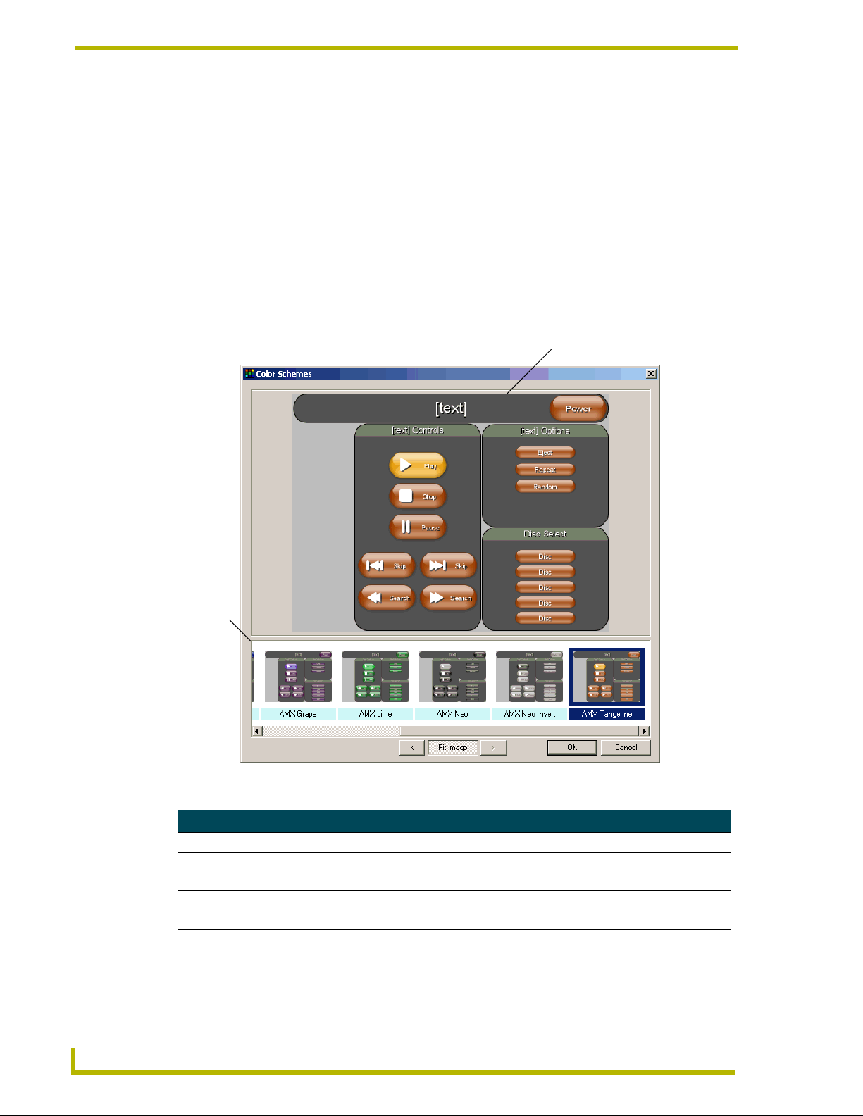
Program Reference
Close Project Dialog Window
If you have made any changes to your project file, close the project and not saved, you will be
prompted, The project has been modified. Do you want to save the changes? Select Ye s to save and
continue closing. Select No to not save the changes and close the project file. Select Cancel to leave
the project file open.
Color Schemes Dialog Window
Templates can contain multiple color palettes, allowing you to switch from one color scheme to
another within one template. The current scheme is reflected in the element preview.
Used either with Chameleon buttons or standalone, you can use a single template that can deliver
different predefined color schemes.
Preview Image
Available
Color
Schemes
FIG. 13 Color Schemes Dialog Window
Color Schemes Dialog Window
Preview Image A sample view of the selected color scheme.
Available Color Schemes All color schemes available for your selected template
are displayed here.
OK Accepts the selected color scheme and closes the window.
Cancel Does not apply the color scheme change and closes the window.
34
G4 PanelBuilder
Page 43

Program Reference
Diagram Preview Dialog Window
The Diagram Preview dialog window is a graphic preview of the selected element. The text on the
buttons appear as they will in the final panel file. This is useful used in conjunction with Diagram
Properties.
Diagram Preview Dialog Window
Fit Image When selected, the panel view will compress to fit within the window.
Save Opens a file save dialog to save a .JPG version of the selected previewed image.
To Clipboard Copies the panel preview to your computer's clipboard.
Close Closes the Diagram Preview.
Diagram Properties Dialog Window
The Diagram Properties dialog window allows you to edit some of the text aspects of the elements.
Element Name
Node Name
Title
Connections
FIG. 14 Diagram Properties Dialog Window
Diagram Properties Dialog Window
Element The name of the element selected and the number of selections available.
Node Name Click in the field to type and edit a new name that will appear on the selected node.
Title This is the title displayed on the panel page and any corresponding buttons the title populates.
To change the field with standard ASCII, type directly in the field. To edit the field using Unicode,
click on the browse button to launch the Unicode edit window.
Connections The connections displays how many are available and what the displayed name is within the
OK Returns to the Diagram area with changes.
Cancel Aborts changes and returns to the Diagram area.
currently selected node. This text is what is displayed on the buttons of the selected panel page.
To edit, click in the text field and either begin typing or select the browse button (...).
The browse button opens a text entry field that will allow you to see the Unicode Send
Command Value. Once you have input the text, click OK to return to the Diagram Properties
dialog window with the changes or click Cancel to return with no changes.
G4 PanelBuilder
35
Page 44

Program Reference
Errors And Warnings Report Dialog Window
You can apply new templates (.TPT files) to preexisting G4 PanelBuilder projects (.PB4 files). The
application will notify you in the event there are discrepancies.
FIG. 15 Errors And Warnings Report Dialog Window
An error will keep the element from working while warnings work but are replaced with the
element closest matching the original element.
Click Close to confirm and continue to the project file.
Generate TPDesign4 Project Dialog Window
The Generate TPDesign4 dialog window is a typical Windows dialog window. Browse to where
you want the generated project file saved. Select Cancel to return to the application.
There is one difference within this dialog window. In the bottom left is a checkbox called, Open
project in TPDesign4. Once the file has been generated, TPDesign4 will launch and open your
newly created .TP4 file.
36
G4 PanelBuilder
Page 45
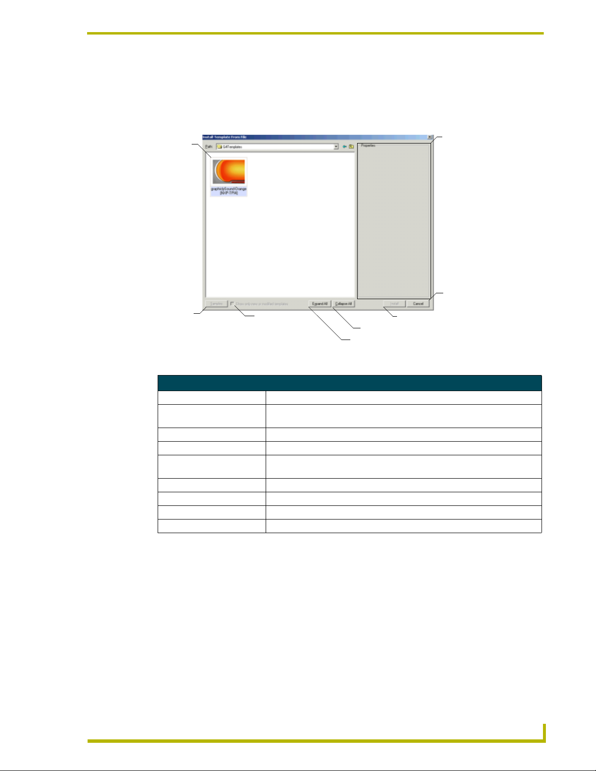
Program Reference
Install Templates from File Dialog Window
The Install Templates from File dialog window is similar to the AMX.com Template Library dialog
window.
Te mp l a t e
Te mp l a te
Thumbnail
Family
Properties
Cancel
Samples
FIG. 16 Install Templates from File Dialog Window
Filter Option
(Show modified)
Install Template
Collapse All Families
Expand All Families
Install Templates from File Dialog Window
Template Family Thumbnail A graphic representation of the panel properties.
Template Family Properties The name of the selected template family and the number of templates
available.
Template Family Panel Types Panels available for use within the selected family.
Samples Launches the Template Sample Images dialog window.
Show only new or modified
templates
Expand All Shows all available templates within each family.
Collapse All Closes all expanded template families.
Install Installs the selected template family to your available directory of templates.
Cancel Closes the Install Template from File dialog window.
Filters the view to show only templates that differ from what you have already
available.
New From File Dialog Window
The New From File dialog window is a typical Windows dialog window. Browse to the desired G4
PanelBuilder project file (*.PB4). Select and click Open. If you do not find the file, select Cancel
to return to the application.
G4 PanelBuilder
37
Page 46
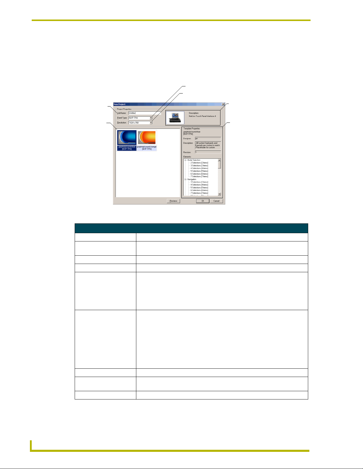
Program Reference
New Project Dialog Window
With the New Project dialog window you can create a new job name and establish the desired panel
type and resolution. Additionally, the New Project dialog window allows you to browse through
available local template files and confirm if they fit selected panel types.
Panel Type
Panel Resolution
Panel Type
Job Name
Description
Template Family
Thumbnail
FIG. 17 New Project Dialog Window
Te mp l a t e
Properties
New Project Dialog Window
Job Name Click within the text field to type the job name of the new project.
Panel Type A drop down list of AMX G4 panels. Click on the panel you would like to design
for use.
Panel Resolution A drop down list of available resolutions for your selected panel type.
Panel Type Description A thumbnail image and name of your selected panel type.
Template Family Thumbnail Thumbnail graphics for templates that meet the criteria established in the panel
type and resolution fields. If no suitable templates are available the message, No
Compatible Templates For Selected Panel Type, will appear. An exclamation
point will appear in the top right of a thumbnail that can be used for the panel
type but was not originally designed for that use. Some images within the panel
pages could require alterations.
Template Properties The template properties are:
• Template family file name
• Designer - Name of the individual that created the template
• Description - A brief note or special interest for the selected template appears
here.
• Revision - The version number of the selected template.
• Elements - A expandable selection of all elements with their number of
available selections.
Previews button Launches the Template Sample Images dialog window.
OK button Accepts selections made and opens the project into the G4 PanelBuilder
Application Interface area.
Cancel button Cancels opening a new project file and returns to the applications.
38
G4 PanelBuilder
Page 47
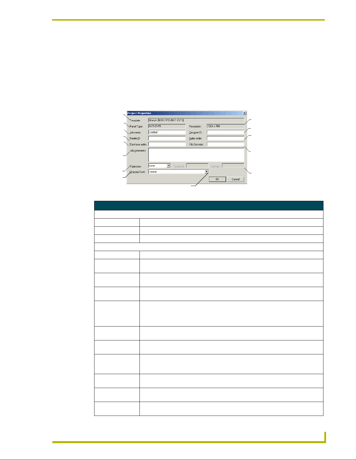
Program Reference
Open Project Dialog Window
The Open Project dialog window is a typical Windows dialog window. Browse to the desired G4
PanelBuilder project file (*.PB4). Select and click Open. If you do not find the file, select Cancel
to return to the application.
Project Properties Dialog Window
Project Properties is a resource for checking the template in use with panel type and resolution.
This information is read-only. You can also add your own information within the Project Properties.
Te mp l at e
File Name
Panel Type
Job Name
Dealer ID
Purchase
Order
Job Comments
Panel Resolution
Designer ID
Sales Order
File Version
File Protection
Unicode Font
Password
Password Confirmation
FIG. 18 Project Properties Dialog Window
Project Properties Dialog Window
Read-only information:
Template File Name The name of the .TPT file currently open.
Panel Type The panel type the project is designed to fit.
Resolution The resolution the project is designed to fit.
User defined information:
Job Name Click in this field to type and edit the job name.
Dealer ID Click in this field to type and edit the Dealer ID. (this field is not necessary to create a
panel file.
Purchase order Click in this field to type and edit the purchase order information. (this field is not
necessary to create a panel file.)
Job comments Click in this field to type and edit any extra information concerning the panel file. (this
field is not necessary to create a panel file.)
Protection A drop-down list containing, none, read-only and locked. None has no password
security. Both read-only and locked enable the Password and Confirm fields when
selected. Read-only allows for viewing the panel file while locked does not allow for
viewing or editing of project files. (this field is not necessary to create a panel file.)
Password Click in this field to type and edit the password. (this field is not necessary to create a
Confirm Click in this field to re- type the password. (this field is not necessary to create a panel
Unicode Font G4 PanelBuilder supports the use of Unicode within the templates. If Unicode characters
File Revision Click in this field to type and edit the file revision number. (this field is not necessary to
Sales order Click in this field to type and edit the sales order information. (this field is not necessary
Designer ID Click in this field to type and edit the Designer ID. (this field is not necessary to create a
panel file.)
file.)
are specified but the font utilized within the template does not support them, a
replacement font is used. You designate the replacement font in this list.
create a panel file.)
to create a panel file.)
panel file.)
G4 PanelBuilder
39
Page 48

Program Reference
Replace Template Dialog Window
When installing .TPT files from AMX.com G4 PanelBuilder will first check to see if the file
already exists locally. The Replace Template dialog window indicates the file is found. You can
check the dates to see if they match or if one is older than the other.
.TPT
Currently on
your computer
FIG. 19 Replace Template Dialog Window
.TPT
available on
AMX.com
Replace Template Dialog Window
Yes Confirms the replacement of the .TPT file on a panel-by-panel basis.
Yes All Confirms the replacement of all .TPT files at one time.
No Denies the replacement of the .TPT file on a panel-by-panel basis.
No All Denies the replacement of all .TPT files at one time.
Abort Cancels the template import at the point abort is chosen. Any previous templates you selected Yes for
are replaced regardless of the Abort selection.
40
Save As Dialog Window
The Save As dialog window is a typical Windows dialog window. Browse to where you want the
project file saved. Select Cancel to return to the application.
There is one difference within this dialog window. In the bottom left is a checkbox called, Package
templates with project file. When saving a G4 PanelBuilder project file, check this option to save
the template with the project file. This embeds the .TPT file with the .PB4 file. This feature allows
you to transport .PB4 files to other computers that have G4 PanelBuilder without concern for the
template file (*.TPT).
When loading the .PB4 file and the .TPT file isn't found, G4 PanelBuilder installs the
.TPT file.
When loading the .PB4 file and the .TPT file is found, G4 PanelBuilder uses the resident
.TPT file.
When loading the .PB4 file and the .TPT file is found but there are differences, G4
PanelBuilder will prompt you for which .TPT file to use.
G4 PanelBuilder
Page 49

Program Reference
Template Manager Dialog Window
The template manager allows you quick access to adding and removing templates locally.
Template File Name
Template Designer
Available Panel
Type Templates
Template Samples
Remove Template
Install Templates
Expand and Collapse Template Families
FIG. 20 Template Manager Dialog Window
Template Manager Dialog Window
Template file name The name of the selected template family and the number of templates available.
Designer Designer of the selected template.
Templates The individual panel type templates available within the selected template family.
Install Provides a drop down selection of From AMX.com and From File.
Remove Removes the selected template family from your local directory.
Samples Launches the Template Sample Images dialog window.
Expand All Shows all available templates within each family.
Collapse All Closes all expanded template families.
When viewing an individual template within a family, more information is available:
Description A brief note or special interest for the selected template appears here.
Revision The version number of the selected template.
Last Save The date the selected template was last saved.
Elements A expandable selection of all elements with their number of available selections.
G4 PanelBuilder
41
Page 50

Program Reference
Template Sample Images Dialog Window
When creating a new G4 PanelBuilder file (*.PB4) you need to assign a template file to it. Template
Manager allows you to preview sample images before deciding which one to use.
The dialog has a screen view of each page with a left-right, scroll navigation below it. Beneath the
scroll navigation is:
Template Sample Images Dialog Window
< / > buttons Navigates left and right between the panel samples
Fit Image Toggles the sample image from default resolution size to fit within the dialog window.
Close Closes the Template Sample Images dialog window.
Unicode Edit Window
G4 PanelBuilder supports the use of Unicode text in place of standard ASCII text. The Unicode can
only be edited through the Unicode Edit window.
Text Field
Unicode Value
FIG. 21 Unicode Edit Window
Unicode Edit Window
Text Field Select, type and edit within this field.
Unicode Value This field displays the Unicode equivalent of what you have entered into the Text field.
OK Accepts the changes and returns to the properties.
Cancel Closes the window without making changes.
42
G4 PanelBuilder
Page 51

Program Reference
Context Menus
Diagram Area Context Menu
The Diagram area context menu is a quick list of commonly used functions. To access the context
menu, right-click within the Diagram area.
Diagram Area Context Menu
Add Element A complete list of available elements within your selected template. Select any
Properties Launches the Diagram Properties dialog window. This feature views the
Preview Launches the Diagram Preview dialog window.
Delete Deletes the element currently selected in the Diagram area.
Snap To Grid Locks all element placements to grid lines.
Zoom Out Decreases the magnification of the diagram area. Increments are 150%, 125%,
Zoom In Increases the magnification of the diagram area. Increments are 150%, 125%,
Zoom A list of available increments to zoom into or out of the diagram area. Click on
Copy Snapshot To Clipboard Copies only the diagram area to your computer's clipboard.
element to have it placed within the Diagram area.
properties of the selected element within the Diagram area.
100%, 75% and 50% of work area.
100%, 75% and 50% of work area.
the desired magnification to implement.
Toolbox Context Menu
Right-click on any of the elements listed within the toolbox to access the toolbox context menu.
The options available within this context menu are also found in the Toolbox menu.
Toolbox Context Men
Add Element To Diagram Adds the selected element to the Diagram area.
Remove All Instances From Diagram Removes all instances of the selected element from the Diagram area.
Element Sample Image Launches a sample screen shot graphic of the selected element.
G4 PanelBuilder
43
Page 52
Program Reference
View Context Menu
Right-click anywhere on the menu or toolbar area to access the View context menu. You can toggle
different aspects of the G4 PanelBuilder Application Interface on and off. The same properties can
be found in the View menu.
View Context Menu
Toolbar A check next to this item indicates it is visible. Click to remove the toolbar.
Tasks Pane A check next to this item indicates it is visible. Click to remove the tasks pane.
Toolbox A check next to this item indicates it is visible. Click to remove the toolbox.
Status Bar A check next to this item indicates it is visible. Click to remove the status bar.
Visual Style A list of visual appearances for the G4 PanelBuilder. Select one of the following:
• Default (Windows 2000®)
• Office XP®
• Office 2003®
44
G4 PanelBuilder
Page 53

Program Reference
G4 PanelBuilder
45
Page 54

AMX reserves the right to alter specifications without notice at any time.
ARGENTI NA • AUST RALIA • BELGIUM • BRAZIL • CANADA • CHINA • ENGLAN D • FRANC E • GERMA NY • GRE ECE • HO NG KONG • INDIA • I NDONES IA • ITALY • JAPAN
LEBANON • MALAYSIA • MEXICO • NETHERLANDS • NEW ZEALAND • PHILIPPINES • PORTUGAL • RUSSIA • SINGAPORE • SPAIN • SWITZERLAND • THAILAND • TURKEY • USA
ATLANTA • BOSTON • CHICAGO • CL EVELAND • DALLAS • DENVER • INDIANAPOLIS • LOS ANGELES • MINNEAPOLIS • PHILADELPHIA • PHOENIX • PORTLAND • SPOKANE • TAMPA
3000 RESEARCH DRIVE, RICHARDSON, TX 75082 USA • 800.222.0193 • 469.624.8000 • 469-624-7153 fax • 800.932.6993 technical support • www.amx.com
2005 AMX Corporation. All rights reserved. AMX, the AMX logo, the building icon, th e home icon, and the light bulb icon are all trademarks of AMX Corporation.
©
033-004-2830 6/05
In Canada doing business as Panja Inc.
Last Revision: 6/1/05
 Loading...